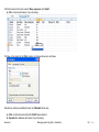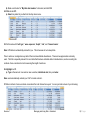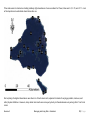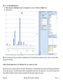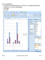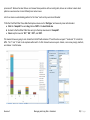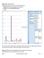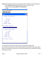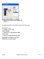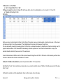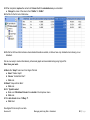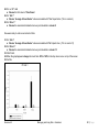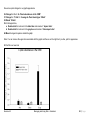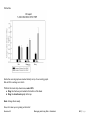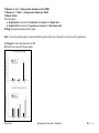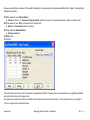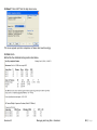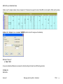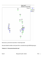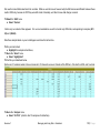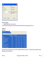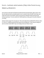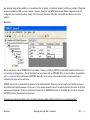
1
IMPROVING LOCAL CAPACITY FOR CORAL REEF
MONITORING DATA INTERPRETATION
A guidebook with step-by-step exercises to improve local capacity for data collection, storage, handling,
visualization, and analysis throughout Micronesia.
Dr. Peter Houk
www.pacmares.com
Table of Contents
Introduction: .............................................................................................................................................................. i
Section 1 – Database generation, manipulation, and query investigation ...................................................................................... 1
Exercise 1 – Establishing a database ......................................................................................................................................................................... 1
Exercise 2 – Manipulating, Managing, Working with, and Visualizing a Database ............................................................................................... 11
Exercise 3 – Advanced queries into a large, multivariate dataset to understand ecological patterns pertinent for management actions................... 27
Exercise 4 – Beyond examining trends. Reformatting an existing database to understand statistical aspects of the data. ........................................ 37
Section 2 - Univariate Statistics and graphing the results .......................................................................................................51
Exercise 5 – Simple calculations of statistical power for influential, dependent variables. ....................................................................................... 51
Exercise 6.1 – An introduction to creating report-quality graphs and preparing data for univariate statistical analyses ........................................ 63
Exercise 6.2 – Conducting basic univariate statistical analyses and producing informative, professional quality graphs to show your trends ........ 74
Section 3 – Multivariate statistics and graphing the results...................................................................................................... 91
Exercise 7 – An introduction to multivariate data considerations, PRIMER-E, and PERMANOVA+................................................................... 91
Exercise 8 – A multivariate, statistical examination of Pohnpei’s Marine Protected Areas using PRIMER-E and PERMANOVA+ ................... 124
Introduction:
Statistically-sound science is required to assess the status of regional and local management efforts ranging from community-based marine
protected areas to expansive regional networks defined by the Micronesian Challenge. Despite having common goals of protecting their resources
for future generations, jurisdictions throughout Micronesia strongly differ in their approach used to monitor coral reefs, and thus, in the information
that is available for managers to act upon. This is, in part, due to unequal funding and capacity distributed throughout the region. As of 2009,
monitoring throughout Micronesia ranged from reef-check surveys conducted by governmental and recreational divers in Kosrae, to seven-year
programs supporting multiple trained biologists in the Commonwealth of the Northern Mariana Islands and Palau. Accordingly the questions being
answered, statistical power to detect change, and the precision of the data differ considerably (Houk and van Woesik, 2006; Houk 2009; Waddell
and Clarke, 2008).
Recently, the 5 political jurisdictions of Micronesia have begun to address these issues, under the framework of the Micronesia Challenge. In June
2008, the newly formed MC Measures Working Group identified the need to develop an appropriate framework to assist monitoring programs in
each of the jurisdictions to track their progress both locally and regionally in effectively managing their resources for sustainable use. Spawning
from the goals set forth by the MC Measures Working Group collaborations between the Pacific Marine Resources Institute (PMRI), Dr. Peter Houk,
and jurisdictional monitoring programs were conducted to evaluate the status of existing datasets in 2009. This effort initiated positive, continued
collaborations for enhanced scientific oversight of monitoring activities with numerous regional partners and scientists.
Building upon a scientific foundation to match management goals with monitoring activities, key recommendations were made to initiate a
standardized monitoring approach for the MC, and beyond (Houk 2009). These designs and methods were tested in each jurisdiction, and shown
to address many pressing management concerns with adequate statistical considerations. Since 2009, data has been collected using the updated
techniques, and now exists. However, these data are not being thoroughly examined and reported on because, generally, the scientific expertise
needed to digest the collected data for management has not yet been well developed within local programs. This forms the basis for the
development of this guidebook.
Here, we present a step-by-step data analyses and graphing guidebook that was produced by PMRI and funded by NOAA Pacific Islands Marine
Protected Area Community program. This guidebook was developed using regional data collected during FY 09 collaborations between PMRI and
FSM/RMI coral monitoring programs. The goal is to bring key users of datasets from each FSM and RMI jurisdiction together for a “hands on”
workshop to evaluate their data, and learn how to efficiently visualize and, when appropriate, test for significance. The guidebook represents a
framework for this process. The guidebook was produced using four major software platforms: Microsoft Excel, Access, PRIMER-E, and Sigma
Plot. These will all be needed to use this guidebook. Please provide constructive comments regarding the guidebook to PMRI through their
website (www.pacmares.com).
Introduction
Managing and Using Data - Guidebook
i|Page
Section 1 – Database generation, manipulation, and query investigation
Exercise 1 – Establishing a database
The initial establishment of a database can often seem like a daunting task for us. Consider that a wealth of information is typically
required, or at least desired, and all of that information resides with multiple people or agencies. However, Micronesia’s coral
monitoring programs are often limited in personnel and capacity, so learning to do the best possible job with the resources at hand is a
logical outcome. There is no one right way to format a database, several different approaches can lead to similar outcomes. However,
some basic rules do apply. When deciding upon how to format a database the first question that one should ask is what is being
measured and what is the unit of replication. Two examples below will show different approaches.
Example 1 – Macroinvertebrate data collection from Chuuk Rapid Ecological Surveys
Rapid ecological assessments were conducted in Chuuk during August-September 2008. In this example we will build a desirable
Microsoft Excel database to store the quantitative macroinvertebrate estimates that were made.
1. Open Excel
2. Select and open the file “Chuuk-REA-invert-database” from the example file directory on your computer.
3. Click on the first sheet “Brainstorm metadata fields” to understand the nature of data collection.
Data were collected from 8 islands among a variety of reef types and wave exposures. At each site surveyed, two depths were
examined for macroinvertebrate abundances along 5 transects. A transect consisted of a 5-minute timed swim. The observer recorded
all conspicuous macroinvertebrates that were observed. No size data were collected, just counts. From the “Brainstorm metadata
fields” sheet you can get an idea of the sampling scheme. This is a logical first step in creating a database, to generate a ‘brainstorm’
or relevant metadata fields sheet that breaks down how sampling was conducted.
4. Click on the next tab “Metadata”.
Here a list of all sites surveyed was populated while surveys were being conducted. Location information exists as well as site
characteristics. Armed with this information laid out in this manner, were ready to begin building our database.
Exercise 1
Managing and Using Data - Guidebook
1|Page
5. Click on the next tab “Database-build”.
Notice that the metadata headings from the earlier sheets are copied over already. We need to populate them, and reduce the chance
of data entry error.
6. Click on the “Data” tab on the main menu of excel – up top.
7. Click on the entire “A” column above the word “Island” – see below
8. Now under the excel sub-menu “Data Tools” click on “Data Validation”
a) The menu below should pop-up. Click on the “Settings” tab.
b) Then for validation criteria, scroll down until you find the “List”.
Exercise 1
Managing and Using Data - Guidebook
2|Page
9. Now you should see a “Source” field open up, where you want to provide the selective criteria for entering data into these cells (i.e.,
the island names where data was collected from).
a) Type in exactly what is seen below.
10. Click OK
This code logically refers Excel to the sheet named “Brainstorm metadata fields”, and says that all possible islands where data were
collected from are located in cells A2:A9. Verify that for yourself. (Note: When doing this, it is very desirable to have scratch paper for
taking informal notes to assist you with entering source codes and functions into excel.)
11. Click in cell A2 and notice there is a dropdown arrow on the right hand side.
a) Click the drop down arrow and notice the list of islands appears where data were collected from.
b) Choose any island name for now.
c) Click in cell A3, do the same. Populate cells down to A10.
Exercise 1
Managing and Using Data - Guidebook
3|Page
12. Do the same for the next column “Reef type”
a) Click on the column “B” on top of “Reef type”
b) Type the below code into the empty “Source” box.
13. Again, verify yourself why cells B2:B5 are chosen by examining the “Brainstorm metadata fields”
Populate cells B2:B10 with values of your choosing.
Exercise 1
Managing and Using Data - Guidebook
4|Page
14. Do the same for the next column “Wave exposure” and “Depth”
a) Fill in columns with values of your choosing.
15. Now, do the same for the “Site” column, but change the source as follows
Note that we reference a different sheet, the “Metadata” sheet now.
a) Click on that sheet and verify that A2:A57 were selected.
b) Populate the database with values of your choosing.
Exercise 1
Managing and Using Data - Guidebook
5|Page
16. Now for the next column “Transect #:” we can again do the list function, or we can simply write the numbers 1 – 5. You choose and
populate the cells.
Now for the fields “GPS X” and “GPS Y” we will use a “lookup” function because there are too many numbers in the GPS coordinates
to try and process through a dropdown list.
17. Click on cell G2
a) Type the following in the function toolbar:
The “lookup” function first asks for the reference cell value upon which the lookup will occur, in this case it is cell E2, or the “site”. Next,
you have to provide a list of all possible sites for excel to look up, in this case the list is found on the “Metadata” sheet, columns B and C
are the X and Y coordinates (i.e., lat and long) for each site. Now, you do this for the GPS Y, or latitude, coordinate.
Exercise 1
Managing and Using Data - Guidebook
6|Page
Note: It is important to note that the “$” in the cell formula means for Excel to keep the exact cells when conducting the functions.
Without them, the references for the lookup values would change when we cut and paste into cells below to automatically populate our
database.
18. Get a scratch paper out, click on the “Metadata” sheet, and note which cells that contain GPS Y coordinates you are interested in,
and the site names associated.
a) The relevant information to write are the site names that will be looked up (A2:A57, on the “Metadata sheet”), and the valued
you want inserted, GPS Y (B2:B57).
19. Go back to our “Database-build” sheet and highlight the first cell you want to populate with the “lookup” function for GPS Y, or
latitude. This is cell H2.
a) Once highlighted, enter the appropriate formula: =lookup(E2, Metadata!$A$2:$A$57, Metadata!$B$2:$B$57)
Note: we do not want and $ near the E2 because that is dynamic, and we want to drag our formula to autofill the cells below. However,
we want $ to appear for all lookup list values on the “Metadata” sheet. These will never change.
b) Your database should now look like below.
20. Fill in your GPS data for all other sites.
21. Highlight the G2 and H2 cells together and copy the contents, press the “Ctrl + C”.
Exercise 1
Managing and Using Data - Guidebook
7|Page
22. Scroll down to cell G3 and paste the formula, “Ctrl + V”.
a) Fill all the way down to G10.
Your database should look like below.
Now that we have everything in order, we are ready to formalize our database into an Excel “list” function.
23. Highlight all cells where data exists, A1 to H10.
a) Click on the “Insert” main tab for Excel, on the sub-menu click on “table”.
You should have a dialog box appear as below.
Exercise 1
Managing and Using Data - Guidebook
8|Page
b) Make sure the box for “My table has headers” is checked, and click OK.
24. Click in cell A11.
a) Select any island of you like from the drop down menu.
25. Do the same with “reef type”, “wave exposure”, “depth”, “site”, and “transect name”.
Note: GPS data is automatically entered for you. This is because of our lookup table.
Time to enter our ecological survey data of the macroinvertebrate abundances. There are two approaches commonly
used. The first is especially relevant for count data that has been collected without individual sizes, such as counting the
numbers of sea cucumbers but not measuring the length of each one.
26. Highlight cell I1.
a) Type in the name of one common sea cucumber, Holothuria atra, then push enter.
Note: excel automatically extends your “list” to include column I.
27. Enter numbers of sea cucumbers encountered for each transect surveyed. You can just enter values of your choosing.
Exercise 1
Managing and Using Data - Guidebook
9|Page
It is very straightforward how to continue to enter data in this manner, one can keep on adding species in the columns to the right of the
Excel “list”.
Finish exercise 1, save your Excel file for future reference.
Exercise 1
Managing and Using Data - Guidebook
10 | P a g e
Exercise 2 – Manipulating, Managing, Working with, and Visualizing a Database
1. Open the file “Chuuk-REA-invert-database-complete”.
a. Click on the sheet “Database-build”.
Here, you will find the same database we just built, however, now it is populated with 520 transects of macroinvertebrate data
abundance estimates that were collected during the Chuuk REA. Examine the database, especially look at the organization. The
data are sorted by Island, Site, and Depth. You can re-sort the data by using the column headers, and clicking on the dropdown
arrow next to the column heading.
2. Click on cell K2 “Tridacna spp.”.
a. Sort from “largest to smallest”.
Exercise 2
Managing and Using Data - Guidebook
11 | P a g e
You can get a general understanding this way, for instance, that the atolls hold more large clams (grouped as Tridacna spp.), as
compared with Chuuk. And, in particular, Kuop seems to appear many times at the top of the list.
3. Now, do the same sorting for the common sea cucumber Holothuria atra.
Which island consistently holds the greatest abundance of this common sea cucumber?
Lets return the database back to its original form.
4. Click on the “Depth”
a. Sort “smallest to largest”.
5. Click on site
b. Sort “A to Z”.
6. Click on “Island”
c. Sort “A to Z”.
You can notice this is exactly how the database looked when we first opened it.
Now, we will add some additive, summary columns that will help us to better visualize our results. Notice that columns I, J, and K all
refer to “clams”. Lets add a column to help summarize the abundance of all clams together.
7. Click on column L “Crinoids”, right after the last column with clam names.
8. Right click the mouse and select “insert”.
Notice a new column appears called “Column 1”.
a. Change the name to “Clam Total”.
Exercise 2
Managing and Using Data - Guidebook
12 | P a g e
9. Now, highlight cell L2. Write “=sum(” (to conduct an automated sum function in excel.)
b. Click on the cell I2, place a comma( , ).
c. Click on J2, add another comma,
d. Click on K2, finish with a closed parenthesis “)”.
e. Press enter.
Excel fills in a sum function for the entire database automatically. This column is now the total abundance of all three clam categories,
and can be used as a summary.
Next, we will do the same for sea cucumbers. Column AB has the name of the last sea cucumber, “Thelonota anax”.
10. Click on the next column, AC, and right click, and again “insert”.
a. Name this Sea Cucumber Total.
11. Do the sum function for excel, ensure that all sea cucumbers are included, columns P through AC.
Exercise 2
Managing and Using Data - Guidebook
13 | P a g e
(Note: Instead of clicking individual cells, you can drag the excel cursor across all cells if you like.)
Your spreadsheet should look like below.
12. Repeat process for:
a. Seastars – Columns AD through AH contain names of seastars
b. Grazing urchins - Columns AJ and AK contain grazing urchins.
13. Repeat process for edible shells too. (Note: Here, you can just click in the cell AP1 and type “Edible Shell Total”)
Exercise 2
Managing and Using Data - Guidebook
14 | P a g e
a. Do the same sum function.
b. See below for confirmation.
Exercise 2
Managing and Using Data - Guidebook
15 | P a g e
That ends our basic database manipulation, you can review the steps and logically think of other ways to do similar things.
Now, we will begin to visualize the dataset using Excel’s Pivot Table.
In order to set up a Pivot Table, you first need to highlight the cells that define the table.
14. To the upper left of cell A1, there is a small box with a diagonal arrow.
a. Click on that box (all cells in the database are automatically highlighted)
b. Click on the “Insert Tab” of Excels main menu, and
c. Click on Pivot Table.
d. The table/range should match, and ensure that “New Worksheet” is selected.
e. Click OK.
Exercise 2
Managing and Using Data - Guidebook
16 | P a g e
A new sheet (see below) should be created between “Metadata” and “Database-build” that is called “Sheet 1”. You can
right click and rename it to “Chuuk REA Invert Pivot”. Click back inside the “Pivot table area” in the upper left. With
Pivot Table you can make summary tables and graphs easily and quickly. The first thing we will do is take a simple look
at sea cucumber abundances by island.
15. Click and Drag the “Island” Box from the “Pivot Table Field list” on the right and place it down in the “Row Labels”.
16. Click and Drag “Sea Cucumber Total” box from the “Pivot table field list” (hint, you need to scroll down to find it), and place it
under “values”
17. Click one time on the “Count of Sea Cucumber Total” box under values, a sub-menu should pop-up.
a. Click on the “Value Field Setting” - Notice count is selected, but we want to examine average values found on each transect.
Exercise 2
Managing and Using Data - Guidebook
17 | P a g e
b. Click on “Average”.
c. See below for a confirmation of these steps
Lets also view the standard deviations to understand how the data was spread among the surveyed transects.
18. Click and drag the “Sea Cucumber Total” box from on top below the existing “Average of Sea Cucumber” in Values.
a. Click the new “Count of Sea Cucumber Total” box and again choose “Value Field Setting”.
b. Scroll down on the pop-up menu and choose “StdDev”.
Now you have averages and standard deviations side by side, lets view this graphically.
Exercise 2
Managing and Using Data - Guidebook
18 | P a g e
19. Click on any cell in the Pivot Table (the new data table on the upper left of the sheet)
a. Click on the “Insert” main menu tab in Excel. (You can see a lot of options here, we want to look at simple “Column” charts)
b. Click on “Column”, and select the “first graph option” in the top left.
Let’s move the chart to a new sheet for simplicity.
20. Right click in the chart and select “Move Chart”.
Exercise 2
Managing and Using Data - Guidebook
19 | P a g e
21. Select “New Sheet” and rename the chart “Chuuk REA Invert Summary”.
A new sheet is created and our desired summary is easily seen and understood.
Exercise 2
Managing and Using Data - Guidebook
20 | P a g e
Now, we can take a moment to reflect upon what the data is telling us. First, on average, there was no site surveyed in Chuuk that had
more than 4 sea cucumbers per 5-minute swim, a very low value compared with other REA reports conducted in similar habitats and
depths. Second, Chuuk has the greatest abundance of sea cucumbers, a consequence of the high islands located in Chuuk Lagoon,
providing suspended particulate matter to the lagoon through the deposition of terrestrial organic matter. These trends are expected.
Third, the outer islands all have very low abundances; in fact at some none were recorded. Fourth, in all instances the standard
deviation is greater than the average. This informs us right away that our statistical power to detect change over time in sea cucumber
abundances is low for the entire island level. However, our goals are to understand change at the individual site level. So we will see
how the data improve our understanding of the distribution of sea cucumbers around Chuuk only.
Notice you can manipulate the Pivot Table in chart mode with Excel as well as table mode. These next steps could be done on the
“Chuuk REA Invert Summary” graph sheet, or the “Chuuk REA Invert Pivot” table sheet. Keep on the graph sheet for now.
22. Under the “PivotChart Filter Pane” window click on the drop down menu for “Island”.
a. Uncheck all islands except for Chuuk.
b. On the “PivotTable field list” drag “Site” and “Depth” below “Island”.
c. Confirm below.
Exercise 2
Managing and Using Data - Guidebook
21 | P a g e
The first thing we notice is that our standard deviations are greatly reduced when examining data at the site level, suggesting our
survey goals of detecting change at the site level are better approached. However, they are still higher than desired for many sites.
We will touch back on that later.
23. Remove the “StdDev of Sea Cucumber Total” box from Values.
a. Click and drag it back up from where you initially grabbed it.
24. Back on the “PivotChart Filter Pane” window click on the drop down menu for “Depth” and leave only the 3m depth highlighted.
25. Confirm below.
Exercise 2
Managing and Using Data - Guidebook
22 | P a g e
Three sites seem to stand out as holding relatively high abundances of sea cucumbers for Chuuk, these are C-5, C-15, and C-11. Look
at the map below to understand where those sites are.
Not surprising the highest abundances were found on Chuuk’s inner reefs, adjacent to islands of varying population, land-use, and
other physical attributes. However, many similar inner reefs were surveyed, yet why do the abundances vary among them? Let’s look
closer.
Exercise 2
Managing and Using Data - Guidebook
23 | P a g e
26. From the “PivotTable Field List”
a. Click and drag the “Reef type” box below the “Island”, but on top of the “Site” and “Depth” boxes.
b. Confirm below.
We can now easily see that sea cucumbers are preferably found on the inner reefs as expected, but why is there so much variation
among inner reef sites?
27. Go to the drop down menu for the “Reef type” filter pane, check only “inner”.
Nine sites are left on our graph, again you can refer to the map above to understand which inner reefs have the highest abundances of
sea cucumber resources. Our final step here will be to investigate the quality of our data collection (i.e., if we re-do the surveys do we
have statistical confidence to detect a change, especially at the sites where resources are good).
Exercise 2
Managing and Using Data - Guidebook
24 | P a g e
28. On the “PivotTable Field List”
a. Click and drag the “Sea Cucumber Total” again down to the “Values” box, below “Average of Sea Cucumber Total”.
b. Left click the box one time, click on “Value Field Settings”
c. Set to “StdDev”.
d. Confirm below.
Exercise 2
Managing and Using Data - Guidebook
25 | P a g e
We can also look at the 10m depth and find similar patterns, however abundances typically decrease with depth, can you find the site
with an exception to this pattern?
In two out of three of the sites where sea cucumbers were most abundant our standard deviation is less than half of our average, or
mean. While any coral reef manager would like lower standard deviation bars, this is a satisfactory situation. How do our findings
translate to future next steps and potential management actions?
First, one commonly applied rule for management is to protect the locations where good resources exist. It would be insightful to
understand why C-5, C-15, and C-11 hold high resource abundances. The two probable causes attributable to patterns are: 1) differing
natural environments, or 2) human harvesting trends. This is where scientists and monitoring teams present findings to communities
and knowledgeable individuals to learn, and plan for management accordingly. If we can understand what conditions lead to high sea
cucumber populations than we can identify and prioritize management actions that should be efficient.
Second, long-term monitoring focused on sea cucumbers for Chuuk seems best focused upon “inner” reefs. People in charge of
continued monitoring programs might design, or re-design, annual ecological surveys accordingly. It seems less appropriate to
randomly survey all reef habitats in Chuuk, however, like any dataset, the REA data doesn’t tell the whole story. For example, the outer
reef flats were not surveyed and typically hold high sea cucumber populations, but usually of only a few species.
End of Exercise 2
Exercise 2
Managing and Using Data - Guidebook
26 | P a g e
Exercise 3 – Advanced queries into a large, multivariate dataset to understand ecological patterns
pertinent for management actions.
1. Open the file “Pohnpei-MPA-fish-transects”.
Notice there are two sheets that are populated with data and site information.
2. Click on the sheet “Site information”.
This sheet contains a list of all MPA monitoring locations for Pohnpei’s program, MPA status, reef-type, indicator fish species, and two
coefficients that are used to estimate biomass from length estimates.
3. Click on the next sheet “PNP Fish Database”
You can see a dataset for Pohnpei’s 2006 indicator fish monitoring efforts. First notice the design of the database is different from the
Chuuk REA database. Here, each row represents one individual fish on any particular transect, at any particular site. With the Chuuk
REA data each row represented one transect.
Take time to notice the column headings and how the drop down menu and lookup functions were created.
4. Do this by clicking in cells A2 across, and understand how each function works.
The formula for fish biomass comes from published studies and each species coefficients comes from a website called “FishBase”, a
global initiative to improve our understanding and science surrounding fish and fisheries (www.fishbase.org).
We are going to be manipulating this database to understand trends in MPA success. In the case of any master database, no data
queries or graphing should be conducted using the same file as the original database.
Exercise 3
Managing and Using Data - Guidebook
27 | P a g e
5. First do a “save as” and name the file “Pohnpei-MPA-fish-transects-exercise”, or any other name of your choosing.
Now we are ready to begin our query and investigation. Logically, we’ll start by asking the most general questions, and get more
specific as we learn.
6. Highlight all of the data and again insert a Pivot Table like before.
a. Change the name of the sheet to “PNP fish pivot”
Exercise 3
Managing and Using Data - Guidebook
28 | P a g e
b. Click ok in the dialog box.
We will first take a look at all MPA’s grouped together, not yet taking into account statistical sampling concerns like standard deviations
and confidence intervals surrounding our data.
7. Click and drag the “MPA” box and put in under “Row Labels”.
a. Put “Species” under “Column labels”
b. Put “Biomass” under “Values”.
c. Left click the “Count of Biomass” box once and change the field settings to “average”.
d. Confirm below.
Exercise 3
Managing and Using Data - Guidebook
29 | P a g e
8. Go to the “Insert” tab off the main menu of Excel and insert a column chart,
a. Choose the stacked column chart one showing cumulative data summaries.
Exercise 3
Managing and Using Data - Guidebook
30 | P a g e
b. Right click in the chart area and move this chart to its own sheet.
c. Name the sheet “PNP fish pivot chart”.
d. Confirm below.
9. Click on the “MPA” drop down menu in the PivotChart Filter Pane,
Exercise 3
Managing and Using Data - Guidebook
31 | P a g e
a. Uncheck the “blank” box if it happens to be selected, if not you don’t need to do anything.
This initial chart seems like positive news, on average there is a greater biomass of just about every indicator species inside of the
MPA’s compared with outside. However, there is a lot more to consider before coming to that conclusion so we should continue our
investigation.
10. Click and drag the “Reef type” box and drag it into the fields box, putting it above “MPA”.
Now we can clearly see that inner reef MPA’s are protecting a much larger proportion of the biomass as compared with outer reefs.
Specifically, Caranx melampygus (jack) and Hipposcarus longiceps (parrotfish) are two fish that seem to be influential drivers of this
trend. Are these differences in success based upon reef type due to proximity of human populations that help maintain and enforce
the MPA? Are they due to natural differences in habitat types, whereby outer reefs are harder to access so differences are less
Exercise 3
Managing and Using Data - Guidebook
32 | P a g e
pronounced? We must be clear that we can’t answer these questions with our existing data, but we can continue to learn about
patterns so we know how to most efficiently learn about cause.
Let’s focus more on understanding patterns for the “inner” reefs as they seem most influential.
11. On the PivotChart Filter Pane, click the drop down menu next to “Reef type”, and leave only inner reefs checked.
a. Click the “SampleID” box and drag it below “MPA” in the Axis Fields box.
b. Go back to the PivotChart Filter Pane and go to the drop down menu for “SampleID”.
c. Check only the boxes for “DI1”, “DI2”, “DO1”, and “DO2”.
This means that we are going to look at data from the MPA with nickname “D” and the sites surveyed “I” inside and “O” outside the
MPA. The “1” and “2” refer to site replicates within which 5 x 50m transects were surveyed. Indeed, a nice survey design, methods,
and dataset. Confirm below.
Exercise 3
Managing and Using Data - Guidebook
33 | P a g e
These results contradict our earlier finding of success for MPA’s in general. For this MPA we see there appear to be more fish outside
the MPA compared with inside. Check to agree that these trends are especially pronounced for Chlorurus microrhinos and Naso
unicornis at the “DO1” site, outside the MPA.
Note: You can hover over any part of the data bar and Excel should automatically tell you what fish species each color
represents. Confirm below if it is not clear.
Let’s look at the next MPA.
12. Go back to the PivotChart Filter Pane and
a. Go to the drop down menu for “SampleID”.
b. Check only the boxes for “KI1”, “KI2”, “KO1”, and “KO2”. This means that we are going to look at data from the MPA with
nickname “K” now.
Exercise 3
Managing and Using Data - Guidebook
34 | P a g e
The results again clearly show no substantial benefits of the “K” MPA site.
Let’s continue because we know the overall trends suggested MPA’s were working on the whole.
13. Go back to the PivotChart Filter Pane
a. Go to the drop down menu for “SampleID”.
b. Check only the boxes for “LI1”, “LI2”, “LO1”, and “LO2”.
Now we can easily see the perceived success of this MPA compared with others.
You can do the same examinations for MPA’s “M” and “N”. You can confirm below for MPA N”.
Exercise 3
Managing and Using Data - Guidebook
35 | P a g e
We have learned a great deal from our investigations thus far. First, for inner reefs, MPA’s “D” and “K” do not seem successful as
compared with all other three. Second, by far, the most success seems to be found at MPA “L”. Third, although team Pohnpei
monitors 16 indicator fish, trends are most influentially delineated by only a few fish. Namely, these are Chlorurus microrhinos,
Hipposcarus longiceps, Caranx melampygus, Naso unicornis, and maybe one or two others. This is understandable because these are
relatively large fish that make up a high proportion of Pohnpei’s fish market catch. It is very interesting to learn that fewer fish may be
able to serve as statistically useful indicators for MPA success, and these are common with local names that are well known.
End of Exercise 3, save the file, and keep it open. This same file will be used for Exercise 4.
Exercise 3
Managing and Using Data - Guidebook
36 | P a g e
Exercise 4 – Beyond examining trends. Reformatting an existing database to understand statistical
aspects of the data.
While we have successfully visualized trends regarding fish assemblages from Pohnpei’s MPA dataset in Exercise 3, will now take a
look at the statistical confidence of these data, as we have yet to view any error bars that describe consistencies among transects and
sites. Because the original database was generated by placing each individual fish measurement in its own row with lots of metadata,
we will need to re-format the dataset to generate summaries at the transect-level. Recall, the transect is our unit of replication within
each site. It is good to understand the functional differences for different database formats, take a moment to reflect.
Programs like Excel make it relatively easy to switch formats in a short time frame.
1. First, go back to our “PNP fish pivot” worksheet.
2. Under “Row Labels” click and drag the boxes for “MPA” and “Reef type” out.
3. Click and drag “Replicate” and put it under “SampleID”.
a. Under values, left click once on “Average of Biomass”, and change the attribute field to “Sum”.
b. Confirm below.
Exercise 4
Managing and Using Data - Guidebook
37 | P a g e
Now we have a spreadsheet with each replicate transect as a row, and a total amount of fish biomass recorded on each transect
(hence the sum instead of average function). This is exactly what we need to examine transect-level replication, total sums of biomass
for each species along each transect.
4. Right click anywhere in the table and go to “Pivot Table Options”.
a. Make sure the “Layout&Format” tab is selected and put a “0” in the box next to “For empty cells show:”.
5. Click on the “Totals&Filters” tab.
a. Uncheck the boxes for “Show grand totals”, both of them.
6. Click on the “Display” tab.
a. Check the box that says “Classic Pivot Table layout”
7. Click OK to close the dialog box.
8. Confirm below.
Exercise 4
Managing and Using Data - Guidebook
38 | P a g e
Just a few more steps and then we will have re-created a new database for our needs.
9. Click on cell A4, on the pivot table.
a. Right click and choose “Field Settings”
b. Under “Subtotals” click none.
c. Click OK to close the dialog box.
Now we want to re-add the “MPA” and “Reef type” information in our table.
10. Click and drag these boxes and put them under “Replicate”.
11. Click on cell B4, again choose “Field Settings”
a. Under “Subtotals” click none.
b. Click OK to close the dialog box.
Exercise 4
Managing and Using Data - Guidebook
39 | P a g e
12. Click on cell C4, again choose “Field Settings”,
a. Under “Subtotals” click none.
b. Click OK to close the dialog box.
13. Confirm below.
Note: This is the layout of the table we want to export for further investigation.
Note: It’s a good idea to save your work at this point.
14. Check the drop down menus for “SampleID”, “Replicate”, “MPA”, and “Reef type” (these are cells A4, B4, C4, and D4)
Note: Make sure no filters are on and all boxes have a green check mark.
15. Click anywhere inside the pivot table
a. Press the Ctrl + A buttons on the keyboard to select all the data.
b. Right click again and select “copy”.
16. Click the Excel worksheet named “Sheet 1”.
a. Click in cell A1.
Exercise 4
Managing and Using Data - Guidebook
40 | P a g e
b.
c.
d.
e.
Right click and select “Paste Special”
Select “Values”
Click OK.
Confirm below.
You should now have a new formatted sheet. Confirm below.
Exercise 4
Managing and Using Data - Guidebook
41 | P a g e
17. Rename this sheet from “Sheet 1” to “PNP Fish Data by Transect”.
Exercise 4
Managing and Using Data - Guidebook
42 | P a g e
18. Delete “Row 1”
a. Highlight the rest of the data (Ctrl + A)
19. Go to the insert tab from Excel’s main menu, and choose “Table”.
20. Click OK
21. Confirm below.
You should have a new database generated that shows fish abundances by transects now. There is only one problem left, for each site
(“SampleID”) there is only one label with four blank boxes below. We need to fill in the blank boxes below each site label.
Unfortunately, there is no automated, easy process to do this, but Excel has some helpful functions to reduce the time required.
22. Highlight cells A2:A6
Exercise 4
Managing and Using Data - Guidebook
43 | P a g e
23. Go to the “Home” tab on Excel’s main menu
a. Click on the drop down box named “Fill”.
b. Choose the first option “Down”. (Notice Excel fills the boxes with the same site label “DI1”)
c. Confirm below.
24. Do the same for all other sites.
25. Highlight cells A7:A11
a. Go to the “Fill” drop down menu and select “down”.
b. Keep on doing this until you fill in all blank boxes on the database.
Tip: Another trick you can use from the keyboard is to click on the first cell with the site name, press Ctrl + C, then move
down to the blank cell and press Ctrl + V. This cut and paste works as well.
Ensure that under the heading ‘Reef Type’ (Column D), only ‘Inner’ is selected.
Exercise 4
Managing and Using Data - Guidebook
44 | P a g e
When finished confirm you completed data table below.
We are now ready to begin examining our statistical confidence.
26. Click anywhere in the table then press Ctrl + A to highlight all the data.
Exercise 4
Managing and Using Data - Guidebook
45 | P a g e
27. Insert a new Pivot Table, and name it “Pivot PNP Fish by Transect”.
a. Click and drag the “Sample ID” box and put it under Row Labels.
We will first look at one influential fish we found from earlier.
b. Click and drag the “Hipposcarus longiceps” box and put it under values.
c. Click and drag the exact same box, and put it under values.
d. Confirm the look of your “Values” box below.
28. Left click on the top “Sum of Hipposcarus” box
a. Change the attributes field to Average.
29. Left click on the bottom “Sum of Hipposcarus” box
a. Change the attributes field to StdDev.
Exercise 4
Managing and Using Data - Guidebook
46 | P a g e
30. Click anywhere inside the main table
31. Insert a basic column chart (the one on the top left of the selection menu)
a. Right click inside the chart and move it into its own spreadsheet
b. Rename the sheet “Pivot Graph PNP fish transect”.
c. Confirm.
We can clearly see that the standard deviation surrounding these parrotfish estimates for each site is higher than desired, and there is
no need to proceed with calculations of statistical power (which we will do in a later exercise).
32. Repeat steps 26b - 30 and look at “Naso unicornis” (another influential fish we examined before)
Does the situation differ? Try a few other fish as well. Discuss conclusions.
Exercise 4
Managing and Using Data - Guidebook
47 | P a g e
Clearly at the individual species level there is too much variation in the data to be able to detect significant change over time with
statistical confidence. However, we shouldn’t worry, fish assemblage data are naturally multivariate in nature. That is, there are many
species that make up the total biomass on any given transect, and perhaps we should try to account for all of them simultaneously,
rather than individually, one by one. In a later exercise we will analyze the multivariate properties of fish assemblage data. Here, we
will attempt a couple last steps to see if we can utilize some properties of the univariate fish dataset.
33. Return Click in cell V1
a. Name this cell “Total Biomass”. (Notice Excel automatically includes this as part of your data table, and the colors change)
34. Click in cell V2
a. Type the following function “=sum(”,
b. Highlight all cells in the 2nd row with a fish name on top of them. (Excel should autofill the entire column once you hit Enter)
35. Confirm.
36. Go back to the “Pivot Graph PNP fish transect” worksheet with our graph.
Exercise 4
Managing and Using Data - Guidebook
48 | P a g e
37. Click anywhere in the chart to activate the Pivot Chart functions.
38. Click on the “Analyze” tab in Excel’s main menu, then click the “Refresh” button.
Notice in your “PivotTable Field List” that “Total Fish Biomass” has been added.
39. Remove all active boxes from the “Values” field by unchecking the green marks next to any active fish name you were previously
investigating.
40. Click and drag the “MPA” box and place it under “SampleID”.
41. Click and drag the “Total Fish Biomass” box and place it under “Values”.
a. Do this twice so you have two boxes.
b. Change the attributes of each to “Average” and “StdDev”.
Exercise 4
Managing and Using Data - Guidebook
49 | P a g e
We can clearly see that we have improved our confidence interval surrounding our data by utilizing the new field “sum of fish biomass”.
In many instances the standard deviation appears to be less then 50% of the mean, and appropriate for the calculation of statistical
power. However, this trend is not universal, and our conclusion would be to also examine the multivariate properties of these datasets.
Both statistical power and multivariate data analyses are approached in a later exercise.
In just a short period of time we have successfully identified island-wide trends associated with Pohnpei’s MPA network. We
subsequently identified which MPA’s seem to be most successful. Finally, we re-formatted our data to understand statistical
consideration of our dataset. We are armed with a logical framework and flow to create a report, power point lecture, grant application,
or other type of summary that may be necessary.
42. Save your file for future reference, then you can close it.
End of Exercise 4.
Exercise 4
Managing and Using Data - Guidebook
50 | P a g e
Section 2 - Univariate Statistics and graphing the results
Exercise 5 – Simple calculations of statistical power for influential, dependent variables.
Statistical power is defined as a probability (0 to 100%) that data we collect will be able to detect a desired level of change in the
abundance or density of coral, fish, or invertebrates in question. If we take just a few measurements our standard deviation will be high
and our power will be low. However, when do we know enough is enough so we can balance our logistical and financial constraints
with our data needs? Obviously 0% power is not desirable, but 100% is equally unattainable unless sampling effort is increased
beyond realistic levels. Studies agree that power should be 70% or higher for detecting a relative 20 – 30 % change in the resource
abundance in question (coral, fish, sea cucumbers, etc.). Here we will conduct some very basic power calculations using the free
software R (http://www.r-project.org). Of course the topic of statistical power is well developed in the scientific literature, and references
are easily attainable from the “Google Scholar” search engine. Here we will touch upon the subject for our needs of assessing data
confidence.
You should have already installed the software package “R” on your computer, if you have not do so now. R is a computer language,
and interface program, that allows any user to create their own “code” or instructions for data analysis and user interface. A great book
to describe R, and provide you with plenty of examples is “The R Book, MJ Crawley (2007). John Wiley & Sons Inc.”. Here, we will
only use one simple feature of R to generate statistical power estimates. You can navigate to
(http://sekhon.berkeley.edu/stats/html/power.t.test.html) to understand the code (or package) that we will use.
We will again use Excel as a basis for our inquiries.
Open the file “Kosrae-benthic-data-example”.
Exercise 5
Managing and Using Data - Guidebook
51 | P a g e
You can see a very straightforward datasets with “Sample ID”, “Replicate”, and “Date” to define each sampling event. The remaining
codes indicate benthic categories that Kosrae’s monitoring program used to collect data. These benthic data were collected using four,
20m long transect lines and noting the benthic life form at each 0.5m mark on the line. Thus, there is a total of four replicate transects
with 40 benthic data points collected along each.
For our purposes we will focus on “Column L” or “HC”, which refers to hard coral cover. The numbers below are percent coverages.
There are four key elements for calculating and understand statistical power:
1) standard deviations associated with your measurements,
2) required statistical power or confidence,
3) number of replicate samples you have used
4) desired absolute value of change you want to be able to detect.
If you know any of the above 3 values, the simple analyses through “R” will provide you with the calculation of the fourth.
First we will use a Pivot Table to transform the look of our data table for easier interpretation.
1. Insert a Pivot Table; call it “Kosrae-benthic-pivot”.
a. Place “Sample_ID” under “Row labels”, and “HC” under “Values” two times.
b. Change the attributes of one of the “HC” boxes to “Average”, and the other to “StDev”.
c. Confirm below.
Exercise 5
Managing and Using Data - Guidebook
52 | P a g e
Now we have a simple table of each monitoring station with an average and standard deviation of hard coral cover.
Get out our scratch paper for now, and note the sample ID and standard deviation for the first row of data, row 5.
2. Open the R software.
Exercise 5
Managing and Using Data - Guidebook
53 | P a g e
You should have a “R Console” dialog box that is ready to accept code to process your queries.
The package for standard statistical power calculations comes pre-loaded in R.
3. Insert the code you learned about from the website. (power.t.test(n=4, sd=13.92, power=0.7)”)
We are required to provide 3 of the fours items listed above, remember. So we know our sampling originated from n=4 transects, our
sd=13.92 from the excel sheet, and our desired power level (or probability) will be 70% or 0.7.
4. Press Enter
5. Confirm with screen shot below.
Exercise 5
Managing and Using Data - Guidebook
54 | P a g e
We can see the results now very clearly. We are interested in the value for “delta” or level of change successfully detected, because
we set the values for the rest.
The results suggest that given our sample size and standard deviation we are able to confidently detect a ~30% change in coral cover
with statistical significance
6. Write the delta value (29.29) on your scratch paper.
7. Go back to Excel.
To understanding what our delta value translates into, in terms of percent change, lets put our delta value in perspective with our coral
cover value.
a. Click in Cell E4 and type the word “Delta”.
Exercise 5
Managing and Using Data - Guidebook
55 | P a g e
b. Type in our value (29.29) below in Cell E5.
c. Click in Cell F4 and type “Percent Change Detected”.
d. Click in Cell F5 and type the following simple math formula “=(29.29/63.75)*100”.
This takes our “delta” value, divides it by the total coverage of coral, and tells us what percent change we can successfully account for
with our sampling design.
e. Confirm.
Notice that only a ~46% change in coral cover can be detected from this first site with statistical confidence, however we desired to
detect 30% change in coral cover.
How many replicate samples would we need to do that? Its easy to calculate.
First, recall that the average coral cover for the “FMKSA04111” site is 63.75%, and 30% of that is easily calculated as “19.13”.
Exercise 5
Managing and Using Data - Guidebook
56 | P a g e
So, our desired “delta” value is 19.13 and now we want to find out what number of transects we need to reach our goal.
8. Go back to the R software.
a. Type in the following code → “power.t.test(delta=19.13, sd=13.92, power=0.7)”
b. Press Enter.
c. Confirm.
Now, let’s focus on the value for “n” that was calculated for us (n=7.62). This means that to accomplish our goals we’d need to sample
~8 transects, or basically double the amount of work Kosrae had done.
But, let’s think bigger picture. We can see that several surveys were already completed, and perhaps we’d like to know, on average,
how did the surveys do at accomplishing their statistical confidence goals.
Exercise 5
Managing and Using Data - Guidebook
57 | P a g e
9. Go back to Excel.
a. Delete cells E5-E6 and F5-F6 for now, because we want to look at all sites combined.
b. In Cell E5, type “Overall HC Average”
c. In F5 type “Overall HC standard deviation”
d. In cell E6 type “=average(B5:B28)” (this takes the overall average of HC)
e. In cell F6 type “=average(C5:C28)” (this takes the overall mean deviation of HC)
f. Confirm.
Now, note the overall standard deviation on your scratch paper
10. Return to the R Software.
a. Type “power.t.test(n=4, sd=10.63, power=0.7)”
Exercise 5
Managing and Using Data - Guidebook
58 | P a g e
b. Confirm.
We can see that based upon all of the sites Kosrae’s team surveyed, a ~22% change is confidently detected in HC.
To understanding what our delta value translates into, in terms of percent change, let’s put our delta value in perspective with our coral
cover value.
11. Go back to Excel.
a. Click in Cell G4 and write the word “Delta”.
b. Type in our value (22.37) below in Cell G5.
c. Click in Cell H4 and write “Percent Change Detected”.
Exercise 5
Managing and Using Data - Guidebook
59 | P a g e
d. Click in Cell H5 and write the following simple math formula “=(22.37/60.52)*100”.
This takes our “delta” value, divides it by the mean coverage of coral, and tells us what percent change that was detected, on average,
with our sampling design.
e. Confirm.
We can see that Kosrae is successfully able to detect a ~37% change in HC, should one occur, with confidence using their sampling
design.
Recall that our goals were to detect a 30% change in HC.
Exercise 5
Managing and Using Data - Guidebook
60 | P a g e
12. Go back to R and Calculate how many transects would be required to improve our confidence just a bit to attain these goals.
a. Set our delta value to 30% of the average estimate of coral cover, (or 30% of 60.52, or 18.16)
b. Type the following: “power.t.test(delta=18.16, sd=10.63, power=0.7)”
c. Confirm.
You can see that with just a bit more effort (~5 transect) Kosrae could successfully meet the goals we laid out.
We are finished with the current exercise. Note that we can easily substitute fish counts, abundances, biomass, algae coverage, or
whatever our key ecological metric is within any survey. This exercise was intended to provide you an example to follow for making
future calculations on your own.
Exercise 5
Managing and Using Data - Guidebook
61 | P a g e
Also keep in mind that many ecological datasets are multivariate in nature, and statistical power, by definition, only accounts for one
variable. Typically, monitoring programs select one key variable, such as coral coverage or other abundant benthic organisms, to
examine. The results will indicate whether or not your level of replication is sufficient, generally. This is usually a good start prior to
moving into multivariate considerations of the datasets, presented below.
End of Exercise 5
Exercise 5
Managing and Using Data - Guidebook
62 | P a g e
Exercise 6.1 – An introduction to creating report-quality graphs and preparing data for univariate
statistical analyses
So far we have been using Excel to generate our visual graphs because of the easy manipulation of data through the PivotTable and
PivotChart functions. However, once we have completed our initial investigations and have decided upon the influential trends and
what graphs best show them, we often desire to create professional, publication-quality graphs for our grant applications and reports.
In this exercise the Sigma Plot software is introduced. This software platform is one easy approach that many research scientists use
to generate professional figures and conduct basic accompanying statistical analyses. We will make a series of graphs that correspond
to investigation of coral reef monitoring trends that have emerged in the Commonwealth of the Northern Mariana Islands (CNMI).
1. Open Excel
a. Open the file “cnmi-inverts-example”.
These are macroinvertebrate count data that were collected along 50m x 4m belt transects over the past 9 years. Each row
corresponds to one individual transect. Look at the database, and the corresponding metadata sheet to understand how these data are
arranged. Note that columns G and H will be explained later in this exercise, they pertain to our preliminary findings that we will go
through.
CNMI’s program has experienced several years of higher than average Acanthaster planci abundances, and associated coral damage.
We will use the collected data to understand what has happened and what potential consequences and management actions are.
2. Make a PivotTable.
a. Rename the new worksheet “CNMI-invert-pivot”.
3. Drag “Year” under “Column Labels”
a. Scroll down to “Acanthaster” and drag it under “Values”.
b. Left click on it and change the “Value field setting” to “Average”.
4. Drag “Site”, “Date”, and “Transect” under the Row Labels, in that order.
5. Right click anywhere in the PivotTable and
a. Select “Pivot Table Options”.
6. On the “Layout & Format” tab put a check next to the box “For empty cells show:”
a. Put a “0” (zero) in the space.
Exercise 6.1
Managing and Using Data - Guidebook
63 | P a g e
7. On the “Totals and Filters” tab uncheck “Show grand totals” for columns and rows.
8. On the “Display” tab check “Classic PivotTable layout” option.
9. Right click in cell “A4” and go to “Field Settings”
a. select “None” under subtotals.
10. Repeat Step 9 for Cells “B4” and “C4”. Confirm.
Exercise 6.1
Managing and Using Data - Guidebook
64 | P a g e
Our table now has the population density estimates for coral-eating starfish during each year. These are the data and proper format
required for Sigma Plot to produce our desired graph.
11. Click on the dropdown menu for “Year” in the PivotTable (cell D3)
a. Transfer our data year by year. (Check only the box next to “2000” first)
b. Confirm.
Exercise 6.1
Managing and Using Data - Guidebook
65 | P a g e
We have to transfer our data on a year-by-year basis because Excel has put in “0” for all empty boxes, even if no surveys were
conducted. It’s easy to do.
12. Right click on “Column D”
a. Select “Copy”.
13. Open Sigma Plot
a. Start a new notebook.
14. Right click on “Column 1”
a. Choose paste.
15. Do this for all years, then confirm.
Exercise 6.1
Managing and Using Data - Guidebook
66 | P a g e
Now we can clean this up a bit before starting our graph and statistical analyses.
16. Right click on “Row 1”
a. Choose “Delete Rows”.
b. Delete rows 1 – 3 (so choose to delete “3” rows, starting “at row” 1)
Finally, let’s promote our years to official column titles.
17. Right click on column 1
a. Choose “Column Titles”.
b. Click on the promote button to move the text heading of the first column up.
Notice on your datasheet that “2000” has been promoted to a column title.
18. Click on “Next”
a. Promote the names for columns 2-10.
b. Close the dialog box.
Exercise 6.1
Managing and Using Data - Guidebook
67 | P a g e
We will now make headers to define our different years of data.
19. Click on the first cell under “Column 11”.
a. Type the word “Year”.
20. In the cell under “Year” type in “2000”, then “2001” in the cell under that
a. Continue until “2009”.
21. Promote “Year” to a column title as we just did before.
22. Confirm.
Now we are ready to create a simple bar chart.
23. Go to the “Graph” main menu on the top
a. Scroll down to “Create Graph”.
24. Choose “Vertical Bar Chart”.
Exercise 6.1
Managing and Using Data - Guidebook
68 | P a g e
a. Click next.
For this example we have just a simple bar chart with error bars,
25. Choose “Simple Error Bars”.
a. Click next.
We want the bars in our chart to represent “Column Means”, and let’s make errors bars that represent “Standard Error”.
26. Choose “None” for the lower error bars (these are redundant)
a. Click next.
Exercise 6.1
Managing and Using Data - Guidebook
69 | P a g e
27. For data format select “X Many Y”.
a. Click next.
Now Sigma Plot is asking for the data.
28. In the “Data for X” choose column 11 (“Year”)
a. “Bar 1” choose “2000”.
Exercise 6.1
Managing and Using Data - Guidebook
70 | P a g e
b. Repeat until you reach “Bar 10” and have highlighted “2009”.
c. Click Finish.
The initial look of the graph that is created is relatively unimpressive, but this is easy to change.
29. In the “Zoom” box on top
a. Change the value “50%” to “100%”.
30. Click on “2D Graph 2”
a. Change the title to “A. planci abundances in CNMI”
31. Click on “Y Data”
a. Change this to “Average COTS observed per 100m2”.
32. Delete “X Data” and the legend below showing “Plot 1”.
33. Double click on the vertical axis numbers
Exercise 6.1
Managing and Using Data - Guidebook
71 | P a g e
a. In the “End” box change the “14” to a “1”.
b. Click OK (take a moment to look at the quality and information presented in just a few easy steps)
Sigma Plot allows you to export these graphs in raster or vector formats, to preserve high resolution images for your reports or grant
applications.
Exercise 6.1
Managing and Using Data - Guidebook
72 | P a g e
We can summarize that higher than average A. planci abundances were evident in the CNMI between 2003 and 2006. We now wish to
understand the ecological consequences of high starfish abundances in terms of our other datasets, and eventually look at recovery.
Save your work. Keep your files open as they are needed for exercise 6.2.
End of Exercise 6.1
Exercise 6.1
Managing and Using Data - Guidebook
73 | P a g e
Exercise 6.2 – Conducting basic univariate statistical analyses and producing informative,
professional quality graphs to show your trends
1. Go back to our Excel file
a. Make the main database sheet active.
Notice column G, which is named “COTS”. Click on the drop down menu and notice there are three choices: “Before”, “During”, and
“After”. These indicate that data were collected before (i.e, from 2000 – 2003), during (2003 – 2006), and after (2006 – 2009) high
COTS activity.
Also notice Column H “Impact Sites”. The predator starfish were not seen in high abundances at all sites where monitoring was
conducted at. “No” indicates that no increase in COTS abundances was evident and “Yes” means high populations were recorded.
We will explore another, more simplified format for transferring data into Sigma Plot for further graphing and analyses of CNMI’s
database.
2. Go back to our PivotTable sheet.
3. Remove all “Column”, “Row”, and “Values” from the boxes on the lower right.
4. Choose “COTS” and “Impact Sites” for new row labels in that order.
a. Drag “Acanthaster” under “Values” 3 times.
5. Left click the first “Acanthaster”
a. Select “Field Attributes” and then select “Count”.
6. Set the second to “Average”.
7. Set the third to “StdDev”.
8. Right click on Cell “A4” (or “COTS”) and
a. Choose “Field Settings”
b. Check “None” under subtotals and filters.
9. Repeat previous step for “Impact Sites”.
10. Confirm
Exercise 6.2
Managing and Using Data - Guidebook
74 | P a g e
We again have data ready for Sigma Plot, in a simplified, summarized format. Sigma Plot can handle raw data or summarized, a major
benefit for us. Take a moment to understand what is on our datasheet. The “Count” function in excel adds up all cases where data
was collected, regardless of the value (i.e., regardless of how many COTS we saw on the transect line, Excel gives a value of 1 for
every data entry). Thus, the “Count” is our sample size (n), or total number of transects that were surveyed in each category. The
average and standard deviation are self explanatory.
Lets filter our data and begin to transfer to Sigma Plot. Let’s first consider only the “Impact Sites” where increase COTS abundances
were noted.
11. Click on the drop down menu next to “Impact Sites”
a. Check only the “Yes” box.
12. Highlight all of the cells in our Pivot Table
a. Copy the data.
13. Open (or return) Sigma Plot.
14. Right click on “Section 1” in the panel on the left hand side
a. Scroll down to “New”, and choose “Worksheet”.
15. Right click in cell 1,1 and choose “Paste”.
16. Confirm.
Exercise 6.2
Managing and Using Data - Guidebook
75 | P a g e
17. Right click on row 1, and delete this entire row.
a. Rename cell 1,1 from “COTS” to “Time Frame”.
The values below indicate our time frame of observation.
18. Right click on Column 1
a. Choose “Column Titles”
19. Promote the column headings to titles for all 5 columns.
20. Confirm.
Now we need to import the data from the sites where COTS abundances showed no increases over the disturbance years.
21. In Excel change your “Impact Sites” filter to “No”.
22. Copy the entire table.
23. Go back to Sigma Plot (leave columns 6, 7, and 8 blank - for later use).
b. Right click on the first cell in Column 9 and select “Paste”.
c. Highlight only the cells you want to include in your data starting with “COTS” in the upper left and “0.2928” in the lower left
(corresponding to cells 9,2 and 13,5)
24. Cut (Ctrl + X) the highlighted data
a. “Paste” them one row up (cell 9,1).
25. Rename cell 9,1 from “COTS” to “Time Frame”.
Exercise 6.2
Managing and Using Data - Guidebook
76 | P a g e
26. Right click on Column 9
a. Choose “Column Titles”
b. Promote the column headings to titles for all 5 columns (columns 9-13).
27. Confirm.
Based upon previous exploration of the data using Excel Pivot Tables it was determined that a simultaneous look at grazing sea urchins
was most useful to understand some influential trends. We will now place the grazing urchin data alongside the COTS data.
28. Go back to Excel.
a. Change the “Impact Sites” filter to “Yes”.
b. Remove all “Acanthaster” boxes from under the “Values”.
29. Drag the “Grazing Urchin Total” box under “Values” three times
a. Change the attributes of the first Grazing Urchin Total box to “Count”.
b. Change the second to “Average”.
c. Change the third to “StdDev”.
30. Confirm.
Exercise 6.2
Managing and Using Data - Guidebook
77 | P a g e
31. Copy the relevant data cells in Excel.
32. Return to Sigma Plot.
a. Paste these data cells below our existing tables (choose cell 6,10)
33. Confirm.
Notice the first two columns are the same and already are presented in columns 1 and 2.
34. Highlight just the data, from “Count of Grazing” to the number “3.0964”.
a. Cut and paste these data under Column 6.
35. Promote the column headings to titles.
a. Delete all unnecessary cells left below.
36. Confirm.
Finally we get the last set of data from Excel.
Exercise 6.2
Managing and Using Data - Guidebook
78 | P a g e
37. Go back to our PivotTable
a. Set the “Impact Sites” filter to “No”.
38. Copy and paste these data into Sigma Plot, all the way at the end of our existing table (i.e., into columns 14, 15, and 16)
a. Promote the headings to titles
39. Confirm
Notice you have to use the lateral scroll bar on the bottom of the screen now as your data exceeds a typical screen view. In the screen
shot above scrolling to the right was needed. The highlighted cells show the last data we just brought over.
The last step before proceeding to making graphs is to transform our standard deviations to standard errors that are commonly used for
graphical representations of our datasets and understanding statistical significance. Recall that the Standard Error is simply the
standard deviation divided by the square root of the sample size.
In each instance where a StdDev column of data is present we will change these to StdErr. We have to do this manually as Excel does
not have a Standard Error function customized for our needs.
40. Scroll to “StdDev of Acanthaster” (Column 5) associated with the “Yes” impact sites.
Recall that the “Count” column indicates our sample size, so we need to divide the value in “StdDev” cell by the square root of the value
in the “Count”.
Do this with a calculator, a fresh spreadsheet in Excel, or other means of your choosing.
Exercise 6.2
Managing and Using Data - Guidebook
79 | P a g e
41. When completed, replace the contents of Column 5 with the standard errors you calculated
a. Change the name of the column from “StdDev” to “StdErr”.
42. Confirm for the first set of data below.
43. Do this for all three other instances where standard deviations existed, so that we have only standard errors showing on our
datasheet.
We are now ready to create informational, professional graphs and associated testing using Sigma Plot.
Note: Save your work.
44. Go to the “Graph” main menu from Sigma Plot and
a. Select “Create Graph”.
b. Choose “Vertical Bar Chart”.
c. Click next.
45. Select “Grouped Error Bars”.
a. Click next.
46. For “Symbol values”
a. Make sure “Worksheet Columns” is selected in the drop down menu.
b. Click next.
47. For data format choose “X Many Y”.
a. Click Next.
Now Sigma Plot is ready for our data.
Exercise 6.2
Managing and Using Data - Guidebook
80 | P a g e
48. For our “X:” data
a. Choose the first column “Time Frame”.
49. For “Set 1:”
a. Choose “Average of Acanthaster” values associated with “Yes” impact sites. (This is column 4)
50. For “Error 1:”
a. Choose the associated standard errors we just calculated in column 5.
Now were ready to enter a second set of data.
51. For “Set 2:”
a. Choose “Average of Acanthaster” values associated with “No” impact sites. (This is column 12)
52. For “Error 2:”
a. Choose the associated standard errors we just calculated in column 13.
53. Click Finish.
54. When the graph appears change the zoom from 50% to 100% in the drop down menu on top of the screen.
55. Confirm.
Exercise 6.2
Managing and Using Data - Guidebook
81 | P a g e
Now some quick changes to our graph appearance.
56. Change the title to “A. Planci abundances in the CNMI”.
57. Change the “Y Data” to “Average A. Planci density per 100m2”.
58. Delete “X Data”.
59. In the legend box,
a. Double click the text next to the black box and rename it “Impact sites”.
b. Double click the text next to the grey box and rename it “Non-impact sites”.
60. Move the legend anywhere inside the graph.
Note: You can remove the upper line associated with the graph and the one on the right too if you like, just for appearance.
61. Confirm our new look.
Exercise 6.2
Managing and Using Data - Guidebook
82 | P a g e
Now we have a very informative graph that is clearly showing a major increase in COTS abundances during the disturbance years at
the sites we consider to be “impacted” as compared with all others. Note we can’t run a formal statistical analyses on these data
because our groupings “impact” or “no impact” were not defined prior to examining the data (or apriori). This is fine because were
interested in examining the cascading impacts to the grazing urchins, and eventually graph affinities with coral reef recovery.
62. Go back to our Sigma Plot data sheet, “Data 2”.
63. Go to the “Graph” main menu from Sigma Plot
a. Select “Create Graph”.
64. Choose “Vertical Bar Chart”
a. Click next.
65. Select “Grouped Error Bars”.
a. Click next.
66. For “Symbol values”
a. Make sure “Worksheet Columns” is selected in the drop down menu.
b. Click next.
67. For data format choose “X Many Y”.
a. Click Next.
Now Sigma Plot is again ready for our data.
68. For our “X:” data choose the first column “Time Frame”.
69. For “Set 1:”
a. Choose “Average of Grazing Urchins” values associated with “Yes” impact sites. (This is column 7)
70. For “Error 1:”
a. Choose the associated standard errors we just calculated in column 8.
Now were ready to enter a second set of data.
71. For “Set 2:”
a. Choose “Average of Grazing Urchins” values associated with “No” impact sites. (This is column 15)
72. For “Error 2:”
a. Choose the associated standard errors we just calculated in column 16.
73. Click Finish.
Exercise 6.2
Managing and Using Data - Guidebook
83 | P a g e
74. Confirm.
Notice the second graph was created directly on top of our existing graph.
We will first re-arrange our charts.
75. From the zoom drop down menu, select 50%.
a. Drag the chart we just created to the bottom of the sheet
b. Drag the Acanthaster graph to the top.
Note: Arrange them neatly.
Now, let’s clean up our grazing urchin chart.
Exercise 6.2
Managing and Using Data - Guidebook
84 | P a g e
76. Rename the title to “Grazing urchin abundances in the CNMI”.
77. Rename the “Y Data” to “Average urchin density per 100m2”.
78. Delete “X Data”.
79. In the Legend
a. Double click the text next to the black box and rename it to “Impact sites”.
b. Double click the text next to the grey box and rename it to “Non-impact sites”.
80. Drag the legend anywhere inside the graph.
Note: You can remove the upper line associated with the graph and the one on the right too if you like, just for appearance.
81. Change the zoom drop down menu to “Fit”.
82. Confirm our new look of the two graphs.
Exercise 6.2
Managing and Using Data - Guidebook
85 | P a g e
Consider these very interesting results. At the impact sites where COTS abundances were high we have noted what seems to be a
significant decline in grazing urchins. It appears that when the COTS abundances grew, the urchin abundances declined. Strong
evidence comes from the fact that the trend was only noted at the impact sites. We know how important grazing urchins are for reefs to
recover, so the findings are clearly influential. What we don’t know is how the declines in urchins occurred. Are Acanthaster superior to
the grazing urchins and able to take all of the good hiding spots in the reef, leaving the urchins open for predation? Was there a direct
competitive interaction? We don’t know the answers to these questions, but the trend we do know is of great concern. Let’s see if
these findings are indeed significant.
Sigma Plot has a number of built in statistical testing procedures. We will use a straightforward ANOVA test to examine if there were
differences in urchin densities between the timeframes, at both the “Impact” and “Non-impact” sites. ANOVA tests compare the
distributions of the samples, and require us to input means, standard errors, and sample sizes for each set of measurements. This
guidebook assumes you have basic statistical knowledge; however any introductory statistics book can serve as a guide to better
understand the procedures available in Sigma Plot. There is also a well developed “Help” menu with lots of additional information.
83. Click back on our “Data 2” sheet.
First we will analyze if urchins densities from the impact sites were significantly different during each time frame.
84. Under the “View” main menu
a. Scroll down to “Toolbars” and make sure “Statistics” is highlighted.
You should see a statistics toolbar appear, it has a yellow light bulb icon and a drop down menu next to it.
85. In the drop down menu
a. Scroll down to “One Way ANOVA”.
b. Click on the magic wand icon next to the drop down menu.
The first step is to define our data format.
c. Select “Mean, Size, Standard Error” to match our data.
86. Click next.
Exercise 6.2
Managing and Using Data - Guidebook
86 | P a g e
Now we are asked for our dataset. First we will test whether or not grazing urchin abundances differed at the “Impact” sites during the
different time periods.
87. When asked for our “Data for Mean:”,
a. Choose column 7, or “Average of Grazing Urchin” (which corresponds to average abundances within our impact sites)
88. When asked for our “Size:” (remember this is sample size)
a. Select our Count data located in column 6.
89. When asked for Standard Error
a. Choose column 8.
90. Click Finish.
91. Confirm.
The informational box tells us that “Treatments are significantly different”, meaning that urchin abundances are significantly different
among the time frames at the impact sites.
We need to know which time frames are different from each other because there are three. So the dialog box asks us logically to
choose a comparison of individual means.
Exercise 6.2
Managing and Using Data - Guidebook
87 | P a g e
92. Select “Fisher LSD” from the drop down menu.
This is one popular post-hoc comparison of means test used in ecology.
93. Click Finish.
94. Confirm the statistical testing results sheet below.
Exercise 6.2
Managing and Using Data - Guidebook
88 | P a g e
Note on this sheet the groups are referred to as Row 1, 2, and 3. From our main data sheet we know that Row 1 represents the time
frame after the COTS disturbances, Row 2 is before, and Row 3 is during. General data summaries that we selected for input first
appear under “Group Name”. Then under “Source of Variation” we have our ANOVA table showing significant differences between the
groups (but we don’t yet know which ones, just that variation exists). Finally, under “Comparison” we see individual pairwise testing
results. Pairwise testing shows that Row 1 is unique and significantly different from all others, and Row’s 2 and 3 are the same.
Translated, urchin densities significantly declined during the years where A. planci abundances were high, but seem to have
rebounded.
We will now look at the “Non-impact” sites where we hypothesize that no change in urchin densities would have occurred.
95. Click on the magic wand icon next to the drop down menu.
Again, the first step is to define our data format.
a. Select “Mean, Size, Standard Error” to
match our data.
b. Click next.
96. For “Data for Mean:”,
a. Select column 15, or “Average of Grazing
Urchin” (which corresponds to average
abundances within our Non-impact sites)
97. For our “Size:” (remember this is sample size)
a. Select Count data located in column 14.
98. For Standard Error
a. Select column 16.
99. Click Finish.
100. Confirm.
Exercise 6.2
Managing and Using Data - Guidebook
89 | P a g e
The resultant summary sheet informs us that no significant variation was detected. We can look under the “Source of Variation” section
and see our P-value is much greater than 0.05, typically required for significance. Thus, there is no need to conduct pairwise testing
because no overall significant variation was detected. This tells us that at sites where no major increases in A. planci density were
observed the urchin density remained the same. We can now be pretty confident in our conclusions that are graphically represented.
We are completed with this exercise, however you can open another existing file to better understand the ecological consequences
associated with high A. planci densities in the CNMI from 2003-2006.
End of Exercise 6.2
Exercise 6.2
Managing and Using Data - Guidebook
90 | P a g e
Section 3 – Multivariate statistics and graphing the results
Exercise 7 – An introduction to multivariate data considerations, PRIMER-E, and
PERMANOVA+
For this exercise we will again consider fish biomass data collected along replicate transect lines, this time from Nimpal and Gachuug
municipalities, Yap State, Federated States of Micronesia. Rather than focus upon any individual species of fish, or compare “total
biomass”, we will now begin to address the multivariate nature that many ecological datasets have. Yap Community Action Program’s
marine office conducts monitoring at several localities that desire to establish Marine Protected Areas (MPA) for conservation purposes.
Similar to Pohnpei, for each MPA that is surveyed, there is an ecologically-similar reference site. Yap’s program collects data at two
different depths, a 3m and 10m.
1. Open Excel
a. Open “Yap-Nimpal-MPA-Fish”.
Notice the database, site metadata, and fish species lookup tables that were used to generate the database. In this database each row
represents one or more fish of the exact same size, of a particular species, that was observed on a single transect. This structure
represents another commonly used format for reporting upon visual census fish data. For the Pohnpei database recall that each row
was one individual fish only, here column J indicates how many fish were seen on any transect of the same species and size. Make
sure you understand that before moving forward.
We will need to prepare a table that we can import to PRIMER-E for further analyses. We’ll again use Pivot Table features.
2. Highlight the data and insert a Pivot Table,
a. Name the table “Yap-fish-pivot”.
b. Add “Site”, “MPA Status”, “Year”, “Reef Type”, “Depth (m)”,
and “Transect” all under Row Labels (in that order)
c. Add “Scientific Name” to the Column Labels.
d. Add “Biomass” to the Values.
e. Change the attributes of Biomass to “Sum”.
Exercise 7
Managing and Using Data - Guidebook
91 | P a g e
3. Confirm.
Now modify the way the table looks for easiest input into PRIMER.
4. Right click in cell A5
a. Select “Field Settings”,
b. Under “Subtotals”, select “None”.
5. Confirm.
Exercise 7
Managing and Using Data - Guidebook
92 | P a g e
6. Repeat for cells A6, A7, A8, and A9.
This will condense all of the subtotals that Excel auto-generates.
7. Right click anywhere in the table
a. Scroll down and select “PivotTable Options”.
8. On the tab “Layout & Format”
a. Check the box that says “For empty cells show:”
b. Put a “0” in the box.
9. On the tab “Totals & Filters”
a. Uncheck the box “grand totals for rows and columns”.
10. On the tab “Display”
a. Check the box “Classic Pivot Table layout”.
11. Confirm these settings and the new table look.
Exercise 7
Managing and Using Data - Guidebook
93 | P a g e
We will export this to a new sheet now.
12. Click on any cell in the table.
a. Press Ctrl+A.
b. Right click and select “Copy”.
13. Select “Sheet3”.
a. Right click in cell A1
b. Select “Paste Special” and select “Values”.
c. Click OK.
14. Rename the sheet “Primer-Prepare-Yap-Fish”.
Exercise 7
Managing and Using Data - Guidebook
94 | P a g e
15. Confirm.
16. Delete extraneous rows and columns.
a. Delete Row 1.
b. Delete Row 77
Exercise 7
Managing and Using Data - Guidebook
95 | P a g e
c. Delete column “AC”.
Now, we have to fill in the missing cells in columns A through E, with fill down functions similar to before. Do this on your own and
confirm the look of your working data table below.
We have one last step before we can import our file into PRIMER-E. We must distinguish between the metadata and the ecological
data. PRIMER-E requires that all data appear first, followed by a blank column, then the metadata. We will re-format accordingly.
17. Highlight columns A through F
18. Right click the highlighted cells and select cut.
Exercise 7
Managing and Using Data - Guidebook
96 | P a g e
19. Scroll to the right of your sheet until you get to column AD
a. Right click in cell AD1, and select Paste
b. Rename this sheet now to “PRIMER import”
c. Scroll back to columns A to F and note they are blank. Delete all of these columns.
d. Confirm – note you can only see the right side of the database in this screen shot, where we moved the metadata
Exercise 7
Managing and Using Data - Guidebook
97 | P a g e
20. Save AND Minimize the Excel file.
21. Open the PRIMER-E Program.
a. Click on the “open file” icon
b. Click the arrow to open the drop down menu next to “Files of type:”
c. Set this to Excel.
22. Navigate to your Excel file, “Yap-Nimpal-MPA-Fish.xlsx”, and click open
23. Click on the dropdown menu that now appears under “Excel
worksheet”
a. Select the “Primer import” sheet we just made
b. Make sure “Sample data” is checked
24. Click Next.
Note: We did not include a title in our Excel sheet
25. In the next dialog box
a. Uncheck the green mark next to “Title”.
Note: We also did not include Row labels in our Excel sheet,
b. Uncheck the green mark next to “Row labels”.
c. Select “Samples as rows” (as our data are aligned in
rows)
26. Select “Biomass” for the type of data.
Exercise 7
Managing and Using Data - Guidebook
98 | P a g e
27. Click “Finish”.
You should have now successfully imported your data into PRIMER, maximize the windows and confirm.
Exercise 7
Managing and Using Data - Guidebook
99 | P a g e
We will now view our factors that we wish to use in our analysis.
28. In PRIMER, Click on “Edit” menu and scroll down to and select “Factors”. Confirm with screen shot below. These are all of the
metadata columns in our excel sheet that we moved to the right of our data block.
29. Click OK
Now we are set for our analyses with PRIMER.
30. Save your workspace as a new PRIMER file called “Yap-multivariate-fish-exercise”.
Exercise 7
Managing and Using Data - Guidebook
100 | P a g e
First, a note about PRIMER: this is a very powerful and user-friendly data visualization and analyses package. In this exercise we will
cover some of the basic features. Each user at this workshop was provided a user manual and example guidebook that accompanies
the software. As your capacity develops and your datasets emerge and change, you can refer to the manual for more examples and
suggestions. Here, we will conduct some of the most basic procedures in PRIMER that shows how easy and powerful a multivariate
approach to data analysis can be. It should be understood that less care is given to explaining the mathematical calculations that
accompany these procedures; rather we focus mostly on visualizing and testing patterns and leave it to the user manual to describe the
math behind each operation.
We will first take a multivariate look at the differences in fish assemblages for shallow coral assemblages inside the Nimpal no-take
preserve, and the Gachuug reference location.
31. Select the samples that we wish to compare.
32. From the PRIMER main menu,
a. Click on “edit” and scroll down to “factors”.
Note: Get some scratch paper and a pencil ready.
27. Maximize the “Factors” dialog box to the entire screen
We will first look at the differences in fish assemblages between the Nimpal conservation area and the Gachuug reference site for the
“Channel” reef type, and only at “3m”. We want to record all “Labels”, or sample ID’s, that pertain to our analyses so we can select
them from the main screen.
Important: Confirm on your own that for the analyses defined above we wish to examine sites (or Labels) (S6-10), (S26-30), (S41-45),
and (S61-65). These correspond to both Nimpal and Gachuug samples, channel reef types only, and 3m depth only.
28. Close the Factors window.
29. On your main data sheet highlight the rows that pertain to our desired analysis by left clicking on each.
30. Confirm below.
Exercise 7
Managing and Using Data - Guidebook
101 | P a g e
33. Once you have selected the appropriate samples, navigate to the “Select” main menu and scroll down to “Highlighted”.
Exercise 7
Managing and Using Data - Guidebook
102 | P a g e
a. Confirm below
You will notice the color of the cells changes to blue to indicate that selective conditions for samples are in place. (Note: each row
represents one individual transect from which observations were made.)
Next, we are ready to conduct a basic data transformation, a log transformation, so that our analyses takes into account the dominant
and rare species of fish recorded in a more realistic manner as they existed at the study sites. Without the transformation, dominant
fish such as ‘Ctenochaetus striatus’ would have a dominant influence on the multivariate assessment. While this species is
commonplace to most reefs on Yap, our goal is to take the entire assemblage into account. You can confer with the user manual to
Exercise 7
Managing and Using Data - Guidebook
103 | P a g e
better understand the concepts behind data transformations. Also, the topic of transforming data has been heavily documented in
books and scientific articles. The transformation one chooses typically depends upon the type of data that was collected. Count data
typically utilize a different transformation as compared with biomass and percent coverage data. The transformation selected for use
here is widely accepted and commonly employed for biomass and abundance data.
34. Goto the “Analyze” main menu,
1. Scroll down to “pre-treatment”
2. Select “Transform overall”.
3. Select Log (X+1) from the drop down menu
4. Click OK.
5. Confirm Below
You have now created a new species by site datasheet, you can see on the left that the current name is “Data1”.
35. Rename this to “3m-channel-transformed”.
Exercise 7
Managing and Using Data - Guidebook
104 | P a g e
We will now proceed and create a similarity matrix. A similarity matrix compares each individual sample (our ‘sample’ unit is one
individual transect remember) to others based upon the differing biomass of fish in each species category. Again there are many
mathematical formulas that researchers have derived to do this, we’ll use a very common one for ecological studies called a “BrayCurtis” similarity measure. Here is what it looks like:
D(y1, y2) = Σ |y1j – y2j| / Σ (y1j + y2j)
D is the Bray-Curtis distance between two samples (or transects in our case). Σ represents the summation for all fish species and y1j
and y2j represent fish biomass from two different transects. It is simple to understand that the ecological distance is calculated by
dividing the difference between fish biomass by the sum, for two consecutive transects. This is done for all species and all
transects by the computer, and we end up with desirable measure of distance between each pair of transects. In other words, the
distance tells us how similar two transects were, or were not.
36. Go to the “Analyze” menu
a. Select “Resemblance”.
Exercise 7
Managing and Using Data - Guidebook
105 | P a g e
Note: Make sure the analysis is between “Samples” and were using the “Bray-Curtis” similarity.
37. Click OK.
Exercise 7
Managing and Using Data - Guidebook
106 | P a g e
Now we have a “data matrix” that compares every possible combination of transects, and provides a distance measure of ecological
similarity for each comparison.
Exercise 7
Managing and Using Data - Guidebook
107 | P a g e
Note that we could have used many different similarity indices besides the Bray-Curtis, you can learn about these and when they are
appropriate from your user manual.
From here we want to visualize our findings. PRIMER, again, has many options for the user to consider. We will use the most common
visualization method called “multi-dimensional scaling”. Through this process the distances we calculate between each pair of sites are
ranked from lowest to highest using an ordinal scale, and the resultant plot highlights these relationships, specifically, how the pairwise
relationships all fit into a bigger picture, called “multi-dimensional” space. The computer then reduces the dimension of the resultant
plot down to two or three, while preserving as much of the structure in the data as possible. It is best understood through an example,
and the math behind this can be found in the user manual.
38. Go to the “Analyze” menu.
(Notice the options have changed, items that were previously available are no longer. This is because we are working with an active
‘resemblance matrix’ as opposed to a ‘species by site’ dataset.)
a. Select MDS.
b. Keep the default settings for our options
c. Click OK.
Exercise 7
Managing and Using Data - Guidebook
108 | P a g e
After a bit of processing time, PRIMER produces a 2-dimensional and 3 dimensional plot called “Graph1 and Graph2”.
Let’s just focus on the first, 2-dimensional plot. We will change the look of this plot to better understand the findings.
39. Under the “Graph” menu
a. Select “Data labels & symbols”.
40. For “Labels”
a. Check the “By factor” box
b. From the drop down menu select “Year”
41. For “Symbols”
a. Check the “By factor” box
b. From the drop down menu select “Site”
42. Click ok
Exercise 7
Managing and Using Data - Guidebook
109 | P a g e
43. Confirm
(Note: Your graph may be rotated differently, however the spatial distances between sites should be the same.)
Exercise 7
Managing and Using Data - Guidebook
110 | P a g e
Take a moment to reflect what we learn from this graph. First, in the upper right corner we see “2D Stress: 0.22”. This tells us how
successful our MDS plot has maintained the actual ecological distances between each transect, while transforming the output into only
2 dimensions. The user manual provides references to research that suggest that values of 0.25 or below are typically considered
sufficient and reliable. So, we have successfully portrayed our data into 2-dimensions, and don’t need to look at the 3-dimension graph,
unless your interested.
Most notably, however, the graph tells us that for inner channel sites, 3m fish biomass data have changed for the Nimpal site between
2007 and 2009. This is not true for all transects, but for many the trend holds. However for Gachuug, the fish biomass did not change.
So, we have indication that change occurred only at Nimpal, the MPA, but we need to understand what the ‘change’ is.
Next we will calculate the contribution of each species of fish to our detected trends. PRIMER has a built in analyses that calculates the
relative contributions of each species in determining the trends that the graph show.
44. Go back to the “3m-channel-transformed” data sheet.
We need to make further selections from our data. What we want to know is how and why the fish biomass are different between these
reefs in 2009 only, because in 2007 they were still similar. Basically, we’d like to know what change occurred.
45. In the “Edit” menu, then select “Factors”.
Notice only our subset of sites appears.
For our next examination we wish to look at only 2009 data, corresponding to samples (S26-30) and (S61-65). Note those sample
labels on your scratch paper and close the factors box.
46. On the main datasheet highlight only the new samples noted above,
47. Go to the “Select” menu
a. Select “highlighted”
Exercise 7
Managing and Using Data - Guidebook
111 | P a g e
48. Confirm your datasheet below.
(Notice only 10 samples remain, these correspond to 10 transects surveyed, 5 inside of the MPA at a 3m depth in 2009, and 5 outside.)
49. Go to the “Analyze” menu and select “SIMPER” (which is short for analyses of similarities).
50. Under “Factor A:”
a. Select “Site”
So we can determine differences can leave the default settings that match our MDS plot generation
51. Click OK.
52. Confirm
Exercise 7
Managing and Using Data - Guidebook
112 | P a g e
(Note: Scroll down the text output sheet so we can see the comparison between the two sites. The relevant section was manually
highlighted in blue for identification)
From this table three columns are most informative. The first column has the average biomass from Gachuug (the reference site) for
each fish species. The second from Nimpal. For now, we can disregard the next two columns and focus upon the % contribution. We
are most interested in what species contributed to the majority of the difference found in our MDS plot. Notice the first four fish
cumulatively accounted for > 50% of the variance (the last column tells us the cumulative variance accounted for). So we should
logically focus upon these four species. The most notable difference are a shift in parrotfish from Chlorurus sordidus, very common at
the reference site, to ‘other Scarids’ (including Hipposcarus longiceps, Scarus forsteni, S. frenatus, and others). Also, there has been
an increase in the grouper (Cephalopholus argus).
Now we have a good idea of where change occurred, the magnitude of change, and what ‘change’ consisted of. This is very powerful
to aid our understanding.
Let’s continue to look at other reef types and depths.
53. Go back to the first, main data sheet under the “Yap-multivariate-fish-exercise”.
54. From the select menu, select “All”.
Exercise 7
Managing and Using Data - Guidebook
113 | P a g e
55. Go back to the “Edit” menu and select “Factors”.
Let’s look at the same channel reefs, this time at the 10m depth.
56. On your scratch paper record the relevant sites we want to highlight (S1-5), (S21-25), (S36-40), and (S56-60).
(Note: You can deselect the undesired samples by clicking on them, and select the new samples noted above)
57. From the “Select” menu choose “Highlighted”.
58. Confirm.
We will follow the exact same steps as before.
59. Select the “Analyze” menu,
a. Go to “pre-treatment”,
b. Select “Transform overall”.
Exercise 7
Managing and Using Data - Guidebook
114 | P a g e
60. Select “Log (X+1)” from the drop down menu and
61. Click OK.
You have now created a new species by site datasheet, you can see on the left that the current name is “Data1”.
62. Rename this to “10m-channel-transformed”.
63. Go to the “Analyze” menu
a. Select “Resemblance”.
Exercise 7
Managing and Using Data - Guidebook
115 | P a g e
64. Under “Analyze Between”
a. Select “Samples”
65. Under “Measure”
a. Select “Bray-Curtis similarity”.
66. Click OK.
Exercise 7
Managing and Using Data - Guidebook
116 | P a g e
Now we have a “data matrix” that compares every possible combination of transects, and provides a distance measure of ecological
similarity for each comparison. From this we will again create our multi-dimensional scaling plot (MDS plot).
67. Go to the “Analyze” menu.
Exercise 7
Managing and Using Data - Guidebook
117 | P a g e
68. Select MDS.
a. Keep the default settings for our options
b. Click OK.
After a bit of processing time, PRIMER again produces the 2-dimensional and 3 dimensional plots called “Graph1 and Graph2”. Let’s
just focus on the first, 2-dimensional plot.
69. Under the “Graph” menu,
70. Select “Data labels & symbols”.
Exercise 7
Managing and Using Data - Guidebook
118 | P a g e
71. For “Labels”
a. Check the “By factor” box
b. From the drop down menu select “Year”.
72. For “Symbols”
a. Check the “By factor” box
b. From the drop down menu select “Site”.
73. You should have changed the look of your graph, confirm.
Exercise 7
Managing and Using Data - Guidebook
119 | P a g e
Notice we have very similar trends compared with our 3m depth analyses earlier.
Next we will calculate the contribution of each species of fish to our detected trends using the SIMPER analyses again.
74. Go back to the “10m-channel-transformed’ data sheet”
Exercise 7
Managing and Using Data - Guidebook
120 | P a g e
We need to make further selections from our data. What we want to know is how and why the fish biomass are different between these
reefs in 2009 only, because in 2007 they were still similar. Basically, we’d like to know what change occurred.
75. Select the “Edit” menu
a. Select “Factors”.
Notice only our subset of sites appears. For our next examination we wish to look at only 2009 data, corresponding to samples (S2125) and (S56-60).
Note those sample labels on your scratch paper and close the factors box.
76. On your main sheet
a. Highlight the samples noted above,
77. Go to the “Select” menu
a. Select “highlighted”.
78. Confirm your datasheet below.
Notice only 10 samples remain, these correspond to 10 transects surveyed, 5 inside of the MPA at a 10m depth in 2009, and 5 outside.
79. Go to the “Analyze” menu
a. Select “SIMPER” (which is short for analyses of similarities).
Exercise 7
Managing and Using Data - Guidebook
121 | P a g e
80. Under “Factor A:”
a. Select “Site” from the drop down menu
So we can determine differences can leave the default settings that match our MDS plot generation, and
81. Click OK.
82. Confirm.
Scroll down the text output sheet so we can see the comparison between the two sites. The relevant section was again manually
highlighted in blue for identification.
Exercise 7
Managing and Using Data - Guidebook
122 | P a g e
From this table three columns are most informative. The first column has the average biomass from Gachuug (the reference site) for
each fish species. The second has data from Nimpal. For now, we continue to disregard the next two columns and focus upon the %
contribution. We are most interested in what species contributed to the majority of the difference found in our MDS plot. Notice the first
three fish cumulatively accounted for > 50% of the variance (the last column tells us the cumulative variance accounted for). So we
should logically focus upon these three species. The most notable difference, again, is a shift in parrotfish from Chlorurus sordidus,
very common at the reference site, to ‘other Scarids’ (including a mixture of other species of parrotfish besides the common ones, as
noted by Yap’s monitoring program). Also, there has been an increase in the grouper (Cephalopholus argus).
We could continue to do this for the “Outer” reefs too, but for our purposes we can conclude the exercise now. We conclude that
substantial changes appear to have occurred between 2007 and 2009 for the “Channel” monitoring sites associated with Nimpal MPA
and Gachuug reference area. In a later exercise we will test whether or not these changes were statistically significant using a
multivariate, nested ANOVA approach. This exercise was intended to improve our ability to visualize and comprehend our data initially.
Often we’d like to have immediate insight into potential trends, regardless of statistical significance, soon after our surveys are
conducted. This exercise represents one means at gaining quick insight into multivariate patterns in our collected ecological datasets.
End of Exercise 7
Exercise 7
Managing and Using Data - Guidebook
123 | P a g e
Exercise 8 – A multivariate, statistical examination of Pohnpei’s Marine Protected Areas using
PRIMER-E and PERMANOVA+
For this exercise we will refer back to the Pohnpei marine protected area fish biomass data we began to explore in exercise 3 and 4.
We will be looking these data from a multivariate perspective in order to understand the status of each MPA. More formally, we will
examine how the variance in the fish dataset is spread out among the numerous independent variables that emerge from their
monitoring program design. To this end, we will also test for statistical significance, providing a guide for future work with datasets of
your choosing.
It will help to examine a diagram of the survey design used. There were five villages that have established MPA’s within them, noted as
D, K, N, M, and L. Each MPA encompasses both inner lagoon and outer reef sampling sites. For each reef type two sampling sites
were set up inside and outside the MPA. Finally, at each sampling site there were 5 transects surveyed.
Exercise 8
Managing and Using Data - Guidebook
124 | P a g e
This type of experimental design is defined as “nested”. Reef type is nested within village location, MPA status is nested within reef
type, and sites are nested within each MPA status. Using this design we can examine all MPA’s together or individually, however it is
always best to start our investigations with a big-picture perspective (i.e., highest levels first), then work our way down based upon
significant findings. We are interested in determining what nesting level, or levels, explain significant proportions of the variation in the
fish biomass data, obviously we are most interested in learning about MPA status, but we wish to account for all other predictable
variation that is possible to do so. The PERMANOVA+ software allows us to efficiently do this for our multivariate dataset.
First we need to import our data from excel as we did in the previous exercise.
1. Open the “Pohnpei-MPA-fish-PERMANOVA-example” file.
Take a look at both worksheets. First look at the “Data” sheet. You can see the metadata columns follow the diagram above, starting
with ‘Location’ and ending with ‘Transect #’. After these information data you can see each indicator fish species, and the biomass.
2. Click on the sheet “For Primer”.
These are the same data arranged for input into PRIMER to import the numerical data, and the explanatory factors. You can see the
fish abundance data appear first, but as you scroll to the right you eventually come to a blank row, then the informational data. This is
the format that is required by PRIMER, used in our previous exercise. Numerical data followed by a blank, then categorical data.
3. Close Excel and Open PRIMER.
4. Select Open from the menu.
a. Select Excel under the dropdown menu for ‘files of type’
b. Navigate to “Pohnpei-MPA-fish-PERMANOVA-example.xlsx”
c. Click “Open”.
Note that PERMANOVA stands for “permutation multivariate ANOVA”.
5. In the next menu box
a. Click the dropdown menu and choose the excel worksheet titled “For Primer”.
b. Select “Sample data” as the data type
c. Click next.
6. Uncheck the two green marks next to “Title” and “Row labels” (we do not have either of these in our Excel file)
a. Select “Samples as rows” for the Orientation.
b. Select “Biomass” for the data type.
c. Click Finish.
Exercise 8
Managing and Using Data - Guidebook
125 | P a g e
7. Confirm below.
Note: Check to ensure that the “factors” have all been imported too.
Exercise 8
Managing and Using Data - Guidebook
126 | P a g e
8. Under the ‘Edit’ menu
a. Select “factors”
9. Confirm below.
You can see that all of our factors have been automatically imported by PRIMER. We are going to use a useful feature in PRIMER and
make a new factor that is a combination of several of the others. This will be done so we can generate a better graphical interpretation
at a later stage in this exercise.
Exercise 8
Managing and Using Data - Guidebook
127 | P a g e
10. Click on the “Combine” box on the left.
a. Place ‘Location’, ‘Reef type’, ‘MPA’, and ‘Site’ in the “Include” box in that order, which follows our experimental design
diagram above.
b. Click OK.
You can see your new factor has appeared.
11. Using the rename box on the left,
a. Rename this factor to “Combined name”.
b. Click OK (Note: No changes will be saved unless you click on OK)
In order to help us set up our PERMANOVA design, let’s first gain a big-picture perspective of the data set. To do this we will create a
multi-dimensional scaling plot, similar to the last exercise.
12. Go to the “Analyze” menu
a. Select “pre-treatment”.
b. Select “transform overall”
13. In the dropdown menu
a. Select “Log(x+1)”.
Exercise 8
Managing and Using Data - Guidebook
128 | P a g e
b. Click OK.
A new sheet with the log-transformed data should appear.
14. Go to the “Analyze” menu
a. Create a Bray-Curtis similarity matrix by scrolling down to “resemblance” (make sure the analyses is between samples and
you use a Bray-Curtis similarity method)
15. Click OK
16. Confirm.
Exercise 8
Managing and Using Data - Guidebook
129 | P a g e
Now we just need to create multi-dimensional scaling plot to improve our big-picture understanding before moving forward.
17. Go to “Analyse”,
a. Select “MDS” (wait for the computer to process the required calculations)
Once completed lets change the look of the graph to gain a better perspective for our analyses.
18. Go to the “Graph” menu
a. Select “Data Labels & Symbols”.
b. On the “Labels” left hand side uncheck the box that says “Plot”.
c. On the “Symbols” side change the factor dropdown menu to “Location”.
19. Click OK
20. Confirm.
Exercise 8
Managing and Using Data - Guidebook
130 | P a g e
This MDS plot shows similarities between the individual fish transect data from each location, but it does not tell us anything about the
different reef types, MPA status, or individual sites yet. The intermixing of symbols and colors strongly suggests that there are no
strong difference in the overall composition of fish assemblages between the locations. Lets look at the reef types.
21. Go to the “Graph” main menu and
a. Select “Data Labels & Symbols”
22. On the “Symbols” side
a. Change the factor dropdown menu to “Reef type”.
23. Click OK
24. Confirm.
Exercise 8
Managing and Using Data - Guidebook
131 | P a g e
In this MDS plot we can start to see where some of the ecological variation exists. While not extremely clear, we can start to see
separation between the two different reef types, regardless of MPA status. This tells us that in order to compare MPA and reference
sites, it would be a very good idea to first account for reef type, which we will do next. Before moving on you can change the data
symbols to other factors if you like. One last note here, there is one green triangle in the far right hand of the above plot. These seems
to be a strong outlier, meaning it is very unlike any of the other transects. Typically when this occurs there may have been an error in
the data collection or entry, or this may just be a very unique situation. Either way, we should remove this outlier point from further
analyses, as it may bias the outcome.
Now let’s find out the name of the outlier sample.
25. Go back to the “Graph” menu
a. Select “Data Labels & Symbols”
26. On the left, click on box for “Plot” the labels.
27. Click OK
28. Confirm.
Exercise 8
Managing and Using Data - Guidebook
132 | P a g e
We can see that our outlier transect is “S126”. Note that on your scratch paper.
29. Move back to our data file, after the log transformation.
a. On the left, make active the “Data1” sheet.
b. Rename to “log-transformed”.
30. Confirm.
Now with this sheet active
31. Highlight all the data by clicking in the box above “S1” and to the left of “Acanthurus lineatus”.
The data sheet should change color.
32. Scroll down to “S126”
a. Click on that row.
That row should change to a different color.
Exercise 8
Managing and Using Data - Guidebook
133 | P a g e
33. Go to the “Select” menu on top
a. Scroll down to “Highlighted”.
Now you have a new datasheet with the outlier data removed, ready for further analyses.
Note: Check to ensure that S126 is no longer there.
34. Confirm.
Exercise 8
Managing and Using Data - Guidebook
134 | P a g e
Now, we are ready to design our PERMANOVA+ analysis. This is just like designing any standard ANOVA analysis.
35. Go to the PERMANOVA+ menu
36. Select “Create PERMANOVA+ design”.
37. Title this “PNP MPA”.
Recall from our diagram above we have four factors: 1) Location, 2) Reef type, 3) MPA status, and 4) Sites. If you can’t recall this see
the figure in the introduction above.
38. Select “4” factors
39. Click OK.
40. Double click in the first cell below “Factor” (you will notice a drop down menu appears)
a. Select “Location”.
41. In the cell below “Location”
a. Select “Reef type”.
42. Continue down the column selecting “MPA” and “Site”, in that order.
Exercise 8
Managing and Using Data - Guidebook
135 | P a g e
43. Double click on the cell next to “Reef type”, under the column “Nested in”
a. Nest “Reef type” in “location”, as we discussed above.
44. Click OK.
45. Nest “MPA” within “Reef type” (as there are sites inside and outside of MPA’s for each reef type)
46. Finally, nest “Site” within “MPA” (as there are two sites with 5 transects each inside each MPA zone)
47. In the next column “Fixed/random” we need to
a. Make sure the first box is set to “Random”,
b. The second and third to “Fixed”
c. The fourth to “Random”.
Exercise 8
Managing and Using Data - Guidebook
136 | P a g e
Our sampling design dictates whether or not a variable is fixed or random. For instance, “Location” could be any village in Pohnpei that
decides to establish an MPA, so is set to random. However, “Reef type” and “MPA” status are well-defined categories that do not
change and are not random by nature. Finally, “Site” or the exact placement of the sites in each MPA and reference site is also
random.
48. Confirm.
We are now ready to run our PERMANOVA on the dataset. However, just like any ANOVA test, we need to examine whether or not
our variances are homogeneous. This will determine if we can continue with our PERMANOVA or we need to utilize a non-parametric
test (i.e., a rank sum test procedure like an ANOSIM). Basically, can we use our actual numerical data, or do we need to use a
derivative of the data, such as rank sums.
PRIMER has a function to understand the dispersion of the multivariate data. Dispersion can be thought of as statistical variance, or
how different each replicate measure is to the next. For our example we wish to know if the replicate transects from each site all have
similar levels of dispersion. If they do, we can move forward with our PERMANOVA, else, we’d probably choose to move on with the
ANOSIM procedure, discussed above in Exercise 7.
Remember we removed one outlier point so we need to calculate another similarity matrix from our log-transformed data.
Exercise 8
Managing and Using Data - Guidebook
137 | P a g e
49. Highlight the “log-transformed” data sheet on the left.
50. Go to the “Analyse” menu
a. Scroll down to “Resemblance”
b. Create a Bray-Curtis similarity matrix.
51. Go to the PERMANOVA+ menu
52. Scroll down to PERMDISPERSE. The following dialog box should appear
53. Change the group factor to “Site”
Meaning that we want to understand the variance at the site level, within which five replicate transects of data were collected. You can
refer back to the diagram at the top if you don’t understand why we are choosing “Site”.
Exercise 8
Managing and Using Data - Guidebook
138 | P a g e
54. Click OK.
You should now get a PERMDISP results sheet that displays the homogeneity of multivariate dispersions. These results can be
interpreted like and ANOVA F-statistic. The key results are located under the “Deviations from Centroid” header. Here you can see
that our F-statistic is relatively low (1.9), and that we have 32 total sites, meaning there are 31 degrees of freedom for the test. The last
item displays the P-value, P(perm) = 0.1, suggesting that no significant differences in multivariate dispersions exist between all of the
sites. Below this you can find the average dispersion value for each site.
For our purposes, the non-significant value means that we can proceed as planned with our PERMANOVA, using the parametric
dataset.
Exercise 8
Managing and Using Data - Guidebook
139 | P a g e
PERMANOVA Testing:
The input for a PERMANOVA test is a similarity matrix, such as our Bray-Curtis similarity matrix we created that describes how similar
each individual transect is to one another.
55. On the left hand side of the screen highlight the “log-transformed” sheet.
56. Go to the “Analyse” menu
a. Select “Resemblance” make sure you are calculating a “Bray-Curtis” similarity matrix again
57. Click OK.
58. Rename the resultant matrix “Bray-Curtis similarity”.
See the previous exercise for a more formal definition of what this similarity matrix represents.
Exercise 8
Managing and Using Data - Guidebook
140 | P a g e
59. Go to the PERMANOVA+ menu
a. Select “PERMANOVA”.
60. Under “Design Worksheet:” select “Design1”
61. Under “Test”
a. Select “Main test”.
You can use the default settings for the rest. The user guide has detailed explanations of each, we have selected the most common
and general settings for now.
62. Click OK.
Exercise 8
Managing and Using Data - Guidebook
141 | P a g e
After a bit of computation, you should get a PERMANOVA results sheet.
The resultant data sheet starts with a summary of what you did to your dataset, and what type of factors you have, and how they were
nested. Next, and most notable, you will find the PERMANOVA table of results. You can read this just like you would read an ANOVA
table output. To better understand the calculations and logic refer to the user manual.
Exercise 8
Managing and Using Data - Guidebook
142 | P a g e
Here we see that “Location” was a significant predictor of the fish assemblages, suggesting significantly different assemblages exist
within each village location, when looking at all transects together, regardless of reef type or MPA status. This is somewhat surprising
considering our initial look at the MDS plot did not reveal easily interpretable differences. Nonetheless, the formal test of significance is
our most thorough evidence.
Second, once location is accounted for, we also see that “Reef type” is a significant predictor of fish assemblages, and it actually had
the highest F-statistic, suggesting its greater influence compared with “Location”. This is not surprising either as our initial investigation
of the MDS plot suggested this.
Third, we see that MPA status did not consistently predict any variance in fish biomass. Again, given what we found out in Exercise 3
and 4, where we noted that some MPA’s were indeed successful and others not as much, this is expected, especially when looking at
all of them together.
Finally, and notable, there was a significant amount of variance explained by “Site”. This means that in the majority of instances sites
within specific “Reef types”, and within a specific “MPA status”, can be quite different. Thus, it would be incorrect to lump the data
from the two sites together to judge MPA status. Rather, we might do better by considering each site independently.
Below the table of results you can find descriptions of the numerical models that best fit our dataset. Last, the final “Estimates of
components of variation” table shows us what the relative influence of each variable is, similar to estimates of individual ANOVA sum of
square means. Individually, you can see the greatest components of variation exist at the “Site” and “Reef type” level, again supporting
our initial MDS plot analysis. The user manual can help to understand these computational terms better, here we highlight the bottomline findings and follow logical steps suggested by our sequential analysis.
So, what do we know?
There is a lot of variation among individual sites even if they are in the same “Location”, “Reef Type”, and “MPA” status. We might not
desire to combine data from sites to judge a higher-order variable such as “MPA” status. However, the experimental design was set up
to do this, recall “Site” was selected to be a random factor. So, we will proceed with our experimental design, but keep our knowledge
gained in mind.
63. Go back to our “Bray-Curtis similarity” sheet.
We are ready to do a pairwise comparison to learn about the success of MPA status for each location and reef type, separately.
64. From the “PERMANOVA” menu
65. Select “PERMANOVA”
Exercise 8
Managing and Using Data - Guidebook
143 | P a g e
a. Change our “Test” to “Pair-wise”
66. From the drop down menu below, select “MPA(Reef type(Location))”
67. Click OK.
68. Confirm the second PERMANOVA results sheet below.
Here we can see the results of the pair-wise comparisons. The box above (i.e., the screenshot) highlights the first pair-wise
comparison from inside of Village “D”, on the “Inner Reefs”, and we can see that a non-significant t-statistic and P-value emerged.
We can continue to scroll down and view each of the pair-wise results, however none are significant. We have a good idea as to why
this is, and that is due to the “Site” level variation that exists. Let’s confirm this.
69. Go back to your “Bray-Curtis similarity” sheet.
70. Go to the PERMANOVA menu
a. Select “PERMANOVA”.
71. Select pair-wise
a. This time in the drop down box select “Sites”.
72. Click OK.
Exercise 8
Managing and Using Data - Guidebook
144 | P a g e
Note : When the warning box appears you can click OK, we’re well aware of
our study design and we simply wish to view and understand the results so
we can best move forward.
73. Confirm the third PERMANOVA sheet.
Exercise 8
Managing and Using Data - Guidebook
145 | P a g e
A review of these site comparisons reveals that approximately 50% of pair-wise comparisons were significant. This confirms our
thoughts that “Site” level variation is very high and needs to be accounted for, and probably is driving our non-significant findings of the
differences between MPA status. While clearly we expected some site-level variation, we also expected that in some instances, MPA
status might have a stronger influence on the fish biomass than reported.
While not the results we expected, it seems that a road for future analyses has been defined. In the future, we might want to remove
the “nesting” of site within MPA status, and draw comparison among all sites from each corresponding reeftype, within each MPA
locality. This is a logical step for Pohnpei’s program to consider. Here, we begin to move in this direction in the final steps of our
exercise.
Just a word of caution at this point. We can think of several reasons as to why our results came about, ranging from data-collector
variance (i.e., different people collecting data from different locations), number and choice of indicator species, number, length, and
width of transects, quality of the data collection, and most importantly, the length of time any particular site has been an established and
enforced MPA. We have to be careful in using “absolute” terms when describing findings. Our discussion above describes the most
probable causes for our findings.
Graphical interpretations:
Our last exercise will be to look at and graph specific comparison between
all sites for one of the MPA’s. This was defined as the logical next step to
take by our preliminary analyses. However, here we will only do this for one
of the MPA’s.
74. Click onto our “log-transformed” sheet.
75. Click on the “Select” menu and click “Samples…”
a. Check “Factor level”.
b. In the drop down menu highlight “Combined name” and
c. Click on the “Levels” box.
We will only consider village “M”, and the “Outer” reefs in both MPA status.
76. In the “Include” dialog box select “MOuterYesMI3”, “MOuterYesMI4”,
“MOuterNoMO3”, “MOuterNoMO4”.
77. Confirm with the image to the right.
78. Click OK in all dialog boxes.
Exercise 8
Managing and Using Data - Guidebook
146 | P a g e
You should now have a subset of your desired sample transects.
79. Next, under “Analyze”,
a. Go to “Resemblance” and
b. Create a Bray-Curtis similarity matrix.
80. While keeping you matrix sheet active,
a. Go to “Analyze” again and
b. Select MDS plot.
81. Click OK for the default settings.
82. From the graph page, select “Data labels & symbols”
a. Uncheck the “Plot” box for labels.
b. On the right, select “Combined name” from the dropdown menu
c. Click OK
d. Confirm your informative plot.
Exercise 8
Managing and Using Data - Guidebook
147 | P a g e
From this MDS plot it appears there are strong differences between individual sites, but also between inside and outside the MPA’s.
This is exactly the situation we thought was occurring from our initial analyses. However, we have to consider how these MDS plots
are made before we wonder why non-significant findings were made in our PERMANOVA above where both sites were combined
within each MPA status prior to examining for significance. MDS plots use non-parametric rank ordering of the inter-site differences.
Meaning, rather than using the actual distances reported in the Bray-Curtis similarity matrix between any two sites, they simply rank the
inter-site differences and capture the relative spread in two-dimensional space, described in Exercise 7. Just as an exercise lets run
an associated non-parametric test of significance now. This procedure is called an ANOSIM, short for analysis of similarities.
83. Highlight your “Resem1” similarity matrix associated with this plot.
84. Go to the “Analyze” menu and
a. Scroll down to the ANOSIM.
85. Select a “one way” design
a. Set “Factor A” to “MPA”. (This will let us evaluate significant differences between all sites located within MPA’s and all sites
located outside of MPA’s)
86. Click OK
87. Confirm.
Exercise 8
Managing and Using Data - Guidebook
148 | P a g e
The first graph that appears shows the variation in the permutated R values that were calculated, typically a frequency distribution
centered around 0 is desired to show that the procedure was successful, and that the calculated R-statistic is consistent.
88. Click on the ANOSIM spreadsheet on top of this graph page
a. Scroll down to the results for the “Global Test”.
Exercise 8
Managing and Using Data - Guidebook
149 | P a g e
You can see our R-statistic is 0.537, and P-value is 0.1% or 0.001. The guidance materials in the PRIMER book describes how to
interpret significance using ANOSIM. Without getting into details provided there, the guidance suggests that any R-statistic above 0.5
can be considered statistically significant. Thus, the ANOSIM detects significant differences between MPA status that the
PERMANOVA did not. We should again understand this may be due, in part, to the non-parametric ranking procedure.
Our last procedure here will be to prepare a PCO plot, rather than a MDS plot. PCO, or Principal Coordinate Ordination is a
parametrical approach to produce informative plots such as MDS, using the actual values of the Bray-Curtis similarity matrix. PCO
plots correspond to PERMANOVA test results.
89. Highlight the “Resem1” similarity matrix used
with our ANOSIM.
90. Click on the PERMANOVA menu
91. Scroll down to PCO.
92. Keep all default settings
93. Click OK.
94. From the graph page, select “Data labels &
symbols”.
a. Uncheck the “Plot” box for labels.
b. On the right, select “Combined name” from
the dropdown menu.
95. Click OK
96. Confirm your informative plot, noting that red
circles and black dashed lines were only drawn
in here for explanatory purposes described
below.
Exercise 8
Managing and Using Data - Guidebook
cv
150 | P a g e
We can see clear similarities between our PCO plot and our MDS plot. To better understand why we didn’t get significant findings in
our PERMANOVA you can envision the two data clouds circled above. These represent the two datasets we wish to detect significant
differences in. The average radius of these circles represents the “component of variation” or basically the variance in the multivariate
data. This is the dashed black line above with a “CV” next to it. These can be interpreted like standard deviation bars on our graphs. If
the black dash line is longer that the mean distance between the two center points of our circle, the PERMANOVA will most likely show
a non-significant result. Also different from the MDS plot, you can see numerical values on the X and Y axes.
The last clear message we can learn through our visualization of the PCO plot is that it seems the MPA status is, in fact, having an
impact on the fish assemblages here. However, you can see the high inter-site variation between the two sites in the MPA boundary: 1)
“MOuterYesMI3”, the green plus signs, and 2) “MOuterYesMI4”, the blue X. It appears both sites, individually, would be significantly
different from the reference sites, but when combining the data from these sites to test for MPA effectiveness, too much variation is
introduced.
Clearly our summary provides a wealth of information to inform the monitoring and management programs of Pohnpei. Some clear
suggestions from exercises 3, 4, and 8 are that the MPA’s have a mixed success, and trends vary within each village. Even at sites
where current improvements are noted, the results are not yet significant in all cases. This may be due to the confidence in our
monitoring data, the amount of time since the MPA was established, or the level of compliance with the no-take fishing policy.
For the monitoring program these results suggest potential changes to their sampling design and/or methodologies. It seems very
important to maintain the same data collector when conducting fish surveys. Similar, there may be a desire to expand data collection
efforts to include all food fish, rather than the select indicator species. Finally, reducing the number of replicate stations in each MPA
main represent one means of saving time and funding to accomplish the other deficiencies.
A last note is that there are several ways in which these data could have been analyzed using PERMANOVA. We might want to
consider further tests at the individual site level, rather than grouping the sites to determine whether or not MPA are successful. Clearly
this would be a positive next step, but entails somewhat of a revision of the ecological sampling plan. These are all terrific points for
monitoring programs to discuss with each other and with scientific advisors.
End of Exercise 8
Exercise 8
Managing and Using Data - Guidebook
151 | P a g e