1
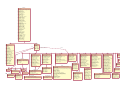
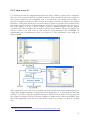
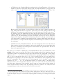
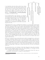
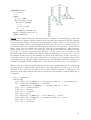
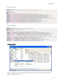
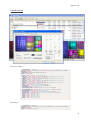
Appendix C
3state
(Boolean)
If true, the box can display a third state: it can be dimmed as well as checked. A grey colour
within the check box indicates to the user that the box cannot be checked - i.e., that it is has
been disabled.
RightButton (Boolean)
If true, positions the check box'
s square on the right side of the button rectangle (the text
appears to the left).
PushLike
(Boolean)
If true, makes a check box look and act like a push button. The button looks raised when it
isn'
t pushed or checked, and sunken when it is pushed or checked.
RADIOBUTTON
A radio button looks like a check box except that it uses a circle rather than a box. A dot
within the circle indicates that it has been checked. Text is usually displayed to its right.113
Only one check may be made if there are multiple buttons: groups of radio buttons are
conventionally used to indicate mutually exclusive options. Unlike check boxes, they do not
work as toggle (that is, when you click it a second time, its state remains unchanged).
(Boolean)
Auto
If true, when the user selects it, the system automatically sets the button'
s check state to
checked and automatically sets the check state for all other buttons in the same group to
cleared.
RightButton (Boolean)
If true, positions the radio button'
s circle on the right side of the button rectangle (the text
appears to the left).
PushLike
(Boolean)
Makes a radio button look and act like a push button. The button looks raised when it isn'
t
pushed or checked, and sunken when it is pushed or checked.
CUSTOMBUTTON
It’s an owner-drawn button, that is, a button that the program is responsible for drawing.114
LISTBOX
This class defines child window controls called list boxes. A list box contains a collection of
items115 displayed as a scrollable columnar list within a rectangle from which a user can chose
(such filenames in the current directory when the user select Open from the File menu). The
user can view and select an item by highlighting it with a left mouse click.116 If the list box is
not large enough to display all the list box items at once, the list box can also provide a scroll
113
Unless RightButton=true.
The owner window receives the WM_DRAWITEM message.
115
Items can be represented by text strings, bitmaps, or both.
116
Selecting a list box item changes its visual appearance, usually by changing the text and background colors.
114
111