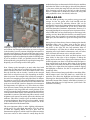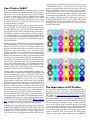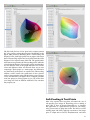
1
For all of our articles, tips and blog posts, visit www.artofprintmaking.com
How to Print HDR Photographs
by Renée Besta
Renée M. Besta is deeply drawn to photography as a unique means of
personal expression, being avidly engaged in the art form for over 35
years. Renée is a fine art photographer and printer, digital imaging and
graphics instructor, graphic designer, and exhibit producer who resides on
the scenic California Central Coast near San Luis Obispo. For more info on
Renee you can check out her website at: www.renmarphoto.com.
TABLE OF CONTENTS:
Camera Settings and Color Management ..........................1
Proper Camera HDR Color Spaces and Settings .....................1
Photoshop and Camera Raw Color Settings............................3
RGB Color Space ......................................................................5
Keeping Your Files Looking Their Best ...................................6
Getting to Know Your Image Profile .......................................8
Monitors and Post-Processing
..............................................8
Calibrate and Profile Your Monitor ........................................8
What Monitor Should I Use? ...................................................9
What Subjects Work Best With HDR? ..................................10
Best Practices for HDR Processing ........................................10
HDR A-GO-GO .......................................................................13
Get Your Style On ...................................................................15
Prints That Really Pop .............................................................15
Printing HDR Images.............................................................15
Printer & Ink Types ................................................................16
Can I Print in 16-Bit?..............................................................17
The Importance of ICC Profiles .............................................17
Color Profile Visualization .....................................................18
Soft-Proofing & Test Prints ....................................................21
The Printing Workflow ..........................................................23
Breathing Color, Inc
18552 MacArthur Blvd Irvine, CA 92612
P. 866.722.6567
E. [email protected]
www.breathingcolor.com
How to Print HDR Photographs
— Camera Settings and Color
Management
back and be sure we are adhering to best practices for HDR
shooting/processing and color management. Producing the
highest quality fine art prints begins with a properly processed
image file.
I realize many of you are advanced photographers; however,
it has been my experience as a fine art printer and instructor
that even the best photographers may be unaware of basic
information necessary to produce prints that really pop. Since
you have taken time to read this article, I presume you are
interested in taking your images and prints to the next level,
and are willing to put in the time necessary.
In this series, we will cover everything you need to know from
camera settings and color management, to post-processing
and printing tips. I will attempt to simplify things by walking
you through the necessary steps to produce superb prints from
your HDR images. For the purpose of this article, I assume you
own a digital SLR camera, are using an image editing program
such as Photoshop, Lightroom, or Aperture, and are somewhat
familiar with HDR processing software.
Moon Over Piedras Blancas Bluffs ©Renee Besta
There are a ton of HDR tutorials on the internet. There are
very few that frame them through the lens of printing. This
is a start to finish encyclopedic tutorial on how to print great
HDR photographs.
Introduction
Originally developed for use in the movie industry, HDRI (high
dynamic range imaging or just HDR) was once a well-kept
secret in Hollywood’s CG artist community. Now a much more
mature technology, HDR has found its rightful place in digital
photography, resolving the age-old film photography dilemma
of whether to expose for the highlights or shadows. HDR
allows photographers to capture the full range of luminosity
in a scene, despite great differences in tonality. From bright
sunlight to the deepest shadow details, HDR captures it all.
With so much tonal information available in an image, the bar
has been raised to new heights, yielding stunning images and
prints.
HDR has been in my arsenal of tools since 2007, shortly
after I discovered a wonderful book by Emmy award-winning
visual effects artist Christian Bloch, The HDRI Handbook.
In his book, Mr. Bloch states that HDR is akin to a digital
negative on steroids, and with that I concur. Coupled with
the inspirational images of Photoshop guru/instructor Ben
Willmore, an entirely new world was opened up as I was able
to capture all tonal values present in a scene. My photographs
could now convey those scenes as I experienced them, without
compromise.
Over the past four years, HDR software and related plug-ins
have greatly improved, bringing with them a steep learning
curve, ever-increasing computer hardware requirements, and
many choices. The plethora of HDR information available on
the web is enough to make the average photographer’s head
spin, with conflicting opinions on how best to merge, tone
map, and post-process images. But before we can begin to talk
about the printing process, it is necessary to take many steps
Although there are now many fine software programs available
to merge and tone map HDR images, I will be focusing
on Photomatix Pro by HDRsoft, as it remains a staple for
many HDRtists. Photomatix has been around a very long
time, has a great reputation, and is still very popular. Other
popular options include Photoshop CS5’s built-in HDR Pro,
Nik Software’s HDR Efex Pro, and Unified Color’s HDR
Express/HDR Expose. Whatever software you choose, the
basic principles remain the same. Once certain terms and
settings are clarified and put into practice, you’ll be making
images and prints like a champ. So, let’s get started!
Proper Camera HDR Color Spaces
and Settings
Before the shutter button is even pressed, we need to step back
and be certain the camera’s settings are optimized for HDR
shooting. Here are some important points to keep in mind:
1. For best results, shoot in Camera Raw mode. This will
enable you to capture the most tonal (or brightness)
values in a scene by keeping the image in 16-bit mode and
avoid having the camera make any processing decisions.
Raw files include 1 to 2 EVs (exposure values or stops)
more at each end of the exposure, so they contain much
more tonal information than jpegs. This is why the
Recovery slider in Photoshop Camera Raw or Lightroom
is so efficient in regaining lost highlight information.
Something not possible with jpegs.
2. If shooting jpegs, please be aware that by nature jpegs
are compressed 8-bit files, which translate to 256 tonal
values. Eight bits is 2^8 which equals 256 values, ranging
from 0 (black) to 255 (white), not even close to what the
human eye can see. In contrast, 16-bit files contain over
65,000 tonal values; however, one of those bits is used
for something else, so Photoshop can only use 15 bits.
That still gives us 2^15 which equals 32,768 values, a
whopping amount.
1
Since the point of HDR is to capture as much tonal
information as possible, shooting jpegs defeats this
purpose. Not to mention the fact that in 16-bit mode
you have much more leeway when editing your images
because you are starting with many more tonal values.
Keeping an image in 16-bit will reduce banding and
posterization. If you have ever applied adjustment
layers such as Curves in Photoshop to an 8-bit image,
you probably noticed the resulting ‘combing‘ in the
histogram. This translates to lost information, and is
represented by the white vertical lines. Below is an 8-bit
HDR tone mapped image with no adjustments applied
yet in Photoshop CS5:
Below is the same 8-bit image with a slight Curves
adjustment applied. Notice the combing in the histogram
(seen as vertical white lines):
you the greatest color gamut. On my Nikon, this menu
can be found under Shooting Menu > Optimize Image
> Custom > Color Mode. Check your user manual for
details. Please be aware that this only has an effect if you
are shooting jpegs, as the camera will apply that color
space and compress your image down to 8-bit. Note that
if shooting in Camera Raw, this setting is irrelevant, as
no on-board software processing is done by the camera.
However, as you may need to shoot jpegs from time to
time, it is best to set the color space to Adobe RGB and
leave it there. We will talk more about color working
spaces later.
4. When shooting HDR, it is important that the camera
be as stable as possible (on a sturdy tripod) and that
the images are shot in quick succession. Otherwise you
run the risk of misregistration, blurring, and ghosting
(moving objects in the scene) when merging the files.
Use a cable release to reduce camera shake and always
shoot in aperture priority mode, varying only the shutter
speed. After focusing the camera, switch from autofocus
to manual focus mode; if not, you run the risk that the
camera will change the focus between exposures. (This
is particularly important in scenes with low light, as the
camera may attempt to refocus between the bracketed
shots.) If your lens has image stabilization, turn it off
when using a tripod.
5. Shoot at the lowest possible ISO to avoid noise
(HDR software will exaggerate noise), and enable your
camera’s continuous shooting mode. To further avoid
shake, use the mirror lockup mode or enable the
exposure delay mode on your camera.
Can you bracket and tone map jpegs? Of course, but
for the purpose of this article, we are aiming for best
practices that will result in the highest quality prints.
Heck, there are now apps for the iPhone that allow
you to make ‘HDR’ images. Pseudo-HDR images can
be produced from a single shot and then given that
‘HDR look’ with various plug-in software. Some HDR
software companies emphasize the option to shoot in
jpeg. Nothing wrong with that as it has its place; however,
keep in mind that these companies are trying to sell
their software to the largest, most diverse group of
photographers, and are not necessarily aiming for best
practices or high quality print output.
In today’s digital world, most images end up being posted
on the web, yet never printed. Thus the plethora of 8bit sRGB images floating around. This is a fact lamented
by many and discussed by respected photographer,
printer, instructor, and writer David Ulrich in “Are You
a Craftsman Dedicated to Mastery?”
3. All digital SLRs allow you to select a color space, with
the choices being either sRGB or Adobe RGB. We will
discuss the merits and meanings of various color spaces
later, but for now select Adobe RGB, which will give
6. Enable your camera’s autobracket mode, which allows
you to select how many images will be shot automatically
in a sequence and at which exposure intervals. Each
digital SLR has its own limitations when it comes to
autobracketing, so refer to your user manual for details.
Professional high-end cameras may enable you to shoot
up to nine bracketed shots at the EV interval of your
choice, while others are limited to three shots at 1 or 2 EV
intervals. Obviously the contrast in the scene determines
how many exposures are necessary, so there is never
a definite number. But I have found that shooting a
minimum of 5 shots in 1 EV intervals gives me good
results. This amounts to 2 over, 1 normal (as metered),
and 2 under, a good starting point. For a scene with more
contrast, I may shoot nine images, 4 over, 1 normal, and
4 under.
There is varied opinion on whether to shoot 1 or 2 stops
apart, with most tutorials recommending +2, normal
(as metered), and -2 as a starting point. While this will
often work just fine, I have sometimes found that 2 stops
apart in exposure may be too much, depending on the
contrast of the scene. Image details may end up being
compromised, resulting in increased noise and artifacts.
In general, the more images I feed Photomatix Pro, the
better results I get. Hey, this is a digital camera, so extra
shots are free! Simply stop and think when you’ll be
photographing a particular location again. If the answer
2
is not in a long time, then shooting more images is the
way to go. Shortcuts do not pay off.
7. Here’s a tip for overcoming the limitations of your
camera’s built-in autobracketing feature: add exposure
compensation to the mix. My Nikon only allows me to
shoot 3 exposures, although I can choose the EV intervals
I want up to +/-2. When encountering a scene with great
contrast, such as the inside of a building with bright
light through the windows, many more exposures are
required. Thus I set up autobracketing and take my three
usual shots at 1 or 2 EVs apart, then dial in exposure
compensation on top of that and shoot another three to
nine images, depending on what is needed. That way I
am covered.
Alternately, shoot in manual mode at a fixed aperture.
Meter for the darkest and lightest areas in the scene,
which will provide you with the shutter speeds necessary
to cover the complete tonal range. Then begin by
shooting for the highlights (underexposed shots) and
keep adjusting the shutter speed until you have covered
the shadow areas (overexposed shots).
The best solution, though, is to purchase an
intervalometer such as the Promote Control by Promote
Systems. This wonderful device allows you to program
how many bracketed shots you want and at what EVs.
It is an advanced remote control that works with most
digital SLRs. It is also excellent for noctography (night
photography), allowing you to enjoy a hot cup of coffee
while the Promote does its thing.
sure there is no clipping in the shadows or highlights. In
particular, be sure you have not clipped the highlights by
making certain there are no ‘blinkies‘ on the histogram
in the underexposed shots. Blinkies refer to the flashing
that occurs when reviewing your images on the LCD; the
areas with highlight clipping flash on and off. It is very
important when shooting HDR that the shadows are not
blocked up nor the highlights blown out. If care is not
taken, the HDR software will try and create details where
none exist, thus causing much noise, ugly gray skies, and
other artifacts. All of this adds up to one unattractive
print. When shooting outside under bright sun, it can be
difficult to read the histogram on the camera’s LCD. In
that case, try to shade it with your hands or a hat, or
purchase a loupe from Hoodman.
9. Finally, I recommend you change the order the bracketed
images are shot in to make things easier when later
reviewing your images. I set up my Nikon to first shoot
the underexposed images, then the normal one, followed
by the overexposed images. This order makes most
sense when viewing the bracketed shots in Lightroom or
Bridge, as there is less confusion as to when one sequence
of shots ends and the next begins. Refer to your manual
for directions.
Photoshop and Camera Raw Color
Settings
Before you begin processing your images, whether HDR or
not, it’s important to be certain the proper color settings are
enabled in Photoshop. I have come across many clients who
were having trouble with prints, only to discover they were
working with ‘untagged’ images – those without a color space
assigned – or had recently upgraded to a new version of
Photoshop and did not redefine the default color settings. Let’s
review the color settings in Photoshop. For whatever reason,
the powers-that-be at Adobe set the default Photoshop Color
Settings to North American General Purpose 2, even though
this is not optimal for photographers unless the images are
intended for the web or commercial printing. Begin by going
to the Edit menu, then down to Color Settings.
8. It is important to note that only by viewing the histogram
on your camera’s LCD can you verify that you have taken
enough shots to cover the entire tonal range of a scene. Be
3
The Color Settings dialog box will then open, and the default
settings will be shown unless you have already changed them.
If you cannot see all the options, click on the More Options
button on the right. Here is what the default settings look like
right out of the box:
Note the Description box at the bottom. It states that these
settings are intended for screen and print (meaning 4color CMYK commercial printing, not RGB inkjet printing).
In addition, the profile warnings are disabled. As digital
photographers and inkjet printers, we are most concerned
about the RGB settings, color management policies, and
rendering intent. In order to obtain the widest possible color
gamut from our images, and therefore our prints, we need to
change these settings and save them as our new default. Please
refer to the screenshot below demonstrating the settings I use:
4
‘visually pleasing’ relationships, thus remapping colors that
Photoshop thinks are out of gamut. However, with today’s
advanced printer technologies, some colors that overlap into
the ProPhoto RGB space can now be printed on certain papers.
Thus, the relative rendering intent is my first choice. (I would
recommend when printing to experiment with both rendering
intents.) When you are finished, be sure to click on the Save
button and give your new default color settings a name.
RGB Color Space
Starting from the top under Working Spaces, change the RGB
to ProPhoto RGB and the Gray to Gray Gamma 2.2. More
on this in a moment. Under Color Management Policies,
keep the defaults for each color mode to Preserve Embedded
Profiles, then check all the boxes under Profile Mismatches
and Missing Profiles. These policies establish how Photoshop
handles images whose profiles don’t match your preferred
color working space, or images with untagged or missing
profiles. If there are mismatches when opening an image,
you will receive an alert and be given the option to use the
embedded profile, convert it to your default working space, or
discard it. This serves as a safety net; otherwise you may not
be aware what color space you are working in upon opening
an image.
A word about RGB color spaces – it is preferable to use the
widest possible color gamut, which today means ProPhoto
RGB, developed by Kodak. The prior gold standard, Adobe
RGB (1998), works fine, but you may lose vital color
information in your HDR image and therefore your print. Be
aware that Camera Raw’s (and therefore Lightroom’s) default
color space is ProPhoto RGB, so why use anything less? The
sRGB color space, also referred to as standard or small RGB,
was developed by a team led by Michael Stokes at HewlettPackard in conjunction with Microsoft, and is the smallest
color space intended for web use. (Trivia: the ‘s’ in sRGB stands
for Stokes.) This smaller space is used so that images can
be properly displayed on an assortment of monitors and in
browsers with varying color gamuts. Since most people do
not own high-end pro quality graphics displays, this prevents
images from looking washed out or like a science fiction movie
when posted on the web.
Keep in mind that the goal is to always keep your images as
16-bit tiff or psd files in ProPhoto RGB. You can always export
copies as 8-bit jpegs in sRGB for other purposes, such as the
web or projection on a screen. Let’s take a look at just how
different these color spaces are. The diagram below was made
by color expert Jeff Schewe and can be found in the 2004
Adobe whitepaper, “A Color Managed Raw Workflow –From
Camera to Final Print,” which he co-wrote with the late, great
Bruce Fraser:
Under Conversion Options, Intent, there are basically two
appropriate choices for photography: perceptual and relative
colorimetric. Simply put, rendering intents are various ways
of handling colors that are out-of-gamut – colors present
in an image (source) that a printer (destination) cannot
faithfully reproduce. The perceptual rendering intent will shift
(compress) the colors in an image in an attempt to preserve
5
Why a tiff? Simply because most HDR processing software
(with the exception of Photoshop) uses tiff or jpeg file formats
upon export. The psd format is an Adobe proprietary one. So
unless you are using Photoshop’s Merge to HDR feature, your
exported 16-bit tone mapped HDR file will most likely be a
tiff. There are exceptions to this, such as Unified Color’s HDR
Express/HDR Expose software, which allows you to work in a
32-bit floating point environment instead of downgrading to
16-bit.
While it may seem obvious how to keep your files at their best,
there are some photographers unaware of how to do this; thus
they unknowingly downgrade their images immediately after
export from Photomatix, Lightroom or other HDR software.
Let’s first take a look at the Camera Raw dialog box. In the
screenshot below, notice the colored text at the bottom center
that looks like a hyperlink. If you click on this link, it opens a
dialog box that allows you to choose your output settings.
It is obvious in examining this diagram that ProPhoto RGB is a
much larger color space than Adobe RGB, while sRGB is quite
limiting. This is particularly important when shooting HDR,
as the resulting 32-bit merged file (from the bracketed shots),
even when tone mapped down to 16-bit, produces colors and
tonal values that were at one time impossible to render, much
less print. The circle marked as ‘2200 matte paper’ refers
to results achievable using Epson’s much older Stylus Photo
2200 printer on standard matte paper. It is important to note
that there are certain colors that can be printed with this older
printer that fall outside both the sRGB color space and the
Adobe RGB color space. Since this is so, imagine what current
printers can render.
With today’s technological advances, cameras and printers are
no longer limited to the sRGB space. For example, Epson’s
newer line of printers, the 4900, 7900, and 9900, utilize
ten Ultrachrome HDR pigment inks – including green and
orange – and can print colors that extend into the ProPhoto
RGB space. Thus the importance of starting out with the
highest possible color gamut and staying in it. There is just no
reason to handicap your images at birth, so to speak. You can
always make copies in 8-bit in lower color spaces. In addition,
newer professional fine art papers such as the lines made by
Breathing Color allow your vision to be seared into print. Not
only has printing technology greatly advanced, so have paper
manufacturing and coating technologies.
Keeping Your Files Looking Their
Best
Another issue may arise when exporting your image files
from HDR software, Camera Raw, Lightroom, or Aperture
into Photoshop or plug-in software for further processing.
It is critical that the file be exported as a 16-bit tiff in the
ProPhoto RGB color space and not downgraded at this point.
Be certain this is set for ProPhoto RGB and 16-bit (see below).
The resolution does not matter at this point and can be
changed later in Photoshop. However, do not choose to up- or
downsize your image relative to its native pixel count. I keep
mine at 300 ppi (pixels per inch) so it is resolution-ready for
small prints (more on this later). Once a choice is made, it
becomes the default for each image you open unless you click
on the link and change it. So be sure to always check the link
before opening your image in Photoshop.
If using Lightroom, you most likely exported the Raw HDR
bracketed images from Lightroom into the HDR processing
software of your choice. Once the tone mapped HDR file is
sent back into Lightroom, it should be a 16-bit tiff (unless
you selected 8-bit jpeg or 8-bit tiff). When exporting your
images from Lightroom for editing in another program, the
same concept applies. Go to Photo > Edit In > and choose
the destination software. You will then be presented with a
dialog box of options. In most cases, you will want to ‘Edit a
6
Copy with Lightroom Adjustments,’ not the original. Again,
keep the file in 16-bit ProPhoto RGB. If you can’t see the file
options, click on the Copy File Options triangle to open it.
Once the tone mapped HDR image is downgraded to 8-bit or
a lesser color space, information has been irretrievably lost
in the exported file. However, you can always go back and
re-export the original tone mapped file, but then any postprocessing you did after exporting will be lost (unless you wish
to use the 8-bit edited file in another color space). Refer to the
sample screenshots below:
Then, under File Compatibility, click on Camera Raw
Preferences:
If you are trying to work with the HDR tone mapped file
in Camera Raw and find you can’t open your tiff or jpeg,
you need to change your file handling preferences within
Photoshop. To do this on a Mac, go to Photoshop > Preferences
> File Handling; in Windows, go to Edit > Preferences > File
Handling:
Once inside, look at the bottom under jpeg and tiff handling,
and use the drop-down menus to choose Automatically open
all supported jpegs (or tiffs). I usually have these disabled, as
I prefer to use Lightroom as my Raw editor and don’t want
exported tiffs or jpegs sent into Photoshop’s Camera Raw.
7
If you are having problems getting to the document window,
press the F key repeatedly to change screen modes in
Photoshop until it appears.
How to Print HDR Photographs
Getting to Know Your Image Profile — Monitors and PostI am often asked how to quickly verify the color working space Processing
and bit depth of an image without going through the usual
menus. One easy method I use immediately tells me, upon
opening an image in Photoshop, what those parameters are so
I can breathe easy. Some photographers are not aware that at
the bottom of each document window in Photoshop, a dropdown menu exists that allows you to set your preferences as
to what data is displayed. Look at the bottom lower left of the
document window, just to the right of the currently displayed
document view size, and you will see a small arrow. Click and
hold this arrow, and a drop-down menu will appear where you
can select your preference. By default, Photoshop sets this to
Document Sizes. The option I use is Document Profile, which
shows my copyright status, the color working space, and bit
depth. See below:
Last Stop for the Emmett Kelly ©Renee Besta
Calibrate and Profile Your Monitor
Since your image editing decisions are based solely on what
you see on your monitor, it is very important to both calibrate
and profile your display. Yes, those are two different processes.
The term ‘calibrate your monitor’ is often bantered about, with
nary a mention of profiling. Calibration is the first step and
sets the hardware of your display to behave in an optimal
state based upon a group of standards. This means setting the
proper white point (the color or temperature of the reference
or target white), white luminance (how bright the white is),
gamma (a curve that corrects for the eye’s non-linear response
to light), and more. The second step is to profile your monitor.
Profiling characterizes how accurately your monitor displays
8
colors, then applies corrections (an ICC profile) to compensate
for inaccuracies. This is done by flashing a set of color
patches on the screen and taking measurements with a device
such as a colorimeter or spectrophotometer. Comparisons are
then made between the measured values and known color
references.
Many people think this is just too much trouble, so they
skip these vital steps. I would ask how much ink and
paper they waste trying to get good prints. With today’s
variety of excellent, well-priced devices, there is just no
excuse to forego these important steps. I personally use XRite Photo’s ColorMunki Photo device (a spectrophotometer),
which calibrates and profiles my monitor, printer, projector,
laptop, and more. Since I make my own custom ICC profiles
for printing (more on these later), this device has become
one of my best friends. If you don’t intend to make your
own custom profiles for printing, X-Rite now makes a
less expensive ColorMunki Display device for profiling your
monitor, projector, and laptop. There are many options out
there, so check reviews online. I calibrate and profile my
display once a week in case of drift.
Keep in mind that one of the most common problems
photographers encounter when printing is that their prints
come out too dark. The reasons are simple: their displays
are set too bright and/or they are working in a room that
is too dimly lit. Today most monitors are factory set at near
maximum brightness levels, and may need to be dimmed by
as much as half. The fact is that most consumers love to view
bright screens in showrooms and find them pleasing due to
their high contrast. However, very bright monitors do not
accurately display colors. If your editing decisions are based
upon viewing images at high brightness levels, your images
will most likely come out dark with color inaccuracies.
to work in a room with subdued light, with window
shades closed and no bright lights shining directly on the
monitor. While you don’t want to work in a dungeon,
do not situate your workstation directly in front of a
window. Avoid fluorescent and tungsten lights, as these
will throw off nasty color casts. I work with an Ott-Lite
TrueColor task lamp near my monitor, which is balanced
for daylight. Other brands include SoLux and Sol-Source.
Consider investing in a monitor hood to reduce stray
light, or make your own from cardboard or plastic.
• There is a good reason designers work in rooms with
neutral colors and don’t have loud wallpapers on their
monitor desktops. When surrounded by loud colors, your
eyes will be influenced when editing images. I use a
medium gray background color on my display when
editing.
Have you ever wondered what your color IQ is? There is a
really cool and useful tool by X-Rite that will help determine
how you see colors and how well your monitor is calibrated
and profiled. You can find it free on their website here. This
is a wonderful test that will score you on the ability to arrange
patches of colors in the proper hue order. This test works best
on properly calibrated and profiled monitors, so take a look. I
am proud to say I scored a perfect 100 on the test, thanks to
my great monitor and a good set of eyes. Check out the screen
capture below to see how it works:
Since your profiling device manufacturer will provide you with
detailed information on how to profile your display, I will
review the best settings to use for calibrating your display,
which is the first step:
• Set the white point (color temperature) for D65 (6500
degrees K or Kelvin), which appears to the eye as a
cooler, more bluish white. The older standard of D50
(5000 degrees K) used by pre-press professionals is way
too warm a temperature for most people to accurately
edit images in. These are simply standards developed by
the CIE (International Commission on Illumination –
the ‘E’ is for the French name). The color temperature
illustration below demonstrates this concept of warmth
to coolness (from the 1931 CIE color space chromaticity
diagram with wavelengths in nanometers):
• Set your gamma to 2.2. This has long-since been the
standard for Windows; however, Macs used to use a
gamma of 1.8. With changes in the operating system, the
standard is now 2.2 for Macs as well. Gamma is simply
the nonlinear relationship between the monitor’s input
voltage and the perceived intensity of light it emits. It
affects midtones and is important because the human eye
responds to light in a nonlinear fashion.
• Set the brightness (luminosity) of your display to
100-120 candelas per square meter (cd/m^2). It is best
What Monitor Should I Use?
A brief discussion of monitor quality is appropriate at this
point. There are very valid reasons that some monitors cost
much more than others, not just because some of us are color
geeks. Since the ordinary computer user just wants to browse
the internet, view documents, or play games, he or she is
less interested in color gamut and accuracy. Thus the $200
widescreen display. But as photographers, the old phrase “you
get what you pay for” is very applicable here. You’ve most likely
invested a small fortune in your camera, glass, tripod, and
9
software, so why skimp on the one item that you base your
image editing decisions on?
Many of you are aware of top-of-the-line LCDs such as those
made by Eizo (the Ferrari of displays); while cost-prohibitive
for many of us, the ability of these displays to exceed the
Adobe RGB color space makes them very useful for image
editing and print proofing. NEC Display Solutions also makes
superb pro graphics quality LCDs at lower price points. I am
currently using a 27-inch NEC MultiSync PA271W widescreen
professional graphics monitor, which covers over 97% of
the Adobe RGB color space. It has excellent resolution and
sharpness, and the colors are spot on. Note that I have no
relationship with either X-Rite or NEC, but am merely offering
suggestions. When searching for a good quality display, be
sure to check the technical specs to see what percentage of
the various color spaces the monitor can display. You will be
surprised to discover how many name-brand monitors come
up short in covering as little as 75% of the Adobe RGB color
space.
There are many inexpensive displays out there that can barely
cover the sRGB space, let alone Adobe RGB, thus they are less
than optimal for image editing. In contrast, newer monitors
such as the 700 series RGB-LED backlit displays made by
LaCie cover 123% of Adobe RGB. Your best bet is to buy
the highest quality display you can afford, which may mean
sacrificing screen real estate for color accuracy. Many fine
businesses such as B&H offer a wide variety of high-end
displays and can assist you in making a decision that will suit
both your needs and your wallet.
of other rooms or doorways; and anything old and decaying
such as ghost towns, farmhouses, barns, antiques, etc. One of
the coolest things I love about HDR is its ability to bring out
textures, details in metal surfaces, and clouds. While your eyes
may see clouds in the sky, after tone mapping your images you
will be amazed at just how many more were present.
Best Practices for HDR Processing
In this section, we will highlight certain HDR tone mapping
techniques that result in high quality HDR images. It is
beyond the scope of this article to detail methods for tone
mapping in various HDR software programs, so I will stick
with Photomatix Pro. There are hundreds, if not thousands, of
books, DVDs, videos, and free tutorials on the web that cover
the merging and tone mapping process in various software
from start to finish. Note that HDRsoft, the company that
makes Photomatix Pro, has a user manual available on their
website you can download for free. This manuals covers every
slider in great detail. Since I use Lightroom to export my HDR
bracketed images, I will demonstrate this process using five
shots I took inside an abandoned industrial machine shop
(UrbEx). In this case, the five brackets were shot at 2 EVs
apart: -4, -2, 0, +2, +4, adequate for the lighting in this scene.
Take a look at the Raw bracketed files in Lightroom:
There is much confusion regarding colors that monitors can
display versus what printers can render. The truth is that when
it comes to certain colors, printers can render some colors that
cannot be seen on monitors, and vice versa. Thus the difficulty
of soft-proofing (more on this later).
Keep in mind that many photographers and designers prefer
to work on displays with matte surfaces instead of the newer,
super-glossy generation. Not only can reflections be a problem
on glossy screens, the high gloss can make images appear
sharper than reality with more contrast. In addition, many
pros find it easier and more accurate to calibrate and profile
a matte screen than a glossy one. For me, this is a problem,
so I stick to the matte surface displays. I simply can’t bear to
process my images on what appears to be liquid mercury; it
makes me feel like I have to claw my way through to the image.
Note that all of the companies I mentioned that make highend displays only offer matte surfaces, so enough said.
What Subjects
HDR?
Work
Best
With
While not all subject matter is appropriate for HDR, when
it comes to scenes with high contrast, let the fun begin!
Here are some of my favorite scenarios in which I love to
use HDR: landscapes with lots of puffy clouds and scene
contrast; dimly lit interiors, especially those with brightly lit
windows; anything with metal or machinery (old cars are a
favorite); texture-rich subjects; urban exploration (UrbEx) –
the exploration of abandoned and derelict places (to which I
have become addicted); noctography; interior shots with views
You will notice which shots are underexposed, overexposed, or
normal (as metered). The objective, as with all HDR shooting,
is to take enough brackets to fully cover all tonal values in the
scene. In this case, as the room was somewhat dark, I wanted
to be able to see into the cabinets and shelves, yet not blow
out the light seeping in through the broken window and roof
gashes. HDR is perfect in this situation. As mentioned in Part
One of this series, when shooting bracketed images, please be
sure you take enough exposures to cover the complete tonal
range in the scene. For the darker areas in the scene, you want
to overexpose just enough to avoid any shadow clipping. Check
the histogram and be certain the leading left edge (toe) falls
just within the histogram without being clipped. Similarly, for
the lighter areas in the scene, you want to underexpose just
enough to avoid any highlight clipping. Check the histogram
and be certain the leading right edge (toe) falls just within
the histogram without being clipped. Confusion often arises in
regards to clipping.
10
I am often asked how it is possible to avoid any and all clipping
in the brackets when under- and overexposure are applied.
The answer is to remember that the function of the HDR
processing software is to properly ‘map’ the tones from each
individual bracketed image into one final, large, 32-bit file. For
example, when the HDR software applies tonal values to the
highlights, it attempts to use available tonal information from
the underexposed shots only – not the overexposed shots.
Similarly, when the HDR software applies tonal values to the
shadows, it attempts to use available tonal information from
the overexposed shots only – not the underexposed shots.
The same concept applies to the midtones. This is the reason
the HDR merging process is called ‘tone mapping’ and why
it is so important to cover the entire tonal range in a scene.
If there is not adequate tonal information across the board,
the HDR software will attempt to create details where none
exist, resulting in much noise and artifacts. After selecting the
images in Lightroom, I exported them to Photomatix Pro:
Starting from the top, I chose to ‘Align images by correcting
horizontal and vertical shifts.’ Since my camera was on a
tripod, I selected this method. If for some reason you are
handholding the camera (hopefully not), try using the ‘by
matching features’ options instead. This is important to select
just in case there is some camera movement and the bracketed
shots are not quite aligned. I also check off ‘Crop aligned
result.’ Next, I chose to ‘Reduce ghosting artifacts’ (objects
moving within the scene such as birds, tree branches, people,
etc.) automatically, as there were nesting birds inside this
decaying building and my exposure times would be long.
Note that there are diverse opinions on whether to correct
for ghosting artifacts automatically or manually during postprocessing. I have found that the newer version of Photomatix
does a much better job in handling ghosting issues than before,
so my first choice is to let the software try and make these
corrections. If the results are poor, I can always re-export my
bracketed images and turn this option off.
Since HDR can generate a lot of image noise, I always select
‘Reduce Noise.’ Note that some photographers prefer to deal
with noise later in another application. I find I need to do both.
It depends on the quality of your camera sensor; the more
costly, professional digital SLR sensors are larger and have
much less noise. Next, I select ‘Reduce chromatic aberrations.’
The HDR merging and tone mapping process can create more
chromatic aberrations than normal as it goes about generating
details. Chromatic aberrations occur when light rays pass
through the glass of the lens and are unable to converge at the
same point on the camera’s sensor. They are caused by less
expensive lenses with low quality glass, and are exaggerated
when using wide angle lenses.
I was then presented with a dialog box of options to choose
upon export. The selections here are important, so refer to the
screen capture below:
Chromatic aberrations appear along areas of high contrast
(dark to light) in images, such as the dark edges of a building
against a light sky or in window frames, and look like red,
blue, purple, or green lines (fringes) along the edges of
objects. Although I find I may still need to reduce chromatic
aberrations further in Lightroom, Camera Raw, or Photoshop,
reducing them at the start is a big help.
A much larger problem, though, are halos, which have done
tremendous damage in terms of giving HDR bad press. Halos
occur at well-defined (sharp) edges between light and dark
areas in an image, such as a roof against a bright sky. Halos
make objects appear as if they are next to a nuclear reactor by
glowing or radiating bright light. Nothing screams ‘amateur’
more than halos. These can be minimized or avoided during
the tone mapping process by proper use of several slider
functions, in particular those that adjust smoothing.
11
Note that there is an option to ‘Show intermediary 32-bit
HDR image.’ If this checkbox is selected, Photomatix will
display the merged 32-bit file first, before applying any tone
mapping. Be aware that this file will look terrible onscreen,
since monitors cannot properly render a 32-bit image. Thus
the need to tone map the image down to 16-bit. So why would
you choose to select this option? In case you need to repeat
the tone mapping process, you won’t have to re-export the
bracketed files and merge them to HDR again. Depending on
your computer hardware configuration and how many images
you are merging, this process may take a lot of time. The speed
depends not only on your processor, but also the quality of
your graphics card and how much video RAM it has. In years
past, the merging process could take a lot of time; therefore, it
was a good idea to save the merged 32-bit file in case the tone
mapping process needed to be redone. The option is yours but
keep in mind that the 32-bit files are quite large and take up a
lot of space on your hard drive.
**The above HDR image is a great example of several
problems and illustrates improper use of the Photomatix
sliders: the glowing halo around the tower and grain in
the sky due to excessive local tonal compression when tone
mapping (too much strength and detail contrast), ghosting,
and fringing/chromatic aberrations. Zoom in and look at
the top of the tower to view the green fringing (chromatic
aberrations); the left of the tower near the bottom reveals red
fringing; the smaller tower on the left has purple fringing;
and the roof of the building on the right center also has purple
fringing. You will notice more chromatic aberrations if you
look at the entire image. You will also note the ugly orange
and green colors I refer to that look like radiation sickness.
This image appears cartoonish. In addition, there is ghosting
in the branches in the left foreground due to wind.
Important Tips: Note that the failure to correct chromatic
aberrations and avoid halos is one of the most common
causes of poor print quality. This also applies to the overcompression of details (resulting in grain), lack of noise
reduction, poor cloning work, failure to remove sensor dust,
and other errors. With today’s superb printing technology and
papers with remarkable Dmax and color gamuts, even the
slightest blemishes are readily apparent in print, especially
large prints or images output to metal.
Think of it this way: the difference is like viewing high
versus standard definition on your television set. The day
you watched your first Blu-ray movie in stunning 1080p was
the day you swore you would never go back. In fact, actors
are known to complain that their skin blemishes are readily
apparent in high def. This same concept applies to what
printers and papers are capable of rendering today, thus the
need to create a clean, well-processed image file. So let’s not
add pimples to our pixels!
Next, in the Photomatix export dialog box, check
Automatically re-import into Lightroom library and Stack with
first selected photo. Then be sure to give the new tone mapped
file a name that will make sense. I give a general subject matter
description, then add the initials TM for tone mapped so I will
know that image is the one exported from Photomatix. The
Raw bracketed file numbers are automatically added to the
end. Last, but not least, be sure to select the Output Format.
Choose 16-bit tiff for the highest quality, not 8-bit jpeg or 8bit tiff. Let’s move on to the tone mapping process.
Once inside Photomatix, you will be presented with an array
of sliders, each with a different function. Keep in mind that
these sliders work in conjunction with one another, sort of
like a pulley system. Changes to one slider have an effect on
another. There is no set formula on how to set the sliders;
experimentation is necessary. Simply remember that the only
goal when tone mapping an image is to make sure all possible
tonal values are represented, not produce a final polished and
stylized image.
The first thing to do is to be sure the Tone Mapping button
is selected (not Exposure Fusion), and that the Method is
set to Details Enhancer. (Other less complicated methods are
available, including an automatic one, but the features and
choices are limited.) Note that the latest version is Photomatix
Pro 4.1, so if you are using a prior version, the dialog box will
look different.
Next, be sure to click on the Default button under Reset at the
bottom of the box. Photomatix always opens with the last used
settings, which are probably not appropriate unless you are
processing a series of images shot closely together in time at
the same location. Here is what my tone mapped image of the
machine shop looks like with the Photomatix default settings
out of the box. These settings represent how Photomatix thinks
the image should look. Available presets to start with are seen
in the right column. They give you a starting point to work from
that you can then tweak:
12
unchecked and just use the numerical slider. Keep in mind that
the further the slider is to the right (or when choosing Natural
+), the more realistic the image will look with fewer resulting
halos. Dragging it all the way to the left (or when choosing
Surreal +) creates the so-called Harry Potter look, along with
wild, psychedelic colors, lots of halos, and noise.
HDR A-GO-GO
Note that HDR processing can produce strong greens and
oranges. In fact, the greens often look lime-like and the
oranges very surreal like radiation sickness. This can be
minimized by moving the Lighting Adjustments slider towards
the right for a more natural look. It can also be fixed later
with Hue/Saturation/Luminance adjustments. However, it is
interesting that Epson’s newest x900 series of printers with socalled ‘HDR’ inks now have dedicated green and orange inks,
totaling 10 colors. Most likely this decision was made because
Epson’s newer line of printers can extend into the ProPhoto
RGB space, thus the addition of green and orange inks to the
mix.
Although the image looks washed out and needs more color
and contrast, the histogram shows that no areas are clipped
in the shadows, but a tiny amount of highlight information is
clipped. Overall, however, the entire tonal range can be seen.
One of the first adjustments I make is to fix any clipping in the
highlights or shadows by adjusting the white and black points.
If you are unable to do this, you probably need to add more
bracketed shots by going back and re-exporting the image files.
Hopefully you took enough to afford this option.
Next, I bump up the Strength to 90-100% when faced with
scenes that are shot indoors and detail-rich such as this one.
Please note that if this was a scene shot outdoors with a clear
blue sky (bald sky with no clouds), I would set the strength
much lower to around 60-70% or less, depending on whether
halos are present. The strength slider controls the strength of
the entire tone mapping process and global detail. It darkens
the image as you move it to the right and makes it appear less
natural. For a more photorealistic look and to reduce halos and
grain, move it to the left. I prefer to change the color saturation
and temperature in Lightroom, so I leave those two sliders
alone. Because I want to bring out all the textures in the piece
of equipment in the foreground and overall grittiness of the
scene, I increase the Detail Contrast to around 6, which affects
local fine detail enhancement. (Note that this slider used to be
named Micro-contrast.) The luminosity slider controls overall
brightness and contrast, but mainly affects the shadows and
midtones. This slider is useful to pull out shadow details by
increasing brightness. Here I have it set for around 8. I prefer
to use the luminosity slider to pull more details out of the
shadows rather than the Gamma slider.
Moving down, I almost always choose to bump up the Smooth
Highlights slider a bit to reduce noise in the sky, since I
am using a smaller, cropped sensor (DX format). Moving
this slider to the right will also help minimize halos as
well. Remember, any slider that is named smoothing has a
tempering effect upon details enhancement, and can reduce
halos, chromatic aberrations, noise, and other artifacts.
I have already discussed the white and black points: move
these sliders to the right or left to brighten or darken the
image. Just be sure there is no clipping in the histogram. These
sliders help make sure there is an absolute white and pure or
deep enough black in the image. Below these lie the Gamma
slider, which works much the same as in Photoshop. Moving
the slider left or right affects the brightness without clipping
the highlights or shadows. Use this in conjunction with the
Luminosity slider.
Finally, I almost always bump up the Micro-smoothing slider,
which tempers some of the fine detail on a small scale. In
particular, this affects the highlights and shadows, thereby
reducing noise. Note that this slider works in combination with
the Detail Contrast slider (formerly called Micro-Contrast), so
if I have that slider set to a high amount, I pull it back a bit
with Micro-smoothing.
The most important slider is under Lighting Adjustments,
which used to be called Light Smoothing. You can choose
to check the Lighting Effects box (as I have here for
demonstration purposes), which reveals five different settings
from extra surreal to extra natural. I usually keep the box
13
And here is what it looks like in Lightroom (outlined in white)
next to the five original Raw files:
We are now finished with the tone mapping process, and can
click on the Save and Re-import button at the bottom. Note
that if you want to save your settings as a preset to use again,
click on the Presets drop-down menu and save it for future use.
The settings are saved as XMP sidecar files. Here is what the
image looks like after tone mapping in Photomatix:
Although the image is improved and contains a nice tonal
range, it still lacks contrast and snap. And our work is
only half done. The usual spotting, noise reduction, cloning,
temperature adjustments, perspective correction, cropping,
and other tasks need to be done in Lightroom, Camera Raw or
Photoshop before we begin the post-processing work that will
set our images apart from the pack. Stylization of your images
is a must in today’s competitive environment, and will make a
huge difference in the quality of your prints. Here is my final
image of the abandoned machine shop after post-processing
and stylizing. First, a side-by-side view in Lightroom of the
Photomatix tone mapped image and the final stylized image:
14
Photoshop, and Aperture to accomplish this task. Some of
the most popular plug-ins are made by onOne Software, Nik
Software, and Topaz Labs and include PhotoTools, Color Efex
Pro, Topaz Adjust, and Topaz Detail. In my example above of
the old machine shop, I used PhotoTools 2.6 by onOne. There
are literally tons of tutorials, webinars, and podcasts available
on how to use these plug-ins. Note if you are a member of
NAPP (National Association of Photoshop Professionals), you
will receive discounts on these and other software products,
including those from Adobe. In addition, many renowned
photographers have software discounts available on their
websites.
Next, the final processed image by itself. What a huge
difference stylization makes!
How to Print HDR Photographs
— Printing Tips — Prints That
Really Pop
Deep in the Alabama Hills ©Renee Besta
Printing HDR Images
Equipment Failure ©Renee Besta
Get Your Style On
The final important step in producing an HDR image for print
is, in my opinion, the most fun and rewarding. That step is
stylizing your image to bring out its mood and feel and set it
apart, so don’t stop now. Today there is a bounty of plug-in
software available that works in conjunction with Lightroom,
We’ve come a long way in ensuring our HDR image files have
been generated and processed to give us the greatest possible
dynamic range and color gamut, with the least amount of
noise and artifacts. We have applied proper color management
principles and post-processed and stylized our images to give
the look that we want in a way that is non-destructive to
our image pixels. Finally, we are ready to begin the printing
process. In the past, printer and paper technology would have
limited our HDR vision in print. But with incredible advances
in the art and science of these technologies, the choices are
nearly endless. As an unabashed paper fiend, I am thrilled at
the vast array of amazing papers available on the market today
that produce wide color gamuts, deep rich blacks, smooth
color gradations and tonal transitions, highly-refined shadow
details, and great longevity. These include fine art matte
papers made from cotton, sugar cane, and bamboo, to the
newer glossy baryta and metallic papers. The perfect union of
advanced inkjet printer technology and paper manufacturing
has made this possible. Things have come a long way since I
made my 2005 foray into digital printing with an Epson Stylus
Photo 2200.
In the final section of this article, I will be demonstrating
the entire printing workflow using a Mac computer running
15
OS 10.6 Snow Leopard, an Epson Stylus Pro 3880 printer,
and Photoshop CS5. The sheer number of printer makes and
models, computer operating systems, and versions of various
image editing programs make the task of demonstrating each
scenario impossible. So apologies upfront for not being able
to include screen captures appropriate to your particular
hardware/software combination. However, the principles still
remain the same and workflows that cover these scenarios are
readily available online. I have chosen to use an Epson printer
in this demonstration not only because they still garner the
most market share in the photographic printing market, but
also because they are pioneers in inkjet technology and, in my
humble opinion, still produce the best quality prints.
Printer & Ink Types
For our purposes here, there are two main types of inkjet
printers on the market today: those that utilize dyes, and
those that have pigment-based inks. Note that although dyebased inks have traditionally been known for their very wide
color gamuts, pigment ink technology has greatly improved,
narrowing the advantage. More importantly, dye-based inks
fade much more quickly than their pigment counterparts; thus
any benefit they may have at the outset is eventually erased.
The three major manufacturers of inkjet printers today are
Epson, Canon, and HP. Numerous reviews of various makes
and models can be found on the web, but here are some general
considerations to keep in mind when shopping for a printer:
• Printers using dye versus pigment inks – pigment is
preferred for longevity purposes.
• How many dilutions of black ink are installed? High-end
printers usually have at least three: Black, Light Black,
and Light Light Black. Epson refers to this as their K3
inks (K stands for black, a term that originated in the
printing industry that refers to the ‘key’ or black printing
plate). This is especially useful when making black and
white prints. Canon also offers three levels of black inks
called Black, Gray and Photo Gray.
• How many inks in total are installed? For example,
Epson’s Ultrachrome K3 inks with Vivid Magenta come
with nine total: four blacks (including matte black);
cyan; vivid magenta; light cyan; light vivid magenta;
and yellow. The new Ultrachrome HDR inks add green
and orange to the mix. Canon’s newer 12-color LUCIA
EX inks also include three levels of blacks (plus matte
black) and similar cyans and magentas, but also add
red, green, and blue inks to the mix. These inks are
capable of producing very wide color gamuts never
before achievable.
are more advanced and print in larger volumes may be
better off purchasing a 17″ or wider printer. Commercial
printers and those who earn their living printing for
artists and other photographers most likely own a 24″ or
44″ printer.
• How many ml (milliliters) does each ink cartridge hold?
If you intend to print a lot and want to keep your
costs down, go for a printer that has larger ink tanks
installed, not the small cartridges found on 13″ or smaller
printers. The cost per print will be much less. These
are usually installed on the 17″ and higher printers and
range anywhere from 80 to 220 ml per tank. You may
be surprised to find out that a 17″ printer may end up
costing less than a 13″ printer since it ships with a full set
of much larger ink tanks. When taking into consideration
the cost of these inks, 17″ may be the way to go.
• What length do you need to print? Do you intend to
print panoramas? If you print many panoramas, choose
a printer that accepts roll paper. Also be sure to check the
printer manufacturer’s specifications on the maximum
achievable paper length the printer driver can handle.
For instance, on the Epson 3880 – which does not utilize
roll paper – the maximum paper length you can print is
37.4 inches, not 22 inches as many believe. Although the
printer accepts sheet paper up to 17×22, setting a custom
paper length out to 37 inches can be achieved. This has
been confirmed by Epson. In addition, the investment
in separate RIP (raster image processor) software will
allow you many more options in terms of paper length
and much more. Simply put, a RIP is third party software
that can be used instead of the standard printer driver
that ships with your printer. Discussion of RIPs is beyond
the scope of this article, however.
• What is the size of the ink droplets and how are
they sprayed onto the paper? The smaller, the better,
for smooth color gradations and tonal transitions –
today’s high-end printers spray droplets as small as 3.5
picoliters, resulting in extremely minute detail. Some
printer models use a thermal head to spray ink onto the
paper, which certain experts find objectionable. Do your
research on this.
• Do you often print on both photo and matte papers? If so,
consider purchasing a printer with both types of black ink
installed onboard to avoid the need to swap out inks each
time you need to print on photo versus matte papers.
Some makes and models of printers offer automatic ink
switching, while others have dedicated lines for both
matte and photo inks, the ideal situation to avoid wasting
ink and time.
• How wide do you need to print? For casual printmakers,
a 13″ wide printer may be adequate, while those who
Sittin’ on the Dock of the Bay ©Renee Besta
16
Can I Print in 16-Bit?
Since I have emphasized the importance of keeping your HDR
image file in 16-bit mode, a discussion of this issue is relevant.
The answer is yes and no, depending on your setup. The ability
to output a 16-bit image to print is dependent upon many
things: your specific operating system; whether you use a Mac
or PC; the version of Photoshop or Lightroom you are using;
the make and model of your printer; and, specifically, what
your printer driver can handle.
For example, Macs have been able to output 16-bit data since
OS 10.5 Leopard, two OS versions ago. Both Photoshop CS4
& 5 and Lightroom 2 & 3 can send off 16-bit images to print,
but only the Mac OS is able to take advantage of this feature.
Unfortunately, Windows-based computers cannot yet handle
16-bit printing. This is an operating system problem that has
not yet been addressed by Microsoft, despite rumors to the
contrary. Epson Pro Imaging and Adobe technical support
have confirmed this.
screen captures of what this image looks like: the first is in the
ProPhoto RGB color space – not optimal for web viewing, but I
wanted to demonstrate the differences; the second is the same
image in the sRGB color space for viewing on the web. When
printing the test file, be sure it stays in its original condition.
Do not alter the color space, bit mode, or file type. Simply print
it out using the appropriate ICC color profile for your printer,
ink, and paper combination, and view the results. These balls
contain gradients which will test your printer and profiles
for smoothness, linearity, and gamut. The file is certainly a
challenging one to print and you will want to compare it to the
original in Photoshop.
Because I am using a Mac running Snow Leopard, Photoshop
CS5, and Lightroom 3, the driver for my Epson 3880 printer
allows me to choose to send 16 bits of data per channel when
printing. Note that not all makes and models of printers may
support this option. Nonetheless, even if you can’t produce
a 16-bit print, this does not mean there aren’t advantages to
keeping your image in 16-bit mode until you hit the print
button. As mentioned before, editing images in a high bit mode
is much less destructive, reduces banding and posterization,
and results in smoother tonal transitions. And keep in mind
that there will come a time in the future when Windows users
will be able to utilize this feature, so it is still best for so many
reasons to start out with and maintain 16-bit image files. Note
that if your image is in 16-bit, the printer driver will normally
automatically convert it to 8-bit for printing.
Another controversy revolves around whether printing in 16bit mode makes a visible difference. Many photographers and
experts claim that they cannot see a difference, while others
do. Of course this will depend on the quality of your particular
image, printer, and paper, how large a print you are making
(bigger prints are more apt to benefit from 16-bit printing as
artifacts are more visible), and what colors and tonal values are
present in the image. Personally I have run tests and can see a
difference with some images. In addition, since I often upsize
my images to obtain the necessary resolution for large prints, I
feel printing in 16-bit can be an advantage. As with everything
else, run some tests and do what is right for your situation.
If you would like to test a 16-bit image on your printer and see
how it performs, I would highly recommend master printer/
photographer Bill Atkinson’s Twenty-Eight Balls test image,
which can be downloaded from his website: Bill’s Downloads
page. This page has many ICC profiles you can download for
free, in addition to test images and profile making targets.
Note that this Twenty-Eight Balls test image is a large TIFF file
in the ProPhoto RGB color space and 16-bit mode, and sized
at 14.125 x 23.5 inches at 360 ppi, resolution ready for print.
Note that this is a layered file and contains a type layer for
you to make notes on your printing conditions. Below are two
The Importance of ICC Profiles
One of the most critical elements of the printing workflow is
the proper use of ICC color profiles (we will go through the
application of these profiles in the printing workflow section).
ICC stands for International Color Consortium, a group
of industry vendors/color experts who first established the
standardization of an open, cross-platform, color management
system. Every printer needs specific directions on how to spray
ink on various types of paper in order to achieve accurate
colors. An ICC profile helps accomplish just that. In simple
terms, ICC profiles are small text files containing instructions
on how a given make and model of printer should lay down ink
on a particular paper and inkset. For instance, photo papers
(glossy, semi-glossy, satin, luster, pearl) and matte papers
(cotton, canvas, bamboo, alpha-cellulose) have much different
17
surfaces – a cotton paper will absorb ink much more readily
than a glossy paper. Even within a given category (photo or
matte), paper coatings vary widely as does the surface texture,
or tooth, of the paper. For example, some cotton papers are
very smooth (hot press papers), while others have much more
texture (cold press papers). Thus the need for individual ICC
profiles for each printer, paper, and ink combination. Matte
black inks render images very differently than photo black
inks on various papers, so be sure you are using the correct
black ink (matte or photo) that is appropriate for a particular
paper. For example, you do not want to print using photo
black ink on a matte surface paper – the print will look very
dull and washed out. Similarly, use photo black ink to print
on glossy papers. Sometimes you will find profiles on paper
manufacturers’ websites that allow for printing with either
matte or photo black inks on certain papers. Be sure, whatever
your choice, that you choose the correct ICC profile.
When you purchase a photo inkjet printer, the manufacturer
will usually supply you with a set of ICC profiles for the
papers they make. These are referred to as generic or ‘canned’
profiles, as they are not optimized for your particular hardware
and software. If you wish to test third party papers from
another manufacturer such as Breathing Color, you will need
to either download the appropriate ICC profiles from the
manufacturer’s website (if available), or make your own
custom ICC profiles. Keep in mind when using third party
papers that you need to download and install the ICC profiles
specific to the printer, paper, and ink combination you will
be using. Nearly all paper manufacturers provide these on
their websites; however, not all makes and models of printers
are supported, especially older ones. Instructions are usually
provided on how to download and install these profiles. Be
sure that the profiles are installed in the correct folders before
launching your image editing program.
For the very best results, many photographers make their
own custom ICC profiles with devices such as the i1 series
or ColorMunki Photo by X-Rite, or the Spyder products by
Datacolor. In years past, generic profiles were scoffed at
for producing prints with less than optimal color accuracy;
however, this is no longer true and most will give you good
results to start with. Note that if you are familiar with the
Monaco and GretagMacbeth brands, they are now under
the X-Rite umbrella and have either been discontinued, or
revamped into X-Rite-branded products. So in essence there
are now two major manufacturers of color measurement
devices: X-Rite (now part of Pantone) and Datacolor.
As mentioned before, I personally use the ColorMunki Photo
device to make my own custom ICC profiles, with excellent
results. Datacolor makes a Spyder device at a similar price
point. Are there better and more expensive devices on the
market? Absolutely! Is it necessary to purchase such an
expensive device (many thousands of dollars) in my particular
situation? No. Many self-proclaimed color experts scoff at the
idea of using a device that costs less than $500 to make custom
ICC profiles. Perhaps this is because they have not tested
these devices or analyzed the resulting profiles. I would like to
point out that the ColorMunki contains a spectrophotometer,
a high-end, very accurate apparatus for measuring various
wavelengths of light previously found only in devices that
cost well over a thousand dollars. Previously, one could only
purchase a colorimeter at this price point. Again, I have no
affiliation with X-Rite, but can attest to the fact that the
ColorMunki makes great profiles for my Mac Pro, laptop,
printer, and projector. Datacolor devices have also received
favorable reviews, so do some research to determine if such a
device is right for you. Since I have owned and used Monaco
devices and software in the past, it was a no-brainer for me to
purchase an X-Rite device.
One of the features I like best about the ColorMunki is its
ability to improve upon an existing profile by loading an image
I intend to print, then letting the device analyze that image and
generate a new test target to measure. I then print out another
series of color patches specific to that image and scan them
with the device. Each time this is done, the profile is made
more accurate – thus it is called an iterative process. There is
no question that the more color patches measured, the more
accurate the ICC profile will be. The most expensive devices
require you to print and scan hundreds or thousands of color
patches to generate a single ICC profile. The question is, how
much time and money are you willing to invest to chase down
that extra 5 or 10 percent improvement, which you may or
may not notice. The screen capture below demonstrates the
ColorMunki dialog box for optimizing an existing profile:
Color Profile Visualization
For those of you who are interested (if not, feel free to
skip this section), I will discuss a method to visualize your
ICC profiles by use of 3D color plots. I honestly find this
method much more useful in determining how an image may
print on a particular paper than traditional soft-proofing in
Photoshop (more on soft-proofing later). On the Mac, there is a
wonderful built-in utility called ColorSync which allows you to
analyze and compare profiles to determine their specific color
gamuts. It also includes a feature called Profile First Aid which
will repair profiles so they meet certain ICC specifications.
Color-Sync can be found inside your Mac’s Utilities folder.
On PCs, there is an applet called MS Color Control Panel
that can be downloaded and installed. These comparisons
are useful in determining which paper may be best suited to
print a particular image on a particular printer. Another more
18
comprehensive, professional tool is ColorThink, a program
by Chromix which helps evaluate, graph, and repair your
ICC profiles and much more. ColorThink also allows you to
visualize your images via a 3D graph and overlay them with
the ICC profile you intend to use for printing – a very useful
feature. You can then see which colors may be out of gamut
when printing.
Since color spaces are three-dimensional and consist of three
variables (L for luminance and two color components, a and
b – also known as L*a*b* or LAB), these graphs show the
following: luminance values from dark to light along the L*
axis; magenta to cyan along the a* axis; and yellow to blue
along the b* axis. Note that the proper designation of these
components includes the star (*) symbol.
An important caveat is necessary here before we proceed:
please remember that these plots are only one tool in deciding
which paper is appropriate for a particular image. Just
because a certain paper may appear to have a huge color gamut
does not mean it is the best paper choice to print a particular
image on. As with all things in this life, bigger does not mean
better. Choosing a paper is a very personal choice laden with
certain emotional and spiritual aesthetics. There are no wrong
choices, only a lack of experimentation.
For instance, the feeling you may want to convey to your print
viewer/buyer may be best expressed on a textured matte paper
with a smaller color gamut than a bright, shiny, ‘in-your-face’
photo paper with a huge color gamut. Again, these choices are
more emotional than physical, and all the 3D color charts in
the world only serve as tools to guide you in making a decision.
In addition, please remember that the color gamuts are only
appropriate if they are present in the image you are going to
print. And still, certain subjects may be more suited for some
papers than others. This is another reason HDR photography
has altered the face of printing due to challenges posed by its
huge dynamic range and color gamut. However, each image
is different and may or may not reflect a particular range of
colors. My advice is to experiment with a wide variety of papers
by making test prints of the same image on multiple papers,
both matte and photo. More on making test prints later.
The next set of color plots below compare custom ICC profiles
I made using X-Rite’s ColorMunki Photo for the Epson 3880
printer on Breathing Color’s Elegance Velvet and Optica One
fine art cotton matte papers. The grayish-white wireframe area
represents the Elegance Velvet profile, while the colored cube
the Optica One profile. Note that there are two different views
of the graph that show how various colors and lightness
values are affected (accomplished by rotating the cubes).
Since we are comparing cotton matte to cotton matte papers,
the differences seen are mainly due to the fact that the
Elegance Velvet has a textured surface with a lot of tooth, while
the Optica One has a very smooth surface. It is apparent, at
least on the Epson 3880, that both papers have advantages and
disadvantages in rendering particular colors when compared
to one another. This is the case with most all papers.
Now that we have gotten that out of the way, let’s get started
with the color graphs of various ICC profiles. To begin with,
I would like to show differences using the same paper on
two Epson printers. The color graph below compares ICC
profiles for the same Epson photo paper – Exhibition Fiber
Paper (EFP) – on two different models of Epson printers,
the 3880 and 7900. Since the newer 7900 printer has better
technology and includes green and orange inks, one would
expect the 7900 profile for the EFP paper to have a much wider
color gamut than the 3880 profile, especially in the green and
orange areas. And indeed this is confirmed in the graph below.
The 7900 profile (which nearly swallows the 3880 profile) is
represented by the grayish-white wireframe, while the 3880
profile is shown as the colored cube. To keep things even, I
compared profiles provided by Epson for the EFP. Now you
know why I am salivating to purchase an Epson 7900 or 9900
printer. See the screen capture below:
19
are affected. Since we are comparing two photo papers, the
differences seen are mainly due to the fact that the Vibrance
Rag is a baryta paper with a slightly textured surface, while
the Vibrance Luster has a smoother finish and is meant to
be a substitute for Epson’s Premium Luster Photo Paper.
Once again it is apparent, at least on the Epson 3880, that
both papers have advantages and disadvantages in rendering
particular colors when compared to one another; however,
the Vibrance Luster has an overall greater color gamut due to
its surface characteristics. The glossier the paper surface, the
wider the color gamut in most cases.
The second set of color plots below compare custom ICC
color profiles (also made using the Color-Munki) for the
Epson 3880 printer on Breathing Color’s Vibrance Rag (a
thick fine art cotton-baryta paper) and Vibrance Luster (a
thinner photo paper). Both papers require the use of photo
black ink. The grayish-white wireframe area represents the
Vibrance Rag profile, while the colored cube the Vibrance
Luster profile. Again, note that there are two different views of
the graph that show how various colors and lightness values
20
The third and final set of color plots below compare custom
ICC color profiles (again made using the ColorMunki) for the
Epson 3880 printer on Breathing Color’s Vibrance Rag and
Elegance Velvet, both high quality fine art papers with cotton
bases. Vibrance Rag requires the use of photo black ink, while
Elegance Velvet requires matte black ink. The grayish-white
wireframe area represents the Vibrance Rag profile, while the
colored cube the Elegance Velvet profile. Again, note that there
are two different views of the graph that show how various
colors and lightness values are affected. Since we are now
comparing a photo paper to a matte paper, the differences
are much more pronounced. As expected, the Vibrance Rag
exhibits a wider overall color gamut since it has a glossier
surface. Your particular image and the feeling you are trying to
convey will determine your paper choice. I suggest you make
some test prints on various papers to give you an idea how
your image will look on different substrates. The outcomes
may surprise you.
Soft-Proofing & Test Prints
Most color experts have long-since advocated the use of
soft-proofing your images in Photoshop prior to making a
print. This is done by having Photoshop try to simulate
the application of a particular ICC profile on your image,
using your monitor to judge the results. The idea is to avoid
wasting paper and ink by applying corrections to the image
prior to output such as Curves, Hue/Saturation, and other
21
adjustments. However, Photoshop does not make the best use
of this feature, which has not been updated in many years.
More importantly though, since the soft proof largely depends
upon the quality of your monitor, and because printers can
render colors and tonal values a monitor can’t display (and vice
versa), it is largely a very tricky simulation that may or may not
be put to accurate and efficient use.
For all practical purposes, I’ve found that the best method
is to simply make a small test print using the correct ICC
profile and paper of my choice. A hard proof, so to speak.
Epson’s Professional Imaging Marketing Manager, Dan ‘Dano’
Steinhardt – a Brooks Institute graduate and photographer,
as well as a color and printing expert – seems to agree with
the latter: just make a small test print. Mr. Steinhardt has
rendered this opinion in online printing classes I have taken,
and is certainly highly experienced in the art and science of
printmaking.
While I am not advocating you should never attempt to softproof your images in Photoshop, I am merely offering an
opinion on what has worked best for me. Nothing will give
you a better idea on how an image will print on a particular
paper than simply making a hard proof and holding it in
your hands under proper lighting conditions. This also saves
a lot of time and frustration. For more on problems with softproofing, refer to the excellent article “The Hard Truth About
Soft Proofs” by Melanie Crutchfield of West Coast Imaging by
clicking HERE.
Whenever I purchase paper, I always buy a couple of boxes of
letter-size paper in addition to larger sizes. This is because I
use 8.5×11 paper to make test prints as well as my custom ICC
profiles. I find I can get two reasonably sized images out of
one sheet of letter-size paper by printing a scaled-down image
close to one edge of the paper, then simply turning the paper
around and printing another. If you are using double-sided
paper, then it’s four times the merrier! To do this, the image
needs to be scaled down in Photoshop’s print dialog box (not
in Image > Image Size) and moved to the proper area on the
paper.
Some photographers are unaware this can be done by simply
unchecking both the Center Image and Scale to Fit Media
boxes (be sure the Bounding Box is checked first), then using
the cursor to simply drag the image proxy to the top (or left)
side of the paper, depending on whether you are printing in
portrait or landscape mode. After making the first test print,
simply turn the paper upside down (not over) and repeat this
process with another image you want to test, or the same
image with any needed corrections applied. The screen capture
below demonstrates an image that is 7.2×10.7 inches at 360
ppi, scaled down (in the print dialog box) to around 65% for
making a 4.7×7 test print on 8.5×11 paper (note the subsequent
increase in print resolution to 552 ppi).
Will My Prints Match My Monitor?
While the principle behind consistent color management
practices is to attempt to have the final print match as closely
as possible to your original edited image, it is not practical or
possible to ever have an exact match between your monitor
and print. This is due to several reasons: a monitor emits light
while a print reflects light (two different processes); a print
will always look different depending on the light it is viewed
under (incandescent, halogen, or fluorescent bulbs, indirect
sunlight, etc.); a monitor can display certain colors and tones
that a printer can’t render; and a printer can render certain
colors and tones that a monitor can’t display. These are but
a few reasons your print will never be an exact match to the
image displayed on your monitor. But of course the goal is to
achieve a print that is worthy of your vision and faithful to the
feeling you had when capturing the image.
Printer Evaluation Images
An excellent way to test your printer and avoid problems is
to download and print a so-called printer evaluation or test
chart. Readily available for download on the websites of many
professional photographers, these test images attempt to
detect problems ahead of time by including highly saturated,
hard to render colors; various skin tones; gray ramps to test
for banding or color casts; smooth color gradations and tonal
transitions; and deep shadow details. I would recommend a
test image developed by Bill Atkinson and improved upon by
Uwe Steinmueller and Jack Flesher, all experts in this area.
You can find the file on Mr. Steinmueller’s superb Outback
Photo website HERE along with an explanation on what to
look for when analyzing the print test chart. The image looks
like this:
22
a single magenta color with no stripes present. If the lighting
is not D50 compliant, stripes will be seen on the strip. Below
is an example of what the strips look like under compliant
versus non-compliant viewing conditions (solid color means
compliant; stripes mean non-compliant):
Viewing Your Prints
Before we cover the printing workflow, a brief word about how
to view and evaluate prints is appropriate. I can’t emphasize
enough the importance of proper lighting conditions when
analyzing your prints. Each time you place your print under
a different light source, it will appear different. If you are
working in a room using standard incandescent light bulbs,
or halogen or fluorescent lights (either standard or CFL),
the print simply will not look optimal, since each of these
light sources emits different wavelengths of light (greens,
oranges, etc.) that will be reflected off the print. It is necessary
to invest in a D50-compliant light source to properly view
and evaluate your print. Period. That means a light source
balanced for 5,000 degrees Kelvin, about the same as that
of mid-day sunlight. Graphics professionals have used this
standard for decades. But fear not, as these need not be
expensive investments.
There are many solutions on the market today, ranging from
very inexpensive to cost-prohibitive for most. I personally
use the very affordable OttLite lamp, which is balanced at a
temperature of 5,300 degrees Kelvin, a close enough match.
The OttLite comes in many shapes, sizes, and types; smaller
ones can be purchased for as little as $40 at art supply stores
such as Michael’s or Aaron Brothers. Going up in price, size,
and subsequent D50 compliance are task lamps and bulbs
from Solux and viewing booths from GTI Graphic Technology.
At the very least, buy natural daylight-balanced light bulbs that
fit into standard lamp sockets. Just be sure that the lamp color
is white or neutral inside so it won’t reflect a color cast onto
your print. You may find that the use of a lamp such as an
OttLite or Solux will also help you see and read better in your
home or work environment. These lamps are very popular as
they emit daylight-balanced light, much easier on the eyes
than the ugly yellow or green casts put out by standard light
bulbs and fluorescent tubes.
For advanced users, there is a protocol that will help
you determine whether your lighting conditions are D50
compliant – the use of GATF RHEM light indicator strips.
These adhesive strips can be attached to your print and, when
viewed under proper D50-compliant light, will appear to be
The Printing Workflow
Finally, I will walk you through the printing process on a Mac
using Photoshop CS5 with an Epson 3880 Stylus Pro printer.
I am choosing Photoshop simply because this is the software
most people choose to print from (although many now print
directly from Lightroom). Due to the numerous combinations
of printer makes and models, operating systems, and software,
it is impossible to demonstrate all scenarios. However, the
basic principles are the same in outputting a high quality print.
The first step will be to determine what size image you want to
print on which paper, and whether you have sufficient image
resolution (pixels per inch or ppi) to produce a quality print.
In general, 300 to 360 ppi is a good target range, although
some photographers print as low as 240 ppi which I don’t
recommend. I prefer 360 ppi since the native resolution of
Epson Professional printers such as the 3880 is 360 ppi; if the
printer is fed an image at a lower resolution, it will apply an
interpolation to match the printer’s native resolution. I prefer
to upsize my images ahead of time if necessary using special
software dedicated to this task to be sure my images are at 360
ppi before printing. More on this below.
There is also much confusion when the term resolution is
discussed. Please keep in mind that when printing, ppi (pixels
per inch) means something completely different than dpi (dots
per inch). PPI refers to the resolution of your image and how
close together the total number of available pixels are spread
out over a given area. Since the total pixel count is something
23
native to your camera (i.e. how many megapixels your sensor
has), it cannot be changed. The density of those pixels (how
close those pixels are placed together) when printing, however,
can be altered by changing the ppi in Photoshop. Since printers
do not output pixels but rather place dots on paper, dpi, on the
other hand, refers to how many dots (both large and small) the
printer lays down and in what pattern. More on this later.
In terms of which specific image file resolution to use for
printing, I always use 360 ppi. You may or may not be able
to tell the difference depending on your specific printer, the
paper you use, the quality of the ICC profile, your printer’s
driver, and the final image size. Let’s take a look at resolution.
In Photoshop, go to Image > Image Size and view the image
data. We have a fixed number of pixels in width and height,
which is dependent upon the megapixel count of our camera,
along with a Document Size specified in inches (or other units).
Below that is the Resolution box, with the current value
displayed in pixels per inch. The sample texture-blended
image below (Path to Grace) of a private chapel high upon
a hill was shot with an older 10.2 MP Nikon, so if I want
a resolution of 360 ppi, I can only print an image that is
about 7.2×10.7 inches. Therefore if I want to make a 12×18
print on 13×19 paper, I will need to upsize it using special
software. The subsequent screen capture shows how low the
resolution would drop if I set the document size to 12×18
without upsizing: 215 ppi, much too low for a quality print.
Please be sure to deselect the Resample Image checkbox when
testing dimensions.
After I have upsized my image to 12×18 at 360 ppi, I am
ready to print on the 13×19 paper of my choice. In the
following sample print dialog boxes, I will be demonstrating
the proper settings on the Epson 3880 printer for Breathing
Color’s Vibrance Rag, a 100% cotton photo paper with a
fine surface texture and a baryta gloss finish. (Baryta means
barium sulphate, a clay-like material applied to inkjet papers
that provides a smooth, reflective coating. Baryta was used
in traditional darkroom papers to whiten the paper, add
reflectivity, and provide a base for the emulsion.) This paper
combines the best of both worlds: the luxurious weight,
thickness, and feel of a fine art matte paper with the
advantages of a high Dmax and wide color gamut afforded by
the use of photo papers (those which utilize the photo black
ink). But first, here are some tips before printing that will make
your life much easier:
• Always be sure to get the latest updates for your
printer driver firmware and image editing software (such
as Photoshop or Lightroom) and install them before
printing.
• Make sure the correct black ink is installed and active,
depending on whether you are printing on glossy or
matte paper. This will depend on what brand and model
of printer you are using, and whether the black ink
channel is shared. In some printers, it is necessary
to physically swap out the black ink cartridge for the
matte black one. Other printers like my Epson 3880
automatically choose the correct black ink depending
on the type of paper selected, and have both matte and
photo black inks simultaneously installed.
• Be sure to run a nozzle check first on your printer to be
certain there are no clogs. If there are, you need to run
a cleaning cycle.
• Check the ink levels to be sure there is more than enough
to produce a print at the intended size, and that the inks
are not expired. If you have not used your printer in a
while, remove each ink cartridge and gently shake it with
a slight back and forth motion.
• Use a drafting brush to wipe down the paper before
loading it into the printer. This will remove any loose
small particles left from the manufacturing process, such
as cotton, dust, or, in my case, cat hairs! My cats love to
watch me print, so hair is always in the air as they turn
their heads back and forth as the printhead moves from
left to right, quite a sight.
• Carefully handle all papers by the edges with cotton
gloves to prevent oils from your skin being absorbed. Do
not remove paper from the box until it is time to print.
In order to resolve this dilemma, I use the current industry
standard for upsizing images, Perfect Resize (formerly known
as Genuine Fractals) by onOne Software. It does a much better
job than Photoshop, and also gives you the option to specify
your intended substrate such as matte paper, glossy, canvas,
etc. In fact, it will even calculate and add on the needed size
for canvas gallery wraps.
• This sounds obvious, but be certain to load the correct
side of the paper (the coated and printable side) into
the printer. While this is easy to differentiate with glossy
papers, it can be difficult with some fine art matte papers.
Paper manufacturers normally package their papers so
that the printable side is face up in the box when opened;
however, check the instructions provided to verify this.
• Before you send your image to print, be sure to write
down all the settings you used for the printer and paper,
24
including the black ink used, ICC profile, rendering
intent, dpi (i.e. 1440 or 2880), platen gap setting, paper
thickness, whether bi- or unidirectional printing was
enabled, if high speed printing was turned on or off, etc.
I maintain a print log book that contains all the settings I
used to make each print. While it may seem like a hassle,
it will save you a lot of time and headaches in the future
and streamline your workflow.
enable 16-bit printing (available on the Mac only) and to center
the 12×18 image on the 13×19 paper. I have deselected ‘Scale
to Fit Media’ since I want to print at 100% of the image size and
no more. This will give me a print at 360 ppi as intended when I
upsized the print using Perfect Resize by onOne Software. You
can change the orientation of your print (landscape or portrait
mode) by selecting the proxy icon located just to the right of
the Print Settings button.
Again, this demonstration shows the use an Epson 3880
printer with a Mac running Snow Leopard (OS 10.6) and
Photoshop CS5. The available options are the same on
Windows, but the print dialog box looks a bit different and
some options are located under various tabs. Consult the user’s
manual for details for your specific printer and operating
system.
Proceed to the left column and click on the Print Settings
button. This will now open your printer driver’s dialog box
(refer to the screen capture below). You should see your printer
selected at the top. Under Paper Size, choose both the correct
size as well as the paper path. Some thicker papers need
to be manually fed through the rear of the printer, while
thinner papers such as Breathing Color’s Vibrance Luster can
be placed in the automatic sheet feeder. In this case, I am
using a 13×19 sheet of Breathing Color’s Vibrance Rag paper,
which at a weight of 325 gsm (grams per square meter) and a
caliper rating of 18 mils, is thick and requires manual feeding
through the rear feed slot. Note that Super A3, also known as
Super B, corresponds to 13×19 inches. For a handy paper size
conversion chart (U.S. sizes and metric equivalents), see print
guru Harald Johnson’s excellent DP&I (Digital Printing and
Imaging) website reference chart here. Yes, that is Harald with
a second ‘a’ not an ‘o.’
In Photoshop CS5, go to File >Print and the main Photoshop
(not the printer’s) print dialog box will open. Note that there
is no longer a separate Print Settings menu, as that has now
been incorporated into the new print dialog box in CS5. The
first task is to specify what printer you are using; in my case,
this is the Epson Stylus Pro 3880. Be sure it is powered on
and connected to your computer. Next, in the right column, be
certain the Color Management drop-down menu is visible (not
the Output menu) and that the Document button is selected
(not proof). You should see the current image color space
listed here, which is ProPhoto RGB. Working our way down,
set the Color Handling to Photoshop Manages Colors (not the
printer), then choose the appropriate ICC color profile for the
paper, ink, and printer combination you are using. In this case,
I am printing with Breathing Color’s Vibrance Rag, so I have
selected that profile from the drop-down menu for the Epson
3880 PK ink (PK stands for photo black ink; MK stands for
matte black ink). Note that since I have made a custom ICC
profile, I have given it a name that begins with ‘CMunki’ to note
that I used the ColorMunki device to make the profile:
Next, specify your preferred Rendering Intent, either
Perceptual or Relative Colorimetric. I choose Relative in most
cases (rendering intents were defined in Part 2 of this series).
Be sure Black Point Compensation is always selected so that
the blacks in the source file will be properly mapped to the
destination print file. Note that I have checked the box to
In the next drop-down menu, click to choose Print Settings.
In the Basic tab, choose the proper Media Type. Since we
are using a third party paper and not one manufactured by
Epson, there is no corresponding setting for Vibrance Rag.
Epson wants you to only use Epson papers, of course. The
closest Media Type match according to Breathing Color is
Epson’s Ultra Premium Photo Paper Luster (formerly called
Premium Luster Photo Paper or PLPP). Note that selecting
25
the correct Media Type here is crucial, as this setting instructs
the printhead how to lay down ink based on the type of inkjet
receptive coating present on the paper – it has nothing to do
with the paper weight or thickness, which must be set in the
Paper Configuration menu. Third party paper manufacturers
will provide you with this information along with the generic
ICC profile, since the profile was generated using specific
media type settings.
Below that, you will see that Photo Black Ink is dimmed out
since we are printing on a glossy paper; the printer driver
automatically selects either Photo or Matte Black depending
on the chosen paper type. Next, the Color drop-down menu
should be set for Color, of course, unless you intend to do black
and white printing. The other option here is to use Epson’s
ABW (advanced black and white) printing driver, which has
massively improved the quality of black and white prints due
to the use of three dilutions of black ink (photo or matte black,
light black, and light light black, also known as K3) and a new,
built-in RIP specifically tailored for black and white printing.
Next, and most importantly, the Color Settings drop-down
menu should be set to Off (No Color Adjustment). In the newer
Epson drivers, this is automatically selected when ICC profiles
are used. If Off (No Color Adjustment) is not chosen, double
color management will be done by both Photoshop and the
printer, resulting in terrible prints. Mistakes with this setting
have single-handedly been the cause of most poor prints. So
be certain this is turned off when using an ICC profile and
choosing to have Photoshop, Lightroom, or Aperture handle
colors.
Below the Color Settings, choose the desired Print Quality,
usually 1440 or 2880 dpi (dots per inch). Many people remark
that there is only a marginal improvement in quality (or none
at all) when choosing 2880 dpi and that much ink is wasted in
the process. However, according to Dan Steinhardt of Epson
as well as Epson Pro Imaging Technical Support, there is little
additional ink used, approximately 10%, although printing
will certainly take longer when printing at 2880 dpi. The ink
consumption difference is substantially less than what urban
legend would lead us to believe – that twice as much ink is
used. Simply not true. This is because when printing at 1440
dpi, the printer lays down both large and small dots (otherwise
known as a dithering pattern), whereas in 2880 dpi mode,
only small dots are laid down, therefore improving the print.
When you think about this, it makes sense because larger dots
use more ink than smaller dots. It is the dot size, not just the
number of dots, that account for ink consumption. Yes, it takes
longer when printing at 2880 dpi, but with certain images
output on certain papers, you may see a difference in tonal
gradations, especially when making large prints. Again, make
some test prints to find out what works best for you.
Getting back to the print dialog box, note that I have enabled
16 bits per channel, since I want the most out of my HDR
image (again a Mac-only feature). I have also chosen to select
High Speed. This is a personal choice, and refers to whether
the print head lays down ink in both directions as it passes
back and forth (right to left and left to right) over the paper.
High speed is known as bidirectional mode; when this box
is not checked, the print head will operate in unidirectional
mode and only lay down ink as it passes over the paper in
one direction. Although High Speed mode results in faster
printing times, I have sometimes found the need with thicker
papers to deselect this. Deselecting High Speed also increases
the paper drying time between head passes (since this results
in unidirectional printing), and may reduce head strikes on
some thicker papers. Head strikes occur when the print head
comes into contact with the edges of the paper, and may result
in severe and costly damage. Unidirectional printing is most
likely unnecessary when printing on very thin papers. If you
notice any ink smearing on your prints, however, you may
want to forego High Speed. Again, this is an entirely personal
choice.
Last but not least, I click once again on the Print Settings dropdown menu near the top, and select Paper Configuration. This
reveals advanced options available on professional printers
that allow you to set the Platen Gap (distance between the
print head and surface of the paper) and paper thickness, and
to make other adjustments. Since the Breathing Color paper
I am using is heavy (325g/m2) and thick (18 mils), I need to
widen the Platen Gap so the paper will feed properly and not
jam. Naturally this setting will be determined by the thickness
of your paper. There are paper thickness calculators available
online that will help you translate this information. Note that
when using third party papers, it is critical to change these two
adjustments because the Media Type you chose may not be
appropriate for the paper you are printing on. In this case, I
chose Epson’s Premium Luster Photo Paper as the media type,
which is thin and can be fed through the main automatic sheet
feeder. If I did not go into the Paper Configuration menu and
change the Platen Gap and Paper Thickness settings, it would
default to a thickness of 3 for thinner papers and set the Platen
Gap to automatic, not what we want for this thicker paper.
Finally, I recommend you save the settings for a particular
paper as a Preset as I have done here with the Breathing Color
Vibrance Rag. This makes things much easier when printing
with the same paper in the future as all your settings will
be saved, thus avoiding the need to go into each menu and
choose the proper settings as we have just done. This can
26
be done by holding down the Presets button and using the
drop-down menu to select Save, then giving the Preset a name
that makes sense and reflects the proper print settings for
that particular paper. See the example below. Note that I gave
this Preset a name of “BC Vibrance Rag-PLPP-PK-2880dpi,”
which is short for Breathing Color Vibrance Rag, using a Media
Type of Premium Luster Photo Paper (PLPP), PK (photo black)
ink, at a print resolution of 2880 dpi (dots per inch). The
additional settings for the Platen Gap, Paper Thickness, and
other parameters are recorded in my print log book. Don’t
forget to hit the OK button to save the Preset.
I would like to end this series of articles with one of my favorite
quotes by Ansel Adams: “The best photographer’s are always
the best printers. But the best printers are not necessarily the
best photographers.”
Now go forth and make some knockout prints. May the pixels
be with you!
Want to learn more from Renee?
Former Central Coast Photographic Society President and
digital imaging instructor Renée Besta will be teaching classes
at Studios on the Park in downtown Paso Robles, located
along the spectacular California Central Coast. This scenic
area is the perfect location for photography, from windswept
dunes to ocean vistas. The classes include Introduction to
Fine Art Printing: How to Achieve Exhibition Quality Prints
From Your Images, and Introduction to HDR (High Dynamic
Range) Photography. The dates have not yet been finalized.
For more information, contact Renée at [email protected] or
visit renmarphoto.com and fill out the contact form.
Getting back to the prior print dialog box, we can then click
the Save button, which will take us back to the Photoshop print
dialog box. As previously mentioned, I then verify that ‘Send
16-bit Data’ is selected, as well as ‘Center Image.’ Be sure the
proper paper orientation is selected, then hit Print (at long last
love has arrived).
Although the entire HDR workflow has probably seemed like a
lot of work, once you put best practices into place, the process
will flow automatically. The only thing left to do is to go
have fun making a lot of prints on various papers. One of my
favorite paper types for HDR is metallic (inkjet); these newer
papers have very wide color gamuts, create a near 3D look,
and really pop, especially with images containing metal objects
(cars or trains). As mentioned, the plethora of excellent papers
available today has truly established digital printing King over
the traditional darkroom.
One issue to be aware of when choosing papers, however, is the
possible presence of OBAs (Optical Brightening Additives or
Agents). OBAs are fluorescent compounds that give off a blue
cast in the presence of UV light, thus making papers appear
more white. However, OBAs have the disadvantage of breaking
down over time, thus affecting the look of the print as the paper
turns more yellow. You may notice certain paper brands offer a
choice between bright and natural. This refers to the presence
or absence of OBAs. Breathing Color is well-aware of this issue
and offers many excellent fine art papers that are OBA-free.
A final word about papers, stability, and longevity: for detailed
information, visit Henry and Carol Wilhelm’s Wilhelm
Imaging Research website, where you will find accelerated
testing information on the majority of printers and papers.
In the past, there were printing issues such as bronzing
(the shifting of certain colors depending on the viewing and
lighting angle – often producing a metallic sheen – on PK
papers), metamerism (color shifts under different lighting
conditions), and gloss differential (difference in paper sheen
caused by highlight areas where less ink is laid down). But with
today’s superb technology, these issues have nearly vanished.
27