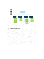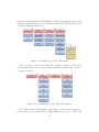
1
HØGSKOLEN I ØSTFOLD
Avdeling for Informasjonsteknologi
Remmen
1757 Halden
Telefon: 69 21 50 00
www.hiof.no
BACHELOROPPGAVE
Prosjektkategori:
X
Fritt tilgjengelig
X
Fritt tilgjengelig etter:
X
Tilgjengelig etter avtale med
Proof of Concept
Omfang i studiepoeng:
20
Fagområde:
arbeidsgiver
Informatikk
Rapporttittel:
Dato:
A Customer Support Chat Component in an Online Banking
Loan Service: A Proof of Concept
Antall sider: 104
20. mai 2015
Forfattere:
Veileder:
Therese Isabelle Dahle, Atle Nærum Eriksen
Per Bisseberg
Avdeling / linje:
Gruppenummer:
Avdeling for Informasjonsteknologi
BO15-G03
Utført i samarbeid med:
Kontaktperson:
EVRY
Per-Ivar Alseen
Antall vedlegg: 8
Ekstrakt:
EVRY provide banks with a web-solution called SBK, where existing and potential bank
customers can apply for loans. They want to expand their product by offering a customer support
chat solution where customers can engage in direct conversation with a bank customer support
operator. We were tasked by EVRY to find a suitable chat solution for this purpose and produce a
Proof of Concept which ensured EVRY's requirements were met. One of EVRY's associates,
eDialog24, already provide EVRY with a chat solution for other banking products, making this our
starting point. We did a thorough analysis of this solution with focus on universal design (design
for all) and human-computer interaction. The analysis proved the solution to be inadequate, and
by looking deeper into the HCI principles and the universal design, we created a HCI proposal
that suggest some improvements. We also proposed security standards to comply to the high-risk
environment of online banking. A heuristic evaluation and usability testing was conducted on the
HCI proposal to further improve our new solution. The result, this Proof of Concept, presents
preliminary requirements that lays the foundation for future development by EVRY, and offers
stand-alone suggestions to EVRY's associate and their product.
3 emneord:
HCI
Universal design
Security
A Customer Support Chat Component in an
Online Banking Loan Service; A Proof of
Concept
BO15-G03
Bachelor thesis, department of Information Technology,
Østfold University College
Therese Isabelle Dahle
Atle Nærum Eriksen
May 21, 2015
Abstract
EVRY provide banks with a web-solution called SBK, where existing and
potential bank customers can apply for loans. They want to expand their
product by offering a customer support chat solution where customers can
engage in direct conversation with a bank customer support operator. We
were tasked by EVRY to find a suitable chat solution for this purpose and
produce a Proof of Concept which ensured EVRY’s requirements were met.
One of EVRY’s associates, eDialog24, already provide EVRY with a chat
solution for other banking products, making this our starting point. We did
a thorough analysis of this solution with focus on universal design (design for
all) and human-computer interaction. The analysis proved the solution to be
inadequate, and by looking deeper into the HCI principles and the universal
design, we created a HCI proposal that suggests some improvements. We
also proposed security standards to comply to the high-risk environment of
online banking.
A heuristic evaluation and usability testing was conducted on the HCI
proposal to further improve our new solution. The result, this Proof of Concept, presents preliminary requirements that lays the foundation for future
development by EVRY, and offers stand-alone suggestions to EVRY’s associate and their product.
1
Statements of Appreciation
We wish to thank EVRY for providing us with this project and for their
cooperation and resourcefulness, and we would also like to thank eDialog24
for giving us access to their product. We also thank Delshad Faraj and
Harald Holone for doing a heuristic evaluation and providing us with valuable
feedback. Further, we want to thank all the participants of the usability test.
In addition we would like to give a huge thanks to our supervisor for
invaluable support throughout the project.
2
Contents
1 Introduction
1.1 Authors . . . . .
1.2 Employer . . . .
1.3 About the project
1.4 Purpose . . . . .
1.5 Deliveries . . . .
.
.
.
.
.
.
.
.
.
.
.
.
.
.
.
.
.
.
.
.
.
.
.
.
.
.
.
.
.
.
.
.
.
.
.
.
.
.
.
.
.
.
.
.
.
.
.
.
.
.
.
.
.
.
.
.
.
.
.
.
.
.
.
.
.
.
.
.
.
.
.
.
.
.
.
.
.
.
.
.
.
.
.
.
.
.
.
.
.
.
.
.
.
.
.
.
.
.
.
.
7
7
7
10
11
11
2 Method
2.1 Quantitative research . . . .
2.2 Qualitative research . . . . .
2.3 Testing . . . . . . . . . . . .
2.3.1 Qualitative testing .
2.3.2 Heuristic evaluation .
2.4 General process . . . . . . .
.
.
.
.
.
.
.
.
.
.
.
.
.
.
.
.
.
.
.
.
.
.
.
.
.
.
.
.
.
.
.
.
.
.
.
.
.
.
.
.
.
.
.
.
.
.
.
.
.
.
.
.
.
.
.
.
.
.
.
.
.
.
.
.
.
.
.
.
.
.
.
.
.
.
.
.
.
.
.
.
.
.
.
.
.
.
.
.
.
.
.
.
.
.
.
.
.
.
.
.
.
.
.
.
.
.
.
.
.
.
.
.
.
.
12
12
12
12
13
13
15
.
.
.
.
.
.
.
.
.
16
16
17
17
17
17
18
19
36
40
.
.
.
.
.
.
.
.
.
.
.
.
49
49
49
51
54
59
62
73
82
82
83
86
90
.
.
.
.
.
.
.
.
.
.
.
.
.
.
.
.
.
.
.
.
.
.
.
.
.
3 Analysis
3.1 SBK requirements . . . . . . . . . . . . . . . . . . . . .
3.1.1 AngularJS . . . . . . . . . . . . . . . . . . . . .
3.1.2 REST API . . . . . . . . . . . . . . . . . . . . .
3.2 Existing solution . . . . . . . . . . . . . . . . . . . . .
3.2.1 EVRY’s current chat solution for internet banks
3.3 eDialog24 . . . . . . . . . . . . . . . . . . . . . . . . .
3.3.1 The eDialog24 chat solution . . . . . . . . . . .
3.4 HCI - Human Computer Interaction . . . . . . . . . . .
3.5 Universal design . . . . . . . . . . . . . . . . . . . . . .
4 Design
4.1 User interface . . . . . . . . . . . . . . . . . . . .
4.1.1 HCI . . . . . . . . . . . . . . . . . . . . .
4.1.2 Frames and positions . . . . . . . . . . . .
4.1.3 Universal design . . . . . . . . . . . . . . .
4.2 Security . . . . . . . . . . . . . . . . . . . . . . .
4.3 HCI proposal . . . . . . . . . . . . . . . . . . . .
4.3.1 Navigation Blueprint . . . . . . . . . . . .
4.4 Test results . . . . . . . . . . . . . . . . . . . . .
4.4.1 Heuristic evaluation of the current solution
4.4.2 Heuristic evaluation of our proposal . . . .
4.4.3 Usability testing of our proposal . . . . . .
4.5 Changes in our HCI proposal after these results .
3
.
.
.
.
.
.
.
.
.
.
.
.
.
.
.
.
.
.
.
.
.
.
.
.
.
.
.
.
.
.
.
.
.
.
.
.
.
.
.
.
.
.
.
.
.
.
.
.
.
.
.
.
.
.
.
.
.
.
.
.
.
.
.
.
.
.
.
.
.
.
.
.
.
.
.
.
.
.
.
.
.
.
.
.
.
.
.
.
.
.
.
.
.
.
.
.
.
.
.
5 Requirements
5.1 SBK requirements . . . . . . .
5.2 Universal design requirements
5.3 HCI requirements . . . . . . .
5.4 Security requirements . . . . .
5.5 Miscellaneous requirements . .
.
.
.
.
.
.
.
.
.
.
.
.
.
.
.
.
.
.
.
.
.
.
.
.
.
.
.
.
.
.
.
.
.
.
.
.
.
.
.
.
.
.
.
.
.
.
.
.
.
.
.
.
.
.
.
.
.
.
.
.
.
.
.
.
.
.
.
.
.
.
.
.
.
.
.
.
.
.
.
.
.
.
.
.
.
.
.
.
.
.
95
95
95
96
97
98
6 Discussions & Further Work
100
7 Conclusion
102
4
List of Tables
1
2
Universal design - Requirement violations . . . . . . . . . . . . 48
Usability test results - Issues . . . . . . . . . . . . . . . . . . . 90
5
List of Figures
1
2
3
4
5
6
7
8
9
10
11
12
13
14
15
16
17
18
19
20
21
22
23
24
25
26
27
28
29
30
31
32
33
34
EVRY organizational chart (Per-Ivar Alseen, System Consultant) . . . . . . . . . . . . . . . . . . . . . . . . . . . . . . .
Financial Services organizational chart (Per-Ivar Alseen, System Consultant) . . . . . . . . . . . . . . . . . . . . . . . . .
Channels organizational chart (Per-Ivar Alseen, System Consultant) . . . . . . . . . . . . . . . . . . . . . . . . . . . . .
Chat client - Online/offline chat client contact point . . . . .
Chat client - Customer-facing chat client . . . . . . . . . . .
Operator client - Log in screen . . . . . . . . . . . . . . . . .
Operator client - Main window . . . . . . . . . . . . . . . .
Operator client - Incoming chat request . . . . . . . . . . . .
Operator client - Missed chat request . . . . . . . . . . . . .
Operator client - Chat dialogue area . . . . . . . . . . . . .
Operator client - Chat typing area . . . . . . . . . . . . . . .
Operator client - Customer information tab . . . . . . . . .
Operator client - Organization area . . . . . . . . . . . . . .
Administrator client - Main window . . . . . . . . . . . . . .
Administrator client - Contact point status picture selection
Universal design - Missing alt-attribute . . . . . . . . . . . .
Universal design - Text as a part of the picture . . . . . . . .
Universal design - Wrongly inverted contrast set up . . . . .
Universal design - Missing focus with keyboard navigation .
Chat contact point position - 1920x1080 . . . . . . . . . . .
Chat contact point position - 1280x720 . . . . . . . . . . . .
HCI proposal - Homescreen . . . . . . . . . . . . . . . . . .
HCI proposal - Chat dialog with customer . . . . . . . . . .
HCI proposal - Operator-conversations tab . . . . . . . . . .
HCI proposal - Operator-conversation dialog . . . . . . . . .
HCI proposal - History . . . . . . . . . . . . . . . . . . . . .
HCI proposal - E-mail . . . . . . . . . . . . . . . . . . . . .
Existing global navigation - Operator client . . . . . . . . .
Dropdown menu - Operator client . . . . . . . . . . . . . . .
Chat menu - Operator client . . . . . . . . . . . . . . . . . .
Navigation proposal - File-menu . . . . . . . . . . . . . . . .
Navigation proposal - Chat-dialog menu . . . . . . . . . . .
HCI proposal - Validation errors with help description . . . .
Final HCI proposal . . . . . . . . . . . . . . . . . . . . . . .
6
.
8
.
9
.
.
.
.
.
.
.
.
.
.
.
.
.
.
.
.
.
.
.
.
.
.
.
.
.
.
.
.
.
.
.
.
10
20
21
23
24
25
26
26
27
28
29
33
35
42
42
43
45
53
54
64
66
68
69
71
72
73
75
80
81
81
85
92
1
1.1
Introduction
Authors
The authors of this paper are Therese Isabelle Dahle and Atle Nærum Eriksen.
Therese Isabelle Dahle is a 24 year old computer science student at Østfold
University College, department Halden, who currently resides in Askim. She
is passionate about information technology in general, and the concept of
bringing an idea to life in the form of a finished product sparks her interest greatly. After graduating she would like to work with programming or
database administration.
Atle Nærum Eriksen, computer science student at Østfold University
College, department Halden, is strongly passionate about programming with
a particular interest towards enterprise programming and software security
which takes up most of his spare time.
1.2
Employer
EVRY is one of the largest companies in the Nordics, and is the result of the
merger of Norway’s two largest IT companies; EDB and ErgoGroup. The
merger took place in 2010 and brought together over 50 years of experience
and innovation. Today, EVRY is providing extensive deliveries to Nordic
companies, financial institutions, health authorities, public sector entities
and municipalities. Some of EVRY’s customers are; DNB, Telenor, Norway
Post, Statoil, Hydro, Sparebanken 1 Group, Storebrand, and Gjensidige.
EVRYs organizational structure consists of staff, business areas, business
groups, business units, departments, sections, teams and support functions.
The organizational structure of EVRY is shown in figure 1. As we can see,
EVRY is divided into different business areas; Regions, Industries, Financial
Services, Nordic Operations and Sweden. Business groups and business units
are then organized under these business areas. This project belongs to the
Financial Services business area.
7
Figure 1: EVRY organizational chart (Per-Ivar Alseen, System Consultant)
Financial Services provides innovative solutions to the bank and finance
sector and is the leading Nordic supplier of IT solutions to this segment. They
have a high focus on automation and self-service while having operational
reliability and high security standards, as this is crucial for the bank and
finance industry. Financial Services is organized into two business groups
and nine business units. The two business groups are Operations and Card,
while the nine business units are Sales and Market (tier 2), Nordic Tier
1, Sparebank 1 S.A, Payment&Security, Core, Channels, Custom Solutions,
PBS and BQC. This project belongs under the Channels business unit. The
structure of Financial Services is shown in figure 2.
8
Figure 2: Financial Services organizational chart (Per-Ivar Alseen, System
Consultant)
The business unit Channels consist of four departments; Loan Processing,
Daily Banking & CRM, Self Service & BQC, ATM. These departments are
again divided into sections. Loan Processing, which is the department we’re
in, got four sections; Loan Process Development, Loan Process Support,
Collateral & Credit and Loan Services. The section we’re a part of is Loan
Services. The organizational structure of Channels can be seen in figure 3.
9
Figure 3: Channels organizational chart (Per-Ivar Alseen, System Consultant)
1.3
About the project
SBK (selvbetjent kreditt: online self-service loan) is a web-solution where
existing and potential customers can apply for loans at a bank. The solution
supports several loan products: Consumer loan, car loan with sales lien,
house loan secured by real estate etc. Users can sometimes ”get stuck” and
be in need of help. A desired solution for this is to have a chat in the SBKscreen where customers can have a direct dialogue with the Bank’s customer
support.
An existing chat solution is already live in another EVRY banking environment. This environment is for the online bank service where customers
can log on their own profile to get access to their bank accounts, loans and
insurances, pay bills, transfer money between accounts and so on.
Our main task in this project is to create a proof of concept. Based of
an analysis and previous research, the proof of concept should secure that
the chat is optimized for its users, both at the bank and for it’s end users.
An optimized solution is easy to locate, easy to use, accessible for users with
disabilities and secure.
10
1.4
Purpose
If a customer is stuck, unsure or got questions while using SBK and customer
support is not easily accessible, it may cause a negative effect in that the
customer does not fill in the loan application correctly, the customer delivers
a weakly filled loan application, or the customer cancels the loan process. E.g.
the customer fills out the loan application and proceed to the stage where
he/she have to fill in security by real estate. Here he/she misunderstands
and adds a property he/she can’t have security in.
By having a chat available that is easy to use, the customer relationship
can be saved or enhanced.
1.5
Deliveries
Our main delivery is a proof of concept which includes system requirements
based on testing results and research. The proof of concept will include
detailed information about HCI requirements. Our secondary delivery will
be the security requirements.
11
2
Method
Our work in this paper is mostly based on analyses of existing solutions and
research articles. To enhance our choice of HCI requirements, there have
been done some tests. There are two types of research methods when doing
these tests; Quantitative research method and qualitative research method.
We have used the qualitative research method as this method is more suitable
when facilitating applications for human behavior.
2.1
Quantitative research
Quantitative research is much more structural than qualitative research and
is all about numerical data. Aliaga and Gunderson [15] introduced the following definition:
“Quantitative research is explaining phenomena by collecting numerical data that are analyzed using mathematically based
methods (in particular statistics).”
Quantitative methods are mostly used when you need data that can be
quantified, and is most commonly used for statistics. An example of quantitative research is a website that conducts a one-question multiple choice
survey every day and collects the results in a structured way. The analysis
performed on the data does not require the data to be very informative in
isolation, because it is the large amount of results the analysis relies on.
2.2
Qualitative research
Qualitative research have no fixed definition and there are many different
definitions out there. Basically, qualitative research is a type of scientific research that aim to capture personal meaning and experience that can not be
quantified or measured [4]. When doing qualitative research, one systematically collects, organize and interpret textual data derived from observation
or conversation.
2.3
Testing
We used two test methods during this project; qualitative testing and heuristic evaluation.
12
2.3.1
Qualitative testing
In qualitative usability testing the researcher is present during the test as an
observer to see how people use technology to meet their needs. Observing
directly give the researcher the ability to ask the user questions, probe on
behavior, or even adjust the test protocol to better match its objectives
[18]. As the most traditional form of user testing, qualitative tests aim at
discovering what does and does not work in the user interface design, and
is grounded in user-behavior analysis. The results of a qualitative test will
help us see what parts of the design to maintain and what parts to improve,
and how to improve it [9]. We ran usability test on a wide range of users,
including two users with vision impairment.
2.3.2
Heuristic evaluation
A heuristic evaluation is a test method for web applications and computer
software where an expert is systematically testing the user interface design
to identify usability problems. The test is done by going through heuristics,
which is usually made to suit the application that is being tested [20]. Nielsen,
which is considered the field leader in heuristics, published these heuristics
in his book Usability Engineering [13]:
“ Visibility of system status:
The system should always keep users informed about what is going on, through appropriate feedback within reasonable time.
Match between system and the real world:
The system should speak the user’s language, with words, phrases
and concepts familiar to the user, rather than system-oriented
terms. Follow real-world conventions, making information appear in a natural and logical order.
User control and freedom:
Users often choose system functions by mistake and will need
a clearly marked ”emergency exit” to leave the unwanted state
without having to go through an extended dialogue. Support
undo and redo.
Consistency and standards:
Users should not have to wonder whether different words, situations, or actions mean the same thing. Follow platform conventions.
13
Error prevention:
Even better than good error messages is a careful design which
prevents a problem from occurring in the first place. Either eliminate error-prone conditions or check for them and present users
with a confirmation option before they commit to the action.
Recognition rather than recall:
Minimize the user’s memory load by making objects, actions, and
options visible. The user should not have to remember information from one part of the dialogue to another. Instructions for
use of the system should be visible or easily retrievable whenever
appropriate.
Flexibility and efficiency of use:
Accelerators—unseen by the novice user—may often speed up the
interaction for the expert user such that the system can cater to
both inexperienced and experienced users. Allow users to tailor
frequent actions.
Aesthetic and minimalist design:
Dialogues should not contain information which is irrelevant or
rarely needed. Every extra unit of information in a dialogue competes with the relevant units of information and diminishes their
relative visibility.
Help users recognize, diagnose, and recover from errors:
Error messages should be expressed in plain language (no codes),
precisely indicate the problem, and constructively suggest a solution.
Help and documentation:
Even though it is better if the system can be used without documentation, it may be necessary to provide help and documentation. Any such information should be easy to search, focused on
the user’s task, list concrete steps to be carried out, and not be
too large.”
Normally a small set of evaluators is examining the user interface based
on the heuristics, as it is impossible for a single evaluator alone to find all
the usability problems. Different people find different problems, therefor this
14
method is quite effective in improving the user interface [16].
2.4
General process
During our process we have had weekly counseling sessions, short group discussions on weekdays, and meetings with our employer and employee have
been agreed on when needed. Communication with our employer have been
on a regular basis through emails and short phone calls.
We have used Trello as our project management tool for easier documentation of our process. It made it easy to keep track of discussions (as we
wrote everything down in a discussion board), our work schedule, how to
structure this document and to sort the requirements. Another tool we used
during our project is Overleaf, which is what we used to write documentations. Google Docs is what we used to sort research papers, found in ACM
Database, to keep track of which articles were relevant and which were not.
15
3
Analysis
In today’s information age, one of the most prominent and recurring components on the internet is the chat component. What all chat components
have in common is that they are familiar to most computer users and have
been for a long time. Immediately this offers us two important advantages:
one, user experience and interaction patterns are already well researched,
and two; there already exist a multitude of implemented solutions available
for reuse.
In this section we will consider the requirements of the SBK-chat in detail
with emphasis on the domain of online banking, and explore an existing
chat solution available internally through EVRY’s associates that may be
customized to our needs. Note that our analysis is based on the solution we
were provided.
3.1
SBK requirements
The initial requirements given to us when we first accepted the project was
not a lot. They wanted the solution to be generalized so it could be used in
several other products, conversations to be stored, chat to be responsive, and
a clear overview of incoming chat on the bank side. Later, we have gotten
a few additional requirements and the total of requirements then looked as
follows:
1. Facilitate for users with vision impairment.
2. Design should be easily customizable for each bank.
3. State data, such as where in the SBK flow a user is, should be attached
when starting a new conversation.
4. Generalize the solution so it’s easy to use in other products.
5. The chat should be responsive.
6. The overview of incoming chats at the bank should be easy to see and
to interact with.
7. Conversations gets stored.
8. Compatible with AngularJS.
Having given us some insight into what they wanted, they stated it was
up to us to find the absolute best chat solution.
16
3.1.1
AngularJS
EVRY is currently developing a new version of SBK, a version that is based
on AngularJS. Therefore, they wanted the chat solution to be compatible
with AngularJS.
AngularJS is a structural JavaScript framework that lets you extend
HTML’s vocabulary for better dynamic web applications. With its data binding and dependency injection, much of the code you would otherwise have
had to write is eliminated. Since AngularJS only runs within the browser, it
is an ideal partner with any server technology [6].
3.1.2
REST API
The new version of SBK will be using REST API in addition to AngularJS,
and it’s the REST API’s job to distinguish between authentication levels
to prevent sensitive information from back-end systems being exposed to
unauthorized users.
REST stands for Representational State Transfer and relies on a stateless,
client-server, cacheable communications protocol (HTTP) [8]. REST API’s
provide access to data entities via URI paths. Using a REST API, the
application makes an HTTP request and parses the response [7]. EVRY is
using JSON (JavaScript Object Notation) as the communication format.
3.2
Existing solution
In this subsection we will explore and examine the existing chat solution
that are offered by EVRY’s associates. Open source implementations are
not considered in this part due to the secure nature of online banking and
EVRY’s need for custom requirements.
3.2.1
EVRY’s current chat solution for internet banks
Due to EVRY’s present involvement with online banks, a chat solution was
already being rolled out onto their servers in Trondheim in participation with
their other online banking software (unrelated to SBK). As we were unaware
of the internet banking terrain, and because it was not at all clear as to
how the system infrastructure set up at EVRY’s data center was expected
to communicate with a chat client, it was a natural starting point for us to
take a closer look at the system.
Even though there possibly existed a reusable chat client on the customer
side for us to use, this would not necessarily mean a server-side system and/or
client would be available to complete our solution. This was a consideration
17
that was repeatedly up for conversation from the beginning as investigation
had not made it clear what pieces of the puzzle were available at this point.
During a conference call to the department responsible for EVRY’s internet banking chat solution in Trondheim, it became clear that one of EVRY’s
partners, eDialog24, was in charge of maintaining the chat solution. What
was not clear, however, was whether only the client- or server-side of the
solution was maintained by eDialog24, or both. According to EVRY’s representative, the chat client’s outwards appearance and looks was configured
and maintained by EVRY, but the actual chat implementation and the backend operator client were maintained by eDialog24. Although eDialog24 had
been mentioned in our introduction meeting with EVRY at Fornebu, it was
first in the conference call that we were introduced to what their role was.
From what was told, EVRY and eDialog24 had an agreement in which
EVRY would rent eDialog24’s chat system in return for them maintaining
said system. The implemented solution of this agreement, dubbed ”EVRY
Chat24 Nettbank”, was meant to be used as the main customer facing chat in
online banks hosted by EVRY. An important detail to note is that although
eDialog24 maintained the software it was hosted on EVRY’s server. This
also included the back-end clients (operator and administrator) and meant
that when a customer entered the chat they would be connected with the
bank directly trough EVRY. The reason for that was mainly because EVRY’s
customers required more stable uptime than what eDialog24 could guarantee,
and also because EVRY needed to support higher levels of security through
a service-level agreement (SLA), which eDialog24 did not offer.
It was unclear at this stage where the actual location of the EVRY servers
were situated which would be used to host the finished SBK solution. This
laid grounds for further investigation. Before pursuing this matter any further however, we decided to establish a better overview of all the moving
parts rather than sift through implementation details, and set up a meeting
with eDialog24. EVRY’s representative sent us a delivery description of the
chat system they had received from eDialog24 which detailed certain key
aspects of the product so that we knew what to expect, and in addition suggested us to look into ”BN Bank”, another solution by EVRY which included
a chat component.
3.3
eDialog24
eDialog24 began as a project within Sentinel Software AS in 2000 and was
later separated into its own company in 2003. eDialog24 AS is an industry
leading international vendor of instant messaging solutions and web collaboration software for companies and businesses. Their main target areas include
18
solutions for chat, e-mail, SMS, and social media, with a focus on written
customer dialogue. With their knowledge, expertise and deep understanding
of the domain of customer related chat solutions they can offer additional
services such as preliminary project analysis, consultation, course training,
professionalization, software development, and assistance in regards to integrating their solutions with existing systems.
Today eDialog24 distributes to and partners with dominating players in
the IT industry which yields them a strategic position that reaches many important segments. A few of these include EVRY, Finn.no, Kommuneforlaget,
and Sentinel Software/CarWEB. With offices in both Oslo and Trondheim,
yet only seven employees total, eDialog24 serves about 300 businesses.
It became evident when working with eDialog24 that they strongly care
about making their customers happy, with a wish to increase their sales,
revenue, and reputation.
3.3.1
The eDialog24 chat solution
The eDialog24 chat solution consisted of three components: the online chat
used by the customer, the operator client used by the banking staff, and the
administrator client used by the banking administration. Each component
was an individual software package that could be installed separately.
We received access to a demo setup on eDialog24’s server where they had
prepared an organization for our test users. An organization is in simple
terms a group where operators can be added, and will be detailed shortly.
The organization received a contact point, which is the URL the chat client
uses to interface with the operator client. Each online bank requires at least
one, although multiple is possible. Keep in mind that since our test environment was not hosted by EVRY it may work slightly different in practice.
19
Figure 4: Chat client - Online/offline chat client contact point
Chat client When a customer wants to initiate contact with the bank
staff, he or she must first activate the chat window. The gateway to the
chat window, also known as the chat’s ”contact point”, is an area within
the browser window made up of either a text link or an image (see figure
4). The image indicates whether the chat is currently operated and can be
customized through the administrator client. An organization is not limited
to only one contact point. When clicked and no operators are available to
chat, a new window pops up, and the user is asked to leave a message along
with their e-mail address and phone number so that the operator can contact
them during opening hours. In the case an operator is available the same
window pops up, but will now instead contain information about how to start
the chat dialogue. There exists a help link in case the customer wishes to
read about the chat’s usage and security guidelines, and a button to start the
chat. The customer is notified that the chat log can be sent to a designated
e-mail address when the dialogue ends.
Once the customer has initiated a new chat dialogue by clicking the start
button he is placed in queue, waiting for an operator to respond. If the
customer decides not to wait he can leave a message like described earlier.
While waiting the customer is unable to type and their only option is to wait
or leave the chat.
20
Figure 5: Chat client - Customer-facing chat client
The chat frame (see figure 5) is an independent browser window made up
of HTML, CSS, and JavaScript, with an information area about the operating
respondent at the top, the chat dialogue in the middle, and the customer’s
typing area at the bottom. The operator is presented with full name, email address, work title, and picture - all configurable by the administrator
client. It is not required to display any of this information, giving each online
bank the freedom to choose how to represent their staff. In any case, if the
operator wishes to hide their personal information but wants to work under
a pseudonym, this is possible to set up in the administrator client by editing
the operator. This way an operator’s personal information may be registered
within the system but will not be presented to customers in the chat frame.
21
The dialogue area shows the timestamps of each reply along with who sent
it, and is by definition a standard chat area. While the operator prepares
a reply, the customer is informed through status messages at the bottom of
the chat dialogue window to indicate an answer is coming up shortly. The
customer’s typing area consists of a text box and a send button, and an
additional button to end the conversation. By ending the conversation, the
customer is offered to type in their e-mail address to receive a copy of the
chat log.
On the technical side the chat itself and its contact point are generated by
the server so that all HTTP resources correspond to those of the online bank.
In other words, for all the links and buttons to be usable and all the images
of the chat to be loaded correctly, the online bank must first configure their
chat settings in the administrator client so that the company logo and other
resources are available to be embedded into the code directly. When the
chat (which is a website) is refreshed, any edited HTML, CSS, or JavaScript
content is reflected immediately with no manual work needed. This will be
detailed further when we discuss the administrator client.
Operator client When a customer initiates a new chat dialogue it is the
bank staff’s chat operator that responds to this request. The tool used by the
chat operator, the eDialog24 Operator, is an independent C++ application
which only runs on the Windows operating system. All chat requests are
redirected to this client, and it comes with an abundance of features to
handle the lifetime of a chat conversation.
The operator client has its own installer and can be installed in several
languages, not restricting itself to only Norwegian or English. It has the
ability to integrate seamlessly with external systems such as Skype, SuperOffice, Lync, Microsoft Outlook, eSak (Noark), TElefon (TAPI and Telenor
Mobile), Google Calendar, Google Hangout, and eJournal. Additionally the
client can be integrated with both e-mail and SMS alerts to help the operators get their job done in an efficient manner, and to announce to waiting
customers that their pending chat conversation has now been opened by an
operator.
22
Figure 6: Operator client - Log in screen
The opening window for the application is the login screen (see figure 6).
It is here possible to log in with a username and password for a specific domain. Such credentials are created in the administrator client and handed to
each operator, and will only work for the domain which under the operator’s
organization was registered.
23
Figure 7: Operator client - Main window
Once logged in a new window appears, which is the operator client’s main
window (see figure 7). It is composed of three subwindows: the chat queue
table (1), the chat area (2), and the organization overview (3). On incoming
chat requests the queue area gets filled with unattended chat request items,
ready for any free operator to respond to. Each item is given a unique
identifier and keeps count of how long it has been in queue so that whenever
an operator becomes free it will be an easy job to find the most urgent item.
As the queue is represented as a table with named columns it is possible to
sort any column at a given time. The other columns worth mentioning are:
• Contact point: Name of the contact point the customer initiated the
chat request from. Each online bank (or in this case eDialog24 chat organization) is not limited to having only one contact point, so knowing
where the customer entered the chat from can be useful to the operator. For example, in the context of a general online banking service, two
contact points could be named ”Account log in” and ”Insurance” respectively, giving the operator a good idea of what the customer needs
help with.
• Contact point URL: The URL of the contact point used by the customer.
24
• User agent: The browser name and version used by the customer, as
well as their operating system. This columns works as a simplified user
agent string, stripping out many of the details otherwise found in said
piece of information. For example, a standard user agent string could
describe the user agent as a 64-bit application running on Windows 7,
but the column in eDialog24 Operator would only show Win32 for the
operating system.
• Recipient name: A prioritized choice for which operator should handle
the chat request.
• Customer number: Incoming chat requests from known customers will
show their name and customer identification number to make them
easier to trace in the queue.
• Date of receipt: Displays when the chat request was first received.
To alert free operators of incoming chat requests, a pop-up window is
displayed that shakes and nudges while playing a sound to gain the operator’s attention (see figure 8). The window disappears after ten seconds, but
the application’s icons on the task bar and status bar keep flashing indefinitely until the request has been answered. If a chat request is not answered
within a certain time or the customer closes the chat and leaves, the request
is marked as ”missed” and the operators are prompted accordingly with a
new window (see figure 9).
Figure 8: Operator client - Incoming chat request
25
Figure 9: Operator client - Missed chat request
The main chat frame is positioned below the chat queue table, and is
structured and designed similarly to the chat frame used by the customer in
the browser (see figure 10). It consists of a dialogue area, a typing area, and
an information tab which displays details about the current conversation and
the customer.
Figure 10: Operator client - Chat dialogue area
If the customer is registered in the system and initiates a chat using their
customer credentials (i.e. not anonymously), their personal information can
be found in this tab (see figure 12), including their full name, e-mail address,
phone number, home address, customer number, and company name. An
operator may attach comment items to a customer which will only be available to other operators, in case additional information is required to better
assist the respective customer in the future. Other information regarding
the conversation itself can be found below the customer details, such as the
IP address and URL of the contact point used by the customer to establish
contact. It is possible to edit all of this information directly in the operator
client without needing the administrator client.
26
Figure 11: Operator client - Chat typing area
The typing area below the chat dialogue is made up of a standard text
area along with a send button (see figure 11). There is a compact WYSIWYG
(What You See Is What You Get) editor where the operator can customize
their input text with features such as bold, italic and underlined text. The
text can be aligned, given a new size, font type, color, or other custom
formatting. A special feature of the operator client compared to the web
client is the ”impulse” feature. While the operator is typing a message of
considerable length and the customer requires an answer immediately other
than the response being prepared, the impulse feature allows the operator to
send a speedy reply without disrupting the longer message. This feature can
be accessed with a button to the right of the original send button, and will
open a new window with a text area and a send button of its own.
27
Figure 12: Operator client - Customer information tab
28
Figure 13: Operator client - Organization area
On the right side of the operator client is a docked window with an
overview of the organization’s operator staff, much similar to a typical friends
list in an instant messaging application (see figure 13). The list is split into
categorized groups, as specified by the administrator client, to allow for a
more fine-grained overview. Operators registered within the organization are
able to contact each other regardless of whether they act as customer-facing
chat operators or not as long as they are using the operator client itself.
This communication may happen across company borders as well if such an
agreement has been made between the two companies.
For example, in our test environment set up by eDialog24, we were registered as operators under the EVRY organization, and assigned to the SBK
subgroup. Despite this we were still able to browse the other subgroups
within the EVRY organization, and even go outside the organization itself
29
to collaborate with ”friend” organizations registered in the system. In our
case the organization used by eDialog24 (named ”Sentinel og eDialog24”)
was accessible from our list, and it was possible to visit its subgroups such as
”customer service”, ”sales” and ”development”, depending on our communication needs. This example proves that the operator client is also suitable
for use within a company that does not necessarily have any customer-facing
operators at all, acting as an internal chat system, much similar to Microsoft
Lync.
An operator’s current availability is decided by the use of availability
states set by the operator. This state can be set both by right-clicking on
the operator client’s icon in the task bar and selecting the wanted state, or
by clicking the availability button at the top of the organization view. The
states are as follows:
• Green with check mark: Available in front. This means the operator is
available to chat with customers.
• Yellow with circle: Available for collaboration. This means the operator is available to chat with colleagues, but not customers.
• Red with dash: Busy.
• Gray with clock: Temporarily away.
Contacting another operator is as straightforward as double clicking his
or her name to open a chat dialogue window. Messages can be delivered both
to SMS and e-mail in addition to the standard instant messaging usage. The
text formatting options described for the operator’s typing area also applies
here, but there also exist a few other features specific to the internal chat.
Examples of these include chat history search, sending group messages to
multiple operators (e.g. to a specific subgroup of operators), viewing an
operator’s calendar, and the ability to receive an alert when an unavailable
operator becomes available. It is for the latter possible to specify the desired
state of the operator becoming available, for example to only alert when
being available for collaboration and not when available in front.
An operator may edit their personal details from the organization view by
right-clicking at their name and selecting the option to edit their personalia.
A new window will then appear with the operator’s details and picture where
the fields are editable. It is from this window also possible to change the
operator’s current password and specify in which channels alerts from the
operator client should be received. An operator could for example decide to
30
only receive alerts in the operator client itself and on SMS, but not on e-mail
or through social media. One might also not wish customers to see these
details at all, and there is an option available to hide the operator’s personal
details in that case. At the bottom of the organization view there resides a
search field which can be used to look up operators within the organization.
The second tab includes an assortment of standardized answers for situations defined by the organization or the operator. The use of standard
answers is to shorten the time it takes for an operator to reply to frequently
asked questions, and to save the operator from having to type out the same
messages over and over. Typical example answers include greeting the customer and wishing them a good day when ending the conversation. A standardized answer can be edited and previewed in an integrated browser within
the operator client, and can also generate HTML code if necessary. Wildcards can be used for dynamic variables, such as ”<PRIVATEOPERATORNAME>” which will insert the operator’s name into the message. As mentioned above it is possible for the operator to create their own standardized
answers.
An important part of the operator’s job is to post-process a completed
conversation. In some cases further evaluation may be needed by other operators, and the operator client offers a feature to schedule a completed conversation for follow-up at a later date by either a designated set of operators
or a subgroup as a whole. Such a follow-up can have comments added to it
and a due date in addition to the main content, which is editable in the same
integrated preview component used by many of the other features, such as
when creating standardized answers. The chat conversation can otherwise be
saved to file, printed out, sent on e-mail, or used to initiate a Google Hangout
invitation. When a case is closed it can be archived under a certain category
name created with the administrator client, but this is not required.
If the situation arises that the operator is unable to answer the customer’s
questions the conversation can be forwarded to another operator with more
knowledge about the specific topic.
We will now take a look at some of the other, sometimes more overlooked
features of the operator client:
• Harassment control: If an operator finds himself the target of harassment, it is possible to ban the customer from using the chat for a
designated amount of time, the default being twenty four hours. The
operator can either enable a cookie in the customer’s browser that will
refuse them to start a new chat conversation, or for more tech-savvy
31
customers, ban the IP address the customer is using. The second option reminds the less tech-savvy operators that more than one customer
may be sharing an IP address, so it should be used carefully.
• Chat history search: The eDialog24 operator client comes with an advanced chat history search mechanism which can not only look through
old conversations but also SMS messages and e-mails. It allows the operator to search within a certain time period, within certain organizations, for specific customers or operators. Additionally one can search
for conversations archived under certain categories which might be an
incentive to mark them accordingly when archiving them.
• Help menu: The operator client’s help menu includes links to help the
operator get started or their questions answered. It includes the application’s changelog, a maintenance news feed, a bug reporting feature,
an introduction to how to use the software, and a comprehensive manual of the eDialog24 Operator.
• File sharing: Files can be shared between the operator and the customer. To use this feature, the operator has to initiate the file transfer.
It is possible to capture the operator’s screen and send it directly to
the customer with the screen dumping feature as well.
• Additional tools: The additional tool menu is a custom menu where the
operator may create their own menu items. Dynamic variable wildcards
such as the chat conversation ID, the customer’s e-mail address, or their
zip code are available to be used when constructing custom URLs to
be launched when the menu item is clicked or its shortcut triggered by
the keyboard. By default this menu offers quick access to phone and
IP address search through the Yellow Pages and WHOIS.
32
Figure 14: Administrator client - Main window
Administrator client The administrator client can in simple terms be
thought of as the management counterpart of the operator client. It is maintained by the bank management staff and is not accessible to operators. The
application has its own installer and can be installed in several languages,
just like the operator client. It is written in C++ and runs on Windows only.
The client’s main window is shown in figure 14 for reference. Much of the application’s functionality have already been described directly or indirectly in
the section detailing the operator client and will be left out here for brevity.
As a short summary the administrator client can be used to:
• Manage operators: Create, edit, or delete operators. Operators can be
assigned to subgroups as witnessed in the operator client’s organization
view, and appointed competency tags to further narrow their field of
expertise. This way operators can search for other operators with specific skills needed to assist a customer. Examples of such competencies
include: finance, sales, support, Telenor expertise, Bank A expertise,
Bank B expertise, and so on. An operator’s log in credentials may also
be restricted to a certain set of IP addresses to limit abuse.
33
• Manage contact points: An organization can have multiple contact
points if desired, and these are managed individually in the administrator client. Each contact point can have its own picture depending on its
availability state (see figure 15), and the HTML, CSS, and JavaScript
used by the chat client can be updated in real-time from this panel.
It is possible to specify a limit on concurrent chat conversations, and
when the limit is exceeded a ”busy” status picture is shown instead
of the usual offline/online picture (see figure 15). The aforementioned
competency list is also managed here for each individual contact point.
One can specify in the panel whether data encryption (SSL) should be
used for this particular contact point, and the language used in the
contact point and its related web chat can be be changed here.
• Standardized answers: Answers to frequently asked questions, welcomeand goodbye messages, and other globally helpful responses can be
managed in the administrator client.
• Statistics: What was the average waiting time for a customer last
month? How many SMSes and e-mails were distributed during lunch
this wednesday? The statistics feature can answer these questions.
• Organization subgroup management: A detailed panel is available to
configure the subgroups within the organization, including fields such
as: department name, phone number, fax, e-mail, website, organization
number, and company/subgroup logo. Other features of this panel
include: specifying when content logs are up for deletion, operator
phone monitoring, opening hours for all contact points, and how to
handle missed chat requests.
34
Figure 15: Administrator client - Contact point status picture selection
Access to eDialog24’s code and their chat’s set up process As mentioned before, eDialog24 were responsible for maintaining their own solution
in all aspects except for the customization of the chat theme. This meant
that any future changes to the product would be carried out by eDialog24
themselves and not require any development intervention from EVRY. By
keeping the implementation details of the chat hidden this gave us bigger
freedom to focus on the other non-technical aspects of the product. A discussion ensued whether or not access to eDialog24’s code would be necessary,
and the conclusion was that even if we were to see the code it would do little
to further our cause.
Our main focus on the chat at this stage was rather inclined towards the
35
setup process of each individual online bank, which meant that eDialog24
most likely had some sort of redirection system in place to make sure each
customer was properly assigned to the correct bank’s operator client. Any
networking code found in their chat products would most likely be of little
importance and controlled by a central server rather than the operator client
acting as a server to which the chat client would connect. In other words,
even with access to eDialog24’s code we would not gain much, and instead
end up performing code reviews for security holes, because there would most
likely be a step by step process already available to easily set up a new chat
contact point offered by eDialog24. Because of the uncertainty in finding an
answer to this question we decided to contact the developers at eDialog24 to
gain better insight into the implementation part of their solution. Our hope
was that this would grant us a better overview of the server architecture at
EVRY used in conjunction with the eDialog24 chat system.
Inquieries brought up by eDialog24 A recurring question, not only
from eDialog24 but also EVRY Trondheim and EVRY Oslo, was the question
of whether the chat should be made available on open websites without the
user being logged in, as it could be an impediment to thorough counseling
from the bank staff if the user’s credentials were kept anonymous throughout
the chat session along with other key information. eDialog24 pointed out that
setting up a secure solution was a more involved process and that they would
prefer to be kept in the loop regarding our decision early on.
The user experience part of the chat solution was important to eDialog24
and one of the questions that kept coming up was the location of the chat’s
contact point. eDialog24’s representative suggested that if the contact point
was positioned in an obscure location, such as being below the scrollheight of
the user’s browser window, the user was more likely to pick up the phone and
call the bank directly, which was an unwanted action and the main reason
a chat was installed in the first place. The answer to this question was not
immediately apparent as each online bank would be likely to prefer to decide
this for themselves individually.
3.4
HCI - Human Computer Interaction
The Association for Computing Machinery defines human-computer interaction as “a discipline concerned with the design, evaluation and implementation of interactive computing systems for human use and with the study of
major phenomena surrounding them” [10]. Basically, everything we discuss
around the user interface is HCI. HCI is very fragmented and there are yet
no agreed set of principles [11]. After reading a lot about HCI from different
36
authors, we came to discuss the different principles we encountered that we
felt could be helpful/useful in creating requirements.
Consistency According to Dix et al [5], consistency relates to the resemblance in behavior arising from situations or tasks that are similar. Nielsen
[13] view consistency as important so that users should not have to wonder
whether the same words, situations or actions mean the same thing.
There’s two different types of consistency; external consistency and internal consistency. External consistency is if the system have any consistencies
with other systems, while internal consistency is when the system is consistent with itself [14]. An example of the operator client being consistent across
systems, is with the operator’s status. The layout of the status is similar to
Skype, and its use is the same. It is best to consider both internal and external consistency, but external consistency can be difficult to achieve when
the system have different needs of functionality in what you would normally
come across.
The consistency in the operator client today is generally lacking. There
are too many different types of conversations; Messages, chat, conversation.
What is the difference between these? There is also no consistency in use of
icons. An example is the e-mail icon. Within the operator client alone, we
counted 5 different e-mail icons. The use of terminology also lacks consistency
as several functions had different names. An example is standardized answers
designer, which also went under the name response designer. There was also
the “Create follow up” in the menu that was the same thing as “Put through
to another operator” in the chat dialog. The navigation also offer little
external consistency.
Familiarity The correlation between the user’s already existing knowledge,
and the knowledge needed to interact with the system efficiently is what familiarity refers to. This is rather a type of consistency based more upon
personal experience, than the system itself [11]. An example of familiarity is the typewriter and the word-processor. When the word-processor was
introduced, the similarity between it and the typewriter made it more immediately accessible to those who had experience with a typewriter [5]. An
example of familiarity within the operator client is the e-mail function. Its
icon is an envelope, which we are familiar with because of e-mails, and when
first introduced; letters. This gives us confidence that the function does what
we expect, and it’s easier to learn how to use the system when it support
familiarity.
The operator client supports familiarity to a certain degree, but some
37
icons aren’t consistent with the action it’s supplemented to so this could
have been better.
Predictability Can a user predict the consequence of an action based on
knowledge gained by past interactions with the system? If the answer to this
is yes, the system offers predictability [11]. Predictability enables the user to
take advantage of his knowledge for efficient use of the system. Consistency
promotes predictability [2].
Predictability can be achieved in different levels of detail as described by
Sears and Jacko [12], one of them being “exact layout and responses”. In this
especially detailed predictability, when certain interface elements is accessed
frequently and the behavior of the system is highly predictable over time,
users can engage in automatic processing in certain areas of the system. This
means they do their tasks quickly, accurately and with little to no attention.
If there are even minor deviations in the systems predictability here, the
automatic process can be impossible or error-prone. A second level of detail
is “success at specific subtasks”. In this case, users might want a more global
predictability, to predict the outcome for when the system performs certain
tasks for the user. In some cases they might even only want to predict the
quality of the result of the task, if it’s a complex task. The third and last
level is “overall competence”, which is the most global level of predictability
and assess whether or not the system tends to perform its tasks successfully
in general.
The operator client doesn’t support predictability very well. The lack
of consistency throughout the client makes it hard to predict what different
actions do, and it’s difficult to predict consequences even after excessive use
of the system. Sometimes the system even changes state entirely, changing
the behavior of every function in the system.
Synthesizability This is referred to as the “honesty of the system”, meaning the user can observe when an operation change happens in the internal
state. This enables the user to form a conceptual model of how the system
operates and can use this to address the current state. An example of this
is when moving a file from one folder to another. We can observe the file
moving due to the progress bar and we can see the change when the file
have been moved by checking the other folder[5]. This can be either immediate honesty (which in our example) or eventual honesty, where you see
the changes eventually. An example in the operator client for this is when
the operator inserts a comment to a specific conversation. The comment is
instantly visible in the comment section. Another example is when loading
38
search results in the history section, where you can see that the results are
loading.
The operator client does support synthesizability to a certain extent.
However, some of the feedback given to the user isn’t descriptive enough
making it hard to judge what the change was. An example of bad feedback:
Customer leaves the chat by clicking the X in the chat window, and the
operator isn’t provided feedback that the customer left the chat.
Recoverability Recoverability might be more widely known as error recovery, and is the ability of how users can recover from their errors. Recoverability have two directions; forward and backward. Forward error recovery
is the only possible way of recovery if the interaction done by the user is not
revocable. Here the current state and the negotiation from this state to the
desired state is covered [3]. Backward error recovery is a way of undoing the
erroneous interaction in order to return to a previous state before continuing, e.g. using backspace when you misspell something in a text-editor [3].
Recoverability is extremely important because it enables users to actually
finish a dialog they started, instead of getting stuck in it. If recoverability
isn’t supported by the system, users might give up on using it during different tasks because they know they might encounter an error they can’t get
out of.
Recoverability can be done in three stages; error prevention, error detection and error recovery [19]. Error prevention can be done by disabling
functions the user won’t need. Like in the operator client, there is a function
where the operator can post to facebook. This function clearly isn’t needed
in order to provide customer service to people they are chatting with, so
this would be a function to disable. Another way of preventing errors is to
constrain the input by making it a dropdown list, radio buttons or similar.
Descriptive instructions and clear error messages are also error preventing
strategies. An example of where this isn’t good enough in the operator client
is where the operators save information about the customers. The different
input fields here does check the input fields and does gives an error message
when entering invalid values, but the problem is that you can just hit enter
and the values are stored anyway.
Error detection is to anticipate possible errors and provide feedback to
the user that reassures them that they did what they intended to do, and
that what they intended to do was correct. This also makes it easier for
developers to detect the bug, if it was a bug, when the user reports the error
message.
Error recovery covers what is mentioned in the introduction to this term.
39
When the error is revocable, the system should give the user options to go
back, cancel or undo. If it is not revocable, the system should make the user
confirm before continuing or it should default to a less harmful state. An
example of this is when the operator client provide a warning message when
you exit or log out.
Both the operator client and the chat client need better recoverability. A
user in the chat client shouldn’t be able to close the chat with the X without
being warned that he is leaving the conversation. An operator shouldn’t
have access to the configuration file (we’ll discuss this further in the security
chapter) and there are several functions within the client today that are
error-prone. Both the operator client and the chat client needs better error
prevention, error detection and error recovery.
Task Migratability The transfer of control to carry out a given task between the user and the system is task migratability. A good example of this
is Word’s spell check. The user creates the sentence, while the system checks
if the words are spelled correctly [11]. This principle supports dynamic task
allocation. When users are left to perform routine tasks they can get bored
and stop concentrating on the task, which can cause errors to occur.
Today, the operator client slightly support task migratability, although
it needs to be improved. An example; The operator have to send the standardized answer introducing himself manually, instead of the system sending
it automatically when answering a customer request.
Multi-threading The ability of the system to support user interaction to
execute multiple tasks simultaneously is what multi-threading refers to [11].
Multi-threading might be more associated with the computer architecture
and operating systems, but the multi-threading in HCI is more related to the
user-system dialogue, and is also called multi-modality. There’s two types
of multi-modality; concurrent and interleaved. Concurrent multi-modality
allows communication of information to separate tasks flow simultaneously.
In interleaved multi-modality the dialogue is limited to a single task, but
allows a temporal overlap between separate tasks [3].
The operator client today does support multi-modality.
3.5
Universal design
In Norway, all ICT solutions have to follow the universal design (better known
as ”design for all” in English) by law [1], as of June 2014. The universal design
force importance of separating design and contents for facilitating different
40
screen resolutions and platforms. This means that HTML should hold the
structure of contents and navigation, while CSS takes care of the appearance
and design. Following this requirement enables better SEO, but also makes
the solution more accessible for users with disabilities. E.g. tools for users
with visual impairment, like a screen reader, will be more capable of finding
the actual content. Furthermore, key objects and features must be clearly
visible for the user. As this chat is to be used for banking customer service,
we see the importance of easy access and use for all end-users.
After looking through the chat solution we did a thorough analysis to
see if it fulfilled the requirements in the universal design. We found that
the chat solution does not meet all the requirements, and we will in this
section outline what passed the requirements and what did not. Due to the
detailed nature of the universal design rules we have only summarized the
most important parts, so this is in no way a complete analysis of eDialog24’s
chat solution. The administrator client was not analyzed because what was
found in the operator client will in most cases apply to this client as well.
Images and graphics Alternative text (alt-attributes) is missing for the
images used to start the chat client and the images in the chat client itself
(see figure 16). In addition, text is a part of the image instead of being
separate or supplemented, which would be fine if the image text were 3 times
as big as the normal body text, but it’s not (see figure 17). For users with
screen readers it is crucial that their device is able to describe the content
and context of the presented image, and this should be specified in the altattribute by the developer.
41
Figure 16: Universal design - Missing alt-attribute
Figure 17: Universal design - Text as a part of the picture
Colors Most of the links in the chat client and operator client are marked
properly with a color that differs from the body text, but not all are styled
with an underscore. There is no use of color in either client that cause
confusion (e.g. red where one would expect green), but some parts rely on
42
color only. On the other hand, the operator’s current status is indicated by
a colored icon which also uses a symbol in addition to the color, such as a
check mark or a circle, which makes it possible to distinguish which icon it
is without the use of color.
Contrasts Our findings were in abundance. Most of the contrasts in both
the chat client and the operator client were found to be incorrect, including
buttons, images, text in images, links, menus, headings, titles, and layout
design. The clients do not come with the option to enable an inverted contrast
set up, and rely on the settings of the browser and the OS for this purpose.
In many cases this should suffice, but automatic tools will not always be able
to do the job. An example is shown in figure 18 where certain parts of the
operator client were not able to handle the change from black to white as
performed by the OS accordingly, leading to white text that is impossible to
read on a white background.
Figure 18: Universal design - Wrongly inverted contrast set up
43
Focus marking Focus marking is the act of marking an object by using
the keyboard. Sometimes it is faster to navigate around in an application by
only using the keyboard, and some users prefer to not use the mouse at all.
For blind users the ability to navigate without a mouse is also crucial.
While navigating with the keyboard in the operator client, it is almost
impossible to know where the focus is as only a few objects have marked
focus, and the marker color is close to invisible. The send and impromptu
send buttons, which are the most crucial buttons for focus, do not offer focus
marking either. The operator client supports custom shortcuts, but this is
not a valid substitute for lack of focus marking.
Regarding the chat client, the image that starts the chat client also has no
focus marking. Before starting the chat all objects are marked when focused,
but after starting the chat (both while in queue and in conversation) focus
is then lost (see figure 19).
44
Figure 19: Universal design - Missing focus with keyboard navigation
Context changes A change of context occurs when focus, content, or user
interface elements are changed or moved without the user explicitly telling
it to. To some users this can be very bothersome and others may believe
they triggered an error. A context change should thus never occur without
explicit user interaction.
The operator client breaks the requirements for context change in a few
areas. For example, if a customer leaves the chat while in queue, a pop-up
45
window appears that can easily disturb operators already writing a response
to another customer. Without a mouse this window can be difficult to exit,
and pop-up windows or elements that act as an overlay are in general not
recommended because of mobile- and keyboard navigation.
Another example is the chat queue which minimizes itself once the last
incoming chat request has been answered. Although this can be disabled
by pinning the window (by clicking on an icon that is hard to find due to
contrast problems), this is unwanted behavior and the operator should be
the one to decide whether this window opens or closes itself.
Keyboard navigation As mentioned before, the operator client is very
lacking when it comes to keyboard navigation and proper focus marking.
The few places it was possible to move with the keyboard the focus order
was unlogical and confusing. In the chat client it was possible to navigate
with the keyboard, but the tab order could be improved.
Design and presentation To make it easier for screen readers, the universal design requires that structure and design be kept separate. As we do
not know the internals of the operator client we were not able to verify this,
but we know that the chat client conforms to the requirements to a certain
degree. For example, at some places CSS is inlined, which comes with complications such as maintainability problems, but for the most part invalid
usage of HTML tags was the problem.
The chat client works properly on mobile platforms and seems responsive,
but it is not possible to enlarge content properly. The universal design requires enlargement of at least 200% without loss of content, so vector graphics
are preferable for this task. The chat client does use this, which is a plus,
but when zoomed in scrolling becomes challenging. Native zooming is not
available in either client, and has to be performed with the OS help tools. It
should be possible to disable all object movement and animations as to help
those with concentration or reading problems.
The clients do fairly well at using predictable elements (i.e. a list where
one would expect a list), but positioning of elements is inconsistent and differ
in different windows. Additionally, the correct usage of elements is not always
present, e.g. using div-tags instead of p-tags for text. The chat client lacks
a title tag which should be used to improve SEO and bookmarking.
When files can be opened through a link the file type and its size should
be explicitly named in the link, especially for documents. In the chat client
this is done properly, an example being when an operator sends the user
a screenshot and the link is as follows: ”Download file screen-capture.jpg
46
(76445)”.
Forms Both clients perform very poorly in form handling. User input
validation is not implemented properly, and despite showing an error message
on invalid input the user is still allowed to save the data.
The error messages displayed on invalid input are not clear enough and
may often be fairly hidden to the user, for example at the bottom of the window, barely visible. As per the universal design requirements these messages
should be local to the field containing the erroneous input and be clearly visible. The presented error messages have no color and could easily be missed
or mistaken by users or operators with visual impairment or other cognitive
problems.
Due to the aforementioned reasons the error messages should be explicit
and concise, telling the user what went wrong instead of simply telling that
the field is wrong: e.g. that to contact the user a valid phone number is
required rather than ”invalid phone number”, which is how it currently exists
in the operator client. Error messages should suggest corrections. To some
users this will make much more sense. In the case the user is still confused
there should be an extended explanation, e.g. ”a phone number consists of
8 digits”, but this should only be displayed if the user clicks it open as to
not annoy the users who do not need it. The operator client has valuable
descriptions in some places, but they are often not hidable.
Every input field is required to be associated with a HTML label, something they are not in the chat client. Forms in the operator client are however
grouped with fieldsets and legends, which is a plus as it helps readability.
Requirement violations overview We have illustrated which of the clients
that do not fulfill each of the universal design requirements in table 1. The
X indicates a violation of requirements.
47
Requirement / Client
Images and graphics
Colors
Contrasts
Focus marking
Context changes
Keyboard navigation
Design and presentation
Forms
Code standards
Language specification
Mobile solutions
Operator Client
X
Chat Client
X
X
X
X
X
X
X
X
X
Not relevant
X
X
X
X
X
X
Table 1: Universal design - Requirement violations
48
4
Design
After pursuing eDialog24’s chat solution we decided to use them for our own
chat solution, as they already cooperate with EVRY. In this section we are
discussing how we landed on different decisions while making this proof of
concept and its requirements. It is worth pointing out that we have not taken
the eDialog24 administrator client into consideration and will not focus on
it since the operator client requirements should mostly apply to it as well.
Additionally, our design choices have been considered with the target group
of each client in mind.
4.1
User interface
The user interface is important to make an IT product that is user-friendly.
User-centered design have therefore become more prominent in the past few
years. In this section we will discuss different topics in user interface design.
4.1.1
HCI
All HCI principles mentioned in the analysis chapter are important in making
the entire chat solution user-friendly. We want our chat solution to support
these principles in all of the clients.
Consistency Consistency is important so that operators using the operator client on a day-to-day basis can work as efficiently as possible. Let’s
give an example of why consistency can increase efficiency: Imagine you are
going to bed, and you need to brush your teeth first. Would you look for your
toothbrush for hours? No, because it is in the same place as it always is. You
just take it without thinking. A consistent design can do the same thing for
users. For a system that is to be used on a day-to-day basis, consistency is
important so that the users can learn how to use it and let their subconscious
mind take over. Functions should be logically placed based on where they are
going to be used and what category they belong to. This makes navigation
consistency important too, so the user does not have to scan every menu in
order to find what he is looking for. Consistent terminology is also important
so that the same action does not have two different names based on where in
the client you are at. This can cause confusion as to what the action actually
does, and one might look for other options before trying it out. Trying and
failing should not be the way to go in order to find what one is after. Not
being consistent like this makes the system harder to learn, and base tasks
can take longer than necessary.
49
Familiarity As stated in the analysis chapter, familiarity eases the learning
process within a system. When the system is easier to learn, the cost of
training employees to use it will decrease, so familiarity in a system is actually
a good business strategy. We will be using familiarity in the operator client by
providing icons users are familiar with as a supplement to text on functions.
Predictability Predictability helps the user gain confidence when using
the system as the user will know what will happen next. It also makes it
easier to take breaks as the user will be able to predict the outcome by
looking at the current state. Supporting predictability in the operator client
will ease the operators workday by making them confident in which actions to
perform to reach their desired goals. An example is if a customer is misusing
the chat, the operator will be able to predict that the user will get blocked
from using the chat for the next 24 hours when performing the block action.
For the chat client this is relevant so the users can predict what happens if
they decide to start a chat with the customer service.
Synthesizability Synthesizability makes the user able to understand why
the system is in a specific state. This is especially helpful if an error occurs,
in the means that the user will understand why the error happened. In
order to support synthesizability, the system have to provide concise and
comprehensible feedback to the user.
Recoverability As stated in the analysis chapter, recoverability is extremely important for usability (and in some cases, security). To further
support error prevention, we are removing unnecessary functions (which ones
will be mentioned in our HCI proposal), presenting more clear error messages
on invalid inputs (and blocking them from being stored if invalid) and by offering more clear descriptive instructions where necessary. Error detection
will also be implemented to make debugging more effective when bugs are
reported. We also want a better error recovery. An example: in the operator
client, if the operator is still having a conversation with a customer and then
tries to close the client (or misclicks). The client should offer a dialog saying
for example ”You are still in a conversation with a customer, are you sure you
want to exit?”. This also goes for the chat client, it should provide a warning to the user before closing so no users accidentally leave the conversation.
Currently, the operator client’s warning message when you exit or log out
is first a standardized one that does not do any checks on whether there is
some unsaved work or any conversations open. Then, after accepting this it
presents a second warning message saying the operator is in a conversation.
50
A warning message should not appear when there is no harm in exiting, and
having a double set when there is harm in exiting is unnecessary. The first
(and only) warning should provide a message of why it is unsafe to close the
client.
Task Migratability Task migratability can be helpful where the operator
needs information about the customer. Collecting data about what step in
SBK the customer is at, or personal information, can be up to both the
system and the operator based on the situation. E.g. if a customer is not
logged in with BankID, he may not have agreed to share any information
with the operator, and the operator has to prompt the customer for this
information. If the customer is logged in, the system can send the information
instantly. We want task migratability to be supported in the entire chat
solution where the task can be both done by the system and the user.
Multi-threading In the operator client, multi-threading is relevant when
the operator is chatting with multiple customers at a time, and even while
chatting with customers there might be a need of contacting other operators
or looking through chat history. Operators might also have to add specific comments to specific customers or conversations, so the need of multithreading in the operator client is highly prominent. It is also necessary in
the chat client, so that the users of this client can still perform the steps in
SBK while chatting with an operator.
4.1.2
Frames and positions
In this section we are discussing the use of frames and position in general to
create a good user interaction for the chat client.
Frames With the current chat solution, the chat client opens up in a new
browser window. Users that need help filling out the loan application during
any step in SBK, will then have to switch between the different browser
windows to be able to chat while completing the step. This is inconvenient
due to several reasons. One reason being that it complicates the user’s process
into describing the problem for the customer support. E.g. having to switch
browser window from the SBK flow to the chat might interrupt the user in a
way that makes it harder to explain the issue without going back to the SBK
window again. Another reason is that it can make it more difficult for users
to see when they get a new response from the customer service if they are
not in the chat browser window. E.g. let’s say the only notification you see
51
when you receive a new response is a sound notification (for example a beep).
If the sound on the computer is muted, or the user is deaf, he/she will not
notice there is a new message. Or let’s say the notification is a beep and a (1)
added behind the tab-title. Since it is a new browser window, and not a new
tab, the extended title will not be visible due to the use of icons in newer OS.
So, what if we extend the notification to mark the browser icon with a color
when a new message is available and let a small notification window pop up
in the lower right corner of the screen, similar to the old MSN Messenger.
This will certainly solve the problem for most users, but can still make it
difficult for some users, for example users with vision impairment. Making
the chat browser window pop up in the middle of the screen whenever there
is a new message will only cause a lot of frustration, so this is not a desired
solution either. So how do we optimize a chat function where the chat is
in another browser window? We do not. We create a chat function where
the chat is integrated in the same browser window as the SBK, e.g. like
the Facebook chat. Having the chat in the same window, but as a separate
frame, will make it more user-friendly as everything the user needs to finish
the step/flow will be on the same screen.
We discussed whether an iFrame would be able to function as the chat
client’s frame, but concluded that iFrames tend to pose design and integration difficulties with existing websites, so we discarded this idea in favor of
more modern technology such as HTML5, JavaScript, and CSS for the frame
overlay functionality.
Positions The chat contact point has to be positioned in near sight so
that users can be aware of their options, so they can use the chat instead of
calling in by telephone. Having a contact point that is visible on the screen
at all times, even if you have to scroll, seems like a good solution for this and
is also what our employer wants. We looked into several options on where
to place the contact point in the SBK screens, but having to take multiple
screen resolutions into consideration, made it obvious that a link somewhere
in the sidebar, on the top near the bank’s logo somewhere, or any other
flat choices, just is not good enough. Especially since each step in the SBK
flow takes up a different amount of the screen, so where the link would be
visible in one step, would make it out of sight in another. As our employer
specifically wanted the contact point to be visible at all times, we figured we
will just leave these ideas behind and start discussing how to make it in a
fixed position, and where to place it.
A good position is a position that people expect. We asked ourselves,
where would we look for the chat contact point? The first thing we thought
52
of was the Facebook Chat, which is positioned to the bottom right. We
then thought of a site we frequently visit, Komplett.no, where the chat also
is positioned to the bottom right. At this point we figured we will check
other banks and see where they got their contact points positioned. A few
of the banks had it just as a link at the top of the page or in their footer.
As previously discussed, this was not something we wanted. We then came
over a bank that had it fixed in the middle of the right side of the screen.
This was a bit hard to spot right away, so we agreed that it was not the best
solution to have it there either. Especially since the SBK on higher screen
resolutions has a lot of space on both sides of the content, so the contact
point would just look out of place if we had it in the middle at the right side.
Looking into a few other sites, we found out that the most natural position
is the bottom right. This was confirmed when we asked a handful of people
“Where would you look for a chat contact point when you visit a page?”. So,
based on this we made the following mock-up for where to place the contact
point in SBK (see figure 20).
Figure 20: Chat contact point position - 1920x1080
The mock-up in figure 20 is shown as what it would look like on a screen
with 1920x1080 screen resolution. To get an idea of what it looks like in a
smaller screen resolution, we also made a mock-up showing it in the 1280x720
screen resolution (see figure 21). The step shown in these figures, is the step
with the least content.
53
Figure 21: Chat contact point position - 1280x720
4.1.3
Universal design
We will in this chapter discuss how the eDialog24 chat solution can be improved to fulfill the requirements of universal design.
Images and graphics All images must have an alt-attribute. If it is a
part of the content, the alt-attribute should carefully state what is in the
image. If the image is a part of the graphics, the alt-attribute should be
blank. Although, if an image is just graphics, it really belongs in CSS and
not the HTML. We want to set a requirement where all images that only
have a graphical purpose, are added through the CSS and have a blank
alt-attribute. If the alt-attribute is missing, audio utilities might read up
the entire file-path which will only cause confusion or boredom, but if the
alt-attribute is left empty this will not happen. Image-links have to have
alt-attributes that explain what and where they lead to. E.g. if there is a
link to a firm’s Facebook page, the alt-attribute should be more descriptive
than ”Facebook”. Simply put: alt-attributes are required in every context
leading to the display of an image on the web. What this entails is that
HTML generated by for example the administrator client must ensure that
all images are automatically assigned a proper alt-attribute. What it also
means is that all images sent from the operator to the customer must have an
alt-attribute. In this case there is a chance the operator himself will have to
manually write the alt-attribute, because it can be hard to automate. What
54
if the operator is visually impaired? Should the customer then be required
to write an alt-tag for the image? The solution to this problem is to let the
alt-attribute reflect where in the loan process the customer is currently at,
and do not let the customer himself write the alt-attribute. This may also
be a possible solution the other way around for when the operator sends the
customer images.
Image links should also have some kind of indication that they are interactable, and they have to be big enough for touch screens. If the image link
can not show indication that it is clickable there has to be a clear description stating that it is. Images that are a part of the content should have
supplementary text. If there is descriptive text alongside an image, such as
an icon with the text ’Print’, the alt-attribute of the image should be empty
or inserted in CSS so that audio utilities do not read it twice. Text should
not be a part of the image due to grainy resolution in zoom, and those who
have turned off graphics will not see the content. In the case text is included
in the image, it is required to be three times the size of normal text and
the text must also appear as a supplement in raw text form alongside the
image. Diagrams and charts which include text should always have the text
alongside the figure as well for the same reasons.
Colors Using different text colors should create associations with the user.
We would like to use a specific text color for the operator and let the customer’s text be the default color. Our belief is that by marking all of the
operator’s responses with the same color as was found on the contact point
of the chat, and that may well be in line with the colors of the bank, the
customer will feel more at ease that he is talking to a legitimate operator
working in that bank.
Using colors on links have to be supplemented with either underlining
or an icon, because users with visual impairments or color blindness may
have trouble distinguishing the links from text. This also applies for users
that experience sunlight glare on their screens, visually impaired or not.
Additionally, links should change color or contrast when hovered over with
the mouse or put into focus by the keyboard.
If color is used to highlight text, supplementary marking is required here
as well. For highlighted text to be detected by any utility, the supplementary
marking must be coded properly. To ensure correct usage of colors it is
recommended to use a color checking tool which supports color blindness
modes.
55
Contrast Using contrast to enhance readability for users is mentioned in
WCAG 2.0 and the requirement is as follows:
• Large-scale text should have a contrast ratio of at least 3.0:1
• Small text have a contrast ratio of at least 4.5:1
• Links should have a contrast of minimum 3.0:1
What qualifies as large text is text that is at least double the size as small
text, has a font size of 18pt or more, or 14pt onwards with a bold typeface.
It can prove somewhat tricky to determine the contrast of text which has a
font with gradually decreasing or increasing colors towards the edges, such
as fonts with smoothened corners. To ensure correct contrast in this case one
has to verify that the contrast remains valid even if it may appear valid at
first glance, because the outlining colors may give the illusion of correctness.
This can be verified with a contrast checking tool. While on the topic, it is
worth mentioning that color blind users might perceive contrasts differently,
and a contrast checking tool should be used with color blind mode activated
to determine if any of the contrasts appear valid but are still lacking for a
color blind person.
Furthermore, we want to support different contrasts, as different users
have different needs. E.g. a light sensitive user might prefer a dark background with light text, rather than a light background with dark text (a
so-called inverted setup). It is possible for users to activate different contrast
settings in their OS, browser and supported websites. From a user perspective, this is the same function no matter where it is activated. Therefore,
we want our chat solution to detect these settings from the OS and browser,
so that the chat uses the contrast specified in either settings. When implementing an inverted contrast mechanism it is important to remember that
all objects should be subject to the new colors, and this also includes objects that have focus which would normally show an indicator that it can be
clicked. In other words, the hover color must be inverted as well.
Focus marking Marking objects that are in focus is important for keyboard navigation. If one can not see what object is in focus, keyboard navigation is almost impossible. As some users might not be able to use a mouse,
or just prefer not to, we want to support keyboard navigation by marking
clickable objects when they are in focus. For improved user experience we
also want focusable objects to have a subtle color change or animation when
hovered over, as to indicate it is focusable.
56
Context changes There should be no page reloading or updating without
it being triggered by the user. Changing the selection of a drop down list
should not be activated before a button is pressed. Covering layers, e.g.
layered pop-ups, should be easy to close with the keyboard or on mobile
platforms. As pop-ups are an annoying factor, the best thing here is to let
the user click it open themselves.
Redirection should happen without user awareness, and if on the web,
it should be performed server-side so the back functionality of the browser
works properly. As for the pin icon that allows the operator to show or
hide the chat queue: replace it with a show/hide button and make it the
default behavior that nothing is shown or hidden automatically - only by
user interaction.
Keyboard navigation As keyboard navigation proved to be impossible
in the operator client, this is something that needs to be improved. For
keyboard navigation, the requirements state that the order in which objects are focused have to safeguard the meaning and structure of the website/application. In this case, the order should be logical in relation to how
the operator client is used. Normally the order follows that of the code, but
can be overridden if necessary. How this is done depends on the implementation platform.
If there is a covering layer, the importance of setting focus at the start
of the information, both visually and in code, is high to make sure users
can access it when navigating with keyboard. We doubt there will be any
covering layers interrupting the SBK dialog, nevertheless this chat solution
might be used in other products, so we want it as a requirement.
For the chat client the focus order should be improved as focusing the
operator’s e-mail or the link to eDialog24’s website are not more important
than the send button or the text area used for typing.
Design and presentation To support a maintainable product and modern browser optimization, we want CSS to be loaded from external sources
and not inlined. We want to make sure all content is scalable and zoomable
without losing readability, and if this can not be achieved by using the native
zooming tool of the OS, it must be implemented in the clients themselves.
The lack of scrollability when being zoomed in on mobile devices should be
fixed as well. Logos, search bars, menus and other elements should have
consistent positioning in between windows so users can find them where they
expect to, or where they found them in another window.
57
Forms To make our solution robust we want to make sure all input fields
are valid before the user can move on, and when they fail to do so the error
messages should be clear and preferably with a distinguishing color. We
want to support the use of extended descriptions for when the user might
not understand the cause of the error, but this should only be displayed
if opened by the user himself. Error messages should describe what went
wrong, not that the input was wrong.
Additionally, all error messages should both show locally beside the input
field, and together in a common error message overview so that the user will
not have to scroll up repeatedly. It is not always clear when using mobile
devices that validation messages showed up if they are outside the current
view port of the device. This also applies to users who rely on zooming
utilities, and to solve this we are allowed to break the rule of context changing
and explicitly place the focus marker on the errors, but this must also be done
in the code to support screen readers.
Code standards Following code standards is essential for good communication between browsers and web-applications, while it also eases maintenance. Therefore, one should choose a code standard and continue using
it. Using old standards might cause some implications as they do not fully
support the universal design, which is why we want our chat solution to be
written using new code standards like HTML5. Although HTML5 has not
been thoroughly tested nor officially approved as a standard yet, it is still
widely used across the web and have proven to be especially user-friendly for
users with disabilities in the sense that data is more structured than ever.
With this in mind, we want our chat to support a wide range of utilities
used by users with disabilities by using the proper HTML5 structure and
semantic elements. Code validation is also of importance to make sure there
are no code structure flaws, e.g. no end-tag, duplicate attributes or IDs,
as this might cause implications using such utilities. To validate code, the
W3C validators can be used. The WAI-ARIA standard may also be used
even though it is not recognized by the W3C validators. Any third party
code generation tools must also validate in order to be safely usable in the
browser.
Language localization in code What language the content is written in
must be specified in the HTML-tag, something which it currently is not. This
is important so that audio utilities know which voice to use when reading
the content. It is also used by the search engine to determine the website’s
relevancy in searches. For us this is mostly important due to the audio
58
utilities. If quotes or similar are in another language, this should also be
marked with a lang-attribute.
Mobile solutions For mobile platforms, the requirement is that it should
be possible to enlarge content and that navigation and functions are usable.
We want our chat solution to be responsive so that it is easy to use on all
platforms. Being responsive is often misinterpreted as having a fixed size and
layout design for every device - however, this is not the case and enlargement
features and similar must be supported for the vision impaired.
Navigation supplementation For better accessibility, supplement navigation is a key feature. The requirement for this in the universal design is
having alternative navigation such as search, site map and an alphabetic list
over content, and consistent navigation. Consistent navigation means that
the navigation is the same, and acts the same, on all pages within a website.
As our chat client is quite minimal it has no need for supplement navigation.
The operator client might do, however, but as operators are trained in how to
use the software and it is not used by the public, the need for such functionality decreases slightly. Although useful, we do not require an application-wide
search mechanism, but we do require that everything is well-documented in
the user manual so that it can substitute for an alphabetic list or something
similar.
4.2
Security
In this section we are discussing security and privacy aspects of the chat
solution, as well as proposing security implementations.
State data and user privacy It was quite clear from the beginning of
our commencement that EVRY wanted the chat component to be usable by
users both anonymous and logged in. For some time it was unclear as to
what this entailed technically, e.g. if we would have to account for network
encryption and the like. Thankfully EVRY got all of this handled, and the
way users authenticate is with the centralized BankID identity provider, as
per the SAML standard. eDialog24 also uses SAML, letting logged in users
in the online bank simply bring along their authenticated SAML object to
the SBK session.
We want to take advantage of this to improve the user experience for
both the customer and the operator by sending along information of where
the customer is in the loan process when initiating a new chat dialogue. For
59
authenticated users we will send along their personal information as well
as what they have currently filled into the forms, but to keep the privacy
concerns to a minimum for the anonymous users we will only include on
what page in the loan process they are currently at.
Security proposals When designing security requirements for such a highrisk environment, as is the case here, there can be no room for error, and the
principle of ”a chain is only as strong as its weakest link” becomes central.
In other words, it does not matter how small a security vulnerability is if it
can make way for new and possibly even more dangerous vulnerabilities. By
following our proposed security, the chat solution should have a decent basis
for living up to the required security standards.
Lacking validation on input fields is one of the most prominent source of
bugs and security vulnerabilities in systems, as it’s one of the things that’s
easy to overlook. We want every input field to obey the rules of universal
design and all fields must be strictly validated in a proper manner. When this
is done a lot of subtle security holes should have been safeguarded against
as a natural result.
Even though most of the validation vulnerabilities can really only be
exploited efficiently by an employee with logged in access to the operator- or
administrator client, it is worth mentioning that social engineering is on the
rise and employees have been known to take a job with the only intention
of infiltrating a company from the inside, in this case as an operator. In
other instances it is not unheard of that existing employees are tricked into
performing tasks instructed by a cunning and deceiving hacker, i.e. the
insertion of executable code instead of the employee’s name. Because of this
it is important to remember that not only the chat client is a ”client” (in
terms of security), the other two are as well. Therefore, we want all validation
to be performed on the server and not exclusively in the clients which can
be reverse engineered or bypassed altogether on the network layer. This is
also true for malware infecting the operator’s computer, most often without
their knowledge.
A breach of this sort may risk customer privacy, not only by gaining
access to their personal data currently held in the browser during the SBK
session (accessible through JavaScript), but also by acting as a platform
for even worse security vulnerabilities. An example could be to access the
customer’s bank account. Although not possible because the chat is hosted
on a different subdomain than the bank’s website, and thus restricted by
the same-origin policy, when dealing with security of this magnitude there
should be no room for any weak links in the security chain, regardless of any
60
surrounding security infrastructure. To support defense in depth we want
our chat solution to be resistant to the attack vectors outlined above with
no exceptions.
We also want to safeguard against denial of service (DoS) attacks. If
there’s lack of length validation in the chat client’s input, it can allow a user
to send in large amounts of data in a short amount of time if automated.
The operator client will then eventually run out of RAM and crash, and in
the case the operator manages to close the conversations, as they are saved
for history purposes all the garbage data will be archived and stored anyway,
eating up space. Additionally, if the operator is not very tech-savvy they
may not know how to kill the application process once it slows down to a
crawl. Remember, running out of memory is not necessarily the problem - the
time it takes to get there is. Because of this we want to put a ”maxlength”
HTML attribute on the input field and enforce it on the server side with a
length check, the former merely being a gesture to improve user experience.
Although unlikely, a botnet could be organized to submit multiple requests
even if the data size is limited, so it should be restricted to as small as possible
while still being user friendly.
In addition, we want to limit the incoming requests to a certain number.
The reason for this is that if there’s no defined restrictions on how many requests an user in the chat client can send, it is possible to write an automated
script that submits thousands of requests in a short amount of time. All of
these requests will then show up in the chat queue and have to be opened,
closed, and then archived by the operator - three steps to get rid of a single
request, and this is what makes it so dangerous. Needless to say, an army
of operators would stand no chance of remedying this situation as another
batch of incoming spam could easily be accumulated with the mere click of
a button on the other side.
To be as safe as possible, we want all incoming requests to be limited to a
certain amount per IP address. To avoid queueing the remaining requests we
want excessive spammers to be IP banned, and for those that keep at it once
their ban wears off, their ban time should be doubled exponentially for every
lockout. The requests exceeding the limit are to be discarded before entering
the system. We also want all input fields to be length checked to avoid all
of the aforementioned data size vulnerabilities. To avoid botnet spam that
is able to bypass the IP ban, one solution is to keep track of recent requests
and compare them to the incoming ones semantically. If the requests appear
too similar it is safe to assume it came from the same underlying source. We
would like to avoid CAPTCHAs for usability reasons, but this is a viable
approach as a last resort. In any case, most spambots can be fooled by
including hidden form fields that serve no real purpose, and by filling them
61
in the spambot reveals itself as the fields would not be visible to regular
users.
One could argue that since the chat contact point is only available to customers already logged into their online bank’s website, and thus shielded by
its security infrastructure, that such a threat is mitigable. However, security
by obscurity is a poor substitute for actual security and should be avoided,
and we’ll provide an example to explain why.
The identifier (ID) assigned to the chat contact point can easily be acquired for example by just having another person log into the bank’s website
who happens to be a customer there, such as a friend, and then read the
HTML source code and look for the part that opens the chat, which is where
the contact point’s ID is located. There is nothing secret about this step,
because the HTML is publicly accessible, hence the “obscurity” part. The
next step is to simply repeat the flow of HTTP requests required to submit
a request, but exchange the contact point ID with that of the bank so that
the bank will receive the request instead. This can easily be automated to
fill up the chat queue as long as one retrieves a session identifier from the
chat server first to avoid disconnection.
This is just a theory, but to be safe we want the redirection mechanism
in our chat solution to account for domain name differences when connecting
to a contact point, other than what was opened in the browser.
Additionally, we want to restrict our solution to as few permitted remote
domains as possible when it comes to downloading scripts. This can be done
by using the ”Content-Security-Policy” HTTP header along with its ”scriptsrc” attribute. Unless there is a very compelling reason to keep them, we also
want to avoid the use of ”unsafe-inline” and ”unsafe-eval” attributes from
this header, since executing code from strings can easily lead to new security
holes if not handled properly. To ensure good coding- and security practices
we also want to favor local variables over global variables. We also want null
checks for every value in every function prologue, and a proper error recovery
mechanism in place to support defensive programming.
4.3
HCI proposal
We created a HCI proposal to test some of our ideas on how the operator
client’s HCI should be. The HCI proposal was made in Adobe Photoshop and
here we discuss some of our choices made in changes. Navigational changes
are further explained in “Navigation blueprints”. To make the mock-up
interactive and enabling clicking in the mock-up, we used the invisionapp.com
platform.
62
Homescreen In the current solution, when you log in and have no active
chats, the chat-window is used for an integrated browser. This browser was
not used by any of the functions using a browser, e.g. when using functions
like looking up a phone number online, a browser outside the client opened
up. As users in a customer service client will not need the browser, we
decided to leave the integrated browser out of our proposal to better support
recoverability (leaving out unnecessary functions). If required, the operator
always has the external browser available, which additionally will perform
better than a built-in browser component (which is meant to only support
basic operations and thus lacks advanced caching mechanisms etc.). When
you first log in, what you will see instead of the integrated browser, is an
empty chat with grayed out buttons and chat-menus (see figure 22). In
addition, we cut down on the number of icons showing here and we added
more to the file-menu. This makes for a more clean look (it is less cluttered,
less information overload) and a design that is more accessible. This change
helps us achieve better consistency, as well as it supports familiarity.
We decided to give the chat queue table a new design. The old table
was a bit simple, and it could be difficult to separate the rows as the lines
between them have little contrast. We therefore chose to have a slightly gray
background on every other row to ease the separation on the eyes and improve
contrast. This table design is something many other applications use, so it
improves our external contrast slightly. We also decided that the columns’
minimum size defaults to showing the column names a 100 %. There is no
minimum size in the current solution, so you can actually resize a column to
not show. We also want fewer columns visible by default, but we want to
keep the option to customize what columns are visible. Most systems provide
this customization, and we want to support users’ expectations.
Another change we have in the chat queue table, is that instead of having
missed calls in a separate (pop-up) window, we want the missed calls to stay
in queue, but with a changed status (e.g. a missed call). This way one can
still treat the missed call as you can with other requests, instead of being
forced to delete it if no personal information was inserted. Changing this
supports the context change requirement in the universal design, but it also
makes it easier for the operators to learn the system as it provides a more
consistent behavior.
63
Figure 22: HCI proposal - Homescreen
Another change we made in the homescreen, was removing the tab “Standardsvar” and adding the tab Operator-conversations (operatørsamtaler) instead. We thought that collecting staff/organization-related functions in one
section makes a more logical structure and therefore makes it easier to use,
and at the same time it is more consistent. We explain more about this new
tab further down this chapter.
When an operator opens a pending chat request, it will launch in the chat
window and be added as a tab, so each chat is a different tab - just like in
the current solution. The changes we made here, is that instead of having
a drop-down menu over the text-area with alignment, font and text-options,
we added the universal icons for this. These icons are used in all text editing
tools so they are easily recognized, and using the icons like this instead of
having it as a drop down menu makes them more easily accessible. This
supports the external consistency-, familiarity- and the ”recognize rather
than recall” principles of the system, and leads to fewer clicks required. In
addition, information about where in the SBK flow the customer is at, will
be displayed as a message in the chat dialog. We also made a small change
64
to the ”Comments” field on the side of the chat-dialogue. The text field is
now over the view where the comments are displayed, instead of underneath.
This makes it easier for operators to use, as it removes some unnecessary
scrolling (see figure 23). The comments can now also be removed by clicking
the X in the corner of the comment. This helps to create even better external
consistency, as it is how it is done in many other systems. We also decided to
remove the e-mail function in the customer information-area as we did not
see the need of it. If the operator wants to send an e-mail to the customer
there is a ”Send e-mail” window for that purpose. Removing this increases
recoverability.
If an operator forwards a conversation to another operator, this has to be
better displayed. Currently it only shows up in the chat queue table at the
receiving operators end, and it is a few rows underneath the other requests
in the table, only marked with a follow-up icon. As conversations being
forwarded might be a live chat with a customer, these should be placed at the
top of the table, not the bottom. Secondly, the operator should get a proper
notification or a display message letting him know he has a conversation
waiting that has been forwarded to him. This makes the system more able
to support synthesizability.
The process of handling e-mail requests from customers included some
peculiar functionality. One function was to send a partial answer. It seems
unprofessional to first send out a partial answer, and then later give a full
answer. The case should be completed entirely before a response is sent out
to the customer, so we decided to remove the partial answer function. There
were also options to complete the case later or place the request back to the
queue. At first it seemed like these functions did the same thing as there
was no visible difference for the operator. Both of these functions place the
case back in the queue. The difference was that one makes it private (so only
the operator who put it back in queue could see it), while the other made
it public for other operators to see as well. Removing one or both seems
like a good option as this is a bit redundant. At first we discussed that one
would not open a case one does not have time to complete, but as unexpected
things may happen we thought keeping the ”complete later”-option might
be the best solution. This is the option that saves the progress and is placed
in the queue as a private case. However, it must be made clear that this is a
previously opened case and that it is private. This can be achieved by using
a status-icon or some kind of highlighting. Reducing the functionality here
helps in increasing the system’s recoverability.
In the organization frame of the screen, we decided to remove the dropdown list that is displayed as a cogwheel next to the operator’s status. This
only provided different status changes that one can also achieve by clicking
65
the status, which makes it redundant. The only difference is that you could
set how many minutes you were going to be away. As this is hard to estimate,
we prefer if the client itself would notice how long an operator have been away
and display this in minutes instead. We also moved the operator’s status
message which can now be found below the operator’s name and information,
instead of in between the name and information. When clicking the statusmessage, a text-field with the message ready to be edited appears.
The drop down menu that could be found in the organization frame is
now more logically structured and have been moved to the file-menu (further explained in the navigational blueprints section). The search-bar at the
bottom of the organization frame is also removed and is now displayed as a
search-menu in the files-menu instead. We also decided to do a change to
how the search works when searching for an operator. Currently, the operator client starts a conversation with the operator you searched for. We want
the search to return a list of results instead, because this is what users would
expect (predictability) and because it’s how other systems operates (external
consistency).
Figure 23: HCI proposal - Chat dialog with customer
66
Operator-conversation tab The thought here was that having options
to all those different kinds of conversations with the other operators (where
some of them ended up in the same area where customer chats end up, and
therefore could be treated as a customer chat with functions like registering the operator as a bank customer) was a bit difficult to comprehend, so
changing them all into a single function seemed like the logical thing to do.
Instead of cluttering up the chat area for customers, we created a tab to
keep control of the conversations with other operators. This tab will show
all active chats with other operators and how many messages that’s received
since you last opened the conversation dialog (see figure 24). To open the
conversation dialog, one simply double clicks on the operator’s name. This
list will also feature group conversations.
When right-clicking on the operators name in this tab, the same menu
will be displayed as if it’s done in the organization-tab. We also reduced the
number of actions possible when right-clicking, so in our proposal one can
only view the operator’s calendar or notify when the operator is available.
When viewing the operator’s calendar in the current solution, and the operator doesn’t have a public calendar, it looks as if the calendar is empty. There
is a small message at the bottom left of the window saying the operator’s
calendar is private. This is difficult to spot, so we’d want the message to be
more clearly visible.
67
Figure 24: HCI proposal - Operator-conversations tab
Operator conversation window Upon opening an operator-conversation,
a new window appears - the operator conversation dialog. This window has
a few new features. You can now add more operators to the chat - ending
up with a group conversation. When clicking on one of the operators frame
in the conversation, expanded information about this operator appears on
the top left side (see figure 25). You can also share screen with the other
participants directly from this dialog, for example to use in a conference call.
68
Figure 25: HCI proposal - Operator-conversation dialog
History window We also propose changes to the history window. The
result table is now more structured. The column-names now indicate what
the columns actually are, as in the current version the column-name is blank
on type and status. We also rearranged the columns to be in a more logical
order. The table design is the same as the table design used for the chat
que, which makes it internally consistent. Adding column names to the icon
columns also support the universal design requirement saying icons should
have supplement text.
In the window where the selected result are displayed, we added supplement text to the icons in the result-menu so one can more easily see what the
function does (supporting universal design). We also grouped the functions
so they became more consistent with the structure of similar functions in
other parts of the operator client. The follow-up and delete button are now
a part of the menu of the selected result, rather than buttons next to the
“Search”-button. We also added the “Edit customer information” function
in the menu, instead of only displaying it when right-clicking a result in the
results-table (see figure 26).
An example of a badly positioned feature in the history window was the
69
feature to send a conversation as an e-mail. This can be a quite useful
function, the problem was that it was almost impossible to spot. There
was just a small e-mail icon in the far bottom left of the window, with
no text or anything to supplement the tiny icon. This white icon a light
beige background would be close to impossible to spot for users with vision
impairment and breaks the universal design requirement about contrasts.
We also want to provide changes to the keyboard navigation in the history
window. One would expect the result you have selected to open if you press
enter, but instead the history just repeats the search. No matter what you
are focusing, it’s like the client thinks you’re focusing the search button. One
can go from result to result in the table with the keyboard arrows, so not
being able to open the selected result with enter breaks the predictability
of the system. This also breaks the universal design requirements about
keyboard navigation, as well as external consistency. Therefore, we want
our solution to do this properly by actually opening the selected result when
enter is pressed.
The search filtering that exists today is also somewhat inconsistent. In
the type-filter, messages are suddenly called “Online messages”, and you also
have chat conversations. We changed this to separate customer conversations
from operator conversations instead. We also removed the phone calls and
social media types, so you can now filter type by customer conversation, operator conversation, SMS or e-mail. We also removed the category part. Using
the same labels in the search as elsewhere in the operator client promotes
internal consistency.
70
Figure 26: HCI proposal - History
E-mail window In the e-mail window, we did the same changes to the text
field menu as we did in the chat dialog and operator conversation dialog. We
also changed the label of Bcc to Blindcopy, as Cc was labeled Copy and it
makes it more consistent. In the current solution, to choose a receiver of the
e-mail, one has to click on the ”To”-label. It’s hard to see, so instead we
made it a link in the text-field. The current “To”-link breaks the universal
design requirement stating that links should have a different color from the
surrounding text.
We also changed the order of From and To, to support better external
consistency. What was hard to understand in the current solution, was how
to attach files with the e-mail. It’s actually an empty drop-down list with
pre-filled options; Attach file, Attach from original e-mail, where “original”
isn’t spelled correctly. After choosing attach file, explorer opens and you
have to select a file. After choosing a file, the icons next to the drop-down
list (play-icon and X-icon) becomes interactive. We first thought that we
had to click the play-icon in order for the attachment to be attached, but
71
what the play-icon actually does is to just open up the file. The X deletes
it. We are not quite sure yet how this really works, but when attaching
more files they just keep filling out more of the drop-down list. Whether or
not all attachments are sent, or if it’s just the attachment selected in the
drop-down list isn’t something we got to test as you can only send the email by setting it up with Outlook. Nevertheless, this isn’t a satisfactory
solution to attaching files, so we made it a part of the menu instead (see
figure 27). Making attachments act as in other e-mail clients, the system get
more externally consistent.
Figure 27: HCI proposal - E-mail
Sounds Some other changes we discussed, but that is hard to illustrate
in a mock-up, is the use of sounds. The notification sound when there’s
an incoming chat is a really loud tune that goes in a loop. As it comes
so suddenly it can be disruptive, and the loop can cause irritation. We’d
recommend using a more subtle tune to avoid disruption and so it’s more
pleasant for the operators.
72
4.3.1
Navigation Blueprint
Blueprints can be used to portray organization, navigation and labeling systems in websites, as they show the relationship between pages and other
content components [17]. As we found the navigation in the operator client
to be illogical and difficult to navigate, we decided to restructure the entire
navigation system. We know this is not a software method, but creating a
blueprint like this will make it much easier to structure a logical and easyto-use navigation within the operator client.
There is a lot of seemingly redundant navigation in the current solution,
so we started by removing duplicate menus. We then tried to create an
overview over what navigation options there are today (see figures 28, 29,
30).
Figure 28: Existing global navigation - Operator client
The global navigation consists of ”File” and ”Help”. File have options
to login, log out, settings, change personal data, download last beta version
and exit. The login and log out is unnecessary. When you first start the
client you have to login in order to open the main window. In order for
the login to be useful, you have to first log out without exiting the client.
Normally, when you log off a program used at work, it’s because you’re
done for the day. Therefor, logging out without exiting the client is illogical.
These two menu items is therefor removed from our proposal, which also
makes a better recoverability. Next, settings and download the latest beta
version is something one wouldn’t expect to find here. If we look at it from
an external consistency point of view, settings is usually found under Tools
and downloads are usually found under Help. We did however have settings
73
under File in the mock-up, but moved it to Tools in our navigation proposal.
Help have options to read introduction, read user manual, send errormessage, look at operational messages, what’s new in this version and about.
First, from a user point of view, what’s the difference between reading an
introduction and reading the user manual? Shouldn’t both accomplish the
same thing? When the workplace acquire a new software, everyone that is to
use it are given user manuals. When hiring new employees, they are given the
user manual. Seeing as this is the same function from the user perspective,
it might only cause confusion having both options so reducing it to one is
what we chose to do. This is more externally consistent, as systems that is
to be used in an organization is always provided with a user manual.
74
Figure 29: Dropdown menu - Operator client
The dropdown menu that could be found both over the incoming messages window, and in the organization window consists of the main items
“Tools”, “Show/Hide”, “Global shortcuts”, “Additional” and “Conversation
shortcuts”. Some of these menu items would be more logical to find next to
“File” and “Help” as this is what we see in other systems (again, external
consistency).
The tools item had 13 options, and we didn’t understand the concept
of many of these. First, there is an option called response designer. As
75
the operator client provides standardized answers the operators can send to
customers, we thought this is the tool where you create these standardized
answers (although the name was a bit inconsistent). Turns out, it wasn’t.
It’s actually grayed out when you’re not in a conversation, because all it
does is to send the standardized answer that you just created to the person
you’re chatting with, instead of saving it. We removed this, since the text
field should suffice. This change enables better recoverability.
There were also two items that looked similar; “Group message” and
“Start a group conversation”. We explored the differences between these two.
Group message sends a message to a group of operators, where the operators
can’t see it’s been sent to multiple respondents. This is a message that
appears in a new window when you open it. Start a group conversation is like
a group conference. The operators can see the other participants in the chat.
What was weird here, was that it opened in the chat customer area, creating
the possibility of treating the conversation as if it was with a customer (e.g.
add operators as online bank customers etc.). We decided to remove the
group message item as one can use e-mail for the same functionality. The
group conversation is also removed as a menu item, as we integrated it with
starting a conversation with any operator. The choices we did here gives
better consistency, predictability and recoverability.
The two items here causing the most confusion when just looking at their
names were ”Post to Facebook” and ”CarWeb, send sales task”. CarWeb is
an unit in the operator client that belongs to eDialog24, so we’re guessing
this is just something that comes with the standardized version for testing.
Therefore, we just overlooked this and removed it from our own proposal.
Post to Facebook on the other hand is unnecessary. Usually it’s the marketing unit in an organization that administrates the company’s representation in the social media, not operators of a customer support channel. If
this functionality was meant for responding on customer support inquiries
on Facebook, the better way is still for the company to just assign trusted
employees with the Facebook page. Removing this function will boost the
recoverability.
Then, let’s take a look at the options History and Search for message.
Search for message goes through the operator conversation history and find
results relevant to the search query. In the history window you can do the
exact same thing by choosing ”Operator conversation”. This is a redundant
navigation choice that we decided to just merge into History alone.
The next two options to discuss is the Follow up and Send screenshot.
These are both a bit out of context. The follow up function opens a new
window where you can choose what operator to pass the follow up to. You
can add text and comments, but there’s no way of attaching any case to the
76
follow up message. The window is the same whether or not you’re in any
customer conversation, so there’s no way of telling if it’s creating a follow
up in the currently highlighted conversation, or if it’s just another follow
up with no case (e.g. blank). It’s also the same window as if you put the
customer through to another operator from the chat dialog. If you just send
a blank follow up to another operator, it opens up as a new chat tab, but the
part of the chat dialog where you see the conversation is gone and instead
the text field cover the entire dialog. If you try to type something and press
Enter, you get an error-message saying you need to use the Send-button to
send a message. Problem is, the send-button isn’t present. Because this is an
option that needs context, we decided to remove it entirely from the menu to
increase the recoverability of the system. The Send screenshot option opens
up a new window from where you can choose to send the screenshot to a
customer (if there is any customer chats active), to an operator, in an active
e-mail, in a new e-mail or to just save the screenshot to your files. It would
be more efficient for the operator to just click ”attach..” in any of these cases,
or even just use the shortcut Ctrl + V.
The Show/Hide item had 5 options; Window size, Show/hide chat que,
Small sized window, Normal sized window and Gather all windows. The
Window size got four sub-items which is 800x600, 1024x768, 1152x864 and
1280x1024. As they are listed as screen resolutions one would think they
do something with the actual resolution of the client. It doesn’t, what it
actually does is just resize the window to fit those proportions. A user with
little technical knowledge, wouldn’t know what these sub-items even mean
due the thesaurus used. If this option is meant to fit the client in different
resolutions, it should do that automatically by detecting the resolution it’s
launched in.
Small sized window and Normal sized window doesn’t actually do what
one would expect it to. Clicking the Small sized window option, minimize
the customer chat part of the client, leaving only the organizational frame
left + it moves the entire client to the top left of your screen. The Normal
sized window option takes it back to normal again. When first reading the
name of these options, we thought it would resize the window or something
similar. The names here should be more consistent to what it actually does.
Gather all windows was a bit of a mystery. When testing it having no
extra windows open in the client, it does nothing. What it actually does
when you have extra windows open, like history, is to place those windows
centered at the top of the main window. This function makes no sense, so
we decided to remove it for further recoverability.
The Global shortcuts item have 8 options. The first one is an option to
Hide/show main window. This action actually minimize the client, and as
77
it’s not possible to use the menu when the client is minimized, we never get
to use the action to show the window again. The name would therefor be
more logical if it was just “Minimize window” or similar. It would also be
more logical if it were placed under the ”Show/hide” item. There’s also two
options here that is also present in the Tools item. These are Send SMS and
Send screenshot. As both Tools and Global shortcuts are reached from the
same menu, this is redundant.
Another two options that are unnecessary because they’re harder to reach
in the menu than in the client, is Read messages and Set status as temporarily
away. Read messages can currently be found in the bottom left part of the
client. You just click the link when there’s a new message, or you can click
the notification window that pops up whenever you receive a new message.
Going in a dropdown menu, finding Global shortcuts and then look for Read
messages requires a lot more clicking and attention, so the other two methods
would always be preferred by the user. The Set status to temporarily away
is also just a click away in the client, so these two options in the dropdown
menu would most likely never be used.
The option Create reminder/task is an action where you can create reminders and tasks that you can later view in your Task list. Task list is
an option found in Tools, and logically these should be located at the same
place. Spreading actions that logically belongs together like this makes the
system inconsistent.
There’s also an option to start the last conversation you had with someone
in the Global shortcuts item. If the last conversation you had was with a
customer in SBK, e.g. a live chat, this option does nothing. If the last
conversation was a missed call, e.g. you responded to an e-mail the customer
left behind, or if it was with another operator it opens the conversation.
If this is an action that operators actually need, it should be consistent in
behavior. Meaning, if the last conversation you had was a live chat, the
system should ignore this and instead open up the last conversation you had
that wasn’t a live chat. Leaving an action doing nothing because something
equals to true, is not acceptable system behavior. Users expect something
to happen when using an action. Actions that aren’t accessible because of a
current state, should be grayed out or not present.
In the Additional item, there are 3 options; Check phone number, Check
IP-address and Edit additional. First of all, the name of this menu item
doesn’t say anything about what it actually covers. If you click the Edit
additional, you actually get a notepad file opened. In this file, you can add
additional options to the Additional menu item. It’s a great idea to let the
users customize their shortcuts, but the problem is that it’s a configuration
file. Most users wouldn’t know how to do any changes here, and if they
78
tried, we can only imagine how many errors occur if they edit something by
mistake. If they knew how to, it’s still something a regular user shouldn’t
have access to. This menu provides both horrible recoverability but is also a
security risk, so we removed it from our proposal. If a customized shortcut
menu is wanted in the last version of the chat solution, this functionality
should be provided through a graphic user interface, as further stated in the
security chapter.
The Check IP-address option is unnecessary. First of all, the action just
sends you to whois.domaintools.com, so there’s not that much information
you get out of it. If you need to know the exact person who’s behind that
IP-address you need a court order. Second of all, why would someone that
works in customer service, need to see who’s behind an IP-address? These
were reasons enough for us to remove this option. As we stated in the HCI
chapter; removing unnecessary functions is error prevention. We also decided
to remove the Check phone number. This opens 1881.no in the browser and
one would still have to type in the phone number.
The last menu item in this dropdown is Conversation shortcuts. We
decided to remove this item entirely as none of the options here are necessary.
To provide an example, there are different options to place focus on either
the chat dialog, the chat que, the text field, the organizational frame etc. It’s
more efficient to just give those areas focus with mouse or keyboard, rather
than using a dropdown menu for it.
79
Figure 30: Chat menu - Operator client
Over to the menu located in the chat dialog. Here we have the “put
chat through to another operator”-button and a “close”-button. Other than
that it also provides a dropdown, which is displayed as a down-arrow. There
are 10 options in this menu. The first is to close the conversation. This is
redundant and unnecessary as you got the close-button right next to this
dropdown. There’s also an option to “Offer to upload file”. What this is
supposed to do, is to make the customer able to upload a file from the chat.
What it does however, is adding a layer on the entire chat for the customer,
making it impossible to use. Nothing is longer clickable, and there’s no way to
upload anything. This is obviously a bug, but we decided to just remove this
and instead make a small menu in the chat where the customer can attach
a file if necessary. The rest of the options in this menu is fine, it just needs
better structure in order to become consistent and to reduce redundancy.
While going through all of the navigation options, we decided for what to
keep and not to keep. Removing some of these functions help us boost error
80
prevention as discussed in the HCI chapter. We then grouped the options and
created a navigation that’s more consistent and logical. The first proposal is
of the File-menu (see figure 31).
Figure 31: Navigation proposal - File-menu
The second proposal is of the chat-dialog menu (see figure 32). The sendmenu displayed here is the same send-menu that’s found in the operatorconversation dialog.
Figure 32: Navigation proposal - Chat-dialog menu
We didn’t include all menus throughout the operator client in this proposal (operator-conversation dialog, right-clicking an operator, e-mail, cus81
tomer e-mail request etc.), but it draws a clear picture of how we want it
structured.
4.4
Test results
To get some proper data to work with, we conducted three different tests;
one heuristic evaluation on the existing solution, then a heuristic evaluation
on our own HCI proposal which is introduced earlier in this chapter, and
finally a usability test on our HCI proposal. The heuristics used are detailed
in the method chapter.
4.4.1
Heuristic evaluation of the current solution
Our first expert was Delshad Faraj, Master student in Computer Science. He
evaluated the existing chat solution and found several things he thought was
curious.
We will first look at the positive sides. The flow of information between
the operator and the customer is satisfactory, i.e. the customer gets a good
picture of what the operator is doing while awaiting a response. Most of the
text and labeling is easy to understand in both the operator client and the
chat client. It is possible to exit unwanted windows. The ”Help” menu is
easily accessible in the operator client. The option for operators to customize
their toolbar with shortcuts is good, because it enables the experienced users.
The documentation is easy to access. These positives show us that there is
some good functionality within the solution that we might want to consider
taking with us in our Proof of Concept.
Now onto the negative feedback. The main window in the operator client
is cluttered with too many icons, and not all of them are self-explanatory. The
”Security and usage” link in the chat client does not work. EVRY image does
not show either. In the organization overview frame in the operator client,
some of the text is in English when the client itself is in Norwegian - where
is the consistency in language usage? The two identical drop down menus in
the main window of the operator client are redundant, and the leftmost menu
should be removed to allow more space for other features or menus. When
the operator exits the chat, a confirmation window appears which includes
a countdown timer. What does this timer indicate? Will the action be false
or true at the end of the countdown? There is no description of what will
happen when it reaches zero. In a critical system there should not be any
doubt about what an action will do, so this is not good enough. The system
makes good use of visibility when it comes to actions and objects, however,
there should be more top-level categories and less sub-categories for easier
82
access to some of the features available in the operator client. The settings
window looks too cluttered which makes it harder to read and find what one
is after. This window should be redesigned for easier use and accessibility.
The design generally needs more contrasts as the current design is too gray.
4.4.2
Heuristic evaluation of our proposal
Our second expert was Harald Holone, Associate Professor at the Faculty
of Computer Science at Østfold University College. He evaluated our HCI
proposal.
In its entirety, the operator client is clear of clutter and straightforward
to use. This lessens the need to remember where things can be found. The
current status of the system is clear and visible, and there is no problem
understanding what is going on. The design is minimal, which is satisfactory.
However, there exist a great deal of menu items and features which are
unnecessary or grouped incorrectly, and some are poorly named. For example, the column names “Ikon”, “Inngang”, and “Språk” in the chat queue
table are hard to understand and reason about. As the “Ikon” column is used
to indicate the current status of the chat request, “Icon” should be renamed
to “Type”. “Inngang” should become “Kontaktpunkt”, and so on, because
that is the terminology of the system. If another language than Norwegian
is found in the “Språk” column, what does this entail? Will standardized
answers be inserted into the chat dialog in that language?
The “Send”-menu in the chat dialog should be renamed to “Sett inn”
(insert), because inserting items is what it is actually used for. “E-post”
and “SMS” should be removed from this menu as they will then be out of
context - one does not insert an e-mail. When offering the customer a file,
send them an URL to an already existing resource instead of uploading the
resource itself temporarily.
When using the screen capture feature, is the whole screen captured, or
only a certain portion of the screen or of a window? Is there a possibility that
private user details might be exposed as part of the capture? The possibility
to send files to the customer exists, so why would one need a screen capture
feature? This also made us realize that to perform a screen capture, one
would need to have the operator client open to use the feature in the first
place, and thus opening up for possible privacy violations as the operator
client window would be part of the resulting captured image. However, we
found that this can be remedied by assigning a shortcut to the screen capture
feature, and thus the window does not have to be opened.
The ban feature’s button should be grouped together with the “Avslutt”
menu as it is in fact another way to exit the conversation. A better proposal
83
would be to have two distinctive buttons to exit the conversation: “Avslutt”
(previously “Fullfør”) and “Utesteng og avslutt”. When it comes to the menu
items in the “Avslutt” menu (with the exception of “Fullfør”), they do not
exit the conversation and should be moved to a distinct menu instead that
has to do with post-processing the conversation. In addition to the menu
changes, the customer should be notified why he was banned.
What would happen if an operator used the impulse (innskytelse) button
to send a shorter response, but then happened to need to write a longer
response? Is the impulse feature really necessary at all? What about sending
SMS messages? Such miscellaneous features could very well be removed if
they are not of any direct importance to the operator. For ease of usability
it should be possible to alt-tab between customer chat dialogues, as multiple
can be open at the same time. All the most frequently used features should
have a keyboard shortcut.
Errors are clearly visible and their positions easily locatable. The error
messages are understandable, but should preferably be less generic and contain more information about what actually went wrong, e.g. ”Phone number
can not contain a letter” instead of ”Invalid phone number”. If phone number internationalization was integrated with the solution it would be even
better to display error messages specific to the phone number’s country. If
producing detailed error messages this way is too challenging, a general, yet
specific, message will suffice. It is a good thing that it is possible to keep
filling in the form despite having typed in invalid data in an earlier field. The
user should not be forced to correct their errors before moving on to the next
input field, only when attempting to save the form.
The error summary (see figure 33) might possibly grow large if too many
errors occur, and will in this case overlap the rest of the screen. To alleviate
this problem, our expert suggested to move the error summary to a more
specific place within the operator client window. This way the usability
flow will not be denied or obstructed if the operator wishes to keep working
regardless.
84
Figure 33: HCI proposal - Validation errors with help description
Help tools should be based on context, e.g. that if the operator is in the
chat history window and decides to open the “Help menu”, the menu items
should correspond to frequently asked questions for that window. The standard menu items should still exist regardless of context based menu items,
however. Additionally, the standard help button (F1 on Windows) should
function as expected.
Customer information in the ”customer details” tab is not relevant for
anonymous customers, and should stay hidden until the operator explicitly
opens it. The button which already exists to hide the tab is a step in the
right direction for now, which is good. Currently, the comments that can
be added to the customer details tab are saved linked with the conversation
and not the customer, even though it should be the other way around. How
about comments linked to anonymous customers? How would these be saved
by the system? There seems to be no way to search for customers, so this
would be a good idea to add to the ”Tools” menu. How would one proceed
to map an anonymous customer to an existing one? In our case this is not
possible, as the only way the customer can become logged in this way is to
85
log in with BankID first and start a new chat conversation.
To maintain consistency between the different chat types, the operator
chat, which currently consists of an independent window for each open conversation, should be moved to the same position as that of the customer chat
dialogue. Open windows should be replaced with a tab per conversation to
stay consistent with the layout. To integrate with the existing chat dialogue
area already filling that space, the operator client should be separated into
two modes: internal and external. In the external mode, customer support
is handled, and everything that goes on in this mode deals with what is external and public facing in the operator’s job. Any internal conversations
among operators should only be accessible in the internal mode. By keeping the internal and external state of the system clearly separated, it is no
longer possible to for example accidentally type into the customer chat’s
text box when one was supposed to type to another operator. The state can
be modified through a radio button or a draggable slider, which makes it
hard to accidentally change mode. Not having to deal with individual, open
windows also makes it easier to navigate with the keyboard, further supporting the universal design. As there will be no need for the chat queue table
in the internal mode, the organization overview can take its place, and the
chat dialogue frame can be expanded to fill in the space. The organization
overview should therefore also be removed from the external view, and the
other frames expanded accordingly.
When it comes to the chat conversation tabs, a test should be conducted
to make sure things don’t go awry if there becomes too many of them. When
right clicking an operator in the organization overview, there should not be
too many menu items so that you would have to scroll. Currently there is
not, which is satisfactory. This goes for all right click menus.
4.4.3
Usability testing of our proposal
In order to find out exactly how user-friendly our HCI proposal was, we
conducted a usability test with 12 participants. These participants were all
first-grade students in Computer Science. The test was divided into three
stages: Introduction, task-execution and a post-task debrief. In the introduction, participants were given two different documents. One being the
anonymity agreement they had to sign, the other being information about
the operator job, how the tasks was organized and the execution-tasks. Facilitators (us) explained to each participant what the application will be used
for and how the mock-up prototype works.
In the task-execution, each participant had to solve 28 given tasks while
their screen was recorded with audio. Participants were encouraged to think
86
out loud, but the minimum requirement was that they said the task number
before starting it. Each participant had one facilitator with them during
the task-execution, who also served as an observer. The facilitator only
interacted with the participant when engaged.
In the post-task debrief, the participants were asked to provide honest
feedback about the HCI proposal in a questionnaire.
Here we summarize both the positive and negative findings from the taskexecution.
As expected the usability test revealed some problems in our HCI proposal, but it also revealed that we’re not “so far off”. The overall results
shows us that the HCI proposal is generally user-friendly, but can be improved. Parts of the navigation is external consistent and therefor easy to
navigate, while other parts are logically structured and therefor easy to learn.
Major functions are accessible and predictable, and actions are logically positioned and easy to find. However, there were some flaws in labeling and
navigation / position.
The table showing incoming chats from customers was easy to locate for
all the participants and everyone expected the chat to open when clicking
it in the table. However, the test revealed that a better distinction of what
part in the client is organizational and what part is customers would provide
a better immediate overview of the client, which also would make the chat
queue table more accessible at first use.
There were several positives regarding the customer chat; all participants
were familiar with the text options, it was easy to locate functions to forward
the chat to another operator and to block a user, and there were no issues
adding customer details and comments. Though, this part also revealed some
usability issues. When the participants had to send a file to the customer, a
label-issue became clear. As the menu from where you send a file is labeled
“Send”, the majority of the participants thought that clicking it would cause
something to be sent to the customer right away. One of the participants
said that “I wouldn’t have used that function without asking a colleague
first, because I don’t want to send something random to the customer.”,
while another said “I thought a bit differently. Since it said Send, I thought
more of it as a send-button like the one at the bottom here.” - referring to the
send-button at the bottom of the text area in the chat window. Providing a
more clear indication this is a dropdown menu or changing the label entirely
are two possible solutions for this. Although all participants were able to
close the customer chats, the close-menu (Avslutt) also revealed it needs a
better indication that it’s a menu.
The label of the Operatørsamtaler-tab also needs a change. This label caused some confusion around where one starts a conversation with an87
other operator. As the label indicate this is the tab where all operatorconversations are located, many participants didn’t realize they had to initiate the conversation from the organization-tab. The Operatørsamtaler-tab
only shows the currently active conversations with other operators, so the label here should be changed to something less misleading, for example “Aktive
samtaler” (Active conversations).
In the operator conversation window, the participants had no trouble
adding operators to the conversation. What did cause some confusion though,
was when they were asked to send a screenshot (skjermdump). Some mixed
this with screen sharing, and again the send-menu proved to be a problem as
there was still uncertainty around it. Screen sharing is located outside the
send-menu, so they might have felt that it was safer than clicking send, but
the issue of the participants mixing screenshot with screen sharing might also
be because the Norwegian word for screenshot isn’t commonly used. This
is one of the cases where we might consider to break the language consistency in order to provide a label that more people would be familiar with.
They became aware of the difference though, when executing a task where
they were prompted to share screen with an operator. In this task, a couple
participants expressed that they wanted screen sharing to be an option if
they right-clicked an operator in the organization-tab as well, as this would
require fewer clicks.
Editing the status message was something all participants managed to
do within a reasonable time. Though, it proved to be a bit hard to spot
as the majority had to look around before finding it. Some looked for it in
the tools-menu before finding it. A solution to this can be to make it look
more editable by for example giving it a link color and an edit-icon (pen),
but we can also consider putting supplement navigation to this function in
the tools-menu to make it more intuitive. There was no issues with changing
status from available to away.
Editing personalia was found right away by most participants, but some
participants checked if it was possible to edit it from the profile by rightclicking their image or similar. One participant even gave up on finding it
elsewhere. A solution to not block users on this feature, is to add functionality
to the profile so users can edit their personalia from there as well.
The help and search-menus proved to be intuitive. The participants had
no issues in finding user manuals or search options. There were no obstacles
when the participants where to find conversations from the past week either,
but some checked if it was possible to right-click the operator they wanted
to check the conversation-history of. Exiting the client was intuitive too.
Here we summarize the results from the post-task debrief.
88
We first asked the participants what their overall impression of the HCI
proposal was. Half of the participants said it was orderly, but some stated
it could be more intuitive. Though, one said it was intuitive. It was also
mentioned that it looked professional, and that it looked similar to other
chat clients like Skype and MSN. The rest just stated it was overall good.
Next, we asked what was easiest. Half of the participants here said that
chatting in general was easiest, while a couple others said most of it was
easy. Other answers given here was chatting with other operators, opening
the customer conversation, standard functions like closing the conversation
with sub-options, functions that resembled functions in other systems like
changing status, choosing bold text and using the help-menu.
We also asked the participants what they thought were most difficult.
Several of the participants thought figuring out who answered the customer
conversations while they were at lunch was the most difficult task. It was
stated that this might have been because the task was poorly phrased. Some
stated that sending a file was hardest because of the label, and one added that
it was difficult to see that close (Avslutt) was a menu as well. Other answers
were that it was difficult to figure out where to close a case, locating the
calendar of an operator, using the history window to find past conversations,
while one stated that everything was quite simple.
Then we asked if there were anything that was particular annoying. Some
participants stated that it was annoying that send was a menu, as they
thought it was a send-button to send the message you had written. One said
it was annoying that you couldn’t edit your personalia in your profile. It was
also mentioned that it was annoying that some of the options weren’t directly
accessible, and gave an example; to find the chat history of an operator. It
would have been preferred if it was possible to right-click the operator and
find history in a context menu here. We were also told that using HTML in
a label maybe wasn’t a good idea as some people might not know what it
is. Other responses we got here was that the Operatørsamtaler-tab should
have had a different label, and that some options required too many clicks
(especially when writing a standardized message).
One of the last questions was if they had any suggestions to improvements.
Again the send-menu came up, and the participants would like more common
and descriptive labels in general. One participant would like a hotkey for the
standardized answers to get easier access to them. Some participants mentioned that a more intuitive way of editing your personalia would be a great
improvement and that we should look for inspiration in how other applications provide this function. It was also mentioned that a better separation of
chat-functions with other functions would be better and gave the tools-menu
as an example.
89
Some functions that was missed by the participants was being able to
right-click and insert file, the possibility of regretting blocking a user, and
larger text. Additional comments by the participants was that they liked the
GUI and think it will work well in practice, and that the overall functionality
was good.
To provide an overview of the issues found in the usability test, the issue
with severity is listed in table 2. The severity levels are as follows: If not
fixed, users won’t be able to complete a scenario (Critical). Users will get
frustrated and some might give up (Serious). Users will manage to complete
the scenario, but might get annoyed (Minor).
Issue
Sending files is in a menu labeled send, and the
indication it’s a menu is poor.
It’s not possible to edit your personalia by clicking
in your profile
Close conversation (Avslutt) has poor indication
it’s a menu.
The Operatørsamtaler label is misleading.
Status message is difficult to locate / spot.
The distinction between what’s organization and
what’s customers in the client is not good enough.
The difference between screenshot (skjermdump)
and screen sharing (skjermdeling) is not clear
enough.
Severity
Serious
Serious
Minor
Minor
Minor
Minor
Minor
Table 2: Usability test results - Issues
4.5
Changes in our HCI proposal after these results
After looking through the results in the different tests we’ve run, it was
obvious we needed to adjust some changes in our HCI proposal. All these
changes is based on the results from both the heuristic evaluations and the
usability test.
Based on the results from the usability test, it became clear that the
Send-menu needed a different label, something like; “Sett inn”(insert), “Legg
ved”(attach) or “Last opp”(upload). Taking the results from the heuristic
evaluation with Holone into consideration as well, we agreed that the new
label should be “Sett inn”. We also decided to remove “E-post” and “SMS”
from this menu as it’s out of context with the new label. Besides, one can
90
send the conversation as an e-mail when ending it. Additional information to
the customer can be added in that e-mail instead of sending it as a separate email. SMS is removed entirely. We would also like to remove “Skjermdump”
and files should be sent from URL instead of uploading it temporarily.
We also did a change on the indication of the dropdown menu elements
from “...” to the down-arrow used in other systems as well. We also want
to provide functionality to edit personalia from the profile, in addition to
the option in the file-menu. Both these changes provides better external
consistency and users will get less annoyed. Like many other systems, we
want the profile picture to display a bar with the text “Endre personalia”
(edit personalia) and an edit-icon when hovered to let the users know you
can edit it from here.
The Operatørsamtaler-label is misleading and we have to admit it was
a last minute label choice we knew weren’t consistent enough with what
the tab is used for. Since the tab actually shows active conversations with
other operators, we agreed on changing the label to “Aktive samtaler”. This
way, users know that this tab only shows current conversations. During
the heuristic evaluation with Holone, we were reminded that we haven’t
specified how operators see they have received new messages when not in
the active conversations-tab. When operators receive a new message, a small
notification window should appear in the bottom right corner of the operator
client. This notification will be visible until messages are read, and it will
state how many unread messages there are currently.
We also did some changes to the status message (statusmelding). To
make it easier to see that it’s editable, we changed the color to a link color
and added an edit-icon behind it.
In the chat queue table, we would like to better specify the column names,
so they are more understandable. “Ikon”, which is an icon showing what kind
of message it is or the status of the message, is changed to “Type”. “Inngang”
(entrance), which shows what contact point the customer clicked to engage
in the conversation, is changed to “Kontaktpunkt” (contact point). We also
want to specify that the “Språk” (language) column should be used to specify
the language for screen readers. It should also be used to let the system know
which standardized answer to send when engaging the conversation with a
customer (if the language is set to Norwegian, a Norwegian standardized
answer is sent automatically introducing the operator to the customer, and
the English version is sent automatically if the languages is set to English).
How many languages is supported and accounted for, isn’t something we
have taken into consideration.
The changes we now have done to the “Avslutt”-menu is to divide it
to two different sections: “Etterbehandling” and “Avslutt”. “Avslutt” now
91
consists of two options: “Avslutt” (old “Fullfør” and “Utesteng og avslutt”
(old “Utesteng”). “Etterbehandling” now consists of “Send samtalen som
e-post”, “Lagre HTML til fil”, “Skriv ut”. This both satisfy the results from
Holone’s expert test and the usability test, and we realize it’s more consistent
and makes much more sense.
We have displayed some of the changes made in figure 34.
Figure 34: Final HCI proposal
There’s also some changes we want to make that we haven’t displayed in
this mock-up.
We want to make the operator client more consistent as suggested by
Holone, by having two modes: internal (the organization part) and external
(the customer part). Instead of using two different layouts for conversation
with customers and conversation with operators, we use the same layout for
both, but with some differences in functionality. The two modes will be
two tabs in the client; when you are in the external mode you will see the
chat queue table, the customer conversations. When you are in the internal
mode you will see the organization tree and operator conversations. The
92
operator conversations will have the same structure as customer conversation,
except there won’t be customer details, comments, “Etterbehandling” and
“Utesteng” in this mode.
Operators should have keyboard shortcuts to the most used functions in
the operator client. Some shortcuts should be inspired by external consistency, like Ctrl + B to get bold text, or Ctrl + I to get italic text. We
also want to provide the operators a shortcut for switching between open
conversation, both in the internal and external mode of the operator client.
This should be provided with alt + tab. In addition, F1 is commonly used
as a shortcut for help, and we want to provide contextual help based on
where in the client the operator is focused when pressing this shortcut. The
contextual help should be provided as an added part of the help menu, as a
separated part at the bottom of the list (a horizontal line will separate the
static help options from the contextual options). An example of contextual
help while chatting with a customer would be “How do I block this user?”,
“How do I insert a standardized answer” etc.
Since the customer details won’t always be needed (when talking to an
anonymous customer, e.g. a customer not logged in with BankID), we want
the customer details section to be collapsed when the customer isn’t logged
in. If they are logged in, the customer details section should be expanded.
We also want to do a change with how the comments work. If the customer
is logged in, the comments should be saved on that customer. If they’re not
logged in, the comments should be saved on the conversation itself. In case
some of the comments added to the identified customer is relevant to the
conversation and therefor is useful when browsing conversation history, the
comments added on the customer during that conversation, should also be
saved on the conversation as well. We also want to provide a new search
option; “Søk etter kunde” (search for customer).
It was pointed out to us in the heuristic evaluation with Holone, that
the error message we had provided when typing in an invalid phone number wasn’t specific enough. Rather than “Ugyldig mobilnummer” (invalid
phone number), we should provide a message about what was wrong, for
example “Mobilnummer kan ikke inneholde bokstaver” (phone number can
not contain letters). This however, raised the question about handling phone
numbers internationally, as the length and structure of a phone number is
different based on what country code you have. Therefore, we want the system to check the syntax of the phone number based on what country code is
provided and the country code should be added as a dropdown list in front
of “Mobilnummer” with the default set to “+47”.
We were advised to move the error message-box that list all form errors at
once to a place where it doesn’t overlap anything important. After discussing
93
this, we decided to leave the box where it appears now, as users are used to
getting the box centered at the top. We think that moving the box to either
side so it doesn’t overlap anything, will increase difficulty in finding this box
for some users. Instead we are specifying that the box should have a max
length, so it never covers any part of the chat or the chat-tabs. When the
error message exceeds this length, the box will be scrollable. As users can exit
this box without fixing the errors, it doesn’t deny or obstruct the usability
flow.
Removing the “Innskytelse”-button was also something that came up in
the heuristic evaluation with Holone, but as we believe this can be quite
useful for operators when preparing longer answers, we want to keep this.
The tabs for the different conversations should act the same as the tabs
in a browser when the amount of tabs exceeds the length of the client. This
means when there’s no room for more tabs, a dropdown list will be provided
at the right end, showing a list of all tabs. The customer identification (their
name or anonymous id) should be visible in the tabs at all times (an example
is how Firefox handles tabs).
We removed custom shortcuts in our first proposal, but after the heuristic
evaluation with Faraj, we decided we want to re-add this functionality in our
proposal. Operators should be able to customize their own shortcut-menu
called “Snarveier”. However, the customization should be provided in a
graphical user interface, and not as a configuration file. We also want to add
a “Vis”-menu with a “Skalering” (scaling) option to zoom in or out, or to
just enlarge text. In addition, this should provide a reset function so that
operators can reset the scaling whenever they wish.
94
5
Requirements
Based on the design and the conducted tests, we present some preliminary
requirements. As these requirements are only preliminary, the requirements
are only presented as a simple list.
5.1
SBK requirements
• All clients must facilitate for users with vision impairment.
• The chat client’s design must be easily customizable for each bank.
• State data, such as where in the SBK flow a user is, shall be attached
when starting a new conversation.
• The solution shall be generalized so it’s easy to use in other products.
• The chat client must be responsive.
• The overview of incoming chats at the bank must be easy to see and
to interact with.
• Chat conversations must be archived.
• The chat client must be compatible with AngularJS.
5.2
Universal design requirements
• All clients must obey the requirements for images and graphics.
• All clients must obey the requirements for colors.
• All clients must obey the requirements for contrasts.
• All clients must obey the requirements for focus marking.
• All clients must obey the requirements for context changes.
• All clients must obey the requirements for keyboard navigation.
• All clients must obey the requirements for design and presentation.
• All clients must obey the requirements for form handling and layout.
• All clients must obey the requirements for code standards.
95
• All clients must obey the requirements for language localization in code.
• The chat client must obey the requirements for mobile solutions.
• All clients must obey the requirements for navigation supplementation.
• It must be possible to adjust the contrast on all icons, in all clients.
5.3
HCI requirements
• All clients must provide consistency.
– Terminology must be used consistently throughout the solution,
and functionality must be grouped in a logical and categorical
manner.
• All clients must provide familiarity. Buttons, icons, menus and functionality must be locatable where one would expect to find them in
other systems.
• All clients must provide predictability.
– Users should gain confidence by being able to predict what the
performed operation does to the system.
• All clients must provide synthesizability.
– Users should understand why the system is in a specific state,
especially when it comes to errors.
– Comprehensible feedback to the user is central.
• All clients must provide recoverability.
– Unnecessary functions must be removed to decrease the occurrence of errors.
– Error messages must be more descriptive and localized.
– It must not be possible to save a form if invalid input is present.
– The chat client shall display a confirmation dialog when attempting to exit it.
– If no conversation is active, the chat- and operator clients shall
not ask for confirmation on exit.
96
• All clients must provide task migratability.
• All clients must provide multi-threading.
– The customer shall be able to fill in forms while chatting with the
operator.
• The chat client shall be held frame as part of the SBK flow, not as a
separate window or iFrame.
• The chat contact point shall be positioned at the bottom right of the
SBK flow to support consistency.
– Must be clearly visible to avoid having the user call the bank
instead.
– Must be sticky above the scrollheight.
• The operator client must provide and abide by the design and facilities
of the HCI proposal and its proposed changes.
• Confirmation boxes shall default to the ”No” option in case of accidental button press.
• The currently installed language of the operator client must be consistent throughout the program. At certain places Norwegian is displayed
regardless of the installed language.
• In the operator client, when an incoming chat request is put on hold
through the right-click menu item ”Start samtale og sett på vent”, the
welcome message to the customer is in English instead of the currently
installed language. This must not persist in our new solution.
• The standardized answer in the operator client must be usable when
not in a conversation with a customer. As it stands this menu item is
disabled unless in a conversation.
5.4
Security requirements
• In the chat client, logged in customers shall have their personal details
and filled-in form data submitted together with a new chat request.
• In the chat client, anonymous customers shall have their current whereabouts in the SBK flow submitted together with a new char request.
97
• All input fields shall be validated, and also length checked, in all of the
clients.
• All validation checks must be performed server-side. This applies to all
of the clients.
• The server distributing packets to the operator- and administrator
clients must limit incoming requests per IP to a specific number in
case of denial of service attacks.
• The chat client must limit the amount of whitelisted domains for downloading scripts by using the ”Content-Security-Policy” HTTP header
with the ”script-src” attribute.
• Local variables shall be preferred over global variables in all of the
clients.
• Every value must be checked for initialization (null) in every function
prologue, and after every function call which returns a reference value.
This applies to all clients.
• There shall exist an error recovery mechanism in all clients which is
used to mitigate unhandled error conditions.
5.5
Miscellaneous requirements
• The operator name written and saved in the ”rediger personalia” feature in the operator client shall be used in the ”¡operator name¿ forbereder en melding...” message shown in the chat client. Currently it
is not, as the name is retrieved from somewhere else and stays static.
• The operator shall be able to offer the customer in the chat client
to upload a file. As it is currently, the chat client crashes when this
operation is performed.
• Wildcard values shall be previewed properly in the editor where one
creates standardized answers, both in the operator- and the administrator clients. As it stands, wildcards in the editor are invisible in the
preview mode.
• The operator client must support non-Norwegian Unicode when sending e-mail messages to support internationalization.
98
• When no operators are online and a chat request ”e-mail” enters the
system to be reviewed at a later time, the request shall be registered
under the contact point which it was sent from. Currently the request
is displayed to every operator in the EVRY organization, but it should
only be directed to those in the SBK sub-group. This applies to the
operator client.
• The organization’s logo in the chat client must be displayed properly.
By default it appears to lead to a missing image resource.
• The operator’s photograph in the chat client must be displayed properly. By default it appears to lead to a missing image resource.
• The links in the chat client must respond accordingly when clicked and
not lead to the index page by default. This is especially true for the
”Klikk her for å lese om sikkerhet og bruk” and the ”Hvis det skulle
bli for lenge å vente, kan du legge igjen en beskjed til oss her” links.
• In the operator client, after selecting a file or screen capture to send
to the customer in the chat client, and the file is then deleted on disk
before the send action is confirmed, the application produces an infinite
amount of error messages when the file is sent, and can only be exited
through the task manager by killing the process. This must not persist
in our new solution.
• The user manual for the new solution must be up to date with the
recent additions and changes. This applies to all the clients.
• At random intervals the chat client displays the message ”... forbereder
en melding...”, where the operator’s name is missing from the beginning
of the message. This must not persist in our new solution.
• The operator client must be properly closed and not linger as a background process when exited, which happens on occasion.
• The chat client shall state opening hours when no operators are available to chat before or after closing time.
99
6
Discussions & Further Work
We did an analysis of universal design in the operator client even though it’s
a desktop application, because we believe it’s only a matter of time before the
law of universal design will apply for desktop applications too. As employers
aren’t allowed in principle to discriminate people because of their abilities
when hiring, the workplace should provide applications that can be used
by anyone. Following the universal design helps in providing an application
that can be facilitated for different user needs. Not hiring someone that are
visually impaired or have other disabilities just because the application they
would have to use makes it not an option, is frivolous when we look at how far
technology has come today. In addition, universal design provides a decent
basis to a satisfactory HCI.
Focusing on HCI is good business. If a firm is to evaluate different solutions for a system they need, they will look for a system that can reduce costs
and increase efficiency. A system with focus on HCI is easier to learn, which
reduce costs in training employees. It also makes an efficient system, and
increasing efficiency in a firm increase gains. Creating a system with focus
on HCI would therefor be more capable of winning the market. In addition,
a well-designed system would be less annoying to use, leaving the business
staff less frustrated and more productive.
We also decided to focus more on security than the technical aspect because this solution revolves around banking which needs to be secure, and
AngularJS seems to work well with most libraries. As we were short on
time, we figured it’s best if we focus on security because people should feel
safe using this solution. Covering the different security requirements we have
provided in this proof of concept will make an adequate security basis.
The data retrieved from the tests have some flaws. We realize that the
heuristic evaluation done by both our experts would have provided more and
better data if they had a deeper understanding of what an operator actually does. In addition, it’s not easy to evaluate a mock-up that provides
functionality in a certain order. This blocks the evaluator from checking the
actual flow of the application, making different heuristics difficult to evaluate. Holone had to rely on our description of how we intend the application
to work in different scenarios when providing feedback. Had it been an application and not a mock-up, he would also have been able to provide more
feedback. Though the little feedback we got proved to be quite valuable.
The usability test might also have been set back a little by the mock-up’s
nature, as there were several functions the participants couldn’t reach. If this
functionality was available, it is possible it would’ve taken the participants
even longer to solve some of the tasks. However, this is to be expected in a
100
preliminary project.
Despite these challenges, we think that the results from all the mentioned
tests provided good feedback and helped us in improving our proof of concept.
Further Work We propose that further work would include analysing both
universal design and HCI in the administrator client. Further, we suggest
doing several iterations of developing and testing to establish a finished set
of requirements. Having operators as participants in the usability testing in
these iterations would be the best solution for checking whether the application covers their needs or not.
101
7
Conclusion
Our primary objective was to create a Proof of Concept with detailed information about HCI requirements. We have fulfilled this by analyzing the
current solution with focus on universal design and HCI, then by creating
a proposal which was tested and improved. Supporting universal design in
the operator client can turn out to be an investment when the law expands
to cover software applications, as a total renovation of the system won’t be
needed. In addition it enables users with different disabilities, reducing the
discrimination of peoples abilities in employment.
A system with well-designed HCI is preferred because it’s easier to learn
and more efficient than systems with less HCI. This helps firms reducing
costs in training of the system, as well as leaving the staff more productive
since they get less frustrated while using the system. Even though we could
have retrieved better test data from the different tests we conducted, it still
provided feedback enough to further develop our proposal.
Originally, our second objective was to provide details about the technical requirements and security requirements. As we were short on time, we
decided to only focus on the security requirements because of the sensitive
nature of online banking. The requirements we have found and discussed
helps making an adequate basis of the security standards.
102
References
[1] Lov om forbud mot diskriminering på grunn av nedsatt funskjonsevne,
2013. URL http://lovdata.no/lov/2013-06-21-61/14.
[2] Robert St Amant and Christopher G Healey. Usability guidelines for
interactive search in direct manipulation systems. In IJCAI, pages 1179–
1184. Citeseer, 2001.
[3] Waqar Aziz and Yaqoob Hashmi. Usability principles for mobile commerce.
[4] Olav Dalland. Metode og oppgaveskriving for studenter, 4. utgave.
Gyldendal Norske Forlag AS, Oslo, 2007.
[5] Alan Dix, Janet E. Finlay, Gregory D. Abowd, and Russell Beale.
Human-Computer Interaction (3rd Edition). Prentice-Hall, Inc., Upper
Saddle River, NJ, USA, 2003. ISBN 0130461091.
[6] AngularJS documentation. Developer guide, introduction, 2015. URL
https://docs.angularjs.org/guide/introduction.
[7] JIRA documentation. Jira 6.4.1 rest api documentation, 2015. URL
https://docs.atlassian.com/jira/REST/latest/.
[8] Dr. M. Elkstein. Learn rest: A tutorial, 2008. URL http://rest.
elkstein.org/2008/02/what-is-rest.html.
[9] Nielsen Norman Group.
Usability testing and ux research, 2015.
URL http://www.nngroup.com/consulting/
ux-research-usability-testing/\#Usability%20Testing%20%
28Qualitative,%20Smaller%20Groups%29.
[10] Thomas T Hewett, Ronald Baecker, Stuart Card, Tom Carey, Jean
Gasen, Marilyn Mantei, Gary Perlman, Gary Strong, and William Verplank. ACM SIGCHI curricula for human-computer interaction. ACM,
1992.
[11] Vita Hinze-Hoare. The review and analysis of human computer interaction (hci) principles. arXiv preprint arXiv:0707.3638, 2007.
[12] Julie A Jacko and Andrew Sears. Human Computer Interaction Handbook: Fundamentals, Evolving Technologies, and Emerging Applications.
CRC press, 2007.
103
[13] Robert L. Mack Jakob Nielsen. Usability Inspection Methods. John
Wiley & Sons, New York, 1994.
[14] Han X Lin, Yee-Yin Choong, and Gavriel Salvendy. A proposed index
of usability: a method for comparing the relative usability of different
software systems. Behaviour & information technology, 16(4-5):267–277,
1997.
[15] Brenda Gunderson Martha Aliaga. Interactive Statistics, 3rd Edition.
Pearson Prentice Hall Inc., Upper Saddle River, 2005.
[16] Jakob Nielsen.
How to conduct a heuristic evaluation,
1995.
URL
http://www.nngroup.com/articles/
how-to-conduct-a-heuristic-evaluation/.
[17] Louis Rosenfeld Peter Morville. Information Architecture for the World
Wide Web. O’Reilly Media Inc., Sebastopol, California, 2006.
[18] Christian Rohrer.
When to use which user-experience research methods, 2014. URL http://www.nngroup.com/articles/
which-ux-research-methods/.
[19] Paul Trenchard-Seys.
11 principles of interaction design explained, 2010.
URL http://shortboredsurfer.com/2010/08/
11-principles-of-interaction-design-explained/.
[20] Wikipedia. Heuristic evaluation, 2015. URL http://en.wikipedia.
org/wiki/Heuristic\_evaluation.
104