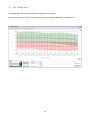
1
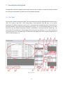
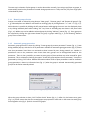
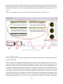
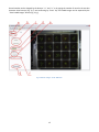
PSI (Photon Systems Instruments), spol. s r.o.
Koláčkova 39, 621 00 Brno
IČO: 60646594
DIČ: CZ60646594
PlantScreen Data Analyzer
v1.3
User manual
Table of contents
Table of contents..................................................................................................................................................... 2
1
Introduction .................................................................................................................................................... 3
2
Please let us know ........................................................................................................................................... 3
3
User interface description ............................................................................................................................... 4
3.1
3.1.1
Manual group selection .................................................................................................................. 5
3.1.2
Automatic group generation ........................................................................................................... 5
3.1.3
Groups storing and loading ............................................................................................................. 6
3.2
4
5
Tab “Start” ............................................................................................................................................... 4
Tab “IR data” ........................................................................................................................................... 7
3.2.1
Sub-tab “Group comparison” .......................................................................................................... 7
3.2.2
Sub-tab “Plant comparison” ............................................................................................................ 9
3.2.3
Sub-tab “Images” .......................................................................................................................... 10
3.3
Tab “FC data” ........................................................................................................................................ 12
3.4
Tab “RGB data”...................................................................................................................................... 13
3.4.1
Sub-tab “RGB features” ................................................................................................................. 13
3.4.2
Sub-tab “Leaf color” ...................................................................................................................... 13
3.4.3
Sub-tab “Images” .......................................................................................................................... 14
3.5
Tab “Weight data”................................................................................................................................. 17
3.6
Tab “Common graph” ........................................................................................................................... 18
3.7
Tab “Features description” ................................................................................................................... 19
Example case ................................................................................................................................................. 20
4.1
Part I ...................................................................................................................................................... 20
4.2
Part II ..................................................................................................................................................... 24
Version history .............................................................................................................................................. 26
2
1 Introduction
PlantScreen Data Analyzer is an application for visualization of PSI PlantScreen experiment data. The version
1.3 can depict data from IR, Fluorcam and RGB cameras and weighing.
The main purpose of the application is to compare parameters of groups of plants in time. The application uses
data from experiments stored in PlantScreen database.
The numerical parameters are shown in graphs, the data from RGB and IR cameras are displayed as original
images. There are individual tabs for each data type – IR, Fluorcam, RGB and weight data - plus one extra tab
for visualization of data from multiple sensors together. Each tab contains tools for graph manipulation and
export to a CSV file format.
2 Please let us know
Please contribute to the application development by sending us a report if you experience unstable behavior.
In case of application crash/erratic behavior, please send an email with the error description and sequence of
your steps leading to it to [email protected]. Also attach log file named “log_file.txt” stored in
C:\Documents and Settings\<UserName>\Application Data\PSI\PlantScreen data analyzer\1.3.0.0\Log\.
3
3 User interface description
The application interface is divided to several parts and every part is placed in its own tab. Tabs are switched
by clicking on the tab header in top left corner of the application window.
3.1 Tab “Start”
The first step necessary to display any data is to select experiments stored in database and the plants used in
them. This is done in tab “Start”. After clicking button “Load experiment from DB” (Fig. 1, a), all stored
experiments are shown in experiment table (Fig. 1, c) along with their detailed descriptions. Experiments can
be filtered based on year and month of experiment start (Fig. 1, b). In the experiment table, one or more
experiments can be selected. Experiments selection is confirmed by “Load trays from DB” button (Fig. 1, d),
which loads all trays contained in selected experiments (if any) into tray table (Fig. 1, e). In case of selection of
more experiments, only trays appearing in all experiments are loaded. Plants from currently selected tray are
shown in plant table (Fig. 1, f).
Fig. 1 Tab "Start"
4
The next step is selection of plant groups. It can be done either manually, by moving trays/plants to groups, or
automatically based on the parameters inserted during experiment run. Group size may vary from single plant
to hundreds of plants.
3.1.1 Manual group selection
Groups are created or deleted by using buttons “New group”, “Remove group” and “Remove all groups” (Fig.
1, g). Selected plants are added or removed from existing group by clicking buttons “>>” and “<<” (Fig. 1, h).
Multi-selection is possible by holding the left mouse button and dragging the cursor over the displayed plants
or by clicking individual plants while holding “Ctrl” key. Plants in selected group are shown in the plants table
(Fig. 1, m). Whole trays can be added to selected group by clicking “Add tray” button (Fig. 1, i). Every group can
be renamed by clicking the right mouse button on group in groups table (Fig. 1, k) and choosing “Rename
group” from context menu.
3.1.2 Automatic group generation
Automatic group generation is done by clicking “Create groups by custom parameter” button (Fig. 1, j). New
dialog window pops up, with the list of all parameters available for automatic group generation (Fig. 2). Please
note that parameters listed here are restricted to those inserted by user during protocol run. Number in
parenthesis next to the parameter name shows how many groups can be distinguished based on this
parameter. There is also a possibility to create an extra group of plants without any value inserted for given
parameter. This is achieved by checking the option “Create also group without chosen parameter”. Groups are
generated by clicking “OK” button. Detailed information about values of plant parameters used for automatic
group generation is shown in information box (Fig. 1, l) when the group is selected. Automatically generated
groups can be further manually edited.
Fig. 2 Creating groups by plant parameter
When the group selection is done, click “Confirm choice” button (Fig. 1, n). After this, the button turns green
(Fig. 3, a), which means that data for created groups are prepared in other tabs. In the same time each group
was assigned a color (Fig. 3. b) which is used in all graphs.
5
Fig. 3 Confirmed plant group choice
3.1.3 Groups storing and loading
Groups created in previous step can be saved or loaded to file. This can be done by buttons “Store groups” and
“Load groups” (Fig. 1, o). Only the group structure is stored in the file, not the experiment data itself.
When groups are loaded from the file and some experiments are already selected, dialog with source
experiments pops up (Fig. 4). Either original experiments from group file or currently selected experiments can
be chosen as data source.
Fig. 4 Experiments choice by loading group set
6
3.2 Tab “IR data”
This tab is divided into three additional sub-tabs. Sub-tab “Group comparison” is designed to compare data
between plant groups while sub-tab “Plant comparison” shows data for individual plants from plant groups.
Sub-tab “Images” shows original captured images from IR camera.
Values of temperature measured by IR camera can be shown in one of these three units of measurement:
degrees of Celsius, degrees of Fahrenheit or Kelvins. This can be set in configuration file named “app.conf”
and stored in the same folder as the application. Default selection is degrees of Celsius.
3.2.1 Sub-tab “Group comparison”
The main part of this tab is graph region situated in the middle of the window. Temperatures are shown for
chosen plant groups. All created groups are shown in the groups table (Fig. 5, a) and their colors in the table
correspond with the colors in the graph.
Groups can be shown/hidden in the graph by clicking “Visible” checkbox next to its name in the group table, or
by selecting them in the table and clicking “Show group in graph” or “Hide group in graph” buttons (Fig. 5, h).
Fig. 5 Sub-tab "Group comparison" in tab "IR data"
7
If there is more than one plant in the group, displayed value is computed from single plant values using one
of the group operations. The kind of operation used in the graph is selected in box “Group method” (Fig. 5, c).
When option “average” is chosen, standard deviation can be shown as semi-transparent area around the
average line. The same applies for median and minimal and maximal values. Even original values for each plant
can be shown in the graph like individual points (Fig. 5, e) by checking the checkbox labeled “Show original
values” (Fig. 5, d).
X axis can represent either round numbers or dates with labels for minutes or hours or days. This can be set in
frame “X axis” (Fig. 5, f).
Value of each data point in the graph can be shown by clicking the left mouse button on it. Each graph area can
be zoomed in by selecting the part of graph while holding left mouse button. The graph area is zoomed out by
clicking the right mouse button over the graph area and choosing “Zoom out” from context menu or by clicking
“Zoom out” button (Fig. 5, g).
The range of Y axis is set by default according to the minimal and maximal values in the graph, but can be
overridden by user by clicking the right mouse button on the graph and choice “Y-axis settings…” in the context
menu. The minimal and maximal value on Y axis can be set in the opened dialog window (Fig. 6).
Fig. 6 Y axis range settings
The data from the graph area can be added to “Common graph” by clicking “Add to common graph” button
(Fig. 5, b). Note that only currently displayed groups are added, and that both options for X axis units will be
available in Common graph regardless of current selection.
The content of all groups can be also exported to CSV file (Fig. 5, i), for further analysis with common
spreadsheet editors (e.g. Microsoft Excel) or with advanced statistic tools. The data from every group are
exported, regardless of the current graph selection. In the exported file, stored data are grouped by all
available group methods (average, standard deviation, …). If necessary, all original data for every plant
in groups can be stored. This is done by checking the checkbox “attach original data”.
Screenshots of the graph area can be stored by clicking a small button with the symbol of camera located
in the top right corner of the graph area (Fig. 5, j).
8
3.2.2 Sub-tab “Plant comparison”
In this tab temperatures of individual plants from chosen groups can be compared.
By selecting one or more groups (Fig. 7, a) and clicking the button “Show plant list” (Fig. 7, b) all plants from
the selected groups are added to plant list (Fig. 7, c). Data for a plant are shown by checking plant’s “Visible”
checkbox.
The meaning of data values chosen in box “Value type” (Fig. 7, d) is different from the values in tab “Group
comparison”. These values are for one plant and choice “Average” shows average temperature on the whole
plant surface which is represented by pixel set. The same applies for median and standard deviation.
Other control elements are the same as those in tab “Group comparison” and are described in the previous
chapter.
Fig. 7 Sub-tab "Plant comparison" in tab "IR data"
9
3.2.3 Sub-tab “Images”
This tab allows loading and browsing the images captured by IR camera. Displayed images can be stored on the
local disc in common image format.
There are some tools for loading and viewing images on the left part of tab “Images”, while the rest of the tab
is reserved as display area. All trays from chosen experiments are listed in list box “Choose tray” (Fig. 8, a). Tray
has to be selected before displaying any images. The buttons for loading images from the database are placed
below the list box (Fig. 8, b). Images for selected tray can be loaded either for all rounds or for currently
selected round only (Fig. 8, e). The progress bar (Fig. 8, c) is visible only while loading the images. This
operation can take even few minutes (depends on round count), but this process runs on the background, so
other parts of the application are still accessible. After all selected images are loaded, it can be shown as
original image or with mask overlay (mask comes from IR analysis) (Fig. 8, d). Both display styles are shown in
Fig. 9. Round number can be changed by the buttons “<<” and “>>” or by typing the number of round in the
text box between these buttons (Fig. 8, e) and confirming by “Enter” key. All loaded images can be exported by
the “Save loaded images” button (Fig. 8, f).
Fig. 8 Sub-tab "Images" in tab "IR data"
10
Fig. 9 Original IR image and IR image with mask
11
3.3 Tab “FC data”
The main part of this tab is the graph region situated in the center of the window. There are shown all
available data from FluorCam measurement for plants in created groups. All available features obtained from
FluorCam measurement are visible in the features list (Fig. 10, a). This list only contains non-empty features
(features programmed in FluorCam protocol before the experiment starts on PlantScreen). Each feature has its
own graph area and can be shown or hidden by clicking on particular checkbox in the features list. Only visible
features will be added to the common graph when the “Add to common graph” button is used.
Other control elements are the same as those in the sub-tab “Group comparison” of tab “IR data” and are
described in chapter 3.2.1.
Fig. 10 Tab "FC data"
12
3.4 Tab “RGB data”
Tab “RGB data” is divided into the three more sub-tabs. The sub-tab “RGB features” is designed to compare
different RGB features obtained from RGB analysis. The sub-tab “Leaf color” studies changes of color on plant
leaves. The sub-tab “Images” shows original captured images from RGB cameras.
3.4.1 Sub-tab “RGB features”
This tab shows data of RGB features obtained from the RGB analysis. Controls on this tab are the same as in
the tab “FC data” and are described in chapters 3.2.1 and 3.3.
Fig. 11 Sub-tab "RGB features" in tab "RGB data"
3.4.2 Sub-tab “Leaf color”
The tab “Leaf color” shows changes in color of plant leaves. There are some predefined colors and graphs show
percentage of each color on the plant.
Every graph area in the line graph (Fig. 12, c) represents one of the predefined colors and contains data for all
visible groups. Every graph area in pie graph (Fig. 12, d) represents one visible group and contains data for all
the predefined colors and one round of experiment. The visualized round can be changed by the buttons “<<”
and “>>” (Fig. 12, e).
13
Which groups are shown in the graphs is selected in the table of groups (Fig. 12, a). Selection determines which
lines in the line graph (Fig. 12, c) are visible and which graph areas in pie graph (Fig. 12, d) are visible. In the
table with leaf colors (Fig. 12, b) there can be selected which graph areas in the line graph (Fig. 12, c) are
visible.
Other control elements are the same as those in the tab “Group comparison” in chapter 3.2.1.
Fig. 12 Sub-tab "Leaf color" in tab "RGB data"
3.4.3 Sub-tab “Images”
The tab “Images” allows loading and browsing images captured by RGB cameras. Displayed images can be
stored on the local disc.
There are some tools for loading and viewing images on the left part of tab “Images, while the rest of the tab is
reserved as display area. All trays from chosen experiments are listed in list box “Choose tray” (Fig. 8, a). Tray
and Camera number have to be selected before displaying any images. The buttons for loading images from
the database are placed below the list boxes (Fig. 8, c). Images for selected tray can be loaded either for all
rounds or for currently selected round only (Fig. 8, f). The progress bar (Fig. 8, d) is visible only while loading
the images. This operation can take even few minutes (depends on round count), but this process runs on the
background, so other parts of the application are still accessible. After all selected images are loaded, it can be
shown as original image, image corrected by Fish eye correction (first analysis step) or with mask overlay
(second analysis step) (Fig. 13, e; Fig. 14). The masks used with RGB images are inverted for visualization.
14
Round number can be changed by the buttons “<<” and “>>” or by typing the number of round in the text box
between these buttons (Fig. 13, f) and confirming by “Enter” key. All loaded images can be exported by the
“Save loaded images” button (Fig. 13, g).
Fig. 13 Sub-tab "Images" in tab "RGB data"
15
Fig. 14 Three ways of showing RGB images
16
3.5 Tab “Weight data”
Tab “Weight data” contains information about changes in plants weight.
Control elements of this tab (Fig. 15) are the same as in the tab “Group comparison” in chapter 3.2.1.
Fig. 15 Tab "Weight data"
17
3.6 Tab “Common graph”
This tab is used to compare different measured/analyzed features from previous tabs between each other.
A new graph area has to be created at the beginning. The areas are managed by the buttons “New area”
and “Remove area” (Fig. 16, a). Existing areas are listed in the areas table (Fig. 16, b) and can be shown/hidden
in the graph by the buttons “Show area” and “Hide area” (Fig. 16, c).
The next step is to add data to the areas. Available graph items, previously exported from tabs IR, FC, RGB
and Weight data, are listed in the items table (Fig. 16, d). Each row in the table represents one item, showing
the group name, measurement type and parameter and the area name which it is added to with
the corresponding color in the graph.
The items are added to an area by selecting area (Fig. 16, b), item (Fig. 16, d) and axis (Fig. 16, f)
and confirming by clicking “Add item to area” button (Fig. 16, e). Each item can be only in one area and plotted
towards one axis. If an item is repeatedly added to the graph, it is kept only in the last area it was added to.
When selected, the item can be removed from the area by clicking “Remove item from area” (Fig. 16, g).
Fig. 16 Tab "Common graph"
18
There are two options for graph Y axis units (Fig. 16, i). It can be either absolute units corresponding to plotted
item, or interval <0,1>. If “Absolute” option is selected, the item can be assigned either to primary (Fig. 16, j) or
secondary (Fig. 16, k) Y axis. This option is useful when comparing two features with different units range
between each other. When “Normalized” option is selected, each feature value is converted to <0,1> interval
before plotting. This is helpful when tracking trends among more features.
Changing of group method (Fig. 16, h) works for all features except for leaf color features from RGB
measurement. These features represent percentage value and stays the same regardless the settings. They
also do not have standard deviation and min-max values.
Other control elements are the same as those in the tab “Group comparison” in chapter 3.2.1.
3.7 Tab “Features description”
This tab contains some helpful information about features in PlantScreen Data Analyzer.
19
4 Example case
4.1 Part I
How to compare all plants from the tray with id 0876 and plants named L8 from tray with id 0877? Parameters
to be plotted are Temperature from IR measurement and Perimeter from RGB measurement.
To accomplish the task above, following steps need to be done:
-
Start the application “PS Data Analyzer”
Go to tab “Start” (Fig. 17)
o Load experiments from DB (Fig. 17, 1)
o Select experiment (Fig. 17, 2)
o Load trays (Fig. 17, 3)
o Create new group and select it (Fig. 17, 4)
o Select tray with id 0876 (Fig. 17, 5)
o Add tray to group (Fig. 17, 6)
o Create new group and select it (Fig. 17, 4)
o Select tray with id 0877 (Fig. 17, 5)
o Select plants named L8 (Fig. 17, 7)
o Add plants to group (Fig. 17, 8)
o Confirm choice (Fig. 17, 9)
Fig. 17
20
Go to the tab “IR data” (Fig. 18)
o
o
Check up if both groups are visible (Fig. 18, 1)
Add current graph items to common graph (Fig. 18, 2)
Fig. 18
21
-
Go to tab “RGB data”, sub-tab “RGB features” (Fig. 19)
o Check up if both groups are visible (Fig. 19, 1)
o Show graph with feature Perimeter (fig. 17, 2)
o Add current graph items to common graph (Fig. 19, 3)
Fig. 19
22
-
Go to the tab “Common graph” (Fig. 20)
o Create new area (Fig. 20, 1)
o Select items representing parameter Temperature (Fig. 20, 2)
o Chose primary Y axis (Fig. 20, 3)
o Add items to selected area (Fig. 20, 4)
o Select items representing parameter Perimeter (Fig. 20, 2)
o Chose secondary Y axis (Fig. 20, 3)
o Add items to selected area (Fig. 20, 4)
o Change Y values type if necessary (Fig. 20, 5)
Fig. 20
23
4.2 Part II
How to store the created groups and reuse them with more experiments which contain the same trays?
To accomplish the task above, following steps need to be done:
-
Create groups (chapter 4.1)
Go to the tab “Start” (Fig. 21)
o Click the button “Store groups” (Fig. 21, 1)
o Open the target folder (Fig. 21, 2)
o Write name of the new file (Fig. 21, 3)
o Click the button “Save” (Fig. 21, 4)
Fig. 21
24
-
-
Stay in the tab “Start” (Fig. 22)
o Remove all the created groups (Fig. 22, 1)
o Select all wanted experiments (Fig. 22, 2)
o Click the button “Load groups” (Fig. 22, 3)
o Find and select the file with the stored group set (Fig. 22, 4)
o Click the button “Open” (Fig. 22, 5)
o Select the option “currently selected experiments” in opened dialog window (Fig. 23)
o Confirm by clicking the button “OK” in dialog window (Fig. 23)
o Confirm the group choice by clicking the button “Confirm choice” (Fig. 17, 9)
Work with data on the other tabs. Rounds from selected experiments are ordered by their start date.
Fig. 22
Fig. 23
25
5 Version history
Version Date
New functionality
1.0
2/2013
Basic version
1.1
4/2013
Application renamed from "CB Data Analyzer" to "PS Data Analyzer"
Fixed tray loading by missing RGB measuring
Even empty trays can be seen.
Added new features for FC measuring (NPQ_lss, Rfd_lss)
Standard deviation can be shown as semitransparent area around the line of average values
Cursor cross is not visible during zooming on graphs
User can set X-axis interval for date type axis
Fix of multiple graph drawing after graph parameters settings changes
Listing of experiments by date (year, month)
1.1.1
5/2013
Fixed plants loading
Changed features for RGB measuring
Plants position on tray is shown in plant list
1.1.2
5/2013
Changed appearence of feature list on tab RGB and FC
1.1.3
6/2013
Working with more experiments with the same trays
Storing of user-group-set to a file with extension .gset
Loading of user-group-set from a file with extension .gset
1.2
6/2013
Added IR tag for showing results of IR measuring
1.2.1
7/2013
Images of all trays from chosen experiments can be loaded In tags RGB and IR
1.2.2
7/2013 Y-axes range can be set by user in every chart
New DB configuration file
Min-max value can be showed with median in charts
Chart export as image for every chart
1.2.3
7/2013 Changed format of file name for all stored images - RGB, IR, mask
Loaded RGB, IR and mask images can be stored to user selected location
New tab with measuring features description
1.3
8/2013 New button on main tab for removing all groups in one click
Groups can be renamed by right click and choose option to rename
Chosen experiments do not have to have the same configuration to be used together
Reloading of experiments must be confirmed
Different experiments can be assigned to groups while loading stored groups
Date and time in names of exported images
By exporting original data, for every plant is stored even tray id and position on tray
Screenshots of common graph
In graphs can be showed points for each original plant value
New tab Leaf color in tab RGB
Measurement units for temperature in IR tab can be changed in configuration file
RGB images can be shown after fish eye correction and with mask used in analyze
IR images can be shown with mask used in analyze
© PSI (Photon Systems Instruments), spol. s r.o.
26