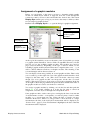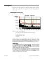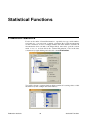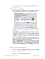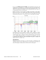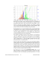
1
Measurement Data Analysis with
Presentation
Quick Start Manual
Discom GmbH, Göttingen
© 2009 Discom Industrielle Mess- und Prüftechnik GmbH
Neustadt 10-12, 37073 Göttingen, Germany
Tel.: (0551) 548 33 – 10
Fax: (0551) 548 33 – 43
Email : [email protected]
www.discom.de
Content
Introduction
3
The Presentation program.......................................................................................3
Installing Presentation.............................................................................................4
First contact ............................................................................................................5
Presentation projects and favorites ............................................................5
The Database assistant
7
Introduction.............................................................................................................7
Adjustment of the database connection .....................................................8
Querying measurements from the database ............................................................8
The multi selection dialog..........................................................................9
Further criteria .........................................................................................10
How to use the list of the selected items...............................................................12
How to display measurements .................................................................12
How to adjust the content of the list ........................................................13
Export of ListData ...................................................................................13
Erase measurements.................................................................................14
Wizards ....................................................................................................14
Work with the “Expert Dialog“
15
Basics and concepts ..............................................................................................15
Content of the Measurement Archives ....................................................15
Measurement Display – the principle ......................................................15
The Expert Dialog of Prasentation........................................................................16
Section “Archive“....................................................................................17
Section “List“...........................................................................................17
Section “Data“ .........................................................................................18
Section “Graphic“....................................................................................18
The toolbar of the PresentationApplication .............................................20
Display of measurements......................................................................................21
Assignment of a graphic modules............................................................22
Marked measurements .............................................................................23
Display of limits ......................................................................................23
Work with the list of the measurements ...............................................................23
Context menu of the measurement list ....................................................23
Marking of measurement curves using the mouse...................................25
Export Data...........................................................................................................27
Graphic Export.........................................................................................27
Export of Data (Excel, Html)...................................................................27
Export of the measurement list ................................................................28
Layouts and Graphic Modules
29
Layouts .................................................................................................................29
The Presentation program
i
Introduction
Edit Mode................................................................................................ 29
Adjustment of Properties......................................................................... 29
Properties of the layout page ................................................................... 30
Context Menu.......................................................................................... 31
Printing of the layouts ............................................................................. 32
Text boxes ............................................................................................................ 32
Long texts................................................................................................ 33
Colourd text list....................................................................................... 33
Curve plots ........................................................................................................... 34
Elements of a Curve plot......................................................................... 34
Scaling and joined axes ........................................................................... 35
Reaf off curve values (Cursor Function)................................................. 37
Statistical Functions
38
Production Statistics ............................................................................................. 38
Measurement Quick Statistics .............................................................................. 39
Statistics Wizard for Measurement Values .......................................................... 40
Selection of the measurements to be evaluated....................................... 41
Pre-evaluation and colours ...................................................................... 42
Selection of the Gaphic Modules ............................................................ 42
Table of the results .................................................................................. 43
Time series and Distribution ................................................................... 43
The Presentation program
ii
Introduction
Introduction
The measurement program stores data of measurements in so-called archives in
a special file format.These archives are collected at a central location (on a
server or the measurement computer) and are indexed by a database.
The Presentation constitutes the complement which is necessary to store the
measurement data. It is capable to read out archive files, display the content of
the measurement data as well as evaluate it.
While the measurement program only works on a computer equipped with
special hardware (the TAS box), Presentation can be used on any computer.
This quick start manual describes the use of the Presentation program assuming
that a presentation project and a database already have been set up. It covers the
retrieval of measurements from the data base, loading measurements from
archive files, the basics of displaying data and of statistical evaluations.
The Presentation program
The Presentation program is the tool you use to look at stored measurement
data, compare and analyse them. Using Presentation you can display the data in
so-called layout pages. On each page there are graphic modules (such as text
boxes and curve plots) which show data, labels, pictures and more.
You can load data from archive files or from the measurement database.
Archive files can be opened directly. Alternatively, in order to query the data
base, you will find a database assistant helping you. Once you loaded archives
or queried the database, you will get a list containing all measurements identified by testing time, serial number, model, test bench and further information.
Once you have loaded some measurements, you can display the data in layouts
using so-called rapports (which are a kind of display macros). Besides, you can
use graphic modules to create a complete measurement report or a data
evalution. Rapports offer many options and possibilities to create measurement
reports, even multi paged ones.
This manual is but a brief instruction and is only concerned with the application
of existing rapports; the creation of rapports as well as the interactive display of
data are discussed in detail in the complete Presentation manual.
The Presentation program
3
Introduction
Installing Presentation
The Presentation program runs on any Windows PC with Windows XP and
above. As is explained in more detail below, you need two components: the
Presentation program itself and a Presentation project.
An installation package for the latest version of the program can be downloaded
from our web site: in your intenet browser, enter www.discom.de/ftp and
search for a file “Presentation_En-(Date).msi”, where (Date) is the
release date of the installer package. Download this file to your computer.
If you have a previous version of Presentation installed, we recommend that
you remove it before installing a new version. Use the Add and Remove
Programs control panel of Windows to uninstall Presentation. This will not
remove any Presentation projects but only the program. Then, execute the
installer package by double-clicking on the msi file.
As explained in “Presentation projects and favorites” below, the Presentation
program needs a project to work on. These projects consist of set of files
located in a folder. In most cases you will find such a project folder on the
measurement PC. You can just copy the folder to the computer where you are
installing presentation. You also can download a sample project from our
website as “Presentation_StdSample”.
In the project folder there is one file called the project base file. After the first
installation of Presentation on a computer, or after you moved the project
folder, Presentation will complain at startup that it was unable to find the base
file. Acknowledge the message and, in the following file open dialog, navigate
to the project folder and select the base file. Typical base file names are
“Presentation.bse”, “GtrPresent.bse” or “GtrPresent.sea”.
Presentation remembers the last used project base file, even if you install a new
version. You only have to select the base file after the very first installation, if
you move the project folder, or if you want to switch to another project.
Installing Presentation
4
Introduction
First contact
After you have installed the Presentation program, you will find a shortcut
named “Presentation“ on your desktop. This link will start the
actual program which is situated in its own installation folder.
(typically in C:\Program files\Discom\...).
The layout pages as well as all the other settings concerning the
Presentation program are stored at a different location. A complete
set of layout pages, settings, rapports etc. is called a Presentation project. You
can use several projects in parallel and switch between them via the
Presentation program (see below).
A typical Presentation project may look like this:
Toolbars
Database query dialog
(“Database assistant“)
Layout pages
with graphic
The central use interface is the large dialog in the top left corner with the titel
Work with measurements from database. With this dialog you can query
measurements from the database, select the measurements you want to be
displayed, and select the rapport you wish to be applied. In the background you
can see several layout pages showing different data. Below the menu toolbar are
the following toolbars:
and
which are handy in order to quickly get to several often required functions. (For
details please see the section “The toolbar of the PresentationApplication” on
page 20.)
Presentation projects and favorites
As already mentioned above you can have several different Presentation
projects at a time and switch between them using the Presentation program
A presentation project comprises all layouts, rapports, settings and database
connections. You can, for example, have two different projects for different
measurement types. The measurement type always appears at the top of the
First contact
5
Introduction
respective page layout. Hence, the content of the measurements is adapted to
the requirements of each kind of measurment type (more or less plots,
spectrograms or not, etc.). Or you might have a project named “Publication
project“ which you can use in order to create official reports. You also have a
project named “Test project” which you can use for experiments and tests.
When this Test projects gets too scrambled, delete it and create a new one by
copying the Publication project.
A Presentation project comprises a large amount of data which are stored in a
collective menu and its submenus. These data describe the individual layouts,
rapports and other settings for this particular project. In order to copy a project,
you have to create a copy (using Windows) of the whole directory.
One of these data is the so-called project base file (file extension “*.bse“ or
“*.sea“; often used names are “Presentation.bse“, “GtrPresent.sea“
or “Projectname-Present.sea“). This file is the start of a series of
parameter files. If you load a project, you have to select this base see file.
The PresentationProgram memorizes the last used base aee file (=the last used
project) in the Windows registry so that you do not see any of the project
management as long as you use one project only.
However, if you press the menu command Project – Switch project in order
to switch to another project you will have to open the base see file of that other
project. Similarly, after the installation of Presentation or if you have deleted or
shifted the folder of the last used project you will always have to open the base
see file of a new project. (You can also drag the base see from the Windows file
explorer into the Presentation main window in order to start the respective
project.)
If you often switch between particular projects you will find the project favorits
to be a great help. By memorizing those projects that you often use, the project
favorits enable you to comfortably switch between them. You open the project
favorits via the menu command Project – Project favorites or by pressing
the toolbar button
.
In the project favorites dialog are listed all familiar favorits. The current project
is marked by a red symbol. Double click on a project in the project list or select
it (by clicking) and press Switch in order to switch to that project. (Of course,
switching to the current project doesn’t have an effect.)
When trying to switch to another project using the menu command Project –
Switch project you will offered automatically to add this project to your
favorites (unless this project already is among your favorites.)
First contact
6
Introduction
The Database assistant
If you have a measurement database and Presentation is properly prepared, the
database assistant will provide you with a simple and comfortable access to
display stored measurements by using predefined rapports. In order to use the
database assistant it is not necessary to know every detail about Presentation.
Thus, you won’t find a description of all the details before the next chapter.
Introduction
In order to open the database assistant, press on your keyboard Ctrl+D or F5 or
the toolbar button Q. Alternatively, you can also open it by clicking in the
menu of the database on the command database assistant.
In the database assistant you can see on the left the listing of the currently
selected measurements, whereas on the right you can choose the selection
criteria:
Above and underneath the list you will find buttons for functions that are
related to the measurements from the list, e.g. the function “display
measurements“. (If the list is completely empty when starting the program for
the first time, this might be due to the selection criteria on the right which are
selected unsuitably. (Please read “Querying measurements from the database”
on page 8 for details about how you can change the selection criteria).
In front of each item in the list you will find a small box which you can tick off
by clicking on it. If you mark something in the list, all selected functions (e.g.
“display measurements“) are only applied on the those marked measurements.
Introduction
7
The Database assistant
If you do not tick off anything at all, the selected functions are applied to all
measurements.
If the list contains a lot of items
If the current query of the database gives you lots of measurements, the load of
the list would take a lot of time – even when you are already trying to further
reduce the query. As a result, when obtaining a particular number of
measurements, the list is not automatically filled-up, but looks like this:
Press (as shown above) the field Click here to load the complete list. There is
a dialog in which you can specifiy the number of measurements that you want
to be shown in the list. If more measurements are selected, they won’t be
displayed. Instead, the remark Click here indicates this case. This amount of
items is specified in the Settings… dialog.
Adjustment of the database connection
Before you can work with the database assistant, you might have to establish a
connection to a database. In order to do so, select in the menu of the database
the command database connection, thus getting to the dialogue where the
database connections are specified.
In most cases, the list will contain only one entry, called “standard“. However,
you can create several database connections and use this dialog in order to
switch between the databases: Select the desired connection in the list and press
execute. Consequently, a new connection will be established and shown
underneath in the dialog as active connection. The other buttons (new, erase
etc.) enable you to manage different connection settings.
In order to change the settings of an already existing connection (e.g.
particularly of “standard“ connections), select them in the list and press edit (or
double click on the list item). In this dialog you will have to specify a
connection to a SQL Server. For more information please see the more
elaborate “Reference manual for the Presentation display“.
Querying measurements from the database
Open the database assistant (using the keyboard commands Ctrl+D or F5, via
the menu database or via the toolbar button Q). If the computer only comes
up with a SQL error message instead of the database assistant, you will either
have to correct the database connection settings (for details please see the
previous section), or the database server might currently not be available (e.g.
because the network is not available). On the right side of the assistant dialog
you will find the checkings concerning the specification of conditions:
Querying measurements from the database
8
The Database assistant
The list on the left of the dialog (not shown in the figure above) displays all
measurements corresponding to those conditions. When modifying one of those
settings, the list on the left will be updated after 1-2 seconds.
(Due to this automatic update the list will not be automatically loaded if it
contains too many measurements – please note the figure above in the section
“If list contains plenty of items“.)
Under settings please enter the period of time in which you want your query to
be in. Using the data- and time specifications From and To, you can select any
time span. When switching to the option Select one day, enter the day of
your query under From (as a result, you will neither have to enter anything
under To, nor specify the time of the day). If you select First N since… or Last
N before…, the From and To time specification will be replaced by a box
where you can specify the quantity. The query will then give you the first n
measurements (e.g. the first 100 measurements) counting from the From point
in time, or in other words the last n measurements before the To point in time.
With the following specifications Type and Bench and Aggregate measured
in mode you can select more settings for the measurement. The condition
“Aggregate measured in mode“ means that only measurements will be selected
that comprise data concerning the respective test bench(es). The selection of
one or several types, benches or conditions concerning the testing uses the multi
selection dialog that will be discussed in the following section.
The multi selection dialog
Using the multi selection dialogyou can select some (or all) from a number of
possible results.Using the multi selection dialog you select several (or all)
results out of an amount of other possible results. The query then gives you all
measurements consisting of the selected results. The multi selection dialog
follows the same pattern concerning types, test benches and aggregate measured
in mode as well as concerning the categories or additional information that will
be discussed a little later. By pressing the button next to “aggregate measured in
mode“ you open the selection dialog for exactly that condition:
Querying measurements from the database
9
The Database assistant
On the right you can see the selected values for the condition (in this example
test benches), on the left you see the non-selected values. The condition will be
met by all measurements containing at least one of the selected.
You can double click on any of the values on the left side in order to move it to
the right list (or the other way round: double click on any of the values in the
right list in order to move it to the left). Instead of a double click you can also
select one or several values from a list and use the buttons >> and << to shift
several values at a time. The buttons *>> and <<* move all values on the right
or left side.
After you have pressed OK, the labeling of the button in the Database assistant
will change in order to reproduce the values that you have selected.
Further criteria
In the Database Assistant, enter a serial number into Serial No. to query all
measurements matching this serial number. If you only enter a fragment of the
serial number, you will get all measurements that have a serial number
containing this fragment. Again: a few moments after you have changed the
item in the box Serial No., the list will be updated automatically.
You can use the ‚*’ as a wildcard to query, for example, all measurements of
the serial numbers “AB*56“, meaning all measurements with a serial number
that starts with “AB“ and ends with “56“.
With ‚+’ you can query several possible values at a time. When entering, for
example, “ABC + DEF“ , you will get all measurements with a serial number
containing “ABC or “DEF“. (To all mathematicians: please notice that even
though you use a ‚+’, the latter signifies ‚or’.)
Underneath the serial number you can specify further conditions. These
conditions refer to characteristics of the measurement that are called “additional
information“. The available “additional information” depends on the
measurements (that is, what information has been stored by the measurement
program). Always available are evaluation result (“o.k.“, “n.o.k.“ or “No
evaluation“) and the kind of measurement (“Serial measurement”, “Reference
measurement”, ...). Other information vary depending on the respective
measurement data and database.
Select in one of the selection lists under Category one out of the „general
information“ and enter under „value“ the value that was asked for (same
procedure as with the serial number) or press the respective button to open a
Querying measurements from the database
10
The Database assistant
multi selection dialog. Afterwards, the button will change its label
corresponding to your selection.
The additional conditions interact, so if you enter an condition in one of the
categories, you will, in the multi selection for the following categories only be
offered those options that remain given the conditions that you specified before.
When creating a condition concerning the “general information“ using the multi
selection dialog and selecting numerous values (so that as a value “*“ occurs),
the latter symbol means that lots of different kinds of results fulfill the selected
conditions – even those measurements which do not contain this “additional
information“ at all. When you, however, select a category under the values
which are a manual input and enter “*“, your entry means “item exists, but is of
arbitrary value“. This means that measurements that don’t contain this
“additional information” do not fulfil the condition in this case.
Querying measurements from the database
11
The Database assistant
How to use the list of the selected items
The left side of the database assistent consists of the list containing all the
measurements.
amount
Standard macro
selected
measurements
marked
measurements
On the right hand side above the list the amount of measurements that are
currently in the list is shown. If your selected query conditions lead to more
than 300 measurement results, the list won’t be filled with data automatically,
because you will have to wait for the list to load, even though you might want
to reduce your selection down. The list, however, shows in the first column a
reference regarding the amount of measurements. If you click on the first
column of the list, the list will boot up normally.
With the button Settings you open a menu for the selection of several settings.
The button Columns-Configuration opens a dialog enabling you to select
which columns you want the list to contain. All components of the “additional
information“ are available to select for possible column headers.
In the list you can select and mark the measurements. You select measurements
by clicking on them with the mouse. You can select several measurements by
pushing and holding on to the Ctrl-key or the Shift-key. Already selected
measurements are highlighted in colour. Marked measurements have a tick in
the box in the first column. You can activate and erase these ticks using the
mouse.
How to display measurements
On the top left of the DatabaseAssistent you will find the List box for the
Standard Rapport. A rapport is a sequency of commands that place the measured
data (curves, values etc.) in graphic modules on layout pages. Select a rapport
that is suitable for the measurements you marked in the list and press Display
Measurements. The measurement data will now be loaded and the rapport
will be executed. The rapport might ask you for further parameters, afterwards
the data of the measurements will be displayed on the layout pages.
How to use the list of the selected items
12
The Database assistant
If measurements are marked (checked) in the list, only those measurements will
be displayed. Otherwise, all measurements in the list will be portrayed by
Presentation.
Instead of executing a rapport, you can also load the measurements in the
“Expert Dialog“ and thus unleash the complete functionality of Presentation. In
order to do so press the button ExpertMode. The measurement will be loaded
and the Expert Dialog will be opened from which you can now work with the
data. Same operating procedure as before: only marked (checked)
measurements will be loaded in the ExpertDialog, otherwise all measurements
included in the list. The usuage of the ExpertDialog will be highlighted in the
next chapter.
How to adjust the content of the list
First, you fill the list by selecting suitable query criteria (for details please see
the passage “Querying measurements from the database” page 8.).
You can now erase particular measurements from the list by selecting them
(clicking on them) and press the Delete-key.
After you have marked measurements (ticked them), you can use Condense
list (underneath the list on the right) in order to erase all measurements from
the list that aren’t marked.
By reducing the content of the list in this manner, the content of the list, of
course, does not reflect the result of the database query on the base of the
selected critera anymore. You can also see the modification by looking at the
right handside of the dialog, which is now deactivated. As a consequence, you
cannot destroy your work accidently by starting a new query. In order to restore
the complete query, press the button Repeat Query.
Using the function Delete (button underneath the list) you can erase
measurements from the database on your own – see the passage “Erase
Measurements“ further down.
Export of ListData
You can export the information of the list (e.g. the list of the point in time,
serial numbers etc.) into the clipboard and from there to Microsoft Excel. Click
inside the list with the right mouse button on a table element. After that a menu
will appear offering several different clipboard export functions:
How to use the list of the selected items
13
The Database assistant
With the first command Copy table to clipboard, the complete list of
measurements will be exported. Afterwards switch to Excel, select a cell and
press on the keyboard Ctrl+V or the menu command Edit – Paste. As a result,
the table will be pasted into the Excel sheet.
The second order Copy column … exports the column into which you clicked
as a list into the clipboard. The third command exports the content of the table
cell into which you clicked (in the above illustration the serial number).
The first command after the hyphen, Copy selected rows in the
clipboard, only exports the data of the selected rows (in the illustration above
8 rows); it obviously isn’t about marked (ticked) rows). The last command
Copy selected rows of column … only exports the data from the column
into which you clicked (in this case 8 rows from the column “Serial Number“).
The data will be transfered to Excel as a text. Excel will then interpret the text
by its own. Concerning time designations this usually works quite well.
However, it might happen that Excel translates a serial number 948502001 into
a number and thus displays it as 9,48E8. You will then have to explain to Excel
by using its cell format function what you the data are looking like.
Erase measurements
With the button Delte underneath the list you can erase measurements out of the
database by your own (not only out of the latest list) If you press Delete, you
will be shown in a separate dialog all marked measurements (all of them if no
measurements are selected). In this case you will, first of all, have to enter a
password before the button Delete will be available enabling you to erase these
measurements from the database.
The measurements will be erased from the database, not from the ArchiveFiles.
If you want to transfer the ArchiveFiles back to the Collector at a later point in
time – e.g. in order to create a new database – the once erased measurements
will be included again in the database.
Wizards
With the button Wizards you open a menu with which you can activate
different assistants, e.g. in order to implement a statistical evaluation of
measurement results:
The wizards will be explained in further detail in the Presentation manual. You
will find an introduction to the Statistics Wizards in the chapter “Statistical
Functions” commencing on page 38.
How to use the list of the selected items
14
The Database assistant
Work with the “Expert Dialog“
For numerous advanced functions in Presentation you will have to switch from
the database assistent to the “Expert Dialog“. Similarly, you will have to use the
“Expert Dialog“ if you work with archive files instead of a database. Last but
not least, the layouts and rapports, which are activated by the database assistent,
will have to be created.
Basics and concepts
In the database assistant you mainly select measurements for the display using
predefined rapports. However, as already mentioned above, the rapports as well
as the layouts have to be created before use, which brings us to the basics of
Presentation.
Content of the Measurement Archives
The measurements will be saved in archive files. The measurement program
creates an archive at the end of each measurement. The latter will then be added
to a larger archive by the Collector service as well as indexed in the database.
Even if the measurements are governed by a database (and you use the database
assistant to select the measurements), the data itself will still reside in archive
files. The database only contains a table of content and an index register of the
archive files.
The data of each measurement are devided up into “chapters“. Each
measurement posseses the chapter “General Data”, which contains information
such as the time stamp of the measurement, the serial number, the type etc.
Normally, each measurement has also the chapter “Measurement reports“,
which comprises the full measurement report as well as the defect reports that
were detected and displayed by the measurement programm. Other common
chapters are “Single values“, “Measurement Curves“, “Spectra“ (for ordinal
spectra) and “Spectrograms“. Not every measurement does have to contain all
these sections, it can, however, contain further setcions that haven’t been
mentioned.
Measurement Display – the principle
In order to display a measurement date – for example a particular spectrum –
you have to select on the one hand, which spectrum (out of the great amount of
spectra that have been measured) you want to see and, on the other hand, where,
in which curve plot, you would like it to be plotted in. This already outlines the
Basics and concepts
15
Work with the “Expert Dialog“
basics of Presentation: you choose measurement data out of the table of content
from the archive and declare in which graphic module you want these data to be
displayed. (This process is called “Assignment of a graphic module”)
Prasentation remembers these grahipcs assignments so that for the next time,
you will only have to load the data and recall the display. For more complex
displays the assignments and display commands are saved in Rapports.
Obviously, you will, first of all, have to load the data of the measurements that
you wish to display into Presentation. Once you have loaded several
measurements, you might want to compare them or perform calculations on
them. This functionality is accessed through the Expert Dialog.
The Expert Dialog of Prasentation
This central control dialog contains several sections that deal with the different
aspects and tasks regarding the display of measurements. The sections are
(following the chronology of the tabs in the dialog):
List: shows the listing of the momentarily loaded measurements. Here, you can,
for example, highlight and dismiss measurements.
Groups: You can cluster measurements so that all measurements of a group
obtain the same colour. In this dialog section you can manage these groups.
Data: In this section you will find the “Table of content“ of the data types (e.g.
“Spectra“, “Single values”, “Report texts“ etc.). Here you can select which data
you want to be shown and assign them to graphic modules.
Archive: Using the section archive, archive files are loaded and unloaded.
Graphic: Here you can govern the layout pages. You can create new layouts or
duplicate already existing layouts. Furthermore, you declare the standard
colours in the graphic section.
Rapport: In the section Rapport you control the record and playback of
rapports and have access to the rapport editor.
Database: From here you can open the database assistent. Due to the fact that
this is also possible via the menu of the Presentation program, the dialog section
“Database“ is usually hidden.
In the following pages the sections List, Data, Archive and Graphics shall
be explained; you will find details regarding the remaining sections in the more
elaborate Presentation manual.
The Expert Dialog of Prasentation
16
Work with the “Expert Dialog“
Section “Archive“
Instead of the using the database you can also upload measurements directly
from the archive files. In the section Archive you govern the uploaded archive
files.
Click on
to load an archive file. While loading the file its content will be
analyzed which might take a few moments concerning large archives. (you will
see a progress bar). Using
you can load all measurementdata archives
from one folder at a time. To rid yourself of an already loaded archive, select
the latter in the list and use the button
. With the button
all loaded
archives will be unloaded.
You will find further information about the dialog section Archive in the more
elaborate Presentation manual.
Section “List“
In this section all the individual measurements that are presently loaded (from
archive files or from the data base) are listed:
The list shows the general data for each measurement: time stamp, serial
number, type, test bench etc. By clicking into a column header you can sort the
measurements by this category. With the aid of the button
you can
determine which columns you want the list to comprise.
In the list you can mark measurements and highlight a measurement. The data
(curves) of marked and highlighted measurements will stand out in the graphics
due to them being displayed in different colours. The difference is: you can
mark any more than one measurement but highlight only one measurement.
To mark a measurement, select it in the list and push the button with the green
arrow
. (Selection means clicking on them; the corresponding line(s) will
be highlighted in colour.) The marked measurements will be displayed in the
list:
The Expert Dialog of Prasentation
17
Work with the “Expert Dialog“
Highlighted
measurement
marked
measurements
selected
measureme
The curves of marked measurements will be shown in colour in the plots (not
necessarily in green). You can determine the colour for marked measurements
in the dialog section Graphic.
You can highlight one individual measurements by selecting them and pressing
. As a result, the highlighted measurement
the button wih the blue bullet
will be displayed in the list by a blue bullet and the corresponding curves will
be drawn in colour as well.
You cancel a marking or highlighting by selecting the measurement and and
pressing the button to mark something or the button to highlight something
respectively, again. The button
cancels all markings.
If you double click on a measurement in the list, this leads to the execution of
the last command (action) that you performed by clicking on a button. For
example, if you last pressed the green arrow to mark something, double clicking
on a measurement will lead to another measurement being marked (or an
already existing marking will be cancelled). Additionally, there are several
keyboard comands concerning the the work with list. These will be described in
the passage “Work with the list of the measurements” on page 23.
On the top right handside you will find a button bearing an eye. Pushing this
key will refresh the display of the data.
Section “Data“
In this section you will find the “Table of content“ of the measurements. From
here you can send the data to the graphics. The section Data posseses very
elaborate features that shall be described on page 21.
Section “Graphic“
In the section Graphic you will find the list of the graphic pages. Here you can
select the colours for the markings and the highlightings.
The Expert Dialog of Prasentation
18
Work with the “Expert Dialog“
On the left side you can see the list of the available graphic pages or “layouts“.
Double click on an entry to open the corresponding page or to bring it to the
foreground.
Each layout is saved in its own file. This file contains information regaring
which graphics how and where they are situated on the page as well as
specifications for invariable elements such as page header, titles or logos. (The
content of the graphics – the data, curves etc. – isn’t saved in the layout file but
will be assigned during the run duration). In the text field below the list will be
displayed the file name.
With the buttons on the right of the list you can govern the layouts. With the
button at the very top
you can load a further layout to the list, with the
lowest button
you erase the selected layout. The buttons below the list
possess the following functions:
“Into the foreground“: the selected graphic page in the list will be
brought to the foreground. (If it’s not opened yet, it will be opened.)
“Clean the blackboard“: all data (measurement curves etc.) will be
“wiped off“ the graphics of the selected page.
“Clear graphic assignment“: the assignment of data to graphic
modules on the selected page (all if no page was selected) will be cleared, the
data will be erased from the graphic modules.
“Print page“: the selected page will be send to the printer (if for this
page the automatic printing is activated; see “Printing of the layouts” on page
32).
“Print all pages“: all opened layout pages will be send to the printer at
the same time.
Chose printer: If this tick boy is activated, the usual Windows-printer
selection dialog will be opened once you click on one of the “print“ buttons,
that is so say you can select the printer for this print and adjust settings. If
Choose printer is switched off, everything will be printed on the printer you
chose as your standard one straight away.
The Expert Dialog of Prasentation
19
Work with the “Expert Dialog“
On the right side you can determine which colours you want to be used for the
marked and highlighted measurements in the graphics.
The toolbar of the PresentationApplication
Many of the functions of Presentation that you require most ofen can be called
by the buttons and control elements of the toolbars straight away without having
to go to the corresponding section of the control dialog.
Toolbar 1
The functions of the buttons from left to right:
1. Open control dialog
2. Open archive file (load)
3. Switch to another archive: all archives that are loaded at the moment will
be unloaded (similar to using the button
in the section archives),
afterwards you can select a new archive.
4. Load folder: load all archives from a folder, similarly to pushing the
button
in the section Archive.
5. Call database assistent.
6. Restart: all loaded data (from archives or from the database) will be
unloaded, all graphics will be erased.
7. Display archive structur.
8. Show graphics modul tree
9. Open Project Favourites dialog: see “Presentation projects and favorite“
on page 5.
10. Print the current layout page (which is situated in the foreground).
11. Print all currently opened layouts.
12. Save all settings, including all layout formatting.
The second to last button opens the so-called Stdout-window, in which, for
example, the execution of DisplayMacros is recorded.
Toolbar 2
This toolbar contains two SelectionLists. In the left one are all currently
available layout pages listed. If you select a page in the list, it will be opened
automatically and brought to the foreground. With the button on the very left
you open all existing layouts. The three buttons on the right next to the
SelectionDialog posess the following functions:
1. ”Wipe off” the currently selected page (erase all data).
2. “Wipe off“ all pages.
3. Close all pages.
The right list allows the selection and execution of a rapport.
The Expert Dialog of Prasentation
20
Work with the “Expert Dialog“
Display of measurements
Similarly to the description in “Basics and concepts” (page 15), the basic
principle of Presentation can be depicted as the selection of a measurement date
from the table of content and the assignment of a graphic module for the
purpose of display. The dialog section Data addresses this central task.
Load an archive (for example via the menu command File/Open Archive; on
page 17 other possibilities will be described) and go to the section Data:
On the left side the table of content of the measurement data is displayed. The
data are divided up into different “chapters“ (the first level of the directory),
according to a division of the measurement values into their natures (types).
You will always find the chapter “General Information“. It contains the general
information about the measurement that you have already seen in the List. The
existence of further chapters depends on if corresponding data are saved in the
archive. In the chapter “Curves“, for example, you will find curves of order
tracks or other tracks, in the section “Single values“ the separately stored single
values and in section “Report texts“ the reports that the measurement program
created as a result of the measurement.
Within each section you will usually find a data tree, consisting of test steps,
channels and other specifications. Click in each case on the + in front of an
entry in order to open the subdivison. In the very “inside” you will reach the
data entries which you will recognize by the fact that they do not bear a +.
The principle of the display is simple: You assign a data entry from the table of
content to a graphic module (e.g. a curve plot) from a layout window by
selecting the data entry (click on it) and then pushing the button Display Xyz
in... on the right (“Xyz“ stands für the name of the data object and reflects the
selection in the ContentTree, similarly to the illustration above “H1 Track“).
You then push the button Display Xyz, and the data will be shown via the
graphic module. With Erase Xyz you erase all data of the selected entry from
the illustration.
Display of measurements
21
Work with the “Expert Dialog“
Assignment of a graphic modules
Before you can display a data entry you have to determine which graphic
module on which layout window is supposed show the. Click through the
content tree until you have found and marked the desired data. The button
Display Xyz remains grey as long as you select a data entry to which you have
not yet assigned a graphic module.
Push the button Display Xyz in ..., to open the dialog for graphic assignment:
These data…
…will be displayed
in these graphic
modules
Layout page
Selected
graphic module
Colour of the data
Colour of the limits
At the top in the textfield you can see the name of the object which you assign
to a graphic (in the illustration “Curves / H-dn / TorqueDiff / Front N“). On the
left side you see the available graphic modules. The modules are sorted by
pages (=layout windows). Depending on the type of data for which you are
searching a graphic module (measurement curves, singular values, text, …), you
will be offered different selections of Graphic modules. The meaning of the
coloured triangles will be discussed later on.
You can display a data entry parallely in several graphic modules. That is why
you see at the top on the right side a list of the graphic modules that have been
assigned to this data entry so far. (This doesn’t work the other way round,
though. Not every graphic module can incorporate all the data of several
entries.) This aspect, however, doesn’t play a role for the assignment. In the list
on the right is shown the page number in squared brackets and then the name of
the graphic module as it can be seen in the tree on the left.
You assign a graphic module by clicking on it in the list and then push the
button >>, or by double clicking on it in the list. In order to cancel an
assignment, select the object on the right side and push the red X.
Some graphic modules, such as curve plots, can display the data of any amount
of measurements at a time – consequently, you will see plenty of curves. Other
modules, e.g. a spectrogram can only portray the data of exactly one measurement. In the cases, where it is only possible to show the data of a single
measurement, the data of the highlighted measurement will be displayed (see
“Section “List“” page 17). If no measurement is highlighted, the data of the first
measurement will be displayed.
Display of measurements
22
Work with the “Expert Dialog“
Marked measurements
On the right side of the section Data from the expert dialog you can select what
should be done with the measurements you marked in the section List
regarding their illustration. If you select the option show all under Display,
all measurements – marked and unmarked ones – will be shown, whereas the
marked measurements will be depicted on their assigned colours. If you select
the option only marked ones, unmarked measurements will be hidden. If
only unmarked ones is selected, the marked measurements will be hidden.
Display of limits
Together with the measurement data the archives also contain the limits which
were valid during the measurement. If you activate in the dialog the option
Show limit the limits will be shown as well (especially concerning
measurement curves and spectra). If you moreover activate only last limit
merely the limit of the last measurement in the list will be displayed (if several
measurements are loaded). Besides, Presentation will also show the limit of a
highlighted measurement (given that a measurement is highlighted). You can
.
switch between these display options using the toolbar button
Work with the list of the measurements
The dialog section List has already been introduced in the passage “Section
“List“” on page 17, as well as the concept of the marked measurements and the
highlighted measurement. The list, however, offers further functions and
options.
Context menu of the measurement list
In the DialogSection List you can recall a PopupMenu by double clicking on an
item in the list of the loaded measurements:
This menu offers acess to many additional features.
Work with the list of the measurements
23
Work with the “Expert Dialog“
The second to last menu item Item origin? reveals, which archive file the
measurement is from, the last item Measurement information opens a
window in which the complete “General Information” concerning the selected
measurement as well as the defect report are shown.
The window remains open until you close it and changes its content if you
recall the measurement information for another measurement. After you have
unsed the command measurement information via the menu once, you can see
the information for other measurements simply by double clicking. When you
mark or highlight a measurement, the function of the double click regarding the
list will turn into a repetition of the marking- / highlighting function.
Marking of measurements
The menu comands on the top deal with marking the measurement (see
“Section “List“” on page 17). Select Mark this item to select all currently
selected list items. By Add to marked items your extend the amount of
marked measurements. The menu point Mark no items removes all markings.
In the submenu Marks/General (see illustration), you will find further
comands for marking. Mark all items marks all measurements in the list. If
you now load further archives, the freshly loaded measurements won’t be
marked. Use filter … allows you to mark all measurements fulfilling
particular conditions, such as all measurements of a certain assembly type.
Invert marking marks all measurements that haven’t been marked yet and
also transforms all marked measurements to unmarked items.
In the dialog section Archive you will find at the botton right the button Mark
content. Select an item in the ArchiveList and click on Mark content.
Thereby, all measurements that are from the selected archive will be marked.
Hide measurements (items)
You can hide measurements from the list. As a result, these measurements will
turn “invisible“: they vanish from the list, and the data won’t be displayed
anymore. Select the menu command Hide marked items in order to hide the
currently selected item (s).
In the submenu Marks/General you will find the comand Hide marked
items. Thereby, all marked measurements will be hidden. By combining the
latter with the command Use filter … you can easily hide all those
measurements that fulfil certain criteria (e.g. all measurements from a test
bench). Likewise in the submenu is situated the command Un-hide all items,
thus making all hidden measurements visible again.
The menu command Remove from List by contrast erases the selected
measurements actually from the list (you can alternatively push the Del-key).
Once all measurements of an archive were deleted from the list, the
corresponding archive file will be deleted from the list of the loaded archives,
too.
Archive features
The submenu Archive features containes three more comands. Particularly
interesting is Export marked to archive: with this comand you can create a
new archive file out of the measurements that you have selected in the list. This
way you can, for example, extract individual measurements from a large
archive or transform selected measurements into a package
Work with the list of the measurements
24
Work with the “Expert Dialog“
Remove from Archive(s) erases the selected measurement(s) from the
archive files. This means: afterwards, the data of the deleted measurements
won’t be accessible anymore (unlike the menu command Remove from List
which only erases the measurements included in the list, but not the data from
the archives).
With the comand edit “additional information“ you can change the
„additional measurement information“ concerning the selected measurement.
Marking of measurement curves using the mouse
You can select curves in curve plots with the mouse so that in the list the
corresponding measurements will be marked. In doing so you can, for example,
identify stray units in a plot of measurement curves.
First, display the measurement curves in a plot. Make sure that the Edit Mode is
switched off in the relevant layout. (Open the context menu of the layout on an
empty section of the page, outside of all GraphicModules, by a right click. The
entry Edit Mode must not be ticked – if it is, reselect it to erase the tick. Please
see “Edit Mode” on page 29.)
Now move the mouse to the curve plot and push (and hold on to) the Shift key.
Use the mouse to pull a selection rectangle so that the curves you wish to select
run through this rectangle:
As soon as you release of the mouse button, all curves running through this
rectangle will be marked. (In the illustration this has already been done so that
the curves turned green already. When executing the operation, the curves are
black and do not change their colour until you release the mouse button.)
Simultaneously, the corresponding items will be marked in the List (with green
arrows). You can now identify the measurements (read off serial numbers etc.)
or apply features of the List context menu (e.g. group all marked measurement).
If you have loaded the measurements using the Database Assistent, the
corresponding items will also be marked (and ticked) there. Likewise you can
identify the measurements and, for example, reduce the list to the marked
measurement by clicking on the function Condense List.
Why doesn’t the selection of curves work in my case?
The most common reason is that for the layout the Edit Mode is switched on. In
this case you won’t receive a selection rectangle, but instead the cuve plots is
surrounded by a shaded frame for as long as you hold on to the Shift-key and
the left mouse button.
Cooking recipe for copying out measurements via curve
selection
Work with the list of the measurements
25
Work with the “Expert Dialog“
You have loaded a bunch of measurements. Some of them are noticeable and
you now want to copy these conspicuous measurements into a separate archive
file in order to, for example, pass this file on to a colleague (or Discom) so that
it can be analyzed.
Proceed like this:
1. Display the data and select the conspicuous measurements with the mouse
(as described above). Now, the measurements that are to be exported
happen to be marked in the List (bearing a green tick). If you want, you
can select further measurements or erase the markings of some
measurements.
2. From the PopupMenu of the List you select in the submenu
Marks/General the comand Invert marking and then the command
Hide marked items. Now the List merely contains those measurements
that you sorted out with the mouse before.
3. Select all measurements in the list (If you click on the first measurement,
hold in to the Shift-key and click on the last measurement). Now select
from the context menu the command Archive features and there
Export. You are done.
Read off data from measurement curves (“CursorFunction“)
You can display the data from all curves in a curve plot concerning a selected xposition. To do so open the properties dialog of the relevant plot and go to the
dialog page Data. You will find further details in the description of the curve
plots “Reaf off curve values (Cursor Function)” on page 37.
Work with the list of the measurements
26
Work with the “Expert Dialog“
Export Data
There are two possibilities to export data from the evaluation: You can export
the PrasentationGraphics (as a Graphic) or the curve data by your own (in Excel
format).
Graphic Export
You can export individual graphic modules (e.g. a cruve plot) or a complete
layout page as a graphic. The graphic will be saved in “WMF“ format
(Windows Metafile). Afterwards you can import these graphics, for example, in
Microsoft Word documents or send it out via e-mail. The export contains all
submodules, too (e.g. the title of plots).
In order to export a graphic, recall the popup menu of the graphic module (by a
right click within the graphic module):
Open the submenu Export graphic and select either As WMF file … or To
clipboard. If you export to the clipboard, you can paste the graphic in another
program (such as Word oder PowerPoint) via the command Paste (or the keys
Ctrl+V).
In order to export a whole page as WMF Graphic, call the popup menu für the
layout (by right clicking outside of each graphic module). You will recognize
the “right“ menu due to the fact that the fourth command is Edit Mode.
Export of Data (Excel, Html)
In order to export the curve dates themselves, select the corresponding data
entry from the content and call the context menu (see illustration below). Here
you will find the menu point Excel export.... You will then be asked for the
file name under which you want the data to be saved.
Export Data
27
Work with the “Expert Dialog“
The Data will be saved in Html format. This Html format is suitable to be
imported to e.g. Excel 2000 or newer.
Even single values can be exported as a table. For the further processing of
exported data we recommend to create a separate Excel sheet containing
additional fields, calculations or graphics. Next, copy out the data from the
sheet you received via the export and paste the data in the Excel sheets.
Export of the measurement list
Likewise the list of the measurements (the way it appears in the dialog section
List) can be exported. To do so, call the context menu of the node General
Information (this ist he first node underneath Contents; see illustration above)
and select Excel export.
The list of the measurement will always be exported as a Html file (independent
of your selection under Data Export; see above). You can open this file with
your Internet Browser or with Excel.
You can also display the list of the measurements in a text field in a layout. In
order to do so, assign to the node General Information a text box graphic
module (or better: a coloured text list box which allows individually coloured
entries). The list that will be shown in the text box will contain exactly the
columns in the exact order as it currently (at the time of display) was shown in
the dialog section List.
Export Data
28
Work with the “Expert Dialog“
Layouts and Graphic Modules
This chapter describes the basics of the Presentation Graphics: the layout pages
as well as text fields and curve plots. You will find further information in a
separat manual.
Layouts
A layout represents a printable page. The content of the page is comprised by
graphic modules. The graphic modules are called modules, because the layout
consists of them in a modular way.
Due to the fact that a layout represents a printed page, it has a suitable page
format. Usually, you have the selection between A4, A4 landsape format, US
Letter and US Letter landscape. For special cases, other formats are possible,
too, but those formats are rarely printable, because your printer will ask for
appropriate paper.
Concerning the display of a layout on the monitor, you can make adjustments
using the Zoom Factor. If the latter is set to 100%, the layout will turn out on
paper the same size as displayed on the monitor – 1 cm on the layout page is
also 1 cm on the monitor. Other Zoom Factors zoom out oder zoom in on the
monitor that that you can see the complete layout or small details. The special
Zoom Factor auto scales the layout so that it fits into the window.
Edit Mode
You can change the properties of graphic modules, such as colours, via the
properties dialogs of the grapic modules. This will be described in the following
passage. However, in order to move graphic modules withinin a layout, create
new moduls or erase already existing ones, you will have to switch the layout to
Edit Mode. You can do so via the popup menu of the layout page or via it’s
properties dialog.
Adjustment of Properties
Each graphic module has properties, such as position, size, colour etc. Different
types of graphic modules possess additional properties, such as thickness of the
lines or text font. In order to determine these properties and to chance them,
each graphic module posseses a properties dialog.
You open the properties dialog of a graphic module by double clicking on the
graphic element in the layout (such as a text field).
Layouts
29
Layouts and Graphic Modules
The following illustration shows the Property Dialog of a text box.
In the title of the dialog you can see the the Name of the graphic module (in this
example “Title”). This is the name that you will see in the graphic assignment
dialog (see “Assignment of a graphic modules”on page 22).
The properties dialogues of the graphic modules have several tabs. Due to all
graphic modules being rectangles, they all have the section Position/Size. The
further tabs depend on the type of the graphic module. Text boxes of any kind
have, for example, the section Text/Font, the coloured text list type has
additionally the special section Listing.
In the universal section Position/Size which is shown above, you can adjust
position, height as well as the background Colour of the Graphic Module. If
you switch of the check box Transparent, the background of the Graphic
Module will be see-through (and the colour you selected does not play a role).
You will usually leave Move along ticked, as it ensures that this module
follows its superior module when that module is moved (e.g. the title of a cuve
plot will be moved together with the curve plot).
Properties of the layout page
The layout itself (the printed page) isn’t a normal graphic module and therefore
has a different properties dialog. It consists of the four tabs Layout view,
Colours and Lines, Page, and Carbon Copies. Double click on a page in
the empty space outside the graphic modules or outside of the margin in order
to open it.
Layout View
The section Layout View (figure below) is particulalry used to adjust the
already described Zoom factor for the display as well as to switch the Edit mode
on and off:
Layouts
30
Layouts and Graphic Modules
Colours and lines
This page of the layout dialog is devoted to the global colour table. For many
graphical elements, such as the colour of frames, rectangles or texts, you can
select any colour. In contrast, for the colours of curves in curve plots, a
numbered colour table is used. This colour table applies to all layouts of a
Presentation project.
In the dialog tab Colours and Lines of the layout you can adjust which
concrete colour is supposed to correspond to an index in the colour table and
how thick you want the curves of this colour to be drawn in curve plots. (You
can do the adjustments in any layout. The changes will then be transfered to all
other layouts automatically.)
By opening the drop down list you can get an overview of the global colour
table. Select a colour (the corresponding index will be shows next to the list)
and press the button Change… in order to the change the colour of this index.
Using New… you can add a new colour to the end of the table, using Delete
you can erase the selected colour from the table (all colours arranged behind
rise in rank by one so that the assignment concerning index numbers and
colours will relocated).
Below the colour you can see buttons for three different line widths (“thin“,
“middle“ und “thick“). You can select for each colour index individually if you
want curves in this colour to be thin, middle ort thick. The colour drop down list
within the global colour table shows the selected line width you assigned to
each colour. (You can, for example, also have two items in the list which have
the same colour, however, have different widths.) Select a line width and press
set all in order to set the selected width for all colours.
In the bottom section Line Width for all Curve Plots you can adjust the
actual line widths of all Curve Plots on this page, that is specify the meaning of
“thin“, “middle“ und “thick“ in centimetres. Unlike the colour and line width
table, these values only apply to particular layouts, meaning that on different
pages “thin“ curves can have varying line widths.
Context Menu
If you right click on a graphic module, a context menu will open containing edit
funcionts concerning this Graphic Modul (see figure below, right side). Right
click ouside of all graphic modules on a layout page, and a context menu for the
layout page will appear (left figure):
Layouts
31
Layouts and Graphic Modules
In the popup menu of the layout you can switch the Edit Mode on and off.
Only if it is switched on, the Edit submenu for graphic modules will be
activated. Its first command Move/Resize allows you to adjust the size and the
position of a graphic module directly by using the mouse.
Using the first command of the layout menu, Properties of…, you will
receive a list of all graphic modules on this page. That way you can open the
properties dialog for graphic modules that you can’t reach or find.
The command or rather submenu Export Graphic was described in detail in
the passage “Graphic Export” on page 27.
The fourth command in the context menu of the graphic modules is variable and
depends on the type of the Graphic Module. For text fields it is Copy text
content (as shown above) and copies the text content of the text field to the
Windows clipboard (so that you can, for example, copy the text in an e-mail).
For curve plots the variable command is called Autoscale and enables you a
quick and handy adjustment of the axis scaling according to the data.
The further commands of the context menu, the creation of new Modules as
well as copying of other layout pages will be explained in-depth in the graphic
manual.
Printing of the layouts
Bring a layout window to the foreground (by clicking into it) and select from
the application menu the command File: Print. The normal print dialog will
appear and you can send the page to a printer as per usual.
Alternatively, you can right click in a layout window amd select from the
context menu the sub menu Printing and from thereof the command Print
window. A printing dialog will open likewise.
Text boxes
The text box probably ist he grahic module which is used most often since it
can be used to create page titles, annotations, as well as to show data (e.g. serial
number or single values). Hence, there are three specializations of a text box:
Data field, numeric text field and coloured list.
All text boxes have in common that they display their text content in a
selectable font and colour in the underlying rectangle. If the reactangle is in
total too narrow, the text might be broken into several rows (this isn’t the case
with coloured text lists that work by rows anyhow). If the rectangle is overall
too small the text will be clipped on the right and/or at the bottom (see also
“Long texts“ below). If you go to the section Position/Size in the properties
dialog of the text box (see figure on previous page or on page 29), select a
Text boxes
32
Layouts and Graphic Modules
background colour and deactivate the check box Transparent, the text
rectangle will be filled in colour. Besides, in the dialog section Frame, you can
add a frame to the text box.
In the dialog section Text/Font you can select the font and the colour of the
text (i.e. of the letters):
Moreover, here you can, of course, enter the text that you want to appear in the
text field. In order to cause a line break, press Ctrl+Enter. (By simply pressing
Enter you close the dialog analog to pressing the button OK.)
If this text box will show data from the archives, you should swtich on the
option May be cleared by data source. This option ensures that the content
of the text field will be deleted and replaced by a dash “-“ if you “wipe“ the
layout.
Long texts
If the text in a text box contains more lines than can fit into the text field, you
can “scroll“ the text through the field. In order to do so, the Edit Mode mustn’t
be acitivated. Position the mouse cursor over the text field and use the up and
down arrow keys of your keyboard or rotate your mouse wheel (if existent) to
scroll the text upwards and downwards. If in the properties dialog of the layout
in the tab Page format the option for multi-page printing is activated, this
layout will be printed several times if you execute the command Print. The text
field, however, will always contain consecutive passages of the entire text when
the layout is being printed. Please notice that printer fonts sometimes look
differently to their monitor equivalents when being printed.
Colourd text list
The text list displays text rows, where to each row can have an individual
colour. You can’t enter the content of the text list manually. It can only be
created automatically by displaying, for example, a “General Information“ in a
coloured text list field.
In the properties dialog tab List you can affect the display of the list. You can,
for example, permit that the text list field displays its lines as multi-columns
automatically if the list becomes too long. (Please note that multi-columned lists
and multi-paged prints of the layout aren’t compatible.)
The text list module is principally constructed for automatic data supply. You
can’t enter or change text rows manually (by typing). You can, however, effect
that the text you entered in the the dialog tab Text/Font will appear as a title
(the first row of the list). You can also activate this option in the properties
dialog tab List.
Text boxes
33
Layouts and Graphic Modules
Curve plots
The curve plot is the ”work horse” among the graphic modules, because it
displays curves of all kinds (spectra, value tracks, time series, distribution
functions etc.) and thus needs to be adjustable to a variety of display tasks in a
flexible way.
Elements of a Curve plot
See this example of a plot:
Sprocket - ramp up
dBmms
110.00
100.00
90.00
80.00
70.00
0
5 10 15 20 25 30 35 40 45 50 55 Ord
The plot consists of several elements:
• The actual plot section (into which the curves are drawn),
• A grid in the plot section,
• A labelled x- and a y-axis,
• A a title.
The title actually isn’t part of the graphic module “Curve Plot“, but a separate
module of the type text box. Most plot modules have an associated text box as a
title. If you create a new graphic module of the type ”Curve plot”, you will
receive a respective title box automatically. If you display curve data in a plot,
the title will be set automatically (you can switch this function off, see below).
Appearance
You can change the apperance of the different elements of the curve plot via its
properties dialog. In its sections Axis and Labelling you can, for example,
select the colours of the grid and the axis, the number format of the axis
labelling and the positioning of the axis labelling.
The curves themselves can be drawn as normal lines (as shown in the figure
above). However, you can also draw little marks (e.g. crosses) at the data points
or instead of lines, create a histogram. In the dialog section Curves you can
select how you want to curves to be drawn.
Curve plots
34
Layouts and Graphic Modules
The line width of the curves and their colours, however, are not set for the plot
module individually, but globally fort he whole layout. This is described in the
section “Colours and lines” on page 31.
Titel and Caption
In the Dialog Section Caption you can select if you want the curve plot (or the
data source of the plot) to set the plot title automatically. You can also select a
different text field for the title. The automatically generated title text is,
depending on the settings in the data display options, the name of the node in
the content tree or the name saved together with the curves.
Scaling and joined axes
The adjustment of a suitable scaling regarding the data is one of the most
commonly used operating operations concerning the curve plot. Therefore, in
this context, there are several additional functions and possibilities.
Pricipally, you adjust the scaling (value intervals and grid intervals) of the xand y-axis in the section Scaling of the properties dialog:
You key in for each axis the minimum and the maximum value (the maximum
value must be bigger than the minimum value). Besides, you have to enter the
tick mark step size for the grid lines. The button left to these check boxes
calculates a recommendation for the tick mark step size fitting to minimum and
maximum value. If you switch on the option Automatic for one of the axis,
minimum and maximum value will be calculated from the data that you display
in the plot (at the time of display).
Instead of using the properties dialog you can adjust the scaling via the
Autoscale function from the context menu of the plot:
Using this command you call the dialog that will show you on the left the
current axis settings and on the right the data interval. Press one of the buttons in order for the program to calculate suitable axis settings on the basis
of the Data interval of one of the axis. You can, however, enter axis settings by
Curve plots
35
Layouts and Graphic Modules
hand as well. You can also call up an autoscale funcion by clicking into the
curve plot and then pressing the Home button on your keyboard.
Changing axis scaling using the mouse and keyboard
You can modify the axis scaling directly using a the mouse wheel of your
mouse (if existent) or by pressing the arrow keys of your keyboard. In order to
do so, the Edit Mode must be switched off for the layout, and the mouse cursor
muss be situated above the concerned plot. You will then be able to execute the
following actions:
Turn mouse wheel normally
Scroll along the y-axis
Mouse wheel + pressing the Shift key
Scroll along the x -axis
with Ctrl-key
Zoom along the y-axis
with Ctrl + Shift-key
Zoom along the x –axis
Arrow keys up / down
Scroll y axis by one grid unit
Arrow keys left / right
Scroll x-axis by one grid unit
Key “Home“
Execute Autoscale
If, as described below, one of the axis is joined with another plot, the respective
mouse wheel action ort he keypress won’t have any effect.
Joined axes
It’s not unusual that several curve plots on a page show similar data, such as
order spectra from different rotors. To compare these curves at a glance, it is
useful if all plots have a uniform scaling. This can be done by connecting the
scaling of the plots. You can connect the x- and the y-axis independently of
each other.
One of the curve plots on the page will become the “Master“ to which the other
plots will be attached. Only for the master plot you will be able to adjust the
scaling for the joined axis directly in the dialog, via autoscaling or by executing
one of the previously described mouse-/keyboard functions.
For one of the other plots, call the properties dialog and then go to the Section
Attach Scaling:
Select via the dropdown lists for the x- and the y-axis separately if, and if yes
with which curve plot on this page you want to connect the axis.
With the functions of this dialog page you can also realize a singular axis and
that way display in the same plot data regarding two different y-axis (analog to,
for example, a climate diagram where the temperature and precipitation is
Curve plots
36
Layouts and Graphic Modules
shown over the months). The exact modus operandi to do so is described in
detail in the Graphic Manual.
Reaf off curve values (Cursor Function)
In the Section Values of the Properties Dialog you can read off the values of
all curves concerning an x-position:
Here, you fill find all curves listed, for clarity also with their colours that they
have in the plot. Above in the Dialog the current positioin of the mouse cursor
will be shown (converted into plot coordinates). In the list you will find for each
curve the value that the curve exhibits at this x-position of the mouse.
Instead of using the mouse, you can press the button => next to the x-position.
The x position field will then be unlocked for entering a position Thus, you can
key in a set position.
You can mirror the list additionally in a graphic nodule (preferably in a
coloured text list box), by switching on the check box below and selecting the
respective module.
Please note that the list of the values – even when they are shown in a graphic
module – will only be updated if the Value Dialog page is opened and if you
move the mouse over the plot! The mirroring in a graphic module gives you the
opportunity to print the list.
Curve plots
37
Layouts and Graphic Modules
Statistical Functions
Production Statistics
For the nodes under “General Information“, especially for type, serial number,
test bench etc., you can create a statistic concerning the loaded measurements
via the content tree. Load, for example with the aid of the database assistant, all
measurements from a month to the Expert Mode. After that, open the context
menu of one of an item below the “General Information“ node in the data
content tree by right clicking and select the comand Evaluation:
You will be shown a separate window which contains all occuring values of this
information (in this example the Serial number)
Production Statistics
38
Statistical Functions
For each value will be listed the total amount of measurements with this value
as well as in brackets the amount of measurement bearing a not OK evaluation.
Moreover, you will see the percentage of measurements with this value.
You can sort the lines by names or by amount by clicking on the respective
column heading.
Measurement Quick Statistics
The Prasentation offers a simple way to create a statistic (distribution, time
series) for particular measurement values (“Single Value Evaluation”). This
function is supposed to enable you to obtain a quick first impression of the
distribution or the chronological development of a particular measurement
value. It doesn’t provide printable reports and doesn’t enable you to change
settings. For the “Full version“ of a statistical evaluation please use the Statistic
Assistent (see page 40) or the R.Pal web interface.
In order to obtain the Quick Statistics, navigate in the content tree of the data
tab to the node of the concerned measurement value and call its context menu
by right clicking:
In the menu you select the command Evaluation… That way you get to the
window Single Value Evaluation:
Amount
of
measure-
Export to
Excel
Show time
series
Show
distributio
Measurement Quick Statistics
39
Statistical Functions
At the top of the window you can see the list of the measurements and their
values and at the end of the list the average value as well as the standard
deviation. For measurements with values larger than the limit, the measurement
value will be highlighted in red.
In the lower section of the window you can optionally see the distribution of the
values (green) and the limit (red) or the time series of values and limits.
If you double click on a line in the measurement list, this measurement will also
be highlighted in the list on the dialog tab List. That way you can by double
clicking on a n.OK. measurement in the Quick Statistics easily highlight the
other measurement values (e.g. spectra) concerning this measurement.
You can’t display the curves of the Quick Statistics in a graphic module on a
layout page, but you can export the graph and after that incorporate it for
example in a Word document. Within the graph, make a right click and from the
context menu select the command Export Wmf. You can now save the graph
as a file in WMF file format, which is a format that is used within Windows. If
you click on Cancel in the file selection dialog, instead of being written to a
file the graph will copied to the Windows clipboard. You can now for example
in Word use the Paste command (Ctrl+V) and the graph will be pasted directy
into the Word document.
Statistics Wizard for Measurement Values
The Statistics Wizard allows the evaluation of measured values (“Single
Values“) in the form of time series and distributions.
Statistik
Verteilung
Zeitreihe
Summenvert.
%
%
50%
96
96
94
94
92
92
90
90
90% 88
88
86
86
84
84
10%
82
82
5%
80
45%
95%
40%
35%
Band 2 H-up
Band 2 H-dn
Band 2 Mix H-up
Band 2 Mix H-dn
30%
25%
20%
15%
85%
0%
75.00
80.00
Bezeichnung
Band 2 H-up
Band 2 H-dn
Band 2 Mix H-up
Band 2 Mix H-dn
85.00
Typ
*
*
*
*
90.00
Prüfstand
*
*
*
*
95.00
Prüfzustand
H-up
H-dn
H-up
H-dn
80% 78
08-09
00:00
80
08-09
14:16
08-10
04:33
Kanal Mittelwert Standardabw. Minimum
SK1
87.9379
3.31961
76.1165
SK1
88.7371
3.45803
80.5741
Mix
92.4147
1.272
87.8239
Mix
93.7483
2.53255
84.138
08-10
18:50
08-11
09:06
78
08-11
23:23
Maximum
92.6649
92.9787
93.6896
95.491
It works only together with the measurement database, meaning that it can’t be
used for directly loaded archive files.
You can call the Statistic Wizard via the database assistant (using its button
Wizards). The evaluation will be run an, as usual, the measurements that are
currently marked in the list of the Database Dialog. It’s not necessary to display
the data of these measurements (using a display rapport and the function
Display Measurements) – it’s not even necessary to show the list itself
entirely.
Statistics Wizard for Measurement Values
40
Statistical Functions
Selection of the measurements to be evaluated
The first step is to select which single values you want to be evaluated:
Here you can see the list of the Single Values (which is empty at the start).
Press the button with the green + underneath the list in order to add another
Single Value to the list.
A single value will be determined by the information State (Test step),
Instrument (type of value), Channel, Location (rotor, gear, …) and Parameter.
In addition, you can specify a particular type and/or tench bench. You will find
all these specifications in the columns of the list. You will have to fill in the
first column “Name” yourself: once you have created a new item, the Label is
called “(Name)“. Select the line with the new item and click on “(Name)“, in
order to type in your description of this Single Value.
The label will be used in the following steps to identify the value, to label the
result curve etc. You are unrestricted in your selection of the description.
To change the specification of a list item, choose from the available values of
each field. Click in a field in order to open a list of possible values (see
illustration).
The second button below the list duplicates the selected line in the list – that
way you can easily add a single value to the list and then modify it so that it
only distinguishes itself from an alredy existing item only by its test step, canal
or the like.
With the buttons
List.
and
you erase the selected List Item ort he entire
The Assistant remembers the list of the single values that you last evaluated,
and presents you with them again during the next start. You can also save the
list with the Single Values under a name: key in the name down in the field next
to Manage Evaluation Parameter Sets and push the button Save. If you
want to load such a saved list, select it in the dropdown box and hit Load. If
you have so many lists that they are already annoying, select one and press
Forget. This list of the evaluation parameter set is independent of the
measurement list in the database dialog and also doesn’t have anything to do
with its list functions.
Statistics Wizard for Measurement Values
41
Statistical Functions
After you have pieced together the Single Values, press Next >. The wizard
now loads the values of all concerned measurements from the database and
performs a pre-evaluation:
Pre-evaluation and colours
In the second Step of the Statistics wizard you will see the list of the single
values again (each bearing the “Name“ that you assigned in the first step):
This table contains for all values the Minimum, the Maximum, the average
value as well as the standard deviation for the values from all concerned
measurements.
At this point in time of the wizard you determine the colours of the curves for
displaying the single value distributions and time serieses later on. Select an
item in the list and select the colour in the check check box Colour: underneath
the list. Here you can also select the colour for the display of the limits (in the
box Limit). If you do not want the limit to be displayed, select the first item
“X“ in the dropdown list for the colour.
In front of the description of the single values you will find a check box for
check marks. Values that do not bear a tick mark, will be excluded from the
Illustration (that is only the ticked items will be displayed).
With the button Excel export you can export the entire data that is available
for the selected single values to a file for the purpose of processing the data
with Excel. The data will be exported into a Html file that can be opened and
processed with Excel. (Start Excel and open the file manually or right click on
the file in the Windows Explorer and select the command Open with...)
Selection of the Gaphic Modules
Next, you determine in which graphic modules you want the different
evaluation results to be displayed in. This setting is usually carried out by
Discom when the project is being installed/commissioned; if not you can
consult the more elaborate manual.
Eventually, we arrived at the illustration of the results.
Statistics Wizard for Measurement Values
42
Statistical Functions
Table of the results
As already mentioned in the precious passage, you can display the list of the
concerned single values in tabular form. This table can contain up to 12
columns:
Press the buttons for those aspects that you want to see as columns within the
table. The Name is the description that you assigned during the first step of the
wizard. From the first step of the wizard you also know Type, Test bench and
the elements of the second row with buttons; they form the explicit specification
of each single value. With the buttons from the third row you can display the
values of the pre-evaluation from the second step of the wizard.
By ticking the corresponding check box, you can select that a table heading
will be built for the output in a text box. At the beginning of this chapter is an
evaluation that at serves as an example (see page). It shows an example of a
table.
With the Eye Button
you can bring about an immediate display if the table
(in the Graphic Modules that you assigned in the previous Assistent step). If
you do not press the button, the table will be displayed automatically as soon as
you hit Next >.
Unlike the table that is supposed to give an overview of the evaluation, the
caption serves as a description of of the evaluation curves. Thus, for the caption
you can select only one of the aspects that are available as table columns.
The example at the beginning of this chapter (page 40) contains both a table
(underneath) and a caption (right). De facto, the caption part would be
dispensable, because the table is also suitable for tagging the colours of the
curves. If you do not need a caption, simply do not assign a graphic module to it
in the third step.
Time series and Distribution
Now follows the last (and most complicated) step of the wizard: the display of
the time series and distributions.
Statistics Wizard for Measurement Values
43
Statistical Functions
If you want to keep it easy, press directly Finish. As as result, the time series
and distributions will be both displayed with automatic scaling – and you’re
done. You can also activate the display with automatic scaling by pressing the
button with the green eyes. The buttons with the blue eyes create the time series
or distributions on the basis of your currently determined parameterizations. For
these parameterizations serves the rest of the Dialog.
Time series
The upper half of the Dialog is devoted to time series. First, you see the Time
interval of the data of the evaluated measurements. You can see the time and
date of the first and the last data, followed squared brackets by the number of
values. These specifications will serve as as orientation if you determine under
Display interval which extract of this time interval you want to be shown.
Select the time span you want to cover. The button <- 00:00 next to the Fromtime sets it to midnight, and the button <-23:59 next to the To-time sets it to 1
second to midnight.
There are three forms of time series: over Time, Index and over Sequence.
Selecting the illustration over time, you will get a linear timeline (e.g. one
division = 12 hours), and the data points will be drawn according to the point in
time of the measurement. The illustration on the following page gives an
example. There, the red dots accumulate where measurements actually took
place, and you see large empty spaces concerning times where no
measurements (or other types that aren’t included in the evaluation) were
carried out.
Statistics Wizard for Measurement Values
44
Statistical Functions
The x-axis is labeled with date and time of day, in the format month-day hour:
minute. In order to clarify where in the displayed time series, the measurement
dots actually lie, the curve plot type was switched to “Curve + points” in the
settings dialog of the curve plot graphic module, section Curves – see
illustration below:
Statistics Wizard for Measurement Values
45
Statistical Functions
If you select display over the index, the measurement points will occur
regularly next to one another (e.g. one division on the scale = 5 measurements),
independent of the time that passed by between the measurements. The x –axis
will now be labelled by the number of the measurement; thus, the curves go
from 0 until the amount of measurements.
Finally, the display over the sequence is similar to the display over the index.
However, the x-axis is now labelled again with the time of the measurements.
Please notice that you don’t have a linear time axis in this display, that is that
the time interval between two scale divisions isn’t constant. Here an example:
In this display you can, for example, see that the values to which were assigned
the colours green and black in the second step of the wizard (see “Preevaluation and colours” on page 42) weren’t measurend before a point in time
close to midday August 9th. (Due to the time axis not being linear, you can’t
conclude from the start of the curves at around half way beetween 11:17 h and
14:45 h that the beginning of the measurements took place at 13:00 h –in
middle between 11:17 and 14:45.)
Distributions
With the lower half of the dialog you control the display of distributions. The
distribution function shows which results were often measured and which ones
rarely. The display is usually carried out in the form of a histogram:
Statistics Wizard for Measurement Values
46
Statistical Functions
The distribution function for a measurand is formed by decomposing an
Evaluation interval (in the example of the distribution above the interval from
75 to 120) in equal devisions (in this case 60) and then by counting how many
measurement results fall into each of these intervals. In the graphic, a bar is
drawn for each division. Its height corresponds to the amount of included
results (or its percentage regarding the total number of all measurements). In the
case of a typical measurement, the peripheral divisions will only include a small
amount of values, those divisions around the average value plenty.
From the picture above one can read off that the values of the measurement that
was assigned the colour orange (see the second step of the Assistant “Preevaluation and colours” on page 42), accumulate around 90 and rarely exeed the
98, while the green measurand delivers values around 97, averaged therefore
exeeds the organge measurand by 7. In the Graphic above, the left scale
concerns the distribution and shows how many percent of the measurements lie
in an intervall represented by a bar of the histogram.
The Cumulative distribution emerges from the summation of the distribution
“from left to right“ and thus shows how many percent of the measurement
values are smaller than a given value. In the picture above the cumulative
distributions are drawn as continuous curves and refer to the scale on the right
side. By looking at the plot, you can, for example, see that the green curve has a
value of around 96 at x = 105. This means that 96% out of all “green
measurement values“ are smaller than 105.
In the lower half of the wizard dialog you can see the value interval, which is
similar to the time series. In the case of a distribution, the value interval reaches
from the smallest to the greatest occuring measurement results. In brackets you
will additionally be shown an “optimized“ Value interval. This results from the
formation of the average values and the standard deviation of the concerned
measurand and the calculation of the smallest average value minus the triple
standard deviation ort he greatest average value plus triple standard deviation.
That way you will receive a Value interval including “almost all measurements“
(ca. 99,7 %), however, extreme outliers do not distort.
In the fields below you can select the Evaluation interval. Thus, you can
select from where to where the Evaluation interval is supposed to reach.
Example: the smallest occurring value is 1, the greatest 9, but most of the value
lie between 4 and 6. You could then select the interval from 3 to 7 as the
Statistics Wizard for Measurement Values
47
Statistical Functions
evaluation interval in order to see all interesting aspects. The button m/m
adjusts the Evaluation interval to minimum/maximum of the Value interval, the
button opt adjusts it to the “optimized“ value interval. If the option Ignore
values outside interval is activated, measurement values that do not fall into
the evaluation interval will be ignored in the distribution funtion (not so,
however, concerning the cumulative distribution); if the option isn’t activated,
the values outside of the intervall will be included in the first or last bar of the
distribution, respectively.
In the row Resolution: you can adjust the fineness of the devision concerning
the evalution interval (how many bars you would like). You can enter the width
of the bars directly; alternatively, you can use the buttons 1/20, 1/100, 1/500 to
bring about a division in 20, 100 or 500 bars. Moreover you can enter in the last
input fied the desired amount of bars (e.g. 60) and press 1/n.
Using the option Frequency Sum you can hide or un-hide the cumulated
frequency curves. Press one of the “Eye“ Buttons to update the display.
The distribution of the limit value is not always of interest when creating the
distribution evalution – often, the limit is the same for all measurements so that
you will only receive one bar with the height 100%. Then again, this bar can be
useful as it marks where – in relation to the measurement values – the limits are
actually situated. As a consequence, you can hide or un-hide the distribution of
the limit values via the option Display Limit Value distribution (The
cumulative frequency will never be calculated for limit values.)
Exit the wizard using Finish. The graphics will remain until you call the
statistics wizard for the next time. All settings concerning the wizard will be
saved as well. As a result, you will be able to easily go through the wozard by
clicking “Next – Next – Next – Finish“ when starting the evaluation for the next
time.
Statistics Wizard for Measurement Values
48
Statistical Functions