1
Examining the Effect of Navigational Redesign on End User
Experiences
Samantha Cooper
Bachelor of Science in Computer Science with Honours
The University of Bath
May 2008
This dissertation may be made available for consultation within the University Library and may
be photocopied or lent to other libraries for the purposes of consultation.
Signed:
II
Examining the Effect of Navigational Redesign on End User
Experiences
Submitted by: Samantha Cooper
COPYRIGHT
Attention is drawn to the fact that copyright of this dissertation rests with its author. The
Intellectual Property Rights of the products produced as part of the project belong to the
University of Bath (see http://www.bath.ac.uk/ordinances/#intelprop).
This copy of the dissertation has been supplied on condition that anyone who consults it is
understood to recognise that its copyright rests with its author and that no quotation from the
dissertation and no information derived from it may be published without the prior written
consent of the author.
Declaration
This dissertation is submitted to the University of Bath in accordance with the requirements of
the degree of Bachelor of Science in the Department of Computer Science. No portion of the
work in this dissertation has been submitted in support of an application for any other degree
or qualification of this or any other university or institution of learning. Except where
specifically acknowledged, it is the work of the author.
Signed:
III
Abstract
This project presents a user-centred design approach to the redevelopment of an application
used to prepare data for a Customer Relationship Management system. A new system could
potentially take minutes to support tasks that currently take hours. With an aim to improve the
navigational efficiency through the user interface this project conducts background research,
followed by requirements analysis and design and development. Finally an empirical evaluation
is used to measure the success of the new interface by completing a comparative evaluation.
IV
Contents
CONTENTS ............................................................................................................................................................................II
LIST OF FIGURES ................................................................................................................................................................ V
LIST OF TABLES ................................................................................................................................................................ VI
ACKNOWLEDGEMENTS ................................................................................................................................................. VII
INTRODUCTION .................................................................................................................................................................. 1
1.1
1.2
AIM ............................................................................................................................................................................................ 1
OBJECTIVES .............................................................................................................................................................................. 1
LITERATURE SURVEY ....................................................................................................................................................... 3
2.1
INTRODUCTION TO HCI.......................................................................................................................................................... 4
2.2
WHAT IS COGNITION?............................................................................................................................................................. 5
2.3
HEURISTICS .............................................................................................................................................................................. 6
2.4
DESIGN CONSIDERATIONS ...................................................................................................................................................... 7
2.4.1 Navigation design ......................................................................................................................................................... 7
2.4.2 Designing for both novice and expert users ..................................................................................................... 10
2.4.3 Providing user support ............................................................................................................................................. 11
2.4.4 Information presentation........................................................................................................................................ 12
2.5
USER CENTRED DESIGN ....................................................................................................................................................... 12
2.5.1 Why user-centred design? ....................................................................................................................................... 14
2.5.2 Task Analysis ................................................................................................................................................................ 14
2.5.3 Participatory design .................................................................................................................................................. 15
2.6
USABILITY EVALUATION ..................................................................................................................................................... 17
2.6.1 Analytical Evaluation ............................................................................................................................................... 18
2.6.2 Empirical Evaluation ................................................................................................................................................ 20
2.7
CONCLUSION ......................................................................................................................................................................... 21
REQUIREMENTS .............................................................................................................................................................. 23
3.1
DATA GATHERING ................................................................................................................................................................ 23
3.2
OVERVIEW OF THE TARGETING PROCESS ......................................................................................................................... 24
3.3
INTERVIEW WITH STAKEHOLDERS .................................................................................................................................... 25
3.3.1 Interview Process ....................................................................................................................................................... 26
3.3.2 Questions........................................................................................................................................................................ 26
3.3.3 Background of interviewees ................................................................................................................................... 26
3.3.4 Analysis........................................................................................................................................................................... 27
3.3.5 Summary of findings ................................................................................................................................................. 29
3.4
HEURISTIC EVALUATION OF THE EXISTING TOOL ............................................................................................................ 30
3.5
TASK ANALYSIS .................................................................................................................................................................... 32
3.5.1 Observation ................................................................................................................................................................... 32
3.5.2 Observation summary .............................................................................................................................................. 39
3.6
CARD SORTING SESSION ...................................................................................................................................................... 40
3.6.1 Results and analysis .................................................................................................................................................. 40
3.7
HIERARCHAL TASK ANALYSIS ............................................................................................................................................ 42
3.8
SETTING PRIORITIES ............................................................................................................................................................ 45
3.8.1 Main priorities ............................................................................................................................................................. 45
3.8.2 Secondary priorities .................................................................................................................................................. 45
3.9
PROJECT SCOPE ..................................................................................................................................................................... 46
3.10 REQUIREMENTS SPECIFICATION ........................................................................................................................................ 46
ii
DESIGN ................................................................................................................................................................................ 51
4.1
DESIGN RATIONALE ............................................................................................................................................................. 51
4.2
LOW-FIDELITY PROTOTYPING ............................................................................................................................................ 52
4.2.1 Navigational structure ............................................................................................................................................. 53
4.2.2 Task Sequencing ......................................................................................................................................................... 55
4.2.3 Task Support ................................................................................................................................................................ 57
4.3
CARD USING STORYBOARDING .......................................................................................................................................... 61
4.3.1 Results ............................................................................................................................................................................. 63
4.4
ENVISIONED HTA ................................................................................................................................................................ 64
4.5
HIGH-FIDELITY PROTOTYPING ........................................................................................................................................... 66
4.6
CONCLUSION ......................................................................................................................................................................... 66
IMPLEMENTATION AND TESTING ............................................................................................................................ 70
5.1
AN INTRODUCTION TO THE .NET FRAMEWORK............................................................................................................. 70
5.1.1 ASP.NET ......................................................................................................................................................................... 71
5.1.2 LINQ to SQL................................................................................................................................................................... 72
5.2
DATABASE STRUCTURE ....................................................................................................................................................... 72
5.3
SYSTEM ARCHITECTURE ..................................................................................................................................................... 74
5.4
SYSTEM DEVELOPMENT ...................................................................................................................................................... 75
5.4.1 Navigational Structure: Master Page ................................................................................................................ 77
5.4.2 Importing Data ........................................................................................................................................................... 77
5.4.3 Cross Reference ........................................................................................................................................................... 80
5.4.4 Export.............................................................................................................................................................................. 83
5.5
PARTICIPATORY DESIGN AT THE IMPLEMENTATION PHASE ........................................................................................ 84
5.6
TESTING ................................................................................................................................................................................. 85
5.7
CONCLUSION ......................................................................................................................................................................... 85
EVALUATION .................................................................................................................................................................... 86
6.1
EVALUATION ACTIVITIES..................................................................................................................................................... 86
6.2
EXPERIMENTAL EVALUATION............................................................................................................................................. 87
6.2.1 Hypothesis ..................................................................................................................................................................... 88
6.2.2 Measurements.............................................................................................................................................................. 88
6.2.3 Developing predictions and choosing a means to test this ........................................................................ 89
6.2.4 Identifying variables ................................................................................................................................................. 89
6.2.5 Experimental task and method ............................................................................................................................. 90
6.2.6 Participants .................................................................................................................................................................. 91
6.2.7 Experimental design and data collection method ......................................................................................... 92
6.2.8 Experimental results ................................................................................................................................................. 93
6.3
SUBJECTIVE USER EVALUATION........................................................................................................................................101
6.4
EXPERT EVALUATION ........................................................................................................................................................105
6.5
CONCLUSION .......................................................................................................................................................................107
CONCLUSIONS ................................................................................................................................................................ 108
7.1
PROJECT OVERVIEW ..........................................................................................................................................................108
7.2
PROJECT OUTPUTS .............................................................................................................................................................109
7.2.1 Theoretical .................................................................................................................................................................. 109
7.2.2 Empirical ..................................................................................................................................................................... 110
7.2.3 Methodological understanding ........................................................................................................................... 111
7.2.4 Practical ....................................................................................................................................................................... 111
7.3
FUTURE WORK ...................................................................................................................................................................112
7.3.1 System Further Enhancements ........................................................................................................................... 112
7.3.2 Research Moving Forward .................................................................................................................................... 112
BIBLIOGRAPHY.............................................................................................................................................................. 114
APPENDIX A: REQUIREMENTS SUPPORTING DOCUMENTATION ................................................................ 118
iii
APPENDIX B: DESIGN SUPPORTING DOCUMENTATION ................................................................................. 136
APPENDIX C: IMPLEMENTATION SUPPORTING DOCUMENTATION........................................................... 144
APPENDIX D: EVALUATION SUPPORTING DOCUMENTATION ..................................................................... 151
APPENDIX E: CODE (MAIN CLASSES ONLY) ......................................................................................................... 156
APPENDIX F: ETHICS CHECKLIST ............................................................................................................................ 167
iv
List of Figures
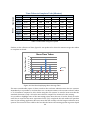
FIGURE 1. NORMAN’S EXECUTION-EVALUATION MODEL ..................................................................................................................... 6
FIGURE 2. AN EXAMPLE OF BREADCRUMBS............................................................................................................................................. 9
FIGURE 3. THE USER CENTRED DESIGN PROCESS ............................................................................................................................... 13
FIGURE 4. GRAPH SHOWING PROPORTION OF USABILITY PROBLEMS FOUND BY EVALUATORS ................................................ 19
FIGURE 5. FORMATION OF THE REQUIREMENTS DOCUMENT ........................................................................................................... 23
FIGURE 6. STRUCTURE OF THE TARGETING DATA ............................................................................................................................... 24
FIGURE 7. AN EXAMPLE OF THE DATA REQUIRED FOR ONE SALES REPRESENTATIVE ................................................................... 25
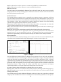
FIGURE 8. AN EXAMPLE OF A MESSAGE PROMPT ................................................................................................................................ 31
FIGURE 9. AN EXAMPLE OF QUERY ICONS ............................................................................................................................................ 31
FIGURE 10. OVERVIEW OF THE TARGETING PROCESS ........................................................................................................................ 33
FIGURE 11. NOTATION USED FOR LPG SALES FORCE......................................................................................................................... 34
FIGURE 12. PROMPT FOR IMPORTING DATA ........................................................................................................................................ 35
FIGURE 13. PROMPT DISPLAYED AFTER A QUERY HAS RAN.............................................................................................................. 36
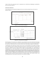
FIGURE 14. CROSS-REFERENCE TABLE .................................................................................................................................................. 37
FIGURE 15. USER’S RESULTS FROM CARD SORTING SESSION............................................................................................................ 40
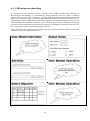
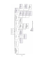
FIGURE 16. HTA FOR THE ORIGINAL SOLUTION .................................................................................................................................. 43
FIGURE 17. HTA FOR THE ACCESS SOLUTION ...................................................................................................................................... 44
FIGURE 18. THE QOC NOTATION .......................................................................................................................................................... 52
FIGURE 19. EXAMPLE USER SKETCH ...................................................................................................................................................... 53
FIGURE 20. NAVIGATIONAL STRUCTURE DESIGNED BY AN INEXPERIENCED USER ......................................................................... 54
FIGURE 21. NAVIGATIONAL STRUCTURE DESIGNED BY A USER WITH MINIMAL EXPERIENCE....................................................... 54
FIGURE 22. NAVIGATIONAL STRUCTURE DESIGNED BY AN EXPERIENCED USER ............................................................................. 54
FIGURE 23. USER SKETCH SHOWING PROCEED BUTTON .................................................................................................................... 55
FIGURE 24. USER SKETCHES FOR UPLOAD FUNCTIONALITY ............................................................................................................... 57
FIGURE 25. CROSS REFERENCE DESIGN 1 ............................................................................................................................................. 58
FIGURE 26. CROSS REFERENCE DESIGN 2 ............................................................................................................................................ 58
FIGURE 27. DESIGNS ................................................................................................................................................................................. 59
FIGURE 28. EXPORT DESIGNS .................................................................................................................................................................. 60
FIGURE 29. CARDS USED FOR CARD SESSION ...................................................................................................................................... 62
FIGURE 30. ENVISIONS HTA ................................................................................................................................................................... 65
FIGURE 31. OVERVIEW OF THE .NET COMMON LANGUAGE RUNTIME............................................................................................ 71
FIGURE 32. DATABASE DIAGRAM ........................................................................................................................................................... 73
FIGURE 33. OVERVIEW OF SYSTEM IMPLEMENTATION ...................................................................................................................... 74
FIGURE 34. HIGH-LEVEL CLASS STRUCTURE ....................................................................................................................................... 76
FIGURE 35. PRINT SCREEN OF THE IMPORT SCREEN ........................................................................................................................... 77
FIGURE 36. PRINT SCREEN OF THE IMPORT SCREEN AFTER FILE UPLOAD ....................................................................................... 80
FIGURE 37. PRINT SCREEN OF AN EXAMPLE CROSS REFERENCE TABLE ........................................................................................... 81
FIGURE 38. PRINT SCREEN OF VIEWING AND EDITING DATA ............................................................................................................. 83
FIGURE 39. AN EXAMPLE OF USER FEEDBACK DURING IMPLEMENTATION...................................................................................... 84
FIGURE 40. BAR CHART DISPLAYING MEAN AVERAGE TIME ............................................................................................................ 94
FIGURE 41. BAR CHART DISPLAYING DIFFERENCES FOR EXPERIENCED AND NOVICE USERS (EXISTING SYSTEM) .................... 95
FIGURE 42. BAR CHART DISPLAYING DIFFERENCES FOR EXPERIENCED AND NOVICE USERS (NEW SYSTEM) ............................ 95
FIGURE 43. BAR CHART DISPLAYING THE MEAN NUMBER OF ERRORS ............................................................................................. 98
FIGURE 44. BAR CHART DISPLAYING THE MEAN NUMBER OF CLICKS.............................................................................................100
FIGURE 45. BAR CHART DISPLAYING LIKERT SCALE SCORES ............................................................................................................102
FIGURE 46. CURRENT PAGING STRUCTURE .........................................................................................................................................104
FIGURE 47. REQUESTED GLOBAL SYSTEM PAGING STRUCTURE .......................................................................................................104
FIGURE 48. STANDARD BREADCRUMB DESIGN ...................................................................................................................................106
FIGURE 49. BREADCRUMB DESIGN .......................................................................................................................................................106
v
List of Tables
TABLE 1 USER CENTRED DESIGN METHODS ........................................................................................................................................ 13
TABLE 2 COMMON ERRORS AND POSSIBLE DESIGN SOLUTIONS ......................................................................................................... 56
TABLE 3 EXPERIMENT VARIABLES ......................................................................................................................................................... 90
TABLE 4 BACKGROUND OF PARTICIPANTS ............................................................................................................................................ 91
TABLE 5 PARTICIPANT ALLOCATION ..................................................................................................................................................... 92
TABLE 6 TIME TAKEN USING EXISTING SYSTEM ................................................................................................................................... 93
TABLE 7 TIME TAKEN USING NEW SYSTEM ........................................................................................................................................... 94
TABLE 8 TYPES OF ERRORS MADE .......................................................................................................................................................... 97
TABLE 9 NUMBER OF ERRORS MADE USING EXISTING SYSTEM .......................................................................................................... 97
TABLE 10 NUMBER OF ERRORS MADE USING NEW SYSTEM ............................................................................................................... 97
TABLE 11 COMPARING THE NUMBER OF CLICKS REQUIRED.............................................................................................................100
TABLE 12 QUESTIONNAIRE RESPONSES FOR EXISTING SYSTEM ......................................................................................................101
TABLE 13 QUESTIONNAIRE RESPONSES FOR NEW SYSTEM ..............................................................................................................102
vi
Acknowledgements
I would like to thank my supervisor, Dr Hilary Johnson who has been an invaluable source of
support and advice over the past year. I would also like to thank both Jason Cooper and Jon Bolt
for contributing their human computer interaction knowledge to the evaluations.
I would also like to say a huge thank you to all of the UK OneLilly team at Eli Lilly & Company for
their endless patience and constant enthusiasm throughout the project.
vii
Chapter 1
Introduction
The motivation for this project originated from an industrial placement year within a CRM
project team at Eli Lilly & Company. Lilly is a global pharmaceutical company; their products
treat cancer, diabetes, depression, schizophrenia and many other conditions.
During the development of a global Customer Relationship Management (CRM) solution, the
design of the tools to support the user tasks were not considered beforehand. As a
consequence, they were implemented in the quickest way possible without any regards for user
needs. One particular system written in Microsoft Access was very poorly designed leading to a
vast number of usability problems. The system failed to support the task in the same way as the
initial solution and consequently led to a negative transfer of existing user knowledge. This in
turn caused a great deal of user frustration with some users abandoning the system and
resorting to completing the task manually.
The CRM system named ‘OneLilly’ was deployed to three countries in May 2007. The system to
be redesigned is used for the preparation of data to be loaded into OneLilly and will be scoped
such that the tool will be used by the UK team, only. The system generates ‘targeting data’ this is
information that will define which healthcare professionals a particular sales representative
will visit, the number of visits that should be made, and finally the sales quota they are aiming to
achieve. The role of the system is to generate and output a combined objectives file to be sent to
OneLilly using data from a variety of sources, including input directly from a user.
1.1 Aim
With users as design partners, the aim of this project is to evaluate and redevelop the OneLilly
targeting application with particular attention to improving the navigational efficiency through
the user interface. The research aim of the project will cover an investigation into how
navigational design can influence user experiences.
1.2 Objectives
The key objectives of the project include:
Complete a literature review to gain a foundation of knowledge in the relevant domain
including usability standards, participatory design methodologies and navigation design
considerations.
Complete an empirical evaluation of the existing tool
1
Engage sample users from the UK CRM team at Eli Lilly to identify their individual
requirements and recruit them to the design team
Undertake iterative user-centred design
Iteratively develop and evaluate a new usable OneLilly targeting system
Comparatively evaluate new system against the existing system using appropriate usability
matrices and methodologies
Complete a project overview to summarise and draw conclusions
The next chapter will investigate the existing literature within the scope of the project.
2
Chapter 2
Literature Survey
The user interface is the interactive part of a system that is used by the human. It is the means
by which users give commands to control its operation, input data and respond to the output. In
principle, it is relatively simple to create a user interface but it is rather more difficult to develop
one that combines usability with usefulness and pleasure to use.
Preece et al [2] states that designing usable interactive products requires considering who is
going to be using them, how they are going to be used, and where they are going to be used. She
states that there are four basic activities of interaction design.
1. Identifying needs and establishing requirements for the user experience
2. Developing alternative designs that meet those requirements
3. Building interactive versions of the designs so that they can be communicated and
assessed
4. Evaluating what is being built throughout the process and the user experience it offers
Evaluating what has been done is the main focus of interaction design. The main focus is to
ensure that the product is usable and this is addressed through a user-centred approach which
considered users throughout.
As described in the introduction chapter the project aim is to redevelop the OneLilly targeting
application to more effectively support the user. With an aim to provide greater navigational
support it will be hoped productivity can also be increased.
With this aim in mind this chapter will be used to gain a background understanding of the key
factors, principles and methodologies in user interface design and development using a usercentred approach. The chapter will begin with a summary and discussion of human computer
interaction (HCI) principles and the design considerations needed to support these principles. It
will then move onto discuss navigation, user support and information presentation. The chapter
will conclude by discussing user-centred design tasks and usability evaluation.
This chapter will also highlight some of the current research impacting navigation design
decisions. This will include the field of information foraging theory and its related concepts such
as information scent and latent semantic analysis.
3
2.1 Introduction to HCI
With the vast increase in use of PC’s in the early 1980s, new usability challenges emerged and
became more salient. Users consisted of cognitive scientists, psychologists, sociologists and
philosophers; they were interested in how people solve problems and learn new things. This
new area of shared interest between computer science and cognitive science is called Human
Computer Interaction (HCI) [3].
“Human-computer interaction is the study of the relationships which exist between human users
and the computer systems they use in the performance of their various tasks”[10].
A long term goal of HCI is to minimize the barrier between the human’s cognitive model of what
they want to accomplish and the computers support for the user’s task. This means that HCI is
concerned with providing an understanding of both the user and the computer system in an
effort to make the interaction between the two easier and more satisfying. However the
emphasis should always be on the user. The interest is in how the human user uses the
computer as a tool to perform their desired task and in order to accomplish this task the user
has to communicate with the computer.
To enable a successful interaction the product must be usable. The term usability has many
different definitions; the Oxford English dictionary defines it as:
“The effectiveness, efficiency, and satisfaction with which users can achieve tasks in a particular
environment of a product. High usability means a system is: easy to learn and remember; efficient,
visually pleasing and fun to use; and quick to recover from errors”.
Nielson [9] defines usability by five quality components:
1. Learnability - how easy is it for users to complete basic tasks the first time they use the
system?
2. Efficiency – once users know the system how quickly can they perform tasks?
3. Memorability – when users return to using a system after a period of time how easily
can they establish proficiency?
4. Errors – How many errors do the users make? Are the severe and can they easily
recover from them?
5. Satisfaction – How pleasant is the system to use?
Nielson also discusses utility which refers to the design functionality, does it do what the users
need? Usability and utility are equally important, it does not matter if something is easy to do if
it is not what the user wants, just as it is no good having a system that could perform the right
tasks but the user cannot make it happen because the user interface is too difficult to use. Ben
Shneiderman [8] makes the same point by stating that usability is about understanding, stating
and serving users needs. Since the needs are the requirements that shape tool they will
determine the utility.
This is stressing the fact that for a system to be usable it must perform exactly what the user
desires. This project is focused on improving the users’ experience and therefore ensuring that
the system enables the user to perform exactly what they need to. As detailed by Preece et al [2]
the best way to accomplish this is by taking a user-centred approach to development, “this
means the users concerns direct the development rather than technical concerns''.
To understand users it is necessary to understand processes, capabilities and predictions that
users might bring to the tasks they perform. This will involve an understanding and knowledge
of cognition.
4
The interface is the intermediate component between the user and the computer system; it
reflects the system model to its users and translates their intentions into appropriate system
activity. A user develops an understanding of how the system works and forms a model known
as the mental model. This model is developed during the interaction and will then form the
basis of future interactions with the system, the more someone learns about a system and how
it functions the more their mental model develops. The term cognitive model is proffered, since
it implies cognition which is more representative of the process involved [15].
2.2 What is cognition?
The term cognition refers to a facility for the human like processing of information; it involves
cognitive processes like thinking, learning, remembering and decision-making. Norman
distinguishes between two general modes:
Experimental is a state of mind of which we perceive, act or react to events around us
effectively, for example driving a car.
Reflective involves thinking, comparing and decision making; this is what leads onto new ideas
and creativity.
However it is clear that the experimental mode still requires comparing and decision making
but this is just achieved automatically without us always realising. For instance in driving a car
your actions will include things like deciding on when to change gear and comparing other
drivers speed with your own.
According to Preece, both of these will require different technological support [2].
There has been research into the evolution of cognitive modelling for understanding and
predicting user-behaviour in a computer system. One example of a cognitive model is to
consider the theory of an action; this is how the user interacts in terms of their goals and what
they need to do to achieve them. Norman’s execution-evaluation cycle is the most influential in
HCI. The cycle can be divided into two major phases, execution and evaluation. These are
subdivided and form seven stages:
1. Establishing the goal
2. Forming the intention
3. Specifying the action sequence
4. Executing the action
5. Perceiving the system state
6. Interpreting the system state
7. Evaluating the system state with respect to the goals and intentions
The theory proposes that the stages take place sequentially but in reality activity would not
proceed in such an orderly sequential manner, some stages could be missed, repeated or
completed in a different order. As a model, it is an approximation of what might happen and
could aid designers to think how best to design an interface to enable users to monitor their
actions [2].
Norman uses this model to demonstrate why some interfaces cause problems to their users, he
describes the terms:
5
Gulfs of execution this is the difference between what the user wants to do and whether the
interface allows them to. If there is no difference the interaction will be effective, the
interface should therefore aim to reduce this gulf.
Gulf of evaluation is the distance between the physical presentation of the system state and
the expectation of the user, if the user can evaluate the presentation to form their goal the
gulf is small. The more effort required the less effective the interaction is.
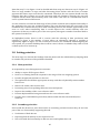
System
Gulf of execution
User’s goal
Gulf of evaluation
Figure 1. Norman’s Execution-Evaluation Model
To pursue a task with computer support, a user needs to translate their real-world goal into a
software orientated goal (also known as a system goal). The simplest case is one where the
system action is identical to the real-world concepts; the aim is to enable the user’s task goal to
be mapped very easily onto appropriate system features. This can be very difficult to do and a
number of researchers have come up with ‘heuristics’ to attempt to support effective user
behaviour.
2.3 Heuristics
A number of advocates of user centred design have presented a set of ‘golden rules’ (heuristics),
although they might not be suitable to every situation they do provide a useful checklist. The
most well-known and used are Nielson’s ten heuristics and Shneiderman’s eight golden rules
[1].
Nielson’s guidelines are:
1. Visibility of system status: The system should always keep users informed about what
is going on, through appropriate feedback within reasonable time.
2. Match between system and the real world: The system should speak the users'
language, with words, phrases and concepts familiar to the user, rather than systemoriented terms. Follow real-world conventions, making information appear in a natural
and logical order.
3. User control and freedom: Users often choose system functions by mistake and will
need a clearly marked way to leave the unwanted state. Support undo and redo.
4. Consistency and standards: Follow platform conventions.
5. Error prevention: Either eliminate error-prone conditions or check for them and
present users with a confirmation option before they commit to the action.
6. Recognition rather than recall: Minimize the user's memory load by making objects,
actions, and options visible. The user should not have to remember information from
one part of the dialogue to another. Instructions for use of the system should be visible
or easily retrievable whenever appropriate.
7. Flexibility and efficiency of use: Accelerators -- unseen by the novice user -- may often
speed up the interaction for the expert user such that the system can cater to both
inexperienced and experienced users. Allow users to tailor frequent actions.
8. Aesthetic and minimalist design: Dialogues should not contain information which is
irrelevant or rarely needed. Every extra unit of information in a dialogue competes with
the relevant units of information and diminishes their relative visibility.
6
9. Help users recognize, diagnose, and recover from errors: Error messages should be
expressed in plain language (no codes), precisely indicate the problem, and
constructively suggest a solution.
10. Help and documentation: Even though it is better if the system can be used without
documentation, it may be necessary to provide help and documentation. Any such
information should be easy to search, focused on the user's task, list concrete steps to be
carried out, and not be too large.
Similarly Shneiderman has developed eight golden rules:
1. Consistency in action sequences, layout, terminology, command use and so on
2. Enable frequent users to use shortcuts to perform regular, familiar actions more
quickly
3. Offer information feedback for every user action
4. Design dialogs to yield closure so that the user knows when they have completed a
task
5. Offer error prevention and simple error handling so that users are prevented from
making mistakes and if they do are offered clear and informative instructions to enable
them to recover
6. Permit easy reversal of actions
7. Support internal locus of control so the user is in control of the system, which
responds to his actions.
8. Reduce short-term memory load by keeping display simple, consolidating multiple
page displays and providing time for learning action sequences.
These rules are guidelines only and are not applicable to every eventuality. They will need the
designers’ interpretation for each new situation. However they are useful and their application
will help most design project. It is now important to gain a background understanding of how
these guidelines and rules can be considered through to design.
2.4 Design considerations
From preliminary research within this project it became apparent that the main issue with the
existing solution was that inexperienced users (and even experienced) experience issues with
understanding the sequence of actions they are required to perform in order to achieve their
goal. The interface is preventing them from completed the task effectively this follows Norman’s
gulf of execution model.
This section will discuss how the heuristics from above can be interpreted to consider design
options; it will focus on considerations for navigational design, designing to suit both novice and
experiences users, and information presentation.
2.4.1 Navigation design
Much of interaction design involves goal-seeking behaviour. Users will have some idea of what
they are looking for and a partial model of the system. When users are navigating through a
system the important thing is not that they take the most efficient route but at each point in the
interaction they make some assessment of whether they are getting closer to their (often
partially formed) goal. To enable the user to do this goal-seeking each screen of the system
needs to give the user enough knowledge of what to do to get closer to their goal [1].
7
To do this goal-seeking, each state of the system or each screen needs to give the user enough
knowledge of what to do to get closer to their goal. Users will typically forage for information by
navigating from page to page along links, their patterns or actions are guided by their
information needs [13]. This is known as Information scenting and is a term used to describe
how people evaluate the options they have and refers to the extent at which users can predict
what they will find if they pursue a certain path through a website. Pirolli and Card describe
information scent as “the (imperfect) perception of the value, cost, or access path of information
sources obtained from proximal cues, such as bibliographic citations, www links, or icons
representing the sources” [45].
Users will use proximal cues such as snippets and graphics to assess the distal content [13]. The
cues such as text labels are used by users to make information seeking decisions and to guide
them to their information goal. If the user feel that they are on the right track to the information
they require, they will continue as long as they sense that they are “getting warmer” i.e. that the
scent is getting stronger or the user will give up [46]. With perfect information scent cues a user
will make no navigation errors and will proceed directly to the desired information [45]. If there
is no or uninformative information scent, i.e. there are no proximal cues for the user to assess,
Pirolli and Card found that the user will perform random choices in the search space as there is
nothing to guide them. A site with weak or no information scent could affect users’ decision to
search or browse in a navigational space. This could result in the user anticipating that
browsing is a more costly strategy than searching. In a study by Katz and Bryne on the effects of
scent and breadth of use of site-specific search, they found that high information scent for menu
options plays a key role in whether a menu will be used. With high information scent on menu
options, their participant used menus even when there was a prominent search function [47].
Nielson [14] states that the most obvious design lesson from information scent is to insure that
links and category descriptions explicitly describe what the user will find at the destination.
Do not make up words or slogans as navigation options. Remember to think about the
words in the users mind and therefore what they would be looking for.
Each page should clearly indicate that they are still heading in the right direction. It should
provide feedback about the current location and how it relates to the users task.
Navigational choices and search queries are driven by how well the written text semantically
matches the search goal. One of the main challenges of written text is the distinction between
what was actually written and what was intended. There are resulting problems with this, as
there are different words that have the same meaning and some words having multiple
meanings (or different interpretations by different people). The problem is that people often
want to access information based on its meaning but individual words used within queries or
used as part of a hyperlink do not uniquely or sufficiently express meaning.
There have been previous attempts to overcome the diversity in human word usage in
information retrieval, for example augmenting the user’s original query terms with related
terms (e.g. from a special thesaurus). It is also possible to measure information scent using
semantic similarity but this is very difficult simply because it is not feasible to ask people for
similarity ratings of all words that may be used in a user interface. These methods are labour
intensive and are not always successful.
Latent Semantic Analysis (LSA) is a technique for identifying both semantically similar words
and semantically similar documents. It was developed to address the problem with early
information retrieval systems that performed exact word matching. For example if you submit
a query for ‘car’ you would only be returned documents or links that contained that exact word
and see nothing containing ‘automobile’ (unless it contained ‘car’ also). LSA considers the words
that co-occur in documents with ‘car’ and the words that co-occur in documents with
‘automobile’ , and given that they overlap significantly it is possible to determine that ‘car’ and
‘automobile’ are semantically related. LSA will produce a rank-ordered list of words that are
semantically similar to it with exact names high on the list [48].
8
If users cannot find what they are looking for they will not be able to perform their desired tasks
and will lead onto the user giving up. Preece et al [2] states that one of the usability goals is that
is that the system should be efficient to use supporting the users carrying out their tasks.
Dix et al [1] lists four things to be aware of when designing each state or screen of the system:
Allowing the user to:
Know where they are
Know what they can do
Know where they are going – or what will happen
Knowing where you have been – or what you’ve done
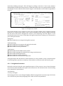
To assist the user to understand where they are some websites show ‘bread crumbs’ at the top
of the screen, this is a path of titles showing where the page is in the site (Figure 2 shows an
example of this). This will help the user get a full sense of their current location relative to the
site structure and they can jump to their desired page by a single click.
Figure 2. An Example of Breadcrumbs
They provide a trail for the user to follow back to the starting/entry point of the
system/website. Although one of the benefits of breadcrumbs is the fact that they are small and
therefore take up minimal space [11] Hudson [12] discusses the fact that users do often ignore
them, he lists some reasons why this might be the case:
Designers seem to be ashamed of their breadcrumb navigation, they make the text too small
or hide them in the heading area or fail to use underlines to make the links obvious
Many sites do not include them
Breadcrumbs are often used in addition to global and secondary navigation systems. There are
three types: trail, path, attribute and location [49]. Path trails convey the path the user has
taken through the site, and are typically represented and used with the back and forward
buttons on any standard web browser. Location trails simply show the path down the website
hierarchy leading to the page. Attribute trails present a particular website as a set of attributes
that it conforms to. For example, a web page on a particular type of car might have a
breadcrumb style trail of Ford > hatchback > under £1000 > used > blue. The difference to
location trail is that this does not necessarily reflect the actual hierarchy of the web site. This
paper will focus exclusively on the use of location breadcrumb trails.
Neilson advocates the use of breadcrumbs as:
They improve the user’s understanding of where they are in the site
They are very easy to use and have never confused users in experiments
They take up very little space on the page and never have negative effects
9
Previous research on breadcrumbs as a navigation tool has been limited by using simple site
structures and completed within controlled experimental conditions [50].
Bernard [51] suggested that the use of breadcrumbs can aid in improving the user’s mental
model of the site’s structure. Opponents of the breadcrumb argue that breadcrumbs are not
used and they have no effect on overall navigational efficiency. Studies by Rogers and Chaparro
[52] found evidence that Bernard’s theory was well founded, and that users mental model of the
system does seem improved when breadcrumbs are used. Maldonado and Pesnick [53]
concurred that most users do not use breadcrumbs nor does it improve navigational efficiency
for those who do, but Rogers and Chaparro [52] backed this but went on to conclude it can and
does have a positive effect when users are trained to use breadcrumbs.
Hudson [54] attempted to explain why breadcrumbs go mostly unused, claiming that many sites
do not use breadcrumbs at all, some sites are not consistent with their implementation and
breadcrumbs are often small and hidden. Rogers and Chapparo [52] also found that positioning
on the page affected its usage.
It is still inconclusive as to the importance of breadcrumbs as a contextual aid, but if training
and familiarity is the key to its success, a familiarity that can only increase across the population
of users over time, and due to its simple implementation and lack of ‘harm’ [55] it is likely that
its usage will pick up, given sufficient time.
To assist the users to understand what they can do you need to make it clear which text is
clickable and which is not. Sometimes this can be difficult when trying to improve the
appearance of a site but it is important to note the trade-off between the appearance and the
ease of use [1]. Visuals, audio and multimedia serve as a powerful illustration of concepts and
ideas. It is therefore important for designers to carefully choose which visuals they use making
sure that they are n necessary to assist the user, graphics unrelated to the content can cause
confusion and the designer should resist the urge to make the produce more visually exciting
[36].
The last two points assisting the user to understand where they are going was discussed at the
start of this section, but also has a link with feedback and ensuring the user knows what they
have done (which is a heuristic listed at the start of section 2.5).
2.4.2
Designing for both novice and expert users
Different users have different needs and skills meaning that help within the system might be
essential to some users, whereas for more regular users of a system user support may not
always be required and could potentially become irritating. Aberg [23] discusses there is a
strong need to provide support to a whole range of users.
J.Wu [25] also makes the same comment by stating that novice and expert users of a system
differ greatly and accommodating both in one interface is a challenge as well as a necessity for
most user interfaces.
Shneiderman [24] comments that ‘expert and frequent users have special needs’ and as his golden
rule states it is a good idea to enable frequent users to use shortcuts. Nielson’s seventh heuristic
also suggest this, they are known as accelerators and are elements that allow a user to perform
a frequent task quickly, even though the same tasks can be performed in a more general or
slower way. These can include things like abbreviations, function keys or an entire command in
a single key press [25]. Another shortcut could be allowing users to jump directly to desired
locations within the system [3].
When using an interface, expert users can form goals and sequences of actions to achieve their
goal much quicker than a novice user. They would prefer the number of interactions to be
reduced, where as novice users would like to be able to see more of the system allowing them to
gain skills and knowledge about the system to help them become experts. Novice users require
10
the interface to be easy to learn and guessable, this means that the users who do not have
previous experience can use the interface. Some of the heuristics above support this for example
recognition rather than recall and consistency.
J.Wu [25] also provides some guidelines and recommendations for accommodating for both
novice and expert users:
Design the top-level of your interface to be simplified as much as possible
Provide accelerators for experienced users
Show the corresponding short cut of a normal menu item within the menu item to enable
users to get to know them
Provide online help to assist novice users without getting in the way of experts
Allow experts to change default settings where appropriate
Novice users may require additional support so the next design consideration is to gain a
background understanding of how this can be done.
2.4.3 Providing user support
There are many ways of providing user support and it is up to the designer to decide on the
most appropriate way for any given system. There are a number of things to be taken into
account:
Design of the user support should not be seen as an ‘add-on’ to system design, it should be
designed with the rest of the system
The same modelling and analytic techniques (for example task analysis) that are used for
design can also guide the design of support material
It is necessary to make decisions about how the help will be presented to the user, how will the
help be requested? How will it be displayed to effectively assist the user?
Help may be a command, a button, a function or a separate application. A command will usually
require the user to specify a topic, and therefore assumes some knowledge, a help button is
readily accessible and does not interfere with the application, a help button could support
context-sensitive help [1].
Context-sensitive help allows the user to get information about a specific area of a system; it
provides information that is relevant to the task the user is currently trying to accomplish. It
ensures that the information is timely, but if the type and scope of the help is not tuned to the
user’s needs then it will not be helpful. Frimm [26] completed some analysis of user needs and
observation of user’s interaction with a system and has indicated a requirement to offer the
following types of context-sensitive help:
‘Where you are’ (example solution breadcrumbs)
‘What you can do’ both goal and command orientated
Field options, values that can be applied to the current field
Help on the current condition, if one exists
It is important to consider how this help will be displayed to the user, it could be in a new
window or it may use part of the screen. Alternatively help hints, prompts or pop-up’s can be
given as the user requests it. The presentation style that is appropriate depends largely on the
level of help being offered and the space required; this will develop from the design of the help
functionality.
11
The physical layout of documentation can make a different to its usability, for example large
blocks of text are difficult to read on screen and may require the user to search for the help they
require. A useful style is to provide a summary of the key information prominently with further
information if required. An index can be a useful summary but should be organized to reflect the
functional relationships between the subjects rather than alphabetic ordering [1]. As already
stated the help system will need to be designed just as the rest of the system is, therefore the
heuristics will also need to be consisted, for example consistency will have a significant play
within the help system.
Consistency is important to consider when designing the presentation of information on the
user interface.
2.4.4 Information presentation
It is also important to consider how information will be presented on screen; this issue has been
around for many years, long before computers and therefore interactive systems. Obviously the
presentation of information on the screen depends on the kind of information; different
purposes will require different representations [1]. But obviously it is important to continue to
consider new users and therefore it is advisable that screens should be simple, it is easy to
overload a new user with too much information as this can be frustrating [36].
When presenting information it is also important to consider colour, when used incorrectly it
can seriously hamper communication. Macfarland [37] recommends perceptual areas such as
using a soft non-intrusive background colour such as soft greys to prevent eye fatigue. A
consistent colour scheme should be used throughout and appropriate colours for each function,
for example red for stop. It is also worth noting that colour is not completely reliable
considering that 10% of males show some indication of colour blindness [36]. Preece et al [2]
discusses the structure of information and show good examples where information has been
ordered into meaningful categories which appropriate blank spacing between enabling easier
reading for the user.
There is an advantage when presenting information in an interactive system in that it is easy to
allow the user to choose among several representations so making it possible to achieve
different goals.
Now that a good background understanding of the design principals and how these can be
interpreted to consider design options has been achieved the next step is to consider the process
by which such designs can be implemented.
2.5 User centred design
Now that I background research into HCI, understood the heuristics and considered how these
affect designers decisions I will now move onto the process of designing.
User centred design puts the users at the centre of its design and development, they should take
part in the decisions that affect and the way that it is designed and used.
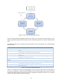
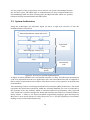
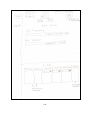
As stated in the introduction there are four stages to interaction design, these stages are carried
out in an iterative fashion with cycle’s being repeated until usability objectives have been
attained, this process is shown in figure 3.
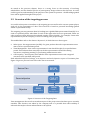
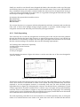
12
1. Plan the user
centred approach
Meets requirements
2. Specify the
context of use
5. Evaluate designs
against user
requirements
3. Specify user and
organisation
requirements
4. Produce design
solutions
Figure 3. The User Centred Design Process
Early in design phase the design solutions are likely to be mock-ups and prototypes, as the
design progresses higher fidelity designs will be evaluated against more specific requirements
[16].
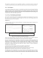
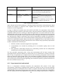
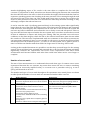
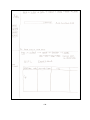
The following table shows a high-level characterization of the most popular user centred design
methods: [17]
Method
Brief description
Sample size
Focus groups
Facilitated discussions to share ideas & opinions about the
system
Field study where designers visit the users workplace to
analyse habits, activities & environmental factors
Users work with the prototype to perform given tasks (see
section 2.6)
Information is written on individual cards, users then sort
depending on some given criteria
Users join the design team (See section 2.4.3)
Low
Users are asked a standard set of questions
Semi-structured questions are asked to: stakeholders,
content experts, support staff, and users themselves.
Identify steps required through interview or observation
(See section 2.4.2)
High
Low
Contextual inquiry
Usability testing
Card sorting
Participatory
design
Questionnaires
Interviews
Task analysis
Varies
Low-Medium
High
Low
Low
Table 1 User centred Design Methods
Table 1 is an important summary and highlights the key methods that will be used throughout
this project. Although a variety of these methods will be used throughout the project, this next
section will take a greater look at the two most significant methods involved in user-centred
design, task analysis and participatory design.
13
2.5.1 Why user-centred design?
As pointed out by Ellen Bravo at a conference in 1990 leaving users out can have disastrous
effects not just on the task goals but on the users themselves [7]. Alison Black [18] states that
“the most successful designs come from understanding the needs of the people that use them.”
Early involvement of users with the future system may lead to adjustment of their expectations
making the eventual acceptance more likely [7]. This in turn could potentially lead to cost
reductions due to early acceptance and reduced development costs.
The process of understanding the user’s expectations means the designer needs to understand
the role of the computer system. This can be done using task analysis, it allows the major task to
be broken down into sub components, this will continue until the task can no longer be broken
down into individual sub-components.
The process of user centred design obviously requires interaction with a number of
stakeholders and as discussions earlier in this chapter has already shown, the design of a usable
system can only be successful by learning, interpreting and understanding the user’s needs.
There are a number of methods that can be used in the requirements phase to begin to
understand users, one of the most commonly used techniques is task analysis.
2.5.2 Task Analysis
Task analysis is mainly used to investigate existing solutions and is used to establish a
foundation of existing practices on which to build new requirements or design new tasks. It
analyses the underlying rational and purpose of what users are doing, trying to achieve and how
they are going about it. Task analysis is a term that covers techniques for investigating cognitive
processes and physical actions at a high level abstraction and in detail. The most widely used
version is Hierarchical Task Analysis (HTA), another well known technique is GOMS (Goals,
Operators, Methods and selection rules) [2].
HTA was originally designed to identify training needs, it is a hierarchy of tasks and sub-tasks. It
describes what order and under what circumstances sub-tasks are performed. HTA focuses on
the physically and observable actions that are performed, it also includes actions that are not
related to the software at all. The starting point is the user goal; the tasks associated with this
are identified and then sub-divided as appropriate [2].
GOMS was developed in the early 1980’s as an attempt to the knowledge and cognitive
processes involved when users interact with a system.
Goals refers the goal that the user is trying to accomplish
Operators refers to the cognitive processes and physical actions that need to be performed in
order to reach that goal
Methods are the learnt procedures for accomplishing the goal; they consist of exact sequence of
steps required
Selection rules are used to determine which method to select when there is more than one
available for a given stage of a task
After the initial practices and processed have been understood the next most significant user
centred techniques is participatory design. Users will participate during the initial exploration
of the problem identified to help define and focus ideas for the solution, right throughout
development through to evaluations of proposed solutions. This is the most important part of
ensuring the solution is exactly what the users want and need.
14
2.5.3 Participatory design
Computer systems development will always be accompanied by the problem of how to define
requirements for the functionality. Participatory design is about establishing meaningful and
productive interactions among those users who are directly impacted by the change in
technology. Participatory design represents a traditional break with traditional approaches to
system development.
Computer applications need to be better suited to the skills and working practices of the people
using the system. Barriers between designers and users need to be broken down in order to
build effective communication throughout the design process. Bodker [30] states that users and
designers have different backgrounds and belong to different communities of practice. The
practice of users is the starting point for design, but at the same time users need to see and
experience new ideas in order to transcend their own practice. Participatory design stresses the
importance of active participation of end users throughout the project from initial research
through to design and evaluation, they should take part in decisions that affect the system and
the way in which it is designed and used. Because technology is not developed in isolation,
participation in decisions about technology also involves decisions about work content and job
design [7].
‘Bridging the gap’ between designers and users is not an easy task, as Kyne [22] discusses
answering questionnaires and discussing requirements specifications are not suitable since
users don’t have the professional knowledge and skills that form the basis for high quality user
contributions. Therefore supplementary tools and techniques have been developed to enable
users to contribute; these include paper and pen exercises, brainstorming, storyboarding and
workshops [1]. Finally actively involving users allows them to reflect their own work and bring
innovative ideas to the design process.
Henderson [21] discusses three main guidelines as an approach to participatory design:
The goal is to improve the quality of work life: Both the users and the developers share
this objective; the focus is not solely on the design of technology. It may include things like
reallocating tasks or moving furniture and the technology might allow or require this. The
focus is the work as a whole and the technology is only a component of this.
The orientation is collaborative: Both designers and developers are actively involved in
decision making, it is recognised that knowledge from both will be required for successful
technology. Through reflection and experience the users will become familiar with
technology as designers will with work practices.
The process is iterative: Emerging design ideas will need to be tried out in a work
environment. It requires developing ways of presenting ideas to users such that they begin
to get an idea of what it would be like to use this technology in their work. Mock-ups,
scenarios and prototypes are some of the ways to allow users this early exposure.
It is often said that users cannot tell you what they want, but when they see something and get
to use it they are soon able to explain what they want [2]. Therefore as the final bullet points
suggests, once initial information has been collected about the task and the user’s opinions it is
worth building iterative prototypes. A prototype can be a paper-based outline of a screen or a
set of screens, an electronic ‘picture’, a video simulation, a cardboard mock-up or a piece of
working software. It allows stakeholders to interact with the envisioned product to gain some
experience, explore imagined uses and suggest improvements.
Lichter [32] defines prototyping as an approach based on an evolutionary view of software
development, affecting the development process as a whole. It involves producing early working
versions “prototypes” of the future application and experimenting with them. It provides a
communication basis for discussions among all groups involved in the development process,
15
especially between users and developers. Floyd [33] discusses the different goals of
prototyping:
Exploratory prototyping is used when the problem is unclear, initial ideas are used as a
basis for clarifying what users and management want. It helps the developers gain an insight
into the application area and the user tasks.
Experiment prototyping focuses on technical implementation of the development goal, it
helps ensure feasibility of a particular application.
Evolutionary prototyping is a continual process for adapting an application to
organizational constraints and requirements; it allows the developers to work in close
cooperation with the users to continue to improve the system.
Firstly a low-fidelity prototype will be produced, these are generally limited function, they are
constructed to view concepts, design alternatives and screen layouts rather than model the user
interaction with a system. In general they are constructed quickly and provide limited or no
functionality; they demonstrate the general look and perhaps feel of an interface. They are
generated to communicate, educate and inform but not to train, test or serve as a basis on which
to code. Rudd et al [34] discuss some of the advantages of low-fidelity prototyping:
Huge value in the early requirements gathering and analysis phase, it can act as a
communication medium by which requirements can be developed.
They can be constructed early in the development without a large investment in cost and
time.
Since they are constructed on paper, they require little or no programming skill.
They are easily portable and easily presented; it can be easily demonstrated to potential
users to quickly obtain feedback on how well the design meets their needs.
Paper-based prototypes or screen mock-ups offer a way to make effective use of the users
experience, two specific examples of this technique have been developed for participatory
design, and these are PICTIVE and CARD.
PICTIVE (Plastic Interface for Collaborative Technology Initiatives through Video Exploration)
is a technique that uses a combination of low-tech design components with video recording
facilities. It is useful for increasing the direct and effective involvement of end users and
stakeholders in the design. Office materials such as sticky notes, highlighters, labels, paper and
scissors are used on a shared design surface to produce low-level prototypes. Some of the
benefits of using materials like this include:
Such low-technical objects insures that all participants have equal opportunities to share
their ideas
They are inexpensive and encourages the participants to be bold with them, hopefully
stimulates inventive design and creative problem resolution
They are easy to change and move around meaning that many variations can be tried
quickly and easily
This technique was developed by Muller [27] in 1991, he describes that PICTIVE is intended less
as a means for the evaluation of an already designed interface, but rather for the creation of the
design of an interface, its purpose is to involve all possible stakeholders meaning that
participants did not have to be technology experts to assist with design.
A PICTIVE session may be a one-to-one collaboration or it might involve a small group,
participants will be asked to prepare before the session. Typically this will be the user
considering a task scenario (for example asking them to prepare what they would like the
system to do for them) and the developer considering an initial or preliminary set of
components based on prior discussions. Each participant will then share their expertise at the
design surface to produce their potential designs together. Since sessions are recorded on video
16
tape it prevents there being a need for a “note taker” and so allows the participants to work
more effectively together [7]. This design technique has been effective but can be time
consuming for larger systems [29]
CARD (Collaborative Analysis of Requirements and Design) is another participatory design
technique. It is primarily used for analyzing and redesigning task flows within a system. Like
PICTIVE, it can be used one-to-one or in groups, It is an informal or semi-structured “card game”
that supports analysis and critique of a system. As described by Tudor [35] although the
PICTIVE technique has been effective, sessions are time consuming and tend to dive
immediately into detailed design, the task flow is often assumed to be correct, rather than
critically examined. Whereas with CARD it is intended to focus on the flow of the users task,
detailed design work can then be done using PICTIVE, these two techniques therefore
complement one another.
With the growing recognition that an understanding of the users work practice would be useful
in the design of a new system, there has been a surge of interest in another technique for
participatory design, ethnography. This is an observational technique; it seeks to understand
settings as they naturally occur, rather than in artificial or experimental conditions. Although
this technique has the most significant benefit of fully understanding the end users it also has a
number of issues. It usually involves quite lengthy periods of time at the study site and once
completed the presentation of the results is frequently not represented in a way that is useful to
designers [31].
There is a vast amount of stakeholders that could potentially be involved in participatory design
these include end-users, developers, human factory workers, technical writers, systems
analysts, trainers and marketing staff. All can make a difference if they are part of the design and
all will have their work lives influenced by the design one way or another [28].
Once a design has been generated it will need to be evaluated not only against the requirements
specification but also against previous designs, again it will also require direct involvement of
stakeholders.
2.6 Usability Evaluation
Usability evaluation is a means of collecting information about the users experience when
interacting with a prototype. As stated throughout this chapter a user-centred approach is being
taken, for this to work effectively evaluation techniques will need to be used throughout the
design and development life-cycle to provide feedback, this means that the results of evaluation
will lead onto modifications of the design by amending it to suit users needs. Without evaluation
designers cannot be sure that the system is usable and what the users want, the main
requirement for an exemplary user experience is to meet the exact needs of the users without
fuss or bother [2]. This therefore highlights that evaluation is a key area to ensuring this is
possible and therefore having a successful end system.
There is a close link between evaluation and prototyping techniques (as previously described).
As Dix et al states [1] evaluation has 3 main goals:
To assess the extent and accessibility of the systems functionality
To assess the user experience of the interaction
To identify any specific problems with the system
As already stated above the systems functionality is extremely important since the user must
have all that they requested, secondly this functionality must be clearly reachable by the users
in terms of the actions that the users need to take to perform the desired task. Aspects like how
easy the system is to learn, the users satisfaction and enjoyment is important to assessing the
17
user experience. Finally any problems with the system will have a direct impact on the usability
and therefore these also need to found as early on in development as possible.
Since the aim is to continuously evaluate, it will not be possible to carry out extensive
experimental testing throughout the design therefore it will be analytic and informal techniques
that will be used, this section will now highlight some of these [1].
Rosson and Carroll [3] state there are two types of evaluation and both of which will be used.
Formative takes place during the design process, each developed prototype will be
evaluated. The goal of formative evaluation is to identify aspects of the design that can be
improved and set priorities.
Summative is completed to access the design result and therefore is most likely to happen
at the end of development (although it can be completed at critical points during
development). Its goal is to answer questions like ‘does the system meet its goals’ and ‘is the
new system better than the previous’.
There are two general classes of evaluation methods; analytical evaluation and empirical
evaluation. Analytical evaluation does not involve users instead analysts or experts will do the
evaluation, where as empirical evaluation will involve users. These are complementary to
formative and summative goals.
2.6.1 Analytical Evaluation
Analytic methods do not involve users. An important motivation for analytical methods is that
they can be used early on in the development phase. The first evaluation of a system should
ideally be performed before any implementation work has started. If the design itself can be
evaluated, expensive mistakes can be avoided since this allows the design to be altered prior to
any significant resource commitments. The intention is to identify any areas that are likely to
cause difficulties because they violate known cognitive principals, or ignore accepted empirical
results. These methods can be used at any stage in the development process making them
flexible. A number of methods have been proposed [1]. The two most used are:
Cognitive walkthrough was originally proposed as an attempt to introduce psychological
theory into informal and subjective walkthrough technique. It involves one or a group of
evaluators (these are experts rather than users for example HCI experts, software developers or
designers) inspecting a user interface by going through a set of tasks and evaluating
understandability and ease of learning.
Walkthroughs require a detailed review of a sequence of actions, these refer to the steps that an
interface will require a user to perform in order to accomplish a particular task. The evaluators
simulate users by stepping through that action sequence to check for potential usability
problems. They will provide a story about why that step is good or bad for a new user.
To do a walkthrough you need four things:
1. A specification or prototype of the system
2. A description of the task the user is to perform using the system
3. A complete written list of the actions needed to complete this particular task
4. An indication of who the users are and what kind of experience and knowledge can
assumed about them
Given this knowledge the evaluators will now critique the system by trying to answer the
following questions at each step:
18
1. Will the users try to achieve the correct effect?
2. Will the user see that the correct action is available?
3. Once the user has found the correct action, how will they know it’s the one they need?
4. If the correct action is performed, will the user see that progress is being made towards
the solution of the task? Are they able to understand the feedback they are receiving?
It is important to document the walkthrough to keep a record of what needs improvement and
what works well, it is therefore a good idea to produce standard evaluation forms. It can also be
useful to indicate the severity of the problem, whether the problem could occur often or how
serious it could be for the users [1].
The second approach is Heuristic evaluation which uses the heuristics discussed earlier in the
chapter. It is an informal method of usability analysis where a number of evaluators are
presented with an interface design and asked to make comments. It was first developed by
Nielson and Molich. The general idea is that several evaluators will independently critique a
system to come up with potential problems.
Nielsen and Molich [5] conducted four experiments to investigate how many evaluators are
sufficient to find the maximum number of usability problems. He found that individual
evaluators were quite bad at doing evaluations individually since they only found between 2051% of the usability problems they evaluated. Figure 2.8 shows how increasing the number of
evaluators just by 2 or 3 there is significant improvement.
Figure 4. Graph Showing Proportion of Usability Problems Found By Evaluators
The study showed that heuristic evaluation is difficult and that you should not rely on the
results of having a single person look at an interface. They will be much better if you have
several people conducting the evaluation, and should do some independently of each other. As
figure 2.8 shows the number of usability problems found grow rapidly in the interval from one
to five evaluators but reaches a point around 10 evaluators. Nielsen and Molich [5] recommend
that heuristic evaluation is done with between 3 and 5 evaluators and that any additional
resources are spent on alternative methods.
To aid the evaluators in discovering the usability problems a set of heuristics (which were
previously discussed in section 2.2.2) are provided to evaluate whether the interface elements
conform to the principals, these are listed and discussed in section 2.2. Each evaluator assesses
the system and notes violations of any of the heuristics that would cause potential usability
issues. The severity is then assessed based on four factors:
1. How common is the problem?
2. How easy is it for the user to overcome?
3. Will it be a one-off problem or persistent?
4. How seriously will the problem be perceived by the user?
19
Even though severity has several components it is common to combine all aspects into a single
rating as an overall assessment to facilitate prioritising. This is usually within a scale of 0-4:
0=
1=
2=
3=
4=
I don’t agree that this is a usability problem at all
Cosmetic problem only: need not be fixed unless there is extra time available
Minor usability problem: Fixing this should be given a low priority
Major usability problem: Important to fix
Usability catastrophe: Imperative to fix this before the product is release
Nielson [6] states that it is difficult to get a good severity estimate from evaluators since they
are more focused on finding new usability problems. Each evaluator will only find a small
number of the problems and therefore their decisions on severity are based on just the set of
problems they identified. Instead it is a good idea to set the severity ratings once the evaluation
session is complete, this can be done by sending out a questionnaire listing the complete set of
identified problems and asking then asking each evaluator to rate each usability problem. It is
important to note that each evaluator should produce individual ratings independent of other
evaluators.
Nielson also states that severity ratings from a single evaluator are too unreliable to be trusted.
As just described above the more evaluators asked to judge the severity of usability problems,
the quality of the severity rating increases rapidly, and using the mean of a set of ratings from
three evaluators is satisfactory for many practical purposes.
2.6.2 Empirical Evaluation
Empirical methods involves studies of actual users, they can be relatively informal for example
observing people while they explore a prototype, or they can be formal and systematic such as
in a controlled laboratory to study performance times and errors. Regardless of the care with
which the data is collected the interpretation of the empirical results depends on having a good
understanding of the system being evaluated [3]. Preece et al [2] further split empirical
evaluation out into two different approaches, usability testing and field studies.
Usability testing is conducted in a laboratory or laboratory like conditions isolating the user
from normal day-to-day interruptions and noise. Taking users out of their working environment
makes the commitment to usability clear to users [4]. This method is important particularly at
the later stages of design. Preece at al [2] states usability testing involves measuring typical user
performance on typical tasks, and will include things like:
Time to complete a task
Time to complete a task after a specified time away from the product
Number and type of errors per task
Number of errors per unit of time
Numbers of navigations to online help or manuals
Number of users making a particular error
Number of users completing a task successfully
This will provide empirical evidence to support a particular claim or hypothesis. It is important
to manipulate the context by moving users out of their usual working environment in order to
uncover problems or observe less used procedures.
Any experiment has the same form and the evaluator will choose a hypothesis (these are often
based on theory or previous research findings) to test. A number of experimental conditions are
considered which differ only in the values of certain controlled variables. There are a number of
factors that are important to the overall reliability of the experiment which must be considered
20
during the design. This includes participants chosen, variables tested and manipulated and the
hypothesis tested. According to Preece at al [2] it is considered that 5-12 users is an acceptable
number to test in a usability study, although sometimes it is possible to use fewer where there
are budget and schedule constraints. For example quick feedback about a design idea can be
obtained from 2 or 3 users.
An effective technique during usability testing is to invite users to think aloud about what they
are doing. This can yield clues to assist the evaluator for example user comments like “This text
is too small” or “I can’t find this menu for…” Afterwards the participants can be invited to make
general comments or suggestions; this informal atmosphere often leads to many spontaneous
suggestions for improvement. Sometimes if two participants are working together produces
more talking as one participant explains procedures and decisions to another [4].
This project will use field studies, these are conducted within the user’s everyday working lives,
they are typically conducted to find out how a product or prototype is adopted and used by
users in their normal circumstances. Evaluating how people think about, interact and integrate
the product within the setting it will ultimately be used in will give a better sense of how
successful the product will be in the real world [2]. The nature of this situation means that you
can observe interactions between systems and individuals that would have been missed in a
laboratory study. Field studies can be used to:
5. Help identify opportunities for new technology
6. Establish the requirements for design
7. Facilitate the introduction of technology or deploy existing technology in new contexts
8. Evaluate technology
The basic techniques for data gathering in field studies are interviews, questionnaires and
observations. The studies to be reported here relate to the improvements in the user interface
design.
Both of the methods described above have limitations Shneiderman [4] highlights some of
these. Testing in this way does emphasise first time use and can have limited coverage of the
interface features. Since usability tests are often short, it is difficult to ascertain how the
performance will be after regular usage. Preece at al [2] also describes some practical issues,
these include things like access to appropriate users this might be dependent on schedules or
budgets. There might be situations where the evaluators have experienced surprise events that
require a decision to be made there and then. You also need to consider users themselves, for
example they might not be a valid representation of the user population the end product is
aimed at. The evaluator should also consider and be aware that some users might be anxious
and uncomfortable when they make mistakes, this could potentially lead them to not acting in
their usual way. Therefore it is important that evaluators put the users at ease.
2.7 Conclusion
This chapter has focused on some key aspects of HCI, usability, guidelines affecting design
considerations and design and evaluation techniques, each of these will need to be considered
when moving through the project. This literature review has also looked at the importance of
following the HCI principles and how these guidelines can influence the design considerations
for incorporating user support and effective navigation. Breadcrumbs has been highlighted as a
potential solution to aid the user navigating the system, this chapter has also covered some
guidelines to support designing interfaces for both novice and expert users.
21
The entire literature review had a significant focus on the importance of involving stakeholders
throughout the project. It is now possible to begin bringing all stakeholders ideas together to
form directions on the new implementation of the OneLilly targeting system.
The next chapter focuses on building up an understanding of the stakeholder’s requirements. It
is now important to continue to refer back to this chapter throughout the project ensuring the
research is put effectively to use.
22
Chapter 3
Requirements
In Chapter 2 an overview of the concepts and processes of which need to be considered
throughout the project were given included a description of the process of user-centred design.
The first step in this process is to identify user needs. Preece et al [2] state that this is ‘to
understand as much as possible about the users, their work and the context of that work so the
system in development can support them in achieving their goals’.
The aim of this chapter is to focus on gathering requirements from the stakeholders of the
OneLilly targeting system, and documents the approaches taken. This will include gaining a
greater insight into the targeting process, completing interviews and an observation with a
selection of the stakeholders and completing task analysis. The chapter will conclude by
discussing the stakeholders chosen priorities and detailing the requirements specification.
3.1 Data Gathering
A requirement is defined as a statement about an intended product that specifies what the
product should do, or how it should perform. It is important to make each requirement as
specific and unambiguous as possible. The overall purpose of collecting data in this phase is to
collect sufficient, relevant and appropriate data to enable such requirements to be formed. Data
gathering is used to find out about the tasks users currently perform and their associated goals,
the context in which the tasks are performed and the rationale for the current situation.
The requirements will be formed from a number of different sources, as shown in Figure 5
Understanding
the underlying
process (3.2 &
3.3)
Evaluating
exisiting
solution (3.4)
Literature
review (chp 2)
Participatory
design (chp 4)
Requirements
Figure 5. Formation of The Requirements Document
23
As stated in the previous chapter, there is a strong focus on the necessity of involving
stakeholders, and the detailed process of participatory design achieves this objective. It is also
useful to gain an understanding of the purpose of the system in question - the knowledge gained
here will be applied throughout the project.
3.2 Overview of the targeting process
It is useful at this point to introduce to the targeting process and how the current system plays a
vital role in the preparation of data. This overview is based on personal knowledge gained
whilst on placement at Lilly.
The targeting process generates data for loading into a global CRM system named ‘OneLilly’. It is
used on a quarterly basis, when data for each of the eight sales forces are generated. There are
other scenarios when data must be updated outside of this schedule – for example, if new sales
representatives join the company, or roles of existing sales people change.
The stakeholders refer to the data as ‘objectives’, of which there are three types:
Sales Quota - the target amount (in GBP) of a given product that sales representatives must
aim to sell in a specified time period.
Time Management - how a sales representative’s time should be split for a specified time
period. This indicates how many days each sales representative should be visiting
customers, completing training, or performing administrative tasks.
Call frequency - the frequency with which a sales representative must visit a targeted
customer in the specified time period.
Each individual objective ‘belongs’ to an objective and each objective is part of a business plan.
Figure 3.2 gives a pictorial view of how the data is structured.
Businss Plan
BSPL
Parent objective
OBJT
Objective
OBSQ
(Sales quota)
OBTM
OBCF
(Time
management)
(Call
frequency)
Figure 6. Structure of the Targeting Data
Time management does not form an inherent part of this project since this data type is currently
unstable. This decision was taken by the company and it is possible that when stability is
achieved this maybe a future enhancement to the system.
24
As an example figure 7 shows the data required for one sales representative targeting 100
customers with two products.
One business plan for every sales
representative
1
There is an objective every month for sales
quota and time management, whereas for call
frequency there is only one objective for the
whole 3 months but this is set for every product
3 for SQ
3 for TM
2 for CF
=8
3 months x 2
products = 6
1 for each
month = 3
100 customers x
2 products =
200
Figure 7. An Example of the Data required for one sales representative
As shown, 218 records are required for one sales representative. This gives an impression of
how time consuming completing this task manually would be, and goes a way to demonstrating
how important it is to have an effective support system in place.
The targeting solution has recently undergone a redevelopment during the new release of a
CRM system. Prior to the current Microsoft Access solution, users completed the task
“manually” (albeit with use of a spreadsheet). Previous to the introduction of this system, users
would take up to six weeks to compile targeting data - the current solution reduced this
significantly, but as previously described, the solution was not developed with any regards to
users meaning a lot of their understanding was lost making the tool difficult to use.
The requirements gathering process will begin with interviews with stakeholders.
3.3 Interview with stakeholders
Beginning the requirements gathering phase with interviews will give a good introduction to
the current process and allow us to see where potential issues lie.
Two operational data stewards are the main users of the current tool, one as the primary user
and the other as a secondary user. In addition, three business data stewards in the team could
potentially be asked to use the tool to support the main users. Users have a range of experience
and technical abilities. Besides users, other potential stakeholders are:
Business integrators, who directly support and assist users with the tool
RADS (Regional Applications Development and Support), a technical group with which
business integrators liaise. This group that will support the solution and carry out any
technical fixes required.
For the purpose of these initial interviews a selection of stakeholders will be used: the primary
user, a business integrator and a member of the technical support group.
25
3.3.1 Interview Process
Interviews will be semi-structured and informal. This will allow preparation of a basic script to
ensure necessary points are covered, and ensure some degree of consistency in the questions
put to each interviewee. This interview style will also provide opportunity for interviewees to
explore avenues that had not previously been considered.
Our aims in conducting the interviews are:
To gain an understanding of what users consider to be the good and bad points of the
existing system
To understand the reasons behind these thoughts
To understand the changes users would like to see in a redeveloped system.
All interviews will be recorded using a Dictaphone for later review.
All interview participants were sent a brief email prior to the interviews outlining the questions
and informing them that the interviews will be recorded, a signed copy of this along the
supplementary notes that were taken can be found in Appendix A: Section 1.
3.3.2 Questions
Below is a list of the questions that were asked of each interviewee.
1. What is good about the current tool? Are there any features you like about the current
tool?
2. Are there any features you would like to see retained from the tool? Alternatively, is
there a process or understanding you have from completing the task manually that you
would like to be able to see in a new system?
3. Do you find the current tool easy to use? If so what makes it easy to use? If not can you
describe why it is difficult to use?
4. What is bad about the current tool? What frustrates you about it? What features would
you like to see removed?
5. What new features would you like to see?
6. Do you have any comments on user experience of the current tool in general? Can you
suggest anything that would enhance the user experience?
7. Can you prioritise enhancements and new features?
8. Do you have any further comments?
3.3.3 Background of interviewees
Interviewee 1
Operational data steward – OneLilly team
Interviewee 1 is the main user of the current tool. It is her responsibility to generate the
objectives files using this tool on a quarterly basis. She is involved in the business rather than IT,
and does not come from a technical background. However, over the past year she has started to
develop some skills using the current Microsoft Access tool aided by training.
Interviewee 2
Business Integrator - Pharma IT team
Interviewee 2 is part of the IT functional area, and has a more technical background. She has a
good understanding of the current tool and her role is to suggest and provide IT solutions to the
OneLilly team. After the current tool was created, Interviewee 2 took responsibility for it, and
thus has a good understanding of its structure, use, problems and benefits.
26
Interviewee 3
Technical support - RADS team
Interviewee 3 has the most technical background of the three. His role is to give technical
support for existing systems. The existing tool developed using Access requires additional
support, for which he is responsible. He often assists with tasks such as updating SQL where
required, and to provide backup to the first line support.
3.3.4 Analysis
All three interviews were conducted on October 30th 2007, and each lasted approximately 45
minutes. From the responses it was clear that users viewed the tool from different perspectives,
the primary user discussed functionality she liked in the existing tool, whereas the business
integrators discussed aspects such as maintainability and ease of support.
There were a number of good aspects to be noted about the current tool. The primary user is
impressed with the functionality of the tool since it allows her to complete her task within a few
hours whereas previously it took several weeks. However, numerous suggestions about the look
and feel of the system describing many of usability issues were made, and the more technically
minded interviewees criticised the tool’s lack of maintainability.
Once all interviews were complete, a brainstorming session was undertaken where all three
interviewees shared their responses. This proved successful, since some of the responses
turned into debates and many of the ideas were expanded upon.
Having analysed the responses, it was found that answers fitted into three distinct categories:
Presentation - how the users view and perceive the system, and their comments on its
appearance
Interaction - how the users use the system and how comfortable they felt navigating it in
order to achieve their goals
Context - what the users described as the functionality of the system
Below a summary of the results is given. Full interview transcripts can be found in Appendix A:
Section 1.
Presentation
Users commented that since the current tool is based on Microsoft Access, the ‘look and feel’ is
consistent with other applications with which they are familiar. For the purpose of this tool this
does not support the usability, however.
A comment was made about Access allowing a diagrammatic view of SQL queries. This is useful
because users and business integrators are required to manually update SQL this is difficult and
the diagrams assist them.
The currently the tool is made up of seven different databases (for each sales force) each of
which is set up slightly differently, causing confusion for users.
Interaction
Every interviewee commented on the navigation of the tool. There is no logical sequence of
actions and this makes it extremely difficult for new users to understand and use.
Some of the comments made regarding this included:
27
The sequence does not follow that of the previous solution
Undesirably the system allows you to navigate anywhere and edit anything in any order
It is very difficult to navigate around or understand what the next action should be, and
users always need instructions in front of them
It is not intuitive
A good technical understanding is needed to follow it through
All of these comments suggest the usability of the existing tool is very poor. Users
communicated that is extremely difficult and near impossible to work out the process which
must be followed to produce the correct output without being given a considerable amount of
guidance and training, thus restricting the number of people who can support the primary user.
One of the interviewees made the commented that “[currently] the user is guiding the system
but it should be the other way around - the system should work in the same way that the user
would think”.
Several comments were made about how comfortable the users felt using the system. These
included:
“I am extremely worried that if I do the slightest thing wrong I will have to start again”
“Sometimes the system does things without telling me”
Error messages can be very difficult to work out without a technical understanding of how
Access works
Any invalid data is simply removed without informing the users. Although such removal is
good for removing undesirable incorrect data, giving feedback to understand why this is
being done, and potentially allowing updating of the data would be better.
There are numerous places where there is not enough feedback regarding what the tool is
doing.
All of the SQL is visible to users, instilling fear in non-technical users. Displaying SQL in this
manner is not appropriate since it is very easy to edit tables or queries, which may result in
system failure. However, being able to access the code easily does allow for flexibility and makes
support easier. This is because in the current state, support can be given immediately by a
business integrator, whereas a formally developed system would be supported by the main
technical group which follows stringent change control procedures. However, the balance
between usability and flexibility in this case is very unsatisfactory and misguided for the users
of the application resulting in system failure, or incorrect and un-validated data being produced.
Context
In terms of functionality, the users like the current tool. The following points were highlighted
as being particularly important:
The checking of input files to ensure data is valid - important since the global OneLilly
application allows the sales representative to enter any value.
Updating the cross-reference table automatically with any necessary additional values is
useful.
Removing invalid data from the output file automatically – although note the point about
feedback made in the above section
The ability to edit the generated data –there will inevitably be some anomalies that require
adjustment
The output file produced follows the OneLilly formal input specification. This specification
can be found in Appendix A: Section 2.
28
However, there are pieces of functionality that confuse users, and have the potential for
improvement:
The cross-reference table easily confuses users. This is because old data values remain
within the table and new values are placed below this (rather than ignoring if the record is
already present) –this problem must then be resolved manually.
Old data should be removed before the tool can be used with new data. This has the
following implications:
The corollary of the above problem is that it is not possible to see data from previous
uses of the tool if it is being used as specified. The current work-around is to rename
tables to allow for data retention; however this causes problems with relational
integrity, and thus is not deemed a reliable mechanism.
It is not possible to compare data generated with a given run of the tool to data
generated previously. This was being noted as useful in investigating errors in generated
data.
Users commented on the robustness of the tool, noting that it is easy to break. Some of the
comments included:
Incorrect results are produced for some values because of inflexible or incorrect SQL.
If any tables or queries are re-named to preserve old data, relational integrity of the data is
compromised, and thus incorrect output can be generated.
It is possible for any user to delete any table or query.
The tool has no security and can be edited by anyone (since it is located on a shared server).
In the next section a summary of the findings is given.
3.3.5 Summary of findings
The crux of the suggestions made about usability can be summarised as follows:
Removing the visible SQL code and enabling the entire process to be carried out through a
graphical user interface.
Navigational assistance is required.
The current tool is only suitable for experienced users this limited its uses and can hold back
deadlines if specific users are away. Therefore it is important that the new systems includes
user guidance at all appropriate points such that a non-experienced user is able to use the
tool
Include guidance through the task, possibly having a bar across the top informing users
of the stage they are currently at (like shopping online checking -> payment).
Include online help facilities throughout the tool. Enable a user to get context-sensitive
help if they desire.
Include training videos illustrating how to complete various tasks for users who desire
this.
Suggestions for new features can be summarised as follows:
Include the ability to complete the necessary tasks for all sales forces within one tool rather
than having multiple instances.
Improve output options, for example sending generated data directly to the server where it
is used.
Provide the ability to save work in progress and return later to a task.
29
Provide the ability to keep an audit trail of what data was sent to OneLilly and by which
user.
Where possible prevent free-text entry and potentially only allow specific users to edit static
fields.
Provide key statistics about generated data upon completion of the process, this could
include a record count for:
Each data type
Invalid records
Each division
Each sales force
Suggestions and comments about maintainability and support can be summarised as follows:
Allow the output file specification to be easily modified to accommodate new software
releases.
Either integrate the tool with ‘Lilly single sign on’ (the standard log-on for all systems across
the Lilly environment) for authorisation purposes, or implement a proprietary login system
and support tools for the tool.
User control of data versus the likelihood of breaking the tool.
Deployment – installation on a shared server is preferred than deployment to multiple
machines. All standard office machines run Internet Explorer V7.
Now interviews are complete the next part of the data gathering process is to complete a
heuristic evaluation of the existing tool.
3.4 Heuristic evaluation of the existing tool
As part of the requirements analysis for the new tool, it is important to identify the underlying
usability problems with the existing system. As discussed in chapter 2, there are a variety of
techniques for evaluating an interface. Heuristic evaluation is an informal method of usability
analysis whereby evaluators are asked to comment on the design within a defined framework. A
HCI expert was asked to complete this evaluation.
Interview with: JC
JC is completing an MSc in Human Communication and Computing at the University of Bath. JC
has experience in the pharmaceutical industry as well as completing a dissertation within the
HCI field.
Method: The HCI expert was presented with the system and asked to perform the task
following the same instructions provided to a user. A copy of these instructions can be found in
Appendix A: Section 3.
A concurrent protocol was provided by the HCI expert whilst working through the task,
identifying well and poorly designed features. His comments were then categorised using
Nielson’s set of heuristics (see section 2.3). Notes were taken throughout the interview. These
can be found in Appendix A: Section 4.
The most discussed heuristic was visibility of system status. On numerous occasions whilst the
HCI expert was using the system it failed to provide him with any feedback. Important episodes
or events were identified as including completion of a query, which if re-run by mistake could
result in incorrect data. Jason advised that a confirmation prompt should be displayed prior to
30
commencing a long or critical action task and the user should be aware when the task has
completed, for example the results could be displayed before a user is returned to a main page.
The lack of clearly defined start- and end-points have a negative effect on the usability of the
existing tool, and the lack of guidance means that it is not possible for a user to follow a path to
their goal. These combine to reduce user awareness of the system state, resulting in users
needing to constantly refer to paper-based documentation in order to achieve their goal.
The lack of a match between the tool and the real world was discussed in detail. One particular
example which was highlighted is that users are unable to see what data is being removed prior
to removal since they are required to write an SQL query to delete rows. This is a concept that is
not familiar with non-technical users - it should match the real world in terms of viewing,
selecting and deleting data through an interface.
The system also displays a number of message prompts which are meaningless to most users.
Figure 8 shows one particular example.
Figure 8. An Example of a Message Prompt
The ‘help’ button provided no further assistance on which option should be chosen. Nielson’s
heuristic states the system should use words and phrases with which users are familiar.
Adopting this principle will lead to a reduction in errors encountered.
Neilson's tenth heuristic states that whilst it may be better that a system can be used without
online documentation, if it must be provided it should be simple to search, task-focused and
easily navigable.Currently, users need to follow written documentation precisely to ensure tasks
are completed successfully. However, the documentation makes assumptions about what
experience of Microsoft Access a user may have. The documentation of the existing tool fails to
provide a complete guide to the steps that must be taken to achieve a desired goal, with large
sections missing.
Finally, an interesting conversation arose during the interview regarding system icons. Access is
standard software, thus the main icons may be familiar to some users, but the HCI expert
discussed how they could be used more appropriately. See figure 9 for an example, the image
shows different query types and their corresponding icons.
Figure 9. An Example of Query Icons
31
The first thing to note is whether or not the icons give an accurate reflection of the associated
activity associated with it. Where possible icons should be based on existing traditions or
standards. However, care should be taken not to confuse users by using a standard icon where a
non-standard activity is likely to be performed.
An example of this is the “append query” icon (third from the top). Upon first examination, and
without knowledge of the icons Microsoft Access uses, it would be natural to assume that a plus
sign means creating a completely new data set, rather than appending to an existing one.
It was pointed out that this particular screen could have been improved through grouping
queries by type rather than ordering them by name. This is especially important since some
query names can be very similar. Now that the initial data gathering phase is complete it is now
possible to begin modelling, this is done using task analysis.
3.5 Task Analysis
As stated in chapter 2, a task analysis is used to establish a foundation of existing practices on
which to build new requirements. It is therefore essential to understand how the task is
currently completed. Data can be collected by an observation of the current task, and this is
completed in section 3.5.1.
From the interview comments and initial discussions it is clear that the users still revert to their
understanding of the previous manual solution, the comments raised by the users suggest that
there is a potential issue with how the task flow is structured differently between the two
solutions. Thus it is important to not only focus on the existing solution but to investigate this
task sequencing issue also from the past experience of users. This analysis will take place by
using a card sorting session to allow users to pictorially show their task sequencing preferences,
this is completed in section 3.6.
Once this data has been collected it will be possible to complete an analysis to look for the
similarities and differences between the two solutions and make informed decisions on which
processes new requirements can be built from. Completing a hierarchal task analysis of each of
the solutions will model the sequencing enabling easier comparison and this is completed in
section 3.7.
3.5.1 Observation
Completing an observation will allow an initial assessment of the usability of the tool, to do this
a user who has never used the tool before was requested to complete the task and a record was
made of where the user experienced issues. Due to the complexity of this tool this would only be
useful if an experienced user firstly gave a demonstration of how they complete the task.
The task will be to generate objectives data for one sales representative from the LPG (Lilly
osteoporosis group) sales force. Typically, the tool would be used to generate data for an entire
sales force and therefore approximately 100 sales representatives, so it is important to note
some areas of the tool will be simplified, for example the cross reference.
The evaluation session will be recorded using a Dictaphone supplemented by hand-written
notes.
32
Background of participants
The experienced user has been using the tool in question since it was developed, and will assist
and demonstrate the tool to the inexperienced user. She has acquired the required technical
skills; however they are not a requirement for her job role.
The inexperienced user has never used the tool. She has a basic understanding of the objectives
data as she has assisted with the task before the adoption of the existing tool. She does,
however, use Microsoft Access for other tasks and consequently some of the concepts are
familiar.
Results and analysis
The experienced user took around 20 minutes to complete the task, in contrast to the
inexperienced user, who took approximately one hour. It is reasonable (based on past
experience) to assume that these figures would be doubled with generating data for all sales
representatives in a sales force because additional actions and verification checks would be
required.
Both users relied on the step-by-step guide (which can be found in Appendix A: Section 3);
although it was observed that this guide is not an accurate reflection of how the task is
completed, as it does not document workarounds for functional problems.
Figure 10 shows a summary of the task with steps labelled on the diagram and then referenced
within the text.
Figure 10. Overview of the Targeting Process
In the following descriptions, italic text describes how the inexperienced user approached each
step.
33
STEP 1 - Generate the business objects report, taking the data from the global CRM system. The
purpose of this is to extract the rating that each sales representative has selected for each health
care professional).
A sales representative will give each of their customers a ‘rating’, which determines how each of
their customer’s are targeted for particular drugs.The rating is selected by each sales
representative from a drop-down box within the CRM system, and has a value taken from the
following values: A+, A, B+, B, C+, C and Non-Target.Each letter refers to a particular rating
which may be different for each sales force. Figure 11 shows the notation used for the LPG sales
force.
For each target customer a value needs to be
entered in the ‘My Selected Rating’ field:
A = Zyp-Sch Only
A+ = Zyp-Sch+ Cym-Dep
B = Zyp-Bip Only
B+ = Zyp-Bip + Cym-Dep
C = Cym-Dep Only
C+ = Zyp-Sch + Zyp-Bip
Non Target = Zyp-Sch + Zyp-Bip + CymDep
Figure 11. Notation used for LPG Sales Force
Zyp-Sch refers to Zyprexa1 for the purposes of treating schizophrenia. Zyp-Bip refers to the
same drug for use in treating bipolar disorder. Cym-Dep refers to Cymbalta2 for the purposes of
treating some forms of depression. This coding system forms the ‘cross-reference’ which has
been mentioned during interviews.
The generation of the business objects report is completed outside the targeting system, since it
is a separate application. For the purposes of this observation the report was already generated
and provided to the inexperienced user.
As the inexperienced user was introduced to the tool, she commented on the fact that data was not
produced in a logical order. Referring back to Figure 3.2,data was generated from the “top-down”
when performing the task manually, whereas with the current tool flow begins with loading and
generating data for the call frequency and then working from the “bottom-up” to create the
targeting data.
The sequence of tasks not following that of the manual system was also raised during the
interviews; the current tool has a very strict sequencing of tasks with little flexibility. These
comments, along with Nielson’s third heuristic of ‘user control and freedom’ have highlighted a
usability issue and will be used in forming new requirements.
A Lilly drug used to treat a range of mental disorders, including schizophrenia and bipolar disorder.
2 A Lilly drug used for treating depression
1
34
STEP 2 - Deleting old data and importing new data from the provided business objects report.
The experienced user explained that she prefers to keep previous data, so she renames the table
containing the previous data rather than deleting it.
New data is then imported by ‘Import’ command on the ‘File’ menu and following the wizard,
ensuring the destination table name is ‘SelectedRatings’. This provides a point of failure, since
an incorrectly named table will produce incorrect data, or not work at all.
The inexperienced user commented that it was difficult to find which table to rename when
following the step-by-step guide. Help was provided to enable her to do this correctly. She noted
that some guidance within the tool would have made this easier. Whilst following the import
wizard, the user had to ask for assistance as she was unclear on which options to choose. She
commented that although the wizard (as shown in figure 12) provided some guidance, it was
general rather than specific to her task.
The user commented that
the field ‘Sales rep name’ is
not required in the final
objectives data so why is it
being imported? The
experienced user
commented that it is
imported (for ease of use,
since it is already within the
business objects report) but
is ignored in the rest of the
tool.
The user described how she
remembered being told
about column headers and
could not remember
whether it should have been
edited here.
Neither of the users
understood what
‘Indexed’ meant, so just
ignored this option.
Figure 12. Prompt for Importing Data
The need for user guidance was raised during the interviews. Again, this features in Nielson’s
heuristics, and will be taken into account when forming new requirements.
STEP 3 - Because the Business Objects report is not always in the same format, it is important to
check that the imported data has the same columns as the existing table. This is made easier by
retaining previous data. All columns must be the same, since queries refer to specific fields. The
experienced user demonstrated how she would correct it if the fields did not match, which
required her to use the design view for the table.
The inexperienced user forgot to complete this step as it was not on her guide sheet. Consequently
the next step failed and the tool displayed the prompt shown in figure 13, which did not help the
user diagnose the problem.
35
Figure 13. Prompt Displayed after A Query has ran
Discussions with the users determined this step should not exist as it was put in place as a
workaround for an unstable Business Objects report. This has now been corrected and produces
data in the correct format each time it is run. This observation highlights the need to ensure that
informative messages are meaningful and useful. Nielson’s heuristic ‘help users recognize,
diagnose, and recover from errors’ should be followed such that users are able to recover using
only the guidance given in error message.
STEP 4 – This step involves running the ‘buildRating2Objective’ query, which builds the crossreference table. It works by selecting unique values of selected rating from the imported data,
and is required because the global OneLilly application from which the data originates contains
a free text field, enabling sales representatives to enter values which are not already in the
cross-reference. The query appends all values to the cross-reference table, even if they already
exist, as noted during user interviews.
The inexperienced user had difficulty locating the required query. After receiving help finding the
queries window, she noticed it was easy to run any query, and thus asked for confirmation that she
was indeed about to run the correct one. Upon running the query, the user was presented with the
prompt shown in figure 3.9, and required assistance on the corrective action to take. Had the user
not received this assistance she would have been unable to continue. She was guided back to
completing the previous step, enabling her to complete step 4 successfully.
This observation again highlighted problems with navigating the current tool. Although tasks
need to be completed in a precise order for the tool to succeed, it gives the users freedom to
complete them in any order. It also highlighted the lack of information on how to proceed,
especially if problems were encountered. Section 2.3.1 of the literature review discussed
navigational design and suggested that each screen of a system should give the user enough
information to allow them to move closer to their goal.
Another problem that was highlighted during this step is that of the current tool adding
duplicate values to the cross-reference table. All of these observations must be taken into
account when forming the requirements specification and for a new system.
STEP 5 - This step is to update the cross-reference table. The user explained that this step is
important to ensuring that generated data are correct. Figure 14 shows a completed crossreference table.
36
Figure 14. Cross-reference table
Running the ‘buildRating2Objective’ query in the previous step, the following fields in the crossreference are filled in automatically:
ID: This field is used only for internal purposes.
FF_POSTFIX: This is used to distinguish between different types of sales representatives
within a sales force (In this particular example R is used for ‘UK-LPG-RSP’ Appendix A:
Section 5 shows example positions and wish sales team they belong to).
Rating: This field contains the unique ratings from the imported data. In this example the
value ‘IS NOT NULL’ appeared. The cause of this was a sales representative entering data
mistakenly whilst attempting to query. Setting all other fields to ‘INVALID’ prevents this
error being passed through to the final files.
The remaining fields must now be completed by the user:
Objective: This field should contain the objective represented by the rating (as previously
seen in figure 11). In this example the rating A+ appears twice, as this letter indicates that a
customer will be targeted for both Zyprexa and Cymbalta.
Product: This field should contain the product identification for the given rating, which must
match the identifier used in global OneLilly application. It is possible that the user can enter
any value, so the user must complete an extra check to ensure no mistakes have been made.
Indication: This is the illness at which the given objective is targeted. For example, the
objective Zyp-Sch has the indication Schizophrenia. Again, it is possible for the user to enter
any value, meaning an addition check for errors must be completed.
Objective parent: This field is used to form part of the objective name (as seen in the second
layer in figure 6). More information on how the objective parent forms part of the targeting
data was discussed in section 3.3.
Further discussions with the user made it apparent that it is possible for the final three columns
to be derived from the objective field; therefore users should not need to manually enter these
values.
When the inexperienced user reached this step she was immediately confused by the additional
rows added. She received help to understand which ones existed already and thus could be deleted.
The experienced user discussed how she normally sorts on the position letter; however this was not
necessary since only with one sales representative is being used here. Once the user was familiar
with which fields required updating, she successfully completed and saved the cross-reference
table.
Another comment raised here was about the layout of the table. She discussed that she thought
having two records for multiple objectives for one rating was confusing. She suggested that she
would like the system to follow her thinking - “being able to add another objective to a rating
37
rather than having the same rating with a different objective”. Finally there was a discussion
around user guidance and assistance to aid the user in completing this cross-reference.
It was decided that the new system should allow the cross-reference table to be sorted by any
column. Since there is no need for the user to view the ID column, this should not be visible to
them, and fields requiring specific values should use drop-down boxes. The user has requested
that automatically generated fields still be visible to them.
STEP 6 – This step is to delete the previous OBCF_ONELILLY table. However, the user prefers to
rename it and then run the ‘Make OBCF_ONELILLY’ query to generate all records for the call
frequency objectives. The user commented that if she is generating data that is not for the fourth
quarter, she has to edit the SQL code (since it is ‘hard-coded’ and so preset to Q4).
For the example used in this observation, the data was for the fourth quarter. However, the
inexperienced user commented that had it been for another quarter she would have been unable to
complete the step since she has never worked with SQL previously. It is also useful to note that both
users said that they do not read the message boxes that are displayed before the query runs,
commenting that either they did not understand them or the messages were uninformative.
At this stage the users discussed how they rename the table to enable them to save the previous
data. This was also discussed during the interviews. They stated that the reason it is desirable to
save previous data is because it can be used to check the generated data, helping them verify
that the query ran correctly, and that this functionality should be maintained in a new system.
A new system should be entirely GUI-based, and not allow users direct access to queries. This
means that there will be a requirement to select for which quarter data is being generated.
STEP 7 - This step is to perform high-level checks on the generated OBCF table in order to look
for significant problems with the data. The user describes it as “giving her a sense of security
that the tool has completed what it is meant to”.
There are two checks carried out by every user at this stage:
1. Ensuring that the divisions correctly correspond to the positions. For example, positions
ending in the letter “R” must have the division “UK-LPG-RSP”. This is done by sorting on
the position field and completing a visual check.
It is useful to note here that this check was completed before the current tool
existed, and in the time since then, the data has been consistently correct. It is
possible that this check is therefore being completed out of habit rather than
necessity.
2. Ensuring that the OBCF data is as expected for each rating. This is achieved by checking
that each type of selected rating from the original file has translated into the correct
objectives in the generated file.
The inexperienced user had difficulties locating the table that the previous query had generated,
and thus was unable to check it. After receiving assistance to locate this, there were no further
problems.
It was requested that anew system still allow users to complete these checks should they wish.
This can be achieved by allowing users to sort on columns and search for specific values within
the data.
STEP 8 - This step involves generating the objective parent records (OBJT) and verifying them.
The ‘Make OBJT_ONELILLY’ query creates a table named ‘OBJT’, which must be verified.
Verification is performed by sorting the table on position division and then completing the
following checks:
38
The position names correspond to the position division
The start and end dates correspond to the name of the objective
The business plan corresponds to the correct position name
The user also takes a random selection of the business plans and checks that a business plan
record exists either within the global OneLilly application or is contained in the business plan
data currently being generated.
She also commented that because of experience of creating objectives data she usually estimates
the number of records expected to be in the OBJT table, providing a useful guideline for
ensuring the data is correct.
During the observation there were no problems with the generated data, so the user explained
why she completes the checks, and that although problems rarely occur, the checks are still
completed for her peace of mind.
The inexperienced user was unable to locate the correct query to run, as the name did not match
the one given in her guide. Upon receiving assistance to locate the query she successfully verified
the table.
A new system must allow users to complete these checks if they so wish – it is anticipated that a
similar method as described for the previous step could be used.
STEP 9 - This step is to export both the OBJT and the OBCF tables and prepare the final file for
loading into OneLilly. The user explained that she uses the “Export as .xls” such that she can
process the data further in Excel.
A print screen of the Excel template used to combine all data types is shown in Appendix A:
Section 7.It consists of a worksheet for each data type, and a further worksheet containing
command buttons for completing verification checks on the data. It also contains a worksheet
for sales quota data (OBSQ), which is generated in the required format externally to the
targeting process. It is verified and exported along with the rest of the data however. The
corresponding OBJT records for the sales quota data are appended to the records exported from
the targeting tool.
When all data has been imported and verified, “Export” button is used to format the data for
loading into OneLilly. The user is informed of the location in which the generated file is placed.
Two final verification checks are performed prior to data loading:
That the expected number of records appears in the file
That the end character is present at the end of every record
The inexperienced user used a different method to export the tables, as she has previous experience
of Microsoft Access. The remaining steps were completed as expected.
It was decided that a new system should allow for this step to be removed. Users should import
the sales quota data, and all verification checks should be completed within the system. It was,
however, requested that it be possible to export the data in the Microsoft Excel format or view
the final file in the format it is as sent as. This will enable users to complete any remaining
checks they wish as well as enabling them to retain all data files produced.
3.5.2 Observation summary
Observing users with the existing tool has given an insight into the targeting process and has
highlighted the following things:
39
The users relied heavily on the step-by-step guide and were confused when it did not
correspond to the tool.
Navigation of the system was a problem for the inexperienced user.
Messages boxes or prompts are often ignored as they are not understood or do not contain
relevant information
The task depends on the cross-reference table being completed properly, but this is a
complex task with which users struggle.
It is clear that users of the existing tool rely on their understanding of the manual system that
was in place prior to it, and the fact that task order is different means that their knowledge does
not directly map onto the tool. Consequently an analysis of the difference in task flow between
the two solutions will now be completed.
3.6 Card sorting session
Because the targeting process is so extensive and flexible, it was decided to scope this session to
deal purely with generation of business plan data. Each participant was asked to compile a list
of the steps required to complete the BSPL data prior to the session.
An informal discussion session was then held to enable participants to compare, describe and
discuss the reasoning behind their choices.
Three users with various levels of experience with the task participated in the session. One of
these was the primary user who also participated in the observations documented previously.
3.6.1 Results and analysis
Each participant produced a different ordering of tasks. Immediately, each user stated how
flexible the manual solution was and how each time they complete the task they alter the task
flow. Although it is important to note that the ordering of steps was different, each user
undertook exactly the same steps.
After the initial discussion the first part of the session involved producing a post-it note of each
step and allowing each participant to arrange them in their preferred order. Notes and pictures
were taken from each of the user’s choice. Figure 15 shows the first user’s result.
Figure 15. User’s Results from Card Sorting Session
The users described how they used an Excel template with column headers set out as the formal
specification shows (the specification can be found in Appendix A: Section 2). To a certain extent
it is then the user’s choice on the ordering of which fields they decide to complete.
40
The first user arranged her cards as follows:
1. In a separate spreadsheet import the sales representative data from OneLilly.
2. Divide the number and letter from each position using a formula
3. Within the template:
4. For the number of records required enter the 5 System Fields
5. For each record generate the Type based on the position
6. For each record use a concatenation formula to complete the BSPL Name based on the
date range, type and position from the initial spreadsheet
7. Generate the Description(a concatenation of name field and “Business plan”)
8. Enter the Start Date and End Date in the correct format
9. For each record enter ‘Y’ for the Locked flag field
10. For each record enter ‘Y’ for the Position flag field
11. Set Status to ‘Planned’ for all records
12. For each position list the Position Division(sales force)
13. For each record generate the position name(This corresponds to each sales representative,
data is taken from the initial spreadsheet)
14. Complete the Local Start Date and Local End Date
15. Complete a manual check to ensure values are correct
16. Verify data using the provided macros
17. Export using the provided macro
18. Verify final load file
Following this initial ordering, the other users re-arranged the cards to represent their routes
through the task. The steps taken by the other two users were as follows:
User Two: 1, 2, 4, 5, 7, 11, 6, 13, 12, 10, 8, 9, 3, 14, 15, 16, 17
User Three: 3, 10, 8, 9, 7, 13, 1, 2, 4, 5, 6, 11, 12, 14, 15, 16, 17
The discussion of the reasoning behind these choices highlighted the following points:
The independent steps are 3, 7, 8, 9, 10 and 13
Steps 14-17 are completed at the end of the process by all users.
Steps 1 and 2 must be completed before any other step that is not independent, since they
provide the basis for completing other fields.
During the discussion the users stated that although they had given their preferred ordering of
tasks they do vary them. Initial solutions reflected much flexibility but this was due to the
amount of manual data entry required. When this was replaced with automation within the
Access application, those steps were removed meaning the flexibility had been lost.
The new system will also contain automation, meaning many of the steps listed in this card
sorting session will no longer be required. The reason for completing this is to understand how
much flexibility the users require and the level of desired flexibility in the new system should
have. As this session has shown the user is aware that some steps need to be completed prior to
others can, in the Access solution users found it more difficult to know the exact ordering
without referring to the paper-based guide. After discussions with the users it was clear that the
41
new system should maintain some flexibility in terms of preparing the data but the new system
should prevent errors such that it does not allow a user to proceed to another step if there is a
pre-requisite. Using the results from the observation and card sorting session it is now possible
to model task within a hierarchal task analysis.
3.7 Hierarchal Task Analysis
The CARD session has provided a useful insight into the flexibility of the task flow for the
previous solution, it is now important to bring together both the observational findings and the
card sorting session to enable us to analyze the underlying rationale and purpose of what the
users are doing. This will provide an informed basis for the new system.
As discussed in section 3.6 creating a HTA for each solution will be of benefit such that the two
models can be compared to find similarities or differences that need to be taken forward into
the new system.
The first manual solution has an extensive number of steps, therefore the HTA will exemplify
detailed steps for just one record type, the remaining will display the high-level tasks only.
Figures 16 and 17 show the HTA for each of the solutions.
42
Figure 16. HTA for the original solution
43
Figure 17. HTA for the Access solution
44
Note that step 7.2.1 in figure 14 can be divided and these steps are shown in step 3 of figure 13.
This is a large number of steps and after discussing these further with the users it became
apparent that these steps could also be automated. Therefore the new system should treat the
business plan data creation just as the objectives and call frequency whereby the user will
complete checks rather than manually enter each field’s value. This is a fundamental shift in
user to system functional allocation.
It is also useful to note that the final stage of both of these solutions was completed externally to
the application the rest was completed within. This was discussed with the users and it was
found that they consider this step to be time consuming and it is also another opportunity for an
error to occur when transferring data. It would improve the overall efficiency and user
experience if this step could be part of the new system, this again is another functional shift to
the system from the user.
As highlighted earlier there is still a concern with the ordering of data production with
reference to figure 6, the number of steps where an alternative ordering is possible is
significantly higher in figure 13. This concern does need to be considered when designing the
new system; if it provides flexibility then it will be a user’s choice on whether they wish to work
on data top-down or bottom-up.
3.8 Setting priorities
The next stage is to discuss the findings from this phase with the stakeholders prompting them
to consider the priorities of the problems identified.
3.8.1 Main priorities
As requested by users during interview sessions:
Ability to export all file types to Excel
Little or no training should be required for the usage of the new targeting system
Provide navigational assistance to the user
The application should have appropriate security such that only OneLilly team members
have access
Remove all visible code from the user
Preventing users from updating table structures and queries
Improve the usability of the cross-reference table
Prevent duplicated data being inserted into the cross-reference table
Provide users with feedback, particularly when invalid data has automatically been
removed
3.8.2 Secondary priorities
Users made the decision to place these items as secondary priorities because they do not form
part of the core functionality supporting the task.
Verification of final data set
Exporting final file directly to the required server
User roles with the functionality to add new users and update their role
45
Saving the current state and when logging back in being returned to that particular users
last state
Providing detailed statistics
Provide user guidance throughout the task
3.9 Project scope
The benefits of the new OneLilly targeting system will include increased navigational efficiency,
improved business processes such that all tasks are completed within a single application and
an easier-to-use interface requiring no technical knowledge. These benefits will then lead onto
increasing the number of potential users and overall productivity of the targeting process. The
aim of the project is to produce a working prototype of the OneLilly targeting application; this
can be satisfied by developing the application for a single sales force within the UK (this will be
LPG).
Section 3.4.4 of the interviews highlighted some concerns for viewing previous data and
keeping an audit trail of previous data that has been produced. Importantly, the aim is to
develop a new usable interface rather than auditing functionality, so this is not a major concern
since stakeholders stated that this can be fulfilled by allowing a user to save every file produce
and storing the file elsewhere.
3.10 Requirements specification
In software engineering two types of requirements have typically been identified: functional,
what the system should do and non-functional, the system properties and constraints. Nonfunctional requirements cover a broad range of different requirements types consequently
Preece et al [2] proposed dividing them further into categories as follows:
Data requirements: capturing the type, volatility, size/amount, persistence, accuracy and
value of the amounts of the required data.
Environmental: referring to the circumstances in which the interactive product will be
expected to operate, these include the physical, social, organisational and technical
environments.
User requirements: capturing the characteristics of the intended user group.
Usability requirements: capturing the usability goals and associated measures for the new
system.
These categories will be used to define the requirements for the new OneLilly targeting system.
Preece et al [2] states that “One of the aims of the requirements activity is to make the
requirements as specific, unambiguous, and clear as possible”, to ensure the requirements
specification follow this they will follow the Volere process (Robertson and Robertson, 1999),
the template suggested includes the following:
Requirement number: to uniquely identify the requirement
Description: a statement of the intention of the requirement
Rationale: an explanation as to why the requirement is necessary
Source: where the requirement was raised
The listed requirements will follow the common convention for distinguishing between
mandatory and desirable requirements, the word ‘shall’ for mandatory and ‘should’ for
desirable.
46
Functional requirements
1. The system shall only allow the UK OneLilly team members to access the system
Rationale: This is required to prevent unauthorised employees to accessing the system
and potentially viewing confidential information. Security is not a main concern for this
project and if this prototype were to be taken further Lilly would integrate this with
their sign-on system. Therefore the login functionality should be kept simple, with the
key requirement being usability.
Source: The need for security was raised during the interviews (section 3.3).
2. The system shall have an administration area that enables objectives and their
corresponding fields to be updated
Rationale: During the observation we learnt that allowing the user to enter free-text
will cause errors to occur, to prevent this from happening it will be replaced with a
drop-down box which requires administering.
Source: Step 5 of the observation (section 3.5.1).
3. The system should only allow specific users access to the administrator area
Rationale: As discussed in requirement 2 allowing free-text entry causes errors, this
can be prevented by allowing only specific users to update objectives
Source: Following Nielson’s guideline of error prevention (literature review section
2.3) and suggestions for new improvements during interviews (section 3.3.5).
4. The system shall allow a user to add call frequency and sales quota data by
providing an Excel spreadsheet
Rationale: This is basic functionality of the system without this data the system would
be unable to fulfil its purpose of generating targeting data for the sales force.
Source: Step 2 of the observation (section 3.5.1).
5. The system shall validate the data added via Excel spreadsheets
Rationale: The global OneLilly application contains a free-text field allowing sales
representatives to enter any value for their selected rating but as stated during the
observation only certain values are valid and correspond to an objective.
Source: Following Nielson’s guideline of error prevention (literature review section
2.3). This was also raised as an important feature during the interview analysis (section
3.3.4).
6. The system shall should remove invalid values and inform the user
Rationale: The current tool automatically removed invalid entries, as raised in the
interview it is essential that this functionality remains in place.
Source: User’s regard the removal of invalid values as a required feature of the system
(section 3.3.4). HCI Expert evaluation (section 3.4) highlighted the importance of
providing user feedback.
7. The system shall be capable of allowing a user to specify a mapping between a
selected rating and an objective
Rationale: Again this is basic functionality of the system without this mapping the
system would be unable to fulfil its purpose. Discussions during step 5 of the
observation highlighted how the system should follow a user’s way of thinking meaning
that objectives are added to ratings.
Source: Step 5 of the observation (section 3.5.1) and the context section of the
interviews (section 3.3.4).
8. The system shall now allow the cross reference to contain duplicate rows
47
Rationale: As discussed in the interview the existing system maintains old values and
places new below, this causes user confusion and frustration and can be prevented
through the use of this requirement.
Source: Following Nielson’s guideline of error prevention (literature review section 2.3)
and user comments during interviews (section 3.3.4).
9. The system shall be capable of producing the following data types BSPL, OBJT,
OBCF and OBSQ following the OneLilly formal input specification (see Appendix A:
Section 2)
Rationale: This is basic functionality of the system and is required to fulfil its purpose of
generating all targeting data.
Source: The context section of the interviews and the observation (sections 3.3.4 and
3.5.1).
10. The system shall allow a user to view the result for each data type
Rationale: This is a basic functionality of the system, it is essential for a user to view the
resultant data
Source: Interviews and observations (section 3.5.1 steps 7 and 8)
11. The system shall allow a user to add, edit or delete any entries within each data
type
Rationale: The HTA’s (figure 16 and 17) shows that a user is currently able to update
any information within the generated data. Users requested that this functionality be
maintained since there may be a need to edit data for an individual sales representative.
Source: The final step of each HTA model (figures 16 and 17) and the context section of
the interview (section 3.3.4).
12. The system shall allow the user to save generated data to an Excel spreadsheet
Rationale: As discussed with stakeholders providing an audit trail is not part of the
scope for this project, for this reason it was requested that data can be saved externally
to the system. Excel is an appropriate file type since this was already used within the
existing system.
Source: Auditing raised during interview comments (section 3.3.4) and compromise
discussed within project scope (section 3.9).
13. The system shall complete verification on any data directly edited
Details of verification required for each data type is specified within the OneLilly formal
input specification (see Appendix: Section 2)
Rationale: This will prevent errors occurring and will result in increased data quality
Source: Following Nielson’s guideline of error prevention (literature review section
2.3). Data quality and accuracy was raised throughout the requirements analysis, the
observation highlighted this (section 3.5.1).
14. The system should allow a user to return their task after a break
Rationale: This will prevent a user either having to stop a task meaning a restart is
required next time or rush to complete the task (potentially causing an error to be
made). Saving state will increase the efficiency and overall productivity of the task
Source: This was raised during the suggestions for new features during interviews
(section 3.3.5).
15. The system shall be capable of producing the combined ‘OBJECTIVES’ resultant file
following the OneLilly Entity Specification Section 5 – Data File Preparation (See
Appendix A: Section 6)
Rationale: This functionality is essential to completing the task
Source: Step 9 of the observation (3.5.1) discussed user comments to remove this step
such that the template is not required but the functionality bought into the system.
48
16. The system shall be capable of allowing the user to separate view each data type
in the correct OneLilly format
Rationale: It is a high priority to ensure that the targeting data is sent to the OneLilly
system correctly the first time therefore a user needs the ability to check the end file.
Source: Following Nielson’s guideline of error prevention (literature review section 2.3)
allowing such checks will minimise the likelihood of incorrect data being sent.
17. The system should be capable of producing statistics on the number of records
imported and produced
Rationale: This task is currently completed manually so incorporating this into the
system will again increase the efficiency and overall productivity of the task
Source: This was raised during the suggestions for new features during interviews
(section 3.3.5).
Non-functional requirements
Data requirements
18. The system shall remove old data once a transaction is complete
Rationale: This was discussed through the suggestion of providing auditing
functionality; stakeholders agreed that storing previous data was not required.
Source: Discussed during project scope (section 3.9).
Environmental requirements
19. The system shall be compatible with the hardware and software available at Eli
Lilly offices
Rationale: This system is intended for employees of Eli Lilly and therefore it should
work on their existing hardware and software
Source: Interviews section 3.3.4
User requirements
20. The system shall use language and terminology that is appropriate for users with
no previous experience of targeting data
Rationale: Some of the OneLilly terminology and abbreviations are not obvious to a
user who has had limited experience with targeting tasks
Source: Interviews section 3.3.4
21. At a user’s request the system should provide context-sensitive help
Rationale: The observation of the previous solution saw how a user may require
additional help, if this is not provided it may cause them to give up on the task
Source: This was discussed in the literature review (section 2.3) and the interviews
(section 3.3.4) examples of where user assistance was required can be seen throughout
the observation.
22. The system shall allow the user to complete the task in their preferred
sequence/order
Rationale: The switch between the first solution and the current solution violated the
users understanding of the task structure. User’s who had varying experience of both
solutions found that their understanding was lost when all flexibility was removed in
49
the current system. The aim of this requirement is to provide flexibility such that any
user will be able to easily navigate between different areas of the system.
Source: Observation step 1 (section 3.5.1) discusses user task sequencing preferences.
The card sorting session (section 3.6) highlighted the need to maintain flexibility.
23. The system shall allow the user to view data that they are required to edit or
delete
Rationale: This will give a user a match between the system and the real world, if they
see what data is being removed it gives them a better understanding of current system
state also
Source: Heuristic evaluation of existing tool (section 3.4)
Usability requirements
24. The system shall give appropriate, meaningful and timely feedback after a user
has completed a task
Rationale: If a user has not received feedback that a specific task has completed they
may be waiting for no reason or attempt to move on potentially causing an error if the
previous task is not complete.
Source: Heuristic evaluation of existing tool (section 3.4)
25. The system shall provide a user with information about the current system state
Rationale: Keeping the updated on the current system state will prevent them from
attempting to complete another task and potentially causing an error.
Source: Heuristic evaluation of existing tool (section 3.4)
26. The system shall prevent errors where possible
Rationale: As the observation shows when a user encounters an error it confuses them
further and could potentially lead to them giving up on the task. Avoiding errors
increases task efficiency.
Source: It was seen that errors occurred throughout the observation. This is also a
guideline specified from Nielson (literature review 2.3).
27. The system shall be easy to navigate and links should be unambiguous
Rationale: The existing system contains no guidance through the task allowing a user to
navigate anywhere, completing any action resulted in an error. The aim of this
requirement is to allow the user to understand where they are and the next steps they
can pursue.
Source: HCI expert evaluation (section 3.4) highlighted the lack of clearly defined start
and end points having a negative effect on the navigational usability. This was also
discussed in the literature review (section 2.4).
28. The system should follow standard design principals as stated in the literature
review
Rationale: To avoid user frustration and improve user experiences
Source: Literature review
This chapter has focused on gathering requirements from stakeholders, including gaining a
greater insight into the targeting process, completing interviews, an observation and a task
analysis. Discussions of priorities and project scoping have taken place, now the next chapter
builds upon these requirements as a foundation to begin design. It is important to note that the
requirements may still evolve during the iterative design process.
50
Chapter 4
Design
The aim of this chapter is to work alongside stakeholders to provide a means to satisfy the
requirements stated in the previous chapter and to explore potential navigational design
structures.
Preece et al [2] states that there are two types of design: conceptual and physical. The former is
concerned with developing a conceptual model that captures what the product will do and how
it will be behave whereas the latter is concerned with details of the design such as screen and
navigational menu structures, both of these will be considered throughout this chapter.
The design emerges iteratively through design-evaluation-redesign cycles continually involving
stakeholders, as discussed in the literature review participatory design will be used throughout
this chapter (this was discussed in greater detail in section 2.5). To allow informed user
interface design decisions to be made this chapter will include the following participatory
design activities:
Iterative low-fidelity prototyping (section 4.3)
CARD using Storyboarding (section 4.4)
Envisioned HTA (section 4.5)
Iterative higher-fidelity prototyping (section 4.5)
The chapter will then conclude with a summary of the design rationales. Each stage throughout
the design will require small meetings of a selected number of stakeholders from OneLilly team
at Eli Lilly.
It can be seen that the design is very much an iterative process meaning that implementation
will begin as part of the design process to allow higher-fidelity prototyping to take place. As
stated in the literature review it is often said that users are unable to know exactly what they
want until they are able to see something, iterations therefore occur to allow them to
understand what is possible and explore different designs. Therefore it should be noted that the
requirements specification is still open to changes.
4.1 Design Rationale
In designing any system decisions are made as the product from a set of possible vague
customer requirements to a deliverable entity. Often it can be difficult to recreate the reasons,
or rationale behind each design decision. Design rationale is the information about the decisions
51
made during a design process and the reasons why those decisions were made. Benefits of
completing a design rationale include:
Encourages a range of possible solutions to be explored rather than a narrow exploration of
a single solution
The effort required forces the designer to carefully consider design decisions
Useful to access at later stages to understand critical decisions and avoid incorrect
assumptions being made
Accumulated knowledge can be reused to transfer what was worked in one situation to
another situation with similar needs
MacLean et al [39] proposed the Questions, Options and Criteria (QOC) notation as an approach
to design rationale. QOC uses a semi-formal notation which uses questions to identify key design
issues each of which is linked to at least two options (providing possible solutions to the
question). All options are comparatively assessed, either positively or negatively against a set of
design criteria to determine the most favourable option [38]. Figure 18 pictorially shows the
QOC notation (an option is favourably assessed in terms of a criterion linked with a solid line,
whereas negative links are dashed).
Question
Option
Criteria
Option
Criteria
Option
Criteria
Figure 18. The QOC Notation
The key to an effective design space analysis is deciding the right questions to use to structure
the space and the correct criteria to judge the options. The initial questions raised must be
sufficiently general that they cover a large enough portion of the possible design space, but
specific enough that a range of options can be clearly identified. Questions which isolate single
issues are easier to understand and resolve. A bad example might be: ‘How should menu’s
work?’ A good question might be: ‘How should menus be accessed?’, therefore only dealing with
one of the issues within the former question [38].
To assist in ensuring that design decisions satisfy every requirements stated in the previous
chapter it has been decided that this chapter will use the QOC notation to keep track of design
rationales.
4.2 Low-fidelity prototyping
A prototype does not have to be a complex piece of software, it can be as simple as paper-based
outline of a screen, an electronic picture or a video simulation of the task. It allows stakeholders
to interact with an envisioned product to gain some experience of using it allowing them to
easily contribute to the next iterative design.
Having collected information what the users do and not like about the existing solution as well
as observing the task being completed within chapter 3 it is now possible to try out ideas by
52
iteratively building prototypes. This will begin by asking a selection of users were asked to
independently sketch their interpretation of what they believe the new system should look like.
An example of such a sketch can be found in figure 19, all sketches can be found in appendix B:
Section 1.
Figure 19. Example user sketch
Once initial sketches were complete all users were brought together and a telephone meeting
took place to compare and contrast some of these initial ideas. The interface design dicussions
fell into three main areas: Navigational structure, task sequencing and task support. It was
decided that these three areas could shape the high-level questions needing to be answered as
part of the QOC notation:
Navigation:
Q1: How should the user navigate through the system?
Task Sequencing
Q2: How should the user progress through each sub-task?
Q3: How should the user help be provided?
Q4: How should errors be prevented?
Task Support
Q5: How should data be added to the system?
Q6: How should mappings be made between ratings and objectives?
Q7: How should data be generated?
Q8: How should this data be validated?
Q9: How should the resultant file be exported?
Through analysis and discussions of these sketches it is now possible to have an initial attempt
at answering these questions, a summary of this and the conclusions made will now be given.
4.2.1 Navigational structure
Obviously with this being the most significant aspect of this project it was a keen discussion
area after the initial sketches. Throughout this discussion it was noted that the criteria needing
to be satisfied are requirements:
22: Flexibility
27: Easy to navigate
Interestingly all three users designed slightly different navigational structures, figure 20 shows
one of which was particularly intriguing since it did not follow any standards.
53
Figure 20. Navigational structure designed by an inexperienced user
Further discussions with the user saw that she had drawn how the task “maps out” in her head.
It is possible to see how this compares to the comments raised during step 1 of the observation
(section 3.5.1), where the verification of data is set out in a hierarchical structure with a “topdown” approach. This design structure was discussed amongst the group and it was decided
that this would not be appropriate. Firstly this is because the design considers how one single
user views and understands the process but as the requirements chapter highlighted users have
differing preferences on the flexible tasks. Secondly the other two users commented on how this
was not a standard navigational structure and so may not be clear that the items are clickable, it
also takes up additional space on the screen and may lead to confusion for some users. The
designer agreed with these comments but also stated how she would like to keep the idea of
highlighting the page or step the user currently at.
Figure 21 and 22 show the remaining two user sketches, both of which adopted a
“breadcrumbs” style, this compares to comments raised during the interviews (section 3.4.5).
Figure 21. Navigational structure designed by a user with minimal experience
Figure 22. Navigational structure designed by an experienced user
The design concept of breadcrumb items representing each sub-task remains the same in both
of these sketches. As indicated in the literature review this will guide and indicate the users
current location within the system. One of the noticeable differences between each of these
designs is the content of the breadcrumb items; figure 4.4 has listed all the data types (which
are obviously that particular user’s preference) whereas figure 4.5 has moved all verification
tasks within one breadcrumb item “Data” and then allowed the user to navigate to each data
type from within this page. Again it is important to remember that different users have a
difference preference of the order in which they verify each data type meaning the breadcrumb
labels in figure 4.4 would not be appropriate for all.
Other comments were raised during this discussion, firstly one designer added a validate
section and the other did not. The designer of figure 21 discussed how she wanted each sub-task
to be assigned to a label. It is possible to see that this is an experienced user since she is
transferring her knowledge of the existing system where data is viewed and validated
separately. The designer of figure 21 commented how she presumed the system would
complete basic verification on behalf of the user and any edits being required from the user can
be done whilst viewing each data type. This discussion concluded with an agreement that user
validation would be completed by the system and user verification can be completed whilst
viewing each data type this meant that this section could be removed. There was also a
comment raised about the need for an “overview” section (a sketch of this section can be seen
on the left hand side of figure 19), after all users reviewed the design for this page it was agreed
that the system should allow the user to specify which data types the system will generate. This
is additional requirement which will need to be added to the requirements specification.
54
Finally it is useful to note that all users designed the links to the sub-tasks on the top of the page
and auxiliary functions were contained within a left hand side menu. User’s were asked whether
they considered having sub-tasks contained within the side menu but all agreed that having it
on the top of the screen made more sense since it is a guidance through the task whereas a side
menu may be thought as simply options.
In summary the options discovered here were:
O1: “Mind-map”
O2: Breadcrumbs
O3: Side Menu
The current decision is to progress with breadcrumbs but with the comments and conclusions
from each of these three designs being brought together to produce another design of the
navigation structure and will form part of the next prototype iteration.
4.2.2 Task Sequencing
This obviously ties in with the navigational structuring since this will be the main guidance
through the task but the aim of this section is to answer the question of how a user should use
this structure to successfully complete the task. Again Throughout this discussion it was noted
that the criteria needing to be satisfied, these are the following requirements:
18: Treating each ‘transaction’ separately
21: Help at the current location
22: Flexibility
26: Error prevention
27: Easy to navigate
A good starting discussion is figure 23 where it can be seen that one of the users designed a
“proceed” button.
Figure 23. User Sketch showing proceed button
This button would obviously move the user onto the next sub-task making it very clear what a
user’s next actions or task should be. Other users stated that they assumed they would be
required to use the navigation structure to manually click onto the next sub-task (as the
hyperlinks show in figure 22). Reviewing the criteria it was decided that a combination of both
of these approaches would be suitable since it will be easy to navigate and provide flexibility
such that a user is easily able to navigate to any sub-task from any single page. The remaining
criteria were yet to be considered in these low-fidelity prototypes; instead these were discussed
and comments will be built into the next prototype iteration.
The task sequencing will affect how each transaction is treated separately since an end point
needs to be reached and the user needs to be aware that once this is reached all data will be
55
removed. Users discussed how this could be achieved and decided it would be useful to make it
clear within the navigational structure that there is an end point. This could be achieved with
the following two options:
O1: A “finish” breadcrumb item
O2: A “finish” button on the final screen
Once the transaction is complete all data needs to be removed this can be added to a finish
button. Having an additional breadcrumb item would bring no extra benefit since there is
nothing to be placed in this section therefore the second option is the most appropriate.
Additionally users discussed need to be able to terminate the task without necessarily
completing it (e.g. last minute business decision to postpone objective creation or if there was
an error with imported data). This can be completed using a button or option that when clicked
will terminate the transaction and remove all data. Users stated that a prompt would be useful
to remind them that data will be removed and to ensure that they wish to terminate without
sending or saving any data.
As discussed during the interviews (section 3.3.4) many of the common errors were caused due
to insufficient guidance through the task meaning users had the freedom to navigate to any subtask and potentially incorrectly run a query. Although not every error is related to the
navigational structure, it is a good idea to review the errors made during the observation
(section 3.5.1) to understand how they could be prevented. These errors along with potential
solutions are summarised in table 2.
Common Error
Possible Design solutions
Incorrect pre-editing of business
objects report
Incorrect options chosen during
import (these were access specific)
Duplicate rows present in the cross
reference table
1. Prevent pre-editing being required by importing based on
column name rather than location
1. Minimise the number of options required
2. Pre-set all options enabling the user to simply add a file only
1. Prevent duplicate rows being added
2. Prevent saving (or proceeding) whilst duplicate rows are
present in the table
1. Disabling the ‘proceed’ button from the cross reference page
2. Allow the user to move to the correct page but with no data
present
1. Do not give users direct access to queries
1. Allow user to select quarter
2. Automatically set quarter (based on current date)
Attempting to view data without first
specifying a mapping between each
selected rating
Running queries in an incorrect order
Specifying an incorrect quarter
Table 2 Common errors and possible design solutions
Finally although the design of the help is not contained within these initial prototypes, it was
considered that this could either be in written form or using videos. As previously discussed
during the interviews users preference is video format.
In summary the options discovered here were:
Q2
O1: Manually click through menu items
O2: Proceed button redirecting to the next most logical sub-task
O3: A combination of both of the above
Q3
O1: Written instructions
O2: Video
56
The options for question four were specified in table 4.1. As with the previous section the
conclusions drawn from this section will now be taken forward to the next prototype iteration.
4.2.3 Task Support
As described throughout this project it is absolutely vital that the system design effectively
supports all tasks. For this reason the questions to be asked are split into each of the sub-tasks
required to enable a user to reach their end goal of delivering the generated data in the correct
OneLilly format. Again Throughout this discussion it was noted that the criteria needing to be
satisfied, these are the following requirements:
4, 7, 9, 10, 11, 15: Specifying core functionality
1, 2, 3, 5, 6, 8, 13, 18: Supporting data integrity
Due to time constraints only one user (experienced) completed screen designs for every section,
the other two users completed 2-4 screen designs. Due to this some of the design options were
discussed from just one or two sketches.
ADDING DATA
As shown in figure 24 all user sketches followed a consistent design using an “upload box” to
add data into the system.
Figure 24. User sketches for upload functionality
There are a couple of things to note here; firstly two of the designs do not contain an “upload”
button and secondly the varying designs of how the upload boxes are displayed.
One user commented that she simply did not think about the details of data being added to the
database and the other user stated that her design would add the data contained within the
Excel sheet to the database once the “proceed” button was clicked. In order to satisfy
requirements 5 and 6 (validation of data contained within the spreadsheet) it would be more
appropriate to add the data whilst still within the “import” section so that the feedback is
returned to the relevant section.
Currently there are three designs options for the display of upload boxes:
O1: Always display both upload boxes (Call Frequency and Sales quota)
O2: Only display the upload box if the data type was selected on the “overview” page
O3: Display one upload box and allow the user to add another if required.
The final option can be dismissed for two reasons: firstly it is unclear which data type needs to
be uploaded first and secondly this would require unnecessary additional clicks to be made.
With reference to Nielson’s 5th heuristic ‘Error prevention’ it has been decided that the second
57
option is the most appropriate since it minimises user confusion by displaying an upload box
just for the data required.
SPECIFYING A MAPPING
Two of the three users sketched a design for the cross reference table; these can be seen in
figure 25 and 26.
Figure 25. Cross reference Design 1
Figure 26. Cross Reference Design 2
Obviously figure 25 contains more detail but some similarities are shown between the designs,
this includes the general layout of the table (would have been taken from the existing solution),
the inclusion of drop-down boxes and notes about some fields being completed automatically.
Looking back at the observation step 3 (section 3.5.1) it was noted that it is possible for the final
three columns (product, indication and objective parent) to be derived from the objective field
and this is reflected in user’s sketch shown in figure 26. Both designs use a drop-down list
allowing the user to select the objective. Two of the users agreed that both of these should be
implemented since this would fix those issues described in the interview and observation of
incorrect values being entered. The third user discussed the potential difficulties of having “set”
objectives the possibility of only an administrator to edit the contents of the drop-down box.
This is obviously a company process decision whereby the current roles and responsibilities are
being questioned and this decision will affect the system design. This therefore leads to the
following options for the objective field of the cross reference design:
58
O1: Drop-down box to select objective: contents only editable by an administrator
O2: Drop-down box to select objectives: contents editable by any user
O3: Free-text entry
The final option was immediately dismissed since this will cause the same errors currently
being experienced with the existing system. Therefore whichever decision it has been decided
that a drop-down box will be used.
GENERATING DATA
The existing solution required users to manually run separate queries to generate each data
type, as already discussed the new system will prevent users from having direct access to such
queries therefore this needs to be considered for the UI design. None of the user sketches made
any reference to how this could be done; further discussions showed users had differing
opinions which again will reflect different options as follows:
O1: Queries will be hidden from the user such that they will be automatically ran when the
“proceed” button (within the cross reference section) is clicked.
O2: As above but rather than the “proceed” button individual queries will run as each data type
is clicked to be viewed.
O3: On the ‘Data section’ include buttons which when clicked will run the relevant query.
The final two options are not appropriate since as previously discussed in the observation
queries have to be ran in a particular order (e.g. call frequency data has to exist before their
objectives are generated) so the first option is the only one where errors can be prevented.
DATA VALIDATION
Two of the three users sketched designs for how data would be viewed and validated by the
users. Both used a standard table design displaying all columns as seen in figure 27.
Figure 27. Designs
The only difference between these two designs is the presence of the ‘add’, ‘edit’ and ‘delete’
controls. When this was raised during the discussion the designer of figure 27 (right hand side)
stated that although it was missed off her sketch there is a need for the ability to ‘edit’ or ‘delete’
a particular entry. Secondly she stated that she does not believe that there is a need for an ‘add’
button since all entries are based on data added and therefore if data is missing it should be
generated from the beginning of the process. Users agreed with the comment raised and
decided that there is only a need for ‘Delete’ and ‘Edit’, this new decision will impact
requirement number 11 since the ‘add’ functionality needs to be removed.
In terms of how the data itself should be validated there are two options:
O1: Only allow valid data to be added to the system (therefore removing invalid during import)
O2: Allowing the user to specify which entries are invalid at the cross reference phase (as the
existing system does)
The second options provides additional flexibility such that if there was a special case selected
ratings (or the standard ones were to be edited) then it would still be possible to use the system.
59
When this was discussed with the users it was clear that such a circumstance would be very
rare and if the standard selected ratings were to be edited then this would be a one-off case only
meaning the system itself should be updated. The first option makes the task simpler for a user
and follows Nielson’s heuristic to prevent errors were possible.
EXPORTING AND SENDING RESULTANT DATA
Again two of the users sketched designs for the export functionality, as figure 28 shows there is
a slight variation in the users preferred options.
Figure 28. Export designs
Comparing the two designs there are two differences: firstly the second design allows the user
to separately view each of the data types in the correct format and secondly the first design
contains an option to view the final file within Excel. From further discussions it was seen that
the ability to view each data type separately will not being any additional benefit than viewing
the complete file. The ability to export the completed file to export turned in a debate since one
user (the main user of the existing system) stated that this functionality is required to allow
further checking to take place (i.e. it is possible to sort/filter within Excel) whereas the other
users stated that they would not use this functionality since they have already had the ability to
export and check data in previous sections.
In terms of the question of how data should be exported there are two options:
O1: When ‘Export’ is clicked the completed is placed on shared server AND automatically sent
to OneLilly (since the user has the ability to view what will be sent before export is clicked)
O2: Keep functionality separately such that it is saved to server when ‘Export’ is clicked and
sent to OneLilly when ‘Send’ is clicked.
The first option will reduce the number of clicks that are required without loosing any
functionality but the second option is following the same process as the existing system. After a
small debate users chose the second option simply because this is what they are used to.
A first iteration of design decisions is now complete and as stated throughout this section the
next step is to work through another iteration which will combine all comments and
conclusions that were made here. This iteration will use storyboarding the reason for this is to
allow users to attempt to interact with the prototype to allow them to see how they might
progress through an example task. It will encourage users to explore new ideas, suggest
modifications or notice something that may be missing or incorrect within the current designs.
60
4.3 CARD using storyboarding
As described in the literature review (section 2.5.3) CARD (Collaborative Analysis of
Requirements and Design) is a participatory design technique used to explore workflow
options. This will offer users a chance to role-play with the prototype and attempt to interact
with it by stepping through a particular task. Although earlier the decision was made to use
breadcrumbs as the navigational structure the ordering of breadcrumb items is yet to be set.
Understanding the workflow particular users follow is important to complete the design
decision of how breadcrumb items should be ordered. It is essential to make sure that they are
in an appropriate order to successfully support the user.
Figure 29 shows the cards that were designed for this session (Note that cards can represent
screens, user’s goals or their intentions).
61
Figure 29. Cards used for CARD session
Note: Although it is not shown on this insert cards were numbered 1-11 working left to right.
Two users participated in this activity but due to travel requirements this CARD session had to
be conducted electronically. Each user was sent a copy of the cards along with a small subset of
example data for one sales representative. The following text shows the instructions that were
sent to each user:
Imagine the cards are now the system and you need to generate OBCF and the
corresponding data only for the 192R sales representative.
Simply arrange the cards in the order you would expect/like to see screen
whilst you complete the targeting data.
- you may use a card more than once (which you will need to since there
is only one card for viewing data but you will have more than one)
- You can also create your own cards if you feel there is something
missing
Please either write on the cards (or paper if you prefer) any decisions you
made at a particular step e.g. you selected „OBCF‟ and „OBJT‟ or you
62
decided that editing was „not required‟. I understand that you have limited
time but if you could also consider anything that you feel is missing or
not right and take any notes on this. Maybe you have a new idea? Or thought
of something that is missing?
(A full copy of the email sent detailing all instructions the users were given can be found in
Appendix B: Section 2).
4.3.1 Results
A copy of the results (returned via email) can be found in Appendix B: Section 2. As seen within
this reply the completion of this activity has resulted in the findings of a new requirement, one
of the users found that the design of the cross reference currently does not include a column to
specify the call frequency. Comparing these results with the discussions around breadcrumb
items in section 4.3 (navigational structure) it can be seen that this activity has confirmed
breadcrumb items need to be in the following order:
Overview* -> Add data -> Cross reference -> Review data -> Export
*Specify data types required
The results also show that an additional card was required to view feedback from the import
(this is from a decision made in the previous section). As this activity has discovered the design
of this feedback is yet to be considered, consequently further questions needs to be considered.
Earlier the question “how data should be validated?” (Q7) was answered by choosing the option
to only allow valid data to be added, as a result of this design decision further questions needs
to be considered:
Q7a: How should feedback be returned to the user?
Q7b: What feedback is required?
The options for these questions were considered via a telephone call [40] with two of the users.
These can be summarised as follows:
O1: Displaying the results in a table below the import box
O2: Displaying a message box
O3: Simply display the invalid data so that the user is aware of exactly what was not loaded
O4: Above plus row number
O5: Above plus reason for rejection
From the observation it was seen that users tend to ignore message boxes so the second option
is more appropriate to ensure users take note of the feedback. For part b all users would prefer
to have the final option but the first option is required at a minimum.
Obviously the designer also needs to be aware of the requirements that a data set needs to
satisfy in order for it to be valid, for the sales quota these are set out within the OneLilly formal
input specification (see Appendix A: Section 2). For the selected ratings the experienced user
provided an email (see Appendix B: Section 3) listing the requirements.
It can be seen from the results that the only difference in workflow was at card number 6 where
each user chose a different data type to verify first. This shows that requirement number 22
(providing flexibility) has been satisfied with this prototype.
This CARD session has provided an understanding of the high-level actions required to
complete the task, it is now a good idea to consider each of these actions in greater details. This
63
can be done using a hierarchal task analysis as previously seen in chapter 3 this involves
breaking tasks down into sub-task and then into sub-subtasks and so on.
4.4 Envisioned HTA
An envisioned HTA will be generated based on findings from the previously conduced HTA
(section 3.7) and the design decisions that have been made so far. Upon completion it will be
discussed with stakeholders to make sure they have a good understanding of how the system
will support each sub-task allow them to suggest any restructuring.
Figure 30 shows the envisioned HTA.
64
Figure 30. Envisions HTA
65
Comparing this HTA to those completed in chapter 3 the first thing to notice is the significant
reduction in the number of steps required (it is now possible to represent all sub-task within
the diagram) and secondly it is possible to see the increased amount of flexibility. A copy of this
HTA was emailed to a selection of users to comment on but only positive feedback was returned
since all users agreed with the task breakdown.
So far stakeholders have been heavily involved to complete two and in some cases three
iterations though low-fidelity prototyping. Every design question has had at least two options
provided and a decision made based on learning’s from previous chapters and user expressed
preferences. The next part of the design process is to begin implementing higher-fidelity
prototypes. Such prototypes are more like the final system and will allow the design decisions
made so far throughout this chapter to be tested.
4.5 High-fidelity prototyping
The purpose of this project is to develop a fully functional prototype so that it can be
successfully handed over to the company to complete longer-term testing following their
business processes. Therefore it has been decided to iteratively develop the prototype using
the .NET framework rather than common high-fidelity prototyping tools such as Visual Basic or
Macromedia. At this stage, both design and implementation are being carried out
simultaneously.
The process will again entail iterative development continuously gathering user feedback. This
section of the design document will only note any further design decisions that arise from this
process, the remaining details of iterative development can be found in the next chapter where
implementation details are discussed in greater detail.
There was only one significant finding during user experimentation of a high fidelity prototype,
this was a potential issue was found with the cross reference table. Currently if a user saves the
cross reference and moves onto view data but finds a mistake they are unable to re-update the
cross reference table successfully. This is because the design had only considered this to be
updated once only. Further discussions with the user it saw that an additional requirement was
needed to specify that the system should allow multiple updates of the cross reference table.
This will prevent the need to for the task to be restarted and so increases productivity.
Although there were no other findings that impacted the requirements specification, throughout
the implementation phase there were many more user comments which continued to feed into
the design. These included comments such as colour schemes, number of rows visible,
placement of buttons and so on.
4.6 Conclusion
All design questions have now been answered with sufficient evidence that the appropriate
decision was made. Now follows a summary of the QOC notation used throughout this chapter.
66
Questions
Options
O1: “Mind Map”
Navigation
O2: Breadcrumbs
Q1: How should the user navigate
through the system?
Criteria (requirement number)
22: Flexibility
27: Easy to navigate
O3: Side Menu
O1: Manually click through menu
items
Task Sequencing
O2: Proceed button redirecting
to the next most logical sub-task
Q2: How should the user progress
through each sub-task?
O3: A combination of both
of the above
Q3: How should the user help be
provided?
18: Treating each
‘transaction’ separately
21: Help at the current
location
22: Flexibility
26: Error prevention
27: Easy to navigate
O1: Written instructions
O2: Video
Q4: How
prevented?
should
errors
be
Task Support
O: All options in table 4.1
O1: Written instructions
O2: Video
Q5: How should data be added to
the system?
O1: Using a drop down box: only
editable by an administrator
Q6: How should mappings be made
between ratings and objectives?
O2: Using drop down box editable by
any user
O3: Free-text entry
Q7: How should data be generated?
O1: When the “Proceed” button is
clicked
O2: When the user wishes to view that
data set
Q8: How should this data be
validated?
O3: Buttons to invoke the query to be
ran
O1: Validate on Import
O2: User specify at cross reference
Q9: How should the resultant file
be exported?
O1: When user clicks “Export”
O2: When user clicks “Send to OneLilly”
67
4, 7, 9, 10, 11, 15:
Specifying core
functionality
1, 2, 3, 5, 6, 8, 13, 18:
Supporting data
integrity
As stated in the introduction and found throughout this chapter the previously stated
requirements specification is open to changes. Here follows a list of those additional or modified
requirements:
Modification to requirements:
11. The system shall allow a user to edit or delete any entries within each data type
Rationale: The HTA’s (figure 3.12 and 3.13) shows that a user is currently able to
update any information within the generated data; users requested that this
functionality be maintained since there may be a need to edit data for an individual sales
representative.
Source: The final step of each HTA model (figures 16 and 17) and the context section of
the interview (section 3.3.4).
Additional functional requirements:
29. The system shall allow a user to specify which data types they wish to be
generated
Rationale: This provides the user with flexibility making the task easier to complete
Source: User designs (section 4.3) sketched functionality this was then agreed by a
selection of the target population
30. The system shall be capable of allowing a user to specify a call frequency for each
selected rating
Rationale: The call frequency is decided by business partners based on the selected
rating therefore this cannot be pre-set meaning the user is required to input this value
Source: A user discovered this was missing when working through a scenario during
the CARD session (section 4.4)
31. The system shall allow a user to terminate the ‘transaction’ at any time
Rationale: If there are import errors then the user may wish to restart, alternatively the
user may wish to restart or terminate if new or different data set has been provided by
business partners.
Source: User designs (section 4.3) within the task sequencing section
Additional user requirements:
32. The system shall allow a user to return and edit the cross reference during a
single transaction
Rationale: Required to support the scenario of a user making a mistake or a business
decision changing (e.g. a call frequency of 2 is selected instead of 3). This requirement
will prevent the need for the task to be restarted and so increases productivity.
Source: Nielson’s 9th heuristic of allowing users to easily recover from errors. This was
highlighted during user experimentations with higher-fidelity prototypes (section 4.6) it
was seen that there is sometimes a need to make changes to the cross references.
This chapter has seen how participatory design techniques have successfully been used to
appropriately and accurately answer design questions. All user feedback has directed further
68
iterations and this will now continue throughout the implementation stage. The next chapter
will now describe the development environment in which the new OneLilly targeting
application is being developed in and give details of the technical background.
69
Chapter 5
Implementation and Testing
The aim of this chapter is to describe the implementation details of how the findings from
previous chapters were used to develop the new OneLilly targeting application. It will begin by
giving an introduction to the .NET framework and discussing why ASP.NET was chosen as the
development environment. It will then move onto an exploration of a recently added extension
to the framework: language-integrated query (LINQ) which proves to be particularly useful for
this implementation.
The chapter will also describe the database set-up, class structures and provide detailed
descriptions of how the main features were implemented.
As discussed numerous times, development is an iterative process so participatory design
techniques will continue to be used allowing the interface to be constantly evaluated. The
feedback obtained will continually be fed back into the design and new iterations. A brief
discussion of the feedback obtained and subsequent changes made in the interface will be
discussed and finally the chapter will conclude by detailing the testing that took place
throughout.
5.1 An Introduction to the .NET Framework
The .NET framework created by Microsoft is a general purpose software development platform
that allows different programming languages and libraries to work together seamlessly to
create windows-based applications. The framework consists of two main components: the .NET
framework class library and the common language run time (CLR).
The class library consists of an object-orientated collection of reusable classes that can be used
to develop a variety of applications. The CLR is the foundation of the framework which manages
code at execution time, figure 31 shows the visual overview of this.
70
Figure 31. Overview of the .NET Common Language Runtime
It can be seen that high-level language compilers for C#, VB.NET and C++ are provided to turn
source code into common intermediate language (CIL), the CLR then compiles this into machine
readable code that can be executed.
5.1.1 ASP.NET
ASP.NET is used to build web based applications. It is part of the .NET framework and is built on
the common language runtime allowing programmers to write ASP.NET using any language
which can be compiled to Common Intermediate Language.
Using the .NET framework drastically reduces the amount of code required to build applications
because of the amount of functionality available ``for free'' in the framework, such as user and
role management. In addition to this, the availability of rapid application development tools
(Visual Studio) with visual designers for initial layout supports iterative prototyping. It has
therefore been decided that this is appropriate for the development required.
Some of the additional advantages of using the .NET framework and in particular ASP.NET
include:
ASP.NET makes development simpler and easier to maintain with an event-driven, serverside programming model
The source code is compiled the first time the page is requested. Execution is fast as the Web
Server compiles the page the first time it is requested. The server saves the compiled
version of the page for use next time the page is requested
Easy access to ODBC data sources for working with Excel files
Easy integration with existing technology in use at Eli Lilly
71
ASP.NET also contains powerful database functionality in order to facilitate interfacing with a
database, and has particularly strong links with SQL Server. The recently added LINQ to SQL
(Language Integrated Query) extensions to the framework simplifies data access further.
This project will use SQL Server to create a relational database and LINQ to SQL for
accessing this data.
5.1.2 LINQ to SQL
Language-Integrating query (LINQ) gives programmers the ability to query and transform data
using any .NET language. LINQ can be used with any data source for example from XML
documents, relational database tables or inside a collection of objects.
LINQ to SQL is the .NET Language-Integrated Query for relational data. It allows the
programmer to model a relational database using .NET classes. It is then possible to query the
database using LINQ, as well as update/insert/delete data from it. Section 5.3 provides more
information on how this is set up.
5.2 Database Structure
The relational database structure was designed based on the learning’s from previous chapters
and it was found that the system needs to include tables for: imported data, cross reference
information, final output and storing user information. Therefore following tables are required:
A table for each of the data types that can be included in the generated objectives file
BSPL
OBJT
OBSQ
OBCF
A table for the selected ratings data to be imported into: SelectedRatings
A table to store selected rating mapping to objective: CrossReference
A table to store the mapping between an objective and its related fields (product, indication
and parent objective): ObjectiveMappings
Tables to store user information
User details: Users
Role details: Roles
Mapping between a user and their role: UserInRole
Note there is no table for the sales quota data to be imported into this is because there is no
intermediary format. Data is loaded straight into the OBSQ table. The data types to be included
in the generated objectives file need to follow the OneLilly input specification which can be
found in Appendix A: Section 2. The SelectedRatings table was designed based on the
information provided in Appendix B: Section 3 and the remaining tables were designed based
on the findings from the observation in chapter 3 (see section 3.5.1). Figure 32 shows the
database diagram.
72
Figure 32. Database Diagram
73
For the purpose of this project there was no need to set up the relationships between
the four data types. The OBCF table is updated based on data contained within the
SelectedRatings table and then following this the OBJT and BSPL tables are updated
based on the data contained within the OBCF table.
5.3 System Architecture
Using the technologies just discussed figure 33 shows a high level overview of how the
implementation is structured.
Relational Database within SQL Server
LINQ
Application
code
.NET Language: C Sharp (.cs)
.aspx
Presentation
code
Cascading Style
Sheets
Figure 33. Overview of System Implementation
As figure 33 shows ASP.NET uses code-behind class files (.cs files), this allows the presentation
code to be separated from the core application code. The code-behind class file is compiled so
that it can be created and used as an object. This allows access to its properties, its methods and
event handlers.
This separating of layers is following the Model-View-Controller (MVC) architecture. The model
represents the information (the data) within the relational database, the view corresponds to
the elements of the user interface which is contained within the presentation code (.aspx and
CSS). Finally the controller manages the detail and communication which is contained within C
Sharp classes. C Sharp is an object-orientated programming language again developed by
Microsoft. It was chosen because it offers the power of C++ and the simplicity of Visual Basic
making it easy to write and maintain code.
74
The benefits of following the MVC architecture in this way include:
It is possible to provide alternative user interfaces for the same model (particularly useful
when dealing with individual or specific user interface requirements).
Will make maintenance and code re-use easier (user interface changes will be much easier)
The clear separation makes the testing of the application much easier
One of the drawbacks of using such a model is the rigorous separation between the model and
the view can means that there are more files to manage and could potentially lead to increased
complexity making debugging more difficult.
This Model-View-Controller framework was originally proposed in the 1980s and is one of the
most widely used for GUI design [44]. More recently there have been further research projects
that have come up with alternatives for example Joelle Coutaz developed the PAC model.
It is now possible to begin implementation following this architecture and using the conclusions
made during chapter 4.
5.4 System Development
The main ‘sections’ (overview, import, cross-reference, each data type and export) required
have already been thoroughly discussed in chapter 4, each of these will now form pages with a
code-behind class file. Additional classes will be required for importing and exporting.
Figure 33 shows the high-level class structure for each of these including the LINQ objects
required. Note light blue shades reflect .aspx pages with a code-behind file (.cs) and green
shades reflect classes (.cs) only. Following this a description of the most significant sections of
code are described.
75
MasterPage
Help
Overview
Import
CrossReference
Administration
Data
Export
BSPL
Importer
OBJT
UserAdmin
LINQ TargetingDataContext
GridViewExport
ImportResults
OBCF
ObjectivesAdmin
CannotOpenFile
Exceptop
FileInWrongFormat
Exceptop
LINQ
ExcelImportersDataContext
Figure 34. High-Level Class Structure
76
OBSQ
5.4.1 Navigational Structure: Master Page
To provide consistent layout throughout the application a master page has been used. This is
where the site navigation structures are contained. Following earlier designs (See Appendix B:
Section 1) this page will contain three content panes:
1. Left Bar: This is the left menu and will contain the Lilly logo at the top and buttons for
logging out and accessing admin and help
2. A breadcrumbs placeholder: This will be placed at the top of the page and implements
the breadcrumb items as described in section 4.3.1 allowing a user to navigate to any
sub-task.
3. Content placeholder: This is where the custom content for each individual page will be
added
As shown in figure 34 this master page also requires a code-behind file this is where the
functions for each button click are contained.
5.4.2 Importing Data
This page is again built based on design decisions made in section 4.2.3 this is shown in figure
35)
Figure 35. Print screen of the import screen
Error Prevention: Upload Control box visibility
As decided in section 4.2.3 the upload control will only be visible if the user selected the tick box
to generate this data on the overview page. This has been implemented using session variables,
77
when the user clicks ‘Save & Proceed’ from the overview page each of the required variables are
saved to a session variable. An example:
Session["OBSQ_required"] = BSPL.Checked;
Session variables can be accessed from any other ASP page and they can be remembered from
one page to another. Here is an example of the code used to assess the variable from another
page:
Boolean OBSQ_required = (Boolean)Session["OBSQ_required"];
So for this particular page the control box is only visible if the OBSQ_required variable was
set to true.
Uploading data from Excel to Relational Database
Inserting data from a local Excel file into the SelectedRatings table of the OneLilly database was
done using ADO.NET (ActiveX Data Objects). ADO is a library contained within the .NET
framework and is used to access data and data services.
The Excel file was opened through the OLE DB (Object Linking and Embedding Database)
provider of ADO.NET, this is an API again designed by Microsoft for accessing different types of
data stored in a uniform manner.
The first step is to establish a connection string:
string excelConnectionString =
String.Format("Provider=Microsoft.Jet.OLEDB.4.0;Data Source={0};Extended
Properties=\"Excel 8.0;HDR=YES;\"", fileName);
This is requesting to open an Excel 8.0 file (location to file is stored in variable filename
which is passed into the method) using OLEDB. The HDR=YES in extended properties states that
the first row is to be used as column headings these can then be used in select statements.
The next step is to open the connection and read data (using a SELECT statement to choose the
required columns) from the Excel sheet:
using (DbCommand command = connection.CreateCommand())
{
// Main$ comes from the name of the worksheet
command.CommandText = "SELECT [Division], [Position],
[Con Integration ID], [My Selected Rating] FROM [Main$]";
try
{
connection.Open();
} catch (Exception)
{
//This is if the file cannot be opened
throw new CannotOpenExcelFileException();
}
Using such a SELECT statement means it does not matter which order the columns appear
within the spreadsheet, although there will still be an issue if the column header names are
changed.
78
The code then continues onto read each row of data and as concluded within section 4.3.1 this
data needs to be validated therefore each row is checked against a set of constraints (these are
discussed in Appendix B: Section 3). For this reason two lists are required one which will store
those records to be imported and the other to store records with errors:
List<EISelectedRating> okToImport = new List<EISelectedRating>();
List<KeyValuePair<int, EISelectedRating>> problems = new
List<KeyValuePair<int, EISelectedRating>>();
EISelectedRating is the object which models the SelectedRating table within the database. The
list of problems uses a KeyValuePair to enable it to store the row number of where the
validation failed providing the user with more information.
The list containing records that passed validation checks these now need to be added to the
SelectedRating table via LINQ. As discussed in section 5.1.2 LINQ allows the database to be
modeled using a class (this class is named ExcelImportersDataContext) and data is added using
the following code:
ExcelImportersDataContext db = new ExcelImportersDataContext();
foreach (EISelectedRating r in okToImport)
{
db.EISelectedRatings.InsertOnSubmit(r);
}
db.SubmitChanges();
results.NumberOfRatingsSuccessfullyImported = okToImport.Count;
return results;
EISelectedRating is the name of the table that data will be loaded into and okToImport is the list
containing valid records to be inserted.
The code is firstly creating an instance of the database model and then looping through each
item in okToImport and adding its values to the table. Changes are then committed to the
database and the number of records successfully added returned to be displayed on the user
interface.
The list containing records that did not pass the validation is looped through and added to a
table displayed to the user. Figure 36 shows an example result:
79
Figure 36. Print screen of the import screen after file upload
As can be seen from figure 36 there is an option to restart (within the left menu) if the user
wishes to make appropriate changes to the spreadsheet and import again. As discussed in
section 5.4.1 this menu is contained within the master page meaning the code for restart is not
part of the import page. If restart is clicked it simply removes all data from every table within
EISelectedRating ready to start a “fresh transaction”.
Finally clicking the ‘Save & Proceed’ button here simply redirects the user to the cross-reference
page.
5.4.3 Cross Reference
This cross reference table needs to be generated based on the data just added. It needs to
contain unique values of the SelectedRating and position letter fields from the EISelectedRating
table and automatically place these into the cross reference table (these values are non-editable
to the user). Additionally there are two columns which will need to be updated (using a dropdown box) by the user: Objectives (with a related Product, Indication and Parent Objective) and
a Call Frequency. An example generated table is shown in figure 37.
80
Figure 37. Print Screen of an example cross reference table
This table needs to be generated when the page loads. The first step is to access the database to
get the data required. The following code shows this:
TargetingDataContext db = new TargetingDataContext();
//unique position & letter - items needed in x-ref
var ratingList = (from sr in db.SelectedRatings
orderby sr.PositionLetter
select new
{
sr.PositionLetter,
sr.SelectedRatingCode
}).Distinct();
var dropDownItems = (from obm in db.ObjectivesMappings
orderby obm.Objective
select obm);
As with the previous description again an instance of the database model is created, note that
this is a different model to the one used by Excel Importers (since it contains different tables).
The code shows the two queries required, the first queries from the data imported to return the
distinct values of PositionLetter and SelectedRatingCode. The second queries from the
ObjectivesMapping table (this table remains the same between “transactions” but can be
updated by an administrator) to return all objectives.
The next step is to bind the results from the first query to controls, this is done using .DatBind()
as shown here:
rptUpdate.DataSource = ratingList;
rptUpdate.DataBind();
foreach (RepeaterItem i in rptUpdate.Items){
81
Each row of the cross-reference table is then dynamically updated with the unique position
letter and selected rating.
The results from the second query are used to update the objectives drop-down box and this is
done by simply adding each item to the DropDownList:
DropDownList list = (DropDownList)i.FindControl("cmbObjectiveMapping");
//add items to the objectives drop-down list
foreach (ObjectivesMapping m in dropDownItems)
{
ListItem l = new ListItem(String.Format("{0} ({1}, {2},
{3})", m.Objective.Trim(), m.Product.Trim(), m.Indication.Trim(),
m.ObjectiveParent.Trim()), m.entry_pk.ToString().Trim());
list.Items.Add(l);
}
The last column in the table contains the drop-down list for the call frequency, this is done in
the same way as above, firstly by creating the list item (items needed are the numbers 1-4) and
then adding each item to the drop down control.
At this stage it is important to note that the additional requirement found during high-fidelity
prototyping (section 4.5) has been met, this was to allow the user to return and update the
cross-reference table during the same transaction. This was met by adding in an extra step
which checks whether a mapping has already been saved and if so updates each variable:
CrossReference current = null;
try
{
current = db.CrossReferences.SingleOrDefault(p => p.PositionLetter
== posLetter && p.UniqueSelectedRating == selRating);
}
catch (Exception)
{
current = null;
}
If there is not already a mapping specified then the ‘current’ variable is set to null. This is then
used when updating the objectives drop-down list by checking whether current is not null and if
so selects the already chosen value. The other factor to note is that when the table is saved for a
second time previous data will need to be removed before new is added, this is done as follows:
bool crossReferenceAlreadyHasData = (db.CrossReferences.Count() > 0);
if (crossReferenceAlreadyHasData)
{
db.CrossReferences.DeleteAllOnSubmit<CrossReference>(db.CrossRefere
nces);
}
When the user clicks save the first step will be to save the selected mappings (or if required
delete and then save) to the CrossReferences table and then finally use this table containing the
selected mappings to update the relevant tables. The session variables described earlier are
82
again used but this time to determine whether a particular query is required to be run
(depending on whether the user selected that particular data type at the overview screen). The
code listings for each of these queries can be found in Appendix E.
Lastly the user is redirected to the data screen, this is where all generated data can be viewed
and edited. Figure 38 shows example print screens of the prototypes:
Figure 38. Print screen of viewing and editing data
As requested in the design as shown in figure 38 it is possible to export the results to an Excel
file, the next section gives a brief discussion of the implementation details.
5.4.4 Export
The export control works by using the StringWriter class to write each row of data into a table
to form an output stream. This is then put into a HttpContext object (this encapsulates all
information related to the request allowing the programmer to access it outside of the actual
page) and then writes this out:
HttpContext.Current.Response.Write(sw.ToString());
HttpContext.Current.Response.End();
Where ‘sw’ is the StringWriter which contains the output stream of data contained within the
GridView. (The actual GridView that is exported is not the one that is displayed; instead there is
a separate hidden one. This is needed to prevent the ‘Edit’ and ‘Delete’ labels being added).
When the document is being served from the server, it needs to prompt the user to save the file
directly to the user's disk, without opening it in the browser.
HttpContext.Current.Response.AddHeader("content-disposition",
string.Format("attachment; filename={0}", fileName));
However, for known MIME (Multipurpose Internet Mail Extensions) types such as Microsoft
Excel ("application/ms-excel"), but is possible to use the content-disposition header to override
this default behaviour:
HttpContext.Current.Response.Clear();
HttpContext.Current.Response.ContentType = "application/ms-excel";
The same concept is used when exporting the end file but the ContentType is set to “text/plain”
rather than Excel.
83
Appendix E contains the full listings of each of the main classes, to see the full set of code please
refer to the attached CD. A description of how participatory design was used throughout this
iterative implementation will now be given.
5.5 Participatory Design at the Implementation Phase
Due to time and location constraints it was not possible to complete participatory design
directly with users, instead email and telephone communications had to be made throughout
the implementation phase.
During the development the application was locally hosted to enable users to freely access and
test it throughout (next section describes this in greater detail). This provided continual user
feedback which successfully guided iterative development ensuring that the system worked as
expected. Feedback obtained in a very of ways including telephone calls whilst the user was
using the system, email feedback (an example can be seen in Appendix C: Section 1) and
annotated print screens. Figure 39 shows an example of one of the ways in which users
provided feedback (further sketches can be seen in Appendix C: Section 2).
Figure 39. An example of user feedback during implementation
84
Although informal testing was completed throughout development, once the application had
met all mandatory requirements and all users were happy with the interface design a final
testing phase took place (the test plan can be seen in Appendix C: Section 3. The next section
will now provide further details on this.
5.6 Testing
Testing is defined as “the process of exercising or evaluating a system by manual or automatic
means to verify that it satisfies specified requirements or to identify differences between
expected and actual results” [56]. This means that testing is the determination of how close to
ideal the systems behavior is and any deviation indicates the presence of a bug.
As previously stated this project is developing the application as a proof of concept only and for
this reason there was no need to follow a strict test plan. Testing still took place, but this was
just on a smaller scale than that of a typical system. A draft test plan (which can be seen in
Appendix C: Section 3) was created and participants were asked to perform these tasks at
various stages throughout the implementation phase. This meant that testing was informally
being completed throughout where the results and feedback being obtained from this testing
were guiding the next stage of development (as described in section 5.5). Obviously if this
system were to be fully integrated into the Lilly environment then a stronger test plan would
need to be developed.
Examining the internal structure of the code to select test cases is known as white box testing,
whilst examining the expected behavior of the code is known as black box testing. Exhaustive
testing would include a test case for every possible path through the system, however this is
impractical and instead the aim was to use black box and select a set of test cases as close to the
ideal as possible.
5.7 Conclusion
This chapter has described the technical details of the development of the OneLilly targeting
application including programming language choice, database design, system architecture, highlevel class structure and further descriptions of the most significant functionality. The next
chapter now focuses on evaluation and uses both empirical and analytical techniques to
evaluate the new system.
85
Chapter 6
Evaluation
The two previous chapters have discussed the design process and methodologies used to
implement the application, this chapter now brings all this together by completing a
comparative evaluation between the existing and new system.
As Dix et al [1] states evaluation has three main goals:
1. To assess the extent and accessibility of the systems functionality: it must meet
the user’s requirements therefore meaning that the design should enable the user’s
to perform their intended tasks more easily
2. To assess the user’s experience of the interaction: this may include aspects such
as how easy it is to learn and use and the user’s satisfaction.
3. To identify any specific problems with the application: this maybe aspects of the
design which, when used in their intended context cause unexpected results or
confusion amongst users.
However, a further goal is the compare systems to establish if there have been improvements
made in the redesign. As noted in the literature review and discussed throughout chapter 4,
evaluation occurs throughout the design process therefore the purpose of this chapter is to
complete a final evaluation to assess the usability benefits of the final prototype compared to
the existing system and ensure that all user requirements have been met by collecting
information about users experience when interacting with each of them.
6.1 Evaluation activities
As discussed in the literature review (section 2.6) there are two general classes of evaluation
methods: formative and summative. Formative has been used and discussed throughout the last
two chapters whereas summative evaluation is completed within this chapter to assess whether
the new OneLilly targeting application is better than the previous one, and if so estimate the
degree of improvement and the implications for the workforce. As the literature review stated
this evaluation can be done in a number of ways:
86
Empirical:
Usability testing involves measuring typical users’ performance on typical tasks. It is
generally done by noting the number and kinds of errors that users make and recording the
time it takes for them to complete a task. Questionnaires and interviews are also used to
gather user opinions.
Field studies are completed in natural settings with the aim of understanding how the
prototype is adopted and used by users in their working and everyday lives.
Analytical:
Cognitive walkthrough
Heuristic evaluation
Formal Evaluation
To ensure an effective evaluation this chapter will encompass all of these approaches and will
be structured as follows:
Empirical Evaluation: Empirical evaluation will include users completing specific
measurable tasks in a representative working environment at Eli Lilly offices.
Subjective Evaluation: This will enables users to give general feedback on the system, this
will include informal interviews and questionnaires, the likert scale will be used.
Analytical evaluation: A HCI expert will be asked to evaluate the new OneLilly targeting
application
It is important to note that the empirical evaluation is actually an experimental manipulation
because there is an independent variable (the system) being varied with the affects on the
dependant variable being measured. However it will not be undertaken using a large number of
users or in a laboratory setting. This experiment is a small-scale pilot study due to there being
limited participants. The application has only four main users (each of which participate in the
experiment) and it is not possible to recruit any more suitable users due to the fact that the
experiment is within industry requiring users to participate during office hours. (Section 6.2.6
discusses participants in greater detail).
6.2 Experimental evaluation
The experiment is the primary means by which it is possible to establish cause-effect
relationships between certain variables and the events that occur as a result of this. Johnson
[42] states that designing HCI experiments involves the following steps:
1. Formulating a hypothesis
2. Developing predictions from the hypothesis
3. Choosing a means to test the prediction
4. Identifying all variables that might affect the results of the experiment
5. Deciding which are the independent variables (and levels of the independent variable),
dependent variables and which variables need to be controlled by some means
6. Designing the experimental task and method
87
7. Subject selection
8. Deciding the experimental design, data collection method and controlling confounding
variables
9. Deciding on the appropriate statistical or other analysis
10. Carrying out the experiment
Although this is only a small scale study it is still important to consider each of these steps for
the experimental evaluation.
6.2.1 Hypothesis
A hypothesis is a testable statement that can be verified or falsified with an experiment. It is
tested by manipulating one or more variables involved. The variable that is being manipulated
is known as the independent variable because the conditions to test the variable are set up
independently before the experiment starts, these will deliberately invoke a change in variables
known as the dependant ones [2]. Murphy [41] states that the most common statistical
procedure is to put a null hypothesis (H0) against an alternative hypothesis (H1). Null
hypothesis usually refer to ‘no difference’ or ‘no effect’. The aim of this experiment is to test the
effect of the independent variable on the dependant variable; this is done by supporting a nullhypothesis.
Null-hypothesis (H0): There is no difference between the new and existing interface.
Hypothesis (H1): The new application developed for OneLilly targeting is superior to the
existing system.
Thus the alternative hypothesis is directional if the null hypothesis has been rejected and the
alternative is supported it will be possible to attempt to understand why this is the case. The
results and analysis will then enable a discussion as to whether there is an impact on end user
experiences after a navigational redesign.
The next section will consider what measurements need to be taken and what these mean to
effectively complete the experimental design.
6.2.2 Measurements
To test the hypothesis it is important to consider what properties of the application would make
it superior, these properties will then be those that are tested.
User preference is a clear property that will indicate this and the problem is that this is a very
subjective measurement and alone will not allow the hypothesis to be tested. Therefore this
needs to be divided further to collect quantitative data.
User preference will be influenced by the usability of the application. Section 2.6.2 of the
literature review states some quantitative performance measures that can be taken to test
usability. The most appropriate of these measurements will be used to form the experimental
design. It is still possible to gather quantitative data on user preference for example using a
likert scale where participants can specify a rating between 1 and 5 to specify their level of
88
agreement with a particular statement. Therefore additionally to performance measures user
preference will be tested using the likert scale on a questionnaire.
It is now possible to develop predictions of what these measurements will show and consider
how these predictions can be tested.
6.2.3 Developing predictions and choosing a means to test this
From the hypothesis a small number of predictions can be developed. Firstly the time to
complete the task will be quicker than that of the existing system. This will primarily be due to
the structural guidance through the task that the new interface provides. The use of
breadcrumbs provides the user with a mental model of where they are within the system and
how far they are through the task. The new application will be easier for inexperienced users to
use due to this as well as the fact that a user does not need a technical understanding since
everything is completed through the interface and no knowledge of SQL is required.
Furthermore data quality and integrity will be improved within the new application since it
completes verification on behalf of the user both during the import phase as well as any edits
that are completed by a user. This will lead to increased productivity and user preference for
the new application. Finally as the new interface was developed using a participatory design
approach users have already approved the new interface and so the prediction is that the new
interface will be superior to the existing with the most significant factor being to due to easier
task completion in reduced time.
There is a prediction that the number of clicks required for a user to reach their goal
(successfully complete targeting data) will be reduced due to the navigational redesign. As
stated in the literature review the use of breadcrumbs increases the usability by providing users
with a mental model of their location within the site.
Predictions will be tested using a variety of methods as described in section 6.1. Notes and
measurements will be taken throughout the experiment as well as it being recorded on a
Dictaphone to capture all user comments. Measurements taken will include number and types
of errors made, number of clicks to locate a specific piece of information and time taken. Notes
will also be made on the path a user takes through the system. Finally participants will be asked
to complete a questionnaire and be informally interviewed to discuss their feedback and
comments.
6.2.4 Identifying variables
A variable is a measurable factor, characteristic or attribute of an individual or a system, it may
be present or absent or take on a range of values at different times. To qualify as a variable two
conditions must be met:
1. There is a general property or characteristic involved
2. The characteristic is measurable (it is important to specify the manner in which the
variable is measured)
The variables that will be used within this experiment are shown in table 6.1:
89
Variable type
Description
Variables
Independent
Variable systematically varied
by the experimenter
The IV is “the system” and has two levels:
1. The existing OneLilly targeting application
2. The new OneLilly targeting application
Dependent
Variable
in
which
the
participants performance is
measured
Preference ratings
Number and types of errors made per task
Number of clicks to locate a specific piece of
information
Number of users completing a task successfully
Time taken to complete a specific task
Table 3 Experiment variables
Data collected will be both qualitative collecting detailed information and quantitative which
involves the analysis of numerical data. Together both data types will provide collective
evidence to test the hypothesis.
A range of additional variables may exist which could affect the experiment, these include
participant experience and mood, the time of day or the environment in which the experiment is
completed within. Even the ordering in which the applications are tested could have an affect.
Although these will not have an adverse affect on the results it is important to be aware and
control them where possible. Johnson [42] states that the strength of an experiment depends on
the experimenter’s ability to guarantee that only the manipulated variables are permitted to
vary systematically, if there is an uncontrolled variable varying along with the intended one it is
known as a confounded variable. Many researches have suggested ways to deal with the effects
of these variables, Keppel [43] states that the three most common ways (and many experiments
include combinations of them all) are:
1. Hold the variable constant throughout the experiment
2. Counterbalance the variable by including all of its variables equally often in each
condition
3. The systematic relationship between the confounding variable and the independent
variable may be destroyed by randomisation.
For this particular experiment time of day and environment will be kept constant. The
participant mood is the most difficult to control. One way to consider this is to link it in with the
time of day; if experiments are completed at the start of the day participants would not have
been pre-exposed to work related stress. The confounding variable of experience can be dealt
with using counter balancing and matching. This can be completed by having an experienced
user in each group and each group beginning with a different system (a greater discussion on
this can be found in section 6.2.7).
6.2.5 Experimental task and method
This is a comparative evaluation therefore the experiment will consist of the same
representative tasks being completed both within the existing as well as the new OneLilly
targeting application. Participants will be asked to complete two main tasks, the first being the
standard task of generating targeting data for a sales force, and the second task is designed to
test the usability of each of the applications. This is done by asking the participant to complete a
90
variety of low-level tasks or actions for example navigating to a specific area or updating a call
frequency value. Full details of each of these can be found on the participant instruction sheet in
Appendix D: Section 1.
6.2.6 Participants
Johnson [42] discusses how it is the participants that provide a sensitive test of the research
hypothesis. ‘Sensitivity’ is the ability to detect differences when they are present. It is possible
to increase sensitivity when the number of participants is increased. Generally the minimum
number of participants in a controlled experiment should be at least six. As previously stated
during requirements (section 3.3) the OneLilly targeting application only has 2 main users and
3 additional users that could potentially be asked to use the application to support the main
users. Four of these users are available to complete the experiment but this is not an issue since
Dix et al [1] points out that the sample size should be large enough to be considered to be
representative of the user population; therefore the number of participants in this case is not an
issue and cannot be changed.
Finally it is important to note that only generalisations within this small population will be able
to be made from the results since this is only a small scale pilot study.
The participants for this experiment shown in table 6.2:
#
Role
Relation to OneLilly targeting
application
Experience
Gender
U1
OneLilly operational
data steward
Primary user
Experience of all solutions
F
U2
Pharma IT – Business
Integrator
Primary support of the application.
Needs to be fully aware of its daily
use.
Good experience of
existing solution
M
U3
OneLilly business data
steward
Secondary user
Minimal experience of the
existing solution
F
U4
RADS* – Technical
support
Supports the application from a
technical perspective (e.g. where it
is hosted & code developments)
Minimal experience: Only
limited understanding of
daily use of the system.
M
Table 4 Background of participants
(* Regional Applications, Development and Support)
The participants cover a range of roles and experiences, it is a very good representation of the
users OneLilly targeting application currently has. It is possible to divide the four participants
into two types: Experienced and Novice. This is important to be aware of when analysing the
experiment results.
91
6.2.7 Experimental design and data collection method
The next step is to decide the experimental method to be used. There are a number of different
experimental design methods that could be used, these include within, between and mixed
groups designs which are all ‘one-off’ experiments. There are also longitudinal and crosssectional studies which span over a greater period of time but due to time constraints the latter
two will not be considered, although longer periods of study would give better learning rate
data.
The two main design methods to consider are between-groups and within-groups, it is
important to consider a number of factors before making the decision on which to use. Withingroups will use the same participants for all conditions. This experiment will have two
conditions, one is the control factor which will be the existing system and the second will be the
experimental treatment being the new system. Between-groups design will use different groups
of participants in each condition, meaning that participants will receive only one of the different
conditions. The advantages of between-groups design include the fact that they are simple to
understand, easy to design and analyse and due to the fact that there are different participants
transfer of learning effects is also prevented. Although it must be possible to match participants
to reduce the effects of individual differences related to their experience. A limiting factor of
between-groups is that it requires more participants meaning that this option has to be chosen
when there are insufficient participants.
Sometimes it is necessary to complete a within-groups experiment since participants act as
their own control, this enables a very good baseline from which to judge differences between
the systems that does not relate to individual differences between the participants. It should be
noted that there are ways to overcome these transfer effects, this could include giving
participants a break or completing some other distraction task between the experiments, this
will reduce the memory for transfer. Another option is to use counterbalancing where the two
groups will complete the experiments in a different order. Although the experimenter should
still be aware that it is possible to have asymmetrical transfer where transfer of learning from
the existing system to the new system might not be the same visa versa.
It is also possible to consider the matched pair design, as with between-groups this involves the
creation of two different groups but participants are matched on the factors that are considered
to be important. This particular experiment an example of factors to match could include
participant experience or ability.
Taking each of these factors into consideration it has been decided that the within-groups
experimental design method will be used. The main reason being due to limited participants but
also as stated this will also be beneficial since participants can act as their own control. The
suggestion of counterbalancing will be used to prevent the transfer of learning effects. The four
participants will be divided into two groups (each group will have both a novice and an
experienced participant) one of which will experience the existing system first and one which
will experience the new system first. This allocation is shown in table 6.3.
Existing system first
New system first
Experienced
U1
U2
Novice
U3
U4
Table 5 Participant Allocation
This allocation also reduces the effect of a greater amount of experience as a confounding
variable since each ‘group’ contains both an experience and novice user.
92
The data collection method will be through the use of questionnaires and written notes
throughout the evaluation sessions (each of these can be found in Appendix D. For further
analysis purposes recordings of both the experiments and interviews will be taken using a
Dictaphone. A stopwatch will be used to record timings and these will noted on paper but also
spoken into the Dictaphone as a backup recording.
6.2.8 Experimental results
The experiments were conducted across two days (26-27th March 2008) and were held at the
Eli Lilly offices. All participants were given the same equipment set-up and brief before the
experiment took place. Measurements taken are those described in table 6.2.2, furthermore
non-statistical results were collected at the end of each experiment via informal interview.
Each measurement will complete additional calculations on each task, these include:
Mean (average): µ
= ∑X /n
Standard Deviation (spread of values): σ
= √∑(X - µ)2
n–1
Where X is the individual value (e.g. time taken) and n is the number of participants. This
section will now discuss each measurement type and conclude by drawing all analysis together.
Time taken
The aim of this measurement is to measure how long it took each participant to complete
individual tasks within both the old and the new system. The results are shown in tables 6 and
7.
Experienced
Time Taken to complete task
U1
U2
Mean
SD
Novice
U3
U4
Mean
SD
Mean
SD
Task 1
Task 2
Task 3
Task 4
Task 5
Task 6
TOTAL
12.25
6.50
1.50
1.25
8.00
10.50
26.75
28.40
8.80
12.25
0.20
0.16
57.50
59.06
9.38
4.07
1.38
0.18
9.25
1.77
27.58
1.17
10.53
2.44
0.18
0.03
58.28
1.10
3.33
8.50
1.60
2.55
13.45
28.00
32.50
38.50
16.69
22.55
0.23
0.40
67.80
100.50
5.92
3.66
2.08
0.67
20.73
10.29
35.50
4.24
19.62
4.14
0.32
0.12
84.15
23.12
7.65
3.74
1.73
0.57
14.99
8.96
31.54
5.23
15.07
5.94
0.25
0.11
71.22
20.04
Table 6 Time taken using existing system
93
Experienced
Time Taken to Complete Task (Minutes)
U1
U2
Mean
SD
Novice
U3
U4
Mean
SD
Mean
SD
Task 1
Task 2
Task 3
Task 4
Task 5
Task 6
TOTAL
1.25
0.26
2.00
2.50
2.90
2.30
4.25
2.90
0.23
0.16
0.22
0.18
10.85
8.30
0.76
0.70
2.25
0.35
2.60
0.42
3.58
0.95
0.20
0.05
0.20
0.03
9.58
1.80
0.43
0.53
2.12
2.00
1.15
1.45
3.56
5.45
0.20
0.22
0.40
0.16
7.86
9.81
0.48
0.07
2.06
0.08
1.30
0.21
4.51
1.34
0.21
0.01
0.28
0.17
8.84
1.38
0.62
0.44
2.16
0.24
1.95
0.80
4.04
1.09
0.20
0.03
0.24
0.11
9.21
1.38
Table 7 Time taken using new system
Further to this collection of data, figure 39 was produced to show the mean average time taken
to complete each task.
Time Taken (Minutes)
Mean Time Taken
35
30
25
20
15
10
5
0
Existing
New
1
2
3
4
5
6
Existing 7.64
1.72
14.9
31.5
15.0
0.25
New
2.16
1.95
4.04
0.20
0.24
0.62
Task Number
Figure 40. Bar Chart Displaying Mean Average Time
The most considerable aspect of these results is the total time taken between the two systems.
Immediately it is possible to see that there is a vast improvement, with a mean total time taken
of 71.22 minutes compared to 9.21 whilst using the new system. It can also been seen that the
standard deviation is only 1.38 on the new solution compared to 20.04 on for the existing.
It is possible to highlight some of the interesting points about this set of results. Firstly it can be
seen that as expected the most experienced user (U1) completed the task within the quickest
time for the existing application. However note that she actually took the longest within the new
system. The reason for this could be the fact that she knows the existing system in greater depth
94
meaning that there has been a negative transfer of existing knowledge (that other participants
wouldn’t have had) to the new system. This meant that she had to unlearn the existing system
as well as learn the new to a much greater extent than the novice users. During the interview it
became apparent that she was trying to map how she completed certain tasks within the old
system to the new one, whereas other participants do not have the existing knowledge to do
this meaning they were able to complete the task in a quicker time.
Figures 40 and 41 show the difference between experienced and novice users.
Mean Time Taken in Existing Solution
Time Taken (Minutes)
40
35
30
25
20
15
10
5
0
Experienced
Novice
1
2
3
4
5
6
Experienced 9.37 1.38 9.25 27.5 10.5 0.18
Novice
5.91 2.08 20.7 35.5 19.6 0.32
Task Number
Figure 41. Bar Chart displaying differences for experienced and novice users (existing system)
Time Taken (Minutes)
Mean Time Taken in New Solution
5
4
3
2
Experienced
1
0
Novice
1
2
3
4
5
6
Experienced 0.75 2.25 2.60 3.58 0.20 0.20
Novice
0.48 2.06 1.30 4.51 0.21 0.28
Task Number
Figure 42. Bar Chart displaying differences for experienced and novice users (new system)
When comparing the results between novice and expert users it can be seen from figure 41 that
in general novice users’ took a greatest amount of time to complete each task within the existing
system. If this is compared to figure 42 this is actually turned around such that in the
experienced users took a greater amount of time at each task. Although the exception being at
step 4 (verifying) where novice took longer this could be due to experienced users being more
familiar with the data and checks required.
95
Another highlighting aspect of U1 results is the time taken to complete the first task (the
overview or preparation of data), when this was discussed during the interview she commented
that she takes her time at the start to check all variables thoroughly. She described that from her
experience spending greater time checking at the start prevents errors running through the task
and saves her time in the long-run. This would make sense since a novice user would not be
aware of what potential errors could occur and therefore what they should be checking, so they
will simply complete the task and move on.
It can be seen that task 4 (verifying generated data) in the existing system takes significantly
longer than the rest of the tasks. As shown as part of the observation in chapter 3 and comments
from interviews, data integrity and validation was an issue due to the fact that the system did
not have any built in validation and it allowed a user to freely access and edit queries. This is a
key area that has been improved within the new system since users have restricted access and
all data is validation on import and during user editing. This has provided users with more
confidence in the data integrity which has led to the reduced verification times shown within
this results set. This was also complemented with user comments in the follow-up interviews,
one participant commented “since it is not possible to edit a query it means the generated data
will always follow the standard process – If I were to use this system over a greater period of
time I would become familiar with those fields I no longer need to check e.g. date format”.
Looking at the standard deviations it is possible to see that they are much larger for the existing
system. This would have been assumed and expected due to the fact that the timings will differ
significantly between the experienced and novice users. Experienced users have found
workarounds and become familiar with tasks that would have taken novice users longer to
complete.
Number of errors made
The aim of this measurement is to understand where and what type of common errors users
experienced between the two systems. Any action that causes the user to remove something
(e.g. delete an incorrectly inputted value) or re-iterate over a particular task (e.g. re-run a
query) will be noted as an error.
The number and type of errors made throughout all experiments were noted (these are shown
in table 8) and the number of errors made are summarised within tables 9 and 10.
#
U1
U2
Within Existing
T2: Accidentally let Access chose a primary
T3: Used a keyboard shortcut to run but clicked
the wrong one
T1: Written delete query incorrectly
T2: Did not select tick-box for first rows as
column names
T2: Inserted into a new table instead of existing
T3: Incorrectly spelt product
T3: Did not remove duplicate rows
T3: Missed the ‘INVALID’ fields in the remaining
columns
T4: Incorrectly copied data to template (put into
wrong sheet)
T4: Macro within external template failed (there
96
Within New
T3: Didn’t realise you need to select from
drop-down box, thought everything within it
would be assigned to that position
T1: Didn’t select the 3 data types needed
T3: Chose incorrect objective (didn’t know
more could be added)
U3
U4
were less rows than last time ran meaning there
were null’s) – verification could not be
completed
T5: Exported from Access but did not
understand how to export to correct format
using the template
T1: Written delete query incorrectly
T1: Did not run the query (just saved it instead)
T2: Let Access chose a primary key
T6: Clicked Export only (participant thought this
would send it as well)
T1: Forgot to update SQL to the correct quarter
T2: Imported the incorrect worksheet
T2: Let Access chose primary key
T3: Spelt the indication incorrectly
T3: Did not remove duplicate rows
T4: Accidentally re-ran the query instead of
opening the table of data generated
T5: Exported the incorrect table (forgot to run
the distinct query first)
None
T2: System only looks at first worksheet – but
data was within second so nothing was
imported
T5: Exported one data type instead of all
Table 8 Types of errors made
Number Of Errors Made
Task 1
Task 2
Task 3
Task 4
Task 5
Task 6
TOTAL
U1
0
1
1
0
0
0
2
U2
1
2
3
2
1
0
9
U3
2
1
0
0
0
1
4
U4
1
2
2
1
1
0
7
Mean
1.00
1.50
1.50
0.75
0.50
0.25
5.50
SD
0.82
0.58
1.29
0.96
0.58
0.50
3.11
Table 9 Number of errors made using existing system
Number Of Errors Made
Task 1
Task 2
Task 3
Task 4
Task 5
Task 6
TOTAL
U1
0
0
1
0
0
0
1
U2
3
0
1
0
0
0
4
U3
0
0
0
0
0
0
0
U4
0
1
0
0
1
0
2
Mean
0.75
0.25
0.50
0.00
0.25
0.00
1.75
SD
1.50
0.50
0.58
0.00
0.50
0.00
1.71
Table 10 Number of errors made using new system
97
Further to this collection of data, figure 43 was produced to show the mean number of errors
made for each task.
Number of Errors
Mean Number of Errors
1.6
1.4
1.2
1
0.8
0.6
0.4
0.2
0
New
Existing
New
Existing
1
2
3
4
5
6
0.75
0.25
0.5
0
0.25
0
1
1.5
1.5
0.75
0.5
0.25
Task Number
Figure 43. Bar Chart displaying the mean number of errors
The most considerable aspect of these results is the clear reduction in the number of errors for
the new system with no errors being made in both tasks 4 and 6. Also note how the standard
deviation is again reduced for the new system, this continues to support the assumption that the
users’ performance is better whilst using the new system.
It is possible to categorise these errors into two main types: Validation (where the system
should prevent the user from completing this particular action) and insufficient guidance
which has led to users lacking understanding in terms of not being aware of what actions are
possible, or where they should or can move onto next. Such errors have been reduced through
the use of breadcrumb navigation within the new system.
Between all users there were 22 errors made within the existing system, the majority of these
should not be possible. Nielson’s guideline for ‘Error prevention’ states that error prone
conditions should be eliminated thus errors like incorrectly spelt products and indications can
(and have been within the new system) eliminated by using a drop-down preventing an
incorrect spelling to be made. The same concept is relevant for manually written queries or
table set up (setting primary keys), within the new system all technical aspects are now hidden
and completed automatically.
The remaining errors (mainly by inexperienced users) fall into the category of insufficient
guidance and included errors like incorrectly moving data or being unaware of how to run a
query or export data. As Nielson states having help and documentation maybe necessary but it
should be kept short and focus on particular tasks, as the design chapter discusses the help
function within the new application follows this guideline by using videos specific to each step.
This functionality (along with the fact that everything is now contained within one system)
prevented such errors occurring in the new system. Comments from inexperienced users
showed that help functions and guidance are no longer as important since the system structure
supports them better than the existing system. One particular comment stated “I don’t need to
understand the fact that a query is being ran, all I need to do is click to view my data” [57].
98
Quotes such as this show how the new system no longer requires a technical understanding
being required meaning users do not need to rely on help and documentation as much.
Reviewing the errors that were made within the new system is important to check that there
are not any remaining usability problems. An interesting error made by the experienced user
was her assuming that everything in the drop-down list was assigned to the position, she did
not realise that she had to select items During the proceeding interview this error was
discussed and her comments showed that she was still relating her understanding to the
existing system. She stated “I am just used to manually entering everything, so at first a dropdown box just confused me” [58]. Since this error did not occur in other participant’s behaviour
it is possible to assume that it was her previous experience that caused this rather than a
usability problem.
Participant 2 (U2) commented that her first error was just a simple mistake and she realised
that she was not paying enough attention to the information on screen, she was able to easily
navigate back to re-select the tick-boxes. Her second error was due to the objective she wanted
to select was not in the drop-down box, once she was told a new one can be added by an
administrator she stated that this should be made clearer on the screen (or she should have be
made aware of this beforehand). Participant 3 made no errors within the new system and
participant 4’s error was due to data being contained within the wrong worksheet (second
instead of first), therefore an error would have occurred whichever system was being used. It
was seen that although this error could have been prevented by allowing the user to chose
which worksheet their data is in, this could also have opposite effect of confusion to what this
means (as has happened in the existing system).
The final error made whilst using the new system was that only one data type was exported
rather than all, the participant commented that since he has now experience of the task he did
not realise that all was required and he simply clicked the first link on the page. During
discussions it was mentioned that an improvement might be to add helpful comments, for
example ‘This will open a file containing business plan data in the OneLilly format’ to this screen
(although it is useful to note that this is discussed in the help video).
Number of clicks
This experiment was conducted to investigate the general usability and to attempt to answer
the question of whether navigational redesign has an impact on end user experiences by
lowering the number of commands and eliminating tedious message prompts and unnecessary
clicks. To assess the efficiency of the interaction design the number of clicks were recorded.
These results are taken from part 2 of the experiment. Participants were asked to locate a
specific piece of information or complete a simple task within the application. Results are
shown in table 11.
Note: The instruction sheet (see Appendix D: Section 1) listed 4 tasks but the results do not
contain data for the final task, the reason for this is because it is not possible to edit an
individual record within the existing system meaning it is not possible to complete the
comparison for this particular task.
99
Number of Clicks
Existing
New
Task 1
Task 2
Task 3
Task 1
Task 2
Task 3
U1
3
4
11
1
2
4
U2
2
12
17
1
2
6
U3
5
7
21
1
2
4
U4
2
4
28
1
2
4
Mean
3.00
6.75
19.25
1.00
2.00
4.50
SD
1.41
3.77
7.14
0.00
0.00
1.00
Table 11 Comparing the number of clicks required
Again further to this data collection, figure 44 was produced to show the mean number of clicks
required to reach their goal.
Number of clicks
Mean Number of Clicks
25
20
15
10
Existing
5
0
New
1
2
3
Existing
3
6.75
19.25
New
1
2
4.5
Task Number
Figure 44. Bar Chart displaying the mean number of clicks
Although it should be noted that this is a small selection of tasks it is possible to see that
generally a participant was able to reach their goal quicker/easier using the new system. As
figure 6.3 shows the most significant difference is task 3 (updating the cross reference), the
main reasons for this difference is due to the fact that within the existing system the user is
required to manually delete existing data and re-run queries. In the new system this is
completed automatically when the save button is clicked.
Again it is possible to see that the standard deviations are larger for the existing system, but one
of the main differences for this particular measurement is that both tasks 1 and 2 within the
new system have a standard deviation of zero. Although as previously noted this is a small
selection of tasks and participants but this data is supporting evidence and therefore a good
indication that the usability has been improved through the navigational redesign.
100
6.3 Subjective user evaluation
After completing the experiment each participant was asked to fill-in a questionnaire which
included 7 questions using the likert rating scale. The final question involved an informal
interview to gather the participant’s general opinion on the new system. Due to time constraints
these interviews were conducted on the telephone the day after the experiment took place (to
assist participants remember their experiences both systems were being used during the
telephone conversation). Written notes and completed questionnaires can be found in appendix
D: sections 2 and 3.
The Questionnaire contained the following statements and asked users to provide a
rating for the new and the existing system (Using a scale of 1-5 with 1 being strongly
disagree and 5 being strongly agree):
1. I found it easy to complete the first task
2. I found it easy to complete the second task
3. I found it easy to locate the call frequency data
4. I didn’t need to rely on a user manual or help functions
5. I find the system easy to navigate through
6. I found it easy to update the cross-reference table and subsequently the data set
7. I found it easy to edit the data produced
The questionnaire scores can be seen in tables 12 and 13.
Responses
Q1
Q2
Q3
Q4
Q5
Q6
Q7
U1
3
3
4
3
2
2
1
U2
1
1
3
1
2
1
2
U3
2
3
4
3
1
3
1
U4
1
1
2
1
1
1
1
Mean
1.75
2.00
3.25
2.00
1.50
1.75
1.25
SD
0.96
1.15
0.96
1.15
0.58
0.96
0.50
Table 12 Questionnaire responses for existing system
101
Responses
Q1
Q2
Q3
Q4
Q5
Q6
Q7
U1
4
5
5
4
5
4
5
U2
4
4
4
4
5
5
5
U3
5
5
5
5
5
4
5
U4
5
5
5
4
5
4
5
Mean
4.50
4.75
4.75
4.25
5.00
4.25
5.00
SD
0.58
0.50
0.50
0.50
0.00
0.50
0.00
Table 13 Questionnaire responses for new system
Figure 45 is a bar chart displaying the mean scores for both systems.
Response
Mean Questionnaire Responses
6
5
4
3
2
1
0
Existing
New
1
2
3
4
5
6
7
Existing
1.75
2.00
3.25
2.00
1.50
1.75
1.25
New
4.50
4.75
4.75
4.25
5.00
4.25
5.00
Question Number
Figure 45. Bar chart displaying likert scale scores
Figure 45 clearly shows a change in user preference with responses to questions 5 and 7 all at
‘strongly agree’. An important fact to note is that even the most experienced user (U1) still rated
the new system higher than the existing.
Having analysed the discussions raised it is possible to categorise them into two sections:
Interaction and context.
Interaction
Every participant discussed how to navigate around the new system and progress towards task
completion. Comments such as “I like knowing how far I’ve got through the task” and “the bar
across the top made locating the cross-reference so much easier when I needed to make a
change” were raised [57]. These provide good supporting evidence that the impact of
navigational redesign through the use of breadcrumbs was successful. Although whilst
referencing the annotated screen shots from the implementation section (see appendix C:
Section 2) during the telephone conversation [58] there were some additional comments and
suggestions raised, these included:
102
It is not immediately obvious that the breadcrumbs are clickable; one participant thought it
was just a “display of your status”. It was suggested that the text should be blue (meaning
the breadcrumb design should no longer be green).
When verifying data the breadcrumbs do not change, one participant suggested that there
be another status bar that pops up below that updates as you work through each data type.
(This would also require a save button at the end of each data type).
It was suggested that there is a ‘Finish’ breadcrumb that they should be redirected to once
they have sent the final file. The participant also suggested that if they click the cross or logout they should be prompted/reminded to send the file.
Another good point to note is that 3 of 4 participants discussed how the new system is
structured in the same way as they ‘think’; comments such as “I like how steps are more clearly
defined” and “the system guides me through” [57]. Reasons for such comments are due to not
only the use of breadcrumbs but also because when the user clicks save at each stage the system
automatically redirects them to the next step. Comparing these comments to those that were
raised during the requirements gathering (see section 3.3.4) it is possible to see a significant
change in user opinion.
Finally another common discussed aspect was the change in user confidence; this has been
increased due to a number of reasons:
Verification during import
Since there is no technical knowledge required participants commented “I don’t need to
worry about whether I made a mistake when editing the query”
The validation that is completed whilst editing produced data
The new system restricts some functionality to administration users only, there were mixed
comments about this since it was stated that the lack of flexibility affects the usability since they
are unable to change the objective details themselves. The main (experienced) user stated that
this was required whereas supporting users stated that this could waste time if the main user
was away and data needed to be completed urgently. The main discussion point was adding
additional objectives to the drop-down box but as the main user pointed out this is not going to
be a frequent occurrence and if this was the case they would be notified well in advance. This
discussion is focused around a change in the roles and responsibilities of the job rather than the
software. It is useful that the software allowed this discussion to go ahead assisting the
company to make business process decisions.
A further enhancement to the administration functionality was also suggested: Adding an
additional role (rather than just admin and user) to include those that can edit generated data
and those that can only view. This would be useful when sharing data to the sale force before it
is complete. It was therefore decided that the administration functionality was useful and
should remain in place.
Finally discussions arose around the screens displaying generated data; comments included the
need to scroll far to the right hand side to see all columns. Users had different opinions on this,
some stated some of the ‘static’ columns could be removed and only displayed when the data is
exported to Excel. Other participants liked being able to see everything, it enabled the user to
verify everything within one screen. Considering both of these comments an additional
enhancement might be to have a button to allow a switch between two different types of views.
This discussion also led onto how the data is divided such that only 10 records are displayed per
screen, participants commented that this is useful but had comments on how this could be
103
improved by following the standard of their global CRM system. Participants stated that it
would improve the usability since they would immediately know how many records (and
pages) there are. Figure 46 and 47 show the difference.
Figure 46. Current paging structure
Figure 47. Requested global system paging structure
Figure 46 shows page number only and this could become very large with significant amounts
of data, therefore as figure 47 shows usability can be improved with the addition of number of
pages along with ‘Previous’ and ‘Next’.
Context
Every participant made a comment about the fact that the new system does not require them to
have any technical knowledge and how much time and effort it saves not having to work these
details out. Comments such as “Just being able to select the quarter from a drop-down box is so
much easier than having to understand how and where to update the SQL” were made.
In terms of functionality there were a number of key areas that participants were particularly
impressed by:
The verification on import, comments like “Its fantastic that I don’t need to worry about
errors moving through each stage” [57]
The information provided when there is an import error is extremely useful to users
Being able to verify, edit and export data from within the tool saves users a lot of time
Overall participants were very happy with the functionality that this prototype provided them
with. The main comment was that currently the tool is only for the LPG sales force and if it were
to be put to its full use the main enhancement would be to extend it to all sales forces.
There were also some suggestions for usability improvement:
The results from the import verification could provide more information, e.g. the nature of
the error rather than just its location.
It would be useful if the position column on the cross reference table was sort able
Having statistics on the export page to inform the user of how many of each data type they
will be exporting and sending (this was also raised during the requirements phase but was
secondary priority).
104
Some suggestions for enhancements:
Currently one of the major issues in any system that is used is if the selected ratings
spreadsheet is changed. Within the old system each column and title had to be precise in
order for it to load, the system has a slight improvement such that columns can now be in
any order but the column titles still need to be exact. A suggested further improvement is to
extent the implementation to directly query and obtain the data from the secondary system
rather than running a report and loading.
Extending the system to include National sales managers as well as sales representatives
If these interview comments were compared to those raised during the requirements phase it is
possible to see a change in user attitude. For example the following quotes can be compared:
“I am extremely worried that if I do the slightest thing wrong I will have to start again”
(requirements interviews 30/11/07)
“It is fantastic that I don’t need to worry about errors moving through each stage”
(Post-evaluation interview 28/03/08)
This example along with other quotes has shown a positive attitude towards the new system
with comments focused on navigational guidance and improved robustness.
Participants also commented on how useful it is that the new system generates business plan
data as well (previously this had to be manually completed externally). Every participant also
commented on how all functionality is now within one application without the need to copy and
paste data into the template. Comments such as “It was easy to make mistakes when moving
data, the new system provides you with more confidence” and “It’s so much easier when its all
together” show that there is a preference for the new system.
6.4 Expert evaluation
As discussed in section 6.1 this section is an analytical evaluation method, it requires analysts or
usability experts. As discussed by Faulkner [10] it is a good idea to use a combination of both
methods so the final part of this evaluation will be an expert heuristic evaluation. As stated
within the expert evaluation within the requirements chapter, this method would usually
require multiple evaluators but due to time constraints and expert availability this will not be
possible and so a single evaluator will be used.
Interview with: Jon Bolt
HCC Masters Student
Jon is completing an MSc in Human Communication and Computing at the university of Bath.
Jon has also gained experience within industry whilst completing a placement abroad.
Jon was presented with the new OneLilly targeting application and in relation to Nielson’s
guidelines (section 2.3) he discussed his thoughts on the new interface.
The majority of comments that Jon raised fitted into Nielson’s fourth guideline, consistency and
standards. Due to the fact that the screens were designed solely from user sketches some
standards were not followed, these included the design of hyperlinks, breadcrumbs, button
design and colour matching. The standard for hyperlinks is blue and underlined but the new
105
system simply underlines the text only, Jon discussed how this could prevent users from
immediately recognising that the text is clickable.
Jon commented that although he cannot see any issues with the current breadcrumbs, he
suggested it might have been more sensible to follow the standard for breadcrumbs (as shown
in figure 48).
Figure 48. Standard breadcrumb design
He also commented on the good aspects of the systems breadcrumbs, these included how it is
useful that the current page is displayed in bold and previous pages are shaded green to
indicate they are completed (as shown in figure 49).
Figure 49. Breadcrumb design
Again his comments touched on how hyperlinks need to be standard; this is because it is not
immediately obvious that the breadcrumbs contain links. Even if the user was aware that they
are links, the green shading could ‘fool’ users into thinking that the pages are no longer
accessible since they are completed (this was also raised and discussed during the user
comments in the interaction of section 6.3). If these links were to become blue then it would
also be a good idea to change the breadcrumb colour design and Jon commented that if possible
the most sensible choice would be make it consistent with the corporate standards.
Button design and colour matching was also mentioned, the current design has green buttons
on the left-hand side menu but Jon commented that firstly buttons are not usually green and
secondly it would be more appropriate to use a standard design for this type of functionality,
this would be to use hyperlinks rather than buttons. Although this comment in valid for
consistency with standard systems, it would not be comment taken forward for this particular
system. This is because the design decisions were made solely by users and therefore the
interface is customised to their preferences.
The discussion then moved onto navigation, Jon suggested that to make the fact that users are
able to navigate back more explicit there could be an additional ‘Back’ button next to the ‘Save &
Proceed’ button on each screen. He also pointed out that when you are within each separate
screen for data the breadcrumbs are broken since the ‘Data’ tab is not in bold thus potentially
confusing users.
Another navigational suggestion that Jon made was in relation to a user accessing the help
videos; to reach them users need to navigate away from their current location and task, this
could potentially lead to confusion when returning. His suggestion was to move each help video
to the relevant page making it clear that it is a video and not written instructions (since this
might encourage them to view it more). This comment was also raised by a user (See annotated
screens in Appendix C: Section 2) therefore this feature would be changed if there were to be
another development iteration.
106
The discussion also highlighted the fact that users may ignore and therefore not even notice the
functionality contained within the left-hand side menu, the suggestion was to move the restart
button to where it would be required (import screen). This again was raised by users also
(Appendix C: Section 1) so again would be an additional change to make. This therefore leaves
only basic functions like the logout contained within the left-hand menu.
A final suggestion that Jon made was to only display the admin links (both the button on the
right hand side and the link on the cross reference page) to admin users only. Although
currently if an admin user attempts to access it they receive an informative error message Jon
suggested it would be better to remove the functionality entirely. This is a valid point and if the
system were to be taken forward this feature would be added in.
6.5 Conclusion
This chapter has completed an informed evaluation by focusing on three key areas: Empirical
involving a small-scale study, subjective to gather user opinion and analytical where a HCI
expert was asked to perform discount usability evaluation. Each technique has provided
different but complementary data to comparatively evaluate the new system against the old.
Results and discussions have also enabled the question of whether breadcrumbs as a
navigational aid have improved end user experiences.
To conclude the section will begin by relating back to the hypothesis:
Null-hypothesis (H0): There is no difference between the new and existing interface.
Hypothesis (H1): The new application developed for OneLilly targeting is superior to the
existing system.
Through each of the evaluation methods and results described throughout this chapter it is
possible to reject the null hypothesis and find sufficient evidence from a variety of sources (both
qualitative and quantitative data) to accept the alternative hypothesis. It is possible to make the
conclusion that the new OneLilly targeting application is superior to the existing system and
through analysis and discussions throughout this chapter it is also possible to say that the
approach adopted to improve navigational efficiency was successful.
Although as stated throughout the evaluation this was a small-scale study only since there were
limited participants available. Further studies would need to take place to be able to draw more
extensive conclusions but clearly not possible with target population as they are limited in
numbers.
In the next and final chapter of this project, conclusions will be drawn about the development of
the new OneLilly targeting application, what has been achieved and whether the objectives
stated at the beginning have been met. This chapter has already suggested some improvements
and potential further developments but the final chapter will summarise and extend upon these.
107
Chapter 7
Conclusions
The aim of this project was to evaluate and redevelop the OneLilly targeting application with
particular attention to improving the navigational efficiency through the user interface. The
research aim of the project was to investigate how navigational design can influence user
experiences.
The question to now consider is whether the aim and objectives stated in chapter 1 have been
achieved. To answer this question, this chapter will explore what has been achieved by
discussing the main learning’s from the project and an analysis of whether the research aim has
been met. The chapter will then move onto a discussion of potential enhancements or future
work which could be undertaken to extend the development and finally concluding by
discussing ideas for improving or moving the current research forwards.
7.1 Project Overview
This project comprises of six chapters which encompass the different stages undertaken to
achieve the redevelopment of the OneLilly targeting application. Now follows a summary of
each of the chapters.
Chapter 1, Introduction provided a background for the project and discussed how it had both an
academic and industrial foundation. It stated the aims and objectives of the project and
discussed which research areas would be considered.
Chapter 2, Literature review provided a background understanding of the key factors, principles
and methodologies in user interface design and development using a user-centred approach.
The chapter began with a summary and discussion of human computer interaction (HCI)
principles and the design considerations needed to support these principles. The chapter then
went onto consider user-centred design tasks and usability evaluation. This chapter also
highlighted some of the current research impacting navigation design decisions including
concepts such as information scent and latent semantic analysis.
108
Chapter 3, Requirements began by providing an overview of the targeting process and focused
on gathering requirements from the stakeholders using a variety of techniques including
interviews, observations and task analysis. This chapter concludes by providing a prioritisation
list and the resultant requirements specification.
Chapter 4, Design used a variety of participatory design techniques to allow informed user
interface design decisions to be made. Design activities included iterative low-fidelity
prototyping, CARD using storyboarding, creating an envisioned HTA and iterative higherfidelity prototyping. This chapter used the QOC (Questions , Options and Criteria) notation to
record all design decisions that were made.
Chapter 5, Implementation described the technical details of how the findings from previous
chapters were used to develop the new OneLilly targeting application. It began by giving an
introduction to the .NET framework and discussing why ASP.NET was chosen as the
development environment. It then moved onto an exploration of a recently added extension to
the framework: language-integrated query (LINQ) which proved to be particularly useful for
this implementation. The chapter also described the database set-up, class structures and
provide detailed descriptions of how the main features were implemented.
Chapter 6, Evaluation focused on three key areas: Empirical involving a small-scale study,
subjective to gather user opinion and analytical where a HCI expert was asked to perform
discount usability evaluation. The chapter concluded by relating back to the hypothesis to
discuss whether the new application developed for OneLilly targeting is superior to the existing
system.
A summary of the project outputs will now be given.
7.2 Project Outputs
Throughout the project document the question of whether navigational redesign impacts end
user experiences has been considered; this investigation was the primary research aim of the
project. Through stakeholder’s choice it has been possible to implement and therefore
investigate breadcrumbs as a solution. Participatory design was utilised as a methodological
tool successfully within the development process. This section will now draw conclusions by
summarising the results of the theoretical, empirical and practical work completed during the
project.
7.2.1 Theoretical
The project has given a good insight into the current research areas impacting navigation
design. The initial research gave an introduction into how the navigational structure has a direct
impact on how users typically forage for information, and therefore how quickly or easily they
reach their goal. Design lessons for information scent were stated by Nielson [14] and were
considered throughout the design. An investigation into current research surrounding the usage
and effectiveness of breadcrumbs as a navigational aid also took place. It was clear that many
109
researchers have different opinions of their utility meaning that currently it is still inconclusive
as to the importance of breadcrumbs as a contextual aid. During the design phase of the project
users made the decision to use breadcrumbs as the navigational aid in the new system, this
therefore provided the opportunity to further demonstrate or extend the current research in
this area.
Throughout design and implementation phases, user discussions and conclusions shaped the
design of the breadcrumb navigation. Design decisions such as colouring, for pop-out and status
reasons, and item ordering for task sequencing reasons was particularly important in meeting
requirements related to providing guidance through the task but at the same time allowing
flexibility. Small status details such as shading to demonstrate progress through the task to aid
location understanding had to be reconsidered to ensure previous breadcrumbs were still seen
to be clickable. During research and experimentation of such designs some key findings were
highlighted:
Keep the navigation as simple as possible with minimal links (during the design phase, one
particular user attempted to add every action to the breadcrumb items, this design was
rejected by remaining users due to its complexity and potentially preventing flexibility).
Consistency is important such that the same navigation structure appears on every page
(this was found to be an issue when the administration page initially had a slight variant in
the structure – this was changed as a result of user feedback)
It needs to be clear that breadcrumb items are clickable
Each breadcrumb item should use short, clear and precise words that are familiar to the
user
Keep similar links together (It was seen that only links relating to the task formed part of
the breadcrumbs, remaining links such as accessing help or administration were contained
in the left menu)
Allow for flexibility (For this project this was particularly relevant and as highlighted within
the literature the interface must allow the users to recover from errors. As seen earlier this
included allowing the user to return to a previous section to make corrections)
Where possible provide the user with information on their current location (this decision
came out during design where the decision was made to make the current link bold)
Chapter six provided evidence that the implementation of breadcrumbs as a new navigational
design was effective in supporting the user to complete their task, guiding their ‘journey’
through the task, and as a result the null hypothesis was rejected. The evidence found within
this project has advanced the state of the current research on navigation to show that with user
involvement during design will have a positive effect on the usage and effectiveness of
breadcrumbs. User choice to include breadcrumbs and the users’ role in design were possibly
pivotal in realising a positive impact of breadcrumb design features.
7.2.2 Empirical
The empirical project output is the observable evidence from the evaluation. As stated within
the chapter six conclusions, there was sufficient evidence from a variety of sources to conclude
that the new targeting application is superior to the existing system. The supporting data
included time taken, number and types of errors made and number of clicks required to reach a
specific location or goal. A reduction in the number of clicks required in the new system shows
that the navigational structure was used to quickly and effectively support the user
110
(questionnaire results also corroborated this). The number of errors was reduced and again
from questionnaire results it can be seen that this was due to the improved navigation design
(user comments stated how the breadcrumbs guided them through the task so they were aware
of what their next actions should be). In conclusion this shows that the results were obtained as
a result of the new navigational structure.
7.2.3 Methodological understanding
Participatory design techniques were encouraged throughout the project lifecycle in a number
of ways. During requirements analysis, interviews encouraged stakeholder interest in the
project and enabled users to easily provide all of their comments on the existing system. A cardsorting session also took place, thus allowing users to discuss and conclude specific reasons for
their task sequencing choices. The results from this fed into requirements and began the
discussion of navigation design.
During the design phase users were recruited to the design team and participated throughout.
To begin users completed low-fidelity prototyping to design the UI, this was followed by group
discussions to elaborate and share ideas. A number of options were selected, discussed and
conclusions began to be made. Finally users took part in a CARD (see section 2.5.3) session, this
was to aid the navigational design decisions. Participatory design techniques continued
throughout implementation where users were available to give feedback, at each iteration.
The process of user-centred design has shaped the project and as a result of giving users the
opportunity to engage in hands-on activities they have happily and immediately adopted and
made use of the new system. Therefore, on significant success of the project is that the software
is now being used on a daily basis in the commercial setting for which it was designed.
In general, using participatory design techniques ran smoothly throughout the project.
However on occasion there were a limited number of comprehension and communication
issues both between the author and between the end users themselves. These resulted from the
fact that not all the stakeholders and the project author could physically meet to discuss every
small change in the implemented design and electronic means was utilised instead for such
feedback needs. Therefore as a recommendation if such a user-centred project were to be
completed again it would be sensible to set up a shared-collaboration area where discussions
and information could be held in one place rather than using email communication.
7.2.4 Practical
The practical project output is the successful redevelopment and deployment of the OneLilly
targeting application. This is a fully functional prototype which is now in use at Eli Lilly and
during company testing was successfully used to generate targeting data for this quarter. The
software has provided the company with significant business benefits with the most substantial
difference being increased productivity due to the amount of time the system saves. Some of the
additional benefits users described the system as bringing included:
Reducing the overhead on the business data stewards since no technical knowledge is now
required to complete the task.
This also reduces the overhead on IT staff since tedious help and training on Access is no
longer required.
111
The data quality and integrity will also be significantly improved leading to a reduction in
load errors (again leading to increased productivity).
The process has been simplified now that all aspects of the task are completed within one
system
7.3 Future Work
This section will consider further work to the OneLilly targeting application including potential
enhancements or additional features mentioned by users during the empirical evaluation.
Finally concluding with a discussion on how the current research may be moving forward.
7.3.1 System Further Enhancements
As stated in section 3.9 the project was scoped to complete implementation for just a single
sales force this was due to limitations of implementation time. Therefore the most significant
further extension would be to expand the application to all eight sales forces. Due to the fact
that the system was developed externally to the company there were also some limitations for
the export functionality, this included the ability to place completed files onto the shared server
requested and loading the file to the OneLilly server.
In terms of future work for the application many suggestions were made during empirical
evaluation. The issue that seems to cause the most difficulty is the business object report that to
be loaded into the application, the existing system required columns to appear in an exact order
with precise column names. Within the new application this was improved such that columns
could now appear in any order but still exact column names are required. This causes user
frustration since loading errors occur frequently due to the business objects report continually
being updated. Although this could be considered a business process issue such that the report
could be prevented from being updated a user suggested adding functionality which
automatically queries the correct server to obtain the data required therefore cutting out the
report generation and loading phases.
Further enhancements were those that were discussed during requirements analysis or stated
as secondary priorities but weren’t implemented, this includes:
Providing specific information on load errors
Providing extensive statistics
Auditing functionality to track changes and monitor data sent
Many user interface design enhancements were suggested and these were discussed in greater
detail during iterative high-fidelity prototyping and again during evaluation (see sections 4.5
and 6.3)
7.3.2 Research Moving Forward
The web provides access to an unparalleled volume of information and this will continue to
expand with an increasing amount of web-based information technologies being introduced.
The ways in which people produce, find, and use information are rapidly evolving which means
that the field of information retrieval is far from being a "solved problem". Navigation directly
112
impacts information retrieval and developing interfaces to effectively support this is likely to be
a significant research area moving forward.
With the trend towards increasing ubiquitous computing and the emergence of mobile devices,
this affords the opportunity for investigating navigation design from a new perspective. Much
existing research has considered the usage of navigational aids based on the size and
positioning on the page, but what are the implications for mobile devices with small screens? Is
there enough room for navigational aids? If they are hidden will users be aware of their
existence? Increasingly standard websites are becoming available on smaller screens, but is it
possible to navigate in the same way? These questions are likely to be those that are considered
in future research.
Finally, how navigation supports searching is a crucial research theme. Today's retrieval
systems support common functions for everyone regardless of who, where or what the
individual is or looking for. Such systems are being used by an increasingly diverse population
for increasingly diverse tasks. Research in the future is likely to design and evaluate how
interfaces and navigation can be improved to understand and respond to individual user needs.
The project has been of great success and has benefited both the company and the author
understanding, as well as considering and enhancing current research.
113
Bibliography
Books
[1] Dix et al, 2004, Human-Computer Interaction 3rd ed. Pearson, Prentice Hall
[2] Preece et al, 2007, Interaction design 2nd ed. Wiley & son
[3] M.Rosson and J.Carroll, 2002, Usability Engineering. Academic Press
[4] Shneiderman and Plaisant, 2005, Designing the user interface 4th ed. Pearson Education
[7] D.Schuler and A.Namioka, 1993, Participatory Design. LEA publishers
[10] C.Faulkner, 1998, The Essence of Human-Computer Interaction. Prentice Hall
[11] J.Nielsen, 2000, Designing Web Usability. New Riders Publishing
[41] K.Murphy, 2004, Statistical analysis. Lawrence Erlbaum Associates publishers
[42] P.Johnson, 1992, Human Computer Interaction: Psychology, Task Analysis and Software
Engineering. McGraw-Hill Book Company
[43] G.Kepple & T.Wickens, 2004, Design and Analysis. A Researchers Handbook. Pearson,
Prentice Hall.
[44] Sommerville, 2004, Software Engineering Seven. Pearson, Addison Wesley.
[56] E.Stiller & C.LeBlanc, 2002, Project-based software engineering. Addison Wesley.
Conference proceedings
[5] J.Nielson & R.Molich, 1990. Heuristic Evaluation of User Interfaces. CHI ’90 Proceedings
[8] G.Grinstien, A.Kobsa, C.Plaisant, J.Stasko, 2003. Which comes first, usability or utility?
Proceedings of the 14th IEEE Visualization Conference
[12] W.Hudson, Oct 2004. HCI and the web: Breadcrumb Navigation.
[13] H.Chi, P.Pirolli, K.Chen, JPitkow, Mar 2001. Using Information Scent to model user
information needs and actions on the web. CHI Proceedings
[15] Allan D.Saja, Jan 1985. The cognitive model: An approach to designing the human-computer
interface. SIGCHI
[16] N.Bevan & I.Curson, May 1999. Planning and Implementing User-centred design. CHI 99’
proceedings
114
[19] Muller, Mar 1991. Participatory design in Britain and North America. Reaching through
technology CHI '91
[20] C.Spinuzzi, Oct 2002. A Scandinavian Challenge, a US Response: Methodological
Assumptions in Scandinavian and US Prototyping Approach. SIGDOC 02.
[21] H.Henderson, Apr 1990. Reflections on participatory design. CHI 90’ proceedings
[22] M.Kyng, Apr 1994. Scandinavian Design: Users in product development. Human factors in
computing systems.
[23] J.Aberg & N.Shahmehri, An Empirical study of human web assistants: Implications for user
support in web information systems. CHI 2001 proceedings.
[24] B. Shneiderman, May 2000 Universal usability. Communications of the ACH
[26] S.Frimm, Jan 1988. A User needs approach to context-sensitive help. ACM SIGCHI
[27] M J.Muller, June 1992. PICTIVE – An exploration in participatory design. Proceedings of the
SIGCHI conference on human factors in computing systems CHI ‘92
[28] M J.Muller, M.Wildman & A.White, June 1993. “Equal Opportunity” PD using PICTIVE.
Communications of the AC, volume 3 pg 64-66
[29] M.Muller, T.Dayton & L.Gayle, 1993. A C.A.R.D game for participatory task analysis and
redesign. Conference in human factors in computing 93’.
[30] S.Bodker & O.Iverson, Oct 2002. Staging a professional participatory design practice –
Moving PD beyond initial fascination of user involvement. NordiCHI conference on humancomputer interaction 2002.
[31] J.Hughes, V.King, T.Rodden & H.Anderson, Apr 1995. The role of ethnography in interactive
system design. Interactions Volume 2, Issue 2, ACM Press.
[32] H.Lichter, S.Hufschmidt & H.Zullighoven, May 1993. Prototyping in Industrial Software
Projects – bridging the gap between theory and practice. Proceedings of the 15th International
conference on Software Engineering ICSE ’93.
[33] C.Floyd, 1984. A Systematic look at prototyping.
[34] J.Rudd, K.Stern & S.Isensee, Jan 1996. Low Vs. High-fidelity prototyping debate. Interactions
volume 3, Issue 1. ACM Press.
[35] L.Gayle Tudor, M.Muller & T.Dayton, Apr 1993. A C.A.R.D game for participatory task
analysis and redesign: Macroscopic complement to PICTIVE. INTERACT ’93 and CHI ’93
conference companion on human factors in computing systems.
[36] C D.Ryan, Dec 2001. The Human Computer Interface: Challenges for educational multimedia
and web designers. SIGCSE, Vol 33. Number 4.
[37] R.Macfarland, 1995. Ten design points for the human interface.
[38] V.Bellotti, A.Maclean & T.Moran, Oct 1991. What Makes A Good Design Question? ACM
SIGCHI Bulletin
[39] A.MacLean, R.Young, V.Bellotti & T.Moran, Sept 1991. Questions, options, and criteria:
elements of design space analysis. HCI volume 6, pg 201-250.
[45] PIROLLI, P., CARD, S.K., 1999. Information foraging. Psychological Review, 106(4), pp.643675.
115
[47] KATZ, M.A, BYRNE, M.D., 2003. Effects of Scent and Breadth on Use of Site-specific search
on E-Commerce Web Sites. ACM Transactions on Computer-Human Interaction, 10(3), pp.198220.
[48] DUMAIS, S.T., 1988. Using Latent Semantic Analysis to improve access to textual
information. Proceedings of the Conference on Human Factors in Computing Systems CHI'88.
[50] B.Lida & S.Hull, 2003. Breadcrumb Navigation: An exploratory study of usage
[53] MALDONADO, C.A., PESNICK, M.L., 2002. Do common user design patterns improve
navigation? Proceedings of the human factors and ergonomics 46th annual meeting. Baltimore,
September, 2002, pp.1315-1319.
[54] HUDSON, W., 2004. Breadcrumb navigation: There’s more to hansel and grettel than meets
the eye. Interactions, 11 (5), September-October 2004, pp.79-80. New York: ACM Press.
Web-based
[6] J.Nielson, 2005. Severity ratings for usability problems [online]. Available at:
http://www.useit.com/papers/heuristic/severityrating.html
[9] J.Nielson, 2005. Introduction to usability [online]. Available at:
http://www.useit.com/alertbox/20030825.html
[14] J.Nielson, 2005. Information foraging [online]. Available at:
http://www.useit.com/alertbox/20030630.html
[17] University of Washington (usability research group). User centred design methods [online].
Available at: http://www.indiana.edu/~usable/presentations/ucd_methods.pdf
[18] Alison Black, Nov 2006 User centered design [online]. Available at:
http://www.designcouncil.org.uk/en/About-Design/Design-Techniques/User-centred-design-/
[25] Jing Wu, Apr 2000. Accommodating both experts and novices in one interface [online].
Available at: http://www.otal.umd.edu/UUGuide/jingwu/
[46] NIELSON, J., 2003. Information foraging: Why Google makes people leave your website
faster [online]. Available from:
http://www.useit.com/alertbox/20030630.html [Accessed 12.04.08]
[49] INSTONE, K., 2002. Location, Path and Attribute breadcrumbs. [online]. Available from
http://instone.org/files/KEI-Breadcrumbs-IAS.pdf [Accessed 12.04.08].
[51] BERNARD, M., 2003. What is the best way to arrange menus? Criteria for optimal web
design (Designing for usability). [online] Available from: http://www.optimalweb.org [Accessed
12.02.08]
[52] ROGERS, B.L., CHAPARRO, B., 2004. [online]. Available from
http://psychology.wichita.edu/surl/usabilitynews/61/breadcrumb.htm [Accessed 12.04.08].
[55] NIELSON, J., 2007. Breadcrumb navigation increasingly useful. [online] available from:
http://www.useit.com/alertbox/breadcrumbs.html [Accessed 12.04.08]
116
Personal Communications
[40] N.Lindsay & N.Langley, 01/04/08 11:30-12:00: Telephone communications discussing
design options
[57] C.Goddard, 28/03/08 14:30-15:00: Telephone communications following-up from
evaluation session.
[58] N.Lindsay, 31/03/08 09:00-09:30: Telephone communications following-up from
evaluation session.
117
Appendix A: Requirements Supporting
Documentation
Section 1: Interview Transcripts and signed copy of email sent to participants
118
119
120
121
122
123
124
125
126
Section 2: OneLilly Objective Input Specification
Input Data Fields
Input
System
Fields
Data: Objective
Record Type: OBJT
Ref. to DD
n/a
n/a
n/a
n/a
n/a
1009
1011
1012
1014
1015
1017
1025
Field Name
Affiliate Code
Record Type
Source System Id
Operation
Operation Date
Name
Type
Description
Start Date
End Date
Status
Target
Business Plan Name
Summary
Locked flag
Geography Name
Primary Position Flag
Position Name
Position Division
Report Flag
LLY_Local Start Date
LLY_Local End Date
Max Length
2
4
30
1
15
100
30
1000
15
15
30
1000
100
1,000
1
50
1
50
100
1
15
15
Input Format
Required
Format
YYYYMMDD HHMISS
YYYYMMDD HHMISS
Integration ID
Default Value
YYYYMMDD HHMISS
YYYYMMDD HHMISS
Inpu
t
Syst
em
Field
s
Data: Objective Time Management
Record Type: OBTM
Ref. to DD
n/a
n/a
Field Name
Affiliate Code
Record Type
Max Length
2
4
Input Format
Required
Format
127
Integration ID
Default Value
Input Data
Fields
n/a
n/a
n/a
Source System Id
Operation
Operation Date
Type
Days
Target Calls Per Day
Ratio
Comments
Parent Objective Name
30
1
15
30
22,7
22,7
22,7
255
100
Ref. to DD
n/a
n/a
n/a
n/a
n/a
Input Data Fields
Input
System
Fields
Data: Objective Sales Quota
Record Type: OBSQ
Field Name
Affiliate Code
Record Type
Source System Id
Operation
Operation Date
Parent Objective Name
Product Id
Primary Product Flag
Currency
Sales Quota
Unit Quota
SoM Quota
Percentage
Max Length
2
4
30
1
15
100
30
1
20
22,7
22,7
22,7
22,7
Input Format
Required
Format
Integration ID
Default Value
USD
Input
System
Fields
Data: Objective Call Frequency
Record Type: OBCF
Ref. to DD
n/a
n/a
n/a
Field Name
Affiliate Code
Record Type
Source System Id
Max Length
2
4
30
Input Format
Required
Format
128
Integration ID
Default Value
Input Data Fields
n/a
n/a
Operation
Operation Date
Contact Id
Parent Objective Name
My Suggested Rating
My Selected Rating
Customer Call Frequency
My Suggested Call Freq
My Call Frequency
My Reason for Difference
Product Id
Indication
1
15
30
100
30
30
10,0
30
10,0
100
30
30
Data: Business Plan
Input Data Fields
Input
System
Fields
Record Type: BSPL
Ref. to DD
n/a
n/a
n/a
n/a
n/a
Field Name
Affiliate Code
Record Type
Source System Id
Operation
Operation Date
Name
Type
Description
Start Date
End Date
Locked flag
Parent Business Plan Name
Primary Position Flag
Position Name
Position Division
Status
LLY_Local Start Date
LLY_Local End Date
Max Length
2
4
30
1
15
100
30
1000
15
15
1
100
1
50
100
30
15
15
Input Format
Required
Format
129
YYYYMMDD HHMISS
YYYYMMDD HHMISS
YYYYMMDD HHMISS
YYYYMMDD HHMISS
Integration ID
Default Value
Section 3: User Instructions for the Existing solution
130
Section 4: Notes taken during expert evaluation of existing system
Following through each step Jason encountered numerous usability issues as well as some parts of the
system where it displayed a good example of usability. These have been categorized into Nielson’s
heuristics:
Heuristic
Comments
Visibility of system
Difficult to know where to go once system has loaded, there is no defined start
status
or completion screen.
Many times throughout the system there is a lack of feedback for example once
a SQL query has been ran it does not inform the user it is complete.
Due to the amount of data the system could produce without the visibility of
the user, the system should provide summary information to make sure the
user is aware of what the system has produced.
Match between system Users are unable to see what data is being removed since they are required to
and real world
write an SQL query to delete rows. This is a concept that is not familiar with
non-technical users, it should match the ‘real world’ in terms of viewing,
selecting and deleting data through an interface.
User control and
There is no defined structure of goals meaning that users are able to navigate
freedom
to any part of the system at any time; this means they have the freedom to
delete any data or even entire queries.
Consistency and
Comments arose around the icons Access uses to represent different types of
standards
queries, Jason advised that these should give a better reflection and made
comments about how to use colour effectively (for example when a user is
working through a task a potential menu on the top could be highlight green for
complete and orange for partially complete, the final task cannot be completed
until all are green).
Error prevention
Erroneous tasks should not be possible, for example running a query before its
prerequisite should not be possible or exporting cannot be done until all other
steps have been completed.
Recognition rather
than recall
Flexibility and
During the interview Jason discussed how the help was good in some parts of
efficiency of use
the system, i.e. before running a query it displays the following prompt:
Aesthetic and
minimalist design
Help users recognise,
diagnose, and recover
from errors
This is useful as an accelerator since there is additional help available for users
that need it.
At numerous locations during the system message prompts contain
information which is irrelevant or rarely needed. Messages should be relevant
and only shown when required.
At start-up of the system the following prompt is displayed:
131
Help and
documentation
It is unclear to the user what this is and what the consequence is when ‘yes’ or
‘no’ is clicked. Jason checked the additional help was but was still unsure so
clicked on yes but then was unable to proceed with the task and had to reopen
the system.
The user instructions fail in numerous places, for an unfamiliar user they would
not be able to complete the task from these instructions only.
132
Section 5: OneLilly Brand Ratings – Also shows which positions/divisions belong to which
sales team
133
Section 6: OneLilly Entity Specification - Objectives
134
Section 7: Print Screen of template used to combine and export data
135
Appendix B: Design Supporting
Documentation
Section 1: User Interface Design sketches completed by end-users
136
137
138
139
140
Section 2: Copy of email communications for the CARD activity
Original Email Sent
On 26 March 2008, at 09:18, Samantha Cooper wrote:
Hi Nicola / Carol,
Following on from our phone call here are the instructions for the CARD
activity. Thanks again for agreeing to complete this activity in such short
notice.
Attached are two files:
1. A JPEG containing a picture of 11 cards (which you will need to print
and cut out)
2. An example data set for one sales representative (although slightly
shortened to make it more appropriate to complete this task).
What you need to do:
Imagine the cards are now the system and you need to generate OBCF and the
corresponding data only for the 192R sales representative.
Simply arrange the cards in the order you would expect/like to see screen
whilst you complete the targeting data.
- you may use a card more than once (which you will need to since there
is only one card for viewing data but you will have more than one)
- You can also create your own cards if you feel there is something
missing
Please either write on the cards (or paper if you prefer) any decisions you
made at a particular step e.g. you selected „OBCF‟ and „OBJT‟ or you
decided that editing was „not required‟. I understand that you have limited
time but if you could also consider anything that you feel is missing or
not right and take any notes on this. Maybe you have a new idea? Or thought
of something that is missing?
What Information you need to send back to me:
- The CARD ordering you choose, either take a photograph or record the
card numbers
- All notes on the decisions you made
- Any additional thoughts you had whilst completing the task
If there is anything you are unclear about or if you have any questions at
all then please feel free to call me. Thanks very much for your help.
Kind Regards,
Sam
Reply email
On 27 March 2008, at 17:18, [email protected] wrote:
Hey Sam,
141
I have added the both mine and Carol‟s ordering (and decisions) to the
bottom of this email. I noticed something that we could be missing (or
maybe it just didn‟t fit on the card?). Card 5 does not have a column to
select the call frequency. Not sure how we missed this in original designs
but obviously as you know this is just added to the SQL code in our current
system but I‟m guessing it would now go with the cross reference? What do
you think?
Also we thought there should be an additional card between 3 and 4, if I
remember rightly in our last discussions we said there would be validation
during import so would we need to view feedback on the import? We added a
card for “View import results and decide whether to terminate and restart
or continue” hope that‟s ok!
Apart from that we are happy with the general design of each screen :-)
Give me a call if you need anything else and see you shortly,
Nicola
Ordering & decisions
Me:
1: Decide I need OBJT & OBCF
2: Presuming I am completing this for the current time period I would
select “Q2” and “2008” and tick the boxes for “OBJT” and “OBCF”
3: Guessing following on from our previous discussions that the upload box
for OBSQ would not be present since I did not select this.
3.5 (our new card!): I will decide to continue
4: 2 selected ratings from sales force R. I will have A which will map to
the objective “Zyp-Sch” and B which will map to the objective “Zyp-Bip”
5: I‟m guessing that N is only there as an example? Since there are no N
reps in the data you gave us? I will ignore that value! I would select the
“Zyp-Sch” from the drop down box (again as we have previously discussed I
am guessing that the remaining fields will be automatically filled in?) I
would like click on “Add objective” and add “Zyp-Bip” to that R as well
6: I would chose OBJT first
7: Looking at my results
8: No editing required
Go back to card 6: Now choose OBCF
7: Looking at my results
8: No editing required
10: Open my file (I would save it and open it from there)
11: Export file!
Carol:
1: OBJT & OBCF
2: I would select “Q3” and “2008” and tick the boxes for “OBJT” and “OBCF”
3: Add my file
New card to view upload feedback: Decide to continue
4: A -> “Zyp-Sch” and B -> “Zyp-Bip”
5: Select the “Zyp-Sch” from the drop down box (will the rest the fields be
automatically added?) I would then click on “Add objective” and add “ZypBip” to that R as well
6: I would chose OBCF first
7: Look at my results
8: No editing required
Go back to card 6: Now choose OBJT
7: Look at my results
8: No editing required
142
10: Open my file
11: Export file
Nicola LINDSAY BSc (Hons)
OneLilly Data Operational Steward
Lilly UK
(Embedded image moved to file:
Lilly House, Priestley Road
pic22532.gif)
Basingstoke, Hampshire, RG24 9NL
UNITED KINGDOM
Tel: +44 1256 775977 Fax: +44
(0)1256 775858
www.lilly.co.uk
Section 3: Email communications for selected ratings validation requirements
On 07 March 2008, at 13:18, [email protected] wrote:
The checks required on imported selected ratings are:
The position, division and contact integration ID fields all have to
be less than 15 characters (and cannot be empty)
The selected ratings that are allowed are: A, A+, B, B+, C, C+, NonTarget
143
Appendix C: Implementation Supporting
Documentation
Section 1: Email feedback during implementation
On 17 March 2008, at 13:18, [email protected] wrote:
Hi Sam,
I looked over what you have done so far and it‟s looking great! Here
are just a few comments:
-
At the moment even when I don‟t have a file in the upload box
I can still press upload
-
When I did upload the file it said 23 rows were imported but
there was only 22
-
When your viewing data the „data‟ link in the navigation is
not bold
-
None of the export functionality appears to be working yet?
But I guess you not finished yet?
Section 2: Feedback via annotated print screens during implementation
144
145
146
147
148
Section 3: Draft Test Plan
This is the test plan that users were provided with during and at the end of
implementation phase
Step
1
Task
Complete
overview
Test data
Select 2009 Q1
Expected Result
Successfully selected
Choose to generate
BSPL, OBJT & OBCF
Successfully selected
When click move to Import screen
Click Save & Proceed
2
Import
Click Browse & locate test data
Click upload
Click Save & Proceed
3
Complete
crossreference
Go to the administration
screen and update the “ZypBip” to be “Zyp-Bip2”
Select an Objective of “ZypBip” and call frequency of 2 for
each item
4
View/edit
data
View each data type
Edit one row of data
On clicking browse a file open box
will successfully load
A message box will be displayed to
confirm that the user is happy to
progress with upload. Upload results
then displayed including number of
records both successfully and
unsuccessfully imported.
When update is clicked it
successfully saves and then displays
new value within the drop-down box
Selected values successfully
selected
Successfully navigated to the correct
data set
Successfully
149
edit
and
5
Export
within each
updated a row
Delete one row of
data within each
Successfully deleted a row
Export the final data file
Successfully open a dialog box
prompting user to save or open file.
150
Appendix D: Evaluation Supporting
Documentation
Section 1: Participant experiment instructions
OneLilly Targeting applications comparison experiment
Thank you for taking the time to complete this experiment – if you have any questions
throughout then please don’t hesitate to stop and ask.
Instructions:
You will be asked to carry out a series of tasks within both the existing and the new OneLilly
targeting application. Please note that the experiment will be recorded on a Dictaphone, these
recordings will only be available to me and will be used for analysis purposes. Although this will
have no impact on how you complete the task the measurements that will be taken include
number of clicks, time taken and number of errors made.
Tasks to be completed within BOTH applications:
Section 1
Generate targeting data for all sales reps within the LPG sales force. The data required is call
frequency and their parent objectives. It will be for quarter 1 of 2009. This is split into 6 phases
1.
2.
3.
4.
5.
6.
Overview/prepare tool
Import
Updating cross-reference
Verify generated data
Exporting to the OneLilly format
Sending to be loaded
Section 2:
This task is split into a number of short tasks to test the usability of the website. For this task,
data will be already be added to the application.
1. Navigate to the cross reference table
2. Navigate to the call frequency data
3. Update the Cross Reference table (and subsequently a new data set) to change
positions ending in N with a selected rating of ‘A+’ to have an objective of ‘ZypSch’
4. Within the objectives data update the call frequency of the first record from ‘1’ to
‘2’.
151
Section 2: Participant Questionnaire responses
152
153
154
Section 3: Telephone conversation notes (the day after experiment)
Participant 1 notable comments
No technical knowledge required:
“I don’t need to understand the fact that a query is being ran, all I need to do is click to view my
data”
“I feel a lot more comfortable using this system, I am always worried that I am going to do
something wrong within the existing system”
With participant 2 the main discussion focused on the cross-reference table:
“This table confused me at first” The user went onto discuss how she thought everything in the
drop-down box was being assigned to that objective, her comment was ““I am just used to
manually entering everything, so at first a drop-down box just confused me”. She noted how
155
now that she is aware of the correct process it is an improvement over the existing since no
free-text entry.
Participant 3 discussed the interface. Her comments were that “I think a blue colouring
would be better, it would match hyperlinks as well”.
Appendix E: Code (Main Classes Only)
Importing Data – Two main classes are:
SelectedRatingsImporter.cs
using
using
using
using
using
System;
System.Collections.Generic;
System.Data;
System.Data.Common;
System.Data.SqlClient;
namespace ExcelImporters
{
public class SelectedRatingsImporter
{
public static SelectedRatingsImportResults
ImportSelectedRatingsDataFromFileToDatabaseConnection(string fileName, string
databaseConnectionString)
{
SelectedRatingsImportResults results = new SelectedRatingsImportResults();
string excelConnectionString =
String.Format("Provider=Microsoft.Jet.OLEDB.4.0;Data Source={0};Extended Properties=\"Excel
8.0;HDR=YES;\"", fileName);
DbProviderFactory factory = DbProviderFactories.GetFactory("System.Data.OleDb");
List<EISelectedRating> okToImport = new List<EISelectedRating>();
List<KeyValuePair<int, EISelectedRating>> problems = new List<KeyValuePair<int,
EISelectedRating>>();
int currentRow = 1;
using (DbConnection connection = factory.CreateConnection())
{
connection.ConnectionString = excelConnectionString;
using (DbCommand command = connection.CreateCommand())
{
// Main$ comes from the name of the worksheet
command.CommandText = "SELECT [Division], [Position], [Con Integration
ID], [My Selected Rating] FROM [Main$]";
try
{
connection.Open();
} catch (Exception)
{
//This is if the file cannot be opened
throw new CannotOpenExcelFileException();
}
try {
//when you got to the end of reading
using (DbDataReader dr =
command.ExecuteReader(CommandBehavior.CloseConnection))
156
- close connection
{
while (dr.Read())
{
currentRow++;
EISelectedRating r = new EISelectedRating();
r.Division = dr["Division"].ToString();
r.Position = dr["Position"].ToString();
r.ConIntegrationID = dr["Con Integration ID"].ToString();
if (dr["My Selected Rating"].ToString().Equals("Non-Target"))
{
r.SelectedRating = "N";
} else {
r.SelectedRating = dr["My Selected Rating"].ToString();
}
string s1 = dr["Position"].ToString();
int length = s1.Length;
//take the last letter of position
r.PositionLetter = s1[(length - 1)];
if (SelectedRatingsImporter.RatingOKForImport(r))
{
okToImport.Add(r);
}
else
{
problems.Add(new KeyValuePair<int,
EISelectedRating>(currentRow, r));
}
}
}
}
catch (Exception)
{
//This is if reading the data fails
throw new ExcelFileInWrongFormatException();
}
}
}
results.NumberOfRatingsSuccessfullyValidated = okToImport.Count;
results.RatingsWithValidationErrors = problems;
int importCount = 0;
ExcelImportersDataContext db = new ExcelImportersDataContext();
foreach (EISelectedRating r in okToImport)
{
db.EISelectedRatings.InsertOnSubmit(r);
}
db.SubmitChanges();
results.NumberOfRatingsSuccessfullyImported = okToImport.Count;
return results;
}
private static bool RatingOKForImport(EISelectedRating r)
{
if (string.IsNullOrEmpty(r.Division) || r.Division.Length > 15)
return false;
if (string.IsNullOrEmpty(r.Position) || r.Position.Length > 15)
return false;
if (string.IsNullOrEmpty(r.ConIntegrationID) || r.ConIntegrationID.Length > 15)
return false;
if (string.IsNullOrEmpty(r.SelectedRating))
return false;
switch (r.SelectedRating)
{
case "A":
157
return
case "A+":
return
case "B":
return
case "B+":
return
case "C":
return
case "C+":
return
case "N":
return
default:
return
true;
true;
true;
true;
true;
true;
true;
false;
}
}
}
}
SelectedRatingsImportResults.cs
using System.Collections.Generic;
namespace ExcelImporters
{
public class SelectedRatingsImportResults
{
private List<KeyValuePair<int, EISelectedRating>> _ratingsWithValidationErrors;
private int _numberOfRatingsSuccessfullyValidated;
private int _numberOfRatingsSuccessfullyImported;
public List<KeyValuePair<int, EISelectedRating>> RatingsWithValidationErrors
{
get { return _ratingsWithValidationErrors; }
set { _ratingsWithValidationErrors = value; }
}
public int NumberOfRatingsSuccessfullyValidated
{
get { return _numberOfRatingsSuccessfullyValidated; }
set { _numberOfRatingsSuccessfullyValidated = value; }
}
public int NumberOfRatingsSuccessfullyImported
{
get { return _numberOfRatingsSuccessfullyImported; }
set { _numberOfRatingsSuccessfullyImported = value; }
}
}
}
Exporting Data: GridViewExportUtil
using
using
using
using
using
using
using
using
using
using
using
using
System;
System.Collections.Generic;
System.Data;
System.Configuration;
System.IO;
System.Web;
System.Web.Security;
System.Web.UI;
System.Web.UI.WebControls;
System.Web.UI.WebControls.WebParts;
System.Web.UI.HtmlControls;
System.Runtime.Serialization.Formatters.Binary;
public class GridViewExportUtil
{
158
public static void Export(string fileName, GridView gridview)
{
HttpContext.Current.Response.Clear();
HttpContext.Current.Response.AddHeader("content-disposition",
string.Format("attachment; filename={0}", fileName));
HttpContext.Current.Response.ContentType = "application/ms-excel";
using (StringWriter sw = new StringWriter())
{
using (HtmlTextWriter htw = new HtmlTextWriter(sw))
{
Table table = new Table();
table.GridLines = gridview.GridLines;
if (gridview.HeaderRow != null)
{
GridViewExportUtil.PrepareControlForExport(gridview.HeaderRow);
table.Rows.Add(gridview.HeaderRow);
}
foreach (GridViewRow row in gridview.Rows)
{
GridViewExportUtil.PrepareControlForExport(row);
table.Rows.Add(row);
}
if (gridview.FooterRow != null)
{
GridViewExportUtil.PrepareControlForExport(gridview.FooterRow);
table.Rows.Add(gridview.FooterRow);
}
table.RenderControl(htw);
HttpContext.Current.Response.Write(sw.ToString());
HttpContext.Current.Response.End();
}
}
}
private static void PrepareControlForExport(Control control)
{
for (int i = 0; i < control.Controls.Count; i++)
{
Control current = control.Controls[i];
if (current is LinkButton)
{
control.Controls.Remove(current);
control.Controls.AddAt(i,
new
LiteralControl((current
LinkButton).Text));
}
else if (current is ImageButton)
{
control.Controls.Remove(current);
control.Controls.AddAt(i,
new
LiteralControl((current
ImageButton).AlternateText));
}
else if (current is HyperLink)
{
control.Controls.Remove(current);
control.Controls.AddAt(i,
new
LiteralControl((current
HyperLink).Text));
}
else if (current is DropDownList)
{
control.Controls.Remove(current);
control.Controls.AddAt(i,
new
LiteralControl((current
DropDownList).SelectedItem.Text));
}
else if (current is CheckBox)
{
control.Controls.Remove(current);
control.Controls.AddAt(i,
new
LiteralControl((current
CheckBox).Checked ? "True" : "False"));
}
if (current.HasControls())
159
as
as
as
as
as
{
GridViewExportUtil.PrepareControlForExport(current);
}
}
}
}
Import code-behind file: Import.aspx.cs
using
using
using
using
using
using
using
using
using
using
using
using
using
using
System;
System.Collections;
System.Configuration;
System.Data;
System.Linq;
System.Web;
System.Web.Security;
System.Web.UI;
System.Web.UI.HtmlControls;
System.Web.UI.WebControls;
System.Web.UI.WebControls.WebParts;
System.Xml.Linq;
ExcelImporters;
System.Collections.Generic;
public partial class LillyTargeting_Import : System.Web.UI.Page
{
protected void Page_Load(object sender, EventArgs e)
{
OBSQPanel.Visible = SharedState.shouldDisplayOBSQ;
lblFileError.Visible = false;
lblValidationErrors.Visible = false;
}
protected void saveButton_Click(object sender, EventArgs e)
{
Response.Redirect("Cross_Reference.aspx");
}
protected void cmdUploadCallFrequencyFile_Click(object sender, EventArgs e)
{
string filename = "C:\\ToUpload\\CallFrequencyData.xls";
//TODO: implement checking of the file type here.
if (fulCallFrequency.HasFile)
{
fulCallFrequency.SaveAs(filename);
SelectedRatingsImportResults
results
SelectedRatingsImporter.ImportSelectedRatingsDataFromFileToDatabaseConnection(filename,
ConfigurationManager.ConnectionStrings["LillyTargetingConnectionString"].ConnectionString);
lblCallFrequencyNumberOfValidationErrors.Text
results.RatingsWithValidationErrors.Count.ToString();
lblCallFrequencyNumberImportedSuccessfully.Text
results.NumberOfRatingsSuccessfullyImported.ToString();
foreach
(KeyValuePair<int,
results.RatingsWithValidationErrors)
{
int rn = rowKV.Key;
EISelectedRating r = rowKV.Value;
EISelectedRating>
TableRow row = new TableRow();
TableCell cell1 = new TableCell();
cell1.Text = rn.ToString();
TableCell cell2 = new TableCell();
cell2.Text = r.Division.ToString();
TableCell cell3 = new TableCell();
cell3.Text = r.Position.ToString();
TableCell cell4 = new TableCell();
cell4.Text = r.ConIntegrationID.ToString();
TableCell cell5 = new TableCell();
cell5.Text = r.SelectedRating.ToString();
160
=
=
=
rowKV
in
row.Cells.Add(cell1);
row.Cells.Add(cell2);
row.Cells.Add(cell3);
row.Cells.Add(cell4);
row.Cells.Add(cell5);
tblValidationErrors.Rows.Add(row);
}
if (results.RatingsWithValidationErrors.Count > 0)
{
lblValidationErrors.Visible = true;
tblValidationErrors.Visible = true;
}
else
{
tblValidationErrors.Visible = false;
lblValidationErrors.Visible = false;
}
panelCallFrequencyResults.Visible = true;
cmdUploadCallFrequencyFile.Enabled = false;
fulCallFrequency.Enabled = false;
}
else
{
lblFileError.Text = "You must browse for a file";
lblFileError.Visible = true;
}
}
protected void cmdUploadSalesQuotaData_Click(object sender, EventArgs e)
{
}
}
Cross Reference code-behind file: Cross_Reference.aspx.cs
using
using
using
using
using
using
using
System;
System.Data.Linq;
System.Collections.Generic;
System.Linq;
System.Web;
System.Web.UI;
System.Web.UI.WebControls;
public partial class LillyTargeting_Cross_Reference : System.Web.UI.Page
{
protected void Page_Load(object sender, EventArgs e)
{
//to prevent the page from being reset
if (Page.IsPostBack)
return;
TargetingDataContext db = new TargetingDataContext();
//unique position & letter - items needed in x-ref
var ratingList = (from sr in db.SelectedRatings
orderby sr.PositionLetter
select new
{
sr.PositionLetter,
sr.SelectedRatingCode
}).Distinct();
var dropDownItems = (from obm in db.ObjectivesMappings
orderby obm.Objective
select obm);
rptUpdate.DataSource = ratingList;
161
rptUpdate.DataBind();
//for each record returned in ratingList query
foreach (RepeaterItem i in rptUpdate.Items)
{
string posLetter = ((Label)i.FindControl("lblPositionLetter")).Text.Trim();
string selRating = ((Label)i.FindControl("lblSelectedRating")).Text.Trim();
string callFreq = ((DropDownList)i.FindControl("callFreq")).Text.Trim();
CrossReference current = null;
try
{
current
=
db.CrossReferences.SingleOrDefault(p
=>
p.PositionLetter
==
posLetter && p.UniqueSelectedRating == selRating);
}
catch (Exception)
{
current = null;
}
DropDownList list = (DropDownList)i.FindControl("cmbObjectiveMapping");
//add items to the objectives drop-down list
foreach (ObjectivesMapping m in dropDownItems)
{
ListItem
l
=
new
ListItem(String.Format("{0}
({1},
{2},
{3})",
m.Objective.Trim(),
m.Product.Trim(),
m.Indication.Trim(),
m.ObjectiveParent.Trim()),
m.entry_pk.ToString().Trim());
if (current != null)
if (current.ObjectiveMappingID == m.entry_pk)
l.Selected = true;
list.Items.Add(l);
}
list.EnableViewState = true;
//call frequency drop-down list
DropDownList callFreqList = (DropDownList)i.FindControl("callFreq");
ListItem
ListItem
ListItem
ListItem
item = new ListItem("1");
item2 = new ListItem("2");
item3 = new ListItem("3");
item4 = new ListItem("4");
callFreqList.Items.Add(item);
callFreqList.Items.Add(item2);
callFreqList.Items.Add(item3);
callFreqList.Items.Add(item4);
callFreqList.EnableViewState = true;
}
}
protected void cmdSaveCrossReference_Click(object sender, EventArgs e)
{
TargetingDataContext db = new TargetingDataContext();
bool crossReferenceAlreadyHasData = (db.CrossReferences.Count() > 0);
//to prevent duplicates (as the user is re-saving)
if (crossReferenceAlreadyHasData)
{
db.CrossReferences.DeleteAllOnSubmit<CrossReference>(db.CrossReferences);
}
foreach (RepeaterItem i in rptUpdate.Items)
{
int test = i.ItemIndex;
CrossReference r = new CrossReference();
r.PositionLetter = ((Label)i.FindControl("lblPositionLetter")).Text.Trim();
r.UniqueSelectedRating = ((Label)i.FindControl("lblSelectedRating")).Text.Trim();
r.CallFrequency
=
Int32.Parse(((DropDownList)i.FindControl("callFreq")).Text.Trim());
162
DropDownList
myDropDownList
=
((DropDownList)i.FindControl("cmbObjectiveMapping"));
string s = i.Controls.OfType<DropDownList>().First().SelectedItem.Value;
r.ObjectiveMappingID
=
Int32.Parse(((DropDownList)i.FindControl("cmbObjectiveMapping")).SelectedItem.Value.Trim());
db.CrossReferences.InsertOnSubmit(r);
}
db.SubmitChanges();
//now can update OBCF, OBJT and BSPL tables
var q1 = from sr in db.SelectedRatings
join
r
in
db.CrossReferences
on
sr.SelectedRatingCode
r.UniqueSelectedRating
where sr.PositionLetter == r.PositionLetter
select sr;
equals
var q2 = from cr in db.CrossReferences
select cr;
//to update the CRMapping in SelectedRatings
foreach (SelectedRating sr in q1)
{
int id;
id = 0;
foreach (CrossReference cr in q2)
{
if ((sr.PositionLetter == cr.PositionLetter)
cr.UniqueSelectedRating))
{
id = cr.entry_pk;
}
}
sr.CrMapping = id;
}
&
(sr.SelectedRatingCode
//get variables from overview page
string quarter = (String)Session["Quarter"];
string year = (String)Session["Year"];
Boolean BSPL_required = (Boolean)Session["BSPL_required"];
Boolean OBJT_required = (Boolean)Session["OBJT_required"];
Boolean OBSQ_required = (Boolean)Session["OBSQ_required"];
//to create OBCF
foreach (SelectedRating a in q1)
{
OBCF obcf = new OBCF();
obcf.Affiliate_Code = "UK";
obcf.Record_Type = "OBCF";
obcf.Source_System_Id = "MANUAL";
obcf.Operation = "I";
obcf.Operation_Date = DateTime.Now.ToString("yyyymmdd hhmmss");
obcf.Contact_ID = a.ConIntegrationID;
obcf.Parent_Objective_Name = quarter + " " + year + " " + a.Position +
" BCF " + a.CrossReference.ObjectivesMapping.ObjectiveParent;
obcf.My_Selected_Rating = a.CrossReference.ObjectivesMapping.Objective;
obcf.My_Call_Frequency = a.CrossReference.CallFrequency;
obcf.Product_Id = a.CrossReference.ObjectivesMapping.Product.Trim();
obcf.Indication = a.CrossReference.ObjectivesMapping.Indication.Trim();
db.OBCFs.InsertOnSubmit(obcf);
}
db.SubmitChanges();
//distinct values of parent objt from obsq and obcf
List<string> q3 = ((from obcf in db.OBCFs
select obcf.Parent_Objective_Name).Union(
from obsq in db.OBSQs
select obsq.ParentObjectiveName)).Distinct().ToList();
163
==
//distinct values of just obcf
List<string> q4 = (from obcf in db.OBCFs
select obcf.Parent_Objective_Name
).Distinct().ToList();
//to create OBJT if selected to do so on overview page
//different query needed depending on whether OBSQ is included
var queryNeeded = q4;
if (OBSQ_required)
{
queryNeeded = q3;
}
if (OBJT_required)
{
foreach (string parent_objt in queryNeeded)
{
//needed to work out whether the parent objt is for sales quota as different
values req
Boolean ifSQ = false;
string isSQ = parent_objt.ToString().Substring(parent_objt.Length - 2, 2);
if (isSQ == "SQ")
{
ifSQ = true;
}
else
{
ifSQ = false;
}
//work out the position from the parent_objt
string position = (parent_objt.ToString()).Substring(8, 11);
OBJT objt = new OBJT();
objt.Affiliate_Code = "UK";
objt.Record_Type = "OBJT";
objt.Source_System_ID = "MANUAL";
objt.Operation = "I";
objt.Operation_Date = DateTime.Now.ToString("yyyymmdd hhmmss");
objt.Name = parent_objt.ToString();
//the objective is for sales quota
if (ifSQ)
{
objt.Type = "Sales Quota";
objt.Description = quarter + " Sales Quota";
}
//objective is for call frequency
else
{
objt.Type = "Brand Call Frequency";
objt.Description = quarter + " Brand Call Frequency";
}
//work out start & end date
switch (quarter)
{
case "Q1":
objt.Start_Date = year + "0101 000000";
objt.End_Date = year + "0331 235959";
objt.LLY_Local_Start_Date = year + "0101 000000";
objt.LLY_Local_End_Date = year + "0331 235959";
break;
case "Q2":
objt.Start_Date = year + "0401 000000";
objt.End_Date = year + "0630 235959";
objt.LLY_Local_Start_Date = year + "0401 000000";
objt.LLY_Local_End_Date = year + "0630 235959";
break;
case "Q3":
164
objt.Start_Date = year + "0701 000000";
objt.End_Date = year + "0930 235959";
objt.LLY_Local_Start_Date = year + "0701 000000";
objt.LLY_Local_End_Date = year + "0930 235959";
break;
case "Q4":
objt.Start_Date = year + "1001 000000";
objt.End_Date = year + "1231 235959";
objt.LLY_Local_Start_Date = year + "1001 000000";
objt.LLY_Local_End_Date = year + "1231 235959";
break;
//no default required as it can only be a value from drop-down box
}
objt.Business_Plan_Name = quarter + " " + year + "-Territory " + position;
objt.Status = "Planned";
objt.Locked_Flag = "Y";
objt.Primary_Position_Flag = "Y";
objt.Position_Name = position;
//to work out position division
string positionLetter = position.Substring(10, 1);
switch (positionLetter)
{
case "B":
objt.Position_Division = "UK-LPG-BP";
break;
case "N":
objt.Position_Division = "UK-LPG-MOOD";
break;
case "P":
objt.Position_Division = "UK-LPG-SCHIZ";
break;
case "R":
objt.Position_Division = "UK-LPG-RSP";
break;
default:
//as division is required make sure there is something if no match
objt.Position_Division = "UNKNOWN";
break;
}
objt.Report_Flag = "Y";
db.OBJTs.InsertOnSubmit(objt);
}
}
db.SubmitChanges();
//select all distinct business plan names from OBJT
List<string> q5 = (from o in db.OBJTs
select o.Business_Plan_Name
).Distinct().ToList();
//to create BSPL if selected to do so on overview page
if (BSPL_required)
{
foreach (string bPlan in q5)
{
BSPL bspl = new BSPL();
//work out position
string position =
(bPlan.ToString()).Substring((bPlan.ToString()).Length
11, 11);
bspl.AffiliateCode = "UK";
bspl.RecordType = "BSPL";
bspl.SourceSystemId = "MANUAL";
bspl.Name = bPlan.ToString();
bspl.Type = "Territory";
bspl.Description = bPlan.ToString() + " Business Plan";
165
-
switch (quarter)
{
case "Q1":
bspl.StartDate = year + "0101 000000";
bspl.EndDate = year + "0331 235959";
bspl.LLY_LocalStartDate = year + "0101 000000";
bspl.LLYLocalEndDate = year + "0331 235959";
break;
case "Q2":
bspl.StartDate = year + "0401 000000";
bspl.EndDate = year + "0630 235959";
bspl.LLY_LocalStartDate = year + "0401 000000";
bspl.LLYLocalEndDate = year + "0630 235959";
break;
case "Q3":
bspl.StartDate = year + "0701 000000";
bspl.EndDate = year + "0930 235959";
bspl.LLY_LocalStartDate = year + "0701 000000";
bspl.LLYLocalEndDate = year + "0930 235959";
break;
case "Q4":
bspl.StartDate = year + "1001 000000";
bspl.EndDate = year + "1231 235959";
bspl.LLY_LocalStartDate = year + "1001 000000";
bspl.LLYLocalEndDate = year + "1231 235959";
break;
//no default required as it can only be a value from drop-down box
}
bspl.LockedFlag = "Y";
bspl.PrimaryPositionFlag = "Y";
bspl.PositionName = position;
string positionLetter = position.Substring(10, 1);
switch (positionLetter)
{
case "B":
bspl.PositionDivision = "UK-LPG-BP";
break;
case "N":
bspl.PositionDivision = "UK-LPG-MOOD";
break;
case "P":
bspl.PositionDivision = "UK-LPG-SCHIZ";
break;
case "R":
bspl.PositionDivision = "UK-LPG-RSP";
break;
default:
//as division is required make sure there is something if no match
bspl.PositionDivision = "UNKNOWN";
break;
}
bspl.Status = "Planned";
db.BSPLs.InsertOnSubmit(bspl);
}
}
db.SubmitChanges();
Response.Redirect("Complete_data.aspx");
}
}
166
Appendix F: Ethics Checklist
UNIVERSITY OF BATH
Department of Computer Science
13-POINT ETHICS CHECK LIST
This document describes the 13 issues that need to be considered carefully before students
or staff involve other people (“participants”) for the collection of information as part of their
project or research.
1.
Have you prepared a briefing script for volunteers?
You must explain to people what they will be required to do, the kind of data
you will be collecting from them and how it will be used.
All participants will be provided with information on what they will be required to do,
the data that will be collected and how this will be used in advance for each event
(Interviews, observations, participatory design and user evaluations).
2.
No
3.
No
4.
Will the participants be using any non-standard hardware?
Participants should not be exposed to any risks associated with the use of nonstandard equipment: anything other than pen and paper or typical interaction
with PCs on desks is considered non-standard.
Is there any intentional deception of the participants?
Withholding information or misleading participants is unacceptable if
participants are likely to object or show unease when debriefed.
How will participants voluntarily give consent?
If the results of the evaluation are likely to be used beyond the term of the project
(for example, the software is to be deployed, or the data is to be
published), then signed
consent is necessary. A separate consent form should
be signed by each participant.
Each participant will sign to state that they have read and understood how their data will be
collected, used and stored. All names will be stated with initials only for reference and kept
anonymously.
5.
Will the participants be exposed to any risks greater than those encountered
in their normal work life?
Investigators have a responsibility to protect participants from physical and mental
harm during the investigation. The risk of harm must be no greater than in ordinary life.
No
6.
Are you offering any incentive to the participants?
167
The payment of participants must not be used to induce them to risk harm
that which they risk without payment in their normal lifestyle.
No
7.
beyond
Are any of your participants under the age of 16?
Parental consent is required for participants under the age of 16.
No
8.
Do any of your participants have an impairment that will limit their
understanding or communication?
No
9.
Additional consent is required for participants with impairments.
Are you in a position of authority or influence over any of your participants?
A position of authority or influence over any participant must not be allowed to
pressurise participants to take part in, or remain in, any experiment.
No
10.
Will the participants be informed that they could withdraw at any
11.
Will the participants be informed of your contact details?
12.
Will participants be de-briefed?
All participants have the right to withdraw at any time during the
They should be told this in the introductory script.
Yes, this is written in the initial briefing email
time?
investigation.
All participants must be able to contact the investigator after the investigation.
They should be given the details of the Unit Lecturer or Supervisor as part of
the debriefing.
Yes all participants are able to contact my supervisor or myself at any time throughout the
project.
The student must provide the participants with sufficient information in the
debriefing to enable them to understand the nature of the investigation.
Yes, all participants will be informed of what the next steps will be and how I plan to use the
data I have collected. Here they will also have the opportunity to ask any other questions.
13.
Will the data collected from the participants be stored in an
form?
anonymous
All participant data (hard copy and soft copy) should be stored securely, and
in anonymous form.
As stated in point 4 names will be anonymous. No data will be passed on and will be used for
relevant purpose only.
168
NAME: Samantha Cooper
SUPERVISOR (IF APPLICABLE): Hilary Johnson
SECOND READER (IF APPLICABLE): ______________________________
PROJECT TITLE: Examining the effect of navigational redesign on end user experiences
DATE: ___________________________________________________________
169