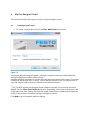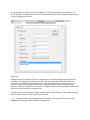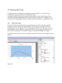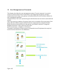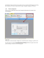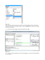
1
Designer Studio 1.90
8004847
20130404NH
This document contains information for Designer Studio on-line help, accessible from
Designer Studio \Help command
CANopen®, CoDeSys® and MODBUS® are registered trademarks of the respective
trademark owners in certain countries.
Manual Designer Studio 1.90
8004847
Version: 20130404NH
Origin: PTn412 / Ver. 1.05
Contents
1
Getting Started with Designer Studio Software ............................................. 9
1.1
Assumptions ...................................................................................... 9
1.2
Installing Designer Studio on a PC...................................................... 9
1.2.1 System Requirements ........................................................................ 9
1.2.2 Installation......................................................................................... 9
1.3
Having multiple versions of Designer Studio on same computer ...... 11
1.3.1 Installing Multiple Studio Instances ................................................. 11
1.3.2 Opening Project file created with older version of Studio ................. 12
1.4
Designer Package ............................................................................ 13
2
The HMI runtime ......................................................................................... 14
3
Basic Unit Settings ...................................................................................... 15
3.1
Other Context menu options ............................................................ 16
3.2
Built-in SNTP Service ....................................................................... 18
4
My First Designer Project............................................................................. 19
4.1
Creating a New Project ..................................................................... 19
4.2
Workspace ....................................................................................... 21
4.3
Select Communication Protocols ...................................................... 22
4.3.1 Configuring a Communication Driver ................................................ 22
4.4
Adding Tags ..................................................................................... 24
4.4.1 Designer Tag Editor .......................................................................... 25
4.4.2 Designer Data Types ........................................................................ 27
4.5
Designing a Page ............................................................................. 29
4.5.1 Importing a Page .............................................................................. 30
4.6
The Designer Widget Gallery ............................................................ 31
4.7
“Attach To” and Dynamic Properties ................................................ 33
4.8
Testing the Project ........................................................................... 36
4.8.1 Launching the HMISimulator ............................................................ 36
4.8.2 Stopping the HMISimulator .............................................................. 36
4.8.3 Simulator Settings ........................................................................... 37
4.8.4 Browsing Project from HMISimulator................................................ 39
4.9
Transferring the Project to Target ..................................................... 39
4.9.1 When Target Flash Memory is Low. .................................................. 46
4.9.2 The Runtime Loader ......................................................................... 46
4.10 Using Windows Client Client ............................................................. 49
4.11 Using ActiveX Client for Internet Explorer ......................................... 51
4.11.1 Copy ActiveX into the Target Device ................................................. 52
4.11.2 Internet Explorer Settings ................................................................ 52
4.11.3 Security Setting for Trusted Site Zone .............................................. 53
4.11.4 Install Active X on Internet Explorer .................................................. 55
4.11.5 Uninstalling Active X ........................................................................ 56
4.11.6 ActiveX information .......................................................................... 56
5
Basic Programming Concepts in Designer.................................................... 57
5.1
Attach to .......................................................................................... 57
5.2
Events .............................................................................................. 61
6
System Variables ........................................................................................ 63
6.1
Alarms ............................................................................................. 63
6.2
6.3
6.4
6.5
6.6
6.7
6.8
6.9
6.10
6.11
7
Communication ................................................................................ 64
Daylight Saving Time ....................................................................... 66
Device .............................................................................................. 67
Dump Information ............................................................................ 69
Network ........................................................................................... 70
Printing ............................................................................................ 70
SD Card ............................................................................................ 72
Time................................................................................................. 73
USB Drive ........................................................................................ 73
User Management ............................................................................ 74
Working with Actions .................................................................................. 76
7.1
Widget Actions ................................................................................. 76
7.1.1 ShowWidget .................................................................................... 76
7.1.2 TriggerIPCamera .............................................................................. 77
7.1.3 SlideWidget ..................................................................................... 77
7.1.4 RefreshEvent.................................................................................... 79
7.2
Keyboard Macro Actions .................................................................. 79
7.2.1 SendKey .......................................................................................... 79
7.2.2 SendKeyWidget ............................................................................... 80
7.3
Page Actions .................................................................................... 82
7.3.1 LoadPage ......................................................................................... 82
7.3.2 HomePage ....................................................................................... 83
7.3.3 PreviousPage ................................................................................... 84
7.3.4 NextPage ......................................................................................... 84
7.3.5 LastVisitedPage ............................................................................... 84
7.3.6 ShowDialog ..................................................................................... 84
7.3.7 CloseDialog...................................................................................... 85
7.3.8 ShowMessage.................................................................................. 85
7.3.9 LaunchApplication ........................................................................... 86
7.3.10 LaunchBrowser ................................................................................ 88
7.4
Tag Actions ...................................................................................... 89
7.4.1 DataTransfer .................................................................................... 89
7.4.2 ToggleBit ......................................................................................... 90
7.4.3 SetBit............................................................................................... 91
7.4.4 ResetBit ........................................................................................... 92
7.4.5 WriteTag .......................................................................................... 93
7.4.6 StepTag ........................................................................................... 94
7.5
Trend Actions ................................................................................... 95
7.5.1 RefreshTrend ................................................................................... 95
7.5.2 ScrollLeftTrend................................................................................. 95
7.5.3 ScrollRightTrend .............................................................................. 95
7.5.4 ScrollTrendtoTime ............................................................................ 96
7.5.5 PageLeftTrend.................................................................................. 96
7.5.6 PageRightTrend ............................................................................... 96
7.5.7 PageDurationTrend .......................................................................... 97
7.5.8 ZoomInTrend ................................................................................... 97
7.5.9 ZoomOutTrend ................................................................................. 97
7.5.10 ZoomResetTrend .............................................................................. 97
7.5.11 PauseTrend ...................................................................................... 97
7.5.12 ResumeTrend ................................................................................... 98
7.5.13
7.5.14
7.6
7.6.1
7.6.2
7.6.3
7.6.4
7.7
7.7.1
7.7.2
7.7.3
7.7.4
7.7.5
7.7.6
7.7.7
7.7.8
7.8
7.8.1
7.9
7.9.1
7.9.2
7.9.3
7.9.4
7.9.5
7.9.6
7.9.7
7.9.8
7.10
7.10.1
7.10.2
7.10.3
7.10.4
7.10.5
7.10.6
7.10.7
7.10.8
7.10.9
7.11
7.11.1
7.11.2
7.11.3
7.11.4
7.11.5
7.12
7.12.1
7.12.2
7.12.3
7.12.4
7.12.5
7.12.6
Show Trend Cursor........................................................................... 98
ScrollTrendCursor ............................................................................ 98
Alarm Actions ................................................................................... 99
SelectAllAlarms .............................................................................. 100
AckAlarm ....................................................................................... 100
ResetAlarm .................................................................................... 100
EnableAlarms ................................................................................. 100
System Actions .............................................................................. 101
Restart ........................................................................................... 101
ControlUserLED .............................................................................. 101
DumpTrend .................................................................................... 102
DeleteTrend ................................................................................... 106
DumpEventArchive......................................................................... 106
ResetProtoErrCount ....................................................................... 108
DeleteEventArchive ........................................................................ 108
SafelyRemoveMedia ...................................................................... 108
Multi-Language (MultiLang) Actions ............................................... 109
SetLanguage .................................................................................. 109
Recipe Actions ............................................................................... 110
DownloadRecipe ............................................................................ 110
UploadRecipe ................................................................................ 111
WriteCurrentRecipeSet................................................................... 112
DownloadCurRecipe....................................................................... 113
UploadCurRecipe ........................................................................... 114
ResetRecipe ................................................................................... 115
DumpRecipeData ........................................................................... 116
RestoreRecipeData ........................................................................ 117
User Management Actions ............................................................. 118
LogOut ........................................................................................... 118
SwitchUser..................................................................................... 119
ResetPassword .............................................................................. 121
AddUser ......................................................................................... 121
DeleteUser ..................................................................................... 122
EditUsers ....................................................................................... 123
DeleteUMDynamicFile .................................................................... 124
ExportUsers ................................................................................... 124
ImportUsers ................................................................................... 125
Media Actions ................................................................................ 126
PlayMedia ...................................................................................... 127
StopMedia ..................................................................................... 127
ReloadMedia.................................................................................. 127
PauseMedia ................................................................................... 127
BrowseMedia ................................................................................. 127
Print Actions .................................................................................. 128
PrintGraphicReport ........................................................................ 128
PrintText ........................................................................................ 128
EmptyPrintQueue ........................................................................... 128
PausePrinting ................................................................................ 129
ResumePrinting ............................................................................. 129
AbortPrinting ................................................................................. 129
8
Working with Alarms ................................................................................. 130
8.1
Alarm Configuration Editor. ............................................................ 130
8.2
Alarms’ State Machine ................................................................... 131
8.3
Setting Events ................................................................................ 133
8.3.1 Log Events ..................................................................................... 133
8.3.2 Notify ............................................................................................. 134
8.3.3 Actions........................................................................................... 135
8.4
Configure Alarms Widget................................................................ 136
8.5
Enable/Disable Column Sorting ..................................................... 136
8.6
Configure Alarms History Widget.................................................... 137
8.7
Managing Alarms at Runtime. ........................................................ 138
8.8
Enable/Disable Alarms at Runtime ................................................. 138
8.9
Live Data in Alarms Widget............................................................. 139
8.10 Exporting Alarm Buffers as CSV file ................................................ 140
9
Working with Recipes ................................................................................ 141
9.1
Recipe Configuration Editor............................................................ 141
9.2
Configuring Recipe Sets on the Page .............................................. 143
9.3
Defining Recipe Fields .................................................................... 143
9.4
Recipe Status ................................................................................. 145
9.5
Configuring Recipe Widget for Runtime Execution .......................... 145
9.6
Configure Recipe Transfer Macros. ................................................. 146
9.7
Upload or Download Recipes During Runtime ................................ 146
9.7.1 Recipe Download Through Recipe Widget in Runtime..................... 146
9.7.2 Recipe Download or Upload Through Recipe Transfer Macro in Runtime
146
9.7.3 Backup and Restore of Recipes Data .............................................. 147
10
Working with Trends ................................................................................. 148
10.1 Real-Time Trend ............................................................................. 148
10.2 History Trend ................................................................................. 150
10.3 Configuring Trend Window for History Trends ................................ 152
10.4 Trend Window Properties (Advanced View) .................................... 154
10.5 Trend Cursor .................................................................................. 154
10.6 Exporting Trend Buffer Data to CSV file .......................................... 156
11
Working with Multi-Language.................................................................... 157
11.1 Add a Language to Project.............................................................. 158
11.1.1 Language Display Combo ............................................................... 158
11.2 Multi-Language Widget .................................................................. 159
11.2.1 Multi-Language for Static Text Widget ............................................ 159
11.2.2 Multi-Language for Message Widget .............................................. 159
11.2.3 Multi-Language for Alarm Messages .............................................. 160
11.2.4 Multi-Language for Pop-up Messages ............................................ 160
11.3 Export and Import of Multi-language Strings .................................. 161
11.4 Change Languages at Runtime ....................................................... 164
12
Working with the Scheduler ...................................................................... 165
12.1 Configuring the Scheduler Engine .................................................. 165
12.2 HighResolution .............................................................................. 166
12.3 Recurrence Scheduler .................................................................... 166
12.4 Configuring Location in Designer Studio......................................... 168
12.5 Configuring the Schedule Interface for Runtime Interaction ............ 170
12.6
Schedule the Events During Runtime ............................................. 171
13
User Management and Passwords............................................................. 173
13.1 Configuring Security Options ......................................................... 174
13.2 Configuring Groups and Authorizations .......................................... 174
13.3 Modifying the Access Permission of Groups ................................... 174
13.3.1 Widget Permissions ....................................................................... 175
13.3.2 Action Permissions......................................................................... 177
13.3.3 FTP Authorizations ......................................................................... 177
13.3.4 HTTP Authorizations....................................................................... 178
13.3.5 Miscellaneous ................................................................................ 179
13.3.6 Access Priority ............................................................................... 180
13.4 Configuring Users .......................................................................... 180
13.5 Default User ................................................................................... 181
13.6 Assigning Widget Permissions from Page View............................... 182
13.7 Operation on Runtime .................................................................... 183
14
Audit Trails................................................................................................ 185
14.1 Enable or Disable the Audit Trail .................................................... 185
14.2 Configure Audit Events ................................................................... 186
14.3 Configure Tags in the Audit Trail..................................................... 186
14.4 Configure Alarms in the Audit Trail ................................................. 187
14.5 Configure Login or Logout Details in Audit Trail. ............................. 188
14.6 Viewing Audit Trails in Runtime ...................................................... 189
14.7 Exporting Audit Trail as CSV File ..................................................... 189
15
Configuring printouts in Designer .............................................................. 190
15.1 Adding a report .............................................................................. 190
15.1.1 Alarm Reports ................................................................................ 190
15.1.2 Reports .......................................................................................... 192
15.1.3 Page body ...................................................................................... 193
15.1.4 Header and Footer ......................................................................... 194
15.2 The contextual Widget Gallery ........................................................ 195
15.3 Print Events.................................................................................... 196
15.4 Printer configuration ...................................................................... 199
15.5 Supported printers......................................................................... 200
15.6 Minimum requirements .................................................................. 201
16
Keypads .................................................................................................... 202
16.1 Creating and Using Custom Keypads .............................................. 203
16.2 Deleting or Renaming Custom Keypads .......................................... 206
17
Special Widgets ........................................................................................ 207
17.1 Date Time Widget........................................................................... 207
17.2 RSS Feed Widget ............................................................................ 208
17.3 Control List Widget......................................................................... 209
17.3.1 State .............................................................................................. 210
17.3.2 Selection........................................................................................ 212
17.3.3 Write on Select............................................................................... 212
17.3.4 Write on Enter ................................................................................ 212
17.3.5 Read Only ...................................................................................... 212
17.4 Variables Widget ............................................................................ 213
17.4.1 Using Variables in JavaScript .......................................................... 215
17.5 Media Player Widget ...................................................................... 215
17.5.1 Using Media Player in JavaScript .................................................... 217
18
Working with Custom Widgets................................................................... 219
18.1 Creating a Custom Widget .............................................................. 219
18.2 Adding the Properties .................................................................... 220
18.3 Editing Custom Properties .............................................................. 223
19
Sending E-mail .......................................................................................... 224
19.1 SendMail Script.............................................................................. 224
19.2 Configure E-mail Server.................................................................. 224
19.3 Configure E-mail Accounts ............................................................. 225
19.4 Sending Live Tag Data through E-mail ............................................ 226
20
Working with JavaScript ............................................................................ 228
20.1 Execution ....................................................................................... 228
20.2 Events ............................................................................................ 228
20.2.1 Widget Events ................................................................................ 229
20.2.2 Page Events ................................................................................... 230
20.2.3 System Events ............................................................................... 231
20.3 Language Reference....................................................................... 232
20.3.1 Objects .......................................................................................... 233
20.3.2 Keywords ....................................................................................... 244
20.3.3 Global Functions ............................................................................ 244
20.4 Debugging of JavaScript ................................................................. 244
20.5 Limitations ..................................................................................... 246
21
Updating System Components in CPDX HMI .............................................. 247
21.1 System Settings Tool ..................................................................... 247
21.1.1 List of Upgradable Components ..................................................... 251
21.2 Update of System Components from Designer Studio .................... 252
21.3 Update of the System Components via USB Flash Drive ................. 254
21.3.1 Upgrade Steps ............................................................................... 255
21.3.2 Updating Panel Runtime ................................................................ 256
21.3.3 Updating Runtime from Studio ....................................................... 256
21.3.4 Updating Runtime from USB Drive ................................................. 257
21.4 License Activation of HMI Panel Software Modules ........................ 259
21.4.1 Activate Panel ................................................................................ 259
21.4.2 Save License .................................................................................. 261
21.4.3 Import license ................................................................................ 262
21.4.4 CoDeSys Demo Mode ..................................................................... 263
22
Designer Functional Specifications and Compatibility................................ 265
22.1 Table of Functions and Limits ......................................................... 265
22.2 Compatibility ................................................................................. 265
1
Getting Started with Designer Studio Software
The Designer Studio is a software application used to create graphical HMI pages. The
Designer Studio has a drag-and-drop interface that makes it easy to create complex
display pages. The same features found in many popular Windows applications are also
available in the Designer Studio.
This document describes how to use the Designer Studio application, and is divided into
chapters that represent the key operations of the Designer Studio. Each chapter is
presented in a standalone manner, allowing you to jump from chapter to chapter,
depending on the task you wish to perform.
1.1
Assumptions
We assume that those reading this manual are using the Designer Studio software to
design control panel applications that run on CPDX panels.
We also assume that you have a basic understanding of PCs, Microsoft Windows, and the
type of network environment in which you will run the application.
1.2
Installing Designer Studio on a PC
1.2.1
System Requirements
Designer Studio has the following system requirements:
Windows XP –SP3, Windows Vista SP1 or SP2, Windows 7.
100 MB of disk space
Minimum of 512 MB RAM
Ethernet interface
1.2.2
Installation
Run the Designer Studio setup application “Designer Studio-vxxxxxxx.exe” and follow the
instructions on the screen.
Figure 1
1. Read the Designer Studio Software License and accept the agreement.
2. Follow the instructions on the screen. The default location for the Designer Studio
software is C:\Program Files\Festo Software\Designer Studio. Default installation
path can be changed depending on needs.
Figure 2
6. If the Select Components step is available, select the components you want to
install.
7. The installation procedure will create a program group called Designer Studio in
the Start menu. A Designer Studio icon can be added to the desktop. Designer
Figure 3
Figure 4
After installing the Designer Studio, you can run the Studio application by using the
desktop icon or from Start > All programs > Designer Studio.
1.3
Having multiple versions of Designer Studio on same computer
This feature enables users to install different instances of Designer on the same
computer. Each installation will have its own settings, will work independently and can be
uninstalled individually.
1.3.1
Installing Multiple Studio Instances
During the installation process three scenarios may arise and are described below.
1.3.1.1 System without an installation of Studio already installed
The installation procedure asks for the destination folder and installs in the folder that
has been specified.
1.3.1.2 System with only one instance of Studio already installed
The installer detects that one version is already available and it will ask if you want to
replace the current version with the new one or if you want to install another instance.
1.3.1.3 System with multiple instances of Studio already installed
The installer detects that one or more installations of Designer are available and it will
ask if you want to replace the last installed instance with the new one or if you want to
install another instance (Figure 5).
Figure 5
When the user tries to install a second instance of the same version of Designer, Setup
will detect it and will show a warning message that the same version is already available
in the computer. Setup will also provide the user with the reinstall option (Figure 6).
Figure 6
Each installation goes to a sub-folder which has the version number as part of its name;
for instance:
C:\Program Files\Festo Software\Designer Studio 1.90.
Each installed version provides its ID in the Control Panel. Add/remove program facility is
provided in order to remove it individually from the computer.
Each installation identifies itself in the Start Menu with a program group name.
NOTE Multiple Studio installations provide a common workspace folder for all instances
of the Designer that have been installed.
1.3.2
Opening Project file created with older version of Studio
When a Designer project (file with .jpr extension) is opened, Designer checks for the
match between the version ID stored in the jpr file and its version ID; if they match, the
project file will be opened normally; if they do not match, Designer shows a warning
message to inform that the project has been created with a different version of Designer
(and report this version ID if it is available in jpr).
In this case Designer will offer two options to convert the project.
• Convert and open the project from current path. The project will be converted
without a backup copy of the original version.
• Convert and save the project to a new location and Open. The older version is
maintained as a backup copy.
Figure 7
1.4
Designer Package
The Designer Studio contains the following package as part of the installation.
Designer Studio
Designer Studio is an application for designing custom HMI projects in a user-friendly
manner, along with a variety of options in its built-in library, the Widget Gallery.
Windows Client
Designer Client is a light-weight application that can be used on Windows computers to
remotely view and manage an application running on an HMI.
HMIce Application
The Runtime is a standalone application that runs on the CPDX HMI. The Studio allows for
the update of the run time on the Target devices.
2
The HMI runtime
The HMI runtime is designed to support different platforms and different operating
systems.
All the panels are running today on the base of the Windows CE operating system
(Version 6 R3).
The operating system and all its options are built around the minimum set of
requirements of the HMI runtime; there is no option to get direct access to the Operating
system settings as all the needed components are managed via the runtime itself or via
Designer.
Later in this document you will find more information on how to install the HMI runtime
and how to manage the update of other system components (firmware) on the units, but
always with a dedicated interface which prevents a direct access to the operating system,
often a source of complexity.
Runtime Modes
The HMI runtime is composed of two logic units: one is called “server”, the other one is
called “client”.
The server unit is responsible for handling the HMI services such as running the
communication protocols, performing data acquisition, driving trend buffer sampling
activities, monitoring alarms, and so on.
The client unit is the part which is responsible for the visualization process: using the
data collected at the server side to render it on the display as graphical information.
The server unit of the HMI runtime can be in one of two operating modes: Configuration
Mode and Operation Mode.
Configuration Mode: the server is idle; activity has not started; for example no project is
loaded on the panel or system files are missing.
Operation Mode: the server is active; it is operating according to the settings defined by
the system files and by the application project.
The server operating mode is independent of the client side operating mode; you may
have a visualization running but server activity stopped.
3
Basic Unit Settings
The device basic settings are available from the Show System Settings Menu, which is
accessible through the runtime’s Context Menu, if the panel has the runtime already
installed, or by using the dedicated button on the unit when in loader mode (see for this
the chapter “The Runtime Loader” below in this document).
Press and hold your finger on an empty area of the screen for few seconds, until the
context menu appears as shown in the figure below.
Figure 8
Touch on Show system settings to access the system settings tools.
The System settings tool is a rotating menu through which you can scroll using the “Next"
and “Back" buttons. It includes the following entries:
Calibrate Touch
To calibrate the touch screen if needed
Display settings
Backlight and Brightness control
Time Internal RTC settings
BSP Settings Operating system version, Unit operating timers: power up and activated
backlight timers, Buzzer control, Battery LED control
Network
IP address settings
Plugin List Provides a list of the plug-in modules installed and recognized by the
system; this option may not be supported by all platforms and all versions.
NOTE Settings selected and confirmed with the OK button in the upper right corner of
the dialog are automatically saved to the registry.
Figure 9
3.1
Other Context menu options
The context menu has several other options as follows:
Zoom In/Out/100% Allow to zoom the view at runtime.
Pan Mode
a zoom in.
Enables/Disables the pan mode; works only when you have first activated
Settings
Provides options to set the Context menu activation delay, to
enable/disable the visualization of the mouse pointer, to show the busy cursor
(hourglass) when the system is busy with a long operation, to enable/disable the use of
an external physical keyboard. The figure below shows how the Settings dialog looks on
the unit.
Figure 10
Project Manager
When activated, a dialog box will appear (see figure below)
providing options to unload (de-activate) the current project, load (activate) another
project present on the panel memory, or delete a project.
Please note that projects can be deleted only after they are unloaded. If you click on a
project name other than the active one, the option "Load project" will first unload the
running application and then automatically activate the new one.
NOTE Project manager is supported starting from runtime version 1.60 and above. For
older versions, please refer to the “Manage Target” chapter in this document for how to
switch projects on the device from the Studio software.
Figure 11
Update
When activated, the panel verifies first the presence of an external USB pen
drive inserted in the panel USB port, and later for the presence on its root folder of the
update package. See the “Updating Runtime from USB Pen Drive“ chapter in this
document for further information
Logging
Enables you to display a trace of the system operation log; may be very
useful in case there is a need to debug a problem of any nature. The following figure
shows a case in which the system reports a communication error; the decoding of the
reported information may not be immediate, but you can always use the option “Log to
file” to save the dialog context to a file that can be later provided to Technical Support for
investigation. The log file is called “logger.txt” and it saved to the folder “..\var\log” on
the panel flash disk. The file can be retrieved from the panel using an FTP client.
NOTE The “Log TO FILE” Option is saved and retained after power cycles; when not
needed any more, it must be manually deactivated.
Figure 12
Show log at boot
Enables the logger at start up; if the “Log to file” option has been
enabled, the files are saved, in this case, from the startup phase.
About Shows information about the runtime version
3.2
Built-in SNTP Service
The CPDX Panels Operating System features an integrated SNTP (Simple Network Time
Protocol) that synchronizes the internal RTC panel whenever the predefined server is
available.
The server addresses are hard-coded and cannot be changed by the user. The system
searches for the following servers:
• time.windows.com
• tock.usno.navy.mil
SNTP servers are checked at power up, or once per week if the panel is not powered off.
4
My First Designer Project
This section describes the steps to create a simple Designer project.
4.1
Creating a New Project
1. To create a new project click on the File > New Project menu item.
Figure 13
The Project Wizard dialog will appear, asking for a project name and a path where the
corresponding project folder will be stored.
Designer projects are stored in a folder that has the same name as the project. This folder
contains all the project files. To move, copy or backup a project, you can simply move or
copy the project folder and all its contents to the desired location.
NOTE DO NOT rename the Designer Project folders manually. If you need to rename a
project, use the File > Save Project As function. Depending on the size of the project, this
could take some time. Please wait until the newly named project opens and all pages are
visible in the project tree before closing or taking any actions.
Click Next to go to the panel selection dialog.
Figure 14
The panel selection is shown in the figure above. Here, you can scroll through a list of
available HMI models to select the model you are working with.
For each model, two radio buttons are available to select the orientation: landscape
(default) or portrait. In portrait mode the device is rotated 90° clockwise.
NOTE Portrait mode operation has some limitations. All the System Settings dialogs do
not support the portrait mode and they still appear as horizontal.
Click Finish to complete the Wizard.
Once the HMI model is chosen, you can convert the project to any other model, using the
project properties portion of the screen, as shown below. This will not resize all widgets in
the project to the correct size to fit a smaller or larger screen, it will simply change the
model type and give a warning if some objects will be lost during the conversion.
Figure 15
4.2
Workspace
The Designer Studio workspace is divided into three main areas.
On the left-hand side of the window, you will find the Project View and Object View (as a
sliding tab). Project View presents the project files in the form of a hierarchical Project
Tree. Object View lists the Widgets with the corresponding ID’s used in the page.
The center area is the main working space and is where editors create the HMI display
pages and configure the project’s various features. The current page or pages opened in
the Editor View are indicated by a tab at the top of the center area. You can quickly switch
between the different pages in the Editor View by clicking on the desired tab.
The right part of the window shows the properties for the selected object, and on the very
right side, the Widget Gallery can be found as a slide-in pane. The Widget Gallery
provides a large library of symbols and graphic objects. When an object is selected, the
object visual settings can be changed by editing the various properties in the Property
View.
Figure 16
NOTE The Studio workspace layout can be freely changed at any time; any change is
saved and maintained among Studio activations. In case you need to reset the workspace
to the original default layout, use the command called “Reset and Restart” under the File
menu.
Figure 17
4.3
Select Communication Protocols
Device Communication drivers are configured in the “Protocol Editor", which is accessible
from the project tree (as shown in the figure below). Double click on the Protocols icon in
the Project Tree view to open the Protocol Editor.
To add a driver, click on the “+" Icon and select the driver from the list in the controller
field.
Figure 18
4.3.1
Configuring a Communication Driver
The combo box shows the list of available communication drivers. Once a driver is
selected, configure the driver by clicking on the browse button in the Configuration field.
A configuration dialog will be displayed, allowing you to set the parameters of the driver
(as shown in the figure below).
As an example, to create a project for Modbus TCP, you would select the Modbus TCP
driver and then configure the communication parameters by selecting the browse button
in the Configuration column.
Figure 19
Designer supports multiple protocol configurations. By repeating the steps previously
outlined, you can add up to four protocols in the protocol editor. Note that while it is
possible to run different Ethernet protocols over the same physical Ethernet port, you
cannot run different serial protocols over a single serial port. Some serial protocols
support access to multiple PLCs, but this is an option that has to be configured within the
protocol and still counts as one protocol.
The last column in the Protocol Editor is dedicated to Tag Dictionary. This shows the tags
that have been imported for a particular protocol.
NOTE The Alias works only for tags that are imported. The tags which are manually
added will not have the Alias prefix in the tag name.
4.4
Adding Tags
Designer uses Tag names to access all device data. All fields and reference locations in
the device need to be assigned a Tag name to be used in the HMI. To assign Tags, double
click on the Tags icon in the Project View and the Tag Editor will be displayed (as shown in
the figure below).
Figure 20
To add a new Tag, click on the “+" icon, and select the Address from the Communication
protocol address dialog. When Tags are initially added, these Tags are named Tag1, Tag2,
etc., by default. The user can rename the Tag with the appropriate name by clicking once
on the Tag name.
The Tag Editor in Designer provides a Tag Import feature, which is available based on the
protocol selected.
Not all protocols support Tag Import.
If the protocol does support this feature (see specific Protocol documentation), first
select the Protocol from the filter button and then click on the Import button (as shown in
the figure below).
Figure 21
You will see the dialog that corresponds to the protocol selected, which prompts you to
browse for the symbol file. The symbol file is exported from the controller programming
software.
4.4.1
Designer Tag Editor
The tool in Designer used to create and manage tags is called the Tag Editor.
For each tag, the Tag Editor allows you to specify several properties.
Name This is the unique name at the project level of the tag. This is the primary key used
to identify the information in the internal runtime tag database. Note that you cannot use
the same tag name even if you are referring to different communication protocols.
Group After the tags have been defined in the Tag Editor, they are used in the project by
attaching them to the widgets' properties (see chapter “Attach To” for a complete
explanation).
For each screen the system is able to identify which tags are used in the specific page and
identifies them as part of the "page group". This allows easy handling at run time of the
requests made by the communication protocol to the connected controller(s): only the
tags included in the displayed page are queued for polling from the controller memory.
This mechanism is fully automatic and there is no intervention required by the user.
The tag editor allows you to define groups of tags not belonging to a specific page but, for
instance, grouped according to their logical meaning.
We can call these groups "Users' groups". Users' groups have no meaning for the local
visualization, but they are very useful when external software communicates with the
local Designer runtime requesting sets of data that must be independent from the
currently displayed screen.
The Designer web server publishes a set of communication interfaces that can be used
from a 3rd party application to interface with the local tag database and read the tags
according to their grouping.
The group column allows you to define the users' groups and assign tags to them.
Driver Specifies the communication protocol for which the tag is defined.
Address
This shows the PLC controller memory address. To edit it, click on the right
side of the column to get the dialog box where you can enter the address information.
Comment
Allows you to add a description of the tag.
R/W This option determines if the tag must be managed as Read only (R), Write only (W)
or Read/Write (R/W).
Active As explained above, tags are grouped per page and, if needed, in users' groups.
By default tags are not active; this means they are automatically activated by the runtime
when the visualization requires them. You can force the system to continuously read a
certain tag even if not present in the current page by setting its Active property to true. An
example is if you need to embed a tag within an email message sent by the panel.
We recommend that you leave this parameter at false to avoid unexpected results in
terms of overall device performance.
Simulator
Designer Studio provides off-line simulation. The behavior of each tag
during simulation mode can be specified here by choosing between several profiles as
shown in the figure below.
Figure 22
Scaling
Tag values are normally transferred "as they are" from the protocol to the
real time tag database. You can specifically apply scaling to the tag values before they are
stored in the database. The available scaling options are shown in the figure below.
Scaling can be specified in terms of linear relationship as a formula or as range
conversion.
Figure 23
The tag name must be always unique at the project level; often it may happen that the
same tags, from the same symbol file have to be used for two different controllers. Since
having tags with the same name is not supported, you can use the “Alias” feature to
automatically add a prefix to the imported tag to make them unique at the project level.
When importing tags for a Protocol, the tag names may be prefixed by the name given in
the “Alias” item of the protocol configuration dialog box. Please note that not all
protocols support the “Alias” feature. See protocol documentation for specific
information.
4.4.2
Designer Data Types
When creating a tag, Designer shows a dialog box in which you need to specify the tag
properties. The tag Memory Types are specific to the selected Protocol.
Figure 24
The tag Data Type must be selected from the list of available Designer Data Types,
according to the internal representation you need for the selected controller address.
Designer Data Types are summarized in the following table.
Data Type
Description
string
Character strings. The characters are coded in UTF-8 format.
boolean
Boolean is one bit data
float
double
Float corresponds to the IEEE single-precision 32-bit floating
point type
Double corresponds to IEEE double-precision 64-bit floating
point type
binary
Binary represents arbitrary binary data
int
Int is signed 32 bit data
short
Short is signed 16 bits data
byte
Byte is signed 8 bits data
unsignedInt
UnsignedInt is unsigned 32 bit data
unsignedShort
UnsignedShort is unsigned 16 bit data
unsignedByte
UnsignedByte is unsigned 8 bit data
time
Time data
boolean [ ]
Array of Boolean
byte [ ]
Array of byte
short [ ]
Array of short
int [ ]
Array of int
unsignedbyte [ ]
Array of unsignedbyte
unsignedshort [ ]
Array of unsignedshort
unsignedint [ ]
Array of unsignedint
float [ ]
Array of float
double [ ]
Array of double
time [ ]
Array of time
NOTE String coding in UTF-8 format is supported from runtime version V1.80
4.5
Designing a Page
When a project is created, a page is automatically added to the project and shown in the
Page Editor. To add objects to a page, simply drag and drop the objects from the Widget
Gallery to the page.
To add a new page, right click on the Page node from the project tree and select “Insert
new page”. A dialog box will appear asking for the name of the new page.
Figure 25
4.5.1
Importing a Page
A page can also be imported from another project. By right clicking on the page folder in
the Project View, you will see an option named “Import Page”. Please refer to the Figure
below.
Figure 26
After selecting a page to be imported from the desired project, when you click OK, you get
a warning message in the editor as shown in the figure below.
Figure 27
Page Import can support only import of the page and the widgets in it, but not the Macro
actions and datalinks attached to the widget. By selecting “Yes” all the datalinks and the
Macro actions attached to the widgets will be removed. Only the Widgets will remain. By
selecting “No” the macro actions and the datalinks will remain attached to the widgets,
but may not function properly during runtime, unless the tags associated with the Macros
and datalinks are present or created in the new project.
NOTE The page import can be done between projects made in the same version of the
software. If the versions are different, then a warning message will pop up to save the
project in the new version, then try again to import the page.
4.6
The Designer Widget Gallery
The Gallery is adjacent to the Property View panel and can be opened by clicking on the
Widget Gallery tab (as shown in the figure below).
Figure 28
Select the desired object from the Widget Gallery, then drag and drop it on the page. To
change the appearance of the object, select the desired property from the property pane
and change the property settings.
All the HMI objects required to build an application are available in the Widget Gallery.
The Widget Gallery is accessible as a slide in pane from the right side of the workspace
(as explained in the previous chapter).
The gallery is divided into several categories, each with collections of different types of
objects.
Click on a category to display its sub-categories.
For each sub-category, the gallery offers the option of applying different styles to the
objects within that category (when possible).
The figure below shows the Widget style button for round gauges.
Figure 29
Clicking on the style button will display the available styles for the current object.
Select one of the available styles to apply it to the gallery objects.
This is done using the Page Toolbar shown in the figure below.
NOTE Style change may not be available for all widgets.
Figure 30
Once on the page, the object can still be subject to additional style changes.
This is done using the Page Toolbar shown in the figure below.
Depending on the object selected, you can have options for the style, frame, fill
color…along with the font type and size and other standard object properties
4.7
“Attach To” and Dynamic Properties
Designer allows for simple binding between Tags and Widget Properties. Many different
Widget Properties can be attached to a Tag, which allows you to control the device and
animate objects based on live data.
To attach a Tag to a property, click on the property in Property view. A
button will be
displayed on the right side of the property. Click on this button and select the item Attach
To… from the menu (as shown in the figure below).
For example, when working with a gauge object, the most common action taken by the
programmer is to attach a Tag to the needle, so that the value of the Tag referenced in the
controller memory is represented by the needle movement.
Figure 31
To attach the Tag to the needle, single click on the object to display its properties in the
Property view. Locate the “Value" property and click on the + button on the right part of
the field as shown in above figure. Select the Attach To… menu item and a dialog will be
displayed as shown in the figure below.
Figure 32
When attaching a Tag, you can attach four types of data sources: Tag, System Tag,
another object property (Widget) and Recipes.
Select the ‘Tag’ source type to attach to a Tag defined in the Tag editor.
Select the ‘System’ source type to attach to a System Tag
Select the ‘Widget’ source type to attach to data from another object.
Select the ‘Recipe’ source type to attach to Recipe data from Recipe manager.
Now select the Tags from the Tag Name combo and Click OK.
Tags can be attached to many different properties of the object. You can attach a Tag to a
different property by selecting the property in the Property view and clicking on the
Attach To… pop-up menu. You can also right-click on the object and select the Attach To…
menu item. The “Attach To" dialog will be displayed and you can select the desired
property from a list on the right part of the dialog.
NOTE A specific chapter later in this document describes in detail the “Attach to”
concept.
4.8
Testing the Project
HMISimulator provides the facility to test the project functionality before downloading it
to the panel. This feature is useful to test the project when no PLC hardware is available.
The user can choose real PLC or PLC simulator for the project. The simulator field in Tag
Editor and simulator settings dialog are used to configure HMISimulator.
4.8.1
Launching the HMISimulator
HMISimulator can be launched from Designer and also can be run as a standalone
application.
If you launch from Designer select the Run > Start Simulator menu item to start it.
Figure 33
At this point, the simulator is running locally on the PC, similar to the way the server runs
on a panel.
4.8.2
Stopping the HMISimulator
Figure 34
To stop the HMISimulator, select the Run >Stop Simulator menu item. You can also exit
the simulator using close button of HMISimulator and by using the Exit option from the
contextual menu.
Figure 35
4.8.3
Simulator Settings
The HMISimulator has the option to use actual or simulator protocols using the Simulator
Settings button in the toolbar.
Figure 36
When we invoke the Simulator Settings button, a dialog will popup which displays the
protocols used in the project. User can select to use actual or simulator protocols by
using the Use Simulation checkbox.
By default the HMISimulator uses simulator protocol defined in the Tag Editor Simulator
column (see Figure 37).
NOTE Some protocols, for example the Variable protocol, don't have actual protocol
(Win32) and, for these protocols this option remains disabled.
Figure 37
When defining Tag values, the Tag Editor also includes a field to select a method for
simulating the data as shown in the figure below. Tag values can be simulated in the
following ways:
Figure 38
4.8.3.1 Variables
The data is stored in a variable in the simulator. This variable holds the value of the Tag
so the client can read and write to the Tag value.
4.8.3.2 Counter
A count value is incremented from 1 to 1000. When the counter reaches 1000, the value is
reset to 0 and the counter restarts.
4.8.3.3 Sine Wave
A sine wave value is generated and written to the Tag value. The Min, Max and Period
values of the Sine wave can be defined for each Tag.
4.8.3.4 Triangle Wave
A triangle wave value is generated and written to the Tag value. The Min, Max and Period
values of the wave can be defined for each Tag.
4.8.3.5 Square Wave
A square wave value is generated and written to the Tag value. The Min, Max and Period
values of the Sine wave can be defined for each Tag.
4.8.4
Browsing Project from HMISimulator
In the HMISimulator users have the option to select a project using the browse button in
the toolbar. Users can select any project file already created.
Figure 39
4.9
Transferring the Project to Target
The Designer project can be transferred to the Designer Server Target system using the
“Download to Target" item in the Run Menu.
NOTE The project can be transferred to the device via Ethernet or via USB drive. In case
the project is downloaded to the unit via Ethernet, the panel must have a valid IP address
assigned, either static or dynamic via DHCP server. Please see the chapter “Unit Basic
Settings” for further information on how to assign an IP address to the panel.
The Download to Target dialog is shown in the figure below.
Once the panel has a valid IP address assigned, it will become discoverable on the local
network. Click on the “discovery” button as indicated in the figure below and click on the
desired IP address.
Click on the Download button to start the process. The system will switch the Target to
Configuration mode and transfer the files. When the download operation is completed,
the Target is automatically switched to Operation mode and the downloaded project is
started.
Figure 40
Any time a project is changed, the modified files needs to be transferred to the Target
device. When updating a Target, Designer provides the option Download only changes to
transfer only the modified files to the device. The figure below shows the Advanced
options expanded.
Figure 41
The other option is about deleting dynamic files. There are files that can be modified from
the panel at runtime, for example you can create new users at runtime or you can upload
new value in the recipes. If the option to delete the files is selected, the edited
configuration of the recipes, or users, or the schedulers will be deleted and overwritten by
the project configuration.
IMPORTANT Please make sure to check carefully before selecting this option as some
data can be lost.
When transferring a project, the Studio uses a combination of HTTP and FTP connection.
The HTTP connection is used to issue commands to the target device like “switch to
transfer mode” or “unload running project”; the FTP session is instead used to transfer
the files to the panel flash memory.
The Default port for HTTP connections on the Target is set to 80. However, the user can
change the port number to a different value. To set the port number, from Designer, click
on the Run > Manage Target, then click on Target Setup on the dialog. The HTTP, FTP
port or HTTPS, FTPS port can be set for the target.
The Host Name can be defined by the user, in the appropriate box in the Target Port popup. This will allow each panel to be easily identified on a network with multiple panels.
The drop down box will no longer show [email protected], but will show, for
example, [email protected].
After renaming the host, it is necessary to download the system files to the target.
Figure 42
NOTE Transferring a project after the above settings will result in a change of the default
configuration. At the next download, the new ports will be used on the target and the new
ports will have to be specified in the software to match the new selection.
In the download dialog, click on Advanced Menu and set the port.
Figure 43
Set the HTTP/HTTPS port and FTP/FTPS port of the Target. They represent the port
numbers the software uses to connect to the FTP(S) and the HTTP(S) servers on the
Target. This is useful whenever default ports are, for some reason, in use by other
applications or services, or if the local network requires using different port settings.
Figure 44
The HMI system also supports the ability to transfer a project to the panel device using a
USB drive.
To transfer the project via an external USB flash disk, you need to first create the so called
“Update Package”.
From the “Run” menu click on “Manage Target” and select the “Update Package” as
shown in the following figure.
Figure 45
Designer will show a dialog where you are asked to specify the Target type, what to
update (in this example we are transferring a project, so only the first check box has to be
checked), the path where to store the result of the operation (it can be directly to the root
folder of a USB drive plugged to a USB port on the PC) and the encryption option.
Encryption option, when marked, creates a zip file protected by a password only known to
Designer and runtime. This password makes sure the zip file is not opened by unauthorized person and its contents not changed for any reason. The password cannot be
changed after the file is created.
Once ready, click the Create button to generate the update package.
Figure 46
Assuming you have stored the package on the root folder of a USB drive, remove the
drive from the PC, plug it into the panel, activate the context menu by holding your finger
for a few seconds on the screen (see also “Basic Unit Settings“)and select “Update…” as
shown in the following figure.
Figure 47
The system will automatically check for the update package on the root of the USB drive
and ask to proceed with the update according to the following figure.
Figure 48
Mark the “Auto select best match” check box and click the “Next” button.
The rest is automatically done by the system.
NOTE The Update Package can also be used to update the panel’s runtime. For this
please see the chapter “Updating Runtime from USB Pen Drive“
4.9.1
When Target Flash Memory is Low.
While trying to download a project to the Target, if the project size is almost near or
greater than the free space available in the flash memory, then it’s not possible to
download the project directly. The difference between the project size and available free
memory should be at least 2MB.
Figure 49
While clicking Download, a warning message will pop up mentioning that the Target
memory is low and whether you need to delete some projects (as in the figure given
above). Soon after you click “Manage Target”, the Manage Target window will open
showing all the available projects in the Target. Deleting the unwanted projects from the
target creates more memory space, hence making it possible to download the current
project. By pressing Cancel, the dialog will close, and the download operation is aborted.
NOTE The automatic check for available space for project download is a feature available
from Designer and runtime version 1.80.
4.9.2
The Runtime Loader
The explanations provided in the previous chapters are valid when using a panel with the
runtime system already installed.
The HMI devices are delivered from the factory without the runtime. When you power up
the unit for the first time, it starts with the “Runtime Loader” screen as shown below.
Figure 50
NOTE The Runtime Loader is a feature dependent from the device Operating System and
may not be available on all the units. The description provided in this chapter assumes
that you are using Designer V1.80. On MIPS based units, the Runtime Loader is available
from version V2.65; on ARM based units the Runtime Loader is supported from BSP
version V1.52.
When you click on “System settings” you can activate the System menu in User mode,
where you can set the IP address of the panel. See the chapter “System settings tool” for
additional information on this tool.
Once the IP address is assigned and the panel is connected to a valid network, the easiest
way to install the runtime is to download a project from the Designer. See the chapter
“Transferring the Project to Target“ for additional information.
The normal download procedure in Studio is able to recognize the need for transferring
the runtime and the process is automatically started.
As soon as the panel IP is selected from the list of available units in the network, Studio
will recognize the need for transferring the runtime, providing the information as shown in
the following figure.
Figure 51
Just click on the Install runtime button to proceed.
The process will automatically go through the required steps, ending with the project
download.
On an off-the-shelf unit the runtime can be installed also using an USB pen drive.
Prepare the Update Package according to the instructions provided in the chapter
“Transferring the Project to Target“ and make sure to mark all the check boxes for the
HMI Runtime as shown in the following figure.
Figure 52
Then plug the USB drive in the panel and click on the “Transfer from disk” button as
below.
Figure 53
Then follow then the instructions on the screen.
NOTE The Runtime Loader on the panel does not support the automatic installation of
the runtime with versions prior to 1.80; in case an older version of the runtime has to be
used on a unit with the Runtime loader, please contact technical support for additional
information.
4.10
Using Windows Client Client
The Windows Client Client provides remote access to the Designer Server, and is included
in the Designer Studio installation. The Windows Client Client consists of a simple
standalone application; although it uses the same graphic rendering system as the
server, it relies on a specified Designer Server for live data.
Windows Client Client for Windows is available in the Runtime folder of the Designer
Studio root folder. Execute the Windows Client Client application from the Runtime folder
or from the start up menu (Designer Studio- Windows Client). The client will open in a
browser-like style window. Type the server IP address (the panel’s IP address) in the
address bar (for example: http://192.168.1.12). The Client will connect to the server and
the same graphical application running on the Server panel will be loaded in the client
window.
Windows Client Client acts as a remote client and communicates to the server, sharing the
local visualization with those Tag values that are maintained or updated by the
communication protocol.
Time Zone Options for Client
Starting from version V1.60 the Windows remote client provides an additional option to
handle the visualization of the timestamp information of a project.
From the "Settings" dialog you now have access to a set of new options shown in the
next figure:
Figure 54
The Time settings information is used by the client to adapt the widget timestamp
information according to the desired behavior.
Widget Defaults
Allows you to display the time information per each widget
according to the widget settings provided at the time of programming in the Designer.
Local Time Translates all the timestamp information of the several widgets used in the
project into the PC local time where the client is installed.
Global Time Provides all the timestamp information with reference to the UTC time
(Coordinated Universal Time).
Server Time Translates all the timestamp information of the widgets used in the project
in order to show the time as it is at the panel side.
NOTE To be properly used, this feature requires you to set the panel RCT with the correct
zone and DST (Daylight Savings Time) options.
Using the Integrated FTP Server
The HMI runtime system features an integrated FTP server that can be used to get access
to the internal flash disk data.
NOTE Folders present on the Flash disk external to the runtime directory are not
accessible via FTP; external USB drive and SD Storage Card are not accessible via FTP.
You can use any standard FTP client program to connect to the panel FTP server. The FTP
server responds to the standard port 21 when using the IP address assigned to the panel
as host.
NOTE The server supports only ONE connection at a time; if you are using an FTP client
which is configured to multiply the connections to the server in order to speed up the
transfer operation, you will need to disable this feature in the client program or set the
maximum number of connections per session to 1.
The FTP server is configured by default to accept incoming connection from the following
accounts:
User name: admin
Password: admin
FTP permissions and account information can be changed from the “UserGroups” under
the “Security” item of the project folder as shown in the following figure.
Figure 55
Additional information can be found later in this document in the chapter titled “FTP
Authorizations”.
4.11
Using ActiveX Client for Internet Explorer
In the standard distribution of Designer Studio, a Windows Client Client and Designer
ActiveX Client is provided.
ActiveX components are NOT installed by default to the Target devices, in order to save
space in the flash memory.
NOTE This ActiveX requires Microsoft Visual C++ 2008 Redistributable Package (x86)
installed on your system. You may need to download the Download Microsoft Visual C++
2008
Redistributable Package (x86) from the Microsoft web site.
4.11.1 Copy ActiveX into the Target Device
The ActiveX component is distributed with the Designer Studio installation package. The
related files are located in the Runtime folder of the Designer Studio installation
directory. The files, “HMIAX.cab" and “HMIClientAX.html", should be copied into the
workspace folder of the Target device, where the Runtime is installed. The file copy can
be done using the panel FTP server as described in the dedicated chapter.
4.11.2 Internet Explorer Settings
Internet Explorer settings must be changed, adding the panel’s IP to the list of the trusted
sites.
In Tools – Internet Option Security tab choose, “Trusted sites". Then click on the “Sites"
button.
Type in the IP address of the Target device, the location where the ActiveX component has
been installed and it will be loaded to the browser.
Figure 56
4.11.3 Security Setting for Trusted Site Zone
Set your Internet Explorer Browser as seen in the following images:
Figure 57
Figure 58
Figure 59
4.11.4 Install Active X on Internet Explorer
In Internet Explorer, allow the installation of the ActiveX component when the question
pops up in your browser.
Figure 60
In case you are using a Vista or Windows 7 operating system, you need to click on Yes on
User Account Control, as shown in the following picture.
Figure 61
4.11.5 Uninstalling Active X
To remove the ActiveX component from your system, you must delete it from the
computer. By default, the component is installed in the following folder:
C:\Program Files\Festo\HMIClientAX
4.11.6 ActiveX information
The ActiveX is able to show projects at a maximum pixel resolution of 1200 x 800.
5
Basic Programming Concepts in Designer
The programming guidelines for Designer are based on a few basic concepts, which are
common in many parts of the system.
5.1
Attach to
In Designer the basic programming techniques are used to configure the properties of an
object placed on a page.
Object properties can be set at programming time or configured to be dynamic.
To change a property at programming time you can use the page toolbar or the property
pane which shows the properties available for the selected object.
Figure 62
The page toolbar permits a quick change of the most commonly used object properties.
When you need a complete view of all the properties of a certain object, you need to use
the property pane. You have to select an object to see its properties shown in the
property pane.
The property pane allows you to both change a property at programming time and attach
the property to a dynamic element.
From the property pane, when you click on the right side of a property cell, you get the
ability to "Attach to" the property to a tag. This operation is done using the "Attach to"
dialog shown in the figure below.
Figure 63
The “Attach to” dialog has two tabs. The first is called "Tag" and allows you to attach the
property to an element. The "source" can be selected using the radio buttons.
The element to which the property can be attached is:
- a Tag
- a System Variable (see chapter System Variables for an explanation of the meaning of all
System Variables)
- a property from another Widget
- an element of a Recipe
The radio buttons at the bottom allow you to set the access type.
The TagIndex selection is used in the case of arrays to determine the array element.
Figure 64
When adding Tags, the Protocols used in the Project are shown in the tag Dialog box and
when expanding each protocol, the corresponding tags can be seen. The tags will be
arranged in alphabetical order inside each Protocol.
There is an Option to search the tag to be attached by its name as shown in the Figure
above.
This makes it easy to find Tags.
The search can be done in two ways: first, you can start typing the tag name in the left
box and this will “jump” into the list to the first tag starting with the characters you have
entered; second, you can type in the search box any part of a tag name and this will
automatically apply a filter to the view so that only the tags which contain the search
characters are displayed.
Figure 65
The second tab is called "XForms" and it is shown in the figure below.
The XForms tab allows you to apply transformations to the numeric value of the source
element before it is applied to the property.
Transformations can be simple linear relationships or generic transformations.
Linear scaling can be configured when selecting the "Scale" radio button and they can be
specified in terms of a formula or "By range". In case the range mode is selected, you just
need to specify the input and output range and the system will automatically calculate
the factors for the formula.
Figure 66
Special transformations are available when you click on the "Transform" radio button.
Currently supported transformations are color conversion and bit/byte index.
Color conversion
Allows you to define a map between numeric values of the tag and
colors to be assigned to the property. This feature is used to change the color of a button,
for example, based on the value of a tag. If the tag is an integer, you can have many
different colors based on the tag value.
Bit and Byte index Allows extracting a single bit or byte content from a word depending
on the specified bit or byte number.
Figure 67
5.2
Events
In a Designer system, Events are the way to attach actions in the applications.
There are three types of Events:
• events related to buttons.
• events related to data changes
• other events
Events are generated under the following conditions:
• when a button is pressed.
• when a button is released.
• when the value of a Widget (a numeric field for example) or, of one of the widget
properties attached to a tag, changes, an event will be triggered. This is the
OnDataUpdate event.
• when a page is entered
• when a page is left (on exit)
• when the visualization component of at least one object in a certain page changes
• when an alarm is triggered
• when the scheduler engine is triggered because of a time condition
Whenever the system generates an event, it is possible to attach one of the following
actions to the event:
• a specific action selected from a list of predefined actions
• a piece of JavaScript code
The figure below shows an example of an action activated by pressing a button.
Figure 68
By associating actions to events, the Designer programmer configures program
interactions with the interface.
6
System Variables
System variables are special tags containing information about the runtime and its
operation.
System variables are available in the Attach to dialog from the "Source” selection as
shown in the following picture.
Figure 69
System variables are divided into categories. Categories are described in specific
chapters.
6.1
Alarms
The variables in this category return information about the actual number of alarms
divided per status.
Figure 70
All these system variables are Int type (32 bit), read only.
6.2
Communication
These variables return information about the status of the communication between the
target device and the controllers configured in the Protocol Editor.
Figure 71
Protocol Communication Status
values:
The variable is read only Int (32 bit), and can have 3
0
No protocol running; it may occur if the protocol driver has not be properly
downloaded to the target system
1
Protocol has been properly loaded and started; no communication errors
2
At least one communication protocol is reporting an error
Protocol Error Message
This variable returns an ASCII string containing a description
of the actual communication error. The communication protocol acronym is reported
between square brackets to recognize the source of the error in case of multiple protocol
configurations.
The variable is a read only string. If no errors are present, the string will be blank.
Protocol Error Count This variable returns the number of communication errors that
occurred since the last time it was reset.
The variable is a read only integer. The reset of this variable is only possible using the
dedicated Action “Reset Protocol Error Count“
6.3
Daylight Saving Time
The variables in this category return information about the system clock and allow
adjusting it from the application.
They contain information on the "local" time.
All the variables are read only; this means that you cannot change them to update the
system RTC. All the variables are bytes (8 bit) except for the DLS and Standard Offset that
are shorts (16 bit).
Standard time is the "solar time" and other is Daylight Savings Time.
Standard offset
represents the offset in minutes when standard time is set, with
respect to GMT. (with respect to the picture it is -8*60 = - 480 minutes)
Standard week
it is First = 1).
the week in which the Standard time starts (w.r.t. the picture
Standard Month
the month in which the standard time starts (range of the variable is
[0 -11] so w.r.t. the picture it is November = 10)
Standard Day day of week in which the standard time starts (w.r.t. the picture it is Sunday
= 0)
Standard hour
field it is 02 = 2)
hour in which the standard time starts (w.r.t. the picture in Time
Standard minute
field it is 00 = 0)
minute in which the standard time starts (w.r.t. the picture in Time
Dst offset
represents the offset in minutes when DLS time is set, with respect to GMT.
(w.r.t. the picture it is -7*60 = - 420 minutes)
Dst week
week in which the DLS time starts (w.r.t. the picture it is Second = 2).
Dst Month
month in which the DLS time starts (range of the variable is [0 -11] so w.r.t.
the picture it is March = 2)
Dst Day
day of week in which the DLS time starts (w.r.t. the picture it is Sunday = 0)
Dst hour
2)
hour in which the DLS time starts (w.r.t. the picture in Time field it is 02 =
Dst minute
0)
minute in which the DLS time starts (w.r.t. the picture in Time field it is 00 =
Figure 72
6.4
Device
The variables in this category can be used to adjust specific device settings and get
operational information.
Figure 73
Available System Memory: Returns the free available RAM memory in bytes; it is a 64 bit
data; it is a read only variable.
Backlight Time:
Returns the activation time in hours of the display backlight lamp
since production of the unit; it is a read only variable.
Battery LED Allows you to enable/disable the use of the front LED indicator to report
the low level battery status. It can have values 0 (disabled) or 1 (enabled).
Battery Timeout
Reserved.
Display Brightness This variable is an integer of R/W type. Its range goes from 0 to 255.
It can be used to check brightness level and adjust it from the application. Typical use is
connected to a slider widget.
External Timeout
Allows setting the non-operational time after which the display
backlight is automatically turned off. The backlight is automatically turned back on when
the user presses on the touch screen.
The variable is an int of R/W type.
Flash Free Space
Returns the free space left in the device internal flash.
System Font List
List of system fonts.
The variable is a read only string.
System Mode Returns a value informing the operation status of the runtime - the possible
values are:
1: Booting
2: Configuration mode
3: Operating mode
4: Restart
5: Shutdown
System UpTime:
Returns the total time in hours in which the system has been
powered since production of the unit. It is a read only variable.
Touch Buzzer Allows you to enable/disable the touch audible feedback. It can have
values 0 (disabled) or 1 (enabled).
6.5
Dump Information
These variables return information about the status of the copy process to external drives
(USB or SD Card) for trend and archive buffers
Figure 74
Dump Trend Status Returns value 1 during the copy process of the trend buffers. If the
copy duration time is less than one second, the system variable does not change its value.
Dump Archive Status Returns value 1 during the copy process of the archive buffers. If the
copy duration time is less than one second, the system variable does not change its value.
6.6
Network
Figure 75
The system variables in this category allow you to show and set network device
parameters. Except for the MAC ID, they are all strings of R/W type.
6.7
Printing
The variables in this category return information about the Printing system. All the
variables are read only.
Figure 76
In the table below you can read the description of the available system variables.
Variable Name
Completion percentage
Current disk usage
Current job
Current RAM usage
Disk quota
Graphic job queue size
RAM quota
Status
Text job queue size
Description
The percentage of competition of the current print job. It
ranges from 0 to 100.
The size (in bytes) of folder where PDF reports are stored (it
is reportspool if option Spool media type is Flash).
The name of the report the job is processing.
The size (in bytes) of the RAM used to process the current
job.
The maximum size (in bytes) of the folder where PDF reports
are stored.
The number of the available graphic jobs in the printing
queue.
The maximum size (in bytes) of the RAM used to generate
reports.
A string representing the status of the printing system. The
possible values are idle, error, paused and printing.
The number of the available text jobs in the printing queue.
6.8
SD Card
The variables in this category return information about the external SD Card plugged into
the panel. They are 64 bit variables, except the drive name which is a string. All the
variables are read only.
Figure 77
SD Card FreeSpace Size in bytes of the available space
SD Card Name
Name of the SD card
SD Card Size
Size in bytes of the card plugged in the slot
SD Card Status
Status of the SD card
6.9
Time
Figure 78
The variables in this category return information about the System Time expressed in UTC
format.
They are all Int (32 bits) of read/write type, except for the System time which is a 64 bit
variable, still of read/write type. This is actually the UTC time which also is available as
date/time from the other variables.
6.10
USB Drive
The variables in this category return information about the external USB drive connected
to the panel, They are 64 bit variables, except the drive name which is a string. All the
variables are read only.
Figure 79
USB Drive free space Size in bytes of the available space
USB Drive Name
Name of the USB device
USB Drive Size
USB Drive Status
6.11
Size in bytes of the device plugged in the USB port
Status of the USB device
User Management
These system variables return information about users and groups.
Figure 80
No Of Remote-Clients Alive Number of remote clients connected to the server.
This is a read only short (16 bit).
This Client Group-Name
to.
This is a read only string.
Name of the group to which the current logged user belongs
This Client ID The variable is valid with reference to the Client scope. Local and remote
clients connected to the same "server" (same runtime) get a unique ID returned by this
variable.
This is a read only short (16 bit).
This Client User-Name
variable is displayed
This is a read only string.
Name of the user logged to the Client where the system
7
Working with Actions
Actions are the function used to interact with the system; they are normally executed
when events are triggered.
When considering events generated by buttons (pressed or released) not all the actions
are available for both states. In case the selected action is not supported for the actual
state, the software will report a warning message as shown in the following figure.
Figure 81
7.1
Widget Actions
The following chapters will include the description of a set of actions dedicated to
handling widget visibility and control.
7.1.1
ShowWidget
The ShowWidget macro allows you to show or hide the page widgets. In the macro
properties, select the widget you want to show or hide, then set the show properties as
follows: false to hide and true to show widget.
Figure 82
7.1.2
TriggerIPCamera
The TriggerIPCamera macro allows you to start the image capture from an IP Camera.
Select the IP Camera Widget in the Macro Properties to trigger the capture from the IP
Camera.
Figure 83
7.1.3
SlideWidget
The SlideWidget macro allows you to show the sliding effect of a Widget, or of a Widget
group, in HMI Runtime.
NOTE The widget or grouped widget can actually be outside of the page in the project
and slide in and out of view.
Figure 84
Widget
The Widget to slide
Direction
Sliding Direction
Speed
The transition speed of the sliding Widget
X Distance
The travel distance of the X coordinate of Pixel
Y Distance
The travel distance of the Y coordinate of Pixel
Slide Limit Enable/Disable limiting the movement with Respect to the Coordinates (X
and Y) of the Widget.
X Limit
When specified, automatically stops the slide action when the widget
reaches the specified position.
Y Limit
When specified, automatically stops the slide action when the widget
reaches the specified position.
Toggle Visibility
Toggle the Visibility of the Widget at the end of each Slide action.
Image WidgetAllows an image to show during the movement; the specified image will be
shown during the Slide Operation between the start and end point of the movement.
7.1.4
RefreshEvent
The RefreshEvent macro allows you to refresh the selected Event Widget. The Event
Widget is a component of the Alarm History Widget (see paragraph Configure Alarms
History Widget.).
Figure 85
7.2
Keyboard Macro Actions
The Keyboard macro actions include Send Key and Send Key Widget.
7.2.1
SendKey
The SendKey macro is used to enter the predefined character to the Read/Write Widget.
Define the predefined key code and Shift key code to the Macro actions property. In
runtime, first click the R/W numeric Widget, then execute the Macro to send the
predefined keys to the Numeric Widget. The action works on the field currently being
edited.
NOTE To use the SendKey macro, you must define the keypad type as “Macro" in the
Numeric Widget properties (as shown in Figure 49).
Figure 86
Figure 87
7.2.2
SendKeyWidget
The SendKeyWidget macro is used to enter the predefined character or function for a
specific Widget. To use the macro, define the Widget ID and the key code in the Macro
Properties.
The Control List Widget (available in the advanced category of the Widgets Gallery) is a
good example of how this macro command can be used. Here Up and Down buttons have
been implemented using the SendKeyWidget macro. See the figure below for reference.
Figure 88
NOTE To use the SendKey macro, you must define the keypad type as “Macro" in the
Numeric Widget properties.
Figure 89
7.3
Page Actions
The Page Actions macros are used for page navigation and to load-specific pages. Please
note that the Page Actions are programmable ONLY in the released state.
The Page Actions macros are available for Alarms, Schedulers and Mouse Release Events.
7.3.1
LoadPage
The LoadPage macro allows you to load the selected page of the project file when the
macro is executed.
Figure 90
7.3.2
HomePage
The HomePage macro allows you to specify the home page.
By default, the home page is the first page of the project. However, you can change the
home page in the project configuration properties. To change the home page, double
click on the project name item in Project View. Once in Properties, choose the home page
(as shown in the figure below).
Figure 91
7.3.3
PreviousPage
The PreviousPage macro allows you to navigate the HMI runtime to the previous page.
7.3.4
NextPage
The NextPage macro allows you to navigate the HMI runtime to the next page.
7.3.5
LastVisitedPage
The LastVisited page macro allows you to load the page previously displayed on HMI
runtime.
7.3.6
ShowDialog
The ShowDialog macro allows you to display the Dialog Pages defined in the project.
After the execution of this macro, the HMI runtime displays the specified Dialog Page.
Figure 92
7.3.7
CloseDialog
The CloseDialog macro is applicable only to Dialog pages. The Close Dialog macro allows
you to close the dialog page currently displayed.
7.3.8
ShowMessage
The ShowMessage macro allows you to display warning message popups when the macro
is executed. Type the message that you wish to have displayed while executing the macro
(as shown in the figure below).
Figure 93
7.3.9
LaunchApplication
The LaunchApplication macro allows the user to launch an external application when the
macro is executed. To configure, the following information must be provided in order to
execute the requested application.
App Name
name of the executable file complete with extension. For example, if you
want to run Notepad application, the argument should be “notepad.exe"
Path application path; when the target platform is Windows CE, the path is \flash\qthmi.
This is the folder that you see and have access to, when connecting to the panel via FTP.
Arguments Some applications may need arguments to be passed. For example, to
open a pdf file, specify the file name so that, while launching the application, the file
name set in the argument is loaded on the application. For example,
\flash\qthmi\Manual.pdf will open the document “Manual.pdf”.
Single Instance This argument allows the application to start in a single instance or
multiple instances. When single instance is selected, the system first verifies whether the
application is already running. If it is running, then the application pulls it up (the
operating system puts it in the foreground to the user’s attention); if it is not running,
then the application is launched.
Figure 94
PDF Reader
You can use the macro LaunchApplication to run the PDF Reader or to open a PDF file
stored on the Flash, the USB memory stick or the SD Card.
NOTE If you want to store a PDF file in the Flash, then you can follow instructions
described in the chapter Using the Integrated FTP Server.
To open the PDF Reader fill in the forms as described in the following figure
Figure 95
If you want to open a PDF file directly, type the absolute path of file in the field
arguments. For example \Storage Card\PDF\demo.pdf.
NOTE The PDF Reader works only with some HMI panels. It doesn’t work with the
Simulator, the Windows Client or ActiveX.
7.3.10 LaunchBrowser
LaunchBrowser will launch the default web browser. You can define the URL address of
the webpage in the arguments.
NOTE Not all the CPDX platforms are equipped with a default web browser. Contact
Technical Support for additional information.
Figure 96
7.4
Tag Actions
The Tag Actions macros are used to interact with the application Tags.
7.4.1
DataTransfer
DataTransfer macros allow you to exchange data between two controllers, between
registers within a controller, or from system variables to controllers (and vice versa).
“SrcTag" refers to the source Tag and “DestTag" refers to Destination Tag. The various
Tag types include a Controller Tag, a System Tag, a Recipe Tag and Widget Property.
Figure 97
7.4.2
ToggleBit
Toggle Bit macros allow you to “toggle" (meaning set or reset) a bit of a tag. The BitIndex
allows you to select the bit to be inverted: this requires a read-modify-write operation;
the read value is inverted and then written back to the controller tag.
Figure 98
7.4.3
SetBit
The SetBit macro allows you to set the selected bit. When the macro is executed, the
value of the selected bit is set to “1".
The BitIndex property allows you to select the bit position inside the Tag.
Figure 99
7.4.4
ResetBit
The ResetBit macro allows you to reset the selected bit. When the macro is executed, the
value of the selected bit value is set to “0”
The BitIndex property allows you to select the bit position inside the Tag.
Figure 100
7.4.5
WriteTag
WriteTag allows you to write constant values to the controller memory. In the Macro
properties you have to specify the Tag name and the value to be written.
Figure 101
7.4.6
StepTag
The StepTag macro allows you to increment or decrement the value of a Tag.
TagName
Step
Name of the Tag you want to Step
Step value
Do not step over limit
Step Limit enable
Step Limit
If the “Do not step over limit” is true, then the macro will work until the Tag
value reaches the specified value.
Figure 102
7.5
Trend Actions
Trend actions are used for both Live Data Trends and the Historical Trends Widget.
7.5.1
RefreshTrend
The RefreshTrend macro is used to refresh the Historical Trend window. You have to
specify the Trend Widget in the macro properties.
7.5.2
ScrollLeftTrend
The ScrollLeftTrend macro is used to scroll the Trend window to the left side, by onetenth (1/10) of the page duration.
NOTE With the Real-Time trend it is recommended to pause the trend using the macro
PauseTrend, otherwise the window is continuously shifted to the current value.
7.5.3
ScrollRightTrend
The ScrollRightTrend macro is used to scroll the Trend window to the right side, by onetenth (1/10) of the page duration.
NOTE With the Real-Time trend it is recommended to pause the trend using the macro
PauseTrend, otherwise the window is continuously shifted to the current value.
7.5.4
ScrollTrendtoTime
The ScrollTrendtoTime is used to scroll the Trend Window to a particular point in time.
When you execute this macro the Trend Window will move to the time specified in the
Macro Properties.
Figure 103
This Action may be very useful when you need to scroll at a specific position in a trend
window based on the time at which a certain event occurs. This can be achieved by
configuring an action for that alarm (event) that executes a Data Transfer of the system
time into a Tag; when selecting that tag as “ScrollTrendtoTime” parameter (see above
figure) the trend windows will be centered at the time in which the event has been
triggered.
7.5.5
PageLeftTrend
The PageLeftTrend macro allows you to scroll the Trend window by one-page duration.
For example, if the page duration is 10 minutes, then, with the PageLeftTrend macro you
can scroll the trend left for 10 minutes.
7.5.6
PageRightTrend
The PageRightTrend allows you to scroll the Trend window by one-page duration. For
example, if the page duration is 10 minutes, then, with the PageRightTrend macro, you
can scroll the trend right for 10 minutes.
7.5.7
PageDurationTrend
The PageDuration macro is used to set the page duration of the Trend window. In Macro
Properties, you must define the Trend Name and Page Duration.
Figure 104
NOTE You can also use a combo box Widget to select the page duration at Runtime.
7.5.8
ZoomInTrend
ZoomInTrend macro allows you to reduce the page duration.
7.5.9
ZoomOutTrend
ZoomOutTrend macro allows you to make the page duration longer.
7.5.10 ZoomResetTrend
ZoomResetTrend macro allows you to reset the zoom level back to the original zoom level.
7.5.11 PauseTrend
PauseTrend macro allows you to stop plotting the Trend curves in the Trend window.
When used with Real Time Trend the plotting stops when the curve reaches the right
border of the graph. The Trend logging operation is not stopped from the panel when this
macro command is used.
7.5.12 ResumeTrend
ResumeTrend macro allows you to resume a Trend plotting you previously paused. After
executing the ResumeTrend macro, the Trend window will start to plot the data to the
Trend once again.
7.5.13 Show Trend Cursor
The ShowTrendCursor macro allows the user to know the value of the curve at a given
point on the X-Axis. Use this macro to activate the Trend Cursor. At Runtime, upon
executing the macro, a Vertical Line (Cursor) will display in the Trend Widget. When the
Graphic Cursor is enabled, the scrolling of the Trend is stopped. You can implement Scroll
Cursor macros to move the Graphic Cursor over the curves, or to move the entire Trend
window.
Figure 105
7.5.14 ScrollTrendCursor
The ScrollTrendCursor macro allows the user to scroll the Trend Cursor in forward or
reverse time direction. The Y-Cursor value will display the Trend value at the point of the
cursor. The scrolling percentage can be set at 1% or 10%. The percentage is calculated
based on the Trend window duration.
Figure 106
7.6
Alarm Actions
Alarm Actions are macros used to acknowledge or reset the alarms. The actions listed
here can be used to build a custom Widget for the alarm display; you can observe an
example of how these are used in the default Alarm Widget, available in the Widget
gallery.
Figure 107
7.6.1
SelectAllAlarms
This macro allows you to select all the Alarms in the Alarm Widget.
7.6.2
AckAlarm
The AckAlarm macro allows for acknowledging the selected Alarms.
7.6.3
ResetAlarm
The ResetAlarm macro allows you to reset the selected acknowledged Alarms.
7.6.4
EnableAlarms
The EnableAlarms macro is used in conjunction with the “Save” button of the Alarm
widget; it is required to properly save at runtime the changes made in the “Enable” check
boxes from the “Enable” column in the alarm widget.
Figure 108
7.7
System Actions
The System Actions macro allows you to use the system properties in Runtime.
7.7.1
Restart
The Restart system macro allows you to restart Designer Runtime. After executing the
macro, the Designer server goes to configuration mode and restarts Runtime.
7.7.2
ControlUserLED
This allows the switching ON, OFF or blinking of the User LED. In the action properties, the
LED action can be set to OFF, ON or Blink.
Figure 109
NOTE Not all HMI models have User LED indicators. Check the product documentation
for further information.
7.7.3
DumpTrend
The DumpTrend macro is used to store the Historical Trend data to external drives, such
as a USB drive or an SD card. In the macro properties, you must configure the Historical
Trend name you want to store and the destination folder path. If you use a USB drive
plugged into the USB port, the path will be \USBMemory or if you use an SD Card, the
path will be \Storage Card, followed by the specified folder in the memory.
NOTE The execution of the Dump action will automatically force a flush to disk of the
data temporarily maintained in the RAM memory. See the chapter “Trend Editor” for
further information about the policy used to save sampled data to disk
NOTE The external drives plugged on the USB port of the panel must have format FAT or
FAT32. NTFS format is not supported.
Figure 110
DumpAsCSV If this option is set to true, then the buffer will be directly dumped to the
specified location as a *.CSV file in the format specified below. If it is set as False, then
the dump of the trend file will be in binary format; the result of the dump operation is
actually a couple of files, one with extension .dat and one with extension .inf. An external
utility is then required to convert it to a CSV format. These two files are both required by
the utility to operate the conversion.
DateTimePrefixFileName When this Option is enabled the dumped File will have the
Date and Time as Prefix to the name of the File. For example if we are making a Dump at
10.10AM on 1-1-2012, then the file name will look like
D2012_01_01_T10_10_Trend1.csv. [DYear_Month_day_THour_Minute_Filename]
This helps to know the Time at which the Dump was executed and also to identify which
one is the latest.
timeSpec
This option defines the time format used when dumping the trend to file.
• Local: the time values exported are the time of the HMI device.
• Global: the time values exported are in the Coordinated Universal Time (UTC)
format.
Example:
Local
Global
2012-10-11T05:13:43.724-07:00
2012-10-11T12:13:43.724Z
NOTE The software tool required to convert the dump files to CSV are available in the
Designer folder called “Utils” under the directory where the software is installed.
The tool needed to convert trend buffers is called “TrendBufferReader.exe".
The TrendBufferReader.exe tool can be invoked using a batch file with the following
syntax:
TrendBufferReader -r Trend1 Trend1.csv 1
where Trend1 is the name of the trend buffer without extension resulting from the dump
(original file name is trend1.dat) and Trend1.csv is the name desired for the output file.
The resulting CSV file has 5 columns with the following meaning:
DataType, Value, Timestamp(UTC), SamplingTime(ms), Quality
Where:
DataType:
code that gives information about the data type of the sampled Tag
according to the following codes:
0: Empty
1: Boolean
2: Byte
3: Short
4: Int
5: Unsigned Byte
6: Unsigned Short
7: Unsigned Int
8: Float
9: Double
Value value of the sample
Timestamp(UTC)
timestamp in UTC format
SamplingTime(ms) sampling interval time in milliseconds
Quality
gives information on the tag value quality. The information is coded
according the OPC DA standard; the information is stored in a byte data (8 bits) currently
defined in the form of three bit fields; Quality, Substatus and Limit status.
The 8 Quality bits are arranged as follows:
QQSSSSLL
For a complete and detailed description of all the single fields, please refer to the OPC DA
official documentation. Shown below are the most commonly used quality values
returned by the HMI acquisition engine:
Quality Code
Quality
0
BAD
Description
The value is bad but no specific reason is known
There is some server specific problem with the
configuration. For example, the tag in question has
been deleted from the configuration file (tags.xml).
This quality may reflect that no value is available at this
time, for reasons such as the value may have not been
provided by the data source.
4
BAD
8
BAD
12
BAD
A device failure has been detected
16
BAD
Timeout occurred before device responded.
24
BAD
Communications have failed.
28
BAD
32
BAD
There are no data found to provide upper or lower
bound value (trend interface specific flag).
No data have been collected (i.e. archiving not active.
Trend interface specific flag).
64
UNCERTAIN There is no specific reason why the value is uncertain.
65
UNCERTAIN
66
UNCERTAIN
67
UNCERTAIN
84
UNCERTAIN
85
UNCERTAIN
86
UNCERTAIN
87
UNCERTAIN
192
GOOD
There is no specific reason why the value is uncertain.
(The value has ‘pegged’ at some lower limit)
There is no specific reason why the value is uncertain.
(The value has ‘pegged’ at some high limit.)
There is no specific reason why the value is uncertain.
(The value is a constant and cannot move.)
The returned value is outside the limits defined for it.
Note that in this case the “Limits” field indicates which
limit has been exceeded but the value can move farther
out of this range.
The returned value is outside the limits defined for it.
Note that in this case the “Limits” field indicates which
limit has been exceeded but the value can move farther
out of this range. (The value has ‘pegged’ at some
lower limit)
The returned value is outside the limits defined for it.
Note that in this case the “Limits” field indicates which
limit has been exceeded but the value can move farther
out of this range. (The value has ‘pegged’ at some high
limit.)
The returned value is outside the limits defined for it.
Note that in this case the “Limits” field indicates which
limit has been exceeded but the value can move farther
out of this range. (The value is a constant and cannot
move.)
7.7.4
DeleteTrend
The DeleteTrend macro allows you to delete saved Trend data from the file. In Macro
Properties, define the Trend name from which you want to delete the trend logs.
7.7.5
DumpEventArchive
The DumpEventArchive macro is used to export the Historical Alarm log and Audit Trail
data to external drives, such as a USB memory or SD card. If you use a USB drive the path
will be \USBMemory or if you use an SD Card the path will be \Storage Card, followed by
the specified folder in the memory.
NOTE The external drives plugged on the USB port of the panel must have format FAT or
FAT32. NTFS format is not supported.
In the Macro Properties, you need to configure the Event buffer name that you want to
dump and the destination folder path. The DumpConfigFile property must be set to true
when you plan to convert the dumped files to CSV.
DumpAsCSV
If this option is set to true, the buffer will be directly dumped to the specified location as a
*.CSV file. If it is set as false, then the dump of the trend file will be in binary format an
external tool is then required to convert it to a CSV format.
DateTimePrefixFileName
When this option is enabled the dumped file will have the Date and Time as prefix to the
name of the file.
For example if we are making a Dump at 10.10AM on 1-1-2012, then the file name will
look like D2012_01_01_T10_10_alarmBuffer1.csv.
[DYear_Month_day_THour_Minute_Filename]
This helps to know the Time at which the Dump was made and also to identify which one
is the latest
NOTE This option is only supported when exporting to CSV directly.
timeSpec
This option defines the time format used when dumping the event archive to file.
• Local: the time values exported are the time of the HMI device.
• Global: the time values exported are in the Coordinated Universal Time (UTC)
format.
Example:
• Local
• Global
2012-10-11T05:13:43.724-07:00
2012-10-11T12:13:43.724Z
When exporting Event buffers in binary format assuming the DumpConfigFile option is set
to true (recommended settings), the result of the dump action execution is 2 folders; one
is called “data” and it contains the data files, the second one is called “config” and it
does contain the configuration files needed by the tool to recover the complete
information for proper conversion to CSV.
Once the two folders are copied from the root of the USB drive to the computer disk, the
folder structure will look as follows:
.\config\
alarms.xml
eventconfig.xml
.\data\
AlarmBuffer1.dat
AlarmBuffer1.inf
.\
AlarmBufferReader.exe
NOTE The utility is distributed in Designer in the folder Festo Software\Designer
Studio\Utils.
The AlarmBufferReader can be called from command line with the following syntax:
AlarmBufferReader AlarmBuffer1 FILE ./AlarmBuffer1.csv
Where AlarmBuffer1 is the name of the dumped .dat file without extension and
AlarmBuffer1.csv is the desired output file name.
Figure 111
The utility called “AuditTrailBufferReader.exe" is available for Audit Trail buffers.
NOTE The action must to be configured with the option DumpConfigFile set to true.
The result of the dump is a directory structure similar to the one generated for Events.
The conversion tool can be called from the command line according to the following
syntax:
AuditTrailBufferReader AuditTrail FILE ./AuditTrail.csv
Where AuditTrail is the name of the dumped buffer without extension and AuditTrail1.csv
is the desired output file name.
7.7.6
ResetProtoErrCount
The ResetProtoErrCount macro is used to reset the Protocol Error Count System Variable.
See the chapter “System Variables“ for further information about system variables.
7.7.7
DeleteEventArchive
The DeleteEventArchive macro allows you to delete saved Event buffers log data from the
file. In the macro properties, define the Event buffer name that you want to delete from
the Event logs.
7.7.8
SafelyRemoveMedia
If you unplug an SD Card or a USB drive from HMI while it's transferring or saving
information, you might risk losing some information. This macro provides a way to help
you safely remove such devices.
Figure 112
7.8
Multi-Language (MultiLang) Actions
The Multi-Language (MultiLang) macros are used to select and modify the languages
used in the application.
7.8.1
SetLanguage
The SetLanguage macro allows you to set the current display language. In Macro
Properties, enter in the Language. At runtime, while executing the macro, the selected
language will be applied to all applicable Widgets.
Figure 113
7.9
Recipe Actions
The Recipe Actions macros are used in programming the recipe management.
7.9.1
DownloadRecipe
The DownloadRecipe macro allows you to transfer a set of Recipe data to the controller.
In macro properties, select the Recipe in the Recipe Name field and select the Recipe set
you want to download. To download the currently selected Recipe set, select “curSet" in
RecipeSet.
Figure 114
7.9.2
UploadRecipe
The UploadRecipe macro allows you to transfer the controller data to the Recipe set data.
In the macro properties, select the Recipe in the Recipe Name and select the Recipe set
that you want to upload. To upload to the currently selected Recipe set, select “curSet" in
RecipeSet.
Figure 115
7.9.3
WriteCurrentRecipeSet
The WriteCurrentRecipeSet macro allows you to set the selected Recipe as current Recipe
Set. In Macro Properties, select the Recipe and Recipe Set you want to set as the Current
Recipe in runtime.
Figure 116
7.9.4
DownloadCurRecipe
The DownloadCurRecipe macro allows you to transfer the current set of Recipe data to
the controller. No parameter is required in the Macro Properties. This will download the
currently selected Recipe and Recipe set to the controller.
Figure 117
7.9.5
UploadCurRecipe
The UploadCurRecipe macro allows you to transfer the set of controller data values to a
Recipes set. No parameter is required in the Macro Properties. This will upload the
currently selected Recipe from the controller.
Figure 118
7.9.6
ResetRecipe
The ResetRecipe macro allows you to restore the factory settings for the Recipe data. The
uploaded Recipes will be replaced with the original Recipe data. In the macro property,
select the Recipe that you want to reset to factory settings.
Figure 119
7.9.7
DumpRecipeData
The DumpRecipeData macro allows you to dump the recipe to the Flash memory, a USB
memory or an SD card. In the Macro Properties, define the location where to save the
dumped file. Recipe data is saved in CSV format. If you use a USB drive the path will
be \USBMemory or if you use an SD Card the path will be \Storage Card, followed by the
specified folder in the memory.
NOTE The external drives plugged in the USB port of the panel must have format FAT or
FAT32. NTFS format is not supported.
Figure 120
DateTimePrefixFileName When this option is enabled the dumped file will have the
Date and Time as prefix of the name of the File. For example: if we are making a Dump at
10.10AM on 1-1-2012, then the file name will look like
D2012_01_01_T10_10_recipe1.csv. [DYear_Month_day_THour_Minute_Filename]
This helps to know the Time at which the Dump was executed and also to identify which
one is the latest.
7.9.8
RestoreRecipeData
The RestoreRecipeData macro allows you to restore the Recipe data using the saved
Recipe data file from the USB memory or SD card. In Macro Properties, provide the file
path of the Recipe files. In the figure below the example shows the case of a USB drive. If
you use a USB drive the path will be \USBMemory or if you use an SD Card the path will
be \Storage Card, followed by the specified folder in the memory.
NOTE The external drives plugged on the USB port of the panel must have format FAT or
FAT32. NTFS format is not supported.
Figure 121
7.10
User Management Actions
User Management Actions macros have been designed for user management and security
settings in Runtime.
7.10.1 LogOut
The LogOut macro allows you to log off the current user in Runtime. After executing the
LogOut macro, the HMI behavior depends on whether a Default user is configured in the
project or not.
If there is a Default user, the LogOut automatically logs in the Default user. If there is not
a Default user or you logout from the Default user, then the log-in screen is shown.
Figure 122
7.10.2 SwitchUser
The SwitchUser macro allows you to switch between two users without logging-out the
logged-in user. The server continues running with the previously logged-in user, until the
next user logs in. This means, after executing the SwitchUser macro, runtime will display
the User Login template. Internally, however, the server runs with the previously loggedin user. This action is useful for ensuring that there is always one user logged onto the
system.
Figure 123
Click on the “Back" button to go back to the previously logged-in user.
Figure 124
7.10.3 ResetPassword
The ResetPassword macro allows the current user to restore his or her original password;
this macro will restore settings specified in the project file for the current user password.
No parameter is required to set this macro.
Figure 125
7.10.4 AddUser
The AddUser macro is used to add users at runtime. When this macro is executed, a
template page pops up, where parameters for the user can be set. These parameters
include Username, Password, Group, Comments, flags like ‘password must contain
numbers’, ‘password must contain special character’, ‘user must change his initial
password’, ‘enable logoff time’ and ‘Inactivity Logoff Time’. The User Log is shown in the
figure below.
Figure 126
7.10.5 DeleteUser
The DeleteUser macro is used to delete users at runtime. Upon executing this macro, a
template page will pop up where you can select the user you wish to delete. No
parameters are required to set this macro. After executing the macro, the Delete User
form will be displayed, as shown in the figure below.
Figure 127
7.10.6 EditUsers
The EditUsers macro is used to edit users at runtime. When executing this macro, a
template page pops up. Here you can select a user and modify this user’s parameters
(such as Username, Password, Group, Comments, flags like ‘password must contain
numbers’, ‘password must contain special character’, ‘user must change his initial
password’, ‘enable logoff time’ and Inactivity Logoff Time). After executing the macro, a
User Edit form will pop up, as shown in the figure below.
Figure 128
7.10.7 DeleteUMDynamicFile
The DeleteUMDynamicFile macro allows you to delete the dynamic user management file.
This means that the users created, edited, or deleted in Runtime will be erased, and the
server will restore the settings from the project file, originally downloaded from Designer.
No Macro Properties are required.
7.10.8 ExportUsers
The ExportUsers macro allows exporting user details to an xml file (usermgnt_user.xml).
User details will be in encrypted form. In the Macro Properties, the destination folder path
must be set to the location where the usermgnt_user.xml file is saved.
If using a USB drive plugged in to the USB port, the path will be “\USBMemory", followed
by the specified folder in the memory (or left empty for root folder).
NOTE The external drives plugged in the USB port of the panel must have format FAT or
FAT32. NTFS format is not supported.
Since the file is encrypted, there is no way to edit the user configuration from this
exported file. This action is most useful for making a backup to be used for a later restore.
Figure 129
7.10.9 ImportUsers
The ImportUsers macro allows importing user details from an xml file named
“usermgnt_user.xml". The path of the folder where the usermgnt_user.xml file is located
must be specified in the Macro Properties.
If using a USB drive plugged into the USB port, the path will be “\USBMemory", followed
by the specified folder in the memory (or left empty for root folder).
NOTE The external drives plugged in the USB port of the panel must have format FAT or
FAT32. NTFS format is not supported.
Figure 130
7.11
Media Actions
The Media Actions macros have been created to interact with the Media Player widget at
Runtime.
Figure 131
7.11.1 PlayMedia
The PlayMedia macro allows you to start playing the videos when the Media Player
widget is paused or stopped. You have to specify the Media Player Widget in the macro
properties.
7.11.2 StopMedia
The StopMedia macro allows you to stop the video running in the Media Player widget.
You have to specify the Media Player Widget in the macro properties.
7.11.3 ReloadMedia
The ReloadMedia macro allows you to stop the video running in the Media Player widget
and play it from the beginning. You have to specify the Media Player Widget in the macro
properties.
7.11.4 PauseMedia
The PauseMedia macro allows you to pause the video running in the Media Player
widget. You have to specify the Media Player Widget in the macro properties.
7.11.5 BrowseMedia
The BrowseMedia macro allows you to browse the HMI panel and select a video to be
loaded in the Media Player widget. You have to specify the Media Player Widget in the
macro properties.
7.12
Print Actions
Figure 132
7.12.1 PrintGraphicReport
The PrintGraphicReport macro allows you to print a graphic report. You have to specify
the report name in the combo box reportName. The option silent (default value is true) , if
set to false, allows you to open a dialog at runtime which asks the user to adjust printer
properties.
7.12.2 PrintText
The PrintText macro allows you to print the string written in the field text. The option
silent (default value is true) allows, if set to false, you to open a dialog at runtime which
asks the user to adjust printer properties.
7.12.3 EmptyPrintQueue
The EmptyPrintQueue macro allows you to empty the current printing queue. If the macro
is executed in the middle of the execution of a job, then the queue will be cleared at the
end of the job.
7.12.4 PausePrinting
The PausePrinting macro allows you to put on hold the current printing queue. If the
macro is executed in the middle of the execution of a job, then the queue is paused at the
end of the job.
7.12.5 ResumePrinting
The ResumePrinting macro allows you to start the queue if previously it was put on hold.
7.12.6 AbortPrinting
The AbortPrinting macro allows you stop the execution of the current job and remove it
from the queue. If the queue has another job, then, after aborting, the next one starts
immediately.
8
Working with Alarms
The Alarm handling has been designed to provide alerts through pop-up messages,
typically to issue warnings, to indicate any abnormal conditions or any malfunctions in
the system under control. Whenever a Bit goes high, or the value of a Tag crosses the
limit of deviation defined in the Alarm configuration, the respective Alarm message(s) will
be displayed in a special dialog. Or, alternatively, you can program certain macro actions
to be executed when the Alarm is triggered.
Please note that, in Designer, there is no default action associated with a triggered Alarm.
The visualization of a specific page containing the Alarm Widget is optional, and the
specific action executed when the trigger condition is verified can be any one of the
actions found on the Action list.
The configuration of an Alarm determines whether or not the alarm requires user
acknowledgement. It can also be used to determine how the Alarm appears when
displayed on the HMI device (like background and foreground color). Alarm Configuration
also determines whether, and when, the corresponding alarm is logged to the Event list.
For Alarms displaying critical or hazardous operating and process status, a stipulation can
be made requiring the plant operator to acknowledge the Alarm.
The Alarms are configured in the alarm manager and, thus, are a component of all screens
of a project. More than one Alarm can be displayed simultaneously in the alarm widget,
depending on its configured size. An Event can trigger the closing and reopening of the
Alarm window.
Please note that, in Designer, working with Alarms is similar to working with Events. In
general, there is no absolute need to have a pop-up dialog when an Alarm is triggered.
Any “background" action (from the list of available actions) can be associated with this
Event.
8.1
Alarm Configuration Editor.
In the Project Workspace, double click on Alarms to open the Editor. Then add the Alarms
by clicking the “+" button.
Figure 133
Name Specifies the name of the Alarm.
Enable A user can enable or disable the triggering of particular alarms. Alarms can be
enabled or disabled on Runtime as well (for more information, please see Chapter Enable
/ Disable Alarms in Run-time ).
Acknowledgement For an alarm that needs to be acknowledged by the operator (when
the alarm is triggered), select the check box to enable the Acknowledgment. If checked,
an operator is required to acknowledge this alarm any time it is triggered, before it will be
cleared from the Active alarm widget.
Reset This check box, specific to each alarm, works in conjunction with the acknowledge
check box. After an alarm requiring acknowledgment has been acknowledged, it will be
cleared from the alarm list. If the Reset check box is checked, the alarm will continue to
be listed in the alarm list, as “Not Triggered Acked”, until the Reset button present in the
alarm widget is pressed.
Tag Attach the Tag for which the Alarm shall periodically check the Tag value, so that
the respective alarm(s) is triggered when this deviates from its limits. (The Alarm function
will refer to the value of this Tag, or to the state of a Bit, in the case of Bitmask, to
determine when to trigger the Alarm.)
Buffer Specifies the Buffer file to which the Alarm history will be saved.
Trigger
This selection determines the triggering condition for an alarm.
Three Alarm types are available:
Limit Alarm A Limit Alarm is triggered when the monitored Tag value goes OUTSIDE of
its given boundaries (low limit and high limit).
NOTE When the Tag value is equal to its low or high limit, the alarm is not triggered.
Bitmask Alarm
To get a valid trigger, the bitwise AND operator compares each bit of
the bitmask with the Tag value corresponding to that Alarm. If both bits are on, the alarm
is set to true. When the Bitmask Alarm is selected, you can specify one or more Bit
positions inside the Tag. When one of the Bits is set, the alarm is triggered. The Bit
position must be given in decimal format; if more Bits are specified, each position must
be separated by a “,".
NOTE Bitmask is a position, so it starts from zero (0).
Deviation Alarm
For the Deviation Alarm, a predefined “set point", as well as a value
for “deviation" will be given. If the percentage of deviation of the Tag value from the set
point exceeds this deviation, then the trigger condition becomes true.
8.2
Alarms’ State Machine
The HMI system implements an alarm State Machine which is described by the following
figure.
The graph includes states and transitions between them according to the selected
options and desired behavior.
Figure 134
Actions
Define the action(s) to be executed for the specific Alarm.
Actions are executed by default when the specified trigger condition becomes true.
Additional conditions can be specified in the “Events" configuration (in the last column of
the Alarm editor, as explained in the chapter Action Enable).
Figure 135
Description This is the description of the alarm. The Alarm description is normally text;
this text supports the multiple language features. The text can be a combination between
static and dynamic parts, where the dynamic portion includes one or more tag values.
Please see the chapter “Live Data in Alarm Description” for further information about this
feature.
FG Color, BG Color You can modify the Foreground (FG) and Background (BG) colors of
the alarm, which will both apply to the Alarm Widget.
Severity
A user can indicate the Severity of each alarm. If multiple Alarms are
triggered simultaneously, the actions will be executed based on Severity settings.
Events
These options allow you to specify conditions relating to following matters:
when the Alarms’ events are to be logged, when the Alarms Widget View is to be
refreshed or updated by the system, and some particular options for action execution.
Setting Events is described in a dedicated chapter.
8.3
Setting Events
This chapter describes how to set Events in the Alarm Configuration Editor.
8.3.1
Log Events
Select the “Log" tab in the dialog box (as shown in figure). The list below this represents
a set of conditions for which you may want to store the specific event in the Alarm History
Buffer. Click the check boxes corresponding to the application requirements.
Figure 136
The Alarm Events History can be accessed by logging in a dedicated buffer called “Event
Buffer"; to configure the Event Buffer, double click on “Buffers" in the Configuration
Editor (as shown in the figure below). Here there is an Option of Selecting the storage
type. There are three Options: Flash , USBMemory, and SD Card. For SD Card and
USBMemory, a specific path must be provided where the files have to be stored.
NOTE An external USB drive is referenced by the operating system as “USBMemory”; an
SD card as “Storage Card”.
Figure 137
When the events’ buffers are stored in the internal flash disk, the system saves the file on
disk every 5 minutes.
This parameter allows a certain degree of freedom in the control of the number of events
retained in RAM before saving them to the file on disk. With this parameter it is possible
in fact to decide exactly after how many events the data will be written to disk. This
parameter is used ONLY when an external disk storage is selected. When the internal
Flash disk is used, the parameter is automatically forced to “0” (not used).
NOTE If the application requires fast saving of events, we suggest that you use an
external storage device with adequate support for frequent write operations. It is strongly
recommended to avoid fast writing to internal flash disk.
8.3.2
Notify
The user can choose the conditions under which the Alarms should be posted in the
Alarm Widget.
This specifically refers to the default Alarm Widget, available in the Widget gallery. The
user can decide when the Widget will be updated with a change of an Alarm Status. We
recommend leaving the default settings here, and changing only those necessary for
specific application requirements.
Figure 138
8.3.3
Actions
The user can specify the conditions under which the action(s), configured for the specific
Alarm, must be executed.
Figure 139
By default, the actions are executed only when the Alarm enters the triggering condition;
you may change this by configuring the system to execute the configured action also for
the other alarm states available.
8.4
Configure Alarms Widget
You can insert the Alarms Widget in a page to see the status, and acknowledge or reset
the alarms. Simply drag and drop the Active Alarms Widget from the Gallery.
Figure 140
The Alarm Widget will display the Alarms in Runtime.
NOTE Starting from version 1.80, the Alarms’ widget provided in the gallery no longer
has the “Priority” column. The widget has a new column called “Severity” which comes by
default next to the ID column. Severity column takes the values from the Severity settings
from the Alarm Editor.
8.5
Enable/Disable Column Sorting
You can enable or disable the column sorting option, available at Runtime for the Alarms
Widget, by clicking on the column header. The sorting order is based on the string sorting.
Figure 141
8.6
Configure Alarms History Widget
Designer automatically logs the Alarm list based on the Flag Settings set in the Alarms
Editor, under “Log Event Types". To see the Historical Alarm list, you must configure the
Alarms History Widget (available in the Gallery) on a dedicated page.
Figure 142
NOTE Starting from version 1.80, the event viewer in the gallery includes two new
buttons called “Backward” and “Forward”; they allow you to scroll the events in the past
or in the future in steps defined by the “Duration” property.
The selection of the Event Buffer is available in the property panel (as shown in the
figure).
Figure 143
NOTE For each of the different Alarm Buffers, a specific Event Widget must be configured
for the project; the current version of the Event List Widget does not allow you to switch
between buffers.
8.7
Managing Alarms at Runtime.
When an Alarm is triggered, the Alarm will be displayed in the Active Alarms Widget. The
Widget allows you to acknowledge and reset the Alarm.
The Alarm display can be filtered by “Hide Not Triggered", “Show All" and other custom
filters.
Please note that the visualization of the Alarm Widget is not automatic. If the Widget has
been placed on a certain page, when an alarm is active, you must add a dedicated action
that will go to the page showing the Alarm widget.
8.8
Enable/Disable Alarms at Runtime
You can enable or disable the alarms at runtime. If you want to disable an alarm, just
uncheck the alarm from the Enable column in the Alarm Widget and execute the Save
command. This way the alarm will not get triggered and the disabled alarm will not be
displayed at Runtime.
Figure 144
Later, if you want to enable again the Alarm, select the Alarm and check the Enable check
box. Then execute the Save command. The Alarm will now be subscribed and subject to
being triggered.
8.9
Live Data in Alarms Widget
This feature is used to view the live Tag data value inside the alarm description. It is
applicable for both Active Alarms and History Alarms widget.
To configure the live data visualization in the Alarm Widget, follow a simple syntax rule.
The Tags to be included must be specified in the alarm description string, including the
Tag names in square brackets:
[Tag name]
An example is shown below.
Figure 145
During Runtime in the Alarm Widget, the markers and Tag name will be replaced in the
description column by the actual value of the Tag. The Widget automatically refreshes
and shows the current values of the Tags in the Widget.
In History Alarm Widget, it will show the value of the Tag at the moment the alarm was
triggered.
Into the CSV file resulting from the Dump of the alarms events list, the Tag values can be
seen in the description column.
Result will be displayed as shown in the figure below.
Figure 146
NOTE The ability to store the alarm description with tag values in the event buffer is a
feature supported starting from version 1.80
8.10
Exporting Alarm Buffers as CSV file
The historical alarm list (the event buffer) can be exported using the action called
“DumpEventArchive”..
NOTE The tag values included in the Alarms description are also included in the event
log stored in the event buffer The tags are sampled at the moment the alarm is triggered
and that is the value recorded and included in the description. In the Alarm description,
displayed by the Alarm widget, the value may change because it is constantly updated,
but no additional values are recorded. This feature is supported starting from version
V1.80.
9
Working with Recipes
Recipes are a solution for organizing data storage in the HMI device and include services
for exchanging data with connected controller devices.
This data can be written to the controller, and, conversely, the data can be read from the
controller and saved back on the HMI panel storage media. This concept offers you a
powerful way to extend the capabilities of the controller. This is especially true for
controllers that have a limited amount of memory.
The Recipe memory is the physical storage for the Recipes. The “Recipe Tag" block
basically identifies the “current Recipe". From the Recipe memory, you select one Recipe
data record or Recipe set and designate it “current/active Recipe". Then, you can transfer
this recipe data, to or from the controller. Recipe tags can be displayed and edited on a
page.
Currently, the Recipe data is configured in the Designer workspace and the user can
specify default values for each element of the data records. On Runtime, the data can be
edited; this new data is saved to a new and separate data file, different from the original
one containing the default values. Any change to recipe data is stored on disk. The use of
a separate data file on Runtime ensures that modified Recipe values are retained
throughout different project updates. In other words, a subsequent project update does
not influence the Recipe data modified by the user on Runtime.
NOTE To reset the recipe data to the default values, there is a dedicated action called
“Reset recipes”; see below in this chapter for further information.
The User can also select where the Recipe needs to be stored. There are three options for
this: FLASH, USB, and SD Card. The user can select any one.
You can configure Recipes by adding the required controller data items to a page from the
Recipe Widget. A Recipe can be associated with a particular page and is composed of all
the Recipe data items on that page. Recipe data items contain all the information
associated with normal controller data items; but, rather than the data being read and
written directly to the controller during the course of normal operation, the data is instead
read from and written to the panel memory that is reserved for the data item.
This chapter describes how to configure and use the Recipes in the Designer application.
9.1
Recipe Configuration Editor
In the Project View pane, select Recipes and right click. Then choose Insert Recipe if you
want to create a new Recipe. The newly added Recipe item will be added in the project
workspace.
Figure 147
Figure 148
Double click on the Recipes to open the Recipe Editor, as shown in the figure below.
Add the recipe elements by clicking the “+" button, and then link the tags to the recipe
element.
By clicking on the button “Storage Type” you can select where to store recipe data. See
the figure below.
Figure 149
A dialog in which the selection can be made will open. See the figure below.
For USB and SD card you must provide the folder location.
Figure 150
NOTE An external USB pen drive is referenced by the operating system as
“USBMemory”; an SD card as “Storage Card”.
9.2
Configuring Recipe Sets on the Page
The number of parameter sets can be changed in the “Number of sets” field in the
property pane. From there you can also change the name of each Recipe set.
Recipe values for all the parameter sets can be entered into the Recipe Editor window.
Figure 151
9.3
Defining Recipe Fields
The user can define the Recipe field on the page by using the numeric field Widget from
the gallery and attach the Tags from the Recipe data source. The figure below shows an
example of a Tag attached to a Recipe field.
Figure 152
The Attach to Dialog allows you to attach to the numeric field all the different Recipe
variables, such as:
Current Recipe ->Current selected Recipe set-> Element -> value (or) name
Selected Recipe -> Selected Set0 -> Element -> Value (or) Name
Selected Recipe list
Currently selected Recipe list
Recipe Status
Among others…..
When the numeric fields are defined as Read/Write, the default Recipe data can be edited
on Runtime. As explained in the introduction, these new values are stored in a separate
file as modified Recipe data.
9.4
Recipe Status
After every Recipe Upload or Download, or Recipe set modification, the Recipe Status
parameters contain a value with the result of the operation.
The following are the values and conditions for the Recipe Status system variable.
Code
Function
Description
0
Set modified
Current selected set changed.
1
Download
triggered
Triggered a download request.
2
Download Done
Download action completed.
3
Download Error
Error occurred when doing download - errors like unknown
set, unknown recipe, controller not ready, Tags write failed
etc.
4
Upload triggered
Triggered an upload request.
5
Upload done
Upload action completed.
6
Upload Error
Error occurred when doing upload - errors similar to
download errors.
7
General Error
Errors like data not available.
NOTE When the panel starts up the value of Recipe Status is 0.
9.5
Configuring Recipe Widget for Runtime Execution
Two default Recipe Widgets are available in the advanced Widget Gallery category.
The “Recipe Set" Widget allows you to select a Recipe set for the upload and download
operations. If you have more than one Recipe in the project, then the “Recipe Menu"
Widget can be directly used to manage all the Recipes from a single Widget, listing
Recipes and selecting the sets for each Recipe.
Figure 153
9.6
Configure Recipe Transfer Macros.
The Recipe transfer action can be completed through the action list dialog. The transfer of
Recipes can be achieved by any of the following methods:
Attaching an action to an event for button or switches
Configuring the action from the Alarms action list.
Using the Scheduler actions list.
Description of actions available for Recipes is included in the relevant chapter.
Figure 154
9.7
Upload or Download Recipes During Runtime
9.7.1
Recipe Download Through Recipe Widget in Runtime
Drag and drop the Recipe Widget (as described in the Chapter ” Configuring Recipe
Widget for Runtime Execution”) into the project to execute the Recipe transfer in Runtime.
Select the Recipe from the drop down box, and select the Recipe set from the set
dropdown list. Then press the “Download" button to download the current selected
Recipe set, or press the “Upload" button to upload the current selected Recipe set.
9.7.2
Recipe Download or Upload Through Recipe Transfer Macro in Runtime
The Recipes can be Downloaded or Uploaded through the Recipe transfer macro. At
runtime, execute the macro (if the macro is programmed with a push button, then press
the button). The Recipes data will then be transferred to the controller, or uploaded from
the controller, depending on the action programmed. The figure below shows a simple
example of a project using Recipes at Runtime.
Figure 155
9.7.3
Backup and Restore of Recipes Data
The Recipe data stored in the HMI device can be exported for backup purposes and later
restored. Please refer to the actions “Dump Recipe Data“ and “Restore Recipe Data” for
further information.
10 Working with Trends
Trending indicates a method of sampling and recording values of a specified Tag
according to sampling conditions (normally, the time).
Trending is divided into two main parts: Trend acquisition and Trend viewing. Trend
acquisition (programmed with the Trend Editor) collects the data into a database. The
Trend viewer (Trend Widget) displays the data from this database in a graphical format.
10.1
Real-Time Trend
In real-time Trend, the data will be presented directly in the Trend window, and the
changes to the live data can be seen directly in the format of a curve on the Trend
window. Users can manage the process by seeing the Trend on the HMI. The real-time
Trend Widget is just a viewer for a Tag, and it does not refer to any saved data in any
buffer. Any curve plotted is lost when the page containing the Widget is changed.
To configure the RealTime Trend, just drag and drop the RealTime Trend Widget from the
gallery.
Figure 156
Figure 157
Select the Trend Widget and, in the properties pane, attach to the “Curve x Value"
property the Tag for which you want the data to be plotted. Data are always plotted
against time.
Num Curves (Number of curves) This property allows you to configure the number of
trend curves in the Trend window. A maximum of 5 curves can be configured in a Trend
window.
Page Duration
Here you can set the time range of the X-Axis. However, you can
dynamically change the page duration in Runtime with the Date Time combo widgets,
attaching it to the Trend window page duration properties.
X Labels
This property defines the number of Labels in the X-axis scale.
Y Labels
This property defines the number of Labels in the Y-axis scale.
Title These properties allow you to modify the Trend title and font properties (like font
size, label, etc.)
Curve x
These properties allow you define the Tag or the Trend buffer that will be
plotted into the trend window.
Scaling can be applied to the Tag values. To apply scaling, use the X Forms attached to
dialog.
You can set the Minimum or Maximum of the curves. You can also attach a Tag to these
minimum and maximum properties. This enhances the ability to change the min and max
dynamically in the Runtime.
Also you can modify the properties, such as colors, update time, number of samples, etc.
of the Trend curves through the property view.
10.2
History Trend
If you want to analyze the data at a later time, the Trend data will need to be stored. For
this purpose you use History Trend. When you select History Trend, you can store the
data information with reference to time.
The first step in creating a History Trend is to create a Trend Buffer.
The purpose of the trend buffer is to save a sequence of values of a specified Tag in order
to record the state of the tag while time changes. Once values are stored in the buffer, a
dedicated widget, called History Trend viewer, can be used to display the curve in a
graphical format.
The History Trend viewer is available in the widget gallery.
In the History Trend widget the start time of the Trend window will be the current time
and stop time will be the current time + duration of the window.
The plot starts from the left end of the Trend window as in the figure below. The graph will
be automatically refreshed during a certain interval of time, until the stop time. When the
curve reaches the stop time, the graph will scroll left and the update of the curve will
continue until it again reaches the right side of the viewer. At that moment a new scroll is
automatically done and the process repeats.
NOTE Automatic refresh is an option available starting from version 1.80.
Figure 158
Trend Editor
Historical trends require a proper configuration of trend data buffer. Trends’ buffers are
configured using the Trend Editor.
The trend buffers are stored in the format of a data file. There is an option to store these
data files on the Flash Disk, USB Memory or SD card. You can select where to store the
data file for each trend buffer.
NOTE An external USB drive is referenced by the operating system as “USBMemory”; an
SD card as “Storage Card”.
Figure 159
In the Project View pane, double click Trends to open the Trend Editor. Then add the trend
buffer, by selecting the “+ Add" button on the editor. By clicking “+” near each trend
buffer, the corresponding buffer configuration is expanded.
The “Total Memory Space” bar shows how much memory has been used by the trend
buffers currently configured. The max number of samples allowed for a project is
1200000. The memory use is the percentage of this number. As in the Figure above,
suppose the total number of samples used in the project is 80000. Then the total memory
used will be shown as 3%. This is calculated by the formula
As we Increase the number of samples, the percentage of usage also increases and this
will be shown in the bar.
NOTE The maximum number of trend buffers per project is 30 with a total number of
1200000 samples. The maximum number of samples configurable for a single trend
buffer is limited to 200000.
The following are the properties of each trend buffer in the Trend Editor:
Trend Name This defines the trend buffer name, which will appear when you define the
buffer to a trend window property pane. A default name is assigned by the system; the
name can be modified by the user.
Active Specifies if the trend runs by default when the system starts up.
NOTE The trend buffers cannot be activated during Runtime.
Source This combo list allows selecting the Tag which is sampled by the Trend manager
system.
Sampling Time
Samples are collected and stored in the disk data file on a
cyclical basis. Default sampling condition is the time; the sampling time specifies the
sampling period in seconds.
Trigger
When the Trigger tag is specified, the source tag is not sampled on a
cyclical basis but on the Trigger tag value change. In any case, the samples are plotted
with respect to the time. The Trigger tag and source tag can be the same.
Number of Samples This represents the buffer size expressed in samples.
Storage Device
This is an option to select where the trend buffer data file will be stored.
Here three options are provided: Flash, USBMemory and SD card. For Storing in
USBMemory or SD card, the correct path must be specified in the field “Path” provided
for this purpose.
NOTE Please make sure that the USB drive or SD card has been properly inserted in the
HMI Panel before starting the Dump action.
NOTE An external USB pen drive is referenced by the operating system as
“USBMemory”; an SD card as “Storage Card”.
Buffer This is an option to select how the buffer sampling has to be executed and how
the data files have to be created. Two options are available: Cyclic and Create a new file.
If Cyclic is selected then the trend data is organized in the form first in first out (FIFO).
Once the buffer gets full, the oldest values will be erased to create space for storing the
new values.
If Create a new file is selected, when the buffer gets full, it stops storing the data and it
will create a new file where the new trend buffer values will get stored. The older values
will not get erased. The buffer values will be stored in different files.
Boundaries This specifies the boundaries.
When the triggering condition is the time, a new sample is considered significant (and
then stored) only if its value, in comparison with the last saved value, goes out from the
specified boundaries.
In case the triggering condition is based on a trigger tag value change, the boundaries are
applied to the trigger tag value.
10.3
Configuring Trend Window for History Trends
The History Trend widget (trend window) is the area used to display the trend buffer in a
curve format. After configuring the trend buffer in Trend Editor, you can use the Historical
Trend viewer widget to plot the trend curve on the screen. From the trend gallery page,
drag and drop the “History Trend" widget to the page.
Figure 160
Then, in the property pane of the Trend window, attach the trend buffer to be plotted in
the trend window (as shown in the figure below).
Figure 161
10.4
Trend Window Properties (Advanced View)
With the help of the property pane of the trend window, you can customize the Trend
window properties, such as, X Axis time, Y Axis value, number of trend curves, changes to
the labels, grids, number of samples, etc.
In the “Curve x” category there is one property called “Request Samples” as shown in the
figure below.
Figure 162
This property represents the maximum numbers of samples read by the widget at one
time from the buffer data file; this block size can be adjusted to fine tune performances in
trend viewer refresh, especially when working with remote clients. The default value is
normally a good compromise for most cases.
10.5
Trend Cursor
The Trend Cursor allows you to see the trend value at a point. Use Show Trend Cursor
macro and Scroll Trend Cursor macro to enable the Trend cursor and move it to the
required point to get the value of the Curve at particular instant in time.
Figure 163
To display the value of the Trend Cursor on the page, define a numeric field and attach
the Cursor Value Widget Tag (as shown in the figure below). This is the Y axis Value of the
Cursor.
Figure 164
To get the Time at the Particular Point where the Cursor is placed, define a numeric field
and attach to the “Widget Tag” as shown in the figure below.
Figure 165
The Widget tag shown in the figure above represents the X axis cursor value for the trend
window.
10.6
Exporting Trend Buffer Data to CSV file
The trend buffers stored in the selected media can be exported to CSV file using
dedicated actions. Please refer to “Dump Trend” for further information.
11 Working with Multi-Language
A true Multi-language feature has been implemented in Designer through code pages
support from the Microsoft Windows systems. The Multi-language feature handles
different code pages for the different languages. A code page (or a script file) is a
collection of letter shapes used inside each language.
The Multi-language feature can be used for a project by defining languages and character
sets. Designer also extends the TrueType Fonts (in short TTF) provided by Windows
systems to provide different font faces associated with different character sets.
Designer has features that allow users to provide strings for each of the languages.
When in edit mode, Designer Studio provides support to change the display language
from a language combo box. This helps users see the page look and feel at design time.
NOTE In Windows XP operating systems, for the proper operation of the Multi-language
editor in the Studio, you will need to install the support for complex script and East Asian
languages as shown in the figure below.
Figure 166
Designer is actually supporting a restricted set of fonts for the Chinese languages.
For Simplified Chinese, Designer supports the following fonts:
1. Fangsong - simfang.ttf
2. Arial unicode MS - ARIALUNI.TTF
3. Kaiti - simkai.ttf
4. Microsoft Yahei - msyh.ttf
5. NSImsun - simsun.ttc
6. SimHei - simhei.ttf
7. Simsun - simsun.ttc
For the Traditional Chinese language, Designer supports the following fonts:
1. DFKai-SB - kaiu.ttf
2. Microsoft Sheng Hai - msjh.ttf
3. Arial unicode MS - ARIALUNI.TTF
4. MingLiU - mingliu.ttc
5. PMingLiU - mingliu.ttc
6. MingLiU_HKSCS - mingliu.ttc
11.1
Add a Language to Project
To add a language to a project, launch Multi-language from the Project View pane. Click
the “Add" button to add the language, then select the Writing system and the Default
Font used by all the “table like" widgets (such as alarms or events). Use the “Default"
button to set the default language used when the Runtime starts Multi-language.
Figure 167
11.1.1 Language Display Combo
This combo can be used to change language at the design phase. This helps users to view
the page in the different supported languages at design time itself.
Figure 168
11.2
Multi-Language Widget
Multi-language support is available for different objects, like push buttons, static text,
message, alarm description and pop-up messages.
11.2.1 Multi-Language for Static Text Widget
When you double click a text widget on the page, the dialog shown below will open. Here,
you can edit the text for the selected language and select the font.
The bold, italic and color properties are set for all the languages globally for the widget.
Text for each of the languages can be given, by selecting the language from the combo
box. However, it is recommended that you use the export and import features, as
described in the chapter “Export and Import of Multilanguage Strings”.
Figure 169
11.2.2 Multi-Language for Message Widget
Designer allows you to use Multi-language in the message widget. After you drag and
drop a message widget, select the language from the Language combo box and enter the
message description for the selected language. . Again, you can also use the export and
import features, as described in the chapter ” Export and Import of Multilanguage
Strings”.
Figure 170
11.2.3 Multi-Language for Alarm Messages
Designer allows you to use Multi-language for Alarm messages.
To add a Multi-language string for an Alarm message, open the alarm editor, select the
language list from the tool bar (Language combo) and add the alarm messages. You can
also use the export and import features, as described in the chapter “Export and Import of
Multilanguage Strings”.
Figure 171
11.2.4 Multi-Language for Pop-up Messages
For the popup message macro, you can define the Multi-languages. To do this, you first
need to select the language from language list combo, and then enter the message in the
Show Message macro (as shown in the figure below).
Figure 172
11.3
Export and Import of Multi-language Strings
The easiest way to translate a project into multiple languages is to use the Export feature,
exporting all text to a file. The translation can be done in that document, then using the
Import feature, bring all text for all languages back into the project.
The Multi-language strings will be exported in CSV file format, then you can modify the
strings with an external editor, and import it back to the Designer Studio.
The CSV file exported by Designer is coded in Unicode. To edit it, you need a specific tool
that supports CSV files encoded in Unicode format.
To export the Multi-language strings, open the Multi-language editor and switch to Text
view. Then, click the Export button and save the CSV file. You can then modify the
exported CSV file and Import back to Designer. Click the Save button to save the text.
NOTE It is recommended that you set all languages that will be used in the project
before exporting the file. This will guarantee that the exported file will contain all columns
and language definitions for that project.
Figure 173
The strings are imported matching the widget ID and the page number of each widget.
To change the separator used in the exported file, please have the regional settings of
your work PC changed. Upon importing, the separator information is retrieved from the
file; if not found, the default character "," is used. Immediately after the Import, the
modified strings will be displayed in the text tab. Once the user hits the button to "Save"
the changes, the changes are saved to the internal widgets.
Figure 174
The feature Import supports two formats (Figure 175):
• Comma Separated Values (.csv)
• Unicode Text (.txt)
Figure 175
The Unicode Text file format must be used every time you import a file modified by
Microsoft® Excel®. You can save your Excel® sheet in this format choosing File > Save
As… and choose the option Unicode Text (*.txt) from the Save as type: combo.
11.4
Change Languages at Runtime
After the project download, Runtime will start using the Default Language. However, you
can change the language on Runtime using the “SetLanguage" macro.
LangID is the language index corresponding to the language ID, as it can be read from the
Language Configuration Editor.
NOTE After languages are changed at runtime with the macro execution, the current
language is saved and retained for the next run.
12 Working with the Scheduler
Designer provides a scheduler engine that can be easily configured to program the
execution of specific actions at repeated intervals, or on a time basis.
Depending on your application, creating a schedule is typically performed with a 2-step
process. The first step is to define the parameters of the schedule to run on the panel.
This includes selecting the actions to perform when the scheduled event is activated.
The first step is performed using the Scheduler Editor.
The second step is to create a Runtime user interface that allows the end-user to change
settings per each defined scheduler. For example, the Runtime user interface will allow
the user to turn on a device at 5:00 pm, and turn the device off at 10:00 pm, every day.
This can be done by dragging and dropping a predefined Scheduler widget, from the
Gallery, and placing it on the page. Once on the page, you can set the properties of the
individual GUI elements to create the desired interface to be presented to the end-user.
12.1
Configuring the Scheduler Engine
The configuration of the Scheduler Engine is done using the Scheduler Editor. The
Scheduler Editor is accessible from the ProjectView pane (as shown in the figure below).
Figure 176
Click on the “+" symbol to add a schedule item. Schedule items can be of two different
types as listed below and shown in the figure below:
Recurring Scheduler
High-Resolution Scheduler
Figure 177
Name Allows you to define the name of the Scheduler.
Type Allows you to select the type of Scheduler.
Schedule
Allows you to select different Scheduler options, which are described in
chapters Recurrence Scheduler and Type.
Action Allows you to define macros, which have to be executed at the scheduled time.
Priority
Allows you to set a priority level for the event. This is used in case two
distinct schedules occur at the same time. The event with the higher priority will be
executed before those of lower priority.
12.2
HighResolution
The HighResolution scheduler can be programmed to perform an action, or sequence of
actions, repeatedly, at a specific duration. The High Resolution scheduler can be set in
milliseconds. To configure the HighResolution scheduler, select “HighResolution" from
the Type column and set the desired duration from the schedule column.
Figure 178
NOTE The HighResolution scheduler cannot be changed during Runtime. If the user
needs to change the schedule Runtime, then the Recurrence scheduler should be used by
selecting “Every", which is described in the following chapters. The minimum time
resolution, when using a Recurrence scheduler in “Every" mode, is one second.
12.3
Recurrence Scheduler
The Recurrence Schedulers can be programmed to perform an action, or sequence of
actions, and the schedule can be modified during Runtime.
Figure 179
By default, when a schedule is added, the “Enable schedule” checkbox is marked. You
have the option to keep a schedule in the project but disable it by unchecking the box.
Each Scheduler can be configured to run once at Startup (when the “On Startup” checkbox in marked).
Additionally, you can specify the scheduler to be enabled only at the first start up run by
using the “Execute only at startup” check box.
Type The Type combo allows you to select the type of Schedulers (as shown in the
figure below). However, you can change the type of scheduler at anytime during the
Runtime, as described in the chapter: Schedule the Events During Run-time.
Figure 180
Options available for Type are the following:
By Date
Custom
Daily
By Date scheduler allows you to define the schedule for the
specific date and time when the actions shall be executed. To
define the schedule by date scheduler, select “By Date" from
the type combo and set the date and time.
The Custom mode allows to specify a “one shot" scheduled
action(s)
Daily schedules define the execution of a set of actions on a
Every
Hourly
Monthly
Weekly
Yearly
12.4
daily basis by specifying the time of day in which the actions
are to be executed. To configure the Daily schedule, select
Daily from the Type combo and set the time. For some of the
Schedule types, you can further control them through
different modes of Sunrise+, Sunrise-, Random, etc.
The Every Scheduler is much like the High Resolution
scheduler, with the ability to change it in Runtime. The
“Every" Scheduler allows you to execute macros with a
specific time interval. The time interval can be set from 1 sec
to 1 day (For example, data transfer from one protocol to
another with an interval of every 5 minutes).
The Hourly Schedules allow you to execute a set of actions
on an Hourly basis, by specifying the minute in which the
actions have to be executed. To configure the Hour schedule,
select hourly from the Type combo and set the time of the
macro execution. For example, values to be written to the
controller on the 5th Minute of every hour.
The Monthly Schedules allow you to execute a set of actions
on a Monthly basis, by specifying the day in which the
actions have to be executed. To configure the Month
schedule, select Monthly from the Type combo and set the
day and time of the macro execution. For example, for values
to be written to the controller at 4:35 on 5th of every month, a
monthly scheduler can be programmed to perform the
actions.
Weekly schedules allow you to execute a set of actions on a
Weekly basis by specifying the time and day(s) in which the
actions have to be executed. To configure the Week’s
schedule, select Weekly from the Type combo and select the
days of the week and the time for the macro execution. For
example, for an Alarm to be triggered at 6:00 AM on
weekdays (Monday to Friday), the Weekly scheduler can be
programmed to perform the same actions.
The Yearly schedule allows you to execute a set of actions
once a year, specifying the date and time in which the actions
have to be executed. To configure the Yearly Schedule, select
Yearly from the Type combo and select the date and time for
the macro execution. For example, for daylight savings time
to be set on a specific date every year, set the date and time
of the starting date for the daylight savings and define the
macros to set the new time.
Configuring Location in Designer Studio
In Designer Studio there is a unique scheduler feature based on sunrise and sunset.
Before you start the sunrise or sunset scheduler, you need to define the location. Based
on the UTC location, the Designer system automatically calculates the sunrise and sunset
time.
In the installation, only a few locations are set by default. If your location does not show
up in the list, you can add your location by entering the latitude, longitude and UTC
information in the “Target_Location.xml" file located in the Designer Studio\studio\config
folder.
For example, the information for the city of Verona is shown below:
After entering the location information, the software displays the city name in the
Location combo list, and you can see the sunrise and sunset time on the dialog (as in the
figure below).
Figure 181
Condition
The Condition combo allows you to select a Boolean Tag (Yes/No) to be
evaluated, before activating the specified actions, at the moment the timer is triggered. If
Tag = True, actions will be executed, and if Tag = False, the actions will not be executed.
By default, there is “none" => the actions are executed when the timer is triggered.
NOTE The condition combo will list only the Tag attached to the Boolean data type.
Actions
From the Action List dialog, you can add as many Actions as desired. The
Actions will automatically be executed when the Schedule time occurs.
Figure 182
NOTE The Actions should be programmed in the Studio. Actions cannot be modified at
Runtime, all other scheduler parameters can be modified in Runtime (such as, type,
mode, location, etc.)
12.5
Configuring the Schedule Interface for Runtime Interaction
The User Interface for Runtime is the Widget called Scheduler. To add this to the project,
just drag and drop it from the advanced section of the Widget Gallery. Once the object is
on the page, in order to select the Scheduler items to be displayed in the Widget, click on
the + button of the “Name" property that is part of the Scheduler object. A Dialog page
will open (as shown in the figure below) where you can add the schedule from the list at
Runtime.
Figure 183
In the Properties pane, you can customize the scheduler Widget to adjust row colors,
column width, and show or hide column, etc.
12.6
Schedule the Events During Runtime
If you defined the scheduler GUI on a page (as described in the chapter “Configuring the
Schedule Interface for Run-time Interaction”), then you can schedule the event, and
modify this schedule, during Runtime on the server.
In Runtime, the user has the flexibility to change all possible types and change the
possibility to modes as described in the dedicated chapter.
Figure 184
Occurrence The Occurrence column specifies the date selected by the type of column,
as shown in the figure.
Condition
The Condition column lists the available Boolean Tags from the project. If a
Tag is selected as a condition, then the scheduler will trigger only when the condition Tag
value is 1, otherwise the scheduler will not trigger.
Enable
The Enable check box allows you to enable or disable the schedule. The
scheduler will trigger when the enable check box is set. If you want to disable the
scheduler temporarily, then uncheck the Enable check box.
13 User Management and Passwords
This chapter describes the user management system. The main purpose is to restrict
access to various objects and/or operations, by configuring user groups and their
authorization level. Users, user groups and authorizations are the 3 entities defined for
user management handling.
The basic entity is the user, representing an individual that has the need to work with the
system.
Each user must be a member of a group. Users can be a member of just one group. Each
group will have different types of authorizations and permissions assigned to them.
Authorizations and permissions for the groups are divided in two basic categories:
Widget permissions hide, read only, full access
Action’ permissions allowed or not allowed.
The proper combination of these groups and permissions will implement the required
level of security options for the application.
Figure 185
13.1
Configuring Security Options
The section describes how to configure security settings in the Designer Studio.
NOTE To enable or disable the user management feature, right click on the “Security"
folder in the Project View and set Enable or Disable. See the following figure as a
reference.
Figure 186
13.2
Configuring Groups and Authorizations
Open UserGroups to configure in the ProjectView.
Figure 187
New User groups can be added by clicking the “+” Button.
Three predefined groups are available by default, these groups cannot be deleted and
their names cannot be changed.
Predefined group authorizations and comment fields can instead be changed according to
the application’s requirements.
For each group of users you can assign a Home Page. This means that, whenever a user
from this User Group is logging in, the selected Home Page for that group will appear.
There is one additional option called ‘Use Last Visited Page’. If enabled, and a user logs
in, the page visited by the previous user will be displayed.
13.3
Modifying the Access Permission of Groups
To modify and assign the permissions, click the browse button on the Authorization
Setting column.
The Admin Authorizations dialog will open, giving you access to tabs for the different
available options.
13.3.1 Widget Permissions
The following figure shows the dialog where you can change the widgets permissions.
Figure 188
For the widget, the possible options are:
• Full-Access,
• Read-Only
• Hide
When you click on “Base settings” the right part of the dialog shows the permissions that
will be valid as default and at the project level.
Figure 189
The widgets’ security settings can be changed, not only globally, but also for each single
widget defined within the project; all the widgets can be reached from the tree structure
on the left part of the widget tab.
Permissions can be given at three levels:
• Project level
• Page level
• Widget level
In the tree structure the permission for a page can be set as
• Full Access
• Hide
• Read Only
All the widgets on this page will take the settings that have been assigned to the page
with a type of hierarchy logic.
Suppose the page permission is set as ‘Read Only’, then all the widgets in the page will
have the permission as “Read Only”. On selecting a widget inside the page from the tree
structure, you can see that the permission is given as “Use Base Settings”. This means
that it takes the permission given to the page (Read Only).
The widget permission takes the priority as follows:
Low priority
Basic settings (widget settings in general for the project)
Medium priority
Page settings (settings for all the widgets on a particular
page)
High priority
Widget settings (individual widgets or its group/parent
widget permission of any page).
For example, suppose a widget is set at “Read Only” permission at project Level and it is
given “Full Access” at page Level then the page Level Settings will be taken.
Later in the chapter, we explain how to modify permissions for a specific widget directly
from the page view (rather than locating the widget from the tree view shown in the
authorization dialog).
13.3.2 Action Permissions
Figure 190
With this dialog, it is possible to assign the authorizations for the actions with respect to
a project. The access is either Allowed or Not Allowed.
As for the widgets, the authorizations can be assigned globally, but also for each single
page, and the widget programmed into the project.
Later in the chapter, we will explain how to modify permissions for a specific action
directly from the page view (rather than locating the action from the tree view shown in
the authorization dialog).
13.3.3 FTP Authorizations
For each group, you can set specific authorizations related to the use of the FTP server, as
shown in the following picture.
FTP permissions can be enabled or disabled. If enabled, you can specify from the
"Permissions" combo box the access level selecting between All, Write, Read, Browse,
and None.
The IP Address list access allows you to specify from which IP an incoming FTP connection
should be accepted.
NOTE IP access list configuration is common to all groups.
Figure 191
13.3.4 HTTP Authorizations
The HTTP authorization dialog allows you to configure the IP access list, which is common
to all groups.
Additionally, the user can define specific access permissions to a specific URL path within
the Designer web server.
Figure 192
Figure 193
13.3.5 Miscellaneous
The Miscellaneous tab contains different settings related to several options as indicated
in the following picture.
Please note that as indicated in the picture, some settings are related to the group, but
some settings are global to all groups.
Figure 194
13.3.6 Access Priority
If the Access control is applied to a Widget, page and or even the Global Access, then the
top priority goes to the Widget access.
Top Priority
Medium Priority
Low Priority
Control from Widget
Page Access or its Parent Access
Global Access
This means that “exceptions" configured for an action or a Widget, directly from the page
view, has priority over the base settings.
13.4
Configuring Users
To configure users double click on Users from the Project View, and then click on the +
sign to add a new user.
A user named admin is already present by default and this user cannot be deleted.
Figure 195
Name User Name
Default User Identifies the user which is automatically logged-in by the system when
starting, re-starting or after a logout; only one default user is allowed.
Group
Select user groups for the user.
Password
Enter the initial password for the user
Change Initial Password
logon
Comments
If True, the user is forced to change his password on first
Comments for the user
Logoff time (In Min) The user will be automatically logged off after the specified time
with no actions on the panel. After Log off, the Designer Server goes to the default user.
Minimum Length
In Numbers, is the minimum length of the password. It should be
equal or greater than the set value.
Must Contain Special Characters
special character
Must Contain Numbers
digit.
13.5
If True, the password should contain at least one
If True, the password should contain at least one numeric
Default User
You can program a Default User for a project. When the system starts or reboots, the
Runtime is logged in with the default user. All the privilege settings of the default user
will be activated in the system. If you want to log in as a different user in Runtime, you
can use either the Switch User macro or the Log Off macro.
The default user will automatically get logged in if any user (other than default user) logs
off.
13.6
Assigning Widget Permissions from Page View
You can assign different levels of security, to different user groups, on a single widget,
directly from the project pages.
Select the widget, then right click and select security settings from the context menu.
Next, choose the group and assign the security properties to access the widget (as shown
in the figure).
Figure 196
Figure 197
13.7
Operation on Runtime
After starting the Runtime, if a default user is specified within the project, the system will
provide automatic login of that user without prompting for a user login.
If no default user is configured, the system will ask for a User name and Password, and
based on the user, the Runtime will allow only the configured permissions for that logged
user.
Please note that there are specific actions for user logout, edit user, add user, remove
user and switch user.
In particular, please note that users can be edited, added or removed on Runtime using
the specifications provided in the Action List, as shown in the figure below and explained
in the chapter User Management Actions.
All the users’ information modified at Runtime is stored in a separate file, thereby
preventing loss of the users’ configurations in case of a new project download.
The proper action “DeleteUMDynamicFile" must be used if the modified user settings
have to be deleted and you want to revert back to the initial settings.
Figure 198
Figure 199
14 Audit Trails
Designer supports Audit Trail functionality which provides basic process tracking and
user identification linked to events with a time and date stamp. The logged users and
events allow for a review and/or report of your production processes.
The Audit Trail function provides flexible, tailor-made and easy-to-review event logs.
The Audit Trail (or audit log) is a chronological sequence of audit records, each containing
information on the actions executed and the user that did them.
The Audit Trail can be enabled with or without user management. So it can access and
supervise all actions from all users, and a normal user could not stop or change this.
14.1
Enable or Disable the Audit Trail
In the Project View pane, right click on the Audit Trail and click either enable or disable
the Audit Trail recording on Runtime. The padlock symbol in the tree informs you that, in
the project, the Audit Trail is enabled or disabled. When the Audit Trail is enabled, the
padlock symbol is shown locked, otherwise, it stays open.
Figure 200
14.2
Configure Audit Events
You can have more than one set of Audit Records. To add to the Audit files, you need to
configure the Events buffer.
Double click the Events buffer from the project workspace. Next, add the events buffer
and set the file size, and then select the log type “Audit".
Here there is an option for selecting the storage where the dumped Audit files have to be
stored. There are three options: Flash, USBMemory, SD Card. For SD Card and
USBMemory, a specific path has to be provided.
NOTE An external USB drive is referenced by the operating system as “USBMemory”; an
SD card as “Storage Card”.
Figure 201
The system provides a save to file on the disk every 5 minutes.
NOTE If the application requires fast saving of events, we suggest using an external
storage device with adequate support for frequent write operations. It is strongly
recommended to avoid fast writing to an internal flash disk.
14.3
Configure Tags in the Audit Trail
For most cases, all the tags specified in the project do not necessarily need to be
monitored. You can customize the tags to be monitored by the Audit Trail.
Figure 202
In the Audit Trail editor, all the Tags are available for selection. You can select only the
Tags to be monitored by the Audit Trail. For each selected Tag, the Audit Trail will record
the write operation to that Tag, together with the time stamp and user that executed the
write operation.
14.4
Configure Alarms in the Audit Trail
You can specify the alarms to be monitored by the Audit Trail. Double click Audit Trail
from the project workspace and click on the Alarms tab. Select the alarms you want to be
logged in the Audit Trail. The Audit Trail for alarms will also record and acknowledge the
operation done by the logged-in user.
Figure 203
14.5
Configure Login or Logout Details in Audit Trail.
The Audit Trail can record information about user login and user logout events. These
settings are available in the Misc tab of the Audit Trail.
Figure 204
14.6
Viewing Audit Trails in Runtime
The Audit Trail data cannot be displayed in Runtime. They are only available in the
exported data file.
14.7
Exporting Audit Trail as CSV File
You can convert the audit data to a “.csv" file.
For a detailed description, look at the explanation provided for the DumpArchive macro
action.
15 Configuring printouts in Designer
A report printout is a collection of information to be printed when a specific event is
triggered.
The Designer programming software provides a dedicated editor to configure reports,
their content, the printer and when they have to be printed.
The report comes as a special collection of pages with header, footer and body, including
options for cover page. When configuring reports, Designer provides access to a
dedicated gallery featuring only the widgets available for printouts.
When the programmed event is triggered the report printout is started and the entire
printing activity is carried in the background with no significant influence on the general
behavior of the interface in terms of reactivity and performance.
15.1
Adding a report
In the Project Workspace, double click on Reports to open the Editor. Then add the report
by clicking the “+" buttons.
There are two types of reports available:
Alarms report
Graphics report
The Alarms reports are used to configure the line by line printout of alarms; printout is
executed at the moment the alarm is triggered.
The Graphics reports contain graphical elements and generic composition of widgets
including screen shots, or alarms.
Figure 205
15.1.1 Alarm Reports
To add a report for line by line alarm printing click on the “Alarm Report” button as shown
in the following figure.
Figure 206
Mark the check box “Use Default Printer Settings” if the report can use default settings
for the printer.
The format of the printout can be freely defined using the report editor; the paper size can
be defined in number of characters, while the available fields are listed in the box on the
right side.
Figure 207
To include a field in the line to be printed, just drag and drop them from the list to the
page layout.
The field can be resized using the mouse, the tooltip is showing the dimension in “chars”.
In case of the text is bigger than the dedicated space the auto wrap is applied.
NOTE Only one Alarm Report can be set active in a project.
15.1.2 Reports
To add a graphic report, click on the “Report” button as shown in the following figure.
Figure 208
The following figure shows how the report configuration looks.
This part of the editor is used to set the number of pages and their order.
Use the icon with the “+” symbol to add a page to the report layout.
When the mouse goes over any page already configured, two icons appear to allow
change of order and page delete.
Figure 209
Double click on a page to edit the page report content using the page editor.
Each page is divided in three sections: the header, the footer and the page body.
In the page editor the area under editing is shown in white, the others are grayed out.
To edit a different section, just double click over the grayed out area.
15.1.3 Page body
The page body is the central part of the page as shown in the following figure.
Figure 210
The widget gallery accessible from the right side sliding tab is contextual and includes
only the widgets available for the area under editing.
15.1.4 Header and Footer
The header and footer are the top and bottom parts of the page as shown in the following
figure.
Figure 211
The widget gallery accessible from the right side sliding tab is contextual and includes
only the widgets available for the area under editing.
15.2
The contextual Widget Gallery
The widget gallery which can be normally recalled from the right side sliding pane is
always adapting itself to the context.
Figure 212
The available widgets are:
Page Number Widget: automatic page numbering
Screenshot Widget: used to take a print screen of the current page HMI is showing. When
you drag & drop the widget in page it will get automatically the page dimension of the
HMI
Alarm widget: it is used to print the entire contents of the event buffer (the Default buffer
is Alarm Buffer1)
The “Text” category collects the typical widgets used to compose reports with labels and
numeric fields.
15.3
Print Events
The configured reports can be started following specific events.
For Alarms reports, the configuration of the event can be done directly in the alarm editor
from the Events dialog by clicking on the “Print” tab as shown in the following figure.
Figure 213
Graphic reports printout can be started using the decicated action as shown in the
following figure.
Figure 214
The Silent option (true by default) allows, when set to false, a dialog to popup at runtime
which asks the user to adjust printer properties as shown in the following figure.
NOTE If the printer is set to PDF the resulting file is saved in the unit
folder \Workspace\#PROJECTNAME#\reportspool (where #PROJECTNAME# is a
placeholder for the real name of your project). You can retrieve the PDF reports accessing
the unit with an FTP client as described in chapter Using the Integrated FTP Server.
15.4
Printer configuration
Printer can be configured at project level using the dedicated tool as shown in the
following figure.
Figure 215
Each report can be eventually configured to use default printer settings, or specific ones.
Per each report un-mark the Use Default Printer Settings check box to get access to the
printer settings as shown in the following figure.
Figure 216
15.5
Supported printers
List of print languages tested
•
•
•
•
Adobe PDF File
HP PLC3
HP PLC5e
Epson LX (9-pin)
List of Printer tested:
•
•
•
•
•
•
•
HP Laserjet 1320
HP Laserjet 4350
HP Laserjet 4700DN
HP Laserjet 2015DN
HP Deskjet D5560
Epson M2310
Epson LX-300+II
Available language printing languages NOT tested:
•
•
•
•
•
•
•
•
•
•
•
•
•
•
•
•
•
•
•
15.6
HP PCL
Epson ESC/P 2
Epson Stylus COLOR
PocketJet II
PocketJet 200
Canon BJ (300 dpi)
Canon BJ (360 dpi)
Amtech
Epson LX (9-pin)
Adobe PDF file
MTE W40
Canon IP90
Partner M1POS
SP-T8
Canon IP100
Zebra
MP-300
O'Neil 4 inch
O'Neil 3 inch
Minimum requirements
Report printing from panel is supported starting from Designer and runtime version 1.90
and above and operating system version (BSP) on panel V1.54 or above for CPDX series.
16 Keypads
Keypads are used for data entry operations. Several keypads are provided in the Studio
by default, including Numeric, Alphabet, Alphabet Small and Up-Down, as shown in the
following pictures:
Figure 217 – Numeric keypad
Figure 218 - Alphabet keypad
Figure 219 - Alphabet Small keypad
Figure 220 - Up Down Keypad
16.1
Creating and Using Custom Keypads
Keypads can be created from scratch using the following procedure. Note that you can
also change the existing keypads.
From the Project View pane right-click on the Keypads folder. A context menu will be
displayed, as shown in the figure below:
Figure 221
Clicking on the “Insert Keypad" will generate a pop-up with the “New Keypad" dialog, as
shown below.
Figure 222
The user can select any of the available keypads that are provided in the project template
(the list shown on the left side) to create a custom keypad. If you need to create a keypad
from scratch, then select the “Blank" option. This will insert a Blank Keypad, as shown
below:
Figure 223.
You can use the widgets available from the Keypad Widget gallery (as shown in the
picture below) to create the custom keypad.
Figure 224
A sample custom-created keypad is shown below.
Newly created keypads will be saved in the project folder, together will all other project
files.
Figure 225
Once the custom keypad has been created, it may be used for any specific field where the
Keyboard Type property has been properly set, by selecting the corresponding keypad
from the property “Keypad Type" in the property pane as shown below.
Figure 226
The Up-Down keypad is mainly used for moving cursors in Widgets that are requiring this
function. An example is the “Control List" as shown in the following picture.
Figure 227
16.2
Deleting or Renaming Custom Keypads
In the Project View pane right-click on the keypad you need to delete or rename. A context
menu will be displayed as shown in the figure below.
Figure 228
The user can choose the options:
• Remove KeyPad Page to remove the keypad page from the project
• Rename Keypad Page to rename the keypad.
NOTE By default, any numeric widget (read/write numeric field) will be assigned the
numeric keypad. If you decide to modify the default numeric keypad that will be used
throughout the project, the following procedure is recommended, so you won’t need to
assign that new keypad to all numeric entry widgets. First, create a new keypad, using the
numeric keypad as the keypad type and save it with a different name. This will be a
backup of the numeric keypad. Then open and modify the default numeric keypad, and
save it with its original name. The now modified numeric keypad will be assigned by
default to all numeric fields in the project.
17 Special Widgets
17.1
Date Time Widget
The Date Time widget is a widget that can be used to view and edit the current time and
date at Runtime. The widget can be found in the Widget Gallery.
The widget value has to be attached to the System Time system variable. If you drag and
drop the widget it automatically shows the current time, which it takes from the system
time.
In the Property pane of the widget you can set the format of the date and time as “Date
only”, “Time only”, “Date and Time”. Different formats for representing date and time are
available as shown in the figure below.
Figure 229
The Time Spec option allows selecting which time the widget has to show during
Runtime; three options are available for this property:
• Server
• Local
• Global
To understand the difference between the options available for the “Time Spec” property,
you need to recall the basic concepts behind the HMI system architecture. Please read the
chapter “Runtime Modes” to become familiar with the HMI software architecture first.
If you select “Server” as Time Spec, the widget will show the time information as handled
by the server side of the HMI system.
If you select Global as Time spec, it will show the Global Time (GMT).
If you select Local as Time Spec, it will show the Local Time in the Widget (the time of the
target where the project is running). Please see the chapter “Time zone options for Client“
for additional information on how to interpret the time information when running the
project on a remote client.
Figure 230
17.2
RSS Feed Widget
The RSS (Really Simple Syndication) Feed widget allows you to display on the screen your
favorite RSS feeds directly from the Internet.
The widget is available in the Widget Gallery. When placed on the page the widget looks
as shown in the figure below
Figure 231
The RSS Feed widget main properties are:
RSS Source
allows you to specify the feed URL
UpdateRate allows you to specify the refresh time.
Properties are shown in the figure below.
NOTE Feeds sources are fixed and cannot be changed at runtime.
Figure 232
NOTE The RSS Feed widget is specifically designed to work on units where the Internet
Explorer browser (Pocket Internet Explorer) is part of the operating system.
17.3
Control List Widget
Control List widget is a convenient way to represent the status associated with a
particular process, but also a way to control that process from the same widget.
The Control List widget is available in the Widget Gallery.
There are two types of control lists. One is a control list group, in which the up and down
buttons are present on the control list itself. The state can be selected with the up and
down buttons. The other type of control list has no pre-configured buttons in the group.
In that case, the state can be selected by pressing on the screen.
Figure 233
17.3.1 State
States are added by selecting Add/Remove List Items from the List Data option in the
property pane. Any value can be assigned to a State; activating the State will result in a
write operation to the Tag, which has been linked to the Value property of the Control List
Widget.
Figure 234
Figure 235
Figure 236
17.3.2 Selection
Selection shows which status is currently selected, and will appear as a highlight cursor
moving up and down (according to the use of the defined keys). The Selection property
can be attached, as well, to a Tag.
The small triangle on the left side of the list tells you what the current status is.
There are two write modes for the control list: Write on Select and Write on Enter.
17.3.3 Write on Select
On Write on Select, the value will automatically be written when one of the states is
selected
17.3.4 Write on Enter
On Write on Enter you need first to select the state, and then press the enter key to write
the status value to the Tag.
17.3.5 Read Only
The Read only property of the widget can be attached to a tag and will control whether
the control list will be just an indicator, or a combination of both. For example, with a
machine in Manual mode, the Control list will let the operator select which state should
be active and while in Auto mode, the list is an indication of the active step.
17.4
Variables Widget
The Variables widget is available in the Advanced category under the Data Sources subcategory as shown in the following figure.
Figure 237
The purpose of the Variables widget is to have some internal variables that can be used
for operations such as data transfer or use in JavaScript programs. The variables are local
to the page where the widget has been inserted.
To insert the widget in a page, just drag and drop it to any position on the page. This will
display a placeholder to indicate that the widget is present, but it will not be visible at
runtime. You can create some variables and assign values as shown in the following
figure.
Figure 238
The configured Variables can be referenced from the Attach tag dialog once you click on
the Widget source as shown in the following figure.
Figure 239
In case global variables are needed, they can be configured from the project widget,
adding the desired variables to the global Variable Widget as shown in the following
figure
Figure 240
17.4.1 Using Variables in JavaScript
The Variables can be also referenced in JavaScript programs with the following syntax:
For Local Variables
var varWgt = page.getWidget("_VariablesWgt");
var compVar = varWgt.getProperty("VariableName");
For Global Variables
var varWgt = project.getWidget("_VariablesWgt");
var compVar = varWgt.getProperty("VariableName");
17.5
Media Player Widget
The Media Player Widgets are available under Media Player in the Media category of the
widget gallery.
Figure 241
The widget can be used to play videos from a playlist. The video files can be stored on the
Flash, a USB memory stick or an SD Card. There are two available widgets. The first one is
without the multimedia frame so it just plays the video without any user control. The
second widget includes a multimedia frame where you can find buttons to play and stop
the video.
To use the widget just drag and drop it onto a project page.
The widget properties are shown in the following figure.
Figure 242
The Media Player widget properties are:
Media Player List
Loop Style
allows you to create a playlist by selecting the video files to be
available to the widget
Allows you to define the way the video in the playlist is played. The
available values are NoLoop, LoopOne, LoopAll and Random.
• NoLoop allows you to play all the videos in the playlist, then
it stops.
• LoopOne allows you to loop on the first video in the playlist.
• LoopAll allows you to loop on the playlist following the list of
videos.
• Random allows you to play the videos in a random order.
NOTE The Media Player Widget works only with some HMI panels. It doesn’t work with
the Simulator, the Windows Client or ActiveX. You can have only one Media Player widget
in a page.
It supports videos encoded with the following codecs:
• DSP based video codecs
o H264 using AVI/MP4 container (suggested) o MPEG2 using AVI container
o MPEG4 using AVI container
• Software video codec
o Microsoft MPEG4 v3 using an AVI container.
DSP Video Codecs
The first three codecs use the processor DPS (video hardware acceleration) and you need
a BSP 1.55 to play them .These videos can have a maximum resolution of 720*576 pixels
and a bit rate of 4200 kb/s. 720p and 1080p are not supported. Audio is not supported.
Software Video Codec
The videos encoded with Microsoft MPEG4 v3 are not using the hardware acceleration
and have more limitations. To prevent the videos from running jerky a maximum
resolution of 640x512 pixels and a bit rate of 1300kb/s are suggested. In addition, the
size of the Media Player widget used on the page should have the same size as the
videos in the playlist, in order to avoid upscaling and downscaling. Audio is not
supported.
17.5.1 Using Media Player in JavaScript
The Media Player Widget can be also referenced in JavaScript programs with the following
syntax:
//get the mediaplayer widget.
var mediaWgt = page.getWidget("MediaPlayerWgt2");
//load the play list
mediaWgt.setProperty("medialist", "/Storage Card/demo_3.avi,/Storage
Card/video1_3.avi");
// set the loopstyle 0 - noloop, 1 - loop one, 2- loop all, 3 - random
mediaWgt.setProperty("loopstyle", 2);
//start playing the first file.
mediaWgt.mediapath = "/Storage Card/demo_3.avi";
For a complete reference about JavaScript refer to chapter “Working with JavaScript”.
18 Working with Custom Widgets
Designer Studio has a large widget library which includes predefined dynamic widgets
(such as buttons, lights, gauges, switches, Trends, Recipes, and dialog items), as well as
static images (such as shapes, pipes, tanks, motors, etc.). With the widget library, you
can simply drag and drop an object onto the page, and then size, move, rotate or
transform it any way you want. All widgets in the gallery are vector based, so they look
good at any size.
Custom widgets are widgets created by the user and based on the existing widgets from
the gallery. This chapter describes how to create a custom widget and assign properties
to it.
The advantage of the custom widget is that it can be built out of several elements, but
with the flexibility to select only the necessary properties to be published and made
available in the “custom widget" Property pane.
18.1
Creating a Custom Widget
The following steps describe how to create a custom widget:
1: Select all the Widgets you want as part of the custom Widget and group them.
2: Right click on the group, and select "Convert To Widget" from the context menu.
A Convert to Widget dialog box is shown below.
Figure 243
You can select existing custom widget types (such as Knobs, Button With Light, etc.), or
you can select "Custom" to create a new custom widget type.
18.2
Adding the Properties
After creating the custom widget, the next step is to add the properties that will be
published in the custom widget property pane. The “Property Select" dialog shows all the
applicable properties for the grouped widget; this is basically a list of all the properties of
the individual widgets grouped together. You can select the properties that you want to
expose for that custom widget by clicking the corresponding check box.
Figure 244
Enter the name of the custom widget. This is the name that will appear in the Property
view.
The next step is to select the properties that will be displayed in the Property view. Click
on the ‘+’ button above the ‘Properties’ list box, and a Property Select dialog will be
displayed.
NOTE The ConvertToWidget dialog shows “standard" custom widget types. These types
are defined in the gallery. The dialog, however, does not show types that are specifically
created for a project.
Display Name
Name that will be shown in the Property view. You can change it to
set the information for each custom widget property.
Attribute Name
The name exposed by Designer, to JavaScript functions and
Attach Tag dialog. The default property name has the form 'WidgetType.name';
'WidgetType' is the type of widget; and 'name' is the attribute name. If you have more
than one widget of the same type, the widget type name will be WidgetType01,
WidgetType02, etc.
Display Category
The category or group of the property in the Property view. All
properties in the same category are shown together in the Property view. This allows you
to organize the properties in the view. The Display Category allows you to view by
category group, by clicking on either the Collapse or Expand button. For example, you can
declare position properties, like the X coordinate, height, width properties in a single
display category called Position.
Description
Allows you to define the description and comments within the
property; the information will be displayed in the property pane.
Advanced
The properties are shown in either the “Normal" or “Advanced"
mode. The “Advanced" check box allows you to specify whether each property should
appear in the advanced, or in the simple property pane view mode.
Support Tags
The “Supports Tags" checkbox must be marked if the property
supports the “Attach to" attribute.
Tags
The “Tags" list box indicates the internal Tag name for the Widget.
This internal Tag name is typically the same as the attribute name; however, this is not
always the case. You can assign a different attribute name for your custom Widget. The
Tag list is also used to combine Tags.
If you want to combine two or more properties into one, select the primary property in the
Property List and click on the ‘+’ button above the Tags list box. The Property Select
dialog will be displayed, and you can select the properties that should be combined. Note
that this dialog box only shows the properties that should be combined (not all properties
are shown in the Properties list). For example, to combine the 'min' property of the scale
Widget and Bargraph Widget, click on the NeedleWgt min property and click on the
BargraphWgt min property from the Property Select dialog. Click the OK button. Both
attributes will be shown in the Tags list box, as shown in the figure below.
Figure 245
You can arrange the order of the properties by clicking on the up or down button in the
Property List. To remove a property, select the property name and click on the delete
button.
When a property is selected in the Property List, the property information is shown in the
dialog box.
18.3
Editing Custom Properties
If you want to change the properties of a Custom Widget after it has been created, you
can simply right click on the Widget in the Page editor and select the "Custom Properties"
menu item from the context menu. The Custom Properties dialog will be displayed and
you can change the properties.
19 Sending E-mail
SendMail is an action that can be programmed and be triggered from an alarm or a timed
scheduled action.
You can include tags in the e-mail body; upon executing the action, the tags value will be
read by the system and included in the message body.
19.1
SendMail Script
SendMail action is available under the script tab of the Action List for alarms and
scheduler actions.
Figure 246
19.2
Configure E-mail Server
To configure the e-mail server, you need to provide the following information: SMTP
Server Address (SMTP), Server Name (optional – it can be used for information
purposes), Server Port and , if authentication is required, UserName and Password.
Figure 247
NOTE You can add more E-mail servers by clicking the “+" button on the left hand side.
When you are writing, the system does not yet support any security login mechanism,
such as SSL.
19.3
Configure E-mail Accounts
In the e-mail info, set recipient e-mail addresses. If you want to send the email to more
than one recipient, separate the e-mail addresses with a semi-colon “;".
Figure 248
19.4
Sending Live Tag Data through E-mail
You can send live tag data to the recipients within the email body.
In e-mail info, select the tags you want to send from the Tag1, Tag2, Tag3 dialog boxes.
In the email body, use the keyword “@TagIndex" to display the tag data. The “Tag”
information that follows the “@” symbol represents the index of the tag as per the
configuration made. In the example below, the “Temperature” tag has index 2; to insert
the value of the “Temperature” tag in the mail message body, use the “@2” syntax.
An example is shown in the figure below.
Figure 249
A maximum number of 3 tags are supported in each e-mail message body.
20 Working with JavaScript
The purpose of this chapter is to describe the JavaScript interface implemented in
Designer. Designer JavaScript is based on the ECMAScript programming
language http://www.ecmascript.org , as defined in standard ECMA-262. Microsoft
Chakra and Firefox SpiderMonkey JavaScript engines support the ECMAScript standard. If
you are familiar with JavaScript, you can use the same type of commands in Designer as
you do in a web browser. If you are not familiar with the ECMAScript language, there are
several existing tutorials and books that cover this subject, such as:
http://doc.trolltech.com/4.7/ecmascript.html
https://developer.mozilla.org/en/JavaScript
This purpose of this document is not to explain JavaScript language, but rather to
describe how JavaScript is used in the HMIce Application.
20.1
Execution
A JavaScript function is executed when an event occurs. For example, a user can define a
script for the OnMousePress event and the JavaScript script will be executed when the
button is pressed on the panel.
It is important to note that JavaScript functions are not executed in the same manner as
certain other controller programming scripts, such as Ladder Logic. JavaScript functions
are not executed at a given scan rate the whole time, but they are only executed when the
given event occurs. This approach minimizes the overhead required to execute logic on
the panel.
Designer provides a JavaScript engine running at the client side. Each project page can
contain scripts with scope local to the page where they are programmed. The project can
also contain global scripts that can be executed by scheduler events or alarm events, but
it is important to understand that the scripts are still executed at the client side. In other
words, having more than one client connected to the panel (for instance, an external PC
running the Windows Client) means each client will run the same script, providing output
results that depend on the input. Inputs provided to the different clients may be different.
This can be clarified, for instance, considering a situation in which the script acts based
on a slider position, which can be different for the different clients.
20.2
Events
You can add the JavaScript in the following events:
•
•
•
Widget Events
Page Events
System Events
Figure 250
20.2.1 Widget Events
1) onMousePress
void onMousePress(me, eventInfo)
This event is available only for buttons and it occurs when the button is pressed.
Parameters
me
The object that triggers the event.
eventInfo
It is reserved for future enhancements.
function buttonStd1_onMousePress(me, eventInfo) {
//do something…
}
2) onMouseRelease
void onMouseRelease (me, eventInfo)
This event is available only for buttons and it occurs when the button is released.
Parameters
me
The object that triggers the event.
eventInfo
It is reserved for future enhancements.
function buttonStd1_onMouseRelease(me, eventInfo) {
//do something…
}
3) onDataUpdate
boolean onDataUpdate (me, eventInfo)
This occurs when the data attached to the Widget changes.
Parameters
me
The object that triggers the event.
eventInfo
An object with these fields (you can refer fields using “.” - dot
notation):
oldValue:
The old value that is the widget value before the change.
newValue:
The new value that is the value which will be updated to the widget.
attrName:
The attribute on which the event is generated
index:
An integer attribute index if any, default = 0
mode:
W when user is writing to the widget, R otherwise.
This event is triggered by the system before the value is passed to the Widget; this means
the code programmed here can modify or alter the value before it is actually passed to
the Widget.
The code can terminate with a return true or return false.
After terminating the code with return false, the control is returned to the calling Widget
that may launch other actions.
After terminating the code with true, the control is NOT returned to the Widget and this
makes sure that no additional actions are executed following the calling event.
This method is always called the first time you enter a page.
function buttonStd1_onDataUpdate(me, eventInfo) {
if ( eventInfo.oldValue < 0) {
//do something…
}
return false;
}
20.2.2 Page Events
4) onActivate
void onActivate( me, eventInfo )
This event occurs each time the page is shown.
Parameters
me
The object that triggers the event.
eventInfo
It is reserved for future enhancements.
This JavaScript will execute when the page is Active. It means that, when the page is
loaded, the script will execute.
function Page1_onActivate(me, eventInfo) {
//do something…
}
5) onDeactivate
void onDeactivate( me, eventInfo )
This occurs when leaving the page.
Parameters
me
The object that triggers the event.
eventInfo
It is reserved for future enhancements.
function Page1_onDeactivate(me, eventInfo) {
//do something…
}
20.2.3 System Events
There are two types of system events, one is related to the scheduler, the other one
related to the alarms.
Scheduler Event
The event occurs when triggered by the proper action available in the scheduler system
as shown in the figure below.
Figure 251
Alarm Event
The event occurs when triggered by a specific alarm condition and programmed in the
proper action as shown in the figure below.
Figure 252
Once the system events are configured, the custom code for them can be edited from the
global JavaScript editor interface, which is available from the Project view (double click on
the project name icon) as shown in the figure below.
Figure 253
20.3
Language Reference
The following sections describe the JavaScript functions and properties that are unique to
the Designer environment.
20.3.1 Objects
Designer uses JavaScript objects to access the elements of the page. Each object is
composed of properties and methods that are used to define the operation and
appearance of the page element. The following objects are used to interact with elements
of the HMI page.
20.3.1.1 Widget
The Widget class is the base class for all elements on the page including the page
element. Note that Widget is not a specific element but a JavaScript class.
20.3.1.2 Properties
The following properties are common among all widgets.
IMPORTANT When you change the properties of widgets with JavaScript you have to set
set the widget Static Optimization to Dynamic, otherwise changes to properties will be
ignored. You can find the option Static Optimization in the Advance Properties.
objectName
string objectName
It gets the name of the Widget. The name is a unique id for the Widget.
function btnStd04_onMouseRelease(me) {
var wgt = page.getWidget("rect1");
var name = wgt.objectName;
}
x
number x
It gets or sets the Widget ‘x’ position in pixels.
function btnStd1_onMouseRelease(me) {
var wgt = page.getWidget("rect1");
wgt.x = 10;
}
y
number y
It gets or sets the Widget ‘y’ position in pixels.
function btnStd1_onMouseRelease(me) {
var wgt = page.getWidget("rect1");
wgt.y = 10;
}
width
number width
It gets or sets the Widget width in pixels.
function btnStd1_onMouseRelease(me) {
}
var wgt = page.getWidget("rect1");
wgt.width = 10;
height
number height
It gets or sets the Widget height in pixels.
function btnStd1_onMouseRelease(me) {
var wgt = page.getWidget("rect1");
wgt.height = 10;
}
visible
boolean visible
It gets or sets the Widget visible state.
function btnStd4_onMouseRelease(me) {
var wgt = page.getWidget("rect1");
wgt.visible = false;
}
function btnStd5_onMouseRelease(me) {
var wgt = page.getWidget("rect1");
wgt.visible = true;
}
value
number value
It gets or sets the Widget value.
function btnStd6_onMouseRelease(me) {
var wgt = page.getWidget("field1");
wgt.value = 100;
}
opacity
number opacity (range from 0 to 1)
It gets or sets the Widget opacity. Values are decimals from 0 to 1, where 1 is 100%
opaque.
function btnStd8_onMouseRelease(me) {
var wgt = page.getWidget("rect1");
wgt.opacity = 0.5;
}
rotation
number rotation (in degrees)
It gets or sets the rotation angle for the Widget. The rotation is done by degree and makes
a clockwise rotation, starting at the East position.
function btnStd9_onMouseRelease(me) {
var wgt = page.getWidget("rect1");
wgt.rotation = 45;
}
userValue
string userValue
It gets or sets a user-defined value for the Widget. This field can be used by JavaScript
functions to store additional data with the Widget.
function btnStd9_onMouseRelease(me) {
var wgt = page.getWidget("rect1");
wgt.userValue = "Here I can store custom data";
}
Every widget has some specific properties that you can access using dot notation. For an
up-to-date and detailed list of properties you can use the Qt Script Debugger inspecting
the widget methods and properties.
20.3.1.3 Methods
getProperty
object getProperty( propertyName, [index] )
Returns a property
Parameters
propertyName
A string containing the name of property to get.
index
The index of the element to get from the array. Default is 0.
Almost all properties that is shown in the Designer Property view can be retrieved from
the getProperty method. The index value is optional and only used for Widgets that
support arrays.
function buttonStd1_onMouseRelease(me, eventInfo) {
var shape = page.getWidget("rect2");
var y_position = shape.getProperty("y");
}
function buttonStd2_onMouseRelease(me, eventInfo) {
var image = page.getWidget("multistate1");
var image3 = image.getProperty("imageList", 2);
//…
}
setProperty
boolean setProperty( propertyName, value, [index] )
Sets a property for the Widget
Parameters
propertyName
A string containing the name of property to set.
value
A string containing the value to set the property.
index
The index of the element to set in the array. Default is 0.
Almost all properties that are shown in the Designer Property view can be set by this
method. The index value is optional and only used for Widgets that support arrays (for
example a MultiState Image widget). The setProperty method returns a boolean
value true or false to indicate if the property was set or not.
function buttonStd1_onMouseRelease(me, eventInfo) {
var setting_result = shape.setProperty("y", 128);
}
if (setting_result)
alert("Shape returned to start position");
function buttonStd2_onMouseRelease(me, eventInfo) {
var image = page.getWidget("multistate1");
var result = image.setProperty("imageList", "Fract004.png", 2);
//…
}
20.3.1.4 Page Object
This object references the current HMI page. The page is the top-level object of the
screen.
20.3.1.5 Properties
backgroundColor
string backgroundColor (in format rgb(xxx, xxx, xxx) where xxx range from 0 to 255)
The page background color
function btnStd11_onMouseRelease(me) {
page.backgroundColor = "rgb(128,0,0)";
}
width
number width
The Page width in pixels
function btnStd05_onMouseRelease(me) {
var middle_x = page.width / 2;
}
height
number height
The Page height in pixels
function btnStd05_onMouseRelease(me) {
var middle_y = page.height / 2;
}
userValue
string userValue
It gets or sets a user-defined value for the Widget. This field can be used by JavaScript
functions to store additional data with the page.
function btnStd9_onMouseRelease(me) {
page.userValue = "Here I can store custom data";
}
20.3.1.6 Methods
getWidget
object getWidget( wgtName )
It returns the Widget with the given name.
Parameters
wgtName
A string containing the name of widget
Return value
An object representing the widget. If the widget does not exist, null is returned.
function btnStd1_onMouseRelease(me) {
var my_button = page.getWidget("btnStd1");
}
setTimeout
number setTimeout( functionName, delay )
It starts a timer to execute a given function after a given delay once.
Parameters
functionName
A string containing the name of function to call.
delay
The delay in milliseconds.
Return value
It returns a number corresponding to the timerID.
var duration = 3000;
var myTimer = page.setTimeout("innerChangeWidth()", duration);
clearTimeout
void clearTimeout( timerID )
It stops and clear the timeout timer with the given timer.
Parameters
timerID
The timer to be cleared and stopped.
var duration = 3000;
var myTimer = page.setTimeout("innerChangeWidth()", duration);
// do something
page.clearTimeout(myTimer);
setInterval
number setInterval( functionName, interval )
It starts a timer that executes the given function at the given interval.
Parameters
functionName
A string containing the name of function to call.
interval
The interval in milliseconds.
Return value
It returns a number corresponding to the timerID
var interval = 3000;
var myTimer = page.setInterval("innerChangeWidth()", interval);
clearInterval
void clearInterval( timerID )
It stops and clears the interval timer with the given timer.
Parameters
timerID
The timer to be cleared and stopped.
var interval = 3000;
var myTimer = page.setInterval("innerChangeWidth()", interval);
// do something
page.clearInterval(myTimer);
clearAllTimeouts
void clearAllTimeouts()
It clears all the timers started.
Page.clearAllTimeouts();
20.3.1.7 Group Object
A group is a basic logical element that is associated with a set of logical tags. It provides
an interface to enable the uniform operation on a set of logically connected tags.
20.3.1.8 Methods
getTag
object getTag( TagName )
Gets the tag specified by TagName from the group object.
Parameters
TagName
A string representing the tag name.
Return value
An object that is the value of the tag or if tag value is an array it returns the complete
array. If you need to retrieve an element of the array, check the method getTag available
in object Project. undefined is returned if tag is invalid.
var group = new Group();
project.getGroup("GroupName", group);
var value = group.getTag("Tag1");
getCount
number getCount()
Returns total number of tags in this group.
Return value
The number of tags.
var group = new Group();
project.getGroup("GroupName", group);
var value = group.getCount();
getTags
object getTags()
Returns the list of all tags in group.
Return value
An array of all tags in the group.
var group = new Group();
project.getGroup("enginesettings", group);
var tagList = group.getTags();
for(var i = 0; i < tagList.length; i++){
var tagName = tagList[i];
//do something…
}
20.3.1.9 Project Object
This object defines the project widget. The project widget is used to retrieve data about
the project such as tags, alarms, recipes, schedules, tags and so on. There is only one
widget for the project and it can be referenced through the project variable.
20.3.1.10
Properties
startPage
string startPage
The page shown when the application is started
var startPage = project.startPage;
project.startPage = "Page2.jmx";
20.3.1.11
Methods
nextPage
void nextPage()
The script executes the next page macro.
project.nextPage();
prevPage
void prevPage()
The script executes the Previous page macro.
project.prevPage();
homepage
void homePage()
The script executes the Home page macro.
project.homePage();
loadPage
void loadPage(pageName)
The script executes to load the set page defined in the script.
project.loadPage("Page5.jmx");
showDialog
void showDialog(pageName)
The script executes to show the dialog page.
project.showDialog("Dialog.jmx");
closeDialog
void closeDialog()
The script executes to close the currently-opened dialog page.
project.closeDialog();
showMessage
void showMessage( message )
The script executes to display the message popup.
project.showMessage("Hi This is test message");
getGroup
number getGroup( groupName, groupInstance, [callback] )
Fast read method which gets the values of all tags in a group.
Parameters
groupName
A string containing the name of the group.
groupInstance
The group element to be filled.
callback
A string containing the name of the function to be called when the group is
ready.
Return value
A number value that is the status: 1 for success, 0 for fail.
var group = new Group();
var status = project.getGroup ("enginesettings", group);
if (status == 1) {
var value = group.getTag("Tag1");
if (value!=undefined) {
// do something with the value
}
}
var g = new Group();
var status = project.getGroup ("enginesettings", g, "fnGroupReady");
function fnGroupReady(groupName, group) {
var val = group.getTag("Tag1");
if (val!=undefined) {
// do something with the value
}
}
getTag
object getTag( tagName, state, index)
void getTag( tagName, state, index, callback )
It returns the tag value or the complete array if index value is -1 of the given tagName.
Parameters
tagName
A string of the tag name.
state
The state element to be filled.
index
An index if the tag is array type. -1 returns the complete array. Default is 0.
callback
function name if an asynchronous read is required. Default = “".
Return value
Tags value is returned. If tag is array type and index = -1 then the complete array is
returned.
Remarks
For non array tags provide index as 0.
var state = new State();
var value = project.getTag("Tag1", state, 0);
//
//for non array type
//tags index is not considered, so can be left as 0
//
if (value!=undefined) {
//...do something with s
}
var state = new State();
project.getTag("Tag1", state, -1, "fnTagReady");
function fnTagReady(tagName, tagState) {
if (tagName=="Tag1") {
var myValue = tagState.getValue();
}
}
setTag
number setTag( tagName, tagValue, [index], [forceWrite] )
Sets the given Tag in the project. Name and value are in a string.
Parameters
tagName
A string of the tag name.
tagValue
An object containing the value to write.
index
An index if tag is array type. Set -1 to pass complete array. Default is 0.
forceWrite A boolean value for enabling force write of tags, the function will wait for
the value to be written before it returns back. Default is false.
Return value
Interger value for denoting success and failure of action when forceWrite is true. A 0
means success and -1 means failure. If forceWrite is false, returned value will
be undefined.
var val = [1,2,3,4,5];
var status = project.setTag("Tag1", val, -1, true);
if (status == 0) {
// Success
} else {
// Failure
}
var val = "value";
project.setTag("Tag1", val);
getRecipeItem
object getRecipeItem (recipeName, recipeSet, recipeElement)
Gets the value of the given recipe set element.
Parameters
recipeName
A string representing the recipe name.
recipeSet
A string representing the recipe set, can be either the recipe set
name or 0 based set index.
recipeElementA string representing the recipe Element, can be either the element name
or 0 based element index.
Return value
An object with the value of the recipe. undefined is returned if invalid. If of type array, an
array object type is returned.
var value = project.getRecipeItem("recipeName", "Set", "Element");
setRecipeItem
number setRecipeItem (recipeName, recipeSet, recipeElement, value )
Gets the value of the given recipe set element.
Parameters
recipeName
A string representing the recipe name.
recipeSet
A string representing the recipe set, can be either the recipe set
name or 0 based set index.
recipeElementA string representing the recipe Element, can be either the element name
or 0 based element index.
value
An object containing the value to store in the recipe. It can be an
array type too.
Return value
Interger value for denoting success and failure of action. A ‘0’ means success and ‘-1’
means failure.
var val = [2,3,4];
project.setRecipeItem("recipeName", "Set", "Element", val);
if (status == 0) {
// Success
} else {
// Failure
}
downloadRecipe
void downloadRecipe (recipeName, recipeSet )
Downloads the recipe set to corresponding tag.
Parameters
recipeName
A string representing the recipe name.
recipeSet
A string representing the recipe set, can be either the recipe set
name or 0 based set index.
project.downloadRecipe("recipeName", "Set");
uploadRecipe
void uploadRecipe (recipeName, recipeSet )
Uploads the value of tags into the provided recipe set.
Parameters
recipeName
A string representing the recipe name.
recipeSet
A string representing the recipe set, can be either the recipe set
name or 0 based set index.
project.uploadRecipe("recipeName", "Set");
20.3.1.12
State
Class for holding state of a variable acquired from the controlled environment. Beside
value itself, it contains the timestamp indicating when the value is collected together with
flags marking quality of the value.
20.3.1.13
Methods
getQualityBits
number getQualityBits()
Returns an integer - a combination of bits indicating tag value quality.
Return value
A number containing the quality bits.
var state = new State();
var value = project.getTag("Tag1", state, 0);
var qbits = state.getQualityBits();
getTimestamp
number getTimestamp()
Returns time the value was sampled.
Return value
A number containing the timestamp (for example 1315570524492).
Remarks
Date is a native JavaScript data type.
var state = new State();
var value = project.getTag("Tag1", state, 0);
var ts = state.getTimestamp();
isQualityGood
boolean isQualityGood()
It returns whether value contained within this State object is reliable.
Return value
A Boolean true if quality is good, false otherwise.
var state = new State();
var value = project.getTag("Tag1", state, 0);
if (state.isQualityGood()) {
// do something…
}
20.3.2 Keywords
Global objects are predefined and always available objects that can be referenced by the
names listed below.
page
object page
It references the page object for the current page.
function btnStd04_onMouseRelease(me) {
var wgt = page.getWidget("rect1");
var name = wgt.objectName;
}
project
object project
It references the project Widget.
var group = new Group();
project.getGroup("GroupName", group);
var value = group.getCount("Tag1");
20.3.3 Global Functions
print
void print( message )
It prints a message to the HMI Logger window.
Parameters
message
A string containing the message to display.
print("Test message");
alert
void alert( message )
It displays a popup dialog with the given message. The user must press the OK button in
the dialog to continue with the execution of the script.
Parameters
message
A string containing the message to display.
NOTE The alert function is often used for debugging JavaScript routines.
alert("Test message");
20.4
Debugging of JavaScript
You can enable or disable the debugging mode to find, to solve the script errors or to
inspect the properties and methods of elements. To enable the debugging mode, in the
Advanced Properties Page, set JavaScript Debug to True as shown in the below figure.
Figure 254
Then in Runtime, when the events are called, the script debugger will show the debug
information (as shown in the figure below). In the box Locals you can inspect all available
variables and elements.
NOTE The JavaScript Debugger is disabled on MIPS based HMI.
Figure 255
For a complete reference guide about Qt Script Debugger you can open the following link
in your browser:
http://doc.troll.no/4.7/qtscriptdebugger-manual.html
20.5
Limitations
Widgets cannot be instantiated from JavaScript. The Widgets can only be accessed and
changed. If you need additional Widgets on the page, you can add hidden Widgets on the
page, and show or position them from JavaScript.
21 Updating System Components in CPDX HMI
Most of the system software components can be easily upgraded by the end users; this
ensures a high degree of flexibility in providing updates and fixes to existing and running
systems.
This upgrade can be done using USB flash drives, loaded with the new software modules,
and by running the procedure, described in detail in this chapter.
Each unit comes from the manufacturing with a "product code" label, which includes all
the information related to the factory settings (in terms of hardware, software and
firmware components).
Product labeling is the first reference for checking the factory settings and version of the
components installed at time of manufacturing.
The update tool on the HMI panel also provides the user with detailed information on the
components actually running in the system.
NOTE Files required for upgrades depend on the product code. Using the wrong files for
upgrade may result in system malfunctions, and may even render the system unusable.
NOTE Files for upgrades are distributed on demand as a technical support activity.
21.1
System Settings Tool
The System Settings tool comes with an interface based on a rotating menu, with
navigation buttons at the top and bottom to scroll between the available options. The tool
is shown in the figure below.
On the left side, several components and functions are highlighted and, for each of them,
the right side ("Info" pane) shows the information about the current version (when
applicable). In the picture below, the version of the Main OS component is shown.
Figure 256
System Settings tool has two operating modes:
• User Mode
• System Mode.
The difference between them is the number of available options.
User mode is the simple interface where generic users can get access to the basic
settings of the HMI panel:
Calibrate Touch
calibration of the touch screen interface
Plugin List provides a list of the plug-in modules installed and recognized by
the system; this option may not be supported by all platforms and all versions.
Network
allows you to change the device IP address and other options of the
network interface
Time allows you to change the panel RTC options, including time zone and DST
Display settings
screen-saver and brightness adjustment
BSP settings allows you to check the BSP (Board Support Package) version,
check the operating hours timers for both the unit and the backlight, enable or
disable the buzzer, and enable or disable the use of the "low battery" front LED
indicator..
System Mode is the interface of the System Settings tool, with all the options. In addition
to the options available in User Mode, you have the following important features:
Format Flash to format the internal panel flash disk. All projects and the runtime
will be erased, returning the panel to a factory new condition
Restore Factory Settings has two options are available; the first (Uninstall HMI)
removes the HMI runtime from the unit (if present); at the next start the panel will
behave as a brand new unit. This command does not reset settings like IP,
brightness or RTC and the command may not be present in all platforms and
versions. The second option (Clear System settings) allows you to reset the
system parameters.
Resize Image Area resizes the Flash portion reserved to store the splash screen
image that is displayed at power up. Default settings are normally ok for all units.
Download Configuration OS checks the actual version and upgrades the back-up
operating system (see relevant chapter, for additional details)
Download Main OS checks actual version and upgrades the main operating
system (see relevant chapter for additional details)
Download Splash Image
loads a new file for the splash screen image displayed
by the unit at power up; the image must be supplied in a specific format. We
suggest that you update the splash screen image directly from the Designer
programming software.
Download Bootloader
checks the actual version of the system boot loader
and upgrades the system boot loader.
Download Main FPGA
checks the actual version and upgrades the main
FPGA file; this command may not be available in all platforms and versions.
Download Safe FPGAchecks the actual version and upgrades the back-up (safe)
copy of the FPGA file; this command may not be available in all platforms and
versions.
Download System Supervisor
checks the actual version and upgrades the
system supervisor firmware (used for the RTC and power supply handling).
NOTE The System Settings tool also includes other options; not all options are described
and documented at this time.
IMPORTANT Operation with the System Settings Tool is critical and, when not
performed correctly, may cause product damages requiring service of the product. Ask
Technical Support for further details.
When executed in “System Mode” the System settings also provide the “BSP Settings”.
Only when recalled from the System Mode, the BSP settings show an additional tab called
“Password” as shown in the figure below.
Figure 257
This function allows you to protect access to the System Settings in System mode with a
password, so all the advanced and critical functions are not easily accessible to anyone.
To activate the protection, simply mark the check box “Password Protected” and specify
the desired password as shown in the figure.
The password must be at least 5 characters long.
If you are changing a password previously defined or disabling the protection, you are
asked to provide the old password first.
NOTE Please keep a note of the configured password in a safe place. There is no way to
reset the password protection and, in case it is lost, the unit must be returned to the
factory for proper reconditioning.
When the System Settings menu is protected by a password, for each critical function you
try to execute that may compromise the proper system operation, the HMI will prompt
you to enter the password. If correct, the operation will proceed; if wrong, the operation
will be aborted.
Figure 258
The System Settings tool is accessible from the Designer context menu by selecting the
item "Show system settings".
When activated this way, the System Settings tool always starts in "User Mode".
The Designer context menu can be activated by pressing and holding down a screen area
without buttons or other touch sensitive elements, until the menu is displayed.
The HMI products also support a special procedure for accessing the System Settings
tool; the special procedure is required to start the System Settings in System Mode, or
when the standard access procedure is not accessible for some reason.
When activated by this special procedure, the System Settings tool always starts in
"System Mode".
The special access to the System Settings tool can be activated with a tap-tap sequence
over the touchscreen during the power-up phase.
Tap-tap consists of a high frequency sequence of touch activations, done by the simple
means of finger tapping the touchscreen, performed during the power up and started
immediately after the device has been powered.
21.1.1 List of Upgradable Components
The HMI panels support the upgrade of the following components:
System Supervisor Firmware of the system supervisor controller
(sample file name: packaged_GekkoZigBee_v4.13.bin)
NOTE IMPORTANT - The System Supervisor Component can be upgraded only if the
actual version on the panel is V4.13 or above. Version V4.08, V4.09, V4.10 and V4.11
MUST NOT be updated, they do not support automatic update from System Settings.
Main FPGA FPGA firmware
(sample file name: h146xaf02r06.bin)
Safe FPGA
back-up copy of the Main FPGA that ensures unit booting in case of main
FPGA corruption (may be after failed update)
(Sample file name: h146xaf02r06.bin)
NOTE When updating FPGA firmware on the panel, the same file must be used for Main
and Safe FPGA components
Bootloader Loader to handle panel start-up
(sample file name: redboot_UN20HS010025.bin)
Main OS
Main Operating System
(sample file name: mainos_UN20HS0160M0237.bin)
Configuration OS
Back-up operating system that ensures units are recovering in case
of main operating system corruption (may be after a failed update)
(sample file name: configos_UN20HS0160C0237.bin)
21.2
Update of System Components from Designer Studio
Designer Studio provides a tool to update system components by downloading them to
the target device using the Ethernet communication interface.
The tool is called Manage Target and it is available from the Run menu.
Figure 259
The Manage Target dialog has two tabs.
The first step is to use the Target discovery function to locate the panel IP from the local
network. Click on the little arrow symbol and identify the HMI panel from the list of units
recognized in the network. In case the panel is not listed, you can try a second time or
type the IP directly in the box. Then click out of the box to accept the inserted IP. See the
figure below.
Figure 260
When the device is recognized the Info box shows the target details as shown as an
example in the figure below.
Figure 261
In the component list locate the one you need to update, check the box and browse for
the file from the "Source file" box as shown in the figure below.
Figure 262
Then click download and check the progress from the Status box below.
NOTE In the component selection you can mark more than one check box and provide the
related file to be downloaded. The system will then execute the transfer of the all the
elements, one after the other, and at the end you will need to cycle the power of the
system.
Manage target also allows you to replace the default splash screen image shown by the
devices during the power up phase. Image for the splash screen must be provided in
bitmap format saved in RGB 565 format.
NOTE Splash screen images must NOT be bigger than 500 KB and they must have a black
background to ensure the best optical results.
21.3
Update of the System Components via USB Flash Drive
The upgradable components in a unit are listed in the chapter “List of upgradable
components“. For each component a specific file (or set of files) is provided. Checksum
file with an .md5 extension is required to be present in the same location as the system
file to be upgraded.
The system components files are available on demand; please contact technical support
for any specific needs.
21.3.1 Upgrade Steps
Copy all the files you need to upgrade to a USB Memory and plug this into the USB port of
the panel.
Start the System Settings tool with the special procedure for getting this in System Mode,
and then locate the desired item in the rotating menu. Click directly on the item (the blue
button with white label) and browse to locate the proper file stored on the pen drive
(USBMemory). The figure below shows an example of the Main OS components.
Figure 263
NOTE Select the "Download" command to transfer files to the panel. Select the
"Upload" command to get files from the panel.
Then follow the instructions on the screen to proceed with the update. A progress bar on
the screen will inform you about the status of the operation. Please make sure to NOT
turn off power to the panel while a system component is being upgraded. Some of the
components will require some time for the upgrade to complete.
NOTE Upgrade procedure may change depending on the hardware revision or operating
system version from which you start; please contact technical support offices for any
detail about the exact sequence.
21.3.2 Updating Panel Runtime
This chapter assumes the panel is up and running with the runtime components installed.
Please see the chapter “Transferring the Project to Target“ for any information related to
the very first use of a brand new unit, just out of production.
Panel Runtime can be updated directly from the Designeror using a USB pen drive.
21.3.3 Updating Runtime from Studio
From the Run menu select the "Manage Target" option, then click on "Update Runtime",
as shown in the following image.
Figure 264
A confirmation message will inform you about the current version installed and the
version available in Studio.
When using the “Download” facility of Studio to simply transfer a project to the panel,
Studio is always checking in the background if the existing runtime on the target is
compatible with the Studio version in use.
In case the runtime on the panel is found not to be compatible with the actual version of
Studio, you will automatically be asked to proceed with an update of the HMI runtime on
the device.
In case the runtime version of the panel is found not compatible, Studio will display a
warning message as shown in the following figure.
You need to use the Manage Target tool to update the runtime as described in the
previous chapter.
Figure 265
21.3.4 Updating Runtime from USB Drive
From the Run menu, select "Update package" to start the update package creation
process.
Figure 266
21.3.4.1 Package Creation
Select the Target from the Target drop down list. Select the components you need to
update and specify the output directory. Then click on "Create".
Figure 267
21.3.4.2 Encrypted Package
The Package can be encrypted. If the check is enabled, then a hard-coded password is
used to encrypt the package.
21.3.4.3 Transferring the Update Package on the Target Device
Copy the package created to a USB drive, or create the package directly on the USB drive,
then plug the USB drive into the HMI.
Press and hold your finger on the screen for few seconds, until the context menu is
shown.
Click on Update to activate the procedure.
Figure 268
The wizard utility will start. Check "Auto select best match”, and then click "Next".
Figure 269
Press on "Close" at the end of the operation.
21.4
License Activation of HMI Panel Software Modules
Designer Studio provides the interface for activating software modules in the HMI Panel.
You can access the UI from Run -> Manage Target - >License. The interface provides two
operations - Activate Panel and Save License - which needs a working Internet
connection or – Import License – which can be done offline.
21.4.1 Activate Panel
Activate panel operation is used to activate the license on its corresponding panel. The
panel must be connected to the network.
IMPORTANT You must install the Runtime in the HMI Panel to activate the licenses.
1. Select the location used to backup license files. From this point on, the path
selected will be called LICENSEFOLDER in the document.
2. Select the Activate Panel option using the radio button.
3. Select Panel.
Press the “Select IP” button and it will show all of the panels connected to the
network. Then select the panel on which the license is to be activated.
Once you select the IP,
• The PANELID number will be shown in the “Panel ID” box.
• If you have the backup files of previously activated or created license files in
the LICENSEFOLDER, the activation key and enabled features will be displayed
in the “Activation keys” section.
• One empty edit box in the “Activation keys” section will be enabled for you to
enter a new activation key. The Activate Panel button will be enabled.
4. Enter activation key.
If you have a new activation key to be activated enter it in the empty edit box in
the “Activation keys” section. Once you enter a new activation key
• The Add Another Key button will be enabled, so that you can add a new edit
box and enter another activation key.
5. Activate panel
Once you have completed entering the activation key, you can press the Activate
Panel button to activate licenses on the HMI Panel.
Once you press the Activate Panel button
• It verifies the activation key.
• It creates a license file and stores it in the folder LICENSEFOLDER\HMI
Licenses\PANELID.
• It downloads the license file to the HMI Panel and activates it.
Once the activation is completed, the enabled features or status of the activation keys
will be displayed in the “Feature/status list” box that can be seen on the right side of the
Activation keys boxes.
NOTE After the activation is complete, to enable license in the panel you must restart it.
21.4.2 Save License
Save License operation is done to create the license file now for activation later.
1. Select the location used to backup license files. From this point on the path
selected will be called LICENSEFOLDER in the document.
2. Select Save License option using the radio button.
3. Enter Panel ID.
Once you enter the Panel ID
• If you have the backup files of previously activated or created license files in
the LICENSEFOLDER, the activation key and enabled features will be displayed
in the “Activation keys” section.
• One empty edit box in the “Activation keys” section will be enabled to enter a
new activation key.
• The Save License button will be enabled.
4. Enter activation key.
If you have a new activation key to be activated enter it in the empty edit box in
the “Activation keys” section. Once you enter new activation key.
• The Add Another Key button will be enabled, so that you can add a new edit
box and enter another activation key.
5. Save License
Once you have completed entering the activation key, you can press the Save
License button for saving license files.
Once you press the Save License button
• It verifies the activation key.
• It creates a license file and stores it in the folder LICENSEFOLDER\HMI
Licenses\PANELID.
Once the activation is completed, the enabled features or status of the activation keys
will be displayed in the “Feature/status list” box that can be seen on the right side of the
Activation keys boxes.
NOTE After the activation is complete, to enable license in the panel you must restart it.
21.4.3 Import license
If for some reasons it’s not possible to have a working Internet connection on the PC
running Designer Studio, then you cannot use the previous two methods. You must
download the license from a PC with an Internet connection and then import the license
using the Import License button.
Figure 270
1. Go to https://license.x-formation.com using a standard web browser.
2. Type your activation key (e.g. 5BDI0-FORLS-HR67G-5BI5T) and proceed.
3. Type your HMI MAC ID in field HostID Value as Custom=MAC_ID (e.g.
Custom=0030D801DE27).
4. Click Activate to generate the license.
5. Click Download to save the license file to your PC.
6. Open Designer Studio and select Run > Manage Target > License property page.
7. Select the panel if it is connected or enter the MAC ID if you are generating the
license offline.
8. Click the Import license button and select the license obtained via step 5 above.
Add more license files if more than one activation key was purchased.
9. You can press the Activate Panel button to activate licenses on the HMI Panel or
you can press Save License for offline license file generation.
NOTE After the activation is complete, to enable license in the panel you must restart it.
21.4.4 CoDeSys Demo Mode
You can enable CoDeSys demo mode following these steps:
10. Type the keyword CODESYS_DEMO in an empty Activation key section.
• Activate panel
Once you have completed entering the activation key, you can press the Activate
Panel button to activate licenses on the HMI Panel.
Figure 271
NOTE After the activation is complete, to enable license in the panel you must restart it.
22 Designer Functional Specifications and Compatibility
The scope of this chapter is to provide a clear overview of the supported functions and
related limitations for both programming software and HMI runtime system.
What is listed below in this document is a safe limitation, above which proper operation
and state-of-the-art performance of the system is not guaranteed.
22.1
Table of Functions and Limits
Function \ Feature
Max allowed
Number of pages
Number of Widgets
Number of Tags
Number of dialog pages
Number of objects of any type in one page
Number of Recipes
Number of parameter sets for a Recipe
Number of elements per Recipe
Number of user groups
Number of users
Number of concurrent clients
Number of schedulers
Number of alarms
Number of templates pages
Number of actions programmable per
button state
Number of Trend Buffers
Number of curves per Trend Widget
Number of curves per page
Number of samples per Trend Buffer
Number of Trend Buffer Samples for a
Project
Number of messages in a message field
Number of languages
Number of events per buffer
Number of event buffers
JavaScript file size per page
Size of project on disk
1000 (max screen size 1280x800 pixels)
2000
10000
20
2000
32
1000
1000
20
50
4
30
500/2000 (depends on HMI model)
50
32
22.2
30
5
10
200000
1200000
1024
16
2048
4
8KB
30MB
Compatibility
Starting from the first official release of Designer V1.00 (00) we have applied the
following policy for compatibility:
Designer Studio version MUST always be aligned with Designer Runtime on the panel; the
user has the responsibility to update Runtime components on the Target device together
with any Studio update; a Runtime update can be done directly from Studio using the
"Update Target" command available in the "Run\Manage Target" dialog.
Any version of Studio newer than V1.00 (00) is able to open and properly handle projects
created on an older version, but no older than V1.00 (00).
Projects created with older versions of Studio, but not older than V1.00 (00), opened with
later versions and deployed to compatible Runtime, are ensured to maintain the
performance and functionality just as before.
Compatibility between newer versions of Runtime and those projects created and
deployed with older versions of Studio is not ensured.