1
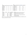
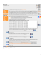
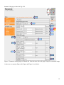
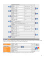
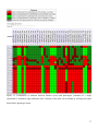
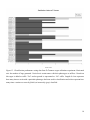
PhenoLink user guide
Brief introduction
PhenoLink is an easily-accessible web-tool to link phenotypes to ~omics data. It requires both ~omics (see
Fig. 3.D) and phenotype data (see Fig. 3.E) as tab-delimited text files (see Fig. 1.A and Fig. 2). The first
column of these files must contain information about strains, thus for a strain the same identifier must be used
in both files. For strains with public genbank (NCBI) files one can select a corresponding file from the
genbank files list shown in Fig. 3.A. and selected files will be used to add annotation information to genes
uploaded in ~omics data set. When there is no genbank file for uploaded ~omics data or ~omics data do not
contain information about genes then one can upload tab-delimited annotation file (see Fig. 2.C and Fig. 3.B).
PhenoLink can be used in actual (see Fig. 3.C) or demo mode (see Fig. 3.F). Input data is only necessary in
actual mode. For the demo mode Lactobacillus plantarum data would be used. This data was also used to
demonstrate applicability of PhenoLink. After selecting input data and run mode, click to “Upload Files”
button (see Fig. 3.H) to go to “Settings” page.
The default settings of parameters are often sufficient for linking ~omics to phenotype data. However, the
following parameters might be adapted to uploaded data: discarded phenotypes (see Fig. 5.C), bin count and
names of bins for continuous values (see Fig. 5.L and Fig. 5.M) and visualization of links to phenotypes for
each experiment (see Fig. 6.K). If supplied ~omics data do not contain binary data then change option shown
in Fig. 5.B to “Yes”, which will show another text box below this drop-down box (see Fig. 7). In this new text
box enter a cutoff value. However, binarizing continuous feature values is only necessary for visualization of
identified relations. Bagging is enabled by default to minimize imbalance in phenotype data, but it can be
disabled (see Fig. 5.G and Fig. 8), though not recommended. All these parameters are explained in detail in
“Modifying process settings” section of this guide below. Once all parameters are set, the association analysis
can be started by clicking “Proceed” button (see Fig. 6.M) and information about each step in the analysis is
shown (see Fig. 9). The typical run time of PhenoLink for the L. plantarum genotype and phenotype data
would be around 10 minutes; however it differs depending on the data uploaded. After association analysis is
successfully finished links to results are displayed (see Fig. 10). These links include visualization of relations
between features and all phenotypes (see Fig. 11), visualization of relations between features and phenotypes
of a single experiment (see Fig. 12), and classification performance for each experiment (see Fig. 13).
1
Figure 1. Flow diagram of PhenoLink.
2
A
B
C
Figure 2. ~Omics (A), phenotype (B) and annotation (C) data should be uploaded as tab-delimited text files.
Uploading an annotation file is optional.
3
A
B
C
D
E
F
G
H
Figure 3. Start page of a PhenoLink.
4
Association analysis with PhenoLink
PhenoLink is used to identify links to phenotypes from ~omics data as briefly described in the previous
section. These data sets are often large, which makes identifying links to phenotypes difficult. Therefore we
use the Random Forest algorithm to select features that are relevant for a phenotype. Since this algorithm
build ensemble of trees, highly-correlated features would get predictive scores that are biased towards their
selection order in tree building. A pair of features is highly correlated if their correlation is above certain
threshold based on Pearson’s (default of 0.98) and Spearman’s (default of 0.95) correlation metrics.
PhenoLink removes all but one of the highly-correlated features. Features with similar (or same) values
across all observations, having very low variance (default cutoff is 0.05) decreases classification accuracy, so
such features are also discarded by default. Additionally, in phenotype data many strains may exhibit the
same phenotype (dominating phenotype) and only a few would have a different phenotype. Such imbalance
in phenotype data is decreased by bagging for which two procedures are used: multiple down-sizing and
multiple-covering.
PhenoLink uses two procedures to identify relevant features based on predictive scores generated by the
Random Forest algorithm: (i) select only relevant features; (ii) discard irrelevant features. The selection
procedure is iteratively applied until there are not more than a certain number of features (default of 5) are
removed. Once final set of relevant features are selected features that are highly-correlated to any feature in
this data set are added to a list of relevant features.
Links identified by PhenoLink is visualized to allow better identification of relations between features and
phenotypes, among features, and among phenotypes. Additionally, this enhanced visualization allows to
search and sort feature names, hide columns and limit number of displayed rows. In the following sections for
demonstration purposes of a PhenoLink, ~omics and phenotype data of 42 Lactobacillus plantarum strains is
used in actual run mode of the tool. In demo run mode the same data set would be used. This data sets were
described in “PhenoLink – a web-tool for linking phenotype to ~omics data for bacteria: application to genetrait matching for Lactobacillus plantarum strains” (manuscript is submitted).
Selection of annotation information source (Fig. 4)
This step is only necessary if you want to add additional information to the visualization of links to
phenotypes. A genbank file can be chosen from the genbank files list as shown in Fig. 4.A, only when
uploaded ~omics data contains information about genes (e.g.: gene presence/absence or gene expression data)
5
and the organisms used in the design of the ~omics experiment (e.g.: organisms used in designing microarray
probes) are listed in the genbank files list. Multiple files can be selected by holding the Ctrl key pressed and
clicking the desired strain (or plasmid) name. In this guide we are going to use the presence/absence of genes
in 42 L. plantarum strains based on comparative genome hybridization (CGH) arrays. Probes on these arrays
were based on L. plantarum WCFS1 and its three plasmids; therefore from the genbank files list we choose
four files as shown in Fig. 4.A. When there is no genbank file for an organism of your choice or you want to
add more information to the resulting visualization, you can upload a tab-delimited text file (see Fig. 2.C) by
clicking “Browse...” as shown in Fig. 4.B. Note that as described in the “Brief introduction” section the first
column of this file should contain information about organisms used in this study.
6
A
B
C
D
F
E
G
H
Figure 4. Start page of a PhenoLink.
Uploading phenotype and ~omics data sets (Fig. 4)
In this guide we are going to use presence/absence of genes in 42 L. plantarum strains and phenotypic
assessments of these strains under various experimental conditions. These data sets can be downloaded by
right-clicking on a link “Presence/absence file” (see Fig. 4.G) and then clicking “Save Link As...” command.
In the same way download phenotype data from the link “Phenotype information file” (see Fig. 4.G). Note
“Save Link As...” command shown in Firefox might be different in other browsers.
7
Having downloaded these files click on “Browse...” button shown in Fig. 4.D and select the presence/absence
file you have just downloaded and for phenotypes file upload the second file you have downloaded by
clicking “Browse...” button shown in Fig. 4.E.
PhenoLink by default runs in an “actual” mode, make sure “actual” mode is chosen (see Fig. 4.C). Click on
“Upload File(s)” button shown in Fig. 4.H to proceed to next step.
Modifying process settings (Fig. 5 and Fig. 6)
Parameter settings for data preprocessing and phenotype to ~omics association analysis can be changed on
the web-interface (Fig. 5 and Fig. 6). Generally, predefined values should be sufficient for typical ~omics and
phenotype data. So, before modifying any parameter it is recommended to read more about each parameter by
clicking on a link shown in Fig. 5.A and reading further on this guide. Additionally, in the following subsections, we explain what each parameter is and how to change them to optimize the association analysis for
your own needs.
Data upload and preprocessing
1. Features in a given ~omics data set might have continuous values, e.g., gene expression data.
However binary values are used only for visualization purposes. There is no need to change default
chosen option of “No” in a drop-down box shown in Fig. 5.B if supplied ~omics data is already binary
data. Enabling binarizing ~omics data by choosing “Yes” option will show a new text box just below
this drop-down box (see Fig. 7) and you can define a cutoff to binarize data in this text box (read the
next step). In default setting of “No”, continuous values are binarized by using a cutoff, which is an
average of maximum and minimum values in ~omics data.
2. Continuous values below a predefined cutoff value are assumed as zero (e.g.: absent or lowexpressed) and values above or equal to the cutoff value are assumed as one (e.g.: present or highlyexpressed). A default cutoff value is calculated as the average of maximum and minimum values in a
data set. This cutoff value can be changed in a field shown in Fig. 7.B to suit your needs.
3. Sometimes phenotype of an organism couldn’t be reliably determined. For instance, in L. plantarum
phenotype data in some experiments the phenotype of certain strains could not be identified reliably
resulting in a phenotype “Maybe”. Thus strains with such ambiguous phenotypes should not be used
in association analysis to increase classification accuracy. If there are several ambiguously defined
phenotypes (e.g.: “Maybe”, “Putative”) they can be discarded by listing names of all these
phenotypes, where names are separated by comma. If there are no such phenotypes or you want to
include them in the association analysis then leave the text box shown in Fig. 5.C empty (default);
8
otherwise write phenotypes that should be discarded in this text box.
4. Features with Pearson's and Spearman's correlation score above certain cutoff values are assumed to
be highly-correlated. These cutoff values are defined by default to be 0.98 and 0.95 for Pearson’s and
Spearman’s metrics, respectively (see Fig. 5.D and Fig. 5.E).
5. Features that have similar (or the same) value across many or all observations, i.e. features with low
variances, are not used in classification. Minimum variance can be defined in a text box shown in Fig.
5.F. Setting this value to 0 (zero) would use such features in classification.
Classification: bagging
1. Imbalance in phenotype data can be decreased by any of the two bagging procedures. It is
recommended to always enable bagging even if there is no imbalance in phenotype data, because for
such data set bagging will not create any bags. Though it is not recommended, bagging can be
disabled by choosing “No” option from the drop-down box shown in Fig. 5.G (see also Fig. 8).
2. There are two types of bagging procedures to create bags “Multiple down-sizing” and “Multiple
covering” as shown in Fig. 5.H. The latter procedure guarantees that each member of a phenotype
with many instances are used at least predefined times. However, former method is recommended to
create bags (see Manuscript text).
3. The number shown in the text box in Fig. 5.I has different usage for each bagging procedure. In case
of multiple down-sizing this number of bags will be created. In the multiple-covering procedure at
least this number times a number defined in Fig. 5.J bags would be created. The recommended value
for large data sets is smaller, because each bag is classified separately requiring substantial
computational resources. For small data sets even the maximum value of 100 should not be a problem
with multiple down-sizing.
4. An imbalance in phenotype data can be detected by comparing the number of instances with each
phenotype. A phenotype with the maximum number of instances is a dominating phenotype and a
phenotype with minimum number of instances is a repressed phenotype. We define that if the
dominating phenotype has at least r times more instances than the repressed phenotype there is an
imbalance in phenotype data. The recommended value of 2 for the cutoff r can be changed in a text
box shown in Fig. 5.J.
5. Instances (here strains) of phenotypes with fewer instances are prone to misclassification. Thus
phenotypes with fewer than the predefined number of instances are not used in classification. This
cutoff is by default 4, but it can be changed in a text box shown in Fig. 5.K.
6. Phenotype data that are shown as continuous values are binned prior to classification. For large data
9
sets more bins would result in more accurate description of phenotypic measurements; however for
small data sets (e.g.: for L. plantarum data) the default bin count defined in the text box shown in Fig.
5.L should be sufficient. Foe large data sets (e.g.: phenotype data with more than 100 instances (here
strains) a bin count of 4 or above would be more adequate.
7. Naming each bin by default will follow this convention: class1, class2, ..., classN. Here N is the
number defined in the previous step. However, naming could be changed to obtain more meaningful
names, like for 3 bins: low, medium, high. If multiple names are used then they should be separated
by comma in a text box shown in Fig. 5.M.
Classification: feature selection
1. The Random Forest algorithm estimates the classification error for each class (phenotype), which
determines how many instances (here strains) of a phenotype have been correctly identified. Only the
results of the association analysis for phenotypes with a classification error below the default cutoff of
40% (defined in a text box in Fig. 6.A) would be listed.
2. In the Random Forest algorithm for each split in a tree m (square root of number of features) features
are chosen randomly. For ~omics data sets with many features multiplying this number by a number
bigger than the default number of 1 defined in a text box in Fig. 6.B allows to consider more features
for each split increasing classification accuracy.
3. Feature selection based on the Random Forest algorithm decreases the number of possibly relevant
features for a phenotype. However, for some phenotypes still many relevant features could be
identified. This list can be reduced by selecting only top N features based on their importance for a
given phenotype. Recommended number of top 50 features can be changed in the text box shown in
Fig. 6.C.
4. The Random Forest algorithm builds many trees to classify input data. The default number of trees
trained by this algorithm in PhenoLink is 500 (Fig.6.D). For typical ~omics and phenotype data sets
this number should not be changed, but for very large data sets one can increase it to accurately
identify links to phenotypes. An increase in the number of trees would also increase time required to
do association analysis.
5. Features that have a positive contribution to classify a phenotype could in some cases be just by
chance getting this positive score. Thus, a feature must be consistently positively contributing to at
least a certain percent (default of 10%) of strains of a phenotype. A large cutoff value defined in a text
box shown Fig. 6.E would decrease number of relevant features, allowing only identification of very
obvious relations.
10
6. In order to have a more stable feature selection procedure the same data is by default classified 3
times. Features that were identified as relevant in all classifications were considered as relevant,
which decreases chance of identifying wrong relations. Note that the higher values defined in a text
box shown in Fig. 6.F would increase the time to identify relations.
7. The contribution of each feature to correctly classify a strain of a phenotype is determined by the
Random Forest algorithm; however in case of bagging where strains of a phenotype is generally used
more than once the contribution scores for each strain in multiple classifications will be merged to
obtain a general contribution score of a feature for a given strain. The default method to merge
contribution scores determines the median of all scores (defined in a drop-down box shown in Fig.
6.G). This method is more robust than the averaging contribution scores, because when there is a
single positive contribution score with all other features with zero contribution scores averaging
would result in a positive score.
8. In PhenoLink the feature selection/elimination process could be defined either as using only relevant
features or discarding irrelevant features in next classification step. Both procedures shown in Fig.
6.H give similar results.
Visualization
1. There are three types of visualizations of which two could be disabled or enabled in the settings page.
Visualization of links to all phenotypes is always provided. A feature is considered as sufficiently
present if is present in at least in predefined percent of strains of a phenotype. This cutoff can be
defined in a text box shown in Fig. 6.I. Sufficient presence level of a feature is used in visualization to
merge with feature’s phenotype importance, i.e. the sum of the feature’s contribution score to classify
each strain of a phenotype.
2. Similar to previous step, a feature is considered as sufficiently absent if is absent in at least predefined
percent of strains of a phenotype. This cutoff can be defined in a text box shown in Fig. 6.J. Sufficient
absence level of a feature is used in visualization to merge with feature’s phenotype importance, i.e.
the sum of the feature’s contribution score to classify each strain of a phenotype.
3. The relationship between relevant features and strains of a phenotype for each experiment is disabled
by default as shown in Fig. 6.K. Enabling this would allow to identify relationship between
phenotypes, strains and features.
4. Classification results for each experiment could be visualized to identify which strains were more
often misclassified than others. This visualization is enabled by default (drop-down box Fig. 6.L).
Once all parameters are configured the association analysis will begin by clicking the “Proceed” button at the
11
bottom of the page as shown in Fig. 6.M.
A
B
C
D
E
F
G
H
I
J
K
L
M
Figure 5. Parameter settings page for PhenoLink. Note that since this web page is large its screenshot image
is shown as two separate figures: this figure and Figure 6 (see below).
12
A
B
C
D
E
F
G
H
I
J
K
L
M
Figure 6. Parameter settings page for PhenoLink. Note that since this web page is large its screenshot image
is shown as two separate figures: Figure 5 (see above) and this figure.
A
B
Figure 7. (A) Enabling binarizitaion option shows a text box (B) to enter a cutoff value.
13
Figure 8. Disabling bagging option hides all bagging related parameters.
Run phase (Fig. 9)
Once all parameters are configured, PhenoLink starts the association analysis and web page is refreshed each
5 seconds showing each step of the association analysis phase. Run phase for association analysis using L.
plantarum gene presence/absence and phenotype data is shown in Fig. 9. Some processes may take longer, so
their sub-processes are shown in phase details section (see Fig. 9.A). Once the process is finished phase
details section will not be shown anymore. After association analysis finishes, typically requiring around 10
minutes, results of the association analysis would be comparable to that of Fig. 8.
A
Figure 9. Run phase in PhenoLink shows each step involved in the association analysis.
14
Results (Fig. 10)
In the “Results” page links to downloadable files are shown, which include results of the association analysis
(Fig. 10.A), links to the visualization of the results (Fig. 10.B) by clicking “See” link visualization will be
displayed in a new page. In Fig. 10.C links to preprocessed ~omics and phenotype data are shown and by
clicking “See” content of the file will be displayed in a new page.
A
B
C
Figure 10. PhenoLink results page with links to results, visualization of results and preprocessed files.
Visualization (Fig. 11, 12 and 13)
There are three different kinds of plots of which two visualize results found by PhenoLink. These
visualizations show relations to all phenotypes (see Fig. 11) and for phenotypes of a single experiment (see
Fig. 12). Columns of these tables can be hidden by clicking tick marks shown below phenotype names.
Classification performances for each experiment is shown as a bar plot like the one in Fig. 13.
15
Figure 11. Visualization of relations between features (rows) and all phenotypes (columns). Columns of the
table can be hidden by clicking tick marks shown below phenotype names.
16
Figure 12. Visualization of relations between features (rows) and phenotypes (columns) of a single
experiment (L-Arabinose sugar utilization test). Columns of the table can be hidden by clicking tick marks
shown below phenotype names.
17
Figure 13. Classification performance using data from D-Turanose sugar utilization experiment. Horizontal
axis: the number of bags generated. Vertical axis: strain names with their phenotypes as suffixes. Growth on
this sugar is added as suffix “Yes” and no-growth is represented as “No” suffix. Length of a bar represents
how many times a strain with a particular phenotype has been used in classification and colors represent how
many times a strain was correctly (black) or incorrectly (gray) classified.
18