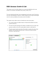
1
Checkbox Survey Server User Manual
Welcome to Checkbox Survey Server
Checkbox Survey Server is the premier enterprise class web survey and
feedback management platform. This help system is organized into several sections:
•
Getting Started walks you through the basic operation of Checkbox
Survey Server and describes how to set up your first survey
•
Key Concepts gives a high level overview of the concepts and terms
used throughout Checkbox Survey Server
•
The main help contents provides context-sensitive information about
the screens and controls of Checkbox Survey Server
•
How do I...? Provides comprehensive walk-throughs of advanced tasks
Getting Started
This section provides an introduction to the user interface of Checkbox
Survey Server as well as brief walk throughs of common tasks to help you
jump right in and start using Checkbox Survey Server.
•
Getting Around
•
Creating a Survey
•
Sending an Invitation
•
Creating a Report
Getting Around Checkbox Survey
Server
The user interface of Checkbox Survey Server follows certain conventions to
keep the user experience consistent throughout the application. Listed here
are some of the common user interface elements.
Application Toolbar
The application toolbar provides buttons used to navigate among the main
functional areas of Checkbox Survey Server. The application toolbar also
provides a link to allow the currently logged in user to edit their profile
information.
Breadcrumb Trail
The breadcrumb trail provides context to remind you of your place in within
the application. When editing a survey or report, the breadcrumb trail will
contain the survey or report name as a reminder of which survey or report
you are editing. You may select a breadcrumb link to navigate to the screen
representing a point on the trail.
Screen Menu
The screen menu is dynamically populated depending on what screen is
currently being displayed, containing links to related screens.
In the image above the screen menu is displaying the menu shown when viewin
g the pages of the survey editor.
Screen Toolbar
The screen toolbar is located directly below the screen menu and contains butto
ns allowing you to perform actions related to the items on screen. Common
items available on the screen toolbar include paging and sorting controls, as
well as buttons to perform an immediate action, such as adding a new page
to a survey.
Editor Controls
The following application elements are only available within
the survey or report editor.
Page Menu The page menu contains items that will act on the specific page with which
the menu is associated. Both the survey and report editors can be configured
to show multiple pages on one screen, in which case each page will have its
own page menu.
Item Menu
The item menu contains items that will act on the specific item with which
the menu is associated. When there are multiple items displayed on the
screen, each one will have its own item menu. The menu associated with an
item appears above the preview area for that item.
Creating a Survey
Creating surveys is the core activity of Checkbox Survey Server. This
document will walk you through the steps required to create and activate a
basic survey. For this walk through we'll create a very brief survey to gauge
interest in a holiday party, but you can follow the walk through to create any
type of questions you like.
To get started, you need to create a new survey and give it a unique name.
1. Log in to Checkbox Survey Server and select the Survey button from the
application toolbar
2. Select the New Survey button to launch the survey editor
3. Enter the desired name of your survey in the Survey Name field. If your
desired survey name is already taken, Checkbox Survey Server will prompt
you to select another. The name of your survey is used to identify it within
Checkbox Survey Server, but it is never shown to survey respondents. Enter
the respondent-facing title of your survey in the title field. You may also
enter a longer description of your survey in the description field. When
you've entered your name, title, and description, select the Submit button.
You will now have a new empty survey, and you will be looking at the survey
page editor, as shown here:
From the page editor, you can add survey items to the page being displayed,
add additional pages to the survey, and create and edit logical conditions and
page branching rules.
4. Add a new item to page one by selecting the Add Item link from the page
menu (the green bar in the above image). You will see a list of items from
which you may choose. 5. Select the Radio Buttons link from the Question Items section to add a
Radio Button item to page one of your survey.
You will now be looking at the item editor for the Radio Buttons item
type. The top section of the editor allows you to enter the question text and
sub text that will be displayed to the respondent. The next section of the
editor allows you to set options that determine how the item will behave,
while the section below that allows you to enter the list of choices
respondents will have to select from. The bottom section allows you to
specify how the item will appear to survey respondents. Although each
survey item editor is slightly different, they all follow this general layout.
6. Enter the text for your question in the question text field, and any
clarifying instructions in the sub text field as show below:
7. Since this question is so important to the results of the survey, we will
make it required. Select "Yes" in the Answer is Required drop down list in
the Options section of the item editor.
8. Now enter the options from which respondents will select in the Inputs
table. Each new choice is entered in Text column. If you run out of rows,
you can add more by selecting the Add Rows link below the table. 9. When you've finished adding input options, select the Submit button at the
bottom of the item editor screen. Your changes will be saved and you will be
returned to the page editor screen, where a preview of your newly added
item will appear on page one.
Adding additional items follows the same procedures as in steps four through
nine above. Items with predefined lists of input options (Radio Buttons,
Checkboxes, Drop Down List) will work nearly identically to the example
above, while other items will differ to a greater degree.
10. Once all the items and pages are added to the survey, it's time to turn
our attention to how the survey will look to respondents. Select the Style
link from the screen menu (black bar). You will be shown the style editor
screen, from which you can set options that determine how the survey will
appear.
The setting that will have the largest impact as to how your survey will
appear is the Style Template setting. Creating a Style Template is beyond
the scope of this walk through, for now, simply select one of the existing
Style Templates.
The rest of the style options are fairly self explanatory, and aren't really
needed anyway for our simple example.
11. Now let's check the security of our survey to be sure that everyone we'd
like to be able to take it will be, and no one we'd prefer not take this survey
will be permitted to. Select the Permissions link from the screen menu. You
will be shown the survey permissions screen.
12. By default, all surveys are made public, meaning that anyone who
navigates to the survey url when it is active will be able to respond to the
survey. Since our survey is intended for fellow employees, we'll change the
security setting. Select All Registered Users in the Survey Security
section. This will configure the security settings of our survey so that only
users registered with Checkbox Survey Server will be allowed to respond to
our survey.
Select the Update Settings button to save our change.
13. The final step remaining is to make our survey active so that people may
respond to it. To do that, select the Activation link in the screen menu. You
will be shown the survey activation screen.
14. Select the Activate link, and the status of the survey will immediately
change to active.
That's it, your survey is now active and users may respond to it.
Sending Invitations
Checkbox Web's invitation manager allows you to send email invitations to a
survey. This walk through will guide you through the process of sending a
simple invitation.
1. To get started, log into Checkbox Web, and select the Invitations button
from the application toolbar.
2. You will now be looking at the invitation manager, which lists existing
invitations as well as allows you to create a new invitation. Create a new text
invitation by selecting Text from the drop down next to the New Invitation
button, then select the New Invitation button.
3. You will be looking at the list of surveys you can send invitations for. Find
the survey you'd like to invite people to, and select the Add button next to
the survey name.
4. Now you will see the pending invitations screen, showing a message that
no recipients have been added to the invitation. To add recipients to your
invitation, select the source from which you'd like to add recipients from the
drop down list next to the Add button. We'll select a group of users to add,
as that will allow us to send the invitation to multiple users without having to
locate them all individually. Select User Groups from the drop down list then
select the Add button.
5. You'll see a list of all the user groups in Checkbox Survey Server. Check
the checkbox next to the user group that contains the users you'd like to
invite and then select the Add Selected Groups button.
6. You will be returned to the pending invitation screen, now showing the
group you selected. Now that we've set up who will receive our invitation,
let's set up the message. Select the Edit Message button to continue.
7. The invitation message screen should look familiar, as it is patterned after
the email composition windows in popular email programs. Several fields will
already be populated with default data. The main message field will contain
a link or url to your survey already configured. Add or edit the text as you
like, but be sure to leave this link or url intact, otherwise your recipients
won't be able to easily access your survey. After you've edited the email
fields, select the Review and Send button to continue.
8. You will now be shown a preview of how your message will appear along
with the list of people to whom it will be sent. This is your last chance to
check over your invitation before it is sent, so be sure it looks the way you
intend it to. When you're satisfied, select the Send button.
9. As soon as you select Send, a pop up window will open showing the
progress of the invitations. Be sure your browser allows pop ups, and leave
this window open until you are notified that all the invitations have been sent
successfully. Checkbox Survey Server will throttle the rate at which it sends
invitations to prevent a large number of invitations from impacting the
responsiveness of the system for other users. If needed, you may pause the
invitation process using the Pause button.
10. When all invitations have been sent, select the Close button to close the
pop up. You will see a message in the main application window that your
invitation has been sent. Select the Return to Invitation Manager button to
return to the invitation manager, where your invitation will now appear in the
list of current invitations, along with response rate information.
That's it, your invitation has been sent, and you can track as people respond
to your survey.
Creating Reports
In this walk through, we'll cover creating a basic report to analyze survey
data.
1. Navigate to the report manager by selecting the Reports button on the
application toolbar.
2. You'll now be looking at the Report Manager, which shows all the surveys
for which you may create reports. Locate the survey you wish to report on in
the list, and select the View Analyses button corresponding to that survey.
3. You will see the list of reports for this survey, if this is the first time you're
creating a report for this survey, there will be none in the list. Above the list
are two buttons that you may use to create a new survey. The Report Wizard helps you create creates a pre-populated report using the
most common report items, based on the structure of your survey. For most
users, this is an excellent way to start, as it saves the effort of adding basic
report items and leaves you free to fine tune the report to get more detailed
information.
The New Report button creates a new, empty report, which can then be built
in a manner very much like a
survey. For this walk through we'll generate our report manually, so select the
New Report button.
4. After selecting the New Report button, you should see the report
properties page of the report editor. Before we can begin adding items to our
report we need to give it a unique name. Enter a name for your report in the
Report Name field. You may also select a Style Template to determine how
your report will look. These are the same Style Templates used for
surveys. You don't need to choose one now, as you can always return to the
report properties screen and change it later. After you've entered your
name, select the Submit button.
5. You'll now be looking at the report page editor, which should look familiar
as it uses the same basic structure and process as the survey editor. To add
a report item to the current page, select the Add Item link from the page
menu.
6. You will see the item selection screen, which is in fact the same screen
used when adding an item to a survey, but containing report items
instead. Select the Summary Item to open the report item editor.
The summary item is designed to summarize results in a table or graph. It is
used with survey items that have a predefined list of input options such as
the radio button list. For this walk through we're using the simple survey
created in the Creating a Survey walk through, which contains a radio
buttons item. 7. The summary item editor is divided into two areas, the top part of the
editor allows you to select to survey items to report on and set basic options,
the bottom part of the editor allows you to modify the appearance of the
report item.
Select the item you wish to report on in the left side of the item accumulator
and select the ">>" button to move the item to the right side of the
accumulator.
For now, we'll stick with the remaining default options, which deal with how
questions that allow the respondent to select "other" from the list of inputs
and provide their own answer. 9. Next, we'll choose how we would like our summary to be displayed. Our
choices are to display the data as a table or as a chart. A pie chart will let us
see at a glance which option has been selected most often, so select
the Pie Chart option from the Graph Type drop down. Select the Submit button
to save the changes to this report item and return to the report page editor.
10. You will be returned to the report page editor, which will
display information about the report item as well as a preview of how your
report item might look in the actual report.
Adding additional items follows the same procedures as in steps five
ten. There is greater variation in how report items work than in how survey
items work. Be sure to read the sections of help covering each report item
type to get a feel for how to use them.
11. By default, your report will only be available to you (as the author) and
the users in the system administrator role. No change is required if you're
the only person that's going to analyze the results of your survey, but if
you'd like to share your report, you'll need to explicitly give other users the
ability to do that.
To change the permissions of your report, select the Permissions button on
the screen toolbar.
12. You should now be looking at the access control list editor for your
report. A full discussion of how to use the access control list (ACL) editor is
beyond the scope of this walk through and can be found elsewhere in this
help system. For now, let's set our report to be publicly accessible, so that
anyone who has the link to the report can see it.
To make a change that will affect all users without having to add them to the
ACL, we can edit the default policy. Select the Edit Default Policy button at
the top of the ACL editor.
13. The default policy editor contains the permission policies that we can
grant to users. In this case, we want all users to be able to view our report,
so check the checkbox next to the View Report policy and then select the OK
button.
14. After you've edited the default policy you will be returned to the ACL
editor for your report. No more changes are required here, so select the
Back button to return to the report page editor.
15. Now that your report is configured so that it will be visible to others, you
can share it with them by providing the direct url of the report. The url is
displayed at the top of the report page editor, directly below the screen
menu and toolbar.
That's it, other people will now be able to view your report, and the graphs
and tables will automatically update as people respond to your survey.
Key Concepts
This section provides a high level overview of some of the keys to
understanding and getting the most out of Checkbox Survey Server.
•
Survey Life Cycle
•
Access Control
•
Invitations
•
Reports
The Survey Life Cycle
The survey lifecycle is best thought of as a linear process that moves from
creating an empty survey (or copying an existing survey) through analyzing
the results.
The entire process is summarized in the diagram below, and explained in
more detail in the sections that follow.
In this diagram, the survey is inactive (not available to respondents) in the
areas with a gray background, and active in the areas with a white
background.
Creating New Survey
Surveys can be created from the Survey Manager in one of three ways: by
creating a new, empty survey, by copying an existing survey, or by importing
a survey previously exported to XML.
Build Survey
In the most basic sense, to build a survey is to add pages to the survey and
to add items to those pages. Items may consist of display items that simply
display information to the respondent, question items that collect information
from the respondent, or action items that cause Checkbox Survey Server to
perform an automated task.
More advanced surveys may take advantage of logical conditions, which
allow the survey author to specify that a page or item only appear if the
respondent answered a previous item in a certain way; page branching,
which allows the survey author to easily redirect respondents within the
survey; and data piping, which allows data a respondent enters to appear in
subsequent items.
In addition to adding pages and items, the "Build Survey" phase
encompasses creating the look and of the survey. The appearance of the
survey controls as well as the colors, fonts, layout, and more can all be
configured from the survey editor.
Set Permissions
A survey's permissions determine who make respond to the survey, as well
as who may edit it, and who may view the results. From the survey editor
you may configure all of these permissions using a combination of high level
settings and low-level permission controls that let you determine exactly
which users may perform which actions.
Activate Survey
In order for respondents to be able to respond to a survey it must be
active. Surveys can be activated manually, or scheduled to become active
(or inactive) on specified dates.
Note that in the diagram above, building the survey is shown as an activity
that occurs while the survey is inactive. It is possible to make changes to a
survey while it is active. However, changing survey questions or conditional
rules after responses have already been gathered may affect the quality and
validity of the data gathered, and should only be attempted after careful
consideration.
Invite Users
Once your survey is configured and active, you can use Checkbox Survey
Server's invitation manager to invite users. You can invite registered users,
or simply send emails to a list of email addresses. The invitation manager
allows you to track the response to your emails and send reminders to users
who have not yet taken the survey if needed.
Analyze Results
Survey results may be checked any time after the first response has been
collected. You can run reports against a live survey to spot check results,
then create a more in depth report, drilling down and cross tabulating the
results when the survey is complete. You can examine indiviudal responses,
as well as export all the survey data for analysis in SPSS, Excel, or another
statistical package.
Access Control Key Concepts
Checkbox Survey Server offers a comprehensive system for controlling
access to data created by users of the application such as surveys, reports,
and email lists. In principle Checkbox Survey Server works very much like
the Windows® file system: users are put in roles such as System
Administrator, and access-controllable items in Checkbox Survey Server
behave like files and folders in Windows, with access control lists determining
what users may take what actions on them.
In practice, Checkbox Survey Server offers several levels of control, so that
the most common access control tasks can be accomplished without having
to worry about user roles or access control lists. For example, you can make
a survey available only to registered users of Checkbox Survey Server with a
single setting; behind the scenes, Checkbox Survey Server configures the
access control lists appropriately.
Access Controllable Items
The following items within Checkbox Survey Server are access controllable:
•
Surveys
•
Reports
•
Libraries
•
User Groups
•
Email Lists
To be access controllable means that you can restrict the actions that
registered users may take on these items. For example, you can prevent all
users in the “Survey Authors” group from deleting survey items from a
library. Controlling access to all of these items uses the same underlying
method, and the same advanced ACL editor can be used to manage access to
all of them. However, different access controllable items may have different
“simple” permission controls allowing you to easily set the most common
permissions.
Permissions
Permissions are the basic element of access control. Permissions represent
the actions that users may take on access controllable items. For example,
the “Form.Fill” permission controls whether or not a user may complete a
survey. If the user is granted the Form.Fill permission on a survey, they will
be able to complete that survey. Permissions are not editable directly; they
are associated with user roles or access controllable items. You may enable
or disable a permission for a user or group with respect to an access
controllable item, but the list of permissions associated with a role or access
controllable item is fixed.
Permission Masks
Permission masks are a collection of related permissions combined into a
logical grouping with an easy to understand name. For example, the
permissions Form.Fill, Form.Create, Form.Delete, Form.Edit, and Form.Fill
are combined into the permission mask "Administer Survey." By default the
ACL editor shows permission masks in the policy box. You may toggle the
view to see the individual permissions if needed.
Roles
A role is a pre-defined collection of permissions associated with a user. Roles
define the general actions that a user is allowed to take. In a sense a user’s
role defines what that user is with respect to Checkbox Survey Server; all
users must be in at least one role to be able to accomplish anything in
Checkbox Survey Server. For example: the Respondent role has the
permissions required to complete a response to a survey, meaning that they
have the potential capability to complete any survey in Checkbox Survey
Server.
Access Control Lists
An access control list (ACL) describes the relationship between users (and
groups) and an access controllable item. Each access controllable item has its
own ACL that lists the users and groups who have some permission with
respect to that item, and details the specific permissions each user or group
has, known as the access policy for that user.
Default Policy
The default policy of an ACL determines what permissions are granted to
users who are not on the ACL. For example, if the default policy for a survey
grants the “Take Survey” permission, any user can take that survey (unless
this default permission is overridden by an access policy for a specific user
that does not grant that permission).
Putting it together
As permissions are associated with both a user’s role and the access
controllable item they’re interacting with, both sets of permissions must
match in order for the user to accomplish the action they’re trying to take. As
the permissions associated with a user’s role are general across all access
controllable items in the system, they are the first to be evaluated. If the
user’s role has the permission corresponding to the action the user is trying
to perform, the ACL permissions on the access controllable item they’re
attempting to interact with are checked. If the ACL contains the appropriate
permission for that user, the user is permitted to perform the action they’re
attempting. The following flow chart illustrates the process Checkbox Survey
Server uses to evaluate permissions.
From the diagram a few key points about access control become clear:
•
An ACL policy cannot grant permission to a user who is not in a role
that also grants the corresponding permission.
•
An ACL policy can deny a permission to a user even if they normally
have that permission (i.e. the user is in a role that has that permission)
•
An ACL policy for a user or group can deny a permission to that user or
group even if the default policy grants that permission to every other
user
System Administrator Role
The System Administrator role is not governed by access control lists, and
permissions may not be denied to a user in the System Administrator by
editing the ACL of an access controllable item. For this reason, it is important
to carefully control which users are put in the System Administrator role.
Survey and Report Permissions
Surveys and reports offer several security shortcuts that allow you to
configure access control to a survey or report by configuring a single option.
The possible security types for surveys are:
•
Public
•
Password Protected
•
Access Controlled
•
All Registered Users
The possible security types for reports are:
•
Analysis Administrators and System Administrators
•
Access Control List
•
Registered Users
•
Everyone
Of these, “Access Controlled” for surveys and “Access Control List” for reports
let you control the ACL directly as described above. The other options can be
thought of as templates that automatically configure the ACL to achieve the
behavior described in the name of each security type.
The lone exception to this is the “Password Protected” option for surveys.
This option allows you specify a global password that all survey respondents
must enter before they may take the survey. “Password Protected”
configures the ACL identically to the “Public” option, with the addition of the
global password.
Invitations
Checkbox Survey Server's invitation functionality provides a convenient way
to send email to potential respondents notifying them of your survey. The
invitation manager allows you to create a new invitation as well as monitor
the progress of invitations you've already sent.
Invitation Message
Invitations may be sent as plain text or as HTML. Both formats allow your to
add your own text to the message, and both automatically include a link
directly to the survey as well as an optional link to allow a recipient to opt
out of future invitations.
Personalizing Invitations
Invitations that are sent to users registered in Checkbox Survey Server may
be personalized with information from the user's profile such as their
name. This feature is only available if the invitation' list of recipients is
populated from users of Checkbox Survey Server, as opposed to email lists
or individual email addresses. Recipients
Invitation recipients may be drawn from users and user groups registered in
Checkbox Survey Server, or to email lists or individual email addresses not
associated with registered users; in this way you can invite just about
anyone to take a survey. The security settings for the survey to which you
are inviting respondents will impact the available sources from which you
may draw respondents. Invitations to surveys restricted to users on an
access control list or to registered users may only be sent to registered users
of Checkbox Survey Server, as respondents must be registered to complete
the survey.
Sending Invitations
When your message is ready and your list of recipients has been selected,
Checkbox Survey Server can send your invitation using the mail (SMTP)
server configured during installation. Invitations will be sent directly from
the Checkbox Survey Server administration console when you select the
Send button; a pop up window will open displaying a progress indicator, and
will continue until all invitations have been sent or the process is canceled.
Checkbox Survey Server throttles the sending of invitations to avoid causing
an interruption in survey availability for other users. As a result, sending a
large number of surveys may take a long period of time. Some degradation
in performance may still be noticeable to other users while invitations are
being sent.
Tracking Responses
Once your invitation has been sent, the invitation manager allows you to
track which users have responded to the invitation and completed the survey
and which have not. You can send a reminder email to those recipients who
have not yet completed the survey.
Reports
Checkbox Survey Server provides a rich reporting interface to allow you
analyze the results of your survey in a variety of ways. Reports can include
data tables and graphical charts, as well as static text, HTML, and images so
you can format your report in a pleasing manner for sharing your results with
others.
Creating A New Report
To create a new report, you can create a new empty report in the report
manager and build it manually, or you can let Checkbox Survey Server auto
generate a report for you using the Report Wizard. When Checkbox Survey
Server auto generates a report, it examines the item types in your survey
and selects the most common corresponding report type to display the data.
Building A Report
Building a new report follows a very similar path to building a survey. In
fact, the report editor and the survey editor share many components and
some of the very same items that may be added to a survey may be added
to a report.
There are several report types that let you show either detailed response
data or aggregate response data into a summary table or chart. Other report
item types let you cross tabulate multiple items. Typically, you will select a
report item display type (e.g. a summary chart) choose the survey items or
items you'd like to report on, then select the way you'd like the item to be
displayed (e.g. as a pie chart vs. a bar chart).
Reports may also include static items like HTML and images and support
style sheets to allow you to format your report attractively for sharing with
others or for saving to a static file format such as Word or a Acrobat.
Filters
Report filters offer a flexible way to drill down into your survey data to sport
trends and analyze key data points. Filters are constructed as logical
statements based on the results of the survey and are used to control the
results that are included in a report or an individual item within a report. For
example, you could use a filter to display only the results of respondents who
answered that they were between 18 and 14 years old, or two show how two
different demographic groups responded to the same question.
Running A Report
To run a report, select the run report button from the report manager, or
select the report link from the report editor. You can share your report with
others by providing them with the direct report link displayed in the report
editor. Check that you've set the report permissions properly to ensure that
those whom you invite to view your report will be allowed to do so.
Surveys
Survey creation and administration is the heart of Checkbox Survey Server. The survey manager allows you to organize your existing surveys, while the
survey editor allows you to create new surveys and edit existing ones.
Survey Manager
The survey manager screen lists all surveys that are available to you to edit.
The survey manager allows you to organize your surveys into folders in a
manner similar to Windows explorer.
Working with surveys and folders
The survey grid displays all surveys and folders which have been created
previously, and which the current user has permission to edit. The survey
manager can display the root folder which may contain sub folders and
surveys, or the contents of a sub folder, which may contain only surveys. Information and controls available for each folder:
Description
Action
Folder
Name
Open
Folder
Changes the view of the survey manager to view the contents of the
selected folder
Owner
Displays the user that is responsible for this folder
Created Displays the date and time this folder was created
Copy
Copies the selected folder and all surveys it contains into a new folder
in the root named "Copy of [folder name]"
Delete
Deletes the selected folder and all surveys it contains
Information and controls available for each survey:
Survey
Name
Action
Open
Survey
Description
Opens the survey editor for the selected survey
Action
Description
Owner
Displays the user that is responsible for this survey
Activated
The current activation status of this survey (Yes = responses can
be created for this survey, No = no new responses are permitted)
Responses The number of responses to this survey
Created
The date and time when this survey was first created
Copy
Survey
Creates a copy of the selected survey in the current folder named
"[Survey Name] Copy X"
Move
Survey
Moves the selected survey into another folder See how: Select
Export
Survey
Exports the selected survey as XML, for storage offline, or to
transfer surveys between instances of Checkbox Survey Server
Delete
Survey
Deletes the selected survey
the move button; you will be shown a drop down list of other
available folders. Select your desired destination folder from
the list, then select the Move Survey button to move the
survey to your selected folder.
View/Crea Navigates to the report list screen for this survey, allowing you
te Reports to view existing or create new reports
View
Navigates to the response list screen for this survey, allowing
Individual you to view, edit, or delete responses
Responses
Export
Results
Navigates to the export results screen for this survey, allowing
you to export the response data
Navigation
Paging
You may use these controls to page through items in a grid:
First Page
Navigates to the first page of items
Previous
Page
Navigates to the previous page
Page
Selector
Displays the current page. Navigate directly to another page by
selecting it from the list
Next Page
Navigate to the next page
Last Page
Navigates to the last page
Sorting
When the column header text of a grid column is underlined, the items in the
grid may be sorted by that column. To sort the grid by a particular column,
select the column header text. Clicking the column header a second time will
reverse the sort order.
Grid Filtering
You may filter the contents of a grid so that only results that meet your filter
criteria are displayed. Using the filter functionality also allows you to search
for specific items.
To enable a filter, enter your filter or search criteria in the text box, select
the field you wish to filter on from the drop down list, and select the green
arrow button. Your filter will remain in effect until you remove it.
Not all filter controls may include the filter field drop down list.
To remove a filter (or to cancel a search and return to the full list if no results
match your criteria) select the red minus button.
Menu Items
When viewing the survey manager root, the page menu contains a single
item:
Survey Manager - Refreshes the survey and folder list
When viewing the contents of a folder, there are two additional menu items:
Folder Properties – Displays the folder properties screen
Folder Security – Displays the ACL editor for this folder. See "Access Control
Key Concepts"
Toolbar Items
Navigates to a blank survey properties screen, allowing you to create a
new survey. See "Creating a Survey", See "Survey Properties"
Imports surveys previously exported to XML
When viewing the survey manager root, navigates to a blank Folder
Properties screen, allowing you to create a new folder
When viewing the contents of a folder, navigates to the root of the
survey manager
Survey Editor
The survey editor is composed of several different screens used together to
create and manage a survey. A typical survey development lifecycle might
look like this:
1.
Create a new survey, giving it a name and title
2.
Add pages and items to the survey
3.
Edit the survey's style to create the desired look and feel
4.
Edit the survey's permissions, to determine who may respond to the
survey or view its results
5.
Test the survey, to ensure it looks and behaves as expected
6.
Activate the survey so it is available to respondents
The various screens of the survey editor correspond to the steps
above. Although not all screens must be visited to design and launch a
survey, it is a good idea to check each section of the editor to ensure that
the default settings are appropriate for each survey.
Edit Language
Next to the survey title is a drop down list containing the languages
associated with this survey. To change the edit language, select a new
language from the drop down list.
Menu Items
Survey Manager - Navigates back to the Survey Manager
Survey Editor - Naviagtes back to the survey page editor screen
Properties - Naviagates to the survey properties screen
Style - Navigates to the survey style screen
Permissions - Navigates to the survey permissions screen
Activation - Navigates to the survey activation screen
Test Survey - Navigates to the test survey screen
Survey Page Editor
The survey page editor is the primary screen of the survey editor. The page
editor screen lets you add pages and items to your survey, manage
branching, conditions, and piping, as well as configure hidden data items and
survey completion events.
Getting around the page editor
The page editor screen is divided into three logical areas:
•
The survey toolbar contains buttons that relate to the entire survey and
is always present
•
The page area contains menus and information related to a single
page. The page area appears once for each page displayed on the
screen
•
The item area contains menus and information related to a single
item. The item area appears once for each item displayed on the
screen
Survey Toolbar
The survey toolbar contains buttons that relate to the entire survey such as
adding a page or exporting the survey to XML.
Adds a new blank page to the current survey as the last
page. If you are only viewing one page at a time, the
new page becomes the active page.
Shows a preview of the survey in a new browser
window. The preview uses the actual survey items and
styles, but it is not a live survey that can collect data.
Prints a copy of the survey as it will appear in completed
form. This is useful for printing copies of the survey to be
completed by hand, for respondents who cannot respond
via the internet.
Saves the survey as an XML file for storage on your local
file system.
Select the page to be viewed. You may select a single
page (including the hidden items and completion pages)
or view all pages at once.
Page Area
The page area contains the page menu, with links to perform page specific
actions such as adding an item, as well as the page status area, which
reports the status of condition or branching rules applied to this page.
Page Menu
The page menu contains the following items:
Add Item Navigates to the Add Item screen, allowing you to select an item type to be
added to the bottom of the current page
Copy
Duplicates the selected page as the last page in the survey.
Note: Copying a page copies any pipes and item scores, but does NOT copy page
condition or branching rules
Move
Moves the selected page to a new location in the survey. See how: Select the
Move link; You will see a screen with a drop down menu of possible page
locations, select the desired new location for this page; select the OK
button
Delete
Deletes the selected page and all its items. This will also delete any response
data to the items on the page, any conditions or branches that use items on
the page, and any pipes which use items on the page. Please use caution when
deleting pages
Conditions Navigates to the expression editor screen to allow you to add a conditional rule
for this item. See Conditions
Branching Navigates to the expression editor screen to allow you to add a branching rule
for this item. See Branching
Page Status Area
The page status area displays any condition or branching rules associated
with the page so you can keep track of the circumstances under which the
page will be displayed.
Item Area
The item area contains the item menu, with links to perform item specific
actions such as deleting an item, the item preview area which shows how the
might appear when published, as well as the item status area, which reports
the status of condition rules applied to this item.
Item Menu
The item menu contains the following items:
Edit
Navigates to the item editor for the selected item. See Items
Move
Moves the selected item to a new page. Possible destinations include any display
page of the survey, a new page created with just the selected item on it, or the
completion page if the item is compatible with the completion page. See how:
Select the Move link; You will see a screen with a drop down list of possible
destination pages, select the desired new location for this item; select the OK
button
Copy
Duplicates the selected item as the last item on the page.
Note: Copying an item copies any pipes and item scores, but does NOT copy condition
rules
Insert Inserts a new item directly prior to the selected item. Navigates to the Add Item
screen
Export Saves the item as an XML file for storage on your local file system
Delete Deletes the selected item
Note: Deleting an item deletes an conditions that depend on that item, but does not
delete pipes from that item
Item Preview Area
The item preview area displays the item as it might appear in the published
survey. The preview will show the displayable data of the item (options in a
drop down list, for example) but will not apply the Style Template to the
item.
The item preview area also may contain positioning arrows that allow you to
move the item up or down with respect to the other items on the same page.
Item Status Area
The item status area displays any logical expressions associated with a
conditional rule for this item.
Navigates to the expression editor screen to allow you to add a conditional rule for
this item. See Conditions
Survey Items
Survey items are the building blocks of surveys, the questions users respond
to as well as static display data like images and messages.
Items fall into one of three categories: •
Question Items - These items gather data from the user
•
Display Items - These items display static data
•
Other Items - These items perform an automated action or interact
with live survey data
Question Items
Question Items are the most commonly used item type. Question items
gather data from respondents and are the only item types that may be
reported on.
•
Checkboxes
•
Drop Down List
•
Matrix
•
Open-ended multi-line text
•
Open-ended single line text
•
Radio Buttons
•
Rating Scale
Checkboxes
The checkbox item type allows the respondent to select zero to many options
from a predefined list that is displayed as a list or grid of checkboxes.
Question Text/SubText
Question
Text
The primary text of the item displayed to the respondent. Data may be piped
into this field. See "Piping"
Question
Sub Text
Secondary text displayed along with the question text. Use to provide
clarification or direction (e.g. "Select at most 2 choices"). Data may be piped
into this field. See "Piping"
Alias
A short mnemonic phrase that can be shown in reports in place of the full question
text to save space.
The alias is not displayed to the survey respondent
Options
Max. To
Select
Specifies the maximum number of item options that the respondent may
select in responding to this item
Min. To
Select
Specifies the minimum number of item options that the respondent may
select in responding to this item
Randomize When Yes is selected, the item's input options will be displayed in a random
Options
order to respondents (each respondent will see the options in a different
order to reduce bias introduced by the order of the options)
Allow
"Other"
Answer
When Yes is selected, the respondent will be allowed to specify a free-text
response in addition to the predefined options
Default
"Other"
Text
Specifies the text that will precede the free text box created by enabling the
above option
Inputs
Inputs are the possible answers a respondent may choose from in answering
an item.
Therre are three
e different input meth
hods you may
m
use to create the
e list of
inputts for yourr item: norm
mal view displays
d
a row
r
for eac
ch input, allowing you
u
the most
m
power in creatin
ng your listt of inputs. Quick Enttry and XM
ML Import
view
ws allow you
u to bulk lo
oad a long list of inpu
uts.
Norrmal Vie
ew
In th
he normal view,
v
the in
nputs are arranged
a
in
n a grid, with each input
repre
esented by
y a row in the
t
grid.
eral controlls apply to the entire grid:
Seve
Action
Sorrt
Descrip
ption
Sorts th
he existing inputs alphabetically
y
Clea
ar
Clears the
t
"selected co
olumn" selection
n, allowing you to
t specify that no
n
Sele
ection rows are selected by default. On inputt lists where mu
ultiple selection is
possible
e, this button is replaced with a checkbox thatt allows you to easily
e
select all rows.
dditional rows to
o the input grid to allow you to
o add more inpu
uts
Add (loccated Adds ad
ow the
Rows belo
grid
d)
h row of the
e grid may
y have the following controls:
c
Each
Moves the inpu
ut up or down within
w
the list of inputs
Deletes the sellected input
Text
The display tex
xt of this input. This field is req
quired
Displays the pipe panel for thiis input. See "P
Piping"
Selected When checked, this input will be selected by default when th
he respondent views
v
the item
Alias
A short mnemon
nic phrase that can
c
be shown in reports in place of the full question
text to save spa
ace. The alias is nott displayed to the survey respond
dent
Points
Specifies the number of points granted to the respondent for selecting this input
option. This column is only visible when the "Scored Survey" option is selected on t
he Survey Properties screen. See "Scored Surveys"
Quick Entry View
The quick entry view allows you to enter large numbers of inputs
easily. Simply type or copy and paste your input data in a comma separated
fomat:
Text,Selected,Alias
Where Text and Alias are free form strings, and Selected is 1 if you want the ite
m to be selected and 0 if not.
XML Import View
The XML Import view allows you to upload a file that contains your inputs
described in an XML formatted file. The file extension must either be .xml or
.txt.
To load inputs via XML, enter the file name of your XML file into the text box or
select the Browse... button and locate your file on your file system.
When you select the Submit button to save all changes to this item, your
XML file will be validated and uploaded.
See: XML schema specification
Appearance
Layout
Specifies whether the item input options will displayed oriented vertically or
horizontally
Columns Specifies the number of columns used to display item input options. When the
selected layout is vertical, options will run sequentially down the first column
and continue at the top of the subsequent column. When the selected layout is
horizontal, options will run sequentially across the first row and continue at the
left of the subsequent row
When Yes is selected, each option's text will be preceded by a number.
Show
Number
When the Randomize Options option is selected, the options will be randomized, but
Labels
the number labels will be sequential (i.e. each option will have a different number
shown to each respondent
Item
Specifies the horizontal alignment of the item within the survey screen
Position
Label
Specifies the location of the Question Text relative to the list of input options
Position
Appearance options are used by Checkbox Survey Server only and have no
affect on the appearance of surveys on Checkbox Mobile Drop Down List
The drop down list item allows the respondent to select zero or one options
from a predefined list that is displayed as a drop down box.
Question Text/SubText
Question
Text
The primary text of the item displayed to the respondent. Data may be piped
into this field. See "Piping"
Question
Sub Text
Secondary text displayed along with the question text. Use to provide
clarification or direction (e.g. "Select at most 2 choices"). Data may be piped
into this field. See "Piping"
Alias
A short mnemonic phrase that can be shown in reports in place of the full question
text to save space.
The alias is not displayed to the survey respondent
Options
Answer is
Required
When Yes is selected, the respondent must respond to this item in order to
continue through the survey
Randomize When Yes is selected, the item's input options will be displayed in a random
Options
order to respondents (each respondent will see the options in a different
order to reduce bias introduced by the order of the options)
Allow
"Other"
Answer
When Yes is selected, the respondent will be allowed to specify a free-text
response in addition to the predefined options
Default
"Other"
Text
Specifies the text that will precede the free text box created by enabling the
above option
Inputs
Inputs are the possible answers a respondent may choose from in answering
an item.
There are three different input methods you may use to create the list of
inputs for your item: normal view displays a row for each input, allowing you
the most
m
power in creatin
ng your listt of inputs. Quick Enttry and XM
ML Import
view
ws allow you
u to bulk lo
oad a long list of inpu
uts.
Norrmal Vie
ew
In th
he normal view,
v
the in
nputs are arranged
a
in
n a grid, with each input
repre
esented by
y a row in the
t
grid.
eral controlls apply to the entire grid:
Seve
Action
Sorrt
Descrip
ption
Sorts th
he existing inputs alphabetically
y
Clea
ar
Clears the
t
"selected co
olumn" selection
n, allowing you to
t specify that no
n
Sele
ection rows are selected by default. On inputt lists where mu
ultiple selection is
possible
e, this button is replaced with a checkbox thatt allows you to easily
e
select all rows.
dditional rows to
o the input grid to allow you to
o add more inpu
uts
Add (loccated Adds ad
ow the
Rows belo
grid
d)
h row of the
e grid may
y have the following controls:
c
Each
Moves the inpu
ut up or down within
w
the list of inputs
Deletes the sellected input
Text
The display tex
xt of this input. This field is req
quired
Displays the pipe panel for thiis input. See "P
Piping"
Selected When checked, this input will be selected by default when th
he respondent views
v
the item
Alias
A short mnemon
nic phrase that can
c
be shown in reports in place of the full question
text to save spa
ace. The alias is nott displayed to the survey respond
dent
Points
Specifies the number of points
s granted to the
e respondent for selecting this input
option. This column is only visiible when the "S
Scored Survey" o
option is selected on t
he Survey Properties screen. See "Scored Surveys"
Quick Entry View
The quick entry view allows you to enter large numbers of inputs
easily. Simply type or copy and paste your input data in a comma separated
fomat:
Text,Selected,Alias
Where Text and Alias are free form strings, and Selected is 1 if you want the ite
m to be selected and 0 if not.
XML Import View
The XML Import view allows you to upload a file that contains your inputs
described in an XML formatted file. The file extension must either be .xml or
.txt.
To load inputs via XML, enter the file name of your XML file into the text box or
select the Browse... button and locate your file on your file system.
When you select the Submit button to save all changes to this item, your
XML file will be validated and uploaded.
See: XML schema specification
Appearance
Show
Number
Labels
When Yes is selected, each option's text will be preceded by a number.
When the Randomize Options option is selected, the options will be randomized, but
the number labels will be sequential (i.e. each option will have a different number
shown to each respondent
Item
Position
Specifies the horizontal alignment of the item within the survey screen
Label
Position
Specifies the location of the Question Text relative to the list of input options
Appearance options are used by Checkbox Survey Server only and have no
affect on the appearance of surveys on Checkbox Mobile Matrix
The matrix item type allows respondents to answer several related questions
at once, or to provide feedback along several axes.
The Matrix item is NOT supported on Checkbox Mobile.
Question Text/SubText
Question
Text
The primary text of the item displayed to the respondent. Data may be piped
into this field. See "Piping"
Question
Sub Text
Secondary text displayed along with the question text. Use to provide
clarification or direction (e.g. "Select at most 2 choices"). Data may be piped
into this field. See "Piping"
Alias
A short mnemonic phrase that can be shown in reports in place of the full question
text to save space.
The alias is not displayed to the survey respondent
Options
The matrix item displays items along two axes: the vertical axis is called the
category axis and represents the topical items the respondent evaluates. The
horizontal axis is called the item axis and contains the actual survey items
the respondent answers.
The following image shows an example matrix item as it might appear to a
survey respondent. The restaurant names are the "categories" of this matrix
item, and the Value and Quality rating scales are the item columns.
Categories
Editing categories is a two step process. The main matrix item editor is used
to position categories, while the category editor is used to add or edit
categories.
Action
Description
Add/Edit categories
Navigates to the Matrix Categories Editor
Move up
Moves the selected category up one spot
Move down
Moves the selected category down one spot
Delete
Deletes the selected category
Item Columns
Item columns are added and edited using the item editors of the item type
being added as a matrix column (e.g. single line text).
To add a new item column, select the desired item type from the drop down
below the matrix editor, then select the green plus button. This will navigate
you to the appropriate item editor, where you may create the item exactly as
if it were being added directly to the survey.
Once an item column has been added, you may position it using the controls
in the matrix editor.
Action
Description
Move left
Move the selected column one position to the left
Edit item
Navigates to the item editor for the selected column item type
Delete
Deletes the selected item column
Move right
Move the selected column one position to the right
Open-Ended Multi-Line Text
The open-ended multi-line text item allows the respondent to enter a long
free-form text answer.
Question Text/SubText
Question
Text
The primary text of the item displayed to the respondent. Data may be piped
into this field. See "Piping"
Question
Sub Text
Secondary text displayed along with the question text. Use to provide
clarification or direction (e.g. "Select at most 2 choices"). Data may be piped
into this field. See "Piping"
Alias
A short mnemonic phrase that can be shown in reports in place of the full question
text to save space.
The alias is not displayed to the survey respondent
Options
Default
Text
Specifies the text that will be displayed in the text box when the respondent
first views this item. This text is replaceable by the respondent. Data may be
piped into this field. See "Piping"
Answer is When Yes is selected, the respondent must respond to this item in order to
Required continue through the survey
Appearance
Rows
Specifies the height (in rows of text) of the text box
Columns
Specifies the width (in columns of characters) of the text box
Item Position Specifies the horizontal alignment of the item within the survey screen
Label Position Specifies the location of the Question Text relative to the list of input
options
Appearance options are used by Checkbox Survey Server only and have no
affect on the appearance of surveys on Checkbox Mobile
Open-Ended Single-Line Text
The open-ended single-line text item allows the respondent to enter a short
free-form text answer. The answer may also be restricted to certain formats
or data types.
Question Text/SubText
Question
Text
The primary text of the item displayed to the respondent. Data may be piped
into this field. See "Piping"
Question
Sub Text
Secondary text displayed along with the question text. Use to provide
clarification or direction (e.g. "Select at most 2 choices"). Data may be piped
into this field. See "Piping"
Alias
A short mnemonic phrase that can be shown in reports in place of the full question
text to save space.
The alias is not displayed to the survey respondent
Options
Default
Text
Specifies the text that will be displayed in the text box when the respondent
first views this item. This text is replaceable by the respondent. Data may be
piped into this field. See "Piping"
Answer
Format
Specifies the type or format that the respondent's answer must conform to
Max.
Length
The maximum number of characters that the respondent may enter into the
text box
Minimum
Value
Specifies the minimum permitted value when Decimal, Integer, or Money is
selected in the Answer Format drop down
Maximum Specifies the maximum permitted value when Decimal, Integer, or Money is
Value
selected in the Answer Format drop down
Answer is When Yes is selected, the respondent must respond to this item in order to
Required continue through the survey
Appearance
Width
Specifies the width of the text box in pixels
The unit of width may vary depending on the browser the respondent uses
Item Position Specifies the horizontal alignment of the item within the survey screen Label Position Specifies the location of the Question Text relative to the list of input
options Appearance options are used by Checkbox Survey Server only and have no
affect on the appearance of surveys on Checkbox Mobile Radio Buttons
The radio buttons item type allows the respondent to select zero or one
options from a predefined list that is displayed as a list or grid of radio
buttons.
Question Text/SubText
Question
Text
The primary text of the item displayed to the respondent. Data may be piped
into this field. See "Piping"
Question
Sub Text
Secondary text displayed along with the question text. Use to provide
clarification or direction (e.g. "Select at most 2 choices"). Data may be piped
into this field. See "Piping"
Alias
A short mnemonic phrase that can be shown in reports in place of the full question
text to save space.
The alias is not displayed to the survey respondent
Options
Answer is
Required
When Yes is selected, the respondent must respond to this item in order to
continue through the survey
Randomize When Yes is selected, the item's input options will be displayed in a random
Options
order to respondents (each respondent will see the options in a different
order to reduce bias introduced by the order of the options)
Allow
"Other"
Answer
When Yes is selected, the respondent will be allowed to specify a free-text
response in addition to the predefined options
Default
"Other"
Text
Specifies the text that will precede the free text box created by enabling the
above option
Inputs
Inputs are the possible answers a respondent may choose from in answering
an item.
Therre are three
e different input meth
hods you may
m
use to create the
e list of
inputts for yourr item: norm
mal view displays
d
a row
r
for eac
ch input, allowing you
u
the most
m
power in creatin
ng your listt of inputs. Quick Enttry and XM
ML Import
view
ws allow you
u to bulk lo
oad a long list of inpu
uts.
Norrmal Vie
ew
In th
he normal view,
v
the in
nputs are arranged
a
in
n a grid, with each input
repre
esented by
y a row in the
t
grid.
eral controlls apply to the entire grid:
Seve
Action
Sorrt
Descrip
ption
Sorts th
he existing inputs alphabetically
y
Clea
ar
Clears the
t
"selected co
olumn" selection
n, allowing you to
t specify that no
n
Sele
ection rows are selected by default. On inputt lists where mu
ultiple selection is
possible
e, this button is replaced with a checkbox thatt allows you to easily
e
select all rows.
dditional rows to
o the input grid to allow you to
o add more inpu
uts
Add (loccated Adds ad
ow the
Rows belo
grid
d)
h row of the
e grid may
y have the following controls:
c
Each
Moves the inpu
ut up or down within
w
the list of inputs
Deletes the sellected input
Text
The display tex
xt of this input. This field is req
quired
Displays the pipe panel for thiis input. See "P
Piping"
Selected When checked, this input will be selected by default when th
he respondent views
v
the item
Alias
A short mnemon
nic phrase that can
c
be shown in reports in place of the full question
text to save spa
ace. The alias is nott displayed to the survey respond
dent
Points
Specifies the number of points granted to the respondent for selecting this input
option. This column is only visible when the "Scored Survey" option is selected on t
he Survey Properties screen. See "Scored Surveys"
Quick Entry View
The quick entry view allows you to enter large numbers of inputs
easily. Simply type or copy and paste your input data in a comma separated
fomat:
Text,Selected,Alias
Where Text and Alias are free form strings, and Selected is 1 if you want the ite
m to be selected and 0 if not.
XML Import View
The XML Import view allows you to upload a file that contains your inputs
described in an XML formatted file. The file extension must either be .xml or
.txt.
To load inputs via XML, enter the file name of your XML file into the text box or
select the Browse... button and locate your file on your file system.
When you select the Submit button to save all changes to this item, your
XML file will be validated and uploaded.
See: XML schema specification
Appearance
Layout
Specifies whether the item input options will displayed oriented vertically or
horizontally
Columns Specifies the number of columns used to display item input options. When the
selected layout is vertical, options will run sequentially down the first column
and continue at the top of the subsequent column. When the selected layout is
horizontal, options will run sequentially across the first row and continue at the
left of the subsequent row
When Yes is selected, each option's text will be preceded by a number.
Show
Number
When the Randomize Options option is selected, the options will be randomized, but
Labels
the number labels will be sequential (i.e. each option will have a different number
shown to each respondent
Item
Specifies the horizontal alignment of the item within the survey screen
Position
Label
Specifies the location of the Question Text relative to the list of input options
Position
Appearance options are used by Checkbox Survey Server only and have no
affect on the appearance of surveys on Checkbox Mobile Rating Scale
The rating scale item type allows the respondent to select a point on an
ordinal scale.
Question Text/SubText
Question
Text
The primary text of the item displayed to the respondent. Data may be piped
into this field. See "Piping"
Question
Sub Text
Secondary text displayed along with the question text. Use to provide
clarification or direction (e.g. "Select at most 2 choices"). Data may be piped
into this field. See "Piping"
Alias
A short mnemonic phrase that can be shown in reports in place of the full question
text to save space.
The alias is not displayed to the survey respondent
Options
Scale Start
Value
Specifies the integer value at which the scale starts
Scale End
Value
Specifies the integer value at which the scale ends
Answer is
Required
When Yes is selected, the respondent must respond to this item in order
to continue through the survey Scale Start
Text
Specifies the text that accompanies the start value of the scale
Scale Mid Text Specifies the text that accompanies the middle value of the scale , if
applicable
Scale End
Text
Specifies the text that accompanies the end value of the scale
Appearance
Layout
Specifies whether the item input options will displayed oriented vertically
or horizontally
Item
Specifies the horizontal alignment of the item within the survey screen Position
Label
Position Specifies the location of the Question Text relative to the list of input
options Appearance options are used by Checkbox Survey Server only and have no
affect on the appearance of surveys on Checkbox Mobile CAPTCHA
CAPTCHA stands for "Completely Automated Public Turing Test to tell
Computers and Humans Apart." The CAPTCHA item generates a code and
displays it in a format that is readable by human users but not by computers,
preventing automated “bots” from filling out surveys and possibly skewing
the collected data.
When a CAPTCHA item is displayed in a survey, the respondent must
correctly enter the displayed code or the survey will not advance when the
“Next” button is clicked. If the respondent does not enter a code or enters
the wrong code, an error message will be displayed that instructs the
respondent to enter the correct code.
Question Text/SubText
Question
Text
The primary text of the item displayed to the respondent. Data may be piped
into this field. See "Piping"
Question
Sub Text
Secondary text displayed along with the question text. Use to provide
clarification or direction (e.g. "Select at most 2 choices"). Data may be piped
into this field. See "Piping"
Alias
A short mnemonic phrase that can be shown in reports in place of the full question
text to save space.
The alias is not displayed to the survey respondent
Options
Text Format
Choose the possible formats to use to display the text. Each time the item
is displayed, the format will be randomly chosen from one of the selected
formats. See "CAPTCHA Text Format Examples"
Minimum Code Length
Minimum length for the generated code. When the code is generated, the
length will be randomly chosen to be between the minimum code length
and maximum code length (inclusive)
Maximum Code Length
Maximum length for the generated code. When the code is generated, the
length will be randomly chosen to be between the minimum code length
and maximum code length (inclusive)
Code Type
Type of code to generate:
• Alphanumeric – The code will include both letters and numbers
• Alpha – The code will only include letters
• Numeric – The code will only include numbers
Image Width
Width of the generated code image. Since some formats look better with
different width and height parameters, you may wish to experiment with
this value
Image Height
Height of the generated code image. Since some formats look better with
different width and height parameters, you may wish to experiment with
this value
Image Format
Image format for the generated image. In most cases, the default value of
.gif should work fine
Enable Sound
If enabled, a speech icon will be displayed to the respondent. When the
respondent clicks the icon, the code will be rendered in audio format
Preview
Refresh
Updates the preview image using the specified options
Display Items
Display items display static or dynamic content to a survey respondent. The
respondent does not interact with them in any way, and they are reported
on.
•
Total Score
•
Response Summary
•
Horizontal Line
•
HTML
•
Image
•
Message
•
Data Report
•
Data Graph / Table
•
Scoring Message
Action items are NOT supported by Checkbox Mobile. Total Score
The total score item allows you to display a static message along with the
survey respondent's current total score.
Message The text to be displayed to the respondent. The respondent's current total
score will be appended to the end of the message
Sample
Displays the message as it might appear to the respondent. The text entered
Message into the Message field will be reflected in the sample message once the
message text has been saved
Appearance
Font Size
Specifies the size of the font (in points) of the message
Font Color Specifies the color of the font. Valid values include HTML Hex colors (in the
format #XXXXXX) or valid HTML named colors(e.g. "Red")
Item
Position
Specifies the horizontal alignment of the item within the survey screen Response Summary
The display response item allows you to display the details of the current
response, including the respondent's answers.
Display Specifies whether the response should appear as a link, or directly as a table in
the survey page
Horizontal Line
The horizontal line item displays a horizontal line on the survey page.
Width
Specifies the width of the horizontal line. The units of the width are specified
by the drop down box as either pixels (absolute width) or percent (relative
width)
Thickness Specifies the height of the line in pixels
Color
Specifies the color of the line. Valid values include HTML Hex colors (in the
format #XXXXXX) or valid HTML named colors(e.g. "Red")
HTML
The HTML item allows you to display complex data to the respondent. Using
the HTML item you can display videos, audio clips, flash animations, and
more.
The HTML item editor offers two views, toggled by using the Edit Mode drop
down:
•
Text mode allows you to enter raw HTML
•
HTML mode displays a WYSIWYG HTML editor that allows you to design
your HTML using a word-processor like interface
Both text mode and HTML mode support piping. See "Piping"
Image
The image item allows you to display an image directly in your survey. You
may link an existing image or upload one from your local file system.
Options
Image Alt. Specifies the text that will be included as alternate text (i.e. text displayed to
Text
respondents who cannot see the image)
Image
Upload
When selected, the image source text box is formatted to contain a local file
Image
path and the browse button appears. The image specified in the image
from Local source text box will be uploaded to the Checkbox Survey Server server
Folder
Use Image When selected, the image source text box is formatted to contain a URL
from Web reference to an image already available on the internet. The image specified
Site
in the image source text box will be linked into the survey
Image
Source
Specifies the location from which the image should be linked or uploaded
Preview
When selected, the image will be displayed on the item editor screen. If the
Upload Image from Local Folder option is selected, the image will be
uploaded to the Checkbox Survey Server server
Appearance
Item Position
Specifies the horizontal alignment of the item within the survey screen Images greater than approximately 40 kilobytes in size will not display on the
Pocket PC version of Checkbox Mobile due to the memory limitations of those
devices.
Message
The message item allows you to display a static text message to the survey
respondent.
Message The text to be displayed to the respondent. Data may be piped into this field.
See "Piping"
Appearance
Font Size Specifies the size of the font (in points) of the message
Font
Color
Specifies the color of the font. Valid values include HTML Hex colors (in the format
#XXXXXX) or valid HTML named colors(e.g. "Red")
Note: Only Hex color values are compatible with Checkbox Mobile
Specifies the horizontal alignment of the item within the survey screen Item
Position
Data Report
The data report item allows you to display a link to, or redirect the
respondent to, a report analyzing the results of this survey.
Options
Report
Specifies the report to which you would like to link or redirect.
Only existing reports for this survey will appear in the list. See Reporting
Link
Option
Specifies whether the respondent will be automatically redirected to the report
or whether they will be required to select a hyperlink to see the report
Hyperlink When "Show Link" is the selected link option, specifies the text of the
Text
hyperlink displayed to the respondent. Data may be piped into this field. See
"Piping"
Appearance
Font
Size Specifies the size of the font (in points) of the hyperlink
Font
Color Specifies the color of the font. Valid values include HTML Hex colors (in the
format #XXXXXX) or valid HTML named colors(e.g. "Red") Specifies the horizontal alignment of the item within the survey screen Item
Position Data Graph / Table
The data graph/table item allows you to place a report graph or table
summarizing the responses to a previous survey item directly in the survey.
Options
The data graph table item editor functions identically to the summary report
item editor.
Source Items
The source items accumulator allow you to specify which survey items' data
will be included in the graph or table. The left pane of the accumulator lists
survey items that are available for inclusion in the graph or table, while the
right hand side lists items that are currently included. To include an item,
select it in the available list and select the ">>" button to move it to the list
of included items. To remove an item, select it in the included list and select
the "<<" button to move it to available list.
Other Options
These options determine how "Other" responses are handled.
Aggregate
When
selected, all "other" responses are counted together under an "other" label
Display All
When selected, all "other" responses are listed individually, with the actual
data entered by the respondent displayed
Aggregate When selected, all "other" responses are combined in the summary table or
And Display graph, and a separate table lists each respondent's actual data below
Appearance
Graph
Type
Specifies the type of graph or table to use when displaying the survey item data
Use
When Yes is selected, the labels for the graph or table will use the item alias
Aliases
text, otherwise the full question text will be used
Specifies the horizontal alignment of the item within the survey screen Item
Position
Scoring Message
The scoring message item allows you to display one or more messages
depending on the range the respondent's current total score falls into.
Adding a Message
To add a new scoring message, select the New Message button, which will
display the Edit Message pane.
Existing Messages
Existing scoring mesasges are displayed in a table at the top of the editor.
Edit
Populates the Edit Message pane with the text and point ranges of the selected
message
Delete
Deletes the selected message
Score
Displays the score range associated with this message
Message Displays a preview of the message text
Edit Message Pane
The Edit/Add message page allows you to create a new scoring message or
edit an existing one. To add or edit a message, enter or change the data in
the fields below, then select the Add Message or Edit Message button.
Min.
Score
The minimum current total score that the respondent must have to see this
message
Max.
Score
The maximum current total score that the respondent may have to see this
message Message
The text to be displayed to the respondent. Data may be piped into this field.
See "Piping"
Appearance
Font Size
Specifies the size of the font (in points) of the message
Font Color Specifies the color of the font. Valid values include HTML Hex colors (in the
format #XXXXXX) or valid HTML named colors(e.g. "Red")
Item
Position
Specifies the horizontal alignment of the item within the survey screen Action Items
Action items allow you to place items in your survey that interact with other
systems or allow the survey respondent to take some action.
•
Email Message
•
Email Response
•
Hidden Item
•
Hyperlink / Redirect
•
Profile Property Update
Email Message
The email message item allows you to send an email while the respondent is
taking the survey.
The email message item is NOT supported by Checkbox Mobile. Each email will only be sent once per response, i.e. if a respondent uses the
Back button to return to the page that contains the email message item, the
email will not be sent again.
Message Options
Message
Format
Specifies the format in which the message will be sent. Some email clients
may not be able to display HTML messages, but they allow for a much richer
email message
From
The email address the message will appear to have been sent from. Data may
be piped into this field. See "Piping"
To
The email address(es) the message will be sent to. Data may be piped into
this field. See "Piping"
Bcc
The email address(es) the message will be sent to that will not appear in the
To list (these email addresses are not visible to recipients of the email). Data
may be piped into this field. See "Piping"
Subject
The subject of the email. Data may be piped into this field. See "Piping"
Body
The body of the email. Data may be piped into this field. See "Piping"
Email Response
The email response item allows you to email the current response while the
respondent takes the survey.
Each email will only be sent once per response, i.e. if a respondent uses the
Back button to return to the page that contains the email response item, the
email will not be sent again.
Message
Format
Specifies the format in which the message will be sent
From
The email address the message will appear to have been sent from. Data may
be piped into this field. See "Piping"
To
The email address(es) the message will be sent to. Data may be piped into
this field. See "Piping"
Bcc
The email address(es) the message will be sent to that will not appear in the
To list (these email addresses are not visible to recipients of the email). Data
may be piped into this field. See "Piping"
Subject
The subject of the email. Data may be piped into this field. See "Piping"
Body
The body of the email. The response data will be appended to the end of any
text you enter in this field. Data may be piped into this field. See "Piping"
Hidden Item
A hidden item allows you to record data with a survey response that is not
explicitly entered by the Respondent as the answer to an item. When using
piping or creating conditions and branching rules, you can use the "answer"
to a hidden item just like you would use the answer to a text input.
Hidden items are only recommended for advanced users or those with web
programming experience, as they require technical knowledge and the ability
to modify web pages and/or code outside of Checkbox Survey Server.
Question A description of the item or data. This field is not displayed to end users and is
Text
visible only in the survey editor and in any reports that include this item. Data
may be piped into this field. See "Piping"
Alias
A short mnemonic phrase that can be shown in reports in place of the full
question text to save space. The alias is not displayed to the survey
respondent Options
Variable
Name
Specifies the name of the variable to be retrieved and stored with the
survey response
Hidden Field Specifies the source of the variable to be stored:
Type
Query String: Checkbox Survey Server will read this variable from the query
string used to access the survey
Session: Checkbox Survey Server will read this variable from the
ASP.NET session values
Cookie: Checkbox Survey Server will read this variable from the cookie
values
The Hidden Items survey page
Each survey contains a dedicated first page that is designed to contain only
hidden items. This page is not displayed to the survey respondent, and
ensures that data gathered by hidden items will be available even on the first
page of the survey shown to the user. Use of the hidden items page is
optional as hidden items may be placed on any survey page, but is highly
recommended.
See "Pass In Variables From Another Application"
Hyperlink / Redirect
The hyperlink / redirect item allows you to provide a link to, or redirect the
user to a web page outside of the current survey.
Options
Link/Redir Specifies the URL that the link or redirection should navigate to. Data may be
piped into this field. See "Piping"
ect URL
Link Option Specifies whether the respondent will be automatically redirected to the URL
or whether they will be required to select a hyperlink to navigate to the URL
Hyperlink
Text
When "Show Link" is the selected link option, specifies the text of the
hyperlink displayed to the respondent. Data may be piped into this field.
See "Piping"
Restart
Survey
When Yes is selected...
Apearance
Font
Size Specifies the size of the font (in points) of the hyperlink
Font
Color Specifies the color of the font. Valid values include HTML Hex colors (in the
format #XXXXXX) or valid HTML named colors(e.g. "Red") Specifies the horizontal alignment of the item within the survey screen Item
Position Profile Property Updater
The profile property updater allows you to direct a survey item response into
the respondent's user profile.
For this item to function properly, the respondent must be a registered user
of Checkbox Survey Server. Therefore the survey permission type must be
either "All Registered Users" or "Access List"
The profile property updater item is only recommended for advanced users as
it directly and irreversibly modifies the user information for the survey
respondent.
Options
Source
Item
The survey item from which the answer will be used to update the
respondent's user profile
Profile
Provider
The profile provider used to broker the update to the respondent's user
profile
User
Attribute
The attribute of the respondent's user profile to be overwritten with the
answer to the selected survey item
File Upload Item
The file upload item allows the respondent to upload a file as part of their
survey response.
The file upload item is NOT supported by Checkbox Mobile
Question Text/SubText
Question
Text
The primary text of the item displayed to the respondent. Data may be piped
into this field. See "Piping"
Question
Sub Text
Secondary text displayed along with the question text. Use to provide
clarification or direction (e.g. "Select at most 2 choices"). Data may be piped
into this field. See "Piping"
Alias
A short mnemonic phrase that can be shown in reports in place of the full question
text to save space.
The alias is not displayed to the survey respondent
Options
File Type(s)
Specify the file types (extensions) that respondents may upload. These extensions will be
displayed alongside the item in the survey
Answer is
Required
When Yes is selected, the respondent must respond to this item in order to continue through
the survey
Add Item To Survey
The Add Item To Survey screen allows you to add an item to a survey, either
by adding an existing item or by creating a new item.
Add Existing Items
Add From Navigates to the Add Item From Library wizard, allowing you to select an item that has been
Library
stored in an item library
Import
Navigates to the Import Item screen, allowing you to import an item that was previously
From XML exported to XML from this or another installation of Checkbox Survey Server
Add New Item
To add a new item to your survey, select the name of the item type you
would like to add from one of the item type tables.
Add Item From Library
The Add Item From Library wizard allows you to select one or more survey
items stored in a library to your current survey or library. Adding items from
a library is a two step process in which you first select the library from which
you would like to add items, then select the items themselves,
Step One: Select Library
In step one, you select the source library from which you plan to add items
to your survey or library. The library grid displays all libraries from which you
may add survey items.
Information and controls available for each library:
Action
Description
Library Name The name of the library
Description
A description of the library
Select
Selects this library as the source library for step two of the add item from library wizard
Navigation
Paging
You may use these controls to page through items in a grid:
First Page
Navigates to the first page of items
Previous
Page
Navigates to the previous page
Page
Selector
Displays the current page. Navigate directly to another page by
selecting it from the list
Next Page
Navigate to the next page
Last Page
Navigates to the last page
Step Two: Select Items
In step two, you select the item(s) from within the library you selected in
step one to be added to your survey or libarary. The item grid displays all of
the items contained in the selected library.
Information and controls available for each item:
Action
Description
Select
Selecting the checkbox next to an item marks it for addition to your survey or library. Selecting
the checkbox in the header row marks all items in the library for addition to your survey or library
Item
Text
Displays the text of the item (typically the question text) in the survey's default language
Item
Type
Displays the type of the survey item
View
Opens a pop-up window with a preview of the survey item, allowing you to see how it might look
in a survey
Import Item
The Import Item screen allows you to import a survey item that has been
previously exported to XML from this or another installation of Checkbox
Survey Server.
To import an item from an XML file, enter the file name in the text box, or
select the Browse button to locate the file on your local file system. When
you have entered a valid path to your item XML file, select the Import button
to import the item.
Survey Properties
The survey properties screen allows you to edit the name, title, and
description of a survey. You may also set global survey options.
The survey properties screen is also shown when creating a new survey.
Properties
Survey Name
The unique name of this survey. This name is not displayed to the
survey respondent.
Survey Title
The title of the survey. This title may be shown to the survey respondent, it
does not need to be unique.
This field is multi-language aware and can be set for each language
Survey
Description
A description of the survey. The description is not displayed to the survey
respondents.
This field is multi-language aware and can be set for each language
Custom Survey URL
URL Text
Specifies the text to be used as the url for the survey
Extension Specifies the extension to be added to the survey url. Valid extensions are configured by your server
administrator. See "Configuring Custom Survey URLs"
Basic Options
Scored Survey
Enable item scoring for this survey. See "Scored
Surveys"
Make this survey available to
Checkbox Mobile devices
Enables this survey to be synchronized to Checkbox
Mobile devices. See Mobile Synchronization
Survey Style
The survey style screen allows you to manage the appearance of a survey as
it will appear to respondents.
These settings only apply to surveys when viewed using Checkbox Survey
Server's web survey interface. They have no effect on how surveys appear
on Checkbox Mobile devices.
Style Template
A Style Template determines how various survey elements (e.g. question
text) will appear to survey respondents. Select a Style Template from the list
of available templates to apply it your survey. You may preview how your
survey will look with the Style Template applied by selecting the Preview
button. See "Style Templates"
Page Layout
Page layout templates allow you to arrange survey items on your survey
pages by placing them into designated zones. For example, you can create a
layout to arrange survey items in multiple vertical columns. To edit the page
layout used on each page, select the Edit Page Layout link, which will open
the page template editor in a separate window. See "Page Layout Templates"
Style Options
The following survey style options may be set:
Show Page
Numbers
When checked,the respondent will see the number of pages in the survey
as well as the current page they are on (e.g. "Page 2 of 5")
Show Progress When checked, the survey displays a visual progress bar at the top of the
Bar
page which tracks the respondent's progress
Show
Question
Numbers
When checked, the respondent will see item numbers next to each
question. The numbering starts with 1 on the first item on the first page
and continues consecutively until the end of the survey
Show Survey
Title
When checked, the title of the survey is displayed at the top of every
page in the survey
Randomize
When checked, the items on each page are displayed in random order
Items in Pages
Show
Validation
Message
When checked, respondents will see an error message above an item if
their response to that item fails validation
Show
When checked, respondents will see an error message
Validation/Re in a modal dialog box if their response to that item fails validation
quired Fields
Alert
Customizable Text
You may also change the text that appears on the survey control buttons
when the respondent is taking the survey. These elements may be edited:
•
Survey Title
•
Continue button
•
Finish button
•
Back button
•
Save and Exit button (Only visible when survey allows users to resume)
Survey Permissions
The survey permissions screen is used to configure the users who may
participate in the survey. The screen is divided into five sections that control
various aspects of survey permissions. All settings are saved by selecting the Update Settings button at the bottom
of the screen.
Survey Security
The survey security section provides high level options to control access by
respondents to this survey. These options should cover the large majority of
survey access control situations. Public
All users, including those not registered in the system, will be allowed to
respond to this survey
Password
Protected
A single password will control access to this survey. Choosing this option will
show a password field, allowing you to set the password required to respond
to this survey
All
All users registered in the system will be allowed to respond to this survey
Registered
Users
Access List Only users specified in the access control list will be allowed to access this
survey. Choosing this option will show the Respondents List button, allowing
you to open the Respondent List screen to specify which users have access to
this survey
Response Options
The response options section of the Survey Permissions screen allows you to
control how users can respond to your survey.
Maximum
Sets the maximum number of responses that may be submitted for this
Responses
survey. When the limit is reached, respondents will see a message informing
them that the limit has been reached
Responses
Per User
Sets the maximum number of times each user is allowed to respond to a
survey
Prohibit
When checked, the survey will not navigate to the previous page when the
Back Button user clicks the Back button in their web browser
Allow Users When checked, the system will remember a user's place while taking a
to Resume survey. If the user closes their browser and re-opens the survey link, they
will be returned to whatever page they left off on
Allow Users When checked, users who return to the survey link after they have
to Edit
completed the survey will be able to review and edit their responses to the
Responses survey
Report Security
The report security section of the Survey Permission screen allows you to
control access to data reports generated from this survey.
Survey
Only the users listed as owners of this survey, along with users in the
Owners &
System Administrator role may generate reports based on this survey
System
Administrators
Use Access
Control List
Only users specified in the access control list will be allowed to generate
reports for this survey. Choosing this option will show the Report
Creators List button, allowing you to open the Report Creators List screen
to specify which users have access to create reports for this survey
All Registered All users registered in the system will be allowed to create reports for this
Users
survey
Everyone
All users, including those not registered in the system, may create
reports based on this survey
Survey Owner
The survey owner section of the Survey Permission screen allows you to
change the user who is administratively responsible for this survey.
To change the owner of the survey, select the button next to the username;
this will open a dialog box containing a list of available users. Select a new
username to re-assign ownership of this survey.
Advanced Options
The advanced options section of the Survey Permission screen allows you to
use the access control list editor to exercise finer control over access to this
survey.
Advanced ACL
Editor
Selecting this button will open the advanced access control list editor for
this survey
Do not
automatically
change access
lists to match
Survey and
Report security
types
When this option is selected, changes made to the Survey Security and
Report Security radio buttons in the other sections of the Survey
Permission screen will not affect the access control list for the survey.
For example, if the survey security was set to "Access Control List" and
then changed to "All Registered Users" the ACL would not be updated to
reflect the addition of these new users.
Survey Activation
The Survey Activation screen is used to activate and deactivate a survey as
well as to configure certain parameters that specify when the survey can be
taken. By default, the survey upon creation will be set as Inactive which will
display in the color red.
When a survey is inactive, it can still be edited, but users cannot respond to it.
When a survey is active
users can respond to it and their responses will be recorded in the database.
Activation Status
You may manually set the activation status of the survey, or you may set
effective dates for the survey, with it automatically activating on the start
date and deactivating on the end date.
Activate/D The current status of the survey will be displayed in large type, either Active
eactivate (in green) or Inactive (in red). Selecting the activate or deactivate
link next to the current status will toggle the activation status of the survey
Start Date The date on which the survey should become active (the survey will become
active at 12:00 AM on the specified date)
End Date
The date on which the survey should become inactive (the survey will
become inactive at 12:00 AM on the specified date)
Update
Dates
Save changes made to the start and/or end date fields
Summary
The summary section displays basic statistics about the survey.
Survey URL
The survey url section displays the urls that may be used to access this
survey.
If Checkbox Survey Server is set to only allow secure survey IDs, only one
link will be shown, otherwise, the default, secure link will be shown along
with a link designed for legacy compatibility. See Application settings
Test Survey
The test survey screen provides a link you may use to test your survey. The
survey will be opened in a new window, be sure your browser is set to allow
pop ups.
This test link allows you to test all survey functionality including branching,
conditions, and piping to get the most complete idea of how your survey will
appear to respondents.
While testing your survey, your response will be saved to the database
regardless of the activation status of your survey. If you do not wish for
your test responses to be included in reports, you may delete them from the
Report Manager before activating your survey.
Conditions and Branching
Conditions allow you to specify that an action, such as displaying a survey
page or item, only occurs if a condition that you specified has been met, such
as if a respondent selects a certain answer to a survey item.
Conditions have two parts: an expression and an action. The expression is
the logical statement that is evaluated to determine if the condition is true,
and the action is what Checkbox Survey Server will do if the condition
evaluates to true. For conditions applied to a survey item, the action is to
display the item to the respondent. For example, if a condition has an
expression that reads "If [the answer to] 'How old are you?' is greater than
18" and that expression evaluates to true when the respondent takes the
survey because they input their age as 30, the item to which that condition is
attached will be displayed.
Page Conditions vs. Branching
Page branches are simply conditions where the action is "Go to page X"
rather than "Show page." Branch conditions are evaluated after a page is
submitted; therefore expressions created for page branch conditions may
include items on the current page, while normal page and item conditions
may only include items located on previous pages in the survey.
Conceptually, you can accomplish the same behavior with page conditions as
you can with branches. If, for example, your survey had four pages of items
intended for members of a specific department, you would not want to show
those pages to respondents not in that department. You could place a
condition on each of the four pages so that they would only be displayed if
the responded was a member of the desired department, or you could create
a branch on the page before the four department-specific pages that moved
the responded directly past the four pages to the subsequent page.
Working With Expressions
Expressions are logical statements that consist of a source operand, and
operator, and a target operand. If the result of comparing the source
operand with the target operand using the operator is true, the expression is
true. A source operand might be a respondent's answer to a survey item, the
target operand might be one of the possible item options, and the operator is
a logical comparison. For example, a typical expression would be: "If [the
answer to item] '1.1 How old are you?' Is Greater Than 18." In this example,
the survey item 'How old are you?' is the source operand, the value 18 is the
right operand, and "Greater Than" is the operator.
Expressions are created using the expression editor, shown below in its initial
state when no expression has been created:
From the top left, the controls available on the expression editor are:
Source
Operand
Type
Specifies the type of source operand. Possible values include Item (Survey Item), User (User
information), Response (user response data).
Source
Specifies the value to be used as the source operand. Values in this list are determined by the
Operand selected source operand type. For example, when the selected type is "Item" all the survey items
available as source operands will appear in this list
Operator Specifies the logical operator to be used to compare the source operand with the target operand
Target
Specifies the value to be used as the target operand. Depending on the selected source operand and
Operand operator, this control may be a list, a free text field. or may not appear at all. For example, if the
selected operator is "Was Answered" the target operand field will not be displayed since it is not
required
To create an expression, select your desired source operand type, source
operand, operator, and target operand then select Add.
Once a single expression has been created using the controls described
above, the condition editor will shift to compound condition display mode.
The expression you created will be displayed, along with controls that allow
you to create additional expressions linked to the existing one. If you do not
wish to create a compound condition, simply select the "<< Survey
Editor" button to save your condition and return to the survey editor.
Compound Expressions
Compound expressions may be created that group child expressions logically
using an AND or OR operator. For example, if you group three child
expressions using the AND operator, all three child expressions must
evaluate to true in order for the parent expression to evaluate to true.
The expression editor in compound mode is shown below:
Compound expressions are created by grouping child expressions with a
logical operator. Groups of expressions are denoted by the horizontal line in
the expression editor. Expressions within a group are joined using the AND
operator, while groups are joined using the OR operator.
To add an expression to a group, select the appropriate operands and
operator to create your expression as described above, then select the green
plus button corresponding to the expression you have just configured. To
remove an expression from a group, select the trash can button to the left of
the expression. To remove a group, select the trash can icon above the
group separator line (above and at the right end of the separator).
Branch Targets
When you are creating a branch condition, there will be an additional control
in the expression editor that allows you to select the destination page for
your branch. The target page control does not appear until the expression
editor is in compound mode, so you will first create your base expression,
then select your page target.
Piping
Piping allows you to redirect a user's response to a particular item into the
question text or item options of a subsequent item.
For example, if you were to ask "Who is your favorite actor?" in an openended question, and the respondent submits "John Travolta", you may later
ask the respondent in a related question: "Why is John Travolta your favorite
actor?" Similarly, you may also put "John Travolta" as one of the possible
answers to a question with a predetermined list (e.g. Checkboxes), thus
ensuring the respondent's favorite actor will be an option.
You may also pipe system data into a question such as the user's email
address or the time the response was started.
Pipe data types
Data may be piped into a text field from a variety of sources. The source
types are summarized here, the actual pipe data items available of each type
will vary depending on how Checkbox Survey Server is configured, and how
the current survey has been designed.
•
Survey Item - Survey item pipes are the most common type of
pipe. They specify that the answer to a survey item be directed into the
text of a subsequent item
•
User Attribute - Specify that an attribute of the respondent taking the
survey (e.g. their name or email address) be directed into the text of a
survey item. User attribute pipes work only with survey respondents
that are registered users of Checkbox Survey Server
•
Response Data - Specify that meta data about the response itself (e.g.
the time the user began responding to the survey) be directed into the
text of an item
•
Survey Data - Specify that meta data about the survey itself (e.g. the
survey ID) be directed into a survey item
Adding a pipe token
Checkbox Survey Server tracks pipe targets by inserting a token in the form
@@Pipe_Name where you would like the piped data to appear. To add a pipe
token to a field that supports them, select the pipe icon alongside the text
field.
Selecting the pipe icon displays the pipe selection panel.
The pipe selection panel has the following controls:
Edit Survey Item
Pipes
Control
Description
Pipe type
drop down
Select the type of pipe data to the field
Pipe data
drop down
Select the actual data element to be piped into the field
Add pipe
Adds a pipe token representing the selected type and
data element to the field
Pipe editor
Navigate to the pipe editor for survey item pipes. See
"Creating a survey item pipe"
Once the pipe token has been added to the text field, you may move it within
the text field if it's not in the location you desire.
Creating a survey item pipe
To navigate to the survey item pipe editor, select the "Edit Survey Item
Pipes" link in the pipe selection panel.
The Edit Survey Item Pipes screen is divided into two areas. The top area
lists existing item pipes for this survey, and the bottom area contains
controls to create a new pipe.
Survey Item Pipes
The top part of the Edit Survey Items screen lists existing pipes. New pipes
may not use the same name as an existing pipe.
Deletes the selected pipe from this survey
New pipe
The bottom part of the screen allows you to create a new survey item pipe.
Survey
Item
The survey item from which you would like to pipe the respondent's answer
Pipe
Name
The name of the pipe (It will automatically be prefixed with @@, you do not
need to add it)
Add Pipe Select this button to add your new pipe to the list of existing pipes
OK
Select this button to save all changes made to pipes and return the item editor
you were previously viewing
Scored Surveys
A scored survey allows you to assign a point value to item input
options. These points may be used to create correct and incorrect answers
(as in a quiz), to create response total ranges (as in a personality type
assessment), or to facilitate quantitative analysis (creating an interval scale).
Enabling Scoring
To assign points to item input options and create scoring messages, scoring
must be enabled for the survey. To enable scoring, select the Scored Survey
option on the Survey Properties screen.
Assigning Points
When scoring is enabled for a survey, item types with predefined lists of
input options may have points assigned to each input option. To assign
points, populate the Points column in the input option section of the item
editor. The following item types support assigning points to item options:
•
Checkboxes
•
Drop Down List
•
Matrix
•
Radio Buttons
Note: The Rating Scale item does not support points as it is designed as an
ordinal scale. To create an interval scale, use the Radio Buttons item
instead.
Points Messages
Checkbox Survey Server offers two item types specific to scored surveys, the
total score item and the scoring message item.
•
The Total Score item displays a free form message along with the
respondent's current total score
•
The Scoring Message item displays a free form message that will be
displayed if a respondent's total score falls within the score range
associated with the message
Points in Reports
Checkbox Survey Server offers two report types specific to scored surveys,
the average score item and the total score item.
•
The Average Score item displays the average score for all responses to
an item or items
•
The Total Score item displays the distribution of total scores for one or
more items across all responses
Folder Properties
The folder properties screen allows you to edit the name and description of a
folder. The folder properties screen is also shown when creating a new folder.
The survey properties screen has the following data fields:
Name
The unique name of this folder
Description
A description of the folder
Import Survey From XML
The Import Survey screen allows you to import a survey that has been
previously exported to XML from this or another installation of Checkbox
Survey Server.
To import a survey from an XML file, enter the file name in the text box, or
select the Browse button to locate the file on your local file system. When
you have entered a valid path to your item XML file, select the Import button
to import the survey.
Style Templates
Style templates allow you to create a reusable "template" to control the look
and feel of your survey when a respondent is taking it. This feature makes it
very easy to quickly deploy similar looking surveys while maintaining control
over almost every visual aspect of the survey.
Each Style Template uses Cascading Style Sheet (commonly known as CSS)
code which is saved to the database, and applied to a survey when a user
responds to it. Once a Style Template has been created and applied to a survey, you may
modify the appearance in real-time and all of the surveys using the template
will be immediately updated.
Style Manager
The Style Manager screen allows you to manage existing Style Templates as
well as create new ones.
Working with Style Templates
Style Templates are listed alphabetically in a table, with the following actions
available for each template:
Action
Edit
Description
Launches the Style Template editor for the corresponding style
Preview Displays a pop-up window showing a sample survey using the selected
Style Template
Copy
Creates a duplicate of the selected Style Template with "_copy" appended
to the end of the Style Template name
Export
Exports the selected Style Template to an XML file. This XML file will be
downloaded by your web browser, and you can save it locally for later
use.
Delete
Deletes the selected Style Template
Menu Items
When viewing the survey manager root, the page menu contains a single
item:
Style Manager - Refreshes the style list
Toolbar Items
Navigates to a blank style properties screen, allowing you to create a
new Style Template
Imports a Style Template previously exported to XML. See
how:Select the "Import from XML" button; Enter the path to your
Style Template XML file or select "Browse" to locate the file on
your hard drive; finally, select the "Submit" button
Style Template Editor
The Style Template editor consists of several screens used together to create
or edit a Style Template. The screens may be visited in any order, and in
fact substantially all Style Template settings are optional; an un set Style
Template setting will simply cause a survey to display using the respondent's
browser's default appearance settings.
Menu Items
•
Style Manager - Navigates back to the Style Manager
•
Properties - Navigates to the Style Template properties screen. Use this
screen to set the name of your Style Template
•
Header/Footer - Navigates to the header/footer properties screen. Use
this screen to enter HTML and images to appear above and below your
survey items
•
Base Styles - Navigates to the base styles properties screen. Base
styles are applied to text that does not have its own specific style
•
Item Styles - Navigates to the item styles properties screen. Item
styles determine how your survey items will appear
•
Additional Styles - Navigates to the additional styles properties screen.
Additional styles let you specify the appearance of survey elements
such as the progress bar
Style Properties
The style properties screen allows you to specify the name of your style
template as well as whether or not it will be usable publicly. The style
properties screen is the screen shown when creating a new style template.
Name Specifies the unique name of this style template
Public When checked, this style template will be available for other users to use with
their surveys, as well as to edit
Style Header/Footer
The header/footer editor screen allows you to add HTML to appear above and
below survey items.
Text/HTML Toggles between displaying the HTML editor for the header and footer or a
Editor
plain text box.
Upload
Image
Navigates to the Image Upload screen, which allows you to upload images to
be displayed in the header or footer
Header
Specifies the HTML that will be rendered above the survey items when the
survey is displayed to survey respondents
Footer
Specifies the HTML that will be rendered below the survey items when the
survey is displayed to survey respondents
Upload Image
The Upload Image screen allows you to upload an image to be displayed in
the header and/or footer of a Style Template.
Source
To upload an image, enter the path to the image on your local file system
into the text box. You may select the Browse button to open a file system
window to help you locate the file. Select the Preview button to see how your
image will look when displayed on screen.
Options
•
Add Image to Header - Select this option to have code to display your
newly uploaded image added to the header section of the Style
Template
•
Add Image to Footer - Select this option to have code to display your
newly uploaded image added to the footer section of the Style Template
Base Styles
Base styles specify how global elements of a survey (such as the
background) will appear to survey respondents.
Body
Background
Color
Specifies the background color if the survey screen. Valid values are
hexadecimal HTML color values (e.g. "#FFFFFF") or named HTML colors
(e.g. "Red"). Select the color selector button to launch a color picker popup window.
Background
Image
Navigates to the Upload Background Image screen
Top Margin
Specifies the top margin of the survey screen in pixels
Left Margin
Specifies the left margin of the survey screen in pixels
Fonts
All fonts may be specified using the following fields:
Name Specifies the font face to be used
Size
Specifies the font size (in pixels) to be used
Style
Specifies the font style (e.g. bold) to be used
Color Specifies the font color to be used. Valid values are hexadecimal HTML color values
(e.g. "#FFFFFF") or named HTML colors (e.g. "Red"). Select the color selector
button to launch a color picker pop-up window.
All font settings are optional; un set font settings will default to either the
base font (if set) or the respondent's browser default appearance settings.
Base Font
The base font will be used for all survey text without its own specific font
specified. Title Font
The title font is used to display the survey title (if enabled) on the survey
screen.
Error Font
The error font is used for any error or validation messages that are show to
the survey respondent.
Page Number Font
The page number font is used to display survey page numbers (if enabled).
Upload Background
The Upload Background screen allows you to specify an image to be used as
the background image of your Style Template.
Upload
When selected, the image source text box is formatted to contain a local file
Image
path and the browse button appears. The image specified in the image
from Local source text box will be uploaded to the Checkbox Survey Server server
Folder
Use Image When selected, the image source text box is formatted to contain a URL
from Web reference to an image already available on the internet. The image specified
Site
in the image source text box will be linked into the Style Template
Image
Source
Specifies the location from which the image should be linked or uploaded
Preview
When selected, the image will be displayed on the item editor screen. If the
Upload Image from Local Folder option is selected, the image will be
uploaded to the Checkbox Survey Server server
Item Styles
The item styles screen allows you to specify how survey items will appear to
survey respondents.
Survey Item Fonts
These fonts determine how survey item text will appear.
Name Specifies the font face to be used
Size
Specifies the font size (in pixels) to be used
Style
Specifies the font style (e.g. bold) to be used
Color Specifies the font color to be used. Valid values are hexadecimal HTML color values
(e.g. "#FFFFFF") or named HTML colors (e.g. "Red"). Select the color selector
button to launch a color picker pop-up window.
Question Text
This font will be used for the Question Text field for all survey items.
Question Sub Text
This font will be used for the Question Sub Text field for all survey items.
Answers
This font will be used for the input options for survey items that have
predefined answers (e.g. Checkboxes).
Matrix Styles
These options specify how matrix items will appear to survey
respondents. Since matrix items are displayed as a table, the appearance
options are more comprehensive than for other items.
Background Colors
Header Row
Specifies the background color for matrix item rows marked as header
rows
Subheading
Row
Specifies the background color for matrix item rows marked as subheading
rows
Default Row
Specifies the background color for odd numbered matrix item rows, or for
all rows if no alternating row color is specified
Alternating
Row
Specifies the background color for even numbered matrix item rows
Fonts
Matrix item fonts determine how text will appear within the matrix item
table.
Name Specifies the font face to be used
Size
Specifies the font size (in pixels) to be used
Style
Specifies the font style (e.g. bold) to be used
Color Specifies the font color to be used. Valid values are hexadecimal HTML color values
(e.g. "#FFFFFF") or named HTML colors (e.g. "Red"). Select the color selector
button to launch a color picker pop-up window.
Header Row
Specifies the font for matrix item rows marked as header rows
Subheading
Row
Specifies the font for matrix item rows marked as subheading rows
Default Row
Specifies the font for odd numbered matrix item rows, or for all rows if
no alternating row font is specified
Alternating
Row
Specifies the font for even numbered matrix item rows
Matrix Border
Width Specifies the thickness of the table border in pixels
Color
Specifies the color of the table border. Valid values are hexadecimal HTML color
values (e.g. "#FFFFFF") or named HTML colors (e.g. "Red"). Select the color
selector button to launch a color picker pop-up window.
Additional Styles
The additional styles screen allows you to configure the appearance of
elements displayed on screen during your survey that are not part of the
survey itself (e.g. the buttons used to advance through the survey).
Progress Bar
Color
Specifies the color of the progress bar. Valid values are hexadecimal HTML
color values (e.g. "#FFFFFF") or named HTML colors (e.g. "Red"). Select the
color selector button to launch a color picker pop-up window.
Border
Color
Specifies the border color of the progress bar. Valid values are hexadecimal
HTML color values (e.g. "#FFFFFF") or named HTML colors (e.g.
"Red"). Select the color selector button to launch a color picker pop-up
window.
Width
Specifies the width in pixels of the progress bar
Height
Specifies the height in pixels of the progress bar
Alignment Specifies the horizontal alignment of the progress bar within the survey
screen
Button Style
Font Style
Name Specifies the font face to be used
Size
Specifies the font size (in pixels) to be used
Style
Specifies the font style (e.g. bold) to be used
Color Specifies the font color to be used. Valid values are hexadecimal HTML color values
(e.g. "#FFFFFF") or named HTML colors (e.g. "Red"). Select the color selector
button to launch a color picker pop-up window.
Border
Width
Specifies the width of the button border in pixels
Border Color Specifies the color of the button border. Valid values are hexadecimal HTML
color values (e.g. "#FFFFFF") or named HTML colors (e.g. "Red"). Select
the color selector button to launch a color picker pop-up window.
Background Specifies the background color of the button. Valid values are hexadecimal
Color
HTML color values (e.g. "#FFFFFF") or named HTML colors (e.g.
"Red"). Select the color selector button to launch a color picker pop-up
window.
Item Spacing
Spacing Between
Items
Specifies the vertical white space in pixels that will be plced
between survey items
Page Layout Templates
Page layout templates allow you to control the positioning of survey items
within a survey page. Page templates are HTML files that contain named
zones into which survey items can be placed. Each page in a survey can use
a different template, allowing virtually limitless layout options within a
survey.
The image below shows the sample template that is included with
Checkbox®. This template contains three zones used to contain survey items:
Top, Default, and Bottom. (In all templates, the Default zone is a special
zone where all items not assigned to a specific zone are placed). This
template also contains other zones that have a specific purpose, such as
containing the progress bar, survey title, back/next/save buttons, etc.
•
Using Page Layout Templates
•
Creating A Page Layout Template
Using Page Layout Templates
To apply layout templates to your survey, or to configure page layout
templates that have already been applied, edit your survey, then select the
“Edit Page Layout” link on the survey style screen. This link opens a new
popup window, so be sure that any popup blocking software is temporarily
disabled.
Each page in the survey may have a different style template applied, or
different pages may use the same template but with different configuration
options. When the page layout editor opens, you will see a screen that looks
like the following, with configuration options displayed on the left side and a
preview of the survey on the right side.
Figure 1: Page Layout Template editor
Applying A Template
After selecting a template, the screen will automatically refresh and the left
side of the screen will show any configuration options for the template and
the preview will show what the selected survey page looks like with the
template applied.
To configure options for a page, select a page from the list then choose a
template. If a page template has already been configured for the selected
page, the screen will automatically refresh to show the configured options for
that page. To remove a template from a page, change the selected template
to [None Selected].
Once the layout for the selected page has been configured to your liking, you
can select a different page to configure. When you are done configuring page
layouts, click the Save and Close button to save your changes. To exit
without saving your changes, simply close the popup window.
Template Options
The sample template that ships with Checkbox® includes a few configuration
options, though most templates will not have any configuration options.
Option
Description
Columns
Number of columns to display survey questions in
Repeat Direction
Repeat direction for questions within columns
Border Width
Width of the border that will surround all of the survey except for the header and footer. If set
to zero, no border will be displayed
Border Color
Color of the border. To hide the border, choose a width of zero or set the background color to
“Transparent”
Rounded Corners
Specify whether the border will have squared or rounded corners
Background Color
Background color for all areas inside the border. The rest of the survey page will have the
background color (if any) specified in the survey’s style template. To show the same
Option
Description
background color as the rest of the survey page, enter “Transparent” as the color
The following image shows the included template with several options
applied:
Creating A Page Layout Template
A Page Layout Template is an ASP.NET User Control that defines “zones” that
can contain survey questions or report items. While this explanation may
sound technical, to create a layout template one needs only have some basic
knowledge of HTML. No coding or knowledge of the underlying Checkbox
code is necessary to create a template.
Some zones have a specific purpose, such as containing the progress bar,
survey title, page numbers, or the back/next/finish buttons. Other zones can
contain questions and report items. A zone’s function is determined by its
name.
Creating the Template
Checkbox® searches for custom templates in the
CheckboxWeb/Forms/Templates folder. Any custom template you create
should be placed in this folder, where it will be automatically detected and
available for use by survey/report editors.
The steps below describe how to create your own template. For your
convenience, the appendix contains a simple template that you can use as a
starter for your own templates. See "Page Layout Templates"
1.
Create the template fileTo create a new template, create a file in this
folder called [TEMPLATE_NAME].ascx. For your template, replace
[TEMPLATE_NAME] with the name you would like to use. Any name is
possible, as long as it’s a valid file name
2.
Add the template header
So far, we just have a blank file. The first thing we need to do to make
it a layout template is to add a directive to the top of the file that tells
the web server how to handle the file. This directive tells the server that
the file is more than just an HTML file. Add the following two lines to
the start of the file:
<%@ Control Language="C#" AutoEventWireup="true"
Inherits="Checkbox.Web.Forms.UI.Templates.UserControlLayoutTem
plate" %>
<%@ Register TagPrefix="cc1"
Namespace="Checkbox.Web.Forms.UI.Templates"
Assembly="Checkbox.Web" %>
3.
Add HTML layout and zone tags
Now you are ready to actually build your template and specify whatever
HTML you desire. To add a zone to the template,place a custom tag like
the following where you want your survey items to appear within your
HTML:
<cc1:ControlLayoutZone ID="_titleZone" ZoneName="Title"
runat="server" />
The tag above tells Checkbox® where to put the survey title when
displaying a survey. Each tag added to the template should have a
different ID and ZoneName attribute. The ID is used internally by
ASP.NET to identify the tag and the ZoneName will be displayed to
the survey/report editor when they configure their survey/report
page to use the template.
Important: All templates must contain a zone named "Default" to provide a
zone to contain survey or report items not explicitly added to another zone
Reserved Zone Names
The following zone names have a special purpose to be used to place
elements other than survey items on the survey page.
It is possible to create a template that omits one or more of the reserved
zones. This will result in the content that normally appears in the zone not
being displayed. For example, if the Progress Bar zone is not placed in a
template, any page using that template will never display the progress bar.
Zone Name
Purpose
Title
Contains the survey title
Page Numbers
Contains the page numbers
Progress Bar
Contains the progress bar
Default
Contains all survey or report items not explicitly placed in another zone
All templates must contain a Default zone
Back
Contains the Back button
Save and Quit
Contains the Save and Quit button
Next/Finish
Contains the Next or Finish button
Libraries
Libraries allow you to store survey items for use in multiple surveys, letting
you create a survey item once and re-use it multiple times.
Library Manager
The library manager lists all libraries that are available for you to edit.
Working with Libraries
The library grid displays all libraries which have been created previously, and
which the current user has permission to edit. Information and controls available for each library:
Action
Edit
Description
Opens the library editor for the selected library
Export Exports the selected library as XML, for storage offline, or to transfer
libraries between instances of Checkbox Survey Server
Delete Deletes the selected library
Navigation
Paging
You may use these controls to page through items in a grid:
First Page
Navigates to the first page of items
Previous
Page
Navigates to the previous page
Page
Selector
Displays the current page. Navigate directly to another page by
selecting it from the list
Next Page
Navigate to the next page
Last Page
Navigates to the last page
Menu Items
Library Manager - Refreshes the list of libraries
Toolbar Items
Navigates to a blank library properties screen, allowing you to create
a new library. See Library Properties
Import libraries previously exported to XML
Library Editor
The library editor is composed of several screens used together to create and
manage a library. A typical library development lifecycle might look like this:
1.
Create a new library giving it a name and title
2.
Add items to the library by creating then from scratch, or by copying
them from an existing survey or other library
3.
Set permissions on the library to specify who may access it
Menu Items
Library Manager - Navigates back to the Library Manager
Properties - Navigates to the survey properties screen
Edit Items - Navigates to the edit library items screen
Add Items - Navigates to the add items to library screen
Permissions - Navigates to the library permissions screen Library Properties
The library properties screen allows you to edit the name and description of a
library.
Name
The unique name of this library
Description
A description of the library
Add Item To Library
The add item to library screen allows you to create a new item to add to a
library, or to select an item from an existing survey or library and copy it to
the library.
Creating a new item
To create a new item and add it to the library, select the desired item type
and create it exactly as you would when adding an item to a survey. For
more information on creating survey items, see survey editor.
Copying an existing item
Existing items may be copied from surveys or other libraries. In both cases,
the process is substantially the same.
Select the library or survey from which you would like to copy an item from
the list of surveys or libraries. Next, select one or more items from within
that survey or library by selecting the checkboxes corresponding to the
item(s). You may also preview the items to ensure you are selecting the
correct ones. Select the "Add selected items" button to add these items to
your library.
Conditions and piping information will not be copied to the library. If you
have piped data into the item you select for addition to the library, the pipe
token will be copied as part of the item's data, but it will not be associated
with an actual data pipe.
Library Item Editor
The library item editor lets you add new items to your library and edit
existing items in the library. The library item editor works identically to the
survey item editor, however not all operations are available on an item in a
library as are available on an item in a survey.
Item Area
The item area contains the item menu, with links to perform item specific
actions such as deleting an item and the item preview area which shows how
the might appear when published.
Item Menu
The item menu contains the following items:
Edit
Navigates to the item editor for the selected item. See Items
Export Saves the item as an XML file for storage on your local file system
Delete Deletes the selected item
Item Preview Area
The item preview area displays the item as it might appear in the published
survey. The preview will show the displayable data of the item (options in a
drop down list, for example) but will not apply any Style Template to the
item.
Library Permissions
The library permissions screen allows you to edit the access control list for
the current library. The library permissions screen uses the same access
control list editor used throughout the application.
See Access Control List Editor
Reports
Checkbox Survey Server allows you to create customized reports using a
process very similar to creating surveys. Like surveys, reports consist of
report items added to pages. After editing, reports are then "run" against the
live survey data to display it as charts and graphs in the same way that a
completed survey is activated to gather responses. You may create multiple
reports against the same survey data, allowing you to analyze the same data
set in different ways.
The report manager allows you to review and organize reports for the
surveys in your system, to view and edit individual responses, as well as to
export response data for analysis in other applications such as SPSS.
The report editor allows you to create or edit a report by adding and editing
report items as well as create filters and apply then to an entire report or a
single report item.
Report Manager
The report manager screen lists all the surveys for which you may
•
View, edit, or create new reports
•
View and edit response data
•
Export data.
Working with surveys and reports
The report manager lists all the surveys that you have permission to view or
administer reports and/or response data.
Information and controls available for each survey:
Action
Survey
Name
Description
Displays the name of the survey
#
Responses
Displays the number of complete responses collected for this
survey
Active
The current activation status of this survey (Yes = responses can
be created for this survey, No = no new responses are permitted)
View
Reports
Navigates to the report list screen for the selected survey
View
response
details
Navigates to the response details screen for the selected survey
Export
Navigates to the response data export screen for the selected
survey
Navigation
Paging
You may use these controls to page through items in a grid:
First Page
Navigates to the first page of items
Previous
Page
Navigates to the previous page
Page
Selector
Displays the current page. Navigate directly to another page by
selecting it from the list
Next Page
Navigate to the next page
Last Page
Navigates to the last page
Sorting
When the column header text of a grid column is underlined, the items in the
grid may be sorted by that column. To sort the grid by a particular column,
select the column header text. Clicking the column header a second time will
reverse the sort order.
Grid Filtering
You may filter the contents of a grid so that only results that meet your filter
criteria are displayed. Using the filter functionality also allows you to search
for specific items.
To enable a filter, enter your filter or search criteria in the text box, select
the field you wish to filter on from the drop down list, and select the green
arrow button. Your filter will remain in effect until you remove it.
Not all filter controls may include the filter field drop down list.
To remove a filter (or to cancel a search and return to the full list if no results
match your criteria) select the red minus button.
Menu Items
When viewing the report manager, the page menu contains a single item:
Report Manager - Refreshes the survey list
Report List
The report list screen lists all the reports that are available for the selected
survey. Conceptually, it is similar to the survey manager, in that from this
screen you can manage existing reports as well as create new ones.
Working with reports
The report grid displays all reports for the current survey that have been
previously created, and which the current user has permission to view or
edit.
Information available for each report:
Action
Report Name
Description
Displays the name
of the report
Run
Navigates to the
run report screen
for the selected
report. Running
the report displays
all the report
items populated
with the live data
of the survey
Edit
Navigates to the
report editor for
the selected report
Copy
Copies the
selected report by
creating a
duplicate report
named "Copy [n]
of [report name]"
Delete
Deletes the
selected report
Navigation
Paging
You may use these controls to page through items in a grid:
First Page
Navigates to the first page of items
Previous
Page
Navigates to the previous page
Page
Selector
Displays the current page. Navigate directly to another page by
selecting it from the list
Next Page
Navigate to the next page
Last Page
Navigates to the last page
Sorting
When the column header text of a grid column is underlined, the items in the
grid may be sorted by that column. To sort the grid by a particular column,
select the column header text. Clicking the column header a second time will
reverse the sort order.
Grid Filtering
You may filter the contents of a grid so that only results that meet your filter
criteria are displayed. Using the filter functionality also allows you to search
for specific items.
To enable a filter, enter your filter or search criteria in the text box, select
the field you wish to filter on from the drop down list, and select the green
arrow button. Your filter will remain in effect until you remove it.
Not all filter controls may include the filter field drop down list.
To remove a filter (or to cancel a search and return to the full list if no results
match your criteria) select the red minus button.
Menu Items
Report Manager - Navigates back to the report manager screen, listing all
surveys for which reports may be viewed or created
Report List - Refreshes the report list screen
Toolbar Items
Navigates to a blank report properties screen,
allowing you to create a new report
Navigates to the Report Wizard, allowing you to
quickly generate reports with the most common
options
Navigates to the report filters screen, where you
can create and edit report filters
Report Page Editor
The report page editor is the primary screen of the report editor. The page
editor screen lets you add pages and items to your report, and edit existing
items.
Getting around the page editor
The page editor screen is divided into three logical areas:
•
The report toolbar contains buttons that relate to the entire report and
is always present
•
The page area contains menus and information related to a single
page. The page area appears once for each page displayed on the
screen
•
The item area contains menus and information related to a single
item. The item area appears once for each item displayed on the
screen
Report Toolbar
The report toolbar contains buttons that relate to the entire report such as
adding a page.
Adds a new blank page to the current report as the
last page. If you are only viewing one page at a
time, the new page becomes the active page. Navigates to the apply filters to report screen,
allowing you to filter the entire report based on the
selected filter criteria
Page Area
The page area contains the page menu, with links to perform page specific
actions such as adding an item.
Page Toolbar
The page menu contains the following items:
Add
Item
Navigates to the Add Item screen, allowing you to select an item type to be added
to the bottom of the current page
Move
Moves the selected page to a new location in the survey. See how: Select the
Move link; You will see a screen with a drop down menu of possible page
locations, select the desired new location for this page; select the OK button
Delete Deletes the selected page and all its items
Item Area
The item area contains the item menu, with links to perform item specific
actions such as deleting an item, the item preview area which shows how the
might appear when published, as well as the item status area, which reports
the status of filters applied to this item.
Item Menu
The item menu contains the following items:
Edit
Navigates to the item editor for the selected item. See Items
Move
Moves the selected item to a new page. See how: Select the Move link; You will
see a screen with a drop down list of possible destination pages, select the
desired new location for this item; select the OK button
Copy
Duplicates the selected item as the last item on the page
Insert Inserts a new item directly prior to the selected item. Navigates to the Add Item
screen
Delete Deletes the selected item
Item Preview Area
The item preview area displays the item as it might appear in the published
report, along with contextual information to help you track the survey items
associated with this report item as well as the configured options. The
preview will show the displayable data of the item (a sample graph, for
example) but will not apply the Style Template to the item.
The item preview area also may contain positioning arrows that allow you to
move the item up or down with respect to the other items on the same page.
Item Status Area
The item status area displays any filters associated with an item
Navigates to the apply filters to report screen, allowing you to filter the current item
based on the selected filter criteria
Report Items
Report items are the building blocks of reports, graphs and tables of
response data as well as static display data like images and messages.
•
Report Items - These items are driven by response data, displaying
charts, tables, detailed information, or statistical functions. Certain
report items are appropriate for certain survey item types, and the
report item editor will only allow you to associate report items with
appropriate survey item types.
•
Display Items - These items display static data
Average Score
The average score item displays the average score across one or more
scored survey items. This report item type is only available with scored
surveys.
Options
Source Items
The source item accumulator allows you to specify which survey items will be
included as part of this report item.
Survey items in the left hand box of the accumulator are compatible with the
current report item type and may be associated with this report item. Survey
items in the right hand box of the accumulator are already associated with
this report item.
To associate a survey item with this report item, select it in the left hand box
and then select the ">>" button. To remove the association between a
survey item and this report item, select it in the right hand box and then
select the "<<" button. You may perform the same operation on multiple
survey items at once by holding down the Control (Ctrl) key on your
keyboard while selecting multiple survey items (note that this behavior
depends on your browser and computer, and may not work on all systems).
Weighting Options
Cross Tab
The cross tab item allows you to create a two dimensional matrix relating the
answers of one item to those of another. Survey items are shown on the X
and Y axes, with each cell of the table representing the count of responses
that contained that combination of answers.
Options
Source Items
The source item accumulator allows you to specify which survey items will be
included as part of this report item.
Survey items in the left hand box of the accumulator are compatible with the
current report item type and may be associated with this report item. Survey
items in the right hand box of the accumulator are already associated with
this report item.
To associate a survey item with this report item, select it in the left hand box
and then select the ">>" button. To remove the association between a
survey item and this report item, select it in the right hand box and then
select the "<<" button. You may perform the same operation on multiple
survey items at once by holding down the Control (Ctrl) key on your
keyboard while selecting multiple survey items (note that this behavior
depends on your browser and computer, and may not work on all systems).
For the cross tab item there are two source item accumulators, one for the X
axis and one for the Y axis. Once an item has been added to one of the axes,
it will no longer be available to be added to the other axis.
Matrix Summary
The matrix summary item allows you to create a table to display the answers
to a matrix item
Summary
The summary item provides an aggregate snapshot of one or more items. It
is used for survey items that provide a pre defined list of item input options
such as radio buttons.
Options
Source Items
The source item accumulator allows you to specify which survey items will be
included as part of this report item.
Survey items in the left hand box of the accumulator are compatible with the
current report item type and may be associated with this report item. Survey
items in the right hand box of the accumulator are already associated with
this report item.
To associate a survey item with this report item, select it in the left hand box
and then select the ">>" button. To remove the association between a
survey item and this report item, select it in the right hand box and then
select the "<<" button. You may perform the same operation on multiple
survey items at once by holding down the Control (Ctrl) key on your
keyboard while selecting multiple survey items (note that this behavior
depends on your browser and computer, and may not work on all systems).
When multiple items are associated with a summary item, each item will be
displayed separately, all using the same configured options. For example, if
you associated three source survey items with one summary item, and select
the options to display them as pie charts using aliases, when you run the
report all three survey items will be displayed with their own pie chart, using
aliases.
Other Options
The other options determine how survey items that allow an "other" free-text
input will be handled.
Aggregate
All "other" responses will be counted as the same
answer and displayed alongside the predetermined options
Display All
Each "other" response will be treated as a
distinct answer option and displayed separately
Aggregate And Display
A combination of the above two options: "other"
responses will be combined and displayed as one
option in the summary item (graph or table), with
an additional table below showing all the distinct
answers
Appearance
Graph Type
Specifies the way the summary data should be
displayed. The data may be displayed as a table
summarizing the percentage of respondents who
selected an input option as text, or as various types
of graph that represent the percentage graphically
Use Aliases
Specifies if the graph or table legend will use the
actual text of the survey item, or the alias specified
when the item was created. Aliases are typically
shorter and using them may make your graph or
table easier to read
Item Position
Specifies the horizontal alignment of the item within
the report page
Horizontal Line
The horizontal line item displays a horizontal line on the report page.
Width
Specifies the width of the horizontal line. The units of the width are specified
by the drop down box as either pixels (absolute width) or percent (relative
width)
Thickness Specifies the height of the line in pixels
Color
Specifies the color of the line. Valid values include HTML Hex colors (in the
format #XXXXXX) or valid HTML named colors(e.g. "Red")
HTML
The HTML item allows you to display complex data to the respondent. Using
the HTML item you can display videos, audio clips, flash animations, and
more.
The HTML item editor offers two views, toggled by using the Edit Mode drop
down:
•
Text mode allows you to enter raw HTML
•
HTML mode displays a WYSIWYG HTML editor that allows you to design
your HTML using a word-processor like interface
Image
The image item allows you to display an image directly in your report. You
may link an existing image or upload one from your local file system.
Options
Image Alt. Specifies the text that will be included as alternate text (i.e. text displayed to
Text
respondents who cannot see the image)
Image
Upload
When selected, the image source text box is formatted to contain a local file
Image
path and the browse button appears. The image specified in the image
from Local source text box will be uploaded to the Checkbox Survey Server server
Folder
Use Image When selected, the image source text box is formatted to contain a URL
from Web reference to an image already available on the internet. The image specified
Site
in the image source text box will be linked into the survey
Image
Source
Specifies the location from which the image should be linked or uploaded
Preview
When selected, the image will be displayed on the item editor screen. If the
Upload Image from Local Folder option is selected, the image will be
uploaded to the Checkbox Survey Server server
Appearance
Item Position
Specifies the horizontal alignment of the item within the report screen Message
The message item allows you to display a static text message to the survey
respondent.
Message
The text to be displayed to the respondent
Appearance
Font Size
Specifies the size of the font (in points) of the message
Font Color Specifies the color of the font. Valid values include HTML Hex colors (in the
format #XXXXXX) or valid HTML named colors(e.g. "Red")
Item
Position
Specifies the horizontal alignment of the item within the survey screen Responses
The Responses screen lists all the responses gathered for a survey. You may
view, edit, or delete a response.
Working With Responses
Information and controls available for each response:
Action
Description
User Name
The user name of
the respondent
who created this
response. The
user name field
will be blank if the
respondent is not
registered with
Checkbox Survey
Server (i.e. an
anonymous
respondent)
Completed
Displays the date
and time when
the response was
completed
IP Address
Displays the
Internet Protocol
address of the
computer the
respondent used
to complete the
survey
View response
Navigates to the
response details
screen for the
selected survey
Edit response
Opens the survey
window, allowing
you to edit the
survey exactly as
if you were taking
it again
Action
Delete
Description
When selected,
the corresponding
response will be
deleted when the
Delete Responses
button is selected
Controls
The following controls are available for all responses:
Delete All Responses
When selected, all
responses are
deleted
Delete Selected Responses
When selected, all
responses marked
for deletion (by
selecting the
corresponding
checkbox) are
deleted
Navigation
Paging
You may use these controls to page through items in a grid:
First Page
Navigates to the first page of items
Previous
Page
Navigates to the previous page
Page
Selector
Displays the current page. Navigate directly to another page by
selecting it from the list
Next Page
Navigate to the next page
Last Page
Navigates to the last page
Sorting
When the column header text of a grid column is underlined, the items in the
grid may be sorted by that column. To sort the grid by a particular column,
select the column header text. Clicking the column header a second time will
reverse the sort order.
Grid Filtering
You may filter the contents of a grid so that only results that meet your filter
criteria are displayed. Using the filter functionality also allows you to search
for specific items.
To enable a filter, enter your filter or search criteria in the text box, select
the field you wish to filter on from the drop down list, and select the green
arrow button. Your filter will remain in effect until you remove it.
Not all filter controls may include the filter field drop down list.
To remove a filter (or to cancel a search and return to the full list if no results
match your criteria) select the red minus button.
Menu Items
When viewing the response list, the page menu contains these items:
Report Manager - Navigates back to the report manager screen
Report List - Navigates to the report list screen
Response Details
The response details screen allows you to review the complete response
created by a user to your survey, as well as to view selected meta data about
the response.
The response details screen is divided into three areas of related information:
response information, user information, and answer information.
Response Information
The response information section contains data about the response itself.
Started
Displays the date and time when the user began
the response (when they viewed the first page of
the survey)
Completed
Displays the date and time when the user
completed the response (if applicable)
Last Edited
The date and time when the user submitted the
last page they completed
Total Time
The total elapsed time, from the time started, to
the time last edited
User Information
The user information section contains data about the respondent, if they are
registered with Checkbox Survey Server.
Unique Identifier
The string that uniquely identifies the user to
Checkbox Survey Server. The unique identifier may
include the user's username as well as their domain
if they are a user from another system (such as a
Windows domain or directory user)
Username
The user's Checkbox Survey Server user name
Response Details
The response details section displays the actual answers to the questions
asked during the survey, as well as any data gathered programmatically
(e.g. from hidden items).
The response details section is organized by the pages of your survey. Each
page of the survey appears as a table, with each item along with its answer
listed sequentially within the page.
Editing Responses
Checkbox Survey Server allows you to open a response and edit any of the
answers previously entered as part of that response. Selecting the edit
button on the response list screen will open the
survey with the response data pre-populated in a new window, exactly as it
appeared to the user who completed the response.
To edit the response, simply change the answers and submit each page
exactly as if taking the survey. Changes will be saved as soon as each page
is submitted, so it is not necessary to complete the entire survey; simply edit
the items you wish to change, then close the survey window.
Export Results
The export results screen is used to export the response data from a survey
into a file format that may be opened by other programs. Exporting results is
useful when you need to analyze the data in more detail, or combine it with
data from other sources for analysis.
Export Options
Export Mode - Select CSV to export your data as a standard comma
separated values file. This format is useful for importing the data in Microsoft
Excel or a database program such as Access or Oracle. Select SPSS to export
your data in the SPSS format. This format is used exclusively for importing
data into SPSS for statistical analysis.
CSV Options
When CSV is selected as the export mode, the following options are
available:
Detailed
When selected, the export file will contain all available meta data about each
Response response. Examples of meta data include the response time stamp
Info
Detailed
When selected, the export file will contain all available meta data about the
User Info user who completed each response. Examples of meta data include the user's
username
Merge
When selected, all the input options from a checkbox item will be consolidated
Checkbox into the same field, separated by a space character. For example, if the user
Results
selected option A and option B, the answer field for the checkbox item would
contain "A B". When not selected, each selected input option will have its own
field
Export
Openended
Results
When selected, the export file will include responses to items that allowed the
respondent to enter fee form text, such as single line text items
Export
With
Aliases
When selected, the alias for each survey item will be exported rather than the
full text of the item
Export
Hidden
When selected, the response data for hidden items will be included in the
export file
Items
SPSS Options
When SPSS is selected as the export mode, the following options are
available:
View
SPSS
Key
When selected, displays the keys in the SPSS file that correspond to the survey
items. SPSS requires numeric data identifiers, so this key is used to relate the
numeric SPSS identifier with the text of the item used by Checkbox Survey Server
Output Encoding
Specifies the character set to be used to output the exported data.
Report Filters
Report filters allow you to drill down to subsets of survey data within a
report. For example, you may create a filter on a survey item so that only
respondents who answered in a particular way will be included in a report.
You may assign filters to an entire report, or to individual items within a
report.
When a filter is applied to a report or a report item, only responses that meet
the filter criteria will be included in that report or report item.
For example, your survey might have items that asked respondents their
gender as well as their age range and their favorite brand of shoe. When you
are ready to report on your survey results, you want to be able to segregate
results based on both age and gender. You first create filters for your survey
such as "Gender Is Equal To Male" and "Age Range Is Equal To 21 to 30."
You then create a report and name it "Male Results." First you apply the
"Gender Is Equal To Male" filter to the entire report, so that only responses
of males will be included in the report. You then create a report item that
summarizes the responses to the favorite shoe question. You then apply the
"Age Range Is Equal To 21 to 30" filter to this survey item. When you run
your report, this item will only display the favorite shoes of males between
the ages of 21 and 30.
Managing Filters
Filters are managed at the survey level, so that they are shared across all
reports created for that survey. Before you can apply a filter to a report, or
to items contained in a report, you must create the filter. To create new
filters, or edit existing filters for a survey select the Edit Filters button on the
Report Manager screen.
Working with filters
The filter grid displays existing filters for the current survey, allowing you to
edit or delete filters.
Information and controls available for each filter:
Action
Filter Name
Description
Displays a description of the filter's logic
Edit
Opens the filter editor for the selected filter
Delete
Deletes the selected filter
Menu Items
Reporting - Displays the Reporting screen
Report Manager - Displays the Report Manager screen for the current survey
Toolbar Items
Navigates to a blank Edit Filter screen, allowing you to create a new filter for e current
survey. See "Editing Filters"
Automatically generates filters based on the items in the survey using the most appropriate
options. More Information:The auto generate process creates filters using all possible
responses to survey items with option lists, along with "Answered" and "No
Answered" filters for all items.
Deletes all filters for the current survey
Editing Filters
The Edit Filters screen allows you to create a new report filter or edit an
existing report filter.
The following controls are available when editing or creating a filter:
Source
Item
The survey item on which this filter is based
Operator The logical operator to be applied to responses to the selected source item
Target
Value
The answer value that the response to the source item must be according to the operator. This field
may contain the list of possible answers for an item with an option list, it may be a free-form text box
for open ended items, and it will not be present for the "Was Answered" and "Was Not
Answered" operators
Applying Filters
Filters may be applied to an entire report or an individual report item.
Filters applied at the report level will be applied to all items within the report.
For example, if you apply a filter called "Gender Is Equal To Male", only
responses from respondents who answered "Male" to the "What is your
gender?" question will be included in the report.
Filters applied at the item level will cause only responses that meet the filter
criteria to be included in the results reported by the item. Item filters are
applied after any applicable report filters. For example, if you have a report
filter applied named "Gender Is Equal To Female" and you apply a filter
named "Age Range Is Equal To 25 to 34", the results included in the report
item will only include responses from respondents who indicated that they
were a female between the ages of 25 and 34.
You may apply multiple filters to a report or report item, which will all be
applied in an additive fashion (i.e. responses must met ALL filter criteria to be
included in the report or report item).
To apply a filter, select the filter you would like to apply in the Available
Filters list (left hand side of the accumulator) and then select the ">>" button
to move it to the Associated Filters list (right hand side of the accumulator).
You may remove a filter by reversing the process. You may associate or
remove multiple filters at once by selecting more than one filter in the
appropriate list by holding down the CTRL key and selecting the applicable
filter names.
Date Filters
Date filters allow you include only responses completed within a specified
date range in a report.
To apply a date range filter, enter a valid date in either or both of the start
and end date text boxes. You may use the date picker to assist you by
selecting the date button next to the text box.
Users and Groups
Checkbox Survey Server offers a user and group management system
conceptually similar to that of Windows. Users can be assigned to roles,
which in turn are associated with a set of permissions. Users can also be
members of groups, which can be used to organize users, and can be added
directly to access control lists.
Users can be added to Checkbox Survey Server manually, or imported in
bulk from another system.
In addition to users and groups, you may create email lists, which are simply
collections of email addresses used for invitations.
Menu Items
The following menu items are available throughout the user management
section:
Users & Groups - Navigates to the main screen of the user management
section
User Manager - Navigates to the user manager screen (list of existing users)
User Groups - Navigates to the user group management screen (list of
existing groups)
Import Users - Navigates to the import user screen
Email Lists - Navigates to the email list screen (list of existing email lists)
User Manager
The user manager lists all users who are registered with Checkbox Survey
Server, and allows you to add new users.
Working with users
The user grid displays all users who are currently registered with Checkbox
Survey Server.
Information and controls available for each user:
Username The username that identifies each user
Email
Address
The email address of each user (if applicable)
Domain
The network domain of each user (if applicable)
Delete
When selected, and responses that this user has created (to any survey) will
Responses be deleted when the Update button is selected
Delete
User
When selected, this user will be deleted when the Update button is selected
Note: Deleting a user does NOT delete their response data (these responses
become anonymous instead. To fully remove a user and their response data, first
delete their responses, then delete the user
Navigation
Paging
You may use these controls to page through items in a grid:
First Page
Navigates to the first page of items
Previous
Page
Navigates to the previous page
Page
Selector
Displays the current page. Navigate directly to another page by
selecting it from the list
Next Page
Navigate to the next page
Last Page
Navigates to the last page
Sorting
When the column header text of a grid column is underlined, the items in the
grid may be sorted by that column. To sort the grid by a particular column,
select the column header text. Clicking the column header a second time will
reverse the sort order.
Grid Filtering
You may filter the contents of a grid so that only results that meet your filter
criteria are displayed. Using the filter functionality also allows you to search
for specific items.
To enable a filter, enter your filter or search criteria in the text box, select
the field you wish to filter on from the drop down list, and select the green
arrow button. Your filter will remain in effect until you remove it.
Not all filter controls may include the filter field drop down list.
To remove a filter (or to cancel a search and return to the full list if no results
match your criteria) select the red minus button.
Toolbar Items
Navigates to a blank edit user screen, allowing you to create a new
user
Edit User
The edit user screen allows you to edit the properties of an existing user or
create a new user. You can edit the users' login credentials, their
demographic information, their roles, and their membership in groups.
Login Information
The login information are the basic credentials used by Checkbox Survey
Server to authenticate a user and grant or deny them access to Checkbox
Survey Server.
Login
Type
Specifies the method to be used to authenticate this user. When Password is
selected, the user will be prompted to enter a username and password to log into
Checkbox Survey Server. When Network is selected, if the user is already
authenticated on the network domain where Checkbox Survey Server is installed,
Checkbox Survey Server will grant the user access.
Note: Checkbox Survey Server must be configured to allow network logins before
users whose login type is network will be authenticated. See Network Users
Desired
The username to use to authenticate this user. Usernames must be unique
Username (or unique within a network domain)
Password Specifies the password for this user. Only visible if the selected login type is
Password
Confirm
Specifies the password for this user. You must enter the password twice to
Password ensure that typing errors
Domain
Specifies the network domain this user belongs to. Only visible if the selected
login type is Network
User Information
The fields under user information are used to capture demographic
information about users such as their name and address. These fields are
configurable at an application level. See Users and Security Settings.
The email field is the only field included by default by Checkbox Survey
Server. The email address is used for sending invitations; although it is not a
required field, it cannot be removed from the user information section.
User Roles
Roles represent a set of permissions that may be associated with a user. In
essence, a user's role describes what that user IS with respect to Checkbox
Survey Server (e.g. "user is a survey administrator"). See "Roles"
The role accumulator has two boxes: the left hand box contains all the
available roles the user may be put into, and the right hand box contains all
the roles the user is currently in. To associate a user with a role, select the
role in the left hand box and then select the ">" button. To remove a user
from a role, select it in the right hand box and then select the "<" button.
User Groups
User groups offer a way to organize users so that the same access control
permissions may be granted to a dynamic set of users. The group accumulator has two boxes: the left hand box contains all the
available groups the user may be put into, and the right hand box contains
all the groups the user is currently in. To associate a user with a group select
the group in the left hand box and then select the ">" button. To remove a
user from a group select it in the right hand box and then select the "<"
button. User Groups
User Groups provide a convenient way to organize users in order to simplify
management of Checkbox Web. For example, you can create a user group
consisting of all the people in one department, so that you can easily invite
that entire department to take a survey by simply naming the group as the
recipient of the invitation. User groups also provide a way to simplify access control, allowing you to
grant or deny permissions to a group of users, with permissions updated
dynamically as users join and leave a group.
User Groups
The user groups screen allows you to manage existing user groups and
create new ones.
Working with user groups
The user grid displays all user groups that currently exist.
Information and controls available for each user group:
Group
Name
The display name of this group
Description
A free text description of the group
Users
Displays the total number of users that are currently members of
this group
View/Edit Navigates to the Edit Group screen for the selected group,
allowing you to add or remove users from this group
Properties Navigates to the User Group Properties screen, allowing you to
edit the group name and description
Copy
Creates a duplicate of the selected group with the name "Copy [n]
of [Group Name]"
Delete
Deletes the selected user group
Navigation
Paging
You may use these controls to page through items in a grid:
First Page
Navigates to the first page of items
Previous
Page
Navigates to the previous page
Page
Selector
Displays the current page. Navigate directly to another page by
selecting it from the list
Next Page
Navigate to the next page
Last Page
Navigates to the last page
Sorting
When the column header text of a grid column is underlined, the items in the
grid may be sorted by that column. To sort the grid by a particular column,
select the column header text. Clicking the column header a second time will
reverse the sort order.
Grid Filtering
You may filter the contents of a grid so that only results that meet your filter
criteria are displayed. Using the filter functionality also allows you to search
for specific items.
To enable a filter, enter your filter or search criteria in the text box, select
the field you wish to filter on from the drop down list, and select the green
arrow button. Your filter will remain in effect until you remove it.
Not all filter controls may include the filter field drop down list.
To remove a filter (or to cancel a search and return to the full list if no results
match your criteria) select the red minus button.
Toolbar Items
Navigates to a blank edit user group screen, allowing you to create a
new user group
Edit User Group
The edit user group screen allows you to view, add, or delete the users in a
user group.
Working with users
The user grid displays all users that are currently members of this group.
Information and controls available for each user:
Remove
When selected, the current user will be removed from this group when the
Delete button is selected
Username
The user's username
Email
Address
The user's email address (if applicable)
Domain
The user's network domain (if applicable)
Navigation
Paging
You may use these controls to page through items in a grid:
First Page
Navigates to the first page of items
Previous
Page
Navigates to the previous page
Page
Selector
Displays the current page. Navigate directly to another page by
selecting it from the list
Next Page
Navigate to the next page
Last Page
Navigates to the last page
Sorting
When the column header text of a grid column is underlined, the items in the
grid may be sorted by that column. To sort the grid by a particular column,
select the column header text. Clicking the column header a second time will
reverse the sort order.
Grid Filtering
You may filter the contents of a grid so that only results that meet your filter
criteria are displayed. Using the filter functionality also allows you to search
for specific items.
To enable a filter, enter your filter or search criteria in the text box, select
the field you wish to filter on from the drop down list, and select the green
arrow button. Your filter will remain in effect until you remove it.
Not all filter controls may include the filter field drop down list.
To remove a filter (or to cancel a search and return to the full list if no results
match your criteria) select the red minus button.
Toolbar Items
Navigates to the add users to group screen, allowing additional users to
be included in this group
Navigates to the access control editor for this group. See "Edit Access
Control List"
Add Users To Group
The add users to group screen allows you to select users for inclusion in a
group.
Working with users
The user grid displays all users that can be added to the group
Information and controls available for each user:
Select
When selected, the current user will be added to this group when the
Submit button is selected
Username
The user's username
Email Address The user's email address (if applicable)
Domain
The user's network domain (if applicable)
Selecting the "Select All"checkbox will cause all users to be selected for
inclusion in this group.
Note: Users may be added from one page at a time only. To add users
spanning multiple pages, add all the users you would like to add from a
single page, then return and add the remaining users, one page at a time. Navigation Paging
You may use these controls to page through items in a grid:
First Page
Navigates to the first page of items
Previous
Page
Navigates to the previous page
Page
Selector
Displays the current page. Navigate directly to another page by
selecting it from the list
Next Page
Navigate to the next page
Last Page
Navigates to the last page
Sorting
When the column header text of a grid column is underlined, the items in the
grid may be sorted by that column. To sort the grid by a particular column,
select the column header text. Clicking the column header a second time will
reverse the sort order.
Grid Filtering
You may filter the contents of a grid so that only results that meet your filter
criteria are displayed. Using the filter functionality also allows you to search
for specific items.
To enable a filter, enter your filter or search criteria in the text box, select
the field you wish to filter on from the drop down list, and select the green
arrow button. Your filter will remain in effect until you remove it.
Not all filter controls may include the filter field drop down list.
To remove a filter (or to cancel a search and return to the full list if no results
match your criteria) select the red minus button.
Group Properties
The group properties screen allows you to set the name and description of a
user group
Name
A unique name for the user group
Description A free text description of the user group to help identify it or describe its
purpose
Import Users
The import users wizard is a series of screens that walk you through the
process of bulk importing users into Checkbox Survey Server, either from a
flat file, or copy and pasted into Checkbox Survey Server.
The wizard consists of three screens, the first screen allows you to specify
what fields are included in your import data and how the imported users will
be treated, the second screen allows you to specify the file containing the
users to import, or to paste the user information in, and the third screen
allows you to review your imported data before committing the changes.
Checkbox Survey Server accepts user data imported as comma separated
values (CSV). Any file you use to import user data, as well as any data
pasted into the import wizard must be in CSV format.
Screen One
The first screen contains three steps that must all be completed before
continuing to the second screen.
Step One
In Step One, you must select the roles you would like your imported users to
have. You must select at least one role.
The roles accumulator allows you to associate a role or roles with your
imported users. Roles in the left hand box of the accumulator may be
assigned to the imported users. Roles in the right hand box of the
accumulator are already selected for association with the imported users
To associate a role with the imported users, select it in the left hand box and
then select the ">" button. To remove the association between a role and
the users to be imported, select it in the right hand box and then select the
"<" button. You may perform the same operation on multiple roles at once
by holding down the Control (Ctrl) key on your keyboard while selecting
multiple roles (note that this behavior depends on your browser and
computer, and may not work on all systems).
Step Two
In step two you must select the mappings between the columns in the import
file and the user fields configured in Checkbox Survey Server. Checkbox
Survey Server will expect the imported data to be in the format and order
specified in the field accumulator.
The field accumulator allows you to associate the user fields configured in
Checkbox Survey Server with the columns of your import data. Fields in the
left hand box of the accumulator
are the user fields currently configured in Checkbox Web that may be specified a
s present in the imported data. Fields in the right hand box of the
accumulator are already specified as present in the imported data. The fields
accumulator works identically to the roles accumulator.
Use the arrows to the right of the right hand accumulator to place the fields
in the correct order. Move the fields up and down until their sequence (top to
bottom) matches the order of columns (left to right) in your import data.
Step Three
In step three you may add your imported users to an existing user
group. This step is optional.
The groups accumulator allows you to associate a group or groups with your
imported users. Groups in the left hand box of the accumulator may be
assigned to the imported users. Groups in the right hand box of the
accumulator are already selected for association with the imported users .
The groups accumulator works identically to the roles accumulator.
Screen Two
The second screen of the import users wizard allows you to provide the
actual data to be imported. There are two options for providing the data: by
browsing for an existing file containing the data, or by pasting the data
directly into Checkbox Survey Server.
Option One
The first option is to browse for a file containing the data to be
imported. Either enter the path to the file directly into the text box, or select
the Browse... button to open up a file dialog to locate the file on your local
file system. After you the file path text box is populated, select the Upload
button to import your data.
Option Two
The second option is to paste your comma separated data directly into
Checkbox Survey Server. To use this method, paste your data into the large
multi-line text field. The expected format of the data is displayed directly
above the field. After you have pasted your data into the field, select the
Import button to import your data.
Screen Three
The third screen allows you to review the imported data before committing
the new users to Checkbox Survey Server. Once you are satisfied that the
correct data has been imported, select the Import button to commit the new
users to Checkbox Survey Server.
Email Lists
Email lists provide a convenient way to pre-load and organize email
addresses to use to invite respondents to complete a survey. Email lists are
simpler to manage than users and user groups, and you can invite people to
take surveys anonymously.
Email Lists
The email list screen allows you to manage existing email lists and create
new ones.
Working with email lists
The user grid displays all email lists that currently exist.
Information and controls available for each email list:
List Name
The display name of this email list
Description
A free text description of the email list
Users
Displays the total number of users that are currently members of
this group
Created By
The username of the user who created this email list
Date
Created
The date when this email list was created
View/Edit Navigates to the Edit List screen for the selected email list allowing
you to add or remove addresses from this list
Properties Navigates to the Email List Properties screen, allowing you to edit
the list name and description
Copy
Creates a duplicate of the selected list with the name "Copy [n] of
[List Name]"
Delete
Deletes the selected email list
Navigation
Paging
You may use these controls to page through items in a grid:
First Page
Navigates to the first page of items
Previous
Page
Navigates to the previous page
Page
Selector
Displays the current page. Navigate directly to another page by
selecting it from the list
Next Page
Navigate to the next page
Last Page
Navigates to the last page
Sorting
When the column header text of a grid column is underlined, the items in the
grid may be sorted by that column. To sort the grid by a particular column,
select the column header text. Clicking the column header a second time will
reverse the sort order.
Grid Filtering
You may filter the contents of a grid so that only results that meet your filter
criteria are displayed. Using the filter functionality also allows you to search
for specific items.
To enable a filter, enter your filter or search criteria in the text box, select
the field you wish to filter on from the drop down list, and select the green
arrow button. Your filter will remain in effect until you remove it.
Not all filter controls may include the filter field drop down list.
To remove a filter (or to cancel a search and return to the full list if no results
match your criteria) select the red minus button.
Toolbar Items
Navigates to a blank Email List Properties screen, allowing you to
create a new user group
Edit Email List
The edit email list screen allows you to view, add, or delete the addresses in
an email list.
Working with addresses
The address grid displays all email addresses that are currently included in
this list.
Information and controls available for each address:
Remove
When selected, the current email address will be removed from this list when
the Delete button is selected
Email
Address
The email address
Navigation
Paging
You may use these controls to page through items in a grid:
First Page
Navigates to the first page of items
Previous
Page
Navigates to the previous page
Page
Selector
Displays the current page. Navigate directly to another page by
selecting it from the list
Next Page
Navigate to the next page
Last Page
Navigates to the last page
Sorting
When the column header text of a grid column is underlined, the items in the
grid may be sorted by that column. To sort the grid by a particular column,
select the column header text. Clicking the column header a second time will
reverse the sort order.
Grid Filtering
You may filter the contents of a grid so that only results that meet your filter
criteria are displayed. Using the filter functionality also allows you to search
for specific items.
To enable a filter, enter your filter or search criteria in the text box, select
the field you wish to filter on from the drop down list, and select the green
arrow button. Your filter will remain in effect until you remove it.
Not all filter controls may include the filter field drop down list.
To remove a filter (or to cancel a search and return to the full list if no results
match your criteria) select the red minus button.
Toolbar Items
Navigates to the add addresses to list screen, allowing additional
email addresses to be included in this list
Navigates to the access control editor for this email list. See "Edit
Access Control List"
Add Email Addresses To List
The add email addresses screen allows you to enter email addresses to be
included in an email list.
Email
Addresses
Enter one email address per line in the text box to add them to your
email list
Email List Properties
The email list properties screen allows you to set the name and description of
an email list.
Name
A unique name for the email list
Description A free text description of the email list to help identify it or describe its
purpose
Invitations
Invitations are email messages sent to potential survey respondents inviting
them to participate in the survey. Invitations include a text message and a
direct link to the survey, and may optionally include personalized information
such as the name of the recipient.
Invitations can be created in two formats: plain text and HTML. HTML emails
offer richer formatting, allowing you to specify fonts, colors, and images to
be included in the email message, but require that the recipient use an
HTML-compatible email client in order to properly view them.
Invitations are sent with tracking information embedded in them to help you
keep track of how many invitees have responded to your survey. You can
also send reminders to those invitees who have not yet responded.
To send invitations requires that Checkbox Survey Server, and the server
that hosts it, be properly configured to send email. The minimum
requirements are a valid email object, a valid SMTP host, and a valid "from"
email address. Most of these settings can be configured in Application
Settings.
The invitation wizard
The process of creating an invitation follows a linear path that Checkbox
Survey Server will walk you through using a wizard-like interface. The wizard
is started when you create a new invitation, and concludes when you send
the invitations. You may exit the wizard and resume it later using the
invitation manager. The steps of the wizard are:
1.
Select the survey to which you would like to invite people
2.
Select or input the users or email addresses to which you would like to
send the invitation
3.
Edit the text of the invitation message
4.
Review the list of recipients and message text, then send the invitation
via email
Invitation Manager
From the invitation manager you can create a new invitation, review the
response to an existing invitation, and remind users via a second invitation to
those users who have not yet responded to your survey.
Working with invitations
The invitation manager lists all existing invitations to surveys which you have
permission to administer. Information and controls available for each invitation:
Action
Description
Survey
Name
The name of the survey which this invitation is associated with
Subject
The subject text of the invitation
# Sent
The number of invitations successfully sent to recipients
Failed
The number of invitations that failed to be sent properly. Failed
invitations result solely from errors during the send process; other
errors such as invalid addresses are not counted
#
Responde
d
The number of invitation recipients who have responded to the survey
%
Responde
d
The percentage
of recipients successfully invited (whose invitation did not produce an er
ror) who have responded to the survey
Details Navigates to the Invitation Details screen, which displays the users (and/or
email addresses) that comprise the sent, failed, and responded counts
Note: The Invitation Details screen is not available if the selected invitation
has not yet been sent
Remin Navigates to the Send Reminders screen, allowing you to send a
d
follow up email to those recipients who have not yet taken the survey
Invite
Navigates to the Add Recipients screen of the Invitation Wizard,
allowing you to resume the invitation wizard process if you stopped
before completing it previously
Action
Description
Delete Deletes the selected invitation
Navigation
Paging
You may use these controls to page through items in a grid:
First Page
Navigates to the first page of items
Previous
Page
Navigates to the previous page
Page
Selector
Displays the current page. Navigate directly to another page by
selecting it from the list
Next Page
Navigate to the next page
Last Page
Navigates to the last page
Grid Filtering
You may filter the contents of a grid so that only results that meet your filter
criteria are displayed. Using the filter functionality also allows you to search
for specific items.
To enable a filter, enter your filter or search criteria in the text box, select
the field you wish to filter on from the drop down list, and select the green
arrow button. Your filter will remain in effect until you remove it.
Not all filter controls may include the filter field drop down list.
To remove a filter (or to cancel a search and return to the full list if no results
match your criteria) select the red minus button.
Menu Items
Invitation Manager - Refreshes the invitation list
Toolbar Items
When the plus button is selected, Navigates to the
Select Survey screen of the Invitation Wizard,
allowing you to create a new invitation using the
message type selected in the drop down list. Possible
message types are HTML, which allows rich text
formatting, or Text, which offers no formatting but
ensures compatibility with all email clients
The Invitation Wizard
The process of creating an invitation follows a linear path that Checkbox
Survey Server will walk you through using a wizard-like interface. The wizard
is started when you create a new invitation, and concludes when you send
the invitations. You may exit the wizard and resume it later using the
invitation manager. The steps of the wizard are:
1.
Select the survey to which you would like to invite people
2.
Select or input the users or email addresses to which you would like to
send the invitation
3.
Edit the text of the invitation message
4.
Review the list of recipients and message text, then send the invitation
via email
Invitation Wizard - Select Survey
The select survey screen allows you to select the survey to which you would
like to invite users.
Working with surveys
The survey grid displays all the surveys that you may invite users to respond
to.
Information and controls available for each survey:
Action
Select
Description
When selected, this survey will be associated with the new invitation. The
invitation text will contain an embedded link directly to the selected survey.
Note: Subsequent invitation options will depend on the permissions
configuration of the selected survey. For example, you are only able to pipe
personalized user information into invitations if the survey you are inviting
people to is restricted to registered users
Survey
Name
The name of the survey (the system name, not the title)
Owner
The username of the user who created this survey
Activated The activation status of this survey, Yes means the survey is accessible
and can collect responses, no means the survey cannot be accessed
Navigation
Paging
You may use these controls to page through items in a grid:
First Page
Navigates to the first page of items
Previous
Page
Navigates to the previous page
Page
Selector
Displays the current page. Navigate directly to another page by
selecting it from the list
Next Page
Navigate to the next page
Last Page
Navigates to the last page
Sorting
When the column header text of a grid column is underlined, the items in the
grid may be sorted by that column. To sort the grid by a particular column,
select the column header text. Clicking the column header a second time will
reverse the sort order.
Grid Filtering
You may filter the contents of a grid so that only results that meet your filter
criteria are displayed. Using the filter functionality also allows you to search
for specific items.
To enable a filter, enter your filter or search criteria in the text box, select
the field you wish to filter on from the drop down list, and select the green
arrow button. Your filter will remain in effect until you remove it.
Not all filter controls may include the filter field drop down list.
To remove a filter (or to cancel a search and return to the full list if no results
match your criteria) select the red minus button.
Menu Items
Invitation Manager -Cancels this invitation wizard and navigates back to the
invitation manager screen
Invitation Wizard - Select Recipients
The select recipients screen allows you to select the recipients for your
invitation.
Recipients can be added several ways, depending on the source from which
you would like to select them. Possible sources for recipients are:
•
Users (users registered with Checkbox Survey Server)
•
User Groups
•
Email Addresses
•
Email Lists
The user interface for Users, User Groups, and Email Lists are substantially
the same, and are grouped together below.
Working with recipients
The recipient grid displays all users, groups, email addresses, and email lists
currently selected as recipients for your invitation.
Action
Recipient
Name
Description
Recipient
Type
Indicates the type of this recipient (respectively: email list, user
group, user, email address)
The name of this recipient (username, group name, email list
name, or email address)
Delete
When selected, the corresponding entry will be removed from the
recipient list
In addition to the controls related to each recipient grid row, the Clear List
button below the grid will clear all recipients from the list when selected.
To add a recipient to the list, select the type of recipient you would like to
add then select the green plus button. You will then navigate to the
appropriate screen to add your selected type of recipient. This process is
outlined below:
Adding Users, User Groups, or Email Lists
The select recipient grid displays all the users, groups, or lists that may be
invited to the selected survey.
Action
Select
Description
When checked, the selected user, group, or list will be included in
the recipient list for this invitation. You may select all rows on the
current page by selecting the checkbox in the header row
Username,
Group Name,
List Name
Displays the user's username, the group name, or the email list
name
Email
Address
When the select recipient grid is displaying users, displays the
email address associated with the user
The following controls are available when adding users, use groups or email
lists:
Return to
Recipient
List
Navigates back to the Select Recipients screen of the invitation wizard
without adding any selected user, group, or list
Add
Selected
[Users,
Groups,
Lists]
When selected, the marked users, groups, or email lists are added to the
recipient list of the current invitation, and you are returned to the Select
Recipients screen of the invitation wizard
Add All
[Users,
Groups,
When selected, all available users, groups, or email lists are added to the
recipient list (even those not visible on the current page of the recipient
grid), and you are returned to the Select Recipients screen of the invitation
Lists]
wizard
Navigation
Paging
You may use these controls to page through items in a grid:
First Page
Navigates to the first page of items
Previous
Page
Navigates to the previous page
Page
Selector
Displays the current page. Navigate directly to another page by
selecting it from the list
Next Page
Navigate to the next page
Last Page
Navigates to the last page
Grid Filtering
You may filter the contents of a grid so that only results that meet your filter
criteria are displayed. Using the filter functionality also allows you to search
for specific items.
To enable a filter, enter your filter or search criteria in the text box, select
the field you wish to filter on from the drop down list, and select the green
arrow button. Your filter will remain in effect until you remove it.
Not all filter controls may include the filter field drop down list.
To remove a filter (or to cancel a search and return to the full list if no results
match your criteria) select the red minus button.
Adding Email Addresses
Email addresses are added to the recipient list by entering them by hand, or
by pasting them in.
Email
Addresses
Enter one email address per line in the text box to add them to your
recipient list
The following controls are available when adding users, use groups or email
lists:
Return to
Recipient
List
Navigates back to the Select Recipients screen of the invitation wizard
without adding any selected user, group, or list
Add
When selected, the input addresses are added to the recipient list of the
Addresses current invitation, and you are returned to the Select Recipients screen of the
invitation wizard
Invitation Wizard - Edit Message
The edit message screen allows you to edit your invitation message including
the email subject, from address, and message body.
The edit message screen is designed to look like the compose message
screen of a typical email program, so the fields and functions should feel
familiar.
From Address The email address that will be listed as the sender of this invitation. A
valid email address is required, as many mail systems will verify the
sender's email before accepting an email message
From Name
The display name that will be listed as the sender of this invitation. This
is the name that will appear as the "From" field in your recipient's email
program
Subject
The subject of your invitation email. By default this field is populated
with the title of the selected survey. Data may be piped into this field.
See "Piping"
Allow Opt Out When selected, a message and url will be added to your invitation
message instructing recipients how they may exclude themselves from
future survey invitations and reminders
When selected, registered Checkbox Survey Server users who have permission
Link
Automatically to take the selected survey will be automatically logged in when they select the
Logs Users In survey link in the invitation email.
Note: This option will only be available when the selected survey uses a
security type that restricts access to registered users
Message Body The message body of your invitation. The message is pre-populated with the
url and title of your survey. If your selected invitation type was text, the
message body editor will be a plain text box, into which you may enter any
text you would like to appear in your invitation email. If your selected
invitation type was HTML, you may see the WYSIWYG HTML editor (depending
on your application configuration). You may enter HTML tags, or use the
WYSIWYG editor to construct your message. Data may be piped into this
field. See "Piping"
Note: Take care not to edit the survey url inadvertently. The survey url must
be properly formatted and contain no white space or line breaks in order to
function properly
Invitation Wizard - Review and Send
The review and send screen allows to to check over your invitation and send it.
The review and send screen looks much like the edit message screen, but none o
f the fields are editable. Once you are satisfied that your message is correct, sel
ect the Send button to launch the invitation progress popup screen. If you spot an error or omission in your invitation, use the screen me
nu to navigate back to the appropriate screen within the invitation wizard to corr
ect the mistake.
Invitation Progress Pop-Up
Once you have selected the Send button, a window will pop up reporting the pro
gress of the system while sending the invitations. Checkbox Web sends invitatio
ns in batches to avoid creating a performance drain on your system. You may s
elect the Pause button to interrupt the invitation sending process, but do not
close the invitation progress window after pausing, or you will not be able to
restart the process.
Reminders
The invitation reminder
screen allows to to check over your invitation and send reminders to recipients
who have not yet responded to your survey.
The review and send screen looks much like the edit message screen, but none o
f the fields are editable. Once you are satisfied that your message is correct, sel
ect the Send button to launch the invitation progress popup screen. If you spot an error or omission in your invitation, use the screen me
nu to navigate back to the appropriate screen within the invitation wizard to corr
ect the mistake.
Invitation Progress Pop-Up
Once you have selected the Send button, a window will pop up reporting the pro
gress of the system while sending the invitations. Checkbox Web sends invitatio
ns in batches to avoid creating a performance drain on your system. You may s
elect the Pause button to interrupt the invitation sending process, but do not
close the invitation progress window after pausing, or you will not be able to
restart the process.
Invitation Details
The invitation details screen allows you to see the status of individual
recipients of your invitation.
The invitation details screen will display a list of users who meet the status
criteria specified by the filter drop down list.
The four possible statuses are:
•
All Invited - Display all recipients who were added to the recipient list
•
All Invitations Sent - Display recipients to whom an invitation was
successfully sent
•
Has Responded - Display all recipients who have responded to your
survey
•
Has Not Responded - Display all recipients to whom an invitation was
successfully sent, but who have not yet responded to your survey
The following information is available for each user
Action
Recipient
Name
Description
Recipient
Type
Indicates the type of this recipient (respectively: email list, user
group, user, email address)
The name of this recipient (username, group name, email list
name, or email address)
Responded Indicates whether or not this recipient has responded to the
survey
# Sent
The number of invitations (including reminders) sent to this
Action
Description
recipient
Navigation
Paging
You may use these controls to page through items in a grid:
First Page
Navigates to the first page of items
Previous
Page
Navigates to the previous page
Page
Selector
Displays the current page. Navigate directly to another page by
selecting it from the list
Next Page
Navigate to the next page
Last Page
Navigates to the last page
Settings
Checkbox Survey Server allows you to configure many aspects of system
behavior, from appearance to security. Monitoring tools are also provided to
keep you informed of the status of Checkbox Survey Server.
Settings
The settings section of Checkbox Survey Server allows you to configure the
application's behavior and appearance.
•
Application Settings - Used to configure application installation variables
•
Appearance Settings - Modify the application's appearance
•
User Settings - Configure how users interact with the system
•
Network Users - Configure login settings for Network Users
•
Preferences - Other application preferences and settings
•
Mobile Device Settings - Add and remove Checkbox Mobile devices
Application Settings
The application settings screen is used to configure settings that govern the
basic operation of Checkbox Survey Server.
All settings changed in any section are saved by selecting the Update button
at the bottom of the screen.
License Information
Serial Number - The unique identification number for your installation of
Checkbox Survey Server
License Type - The type of license installed
Activation Status - Displays the activation status of the license installed with
this installation of Checkbox Survey Server
Folder/Path Settings
Host URL - The web path to the server that hosts this installation of
Checkbox Survey Server
Application Root - The relative web path to the root directory of this
installation of Checkbox Survey Server
The url that users will use to access this installation of Checkbox Survey
Server is a combination of the Host URL plus the Application Root. For
example: http://www.domain.com/Checkbox. Do not change either of these settings without making the corresponding
changes to your web server, e.g. do not change the application root unless
you change your web server configuration to map the new path to the
location of Checkbox Survey Server's files
Exception Log - The physical path to the application log file
Email Settings
Email Enabled - When selected, the email settings fields are enabled, and
when properly configured Checkbox Survey Server can send outgoing emails
Checkbox Survey Server send outgoing email for several reasons including
survey invitations, password reset requests, and administrator notifications.
If you disable email, these features will not function
System Email Address - The email address that Checkbox Web will send from
when sending administrator notification email and password reset emails
Default Invitation Sender Address - The email address that will be used for
the from address on email invitations if one is not supplied
Default Invitation Sender Name - The name that will be used (along with the
default invitation sender address) when sending email invitations. This value
may or may not be recognized by the recipient's email client
SMTP Mail Host - The outgoing email server that Checkbox Web will use to
send email. This can be any valid server that is currently accepting SMTP
email requests
Security Settings
Concurrent Login Mode - Specifies how Checkbox Survey Server reacts when
more than one person attempts to login using the same username. The
available settings are:
•
Allowed - Every username may be used for an unlimited number of
concurrent logins
•
Not Allowed - Each username can only be logged in from one location.
Further attempts to login will be blocked until the first user signs off
•
Logout User - When selected, subsequent attempts to login using an in-
use username will succeed, with the first user being logged off
Session Type - Specifies the method to be used to keep track of user
sessions for anonymous survey respondents. The available settings are:
•
Cookies - When selected, a persistent text file will be stored on the
respondent's computer to identify them
•
Cookieless - When selected, all session information will be stored on the
server, and no persistent information will be stored on the respondent's
computer
If you selected cookieless sessions, anonymous survey respondents will not
be able to pause and resume a survey, and survey authors will not be able to
enforce per-respondent response limits on public surveys. However, cookie
based sessions require that your respondent's browser accept cookies from
your web site in order for your surveys to function properly.
Session Timeout - This value (in minutes) sets the amount of time to elapse
before a session will expire. This time is only measured during periods of
inactivity
Cookie Name - Specify the name of the cookie that is used by the
application. This allows for multiple installations of Ultimate Survey to exist
on the same server, by specifying a unique cookie name for each installation
Use Secure Form IDs - When selected, the survey identifier used in the url of
the respondents browser (and sent in invitations) will be a randomly
generated 32 character string. When not selected, the survey ID will be an
integer
Secure Form IDs prevent a malicious user from guessing the address of
another survey by incrementing the ID of a known survey. However, secure
form IDs are incompatible with links to surveys created in versions of
Checkbox Survey Server (Ultimate Survey) prior to version 3.0.
Image Options
Store Images in Database - When selected, images uploaded as part of
surveys will be stored in the database and retrieved dynamically when
required. When not selected, uploaded images will be stored locally on the
web server and will be added to surveys when required; options to configure
where images are stored are enabled when the option to store images in the
database is not selected
In order to synchronize images in a survey to a Checkbox Mobile device, the
option to store images in the database must be selected.
In order for uploaded images to display properly when Checkbox Survey
Server is installed on a web farm, the option to store images in the database
must be selected.
Uploaded Images URL - The web url to the folder where uploaded images are
to be stored (when images are to be stored on the local file system)
Uploaded Images Folder - The local system path where you would like to
store uploaded images.
This path must be accessible to IIS (either by placing it under the wwwroot
folder or by creating a virtual directory to it. The IIS user must have write
permissions for this folder.
Advanced Options
Display Exception Information - When selected, information about errors
that occur within Checkbox Survey Server will be displayed directly in the
user's browser. Selecting this option will enable the following two options
Show Exception Stack Trace - When selected, displayed error information will
include the list of function calls being made when the error occurred
Show Server Parameters in Error Display - When selected, sever variables
(e.g. HTTP parameters) will be included in the displayed error information
Enabling the display of error information could expose potentially sensitive
information to external users. It is highly recommended none of these
options be enabled except at the direction of Prezza Technologies support
specialists.
Appearance Settings
The appearance settings screen is used to configure settings that govern the
look and feel of Checkbox Survey Server.
All settings changed in any section are saved by selecting the Update button
at the bottom of the screen.
Navigation
Site Name - Specifies the name of the web site as it will appear in the title
bar of users' browsers
Home Page Body - Specifies the HTML that will appear on the default (home)
screen of Checkbox Survey Server. You may toggle between the WYSIWYG
HTML editor and a plain text box by selecting the Text/HTML link at the top
right corner of the home page body field
Show Navigation Links When Not Logged In - When selected, the application
toolbar will contain the Surveys, Reports, Help, and Login buttons, allowing
anonymous users to access lists of available public surveys and reports
without needing a direct link to them
Header
Header Type - Specifies the display type to be used for the area at the top
left of the administration application, where the Checkbox Survey Server logo
is displayed by default. The two options are text and image. Selecting text
will allow you to enter the various properties of the text header including font
and color, while selecting image will allow you to specify an image to be
displayed
Upload Logo
The Upload Logo screen allows you to specify an image to be used in the
header of the Checkbox Survey Server administration console.
Upload
When selected, the image source text box is formatted to contain a local file
Image
path and the browse button appears. The image specified in the image
from Local source text box will be uploaded to the Checkbox Survey Server server
Folder
Use Image When selected, the image source text box is formatted to contain a URL
from Web reference to an image already available on the internet. The image specified
Site
in the image source text box will be linked into the application
Image
Source
Specifies the location from which the image should be linked or uploaded
Preview
When selected, the image will be displayed on the item editor screen. If the
Upload Image from Local Folder option is selected, the image will be
uploaded to the Checkbox Survey Server server
User Settings
The user settings screen is used to configure hoe Checkbox Survey Server
handles registered users.
All settings changed in any section are saved by selecting the Update button
at the bottom of the screen.
Registration Settings
Allow Public Registration - When selected, users may self-service register
themselves with Checkbox Survey Server. When not selected, only users
with the appropriate permissions may add additional users. The additional
registration settings are only active when this option is selected
Email Required - When selected, users who self-register will be required to
provide their email address to register
Default User Roles - Specifies which roles will be assigned to new users who
self-register. The currently assigned roles are listed in a bulleted list. To edit
the role association, select the role icon to open the default user roles screen
It is strongly recommended that you assign self-registered users the
minimum possible set of permissions that are required. Granting high levels
of permissions to unknown users presents a serious security risk.
Custom User Fields
Custom user fields allow you to specify the information that will be stored for
each user. The only user information required by Checkbox Survey Server
are username and password. A user's email address is always requested, but
is only made required if you select the corresponding option above. Using
custom user fields, you can specify additional fields that will be stored for
each user. Typical uses for custom user fields are to store contact or
demographic information such as address or gender.
To add a custom user field, enter the name of the field in the text box, then
select the green plus button.
Controls available for existing user fields:
Moves the selected field up one place in the current order
Moves the selected field down one place in the current order
Removes the selected user field
Security Settings
Use Password Encryption - When selected, user passwords will be encrypted
using a one-way hash so that a user's password cannot be discovered by
looking at the database
Encrypt Passwords - When the Use Password Encryption option is selected,
this button becomes active. Selecting this button will replace all existing
passwords with an encrypted version so that they will continue to function
with the Use Password Encryption option enabled.
Once existing passwords have been encrypted, the Use Password Encryption
option cannot be disabled without rendering all existing passwords unusable.
Network User Settings
The network users settings screen is used to configure how Checkbox Survey
Server handles network users. Checkbox Survey Server can be configured to
use the network authentication capabilities of your web server or Active
Directory, eliminating the need to register users with Checkbox Survey
Server.
All settings changed in any section are saved by selecting the Update button
at the bottom of the screen.
Options
The following options may be configured to control how network users
interact with Checkbox Survey Server:
Option
Allow
Network
Login
Description
When selected, Checkbox Survey Server can use the web server's built in authentication system to
authorize users. For this setting to work properly, your web server must be properly configured to
gather user authentication information . When this option is selected, the Do Not Require
Registration option becomes available
Do Not
When selected, users who are authenticated using the web server's built in authentication system
Require
are granted a set of default permissions within Checkbox Survey Server, and therefore do not have
Registration to be registered with Checkbox Survey Server. When this option is selected, the default role
accumulator becomes available
Allow
interactive
login
When selected, both Windows Active Directory domain users and Checkbox users are able to
authenticate with Checkbox Survey Server. In the case that a domain user and a Checkbox user
exist with the same username and password, the Checkbox user's credentials will override the
domain user
Directory
naming
context
Specifies the Active Directory distinguished name. This field is required for interactive login.
Find Default When selected, Checkbox Survey Server will attempt to automatically find the default distinguished
Naming
name used in the environment in which Checkbox Survey Server has been installed
Context
Network
user
variable
Specifies the name of the server variable which stores network user information. Default value is
"LOGON_USER"
Option
Description
name
Default Roles
The default user roles screen allows you to specify what roles will be
assigned to network users who are not registered with Checkbox Survey
Server.
The role accumulator has two boxes: the left hand box contains all the
available roles the user may be put into, and the right hand box contains all
the roles the user is currently in. To associate a user with a role, select the
role in the left hand box and then select the ">" button. To remove a user
from a role, select it in the right hand box and then select the "<" button.
Preferences
The preferences screen allows you to configure the default behavior of
various areas of Checkbox Survey Server.
All settings changed in any section are saved by selecting the Update button
at the bottom of the screen.
System Wide
Results Per Page - Specifies how many items will be displayed on one screen
in item grids (e.g. the available surveys list)
Use HTML Editor - When selected, the WYSIWYG HTML editor will be enabled
and set as the default editor for HTML data
Use Date Picker - When selected, an HTML pop-up date picker will be
displayed alongside fields designed to accept date input
Survey Preferences
Default Edit Survey View - Specifies whether the survey editor displays only
a single page at a time, or all pages simultaneously
Default Drop Down Text - Specifies the text that appears in the first line of
drop down questions. Typically, this is text that will alert the user to the fact
that they must make a selection from the drop down box
Default Other Text - Specifies the default text label text that is used when
"Allow Other" is enabled on a question
Default Option Mode - Specifies the default mode to use for inputting item
input options
Default Survey Style - Specifies the Style Template that will be associated
with new surveys by default
Confirm When Deleting Survey Items and Pages - When Yes is selected, a
message box will prompt users for confirmation when they attempt to delete
a survey item or page
Enable Custom Survey URLs - When Yes is selected, survey authors will be
able to specify custom urls for surveys, allowing them to distribute a simpler
URL to respondents. See "Configuring Custom Survey URLs"
Allow Editing of Active Surveys - When No is selected, a survey may no
longer be edited once it has been activated
Enable File Upload Item - When selected, the File Upload item will be
available in the survey editor to be added to surveys. See "File Upload Item
Settings" See "File Upload Item"
Report Preferences
Default Export Type - Specifies the default response data export type as
either CSV or SPSS formats. Both options will still be available when
exporting
Report Incomplete Responses - When selected, incomplete responses will be
included in response counts and reports
Default To Aliases In Reports - When selected, report item editors will
default to displaying the survey item alias in reports instead of the full
question text
Show Preview in Report Editor - When selected, a preview of each report
item will be displayed on the report page editor, in the same way that survey
item previews are displayed on the survey page editor
Mobile Device Settings
The mobile device settings screen allows you to add or remove Checkbox
Mobile devices as well as monitor their status.
Device Administration Settings
Allow devices to be added automatically on synchronization - When selected,
Checkbox Mobile devices that provide valid authentication data will be
automatically added to the list of devices permitted to synchronize with this
installation of Checkbox Survey Server as long as there are free
synchronization slots available under the current license.
Maximum number of devices permitted - Displays the number of devices
permitted to synchronize under the current license.
Configured Devices
The configured devices grid lists the Checkbox Mobile devices that are
permitted to synchronize with this installation of Checkbox Survey Server.
The following information and controls are available for each device:
Action
Description
Device Name
A "friendly" name to describe the device
Device ID
The unique identifier of this device
Last
Synchronizatio
n
The date and time of the last successful synchronization of this
device
Last Sync User The username of the user using this device when it last
successfully synchronized
Last Sync
Result
Indicates the success or failure of the last synchronization
attempt for this device
Action
Edit
Description
Navigates to the Edit Device screen, allowing you to rename
this device
Delete Removes the selected device from the list of devices that are
permitted to synchronize with this installation of Checkbox
Survey Server
Device Toolbar
Navigates to the add new device screen. This button is available when
the number of devices currently configured to synchronize with this
installation of Checkbox Survey Server is less than the number
permitted by the current license
Monitoring Tools
Checkbox Survey Server provides two monitoring tools to help you better
understand your installation of Checkbox Survey Server.
Current Users - Lists all users currently using the application and allows you
to log them off
Exception Log - Provides a log of errors the system has encountered to assist
with troubleshooting
Current Logged-In Users
The current logged in users screen allows you to see which users are
currently logged in and allows you to log them off.
Server Name - Displays the name of the server for which users are being
listed. In an environment with multiple web servers hosting one installation
of Checkbox Survey Server (a web farm) you will need to select the reload
button to refresh the list to see the activity across other servers
Number of users - Displays the total number of users currently being served
Checkbox Survey Server pages from this installation of Checkbox Survey
Server on the current server
The user grid displays the following information and controls for each user:
User
Action
Description
The username of the user, if registered with Checkbox Survey Server
User Host The host name (computer name) of the computer from which this user
is accessing Checkbox Survey Server
User IP
Address
The internet protocol address of the computer from which this user is
accessing Checkbox Survey Server
User
Agent
The brand and version of the browser the user is using to access
Checkbox Survey Server
Logged In Since
The date and time when this user first accessed Checkbox Survey
Server
Currently Viewing
The url of the page within Checkbox Survey Server the user is
currently viewing
Logout Logs out the selected user
User When you log out a user, they will only be logged out of the current server
if this installation of Checkbox Survey Server is hosted on multiple
servers. Refresh the user list to log the user out of all web servers. The
current user (you) can not be logged out
Exception Log
The exception log displays errors that Checkbox Survey Server has
encountered to assist you with troubleshooting.
Server Name - Displays the name of the server for which exceptions are
being listed. In an environment with multiple web servers hosting one
installation of Checkbox Survey Server (a web farm) you will need to select
the reload button servers
to refresh the list to see the activity across other
Number of entries Displays the total number of exceptions logged by this
installation of Checkbox Survey Server on the current server
Selecting an exception ID will navigate to the exception details screen.
The exception log screen is provided to help you diagnose and troubleshoot
errors with the assistance of Prezza Technologies' support professionals; the
error information may be encrypted and unreadable
Survey Respondents/Report Creators
The Survey Respondents screen and Report Creators screen offer a simplified
view of the access control list for survey control and report creation,
respectively. Both screens allow you to simply add users to the access
control list, setting the appropriate permission policies automatically.
All changes to the respondents or report creators list are made by selecting
the Back button, which will save changes to the list and navigate back to the
Survey Permissions screen.
The primary control on this screen is the access control list accumulator. The
left side of the accumulator represents users and groups that are not
currently in the access control list for this survey and that can be added. The
right side of the accumulator represents the users and groups currently on
the access control list for this survey.
•
To add a user or group to the respondent or report creator list for this
survey, select the arrow next to the user or group in the left hand box
•
To remove a user or group from the respondent or report creator list for
this survey, select the arrow next to the user or group in the right hand
box
Show
When checked, user groups will appear in the left hand box of available users
Groups
in addition to individual users
Grid Filtering
You may filter the contents of a grid so that only results that meet your filter
criteria are displayed. Using the filter functionality also allows you to search
for specific items.
To enable a filter, enter your filter or search criteria in the text box, select
the field you wish to filter on from the drop down list, and select the green
arrow button. Your filter will remain in effect until you remove it.
Not all filter controls may include the filter field drop down list.
To remove a filter (or to cancel a search and return to the full list if no results
match your criteria) select the red minus button.
Paging
You may use these controls to page through items in a grid:
First Page
Navigates to the first page of items
Previous
Page
Navigates to the previous page
Page
Selector
Displays the current page. Navigate directly to another page by
selecting it from the list
Next Page
Navigate to the next page
Last Page
Navigates to the last page
Edit Access Control List
The access control list editor allows you to exercise detailed control over
access to an access controllable item (survey, report, etc.)
For most situations the basic user management and access control functions
are more than adequate. However, certain situations may require the deeper
level of control provided by the access control list editor.
The access control editor screen is divided into three main areas:
1.
The control buttons provide access to functions that affect the entire
access control list
2.
The user list (left hand side of the editor) contains the list of users and
groups currently in the ACL and provide controls to edit that list
3.
The policy pane (right hand side of the editor) contains the policy that
applies to the currently selected user in the user list and provides
controls to edit the policy
Control Buttons
Back
Saves and changes made to the ACL and navigates back to the permissions
page for the item whose ACL is being edited
Edit
Default
Policy
Opens the default policy editor to allow you to set the policy that applies to
users not explicitly in the ACL. The default policy editor operates identically to
the policy pane
User List
The left hand side of the ACL editor allows you to manage the users that are
currently in the ACL as well as to add new users. The user list itself has the
following controls:
Action
Description
Add
Entries
Navigates to the Add Entries to Access Control List screen to
allow you to select additional users and groups to be added
to this ACL
Load
Policy
Selects the user or group and loads their policy into the
policy pane, where it may be edited
Remove
user or
group
Removes the selected user or group from this ACL
Grid Filtering
You may filter the contents of a grid so that only results that meet your filter
criteria are displayed. Using the filter functionality also allows you to search
for specific items.
To enable a filter, enter your filter or search criteria in the text box, select
the field you wish to filter on from the drop down list, and select the green
arrow button. Your filter will remain in effect until you remove it.
Not all filter controls may include the filter field drop down list.
To remove a filter (or to cancel a search and return to the full list if no results
match your criteria) select the red minus button.
Paging
You may use these controls to page through items in a grid:
First Page
Navigates to the first page of items
Previous
Page
Navigates to the previous page
Page
Selector
Displays the current page. Navigate directly to another page by
selecting it from the list
Next Page
Navigate to the next page
Last Page
Navigates to the last page
Policy Pane
The right hand side of the ACL editor allows you to edit the policy associated
with the selected user or group in the user list.
Action
Description
Advanced
Toggles the policy pane between normal mode, which displays
mode toggle Permission Masks, and advanced mode, which displays individual
Permissions
When a user or group is selected in the user list, the policy pane becomes
enabled. The list of available permissions in the pane will depend on the
available permissions associated with the access controllable object as well
as those associated with the role(s) of the selected user.
Checking a box next to a permission will grant the selected user that permission for this object, while clearing the checkbox will remove the permission.
When you have made your desired changes to the policy, select the Apply
Policy button to save the changes.
Add Entries to ACL
The add entries to ACL screen is accessed by selecting the Add Entries button
on the ACL editor screen.
The add entries to ACL screen displays an accumulator, with the left side
representing users and groups not currently on the ACL but that may be
added, and the right hand side representing users and groups that have been
selected for addition.
To add a user to the ACL, move the user across the accumulator to the right
hand side, then select the OK button.
Available Users
The left side of the accumulator lists users not currently on the ACL and not
selected for addition but are available to be added.
Show
Groups
When checked, user groups appear in the available users list, along with
individual users
Action
Add User
Description
Adds the selected user to the list of users to be added to the ACL
Grid Filtering
You may filter the contents of a grid so that only results that meet your filter
criteria are displayed. Using the filter functionality also allows you to search
for specific items.
To enable a filter, enter your filter or search criteria in the text box, select
the field you wish to filter on from the drop down list, and select the green
arrow button. Your filter will remain in effect until you remove it.
Not all filter controls may include the filter field drop down list.
To remove a filter (or to cancel a search and return to the full list if no results
match your criteria) select the red minus button.
Paging
You may use these controls to page through items in a grid:
First Page
Navigates to the first page of items
Previous
Page
Navigates to the previous page
Page
Selector
Displays the current page. Navigate directly to another page by
selecting it from the list
Next Page
Navigate to the next page
Last Page
Navigates to the last page
Users to Add to ACL
The right side of the accumulator contains users that will be added to the
ACL when this screen is closed.
Action
Remove
User
Description
Removes the selected user from the list of users that will be added to
the ACL
OK
Adds the users in the right hand side of the accumulator to the ACL and navigates
back to the ACL editor screen
Cancel Navigates back to the ACL editor screen without adding any users to the ACL
Installation
Checkbox Survey Server is designed to require little maintenance other than
basic installation, and even those tasks have been simplified so that the
majority of installation and maintenance tasks can be accomplished within
the application itself.
System Requirements
Checkbox Web is a web based application which requires a Microsoft Windows
based web server and an instance of SQL Server (7.0, 2000, or 2005) to host
the application.
Detailed Requirements:
Operating
System
(server)
Microsoft Windows NT 4.0 (Intel) with Service Pack 6 installed, Windows
2000 Server, Windows 2003 Server, or Windows XP. Windows 2000 Server
or greater recommended
Web Server Microsoft Internet Information Server (IIS) 4.0 or above; IIS 5.0
recommended
.NET
Microsoft .NET Framework 2.0 required on web server
Framework
Database
Microsoft SQL Server 7.0, 2000, or 2005. SQL Server 2000 or higher
recommended
Email
(optional)
Microsoft CDOSYS component (built in to Windows 2000 and higher)
Disk Space 10MB combined for application installation and base database; Overall
database size depends number of surveys, users, and responses
Privileges
Administrative privileges on the system are required for installation only
Patches and Updates
The patches and updates screen allows you to review patches and updates
that have been installed to your installation of Checkbox Survey Server as
well as install new patches.
To access the patches screen, enter the path to your installation of Checkbox
Survey Server plus "/install" into your web browser (e.g.
http://www.domain.com/Checkbox/install). You will need to log in to
Checkbox Survey Server with a user in the Administrator role. Select the
Patches link to navigate to the patches and updates screen.
Installed Patches
If one or more patches have been installed, they will be listed here.
Available Patches
If you have added one or more patch files to the installation folder, they will
be listed here.
Adding a Patch
For a patch to be listed as available, the patch package will need to be placed
in the appropriate folder within your Checkbox Survey Server
installation. Extract the patch package into its own folder under the
install/patches folder under the root folder of your Checkbox Survey Server
installation on your web server.
Installing a Patch
To install a patch, select its name from the list of available patches. The
patch installer will prompt you for any additional information it needs, then
install itself to your instance of Checkbox Survey Server. Checkbox Survey
Server will likely restart after a patch is installed, so it is best to perform
patches at a time when few users are expected to be using the application.
Modules
The modules screen allows you to review modules that have been installed to
your installation of Checkbox Survey Server as well as install new modules.
A module is a separately licensed add-on to Checkbox Survey Server, such
as support for multiple languages or mobile device synchronization.
To access the modules screen, enter the path to your installation of
Checkbox Survey Server plus "/install" into your web browser (e.g.
http://www.domain.com/CheckboxWeb/install). You will need to log in to
Checkbox Survey Server with a user in the Administrator role. Select the
Modules link to navigate to the modules screen.
Installed Modules
If one or more modules have been installed, they will be listed here.
Available Modules
If you have added one or more module files to the installation folder, they
will be listed here.
Adding a Module
For a module to be listed as available, the module package will need to be
placed in the appropriate folder within your Checkbox Survey Server
installation. Extract the module package into its own folder under the
install/modules folder under the root folder of your Checkbox Survey Server
installation on your web server.
Installing a Module
To install a module, select its name from the list of available modules. The
module installer will prompt you for any additional information it needs, then
install itself to your instance of Checkbox Survey Server. Checkbox Survey
Server will likely restart after a module is installed, so it is best to perform
module installations at a time when few users are expected to be using the
application.
Configuring Custom Survey URLs
To enable custom survey URLs, it is necessary to make some configuration
changes to your web server.
Allowed Extensions
Valid extensions are stored in the web.config in the setting with the key
“AllowedUrlRewriteExtensions” under the AppSettings node. The value field
for this setting contains a comma-separated list of valid extensions (without
any punctuation marks). If the key is not present, you can add it manually.
Here is example of the key configured with .aspx and .survey configured as
valid extensions.
<add key="AllowedUrlRewriteExtensions" value="aspx,survey"
/>
URLRewriter Module
The next step is to register the URL Rewriter module. This module intercepts
requests for surveys and, if necessary, maps the requested URL to a survey
URL. In the <System.Web> section of the web.config, add the following:
<httpModules>
<add
type="Checkbox.Web.UrlRewriting.SurveyUrlRewriter,Checkbox.
Web" name="SurveyUrlRewriter" />
</httpModules>
Configure Internet Information Server
(IIS)
The next step is to configure IIS by mapping the allowed extensions to the
ASP.NET ISAPI dll. To configure these mappings, take the following steps:
1.
1. Open IIS Manager and navigate to the website (or virtual folder) for
Checkbox Survey Server
2.
Right-click on the site/folder and select “Properties.”
3.
Depending on whether Checkbox Survey Server is its own site or virtual
folder, there will be a “Home Directory” or “Virtual Directory” tab. Click
on this tab
4.
Click the “Configuration” button to bring up the “Application
Configuration” dialog
5.
If it is not visible, click the “Mappings” tab
6.
Check the list of mappings for each of the extensions specified in the
web.config. If the extension is not there, click the “Add” button to add it
7.
In the executable field, enter the path to the ASP.NET 2.0 ISAPI dll. The
path will look something like:
C:\WINDOWS\Microsoft.NET\Framework\v2.0.50727\aspnet_isapi.dll
8.
Enter the extension in the extension field. Be sure to include the period
in the extension
9.
Select the radio button next to the “All Verbs” option
10. Finally, uncheck “Check that file Exists.”
11. Click “OK.”
12. Repeat steps 6-11 for each allowed extension.
Configure Checkbox Survey Server
The final step is to enable custom survey URLs within Checkbox Survey
Server. Log in as a user with “System Administrator” privilege and go to
Settings->Preferences. Enable URL rewriting by clicking the appropriate radio
button then click the “Update” button. See "Preferences"
Pass In Variables From Another
Application
Checkbox Survey Server allows you to pass in variables from other
applications so that you may store these variables along with the answer
data and use them to control the behavior of your survey.
Hidden Items
The hidden item type is the entry point for external data in a survey. The
hidden item allows Checkbox Survey Server to read information from several
external sources such as the query string passed to the browser when a user
clicks a hyperlink to start a survey. Hidden items are typically placed on the
first page of the survey, which is a special page dedicated to hosting only
hidden items to ensure that the data gathered by the hidden items is
available throughout the survey.
See "Hidden Item"
Example Walk Through
Note: This walk through assumes some basic knowledge about web
programming such as creating hyperlinks that pass data via the query string.
Please be sure you are comfortable with these concepts before attempting to
use hidden items.
Background: An online retailer would like to solicit feedback on certain
products from customers who have purchased them. They plan to create a
survey that is generally the same for all products, but contains some
questions specific to each product. The survey will be accessed by the user
clicking on a "give us feedback" link next the product description in the user's
order details screen.
1. The survey author creates a survey containing the common questions as
well as a page each containing the questions specific to each product.
2. The survey author adds a hidden item to the hidden items page. The
author gives the item a name to be used to refer to the captured value
throughout the survey of "Product_Name" and specifies that the value will be
read from a query string variable named "productname"
3. The survey author adds conditions to the pages specific to each product.
These conditions will cause these pages to be displayed only if the value of
the hidden item corresponds to the target value, ensuring that only users
who purchased a specific product will be show questions regarding it.
Similarly, if the variable value was a text value, the survey author could use
is a pipe value and display it to the survey respondent. See "Conditions and
Branching" , See "Piping"
4. The survey author then works with the developer of the order details page
of the retailer's web site to construct the link to the survey. The link is
constructed dynamically so that for each product it adds a query parameter
called "productname" to each link to the survey specifying the name of the
product the link corresponds to. A representative link url might look like:
http://surveyserver.company.com/Checkbox/survey.aspx?s=52076c7949a14cdc
b008e24f4da9120f&productname=Widget1
When users click on this link, Checkbox will read the value of the
"productname" query string parameter via the hidden item created in step 2,
and use that value to control the behavior of the survey via the conditions
created in step 3.
Authenticate users using Active
Directory
Checkbox Survey Server allows you to authenticate users directly against
your network's Active Directory domain, allowing you to bypass the web
server's login security. When combined with the appropriate default roles,
these users may use Checkbox Survey Server without having to be
registered users of Checkbox Survey Server. This document will walk you
through the process of configuring Checkbox Survey Server to authenticate
against an Active Directory domain as well as configuring default permissions
so that these domain users may log in to Checkbox Survey Server without
having to first register.
Note: This walk through assumes some basic knowledge about Active
Directory, such as how to find the values of variables needed to authenticate.
Please be sure you have these values or know how to obtain them before
attempting to configure interactive login.
Configure interactive login
1. Log in to the instance of Checkbox Survey Server to which you would like
to allow interactive login. You must be logged into Checkbox Survey Server
as a user in the "System Administrator" role to perform the actions in this
walk through.
2. Navigate to the Network Users settings screen [Settings -> Network
Users].
3. Select the "Allow network login" checkbox. This will enable the subsequent
controls to allow you to fully configure interactive login. See Figure 1 below
for an example configuration.
4. Select the "Do not require registration" checkbox. This will enable users
who are authenticated via Active Directory to use Checkbox Survey Server
without having to also register as a user within Checkbox Survey Server. If
you do not select this checkbox, Checkbox will use Active Directory to verify
the user's credentials, but all their roles and permissions within Checkbox will
be governed by their Checkbox user settings. With this box selected, their
roles will be governed by the default roles assigned to network users in step
8.
5. Select the "Allow interactive login" checkbox. This will allow users to enter
their Active Directory username and password into the Checkbox login screen
rather than in a login screen provided by the web browser. This simplifies the
user experience and ensures consistent behavior using a variety of web
browsers and operating systems. Importantly, it also allows Checkbox to
authenticate both Active Directory users as well as those not members of the
domain, but registered with Checkbox Survey Server.
6. Enter the directory naming context for your domain. You can obtain this
information from your system administrator. Alternatively, you may allow
Checkbox Survey Server to determine this information automatically by
selecting the "Find the Default Naming Context" link.
7. Enter the server variable name used to store the network user credentials
Configure default roles
8. To allow network users to interact with Checkbox Survey Server without
having to register, specify the roles that all network users will be granted if
they are not registered with Checkbox Survey Server. If you would like a
network user to have a different set of permissions, you must add that user
as a Checkbox Survey Server user as well.
Figure 1: Sample interactive login settings:
Page Layout Templates
This appendix contains sample templates you may use as a starting point in
creating your own page layout templates.
Note: Due to the way the sample templates are formatted in this help
system, many of the sample templates will feature HTML that has wrapped
lines. When creating your own templates, there is no need to wrap HTML
lines manually.
•
Starter Template
•
Image on the Left
•
Top, Bottom, and Two Columns
Starter Template
This is a very basic template that has no layout options. It contains tags for
all possible zones and can be used as a “starter” for creating new templates.
<%@ Control Language="C#" AutoEventWireup="true"
Inherits="CheckboxWeb.Forms.Templates.AutoColumns" %>
<%@ Register TagPrefix="cc1"
Namespace="Checkbox.Web.Forms.UI.Templates"
Assembly="Checkbox.Web" %>
<!-- Header --> <cc1:ControlLayoutZone ID="_titleZone" ZoneName="Title"
runat="server" />
<cc1:ControlLayoutZone ID="_pageNumberZone" ZoneName="Page
Numbers" runat="server" />
<cc1:ControlLayoutZone ID="_progressZone" ZoneName="Progress Bar"
runat="server" />
<!-- Default --> <cc1:ControlLayoutZone ID="_defaultZone"
ZoneName="Default" runat="server" />
<!-- Buttons -->
<cc1:ControlLayoutZone ID="_previousZone" ZoneName="Back"
runat="server" />
<cc1:ControlLayoutZone ID="_saveZone" ZoneName="Save and Quit"
runat="server" />
<cc1:ControlLayoutZone ID="_nextZone" ZoneName="Next/Finish"
runat="server" />
Image On The Left
This template places an image on the left side of the page and all questions
on the right side.
<%@ Control Language="C#" AutoEventWireup="true"
Inherits="CheckboxWeb.Forms.Templates.AutoColumns" %>
<%@ Register TagPrefix="cc1"
Namespace="Checkbox.Web.Forms.UI.Templates"
Assembly="Checkbox.Web" %>
<!-- Header -->
<cc1:ControlLayoutZone ID="_titleZone" ZoneName="Title" runat="server"
/>
<cc1:ControlLayoutZone ID="_pageNumberZone" ZoneName="Page
Numbers" runat="server" />
<cc1:ControlLayoutZone ID="_progressZone" ZoneName="Progress Bar"
runat="server" />
<table width="100%">
<tr valign="top">
<!-- Image -->
<td align="left"> <img src="http://myurl.com/images/myImage.jpg" />
</td>
<!-- Questions -->
<td> <cc1:ControlLayoutZone ID="_defaultZone" ZoneName="Default"
runat="server" /> </td>
</tr>
</table>
<!-- Buttons -->
<cc1:ControlLayoutZone ID="_previousZone" ZoneName="Back"
runat="server" />
<cc1:ControlLayoutZone ID="_saveZone" ZoneName="Save and Quit"
runat="server" />
<cc1:ControlLayoutZone ID="_nextZone" ZoneName="Next/Finish"
runat="server" />
Top, Bottom, and Two Columns
This template is a little more complicated. It contains four zones for items
laid out as show in the following diagram:
Title
Page Numbers
Progress Bar
Top
Left Side
Right Side
Default
Buttons
A survey/report designer can place items in the Top, Left Side, Right Side, or
Default zones.
<%@ Control Language="C#" AutoEventWireup="true"
Inherits="CheckboxWeb.Forms.Templates.AutoColumns" %>
<%@ Register TagPrefix="cc1"
Namespace="Checkbox.Web.Forms.UI.Templates"
Assembly="Checkbox.Web" %>
<!-- Header -->
<cc1:ControlLayoutZone ID="_titleZone" ZoneName="Title" runat="server"
/>
<cc1:ControlLayoutZone ID="_pageNumberZone" ZoneName="Page
Numbers" runat="server" />
<cc1:ControlLayoutZone ID="_progressZone" ZoneName="Progress Bar"
runat="server" />
<table width="100%">
<tr valign="top">
<!-- Left Side-->
<td align="left"> <cc1:ControlLayoutZone ID="_leftZone" ZoneName="Left
Side" runat="server" /> </td>
<!-- Right Side-->
<td align="left"> <cc1:ControlLayoutZone ID="_rightZone"
ZoneName="Right Side" runat="server" /> </td>
</tr>
</table>
<cc1:ControlLayoutZone ID="_defaultZone" ZoneName="Default"
runat="server" />
<!-- Buttons -->
<cc1:ControlLayoutZone ID="_previousZone" ZoneName="Back"
runat="server" />
<cc1:ControlLayoutZone ID="_saveZone" ZoneName="Save and Quit"
runat="server" />
<cc1:ControlLayoutZone ID="_nextZone" ZoneName="Next/Finish"
runat="server" />
Welcome to Checkbox Survey Server
Checkbox Survey Server is the premier enterprise class web survey and
feedback management platform. Getting Around
There are three areas of Checkbox Survey Server accessible to users who are
not currently logged in. These areas are reachable by selecting the
appropriate button from the application toolbar:
•
Surveys - View a list of all surveys that you may respond to
•
Reports - View a list of all reports you may view
•
Login - Log in to Checkbox Survey Server if you are already a user or
register with Checkbox Survey Server if you are not
Available Surveys
The available surveys screen lists all surveys that you may respond to.
Surveys are listed by title; to respond to a survey, select the title of that
survey to open a pop-up window containing the survey.
Navigation
Paging
You may use these controls to page through items in a grid:
First Page
Navigates to the first page of items
Previous
Page
Navigates to the previous page
Page
Selector
Displays the current page. Navigate directly to another page by
selecting it from the list
Next Page
Navigate to the next page
Last Page
Navigates to the last page
Grid Filtering
You may filter the contents of a grid so that only results that meet your filter
criteria are displayed. Using the filter functionality also allows you to search
for specific items.
To enable a filter, enter your filter or search criteria in the text box, select
the field you wish to filter on from the drop down list, and select the green
arrow button. Your filter will remain in effect until you remove it.
Not all filter controls may include the filter field drop down list.
To remove a filter (or to cancel a search and return to the full list if no results
match your criteria) select the red minus button.
Report Manager
The report manager screen lists all the surveys for which you may
•
View reports
•
View response data
•
Export data.
Working with surveys and reports
Information and controls available for each survey:
Action
Survey
Name
Description
Displays the name of the survey
#
Responses
Displays the number of complete responses collected for this
survey
Active
The current activation status of this survey (Yes = responses can
be created for this survey, No = no new responses are permitted)
View
Reports
Navigates to the report list screen for the selected survey
View
response
details
Navigates to the response details screen for the selected survey
Export
Navigates to the response data export screen for the selected
survey
Navigation
Paging
You may use these controls to page through items in a grid:
First Page
Navigates to the first page of items
Previous
Page
Navigates to the previous page
Page
Selector
Displays the current page. Navigate directly to another page by
selecting it from the list
Next Page
Navigate to the next page
Last Page
Navigates to the last page
Sorting
When the column header text of a grid column is underlined, the items in the
grid may be sorted by that column. To sort the grid by a particular column,
select the column header text. Clicking the column header a second time will
reverse the sort order.
Grid Filtering
You may filter the contents of a grid so that only results that meet your filter
criteria are displayed. Using the filter functionality also allows you to search
for specific items.
To enable a filter, enter your filter or search criteria in the text box, select
the field you wish to filter on from the drop down list, and select the green
arrow button. Your filter will remain in effect until you remove it.
Not all filter controls may include the filter field drop down list.
To remove a filter (or to cancel a search and return to the full list if no results
match your criteria) select the red minus button.
Login
The login screen allows you to log in to Checkbox Survey Server if you are a
registered user, or register if you are not.
Logging In
To log in, enter your username and password in the appropriate text boxes,
then select the Login button.
Registering
If the Checkbox Survey Server administrator has configured the application
to permit it, you may register yourself as a user of this instance of Checkbox
Survey Server. To register:
1.
Select the Register link on the login screen. You will be navigated to
the register screen
2.
Enter your desired username and password, along with other
information that may be requested
3.
Select the Register button. If your registration is accepted, you will be
logged into this instance of Checkbox Survey Server using your newly
created user credentials
Forgotten Password
If you have forgotten your password, select the Forgot Password link. You
will be navigated to the Look Up Your Login Information screen. Enter your
email address and select the Submit button. If the email address you
entered matches the one stored with your user information, you will be
emailed information instructing you how to recover your username and
password.