1
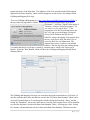
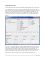
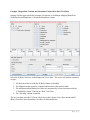
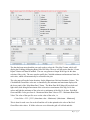
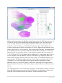
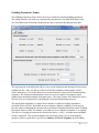
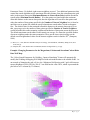
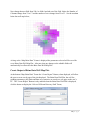
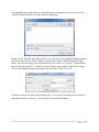
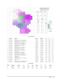
Gridding & Mapping of Brine Data Java Applet
by John R. Victorine
Introduction
The Gridding and Mapping Web Application is an interactive process that assists the user in
building simple color contour maps of Brine Data Well data. The “contour” map uses a
“colorlith” presentation, i.e. mapping 3 brine data curves to 3 primary colors, Red, Green and
Blue and mixing the colors to create a final color based on the magnitude of the selected brine
data curves. The Gridding & Mapping module first appeared in PfEFFER Pro an Excel Spread
Sheet Program developed by the Kansas Geological Survey, released 1998. It also appeared in
GEMINI (Geo-Engineering Modeling through INternet Informatics) web application developed
by Kansas Geological Survey 2000 – 2003 as part of Volumetrics Module. A stand-alone
Gridding & Mapping Web App was one of the first web apps developed as part of the Gemini
Tools in November of 2003. The 2003 version was designed for a user to enter any type of data
for the group of wells, core data, tops thickness, etc. The data was saved as XML Extensible
Markup Language Project Files. The program automatically accessed the saved data between
dialogs. This new version focuses on the CO2 Wells with Brine Data. The data is stored on the
CO2 ORACLE Database Tables at the Kansas Geological Survey (KGS). A series of ORACLE
PL/SQL Stored Procedures were created to access this data. This version is very dependent on
the KGS database.
Peter L. Briggs(1) identified a method to assist geologist in well log interpretation by creating a
color log presentation. His method provided a means to combine three different log curves from
one well into one image track that varies along the depth by assigning each curve to a specific
primary color of red, green and blue. His method assumed that the primary colors would appear
to the human eye as orthogonal and miscible where the resulting color image would preserve all
the information of the original log curves. The color image presentation of well log data reduced
the number of displays competing for the interpreter’s attentions by uniting the three log curves
into one display and relieved the burden of mentally combining data from several separate
displays. Overall the color log images presented log data to the user in a form that differs from
the conventional log presentation and relied on the human perceptions and pattern recognition
skills. The term Colorlith was first introduced by David Collins(2) in a USGS paper discusses the
visualization of subsurface geology as achieved by COLORLITH, a software system… Many of
the GEMINI Tools use a “Colorlith” plot track to illustrate the lithology at a glance. This
program extends this concept to the Gridding & Mapping web app with the brine data curves
since there are a number of data types that are created for each water sample for each well. The
idea of using the brine data magnitudes to create the color “contour” map would reflect the
(1) Color display of well logs, Peter L. Briggs, Mathematical Geology, Volume 17, Number 4, May 1985.
(2) Color Images of Kansas Subsurface Geology from Well Logs, D. R. Collins and J. H. Doveton, Computer &
Geosciences, Vol. 12, No. 4B, pp.519-526 1986
1|Page
general chemistry of the brine data. The influence of the CO2 injected into the Mississippian
might alter the brine chemistry which could be mapped over time by the color changes on the
Gridding and Mapping Web App.
To access Gridding and Mapping go to http://www.kgs.ku.edu/PRS/Ozark/Software/GRID/ at
the top of the web page there is a menu "Main Page|Description|Applet|Help|Copyright &
Disclaimer|". Select the "Applet" menu option a
"Warning - Security" Dialog will appear (“Do
you want to run this application?”). The
program has to be able to read and write to the
user’s PC and access the Kansas Geological
Survey (KGS) Database and File Server,
ORACLE requires this dialog. The program does
not save your files to KGS, but allows you to
access the KGS for well information. The
program does not use Cookies or any hidden
software. The blue shield on the warning dialog
is a symbol that the Java web app is created by a trusted source, which is the University of
Kansas. Select the "Run" Button, which will show the Gridding and Mapping Module Panel
illustrated below,
The Gridding and Mapping Web App was created for the South-central Kansas CO2 Project, so
only the wells that have brine data that are saved to the CO2 Brine Data Database Tables can be
accessed. Presently there are 2 search engines with this dialog the Search By “Dates” and the
Search By “Formation”, but as more brine data is saved the search engine above will be modified
to reflect the data that is saved in the Brine Data Database Tables. Selecting any of the “Search
By” buttons will automatically search for data in the Brine Data Database Table based on the
2|Page
type of search. The following buttons will retrieve the available brine data by XML - Extensible
Markup Language data streams that are parsed. The XML calls are listed as follows:
Buttons
Sampled Date
Received Date
Reported Date
Buttons
Formations
ORACLE PL/SQL call to retrieve the number of wells and available dates
http://chasm.kgs.ku.edu/ords/iqstrat.co2_grid_brine_data_pkg.getDateListXML?iDate=0
http://chasm.kgs.ku.edu/ords/iqstrat.co2_grid_brine_data_pkg.getDateListXML?iDate=1
http://chasm.kgs.ku.edu/ords/iqstrat.co2_grid_brine_data_pkg.getDateListXML?iDate=2
ORACLE PL/SQL call to retrieve the number of wells and Formations (Tops)
http://chasm.kgs.ku.edu/ords/iqstrat.co2_grid_brine_data_pkg.getTopsListXML
The Search By “Dates” returns the actual date entered for the brine data group and the total
number of wells that have brine data with that date, i.e., select the “Sampled Date” Button and
the following list will be displayed.
At the time of this document there are only 2 possible well groups, “2012-10-04” and “2012-0512”. The “2015-05-12” brine data well group has a total of 27 wells out of a possible 40 wells
with brine data sampled on this date. The user only needs to highlight the 2nd row in the list and
click on the “Select” button at the bottom of the panel. This action will automatically retrieve the
date as the search criteria and make an ORACLE PL/SQL call,
http://chasm.kgs.ku.edu/ords/iqstrat.co2_grid_brine_data_pkg.getDateXML?iDate=0&sTime=2015-05-12
This call will return a XML – Extensible Markup Language data stream with a list of wells and
the brine data of each well in the Sampled Date Well Brine Data Group. The “Map” button will
automatically become enabled, which indicates that the brine data was successfully downloaded
and parsed into the Brine Data List Structure. To plot the brine data to the Gridding & Mapping
Well Map click on the “Map” button. This will take you to the “Map Brine Data” Frame.
The other button above the “Map” button is the “Well List” Button which will display all the
CO2 wells that have Brine Data in the CO2 Brine Data Database Tables in the “Well List” Frame.
This Frame shows the well header information for the wells available. The Gridding and
Mapping Program require the UTM X & Y for each well to create a plot. The program will not
work if the wells do not have this data computed. The well list is coming from the KGS
ORACLE Well Header Information Database Table and the UTM X & Y are already computed
so the user really does not have to do anything with the well list. If any well is missing a UTM
X & Y then the user can select the well and click on the “Compute UTM for Selected Well
Only” to compute the UTM from the latitude and longitude of the well.
3|Page
Map Brine Data Frame
The “Map Brine Data” Frame is basically the Gridding & Mapping Plot Control. The frame has
3 sections the upper or check boxes of possible brine data types that were analyzed for the well
group. The check boxes are grouped in 3 separate panels, “Other Brine Data Types, Cations, and
Anions. There are 3 check boxes for each brine data type, R-Red, G-Green and B-Blue. The
program is designed to allow the user to select up to 3 brine data curves and to map each curve
with a primary color to form a “Colorlith” of the brine data on the Gridding & Mapping Well
Map Plot.
As the user selects each brine data curve for plotting the program computes a statistical analysis
of the data, i.e. computing the Minimum, Maximum, Mean, Median, etc. of the brine data curve
in the second section. The data is presented so the user knows the spread of the data. The
program automatically selects the 5% and 95% for the minimum and maximum plot values and
places them in the text fields at the bottom of the panel for the color selected. The user can
change the values, which will change the color of the Gridding & Mapping Plot Area.
4|Page
Example: Magnesium, Calcium and Strontium Cations Brine Data Well Map:
Starting with the upper panels this example will generate a Gridding & Mapping Brine Data
Well Map for the Magnesium, Calcium and Strontium Cations.
Select the R (Red) Check box in the Magnesium Curve Row. This action will perform a number
of steps,
1. All other check boxes under the R (Red) column are disabled.
2. The Magnesium data spread is computed and inserted in the statistics table.
3. The minimum and maximum plot values are automatically selected and inserted in the
“Colorlith Plot Limits” Panel in the “Red” Color Row.
4. The “Plot Map” Button is enabled.
The user can then select the G (Green) Check box in the Calcium Curve Row and then the B
(Blue) Check box in the Strontium Curve Row as illustrated below.
5|Page
The data has been entered and the user only needs to select the “Plot Map” button, which will
display the Gridding & Mapping Brine Data Well Map. The user will also notice that the “Create
Report” Button will then be enabled. The user can generate a Output Web Page for this data
selection if they wish. The user can also modify the Colorlith minimum and maximum limits for
each color, which will automatically be reflected in the plot.
The color map reflects the brine chemistry for the Magnesium-Calcium-Strontium Cations. The
Colorlith Red-Green-Blue color mix is controlled by the minimum and maximum displayed in
the lower panel of the “Map Brine Data” Frame. The Brine Data Well Map will have dark and
light colors, dark being the maximum of the color mix or maximums of the Mg-Ca-Sr data
values and light the minimum of the color mix or minimums of the Mg-Ca-Sr data. Each Red,
Green and Blue Color goes from 0 – Maximum Brine Data Value to 255 – Minimum Brine Data
Value. The value of the specific curve set the value of the color, i.e.
Color Value = 255 – [255 * (brine data value – Minimum) / (Maximum – Minimum)]
This is done for each curve for each cell and the cell is then painted to the color of the RedGreen-Blue color values. If all the colors are set to 0 then the grid cell is black and this
6|Page
indicates that the maximum value for all the selected curves was used. If all the colors are set to
255 then the grid cell is white and this indicates that the minimum value for all the selected
curves was used. If the brine data was proportional between the wells, i.e. they brine data
changes by a factor “A” then you would expect the color to be grays. The brine data is not
necessarily proportional, in that the concentration of Calcium, Magnesium and Strontium is the
same by only a factor of “A” for each well. This gives the color of the map. The Strontium will
be at a maximum for some wells and a minimum for others and the same for the Calcium and
Magnesium will vary across the well area. As the plot above suggests the Green areas at well
15-191-10055 and 15-191-10107 implies that the Magnesium is at its maximum and Calcium is
set at its minimum, while the Strontium is also at its maximum, e.g. Magnesium (Red) Color
value is about 0 and the Calcium (Green) Color value is about 255 and Strontium (Blue) Color
value is about 0. The Red-Green-Blue color mix is Green. The area around the wells 15-19121608 and 15-191-10059 in the upper left area suggests that all the brine data are at their
minimums or set to 255, which will display a white color. Dark purple colors suggest that the
Magnesium and the Strontium are both at their minimum and the Calcium is at its maximum in
that area.
The Gridding Parameters can be modified by selecting the “Grid Parameters” Button, which will
change the gridding pattern between the wells. Clicking on the “Grid Parameters” Button will
display the “Select Search Parameters for Gridding – Input to Simulation” Frame.
7|Page
Gridding Parameters Frame
The Gridding Parameters Frame allows the user to modify the standard gridding parameters.
The changes that the user makes are automatically passed back to the Map Brine Data Frame,
also if the Brine Data Well Map is displayed; the data is automatically updated in the plot.
The upper portion of the dialog box allows you to set the minimum grid spacing between nearest
neighbors in feet. Once you tab out of that text field the minimum and maximum X and Y
values in the grid, as well as the number of rows and columns for the grid will be automatically
computed. The minimum and maximum values are set to encompass a rectangular region
slightly larger than that bounding all the data points. The lower portion of the dialog box allows
the user to set several parameters controlling the search and interpolation processes.
The interpolation algorithm is a simple inverse distance weighted averaging algorithm as
described in Davis (1986). By default an inverse distance-squared weighting is used, but you
have the option of changing the exponent (Inverse Distance Weighting Exponent on the Gridding
Parameters Frame) so that, for example, you could use inverse distance (exponent=3) weighting.
The effects of varying the exponent are described in Davis(3) (1986). A simple nearest neighbor
search is employed. The maximum number of nearest data points to use in estimating the
parameter value at a grid node is specified as Number of Nearest Neighbors in the Gridding
8|Page
Parameters Frame. By default, eight nearest neighbors are used. Two additional parameters that
control the search algorithm are the maximum allowable distance from the estimation point (grid
node) to the nearest data point (Maximum Distance to Nearest Data Point) and the maximum
search radius (Maximum Search Radius). If no data points are found within the maximum
allowable distance to the nearest data point, then the algorithm will search for data points until
either the number of data points specified in the Number of Nearest Neighbors box is found or
until there are no points left within the specified maximum search radius, whichever happens
first. The default value for the maximum allowable distance to the nearest data point is set so
that, on average, twice the number of data points specified as Number of Nearest Neighbors
would fall within this radius assuming a uniform distribution of data points across the map area.
The default maximum search radius would contain, on average, five times the specified number
of nearest neighbors under the same assumption. These are the same criteria used to set the
default search neighborhood values for the nearest neighbor search in Surface III(4) (Sampson,
1988).
(3) Davis, J.C., 1986, Statistics and Data Analysis in Geology, Second Edition, John Wiley & Sons, New
York, 646 pp.
(4) Sampson, R.J., 1988, Surface III User's Manual, Kansas Geological Survey, 277pp.
Example: Changing Parameters for the Magnesium, Calcium and Strontium Cations Brine
Data Well Map:
The “Select Search Parameters for Gridding – Input to Simulation” Frame will automatically
modify the Gridding & Mapping Well Map Plot with each modification to the editable fields. As
an example of changing the grid cell size, the “Minimum Grid Spacing with 5 grid cells between
nearest neighbors in feet (590.4 by 590.4):” text field has the value 590.4, which is presented the
plot below as 23 columns by 33 columns,
9|Page
Now change that text field from 590.4 to 1000.0 and tab out of the field. Notice the Number of
Columns change from 23 to 17 and the number of rows change from 22 to 23. See the resultant
brine data well map below,
As long as the “Map Brine Data” Frame is displayed the parameters selected will be saved for
every Brine Data Well Map Plot. Also note, that any changes to the editable fields will
automatically be reflected in the Brine Data Well Map Plot.
Create Output of Brine Data Well Map Plot.
At the bottom “Map Brine Data” Frame the “Create Report” Button, when displayed, will allow
the user to create a web page of the plot displayed. The Brine Data Well Plot, the well list ,
gridding parameters, plot limits and data curve statistics are saved to a web page on the user’s
PC. The “Create Report” Button is only enabled when the Brine Data Well Plot is displayed,
click the button to display the “Select a Different Directory Path” Frame,
10 | P a g e
The default directory path is the user’s home directory, to change the directory path select the
“Search” Button to display the Search Directory Path Frame.
Search your PC directory path to the directory you wish to save the Gridding & Mapping Report
Web Page, then click the “Select” Button to return to the “Select a Different Directory Path”
Frame. The directory path will be transferred to the “Save File To” Text field. The default file
name of the generated PNG – Portable Network Graphics image and the HTML file is Output.
The user can change the name to anything in this case Mg-Ca-Sr will be used,
Select the “Continue” button to generate the report. The web app will automatically collect the
data and generate the web page. The web page will automatically display,
11 | P a g e
12 | P a g e
13 | P a g e