1
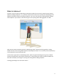
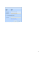
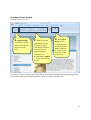
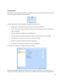
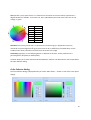
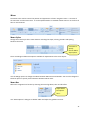
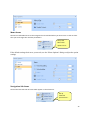
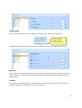
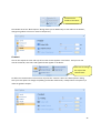
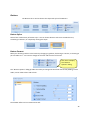
Artisteer
User Manual
Table of Contents
What Is Artisteer? ................................................................................................................................... 4
How to work with Artisteer interface?..................................................................................................... 5
Quick Start Guide .................................................................................................................................... 6
Downloading Artisteer......................................................................................................................... 6
System Requirements.......................................................................................................................... 7
Installing Artisteer ............................................................................................................................... 8
Activating the software........................................................................................................................ 8
Creating a basic design ...................................................................................................................... 10
Further customization ...................................................................................................................... 11
Dialog boxes ...................................................................................................................................... 12
Working with colors........................................................................................................................... 13
Color Selector dialog.......................................................................................................................... 14
Navigation Bar....................................................................................................................................... 16
Ideas ................................................................................................................................................. 16
Creating Your Design ..................................................................................................................... 16
Making Adjustments...................................................................................................................... 16
Export Design .................................................................................................................................... 16
Templates...................................................................................................................................... 17
Export Design options.................................................................................................................... 17
Exporting a design as an HTML template ..................................................................................... 17
Exporting a design as a WordPress theme.................................................................................... 18
Exporting a design as a CodeCharge Studio Project ...................................................................... 18
Layout ............................................................................................................................................... 20
Page/Column Layout...................................................................................................................... 20
Individual Element Layout.............................................................................................................. 21
2
Colors & Fonts ................................................................................................................................... 21
Changing Colors............................................................................................................................. 21
Font Theme ................................................................................................................................... 23
Background ....................................................................................................................................... 23
Sheet................................................................................................................................................. 24
Header .............................................................................................................................................. 25
Header Layout ............................................................................................................................... 25
Header Background Photo ............................................................................................................. 26
Header Foreground Photo ............................................................................................................. 28
Title ............................................................................................................................................... 30
Menu................................................................................................................................................. 31
Menu Styles................................................................................................................................... 31
Menu Bar....................................................................................................................................... 31
Menu Items ................................................................................................................................... 32
Navigation Sub Items ..................................................................................................................... 32
Blocks................................................................................................................................................ 33
Block Styles.................................................................................................................................... 33
Background ................................................................................................................................... 34
Shadow.......................................................................................................................................... 34
Header........................................................................................................................................... 34
Content ......................................................................................................................................... 35
Buttons.............................................................................................................................................. 36
Button Styles ................................................................................................................................. 36
Button Format ............................................................................................................................... 36
Glossary ................................................................................................................................................ 38
3
What Is Artisteer?
Artisteer is the first and only Web design automation product that instantly creates fantastic looking
Website and Blog templates. It is a powerful software that makes YOU a professional Web designer of
Websites, WordPress themes and blog templates. It lets you create fantastic looking Website designs
and templates in just minutes, without having to know anything about editing graphics or HTML.
With Artisteer YOU immediately become a Web design expert, editing and slicing graphics, coding
XHTML and CSS, and creating CMS templates and Wordpress themes - all in minutes, without Photoshop
or Dreamweaver, and no technical skills.
Use Artisteer to generate cool Web design ideas, adjust the generated designs using many included
elements, backgrounds, photo objects and buttons, create professional and full compliant HTML and
CSS code and export your design to create great looking Web and Blog templates.
Creating great designs has never been easier!
4
How to work with Artisteer interface?
The Artisteer interface is quite simple to learn. There are several main items: Main Menu, Quick Access
Menu, Tabbed Navigation Bar and Design Preview (highlighted on the image below).
Main Menu contains basic file commands, recent documents and other standard items for File menu.
Quick Access Menu contains Undo, Redo, Save and Open shortcuts.
Navigation Bar contains all available editing tools.
Design Preview lets you see how your design will look like. All links and buttons on preview are nonclickable.
Main Menu
Quick Access Menu
Navigation Bar
Design Preview
5
Quick Start Guide
Downloading Artisteer
You can download the Artisteer installation file from the official Artisteer Web site at
http://www.artisteer.com. The software is provided with a free trial period that allows you to evaluate
the product before purchasing. During this period of time Artisteer is fully functional and has all its
features available for testing. The only restriction is that all the templates and images generated with
Artisteer will have watermarks on them until the product is activated. The trial period is unlimited so
you can activate the software at any time you wish and activation instructions are provided in the
Activating the Software chapter.
6
System Requirements
This section describes the system requirements for the Artisteer software.
Development Environment
•
Intel or AMD processor 1500 Mhz or higher
•
100 Mb free disk space
•
512 Mb RAM or higher
Microsoft Windows 2000, XP, Vista
Microsoft .NET Framework 2.0+. It can be obtained from the Microsoft website at:
•
http://www.microsoft.com/downloads/details.aspx?familyid=0856eacb-4362-4b0d-8eddaab15c5e04f5&displaylang=en
Browsers supported
•
Internet Explorer 6+
•
Firefox 2+
•
Opera 9+
•
Safari 1+
•
Google Chrome 1+
Technologies supported
•
CodeCharge Studio 4
•
Wordpress (2.5-2.6) content management system
Standards supported:
•
XHTML 1.0 Transitional
•
CSS 2
•
Section508 (partially)
•
PNG with transparency
7
Installing Artisteer
This chapter describes how to install Artisteer on your computer.
Before you proceed please make sure that your computer meets the requirements listed in the System
Requirements chapter.
1. Log into Windows as a Power User, or assume the Primary Administrator role.
2. Double-click the installation file called ArtisteerInstall.exe. This will launch a standard
installation process.
3. Select the language that you’d like to use during the installation. Click Next button.
4. Follow the instructions provided by the installation wizard.
5. Carefully read the License Agreement. If you accept its terms, check "I Accept the terms of the
License Agreement" option and proceed to the next step. Otherwise, quit the installation.
6. Select the destination folder where you want to install the product.
7. Indicate whether you want to create shortcut icons on the desktop and Quick Launch panel.
8. Click Install button to start the installation.
9. Click Finish button when the installation is complete.
Activating the software
After you’ve purchased Artisteer you will receive a Serial Number to be used to activate the software.
The activation removes the watermarks added to the generated templates by the trial version.
To activate the product click on the Palette icon to open Artisteer Activation dialog and enter your serial
number in the first box. If your computer is connected to the internet, check "Auto-activation through
the internet" option and click the Activate button.
If you work off-line use the following link to obtain the activation key from any other computer
connected to the web:
http://www.artisteer.com/?p=a
In this case uncheck the "Auto-activation through the internet" option and enter the obtained activation
key directly in the Activation Key box.
8
Restart Artisteer after successful activation.
9
Creating a basic design
Artisteer is as easy as 1-2-3:
1. Suggest Design
2. When you find a
is a great tool to find
basic theme idea and
the place to start
from.
good design idea you
may want to adjust
some design elements
like colors, fonts or
page background
separately. The
corresponding “Suggest
…” button will help you
on this.
3. Click Export
Design to save
created design as
WordPress theme,
HTML template or
any other format
you prefer to use
on your site.
In most cases, nearly everything you need to do can be started by clicking on the Suggest Design button.
This is pretty similar to watching a slideshow. It is fun and even a child can do it!
10
Further customization
Artisteer is a powerful tool with great customization capabilities. After you find a good design idea you
may go into a specific tab and adjust the design to match your needs. On each tab there are a lot of
options for customizing specific elements.
That is not all! If you can’t find the option you want in specific list then click on “More…” to get full
customization capabilities:
Here is an example of how it looks for the Sheet tab:
Even more
options here…
11
Dialog boxes
Many options and settings are included in the dialog boxes which can be accessed by clicking a small
arrow button to the right of the group caption.
The user interface for a typical dialog box includes the following parts:
•
Dialog caption indicating what kind of options are available in the dialog
•
The list of the option groups located in the left pane of the dialog box. Click on the group to
expand its options.
•
Options and settings available for the selected group.
•
Preview checkbox to view the results of the setting automatically as they are changed.
•
Preview button to display the result of the settings on the page.
•
OK button to apply the settings and close the dialog box.
•
Cancel button to discard the changes and close the dialog box.
An example of a dialog box is provided in the picture below.
Most of the dialog boxes contain settings that can be changed using slider bars. Usually these are
settings for the width, height, opacity, transparency and other range values. Position the pointer over
12
the slider and drag it to the right or left to increase or decrease a specific option’s value. The selected
value will be displayed in the box next to the slider bar. You can also enter the desired value directly in
this textbox.
Use the "Preview" button or "Preview" option available at the bottom of the dialog window to preview
the changes.
If the "Preview" checkbox is ticked, the changes will be immediately displayed on the page as you drag
the slider. If you type the value directly in the option box, click outside the box to have the value applied
to the page.
If the "Preview" option is unchecked, press Preview button to see the changes on-screen. It will help you
easily achieve the desired look of your page.
Finally click OK or Cancel button to commit or discard your changes.
Working with colors
The colors on computer monitors are made up of varying amounts of red, green and blue base colors.
Depending on how much you take from each base color, you can create any of the colors which a
monitor can display. For example, a mix of red and green produces yellow color, a mix of red and blue –
magenta and so forth. Mixing all three base colors with full intensity produces white color while the
absence of all the components returns black color.
The values for red, green, and blue base colors are usually specified using a scale from 0–255 (decimal),
where 255 represents 100% intensity of the color.
RGB is a convenient color model for computer graphics because the human visual system works in a
similar way. However human perception does not see colors as triplets of numbers: red, green and blue.
Instead it is quite convenient to describe colors as made up of hue, saturation and lightness (or
luminosity). This HSL scheme defines colors more naturally and can be visualized as a cylinder whose
central axis ranges from black at the bottom to white at the top with neutral colors between them,
where angle around the axis corresponds to “hue”, distance from the axis corresponds to “saturation”,
and distance along the axis corresponds to “lightness”, or “luminosity”.
13
Hue specifies a pure, spectral color. It is measured as a location on the color wheel, expressed as a
degree between 0° and 360°. In common use, hue is identified by the name of the color such as red,
orange, or green.
Hue
0
1
2
3
4
5
6
Color
red
yellow
green
cyan
blue
magenta
red
Saturation is the purity of the color. It represents the amount of grey in proportion to the hue,
measured as a percentage from 0% (grey with no hue at all) to 100% (fully saturated color). On the
standard color wheel, saturation increases from the center to the edge.
Luminosity (Lightness): is the relative lightness or darkness of the color, usually measured as a
percentage from 0% (black) to 100% (white).
Artisteer allows you to work with both HSL and RGB color schemes. The desired color can be specified in
the Color Selector dialog.
Color Selector dialog
The Color Selector dialog is displayed when you select "More Colors…" button in one of the color option
dialogs.
14
The Color Selector dialog lets you select the desired color and adjust the hue, saturation, and brightness
of this color.
There are Luminosity and Hue tabs available in the dialog. Both tabs have a color selection area (color
palette) where you can move a slider until you are satisfied with the color.
On the Luminosity tab there is a special luminosity slider. This slider lets you increase or decrease the
brightness of the color from zero at the bottom to 100 at the top of it.
With the luminosity selected, you can go to the color palette and drag a small circle picker horizontally
and vertically to change the hue and saturation of the color respectively.
The Hue tab contains a separate Hue adjustment slider. Moving it all the way from red (at the bottom)
through orange, yellow, green, blue up to purple allows you to select the desired hue of the color.
Having the Hue selected, you may also move a palette color picker from left to right and from top to
bottom to additionally set the saturation and luminosity values of the color. Saturation can vary from 0%
(completely unsaturated) to 100% (completely saturated, pure color). Luminosity ranges from 0 (black)
to 100% (white).
The values displayed in the right set of boxes will change to indicate the exact color settings. These
values can also be changed manually, directly in the text boxes. It may be convenient when you copy the
exact color value from some other graphic software and want to use it in Artisteer.
Hue
Sat
Lum
Red
Green
Blue
Hex
Hue value of the color ranged from 0° to 360°.
Saturation of the color ranged from 0% (completely desaturated) to 100% (fully saturated).
Luminosity of the color measured in percentage: from 0 (black) to 100% (white).
Decimal value for red color.
Decimal value for green color.
Decimal value for blue color.
A hexadecimal color code (usually used in HTML code).
The "Preview" option makes it possible to see the page with the selected color applied to it.
Ok and Cancel buttons allows you to submit or discard the changes made.
15
Navigation Bar
Let’s have a closer look at the navigation bar. It is divided into nine different distinct categories used to
customize your blog. Moving from left to right, we begin with the overall idea and layout to the site. As
we move to the right, we become focused on specific parts of the site such as blocks and buttons.
Ideas
The Ideas tab is a great way to quickly envision your Website design right before your eyes.
Creating Your Design
Let Artisteer create design for you. The Suggest design feature is best used at the beginning. It allows
you to see the various designs available and helps you determine which styles and themes you like.
Making Adjustments
You are able to make adjustments to many individual components when brainstorming ideas for your
Web design. Possibly the font doesn’t match the layout of the site or the buttons don’t match the
navigation. By making these adjustments, you can get closer to the look that you want to achieve.
Export Design
Once you have settled on the basic look of your site, you can export it as a design or template which is
compatible with the type of blog that you want to use.
There are two steps that need to be followed to export the design:
16
1. First, select a template which will be applied and used when viewing the page in Artisteer.
Currently the following templates are available: Website Design, WordPress and CodeCharge
Studio.
2. Next, tell Artisteer what export option you want to use when generating the selected template.
Choose the desired Export Design option to export and save your design as individual style files.
Let us now consider each option in a little more detail.
Templates
Icon
Option
Description
Website Design
This template can be selected if you don’t use any particular
CMS (content management system) but want to create a
professional css design for your website.
WordPress
The WordPress template option is provided for those who
create designs for WordPress websites.
After selecting this template from the Template list you have
options to export the design as an HTML template or a
WordPress theme.
CodeCharge Studio
CodeCharge Studio template option is provided for
developers and designers who use the CodeCharge Studio
development tool for creating web applications.
After selecting this template from the Template list you have
options to export the design as an HTML template or as a
CodeCharge Studio Project.
Export Design options
Exporting a design as an HTML template
1. Select any template from the Template list.
2. Select Export Design ->"HTML, Adobe Dreamweaver and Microsoft Expression Web Template"
3. Type the path or click the Select button to specify the destination folder where you want to
create HTML template.
The resulting template will contain markup, styles and graphics that are necessary to apply the design to
any Web page.
17
Exporting a design as a WordPress theme
To export a design as a WordPress theme that can be applied to the existing WordPress installation
follow these steps:
1. Select Template->WordPress template.
2. Select Export Design ->"WordPress theme" option.
3. In the folder selection dialog click the Select button to choose a theme folder.
After the export you will obtain WordPress-specific theme files that can be located in the theme folder
on server and easily applied to the WordPress websites. The path to the theme folder in WordPress
system usually looks like WordPressFolder\wp-content\themes\ThemeName.
To apply the new theme login to your Wordpress Admin Panel, navigate to the Presentation tab and
activate this theme.
The generated Wordpress themes are widget ready and compatible with WordPress version 2.5 and
higher.
Exporting a design as a CodeCharge Studio Project
To create a design that can be applied to CodeCharge Studio projects the following steps should be
performed:
1. Select Template->CodeCharge Studio template.
2. Select Export Design ->"CodeCharge Studio Project" option.
3. Browse to the folder where you want to locate the CCS project and click Ok to export the
files.
When the export is completed, a new CodeCharge Studio project will be created in the specified
location. The following pages will be added to the project:
•
PageTemplate
•
Header
•
Footer
•
Main
•
About
PageTemplate is an essential page that will be used as a basis for creating all the new pages within the
CCS project. This functionality is achieved using Project Settings->General->New Page Template option.
18
PageTemplate includes the Header and Footer pages that are used to add page background, sheet,
header and menu styles to the pages. Thus all the newly created CCS pages will have page background,
sheet, header and menu styles automatically applied to them.
However the Artisteer-generated styles cannot be automatically applied to CCS forms, buttons, and
other blocks on the page.
To add style to these components you can consider one of the following solutions:
•
Open CCS Style Builder (Tools->Styles) and add a new style that looks similar to the style
generated by Artisteer. Use this new style for CCS forms and controls.
•
Modify a CCS page template to add the Artisteer styles manually. In that case, do not select any
style when creating forms and controls in CCS. Then switch to HTML mode and modify your
page template manually adding the Artisteer classes and the necessary html tags. A sample html
code is provided on the Main page so you can review it and modify CCS page templates
accordingly.
The example code below demonstrates how to apply the Artisteer-generated styles to a Record
form on CCS page. The unchanged HTML code is shown in black, the removed code lines are
crossed out and highlighted in red, and the lines added to the code are highlighted in blue color.
19
Layout
The layout tab is where you can quickly change the overall positioning of elements on the page.
Page/Column Layout
You can quickly change the positioning of the header and navigator bars. Place the navigator above or
below the header or choose not to use a menu bar at all. In addition, if your page will have more
content, you might want to expand your site into two or more columns.
Click here to
specify custom
column width
When a multi-column layout is being used, the Layout Options dialog displays a set of sliders that that
allows you to set the percentage widths of the columns.
20
Individual Element Layout
Use the individual element layout to change the position of various elements including the location of
the search box, the positioning of categories; the archive links location, the Blogroll, as well as the
position of postings. Let Artisteer do all the work, by leaving your mouse over an option, you can
preview what your selection will look like.
Colors & Fonts
The Color & Fonts tab provides the ability to change the colors and fonts of the template.
Changing Colors
Make changes to the overall theme of the site. You can select from a wide variety of color themes
available. You can even change individual colors. After choosing a set of colors, refine the colors even
further by adjusting the overall contrast of the colors.
21
Adjust
In this block you have the ability to adjust the Color theme. Select one of the predefined schemes or
customize the color theme selecting the desired colors.
More options
here….
Use the "Adjust Options…" option to adjust the luminosity and saturation values of the color theme.
Enter the values or drag the sliders to the right to increase option values or to the left to decrease them.
Both values can range from -100 to +100 percent.
22
Font Theme
Select from a wide variety of font themes to match the overall look and content of the site.
Background
The background of the page is just as important as the page itself. Change the background effects to
achieve the desired look. You can choose to have a gradient look, change the texture, glare or the
overall color of the background.
23
More customization…
The "Page Background" dialog box includes a couple of slider bars for adjusting background settings.
Change the glare and texture transparency, contrast or gradient height to achieve the best result.
Sheet
Make changes to the overall positioning and look of the sheet or page. You might prefer a sheet with
rounded edges instead of square edges. Also, you can change the positioning and look of the sheet.
Maybe you want to move it down a bit from the top of the page, put a shadow effect or change the
width of the borders or the color of the sheet.
Click to customize
your sheet design
Open "Sheet Options" dialog to improve the design of the sheet. Customize Sheet & Shadow parameters
to achieve the desired result:
24
Sheet parameters include the width of the sheet and its borders, the padding and the radius values.
Shadow parameters control the size, angle and opacity of the shadow as well as its distance from the
sheet borders. Enter the values or drag the sliders to the right to increase option values or to the left to
decrease them.
Header
The header tab controls all aspects of the header. Make changes to the size and look of the header
while being able to include background and foreground images.
Header Layout
Make changes to the size and overlook of the header.
25
Click here to
change the
Header options
The layout options (such as the size of the header and the widths of its elements) can be configured in
the General tab of the "Header Options" dialog.
Header Background Photo
Choose from a wide variety of professional background images to be used in the header of your site.
You can also choose to insert your own image as well or choose no background picture at all.
Click here to
specify custom
Background
Header options
Just click here to add
your own Background
picture…
Open the list of images and select "Insert Background from file" option to add custom background
image:
26
Feel free to change the position of the picture or add visual effects to the background to make your
design look even more impressive and unique.
The background parameters can be manually adjusted in the second tab of the "Header Options" dialog.
27
Header Foreground Photo
Choose a photo that will be complementing your header. Choose from a variety of professional photos
of business men and women or use your own photo instead.
Click here to
specify custom
Foreground
photo options
Click here to
add custom
Foreground
Photo…
Select the option "Insert Object from File..." within the Foreground Photo list to use custom images in
the header.
28
You may also change the position of the foreground photo or recolor it transferring color to a grayscale
image.
29
The glow around the image can be tuned up in the third tab of the "Header Options" dialog.
Title
You can change the overall text that is used to name the site.
The title and slogan of your site can be changed just by typing it in the appropriate box. Here you can
change the size, style and font of the title and slogan and also change the color of the text.
Title style
Use this option to change the positioning and the size of the title.
You can change the overall alignment or manually move the title to where you want it to appear in the
header. You can also quickly change the header text size.
30
Menu
The Menu tab is used to control the position and appearance of main navigation menu. It consists of
the menu bar and the menu items. It can be implemented as a standard website menu or in the form of
tabs or menu buttons.
Menu Styles
Change the overall style of the menu buttons including the shape, coloring, borders and spacing
between the items.
Click here to
specify
custom Menu
Style options
There are Margin and Distance options available for adjustments to the menu layout:
Use the Margin option to change the indent between Menu Items and Header. You can also change the
Distance option to specify custom distance between Menu Items.
Menu Bar
Refine the navigation bar further by choosing the overall gradient, color and fill effect.
Adjust Menu
Bar options
here…
Use "Menu Options" dialog to set border width and adjust the gradient contrast.
31
Menu Items
Choose how individual items on the navigation bar should look when you hover over or click on them.
Also you can change color and text parameters.
Set up the
Menu item
options here…
If the default settings don't meet your needs, use the "Menu Options" dialog to adjust the option
settings.
Navigation Sub Items
Control the look and color of items which appear in the submenus.
Set up
submenu
options here…
32
Make additional changes to the Submenu items in the “Menu Options” dialog:
Blocks
Blocks are the individual components that make up the content of the page. Things located in blocks
include links, bookmarks, search, and the overall postings of the page.
Block Styles
Chose how you want blocks to be contained. Maybe you want the content underneath a block to fall
within a border.
Click here to
change the style
of the blocks
Layout options provide the ability to change block spacing, alter the distance between blocks, or make
the blocks more rounded changing the radius value:
33
Background
If your template allows it, you can change the background color and border of the blocks.
Customize block
background by
clicking this button
Make additional changes to the background on the Background tab of the "Block Options" dialog.
Shadow
If you selected a template with a shadow effect, the Shadow option provides the ability to change size,
angle and opacity of the block shadow as well as indicate the distance between the shadow and the
block borders.
Header
Each block has an individual header. Chose how you want that header to look for a block. You can
change the header color as well as font and color of the text.
34
Customize the
header of the block
The Header tab of the "Block Options" dialog allows you to additionally set the width of the borders,
change the gradient contrast or texture transparency.
Content
You can also adjust the color and style of how the content appears in the blocks. And you can also
control the border, text colors and hyperlinks that appear in the blocks.
Click here to change
the style of the
content block
To add more customization to the content style use the "Content" tab in the "Block Options" dialog.
Here you have options to change the padding and border width values, modify texture transparency or
make the gradient steeper:
35
Buttons
The Buttons tab is used to choose the shape and style of the Buttons.
Button Styles
Select from a wide variety of button styles. You can choose buttons with more rounded corners,
something in between, or completely rectangular shape.
Button Format
Make your finishing touches to the button by changing its gradient, thickening it s border, or choosing to
put a shadow on it. You can also change the fill color and the color of the text.
Click here to display
the "Buttons
Options" dialog
The "Buttons Options" dialog provides the ability to change the horizontal and vertical padding, border
width, corner radius values and so forth.
The Shadow effect can be customized as well:
36
37
Glossary
CMS
A Content Management System (CMS) is a software application designed to create, edit, publish and
manage Website content using a simple browser-based interface. The content may include text, photos,
electronic documents, music, video and other type of computer files.
CMSs usually provide a number of ready-made solutions and standard templates for most common
applications.
The main advantage of CMS is that it requires almost no technical skills or knowledge to create the
website and manage its content.
Blog
A blog (short for "Web log") is a special type of Web site with a series of entries usually posted to a
single page in reverse-chronological order.
Blogs are often maintained by an individual and represent the personality of the author, provide diarytype commentary, links to articles on other Web sites, descriptions of different events and social issues,
or include other material such as graphics or video.
WordPress
WordPress is an open source blog publishing application, an advanced blogging tool with a focus on
aesthetics, web standards, and usability. The official WordPress website is http://wordpress.org.
CodeCharge Studio
CodeCharge Studio(CCS) is a Rapid Web Application Development Tool from YesSoftware company. It is
a software for visually creating dynamic database-driven Web applications. The official company website
is http://www.yessoftware.com.
HTML
HyperText Markup Language (HTML) is the predominant markup language for Web pages which
provides a set of markup symbols or codes to specify the structure of documents for retrieval across the
Internet using Web browser programs. HTML is written in the form of tags, surrounded by angle
38
brackets. The document can contain links, headings, paragraphs, lists, and text supplemented with
interactive forms, embedded images, and other objects.
CSS
Cascading Style Sheets (CSS) is a style language that defines the presentation of a document written in a
markup language. CSS controls the overall layout, text size, style, and formatting and other design
properties to let developers separate content from design.
RGB
RGB stands for the three primary colors of light - Red, Green, and Blue. The combination of these colors
in different proportions produces any color in the visible spectrum. RGB system is used for representing
colors on computer display.
HSL
HSL stands for Hue, Saturation, and Lightness. It is a method for describing colors as they are perceived
by a human eye. HSL is considered a more intuitive way of dealing with color than RGB.
Hue corresponds to the actual color, saturation corresponds to the intensity, and luminosity
corresponds to lightness of the color.
39