1
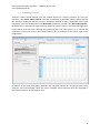
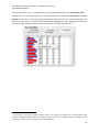
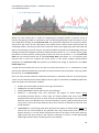
Chorus TweetVis: A Social Media Analysis Tool for Social Scientists User Manual for Chorus Analytics – TweetVis (Chorus-TV) Last Updated 07/10/13 1. Introduction TweetVis is a visual analytic tool for producing interactive representations of data taken from Twitter to assist in a variety of qualitative and quantitative research tasks in social research. TweetVis is effectively used alongside a sister application – TweetCatcher – which allows users to build queries for harvesting tweets around their chosen topic, to be inputted into TweetVis. The data itself allows for the analysis of an array of information pertaining to tweets themselves (i.e. content, authors, date and timestamp, and so on) as well as a SentiStrength value, which uses the SentiStrength (Thelwall et al., 2010) algorithm to provide information as to the positivity or negativity of sentiment expressed in the tweet. TweetVis is a powerful tool for social research, and opens up a multitude of possibilities for research projects that wish to explore and ‘drill down’ into Twitter data. This guide is intended to show users how to install TweetVis, and a selection of basic features of usage. 2 User Manual for Chorus Analytics – TweetVis (Chorus-TV) Last Updated 07/10/13 Contents 1. Introduction ........................................................................................................................................ 2 2. Quick-Start Guide ................................................................................................................................ 4 2. 1. The ‘Start’ Tab – Loading, Selecting and Previewing Data .......................................................... 5 2. 1. 1. Loading Data........................................................................................................................ 5 2. 1. 2. Building an Index ................................................................................................................. 8 2. 2. The ‘Time Line Explorer’ Tab ....................................................................................................... 9 2. 2. 1. Time Line Explorer Interface ............................................................................................. 10 2. 2. 2. Term Profile View .............................................................................................................. 11 2. 2. 3. Term Statistics ................................................................................................................... 12 2. 2. 4. Interval Statistics ............................................................................................................... 15 2. 2. 5. Content Viewer ................................................................................................................. 17 2. 2. 6. The Time-Line View ........................................................................................................... 18 2. 3. The ‘Cluster Explorer’ Tab ......................................................................................................... 22 2. 3. 1. Cluster Explorer Interface ................................................................................................. 23 2. 3. 2. Interval-Level Map ............................................................................................................ 24 2. 3. 3. Tweet-Level Map ............................................................................................................... 26 2. 3. 4. Term-Level Map ................................................................................................................ 27 3. Advanced Users................................................................................................................................. 29 3. 1. Editing the Path to GraphViz ..................................................................................................... 30 3. 2. Setting the Time Field ............................................................................................................... 31 3. 3. Selecting Fields for Inclusion in the Semantic Model ............................................................... 32 3. 4. Previewing the Word Index....................................................................................................... 33 3. 5. Advanced Options in the Start Tab ........................................................................................... 35 4. References ........................................................................................................................................ 37 3 User Manual for Chorus Analytics – TweetVis (Chorus-TV) Last Updated 07/10/13 2. Quick-Start Guide This section provides instruction as to how users may load their data into TweetVis, as well as introducing the key analytic features of the software. 4 User Manual for Chorus Analytics – TweetVis (Chorus-TV) Last Updated 07/10/13 2. 1. The ‘Start’ Tab – Loading, Selecting and Previewing Data 2. 1. 1. Loading Data TweetVis data can be loaded from any folder on your disk or network drive. Users should now be able to run TweetVis by double-clicking on the icon relating to the latest version of TweetVis, where they will be presented with the following Start Screen: You should be able to see that the TweetVis interface consists of one window containing three tabs: Start, Time Line Explorer, and Cluster Explorer. The Start tab is used to load and index the data. Once the data load and indexing process is completed users may then switch to the Time Line Explorer tab, which will contain the main interactive interface for TweetVis from which users can do their analytic work. Loading TweetCatcher Data Users should load data collected through TweetVis’ sister application, TweetCatcher. To do this, users should click Browse (located in the Load and Index sub-display at the top left of the Start tab) and locate their dataset in the following menu: 5 User Manual for Chorus Analytics – TweetVis (Chorus-TV) Last Updated 07/10/13 Loading Data From Other Sources There is also partial support for Twitter data purchased from Salesforce Marketing Cloud service, Radian 6. However this is a legacy function and we cannot guarantee it will load all files purchased from this provider. Once the file location has been specified, users can load and pre-process the data by clicking on the Load Twitter File button. 6 User Manual for Chorus Analytics – TweetVis (Chorus-TV) Last Updated 07/10/13 At this point, users dealing with TC2 data will be asked if they would like to resolve any shortened URLs within their dataset. Although this may take some time, depending on the size of your dataset, this is advisable1 and users will only have to do this on their first loading of the data. Any datasets that have undergone this pre-processing task will be saved with to the same directory as the original dataset, and will be titled with an underscore suffix (e.g. a processed copy of “mydata.txt” will be labelled “mydata.txt_”). On clicking YES, the resolution process will start. This might take anything from a few minutes to a couple of hours, depending upon the number of unique URLs identified within the dataset. Users can track the progress of the URL resolution process in the dark grey progress panel directly under the Load Twitter File button. The user should thereby use this new dataset, ending with a “_” character in any future sessions. 1 This is advisable because it is conventional for Twitter users to use URL shortening services when they are reposting web links into their Twitter feed (in order to make it easier to stay under the 140 character limit). If your analysis will rely on being able to specify and follow the URLs that Twitter users post in their tweets, then resolving these URLs beforehand will make for a more intuitive and straightforward analysis in the Time Line Explorer and Cluster Explorer . Accepting the prompt to resolve any shortened URL links will enable you to read and copy the specific URL location directly from the original tweet (rather than potentially follow up on identical URLs which have been given different shortened ‘handles’). Moreover, this helps ensure security on your computer, since shortened URLs give no indication as to whether their ultimate destination is to a website containing malware or similar. 7 User Manual for Chorus Analytics – TweetVis (Chorus-TV) Last Updated 07/10/13 2. 1. 2. Building an Index Tweetvis creates several indexes from the loaded dataset for analysis purposes. To start this operation, click Create Tweet Indexes, and wait for TweetVis to build the indexes. Before starting this operation, make sure that only ‘Tweet’ is checked in the field list (this is the default state). Upon completion, users will be able to see the Word Index (visible for preview in the Word Index Viewer). By default this is composed of words occurring within the “tweet” field (i.e. the tweet message itself, minus special terms like links, hashtags and mentions). Each cell value (from 0 to 1) reflects the importance of that term (row) in that tweet (column). This is presented in the bottom right of the image below: In addition to the main word index, TweetVis also computes indexes for the special terms: links, mentions, users and hashtags. These are used to compute various statistics which are displayed in the tables located on the two explorer tabs. 8 User Manual for Chorus Analytics – TweetVis (Chorus-TV) Last Updated 07/10/13 2. 2. The ‘Time Line Explorer’ Tab Time Line Explorer is one of two ways TweetVis allows users to approach data taken from Twitter (the other being Cluster Explorer – see section 2. 3.). This approach represents tweet data in a chronological order – we call this a ‘time-dependant’ view of the data. This form of analysis allows users to pull out the features of Twitter-usage and semantic content as they change over time, allowing for the tracing of various patterns and trends, as well as linking those patterns and trends to real world events occurring during the same periods (such as the Twitter conversation surrounding an episode of the BBC programme “Question Time”). This form of analysis also allows users to ‘piece together the story’ of the dataset and understand the unfolding narrative of the data, as well as possibly uncover keywords and topics which may be previously unknown yet important. 9 User Manual for Chorus Analytics – TweetVis (Chorus-TV) Last Updated 07/10/13 2. 2. 1. Time Line Explorer Interface Having loaded their data, users should then click the Time Line Explorer tab at the top of the TweetVis interface. This will display the interface as seen below. Initially no graphs will be displayed as the underlying models must first be computed from the indexes that were computed earlier. First, select a desired interval length (see area a in the figure below). This should be based on the time unit selected when loading the data. For instance, if the time unit is hours and the user wishes to visualize 24 hour intervals, then they should enter ‘24’ into this box. The next thing to do is to specify a novelty comparison period (in intervals). Novelty is defined as the similarity in the wordoccurrence profile between the selected interval and the average of the k preceding intervals (the implications of this are discussed in section 2. 2. 6.). Having set these values, users should then click on (Re)Build Views, which will compute the requested models for analysis. If the models are successfully constructed, users will be presented with a screen that appears similar to the following image: b. a. c. d. e. This processes the data and displays it as a series of chronological intervals for the Term Profile View and the Time-Line View (see area b in the figure above). Each interval (column) can be thought of as a ‘super-tweet’ wherein the value of each cell represents the proportion of tweets in that interval containing that term. The ‘super-tweet’ unit also forms the basis on which the novelty and homogeneity value of terms is computed – see section 2. 2. 6.). These views are interactive. Users can select an interval by pointing and clicking using the mouse. Selecting an interval will cause certain views to display interval specific information (see Interval Statistics and Content Viewer below). 10 User Manual for Chorus Analytics – TweetVis (Chorus-TV) Last Updated 07/10/13 A selection of key features of this Time Line Explorer tab display are discussed in the following sections, using a dataset capturing usages of the hashtag “#bbcqt” around the broadcast of the BBC programme Question Time on 31st January 2013 as an example. 2. 2. 2. Term Profile View This panel is a graphical representation of the Term-Interval Model, derived from the word index created in the Start tab. To create this model, TweetVis looks at word term occurrence in individual tweets and aggregates this data into an ordered set of intervals as specified by the time unit and interval length. Hence the columns of the table now represent time intervals (single minutes in the example) rather than individual tweets. In turn, each cell value represents the relative frequency of that term in that interval i.e. the proportion of all tweets containing that term. The Term Profile View is presented as a frequency chart, so users can easily identify periods at which any term occurs commonly. The result is a graphical profile of each term’s salience across the whole period of the dataset. In the screenshot above we can see that the term “private” appears halfway through our dataset and remains a consistently important topic throughout. Users can scroll through the entire term list using the scrollbar, or filter the terms that appear in the index for ease of reference. Given the expected difficulties in navigating through the entire list of terms (most of which will be of no analytic interest), TweetVis allows users to locate terms of interest in a more directed way and show these exclusively in a filtered viewing mode (see image below). This mode becomes active whenever a term is selected using one of the other list views (see the Term Statistics and Interval #n Statistics views in areas c and d in the figure in section 2. 2. 1. – these are discussed in more depth in later sections). All highlighted row headers are shown in orange. Clicking on a row header will de-select that term. The fastest way to locate known terms is to use the search box (see area e on the screenshot in section 2. 2. 1.). If the term is not indexed an error message will appear. If it is indexed, the view will 11 User Manual for Chorus Analytics – TweetVis (Chorus-TV) Last Updated 07/10/13 switch to filter mode and show this term alongside any existing highlighted terms. Alternatively, important words can be discovered by browsing the words table in in the Term Statistics panel (area c). Clicking on any word term in this table will cause a timeline for that word to appear in the filtered term profile view. 2. 2. 3. Term Statistics Aside from searching for already-known terms, TweetVis is designed to enable users to explore their Twitter data and to discover new terms that perhaps were not expected to be important a priori. This can be achieved in two main ways. The first way is using the Term Statistics frame (see areas c and d on the screenshot in section 2. 2. 1.). Term Statistics apply to the usages of terms throughout the entire dataset and are always visible. By selecting the various tabs in either frame, users can scroll through the entire term index for their dataset and see which words, hashtags, users, mentions and URL links occur most frequently. Each row contains various summary statistics about each term. For instance, the DF column shows the document frequency for each term, which means the total number of tweets containing that term. A full list of these statistics and their meanings is below: DF refers to Document Frequency, or the number of Tweets in which the term appears. GI refers to Global Incidence, or the total number of times the term appears within the dataset. FI refers to First Interval, or the first interval in which the term appears. LI refers to Last Interval, or the last interval in which the term appears. Dur refers to Duration, or the difference between the first and last intervals in which the term appears. Clicking on the column header will sort the terms by any of these variables. Clicking more than once will reverse the order (ascending or descending). 12 User Manual for Chorus Analytics – TweetVis (Chorus-TV) Last Updated 07/10/13 As outlined in section 2. 2. 2., clicking on terms in this panel filters them in the Term Profile View. Additionally, users can select and copy a list of usernames from within the User Tab of the Term Statistics frame. This is done by holding the shift key and clicking the first and last username you wish to include in your list (selected usernames will be highlighted in blue). Having selected a list of usernames, right-clicking on that list will show an option to “Copy Selected Users”2. 2 This function is primarily directed towards Chorus users wishing to explore the “user-following” data collection strategy available within the desktop version of Chorus-TC (TweetCatcher), and allows for the copying of a list of users into a .txt file or an excel spreadsheet. 13 User Manual for Chorus Analytics – TweetVis (Chorus-TV) Last Updated 07/10/13 Double-clicking a term in this panel will bring up a list of Related Words (also known as cooccurrences, concordances or collocations). This message box lists and orders the terms most strongly related to your selected term, with values being on a scale from 0 to 1. This co-occurrence value refers to how many times the co-occurring term occurs with the selected term in your dataset, such that you can consider this a ‘local probability’ that you will find those two words together in the current dataset. Co-occurrences can be computed for words occurring together in the same userdefined interval, as well as for co-locations of words within the same tweet – this is achieved by selecting the appropriate radio button (i.e. Same Interval or Same Tweet). 14 User Manual for Chorus Analytics – TweetVis (Chorus-TV) Last Updated 07/10/13 2. 2. 4. Interval Statistics The second list for discovering useful terms is in the Interval Statistics frame in the bottom right (area b) of the interface. Users can select an interval by clicking on it in the Time Line View (see section 2. 2. 6.) or in the Term Profile View (see section 2. 2. 2.), and this will present statistical information pertaining only to that interval. Selecting one of the various tabs – words, tags, users, mentions and URL links – will present statistics for the most salient variables for the currently selected interval. These detailed Interval Statistics are only visible for one interval at a time. Again, these lists can be sorted by clicking on the column header. A range of statistical measures are available, including: Z refers to the Z-Score of the term. This is a measure of how frequently it occurs in the selected interval relative to its average frequency across all intervals. A high score means that the term is unusually frequent and therefore likely to be a good descriptive term for novel or otherwise rare topics discussed within the interval (see also section 2. 2. 4.). LG refers to the Local-Global Ratio of the term. This is computed as the ratio of local (interval) frequency to global document frequency. Hence, a term that occurs, on average across the whole period, in 2% of all tweets, but occurs in 10% of tweets in the selected interval will achieve an LG score of 5 (10 2). The ordering of terms using this measure will be similar to that of z-score, but not identical as LG does not take account of inter-interval variance. TR refers to the Temporal Ratio of the term, which is a novelty/‘burstiness’ metric measuring how novel the term is in relation to a range of preceding intervals (as defined in the Novelty comparison period (intervals) field, see section 2. 2. 1.). This is similar to LG except that the denominator of the ratio is the average of novelty comparison period, rather than the whole dataset period. This measure is useful for detecting terms that have just 15 User Manual for Chorus Analytics – TweetVis (Chorus-TV) Last Updated 07/10/13 recently become important at that point in the time-line, hence we refer to this as a measure of novelty or ‘burstiness’ (a term that has suddenly become popular). Clicking on the column Clicking on the column header will sort the terms by any of these variables. Clicking more than once will reverse the order (ascending or descending). As outlined in section 2. 2. 2., clicking on terms in this panel filters and highlights them in the Term Profile View. 16 User Manual for Chorus Analytics – TweetVis (Chorus-TV) Last Updated 07/10/13 2. 2. 5. Content Viewer Clicking on a term from the Term Statistics or Interval #n Statistics frame will not only highlight that term in the Term Profile view, but will also result in the update of the Content Viewer (highlighted in the image below) which will then display all tweets from the whole dataset or the selected interval (respectively) containing that term. Entire intervals can be selected for viewing by clicking on the desired interval in the main Time-Line View or the Term Profile View. Note that the content viewer can contain various subsets of content depending on the action used to update it. For instance, if the user selects the Links tab in the tab cluster the user can see a list of the most common URLs included in tweets in the selected interval. Clicking on a URL will cause the content viewer to show all tweets in that interval citing that URL. Similar methods are available for all tabs. 17 User Manual for Chorus Analytics – TweetVis (Chorus-TV) Last Updated 07/10/13 2. 2. 6. The Time-Line View Whilst the Term Profile view is useful for comparing the temporal profiles of specific terms of interest and getting a handle on a dataset in terms of identifying keywords, topics and events, many users might want to begin at the Time-Line View. This provides the high-level of narrative of Twitter activity over the course of the study period. This display shows various metrics derived from the underlying models. The two grey bar-charts detail the tweet count (light grey) and tweet-with-link (URL) count (dark grey) for each interval. The green and blue line graphs are SentiStrength measures relating to positive and negative sentiment respectively (see section 4. 2. 2.), and the red line graph represents a novelty measure, showing shifts in topic over time (see section 4. 2. 3.). The Time-Line View uses the same horizontal axis as the Term Profile View (see section 4. 1.) to represent time intervals and so users can compare the trends shown in the various analytic representations provided in the Time-Line View with patches of individual term-usage as expressed in the TermProfile View index. As with the Term Profile view, users can click on intervals (see section 3. 2. 1. for details as to how intervals are defined and what they represent) to show the entire sub-set of tweets, occurring within that interval, in the Content Viewer. Users can also preview statistical information pertaining to individual intervals, by hovering their cursor over the desired interval which displays various types of information immediately below the Time-Line graph. This information includes: # DOCS: the total number of tweets occurring in that interval INTERVAL #: the interval number DATE/TIMESTAMP: the date and time the interval begins NOVELTY: a percentage value that represents the degree to which tweets across surrounding intervals discuss a novel topic. 0% would indicate that every term in the selected interval was the same as other intervals (as defined by whichever one of the three different burst term definitions the user had selected). Inversely, 100% would indicate that every term in that interval was different than other intervals as defined by the burst term model selection. HOMOGENEITY: a percentage value that represents the degree to which tweets within that interval use the same keywords. 0% indicates that every tweet within that interval has distinct content (i.e. no two tweets comprise the same set of words). At the other extreme, 100% means that every tweet in that interval is identical in content. A value approaching 100% might indicate heavy retweeting activity, for example. 18 User Manual for Chorus Analytics – TweetVis (Chorus-TV) Last Updated 07/10/13 LINK RATIO (LR): the number of tweets containing links against the entire set of tweets for that interval (as a value from 0 = none to 1 = all). SENT+: This provides a numerical value for the mean [mode] average positive sentiment expressed by tweets in the selected interval, according to Thelwall’s (2010) SentiStrength algorithm. This is in a range from +1 to +5, where +1 represents no positive sentiment and +5 represents a strong positive sentiment. SENT-: This provides a numerical value for the mean [mode] average negative sentiment expressed by tweets in the selected interval, according to Thelwall’s (2010) SentiStrength algorithm. This is in a range from -1 to -5, where -1 represents no negative sentiment and -5 represents a strong negative sentiment. Users can hover over tweets to preview this meta-data, or can click on intervals to update the content viewer and interval statistics accordingly. Volume Chart The grey bar charts in the Time-Line View show tweet volume by interval for the dataset being viewed, with the light grey bar chart representing total tweet volume, and the dark grey bar chart representing the volume of tweets containing web links. The intervals of the volume chart are determined by the interval length appearing in the Configure Views frame and the interval unit as set in the Start tab when loading the dataset. In our #bbcqt example, the interval length appears in units of minutes, and is set to 1 such that each interval reflects one minute of the Twitter conversation captured. Remember that users can change the interval length according to the demands of their datasets and analytic work – for instance, if users were working with a large dataset that spanned a significantly long time, they might wish to analyse tweets by weekly intervals (which would require an ‘interval length’ value of 7 and a unit of days). The interval length can be changed at any point, but to effect the change, the user must click on the (Re)Build Views button. In terms of the example #bbcqt dataset, what this frequency chart shows us is an overall picture of the intensity of tweets around an episode of Question Time, and that although talk is concentrated around the time of broadcast, there is nevertheless some ongoing discussion that persists beyond this. The link ratio is demonstrably low throughout, indicating that peoples’ talk about #bbcqt is not an exercise in information propagation, but is more designed to the sharing of opinions and debate (which mirrors the nature of the programme itself). SentiStrength Line Graph The green and blue lines on the Time-Line View represent, respectively, the overall positive and negative sentiment values for tweets by interval (and over time). Using this, users can easily visualise changes in positive and negative sentiment across the entire dataset, noting peaks and troughs at specific points. Users can switch between two different ways of representing this data: by mean SentiStrength value (which is given as a value from +1 and +5 for positive sentiment and -1 and -5 for negative sentiment) or by modal SentiStrength value (which is represented as a discrete figure on a scale of -5 to +5, as defined by the SentiStrength algorithm (http://sentistrength.wlv.ac.uk/). This is achieved by going into the Temporal View menu at the top of the TweetVis screen and selecting either Show Sentiment Means or Show Sentiment Modes. Note that Sentistrength is an algorithm 19 User Manual for Chorus Analytics – TweetVis (Chorus-TV) Last Updated 07/10/13 that was designed to determine sentiment valence levels in short texts, like tweets. It is a mature approach to the problem that has been subjected to empirical validation the results of which are published in the peer-reviewed literature (see Thelwall et al, 2010). Modal SentiStrength Value (y) Mean SentiStrength Value (y) The two (green and blue) SentiStrength line graphs can be understood as reflecting information according to the following axes: Show Sentiment Means Time (x) Show Sentiment Modes Time (x) Features to look for in this line graph include peaks in either positive or negative sentiment as well as cross-overs of the two. Novelty (‘Burstiness’) and Homogeneity Line Graph When the user clicks on Re(build) Views, TweetVis builds a term by interval model. From this, it then builds another model of interval content similarity by computing the similarity in word usage profiles between all interval pairs. This allows TweetVis to do several interesting things. The first interesting thing is the ability to detect flux or stability in the topical content of intervals and tweets. By examining the similarities between adjacent intervals, it is possible to derive a novelty score. Novelty is defined here as the dissimilarity (inverse similarity) in word usage between an interval and other surrounding intervals, whereas homogeneity is defined as the similarity in word usage within an interval. Hence, each point on the red line is a measure of the dissimilarity in word frequency profile between that interval and other surrounding intervals. Similarly, each point on the yellow line is a measure of the similarity in word frequency profile between that interval and other surrounding intervals. 20 User Manual for Chorus Analytics – TweetVis (Chorus-TV) Last Updated 07/10/13 Users should note the term profiles between intervals can fluctuate wildly, especially during quiet ‘non-trending’ periods. This can result in a somewhat choppy or spikey graph. Users can alter the Novelty comparison period (intervals) (and then click (Re)Build Views) to smooth this graph. Essentially, increasing the NCP value equates to instructing TweetVis to take an increasing number of surrounding intervals (and, accordingly, tweets) into account when computing the novelty and homogeneity values for the current interval, and as such, a novelty value can only be computed for integer values of 1 and above. Users can consider the NCP value as a means of determining how sensitive the novelty and homogeneity line graphs are in terms of the whole dataset – for small datasets reflecting definite/focussed tweet content, users are advised to select a low (i.e. more sensitive) NCP value, and for significantly large datasets where the topical themes of tweet content are less well-defined and which span a long total period in time, a higher NCP value may provide a better analytic platform. Global/Current Novelty or Homogeneity of Topic (y) The red novelty and yellow homogeneity line graphs can be understood as reflecting information according to the following axes: Time (x) Hence, as Twitter conversation on the topic converges to trend status, the red line appears closer to 0 in the y axis, whereas the yellow line will increase. For example, in the #bbcqt dataset (see image at the start of section 2. 2. 6.), it is possible to see that during the broadcast of the programme, novelty is fairly low throughout – this shows that whilst the program is on television, people tend to talk about the same issues, and their talk and topics diverge after the programme ends. Homogeneity however also remains low throughout, indicating that at any one time, users are making a mixture of points and there is little convergence on the terms people use to express their opinions. 21 User Manual for Chorus Analytics – TweetVis (Chorus-TV) Last Updated 07/10/13 2. 3. The ‘Cluster Explorer’ Tab Cluster Explorer is the second analytic approach facilitated by TweetVis, and in contrast to the Time Line Explorer, allows for a ‘non-time-dependant’ view of Twitter data. Practically, Cluster Explorer focuses on topical orientations, similarities and co-occurrences contained within the data, without plotting them chronologically. This is intended to allow users to drill further down into the topical and semantic content of their captured tweets, with as little reliance on time and intervals as possible. Users will find their data not organised by time (or at least not strictly organised by time), but rather, by topical and semantic similarity. This analytic approach allows users to understand more about the wider topical makeup of their data, as well as pick apart those topics to identify possibly unexpected aggregations of themes for further investigation. In other words, this view allows us to do two things. First, it is possible to identify the major themes that dominate the period under study without knowing them a priori. Secondly, it allows for an insight into what topics consist of, how they relate to each other, and how topics converge and diverge. This is a potentially interesting dynamic for social research. 22 User Manual for Chorus Analytics – TweetVis (Chorus-TV) Last Updated 07/10/13 2. 3. 1. Cluster Explorer Interface a. b. c. The Cluster Explorer view provides three visual analytic cluster models which equate to semantic ‘maps’ on three different levels: interval, tweet and term. This represents an approach called spatialsemantic mapping whereby distance between nodes (i.e. individual entities within each map) represents their semantic dissimilarity. In other words, nodes that are similar will tend to cluster together. In these views, nodes can be intervals (area a. in the image above), tweets (area b. in the image above) or individual word terms (area c. in the image above). This allows for a ‘non-timedependent’ or ‘topical’ view of the data which is more oriented to the semantic makeup of datasets as a way of organising and displaying information. Users will also note several features that carry over from the Time-Line Explorer view, including the Content Viewer, the Term Statistics panel and the Interval #n Statistics panel. These serve the same role as in Timeline Explorer (with some exceptions noted in the discussions of each level of cluster map shown below), and users may wish to refer to sections 2. 2. 3-5. for further details. 23 User Manual for Chorus Analytics – TweetVis (Chorus-TV) Last Updated 07/10/13 2. 3. 2. Interval-Level Map The Interval-Level Map plots each time interval – in our #bbcqt example, intervals/nodes are one minute slices of Twitter conversation – according to the semantic similarities between them. In the image below, you can see that each node is numbered according to the same interval numbers established in the Time-Line Explorer view (see section 2. 2. 1.) in such a way that it is possible to relate each node back to its position in the unfolding conversation3. Int. 1-49 Intervals are different sizes depending on how populated they are – larger circles indicate intervals containing a larger frequency of tweets, and accordingly, smaller circles indicate a lower amount of tweets in the interval. Similarly, users will note that intervals are different colours on a gradient from black to bright green. This represents the degree to which terms selected in the term-level map (see section 2. 3. 4.) are present in each interval, with bright green indicating a high presence and black indicating no presence. Users can click on individual nodes to display all tweets within that interval in the content viewer. Selecting an interval node in Cluster Explorer will also select that object in Time-Line Explorer (and vice versa). Clicking an interval in this map will select that interval, with the same result as clicking on a column in the Timeline view. In addition it will cause the Tweet-Level Map (see section 2. 3. 3.) to display a spatial-semantic map of tweets belonging to that interval. Users can zoom in and out of the Interval Level Map by clicking and dragging a box around the area they would like to zoom in on. Zooming back out is achieved by either holding the right mouse button down for a gradual shift in focus, or by double clicking the right mouse button to zoom back out to maximum size. Users can also pan around a map using the arrow buttons on their numeric keypad. 3 This makes the Interval-Level Map something of a hybrid ‘time-dependent’ and ‘non-time-dependent’ view, and makes it possible to relate the information displayed in Cluster Explorer back to the Time-Line Explorer view. 24 User Manual for Chorus Analytics – TweetVis (Chorus-TV) Last Updated 07/10/13 Part of the analytic value of this map is in the displaying of the semantic linkages between intervals from different time periods. For example, in the image above, users will note that during the time of broadcast, the program flows in a fairly linear fashion from interval 1 to around interval 49 with a few minor divergences along the way. However, the topics expressed in interval 14-21 (highlighted above) provide a point of divergence from which two topical strands emanate (from approx. intervals 50-70 and intervals 71-121) towards the right-hand side of the map. This indicates that after the broadcast ended, the topics expressed at intervals 14-21 were returned to, and were discussed with two markedly different clusters of opinion. 25 User Manual for Chorus Analytics – TweetVis (Chorus-TV) Last Updated 07/10/13 2. 3. 3. Tweet-Level Map The Tweet-Level Map plots the semantic similarities and differences of tweets occurring within an interval. Intervals can be selected with either the Interval-Level Map (see section 2. 3. 2.) or in TimeLine Explorer (see section 2. 2. 6.). In this map, each node is a tweet within the selected interval, and it is possible to see how individual tweets within the given interval relate, how they diverge, how they converge, and so on. Hovering over a node/tweet results in a ‘tool-tip’ displaying the original tweet content. Users can zoom in and out of this map with the same mouse controls as in the Interval-Level Map (see section 2. 3. 2. for details). Any terms which do not contribute to topical similarity in any way are displayed in a line above the main map, away from the main body of clustering. This view provides an added level of granularity with which users may conduct their analyses along the same lines as that discussed in the previous section. One particular point of difference which users may find interesting is the presence of ‘dandelion’ clusters in the Tweet-Level Map (see highlighted area in the image above). These clusters indicate a strong semantic similarity between tweets, and are most likely to represent an individual tweet that was ReTweeted multiple times without the semantic information changing to any great extent. In these cases, the larger the ‘dandelion’, the more frequently the original tweet has been ReTweeted. 26 User Manual for Chorus Analytics – TweetVis (Chorus-TV) Last Updated 07/10/13 2. 3. 4. Term-Level Map The Term-Level Map plots semantic similarities and differences between individual terms/words appearing in the dataset, and provides the lowest level of granularity in this regard. This allows users to visualise the entire content of their dataset as a semantic map consisting of topical clusters of strongly related words, as well as trace the evolving of topics into new topics and clusters. Users can navigate around the Term-Level Map visually and by zooming in and out of the map with the same controls as in the other panels in the Cluster Explorer tab (see section 2. 3. 2. for further details). Zooming in on clusters of terms in the Term-Level Map makes changes to the Interval-Level Map, wherein the frequency of the selection of terms visible in the Term-Level Map is displayed as a colour gradient from black (not present) to bright green (frequently present). In this way, users can clearly see at what points in time certain terms and topical clusters appear in the timeline of the data. For clarity, users can also add in or remove labels from the map by filtering out terms according to document frequency. Hovering over the control (highlighted in the image below) displays a tool-tip indicating the level of document frequency currently selected. Users will also note that it is possible to select the level of co-occurrence used to compute the TermLevel Map model. By default this is set to compute a model based on semantic similarities between terms as they appear in individual tweets, but an interval-level model (i.e. where individual terms 27 User Manual for Chorus Analytics – TweetVis (Chorus-TV) Last Updated 07/10/13 are assigned a similarity/dissimilarity to other terms based on the intervals in which they occur) may be selected using the radio buttons displayed in the image below. Users can also use the Term Statistics panel as a way of locating individual terms in the map. Clicking on a term in the Term Statistics panel will jump you to that term in the Term-Level Map. 28 User Manual for Chorus Analytics – TweetVis (Chorus-TV) Last Updated 07/10/13 3. Advanced Users Most users will find the Quick-Start Guide (section 2) adequate as a means of extracting professional analyses from their data. However, users may also benefit from familiarising themselves with the more advanced features of TweetVis that permit them to make fundamental changes to the ways in which TweetVis constructs its models, as well as check and preview their data with greater rigour. 29 User Manual for Chorus Analytics – TweetVis (Chorus-TV) Last Updated 07/10/13 3. 1. Editing the Path to GraphViz If users have found it necessary to change the location to which GraphViz is installed, this may cause issues with regard to how TweetVis is able to locate the necessary GraphViz for modelling such things as the Cluster View. Hence, it becomes necessary for users to edit the file path for the “bin” folder within their GraphViz program files. The way to do this is found within the Set Paths frame on the Start tab (highlighted in the image below): Users will have to check the location of the GraphViz “bin” file and re-type it exactly into the field shown above. Then, users should click the “Save” button, which will write this to the Chorus folder so that it will be remembered next time the user opens the program. Users are reminded that it is still recommended to install Chorus to the directories suggested in the setup wizard. 30 User Manual for Chorus Analytics – TweetVis (Chorus-TV) Last Updated 07/10/13 3. 2. Setting the Time Field Before clicking the Load Twitter File users may also wish to set the time unit using the Derive elapsed time field in: box, in the Start tab. This establishes the sensitivity to which TweetVis can pinpoint specific tweets in the timeline. The default unit is hours, such that TweetVis groups tweets together into bins of one hour duration. This binning allows for faster processing of data and also provides a smoothing function which makes it easier to identify trends occurring over time. However, users might need to set a different unit of time – seconds, minutes, hours, days, weeks – depending on the characteristics of their data and the necessary sensitivity to which they will be requiring a time-based analysis. For example, if the dataset represents a short (e.g. 6 hours) but intense period of Twitter activity then using minutes or seconds as the time unit would provide a finer level of granularity on the time-line, whilst retaining a usable program speed. On the other hand, if the dataset follows a niche subject over a period of months, then splitting tweets into days might be more appropriate – this is especially so if users require a less definite reference to the timeliness of tweets in their analyses. If in doubt users should select a smaller unit than they think necessary, and through using the data, evaluate themselves whether the increased sensitivity is worth the time-cost of a shorter period of time field. Users should also be aware that do to the nature of TweetVis’ modelling processes, the presence of very large intervals will tend to have a dramatic effect on computation time. We suggest that it is desirable to select an appropriate interval length to ensure that there are normally less than 2,000 tweets per interval. 31 User Manual for Chorus Analytics – TweetVis (Chorus-TV) Last Updated 07/10/13 3. 3. Selecting Fields for Inclusion in the Semantic Model Within the Start tab, users will note a range of fields within the Field List, which can be selected and de-selected. Selecting a field includes it within the main word index, such that the data pertaining to those fields becomes a part of how TweetVis evaluates such things as homogeneity and novelty, positive and negative sentiment, and semantic clustering. Note that the indexing process will consider only text terms – any numbers or punctuation will not be indexed (although numbers may be selected for inclusion in the word index using the Advanced Options menu – see section 3. 5.). It is expected that by default users will wish to only take into account the content of tweets when forming the word index, i.e. the Tweet field (or CONTENT field in Radian6 datasets), such that any analysis drawn from TweetVis can be said to refer to ‘what Twitter users were publishing on Twitter’. However, other analytic tasks may require the utilisation of other fields in addition to or instead of Tweet. For instance, users may wish only to focus on the usage of hashtags, and accordingly, might try de-selecting Tweet and selecting HashTags. A result of doing this, for instance, would be that the term map (section 2.3.4) would then be composed of tag terms as opposed to free text. Whilst multiple fields can be indexed together (e.g. Tweet plus HashTags) but note that the indexing process will merge content from multiple fields i.e. the index will treat ‘cucumber’ and ‘#cucumber’ will be treated the same in the primary index. Also remember that whilst any combination of fields can be applied to the main word index, it only makes sense to apply fields comprising text of some kind (e.g. applying retweeted, a numerical field, makes no sense). As mentioned above, special terms such as URLs and hashtags contained within tweets are extracted from the Tweet field and modelled separately from the main semantic model, and hence do not have to be selected at this point even if users wish to incorporate them into their analysis (unless users wish to limit their dataset to such things as hashtags or links, as outlined in the example in the paragraph above). In short, all fields remain available to users even if they are not included in the main word index, but users wishing to work semantically with other fields can do so by selecting them in the Field List in the Start tab. 32 User Manual for Chorus Analytics – TweetVis (Chorus-TV) Last Updated 07/10/13 3. 4. Previewing the Word Index Having loaded their data and created their tweet indexes in the Start tab, users will see their word index appear, with numerical values in cells relating to how semantically significant certain terms are in specific tweets. However, this information quickly grows unwieldy for large datasets containing thousands of individual terms. In order to get a better more comprehensive preview of the semantic significance of tweets across their dataset, users can drag the slider (below the horizontal scrollbar of the Word Index Viewer) to zoom in to show more columns (i.e. tweets) in the display (see below): When zooming in in this way, users will notice that the column headers change to reflect a wider range of tweets – in the image above, a dataset of nearly 20,000 tweets is compressed into columns showing 50 tweets each. Furthermore, the display changes from cells containing numerical information to a more visual display with gradients of black and white. This refers to the frequency value of the semantic significance of terms within tweets, where black represents the lowest value (0) and white the highest (1). Conceptually, what this means is that terms which do not occur in a tweet appear black (=0) and terms which have an unusually high occurrence of term (in comparison to the rest of the dataset) would appear white (=1). Practically, users are likely to note that individual terms are represented by various shades of grey, with their semantic importance increasing as the shade becomes lighter (i.e. approximates more towards white). Users are able to scroll through the Term-Tweet index as a spreadsheet (using the scrollbars), to preview the occurrences of expected terms. Additionally, moving the slider underneath toward the 33 User Manual for Chorus Analytics – TweetVis (Chorus-TV) Last Updated 07/10/13 right-hand side compresses the width of the columns to allow a wider view of the index table. When the columns become too narrow, the cells will transform from textual to graphical format to allow a more compact and legible view. In this graphical format, cell values are given on a gradient scale where black = 0 and white = 1. 34 User Manual for Chorus Analytics – TweetVis (Chorus-TV) Last Updated 07/10/13 3. 5. Advanced Options in the Start Tab Users desiring more control over the construction of the indexes TweetVis uses to compute its models may find it useful to change the parameters available within the Advanced Options panel in the Start Tab. This is made visible by clicking Show Advanced Options. The Load Options panel allows users to set the parameters for loading in tweets from their dataset according to a selection of criteria: The Min Chars field refers to the minimum characters per tweet – by default this is set to 64 so as to filter out particularly short or empty tweets which may not contain anything of any semantic significance. The Max # Docs field refers to the maximum documents users wish to include in the model, and by default this is set to the number of available documents in the dataset. However, users dealing with significantly large datasets may wish to first conduct some preliminary analytics on a smaller sub-section of the dataset, and might therefore restrict the maximum number of documents to a smaller figure to alleviate the processing time for building and navigating around models and visualisations. If this number is smaller than the total document count, it is the oldest tweets that will be ignored during the loading process. Using the tweets loaded into the dataset via the criteria set in the Load Options panel, the Word Index Options panel allows users to further manage their data by setting parameters relevant to the construction of the word index: The Index Abbreviations tick box allows users to select whether they do or do not want to treat abbreviations as distinct terms during indexing. For instance, if the box is ticked then “bat” and “BAT” would be treated as separate terms. By default, this box is unticked. 35 User Manual for Chorus Analytics – TweetVis (Chorus-TV) Last Updated 07/10/13 The Allow Numbers tick box allows users to select whether they do or do not want to include numbers as semantic entities in their analyses. By default, this box is unticked. The Porter Stemming tick box allows users to select whether or not they wish to reduce morphological variants of the same term down to the root form or ‘stem’ during the indexing process. For instance, ticking this box would merge the terms ‘running’ and ‘runner ‘into the root word ‘run’). The stemming process is based on quite a simple set of rules and occasionally makes grouping errors, so should be used with caution. That said using it will reduce the size of the vocabulary considerably, speeding processing time, whilst potentially improving the accuracy of semantic similarity measurements. By default, this box is unticked. The Min Chars field allows users to set a lower limit on the minimum number of characters required for a word to be included in the index. By default, this is set to 3. The Min DF field allows users to set a lower limit on the frequency with which terms are to be selected for inclusion in the word index. By default this is set to 1% of the document (tweet) count or 2, whichever is larger. A min DF of 20, for instance, would mean that terms must appear in at least 20 different tweets to be included in the word index. However, users may find it beneficial, especially for small datasets, to reduce this number and thereby include more terms in their index. Whilst increasing the size of the index would accordingly increase the time spent processing and building the models and visualisations, a lower minimum document frequency allows analyses to be more sensitive to the minute detail of different terms which may appear. The Max DF field allows users to set an upper limit on the frequency with which terms are selected for inclusion in the word index. By default, this is set to 50% of the total number of tweets in the dataset. Increasing this value will increase the number of words included in the index, adding more common words, whilst reducing it will decrease the vocabulary size. Generally speaking, rarer words tend to have more value when it comes to semantic analysis, as they have more discriminating power whilst also being are harder to spot via manual analysis. In the sub-menu titled Index Options for Tags, Links, Users, Mentions, users can alter the Min DF (minimum document frequency) with which hashtags, URL links, usernames and @mentions can be included in their respective indexes. By default this is set to 2, but users dealing with significantly large or small datasets may wish to increase or decrease (respectively) the Min DF value. Increasing the value will decrease overall processing time by removing a greater amount of objects from their indexes, whilst decreasing the value will allow for a greater sensitivity of analysis. 36 User Manual for Chorus Analytics – TweetVis (Chorus-TV) Last Updated 07/10/13 4. References Thelwall, M., K. Buckley, G. Paltoglou, D. Cai and A. Kappas (2010). Sentiment Strength Detection in Short Informal Text. Journal of the American Society for Information Science and Technology, 61(12), 2544-2558. 37