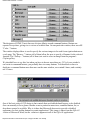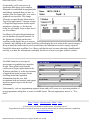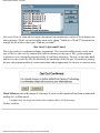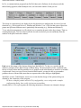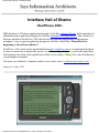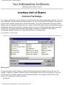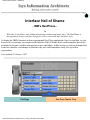
1
Isys Information Architects Inc.
Home
Design
Announcements
Hall of Shame
New Entries
Controls
Stupidity
Visual
Color
Terminology
Errors
Tabs
Metaphors
Globalization
In-Depth
Books
Links
Index
Feedback
Isys Information Architects Inc. specializes in the design and development of
robust, highly usable information systems. Isys focuses on ease of use, recognizing
that software should assist the user in the performance of some task rather than
becoming a task in itself. Isys was founded by Brian Hayes, a former professor of
Industrial Engineering, and system design consultant whose clients have included
AT&T, General Electric, General Motors, Lucent Technologies, NASA, Siemens,
the U.S. Air Force, and the U.S. Army.
We are a full-service
provider of user interface
design and usability
engineering services. Our careful
attention to the user interface can
reduce system development time,
increase user satisfaction, and reduce
training costs.
Our software development
department specializes in the
design and development of
robust, highly usable information
systems for the Windows operating
system. We provide custom
programming, database, and
application development services.
The Interface Hall of Shame
is an irreverent look at
ineffective interface design.
The site includes a collection of
images from commercial, corporate,
and shareware applications that
illustrate how software should not be
designed.
The Interface Hall of
Fame is a collection of
images that demonstrate
interface design solutions that are
both creative and effective.
Hall of Fame
Contact Us
Isys Information
Architects Inc.
5401 McNairy Drive,
Suite 100
Greensboro, NC 27455
[email protected]
© 1996-1999 Isys Information Architects Inc. All rights reserved.
Reproduction in whole or in part in any form or medium without express written permission is
prohibited.
http://www.iarchitect.com/index.htm [14-02-2001 5:43:57 PM]
Isys Interface Design and Usability Engineering
Home
Design
Announcements
Hall of Shame
New Entries
Controls
Stupidity
Visual
Color
Terminology
Errors
Tabs
Metaphors
Globalization
In-Depth
Books
Links
Index
Feedback
Interface Design and Usability
Engineering
Overview
The look and feel of the application can be the single most important determinant of
its value to the user. Isys Information Architects specializes in the design of highly
usable interfaces that are easily learned, minimize user frustration and maximize
user productivity.
We begin with the system requirements and a few basic rules:
●
●
Hall of Fame
●
Software must assist the user perform a task, not become a task in itself
Software must not make the user feel stupid
Software must not make the computer appear to be stupid
Contact Us
Our overiding goal is to delight the user, which we accomplish by anticipating
needs and exceeding expectations.
Benefits
Due to our careful attention to the user interface, Isys Information Architects can
reduce system development time, increase end-user productivity, and reduce
training costs.
Background
Isys Information Architects designers have provided design consultations, design
seminars, and usability engineering services to a wide variety of national and
multi-national companies. Isys Information Architects president, Brian C. Hayes,
has taught undergraduate and graduate courses in human factors engineering and
user interface design, and has conducted extensive research into GUI design and
adaptive assistance software.
List of Publications
Our staff has provided design services in the following types of applications:
http://www.iarchitect.com/mdesign.htm (1 of 2) [14-02-2001 5:44:12 PM]
Isys Interface Design and Usability Engineering
●
●
●
●
●
●
●
CMMS Applications
Computer Assisted Design
Computer-Assisted Instruction
Customer Support
Database Reporting Systems
Facilities Layout and Design
Financial Applications
●
●
●
●
●
●
Human Resource Management
Industrial Automation
International Applications
Military Tactical Systems
Order-entry Retail Systems
Telephony Systems
Services
Isys Information Architects serves as a facilitator between the users and developers
of the application. We can help you attain the highest user satisfaction with your
products by providing:
● User interface design specifications for new or legacy applications
● Evaluation of existing or proposed interface designs
● Analysis of existing task procedures and workflow
● Assistance with eliciting requirements from intended users
● Prioritization of user requirements
● Rapid and iterative prototyping of user requirements
● Usability evaluations and laboratory testing
● Tools and techniques for assessing usability
● Seminars in user interface design and usability engineering
Isys Information Architects is a full-service provider of user interface design and
usability engineering services. We will tailor our services to meet your specific
needs. Contact us for further information, or to arrange a consultation to discuss
your needs.
Home - Design - Develop - Shame - Fame
© 1996-1999 Isys Information Architects Inc. All rights reserved.
Reproduction in whole or in part in any form or medium without express written permission is
prohibited.
[email protected]
http://www.iarchitect.com/mdesign.htm (2 of 2) [14-02-2001 5:44:12 PM]
Interface Hall of Shame - Announcements
Interface Hall of Shame
- Announcements February 3, 2000
CALL FOR PARTICIPATION
Second International Workshop on Internationalisation of Products and Systems (IWIPS2000). 13-15
July 2000, Baltimore, Maryland, USA. A previously announced deadline for submission of papers to
IWIPS2000 has been extended to March 1, 2000. The revised call for papers is available at
http://www.acm.org/~perlman/IWIPS2000.html. For details of last year's IWIPS workshop, visit
http://webctr.net/IWIPS99/.
January 17, 2000
Isys Information Architects has expanded its staff.
Thomas Harrison Hayes, shown here being welcomed
by Isys President Brian Hayes, was brought on board
January 13, 2000, with the expectation that he will
eventually assume an executive position within the
company. During the next few months, the entire staff will
be devoted to Thomas' transition to the company, which
will likely contribute to delays in site updates and the
staff's ability to respond to email in a timely manner.
Additional images can be seen at Thomas' homepage, but
be forewarned: I'm a new dad with a new digital camera
and a cable modem.
November 27, 1999
http://www.iarchitect.com/announce.htm (1 of 2) [14-02-2001 5:47:45 PM]
Interface Hall of Shame - Announcements
Bad GUI in the News
J. Peter Mugaas send in a link to a press release describing a recent lawsuit filed against America
Online on behalf of the National Federation for the Blind. A copy of the complaint is available at
http://www.nfb.org/aolcompl.htm. The lawsuit alleges that AOL specifically designed its service and
proprietary browser to be incompatible with screen access programs used by persons with visual
impairments.
The following features of the user interface were cited in the complaint as barriers to persons with
visual impairments: the use of unlabeled graphics in place of text, the lack of keyboard access to
controls and functionality, and the use of custom controls painted on the screen instead of the use of
standard operating system controls. The suit alleges that as a result, the information on the screen
cannot be converted by screen access programs such as screen readers and refreshable Braille
displays.
Hopefully, the implications of the lawsuit will be recognizable to those developers who emphasize
"pretty" over good design.
Home - Design - Shame - Fame
© 2000 Isys Information Architects Inc. All rights reserved.
Reproduction in whole or in part in any form or medium without express written permission is prohibited.
[email protected]
http://www.iarchitect.com/announce.htm (2 of 2) [14-02-2001 5:47:45 PM]
Interface Hall of Shame
Interface Hall of Shame
The Interface Hall of Shame is an irreverent collection of common interface design mistakes. Our hope is
that by highlighting these problems, we can help developers avoid making similar mistakes.
We are constantly searching for examples of design practices that are worthy of extinction, and those
worthy of emulation (see the Interface Hall of Fame). Submit your own nominations for potential entries
into either hall to [email protected], and we'll try to add it to the collection.
New Entries
4-June-2000
Selecting the wrong control for a
task or changing the way controls
operate can often result in an
inefficient and frustrating
application.
Improper design of the visual elements
in an application can often result in
applications that are difficult to read and
difficult to use.
Our review of the new GUI in
Apple's QuickTime 4.0 Player.
Users of all operating systems
should be concerned.
Nobody likes a stupid computer.
However, many applications interrupt
the user to ask stupid questions,
provide meaningless information, or require the
user to make what should be an obvious
selection.
The improper use color in an
application can seriously impede the
usability of the application.
The terminology used in many
applications often leads the user to
feel that the interface has been written
in a foreign language. We provide a number of
examples of these 'programmerisms'.
Error messages are the antithesis of
proper application design. They are
often ambiguous, rude, and all too
often, incorrect, blaming the user for failures of
the programmer.
Tabbed Dialogs can be a
wonderful solution for complex
design problems. Here are some
examples of a good idea gone bad.
Metaphors can greatly enhance the
usability of applications when properly
used. When improperly applied, well,
they can leave much to be desired.
http://www.iarchitect.com/shame.htm (1 of 2) [14-02-2001 5:48:22 PM]
Interface Hall of Shame
The globalization of applications
provides fertile ground for discovering
important user interface problems.
We have assembled a short list of
Recommended Books for those
visitors who wish to delve more
deeply into user interface design.
Our Product Index lists all products
mentioned in the Hall of Shame, and
provides links to the specific problems
discussed.
We have provided a number of
in-depth critiques of particularly
problematic applications.
More information on user interface
design can be found in our Design
Links section.
Check out our Visitor Feedback section
to peruse others' impressions of the
site, or share your own.
© 1996-2000 Isys Information Architects Inc. All rights reserved.
Reproduction in whole or in part in any form or medium without express written permission is prohibited.
[email protected]
http://www.iarchitect.com/shame.htm (2 of 2) [14-02-2001 5:48:22 PM]
Interface Hall of Shame - Recent Additions
Interface Hall of Shame
- Recent Additions June 4, 2000
Frans de Haan sent in this image of a message provided my MTC Diag, a power management
application that is provided with Saxum 8004 notebook computers. The intent of the message is to
alert the user that the batteries are nearly depleted, but somehow, that message doesn't entirely come
across to the user.
Abbagail Winters send along this image from BatchIt Pro. Despite the designer's attempts to
organize the dialog, that organization may be entirely meaningless.
http://www.iarchitect.com/new.htm (1 of 16) [14-02-2001 5:50:26 PM]
Interface Hall of Shame - Recent Additions
From the BatchIt Pro help file (emphasis added):
The Configuration screen is made up of 4 sections. They include Resizing Settings, Text
Caption, Watermark and the Saving Option...Although this has nothing to do with
Resizing, the Image Orientation option allows to do a mass rotation of all the images...
Owen Rudge sent in this bizarre message from Microsoft's Outlook Express 5.0:
I was using Microsoft Outlook Express 5 and I went into the Deleted Items. To my
surprise I found a message stating that there were no items in the Deleted Items folder
and do I want OE to delete something. What sort of a message is that?!? Why would I
want OE to delete a randomly-selected piece of mail? I didn't try and find out what it
would delete, I just pressed No immediately!
Bo Bichel Nørbæk discovered this dialog in Reflection FTP after
hitting the F5 key to refresh the file listings. Understandably, Bo
asks: "WHY THE #%&?# CAN'T REFLECTION JUST GO
AHEAD AND REFRESH BOTH LISTINGS INSTEAD OF
PUTTING UP THIS STUPID DIALOG BOX?!!!"
Ken Rachynski asks a similar question of Network Associates'
VirusScan. The program adds an item to Explorer's context
menu to allow the user to scan the selected file or folder.
However, rather than performing the scan, the application pops
up a dialog box asking if the user wants to Scan Now?
http://www.iarchitect.com/new.htm (2 of 16) [14-02-2001 5:50:26 PM]
Interface Hall of Shame - Recent Additions
An anonymous visitor sent in this image from Milltronics' Dolphin Plus, a configuration package for
industrial level and flow sensors, as a candidate for the Tabbed Dialog Hall of Shame:
Where's Waldo?
Ben Oram sent in this image from English-German from OneApp Software.
http://www.iarchitect.com/new.htm (3 of 16) [14-02-2001 5:50:26 PM]
Interface Hall of Shame - Recent Additions
The image reveals a number of interface problems related to the program's failure to adopt the
MacOS interface design guidelines, but one in particular is worthy of special mention. The purpose
of the dialog is to display a list of matches for a given word, yet despite the number of matches (101
in this case), the program does not display a scroll bar. Instead, the program employs a custom
control comprised of Up and Down buttons, and a tiny "speck" to indicate the user's relative position
in the list.
When one considers the amount of functionality provided by a standard scroll bar, the decision to
replace it with a far less functional custom control is particularly shameful. In addition to being able
to scroll up and down a line at a time, a standard scroll bar also allows the user to page up and down,
and to grab the scroll indicator and drag it to the desired position. Further, the standard scroll
indicator is far more visible and indicative than what appears to be nothing more than a few
misplaced pixels.
April 2, 2000
It would appear that Microsoft's Artificial Intelligence Division has been at it again. Pierre sent in
this image of the web page he received when he visited http://www.microsoft.com/ie:
http://www.iarchitect.com/new.htm (4 of 16) [14-02-2001 5:50:26 PM]
Interface Hall of Shame - Recent Additions
Could this be a realization that IE4.5 is somewhat better than IE5.0?
PointCast, one of the first "push" systems that "spread
like wildfire" several years ago has been replaced with a
new version. In a detailed guest analysis of the
replacement, visitor Bill Tyler concludes that the
replacement is an inferior tool whose presentation, GUI
and features that are a major regression --not improvement.
Rick Lamoreaux sent in this image he received when attempting to add files to a project in
Microsoft's Visual Source Safe .
As Rick pointed out, the message does not inspire much confidence in the software, and seems to be
not so much a warning as a CYA hedge just in case something goes wrong. The message, "This
might not work, are you sure?", seems to be a means of transferring responsibility for the program's
failure to the user.
Gary Walker received the following message after accidentally deleting several lines in Microsoft's
SQL Server 6.5 -- Enterprise Manager.
If you select more than 20 lines of text from the query window, and then accidentally hit delete, you
get this apparently helpful error message, so that if you change you mind, you can hit "No" to avoid
the delete. However, closer inspection of the message reveals a glaring inconsistency. Hitting "No"
actually causes the Delete operation to continue, but destroys the Undo buffer in the process, leaving
no means of canceling an accidental delete.
http://www.iarchitect.com/new.htm (5 of 16) [14-02-2001 5:50:26 PM]
Interface Hall of Shame - Recent Additions
Søren Erland Vestø sent in this image he received from the otherwise excellent freeware hex-editor
A.X.E.:
Søren received the message upon accidentally saving (via CTRL-S) a document he had opened but
not edited. Beyond the fact that the dialog providers no means for the user to convey, "No it's not
OK", one has to wonder why the message exists at all.
When installing Office 2000 recently, David Nottage discovered that Microsoft's developers still
haven't learned how to write a meaningful error message:
The message is entirely unhelpful, giving no indication of what the error is, what to do to solve it, or
even the location of an error log if one existed.
Welcome to Windows David.
Steve Dieke sent in this image illustrating the Minimalist school of tab design used in Novell
GroupWise 5.1:
In addition to the disconcerting lack of Gestault, the design suffers from a number of other important
http://www.iarchitect.com/new.htm (6 of 16) [14-02-2001 5:50:27 PM]
Interface Hall of Shame - Recent Additions
problems. Most notably, the pictures on the tabs make little sense. Recognizing this, the developers
felt compelled to add a glossary tab (shown) merely to provide an explantion of the images.
Unfortunately, if you have moved off of the glossary tab, you lose the explanations. While tooltips
should not be considered an appropriate solution to the use of unclear icons, they certainly would
have helped here, if Novell had thought to provide them. Better yet, textual labels would have
negated the need for a glossary and tooltips.
Timothy Tan discovered the following catch-22 in Microsoft's Word 97. When doing a spell check
for a document set with the language as "English (British)", the spell check informed him that the
word "worldwide" is not in the dictionary and offered to change it to "world-wide".
Tim accepted the application's offer to change the offending word, only to find that Word 97's
grammer checker considers the word "world-wide" to be a compound word that would be better
written as "worldwide".
Tim discovered that the only way to solve the problem is to add the word "worldwide" to the custom
dictionary, or use the "English (American)" dictionary.
http://www.iarchitect.com/new.htm (7 of 16) [14-02-2001 5:50:27 PM]
Interface Hall of Shame - Recent Additions
Greg Funk sent in this rather perplexing problem he discovered with Microsoft's Internet Explorer
5.0 FTP application:
The problem is one that could keep the more philosophically-minded computer users debating at
great length: What happens when one cancels the operation Cancelling [sic]? Greg points out that the
scenario can be recreated in the following manner:
1. Select file and right-click to Copy To
2. Select folder
3. Let it start copying
4. Hit cancel
It should be noted that the operating is not canceled when requested. Greg eventually had to hit the
close button in the upper right corner. In his own words, Greg "canceled out of canceling the
canceling by hitting the close box."
Of all the possible real-world objects that one could select as the
basis on which to model a software user interface, I do not believe
that one could make a more ill-advised decision than to select a
hand-held remote control. Unfortunately, Creative Labs did just
that with their design of their Creative PC-DVD application.
Visitor Ilari Sani sent along images and a thoughtful critique of the
resultant design, which provides further additional evidence why the
software industry should adopt a zero-tolerance policy against the use
of real-world metaphors.
Additional detailed critiques of real-world interface metaphors in the
Hall of Shame include:
● Apple's QuickTime 4.0 Player
●
ReadPlease 2000 text-to-speech synthesizer
●
IBM's RealCD player
●
IBM's RealPhone telephone application
These reviews reveal a number of important axioms for those
contemplating a real-world design metaphor:
● You cannot think out of the box when you are trying to copy a
box
● It takes a tremendous amount of skill to make a real-world
metaphor work, but only a modicum of intelligence to realize
that one shouldn't even try
● Objects designed to be operated with fingers and thumbs were not designed to be operated
http://www.iarchitect.com/new.htm (8 of 16) [14-02-2001 5:50:27 PM]
Interface Hall of Shame - Recent Additions
●
with mice and keyboards
Industrial designers try to produce designs that are pleasing to the eye; interface designers try
to product designs that make the user's task easier.
Just say No to real-world metaphors.
February 28, 2000
Zing Zing Awungshi Shishak suggested that I take a look at Yamaha's SoundVQ player as a
potential candidate for the Interface Hall of Shame. I didn't bother to look much farther than their
Open File dialog, a portion of which is displayed here.
Have any of the SoundVQ developers ever seen a Windows application?
Tom Campbell received the following message while trying to check out and edit a file in Revision
Master.
As Tom quipped:
In an odd way, such a self-contradicting message is conceptually artistic. There is
tension between the two different spellings of "occurred." And an error message stating
there's no error has a zen symmetry that's at once perplexing and graceful.
http://www.iarchitect.com/new.htm (9 of 16) [14-02-2001 5:50:27 PM]
Interface Hall of Shame - Recent Additions
Jean-Marc Orliaguet provided evidence that messages warning of success are not restricted to the
Windows operating system. The following message was generated by the NetInfo configuration
program running on the Mac OS X Server.
The only real difference between the message on the two operating systems is that the Mac OS X
server feels that it must convey a much greater sense of urgency and alarm!
Søren Vestø found the following problem when trying to install the Microsoft Developer Network.
The problem is that the display of Available Memory maxes out at 999999K, even though Søren
swears that there was 2.4 GB available. Interestingly, despite the fact that the program has concluded
there is not enough memory, it allows the user to proceed, successfully, in fact.
http://www.iarchitect.com/new.htm (10 of 16) [14-02-2001 5:50:27 PM]
Interface Hall of Shame - Recent Additions
Rich Adams was understandably full of questions when trying to uninstall ICQ.
And....order a pizza? Reformat the hard drive? What?
Eric Hartwell highlights a notable problem with the design of
the context menus Internet Explorer. Eric often avails himself
of the 'Save Image As' menu item to copy images from web
sites. Unfortunately, the 'Set as Wallpaper' menu item is
located immediately below the desired menu item, making it a
likely inadvertent target. The problem is that 'Set as Wallpaper'
acts immediately and irreversibly; the application does not first
prompt the user, as is the case with the menu items
immediately before and after it, so there is no way to cancel
the action. If the 'Set as Wallpaper' item is inadvertently
selected, the user will have to go somewhere else and perform
a series of actions to undo the effects of the unintended action.
http://www.iarchitect.com/new.htm (11 of 16) [14-02-2001 5:50:27 PM]
Interface Hall of Shame - Recent Additions
This wonderful example of bad design was contained in the tutorial for Mosaix, a customer support
application popular with mega-corporations:
A competent developer might have recognized the absurdity of the message and simply disabled the
offending 'Glossary' button. The tutorial however, does not appear to be the product of the Mosaix
development team. Rather, it appears to be the product of MediaPros, a company specializing in
computer-based tutorial design, as indicated in this success story posted on the company's website.
With an opening message like this, MediaPros may want to reconsider the tutorial as an example of
their design abilities.
Richard Sheridan provided a couple of images illustrating some further evidence against the use of
real-world metaphors in interface design. Both images come from AudioRack 32, a multimedia
application packaged with his Hewlett-Packard computer.
...like IBM's "Real CD", Audiorack actually looks like a CD-Player, and is hideously
incongruous in the subtle, soothing Windows environment, like someone turning up
dressed like Big Bird to a formal dinner. Yet, since the designers seem obsessed with the
form itself, let's be fussy: it's odd that there is an ugly space next to the "Mixer" button.
What else? I particularly like the button called "Stealth". Everyone else on the planet
would call this "Minimize", and it would be placed top right-hand of the form. In fact,
the tooltip does say, "Enter miniature mode". Then note all the cute LCD symbols on the
display panel. Any idea what they mean? Who cares?
http://www.iarchitect.com/new.htm (12 of 16) [14-02-2001 5:50:27 PM]
Interface Hall of Shame - Recent Additions
The second image was even more revealing. AudioRack 32 used its own custom "Rack Control" to
allow the user to scroll through additional controls that are as yet hidden from the user:
As Richard noted, the Rack Control seems specifically designed by very artistic people to prevent
easy usage. Richard had no idea that other controls were available; he discovered the "feature" when
he accidentally left the mouse cursor over one of the "handles".
February 3, 2000
Martin "Jay" Sundstrøm sent in a couple of images indicating localization problems with the
Danish version of the MacOS 8.6 operating system.
The OS wanted to say "Arkiverer kommentarer i informationsvinduer" (Saving comments in
info-windows), but by not providing adequate space, the designer of the window gagged the OS
before the message could be completed.
When attempting to restart the OS, Danish users are presented with the following message:
In English-language versions of the OS, the user can press the "R" key on the keyboard as a shortcut
for the "Restart" button. Unfortunately, Danish users as well must use the "R" key as a shortcut for
restart, despite the fact that the Danish word for Restart is "Genstart".
Chris Kostiw sent in this image, taken from the Mac shareware version of Risk. The image is
displayed if the user attempts to quit the game without saving. The Mac UI guidelines eshcew the use
of Yes and No responses in dialogs; here's why Apple should change the guidelines:
http://www.iarchitect.com/new.htm (13 of 16) [14-02-2001 5:50:27 PM]
Interface Hall of Shame - Recent Additions
James "Kibo" Parry sent in this image taken from Apple's SimpleText. The dialog thoughtfully
provides a text box into which the user can type a search term, but before he or she can use the search
box, it must first be unlocked, by clicking the arrow button.
It would appear that the designer felt that the user must be protected from accidentally entering text
in the search box.
This example of meaningless GeekSpeak was discovered in Adobe's ImageReady by Joanna
Southerland:
Avery Lee sent in this image provided by Intel's VTune 4.0 performance tuning tool. Avery
discovered the message when he I tried to invoke the 'code coach' on an assembly language file, only
to discover that VTune only understands C/C++, Java, and Fortran:
Somehow, the developer's inability or unwillingness to design an appropriate dialog box doesn't
inspire a great deal of confidence in his or her ability to perform performance tuning.
VTune provides another example of questionable competence in its non-progress dialog, as shown in
http://www.iarchitect.com/new.htm (14 of 16) [14-02-2001 5:50:27 PM]
Interface Hall of Shame - Recent Additions
the following animation:
Michael Wilson sent in this example of programmer verbosity that he was confronted with when he
tried to view Midwest Microwave's online catalog at
http://www.midwest-microwave.ltd.uk/index.htm.
One has to wonder why all that information was loaded into a transitory message box rather than
simply including it on the web page itself.
http://www.iarchitect.com/new.htm (15 of 16) [14-02-2001 5:50:27 PM]
Interface Hall of Shame - Recent Additions
James "Kibo" Parry sent in an image of an error message he received when trying to register with
American Airlines' Web site:
Kibo simply typed "W." (not ".W." and not "-.W.-") when asked for his middle initial. Apparently,
either the "W" or the "." is considered an "invalid special character". Kibo didn't realize that he
could only type "characters".
Less-recent additions...
© 1996-2000 Isys Information Architects Inc. All rights reserved.
Reproduction in whole or in part in any form or medium without express written permission is prohibited.
[email protected]
http://www.iarchitect.com/new.htm (16 of 16) [14-02-2001 5:50:27 PM]
Interface Hall of Shame - Controls
Interface Hall of Shame
- Controls In a graphical user interface, the controls represent the means by which the user communicates with the
application. The quality of the communication depends on two aspects of the controls:
● the appropriateness of the control for the task
● the consistency of the rules under which the control operates.
Select the wrong tool for the job, or change the rules under which the tool operates, and you will create
problems for your users. Here are some examples...
Last updated 19-September-1999
The editors of the August 1999 edition of the Visual Basic Programmer's
Journal 101 Tech Tips for VB Developers must have been running low on tips
to share with their readers. Tip #100 provided the code to make checkboxes act
like option buttons:
Checkboxes and option button controls function similarly but with an
important difference: A user can select any number of checkbox controls
on a form at the same time, but can select only one option button control
in a group at a time.
A small piece of code allows the user to select only one checkbox in a group at any
given time. This change is useful when you want to use checkboxes instead of option
buttons.
We would have written the last line as:
This change is useful when you want to confuse your users.
Option buttons are used to allow the user to make a mutually exclusive selection. Checkboxes are
used to allow the user to make multiple selections. The very appearance of checkboxes tells the user
that he or she can select several items. Never use checkboxes when you want the user to make a
mutually exclusive choice.
http://www.iarchitect.com/controls.htm (1 of 24) [14-02-2001 5:52:18 PM]
Interface Hall of Shame - Controls
Visitor Cory King asks a very good question:
Why is it that Adobe Acrobat has the keyboard navigation keys mixed
up? The "page up" and "page down" keys scroll through a page like
you'd expect the arrow keys to do, while the up and down arrow keys
scroll one page up, and one page down like you'd expect the page
up/down keys to do.
"This is your brain on dope."
We found this bizarre design while reviewing the ad
hoc reporting capabilities of an application
developed in-house at a better-left-unnamed
corporation. The dialog is intended to allow the user
to specify the fields on which to sort the data in a
report. As can be inferred from the image (and not
without considerable difficulty), the user can specify
sorting on three fields. Actually, the user must
specify the sorting on three fields, since there is no
way to indicate that you want to sort on any less. As
indicated in the image, sorting the results by Part ID,
then by Part ID, and then by Part ID would be just
hunky-dory in the mind of the developer.
(BTW, is anyone else reminded of pegboard-climbing exercises from junior high school gym?)
http://www.iarchitect.com/controls.htm (2 of 24) [14-02-2001 5:52:18 PM]
Interface Hall of Shame - Controls
Grrrrr. Setting aside our feelings for Microsoft's policy of requiring Internet Explorer to
successfully run Visual Studio applications, we found their method of indicating this requirement to
be somewhat ... well, stupid. Since installing IE is a requirement, why use an checkbox to indicate
whether or not you want to install it? You have no choice!. Unchecking the box has the effect of
disabling the Next button, preventing the installation from continuing.
The folks at Ryka, a manufacturer of women's shoes, wanted to be certain
that no potential customers could be excluded. Thus, rather than providing
option (or radio) buttons to indicate one's gender, they decided to use
checkboxes, to allow the potential customer to indicate Male, Female, or,
well, both, and for that matter, none. We found this especially interesting
given the company motto, "Exclusively for women by women."
Inclusiveness must be "in".
John Winters sent along a series of screen prints illustrating the useless progress meters
implemented in Microsoft's Outlook. When dealing with a single message, the application displays a
2-state progress bar: the program is either busy, or it's not. Retrieving a message with a 340KB
attachment over a modem connection typically takes 1 minute and 45 seconds. During that time, the
progress meter is shown at its maximum value, rather than displaying the relative progress of the
retrieval (something progress meters are supposed to do). The likely result of this misimplementation
is that the user will conclude the computer has yet again locked-up, and will perform a three-finger
salute to get back to work.
This particular design in Microsoft's Internet Explorer
has prompted us to consider adding another category to
the site: Silly Designs. Whereas toolbars are designed
to provide rapid access to frequently used menu items,
Microsoft's designers chose to use the toolbar to
display...menus.
http://www.iarchitect.com/controls.htm (3 of 24) [14-02-2001 5:52:18 PM]
Interface Hall of Shame - Controls
As can be seen in the image of the Favorites menu, the
Favorites toolbar image merely replicates the menu. In so
doing, the designers have provided no additional usability
benefit, and in fact, have decreased the usablity of toolbar
buttons by changing the control rules: toolbar buttons no
longer initiate an action, certain "special" toolbar buttons
require the user to distinguish among various types of
toolbar buttons and may require a subsequent action of the
user. Since there is no benefit to the design, we regard it
simply as ... well, Silly.
We are grateful to visitor Gordon Allison for providing this example:
I'd like to propose the following example that supports your view that Microsoft's
interface design is in the hands of graphic artists not interface designers.
In the Font dialog box for Word 97 the user can set text attributes using an array of
checkboxes; no problem there. However, there a 4 pairs of mutually exclusive options
listed: strikethrough/double strikethrough, subscript/superscript, emboss/engrave, and
all caps/small caps. the controls look like checkboxes but behave like option buttons.
Obviously, using option buttons would have spoiled the aesthetics of the control group.
Microsoft's Visual C++ 5.0 offers developers a rather unusual spin control
that caught the attention of visitor Mark Otway. As provided by Microsoft,
the spin control operates completely counter to the typical user's
expectations. To increase the value in the control, the user must click the
down arrow. Similarly, clicking the up arrow decreases the value. The
conscientious developer will have to write a routine to reverse the control
rules so that the control operates correctly. As Mark notes, "With Microsoft
providing this sort of 'help', it's a wonder anyone develops an app with any sort of decent
interface....".
http://www.iarchitect.com/controls.htm (4 of 24) [14-02-2001 5:52:18 PM]
Interface Hall of Shame - Controls
Click & Print Certificates is a useful little shareware program for printing a variety of certificates and
awards. The program offers a "Style Buddy" to help the user select which of a number of certificates
to print. Once you get past the obvious problems with the dialog (instructions in the title bar,
right-aligned, vertically-oriented instructions, Cancel button before the OK button, reference to an
"OKAY" button, the use of all capital letters, the hard-coded sickly green color, etc.), there are some
important design problems related to the choice of control for selecting the desired style.
The various styles can be previewed through the use of the horizontal scroll bar; each click displays a
different certificate style. There are two significant problems with this design. In the first place, the
only way to determine which styles are available is to scroll entirely through each of the styles. A
second problem is that the only way to select a particular style is to browse through all those that
precede it. For example, to select the "Team Player" certificate, the user must click on the scroll bar 9
times, waiting for the program to load a preview of each of the 9 certificates that precede it.
We offer the following alternative to Click & Print's Style Buddy, which we feel resolves these
problems.
http://www.iarchitect.com/controls.htm (5 of 24) [14-02-2001 5:52:18 PM]
Interface Hall of Shame - Controls
While checkboxes typically provide the means by which to
specify options, Click & Print uses checkboxes as indicators
and as command buttons. When the user clicks on a
checkbox in Click & Print, a dialog box is opened into
which he or she enters information to be printed on a
certificate. The checkbox only becomes checked if the user
clicks the OK button on the related dialog box.
Setting the date is particularly unusual. The program
defaults to the current date, but the only way to get the date
checkbox checked is to click it, then click the OK button in
the Date dialog.
The most problematic aspect of the design is evident when the user attempts to check the Print
checkbox before he or she has checked all of the checkboxes above it: An error message is displayed,
stating "The checklist is not complete. Are you sure you want to print?"
Here's a lesson from GUI 101:
● Checkboxes are used to toggle an option on or off
● Command buttons are used to initiate actions.
Don't let your confusion confuse the user.
http://www.iarchitect.com/controls.htm (6 of 24) [14-02-2001 5:52:18 PM]
Interface Hall of Shame - Controls
It would appear that the developers of Microsoft's Visual SourceSafe 5.0, were somewhat
uncomfortable with the uncommon file dialogs used throughout Windows95, and decided instead to
develop their own based on the Windows 3.1 common file dialogs. Unfortunately, they ended up
combining the worst elements of each.
As is indicated in the illustration, as the user drills down through the directory tree, he or she will
need to use the mouse to scroll to the right to view the directories. In the course of so doing, the user
loses information as to his or her relative position in the hierarchy. It would seem that the Projects
line above would have been a good place to provide this information, but the developers chose to
parse the full directory path and display only the lowest level. To determine where he or she is in the
hierarchical structure, the user will have to use the mouse to scroll back to the left. By improperly
sizing the folder display, the designers created a great deal of overhead for the user.
http://www.iarchitect.com/controls.htm (7 of 24) [14-02-2001 5:52:18 PM]
Interface Hall of Shame - Controls
Here's a classic example of selecting the wrong tool for the job, and the extraordinary measures users
are required to use to overcome the control mismatch. OzWin II is an off-line reader for the
Compuserve Information Service. One nice feature of the reader is that it allows you to specify a
signature to be appended to your e-mail messages, such as:
Brian Hayes
Isys Information Architects Inc.
http://isys.home.ml.org
Unfortunately, OzWin provides a single-line textbox to enter this information. To add a line break in
your signature, you need to embed the OzWin-specific commands, ^M^J in the text. This of course,
requires that you first read the help file to determine (a) line breaks are permissible, and (b) how this
can be accomplished.
A far more appropriate and intuitive approach would have been to use a multi-line textbox.
Each of us has been using computers for a long
time, and has grown quite fond of using the
keyboard to enter data. Imagine our surprise then,
when trying to enter the schedule time for an event
in Automate Pro, we found that despite its
appearance, and the fact that we can select text, the
control ignores input from the keyboard.
Rather than allowing the user to simply enter the time directly,
Automate Pro requires that the user click on the Set Time button
and enter the time using their special "Clock" control. If it were
not for the instructions on the form, few users would intuit how
to use the control to specify the time.
We would have preferred that Automate Pro allow the user to
employ either method to specify the time. Gimmicks such as
their clock control, if necessary at all, should be offered as an
alternative method of entering data, and the user should be
allowed to choose which is most efficient for him or her.
http://www.iarchitect.com/controls.htm (8 of 24) [14-02-2001 5:52:18 PM]
Interface Hall of Shame - Controls
Ewan is a shareware terminal emulation program
thoughtfully provided to us by our Internet service
provider. The illustration shows the "Ewan Popup
Menu" (thank goodness the designers provided a title
on the menu, otherwise, we might not have known what
it was) that appears upon pressing the right-mouse
button when the cursor is over the main window. The
problem, as we see it, is that the menu provides far too
many irrelevant actions, making it difficult for the user
to locate and navigate to the intended action.
Given that the Popup menu is redundant with the main
menu, and that it requires complex mouse movements
to navigate, we cannot see why a user would ever
bother with it.
For the record, the version we were provided is
somewhat dated (17-Jan-95 in fact); we are hopeful that
Ewan's designers have since provided more context-sensitive context menus.
SimCity 2000 by Maxis is undoubtedly an engaging (OK, addictive)
simulation game, but it does have one unnerving feature that can really
interfere with a new user's ability to learn the game. Several of toolbar
buttons (notably, not all of them) quite unexpectedly have submenus
associated with them, which are available only when the user holds the
mouse button down for a period of time after clicking on the toolbar
button.
This feature was not immediately apparent after a quick review of the
user manual, and the toolbar images provide no indication that this
functionality exists. Nor is there any indication as to which toolbar
images have submenus associated with them. The problem was clearly evident when one of our
colleagues needed to add a power plant to his city: the help file merely stated that you simply clicked
on the Power toolbar button, but after doing so, the user found that the action only added more power
lines to the city. It was only after considerable trial and error (and the resultant frustration), that the
user found that if you clicked and held the toolbar image down, a submenu offering power plants
became available.
One further problem with this design strategy is that a normal button click on the toolbar image will
perform the most recent submenu option, but the image provides no indication of which option that
might have been. The end result is that the user ends up making many inadvertent selections, or
learns to always wait for the submenu to appear before continuing, thereby reducing the efficiency of
his or her task.
http://www.iarchitect.com/controls.htm (9 of 24) [14-02-2001 5:52:18 PM]
Interface Hall of Shame - Controls
Ever wonder about the sequence of building a window in a GUI application? This sequence is
particularly apparent in Unisyn's Automate Pro. The developers apparently forgot about the concept
of tab navigation among controls, relying instead on the tab order generated by the programming
environment. The sequence of navigation among controls as the Tab key is pressed is illustrated
above. As indicated in the figure, the developer first created the Regarding field, then added the OK
and Cancel buttons, the Set Frequency button, and so on.
The end result of this inattention to the user interface is that the user must press the Tab key seven
times in order to move from the Regarding field to the Message field.
Perhaps they'll correct it in version 3.8g...
http://www.iarchitect.com/controls.htm (10 of 24) [14-02-2001 5:52:18 PM]
Interface Hall of Shame - Controls
Consistency is one of the first rules of interface design. The designers of IBM's AudioStation, a
CD-player application, were apparently unaware of the concept. This image is taken from the Playlist
function of the application, which allows the user to select the songs and specify the order in which
they are to be played (well...sort of). The dialog provides two list controls: the CD Tracks List (on
the left), and the Playlist on the right.
The major problem with the design is that the two lists operate differently. For example,
double-clicking on a song in the Track List will cause it to be copied to the Playlist; however,
double-clicking will not remove a song from the Playlist. Additionally, whereas the Track List
supports extended multiple selection, the user can select only a single song at a time in the Playlist,
making the design a contender for our Interface Stupidity section.
There are a number of other design problems with the Playlist function, which we have listed below.
Take another look at the image and see how many you can spot (some of the problems are detectable
only through actually using the application, something IBM should have tried before they released
the application).
Consider this an experiment in web site interactivity...Hold your monitor up to a mirror to see the
problems we've identified (or if that's too awkward, just click on the list below):
http://www.iarchitect.com/controls.htm (11 of 24) [14-02-2001 5:52:18 PM]
Interface Hall of Shame - Controls
Normally we consider providing
context-sensitive help to be a good thing.
WebEditPro however, proves that there is a limit
to the usefulness of that help. On the positive
side, WebEditPro provides tooltips-based help
for almost all controls (and for some
non-controls) in the application. On the negative
side, this help is provided automatically, and
there is no way to disable it. Any time the cursor
pauses briefly over a control, a lengthy
explanation of the control is provided to the user.
While at first glance this may seem beneficial, it
can result in an infuriating experience in practice. The tooltips are subject to frequent inadvertent
display, interfere with the user's ability to peruse the dialogs, and cause the user to conscientiously
position the cursor away from the current dialog in an effort to defeat the help.
One of the basic tenets of interface design is that the user should feel that he or she is in control.
WebEditPro removes this aspect of control from the user, and as a result, becomes distracting and
annoying. Nobody likes a know-it-all, especially when his or her input was unsolicited. Providing
help is a very good thing, but let the user request it.
Here's an example where the control choice is reasonable,
but the units of measurement leave something to be desired.
To set the size of the history cache in Microsoft's Internet
Explorer, the user is provided a slider control as asked to
specify the amount of space on the hard drive to reserve for
storing visited pages. The problem is, the cache size is set as a percentage of drive space. A few
years ago, this would not have been an issue, but as indicated in the following message we received
from Ross Cormier, Microsoft may want to rethink this practice:
When setting cache size in IE 3.0 the user is only allowed to specify a percentage of their
hard drive. The smallest setting is 1%. I have a 4 Gig drive, and don't need 40 MB of cache
thank you.
User control is a point worth considering.
http://www.iarchitect.com/controls.htm (12 of 24) [14-02-2001 5:52:18 PM]
Interface Hall of Shame - Controls
The installation program for PowerSearch asks you to specify the directory into which it should
install itself. The user normally selects the default directory, and the installation proceeds
accordingly. Unfortunately, if the user wants to install the program into a different directory, he or
she is faced with a few problems, since the dialog provides no controls to assist the user. The user
must either recall the directory from memory, or use some other program to locate the appropriate
directory. In either case, the user will need to type the information, which only increases the
likelihood that an error will occur.
A related aspect of this dialog would earn it a place in our Interface Stupidity section. The
application must be installed into the Startup directory for Word for Windows; if the user selects
some other directory, the PowerSearch add-in will not work. This requires that the user know where
the directory is located, and because the program does not verify the accuracy of the user's selection,
the potential for a serious error is increased. The addition of a single line of code would have made
the installation program intelligent enough to determine the appropriate directory, and prevent the
user from making unnecessary mistakes.
Despite all that has been learned about human
interaction with computers, Microsoft still finds ways to
come up controls that are basically inefficient. This list
box is provided by the Certificates function in
Microsoft's Internet Explorer. Humans can scan written
material faster from top to bottom rather than left to
right. Despite this widely-accepted observation, and
despite the fact that vertically-oriented lists are used
throughout Windows, Microsoft chose to require the
user to scroll horizontally in this particular list. In
contrast to the single-item scrolling permitted by vertical lists, horizontal lists create huge visual
changes in which the list is complete redefined, and after which, requires the user to scan vertically
anyway. The most unfortunate aspect to this is that other developers will erroneously conclude that,
since Microsoft is doing it, it must be good design. It's not.
http://www.iarchitect.com/controls.htm (13 of 24) [14-02-2001 5:52:18 PM]
Interface Hall of Shame - Controls
We weren't certain just how to categorize this particular problem, but in our view, displaying only 3
items in a listbox is just plain stupid.
This dialog box is provided by the Associate function in Microsoft's File Manager, as is displayed
when the user wishes to associate a particular file type with an application. In this example, there are
133 entries in the list; clicking the page portion of the scrollbar will display the files 2 at a time. We
are at a loss to explain why the developer didn't use more of the available space on the form to make
the list larger, or why he or she didn't just make the form larger. The end result of the developer's
lack of thought is a control that is essentially useless for the task at hand.
Just when you thought it couldn't get any worse, Microsoft found a way to
further reduce the efficiency of listbox controls. The user-centered
designers of Visual Basic 5.0 decided to eschew the obviously more
appropriate ComboBox, or drop-down, control, and chose a 2-line listbox
instead.
We first came across this example of the inappropriate choice of controls for a task in a form at a web
site, and have since seen the technique inappropriately employed in certain desktop applications as
well:
Please indicate your area of interest:
(We have discovered that some browsers may
not display the control as we had found it. Here
is a static image of the same control).
(go ahead and try it)
How did you hear about our site:
None
Now imagine trying to scroll through a list of 30
items, one item at a time.
http://www.iarchitect.com/controls.htm (14 of 24) [14-02-2001 5:52:18 PM]
Interface Hall of Shame - Controls
Interestingly, both methods were employed within the same form.
The problem, of course, is that the first method ("Spin ComboBox"?) requires much more
intervention on the part of the user, and requires much more of his or her attention to make the
appropriate selection than the simple ComboBox method. The simple ComboBox method takes
advantage of our human ability to rapidly scan information, thereby more rapidly locating the item of
interest (pun not necessarily unintended).
The decision to use the first method may have
been due to the fact that certain browsers do not
handle large lists well (Netscape for Unix comes
to mind), but we feel that a more appropriate
compromise would have been to use a standard
ListBox as shown here, which allows the author
to limit the number of items displayed at one
time:
None
2D Drafting/Detailing
3D Design
Architecture
Assembly Modeling
Aviation Modeling
Building Design
Civil Engineering
Construction
We found it even more interesting that the Spin ComboBox method was set so that multiple
selections could be made. We challenge you to try, then compare it to multiple selections in the
ListBox method. Which do you feel is more straightforward?
In their misguided attempt to
make their program look
different, the developers of IBM's
Aptiva Communications Center
decided to forego the use of
standard Windows controls and instead, develop their own. They have certainly succeeded in their
quest; the application is unlike any other application running in the Windows environment.
Unfortunately, that's the problem, and the image displayed here only illustrates one very small
difference.
Unlike life in high school, in graphical user interfaces, looking like everyone else is a good thing.
When applications look and act alike, users learn them much more quickly, since they can transfer
their knowledge of one application to the others. When your application looks and behaves unlike
other applications, your users will require more time to learn how to use your application. Novelty
for novelty's sake is never a good thing. One only need to recall the experience of sitting in a rental
car, trying to find where the controls are located in this particular car. (The auto industry has gotten
much better at this; in the seventies you never knew where a control might be located).
The use of diamond-shaped rather than round option buttons only increases the likelihood that some
users will be confused. Even more serious, the option buttons act like command buttons; click on one
and the program will jump to another dialog. Just to add to the confusion, the application intermixes
the standard and custom option buttons, both in terms of appearance and behavior.
Don't strive to be different. Strive to be good.
http://www.iarchitect.com/controls.htm (15 of 24) [14-02-2001 5:52:18 PM]
Interface Hall of Shame - Controls
The designers of HTML Transit have an obvious affinity toward command buttons. Buttons are
repeated everywhere, giving rise to visions of a rabbit farm. On one particular window, there were 15
"Color..." buttons.
The window displayed here is used to specify the various images to be used for navigation buttons on
a web page. The "Browse..." buttons (all of them) allow the user to specify a filename for the selected
function. The "Gallery..." buttons (all of them) are used to select an image from the program's
ClipArt gallery.
We shouldn't have to say this, but when you have to devote more than, say, 25% of your window's
real estate to command buttons, you probably have too many buttons. You should never have to
duplicate a command button more than once on the same window, never mind 9 times, and certainly
not 15 times.
One of the basic rules of GUI design is that controls that are disabled should appear to be disabled.
One can normally tell at a glance whether or not a particular menu item, command button, list, or
drop-down control is available. Why is it then, that Microsoft chose not to provide a disabled
appearance for their toolbar buttons in certain applications? This image is taken from the Office95
version of Microsoft Word, but the violation is apparent in all of the Office95 applications.
http://www.iarchitect.com/controls.htm (16 of 24) [14-02-2001 5:52:18 PM]
Interface Hall of Shame - Controls
We know that Microsoft's developers are certainly capable of dynamically changing the appearance
of toolbar images; it's not all that different than changing the appearance of a standard command
button. Our only guess is that the graphics artists at Microsoft simply didn't like the look of disabled
toolbar buttons, regardless of the extra information the disabled appearance provides to the user.
Unfortunately for the user, interface design at Microsoft is now the responsibility of graphics artists
rather than interface designers. It should come as no surprise then, that Microsoft is far and away the
most frequent contributor to the Interface Hall of Shame.
The PowerBuilder programming environment provides tooltips
for its toolbar icons. That's good. It also provides status bar
descriptions for the toolbar icons. That's also good. The tooltips
presentation is delayed, as it should be, such that the user must
pause the cursor over the button for a period of time before the
tooltip is displayed. The problem is that the status bar
descriptions are also delayed, resulting in the incorrect
description being displayed while the program waits to display
the correct description. Here's the rule: tooltips should be
delayed 1-2 seconds, but status bar descriptions should be
immediate.
Select Cut from the Edit menu of just about any application
and what happens? The selected text or object is removed
(and a copy is placed in the clipboard for later use). This
rule is so ingrained that the phrase "Cut and Paste" could be
considered a cultural archetype: almost everyone over the
age of four knows what it means.
Unfortunately, the designers of Microsoft's Excel weren't
familiar with the phrase. To them, "Cut" means "Leave it there", or at least, "Leave it there until I
Paste it somewhere else." Upon selecting Cut, a moving border is drawn around the selection, which
indicates, intuitively speaking, Nothing! Cut will not remove the selection until the user selects Paste
at some later time. In Excel, "Cut" really means "Indicate the selection you might want to Move at
some later time". In fact, after performing the Paste operation of the complete Cut and Paste
sequence, the Undo command is labeled "Undo Move".
By changing the rules, every new or occasional user of Excel is instantly perplexed when performing
the Cut operation. The typical user will Cut, and Cut again, and perhaps Cut again in an attempt to
understand what he or she has done wrong.
They've just got to be chuckling about this one in Redmond.
(Thanks to Steve Bliss for reminding us of this Excel feature)
http://www.iarchitect.com/controls.htm (17 of 24) [14-02-2001 5:52:18 PM]
Interface Hall of Shame - Controls
If you really want to frustrate your users, make sure that you
use the same mnemonic access or keyboard access
characters for different functions. In the GIF Construction
Set the keyboard access keys for the Cut and Copy functions
are the same. The net result of this design error is that the
keyboard access commands don't work, at least, not as the
user would expect them to.
In all other applications,
● to Copy, press ALT+E+C
● to Cut, press ALT+E+T
In GIF Construction Set,
● to Copy, press ALT+E+C+ENTER
● to Cut, press ALT+E+ENTER or ALT+E+C+C+ENTER
As further evidence of their lack of familiarity with mnemonic access characters, they "forgot" to
include them for the bottom four items on the menu.
By the way, it's no longer necessary to display the Shift+Ins and other alternative shortcuts. It's a
good idea to support those options, but continuing to display them merely confuses the new user.
This type of control is seen all too often in corporate applications:
drop-down controls and lists that contain thousands of entries.
Programmers who mistakenly use it generally get a hint that it might be
inappropriate when they find out that it takes an extraordinarily long
time to load the form. The following message, posted in a Visual Basic
programmers forum on December 11, 1996, is typical:
I want to fill a list box with 2000 items ... This takes incredibly
long ... over 20 minutes. Any ideas?
And another posted on December 16th, 1996, is somewhat less typical:
I'm looking for a list box control that can ... hold large numbers of
entries (20,000+)
The excuse for such unwieldy controls is often a misguided interpretation of the almighty call to
arms, "We must ensure data integrity." The programmers want to make sure that the user specifies a
valid entry; in their view, the best way to do this is to force the user to select from a list. That would
be fine if you had, say 20, 60, or maybe even 100 items in the list. Beyond that number, the fact that
the user can only scroll a handful of items at a time causes the control to become unwieldy.
Imagine if you didn't have folders and directories on your hard drive. Whenever you needed to
specify a file, you were presented with a drop-down control containing the name of every file on your
hard drive, and asked to select the one you wanted to open. Few people, programmers included,
would consider such a method as anything less than completely unacceptable.
All data can be organized in some meaningful way that will allow the user to more rapidly access the
specific information he or she is interested in. Files are organized into folders or directories for
http://www.iarchitect.com/controls.htm (18 of 24) [14-02-2001 5:52:19 PM]
Interface Hall of Shame - Controls
example. Employees are often categorized by department, job title, or salary grade. Designing the
interface to exploit the appropriate organization will allow the user to more rapidly locate the desired
information, while at the same time, "ensuring data integrity."
Based on concern over the typing
ability of some of the 400,000
corporate users, the project manager of
this particular application insisted that
drop-down controls be used to collect
information wherever possible. Fortunately, he was transferred to a different project.
The programmer of this corporate application had apparently
not yet read the chapter on the use of drop-down controls.
Makes you wonder how the user is asked to specify his or
her country.
Designs like this often result when the programmer not only
lacks knowledge of proper interface design, but also lacks
experience with the Windows environment. Such designs are
inefficient for the user, and result in larger, more sluggish
applications that waste system memory and resources.
Microsoft's Web Publishing Wizard is used to
upload files to an Internet server. As such, you
would think that selecting files would be the
most important part of the program.
Unfortunately, it's among the most difficult.
The "Wizard" allows you to specify either a
single file, or a directory of files; there's no
in-between. The "Browse Files" button takes
you to a Win95 common file dialog that only
allows you to specify a single file. The
"Browse Folders" button allows you to specify an entire folder. To update 2 files, for example, you
would have to create a temporary folder, copy the files to the folder, run the Wizard, then delete the
temporary folder.
Just to add a little confusion, you must select the "Include Subfolders" option, even if the folder you
selected contains no subfolders. Otherwise, no files will be selected: the Wizard will connect to the
http://www.iarchitect.com/controls.htm (19 of 24) [14-02-2001 5:52:19 PM]
Interface Hall of Shame - Controls
Web site, then ask you to specify which of the non-existent list of files you want as your initial page.
Notice anything missing? After connecting to
the web site, the Web Publishing Wizard asks
you to indicate which of the files should be
used as the main page for the site.
Unfortunately, it requires that you upload the
main page every time you make a change to
your site, even if the main page hasn't changed.
If you forgot to include the main page in the
list of pages to be uploaded, you're out of luck there's no way to go backwards to add the
forgotten file, or to cancel the upload. You
must select one of the files in the list, even
though you know it's the wrong file. You might
try the Close box on the window's title bar, but
that merely closes the window; the application will still (incorrectly) advance to the upload process.
You might be tempted to ask, 'Where's the OK button?'
Well, that's not the problem. The image displayed here is
the progress window displayed when uninstalling
Freeloader, an off-line internet browser. When the
window is first displayed, the user typically believes that
it is providing options as to which components should be
removed, and clicks each of them, thinking, 'of course I
want the executable removed', 'I think I want the registry
entries removed...', and possibly, 'maybe I'll keep the
screen saver'.
Unfortunately, while the checkboxes will accept user input, the user's actions are meaningless. The
checkboxes are used only to indicate which of the lengthy uninstall processes have completed so far.
As the uninstall proceeds, the program will check all of the boxes, then remove the form.
Checkboxes are active controls: they invite manipulation. Using checkboxes solely for display
purposes is simply playing tricks on the user.
http://www.iarchitect.com/controls.htm (20 of 24) [14-02-2001 5:52:19 PM]
Interface Hall of Shame - Controls
Some regard the failure to provide keyboard access to the
application's controls as a mere oversight. We regard it as an
indication that the developer is a hunt-and-peck typist. As the
saying goes, mice are nice, but most experienced users have found
that the keyboard is faster. Touch-typists, on the whole, hate to be
required to remove their hands from the keyboard.
Based on the almost complete absence of keyboard access in Time
& Chaos, we are convinced that not only that its developers are
not touch-typists, but that they aren't very familiar with the
Windows environment. In most situations in the application, the
only way to navigate to a control or field is to click on it.
Navigating among controls by pressing the Tab key is usually not
permitted. This is unacceptable, especially since this is the 5th major release of the product.
Users of the Edit Image function of The GIF Construction Set
will readily identify with the frustration caused when the
developer has neglected to provide keyboard access to
interface controls. Among other properties, the window
allows the user to specify where the image should be located.
Unfortunately, after specifying the 'Left' location, the only
way to get to the 'Top' location is to click on the textbox; the
Tab key will not move the cursor to either of the text boxes,
nor are keyboard access keys provided. The end result is that
the interface becomes a frustrating burden as the user is forced
to repeatedly switch from the keyboard to the mouse.
As further evidence of their love affair with the mouse, the
developers of Time & Chaos decided to extend the new
Windows95 interface standards. The application not only
supports right-click context menus, it supports left-click
context menus as well: click on any of the objects on the form
with either mouse button, and the context menu will be
displayed.
On the surface, it seems like a reasonable idea. In practice
however, it becomes infuriating. Once displayed, there's no
easy way to hide the menu. Normally in Windows95, if you
want to hide the context menu, you simply click the left
button. Once the context menu appears in Time & Chaos, you
have to either hit the escape key, or click somewhere else on the form (which is likely to display
another context menu). The new user is likely to spend much of his or her time trying to get rid of the
menus.
http://www.iarchitect.com/controls.htm (21 of 24) [14-02-2001 5:52:19 PM]
Interface Hall of Shame - Controls
A calendar graphic, properly applied, is often the best
choice for entering dates. Here's an example where the
intention was there, but the execution was lacking.
In Classified, a shareware diary program, the user cannot
directly type the date of birth, but must use the calendar
object, which appears after clicking on the drop-down
arrow. The only way to change the year is to use the
scroll arrows at the bottom: one click for each month, 12
clicks to the year. Now my birthday isn't too far off from
the default date shown, but even then, it required 112
mouse-clicks to set it (could the developer be related to
the manager of the SSN project above?).
Some users might be tempted to use the thumbnail in the
scroll bar to advance the rate more rapidly, and it does:
because the program accepts dates in the range from the
year 1800 to the year 9999, each pixel movement of the thumbnail changes the date by 51 years.
Since birthdates cannot be in the future, and there probably aren't too many computer users born in
the year 1800, the range of acceptable values could probably be reduced without excluding too many
people.
What do you do when you can't find an appropriate menu in which to place a function? One thing
you don't do is to put it in a menu by itself.
ResSched is a shareware scheduling application. Unlike the other menu titles, clicking on Calendar
opens the Calendar Options dialog box. There is no Calendar menu.
Here's the rule: the menu title bar is a collection of menu titles; click on a menu title, and the program
will display the menu. Having a "special" menu title that acts like a command button is not a good
idea ("special" means "inconsistent" and "undesirable").
http://www.iarchitect.com/controls.htm (22 of 24) [14-02-2001 5:52:19 PM]
Interface Hall of Shame - Controls
As undesirable as the Calendar menu title (button?)
is, it is far better than the direct menu commands
used frequently in the sample programs provided
with SQL Windows. The SQL Windows
documentation states that the exclamation point
alerts users that the menu title is a direct action
command. In our view, the exclamation point only alerts users that they are using a downright hostile
application.
Visual Labels supports the use of right-click context menus. Well,
'supports' is somewhat inaccuate; Visual Labels requires right-clicks to
perform necessary functions. It is the only way to access necessary
functions.
Right-click context menus are a useful addition to interfaces. They are
intended to be an alternative means of accessing functions; as shortcuts,
primarily for advanced users. They should never be required, and should
always be used in conjunction with conventional menus. Otherwise, new
users might never realize the functions are available, and they will have no
keyboard access to the functions once they find them.
Whenever a new user is observed using a program that requires
right-mouse clicks, they will inevitably ask, "How do I ...", and when
instructed, will invariably respond with "Gee ... that's odd."
Visual Labels uses a rather odd toolbox. It requires that the user drag
from the toolbox to the desired location. Toolboxes usually serve as a
collection of tools: click on a pen and your cursor behaves as a pen;
click on a paintbrush, and your cursor behaves as a paintbrush, etc.
The toolbox in Visual Labels is much more difficult to get the hang of.
First, forget the operating characteristics of every other toolbox you
have used. Then, click the mouse button and hold it, dragging the
mouse to the drawing area, being careful to keep the button pressed
while moving the mouse. This can be unnerving, especially to users
familiar with any other drawing tool.
One of the principles that makes GUI easy to learn is that interface
features are consistent across applications. Changing an established standard can only lead to
confusion.
http://www.iarchitect.com/controls.htm (23 of 24) [14-02-2001 5:52:19 PM]
Interface Hall of Shame - Controls
Occasionally you'll come across an
application that shows such complete
disregard for established design principles
and industry standards that you have to
wonder if the developers have ever used a
graphical user interface. This image
illustrates a central design idiom used in
PeopleSoft applications. A proper critique
of PeopleSoft applications would require
megabytes of storage, so for the time
being we will simply focus on their novel
use of scrollbars.
Scrollbars in PeopleSoft applications are
used as database navigation controls. In
the illustration, clicking on the outer
scrollbar would display the next category
of awards, and clicking on the inner scroll bar would display the next award in the current category.
Keep in mind, the frames do not scroll up and down; the information in each is simply replaced.
PeopleSoft often nests scrollbars 3 or 4 deep, such that the user becomes absolutely dumbfounded
not only as to how the information is arranged, but also as to how to navigate within a window.
Scrollable forms are a sure sign of
inexperience in graphical user interface
design. These often result from the
conversion of legacy applications to the
Windows platform, or in the development
of applications based on paper forms.
Scrolling forms hide important
information from the user, hide
navigational aids and controls, and require
more user inputs to get to the desired
information.
Unfortunately, visit any programming support forum, and you'll see an ever-increasing number of
new programmers asking how to create scrollable forms. The only appropriate answer is, "You
don't."
Home - Design - Announcements - Shame - Fame
© 1996-1999 Isys Information Architects Inc. All rights reserved.
Reproduction in whole or in part in any form or medium without express written permission is prohibited.
[email protected]
http://www.iarchitect.com/controls.htm (24 of 24) [14-02-2001 5:52:19 PM]
Interface Hall of Shame - Visual Elements
Interface Hall of Shame
- Visual Elements Some developers seem to go out of their way to make their programs difficult to read or understand.
Often this is in a quest to make the program appear new, different, or, pardon the term, "cool". Novelty
has its place, without it, we never would have achieved graphics interfaces. However, when applied
without the aim of enhancing the user's interaction, it usually results in degradation of the interface,
ranging from mild hostility toward the developer's choice of colors, for example, to eye strain and
concomitant headaches from trying to read inappropriate fonts.
Last updated 19-September-1999
Jim Brooking sent us a number of images from Popkin Software's System Architect. Two of the
images illustrate a particularly unusual and particularly bad means of providing dialog resizing
capability. The images are too large to include here, so we've provided a separate page to contain
them. If you've ever had to struggle with how to provide resizeable dialogs, be sure to check this
page out so you can avoid Popkin's technique.
We've come up with a new rule for program developers:
You must at least LOOK at your designs before inflicting them onto your users.
This image was taken from a tutorial released to members of a very large organization to instruct
them in the use of a new software management system. As is clearly evident in the image, the choice
of font, color, and background have made the tutorial almost completely unreadable, and therefore,
http://www.iarchitect.com/visual.htm (1 of 20) [14-02-2001 5:54:31 PM]
Interface Hall of Shame - Visual Elements
absolutely useless.
Try to read the text in the image, and note the intense effort required. The only excuse for such a
pitiful combination of screen characteristics is that the developer never looked at his or her creation;
as such, there is no excuse.
Berco Beute sent us this image of a dialog in Microsoft's Outlook Express Newsreader:
The dialog is presented when the user wants to send a message to more than one newsgroup. There is
one not insubstantial problem, however, there is not enough space in the windows to show the full
names of the newsgroups! A horizontal scrollbar is provided, but as is evident in the image, the
scrollbar is useless. And, in typical Microsoft design style, the dialog is not resizable. The designer
screwed up, the quality assurance department screwed up, and apparently, Microsoft's usability
testing division screwed up by not finding such an obvious fault.
Leif Almberg sent us a screenshot from IBM's
NetFinity, an application for supervising networks
and remote computers. The screenshot was itself a
huge mess of framed controls, taking up the entire
screen. Because of their desire to fit everything into a
single dialog, IBM's designers had to make some
sacrifices. One notable example is that the designers
sacrificed the user's ability to read some of the
controls, such as the list of potential alert conditions,
shown here. The user can scroll through the list one
alert at a time, and will have to scroll both left and
right to view the items. IBM would be hard-pressed
to make this control any less efficient.
http://www.iarchitect.com/visual.htm (2 of 20) [14-02-2001 5:54:31 PM]
Interface Hall of Shame - Visual Elements
The Regional Preferences applet in Windows95 sports a couple of features that make it difficult to for
the user to see what he or she has done. In the first place, they decided to give the sample fields a
disabled appearance, rather than a read-only appearance. Had they decided to use the standard text
color rather than the disabled text color, the second problem might be more evident: they did not
provide enough room in the fields to fully display the specified format. The sample values should
have 4 digits to the right of the decimal, and the negative value should be sporting a closing
parentheses. Oops!
Users of Microsoft's Office97 products will recognize this
new interface "feature". For some inexplicable reason,
Microsoft has decided to add a border around menu titles
when the cursor passes overhead, resulting in changing the
menu title's appearance to that of a command button. Before adding this feature to your applications,
bear in mind that it provides absolutely no usability benefit. It is simply an unnecessary distraction,
that has the very undesirable effect of capturing the user's attention away from the task at hand.
Microsoft added the "feature" only to make their applications look different, not unlike the
gradient-shaded title bars used in Office95. We can only hope that this practice is as short-lived as the
gradient title bar. Our advice: don't waste your time trying to make your menu titles act like
Microsoft's; your time can be better invested in improving the interface.
Microsoft's Access97 sports another variation on unnecessary distractions. As the cursor passes over
the tabs on the main database window, the caption is displayed in a brighter color. Not unlike the
dynamic borders on menu titles in Office97, the practice of dynamically changing the color of
interface elements provides no benefit to the user, but has the undesirable effect of capturing his or
her attention away from the task at hand.
http://www.iarchitect.com/visual.htm (3 of 20) [14-02-2001 5:54:31 PM]
Interface Hall of Shame - Visual Elements
Microsoft's own uncertainty over the practice is clearly evident from the fact that they chose not to
use the new technique on the command buttons on the dialog, nor did they employ the practice on
other tabbed dialogs in Access97.
As further evidence of Microsoft's uncertainty regarding the
application of its new dynamic interface elements, one need
only contrast the "Coolbars" used in Office97 applications
against the "standard" toolbar used in Office97 itself. Coolbar buttons do not become buttons
until the user passes the cursor over them. Toolbar buttons, as used in the Office97 toolbar,
need no user intervention; they are immediately identifiable as controls. Do we detect
dissention, or is it just careless design?
WebZip has unfortunately borrowed many of the
EMERAC-like features of Office97 including the very
inappropriate use of dynamic toolbar buttons (buttons that
are not buttons until the cursor passes overhead) in dialogs
rather than toolbars.
The lower illustration demonstrates the basic problem with
dynamic buttons: one cannot tell at a glance that a control
is indeed a control, and conversely, one cannot tell that an
incidental image is not a control without passing the
cursor above it. The upper two images in the illustration
are incidental images in WebZip: they provide no
functionality. Of course, given the fact that the application
make extensive use of dynamic buttons, the new user, once
he or she has learned that images can become buttons by
passing the cursor overhead, will certainly attempt the
same with the incidental images.
http://www.iarchitect.com/visual.htm (4 of 20) [14-02-2001 5:54:31 PM]
Interface Hall of Shame - Visual Elements
The lower images in the illustration also suggest a further problem with dynamic controls: static
images that are in fact controls may not be regarded as controls because there is no dynamic action
when the cursor passes over them. The "Scroll Down" button does not "pop-up", nor does the cursor
change to a hand (as it does in other places in WebZip, and the "Download Now" button, represented
by the encircled triangle (?!!!), does not change in response to cursor movements.
In addition to the problems related to the use of dynamic buttons, there is also the very serious
limitation related to non-mouse input. Meaningful keyboard access keys cannot be assigned to such
controls, and they do not support voice input. Moreover, we find the use of cryptic graphic images in
lieu of meaningfully captioned buttons (e.g., "New" and "Open" in the upper image, and the
"Download Now" button in the lower image) to be particularly shameful design. Our advice to the
designers of WebZip:
Start paying attention to the U in GUI
WebZip utilizes a navigation toolbar much like that used in this particular Web site.
While we can see the need for such a toolbar on a complex Web site, we think the
idea is misplaced in a relatively simple desktop application (in our opinion, they were
simply trying to imitate the look of a Web site, but that's another discussion
altogether...).
We included this example because it illustrates two visual problems. The first is that
the navigation toolbar is scrollable, but the designers essentially hid this fact from the
user. The designers opted to eschew the standard scrollbar, and utilized one of their
own design, one which few users would be familiar with.
Here's a good rule of thumb to follow when designing your own controls:
Don't.
Use the controls that are provided by the operating system. The user is already
familiar with them and will readily understand their purpose and rules of operation.
The second reason we included this particular example became evident when we
finally realized that the navigation toolbar was scrollable: WebZip provides a "Quick
Start" option for new users, which uses a Wizard-style interface to explicitly describe
how the program is used. Unfortunately, this option is the last item in the navigation
toolbar, and is not visible until the user has stumbled upon the custom scroll control.
Here's another rule of thumb:
Make new-user features visible and accessible
Don't hide the features that make your program usable.
http://www.iarchitect.com/visual.htm (5 of 20) [14-02-2001 5:54:31 PM]
Interface Hall of Shame - Visual Elements
We first noticed the menu animation "feature" in Visual
Basic 5.0, and could only laugh at the absurdity of it.
Actually, it wasn't the actual feature itself that we found
absurd, but the fact that Microsoft actually paid someone to
come up with the idea, then decided to put it in all of their
mainstream products (e.g., Office97).
Since the designers seem to have a great deal of time on their
hands, perhaps it would be better spent increasing the
usability of Microsoft products rather than providing useless
gimmicks to wow their pre-teen customers.
Certain toolbar buttons in PowerBuilder employ a rather unusual
technique that we felt made the product more difficult to learn. As
shown in the illustration, certain toolbar buttons have an associated
drop-down control that causes a sub-toolbar to be displayed. This in
itself is not particularly bad design, but we found the fact that the
toolbar image itself changes to reflect the selected option caused us
to forget how to get back to the original selection.
Once again, we have to thank the boys and girls in Redmond for conceiving of
more completely useless features that can only serve to impress each other during
recess. For those users that prefer to play with their software, the dockable menu in
Office '97 is undoubtedly kewl! We on the other hand, prefer to work with our
software.
With gimmicks like this, is it any wonder that Word now consumes 120
MegaBytes of disk space?
http://www.iarchitect.com/visual.htm (6 of 20) [14-02-2001 5:54:31 PM]
Interface Hall of Shame - Visual Elements
"consistency makes the interface familiar and predictable"
(The Windows User Interface Guidelines for Software Design, Microsoft Press)
Our hope is that most Visual Basic 5.0 developers will learn about consistency from Microsoft's
Design Guidelines rather than from using Microsoft's products. The image above is a compilation of
various dialogs used in the VB5 programming environment. In many parts of the program, the VB5
development team relied on Microsoft's then newly adopted practice of locating command buttons
horizontally aligned in the lower right corner of the dialog boxes. Unfortunately, the developers
responsible for a large number of the functions in the product were not aware of the new "standard".
In addition to the various positions illustrated here, dialog boxes provided by third-party add-ons to
the product (e.g., Crystal Reports) utilized even more creative locations.
http://www.iarchitect.com/visual.htm (7 of 20) [14-02-2001 5:54:31 PM]
Interface Hall of Shame - Visual Elements
This is image selected from Compuserve's WinCim e-mail
applet, and illustrates a typical problem that results when
improperly using controls as indicators rather than as
controls. One of the benefits of many Windows controls
is that they can serve as both control and indicator.
However, when the designer uses a control only as an indicator, a variety of problems are likely to
result. In this case, the user is unlikely to notice that the disabled checkbox to the right of the Attach
button is actually indicating that an attachment has been selected. In contrast, the Auto-File checkbox
clearly indicates that a copy of the message will be automatically filed.
This theme will be repeated several times throughout the Interface Hall of Shame:
If something is important enough to be displayed to the user, make sure that the
user will be able to see it.
The number of recipients is clearly displayed on the screen, the state of the Auto-File option is
clearly displayed on the screen, but whether or not the user remembered to attach the file he or she
intended to send is barely indicated.
Visual Forms is a visual editor for creating HTML
forms. It utilizes the now familiar drawing tools
metaphor, but omitted some of the necessary
visual clues that indicate what you are doing at a
given point in time.
The most notable omission is that the program
does not provide any feedback as to the drawing
mode that you are in. Most applications that use
this metaphor provide a modified cursor which
indicates the selected tool; in Visual Forms,
nothing appears to happen upon the selection of a
drawing tool, that is, until you click somewhere on
the design form. At that point, as shown in the
illustration, a dialog window quite unexpectedly
appears, rather than the image you intended to
draw.
Additionally, unlike most drawing applications, the drawing mode is persistent, that is, after drawing
one object, you will always be in that mode until you select a different drawing tool. The persistence
wouldn't be much of a problem if the cursor indicated that you were in a particular drawing mode,
but without that feedback, the user is likely to inadvertently draw quite a few objects. Since the
pointing cursor is exactly the same as the drawing cursor, the user is often likely to create a new
object when all he or she intended was to point and select an existing object.
http://www.iarchitect.com/visual.htm (8 of 20) [14-02-2001 5:54:31 PM]
Interface Hall of Shame - Visual Elements
This image is from the GIF Construction Set, and
lists the files selected to be included in the
animated image to be created. The user can add
and delete files at this point in the program, but
unfortunately, the designer's didn't provide enough
space to read the entire file name. In this example,
the files are labeled 'base9a.gif' through
'base9k.gif'.
In case you were wondering, you cannot scroll to
the right; what you see is what you get. To add
insult to injury, one-third of the form is taken up
with the company's logo.
Not to be outdone, Microsoft Access 2.0 decided against sizing the control
to contain its data. This combo box is provided in the development
environment and lists all of the subroutines and function names used in a
particular form or code module. Access allows the developer to use up to 40
characters for function names, yet for some inexplicable reason, only
displays the first 15 or so.
Our guess is that the designer of WebForms, if
given his choice, would rather be in a studio
painting landscapes. The overuse of 3-D effects
throughout the application reminds us of the
Arizona desert: wide sweeping valleys interspersed
with mesas of varying heights.
In this case, the overuse of 3-D effects makes the
window unnecessarily cluttered and confusing.
Users will wonder if the various depths represent
some sort of significance, when in fact, they merely
represent the whims of the programmer. As shown
with the command buttons at the bottom of the
window, the misapplication of a sunken 3-D border
surrounding a raised object nullifies the command
button's intended border.
When you find yourself about to unnecessarily clutter your windows with irrelevant visual effects,
try to remember this timeless phrase: Keep it Simple Stupid.
http://www.iarchitect.com/visual.htm (9 of 20) [14-02-2001 5:54:31 PM]
Interface Hall of Shame - Visual Elements
Microsoft Paint provides a good example of why it is
important to make disabled controls appear disabled. To add
text to an image in Paint, the user must first use the Text
tool to define an area to receive the text. The Text function
however, is not available when an image has been zoomed.
Most users are unaware of this because the Text tool gives
every indication that it is indeed available.
In the example illustrated here, the user is trying to add a
line of text to a zoomed image of a sunset. Notice that when the Text toolbutton is clicked, it takes on
a clicked appearance, but Paint rapidly reverts to the previously selected control. Thus, in attempting
to add text to the image, the user inadvertently drew an irregular black line through the image.
After performing such an inadvertent action, most users would assume that they did not click the text
tool button. They will try clicking it again, attempt to define the text rectangle, and ... #$%#@~! there's that darned slash again.
When a tool, or a command is not available, do the user a favor by making it look unavailable.
The Text function in Microsoft Paint demonstrates
another example of mixed signals. Once you have
defined the text area, you can enlarge it, but you cannot
make it smaller. The cursor symbol, shown as a line with
arrows to the right and left, is misleading, since it does
not allow you to move to the left. We are at a loss to
explain why you cannot make the area smaller, and we
are particularly perplexed as to why Microsoft chose to
place a "Two-Way Traffic" sign on a one-way street.
http://www.iarchitect.com/visual.htm (10 of 20) [14-02-2001 5:54:31 PM]
Interface Hall of Shame - Visual Elements
One aspect of Paint that can make it
particularly difficult to use is that the image
does not automatically scroll as you attempt
to move objects beyond the current
boundaries of the viewable area. As shown in
the illustration, the object still appears to be
moving beyond the viewable area, but since
the area does not automatically scroll, the
user has no idea of the object's position
relative to other information in the image.
When this occurs, there is nothing the user
can do about this except attempt to paste it
into a "safe" area, undo the paste, scroll the window to display the appropriate area, then begin the
move or paste operation again. Unfortunately, if you have a particularly wide image, it may be
impossible to move an object from one side of the image to the other.
Some of the network options in Time & Chaos must be REALLY IMPORTANT. Why else would
the developers have displayed them in all uppercase?
Avoiding uppercase is one of the first rules of netiquette because it is universally interpreted as
shouting, and immediately indicates that the writer is either a pyramid marketer ("GET RICH
REALLY QUICK!"), or a first-time user ("HOW DO I SEND A MESSAGE").
In perceptual terms, the use of all uppercase makes the information inherently difficult to read.
DON'T USE IT.
http://www.iarchitect.com/visual.htm (11 of 20) [14-02-2001 5:54:31 PM]
Interface Hall of Shame - Visual Elements
The designers of Midi Orchestrator decided to buck the industry standard of placing status messages
and context-sensitive help in a status bar in the lower left corner of the screen, and decided to place
them in the title bar instead. As the cursor moves over a control, a description of the control is
displayed in the title bar. Midi Orchestrator is an otherwise excellent product, but it has an extremely
complex display: there are 161 controls on the main window. Move the cursor more than 2 or 3
pixels, and a different message will be displayed. Make a sweeping movement with the mouse, and
the title bar of this otherwise wonderful application becomes a strobe light.
This type of information is best displayed using Tooltips which have a built-in delay, such that the
message is displayed only after the cursor has paused over the control. They have the additional
advantage of being displayed in close proximity to the control. Even then, make sure the control
needs a description: displaying "Adjust channel volume" for a control labeled "Volume", and "Total
Length of song" for a control labeled "Total length" does not add much to the user's understanding.
Here's another rule of Windows design: the title bar is used to display the title. Status messages and
context-sensitive help should be placed in the lower left corner of the screen. At least Midi
Orchestrator used a different font for status messages; this, and the fact that it changes so often,
distract the user's attention (painfully so) to the title bar. More typically, users don't look to the title
bar for help; they've come to expect that the title bar will contain the title, and help will be displayed
in the lower left corner. If you need to display status messages, display them where they will be seen.
Hewlett-Packard writes software to support a wide variety of platforms, so we can be somewhat
forgiving of their indiscretion with the placement of menu titles for Windows software.
Under the Windows operating system, the Help menu should be the right-most menu title. This does
not mean that it should be placed all the way to the right, as shown above. In a relatively small
window, the distance is not very significant, but on a maximized window, the menu could be missed.
We've included this example because we still see questions in programming forums asking how this
technique is achieved in the Windows operating system. The answer: don't do it.
http://www.iarchitect.com/visual.htm (12 of 20) [14-02-2001 5:54:31 PM]
Interface Hall of Shame - Visual Elements
The designers of IBM's RealPhone application felt that the user would benefit if the application
wasn't "cluttered" with such distracting items as control labels and instructions. Instead, the designers
opted for the use of so-called "Hover Help" throughout the application. (Why they didn't use the
industry standard "Tooltips" is beyond us). Tooltips are a very important innovation in interface
design, if used appropriately. As indicated here, IBM abused them, making them not only ineffective,
but highly distracting as well. The tooltips (we cannot bring ourselves to use the term 'Hover Help')
are used to compensate for the complete non-intuitiveness of the application, and as a result, provide
far too much information to be effective. Worse than that, the tooltips are only displayed for
approximately 3 seconds: they disappear before the user can finish reading them.
RealPhone has earned a very special place in the Interface Hall of Shame. We consider it among the
worst interfaces we have ever come across. Click here for more information.
This image, from Webforms, simply hurts the eyes. Labels are not aligned to the fields they are
associated with, causing the eyes to zig-zag around the screen as the user attempts to locate a field of
interest. The choice of color to distinguish labels from editable fields further adds to the headache.
Further, placing help information (will not appear on...WHAT?) in the labels just adds to the mess.
Given that their status bar is too difficult to read, they probably decided that this was probably the
next best place for it.
http://www.iarchitect.com/visual.htm (13 of 20) [14-02-2001 5:54:31 PM]
Interface Hall of Shame - Visual Elements
If you really want to make things difficult for your users, just slap a screen together without regard
for order or organization. This image is taken from IBM's Aptiva Communication Center, and
demonstrates to us at least, that the developers simply wanted to get the settings on the screen, rather
than make it easy for people to adjust the settings. There is no flow to the screen; your eyes just jump
around from place to place as your brain tries to elicit some sort of order.
A well-designed screen, in stark contrast to this image, uses position, alignment, and grouping to
organize the information, to provide an information flow. This not only makes it easier to locate a
specific piece of information, it relieves the brain from having to subconsciously apply order.
Some hints:
● Vertically-arranged options are scanned much easier
● Make sure fields are long enough to contain the information
● Left-align labels and their fields within a group
● Assign mnemonics to significant letters in the label ('a' for Wait?, 'i' for Fine?)
In all fairness, IBM did not develop the Communication Center; the application was purchased from
a third-party provider. IBM could have saved themselves some embarrassment if they had reviewed
the application before the purchase.
http://www.iarchitect.com/visual.htm (14 of 20) [14-02-2001 5:54:31 PM]
Interface Hall of Shame - Visual Elements
In this example, from Time & Chaos, the user
might not be aware that the recessed,
low-quality images to the right are actually
command buttons. The curious user might
find that clicking on the left image opens a
File Open dialog, and the right image
previews the selected wave file. If the user
clicks the Preview image (we can't really call
it a button) before a file has been selected, the
click would have no apparent effect, leading
the user to believe that the images are simply just curious images.
The best way to let your users know which aspects of your interface are controls is to make your
controls look like controls. The three objects at the bottom - now they look like command buttons.
Microsoft's Internet Explorer provides a clear example of novelty without reason. One of the reasons
that graphical user interfaces are easy to learn is that the interface controls look and behave as
controls; they appear as though they can be manipulated.
Architects have often removed or confused such visual cues for the sake of novelty. Each of us has
experienced the end result: the embarrassed glance around to make sure that we were not observed
trying to push open a door that must be pulled open.
Aside from the usability aspects, there are the aesthetic. Whereas the toolbars in Word or Excel, for
example, could be described in engineering terms as 'sexy' or 'elegant', the toolbar in Internet
Explorer could only be described as the equivalent of a torn, soiled sweatshirt.
http://www.iarchitect.com/visual.htm (15 of 20) [14-02-2001 5:54:32 PM]
Interface Hall of Shame - Visual Elements
Visual Labels is a useful (as distinct
from usable) little application that
similarly indicates a disturbing trend
away from direct manipulation. The
labels 'Save' and 'Cancel' are indeed
controls. Given their names, it's a good
bet that the users will understand that
clicking them will perform the respective function, but otherwise there is no other indication that
they are controls: the cursor does not change when over the labels, and when clicked, there is no
visual change to the label to indicate that it has been clicked. Fortunately, there are only a few
commands available, otherwise the command bar would require a lot of space.
Undoubtedly, the popularity of the Internet has contributed to this trend. What developers need to
realize is that basic technology of the Internet is a huge step backwards. HTML, the language of the
Internet, offers the designer extremely limited control over the interface. Rather than making our
desktop applications look and act like Internet Web sites, we should be trying to make the Internet
more like our desktop applications.
Here's another example of truly bad internet features
making their way into desktop applications. The image
is from Typograf, a shareware font-management
application. The image contains only a very small
portion of a form that simply lists Internet font-related
sites. Interestingly, while the statements look like
Internet links, the program does not provide Internet
support; clicking on a blue line on the form will not
take you to the listed Internet site. Even worse, the
application does not allow the user to directly copy
web addresses from the form; you would first have to
write it down on paper, then type it into your browser.
Trying to make a desktop application look like browser
can only lead to confusion. In trying to extend the misdirected browser metaphor by applying a
background image, the designer intentionally makes the information more difficult to read. While
you may not be consciously aware of it, your eyes are struggling to extract information from the
various contrasts in the image; eventually this leads to eye strain and headaches.
If the information is worth putting on the screen, make it readable.
http://www.iarchitect.com/visual.htm (16 of 20) [14-02-2001 5:54:32 PM]
Interface Hall of Shame - Visual Elements
The 'About' window of eZip Wizard by ediSys
provides a couple of very useful features: the
ability to connect to their web site, and the
ability to send them an e-mail directly from
within the application. Unfortunately, many
users will be unaware that such functionality
exists. These functions are accessed not by
clicking one of the seven command buttons on
the form, but by clicking on the URL or e-mail
address themselves. There is no visual
indication that these functions exists. The
designer decided to emulate the look and functionality of web-based hypertext links, but he or she
forgot to include the primary affordance used in hypertext links: the cursor changes when passed
over links. The cursor does not change when passed over the addresses on this form.
Many programmers admit to this problem in their
early GUI applications. In this image, the developer
has chosen to give the section labels a raised
appearance. That's one way of ensuring that the user
doesn't confuse them with the editable fields, but
does it come as any surprise that users try to click on
them?
Then again, some arguably experienced
developers/designers continue to make a variant
of the same problem. This image has been taken
from the Find function of Microsoft's Exchange,
a Windows95 mail application. In this case, the
labels really are command buttons; the designer
must have figured that using the command
button as both a button and a label would
conserve screen real estate. The funny thing is though, the same thought wasn't applied to the Look
In field at the top of the window.
The practice of using command buttons as field labels represents particularly bad interface design.
By using a single control for multiple purposes, you confuse the user and make it difficult for him or
http://www.iarchitect.com/visual.htm (17 of 20) [14-02-2001 5:54:32 PM]
Interface Hall of Shame - Visual Elements
her to develop associations between the graphical objects and their functions. One additional problem
is that you make keyboard access difficult, since by placing the mnemonic on the command button,
there is no way to access the field it serves as a label for, without invoking the command button
itself.
This example was taken from the installation of Drawing Board LT, a shareware CAD program.
During the course of the installation, several hundred files are copied to your hard drive. Rather than
indicate the progress of the entire installation, the authors decided that it was more important to
indicate the installation progress of each file.
The end result of this design descision is that the user has absolutely no idea as to the state of the
installation. Most of the files are small (less than 10KB), causing the filename to be overwritten with
such rapidity that it is impossible to read the name of the file. That's not too much of a problem, since
... well, "Who cares about the names of the files as they are installed?!"
The more shameful aspect of the installation is that the fluorescent green progress meter becomes a
completely useless distraction. It flickers with such rapidity that you are forced to turn your eyes
away, or better yet, leave the room before installing the software.
Here's one of those interface "features" that most
users wish had never been invented. MsgBox
Mayhem is a programmer's utility to help design
those nasty error messages. Selecting an icon for
the message causes the icon to blink - forever.
Here's a good rule of thumb to follow: people hate blinking. It is extremely distracting, and should
only be used to draw the user's attention to the most severe conditions, such as: "Your computer is on
fire".
http://www.iarchitect.com/visual.htm (18 of 20) [14-02-2001 5:54:32 PM]
Interface Hall of Shame - Visual Elements
HTML Transit is an award-winning, very useful application that converts a number of file formats to
HTML for use in web sites. When first loaded, it presents a visually pleasing interface.
Unfortunately, "useful" and "visually pleasing" do not necessarily translate to "usable".
One problematic aspect of the program is that it gives the appearance of a multiple-document
interface (MDI) application, as indicated by the File menu, but also acts as a dialog box, as indicated
by the command buttons on the main window. In all other MDI applications, when the user has
selected "New" or "Open" from the File menu, the contents of the window will display the contents
of the file. In HTML Transit however, selecting "Open" only gives the appearance of changing the
title of the window, and selecting "New" does ... nothing. In either case, the contents of the main
window does not change. The new user is likely to select "New" several times, then, after concluding
that the program does not work, uninstall the program.
The basic problem with the program is that it does not provide visual feedback that the operation was
successful. The user must open one of the various dialog boxes associated with the command buttons
(in the left column) to see the information associated with the template. Clicking any of the buttons
in the right column will generate an error message unless the user has specified settings elsewhere in
the program. This is an entirely confusing structure that is likely to cause InfoAccess to lose quite a
few potential customers.
http://www.iarchitect.com/visual.htm (19 of 20) [14-02-2001 5:54:32 PM]
Interface Hall of Shame - Visual Elements
The Microsoft Explorer demonstrates how
inconsistent use of icons can potentially lead to
problems. The toolbar icon for the Delete
command appears remarkably similar to the
Window Close button (in the upper right corner),
and is exactly the same as the Cancel icon in the
widely-used but frowned-upon Borland-style
command buttons.
Home - Design - Announcements - Shame - Fame
© 1996-2000 Isys Information Architects Inc. All rights reserved.
Reproduction in whole or in part in any form or medium without express written permission is prohibited.
[email protected]
http://www.iarchitect.com/visual.htm (20 of 20) [14-02-2001 5:54:32 PM]
Interface Hall of Fame
Home
Design
Announcements
Hall of Shame
New Entries
Controls
Stupidity
Visual
Color
Terminology
Errors
Tabs
Metaphors
Globalization
In-Depth
Books
Links
Index
Feedback
Hall of Fame
Contact Us
Interface Hall of Fame
Occasionally we come across applications that employ interface elements that are so
intuitive and effective, that we feel all applications should emulate them when appropriate.
The Hall of Fame is a collection of design solutions that will likely improve the
effectiveness and usability of all applications that employ them. We applaud the designers
and developers for their creativity and for their consideration of the needs of the user. If you
are aware of interface elements and techniques that you feel are worthy of mention, please
drop us a line and help up spread the word.
Last updated 8-June-1999
We discovered this feature in Apple's
QuickTime 4.0 Player. The program
allows the user to indicate whether he or
she should be notifed in the event that another program takes over the
assignment for any of the file formats normally associated with the QuickTime
Player. We think this is a commendable approach to the fact that many programs
simply assume file associations without notifying the user.
Mark Powell sent us image is from Eudora Pro for Macintosh, which provides
a very useful solution for a very frequent problem.
Since most passwords are case-sensitive, attempting to enter a password with the
Caps Lock key on often leads to an invalid password error. Thus, indicating that
the state of the Caps Lock key may interfere with the processing of the password
is a very good idea. The only changes we would suggest would be to do away
with the blinking (it's an unnecessary distraction), and do away with the
http://www.iarchitect.com/mfame.htm (1 of 8) [14-02-2001 5:56:00 PM]
Interface Hall of Fame
exclamation point (such alarm really isn't necessary).
In the course of developing an
application, programmers rely
heavily on the Find function to
locate specific text within the
often lengthy programs.
Recognizing this, the
developers of Microsoft's C++
not only provided easy access
to the Find function, they gave
it a memory, so that the
programmer can quickly resubmit a previous search. The Find function is
provided through a drop-down control in the toolbar of the main window. The
programmer can either type in a new keyword, or can recall a previous keyword
from the list. To move to the next occurrence of the keyword, click on the Find
Next icon, located to the right of the drop-down. The developer has instant
access to the Find function without having to open a separate window to perform
a search. In engineering terms, we consider this a very elegant solution.
NewsFerret by Vironix Software Labs is a useful shareware
utility that performs off-line searches of Usenet news
servers. Depending upon your search criteria, this can be a
very time-consuming process. Rather than simply displaying
an hourglass cursor on the screen, the designers opted to use
an animated control to keep the user informed that the
program is still working. We think it represents an
appropriate use of graphics, which provides an informative,
yet subtle and non-instrusive message to the user.
A status bar in the lower left corner of the window indicates
which newsgroup is currently being searched. The user can
interrupt the search by selecting either the Stop or New
Search buttons.
(The actual animation is more detailed and much smoother than this facsimile).
http://www.iarchitect.com/mfame.htm (2 of 8) [14-02-2001 5:56:00 PM]
Interface Hall of Fame
The most recently used files
(MRU) concept represented a
real boon to efficient interface
design. The application
maintains a brief list of the
files you recently accessed
with the application. Its use is
based on the observation that most people tend to return to the same file upon
restarting an application. Rather than traversing the file hierarchy, the user can
return to a recently used file with a single mouse click.
Even though the concept has been around for quite a while, few programmers
employ it in their applications. Any document-centric application can benefit
from the use of MRU lists. Its benefits are not limited to document editing
applications, such as text, sound, and graphics editors, but also any application in
which the user deals with conceptual objects, such as employee profiles, reports,
and even address books.
Rather than being a feature, the MRU list should be regarded as a standard.
The designers of CoolEdit95 have taken the MRU concept further, exponentially
improving the efficiency of locating files within the complex file hierarchy.
CoolEdit95 is a very good shareware Windows sound file editor. The designers
modified the Windows95 standard file dialog to include a most recently used
directory control. The control maintains a list of the last 8 directories used
across sessions with the program. Thus, rather than having to navigate through
the complex hierarchy of folders on the hard drive, the user can get to the one of
the recently used folders with 2 mouse clicks. This greatly reduces the amount of
time it takes to locate a desired file.
This is a truly efficient strategy that we hope more applications will exploit.
http://www.iarchitect.com/mfame.htm (3 of 8) [14-02-2001 5:56:00 PM]
Interface Hall of Fame
When Microsoft's Visual Basic 5.0 first starts, it thoughtfully provides a tabbed
dialog that quickly allows you to start a new project, open an existing project, or
open a recently used project. The dialog provides a nice starting point for a new
user, and is a welcome change from previous versions of the product that always
started by loading a skeleton framework for a new project. This latter behavior
entailed a considerable waste of time, since the user will most likely ignore the
skeleton and work on an existing project (he or she would have to wait for two
projects to load: the skeleton, and the desired, existing project).
We do have one complaint about the dialog however: on the Recent tab, we
would have preferred that the entire row be highlighted when selecting a project.
As indicated in the image, only the first column of the selected row is
highlighted, and moreover, attempting to select a project by clicking on the path
in the second column will not change the selection - the user must click in the
first column. Despite this quirk, and the fact that the dialog always opens on the
New tab (developers will most frequently be opening the last project they were
working on), VB developers have found the dialog to be a vast improvement in
the evolution of Visual Basic.
Presenting a small graphic with each item in
a list allows the opportunity to provide
additional information to the user, without
sacrificing valuable screen real estate. Most
users are aware of its use in Microsoft's File
Manager and Explorer to distinguish
between files and directories, and also
among file types. Here, it is shown as used
in Microsoft's Visual Basic to indicate the
type of files used in the project.
http://www.iarchitect.com/mfame.htm (4 of 8) [14-02-2001 5:56:00 PM]
Interface Hall of Fame
In addition to distinguishing among file types, the
list graphic can also provide important information
in other situations as well. We've utilized the
technique throughout HartPro, our own database
reporting application. In this example, it is used to
indicate the types of fields in the database. Indexed
fields are indicated with an 'i' in the field symbol,
user-created fields are indicated with the 'f' in the
symbol, and so on. In other areas of the application,
it is used to provide additional information such as distinguishing among types
of database tables and indicating sort order.
In-line list graphics should be used whenever lists of items are displayed. They
are especially important whenever items of varying types are displayed together
(heterogenous lists), and when the application displays different lists of
homogeneous items (such as a list of reports, and a list of employees). Care
should be taken to keep the graphics small, simple, and subtle.
Given all the passwords each of us must
keep track of these days, it's all too easy to
forget the password for a particular account
or program. The designers of Classified!, a
shareware personal diary program, cleverly
anticipated this problem.
When creating a new account, you are asked
to specify the new password, and in
addition, provide a question and answer, in
the event that you forget your password at
some later time. The login window includes
an "I Forgot..." button that will prompt you
with the question and await your response.
This is a terrific solution to a problem that has plagued sysops everywhere. It is
an interface feature that should be considered for every application that requires
a password.
http://www.iarchitect.com/mfame.htm (5 of 8) [14-02-2001 5:56:00 PM]
Interface Hall of Fame
When the user is
inserting a picture,
Microsoft Publisher
employs a modified
file selection dialog
that previews the
picture before the
file is selected. This
is very smart, and
makes a lot more
sense than waiting
until the user is
returned to the
main application
before displaying
the image.
Due to the potential
delay in loading the
previews, the designers thoughtfully provided an option to disable the preview
function.
If your
application
uses a
restricted set
of images, the
Insert Clipart
function used
in Microsoft
Publisher is an
improvement
over the Insert
Picture
function
above, in that
it allows the
user to view
more images at a time, and to select an image based on the image (what an idea!)
rather than its name.
The major drawback of this technique will be related to the number and
complexity of the images to be displayed. To minimize the delay associated with
loading a large number of images, it would be best to employ some organization
of the images, through a list of categories as shown, or through a drop-down
box.
http://www.iarchitect.com/mfame.htm (6 of 8) [14-02-2001 5:56:00 PM]
Interface Hall of Fame
Sometimes, a preview of the image alone does not provide enough information
to make a selection. In certain applications, an indication of the size of the image
will help the user select the appropriate image. In our Puzzlit game, users are
provided a small preview and the actual dimensions when selecting an image for
the puzzle. This can be especially helpful when viewing the images in the cache
of an internet browser, for example, that includes both thumbnail and complete
versions of the same image. As shown here, we also allow the user to select the
scale of the dimensions, and the program remembers it between sessions.
This should come as no surprise. Tooltips have become essential
in applications that utilize toolbars and toolboxes. They enable
new users to learn the interface more rapidly by making the
toolbar less intimidating, and they allow the user to rapidly
locate functions that may otherwise have been buried within the menus.
Like all good things, tooltips can be overused, to the point of becoming
distracting. Their use should be limited to toolbars and toolboxes, and the user
should be provided the option of turning them off. Tooltips should never be used
for command buttons and text boxes; if your labels do not provide sufficient
meaning, then you need different labels.
http://www.iarchitect.com/mfame.htm (7 of 8) [14-02-2001 5:56:00 PM]
Interface Hall of Fame
Rather than completely submit to the whims of
Microsoft's graphics artists, the designers of
the web browser Opera decided to provide a
welcome option for those of us who find the
Microsoft "Coolbar" to be a distracting
gimmick. The "Show Border" option in Opera
allows the user to display toolbar buttons as
they should be displayed, as controls that
indicate they are indeed controls, without the
distracting flashing of the button border as the
mouse passes over. We strongly encourage all those developers who have felt
compelled to use Microsoft's latest flash and trash gimmick to provide a similar
option.
The web browser Opera provides a number of very useful features that greatly
enhance its usability. One very notable feature is the ability to quickly enlarge or
reduce the web page through a drop-down control, or by pressing the "+" or "-"
keys. Vision-impaired users, late-night surfers, and those that are subject to web
authors that have selected too small a font will find this a very welcome feature.
Home - Design - Announcements - Shame - Fame
© 1996-1999 Isys Information Architects Inc. All rights reserved.
Reproduction in whole or in part in any form or medium without express written permission is prohibited.
[email protected]
http://www.iarchitect.com/mfame.htm (8 of 8) [14-02-2001 5:56:00 PM]
Interface Hall of Shame - QuickTime 4.0
Interface Hall of Shame
- QuickTime 4.0 Player (unframed version)
Amid much fanfare, Apple recently released a beta version of the QuickTime 4.0 Player.
Intended to showcase the technological improvements of the QuickTime 4.0 multimedia
technology, the QuickTime 4.0 Player sports a completely redesigned user interface. The new
interface represents an almost violent departure from the long established standards that have
been the hallmark of Apple software. Ease of Use has always been paramount to Apple, but
after exploring the QuickTime 4.0 Player, the rationale behind Apple's recent "Think Different"
advertising campaign is now clear.
While there are some who would conclude that the revised interface represents innovative
thinking at Apple, we would have to conclude otherwise. There is nothing innovative about the
user interface of the QuickTime 4.0 Player; the developers adopted the same misguided
principles employed in IBM's RealThings, copied some of the same features we critiqued in our
reviews of IBM's RealPhone and RealCD, and added a few new follies of their own.
We recognize that some visitors may disagree with our assessment of particular features of the
application and we invite your feedback. Comments can be sent to [email protected].
For the sake of accuracy, it should be noted that the following is a review of the user interface
of the QuickTime 4.0 Player, not the QuickTime technology itself.
Inducted 25-May-1999
Related Articles
http://www.iarchitect.com/qtime.htm (1 of 15) [14-02-2001 5:57:20 PM]
Interface Hall of Shame - QuickTime 4.0
One look at QuickTime 4.0 Player and one must wonder
whether Apple, arguably the most zealous defender of
consistency in user interface design, has abandoned its
twenty-year effort to champion interface standards. As
with IBM's RealThings, it would seem that appearance
has taken precedence to the basic principles of graphical
interface design. In an effort to achieve what some
consider to be a more modern appearance, Apple has
removed the very interface clues and subtleties that
allowed us to learn how to use GUI in the first place.
Window borders, title bars, window management
controls, meaningful control labels, state indicators,
focus indicators, default control indicators, and
discernible keyboard access mechanisms are all gone.
According to IBM's RealThings, and apparently to
Apple, such items and the meaningful information they provide are merely "visual noise and
clutter". While the graphical designer may be pleased with the result, the user is left in a state of
confusion: unable to determine which objects are controls, which are available at any point in
the interaction, how they are activated, where they may be located, and how basic functions can
be performed.
The QuickTime 4.0 Player sports a consumer interface, designed so that it "looks like" a
physical consumer product. Apologists for this design philosophy maintain that users will more
readily be able to transfer their knowledge of real-world objects to the software. Unfortunately,
the apologists fail to recognize that there are two likely consequences of this approach: (1) the
user is unable to transfer his or her existing knowledge of computer interaction, and (2) the
software becomes needlessly subject to the limitations of the physical device.
The decision to eschew the existing interface controls provided by the operating system creates
a variety of problems. The decision not to provide a title bar, for example, resulted in the loss of
the standard window management controls. Windows users will find the the player offers no
visual indication as to how to move, minimize, or maximize the player window. Similarly, Mac
users will find that the loss of the title bar necessarily means that they have lost the ability to use
the Mac's WindowShade and Zoom features with the player. Because the player does not utlize
the operating system's standard means of managing windows, the designers had to develop their
own; as a consequence, the user cannot rely on the established system conventions to determine,
for example, the active player window. A further consequence is that third-party software that
relies on the standard window management functions of the operating system will not function
appropriately with the QuickTime 4.0 Player. App|Windows, for example, a Mac control panel
that creates a navigation menu based on the titles of applications and any child windows each
contains, cannot extract the names of open QuickTime Player windows.
http://www.iarchitect.com/qtime.htm (2 of 15) [14-02-2001 5:57:20 PM]
Interface Hall of Shame - QuickTime 4.0
The QuickTime 4.0 Player contains many examples of how the software
must adopt the limitations of the physical device it is based on, but the first
example the user is likely to discover is the volume control. Since a
real-world hand-held electronic device typically employs a thumbwheel to
control the volume, the designers concluded that it would work just as well
in a software application. What the designers failed to realize is that a
thumbwheel is designed to be operated by a thumb, not a mouse. Watching new users try to
adjust the volume can be a painful experience. The user invariably tries to carefully place the
cursor at the bottom of the exposed portion of the control, then drags it to the top of the control
and releases, then carefully positions the cursor again at the bottom of the control, drags
upward, and well, you get the picture.
The thumbwheel is the control of choice for physical hand-held devices for a variety of reasons:
it functions in direct relation to the potentiometer used to vary the electrical signal, it is
inexpensive, it is unobtrusive and unlikely to get snagged on other objects, and it responds well
to a simple move of the thumb. None of these reasons relate to the interaction between a user
and an image on the screen. It was selected merely to mimic the appearance of the physical
device, and in this case, was a poor selection for the human-computer interface.
At some point, the designers realized their error, and therefore added other means by which to
adjust the volume. The user can click the player just about anywhere near the thumbwheel and
drag the mouse in any direction to control the volume. Unfortunately, there is no visual
indication that this is possible, thus, it will be learned only through accidental discovery, or by
learning it from somewhere other than the interface. The designers could just as well have
placed a star anywhere on the interface and included a statement in the documentation to the
effect: "Click and drag anywhere near the star to change the volume." The user is expected to
make linear movements to operate a rotary control. This is the reason that most
properly-designed applications utilize linear slide controls for similar functions.
http://www.iarchitect.com/qtime.htm (3 of 15) [14-02-2001 5:57:20 PM]
Interface Hall of Shame - QuickTime 4.0
Another example of the inappropriateness of applying characteristics of physical devices to the
design of software is the very size of the player. The image above illustrates the size of the
player as it appears using the default size of the movie window for the selected movie. As seen
in the image, the QuickTime 4.0 Player appears as though it might fit very comfortably in one's
hand. That would probably be an important requirement for a hand-held device, however, this is
not a hand-held device; it is a piece of software, one that must coexist with other pieces of
software. The design results in an extraordinary waste of screen space. In effect, the designers
have replaced the "visual noise and clutter" of useful controls with white noise: blank space that
interferes with the user's ability to view and access other information on the screen, and as will
be shown later, with the user's ability to interact with the player itself.
http://www.iarchitect.com/qtime.htm (4 of 15) [14-02-2001 5:57:20 PM]
Interface Hall of Shame - QuickTime 4.0
Perhaps in an effort to emulate the design of a real-world device or to avoid potential color
clashes with any of the available colors for iMacs, the designers decided to give the player a
brushed-metal appearance with dark gray controls and a pale yellow progress meter. If that
particular color combination does not appeal to you, too bad; the designers of the QuickTime 4.0
Player were only concerned with their aethestic sense, not yours. Windows users will discover
that the application ignores the user's preferred color settings, and does not provide a means for
the user to specify his or her preferences. Similarly, Mac users will find that the program does
not respond to changes made through the Appearance Manager. The designers did in fact adopt
the user's color preferences for the transient secondary dialogs, but not for the omnipresent
player window. Fortunately, the designers did not prefer purple buttons against a hot pink
background, or diamond-plate to brushed metal.
The color scheme of the QuickTime 4.0 Player not only represents a complete disregard for the
user's color preferences, but the particular scheme selected leads to a number of important
interface problems. Most notably, all of the controls appear to be unavailable. In a properly
designed application, muted colors are used to provide a disabled appearance to any controls
that are unavailable at a given point in the interaction. The designers made no effort to
distinguish between controls that are available and those that are not. As shown below, the
image on the left was captured before a movie had been loaded, and the image on the right was
captured after a movie had been loaded (or was it the other way around?). The Play button is
available in one scenario but not the other. Unfortunately, the designers felt that providing
subtle cues to guide the user's interaction would have amounted to "visual noise." The designers
were apparently unaware of one of the basic rules of GUI design: A GUI should provide
GUIdance.
The designers were not unaware of the information that subtle color
change can provide; they just seem to employ such changes at curious
times. This image illustrates the appearance of the Play button after it has
been clicked and released, that is, while a movie is playing. The change
reflects two possible intentions of the designers: (a) they wanted to let the user know which
button had been clicked, or (b) they wanted to let the user know that a movie is currently
playing. Whatever their intention might have been, the net effect is that the Play button now
appears enabled, while the Stop button appears disabled. The designers have the means to
provide control state information to the user; they just need some direction in when that
information should be provided.
Curiously, a different color change is occasionally used in the
QuickTime Player to indicate the post-click state of other controls.
For example, after the user has opened the "Advanced Controls
http://www.iarchitect.com/qtime.htm (5 of 15) [14-02-2001 5:57:20 PM]
Interface Hall of Shame - QuickTime 4.0
Panel," the controlling button (in the upper right-hand area of the
image) takes on a darker appearance, presumably to indicate that
the panel is open. We would have thought that the very appearance
of the panel itself would be sufficient to indicate that the panel is ...
open.
Based in part on the selected color scheme, the user
cannot distinguish between actual controls and incidental
images. None of the standard affordances are provided to
indicate which objects on the screen are indeed controls.
Moreover, certain controls have the exact same visual
characteristics as incidental graphics. There is nothing
about the image of the speaker, for example, to indicate
that clicking on it will have some effect; nor is there anything about the Apple logo to indicate
that clicking on it will not have an effect. Such distinctions would have interfered with the
designers' sense of aethetics.
The color scheme dictated by the designers has one additional potential consequence that should
not be ignored. Because of the lack of contrast between the gray symbols and gray backgrounds
of the controls, it can be reasonably expected that certain users will have difficulty locating a
control of interest. Older users, and those with even slight visual difficulties will be needlessly
disadvantaged when using the software. Those designers that might want to emulate the buttons
used on the QuickTime Player would be well advised to consider this fact of human vision: the
amount of light that passes through the eye of a sixty year-old is only one-third of that passing
through the eye of a twenty year-old. The lack of contrast in the player controls will necessarily
mean that many older users will be unable to discern the symbols.
As part of their effort to mimic the appearance of the hand-held
consumer device, the designers of the QuickTime 4.0 Player
employed "drawer-like" interface elements. The most notable
of these, and unquestionably the single biggest blunder in the
design of the application (other than attempting to mimic a
physical device) is the Favorites Drawer. The Favorites
Drawer is intended to provide the user rapid access to his or her
favorite multimedia files. By that concept alone, it should be a
useful interface feature. Unfortunately, by virtue of attempting
to mimic real-world devices, and due to a complete lack of
familiarity with basic design principles, the Favorites Drawer in QuickTime is a dismal failure.
The designers provided a smooth animation to give the appearance of the drawer opening at the
bottom of the device, much like, one supposes, a panel might open on a hand-held device, and
very much like the phone number "drawer" used in IBM's RealPhone. The drawer demonstrates
one distinct problem of translating real-world phenomena to the computer desktop: real-world
phenomena are not subject to the constraints of screen size. The extent to which the drawer
can "open", and therefore the number of items visible in the drawer, is a function of where the
http://www.iarchitect.com/qtime.htm (6 of 15) [14-02-2001 5:57:21 PM]
Interface Hall of Shame - QuickTime 4.0
player is located in relation to the bottom of the screen. If you want to hold more than a few
items in the drawer, you'll have to first position the player near the top of the screen. If you want
to hold a lot of items in the drawer, you'll have to increase the resolution of your monitor. If the
player is positioned too close to the bottom of the screen, the drawer will simply not open.
Similarly, the current size of the player can interfere with the user's ability to access items in the
Favorites Drawer; if the size of the player is increased, there is less screen real estate into which
the drawer can open and therefore, fewer items in the drawer are accessible. These problems
would not exist if the designers had employed a standard pop-up window to contain the user's
favorites. These problems are the direct, expected results of dogmatic adherence to a faulty
design philosophy. By restricting themselves to the real-world metaphor, and not availing
themselves of the dynamic features that computers provide, the designers needlessly restricted
the utility and usability of the software.
A look at the arrangement of items in the drawers demonstrates another fundamental problem
with the translation of physical devices to software. The favorites are arranged in a matrix, the
number of elements of which is limited by the size of the screen. A physical item is limited by
its physical size. A virtual item, such as a list of phone-numbers or favorites, is limited only by
the amount of computer memory. If the designers had provided a standard list box there would
be virtually no limit to the number of favorites that a user could maintain. Furthermore, by
availing themselves of other standard GUI elements, the designers could have provided a great
deal of additional functionality such as organizing favorites by whatever constructs the user
wishes to employ, or creating a PlayList of items to be played successively. Computer software
is the ideal platform on which to offer such functionality, but because of their adherence to the
physical device, the designers of the QuickTime 4.0 Player, like other RealThings apologists,
have made their software woefully inept in an area in which it should greatly excel.
The images in the Favorites Drawer, despite their appearance, are not entirely meaningless. The
QuickTime 4.0 Player assigns an image to those items that represent sound files. All sound files
however, will be assigned the same image, and the program provides no means by which the
user can substitute a meaningful image. On the other hand, the image used to represent a given
movie is a thumbnail image of the first frame of the movie. On the surface, this may seem
appropriate, until one looks at a collection of movies: most of the movies we downloaded,
especially those from Apple, begin with a blank, black screen. The first frame of the
http://www.iarchitect.com/qtime.htm (7 of 15) [14-02-2001 5:57:21 PM]
Interface Hall of Shame - QuickTime 4.0
remainining movies constituted a copyright notice which is especially unrecognizeable when
reduced to thumbnail size. What were they thinking?
The images in the drawer indicate little more than the fact that the drawer contains items. For
some completely inexplicable reason, the designers did not feel that it was important to display
a title or other description of the item itself, nor did the designers provide any secondary means
in the drawer itself, such as tooltips, balloon help, or a message in a status bar to distinguish
various titles. This is not a result of the inappropriate application of a real-world metaphor; this
is simply pitiful design. Balloon Help would certainly help the user, but it would still require the
user to pass the cursor over each image until the desired target could be located. Since Balloon
Help requires intervention of the user to be effective, it should be regarded as little more than a
quick fix and not a substitute for an appropriate design of the Favorites function.
The lack of meaningful descriptions for the items forces the user to rely on the physical position
of the item in the matrix. Unfortunately, if the user resizes the player window, the number of
images in each row of the drawer may or may not change. The end result is that the user can no
longer rely on image position as an aid to identification. An item that was the third row from the
bottom, might, after resizing, appear in the second row. Because of the lack of labels and
reliable positioning information, selecting a particular movie or sound file from the favorites
drawer is not unlike trying to find a caramel-filled chocolate from a sampler box of chocolates.
As expressed by Forest Gump in the movie bearing his name:
Mama always said life is like a box of chocolates,
you never know what you are going to get.
The only reliable means of finding a particular type of chocolate is to either bite into each, or at
least press your thumb into the bottom of each and hope that nobody notices later. Similarly, the
only reliable means with which the user can identify a file of choice in the favorites drawer is to
open several until he or she happens upon the file of interest. If the designers had been
concerned with the users' objectives at this point of the interaction with the QuickTime 4.0
Player, specifically, the ability to rapidly locate and open a particular file of interest, the
favorites drawer would never have seen the light of day. Unfortunately, the designers were far
more interested in form over function, where "looking good" is considered more important than
working well.
The application does provide additional means
to determine the names of one's favorite media
files, but the user must go somewhere else. The
application's menu bar offers a function labelled
"Organize Favorites", which when selected
provides a standard listbox containing the
names of the favorites. The listbox allows the
user to rename favorites, delete favorites from
the list, and reorder items in the list; these
functions are notably unavailable from the
Favorites Drawer itself. The Organize Favorites
dialog is not without its own design problems.
http://www.iarchitect.com/qtime.htm (8 of 15) [14-02-2001 5:57:21 PM]
Interface Hall of Shame - QuickTime 4.0
Surprisingly, the Organize Favorites dialog does
not allow the user to Add favorites to the list, for that, the user has to ...go somewhere else.
Items in the list can be reordered, but no indication is provided that this is possible. Further, as
an example of a failure to pay attention in GUI 101, the designers do not allow the user to make
multiple selections in the listbox; you cannot delete more than one item at a time, nor move
more than one item at a time. (Additional design inadequacies of the dialog are discussed
below).
Those limitations aside, all the designers need to do is add the ability to launch a favorite from
the Organize Favorites dialog, change the title of the dialog to "Favorites", and burn the source
code for the drawer. In so doing, they will exponentially improve the utility and usability of the
Favorites function. Then, after the designers complete GUI 201, they might want to provide the
user the ability to organize the favorites into categories, export groups of favorites to share
with others, add the ability to create a playlist, and open a favorite in a new window. When
you are dealing with a computer and not a real-world physical device just about anything is
possible.
A second interface drawer is used to hold (and hide) the "Advanced" controls. These include the
balance, bass and treble audio controls, and the video navigation controls. A similar animation,
smoother than that of the Favorites Drawer is used to give the appearance of the panel opening
at the bottom of the device. Unlike the Favorites Drawer, which will not open if the player is
positioned too close to the bottom of the screen, the Advanced Controls Panel will open beneath
the visible portion of the screen, thereby requiring the user to perform some window
manipulations to view and access the functions.
http://www.iarchitect.com/qtime.htm (9 of 15) [14-02-2001 5:57:21 PM]
Interface Hall of Shame - QuickTime 4.0
The position of the Advanced Controls Panel directly interferes with the Favorites drawer, often
making it impossible to select favorites when the Advanced Control Panel is open. By selecting
a design in which both panels "open" below the player, the two panels must compete for the
same screen real estate. Further, attempts to view more of the Favorites Drawer when the
Advanced Controls Panel is open can cause both panels to be closed. If the designers had
employed a standard pop-up window for one or both of the panels, neither would of necessity
interfere with the other.
The design of the Advanced Controls Panel suffers from a number of basic design problems, the
most notable of which is how the user accesses it. Whereas the Favorites Drawer is accessed by
dragging or double-clicking the "thumb indentation" on the player, the Advanced Controls
Panel is opened by single-clicking the button-that-looks-like-a-shirt-button (there's a
real-world metaphor for you). The image on the button has no resemblence to its function, nor
to the functions contained on the panel. Furthermore, since QuickTime, like IBM's RealCD,
does not provide tooltips (or balloon help) for any of its controls, the interface provides no
indication that the functions exist.
While the Advanced Controls Panel is aesthetically clean and appealing, the arrangement of
controls is likely to lead to mistakes in their operation. Because the designers balanced three
sets of video controls directly above three sets of audio controls, because all of the video
controls resemble arrows, and because the video buttons are several times larger than the audio
buttons, it is reasonable to expect that some users will click on a video control in an attempt to
change the setting of the audio display directly beneath it. While the consequences of such
errors are minimal for a multimedia player, in terms of design principles, this would not be a
http://www.iarchitect.com/qtime.htm (10 of 15) [14-02-2001 5:57:21 PM]
Interface Hall of Shame - QuickTime 4.0
desirable arrangement to follow for software in which such errors could lead to more serious
consequences.
While hiding these controls on a panel does result in a leaner, cleaner interface for the main
player, it is likely that some users would prefer that the controls always be present and
available. The video controls in particular are, after all, standard multimedia controls, and
hiding such basic controls as fast forward and reverse for the sake of a "clean" player interface
strikes us as a mistaken design priority. One solution would have been to allow the user to
indicate that the Advanced Controls Panel be kept open; unfortunately, the program offers no
such option, nor does it remember the state of the panel between sessions.
The interface offers a third drawer, opening into the same location as the others. The
Information Drawer contains some information for the currently loaded movie. Like the
Advanced Controls Panel, the user's access to the Information Drawer is restricted by the
location and size of the player. If the player is positioned too low on the screen, if the user is
currently viewing a large movie, or if the user has resized the player to a large size, the
Information Drawer cannot be accessed. In a true example of the nature of competing screen
real estate, if the user accesses the Information Drawer while the Advanced Controls Panel is
open, the player will close the Advanced Controls Panel before opening the Information
Drawer. The net result of this competition for real estate is that the user cannot have both panels
open at the same time. Moreover, the user will have to specifically re-open the Advanced
Controls Panel to return the Player to the state it was in before opening the Information Drawer.
The same information provided in the Information Drawer is also provided somewhere else in
the interface. The Get Info menu function displays a dialog containing a repeat of that
information, and provides additional information as well. In fact, the Get Info dialog is the only
place in the application where the user can discover the length of the currently selected movie
(without of course, having to watch the movie or move to the end of the movie). Not only does
the Get Info dialog provide more information, it does so without interfering in any way with the
rest of the interface.
Unfortunately, the Get Info dialog is a complete UI
aberration. Locating the same information as that
contained on the Information Drawer will require
scrolling through a three-item listbox (which only
http://www.iarchitect.com/qtime.htm (11 of 15) [14-02-2001 5:57:21 PM]
Interface Hall of Shame - QuickTime 4.0
displays two lines at a time) and selecting the
various options. At a minimum, this will require
three additional mouseclicks. Locating additional
information, such as the original size of the movie
or its duration, will require an additional two
mouseclicks each. Locating the format of the video
track will require an additional four mouseclicks
among two controls, and locating the sampling rate
of the sound track will require additional
manipulation of two controls for an additional four
mouseclicks. The person responsible for creating
this Rube Goldberg design could not have made the information more difficult to locate and
access.
There are many additional interface problems that indicate a general lack of familiarity with the
basic principles of user interface design. These problems, we believe, cannot be excused by the
"beta" status assigned to the product. Apple, regarded by many as the definitive advocate of
attention to the user interface, should be setting an example for other developers to follow, not
relying on its users to identify user interface problems in its products. One characteristic of the
QuickTime 4.0 Player that we found particularly striking was that the program is often stupid.
It "forgets", for example, the user's specified volume, bass, treble, and balance settings. It
cannot remember the state of the Advanced Controls Panel, and it cannot remember where a
particular dialog had last been positioned. Providing an application a means of recall is standard
practice in the software industry; the failure to provide such recall is more a reflection on the
designers' backgrounds than on the beta status of the product. Additional such examples include
the failure to allow multiple selections in lists, the failure to indicate the default command
button when an item in a list is selected, the failure to allow the user to cancel changes in certain
dialogs, the lack of keyboard navigation among controls on a dialog, the inconsistent
application of standard controls rules, and the use of convoluted and inconsistent navigation
paths through the application.
http://www.iarchitect.com/qtime.htm (12 of 15) [14-02-2001 5:57:21 PM]
Interface Hall of Shame - QuickTime 4.0
The user quickly discovers such problems when attempting to specify options within the player.
The "QuickTime Settings" dialog, which is accessed by selecting (of all things) either
Connection Speed, Streaming Proxy, or Registration from the Preferences submenu of the Edit
menu, is particularly problematic. Each option takes the user to the same dialog, which offers a
drop-down control containing many other categories of settings. While selection of most of the
items in the drop-down control will cause the options related to that category to be displayed in
the dialog, selecting one in particular causes an additional dialog to be opened. A separate
preferences dialog, General Preferences, offers additional options and suffers fewer UI
problems. The General Preferences dialog is accessed through the more straightforward means
of selecting General from the Preferences submenu of the Edit menu. The fact that the program
offers two separate options dialogs can possibly be attributed to the product's beta status.
Hopefully, the QuickTime design team will place a call to someone in Apple's interface design
group for a consultation on how the two dialogs can be combined into a single, properly
designed and easily accessed dialog.
Perhaps one of the most shameful aspects of the program is
that it does not come with its own help facility. Users in
search of elementary help on the program, such as learning
which combinations of keys must be selected to perform
basic functions, or to learn which file types are supported,
will first have to log onto the internet and access Apple's
website. Once there, the user will have to learn how to
navigate the web pages of the site, based on whatever
navigation methodology might be in place on that
particular day. Depending upon the user's internet connection, it might take several minutes
simply to access the web page. In contrast, if the program had been properly supplied with its
own help facility, the user, by leveraging his or her existing knowledge of how to use help,
could locate the information much more efficiently.
While we can recognize that the software company might realize certain economic benefits by
utilizing on-line help in lieu of local help, any such advantages are far outweighed by the
disadvantage placed on the user.
On-line help should be considered an adjunct to a local help facility.
http://www.iarchitect.com/qtime.htm (13 of 15) [14-02-2001 5:57:21 PM]
Interface Hall of Shame - QuickTime 4.0
One area that can be expected to cause confusion is the use of two separate "About" dialogs.
These typically include the version information for the program, copyright notices, and other
such information. Selecting "About QuickTime Player..." from the Help menu causes one
"About" dialog to be displayed; the other About Box is accessed by selecting "About
QuickTime" from the drop-down box of categories on the QuickTime Settings dialog which is
itself accessed by selecting either Connection Speed, Streaming Proxy, or Registration from the
Preferences submenu of the Edit menu. While there is a logic behind the two About Boxes, the
logic will not be apparent to those many users who will not notice the distinction between the
titles "About QuickTime Player" and "About QuickTime". The typical user will not notice that
there is a distinction between the player and the underlying system files that allow it to work. If
it is necessary to provide both types of information, they should be provided within a single
dialog, accessed from a single location in the application.
Concluding thoughts
The design of the user interface in the QuickTime 4.0 Player could hardly be described as
innovative. It merely represents the latest failure in a sporadic attempt to make computer
software look more like real-world analogues. We have attempted to explain in this review, and
in our earlier reviews of IBM's RealPhone and RealCD, why such attempts are misguided.
While we acknowledge that Apple's use of a hand-held electronic device as a model is more
appropriate than IBMs attempt to model a CD player application on a plastic CD case, we
cannot ignore the fact that designing a multimedia viewer to look like a hand-held device is no
less inappropriate than designing a personal information management application to look like a
hand-held PDA. The model necessarily restricts the utility of the software. Additionally, we
hope to have explained why the effort is particularly doomed to failure when the designer is
either unfamiliar with the basic concepts relating to human-computer interaction, or chooses to
ignore those concepts.
We find this trend toward "consumer" interfaces to be particularly disturbing. The design places
a premium on aesthetics over usability. The emphasis is on creating a flashy product, and not on
creating a useful and usable product. Rather than asking, "How can we make this look more like
a real thing?", the designers would do their users a far more important service by asking, "How
can we make this operate better than the real thing". To use the QuickTime 4.0 Player as an
example, the designers spent far too much time making the software look like a hand-held
player, and far too little time examining how they might add utility to such a player. A
hand-held player is just that: a player. A software-based multimedia viewer can become an
information device. It would appear that this latter approach was never considered in the design
of QuickTime.
We should all be disturbed by this trend. Apple devotees should be enraged. Apple has amassed
a dedicated following of users due, without question, to Apple's attention to the user interface. If
the user interface of the QuickTime 4.0 Player is an indication of the future of GUI design at
Apple, Apple's leadership should certainly be worried. Without that attention to the user
http://www.iarchitect.com/qtime.htm (14 of 15) [14-02-2001 5:57:21 PM]
Interface Hall of Shame - QuickTime 4.0
interface, there is no real reason for a dedicated following among its users.
Our hope is that apologists for the real-world design philosophy will take a serious look at the
limitations of their approach. It would seem that this approach has arisen from a belief that the
current state of GUI design has stagnated, and that a radical design approach is necessary. The
constancy of the desktop model might be explained in terms of the constancy of steering wheels
and pedals in automobiles: they work very well.
We do not dispute that there is room for improvement and we do not wish to detract from any
sincere effort to explore alternatives. Unfortunately, instead of investigating how current GUI
design strategies might be improved, followers of the real-world approach have decided to
completely abandon those strategies, and with them, the basic principles of design such as
perceived affordance, feedback, guidance, and consistency. The attempts to follow this
approach have demonstrated that they have indeed, thrown out the baby with the bathwater. We
are struck by the consistency of failure exhibited in these attempts, and see several possible
explanations for the failure rate: (a) it is being attempted by the wrong persons, (b) it is being
attempted for the wrong reasons, or (c) a combination of both. We believe there is data to
support each of these candidate explanations and another as well: designing virtual software in
accordance to the requirements and characteristics of physical devices does not work.
Related Articles
●
Sherlock: Get a Clue (Leander Kahney, Wired News)
●
A Worm in the Apple? (Salon Magazine)
●
Has Apple finally lost the plot? (The Independent)
●
Apple Quicktime Player 4.0 a Real Dud (Bruce Tognazzini)
●
QuickTime 4? Blech. (Erik Barzeski, MacOpinion)
●
Quicktime 4: Three Strikes and Yer Out! (Jeff Lewis, MacOpinion)
●
This Year's Skin (Feed Magazine)
●
Real Interfaces: UI Religious Wars (David K. Every, MacKido)
●
Fix QuickTime4 Petition
Home - Design - Announcements - Shame - Fame
© 1999-2000 Isys Information Architects Inc. All rights reserved.
Reproduction in whole or in part in any form or medium without express written permission is prohibited.
[email protected]
http://www.iarchitect.com/qtime.htm (15 of 15) [14-02-2001 5:57:21 PM]
Interface Hall of Shame - Stupidity
Interface Hall of Shame
- Interface Stupidity Despite remarkable advances in technology, many computer applications still appear to have the I.Q. of a
toaster. Many computer applications interrupt the user with silly questions, require the user to explicitly
specify obvious selections, fail to remember even the simplest of things, and make inane, unnecessary
statements. Here are a few examples:
Last updated 19-September-1999
Chris Gumprich sent us this image from Microsoft's Windows Media Player. It would seem that the
developer wanted to be certain that he or she provided a tooltip for every control, regardless of
whether or not the message was needed or helpful.
OK, make mine a Chivas on the rocks...
http://www.iarchitect.com/stupid.htm (1 of 18) [14-02-2001 5:58:33 PM]
Interface Hall of Shame - Stupidity
Microsoft Word 6.0 when asked to open a document from an unknown version of Word displays the
above message. Word's conversion utility seems to be asking, "I think it's a Word '97 document, but
it might be one of these other types. What do you think?".
How the #$%@& would I know!
This is the result of a confirmation-happy programmer. The conversion utility knows exactly what
type of file it is (the raw file contains two explicit references to the type of file), yet the program
wants the user to confirm the program's ability to read these references. The user, on the other hand,
unless he or she created the file, has absolutely no knowledge of the file type. By needlessly asking
the user, the program needlessly creates uncertainty and an opportunity for the user to cause an error.
Mark McIntyre sent us this image of a message he received after unsubscribing from an unwanted
mailing list. As Mark noted:
I couldn't help but laugh out loud at the complete idiocy of the message.
Neither could we.
http://www.iarchitect.com/stupid.htm (2 of 18) [14-02-2001 5:58:33 PM]
Interface Hall of Shame - Stupidity
Kate Adams sent us this example of interface stupidity from ClearCase, a source-code control
system from Rational Software. Given the result, the question strikes us as rather irrational.
Jacek Wojdel sent us this image of a message he received from an NT workstation:
Duh!
Cancel just about any function in Quicken's Turbo Tax, and the
program will thoughtfully tell you that you cancelled the function.
Duh! Such stupidity is somewhat troubling for an application that
we're supposed to trust to represent us to the Internal Revenue
Service.
http://www.iarchitect.com/stupid.htm (3 of 18) [14-02-2001 5:58:33 PM]
Interface Hall of Shame - Stupidity
This revealing example of context-sensitive, though hardly user-sensitive, help in AutoCAD
Mechanical was provided to us by visitor Jerry Albro:
While some may regard the message as humorous, we find it particularly contemptuous.
We are reminded of a recent drugstore advertising campaign with the motto, "treat every customer as
you would want your mother to be treated." That AutoCAD allowed this message to slip into its final
product is truly shameful.
Update: We've received word from an individual at AutoDesk that the author of the message
considered it a joke that would never be seen by the users. As a result of the joke, the employee is
now a former employee, and AutoDesk has sent thousands of letters of apology to its customers.
Who's laughing now?
This example of the wonders of artificial intelligence in Netscape Communicator was provided to us
by visitor Simon Wilkinson:
Just thought I would write in to inform you about the very unintelligent spell checker
which comes with Netscape Communicator. When checking the word 'CD-ROM' the
spell checker offered as a suggestion to this 'wrong' word, you guessed it 'CD-ROM'.
(For the record, it's a letter 'O', not a zero).
http://www.iarchitect.com/stupid.htm (4 of 18) [14-02-2001 5:58:33 PM]
Interface Hall of Shame - Stupidity
This image from Microsoft's Notepad was provided to us by Todd Barlow:
Here is my nominee for the Hall of Shame. This message appears when I try to
save an empty Notepad file. You may ask "Why save an empty file?" This is the
way I work. I open Notepad. I think about what I'm going to write. I give the
file a name. I start writing. I was able to do this in Win 3.1.
Evidently, my work habits need improvement and Microsoft has taken responsibility for
telling me.
François Gouget was one of many others who also nominated this particular Notepad feature.
François also pointed out that the operating system itself has no problems creating empty text files:
...did you notice that notepad will not let you save an empty file? But using the
"New.../Text Document" contextual menu in Explorer will create an empty (0 bytes) text
file that notepad will then open without any problem. So why have this arbitrary
restriction?
Well actually, no, I do not want to update the records that wouldn't be updated anyway.
Duh! This informative message is provided by Microsoft's Access 95 in response to the user's having
executed a query that has ... no effect on the data.
http://www.iarchitect.com/stupid.htm (5 of 18) [14-02-2001 5:58:34 PM]
Interface Hall of Shame - Stupidity
This interesting feature in Microsoft's NT Operating System was provided to us by visitor Jerry
Albro:
The message was generated after Jerry copied his NT user profile in System Properties dialog. Since
when is success an error?
This feature in Microsoft's Outlook 98 was provided to us by visitor James Jarrett:
I ran across this when I right-clicked on a bitmap in the Contact Editor in Outlook 98.
Notice that it tells you that the bitmap doesn't do anything and then refers you to a question
mark in a gray box that doesn't exist! I think they are trying to refer you to the question
mark in the yellow talk balloon in the toolbar, but I'm not sure.
(We're still chuckling...)
http://www.iarchitect.com/stupid.htm (6 of 18) [14-02-2001 5:58:34 PM]
Interface Hall of Shame - Stupidity
This gem in Windows95 was provided to us by visitor Roy Child:
I came across this message when trying to delete files from a nearly-full hard drive in
Windows 95. This has got to be the #1 stupidest error message I have ever seen.
Perhaps this an indication of Microsoft's interpretation of the term "Artificial Intelligence".
This image from Pretty Good Privacy was provided to us by visitor Emanuela Moreale
While PGP's designers thoughtfully provided a Wizard to assist the user in generating an encryption
key, and thoughfully provided a very professional and rather pleasing graphic image, they forgot to
provide the Help button referred to in the text of the dialog. Cryptic indeed.
http://www.iarchitect.com/stupid.htm (7 of 18) [14-02-2001 5:58:34 PM]
Interface Hall of Shame - Stupidity
This example of useless messages was provided to us by visitor Lin Ziyuan.
I'm writing in to complain about the new feature in the newest version of Microsoft's
browser, Internet Explorer. Everytime when you download a file, a 'Download Complete'
message box pops up. This is particularly irritating if you've got a lot of files to download.
Why does IE4 need to report that it has completed downloading anyway?
It doesn't, it's just being stupid. Despite all of their purported usability testing, Microsoft did not
realize that this was a problem when they released IE 4.0. The problem could be resolved by
downloading a 15MB fix to IE 4.0, which, among other fixes, provided an option to turn off this
unnecessary notification. In later versions of IE, the option is provided, although the default is to
display the message.
Microsoft's WordPad can be infuriatingly stupid. This message was presented after the user has
opened an existing text-only document, made some changes (none of which involved formatting
changes), and attempted to save it. The user's first response to the message is one of alarm
('REMOVE ALL FORMATTING'?!), but after seeing it the first several hundred times, the response
becomes one of anger: 'If I wanted to save it as a different file type, I would have selected SaveAs,
and specified a different file type!' This occurs each time you save the document even if you haven't
closed it between changes.
http://www.iarchitect.com/stupid.htm (8 of 18) [14-02-2001 5:58:34 PM]
Interface Hall of Shame - Stupidity
This option in this particular dialog in the GIF Construction Set could leave quite a few users
scratching their respective heads. It might even cause some of them to immediately cancel the dialog,
thinking that they selected File Open rather than File Save.
We have never opened a Word document in Microsoft's WordPad. Yet every time we attempt to open
a document in WordPad, it assumes that we want to open a Word document. We use WordPad to edit
our HTML documents (such as the one you are reading now), but WordPad does not provide an
"HTML documents (*.htm)" file-type option, nor does it provide the ability to add it to the list of file
types (which really would have been useful).
While hoping for that feature might be expecting too much, what we would really like to see is that
WordPad be given the ability to remember the last specified file-type. Thus, if we specified "Text
Documents (*.txt)", the last time we used WordPad, the File Open dialog would default to the "Text
Documents (*.txt)" file type the next time we used WordPad. We don't believe that asking a
computer to remember something would be asking too much.
http://www.iarchitect.com/stupid.htm (9 of 18) [14-02-2001 5:58:34 PM]
Interface Hall of Shame - Stupidity
Time & Chaos is a really useful PIM application. However, it has the
unnerving tendency to interrupt the user with useless statements. The
following message is displayed, and requires a response, whenever the user
has made changes to the program settings. It's almost as though the program
is seeking a pat on the head.
If there is any benefit to this intrusion, perhaps we should display similar
messages for other command selections:
● "The selected text has been copied - OK?"
● "You have selected Print - OK?"
● "Your page has been printed - OK?"
We'll stop now - OK?
When you exit the event scheduling
program Automate Pro, the program
thoughtfully reminds you that doing so will
prevent all scheduled tasks from being
performed. The fact that it also warns you
even when you have no tasks scheduled
caused us to wonder just how much we
should rely on the program.
Another example from Time & Chaos. Whenever the user exits the program, this dialog is presented,
even if no changes have been made. A better, less intrusive, and more intelligent method would be to
automatically perform the backup when necessary.
http://www.iarchitect.com/stupid.htm (10 of 18) [14-02-2001 5:58:34 PM]
Interface Hall of Shame - Stupidity
PowerBuilder has a penchant for making software development a truly inefficient process.
Throughout the application, when a list of variables or properties is presented to the user, the list is
sorted by data type (e.g., integer, real number, etc.), rather than according to name.
The above example shows a list of objects on the left, and the available properties (e.g., backcolor,
height, width) of that object are displayed on the right. When a programmer is searching for a
property of interest, the data type is meaningless, and only serves to make it more difficult to locate
the desired property. One would have thought that they would have realized that this is a problem,
given that this is the fifth major version of the product.
One of the features of PowerBuilder is that it allows the user to
specify his or her own events, based on operating system messages.
These messages are presented to the developer through a list, from
which he or she selects the message of interest. The drawback is that
there are hundreds of messages, each of which PowerBuilder
unnecessarily attaches its own "pbm_" prefix to. Because of this
prefix, the user cannot jump through the list by pressing the first
character of the desired message, but instead, must physically scroll
through the list using the scroll bar. The user ends up wasting a great
deal of time searching through the list, when a few keystrokes could have made the process much
more efficient.
http://www.iarchitect.com/stupid.htm (11 of 18) [14-02-2001 5:58:34 PM]
Interface Hall of Shame - Stupidity
Based on their decision to post an advertisement on their users' Start Menus, the Start Menu folder
for Datastream's Demo would be more appropriately entitled, "The Leader in Arrogant Software".
The interface requirements of an installation program are no less important than the interface
requirements of the software to be installed. The installation program for Datastream's Demo, an
application that provides a preview of Datastream software, provides a number of examples of how
not to design an installation program:
● Creates a folder that contains a single item, rather than simply adding the item.
● Does not allow the user to specify the folder into which the item should be installed.
● Uses an unnecessarily lengthy title that more than doubles the normal width of the start menu.
● Does not provide an uninstallation program, nor register itself with the Windows95 Remove
Software applet. Removing the software will require an experienced user at least 10 minutes of
effort, and even then, traces of the program will likely remain on the system.
The installation program provides your users the first impression of your software. How intelligent
your software may seem will be determined in part by the apparent intelligence of the installation
program. In this case, Datastream may want to reconsider how they showcase their software.
Stray from Microsoft's mainstream applications and
you can easily find instances of interface stupidity.
This example can be found in the Index function of
the Office Development Kit. The user selects a topic
of interest from the index, and is then presented a
list, as shown here, of all instances of the topic in
the files. The problem is, (and this shouldn't take a
brain surgeon to figure out), is that the list provides
no indication of the context in which the topic is
discussed in each instance. The user must "Go To"
each instance to determine which relates to his or
her concern.
In this particular list, the first instance discusses AutoSize as it relates to pushbuttons, the second
instance discusses AutoSize as it relates to picture controls, the third as it relates to label controls,
and so on.
The program could easily determine the context of each instance, but for some reason, the
programmers decided that they had better things to do.
http://www.iarchitect.com/stupid.htm (12 of 18) [14-02-2001 5:58:34 PM]
Interface Hall of Shame - Stupidity
Imagine the following scenario: You walk into a
bar and say to the bartender, "I want a beer." The
bartender responds, "Do you want a beer, or
something else?" You think to yourself, "pehaps he
didn't hear me", so you again say, "I want a beer".
The bartender responds, "Do you want a beer, or
something else?" You stand there perplexed, "is
this guy an idiot, or am I living a Kafka story?"
Connecting to Compuserve through their WinCim
application is not unlike this scenario. When you
select Connect from the File menu, the application
responds with the dialog box shown to the right.
After the user has issued a command, the fact that WinCim asks, "Do you want to connect, or do
something else?", makes it seem pretty darn stupid. You need to again state that you want to connect,
or press the Continue(?) button to dismiss the dialog and ... do something else.
This attitude expressed in this error
message from IBM's Aptiva Address
Book application, certainly earns it a
place in our Error Messages section, but
it illustrates two aspects of interface
stupidity. The first is that the message is
wrong; it is generated when the user
attempts to add a record that's missing
either the last name or the phone
number. The programmer apparently
was not competent enough to display a message for the specific omission, so he or she opted for a
generic incorrect message.
The second, more serious aspect of interface stupidity is that the program has adopted arbitrary rules
based on the needs of the program rather than the needs of the user. The application requires the user
to enter a last name and a phone number for each record. The end result of these rules is that they
compromise the usefulness of the application. How does the user enter a record for the local power
company? Do I have to know the name of the receptionist at the cable company just to store the
number of the billing department? What if I want to enter the mailing address of a company and I
don't have the phone number - after all, it's an Address book! The only way to do so is to enter a fake
phone number.
The problems illustrated with this application are unfortunately all too common, especially in
corporate applications. They result when the application is designed according to the needs of the
database, rather than designing the database according to the needs of the user. Any time you hear the
phrase, "required field", an alarm should go off warning you to determine how it will limit your
users.
http://www.iarchitect.com/stupid.htm (13 of 18) [14-02-2001 5:58:34 PM]
Interface Hall of Shame - Stupidity
This one is a personal pet peeve of the author. In the Visual Basic
programming environment, if you select a piece of text then open
the Find dialog, the highlighted text will be displayed as the text
to search for. This is as it should be. Unfortunately, few other
programs are smart enough to figure out that if you open the Find
dialog immediately after selecting some text, you are likely to be
searching for another instance of that same text.
As shown in the image, Notepad is unable to figure out that I
might just want to search for "HP Deskjet". Similarly, Microsoft's
Word, Excel, and Access programs are equally dumb. At least, the developers decided to make them
that way. The developers of Microsoft's Wordpad on the other hand, decided that having to write an
extra line or two of code was not too high a price to pay for making the user's life a little easier.
How many bitmap files do you keep in
your Windows directory? Every time you
start Microsoft Paint and attempt to open
a file, the starting directory is always the
Windows directory. For most users, this
directory contains more folders and files
than any other directory. As such, it is
probably the last place you would look for a bitmap file.
Most users keep their bitmap and graphic files together in one of a few separate directories on their
computers. A smart program would be able to remember the last directory selected by the user.
Unfortunately, Paint's developers took the easy way out, making your computer dumber in the
process. Writing a smart program can sometimes require a little extra effort. In this case, it would
have required very little extra effort.
While it is possible to specify the starting directory to be used, this is accomplished not from within
Paint, but by going ... somewhere else: open Explorer, locate the shortcut to the MS Paint
application, right-click on it, select Properties, select the ShortCut tab, and directly type in the desired
directory. This is how we believe Microsoft came up with the "Where do you want to go?" ad
campaign: it's a shortened version of the question, "where the heck do you have to go to change the
default directory in Paint?"
http://www.iarchitect.com/stupid.htm (14 of 18) [14-02-2001 5:58:34 PM]
Interface Hall of Shame - Stupidity
Tooltips were intended to provide descriptive information to
help new users learn the functions of graphical toolbar buttons.
When they are used for standard command buttons, they
invariably elicit the following response from users:
Duh!
As shown in this image from Mindspring's Pipeline+ internet
access application, rather than providing useful information to
the user, the tooltips merely convey that the designer is,
well...let's just say, intellectually challenged.
Here's a rule that developers should keep in mind:
People generally don't like to use stupid applications
John wrote to describe this particularly helpful feature
of Netscape Navigator, which can easily be replicated by
specifying "Text-Only" toolbar buttons in the General
Preferences section. It certainly got a chuckle out of us.
Attempting to exit Visual Labels can be a trying
experience. When selecting the Exit command,
the user is presented the following message,
forcing the user to (1) respond to the message,
and (2) perform one of the required functions.
Upon selecting Cancel, as directed by the previous error message,
the user is then hit with the following message, sure to raise the
blood pressure of any user.
This process could be handled much more smoothly, without
requiring the user to jump through the programmer's hoops.
http://www.iarchitect.com/stupid.htm (15 of 18) [14-02-2001 5:58:34 PM]
Interface Hall of Shame - Stupidity
Microsoft's Web Publishing
Wizard, is used to manage Web
site files. At one point in the
process, the Web Wizard obtains
a list of the existing files on your
site then asks you, one file at a
time, whether or not you want to
delete the file. If we wanted to
delete the file zderr.gif, for
example, we would have to
respond "No" to each of the
nearly 600 filenames that precede
it. Computers can't get much dumber than this.
If the program is smart enough to get the list of files, why can't it be smart enough to display the list,
rather than showing them one at a time?
"Wizard" might be asking too much.
Before connecting to the internet server,
Microsoft's Web Wizard asks for the user's
ID and password. The "Wizard" then
starts the Windows95 dialer, but forgets to
pass it the account information just
entered.
In a misguided attempt to add intelligence to Office95 applications,
Microsoft ended up demonstrating just how stupid a computer can
be, and how infuriating it can be for the user.
After selecting the Save function in an Office95 application, the
Office95 uncommon dialog will be displayed, with a suggested
filename, apparently taken from the first line of the document. The
problem is clearly expressed in this note we received from Chuck
Layton:
If you change the file name and then navigate to a
different directory, the file name reverts to the suggested
name. It drives me crazy! Am I supposed to say "Oh gosh!
http://www.iarchitect.com/stupid.htm (16 of 18) [14-02-2001 5:58:34 PM]
Interface Hall of Shame - Stupidity
You're right! That file name makes a lot more sense now that I'm saving it to a different directory!"?
Searching for a phone number in
Compuserve's WinCim application makes you
feel like you're sitting under a glaring light in a
smoke-filled room. The application displays
form after form after form, each with a single
choice to be made. In addition to those shown,
there are two additional forms, but each
appears maximized, so as to obscure the
others.
Perhaps the designer thought that since the site
is free, timely interaction with this function
really wasn't a criterion. Then again, perhaps
the designer didn't think.
For some reason, the designers of
Microsoft Word for Windows 6.0
decided to limit the computer's
intelligence. Your computer is
certainly capable of sorting records
on more than three fields, yet the
designers chose to set an arbitrary
limit, deciding that you probably
wouldn't need more.
Because of this arbitrary limit, we
cannot, for example, sort our clients
by State, City, Last Name, and First Name. The designers figured we'd never need to.
The old saying, "When you assume, you make an ass out of u and me", still holds true.
http://www.iarchitect.com/stupid.htm (17 of 18) [14-02-2001 5:58:34 PM]
Interface Hall of Shame - Stupidity
Netmanage Ecco Pro (v4.01) is purported to be a
"very sophisticated personal information
manager". Some magazine reviews praised its
flexibility, while others complained about its
rigid structure. The reviewers in the first
category probably never tried the Sort function,
which needlessly limits the user to only two sort
fields. Want to see your contacts sorted by State,
City, and Name? Ain't gonna happen. To
Netmanage, we must ask, "Why Not?"
Win95's Explorer allows you to exclude certain file
types from being displayed. That's nice. Unfortunately,
they don't allow you to chose which types can be
excluded; you either exclude no files, or you exclude all
of the files in a set predefined by Microsoft. That's not
nice. Developers for example, are often interested in
.DLL files, but to have them displayed, they also have to
display .DRV, .VXD, .SYS, and .386 files, all of which
are meaningless to all but the most sophisticated
propeller-heads.
Home - Design - Announcements - Shame - Fame
© 1996-2000 Isys Information Architects Inc. All rights reserved.
Reproduction in whole or in part in any form or medium without express written permission is prohibited.
[email protected]
http://www.iarchitect.com/stupid.htm (18 of 18) [14-02-2001 5:58:34 PM]
Interface Hall of Shame - Color
Interface Hall of Shame
- The Use of Color When properly applied, color can greatly enrich the user interface by improving the aesthetic quality of
the interface, and by guiding the user's attention to points of interest. The improper use of color on the
other hand, can seriously impair the user's ability to interact with the program.
Last updated 19-September-1999
Despite the fact that Windows95 allows its users to select a
variety of color schemes, it would appear that many developers
stick to the default, battleship gray, standard color scheme.
This is particularly evident in this image from Dialog32, a
shareware telephone logging application, when run on a PC
utilizing a color scheme other than the default. Dialog32's
developers hard-coded certain colors in the application to
match the color scheme on their own PC's, without realizing
the resulting effect when run under a different color scheme.
The end result is ... well, unfortunate.
Let this be a warning to all Windows developers: immediately
change to a different color scheme and re-run your programs.
In the course of your development, periodically change your color scheme and verify that your
application will not be subject to such unfortunate results. While you are at it, determine if changes to
other display settings such as font size will impact on your designs.
http://www.iarchitect.com/color.htm (1 of 7) [14-02-2001 5:59:01 PM]
Interface Hall of Shame - Color
Sometimes the best intentions of the developer go
unrealized. This image was borrowed from one
particular application that hard-coded the colors of the
text in the command buttons such that all affirmative
buttons (OK, Yes, Open) have green-colored text and
all negative buttons (Cancel, No, Close) have
red-colored text. Unfortunately, doing so can cause a
number of problems.
In the first place, the background color of the button is determined by the Windows color
preferences. As shown above, hard-coding the color of the text can make it difficult, and in some
cases, impossible to read.
Secondly, as shown in this example, Green/Red-Affirmative/Negative distinction may be
inconsistent with a particular task. In western society, users may interpret the green label as
indicating the "good" or proper response. As shown in this example however, deleting all records is
more than likely not a good thing to do.
Additionally, enforcing your particular color associations on your users may create some
incompatibilities with cultural interpretations of color. In certain eastern societies, for example, red is
considered an affirmative, or positive color. Subjecting these users to your color associations is an
indication of cultural arrogance.
Finally, a significant percentage of the population has some degree of color vision deficiency; the
most prevalent of which, is the diminished ability to distinguish between red and green. Your
attempts to provide unnecessary additional information will be lost on a significant portion of your
users, and may become a source of their resentment.
To be on the safe side, avoid using color as a means of interpretation, and be certain to avail yourself
of the user's color preferences. These preferences are not merely the means by which the user
"personalizes" his or her PC, but in many instances are selected to maximize the readability of the
applications under specific lighting and display conditions. When you avail yourself of these settings,
you can be certain that you will not risk the resentment of the user.
http://www.iarchitect.com/color.htm (2 of 7) [14-02-2001 5:59:01 PM]
Interface Hall of Shame - Color
We were torn between placing this example here or in the
Interface Stupidity section. The image was provided to us by
IBM's User Interface Architecture and Design Group. No, they
didn't discover it, they created it; this image is taken from their
self-proclaimed "State of the Art" RealCD application.
It would seem that Big Blue now regards black as a truly modern
color, so much so that the fact that users cannot distinguish a
control from its background was only a small price to pay for being trendy. That they had to add a
label to point at the button should have been a pretty good indication that black buttons on a black
background is probably not a good design technique.
This example is but one of the many problems with IBM's RealCD application. For an in-depth look,
check out our RealCD Review.
The color scheme dictated by the designers of Apple's
QuickTime 4.0 Player could have serious consequences for
many users. Because of the lack of contrast between the gray
symbols and gray backgrounds of the controls, it can be
reasonably expected that certain users will have difficulty locating a control of interest. Older users,
and those with even slight visual difficulties will be needlessly disadvantaged when using the
software. The designers failed to consider this fact of human vision:
the amount of light that passes through the eye of a sixty year-old is only one-third of
that passing through the eye of a twenty year-old.
The only way to ensure that such users will be able to detect the symbols is to have sufficient contrast
between the symbol and its background. Curiously, the contrast is changed after the user has clicked
the buttons.
A detailed review of the QuickTime 4.0 Player can be found in our In-Depth section.
http://www.iarchitect.com/color.htm (3 of 7) [14-02-2001 5:59:01 PM]
Interface Hall of Shame - Color
Joost Vunderink sent along a couple of images illustrating a fundamental design problem with Easy
CD Creator, a program used to write CD-ROMS. At the end of creating a CD, there are two possible
outcomes: the process was successful, or 'some error occured' (a not infrequent result when writing
CD-ROMS).
The error message is displayed above. The successful message is displayed below.
So what's is the problem? The dialogs are far too similar, and both utilize a red-heavy icon to
represent success or failure. As Joost indicates:
Each time I've finished a CD I see something red and I panic... but then it's alright after
all.
Good question! We believe we determined how the designers at
AST Software came up with the name for their In/Out whiteboard
application Who's Where?: is the individual 'in' or 'out'? Obviously,
given the bright green color and the raised appearance of the In
button, the individual is 'in'. Obvious, that is, to most people, but not
to the application's developers. Actually, the individual is 'out'.
http://www.iarchitect.com/color.htm (4 of 7) [14-02-2001 5:59:01 PM]
Interface Hall of Shame - Color
Changing your Windows color scheme can
often illuminate otherwise hidden examples
of interface design problems. Applications
should be designed to utilize the user's
preferred color scheme, to prevent problems
that might arise when the user's color
scheme is different than that of the
developer. The developers of Microsoft
Access improperly hard-coded some of the
colors in the application, resulting in the
image shown here. (To be consistent with the user's preferred color scheme, the window's
background should be the same color as the command buttons, as shown below).
To be fair, this is an easily overlooked aspect of
interface design, and requires that you specifically
check your design under a variety of non-standard
color schemes. If forgotten, important color
information in your application might be hidden, or,
the resultant color mixture could be so unappealing
that your users will not want to interact with your
program.
Just as your application should be independent of the user's preferred color scheme, your
documentation should also be color independent. Under the standard color scheme, controls with a
gray background are read-only. However, under a non-standard color scheme, none of the labels will
have a gray background.
The improper use of color can really detract from the aesthetic quality of an application. The toolbar
used in Compuserve's WinCim 2.0 application reminds us of a child's paint-by-numbers set. The
images not only lend themselves to an unprofessional appearance, they are distracting.
The toolbar used in Microsoft Word, in contrast, uses a much more limited set of colors, and the
colors are themselves subtle. Despite these differences, Word's toolbar provides far more information
in less space, because it primarily relies on shape to distinguish among the functions. In addition to
presenting a more professional appearance, the judicious use of color is less likely to give rise to
unintended interpretation based on the user's personal and cultural color associations.
http://www.iarchitect.com/color.htm (5 of 7) [14-02-2001 5:59:01 PM]
Interface Hall of Shame - Color
Color can also detract from the information you are trying to convey. This image includes some of
the many toolbar buttons used in Zoc, a communications application. In this example, the first four
toolbar buttons represent various ways of sending a file. These are, in order of appearance:
● Send
● Send without carriage returns
● Send with quotes
● Send with CIS quotes
The differences between the images are almost undetectable, as each image is overwhelmed by the
blue object in its foreground (we're pretty certain it's a telephone). Without tooltips, the user would
be unlikely to be able to distinguish the function of each image; the developers could have simply
skipped the images altogether.
This image is taken from the tutorial for Pirates: Quest for
the seas. The tutorial ignores the user's display preferences
and uses hard-coded colors, the combination of which is
reminiscent of that used in older monochromatic computer
monitors. We found the combination particularly hurtful on
the eyes; the three-dimensional text is an extra bonus to
make the text just all that more difficult to read.
A detailed review of Pirates can be found in our In-Depth
section.
This is an image of the status bar used in Webforms,
developed by Q&D Software Development. It is
intended to provide descriptive information that
helps users learn how to use the application.
Unfortunately, the choice of color and the use of a
3-D font make the information almost impossible to
read.
By the way, we're pretty sure that the text reads: "HTML Browse" or "HTML/Browse". "Preview"
would have been a better choice, but since you can't read it anyhow, it hardly matters.
http://www.iarchitect.com/color.htm (6 of 7) [14-02-2001 5:59:01 PM]
Interface Hall of Shame - Color
A great source of information for designing with color can be found at: Color Contrast and
Partial Sight.
Home - Design - Announcements - Shame - Fame
© 1996-2000 Isys Information Architects Inc. All rights reserved.
Reproduction in whole or in part in any form or medium without express written permission is prohibited.
[email protected]
http://www.iarchitect.com/color.htm (7 of 7) [14-02-2001 5:59:01 PM]
Interface Hall of Shame - Terminology
Interface Hall of Shame
- Terminology Wouldn't it be great if program developers and users shared the same knowledge base? Programs would be
designed according to the tasks of the users and each would know what the other was talking about.
Unfortunately, that's rarely the case, and too many programs give the impression that they were written in a
different language. Here are some examples of some rather unclear program elements.
Last updated 15-December-1999
Olli Siltanen suggested we take a look at CSE HTML Validator v3.05, a program designed to check
HTML documents for syntactical errors. We found this portion of its Options dialog to be
particularly problematic.
The "Flag" checkboxes are used to set validation and program options. Quick, here's a test:
1. Which flag checks for tags specific to Internet Explorer?
2. Which flag checks for tags specific to Netscape Navigator?
3. Which flag displays a warning against the use of <CENTER> tags?
4. Which flag controls whether sound is played during validation?
5. What does Flag 14 do?
Here are the answers:
1. Flag 1.
2. Flag 2.
3. Flag 9. It also warns against the use of <BASEFONT>, <FONT>, <S>, and <U>
tags.
4. Flag 10 of course.
5. Nothing. OK, it's a trick question: flags 14-20 don't do anything; they are merely
http://www.iarchitect.com/clarity.htm (1 of 23) [14-02-2001 6:00:17 PM]
Interface Hall of Shame - Terminology
placeholders for possible future expansion.
Each flag controls the validation of several HTML tags; the user will have to visit the help file to
determine the tags related to a particular flag. The existing design is merely a reflection of the
programmer's model of the system, which in no way helps the user. The developer was concerned
with making the program configurable for a variety of browsers and expandable to include changes
to HTML specifications as they occur.
Hey, here's an idea: if Flag 1 represents IE-Specific, why not call it something like, oh, I don't know,
maybe ... IE-Specific? We offer the following as an alternative design that would benefit both the
user and the developer. The alternative provides immediate access to the definition of the program
settings, and allows the developer to add additional capabilities in the future without changing the
design of the form or its documentation.
Update 19-September-1999: in the recently released version 4.0 of CSE HTML Validator, the
developers took a bad idea and made it far worse. Now rather than having to struggle with 20 flags,
the user must contend with 60:
An additional change in the new version was to employ an HTML-based help file, with a navigation
structure that makes it even more difficult to find explanations for the flags.
http://www.iarchitect.com/clarity.htm (2 of 23) [14-02-2001 6:00:17 PM]
Interface Hall of Shame - Terminology
This message was generated when uninstalling JAWS, an otherwise very useful screen reading
program. This simple dialog however, demonstrates a number of significant problems.
Users have unfortunately become conditioned to confirmation dialogs. This particular confirmation
dialog, however, requires that the user pay particular attention. When uninstalling JAWS, the contents
of its directory, and any subdirectory contained in that directory are removed, whether or not the files
are associated with JAWS. This is an unnecessarily dangerous operation, the consequences of which
will be overlooked by the many users that have come to casually dismiss confirmation dialogs.
The user that does catch the import of the message is expected to enter the file hierarchy to perform
some file manipulations. "Save" is a rather inappropriate suggestion, and is likely to confuse an
inexperienced user. The user must move the files and/or directories simply because the programmer
chose to wipe out the directory rather than removing only appropriate files.
A further problem with the dialog is that it contains an OK and a Cancel button, but the instructions
refer to the ENTER and ESCAPE keys. New users are unlikely to know that the ENTER key is the
equivalent of selecting the default command button, nor that the Escape key is the keyboard
equivalent of selecting the Cancel command button. Moreover, if the default command button has
been changed, perhaps due to an inadvertent keyboard action, the keyboard mappings are no longer
appropriate. As shown in the above image, pressing the Enter key will have the effect of selecting the
Cancel button.
A particularly insiduous problem with the JAWS uninstall procedure is that the procedure does not
remove the half-dozen entries the installation program created in the user's Start Menu. The user is
forced to navigate the Windows95 file hierarchy to clean up after the lazy programmer. One is left to
wonder what other items were carelessly left on the system.
http://www.iarchitect.com/clarity.htm (3 of 23) [14-02-2001 6:00:17 PM]
Interface Hall of Shame - Terminology
Alexander Lewis sent in this image of a misleading error message in Microsoft's Outlook '98:
The message is generated when a user attempts to view the calendar of another individual but does
not have read permissions for that calendar. The message gives the impression that there is actually
something wrong with the other individual's configuration, when in fact, it's merely a permissions
issue. Once the user is granted read permission to the other Calendar, the message will not appear.
We came across this confusing instruction when
installing a demo version of TransSoft Ltd.'s FTP
Control (v. 3.33). The installation program uses a
Wizard approach to take the user through a series of
configuration screens. On the last screen, a portion of
which is shown here, the user is instructed to select the
Finish button, despite the fact that the dialog offers a Next button, and when the Next button is
indeed the default. Our bet: most users press the Next button in spite of the instructions, only to find
that doing so takes them back to the beginning of the configuration process.
Nigel Harris sent us some images from Oracle's SQL*Net Easy Configuration utility. The image
above illustrates the utility's main form. One problem is that the Cancel button does not really cancel
anything; instead, it dumps the user out of the application. Close attention to the instructions on the
form should reveal this:
http://www.iarchitect.com/clarity.htm (4 of 23) [14-02-2001 6:00:17 PM]
Interface Hall of Shame - Terminology
If you would like to exit SQL*Net Easy Configuration at any time, choose CANCEL
Here's an idea: how about labeling the Cancel button...Exit?
The instructions fail to point out an alternative means of exiting the application: select the Exit
option, then press OK. If Cancel really Exits, why provide the Exit option at all?
The truly sad part of all this is that after hitting the Cancel button, a message box is displayed to
indicate that you have ... exited the application. If you had hit the Cancel button by mistake, (or if
you had intended to Cancel your last operation), you're out of the application and out of luck. The
confirmation message does not allow you to Cancel the exit process.
The wonders of cross-platform software:
We found this curious message when uninstalling Apple's QuickTime 4.0 Player for Win95. We are
told that the phrase "System Extensions" is familiar to Mac users, but the Win95 users who will see
the message will justifiably be at a loss as to its meaning.
Some might argue that the oversight is a reaction to the fact that Mac users have had to endure
similar oversights in Microsoft products. Sylvain Martel sent us this image of an error message he
received from Microsoft's Office 98 on a PowerMac when attempting to add a flow chart to a Word
document.
http://www.iarchitect.com/clarity.htm (5 of 23) [14-02-2001 6:00:17 PM]
Interface Hall of Shame - Terminology
Needless to say, Sylvain had more than a little difficulty finding a Windows User's Guide among
Apple's documentation.
In the spirit of rewarding the many technical writers who have suggested various corrections to the
site, we present this image sent to us by Stephen Ross:
The message was displayed when Stephen attempted to install Microsoft's Visual J++ on a PC that
was running low on hard disk space. It would appear that Microsoft's QA testing group never tried to
install the product on a similarly overburdened PC.
Paint Shop Pro offers a very handy Browse function that displays thumbnail
images of each of the graphic images in any particular folder. A double-click on
the image of interest opens the image for editing.
Unfortunately, the Browse function has one very annoying interface feature.
After a Browse operation has been performed, the Browse menu item
disappears; to browse a different folder, you must select "New Folder" from the
File menu. Despite the fact that we've been heavy users of Paint Shop Pro for
several years, this "feature" still throws us; when we want to perform a browse,
we look for an item labelled ... "Browse".
While we can somewhat recognize the rationale for renaming the menu item,
PSP's designers failed to consider the problems it would cause. In addition to
the fact that the function seems to have disappeared, the phrase "New Folder"
has a different meaning in the Windows operating system (i.e., "to create a New
Folder"). Further, and quite fortunately, PSP does not rename other menu items
http://www.iarchitect.com/clarity.htm (6 of 23) [14-02-2001 6:00:17 PM]
Interface Hall of Shame - Terminology
under similar circumstances. After opening an image, the menu item
"File-Open" does not become "File-New Image". After creating a new image,
the menu item "File-New" does not become ... "File-New New Image".
This message in Quicken's Turbo Tax will
cause a great deal of uncertainty. We found it
when, just after starting TurboTax, we selected
the "One-Click Update" function from the
Help menu, to connect to their web-site and
see if any updates to the program were
available. Since we had no idea of which file
the message referred to, we cancelled the
function. It was only after curiousity got the better of us that we attempted the update again, and said
"Yes, save whatever file you're talking about" that we learned which file the message referred to. The
program then presented a Save File dialog, with the title, "Save Tax Return". We found this
somewhat bizarre, because we had not yet started working on a tax return; TurboTax uses a
wizard-like interface, and we had not yet selected the "Let's get started" function.
As it turns out, TurboTax always starts up with a tax return in the background. Even if you attempt to
exit the program without working on the return, TurboTax will display the "Save this File?" prompt,
inevitably causing new users of the program to rightfully ask, "Which file?"
Shamil sent us an image from Windows Help Designer
(Professional edition v.2.1.2) illustrating a particularly
unprofessional and unhelpful ordering of items.
One would think that the developer, at some point, would
have looked at his creation and realized how difficult it is
to locate a particular language. Oh well...
http://www.iarchitect.com/clarity.htm (7 of 23) [14-02-2001 6:00:17 PM]
Interface Hall of Shame - Terminology
This message, generated during the installation of a U.S. Robotics modem, falls into the category,
"Say what you mean." If the developer wanted the buttons to mean "Yes" and "No", why didn't he or
she simply label them "Yes" and "No"?
This image from OrderWriter, one of the Big Two in sales
force automation software for the foodservice industry, was
provided by visitor Lauren Eve Pomerantz:
OrderWriter allows you to search either
the description field or the product
number for an alphanumeric string. The
box that you check to indicate that you want to search
the product number is labeled "Field is an Alpha
Item."
But you knew that, right?
http://www.iarchitect.com/clarity.htm (8 of 23) [14-02-2001 6:00:17 PM]
Interface Hall of Shame - Terminology
At the risk of offending our many Linux visitors, we have included this example of geekspeak sent to
us by visitor Paul Winkler. The message is displayed when the user attempts to exit XFM, the
"X-windows File Manager". The hapless user is faced with three rather ambiguous options, leading
to such questions as:
● does "Continue" mean "continue using XFM" or "continue to exit"?
● Is "Cancel" somehow different from "Abort"?
● Isn't it about time someone complained about this?
Actually, "Continue" means "continue to exit"; if you would rather not exit XFM, then you are
expected to select either "Cancel" or "Abort". What's the difference? Apparently nothing.
We found this interesting dialog in CompuServe's WinCim application. The dialog is presented when
the user has asked to update his or her credit card information. We found the last paragraph rather
indicative that the programmer was more comfortable talking with computers than he or she would
be talking to computer users. Is it really necessary to inform the user that he or she would "...enter a
program" to renew the information, or would not "...to renew your information" suffice.
Given that the window is a simple confirmation dialog, why did the programmer decide to make it
appear to be a serious error message? Is the title "Alert", accompanied by the Windows caution
symbol really appropriate?
While we understand that CompuServe must support a variety of platforms, we would have hoped
that they would have verified that the instructions given in each version of its software would be
http://www.iarchitect.com/clarity.htm (9 of 23) [14-02-2001 6:00:18 PM]
Interface Hall of Shame - Terminology
consistent with the intended platform. We can understand the meaning of "Press <CR>" (although we
would expect that the phrase might cause many of CompuServe's computer-unsophisticated users to
scratch their heads), but the phrase "type M to return to the previous menu" simply does not apply to
this version of the software. Typing the letter M, of course, does nothing.
Watcom C++ programming environment. Should we even
mention the problem?
Change sucks. In their transition from version 4 to version 5 of Paint Shop Pro, the designers chose
to radically change the way users interact with the program.
The images above are cropped from the Save dialogs from version 4 (left) and version 5 (right). The
upper field represents the default filename assigned to the image, and the lower field represents the
file type. Whereas in version 4, the user that wants to save an image in .GIF format simply selects
"GIF" from the file type drop-down, the version 5 user must now select "CompuServe Graphics
Interchange". Similarly, to save an image in .BMP format, one formerly selected "BMP", and must
now select "OS/2 or Windows Bitmap".
This presents a couple of significant problems. The user is now burdened with the task of knowing
the technical jargon formerly represented by the extension itself. It is completely unnecessary to
require the user know, for example, the the extension .TIF represents "Tagged Image File Format", or
that .GIF represents "CompuServe Graphics Interchange." Secondly, because of this change, existing
users can no longer employ the keyboard shortcuts they have been using for years. Whereas the user
could specify the .GIF format by typing the letter "G", he or she must now type a "C" for the same
result.
http://www.iarchitect.com/clarity.htm (10 of 23) [14-02-2001 6:00:18 PM]
Interface Hall of Shame - Terminology
Another serious change in the new version is that the program no longer remembers the last file type
selected. Formerly, if the user saved an image in .GIF format, the file type field in the Save dialog
would default to .GIF format for subsequent images. In version 5, however, the file type always
defaults to .PSP, or rather, "Paint Shop Pro Image", format. Those users who do not regularly use this
format are now forced to specify the file type each time they save an image. Since there has been a
widespread effort to incorporate recall in applications in recent years, we find it particularly shameful
that the makers of Paint Shop Pro decided to remove this extremely useful feature from the program.
The shareware program, Woodworkers
Estimate Helper provides a classical example
of geekspeak. The program is "designed for
woodworkers and cabinet makers", and
purports to assist in the process of calculating
price quotes for their projects. Unfortunately
the program uses such esoteric programming
terminology as "Databases", "Records", and, if
the user attempts to enter a duplicate part
name, presents the message "Key Validation
Error". While we do not mean to disparage any woodworkers, we can quite confidently state that the
typical woodworker has essentially no practical understanding of such terms, nor should they be
required to.
Interestingly, aside from the menu items, the application makes no reference to a "Wood Database"
nor an "Items Database". These menu items refer to grids on the main form that are labeled "Wood
Project Parts" and "Other Expenses" respectively (just to add to the confusion, the Help file refers to
the latter as the "Hardware Database").
Is it any wonder that many new users are intimidated by computers?
(BTW, "Quantitys"?)
While many European users of Automate Pro will
be comfortable with the 24-hour time format the
program imposes, most American users will resent
that fact that they have to perform some mental
calculations to convert times from the familiar
12-hour format to the format required by Automate
Pro.
Automate Pro should have respected the user's wishes and used the format specified in the user
preferences section of the operating system. Admittedly, this would have increased the complexity of
the source code, but then, the computer is much more adept at performing such conversions than the
user.
http://www.iarchitect.com/clarity.htm (11 of 23) [14-02-2001 6:00:18 PM]
Interface Hall of Shame - Terminology
It would appear that at least some of the designers at Microsoft believe
that the "G" in GUI must stand for "Geekspeak". This image was taken
from the Page Setup function in Microsoft's Internet Explorer. The
function allows the user to specify formatting to be applied to the headers
and footers of pages printed from the browser. In the example illustrated,
it should be clear to all viewers that the user has specified that the
window title should be displayed in the upper left portion of the page,
and that the date (in short format) should be placed in the lower left
corner of the page. But, you knew that right? - not likely.
Despite nearly 20 years of research into graphical user interfaces, the designers of Internet Explorer
decided that it was more efficient (for them) to require the user to either memorize a set of
meaningless codes, or refer to the help file when interacting with their product.
Here's a good rule of thumb for designing your own interfaces:
if your users cannot utilize your design without referring to the help file, then your
design probably needs work.
Creating a new table in a Microsoft Access table can be a trying experience. Typically, when one
creates a table, one needs to specify the name of the field, the datatype (Integer, Long, Boolean, etc.),
and, for Text fields, the maximum number of characters. Access however, makes this simple task
exceedingly difficult.
For numeric fields, Access requires the user to specify settings in two separate controls: the "general"
data type (Number, Text, Currency, etc.), and the "specific" number type (Long, Binary, Integer,
Double, etc.). This wouldn't be too much of a problem if the controls were in some proximity to each
other, but Access' designers placed the specific number type control at the bottom of the form, did not
assign a mnemonic access character to it, and did not place it in the tab order of the form. Basically,
you can only get to it by clicking on it. (One can use the F6 function key to switch to the lower pane,
but there is no indication that this functionality exists on the design window, in the menus, nor in the
table design help sections of the help file).
For text fields, the user must also specify the maximum length of the field ("Field Size") in the image
above. Like the problem with numeric fields, this wouldn't be much of a problem if the Field Size
control was somewhere near the Data Type control. Unfortunately, like the number type control, it is
located at the bottom of the form, not in the control navigation path of the form, and without a
http://www.iarchitect.com/clarity.htm (12 of 23) [14-02-2001 6:00:18 PM]
Interface Hall of Shame - Terminology
mnemonic access character. In both cases, you cannot get to the control that you would most likely
use next.
The problem with the dialog is that Access did not place the necessary control in the grid (as with
Name and Type). The final column in the grid is "Description", which most developers ignore. Had
they placed Number Type and Field Size in the grid, creating a table would have been a much more
efficient process.
Although this image was taken from version 2 of Access, the design remains the same in Access 97.
Icons are certainly a means of communicating to the user, well, some of the time. This collection of
icons represents some of the many toolbar icons available in ccMail, and represents, from our view,
perhaps the least intuitive collection of images intended for general use that we have yet come across.
While some of the images are immediately recognizeable (e.g., the printer, and the trashcan), the
functions of many of the images are completely unclear. We had to struggle to find the "Send"
button, and arrived at it only by a process of elimination.
To make matters worse, ccMail does not provide ToolTips ("bubble help") for the toolbar images,
nor does it provide a status line description of the images. Users are justifiably hesitant to "explore"
the toolbar, since they are afraid of initiating an unwanted action.
Not surprisingly, many of the ccMail users we've spoken with choose to skip the toolbar altogether,
relying instead on the menus the toolbars were intended to augment.
Is it just us, or does something seem ... odd about this
particular menu option in Visual Forms? It strikes us as
akin to "See the Invisible Man!"
In Visual Forms, this menu option allows you to specify
whether or not formatting labels are displayed in the
forms editor. In this case, "Formatting Labels" might have
been a better caption for the menu item.
http://www.iarchitect.com/clarity.htm (13 of 23) [14-02-2001 6:00:18 PM]
Interface Hall of Shame - Terminology
This confusing array of commands is available in a tabbed dialog in OzWin II, an off-line
Compuserve reader. Not only does the user have to resolve the differences between OK and Apply,
he or she must resolve the differences between Cancel and Reset. Let's go to the OzWin Help file for
an explanation of the distinctions:
Make your option selections and then click the Apply push button. Items left blank or
unselected (or in the case of checkboxes, left in a grayed state) will not be updated in the
selected forums.
Clicking the Reset pushbutton will reset all options on all notebook tabs to their original
values.
Clicking the OK pushbutton will save your changes and close the dialog. Clicking the
Apply pushbutton will save your changes but will not close the dialog. This allows you
to apply settings to forums in a different group. Clicking the Cancel pushbutton will
cancel any changes made before clicking the Apply pushbutton, and will close the
dialog.
Oh - now I get it. Give me a break!
When you see commands like these in an
application, it's a sure sign that the developer
spends way too much time in front of a computer.
These commands represent the actual
programmatic statements used to write the program, and have little relevance to non-programmers.
"Fetch" ?! - whoof.
When the designers of Microsoft's Word for
Windows (6.0) realized that the FindFile
function had more options than real estate, they
decided to create a new control into which they
could dump all the extra controls.
We're not too happy with the use of menu-type
command buttons, since they operate unlike all
other command buttons in Windows. They also
introduce an extra step into the process of
selecting a desired function. The designers at
least provided an indication that there is something different about this particular button, unlike
similar controls later used in Windows95.
A bigger problem here is that the commands are not meaningfully grouped: the first 5 are related to
http://www.iarchitect.com/clarity.htm (14 of 23) [14-02-2001 6:00:18 PM]
Interface Hall of Shame - Terminology
the currently selected file, and the last is related to the entire list. The designers might just as well
have just labeled the button Miscellaneous. If the items cannot be meaningfully grouped, then they
shouldn't be grouped at all. "Things we couldn't fit elsewhere" is not a meaningful construct on which
to design an interface.
We offer the following advice to the developers of Zoc, a
communications application:
Read This! There is no reason to have exclamation points on your command buttons! They make it
seem as if your application is shouting at the user! The fact that it's a command button already
indicates that it is going to do something! The exclamation point adds nothing but perceived
resentment! Don't do it!
There, we feel better now.
This is not a serious problem, but it does illustrate that
programmers view the world in a slightly different way
than normal people. One of the first things you learn as a
programmer is that all of your previous mathematical
education has been wrong. You don't start counting at the
number 1, as in "1 Mississippi, 2 Mississippi, 3
Mississippi...". Programmers are taught that counting
begins at 0. Thus, if you have a single banana in front of
you, it would be called Banana 0. If you had 2 bananas,
they would be called Banana 0 and Banana 1
respectively.
Now if you're not a programmer, this would probably be
somewhat confusing. In fact, this retraining is perhaps the cause of most of the mistakes made by
new programmers. If they want to refer to the second item in a list, for example, they have to refer to
item(1) in their code.
Normally, this is hidden from the user. The designers of Netscape Navigator however, forgot that
most people using their product are not programmers.
(Those of you familiar with Carl & Gary's VB site, and the process of specifying
mnemonic characters in Windows apps, might notice a slight bug in Netscape
Navigator. It's not a big problem, but it results in a less-than-professional appearance.)
http://www.iarchitect.com/clarity.htm (15 of 23) [14-02-2001 6:00:18 PM]
Interface Hall of Shame - Terminology
Tom Erwich sent in this image of the High Scores dialog in the freeware game, xBlock.
Somehow, I just can't envision people really aspiring to be 'Number 0'. As Tom quipped: It's nice to
stand at the top. But in this game, instead of being a hero, you become a zero!.
We were exploring Netscape Navigator recently and
came across this rather unusual symbology. We felt that
the combination of the ALT, SHIFT, and < keys made
for a rather awkward "shortcut" for moving to the
previous page. Not only unusual, but unsuccessful as
well. The symbology is intended to represent the left
arrow key, normally represented with..."left" or "left
arrow". Thank you Netscape, for the opportunity to laugh at our own silly interpretation of your
terminology.
What the heck is a 'file specification error'? Sure,
we know, but we've been using computers for a
long time. The new user, however, most likely
has no idea.
If you need to say that the program cannot find a
particular file, simply state that the program
cannot find the file.
http://www.iarchitect.com/clarity.htm (16 of 23) [14-02-2001 6:00:18 PM]
Interface Hall of Shame - Terminology
Why is it that programmers cannot grasp the fact that most users
typically do not understand the RGB hexadecimal translation of color?
It would make far more sense to display a selected color by showing the
Color selected.
Of course, this design might be appropriate if users of Webforms
thought in terms of, "Hey the background is a bit too rich, maybe I
should use FF2ACC instead."
Sometimes applications give the appearance that
the developers must have a dog-eared (Fetch!)
thesaurus next to their computers. Each of these
terms was used in various areas of the same
corporate application.
Microsoft has reported that the term "Find" was most readily understood by new users. Search or
Find, just be consistent within the application.
Despite the findings of their usability labs, Microsoft failed to
retrofit the release of NotePad packaged with Windows95. It is the
only Microsoft application we have found that offers a Search
menu; in all of their other applications, the Find function is placed
in the Edit menu. Inevitably, when we try to find something in
Notepad, the system beeps at us, since it cannot resolve the
ALT+E+F keyboard equivalent that works in every other application.
We were also disappointed to find that the new version of Notepad failed to provide a Search and
Replace function. Given all the operating system releases and upgrades, you would have thought they
would have fixed Notepad by now.
More information on the Find command can be found in the Interface Stupidity section.
http://www.iarchitect.com/clarity.htm (17 of 23) [14-02-2001 6:00:18 PM]
Interface Hall of Shame - Terminology
The Backup function in Quickbooks 4.0 provides a message that has no apparent relation to the
function and has the effect of completely confusing the user. The user is first asked to select the file
to be backed-up, and is then provided the message above. The problem is concisely identified in this
message sent to us from Richard Lucey:
When I first attempted to backup, I wasn't quite sure that the selected file was going to
be backed up. I answered No to the message and was brought out of the back-up
screen. I finally got brave enough to answer Yes, and then I noticed that the back-up
was proceeding. Seems like an awfully odd way to handle something as critical as a
backup file by giving the user the impression that the file is about to be deleted instead
of backed up.
Our guess is that very few Quickbooks users elect to backup their files.
By the way, it's probably not all that important to point out that the user is about to delete an already
existing file. We don't imagine that too many users try to delete non-existent files.
Sometimes you can carry real-world metaphors too far. IBM's
Audiostation is a multimedia player that is pre-packaged with
some models of their PCs. While "Power" makes sense to a
stereo system component, it makes little sense in a computer
application. Click on Power and the program ends, invariably
eliciting an "Ooops" from the curious user.
http://www.iarchitect.com/clarity.htm (18 of 23) [14-02-2001 6:00:18 PM]
Interface Hall of Shame - Terminology
We were quite curious as to the function of the Mode button in IBM's Audiostation. The term
"Mode" by itself is rather ambiguous, but even more problematic, it was only after clicking the
button several times that we realized that it referred to the playback mode, which is displayed in the
far right-hand portion of the display. At 640 x 480 resolution, there is a distance of 6 inches between
the Mode button and the display.
We assume that this design resulted from IBM's attempt to mimic the real-world display of physical
CD players into the design. Sure it looks cool, but by using the real-world metaphor, the software
application becomes subject to the limitations of the real-world CD player. For example, the only
way to determine which modes are available is to repeatedly press the Mode button; when it loops
back to the beginning, you will know the range of possible playback modes.
An alternative design, would be to provide a combo box, which lists
all of the possible modes and asks the user to directly select the
desired mode. This is a standard GUI software solution that is not
available in real-world CD players, and is therefore unavailable to
designers that try to translate real-world designs to the design of software.
How the designer organizes information in the user interface can have
important consequences on the efficiency with which the user can interact
with the product. A case in point is provided by the Controls combo box
provided by Microsoft Access 2.0.
The controls combo box lists all controls used on a form. When the developer
needs to modify the code for a particular control, he or she can access that
section of the code by selecting the desired control from the list. What we
find surprising is that Microsoft failed to provide any apparent order in the
display of the controls. In other Microsoft development products, the controls
are listed alphabetically. Access however, lists controls in the order in which they were added to the
form. While this may make some limited sense at the time you are developing the form, it can wreak
havoc on complex forms, and especially when the code must be modified at a later time. This is
especially problematic when a programmer has to modify the code developed by someone else, as the
former has no knowledge of when controls were added to the form, and therefore must read the entire
list to locate the control of interest. After discovering this "feature" while modifying complex forms
generated by someone else, we could only wonder, "What the heck was Microsoft thinking?"
http://www.iarchitect.com/clarity.htm (19 of 23) [14-02-2001 6:00:18 PM]
Interface Hall of Shame - Terminology
Paint Shop Pro is an excellent, full-featured graphics editing application. Unfortunately, it has one
very annoying feature that dramatically detracts from its usability: the user cannot print an image at
its actual size, at least not without having to pull out a calculator and performing some conversions.
By default, the print function sizes the image to fit the page. The user can override this setting by
entering the dimensions of the image in the Page Setup window shown above, in either inches or
millimeters. The problem is that Paint Shop Pro, like most graphics packages, uses pixel
measurement throughout the rest of the application. The actual size of the sunset image shown in the
preview window above is 299 pixels wide by 186 pixels tall (approximately 4 inches by 2.5 inches).
To print the image at its actual size, the user would either have to guess as to the approximate size of
the image, or convert the pixel dimensions of the image to the scale of measurement used on the Page
Setup window. Unfortunately, as is the nature of computer images, any difference in the dimensions
of the image will degrade the quality of the printed image.
A much more useable solution would have been to (a) default to the actual size, and/or (b) provide
Actual Size and Fit to Page options.
One additional problem is that the user cannot change the page orientation from the Page Setup
dialog. The user would have to close the Page Setup dialog, open the Print Setup dialog, make the
change, then return to the Page Setup dialog. That seems like a lot of unnecessary wandering about
the application.
Aside from these problems, Paint Shop Pro is an excellent program, and is one of the best shareware
programs available.
This image comes from NoteBook, a handy shareware
note-organizing application. They have reversed the order of the
dialog buttons (relative to the Windows standard) throughout the
application, except when it relies on the common Windows dialogs.
Please do not follow their example. It can only guarantee that your users will often approve dialogs
they didn't intend, and cancel dialogs they intended to approve.
http://www.iarchitect.com/clarity.htm (20 of 23) [14-02-2001 6:00:18 PM]
Interface Hall of Shame - Terminology
One of the most prevalent interface omissions is that developers forget to
utilize mnemonic access characters to provide keyboard access to the
controls in an application. There are instances however, when they are
used needlessly. This example was taken from GIF Animator, a shareware utility for creating
animated GIF images. This is not a particularly shameful practice, but we felt that it was important to
point out that there are two controls in Windows applications that do not have mnemonics assigned
to them: the OK and Cancel buttons. This is admittedly an inconsistency in the Windows interface
standards, but the reasoning behind it is that both command buttons have built-in keyboard access:
the OK should be the default command button, thus the Enter key would provide keyboard access,
and the Esc key should invoke the Cancel function. Just make sure that you program your application
to support these standards. One advantage of this inconsistency is that it frees up the characters to be
used as mnemonics elsewhere in the application. As the complexity of the window increases, this can
be very important.
By the way, both of the letters in "OK" should be capitalized.
The message is clear and understandable, but the
choices are ambiguous. This error message is
displayed by ZDnet's File Finder, when a keyword
search has failed to locate any matches. Having a
choice where none would seem necessary creates
uncertainty.
What does 'Proceed' do? The answer is the same as
'Cancel', except that it makes the user feel more
uncomfortable.
We weren't sure how to categorize this design 'strategy', but Microsoft's interpretation of
"Query-by-Example" in Access is anything but clear and understandable. It would more appropriately
be labeled Query-by-Confusion. The dialog attempts to combine too many functions into a single
form, without providing any guidance, resulting in an interface mess that guarantees the user will
have to refer to the manual to proceed.
The dialog provides no indication of which search functions are possible (>, = , like, in, etc.), nor any
http://www.iarchitect.com/clarity.htm (21 of 23) [14-02-2001 6:00:18 PM]
Interface Hall of Shame - Terminology
guidance as to the syntax required of each. If the user wanted to select the records of all publishers in
MA, NY, CA, and HI, would he or she have to include 4 separate conditions for State? To do so
would greatly reduce the efficiency of the query. Similarly, does the user have to specify the sort
direction of each field in the result set? Of course not, but the design of the form gives this
impression.
Given the complexity of the programming task, that is, to be able to perform all of the necessary
functions, we're pretty sure that the developer was very proud that he or she was able to combine
them into a single form. Unfortunately, by combining everything on a single form, the efficiency of
each function is reduced to nothingness. The best solution would have been three separate forms: one
for specifying the fields to be included in the results, another to specify the sort order, if any, and a
third for specifying the search criteria. That way, the interface problems relevant to each function
could be properly addressed.
While we appreciate the difficulty of the task, and the complexity of the programmatic solution, from
an interface perspective, the end result would be laughable if it weren't so sad.
This toolbar, from Canyon Software's Drag and
File, a very well thought-out replacement for the
Windows95 Explorer, represents an interface technique we've not seen before, and well, we do not
feel represents an advance in usability. Drag and File assigns mnemonic (keyboard access keys) to
toolbar buttons, and displays the key in the button's image; the user accesses the function by pressing
the ALT key and the mnemonic key at the same time. While we are very vocal supporters of
mnemonic access characters on windows controls, we believe that placing them on toolbar buttons
will be more problematic than helpful. We have the following concerns:
● The characters clutter the toolbar images. Toolbar images are already constrained by a limited
amount of real estate. Adding mnemonic characters reduces the amount of space available for
the graphic image.
● The mnemonics differ from mnemonic characters used elsewhere in that they are not
underlined. Users may not be aware that they are used by themselves, in conjunction with the
ALT key, or with the CTRL key, the Shift key, or some other combination. For example,
ALT-M will invoke the Move operation, but CTRL-M will invoke the Map Network Drive
operation. This can cause the user to develop incorrect associations among the keys and their
function.
● Each toolbar function already has a mnemonic associated with it through the menu (for
example, ALT-F-C will invoke the File Copy function). Since there is only a limited set of
characters to be used as mnemonics, the extra mnemonics used on the toolbar buttons might
better be used elsewhere in the application (such as the menu titles).
● Shortcut keys (as distinct from mnemonic access characters) are normally placed in the menu
items. Drag and File does not provide shortcut keys for the many of the toolbar functions.
● Toolbar functions that are removed from the toolbar through the Customize option lose the
associated toolbar mnemonic. For example, after having learned the ALT-N combination to
access the Rename function, the user that removes the Rename toolbar button will find that
ALT-N no longer works. Afterwards, the only way to access the function from keyboard will
http://www.iarchitect.com/clarity.htm (22 of 23) [14-02-2001 6:00:18 PM]
Interface Hall of Shame - Terminology
●
●
be to learn and use the ALT-F-R menu equivalent.
Placing the mnemonic on the image reduces the language independence of images. This will
impact the conscientious developer more than the users, as he or she will have to create new
images for each language. "V" makes a useful mnemonic for "View" in the English language,
but may be entirely inappropriate in other languages. One advantage of icons is that they can
transcend language differences.
In a related vein, some of the mnemonics seem inappropriate when isolated from the rest of the
words they represent. For example, "L" for "Filter", and "R" for "Print" seem particularly
unrelated to the functions they represent, less relevant than if displayed as Filter and Print.
Drag and File has a few additional interface problems (e.g., toolbar functions that are not available
through the menus, and images that are inconsistent with images used elsewhere, such as the
binoculars for View and the magnifying glass on a page for Find), but is otherwise a very good
program, and seems much better organized that Microsoft's Explorer. In particular, we feel that
placing file-related functions (copy, delete, and move) under the File menu is a significant
improvement over Explorer's Edit menu.
Home - Design - Announcements - Shame - Fame
© 1996-2000 Isys Information Architects Inc. All rights reserved.
Reproduction in whole or in part in any form or medium without express written permission is prohibited.
[email protected]
http://www.iarchitect.com/clarity.htm (23 of 23) [14-02-2001 6:00:18 PM]
Isys Information Architects - Error Messages
Interface Hall of Shame
- Error Messages Imagine you are gathered with your friends, and you begin describing a historic event that you witnessed on the television...
This is how error messages often appear to the user. Error messages are often invasive and rude,
halting the current activity, and demanding that you acknowledge them before you are allowed to
continue. If your friends acted this way, they wouldn't remain your friends for long.
On the other hand, many error messages are ambiguous, failing to provide meaningful information,
and at times are simply incorrect, potentially causing undue grief and expense to the innocent user.
Most often, an error message is an explicit declaration that the application developer has failed to
anticipate the needs or capabilities of the user.
The examples below demonstrate how error messages should not be written. For additional
information, see our page on Writing Effective Error Messages.
Last updated 4-April-2000
We are unfortunately all too familiar with the use of terms such as "Fatal Error", "Critical Error", and
"Severe Error", but Ben Speakmon discovered an entirely new type of error in FreeJava:
The message resulted when Ben invoked the Build command after editing a project. Apparently,
FreeJava's developers consider the fact than an error occurred as being far more important than
identifying the source of the error.
http://www.iarchitect.com/errormsg.htm (1 of 18) [14-02-2001 6:01:37 PM]
Isys Information Architects - Error Messages
Keith Uher sent in this image of a useless message he received from RoboHelp, an otherwise very
useful help documentation utility.
The message appears when generating a Word document from an online help project. It's great that
the program offers the option of viewing the results, but in this case, it's the only option; the user
cannot elect to not view the document. One would have thought that the very act of viewing the
resulting document would have been sufficient indication that the conversion had completed.
Claes Tullbrink discovered this example of circular logic in RealPlayer for Windows, (v. 6.0.0.128):
I have been involved in a number of debates over the years with command-line interface advocates
who argue that graphic user interfaces are merely "dumbing down the interface". After receiving
images of such informative messages as these in recent Microsoft products, my confidence in the
alternative position has been considerably decreased:
Kirill Manucharov sent in this image from Microsoft's Outlook Express.
Sebastian Sorri sent in this image from Microsoft's Outlook 98.
Then again, sometimes Microsoft might be providing more information than they intended. Andrew
Chappell swears that he received the following message immediately after booting Windows95:
http://www.iarchitect.com/errormsg.htm (2 of 18) [14-02-2001 6:01:37 PM]
Isys Information Architects - Error Messages
I discovered the following message at a most unfortunate time. More than halfway through the
download of a 400MB file, I accidentally hit the Windows close button in CuteFTP. Fortunately, the
application displayed a confirmation message. Unfortunately, none of the developers had ever looked
at the message:
The most insidious aspect of the dialog is that it does not provide a clear way out. I would have
appreciated a clear confirmation message:
You've been downloading this file for more than 2
hours. Are you really sure you want to throw all that
time away?
[Yes]
[No, it was a mistake!]
Instead, CuteFTP merely offers an OK button (No, it's definitely NOT OK!) and a Help button that
does ... nothing. A word of warning: Do not hit the OK button. If you want to tell CuteFTP that you
didn't really intend to cancel the download, you are expected to hit the little X button in the title bar.
BTW, the dialog title should raise an eyebrow: "Dialog"? This is supposed to be meaningful ... how?
I have long held the belief that poorly designed development tools and training are among the
primary contributors of poorly designed user interfaces. The help file for Microsoft's Access provides
such an example. In the discussion of formatted message boxes, Microsoft suggests that the
developer "enter the following in the message argument: Wrong button!@That button does not
work.@Try another." The direct result is as follows:
The indirect result is that would-be developers are taught that tossing such messages at the user is an
appropriate design strategy. It is not.
http://www.iarchitect.com/errormsg.htm (3 of 18) [14-02-2001 6:01:37 PM]
Isys Information Architects - Error Messages
Microsoft's Outlook Express redefines the word 'question':
So what's the question?
Luke Tomasello sent in this image of an error message he received while working in the Microsoft
Developer Studio:
Luke was struck with the "hopelessness" of the message. I've read the message several times, and can
only conclude that the dialog box desperately needs another button:
I don't know!
James Hewett-Hicks sent us this image of a message he received from Banyan Vines'
BeyondMail®. According to James, the message appeared "out of the blue" while the program was
minimized. As to the practice of placing the error code in the title of the message box, well that is
simply BeyondBelief®.
http://www.iarchitect.com/errormsg.htm (4 of 18) [14-02-2001 6:01:38 PM]
Isys Information Architects - Error Messages
As stated elsewhere on the site, Paint Shop Pro is
an excellent graphics application, but at least
through version 4.12, it has one extremely
annoying interface inefficiency. When exiting the
application, the user is prompted to save each
unsaved image. The fact that it prompts the user is
quite nice; unfortunately, since the prompt dialog
does not provide a No to All button, the user is
forced to respond to the prompt for each unwanted image. As is often the case when preparing
images for the Interface Hall of Shame, a Paint Shop Pro session might involve many images, only
one of which will ultimately be saved for use. Unfortunately, without the No to All option, the user is
forced to specifically tell Paint Shop Pro, "No", "No", "Nope", "Not that one", "Not that one either",
(sigh), "No", "Uh-uh", "If I wanted that one, I would have saved it", "nope", "no", ...
It would appear that the reason for the omission is that PSP is relying on the Windows built-in
message box functions, which do not support a No to All button. While reliance on the built-in
functions relieved PSP's developers from the negligible burden of creating their own dialog, it often
requires the user to respond to a plethora of useless messages.
Bob Rock received this message when attempting to delete the Internet Explorer cache from within
Windows Explorer. Unfortunately, the message box did not provide a Delete All command button,
requiring Bob to individually confirm the deletion of hundreds of cookies.
Not surprisingly, Bob tried to give up after a while, and clicked No button. Unfortunately, this
provided little satisfaction, since Explorer continued to provide confirmation for each of the
remaining cookies.
The wording of the message is rather interesting:
Cookie: X is a cookie!
Aside from its inherent redundancy, one has to wonder about the emphasis placed on the fact that it's
a cookie. To a web-savvy individual, that would be a meaningful statement, but I would bet that a
large percentage of Win95 users would have preferred an alternative command button:
I Don't Know...What's a Cookie?
When the user clicks the Cancel button while performing a spelling
check in Allaire's HomeSite 4.0, the program thoughtfully displays
a modal message to inform the user that ... the spell check was
cancelled.
http://www.iarchitect.com/errormsg.htm (5 of 18) [14-02-2001 6:01:38 PM]
Isys Information Architects - Error Messages
Veikko Punkka sent us this image he received from Lotus' cc:Mail:
In Veikko's own words:
My favorite error message is the delightful 'No Error' occasionally encountered with
cc:Mail. While having 'No Error' sounds like a good thing, it is labeled as a fatal error,
which sounds like a bad thing. When the user clicks on the OK button, cc:Mail
terminates, which seems to indicate that having 'No Error' is a serious error in cc:Mail.
Then again, maybe using cc:Mail was the error, in which case exiting the program just
corrects the error with the result of there being no error.
Mathew King sent us this poorly composed error message he received from JDeveloper:
We're just glad that the filename wasn't any longer, which would have prevented the user from ever
gleaning the intent of the message, and the meaning for the various buttons.
Visitor Thomas Emhardt described the uniquely aggravating method taken by the shareware e-mail
application AK-Mail to protect users from themselves. When the user attempts to delete a mail folder,
the program requires the user to type the response "YES" into the text box ('Y' will not suffice; the
OK button is disabled until all three letters are typed). Thankfully, the program does not require
similar actions when deleting a message nor when deleting an address book entry; in these scenarios,
the standard 'Yes-No' confirmation dialog is used.
http://www.iarchitect.com/errormsg.htm (6 of 18) [14-02-2001 6:01:38 PM]
Isys Information Architects - Error Messages
Jim Murphy sent in this troubling confirmation dialog he received from Eye Candy v. 3.01, a
collection of plug-in filters for graphics programs. The message was displayed in response to Jim's
having inadvertently selecting the Delete button when reviewing a list of user-defined filters. Given
no other option, Jim had to resort to the infamous three-finger salute (CTRL-ALT_DELETE) to exit
the application, which resulted in the loss of his work up to that point.
The problem was corrected in version 3.03 of the program.
Paul sent us this image of the first dialog displayed after installing MultiEdit, a program advertised
as being the ultimate editor for all programming needs:
I was suprised as soon as the program started... Up comes a "Critical Error" message
box. What's wrong? I thought. Nothing, the program just wanted me to select a
keyboard mapping. Call me picky if you want, but when I see a big X in a red circle I
assume that a serious error has occured.
Ed Chaney sent us this image from Microsoft's Internet Explorer 4.0. According to Ed, the message
results when logging into an FTP server fails for just about any reasion (but mainly when the server
is full). While the server may have returned extended information, Microsoft clearly decided to
withhold it from the user (perhaps Microsoft felt that learning that the server was full might be just a
bit too technical for the typical IE user).
http://www.iarchitect.com/errormsg.htm (7 of 18) [14-02-2001 6:01:38 PM]
Isys Information Architects - Error Messages
Florian Hoornaar sent us this image of a
particularly meaningful message from Microsoft's
Access. Hmmm...what would you do?
Bobby Jack sent us this image he often receives when trying to load Netscape Navigator on the
university network. Netscape would have had a hard time trying to fit any additional information in
the message, and an equally hard time being any less clear.
(A side note to Netscape: when you suggest that the user hit the Continue button, you should
probably include a Continue button on the dialog).
Visitor J. Peter Mugass pointed us to the web site that displays this error message to any user who
chooses to visit it.
This is an absolutely stupid message, not just because you should never design a web site for a
particular resolution, but because this message is displayed to all visitors regardless of the resolution
of their screens. It is particularly bad because the page stops loading until the user responds to the
message. A question to Sungate Technolgies, the web site designers and author of the message: what
is the functional difference between the OK and the Cancel buttons?
Carl Fink sent us this image of a message he received from Microsoft's Word 97, which reminded us
of the old MouseTrap board game from Milton-Bradley.
http://www.iarchitect.com/errormsg.htm (8 of 18) [14-02-2001 6:01:38 PM]
Isys Information Architects - Error Messages
The message arises when you elect to spell-check a document that contains text that you had earlier
indicated that you did not want to perform spell-checking on ("no proofing"). The message is
certainly informative, but requires that the user either have an exceptional memory, or have pen and
paper handy to write down the Rube Goldberg steps that it refers to.
We would like to thank Ludwig Alberter for informing us about an absolutely frightening warning
message generated by Microsoft's Office '97:
The message is generated when the user requests that a shortcut icon on the Office shortcut toolbar be
deleted (using the toolbar's Customize function). In the example above, we added a shortcut to an
image file, then asked that it be deleted.
As Ludwig explained,
Never mind the typo in the sentence ("that that"), but the whole meaning is just rubbish the only thing that gets deleted is the shortcut button, as expected.
Rather than "as expected", we would have used the phrase "as requested". Indeed, we would expect
that the message would unnecessarily frighten most users into keeping unwanted shortcuts on the
toolbar.
Go ahead, delete those shortcuts. Microsoft dares you.
Christian Kanja sent us this useless error message
he came across in Microsoft's Data Link application.
We are reminded of the following refrain from Bob
Dylan's Ballad of a Thin Man:
Because something is happening here
But you don't know what it is
Do you, Mister Jones?
http://www.iarchitect.com/errormsg.htm (9 of 18) [14-02-2001 6:01:38 PM]
Isys Information Architects - Error Messages
It would seem that Netscape's Hidden Frames function generates
hidden messages as well. We've come across this ...message in
Navigator, but as could be expected, we have no idea what it
means or why it was generated.
Garry Glendown sent us these images he received while uninstalling Team Flow Server.
What happens if the user decides that he or she does not want to uninstall the application?
Carl Fink reminded us of this feature in Paint Shop Pro, which illustrates a completely avoidable
error message. If there are no options available, then disable the Options button.
Aside from the fact that the message even exists, it should be noted that its wording is quite dubious.
Paint Shop Pro is an image editing application, as such, the term "selection" has a particular
meaning; it refers to that area of the image you have selected for editing. The use of the term
"selection" in the error message is misleading; in this case, it refers to the selected "Fill Style". Many
users will not realize the developer's error.
We normally do not include interface examples from games, but we found this particular message in
Jazz Jackrabbit 2 to be particularly illustrative of a major problem with error messages. Specifically,
this message is not intended for the user; it is a message from the developer to the developer. The
person most likely to see it however, is the user.
http://www.iarchitect.com/errormsg.htm (10 of 18) [14-02-2001 6:01:38 PM]
Isys Information Architects - Error Messages
Let's try to determine just what happened here. Is it an "Application Error", a "Fatal Application
Error", and "internal error", or an "Amnesia Error"? Did the developer screw up by not
allocating enough memory, or was there not enough memory available to be allocated? Is there
something the user can do to alleviate the problem (apparently not), and what would prevent the user
from concluding that the message will reappear when the application is restarted (nothing).
Geeks. Can't live with 'em; can't live without 'em.
The following message was discovered by Bret Empie while using Microsoft's Visual Fox Pro 3.0
I suppose there is something messed up in the environment to generate the error, which
occurred when I tried to display my OLE Controls library in Visual FoxPro 3.0.
Anyhow, one might wonder how we are expected to close the drive door on a partition.
While some programmers might readily understand this message, we would consider it beyond the
understanding of most computer users, especially for the target population of the particular
application that generated the message. The message is displayed by Dr. Zeuss's ABC, an alphabet
game intended for 3 to 5 year-old children. Funny thing though, the message is completely
unnecessary, since the program works just as well at any typical display setting.
We came across this informative error message in Microsoft's Visual Basic 5.0 recently. Since the
message provides no indication as to the problem nor its cause, we decided to accept Microsoft's
offer for assistance. After pressing the Help button, we were rewarded with the following insight:
Visual Basic encountered an error that was generated by the system or an external
component and no other useful information was returned.
The specified error number is returned by the system or external component (usually
from an Application Interface call) and is displayed in hexadecimal and decimal format.
In other words:
Something bad happened. We don't know what it was or what caused it. All we do know
is that the hexadecimal number you see is a hexadecimal number, but the number itself
http://www.iarchitect.com/errormsg.htm (11 of 18) [14-02-2001 6:01:38 PM]
Isys Information Architects - Error Messages
is meaningless.
What the help file left out was the solution: reboot windows, again.
Which of Microsoft's minions is responsible for this error message in Access 95? The error message
results when the user has selected a record to be deleted, then presses the ...Delete button. We can
understand the desire to obtain confirmation from the user before performing a destructive action, but
we find the wording of the message to be particularly presumptuous: "Solution" implies that there is
a "problem". In this case, there is no problem: the user in effect said, "Delete the record".
We are also bothered by the permitted alternatives of "Yes" and "No" in response to a non-question.
The developer might just as well have labeled the buttons "Potatoes" and "Ham" and said, "Click
Potatoes to permanently delete these records...". In this context, "No" is no more meaningful than
"Ham". Perhaps recognizing this, the developer chose not to mention the "No" button in the
instructions. He or she should have; since the record is visually deleted before the message appears,
selecting "No" would indeed seem to "undo" the action, thereby revealing the error of the error
message.
A much more grammatically correct, less arrogant, and far more understandable method would have
been to simply ask a straightforward question: "Are you sure you want to delete this record?", and
provide straightforward options: "Yes" and "No".
Like Access 95, Windows95 has a tendency to create "problems" where there are none. The above
message is generated when the user cancels a Print command from any of Explorer's many
incarnations (Explorer, the uncommon file dialogs, and the Find Applet). Upon selecting Print, a
progress dialog is displayed which offers a Cancel button to cancel the print. If you hit the Cancel
button, intending to, perhaps, Cancel the print, Windows95 reports that a "problem" has occurred.
http://www.iarchitect.com/errormsg.htm (12 of 18) [14-02-2001 6:01:38 PM]
Isys Information Architects - Error Messages
Microsoft's Notepad, even after some ... oh, about 7 years of development and re-release, still has a
problem with handling files greater than 32,000 bytes. In this particular example, Notepad allowed
the user to open the file for editing, but upon the first editing operation, promptly displayed the
message shown above.
The message is patently false. The problem is not that the computer does not have enough available
memory; you could quit (and remove for that matter) every application on your computer and
Notepad would still say you don't have enough memory. The problem is that Notepad itself cannot
deal with files that are above an arbitrary size, due to an elementary and insufficient programming
model, and Microsoft's reluctance to update this very popular tool.
This message from Microsoft's Access 95 seems relatively benign, until one considers the context in
which it arises. The message results when the user attempts to use the "Save As/Export Table"
function, and selects the option to "Save the table to an external file or database". The user is then
prompted to select a file type from a list of permissible file types, and Access generates an
appropriate name for the file.
So far, all is as it should be.
If the user selects the "Microsoft Excel" file type from the list of permissible file types, Access will
create a new Excel file if one does not already exist for the specified name and path. However, if the
user selects the "Microsoft Access" file type from the list, and if a file by that name does not exist,
rather than creating the file, Access displays the message shown here, telling you to go do it yourself,
even when you used the file name that Access itself generated. This is not as it should be.
Interestingly, Access does not allow the user to create a new database while keeping the existing
database open. For the message to be truly correct, it should instruct the user to close the current
database, create a new database, close the new database, open the previous database, and only then,
attempt to export the table to the new database. This is usability at its best!
http://www.iarchitect.com/errormsg.htm (13 of 18) [14-02-2001 6:01:38 PM]
Isys Information Architects - Error Messages
Dan Sneddon sent us this image of a message generated by Microsoft Excel. We not sure which is
more shameful, the confusing options, or the fact that Microsoft's technical support claimed it was
due to an "improper installation."
Here's an example of a completely unnecessary error message
provided by Paint Shop Pro 5.0. The program correctly
remembers the last directory from which the last image was
opened, but if that directory happened to be the floppy drive, the
program will search the floppy on the next open, even if the next
open occurs weeks later. If there is no floppy in the drive, the
error message is generated, requiring the user to respond to the
message before the program can proceed. Such a message should
only be generated when the user has specifically requested that the program look on the floppy.
This is one of those truly unnecessary
error messages that has no right to be in
an application. The message is displayed
in Visual Forms when the user has
selected the Preview function, without
having first specified the browser to use
to view the document.
Since this is likely to occur the first time the user tries to view his or her work, (as it happened with
us), why not simply display the Select Browser dialog, without showing the error message?
Why did the developer feel it necessary to shout at the user? If I had the chance, I'd shout back,
"Why the heck is the button labeled 'Yes'?!!!
Can't we all just get along?
The registration page at Microsoft's Developer's
Network web site thoughtfully provides an option
to indicate that you do not wish to receive faxes.
Unfortunately, well...the image says it all.
We found it especially interesting that the fax
number is required only when you select the "no faxes" option.
http://www.iarchitect.com/errormsg.htm (14 of 18) [14-02-2001 6:01:38 PM]
Isys Information Architects - Error Messages
Is it any wonder that many people consider programmers to be geeks?
Matt McClinch sent us this image of a bizarre error message provided by Eudora Light, a
popular e-mail program. Matt, a computer science student, was able to determine that the
message was attempting to indicate that the mail client was not adhering to the SMTP
protocol. Non-programmer types would probably wonder, "Huh? What did I do wrong?"
The problem here is two-fold: the Eudora programmer improperly chose to "parrot" the error
message generated by the SMTP server, and additionally, improperly chose to frame the message in
the context of a dialog between the two machines. We have no difficulty imagining the programmer
sharing the resultant message to his programming friends, snickering ala Beavis and Butthead at his
keen sense of humor. We'd suggest that he take a day off from the computer, and go out and interact
with a few non-programming-type individuals.
(We can't help but wonder what 503 impolite people would say...)
This message is generated by OzWin II, a popular off-line reader
for the Compuserve Information Service. The error occurs when
the user clicks the OK button on a window containing a list of
items to be selected; in this instance, the list consisted of a single
item. This is a rather nefarious message, since only programmers
would understand its meaning. To most users, it only conveys
that they must have done something wrong.
There is only one reason for such a message: the programmer was lazy. He or she simply chose to
display the error message generated by the programming environment, rather than providing a
message that would be meaningful. Moreover, the message could have been obviated simply by
having a default selection in the list. In most programming languages, this would have taken one
extra line of code.
One of our visitors sent us this image after an unsuccessful attempt to access our former site. The
message was generated by Microsoft's Internet Explorer, and not surprisingly, left the user in a rather
confused state. It would appear that the developer was in a similarly confused state when he or she
composed the message.
http://www.iarchitect.com/errormsg.htm (15 of 18) [14-02-2001 6:01:38 PM]
Isys Information Architects - Error Messages
We came across this confidence-inspiring message in several
areas of Microsoft's Visual Basic 5.0. The first time it appeared,
we took a chance and hit the OK button, which only had the
effect of displaying the same message again. Clicking the Cancel
button cleared the message and the program proceeded
apparently as it should.
We came across this gem in one of Compuserve's programming
forums. We've reproduced it here not so much as an indictment
against the programmer (who should have been more careful), but
as an illustration of the awesome respect some users have for
computers, and why it is so important to be careful as to how we
communicate with them:
Yesterday a young secretary called our helpline saying she's
following the instructions on screen, but when she types in
the word "mismatch", nothing happens! A bit puzzled, I asked what it is she's actually
trying to do, and she says she's hit File/Save and now a message has appeared saying
"Type mismatch".
... very embarrassing for three of us: her, me and our tester (who'll be on short rations all
next week!).
- Steve
For those who may not be familiar with the phrase 'Type Mismatch', it is an error message generated
by the programming environment, and indicates that the programmer has tried to set a variable to a
value of the wrong data type, such as setting a number variable equal to a word, as in TotalSalary =
"Massachusetts". Steve should have been checking to make sure that the error did not occur, and if it
did, provide a meaningful message, rather than relying on the system error messages.
This completely ambiguous message appears in a sample
program provided to developers using Gupta's SQL Windows
development system. It appears in response to a prompt for a
Check-In Date in a hotel desk sample application. The
message provides no indication of the correct format of the
date. The message would be unnecessary if the program
defaulted the date to the current date.
This message is generated by the SQL Windows
development environment. It arises when the
developer has typed an incorrect statement while
writing a program. The available responses are
meaningless: what does 'Yes' do - retain the
incorrect statement?
The really unfortunate aspect of these error
messages is that programmers learn primarily
through example. When the programming environment itself generates poor messages, and the
sample programs contain poor messages, is it any wonder that the programmers will tend to write
poor messages in their future applications?
http://www.iarchitect.com/errormsg.htm (16 of 18) [14-02-2001 6:01:38 PM]
Isys Information Architects - Error Messages
Paul Adams wrote to us to point out a rather bizarre and potentially destructive error message
provided by the Find File function in Microsoft's Office 4.2:
I was trying to search my entire hard drive for a file. Although I don't know the exact
number of directories, it isn't very many. I would think the programmers should have
anticipated users searching an entire drive for a file. That aside, why in the world
would they suggest deleting "one or more directories" as an acceptable method of
resolving this problem? This is the most dangerous error message I have ever come
across. I can't believe this was in a commercial product.
It would seem that the developer should have been a little more careful in his or her advice. The
intent of the message was probably to decrease the number of directories specified to be searched,
since the Find File function allows the user to specify multiple discrete directories, but the message
as written might lead some users to actually delete the directories from the hard drive.
This example suggests another useful guideline for developers:
You are responsible for any misinterpretation of your messages.
How should you respond to the above? This message is generated by the FileFind function in
Microsoft's Word for Windows, when the user attempts to copy a file to the same location where it is
currently located.
Word appears to cancel the operation in response to either the OK or Cancel buttons. Actually,
different things can occur, depending on the number of files you have attempted to copy. According
to Microsoft:
If one file is selected, Word cancels the function in response to either OK or Cancel. If
multiple files are selected, Word cancels the function for one file at a time when you
choose OK. If you choose Cancel, Word cancels the entire operation for all selected
files.
Clear enough? You might have expected that the Help button would supply this information. Nope,
we had to search Microsoft's web site to find it. If you press the Help button in response to this
message, all it tells you is that:
You tried to create a copy of a file that uses the same filename and location as the
original file. You cannot copy a file to itself.
To correct this problem
● Type a new filename or path.
Gee, thanks for the insight!
http://www.iarchitect.com/errormsg.htm (17 of 18) [14-02-2001 6:01:38 PM]
Isys Information Architects - Error Messages
Ambiguity in action. This unclear message
resulted after the user mistyped a filename,
something a user should never be required to do.
Most operating systems have built-in file
selection dialogs that programmers can easily use
in their programs. The file selection dialogs make
it impossible to mistype a filename. Not using
them is an indication of laziness, and an
invitation to mistakes.
Messages similar to this are perhaps the
most common, and the ones most easily
avoided. This message is generated by
the Address Book applet of IBM's
Aptiva Communication Center when the
user has pressed the Change button
when looking at a blank record. Maybe
it's a stupid mistake, but when stupid
computers allow people to make stupid
mistakes, we'll make them. What the
user does not expect is a computer with an attitude. The message might as well say: "Change?! How
stupid are you? What the heck do you want me to change?!"
There is an obvious solution, which has become a standard of graphic interface design: never provide
a function that will only result in an error message; disable any functions that don't apply.
This is a truly insidious error message,
provided all too often by Visioneer's
Paperport, an award-winning, very
useful document imaging and
management application. The message
is not necessarily rude or ambiguous;
the problem is due to the fact that it is
incorrect. It results from a bug in the
software such that it does not correctly determine the amount of available computer memory for
certain Windows95 users. Because of the message, users have reportedly removed software from
their computers, repeated reinstalled the application and the operating system, and in some cases,
spent hundreds of dollars purchasing additional memory for their computers, all to no avail.
A note to all application developers: make sure your messages are correct!
Home - Design - Announcements - Shame - Fame
© 1996-2000 Isys Information Architects Inc. All rights reserved.
Reproduction in whole or in part in any form or medium without express written permission is prohibited.
[email protected]
http://www.iarchitect.com/errormsg.htm (18 of 18) [14-02-2001 6:01:38 PM]
Interface Hall of Shame - Tabbed Dialogs
Interface Hall of Shame
- Tabbed Dialogs Tabbed dialogs are great. They allow the designer to organize information, and provide an intuitive means of
navigating that information. In the hands of a misinformed or mis-intentioned designer however, the tabbed dialog
design strategy can make it all too easy to create inefficient and confusing dialogs.
Last updated 4-April-2000
This Font dialog in Microsoft Word 6.0 illustrates one of the earliest criticisms of tabbed dialogs. By
placing the command buttons on the tabs themselves, the user was often confused as to the
consequence of selecting the buttons. The placement of the buttons seems to indicate to the user that
he or she must click the OK button after making changes to any tab before moving on to the next tab.
In time, designers recognized that if the command buttons were placed outside of the set of tabs, the
user would correctly consider those buttons as controlling the entire set of tabs, as shown in the
Properties dialog from the Windows 95 version of Microsoft Word:
http://www.iarchitect.com/tabs.htm (1 of 21) [15-02-2001 6:03:26 AM]
Interface Hall of Shame - Tabbed Dialogs
Microsoft adopted this new button placement strategy throughout Windows 95, but unfortunately,
chose not to correct the known problems in its Office Suite of applications. For example, aside from
minor cosmetic changes, the Font dialog in the Windows 95 version of Word is essentially no
different from the earlier version:
Tabbed dialogs can also make it difficult for the user to know when their changes will take effect.
Most tabbed dialogs follow the rule employed with standard dialogs: changes take place when the
user selects the OK button. The Options dialog of Microsoft's Word 6.0 sporadically follows this
rule: several options were specifically programmed to take effect when the user switches to a
different tab.
For example, in the group of "Show" options, all of the options except the Picture Placeholders
option will take effect when the user switches to a different tab. In addition, when the user switches
to a different tab after changing any of these option, the Cancel button changes to Close. This latter
"feature" means that these changes cannot be cancelled without manually resetting them to their
original values. Other options on this tab and on other tabs in the dialog are subject to this
inconsistent application of the rules, and these inconsistencies were carried into later versions of the
Office suite of applications.
Such inconsistencies prevent the the user from anticipating the behavior of the application, make it
more difficult to learn how to use this and other applications, and make for an uncomfortable
computing experience.
http://www.iarchitect.com/tabs.htm (2 of 21) [15-02-2001 6:03:26 AM]
Interface Hall of Shame - Tabbed Dialogs
In Word 6.0, Microsoft attempted to increase the utility of the tab metaphor by increasing the number
of tabs in the dialog. Unfortunately, this increase in utility resulted in a serious decrease in usability.
In effect, the designers took a good idea and extended it to the point were it negated any benefits it
made possible.
The sheer number of tabs in the dialog intimidates new users, and makes it difficult for the user at
any experience level to locate a particular tab of interest. The arrangement of the tabs does not appear
to be based on any meaningful construct. Visually, the additional rows of tabs contributes to a
cluttered appearancee. Instead of a single tab object, there are now three tab objects, each consuming
real estate with unnecessary visual distractions. The most important problem is that clicking on a tab
in any of the back rows causes a disconcerting rearrangement of the tabs. The selected tab jumps to
the front, but the cursor is left pointing at an unrelated tab, drawing the user's attention away from the
tab of interest.
In her book, GUI Design for Dummies, Laura Arlov presents some important advice:
One row of tabs is enough. Again: One row is enough. And once more: One row is
enough.
Many developers seized upon Microsoft's use of multi-row tabbed dialogs, believing, "Microsoft
does it so it must be OK". Some took this mistaken approach and found a way to make it even less
usable, as indicated in this illustration from Webforms by Q&D Software Development:
Because the number of tabs per row varies, clicking on one of the tabs from other than the front row
causes a major reorganization of the entire set of tabs. Tabs switch positions not only front to back,
but also left to right, leaving the user in a state of utter confusion.
http://www.iarchitect.com/tabs.htm (3 of 21) [15-02-2001 6:03:26 AM]
Interface Hall of Shame - Tabbed Dialogs
In Zoc, a communications program from EmTech Innovative Software, the developers took the
tabbed dialog approach, added multiple rows, and varied the number of tabs per row:
The design is compromised even further by the fact that there are multiple tabs for each of several
functions (e.g., Device and Device-2, Window and Window-2, etc.). The fact that some of these tab
groups are split onto different rows is particularly disconcerting (e.g., Modem and Modem-2).
To see why this arrangement is so ill-advised, try to count the tab pairs in the above image. Then try
counting them again. Our bet is that it will take several tries before you can confidently state the
number of tab pairs. Innovative indeed.
Paul sent us this image of the Options dialog from MultiEdit 8.0. To date, we consider this the
definitive example of how not to design a tabbed dialog. The sheer number of tabs, combined with
the use of iconic labels and the gratuitous use of graphics on the tabs themselves results in a veritable
visual assault. Once your eyes recover from the initial assault, you may be able to spot another
problem: the use of nested tabs (note that two separate tabs on the dialog are highlighted).
MultiEdit's creator, Todd Johnson, wrote to us to state that the design of the options dialog was
dictated by the complexity of the program:
We have a complex product with a LOT of configurablity, so we end up with a complex
configuration dialog, there really isn't anyway around that.
Actually there is. We've put together the following animation to illustrate one alternative design:
http://www.iarchitect.com/tabs.htm (4 of 21) [15-02-2001 6:03:26 AM]
Interface Hall of Shame - Tabbed Dialogs
The alternative offers a number of important advantages over the existing design:
● Option categories are presented in a consistent order
● The selection of one category does not alter the order of the others
● User has keyboard access to switch categories
● The use of distracting colors has been eliminated
● The use of distrating images on the tab headings and on the tabs themselves have been
eliminated
● The use of embedded tabs has been eliminated
While it is our belief that the proliferation of configuration options in MultiEdit has far exceeded the
point of diminishing returns, the alternative design offers one important additional benefit:
● Additional categories can be added without impacting the design of the form or the user's
ability to locate a category
The result is a cleaner, more parsimonious dialog in which the user can much more rapidly locate and
navigate to the information of interest.
http://www.iarchitect.com/tabs.htm (5 of 21) [15-02-2001 6:03:26 AM]
Interface Hall of Shame - Tabbed Dialogs
Based on the novel tabbed dialog used in Microsoft's Visual SourceSafe 5.0, it would appear that at
least some of Microsoft's developers have found multi-row tab displays to be problematic.
Unfortunately, the alternative leaves a great deal to be desired.
Since the SourceSafe properties dialog provides more tabs than can be displayed in a single row, the
developers elected to use a scrolling tab control. The arrow controls on the right edge of the tabs
allow the user to scroll through the tab captions. Interestingly, scrolling through the tab captions does
not change the current tab, it just allows the user to see those tabs that are otherwise hidden.
The notion of hiding tabs from the user has to be among the most ill-advised design strategies one
could possibly conceive. The strategy forces the user to take actions (four mouse-clicks in the above
illustration) just to determine which types of properties are available, and moreover, requires another
four mouse-clicks to get back to the beginning after exploring the dialog. Hopefully, modifying the
options on the last tab in the dialog will be a very infrequent process.
Microsoft employs this strategy in a number of its development tools, and has built methods into
those tools for developers to add it to their own applications. This will undoubtedly cause the
proliferation of this truly shameful design strategy, one which would never have survived even the
most casual usability testing.
The purpose of tabbed dialogs is to present related information in an organized
manner. One advantage of the tabbed dialog is that it provides the user an overview
of the contents of the dialog. Thus, it is important that the categories, or tabs, be
somewhat related to each other.
This is not always the case. The following dialog is presented in response to the
user's having selected "Add/Remove Programs" from the Windows 95 Control Panel:
Of the three tabs, only "Install/Uninstall" seems relevant to the function (one has to wonder why
http://www.iarchitect.com/tabs.htm (6 of 21) [15-02-2001 6:03:26 AM]
Interface Hall of Shame - Tabbed Dialogs
Microsoft did not use the terms "Add/Remove" for this tab). While "Windows Setup" technically
involves the installation and removal of programs, the phrase seems to imply the setting of system
configuration parameters; it does not appear to be conceptually related to the process of adding and
removing programs. Finally, there is no arguable relationship between creating a "Startup Disk" and
the installation and removal of software. As with "Windows Setup", the user would never think to
look for this function under the title "Add/Remove Programs".
The "Add/Remove Programs" dialog seems to be an example of the Available Space Metaphor
described on the Metaphors section of our site. Specifically, it would seem that the "Windows Setup"
and "Startup Disk" functions were placed on the dialog simply because there was space available on
the dialog.
The Windows 95 Find Applet is critically examined in the In-Depth section of the Interface Hall of
Shame, but a portion of that discussion bears repitition here. Specfically, the applet illustrates the use
of tabs where such use is not indicated, and how the misapplication of the tab metaphor can indeed
decrease the usability of the application.
Tabs reduce clutter in complex windows by organizing the information into discrete sections. The
information in the Find dialog however, is neither complex nor cluttered, nor do the imposed sections
reflect distinct sections. In fact, similar criteria are entered on separate Tabs, creating a conflict for
the user.
One point of conflict imposed by the Tabs is the type of files to be searched. The user could specify
the file type by entering a file extension and wildcard for the 'Named' field on the "Name & Location
Tab", or could select one of the file types from the 'Of type' drop-down on the Advanced Tab.
Changing one of these fields causes the other to change, but because they are placed on separate
Tabs, this change is not visible to the user. Regardless of the criteria specified in the 'Named' field,
'Of type' will read 'All files...'. Changing the 'Of type' has the effect of deleting the user's earlier file
name specification. The end result of all this is that the user is confused as to which files are being
searched for.
The appropriateness of the term 'Advanced' is dubious at best. Is searching for a string of text in files
really an advanced feature? The likely result of the 'Advanced' label is that some users will be
intimidated from ever exploring the Tab.
Since the dialog offers very few criteria, there is no reason not to provide them in a single location.
Such a design would allow the user to instantly see the various criteria and would prevent conflicts
between visible and invisible criteria.
http://www.iarchitect.com/tabs.htm (7 of 21) [15-02-2001 6:03:26 AM]
Interface Hall of Shame - Tabbed Dialogs
Occasionally, you find people employing tab controls for unusual reasons. This example, taken from
Mountain Menus by Lone Wolf Software, shows the use of tab controls to present a menu of toolbar
buttons:
Part of the problem here is that the toolbars do not necessarily reflect the menus they are intended to
augment. While the "View" toolbar, for example, replicates the functions available in the "View"
pulldown menu, the "System" toolbar consists of some of the menu items from the "Configure"
pulldown menu, and some from the File pulldown menu. At the very least, the distinctions made in
the toolbar tabs make it more difficult for the user to develop associations between the toolbars and
the menus.
One has to wonder however, what possible benefits one can gain by placing toolbars in a tabbed
arrangement. Lone Wolf Software claims that the arrangment allows them to present more buttons
than can normally fit on a window, and moreover, that they can create bigger buttons without
running out of real estate. By placing representations of menu items within tabs however, the
developers have simply created a duplicate menus. Toolbar buttons are intended to provide single
click access to frequently used menu items. If the toolbar button is within a tab, the user is
essentially performing the same action as that provided in the menu. Any possible benefit, if any,
provided by this strategy is offset by the difficultes created by inconsistent grouping of items
between the tabs and the original menus.
This unusual application of the tabbed dialog metaphor was discovered in Contact Master, a contact
management application developed by Bytemasters. Whereas the application makes appropriate use
of tabs in other areas, in this particular dialog, tabs are used to ... sort database records:
http://www.iarchitect.com/tabs.htm (8 of 21) [15-02-2001 6:03:26 AM]
Interface Hall of Shame - Tabbed Dialogs
The selection of any tab in the dialog will cause the list of records to be sorted according to values in
the associated column. Moreover, the arrangement of the columns will change, such that the sort
column is always placed in the first column.
The inconsistent application of the tab metaphor is noted in the application's help file, which offers
the following definition for the term "tab" (emphasis added):
A common navigational tool used in Contact Master is the tab. Tabs allow you to
instantly change the display order of data in a list box or access multiple pages on a
form.
Tabs are a navigational aid; they help to organize information and provide rapid access to that
information. By imbuing tab controls with magical powers, Bytemasters has created inconsistencies
not only within the application, but between tab controls in Contact Master and tab controls in every
other application.
Not surprisingly, the misapplication of the tab metaphor unnecessarily restricts the utility of the
application. Specifically, the user is only allowed to sort records on a single field, and further, the
tab-sort method provides no means for the user to change the column order of the fields.
This gratuitous use of the tab metaphor was discovered in MediaBlaze 98, a multimedia viewer
application that was inexplicably granted a 5 Cows rating at TUCOWS:
The first four tabs are used merely to change the type of files displayed in the (unlabeled) directory of
http://www.iarchitect.com/tabs.htm (9 of 21) [15-02-2001 6:03:26 AM]
Interface Hall of Shame - Tabbed Dialogs
files. The "MediaAgent" tab displays a search function to locate files on the user's computer.
Interestingly, on the MediaAgent tab, standard option buttons are provided to allow the user to
specify the type of files to be located. The "About" tab displays the information typically displayed in
the standard About box.
Tabs were thus needlessly and inconsistently applied in the application. Moreover, since the
application does not offer an option to make the tabs readable, the user is left to tilt his or her head to
read the tabs. The tabs do not provide any benefit for the user, and in fact, serve only to further
degrade the usability of this particular application.
The Address Book function in IBM's Aptiva Communication Center illustrates the joy the developers
must have felt when they discovered the use of tabbed dialogs:
The developers seem to have beside themselves with the new ability to place tab controls whereever
they wanted. Tabs are placed along the top and along both sides; undoubtedly, if they were not
constrained by the size of a 640x480 screen, they would have found a reason to put tabs along the
bottom as well.
Of all the various sets of tabs, only those tabs along the right side of the display are appropriate in
this dialog. These allow the user to quickly "move" to an appropriate page in the address book. While
not easily discernible, there are two tabs along the left-hand side of the dialog; these allow the user to
toggle the display between the Address Book view, and a Speed Dial view. The "tabs" along the top
are particularly deserving of attention. Of the nine "tabs", only two, Add and Change, can be argued
to cause a different tab to be displayed. "Change" causes the currently selected record to be displayed
in the "notebook" area of the display, and "Add" causes a blank record to be displayed in the area.
The other seven "tabs" are actually command buttons, each either causing a secondary dialog to be
displayed, or initiate an immediate action.
This is the kind of design that gives tabbed dialogs a bad reputation.
http://www.iarchitect.com/tabs.htm (10 of 21) [15-02-2001 6:03:26 AM]
Interface Hall of Shame - Tabbed Dialogs
With the release of Windows 95, Microsoft introduced what they considered a new type of tabbed
dialog: the Properties Dialog. Each object in the operating system, such as a file, folder, printer, or
disk drive, has an associated Properties Dialog which describes various information and
characteristics of that object. The information in these dialogs always presented through the use of
tabs, and very often, through a single tab:
Tabs are used to provide a conceptual categorization of the information contained on the dialog. A
dialog consisting of a single tab is the GUI equivalent of the phrase, "1 record(s) found.". The
single tab implies that other categories exist when in fact they do not. The tab does not provide any
useful information to the user, it just takes up space and adds visual noise to the dialog.
Microsoft maintains that tabs should always be used for these dialogs, even when there is a single
tab. The rationale is that the tab makes it clear to the user that he or she is viewing properties and not
a regular dialog box.
This argument is hogwash. The very use of the word "Properties" in the command used to display the
dialog, together with the use of the word "Properties" in the title of the dialog should be sufficient to
make it clear to the user that he or she is viewing properties. Moreover, users do not make
distinctions between "Property Dialogs" and "standard" dialogs. The typical user, upon seeing a
dialog with tabs across the top sees "a window with tabs in it".
Despite the user interface intentions expressed in their position, the argument in favor of single-tab
dialogs is an after the fact rationalization to support the consequences of an underlying programming
model. The Properties Dialogs are based on functions built into the operating system that allow
developers to programmatically define the tabs to be displayed in the Properties Dialog. As shown in
the image below, the properties information for certain objects may only require a single tab, whereas
other objects may require additional tabs.
http://www.iarchitect.com/tabs.htm (11 of 21) [15-02-2001 6:03:26 AM]
Interface Hall of Shame - Tabbed Dialogs
The functions allow developers to display up to 24 tabs in the dialog (if anyone ever sees such a
dialog, please send along a screen print!). The technique is described in a number of Microsoft
publications, including Creating a Property Sheet, available on the Microsoft Developer Network.
Programmatically, it's an elegant technique, providing a mechanism by which developers can extend
the default behavior of the operating system. The problem however, is that the model is based on a
single tab, and the appearance of the single tab leads other developers to conclude that a single tab
dialog is perfectly acceptable. It is not, and any attempt to justify such dialogs on a user interface
basis is at best insincere.
The influence of the Property Sheet programmatic model can be clearly seen in this illustration of the
Options dialog in ClipTrakker, from Silicon Prairie Software:
The term "Property Sheet" is a programmatic term that is meaningless to the user. It is especially
meaningless when one considers that access to this dialog is provided by a menu item with the label
"Options". Further, since the Property Sheet programmatic model states that property sheets have
tabs, the developers of ClipTrakker provided a tab, despite the obvious fact that such a tab is
unnecessary.
In this case, the tab structure should be removed from the dialog, and the title should be changed to
"Options".
The installation program for Lotus ScreenCam demonstrates the absurdity of single-tab tabbed
dialogs:
The developer thoughtfully provided an instruction to assist the user. Unfortunately, since the dialog
contains only a single tab, the instruction only serves to confuse the user. Given the often bizarre
interface rules employed in other Lotus applications, one could reasonably expect that some users
would interpret the instruction as meaning that they must first click on the tab itself before changes
could be made.
Visual Portfolio Manager is a client management system for attorneys. The application presents a
number of problems related to their use of the tab metaphor:
http://www.iarchitect.com/tabs.htm (12 of 21) [15-02-2001 6:03:26 AM]
Interface Hall of Shame - Tabbed Dialogs
Specifically, the main purpose of tabs in the application is to provide access to collections of buttons
(a menu of sorts) of system functions. For the most part, the tabs serve as menus, each containing a
number of submenu items. Further, this design is not consistent. Mixed in among the menu tabs are
option-like dialogs and function dialogs (e.g., Database Connection). Certain tabs (e.g., Backup and
Utilities) represent rarely used functions, but are nonetheless given the same priority in the dialog as
frequently used function. None of the tabs are related to each other, except for the fact that the
designer simply put them on the same form.
Menus would have been a far more appropriate design strategy for this application. One advantage
they provide over tabs is that they can be accessed through a variety of methods including short-cuts,
accelerator keys, and perhaps a toolbar of frequently used functions.
Don't let this happen to your applications.
http://www.iarchitect.com/tabs.htm (13 of 21) [15-02-2001 6:03:26 AM]
Interface Hall of Shame - Tabbed Dialogs
In the Add Database function of Oracle's Personal Oracle Lite, a tabbed dialog is used to allow the
user to specify the properties of a new database. Unfortunately, the design of the dialog prohibits the
user from exploring the tabs of the dialog. As illustrated above, if the curious user clicks on the
Settings tab, he or she is rewarded with an error message.
One of the fundamental principles of graphical user interface design is that the user should be
allowed to explore the interface. By performing field validation when the user leaves a field, Oracle
has needlessly prevented users from exploring the dialog. The dialog should have been designed such
that field validation takes place only after the user has selected the OK button. In effect, Oracle has
placed a linear model on an interface that is by definition, non-linear. If a linear model indeed
underlies the process of specifying a new database, then Oracle should have used a linear interface,
such as a Wizard.
As a side note, notice that the OK button is enabled and is the default button, even though all of the
fields are empty. Can you guess what happens when the OK button is clicked?
Labeling is certainly not a tab-specific problem, but we've come across a number of tabbed dialogs
where the labeling contributes to the inefficiency of the design.
In the Text Properties dialog in Lotus Notes 4.6, ambiguous iconic labels have been used in place of
meaningful textual labels. The user will have to rely on repeated trial and error exploration of the
dialogs to learn the actual meanings of the icons. The use of icons in this dialog is particularly
dubious since there are no apparent real estate constraints that would have precluded the use of
meaningful textual labels.
If you are considering using iconic labels in your own applications, you may want to look at the
"InfoBox" in Lotus Approach:
http://www.iarchitect.com/tabs.htm (14 of 21) [15-02-2001 6:03:26 AM]
Interface Hall of Shame - Tabbed Dialogs
This dialog should serve as a warning to developers:
icons require a great deal of creativity
The developers of this particular dialog were simply not up to the task: if they couldn't come up with
an icon, they simply used a textual label instead. Thus, two types of labeling are used in the dialog:
ambiguous iconic labels, and meaningful textual labels. Your own ability to interpret the various
labels should clearly indicate which type should be used.
A further illustration of why iconic labels should not be used is provided in this dialog from the
newly redesigned Lotus Notes 5.0:
The dialog is no less puzzling than Myst. Follow along with this computer professional as he attempts
to discern the meanings of the various icons (from left to right):
● Information about books
● Information about things other than books
● A printer! OK...that seems pretty obvious...
● Drafting tools...OK...something to do with layout or construction
● Oh that's easy: setting the parameters for the space shuttle
● I will assume this is the Find tab
● Options for geeks perhaps? But would non-geeks get the meaning?
Of the seven tabs, there are only two that I feel reasonably confident that I have interpreted correctly,
but then, I've only been using computers for some twenty-five years. Perhaps if the dialog had a title
I might have some idea as to what the categories are related to, and that alone might have increased
the number of understandable icons to three.
Ed Deans provided this image from the TCP/IP configuration dialog in IBM OS/2 Warp Server for
e-business (the height of the image has been reduced by one-half to reduce bandwidth):
http://www.iarchitect.com/tabs.htm (15 of 21) [15-02-2001 6:03:26 AM]
Interface Hall of Shame - Tabbed Dialogs
As Ed described the dialog:
Not only does it not use the standard OS/2 tabbed dialog control, the layout is so poorly
designed it's next to impossible to see at-a-glance where you are in an oversized dialog
that has tabbed pages on a tabbed page!
To date, this is the winner in our ongoing search for the definitive example of improperly designed
tabbed dialogs. There's still time left to submit your own candidates...
Sean Luke sent us a number of images from the MacOS Sherlock find utility that seem to indicate
that Apple just isn't all that comfortable creating tabbed dialogs:
http://www.iarchitect.com/tabs.htm (16 of 21) [15-02-2001 6:03:26 AM]
Interface Hall of Shame - Tabbed Dialogs
Where does one begin...
Perhaps the most notable problem illustrated in the animation is that the size of the dialog is
determined by selected tab. The resizing can be severe: as search criteria are added in the Find File
tab, the height of the dialog itself increases; switching to a different tab will cause large, abrubt, and
unexpected visual changes. These changes contribute to the impression that instead of a single
coherent dialog, Sherlock is a collection of three distinct dialogs, thereby defeating the purpose of the
use of a tabbed dialog.
The titles of the tabs introduce a number of conceptual problems. The tabs "Find File" and "Find by
Content" both allow the user to Find Files. The former allows the user to find files based on
operating system characteristics of the file, such as name, size, creation date, and location. "Find by
Content" allows the user to find files based on their content and location. These distinctions are based
on the different programmatic models underlying the two types of searches, but the distinctions, like
the underlying models, are lost on the typical user. To the typical user, searching for files that contain
the word "model" is no different than searching for files whose name contains "model".
By allowing the underlying programmatic model to dictate the separation of content from other file
characteristics, the designers have greatly reduced the utility of the file searching function. Sherlock
does not, for example, allow the user to search for all files whose name contains "model" that contain
the phrase "programmatic model". In fact, content cannot be combined with any other file
characteristic. This is a severe limitation that further underscores the lack of cohesiveness of the tabs
in the dialog: despite their appearance in a single dialog, "Find Files" is a completely separate
function than "Find by Content". By placing these function in a single dialog, the user is led to
believe that the functions can be combined, when in fact, they cannot.
By including the Search Internet tab on a dialog that is otherwise concerned with file searching, the
designers have implied that the two functions are somehow related or similar. Internet search engines
are based on page structure, keywords, embedded tags, and word stemming (searches for 'thought'
can also return matches with 'think' and 'thinking'). File searches are based on string literal
comparisons: only those files containing the exact same sequence of characters will be matched.
Similarly, wildcard characters can be used in file searches, but cannot be used in Internet searches.
http://www.iarchitect.com/tabs.htm (17 of 21) [15-02-2001 6:03:26 AM]
Interface Hall of Shame - Tabbed Dialogs
Sherlock allows the user can restrict the file search to name or date, whereas the same restrictions are
not permitted with Sherlock's Internet searches (although such criteria are permitted with many
Internet search engines).
Thus, Sherlock consists of three distinct functions combined into a single dialog. The designers need
to find a way to combine the Find Files and Find by Content functions into a single function that is
consistent with the user's expectations and which relieves the user from having to make a
programmatic distinction between the two. Further, the Search Internet function should be placed in a
separate application altogether. The function requires a completely different set of operators and
criteria, and produces a completely different form of output. Sherlock utlizes the tab metaphor not to
present conceptually-related information, but to present apples, apples, and oranges.
Olli Siltanen suggested Siemens' WebWasher, an advertisement filtering program for web surfing, as
a good example of improper tab design:
The truly sad aspect to this design is that tab controls were developed in large part to allow designers
to get a lot of information on the screen without scrolling. By having chosen the scrolling controls
model, the designers of WebWasher have effectively hidden controls from the user, removed
keyboard access from those controls, and require the user to use the mouse to determine what
controls and options are available.
http://www.iarchitect.com/tabs.htm (18 of 21) [15-02-2001 6:03:26 AM]
Interface Hall of Shame - Tabbed Dialogs
An anonymous visitor pointed out a truly awful use of tabs on the website for the Ottawa-Carleton
Real Estate Board. We've reproduced a portion of the behemoth here:
Every individual that I have observed as he or she initially looked at the page first threw his or her
head back in surprise, then tilted it left and right in an attempt to discern the labels on the tabs along
the left and right. The initial surprise is undoubtedly in response to the predominant use of electric
blue, or at least to its combination with purple and "Geek" green. The subsequent head tilt response is
the expected result of using rotated text as labels. Once you get beyond those characteristics of the
design, you may also recognize that the tabbed search dialog is itself presented within a "tabbed"
page layout.
Gilad Deneboom tipped us to the fact that GetRight, a popular downloading utility, just doesn't get it
when it comes to designing tabbed dialogs.
The above image illustrates GetRight's convoluted configuration dialog. The dialog offers a number
of tabs to configure the program, one of which is labeled "Advanced". Among the variety of options
on the Advanced tab, the user will discover a button labeled "More"; clicking this button causes
another tabbed dialog to be displayed, entitled "More Advanced Configuration."
A glance at the tabs on the More Advanced dialog reveals that the developer seems to have run out of
ideas for labeling the tabs. More what? Even more what?
http://www.iarchitect.com/tabs.htm (19 of 21) [15-02-2001 6:03:26 AM]
Interface Hall of Shame - Tabbed Dialogs
Steve Brickman sent in this image from the configurations dialog of Psychedelic Screen Saver by
Synthesoft:
Yes, there are 30 tabs in the dialog. Moreover, a great many of the individual tabs have arrows
(shown in lower left of above image) to allow the user to navigate across the multiple "pages"
contained on the tab. What an absolute nightmare!
Update: The following letter from the author of the Psychedelic Screen Saver was received shortly
after the above entry appeared:
I'm writing to thank you for including the Psychedelic Screen Saver in your "Hall Of
Shame". It (and the subsequent taunting I received from my colleagues) was just the
push I needed to get off my butt and redesign the interface. I found your critiques of the
poor tabbed dialogs combined with the "Hall of Fame" examples of proper UI design to
be quite informative. I managed to trim down the number of tabs to just five (from 30!)
using a technique modeled after your suggested solution to MultiEdit's mess. Instead of
using a list box, however, I used a treeview because it better illustrates the hierarchical
nature of a display setting for the screen saver. The screen saver still has *piles* of
controls but I really don't see a way to limit these in a way that doesn't take power away
from the user. However, even with just the existing changes, the feedback from our beta
testers has been overwhelmingly positive. Not surprisingly, I've found that after using
the new UI myself for a while it has become crystal clear just how poor the old one was.
;-)
While the UI is far from perfect, it's one heck of a lot better than it was!
Thanks for the advice!
Mike Irvine
Synthesoft
With due apologies to Sesame Street, I offer the following variation of one of their favorite tunes:
One of these tabs is not like the others,
One of these tabs just doesn't belong...
http://www.iarchitect.com/tabs.htm (20 of 21) [15-02-2001 6:03:26 AM]
Interface Hall of Shame - Tabbed Dialogs
Scid suggested the .exe/.dll compression program ASPack as a candidate for the Tabbed Dialogs
section of the site.
Five of the six tabs work as one would expect tabs to work: click on any of these, and the dialog will
switch to the appropriate page. One tab however, operates like a command button: click on the "Exit"
tab and, Oops, you're staring at a blank screen. Thus, unlike the "Open File" tab, which does not open
a file, or the "Compress" tab, which does not compress a file, or even the "Help" tab, which does not
provide help, the "Exit" tab does what it says; it exits the application.
Home - Design - Announcements - Shame - Fame
© 1996-2000 Isys Information Architects Inc. All rights reserved.
Reproduction in whole or in part in any form or medium without express written permission is prohibited.
[email protected]
http://www.iarchitect.com/tabs.htm (21 of 21) [15-02-2001 6:03:26 AM]
Interface Hall of Shame - Metaphors
Interface Hall of Shame
- Misplaced Metaphors Metaphors are often employed in interface design to help users learn the application by facilitating the
transfer of existing knowledge. Some of the better-known interface metaphors include VisiCalc's ledger
metaphor, the Desktop Metaphor first employed by Xerox, and Quicken's checkbook metaphor.
Improperly applied metaphors, on the other hand, can detract from the usability of the application, as
shown in the following examples.
Additional Sources of Information
Last updated 15-December-1999
Manhaeve Hendrik sent us this image of the
Mannesman Tally printer dialog. It is the first such
dialog we've seen to utilize a VCR metaphor to
control a printer. Hopefully, it will be the last such
dialog we see. The Stop and Pause buttons, while not
defensible, are at least somewhat understandable, but a
Rewind button? As Manhaeve quipped, "What does
this do, rewind the paper and erase what was already
printed?"
http://www.iarchitect.com/metaphor.htm (1 of 11) [15-02-2001 6:04:37 AM]
Interface Hall of Shame - Metaphors
As a means of deleting files and documents, the Macintosh trashcan is a perfectly
intuitive metaphor. Unfortunately, the designers decided to extend the trashcan
metaphor to include the completely counterintuitive function of ejecting diskettes:
drag an image of the diskette to the trashcan to eject it from the computer.
The Macintosh simply took the trashcan metaphor too far. They imbued the
trashcan with magical powers that are completely incompatible with the established
metaphorical association of deleting files. As a result, new users express anxiety
and dismay at the metaphor, and even experienced users express reluctance to use
the metaphor: "I don't want to delete the files on the diskette, I just want the
computer to spit it out."
Watcom's C++ Editor provides a startling example of why metaphors are subject to basic principles
of graphical interface design. Most notably, the metaphor must be apparent to the user, and the
designer must include visual clues (or affordances) that will indicate the function of the metaphor.
This window shown above is used to customize the application's status bar. Through the use of the
familiar drag-and-drop metaphor, the user can specify the types of information to be displayed in the
status bar, and the relative locations of that information. The user is expected to click on one of the
boxes, then drag it to the appropriate location in the status bar. Unfortunately, the window provides
no indication that this is so. The window is devoid of information, making it very unlikely that users
will intuit the metaphor without resorting to the help file (access to which, by the way, is not
provided from the window).
http://www.iarchitect.com/metaphor.htm (2 of 11) [15-02-2001 6:04:37 AM]
Interface Hall of Shame - Metaphors
One of our visitors send us a collection of images illustrating the use of a Stoplight Metaphor as it
was being used in an application at his company. He wanted to know if we considered it material for
the Interface Hall of Fame or the Interface Hall of Shame. Well, here we are.
The "stoplights" are displayed in the lower right corner of the window. Their purpose is to indicate
the user's progress while entering information in a complicated tabbed dialog box. Stoplight 1 relates
to the first tab, Stoplight 2 relates to the second tab, and so on (anyone see a problem here?). The
stoplight can be any of three colors:
Yellow Some information has been entered on the tab
Red
Not all required information has been entered
Green
All required information has been entered
While we found a number of problems with the general design of the form, there are some significant
problems specifically related to the stoplight metaphor.
1. Too much information. The stoplight metaphor requires the user to learn the meanings of
three states, when only one is necessary. The only important indication to the user is that
required information on a particular tab is missing. Thus, the interface is unnecessarily
cluttered with three distracting colors, when only one is necessary.
2. Conflicting messages. Notice in the image above that the "Post and Send" button is currently
enabled, even though the stoplights indicate that required information has not been entered.
Our guess is that the stoplight metaphor was developed to provide additional information
above that provided by simply disabling the button; specifically, to indicate which tab required
completion before the information could be sent. In the current implementation, the user is
being simultaneously told that the form can and cannot be submitted.
3. Labeling and Placement of the stoplights. The stoplights are labeled 1 through 6, yet the tabs
are not numerically labeled. This will require the user to either physically or mentally
determine the tab indicated by the number. Furthermore, the stoplights are located distant from
http://www.iarchitect.com/metaphor.htm (3 of 11) [15-02-2001 6:04:37 AM]
Interface Hall of Shame - Metaphors
the tabs they represent (the form is much larger than the image shown here), thereby increasing
the cognitive burden on the user.
We would suggest the following as an alternative, which provides a single "Required Information
Needed" indicator, physically proximate to the tab requiring information:
The Wizard Metaphor can be very useful for guiding a user through an infrequent or complex
process. Unfortunately, many designers have erroneously exploited wizards as a means of making an
application "easy-to-use", when in fact, they can make the application considerably more difficult to
use.
eZip Wizard by ediSys is one example of the misuse of the wizard approach to interface design. eZip
is a utility to create, modify, and decompress Zip files, a process most internet travelers are very
familiar with. Zip compression is essentially a file management process: the zip file is not unlike a
folder, which contains one or more additional files. The user needs to open the Zip file and extract
one or more files from it, or create a folder and add files to it, or remove files from an existing folder.
The problem with wizards in general, and with eZip in particular, is that they enforce a linear
arrangement on the interface: the user must follow the steps the developer programmed into the
application. This can be useful for the first-time or infrequent user, but can be oppressive to the
experienced user. In eZip, these steps are defined as a fixed series of questions:
● "What do you want to do?"
● "What options do you want?"
● "What name do you want to use?"
● etc., ad nauseum
The user must respond to each question before proceeding to the next application-imposed step.
http://www.iarchitect.com/metaphor.htm (4 of 11) [15-02-2001 6:04:37 AM]
Interface Hall of Shame - Metaphors
The first-time user may find the structure helpful, but the program's rigidity will soon be regarded as
tedious. Users that frequently create or modify Zip files will find the structure unacceptable: even the
relatively simple process of adding or removing a file becomes an interrogation.
Wizards should only be used for infrequently-used, complex processes, such as configuring a modem
or partitioning a hard drive. Otherwise, they prohibit the user from controlling the application and
give the appearance of treating the user as an idiot. As users, we don't like being treated like idiots,
and will likely regard the application as 'stupid'.
The Wizard Metaphor discussed above is based on a linear model of interaction, well demonstrated
in this example of a database search provided in CompuServe's WinCim application. Compuserve
offers a database of frequently asked questions, which can be searched via the use of keywords. As
shown in the example, a simple search can require the user to interact with a surprisingly large
number of dialogs, and requires the user to remember instructions shown very early in the sequence.
The linear metaphor is essentially an interrogation, and is regarded by many users as such. In this
case, the task could have been easily accomplished in a single dialog, rather than the six disjoint
dialogs shown. It is clearly evident that the programmers was considering only his or her
programmatic requirements, and was blind to the needs of the user.
http://www.iarchitect.com/metaphor.htm (5 of 11) [15-02-2001 6:04:37 AM]
Interface Hall of Shame - Metaphors
While most metaphors in interface design attempt to provide a basis on which the user can develop
an appropriate model of the system's design, we have included this example as illustrative of the
designer's mental model. We call this the Available Space Metaphor, and it describes how this
individual approaches the task of adding functionality to an existing system.
This pseudo-tabbed dialog is used to provide user access to the various types of information in a
complex system. Information types are arranged in accordance to the amount of available space on a
particular pseudo-tab. When a psuedo-tab became full, the designer simply added another
pseudo-tab, and added the new information types.
The tab labels have no relation to the information each contains, and further, there is no apparent
grouping of information. "Tasks", for example, is located on "Page 1", whereas "Task Types" is
located on "Page 3". The developer seems interested only in providing access to the functions, not in
the degree to which that access might be meaningful to the user.
The tabbed dialog metaphor only works when the tabs contain related information. For situations in
which the groupings are difficult to define, a simple alphabetized list of functions would have
worked much better.
We found this unusual metaphor in Flexi, an accounting package for medium-sized businesses. We
refer to it as the Magnifying Glass Metaphor since the listbox displays a magnified image of the
selected item. Our guess is that the designers wanted to increase the likelihood that the user would be
able to detect which item has been selected, but we would have thought that the bold blue border
would have been sufficient for this purpose. The magnification is not only unnecessary, it makes the
information more difficult to read.
http://www.iarchitect.com/metaphor.htm (6 of 11) [15-02-2001 6:04:37 AM]
Interface Hall of Shame - Metaphors
Dan Weinlader sent in this image of a dialog from Socket Spy/32, a winsock trace utility. The dialog
allows the user to set breakpoints to interrupt the program flow so that the user can better monitor the
process.
Aesthetically, the design reminds me of the "matched pairs" type of questions used in grade school,
"Draw a line from the item on the left to its counterpart on the right." On a more technical level, I
would have thought that a programmer sufficiently competent to develop a communications trace
utility would have been sufficiently competent to know how to display checkboxes within a list, but
since he or she was not, we can now add the Matched Pairs metaphor to our list of design strategies
to be avoided.
(Sigh...)
Meet the animated paperclip, Microsoft's woefully inept attempt to provide
interactive assistance in its Office97 applications. The paperclip is always
on the screen, shifting about to let you know he's evaluating you as you
compose a business letter, record your receipts in a ledger, or do whatever
one does with a high-end productivity application. When you begin to
perform a significant function, the paperclip jumps to life, raises his
eyebrows, and dances about in the window. When you initiate an
infrequently used function, the paperclip will interrupt you to ask if you want help.
My five-year-old niece loves the paperclip. Printing a page produces squeals of delight as the
paperclip squeezes itself through rollers to illustrate the path of the page through the printer. That
five-year-olds find the paperclip so cute should have been a clue to Microsoft that there might be
http://www.iarchitect.com/metaphor.htm (7 of 11) [15-02-2001 6:04:37 AM]
Interface Hall of Shame - Metaphors
some problems with the design: five-year-olds do not purchase $500.00 application suites; adults do,
and most adults quickly tire of "cute".
The notion of interactive assistance is not the problem. Isys' founder was conducting research on
interactive assistance as a graduate student nearly 15 years ago. The problem is that Microsoft's
implementaion is intensely intrusive: the paperclip is incessantly animated, swaying about, moving
its eyes, and even "jotting down notes". When it "speaks", you cannot help but listen. The user can
turn it off, but only temporarily: the next time he or she tries to access the Help file, the paperclip
again comes to life.
It would seem that the designers' enthusiasm for finally implementing interactive assistance clouded
their ability to distinguish between the short-term "Wow!" first impressions and the more important
extended-use reactions. Then again, this hypothesis is based on the dubious assumption that the
marketing department even allowed testing to be performed.
A side note to Microsoft: a shifty-eyed character does not inspire much confidence and trust. Perhaps
the "Puppy" agent would have been a better choice as the default.
Update (26-October-1998)
We are grateful to a visitor for pointing us to a recent article posted on CNN Interactive. In Microsoft
Assistant Killed in Denver, it was reported that Microsoft program managers demonstrated a
technique to kill the assistant to a crowd attending a development conference. As reported in the
article:
The assistant, a paper clip with expressive eyes and hyperactive eyebrows that offers
user tips, has been the source of wide scorn among developers, who have little use for
its cuteness and intrusiveness. The assistant's demise triggered a hearty round of
applause.
http://www.iarchitect.com/metaphor.htm (8 of 11) [15-02-2001 6:04:37 AM]
Interface Hall of Shame - Metaphors
Whenever we are forced to used any of Microsoft's new applications, we cannot help but think of the
1957 comedy, "Desk Set", starring Spencer Tracy and Katherine Hepburn. Tracy played an
efficiency expert with the unwelcome task of replacing the research department staff at a large
corporation with a computer named "EMERAC". In an effort to engender maximum audience
distaste for the computer, EMERAC was portrayed as a wall-sized panel of blinking lights, alarms,
bells and whistles.
In evaluating interfaces, we now use the term The EMERAC Metaphor to refer to useless features
that only serve to distract the user from the particular task at hand. As is amply demonstrated in the
images above, Microsoft has made the EMERAC metaphor a central design theme in their
applications. Such features provide absolutely no benefit for the user, and are only used to make the
program look different, and perhaps, as a means of showing off one's programming abilities.
By now, you've probably scrolled the page down to hide the above animations. This should be a good
indication that the EMERAC metaphor is not something worthy of emulation. Instead, we would
recommend that you strive to employ the KISS Metaphor (Keep it Simple, Stupid). Your users will
thank you.
Spidersoft's WebZip employs a particularly insidious
metaphor in their list controls. As the cursor passes over
items in the list, the color of the item changes to reflect,
well...nothing other than the fact that the cursor is over the
item. By itself, this is simply another example of the
distracting EMERAC metaphor described above.
Unfortunately, WebZip takes it one step further: if the
cursor pauses for a moment, the item under the cursor is
automatically selected; a mouseclick is not necessary.
The problem, as it is quickly discovered by using the
control, is that the technique is subject to frequent inadvertent selection. Imagine having selected a
file in the 'normal' way by clicking on it, then, as you move the cursor toward a menu item or
command button, the phone rings, or you stop to consider which command applies. If this happens
with WebZip, your selection will be deselected, and the item under the cursor at the time you paused
will be selected instead. Since WebZip allows extended multiple selection, your series of complex
movements to select several disjoint selections could be wiped out simply by pausing to think for a
second.
Microsoft refers to the automatic selection of list items by pausing the cursor as a Hot Cursor. We
were very surprised to find that the Hot Cursor Metaphor, along with the EMERAC-like coloring
of list items, is built into the Win95 operating system: developers need only toggle specific settings
in the control to enable these effects. Our hope is that few developers would want to degrade their
applications by adding such useless special effects. They are distracting, cause the control to operate
differently from similar controls, and can result in the computer's undo-ing the user's actions.
http://www.iarchitect.com/metaphor.htm (9 of 11) [15-02-2001 6:04:37 AM]
Interface Hall of Shame - Metaphors
An extensive review of the user interface for Apple's QuickTime
4.0 Player can be found in the In-Depth section of the site. One
aspect of the interface was particularly troubling: the Favorities
Drawer, which is used to collect and provide access to the user's
collection of multimedia files. As a file is added to the favorites
collection, the application assigns an image to represent the file.
As we pointed out in the review, the same image is used to
represent all sound files, and a thumbnail of the first frame of
the movie is used to represent movie files.
The QuickTime Player's drawer may be the first example of the
Box of Chocolates Metaphor, based on the following quote from the movie Forest Gump:
Mama always said life is like a box of chocolates,
you never know what you are going to get.
The task of selecting a particular sound file is not unlike that of selecting a particular chocolate from
a box of chocolates: since they all look alike, they only way to find the file of interest is to "bite" into
several until you find the one you wanted. Selecting a particular movie follows the same process.
Since a movie is identified in the QuickTime 4.0 Player by its first frame, and since the first frame of
most movies is blank (especially movies provided by Apple), one cannot identify a movie from its
image.
Instead of acknowledging this situation as a poorly designed interface, the chief designer for Apple's
QuickTime 4.0 Player blames the content providers. Movie makers should make the first frame
self-identifying, despite the fact that copyright laws in many countries specify that the first frame be
reserved for copyright information. Similarly, but even more absurdly, producers of sound files, such
as WAV and MIDI files should change the file format to include a representative image. Further,
users who complained to Apple about this design were told to petition the content providers to
change their file formats so that QuickTime could provide a meaningful way to identify the files. One
would be hard-pressed to find a more definitive example of designer arrogance.
Additional Sources of Information
●
Feelings Stuck in a GUI web: metaphors, image-schemata, and designing the human computer
interface Tim Rohrer
●
Do Metaphors Make Web Browsers Easier to Use? Elissa Smilowitz
●
On Magic Features in (Spatial) Metaphors Andreas Dieberger
●
The Myth of Metaphor Alan Cooper
●
Carroll, J. M., and others "Interface Metaphors and User Interface Design." In Handbook of
Human-Computer Interaction, edited by M. Helander. North-Holland: Elsevier Science Publishers
B.V., 1988.
Erickson, T. D. "Working With Interface Metaphors." In The Art of Human Computer Interface
Design, edited by Brenda Laurel. Reading, MA: Addison-Wesley, 1990.
●
http://www.iarchitect.com/metaphor.htm (10 of 11) [15-02-2001 6:04:37 AM]
Interface Hall of Shame - Metaphors
Home - Design - Announcements - Shame - Fame
© 1996-2000 Isys Information Architects Inc. All rights reserved.
Reproduction in whole or in part in any form or medium without express written permission is prohibited.
[email protected]
http://www.iarchitect.com/metaphor.htm (11 of 11) [15-02-2001 6:04:37 AM]
Isys Information Architects - Globalization
Interface Hall of Shame
- Globalization As software producers expand their markets by introducing their products in other countries, they face a
host of new interface considerations. The simplest problem is the accurate translation of their product to
the target language. Other problems include sensitivity to cultural issues, such as the use of images and
color.
We hope to provide a clearinghouse of these problems, and since we rarely have access to multi-lingual
software (nor would we understand much of it if we did), we will rely heavily on contributions from our
visitors. To submit an example, please drop us a line at [email protected], and include an image if
at all possible.
Additional Sources of Information
Globalization Tips
Last updated 23-November-1998
This image was provided to us by an individual identified only by the name Phoenix, who
received the message while attempting to install an Iomega Zip Drive onto a machine
running the French version of Windows95 (note that the menu titles in the background
window indicate a French version of Explorer). Given that the installation program was unable to
determine the appropriate language to use, we are not a bit surprised that it was also unable to
correctly identify the operating system. Unfortunately, there are probably many
http://www.iarchitect.com/global.htm (1 of 6) [15-02-2001 6:10:34 AM]
Isys Information Architects - Globalization
non-English-speaking individuals that will be unable to appreciate the erroneous error message.
This image was also provided to us by the individual identified only by the name Phoenix.
While many French-speaking individuals will able to abstract the correct meaning of the
message, we suspect that many individuals will be feverishly searching for a floppy disk
labeled 'Windows 95 CD-ROM'. Of course, the search will be fruitless, resulting in an almost
guaranteed call to technical support.
Not convinced? Consider how your mother, grandmother, or boss would react to a message entitled
"Insert Floppy - please insert the disk labeled "Windows 95 CD-ROM'.
Alex Regenass wrote us to point out that Microsoft's translators made the German version of Find
Applet even more difficult to use:
I fully agree with your criticism of the find applet. But in the german version of
Windows 95 Microsoft even managed to make it worse. The button "Browse" which is
used to choose another starting directory is labeled "Durchsuchen" which you could
translate as "search", "comb", or "scour". The button "Find now" is labelled "Starten"
(obviously translated as "Start"). So guess how many people try to find a file by
clicking on "Durchsuchen". It happens to me even I know about this mislabelling.
Arrgh.
http://www.iarchitect.com/global.htm (2 of 6) [15-02-2001 6:10:34 AM]
Isys Information Architects - Globalization
PMC for Windows 2.3 is a complex application for automating industrial maintenance management,
and is available in several languages. While the application's user interface has been translated into a
variety of languages, the user interface of its installation program has not. Thus, purchasers of the
Spanish version of the application will see the exact warning message above, as will purchasers of
the Dutch version, etc. The complex installation program is entirely written in English, regardless of
the purchased version of the product.
The truly insidious aspect of this problem is that rather than investing in a multilingual installation
toolkit, the company adopted the preposterous policy of telling its customers, "always choose the
default option", regardless of the severity, impact, or even the content of the message. This has
undoubtedly created a nightmare for the company's technical support department, and moreover, for
the non-English speaking purchasers of the product.
Localizing an application is not simply a matter of translating the text of the interface to the target
language. Thor Are Helge of Norway described a particularly problematic aspect of many
"multi-cultural" applications, including this image taken from Time Magazine's web site:
Most U.S. designed applications assume that every country in the world has the
same address conventions and ask us to select U.S. states from drop down
boxes, put the zip code in behind the state name etc. Using a U.S. designed
form generally ensures that the mail will not be delivered. In Norway, we don't use
state names in our address, and we put our zip codes in front of the address. Also the
"City:" field is not correct for Norway. Because we are so few, we do not have many
cities and do not need to address by city. Kolsås is one of several districts of the city
where I live, but by no means a city in itself.
Thor provided a fictitious example of a typical Norwegian address:
Ola Nordmann
Brattøret 8
http://www.iarchitect.com/global.htm (3 of 6) [15-02-2001 6:10:34 AM]
Isys Information Architects - Globalization
1352 Kolsås
Norway
According to Thor, the most frustrating forms are those that employ edit-checking, and tell the user
they have "forgotten" to enter a state, or that the postal code is not properly formatted.
A more culturally flexible means of collecting address information is provided at Byte Magazine's
web site:
A more usable alternative would be to simply provide a free-form text field and trust that the user has
entered a valid address. This reduces any uncertainty associated with the various addresses (is
'Address 1' my home address, and 'Address 2' my work address, etc.?). While both of these
approaches place the burden of organizing your data on you rather than on your users, it may be the
only practical means of collecting such variable information.
Chris Herboth has put together a page describing various international address formats, appropriately
entitled, International Mailing Address Formats.
http://www.iarchitect.com/global.htm (4 of 6) [15-02-2001 6:10:34 AM]
Isys Information Architects - Globalization
Tim Jones of Australia provided this image and described the frustration of having to use
word processors that only support spell checking in American English. While the spell
checking functions of most major word processors support variants of English, such as
"Proper English", many programs provide spell checking through culturally insensitive third-party
add-ins that do not recognize archetypical spellings such as "Customise".
Visitor Peter van der Woude sent along this image from the registration form of Norton Anti-Virus
5.0. Peter, from the city of Sydney, in the state of New South Wales, in the country of Australia,
filled in the form as best as it allowed. The form would not allow him to enter a state, and it
disallowed his 4-digit postal code. Clicking on the Next button in the registration wizard caused a
error message to be displayed: "Please enter your zip code to continue". Peter found that if he
preceded his actual postal code with the letter 'Z', Norton would consider it a valid "zip" code, and
thus allow him to submit his order.
Norton seems to be unaware that Austrailia does indeed have states. Norton also seems to be unaware
that the phrase "zip code" may not be a familiar term outside of the United States. Norton further
seems to be unaware that in some countries, postal codes may actually be less than 5 characters in
length. Norton's most important failure however, is not recognizing that if you make it difficult or
impossible for potential customers to purchase your software, potential customers will not purchase
your software. It shouldn't come to anyone's surprise that Peter opted not to buy the software:
I would have to enter an invalid postcode in order to have software that I paid for sent
to the wrong address".
If you sell software, you might want to take a moment to check your own registration methods for
such foolishness.
http://www.iarchitect.com/global.htm (5 of 6) [15-02-2001 6:10:34 AM]
Isys Information Architects - Globalization
Alvaro Vicario sent in a number of images from ScanExpress,
an image scanning and retouching utility provided with Mustek
scanners. The application is alleged to be the Spanish version of
the program, but as is evident from the image, the translation
encountered a number of problems.
The command button in the image also reveals a fundamental
problem when translating applications across languages: some
languages require much more physical space than others to
convey the same meaning. What appears in the image as "ista
prelimina" is a best effort to display "Vista preliminar". In many
areas of ScanExpress, translations are often similarly truncated: "Tamaño de la imagen" appears as
"Tamaño de l", and "Máscara de contraste" is displayed as "Máscara de contr".
A quick note to the developers of ScanExpress: "Scan" and "PreScan" are not really words in the
Spanish language. Then again, neither are "Master", "User Manual", "User Guide", nor "Uninstall".
Additional Sources of Information
●
Windows User Interface Guidelines for Software Design - Internationalization (Microsoft)
●
International Usability Testing (Jakob Nielsen)
●
World-Wide CHI: Cultural User Interfaces, A Silver Lining in Cultural Diversity (Alvin Yeo)
●
International User Interfaces. Edited by Elisa del Galdo and Jakob Nielsen, published by John
Wiley & Sons, New York, NY, 1996. ISBN: 0-471-14965-9 (hardcover).
Home - Design - Announcements - Shame - Fame
© 1996-2000 Isys Information Architects Inc. All rights reserved.
Reproduction in whole or in part in any form or medium without express written permission is prohibited.
[email protected]
http://www.iarchitect.com/global.htm (6 of 6) [15-02-2001 6:10:34 AM]
Interface Hall of Shame - In-Depth Reviews
Interface Hall of Shame
- In-Depth Critiques Occasionally we come across applications that are so plagued with interface design problems that they
beg an in-depth critique. We're not sure whether the problems arise through ignorance of the principles of
proper design, or result from an arrogant disdain for the same principles. Whatever the basis for these
problems, these examples provide a wealth of information as to how applications should NOT be
designed.
ReadPlease 2000 is a potentially useful text-to-speech software
application designed to look like a Palm Pilot. The usefulness of
the application however, is almost entirely negated by the
gratuitous application of a completely inappropriate metaphor.
Amid much fanfare, Apple recently released a beta version of
QuickTime 4.0. In addition to a variety of technological
improvements over previous versions, QuickTime 4.0 sports a
completely redesigned user interface, one that represents an
almost violent departure from the long established standards that
have been the hallmark of Apple software. Ease of Use has
always been paramount to Apple, but after exploring QuickTime
4.0, the rationale behind Apple's recent "Think Different"
advertising campaign is now crystal clear.
We wish we found IBM's Lotus Notes a long time ago.
This single application could have formed the basis for
the entire site. The interface is so problematic, that one
might conclude that the designers had previously visited
this site, and misread "Hall of Shame" as "Hall of
Fame".
http://www.iarchitect.com/target.htm (1 of 3) [15-02-2001 6:11:45 AM]
Interface Hall of Shame - In-Depth Reviews
A regular visitor to the site pointed us to the shareware strategy game,
Pirates: Quest for the Seas. The program offers a number of important
lessons for the user interface designer, including tips on how to spot a GUI
designed by someone without GUI design experience.
IBM's RealCD represents a new philosophy in interface
design. We invite you to try it out, share your
impressions, and see whether or not it represents the
"state of the art" as IBM claims. (OK, the fact that it's in
this category might be a clue...).
In Windows95, there is perhaps no better
example of how applications should not be
designed than the Find Applet. Its
combination of confusing structure,
inconsistency both within itself and with the
rest of Windows95, and overall
disorganization highlight it as a true
embarrassment to Microsoft.
We were more than a little curious when the early
reviews of Windows95 referred to the Explorer
essentially as "something you will eventually get
used to." Since Explorer is one of the core
components of Windows95, we felt it was important
to identify some of the many interface problems
associated with it.
http://www.iarchitect.com/target.htm (2 of 3) [15-02-2001 6:11:45 AM]
Interface Hall of Shame - In-Depth Reviews
The Windows95 common file dialogs (Open File,
Save File, Run) offer further proof that proper
interface design is no longer a concern at Microsoft.
We are at a loss to explain what the designers were
thinking when they came up with these dialogs.
What we do know however, is every time a new user
is presented the Windows95 common file dialog, he
or she is at a loss as to what the heck is going on.
IBM's RealPhone is purported to be an
experiment in user interface design. We
regard it as a complete failure in interface
design, and an embarrassment to the entire
interface design profession. We examine the
many interface design problems, and attempt
to highlight why "real-world" metaphors
rarely succeed in interface design.
trueSpace2 is an extremely powerful 3D
graphics tool that will allow you to create
stunning images and visual effects.
Unfortunately, to achieve this power, the
designers have literally turned interface design
on its head, resulting in an interface that will
absolutely confound the user. Whereas the
properly designed interface is almost invisible
to the user, trueSpace2 users will find
themselves stumbling over the interface.
Home - Design - Announcements - Shame - Fame
© 1996-2000 Isys Information Architects Inc. All rights reserved.
Reproduction in whole or in part in any form or medium without express written permission is prohibited.
[email protected]
http://www.iarchitect.com/target.htm (3 of 3) [15-02-2001 6:11:45 AM]
Interface Hall of Shame - ReadPlease 2000
Interface Hall of Shame
- ReadPlease 2000 IBM introduced a CD player application designed to look like a plastic CD case. Apple introduced a
multimedia player application designed to look like a handheld electronic device. Now, MoneyTree
Software introduces ReadPlease 2000, the latest in the gratuitous application of inappropriate
metaphors: a text-to-speech application designed to look like a Palm Pilot. What the heck is
happening to the software industry?.
ReadPlease 2000, which can be downloaded from http://readplease.com, is an application designed
to convert written text to human-like speech. As such it could probably be a very useful application.
Unfortunately, the utility of the application is likely to be lost due to MoneyTree's slavish adherence
to a meaningless metaphor.
We invite your feedback. Comments on this review can be sent to [email protected].
Inducted 11-July-1999
http://www.iarchitect.com/readplease.htm (1 of 9) [15-02-2001 6:13:42 AM]
Interface Hall of Shame - ReadPlease 2000
Sigh...
In theory, an interface designer adopts a metaphor as a means of making the application easier to
learn. This theory is based on the premise that the user will be able to transfer his or her knowledge
of a familiar object structure to the new application. In practice however, an interface designer often
adopts a metaphor as a means of expressing his or her model of how the system is organized. That
the metaphor might make the application easier to use is often an after-the-fact and unsubstantiated
rationalization of the design.
This is certainly the case with ReadPlease 2000. The designer took great pains to make the interface
look like a hand-held PDA (Personal Data Assistant). Even the green color typical of the LED
screens used in PDA's was adopted (despite the fact that the resulting color combination makes the
text more difficult to read). The only PDA characteristic missing from the design is the effect of glare
on the screen. All of this attention to the design of a PDA then begs the obvious question: what is it
about the design of hand-held PDA's that would make it easier for computer users to use a
text-to-speech synthesizer application?
The answer is of course: nothing. The typical PDA user was already a highly experienced
computer-user before he or she first picked up a PDA. The typical computer-user, on the other hand,
has never picked up a PDA. Thus, there is no knowledge to be transferred to the interface of one to
the other. We can therefore rule out usability as a reason for adopting the PDA metaphor in this
particular application. The only reason the designer adopted the PDA metaphor in this particular
application was because he or she was familiar with PDA's, and felt that emulating one would make
this application look "Kewl".
"Kewl", like beauty, is in the eye of the beholder, and some users will conclude that the designer has
successfully achieved his or her goals. Others will conclude otherwise. I for one do not consider a
primarily black interface to be attractive. I particularly do not find black text against a green
background in a black window to be attractive, and I especially do not consider purple-highlighted
text against a green background in a black window to be attractive. What I find least appealing of all
this is that despite the fact that I have a monitor that supports 16 Million colors and an operating
system that allows me to specify my color preferences, ReadPlease 2000 subjects me to the dubious
aesthetic preferences of its designer.
I find that being subjected to these colors because of the designer's slavish adherence to an
http://www.iarchitect.com/readplease.htm (2 of 9) [15-02-2001 6:13:42 AM]
Interface Hall of Shame - ReadPlease 2000
inappropriate design metaphor to be most unappealing. The green color of the display window was
selected to emulate the green window of the PDA display. Adopting this color in ReadPlease 2000
represents one of the fundamental problems in applying real-world metaphors to the design of
software: the software becomes subject to the limitations of the real-world device. The green color of
the PDA display is the result of a number of compromises that necessarily had to be made in order to
have an inexpensive display in an extremely restricted amount of physical space. Adopting these
characteristics into desktop software designed to be displayed on a CRT monitor or Active Matrix
display is nothing less than absurd, especially when one considers that the result makes the text more
difficult to read, and that PDA manufacturers would kill to be able to provide the same richness that
these displays allow.
At some point, the designer of ReadPlease 2000 recognized the limitation
of the visual metaphor, and provided a means to change the color of the
display window (a feature notably missing from the PDA on which the
design is based). The green button in the lower right-hand corner of the
ReadPlease 2000 interface allows the user to change the background color
of the display window to one of four preselected colors (preselected, that
is, by the designer). There is nothing about the button to indicate its
association to the background color of the display window, and interestingly, the button is given the
incorrect tooltip "Adjust Brightness". One color that the interface does not provide is the standard
Windows Window Text color that the user has specified to be used system-wide to indicate that a
window permits text entry. The default display of ReadPlease 2000, together with its almost invisible
text cursor, is likely to inhibit new users from discovering that text can be directly entered into the
window.
The provision of the green button is taken directly from the physical design of the Palm Pilot itself.
This same button is provided on older PalmPilots to turn the device on and off. On newer PalmPilots,
holding this button down toggles backlighting. Attempting to adapt this physical control model into a
desktop software application will only lead to problems for users experienced with the actual PDAs.
The choice of colors used in the application is merely
one artifact of relying on a real-world metaphor. An
additional artifact is the impact the design has on
expected system behavior. ReadPlease 2000 is
presented to the user within an application window (this
could be considered the PDA-in-a-box metaphor). The
application window is resizable, but the user quickly
realizes that the resizing of the ReadPlease 2000
window is unlike the resizing of any other window.
ReadPlease 2000 utilizes proportional resizing. The user
that attempts to widen the display will find that the
height is increased as well. Moreover, and unlike any
other application on the system, the individual screen
objects within the display are resized accordingly. Thus,
resizing the window to increase the amount of text
http://www.iarchitect.com/readplease.htm (3 of 9) [15-02-2001 6:13:42 AM]
Interface Hall of Shame - ReadPlease 2000
visible in the display has the unexpected and unwanted
effect of increasing the size of all the controls in the
window. The end result is that the controls consume a
huge amount of real estate, which reduces the amount of
real estate available to display the text, which is the
user's original purpose for resizing the window.
This behavior is entirely inconsistent with the user's
expectation of window resizing. The only reason for this
inconsistency in this particular application is that the
designer was mistakingly trying to protect the visual
integrity of the metaphor, rather than considering the
user's purpose for resizing the window.
The adherence to the visual metaphor has additional screen
real-estate concerns. PDA's have a border surrounding the
display, so the designer of ReadPlease 2000 added a similar
border. This border serves no purpose other than to maintain the
visual metaphor and in so doing, needlessly consumes an
inordinate amount of screen real estate. Because of the
inappropriate use of proportional screen resizing, increasing the
size of the display has the effect of proportionally increasing
this border, resulting in an even greater waste of screen real
estate.
http://www.iarchitect.com/readplease.htm (4 of 9) [15-02-2001 6:13:42 AM]
Interface Hall of Shame - ReadPlease 2000
It would appear that the designer did not want to completely waste all that space that the PDA border
consumes, so he or she decided to utilize it. The border provided a convenient place for the designer
to needlessly repeat the title of the application, to needlessly provide the name of the software
publisher, and to needlessly provide the time of day (to the nearest second). None of these provisions
adds value to the text-to-speech application; they are merely attempts to fill the space that exists only
because of the designer's adherence to the PDA metaphor.
The main interface of ReadPlease 2000 allows the user to directly change various
settings of the player. A slider control, for example, was appropriately chosen to
allow the user to change the volume. Additionally, a slider control is provided to
allow the user to change the font size of the text contained in the display area of the
interface. Unfortunately, whereas the volume control responds immediately to the
user's input, the font size slider has a built-in lag time, often lasting several seconds,
before the control responds to user input. This lag appears to be due to some complex
programming manipulations necessitated by the program's non-standard graphical
architecture. While waiting for the slider thumb to catch up to the user's input, the
entire interface can be clearly seen to be redrawn, perhaps several times. The
appearance of the menu titles, for example, change to disabled, then return to enabled
appearance. In addition, all of the text in the display area of the interface is
programmatically selected when the user initiates a font-sizing operation, and remains
selected after the resize is completed. This latter "feature" requires the user to
specifically de-select the text after any font-sizing operation. The end result of this programmatic
approach is that the font-sizing control is particularly awkward to use.
http://www.iarchitect.com/readplease.htm (5 of 9) [15-02-2001 6:13:42 AM]
Interface Hall of Shame - ReadPlease 2000
The main interface of ReadPlease 2000 also allows the user to change the speed
of playback. Unfortunately, rather than using a slider control, the designers
selected a shuttle-type control, similar to those found on high-end video
equipment. The designer could not have selected a control that would be any
more unusable than the shuttle control. The designer was aware that the speed
control would be problematic, as indicated in the following statement in the Help
file:
One thing that will take a bit of getting used to is the Speed control.
The Help file author, however, felt that the only problem was that the speed control has a built-in
3-second delay before the speed is changed. The delay is but a minor problem with the control,
especially when one considers that almost all of the controls have a lag. The real problems with the
speed control are that:
● it does not provide an indication of the minimum or maximum values
● it does not provide an indication of the current position relative to the minimum and maximum
values
● it does not indicate the extent of movement necessary to effect a desired change
● it requires a circular movement of the mouse, something mice are particular ill-equipped to do.
Interestingly, the options dialog of the application provides slider controls to change the playback
speed. Here, sliders provide a far more intuitive and usable interface in much less space than the
shuttle control.
The main interface of ReadPlease 2000 also allows the user to
change among four pre-selected voice configurations: Mary,
Mike, Sam, and Marilyn the adult entertainment star shown here
(this latter observation is merely a reflection of the image used to
represent the voice, and not a reflection of the characteristics of
the voice itself). The voice selection control is particularly
unusable, most notably due to its built-in lag time. Two buttons
are provided to allow the user to scroll through the available
voices. After clicking on a button, the user must wait ten seconds
before the application responds. During this time, the interface
provides no indication that the application has received the input.
In addition, the control provides no indication as to how many
voices are available. The only way to determine the number of permissible voices from the main
interface is to "scroll" through each; when it wraps around to a familiar image, the user will know
that he or she has seen all of the alternatives. Moreover, each time a voice is selected, the application
automatically starts to read the text in the display area, starting at the beginning for each voice
selected; changing voices on the fly is not possible.
http://www.iarchitect.com/readplease.htm (6 of 9) [15-02-2001 6:13:42 AM]
Interface Hall of Shame - ReadPlease 2000
The designer's aesthetic preferences extend beyond the
adherence to the PDA metaphor. The menus used in ReadPlease
2000 are particularly attractive, utilizing a gradiant shaded
background and colorful icons. Unfortunately, these "features"
come at a huge price for the user: as tested on a Pentium 150
running Windows 95, ten seconds will pass from the time the
user clicks the File menu title until the menu is displayed. In
order to achieve these aesthetic features, the designer could not
utilize the operating system's own menu drawing facilities. The
end result is shown in the real-time animation shown here: the
menus become absolutely unusable. This is an unacceptably
high price to pay for aesthetics, and one that this author finds
particularly unattractive.
Perhaps due to the fact that ReadPlease 2000 utilizes non-standard
menus, or because the designer was unfamiliar with rules for good GUI
design, the application allows the user to select commands that do not
pertain to the current situation. In this case, the context menu (dislayed
when right-clicking on the text area of the display) allows the user to
play the currently selected text, even when no text has been selected. We
only mention this because of the rather humorous result: ReadPlease
2000 provides an audio error message to the effect that...no text has
been selected:
Sorry--you-have-not-selected-any-text
I-am-unable-to-read-it-to-you.
http://www.iarchitect.com/readplease.htm (7 of 9) [15-02-2001 6:13:42 AM]
Interface Hall of Shame - ReadPlease 2000
The architecture of ReadPlease 2000 can be downright confusing at times. The options dialog, for
example, is presented within the same apparent dialog as the main interface, rather than in its own
dialog as the user would expect. Unfortunately, this means that the size of the options dialog, and its
readability is determined by the size of the main interface. If the user had resized the main interface
to a small size, the options dialog can be nearly unreadable, thus requiring the user to resize the
dialog.
The options dialog does not provide a Close or Cancel button, and instead, only provides an OK
button. If the user wants to cancel any changes he or she has made in the options dialog, the changes
can only be undone by manually resetting them back to their original settings. The user must select
the OK button to return to the main interface, regardless of whether or not changes have been made.
Additionally, as with most of the controls in ReadPlease 2000, there is a huge delay from the time
the OK button is clicked until the dialog is closed.
http://www.iarchitect.com/readplease.htm (8 of 9) [15-02-2001 6:13:42 AM]
Interface Hall of Shame - ReadPlease 2000
ReadPlease 2000's unique architecture is
immediately apparent when attempting to acces its
Help file. Selecting Contents from the Help menu
does not open the Help file as would be expected,
but instead causes the Help Tab in the Options
dialog to be displayed over the main interface. At
that point, the user can again ask to see the Help file,
or can ask to be taken to the ReadPlease website.
Note that as with the Options dialog discussion
above, the size of the Help Tab in the Options dialog
is dependent on the size of the main interface; if the user resized the main interface smaller, portions
of the Help Tab will not be readable.
There is a good deal more that one could criticize about the ReadPlease 2000 user interface, but we
hope to have illustrated the main problems with its design. It should be clearly evident that usability
was not an important objective for the designer. Instead, the designer was only interested in the
aesthetic appearance of the interface. If that meant that the user had to wait 10 seconds for a menu to
be displayed, or if the user would be confused by the controls or the application architecture then so
be it. Hopefully, more designers will recognize that the importance of the interface does not rest in its
appearance but in the ease with which users can accomplish their goals. Sadly, the emphasis on
making it look "kewl" to individuals without visual impairments makes the application almost
completely unusable by those individuals who could most benefit from its underlying technology.
Home - Design - Develop - Shame - Fame
© 1999 Isys Information Architects Inc. All rights reserved.
Reproduction in whole or in part in any form or medium without express written permission is prohibited.
[email protected]
http://www.iarchitect.com/readplease.htm (9 of 9) [15-02-2001 6:13:42 AM]
Interface Hall of Shame - Lotus Notes
Interface Hall of Shame
- Lotus Notes We wish we found IBM's Lotus Notes a long time ago. This single application could have formed the basis for the
entire site. The interface is so problematic, one might reasonably conclude that the designers had previously visited
this site, and misread "Hall of Shame" as "Hall of Fame". Lotus Notes 4.6 contains almost every example of
inefficient design illustrated thoughout the entire Hall of Shame site.
What follows is an introductory collection of some of the myriad of problems with the application. As we
fortunately no longer use Notes, we encourage you to let us know which aspects of Lotus Notes have caused you
difficulty. Of course, we recognize that some visitors may disagree with our assessment of particular features of the
application, and we invite your feedback. Comments can be sent to [email protected].
Feedback from Notes users...
Feedback from Notes developers...
Last updated 28-July-1999
The command buttons shown here are the main entry point
to the application. Unlike all other command buttons
however, these buttons require a double-click to operate.
The new user, of course, is unaware of this "feature", and
clicks on the desired button, then waits for something to
happen. The only thing that happens unfortunately, is that
the button takes on a depressed appearance. The user will
wait some period of time believing perhaps that the
application is processing his or her request, then likely conclude that the button doesn't work, and
clicks a different button. It is only after a considerable amount of time, clicking all of the buttons, and
some divine insight that the user attempts a double-click.
http://www.iarchitect.com/lotus.htm (1 of 13) [15-02-2001 6:15:06 AM]
Interface Hall of Shame - Lotus Notes
Once the user has figured out the operating characteristics of the
main command buttons, he or she is presented a new set of buttons
with a different set of operating characteristics. The command
buttons shown here operate with a single click, do not take on a
depressed appearance, and display a highlighted line to indicate
which button has been clicked.
While many users would at first glance conclude that the "arrow" on
the topmost button is an indicator that this is the currently selected
button, it is used to indicate that this is a "special" (a.k.a.
inconsistent and undesirable) type of button. Clicking on the arrow causes the button to "open"
(downward) to reveal a variety of folders. Why the designers chose to use an arrow pointing to the
right to indicate downward movement is one of the many mysteries of this program.
This image from Notes was provided to us by visitor Susan Singer:
One of the most annoying aspects of Notes is its failure to provide horizontal
scroll bars when necessary. I suppose many users don't care what's on the
right side of their screens. The attached bitmap shows an instance where 2
horizontal scroll bars are needed. To add a horizontal scroll bar the user has to
(instinctively?) click on View then select Show then select Horizontal Scroll Bar.
This image was provided to us by visitor Ernest Pittarelli:
This is the most infuriating message of all. WHY am I limited to only 8
windows at a time?!?
Visitor Lorenzo Marcantonio writes that this message is seen all too frequently
http://www.iarchitect.com/lotus.htm (2 of 13) [15-02-2001 6:15:06 AM]
Interface Hall of Shame - Lotus Notes
when performing searches in Notes "ominous" help system, as each search opens a new window.
Because of the Notes design model, the spell-checker becomes almost useless. In addition to
checking the body of the letter, the Lotus Notes spell-checker in also checks the e-mail addresses,
invariably returning spelling errors.
Like most e-mail readers, Lotus Notes provides the
ability to attach files to message. Unfortunately,
because of the design of the application, most users
have a particularly difficult time with this simple
function.
The Attach File function only works when the cursor
is in the "Body" section of the letter. If the cursor is
in any other area of the letter, the Attach File
function, while not disabled, will not work, and will instead cause the poorly-composed, generic
Notes error message to be displayed.
The problem with attaching files is an artifact of
Notes' document-centric design. There is no
functional reason why the user must be in the
Body of the letter to attach a file. Attachments in
Notes are indicated with an icon to represent the
attached file. As such, the icons could simply be
appended to the end of whatever information was
included in the Body portion of the message,
regardless of where the thin black line of the
cursor was located at the time of the attachment.
The recent experience of one of our clients, a large financial institution, provides a notable
illustration of the difficulties users have with the Attach File function. Just after the corporation
switched to Lotus Notes, their Help Desk was inundated with calls from employees specifically
asking how to attach files. To stem the tide of calls, the organization sent a letter to each of its
employees explaining the necessary steps. This should go without saying, but such an action really
shouldn't be necessary.
http://www.iarchitect.com/lotus.htm (3 of 13) [15-02-2001 6:15:06 AM]
Interface Hall of Shame - Lotus Notes
A visitor wishing to remain anoymous sent us the following message that was sent to all members of
his organization from the head of the IT department. The message was sent 5 months after the
company switched to Lotus Notes, and to us, represents yet another example of the extraordinary
efforts Lotus Notes requires of the organizations that adopt it.
To: all@a_really_big_corporation.com
Subject: Signatures in Lotus Notes
Did you know the Lotus Notes letterhead that contains all of your contact
information (phone numbers, address, etc.) does not get sent when you send
Email outside of Lotus Notes?
Would you like the ability to select from multiple signatures (contact
information) and insert them into Email that you send to non-Notes users?
When we first went live on Lotus Notes, many of our users expressed
concern that they no longer could use an automatic signature on their
Emails. This was a feature available in many other Email solutions, but not
in Lotus Notes. Well, now we have some good news for those of you who
would like signature capability. Winnie Pooh [a fictitious name] has figured
out a way to create a Lotus Notes database and a SmartIcon that will allow
you to quickly and easily create signatures for your Emails. For example,
you could set up a Business Signature, an Internal Signature, and a Personal
Signature - all containing different types of information. Then using the
signature SmartIcon you can select a Signature from your database to insert
in to your Lotus Notes Email before sending. The signatures are restricted to
256 characters, they do not support tabs or fonts, and they must be text only
(that is all that gets sent outside of Notes anyway).
If this feature is something you could use, please send an email request
directly to Winnie Pooh. She will send you a small Lotus Notes database, a
SmartIcon, and installation instructions that will allow you to create
multiple signatures.
This is really a great innovation on Winnie's part and I'm sure that everyone
who wants to use a signature on their emails will appreciate his persistence
in developing this solution!
http://www.iarchitect.com/lotus.htm (4 of 13) [15-02-2001 6:15:06 AM]
Interface Hall of Shame - Lotus Notes
The simple act of sending a reply to a letter is no less convoluted. Selecting "Reply" does not append
the original message to the reply, the most likely means of replying to a message. To attach the
original message, the user must select the dubiously worded "Reply With History" function.
Upon selecting either the "Reply" or the more likely "Reply With History" button, a new window is
opened containing the Notes fields. By default, Notes includes only the sender as a recipient. To send
the reply to all recipients, the user must select the "Reply To All" button. Interestingly, the "Reply To
All" button has no apparent effect on the message. The new user is likely to click on it, pause a
moment, click on it again, and perhaps click on it again. To see that the button has indeed had an
effect, the user must "open" the recipient fields. What should have been a single step requires three
separate actions of the user.
Visitor John Kristoff wrote us to describe Notes' behavior that he finds particularly problematic:
When you reply "with history", the original note you're replying to ends up
first being copied into the clipboard, and is then pasted into your new e-mail.
Any information you had earlier copied (to the clipboard) and wanted to
paste into your message will be wiped out.
Because of this bizarre behind-the-scenes behavior of Notes John learned to use the "Forward"
function instead since it doesn't use the clipboard. Unfortunately, he then has to manually add the
addressees to the message.
Pressing the Trash button while reading a
message has the same apparent effect as the
"Reply to All" button: nothing. The typical user
will click it, click it again, scratch his or her
head and perhaps look around before clicking it
again. Still, nothing happens.
While one would expect that the Trash button would close the message and send it to the trash folder,
it merely indicates to the program (as opposed to the user) that the message should be sent to the
trash folder when the user closes the message. The likelihood that someone would want to continue
reading a message after saying 'trash it' seems particularly remote, thus, building such functionality
into the program strikes us as a misguided effort that is likely to confuse the user.
To make the program understand that you really do want to trash a message, you must select the
"Delete" button on the same toolbar, which in fact does close the message and send it to the trash
folder. The Delete button, however, is at the extreme right hand edge of the toolbar, and is only
http://www.iarchitect.com/lotus.htm (5 of 13) [15-02-2001 6:15:06 AM]
Interface Hall of Shame - Lotus Notes
visible if the application is maximized at a resolution of at least 800x640.
Lotus Notes also provides "Trash" and "Delete" buttons
from the in-box itself; unfortunately, the actions of
these buttons are in direct contradiction to the same
buttons provided when reading a letter. Whereas the
"Delete" button from the letter window causes the
message to be immediately sent to the Trash folder, the
same button in the in-box window merely toggles
whether the selected letter should be sent to the Trash folder at some later time. Similarly, whereas
the Trash button from the letter window marks the letter as one to be sent to the Trash folder at some
later time, the "Trash" button in the in-box causes the message to be immediately deleted from the
in-box and sent to the Trash folder.
It should be pointed out the the image of the Delete button above is
only available when the program is viewed on a monitor with a
resolution of at least 1024x768. When viewed at a more typical
resolution of 800x600, the Delete button is truncated, as shown here;
at a resolution of 640x480, the Delete button is not displayed at all.
Go figure.
Part of the difficulty facing new users of
Lotus Notes is the terminology employed by
the application. The main application
command buttons provide access to
"databases", such as the E-Mail Database, the
Help Database, the Address Database, etc.
The Help database defines a database as a
single file containing multiple documents,
then defines a document as a "datebase
entry" consisting of "fields". The Help
database then gets into a verbal joust with the
user with such terms as "database libraries",
"records", and "Domino Servers". While the
Help database describes the steps necessary to
"replicate" a database, it fails to define the
word "replicate".
All of these terms are meaningless to most computer users. Moreover, they should be meaningless to
most users. Unfortunately, to learn to use Notes the shipping clerk, the secretary, and the
vice-president of finance all have to develop a programmer's vocabulary. Computer applications are
supposed to shield the user from such terminology.
Similarly, the application makes dubious distinctions among the various functions in the program. As
shown in the image, forwarding a letter is considered an "Action" and, by virtue of its grouping, is
somehow considered related to "Emptying the Trash", whereas replying to a letter is considered a
"Creation", and not unlike the act of entering an appointment in the calendar.
The terminology employed in Notes can baffle computer professionals. It doesn't require much
http://www.iarchitect.com/lotus.htm (6 of 13) [15-02-2001 6:15:07 AM]
Interface Hall of Shame - Lotus Notes
generalization to conclude that it could utterly defeat the casual computer user.
As an illustration of the difficulties inflicted upon
the user by the terminology employed in Lotus
Notes, one merely needs to look at the task of
accessing the address book. An address book is a
central concept in nearly every e-mail application;
it is a clearly recognized metaphor for a collection
of names and addresses. While Lotus Notes does
include an address book, it is buried under so much
system structure and jargon that the very powerful
metaphor is made irrelevant and impotent.
The address book in Notes is accessed by selecting
the File menu, the Database submenu, and the
Open submenu item, while ignoring all the
irrelevant submenus and submenu items. The user
is then provided the dialog illustrated here, and
prompted to specify the Server, the Database, and
the File. Access is then provided when the user has
selected the Open button.
Given the task, and the metaphor, this is Geekspeak at its finest! This terminology underscores Lotus
Notes as an application clearly designed by geeks to be used by geeks. Unfortunately, those
responsible for purchasing Notes as a corporate e-mail solution must be geeks as well.
Have you ever attempted to change the default internet browser in Lotus Notes? Did you even know
it was possible? Jeanot van Belkom sent us the following summary of his attempts to perform this
otherwise simple function:
In one of the Lotus Notes manuals, I found the remark that it is possible to
choose a different Internet browser as your default. Anxious (the standard
Notes browser doesn't even support frames), I started looking for the place to
set this default.
My first guess (being a Windows user) was to look under Edit-Preferences, but found
that option non-existent. Not easily discouraged, I went through a few menu sections
and hit upon File-Tools-User Preferences. Satisfied with myself for looking further
than only the most likely solution, I navigated the dialog boxes a few times. I recall
thinking by myself: "Why I am constantly overlooking this thing?", but eventually
decided the option was not to be found there.
Since then, I don't know how much time I have spent looking for this functionality, but it
must have been substantial. In the end, I was put on the right track by a collegue of
mine. He remembered coming across this option while configuring his laptop computer.
And yes, after some smart deduction, we found the wanted functionality: just go to
File-Mobile-Edit Current Location.
Of course, why didn't I think of this before?
http://www.iarchitect.com/lotus.htm (7 of 13) [15-02-2001 6:15:07 AM]
Interface Hall of Shame - Lotus Notes
This image from Notes was provided to us by visitor Colleen Burke:
The status bar at the bottom of the screen has tiny arrows that act as
"drop-up" menus. But, they all look disabled, even when they aren't. In the
image, you'd never know that the first 3 status menus (?) are disabled, and the
last 3 are enabled.
Markus Kässbohrer described a rather bizarre aspect of Notes:
You can set up Notes
to automatically
display an alert when
a mail comes in. Choosing
"OK" will clear the alert and do
nothing else (well, you wanted
to be notified, so, notified you
are). However, if you choose
"OK," complete what you were doing, and then switch to Notes a few minutes later
you'll find - no mail. The new mail is only actually collected if you choose "Open Mail".
On the other hand, if you've got the "drafts" folder of your inbox open at the time you
choose "Open Mail," nothing will happen and the new mail will not be retrieved.
http://www.iarchitect.com/lotus.htm (8 of 13) [15-02-2001 6:15:07 AM]
Interface Hall of Shame - Lotus Notes
Scott sent us this collection of images relating to the Notes Help system (itself worthy of its own
wing in the Hall of Shame):
Look at a Notes application, have a user bring up a "Picklist" dialog box, click
on the Help button, and have fun learning about how a developer created the
dialog box and not how a user can actually use the darn thing.
You would think that clicking on this button would give help to the user about what they
need to do. But Noooo, what they get is help on how to write the code to display a
picklist. Hmmm, I'm a developer and find this useful, but not in this context.
Here's what Notes displays in response to the user's request for help:
Markus Kässbohrer wrote to describe the interface inadequacies of the Address Book in Notes:
http://www.iarchitect.com/lotus.htm (9 of 13) [15-02-2001 6:15:07 AM]
Interface Hall of Shame - Lotus Notes
I would consider Notes' Address Book an example of how to make the user's
job as hard as possible...everything that would help you get the task done
quickly does not work.
You can not drag-and-drop recipients from the list to the message headers.
Double-clicking on a name has no effect at all (since the difference between "to" and
"cc" in practical terms is nil and "bcc" is used only in special circumstances the
software wouldn't have to be particularly intelligent to guess at what you want to do).
Selecting a name and pressing enter not only does not put that name into any header
field, it also (through the default "OK" button) clears away the whole dialogue box. So
you have to dance in a zig-zag between the name list and the to/cc/bcc buttons. Of
course the same shortcuts all do not work in the addresses field either, it's click on a
recipient, down to click on remove, up to click on a recipient, down to...
Perhaps the most infuriating "feature" of Notes, as it
was configured at the corporation where it was
inflicted upon us, is that every time the user presses the
Send button after composing a letter, the application
responds with the illustrated message.
We have two alternative suggestions: (1) change the
caption of the "Yes" button to "Yes, Dammit!",
because that's what every user thinks when they see the
message; or (2) recognize that the user, by pressing "Send", probably wants to ... Send the letter, so
just Send it!
http://www.iarchitect.com/lotus.htm (10 of 13) [15-02-2001 6:15:07 AM]
Interface Hall of Shame - Lotus Notes
Lotus Notes offers the user the ability to set certain preferences for its Archive functions.
Unfortunately, many users will conclude that these settings cannot be manipulated.
The Archive Preferences dialog contains a number of checkboxes, some of which are shown in the
illustration. For some inexplicable reason, Notes' designers chose to display the dialog in read-only
mode; that is, clicking on the checkboxes has no effect. Unlike all other dialog windows in all other
applications (and, for that matter, all other dialogs in Notes, the user must first change the state of the
Archive Preferences dialog to Edit mode. This absolutely non-intuitive requirement is accomplished
through the absolutely non-intuitive action of double-clicking somewhere on the dialog itself. The
dialog will then behave as a normal dialog.
Judging from the number of visitors who have mentioned it, the process of copying messages in
Notes is perhaps its worst interface "feature". Apparently, when mail messages are copied from one
folder to another, the message itself is not copied; Notes creates a "reference" to the message.
Unbeknownst to the user, if you delete the reference, Notes will in turn delete the message itself.
Similarly, deleting the message will cause all references to it to also be deleted.
A number of visitors described the loss of valuable information through this process.
Wayne was one of several visitors that wrote that the Notes Text Properties dialog is a source of
confusion:
Setting text font properties stops me cold every time. Select the text and bring
up Edit Text Properties. Change font, color or whatever. Now look for the OK,
Apply and Cancel buttons you always find in this kind of dialog. There are
none! Have the changes been applied? Turns out yes. No way (that I recall) to undo the
changes! The Edit Text Properties dialog is an always-stay-on-top non-modal dialog.
The only way out of it is through the x in the top-right control box. This is the only such
dialog I know of in Notes. Once in a while it's convenient to be able to edit multiple
http://www.iarchitect.com/lotus.htm (11 of 13) [15-02-2001 6:15:07 AM]
Interface Hall of Shame - Lotus Notes
successive selections of text. The rest of the time the absence of any buttons confounds
me for at least a few moments.
Frank Kneepkens sent some images describing Notes lack of an automatic wordwrap feature:
When the incoming messages
have only CR/LF's between
paragraphs, you see those
paragraphs as one long line when
reading the message from the inbox. You
have to select the (hidden) horizontal
scroll bar to read the line. There is no
way to set automatic word wrap.
Complaints to Lotus about this problem are responded to with the canned phrase, "It's not Lotus
Notes's fault, it's the sender's. Huh?
To get the message word wrapped you have to do the following:
1. put the document in edit mode
2. highlight the body of the text
3. select text properties
4. select the alignment tab
5. choose left align
Then, you can read the message without horizontal scrolling.
Be careful with that "Save As Draft" button...
If you're writing a mail and worried you might lose it you can either press
control-s and then continue writing right away, or press the "save as draft" button, whereupon the
messages vanishes into the drafts folder and you (assuming you figured that out) go back to your
desktop, open drafts, and re-open the message to eventually continue working on it.
(Thanks to Markus Kässbohrer for pointing this out).
The login window for the Lotus Notes utilizes a security "feature" to defeat would-be onlookers from
learning your password. Never mind the fact that the password characters are not displayed (as with
all login windows), the designers decided to add further "protection" by adding extraneous characters
to the password field, so would-be onlookers cannot determine how many characters are contained in
the password (in the above example, a six-character password is being entered). Further, as groups of
characters are typed, the images on the dialog change to distract the would-be onlooker from
http://www.iarchitect.com/lotus.htm (12 of 13) [15-02-2001 6:15:07 AM]
Interface Hall of Shame - Lotus Notes
observing the number of (extraneous) characters typed. Now if Notes could somehow mask the sound
of keypresses at the keyboard, all this programming effort might be worth something.
Who cares.
This is not the login window for a weapons targeting system; it is an e-mail application. We wish the
designers had spent their time improving the usability of the application itself rather than wasting it
on useless diversions.
Home - Design - Announcements - Shame - Fame
© 1996-2000 Isys Information Architects Inc. All rights reserved.
Reproduction in whole or in part in any form or medium without express written permission is prohibited.
[email protected]
http://www.iarchitect.com/lotus.htm (13 of 13) [15-02-2001 6:15:07 AM]
Interface Hall of Shame - Pirates In Depth
Interface Hall of Shame
- Pirates In-Depth We received a message from visitor Jovan Milosevic asking that we look at the popular shareware
game Pirates: The Quest for the Seas. Normally, we're not too interested in games and game
interfaces, since gamers seem particularly tolerant of the interfaces they are required to use; in many
cases, overcoming the difficulties of the interface is part of the challenge of the game. However, the
screenshots Jovan included with his message very much caught our attention, prompting us to
suggest a different name for the program:
Pirates: What happens when a GUI is designed by someone who has never used a
GUI
We can offer no opinion as to Pirates' quality as a strategy game. TUCOWS rated the game as
having 4 out of 5 cows, causing us to seriously question the integrity of their rating system, which
purportedly requires that a program in this category "has a cool, intuitive interface", and be "user
friendly". The poor quality of the user interface in Pirates did not inspire us to sacrifice the time
necessary to learn how to play the game. While Pirates is a game, we have seen many of its interface
failures in corporate applications and felt that it was important to discuss the underlying reason: the
developer didn't have the faintest notion as to how to design a graphical user interface.
We recognize that some visitors may disagree with our assessment of particular features of the
application, and we invite your feedback. Comments can be sent to [email protected].
Last updated 20-February-1999
Let's start this discussion with what is perhaps the most bizarre password dialog we have yet come
across:
Huh?
http://www.iarchitect.com/pirates.htm (1 of 5) [15-02-2001 6:16:29 AM]
Interface Hall of Shame - Pirates In Depth
Apparently, and this is learned only after much consternation, the user is expected to type the
password into the ... Cancel button. As characters are typed, there is no indication that the input has
been received other than the fact that the blinking cursor moves to the right as characters are typed.
Placeholder characters are not displayed, so there is no feedback as to the number of characters
typed. Moreover, there is no visual indication as to how to "submit" the password; the user is
expected to simply hit the Enter key upon completion of the password. We didn't want to; we have
come to expect that when presented a dialog with a single, enabled command button, pressing the
Enter key will select that command button. If you have entered an incorrect password, the program
behaves as if you didn't enter a password at all; no feedback is provided other than the fact that the
password dialog disappears.
The main window of Pirates includes a menu bar, and an array of command buttons. Interestingly,
when the game first starts, the menus are useless; while they seemingly offer functions, the functions
themselves do nothing. Of the seven menu titles shown, only the last two are functional, and unlike
the other five, these are commands, not menus. The menus become relevant, and functional, only
after the user has initiated a game using the appropriate command buttons.
Windows users will notice that the main window does not have a system menu icon (normally
located in the upper left-hand corner of the window), and that the window close button (the X in the
upper right-hand corner of the window) has been disabled. The Turn menu offers a "Save and Exit"
function, but this does nothing, until the user has launched a game. The only way to quit the program
is to select the "EXIT PIRATES" command button. Thus, the designer has disabled all the typical
means of closing a program used on this particular operating system, and required the user to perform
an operation that is not normally performed in the operating system (selecting a command button
from a window with a menu).
http://www.iarchitect.com/pirates.htm (2 of 5) [15-02-2001 6:16:30 AM]
Interface Hall of Shame - Pirates In Depth
Some of the menus themselves are worthy of note. The Music
menu, for examples, offers two choices, "Music On" and "Music
Off". Perhaps because the developer had not yet learned how to
place checkmarks in menus, there is no indication as to which
option is currently in effect. The Animation menu is similarly
designed.
There is a potential interesting consequence of this design that should not be unexpected. Pirates
plays a short tune when the program is first run. Selecting "Music Off" during this tune has no effect
on this tune (nor on the irritating Parrot Screech sound played whenever a command button is
selected), since the Music menu is disabled, despite is enabled appearance, until a game has been
initiated. Thus, the new user could reasonably conclude that the program has a bug: Music Off did
not turn off the music, and selecting "Music On" will not cause music to be played. Similarly, the
program displays a sailing ship in the opening window, yet the "Sailing Animation On" menu option
does not initiate animation. Some users might never try these menu options again, and some, we
would expect, would simply remove the seemingly "bug-ridden" program from their PCs without
exploring further.
We chose not to remove the program just yet. We wanted to learn enough about the game to be able
to fairly evaluate its interface, and chose the "How to Play PIRATES" menu command. We were
then rewarded with perhaps the worst Help system we have yet to come across, part of which is
displayed here:
The Pirates help system consists of a very lengthy ReadMe-like textual description of the game, and 20 command
buttons to navigate to sections of the document. We're just grateful that the game wasn't so complicated as to require
40, or 50 sections; thankfully the relative simplicity of the game left some room to read the help file. Despite the
plethora of buttons, there were two that were noticeably absent: "Close (this window)" and "Print". The only way to
close the help window is to select the Windows close button (in the upper right-hand corner), and it should be noted
that this is one of the very few windows in the program in which this button is enabled.
The Print button would have been a very helpful addition. The "help" is quite lengthy, and is displayed in a restricted
and unchangeable window size. We have no doubt that many users would have preferred to learn about the game at
their leisure away from the computer rather than be limited to the display method programmed into the application.
http://www.iarchitect.com/pirates.htm (3 of 5) [15-02-2001 6:16:30 AM]
Interface Hall of Shame - Pirates In Depth
As an alternative to the Pirates help, the user could turn to
the "Pirates Tutorial", which in all fairness, provides detailed
assistance in how to play the game. The tutorial, however, is
not without serious design problems.
First, like all of the dialogs in the program, the tutorial
ignores the user's display preferences and uses hard-coded
colors. Interestingly, we see this particular color combination
not infrequently. Yellow text on a green screen seems to be
the combination of choice for programmers that are used to
older monochromatic computer monitors, and is a very good
indication that the programmer has little GUI experience.
The three-dimensional text chosen for Pirates is an extra
bonus to make the text just a bit more difficult to read.
Secondly, while the tutorial window is resizable (by dragging the border), only the size of the
window changes; the user is presented with a large white window with a small green area containing
text in the upper left corner. Conversely, the tutorial can be minimized, but doing leaves the user in a
state of limbo; the tutorial is a "modal dialog", such that the program ignores any input until the
tutorial is closed in the appropriate manner; the new user that minimized the tutorial, purposefully or
inadvertently, will have to search for the minimized window to have any further interaction with the
program.
More importantly, the tutorial consists of dozens of screens similar to that displayed here.
Unfortunately the tutorial is forward-only; while the "Next" button is clearly and unambiguously
labeled, the other has no such label. The unfortunate user hoping to review the last screen will sadly
learn that the button means "Go All the Way Back to the Beginning".
The file selection dialog in Pirates will undoubtedly create uncertainty for new users of the program.
Instead of alphabetizing the items in the lists to make it easy to locate an item of interest, the
developer chose to use randomly order the lists. To display the contents of a different drive, the user
must (1) locate the drive by clicking on the tiny drive scroll arrows, then (2) double-click on the drive
name. The Tab key can be used to navigate among controls, but the navigation order of the controls
http://www.iarchitect.com/pirates.htm (4 of 5) [15-02-2001 6:16:30 AM]
Interface Hall of Shame - Pirates In Depth
is random, each list object is actually two controls (the list and the scrollbar, thus requiring two Tab
presses to move to another control), and since only the command buttons indicate that they have the
focus, you rarely know which control you have landed on.
Perhaps it was the designer's intention of presenting a visually balanced dialog, but we considered the
inclusion of non-command buttons to be particularly unbalanced. Apparently, when there are
commands that apply in certain contexts but not to the current context, their labels are hidden from
the user, and a placeholder for the button is left. In a typical Windows application, the button is given
a disabled appearance, not unlike that of the "Exit Profile Viewer" button, which despite its
appearance, is the only selectable button.
Here's a question for the developer: is the dialog a "File Navigator" or a "Profile Viewer"?
Needless to say, this is about as far as we ventured into the game. While we hold the position that
game interfaces are often part of the challenge of the game, none of the interface "features" we've
listed have anything to do with playing the game; they are all from the preliminary steps necessary to
initiate a game. Thus, the complete lack of attention to the user interface cannot be excused by saying
"it's part of the game". Rather, it's simply an indication that the developer has no practical GUI
experience, and shouldn't be designing GUI interfaces until he or she has at least spent some time
using one.
Home - Design - Announcements - Shame - Fame
© 1999-2000 Isys Information Architects Inc. All rights reserved.
Reproduction in whole or in part in any form or medium without express written permission is prohibited.
[email protected]
http://www.iarchitect.com/pirates.htm (5 of 5) [15-02-2001 6:16:30 AM]
Interface Hall of Shame - RealCD
Interface Hall of Shame
- IBM's RealCD RealCD is an audio-CD software package developed by the User Interface Architecture and Design
Group at IBM. The application is intended to showcase IBM's use of real-world metaphors in interface
design, that is, designing software based on objects, actions, and processes that people interact with in the
real world.
As with our review of IBM's RealPhone, we'll start with IBM's own description of the product:
IBM RealCD(TM) is an object-oriented user interface design for listening to digital audio.
The real-world interface, modeled on a plastic CD case and combined with controls for
playing music, represents the state of the art for on-line music.
At the very least, IBM certainly has great copywriters. They've managed to fit nearly every contemporary
buzz-word into the two sentence description:
●
●
●
object-oriented
digital audio
real-world
●
●
state of the art
on-line music
The only noticeable omission is the phrase "paradigm shift". Despite all of the catch-words, the one
phrase that caught our attention was the phrase "modeled on a plastic CD case". This was simply
something we had to see.
We've seen it, used it extensively, and have prepared an in-depth review of the design. Before you peruse
our findings, we would like to extend IBM's invitation to you to obtain and try out the software yourself.
This way, your experience with the product will not be impacted by the information provided here, and
will be more like that of a new user seeing the product for the first time.
RealCD is available from IBM at http://www.ibm.com/ibm/easy/frontdoor/fddownloads2.html. At
present, RealCD is only available for use on the Windows95 operating system.
Last updated 14-November-1997
Visitor Comments...
http://www.iarchitect.com/realcd.htm (1 of 8) [15-02-2001 6:17:00 AM]
Interface Hall of Shame - RealCD
Here is the RealCD user interface, that is, about all that
most users will likely see. There is a great deal more to
it, such as the list of songs contained on the CD, and the
"Help Book", as IBM prefers to call it, which explains
how to use the application. The problem is, there is no
indication from the main interface that these features
exist, nor does the interface provide any clue as to how
the user can access them.
Strangely, this is by design, and the IBM design team is
quite proud of this fact: their main goal was to reduce all
of the "clutter" created by standard GUI controls. The
end result of their efforts to reduce clutter is an interface
in which 88% of the space is devoted to a logo, and the
remaining 12% provides absolutely no direction to the user.
For the sake of clarity, we have removed the logo so that our readers can concentrate more on
RealCD's controls (by the way, this is not possible with RealCD).
Aside from the standard CD player controls (play, stop, next track, and previous track) there
are 3 additional controls on this panel. The Eject button might be identified to some users
through the process of elimination, but became apparent to us only after we heard the
CD-drawer open several seconds after an inadvertent mouse click.
Of the two remaining controls, the Exit Application control is perhaps the least intuitive
control we have seen in a graphics user interface. We searched in vain for it, clicking on the
control panel, the logo, right-clicking in various places, all to no avail. It was only after
making note of the fact that this application was designed by IBM's User Interface and
Architecture Design Group that we surmised that the green "light" might in fact be the means
by which the user exits the application. Sadly, our assumption was correct. Clicking on a
green light to exit an application is about as intuitive as clicking on the Start button to exit
Windows95. The only good thing we can say about this particular aspect of the design is that
it is so stupid and so counterintuitive, that once discovered, few users will ever forget it.
The remaining control is perhaps the most important control in RealCD, and true to the design team's
tendencies, it bears the least resemblance to a control. It is the only means to access the "Help Book",
and the only means to view the contents of the CD. This control is the "Open the CD Case Button",
represented by the 2 gray squares.
RealCD does not provide a status bar nor tooltips to indicate the functions of the various controls, nor
for that matter, to identify which screen objects are indeed controls (IBM considers such interface
elements as "clutter"). Since the "Open the CD Case" control is so completely inapparent, our guess
is that most new RealCD users will never realize that the application offers more than the basic
playback functions.
http://www.iarchitect.com/realcd.htm (2 of 8) [15-02-2001 6:17:00 AM]
Interface Hall of Shame - RealCD
If the RealCD user has been lucky enough to discover the "Open" button, he or she will be rewarded
with an apparent doubling of the size of the application. While IBM has kept to their practice of
removing the "clutter" of meaningful, standard controls, they decided to stick to their practice of
devoting a huge amount of screen real estate to their logo.
When "opening" the CD, the user must be careful to make sure that the application is positioned
toward the right-hand side of the screen. Like a "real" CD case, RealCD opens to the left. If the
application is positioned toward the left-hand side of the screen before it is opened, the left-hand
portion of the opened CD will be positioned off the screen. This again, is by design: despite its
obvious usability problems, IBM's design group argues that keeping the "main" interface (a new
concept in itself) stationary is preferable to moving the interface into a useful and usable location.
(An even more bizarre problem related to this design strategy will be demonstrated below).
Opening the "case" provides access to the meat of
the RealCD application: the list of songs on the
CD, and also provides the conscientious developer
a host of examples of how not to design an
interface.
http://www.iarchitect.com/realcd.htm (3 of 8) [15-02-2001 6:17:00 AM]
Interface Hall of Shame - RealCD
PlayMode Options
The dark objects to the left of the apparently-disabled Random and Continuous labels
are actually option buttons. Although RealCD was designed for Windows95, the
designers reasoned that using standard Windows option controls would somehow
degrade the interface and that using completely unrecognizable graphic objects would
somehow improve the interface. So much for the design concepts of affordance and
accessibility.
Volume Control
The dark gray triangular-shaped image in the lower right of the CD case is the label for
the volume control. The black slider (against a black background) is used to adjust the
volume: slide it to the right to increase the volume, to the left to decrease volume.
Interestingly, the keyboard equivalents for the volume control are based on the reverse
dimension: press Shift+Up Arrow to move the slider to the right, and Shift+Down
Arrow to move the slider to the left.
Scroll Controls
Despite its outward appearance, the list of tracks is actually a scrollable list (there are
actually 18 tracks on the CD pictured). Unlike the standard scroll bars used in all
operating systems, and most notably unlike the scroll bars used in Windows95 (the
operating system RealCD was designed to run on), IBM decided to create their own
scroll controls and indicators. The small green triangle represents the scroll down
control; its sister control, the scroll up control is not displayed. Unfortunately, in
creating their own scroll controls, IBM left out the ability to page through the list, and
an indication of the relative size of the list, both of which are provided with standard
scroll bars. The only way to determine how many tracks are on the current CD is to
repeatedly scroll down through the list, one track at a time, until the list stops scrolling.
Track Options
Despite their outward appearance, the green bullets to the left of the track names are
actually option controls that operate just like the Random and Continuous mode option
buttons. Clicking on a bullet will disable the track adjacent to it; clicking again on the
same button will enable the track; double-clicking will cause the state to change twice
rapidly, rather than playing the song, as most users would expect. One feature that is
notably lacking with this design is the ability to enable/disable multiple tracks at a time,
something that is provided by the multiple-selection and extended-selection properties
of standard list controls.
Track Reordering
The bullet images to the right of the track names are also controls. However, unlike the
left-hand bullets, clicking on a right-hand bullet has no effect. The right-hand bullets
allow the user to change the order of tracks in the playlist by dragging a track and
moving it relative to the other tracks. Unfortunately, because of the complete absence of
affordance, few users would ever realize that such a feature exists.
Track Names
http://www.iarchitect.com/realcd.htm (4 of 8) [15-02-2001 6:17:00 AM]
Interface Hall of Shame - RealCD
Despite their visual appearance, the track names are editable. By clicking on a track
name, a standard textbox appears, allowing the user to enter a name to associate to the
track. This could be very useful feature of RealCD, unfortunately, by hiding this feature,
most users might never know it exists. (By the way, "RealCD1" is not the title of the
application; it is the temporary name given to the CD, and can be edited by the user).
Actually, unlike the logo on the "unopened" case, the logo on the "opened"
case is functional, although it will take some luck to discover it. The left-hand
panel of the opened CD case contains the "Help Book", a design based
apparently and sadly, on the liner notes of actual CD cases. Unfortunately,
after overcoming the difficulty of opening the CD case itself, the user wishing
to view the Help Book is faced with the difficulty of opening the Help Book.
We tried the "standard Windows approach" (pressing the F1 function key) to no avail. We clicked on
the right panel, we clicked on the left panel, we right-clicked on both, all to no avail. It was only after
inadvertently moving the cursor toward the lower right-hand portion of the left panel that we noticed
an animated page-corner graphic, indicating that something existed in the left panel of the case.
After clicking on the page-corner, the Help Book opens, thereby tripling the apparent size of the
application from its original size. Unfortunately, the Help Book also opens to the left, so that the
left-hand page of the Help Book is displayed off the screen, and is hence, not visible to the user
(we're not kidding - this really has to be seen to be truly appreciated). The only way to see the Help
Book is to physically move it into view, but since IBM considers such essential GUI controls as title
bars to be unnecessary clutter, there is no apparent way to move the Help Book.
Since we had previously used IBM's "Real" applications, we were already familiar with IBM's
special technique of moving windows. We started to move the app to the right so that we could see
the entire Help Book, and quickly learned that the Help Book is a separate application. This was
somewhat disconcerting, but not all that bad, until we stopped moving it. We had the misfortune to
stop dragging the Help window when it was over the RealCD window, which, get this, closes the
Help Book! To successfully view the Help Book, the user has to move the RealCD application to the
right, so that there would be enough room to display both sections of the Help Book, or be certain
that the cursor was not over the left-pane of the CD case at the time of dropping the Help Book. The
User Interface and Architecture Design Group at IBM thinks this is a good thing. We consider it
absurdly stupid, completely non-intuitive, and incredibly difficult to use.
http://www.iarchitect.com/realcd.htm (5 of 8) [15-02-2001 6:17:00 AM]
Interface Hall of Shame - RealCD
IBM did provide keyboard access to some of the features of RealCD.
Unfortunately, they hid the description of the keyboard commands
on page 12 of the Help file (a small portion of which is displayed
here).
One of the advantages of standard Windows controls (those that the
UI&A Design group at IBM so loudly disdains) is that they provide
explicit instructions for keyboard access. For example, all controls
(should) have mnemonic characters (the underlined letter) assigned
to them, and menu items often have a keyboard shortcut (e.g., CTRL+P) to the right of the name of
the item. While all users benefit from this information, IBM considers it "clutter", and chose to hide
it in the Help file, thereby requiring those users lucky enough to find it to memorize the information
in order to utilize it. This is quite simply, poor design.
RealCD does have one useful feature to offer: the
user can change the logo image. Unfortunately,
this is accomplished not from within RealCD, but
from within its Help file.
Let's restate the design: while you can change the
title of the CD from within RealCD, and you can
change the names of the tracks on that CD from
within RealCD, you must invoke a different
application to change the cover art to be
associated with the CD.
The Cover Art function is described on page 14 of the Help Book, and the controls to perform the
function are provided on page 15. While most designers might have provided a simple command
button on the application to perform such a function, the "user-centered" designers at IBM decided it
was more usable to require the user to:
1. Open the CD Case
2. Drag the Help Book into a viewable area
3. Flip and search through 14 pages of irrelevant information
4. Interact with a graphic image that provides no visual indication that it is interactive.
This is a good thing? Hello?!
http://www.iarchitect.com/realcd.htm (6 of 8) [15-02-2001 6:17:00 AM]
Interface Hall of Shame - RealCD
Continuing the design strategy introduced with the Cover Art function,
IBM's designers provided some additional useful functionality in the
Help Book. The user can specify whether or not RealCD should start
automatically whenever a CD is loaded into the CD drive.
Unfortunately, this setting is only available from page 17 in the Help
Book.
Apparently, in their attempt to reduce the interface "clutter", RealCD's designers felt that the Help
Book represented a welcome repository into which they could dump otherwise useful functions and
controls. While most conscientious designers are trying to make Help files unnecessary, IBM seems
bent on making them required reading.
If RealCD were just another shareware application we probably would not have taken much notice of
it, and we certainly would not have devoted the time and attention to it we have here. What most
captured our attention about the application was IBM's shameless promotion of the application's
usability. In addition to the proclamations of "state of the art" and "intuitive" design, IBM promoted
the design through white papers touting their design philosophy and the merits of "real-world"
design, while also pointedly mocking the established design principles that have made computers
accessible to millions of users.
As to the benefits of IBM's "real-world" design, let's get real: an application modeled after a plastic
CD case?! The basic premise of their philosophy is that users will transfer their knowledge of the
real-world counterpart to the computer representation. Our challenge to IBM is as follows: what
possible knowledge could a user transfer from a plastic CD case that could remotely help them to
play CD's on his or her computer?
A plastic CD case is as it is for 2 reasons: (a) it is an inexpensive means to protect the CD, and (b) its
compact design reduces shipping and transportation costs. The only aspect of the real CD case design
that relates to usability is that the tracks are listed on the outside of the case, so that prospective
buyers do not have to open the case to see which songs are contained on the CD. We find it sadly
amusing that self-proclaimed design professionals dropped the only usability feature of real CD cases
from the application modeled on them, and decided instead to hide the song list underneath a
completely unnecessary cover.
There is a great deal more we could criticize about RealCD, and many of the issues raised in our
review of IBM's RealPhone are equally relevant here. In that review, we wondered whether IBM's
unfounded criticism of established design principles and standard controls arose from ignorance or
arrogance. After having used their applications extensively, and after having read their promotional
materials, we can confidently conclude that their design philosophy stems from an arrogant rejection
of 20 years of research into graphical interface design, and a woefully misguided belief that being
different is good.
The User Interface Architecture and Design Group packages each of their applications with an
extensive usability questionnaire (surprisingly, the questionnaire provided more information about
available features in RealCD than the application itself). We find it interesting that IBM has been
http://www.iarchitect.com/realcd.htm (7 of 8) [15-02-2001 6:17:00 AM]
Interface Hall of Shame - RealCD
soliciting input from users of these apps for several years, but has yet to summarize the input they
have received. We think the reason for their reluctance is aptly summarized in a line from a Bob
Dylan tune: "...you don't need a weatherman to know which way the wind blows". If IBM's designers
were to spend their time in a sincere effort to improve their interfaces rather than an insincere effort
to rationalize the non-usability of their interfaces, the direction of the wind would have been instantly
known.
We welcome your comments.
Home - Design - Announcements - Shame - Fame
© 1996-2000 Isys Information Architects Inc. All rights reserved.
Reproduction in whole or in part in any form or medium without express written permission is prohibited.
[email protected]
http://www.iarchitect.com/realcd.htm (8 of 8) [15-02-2001 6:17:00 AM]
Interface Hall of Shame - Win95 Find Applet
Interface Hall of Shame
- Windows95 Find Applet In Windows95, there is perhaps no better example of how applications should NOT be designed than the
Find Applet. It suffers from poor overall structure, applies internally inconsistent control rules, employs
controls that are inconsistent with the same controls used elsewhere in Windows95, restricts the user by
applying arbitrary rules, and offers essentially no support. While it offers several useful features in
addition to those provided by the Search function in the Windows3.1 File Manager, the implementation
of those features is poorly realized.
Last updated 24-February-1999
The Find Applet is a truly bizarre mix of interface elements: a dialog box with a menu bar. This is
typically regarded as a beginning programmer's mistake. There's always been a rather simple rule to
follow when designing a window: dialog boxes don't have menus. Menus indicate a
document-centric application, such as text editors and graphics applications, in which you can have
multiple documents open simultaneously.
An 'Edit' menu? What is there to cut, copy or paste? 'View'?, there are no icons to arrange? Since this
the only dialog box without a Cancel button, the first menu the user is likely to use is the File menu;
it contains the Close command.
The Find window is not really a dialog box. Well, it is, sort of, until you perform a search. The
http://www.iarchitect.com/find95.htm (1 of 8) [15-02-2001 6:17:20 AM]
Interface Hall of Shame - Win95 Find Applet
menus become relevant only after you have hit the Find Now button (as opposed to Find Later), and
they are only relevant if the search was successful. As soon as the user presses Find Now, the dialog
box becomes taller, to display the results of the search. Of course, if you've moved the form to the
lower portion of the screen, you might never know that your search was successful.
In this way, the Find dialog exists as both a dialog box and a document-centric application.
Confused? So was the designer.
The basic problem is that the Find window attempts to simultaneously display the contents of what
should be displayed in two separate windows. There should be an initial Find dialog, for the user to
enter their criteria, and a separate results window. This would avoid confusing the user with controls
that have no relevance to the separate purposes, and allows the design of a window optimized for its
distinct purpose.
Viewing the results of the search can often involve a considerable amount of
screen management. Find only leaves enough room to display 4 files, so you'll
often want to resize the screen so that more files are listed. If you make extensive
use of long file names, you'll probably want to increase the width of the name
column. If you are interested in the file's location, you'll probably want to increase
the width of the Folder column. Interested in the file dates? You'll either have to
scroll to the right, or increase the width of the window to see them.
Now that you have the display arranged according to your needs, don't exit the Find Applet; if you
do, you'll just have to reset them the next time you perform a search. Find has no memory between
sessions, and no means to specify your display preferences.
Interface designers refer to all this management as excise; it represents all the piddly stuff you have
to do just to get to the real purpose of your task. In Find this excise is part of the price the user has to
pay because the designer decided to combine the criteria and results into the same window. If the
designers had used a separate results window, they could have optimized its design to take into
consideration the purpose of the window: to provide sufficient information, properly arranged, to
allow the user to rapidly identify the desired file or files.
Thanks to Tim Jones for pointing out Find's forgetfulness:
I *HATE* the way the damn thing NEVER remembers what size I had its results
portion or how wide columns were, fancy having to do that *every* time you use the
darn thing...I use the damn thing everyday and it is amazing how quickly you adapt to
such ugliness.
http://www.iarchitect.com/find95.htm (2 of 8) [15-02-2001 6:17:20 AM]
Interface Hall of Shame - Win95 Find Applet
The use of Tab sheets in this dialog represents an
unnecessary application of micro-management. Tab
sheets are a great means of reducing clutter on a
complex windows, by organizing the information into discrete sections. However, their use in the
Find dialog is inappropriate, since the dialog is neither complex nor cluttered, nor do the imposed
sections reflect distinct sections. In fact, similar criteria are entered on separate Tabs, creating a
conflict for the user.
One point of conflict imposed by the
Tabs is the type of files to be searched.
As shown in the figure, the user could
specify the file type by entering a file
extension and wildcard for the 'Named'
field (what kind of label is that?!) on the
Name & Location Tab, or could select
one of the file types from the 'Of type'
(who comes up with these labels?)
drop-down on the Advanced Tab.
Changing one of these fields causes the
other to change, but because they are
placed on separate Tabs, this change is not visible to the user. Regardless of the criteria specified in
the File Name field, Type will read 'All files...'. Changing the File Type has the effect of deleting the
earlier *.ini specification. The end result of all this is that the user is confused as to which files are
being searched for.
The appropriateness of the term 'Advanced' is dubious at best. Is searching for a string of text in files
really an advanced feature? The likely result of the 'Advanced' label is that some users will be
intimidated from ever exploring the Tab.
An appropriate design of the Find Criteria dialog would have been a single window which would
allow the user to instantly see the types of criteria allowed, and allow them to specify any
combination from the same location. The Find dialog allows very few criteria; therefore there is no
reason not to provide them in a single location.
http://www.iarchitect.com/find95.htm (3 of 8) [15-02-2001 6:17:20 AM]
Interface Hall of Shame - Win95 Find Applet
The image shown above also illustrates the inconsistent use of control rules in the Find applet. The
File Name field supports the use of wildcard characters and placeholders for searching. As shown,
*.ini would search for all files with the extension .ini. Similarly, d*.ini would locate any files
beginning with the letter 'd' having the extension .ini, and ??d* would located all files that have the
letter 'd' in the third character of the name, of any file extension.
This is pretty powerful stuff, and probably the most advanced feature in the dialog. Unfortunately,
the Containing field on the Advanced Tab does not support wildcards nor placeholders in searches.
Entering develop* with the expectation of finding all files containing the words develop, developer,
development, etc., will only lead to disappointment and frustration. The 'Containing' search is a
literal search.
Interestingly, there is no indication that wildcards are permitted in the File Name field (nor any
indication that they are not permitted on the Containing field). Further, there is no mention of
wildcards in the Help file, nor in the context-sensitive ('What's This?') help for the field.
As discussed above, the Advanced Tab allows the user to search for those
files containing a particular string. We found it somewhat surprising that the
Tab did not provide a means to allow the user to specify a case sensitive
search. For some inexplicable reason, case sensitivity for the search string is
specified under the Options menu. If you forget about this hidden function,
you might never get the results you expect.
Since there was plenty of room left on the Tab, we can only surmise that Microsoft placed it in the
Options menu only so that the Options menu would have more than one menu item under it.
By the way, Find ignores the case sensitivity setting when performing a File Name search (e.g.,
COPY*), even though Explorer displays files with case. Case sensitivity only applies when
searching for a particular string within a file, therefore, it should only be enabled when a string has
been specified.
When specifying where the search can be conducted, Find
provides a drop-down control with the label 'Look in'.
Unfortunately, the Find 'Look in' control operates differently
than all other Look in controls in Windows95.
The Find dialog 'Look in' control only displays the physical
drives available for searching. The 'Look in' control used
elsewhere in Explorer displays the drives, Network
Neighborhood, and the desktop folders. To search a desktop folder, the user would have to click on
Browse, then navigate through the hierarchy until C:\WINDOWS\DESKTOP\(folder) is specified.
There can be no rational reason why the Find 'Look in' should operate any differently than any other
'Look in'.
http://www.iarchitect.com/find95.htm (4 of 8) [15-02-2001 6:17:20 AM]
Interface Hall of Shame - Win95 Find Applet
One potentially nice feature of the Find Applet is that you can save your search
criteria for use at some other time. Unfortunately, Microsoft's implementation of
this feature leaves much to be desired.
When the user selects Save Search from the File menu, Find creates an icon on the
desktop with a name assigned by Find. The user cannot specify the name nor the
location of the saved search from the Find Applet. To change the name or location, you have to use a
different application.
A related problem occurs when trying to run a previously saved search. The Find dialog provides no
means of 'Opening' a previous search. You would have to open the search file from the Explorer, or
perform a 'Find' to locate the search file before running it. This, quite simply, is bizarre, and is
completely contrary to the principles of MDI design that Find is poorly attempting to implement.
Notice that the name that Find assigned to the desktop icon above. The actual search saved was the
*.ini search shown previously on this page. Due to Windows95's own file-naming rules, the asterisk
(*) is an invalid character in filenames, thus, a different character (@) is substituted. We would have
to wonder how many users re-open such searches to see if they had mistyped the * in the critera.
Unfortunately, the Find Applet's ability to save a search is
dependent on when you decide to save it. Despite the fact that the
"Save Search" menu item is enabled before a search is performed,
and despite the fact that the applet will create a file on your
desktop, the search itself is not saved. If you save your search
before performing a search, all of your search criteria will be lost.
http://www.iarchitect.com/find95.htm (5 of 8) [15-02-2001 6:17:20 AM]
Interface Hall of Shame - Win95 Find Applet
We'll let visitor Albert Walker describe this unusual interface feature:
I performed a search and clicked on the "Save
Results" option numerous times, thinking that it
would prompt me to save the results of my search,
or at least place an icon on the desktop like it does when you
select "Save Search" on the "File" menu. From what I could
tell, all it did was place a checkmark next to the menu item.
Selecting it again removed the checkmark.
After having lots of fun turning the checkmark on and off for a while, it suddenly dawned on me that I
had no idea what was happening (and I consider myself a pretty savvy Windows user!).
It was not until visiting the Win95 help system, and performing a find on "find" (itself another area
of discussion altogether), that Albert learned that to save the results of a search, the user must select
"Save Results" from the Options menu, and select "Save Search" from the File menu. In other words,
to accomplish a single task, the user must select two menu items from two different menus. We find
it interesting that all that usability testing that Microsoft claimed to have performed did not find this
to be ... awkward.
One notable feature of a well-designed GUI is that it provides the user a
variety of ways to perform an action. For example, in addition to clicking on
the control of choice, the user can also chose a keyboard shortcut, or can use
the Tab key to navigate to the control. The designer of the Find Applet took this feature one step too
far: in addition to clicking on the "Include subfolders" checkbox, the user can also set it by clicking
on any of the other tabs in the dialog, then return to the "Name & Location" tab.
To see this for yourself, uncheck the checkbox (using any of the standard GUI techniques), click on
the Advanced tab, then go back to the "Name & Location" tab. You will find that the "Include
subfolders" checkbox has been magically selected for you.
The "Date Modified" tab of Find Applet provides spin
buttons to allow the user to specify the number of days or
months since a file was last modified. Given the size of the
up and down buttons provided by the control, we would consider the use of spin buttons to be a
dubious choice, even in the hands of a competent developer. In the case of the developer of the Find
Applet, on the other hand, the implementation of the buttons is particularly poor.
Spin buttons are intended to provide guidance to the user by restricting input to the range of
acceptable values. The range of acceptable values for the number of days in the Find Applet, as
discovered by scrolling down until the minimum value is reached, and up until the maximum value is
reached is from 0 to 999 days. So it would seem. When a search is performed using 0 days, the
program responds with the message "You must specify a valid number." Despite the fact that 0 is
indeed a valid number, the developer's failure to specify the correct range negates any benefit of
http://www.iarchitect.com/find95.htm (6 of 8) [15-02-2001 6:17:20 AM]
Interface Hall of Shame - Win95 Find Applet
using a spin control.
Another failure is evident in the fact that the user can, if he or she so desires, type letters into the
textbox portion of the control. Since the applet can only interpret integers, the developer should have
written a line or two of code to ignore any non-numeric input. This would have negated the need to
perform a specific error-check for non-numeric input, and consequently, would have made the
erroneous error message unnecessary.
Peter Lind wrote to inform us of a particularly problematic
feature of the Find Applet. The success of a search
performed with the Find Applet is dependent on the user's
selection for the Hide Files option in the Explorer application. For
example, if the Show all files option is selected, the Find Applet will
correctly locate the file moricons.dll (located in the Windows directory), even if the user has simply
entered "moricons" in the Named field. However, if the user selected the Hide files option in
Explorer the Find Applet will incorrectly report that it cannot find "moricons", "moricons.*", or even
"moricons.dl*". If the Hide files option is selected, the Find Applet will only find the file is the entire
filename is specified.
Psychologists refer to this as a Mode Error, in that the behavior of the application is dependent on
the selected mode (not unlike the difference in word processor behavior between "insert" vs.
"overstrike" modes). The problem is exacerbated in the Find Applet by the fact that there is no
indication of the particular mode, and moreso, by the fact that the mode is specified in a completely
separate application. As a result of this design, the user can never be sure of the results of the familiar
wildcard search unless he or she has gone to a separate application to ascertain whether or not the
correct mode has been specified.
Alex Regenass wrote us to point out that Microsoft's translators made the German version of Find
Applet even more difficult to use:
http://www.iarchitect.com/find95.htm (7 of 8) [15-02-2001 6:17:20 AM]
Interface Hall of Shame - Win95 Find Applet
I fully agree with your criticism of the find applet. But in the german version of
Windows 95 Microsoft even managed to make it worse. The button "Browse" which is
used to choose another starting directory is labeled "Durchsuchen" which you could
translate as "search", "comb", or "scour". The button "Find now" is labelled "Starten"
(obviously translated as "Start"). So guess how many people try to find a file by
clicking on "Durchsuchen". It happens to me even I know about this mislabelling.
Arrgh.
Perhaps one of the most shameful aspects of the Find Applet is the fact that it
does not provide on-line help. Sure, there is a help menu, but selecting that
will dump you into the Windows95 general help file, which contains only a
mere mention of the Find Applet. There is no mention that you can search for
strings in files, or use wildcards in File Name searches. The user is left to learn
about the applet through trial and error, or by learning about it from some other source.
We received a letter from an individual using the name "Spearfish", which may provide some
insight into Microsoft's reasoning behind the design of the Find dialog:
If Microsoft made everything perfect the first time around, they would be a defunct
company. I hate to say it, but the find dialog problems were probably purposefully
DUMB on the part of Microsoft. What better way to get at our pocket books again than
to make a better product?
Our hope is that most developers will take the alternative view that quality sells.
Home - Design - Announcements - Shame - Fame
© 1996-1999 Isys Information Architects Inc. All rights reserved.
Reproduction in whole or in part in any form or medium without express written permission is prohibited.
[email protected]
http://www.iarchitect.com/find95.htm (8 of 8) [15-02-2001 6:17:20 AM]
Interface Hall of Shame - Win95 Explorer
Interface Hall of Shame
- Windows95 Explorer While the Windows 3.1 File Manager was certainly not perfect, it performed file management tasks well.
Ask a former Windows3.1 user about his or her first impressions of Microsoft Explorer, and the response
will most likely be "Hated it." Clues to its problems were evident in some of the early reviews of
Windows95, and the many "Win95-HowTo" books. Many authors proclaimed that "it will seem difficult
at first, but after you get used to it you'll find that it makes a lot of sense." Imagine telling that to your
customers.
Last updated 15-December-1999
Explorer uses a hierarchical outline control to show
the contents of all drives at the same time. Microsoft
itself reported that new users had difficulty with the
control, which is why 'My Computer' only shows the
contents of a single drive at a time. There are two
major problems with combined control approach.
First, once you have navigated sufficiently into a
particular drive, there is no indication as to where you
are in the hierarchy. As shown in the image, there is
no indication of which drive you are currently
exploring, nor can you tell which direction to scroll to
get to a particular drive. Microsoft concluded that new
users were overwhelmed by the amount of
information presented in the combined control. We
would conclude that the problem isn't so much the amount of information, but the lack of spatial
information. Based on the way the information is presented, it is very easy for the user to lose track
of where he or she is at any given point.
Combining all of the drives into a single control also presents a second problem in that it can be
difficult to switch from one drive to another. To get from drive C to the contents of drive G, for
example, you have to either collapse the outline, manipulate the combo box, or scroll past all the
displayed contents of drives C, D, E, and F. In contrast, in File Manager, all you have to do is click
on the 'G' icon.
http://www.iarchitect.com/explore.htm (1 of 10) [15-02-2001 6:17:49 AM]
Interface Hall of Shame - Win95 Explorer
Explorer has some built-in inconsistencies that make it difficult to learn
how to use it. For example, not all files are treated the same. Drag a
document file from one folder to another and the file will be moved. Drag
an executable file from one folder, and the file ... won't be moved. Instead,
Explorer creates a shortcut to the file in the second folder. To delete the file at some later time, you'll
need to delete both the original file and the shortcut. Interestingly, one of the goals of Windows95
was to make the distinction between executables and document files less defined.
To further add confusion, dragging behavior also depends on the number and type of files dragged.
Drag a set of executable files and a shortcut to each is created in the target directory. However, if at
least one of the selected files is a document file, then all files are (really) moved, regardless of each
file's type.
One of the most disturbing aspects of these distinctions is that certain actions cannot be undone. For
example, you can Undo the dragged movement of a document file, but you cannot Undo the dragged
movement of an executable file. The real problem arises in that the Undo functionality is related to
the last "undoable" action, not the last action. For example, drag a document to another folder. Then,
drag an executable to another folder. Selecting Undo would undo the first move, not the most recent.
This increases the likelihood that the user will inadvertently Undo something he or she had not
intended. Since Explorer keeps track of the last undoable action until Windows95 is rebooted, it is
quite possible to undo an operation you completed hours or even days before.
The only way to be sure of what will happen when dragging a file
is to perform a right-click-and-drag; in that case, Explorer will ask
you what you want to do after dragging. The only problem with
that is that the right-click-and-drag is perhaps the least intuitive
operation ever conceived in interface design. Not only is it
physically awkward, it simply would never occur to anyone to
even try it.
One of the biggest obstacles to new users of Explorer is its inappropriate
application of the clipboard metaphor to file management. Given enough
experience with them, users that have become accustomed the eccentricities of
Explorer's implementation of the functions find them to be quite useful. The problem is, it takes a
considerable amount of practice to get used to them.
The basic problem is that the commands do not operate the same manner as the same commands in
all other applications. For example, select an amount of text in a text editor and select Cut; the
selected text is removed from the document. On the other hand, select a file in Explorer and select
Cut; the file is still there! The operation has no effect until you select Paste at some later time.
True clipboard operations are application independent. You can copy a paragraph from a document
in one application, then paste it into the document of another. You cannot however, copy a bitmap
file in Explorer then paste it into another document (which really would be a useful function).
Moreover, true clipboard operations are singular actions. You can Undo the last Cut or the last Paste
http://www.iarchitect.com/explore.htm (2 of 10) [15-02-2001 6:17:49 AM]
Interface Hall of Shame - Win95 Explorer
operation. But since in Explorer, a Cut is not really a Cut until you Paste, there's nothing to Undo
until you Paste. Even then, the Undo command is labeled Undo Move.
While these differences can be learned with practice, a well-designed interface should not require
practice. Even the most experienced user has to make the mental note: "these aren't the same as
normal clipboard operations." In time, less attention is given to the distinction, but it never
disappears.
If you really want to confuse your users and make it difficult for them to learn how to use your
application, occasionally change the rules under which the controls operate in your application.
Explorer does just this in its multiple selection method.
Usually, you select a continuous range of items within a list by clicking on the first item, then
clicking on the last item in the range while holding the Shift key down. All items between the two
will then be selected. This is the standard method of multiple selection in Windows, and the standard
method of multiple selection in Explorer as well, as long as you are not using either of the Icon
views.
In the figure, the left panel represents the List view in Explorer, and the right panel represents the
Small Icon view of the same folder. In both panels, the file labeled 1 was selected first, and the file
labeled 2 was Shift-selected second. Notice however, that the range of files selected by each is
different. When in either of the Icon views, Explorer selects those objects that fall within the
imaginary rectangle bounded by the two selected objects.
All we can ask is 'Why?': for what purpose would Microsoft make the same selection method yield
different results? They switched the rules in the middle of game and here are the likely results:
● The user will wonder what he or she did wrong
● The user will become frustrated that the computer no longer operates as expected
● The application's eccentricities will increase the amount of time to learn it.
http://www.iarchitect.com/explore.htm (3 of 10) [15-02-2001 6:17:49 AM]
Interface Hall of Shame - Win95 Explorer
Back in the days when Microsoft followed their own design
standards, there was a rule that you displayed keyboard shortcuts
next to the menu item they were associated with. For example,
rather than selecting Copy from the Edit menu, you could press
CTRL+C to obtain the same result. This was a good way of letting
the user know that a shortcut existed.
The designers of Explorer decided against displaying most of the
shortcuts, so that most users might never know the shortcuts
existed. The only reason we can arrive at to explain this is that
Microsoft wanted to give the many authors of "Windows95
Secrets"-type books something to write about (as if they didn't
have enough already).
For those users who haven't "discovered" these features from some
other source, we offer the following:
F1
Open the Help File
F2
Rename the currently selected file
F3
Open the Find applet
F4
Cause the Drives drop-down to drop-down
ALT+F4
Exit the application
F5
Refresh the display
F6
Move focus to other control (same as Tab)
F10
Set focus to menu bar
CTRL+F10 Same as F10
SHIFT+F10 Display context window for the current pane
CTRL+F
Open the Find applet
CTRL+G
Open the GoTo Folder dialog
CTRL+U
Undo the last Edit operation
For Microsoft to have 'forgotten' to include these shortcuts on the menu items they represent is
especially shameful, since they led the way in creating this standard.
Here's the rule: if you provide shortcuts in your application, let people know about them. Display
the shortcut to the right of the menu item it represents.
Interesting note: one of the most useful features of Explorer, the "Up one Level" function, which
takes you to the next higher level in the hierarchy, can only be accessed by the toolbar icon; not only
does it not have a shortcut, it has no menu or keyboard equivalent. Well, that's not entirely true, you
can use the following sequence of keyboard commands: TAB + Down + Up + Enter. The
http://www.iarchitect.com/explore.htm (4 of 10) [15-02-2001 6:17:49 AM]
Interface Hall of Shame - Win95 Explorer
responsible party in Redmond was apparently asleep during the design review.
David Dameo wrote us to let us know that the "Up One Level" function can be accessed
through the use of the Backspace key. We are grateful to him for pointing out a function
which we were unaware of, despite the fact that we've been using Windows95 for 18
months. Thanks for the correction David.
At first, we regarded the practice as being entirely non-intuitive, but a recent letter from Katy
Mulvey succinctly describes the problem:
I always get a little nervous when I use the "up one level" shortcut -- the backspace key is
just too closely associated with "erase this" to be entirely comfortable.
Of course, as is typical in Windows95, getting help for Explorer can be difficult.
Microsoft decided against providing a Help file for Explorer. Upon selecting Help, you
will be placed in the Windows95 general help file, left to your own devices to decide
what it is you need help with, and how to find it.
Explorer provides you the ability to sort the list of files by
size, date, type, and name, well sort of. Explorer does not
utilize true ASCII sorting, and tends to ignore certain
characters when sorting the list, resulting in a list that is
not appropriately sorted.
The illustration to the right shows two views of the same
folder, both sorted by filename. The Explorer list is shown on the left, and the same folder, as
displayed by File Manager, is shown on the right. How is it that two applications, from the same
software company no less, yield two completely different sets of results, only one of which is
correct?
As indicated in the illustration, Explorer actually ignores the hyphen character when sorting the
filenames. For many users, this may not be an issue, but as indicated in a recent note from Jerry
Foster, this "feature" can be quite problematic for some users:
Hyphens are used extensively as a naming convention in our development environment.
Its incredibly frustrating to be unable to locate files due to this "feature." Apparently
Microsoft figures its users to be idiots and unable to alphabetize properly. I have a
hard time trusting an operating system that ignores all those silly ASCII standards.
Sorta' makes ya wonder... Perhaps this is the reason Explorer doesn't really have a Sort function, and
instead, refers to it as Arrange Icons. If they labeled it Sort, users might expect that it would actually
sort the filenames.
http://www.iarchitect.com/explore.htm (5 of 10) [15-02-2001 6:17:49 AM]
Interface Hall of Shame - Win95 Explorer
Maybe it was an attempt to make computers
more human-like, but we were surprised at the
lack of precision in the file sizes reported by
Explorer. Rather than reporting the exact size
of the file in bytes, Explorer always rounds to
the nearest kilobyte (KB). A 1-byte file will be
reported as being 1,000 bytes in size. The
illustration shows the same files and their sizes
as reported by Explorer (on the left), and File Manager (on the right).
As we looked into Explorer's estimation further, we uncovered a number of disturbing problems.
Whereas the filelist area of Explorer shows an estimate based on a 1000-byte Kilobyte, the status bar
displays an estimate based on a 1024-byte Kilobyte for the selected file. Consider the following
figures:
True Size
127 bytes
3428 bytes
51,289 bytes
Filelist Size
1 KB
4 KB
51 KB
Status Bar Size
127 bytes
3.34 KB
50.0 KB
What bothers us most about Explorer's estimation is that the user is not allowed to specify the
precision. This would seem to be a perfect candidate for inclusion on the Options dialog: the user
could specify actual size in bytes, the actual size in kilobytes, or the estimated size, as currently used.
We came across a rather interesting message posted in one of the
Windows95 internet newsgroups. We feel that it quite succinctly
illustrates one of the problems with Explorer and with Windows95
itself.
A quick question for you - how do you increase the font size
of the file names in Win95 file Explorer? The 'display'
setting in control panel allows me to change the size of the
menu text but not the filename text size. Does anyone know
how to do this? It's for a person with a visual disability
[most of the other display settings are on 'large', it's just
explorer that's unreadable]. Any other suggestions welcome
- except "buy a 17inch monitor" !
At first glance, you might expect that Explorer's Options menu
would be the appropriate area to specify Explorer's display
characteristics. Unfortunately, the options available under
Explorer's Option menu offers very few options. We were able to
solve the riddle only by recognizing that despite its outward appearance, Explorer is not really an
application, it is an extension of the operating system. Thus, we guessed that we could manipulate
Explorer's display by changing the display of the operating system itself. Rather than attempting to
http://www.iarchitect.com/explore.htm (6 of 10) [15-02-2001 6:17:49 AM]
Interface Hall of Shame - Win95 Explorer
change Explorer's settings in Explorer, we found (through considerable trial and error we might add),
that the font characteristics of the filenames in Explorer are set by changing the characteristics of, of
all things, the desktop icons.
Now maybe this makes sense to the folks in Redmond, but it is not without considerable confidence
that we can conclude that few users would ever intuitively realize the connection.
This is one of the significant problems with Explorer: it has the appearance of a distinct application
(not unlike File Manager), but because it pervades all of Windows95, it is an ill-defined application,
pieces of which are spread throughout the operating system.
The user can, for example, decide against displaying DLL files in the Control Panel, (which cannot
display DLL files anyway), and none of the other Explorer windows will indicate that they contain
DLL files. Changing the sort order of files in a particular folder will cause the sort order of files in all
folders to be changed. Windows95 gives the appearance that a particular file association can be set
for a particular folder, but after associating a particular file type in one particular folder, you will find
that the association has been made throughout all of Windows95. And as we have seen above, to
change the display characteristics of Explorer, you have to go to the desktop and change the settings
in an apparently distinct application.
The cause of these problems is that Explorer lacks an identity. Without an identity, the user is made
uncertain as to where to perform certain operations, and as to the scope of those operations. Now
we're not too sure of how many of our visitors will be designing operating systems in the future, but
we are pretty certain that the lack of identity makes Explorer a pretty weak and problematic model to
follow.
The "file delete confirmation" is further evidence
of Explorer's lack of identity, and the problems
this can create for the user. Windows95 provides
the option of not displaying this message when
deleting files. However, this option is not
provided in Explorer, but in the Recycle Bin
itself. Interestingly, it is not offered under the
"Options" menu in the Recycle Bin, but is only
accessible by right-clicking on the Recycle Bin, selecting "Properties", then selecting the "General"
tab. In all outward appearances, the user must change the properties of another application to change
the behavior of Explorer.
What makes this interface fragmentation even more confusing is that the file delete confirmation
setting in the Recycle Bin does not apply to the Recycle Bin: dragging a file to the Recycle Bin will
not display the message, regardless of the setting. Further, when you decide to "empty" the Recycling
Bin, it will still ask you whether you are sure you want to delete the file(s), regardless of the setting.
We also found the wording of the message to be problematic. The message uses the phrase "send to",
yet the "Send To" submenu in Explorer's context menu does not provide a Recycle Bin option. If one
right-clicks on a file, then selects "Delete" from the context menu, the confirmation message refers to
http://www.iarchitect.com/explore.htm (7 of 10) [15-02-2001 6:17:49 AM]
Interface Hall of Shame - Win95 Explorer
sending the file to the Recycle Bin. To actually "delete" a file (that is, skip the Recycle Bin
altogether), one must press the Shift key and select the "Delete" context menu option. Performing
this latter operation will provide an accurately worded confirmation message ("Are you sure you
want to delete 'filename.ext'?), regardless of the setting of the file delete confirmation in the Recycle
Bin.
The end result of this fragmentation and inconsistency is that it is very difficult for the user to
develop an appropriate mental model of the process of deleting a file, and without a means of
predicting the operating system's behavior, is left with the uncomfortable feeling of being at the
mercy of it.
Deleting a file from the desktop provides additional
problems for the user. We could envision one
additional button on the above confirmation
message: I Don't Know. As is indicated by the tiny
little arrow in the icon for "A Very Important
Program", the icon represents a shortcut to the
program. The confirmation message, however,
provides no indication that the user is about to delete
merely the shortcut (in fact, notice the title of the
message). Many new Windows95 users we suspect,
(and not a few experienced users), might feel that they are about to delete the program itself,
resulting in an icon left on the desktop that the user was afraid to remove.
As can be gleaned from this critique, we essentially avoid
using Explorer altogether. Therefore, we are grateful to
Michael Schmitt for providing an image which encapsulates a
handful of interface design problems with Explorer's Go To
Folder control:
● The drive letters (C, D, etc.) are written after the name,
and therefore, are often not visible
● The list is sorted by the drive letter, which is not visible.
● The control is not wide enough to fully display the drive
names
● Because only partial names are visible, the list could
display seemingly identical names.
● The list provides no meaningful way for the user to
quickly select drive 'P', for example, without having
memorized the often arbitrary drive name
Perhaps Microsoft was merely trying to prevent information overload. Then again, perhaps not.
http://www.iarchitect.com/explore.htm (8 of 10) [15-02-2001 6:17:49 AM]
Interface Hall of Shame - Win95 Explorer
Windows95 instructor Rik Manhaeve wrote in to point out a particularly problematic aspect of the
options dialog provided by Explorer:
Windows 95 was designed to be used by people using a computer for the first time. How
should they know what MSDOS is, what extensions are, what a path is...? They don't,
and these options are very difficult to meaningfully describe to such users. Microsoft
should have made a separate section for users moving from MSDOS or Windows 3.11
and put the related issues over there. First time users would see that this is not meant
for them to deal with.
Rik also pointed out another problem with the options: the wording is inconsistent, thereby making
the meaning of a checkmark inconsistent. In the first option, a checkmark is positive (display the
path). In the second option, on the other hand, a checkmark is negative (hide the extensions).
Iain Marshall pointed out a rather amazing example of computer stupidity in Windows 95 Explorer.
Iain examined the contents of a floppy disk, then deciding to format the disk (yes, it is possible to
format a drive with Explorer, but you have to search around for the means to do so). His attempt was
met with the following message:
It might be worth noting that the only application that is using the drive is Explorer itself. In order to
format the disk, the user must display the contents of some other drive, then right-click on the floppy
drive and select Format.
http://www.iarchitect.com/explore.htm (9 of 10) [15-02-2001 6:17:49 AM]
Interface Hall of Shame - Win95 Explorer
Visitor Luke Tomasello sent in this image of a message he received from Windows95 when
attempting to delete some files from a disk that happened to be write-protected:
The "write protected" clause in the message is appropriate, but the suggestion to use another disk
seems rather curious, since the files to be deleted happen to be on this disk.
Home - Design - Announcements - Shame - Fame
© 1996-1999 Isys Information Architects Inc. All rights reserved.
Reproduction in whole or in part in any form or medium without express written permission is prohibited.
[email protected]
http://www.iarchitect.com/explore.htm (10 of 10) [15-02-2001 6:17:49 AM]
Interface Hall of Shame - Win95 File Dialogs
Interface Hall of Shame
- Common File Dialogs The common file dialogs used in Windows95 clearly demonstrate that programming efficiency was a far
more important concern to Microsoft than usability. New users and experienced computer users alike are
stumped when initially presented the common file dialogs. Even with considerable experience with the
dialogs, they are notoriously inefficient to use, require considerable input of the user to find the necessary
information, and offer the potential to lead the unwary user on a convoluted path through the operating
system. The very design of the common dialogs makes it difficult to explain how they operate,
consequently making it difficult to explain the problems the design present.
Last updated 17-April-1998
Where am I?
The main problem with the dialogs is that they hide the hierarchical information from the user. For
example, consider a scenario in which you have created folders for each of several projects: Project A
and Project B. Each folder contains several common subfolders, for example Contacts, Notes, and
Reports. We could represent this as follows:
● ProjectA
http://www.iarchitect.com/file95.htm (1 of 8) [15-02-2001 6:20:31 AM]
Interface Hall of Shame - Win95 File Dialogs
Contacts
❍ Notes
❍ Reports
● ProjectB
❍ Contacts
❍ Notes
❍ Reports
Given this scenario, consider which of the following images provides the necessary navigation
information:
❍
A lowercase "i" is a lousy choice for the
mnemonic character; why they didn't choose
the "L" is beyond us.
The Windows 95 dialog provides no indication of which Notes folder you are in. The only way to verify
that you are in the appropriate Notes folder is to click on the "Look in" combo box and scroll upwards.
In contrast, the Windows 3.1 common file dialogs explicitly displays the hierarchical directory,
graphically in the directories control, and verbally, in the label above the directory control. The user is
instantly aware of which Notes folder he or she is currently in. The extra information provided in the
Windows 3.1 file dialog reduces uncertainty, makes it less likely that an incorrect file will be selected,
and reduces the manipulations the user has to make to select the appropriate file.
Jack of all Trades...Master of None
Another problem with the Windows 95 common file dialogs is that, by using a single control to display
folders and files, the user may have to perform several actions to determine if the folder contains the
desired file, or if it contains any files at all. When a folder contains a large number of subfolders, the user
may have to scroll to the right simply to determine if the folder contains any files at all.
http://www.iarchitect.com/file95.htm (2 of 8) [15-02-2001 6:20:31 AM]
Interface Hall of Shame - Win95 File Dialogs
The Windows 3.1 common file dialog, in stark contrast, explicitly separates files from folders. As you
navigate among the directories in the directory control, the files contained in the selected directory are
instantly displayed in the files list.
Hey, maybe they're on to something...
http://www.iarchitect.com/file95.htm (3 of 8) [15-02-2001 6:20:31 AM]
Interface Hall of Shame - Win95 File Dialogs
It would appear that, in time, Microsoft's designers realized the problems created by combining folders
and files into a single control in the Win95 common file dialog design. This image was taken from the
Office97 common file dialog, and illustrates a woefully bad attempt to minimize the problems. In the
Office97 file dialogs, whenever the user opens a folder, the dialog skips over all the constituent folders
and selects the first constituent file. Thus, the user can rapidly see the files contained in the folder.
Good idea? No. When the folder itself contains many folders, the rapid scrolling to the right is
completely disconcerting. Moreover, the "solution" now creates a great deal of overhead for the user
when he or she needs to drill-down through several folders. Each time a folder is opened, the user has to
scroll back to the beginning of the list to open each subsequent folder. (In the above example, the user
had to click on the paging area of the scrollbar 15 times to get back to the beginning of the list of folders
in the InfoSys folder).
The only appropriate resolution to this problem is to have separate controls: one for the folders and one
for the files.
A Lesson in Inefficiency
The dialogs’ handling of long filenames further reduces their efficiency. Windows95 makes the column
widths in the dialogs wide enough to display the longest name of the files or folders contained in the
current folder. This results in an amazing waste of screen space, especially when, for example, all of the
files in the C:\ folder are in 8.3 format with the exception of "COPY (BEFORE NAV) OF
AUTOEXEC.BAT" which some installation program has thoughtfully created for you. A single filename
like this can result in the dialog displaying only 6 files at a time, meaning that you will have to make
more scrolling inputs to get to the desired file.
Stunted Growth
Perhaps the most frequently mentioned complaint that we receive concerning the
Windows95 common file dialogs is that they are not resizeable. Depending upon the
length of a single file in the currently displayed folder, the dialog may be limited to
displaying only 7 files in the default mode, and in Details mode, will never display
more than 7 files. Unfortunately, someone at Microsoft felt that this wouldn't be an
issue.
Memory Impaired
One characteristic of the common file dialogs that would earn them notable
http://www.iarchitect.com/file95.htm (4 of 8) [15-02-2001 6:20:31 AM]
Interface Hall of Shame - Win95 File Dialogs
mention in the Interface Stupidity section of the Hall of Shame is that they are
unable to recall the user's preferences from one instance of the dialog to the
next. For example, if you decide to view the files in detail mode, sorted by
Modification Date, the dialog will have forgotten these details the next time it
is opened, reverting instead to the default mode, and requiring the user to re-specify his or her
preferences.
Attention Deficit Disorder
An application uses the common Open File dialog simply to allow you to
specify the file to be worked on. Why is it then, that the Open File dialog
allows you to rename files, delete files, create new folders, send files to the
printer, send a fax, save a file to a floppy disk, try to convert a bitmap file to an
Excel spreadsheet, edit a file with a different application, create an e-mail
message. and so on, all while the calling application is waiting for the name of
the file you want it to work on? This is bizarre!
While you could do all these things and more from the Open File dialog, who
would want to? The availability of these functions from this location could
only be of extremely limited value to the most experienced of users, at the cost
of easily confusing the new user. These functions are not mere distractions,
they could lead the user on a convoluted path through the operating system,
taking them further and further away from the initial task.
Fortunately, by violating their own standards, Microsoft has inadvertently
protected some new users from the confusion these functions offer. The only
way the user can access them is to right-click on a filename. By their own
standards, the right-click menu is supposed to be an alternative method of
accessing menu-based functions. Since the Open File dialog is a dialog box, it
should not have menus; therefore it should not have a context (or right-click) menu.
Get Your Pointers Out
One particularly bad design feature of the
common file dialogs is that they require the use
of a pointing device to access certain functions.
The common file dialogs utilize toolbar
buttons for the Create New Folder function and to toggle between List and Detail display modes. The
presence of toolbar buttons in a dialog box is itself enigmatic, since toolbar buttons were created to be
used as an alternative means of accessing frequently-used menu commands. Since the dialogs do not
have menus, and because toolbar buttons do not have captions, there is no means to access these
functions from the keyboard. While the graphical buttons sure are pretty, they have no place in a dialog
box.
Perhaps they were Mistaken After All
Since first criticizing the right-click context menu on the common file dialogs, we have received a few
letters criticizing our position. It seems that a number of people, after having become used to the context
http://www.iarchitect.com/file95.htm (5 of 8) [15-02-2001 6:20:31 AM]
Interface Hall of Shame - Win95 File Dialogs
menus, find that they are really quite useful. We agree, but then again, we have been using computers for
a long time, as have the persons who find the context menus most useful. We've maintained our position
based on our observations of new users, and recently, based on circumstantial evidence provided to us
from Microsoft.
The Arrange Favorites dialog from Microsoft's Internet Explorer is pictured below. Notice that it is
clearly based on the Windows95 common file dialogs, and most likely utilizes the same code. A cursory
review of the image will demonstrate rather important differences between this dialog and the common
file dialogs. Specifically, the most frequently used context menu commands have been explicitly located
on the dialog. Furthermore, Microsoft added instructions for the functions on the dialog itself.
What we find most interesting is the timing of this change: Internet Explorer was released long after
Windows95. Now we could be mistaken here, but we can only surmise that the change was the result of
observed difficulties with the use of the context menus. We welcome all alternative explanations.
Cancel? - Not.
Of course, if a user selected one of these functions inadvertently, such as deleting a file,
they could simply hit the Cancel button to undo the changes, right? Wrong. Unlike all
other dialog boxes, the Cancel button on the standard file dialogs does not undo the changes that have
been made, it merely closes the dialog. This is probably because standard file dialogs are not supposed to
allow any changes to occur.
Roget's Syndrome
What does "Open" really mean anyhow? That depends on a number of
things, most importantly, which 'Open' function you select. If you clicked
on the button labeled Open, the current application would attempt to
open the file for editing, which was the purpose of providing this dialog.
If you selected the context menu item Open, however, several different
things might happen, depending on the type of file you clicked on. If you
"Opened" an executable file, Open would start, or Run the application. If you clicked on data file, Open
http://www.iarchitect.com/file95.htm (6 of 8) [15-02-2001 6:20:31 AM]
Interface Hall of Shame - Win95 File Dialogs
would start a parent application for the file, then Open the data file with the parent application. The one
thing the context menu Open does not do is open the file with the current application.
Standards are for Breaking
At about the same time that Microsoft released Windows95 with the new Common file dialogs, they also
released Office95, the flagship of their software development efforts. Interestingly, the developers of
Office95 decided against using the Common file dialogs of Windows95. Rather than allowing the user to
take advantage of the benefits of Common dialogs, Microsoft decided to create unique dialogs for
Office95. Does anyone at Microsoft talk to each other?
File Extension Arrogance
One particularly frustrating aspect of the Win95 common dialogs is that they ignore the requests of the
user. As shown in the above image, the user attempted to save the file with the name 'test' and the
extension '.bch'. The common dialog chose to ignore the user's extension and add one of its own,
resulting in a file of the name 'test.bch.txt'.
Unbeknownst to Windows95, users may actually have a need to assign a file extension other than those
that have already been registered. Perhaps the user is creating data files for a particular application, or is
http://www.iarchitect.com/file95.htm (7 of 8) [15-02-2001 6:20:31 AM]
Interface Hall of Shame - Win95 File Dialogs
trying to manipulate the sort order of files displayed in Explorer.
The problem is not a question of ignorance: Windows95 is perfectly capable of determining if the
user-specified extension is already registered (e.g., 'test.doc' would not be renamed 'test.doc.txt', nor
would 'test.htm' be renamed as 'test.htm.txt'). It seems to be a question of arrogance: if the user adds an
extension that has not been registered, Windows95 assumes that the user has screwed up, and therefore it
appends an extension that it feels is appropriate.
Home - Design - Announcements - Shame - Fame
© 1996-1999 Isys Information Architects Inc. All rights reserved.
Reproduction in whole or in part in any form or medium without express written permission is prohibited.
[email protected]
http://www.iarchitect.com/file95.htm (8 of 8) [15-02-2001 6:20:31 AM]
Interface Hall of Shame - RealPhone
Interface Hall of Shame
- IBM's RealPhone TM
Welcome to the future; one without distracting windows and menu bars. The RealPhone is
an experiment in user interface design for a new, real-world user interface style...
So begins the IBM's literature on their experimental RealPhone application. Once we read this, we just
knew we'd be creating a new chapter in the Interface Hall of Shame. Real-world metaphors have been
attempted in the past, and have almost always met with failure. In this section, we take an in-depth look
at the new interface, and attempt to illustrate why real-world metaphors rarely live up to their
expectations.
Last updated 21-January-1997
The Hype
http://www.iarchitect.com/phone.htm (1 of 6) [15-02-2001 6:20:44 AM]
Our User-Centric View
Interface Hall of Shame - RealPhone
A Windows-based application without
windows? Windows are used to separate
tasks into manageable sections. You might
have a word processor running in one
window, and a spreadsheet application in
another. A windows-based application
without windows is analogous to a
paper-based task without paper.
Welcome to the future; one without distracting
windows and menu bars.
You will not need to guess about what the
RealPhone is supposed to do.
If you can use a telephone, you can use this
software.
http://www.iarchitect.com/phone.htm (2 of 6) [15-02-2001 6:20:44 AM]
Similarly, we've found that menus are a
valuable learning tool for new users. They
organize the many functions of an application
into distinct categories, thus serving as the
primary means by which new users learn
complex applications. If you remove the
menus, you had better provide some other
means of providing this valuable information.
Unfortunately, RealPhone does not.
Put a telephone-type keypad on any
application, and the user will pretty rapidly
guess that it's a telephone application. Sure,
having an image of a telephone handset
helps, but it's not necessary. Make the
handset a necessary control for the
application, and you'll have a lot of users that
are unaware that it's a control. Controls
should look like controls, and they should
appear manipulatable.
Here's where the metaphor starts to break
down. No matter how similar your program
appears to look like a phone, it will always
operate differently. When using a real phone,
you pick up the phone, verify the dial tone,
then dial your number. With RealPhone you
dial your number, then point to the handset
and click on it to start the call. Furthermore,
to speed dial a number on a real phone, you
pick up the handset, then press the speed dial
number. On RealPhone however, you simply
click on the speed dial number, which is
likely to lead to a lot of inadvertent phone
calls. Inadvertent mouse clicks don't happen
when using real-world phones, but they occur
Interface Hall of Shame - RealPhone
frequently in computer-based applications.
Novice users can use it immediately...
Not likely. The application does not provide
an area to type the number to be dialed. It
displays numbers as they are typed, but
because there is no control to receive the
focus, there is no indication that you can type
at all. Furthermore, while the interface
provides command buttons for Redial and
Flash, it does not provide a command button
to initiate the call once the number has been
entered. The user has to click on the handset,
which is so non-intuitive that few users
would ever consider trying it. In order to
compensate for the non-intuitiveness of the
interface, RealPhone relies on extremely
lengthy tooltips to provide instructions. Many
of the tips are so long they cannot be read in
the display time for the tooltips (less than 3
seconds).
...expert users can learn shortcut keys and other
advanced ways of using the interface to make it
more efficient
Surprisingly, as part of their modernization of
the interface, when IBM removed the control
labels, they also removed essential interface
components such as mnemonic access
characters. While RealPhone does provide
accelerator keys for the speed dial numbers,
they are based on their numerical position in
the list: to dial the first speed dial number,
press ALT+1, for the second, press ALT+2,
for the tenth, ALT+0. Unfortunately, the
speed dial numbers do not have index
numbers associated with them, so the user
would have to count the speed dial positions
to determine the numerical value to press.
Part of the appeal of the RealPhone is its visual
appearance. It is a fully-rendered,
three-dimensional phone.
Appeal is in the eye of the beholder. We
would prefer that it look, and act, more like a
computer application. In particular, we find
RealPhone's lack of intelligence to be most
unappealing.
http://www.iarchitect.com/phone.htm (3 of 6) [15-02-2001 6:20:44 AM]
Interface Hall of Shame - RealPhone
RealPhone can do more than a real telephone
without breaking the visual metaphor.
By modeling it after a real phone, IBM has
unnecessarily limited its functionality. For
example, the number of speed dial numbers
on a real phone is limited by the size of the
phone and economics. Virtual phones have
no such limit. Why only 10 speed numbers?
Why not 20, 50, or 100? They could simply
have listed the names and let the user click on
the desired name to call. IBM decided against
utilizing the greatest asset of computers:
unlike a real phone, computers are smart. A
computer could very easily, for example,
provide several sets of speed dial buttons that
correspond to categories of numbers:
"Clients", "Employees", "Friends", etc.
Unfortunately, the real-world metaphor
would not support such categorization, so
IBM left it out of the application.
It has a built-in drawer for holding your
most-used telephone numbers. The drawer
works like a physical object, it slides in and
out...
Maybe the phones at IBM have drawers
underneath them, but not one of the phones
we've ever used had a drawer. So much for
the real-world metaphor. The resultant
problem is that the user is provided no
indication of how to add a name to the
database, nor how to configure a speed dial
button.
Also, the body of the phone can be extended or
shortened with a toggle switch
Again, maybe the phones at IBM have toggle
switches that modify the physical size of the
phone, but we've never seen one. There is no
real-world equivalent for this function. The
toggle switch, like all controls in RealPhone
are not labeled, nor is there a visual
indication of its function. Only the curious
would ever click on it.
http://www.iarchitect.com/phone.htm (4 of 6) [15-02-2001 6:20:44 AM]
Interface Hall of Shame - RealPhone
The most obvious missing pieces of this
Windows app are the rectangular window
border and controls. These items are included
on nearly every existing Windows program.
While they give you control over the "little
boxes" (windows) on your computer screen,
they are not really part of the task of writing a
document, editing an image, editing a database,
or sending a note. They also drive visual
designers nuts, because they completely disrupt
the visual metaphor of the application.
The very components of windows that IBM
eschews are extremely valuable controls and
visual indicators. That's why they are part
of every existing windows program. The
border indicates that the window is
resizeable, and provides a means to resize it.
The title bar provides a means to move the
window, and when you have several
programs running at once, provides the
primary means of switching between
applications. The "little boxes" are very
important window management controls;
they allow the user to quickly minimize or
close the application to get to another. When
you take away these elements, you take away
valuable information, and very frequently
used controls.
IBM's position on the "little boxes" is either
pure arrogance or pure ignorance. The title
bar standard exists to provides consistent
access to these function across all
applications. Suddenly, IBM concludes that
this is a bad thing?
The basic problem with IBM's RealPhone is that IBM started out with the metaphor rather than the goal
of optimizing the usefulness of the application. The most important aspect of a computer-based telephone
application is not the ability to dial a phone number. You could simply provide a blank text box and a
button labeled 'Dial' and have a more intuitive interface than RealPhone. The most important aspect of a
telephone application is the ability to manage the names and numbers, part of which is retrieving a
particular number quickly. IBM provided almost no administration functions in the application, not even
the ability to edit an existing entry, nor the ability to search for a particular name. To do so would have
"broken the visual metaphor". This is exactly the problem with applications based on real-world
metaphors: they do not support functions that are not permissible in the real-world, but are not only
feasible in computer applications, they are desirable. The task is to allow the user easy and rapid access
to these information management functions. Unfortunately, RealPhone fails miserably in this regard.
Consider the process of assigning a name and telephone number to a speed dial position:
1. Open the 'drawer'
2. Type in name and number
3. Click on the Add Name button
4. Click on the Set Speed Dial button
5. Click on the desired Speed Dial button
http://www.iarchitect.com/phone.htm (5 of 6) [15-02-2001 6:20:44 AM]
Interface Hall of Shame - RealPhone
6. Close the 'drawer'
Of course, this assumes the user somehow figured out this process, which can be difficult since
RealPhone does not provide any instructions.
If you made a typographical error while entering the name or typed a name longer than 15 characters (the
display limit on the speed dial labels), you'll have to:
1. Open the 'drawer'
2. Scroll to the name in the list
3. Click on the Delete button
4. Type in the corrected name and number
5. Click on the Add Name button
6. Click on the Set Speed Dial button
7. Click on the desired Speed Dial button
8. Close the 'drawer'
Be careful not to hit the Enter key when entering a new name and number. While anyone experienced
with other Windows-based applications would expect the Enter key to be an equivalent to clicking the
Add Name button, Enter will begin dialing whatever number is selected in the list of numbers, not the
number being typed. If the user did not select a number in the list, RealPhone selects the first number in
the list, even if the number is not visible. RealPhone's designers must have felt that default command
buttons were simply another distraction in Windows applications.
If you hit the Delete button by mistake, you'll have to re-enter the information; there's no confirmation
message to prevent inadvertent deletions, and there's no means to Undo an accidental delete.
Beyond the inappropriate application of the metaphor, RealPhone is replete with interface design
problems, violating nearly every aspect of proper interface design. We found it so poorly designed that
we almost decided against including it in the Hall of Shame. IBM's hype of the design can only lead to
further disdain for the phrase "easy to use", and we feel, embarrasses the entire interface design
profession.
IBM is currently offering an evaluation copy of RealPhone from their web site, at
http://www.ibm.com/ibm/hci/exhibits/3d/realphone.html. Download a copy and judge for yourself.
Home - Design - Announcements - Shame - Fame
© 1996-2000 Isys Information Architects Inc. All rights reserved.
Reproduction in whole or in part in any form or medium without express written permission is prohibited.
[email protected]
http://www.iarchitect.com/phone.htm (6 of 6) [15-02-2001 6:20:44 AM]
Interface Hall of Shame - trueSpace2
Interface Hall of Shame
- trueSpace2 In-Depth We received the following note from Devin Knutscon:
...have you had occasion to look at True Space 2.0? Undoubtedly one of the worst all
around interfaces I have ever seen.
We were admittedly curious, so we went to Caligari's web site to investigate. Once there, we found
the following claims:
● ...a pleasure to use and easy to learn
● ...its so easy to use it becomes second nature the first time you use it
● ...the most advanced user interface of any 3D graphics and animation program on Windows
● ...easier to use than most 2D drawing programs
Conflicts between the opinions of users and the claims of marketeers are not unusual, but rarely are
they this divergent. In our quest to learn more, we downloaded the 6 MB demo and installed it. What
we discovered is a remarkable example of the differences between useful applications and usable
applications.
There is no doubt that truespace2 is a useful application. It offers tremendous graphical power and
features that allow you to create some truly inspiring graphics. However, this power comes at a great
cost: the user interface will absolutely confound experienced Windows users. You will quickly find
yourself stumbling over the interface and struggling to understand its idiosyncracies. To be able to
use truespace2 effectively, you have to forget that you have ever used a Windows application before.
Last updated 13-Mar-1997
http://www.iarchitect.com/truesp.htm (1 of 6) [15-02-2001 6:21:11 AM]
Interface Hall of Shame - trueSpace2
The first thing one notices about trueSpace2 is that the application is upside-down. The title bar,
menu bar, and toolbar are placed at the bottom of the screen. If you have your Windows95 taskbar set
to Auto-Hide, you will likely find yourself constantly triggering the taskbar, which then overlays the
trueSpace2 menu bar. You have to move the cursor away from the taskbar, wait for it to hide, then,
very carefully, try to click on the menu title without triggering the taskbar again.
One does not have to examine the title bar very closely to notice some additional differences between
it and the standard windows title bar. The trueSpace2 title bar is actually a condensation of the title
bar, menu bar, and toolbar into a single apparent object. Everything is squished together, except the
window management buttons (close, minimize, maximize); the latter are split between the left and
right portions of the new title bar (not all are visible in this image).
Further exploration of the interface reveals that the status bar, used to display context-specific help,
in not placed at the bottom of the window as it would normally be located, but between the title bar
and the toolbar. This placement makes it difficult to read the status information, since it is effectively
camouflaged by its surrounding objects.
trueSpace2 does provide the option of locating the title bar at the top of the window, but this option
(labeled 'TopMenu') also moves the status bar to the top as well.
These are the various toolbar buttons used in trueSpace2; we've grouped them together to conserve
space (the buttons on the bottom row are normally located in the title bar). We would never have
considered using a pastel color scheme before; now we know why. The soft colors make it difficult
to distinguish among the many buttons. The shape of the image is muted by the color scheme,
making it difficult to extract the shapes in the images. Here's a test: locate the Cut (actually 'Erase')
and Copy buttons from the toolbar (answers at the bottom of this page).
Despite the difficulties locating and interpreting the toolbar images, you better get used to it: whereas
most applications use the toolbar as an additional means of accessing frequently used functions, in
trueSpace2, it is the only way. The designers proclaim this as a feature of the interface:
The interface is completely icon-driven ... no more searching through endless menus
and submenus to find the features you need.
http://www.iarchitect.com/truesp.htm (2 of 6) [15-02-2001 6:21:11 AM]
Interface Hall of Shame - trueSpace2
We regard it as a severe hindrance. One of the benefits of a menu-driven application is that it groups
the functions (hopefully) into logical groups. For many new users, this is the primary means of
learning the application. One can quickly scan the items contained in each menu simply by dragging
the cursor along the standard menu bar. The designers of trueSpace2, however, chose to nest the
functions in the toolbar buttons, forcing the user to alternately open and close various function
windows (more on closing windows later) until the desired function is eventually located. Rather
than searching through menus, which have titles to describe them, the user must resort to searching
through cryptic toolbars and sub-toolbars to find the needed function.
An example of this problem became immediately apparent. The first task we attempted was to draw
some 3D text on the screen. We examined each toolbar button, read the status line for each, and
could not find a Text function. We opened the Help file, searched for "Text", and was instructed to
simply hit the "Text" button. We then went back and examined the status message for each toolbar
button again, in the event that we may have skipped it in our first pass. The second search was no
more fruitful than the first. After some reflection, we hypothesized that perhaps Text is considered a
Primitive object, so we clicked on the Primitives button (guess which button that is). We were then
rewarded with a secondary panel containing an additional 15 toolbar buttons, one of which was the
Text button. By virtue of trueSpace2's "easy-to-use" interface, it required 20 minutes and reference to
the Help file to locate a basic function.
Speaking of adding text, when we finally found the text function,
we lost the cursor. Eventually, as our random mouse movements
returned the cursor to the toolbar area, it was visible again. The
problem: the trueSpace2 drawing area has a medium gray
background, and the text cursor has a medium gray background,
one shade darker. This can be seen by close inspection of the
image here, but is even less clear when one is working with a
maximized window.
Of course, there might be a way to change the default color of the workspace, but we sure couldn't
find it.
http://www.iarchitect.com/truesp.htm (3 of 6) [15-02-2001 6:21:11 AM]
Interface Hall of Shame - trueSpace2
The toolbar is the main feature of the trueSpace2 interface, but
it is also perhaps the most difficult aspect of the application to
understand. Depending upon the button, the user may be
required to left-click, right-click, or click-and-hold on the
button. There is no apparent indication on the button to signify
how it should be operated, and because of this omission, the
user cannot anticipate what is required of him or her, nor what
will happen as a result of a particular action.
Most of the toolbar buttons will display a "Panel" (actually a modeless mini-dialog box that usually
contains a number of additional toolbar-like buttons) in response to a left-click. Others, such as the
"Deform Object" button shown here, will display a Panel upon a left-click, but will also display a
sub-toolbar if the user holds the mouse button down for a short period of time. Others, such as the
"Axes" button will toggle a change in the display when left-clicked, and some, like the "Toggle Grid
Mode" will have no apparent effect when left-clicked, but will display a properties panel when
right-clicked. The lack of consistency in the operation of the various buttons makes learning the
application very difficult.
After the toolbar, "Panels" are the next most
significant interface objects in trueSpace2. The
Properties panel is shown at the right. All of the
panels are modeless, meaning they remain on the
screen until you specifically dismiss them (although
this is not always true; selection of certain toolbar
buttons will close the panels opened by certain other
toolbar buttons).
Because the panels are modeless, the user spends
much of his or her time closing windows that are no
longer needed. Unfortunately, the experienced
Windows user will initially have some difficulty
closing these panels, since the standard window
management controls have been removed from the
panel's title bar. According to the Help file, the panel
may be closed by right-clicking on either a blank area on the panel (if one can be found), or on a
button on the panel, then dragging the cursor outside of the panel's border. The effect, as shown here,
is laughable. Releasing the right-button will close the panel.
An alternative means, not described in the Help file, is to click on the system menu button in the
upper left corner of the panel. The reason this is not described in the Help file is because the window
title bars are optional, though why anyone would want to hide the only indication of what function
they are currently using escapes us.
http://www.iarchitect.com/truesp.htm (4 of 6) [15-02-2001 6:21:11 AM]
Interface Hall of Shame - trueSpace2
So confident were trueSpace2's designers of the intuitiveness
of the application, they decided that command button labels
were not needed. The rectangle, under the words "Input
Image" is actually a command button. Clicking on it will
cause a standard (really!) Windows file dialog box to be
displayed. Upon selecting a file, the caption of the button will
change from nothing to the name of the selected file.
Unfortunately, if you really didn't want to assign a file, there's
no way to cancel or otherwise Undo the selection. ("Who
would ever need to do that?")
Using standard Windows controls would have been
too easy, on the programmer and on the user. This is
the only reason we can come up with to explain the
combo-command button used throughout
trueSpace2. Click on one of these buttons, and a list
of various settings is overlaid onto the button. Unlike
standard combo-box controls, the user must hold the
mouse button down to move through the list;
releasing the button will select the item currently
under the cursor.
To the experienced Windows user, this can be downright frustrating. Windows users typically click
(and release) the down arrow of a combo-box, then scroll through the resultant list, and click again to
make the selection and close the list. By creating their own control, trueSpace2's designers have
required us to unlearn a well-ingrained habit, just so that we can interact with their program.
By eschewing standard controls, trueSpace increases
the probability that the user will make an inadvertent
selection. This particular panel uses the same
pseudo-combo-command button as shown above,
however, because the list is longer, and the window is
positioned near the bottom of the screen (by default),
the designer's opted to shift the list up, so that it can be
displayed in its entirety. In so doing, as soon as the
user clicks on the button, the selection is automatically
changed, without any input from the user other than
clicking on the button in the first place. The animation
to the right shows the effect in response to a single
click on the combo-command button.
http://www.iarchitect.com/truesp.htm (5 of 6) [15-02-2001 6:21:11 AM]
Interface Hall of Shame - trueSpace2
The designer's of trueSpace2 describe the interface as being direct manipulation, "just
point at the object and click". However, determining which object should be clicked
on can be confusing.
For example, to open the "Object Information" panel for a given object on the screen, the user must
click on the object to select it, and then, right-click on the pointer toolbar button (we're not kidding).
Additionally, to set the font for text on the screen, you must right-click on the Text button, rather
than the text you want to modify. Unfortunately, you must specify the font before you create the text
object; you cannot modify the font of an existing text object.
The only direct manipulation going on here is the manipulation of potential customers into believing
that this product is easy-to-use.
Answers to the Toolbar Quiz:
● Erase: row 3, column 2
● Copy: row 3, column 3
● Primitives: row 3, column 7
trueSpace2 is unquestionably a very powerful and feature-rich application that will allow its users to
create stunning graphics and visual effects. We'll trust the reviews in such magazines as InfoWorld
and PC Week when they say you cannot find more features at a better price than trueSpace. But there
is no question that proficiency with the tool will require extensive practice, trial-and-error, and a
stunning lack of familiarity with how Windows applications normally operate. This is a tool designed
for full-time users who can afford the very significant investment in hands-on training it requires.
Home - Design - Announcements - Shame - Fame
© 1996-2000 Isys Information Architects Inc. All rights reserved.
Reproduction in whole or in part in any form or medium without express written permission is prohibited.
[email protected]
http://www.iarchitect.com/truesp.htm (6 of 6) [15-02-2001 6:21:11 AM]
Interface Hall of Shame
Home
Design
Announcements
Hall of Shame
New Entries
Controls
Stupidity
Visual
Color
Terminology
Errors
Tabs
Metaphors
Globalization
In-Depth
Books
Links
Index
Feedback
Interface Hall of Shame
The Interface Hall of Shame is an irreverent collection of common interface design
mistakes. Our hope is that by highlighting these problems, we can help developers
avoid making similar mistakes.
We are constantly searching for examples of design practices that are worthy of
extinction, and those worthy of emulation (see the Interface Hall of Fame). Submit
your own nominations for potential entries into either hall to
[email protected], and we'll try to add it to the collection.
New Entries
4-June-2000
Hall of Fame
Our review of the new
GUI in Apple's
QuickTime 4.0 Player.
Users of all operating
systems should be concerned.
Contact Us
Selecting the wrong
control for a task or
changing the way
controls operate can often result in an
inefficient and frustrating application.
Nobody likes a stupid
computer. However, many
applications interrupt the
user to ask stupid questions, provide
meaningless information, or require
the user to make what should be an
obvious selection.
Improper design of the visual
elements in an application
can often result in applications that
are difficult to read and difficult to
use.
The improper use color in
an application can seriously
impede the usability of the
application.
http://www.iarchitect.com/mshame.htm (1 of 2) [15-02-2001 6:21:23 AM]
Interface Hall of Shame
The terminology used in
many applications often
leads the user to feel that
the interface has been written in a
foreign language. We provide a
number of examples of these
'programmerisms'.
Error messages are the
antithesis of proper
application design. They are
often ambiguous, rude, and all too
often, incorrect, blaming the user for
failures of the programmer.
Tabbed Dialogs can be
a wonderful solution for
complex design
problems. Here are some examples of
a good idea gone bad.
Metaphors can greatly
enhance the usability of
applications when properly
used. When improperly applied, well,
they can leave much to be desired.
The globalization of
applications provides fertile
ground for discovering
important user interface problems.
We have assembled a short
list of Recommended
Books for those visitors
who wish to delve more deeply into
user interface design.
Our Product Index lists all
products mentioned in the
Hall of Shame, and
provides links to the specific
problems discussed.
We have provided a
number of in-depth
critiques of particularly
problematic applications.
More information on user
interface design can be
found in our Design Links
section.
Check out our Visitor
Feedback section to peruse
others' impressions of the
site, or share your own.
© 1996-2000 Isys Information Architects Inc. All rights reserved.
Reproduction in whole or in part in any form or medium without express written permission is
prohibited.
[email protected]
http://www.iarchitect.com/mshame.htm (2 of 2) [15-02-2001 6:21:23 AM]
Interface Hall of Shame - Recommended Reading
Interface Hall of Shame
- Recommended Reading We have compiled the following short list of books that we recommend to aspiring designers and to
developers interested in learning more about the design of effective interfaces. The links on this page will
take you to the book's listing on amazon.com, where you can read the reviews of other readers for the
selected book.
Don Norman's The Design of Everyday Things is in our view the single most
important book on interface design, yet does not directly discuss the design of
software interfaces. By examining the devices we use on a daily basis, the author
lucidly describes basic principles of design in an enjoyable manner. This book
will change the way you view your world. A must-read.
Laura Arlov's GUI Design for Dummies, despite its unfortunate title, is a valuable
resource for the developer. The book offers straightforward, practical advice in an
easy to read format. The book provides many examples and will become a
valuable reference. The section on the differences between developers and users
should be required reading in every programming class. Very highly
recommended.
http://www.iarchitect.com/books.htm (1 of 4) [15-02-2001 6:27:27 AM]
Interface Hall of Shame - Recommended Reading
Alan Cooper's The Inmates are Running the Asylum: Why High Tech Products
Drive Us Crazy and How To Restore the Sanity is an exceptional treatise on the
deplorable state of software design. Why does software suck? Read the book. If
more developers and IT managers had, there would be no need for the Interface
Hall of Shame. A must read for any member of the computing profession.
Alan Cooper's About Face is an important book for developers because it
challenges the developer to view the interface from the user's perspective. Some
readers may find some of the recommendations controversial, but the book is
unquestionably thought-provoking. It is not a practical, how-to guide to interface
design, but it will definitely change your approach to interface design. Highly
recommended.
International User Interfaces, edited by Elisa del Galdo and Jakob Nielsen, is
an essential reference for developers, documentation specialists, and program
managers involved in the development of software for international use.
Taken as a whole, the book emphasizes the importance of recognizing and
acknowledging cultural differences in software design and use. The book has
a decidedly academic approach, but provides a wealth of useful information in
specific articles on such topics as international usability testing, the use of
images and symbology, designing for Arabic and Chinese fonts, and the
impact of design on cultural acceptance of the product.
Ben Shneiderman's Designing The User Interface: Strategies for Effective
Communication is a comprehensive textbook covering the history, underlying
issues, and principles of user interface design. The book provides practical
techniques and guidelines, supported by empirical research, and should serve as
an invaluable resource for designers and developers. Highly recommended.
http://www.iarchitect.com/books.htm (2 of 4) [15-02-2001 6:27:27 AM]
Interface Hall of Shame - Recommended Reading
Everett McKay's Developing User Interfaces for Microsoft Windows provides
a great deal of practical, straightforward information written specifically for
Windows developers. Unlike most books on GUI design, this book is written
by a programmer, and as such, may seem more accessible to other developers.
Highly recommended for the target audience.
Edward Tufte's The Visual Display of Quantitative Information is the
definitive reference on the presentation of data. Full of examples, this book
will help you create elegant and professional graphics to convey your message.
Do not try to graphically present data to your users without having read this
book. Very highly recommended.
Edward Tufte's Envisioning Information is a companion book to The Visual
Display of Quantitative Information. Beautifully arranged and easy to read,
this book will change the way you view the presentation of information. Very
highly recommended.
Sun Microsystem's Java Look and Feel Guidelines provides essential
information for anyone involved in creating cross-platform applications and
applets in the JavaTM programming language. Highly recommended.
http://www.iarchitect.com/books.htm (3 of 4) [15-02-2001 6:27:27 AM]
Interface Hall of Shame - Recommended Reading
Home - Design - Announcements - Shame - Fame
© 1996-1999 Isys Information Architects Inc. All rights reserved.
Reproduction in whole or in part in any form or medium without express written permission is prohibited.
[email protected]
http://www.iarchitect.com/books.htm (4 of 4) [15-02-2001 6:27:27 AM]
Interface Hall of Shame - Product Index
Interface Hall of Shame
Product Index
Product
Symptom
Adobe Acrobat
Rewriting the (control) rules
AK-Mail
Protecting users from themselves
Apple QuickTime 4.0
Player
An in-depth review
Cross-platform terminology?
Life is like a box of chocolates...
Apple Sherlock
It's a matter of apples and oranges, and apples
ASPack
One of these tabs is not like the others...
AutoCad Mechanical
Contempt for users?
Unisyn's Automate Pro Navigation Confusion
Trust us, our way is better
A question of faith
Who's job is it anyhow?
Banyan Vines'
BeyondMail
Title Bar Geekspeak
ccMail
Enigmatic toolbars
A critical non-error
Classified!
Time-Wasting Calendar Control
Click & Print
Certificates
The Style "Buddy"
Control confusion
http://www.iarchitect.com/idxprod.htm (1 of 11) [15-02-2001 6:33:41 AM]
Interface Hall of Shame - Product Index
Compuserve WinCim
The Third Degree I
The Third Degree II
Only her hairdresser knows for sure
Coloring Books
Eh? Say again Sonny?
CompuServe Geekspeak
Contact Master
Tabbed sort order?
CSE HTML Validator Flag Day!
CuteFTP
No way out
Datastream's Demo
Installation arrogance
Dialog32
Novice color mistakes
Drag And File
Keyboard equivalents for icons?
Drawing Board LT
Insane installation progress indicator
Dr. Zeuss ABC
Challenging messages for children
Easy CD Creator
Alarmist colors
Eudora
Cute, but terribly unclear
Someone needs to get out more
Ewan 1.052
Can't see the forest through the trees
Eye Candy 3.0
No way out
eZip Wizard
Hidden functionality
Wizard-enforced stupidity
Flexi
Magnifying Glass Metaphor
FreeJava
Holy Errors Batman!
Freeloader
Trick or Treat
GetRight
Convoluted tab navigation
GIF Animator
Minor excess
http://www.iarchitect.com/idxprod.htm (2 of 11) [15-02-2001 6:33:41 AM]
Interface Hall of Shame - Product Index
GIF Construction Set
It don't work that way anymore
Long file names? Better think ahead
You can't get there from here
Mixed signals
Homesite 4.0
Unnecessarily interrupting the user...
HP ScanJet
Help is waaaay over there...
IBM Aptiva
Communication
Center
Copping an attitude
Arbitrary Stupidity
Novelty for novelty's sake
Tab Addiction
No rhyme nor reason
IBM Audiostation
Power metaphor
Won't you be my neighbor?
Of Lists and Broken Rules
IBM NetFinity
Real estate woes
IBM RealCD
Macabre Design
Even Pangloss would despair
IBM RealPhone
Tooltip Abuse
A complete embarrassment
InfoAccess
Breeding like...buttons
HTML Transit
Why doesn't it do anything?!
Jaws
Be careful what you ask for...
Jazz Jackrabbit 2
Geekspeak for the kids among us
JDeveloper
Failure to think ahead...
Linux XFM
Geekspeak that would confuse the geeks themselves
Lotus Notes
(We needed to devote an entire section for it)
Macintosh OS
Trashing metaphors
Mannesman Tally
Printers
A VCR-based printer?
http://www.iarchitect.com/idxprod.htm (3 of 11) [15-02-2001 6:33:41 AM]
Interface Hall of Shame - Product Index
Maxis SimCity
Patience is a virtue
MediaBlaze 98
Gratuitous use of tabs
Microsoft Access
Query-by-Confusion
Artistic Roulette
Control Anorexia
Functional Disorder
Jumping through hoops
Not enough information
Teaching bad design
Microsoft Access 95
"Are you really sure you want to do nothing?"
Go do it yourself!
A pissant speaks
Microsoft Access 97
Inconsistent Distractions
Microsoft Data Link
"Something is happenin' and we don't know what it
is"
Microsoft Developer
Studio
Damned if you do...
Microsoft Excel 5.0
Rewriting the rules
"The confusing options are your fault"
Microsoft Exchange
Who needs standards anyway?
Dueling purposes
Microsoft Explorer
Exploring a cave without a light
Confusing icons
Hide everything or hide nothing
Top Secret Features
Changing the rules in the middle of the game
It's a clipboard - really
Where do I want to go? - Where am I?
Not undoing things that can't be undone
Nobody uses Help anyhow
Sorted, sort of...
Explorer's identity crisis
Interface Defragmentation
Guestimation
Go to...Where?! Sickeningly sweet error message
http://www.iarchitect.com/idxprod.htm (4 of 11) [15-02-2001 6:33:41 AM]
Interface Hall of Shame - Product Index
MS Explorer Find
Applet
An in-depth review Improperly tabbed dialog
Microsoft Internet
Explorer
A Toolbar-Thingy, Sort of
Adequate Control?
Inefficient Scrolling
Character-Based Interface Design
An alternative definition of success
Needless interruptions
Silly Toolbar Design
Missing Information
Microsoft File
Manager
Control Impotence
Microsoft Media
Player
Make mine a Chivas...
Microsoft Notepad
Whaddaya expect me to do with it?
And now for somthing completely different
"We are wrong, but most users won't know"
Needlessly changing the rules
Microsoft ODK
That's for me to know and you to find out
Microsoft Office 4.2
You want me to do What?!
Microsoft Office95
Do as I say, not as I do
Do as I say, ...sometimes
Suggest THIS!
Microsoft Office 97
Sickeningly Cute
Show and tell
Unncecessary Distractions
Dissention among the ranks
A misguided file dialog "fix"
Microsoft's Triple-Dog-Dare
Microsoft Outlook
Too stupid to describe
Hiding what the user needs to see
Misleading conclusions...
So what's the question?
Useless progress meters
http://www.iarchitect.com/idxprod.htm (5 of 11) [15-02-2001 6:33:41 AM]
Interface Hall of Shame - Product Index
Microsoft Paint
The last place you'd look
Toolbar games
Mixed signals
Blind Man's Bluff
Microsoft Visual C++ Counterintuitive spin controls
Microsoft Visual J++ Geek verbal skills
Microsoft Visual
SourceSafe 5.0
Hiding information behind scrolling tabs
Making files just a bit harder to find
Microsoft Visual
Studio
Kafkaesque options
Microsoft Web Wizard The Third Degree, Version 2
Poor Short-Term Memory
No pain - no gain
Between a rock and a hard place
Microsoft Word 6.0
Faulty Assumptions
Special rules we won't tell you
Confusing tab structure
Inconsistent tab rules
Confusing multi-row tabbed dialog
How the heck should I know?
Things we couldn't fit elsewhere
Microsoft Word 97
Aesthetics over good design?
Rube Goldberg message
Microsoft WordPad
Get a clue!
Memory-impaired
Midi Orchestrator
Saturday Night Fever
Mindspring's
Pipeline+
Oh, is that what you meant?
Mountain Menus
A tabbed toolbar?
MsgBox Mayhem
Bells and Whistles
MultiEdit
The absolute worst tabbed dialog?
Unnecessarily alarming the user
http://www.iarchitect.com/idxprod.htm (6 of 11) [15-02-2001 6:33:41 AM]
Interface Hall of Shame - Product Index
Mustek's ScanExpress Lessons on how not to localize an application
NetManage Ecco
Sort limitations
Netscape
Communicator
Truly "artificial" intelligence
Netscape Navigator
"A, B, C, it's easy as 0, 1, 2"
Hieroglyphics, or just bad symbols
Lack of intelligence
Subliminal messages
Too much information
Norton Anti-Virus 5.0 Foreigners not welcome
NoteBook
Back arsewards buttons
Oracle Lite
Exploration Not Permitted
Oracle SQL*Net
Mixing commands, options, and meanings...
OrderWriter
Isn't it obvious?
OzWin II
I'm a lazy programmer!
The wrong tool for the job
Get your thinking caps on!
Paint Shop Pro
Unfortunate defaults
Changing the way you use the product
Flawed recall
Options where none exist
Singular messages
Bait & Switch menu items
PaperPort
Expensive Error Message
PMC for Windows
Pay no attention to us...
PowerBuilder 5.0
Delayed gratification
Misguided priorities
Programmed inefficiency
Popkin's System
Architect
How not to resize a form
PowerSearch
We could help you but we won't
http://www.iarchitect.com/idxprod.htm (7 of 11) [15-02-2001 6:33:42 AM]
Interface Hall of Shame - Product Index
PeopleSoft
Unscrollable Scrollbars
PGP 5.5
Cryptic instructions
Psychedelic Screen
Saver
Tabs on acid (and a response from its creator)
Quickbooks 4.0
Hey that's not what I wanted!
ReadPlease 2000
In-depth review of gratuitous metaphor
RealPlayer 6.0
...chicken or the egg?
ResSched
Immediate-Action Menu Titles
RoboHelp
No way out
Spidersoft's WebZip
The insidious Hot Cursor metaphor
Necessary but hidden features
The problems with dynamic buttons
SQL-Windows
Ambiguous Error Message
Hostile Menu Titles
Unhelpful Error Message
Team Flow Server
"DON'T TOUCH THAT BUTTON!"
Time & Chaos
Intrusive, Unnecessary Interruptions
Curiouser and Curiouser...
I'M SHOUTING AND I DON'T KNOW WHY
We don't need no stinkin' access keys
Left-click context menus?
trueSpace 2.0
An in-depth review
Quicken's TurboTax
Say what you mean...
Can it really be trusted?
Rational's ClearCase
A particularly irrational question
Siemens WebWasher
Scrolling withing tabs
Socket Spy/32
The "Matched Pairs" Metaphor
TransSoft's FTP
Control
A fork in the road
http://www.iarchitect.com/idxprod.htm (8 of 11) [15-02-2001 6:33:42 AM]
Interface Hall of Shame - Product Index
Typograf
Where's Waldo?
US Robotics Install
What I meant was...
Visual Basic 5.0
A lesson in inconsistency
Way too much time on their hands
Confidence inspiring messages
Progressive inefficency
"Something's going on...but what?
Visual Forms
Can't we all just get along?
See the Invisible Man!
Errors = 1/Feedback
Visual Fox Pro 3.0
Hardware incompatibilities
Visual Labels
Command Non-Buttons
Drag from Toolbox?
Painful Exit Procedures
Mandatory Right-Click
Visual Portfolio
Manager
Tabs in lieu of menus
Watcom C++
Metaphors need to be apparent
Mor atention needed
WebEditPro
Stop Helping Me!
Webforms
Confusing Multi-row Tabs
Landscape Artistry
Painting by Numbers
Unreadable Status Bar
Stressful Colors and Alignment
Windows NT
Since when is success an error?
Stupid NT message
http://www.iarchitect.com/idxprod.htm (9 of 11) [15-02-2001 6:33:42 AM]
Interface Hall of Shame - Product Index
Windows95
An in-depth review
In-depth: Uncommon file dialogs
Artificial Intelligence?
So, is it a floppy or a CD?
Just assume it knows what you want
'Problem' where none has occurred.
Single tabs are not OK
Improperly grouped tabs
Who's Where?
Backwards design
Windows Help
Designer
Unhelpful ordering
Woodworkers
Estimate Helper
The difference between us and them
xBlock
"We're Number 0!
ZDnet File Finder
The difference between this and this
Zoc for Windows
Tab sheets extraordinaire
Why even bother with toolbar images?
Angry command buttons
(General)
How many ways can you spell 'Find'
Color Stereotypes
Fetch Me Some More Jargon
Can we fit any more options?
Drop-Downs are Easy, Let's use More
Thank Heavens for 31-inch Monitors
Do As I Mean
Hey, this 3-D stuff is great!
Computer geek-speak
999 Beers on the Wall...
Say what you mean - or else
Stoplight Metaphor
Available Space Metaphor
Home - Design - Announcements - Shame - Fame
© 1996-1999 Isys Information Architects Inc. All rights reserved.
Reproduction in whole or in part in any form or medium without express written permission is prohibited.
http://www.iarchitect.com/idxprod.htm (10 of 11) [15-02-2001 6:33:42 AM]
Interface Hall of Shame - Product Index
[email protected]
http://www.iarchitect.com/idxprod.htm (11 of 11) [15-02-2001 6:33:42 AM]
Playlist Quiz
Interface Hall of Shame
Answers to the Playlist Quiz
Return...
© 1996-1999 Isys Information Architects Inc. All rights reserved.
Reproduction in whole or in part in any form or medium without express written permission is prohibited.
http://www.iarchitect.com/auderr.htm [15-02-2001 6:34:47 AM]
Interface Hall of Shame - Design Links
Interface Hall of Shame
- Design Links Principles of good GUI Design - James Hobart
While our Interface Hall of Shame illustrates out how not to design an application, our
approach to how applications should be designed might be overly subtle for some visitors.
James Hobart's article takes a more conventional approach by describing the principles of
GUI design. The article is a valuable resource.
How to design a good User Interface
An excellent overview of the interface design process by Laura Arlov, author of GUI Design
for Dummies.
The National Center for Accessible Media
The Web Access Project researches, develops and tests methods of integrating access
technologies (such as captioning and audio description) and new Web tools into a World
Wide Web site, making it fully accessible to blind or deaf Internet users.
Macintosh Interface Guidelines
Despite the proprietary nature of the title, this resource has a great deal to offer designers
and developers of all applications, regardless of the target operating system.
Windows Interface Guidelines
An online copy of Microsoft's design guidelines. Provides some useful information on the
principles of GUI design, but unfortunately spends too much time on the "G" in GUI. We
found that the first version of the book, although intended for Windows 3.1 applications,
provided much more useful design information.
OSF/Motif Style Guide
Again, despite the proprietary nature of the title, this resource offers a good discussion of
basic user interface design principles
Color Contrast and Partial Sight
Color sensitivty affects a much wider population than the 6-8% of males that Perception
textbooks typically identify as congenitally color-deficient. This article provides some
startling information on the breadth of the problem, and also provides a very informative
discussion of designing with color.
http://www.iarchitect.com/links.htm (1 of 4) [15-02-2001 6:40:59 AM]
Interface Hall of Shame - Design Links
The Windows 95 User Interface: A Case Study in Usability Engineering
Sources describing Microsoft's usability testing of the Windows 95 user interface are very
difficult to locate. This article is the most frequently cited source, and while it does describe
the testing process, it is lacking in data and conclusions. There were however several
findings that we found interesting, especially since they were apparently not corrected:
● Beginning users were bewildered by the hierarchical file system. Intermediate users
could get around in the hierarchy, but only just barely.
● Beginning users and some intermediates had a lot of trouble using the mouse,
especially double-clicking.
● Beginning users and many intermediates relied almost exclusively on visible cues for
finding commands. They relied on (and found intuitive) menu bars and tool bars, but
did not use pop-up (or "context") menus even after training.
● Several users attempted to delete files via the Edit Cut command [indicating a
fundamental problem with the file-clipboard metaphor - Isys].
The L.U.C.I.D. Computing Movement
In their own words:
"The L.U.C.I.D. Computing Movement has been formed to fight for software
usability. The word lucid means 'clear' and 'easy-to-understand.' Our goal is to
humanize the design of software. In doing so we will save industry billions of
dollars, we will create new markets for computer products and increase our
well-being."
Quinn's Human Interface Subtleties Page
An interesting discussion of several subtle interface features found in Macintosh software.
Human-Computer Interaction Sites
ACM SIGCHI Special Interest Group on Computer-Human Interaction
Australian Computer Society Western Australia Branch
Cognitive Recognition and Interface Design
Computer Assisted Learning Pages (Andrew Doherty)
The EPSS InfoSite
ErgoWorld
dotParagon (Kathy Gill)
GNOME Style Guide
Group for User Interface Research, University of California at Berkely
Hans de Graaff's HCI Index
Human Computer Interaction - Massimo Zancanaro
Human Factors and Ergonomics Society - Potomac Chapter
Interaction personne-système inforatisé
Nomos Management AB (Stockholm Ergonomics Consultancy)
http://www.iarchitect.com/links.htm (2 of 4) [15-02-2001 6:40:59 AM]
Interface Hall of Shame - Design Links
Online Resources for Human-Computer Interaction
Usability First
Usability Professionals' Association
Useful Resources for UTEST Subscribers
useit.com: Jakob Nielsen's Website
Louis Vroomen's Human Computer Interaction Page
Sylvia's Human Computer Interaction pages
Academic use of the Hall of Shame
Electronic Textuality (English 379C)
GUI Design & Programming (COEN 277), Santa Clara University
Human Computer Interaction, Napier University
Human Computer Interaction (CS 488/688), North Dakota State University
Human Computer Interaction (COMP3511/9511), The University of New South Wales
Human Factors (BAE360), Royal Military College of Canada
Human Factors in I.T. (GIT2141), Nottingham Trent University
Internet for Educators Home Page
Introduction to Health Care Informatics, Indiana State University School of Nursing
Introduction to Visual Basic 5.0 Programming, Napier University
Multimedia Information Systems (CA414), Dublin City University
Psychology of Human Computer Interaction (HUC302), Loughborough University
Systems Design (CIS 331), Georgia State University
Usability Engineering (CS491), Royal Melbourne Institute of Technology
User Interface Design, Prototyping, and Evaluation (CS 160), University of California at Berkeley
The Visualization of Information Structures, Rutgers University
Visual Representation of Information (CUIN7317), University of Houston
Technical Writing Sites
Internet Resources for Technical Communicators
TechComm - the technical communicators' discussion list
The Role of the Technical Writer in User Interface Design (LeRoy L. Miller)
Web Sites of Interest for Technical Communicators
Visual Basic Sites
Carl & Gary's Visual Basic Home Page (the mother of all VB sites)
The Development Exchange
Dr. VBs' Question Page
Jose's World of Visual Basic
Visual Basic Online Magazine
http://www.iarchitect.com/links.htm (3 of 4) [15-02-2001 6:40:59 AM]
Interface Hall of Shame - Design Links
Visual Basic Q&A Tips & Techniques
Other Programming Sites
Aralis Developer Links
The Computing Page
ESB Consultancy (Delphi)
Jim Menard's Geek Page
OSU Linux Club
Seattle FoxPro User Group
Software Design Smorgasbord (Craig Marion)
Miscellaneous Sites
The Coalition for User's Rights
The Complete Macintosh Web Site
Communications for a Sustainable Future
CSS Internet News Disability Internet Resources
Grand Central
Internaut University
Lemon Law Warranties: worth the paper? (PC Mag Article)
MacAddict
MacKiDo
Microsoft Fact, Fiction, and Fun
The MSBC Superlist of Anti-Microsoft Web Sites
Multimedia Cafe
Tony Pittarese's Business Sense
Professional Opinions About Win95 and the Future of Windows in General
Software warranties: Time to clean up their act (PC Week Article)
The Support Group for People Used by Microsoft
Why are Macs Better than Windows Computers?
Why Windows95 Sucks!
WordFixers
YAMOO! (Yet Another anti-Microsoft Oriented Oracle!)
Yet Another Anti-MS Page (Ben Hutchings)
Home - Design - Announcements - Shame - Fame
© 1996-1999 Isys Information Architects Inc. All rights reserved.
Reproduction in whole or in part in any form or medium without express written permission is prohibited.
[email protected]
http://www.iarchitect.com/links.htm (4 of 4) [15-02-2001 6:40:59 AM]