1
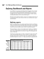
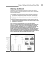
Chapter 1
RI
AL
Getting in the Dashboard
State of Mind
TE
In This Chapter
Comparing dashboards to reports
MA
Getting started on the right foot
Dashboarding best practices
D
I
GH
TE
n his song, “New York State of Mind,” Billy Joel laments the differences
between California and New York. In this homage to the Big Apple, he
implies a mood and a feeling that comes with thinking about New York. I
admit it’s a stretch, but I’ll to extend this analogy to Excel — don’t laugh.
CO
PY
RI
In Excel, the differences between building a dashboard and creating standard
table-driven analyses are as great as the differences between California and
New York. To approach a dashboarding project, you truly have to get into the
dashboard state of mind. As you’ll come to realize in the next few chapters,
dashboarding requires far more preparation than standard Excel analyses. It
calls for closer communication with business leaders, stricter data modeling
techniques, and the following of certain best practices. It’s beneficial to have
a base familiarity with fundamental dashboarding concepts before venturing
off into the mechanics of building a dashboard.
In this chapter, you get a solid understanding of these basic dashboard concepts and design principles as well as what it takes to prepare for a dashboarding project.
10
Part I: Making the Move to Dashboards
Defining Dashboards and Reports
It isn’t difficult to use report and dashboard interchangeably. In fact, the line
between reports and dashboards frequently gets muddied. I’ve seen countless reports that have been referred to as dashboards just because they
included a few charts. Likewise, I’ve seen many examples of what could be
considered dashboards but have been called reports.
Now this may all seem like semantics to you, but it’s helpful to clear the air a
bit and understand the core attributes of what are considered to be reports
and dashboards.
Defining reports
Reports are probably the most common application of business intelligence.
A report can be described as a document that contains data used for reading
or viewing. It can be as simple as a data table or as complex as a subtotaled
view with interactive drilling, similar to Excel’s Subtotal functionality.
The key attribute of a report is that it doesn’t lead a reader to a predefined
conclusion. Although a report can include analysis, aggregations, and even
charts, reports often allow for the end user to apply his own judgment and
analysis to the data.
To clarify this concept, Figure 1-1 shows an example of a report. This report
shows the National Park overnight visitor statistics by period. Although
this data can be useful, it’s clear this report isn’t steering the reader in any
predefined judgment or analysis; it’s simply presenting the aggregated data.
Figure 1-1:
Reports
present data
for viewing
but don’t
lead
readers to
conclusions.
Chapter 1: Getting in the Dashboard State of Mind
Defining dashboards
A dashboard is a visual interface that provides at-a-glance views into key
measures relevant to a particular objective or business process. Dashboards
have three main attributes:
Dashboards are typically graphical in nature, providing visualizations
that help focus attention on key trends, comparisons, and exceptions.
Dashboards often display only data that are relevant to the goal of the
dashboard.
Because dashboards are designed with a specific purpose or goal, they
inherently contain predefined conclusions that relieve the end user from
performing his own analysis.
Figure 1-2 illustrates a dashboard that uses the same data shown in
Figure 1-1. This dashboard displays key information about the National Park
overnight visitor stats. As you can see, this presentation has all the main
attributes that define a dashboard. First, it’s a visual display that allows you
to quickly recognize the overall trending of the overnight visitor stats.
Second, you can see that not all the detailed data is shown here; only the key
pieces of information that’s relevant to support the goal of this dashboard.
Finally, by virtue of its objective, this dashboard effectively presents you with
analysis and conclusions about the trending of overnight visitors.
Figure 1-2:
Dashboards
provide
at-a-glance
views
into key
measures
relevant to a
particular
objective or
business
process.
11
12
Part I: Making the Move to Dashboards
Preparing for Greatness
Imagine your manager asks you to create a dashboard that tells him everything
he should know about monthly service subscriptions. Do you jump to action
and slap together whatever comes to mind? Do you take a guess at what he
wants to see and hope it’s useful? These questions sound ridiculous but such
situations happen more that you think. I’m constantly called to action to create
the next great reporting tool but am rarely provided the time to gather the true
requirements for it. Between limited information and unrealistic deadlines, the
end product often ends up being unused or having little value.
This brings me to one of the key steps in preparing for dashboarding —
collecting user requirements.
In the non-IT world of the Excel analyst, user requirements are practically
useless because of sudden changes in project scope, constantly changing priorities, and shifting deadlines. The gathering of user requirements is viewed to
be a lot of work and a waste of valuable time in the ever-changing business
environment. But as I mention at the start of this chapter, it’s time
to get into the dashboard state of mind.
Consider how many times a manager has asked you for an analysis and then
said “No, I meant this.” Or, “Now that I see it, I realize I need this.” As frustrating
as that can be for a single analysis, imagine running into this during the creation of a complex dashboard with several data integration processes. The
question is, would you rather spend your time on the front end gathering user
requirements or spend time painstakingly redesigning the dashboard you’ll
surely come to hate?
The process of gathering user requirements doesn’t have to be an overly
complicated or formal one. Here are some simple things you can do to ensure
you have a solid idea of the purpose of the dashboard.
Establish the audience and
purpose for the dashboard
Chances are your manager has been asked to create the reporting mechanism,
and he has passed the task to you. Don’t be afraid to clarify the source of the
initial request and talk to them about what they’re really asking for. Discuss the
purpose of the dashboard and the triggers that caused them to ask for a dashboard in the first place. You may find, after discussing the matter, that a simple
Excel report meets their needs, foregoing the need for a full-on dashboard.
If a dashboard is indeed warranted, talk about who the end users are. Take
some time to meet with some of the end users and talk about how they’d use
the dashboard. Will the dashboard be used as a performance tool for regional
Chapter 1: Getting in the Dashboard State of Mind
managers? Will the dashboard be used to share data with external customers?
Talking through these fundamentals with the right people helps align your
thoughts and avoids the creation of a dashboard that doesn’t fulfill the
necessary requirements.
Delineate the measures for the dashboard
Most dashboards are designed around a set of measures, or key performance
indicators (KPIs). A KPI is an indicator of the performance of a task deemed
to be essential to daily operations or processes. The idea is that a KPI reveals
performance that is outside the normal range for a particular measure, so
it therefore often signals the need for attention and intervention. Although
the measures you place into your dashboards may not officially be called
KPIs, they undoubtedly serve the same purpose — to draw attention to
problem areas.
The topic of creating effective KPIs for your organization is a subject worthy
of its own book and is out of the scope of this endeavor. For a detailed guide
on KPI development strategies, pick up David Parmenter’s Key Performance
Indicators: Developing, Implementing, and Using Winning KPIs (Wiley). This
book provides an excellent step-by-step approach to developing and
implementing KPIs.
The measures used on a dashboard should absolutely support the initial purpose of that dashboard. For example, if you’re creating a dashboard focused
on supply chain processes, it may not make sense to have human resources
headcount data incorporated. It’s generally a good practice to avoid inclusion
of nice-to-know data into your dashboards simply to fill white space or
because the data is available. If the data doesn’t support the core purpose
of the dashboard, leave it out.
Here’s another tip: When gathering the measures required for the dashboard,
I find that it often helps to write a sentence to describe the measure needed.
For example, instead of simply adding the word Revenue into my user requirements, I write what I call a component question, such as, “What is the overall
revenue trend for the last two years?” I call it a component question because
I intend to create a single component, such as a chart or a table, to answer
the question. For instance, if the component question is, “What is the overall
revenue trend for the last two years?,” you can imagine a chart component
answering that question by showing the two-year revenue trend.
I sometimes take this a step further and actually incorporate the component
questions into a mock layout of the dashboard to get a high-level sense of the
data the dashboard will require. Figure 1-3 illustrates an example.
13
14
Part I: Making the Move to Dashboards
What is the overall trend for the last two years?
Which are the
top 10 months?
What is the % breakout of service offering?
What is the quarterly
trend for Tent
Campers?
What is the quarterly
trend for RV
Camper?
What is the quarterly
trend for Backcountry
Campers?
What is the quarterly
trend for Concessioner
Lodging?
Which are the
bottom 10 months?
Figure 1-3:
Each box in
this
dashboard
layout
mockup
represents a
component
and the type
of data
required to
create the
measures.
What is the
current month’s
revenue by
service
offering?
What is last
year’s
average
revenue by
service
offereing?
What is the
variance
between
average
revenue
last year
and the
current
month’s
revenue?
Each box in this dashboard layout mockup represents a component on the
dashboard and its approximate position. The questions within each box
provide a sense of the types of data required to create the measures for the
dashboard.
Catalog the required data sources
When you have the list of measures that need to be included on the dashboard, it’s important to take a tally of the available systems to determine if
the data required to produce those measures are available. Ask yourself the
following questions:
Do you have access to the data sources necessary?
How often are those data sources refreshed?
Who owns and maintains those data sources?
What are the processes to get the data from those resources?
Does the data even exist?
Chapter 1: Getting in the Dashboard State of Mind
These are all questions you need answered when negotiating development
time, refresh intervals, and phasing.
Conventional wisdom says that the measures on your dashboard shouldn’t
be governed by the availability of data. Instead, you should let dashboard
KPIs and measures govern the data sources in your organization. Although
I agree with the spirit of that statement, I’ve been involved in too many
dashboard projects that have fallen apart because of lack of data. Real-world
experience has taught me the difference between the ideal and the ordeal.
If your organizational strategy requires that you collect and measure data
that is nonexistent or not available, press pause on the dashboard project
and turn your attention to creating a data collection mechanism that will get
the data you need.
Define the dimensions and
filters for the dashboard
In the context of reporting, a dimension is a data category used to organize
business data. Examples of dimensions are Region, Market, Branch, Manager,
or Employee. When you define a dimension in the user requirements stage
of development, you’re determining how the measures should be grouped
or distributed. For example, if it’s determined that your dashboard should
report data by employee, you need to ensure that your data collection and
aggregation processes include employee detail. As you can imagine, adding a
new dimension after the dashboard is built can get complicated, especially
when your processes require many aggregations across multiple data
sources. The bottom line is that locking down the dimensions for a dashboard early in the process definitely saves you headaches.
Along those same lines, you want to get a clear sense of the types of filters
that are required. In the context of dashboards, filters are mechanisms that
allow you to narrow the scope of the data to a single dimension. For example,
you can filter on Year, Employee, or Region. Again, if you don’t account for a
particular filter while building your dashboarding process, you’ll likely be
forced into an unpleasant redesign of both your data collection processes
and your dashboard.
If you’re confused by the difference between dimensions and fields, think
about a simple Excel table. A dimension is like a column of data (such as a
column containing employee names) in an Excel table. A filter, then, is the
mechanism that allows you to narrow your table to show only the data for
a particular employee. For example, if you apply Excel’s AutoFilter to the
employee column, you are building a filter mechanism into your table.
15
16
Part I: Making the Move to Dashboards
Determine the need for drill-down features
Many dashboards provide drill-down features that allow users to “drill” into
the details of a specific measure. You want to get a clear understanding of the
types of drill-downs your users have in mind.
To most users, drill-down feature means the ability to get a raw data table
supporting the measures shown on the dashboard. Although getting raw data
isn’t always practical or possible, discussing these requests will at a minimum allow you to talk to your users about additional reporting, links to other
data sources, and other solutions that may help them get the data they need.
Establish the refresh schedule
A refresh schedule refers to the schedule by which a dashboard is updated to
show the latest information available. Because you’re the one responsible for
building and maintaining the dashboard, you should have a say in the refresh
schedules. Your manager may not know what it takes to refresh the dashboard
in question.
While you’re determining the refresh schedule, keep in mind the refresh
rates of the different data sources whose measures you need to get. You can’t
refresh your dashboard any faster than your data sources. Also, negotiate
enough development time to build macros that aid in automation of
redundant and time-consuming refresh tasks.
A Quick Look at Dashboard
Design Principles
When collecting user requirements for your dashboarding project, there’s a
heavy focus on the data aspects of the dashboard: The types of data needed,
the dimensions of data required, the data sources to be used, and so on.
This is a good thing — without solid data processes, your dashboards won’t
be effective or maintainable. That being said, here’s another aspect to your
dashboarding project that calls for the same fervor in preparation: the
design aspect.
Excel users live in a world of numbers and tables, not visualization and design.
Your typical Excel analyst has no background in visual design and is often left
to rely on his own visual instincts to design his dashboards. As a result, most
Excel-based dashboards have little thought given to effective visual design,
often resulting in overly cluttered and ineffective user interfaces.
Chapter 1: Getting in the Dashboard State of Mind
The good news is that dashboarding has been around for such a long time,
there’s a vast knowledge base of prescribed visualization and dashboard
design principles. Many of these principles seem like common sense; even
so, these are concepts that Excel users don’t often find themselves thinking
about. Because this chapter is about getting into the dashboard state of
mind, I break that trend and review a few dashboard design principles that
improve the design aspect of your Excel dashboards.
Many of the concepts in this section come from the work of Stephen Few,
visualization expert and author of several books and articles on dashboard
design principles. As this book is primarily focused on the technical aspects
of building reporting components in Excel, this section offers a high-level
look at dashboard design. If you find that you’re captivated by the subject,
feel free to visit Stephen Few’s Web site at www.perceptualedge.com.
Rule number 1: Keep it simple
Dashboard design expert, Stephen Few, has the mantra, “Simplify, Simplify,
Simplify.” The basic idea is that dashboards cluttered with too many measures
or too much eye candy can dilute the significant information you’re trying to
present. How many times has someone told you that your reports look
“busy”? In essence, this complaint means that too much is going on in the
page or screen, making it hard to see the actual data.
Here are a few actions you can take to ensure simpler and more effective
dashboard designs.
Don’t turn your dashboard into a data repository
Admit it. You include as much information onto a report as possible, primarily
to avoid being asked for additional information. We all do it. But in the dashboard state of mind, you have to fight the urge to force every piece of data
available onto your dashboards.
Overwhelming users with too much data can cause them to lose sight of
the primary goal of the dashboard and focus on inconsequential data. The
measures used on a dashboard should support the initial purpose of that
dashboard. Avoid the urge to fill white space for the sake of symmetry and
appearances. Don’t include nice-to-know data just because the data is
available. If the data doesn’t support the core purpose of the dashboard,
leave it out.
Avoid the fancy formatting
The key to communicating effectively with your dashboards is to present
your data as simply as possible. There’s no need to wrap it in eye candy to
make it more interesting. It’s okay to have a dashboard with little to no color
17
18
Part I: Making the Move to Dashboards
or formatting. You’ll find that the lack of fancy formatting only serves to call
attention to the actual data. Focus on the data and not the shiny happy
graphics. Here are a few guidelines:
Avoid using colors or background fills to partition your dashboards.
Colors in general should be used sparingly, reserved for providing information about key data points. For example, assigning the colors red,
yellow, and green to measures traditionally indicates performance level.
Adding these colors to other sections of your dashboard only serves to
distract your audience.
De-emphasize borders, backgrounds, and other elements that define
dashboard areas. Try to use the natural white space between your components to partition your dashboard. If borders are necessary, format
them to hues lighter than the ones you’ve used for your data. Light grays
are typically ideal for borders. The idea is to indicate sections without
distracting from the information displayed.
Avoid applying fancy effects, such as gradients, pattern fills, shadows,
glows, soft edges, and other formatting. Excel 2007 makes it easy to
apply effects that make everything look shiny, glittery, and generally
happy. Although these formatting features make for great marketing
tools, they don’t do your reporting mechanisms any favors.
Don’t try to enhance your dashboards with clip art or pictures. Not
only do they do nothing to further data presentation, they often just
look tacky.
Limit each dashboard to one printable page
Dashboards in general should provide at-a-glance views into key measures
relevant to particular objectives or business processes. This implies that all
the data is immediately viewable on the one page. Although including all your
data on one page isn’t always the easiest thing to do, there’s much benefit to
being able to see everything on one page or screen. You can compare sections
more easily, you can process cause and effect relationships more effectively,
and you rely less on short term memory. When a user has to scroll left, right,
or down, these benefits are diminished. Furthermore, users tend to believe
that when information is placed out of normal view (areas that require
scrolling), it’s somehow less important.
But what if you can’t fit all the data on one sheet? First, review the measures
on your dashboard and determine if they really need to be there. Next, format
your dashboard to use less space (format fonts, reduce white space, and
adjust column and row widths). Finally, try adding interactivity to your dashboard, allowing users to dynamically change views to show only those
measures that are relevant to them.
Chapter 1: Getting in the Dashboard State of Mind
Use layout and placement to draw focus
As I discuss earlier in this chapter, only measures that support the dashboard’s utility and purpose should be included in the dashboard. However, it
should be said that just because all measures on your dashboard are significant, they may not always have the same level of importance. In other words,
you’ll frequently want one component of your dashboard to stand out from
the others.
Instead of using bright colors or exaggerated sizing differences, you can leverage location and placement to draw focus to the most important components
on your dashboard.
Various studies have shown that readers have a natural tendency to focus
on particular regions of a document. For example, researchers at the Poynter
Institute’s Eyetracker III project have found that readers view various regions
on a screen in a certain order, paying particular attention to specific regions
on the screen. They use the diagram in Figure 1-4 to illustrate what they
call priority zones. Regions with the number 1 in the diagram seem to have
high prominence, attracting the most attention for longer periods of time.
Meanwhile, priority 3 regions seem to have low prominence.
Figure 1-4:
Studies
show that
users pay
particular
attention to
the upperleft and
middle-left
of a
document.
1
1
2
3
1
1
2
2
2
2
2
3
3
3
3
3
19
20
Part I: Making the Move to Dashboards
You can leverage these priority zones to promote or demote certain components based on significance. If one of the charts on your dashboard warrants
special focus, you can simply place that chart in a region of prominence.
Note that surrounding colors, borders, fonts, and other formatting can affect
the viewing patterns of your readers, de-emphasizing a previously high
prominence region.
Format numbers effectively
There will undoubtedly be lots of numbers in your dashboards. Some of them
will be in charts, and others will be in tables. Remember that every piece of
information on your dashboard should have a reason for being there. It’s
important that you format your numbers effectively to allow your users to
understand the information they represent without confusion or hindrance.
Here are some guidelines to keep in mind when formatting the numbers in
your dashboards and reports:
Always use commas to make numbers easier to read. For example,
instead of 2345, show 2,345.
Only use decimal places if that level of precision is required. For
instance, there’s rarely benefit for showing the decimal places in a
dollar amount, such as $123.45. Likewise in percentages, use only the
minimum number of decimals required to represent the data effectively.
For example instead of 43.21%, you may be able to get away with 43%.
Only use the dollar symbol when you need to clarify that you’re
referring to monetary values. If you have a chart or table that contains
all revenue values, and there’s a label clearly stating this, you can save
rooms and pixels by leaving out the dollar symbol.
Format very large numbers to the thousands or millions place. For
instance, instead of displaying 16,906,714, you can format the number to
read 17M.
You can easily format large numbers in Excel by using the Format Cells dialog
box, shown in Figure 1-5. Here, you can specify a custom number format by
selecting Custom in the Category list and entering the desired number format
code in the Type input box. In Figure 1-5, the format code 0,,"M" ensures the
numbers are formatted to millions with an M appendage.
Chapter 1: Getting in the Dashboard State of Mind
Figure 1-5:
Select
Custom in
the Category
list and
enter a
number
format code
in the Type
input box.
Table 1-1 lists some common format codes and how they affect numbers.
Table 1-1
Number Format Codes
Number Format Code
How 16,906,714 Would be Displayed
0,
16907
0,0,
16,907
0.00,
16,906.71
0,”K”
16907K
0,0,”K”
16,907K
0.00,”K”
16,906.71K
$0,0,”K”
$16,907K
0,,
17
0,,”M”
17M
0.0,,”M”
16.9M
0.00,,”M”
16.91M
$0.0,,”M”
$16.9M
21
22
Part I: Making the Move to Dashboards
Use titles and labels effectively
It’s common sense, but many people often fail to label items on dashboards
effectively. If your manager looks at your dashboard and asks you, “What is
this telling me?,” you likely have labeling issues. Here are a few guidelines for
effective labeling in your dashboards and reports:
Always include a timestamp on your reporting mechanisms. This
minimizes confusion when distributing the same dashboard or report in
monthly or weekly installments.
Always include some text indicating when the data for the measures
was retrieved. In many cases, timing of the data is a critical piece of
information when analyzing a measure.
Use descriptive titles for each component in your dashboard. This
allows users to clearly identify what they’re looking at. Be sure to avoid
cryptic titles with lots of acronyms and symbols.
Although it may seem counterintuitive, it’s generally good practice to
de-emphasize labels by formatting them to hues lighter than the ones
used for your data. Lightly colored labels give your users the information they need without distracting them from the information displayed.
Ideal colors to use for labels are colors that are commonly found in
nature: soft grays, browns, blues, and greens.