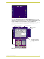
1
instruction manual
TPDesign3
Touch Panel Design Program
(Version 3.16)
So ftw are
Software Warranty Agreement
PRE-RELEASE CODE.
Portions of the AMX Software may, from time to time, as identified in the AMX Software, include PRE-RELEASE CODE
and such code may not be at the level of performance, compatibility and functionality of the final code. The PRERELEASE CODE may not operate correctly and may be substantially modified prior to final release or certain features
may not be generally released. AMX is not obligated to make or support any PRE-RELEASE CODE. ALL PRERELEASE CODE IS PROVIDED “AS IS” WITH NO WARRANTIES.
LIMITED WARRANTY.
AMX warrants that the AMX Software will perform substantially in accordance with the accompanying written materials
for a period of 30 days from the date of receipt. AMX DISCLAIMS ALL OTHER WARRANTIES, EITHER EXPRESS OR
IMPLIED, INCLUDING, BUT NOT LIMITED TO IMPLIED WARRANTIES OF MERCHANTABILITY AND FITNESS FOR
A PARTICULAR PURPOSE, WITH REGARD TO THE AMX SOFTWARE. THIS LIMITED WARRANTY GIVES YOU
SPECIFIC LEGAL RIGHTS.
LICENSEE REMEDIES.
AMX's entire liability and your exclusive remedy shall be repair or replacement of the AMX Software that does not meet
AMX's Limited Warranty and which is returned to AMX. This Limited Warranty is void if failure of the AMX Software has
resulted from accident, abuse, or misapplication. Any replacement AMX Software will be warranted for the remainder
of the original warranty period or 30 days, whichever is longer. Outside the United States, these remedies may not
available.
NO LIABILITY FOR CONSEQUENTIAL DAMAGES. IN NO EVENT SHALL AMX BE LIABLE FOR ANY DAMAGES
WHATSOEVER (INCLUDING, WITHOUT LIMITATION, DAMAGES FOR LOSS OF BUSINESS PROFITS, BUSINESS
INTERRUPTION, LOSS OF BUSINESS INFORMATION, OR ANY OTHER PECUNIARY LOSS) ARISING OUT OF
THE USE OF OR INABILITY TO USE THIS AMX PRODUCT, EVEN IF AMX HAS BEEN ADVISED OF THE POSSIBILITY OF SUCH DAMAGES. BECAUSE SOME STATES/COUNTRIES DO NOT ALLOW THE EXCLUSION OR LIMITATION OF LIABILITY FOR CONSEQUENTIAL OR INCIDENTAL DAMAGES, THE ABOVE LIMITATION MAY NOT
APPLY TO YOU.
If you acquired this product in the United States, this Agreement is governed by the laws of the State of Texas.
Should you have any questions concerning this Agreement, or if you desire to contact AMX for any reason, please
write: AMX Corporation, 3000 Research Drive, Richardson, TX 75082.
Table of Contents
Table of Contents
Product Information .................................................................................................1
Features ............................................................................................................................ 1
Minimum System Requirements ....................................................................................... 1
Supported Platforms for HTML.......................................................................................... 2
Web Servers ............................................................................................................................ 2
Web Clients.............................................................................................................................. 2
Installing TPDesign3 ......................................................................................................... 2
Touch Panel Pages ........................................................................................................... 2
Window and Toolbar Reference ..............................................................................5
TPDesign3 Windows ......................................................................................................... 5
Main Menu......................................................................................................................... 6
Standard Toolbar............................................................................................................... 8
Main Toolbar ..................................................................................................................... 9
Button Borders Toolbar ................................................................................................... 10
Button Types Toolbar ...................................................................................................... 11
Fonts Toolbar .................................................................................................................. 12
Hotkey Shortcut Information............................................................................................ 13
Designing Panel Pages ..........................................................................................15
Defining your Preferences............................................................................................... 15
Creating a New Project ................................................................................................... 16
Setting Panel Properties.................................................................................................. 17
Importing Bitmaps ........................................................................................................... 18
Optimization of images........................................................................................................... 19
Importing Icons................................................................................................................ 19
Creating/Editing an Icon .................................................................................................. 20
Managing Fonts............................................................................................................... 20
Creating a New Page ...................................................................................................... 21
Setting Page Properties .................................................................................................. 21
Creating a Button ............................................................................................................ 22
Assigning Button Color Properties .................................................................................. 22
Selecting a Button Color.................................................................................................. 23
Changing Button Borders ................................................................................................ 23
Adding Button Text.......................................................................................................... 24
Adding a button type ....................................................................................................... 25
Selecting an Icon............................................................................................................. 25
TPDesign3 Touch Panel Program
i
Table of Contents
Selecting a Picture .......................................................................................................... 26
Image Positioning................................................................................................................... 26
Changing Button Size ..................................................................................................... 27
Using the size to picture feature............................................................................................. 27
Locking the Position of a Button...................................................................................... 28
Copying and Pasting Buttons.......................................................................................... 28
Setting General Button Properties .................................................................................. 28
Creating a Page Flip .............................................................................................................. 30
Setting Joystick Button Properties .................................................................................. 30
Setting Bargraph/Slider Control Button Properties.......................................................... 31
Setting Brightness Button Properties .............................................................................. 32
Setting Date Button Properties........................................................................................ 32
Setting Time Button Properties ....................................................................................... 32
Setting Keyboard Button Properties................................................................................ 33
Setting Keypad Button Properties ................................................................................... 33
Setting Panel Setup Button Properties............................................................................ 33
Setting Sensors Setup Button Properties on CP4 panels ............................................... 33
Setting Video Setup Button Properties............................................................................ 34
Setting VGA Video Setup Button Properties ................................................................... 34
Setting Video Window Button Properties ........................................................................ 34
Setting Video Joystick Button Properties ........................................................................ 35
Defining External Buttons................................................................................................ 36
Verifying Channel Assignments ...................................................................................... 37
Creating a Popup Page................................................................................................... 37
Managing a Popup Page................................................................................................. 38
Run Simulation................................................................................................................ 38
Downloading a Project to a Touch Panel ........................................................................ 38
Using TPDesign3 to Download Design XPress 1.1 - Generated Panel Pages...................... 39
Uploading a Project from a Touch Panel ........................................................................ 39
HTML Conversion and Server Download........................................................................ 40
Downloading to a NetLinx Master on a LAN .......................................................................... 41
ii
TPDesign3 Touch Panel Program
Product Information
Product Information
TPDesign3 is a 32-bit Windows® application that enables you to create touch panel pages in
minutes. You can use TPDesign3 to import fonts, bitmaps, and icons for use in your file pages and
then download the newly created files to either a touch panel or the Internet. TPDesign3 provides
point-and-click touch panel programming and page printing. You can program panels through the
Central Controller's program port via AXlink or directly through the touch panel's onboard RS-232
DB-9 port. In order for touch panels to effectively handle using TPD3 designed panel pages, they
must have the most current firmware and appropriate memory installed.
Features
!
Added a Snap To Grid icon feature to both the Edit and right-click button menus.
!
Added the Confirm Page Delete Actions to the Edit > Preferences > Application tab >
Miscellaneous section. This feature confirms page deletion from the current TPDesign3
project file.
!
Addition of items to the Main toolbar, such as: Snap To Grid, On State, and Lock Button
(also added to both the Edit and Button drop-down menus).
!
Sensors Setup button on the Button Types toolbar is available for the adjustment of
sensors on the four-inch Color Passive panels.
!
Static and WebLinx HTML files now have the option to enable or disable the emulation
of external buttons.
!
Size To Picture feature resizes a button to fit the dimensions of the inserted graphic.
!
Simulation mode and Static/WebLinx exports now obey External Button Style properties.
!
Increased support of image types by the Bitmap Manager.
!
Provides support for 1 and 2-bit Black/White bitmaps.
!
Unicode® character support for far-eastern languages such as Chinese. Characters for
middle-eastern languages such as Arabic are not supported within the Unicode fonts
because they are bi-directional. Buttons with Unicode fonts can only be created and
edited using the TPDesign3 Touch Panel Design Program.
!
Upload, revise, and update existing TPDesign3 touch panel files.
Minimum System Requirements
!
Pentium 233 (recommended 300 MHz) class central processing unit (CPU)
!
Windows® compatible CD-ROM drive
!
Microsoft Windows 95®, 98®, 2000®, or Windows NT® 4.x (service pack 5 or greater)
operating systems
!
48 MB RAM for Windows 95/ 98 (64 MB recommended for Windows NT) (96 MB
recommended for Windows 2000)
TPDesign3 Touch Panel Program
1
Product Information
!
75 MB (150 MB recommended) of free hard-disk space
!
VGA monitor running a minimum resolution of 800x600
!
Mouse or equivalent pointing device
Supported Platforms for HTML
Web Servers
Touch panel files exported as Inactive HTML are compatible with any Web Server. A Web Client
can run these same files locally, without the need for a Web Server. Files exported as Active
WebLinx HTML require a Web Server capable of processing ASP scripts that use VBScript. This
currently means using either Microsoft's Personal Web Server for Windows 95, 98, or Windows NT
4.0 Workstation, and Microsoft's IIS (Internet Information Services) for Windows NT 4.0 Server,
Windows 2000 Professional, and Windows 2000 Server.
Files exported as Active NetLinx HTML are intended to be run against the internal Web Server in a
NetLinx controller, and require no additional external Web Server.
Web Clients
Touch panel files exported as either Inactive HTML or Active WebLinx HTML are compatible with
any Web Client that can execute client-side JavaScript 1.1 code and that has basic DHTML support.
Clients include Microsoft Internet Explorer 4.0 (and higher) running on all platforms for which
they have been released (Windows, Unix, and Mac).
Touch panel files exported as Inactive HTML or Active HTML are not supported in
Netscape Navigator.
Installing TPDesign3
To install the TPDesign3 program:
1. Put the AMX Control Disc into the CD-ROM drive.
2. In File Manager (or Explorer in Windows), double-click AMXSetup.exe from the directory
window for your CD-ROM drive.
3. Follow the instructions that appear on your screen.
Restarting the computer is not necessary for installation.
Touch Panel Pages
The area of display on an AMX touch panel is called a page. Pages can be designed as a control
panel. You can add buttons, bargraphs, sliders, and drawings to a touch panel page, and then
designate the control functions for each object. FIG. 1 shows a page created for a touch panel.
You can create as many panel and popup pages as needed to achieve your functional goals. Refer to
the Setting General Button Properties section on page 28 for more information on creating and
applying page flip features.
When you create multiple pages, you must link them (via page flips) to be able to go from one page
to another. Do this with a page-flip attribute assigned to the specific button. For example, FIG. 1
2
TPDesign3 Touch Panel Program
Product Information
FIG. 1 Example touch panel page
shows a page with a DVD button. When pressing this button, the desired result is to go to a preconstructed page (or popup page) that allows you to change preferences for the DVD (FIG. 2). The
page flip to the DVD popup page (DVD CONTROL) is selected for the Destination.
Therefore, in an actual operation of the program, pressing the DVD button creates a page flip to the
popup page called DVD CONTROL that contains buttons that control the DVD.
Button selected for button
properties assignments
Button Properties box
Button position on
page
Assigned page flip attributes
cause the popup page on the
left to appear
Popup page
FIG. 2 Example touch panel page with assigned page flip
TPDesign3 Touch Panel Program
3
Product Information
4
TPDesign3 Touch Panel Program
Window and Toolbar Reference
Window and Toolbar Reference
TPDesign3 Windows
The first elements available in the Workspace are the Main Menu bar, Toolbar buttons, and Status
bar. Double-clicking any area of the Status bar causes the feedback and page flip displays to change
to location and size displays. FIG. 3 shows the Status bar elements and identifies the data shown by
each.
Main Menu bar
Toolbar buttons
Workspace
Status bar
elements
FIG. 3 TPDesign3 Main Menu and Status bar elements
The main elements of the TPDesign3 Main Menu are described below:
TPD3 Main Elements
Main Menu bar
Provides access to all the functions needed to work with files, objects, and
properties.
Toolbar buttons
Contain the buttons you can select (when a file is opened) to perform various
TPDesign3 operations or functions.
Status bar
Contains the following default elements:
• Cursor displays the X and Y mouse cursor coordiates on a page.
• CH# shows the channel number assigned to the selected object.
• Var Txt shows the variable text channel assigned to the selected object (if
enabled).
• FdBck shows the feedback (type) assigned to the selected object (if
enabled).
• Pg. Flip shows the object’s designated page flip (if enabled).
Double-clicking on the Status Bar opens a graphical elements row with these
additional fileds:
• Loc shows the location of the button on the page.
• Size shows the pixel height and width of the selected object.
• Rev shows the version of the active project file.
TPDesign3 Touch Panel Program
5
Window and Toolbar Reference
Main Menu
Provide access to all functional features applicable within a project file.
!
File menu items are used on the Project files.
• NEW creates a new project file and opens a New Workfile dialog box.
• OPEN opens an existing project file.
• CLOSE closes an open project.
• SAVE saves an open project file with the default information for the name.
• SAVE AS saves an open project in a selected folder location, with a manually entered file
name, and as a selectable file type.
• SAVE ALL saves all .TPD project files that are currently open.
• SAVE AS DIFFERENT PANEL TYPE opens the New Panel Type dialog box, and saves the
current project file as a panel type other than the type selected in the New Workfile dialog box
for the current project.
• DOWNLOAD TO PANEL opens the Download To Panel dialog box. Use this dialog to
download buttons, pages, bitmaps, icons, and fonts to a touch Panel.
• UPLOAD FROM PANEL opens the Upload From Panel dialog box. Use this dialog to upload
buttons, pages, bitmaps, icons, and fonts from a touch Panel.
• RUN SIMULATION runs your project file on your computer (with limited functionality).
• SAVE AS HTML opens the HTML Conversion Options dialog box and allows you to convert
your panel file.
• PRINT SETUP opens the Print Setup dialog box and sets the printer, paper size, paper
source, and orientation options.
• PRINT PREVIEW opens a graphical image of the touch panel pages contained in the project
file. Provides the option to select from three types of print information for a selected page.
• PRINT prints the selected panel page using one of three types of print information.
• Properties opens the Project Properties dialog box and displays all available information on
the project file.
• (FILE HISTORY) lists the most recently opened files with the accompanying file location.
!
Edit menu items are used on both the page elements and the Project file.
• CUT cuts selected objects or text, and moves the selection to a clipboard buffer.
• COPY copies a selected object or text to the clipboard.
• PASTE pastes an object or text stored in the clipboard buffer (with the Cut or Copy option)
and places it into a specified location.
• DELETE deletes a selection.
• SELECTION TOOL when active, allows you to select objects on a panel page.
• BUTTON DRAW is used to create buttons on a panel page.
• QUICK TEXT types text on a button using the currently set font options.
• SNAP TO GRID positions selected page elements (such as buttons) on grids lines. These
grid units are defined in the Edit > Preferences > Application tab.
• SELECT ALL select all objects or text on the page.
• PREFERENCES configures the Project preferences used by TPDesign3 as a baseline for the
creation of any further projects.
!
Panel menu options are used on panel elements.
• EXTERNAL BUTTONS sets the channel codes, page flips, and string outputs.
• SENSORS sets the Panel Sensors device and channel values.
• CHANNEL MAPS opens the Channel Map dialog box and allows you to view the channels
(CODE) and level numbers assigned to the touch panel buttons.
6
TPDesign3 Touch Panel Program
Window and Toolbar Reference
• BITMAPS opens the Bitmap Manager dialog box. Use this dialog to view all of the bitmaps
contained in the project file.
• ICONS opens the Icon Manager dialog box. Use this dialog to view all of the icons contained
in the project file.
• PANEL MEMORY shows the amount of memory used in the touch panel.
• PANEL EXPLORER shows the files that comprise the current project.
• PROPERTIES sets default settings for the touch panel file.
!
Page menu options are used on panel pages.
• ADD PAGE adds a page to the project file.
• DELETE PAGE removes a page to the project file.
• ADD POPUP PAGE adds a popup page to the project file. These added popup pages can be
seen from the Windows drop-down menu.
• DELETE POPUP PAGE deletes a popup page from the project file.
• MANAGE POPUP PAGES displays, selects, and edits popup pages created within the
currently displayed project file.
• RENAME opens the Rename Page dialog box (if a panel page is selected) or the Rename
Popup Page dialog box (if a Popup page is selected).
• EXPORT PAGE AS BITMAP opens the Bitmap View dialog box. You can then use this dialog
box to copy a page to the Windows clipboard, or save it as a *.BMP format graphics file for
use with an external application.
• PROPERTIES allows you to name the page and to set the page color/page properties.
!
Button menu options are used on button elements.
• TEXT sets text properties for all buttons (On and Off States).
• COLORS sets the selected button’s text, fill, and border On/Off state colors.
• BORDER sets the button’s border style.
• ICON adds an icon to a button’s Off or On State, and clears the active icon state or clear both
icon states.
• PICTURE adds a bitmap picture to the Off or On State of the selected button.
• IMAGE POSITIONING sets the bitmap or icon position inside the active button.
• BUTTON SIZE sets the Left and Top positions, Width, and Height of the active button.
• PROGRAMMING DESCRIPTION allows you to provide property identifiers/information
relating to a specific button or to all buttons of a specific type.
• ON STATE shows the active button’s On State. (F11).
• LOCK BUTTON locks the selected page elements (buttons) to a position on the page. This
position can not be undone unless the process is repeated for the same button.
• CENTER centers the selected button or group of buttons on the page.
• SIZE TO PICTURE changes the size of the button to match the size of the inserted picture.
• PROPERTIES opens the Button Properties dialog box for the selected button.
!
Fonts menu options give the user the ability to alter the fonts used in the project file.
Specifically on page graphics and button text.
!
Drawing menu options are used on the panel page buttons and graphics.
• BRING TO FRONT moves one or more selected buttons in front of all other buttons on the
page.
• SEND TO BACK moves one or more selected buttons behind all other buttons on the page.
• SHIFT UP moves a single selected button above another.
• SHIFT DOWN adds moves a single selected button behind another.
TPDesign3 Touch Panel Program
7
Window and Toolbar Reference
• ALIGN sets the alignment on multiple buttons.
• MAKE SAME SIZE makes the Height/Width/or both features of selected buttons the same.
• HORIZONTAL SPACING adjusts the horizontal spacing of selected buttons.
• VERTICAL SPACING adjusts the vertical spacing of selected buttons.
!
Windows options give the user the ability to cascade the open page windows from upper
right to lower left. Cascading allows you to view all of the window title bars. Another
feature of this menu is the listing of the open project files.
!
Help menu options give the user the choice of opening the Help Contents (on-line help)
or viewing information about the version of the TPDesign3 program being used (in the
form of a splash-screen).
Standard Toolbar
You can use the Standard toolbar buttons to perform a wide variety of operations. The Standard
toolbar is not selectable from the drop-down menus and always appears on the Workspace. It is
movable and can be placed in either a vertical or horizontal positions.
The Standard toolbar buttons are described in the following table. Select Standard, from the Tools
menu, to toggle the Main toolbar buttons On or Off in the Main window.
Standard Toolbar Buttons
8
New
Creates a new project file.
Open
Opens an existing project file.
Close File
Closes the currently displayed project file.
Save
Saves the currently displayed project file without closing it.
Cut
Cuts the highlighted object from the displayed panel page.
Copy
Copies the highlighted object on the displayed panel page.
Paste
Pastes a previously copied or cut object onto the currently displayed panel page.
Delete
Deletes the currently highlighted object on the currently displayed panel page.
Run Simulation
Runs a limited capability simulation of the project file being created.
Add Page
Adds a new touch panel page to the project file currently being developed.
TPDesign3 Touch Panel Program
Window and Toolbar Reference
Standard Toolbar Buttons (Cont.)
Delete Page
Deletes a touch panel page from the project file currently being developed.
Add Popup Page
Adds a popup page to the project file currently being developed.
Delete Popup Page
Deletes a popup page from the project file currently being developed,
Manage Popup
Page
Displays, selects, and edits popup pages created within the currently displayed
project file.
Download To Panel
Downloads the current project file to the connected touch panel from a PC.
Upload From Panel
Uploads a project file from the connected touch panel.
Main Toolbar
You can use the Main toolbar buttons to perform a wide variety of button operations. The Main
toolbar is not selectable from the drop-down menus and always appears on the Workspace. It is
movable and can be placed in either a vertical or horizontal position.
The Main toolbar buttons are lists and described in the following table. Select Main Toolbar from
the Tools menu to toggle the main toolbar buttons On or Off in the main window.
Main Toolbar Buttons
Selection Tool
Selects buttons.
Button Draw Tool
Draws a button on the active page.
Text Tool
Adds or deletes text to a button on the active page.
Snap To Grid
Assigns a group of selected buttons to snap to the nearest grid intersection. The
distance between intersection points is a pixel unit defined in the Edit > Preferences > Application tab.
On State
Click this button to view the On State condition of a selected button. If multiple buttons are selected, the On State reflects the condition of the first button.
Lock Button
Locks a selected button into a fixed position on the panel page.
Icon Manager
Opens the Icon Manager dialog box.
Bitmap Manager
Opens the Bitmap Manager dialog box.
TPDesign3 Touch Panel Program
9
Window and Toolbar Reference
Main Toolbar Buttons (Cont.)
External Buttons
Opens the External Buttons dialog box.
Channel Maps
Opens the Channel Map dialog box to view current channel assignments.
Button Borders Toolbar
You can use the Button Borders toolbar to add different border styles to selected buttons. The
Button Borders toolbar is not selectable from any drop-down menu. It is movable and can be placed
in either a vertical or horizontal position. A similar function is available from the Borders option
from the Button drop-down menu or from the right-click Button options menu.
The toolbar buttons are lists and described in this table. Select Button Borders from the Tools menu
to toggle the main toolbar buttons On or Off in the main window.
Button Borders Toolbar Buttons
10
No Border
Changes the selected button to remove any border.
No Border Special
Changes the selected button to a display no special border.
Single Line
Changes the selected button border to a thin, single line border.
Double Line
Changes the selected button border to a double line.
Triple Line
Changes the selected button border to three line widths wide.
Single Rounded
Changes the selected button border to a single line border with rounded corners.
Double Rounded
Changes the selected button border to a double line border with rounded corners.
Single Raised
Changes the selected button border to a raised single line border.
Double Raised
Changes the selected button border to a double raised line border.
Triple Raised
Changes the selected button border to a raised triple line border.
Double 2 Single
Changes the selected button border to two double single lines.
Double 3 Single
Changes the selected button border to three double single lines.
TPDesign3 Touch Panel Program
Window and Toolbar Reference
Button Borders Toolbar Buttons (Cont.)
Double Shadow
Changes the selected button border to double shadow.
Single Diamond
Changes the selected button border to single diamond.
Double Diamond
Changes the selected button border to a double diamond.
3D Single
Rectangle
Changes the selected button border to a 3-dimensional rectangle.
3D Double
Rectangle
Changes the selected button border to a 3-dimensional double rectangle.
3D Single Round
Changes the selected button border to a 3-dimensional single round rectangle.
3D Double Round
Changes the selected button border to a 3-dimensional double border with
rounded corners.
Neon 1
Changes the selected button border to single Neon.
Neon 2
Changes the selected button border to double neon.
Blue Neon
Changes the selected button border to a blue neon border.
Green Neon
Changes the selected button border to a green neon border.
Button Types Toolbar
You can use the Button Types toolbar buttons to assign a particular function to a selected button
(the availability of these features are dependant on the type of panel project selected). The Button
Types toolbar is not selectable from the drop-down menus. It is movable and can be placed in either
a vertical or horizontal position.
The Button Types toolbar buttons are lists and described in Figure 5. Select Button Types from the
Tools menu to toggle the main toolbar buttons On or Off in the Workspace.
Button Types Toolbar Buttons
Button Names
Operation
General
Changes an active button into a general button. Sets the button to automatically
send a message to the Central Controller via the AXlink connector, or through
wireless communication (Wave Server).
Joystick
Changes an active button into a joystick button. Sets the button to a joystick that
includes a control stick. When you move the control stick, the touch panel sends
data to the Central Controller and to the external device to perform a pre-programmed operation.
TPDesign3 Touch Panel Program
11
Window and Toolbar Reference
Button Types Toolbar Buttons (Cont.)
Bargraph
Changes an active button into a bargraph button. Sets the button to a bargraph or
slider. Data for the bargraph or slider response comes from the Central Controller.
This response is unavailable for one-way ViewPoint panels.
Brightness
Changes an active button into a brightness button. Sets the button to open the
Brightness page. This page shows the color palette.
Date
Changes an active button into a date button to a page. Displays the current date
on the button.
Time
Changes an active button into a time button. Displays the current time on the button.
Keyboard
Changes an active button into a keyboard popup button. Sets the button to open
the keyboard so you can enter a name or string.
Keypad
Changes an active button into a keypad popup button on a page. Sets the button
to open the keypad so you can enter a password or value assignment.
Panel Setup
Changes an active button into a panel setup button on a page. Sets the button to
open the Setup page.
Sensors Setup
Changes an active button into a sensors setup button that takes the user to the
panel’s Sensors Setup page.
Video Setup
Changes an active button into a video setup button. Sets the button to open the
Video Setup page so the user can set the incoming video display properties on the
touch panel.
VGA Video Setup
Changes an active button into a VGA video setup button.
An AXB-TPI does not allow a button to be assigned to VGA Video Setup.
Video Window
Changes an active button into a video window on a page. Turns the button into a
video window to display the incoming video signal.
Video Joystick
Changes an active button into a video joystick on a page. Sets the button to a
video joystick that displays the incoming video signal, and a control stick. When
you move the control stick, the touch panel sends data to the Central Controller
and to the external device to perform a pre-programmed operation.
Fonts Toolbar
You can use the Fonts toolbar to assign a font to the text within a button. The Fonts toolbar is
selectable from the drop-down menus and always appears on the Workspace. For more information
on additional toolbar buttons, refer to the Managing Fonts section on page 20.
12
TPDesign3 Touch Panel Program
Window and Toolbar Reference
Hotkey Shortcut Information
This table lists and describes the different hotkey functions available in TPDesign3.
Hotkeys and their Descriptions
Hotkey
Description
F1
Gives you access to the On-Line Help.
F2
Toggles the Main Toolbar On/Off.
F3
Toggles the Button Borders Toolbar On/Off.
F4
Toggles the Button Types Toolbar On/Off.
F5
N/A
F6
Toggles the Fonts Toolbar On/Off.
F7
Activates the Button Colors Scheme dialog box - this
dialog box changes the button properties for the
active project ONLY.
F8
Activates the Power Assign dialog box.
F9
Activates the Paste Controls dialog box.
F10
N/A
F11
Toggles between a selected button’s On/Off states.
F12
Centers selected buttons on the visible panel page.
TPDesign3 Touch Panel Program
13
Window and Toolbar Reference
14
TPDesign3 Touch Panel Program
Designing Panel Pages
Designing Panel Pages
This section allows you to quickly create a project, page, button, and then download the project to a
touch panel via AXlink. The project file programs consist of individual pages (screens) containing
jumps to other pages, links to popup pages, or control commands for devices.
Defining your Preferences
Before beginning the development of any project, you must first define the panel preferences that
will govern the touch panel project. Three preferences take precedence in the TPDesign3 project
unless altered by dialog boxes such as: Panel Properties, Page Color, and Button Colors
Schemes. Refer to the previous sections covering these dialog boxes for more detailed information
about the hierarchy of each dialog's properties in relation to Edit: Preferences.
The Preferences tabs (FIG. 4) show the defaults associated with the TPDesign3 project file. Any
time a change is made to any of these tabs, the change is stored with the project file. Color changes
in the Buttons Colors Scheme dialog box, takes precedent over the color values in the Default
Colors tab, as long as the TPDesign3 session (program) is active. When the session is closed, any
new buttons retain the properties of the Default Colors tab.
To set up application preferences:
1. Select Preferences from the Edit drop-down menu. The Preferences dialog boxes appear
(FIG. 4).
FIG. 4 (Panel) Preferences dialog boxes
The Applications tab focuses on the Panel Explorer (open/closed).
2. Under Panel Explorer, select or deselect the desired options associated with the Panel Explorer
dialog box.
3. Click Snap to Grid to set an invisible grid for alignment purposes. Then select the width
between the invisible gridlines (2, 4, 8, or 16 pixels). When the project is begun, objects on the
page will snap to the grid when the Snap To Grid button is selected from the Main Toolbar and
applied to a button. This settings works in conjunction with the Snap to Grid button in the Edit
drop-down menu. Refer to the Snap To Grid information on page 9 for more information.
4. Click on any of the desired options in the Miscellaneous section of the Application tab.
TPDesign3 Touch Panel Program
15
Designing Panel Pages
In order to use graphical representations of both bitmaps and icons, it is
recommended that you select the Use Graphical Dialogs options. This allows lists to
appear in their graphical rather than textual form.
5. If you want a graphic (such as your company logo) printed in the boilerplate section when you
choose to print, select
and then select the graphic file on your computer to be used. Then
click OK.
The boilerplate section is an area on the bottom of printed panel pages. For more information
see the Print Preview and Print information of the Main Toolbar section on page 9.
6. Select the different pathways for your Bitmap Files, TPDesign Project Directory, and Backup
Files folders. Do not alter the first two directories (Panel Product Files and Font Files).
These two directories point to the data required to run the TPDesign3 program.
7. From the Default Colors tab, select a page color by clicking the Page Color box; then select the
page color from the color palette on the right.
Any changes to panel or button properties (namely changed to the Button Colors
Scheme dialog box) are only valid for the project as long as long as the project
session is STILL ACTIVE (OPEN) project session remains open. After the project is
closed and a new project is opened, the Default Colors tab properties take
precedence. The Button Colors dialog box controls changes to only currently
selected buttons and any new buttons default to either the Default Colors or Button
Colors Scheme settings (depending on current precedence). Default Colors are the
ONLY properties that are kept in the system’s registry file.
8. Select the OFF Fill Color box (the Setting filed displays the currently active button property).
9. Click on another color from the color palette to change the color for this button state.
10. Repeat step 8 and 9 for the other button properties on this tab.
11. Click OK when you're ready to accept the project preferences.
Creating a New Project
To create a TPDesign3 project:
1. Click the New icon
from the Standard toolbar or File drop-down menu. The New Workfile
dialog box (FIG. 5) appears.
This panel type activates the Sensors Setup
button from the Button Types Toolbar
FIG. 5 Sample New Workfile dialog box
2. Select the touch panel type and click Create to open the Project Properties dialog box.
Be sure to select the appropriate touch panel type for which you will be creating the program.
16
TPDesign3 Touch Panel Program
Designing Panel Pages
3. Enter all relevant information. The data entered in these fields is used to construct the project
filename.
The information entered is used to construct the project filename. For example, if you
enter: AMX01 (dealer ID), Audiovista Inc (company name), SO#12345 (sales order
number), rev 3 (revision number), BUD (your initials). When you save the project file,
the filename would be: AMX01,Adiovista Inc,SO#12345,rev 3,BUD.tpd.
4. Click OK to close the Project Properties dialog box.
This opens the TPDesign3 Workspace, with the first page of the touch panel file (Main Page)
and the Panel Explorer window (displaying the project folders).
5. Save the new project by choosing either Save, Save As (recommended to individual project
files), and Save All (used to save all open projects within TPDesign3).
The Save As option is more versatile, allowing you to rename the file and determine where the
file is saved. The default name for any created project is based on the information entered in
the Project Properties fields.
6. Click on the Main page to move the Panel Explorer dialog box behind the panel page, if it
obstructs your view of the page.
The new project is listed in the Panel Explorer. The Tree View shows the Pages, Popup Pages,
Bitmaps, Icons, and Fonts associated with the new project.
Setting Panel Properties
To set panel properties:
1. Select Properties from the Panel drop-down menu. The Panel Properties dialog box opens.
Verify or add touch panel settings.
The Color Background field sets the background color for the touch panel pages
created in the project. The color of any new created panel pages are changed to
match this selected color only after you click OK and exit from this dialog box. This
change in Page color takes precedence over the color set in the Preferences - Default
Colors tab, AS LONG AS THE PROJECT IS SAVED WITH THESE CHANGES. This
color change is not added to the system registry and will only apply to this particular
project. Any new project will use the settings from the Default Colors tab.
2. Under Start Page, select the first page to appear when the touch panel is powered up. Selecting
None will enable the last open page on the power-up.
3. Enter the starting address for the panel (1-255) in the Base Address field.
4. Enter a Blink Rate value between 0 and 99. Default is 5. Blink rate value is in 1/10 of a second
and applies to all buttons set with the blink feedback option. The Blink Rate is the value that
the panel will use if the feedback type is set to blink.
5. Click the Page Tracking option if you want the AMX Central Controller to be notified when a
page flip has occurred. Notification will have the current page name.
6. Set the number of AXlink Devices Used by the touch panel in this program/project. This value
is important to determine the number of devices used by the panel. Panels only allow a range of
1-4 to be entered into this field.
Some panels do not support more than one device. Wave panels support only one at this time.
TPDesign3 Touch Panel Program
17
Designing Panel Pages
7. Under Output Strings, enter the Startup, Wakeup, and Sleep strings associated with the touch
panel program/project.
8. Select the Date and Time Format.
9. Click
to display the Select Color palette; select the color to be used as default for all pages
associated with this touch panel program/project. This background page color has precedence
over the Page Color setting in the Default Colors tab (as long as it is saved with the project).
Importing Bitmaps
1. Select Bitmaps from the Panel drop-down menu to open the Bitmap Manager dialog box
shown in FIG. 6 and view the bitmaps contained in the project file. (The dialog box is initially
empty for most new projects but then gets populated by importing bitmaps).
FIG. 6 Bitmap Manager dialog boxes
You can also use the shortcut keys Ctrl+M to open the Bitmap Manager. Most Bitmap
Managers are blank until you import some bitmaps to the Bitmap Library. The manager now
supports more image types:
BMP - Windows Bitmap
PCX - PC (Zoft) Paintbrush
EMF - Windows Enhanced Meta File
PNG - Portable Network Graphics
EPS - Encapsulated Poscript
PSD - Photoshop Pro Image
ICO - Windows Icon
PSP - PhotoShop
IFF - Interchange File Format
RLE - Windows RLE
JPG (JPEG) - Joint Photographic Experts Group TGA - TrueVision Targa
LMB - Deluxe Paint
TIFF - Tagged Image File FormatUncompressed Only
PCT - MacIntosh PICT
WMF - Windows Meta File
2. Click Import to open the Import Bitmap dialog box and search for bitmaps (and other
supported image types) you want to import into the Bitmaps Library for the project. Bitmaps
are selected individually or in groups by using a combination of the Shift and left-mouse key.
3. Click Open when you're done selecting the bitmap files. A warning message appears if the
bitmap exceeds the panel screen dimensions assigned to the project file.
4. Once you have populated your Bitmap Manager with bitmaps (FIG. 6), select one or more
bitmaps that you want to Optimize to develop a common color palette. Refer to
the Optimization of images section on page 19 for more detailed information about the
Optimization feature.
18
TPDesign3 Touch Panel Program
Designing Panel Pages
5. You can now Cut, Copy, Paste, Delete, Export, and Rename images in the Bitmap Manager.
The Bitmap library cannot contain any bitmaps with identical names.
!
If the Default Names for Object Copies field is selected in the Preferences - Application
tab, then the newly copied/pasted bitmap will have Copy of added before the original
name.
!
If the Default Names for Object Copies field is NOT selected in the Preferences Application tab, a Rename Bitmap dialog box asking for a name that won't conflict with
another identically named bitmap in the library.
6. Click Close to accept changes made in the Bitmap Manager dialog box.
Color panels support 1 and 2-bit images to conserve memory in the panel. If the
image ONLY has black and white in its color scheme, it is flagged as a 1-bit image. If
the image has black AND white colors, with at least one transparent pixel is
transparent, the image is flagged as a
2-bit image.
If the panel firmware is lower than 5.02, the images are downloaded in standard 8-bit
format.
Optimization of images
TPDesign3 handles 255 available colors. The Optimize feature determines the available colors and
arranges them into a new 255 color palette. The program then applies this new palette to the
optimized pictures (greatly reducing their size by removing any additional colors).
The first 87 available colors slots are occupied by the software’s color palette and position 255 is
reserved for the transparent color. When an image or set of images is optimized, TPDesign3
performs a statistical analysis of the colors available in the graphics and reads if any of those colors
are common to the 88 pre-existing colors (the 89th color is transparent). The program then assigns
the most used colors (of the group) to next 83 color slots. The remaining color slots are occupied by
a group of the closest colors matching the colors used in the selected images.
To optimize effectively:
!
Choose either pictures with similar color values or choose a single image to optimize.
Choosing images with similar colors allows the program to create a color palette that
closely resembles the actual colors of the images.
!
Import images that are small in size and only contain 256 colors.
Importing Icons
1. Select Icons from the Panel drop-down menu to open the Icon Manager dialog box and view
the icons contained in the project file. (The dialog box is initially empty for most new projects
but then gets populated with imported icons).
You can also use the shortcut keys Ctrl+I to open the Icon Manager. Most Icon Managers are
blank until you import some icons to the Icon Library.
2. Click Import to open the Import Icon dialog box and search for icons you want to import into
the Icons Library for the project. Multiple icons can be selected by pressing Shift and using the
left mouse button.
TPDesign3 Touch Panel Program
19
Designing Panel Pages
3. Click Open when you're done selecting the icon files. A warning message appears if the icon
exceeds the panel screen dimensions assigned to the project file.
4. You can now Cut, Copy, Paste, Delete, Export, and Rename images in the Icon Manager. Icons
can have duplicate names because they are identified by position in the library. Once an icon is
copied, you can only paste it into an open position in the manager dialog box.
!
The Project Explorer also allows you to Cut, Copy, and Paste. The explorer attempts to
place a pasted icon into the same relative position in the target project as its' occupied in
the source project. If the position in the target project already has an icon, it is placed into
the first available empty position. If there are no empty positions available, the Paste
operation fails and an error message appears.
!
Using the Icon Manager, if a position within the library is chosen, the Paste operation
attempts to place the icon in the specified position. If the position is occupied, the user is
given a choice to place the icon into the first available empty place in the icon library,
replace the icon, or to not save the new icon. If the Icon Manager is full, the user is given
an error message and the paste does not occur.
5. Click Close to accept changes made in the Icon Manager dialog box.
The Icons library may contain icons with the same name because they are placed
into the library by position. Paste is only enabled when there is an icon in the
clipboard available for pasting into the library.
Creating/Editing an Icon
1. Double-click an existing icon or a blank cell from the Icon Manager dialog box to open the
Icon Editor window. Use this dialog to pixel-edit the selected icon.
2. Use the controls located on the left side of the dialog box to change the color properties of
individual pixels, create shapes, color areas, and rotate created images.
3. Click OK to accept the changes made to the icon image and close the Icon Editor dialog box.
4. Click Close on the Icon Manager dialog box to accept changes to the manager dialog box and
return to the main program.
Managing Fonts
1. Select Manage Fonts from the Fonts drop-down menu to open the Manage Fonts dialog box.
2. Select a font type from the Import Touch Panel Fonts. This field shows a list of all TrueType®
fonts found on your computer system that can be imported to the program.
The Manage Fonts dialog box has Copy, Paste, Cut, and Delete functionality for one
font at a time within the current project or between projects. Any font occurs only once
within a library.
You can cut and delete fonts from this listing, but DO NOT REMOVE the stock fonts
native to a touch panel.
3. Change the text properties for the selected font by altering the Style and Point Size.
4. Click Import Font after changing the font properties. The altered font type appears at the top of
the Fonts In Panel field.
20
TPDesign3 Touch Panel Program
Designing Panel Pages
5. Once the font appears in the Fonts In Panel field, it is now possible to Copy, Paste, Cut, and
Delete the font from the library.
Creating a New Page
When TPDesign3 opens, the program constructs the first page (Main Page). Pages can be designed
as a control panel in itself. You can add buttons, bargraphs, sliders, and drawings to a touch panel
page, and then designate the control functions for each object. This Main page should also contain
a SETUP button to give you access to the panel setup pages.
By placing the mouse pointer over a page area and clicking the right mouse button, a drop-down
menu appears. This menu combines many of the options found within the Edit and Page menus.
Refer to the Quick Start Page Design section on page 13 for more information.
However, you create a project page by performing the steps below:
1. Click the Add Page icon
from either the Standard toolbar or the Page drop-down menu.
2. Enter a name for the new page into the Add Page dialog box.
3. Click OK. The newly created page appears on the Workspace (actively selected). Enter the new
Page Name and click OK. The new page is created and displayed within the Workspace.
Now there are two pages in the project: Main page and the new page. You can set the page
properties and create functional buttons. These buttons allow page flips from one page to another.
Setting Page Properties
Color characteristics only apply to the individual page of a particular project.
1. Select Page > Properties from the Main menu or right-click on the page and select properties.
The Page Properties dialog box (FIG. 7) appears on-screen.
This checkbox appears if the panel type
supports them.
Only appears on the AXB-TPI panel type
containing card slots
Slot ID
FIG. 7 Page Properties dialog boxes
2. Type the name for the page under construction and select a page color.
3. Select Graphic Page from the palette if you are receiving a video input and/or select Graphic
Page if you are receiving an RGB video input.
The Graphic page feature is only supported within a CG (Color Graphic) panel type.
4. Select a slot number, if your panel type (such as the AXB-TPI) provides you with a Slot ID
drop-down menu.
TPDesign3 Touch Panel Program
21
Designing Panel Pages
This alteration of the page color overrides that of the Preferences - Default Colors tab setting for
Page Color, as long as the project session is OPEN.
TPDesign3 has the ability to copy page elements to another page or drawing
application.
Creating a Button
Since all touch panel page objects are buttons, begin with button construction. The button type is
determined by selecting the choices from the Button Types toolbar.
1. Select the Button Draw tool
from the Main toolbar to create a button.
2. On the Main page, left click/hold your mouse button down and drag the mouse pointer
diagonally until the desired button dimension is obtained.
The position of the button is also controlled by the Snap To Grid feature of the Edit >
Preferences > Application tab. This feature (along with the defined pixel units) works with the
Snap to Grip button in the Main Toolbar. Refer to the Defining your Preferences section on
page 15 for more information.
It is best to have at least one button on each page going to another location in your project. If
you do not, a page jump may leave you stranded there unless, unless you are able to open the
PAGE GOTO menu from the touch panel's Editor menu bar.
In the Tools menu, the Standard, Main Toolbar, Button Borders, Button Types, and Fonts options
are all selected by default.
Assigning Button Color Properties
TPDesign3 gives the user different avenues to alter the color properties for different project
elements. The program also requires an order of precedence to the assignment of colors for buttons.
The three avenues for button color alteration from the Main menu are:
!
Edit > Preferences > Default Colors tab
!
Button > Colors > Button Colors dialog box
!
Tools > Button Colors (F7) > Button Colors Scheme dialog box
When a project is begun, the colors properties for the On/Off states of the buttons’ Fill, Border, and
Text colors are set in the Default Colors tab. If a buttons’ color is altered through the use of the
Button Colors dialog box, any property change is only valid for the selected buttons. Once another
button is created, the Default Colors tab values take effect and are applied from that point forward.
Once the project file is closed, the properties in the Default Colors tab take precedence unless those
changes were saved to the project (as with Panel Properties). Default Colors are the ONLY
properties that are kept in the system’s registry file.
When the Button Colors Scheme dialog box is used to alter a buttons’ color values, those changes
override the pre-existing properties in the Preferences-Default Colors tab as long as the TPDesign3
program is OPEN. When the program is closed and re-opened, the Default Colors options take
precedence.
22
TPDesign3 Touch Panel Program
Designing Panel Pages
Selecting a Button Color
Using the Button Colors dialog box sets the button color properties for a single or group of selected
buttons. If any other buttons are created, their color properties default to either the Default Colors
or Button Colors Scheme properties.
1. Select Colors from either the Button drop-down or right-click Button option menus to open the
Button Colors dialog box (FIG. 8).
Button border
color
Button fill
color
available 89 colors
(including transparent)
Button text
color
FIG. 8 Button Color dialog box
You can set the text, fill, and border On/Off State colors in TPDesign3 by using the
Button Colors - Button Colors Scheme dialog box. You can also use the
Preferences - Default Colors tab to set more permanently stored project color
properties. These color settings are in effect when you launch TPDesign3 and create
a new project file. However, if you change the color settings in the Colors Palette, they
become disabled until you start a new project or restart TPDesign3.
2. Change the button border color by clicking on the button border for either the button On or Off
states and then select a new color from the adjacent color palette.
3. Change the button fill color by clicking on the button fill area for either the button On or Off
states and then select a new color from the adjacent color palette.
4. Change the button text color by clicking on the button text area for either the button On or Off
states and then select a new color from the adjacent color palette.
5. Click OK to accept your changes and return to the main menu.
Changing Button Borders
1. Select a button and, using a mouse, right-click to open the button options menu.
2. Click on Border from either the Button drop-down or right-click Button option menus. The
Select Border dialog box is displayed.
Another way to change a button border is by selecting the button, and choosing the desired
border from the Button Border toolbar.
3. Select the desired border from the list on the right. The image on the left corresponds to the
graphical representation of the border.
4. Click OK.
TPDesign3 Touch Panel Program
23
Designing Panel Pages
Adding Button Text
1. Select Text from either the Button drop-down or right-click Button option menus to open the
window.
Each screen handles the text properties for the separate On and Off States. The Text, Font
Style, and Justification field options appear on the right of the Off State dialog box. These
features can be separately applied to selected buttons.
TPDesign3 does not allow any modifications to the On State of a button for text, font, bitmaps,
or icons if you assign a variable text code to this button. If the checkmark for the "Use the same
text for the On State of the button" field is de-selected, the Button Text Properties window
expands to display the On State (FIG. 9).
Position of text
on button face
Type text to appear on
the button’s Off State
If not checked, the
button allows a
different text for the
On and Off States
Controls these features
independently of each
other on selected buttons
Used on either single
or multiple selected
buttons
Frame showing text
size selection
Type text to appear on
button’s On State
Type text and size selection
FIG. 9 Button Text Properties for On/Off States
Make sure to note what features are chosen for alteration on the selected buttons.
There is NO UNDO in TPDesign3; if you alter a property on selected buttons
accidentally, you must go back and rebuild the button.
2. Enter your text into the Text field. Use Shift+Enter to go to the next line of text.
3. Select a font from the fonts list. A preview of the selected font is shown in the preview window.
4. Set text justification by clicking an area in the Text Justification window.
5. Remove the checkmark by the "Use the same text for the On State of the button" field only if
you want different text to appear for the two states. A button that changes from ON to OFF is
an example of a button with different text for different states.
6. Add the checkmark by the "Use the same text for the On State of the button" field only if you
want the same text to appear for the two states. A CD button that only changes color from ON
to OFF but maintains the name is an example of a button with the same text for different states.
7. Then, type the button text for the On and Off States.
24
TPDesign3 Touch Panel Program
Designing Panel Pages
8. If you want to change any combination of the text, font, and/or justification for selected buttons
(best used on multiple buttons), select the corresponding fields from the right of the Off State
dialog box. These features work independently of each other and act on any selected buttons
from the panel project.
9. Click OK to accept your changes and return to the main menu.
Adding a button type
Buttons are typically assigned two main properties: a border and a type. Any pre-existing text on
the button is over-written with the name of the selected button type.
1. Select the button by clicking on it with your left mouse button. The resize handles then appear.
2. Click a button type from the Button Types toolbar. In this example, we'll use Time
.
3. Select a border from the Borders toolbar. FIG. 10 shows a time button using a Neon 2 border.
FIG. 10 Adding a button type
Selecting an Icon
1. Click a button to select it.
2. Select Icon from either the Button drop-down or right-click Button option menus to open one
of the Select Icon dialog boxes shown in FIG. 11. To the left of the Icon Info section is the icon
list. This lists all the available images.
Use Graphical dialog feature
NOT SELECTED
Use Graphical dialog feature
SELECTED
FIG. 11 Select Icon dialog boxes
!
To view the text listing of available icons, do not select the Use Graphical Dialog option
from the Edit > Preferences > Application tab.
!
To view the graphical listing of available icons, select the Use Graphical Dialog option
from the Edit > Preferences > Application tab.
3. Select an icon name from the listing of available icons. The first choice will assign the Off
State Icon.
TPDesign3 Touch Panel Program
25
Designing Panel Pages
4. Click in the On State Icon field (title turns red); choose an icon from the listing to assign the
On State of the button. Repeat this step for the Off State.
5. You can clear the individual or both states by using either the Clear or Clear Both buttons at the
top of the Select Icon dialog box. The On/Off States of a button can have the same icon
assigned to them.
6. Click OK to accept your changes and return to the main menu.
Selecting a Picture
1. Select a button by clicking on it.
2. Select Picture from either the Button drop-down or right-click Button option menus to open
one of the Select Bitmap dialog boxes similar to those shown in FIG. 11. To the left of the
Bitmap Info section is the bitmap list. This lists all the available images.
!
To view the text listing of available bitmaps, do not select the Use Graphical Dialog
option from the Edit > Preferences > Application tab.
!
To view the graphical listing of available bitmaps, select the Use Graphical Dialog option
from the Edit > Preferences > Application tab.
3. Select a picture name from the listing of available pictures. The first choice will assign the Off
State Bitmap.
4. Click in the On State Bitmap field (title turns red); choose a picture from the listing to assign as
the On State of the button.
5. You can clear the individual or both states by using either the Clear or Clear Both buttons at the
top of the Select Bitmap dialog box. The On/Off States of a button can have the same picture
assigned to them.
6. Click OK to accept your changes and return to the main menu.
Image Positioning
1. Select a button by clicking on it.
2. Select Image Positioning from either the Button drop-down or right-click Button option menus
to open the Image Position dialog box (FIG. 12). Use this dialog box to set the bitmap or icon
position on the active button.
Subsequent button resizing operations,
after the Image Positioning window is closed,
re-centers all images in both the On and Off States.
FIG. 12 Image Position dialog box
3. Click a Button State to edit the button image features. You can choose either the On, Off, or
Both States of a button. The button displayed corresponds to the selection.
26
TPDesign3 Touch Panel Program
Designing Panel Pages
4. Click and select any icons or pictures within the button display window to begin moving them.
They can be moved by either using the Nudge Controls arrows or by selecting the image and
dragging it to its new position with your mouse. The X, Y image location appears below the
nudging buttons (based on the current button size).
5. Click OK to accept your changes and return to the main menu.
Changing Button Size
1. Select a button by clicking on it.
2. Select Button Size from either the Button drop-down or right-click Button option menus to
open the Button Position and Size dialog box. This dialog box sets the left, top, width, and
height of the active button. The type of touch panel you are designing restricts the maximum
button size.
3. Enter the Left value. This is the number of pixels, from the left screen edge, the button will be
located.
4. Enter the Top value. This is the number of pixels, from the top of the screen, the button will be
located.
5. Enter the Width and Height values. These are the pixel width and height of the button.
6. Click OK to accept your changes and return to the main menu.
You can also resize the button by clicking on it and wait for the resize handles (FIG. 13) to
appear.
Button resize handles
FIG. 13 Sample new button
!
Resize a button by selecting one of the button handles (by placing the mouse cursor over
the handle). The cursor changes to a double arrow indicating the available direction for
resizing.
!
While holding down the left mouse button, drag the button to the desired size. When
done, release the left mouse button.
Using the size to picture feature
This feature resizes a button (and repositions if necessary) to the dimensions of its assigned picture.
If both the On and Off states of the picture are applied to a button; but the picture differs in size, the
button is resized to the smaller value of each dimension. If an On state graphic is 200x100 and the
Off state graphic is 100x200, the picture is resized to 100x100 (the smaller of the two dimensions).
!
Right-click the button and choose Size To Picture from the pull-down menu. This feature
resizes the button to match the dimensions of the picture. If the dimensions of the On and
Off States differ, the button is resized to match the smaller of the two.
!
Click on a button and, from the Button drop-down menu, click Size to Picture.
TPDesign3 Touch Panel Program
27
Designing Panel Pages
Locking the Position of a Button
1. Select a button or group of button from the panel page.
2. Click on the Lock button
from the Main Toolbar. Make sure the buttons being locked into
position are actively selected.
These buttons will not move from their locked position unless they are unlocked using the
same steps used to fix them into place.
Copying and Pasting Buttons
Define the paste parameters for copied buttons:
1. Press the F9 key or click Paste Controls from the Tools drop-down menu.
2. Placing a checkmark next to those button properties that are retained in the copy/paste process.
These elements include: codes, levels, images, colors, and fonts. If there is no checkmark next
to a button element, it will not be pasted into the copy of the selected button.
To copy buttons:
1. Select the page elements:
!
Use the Shift + left-mouse button to select buttons on a page.
!
Click Edit > Select All (from the Main menu) to select everything on the active page.
!
Position your cursor at one corner of the page. Hold down your left-mouse button and
drag the cursor to the opposite end of the page.
2. Copy the page elements:
!
Click Edit > Copy (from the Main menu) to copy selected elements on the active page.
!
Place the cursor on any of the selected buttons and right-mouse click. Click Copy from
the button right-click menu.
To paste buttons:
1. Place the cursor over the area of pasting (either an area on the same page or open another page)
and:
!
Click Edit > Paste (from the Main menu) to paste selected elements on the active page.
!
Place the cursor on any of the selected buttons and right-mouse click. Click Paste from
the button right-click menu.
Setting General Button Properties
The button properties include the Channel Code, Variable Text assignments, type of Feedback,
Page Flip, Password-Protected attribute, button Type, and String Output for the selected button.
1. Draw a button on the working page by using the Button Draw tool from the Main toolbar, and
selecting the border style and colors.
2. Select the General Button tool (default selected from the Button Types toolbar). Refer to
the Button Types Toolbar Buttons on page 11 for more information.
3. Select Properties from either the Button drop-down or right-click Button option menus to open
the Button Properties dialog box (FIG. 14).
28
TPDesign3 Touch Panel Program
Designing Panel Pages
Allows you to Hide or Show
the button location window
Window identifies button’s
location on the page
FIG. 14 Button Properties dialog box
Axcess software uses the channel code number to identify the button and its
operation.
4. Enter a value for the Channel Code Device (the panel's AXlink base address) and Channel, or
select Channel-Assign. To use a device value higher than 1, set the devices used in the Panel
properties to a value higher than 1.
5. Under Variable Text address, assign a Device, Channel, or click VarText-Assign.
6. In the Page Flip section, select the choice for the type of Page Flip assigned to the selected
button.
7. Select the destination for the page flip from the Destination drop-down list of available pages.
8. Select a feedback option from the Feedback drop-down list. Feedback is a change in the button
display when the button is pressed.
9. Click the Password Protected checkbox. This invokes a popup password box requiring a
password to get any button action (page flip, channel code, etc.) to occur.
10. In the String Output text field, enter the string output to be sent to the AMX Central Controller
(if required). The following table lists strings and their features.
Strings and their Features
$SL
In the wireless panels, entering this string causes the panel to go into sleep mode.
Example:
$SL 10
Entering this string into the String Output field causes the panel screen to go into sleep mode after
10 seconds.
$ID
In the two-way wireless WAVE interfaces, entering a number after this string redefines the Group ID
to the number entered.
$VI
In wired panels with video, entering this string sets the video interlace. A zero after the string sets a
non-interlaced signal. A one sets an interlaced signal.
Interlaced video is a progressive scan that paints every other line of the screen with the first pass
and the remaining lines on the second pass. Non-interlaced is an every-line scan that refreshes
every line in sequence from the top down (preventing flickering).
11. Click OK to accept the changes.
TPDesign3 Touch Panel Program
29
Designing Panel Pages
Creating a Page Flip
Page flips let you select an object on a page and "flip" to another page in the project. You must have
two or more pages in your project to setup a page flip.
To create page flips:
1. Select or draw a button to use for activating a page flip. Then, double-click the button to
display the Button Properties dialog box (FIG. 14).
2. Under Page Flip, select Standard.
3. For Destination, use the drop-down list selection and click the destination page.
4. You can also:
!
Enter the values for Channel Code and Variable Text, or press Assign for each.
!
Use the Feedback drop-down list to view and select the type of button feedback required
for a page flip. Click OK to save your selections and values.
!
Enter the necessary text and text properties from the text dialog box to describe the button
on the touch panel. Click OK to save your selections to the button's properties.
Setting Joystick Button Properties
You can create a joystick button on the panel page. Joysticks are vertical and horizontal direction
controllers you can use for camera operations, such as pan and tilt.
1. Draw a button on the working page by using the Button Draw tool from the Main toolbar, and
then select the border style and colors.
2. Click the Joystick button from the Button Types toolbar. The button now becomes a joystick
controller.
3. To set the joystick button attributes, double-click the joystick button just created; the Button
Properties dialog box for a joystick (FIG. 15) appears.
FIG. 15 Button Properties - Joystick dialog box
4. Enter the Device number and Channel number or select Channel-Assign.
5. Under Variable Text address, assign a Device, Channel, or click VarText-Assign.
6. Under Joystick Type, select Centering or Non-Centering for the joystick title or select
Centering or Non-Centering for the Crosshair placement on the button.
7. Enter the Device levels or press Level-Assign.
8. Assign the Horizontal and Vertical values.
30
TPDesign3 Touch Panel Program
Designing Panel Pages
9. Enter any String Output (if necessary).
10. Click OK to accept any changes made and return to the main program.
Setting Bargraph/Slider Control Button Properties
Bargraph/slider controls are level monitors and adjustable level controls that you can configure to
monitor or adjust things such as audio outputs and lighting levels. You can create vertical and/or
horizontal bargraphs/slider controls with the buttons on the toolbar (FIG. 16).
Vertical bargraph/slider control
Horizontal bargraph/slider control
FIG. 16 Bargraph types example
1. Select the button draw tool from the Main toolbar and draw a vertical or horizontal bargraph on
the current working page.
2. Select the Bargraph button tool from the Button Types toolbar.
3. Double-click the button to open the Button Properties dialog box (FIG. 17).
FIG. 17 Button Properties - Bargraph dialog box
4. Under Channel Code, enter the Device and Channel number or click Channel-Assign.
5. Under Variable Text address, assign a Device, Channel, or click VarText-Assign.
6. Under Orientation, select either Vertical or Horizontal as your bargraph orientation.
7. Under Level Type, select either Display, Active, or Center for a bargraph or slider.
Selection for Level Type is either bargraph (displaying equipment responses/states) or slider
(adjustments to sound or lighting levels). You may only have 8 levels per device on a touch
panel.
8. Under Level, enter the Device and Level values, or click Level-Assign. (The Axcess software
program uses level codes 1 through 8 to identify the bargraph and its associated operations.)
9. If you need to send a command string to the Central Controller, enter the string text under
String Output.
10. You can also set the bargraph as a battery level indicator by selecting the Battery Indicator field
(same as setting the device to 1 and the level to 255). The three-letter symbol "Bat" appears on
TPDesign3 Touch Panel Program
31
Designing Panel Pages
the button to indicate it is a battery level indicator if the Show Function Codes option
(Edit > Preferences) has been selected on the Applications tab.
11. Click OK to accept any changes made and return to the main program.
Setting Brightness Button Properties
The Brightness button provides the attributes required to control the brightness level of a touch
panel that has bright adjust capabilities built in.
1. Draw a button on the working page by using the Button Draw tool from the Main toolbar; then,
select the border style and colors.
2. Click the Brightness button from the Button Types toolbar. The button is now a Brightness
button.
3. Double-click the brightness button to open the Button Properties dialog box.
4. Under Channel Code, enter the Device and Channel number or click Channel-Assign.
5. Under Variable Text address, assign a Device, Channel, or click VarText-Assign.
6. Under String Output, enter any required data.
7. Click OK to accept any changes made and return to the main program.
Setting Date Button Properties
1. Draw a button on the working page by using the Button Draw tool from the Main toolbar; then,
select the border style and colors.
2. Click the Date button from the Button Types toolbar. The button is now a Date button.
3. Double-click the Date button; the Button Properties dialog box appears.
4. Under Channel Code, enter the Device and Channel number or click Channel-Assign.
5. Under Variable Text address, assign a Device, Channel, or click VarText-Assign.
6. Enter any required data in the String Output field.
7. Click OK to accept any changes made and return to the main program.
Setting Time Button Properties
1. Draw a button on the working page by using the Button Draw tool from the Main toolbar; then,
select the border style and colors.
2. Click the Time button from the Button Types toolbar. The button is now a Time button.
3. Double-click the time button; the Button Properties dialog box appears.
4. Under Channel Code, enter the Device and Channel number or click Channel-Assign.
5. Under Variable Text address, assign a Device, Channel, or click VarText-Assign.
6. Select the Enable Blinking Colon option if you want the colon separator blink when the time is
shown.
7. Enter any required data in the String Output field.
8. Click OK to accept any changes made and return to the main program.
32
TPDesign3 Touch Panel Program
Designing Panel Pages
Setting Keyboard Button Properties
1. Draw a button on the working page by using the Button Draw tool from the Main toolbar; then,
select the border style and colors.
2. Click the Keyboard button from the Button Types toolbar. The button is now a Keyboard
button.
3. Double-click the Keyboard button; the Button Properties dialog box appears.
4. Under Channel Code, enter the Device and Channel number or click Channel-Assign.
5. Under Variable Text address, assign a Device, Channel, or click VarText-Assign.
6. Enter any required data in the String Output field.
7. Click OK to accept any changes made and return to the main program.
Setting Keypad Button Properties
1. Draw a button on the working page by using the Button Draw tool from the Main toolbar; then,
select the border style and colors.
2. Click the Keypad button from the Button Types toolbar. The button is now a Keypad button.
3. Double-click the Keypad button; the Button Properties dialog box appears.
4. Under Channel Code, enter the Device and Channel number or click Channel-Assign.
5. Under Variable Text address, assign a Device, Channel, or click VarText-Assign.
6. Click OK to accept any changes made and return to the main program.
Setting Panel Setup Button Properties
1. Draw a button on the working page by using the Button Draw tool from the Main toolbar; then,
select the border style and colors.
2. Click the Panel Setup button from the Button Types toolbar. The button is now a Setup button.
3. Double-click the Panel Setup button; the Button Properties dialog box.
4. Under Channel Code, enter the Device and Channel number or click Channel-Assign.
5. Under Variable Text address, assign a Device, Channel, or click VarText-Assign.
6. Enter any required data in the String Output field.
7. Click OK to accept any changes made and return to the main program.
Setting Sensors Setup Button Properties on CP4 panels
1. Draw a button on the working page by using the Button Draw tool from the Main toolbar; then,
select the border style and colors.
2. Click the Sensors Setup button from the Button Types toolbar. The button is now a Sensors
Setup button.
3. Double-click the Sensors Setup button; the Button Properties dialog box.
4. Under Channel Code, enter the Device and Channel number or click Channel-Assign.
5. Under Variable Text address, assign a Device, Channel, or click VarText-Assign.
6. Enter any required data in the String Output field.
TPDesign3 Touch Panel Program
33
Designing Panel Pages
7. Click OK to accept any changes made and return to the main program.
Setting Video Setup Button Properties
1. Draw a button on the working page by using the Button Draw tool from the Main toolbar; then,
select the border style and colors.
2. Click the Video Setup button from the Button Types toolbar. The button is now a Video Setup
button.
3. Double-click the Video Setup button; the Button Properties dialog box appears.
4. Under Channel Code, enter the Device and Channel number or click Channel-Assign.
5. Under Variable Text address, assign a Device, Channel, or click VarText-Assign.
6. Enter any required data in the String Output field.
7. Click OK to accept any changes made and return to the main program.
Setting VGA Video Setup Button Properties
1. Draw a button on the working page by using the Button Draw tool from the Main toolbar; then,
select the border style and colors.
2. Click the VGA Video Setup button from the Button Types toolbar. The button is now a VGA
Video Setup button.
3. Double-click the Video Setup button; the Button Properties dialog box appears. Panels that do
not support this feature (such as the AXB-TPI) do not allow you to select this button type.
4. Under Channel Code, enter the Device and Channel number or click Channel-Assign.
5. Under Variable Text address, assign a Device, Channel, or click VarText-Assign.
6. Enter any required data in the String Output field.
7. Click OK to accept any changes made and return to the main program.
Setting Video Window Button Properties
1. Draw a button on the working page by using the Button Draw tool from the Main toolbar; then,
select the border style and colors.
2. Click the Video Window button from the Button Types toolbar. The button is now a Video
Window button.
3. Double-click the Video Window button; the Button Properties dialog box (FIG. 18) appears.
The Slot ID
dialog box
corresponds
to the slots
on the
AXB-TPI
FIG. 18 Button Properties - Video Window dialog box
34
TPDesign3 Touch Panel Program
Designing Panel Pages
4. Enter the Device and Channel numbers and required String Output information.
5. For panels with more than one video window, select Slot ID to open the Slot ID dialog box
(FIG. 19). Use this dialog box to assign different video buttons to different video windows.
Select the appropriate video window; then, click OK to return to the Button Properties dialog
box.
Multiple windows are only available if you are using
an AXB-TPI display driver box
FIG. 19 Slot ID dialog box
6. Select the Correct Aspect Ratio (4:3) button and then OK. When the Button Properties window
closes, the video window button is automatically resized to an aspect ratio of 4:3 of the
originally drawn size. Any subsequent resize operations enforce this aspect ratio.
Setting Video Joystick Button Properties
1. Draw a button on the working page by using the Button Draw tool from the Main toolbar; then,
select the border style and colors.
2. Click the Video Joystick button from the Button Types toolbar. The button is now a Video
Joystick button.
3. Double-click the Video Joystick button to display the Button Properties dialog box (FIG. 20).
FIG. 20 Button Properties - Video Joystick dialog box
4. Under Video Joystick Options, select Centering or Non-Centering and assign the Device,
Horizontal, and Vertical values, or select Level-Assign. Multiple video windows are available
only if you are using an AXB-TPI display driver box.
5. Enter the Device and Channel numbers and any required String Output information.
6. For panels with more than one video window, select Slot ID to open a Slot ID dialog box. Use
this dialog box to assign different video buttons to different video windows. Select the
appropriate video window; then, click OK to return to the Button Properties dialog box.
7. Select the Correct Aspect Ratio (4:3) button and then OK. When the Button Properties window
closes, the video joystick button is automatically resized to an aspect ratio of 4:3 of the
originally drawn size. Any subsequent resize operations enforce this aspect ratio.
TPDesign3 Touch Panel Program
35
Designing Panel Pages
Defining External Buttons
This feature is only available on touch panels that support external pushbuttons. If your touch panel
project doesn't support external pushbuttons, that feature will be inaccessible from the Panel dropdown menu.
1. Select External Buttons to open the External Buttons dialog box (FIG. 21).
This dialog is only displayed if the panel type
supports external buttons. The number of buttons
displayed depends on the type of touch panel being
used for the project.
FIG. 21 External Buttons dialog box
2. Select either the Show Button Properties or Show Programming Description option from the
When a Button is Clicked section of the dialog box.
!
The When a Button is Clicked / Show Button Properties shows the Button Properties
dialog box for the selected external button.
!
The When a Button is Clicked / Show Programming Description shows the Button
Programming Description dialog box for the selected external button.
3. Click on any of the displayed buttons to open either of the dialog boxes shown in FIG. 22.
FIG. 22 External Button Programming Description and Button Properties dialog boxes
The Button Programming Description dialog box is focused toward the panel programmer and
allows you to provide property identifiers/information relating to a specific button or to all
buttons of a specific type. This information is printed out with the Description option of
File > Print/Print Preview.
4. Click OK to accept any changes made to either of these dialog boxes and return to the External
Buttons dialog box.
5. Click the X located in the upper-right hand to exit from the External Buttons dialog box and
return to the main program.
36
TPDesign3 Touch Panel Program
Designing Panel Pages
Verifying Channel Assignments
Confirm you have assigned channel values to various buttons, through the use of the Button
Properties dialog box. To confirm the channels (CODE) and level numbers assigned to each of the
touch panel buttons in your project, use Channel Maps
1. Select a button and click the Channel Maps button
from either the Panels drop-down menu
or Main toolbar to open the Channel Map Locator for the current project.
The 255 numbered buttons represent the 255 available channels for each of the used device
values.
2. Click on the appropriate view of available channel types and then select from the listing of
assignable Device Numbers. The channel buttons display a red checkmark on those channel
values that are already assigned to a button.
3. Double-click on the channel map button values to open the Channel Map locator dialog box.
This dialog box displays the button and location assigned to the selected channel value and
device number. The Channel Location page filed displays the different pages containing
buttons with the same channel code value and using the same device number.
4. Click Exit and Close to shut-down the Channel Maps dialog box.
Creating a Popup Page
Popup pages are partial pages used with full-page screens. When a popup page is created from a
button, the popup page takes on the attributes and properties assigned to the button selected to
activate the popup page.
To create a popup page:
1. Using the Page drop-down menu, or the right-mouse click Page options menu (FIG. 23), select
the Add Popup Page button tool. The Add Popup Page dialog box (FIG. 23) opens.
Right-click
page options
menu
Add Popup
Page dialog
box
FIG. 23 Right-click page options menu and Add Popup Page dialog box
2. Enter the name for the new popup page; select the Left and Top positions for the button
placement on the page, and enter the dimensions for the popup page.
3. Click OK to open the Popup Page Editor.
You can use a pre-existing button and its attributes to automatically create a popup
page that matches it. Select a button, and the Add Popup page option. The button's
attributes are automatically plugged into the Add Popup Page dialog box. Then,
select OK to create the new popup page with the button's attributes.
TPDesign3 Touch Panel Program
37
Designing Panel Pages
4. Click the popup page from the dialog window and hold down the left mouse to drag the popup
page where you want it. (Note that the Left and Top values change).
5. Select Reference Background Page using the drop-down menu and click the page name. This
shows you what the popup page will look like on any given full-sized page and is for visual
reference only. The Reference Background page is the page containing the button that activates
the popup page.
6. Using the Border drop-down menu, select the border type. Then, select Colors, Groups, and
OK.
7. To create a button within the popup page, see the Creating a Button section on page 22.
Managing a Popup Page
1. Click Manage Popup Pages from either the Page drop-down menu or right-click Page options
menu. This opens a Popup Page Editor.
2. Choose a Popup Page from the Name drop-down list. This displays the Popup page on the left
of the Popup Page Editor dialog box.
3. Change the Popup Page properties from the available options such as: colors, rename, groups,
border, and dimensions.
4. Click OK to accept changes to the Popup pages.
Run Simulation
The simulation mode allows you to run your project on your computer (with limited functionality)
and get an idea of the project's operation on the touch panel. It is recommended that before you
download a project to a panel you test out the validity of the project components using this feature.
1. Click the Run Simulation icon
menu.
from either the Standard toolbar or from the File drop-down
2. To end simulation mode, click the X in the upper-right of the simulation display window or
press escape at any time.
The simulation mode now obeys the External Button Style properties now available in PPFs.
Downloading a Project to a Touch Panel
Communication to the touch panel is done directly via an RS-232 connection, from the rear of the
computer to the rear of the panel, or from the computer to the Central Controller (via RS-232) then
to the panel via AXlink.
Modem Support is available through the Comm Settings tab, but disables the COM Port and Baud
Rate information.
1. Click the Download To Panel icon from either the Standard toolbar or File drop-down menu.
2. Click the Comm Settings tab and configure the communication parameters between the touch
panel and TPDesign3 program. Baud Rates range from 110 to 115200 KB. Default
communication is set at 38.4K for the Baud Rate.
3. Choose from a listing of all locally available COM ports (COM1 through COM32).
4. Connect an RS-232 cable from the rear of the computer to the Central Controller.
38
TPDesign3 Touch Panel Program
Designing Panel Pages
5. Connect an AXlink cable from the Central Controller to the touch panel's rear AXlink
connector.
6. Set the touch panel to the Main page. Verify that the Baud Rate (in the Protected Setup page on
the panel) is set to the same communication speed set in the Comm Settings tab.
7. Click Connect from the Mode section of the Actions tab. The program retrieves all available
touch panels connected to the system.
8. Select the touch panel you want to download the project to and click Begin. The touch panel
begins to download the information from the program. The status of the download is shown at
the bottom of the Actions tab.
9. Click Close when done downloading.
Using TPDesign3 to Download Design XPress 1.1 - Generated Panel Pages
You can use either TPDesign3 or NetLinx Studio to download Design XPress 1.1 - generated touch
panel files to the panels. If you are using TPDesign3, verify that all Color Optimization options
are turned off. There are no optimization issues when downloading via NetLinx Studio.
There are two places in TPDesign3 where bitmap optimization can be selected: The Bitmap
Manager, and the Download to Panel dialogs.
1. In the Bitmap Manager dialog (Panel > Bitmap Manager), make sure that you do not click
the Optimize button at any time that the project is open. If by mistake you optimize the
bitmaps in your project, you must close the TPD project without saving any changes, and reopen.
2. In the Download to Panel dialog (Comm Settings tab), verify that Optimize Bitmap Colors is
not selected. This dialog is accessible via the File menu.
Uploading a Project from a Touch Panel
1. Click the Upload From Panel icon from either the Standard toolbar or File drop-down menu.
2. Click the Comm Settings tab and configure the communication parameters between the touch
panel and TPDesign3 program. Baud Rates range from 110 to 115200 KB. Default
communication is set at 38.4K for the Baud Rate.
3. Choose from a listing of all locally available COM ports (COM1 through COM32).
4. Connect an RS-232 cable from the rear of the computer to the Central Controller.
5. Connect an AXlink cable from the Central Controller to the touch panel's rear AXlink
connector.
6. Set the touch panel to the Main page. Verify that the Baud Rate (in the Protected Setup page on
the panel) is set to the same communication speed set in the Comm Settings tab.
7. Click Connect from the Mode section of the Actions tab. The program retrieves all available
touch panels connected to the system.
8. Select the touch panel you want to upload the project from and click Begin. The touch panel
begins to upload the information from the panel. The status of the upload is shown at the
bottom of the Actions tab.
9. Click Close when done uploading the panel file.
TPDesign3 Touch Panel Program
39
Designing Panel Pages
HTML Conversion and Server Download
Once you are done creating your project in TPDesign3, you are ready to convert the file contents to
HTML and transfer it to an outside FTP server.
1. Click Save As HTML from the File drop-down menu to open the HTML Conversion Options
dialog box (FIG. 24).
Browse button
Emulate External Buttons enables/disables
the emulation of external buttons. This feature is
only valid for Static and WebLinx HTML exports
FIG. 24 HTML Conversion Options dialog box
2. Use the Browse button
and choose the directory that the converted touch panel pages will
reside in. If you want to create a subdirectory (based on the name of the project) in the selected
folder, click Create Panel Subdirectory. If these files already exist in that directory, click the
Overwrite Existing Files option to overwrite all duplicated information.
3. Select the pixel screen dimensions associated with the new HTML file. This should match the
dimensions for the touch panel project file.
4. Enter the Base Address. This is the starting address for the exported panel.
WebLinx HTML exports have an added option allowing the user to set the WebLinx server host
name to a value other than "localhost".
5. Select the Open panel in new window option if you would like the panel displayed in a separate
browser window sized to fit the panel.
6. Select the Show NetLinx Debug Status option if you are going to be using the HTML from
within a NetLinx system and want to view the debug status. This option is unavailable if either
the Static or WebLinx HTML options are selected.
7. Select the Create Zip File option if you want to take the converted project file information and
package it in a Zip file for smaller size.
8. Click Convert at the bottom of the dialog box. A Building HTML message appears on top of
the progress bar (indicating the progress of the conversion).
Any interruption in the upload process can cause damage to the HTML files. Before
you attempt to upload any information, note the type of control system being used
and where the information is uploaded to.
40
TPDesign3 Touch Panel Program
Designing Panel Pages
9. Once completed, click FTP Transfer to begin the process of transferring the information to an
outside server via FTP.
10. Enter the IP Address or Host Name. This routes the information being transferred to the
specific address or host that corresponds to the external FTP server. Refer to the Downloading
to a NetLinx Master on a LAN section for more information on downloading to a NetLinx
Master.
The file transfer capabilities of TPD3 are to any FTP-capable destination.
To transfer files to a NetLinx master on a LAN, it must be accessible via an Ethernet
connection (TCP/IP).
11. Enter the User and Password information into their respective fields. This information is used
by the server to authenticate the user and grant access to the server.
12. In most cases, leave the Start Directory field blank but if a specific directory path is needed
then enter it exactly as it appears in the server.
13. Select Overwrite Existing Files, if these files currently exist in the directory.
14. Click Begin to initiate the download of the files to the server.
Downloading to a NetLinx Master on a LAN
To send the HTML pages to a NetLinx controller on a LAN, the controller must be accessible via
an Ethernet connection (TCP/IP).
To send the HTML pages:
1. Enter the NetLinx Masters’ IP address in the IP Address (Host Name) field.
2. Enter NetLinx (case sensitive) in the FTP User field.
3. Enter password (case sensitive) in the Password field.
4. Leave the Start Directory field blank, because the default starting directory upon login is /
USER.
This causes the files to be placed in a Panel subfolder in the user folder on the NXI.
TPDesign3 Touch Panel Program
41
033-004-1427 12/02 ©2002 AMX Corporation. All rights reserved. AMX, the AMX logo, the building icon, the home icon, and the light bulb icon are all trademarks of AMX Corporation.
AMX reserves the right to alter specifications without notice at any time. *In Canada doing business as Panja Inc.
AMX reserves the right to alter specifications without notice at any time.
DALLAS, TEXAS • LOS ANGELES, CALIFORNIA • MEXICO CITY, MEXICO • ONTARIO, CANADA • PHILADELPHIA, PENNSYLVANIA • SHANGHAI, CHINA • SINGAPORE • TAMPA, FLORIDA • WESTERLO, BELGIUM • YORK, ENGLAND
3000 RESEARCH DRIVE, RICHARDSON, TX 75082 USA • 800.222.0193 • 469.624.8000 • 469-624-7153 fax • 800.932.6993 technical support • www.amx.com