1
User and Reference Manual
Altova StyleVision 2010 User & Reference
Manual
All rights reserved. No parts of this work may be reproduced in any form or by any means
- graphic, electronic, or mechanical, including photocopying, recording, taping, or
information storage and retrieval systems - without the written permission of the publisher.
Products that are referred to in this document may be either trademarks and/or registered
trademarks of the respective owners. The publisher and the author make no claim to
these trademarks.
While every precaution has been taken in the preparation of this document, the publisher
and the author assume no responsibility for errors or omissions, or for damages resulting
from the use of information contained in this document or from the use of programs and
source code that may accompany it. In no event shall the publisher and the author be
liable for any loss of profit or any other commercial damage caused or alleged to have
been caused directly or indirectly by this document.
Published: 2010
© 2010 Altova GmbH
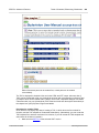
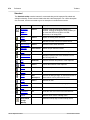
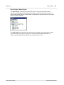
Table of Contents
1
Altova StyleVision 2010
3
2
About this Documentation
6
3
New Features
3.1
Version 2010
....................................................................................................................... 11
4
Introduction
4.1
15
What Is an.......................................................................................................................
SPS?
4.2
....................................................................................................................... 17
Product Features
4.3
Terminology
....................................................................................................................... 20
4.4
Setting up.......................................................................................................................
StyleVision
24
4.5
25
Authentic .......................................................................................................................
View in Altova Products
5
User Interface
5.1
....................................................................................................................... 29
Main Window
5.1.1
Design View
........................................................................................................... 30
5.1.2
Authentic...........................................................................................................
View
31
Output Views
........................................................................................................... 33
5.1.3
5.2
Sidebars ....................................................................................................................... 35
Design Overview
........................................................................................................... 38
5.2.1
5.2.2
Schema Tree
........................................................................................................... 41
5.2.3
Design Tree
........................................................................................................... 44
5.2.4
Style Repository
........................................................................................................... 48
Styles ........................................................................................................... 51
5.2.5
5.2.6
Properties
........................................................................................................... 53
5.2.7
Project ........................................................................................................... 57
6
Quick Start Tutorial
6.1
.......................................................................................................................
61
Creating and
Setting Up a New SPS
Altova StyleVision 2010
10
14
28
60
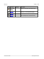
1
2
6.2
.......................................................................................................................
64
Inserting Dynamic
Content (from XML Source)
6.3
.......................................................................................................................
70
Inserting Static
Content
6.4
Formatting.......................................................................................................................
the Content
75
6.5
Using Auto-Calculations
....................................................................................................................... 81
6.6
....................................................................................................................... 84
Using Conditions
6.7
.......................................................................................................................
91
Using Global
Templates and Rest-of-Contents
6.8
That's It! ....................................................................................................................... 95
7
Usage Overview
7.1
SPS and Sources
....................................................................................................................... 99
7.2
100
Creating .......................................................................................................................
the Design
7.3
.......................................................................................................................
101
XSLT and
XPath Versions
7.4
SPS and Authentic
.......................................................................................................................
View
102
7.5
Synchronizing
.......................................................................................................................
StyleVision and Authentic
104
7.6
.......................................................................................................................
105
Generated
Files
7.7
.......................................................................................................................
107
Projects in
StyleVision
7.8
Catalogs .......................................................................................................................
in StyleVision
111
8
SPS File: Content
8.1
Inserting .......................................................................................................................
XML Content as Text
117
Inserting
...........................................................................................................
Content with a Predefined Format
120
8.1.1
8.1.2
Adding ...........................................................................................................
Elements in Authentic View
121
8.1.3
Rest-of-Contents
........................................................................................................... 124
8.2
.......................................................................................................................
125
User-Defined
Templates
8.3
User-Defined
.......................................................................................................................
Elements, XML Text Blocks
128
8.3.1
User-Defined
...........................................................................................................
Elements
129
8.3.2
User-Defined
...........................................................................................................
XML Text Blocks
130
8.4
Tables
8.4.1
8.4.2
8.4.3
8.4.4
8.4.5
8.4.6
....................................................................................................................... 131
Static Tables
........................................................................................................... 134
Dynamic
...........................................................................................................
Tables
136
Tables in
...........................................................................................................
Design View
141
Table Formatting
........................................................................................................... 143
Row and
...........................................................................................................
Column Display
147
XML Tables
........................................................................................................... 149
8.5
Lists
8.5.1
8.5.2
....................................................................................................................... 153
Static Lists
........................................................................................................... 154
Dynamic
...........................................................................................................
Lists
156
98
116
Altova StyleVision 2010
8.6
Graphics....................................................................................................................... 159
8.6.1
Image URIs
........................................................................................................... 160
Image Types
...........................................................................................................
and Output
162
8.6.2
8.6.3
Text State
...........................................................................................................
Icons
163
8.6.4
Example:
...........................................................................................................
A Template for Images
166
8.7
....................................................................................................................... 167
Form Controls
8.7.1
Input Fields,
...........................................................................................................
Multiline Input Fields
169
8.7.2
Check Boxes
........................................................................................................... 170
Combo ...........................................................................................................
Boxes
172
8.7.3
8.7.4
Radio Buttons,
...........................................................................................................
Buttons
175
8.8
Links
8.9
Layout Modules
....................................................................................................................... 177
Layout ...........................................................................................................
Containers
178
8.9.1
8.9.2
Layout ...........................................................................................................
Boxes
182
8.9.3
Lines ........................................................................................................... 186
....................................................................................................................... 176
.......................................................................................................................
188
8.10 The Change-To
Feature
9
SPS File: Structure
192
9.1
Schema Sources
....................................................................................................................... 194
9.1.1
DTDs and
...........................................................................................................
XML Schemas
196
9.1.2
DB Schemas
........................................................................................................... 201
9.1.3
User-Defined
...........................................................................................................
Schemas
202
9.2
205
Modular .......................................................................................................................
SPSs
9.2.1
Available
...........................................................................................................
Module Objects
207
Creating...........................................................................................................
a Modular SPS
210
9.2.2
9.2.3
Example:
...........................................................................................................
An Address Book
214
9.3
Templates
.......................................................................................................................
and Design Fragments
219
9.3.1
Main Template
........................................................................................................... 220
9.3.2
Global Templates
........................................................................................................... 221
9.3.3
User-Defined
...........................................................................................................
Templates
225
Variable...........................................................................................................
Templates
228
9.3.4
9.3.5
Node-Template
...........................................................................................................
Operations
229
9.3.6
Design ...........................................................................................................
Fragments
233
9.4
....................................................................................................................... 236
XSLT Templates
10
SPS File: Advanced Features
240
10.1 Auto-Calculations
....................................................................................................................... 241
10.1.1 Editing ...........................................................................................................
and Moving Auto-Calculations
242
Altova StyleVision 2010
3
10.1.2
10.1.3
10.1.4
Updating
...........................................................................................................
Nodes with Auto-Calculations
244
Auto-Calculations
...........................................................................................................
Based on Updated Nodes
246
Example:
...........................................................................................................
An Invoice
248
....................................................................................................................... 251
10.2 Conditions
10.2.1 Setting ...........................................................................................................
Up the Conditions
252
10.2.2 Editing ...........................................................................................................
Conditions
255
...........................................................................................................
Conditions
256
10.2.3 Output-Based
10.2.4 Conditions
...........................................................................................................
and Auto-Calculations
258
10.3 Grouping....................................................................................................................... 259
10.3.1 Example:
...........................................................................................................
Group-By (Persons.sps)
262
10.3.2 Example:
...........................................................................................................
Group-By (Scores.sps)
264
10.4 Sorting ....................................................................................................................... 267
10.4.1 The Sorting
...........................................................................................................
Mechanism
268
10.4.2 Example:
...........................................................................................................
Sorting on Multiple Sort-Keys
270
.......................................................................................................................
273
10.5 Parameters
and Variables
10.5.1 User-Declared
...........................................................................................................
Parameters
274
...........................................................................................................
for Design Fragments
276
10.5.2 Parameters
10.5.3 SPS Parameters
...........................................................................................................
for Sources
279
10.5.4 Variables
........................................................................................................... 280
282
10.6 Table of .......................................................................................................................
Contents, Referencing, Bookmarks
10.6.1 Marking...........................................................................................................
Items for TOC Inclusion
285
Structuring
...........................................................................................................
the Design in Levels
287
...........................................................................................................
290
Creating
TOC Bookmarks
10.6.2 Creating...........................................................................................................
the TOC Template
293
Reflevels
...........................................................................................................
in the TOC Template
295
TOC References:
...........................................................................................................
Name, Scope, Hyperlink
296
...........................................................................................................
297
Formatting
TOC Items
10.6.3 Example:
...........................................................................................................
Hierarchical and Sequential TOCs
298
10.6.4 Auto-Numbering
........................................................................................................... 302
10.6.5 Text References
........................................................................................................... 306
...........................................................................................................
and Hyperlinks
308
10.6.6 Bookmarks
Inserting
...........................................................................................................
Bookmarks
309
Defining...........................................................................................................
Hyperlinks
312
11
SPS File: Presentation
318
.......................................................................................................................
319
11.1 Predefined
Formats
11.2 Output Escaping
....................................................................................................................... 321
11.3 Value Formatting
.......................................................................................................................
(Formatting Numeric Datatypes)
323
...........................................................................................................
Formatting Mechanism
324
11.3.1 The Value
4
Altova StyleVision 2010
11.3.2
Value Formatting
...........................................................................................................
Syntax
327
11.4 Working .......................................................................................................................
with CSS Styles
333
CSS Stylesheets
335
11.4.1 External...........................................................................................................
11.4.2 Defining
...........................................................................................................
CSS Styles Globally
338
11.4.3 Defining
...........................................................................................................
CSS Styles Locally
341
Selecting
...........................................................................................................
SPS Components to Style
342
...........................................................................................................
345
How Styles
Are Applied to Components
11.4.4 Setting ...........................................................................................................
CSS Property Values
346
11.5 Style Properties
.......................................................................................................................
Via XPath
348
11.6 Designing.......................................................................................................................
Print Output
351
...........................................................................................................
Sections
353
11.6.1 Document
Initial Document
...........................................................................................................
Section
355
Page Layout
...........................................................................................................
Properties
358
Headers...........................................................................................................
and Footers: Part 1
363
366
Headers...........................................................................................................
and Footers: Part 2
11.6.2 Keeps and
...........................................................................................................
Breaks
368
11.6.3 PDF Fonts
........................................................................................................... 369
11.6.4 Pixel Resolution
........................................................................................................... 372
12
SPS File: Additional Functionality
376
.......................................................................................................................
377
12.1 Altova Global
Resources
12.1.1 Defining
...........................................................................................................
Global Resources
378
Files ........................................................................................................... 380
Folders........................................................................................................... 383
Databases
........................................................................................................... 384
Copying...........................................................................................................
Configurations
386
...........................................................................................................
Resources
387
12.1.2 Using Global
Assigning
...........................................................................................................
Files and Folders
388
Assigning
...........................................................................................................
Databases
391
Changing
...........................................................................................................
Configurations
392
393
12.2 Authentic.......................................................................................................................
Node Properties
.......................................................................................................................
395
12.3 Additional
Validation
12.4 Working .......................................................................................................................
with Dates
397
12.4.1 Using the
...........................................................................................................
Date-Picker
398
12.4.2 Formatting
...........................................................................................................
Dates
400
403
12.5 Unparsed.......................................................................................................................
Entity URIs
12.6 Using Scripts
....................................................................................................................... 405
12.6.1 Defining
...........................................................................................................
JavaScript Functions
407
12.6.2 Assigning
...........................................................................................................
Functions as Event Handlers
408
Altova StyleVision 2010
5
12.6.3
External...........................................................................................................
JavaScript Files
409
12.7 HTML Import
....................................................................................................................... 411
New SPS via HTML Import
412
12.7.1 Creating...........................................................................................................
12.7.2 Creating...........................................................................................................
the Schema and SPS Design
414
12.7.3 Creating...........................................................................................................
Tables and Lists as Elements/Attributes
416
12.7.4 Generating
...........................................................................................................
Output
418
13
SPS File and Databases
420
422
13.1 DBs and .......................................................................................................................
StyleVision
.......................................................................................................................
424
13.2 Connecting
to a Database
13.2.1 Connection
...........................................................................................................
Wizard
426
13.2.2 ADO Connections
........................................................................................................... 429
........................................................................................................... 436
13.2.3 ODBC Connections
13.2.4 Global Resources
........................................................................................................... 439
13.3 DB Data .......................................................................................................................
Selection
440
13.3.1 Non-XML
...........................................................................................................
Databases
441
13.3.2 XML Databases
........................................................................................................... 448
.......................................................................................................................
451
13.4 The DB Schema
and DB XML files
13.5 DB Filters:
.......................................................................................................................
Filtering DB Data
454
13.6 SPS Design
.......................................................................................................................
Features for DB
459
.......................................................................................................................
462
13.7 Generating
Output Files
....................................................................................................................... 464
13.8 Query Database
13.8.1 Data Sources
........................................................................................................... 466
13.8.2 Browser...........................................................................................................
Pane: Viewing the DB Objects
468
...........................................................................................................
Description and Features
472
13.8.3 Query Pane:
13.8.4 Query Pane:
...........................................................................................................
Working with Queries
476
13.8.5 Results ...........................................................................................................
and Messages
477
14
Authentic View
480
481
14.1 Authentic.......................................................................................................................
View
14.1.1 Overview
...........................................................................................................
of the GUI
482
14.1.2 Authentic
...........................................................................................................
View Toolbar Icons
483
...........................................................................................................
View Main Window
485
14.1.3 Authentic
14.1.4 Authentic
...........................................................................................................
View Entry Helpers
488
14.1.5 Authentic
...........................................................................................................
View Context Menus
492
494
14.2 Editing in.......................................................................................................................
Authentic View
14.2.1 Basic Editing
........................................................................................................... 495
14.2.2 Tables in
...........................................................................................................
Authentic View
498
6
Altova StyleVision 2010
14.2.3
14.2.4
14.2.5
14.2.6
14.2.7
15
........................................................................................................... 499
SPS Tables
XML Tables
........................................................................................................... 500
XML Table
...........................................................................................................
Editing Icons
504
Editing ...........................................................................................................
a DB
506
...........................................................................................................
507
Navigating
a DB Table
DB Queries
........................................................................................................... 508
Modifying
...........................................................................................................
a DB Table
512
Working
...........................................................................................................
with Dates
514
........................................................................................................... 515
Date Picker
Text Entry
........................................................................................................... 516
Defining
...........................................................................................................
Entities
517
Images ...........................................................................................................
in Authentic View
519
Keystrokes
...........................................................................................................
in Authentic View
520
Automated Processing
522
15.1 Command
.......................................................................................................................
Line Interface: StyleVisionBatch
524
...........................................................................................................
Syntax
525
15.1.1 StyleVisionBatch
15.1.2 StyleVisionBatch
...........................................................................................................
Examples
528
15.2 Using AltovaXML
....................................................................................................................... 531
15.2.1 XSLT 1.0
...........................................................................................................
CLI Transformations
532
15.2.2 XSLT 2.0
...........................................................................................................
CLI Transformations
533
.......................................................................................................................
534
15.3 How to Automate
Processing
15.3.1 Creating...........................................................................................................
Batch Files
535
15.3.2 Automating
...........................................................................................................
with Scheduled Tasks (Windows XP)
536
...........................................................................................................
with Scheduled Tasks (Windows Vista)
539
15.3.3 Automating
16
StyleVision in Visual Studio
546
16.1 Installing.......................................................................................................................
the StyleVision Plugin
547
.......................................................................................................................
548
16.2 Differences
with StyleVision Standalone
17
StyleVision in Eclipse
550
551
17.1 Installing.......................................................................................................................
the StyleVision Plugin for Eclipse
17.2 Stylevision
.......................................................................................................................
Entry Points in Eclipse
555
18
Reference
560
18.1 Toolbars....................................................................................................................... 561
........................................................................................................... 564
18.1.1 Formatting
Altova StyleVision 2010
7
18.1.2
18.1.3
18.1.4
18.1.5
18.1.6
18.1.7
Insert Design
...........................................................................................................
Elements
565
Table ........................................................................................................... 568
Authentic
........................................................................................................... 570
Design ...........................................................................................................
Filter
572
Global Resources
........................................................................................................... 573
Standard
........................................................................................................... 574
18.2 Design View
....................................................................................................................... 576
18.2.1 Symbols........................................................................................................... 577
18.2.2 Edit XPath
...........................................................................................................
Expression
581
....................................................................................................................... 584
18.3 File Menu
18.3.1 New ........................................................................................................... 585
18.3.2 Open, Reload,
...........................................................................................................
Close, Close All
592
...........................................................................................................
Design As, All
597
18.3.3 Save Design,
18.3.4 Save Authentic
...........................................................................................................
XML Data, Save As
602
18.3.5 Save Generated
...........................................................................................................
Files
603
18.3.6 Assign/Unassign
...........................................................................................................
Working XML File
605
...........................................................................................................
Template XML File
606
18.3.7 Assign/Unassign
18.3.8 Properties
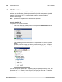
........................................................................................................... 608
18.3.9 Print Preview,
...........................................................................................................
Print
610
18.3.10 Most Recently
...........................................................................................................
Used Files, Exit
611
....................................................................................................................... 612
18.4 Edit Menu
18.4.1 Undo, Redo,
...........................................................................................................
Select All
613
...........................................................................................................
Next, Replace
614
18.4.2 Find, Find
18.4.3 Stylesheet
...........................................................................................................
Parameters
616
18.4.4 Collapse/Expand
...........................................................................................................
Markup
617
....................................................................................................................... 618
18.5 Project Menu
18.5.1 New Project,
...........................................................................................................
Open Project, Reload Project
620
18.5.2 Close Project,
...........................................................................................................
Save Project
621
...........................................................................................................
/ Global Resource / URL to Project
622
18.5.3 Add Files
18.5.4 Add Active
...........................................................................................................
(and Related) Files to Project
624
18.5.5 Add Project
...........................................................................................................
and External Folders to Project
625
....................................................................................................................... 628
18.6 View Menu
18.6.1 Toolbars
...........................................................................................................
and Status Bar
629
18.6.2 Design ...........................................................................................................
Sidebars
630
Filter, Zoom
631
18.6.3 Design ...........................................................................................................
18.7 Insert Menu
....................................................................................................................... 632
........................................................................................................... 633
18.7.1 Contents
18.7.2 Rest of ...........................................................................................................
Contents
634
18.7.3 Form Controls
........................................................................................................... 635
18.7.4 Auto-Calculation
........................................................................................................... 636
8
Altova StyleVision 2010
18.7.5
18.7.6
18.7.7
18.7.8
18.7.9
18.7.10
18.7.11
18.7.12
18.7.13
18.7.14
18.7.15
18.7.16
18.7.17
18.7.18
18.7.19
18.7.20
18.7.21
18.7.22
Date Picker
........................................................................................................... 638
Paragraph,
...........................................................................................................
Special Paragraph
639
Image ........................................................................................................... 640
Horizontal
...........................................................................................................
Line
641
Table ........................................................................................................... 642
Bullets ...........................................................................................................
and Numbering
643
Bookmark
........................................................................................................... 646
Hyperlink
........................................................................................................... 647
Condition,
...........................................................................................................
Output-Based Condition
649
Template
........................................................................................................... 651
User-Defined
...........................................................................................................
Template
652
Variable...........................................................................................................
Template
653
Layout ...........................................................................................................
Container, Layout Box, Line
654
Table of...........................................................................................................
Contents
655
Design ...........................................................................................................
Fragment
656
Page / Column
...........................................................................................................
/ Document Section
657
DB Control
........................................................................................................... 658
User-Defined
...........................................................................................................
Item
659
18.8 Enclose With
.......................................................................................................................
Menu
660
18.8.1 Template
........................................................................................................... 661
18.8.2 User-Defined
...........................................................................................................
Template
662
18.8.3 Variable...........................................................................................................
Templates
663
...........................................................................................................
Special Paragraph
664
18.8.4 Paragraph,
18.8.5 Bullets ...........................................................................................................
and Numbering
665
18.8.6 Bookmarks
...........................................................................................................
and Hyperlinks
666
18.8.7 Condition,
...........................................................................................................
Output-Based Condition
667
...........................................................................................................
and TOC Levels
669
18.8.8 TOC Bookmarks
18.8.9 User-Defined
...........................................................................................................
Element
670
18.9 Table Menu
....................................................................................................................... 671
18.9.1 Insert Table,
...........................................................................................................
Delete Table
672
18.9.2 Add Table
...........................................................................................................
Headers, Footers
673
18.9.3 Append/Insert
...........................................................................................................
Row/Column
674
...........................................................................................................
Column
675
18.9.4 Delete Row,
18.9.5 Join Cell
...........................................................................................................
Left, Right, Below, Above
676
18.9.6 Split Cell
...........................................................................................................
Horizontally, Vertically
677
18.9.7 View Cell
...........................................................................................................
Bounds, Table Markup
678
........................................................................................................... 679
18.9.8 Table Properties
18.9.9 Vertical...........................................................................................................
Alignment of Cell Content
680
18.10 Authentic.......................................................................................................................
Menu
681
18.10.1 Text State
...........................................................................................................
Icons
682
Altova StyleVision 2010
9
18.10.2
18.10.3
18.10.4
18.10.5
18.10.6
18.10.7
18.10.8
18.10.9
CALS/HTML
...........................................................................................................
Tables
684
Auto-Add
...........................................................................................................
Date Picker
686
Auto-Add
...........................................................................................................
DB Controls
687
Reload ...........................................................................................................
Authentic View, Validate XML
688
Select New
...........................................................................................................
Row with XML Data for Editing
689
Define XML
...........................................................................................................
Entities
690
Markup...........................................................................................................
Commands
691
(Dynamic
...........................................................................................................
Table) Row Commands
692
18.11 Database....................................................................................................................... 693
18.11.1 Query Database
........................................................................................................... 694
Filter, Clear DB Filter
695
18.11.2 Edit DB...........................................................................................................
18.12 Properties.......................................................................................................................
Menu
696
...........................................................................................................
and Numbering
697
18.12.1 Edit Bullets
18.12.2 Predefined
...........................................................................................................
Value Formatting Strings
698
18.13 Tools Menu
....................................................................................................................... 700
18.13.1 Spelling........................................................................................................... 701
18.13.2 Spelling...........................................................................................................
Options
702
18.13.3 Global Resources
........................................................................................................... 705
........................................................................................................... 706
18.13.4 Active Configuration
18.13.5 Customize
........................................................................................................... 707
18.13.6 Options........................................................................................................... 712
714
18.14 Window .......................................................................................................................
Menu
18.15 Help Menu
....................................................................................................................... 715
18.15.1 Table of...........................................................................................................
Contents, Index, Search
716
18.15.2 Activation,
...........................................................................................................
Order Form, Registration, Updates
717
18.15.3 Other Commands
........................................................................................................... 718
19
Programmers' Reference
720
.......................................................................................................................
721
19.1 The StyleVision
API
19.1.1 Interfaces
........................................................................................................... 722
........................................................................................................... 723
Application
AppOutputLine
........................................................................................................... 727
AppOutputLines
........................................................................................................... 732
AppOutputLineSymbol
........................................................................................................... 734
........................................................................................................... 736
Document
Documents
........................................................................................................... 744
Parameter
........................................................................................................... 747
Parameters
........................................................................................................... 748
........................................................................................................... 749
SchemaSource
10
Altova StyleVision 2010
19.1.2
........................................................................................................... 752
SchemaSources
StyleSheet
........................................................................................................... 754
Enumerations
........................................................................................................... 756
ENUMApplicationStatus
........................................................................................................... 757
........................................................................................................... 758
ENUMAppOutputLine_TextDecoration
ENUMAppOutputLine_Severity
........................................................................................................... 759
ENUMSchemaSourceType
........................................................................................................... 760
ENUMSchemaType
........................................................................................................... 761
.......................................................................................................................
762
19.2 StyleVision
Integration
19.2.1 Integration
...........................................................................................................
at Application Level
763
...........................................................................................................
764
Example:
HTML
19.2.2 Integration
...........................................................................................................
at Document Level
766
Use StyleVisionControl
........................................................................................................... 767
Use StyleVisionControlDocument
........................................................................................................... 768
........................................................................................................... 769
Use StyleVisionControlPlaceHolder
Query StyleVision
...........................................................................................................
Commands
770
Examples
........................................................................................................... 771
19.2.3 Command
...........................................................................................................
Table for StyleVision
774
........................................................................................................... 775
File Menu
Edit Menu
........................................................................................................... 777
Project ...........................................................................................................
Menu
778
View Menu
........................................................................................................... 779
........................................................................................................... 780
Insert Menu
Enclose...........................................................................................................
With Menu
783
Table Menu
........................................................................................................... 784
Authentic
...........................................................................................................
Menu
785
...........................................................................................................
786
Database
Menu
Properties
...........................................................................................................
Menu
787
Tools Menu
........................................................................................................... 788
Window...........................................................................................................
Menu
789
........................................................................................................... 790
Help Menu
Misc Menu
........................................................................................................... 791
19.2.4 Accessing
...........................................................................................................
StyleVisionAPI
808
19.2.5 Object Reference
........................................................................................................... 809
........................................................................................................... 810
StyleVisionCommand
StyleVisionCommands
........................................................................................................... 812
StyleVisionControl
........................................................................................................... 813
StyleVisionControlDocument
........................................................................................................... 819
........................................................................................................... 825
StyleVisionControlPlaceHolder
Enumerations
........................................................................................................... 827
Altova StyleVision 2010
11
20
Appendices
830
.......................................................................................................................
831
20.1 XSLT Engine
Information
20.1.1 XSLT 1.0
...........................................................................................................
Engine: Implementation Information
832
...........................................................................................................
Engine: Implementation Information
834
20.1.2 XSLT 2.0
General...........................................................................................................
Information
835
XSLT 2.0
...........................................................................................................
Elements and Functions
837
20.1.3 XPath 2.0
...........................................................................................................
and XQuery 1.0 Functions
838
839
General...........................................................................................................
Information
Functions
...........................................................................................................
Support
841
20.2 Datatypes.......................................................................................................................
in DB-Generated XML Schemas
844
20.2.1 MS Access
........................................................................................................... 845
20.2.2 MS SQL
...........................................................................................................
Server
846
20.2.3 MySQL........................................................................................................... 847
20.2.4 Oracle ........................................................................................................... 848
20.2.5 ODBC ........................................................................................................... 849
20.2.6 ADO ........................................................................................................... 850
20.2.7 Sybase ........................................................................................................... 851
852
20.3 Technical.......................................................................................................................
Data
20.3.1 OS and ...........................................................................................................
Memory Requirements
853
...........................................................................................................
Parser
854
20.3.2 Altova XML
20.3.3 Altova XSLT
...........................................................................................................
and XQuery Engines
855
20.3.4 Unicode...........................................................................................................
Support
856
Windows
...........................................................................................................
XP
857
...........................................................................................................
858
Right-to-Left
Writing Systems
20.3.5 Internet...........................................................................................................
Usage
859
20.4 License Information
....................................................................................................................... 860
20.4.1 Electronic
...........................................................................................................
Software Distribution
861
20.4.2 Software
...........................................................................................................
Activation and License Metering
862
20.4.3 Intellectual
...........................................................................................................
Property Rights
863
...........................................................................................................
User License Agreement
864
20.4.4 Altova End
Index
12
879
Altova StyleVision 2010
Chapter 1
Altova StyleVision 2010
Altova StyleVision 2010
1
3
Altova StyleVision 2010
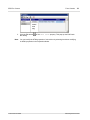
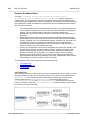
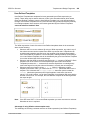
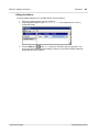
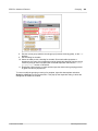
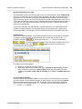
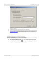
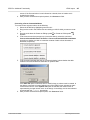
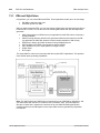
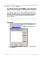
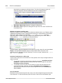
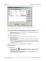
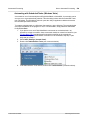
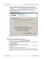
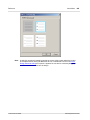
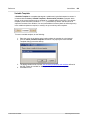
Altova® StyleVision® 2010 Professional Edition is an application for graphically designing
and editing StyleVision Power Stylesheets, available in 64-bit and 32-bit versions. A StyleVision
Power Stylesheet (SPS) can be used for the following purposes:
To control a graphical WYSIWYG view of XML documents in Authentic View, which
is an XML document editor available in the following Altova products: Altova XMLSpy,
Altova StyleVision, Altova Authentic Desktop, and Altova Authentic Browser. It enables
you to easily create electronic forms based on XML documents.
To enable the editing of databases (DBs) via Authentic View and to generate
database reports in HTML and RTF format.
To generate XSLT stylesheets based on the SPS design. (Both XSLT 1.0 and XSLT
2.0 are supported.) The XSLT stylesheets can be used outside StyleVision to transform
XML documents into outputs such as HTML and RTF (Rich Text Format, used by word
processing applications such as MS Word).
To generate, directly from within StyleVision, HTML and RTF output from an XML
document. In the case of DB-based SPSs, StyleVision can additionally generate, for
each SPS, an XML Schema based on the DB and an XML instance document that
adheres to this schema and contains data from the DB.
StyleVision also enables you to import an HTML document and create an XML document from
it.
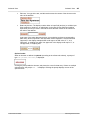
Altova website:
© 2010 Altova GmbH
Stylesheet Designer, XSLT Designer
Altova StyleVision 2010
Chapter 2
About this Documentation
6
About this Documentation
2
About this Documentation
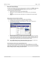
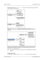
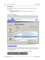
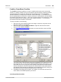
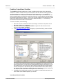
This documentation is the user manual delivered with StyleVision. It is available as the built-in
Help system of StyleVision, can be viewed online at the Altova website, and can also be
downloaded from there as a PDF, which you can print.
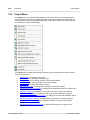
The user manual is organized into the following sections:
An introduction, which explains what an SPS is and introduces the main features and
concepts of StyleVision.
A description of the user interface, which provides an overview of the StyleVision GUI.
A tutorial section, which is a hands-on exercise to familiarize you with StyleVision
features.
Usage Overview, which describes usage at a high level: for example, schema sources
used to create an SPS, the broad design process, Authentic View deployment, and
projects.
SPS File Content, which explains how static (stylesheet-originated) and dynamic (XML
document-originated) components are created and edited in the SPS.
SPS File Structure, which shows how an SPS file can be structured and modularized,
and describes the handling of StyleVision's templates.
SPS File Advanced Features, which describes advanced design features, such as the
automatic generation of calculations, the setting up of conditions, grouping and sorting
on user-defined criteria, and how to build tables of contents and cross-references in the
output document.
SPS File Presentation, which explains how SPS components are formatted and laid
out.
SPS File Additional Editing Functionality, which describes a range of additional features
that can make your SPS more powerful. These features include: global resources for
leveraging functionality in other Altova products, additional validation, scripts, and
variables and parameters.
SPS File and Databases, which explains how databases can be used with SPSs.
Authentic View, which describes how XML documents are edited in Authentic View.
The StyleVision GUI contains an Authentic View preview tab, in which you can
immediately test the Authentic View output.
Automated Processing, which explains how the generation of output files can be
automated.
StyleVision's integration features, which contains the documentation for integrating
StyleVision in other applications. There is also information on how to use StyleVision in
Visual Studio and Eclipse.
A reference section containing descriptions of all symbols and commands used in
StyleVision.
Appendices containing information about the Altova XSLT Engine information and the
conversion of DB datatypes to XML Schema datatypes; technical data about
StyleVision; and license information.
How to use
We suggest you read the Introduction, User Interface and Usage Overview sections first in
order to get an overview of StyleVision features and general usage. Doing the tutorial next
would provide hands-on experience of creating an SPS. The SPS File sections (SPS File
Content, SPS File Structure, SPS File Advanced Features, SPS File Presentation, SPS File
Additional Functionality, SPS File and Databases) provide detailed descriptions of how to use
various StyleVision features. For subsequent reference, the Reference section provides a
concise description of all toolbar icon, design symbols, and menu commands, organized
according to toolbar and menu. The Authentic View and Command Line Interface:
Altova StyleVision 2010
© 2010 Altova GmbH
About this Documentation
7
StyleVisionBatch sections provide, respectively, information about editing in Authentic View and
calling StyleVision from the command line.
Support options
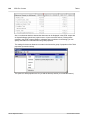
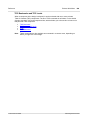
Should you have any question or problem related to StyleVision, the following support options
are available:
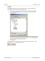
1. Check the Help file (this documentation). The Help file contains a full text-search
feature, besides being fully indexed.
2. Check the FAQs and Discussion Forum at the Altova Website.
3. Contact Altova's Support Center.
© 2010 Altova GmbH
Altova StyleVision 2010
8
About this Documentation
Commonly used abbreviations
The following abbreviations are used frequently in this documentation:
SPS: StyleVision Power Stylesheet
DB: Database
CSS: Cascading Style Sheets
FAQ: Frequently Asked Questions
Altova StyleVision 2010
© 2010 Altova GmbH
Chapter 3
New Features
10
New Features
3
New Features
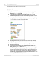
Features that are new in StyleVision Version 2010 Release 3 are listed below.
Value Formatting (Formatting Numeric Datatypes): The earlier Input Formatting
mechanism has been extended to enable—only in the Enterprise Edition—the
formatting of Inline XBRL values when they are output in an (X)HTML report. The older
Input Formatting feature remains unchanged but has been renamed to Value
Formatting.
Global templates can now be created for any node or type in the schema. In earlier
versions of StyleVision, global templates could only be created for global elements and
global types. They can now be created on any node or type, and even for any item
returned by an XPath expression.
Integration in Microsoft Visual Studio 2010. This extends support to the latest version of
Visual Studio, which is in addition to support for versions 2005 and 2008. Support for
Visual Studio 2003 has been discontinued.
Altova StyleVision 2010
© 2010 Altova GmbH
New Features
3.1
Version 2010
11
Version 2010
Version 2010 Release 1
Features that are new in StyleVision Version 2010 Release 1 are listed below. Some of these
new features have required a modification in the way older features are handled. In such cases,
the existing feature continues to behave as before, but uses one or more of the newer
mechanisms. The way a new feature affects existing features is also noted in the list below.
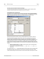
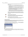
Layout Containers: A Layout Container is a block in which Design Elements can be laid
out and absolutely positioned within the block.
Blueprints: Within a Layout Container an image of a form can be used as an underlay
blueprint for the design. With the help of a blueprint, an existing design can be
reproduced accurately.
Document Sections: Documents can be divided into sections, with each section having
its own properties, such as page layout properties. This enables different parts of a
document to be presented differently. Older features affected: Previous designs had no
sections. These designs will now be created as documents with one section, the Initial
Document Section. Page properties and page layout properties, which were previously
specified for the document as a whole, are now specified for the Initial Document
Section. The cover page for print output of previous versions will be created in the new
version as a template within the Initial Document Section.
Page columns: Pages can be specified to have columns.
User-Defined Templates: A template can be generated for a sequence of items by an
XPath expression you specify. These items may be atomic values or nodes. An XPath
expression enables the selection of nodes to be more specific, allowing conditions and
filters to be used for the selection. Furthermore, templates can be built for atomic
values, thus enabling structures to be built that are independent of the schema
structure. Older features affected: Variable Iterators, which were used to create a
template for a variable, now create a variable on a node template and then a UserDefined template for that variable.
User-Defined Elements: This feature is intended to enable presentation language
elements (such as HTML, XSLT, and XSL-FO) to be freely inserted at any location in
the design.
User-Defined XML Text Blocks: XML Text blocks can be freely inserted at any location
in the design, and these blocks will be created at that location in the generated XSLT
stylesheet.
XSLT Templates: XSLT files can be imported into the generated stylesheets. If a node
in the XML instance document is matched to a template in the imported XSLT file and
no other template takes precedence over the imported template, then the imported
template will be used. Additionally, named templates in the imported XSLT file can be
called from within the design.
Variables: A variable can now be declared on a template and take a value that is
specified with an XPath expression. Previously, the value of a variable was limited to
the selection of the node on which it was created. Variables in the 2010 version allow
any XPath expression to be specified as the value of the variable. Older features
affected: Variables and Variable Iterators. Variables from older versions are now
created on the relevant template and are given a value that selects the same template.
Variable Iterators are replaced with a combination of a Variable and a User-Defined
Template; see User-Defined Templates below.
Inserting Design Elements: Design Elements (paragraphs, lists, images, etc) can be
inserted first, and an XML node from the schema tree assigned to the Design Element
afterwards. This is in addition to the existing mechanism by which a schema nodes is
dragged into the design and a Design Element created for it.
Hide Markup in Design View: Markup tags in Design View can be hidden and collapsed,
thus freeing up space in Design View.
Disable output escaping: A setting that defines whether text output will be escaped or
© 2010 Altova GmbH
Altova StyleVision 2010
12
New Features
Version 2010
not. A character is said to be escaped when it is written as a character entity (such as
& or A). This feature is useful when outputting text that contains program
code.
Pixel Resolution: Pixel length units in the SPS are converted to absolute units for print
output according to a factor that the SPS designer specifies.
Default length units: can be specified in the Options dialog (Tools | Options).
XHTML output: When XHTML is specified as the HTML output preference in the
document's properties (File | Properties), an XHTML document is generated for the
HTML output.
Printout of Design: The design in Design View can be printed with or without tags.
Version 2010 Release 2
Features that are new in StyleVision Version 2010 Release 2 are listed below.
Enterprise and Professional editions are each available as separate 64-bit and 32-bit
applications.
Parameters for Design Fragments allow design fragments to be used with different
parameter values for each usage instance. A different parameter value can be assigned
to a design fragment at each location where the design fragment is used in the SPS.
First and last page headers and footers can be specified separately. This is in addition
to different headers and footer for odd-numbered and even-numbered pages and for
different document sections.
Layout Boxes and Lines can be moved and resized using the keyboard.
Templates around table rows or columns can be added or deleted without modifying the
content or formatting of the row or column involved.
Text in tables and in layout boxes can be rotated clockwise or anti-clockwise so that it is
vertical.
Filters can be set on global templates where these are used in the main template.
Design fragments can be dragged from the Schema Tree, in addition to being available
in the Design Tree.
Altova StyleVision 2010
© 2010 Altova GmbH
Chapter 4
Introduction
14
Introduction
4
Introduction
This section introduces you to Altova® StyleVision® 2010. It consists of the following
sub-sections:
What Is an SPS?, which explains the role of an SPS in an XML environment and with
respect to StyleVision.
Product Features, which provides an overview of the key features of StyleVision.
Terminology, which lists terms used in the StyleVision user interface and in this
documentation.
Setting up StyleVision, which describes how StyleVision is to be correctly set up.
Altova StyleVision 2010
© 2010 Altova GmbH
Introduction
4.1
What Is an SPS?
15
What Is an SPS?
A StyleVision Power Stylesheet (or SPS) is an extended XSLT stylesheet which is used:
1. to control the display and entry of data in the Authentic View of XML documents and
databases (DBs); and
2. to specify the output design of an XML document transformation.
An SPS is saved with the file extension .sps.
Design of the SPS
An SPS is created graphically in StyleVision. It is based on a schema (DTD or XML Schema); if
the SPS is to be used with a DB, it is based on an XML Schema generated automatically by
StyleVision from the DB structure. The design of the SPS is flexible. It can contain dynamic and
static content. The dynamic content is the data in one XML document or DB. The static content
is content entered directly in the SPS. Dynamic content can be included in the design either as
straight text or within components such as input fields, combo boxes, and tables. Additionally,
dynamic content can be manipulated (using Auto-Calculations) and can be displayed if certain
conditions in the source document are fulfilled. Different pieces of content can be placed at
various and multiple locations in the SPS. Also, the SPS can contain various other components,
such as images, hyperlinks, and JavaScript functions. Each component of the SPS can then be
formatted for presentation as required.
The SPS and Authentic View
When a finished SPS is associated with an XML document or DB, that XML document or DB
can be edited in Authentic View. Authentic View is an ideal solution for enabling the distributed
and graphical editing of an XML document or DB. Multiple users can edit an XML document or
DB in the graphical user interface presented by Authentic View. In StyleVision, as you design
an SPS, you can preview and test the SPS (in the Authentic View tab for that SPS). For a
detailed description of how SPSs work with Authentic View, see SPS and Authentic View.
The SPS and XSLT stylesheets
After you have completed designing the SPS, you can generate XSLT stylesheets based on the
design you have created. StyleVision supports both XSLT 1.0 and XSLT 2.0, and from a single
SPS, you can generate XSLT stylesheets for HTML, RTF, XSL-FO, and Word 2007-and-higher
output (XSL-FO and Word 2007-and-higher in Enterprise edition only; RTF in Enterprise and
Professional Editions; in Standard Edition only HTML output is supported). The generated XSLT
stylesheets can be used in external transformations to transform XML documents based on the
same schema as the SPS from which the XSLT stylesheet was generated. For more
information about procedures used with XSLT stylesheets, see the section Generated Files.
The SPS and output
You can also use StyleVision to directly generate output (HTML, RTF, XSL-FO, and PDF in
Enterprise Edition; HTML in Professional and Standard Editions). The tabs for Output Views
display the output for the active SPS document directly in the StyleVision GUI. The required
output can also be generated to file: (i) from within the GUI via the File | Save Generated Files
command; or (ii) by invoking StyleVision via the command line.
© 2010 Altova GmbH
Altova StyleVision 2010
16
Introduction
What Is an SPS?
Authentic View in Altova Products
Authentic View is a graphical XML document editor available in the following Altova products:
*
*
*
*
Altova XMLSpy
Altova Authentic Desktop
Altova Authentic Browser
Altova StyleVision
Altova StyleVision 2010
© 2010 Altova GmbH
Introduction
4.2
Product Features
17
Product Features
The main product features of StyleVision are listed below in two groups:
General product features, which are high-level features
SPS design features, which are features related to the design of the SPS
General product features
Given below is a list of the main high-level features of StyleVision.
Enterprise and Professional editions are each available as separate 64-bit and 32-bit
applications.
Multiple SPS designs can be open simultaneously, with one being active at any given
time. Each SPS design is shown in a separate tab.
Template filters allow you to customize the display of the design document. With this
feature you can disable the display of templates that are not currently being edited, thus
increasing editing efficiency.
Hide Markup in Design View: Markup tags in Design View can be hidden and collapsed,
thus freeing up space in Design View.
While designing the SPS, Authentic View, output views and stylesheets can be
displayed by clicking the respective tabs. This enables you to quickly preview the output
and the XSLT code, and test Authentic View features.
When an SPS is associated with an XML source document or source DB, the source
document can be edited directly in the Authentic View of StyleVision.
DB reports can either be viewed in StyleVision or saved as HTML and RTF files.
IBM DB2 databases, which contain XML columns, are supported.
A DB can be queried directly from StyleVision.
Both XSLT versions (1.0 and 2.0) are supported. XSLT 2.0 provides powerful data
access and manipulation features.
Altova Global Resources can be used to locate source files such as schema, XML, and
CSS. The Global Resources mechanism enables faster and better development and
testing by allowing developers to quickly change source data and to use the
functionality of other Altova applications from within StyleVision.
In the Enterprise and Professional Editions, multiple output formats (HTML and RTF)
are generated from a single SPS design.
Conditions can be set on SPS components to process them differently for different
outputs. With this level of granularity, different outputs can be flexibly structured to take
in the requirements of that particular output.
Both XSLT files and output files can be generated and saved, either directly from within
the GUI or by calling StyleVision from the command line.
HTML documents can be converted to XML.
StyleVision functionality can be called from the command line.
StyleVision functionality can be integrated in external applications, and StyleVision an
integrated in Visual Studio and Eclipse.
SPS design features
Given below is a list of the main StyleVision features specific to designing the SPS.
The SPS can contain static text, which you enter in the SPS, and dynamic text, which is
selected from the source document.
Dynamic content is inserted in the design by dragging-and-dropping nodes, including
specific datatypes, from the schema source. Dynamic design Elements (paragraphs,
lists, images, etc) can also be inserted first, and an XML node from the schema tree
assigned to the Design Element afterwards.
© 2010 Altova GmbH
Altova StyleVision 2010
18
Introduction
Product Features
Dynamic content can be inserted as text, or in the form of a data-entry device (such as
an input field or combo box). When inserted as a data-entry device such as a combo
box, additional possibilities are available. For example, the value of the node can be
selected (by the Authentic View user) from a list of enumerations.
The structure of the design is specified and controlled in a single main template. This
structure can be modified by optional templates for individual elements—known as
global templates because they can be applied globally for that element.
Global templates can also be created for individual datatypes, thus enabling processing
to be handled also on the basis of types.
User-Defined Templates: A template can be generated for a sequence of items by an
XPath expression you specify. These items may be atomic values or nodes. An XPath
expression enables the selection of nodes to be more specific, allowing conditions and
filters to be used for the selection.
User-Defined Elements: This feature is intended to enable presentation language
elements (such as HTML, XSLT, and XSL-FO) to be freely inserted at any location in
the design.
User-Defined XML Text Blocks: XML Text blocks can be freely inserted at any location
in the design, and these blocks will be created at that location in the generated XSLT
stylesheet.
Design Fragments enable the modularization and re-use of templates within an SPS,
and also across multiple SPSs (see modular SPSs), in a manner similar to the way
functions are used.
SPS modules can be added to other SPS modules, thus making objects defined in one
SPS module available to other modules. This enables re-use of module objects across
multiple SPSs and makes maintenance easier.
XSLT Templates: XSLT files can be imported into the generated stylesheets. If a node
in the XML instance document is matched to a template in the imported XSLT file and
no other template takes precedence over the imported template, then the imported
template will be used. Additionally, named templates in the imported XSLT file can be
called from within the design.
Document Sections: Documents can be divided into sections, with each section having
its own properties, such as page layout properties. This enables different parts of a
document to be presented differently.
Layout Containers: A Layout Container is a block in which Design Elements can be laid
out and absolutely positioned within the block.
Blueprints: Within a Layout Container an image of a form can be used as an underlay
blueprint for the design. With the help of a blueprint, an existing design can be
reproduced accurately.
A common feature of XML documents is the repeating data structure. For example, an
office department typically has several employees. The data for each employee would
be stored in a data structure which is repeated for each employee. In the SPS, the
processing for each such data structure is defined once and applied to each relevant
node in turn (the employee node in our example).
Multiple tables of contents can be inserted in XSLT 2.0 SPSs.
Repeating data structures can also be inserted as dynamic tables. This provides
looping in a structured, table format, with each loop through the data structure
producing a row (or, if required, a column) of the table.
A repeating element can be sorted on one or more sort-keys you select, and the sorted
element set is sent to the output (HTML and RTF).
Variables: A variable can now be declared on a template and take a value that is
specified with an XPath expression. Previously, the value of a variable was limited to
the selection of the node on which it was created. Variables in the 2010 version allow
any XPath expression to be specified as the value of the variable.
Nodes can be grouped on the basis of common data content (for example, the common
value of an attribute value) and their positions.
The conditional templates feature enables one of a set of templates to be processed
Altova StyleVision 2010
© 2010 Altova GmbH
Introduction
Product Features
19
according to what conditions in the XML document or system environment are fulfilled.
This enables processing that is conditional on information contained in the source
document or that cannot be known to the SPS document creator at the time of creation
(for example, the date of processing). The available conditions are those that can be
tested using XPath 1.0 or XPath 2.0 expressions.
Auto-Calculations enable you to manipulate data from the source document/s and to
display the result. This is useful, when you wish to perform calculations on numbers (for
example, sum the prices in an invoice), manipulate strings (for example, change
hyphens to slashes), generate content, etc. The available manipulations are those that
can be effected using XPath 1.0 or XPath 2.0 expressions. Native Java and .NET
functions can be used in the XPath expressions of Auto-Calculations.
When data is edited in Authentic View, the result of Auto-Calculations can also be
passed to a node in the source document. This procedure is referred to as updating
the XML node (with the value of the Auto-Calculation).
Additional validation enables individual XML document nodes to be validated
(additionally to schema validation) against an XPath expression defined for that node.
In this way, Authentic View users can be alerted when the data they enter is invalid; a
customized error message for the node can indicate the problem.
Images can be inserted in the design. The URI for the image can be static (entered in
the SPS), or dynamic (taken from a node in the source document), or a combination of
both static and dynamic parts.
Two types of lists can be created: static and dynamic. In a static list, each list item is
defined in the SPS. In a dynamic list, a node is created as a list item; the values of all
instances of that node are created as the items of the list.
Static and dynamic links can be inserted in the design. The target URI can be static
(entered in the SPS), or dynamic (taken from a node in the source document), or a
combination of both static and dynamic parts.
Static bookmarks can be inserted. These serve as anchors that can be linked to with a
hyperlink.
Parameters can be declared globally for the entire SPS. A parameter is declared with a
name and a string value, and can be used in XPath expressions in the SPS. The
parameter value you declare is the default value and can be overridden by a value
passed from the command line.
With the Input Formatting feature, the contents of numeric XML Schema datatype
nodes can be formatted as required for Authentic View display and, in the case of some
formats, optionally for output display. Input Formatting can also be used to format the
result of an Auto-Calculation.
JavaScript functions can be used in the SPS to provide user-defined functionality for
Authentic View and HTML output.
A number of predefined HTML formats are available via the GUI and can be applied to
individual SPS components.
A large number of CSS text formatting and layout properties can be applied to
individual SPS components via the Styles sidebar.
Additionally, CSS styles can be defined for HTML selectors at the global level of an
SPS and in external CSS stylesheets. These style rules will be applied to Authentic
View and HTML output, thus providing considerable formatting and layout flexibility.
Styles can also be assigned using XPath expressions. This enables style property
values to be selected from XML documents and to set property values conditionally.
For paged output (typically RTF, PDF, and Word 2007-and-higher), a number of page
layout options, such as orientation, margins, page-numbering, and headers and footers,
can be specified in the SPS.
© 2010 Altova GmbH
Altova StyleVision 2010
20
Introduction
4.3
Terminology
Terminology
This section lists terms used in the StyleVision GUI and in this documentation. Terms are
organized into the groups listed below, and within each group, they are listed alphabetically.
Altova product-related terms
General XML terms and concepts
XSLT and XPath terms
StyleVision-specific terms
Note:
If a link below points to a term already in the viewport, the screen display will not
change when the link is clicked; in such cases, look for the target term in the current
display.
Altova product-related terms
A list of terms that relate to Altova products.
Authentic View An XML document editor view available in the following Altova products:
Altova XMLSpy; Altova StyleVision; Altova Authentic Desktop; Altova
Authentic Browser. For more details about Authentic View and Altova
products, visit the Altova website.
SPS
The abbreviated form of StyleVision Power Stylesheet, it is used throughout
this documentation to refer to the design document created in StyleVision
and saved as a file with the .sps extension. For a detailed description, see
What Is an SPS?.
Global
resource
An alias for a set of files, a set of folders, or a set of databases. Each alias
has a set of configurations and each configuration is mapped to a resource.
In StyleVision, when a global resource is used, the resource can be
changed by changing the active configuration in StyleVision.
General XML terms
Definitions of certain XML terms as used in this documentation.
schema
A schema (with lowercase 's' ) refers to any type of schema. Schemas
supported by StyleVision are XML Schema (capitalized) and DTD.
XML Schema
In this documentation, XML Schema (capitalized) is used to refer to
schemas that are compliant with the W3C's XML Schema specification.
XML Schema is considered to be a subset of all schemas (lowercased).
URI and URL
In this documentation, the more general URI is used exclusively—even
when the identifier has only a "locator" aspect, and even for identifiers that
use the http scheme.
XSLT and XPath terms
Altova StyleVision 2010
© 2010 Altova GmbH
Introduction
Terminology
21
There have been changes in terminology from XSLT 1.0 and XPath 1.0 to XSLT 2.0 and XPath
2.0. For example, what was the root node in XPath 1.0 is the document node in XPath 2.0. In
this documentation, we use XSLT 2.0 and XPath 2.0 terminology.
absolute XPath A path expression that starts at the root node of the tree containing the
context node. In StyleVision, when entering path expressions in dialogs, the
expression can be entered as an absolute path if you check the Absolute
XPath check box in the dialog. If this check box is unchecked, the path is
relative to the context node.
context item /
context node
The context item is the item (node or string value) relative to which an
expression is evaluated. A context node is a context item that is a node.
The context item can change within an expression, for example, with each
location step, or within a filter expression (predicate).
current node
The current node is the node being currently processed. The current node
is the same as the context node in expressions that do not have
sub-expressions. But where there are sub-expressions, the context node
may change. Note that the current() function is an XSLT function, not an
XPath function, and cannot therefore be used in StyleVision's
Auto-Calculations and Conditional Templates. To select the current node in
an expression use the for expression of XPath 2.0.
document
element
In a well-formed XML document, the outermost element is known as the
document element. It is a child of the document node, and, in a well-formed
XML document, there is only one document element. In the GUI the
document element is referred to as the root element.
document
node
The document node represents and contains the entire document. It is the
root node of the tree representation of the document, and it is represented
in an XPath expression as: '/'. In the Schema Tree window of StyleVision,
it is represented by the legend: '/ Root elements'.
StyleVision-specific terms
Terms that refer to StyleVision mechanisms, concepts, and components.
Blueprint
image
A blueprint image is one that is used as the background image of a layout
container, and would typically be the scan of a form. The SPS design can
be modelled on the blueprint image, thus recreating the form design.
dynamic items
Items that originate in XML data sources. Dynamic items may be text,
tables, and lists; also images and hyperlinks (when the URIs are dynamic).
global element
An element in the Global Elements list in the Schema Tree window. In an
XML Schema, all elements defined as global elements will be listed in the
Global Elements list. In a DTD, all elements are global elements and are
listed in the Global Elements list. Global templates can be defined only for
global elements.
global
template
A global template may be defined for a global element. Once defined, a
global template can be used for that element wherever that element occurs
in the document. Alternatively to the global template, processing for a global
element may be defined in a local template.
© 2010 Altova GmbH
Altova StyleVision 2010
22
Introduction
Terminology
Layout
container
A Layout Container is a design block in which design elements can be laid
out and absolutely positioned. If a design is to be based on a form, it can be
created as a Layout Container, so that design elements of the form can be
absolutely positioned. Alternatively, a design can be free-flowing and have
layout containers placed within the flow of the document.
local template
A local template is the template that defines how an element (global or
non-global) is processed within the main template. The local template
applies to that particular occurrence of the element in the main template.
Instead of the local template, a global template can be applied to a given
occurrence of an element in the main template.
main schema
One of the assigned schema sources is designated the main schema; the
document node of the Working XML File associated with the main schema
is used as the starting point for the main template.
main template
The main entry-point template. In StyleVision, this template matches the
document element and is the first to be evaluated by the XSLT processor.
In the Schema Tree window, it is listed as the child of the document node.
The main template defines the basic output document structure and defines
how the input document/s are to be processed. It can contain local
templates and can reference global templates.
output
The output produced by processing an XML document with an XSLT
stylesheet. Output files that can be generated by StyleVision would be
HTML and RTF format. Authentic View is not considered an output, and is
referred to separately as Authentic View. XSLT stylesheets generated by
StyleVision are also not considered output and are referred to separately as
XSLT stylesheets.
static items
Items that originate in the SPS and not in XML data sources. Static items
may be text, tables, and lists; also images, hyperlinks, and bookmarks
(when the URIs are static).
SPS
component
An SPS component can be: (i) a schema node (for example, an element
node); (ii) a static SPS component such as an Auto-Calculation or a text
string; or (iii) a predefined format (represented in the SPS by its start and
end tags).
template
Defined loosely as a set of instructions for processing a node or group of
nodes.
Template XML
File
A Template XML File is assigned to an SPS in StyleVision (Enterprise and
Professional editions). It is an XML file that provides the starting data of a
new XML document created with a given SPS when that SPS is opened in
Authentic View. The Template XML File must be conformant with the
schema on which the SPS is based.
User-defined
element
An element that is neither a node in the schema tree nor a predefined
element or a design element, but one that is specified by the user. An
element can be specified with attributes.
User-defined
template
A template that is created for a sequence specified in an XPath expression.
User-defined
XML text
blocks
XML Text blocks can be freely inserted at any location in the design
Altova StyleVision 2010
© 2010 Altova GmbH
Introduction
Working
XML/XBRL
File
Terminology
23
A Working XML/XBRL File is an XML data file that is assigned to an SPS in
StyleVision in order to preview the Authentic View and output of the XML
document in StyleVision. Without a Working XML/XBRL File, the SPS in
StyleVision will not have any dynamic XML data to process. If the SPS is
based on a schema that has more than one global element, there can be
ambiguity about which global element is the document element. Assigning a
Working XML/XBRL File resolves such ambiguity (because a valid XML
document will, by definition, have only one document element). Note that
XBRL functionality is available only in the Enterprise edition.
XML document XML document is used in two senses: (i) to refer to a specific XML
document; (ii) to refer to any XML data source, including DB sources (from
which XML data documents are generated for use with an SPS). Which
sense is intended should be clear from the context.
© 2010 Altova GmbH
Altova StyleVision 2010
24
Introduction
4.4
Setting up StyleVision
Setting up StyleVision
Altova StyleVision runs on Windows XP, Windows Vista, and Windows 7. After downloading
StyleVision from the Altova website, double-click the executable (.exe) file to run the setup
program. The setup program will install StyleVision at the desired location. The Altova XSLT
Engines (1.0 and 2.0) are built into StyleVision and are used for all internal transformations.
You, therefore, do not need to install an XSLT Engine additionally to your StyleVision
installation.
You will, however, need to have the following components installed:
Internet Explorer 5.5 or later, for Authentic View and HTML Preview. Internet Explorer
6.0 and later has better XML support and is recommended.
Microsoft Word 2000 or later, for RTF Preview. Microsoft Word 2003 or later is
recommended.
Microsoft Word 2007-and-higher or Microsoft's Word 2007-and-higher Viewer, for
previewing Word 2007-and-higher output in the Word 2007-and-higher Preview tab.
Microsoft Word 2003 with compatibilty pack can be used for previewing Word
2007-and-higher output, but is sometimes unable to render Word 2007-and-higher files
properly.
Note:
In this documentation, we use the abbreviation Word 2007+ to refer to Microsoft Word
2007 or higher versions of this program.
Note:
If there is a problem with an embedded preview, StyleVision will attempt to open the
preview document in an external application (usually MS Word or Adobe Reader). An
error message about the embedded preview will appear in StyleVision. If the preview
document is opened in an external application, you will need to close the external
application before regenerating the temporary output document, otherwise you will get
an error message saying the file is being used by another process. You should also
close the external application before closing the SPS design, otherwise StyleVision will
not be able to close the temporary output document due to the file lock placed on the
document by the external application.
Altova StyleVision 2010
© 2010 Altova GmbH
Introduction
4.5
Authentic View in Altova Products
25
Authentic View in Altova Products
Authentic View is a graphical XML document editor available in the following Altova products:
*
*
*
*
Altova XMLSpy
Altova Authentic Desktop
Altova Authentic Browser
Altova StyleVision
Enterprise editions of Authentic View applications
The following SPS functionality is enabled only in the Enterprise editions of Altova's Authentic
View applications:
Absolute positioning (layout containers)
Java and .Net function calls from XPath expressions in Auto-Calculations
Variables
User-Defined Elements and XML Text Blocks
If any of this functionality is present in an SPS that is opened in a non-Enterprise edition of an
Authentic View application (say, XMLSpy Professional Edition), then the application displays a
message saying that this functionality is available only in the Enterprise edition of the
application.
Note:
StyleVision Enterprise Edition supports the Enterprise Edition of Authentic View,
whereas StyleVision Professional Edition supports the Community Edition of Authentic
View.
© 2010 Altova GmbH
Altova StyleVision 2010
Chapter 5
User Interface
28
User Interface
5
User Interface
The StyleVision GUI (illustration below) consists of the following parts:
A menu bar. Click on a menu to display the items in that menu. All menus and their
items are described in the User Reference section. The menu bar also contains the
Minimize, Restore, and Close Active Document buttons.
A toolbar area. The various toolbars and the command shortcuts in each toolbar are
described in the User Reference section.
A tabbed Main Window, which displays one or more open SPS documents at a time. In
this window, you can edit the design of the SPS, edit the content of Authentic View, and
preview the XSLT stylesheets and output.
The Design sidebars—the Design Overview, Schema Tree, Design Tree, Style
Repository, Styles, Properties, and Project windows—which can be docked within the
application GUI or made to float on the screen.
A status bar, which displays application status information. If you are using the 64-bit
version of StyleVision, this is indicated in the status bar with the suffix (x64) after the
application name. There is no suffix for the 32-bit version.
The Main Window and Design sidebars are described in more detail in the sub-sections of this
section.
Note: The menu bar and toolbars can be moved by dragging their handles to the required
location.
Altova StyleVision 2010
© 2010 Altova GmbH
User Interface
5.1
Main Window
29
Main Window
The Main Window (illustration below) is where the SPS design, Authentic View, XSLT
stylesheets, and output previews are displayed.
SPS documents in the Main Window
Multiple SPS documents can be open in StyleVision, though only one can be active at
any time. The names of all open documents are shown in tabs at the bottom of the
Main Window, with the tab of the active document being highlighted.
To make an open document active, click its tab. Alternatively, use the options in the
Windows menu.
If so many documents are open that all document tabs are not visible in the documenttab bar, then click the appropriate scroll button (at the right of the document-tab bar;
see illustration above) to scroll the tabs into view.
To close the active document, click the Close Document button in the menu bar at the
top right of the application window (or select File | Close).
Document views
A document is displayed in the following views, one of which can be active at a time:
Design View, in which you design the SPS and edit JavaScript functions for use in that
SPS. The view can be toggled between the design document and the JavaScript Editor
by clicking the dropdown menu arrow and selecting Design or JavaScript, as required.
Authentic View, which enables you to immediately see the Authentic View of an XML
document (the Working XML File). The SPS is dynamically applied to the Working XML
File, thus enabling you to try out Authentic View.
Output Views (HTML and RTF output). These views are a preview of the actual output
format and of the XSLT stylesheet used to generate that output. The view can be
toggled between the output preview and the XSLT stylesheet by clicking the dropdown
menu arrow and making the appropriate selection.
Each of the views listed above is available as a tab at the bottom of the Main Window in the
Views Bar. To select a view, click on its tab. The tab of the selected view is highlighted.
© 2010 Altova GmbH
Altova StyleVision 2010
30
User Interface
Main Window
Design View
The Design View (illustration below) is the view in which the SPS is designed. In Design View,
you create the design of the output document by (i) inserting content (using the sidebars, the
keyboard, and the various content creation and editing features provided in the menus and
toolbars); and (ii) formatting the content using the various formatting features provided in the
sidebars and menus. These aspects of the Design View are explained in more detail below.
Design View can also be switched to a JavaScript Editor, in which you can create and edit
JavaScript functions which then become available in the GUI for use in the SPS. To switch to
the JavaScript Editor, click the dropdown button in the Design tab (see illustration) and select
JavaScript from the dropdown menu. To switch back to Design View, click the dropdown button
in the JavaScript tab and select Design from the dropdown menu.
In Design View, the SPS can have several templates: the main template, global templates, page
layout templates, and Design Fragments. You can control which of these template types is
displayed in Design View by using Template Display Filters, which are available as toolbar icons
. These display filters will help you optimize and switch between different displays of your SPS.
Displaying markup tags
The display of markup tags in Design View can be controlled via the markup icons (below).
The icons shown above are toggles. They are, from left: (i) Show small design markups (tags
without names); and (ii) Show large design markups (tags with names). When small markup is
switched on, the path to a node is displayed when you mouseover that node.
Altova StyleVision 2010
© 2010 Altova GmbH
User Interface
Main Window
31
Authentic View
In the Authentic View tab of the Main Window, you can view and edit the Working XML File in
its Authentic View. This view enables you (i) to see how your Authentic XML document will look,
and (ii) to test the Authentic View created by the SPS. This is particularly useful if you wish to
test the dynamic features of Authentic View. For example, you could test how Authentic View
behaves when you:
Add new elements and attributes
Add new paragraphs or table rows
Change values that affect conditional templates
Authentic View and the Working XML File
In order for Authentic View to be displayed, a Working XML File must be assigned to the active
SPS document This Working XML File must be valid according to the schema on which the
SPS is based.
StyleVision creates a temporary XML file that is based on the Working XML File, and it is this
temporary file that is displayed in the Authentic View tab of the Main Window. Modifications that
you make in Authentic View will modify the temporary XML file. The Working XML File itself will
not be modified till you explicitly save the modifications (with the menu command File | Save
Authentic XML Data).
If no Working XML File is assigned, you will be prompted to assign a Working XML File when
you click the Authentic View tab.
Authentic View limitations
The Authentic View in the Main Window is similar to the full-fledged Authentic View available in
XMLSpy and Authentic Desktop except in the following major respects:
Authentic View sidebars are not available in the GUI. To insert or append nodes, you
must right-click and use the context menus.
XML tables are not available for insertion.
Text state icons are not available.
© 2010 Altova GmbH
Altova StyleVision 2010
32
User Interface
Main Window
To test these features, you should use the full-fledged Authentic View in XMLSpy or Authentic
Desktop. A full description of how to use Authentic View is given in the section Editing in
Authentic View. For additional information, please see the Authentic View tutorial in the XMLSpy
or Authentic Desktop user manual.
Enterprise editions of Authentic View applications
The following SPS functionality is enabled only in the Enterprise editions of Altova's Authentic
View applications:
Absolute positioning (layout containers)
Java and .Net function calls from XPath expressions in Auto-Calculations
Variables
User-Defined Elements and XML Text Blocks
If any of this functionality is present in an SPS that is opened in a non-Enterprise edition of an
Authentic View application (say, XMLSpy Professional Edition), then the application displays a
message saying that this functionality is available only in the Enterprise edition of the
application.
Note:
StyleVision Enterprise Edition supports the Enterprise Edition of Authentic View,
whereas StyleVision Professional Edition supports the Community Edition of Authentic
View.
Altova StyleVision 2010
© 2010 Altova GmbH
User Interface
Main Window
33
Output Views
There are two Output View tabs, one each for HTML and RTF outputs. Each output view tab (
illustration below) displays: (i) the XSLT stylesheet for that output; and (ii) a preview of the
output produced by transforming the Working XML File with the XSLT stylesheet.
In an Output View tab, the view can be switched between the XSLT stylesheet and the output
preview by clicking the dropdown button in the Output View tab and selecting the XSLT option
or the output preview option as required.
XSLT view
The XSLT view displays the XSLT stylesheet generated for that output format from the currently
active SPS. The stylesheet is generated afresh each time the XSLT view is selected.
A stylesheet in an Output View tab is displayed with line-numbering and expandable/collapsible
elements; click the + and – icons in the left margin to expand/collapse elements. The stylesheet
in XSLT view cannot be edited, but can be searched (select Edit | Find) and text from it can be
copied to the clipboard (with Edit | Copy).
Note:
The XSLT stylesheets generated from the SPS can be separately generated and
saved using the File | Save Generated Files command.
© 2010 Altova GmbH
Altova StyleVision 2010
34
User Interface
Main Window
Output preview
The Output preview displays the output produced by transforming the Working XML File with
the XSLT stylesheet for that output format. The output is generated afresh each time the Output
preview tab is clicked. Note that it is the saved version of the Working XML File that is
transformed—not the temporary version that is edited with Authentic View. This means that any
modifications made in Authentic View will be reflected in the Output preview only after these
modifications have been saved to the Working XML File (File | Save Authentic XML Data).
If no Working XML File is assigned when the Output preview is selected in the Output View tab,
you will be prompted to assign a Working XML File. For DB-based SPSs, there is no need to
assign a Working XML File since a temporary non-editable XML file is automatically generated
when the DB is loaded and this XML file is used as the Working XML File.
Note:
The output files generated from the SPS can be separately generated and saved using
the File | Save Generated Files command.
Altova StyleVision 2010
© 2010 Altova GmbH
User Interface
5.2
Sidebars
35
Sidebars
The Sidebars (also called sidebar windows or windows) are GUI components that help you
design the SPS and provide you with information related to the active view. Each sidebar (listed
below) is described in a sub-section of this section.
Design Overview
Schema Tree
Design Tree
Style Repository
Styles
Properties
Project
Layout of the views
The layout of a view refers to what sidebars are available in that view and how these sidebars
are positioned within the GUI. Layouts can be customized for separate view categories, and the
customization consists of two parts: (i) switching or or off the display of individual sidebars in a
view (via the View menu or by right-clicking the sidebar's title bar and selecting Hide); (ii)
positioning the sidebar within the GUI as required. The layout defined in this way for a view
category is retained for that particular view category till changed. So, for example, if in Design
View, all the sidebars except the Messages sidebar are switched on, then this layout is retained
for Design View over multiple view changes, till the Design View layout is changed. Note that
the layout defined for any output preview (HTML and RTF Previews) applies to all output
previews. The view categories are: (i) no document open; (ii) Design View; (iii) Output Views;
and (iv) Authentic View.
Docking and floating the Sidebar windows
Sidebar windows can be docked in the StyleVision GUI or can be made to float on your screen.
To dock a window, drag the window by its title bar and drop it on any one of the four inner or
four outer arrowheads that appear when you start to drag. The inner arrowheads dock the
dragged window relative to the window in which the inner arrowheads appear. The four outer
arrowheads dock the dragged window at each of the four edges of the interface window. To
make a window float, (i) double-click the title bar; or (ii) drag the title bar and drop it anywhere
on the screen except on the arrowheads that appear when you start to drag.
Alternatively, you can also use the following mechanisms. To float a docked window, click the
Menu button at the top-right of a docked window (see screenshot below) and select Floating.
This menu can also be accessed by right-clicking the title bar of the docked window.
To dock a floating window, right-click the title bar of the floating window and select Docking from
the menu that appears; the window will be docked in the position in which it was last docked.
© 2010 Altova GmbH
Altova StyleVision 2010
36
User Interface
Sidebars
Auto-Hiding Design sidebar windows
A docked window can be auto-hidden. When a sidebar window is auto-hidden, it is minimized to
a tab at the edge of the GUI. In the screenshot below, all five sidebars have been auto-hidden:
two at the left edge of the GUI, two at the bottom edge, and one at the right edge.
Placing the cursor over the tab causes that window to roll out into the GUI and over the Main
Window. In the screenshot below, placing the cursor over the Styles tab causes the Styles
sidebar to roll out into the Main Window.
Moving the cursor out of the rolled-out window and from over its tab causes the window to roll
back into the tab at the edge of the GUI.
The Auto-Hide feature is useful if you wish to move seldom-used sidebars out of the GUI while
at the same time allowing you easy access to them should you need them. This enables you to
Altova StyleVision 2010
© 2010 Altova GmbH
User Interface
Sidebars
37
create more screen space for the Main Window while still allowing easy access to Design
sidebar windows.
To auto-hide a window, in a docked window, click the Auto Hide button (the drawing pin icon) at
the top right of the window (screenshot below). Alternatively, in the Menu, select Auto Hide; (to
display the Menu, right-click the title bar of the window or click the Menu button in the title bar of
the docked window).
The window will be auto-hidden.
To switch the Auto-Hide feature for a particular window off, place the cursor over the tab so that
the window rolls out, and then click the Auto Hide button (screenshot below). Alternatively, in
the Menu, deselect Auto Hide; (to display the Menu, right-click the title bar of the window or click
the Menu button in the title bar of the window).
Note:
When the Auto-Hide feature of a sidebar window is off, the drawing pin icon of that
window points downwards; when the feature is on, the drawing pin icon points left.
Hiding (closing) sidebar windows
When a sidebar window is hidden it is no longer visible in the GUI, in either its maximized form
(docked or floating) or in its minimized form (as a tab at an edge of the GUI, which is done using
the Auto-Hide feature).
To hide a window, click the Close button at the top right of a docked or floating window (
screenshot below). Alternatively, in the Menu, select Hide; (to display the Menu, right-click the
title bar of the window or click the Menu button in the title bar of the window).
To make a hidden (or closed) window visible again, select the name of the Design sidebar in
the View menu. The Design sidebar window is made visible in the position at which it was
(docked or floating) when it was was hidden.
© 2010 Altova GmbH
Altova StyleVision 2010
38
User Interface
Sidebars
Design Overview
The Design Overview sidebar (screenshot below) enables you to add schema sources, global
parameters, SPS modules, and CSS files to the active SPS. It gives you an overview of these
components and enables you to manage them conveniently in one location.
Adding schema sources
Schema sources may be added to an empty SPS. A schema source is added by clicking the
command Add New Source under the Sources heading. This pops up a menu (screenshot
below) that enables you to add: (i) an XML Schema or DTD or an XML Schema that is
automatically generated by StyleVision from an XML file; (ii) a schema generated by StyleVision
from a DB; or (iv) a user-defined schema.
The Working XML File and Template XML File
When a schema is added, it is listed under the Sources item. Each schema has two sub-items :
The Working XML File.
The Template XML File.
Adding modules, CSS files, parameters, and XSLT files
Click the respective Add New commands at the bottom of the Modules, CSS Files, Parameters
and XSLT Files sections to add a new item to the respective section.
Altova StyleVision 2010
© 2010 Altova GmbH
User Interface
Sidebars
39
Design Overview features
The following features are common to each section (Sources, Parameters, etc) in the Design
Overview sidebar:
Each section can be expanded or collapsed by clicking the triangular arrowhead to the
left of the section name.
Files in the Sources, Modules, and CSS Files sections are listed with only their file
names. When you mouseover a file name, the full file path is displayed in a popup.
Items that are listed in gray are present in an imported module, not in the SPS file
currently active in the GUI.
Each section also has a Add New <Item> command at the bottom of the section, which
enables you to add a new item to that section. For example, clicking the Add New
Parameter command adds a new parameter to the SPS and to the Parameters list in
the Design Overview.
Each item in a section has a context menu which can be accessed either by rightclicking that item or clicking its Context Menu icon
(the downward-pointing arrow to
the right of the item).
The Remove icon in the toolbar removes the selected item. This command is also
available in context menus if the command is applicable.
The toolbar icon Edit File in XMLSpy
starts the selected file in the Altova
application XMLSpy. This command is also available in context menus if the command
is applicable.
The toolbar icons Move Up
and Move Down
are applicable only when one of
multiple modules in the Modules section is selected. Each button moves the selected
module, respectively, up or down relative to the immediately adjacent module. The
commands are also available in context menus where applicable.
Sources
The Sources section lists the schema that the SPS is based on and the Working XML File and
Template XML File assigned to the SPS. You can change each of these file selections by
accessing its context menu (by right-clicking or clicking the Context Menu icon
), and then
selecting the appropriate Assign... option.
Modules
The Modules section lists the SPS modules used by the active SPS. New modules are
appended to the list by clicking the Add New Module command and browsing for the required
SPS file. Since the order in which the modules are listed is significant, if more than one module
is listed, the Move Up / Move Down command/s (in the toolbar and context menu) become
active when a module is selected. The selected module can be moved up or down by clicking
the required command. The context menu also provides a command for opening the selected
module in StyleVision.
Note:
The Design Overview sidebar provides an overview of the modules, enabling you to
manage modules at the file level. The various module objects (objects inside the
modules), however, are listed in the Design Tree sidebar.
CSS Files
The CSS Files section lists the CSS files used by the active SPS. New CSS files are appended
to the list by clicking the Add New CSS File command and browsing for the required CSS file.
Since the order in which the CSS files are listed is significant, if more than one CSS file is listed,
© 2010 Altova GmbH
Altova StyleVision 2010
40
User Interface
Sidebars
the Move Up / Move Down command/s (in the toolbar and context menu) become active when
a CSS file is selected. The selected CSS file can be moved up or down by clicking the required
command. The context menu also provides a command for opening the selected module in
XMLSpy.
Note:
The Design Overview sidebar provides an overview of the CSS files, enabling you to
manage CSS files at the file level. The various CSS rules inside the CSS files, however,
are listed in the Style Repository sidebar.
Parameters
The Parameters section lists the global parameters in the SPS. You can add new parameters
using the Add New Parameter command at the bottom of the section. Double-clicking the
parameter name or value enables you to edit the name or value, respectively. To remove a
parameter, select the parameter and then click the Remove icon in the Design Overview
toolbar or the Remove command in the context menu.
XSLT Files
The XSLT Files section lists the XSLT files that have been imported into the SPS. XSLT
templates in these XSLT files will be available to the stylesheet as global templates. For a
complete description of how this works, see XSLT Templates.
Altova StyleVision 2010
© 2010 Altova GmbH
User Interface
Sidebars
41
Schema Tree
The Schema Tree sidebar (screenshot below) enables you to do the following:
Select multiple root elements (document elements) for a schema.
Drag nodes (elements, attributes, global types) from a schema tree and drop them into
the design. These nodes represent the XML content that is to be included in the output.
View listings of all global elements and types in the schema source. Enables a global
element or global type to be created as a global template.
View a listing of all namespaces used in the SPS.
Root elements
For each schema, under the $XML heading, the selected Root elements (or document
elements) are listed. This list consists of all the root elements you select for the schema (see
below for how to do this). Each root element can be expanded to show its content model tree. It
is from the nodes in these root element trees that the content of the main template is created.
Note that the entry point of the main template is the document node of the main schema, which
you can select or change at any time (see below for how to do this).
To select the root elements for a schema, do the following: Click the Select
button at the
right of the Root Elements item. This pops up the Select Root Elements dialog (screenshot
below), in which you can select which of the global elements in the schema is/are to be the root
elements. See SPS Structure | Schema Sources for an explanation of the possibilities offered
by a selection of multiple root elements.
© 2010 Altova GmbH
Altova StyleVision 2010
42
User Interface
Sidebars
Additionally, all the global elements in the schema are listed under the All Global Elements item.
For each global element, a global template can be created.
Global elements and global types
Global elements and global types can be used to create global templates which can be re-used
in other templates. Additionally, global types can also be used directly in templates.
Design Fragments
All the Design Fragments in the document are listed under this item and can be viewed when
the Design Fragments item is expanded. The following Design Fragment functionality is
available:
Double-clicking the name of a Design Fragment in the Schema Tree enables the name
of that Design Fragment to be edited.
A Design Fragment can be enabled or disabled by, respectively, checking or
unchecking the check box next to the Design Fragment.
S Design Fragment can be dragged from the schema tree into the design.
See the section Design Fragments for information about working with Design Fragments.
Namespaces
The namespaces used in the SPS are listed under the Namespaces heading together with their
prefixes. The namespaces in this list come from two sources: (i) namespaces defined in the
referenced schema or schemas (see note below); and (ii) namespaces that are added to every
newly created SPS by default. Referring to such a list can be very useful when writing XPath
expressions. Additionally, you can set an XPath default namespace for the entire SPS by
double-clicking the value field of the xpath-default-ns entry and then entering the
namespace.
Note:
If you wish to add a namespace to an SPS or to an XSLT stylesheet being generated
from an SPS, the namespace must be added to the top-level schema element of the
Altova StyleVision 2010
© 2010 Altova GmbH
User Interface
Sidebars
43
XML Schema on which the SPS is based.
Toolbar and schema tree icons
The following toolbar icons are shortcuts for common Schema Tree sidebar commands.
In a user-defined schema, adds a child element to the document element or appends
a sibling element to the selected element. More commands for building a
user-defined schema are available by clicking the dropdown arrow of the icon.
Make/Remove Global Template, enabled when a global element or global type is
selected.
Remove the selected item.
Synchronize tree toggle. When toggled on (icon has border), selecting a node in the
tree selects (i) the corresponding node in the design, and (ii) the corresponding node
in the Design Tree if the Synchronize Tree icon in the Design Tree window is toggled
on. When toggled off, the corresponding node in the design is not selected. Switch
the toggle off if dragging a node from the tree and dropping it to the desired location
in the design proves difficult.
When toggled on, the expanded items auto-collapse.
Symbols used in schema trees
Given below is a list of the symbols in schema trees.
Element.
Attribute.
Element with child elements. Double-clicking the element or
the +/- symbol to its left causes the element to
expand/collapse.
DB Filter applied. Applies only to top-level data table elements
in the schema tree.
Global types can be either complex or simple. Complex types
are indicated with a cyan icon, simple types with a brown icon.
© 2010 Altova GmbH
Altova StyleVision 2010
44
User Interface
Sidebars
Design Tree
The Design Tree sidebar (screenshot below) provides an overview of the SPS design.
At the root of the Design Tree is the name of the SPS file; the location of the file is displayed in
a pop-up when you mouseover. The next level of the Design Tree is organized into the following
categories:
Scripts, which shows all the JavaScript functions that have been defined for the SPS
using the JavaScript Editor of StyleVision.
Main Template, which displays a detailed structure of the main template.
Global Templates, which lists the global templates in the current SPS, as well as the
global templates in all included SPS modules.
Design Fragments, which shows all the Design Fragments in the design, and their
structures.
XSLT Templates, which provides the capability to view XSLT templates in imported
XSLT files.
Toolbar icons
The following toolbar icons are shortcuts for common Schema Tree sidebar commands.
Adds a Design Fragment, main template, or layout item to the design. Clicking the
left-hand part of the icon adds a Design Fragment. Clicking the dropdown arrow
drops down a list with commands to add a Design Fragment or any of various layout
items.
Remove the selected item; icon is active when item in the Global Templates or
Layout sub-trees is selected.
Synchronize tree toggle. When toggled on (icon has border), selecting a node in the
tree selects (i) the corresponding node in the design, and (ii) the corresponding node
in the schema tree if the Synchronize Tree icon in the schema tree is toggled on.
When toggled off, the corresponding nodes in the design and schema tree are not
selected.
Auto-collapses items in the design tree when the selection is synchronized.
Modifying the Design Tree display
The display of the Design Tree can be modified via the context menu (screenshot below), which
pops up on right-clicking an item in the Design Tree.
Altova StyleVision 2010
© 2010 Altova GmbH
User Interface
Sidebars
45
A description of the context menu commands is given in the following table.
Add
Enables a main template (when none exists) and a design
fragment to be added.
Remove (Item)
Removes the selected item from the Design Tree and the
Design.
Rename
Enables Design Fragments to be renamed.
Move Up/Down
Disabled.
Open defining module
Disabled.
Expand All
Expands all expandable items in all categories of the Design
Tree.
Collapse All
Collapses the entire Design Tree to the top-level item, which is
the location of the SPS file.
Expand from This
Point
Expands all expandable items in the selected item.
Collapse to This Point
Collapses all items within the selected item, up to the selected
item.
Expand/Collapse All to
This Level
Expands or collapses all categories to the level of the selected
item.
© 2010 Altova GmbH
Altova StyleVision 2010
46
User Interface
Sidebars
Scripts and Main Template
The Scripts listing displays all the scripts in the Design, including those in imported modules.
The Main Template listing displays a tree of the main template. Items in the tree and the design
can be removed by right-clicking the item and selecting Remove.
Global Templates
The Global Templates item lists all global templates in the current SPS and in all added SPS
modules. Global templates defined in the current SPS are displayed in black, while global
templates that have been defined in added modules are displayed in gray (see screenshot
below). Each global template has a check box to its left, which enables you to activate or
deactivate it.
A global template in the current SPS (not one in an added module) can be removed by selecting
it and clicking the Remove button in the toolbar or the Remove command in the context menu.
The component is removed from the design and the tree.
Design Fragments
The Design Fragments item lists all the Design Fragments in the current SPS and in all added
SPS modules. Design Fragments defined in the current SPS are displayed in black, while
Design Fragments that have been defined in added modules are displayed in gray (see
screenshot below). Each Design Fragment has a check box to its left, which enables you to
activate or deactivate it. A Design Fragment in the current SPS (not one in an added module)
can be removed by selecting it and clicking the Remove button in the toolbar or the Remove
command in the context menu. The component is removed from the design and the tree.
Altova StyleVision 2010
© 2010 Altova GmbH
User Interface
Sidebars
47
Each Design Fragment is designed as a tree with expandable/collapsible nodes. Any
component in a Design Fragment tree (that is defined in the current SPS) can be removed by
selecting it and clicking the Remove button in the toolbar or the Remove command in the
context menu. The component is removed from the design and the tree.
XSLT Templates
In the Design Tree sidebar (screenshot below), the XSLT Templates contained in the imported
XSLT file are displayed under the XSLT Templates heading.
There are two types of imported XSLT templates: (i) match templates (indicated by Match), and
(ii) named templates (indicated by Name). In the Design Tree, these two types are listed with (i)
the value of the select attribute of match templates, and (ii) by the value of the name attribute
of named templates, respectively. For a complete description of how XSLT Templates work,
see XSLT Templates.
© 2010 Altova GmbH
Altova StyleVision 2010
48
User Interface
Sidebars
Style Repository
In the Style Repository sidebar (screenshot below), you can assign external CSS stylesheets
and define global CSS styles for the SPS. Style rules in external CSS stylesheets and globally
defined CSS styles are applied to Authentic View and the HTML output document. Note that for
RTF output, styles applied to certain selectors will be discarded (see Defining CSS Styles
Globally for details); these rules are identified in the Style Repository (see screenshot below).
The Style Repository sidebar contains two listings, External and Global, each in the form of a
tree. The External listing contains a list of external CSS stylesheets associated with the SPS.
The Global listing contains a list of all the global styles associated with the SPS.
The structure of the listings in the Style Repository is as follows:
External
- CSS-1.css (Location given in popup that appears on mouseover)
- Media (can be defined in Style Repository window)
- Rules (non-editable; must be edited in CSS file)
- Selector-1
- Property-1
- ...
- Property-N
- ...
- Selector-N
+ ...
+ CSS-N.css
Global
- Selector-1
+ Selector-1 Properties
- ...
+ Selector-N
Precedence of style rules
If a global style rule and a style rule in an external CSS stylesheet have selectors that identify
the same document component, then the global style rule has precedence over that in the
external stylesheet, and will be applied. If two or more global style rules select the same
document component, then the rule that is listed last from among these rules will be applied.
Likewise, if two or more style rules in the external stylesheets select the same document
Altova StyleVision 2010
© 2010 Altova GmbH
User Interface
Sidebars
49
component, then the last of these rules in the last of the containing stylesheets will be applied
Managing styles in the Style Repository
In the Style Repository sidebar you can do the following, using either the icons in the toolbar
and/or items in the context menu:
Add: The Add icon
adds a new external stylesheet entry to the External tree or a new
global style entry to the Global tree, respectively, according to whether the External or Global
tree was selected. The new entry is appended to the list of already existing entries in the tree.
The Add command is also available in the context menu. For more details about using external
stylesheets and global styles, see Working with CSS Styles. Note that an external CSS
stylesheet can also be added or a stylesheet removed via the Design Overview sidebar.
Insert: The Insert icon
inserts a new external stylesheet entry above the selected external
stylesheet (in the External tree) or a new global style entry above the selected global style (in
the Global tree). The Insert command is also available in the context menu. For more details
about using external stylesheets and global styles, see Working with CSS Styles.
Move Up/Down: The Move Up icon
and Move Down icon
move the selected external
stylesheet or global style respectively up and down relative to the other entries in its tree. These
commands are useful for changing the priority of external stylesheets relative to each other and
of global style rules relative to each other. The Move Up and Move Down commands are also
available in the context menu. For more details about how to change the precedence of styles,
see Working with CSS Styles.
Views of global style properties: The properties of a global style can be displayed in one of
three views: (i) by property group; (ii) all properties sorted alphabetically; (iii) properties with
values defined, sorted alphabetically. The view can be changed for each style individually. To
change the properties view of a global style, select that style and click one of the View icons in
the Style Repository toolbar: Grouped
; List All
; and List Non-Empty
commands are also available in the context menu under the View Mode item.
Toggle Important: Clicking the Toggle Important icon
off for the selected CSS rule.
Reload All: The Reload All icon
Reset: The Reset icon
. These
sets the CSS value !important on or
reloads all the external CSS stylesheets.
deletes the selected external stylesheet or global style.
Expand/Collapse All: All expandable items in both the External and Global trees can be
expanded and collapsed with one click using the Expand All and Collapse All commands in
the context menu, respectively.
© 2010 Altova GmbH
Altova StyleVision 2010
50
User Interface
Sidebars
Editing CSS styles in the Style Repository
The following editing mechanisms are provided in the Style Repository:
You can add and remove a CSS Stylesheet, and you can specify the media to which
each external CSS stylesheet applies. How to do this is explained in the section
External CSS Stylesheets.
Global styles can have their selectors and properties directly edited in the Style
Repository window. How this is done is described in the section Defining CSS Styles
Globally.
Altova StyleVision 2010
© 2010 Altova GmbH
User Interface
Sidebars
51
Styles
The Styles sidebar (screenshot below) enables CSS styles to be defined locally for SPS
components selected in the Design View.
The Styles sidebar is divided into two broad parts:
The Styles For column, in which the selected component types are listed. One of
these component types may be selected at a time for styling. (In the screenshot above,
the 1 text component is selected.) For detailed information about the selection of
component types, see Selecting SPS Components to Style.
The Property Definitions column, in which CSS properties are defined for the
component type/s selected in the Styles For column. The Property Definitions column
can be displayed in three views (see below). For the details of how to set local property
definitions, see Setting CSS Property Values. The XPath icon
toggles on and off
the application of XPath expressions as the source of property values. With a property
selected, if the XPath icon is toggled on, then an XPath expression can be entered for
this property and the return value of the XPath expression is used as the value of that
property. In this way, the value of a node in an XML document can be returned, at
runtime, as the value of a property. When the XPath icon is toggled off, a static value
can be entered as the value of the property.
Three views of Property Definitions
The Property Definitions column shows the properties of the component selected in Design
View. The display is available in three views (listed below) and can be switched between each
other by clicking the respective buttons in the toolbar of the Entry Helper:
Grouped
: The properties are organized into groups. In this view, the Property
Definitions column is divided into three columns: Group, Attribute, and Value. All the
available property groups are displayed in the Group column. When a group is selected,
the properties of that group are displayed in the Attribute column. If a value for a
© 2010 Altova GmbH
Altova StyleVision 2010
52
User Interface
Sidebars
property is defined, the value appears in the Value column.
List All
: All properties of all groups are listed in a single alphabetically ordered list.
The Attribute column is listed first, followed by the Group column and then the Value
column.
List Non-Empty
: Only properties that have values defined are listed. The columns
are ordered, from left to right, as follows: Attribute, Group, and Value. In this view, it will
not be possible to define a value for a new property—because no undefined property is
listed. However, this is a quick way to see all the defined properties for the selected
component type, and the displayed properties can be edited.
Views can also be changed by right-clicking any item in the Property Definitions column,
selecting View Mode, and then the required view.
Toggle Important and Reset toolbar icons
Clicking the Toggle Important icon
sets the CSS value !important on or off for the selected
CSS rule. Clicking the Reset icon
resets the value of the selected property.
Altova StyleVision 2010
© 2010 Altova GmbH
User Interface
Sidebars
53
Properties
The Properties sidebar (screenshot below) enables properties to be defined for SPS
components selected in the Design View.
The Properties sidebar is divided into two broad parts:
The Properties For column, in which the selected component types are listed. One of
these component types may be selected at a time and properties assigned for it. (In the
screenshot above, the paragraph component is selected.) For detailed information
about how components with properties are grouped, see the section Components and
their Property Groups below.
The Property Definitions column, in which component properties are defined for the
component type selected in the Properties For column. The Property Definitions column
can be displayed in three views (see below). For the details of what properties are in
each property group, see the section Property Groups below.
Three views of Property Definitions
The Property Definitions column shows the properties of the component selected in Design
View. The display is available in three views (listed below) and can be switched between each
other by clicking the respective buttons in the toolbar of the Entry Helper:
Grouped
: The properties are organized into groups. In this view, the Property
Definitions column is divided into three columns: Group, Attribute, and Value. All the
available property groups are displayed in the Group column. When a group is selected,
the properties of that group are displayed in the Attribute column. If a value for a
property is defined, the value appears in the Value column.
List All
: All properties of all groups are listed in a single alphabetically ordered list.
The Attribute column is listed first, followed by the Group column and then the Value
column.
List Non-Empty
: Only properties that have values defined are listed. The columns
are ordered, from left to right, as follows: Attribute, Group, and Value. In this view, it will
not be possible to define a value for a new property—because no undefined property is
listed. However, this is a quick way to see all the defined properties for the selected
component type, and the displayed properties can be edited.
Views can also be changed by right-clicking any item in the Property Definitions column,
selecting View Mode, and then the required view.
© 2010 Altova GmbH
Altova StyleVision 2010
54
User Interface
Sidebars
Reset toolbar icon
Clicking the Reset icon
resets the value of the selected property to its default.
Components and their property groups
The availability of property groups is context-sensitive. What property groups are available
depends on what design component is selected. The table below lists SPS components and the
property groups they have.
Component
Property Group
Template
Authentic
Content
Authentic; Common; Event
Text
Common; Event
Auto-Calculation
AutoCalc; Authentic; Common; Event
Condition Branch
When
Data-Entry Device
Authentic; Common; [Data-Entry Device]; Event; HTML
Image
Image; Authentic; Common; Event; HTML
Link
Link; Authentic; Common; Event; HTML
Table
Authentic; Common; Event; HTML
Paragraph
Paragraph; Authentic; Common; Event; HTML
The following points about component types should be noted:
Template components are the main template, global templates, and all schema nodes
in the design.
Content components are the content and rest-of-contents placeholders. These
represent the text content of a node or nodes from the XML document.
A text component is a single string of static text. A single string extends between any
two components other than text components, and includes whitespace, if any is
present.
Data-entry devices are input field, multiline input fields, combo boxes, check boxes,
radio buttons and buttons; their properties cover the data-entry device as well as the
contents of the data-entry device, if any.
A table component refers to the table structure in the design. Note that it contains subcomponents, which are considered components in their own right. The sub-components
are: row, column, cell, header, and footer.
A paragraph component is any predefined format.
Altova StyleVision 2010
© 2010 Altova GmbH
User Interface
Sidebars
55
The table below contains descriptions of each property group.
Property Group
Description
AutoCalc
These properties are enabled when an Auto-Calculation is selected. The
Input Formatting property specifies the formatting of an AutoCalculation that is a numeric or date datatype. The XPath property
specifies the XPath expression that is used for the Auto-Calculation.
Authentic
These are SPS-specific properties that are available for templates,
contents, AutoCalculations, data-entry devices, images, links, tables, and
paragraphs. What properties within the group are available are
component-specific. For more details, see Authentic Node Properties.
Common
The Common property group is available for all component types except
the Template and AutoCalc component types. It contains the following
properties that can be defined for the component: class (a class name),
dir (the writing direction), id (a unique ID), lang (the language), and
title (a name).
Data-Entry
Device
Specifies the value range of combo boxes, check boxes, and radio
buttons. Note that this property group does not apply to input fields and
buttons.
Event
Contains properties that enable JavaScript functions to be defined for the
following client-side HTML events: onclick, ondblclick, onkeydown,
onkeypressed, onkeyup, onmousedown, onmousemove, onmouseout,
onmouseover, onmouseup.
HTML
Available for the following component types: data-entry devices; image;
link; table; paragraphs. Note that there are different types of data-entry
devices and paragraphs, and that tables have sub-components. These
properties are HTML properties that can be set on the corresponding
HTML elements (img, table, p, div, etc). The available properties
therefore vary according to the component selected. Values for these
properties can be selected using XPath expressions.
In addition, there are component-specific properties for images, links, paragraphs and other
predefined formats, and condition branches. These properties are described in the respective
sections.
Setting property values
Property values can be entered in one, two, or three ways, depending on the property (see
screenshot below):
Entered directly in the Value column. To do this, select a property, double-click in its
Value column, enter the value using the keyboard, and press Enter or click anywhere in
the GUI.
By selecting a value from the dropdown list of the combo box for that property. Click the
down arrow of the combo box to drop down the list of property-value options.
By using the Edit button
at the right-hand side of the Value column for that property.
Clicking the Edit button pops up a dialog relevant to that property. For example, the
sidebar for the Format property in the screenshot below pops up the Input Formatting
dialog, while that for the XPath property pops up the Edit XPath Expression dialog.
© 2010 Altova GmbH
Altova StyleVision 2010
56
User Interface
Sidebars
For some properties, in the Common and HTML groups of properties, XPath expressions can
be used to provide the values of the property. The XPath icon
toggles on and off the
application of XPath expressions as the source of property values. With a property selected, if
the XPath icon is toggled on, then an XPath expression can be entered for this property and the
return value of the XPath expression is used as the value of that property. In this way, the value
of a node in an XML document can be returned, at runtime, as the value of a property. When
the XPath icon is toggled off, a static value can be entered as the value of the property.
Modifying or deleting a property value
To modify a property value, use any of the applicable methods described in the previous
paragraph, Setting Property Values. To delete a property value, select the property and click the
Reset icon
Altova StyleVision 2010
in the toolbar of the Properties sidebar.
© 2010 Altova GmbH
User Interface
Sidebars
57
Project
The Project sidebar (screenshot below) shows the currently active project. All commands in
the Project menu apply to the currently active project. The currently active project can be
changed by either creating a new project (Project | New Project) or by opening an existing
project (Project | Open Project).
StyleVision projects are an efficient way of grouping, managing, and working with related files.
Once collected in a project, files can be accessed easily from the Project sidebar when
designing an SPS. For example, an SPS file can be dragged from the Project sidebar to the
Design Tree sidebar and created there as a module; or an image file can be dropped into the
design as a static image; or a CSS stylesheet can be dragged to the Style Repository sidebar
as an external stylesheet.
A complete description of how to work with projects is given in the section Projects in
StyleVision.
© 2010 Altova GmbH
Altova StyleVision 2010
Chapter 6
Quick Start Tutorial
60
Quick Start Tutorial
6
Quick Start Tutorial
The objective of this tutorial is to take you quickly through the the key steps in creating an
effective SPS. It starts with a section on creating and setting up the SPS, shows you how to
insert content in the SPS, how to format the components of the SPS, and how to use two
powerful SPS features: Auto-Calculations and conditions. Along the way you will get to know
how to structure your output efficiently and how to use a variety of structural and presentation
features.
Files required
Files related to this Quick Start tutorial are in the application folder C:/Documents and
Settings/<username>/My Documents/Altova/StyleVision2010/StyleVisionExamples
\Tutorial\QuickStart:
QuickStart.xsd, the XML Schema file on which the SPS is based.
QuickStart.xml, the Working XML File, which is the source of the data displayed in
the output previews.
QuickStart.sps, which is the finished SPS file; you can compare the SPS file you
create with this file.
QuickStart.css, which is the external CSS stylesheet used in the tutorial.
NewsItems.BMP, an image file that is used in the SPS.
Doing the tutorial
It is best to start at the beginning of the tutorial and work your way through the sections. Also,
you should open the XSD and XML files before starting the tutorial and take a look at their
structure and contents. Keep the XSD and XML files open while doing the tutorial, so that you
can refer to them. Save your SPS document with a name other than QuickStart.sps (say
MyQuickStart.sps) so that you do not overwrite the supplied SPS file. And, of course,
remember to save after successfully completing every part.
Altova StyleVision 2010
© 2010 Altova GmbH
Quick Start Tutorial
6.1
Creating and Setting Up a New SPS
61
Creating and Setting Up a New SPS
In this section, you will learn:
How to create a new SPS document.
How to add a schema source for the SPS.
How to select the XSLT version of the SPS.
How to assign the Working XML File.
How to specify the output encoding.
How to save the SPS document.
Creating a new SPS document
Create a new SPS document by clicking File | New | New (Empty) or select New (Empty)
in the dropdown list of the New icon
dialog pops up.
in the application toolbar. The Create New Design
The Create New Design dialog (screenshot below) prompts you to select either: (i) a freeflowing document design, or (ii) a form-based document design (in which components are
positioned absolutely, as in a layout program).
In a free-flowing document design, document content is laid out to fit the output media object or
viewer (paper or screen). Items in the document content can only be placed relative to each
other, and not absolutely. This kind of design is suited for documents such as reports, articles,
and books.
In a form-based document, a single Layout Container is created, in which design components
can be positioned absolutely. The dimensions of the Layout Container are user-defined, and
Layout Boxes can be positioned absolutely within the Layout Container and document content
can be placed within individual Layout Boxes. If you wish the design of your SPS to replicate a
© 2010 Altova GmbH
Altova StyleVision 2010
62
Quick Start Tutorial
Creating and Setting Up a New SPS
specific form-based design, you can use an image of the original form as a blueprint image. The
blueprint image can then be included as the background image of the Layout Container. The
blueprint image is used to help you design your form; it will not be included in the output.
You will be creating a free-flowing document, so select this option by clicking the Create a freeflow document radio button, then click OK.
A new document titled SPS1.sps is created and displayed in Design View (screenshot below).
In Design View, an empty main template is displayed. In the Design Overview and Schema Tree
sidebars, there are no schema entries.
Adding a schema source
For this SPS, you will use the schema, QuickStart.xsd. To add this schema as the schema
source, do the following:
1. In the Design Overview sidebar, under the Sources heading, click the Add New
Source command (screenshot above). In the menu that pops up (screenshot below),
select Add XML Schema/DTD/XML.
2. In the Open dialog that pops up browse for the file C:/Documents and Settings/
<username>/My Documents/Altova/StyleVision2010/StyleVisionExamples
\Tutorial\QuickStart\QuickStart.xsd, and click Open.
3. You will be prompted to select a Working XML File. Select the option to select the file
from the filesystem, then browse for the file C:/Documents and Settings/
<username>/My Documents/Altova/StyleVision2010/StyleVisionExamples
\Tutorial\QuickStart\QuickStart.xml, and click Open. The schema will be added
as a schema source in the Design Overview sidebar and in the Schema Tree sidebar (
screenshot below). Also, in the Design Overview, the Working XML File you chose will
be assigned to the schema.
Altova StyleVision 2010
© 2010 Altova GmbH
Quick Start Tutorial
Creating and Setting Up a New SPS
63
You should note the following points: (i) In Design Overview, the $XML entry for the
schema source lists the schema and the Working XML File and Template XML File; (ii)
In the Schema Tree sidebar, the Root Elements tree would list the one or more root
elements (document elements) you select from among the global elements defined in
the schema. In the case of this schema, the element presswatch is selected by default
because it is the one global element in the schema that lies clearly at the top of the
hierarchy defined in the schema; (iii) All global elements in the schema are listed in the
All Global Elements tree.
Selecting the XSLT version
For this SPS you will use XSLT 2.0. To specify the XSLT version, in the application toolbar, click
the
icon.
Assigning or changing the Working XML File
While adding the XML Schema to the SPS in the previous step, you also assigned a Working
XML File to the schema. A Working XML File provides the SPS with a source of XML data to
process. To assign, change, or unassign a Working XML File for a given schema, in the Design
Overview sidebar, right-click anywhere in the Working XML File line you wish to modify (or click
the Context Menu icon
at the right), and select the required command from the context
menu that pops up. The Working XML File is now assigned, and the filename is entered in the
Design Overview. Before proceeding, ensure that you have correctly assigned the file C:/
Documents and Settings/<username>/My Documents/Altova/StyleVision2010/
StyleVisionExamples\Tutorial\QuickStart\QuickStart.xml as the Working XML File.
Specifying the encoding of output
In the Default Encoding tab of the Options dialog (Tools | Options), set the HTML encoding to
Unicode UTF-8 and RTF encoding to UTF-8.
Saving the SPS document
After you have set up the SPS as described above, save it as MyQuickStart.sps in the C:/
Documents and Settings/<username>/My Documents/Altova/StyleVision2010/
StyleVisionExamples\Tutorial\QuickStart folder. Do this by clicking the menu command
File | Save Design or Ctrl+S, and then entering the file name in the Save Design dialog that
pops up.
© 2010 Altova GmbH
Altova StyleVision 2010
64
Quick Start Tutorial
Inserting Dynamic Content (from XML Source)
6.2
Inserting Dynamic Content (from XML Source)
This section introduces mechanisms to insert data from nodes in the XML document. In it you
will learn how to drag element and attribute nodes from the schema tree into the design and
create these nodes as contents. When a node is created as contents, the data in it is output as
a string which is the concatenation of the content of that element's child text nodes and the text
nodes of all descendant elements.
Inserting element contents
In your SPS, do the following:
1. In the Schema Tree sidebar, expand the schema tree up to the children of the
newsitem element (screenshot below).
2. Select the headline element (notice that the element's datatype is displayed in a popup when you mouseover; screenshot above). Drag the element into Design View, and,
when the arrow cursor turns to an insertion point, drop it into the main template.
3. In the context menu that pops up, select Create Contents. The start and end tags of
the headline element are inserted at the point where you dropped the headline
element, and they contain the content placeholder. The headline tags are
surrounded by the start and end tags of the ancestor elements of headline (screenshot
below).
4. In the design put elements on different lines (by pressing Enter) as shown in the
screenshot below.
Altova StyleVision 2010
© 2010 Altova GmbH
Quick Start Tutorial
Inserting Dynamic Content (from XML Source)
65
Click the HTML tab to see a preview of the HTML output (screenshot below). The
HTML preview shows the contents of the headline child elements of newsitem, each
as a text string.
You should also check the preview of Authentic View and the RTF output.
Note:
You can also create the contents of a node by: (i) clicking the the Insert Contents icon
in the Insert Design Elements toolbar, (ii) clicking at location in the design, (iii) selecting,
from the Schema Selector tree that pops up, the node for you wish to create contents.
Inserting attribute contents
When an element is inserted into the design as contents, the contents of its attributes are not
automatically inserted. You must explicitly drag the attribute node into the design for the
attribute's value to be output. In your SPS, now do the following:
1. Place the cursor after the end tag of the headline element and press Enter. This
produces an empty line (screenshot below).
© 2010 Altova GmbH
Altova StyleVision 2010
66
Quick Start Tutorial
Inserting Dynamic Content (from XML Source)
2. In the Schema Tree sidebar, expand the dateline element (screenshot below).
Notice that the dateline element has two child elements, date and place, and that
the place element has two attributes, city and country.
3. Drag the dateline element into the design and drop it at the beginning of the newly
created empty line (screenshot below).
Altova StyleVision 2010
© 2010 Altova GmbH
Quick Start Tutorial
Inserting Dynamic Content (from XML Source)
67
4. Switch to HTML Preview and look carefully at the output of dateline (screenshot
below).
Notice that while the contents of the date children of dateline elements have been
output, no contents have been output for the place children of dateline. This is
because the place data is contained in the attributes city and country and attribute
contents are not output when the attribute's parent element is processed.
5. In Design View, go to the menu command Authentic | Auto-Add Date Picker, and
toggle it off to deactivate the auto-addition of the date picker. (The icon will have no
border when toggled off.) This step is required if the date picker is not to be inserted
automatically when a node of type xs:date or xs:dateTime is inserted into the design
(which you will do in the next step). Drag the date element from the Schema Tree
sidebar and drop it (create it as contents) in between the start and end tags of the
dateline element.
6. Select the city attribute of the dateline/place element (screenshot below) in the
Schema Tree sidebar.
© 2010 Altova GmbH
Altova StyleVision 2010
68
Quick Start Tutorial
Inserting Dynamic Content (from XML Source)
7. Drag the @city attribute node into Design View, and drop it (create as contents) just
after the end tag of the date element.
8. Drag the @country attribute node into Design View, and drop it (create as contents) just
after the end tag of the @city attribute.
When you are done, the SPS design should look something like this:
The HTML Preview will look like this:
Notice that the values of the @city and @country attributes are now included in the output.
Adding more dynamic content
The contents of elements and attributes from the XML data source can be inserted anywhere in
the design using the method described above. To complete this section, add the synopsis and
source elements to the design so that the design now looks like this:
Altova StyleVision 2010
© 2010 Altova GmbH
Quick Start Tutorial
Inserting Dynamic Content (from XML Source)
69
Notice that the synopsis element has been placed before the source element, which is not the
order in which the elements are in the schema. After you have added the synopsis and source
elements to the design, check the HTML preview to see the output. This is an important point to
note: that the order in which nodes are placed in the main template is how you specify the
structure of the output.
Another important point to note at this stage is the form in which a node is created in the design.
In the HTML preview, you will see that all the nodes included in the design have been sent to
the output as text strings. Alternatively to being output as a text string, a node can be output in
some other form, for example, as a table or a combo box. In this section, you have, by creating
all the nodes as (contents), specified that the output form of all nodes are text strings. In the
section, Using Conditions, you will learn how to create a node as a combo box, and in the
section, Using Global Templates and Rest-of-Contents, how to create a node as a (dynamic)
table.
Make sure to save the file before moving to the next section.
© 2010 Altova GmbH
Altova StyleVision 2010
70
Quick Start Tutorial
6.3
Inserting Static Content
Inserting Static Content
Static content is content you enter directly in the design—as opposed to content that comes
from the XML source. A variety of static components can be entered in an SPS design. In this
part of the tutorial, you will learn how to insert the following static components:
An image
A horizontal line
Text
Inserting a static image
The static image to insert is C:/Documents and Settings/<username>/My Documents/
Altova/StyleVision2010/StyleVisionExamples\Tutorial\QuickStart\NewsItems.BMP,
which will be used as the header of the document. To insert this image at the head of the
document, do the following:
1. Place the cursor between the start-tags of newsitems and newsitem (screenshot below
).
Notice that the cursor is within the newsitems element but outside the newsitem
element. It will therefore be inserted in the output once, at the start of processing of the
newsitems element (because there is only one newsitems element defined in the
schema).
2. Right-click, and select Insert | Image. The Insert Image dialog pops up (screenshot
below).
3. In the Static tab, click the Absolute Path, then browse for the file NewsItems.BMP and
select it.
4. Click OK to finish.
Altova StyleVision 2010
© 2010 Altova GmbH
Quick Start Tutorial
Inserting Static Content
71
The HTML preview will look something like this:
Inserting horizontal lines
The first horizontal line you will insert is between the document header and document body. Do
this as follows:
1. Place the cursor immediately after the recently inserted static image.
2. Right-click, and select Insert | Horizontal Line. A horizontal line is inserted.
Set properties for the line as follows:
1. With the line selected in Design View, in the Properties sidebar, select the line
component (in the Properties For column) and then the HTML group of properties.
2. Assign color and size properties for the line.
3. With the line selected in Design View, in the Styles sidebar, select the line component
and then the box group of properties. Define a margin-bottom property of 12pt.
4. Check the output in HTML Preview.
Now insert a horizontal line at the end of each news item. To do this the cursor would have to
be placed immediately before the end-tag of the newsitem element. This will cause the line to
be output at the end of each newsitem element.
Inserting static text
You have already added static text to your design. When you pressed the Enter key to obtain
new lines (in the section Inserting Dynamic Content (from XML Source)), whitespace (static
text) was added. In this section, you will add a few static text characters to your design.
The SPS you have designed up to this point will produce output which looks something like this:
© 2010 Altova GmbH
Altova StyleVision 2010
72
Quick Start Tutorial
Inserting Static Content
Notice that in the output of the dateline element, the contents of the date element and place/
@city and place/@country attributes are run together without spacing. You can add the
spacing as static text. In the design, place the cursor after the date element and enter a colon
and a space. Next, enter a comma and space after the @city attribute (screenshot below)
This part of the output will now look like this:
Notice the colon, spacing and comma in the dateline output. All of these text items are static
text items that were inserted directly in the design.
You will now add one more item of static text. In the design, type in the string "Source: " just
before the start-tag of the source element (screenshot below).
Formatting static text
To format static text, highlight the text to be formatted and specify local style properties. In the
design, highlight the text "Source:" that you just typed. In the Styles sidebar (screenshot below
), notice that the 1 text component is selected. Now select the font group of properties, and, for
the font-style property (screenshot below), select the italic option from the dropdown
menu.
Altova StyleVision 2010
© 2010 Altova GmbH
Quick Start Tutorial
Inserting Static Content
73
The static text (that is, the string "Source:") will be give an italic style in the design, and will look
like this:
The output will look like this in HTML Preview:
If you think there is too little vertical space between the source item and the horizontal line
separating two newsitem elements, then, in the design, insert a blank line between the source
and the horizontal line (by pressing Enter).
After you are done, save the file.
© 2010 Altova GmbH
Altova StyleVision 2010
74
Quick Start Tutorial
Inserting Static Content
In this section you have learned how to insert static content and format it. In the next section
you will learn more about how design components can be formatted using CSS principles and
properties.
Altova StyleVision 2010
© 2010 Altova GmbH
Quick Start Tutorial
6.4
Formatting the Content
75
Formatting the Content
StyleVision offers a powerful and flexible styling mechanism, based on CSS, for formatting
components in the design. The following are the key aspects of StyleVision's styling
mechanism:
CSS style rules can be defined for both block components and inline components.
Predefined formats are block components that have inherent styles and can be used as
wrappers for a group of adjacent components that need to be treated as a block. The
inherent styles of these predefined formats can be overridden by styles you specify.
Class attributes can be declared on components in the design, and the class can be
used as a selector for external or global style rules.
You can specify styles at three levels. These are, in increasing order of priority: (i) style
rules in external stylesheets, (ii) global style rules, and (iii) local style rules. Note,
however, that certain types of selectors in external and global style rules, such as
name-based selectors (h1, a, img, etc), will apply only to Authentic View and HTML
output, not to RTF output. Rules that have class selectors will apply to HTML, RTF,
PDF, and Word 2007+ formats.
In this section, you will learn how to:
Assign predefined formats
Assign a component a class attribute
Define styles in an external CSS stylesheet and add this stylesheet to the style
repository of the SPS
Define global style rules
Define local styles for a selection of multiple design components
Define local styles for a single component
Assigning predefined formats
One reason to assign a predefined format is to give a component the inherent styling of that
predefined format. In the design, select the headline element and then select Insert | Special
Paragraph | Heading 3 (h3) (alternatively use the Predefined Formats combo box in the
toolbar). The predefined format tags are created around the headline element (screenshot
below).
Notice that the font properties of the contents change and that vertical spacing is added above
and below the predefined format. These property values are inherent in the h3 predefined
format.
Another use of predefined formats is to group design components in a block so that they can be
formatted as a block or assigned inline properties as a group. The most convenient predefined
property for this purpose is the div predefined format, which creates a block without spacing
above or below. In your design, assign the newsitem, dateline, synopsis, and source nodes
separate div components. Your design should look something like the screenshot below. Note
that the static text "Source: " is also included in the div component that contains the source
element, and that the entire newsitem element is inside a div component.
© 2010 Altova GmbH
Altova StyleVision 2010
76
Quick Start Tutorial
Formatting the Content
You have now grouped components together in different div blocks. Later in this section, you
will learn how to assign styles to such blocks of grouped components.
Assigning components to class attributes
A style rule can be defined for a class of components. For example, all headers can be defined
to have a set of common properties (for example, a particular font-family, font-weight, and
color). To do this you must do two things: (i) assign the components that are to have the
common properties to a single class; (ii) define the styling properties for that class.
In your design, select the h3 tag, and in the Styles sidebar, select 1 paragraph (to select the
predefined format), and the common group of properties. Double-click in the Value field of the
class property and enter header.
Altova StyleVision 2010
© 2010 Altova GmbH
Quick Start Tutorial
Formatting the Content
77
This particular instance of the h3 format is now assigned to a class named header. When you
define styling properties for the header class (styles from an external stylesheet or global SPS
styles), these properties will be applied to all components in the SPS that have the header
class.
Adding an external CSS stylesheet to the style repository
Style rules in an external CSS stylesheet can be applied to components in the SPS design.
External stylesheets must, however, first be added to the style repository in order for rules in
them to be applied to components. In the Style Repository sidebar (in Design View), do the
following:
1. Select the External item.
2. Click the Add button in the toolbar. This pops up the Open dialog.
3. Browse for the file C:/Documents and Settings/<username>/My Documents/
Altova/StyleVision2010/StyleVisionExamples\Tutorial\QuickStart
\QuickStart.css and click Open.
The stylesheet is added to the style repository. It contains the following rules that are relevant at
this stage:
.header
{
font-family: "Arial", sans-serif;
font-weight: bold;
color: red;
}
h3
{
font-size: 12pt;
}
The style rules for the header class and h3 element are combined and produce the following
HTML output for the headline element.
Note:
The rule using the class selector (.header) is applied to RTF output as well, but the
rule with the h3 name selector is applied to Authentic View and HTML output only.
Defining global style rules
Global style rules can be defined for the entire SPS using CSS selectors. The rules are defined
directly in the Style Repository sidebar. Create a global style rule for the header class as
© 2010 Altova GmbH
Altova StyleVision 2010
78
Quick Start Tutorial
Formatting the Content
follows:
1. With Design View active, in the Style Repository sidebar, select the Global item.
2. Click the Add button in the toolbar. This creates an empty rule for the wildcard selector
(*), which is highlighted.
3. Type in .header to replace the wildcard as the selector.
4. In the color group of properties, select green from the dropdown list of the color
property values (screenshot below).
Where the global style rule defines a property that is also defined in the external stylesheet (the
color property), the property value in the global rule takes precedence. In the HTML preview,
the contents of the headline will therefore be green. Other property definitions from the external
stylesheet (not over-ridden by a property in a global style rule) are retained (in this case, fontfamily and font-weight).
Note:
Since the global style rule uses the class selector, this rule also applies to RTF output—
Altova StyleVision 2010
© 2010 Altova GmbH
Quick Start Tutorial
Formatting the Content
79
in addition to Authentic View and HTML output.
Defining local styles for multiple components at once
Local styles can be defined for multiple components at once. In your design, to specify that the
entire text contents of a news item should have Arial as its font, click the div component
surrounding the newsitem element and, in the Styles sidebar, in the Styles For column, select 1
paragraph. Then, in the font group of properties, assign Arial as the font-family. This
property setting will be inherited by all five descendant predefined formats.
Now, in the design, select the three div components surrounding the dateline, synopsis,
and source nodes (by keeping the Shift key pressed as you click each div component). In the
Styles sidebar, select 3 paragraphs, then the font group of properties, and set a font-size of
10pt. (The h3 component was not selected because it already has the required font-size of
12pt.)
Finally, in the design, select the div component surrounding the dateline element. In the
Styles For column of the Styles sidebar, select 1 paragraph. In the font group of properties,
set font-weight to bold and font-style to italic. In the color group of properties, set
color to gray. The output of the dateline will look like this
Notice that the styling defined for the div component has been applied to the static text within
the div component as well (that is, to the colon and the comma).
Defining local styles for a single component
A local style defined on a single component overrides all other styles defined at higher levels of
the SPS for that component. In the design, select the headline element and assign it a color of
navy (color property in the color group of properties). The locally defined property (color:navy
) overrides the global style for the .header class (color:green).
Select the div component surrounding the source element. In the Styles sidebar, with the 1
paragraph item in the Styles For column selected, set the color property (in the color group of
properties) to gray. In the font group of properties, set font-weight to bold. These values are
applied to the static text. Remember that in the last section the static text "Source: " was
assigned a font-style value of italic. The new properties (font-weight:bold and color:
gray are additional to the font-style:italic property).
Now, in Design View, select the (content) placeholder of the source element. In the Styles
For column, with 1 content selected, set the color property (in the color group of properties) to
black. In the font group of properties, set font-weight to normal. The new properties are set
on the contents placeholder node of the source element and override the properties defined
on the div component (see screenshot below).
Completing the formatting
To complete the formatting in this section, select the div component on the synopsis element
and, in the Predefined Formats combo box in the toolbar, select p. This gives the block the
inherent styles of the HTML's p element. The HTML preview should now look something like
this:
© 2010 Altova GmbH
Altova StyleVision 2010
80
Quick Start Tutorial
Formatting the Content
After you are done, save the file.
Altova StyleVision 2010
© 2010 Altova GmbH
Quick Start Tutorial
6.5
Using Auto-Calculations
81
Using Auto-Calculations
Auto-Calculations are a powerful mechanism for providing additional information from the
available XML data. In this section you will add two pieces of information to the design: the total
number of news items and the time period covered by the news items in the XML document.
Neither piece of information is directly available in the XML document but has to be calculated
or manipulated from the available data.
Counting the news item nodes
In the design, do the following:
1. Create space, as shown in the screenshot below, for a line of static text (on which the
Auto-Calculation will also be placed). Use the Return key to add new lines and insert a
horizontal line below the space you create (see screenshot).
2. Type in the static text "Total number of news items: " as shown in the screenshot
above.
3. Apply local styling of your choice to the static text. Do this as described in the section
Formatting the Content.
4. Place the cursor after the colon and select Insert | Auto-Calculation | Value. This
pops up the Edit XPath Expression dialog (screenshot below). (Alternatively, you can
right-click and select the command in the context menu.)
© 2010 Altova GmbH
Altova StyleVision 2010
82
Quick Start Tutorial
Using Auto-Calculations
5. In the schema tree, note that the context node is newsitems, which is highlighted. Now,
in the Expression text box either type in the expression count(newsitem) or build the
expression using the sidebars. (Double-click the count function to enter it, then place
the cursor within the parentheses of the function and double-click the newsitem node in
the schema tree.
6. Click OK to finish. The Auto-Calculation is inserted in the design at the cursor location (
screenshot below). Format the Auto-Calculation using local styles.
Altova StyleVision 2010
© 2010 Altova GmbH
Quick Start Tutorial
Using Auto-Calculations
83
Your HTML output will look like this:
Displaying the period covered by news items
The period covered by the news items can be obtained by getting the date of the earliest news
item and the date of the latest news item. This can be achieved with XPath expressions like
those given below. The first expression outputs the contents of the date node. The second
expression is a refinement, outputting just the month and year values in the date node. You can
use either of these.
concat(min(//date), ' to ', max(//date)).
concat(month-from-date(min(//date)), '/', year-from-date(min(//date)),
' to ', month-from-date(max(//date)), '/', year-from-date(max(//date)))
In the design, insert the static text and Auto-Calculation as shown in the screenshot below.
Apply whatever local styling you like.
The HTML preview will look something like this:
After you are done, save the file.
© 2010 Altova GmbH
Altova StyleVision 2010
84
Quick Start Tutorial
6.6
Using Conditions
Using Conditions
If you look at QuickStart.xml, you will see that each newsitem element has a metainfo child
element, which in turn can contain one or more relevance child elements. In the SPS design,
you can create a combo box that has a dropdown list which you can populate with unique
relevance element values. When the Authentic View user selects an item from the dropdown
list in the combo box, that item can be passed as a value to a node in the XML document. A
condition can test what the user selection is (by looking up that node) and provide appropriate
processing (displays) for each user selection. In this section, you will create a conditional
template that displays those news items that have a relevance element that matches the user
selection.
We will proceed as follows:
1. Create a combo box in which the Authentic View user can select the byrelevance
value. The values in the dropdown list of the combo box are obtained by using an XPath
expression, which dynamically compiles a list of all unique relevance node values.
2. Insert a condition around the newsitem element. This condition selects all newsitem
elements that have a relevance element with content matching the content of the
byrelevance node. The content that is surrounded by a branch of a condition is know
as a conditional template.
3. Within the conditional template, list each relevance node of that news item.
4. Highlight the relevance element (in the list of relevance elements) that matches the
byrelevance element. This is done by creating a condition to select such relevance
elements and then applying special formatting to this conditional template.
5. In the condition for the newsitem element, insert a branch that selects all news items.
Creating the combo box to select unique node values
In the XML document, the node that will contain the user selection is /presswatch/selection/
byrelevance. This is the node you will create as the combo box. Do this as follows:
1. Insert the static text "Select by relevance: " at the head of the document and just
below the second Auto-Calculation (screenshot below).
2. Drag the byrelevance node from the Schema Tree sidebar (screenshot below), and
drop it after the newly entered static text.
Altova StyleVision 2010
© 2010 Altova GmbH
Quick Start Tutorial
Using Conditions
85
3. In the context menu that appears, select Create Combo Box. This pops up the dialog
shown below.
4. In the Edit Combo Box dialog (screenshot above), select Use XPath Expression, and
enter the XPath expression: distinct-values(//relevance). This expression selects
unique values of all relevance elements in the XML document.
5. Click OK to finish. The combo box is inserted and the design will look something like
this:
© 2010 Altova GmbH
Altova StyleVision 2010
86
Quick Start Tutorial
Using Conditions
6. Switch to Authentic View. When you click the dropdown arrow of the combo box, notice
that the list contains the unique values of all relevance nodes (screenshot below).
Check this against the XML document. This is a dynamic listing that will be augmented
each time a new relevance value is added to the XML document.
Inserting a condition to display news items having the selected relevance
The condition selects newsitem elements that have a metainfo/relevance element with a
value that is the same as that selected by the user (and passed to the /presswatch/
selection/byrelevance element). Insert the condition as follows:
1. Select the contents of the newsitem part of the design which is to be contained inside
the condition (highlighted in the screenshot below).
Altova StyleVision 2010
© 2010 Altova GmbH
Quick Start Tutorial
Using Conditions
87
2. Select the menu command (or context menu command) Enclose with | Condition.
This pops up the Edit XPath expression.
3. Enter the expression metainfo/relevance=/presswatch/selection/byrelevance.
This expression evaluates to true when the value of the metainfo/relevance
descendant of the current newsitem is the same as the value of the /presswatch/
selection/byrelevance element (the user selection).
4. Click OK. The condition is created around the contents of the newsitem element (
screenshot below).
Note that there is a single branch in this condition. News items for which the condition test
evaluates to true are displayed, those for which the condition test does not evaluate to true are
© 2010 Altova GmbH
Altova StyleVision 2010
88
Quick Start Tutorial
Using Conditions
not displayed. The condition in this case, therefore, works as a filter. Later in this section, you
will add a second branch to this condition.
Inserting the relevance node as a list
In order to display the relevance nodes of each newsitem element, insert them in the design
as follows (see screenshot below):
1. Create some vertical space below the div component for the source element and
within the end-tag of the conditional template.
2. Type in the static text "Relevance:" and create a predefined format of div around it
(highlight the static text and insert the predefined format).
3. Drag the relevance element from the Root elements tree in the Schema Tree sidebar
and drop it into the design below the static text Relevance:.
4. Create it as a list. (In the context menu that pops up when you drop the node in the
design, select Bullets and Numbering, and then select the desired list format.)
5. Apply text formatting to the contents of the list. When you are done, the design should
look something like this:
Now, in Authentic View, check the results for different selections of relevance; use the combo
box to change the selection.
Making the selected relevance element bold
Some news items have more than one relevance element. In such cases, the design would be
improved if the relevance that matches the user-selection were visually highlighted while the
others were not. You can do this in the following way:
1. Select the relevance element in the design.
2. Insert a condition, giving it an XPath expression of: .=/presswatch/selection/
byrelevance. This creates a condition with a single branch (screenshot below) that
selects relevance elements that match the byrelevance element.
Altova StyleVision 2010
© 2010 Altova GmbH
Quick Start Tutorial
Using Conditions
89
3. Select the contents placeholder and give it a local formatting (in the Styles sidebar) of
bold (font group) and yellow background-color (color group).
4. Right-click the condition and, from the context menu, select Copy Branch.
5. In the Edit XPath Expression dialog that pops up, check the Otherwise check box
(below the expression text box).
6. Click OK to finish. A new branch (Otherwise) is created (screenshot below). This
condition branch selects all relevance elements that do not match the byrelevance
element.
7. Notice that the contents of the Otherwise branch are a copy of the first branch; the
contents placeholder is bold and has a yellow background. Remove this formatting
(bold and background-color) from the contents placeholder.
You have put a condition with two branches (each with its conditional template) that carries out
the following test on each relevance element: (i) if the contents of relevance match those of /
presswatch/selection/byrelevance, then the contents of relevance are displayed bold and
with a yellow background. Otherwise (the second branch) they are displayed normal. Check this
in Authentic View.
Modifying the combo box and inserting a second condition branch
In the combo box where the Authentic View user selects a byrelevance value, there is no
dropdown list option for selecting all news items. To include this option do the following:
1. In Design View, select the combo box.
2. In the Properties sidebar, with combobox selected in the Properties For column, click
the Edit button of the content origin property (in the combo box group of
properties).
3. In the Edit XPath Expression dialog that pops up, modify the XPath expression from
distinct-values(//relevance) to distinct-values(//relevance), 'All'. This
adds the string All to the sequence of items returned by the XPath expression.
© 2010 Altova GmbH
Altova StyleVision 2010
90
Quick Start Tutorial
Using Conditions
4. Check the dropdown list of the combo box in Authentic View (screenshot below).
Now if the user selection is All, then this value (All) is passed to the node /presswatch/
selection/byrelevance. The idea is that when the byrelevance node contains the value All,
all news items should be displayed.
The condition that displays the news item template has a single branch with the expression
metainfo/relevance=/presswatch/selection/byrelevance. Since no metainfo/
relevance node has the value All, no news item will be displayed when All is te value of the
byrelevance node. What you have to do is create a second branch for the condition, which will
test for a value of All. By creating the news item template within this branch, you will be
outputting the news item if the test is true. Do this as follows:
1. In Design View, select the news item condition.
2. Right-click the condition and, from the context menu, select Copy Branch.
3. In the Edit XPath Expression dialog that pops up, enter the expression: /presswatch/
selection/byrelevance='All'.
4. Click OK to finish. A second branch is created.
The second branch has as its contents the same template as the first branch. What the second
branch does is output the news item template if the user selection is All.
After you have completed this section, save the design.
Altova StyleVision 2010
© 2010 Altova GmbH
Quick Start Tutorial
6.7
Using Global Templates and Rest-of-Contents
91
Using Global Templates and Rest-of-Contents
Global templates are useful for specifying the processing of an element globally. This enables
the rules of the global template (defined in one location) to be used at multiple locations in the
stylesheet. A global template can be used in two ways:
The rules of the global template can be copied to the local template.
A local template (in the main template) can pass processing of that node to the global
template, after completing which processing resumes in the main template; in this case,
the global template is said to be invoked or used.
There are two mechanisms that are used to invoke a global template from the main template:
A local template references a global template.
A (rest-of-contents) instruction in the main template applies templates to the
descendant elements of the current element (that is, to the rest-of-contents of the
current element). If a global template exists for one of the descendant elements, the
global template is applied for that element. Otherwise the built-in template for elements
is applied.
In this section, you will create a design for the team-members' template using the rest-ofcontents instruction and a global template for the global element member.
Inserting the rest-of-contents instruction
The broad structure of the schema is shown in the screenshot below.
The document element presswatch contains three children: (i) selection; (ii) newsitems; and
(iii) team. The main template you have created this far processes the /presswatch element.
Within the presswatch element, only the newsitems element is processed. The selection and
team elements are not processed within the presswatch element (although selection has
been processed within the newsitems element). Inserting the rest-of-contents instruction
within presswatch will therefore cause the selection and team elements to be processed.
Insert the rest-of-contents instruction in the design by placing the cursor between the endtags of newsitems and presswatch, and selecting the menu command or context menu
command Insert | Rest of Contents. The rest-of-contents placeholder is inserted (
© 2010 Altova GmbH
Altova StyleVision 2010
92
Quick Start Tutorial
Using Global Templates and Rest-of-Contents
screenshot below).
If you look at the HTML preview, you will see a string of text (screenshot below):
This string is the result of the application of the built-in templates to the selection and team
elements. The built-in template for elements processes child elements. The built-in template for
text nodes outputs the text in the text node. The combined effect of these two built-in templates
is to output the text content of all the descendant nodes of the selection and team elements.
The text All comes from selection/byrelevance, and is followed by the text output of team/
member descendant nodes, first, last, email, in document order. Note that the id attribute
of member is not output (because, as an attribute, it is not considered a child of member).
Creating a global template for selection
Since the content of selection is not required in the output, you should create an empty global
template for selection so that its contents are not processed. Do this as follows:
1. In Design View, right-click selection in the All Global Elements tree in the Schema
Tree sidebar.
2. In the context menu that pops up, select Make / Remove Global Template. A global
template for selection is created (screenshot below).
3. In the global template, click the contents placeholder.and press the Delete key of your
keyboard. The contents placeholder is deleted.
4. Check the HTML preview. The text All is no longer present in the line of text output by
the built-in templates (screenshot below).
Since the global template for selection is empty, the child elements of selection are not
processed.
Creating a global template for team/member
The objective is to create a table to display details of the members of the press monitoring
team. This table will be created in a global template for the team element. Do this as follows:
1. Create a global template for the element team (right-click team in the All Global
Elements list of the Schema Tree sidebar and select Make / Remove Global Template
).
2. In the All Global Elements list, expand the team element and drag its member child
element into the global template of team (in the design).
Altova StyleVision 2010
© 2010 Altova GmbH
Quick Start Tutorial
Using Global Templates and Rest-of-Contents
93
3. In the context menu that pops up when you drop the element into the global template
of team, select Create Table. This pops up the Create Dynamic Table dialog (
screenshot below).
4. In the attributes/elements list deselect @id, department and telephone (see
screenshot), and click OK. The dynamic table is created.
5. Place the cursor in the dynamic table, and in the Properties sidebar, with table
selected in the Properties For column, specify table properties as shown in the
screenshot below.
6. Set additional properties as required in the Properties and Styles sidebars. For
example, a background color can be set for the header row by placing the cursor in the
header row, and with row selected in the Properties For column of the Styles sidebar,
© 2010 Altova GmbH
Altova StyleVision 2010
94
Quick Start Tutorial
Using Global Templates and Rest-of-Contents
specifying a value for the background-color property (color group). You can also edit
the headers, which are strings of static text. Also, if the content placeholder of the
team element is still present in the global template, delete it.
The HTML preview of the table will look something like this:
Altova StyleVision 2010
© 2010 Altova GmbH
Quick Start Tutorial
6.8
That's It!
95
That's It!
Congratulations for having successfully completed the tutorial. You have learned the most
important aspects of creating an SPS:
How to create the structure of the document (main template and global templates).
How to insert dynamic and static content in the design, using a variety of dynamic and
static SPS components..
How to use CSS styles, in external stylesheets, in global style rules, and in local style
rules.
How to use Auto-Calculations to derive additional information from the available XML
data.
How to use conditions to filter the XML data and how to obtain different outputs
depending on values in the XML data.
How to use global templates and rest-of-contents.
For a more detailed description of these features, see the corresponding sections in the
following four sections:
SPS File: Content
SPS File: Structure
SPS File: Advanced Features
SPS File: Presentation
SPS File: Additional Functionality
These sections also contain descriptions of several other StyleVision features not encountered
in the Quick Start tutorial.
Using the SPS
After completing the SPS, you should also try out the two main uses of SPS:
Editing XML documents in the Authentic View of XMLSpy or Authentic Desktop. (The
Enterprise and Professional editions contain an Authentic View preview tab, which does
not have a few features such as sidebars and Text State Icons.) These two products
provide a full-feature Authentic View, in which you can try out the sidebars and context
menu. To edit QuickStart.xml in Authentic View in XMLSpy or Authentic Desktop,
associate the XML file with MyQuickStart.sps and switch to Authentic View.
Generating XSLT stylesheets for transforming the XML file to HTML output. The XSLT
stylesheets can be generated using the File | Save Generated Files command or via
the command line. Try generating XSLT stylesheets from MyQuickStart.sps and then
using these stylesheets to transform QuickStart.xml.
© 2010 Altova GmbH
Altova StyleVision 2010
Chapter 7
Usage Overview
98
Usage Overview
7
Usage Overview
Objectives
SPS documents that you create in StyleVision can be used for two broad purposes:
To control the display of XML source documents in Authentic View and to enable data
to be entered in XML documents or DBs via the Authentic View interface.
To generate XSLT stylesheets for HTML and RTF output.
In this way, the SPS can be used to enable XML document editing and to generate HTML and
RTF output from the edited XML document. Additionally, the generated XSLT stylesheets can
be used to transform other XML documents based on the same schema as the SPS.
Steps for creating an SPS
Given below is an outline of the steps involved in creating a new SPS.
1. Assign a schema to the newly created empty SPS. The schema may be: (i) a schema
file (DTD or XML Schema); (ii) an XML Schema generated from a DB (Enterprise and
Professional editions only); (iii) a schema based on an XBRL taxonomy (Enterprise
edition only); (iv) a user-defined schema (created directly in StyleVision). This is done in
the Design Overview sidebar. Alternatively, a new SPS can be created directly with a
schema via the File | New command.
2. Assign a Working XML File to the SPS. The Working XML File provides the XML data
processed by the SPS when generating Authentic View and output previews. The
Working XML File is assigned in the Design Overview sidebar. The Working XML File
enables you to preview output in StyleVision.
3. Select the required XSLT version.
4. The SPS document is designed in Design View using the various design components
available to the designer. The design process consists of creating a document structure
and defining presentation properties. If print output is required, then additional print
formatting properties can be specified.
5. The Authentic View and outputs are tested. If modifications to the design are required,
these are made and the SPS document is re-tested.
6. If XSLT files or output files are required, these are generated.
7. If required, assign a Template XML File. The Template XML File provides the starting
data for a new XML document that can be edited in Authentic View using the SPS.
8. The SPS is deployed for use among multiple Authentic View users.
Altova StyleVision 2010
© 2010 Altova GmbH
Usage Overview
7.1
SPS and Sources
99
SPS and Sources
Creating a new SPS file
To create a new SPS document, select an option from under the File | New (Ctrl+N) command
or click the New Design icon
in the Standard toolbar. A new SPS document is created
and is displayed in Design View. The new document is given a provisional name of SPSX.sps,
where X is an integer corresponding to the position of that SPS document in the sequence of
new documents created since the application was started.
After a new SPS document is created, the source files for the SPS must be assigned.
Assigning source files for the SPS
There are three types of source files that can be assigned to an SPS:
Schema sources
Working XML File
Template XML File
These source file assignments are made in the Design Overview sidebar. How to make the
assignments is described in the section, Design Overview. The significant points about each
type of source file are given below.
Schema sources
A schema source file must be assigned to an SPS so that a structure for the design document
can be created. Schema sources are assigned in the Design Overview sidebar. A schema may
be an XML Schema file (.xsd file), an XML Schema generated from an XML file, an XML
Schema generated from a DB file, a DTD, or a user-defined schema. For each schema, one
optional Working XML File and one optional Template XML File can be assigned.
Note:
If you wish to add a namespace to an SPS or to an XSLT stylesheet being generated
from an SPS, the namespace must be added to the top-level schema element of the
XML Schema on which the SPS is based.
Working XML File
An SPS can, optionally, have a Working XML File associated with it. The function of the
Working XML File is to provide the XML data source for output previews in StyleVision, and it
must therefore be valid according to the schema with which it is associated. The Working XML
File is assigned in the Design Overview sidebar.
Template XML File
An SPS can have a Template XML File optionally associated with it. The function of the
Template XML File is to provide the starting data of the new XML document that is created each
time that SPS is opened in the Authentic View of a product other than StyleVision. The
Template XML File must be valid according to the schema with which it is associated. It is
assigned in the Design Overview sidebar.
© 2010 Altova GmbH
Altova StyleVision 2010
100
Usage Overview
7.2
Creating the Design
Creating the Design
In the SPS design, you specify:
1. What content (from the XML document or DB) should go to the output; additionally
content can be inserted directly in the SPS for inclusion in the output;
2. How the output should be structured; and
3. What presentation (formatting) properties are applied to the various parts of the output.
Content for output
The content for the output can come from:
1. The XML document or DB to which the SPS is applied. Content from the XML
document is included in the SPS by dragging the required XML data node from the
relevant schema tree in the Schema Tree sidebar and dropping this node at the desired
place in the SPS.
2. An external XML document that is accessible to the application (that is, to StyleVision or
an Authentic View product). By using the doc() function of XPath 2.0 in an AutoCalculation, content from external XML document sources can be accessed. An XML
document accessed via the doc() function in an XPath expression does not need to be
referenced via the Schema Sources associations.
3. The SPS itself. Text and other content (such as images and tables) can be inserted
directly in the SPS using the keyboard and other GUI features. Such input is
independent of the XML document.
4. Manipulated dynamic (XML source) data, with the manipulations being achieved using
XPath 1.0 and XPath 2.0 expressions. Manipulations are typically achieved with AutoCalculations.
5. For the HTML output, JavaScript functions can be used to generate content.
Structure of output
In the SPS design, the structure of the output can be controlled by using either: (i) a procedural
approach, in which the output structure is specified in an entry-level template (StyleVision's
main template) and can be independent of the structure of the XML document; (ii) a declarative
approach, in which template rules are declared for various nodes (StyleVision's global templates
), thus generating an output that follows the structure of the XML document; or (iii) a
combination of the procedural and declarative approaches. In Design View, you can use a mix
of main template and global templates to obtain the desired structure for the output document.
The use of Modular SPSs and Design Fragments provides additional flexibility in the way an
SPS is structured.
Presentation (or formatting) of the output
In Design View, presentation properties are applied to design components using CSS styles.
Styles can be defined locally on the component, for HTML selectors declared at the document
level, and for HTML selectors declared in an external CSS stylesheet. Additionally, certain
HTML elements can be applied to components using predefined formats. Specifying
presentation properties is described in detail in the section, Presentation Procedures.
Altova StyleVision 2010
© 2010 Altova GmbH
Usage Overview
7.3
XSLT and XPath Versions
101
XSLT and XPath Versions
An SPS is essentially an XSLT stylesheet. For each SPS you must set the XSLT version: 1.0 or
2.0. You do this by clicking the appropriate toolbar icon:
determines two things:
or
. The selection you make
Which of the two XSLT engines in StyleVision is used for transformations; StyleVision
has separate XSLT 1.0 and XSLT 2.0 engines.
What XSLT functionality (1.0 or 2.0) is displayed in the interface and allowed in the SPS
. For example, XSLT 2.0 uses XPath 2.0, which is a much more powerful language than
XPath 1.0 (which is used in XSLT 1.0). Additionally, some SPS features, such as the
table-of-contents feature, is available only with XSLT 2.0.
XSLT transformations
XSLT transformations in StyleVision are used: (i) to generate output views in the interface; and
(ii) to generate and save output files (HTML and RTF) from within the interface and from the
command line. The XSLT engine used for transformations (Altova XSLT 1.0 Engine or Altova
XSLT 2.0 Engine) corresponds to the XSLT version selected in the SPS.
XSLT functionality in GUI
The functionality appropriate for each XSLT version relates mostly to the use of the correct
XPath version (XPath 1.0 for XSLT 1.0 and XPath 2.0 for XSLT 2.0). XPath expressions are
widely used in StyleVision—most commonly in features such as Auto-Calculations and
Conditional Templates—and there are interface mechanisms that require, and help you build,
XPath expressions. The functionality of the correct XPath version is automatically made
available in the interface according to the XSLT version you select.
© 2010 Altova GmbH
Altova StyleVision 2010
102
Usage Overview
7.4
SPS and Authentic View
SPS and Authentic View
One of the core uses of the SPS you create with StyleVision is to control the input of data and
the display of an XML document in Authentic View, which is a document view available in Altova
products. With Authentic View, users who are unfamiliar with XML can easily enter and edit
XML document content correctly.
A document creation and editing process that involves Authentic View consists of two separate
stages:
Document design. The Authentic View of the XML document, which is graphical view,
is designed in StyleVision. The design document is an SPS. The SPS not only
processes the XML document for display in Authentic View and for final output; it also
provides mechanisms, in Authentic View, for inputting data into the XML file or DB.
Content editing. This SPS created in the document design stage is linked to the XML
document to be edited. (The XML document must be valid according to the schema on
which the SPS is based.) An XML document which is linked to an SPS is presented
graphically in the Authentic View of an Altova product as the Authentic View of that XML
document. When a new Authentic XML document is created, it can be assigned an
SPS and then be edited in Authentic View using the document template (Template XML
File) and controls specified in the SPS. If an existing XML document is opened and
assigned an SPS, the existing data is displayed in Authentic View according to the
design in the SPS, and the document can be edited in Authentic View.
The user of Authentic View is not expected to be knowledgeable about either XML or the
schema being used for the document. The document display in Authentic View should make
content editing as easy and non-technical as possible. It is, therefore, the task of the person
who designs the SPS to produce a user-friendly Authentic View display. For detailed information
about using Authentic View, see the Authentic View documentation in the user manual of
XMLSpy or Authentic Desktop.
SPSs for standard industry schemas
Altova's Authentic View package includes SPSs for a number of standard industry schemas.
Users can therefore immediately create an XML document based on a standard schema in
Altova StyleVision 2010
© 2010 Altova GmbH
Usage Overview
SPS and Authentic View
103
Authentic View. The screenshot below shows a partial Authentic View of the NCA Invoice
standard.
You can easily customize any of the supplied standard industry SPSs, which are available in
the Examples/IndustryStandards folder of your application folder.
© 2010 Altova GmbH
Altova StyleVision 2010
104
Usage Overview
Synchronizing StyleVision and Authentic
7.5
Synchronizing StyleVision and Authentic
Each new release of StyleVision contains features that add to the power and capability of
Authentic View. However, the following must be taken into account:
An SPS file created with a later version of StyleVision might be incompatible with an
older version of Authentic View.
New SPS file functionality (created using a later version of StyleVision) will be
interpretable only by a corresponding version (or later) of Authentic View.
So, if a later version of StyleVision is used to create an SPS file, all deployed Authentic View
products must be synchronized with this version of StyleVision. This means, for example, that if
StyleVision 2008 release 2 was used to create an SPS file, then Authentic Desktop 2008
release 2 (or another Authentic View product from this release) must be used to properly edit
this SPS file.
Note that a later version of an Authentic View product will be able to interpret SPSs created with
previous versions of StyleVision.
Synchronization steps when a deployed SPS file is modified using a later version of
StyleVision
If an SPS is already deployed among multiple Authentic View users, and if, subsequently, new
Authentic View functionality is added to the SPS using a later version of StyleVision, then the
developer should go about the task of synchronization in the following sequence:
1. The developer obtains a license key for the new version of Authentic View for himself.
2. The developer successfully tests SPS modifications using the new StyleVision and
Authentic View pair.
3. The new version of the Authentic View product is distributed to all Authentic View users.
4. Only after all three steps above have been successfully carried out, should the
modified SPS be deployed to Authentic View users.
Altova StyleVision 2010
© 2010 Altova GmbH
Usage Overview
7.6
Generated Files
105
Generated Files
In StyleVision, XSLT stylesheets and output files can be generated using the File | Save
Generated Files command or the command line utility, StyleVisionBatch.exe. Alternatively,
if you wish only to validate or transform XML using XSLT, you can do this directly with the Altova
engines and without having to call StyleVision. The Altova engines are available at the Altova
website as the free Altova product, AltovaXML.
The following files can be generated from StyleVision:
XSLT stylesheets based on the SPS design. Separate XSLT stylesheets are generated
for HTML and RTF output.
Output files generated by processing the Working XML File assigned in the SPS with
the XSLT stylesheets generated from the SPS. The command line utility offers the
option of specifying XML files other than the Working XML File as the XML input.
The markup for the output is contained in the SPS. The data for the output is contained in the
XML document or DB. It is the XSLT stylesheet that brings markup and data together in the
output. Both the XSLT stylesheets as well as the actual output can be previewed in StyleVision
in the Output Views.
Note:
If you wish to add a namespace to an SPS or to an XSLT stylesheet being generated
from an SPS, the namespace must be added to the top-level schema element of the
XML Schema on which the SPS is based.
Given below are important points to note about the generated documents:
HTML output and stylesheets: (1) The formatting and layout of the generated HTML
document will be identical to the HTML Preview of StyleVision and near-identical to the
Authentic View of the XML document. (2) Data-input devices (text input fields, check
boxes, etc) in the HTML file do not allow input. These data-input devices are intended
for XML data input in Authentic View and, though they are translated unchanged into
the graphical HTML equivalents, they cannot be used for data-entry in the HTML
document.
RTF output and stylesheets: (1) The RTF design requires specifications for paged
media. You can provide these specifications (cover page design, left/right pagination,
etc) in the Properties sidebar and the Design Tree sidebar. (2) If data-input devices
have been used in the SPS, then, where possible, these are rendered as graphics on
the RTF page. When a data-entry device cannot easily be simulated as a graphic (e.g.
check boxes), a substitute presentation is used.
RTF output
RTF output is generated from your XML file in a single step by processing the XML document
with the XSLT-for-RTF file generated from the SPS. The properties of the RTF output are
defined in the SPS, and you can preview the output in the RTF Preview window. To obtain the
RTF file, you must generate it (using File | Save Generated Files or the command line).
Note:
If there is a problem with an embedded preview, StyleVision will attempt to open the
preview document in an external application (usually MS Word or Adobe Reader). An
error message about the embedded preview will appear in StyleVision. If the preview
document is opened in an external application, you will need to close the external
application before regenerating the temporary output document, otherwise you will get
an error message saying the file is being used by another process. You should also
close the external application before closing the SPS design, otherwise StyleVision will
© 2010 Altova GmbH
Altova StyleVision 2010
106
Usage Overview
Generated Files
not be able to close the temporary output document due to the file lock placed on the
document by the external application.
Altova StyleVision 2010
© 2010 Altova GmbH
Usage Overview
7.7
Projects in StyleVision
107
Projects in StyleVision
Files that are related to each other can be collected in a project in the Project sidebar (
screenshot below). This enables the files in a project to be accessed easily when designing an
SPS. For example, an SPS file can be dragged from the Project sidebar to the Design Tree
sidebar and created there as a module; or an image file can be dropped into the design as a
static image; or a CSS stylesheet can be dragged to the Style Repository sidebar as an external
stylesheet.
Creating and saving a project
A new project is created using the Project | Create Project command. When it is created, a
project contains separate folders for separate types (see screenshot above). File types are
assigned to a folder via the folder's Properties dialog. A project is named when it is saved (with
the extension .svp) for the first time. To subsequently change the name of a project, you
change the project file's name at its location, using an application such as Windows File
Explorer.
Project folders
Folders can be added both to the main project folder as well as to folders within the main
project folder and to sub-folders down to an unlimited number of levels. Three types of folders
can be added: (i) a project folder; (ii) an external folder (which is added by browsing and
selecting); (iii) an external web folder (which is added via a URL). Each of these three folder
types is added to the main project folder using the following Project commands, respectively: (i)
Add Project Folder to Project; (ii) Add External Project Folder to Project; (iii) Add External
Web Folder to Project. To add each of these folder types to a folder or sub-folder within the
main project, select the relevant command from the context menu for that folder or sub-folder.
Each folder can be assigned one or more file types in its Properties dialog (screenshot below).
To pop up the Properties dialog, right-click the folder for its context menu, and select
Properties.
© 2010 Altova GmbH
Altova StyleVision 2010
108
Usage Overview
Projects in StyleVision
In the Properties menu, you can edit the folder name and the file type extensions for that folder
(each file type extension must be separated by a semi-colon). Project folder names can also be
edited by selecting the folder in the Project sidebar, pressing F2, and editing the name.When a
folder has file type extensions defined for it, files with that extension, when added using the Add
File to Project command, are added to the folder. If more than one folder has the same file
type extension defined, the file is added to the first folder in the Project sidebar having that
extension. In the Project sidebar, folders can be reordered using drag-and-drop. However, on
the first level (that is at the level immediately below the main project folder), folders are ordered
as follows: (i) project folders; (ii) external folders; (iii) external web folders.
Project files
Files can be added both to the main project folder as well as to folders and sub-folders within
the main project folder. Files can be added using the following commands in the Project menu:
Add Files to Project: One or more files are selected in a Browse window for addition.
Each of the added files goes into the first folder for which its file type extension has
been defined.
Add Global Resource to Project. A file is added via a global resource.
Add URL to Project: A file is added via its URL (which is defined in the Add URL to
Project dialog).
Add Active File to Project: The active (SPS) file is added to the first folder in the
Project sidebar that has .sps defined as its file type extension.
Add Active and Related Files to Project: The active (SPS) file plus related files, such
as the schema/s, Working XML Files, CSS files, static image files, etc, are added to the
project, in their respective folders as determined by the file type extensions of the
folders. This is a very useful command for quickly gathering into a project all the files
relevant to a given design.
The commands listed above add files to the main project according to the file type extensions of
the folders in the main project folder. To add files to specific folders or sub-folders, right-click
the required folder, and in the context menu that pops up, select the corresponding command.
Within a folder, files are listed in alphabetical order. Note files can also be dragged to another
folder. To see the location of a file, click the Properties command in its context menu.
Global resources
A global resource of file- or folder-type can be added to a folder. A file-type global resource is an
alias for a file resource. An alias can have multiple configurations with each configuration
pointing to a file resource. So if a global resource is used in a project, it can link to any of the
target resources, depending on which configuration is currently active in StyleVision. A foldertype global resource, similarly, is an alias that can target any one of multiple folders according to
the configuration that is currently active. If a folder-type global resource is used in the design to
identify a file (say, a Working XML File or CSS file), the folder-type global resource will identify a
folder only; the path from that folder to the required file will need to be specified additionally. For
more information on how to use global resources, see Using Global Resources.
Drag-and-drop
In the Project sidebar, a folder can be dragged to another folder or to another location within the
same folder. A file can be dragged to another folder, but cannot be moved within the same
folder (within which files are arranged alphabetically). Additionally, files and folders can be
dragged from Windows File Explorer to the Project sidebar.
Using projects
Altova StyleVision 2010
© 2010 Altova GmbH
Usage Overview
Projects in StyleVision
109
Files in a project can be used in various ways depending on what kind of file it is. For each file in
the Project sidebar, the actions available are listed in its context menu (right-click to display).
Additionally, dragging the file to a location where an action can be executed pops up a menu
that contains the relevant command/s; in the case of some commands, the command is
executed directly the file is dropped at the relevant location. Given below is a list of available
actions for various file types.
SPS Files
Open Design opens the SPS in a new design window. (You can also drag the file into
Design View to use this command.)
Import as Module imports the SPS as a module in the currently active SPS; the
imported file will be listed under the Modules heading in the Design Tree. (You can also
import the file as a module by dragging it to the Modules heading in the Design
Overview sidebar.)
XML Files
Edit File in XMLSpy opens the XML file in XMLSpy.
Create New Design creates a new SPS. The schema for the SPS is an XML Schema
generated from the XML document. The Working XML File of the SPS is the XML file.
(You can also drag the file into the Main Template bar of Design View to use this
command.)
Assign as Working XML File assigns the XML File as the Working XML File of the SPS.
(You can also drag the file to the Working XML entry of the Design Overview sidebar to
add it as the Working XML File.)
Assign as Template XML File assigns the XML File as the Template XML File of the
SPS. (You can also drag the file to the Template XML entry of the Design Overview
sidebar to add it as the Template XML File.)
Note: When an XML file is double-clicked, one of three actions will be executed
according to what is specified in the Project tab of the Options dialog: (i) Edit file in
XMLSpy; (ii) Create a new design based on the XML file; (iii) Ask the user which action
to execute.
XML Schema / DTD Files
Edit File in XMLSpy opens the schema file in XMLSpy.
Create New Design creates a new SPS based on the selected schema. (You can also
drag the file into the Main Template bar of Design View to create a new SPS with the
selected schema as the schema source.)
Assign as Schema File assigns the selected schema as the schema source of the
currently active SPS, replacing the current schema source. This command is most
useful for quickly changing schemas, for example, if the schema location has changed
or to correct a wrong assignment. (To use this command, you can also drag the file to
the Schema entry of the Design Overview sidebar.)
Note: When a schema file is double-clicked, one of three actions will be executed
according to what is specified in the Project tab of the Options dialog: (i) Edit file in
XMLSpy; (ii) Create a new design based on the schema file; (iii) Ask the user which
action to execute.
CSS Files
Edit File in XMLSpy opens the CSS file in XMLSpy.
Import into Style Repository adds the CSS file to the External CSS files of the Style
Repository (External heading in the Styles Repository sidebar). (You can also drag the
file to the External heading in the Styles Repository sidebar to import the file into the
style repository.)
© 2010 Altova GmbH
Altova StyleVision 2010
110
Usage Overview
Projects in StyleVision
HTML Files
Edit File in XMLSpy opens the HTML file in XMLSpy.
Open opens the HTML file in the default browser.
Create New Design creates a new SPS, in which you can create the schema based on
the HTML document. (You can also drag the file into Design View to use this
command.)
Image Files
Open opens the image file in the default image viewer / editing application.
Insert Image in Design inserts the image as a static image in the SPS. (You can also
insert the image at a particular location by dragging it there.)
All file types
Explore Containing Folder opens a Windows File Explorer window displaying the
contents of the folder in which the selected file is located.
Cut, Copy, Paste, Delete commands work in the standard Windows way, cutting and
copying the selected file to the clipboard; pasting files from the clipboard; and deleting.
These commands also work for a selection of multiple files.
Select All selects all the files in the project.
Properties pops up the Properties dialog, in which the location of the file is given.
Using projects
Files in a project can be used in various ways depending on what kind of file it is. For each file in
the Project sidebar, the actions available are listed in its context menu (right-click to display).
Additionally, dragging the file to a location where an action can be executed pops up a menu
that contains the relevant command/s. Given below is a list of available actions for various file
types.
Altova StyleVision 2010
© 2010 Altova GmbH
Usage Overview
7.8
Catalogs in StyleVision
111
Catalogs in StyleVision
StyleVision supports a subset of the OASIS XML catalogs mechanism. The catalog mechanism
enables StyleVision to retrieve commonly used schemas (as well as stylesheets and other files)
from local user folders. This increases the overall processing speed, enables users to work
offline (that is, not connected to a network), and improves the portability of documents (because
URIs would then need to be changed only in the catalog files.)
The catalog mechanism in StyleVision works as outlined below.
RootCatalog.xml
When StyleVision starts, it loads a file called RootCatalog.xml (structure shown in listing below
), which contains a list of catalog files that will be looked up. You can modify this file and enter
as many catalog files to look up as you like, each in a nextCatalog element. Each of these
catalog files is looked up and the URIs in them are resolved according to the mappings
specified in them.
<?xml version="1.0" encoding="UTF-8"?>
<catalog xmlns="urn:oasis:names:tc:entity:xmlns:xml:catalog"
xmlns:spy="http://www.altova.com/catalog_ext"
xmlns:xsi="http://www.w3.org/2001/XMLSchema-instance"
xsi:schemaLocation="urn:oasis:names:tc:entity:xmlns:xml:catalog
Catalog.xsd">
<nextCatalog catalog="%PersonalFolder%/Altova/%AppAndVersionName%/
CustomCatalog.xml"/>
<nextCatalog catalog="CoreCatalog.xml"/>
<!-- Include all catalogs under common schemas folder on the first directory
level -->
<nextCatalog spy:recurseFrom="%AltovaCommonFolder%/Schemas" catalog="
catalog.xml" spy:depth="1"/>
<!-- Include all catalogs under common XBRL folder on the first directory
level -->
<nextCatalog spy:recurseFrom="%AltovaCommonFolder%/XBRL" catalog="
catalog.xml" spy:depth="1"/>
</catalog>
In the listing above, notice that in the Schemas and XBRL folders of the folder identified by the
variable %AltovaCommonFolder% there are catalog files named catalog.xml. (The value of the
%AltovaCommonFolder% variable is given in the table below.)
The catalog files in the Altova Common Folder map the pre-defined public and system
identifiers of commonly used schemas (such as SVG and WSDL) and XBRL taxonomies to
URIs that point to locally saved copies of the respective schemas. These schemas are installed
in the Altova Common Folder when StyleVision is installed.You should take care not to duplicate
mappings in these files, as this could lead to errors.
CoreCatalog.xml, CustomCatalog.xml, and Catalog.xml
In the RootCatalog.xml listing above, notice that CoreCatalog.xml and CustomCatalog.xml
are listed for lookup:
CoreCatalog.xml contains certain Altova-specific mappings for locating schemas in
the Altova Common Folder.
CustomCatalog.xml is a skeleton file in which you can create your own mappings. You
can add mappings to CustomCatalog.xml for any schema you require but that is not
addressed by the catalog files in the Altova Common Folder. Do this using the
supported elements of the OASIS catalog mechanism (see below).
There are a number of Catalog.xml files in the Altova Common Folder. Each is inside
© 2010 Altova GmbH
Altova StyleVision 2010
112
Usage Overview
Catalogs in StyleVision
the folder of a specific schema or XBRL taxonomy in the Altova Common Folder, and
each maps public and/or system identifiers to URIs that point to locally saved copies of
the respective schemas.
Location of catalog files and schemas
The files RootCatalog.xml and CoreCatalog.xml are installed in the StyleVision application
folder. The file CustomCatalog.xml is located in your MyDocuments/Altova/StyleVision
folder. The catalog.xml files are each in a specific schema folder, these schema folders being
inside the folders: %AltovaCommonFolder%\Schemas and %AltovaCommonFolder%\XBRL.
Shell environment variables and Altova variables
Shell environment variables can be used in the nextCatalog element to specify the path to
various system locations (see RootCatalog.xml listing above). The following shell environment
variables are supported:
%AltovaCommonF
older%
C:\Program Files\Altova\Common2010
%DesktopFolder
%
Full path to the Desktop folder for the current user.
%ProgramMenuFo
lder%
Full path to the Program Menu folder for the current user.
%StartMenuFold
er%
Full path to Start Menu folder for the current user.
%StartUpFolder
%
Full path to Start Up folder for the current user.
%TemplateFolde
r%
Full path to the Template folder for the current user.
%AdminToolsFol Full path to the file system directory that stores administrative tools for the
der%
current user.
%AppDataFolder
%
Full path to the Application Data folder for the current user.
%CommonAppData
Folder%
Full path to the file directory containing application data for all users.
%FavoritesFold
er%
Full path of the Favorites folder for the current user.
%PersonalFolde
r%
Full path to the Personal folder for the current user.
%SendToFolder% Full path to the SendTo folder for the current user.
%FontsFolder%
Full path to the System Fonts folder.
%ProgramFilesF
older%
Full path to the Program Files folder for the current user.
%CommonFilesFo
lder%
Full path to the Common Files folder for the current user.
%WindowsFolder
%
Full path to the Windows folder for the current user.
%SystemFolder% Full path to the System folder for the current user.
%CommonAppData
Folder%
Full path to the file directory containing application data for all users.
Altova StyleVision 2010
© 2010 Altova GmbH
Usage Overview
Catalogs in StyleVision
113
%LocalAppDataF Full path to the file system directory that serves as the data repository for
older%
local (non-roaming) applications.
%MyPicturesFol
der%
Full path to the MyPictures folder.
How catalogs work
Catalogs are commonly used to redirect a call to a DTD to a local URI. This is achieved by
mapping, in the catalog file, public or system identifiers to the required local URI. So when the
DOCTYPE declaration in an XML file is read, the public or system identifier locates the required
local resource via the catalog file mapping.
For popular schemas, the PUBLIC identifier is usually pre-defined, thus requiring only that the
URI in the catalog file point to the correct local copy. When the XML document is parsed, the
PUBLIC identifier in it is read. If this identifier is found in a catalog file, the corresponding URL in
the catalog file will be looked up and the schema will be read from this location. So, for
example, if the following SVG file is opened in an XML editor that can read catalogs, such as
Altova XMLSpy:
<?xml version="1.0" standalone="no"?>
<!DOCTYPE svg PUBLIC "-//W3C//DTD SVG 1.1//EN"
"http://www.w3.org/Graphics/SVG/1.1/DTD/svg11.dtd">
<svg width="20" height="20" xml:space="preserve">
<g style="fill:red; stroke:#000000">
<rect x="0" y="0" width="15" height="15"/>
<rect x="5" y="5" width="15" height="15"/>
</g>
</svg>
This document is read and the catalog is searched for the PUBLIC identifier. Let's say the
catalog file contains the following entry:
<catalog>
...
<public publicId="-//W3C//DTD SVG 1.1//EN" uri="schemas/svg/svg11.dtd"/>
...
</catalog>
In this case, there is a match for the PUBLIC identifier, so the lookup for the SVG DTD is
redirected to the URI schemas/svg/svg11.dtd (this path is relative to the catalog file), and the
local file that is referenced will be used as the DTD. If there is no mapping for the Public ID in
the catalog, then the URL in the XML document will be used (in the example above:
http://www.w3.org/Graphics/SVG/1.1/DTD/svg11.dtd).
The catalog subset supported by StyleVision
When creating entries in CustomCatalog.xml (or any other catalog file that is to be read by
StyleVision), use only the following elements of the OASIS catalog specification. Each of the
elements below is listed with an explanation of their attribute values. For a more detailed
explanation, see the XML Catalogs specification. Note that each element can take the
xml:base attribute, which is used to specify the base URI of that element.
<public publicId="PublicID of Resource" uri="URL of local file"/>
<system systemId="SystemID of Resource" uri="URL of local file"/>
<uri name="filename" uri="URL of file identified by filename"/>
<rewriteURI uriStartString="StartString of URI to rewrite"
rewritePrefix="String to replace StartString"/>
© 2010 Altova GmbH
Altova StyleVision 2010
114
Usage Overview
Catalogs in StyleVision
<rewriteSystem systemIdStartString="StartString of SystemID"
rewritePrefix="Replacement string to locate resource locally"/>
In cases where there is no public identifier, as with most stylesheets, the system identifier can
be directly mapped to a URL via the system element. Also, a URI can be mapped to another
URI using the uri element. The rewriteURI and rewritsSystem elements enable the rewriting
of the starting part of a URI or system identifier, respectively. This allows the start of a filepath to
be replaced and consequently enables the targeting of another directory. For more information
on these elements, see the XML Catalogs specification.
More information
For more information on catalogs, see the XML Catalogs specification.
Altova StyleVision 2010
© 2010 Altova GmbH
Chapter 8
SPS File: Content
116
SPS File: Content
8
SPS File: Content
This section describes in detail the core procedures used to create and edit SPS document
components that are used to create locations in te document design for XML data ontent. The
procedures are listed below and described in detail in the sub-sections of this section. These
mechanisms are used to design any kind of template: main, global, or named.
Inserting XML Content as Text. XML data can be inserted in the design by dragging the
relevant nodes (element, attribute, type, or CDATA) into the design and creating them
as (contents) or (rest-of-contents).
Working with Tables. Tables can be inserted by (i) the SPS designer, directly in the
SPS design (static tables) or using XML document sub-structures, and (ii) the Authentic
View user.
Creating Lists. Static lists, where the list structure is entered in the SPS design, and
dynamic lists, where an XML document sub-structure is created as a list, provide
powerful data-ordering capabilities.
Using Graphics: Graphics can be inserted in the SPS design using a variety of methods
to determine the target URI (static, dynamic, a combination of both, and unparsed entity
URIs).
Using Data-Entry Devices. XML data can be input by the Authentic View user via
data-entry devices such as input fields and combo boxes. This provides a layer of user
help as well as of input constraints. Individual nodes in the XML document can be
created as data-entry devices.
The Change-To Feature. This feature enables a different node to be selected as the
match for a template and allows a node to be changed to another content type.
Altova StyleVision 2010
© 2010 Altova GmbH
SPS File: Content
8.1
Inserting XML Content as Text
117
Inserting XML Content as Text
Data from a node in the XML document is included in the design by dragging the corresponding
schema node from the Schema Tree window and dropping it into the design. When the schema
node is dropped into the design, a menu pops up with options for how the node is to be created
in the design (screenshot below).
Types of schema nodes
Schema nodes that can be dropped from the Schema Tree sidebar into the design are of three
types: (i) element nodes; (ii) attribute nodes; and (iii) datatype nodes.
Using the Insert Contents toolbar icon
The Insert Contents icon in the Insert Design Elements toolbar also enables you to insert the
contents of a node in the design. Insert contents as follows:
1. Select the Insert Contents icon.
2. Click the location in the design where you wish to insert contents. The Insert Contents
Selector pops up (screenshot below).
© 2010 Altova GmbH
Altova StyleVision 2010
118
SPS File: Content
Inserting XML Content as Text
3. The context of the insertion location in the design is displayed in the XPath Context
field. Select the node for which you wish to create contents.
4. Click OK. The contents placeholder is created. If the node you selected is anything
other than the context node, additional template tags with the path to the selected node
will be created around the contents placeholder.
Outputting text content of nodes
To output the text contents of the node, the node should be created as contents. When a node
is created as contents, the node will look something like this in the design document:
In the screenshot above, the Desc element has been created as contents. The output will
display the text content of Desc. If Desc has descendant elements, such as Bold and Italic,
then the text content of the descendant elements will also be output as part of the contents of
Desc. Note that attribute nodes of Desc are not considered its child nodes, and the contents of
the attribute nodes will therefore not be output as part of the contents of Desc. Attribute nodes
have to be explicitly inserted in order to be processed.
CDATA sections
Altova StyleVision 2010
© 2010 Altova GmbH
SPS File: Content
Inserting XML Content as Text
119
If CDATA sections are present in the XML document they will be output, and in Authentic View,
are indicated with tags when markup is switched on (using the menu command Authentic |
Markup). CDATA sections can also be inserted in the XML document when editing the
document in Authentic View (via the context menu).
In this section
In the sub-sections of this section, we describe other aspects of inserting XML content as text:
Note:
How the text content of a node can be marked up with a predefined format directly
when the node is inserted.
How the structure of the source schema determines the effect of Authentic View usage.
How descendant nodes not explicitly included within a node can be included for
processing. See Rest-of-Contents.
You can create an empty template rule by deleting the (content) placeholder of a
node. An empty template rule is useful if you wish to define that some node not be
processed, i.e. produce no output.
© 2010 Altova GmbH
Altova StyleVision 2010
120
SPS File: Content
Inserting XML Content as Text
Inserting Content with a Predefined Format
The text content of a node can be directly inserted with the markup of one of StyleVision's
predefined formats. To do this, drag the node from the Schema Tree window and drop it at the
desired location. In the menu that pops up, select Create Paragraph (screenshot below).
The predefined format can be changed by selecting the predefined format tag and then
choosing some other predefined format from the Format combo box in the toolbar (screenshot
below) or using the menu command Insert | Format.
The predefined format can also be changed by changing the value of the paragraph type
property of the paragraph group of properties in the Properties window, or by changing the
paragraph type via the node-template's context menu command, Enclose With | Special
Paragraph.
Each paragraph type has particular formatting features that can be used to advantage. Note
that the pre format type enables carriage returns and linefeeds to be output as such instead of
them being normalized to whitespace.
Altova StyleVision 2010
© 2010 Altova GmbH
SPS File: Content
Inserting XML Content as Text
121
Adding Elements in Authentic View
When creating elements in the design, the way you create the elements determines how
Authentic View will respond to user actions like pressing the Tab key and clicking the Add...
prompt. The basic issue is what elements are created in Authentic View when an element is
added by the user. For example, when the user adds an element (say, by clicking the Insert
Element icon in the Elements sidebar), what child elements are created automatically?
The most important point to bear in mind is that Authentic View follows the structure specified in
the underlying schema. In order to ensure that Authentic View implements the schema structure
correctly there are a few design rules you should keep in mind. These are explained below.
Unambiguous content model
A content model is considered unambiguous when it consists of a single sequence (with
maxOccurs=1) of child elements (with no choices, groups, substitutions, etc). In such cases,
when the element is added, the sequence of child elements is unambiguously known, and they
are automatically added. In the screenshot example below, the three child elements are all
mandatory and can occur only once.
When the element parent is added in Authentic View, its child elements are automatically
inserted (screenshot below). Pressing the tab key takes you to the next element in the
sequence.
If the e2 element were optional, then, when the element parent is added in Authentic View, the
elements e1 and e3 are automatically inserted, and the element e2 appears in the Elements
sidebar so that it can be inserted if desired (screenshot below). Pressing the tab key in e1 takes
the user to e3.
The above content model scenario is the only scenario Authentic View considers unambiguous.
All other cases are considered ambiguous, and in order for Authentic View to disambiguate and
efficiently display the desired elements the design must adhere to a few simple rules. These are
explained below.
© 2010 Altova GmbH
Altova StyleVision 2010
122
SPS File: Content
Inserting XML Content as Text
Ambiguous content model
For Authentic View to correctly and efficiently display elements correctly while an XML
document is being edited, the SPS must adhere to the following rules.
Child elements will be displayed in the order in which they are laid out in the design.
In order for Authentic View to disambiguate among sibling child elements, all child
elements should be laid out in the design document in the required order and within a
single parent node. If the sibling relationship is to be maintained in Authentic View, it is
incorrect usage to lay out each child element of a single parent inside multiple instances
of the parent node.
These two rules are illustrated with the following example.
We consider a content model of an element parent, which consists of a single sequence of
mandatory child elements. This content model is similar to the unambiguous content model
discussed above, with one difference: the single sequence is optional, which makes the content
model ambiguous—because the presence of the sequence is not a certainty. If you create a
design document as shown in the screenshot below, there will be ambiguity in Authentic View.
The Authentic View of the parent element will look like this (since the sequence is optional):
Clicking add... pops up a menu of the three child elements:
If you select one of these elements, it will be inserted (screenshot below), but since Authentic
View cannot disambiguate the sequence it does not insert any of the remaining two elements,
nor does it offer you the opportunity of inserting them:
The correct way to design this content model (following the rules given above) would be to
explicitly create the required nodes in the desired order within the single parent node. The
design document would look like this:
Altova StyleVision 2010
© 2010 Altova GmbH
SPS File: Content
Inserting XML Content as Text
123
Note that all three child elements are placed inside a single parent node. The design shown
above would produce the following Authentic View:
The Authentic View user clicks the respective add element prompt to insert the element and its
content.
Note:
If an element can occur multiple times, and if the rules above are followed, then the
element appears in the sidebar till the number of occurrences in Authentic View equals
the maximum number of occurrences allowed by the schema (maxOccurs).
Creating each child element inside a separate parent node (see screenshot below) not
only creates isolated child–parent relationships for each child element so instantiated; it
also increases processing time because the parent node has to be re-traversed in order
to locate each child element.
© 2010 Altova GmbH
Altova StyleVision 2010
124
SPS File: Content
Inserting XML Content as Text
Rest-of-Contents
The rest-of-contents placeholder applies templates to all the remaining child elements of the
element for which the template has been created. As an example consider the following:
An element parent has 4 child elements, child1 to child4.
In the template for element parent, some processing has been explicitly defined for
the child1 and child4 child elements.
This results in only the child1 and child4 child elements being processed. The elements
child2 and child3 will not be processed. Now, if the rest-of-contents placeholder is
inserted within the template for parent, then, not only will child1 and child4 be processed
using the explicitly defined processing rules in the template. Additionally, templates will be
applied for the child2 and child3 child elements. If global templates for these are defined then
the global templates will be used. Otherwise the built-in default templates (for element, attribute,
and text nodes) will be applied.
Important: It is important to note what nodes are selected for rest-of-contents.
Note:
As described with the example above, all child element nodes and child text nodes are
selected by the rest-of-contents placeholder. (Even invalid child nodes in the XML
document will be processed.)
Attribute nodes are not selected; they are not child nodes, that is, they are not on the
child axis of XPath.
If a global template of a child element is used in the parent template, then the child
element does not count as having been used locally. As a result, the
rest-of-contents placeholder will also select such child elements. However, if a
global template of a child element is "copied locally", then this usage counts as local
usage, and the child element will not be selected by the rest-of-contents
placeholder.
You can create an empty template rule by deleting the (content) placeholder of a
node. An empty template rule is useful if you wish to define that some node not be
processed, i.e. produce no output.
Altova StyleVision 2010
© 2010 Altova GmbH
SPS File: Content
8.2
User-Defined Templates
125
User-Defined Templates
User-Defined Templates are templates for items generated by an XPath expression you
specify. These items may be atomic values or nodes. In the screenshot below, which shows
three User-Defined Templates, note the User-Defined Template icon on the left-hand side of
the tags. User-Defined Templates are very useful because they provide extraordinary flexibility
for creating templates. Note, however, that content generated by User-Defined Templates
cannot be edited in Authentic View.
The XPath expression of each of the three User-Defined templates shown in the screenshot
above do the following:
Note:
Selects a node in a source schema. By using an XPath expression, any node in any of
the schema sources can be reached from within any context node. If StyleVision can
unambiguously target the specified node, the template will be changed automatically
from a User-Defined Template to a normal template, enabling Authentic View editing. If
it is a User-Defined Template, this will be indicated by the green User-Defined Template
icon on the left-hand side of the template tags.
Selects a node that fulfills a condition specified by the for construct of XPath 2.0. Such
templates can never resolve to normal templates (but will remain User-Defined
Templates) because the for construct does not allow StyleVision to unambiguously
resolve the target from only the schema information it currently has at its disposal.
Selects a sequence of atomic values {1, 2, 3}. While it is allowed to create a
template for an atomic value, you cannot use the contents placeholder within such a
template. This is because the xsl:apply-templates instruction (which is what the
contents placeholder generates) can only be applied to node items (not atomic
values). You could, however, use an Auto-Calculation in combination with some design
element such as a list. For example, the User-Defined Template at left would generate
the output at right.
If the SPS uses XSLT 1.0, then the XPath expression you enter must return a node-set.
Otherwise an error is reported.
Advantage of using XPath to select template node
© 2010 Altova GmbH
Altova StyleVision 2010
126
SPS File: Content
User-Defined Templates
The advantage of selecting a schema node via an XPath expression (User-Defined Templates)
is that the power of XPath's path selector mechanism can be used to select any node or
sequence of items, as well as to filter or set conditions for the node selection. As a result,
specific XML document nodes can be targeted for any given template. For instance, the XPath
expression //Office/Department[@Location="NY"] will select only those Department nodes
that have Location attribute with a value of NY. Also see the other examples above.
Note:
If an XPath expression contains multiple location path steps, then it is significant—
especially for grouping and sorting—whether brackets are placed around the multiple
location path steps or not. For example, the XPath expression /Org/Office/Dept will
be processed differently than (/Org/Office/Dept). For the former expression (without
brackets), the processor loops through each location step. For the latter expression
(with brackets), all the Dept elements of all Office elements are returned in one
undifferentiated nodeset.
Bracket
s
Underlying XSLT Mechanism
Effect
No
<xsl:for-each select="Org">
<xsl:for-each select="Office">
<xsl:for-each select="Dept">
...
</xsl:for-each>
</xsl:for-each>
</xsl:for-each>
Each Office element
has its own Dept
population. So grouping
and sorting can be done
within each Office.
Yes
<xsl:for-each
select="/Org/Office/Dept">
...
</xsl:for-each>
The Dept population
extends over all Office
elements and across
Org.
This difference in evaluating XPath expressions can be significant for grouping and
sorting.
Inserting a User-Defined Template
To insert a User-Defined Template, do the following:
1. Click the Insert User-Defined Template icon in the Insert Design Elements toolbar and
then click the design location where you wish to insert the template. Alternatively, rightclick the design location where you wish to insert the template and, from the context
menu that appears, select the Insert User-Defined Template command.
2. In the Edit XPath Expression dialog that pops up, enter the XPath expression you want,
and click OK. Note that the context node of the XPath expression will be the node
within which you have clicked. An empty node template will be created. Sometimes a
joined node is created. When a node is joined, the targeted instance nodes are
selected as if at a single level, whereas if a node is not joined (that is if it is split into
multiple hierarchic levels), then the node selection is done by looping through each
instance node at every split level. The nodeset returned in both cases of selection
(joined and split) is the same unless a grouping or sorting criterion is specified. For a
discussion of the effect joined nodes have on the grouping and sorting mechanisms,
see Node-Template Operations.
Editing a Template Match
The node selection of any node template (user-defined or normal) can be changed by using an
Altova StyleVision 2010
© 2010 Altova GmbH
SPS File: Content
User-Defined Templates
127
XPath expression to select the new match expression. To edit the template match of a node
template, right-click the node template, then select the Edit Template Match command. This
pops up the Edit XPath Expression dialog, in which you enter the XPath expression to select the
new node. Then click OK.
Adding nodes to User-Defined Templates
If a node from the schema tree is added to a User-Defined Template, the context for the new
node will not be known if the User-Defined Template has been created for a node or sequence
that cannot be placed in the context of the schema source of the SPS. You will therefore be
prompted (screenshot below) about how the new node should be referenced: (i) by its name
(essentially, a relative path), or (ii) by a full path from the root of the schema source.
Prompting for advice on how to proceed is the default behavior. This default behavior can be
changed in the Design tab of the Tool | Options dialog.
© 2010 Altova GmbH
Altova StyleVision 2010
128
SPS File: Content
User-Defined Elements, XML Text Blocks
8.3
User-Defined Elements, XML Text Blocks
User-Defined Elements and User-Defined XML Text Blocks enable, respectively, (i) any
element, and (ii) any XML text block to be inserted into the design. The advantage of these
features is that designers are not restricted to adding XML elements and design elements from
source schemas and the palette of StyleVision design elements. They can create (i) templates
for elements they define (User-Defined Elements), and (ii) independent and self-contained XML
code (User-Defined Blocks) that creates objects independently (for example ActiveX objects).
There is one important difference between User-Defined Elements and User-Defined XML Text
Blocks. A User-Defined Element is created in the design as a template node for a single XML
element (with attributes). All content of this template must be explicitly created. This content
consists of the various design elements available to the SPS. A User-Defined XML Text Block
may not contain any design element; it is an independent, self-contained block. Since a UserDefined Element is created empty, it does not lend itself for the creation of an object requiring a
number of lines of code. For the latter purpose, User-Defined XML Text Blocks should be used.
Note:
User-Defined Elements and User-Defined Text Blocks are supported in Authentic View
only in the Enterprise Editions of Altova products.
Altova StyleVision 2010
© 2010 Altova GmbH
SPS File: Content
User-Defined Elements, XML Text Blocks
129
User-Defined Elements
User-Defined Elements are elements that you can generate in the output without these
elements needing to be in any of the schema sources of the SPS. This means that an element
from any namespace (HTML or XSL-FO for example) can be inserted at any location in the
design. SPS design elements can then be inserted within the inserted element.
Note:
User-Defined Elements are supported in Authentic View only in the Enterprise Editions
of Altova products.
The mechanism for using User-Defined Elements is as follows:
1. Right-click at the location in the design where you wish to insert the User-Defined
Element.
2. From the context menu that appears, select Insert User-Defined Item | User-Defined
Element.
3. In the dialog that appears (screenshot below), enter the element name, the desired
attribute-value pairs, and, a namespace declaration for the element if the document
does not contain one.
In the screenshot above an XSL-FO element called leader is created. It has been
given a prefix of fo:, which is bound to the namespace declaration xmlns:
fo="http://www.w3.org/1999/XSL/Format". The element has a number of
attributes, including leader-length and rule-style, each with its respective value.
The element, its attributes, and its namespace declaration must be entered without the
angular tag brackets.
4. Click OK to insert the element in the design. The element is displayed in the design as
an empty template with start and end tags (screenshot below).
5. You can now add content to the template as for any other template. The User-Defined
Element may contain static content, dynamic content from the XML document, as well
as more additional User-Defined Elements (see screenshot below).
Note:
A User-Defined Element that is intended for a particular output should be enclosed in a
suitable output-based condition so as to avoid unexpected results in alternative outputs.
© 2010 Altova GmbH
Altova StyleVision 2010
130
SPS File: Content
User-Defined Elements, XML Text Blocks
User-Defined XML Text Blocks
A User-Defined XML Text Block is an XML fragment that will be inserted into the XSLT code
generated by the SPS. It is placed in the SPS design as a self-contained block to which no
design element may be added. Such an XML Text Block should therefore be applicable as
XSLT code at the location in the stylesheet at which it occurs.
The usefulness of this feature is that it provides the stylesheet designer a mechanism with
which to insert XSLT fragments and customized code in the design. For example, an ActiveX
obect can be inserted within an HTML SCRIPT element.
Note:
This feature will be enabled only in Enterprise editions of Authentic View (that is, in
the Enterprise editions of StyleVision, Authentic Desktop, Authentic Browser, and
XMLSpy).
To insert an XML Text Block, do the following:
1. Right-click at the location in the design where you wish to insert the User-Defined
Block.
2. From the context menu that appears, select Insert User-Defined Item | User-Defined
Block.
3. In the dialog that now appears (screenshot below), enter the XML Text Block you wish
to insert. Note that the XML text block should be well-formed XML to be accepted by
the dialog.
In the screenshot above an XML Text Block is added that generates an HTML ordered
list.
4. Click OK to insert the element in the design. The XML Text Block is displayed in the
design as a text box.
Note:
An XML Text Block that is intended for a particular output should be enclosed in a
suitable output-based condition so as to avoid unexpected results in alternative outputs.
Altova StyleVision 2010
© 2010 Altova GmbH
SPS File: Content
8.4
Tables
131
Tables
In an SPS, two types of tables are used: SPS tables and XML tables. There are differences
between the two types, and it is important to understand these. This section contains a detailed
description of SPS tables and XML tables, and instructions about how to use them. For now, we
look at the broad picture.
The illustration below shows the relationship of SPS tables and XML tables to the SPS and to
the XML document.
SPS tables
An SPS table is a component of an SPS, and is created and formatted using StyleVision. If
present in an SPS, an SPS table appears in Authentic View as well as in the XSLT stylesheets
you generate with StyleVision.
The structure of an SPS table is specified by the person who designs the SPS. An SPS table
can be created anywhere in an SPS, and any number of SPS tables can be created.
SPS tables are entirely presentational devices and are represented using the presentational
vocabulary of Authentic View and the output format. The structure of an SPS table is not
represented by nodes in the XML document—although the content of table cells may come
from nodes in the XML document. SPS tables occur in three types of output:
Rendered in Authentic View; a vocabulary specific to Authentic View is used to mark up
SPS tables.
In StyleVision-generated XSLT stylesheets for HTML output, SPS tables are marked up
as HTML tables.
© 2010 Altova GmbH
Altova StyleVision 2010
132
SPS File: Content
Tables
In StyleVision-generated XSLT stylesheets for RTF output, SPS tables are marked up
as RTF tables.
There are two types of SPS tables:
Static tables are built up, step-by-step, by the person designing the SPS. After the
table structure is created, the content of each cell is defined separately. The content of
cells can come from random locations in the schema tree and even can be of different
types. Note that the rows of a static table do not represent a repeating data structure.
This is why the table is said to be static: it has a fixed structure that does not change
with the XML content.
Dynamic tables are intended for data structures in the XML document that repeat.
They can be created for schema elements that have a substructure—that is, at least
one child attribute or element. Any element with a substructure repeats if there is more
than one instance of it. Each instance of the element would be a row in the dynamic
table, and all or some of its child elements or attributes would be the columns of the
table. A dynamic table's structure, therefore, reflects the content of the XML file and
changes dynamically with the content.
XML tables
An XML table is created by the Authentic View user as a data structure in the XML document.
The purpose of XML tables is to give the Authentic View user the option of inserting a table-type
data structure in the XML document. This XML data structure can then be transformed to the
table markup of the output format.
The data structure for an XML table must correspond to either the HTML or CALS table model.
One element in the XML document corresponds to the table element of the CALS or HTML
table model, and must have a substructure that corresponds to either the CALS or HTML table
model. An XML table can be inserted at any point in the XML document where it is allowed
according to the schema. An XML table is formatted after it is inserted in the XML document.
Shown below is the Authentic View of an XML table that corresponds to the HTML table model.
Data that is entered into the table's cells is entered as content of the corresponding XML
elements. For example, the HTML text fragment for the XML table shown in the illustration
above looks like this:
<table border="1" width="40%">
<tbody>
<tr>
<td>Name</td>
<td>Phone</td>
</tr>
<tr>
<td>John Merrimack</td>
<td>6517890</td>
</tr>
<tr>
<td>Joe Concord</td>
<td>6402387</td>
</tr>
</tbody>
</table>
The original XML document might look like this:
Altova StyleVision 2010
© 2010 Altova GmbH
SPS File: Content
Tables
133
<phonelist border="1" width="40%">
<items>
<person>
<name>Name</name>
<phone>Phone</phone>
</person>
<person>
<name>John Merrimack</name>
<phone>6517890</phone>
</person>
<person>
<name>Joe Concord</name>
<phone>6402387</phone>
</person>
</items>
</phonelist>
Note that element names in the XML document do not need to be related to table terminology;
the table structure, however, corresponds to the HTML table model (it could also correspond to
the CALS table model in order to be allowed as an XML table). Also note the following:
An XML table can be inserted at any location in the XML document where, according to
the schema, a table is allowed.
In Authentic View, data is entered directly into table cells. This data is stored as the
content of the corresponding XML table element.
The formatting properties of an XML table are assigned in Authentic View.
Note that XSLT stylesheets generated with StyleVision will not contain XML tables—because no
template for the XML table is automatically included in the SPS.
Summary for designer
From the document designer's perspective, the following points should be noted:
An SPS table occurs in the XML document at a location determined by the designer of
the document—not the user of Authentic View. The structure and formatting of SPS
tables are specified by the designer of the SPS in StyleVision.
The location, structure, and formatting of XML tables are specified by the user of
Authentic View. The user may insert an XML table wherever this is allowed by the
schema (remember: the table element corresponds to an element in the schema). Note
also that the table format of XML tables is available only in Authentic View. The HTML
and RTF output will not automatically display a table format. You will have to create
your own template/s to match the table element, and manually add these to the
generated XSLT stylesheets.
© 2010 Altova GmbH
Altova StyleVision 2010
134
SPS File: Content
Tables
Static Tables
To create a static table, do the following:
1. Use one of the following commands: Table | Insert Table or Insert | Table, or click the
Insert Table icon in the Insert Design Elements toolbar.
2. All of these commands pop up the Create Table dialog (screenshot below).
Click Static Table.
3. The Insert Table dialog (screenshot below) pops up, in which you specify the
dimensions of the table and specify whether the table should occupy the whole
available width.
4. Click OK. An empty table with the specified dimensions, as shown below, is created.
5. You can now enter content into table cells using regular StyleVision features. Cell
content could be text, or elements dragged from the schema tree, or objects such as
images and nested tables. The figure below shows a table containing nested tables.
Static SPS tables are especially well-suited for organizing XML data that is randomly situated in
the schema hierarchy, or for static content (content not derived from an XML source).
Deleting columns, rows, and tables
To delete a column, row, or table, place the cursor in the column, row, or table to be deleted,
and click the menu item Table | Delete Column, Table | Delete Row, or Table | Delete Table,
respectively. If you have nested tables, these commands will apply, respectively, to the column,
Altova StyleVision 2010
© 2010 Altova GmbH
SPS File: Content
Tables
135
row, and table containing the cursor.
Toolbar table editing icons
The table editing icons, which are by default in the second row of the toolbar, are shortcuts to
the Table menu commands. These commands allow you to insert, delete, edit the structure of,
and assign formatting properties to the static table. These icons can also be used for dynamic
SPS tables. They cannot be used for XML tables, since XML tables cannot be created in
StyleVision but must be created in Authentic View by the user. XML tables can only be enabled
in StyleVision.
© 2010 Altova GmbH
Altova StyleVision 2010
136
SPS File: Content
Tables
Dynamic Tables
To insert a dynamic table, do the following:
1. Use one of the following commands: Table | Insert Table or Insert | Table, or click the
Insert Table icon in the Insert Design Elements toolbar.
2. All of these commands pop up the Create Table dialog (screenshot below). If you
clicked the Insert Table icon in the toolbar, the Create Table dialog will pop up when
you click at the location in the design where you want to insert the table.
Click Dynamic Table.
3. In the XPath Selector dialog (screenshot below) that pops up, notice that the XPath
Context is the context of the insertion location, and it cannot be changed in the dialog.
Select the node that is to be created as the dynamic table. In the screenshot below, the
context node is n1:Department, and the n1:Person node has been selected as the
node to be created as a table.
Altova StyleVision 2010
© 2010 Altova GmbH
SPS File: Content
Tables
137
If you select the User-defined XPath option, then you can enter an XPath expression to
select the node to be created as the dynamic table.
4. Click OK. The Create Dynamic Table dialog (screenshot below) pops up.
© 2010 Altova GmbH
Altova StyleVision 2010
138
SPS File: Content
Tables
5. The child elements and attributes of the element that has been dragged into the Design
window are displayed In the "Select attributes/element" list and can be created as
columns of the table. Deselect the child nodes that you do not want and select any
attribute/element you want to include as columns. (In the figure above, the elements
Shares, LeaveTotal, LeaveUsed and LeaveLeft have been deselected.) An
explanation of teh other options is given below. Click OK when done. Note that columns
are created only for child elements and attributes, but for no descendant on a lower
level.
Note:
If you specified a User-defined XPath to select the node to be created as the dynamic
table, then StyleVision will probably not know unambiguously which node is being
targeted. Consequently, the Create Dynamic Table will, in such cases, not display a list
of child attributes/elements to select as the fields (columns) of the table. The table that
is created will therefore have to be manually populated with node content. This node
content should be child attributes/elements of the node selected to be created as the
table.
Note:
Another way of creating a schema node as a table is to drag the node from the schema
tree into the design and to specify, when it is dropped, that it be created as a table.
Table grows down or right
When a table grows top-down, this is what it would look like:
When a table grows left-right it looks like this:
Altova StyleVision 2010
© 2010 Altova GmbH
SPS File: Content
Tables
139
Headers and footers
Columns and rows can be given headers, which will be the names of the column and row
elements. Column headers are created at the top of each column. Row headers are created on
the left hand side of a row. To include headers, check the Create Header check-box. If the table
grows top-down, creating a header, creates a header row above the table body. If the table
grows left-right, creating a header, creates a column header to the left of the table body.
To include footers, check the Create Footer check-box. Footers, like headers, can be created
both for columns (at the bottom of columns) and rows (on the right hand side of a row). The
footer of numeric columns or rows will sum each column or row if the Summary for Numeric
Fields check box is checked.
Via the Table menu, header and footer cells can be joined and split, and rows and columns can
be inserted, appended, and deleted; this gives you considerable flexibility in structuring headers
and footers. Additionally, headers and footers can contain any type of static or dynamic content,
including conditional templates and auto-calculations.
Note: Headers and footers must be created when the dynamic table is defined. You do this by
checking the Create Header and Create Footer options in the Create Dynamic Table dialog.
Appending or inserting a row within a dynamic table does not create headers or footers but an
extra row. The difference is significant. With the Create Header/Footer commands, real headers
and footers are added to the top and bottom of a table, respectively. If a row is inserted or
appended, then the row occurs for each occurrence of the element that has been created as a
dynamic table.
Nested dynamic tables
You can nest one dynamic table within another dynamic table if the element for which the
nested dynamic table is to be created is a child of the element that has been created as the
containing dynamic table. Do the following:
1. Create the outer dynamic table so that the child element to be created as a dynamic
table is created as a column.
2. In the dynamic table in Design View, right-click the child element.
3. Select Change to | Table. This pops up the Create Dynamic Table dialog.
4. Define the properties of the nested dynamic table.
To nest a dynamic table in a static table, drag the element to be created as a dynamic table into
the required cell of the static table. When you drop it, select Create Table from the context
menu that appears.
Tables for elements with text content
To create columns (or rows) for child elements, the element being created as a table must have
a child element or attribute node. Having a child text node does not work. If you have this
kind of situation, then create a child element called, say, Text, and put your text node in the
© 2010 Altova GmbH
Altova StyleVision 2010
140
SPS File: Content
Tables
TableElement/Text elements. Now you will be able to create TableElement as a dynamic
table. This table will have one column for Text elements. Each row will therefore contain one
cell containing the text node in Text, and the rows of the table will correspond to the
occurrences of the TableElement element.
Contents of table body cells
When you create a dynamic table, you can create the node content as any one of a number of
StyleVision components. In the examples above, the table body cells were created as contents;
in the Create Dynamic Table dialog, the option for Display Cells As is contents. They could also
have been created as data-entry devices. There are two points to note here:
The setting you select is a global setting for all the table body cells. If you wish to have
an individual cell appear differently, edit the cell after you have created the table:
right-click in the cell and, in the context menu that appears, select "Change to" and then
select the required cell content type.
If you create cells as element contents, and if the element has descendant elements,
then the content of the cell will be a concatenation of the text strings of the element and
all its descendant elements.
Deleting columns, rows, and tables
To delete a column, row, or table, place the cursor in the column, row, or table to be deleted,
and click the menu item Table | Delete Column, Table | Delete Row, or Table | Delete Table,
respectively. If you have nested tables, the table immediately containing the cursor will be
deleted when the Table | Delete Table command is used.
Toolbar table editing icons
The table editing icons in the toolbar are shortcuts to the Table menu commands. These
commands allow you to insert, delete, edit the structure of, and assign formatting properties to
the dynamic table. These icons can also be used for static tables. They cannot be used for
XML tables, since XML tables cannot be created in StyleVision but must be created in
Authentic View by the user. XML tables can only be enabled in StyleVision.
Creating dynamic tables in global templates
You can also create dynamic tables in global templates. The process works in the same way as
for the Root Template (given above). The important point to note is that, in a global template, a
dynamic table can only be created for descendant elements of the global template node; it
cannot be created for the global template node itself. For example, if you wish to create a
dynamic table for the element authors within a global template, then this dynamic table must
be created within the global template of the parent element of authors, say contributors. It
cannot be created within the global template of the authors element.
Altova StyleVision 2010
© 2010 Altova GmbH
SPS File: Content
Tables
141
Tables in Design View
The main components of static and dynamic SPS tables are as shown in the screenshots below
with the table markup (Table | View Table Markup) switched on.
The screenshot above shows a simple table that grows top-down and that has a header and
footer.
A column is indicated with a rectangle containing a downward-pointing arrowhead.
Column indicators are located at the top of columns. To select an entire column—say,
to assign a formatting property to that entire column—click the column indicator of that
column.
A row is indicated with a rectangle containing a rightward-pointing arrow. Click a row
indicator to select that entire row.
In tables that grow top-down (screenshot above), headers and footers are indicated
with icons pointing up and down, respectively. In tables that grow left-right, headers and
footers are indicated with icons pointing left and right, respectively (screenshot below).
To select the entire table, click in the top left corner of the table (in the screenshots
above and below, the location where the arrow cursor points).
When any table row or column is selected, it is highlighted with a dark blue background.
In the screenshot above, the footer is selected.
In tables that grow top-down, the element for which the table has been created is
shown at the extreme left, outside the column-row grid (screenshot above). In tables
that grow left-right, the element for which the table has been created is shown at the
top, outside the column-row grid (screenshot below).
After a column or row or table has been selected, styles and/or properties can be set for the
selection in the Styles and Properties Windows.
Drag-and-drop functionality
The columns and rows of an SPS table (static or dynamic) can be dragged to alternative
locations within the same table and dropped there.
Enclosing and removing templates on rows and columns
A row or column can be enclosed with a template by right-clicking the row or column indicator
and, from the context menu that pops up (screenshot below), selecting Enclose With |
Template or Enclose With | User-Defined Template. In the next step, you can select a node
from the schema tree or enter an XPath expression for a User-Defined Template. A template
will be created around the row or column.
© 2010 Altova GmbH
Altova StyleVision 2010
142
SPS File: Content
Tables
A template that is around a row or column can also be removed while leaving the row or column
itself intact. To do this, select the template tag and press the Delete key.
The enclosing with, and removing, templates feature is useful if you wish to remove a template
without removing the contents of a row or column, and then, if required, enclosing the row or
column with another template. Enclosing with a User-Defined Template also allows the use of
interesting template-match results within the row or column (via Auto-Calculations, for
example).
Altova StyleVision 2010
© 2010 Altova GmbH
SPS File: Content
Tables
143
Table Formatting
Static and dynamic tables can be formatted using:
1. HTML table formatting properties (in the Properties sidebar)
2. CSS (styling) properties (in the Styles sidebar).
Properties sidebar
The HTML table formatting properties are available in the Properties sidebar (screenshot below
). These properties are available in the HTML group of properties for the table component and
its sub-components (body, row, column, and cell).
Styles sidebar
The CSS table formatting properties are available in the Styles sidebar (screenshot below).
CSS properties are available for the table component and its sub-components (body, row,
column, and cell).
© 2010 Altova GmbH
Altova StyleVision 2010
144
SPS File: Content
Note:
Tables
If all table cells in a row are empty, Internet Explorer collapses the row and the row
might therefore not be visible. In this case, you should use the HTML workaround of
putting a non-breaking space in the appropriate cell/s.
Vertical text
Text in table cells can be rotated 90 degrees clockwise or anti-clockwise, so that the text is
vertical, reading from top-to-bottom or bottom-to-top, respectively. To do this, in the design,
select the content in the table cell that is to be rotated and, in the Properties sidebar (screenshot
below), select tcell. In the Table Cell group of properties, select the required value for the
Orientation property.
Note the following points:
The rotation will be applied to the output, but will not be be displayed in the design.
This property is intended to be applied to text and should not be used for other content.
Besides being applicable to text in table cells, the property can also be applied to text
in Text boxes.
Altova StyleVision 2010
© 2010 Altova GmbH
SPS File: Content
Tables
145
Table formatting via Properties and Styles
Some formatting properties are available in both the Properties sidebar as well as in the Styles
sidebar. The table below lists some of the more important table properties available in both
sidebars.
Table
component
Properties sidebar
Styles sidebar
Table
border, frame, rules; cellpadding,
cellspacing; bgcolor; height, width
(overriden by height, width in Styles
sidebar if the latter exist); align
borders and padding in Box styles;
height, width in Details group (they
override height and width in
Properties sidebar); color, font, and
text styles
Body
align, valign
height, vertical-align; color, font,
and text styles
Column
align, valign
width, vertical-align; color, font, and
text styles; box styles
Row
align, valign
height, vertical-align; color, font,
and text styles; box styles
Cell
align, valign
height, width, vertical-align; color,
font, and text styles; box styles
Height and width
The height and width of tables, rows, columns, and cells must be set in the Styles sidebar (in
the Details group of styles). When a table, column, or row is resized in the display by using the
mouse, the altered values are entered automatically in the appropriate style in the Styles
sidebar. Note, however, that the height and width styles are not supported for cells that are
spanned (rowspans or colspans).
Giving alternating rows different background colors
If you want alternating background colors for the rows of your dynamic table, do the following:
1. Select the row indicator of the row for which alternating background colors are required.
Bear in mind that, this being a dynamic table, one element is being created as a row,
and the design contains a single row, which corresponds to the element being created
as a table.
2. With the row indicator selected, in the Properties sidebar, click the Properties for: trow.
3. Select the bgcolor property.
4. Click the XPath icon in the toolbar of the Properties window, and, in the Edit XPath
Expression dialog that appears, enter an XPath expression similar to this:
if ( position() mod 2 = 0 ) then "white" else "gray"
This XPath expression specifies a bgcolor of white for even-numbered rows and a
bgcolor of gray for odd-numbered rows
You can extend the above principle to provide even more complex formatting.
Numbering the rows of a dynamic table
You can number the rows of a dynamic table by using the position()function of XPath. To do
© 2010 Altova GmbH
Altova StyleVision 2010
146
SPS File: Content
Tables
this, first insert a column in the table to hold the numbers, then insert an Auto-Calculation in the
cell of this column with an XPath of: position(). Since the context node is the element that
corresponds to the row of the dynamic table, the position()function returns the position of
each row element in the set of all row elements.
Table headers and footers in PDF output
If a table flows over on to more than one page, then the table header and footer appear on each
page that contains the table. The following points should be noted:
If the footer contains Auto-Calculations, the footer that appears at the end of the table
segment on each page contains the Auto-Calculations for the whole table—not those
for only the table segment on that page.
The header and footer will not be turned off for individual pages (for example, if you
want a footer only at the end of the table and not at the end of each page). In
In order to omit the header or footer being displayed each time the page breaks, use the
table-omit-header-at-break and/or table-omit-footer-at-break properties (attributes)
on the table element. These properties are available in the Styles sidebar, in the XSL-FO
group of properties for the table. To omit the header or footer when the page breaks, specify a
value of true for the respective attribute. (Note that the default value is false. So not
specifying these properties has the effect of inserting headers and footers whenever there is a
break.)
Hyphenating content of table cells
If you wish to hyphenate text in table cells, you must explicitly set the hyphenate option for the
respective block/s.
Altova StyleVision 2010
© 2010 Altova GmbH
SPS File: Content
Tables
147
Row and Column Display
For tables, the following row and column display options are available in the HTML output only
. These features are not supported in Authentic View and they require XSLT 2.0 to be
selected as the XSLT version of the SPS.
Empty rows and columns can be automatically hidden.
Each column can have a Close button, which enables the user to hide individual
columns.
Row elements with descendant relationships can be displayed with expand/collapse
buttons.
Hiding empty rows and columns by default
To hide empty rows and/or columns in the HTML output, do the following:
1. In Design View, select the table or any part of it (column, row, cell).
2. In the Properties entry helper, select properties for Table, and the Table group of
properties (screenshot below).
3. Select the required value for the Hide Columns and Hide Rows properties. The options
for each of these two properties are the same: Never, If empty, and If body empty. The
If empty option hides the column or row if the entire column/row (including header and
footer) is empty. If body empty requires only that the body be empty.
Note:
If a non-XBRL table has row or column spans (where cells of a row or a column have
been joined), the hiding of empty rows and columns might not work.
User interaction to hide columns expand/collapse rows
It can be specified in the design that each table column contain a Close button in the HTML
output (see screenshot below). The user can then hide individual columns by clicking the Close
button. After the user hides a column, a plus symbol appears in the first column (see screenshot
below). Clicking this symbol re-displays all hidden columns.
© 2010 Altova GmbH
Altova StyleVision 2010
148
SPS File: Content
Tables
Also, row elements that have descendant elements can be displayed in the HTML output with
an expand/collapse (plus/minus) symbol next to it (see screenshot above). Clicking these
symbols in the HTML output expands or collapses that row element. In the design, you can
specify indentation for individual rows using CSS properties.
The settings for these two features are made in the Interactive group of properties of the Table
properties (screenshot below).
The options for both properties are Yes (to add the feature) and No (to not add the feature).
Altova StyleVision 2010
© 2010 Altova GmbH
SPS File: Content
Tables
149
XML Tables
An XML table is defined as a hierarchical XML structure, the elements of which contain the cell
content of the table. This XML structure must correspond exactly to the CALS or HTML table
model. In order for users of Authentic View to be able to insert XML tables the following two
conditions must be fulfilled:
An element must exist in the schema (DTD or XML Schema) with a content model
corresponding either to the HTML or CALS table model
XML tables must be enabled in the StyleVision Power Stylesheet
Note: The purpose of XML tables is to give the user of Authentic View the option of entering
data as a table in Authentic View. This data will be displayed as a table in Authentic View
but will not automatically be displayed as a table in HTML and RTFoutput. This is because
no default processing for the XML table elements is defined. In order to obtain table formatting
in the HTML and RTF output, you must manually define your own templates to provide
processing for the XML table elements, and add these templates to the generated XSLT files. If
you wish to have a table in your HTML and RTF output, we recommend that you use static
and/or dynamic SPS tables.
To enable XML table functionality, the following three steps are required:
1. Define the content model of the table element to match either the CALS or HTML table
structure.
2. Insert the parent of the table element in the design as contents.
3. Enable XML tables in the SPS.
Defining the table content model in the schema
The table element in the schema must have a content model corresponding to either the
HTML or the Exchange model subset of the CALS table model. The content model of the
table element in your schema must correspond exactly with either of these two table
models, i.e. all elements and attributes defined in the table model must be correspondingly
present in the element content model. For information about the CALS table model, see the
CALS table model at OASIS. For an example of a table element having an HTML table
structure, see the HTML-OrgChart XML Schema in the Examples folder (
HTML-OrgChart.xsd).
A table model corresponding to the HTML table model would have a structure as shown in the
XML fragment below.
<table>
<tbody>
<tr>
<td/>
</tr>
</tbody>
</table>
The element names in the example above are the default names you will find in the SPS. If the
names of the table elements in your schema do not match these default names, you must map
the names of the table elements in your schema to the default names in the CALS / HTML
Table Properties dialog (Authentic | CALS/HTML Tables). You can do this when you check the
Enable XML tables option in the dialog. If there is more than one element in the schema that
has a valid table content model, then the mapping to the default names determines which
element will be used as the table element.
Caution: If an element called table exists in the schema, it will be treated as the XML table
element if XML tables have been enabled in the StyleVision Power Stylesheet (because table
is the default name for the table element in the SPS). This could lead to errors if the element
table is not intended to be used as a table element.
© 2010 Altova GmbH
Altova StyleVision 2010
150
SPS File: Content
Tables
Insert the parent of the table element in the design
The parent of the table element must be inserted in the design. To do this, drag the parent
element of the table element into the design and create it as contents.
Enabling XML tables with StyleVision
In order for the user of Authentic View to be able to create XML tables in an XML document,
XML tables must be enabled in the SPS. To enable XML tables, click Authentic | CALS/HTML
Tables. This pops up the CALS / HTML Table Properties dialog (screenshot below).
With the relevant schema selected, check the "Enable XML tables in Authentic" check-box.
Then select the table model type: either HTML or CALS. The screenshot above shows the
default names for the HTML table model. If an element in the table model in your schema
matches a default element name, the default element name is colored black, otherwise red. If a
corresponding element exists in your schema for a default element in the CALS/HTML table
model, then you can map your schema element to the default by entering its name in the User
Defined column for that default element. The screenshot above indicates the following about the
schema:
There is an element called table with a content model the same as the HTML table
model (all default names appear black).
The elements corresponding to the default tr, td, and th are row, cell, and header,
respectively.
The content model of a table element that follows the HTML model would not correspond with
the CALS table model, which is different. Given below is a screenshot of the CALS / HTML
Table Properties dialog (for the same schema as above) with the table model type set to CALS.
Altova StyleVision 2010
© 2010 Altova GmbH
SPS File: Content
Tables
151
Notice the following:
The default CALS table elements that do not exist in the schema are colored red.
Those CALS table model elements that do exist in the table element's content model
appear black, including row.
The entry element has been mapped to cell; this causes both entry and cell to be
displayed in black.
If you wish to use the CALS table model, you should alter the schema to properly include the
missing elements and attributes. Once you have selected the appropriate table model, click OK.
XML tables are now ready to be used in Authentic View.
Note:
The following general points about XML tables should be noted:
The table element can only be inserted at locations in the XML document where the
schema allows the table element.
You, as the person who designs the SPS, only enables XML tables. It is the Authentic
View user who inserts an XML table at his or her discretion.
An XML table is structured and formatted in Authentic View, that is, by the Authentic
View user. The formatting of an XML table cannot be controlled through the SPS.
In the CALS table model, the cols attribute of the Table group element (tgroup)
specifies the number of columns in the table. This attribute–value pair is entered (both
attribute and value) into the XML document when the Authentic View user inserts an
XML table. This is because the user must specify the number of columns when
inserting the table. The value of this attribute changes automatically whenever a column
is inserted, appended, or deleted using the Authentic View GUI tools. The cols
attribute is therefore not shown in the Attributes sidebar and its value, therefore, cannot
be modified there.
The spanspec element is not supported.
Data entered in the cells of an XML table is entered as content of the entry element
(in the case of a CALS table) or td element (HTML table), or corresponding
user-defined element, as the case may be.
© 2010 Altova GmbH
Altova StyleVision 2010
152
SPS File: Content
Tables
To obtain the content of XML tables in HTML and RTFoutput, you must generate the
XSLT (File | Save Generated Files) and, in it, manually create a template for
outputting the table element.
Altova StyleVision 2010
© 2010 Altova GmbH
SPS File: Content
8.5
Lists
153
Lists
There are two types of lists that can be created in the SPS:
Static lists, which are lists, the contents of which are entered directly i the SPS. The list
structure is not dynamically derived from the structure of the XML document.
Dynamic lists, which are lists that derive their structure and contents dynamically from
the XML document.
How to create these two list types are described in detail in the sub-sections of this section.
© 2010 Altova GmbH
Altova StyleVision 2010
154
SPS File: Content
Lists
Static Lists
A static list is one in which list item contents are entered directly in the SPS. To create a static
list, do the following:
1. Place the cursor at the location in the design where you wish to create the static list and
select the Insert | Bullets and Numbering menu command. This pops up a dialog
asking whether you wish to create a static list or dynamic list (screenshot below).
2. Click Static List. This pops up the Bullets and Numbering dialog (screenshot below).
3. Select the desired list item marker and click OK. An empty list item is created.
4. Type in the text of the first list item.
5. Press Enter to create a new list item.
To create a nested list, place the cursor inside the list item that is to contain the nested list and
click the Insert | Bullets and Numbering menu command. Then use the procedure described
above once again.
Note:
You can also create a static list by placing the cursor at the location where the list is to
be created and clicking the Bulleted List or Numbered List icons in the Insert Design
Elements toolbar. The first list item will be created at the cursor insertion point.
Altova StyleVision 2010
© 2010 Altova GmbH
SPS File: Content
Lists
155
Changing static text to a list
There are two ways to change static text to a list:
Highlight the text to change, click Insert | Bullets and Numbering, select the desired
marker type, and click OK. If the text contains a CR-LF, carriage-return and/or linefeed
(inserted by pressing the Enter key), then separate list items are created for each text
fragment separated by a CR-LF.
With the cursor placed in a text fragment, click Insert | Bullets and Numbering, select
the desired marker type, and click OK. That text fragment, till the CR-LF separators on
either side, is created as a list item.
© 2010 Altova GmbH
Altova StyleVision 2010
156
SPS File: Content
Lists
Dynamic Lists
Dynamic lists display the content of a set of sibling nodes of the same name, with each node
represented as a single list item in the list. The element, the instances of which are to appear as
the list items of the list, is created as the list. The mechanism and usage are explained below.
General usage mechanism
Any element can be created as a list.
When an element is created as a list, the instances of that element are created as the
items of the list. For example, if in a department element, there are several person
elements (i.e. instances), and you wanted to create a list of all the persons in the
department, then you must create the person element as the list.
Once the list has been created for the element, you can modify the appearance or
content of the list or list item by inserting additional static or dynamic content such as
text, Auto-Calculations, dynamic content, etc.
Creating a dynamic list
Create a dynamic list as follows:
1. Place the cursor at the location in the design where you wish to create the static list and
select the Insert | Bullets and Numbering menu command. This pops up a dialog
asking whether you wish to create a static list or dynamic list (screenshot below).
2. Click Dynamic List. This pops up the XPath Selector dialog (screenshot below).
3. In the XPath Selector dialog, notice that the XPath Context is the context of the
insertion location, and that it cannot be changed in the dialog. Select the node that is to
be created as the dynamic list. In the screenshot below, the context node is
n1:Department, and the n1:Person node has been selected as the node to be created
as a list. This means that the content of each n1:Person node will be created as an
item in the list.
Altova StyleVision 2010
© 2010 Altova GmbH
SPS File: Content
Lists
157
If you select the User-defined XPath option, then you can enter an XPath expression to
select the node to be created as the dynamic table. Clicking OK pops up the Bullets
and Numbering dialog described in the next step.
4. In the the Bullets and Numbering dialog, select the kind of list you wish to create. You
can choose from a bulleted list (with a bullet, circle, or square as the list item marker),
or a numbered list. Clicking OK creates the list with the type of list item marker you
selected.
© 2010 Altova GmbH
Altova StyleVision 2010
158
SPS File: Content
Altova StyleVision 2010
Lists
© 2010 Altova GmbH
SPS File: Content
8.6
Graphics
159
Graphics
There are two ways in which graphics are used in an SPS:
As images in the design document, and
As Authentic View toolbar icons for applying markup to the XML document (text state
icons).
When inserting images in the design document, the location of the image can be specified
directly in the SPS (by the SPS designer) or can be taken or derived from a node in the XML
document. How to specify the location of the image is described in the section Image URIs.
What type of images are supported in the various outputs are listed in the section Image Types
and Output. The section Text State Icons describes how toolbar icons for Authentic View can be
defined.
Image properties
Images can be set in the Properties window. Do this as follows. Select the image in the design.
Then, in the Properties window, (i) select image in the Properties for column, (ii) select the
required property group, and (iii) within the selected property group, select the the required
property. For example, to set the height and width of the image, set the height and width
properties in the HTML group of properties.
© 2010 Altova GmbH
Altova StyleVision 2010
160
SPS File: Content
Graphics
Image URIs
Images can be inserted at any location in the design document. These images will be displayed
in Authentic View and the output documents; in Design View, inserted images are indicated with
placeholders.
To insert an image, click the Insert | Image menu command, which pops up the Insert Image
dialog (screenshot below). The URI of the image to be inserted is entered in this dialog.
There are three ways in which the URI of the image can be entered:
In the Static tab, directly as an absolute or relative URI. For example, nanonull.gif (
relative URI; see section below), and C:/images/nanonull.gif (absolute URI).
In the Dynamic tab, as an XPath expression that selects a node containing either (i) a
URI (absolute or relative), or (ii) an unparsed entity name. For example, the entry
image/@location would select the location attribute of the image element that is the
child of the context node (that is, the node within which the image is inserted). The
location node in the XML document would contain the image URI. How to use unparsed
entities is described in the section Unparsed Entity URIs.
In the Static and Dynamic tab, an XPath expression in the Dynamic part can be prefixed
and/or suffixed with static entries (text). For example, the static prefix could be C:/
XYZCompany/Personnel/Photos/; the dynamic part could be concat(First, Last);
and the static suffix could be .png. This would result in an absolute URI something
like: C:/XYZCompany/Personnel/Photos/JohnDoe.png.
Altova StyleVision 2010
© 2010 Altova GmbH
SPS File: Content
Graphics
161
Accessing the image for output
The image is accessed in different ways and at different times in the processes that produce the
different output documents. The following points should be noted:
Note the output formats available for your edition: (i) HTML in Standard Editiion; (ii)
HTML and RTF in Professional; (iii) HTML, RTF, PDF, and Word 2007+ in Enterprise
Edition).
For Design View and Authentic View in StyleVision, as well as for Authentic View in
Altova products, you can set, in the Properties dialog, whether relative paths to images
should be relative to the SPS or to the XML file.
For HTML output, the URI of the image is passed to the HTML file and the image is
accessed by the browser. So, if the path to the image is relative, it must be relative to
the location of the HTML file. For the HTML Preview in StyleVision, a temporary HTML
file is created in the same folder as the SPS file, so, for rendition in HTML Preview,
relative paths must be relative to this location.
For RTF output, the URI of the image is passed as an object link to the RTF file and is
accessed by the RTF application (typically MS Word) when the file is opened. If the URI
is relative, it must be relative to the location of the RTF file. For the RTF Preview in
StyleVision, a temporary RTF file is created in the same folder as the SPS file, so, for
rendition in RTF Preview, relative paths must be relative to this location.
Whether the URI is relative or absolute, the image must be physically accessible to the
process that renders it.
Editing image properties
To edit an image, right-click the image placeholder in Design View, and select Image Properties
from the context menu. This pops up the Edit Image dialog, which is the same as the Insert
Image dialog (screenshot above) and in which you can make the required modifications. The
Edit Image dialog can also be accessed via the URL property of the image group of properties in
the Properties window. The image group of properties also includes the alt property, which
specifies alternative text for the image.
Deleting images
To delete an image, select the image and press the Delete key.
© 2010 Altova GmbH
Altova StyleVision 2010
162
SPS File: Content
Graphics
Image Types and Output
The table below shows the image types supported by StyleVision in the various output formats
supported by StyleVision. Note that different editions of StyleVision support different sets of
output formats: Enterprise Edition, HTML, Authentic, RTF, PDF, and Word 2007+; Professional
Edition, HTML, Authentic, RTF; Standard Edition, HTML.
Image
Type
Authen
tic
HTML
RTF
PDF
JPEG
Yes
Yes
Yes
Yes
GIF
Yes
Yes
Yes
Yes
PNG
Yes
Yes
Yes
Yes
BMP
Yes
Yes
Yes
Yes
SVG
No
No
No
Yes
Note the following points:
FOP reports an error if an image file cannot be located and does not generate a PDF.
If FOP is being used to produce PDF, rendering PNG images requires that the JIMI
image library be installed and accessible to FOP.
For more details about FOP's graphics handling, visit the FOP website.
Image resizing in RTF output
Resizing an image in the RTF output is only supported for JPG and PNG images. The following
points should be noted:
Resizing is supported only in designs that use XSLT 2.0, not XSLT 1.0
The height and width attributes of the image must be set in the Details group of the
Styles sidebar. The height and width attributes in the HTML group of the Properties
sidebar are not used.
Only absolute units (px, cm, in, etc) are supported. Percentage values are not
supported.
JPG and PNG images are embedded in the RTF file. This embedding is implemented
using a proprietary Altova XSLT 2.0 extension functionality.
Image embedding in RTF
In the RTF output, images can either be embedded (when XSLT 2.0 is used) or linked. This
setting is made for each SPS individually.To embed images, do the following:
1. With the required SPS active, open the Properties dialog (File | Properties).
2. Check the Embed Images check box (default setting is checked). Note that images will
only be embedded if XSLT 2.0 is set as the XSLT version of the active SPS.
3. Click OK and save the SPS. The setting is saved for the active SPS.
To make this setting for another SPS, make this SPS active and repeat the steps listed above.
If the Embed Images check box is not checked, images will be linked according to the image file
path specified in the images properties (select the image and select URL in the Properties entry
helper). For information about how paths are resolved, see the section Image URIs.
Note:
The RTF format supports embedded images only for EMF, JPG, and PNG files.
Altova StyleVision 2010
© 2010 Altova GmbH
SPS File: Content
Graphics
163
Text State Icons
A Text State Icon is a toolbar icon in Authentic View which can be used to mark up text that is
inside an element of mixed content. The markup that is added is that for descendant elements
of the mixed-content element. When the markup is added, the newly marked-up element in
Authentic View takes the formatting assigned to the global template of that element.
Prerequisites for creating a text state icon
The following prerequisites apply:
A text state icon can be created only for an element that is a child of an element of
mixed content.
The element for which a text state icon is to be created must be declared in the XML
Schema as a global element. (In a DTD, all elements are global elements.)
Text state icons are most commonly used to mark up bold and italic text in paragraphs. The
XML Schema declarations for such a document structure typically would be something like this:
<xs:element name="bold" type="TextType"/>
<xs:element name="italic" type="TextType"/>
<xs:complexType name="TextType" mixed="true">
<xs:choice minOccurs="0" maxOccurs="unbounded">
<xs:element ref="bold"/>
<xs:element ref="italic"/>
</xs:choice>
</xs:complexType>
<xs:element name="para" type="TextType"/>
The para element is of mixed content and may contain bold and italic child elements. The
bold and italic elements may themselves contain bold and italic child elements. In such a
structure, text state icons can be created for the bold and italic elements.
Procedure for creating text state icons
The procedure for creating text state icons can be divided into two broad steps:
Assign a bitmap image file (the text state icon) to the element to be marked up with the
help of the text state icon.
Define formatting, in a global template, for the element to be marked up.
Assuming the schema structure defined above, text state icons for the bold and italic
elements would be created as follows.
1. Select the menu command Authentic | Text State Icons. The Text State Icons dialog (
screenshot below) appears:
© 2010 Altova GmbH
Altova StyleVision 2010
164
SPS File: Content
2.
3.
4.
5.
Graphics
Enter bold as the element for which the text state icon is being created.
Enter bold.bmp as the name of the bitmap image file that is to be associated with the
element bold. The icon file bold.bmp must be saved in a folder called sps\Picts in
your application folder. This image will be used as the toolbar icon in Authentic View.
Now append a row in the dialog and add the italic element and italic.bmp as the
bitmap file for the italic icon.
Click OK to finish and save the SPS.
The steps above assign bitmap image files to the elements to be marked up (bold and italic
). Next, formatting for the two elements must be defined in the global templates of these
elements. This would be done as follows:
1. In the All Global Elements list in the Schema Tree window, right-click the bold element
and select Make Global / Remove from Global. This creates a global template in the
SPS.
2. In Design View, select the (contents) placeholder and assign it a formatting of bold. (In
the Font group of the Styles window, set font-weight to bold.)
3. Repeat the previous two steps for the italic element, but set font-style to italic.
4. Save the SPS.
Now formatting has been defined in global templates for the bold and italic elements.
Using text state icons in Authentic View
The text state icons you create are available for use automatically when that SPS (or XML
document associated with that SPS) is opened in any Authentic View except that of StyleVision
(screenshot below). (In the C:/Documents and Settings/<username>/My
Documents/Altova/StyleVision2010/StyleVisionExamples\Tutorial\Images folder of
the StyleVision application folder, the file Images.xml, which is associated with the SPS file
Images.sps demonstrates the use of the bold and italic text state icons.)
In our example, the text state icons will be grayed out when the cursor is not inside a para
element. They will be enabled when you place the cursor inside a para element (because the
bold and italic elements are child elements of para). To apply markup by using text state
icons, first highlight some text inside the para element in the example file, and then click a text
state icon. The relevant markup will be inserted and the corresponding formatting will be
applied.
Altova StyleVision 2010
© 2010 Altova GmbH
SPS File: Content
Graphics
165
Removing text state icons
To remove a text state icon, in the Text State Icons dialog (Authentic | Text State Icons,
screenshot of dialog above), place the cursor in the row containing tetext state icon to be
deleted and click the Delete button at the top right of the dialog. Then click OK to finish.
© 2010 Altova GmbH
Altova StyleVision 2010
166
SPS File: Content
Graphics
Example: A Template for Images
The StyleVision package contains an SPS file that demonstrates the use of images in
StyleVision. This file is: C:/Documents and Settings/<username>/My Documents/Altova/
StyleVision2010/StyleVisionExamples\Tutorial\Images\Images.sps). The Images
document (Images.xml and Images.sps) consists of three parts:
The first part shows how text state icons can be used in Authentic View (can be created
in Enterprise and Professional editions only). When you open the file Images.xml in
the Authentic View of XMLSpy, Authentic Desktop, or Authentic Browser, you can try
out the use of text state icons. Note that text state icons are not available in the
Authentic Preview of StyleVision, so you cannot try out this feature in StyleVision. How
to create text state icons is described in the Text State Icons section of this user
manual.
The second part contains a table showing which image formats are supported in the
various StyleVision output formats. In Design View, only images with static URIs will be
displayed. All the image formats listed in the table are displayed in Part 3 of the Images
document.
In Part 3, all the popular image formats supported by StyleVision are displayed one
below the other. After opening the file Images.sps in StyleVision, you can switch
among the various previews of StyleVision to see how each image is displayed in that
preview. Since the location of the image is in an XML node, you can also enter the
location of your own images in Authentic View and test their appearances in the preview
windows.
Altova StyleVision 2010
© 2010 Altova GmbH
SPS File: Content
8.7
Form Controls
167
Form Controls
Nodes in the XML document can be created as data-entry devices (such as input fields and
combo boxes). Data-entry devices are intended for easier editing in Authentic View. For
example, an input field makes it clear to the Authentic View user that input is expected in this
location while a combo box lists, as well as restricts, the values a user can enter. When data is
entered into a data-entry device, the data is inserted into the XML document as element content
or as an attribute's value. In the HTML and RTF output, the data-entry device is rendered as an
object that is the same as that displayed in Authentic View, or a near-equivalent. Note that
data-entry devices accept input to the XML document and, therefore, will not work in the HTML
output.
General mechanism
Given below is a list of the data-entry devices available in StyleVision, together with an
explanation of how data is entered in the XML document for each device.
Data-Entry Device
Data in XML File
Input Field (Text Box)
Text entered by user
Multiline Input Field
Text entered by user
Combo box
User selection is mapped to a value.
Check box
User selection is mapped to a value.
Radio button
User selection is mapped to a value.
Button
User selection is mapped to a value.
The text values entered in the input fields are entered directly into the XML document as XML
content. For the other data-entry devices, the Authentic View user's selection is mapped to a
value. StyleVision enables you to define the list of options the user will see and the XML value
to which each option is mapped. Typically, you will define the options and their corresponding
values in a dialog.
General usage
To create a data-entry device, do the following:
1. Drag a node from the Schema Tree window into Design View and drop it at the desired
location.
2. From the context menu that appears, select the data-entry device you wish to create
the node as.
3. For some data-entry devices, a dialog pops up. In these cases, enter the required
information in the dialog, and click OK.
To reopen and edit the properties of a data-entry device, select the data-entry device (not the
node containing it), and edit its properties in the Properties sidebar.
© 2010 Altova GmbH
Altova StyleVision 2010
168
SPS File: Content
Note:
Form Controls
Data can be entered in data-entry devices only in Authentic View.
Data-entry devices can also be created by changing the current component type of a
node to a data-entry device. To do this right-click the node and select Change to.
In the HTML and RTF output, the entry selected by the user is displayed in the output.
Changing the value of a data-entry device in the HTML document does not change the
text value in either the XML document or HTML document.
In the case of some data-entry devices, such as check boxes, where the device cannot
correctly be rendered in print, an alternative rendition is implemented.
Altova StyleVision 2010
© 2010 Altova GmbH
SPS File: Content
Form Controls
169
Input Fields, Multiline Input Fields
You can insert an Input Field or a Multiline Input Field in your SPS when you drop a node from
the Schema Sources window into Design View. The text that the Authentic View user enters into
these fields is entered into the XML node for which the field was created. The content of that
node is displayed in the input field or multiline input field.
Editing the properties of input fields
You can modify the HTML properties of input fields by selecting the input field and then
modifying its HTML properties in the Properties sidebar (see screenshot below).
For example, with the input field selected, in the Properties window select editfield, select
the HTML group of properties and the maxlength property. Then double-click in the Value field
of maxlength and enter a value.
© 2010 Altova GmbH
Altova StyleVision 2010
170
SPS File: Content
Form Controls
Check Boxes
You can create a check box as a data-entry device. This enables you to constrain user input to
one of two choices. In the Edit Check Box dialog (shown below), you specify the XML values to
map to the checked and unchecked events.
In the above screenshot, an element called Name has been created as a check box. If the
Authentic View user checks the check box, a value of true will be entered as the value of the
element Name. If the value is unchecked, then the value false is entered as the XML value of
Name (as defined in the dialog).
Note:
When a new Name (or check box) element is created in Authentic View, its XML value
is empty (it is not the Unchecked Value). The Unchecked Value is entered only after the
check box has first been checked, and then unchecked. To have a default value in a
node, create a Template XML file that contains the default value.
Accessing the Edit Check Box dialog
If you are creating a new check box, when you create the node as a check box, the Edit Check
Box dialog pops up. To access the Edit Check Box dialog afterwards, do the following:
1. Select the check box in the design.
2. In the Properties sidebar, select the checkbox item and then the checkbox group of
properties (see screenshot below).
Altova StyleVision 2010
© 2010 Altova GmbH
SPS File: Content
Form Controls
3. Click the Edit button
Box dialog.
Note:
171
of the check values property. This pops up the Edit Check
You can modify the HTML properties of a check box by selecting it and then modifying
its HTML properties in the Properties sidebar.
© 2010 Altova GmbH
Altova StyleVision 2010
172
SPS File: Content
Form Controls
Combo Boxes
A combo box presents the Authentic View user with a list of options entries in a dropdown list.
The selected option is mapped to a value that is entered in the XML document. The mapping of
drop-down list entry to XML value is specified in the SPS.
Mappings can be made in the Edit Combo Box dialog in one of three ways:
From the schema enumerations for the selected node. In this case, the visible entry (in
the dropdown list) will be the same as the XML value.
From a list defined in the Edit Combo Box dialog. You enter the visible entry and the
corresponding XML value, which may be different.
From the result sequence of an XPath expression relative to the current node. The
items in the result sequence are displayed as the entries of the drop-down list, and the
list entry selected by the Authentic View user is entered as the value of the node. This is
a powerful method of using dynamic entries in the combo box. The node that you create
as the combo box is important. For example, say you have a NameList element that
may contain an unlimited number of Name elements, which themselves have First and
Last children elements. If you create the Name element as a combo box, and select the
Last child element for the list values, then, in Authentic View, you will get as many
combo boxes as there are Name elements and each combo box will have the Last child
as its dropdown menu entry. In order to get a single combo box with all the Last
elements in the dropdown menu list, you must create the single NameList element as
the combo box, and select the Last element in the XPath expression.
Accessing the Edit Combo Box dialog
If you are creating a new combo box, when you create the node as a combo box, the Edit
Combo Box dialog pops up. You can also insert a combo box with the (Insert | Insert Form
Controls | Combo Box) menu command. To access the Edit Combo Box dialog afterwards, do
the following:
1. Select the combo box in the design.
2. In the Properties sidebar, select the combo box item and then the combo box group of
properties (see screenshot below).
Altova StyleVision 2010
© 2010 Altova GmbH
SPS File: Content
3. Click the Edit button
Combo Box dialog.
Form Controls
173
of the the content origin property. This pops up the Edit
Using the Edit Combo Box dialog
The Edit Combo Box dialog is shown below.
To define the entries and values for the combo box, do the following:
1. Select the method with which you wish to define the entries and values by clicking the
appropriate radio button.
2. If you select Schema Enumerations, the enumerations are entered in automatically. If
you select Use List of Values, you can insert, append, edit, and delete any number of
drop-down list entries with their corresponding XML values. If you wish to use values
from the XML file, select Use XPath Expression, and enter or build an XPath
expression to generate the desired sequence.
3. If you wish to have the items that appear in the dropdown list of the combo box in
Authentic View sorted, check the Sort Values in Authentic check box.
© 2010 Altova GmbH
Altova StyleVision 2010
174
SPS File: Content
Form Controls
4. Click OK to finish.
Note
Using an XPath expression to select the items of the combo box drop-down list enables
you to create combo boxes with dynamic entries from the XML file itself.
If the items in the drop-down list of the combo box are obtained from schema
enumerations, they will be sorted alphabetically by default. If the items are obtained
from an XML data file, they will appear in document order by default. If the items are
obtained from a DB, the DB schema must be set as the main schema. If items are
obtained from a DB that is not the main schema, a template for the DB row targeted by
the XPath expression must be included in the design, even if the template must be
empty. Additionally, in such cases, make sure that all instances of the targeted row are
fetched.
You can modify the HTML properties of a combo box by selecting it and then modifying
its HTML properties in the Properties sidebar.
Altova StyleVision 2010
© 2010 Altova GmbH
SPS File: Content
Form Controls
175
Radio Buttons, Buttons
There are two types of button: radio buttons and buttons. Radio buttons allow the Authentic
View user to enter data into the XML file. Buttons do not allow data-entry in Authentic View, but
are useful for triggering events in the HTML output.
Radio buttons
Inserting radio buttons in the SPS allows you to give the user a choice among multiple
alternatives. Each radio button you insert maps to one XML value. The user selects one radio
button. The radio buttons for a node are mutually exclusive; only one may be selected at a time,
and the associated XML value is entered as the value of the node. The way to use this feature
is to create the node for which the data-entry is required multiple times as a radio button. For
each radio button enter (i) some static text to indicate its value to the user, and (ii) an XML value
for each radio button. To edit the XML value of a radio button, in the Properties sidebar, select
the radio button item, then click the Edit button of the radio button property. This pops up the
Edit Radio Button dialog.
Buttons
The button option allows you to insert a button and specify the text on the button. This is useful
if you wish to associate scripts with button events in the generated HTML output. Note,
however, that a button does not map to any XML value and does not allow data entry in
Authentic View.
Note:
You can modify the HTML properties of a radio button or button by selecting it and then
modifying its HTML properties in the Properties sidebar.
© 2010 Altova GmbH
Altova StyleVision 2010
176
SPS File: Content
8.8
Links
Links
Links (or hyperlinks) can be created to bookmarks located in the document as well as to
external resources like Web pages. Links can also be created to dynamically generated
anchors. StyleVision offers considerable flexibility in the way target URIs for hyperlinks can be
built.
The section, Bookmarks and Hyperlinks, describes how to create static and dynamic
bookmarks in the document and how to link to bookmarks as well as to external documents.
Altova StyleVision 2010
© 2010 Altova GmbH
SPS File: Content
8.9
Layout Modules
177
Layout Modules
Layout Modules are objects containing a layout. The module as a whole is inserted in the SPS
design and occurs as a block within the document flow. Within a Layout Module, multiple Layout
Boxes, each containing standard SPS design elements, can be placed according to design
requirements. Using Layout Modules, therefore, designers can create a layout just as they
would using an artboard-based graphical design application.
The steps for creating a Layout Module are as follows:
1. Insert a Layout Container. The Layout Container can occupy the entire width of a page
or can have any other dimensions you want. It can contain a blueprint of the design to
serve as design guide and it can be formatted (in the Styles sidebar) using styles for the
Layout Container.
2. Insert one or more Layout Boxes in the Layout Container. Layout Boxes can contain
multiple design elements (including static text, schema nodes, Auto-Calculations,
images, lists, etc), and they can be formatted (in the Styles sidebar) using styles for the
Layout Box. Layout Boxes can also be moved relative to each other within the Layout
Container and can be positioned in front of or behind each other.
3. Lines can be drawn, formatted, positioned and moved to the front or back of the stack
of layout objects (Layout Boxes and other Lines).
Form-based designs
When you create a new SPS you are offered the choice of creating a free-flowing design or a
form-based design. A form-based design is essentially an SPS design consisting of a Layout
Container.
Note:
Layout Modules are supported in Authentic View only in the Enterprise Editions of
Altova products.
© 2010 Altova GmbH
Altova StyleVision 2010
178
SPS File: Content
Layout Modules
Layout Containers
A Layout Container has the following properties:
Note:
It can be inserted within the flow of a document, that is, within a template. Or it can be
inserted as the container within which the document design is created.
It can have the same dimensions as the page dimensions defined for that section (the
Auto-Fit to Page property of Layout Containers). Or it can have any other dimensions
you specify. See the Layout Container size section below for details.
A layout grid and a zoom feature make the positioning of objects in the Layout
Container easier.
It can have style properties, such as borders, background colors, font-properties for the
whole container, etc.
It can contain Layout Boxes and Lines, but no other design element. (All design
elements must be placed within Layout Boxes.)
It can contain a blueprint, which is an image placed on the artboard to serve as a
reference template for the designer. The design can then be built to match the blueprint
exactly.
Layout Containers are supported in Authentic View only in the Enterprise Editions of
Altova products.
Inserting a Layout Container
To insert a Layout Container, place the cursor at the location where the Layout Container is to
be inserted and click the Insert Layout Container icon in the Insert Design Elements toolbar. A
dialog appears asking whether you wish to auto-fit the Layout Container to the page. If you click
Yes, the Layout Container will have the same size as the page dimensions defined in the page
layout properties of that particular document section. If you click No, then a Layout Container
with a default size of 3.5in x 5.0in is created.
Note that a Layout Container can also be created at the time you create an SPS.
Layout Container size
There are two sets of properties that affect the size of the Layout Container:
The Auto-Fit Page Size property (Properties sidebar, screenshot below) can be set to
yes to create a Layout Container having the same dimensions as those specified for
pages in that document section. A value of no for this property creates a Layout
Container with a customizable size.
The height and width properties of the Details group of Layout Container styles (in the
Altova StyleVision 2010
© 2010 Altova GmbH
SPS File: Content
Layout Modules
179
Styles sidebar) specify the dimensions of the Layout Container. The dimensions can
also be modified directly in the design by dragging the right and bottom margins of the
Layout Container. Note that the height and width properties will take effect only when
the Auto-Fit Page Size property has a value of no.
Layout Container Grid
The Layout Container has a grid to aid in spacing items in the layout. The following settings
control usage of the grid:
Show/Hide Grid: A toggle command in the Insert Design Elements toolbar switches the
display of the grid on and off.
Grid Size: In the Design tab of the Options dialog (Tools | Options) units for horizontal
and vertical lengths can be specified. Note that if very large length units are selected,
the grid might not be clearly visible.
Snap to Grid: A toggle command in the Insert Design Elements toolbar enables or
disables the Snap to Grid function. When the Snap to Grid feature is enabled, the top
and left edges of Layout Boxes and the endpoints of Layout Lines align with grid lines
and points, respectively.
Zooming
To help position objects more accurately, you can magnify the view. Do this by changing the
Zoom factor in the Zoom combo box (in the Standard toolbar), or by pressing the Ctrl key and
scrolling with the mouse.
Layout Container style properties
There are two types of style properties that can be applied to Layout Containers:
Those applied to the Layout Container alone and which are not inheritable, such as the
border and background-color properties.
Those that are inheritable by the Layout Boxes in the Layout Container, such as font
properties.
© 2010 Altova GmbH
Altova StyleVision 2010
180
SPS File: Content
Layout Modules
The style properties of a Layout Container are set in the Layout Container styles in the Styles
sidebar (screenshot above).
Layout Container contents
The only design items that can be contained in a Layout Container are Layout Boxes and Lines.
Additionally, a blueprint (which is not a design element) can be placed in the Layout Container
as a design aid. All design elements must be placed in a Layout Box.
Blueprints
One blueprint can be placed in a Layout Container at a time to aid the designer in creating the
SPS. The blueprint is an image file that can be placed to exactly fit the size of the Layout
Container. Alternatively, if the blueprint image is smaller than the Layout Container, it can be
offset to the desired location in the design (see Blueprint image properties screenshot below).
The designer can use the blueprint by reproducing the SPS design over the blueprint design. In
this way the designer will be able to place design elements in the layout exactly as in the
blueprint. The blueprint will appear only in Design View, but not in any output view: this is
because its purpose is only to aid in the design of the SPS.
The blueprint's properties can be controlled via the Blueprint image group of properties of the
Layout Container properties (in the Properties sidebar, screenshot below).
Altova StyleVision 2010
© 2010 Altova GmbH
SPS File: Content
Layout Modules
181
The opacity of the blueprint in the Layout Container can be specified so that the blueprint does
not interfere with the viewing of the design. The display of the blueprint image can also be
switched off if required.
Note:
If design element markup tags—such as template node tags—are inserted in a Layout
Box, the spacing in the layout will be affected, because the tags occupy space in the
layout. To avoid this source of incongruence and to match the design to the blueprint
more closely, use the Hide Design Markups feature to hide tags.
© 2010 Altova GmbH
Altova StyleVision 2010
182
SPS File: Content
Layout Modules
Layout Boxes
Every design element in a layout (such as static text, schema nodes, Auto-Calculations,
images, lists, etc) must be placed in a Layout Box. The Layout Boxes containing design
elements are laid out as required in the Layout Container. Note that a design element cannot be
placed directly in a Layout Container; it must be placed in a Layout Box.
This section describes how Layout Boxes are used and is organized into the following subsections:
Inserting Layout Boxes
Selecting and moving Layout Boxes
Modifying the size of the Layout Box
Defining Layout Box style properties
Inserting content in the Layout Box
Stacking order of Layout Boxes
Inserting a Layout Box
A Layout Box can be inserted only in a Layout Container. To add a Layout Box, first click the
Insert Layout Box icon in the Insert Design Elements toolbar, then click on the location inside
the Layout Container where you wish to insert the Layout Box. A Layout Box will be inserted,
with its top left corner positioned at the point where you clicked. The box will be transparent, will
have no borders, and will have default text.
Selecting and moving a Layout Box
To select a Layout Box, place the cursor over the left border or top border of the Layout Box so
that the cursor becomes a crossed double arrow. When this happens, click to select the Layout
Box. If you keep the mouse button depressed, you can move the Layout Box to another location
within its Layout Container. You can also move a Layout Box left, right, up, or down by selecting
it, and then pressing the cursor key for the required direction. When the Layout Box is selected,
its properties and styles are displayed in the respective sidebars.
Layout Box size
Each Layout Box has a property called Auto-Resize (see screenshot below). When the value of
this property is set to yes, the Layout Box automatically resizes to exactly accommodate any
content (including markup) that is inserted in it. When the value of Auto-Resize is set to no, the
size of the Layout Box does not automatically change when content is inserted in it. To change
the size of the Layout Box manually, drag its right border and bottom border. You can also the
change the size of a Layout Box by using the cursor keys to move the right and bottom borders
of the box. To do this first select the Layout Box. Then do the following: (i) to move the right
border, keep the Shift key depressed and press the right or left cursor key till the required size
is obtained; (ii) to move the bottom border, keep the Shift key depressed and press the top or
bottom cursor key.
Altova StyleVision 2010
© 2010 Altova GmbH
SPS File: Content
Layout Modules
183
The Additional Height and Additional Width properties give the lengths that are additional to the
optimal dimensions as determined by auto-resizing. The additional lengths are obtained when a
Layout Box is manually resized. Conversely, by changing the values of these two properties, the
size of the Layout Box can be changed.
Note:
In a Layout Box a linefeed is obtained by pressing the Enter key. This is significant,
because if content is added that does not contain a linefeed, then the length of the
current line increases, thus increasing the optimal width of the Layout Box and—
incidentally—affecting the Additional Width value, which is calculated with reference to
the optimal width.
Layout Box style properties
The style properties of a Layout Box are set in the Layout Box styles in the Styles sidebar (
screenshot below). The styles are displayed when the Layout Box is selected, and can then be
edited.
Note:
The background-color value of transparent can be selected in the dropdown list of the
© 2010 Altova GmbH
Altova StyleVision 2010
184
SPS File: Content
Layout Modules
property's combo box (it is not available in the color palette). The significance of this
value in a situation where the Layout Box is part of a stack is explained below.
Inserting content in a Layout Box
Any type of design element can be inserted in a Layout Box, and is inserted just as it normally
would be in an SPS. Note, however, that neither a Layout Container nor a Layout Line can be
inserted in a Layout Box. The following points should be noted:
When design elements are inserted that require a context node, the current node will be
taken as the context node. The current node is the node within which the Layout
Module has been created.
If markup tags are displayed in a Layout Box, they would affect the WYSIWYG nature
of the layout. To see how the layout will look in the output, you can use the Hide Markup
feature (icon in toolbar) to remove markup tags from the display.
Text content in a layout box can be rotated 90 degrees clockwise or anti-clockwise, so
that the text is vertical, reading from top-to-bottom or bottom-to-top, respectively. To do
this, in the design, select the text that is to be rotated and, in the Properties sidebar (
screenshot below), select LayoutBox. In the Layout Box group of properties, select the
required value for the Orientation property.
Note the following points:
The rotation will be applied to the output, but will not be be displayed in the design.
This property can also be applied to text in table cells.
Stacking order of Layout Boxes
Layout Boxes can be placed one over the other. When one Layout Box is placed on top of
another, then, if it is opaque, it hides that part of the Layout Box which it covers. This behaviour
can be extended to a stack of several Layout Boxes. In such a stack, only the topmost Layout
Box will be fully visible; the others will be partially or fully covered.
Layout Boxes can be sent backward or brought forward using the Order menu commands in
Altova StyleVision 2010
© 2010 Altova GmbH
SPS File: Content
Layout Modules
185
the context menu of the selected Layout Box. Using these commands a Layout Box can be
ordered: (i) relative to its nearest neighbor on the stack (the Bring Forward and Send
Backward commands), or (ii) relative to the entire stack (the Bring to Front and Send to Back
commands). In the screenshot above, the stacking order from front to back is as follows:
Left stack: orange, green, blue
Right stack: blue, green, orange
Note that Layout Boxes with transparent backgrounds (the default background of Layout Boxes)
might appear to not move relative to each other, especially if more than one box in the stack is
transparent and if boxes have no borders. The screenshot below presents some ways in which
transparency affects stacking.
Note:
Layout Lines can also be added to a stack of Layout Boxes, and each Line can be
moved relative to other items in the stack.
© 2010 Altova GmbH
Altova StyleVision 2010
186
SPS File: Content
Layout Modules
Lines
Lines can be inserted in a Layout Container (but not in Layout Boxes), then selected, re-sized
and moved around within the Layout Container, assigned properties, and moved backwards
and forwards in a stack of layout items consisting of Layout Boxes and other Lines.
Inserting a Line
To add a Line to a Layout Container, do the following:
1. Click the Insert Line icon in the Insert Design Elements toolbar.
2. Click on the location inside the Layout Container where you wish to locate the start point
of the line.
3. Without releasing the mouse button, draw the line from the start point to the desired
end point. Then release the mouse button.
A black line will be inserted, with a dot at each end indicating the start and end points
respectively.
Selecting, moving, and sizing a Line
In the Main Window, you can carry out the following-drag-and-drop functions:
To select a Line, click any part of the Line (the cursor becomes a crossed double arrow
when it is over the Line). Once a Line is selected, its properties are displayed in the
Properties sidebar and can be edited there (see below).
To move a Line, select it and drag it to the desired location. You can also move a line
left, right, up, or down by selecting it, and then pressing the cursor key for the required
direction.
To graphically re-size or re-orient a Line, select either the start point or end point and
re-position it to obtain a new size and/or orientation. You can also the re-size or reorient a Line by pressing Shift and the cursor keys: the right and left cursor keys move
the right-hand endpoint right and left, the up and down cursor keys move the right-hand
endpoint up and down, respectively.
Line properties
When a Line is selected its properties are displayed in the Properties sidebar (screenshot below
), and the properties (listed below) can be edited in the sidebar. You can also right-click a Line
to pop up the Properties sidebar with the properties of the Line in it.
Altova StyleVision 2010
© 2010 Altova GmbH
SPS File: Content
Layout Modules
187
The following Line properties can be edited in the Properties sidebar:
Color: Specifies a color for the Line. The default is black.
Size and position: The location of the start and end points of the Line can be specified
using an x-y (horizontal-vertical) coordinate system. The reference frame is created with
the top left corner of the Layout Container having the coordinates (x=0, y=0).
Width: Specifies the thickness of the Line.
Lines and stacking order
When a Line is in a stack consisting of Layout Boxes and other Lines, it can be sent backward
or brought forward using the Order menu commands in the context menu of the selected Line.
Using these commands a Line can be ordered: (i) relative to its nearest neighbor on the stack
(the Bring Forward and Send Backward commands), or (ii) relative to the entire stack (the
Bring to Front and Send to Back commands).
In the screenshot above, the stacking order from front to back is as follows: green box, red line,
black line, blue box.
© 2010 Altova GmbH
Altova StyleVision 2010
188
SPS File: Content
8.10
The Change-To Feature
The Change-To Feature
The Change-To feature is available when a template or the contents of a template are selected,
and enables you to change: (i) the node for which that template applies, or (ii) how the node is
created in the design.
What can be changed with the Change-To feature
Either a node or its contents can be changed. In the image below left, the node is selected. In
the image at right, the node's contents are selected.
The n1:Name element in the screenshot above has been created as (contents), and so the
node's contents are represented by the (contents) placeholder. Alternatively, the node could
have been created as another type of content, for example, as an input field or combo box.
Other types of content can also be selected.
The Change-To command
Access the change to comannd by right-clicking your selection. In the context menu that pops
up, select Change To (screenshot below).
Changing template matches
Altova StyleVision 2010
© 2010 Altova GmbH
SPS File: Content
The Change-To Feature
189
If a template is selected, you can change the node for which that template applies. This is useful
if, for instance, the name of an element has been changed in the schema. When you mouse
over the Change To command and select Template from the sub-menu that pops up, you are
presented with a list off all the nodes that may be inserted as a child of the selected node's
parent element. Click one of these nodes to make the template apply to that node.
If the selected node has a content model that does not match that described in the template,
there will be structural inconsistencies. Such inconsistencies are errors and are indicated with
red strikethroughs in the tags of nodes that are invalid.
Changing the content type of the node
If a template or its contents are selected, then you can change the type of content the node is
created as. On hovering over the Change To command in the context menu, the type of content
that the selected node can be changed to is displayed as options in the sub-menu that pops up
(screenshot below).
The screenshot above has been take with a combo box selected.
© 2010 Altova GmbH
Altova StyleVision 2010
Chapter 9
SPS File: Structure
192
SPS File: Structure
9
SPS File: Structure
The structure of an SPS document is both input- as well as output-driven, and it is controlled by:
Schema sources
Modular SPSs
Templates and Design Fragments
Input-driven structure: schemas and modular SPS files
By input-driven, we mean that the source schemas of SPS files specify the structure of the input
document/s and that this structure is the structure on which the SPS document is based. For
example, if a source schema specifies a structure that is a sequence of Office elements, then
SPS design could have a template for the Office element. At processing time this template will
be applied in turn to each Office element in the source data document.
Another example of how the source document structure drives the design of the SPS file can be
seen in the use of tables. Say that an Office element contains multiple Person element
children, and that each Person element contains a set of child elements such as Name, Address
, Telephone, etc. Then a template in the form of a table can be created for the Person element.
Each Person element can be presented in a separate row of the table (screenshot below), in
which the columns are the details of the Person (the child elements of the Person element).
Such a template is possible because of the structure of the Person element and because the
Person elements are siblings. In the table template a single row is designed for the Person
element, and this processing (the row design) is applied in turn to each Person element in the
source document, creating a new row for each Person element, with the child elements forming
the columns of the table.
How to use various kinds of schema sources is described in the section, Schema Sources.
Additionally, StyleVision allows SPSs to be re-used as modules within other SPSs. In this way,
modules can be included within a structure and can modify it. However, a schema structure
contained in a module must fit in with the structure of the underlying schema of the containing
SPS. How to work with modular SPSs is described in the section, Modular SPSs.
Output-driven structure: templates and design fragments
While the schema sources provide the structure of the input data document, the actual design
of the output document is what is specified in the SPS document. This design is contained in
one document template called the main template. The main template typically contains several
component templates and can reference global templates. Templates are described in the
section, Templates and Design Fragments.
This composability (of multiple templates) is further enhanced by a StyleVision feature called
Design Fragments, which enables specific processing to be assigned to a document fragment
that can be re-used. A Design Fragment is different than a global template in that: (i) it can be
Altova StyleVision 2010
© 2010 Altova GmbH
SPS File: Structure
193
composed of multiple templates; and (ii) identical content with different processing can be
created in separate design fragments, either of which can be used in a template according to
the situation. For example, in some processing situations, an Email node might be required as
a link that opens an empty email; in other cases the Email element could be required in bold
and in red. Two separate design fragments could provide the respective processing, and both
can be re-used as required.
Design fragments are described in detail in the section, Design Fragments.
© 2010 Altova GmbH
Altova StyleVision 2010
194
SPS File: Structure
9.1
Schema Sources
Schema Sources
The schema sources are the starting point of the design, and design structure can be influenced
by: (i) choices you make during schema selection, and (ii) the root elements you select in the
schema.
Schema selection
The selection of the schema for a new SPS file can be done in the following ways:
1. Click File | New and directly select a schema source to add via one of the methods
(except New (empty)) available in the menu that pops up.
2. Click File | New, select New (empty) from the menu that pops up. After the new SPS is
created and displayed in the GUI, in the Design Overview sidebar, select the Add New
Schema command. This pops up a a menu listing the methods you can use to add
different types of schemas (screenshot below). Each command in this menu is
described in the sub-sections of this section.
The schema source can be selected from a file, from a DB, or be user-defined. An important
point to consider is whether you will be using global templates, and whether elements you wish
to create as global templates are defined as global elements in the schema. When adding a
DTD from file, remember that all elements defined in the DTD are global elements. When
adding an XML Schema from file, it is worth checking what elements are defined as global
elements and, should you wish to make any change to the schema, whether this is permitted in
your XML environment. When a DB is selected, during the import process, you can select what
tables from the DB to import. This selection determines the structure of the XML Schema that
will be generated from the DB.
Note:
If you wish to add a namespace to an SPS or to an XSLT stylesheet being generated
from an SPS, the namespace must be added to the top-level schema element of the
XML Schema on which the SPS is based.
Root elements
If a schema source has multiple global elements, then multiple root elements (document
elements) can be selected for use in the design. This enables the SPS design to have
templates that match multiple document elements. The advantage of this is that if an SPS, say
UniversalSPS.sps, based on UniversalSchema.xsd has one template each for its two root
elements, Element-A and Element-B, then this one SPS can be used with an XML instance
document which has Element-A as its document element as well as with another XML instance
document which has Element-B as its document element. For each XML instance, the relevant
template is used, while the other is not used. This is because for the document element of each
XML instance document, there is only one template in the SPS which matches that document
element. For example, the document element /Element-A will be matched by the template
which selects /Element-A but not by that which selects /Element-B. In this connection, it is
important to remember that if multiple global elements are defined in the schema, an XML
document with any one of these global elements as its document element is valid (assuming of
course that its substructure is valid according to the schema).
To set up the SPS to use multiple root elements (document elements), click the
Altova StyleVision 2010
button to
© 2010 Altova GmbH
SPS File: Structure
Schema Sources
195
the right of the /Root elements entry of the schema. The following dialog pops up.
The dialog lists all the global elements in the schema. Select the global elements that should be
available as root elements (document elements), and click OK. The schema tree would then
look something like this:
For the SPS represented in the screenshot above, two templates, to match both the document
elements, can now be created in the design. The SPS can then be used with different XML
instances that are valid according to NanonullOrg.xsd, some with Department as document
element, others with OrgChart as document element. The appropriate template will be used in
the case of each instance document.
© 2010 Altova GmbH
Altova StyleVision 2010
196
SPS File: Structure
Schema Sources
DTDs and XML Schemas
An SPS can be based on an XML Schema or DTD. An XML Schema or DTD can be created
as a schema source in one of the following ways:
The XML Schema or DTD is is created as a schema source directly when the SPS is
created (File | New | New from XML Schema / DTD / XML).
The XML Schema or DTD is added to an empty SPS (in the Design Overview sidebar).
The respective commands prompt you to browse for the XML Schema or DTD. If the schema is
valid, it is created as a schema source in the Schema Sources tree of the Schema Tree
sidebar. Alternatively, an XML file can be selected. If an XML Schema (.xsd) or DTD file is
associated with the XML file, then the XML Schema or DTD file is loaded as the source schema
and the XML file is loaded as the Working XML File. If no schema is associated with the XML
file, a dialog pops up asking whether you wish to generate an XML Schema based on the
structure and contents of the XML file or browse for an existing schema. If you choose to
generate a schema, the generated schema will be loaded as the source schema, and the XML
file will be loaded as the Working XML File.
Selecting files via URLs and Global Resources
In several File Open and File Save dialogs, you can choose to select the required file or save a
file via a URL or a global resource (see screenshot below). Select the Switch to URL or Switch
to Global Resource to go to one of these selection processes.
Altova StyleVision 2010
© 2010 Altova GmbH
SPS File: Structure
Schema Sources
197
Selecting files via URLs
To select a file via a URL, do the following:
1. Click the Switch to URL command. This switches to the URL mode of the Open dialog
(screenshot below).
2. Enter the URL you want to access, in the Server URL field (screenshot above). If the
server is a Microsoft® SharePoint® Server, check the Microsoft® SharePoint® Server
check box. See the Microsoft® SharePoint® Server Notes below for further information
about working with files on this type of server.
3. If the server is password protected, enter your User-ID and password in the User and
Password fields.
4. Click Browse to view and navigate the directory structure of the server.
5. In the folder tree, browse for the file you want to load and click it.
© 2010 Altova GmbH
Altova StyleVision 2010
198
SPS File: Structure
Schema Sources
The file URL appears in the File URL field (screenshot above). The Open button only
becomes active at this point.
6. Click the Open button to load the file. The file you open appears in the main window.
Note:
The Browse function is only available on servers which support WebDAV and on
Microsoft SharePoint Servers. The supported protocols are FTP, HTTP, and HTTPS.
Note:
To give you more control over the loading process, you can choose to load the file
through the local cache or a proxy server (which considerably speeds up the process if
the file has been loaded before). Alternatively, you may want to reload the file if you are
working, say, with an electronic publishing or database system; select the Reload
option in this case
Microsoft® SharePoint® Server Notes
Note the following points about files on Microsoft® SharePoint® Servers:
In the directory structure that appears in the Available Files pane (screenshot below),
file icons have symbols that indicate the check-in/check-out status of files.
Altova StyleVision 2010
© 2010 Altova GmbH
SPS File: Structure
Schema Sources
199
Right-clicking a file pops up a context menu containing commands available for that file
(screenshot above).
The various file icons are shown below:
Checked in. Available for check-out.
Checked out by another user. Not available for check-out.
Checked out locally. Can be edited and checked-in.
After you check out a file, you can edit it in your Altova application and save it using File
| Save (Ctrl+S).
You can check-in the edited file via the context menu in the Open URL dialog (see
screenshot above), or via the context menu that pops up when you click the file tab in
the Main Window of your application (screenshot below).
When a file is checked out by another user, it is not available for check out.
When a file is checked out locally by you, you can undo the check-out with the Undo
Check-Out command in the context menu. This has the effect of returning the file
unchanged to the server.
If you check out a file in one Altova application, you cannot check it out in another
Altova application. The file is considered to be already checked out to you. The
available commands at this point in any Altova application supporting Microsoft®
SharePoint® Server will be: Check In and Undo Check Out.
© 2010 Altova GmbH
Altova StyleVision 2010
200
SPS File: Structure
Schema Sources
Opening and saving files via Global Resources
To open or save a file via a global resources, click Switch to Global Resource. This pops up a
dialog in which you can select the global resource. These dialogs are described in the section,
Using Global Resources. For a general description of Global Resources, see the Global
Resources section in this documentation.
The anyType datatype of XML Schema
If an element in the XML Schema has been assigned the anyType datatype of XML Schema or
if it has not been assigned any datatype, then the schema tree in the Schema Tree will show
this element as having all the global elements of that schema as possible children. For
example, if an element called email has not been assigned any datatype, then it will be
displayed in the schema tree with all global elements as possible children, such as, for
example: person, address, city, tel, etc. To avoid this, assign the email element a datatype
such as xs:string.
Altova StyleVision 2010
© 2010 Altova GmbH
SPS File: Structure
Schema Sources
201
DB Schemas
An SPS can be based on a schema that is generated from a DB or have a DB-based schema
(DB schema) as one of its schema sources. A DB schema can be created as a schema source
in one of the following ways:
The DB schema is generated for a new SPS when the SPS is created directly from a
DB (File | New | New from DB or File | New | New from XML Column in IBM DB2).
The DB schema is added to a new empty SPS that has no schema sources (in the
Design Overview sidebar).
The respective DB-schema-generation commands generate a temporary XML Schema from
the selected DB and creates the schema as a schema source in the Schema Tree sidebar, or
the command loads a DB-based schema (DB schema) from an XML DB. An element
extraneous to the DB, called DB, is created as the document element, and the DB structure is
created within this document element. During the schema creation process, you will be
prompted to select which tables or data from the database you wish to import. These database
tables will be created in the XML Schema as children of the DB element and also as items in the
Global Templates list.
Creating the XML Schema from the DB consists of two steps:
Connecting to a Database. This consists essentially of browsing for the DB file (if it is a
MS Access DB), or building a connection string (all other DBs except MS Access).
DB Data Selection. In this step, the table or data structure from the database is
selected. In the case of non-XML DBs, the temporary XML Schema that is generated
and the XML file that is created will be based on the selected data tables.
After the schema source appears in the Schema Tree window, you can start designing the SPS.
A temporary XML File is created each time an output preview tab is clicked. The XML file is
structured according to the generated XML Schema and contains data from the selected DB
tables.
© 2010 Altova GmbH
Altova StyleVision 2010
202
SPS File: Structure
Schema Sources
User-Defined Schemas
You can quickly create a user-defined schema in the Schema Tree sidebar. This is useful if you
have an XML document that is not based on any schema and you wish to create an SPS for this
XML document.
To add and create a user-defined schema, in the Schema Tree sidebar, do the following:
1. Click File | New | New (empty). In the Design Overview sidebar, click the Add New
Schema command (under the Sources heading), and select Add User-Defined
Schema (screenshot below).
The new schema is created and is indicated with the parameter $USER (screenshot
below).
2. In the Root Elements tree, there is a single root element (document element) called
UserRoot.
3. Double-click UserRoot and rename it to match the document element of the XML
document for which you are building this schema.
4. To assign a child element or an attribute to the document element, select the document
element (UserRoot), and click, respectively, the Append New Element icon
or the
Append New Attribute icon
in the toolbar of the Schema Tree sidebar.
Alternatively, you can right-click and select the required command from the context
menu. After the new element or attribute is added to the tree, type in the desired name.
Note that the Append New Element icon
and append New Attribute icon
have dropdown menus that can be accessed by clicking the dropdown arrow in the
respective icon. The dropdown menus contain items that enable you to add nodes at
alternative levels relative to the selected node. You can also drag nodes to the desired
location (described in the next step). In the screenshot below, the Article element is
the document element. The elements Title, Para, Bold, and Italic, and the
attributes ID and Author have been added at the child level of Article.
Altova StyleVision 2010
© 2010 Altova GmbH
SPS File: Structure
Schema Sources
203
5. To move the elements Bold and Italic, and the attribute ID to the level of children of
Para, select each individually and drag to the Para element. When a bent downwardpointing arrow
appears, drop the dragged node. It will be created as a "child" of Para
(screenshot below).
6. When any element other than the document element is selected, adding a new element
or attribute adds the new node at the same level as the selected element. Drag a node
(element or attribute) into an element node to create it as a "child" of the element node.
© 2010 Altova GmbH
Altova StyleVision 2010
204
SPS File: Structure
Schema Sources
Editing node names and deleting nodes
To edit the name of an element or attribute, double-click in the name and edit the name. To
delete a node, select it and click the Remove icon
Remove from the context menu.
Altova StyleVision 2010
in the toolbar. Alternatively, select
© 2010 Altova GmbH
SPS File: Structure
9.2
Modular SPSs
205
Modular SPSs
The global templates of an SPS, as well as Design Fragments, JavaScript functions, and page
layout items can be used in the design of another SPS. This enables:
1. The re-use of global templates and other components across multiple SPSs, the main
advantages of which are single-source editing and consistency of output.
2. SPSs to be modularized, and thus to be more flexibly structured.
In any given SPS, one or more SPSs can be added as modules. Some types of components (or
objects) in these modules are then available to the importing (or referring) SPS.
Available module objects
The section, Available Module Objects, not only describes the extent to which, and conditions
under which, the various components of an SPS are available to an importing SPS. It also lists
those components that are not available to the importing SPS. You should note that if an added
module itself contains modules, then these are added recursively to the referring SPS. In this
way, modularization can be extended to several levels and across a broad design structure.
Creating a modular SPS
To build a modularized SPS, first add the required SPS to the main SPS as a module. All the
global templates, Design Fragments, JavaScript functions, and page layout items in the added
module are available to the referring SPS. Each of the available objects is listed in the Design
Tree, under its respective heading (screenshot below), and can be activated or deactivated,
respectively, by checking or unchecking its check box.
These objects can then be re-used in the referring SPS according to their respective inclusion
mechanisms. Global templates and page layout items typically would need merely to be
activated in order for them to be applied in the referring SPS. Design fragments have to be
dragged from the Design Tree to the required location. And JavaScript functions are assigned
via the Property window as event handlers for the selected design component.
How to create and work with a modular SPS is described in the section, Creating a Modular
© 2010 Altova GmbH
Altova StyleVision 2010
206
SPS File: Structure
Modular SPSs
SPS.
Terminology
When an SPS is used within another module it is said to be added to the latter, and we call the
process adding. The two SPSs are referred to, respectively, as the added SPS module and
the referring SPS module. When an SPS module is added, its objects are added to the
referring SPS module. These objects are called module objects, and are of the following types:
global templates; Design Fragments; JavaScript functions; and page layout items.
Altova StyleVision 2010
© 2010 Altova GmbH
SPS File: Structure
Modular SPSs
207
Available Module Objects
This section lists the objects in added SPS modules that are available to the referring SPS
module. The listing explains in what way each object is available to the referring SPS module
and how it can be used there. For a step-by-step approach to creating modular SPSs, see the
next section, Creating a Modular SPS. This section ends with a list of objects in the added SPS
that are not available to the referring SPS module, which will help you to better understand how
modular SPSs work.
Namespace declarations
Global templates
Design fragments
Added modules
Scripts
CSS styles
Page layouts
Unavailable module objects
Namespace declarations
Each SPS stores a list of namespace URIs and their prefixes. When an SPS is added as a
module, the namespaces in it are compared to the namespaces in the schema source/s of the
referring SPS. If a namespaces URI in the added SPS matches a namespace URI in the
schema source/s of the referring SPS, then the prefix used in the schema source of the
referring SPS is adopted as the prefix for that namespace in the referring SPS. If a namespace
in the added SPS cannot be matched with any in the schema source/s of the referring SPS,
then an error message indicating this is displayed.
The screenshot above shows the various namespaces in an SPS, together with their prefixes, in
the Schema Tree sidebar. These namespaces come from the source schema/s and cannot be
edited.
Global templates
© 2010 Altova GmbH
Altova StyleVision 2010
208
SPS File: Structure
Modular SPSs
The global templates of the added SPS module are available to the referring SPS module and
are displayed in the Design Tree sidebar (screenshot below).
Note that the main template of added modules are not available. This means that if you plan to
re-use a template via the modular approach, you must create it as a global template. If no global
template is defined for a particular element and processing is invoked for that element, then the
default processing for that element (XSLT's built-in templates) will be used.
Design fragments
Design fragments in the added SPS module are available to the referring SPS and are
displayed in the Design Tree sidebar (screenshot above). When inserting a design fragment in
the design, care should be taken to place the design fragment within the correct context node in
the design.
Added modules
Each added SPS module also makes available to the referring SPS its own added modules,
and their added modules, and so on. In this way, adding one module recursively makes
available all modules that have been added to it, down multiple levels. Needless to say, these
modules must together construct a content model that is valid according to the source
schema/s of the referring SPS module. Modules are displayed and can be managed in the
Design Overview sidebar.
Scripts
The scripts in all the added SPS modules are available for use in the referring SPS and are
displayed in the Design Tree sidebar. In effect, the scripts of all the added modules are
collected in a library that is now—in the referring SPS—available for selection in the Properties
dialog.
CSS styles
The global styles present in added SPS modules are carried over to the referring SPS as global
Altova StyleVision 2010
© 2010 Altova GmbH
SPS File: Structure
Modular SPSs
209
styles and the style rules are displayed in the Style Repository sidebar. The CSS files are also
listed in the Design Overview sidebar. Similarly, external CSS files that were available to the
added SPS module, are available to the referring SPS module.
Page layouts
The page layouts of an added module are available to the referring SPS and are displayed in
the Design Tree sidebar.
Module objects that are not available to the referring SPS
The following objects of the added module are not available to the referring SPS:
Parameter definitions: are ignored.
Schema sources: The schema source on which the added SPS is based is ignored.
Bear in mind that the content model of the document element of the added SPS must
be contained within the content model of the referring SPS; otherwise it would not be
possible to correctly use the added SPS as a module. If you wish, you could always add
a user-defined schema to the referring SPS. The additional schema could
accommodate the content model of the added global template/s.
Working XML File and Template XML File: References to these files are ignored. The
referring SPS uses its own Working XML and Template XML Files.
XPath default namespaces: If they have been set on a module that is imported then
they are not carried through to the importing SPS.
© 2010 Altova GmbH
Altova StyleVision 2010
210
SPS File: Structure
Modular SPSs
Creating a Modular SPS
Creating a modular SPS consists of three broad parts:
1. Design and save the SPS module to be added.
2. Add the module to the SPS in which it is to be used (that is, to the referring SPS
module).
3. Activate or deactivate the added object/s as required.
4. Apply the required object whereever required.
The SPS module to be added
There are two points to bear in mind when creating an SPS that will be added to another:
1. The templates that can be used in the referring SPS module can only be global
templates. This means that the templates you wish to re-use must be created as global
templates in the SPS module that is to be added.
2. The document structure defined in the SPS module to be added must be valid within
the content model defined by the source schema/s of the referring SPS. If an added
template is not contained in the content model defined by the main schema of the SPS,
its content model, however, can still be defined in a user-defined schema.
When creating the SPS module to be added, the schema on which you base the SPS could be
one of the following:
The main source schema of the referring SPS. In this case, when the SPS is added, the
added global templates will be part of the content model of the referring SPS's main
schema. The output of these global templates in Authentic View is, therefore, editable.
A schema which defines a content model that is part of the content model defined by
the main schema of the referring SPS. In this case, when the global templates are
added, they will fit into the content model of the main schema of the referring SPS. The
output of these global templates is editable in Authentic View.
A schema which defines a content model that is not part of the content model defined
by the main schema of the referring SPS. When this SPS module is added, its global
templates will not be part of the content model of the main schema of the referring SPS.
They can, however, be used to produce output if a user-defined schema is used that
defines a content model that contains the content model of the global template/s. In
Authentic View, however, the output of these global templates cannot be edited.
When defining the content models in your schemas, you should pay close attention to the
namespaces used since these determine the expanded names of nodes.
You could use a Working XML File to test the output of the SPS module to be added. The
reference to this Working XML File will be ignored by the referring SPS.
Adding the SPS module
To add a module to an SPS, in the Design Overview (screenshot below), click the Add New
Module command, browse for the required SPS file in the dialog that appears, select it, and
click Open.
Altova StyleVision 2010
© 2010 Altova GmbH
SPS File: Structure
Modular SPSs
211
The module is added to the SPS and is listed under the Modules heading in the Design
Overview. In the screenshot above, the BusinessAddressBook.sps and
PersonalAddressBook.sps modules have been added to the AddressBook.sps module (the
active SPS). All the added module objects are listed in the Design Tree sidebar; added CSS
files, though, are also also listed in the Design Overview. If the added modules themselves refer
to modules, these latter, indirectly imported modules are listed under the Modules heading, but
in gray. Information about which modules import an indirectly imported module is available in a
pop-up that appears when you mouseover the indirectly imported module.
To open one of the added modules or indirectly imported modules quickly in StyleVision, rightclick that module, and select Open Defining Module from the context menu that pops up.
Order of added modules
The order in which modules are added and listed is significant for the prioritizing of CSS styles.
In keeping with the CSS cascade order, CSS style rules in a relatively later module (lower down
the list) have priority over style rules defined in a relatively earlier module (higher up the list).
CSS styles in the referring SPS module have priority over those in any added module. To
change the relative position of an added module, select it in the Design Overview and click, as
required, the Move Up or Move Down toolbar icon in the Design Tree toolbar.
The module order is not significant for resolving conflicts among scripts, global templates,
design fragments, and page layout items.
File modification alerts
If any added file (whether an SPS module, schema, or Working XML File) is modified after the
referring SPS module has been opened, then a file modification pop-up will alert you to the
change and ask whether the referring SPS module should be refreshed with the changes.
© 2010 Altova GmbH
Altova StyleVision 2010
212
SPS File: Structure
Modular SPSs
Activating/deactivating the added object
All module objects in all added modules (whether added directly or indirectly) are added to the
referring SPS and are listed under the corresponding headings in the Design Tree: Scripts;
Global Templates; Design Fragments; and Page Layout. Next to each of these objects is a
check box (see screenshot below), which you can check or uncheck to, respectively, activate or
deactivate that object. When an object is deactivated, it is effectively removed from the SPS.
In the screenshot above, all the global templates used in the AddressBook.sps module are
listed under the Global Templates heading. Those that have been added via other modules
(whether directly or indirectly) are displayed in gray. Those that have been created directly in
AddressBook.sps are displayed in black. The screenshot shows that only one global template,
addr:Email, has been created in AddressBook.sps itself. All the other global templates have
been added via other modules, and the file in which each of these is defined is listed next to its
name.
Notice that there are two global templates for addr:Email, one created in the referring SPS (
AddressBook.sps) itself, and the other created in the added module ContactPoints.sps. If
more than one global template has the same (namespace-) expanded name, then only one of
these will be active at a time. You can select which one by checking its check box.
(Alternatively, you activate the global template from its context menu in Design View.) This
mechanism is useful if you: (i) wish to override an added global template with one that you
create in the referring SPS module, or (ii) wish to resolve a situation where a global template for
one element is defined in more than one added module.
A global template that has been defined in the current SPS can be deleted by selecting it and
clicking the Remove button. However, global templates that have been defined in an added
module cannot be removed from the referring SPS. They must be removed by opening the
added SPS and removing the global template there.
Individual scripts, Design Fragments, and page layout items can be activated and deactivated in
the same way.
Altova StyleVision 2010
© 2010 Altova GmbH
SPS File: Structure
Modular SPSs
213
Applying or using modular objects
In the referring SPS module, you design your templates as usual. Each different type of added
object is used or applied differently. You should, of course, ensure that each module object you
wish to apply has been activated.
Global templates
When you wish to use a global template from any of the added SPS modules, you must make
sure that this global template is indeed applied. This can be done in one of two ways, according
to which one is appropriate for your design:
In the main template, specify that the element template either uses the global template
for that element or copies that global template locally. These two commands are
available in the context menu that appears when you right-click the element tag in the
design.
In the main template, the contents or rest-of-contents placeholders cause templates to
be applied, leading to the relevant global templates being processed.
Design Fragments
To use a Design Fragment, drag it from the Design Tree to the desired location in the main
template or a global template. Make sure that the location where the Design Fragment is
dropped is the correct context node for that Design Fragment. For details, see Design
Fragments.
Scripts
All JavaScript functions (whether in an added module or created in the referring SPS) are
available as event handlers, and can be set for a particular event via the Properties sidebar.
Page layout items
If page layout items have been defined in any of the added modules, these are listed under the
Page Layout item of the referring SPS module. If a page layout item is not required, it can be
unchecked. Where there is more than one option for the same item, for example, HeaderOdd,
then you can select which one of the options is to be applied by checking that option's check
box.
© 2010 Altova GmbH
Altova StyleVision 2010
214
SPS File: Structure
Modular SPSs
Example: An Address Book
The folder C:/Documents and Settings/<username>/My Documents/Altova/
StyleVision2010/StyleVisionExamples\Tutorial\ModularSPS contains examples of
modular SPSs. The example files in this folder comprise a project in which an address book
containing business and personal contacts is modularized. The example not only demonstrates
the mechanisms in which modularization is implemented, but also illustrates the main reasons
why one would modularize.
The complete address book is composed of two modules: (i) a business address book,
and (ii) a personal address book, each of which has a separate SPS defining different
designs. The two modules together make up the composite address book.
Modularization in this case is used to compose: the modules are the components of a
larger unit.
Although the content model of each module (business and personal address books)
differs slightly from the other, both have a common module, which is the ContactPoints
module, consisting of the core contact details: address, telephone, fax, and email. The
ContactPoints module can therefore be shared between the two address books
(business and personal). Modularization in this case enables a single module to be
used as a common unit within multiple other units.
Further, the ContactPoints module can be modularized to provide more flexibility. In the
example project, we have created a separate Address module to contain the postal
address, which may have one of three content models, depending on whether the
address is in the EU, US, or elsewhere. The output for all three content models is
defined in a single SPS. However, they could have been defined in separate SPSs,
which would have provided finer granularity. In this case, modularization would provide
more flexibility as modules could be re-used more easily.
The description of this project is organized into the following parts:
The schema files
The XML data sources
The SPS files
The schema files
When creating schemas for modular SPSs, the most important thing to bear in mind is to create
the elements that you wish to re-use as global elements. The schema for the address book is
AddressBook.xsd. This schema has been constructed by importing the schemas for the
business address book (BusinessAddressBook.xsd) and personal address book (
PersonalAddressBook.xsd). The BusinessAddressBook.xsd schema provides a content
model for companies, while the PersonalAddressBook.xsd schema provides a content model
for persons (see screenshot below).
Altova StyleVision 2010
© 2010 Altova GmbH
SPS File: Structure
Modular SPSs
215
Both schemas import the ContactPoints.xsd schema (see screenshot below), which defines
a content model for contact details.
Finally, the ContactPoints.xsd schema (screenshot below) includes the Address.xsd
schema, which defines the three address-type content models: for EU, US, and other
addresses.
Imports are used when the imported schema belongs to a different namespace than the
importing schema. Includes are used when the included schema belongs to the same
namespace as the including schema.
Note:
The screenshots above are of the schema in the Schema/WSDL View of Altova's
XMLSpy.
The XML data sources
The XML data is contained in the file AddressBook.xml. This file is structured so that the
© 2010 Altova GmbH
Altova StyleVision 2010
216
SPS File: Structure
Modular SPSs
AddressBook element contains the companies and persons elements as its children. The
content models of these two elements are defined in the schema files, BusinessAddressBook.
xsd and PersonalAddressBook.xsd, respectively.
There are two additional XML data files, which correspond to the BusinessAddressBook.xsd
and PersonalAddressBook.xsd schemas. These two XML files, BusinessAddressBook.xml
and PersonalAddressBook.xml, are used as the Working XML Files of the corresponding SPS
files.
The three XML files are the Working XML Files of the following SPS modules:
AddressBook.xml => AddressBook.sps, ContactPoints.sps, Address.sps
BusinessAddressBook.xml => BusinessAddressBook.sps
PersonalAddressBook.xml => PersonalAddressBook.sps
The SPS modules
The description of the SPS modules starts with the most basic module (Address.sps) and
progresses in compositionally incremental steps to the complete address book (AddressBook.
sps). All the SPS modules use AddressBook.xsd as its schema.
Address.sps
The key points to note are the use of the schema and the Working XML File.
Address.sps uses AddressBook.xsd as its schema, but the schema could equally well
have been Address.xsd, ContactPoints.xsd, BusinessAddressBook.xsd, or
PersonalAddressBook.xsd—since the Address element is present in all these
schemas and would be available as a global element. When the SPS module is added
to another SPS module, the schema of the imported module is ignored, so which one is
used is not important when the SPS is added as a module.
The Working XML File is AddressBook.xml. Note that the main template in Address.
sps specifies that only the Address element should be processed, and that global
templates for Address-EU, Address-US, and Address-Other have been defined.
Because only the Address element is processed, the output previews show only the
output of Address. When Address.sps is used as a module, the global templates are
added and the main template is ignored.
ContactPoints.sps
This SPS imports one module. Note the use of global templates within other global templates
and the main template.
ContactPoints.sps uses AddressBook.xsd as its schema and AddressBook.xml as
its Working XML File.
Address.sps is added as a module, thus making the global templates of the AddressEU, Address-US, and Address-Other elements available.
Global templates for the ContactPoints and Email elements are defined. Note that
the ContactPoints definition uses the global template of Email (screenshot below).
Altova StyleVision 2010
© 2010 Altova GmbH
SPS File: Structure
Modular SPSs
217
The main template—required for the previews—uses the global template of the
ContactPoints element, thus enabling previews of the ContactPoints output.
BusinessAddressBook.sps and PersonalAddressBook.sps
This SPS imports one module, which in turn imports another. Note that the main template
simply applies global templates.
Each of these two modules uses AddressBook.xsd as its schema. The Working XML
Files are, respectively, BusinessAddressBook.xml and PersonalAddressBook.xml.
ContactPoints.sps is added as a module. This causes Address.sps to be indirectly
imported. All the global templates in these two modules are available to the referring
SPS module.
In BusinessAddressBook.sps, global templates are defined for the Companies and
Company elements. Note that the Company definition uses the global template of
ContactPoints.
In PersonalAddressBook.sps, global templates are defined for the Person and
Persons elements. The Person definition uses the global template of ContactPoints.
AddressBook.sps
There are two global templates for the Email element; any one can be activated..
AddressBook.sps uses AddressBook.xsd as its schema. The Working XML File is
AddressBook.xml.
BusinessAddressBook.sps and PersonalAddressBook.sps are added as modules,
and this causes ContactPoints.sps and Address.sps to be indirectly imported.
A global template is defined for the Email element. This means that there are now two
global templates for Email, one in ContactPoints.sps and the other in AddressBook.
sps (see screenshot below).
In the Global Templates list in the Design Tree (screenshot above), you can select
© 2010 Altova GmbH
Altova StyleVision 2010
218
SPS File: Structure
Modular SPSs
which of the two global templates should be active. StyleVision allows only one to be
active at a time. Whichever is active is used within the ContactPoints global template.
The main template contains some static content for the output header.
Altova StyleVision 2010
© 2010 Altova GmbH
SPS File: Structure
9.3
Templates and Design Fragments
219
Templates and Design Fragments
The design document is composed of templates, and it is important to recognize the various
types of templates that can be used.
Main templates and global templates: The design document consists of one main
template and, optionally, one or more global templates. Global templates can be
referenced via the main template.
Node-templates and variable iterators: These are the templates that constitute the main
template and global templates. A node-template matches a node in a schema source.
Design fragments: These are templates that are designed separately and re-used in
various parts of the design (main template or global templates).
In this section, we describe the role that templates and design fragments play in the structure of
the design. We are not concerned here with the presentation properties in the design, only the
structure. In this section, we also do not consider additional structural items for paged media,
such as cover pages, headers and footers. These are described in the section, Designing Print
Output.
Note:
In Design View, the SPS can have several templates: the main template, global
templates, page layout templates, and Design Fragments. You can control which of
these template types is displayed in Design View by using Template Display Filters,
which are available as toolbar icons. These display filters will help you optimize and
switch between different displays of your SPS.
© 2010 Altova GmbH
Altova StyleVision 2010
220
SPS File: Structure
Templates and Design Fragments
Main Template
The main template determines the structure of the output. That is, the sequence in which the
main template is laid out in the design is the sequence in which Authentic View and the output is
laid out. In programming jargon, this is procedural processing. Processing starts at the
beginning of the template and proceeds in sequence to the end. Along the way, nodes from the
XML document are processed. The templates which process these nodes are called local
templates. After a local template is processed, the processor moves to the next component in
the main template, and so on. Occasionally, a node may reference a global template for its
processing. In such cases, after the global template is executed for that node, the processor
returns to the position in the main template from which it branched out and continues in
sequence from the next component onwards.
The entry point for the main template is the document node of the schema. StyleVision offers
the option of selecting multiple root elements (document elements). This means that within the
main template, there can be local templates for each of the active document elements. The one
that is executed during processing will be that for the element which is the document element of
the XML instance document being processed.
Altova StyleVision 2010
© 2010 Altova GmbH
SPS File: Structure
Templates and Design Fragments
221
Global Templates
A global template can be defined for any node or type in the schema, or for a node specified in
an XPath pattern.
A global template specifies instructions for the selected node or type, and it is invoked by a call
from the main template, design fragments, or other global templates. The processing model is
similar to that of declarative programming languages, in that a single template is defined and
invoked multiple times. In this way a single definition can be re-used multiple times. Global
templates are invoked in two situations:
When a node or type in the main template has been set to reference its global template
(done by right-clicking the component in the design and selecting Make Global
Template).
When a (contents) or (rest-of-contents) is inserted within an element or type in a
local template, and the rest of the content of that element or type includes a node or
type for which a global template exists.
Global templates are useful if a node (or type) occurs within various elements or in various
locations, and a single set of instructions is required for all occurrences. For example, assume
that a para element must be formatted the same no matter whether it occurs in a chapter,
section, appendix, or blockquote element. An effective approach would be to define a global
template for para and then ensure, that in the main template the global template for the para
element is processed wherever required (for example, by including //chapter/para in the
main template and specifying that para reference its global template; or by including //
chapter/title and then including (contents) or (rest-of-contents) so that the rest of the
content of the chapter element is processed with the available global templates and default
templates). Also, a global template can be defined for a complex type (for example, one that
defines an address model) or even for a simple type (for example, xs:decimal). In such cases,
all occurrences of the type (complex or simple) that invoke the global template for that type will
be processed according to the rules in the global template.
Creating a global template
Global templates can be created for any node or type in the schema, or for a node specified in
an XPath pattern., and are created from the Schema Tree sidebar (screenshot below).
© 2010 Altova GmbH
Altova StyleVision 2010
222
SPS File: Structure
Templates and Design Fragments
A global template can be created in any of the following ways:
Click the Add New Global Template button located at the right of the Global
Templates item in the Schema Tree (see screenshot above). This pops up the Add
New Global Template dialog (screenshot below). You can select an element, an
attribute, or a type from the schema tree shown in the dialog, or you can enter an XPath
pattern. (Note that global templates created for nodes selected with an XPath pattern
are not supported in Authentic.) This selects the node that must be created as the
global template. Click OK to finish. The template will be created and appended to the
already existing templates in Design View and can then be edited. In the Schema Tree,
the schema node or type will be marked with a plus sign icon in front of it.
Right-click the schema node or type component in the Schema Tree (under Root
Elements, All Global Elements, or All Global Types, as appropriate), and select the
command Add New Global Template. This pops up the Add New Global Template
dialog, which is described above.
Right-click the schema node or type component in the Schema Tree (under Root
Elements, All Global Elements, or All Global Types, as appropriate), and select the
command Make/Remove Global Template. The template will be created and
appended to the already existing templates in Design View and can then be edited. In
the Schema Tree, the schema node or type will be marked with a plus sign icon in front
of it.
Global templates can also be created from templates in the main template in Design
View. Right-click the template (either in Design View or the Schema Tree sidebar) and
select the command Make Global Template. A global template is created from the
selected template (it is appended to the templates in Design View) and the template in
the main template is automatically defined to use this global template (see below for an
explanation of how global templates are used).
Using a global template
Altova StyleVision 2010
© 2010 Altova GmbH
SPS File: Structure
Templates and Design Fragments
223
After a global template has been created, it can be used when a node having the same qualified
name is inserted into the document (by dropping . Alternatively, if a local template is present in
the design and a global template exists for a node having the same qualified name, then the
global template can be used instead of the local template. To use a global template for a local
template, right-click the local template in Design View and select the command Use Global
Template. When a global template is used, its processing instructions are called and used by
the local template at runtime.
Wherever a global template is used in the design, an XPath pattern can be created on the
global template to filter the nodeset it addresses. To create such a filter, right-click the global
template tag in the design, and select Edit XPath Filter in the context menu that appears. This
pops up the Edit XPath Expression dialog, in which the required expression can be entered.
Copying a global template locally
After a global template has been created, its processing instructions can be copied directly to a
template of the same qualified name in the main template. To do this, right-click the local
template and select the command Copy Global Template Locally. Copying the global
template locally is different than using the global template (at runtime) in that the processing
instructions are merely copied in a one-time action. The global template has no further influence
on the local template. Either, or both, the global template and local template can subsequently
be modified independently of each other, without affecting the other. On the other hand, if it is
specified that a global template should be used (at runtime) by a local template, then any
modifications to the global template will be reflected in the local template at runtime.
Activating and deactivating global templates
A global template can be activated by checking its entry in the global templates listing in the
Schema Tree sidebar. It can be deactivated by unchecking the entry. If a global template has
been activated (the default setting when the global template was created ), it is generated in the
XSLT stylesheet. If it has been deactivated, it is not generated in the XSLT stylesheet but is still
saved in the SPS design.
Any local template that uses a deactivated global template will then—since it is not able to
reference the missing global template—fall back on the default templates of XSLT, which have
the collective effect of outputting the contents of descendant text nodes.
The advantages of the activation/deactivation feature are: (i) Global templates do not have to be
deleted if they are temporarily not required; they can be reactivated later when they are
required; (ii) If there are name conflicts with templates from imported stylesheets, then the
global template that is not required can be temporarily deactivated.
Removing a global template
To remove a global template, right-click the global template to be removed, either in Design
View or the Schema Tree sidebar, and select the command Make/Remove Global Template.
Simple global templates and complex global templates
Global templates are of two types: simple and complex. Complex global templates are available
for reasons of backward-compatibility. If a global template in an SPS created with a version of
StyleVision prior to version 2006 contains a table or list, then that global template will typically
be opened in StyleVision 2006 and later versions as a complex global template.
A complex global template is different than a simple global template in the way the node for
which the global template was created is processed. When the first instance of the node is
encountered in the document, the complex global template processes all subsequent instances
© 2010 Altova GmbH
Altova StyleVision 2010
224
SPS File: Structure
Templates and Design Fragments
of that node immediately afterwards. A simple global template, on the other hand, processes
each node instance only when that node instance is individually encountered.
It is important to note that a simple global template will be automatically converted to a complex
global template if a predefined format or newline is created around the element node for which
the global template was created. This will result in the processing behaviour for complex global
templates (described in the previous list item). To revert to the simple global template, the
predefined format should be removed (by dragging the node outside the predefined format and
then deleting the predefined format), or the newline should be removed (by deleting the item in
the Design Tree sidebar), as the case may be. To avoid the automatic conversion from simple
global template to complex global template, make sure that the predefined format or newline is
added within the node tags of the element for which the simple global template was created.
Global templates in modular SPSs
When an SPS module is added to another SPS module, the global templates in the added
module are available for use within the referring SPS. For more information about using
modular SPSs, see the section Modular SPSs.
Altova StyleVision 2010
© 2010 Altova GmbH
SPS File: Structure
Templates and Design Fragments
225
User-Defined Templates
User-Defined Templates are templates for items generated by an XPath expression you
specify. These items may be atomic values or nodes. In the screenshot below, which shows
three User-Defined Templates, note the User-Defined Template icon on the left-hand side of
the tags. User-Defined Templates are very useful because they provide extraordinary flexibility
for creating templates. Note, however, that content generated by User-Defined Templates
cannot be edited in Authentic View.
The XPath expression of each of the three User-Defined templates shown in the screenshot
above do the following:
Note:
Selects a node in a source schema. By using an XPath expression, any node in any of
the schema sources can be reached from within any context node. If StyleVision can
unambiguously target the specified node, the template will be changed automatically
from a User-Defined Template to a normal template, enabling Authentic View editing. If
it is a User-Defined Template, this will be indicated by the green User-Defined Template
icon on the left-hand side of the template tags.
Selects a node that fulfills a condition specified by the for construct of XPath 2.0. Such
templates can never resolve to normal templates (but will remain User-Defined
Templates) because the for construct does not allow StyleVision to unambiguously
resolve the target from only the schema information it currently has at its disposal.
Selects a sequence of atomic values {1, 2, 3}. While it is allowed to create a
template for an atomic value, you cannot use the contents placeholder within such a
template. This is because the xsl:apply-templates instruction (which is what the
contents placeholder generates) can only be applied to node items (not atomic
values). You could, however, use an Auto-Calculation in combination with some design
element such as a list. For example, the User-Defined Template at left would generate
the output at right.
If the SPS uses XSLT 1.0, then the XPath expression you enter must return a node-set.
Otherwise an error is reported.
Advantage of using XPath to select template node
The advantage of selecting a schema node via an XPath expression (User-Defined Templates)
© 2010 Altova GmbH
Altova StyleVision 2010
226
SPS File: Structure
Templates and Design Fragments
is that the power of XPath's path selector mechanism can be used to select any node or
sequence of items, as well as to filter or set conditions for the node selection. As a result,
specific XML document nodes can be targeted for any given template. For instance, the XPath
expression //Office/Department[@Location="NY"] will select only those Department nodes
that have Location attribute with a value of NY. Also see the other examples above.
Note:
If an XPath expression contains multiple location path steps, then it is significant—
especially for grouping and sorting—whether brackets are placed around the multiple
location path steps or not. For example, the XPath expression /Org/Office/Dept will
be processed differently than (/Org/Office/Dept). For the former expression (without
brackets), the processor loops through each location step. For the latter expression
(with brackets), all the Dept elements of all Office elements are returned in one
undifferentiated nodeset.
Bracket
s
Underlying XSLT Mechanism
Effect
No
<xsl:for-each select="Org">
<xsl:for-each select="Office">
<xsl:for-each select="Dept">
...
</xsl:for-each>
</xsl:for-each>
</xsl:for-each>
Each Office element
has its own Dept
population. So grouping
and sorting can be done
within each Office.
Yes
<xsl:for-each
select="/Org/Office/Dept">
...
</xsl:for-each>
The Dept population
extends over all Office
elements and across
Org.
This difference in evaluating XPath expressions can be significant for grouping and
sorting.
Inserting a User-Defined Template
To insert a User-Defined Template, do the following:
1. Click the Insert User-Defined Template icon in the Insert Design Elements toolbar and
then click the design location where you wish to insert the template. Alternatively, rightclick the design location where you wish to insert the template and, from the context
menu that appears, select the Insert User-Defined Template command.
2. In the Edit XPath Expression dialog that pops up, enter the XPath expression you want,
and click OK. Note that the context node of the XPath expression will be the node
within which you have clicked. An empty node template will be created. Sometimes a
joined node is created. When a node is joined, the targeted instance nodes are
selected as if at a single level, whereas if a node is not joined (that is if it is split into
multiple hierarchic levels), then the node selection is done by looping through each
instance node at every split level. The nodeset returned in both cases of selection
(joined and split) is the same unless a grouping or sorting criterion is specified. For a
discussion of the effect joined nodes have on the grouping and sorting mechanisms,
see Node-Template Operations.
Editing a Template Match
The node selection of any node template (user-defined or normal) can be changed by using an
XPath expression to select the new match expression. To edit the template match of a node
Altova StyleVision 2010
© 2010 Altova GmbH
SPS File: Structure
Templates and Design Fragments
227
template, right-click the node template, then select the Edit Template Match command. This
pops up the Edit XPath Expression dialog, in which you enter the XPath expression to select the
new node. Then click OK.
Adding nodes to User-Defined Templates
If a node from the schema tree is added to a User-Defined Template, the context for the new
node will not be known if the User-Defined Template has been created for a node or sequence
that cannot be placed in the context of the schema source of the SPS. You will therefore be
prompted (screenshot below) about how the new node should be referenced: (i) by its name
(essentially, a relative path), or (ii) by a full path from the root of the schema source.
Prompting for advice on how to proceed is the default behavior. This default behavior can be
changed in the Design tab of the Tool | Options dialog.
© 2010 Altova GmbH
Altova StyleVision 2010
228
SPS File: Structure
Templates and Design Fragments
Variable Templates
A Variable Template is a template that targets a variable and, by default outputs its content. It
is inserted with the Insert | Variable Template or Enclose with | Variable command, which
inserts, at the cursor insertion point, a template for a variable defined in the SPS. The variable
template (screenshot below) contains a content placeholder by default, and this serves to
output the contents of the variable. You can insert additional content (static as well as dynamic)
in the variable template as required, or modify it as you would any other template.
To insert a variable template, do the following:
1. Place the cursor in the design at the location where the template is to be inserted.
2. Click the Insert | Variable Template command. This pops up the Insert Variable
Template dialog (screenshot below).
3. The dialog contains a list of all the user-declared parameters and variables defined in
the SPS. Select the variable for which you wish to add a variable template.
4. Click OK to finish.
Altova StyleVision 2010
© 2010 Altova GmbH
SPS File: Structure
Templates and Design Fragments
229
Node-Template Operations
A node-template is a template in the design that specifies the processing for a node. In the
design, node-templates are displayed with beige start and end tags (screenshot below). The
screenshot below contains two node-templates: metainfo and relevance.
The operations that can be carried out on a node-template are accessible via the context menu
of that node-template (accessed by right-clicking either the start or end tag of a node-template,
see screenshot below).
The commands in this context menu are described below:
Global templates
Template match
XPath filters
Group by, Sort by, Define variables, Template serves as level
Create Design Fragment
Remove Tag Only
© 2010 Altova GmbH
Altova StyleVision 2010
230
SPS File: Structure
Templates and Design Fragments
Edit, Enclose with, Change to, Authentic properties
These menu commands are described below. Note that for a given node-template, some
commands might not be available; these are grayed out in the context menu.
Global templates: make, use, copy locally
A node-template in the main template can be changed to or associated with a global template
via the following commands:
Make global template: This option is available if the node-template represents an
element that is defined as a global element in the schema. A global template will be
created from the node-template. The node-template in the main template will use this
global template and its tags will then be displayed in gray (indicating its use of the global
template).
Use global template: If a global template of the same qualified name as the nodetemplate has been defined, the node-template will use the processing of the global
template. The tags of the node-template will become gray.
Copy global template locally: The processing instructions of a global template of the
same qualified name as the node-template are copied physically to the node-template.
The node-template is independent of the global template. Subsequently, both it and the
global template can be modified independently of each other. Since the node-template
does not reference a global template, it retains its beige color.
For more information, see the section Global Templates.
Editing the template match
The node for which a template has been created can be changed by using this command. The
Edit Template Match command pops up the Edit XPath Expression dialog, in which you can
enter an XPath expression that selects another node in the schema. You can also enter any
XPath expression to change the template to a User-Defined Template.
Edit/Clear XPath Filter
An XPath filter enables you to filter the nodeset on which a node-template is applied. XPath
filters can also be applied to global templates.
By default, a node-template will be applied to nodes (elements or attributes) corresponding to
the node for which the node-template was created (having the same name and occurring at that
point in the schema hierarchy). For example, a node-template for the /Personnel/Office node
will select all the /Personnel/Office elements. If an XPath filter with the expression 1 is now
created on the Office element (by right-clicking the Office element and editing its XPath
Filter), this has the effect of adding a predicate expression to the Office element, so that the
entire XPath expression would be: /Personnel/Office[1]. This XPath expression selects the
first Office child of the Personnel element, effectively filtering out the other Office elements.
A filter can be added to any node-template and to multiple node-templates in the design. This
enables you to have selections corresponding to such XPath expressions as: /Personnel/
Office[@country='US']/Person[Title='Manager'] to select all managers in the US offices
of the company. In this example, a filter each has been created on the Office and on the
Person node-templates, respectively.
Wherever a global template is used—that is, called—an XPath filter can be applied to it. So, for
Altova StyleVision 2010
© 2010 Altova GmbH
SPS File: Structure
Templates and Design Fragments
231
every instance of a global template that is used, an XPath filter can be applied to the global
template in order to restrict the targeted nodeset.
To add an XPath Filter to a node-template, right-click the node-template and select Edit XPath
Filter. Enter the XPath filter expression without quotes, square brackets, or delimiters of any
kind. Any valid XPath expression can be entered. For example:
1
@country='US'
Title='Manager'
After an XPath Filter has been created for a node-template, this is indicated by a filter symbol in
the start tag of the node-template. In the screenshot below, the synopsis node-template has a
filter.
Note:
Each node-template supports one XPath Filter.
Group by, Sort by, Define variables, Template Serves as Level
The mechanisms behind these commands are described in detail in their respective sections:
The Group by command enables instances of the node represented by the selected
node-template to be grouped. The grouping mechanism is described in the section,
Grouping.
The Sort by command enables instances of the node represented by the selected
node-template to be sorted. The sorting mechanism is described in the section, Sorting.
The Define Variables command enables you to define variables that are on scope on
the selected node-template. How to work with variables is described in the section,
Variables.
The Template Serves as Level command is a toggle command that creates/removes
a level on the node-template. Levels can be specified at various levels in order to
structure the document into a hierarchy. This structure can then be used to generate a
table of contents (TOC), automatic numbering, and text references. These features are
described in detail in the section, Table of Contents (TOC) and Referencing.
Create Design Fragment
Creates a Design Fragment template from the selected template. The resulting Design
Fragment template is added to the Design Fragment templates at the bottom of the design, and
added to the Design Tree and Schema Tree. The Design Fragment is also applied at that point
in the design where it was created.
Remove (Template or Formatting) Tag Only
This command removes the selected template or formatting tag only. It does not remove any
descendant nodes or formatting tags. This command is useful for removing a formatting tag or
a parent element tag without removing all that is contained within the tag (which is what would
happen if the Delete operation is carried out with a tag selected). Note, however, that removing
a parent element might render descendant nodes of the deleted element invalid. In such cases,
the invalid nodes are indicated with a red strike-through.
© 2010 Altova GmbH
Altova StyleVision 2010
232
SPS File: Structure
Templates and Design Fragments
Edit, Enclose with, Change to, Edit Authentic Properties
These commands are described below:
Edit: Pops out a submenu with the familiar Windows commands: cut, copy, paste, and
delete.
Enclose with: The node-template can be enclosed within the following design
components, each of which is described in a separate section of this documentation:
paragraph, special paragraph, Bullets and Numbering, Hyperlink, Condition, TOC
Bookmark and Level.
Change to: The Change-To feature enables you to change: (i) the node for which that
template applies, or (ii) how the node is created in the design. It is described in detail in
the section, The Change-To Feature.
Edit Authentic Properties: The instantiated node in Authentic View can be assigned
certain properties, which can be edited in the Properties sidebar that appears on
selecting this command. Authentic Properties are described in detail in the section,
Authentic Node Properties.
Altova StyleVision 2010
© 2010 Altova GmbH
SPS File: Structure
Templates and Design Fragments
233
Design Fragments
Design Fragments are useful for creating parts that can be re-used at different locations in the
document, similar to the way functions are re-used.The usage mechanism is as follows:
1. Create the Design Fragment in the design
2. Fill out the contents of the Design Fragment
3. Insert the Design Fragment at a location in a template.
Creating a Design Fragment
To create a Design Fragment do the following:
1. In the Design Tree, click the Add Design Fragment toolbar icon
. This adds a
Design Fragment item in the Design Fragments list of the design tree (screenshot
below). Also see note below.
Notice that a Design Fragment template is also created in the SPS design. This
template is appended to the templates already in the design. (If you wish to see only the
Design Fragments that are in the design, hide the main template and global templates
by clicking their Show/Hide icons in StyleVision's Template Filter toolbar.) Additionally,
the Design Fragment templates are also listed in the schema tree for ready access
from there.
2. Double-click the Design Fragment item (either in the design tree or the schema tree) so
as to edit its name. Name the Design Fragment as required and press Enter. The
edited name is entered in the Design Tree (screenshot below) and in the template in
the design.
3. In the design, create the contents of the Design Fragment template. How to do this is
described in the next section.
Note:
If you wish to create a Design Fragment from an already existing template, right-click
that template and select the command Create Design Fragment from the context
menu that pops up. This creates a Design Fragment template from the selected
template at that point in the design. The Design Fragment template is also appended to
the existing Design Fragment templates at the bottom of the design and added to the
Design Tree and Schema Tree. Creating a Design Fragment in this way also applies it
directly at the point where it was created, there is no need to insert it from the Design
Tree or Schema Tree.
© 2010 Altova GmbH
Altova StyleVision 2010
234
SPS File: Structure
Templates and Design Fragments
Creating the contents of a Design Fragment
The contents of the Design Fragment template are created as for any other template. To insert
static content, place the cursor in the Design Fragment template and insert the required static
content. To insert dynamic content, drag the required schema node into the Design Fragment
template.
When dragging a node from the schema source you can drag the node either: (i) from the
Global Elements tree, or (ii) from the Root Elements tree. The difference is significant. If a node
is dragged from the Global Elements tree, it is created without its ancestor elements (in the
screenshot below, see the EmailPerson Design Fragment) and, therefore, when used in a
template, it will have to be used within the context of its parent. On the other hand, if a node is
dragged from the Root Elements tree, it is created within a structure starting from the document
node (in the screenshot below, see the EmailDocNode Design Fragment), and can therefore be
used anywhere in a template.
The screenshot above shows two Design Fragment templates that produce identical output for
the Person element. In the EmailPerson Design Fragment template, the Person node has
been created by dragging the global element Person into the EmailPerson template. In the
EmailDocNode Design Fragment template, the Person node has been dragged from the Root
Elements tree, and is created with an absolute path (from $XML, the document node).
When these Design Fragment templates are inserted in the main template, care must be taken
that the EmailPerson template is called from within a context that is the parent of the Person
node. You can experiment with these Design Fragments. They are in the example file Email.
sps, which is in the folder C:/Documents and Settings/<username>/My Documents/Altova/
StyleVision2010/StyleVisionExamples\Tutorial\DesignFragments.
You can also define a parameter with a default value on the Design Fragment. The parameter
can be assigned a different value in every Design Fragment instance. See Parameters for
Design Fragments for details.
After you have completed the design, notice that the components of the design are also
graphically depicted in the Design Tree.
Altova StyleVision 2010
© 2010 Altova GmbH
SPS File: Structure
Templates and Design Fragments
235
Inserting a Design Fragment in a template
To insert a Design Fragment, drag the Design Fragment from the Design Tree or Schema Tree
to the required location. The location at which the Design Fragment is dropped should be such
that it provides a correct context. If the contents of the Design Fragment were created from a
global element, then the correct context in the main template would be the parent of the node
dragged into the Design Fragment. See Creating the contents of a Design Fragment above.
Alternatively, right-click at the location where the Design Fragment is to be inserted and select
Insert Design Fragment from the context menu.
Note:
If a Design Fragment is referenced in the main template and if the name of the Design
Fragment is changed subsequently, then the reference in the main template will no
longer be correct and an XSLT error will result. In order to correct this, delete the
original reference in the main template and create a fresh reference to the newly named
Design Fragment.
Deleting a Design Fragment
To delete a Design Fragment, select it in the Design Tree and click the Remove toolbar icon of
the Design Tree
.
Design Fragments in modular SPSs
When an SPS module is added to another SPS module, the Design Fragments in the added
module are available for use within the referring SPS. For more information about using
modular SPSs, see the section Modular SPSs.
Example file
For an example SPS, go to the folder C:/Documents and Settings/<username>/My
Documents/Altova/StyleVision2010/StyleVisionExamples\Tutorial\DesignFragments.
© 2010 Altova GmbH
Altova StyleVision 2010
236
SPS File: Structure
9.4
XSLT Templates
XSLT Templates
XSLT files can be imported into an SPS, and XSLT templates in them will be available to the
stylesheet as global templates. If, during the processing of the XML document, one of the XML
nodes is match to an imported XSLT template, then the imported XSLT template is applied to
that node. If the imported XSLT file contains named templates, these are available for
placement in the design.
Note:
Imported XSLT templates cannot be modified in StyleVision.
Importing the XSLT file
To import an XSLT File, do the following:
1. In the Design Overview sidebar (screenshot below), click the Add New XSLT File link,
and then the Add XSLT File command.
2. In the Open dialog that appears, browse for the required XSLT file, select it, and click
Open. The XSLT file is imported. An xsl:import statement is added to the XSLT
stylesheet, and, in the Design Tree sidebar (screenshot below), the XSLT Templates
contained in the imported XSLT file are displayed under the XSLT Templates heading.
There are two types of imported XSLT templates: (i) match templates (indicated by Match), and
(ii) named templates (indicated by Name). In the Design Tree, these two types are listed with (i)
the value of the select attribute of match templates, and (ii) by the value of the name attribute
of named templates, respectively.
Altova StyleVision 2010
© 2010 Altova GmbH
SPS File: Structure
XSLT Templates
237
Match templates
Match templates will be used when a template, in the course of processing, applies templates to
a node in the XML document instance, and the match template is selected to be applied. This
will happen when the qualified name of the XML node matches the qualified name of the
imported match template. If a global template has been created in the SPS that has the same
qualified name, then it has precedence over an imported template and will be used. If there are
several imported XSLT files, the file imported first (and listed first in the XSLT code) has the
lowest precedence, followed by the second lowest precedence for the file imported second, and
so on.
Named templates
A named template can be dragged from the Design Tree to any location in the design. At this
location, it will be created as an xsl:call-template element (screenshot below) that calls the
named template.
The effect of this in the output is to implement the named template at that location in the design.
This can be useful for inserting content that is independent of both the XML instance document
as well as of the XSLT stylesheet.
© 2010 Altova GmbH
Altova StyleVision 2010
Chapter 10
SPS File: Advanced Features
240
SPS File: Advanced Features
10
SPS File: Advanced Features
How to create the basic content and structure of the SPS design is described in the sections,
SPS File Content and SPS File Structure. Very often, however, you will also need to modify or
manipulate the content and/or structure of source data in particular ways. For example, you
might wish to sort a group of nodes, say nodes containing personnel information, on a particular
criterion, say the alphabetical order of employee last names. Or you might wish to group all
customers in a database by city. Or add up a product's sales turnover in a particular city. Such
functionality is provided in StyleVision's advanced features, and these are described in this
section.
Given below is a list of StyleVision's SPS file advanced features:
Auto-Calculations. Auto-Calculations are a powerful XPath-based mechanism to
manipulate data and (i) present the manipulated data in the output as well as (ii) update
nodes in the XML document with the result of the Auto-Calculation.
Conditions. Processing of templates and the content of templates can be conditional
upon data structures or values in the XML, or upon the result of an XPath expression
Grouping. Processing can be defined for a group of elements that are selected with an
XPath expression.
Sorting. A set of XML elements can be sorted on multiple sort-keys. .
Parameters and Variables. Parameters are declared at the global SPS level with a
default value. These values can then be overridden at runtime by values passed to the
stylesheet from the command line. Variables can be defined in the SPS and these
variables can be referenced for use in the SPS.
Table of Contents (TOC) and Referencing. Tables of Contents (TOCs) can be
constructed at various locations in the document output, for all output formats. The
TOC mechanism works by first selecting the items to be referenced in the TOC and
then referencing these marked items in the TOC. Other features which use referencing
are: (i) Auto-Numbering (repeating nodes in the document can be numbered
automatically and the numbers formatted; (ii) Text References (text in the document
can be marked for referencing and then referenced from elsewhere in the document);
and (iii) Bookmarks and Hyperlinks (bookmarks mark key points in the output
document, which can then be targeted by hyperlinks. Hyperlinks can also link to
external resources using a variety of methods to determine the target URI (static,
dynamic, a combination of both, and unparsed entity URIs).) All these referencing
mechanisms are described in this section.
Altova StyleVision 2010
© 2010 Altova GmbH
SPS File: Advanced Features
10.1
Auto-Calculations
241
Auto-Calculations
The Auto-Calculation feature (i) displays the result of an XPath evaluation at any desired
location in the output document, and (ii) optionally updates a node in the main XML document
(the XML document being edited in Authentic View) with the result of the XPath evaluation.
The Auto-Calculation feature is a useful mechanism for:
Inserting calculations involving operations on dynamic data values. For example, you
can count the number of Employee elements in an Office element (with
count(Employee)), or sum the values of all Price elements in each Invoice element
(with sum(Price)), or join the FirstName and LastName elements of a Person element
(with concat(FirstName, ' ', LastName)). In this way you can generate new data
from dynamically changing data in the XML document, and send the generated data to
the output.
Displaying information derived from the structure of the document. For example, you
can use the position() function of XPath to dynamically insert row numbers in a
dynamic table, or to dynamically number the sections of a document. This has the
advantage of automatically generating information based on dynamically changing
document structures.
Inserting data from external XML documents. The doc() function of XPath 2.0 provides
access to the document root of external XML documents, and thus enables node
content from the external XML document to be inserted in the output.
Updating the value of nodes in the main XML document. For example, the node
Addressee could be updated with an XPath expression like concat(Title, ' ',
FirstName, ' ', LastName).
Presenting the contents of a node at any location in the design.
© 2010 Altova GmbH
Altova StyleVision 2010
242
SPS File: Advanced Features
Auto-Calculations
Editing and Moving Auto-Calculations
Creating Auto-Calculations
To create an Auto-Calculation, do the following:
1. Place the cursor as an insertion point at the location where the Auto-Calculation result
is to be displayed and click Insert | Auto-Calculation. In the submenu that appears,
select Value if the result is to appear as plain text, select Input Field if it is to appear
within an input field (i.e. a text box), or select Multiline Input Field if it is to appear in a
multiline text box. (Note that the output of the Auto-Calculation is displayed as a value,
or in an Input Field. It is an output in Authentic View, and cannot be edited there.) The
Edit XPath Expression dialog pops up (screenshot below).
2. In the Expression pane, enter the XPath expression for the Auto-Calculation via the
keyboard. Alternatively, enter the expression by double-clicking nodes, operators,
and/or functions in the sidebar panes of the dialog. It is important to be aware of the
context node at the insertion point; the context node is highlighted in the schema
sources tree when the dialog pops up. (If you have selected XSLT 1.0 as the version of
the XSLT language for your SPS, then you must use XPath 1.0 expressions; if you have
selected XSLT 2.0, then you must use XPath 2.0 expressions.)
3. Optionally, if you wish to copy the value of the Auto-Calculation to a node in the XML
document, you can select that node via an XPath expression. How to update nodes with
the result of the Auto-Calculation is described in the section, Updating Nodes with
Auto-Calculations.
Click the OK button finish. In the Design tab, the Auto-Calculation symbol is displayed. To see
the result of the Auto-Calculation, change to Authentic View or an Output View.
Editing Auto-Calculations
To edit the XPath expression of the Auto-Calculation, select the Auto-Calculation and, in the
Altova StyleVision 2010
© 2010 Altova GmbH
SPS File: Advanced Features
Auto-Calculations
243
Properties sidebar, click the Edit button of the XPath property in the AutoCalc group of
properties (screenshot below). This pops up the Edit XPath Expression dialog (screenshot
above), in which you can edit the XPath expression.
Formatting Auto-Calculations
You can apply predefined formats and CSS styles to Auto-Calculations just as you would to
normal text: select the Auto-Calculation and apply the formatting. Additionally, input formatting
of an Auto-Calculation that is a numeric or date datatype can be specified via the Input
Formatting property in the AutoCalc group of properties in the Properties window.
Note also that you can include carriage returns and/or linefeeds (CR/LFs) in the XPath
expression. If the Auto-Calculation is enclosed in the pre special paragraph type, the output of a
CR/LF will produce a new line in the output (except in the RTF output). An example of such an
XPath expression is:
translate('a;b;c', ';', codepoints-to-string(13))
Moving Auto-Calculations
You can move an Auto-Calculation to another location by clicking the Auto-Calculation (to select
it) and dragging it to the new location. You can also use cut/copy-and-paste to move/copy an
Auto-Calculation. Note, however, that the XPath expression will need to be changed if the
context node in the new location is not the same as that in the previous location.
Summary of important points
Note the following points:
An Auto-Calculation can be inserted anywhere in the Design Document.
The point at which you insert the Auto-Calculation determines the context node for the
XPath evaluation.
In Authentic View, an Auto-Calculation is re-evaluated each time any value relevant to
the calculation (that is, any node included in the XPath expression) changes.
An Auto-Calculation result is non-editable in Authentic View or any other output view.
Any node in the XML document can be updated with the result of the Auto-Calculation.
© 2010 Altova GmbH
Altova StyleVision 2010
244
SPS File: Advanced Features
Auto-Calculations
Updating Nodes with Auto-Calculations
You can copy the value (or result) of an Auto-Calculation to a node in the main XML document
(the document being edited in Authentic View). You do this as follows:
1. Create the Auto-Calculation as described in Editing and Moving Auto-Calculations.
2. Select the Auto-Calculation and, in the Properties sidebar, click the Edit button of the
Update XML node in Authentic property in the Authentic group of properties (
screenshot below).
3. In the Schema Selector dialog that pops up (screenshot below), select the node to
update and click OK to finish.
The node to update is now specified.
The XPath expression must select a single node. If the XPath expression selects multiple
nodes, no node will be updated.
IMPORTANT!
For a node in the main XML document to be updated two conditions must be fulfilled:
1. The XPath expression for the Auto-Calculation must include at least one value that is
Altova StyleVision 2010
© 2010 Altova GmbH
SPS File: Advanced Features
Auto-Calculations
245
related to an XML node, i.e. a dynamic value. For example, Price*1.2. This
expression involves the element Price, and is therefore dynamic. If the XPath
expression contains a static value (for example, string("Nanonull, Inc.")), then
the Update XML Node feature will not work.
2. Any one of the nodes used in the XPath expression must be modified in Authentic View.
So, if the XPath expression is Price*1.2, and the Auto-Calculation is set to update the
VATPrice node, then the Price element must be modified in Authentic View in order for
the VATPrice node to be updated.
Changing the node to update and cancelling the update
To change the node to update, click the Edit button of the Update XML Node property in the
Authentic group of properties of the Auto-Calculation (in the Properties window) and then select
the required node from the Schema Selector dialog box that pops up. To delete the Update XML
Node property, click the Remove button in the toolbar of the Properties window.
Should you use the Auto-Calculation or the updated node contents for display?
If there are no conditional templates involved, you can use either the Auto-Calculation or the
contents of the updated node for display. It is immaterial which one you choose because the
node update happens immediately after the Auto-Calculation is evaluated and there is no factor
to complicate the update. You should, however, be aware that there is a different source for the
content displayed in each of the two cases.
Hiding the Auto-Calculation
You may find yourself in the situation where you wish to use an Auto-Calculation to make a
calculation in order to update a node with the value of the Auto-Calculation. In this case, one of
the following scenarios arise:
You wish to display the result just once. You cannot hide the Auto-Calculation since it
would then not be evaluated. If there is no conditional template involved, it is best to
display the Auto-Calculation and not display the contents of the updated node.
You wish not to display the result, merely to update the node. The best way to handle
this scenario is to apply text formatting to the Auto-Calculation, so that it is invisible on
the output medium (for example, by applying a white color to an Auto-Calculation on a
white background).
© 2010 Altova GmbH
Altova StyleVision 2010
246
SPS File: Advanced Features
Auto-Calculations
Auto-Calculations Based on Updated Nodes
If you wish to create an Auto-Calculation (second Auto-Calculation) that uses a node updated
by another Auto-Calculation (first Auto-Calculation), there are two possible situations:
The two Auto-Calculations are in the same template.
The two Auto-Calculations are in different templates.
Auto-Calculations in the same template
When two Auto-Calculations are in the same template, the SPS applies the following procedure:
1. A node used in the XPath expression of the first Auto-Calculation is modified.
2. All node values in the XML document are read and all Auto-Calculations are executed.
3. Assuming that the first Auto-Calculation is executed correctly, it updates the specified
XML node (call it Node-A). The second Auto-Calculation, which is based on Node-A, will
be executed but will use the value of Node-A before Node-A was updated. This is
because the value of Node-A was read before it was updated, and has not been read
since then.
4. If the document is now edited in any way or if document views are changed (from and
to Authentic View), then the values of nodes are read afresh and Auto-Calculations are
executed.
5. The second Auto-Calculation is now carried out. (If this Auto-Calculation is intended to
update a node, then, as is usual for node updates, a node used in the XPath expression
will have to be changed before the update takes place.)
The time lag between the updating of Node-A and the evaluation of the second Auto-Calculation
with the updated value of Node-A could be confusing for the Authentic View user. To ensure that
this situation does not occur, it is best that the XPath expression of the second Auto-Calculation
contain the XPath expression of the first Auto-Calculation—not the updated node itself. As a
result, the second Auto-Calculation will execute with the input to the first Auto-Calculation and
perform that Auto-calculation as part of its own Auto-Calculation. This enables it to be evaluated
independently of the contents of Node-A.
Example
The first Auto-Calculation calculates the VAT amount of a product using the nodes for (i) the net
price, and (ii) the VAT rate; it updates the VAT-amount node. The second Auto-Calculation
calculates the gross price, which is the sum of net price and VAT amount; it updates the gross
price node.
The Auto-Calculation to calculate the VAT amount is: NetPrice * VATRate div 100.
When the VAT rate of the product is entered, the Auto-Calculation is executed and
updates the VATAmount node.
If the Auto-Calculation to calculate the gross price is: NetPrice + VATAmount, then the
Auto-Calculation will execute with the value of VATAmount that was read in before
VATAmount was updated.
If, however, the Auto-Calculation to calculate the gross price is: NetPrice +
(NetPrice * VATRate div 100), then the Auto-Calculation will execute with the value
of VATRate and will update the GrossPrice node. The updated VatAmount node has
been left out of the second Auto-Calculation.
For a detailed example, see Example: An Invoice.
Auto-Calculations in different templates
When two Auto-Calculations are in different templates, a node updated by the first AutoCalculation can be used by the second Auto-Calculation. This is because Auto-Calculations are
Altova StyleVision 2010
© 2010 Altova GmbH
SPS File: Advanced Features
Auto-Calculations
247
calculated and nodes updated for each template separately. For an example of how this would
work, see Example: An Invoice.
© 2010 Altova GmbH
Altova StyleVision 2010
248
SPS File: Advanced Features
Auto-Calculations
Example: An Invoice
The Invoice.sps example in the folder C:/Documents and Settings/<username>/My
Documents/Altova/StyleVision2010/StyleVisionExamples\Tutorial\AutoCalculations\ demonstrates how Auto-Calculations can be used for the following purposes:
Counting nodes
Selecting a node based on input from the Authentic View user
Updating the content of a node with the result of an Auto-Calculation
Using the result of one Auto-Calculation in another Auto-Calculation
In the example file, the Auto-Calculations have been highlighted with a yellow background color
(see screenshot below).
Counting nodes
In the Invoice example, each product in the list is numbered according to its position in the list of
products that a customer has ordered (Product 1, Product 2, etc). This numbering is
achieved with an Auto-Calculation (screenshot below).
In this particular case, the XPath expression position() would suffice to obtain the correct
numbering. Another useful way to obtain the position of a node is to count the number of
preceding siblings and add one. The XPath expression would be: count(precedingsibling::Product)+1. The latter approach could prove useful in contexts where using the
position() function is difficult to use or cannot be used. You can test this Auto-Calculation in
the example file by deleting products, and/or adding and deleting new products.
Selecting a node based on user input
In the Invoice example, the user selects the category of product (Book, CD, DVD, or Electronics
) via a combo box. This selection is entered in the //Product/Category node in the XML
document. An Auto-Calculation then uses this value to reference a "lookup table" in the XML
document and identify the node holding the VAT percentage for this product category. The
XPath expression of this Auto-Calculation is:
for $i in Category return /Invoice/Categories/Category[. = $i]/@rate.
The VAT percentage is displayed at the Auto-Calculation location in the output. In the Invoices
example, the lookup table is stored in the same XML document as the invoice data. However,
such a table can also be stored in a separate document, in which case it would be accessed
using the doc() function of XPath 2.0. To test this Auto-Calculation, change the product type
Altova StyleVision 2010
© 2010 Altova GmbH
SPS File: Advanced Features
Auto-Calculations
249
selection in any product's Category combo box; the VAT value will change accordingly (
Book=10%; CD=15%; DVD=15%; Electronics=20%).
Updating content of a node with the result of an Auto-Calculation
The VAT percentage obtained by the Auto-Calculation from the lookup is dynamic and stored
temporarily in memory (for use in Authentic View). The result of the Auto-Calculation can,
however, be stored in the VAT node in the XML document. This has two advantages: (i) the
content of the VAT node does not have to be entered by the user; it is entered automatically by
the Auto-Calculation; (ii) each time the lookup table is modified, the changes will be reflected in
the VAT node when Invoice.xml is opened in Authentic. To cause an Auto-Calculation to
update a node, select the Auto-Calculation in Design View, and in the Properties window (
screenshot below), click the Authentic | Update XML Node button. In the dialog that pops up,
select the VAT node, and then click OK.
In Authentic View, when the user selects a different product category in the combo box, the
Auto-Calculation obtains the VAT percentage by referencing the lookup table, displays the VAT
percentage, and updates the VAT node.
Using an Auto-Calculation-updated node in another Auto-Calculation
The VAT percentage, obtained by the Auto-Calculation described above, is required to calculate
the gross price (net price + VAT amount) of each product. The formula to use would be derived
as follows:
Gross Price = Net Price + VAT-amount
Since VAT-amount = Net Price * VAT-percentage div 100
Gross Price = Net Price + (Net Price * VAT-percentage div 100)
The net price of a product is obtained from the PriceNet node. The VAT percentage is
calculated by an Auto-Calculation as described above, and this Auto-Calculation updates the
VAT node. The content of the VAT node can now be used in an Auto-Calculation to generate the
gross price. The XPath expression to do this would be:
PriceNet
+ (PriceNet * (VAT div 100))
The XPath expression can be viewed and edited in the Properties window. You can test the
Auto-Calculation for the gross price by changing either the price or product category of any
product. Notice that the gross price (price including VAT) of the product also changes.
© 2010 Altova GmbH
Altova StyleVision 2010
250
SPS File: Advanced Features
Auto-Calculations
In the Invoice SPS, the gross price Auto-Calculation updates the PriceGross node in the XML
document.
The updated PriceGross nodes can now be used in an Auto-Calculation that sums up the
prices of all purchased products. The XPath expression would be: sum(Order/Product/
PriceGross). In the Invoice SPS, this Auto-Calculation updates the PriceTotal node. You can
test this Auto-Calculation by modifying the prices of individual products and seeing the effect on
the price total.
An Auto-Calculation Exercise
Now add two Auto-Calculation components to the SPS yourself.
1. Create an Auto-Calculation that calculates a volume discount for the entire invoice. If
the order amount (price total) exceeds Euro 100, Euro 300, or Euro 600, discounts of
5%, 10%, and 12% apply, respectively. Display the discount amount (see screenshot
below) and update the DiscountAmount node in the XML document.
2. Create an Auto-Calculation that calculates the discounted bill amount. This amount
would be the price total less the discount amount (as calculated in the previous AutoCalculation). Display the bill amount (see screenshot below) and update the
BillAmount node in the XML document.
Set up these components so that the Authentic View output is as shown in the screenshot
below.
You can see these two additional Auto-Calculations in the file InvoiceWithDiscounts.sps,
which is in the C:/Documents and Settings/<username>/My Documents/Altova/
StyleVision2010/StyleVisionExamples\Tutorial\Auto-Calculations folder.
Altova StyleVision 2010
© 2010 Altova GmbH
SPS File: Advanced Features
10.2
Conditions
251
Conditions
You can insert conditions anywhere in the design, in both the main template and global
templates. A condition is an SPS component that is made up of one or more branches, with
each branch being defined by an XPath expression. For example, consider a condition
composed of two branches. The XPath expression of the first branch tests whether the value of
the Location attribute of the context node is "US". The XPath expression of the second branch
tests whether the value of the Location attribute is "EU". Each branch contains a template—a
condition template. When a node is processed with a condition, the first branch with a test that
evaluates to true is executed, that is, its condition template is processed, and the condition is
exited; no further branches of that condition are evaluated. In this way, you can use different
templates depending on the value of a node. In the example just cited, different templates could
be used for US and EU locations.
This section consists of the following topics:
Setting Up the Conditions, which describes how to create a condition and its branches.
Editing Conditions, about how to edit the XPath expressions of condition branches after
they have been created.
Conditions for Specific Outputs, which shows how conditions are used to produce
different output for different output formats.
Conditions and Auto-Calculations, explains usage issues when conditions and
Auto-Calculations are used in combination.
© 2010 Altova GmbH
Altova StyleVision 2010
252
SPS File: Advanced Features
Conditions
Setting Up the Conditions
Setting up the condition consists of the following steps:
1. Create the condition with its first branch.
2. Create additional branches for alternative processing.
3. Create and edit the templates within the various branches of the condition.
Creating the condition with its first branch
Set up a condition as follows:
1. Place the cursor anywhere in the design or select a component and then select the
menu command Insert | Condition.The Edit XPath Expression dialog pops up (
screenshot below).
2. In the Expression pane, enter the XPath expression for the condition branch via the
keyboard. Alternatively, enter the expression by double-clicking nodes, operators,
and/or functions in the sidebar panes of the dialog. It is important to be aware of the
context node at the insertion point; the context node is highlighted in the schema
sources tree when the dialog pops up.
3. Click OK to finish. The condition is created with its first branch; the XPath expression
you entered is the XPath expression of the first branch. If the condition was inserted at
a text insertion point, the first branch is empty (there is no template within it; see
screenshot below). If the condition was inserted with a component selected, the
condition is created around the component, and that component becomes the template
of the first branch.
To select the entire condition, click the cell with the question mark. To select the first
Altova StyleVision 2010
© 2010 Altova GmbH
SPS File: Advanced Features
Conditions
253
branch, click the cell with the number one.
After creating a condition with one branch (which may or may not have a template within it), you
can create as many additional branches as required.
Creating additional branches
Additional branches are created one at a time. An additional branch is created via the context
menu (screenshot below) and can be created in two ways: (i) without any template within it (Add
New Branch); and (ii) with a copy of an existing template within the new branch (Copy Branch
).
To create a new branch, right-click any branch of the condition and select Add New Branch
from the context menu. The Edit XPath Expression dialog will pop up. After entering an XPath
expression and clicking OK, a new empty branch is added to the condition. This is indicated in
the design by a new cell being added to the condition; the new cell has a number incremented
by one over the last branch prior to the addition.
To create a copy of an existing branch, right-click the branch of the condition you wish to copy
and select Copy Branch. The Edit XPath Expression dialog will pop up, containing the XPath
expression of the branch being copied. After modifying the XPath expression and clicking OK, a
new branch is added to the condition. The new branch contains a copy of the template of the
branch that was copied. The new branch is indicated in the design by a new cell with a number
incremented by one over the last branch prior to the addition.
The Otherwise branch
The Otherwise branch is an alternative catch-all to specify a certain type of processing
(template) in the event that none of the defined branches evaluate to true. Without the
Otherwise branch, you would either have to create branches for all possible eventualities or be
prepared for the possibility that the condition will be exited without any branch being executed.
To insert an otherwise branch, use either the Add New Branch or Copy Branch commands
as described above, and in the Edit XPath dialog click the Otherwise check box (screenshot
below).
© 2010 Altova GmbH
Altova StyleVision 2010
254
SPS File: Advanced Features
Conditions
Moving branches up and down
The order of the branches in the condition is important, because the first branch to evaluate to
true is executed and the condition is then exited. To move branches up and down relative to
each other, select the branch to be moved, then right-click and select Move Branch Up or
Move Branch Down.
Deleting a branch
To delete a branch, select the branch to be deleted, then right-click and select Delete Branch.
Altova StyleVision 2010
© 2010 Altova GmbH
SPS File: Advanced Features
Conditions
255
Editing Conditions
To edit the XPath expression of a condition branch, do the following:
1. Select the condition branch (not the condition).
2. In the Properties sidebar, select condition branch in the Properties For column (
screenshot below).
3. Click the Edit button
of the XPath property in the When group of properties. This
pops up the Edit XPath Expression dialog, in which you can edit the XPath expression
for that branch of the condition.
© 2010 Altova GmbH
Altova StyleVision 2010
256
SPS File: Advanced Features
Conditions
Output-Based Conditions
Individual components in the document design can be processed differently for StyleVision's
different output formats (Authentic View, RTF and HTML). For example, consider the case
where you wish to create a link, which, in Authentic View should point to a file on a local system,
but in the HTML output should point to a Web page. In this case, you can create one condition
to process content for Authentic View output and a second condition to process content for
HTML output. Or consider the case where you want some text to be included in the Authentic
View output but not in the HTML output. A condition could be created with a branch for
processing Authentic View output, and no branch for HTML output.
Note:
Conditions for specific output can be placed around individual parts or components of
the document, thus providing considerable flexibility in the way the different output
documents are structured.
Creating conditions for specific output
To create conditions for specific output, do the following:
1. In Design View, select the component (or highlight the document part) which you wish
to create differently for different output formats.
2. Right-click, and, from the context menu that pops up, select Enclose with | OutputBased Condition. This inserts the output condition with three branches, each having
the same content (the selected component). Each branch represents a single output (
Authentic View, RTF or HTML). To determine which branch represents which output,
mouseover the branch tag or check the XPath expression of the selected branch (in the
Properties sidebar, in the Condition Branch entry, click the Edit button).
3. Within each branch, define the required processing. If you wish not to have any
processing for a particular output format, then delete the branch for that format (select
the branch and press Delete, or select the branch and in the (right-click) context menu
select Delete Branch).
Note:
The output-based condition can also be created first and (static and/or dynamic)
content for each branch inserted later. First insert the output-based condition at a
cursor insertion point in the design. Then within the respective branches, insert the
required static and/or dynamic content.
Editing the branches of an Output-Based Condition
The XPath expression of a branch of an output-based condition is $SV_OutputFormat =
'format', where format is one of the values: Authentic, RTF or HTML. You can edit the XPath
expression of a condition branch (in the Properties sidebar, in the Condition Branch entry, click
the Edit button). For example, you could combine the Authentic View and HTML output formats
in one condition branch (using the XPath expression: $SV_OutputFormat = 'Authentic' or
$SV_OutputFormat = 'HTML').
You can also (i) delete one or more branches; (b) create an otherwise branch in a condition;
and (c) move the branches up or down relative to each other, thus changing the relative priority
of the branches. For information on how to carry out these actions, see Setting Up the
Conditions and Editing Conditions.
Using the $SV_OutputFormat parameter
In the XSLT file generated for each output, $SV_OutputFormat is created as a global parameter
and assigned the value appropriate to that output format (that is, Authentic, RTF or HTML). This
parameter can be overridden by passing another value for it to the processor at runtime. This
could be useful, if, for example, you wish to create two alternative HTML output options, one of
Altova StyleVision 2010
© 2010 Altova GmbH
SPS File: Advanced Features
Conditions
257
which will be selected at runtime. You could then create condition branches $SV_OutputFormat
= 'HTML-1' and $SV_OutputFormat = 'HTML-2'. At runtime you could pass the required
parameter value (HTML-1 or HTML-2) to the processor. For information about how to use
StyleVision from the command line, see Command Line Interface: StyleVisionBatch.
© 2010 Altova GmbH
Altova StyleVision 2010
258
SPS File: Advanced Features
Conditions
Conditions and Auto-Calculations
When using Conditions and Auto-Calculations together, there are a few issues to bear in mind.
The two most fundamental points to bear in mind are:
Only Auto-Calculations in visible conditions—that is the branch selected as true—are
evaluated.
Auto-Calculations are evaluated before Conditions.
Here are a few guidelines that summarize these issues.
1. If an Auto-Calculation updates a node, and if that node is involved in a Condition (either
by being in the XPath expression of a branch or in the content of a conditional
template), then keep the Auto-Calculation outside the condition if possible. This
ensures that the Auto-Calculation is always visible—no matter what branch of the
condition is visible—and that the node will always be updated when the
Auto-Calculation is triggered. If the Auto-Calculation were inside a branch that is not
visible, then it would not be triggered and the node not updated.
2. If an Auto-Calculation must be placed inside a condition, ensure (i) that it is placed in
every branch of the condition, and (ii) that the various branches of the condition cover
all possible conditions. There should be no eventuality that is not covered by a condition
in the Conditional Template; otherwise there is a risk (if the Auto-Calculation is not in
any visible template) that the Auto-Calculation might not be triggered.
3. If you require different Auto-Calculations for different conditions, ensure that all possible
eventualities for every Auto-Calculation are covered.
4. Remember that the order in which conditions are defined in a conditional template is
significant. The first condition to evaluate to true is executed. The otherwise condition
is a convenient catch-all for non-specific eventualities.
Altova StyleVision 2010
© 2010 Altova GmbH
SPS File: Advanced Features
10.3
Grouping
259
Grouping
The grouping functionality is available in XSLT 2.0 SPSs and for HTML and RTF output.
Grouping is not supported for Authentic View output.
Grouping enables items (typically nodes) to be processed in groups. For example, consider an
inventory of cars, in which the details of each car is held under a car element. If, for example,
the car element has a brand attribute, then cars can be grouped by brand. This can be useful
for a variety of reasons. For example:
All cars of a single brand can be presented together in the output, under the heading of
its brand name.
Operations can be carried out within a group and the results of that operation presented
separately for each group. For example, the number of models available for each brand
can be listed.
Additionally, a group can be further processed in sub-groups. For example, within each brand,
cars can be grouped by model and then by year.
Grouping criteria
Items can be grouped using two general criteria: (i) a grouping key, which typically tests the
value of a node, and (ii) the relative position of items. The following specific grouping criteria are
available:
group-by, which groups items on the basis of an XPath-defined key. For example, car
elements can be grouped on the basis of their brand attributes. The grouping is set on
the car element, and an XPath expression selects the brand attribute.
group-adjacent uses a combination of grouping-key and position criteria. All adjacent
items that have the same value for the grouping key are included in one group. If the
grouping-key value of an item is different from that of the previous item, then this item
starts a new group.
group-starting-with starts a new group when a node matches a defined XPath pattern.
If a node does not match the defined XPath pattern, then it is assigned to the current
group.
group-ending-with ends a group when a node matches a defined XPath pattern; the
matching node is the last in that group. The next node starts a new group. If a node
subsequent to that which starts a group does not match the defined XPath pattern it is
assigned to the current group.
Creating groups
Groups can be created on either a node or a current-group template via the context menu. To
create a group, right-click the node or current-group template, and in the context menu that
appears, select the Group by command. This pops up the Define Output Grouping dialog (
screenshot below).
© 2010 Altova GmbH
Altova StyleVision 2010
260
SPS File: Advanced Features
Grouping
In the dialog, check the Enable Grouping check box, then select the required Grouping Type
and, in the Match text box, enter the XPath expression that defines the grouping key (for the
group-by and group-adjacent options) or the desired match pattern (for the group-starting-with
and group-ending-with options). When you click OK, a dialog pops up asking whether you wish
to sort the group-set alphabetically (in ascending order). You can always sort group-sets
subsequently or remove such sorting subsequently. The screenshot below shows nodes and
current-group templates which have had grouping added to them.
Altova StyleVision 2010
© 2010 Altova GmbH
SPS File: Advanced Features
Grouping
261
In the screenshot above, the person node has been grouped and the resulting groups sorted.
For example if the person elements have been grouped by department, then the various
departments can be sorted in alphabetically ascending order. The groups thus created have
been further grouped by creating grouping on the current-group() template. In this way person
elements can be grouped, say, first by department, and then by employment grade.
Sorting groups
After confirming a grouping definition, a pop-up asks you to confirm whether the groups should
be sorted in ascending order or not. You can set sorting subsequently at any time, or modify or
delete, at any time, the sorting set at this stage.
To set, modify, or delete sorting subsequently, right-click the required grouping template and
select Sort by. This pops up the Define Output Sort Order dialog. How to use this dialog is
described in the section Sorting. The important point to note is that to sort groups on the basis
of their grouping-key, you must select the XPath function current-grouping-key() as the
sorting key. For examples, see the files described in the following sections.
Viewing and editing grouping and sorting settings
To view and edit the grouping and sorting settings on a template, right-click the template and
select Group by or Sort by, respectively. This pops up the respective dialog, in which the
settings can be viewed or modified.
© 2010 Altova GmbH
Altova StyleVision 2010
262
SPS File: Advanced Features
Grouping
Example: Group-By (Persons.sps)
The Persons.sps example is based on the Persons.xsd schema and uses Persons.xml as its
Working XML File. It is located in the C:/Documents and Settings/<username>/My
Documents/Altova/StyleVision2010/StyleVisionExamples\Tutorial\Grouping\Persons
\ folder. The XML document structure is as follows: an employees document element can
contain an unlimited number of person employees. Each person employee is structured
according to this example:
<person first="Vernon" last="Callaby" department="Administration" grade="C"/>
In the design we group persons according to department. Each department is represented by a
separate table and the departments are sorted in ascending alphabetical order. Within each
department table, persons are grouped according to grade (sorted in ascending alphabetical
order) and, within each grade, persons are listed on in ascending alphabetical order of their last
names.
Strategy
The strategy for creating the groups is as follows. The grouping is created on the person
element with the department attribute being the grouping-key. This causes the person elements
to be ordered in groups based on the value of the department attribute. (If sorting is specified,
then the department groups can be organized in alphabetical order, for example, Administration
first, and so on.) Since the departments are to be created as separate tables, the currentgrouping (which is based on the department grouping-key) is created as a table. Now, within
this grouped order of Person elements, we specify that each group must be further ordered with
the grade attribute as the grouping-key.
Creating the SPS
The design was created as follows:
1. Drag the person element from the schema tree and create it as contents.
2. Right-click the person element tag and, in the context menu, select Group by.
3. In the Define Output Grouping dialog, select group-by, set the XPath expression in the
Match text box to @department, and click OK.
4. A dialog pops up asking whether the groups should be sorted. Since we wish the
groups to be sorted according to the default ascending alphabetical sorting, click OK.
(Sorting can always be set, modified, or deleted subsequently.)
5. Since each group (which is a department) is to be created in a separate table, create
the current group as a table. Do this by right-clicking the current-group() tag (
screenshot below), and selecting Change to | Table, selecting the child attributes
@last and @grade as the columns of the table.
6. Re-organize the contents of the columns and cells of the table so that the first column
contains @grade and the second column contains the @first and @last nodes (see
screenshot below).
7. Within the current group, which is grouped by department, to group by grade, create a
grouping for the grade attribute on the current-group() template. Confirm the default
sorting.
Altova StyleVision 2010
© 2010 Altova GmbH
SPS File: Advanced Features
Grouping
263
8. Sort the current group (which is the sub-group of persons sorted by grade), on the last
attribute.
9. Set formatting for the table.
10. Above the table provide a heading for the table. Since each table represents a
department, the name of the department can be dynamically obtained from the current
context by using an Auto-Calculation with an XPath expression that calls the currentgrouping-key() function of XPath 2.0.
11. Repeat the entire process, to create similar output, but this this time grouping persons
by grade and then by department.
To view or modify the grouping or sorting of a template, right-click that template and select
Group by or Sort by from the context menu. This pops up the respective dialog, in which the
settings can be viewed or modified.
© 2010 Altova GmbH
Altova StyleVision 2010
264
SPS File: Advanced Features
Grouping
Example: Group-By (Scores.sps)
The Scores.sps example is based on the Scores.xsd schema and uses Scores.xml as its
Working XML File. It is located in the C:/Documents and Settings/<username>/My
Documents/Altova/StyleVision2010/StyleVisionExamples\Tutorial\Grouping\Scores\
folder. The XML document structure is as follows: a results document element contains one
or more group elements and one or more match elements. A group element contains one or
more team elements, and a match element is structured according to this example:
<match group="A" date="2007-10-12">
<team name="Brazil" for="2" points="3"/>
<team name="Germany" for="1" points="0"/>
</match>
The design consists of three parts (screenshot below): (i) the match results presented by day
(grouped on //match/@date); (ii) the match results presented by group (grouped on //match/
@group); and (iii) group tables providing an overview of the standings by group (a dynamic table
of the group element, with Auto-Calculations to calculate the required data).
Altova StyleVision 2010
© 2010 Altova GmbH
SPS File: Advanced Features
Grouping
265
Strategy
For the two sections containing the match results, we group matches by date and tournamentgroup. For members of each group (date and tournament group), we create borderless tables
(for alignment purposes). So matches played on a single date will be in a separate table, and all
the match results of a single tournament group will be in a separate table (for example, Group A
matches). For the group-tables section, the group element is created as a dynamic table, with
© 2010 Altova GmbH
Altova StyleVision 2010
266
SPS File: Advanced Features
Grouping
Auto-Calculations providing the value of the required data.
Creating the SPS
The design was created as follows:
1. Drag the /results/match element from the schema tree and create it as contents.
2. Right-click the match element tag and, in the context menu, select Group by.
3. In the Define Output Grouping dialog, select group-by, set the XPath expression in the
Match text box to @date, and click OK.
4. A dialog pops up asking whether the groups should be sorted. Since we wish the
groups to be sorted according to the default ascending alphabetical sorting, click OK.
(Sorting can always be set, modified, or deleted subsequently.)
5. Since each group (which is a date) is to be created in a separate table, create the
current group as a table. Do this by right-clicking the current-group() tag, selecting
Change to | Table, and then selecting the descendant nodes team/@name and team/
@for as the columns of the table (see screenshot below).
6. Set a hyphen in each cell that will be output if the match is not the last in the current
group (using a conditional template with a condition set to position() != last().
This provides output such as: Brazil - Germany or 2 - 1.
7. Put an Auto-Calculation in the header that outputs the current grouping key for the
respective group (XPath expression: current-grouping-key()).
8. Format the table as required.
9. To group the matches by tournament group, repeat the entire process, but group
matches this time on the group attribute of match.
10. For the group tables (in the third section of the design), which contain the standings of
each team in the group, create the /results/group element as a dynamic table. Add
columns as required (using the Table | Append Column or Table | Insert Column
commands). Set up Auto-Calculations in each column to calculate the required output
(3 point for a win; 1 point for a draw; 0 points for a loss). And, finally, sort the table in
descending order of total points obtained. To see the XPath expressions used to obtain
these results, right-click the Auto-Calculation or sorted template, and select,
respectively, the Edit XPath and Sort by commands.
Altova StyleVision 2010
© 2010 Altova GmbH
SPS File: Advanced Features
10.4
Sorting
267
Sorting
The sorting functionality is available in XSLT 1.0 and XSLT 2.0 SPSs and for HTML and RTF
output. Sorting is not supported for Authentic View output.
A set of sibling element nodes of the same qualified name can be sorted on one or more sortkeys you select. For example, all the Person elements (within, say, a Company element) can be
sorted on the LastName child element of the Person element. The sort-key must be a node in
the document, and is typically a descendant node (element or attribute) of the element node
being sorted. In the example mentioned, LastName is the sort-key.
If there are two elements in the set submitted for sorting that have sort-key nodes with the same
value, then an additional sort-key could provide further sorting. In the Person example just cited,
in addition to a first sort-key of LastName, a second sort-key of FirstName could be specified.
So, for Person elements with the same LastName value, an additional sort could be done on
FirstName. In this way, in an SPS, multiple sort instructions (each using one sort-key) can be
defined for a single sort action.
The template is applied to the sorted set and the results are sent to the output in the sorted
order. Sorting is supported in the HTML and RTF output.
In this section
The sorting mechanism is described.
An example demonstrates how sorting is used.
© 2010 Altova GmbH
Altova StyleVision 2010
268
SPS File: Advanced Features
Sorting
The Sorting Mechanism
Setting up a schema element node for sorting consists of two steps:
1. In Design View, select the schema element node that is to be sorted. Note that it is the
instances of this element in the XML document that will be sorted. Often it might not
immediately be apparent which element is to be sorted. For example, consider the
structure shown in the screenshot below.
Each newsitem has a dateline containing a place element with a city attribute. The
@city nodes of all newsitem elements are to be output in alphabetical order. In the
design, should the @city node be selected for sorting, or the place, dateline, or
newsitem elements? With @city selected, there will be only the one city node that will
be sorted. With place or dateline selected, again there will be just the one respective
element to sort, since within their parents they occur singly. With newsitem selected,
however, there will be multiple newsitem elements within the parent newsitems
element. In this case, it is the newsitem element that should be sorted, using a sort-key
of dateline/place/@city.
2. After selecting the element to sort, in the context menu (obtained by right-clicking the
element selection), click the Sort Output command. This pops up the Define Output
Sort Order dialog (screenshot below), in which you insert or append one or more sort
instructions.
Each sort instruction contains: (i) a sort-key (entered in the Match column); (ii) the
datatype that the sort-key node should be considered to be (text or number); (iii) and
the order of the sorting (ascending or descending). The order in which the sort
instructions are listed is significant. Sorting is carried out using each sort instruction in
turn, starting with the first, and working down the list when multiple items have the same
value. Any number of sort instructions are allowed.
Altova StyleVision 2010
© 2010 Altova GmbH
SPS File: Advanced Features
Sorting
269
For an example of how sorting is used, see Example: Sorting on Multiple Sort-Keys.
A note about sort-keys
In both XSLT 1.0 and XSLT 2.0 SPSs, the XPath expression you enter for the sort-key must
select a single node for each element instance—not a nodeset (XPath 1.0) or a sequence of
items (XPath 2.0); the key for each element should be resolvable to a string or number value.
In an XSLT 2.0 SPS, if the sort-key returns a sequence of nodes, an XSLT processing error will
be returned. So, in the Person example cited above, with a context node of Person, an XPath
expression such as: ../Person/LastName would return an error because this expression
returns all the LastName elements contained in the parent of Person (assuming there is more
than one Person element). The correct XPath expression, with Person as the context node,
would be: LastName (since there is only one LastName node for each Person element).
In XSLT 1.0, the specification requires that when a nodeset is returned by the sort-key selector,
the text value of the first node is used. StyleVision therefore returns no error if the XPath
expression selects multiple nodes for the sort-key; the text of the first node is used and the
other nodes are ignored. However, the first node selected might not be the desired sort-key. For
example, the XPath expression ../Person/LastName of the example described above would
not return an error. But neither would it sort, because it is the same value for each element in
the entire sort loop (the text value of the first LastName node). An expression of the kind:
location/@*, however, would sort, using the first attribute of the location child element as the
sort-key. This kind of expression, however, is to be avoided, and a more precise selection of the
sort-key (selecting a single node) is advised.
© 2010 Altova GmbH
Altova StyleVision 2010
270
SPS File: Advanced Features
Sorting
Example: Sorting on Multiple Sort-Keys
In the simple example below (available in the application folder C:/Documents and Settings/
<username>/My Documents/Altova/StyleVision2010/StyleVisionExamples\Tutorial
\Sorting\SortingOnTwoTextKeys.sps), team-members are listed in a table. Each member is
listed with first name, last name, and email address in a row of the table. Let us say we wish to
sort the list of members alphabetically, first on last name and then on first name. This is how
one does it.
When the list is unsorted, the output order is the order in which the member elements are listed
in the XML document (screenshot below, which is the HTML output).
In Design View, right-click the member element (highlighted in screenshot below), and from the
context menu that appears, select the Sort Output command.
This pops up the Define Output Sort Order dialog (screenshot below). Notice that the element
selected for sorting, members, is named at the Sort Nodes entry. This node is also the context
node for XPath expressions to select the sort-key. Click the Add Row button (at left of pane
toolbar) to add the first sort instruction. In the row that is added, enter an XPath expression in
the Match column to select the node last. Alternatively, click the Build button
to build the
XPath expression. The Datatype column enables you to select how the sort-key content is to be
evaluated: as text or as a number. The Order column lists the order of the sort: ascending or
descending. Select Text and Ascending. Click OK to finish.
Altova StyleVision 2010
© 2010 Altova GmbH
SPS File: Advanced Features
Sorting
271
In Design View, the member tag displays an icon indicating that it contains a sort filter
. The HTML output of the team-member list, sorted on last name, is shown below.
Notice that the two Edwards are not alphabetically sorted (Nadia is listed before John, which is
the order in the XML document). A second sort-key is required to sort on first name.
In Design View, right-click the member tag and select the Sort Output command from the
context menu. The Define Output Sort Order dialog pops up with the last sort instruction listed.
To add another sort instruction, append a new row and enter the first element as its sort-key (
screenshot below). Click OK to finish.
© 2010 Altova GmbH
Altova StyleVision 2010
272
SPS File: Advanced Features
Sorting
In the HTML output, the list is now sorted alphabetically on last name and then first name.
Altova StyleVision 2010
© 2010 Altova GmbH
SPS File: Advanced Features
10.5
Parameters and Variables
273
Parameters and Variables
Parameters and variables can be declared and referenced in the SPS. The difference between
the two is that while a variable's value is defined when it is declared, a parameter can have a
value passed to it (at run-time via the command line) that overrides the optional default value
assigned when the parameter was declared.
In this section, we describe the functionality available for parameters and variables:
User-Declared Parameters explains how user-defined parameters can be used in an
SPS.
Parameters for Design Fragments describes how parameters can be used with design
fragments.
SPS Parameters for Sources are a special type of parameter. They are automatically
defined by StyleVision for schema sources (specifically, the Working XML Files of
schemas). Since the name and value of such a parameter are known to the user, the
parameter can be referenced within the SPS and a value passed to it at run-time from
the command line.
Variables enable you to: (i) declare a variable with a certain scope and define its value,
and (ii) to reference the value of declared variables and create a template on a node or
nodes selected by the variable.
© 2010 Altova GmbH
Altova StyleVision 2010
274
SPS File: Advanced Features
Parameters and Variables
User-Declared Parameters
In an SPS, user-declared parameters are declared globally with a name and a default string
value. Once declared, they can be used in XPath expressions anywhere in the SPS. The default
value of the parameter can be overridden for individual XSLT transformations by passing the
XSLT stylesheet a new global value via the command line.
Use of parameters
User-declared parameters are useful in the following situations:
If you wish to use one value in multiple locations or as an input for several calculations.
In this case, you can save the required value as a parameter value and use the
parameter in the required locations and calculations.
If you wish to pass a value to the stylesheet at processing time. In the SPS (and
stylesheet), you use a parameter with a default value. At processing time, you pass the
desired value to the parameter via the command line.
Usage mechanism
Working with user-declared parameters in the SPS consists of two steps:
1. Declaring the required parameters.
2. Referencing the declared parameters.
Declaring parameters
All user-defined parameters are declared and edited in the Edit Parameters dialog (screenshot
below). The Edit Parameters dialog is accessed via: (i) the Edit | Stylesheet Parameters
command, (ii) the Parameters button in the Edit Database Filters dialog (Edit | Edit DB Filter),
and (iii) the Edit button
of the Parameters entry in the Design Overview sidebar.
Declaring a parameter involves giving it a name and a string value—its default value. If no value
is specified, the default value is an empty string. The default value will be used each time the
parameter is referenced, and it is overridden only if a new value is passed for that parameter on
the command line.
To declare a parameter, do the following:
1. In the Edit Parameters dialog, append or insert a new parameter by clicking the Append
Altova StyleVision 2010
© 2010 Altova GmbH
SPS File: Advanced Features
Parameters and Variables
275
or Insert buttons. A new line appears.
2. Enter the name of the parameter. Parameter names must begin with a letter, and can
contain the characters A to Z, a to z, 0 to 9, and the underscore.
3. Enter a default value for that parameter. The value you enter is accepted as a text
string.
You can insert any number of parameters and modify existing parameters at any time while
editing either the SPS or Authentic View.
Note:
The Edit Parameters dialog contains all the user-defined parameters in an SPS.
Parameters can also be declared in the Design Overview sidebar.
Referencing declared parameters
Parameters can be referenced in XPath expressions by prefixing a $ character before the
parameter name. For example, you could reference a parameter in the XPath expression of an
Auto-Calculation (e.g. concat('www.', $company, '.com')). If your SPS is DB-based,
then you can also use parameters as the values of DB Filter criteria. The DB parameters,
however, are declared and edited in the Edit Parameters dialog.
Note:
While it is an error to reference an undeclared parameter, it is not an error to declare a
parameter and not reference it.
© 2010 Altova GmbH
Altova StyleVision 2010
276
SPS File: Advanced Features
Parameters and Variables
Parameters for Design Fragments
Parameters for Design Fragments enable you to define a parameter on a design fragment you
have created and to give this parameter a default value. At each location where this design
fragment is used in the design, you can enter a different parameter value, thus enabling you to
modify the output of individual design fragments.
For example, a design fragment named EMailAddresses can be created with a parameter
named Domain that has a default value of altova.com. Now, say this parameter is used in an
Auto-Calculation in the design fragment to generate the email addresses of company
employees. For the EU addresses, we could use the design fragment EmailAddresses and edit
the value of the Domain parameter to be altova.eu. In the same way, in the template for
Japanese employees, we could edit the value of the Domain parameter to be altova.ja. For
the US employees of the company, we could leave the parameter value of Domain unchanged,
thus generating the default value of altova.com.
Using parameters for design fragments consists of two parts:
1. Defining the parameter with a default value on the design fragment where it is created.
2. Editing the parameter value where the design fragment is used.
These parts are explained in detail below.
Note:
Parameters for Design Fragments are supported in Authentic View only in the
Enterprise Editions of Altova products.
Defining the parameter
Each design fragment can be assigned any number of parameters. To do this, click the Define
Parameters link in the title bar of the design fragment (see screenshot below).
This pops up the Define Parameters for Design Fragments dialog (screenshot below). Click the
Append or Insert icon at top left to add a parameter entry line. Enter or select the name,
datatype, number of occurrences, and default value of the parameter. The Occurrence attribute
of the parameter specifies the number of items returned by evaluating the XPath expression
specified as the default value of the parameter. The Occurrence attribute is optional and is, by
default, exactly one. You can add as many parameters as you like.
Altova StyleVision 2010
© 2010 Altova GmbH
SPS File: Advanced Features
Parameters and Variables
277
There are two types of Delete icon. The Delete icon to the right of each parameter entry deletes
the default value of that parameter. The Delete icon at the top right of the pane deletes the
currently highlighted parameter.
Note:
If the SPS uses XSLT 1.0, then the XPath expression you enter must return a node-set.
Otherwise an error is reported.
Using the parameter
After a design fragment has been created, it can be inserted at multiple locations in the design
(by dragging it from the Design Tree or Schema Tree). The screenshot below shows the design
fragment EmailAddress, inserted after the n1:Name element.
If a parameter has been defined for this design fragment, then its value can be edited for this
particular usage instance of the design fragment. Do this by right-clicking the design fragment
and selecting the command Edit Parameters. This pops up the Edit Parameters for Design
Fragments dialog (screenshot below).
© 2010 Altova GmbH
Altova StyleVision 2010
278
SPS File: Advanced Features
Parameters and Variables
You can edit the value of the parameter in this dialog. Click OK to finish. The new parameter
value will be used in this usage instance of the design fragment. If the parameter value is not
edited, the original (or default) parameter value will be used.
Note:
If XSLT 1.0 is being used, then the XPath expression must return a node-set.
Otherwise an error is reported.
Altova StyleVision 2010
© 2010 Altova GmbH
SPS File: Advanced Features
Parameters and Variables
279
SPS Parameters for Sources
An SPS can have multiple schema sources, where a schema could be a DTD or XML Schema
on which an XML document is based, or an XML Schema that is generated from a DB and on
which the DB is based.
In each SPS, there is one main schema, and, optionally, one or more additional schemas.
When you add a new schema source, StyleVision automatically declares a parameter for that
schema and assigns the parameter a value that is the URI of the Working XML File you assign
to that schema. In the case of DBs, StyleVision generates a temporary XML file from the DB,
and sets the parameter to target the document node of this temporary XML file.
Referencing parameters for sources
Each SPS parameter for a schema source addresses the document node of an XML file
corresponding to that schema. In StyleVision, the XML file for each schema is the Working XML
File or the XML file generated from a DB. SPS parameters for sources can therefore be used in
two ways:
1. In XPath expressions within the SPS, to locate nodes in various documents. The
parameter is used to identify the document, and subsequent locator steps in the XPath
expression locate the required node within that document. For example, the
expression: count($XML2//Department/Employee) returns the number of Employee
elements in all Department elements in the XML document that is the Working XML
File assigned to the schema source designated $XML2.
2. On the command line, the URI of another XML file can be passed as the value of an
SPS parameter for sources. Of course, the new XML file would have to be based on the
schema represented by that parameter. For example, if FileA.xml and FileB.xml are
both valid according to the same schema, and FileA.xml is the Working XML File
assigned to a schema $XML3 used in an SPS, then when an XSLT transformation for
that SPS is invoked from the command line, FileB.xml can be substituted for FileA.
xml by using the parameter $XML3="FileB.xml". You should also note that, on the
command line, values should be entered for all SPS parameters for sources except the
parameter for the main schema. The XML file corresponding to the main schema will be
the entry point for the XSLT stylesheet, and will therefore be the XML file on which the
transformation is run.
© 2010 Altova GmbH
Altova StyleVision 2010
280
SPS File: Advanced Features
Parameters and Variables
Variables
Using variables consists of two parts: (i) declaring the variable, and (ii) using the variable.
Note:
Variables are supported in Authentic View only in the Enterprise Editions of Altova
products.
Declaring a variable
A variable can be declared on any template included in the design. It is given a name, a
datatype, and a value. Additionally, you can specify whether it is to be editable in the Enterprise
editions of Authentic View. The variable will then be in scope on this template and can be used
within it. To declare a variable so that it is in scope for the entire document, declare the variable
on the root template. A major advantage of declaring a a variable only on the template where it
is needed is that XPath expressions to locate a descendant node will be simpler.
Declare a variable as follows:
1. Right-click the node template on which the variable is to be created and select the
command Define Variables.
2. In the Define Variables dialog that appears (screenshot below), click the Append
Variable icon in the top left of the Variables pane, then enter a variable name. The
value of the variable is given via an XPath expression. If you wish to enter a string as
the value of the variable (as in the first variable in the screenshot below), then enclose
the string in quotation marks. In the screenshot below, the value of the SelectGroup
variable is the empty string. Otherwise, the text will be read as a node name or a
function-call.
3. Setting a variable to Editable (by checking the Editable check box) enables the. In this
case, you must also set the datatype value to the correct type, such as xs:string.
4. You can add as many variables as you like, but the name of a variable must not be the
name of an already declared in-scope variable. To delete a variable click the Delete
icon in the top right of the pane.
5. Click OK when done. The template tag will now have a $ icon to indicate that one or
more variables have been declared on it.
In this way, variables can be created for each node template that is present in the design. Each
of these variables will have a name and a value, and will be in scope within the template on
Altova StyleVision 2010
© 2010 Altova GmbH
SPS File: Advanced Features
Parameters and Variables
281
which it was declared. To edit a variable subsequently, right-click the node template on which
the variable was created and select the command Define Variables to access the Define
Variables dialog.
Using a variable
For a variable to be used at any location, it must be in scope at that location. This means that a
variable can only be used within the template on which it was defined. Variables can also be
edited in Authentic View so that users can control the display. The edited value is discarded
when the SPS is closed.
A variable can be used in any XPath expression, and is referenced in the XPath expression by
prefixing its name with a $ symbol. For example, the XPath expression $VarName/Name selects
the Name child element of the node selected by the variable named VarName.
When you enter an XPath expression in the Edit XPath Expression dialog, in-scope variables
appear in a pop-up (see screenshot above). Selecting a variable in the pop-up and pressing
Enter inserts the variable reference in the expression.
© 2010 Altova GmbH
Altova StyleVision 2010
282
SPS File: Advanced Features
Table of Contents, Referencing, Bookmarks
10.6
Table of Contents, Referencing, Bookmarks
The Table of Contents (TOC) and referencing mechanisms work by creating anchors at the
required points in the design document and then referring back to these references from TOCs,
text references, auto-numbering sequences, and hyperlinks. Two types of mechansim are used:
A simple anchor is created at a point in the design document. The anchor (or
bookmark) is given a unique name and this name is used as the target of links that
point to this document fragment. This mechanism is used for the Bookmarks and
Hyperlinks feature. Links can additionally point to URLs outside the document.
For more complex referencing, such as for TOCs and the auto-numbering of document
sections, building the anchor involves two parts. First, the document is structured into
the hierarchy required for the TOC. This is achieved by assigning levels to different
points in the document structure. Second, the text that will appear in the referencing
component must be defined. After the levels and the reference text have been defined,
the referencing component can be designed. This mechanism is broadly described
below, under The TOC mechanism.
The various referencing features are explained in detail in the rest of this section.
The TOC mechanism
If you have selected XSLT 2.0 (not XSLT 1.0) as the XSLT version of your SPS, you can create
a table of contents (TOC) at any location in the design. The mechanism for creating the TOC
consists of two parts, which are described in the sub-sections of this section:
The items from the design that are to be included in the TOC are marked in the design.
These items can be static content or dynamic content. In the bottom half of the
screenshot below, yellow TOC bookmark tags
within the header
tag marks the header item for inclusion in the TOC.
A template is created for the TOC (highlighted in screenshot below). The TOC template
contains the design of the TOC; it can be located anywhere in the design. In the
example shown in the screenshot below, the TOC template is located near the top of
the document.
Altova StyleVision 2010
© 2010 Altova GmbH
SPS File: Advanced Features
Table of Contents, Referencing, Bookmarks
283
Either of these two parts can be created first, or both parts can be created
concomitantly.
The TOC is displayed in Authentic View and in the HTML and RTF output. Also note that: (i)
TOCs can be created with a flat or a hierarchical structure (with corresponding numbering), and
(ii) multiple TOCs can be created within a design. As a result, a stylesheet designer can create
a document with, say, one (hierarchical) TOC at the book level and others (also hierarchical) at
the chapter level, plus (flat) lists of figures and tables.
Procedure for creating TOCs
Given below is one step-by-step way of creating a TOC, in which items are first marked for
inclusion, and the TOC template is constructed subsequently. (Alternatively, you can create the
TOC template first, and then mark items for inclusion; or you can create the TOC template and
select items for inclusion in parallel.)
1. Make sure that XSLT 2.0 is the selected XSLT version.
© 2010 Altova GmbH
Altova StyleVision 2010
284
SPS File: Advanced Features
Table of Contents, Referencing, Bookmarks
2. Structure the document in levels. If the TOC is to have multiple levels, structure the
design in a hierarchy of nested levels. If the TOC is to have a flat structure (that is, one
level only), then create at least one level that will enclose the TOC bookmarks.
3. Create one or more TOC bookmarks within each level in the document design. The
TOC bookmarks identify the components within each level that are to appear in the
TOC.
4. Create a TOC template. The TOC template should have the required number of TOC
reference levels (reflevels). In the case of a multi-level TOC, the reflevels in the TOC
template should be nested (see screenshot above).
5. Create TOCrefs. In the TOC template, set up a TOCref for each level. Each TOCref will
reference, by name, the required TOC bookmarks within that level in the document;
alternatively, the TOCref may additionally reference TOC bookmarks in other levels.
6. Format the TOC items. Each TOC item (in the TOC template) can contain item
numbering (including hierarchical), the TOC item text, a leader, and, for paged media, a
page number. Each TOC item and its parts can be formatted as required. Note that you
can include numbering not only in the TOC template, but also within a TOC bookmark
in the main body of the document.
Altova StyleVision 2010
© 2010 Altova GmbH
SPS File: Advanced Features
Table of Contents, Referencing, Bookmarks
285
Marking Items for TOC Inclusion
Marking an item in the design for inclusion in a TOC consists of two steps, which can be done in
any order:
1. Structuring the design document in a hierarchy of nested levels. A level is created in the
design either on a template or around a design component. In the screenshot below, a
level has been created on the topic template
.
When a level is created on a template, this is indicated by the level icon inside the start
tag of the template. For example,
. When a level is created around a
component it is indicated by level tags
. In the screenshot above, the
topics template component is enclosed by a level. The difference between the two
ways of marking levels is explained in the section Structuring the Design in Levels.
When the TOC template is created, it must be structured in a hierarchy of levels, with
the levels in the TOC template corresponding to the levels you have created in the
design. Even for TOCs with a flat structure (one level), the design must have a
corresponding level.
2. Creating a TOC bookmark in the design with a name and TOC-item text. The TOC
bookmark can either enclose or not enclose a design component; in the latter case it is
empty. In the screenshot below, the TOC bookmark does not enclose a design
component.
The TOC bookmark serves as an anchor in the document. In the screenshot above, the
TOC bookmark (and anchor) is located at the start of para element instances. The
TOC bookmark has two attributes: (i) a name that will be used to reference the TOC
bookmark when creating the TOC item in the TOC template, and (ii) a text string that
will be used as the text of the corresponding TOC item. How these two attributes are
assigned is described in the section, Creating TOC Bookmarks.
How marked items are referenced in the TOC template
The TOC template is structured in nested levels (called reference levels (reflevels) to
differentiate them from the levels created in the main body of the design template). Within each
reflevel
, a TOC reference (TOCref)
is inserted (see screenshot below). The
TOCref within a level references TOC bookmarks using the TOC bookmark's name. Each TOC
bookmark with that name and which is within the corresponding level in the XML document will
© 2010 Altova GmbH
Altova StyleVision 2010
286
SPS File: Advanced Features
Table of Contents, Referencing, Bookmarks
be created as a TOC item at this level in the TOC (when the scope of the TOCref is specified to
be the current level). For example, the TOCref indicated with the tag
references
all TOC bookmarks named chapters in the corresponding level in the XML document (when
the scope of the TOCref has been set to current). The text attribute of the respective
instantiated TOC bookmark will be output as the text of the TOC item.
In the screenshot above of a TOC template, there are three nested reflevels, within each of
which is a TOCref that contains the template for the TOC item of that level. For example, in the
first level, there is a TOCref that references TOC bookmarks that have a name of toc
. As a result, all TOC bookmarks in the first level (as structured in the design) and named toc
will be accessed for output at this level in the TOC. The TOCref within the second level also
references TOC bookmarks having a name of toc. As a result, all TOC bookmarks in the
second level of the document (as structured in the design) and that are named toc will be used
for second-level items in the TOC. The third level works in the same way: TOC bookmarks
named toc that occur within the document's third level are referenced for third-level items in the
TOC.
In the sub-sections of this section, we describe: (i) how the design is structured into levels, and
(ii) how bookmarks are created. How the TOC template is created is described in the section,
Creating the TOC Template.
Altova StyleVision 2010
© 2010 Altova GmbH
SPS File: Advanced Features
Table of Contents, Referencing, Bookmarks
287
Structuring the Design in Levels
The hierarchical structure you wish to design for the TOC is specified as a set of nested levels.
As such it is a hierarchical structure which, although related to the XML document structure, is
separate from it. This structure is specified in the SPS document design. The TOC template
that you construct will use a structure corresponding to this hierarchical structure. In the case of
a TOC with a flat structure (one level only), the design document must have at least one level. If
more than one level exists in the document, a flat TOC can then be created for any of these
levels or for multiple levels.
Levels can be created in the main template, in global templates, or in a combination of main
template and global templates. The important thing to note is that wherever created, these
levels must together, in combination, define a hierarchical structure for the output of the SPS.
Creating levels
Each level is created separately. In the design document, levels can be created on a template
or around a component. In the screenshot below, one level has been created on the topic
template (indicated by
) and another around the topics element (indicated by
). The essential difference between these two ways of creating levels is that
the enclose-within-a-level option
enables levels to be created around
components other than templates.
To create a level, do the following:
1. Select the component (template or other).
2. Right-click, and from the context menu select Template Serves As Level (enabled
when a template is selected) or Enclose With | Level. Both these options are also
available in the Insert | Insert Table of Contents menu: Level or Template Serves as
Level.
Levels in global templates
Levels can also be set in global templates. In these cases, care must be taken to ensure that
the levels created in various global templates, as well as those in the main template, together
define a hierarchical structure when the SPS is executed. The screenshot below shows two
levels, one in the main template (on the topic template) and one in the global template for
topic (on the topic template).
© 2010 Altova GmbH
Altova StyleVision 2010
288
SPS File: Advanced Features
Table of Contents, Referencing, Bookmarks
In the content model represented by the screenshot above, topic is a recursive element, that
is, a topic element can itself contain a descendant topic element. In the main template (the
end of which is indicated by the
tag), a level has been set for the first level of topic
. The rest-of-contents instruction in the main template specifies that templates will
be applied for all child elements of topic/body except header. This means that the global
template for topic children of topic/body will be processed. In the global template for topic,
a level has been set on the topic template (indicated by
). This second level of the
TOC hierarchy, which occurs on the second level of topic elements, is nested within the first
level of the TOC hierarchy. Since this global template also has a rest-of-contents instruction,
the global template for topic will be applied to all recursive topic elements, thus creating
additional nested levels in the TOC hierarchy.
As a designer, you should be aware of the number of levels created in the design, because
when the TOC template is constructed, you will need to explicitly specify how TOC items for
each level will be selected and formatted.
Levels in a flat TOC hierarchy
In a flat TOC hierarchy, the TOC items will be output at a single level; the outline of the
document in the TOC will be a simple list of items. In the TOC template, the items to be listed
are referenced in the usual way in the design document: by their name and the level in which
they occur. Therefore, the document design must contain at least one level, and this level must
contain all the required TOC bookmarks.
If the design contains more than one level, and the flat TOC is required, say, for items in the
second level, then the TOC template could have two reflevels with a TOCref within the second
level (screenshot below).
For example, consider the design document shown in the screenshot above: It has one level on
the topic template in the main template and sub-levels on the topic template in the global
template. The TOC template shown in the screenshot below will produce a flat TOC of the
second-level topic headers (assuming that the bookmark name is toc).
Altova StyleVision 2010
© 2010 Altova GmbH
SPS File: Advanced Features
Table of Contents, Referencing, Bookmarks
289
This is because the TOCref in the TOC template references TOC bookmarks named toc that
are within the second level. Notice that in the TOC template the TOCref item is created within
the second reflevel of the TOC template. Since only one level is output (there is no output for
the first reflevel), the resulting TOC will be flat.
Note:
Alternatively, the scope attribute of TOCrefs can be used to specify what level/s in the
design document should be looked up for bookmarks of a given name.
© 2010 Altova GmbH
Altova StyleVision 2010
290
SPS File: Advanced Features
Table of Contents, Referencing, Bookmarks
Creating TOC Bookmarks
TOC bookmarks are created within a TOC level in the document design. They can be created in
the main template and/or in global templates. A TOC bookmark serves two purposes:
It marks a (static or dynamic) component in the design with a static name you assign. It
can either enclose or not enclose a design component; in the latter case it is empty. In
the output, the TOC bookmark is instantiated as an anchor identified by a name.
It defines the text string that will be used as the text for the TOC item/s. This text string
can be the content of child elements of the node where the marker is located, or it can
be the output of an XPath expression.
You can create the TOC bookmark in two ways: (i) by using the Create Marker Wizard, which
enables you to specify the TOC bookmark's name; its text entry; whether auto-numbering
should be used; and the level within which it appears; and (ii) by inserting an empty TOC
bookmark, the properties of which will be defined subsequently.
Creating the TOC bookmark with the Create Marker Wizard
To create a TOC bookmark using the TOC Bookmark Wizard, do the following:
1. Place the cursor at the point in the design document where you wish to insert the TOC
bookmark, or select the design component around which you wish to insert the TOC
bookmark.
2. From the Insert menu, select Insert Table of Contents | TOC Bookmark (Wizard).
This pops up the Create Marker Wizard (screenshot below).
1. In the wizard's first screen (screenshot above) you: (i) define the text entry for the TOC
item; (ii) set the TOC bookmark (or marker) name; and (iii) specify whether this marker
should be numbered in the output. For the text entry you can select whether the text of
child elements should be used, or the result of an XPath expression. For the name of
the marker, you can enter text directly or select from a dropdown list containing the
names of already specified marker names. When you are done, click Next.
2. In the wizard's second screen (screenshot below), you can select the level within which
the TOC bookmark is to be inserted.
Altova StyleVision 2010
© 2010 Altova GmbH
SPS File: Advanced Features
Table of Contents, Referencing, Bookmarks
291
Ancestor templates on which levels are assigned are indicated with a level icon (in the
screenshot above, the topic template has a level). Select a template-level within which
the TOC bookmark is to be created. If a level already exists for this template, the TOC
bookmark will be created within this level, otherwise a new level will be created on the
selected template. Alternatively, you can choose to define the level later by checking the
Define Level Later check box. When you are done, click Finish.
Creating a TOC bookmark
To create a TOC bookmark without attributes, do the following:
1. Place the cursor at the point in the design document where you wish to insert the TOC
bookmark, or select the design component around which you wish to insert the TOC
bookmark.
2. From the Insert menu, select Insert Table of Contents | TOC Bookmark. A TOC
bookmark is inserted. This TOC bookmark has neither a name nor a text entry. These
can be defined subsequently using the Edit commands.
Inserting hierarchical or sequential numbering for a component
Hierarchical or sequential numbering can be inserted within a TOC bookmark's tags. Right-click
at the location where you wish to insert the numbering, then select Insert Table Of Contents |
Hierarchical / Sequential Numbering. Since numbering can only be inserted at locations
within a TOC bookmark, it is better, for numbering purposes, that a TOC bookmark be created
around a component rather than be empty. This would allow greater layout flexibility in the
placement of the numbering.
Editing the name and text entry of a TOC bookmark
The name and text entry of the TOC bookmark can be edited in the Properties window (
screenshot below). To edit these properties, select the TOC bookmark, and either directly edit
the property in the Property window or right-click the TOC bookmark and select the property you
wish to edit.
© 2010 Altova GmbH
Altova StyleVision 2010
292
SPS File: Advanced Features
Table of Contents, Referencing, Bookmarks
The TOC bookmark has three properties: (i) an option (Text From) to specify the text entry,
which could come from the bookmark's content or from an XPath expression; (ii) the name of
the TOC bookmark group (Group); and (iii) an option to remove the bookmark if it is not
referenced.
Altova StyleVision 2010
© 2010 Altova GmbH
SPS File: Advanced Features
Table of Contents, Referencing, Bookmarks
293
Creating the TOC Template
The TOC template is the template that produces the table of contents in the output. It can be
created anywhere within the SPS design, and multiple TOC templates can be created in a
single SPS design.
The steps to create a TOC template are as follows:
1. Place the cursor at the location where the TOC template is to be inserted.
2. Click the menu command Insert | Insert Table of Contents | Table of Contents. This
pops up the Create TOC Page dialog (screenshot below). (Alternatively, this command
can be accessed via the context menu, which appears when you right-click.)
3. Enter the information requested in the dialog: (i) The name of the generated TOC page
is the (TOCref) name that will be used to reference the TOC bookmarks in the design
document. If you select multiple levels for the TOC (next option), the same TOCref
name will be used in all levels (though individual TOCref names can be edited
subsequently). (ii) The number of TOC reflevels specifies how many levels the TOC is
to have. (iii) For printed media, the option to output page references (i.e. page
numbers) is available. (iv) The text entries in the TOC can be used as links to the TOC
bookmarks.
4. Click OK to finish. The TOC template is created with the specified number of reflevels (
screenshot below; the formatting of the TOC template has been modified from that
which is created initially).
Within each reflevel is a TOCref having a name that identifies TOC bookmarks that are
to be the TOC items for that TOC template reflevel. Within each TOCref is a default
template for the TOC item, which you can edit at any time.
© 2010 Altova GmbH
Altova StyleVision 2010
294
SPS File: Advanced Features
Table of Contents, Referencing, Bookmarks
Editing the TOC template
The following editing options are available:
The TOC template can be dragged to another location in the SPS. Note, however, that
a change of context node could affect XPath expressions within the TOC template.
Reflevels can be added to or deleted from the structure of the TOC template.
The properties of individual TOC references (TOCrefs) can be edited. The name and
scope of a TOCref can be changed, and you can choose whether the TOC item
corresponding to the TOCref is created as a hyperlink or not.
TOCrefs can be added to or deleted from any reflevel in the TOC template.
The TOC item within a TOCref can be formatted with CSS properties using the
standard StyleVision mechanisms.
Standard SPS features (such as images, Auto-Calculations, and block-formatting
components can be inserted anywhere in the TOC template.
Altova StyleVision 2010
© 2010 Altova GmbH
SPS File: Advanced Features
Table of Contents, Referencing, Bookmarks
295
Reflevels in the TOC Template
The TOC template is structured in level references (or reflevels); see screenshot below.
These levels are initially created when the TOC template is created, and the number of reflevels
are the number you specify in the Create TOC Page dialog.
Notice that the reflevels are nested. For the purposes of the TOC design there is a one-to-one
correspondence between the reflevels in the TOC template and the levels in the SPS design.
Thus, the first reflevel of the TOC template corresponds to the first level in the SPS design, the
second reflevel in the TOC template to the second level in the SPS design, and so on. The
TOCrefs within a given reflevel of the TOC template identify TOC bookmarks within a specified
scope in the SPS design.
Inserting and removing reflevels
Reflevels can be inserted in or deleted from the TOC template after the TOC template has been
created.
To insert a reflevel, select the content in the TOC template around which a reflevel is to be
created, then select Insert | Insert Table of Contents | Level Reference. Alternatively, from
the context menu, select Enclose With | Level Reference. A reflevel can also be inserted at a
cursor insertion point in the TOC template.
To remove a reflevel from the TOC template, select the reflevel to be removed and either press
the Delete key or select Remove from the context menu. Note that only the reflevel will be
removed—not its contents.
© 2010 Altova GmbH
Altova StyleVision 2010
296
SPS File: Advanced Features
Table of Contents, Referencing, Bookmarks
TOC References: Name, Scope, Hyperlink
TOC references (TOCrefs) occur within level references (reflevels) and have three properties:
A name, which identifies TOC bookmarks of the same name that occur within the
specified scope as the items to be included at that level of the TOC.
A scope, which specifies to which corresponding levels in the SPS design the TOCref
applies. Three options are available: global, current level, current level and descendant
levels.
A hyperlink property which can be toggled between yes and no to specify whether the
corresponding TOC items are created as hyperlinks or not.
To insert a TOCref, place the cursor within a reflevel and, from the Insert menu or context
menu, select Insert Table of Contents | TOC Reference.
To edit a TOCref property, right-click the TOCref tag in the TOC template and select the
property you wish to edit (Create Hyperlink, Edit Group, or Edit Scope). This pops up the
Properties window with the specified property selected for editing (screenshot below).
Alternatively, with the TOCref tag selected, go directly to the required property in the Properties
window (TOC reference group of properties).
Altova StyleVision 2010
© 2010 Altova GmbH
SPS File: Advanced Features
Table of Contents, Referencing, Bookmarks
297
Formatting TOC Items
The TOC item can contain up to four standard components, plus optional user-specified
content. The four standard components are (see also screenshot below):
the text entry of the TOC item, indicated in the TOC template by (text ref)
the leader between the text entry and the page number (for paged media output),
indicated by (.....)
the page reference of the TOC item, indicated by (page ref)
hierarchical or sequential numbering, indicated by (num-lvl) and (num-seq),
respectively
When the TOC template is initially created, the text entry is automatically inserted within
TOCrefs. If the Include Page Reference option was selected, then the leader and page
reference components are also included. Subsequently, components can be inserted and
deleted from the TOC item. To insert a component, place the cursor at the desired insertion
point within the TOC item, and in the context menu, select Insert Table Of Contents | TOC
Reference | Text Entry / Leader / Page Reference or Insert Table Of Contents |
Hierarchical Numbering / Sequential Numbering as required. To delete a component, select
it and press the Delete key.
Additionally, you can insert static content (e.g. text) and dynamic content (e.g. AutoCalculations) within the TOC item.
Formatting the TOC item
The TOC item can be formatted with CSS styles via the Styles sidebar. Individual TOC item
components can be separately formatted by selecting the component and assigning it style
properties in the Styles sidebar.
© 2010 Altova GmbH
Altova StyleVision 2010
298
SPS File: Advanced Features
Table of Contents, Referencing, Bookmarks
Example: Hierarchical and Sequential TOCs
An example SPS file to demonstrate the use of TOCs, called Chapters.sps, is in the folder C:/
Documents and Settings/<username>/My Documents/Altova/StyleVision2010/
StyleVisionExamples\Tutorial\TOC. This SPS is based on a schema that defines the
content model of a large chapter-based document. The schema structure is shown in the
screenshot below and can be viewed in the Schema Tree window of StyleVision when you
open Chapters.sps.
The document element is helpproject, which contains a child topics element. The topics
element can contain an unlimited number of topic elements, each of which can in turn contain
descendant topic elements. The first level of topic elements can be considered to be the
chapters of the document, while descendant topic elements are sections, sub-sections, and so
on.
The SPS contains three TOCs, located at the top of the document, in the following order:
1. Chapters at a glance, which lists the names of each chapter (the first-level topics).
2. Chapters and their sections, which lists each chapter with its descendants sections
(first-level topics, plus each topic's hierarchy of sub-topics down to the lowest-level
topic, which in the accompanying XML document, chapters.xml, is the third-level
topic)
3. List of images, which is a flat list of all images in the document (except the first), listed
by file name.
Altova StyleVision 2010
© 2010 Altova GmbH
SPS File: Advanced Features
Table of Contents, Referencing, Bookmarks
299
SPS structure
Before considering the TOCs in detail, take a look at the structure of the design. Notice that the
main template (with the green $XML tags) contains the TOCs. The rest of the main template
specifies, through the rest-of-contents instruction, that global and default templates are to
be applied.
The TOC definitions are in the global templates for topic and image. In the global template for
topic (screenshot below), a level has been created on the topic element, and a bookmark has
been created within the header child element (but outside the para element).
Since the topic element is recursive, the levels and the bookmark will also recurse. This
means that a new hierarchically subordinate level and and a new bookmark is created for each
descendant topic. Since the formatting of the header (the topic title) for each level is to be
different, we have enclosed each level within a separate branch of a condition with three
branches. Each branch tests for the level at which a topic occurs: first, second, or third level.
Notice that hierarchical numbering (num-lvl) has been inserted within the level. This is done
by right-clicking at the required location and selecting Insert Table of Contents | Hierarchical
Numbering. The effect is to insert the correct hierarchical number before each topic title in the
document's text flow, for example, 3.1 or 4.2.3.
TOC descriptions
Given below is a brief description of each TOC and the points to note about them.
Chapters at a glance: Select the TOC bookmark in the global template for topic. In the
Properties sidebar (screenshot below), notice that the entry text has been set to be constructed
using an XPath expression, and that the XPath expression has been defined as: para. This
means that the contents of the para child of header (since the bookmark has been inserted
within the header element) will be used as the text of the TOC item.
The TOC template itself (screenshot below) contains one reflevel
© 2010 Altova GmbH
, and the TOCref within
Altova StyleVision 2010
300
SPS File: Advanced Features
Table of Contents, Referencing, Bookmarks
that reflevel
has been set to select TOC bookmarks named toc within the scope of
the current level only—which is the first level. As a result, TOC items will be created only for
first-level topics.
Notice also that the numbering has been defined as hierarchical numbering.
Chapters and their sections: In this TOC (screenshot below), notice that three nested
reflevels have been defined, each containing a TOCref for which the scope is the current level.
Since each TOC item is contained in a div block, formatting properties (including indentation)
can be set for the block.
List of images: The list of images is a flat list. First of all, consider within which levels images
will occur in the instantiated document. The image element is a child of the para element. Since
levels have been created on topic elements, image elements will occur within the first, second,
and/or third levels of the document. There is therefore no need to create any level for the image
element.
In the global template for image, the condition (see screenshot below) enables separate
processing for (i) the first image (which is presented in this example), and (ii) the other images
(which, for purposes of economy, are not presented in this example).
Notice that the TOC bookmark is placed only within the second branch of the condition; this
means that the images selected in the first branch are not bookmarked. Also, the sequential
numbering (num-seq) of the images, inserted with Insert Table of Contents | Sequential
Numbering, will start with the second image (because the first image is selected in the first
branch of the condition). Another feature to note is that the numbering can be formatted, as has
been done in this case. To see the formatting, right-click (num-seq), and select Edit Format. In
Altova StyleVision 2010
© 2010 Altova GmbH
SPS File: Advanced Features
Table of Contents, Referencing, Bookmarks
301
the dialog box that pops up, you will see that the formatting has been set to 01, indicating that a
0 will be inserted in front of single-digit numbers.
In the TOC template for images (screenshot below), notice that there is a single TOCref
identifying bookmarks named images, and that this TOCref is within a single reflevel. The scope
of the TOCref (editable in the Properties window when the TOCref is selected) has been set to:
current level and below. The current level, determined by the reflevel, is the first level. The
levels below will be the second, third, and so on. In this way, all images from the first level
downward are selected as items in the TOC.
Since the selected numbering is sequential, the images are numbered sequentially in a flat list.
These numbers can also be formatted.
© 2010 Altova GmbH
Altova StyleVision 2010
302
SPS File: Advanced Features
Table of Contents, Referencing, Bookmarks
Auto-Numbering
Repeating instances of a node can be numbered automatically using StyleVision's AutoNumbering feature. For example, in a Book element that contains multiple Chapter elements,
each Chapter element can be numbered automatically using the Auto-Numbering feature. This
is an easy way to insert numbering based on the structure of the XML document. AutoNumbering can be either flat or hierarchical, and there is a wide variety of formatting available
for the numbers.
Flat (sequential) numbering
Flat numbering can be inserted within a TOC Reference or within a TOC Bookmark. Within a
TOC Reference, flat numbering will point back to a bookmark in the document; it would be a
TOC entry and is described in the Table of Contents (TOC) section. In this section, we describe
how to create flat numbering within a TOC Bookmark in the document. Such numbering can be
independent of a TOC. To create flat numbering in a document, do the following:
1. Place the cursor within the node that has to be numbered and create the TOC
Bookmark (right-click, and select Insert Table of Contents | TOC Bookmark). The
TOC Bookmark will be created.
2. Place the cursor within the tags of the TOC Bookmark, right-click, and select Insert
Table of Contents | Sequential Numbering. This inserts the Auto-Numbering
placeholder for flat (sequential) numbering, (num-seq) (highlighted within the TOC
Bookmark 'TopicHeader' in the screenshot below).
3. Right-click the TOC Bookmark and toggle off the command Construct Entry Text
Using XPath. This is because: (i) the TOC Bookmark is being used solely for flat
numbering and not for TOC entries; no text entry for TOC entries is required; and (ii) to
ensure that no faulty XPath expression—that can cause a transformation error—is
used.
4. There is no need to name the TOC Bookmark (since it will not be referenced from a
TOC template), but you could name it if you wish (right-click the TOC Bookmark and
select the Edit Name command).
In the example shown in the screenshot above, flat numbering has been set on the Topic node.
The result is that each Topic element receives a sequential number, as shown in the
screenshot below.
Altova StyleVision 2010
© 2010 Altova GmbH
SPS File: Advanced Features
Note:
Table of Contents, Referencing, Bookmarks
303
If the flat numbering must be continued on another set of nodes, then use a TOC
Bookmark that has the same name as that of the TOC Bookmark from which the
numbering is to be continued.
Hierarchical numbering
Hierarchical numbering can be inserted within a Reflevel or within a Level in the design. Within
a Reflevel, hierarchical numbering will point back to a TOC bookmark in the document; it would
be a TOC entry and is described in the Table of Contents (TOC) section. In this section, we
describe how to create hierarchical numbering within levels in the document. Such hierarchical
numbering can be independent of a TOC.
To create hierarchical numbering in a document, you must first structure the document in levels
and create levels as described in the section Structuring the Design in Levels. The following
points should be borne in mind:
Levels must be created either on the node to be numbered or within it.
Levels must be nested according to the hierarchy of the numbering required (see
screenshot below).
The hierarchical numbering placeholder must be inserted within the corresponding level
in teh design (see screenshot below).
In the screenshot above, there are two levels. The topic element is recursive, and a level has
been created on two topic elements (by right-clicking the node tag and selecting Template
Serves as Level). One topic element (highlighted in the screenshot above) is nested within
the other. As a result, the levels are nested. Within each level, a hierarchical numbering
placeholder (num-lvl) has been inserted (right-click within the level and select Insert Table of
Contents | Sequential Numbering).
The result of the design shown in the screenshot above will look like this.
© 2010 Altova GmbH
Altova StyleVision 2010
304
SPS File: Advanced Features
Table of Contents, Referencing, Bookmarks
The first level is shown in bold, the second in normal.
Formatting
To format the Auto-Numbering, right-click the Auto-Numbering placeholder ((num-seq) or
(num-lvl)) and select Edit Format. This pops up the respective dialogs (screenshots below), in
which you can select the required formatting from a range of options.
Sequential numbering: Select a numbering style. The selection is is displayed in the
Format String box and can be modified there if required.
Hierarchical numbering: First select the numbering style and then the number of tokens.
The resulting format string is displayed in the Format String box. Levels can be omitted
by entering the required number of levels to be omitted in the Omit Levels box.
Altova StyleVision 2010
© 2010 Altova GmbH
SPS File: Advanced Features
Table of Contents, Referencing, Bookmarks
305
Click OK when done.
© 2010 Altova GmbH
Altova StyleVision 2010
306
SPS File: Advanced Features
Table of Contents, Referencing, Bookmarks
Text References
Anchors can be created on nodes in a document and can be given dynamic names. These
anchors can then be referenced by their dynamic names. This means, in effect, that text can be
marked for referencing and then referenced from elsewhere in the document
In the GUI, these anchors with dynamic names (the text references) are created by means of
TOC Bookmarks, which can use XPath expressions to dynamically locate the text to be
referenced. The design can then contain TOC References that identify the required TOC
Bookmarks by their names. In this way, the TOC Reference identifies the teext reference and
links to it.
TOC References can be located within Levels and within Reference Levels. The latter case is
used in TOCs and is described in the section Table of Contents (TOC). In this section, we
describe how references are created within levels in the design document, thus enabling them
to be used as cross-references.
Step 1: Levels
The document is structured into levels as described in the section Structuring the Design in
Levels. The levels will be used during referencing to specify the scope of the referencing. In teh
screenshot below, a level has been created on the n1:Office element.
Step 2: Creating TOC Bookmarks
Within a level, a TOC Bookmark is created with a name and an XPath expression that identifies
the node in the document, the contents of which is the text reference to be located. In the
screenshot below, the TOC Bookmark within the n1:Name element
has
a name of toc3 and an XPath expression that locates the current node. This means that the
text reference will be the contents of the n1:Name node.
When the XML document is processed, for every n1:Office/n1:Name element an anchor is
created with a text reference that is the value of the n1:Office/n1:Name element.
A TOC Bookmark is inserted in the document by placing the cursor at the required location,
right-clicking, and selecting Insert Table of Contents | TOC Bookmark.
Step 3: Creating TOC References
A TOC Reference is inserted (context menu, Insert Table of Contents | TOC Reference) to
create a link to text references generated by a TOC Bookmark. In the screenshot above, the
selected location of
is within the same level as that in which the
TOC Bookmark was created (the Office level). When defining the TOC Reference, you specify
two things. First, the name of the TOC Bookmark to point to; in the case of the screenshot
above, the name is toc3. Second, the scope of the referencing; in the example shown above,
the scope is the current level. This means that TOC Bookmarks within the current level are
targeted by this reference.
Altova StyleVision 2010
© 2010 Altova GmbH
SPS File: Advanced Features
Table of Contents, Referencing, Bookmarks
307
The output will look something like this:
The purple text is that generated by the (text ref) placeholder of the TOC Reference. The
content of the text reference is derived from the XPath expression in the TOC Bookmark
referenced by the TOC Reference.
In the above example, the scope was set to the current level. There are two other possibilities
for the scope: (i) a global scope, (ii) scope for the current level and below. With these options, it
is possible to also target TOC Bookmarks in other levels of the design.
© 2010 Altova GmbH
Altova StyleVision 2010
308
SPS File: Advanced Features
Table of Contents, Referencing, Bookmarks
Bookmarks and Hyperlinks
In the SPS document, bookmarks can be inserted anywhere within the design. These
bookmarks are transformed into anchors in the output, which can be linked to from hyperlinks.
Hyperlinks can not only link to bookmarks, but also to external resources like Web pages.
StyleVision offers considerable flexibility in the way target URIs for hyperlinks can be built.
In this section, we describe:
How bookmarks can be inserted in the SPS.
How hyperlinks can be inserted in the SPS and how they link to the target pages.
Altova StyleVision 2010
© 2010 Altova GmbH
SPS File: Advanced Features
Table of Contents, Referencing, Bookmarks
309
Inserting Bookmarks
A bookmark (or anchor) can be inserted anywhere in the SPS, at a cursor insertion point or
around an SPS component.
Bookmarks are created in the SPS via the Insert Bookmark dialog (screenshot below). In this
dialog you define the name of the bookmark. The name can be a static name, or it can be a
dynamic name that is (i) derived from XML document content, or (ii) generated arbitrarily with an
XPath expression.
Bookmarks are created at the location specified in the design. If that location is within an
element that repeats, a bookmark is created within each instance of that repeating element. If a
static name is given, then each bookmark will have the same name. Therefore, it is better in
such cases (of repeating elements) to give a dynamic name, which can be, for example, the
content of a child element of the context node (the element within which the bookmark is
created). If the node selected for the dynamic name might have the same content across
multiple instances, then the uniqueness of the bookmark name can be ensured by using the
generate-id() function to generate the name (see screenshot below). To reference the
bookmark, the same ID can be generated as the href value of a hyperlink.
Creating a bookmark
To insert a bookmark, do the following:
1. Place the cursor at the location where you wish to create the bookmark.
2. Select the menu command Insert | Bookmark, or right-click and select Insert |
Bookmark.
3. In the Insert Bookmark dialog (screenshot below), select a tab according to whether the
name of the bookmark should be static (Static tab), dynamically obtained from the XML
document or arbitrarily generated from an XPath expression (Dynamic), or composed
of both static and dynamic parts (Static and Dynamic). In the screenshot below a
dynamic bookmark is created, which has a name that is a unique ID for each Name child
of the context node.
4. Click OK. The bookmark is defined.
After a bookmark has been created, it can be linked to by a hyperlink.
Note:
Bookmarks are created at the location specified in the design. If that location is within
an element that repeats, a bookmark is created within each instance of that repeating
element. If a static name is given, then each bookmark will have the same name.
Therefore, it is better in such cases (of repeating elements) to give a dynamic name,
which can be, for example, the name of a child element of the context node (the
© 2010 Altova GmbH
Altova StyleVision 2010
310
SPS File: Advanced Features
Table of Contents, Referencing, Bookmarks
element within which the bookmark is created). If the node selected for the dynamic
name might have the same content across multiple instances, then the uniqueness of
the bookmark name can be ensured by using the generate-id() function to generate
the name (see screenshot above). To reference such a bookmark, the same ID can be
generated as the href value of a hyperlink. In this case make sure you use the
fragment-identifier # in front of the generate-id() function. The XPath expression
would be: concat('#', generate-id(nodeXXX)).
Altova StyleVision 2010
© 2010 Altova GmbH
SPS File: Advanced Features
Table of Contents, Referencing, Bookmarks
311
Modifying a bookmark
After a bookmark has been created, its name can be modified via the Edit Bookmarks dialog.
This dialog is accessed as follows:
1. Select the bookmark in the design.
2. In the Properties sidebar, click the Edit button of the Bookmark Name property (
screenshot below) in the Bookmark group of properties. This pops up the Edit
Bookmark dialog, which is identical to the Insert Bookmark dialog described above (see
screenshot above).
3. In the Edit Bookmark dialog, edit the name of the bookmark in either the Static,
Dynamic, or Static and Dynamic tab.
Deleting a bookmark
To delete a bookmark, select it in the design and press the Delete key.
© 2010 Altova GmbH
Altova StyleVision 2010
312
SPS File: Advanced Features
Table of Contents, Referencing, Bookmarks
Defining Hyperlinks
Hyperlinks can be created around SPS components such as text or images. The targets of
hyperlinks can be: (i) bookmarks in the SPS design, or (ii) external resources, such as web
pages or email messages. In this section, we first discuss the content of the hyperlink (text,
image, etc) and then the target of the hyperlink.
Creating hyperlinks
A hyperlink can be created in the following ways:
Around text (static or dynamic), nodes, images, conditional templates, AutoCalculations, and blocks of content or nodes; it cannot be created around a data-entry
device such as an input field or combo box—though it can be created around a node or
conditional template in which that data-entry device is. This is the content of the link,
which, when clicked, jumps to the target of the link. To create a hyperlink around a
component in the SPS, select that component and use the Enclose With | Hyperlink
menu command.
A new hyperlink can be inserted via the Insert | Hyperlink menu command. The
content of the link will need to be subsequently added within the tags of the newly
created hyperlink.
Defining the target of the hyperlink
The target of the hyperlink is created in the Insert Hyperlink dialog (screenshot below), which is
accessed via the Enclose With | Hyperlink or Insert | Hyperlink.
The target of a link can be either:
A bookmark in the same SPS design (in which case the target URI must be a fragment
identifier),
Dynamically generated to match bookmark anchors (these URIs are also fragment
identifiers),
An external resource; the URI can be static (directly entered), dynamic (taken from a
node in an XML document), a combination of static and dynamic parts, or the value of
an unparsed entity.
How these targets are defined is explained below. After the URI has been defined in the
Insert/Edit Hyperlink dialog, click OK to finish.
Linking to bookmarks
To link to a bookmark, do the following:
1. In the Static tab of the Insert Hyperlink dialog, click the Bookmark button. This pops up
Altova StyleVision 2010
© 2010 Altova GmbH
SPS File: Advanced Features
Table of Contents, Referencing, Bookmarks
313
the Select Bookmark in Document dialog (screenshot below). The screenshot below
shows two bookmarks: one static, one dynamic.
2. To select a static bookmark as the target URI, double-click the static bookmark and
click OK. If you double-click a dynamic bookmark, you will be prompted to enter an
XPath expression to match the selected dynamic bookmark (see screenshot below).
The dynamic bookmark is actually an XPath expression that generates the name of the
bookmark; it is not itself the name of the bookmark. The Create Hyperlink to Dynamic
Bookmark dialog, displays the XPath expression of the dynamic bookmark and enables
you to construct an XPath expression that will generate a name to match that of the
targeted bookmark. Click OK when done.
© 2010 Altova GmbH
Altova StyleVision 2010
314
SPS File: Advanced Features
Table of Contents, Referencing, Bookmarks
Linking to dynamically generated ID bookmarks
Bookmarks can have dynamically generated ID anchors. If one wishes to link back to such a
bookmark, the problem then is this: Since the names of dynamically generated anchors are
generated at runtime and therefore unknown at design time, how is one to set the href value of
a hyperlink that targets such an anchor? The answer is to use the generate-id() function
once again, this time within the href value of the hyperlink. The key to understanding why this
works lies in a property of the generate-id() function. In a single transformation, each time
the generate-id() function is evaluated for a specific node, it always generates the same ID.
Because of this the IDs generated in the bookmark and the hyperlink will be the same.
Two points should be borne in mind:
Since the generate-id() function must be evaluated as an XPath expression, use the
Dynamic tab of the Insert Hyperlink dialog (see screenshot below) to set the target of
the hyperlink.
The evaluated value of the href attribute must start with # (the fragment identifier).
Consequently the XPath expression will be: concat('#', generate-id(nodeXXX)).
Alternatively, in the Static and Dynamic tab, enter # in the static part of the address and
generate-id(nodeXXX) in the dynamic part.
Linking to external resources
URIs that locate external resources can be built in the following ways:
By entering the URI directly in the Static tab of the Insert Hyperlink dialog. For example,
a link to the Altova home page (http://www.altova.com) can be entered directly in
the Address input field of the Static tab.
By selecting a node in the XML document source in the Dynamic tab of the Insert
Hyperlink dialog. The node in the XML source can provide a text string that is either: (i)
the URI to be targeted, or (ii) the name of an unparsed entity which has the required
URI as its value. For example, the Altova website address can be contained as a text
string in a node.
By building a URI that has both static and dynamic parts in the Static and Dynamic tab
of the Insert Hyperlink dialog. This can be useful for adding static prefixes (e.g. a
protocol) or suffixes (e.g. a domain name). For example, email addresses can be
created using a static part of mailto: and a dynamic part that takes the string content
of the //Contact/@email node (screenshot below).
How to use unparsed entities is described in the section Unparsed Entity URIs.
Editing hyperlink properties
Altova StyleVision 2010
© 2010 Altova GmbH
SPS File: Advanced Features
Table of Contents, Referencing, Bookmarks
315
To edit a hyperlink, right-click either the start or end hyperlink (A) tag, and select Hyperlink
Properties from the context menu. This pops up the Edit Hyperlink dialog (screenshot above).
The Edit Hyperlink dialog can also be accessed via the URL property of the Hyperlink group of
properties in the Properties window.
Removing and deleting hyperlinks
To delete a hyperlink, select the hyperlink (by clicking either the start or end hyperlink (A) tag),
and press the Delete key. The hyperlink and its contents are deleted.
© 2010 Altova GmbH
Altova StyleVision 2010
Chapter 11
SPS File: Presentation
318
SPS File: Presentation
11
SPS File: Presentation
In the SPS design, a single set of styling features is defined for components. These styles are
converted to the corresponding style markup in the respective outputs (Authentic View, HTML,
RTF, PDF and Word 2007+ in the Enterprise Edition; Authentic View, HTML and RTF in the
Professional Edition; HTML in the Standard Edition). Some presentation effects, notably
interactive Web presentation effects (such as combo boxes and JavaScript event handlers), will
by their nature not be available in paged media output (RTF). In these cases, the paged media
will use a suitable print rendition of the effect. For print output, however, StyleVision offers
essential page definition options. These paged media options, such as page size, page layout,
and headers and footers, are defined additionally to the styling of components, and will be used
for RTF output alone.
Styling of SPS components
All styling of SPS components is done using CSS2 principles and syntax. Styles can be defined
in external stylesheets, globally for the SPS, and locally on a component. The cascading order
of CSS2 applies to the SPS, and provides considerable flexibility in designing styles. How to
work with CSS styles is described in detail in the Working with CSS Styles sub-section of this
section.
The values of style properties can be entered directly in the Styles or Properties sidebars, or
they can be set via XPath expressions. The benefits of using XPath expressions are: (i) that the
property value can taken from an XML file, and (ii) that a property value can be assigned
conditionally according to a test contained in the XPath expression.
Additionally, in the SPS design, certain HTML elements are available as markup for SPS
components. These predefined formats are passed to the HTML output. The formatting
inherent in such markup is therefore also used to provide styling to SPS components. When
CSS styles are applied to predefined formats, the CSS styles get priority over the inherent style
of the predefined format. Predefined formats are described in the Predefined Formats subsection of this section. Note that the inherent styles of predefined formats are converted to
equivalent markup for RTF output.
Note:
When defining CSS styles for an SPS component be aware that some styles may not,
by their nature, be applicable to paged media output (RTF). Also, when HTML selectors
are used (in external stylesheets and global style rules), these will not be applicable to
paged media output (RTF). When such selectors are used, a comment is displayed
next to the selector to the effect that the style will not be applied to RTF output.
Designing for paged media output
For StyleVision's paged media support (RTF outputs and XSLT stylesheets for RTF), page
definition and layout options are available. These options are used additionally to the
component styling mechanism, and are described in the Designing Print Output sub-section of
this section.
Altova StyleVision 2010
© 2010 Altova GmbH
SPS File: Presentation
11.1
Predefined Formats
319
Predefined Formats
StyleVision provides a number of pre-defined formats, each of which corresponds to an HTML
element (screenshot below). When you apply a Predefined Format to a component in the
Design, that component is marked up as a component having the corresponding HTML
semantics. This has two effects:
Formatting inherent to the selected predefined format is applied.
The component is contained in the component type, paragraph, which makes it
available for local styling by component type.
Assigning Predefined Formats
Predefined formats can be assigned by clicking Insert | Special Paragraph, and then the
required format, or by selecting the required format from the Format drop-down list in the
Toolbar (shown below).
Inherent styles
The predefined formats used in StyleVision have either one or both of the following two styling
components:
a text-styling component
a spacing component.
For example, the predefined para (p) format has a spacing component only; it puts vertical
space before and after the selected component, and does not apply any text styling. On the
other hand, the predefined Heading 1 (h1) format has both a text-styling component and a
spacing component.
The following styling points about predefined formats should be noted:
The spacing component of a predefined format applies for any type of SPS component,
but the text styling only if it can be applied. For example, if you select an image and
apply a predefined format of Heading 1 (h1) to it, then the spacing component will
take effect, but the text-styling component will not.
The text-styling component of predefined formats does not apply to data-entry devices.
Only one predefined format applies to a component at any given time.
The Preformatted predefined format (pre) applies formatting equivalent to that applied
by the pre tab of HTML: linebreaks and spacing in the text are maintained and a
monospaced font (such as Courier) is used for the display. In the case of run-on lines
with no linebreaks, such as in a paragraph of text, the Preformatted (pre) predefined
format will display lines of text without wrapping. If you wish to wrap the text, use the
predefined format Preformatted, wrapping (pre-wrap).
Defining additional styling for a predefined format
© 2010 Altova GmbH
Altova StyleVision 2010
320
SPS File: Presentation
Predefined Formats
Styles additional to the inherent styling can be defined for a predefined format by selecting it and
applying a local style via the Styles sidebar.
The Return key and predefined formats
In Authentic View, when the Return key is pressed within the contents of an element having a
predefined format, the current element instance and its block are terminated, and a new
element instance and block are inserted at that point. This property is useful, for example, if you
want the Authentic View user to be able to create a new element, say a paragraph-type
element, by pressing the Return key.
Altova StyleVision 2010
© 2010 Altova GmbH
SPS File: Presentation
11.2
Output Escaping
321
Output Escaping
A character in a text string is said to be escaped when it is written as a character reference or
entity reference. Both types of references (character and entity) are delimited by an ampersand
at the start and a semicolon at the end. For example:
the hexadecimal (or Unicode) character reference of the character A is A
the decimal character reference of the character A is A
the HTML (and XML) entity reference of the character & is &
the hexadecimal (or Unicode) character reference of the character & is &
the decimal character reference of the character & is &
the HTML (and XML) entity reference of the character < is <
Output escaping
Output escaping refers to the way characters that are escaped in the input are represented in
the output. A character is said to be output-escaped when it is represented in the output as a
character or entity reference. Note that a character can only be output-escaped when it is
escaped in the input (see table below for examples). In an SPS, output-escaping can be
enabled or disabled for:
Fragments of static text,
The contents placeholder, and
Auto-Calculations
This is done with the disable-output-escaping attribute of the Text group of properties. The
default value of this property is no, which means that output-escaping will not be disabled. So
characters that are escaped in the input will be escaped in the output by default (see table
below for examples).
To disable output escaping, do the following:
1. Select the (i) static text, or (ii) fragment of static text, (iii) contents placeholder, or (iv)
Auto-Calculation for which you wish to disable output escaping.
2. In the Properties sidebar, select the Text group of properties for the Text item, and set
the disable-output-escaping attribute to yes for the various outputs individually or
for all outputs. The available values are:
For HTML (to set disable-output-escaping to yes for HTML output).
For Authentic (to set disable-output-escaping to yes for Authentic output). Note
that disabling output escaping for Authentic View is enabled only in Enterprise
editions of Authentic View (that is, in the Enterprise editions of StyleVision,
Authentic Desktop, Authentic Browser, and XMLSpy).
For RTF (to set disable-output-escaping to yes for RTF output).
For all (to set disable-output-escaping to yes for all outputs).
When output escaping is disabled for a particular output format (for example, HTML output), the
selected text will not be escaped in that output format, but will be escaped in the other output
formats.
Given below are some examples of text with output escaping disabled and/or enabled.
Static text
disable-output-escaping
&
no
&
yes
© 2010 Altova GmbH
Output text
&
&
Altova StyleVision 2010
322
SPS File: Presentation
Output Escaping
&
no
&
&
yes
&
<
no
<
yes
A
no
A
yes
<
<
A
A
&lt;
no
&lt;
yes
<
&amp;lt;
yes
<
&<
yes
&<
Note:
&lt;
Disable-Output-Escaping is supported in Authentic View only in the Enterprise Editions
of Altova products.
Using disabled output-escaping across output formats
If output-escaping is disabled, the text string can have significance in one output but no
significance at all in another output. For example, consider the following input text, which has
escaped characters (highlighted):
<b>This text is bold.</b>
If output-escaping is disabled, this text will be output as:
<b>This text is bold.</b>
If output-escaping is disabled for HTML output and this output is viewed in a browser (as
opposed to a text editor), the markup will be significant for the HTML browser and the text will
be displayed in bold, like this:
This text is bold.
However, if viewed in another output format, such as PDF, the markup that was significant in
HTML will not necessarily be of significance in this other output format. In the particular case
cited above, the unescaped text (output escaping disabled) will be output in PDF format as is,
like this:
<b>This text is bold.</b>
As the example above demonstrates, the output text obtained by disabling output-escaping
might be interpretable as code in one output format but not in another. This should be clearly
borne in mind when using the Disable-Output-Escaping property.
Altova StyleVision 2010
© 2010 Altova GmbH
SPS File: Presentation
11.3
Value Formatting (Formatting Numeric Datatypes)
323
Value Formatting (Formatting Numeric Datatypes)
Value Formatting enables the contents of numeric XML Schema datatype nodes (see list below)
to be displayed in a format other than the lexical representation of that datatype. (For example,
the lexical representation of an xs:date datatype node is YYYY-MM-DD, with an optional
timezone component, such as +02:00.) The Value Formatting is displayed in Authentic View
and, depending on the formatting definition, may also be available for display in the HTML and
RTF output. Value Formatting can also be used to format the result of an Auto-Calculation if the
result of the Auto-Calculation is in the lexical format of one of the numeric datatypes (see list
below) for which Value Formatting is available.
In the sub-sections of this section, we describe:
Note:
how the Value Formatting mechanism works, and
the syntax for defining the Value Formatting.
Value Formatting does not change the format in which the data is stored in the XML
document. In the valid XML document, the data is always stored in the lexical format
appropriate to the datatype of the node. Value Formatting is applied to the display in
Authentic View and, optionally (if available), to the display in the output.
Numeric datatypes for which Value Formatting is available
Value Formatting is available for the following datatypes:
xs:decimal; xs:integer; the 12 built-in types derived from xs:integer
xs:double and xs:float when values are between and including 0.000001 and
1,000,000. Values outside this range are displayed in scientific notation (for example:
1.0E7), and cannot have Value Formatting applied to them.
xs:date; xs:dateTime: xs:duration
xs:gYear; xs:gYearMonth; xs:gMonth; xs:gMonthDay; xs:gDay
© 2010 Altova GmbH
Altova StyleVision 2010
324
SPS File: Presentation
Value Formatting (Formatting Numeric Datatypes)
The Value Formatting Mechanism
Value Formatting can be applied to:
A numeric datatype node, such as xs:decimal or xs:date that is present in the SPS
as contents or an input field.
An Auto-Calculation that evaluates to a value which has the lexical format of a numeric
datatype.
Defining Value Formatting
To define Value Formatting for a node or Auto-Calculation in the SPS, do the following:
1. Select the contents placeholder or input field of the node, or the Auto-Calculation.
2. In the Properties sidebar, select the item, and then the Content group (or AutoCalc
group) of properties. Now click the Edit button
of the Value Formatting property.
Alternatively, right-click and select Edit Value Formatting from the context menu. The
Value Formatting dialog appears (screenshot below). It is different according to whether
the selected component was a node or an Auto-Calculation. If the selected component
was a node, then a dialog like the one below appears. The node represented in the
screenshot below is of the xs:date datatype.
Note that the screenshot above contains the line: Formats for type 'date' and that the
standard format for the xs:date datatype is given alongside the Unformatted check
box. For a node of some other datatype, this information would be correspondingly
different.
If the selected component was an Auto-Calculation, the following dialog appears.
Altova StyleVision 2010
© 2010 Altova GmbH
SPS File: Presentation
Value Formatting (Formatting Numeric Datatypes)
325
3. You now specify whether the display of the component's value is to be unformatted or
formatted. If you wish to leave the output unformatted, select the Unformatted radio
button. Otherwise select the Format as XML Schema Value radio button. (If the value is
unformatted, the output has the standard formatting for the datatype of the selected
node or the datatype of the Auto-Calculation result. If you specify Formatting as XML
Schema Value for an Auto-Calculation, you have to additionally select (from a
dropdown list) the datatype of the expected Auto-calculation result.
4. Enter the Value Formatting definition. This definition can be entered in three ways: (i) by
selecting from a dropdown list of available options for that datatype (see the 'Format in
Output Documents' input field in the screenshots above); (ii) by entering the definition
directly in the input field; and (iii) by using the Insert Field and Field Options buttons to
build the definition correctly. See Value Formatting Syntax for a full description of the
various formatting options.
Errors in syntax
If there is an error in syntax, the following happens:
The definition is displayed in red.
An error message, also in red, is displayed below the input field.
The OK button in the Value Formatting dialog is disabled.
The Go to Error button in the Value Formatting dialog is enabled. Clicking it causes the
cursor to be placed at the point in the format definition where the syntax error is.
Mismatch of data and datatype formats
If the data entered in an XML node does not match the lexical format of that node's datatype, or
if the result of an Auto-Calculation does not match the lexical format of the expected datatype,
then the formatting will be undefined and will not be displayed correctly in the output.
Applying Value Formatting to the output
© 2010 Altova GmbH
Altova StyleVision 2010
326
SPS File: Presentation
Value Formatting (Formatting Numeric Datatypes)
The Value Formatting that you define applies to Authentic View, which is supported in the
Enterprise and Professional editions.
Some Value Formatting definitions—not all—can also, additionally, be applied to HTML output.
To do this, check the Apply Same Format to XSLT Output check box. If this option is not
checked, or if it is not available, then only Authentic View will display the Value Formatting, while
the output will display the value in the standard format for the datatype of the component (the
lexical format).
Altova StyleVision 2010
© 2010 Altova GmbH
SPS File: Presentation
Value Formatting (Formatting Numeric Datatypes)
327
Value Formatting Syntax
The syntax for Value Formatting is:
([prefix character/s]field[suffix
character/s][{field-option1,field-option2,...}])+
where
prefix character/s and suffix character/s are optional specifiers
used to control alignment and the display of positive/negative symbols;
field can be any datatype-specific formatting or text; and
{field-option(s)} is an optional qualifier, that enables additional
formatting options.
Explanation of definition syntax
The Value Formatting definition is constructed as follows:
The definition is composed of one or more fields. For example, the definition DD Month
YYYY has three fields.
Fields can be run together, or they can be separated by the following characters: space,
hyphen, comma, colon, period, or by a text string in single or double quotes. For e
xample, in the definition: DD-Month' in the year 'YYYY, the fields DD and Month are
separated by a hyphen, and the fields Month and YYYY are separated by a text string
enclosed in single quotes.
A field can have optional prefix and/or suffix character/s. For example: <+###,##0.00.
A field can have one or more optional field-options. The field-option/s for each field
must be contained in a single set of curly braces, and must follow the field without any
intervening space. Multiple field-options for a single field are separated by "," (comma).
For example, in the definition: DD Month{uc,ro} YYYY, the curly-brace-enclosed uc
and ro are field-options for the field Month.
Examples
Example of Value Formatting for an xs:decimal datatype:
"$"(##0.00)
Examples of the output would be:
$ 25.00
$ 25.42
$267.56
Example of Value Formatting for an xs:date datatype:
DD Month{uc,ro} YYYY
where
uc and ro are field-options for making the Month field uppercase and
read-only, respectively
An example of the output would be:
24 SEPTEMBER 2003
© 2010 Altova GmbH
Altova StyleVision 2010
328
SPS File: Presentation
Value Formatting (Formatting Numeric Datatypes)
Field types
A field type represents a component of the data and the way that component is to be formatted.
The formatting inherent in the field type can be modified further by prefix and suffix modifiers as
well as by field options. The following tables list the available field types. Note that, in the
drop-down menu of the Value Formatting dialog, there are type-specific and field-only Value
Formatting definitions. You can select one of these and modify them as required by adding
prefix modifiers, suffix modifiers, and/or field options.
Field Type
Explanation
#
Space if no digit at position
0
Zero if no digit at position
,
Digit separator
Y
Year
y
year (base = 1930); see Note below
MM
Month, must have length of 2
DD
Day, must have length of 2
W
Week number
d
Weekday number (1 to 7)
i
Day in the year (1 to 366)
hh
Hour (0 to 23), must have length of 2
HH
Hour (1 to 12), must have length of 2
mm
Minute, must have length of 2
ss
Second, must have length of 2
AM
AM or PM
am
am or pm
AD
AD or BC
ad
ad or bc
CE
CE or BCE
ce
ce or bce
Altova StyleVision 2010
© 2010 Altova GmbH
SPS File: Presentation
Field Type
Value Formatting (Formatting Numeric Datatypes)
329
Explanation
Weekday
Weekday (Sunday, Monday...)
WEEKDAY
Weekday (SUNDAY, MONDAY...)
weekday
Weekday (sunday, monday...)
Wkd
Weekday (Sun, Mon...)
WKD
Weekday (SUN, MON...)
wkd
Weekday (sun, mon...)
Month
Month (January, February...)
MONTH
Month (JANUARY, FEBRUARY...)
month
Month (january, february...)
Mon
Month (Jan, Feb...)
MON
Month (JAN, FEB...)
mon
Month (jan, feb...)
Notes on field length and entry length
The following points relating to the length of data components should be noted:
Length of date fields: When fields such as MM, DD, HH, hh, mm, and ss are used, they must have
a length of 2 in the definition. When the y or Y fields are used, the number of y or Y characters
in the definition determines the length of the output. For example, if you specify YYY, then the
output for a value of 2006 would be 006; for a definition of YYYYYY, it would be 002006. See also
Base Year below.
Extending field length: The * (asterisk) symbol is used to extend the length of a non-semantic
numeric field (integers, decimals, etc). In the case of decimals, it can be used on either or both
sides of the decimal point. For example, the Value Formatting *0.00* ensures that a number
will have zeroes as specified in the formatting if these digit locations are empty, as well as any
number of digits on both sides of the decimal point.
Entry lengths in Authentic View: The display in Authentic View of the contents of a node is
based on the Value Formatting definition for that node. Therefore, the Authentic View user will
not be able to insert more characters than are allowed by the Value Formatting definition. This
is a useful way to restrict input in Authentic View. Note, however, that if the length of a
pre-existing value in the XML document exceeds the length specified in the formatting
definition, then the entire value is displayed.
Note:
If a field does not render any text, this might be because of your region setting in
Windows. For example, Windows returns an empty string for the AM/PM field if the
regional language setting is German.
© 2010 Altova GmbH
Altova StyleVision 2010
330
SPS File: Presentation
Value Formatting (Formatting Numeric Datatypes)
Prefix and suffix modifiers
Prefix and suffix modifiers are used to modify the textual alignment and positive/negative
representations of fields. The following table lists the available prefix and suffix modifiers.
Prefix
Suffix
Explanation
<
Left aligned; default for text. For numbers, which are aligned right
by default, this is significant if there are a fixed number of leading
spaces.
>
Right aligned; default for numbers.
?
Minus symbol adjacent to number if negative; nothing otherwise.
This is the default for numbers.
<?
Minus symbol left-aligned if negative; nothing otherwise. Number
left-aligned, follows minus sign.
<?>
Minus symbol left-aligned if negative; nothing otherwise. Number
right-aligned.
-
-
Minus symbol adjacent to number if negative; space otherwise.
Located before number (prefix), after number (suffix).
<-
>-
Minus symbol if negative; space otherwise. Number and sign
adjacent. Left-aligned (prefix); right-aligned (suffix).
<->
Minus symbol left-aligned if negative; space otherwise. Number
right-aligned.
+
+
Plus or minus sign always, located adjacent to number; before
number (prefix), after number (suffix).
<+
>+
Plus or minus sign always, located adjacent to number;
left-aligned (prefix), right-aligned (suffix).
<+>
(
Plus or minus sign always, left-aligned; number right-aligned.
)
Parentheses if negative; space otherwise. Adjacent to number.
<(
Parentheses if negative; space otherwise. Adjacent to number.
Left-aligned.
<(>
Parentheses if negative; space otherwise. Left parentheses
left-aligned; number and right parentheses adjacent and
right-aligned.
[
]
Parentheses if negative; nothing otherwise. Adjacent to number.
*
*
Extendable number of digits to left (prefix) or to right (suffix)
_
_
Space
^
^
Fill character (defined in options)
th
Ordinality of number in EN (st, nd, rd, or th)
TH
Ordinality of number in EN (ST, ND, RD, or TH)
Altova StyleVision 2010
© 2010 Altova GmbH
SPS File: Presentation
Value Formatting (Formatting Numeric Datatypes)
331
Field options
Field options enable advanced modifications to be made to fields. The following options are
available:
Option
Explanation
uc
Make uppercase
lc
Make lowercase
left
Left aligned
right
Right aligned
ro
Read (XML) only; no editing allowed
edit
The field is editable (active by default)
dec=<char>
Specify a character for the decimal point (default is point)
sep=<char>
Specify a character for the place separator (default is comma)
fill=<char>
Specify fill character
base=<year>
Base year for year fields (see note below)
pos
Show only positive numbers; input of negative numbers allowed
Field options should be used to generate number formatting for European languages, which
interchange the commas and periods of the English language system: for example, 123.456,75
.
The Value Formatting to use to obtain the formatting above would be:
###,###.##{dec=,,sep=.}
Notice that the field retains the English formatting, while it is the field options dec and sep that
specify the decimal symbol and place separator.
Note on Base Year
When using short year formats (such as yy and YY), the base year specifies a cut-off for a
century. For example, the base year field option could be used in the definition
DD-MM-YY{base=1940}. If the user enters a value that is equal to or greater than the last two
digits of the base year, which are considered together as a two-digit positive integer, then the
century is the same as that of the base year. If the value entered by the user is less than the
integer value of the last two digits, then the century is the century of the base year plus one. For
example if you set base=1940, then if the Authentic View user enters 50, the value entered in
the XML document will be 1950; if the user enters 23, the value entered in the XML document
will be 2023.
Note the following points:
Although two digits are commonly used as the short year format, one-digit and
three-digit short year formats can also be used with a base year.
Datatypes for which short year formats can be used are: xs:date, xs:dateTime,
xs:gYear, and xs:gYearMonth.
If the Value Formatting is being set for an Auto-Calculation component, make sure that
the correct datatype is selected in the Value Formatting dialog. (The selected date
© 2010 Altova GmbH
Altova StyleVision 2010
332
SPS File: Presentation
Value Formatting (Formatting Numeric Datatypes)
datatype should be that of the result to which the Auto-Calculation evaluates.)
If the yy field type is used, the default base year is 1930. Explicitly setting a base year
overrides the default.
If the YY field type is used without any base year being set, then the Authentic View user
will be able to modify only the last two digits of the four-digit year value; the first two
digits remain unchanged in the XML document.
Altova StyleVision 2010
© 2010 Altova GmbH
SPS File: Presentation
11.4
Working with CSS Styles
333
Working with CSS Styles
The SPS design document is styled with CSS rules. Style rules can be specified:
In external CSS stylesheets. External CSS stylesheets can be added via the Design
Overview sidebar and via the Style Repository sidebar.
In global stylesheets for the SPS, which can be considered to be defined within the SPS
and at its start. (In the HTML output these global styles are defined within the style
child element of the head element.)
Locally, on individual components of the document. In the HTML output, such rules are
defined in the style attribute of individual HTML elements.
Each of the above methods of creating styles is described in detail in the sub-sections of this
section (links above).
Terminology
A CSS stylesheet consists of one or more style rules. For example:
H1 { color: blue }
or
H1 { color: blue;
margin-top: 16px; }
Each rule has a selector (in the examples above, H1) and a declaration (color: blue). The
declaration is a list of properties (for example, color) with values (blue). In StyleVision, CSS
styles can be defined in the Styles sidebar (local styles) and Style Repository sidebar (global
styles).
Cascading order
The cascading order of CSS applies. This means that precedence of rules are evaluated on the
basis of:
1. Origin. External stylesheets have lower precedence than global styles, and global
styles have lower precedence than local styles. External stylesheets are considered to
be imported, and the import order is significant, with the latter of two imported
stylesheets having precedence.
2. Specificity. If two rules apply to the same element, the rule with the more specific
selector has precedence.
3. Order. If two rules have the same origin and specificity, the rule that occurs later in the
stylesheet has precedence. Imported stylesheets are considered to come before the
rule set of the importing stylesheet.
CSS styles in modular SPSs
When an SPS module is added to another SPS, then the CSS styles in the referring SPS have
priority over those in the added module. When multiple modules are added, then CSS styles in
those modules located relatively lower in the module list have priority. For more information
about modular SPSs, see the section, Modular SPSs.
CSS support in Internet Explorer
Versions of Internet Explorer (IE) prior to IE 6.0 interpret certain CSS rules differently than IE
6.0 and later. As a designer, it is important to know for which version of IE you will be designing.
IE 6.0 and later offers support for both the older and newer interpretations, thus enabling you to
use even the older interpretation in the newer versions (IE 6.0 and later). Which interpretation is
© 2010 Altova GmbH
Altova StyleVision 2010
334
SPS File: Presentation
Working with CSS Styles
used by IE 6.0 and later is determined by a switch in the HTML document code. In an SPS, you
can specify whether the HTML and Authentic View output documents should be styled
according to Internet Explorer's older or newer interpretation. You should then set CSS styles
according to the selected interpretation. For more details, see Properties: CSS Support.
Note:
For more information about the CSS specification, go to http://www.w3.org/TR/RECCSS2/.
Altova StyleVision 2010
© 2010 Altova GmbH
SPS File: Presentation
Working with CSS Styles
335
External CSS Stylesheets
To assign an external CSS stylesheet to the SPS, do the following:
1. In Design View, select the External item in the Style Repository window (screenshot
below).
2. Click the Add button at the top left of the Style Repository toolbar (see screenshot
above).
3. In the Open dialog that pops up, browse for and select the required CSS file, then click
Open. The CSS file is added to the External item as part of its tree structure (see tree
listing and screenshot below).
4. To add an additional external CSS stylesheet, repeat steps 1 to 3. The new CSS
stylesheet will be added to the External tree, after all previously added external CSS
stylesheets.
Note:
You can also add an external CSS stylesheet via the Design Overview sidebar.
Viewing and modifying the tree of external CSS stylesheets
The tree of external CSS stylesheets is structured as follows (also see screenshot below):
- CSS-1.css
- Location of file (editable in Style Repository window)
- Media (can be defined in Style Repository window)
- Rules (non-editable; must be edited in CSS file)
- Selector-1
- Property-1
- ...
- Property-N
- ...
- Selector-N
+ ...
+ CSS-N.css
Each CSS-file-location item can be edited in the Style Repository window; do this by clicking the
Edit button
and selecting the required CSS file. The media to which that particular
stylesheet is applicable can also be edited in the Style Repository window; do this by clicking the
down arrow to the right of the item and selecting the required media from the dropdown list).
The rules defined in the external CSS stylesheet are displayed in the Style Repository window,
but cannot be edited. The Stylesheet, Rules, and individual Selector items in the tree can be
expanded and collapsed by clicking the + and - symbols to the left of each item (see screenshot
below).
To delete an external stylesheet, select the stylesheet and click the Reset button in the Style
Repository toolbar.
Note:
Style rules with certain selectors will not be applied to RTF and PDF output. Such rules
are commented: Will be discarded in PDF, RTF.
© 2010 Altova GmbH
Altova StyleVision 2010
336
SPS File: Presentation
Working with CSS Styles
Changing the precedence of the external CSS stylesheets
The external CSS stylesheets that are assigned in the Style Repository window will be imported
into the HTML output file using the @import instruction. In the HTML file, this would look
something like this:
<html>
<head>
<style>
<!-@import url("ExternalCSS-1.css");
@import url("ExternalCSS-2.css")screen;
@import url("ExternalCSS-3.css")print;
-->
</style>
</head>
<body/>
</html>
The order in which the files are listed in the HTML file corresponds to the order in which they
are listed in the External tree of the Style Repository. To change the order of the CSS
stylesheets in the External tree, select the stylesheet for which the precedence has to be
changed. Then use the Move Up
and Move Down
buttons in the Style Repository toolbar
to reposition that stylesheet relative to the other stylesheets in the tree.
Important: What is important to note is that the lowermost stylesheet has the highest import
precedence, and that the import precedence decreases with each previous stylesheet in the
listing order. The order of import precedence in the listing shown above is: (i) ExternalCSS-3.
Altova StyleVision 2010
© 2010 Altova GmbH
SPS File: Presentation
Working with CSS Styles
337
css; (ii) ExternalCSS-2.css; (iii) ExternalCSS-1.css. When two CSS rules, each in a
different stylesheet, address the same node, the rule in the stylesheet with the higher import
precedence applies.
Editing the properties of external CSS stylesheets
An external CSS stylesheet can be quickly replaced by another by clicking the Edit button
and browsing for the required stylesheet. The media to which an external CSS stylesheet is to
be applied can be selected by pressing the dropdown box of the Media item of an external
stylesheet, and there selecting the required media from the list of options.
© 2010 Altova GmbH
Altova StyleVision 2010
338
SPS File: Presentation
Working with CSS Styles
Defining CSS Styles Globally
Global styles are defined for the entire SPS design in the Style Repository and are listed in the
Style Repository under the Global heading. They are passed to Authentic View and the HTML
output document as CSS rules. In the HTML document, these CSS rules are written within the /
html/head/style element.
In the Style Repository, a global style is a single CSS rule consisting of a selector and CSS
properties for that selector. Creating a global style, therefore, consists of two parts:
Adding a new style and declaring the CSS selector for it.
Defining CSS properties for the style (or selector).
Supported selectors
The following selectors are supported:
Universal selector: written as *
Type selectors: element names, such as h1
Attribute selectors: for example, [class=maindoc]
Class selectors: for example, .maindoc
ID selectors: for example, #header
Adding a global style
To add a global style to the SPS design, do the following:
1. In Design View, select the Global item in the Style Repository window (screenshot
below).
2. Click the Add button at the top left of the Style Repository toolbar (see screenshot
above). A global style is inserted into the Global tree with a * selector (which selects all
HTML elements); the universal selector is the default selector for each newly inserted
global style.
3. To change the selector from the default universal selector, either: (i) right-click and
select an option from the Add Selector submenu, or (ii) click the selector and edit it.
4. Now set the CSS property values for the selector. How to do this is explained in the
section Setting CSS Property Values.
5. To add another global style, repeat steps 1 to 4. The new global style will be added to
Altova StyleVision 2010
© 2010 Altova GmbH
SPS File: Presentation
Working with CSS Styles
339
the Global tree, after all previously added global styles.
Note:
Global styles can also be inserted before a selected global style in the Global tree by
clicking the Insert button in the Style Repository window. The Add and Insert buttons
are also available via the context menu that appears when you right-click a global style
or the Global item in the Style Repository window.
A global style with a selector that is an HTML element can be inserted by right-clicking
an item in the Global tree, then selecting Add Selector | HTML | HTMLElementName.
Editing and deleting global styles
Both, a style's selector as well as its properties can be edited in the Style Repository window.
To edit a selector, double-click the selector name, then place the cursor into the text
field, and edit.
For information about defining and editing a style's property values, see Setting CSS
Property Values. (The style properties can be displayed in three possible views. These
views and how to switch between them are described in Views of Property Definitions.
To delete a global style, select the style and click the Reset button in the Style Repository
toolbar.
Changing the precedence of global styles
Global styles that are assigned in the Style Repository window are placed as CSS rules in the /
html/head/style element. In the HTML file, they would look something like this:
<html>
<head>
<style>
<!-h1
h2
.main
-->
</style>
</head>
<body/>
</html>
{ color:blue;
font-size:16pt;
}
{ color:blue;
font-size:14pt;
}
{ color:green;}
The order in which the global styles are listed in Authentic View and the HTML document
corresponds to the order in which they are listed in the Global tree of the Style Repository. The
order in Authentic View and the HTML document has significance. If two selectors select the
same node, then the selector which occurs lower down the list of global styles has precedence.
For example, in the HTML document having the partial listing given above, if there were an
element <h1 class="main">, then two global styles match this element: that with the h1
selector and that with the .main selector. The color property of .main selector will apply
because it occurs after the h1 selector in the style listing. The font-size of the h1 style will,
however, apply to the <h1> element because there is no selector with a higher precedence that
matches the <h1> element and has a font-size property.
To change the precedence of a global style, select that style and use the Move Up and Move
Down buttons in the Style Repository toolbar to reposition that global style relative to the other
© 2010 Altova GmbH
Altova StyleVision 2010
340
SPS File: Presentation
Working with CSS Styles
global styles in the tree. For example, if the .main global style were moved to a position before
the h1 style, then the color property of the h1 style would have precedence over that of the .
main style.
Altova StyleVision 2010
© 2010 Altova GmbH
SPS File: Presentation
Working with CSS Styles
341
Defining CSS Styles Locally
When styles are defined locally, the style rules are defined directly on the component. These
local rules have precedence over both global style rules and style rules in external CSS
stylesheets that select that component. Locally defined styles are CSS styles and are defined in
the Styles sidebar. (This is as opposed to global styles, which are defined in the Style
Repository sidebar.)
Defining a style locally consists of two parts:
1. The component or components to be styled are selected in the design (Design View).
You can select multiple by keeping the Shift key depressed while selecting
components. These components are each of a particular component type. In the
selection you make, all components of a single component type are listed together by
component type (for example: 50 texts in the screenshot below).
2. After making the selection in Design View, you select the component type (in the Styles
For) column. If there is more than one component for that component type, then styles
will be applied to all these components. How to make a selection for local styling is
described in Selecting SPS Components to Style.
3. After selecting the components to style in the Styles For column of the Styles window,
the styles for that selection are defined in the Property Definitions column. How to do
this is described in the section Setting CSS Property Values.
© 2010 Altova GmbH
Altova StyleVision 2010
342
SPS File: Presentation
Working with CSS Styles
Selecting SPS Components to Style
Any component in the SPS design (except node tags) can be selected for the definition of a
style. Components that can be styled are: (i) a static SPS component such as an AutoCalculation or a text string; or (ii) a predefined format (represented in the Design View by its
start and end tags).
Each SPS component may:
be of a single component type (for example, a horizontal line component is of the line
component type; a (contents) placeholder is of the content component type; a combo
box is of the combobox component type);
have structurally mandatory component subtypes (for example, a table component will
be of the component type table, and will have the mandatory component subtypes body
, row, column, and cell, and optionally, the header and footer component subtypes.
The component or components to style are selected in two steps:
1. Select the SPS component in the design (Design View).
2. Select a component type from the contained component types; this selection is done in
the Styles For column of the Styles sidebar.
These two steps are described in detail below.
Selecting the SPS component
When an SPS component is selected in the design (by clicking it), its component type is listed in
the Styles For column of the Styles sidebar. If multiple components are selected in the design,
all components of one component type are listed together in the Styles For column of the Styles
sidebar (screenshot below).
Altova StyleVision 2010
© 2010 Altova GmbH
SPS File: Presentation
Working with CSS Styles
343
In the Styles For column, the selected component types are organized into the following
categories (each category separated from the next by a line):
Note:
Textual components. These include: static text strings entered directly in the SPS (
texts); Auto-Calculations (autocalcs); dynamic text which is included in the SPS using
the (contents) placeholder (contents); and horizontal lines inserted directly in the SPS
(lines).
Data-entry devices. These include: input fields (editfields); multiline input fields (
multiline editfields);combo-boxes (comboboxes); check boxes (checkboxes); radio
buttons (radiobuttons); and buttons (buttons). See Using Data-Entry Devices.
Images. These are images inserted in the SPS via the Insert | Image command.
Bookmarks and links. Both bookmarks and hyperlinks are indicated as links. See
Bookmarks and Hyperlinks.
Predefined formats. All predefined formats (such as div, p, h1, and pre) are indicated
as paragraphs. See Predefined Formats.
Table components. These include the structural components of a table from the table
component type down to the cell component type. Each subtype is differentiated and
listed separately.
The conditional template and condition components are not listed because they are
filters. Not being present in the output, they do not need to be styled.
Selecting the component type for styling
When a component in the SPS design is selected, it is listed by its type in the Styles For column
of the Styles sidebar. If multiple components are selected, all instances of a single component
type within that selection are listed together and can be styled in one go. In the Styles For
column, you can select any one of the listed component types and define styling for all
instances of this component type. For example, in the screenshot below, the 51 text
components have been selected. You can now define styling in the Styles sidebar for all the
selected 51 instances of static text strings. This selection method is useful if a single style
definition is required for all instances of a component type within a component.
After selecting the required component type, you can define the required style.
© 2010 Altova GmbH
Altova StyleVision 2010
344
SPS File: Presentation
Note:
Working with CSS Styles
If a component type instance is inserted into the design after a style has been defined
for that component type, then this instance must either be styled separately or the style
definition for the component type must be redone with the newly inserted instance
included in the selection.
Selecting a single component for styling
To define styling for a single component, click the required component to select it. In the case
of static text, placing the cursor anywhere within the text string suffices to select it.
Altova StyleVision 2010
© 2010 Altova GmbH
SPS File: Presentation
Working with CSS Styles
345
How Styles Are Applied to Components
The CSS styles that are applied via the Styles sidebar are applied to certain components on the
block level and to other components on the inline level. Knowing at which level styles are
applied to a component (block or inline) will help you to define styles efficiently. For example,
defining vertical margins (the margin-top and margin-bottom properties) for inline styles will
have no effect on the output.
The table below shows how styles are applied to each SPS component type.
Component type
Style application
Static text
Inline
Auto-Calculations
Inline
XML node content created as
Inline
(contents)
Links
Inline application to content of link. Link itself has no
styling.
Predefined formats
Applied to the predefined format element, which are all
block elements.
Horizontal lines
Block
XML nodes created as data-entry
device
Block
Images
Block
Tables and table sub-components
Block
© 2010 Altova GmbH
Altova StyleVision 2010
346
SPS File: Presentation
Working with CSS Styles
Setting CSS Property Values
Style properties are defined in the Styles sidebar (screenshot below) for the selected
component or components. The selection is made in two steps. First, the component is selected
in the SPS. This causes the descendant component types and any associated predefined
formats to appear in the Styles For column of the Styles sidebar (see screenshot below).
Second: In the Styles For column, the descendant component type is selected. In the
screenshot below, the paragraph component type (the predefined format) is selected. Now style
properties can be defined for the predefined format. If, in the screenshot below, the 3
comboboxes entry had been selected, style properties could have been defined for all three
combo boxes in one go.
Style property groups
The available style properties are CSS properties and are defined in 11 groups:
Style Group
Properties
box
Border, margin, and padding settings.
color
Color of node content; background properties.
common
Includes class, display, position, float, z-index among others.
details
Height, width, and vertical alignment properties.
effects
The clip, overflow, and visibility properties.
font
Font specifications, such as family, size, style, weight.
IE
Internet Explorer-specific properties.
numbering
List markers, counters, and quotes.
paged media
Settings for page-breaks, orphans, and widows.
Altova StyleVision 2010
© 2010 Altova GmbH
SPS File: Presentation
Working with CSS Styles
Style Group
Properties
text
Text properties such as text-align, text-decoration, and texttransform, as well as other text-related properties such as letterspacing and word-spacing.
UI
Cursor style setting for user interface.
Note:
347
The visibility, display, float, and position properties are not applied in Design
View and Authentic View.
Entering property values
Property values can be entered in one, two, or three ways, depending on the property:
Entered directly in the Value column. To do this, select a property, double-click in its
Value column, enter the value using the keyboard, and press Enter or click anywhere in
the GUI.
By selecting a value from the dropdown list of the combo box for that property. Click the
down arrow of the combo box to drop down the list of property-value options. In the
screenshot below, the options for the background-repeat property are displayed.
Select the required value from the dropdown list.
By using the sidebar at the right-hand side of the Value column for that property. Two
types of sidebar are available, and these are available only for properties to which they
are relevant: (i) a color palette for selecting colors (in the screenshot below, see color
and background-color properties), and (ii) a dialog for browsing for files (in the
screenshot below, see the background-image property).
Modifying or deleting a property value
If a property value is entered incorrectly or is invalid, both the property and the value are
displayed in red. To modify the value, use any of the applicable methods described in the
previous section, Entering Property Values.
To delete a property value, double-click in the Value column of the property, delete the value
using the Delete and/or Backspace key, and then press Enter.
© 2010 Altova GmbH
Altova StyleVision 2010
348
SPS File: Presentation
11.5
Style Properties Via XPath
Style Properties Via XPath
Styles can be assigned to design components via XPath expressions. This enables property
values to be taken from XML data or from the XPath expression itself. Using the doc() function
of XPath 2.0, nodes in any accessible XML document can be addressed. Not only can style
definitions be pulled from XML data; this feature also enables style choices that are conditional
upon the structure or content of the XML data. For example, using the if...else statement of
XPath 2.0, two different background colors can be selected depending on the position of an
element in a sequence. Thus, when these elements are presented as rows in a table, the oddnumbered rows can be presented with one background color while the even-numbered rows are
presented with another. Also, depending on the content of a node, the presentation can be
varied.
Properties for which XPath expressions are enabled
XPath expressions can be entered for the following styling properties:
All properties available in the Styles sidebar
The Common, Event, and HTML groups of properties in the Properties sidebar
Static mode and dynamic (XPath) mode for property values
For those properties where XPath expressions are enabled, two mode are available:
Static mode, where the value of the property is entered directly in the sidebar. For
example, for the background-color of a design component, the value red can be
entered directly in the sidebar.
Dynamic, or XPath mode, where an XPath expression is entered. The expression is
evaluated at runtime, and the result is entered as the value of the property. For
example, for the background color of a design component, the following XPath
expression can be entered: /root/colors/color1. At runtime, the content of the node
/root/colors/color1 will be retrieved and entered as the value of the backgroundcolor property.
Switching between static and dynamic (XPath) modes
For each property for which XPath expressions are enabled, static mode is selected by default.
To switch a property to dynamic (XPath) mode, select that property and click the XPath icon in
the toolbar of the sidebar (screenshot below).
Altova StyleVision 2010
© 2010 Altova GmbH
SPS File: Presentation
Style Properties Via XPath
349
If a static value was present for that property, it is now cleared and the mode is switched to
dynamic. The Edit XPath Expression dialog appears. It is in this dialog that you enter the XPath
expression for the property. Click OK when finished.
After you enter an XPath expression for the property, an Edit XPath expression button appears
in the Value column for that property (screenshot above). Click this button to subsequently edit
the XPath expression. If you wish to switch back to static mode, click the XPath icon in the
toolbar. This will clear the XPath expression and switch the property to static mode.
Note:
There are two important points to note. First, only one mode (static or dynamic), and the
value/expression for that mode, is active at any time. Any value/expression that
previously existed for the other mode is cleared; so switching to the other mode will
present that mode with an empty entry field. (In order to go back to a previous value/
expression, use the Undo command.) Second, if you reselect a property after further
editing the SPS, then that property will be opened in the mode it was in previously.
Creating and editing the XPath definition
The XPath definition is created and edited in the Edit XPath Expression dialog. This dialog is
accessed in two ways:
Each time you switch to the dynamic mode of a property from static mode (by clicking
the XPath icon in the toolbar of the sidebar), the Edit XPath Expression dialog appears.
You can now create the XPath expression. (Note that clicking the toolbar icon when
already in dynamic mode switches the mode to static mode; it does not pop up the Edit
XPath Expression dialog.)
The Edit XPath Expression dialog also pops up when you click the Edit XPath
Expression button in the Value field of a property that already has an XPath expression
defined for it. The dialog will contain the already defined XPath expression for that
property, which you can now edit.
After you enter or edit the XPath expression in the entry field, click OK to finish.
Values returned by XPath expressions
© 2010 Altova GmbH
Altova StyleVision 2010
350
SPS File: Presentation
Style Properties Via XPath
The most important benefits of using XPath expressions to set a property value are that: (i) the
property value can be taken from an XML file (instead of being directly entered); and/or (ii) an
XPath expression can test some condition relating to the content or structure of the XML
document being processed, and accordingly select a value. XPath expressions return values in
the following two categories:
XML node content
The XPath expression can address nodes in: (i) the XML document being processed by
the SPS, or (ii) any accessible XML document. For example the expression Format/
@color would access the color attribute of the Format child of the context node. The
value of the color attribute will be set as the value of the property for which the XPath
expression was defined. A node in some other XML document can be accessed using
the doc() function of XPath 2.0. For example, the expression doc('Styles.xml')//
colors/color-3 would retrieve the value of the element color-3 in the XML
document Styles.xml and set this value as the value of the property for which the
XPath expression was defined.
XPath expression
The value of the property can come from the XPath expression itself, not from the XML
document. For example, the background color of an element that is being output as a
row can be made to alternate depending on whether the position of the row is oddnumbered or even-numbered. This could be achieved using the XPath 2.0 expression:
if (position() mod 2 = 0) then 'red' else 'green'. Note that the return value
of this expression is either the string red or the string green, and it will be set as the
value of the property for which the XPath expression was defined. In the example just
cited, the property values were entered as string literals. Alternatively, they could come
from an XML document, for example: if (position() mod 2 = 0) then doc
('Styles.xml')//colors/color-1 else doc('Styles.xml')//colors/color-2.
Conversely, the XPath expression could be a straightforward string, for example:
'green'. However, this is the same as entering the static value green for the property.
Altova StyleVision 2010
© 2010 Altova GmbH
SPS File: Presentation
11.6
Designing Print Output
351
Designing Print Output
Properties for paged media output (PDF, RTF, and Word 2007+ in the Enterprise Edition; and
RTF in the Professional Edition) can be defined in the Page Layout group of properties in the
Properties sidebar. The following can be designed for print media:
The document can be divided into sections, each of which can have separate page
definitions. The properties that can be defined are listed below.
Page dimensions (height and width) and and a page orientation (portrait or landscape)
can be defined.
The margins for the body of the page and the available vertical space for headers and
footers can be defined. Also, multiple pages can be defined to be facing (that is, with
mirror margins) or to have the same let and right margins repeating for each page.
Headers and footers can be defined for each section.
Numbering styles and numbering starts can be defined for each section separately, or
page numbering can run on from one section to the next.
For each section, the number and width of columns on a page can be specified.
Properties sidebar
Page properties can be defined individually for each section of the document in the Page Layout
group of properties in the Properties sidebar (see screenshot below). These properties for a
given section are accessed via the Edit Section Properties link of the Initial Section and Section
Break items (screenshot below).
Clicking the Edit Section Properties link pops up the Properties window, with the Page Layout
properties active within it (screenshot below).
© 2010 Altova GmbH
Altova StyleVision 2010
352
SPS File: Presentation
Designing Print Output
How to set the values of these properties is discussed in the section, Page Properties.
Altova StyleVision 2010
© 2010 Altova GmbH
SPS File: Presentation
Designing Print Output
353
Document Sections
An SPS can be designed to have multiple document sections, with each document section
having its own page definition settings. For example, a report which contains tables of data and
text that summarizes this data can be divided into two document sections: one document
section can contain the descriptive text and have portrait orientation, while the other document
section with the tables of data can have landscape orientation. For each document section, the
whole range of page properties (see screenshot below) can be defined. Additionally, each
document section can also have different headers and footers.
When an SPS is created, it is created with one document section, called the Initial Document
Section. This document section is the first document section of the document (whether a singlesectioned or multiple-sectioned document) and cannot be deleted. Initial Document Section
properties include properties and styles for the entire document; these are described in the
subsection, Initial Document Section.
Inserting document sections
To add a new document section, do the following:
1. Place the cursor at the location in the document where you want the new document
section to start.
© 2010 Altova GmbH
Altova StyleVision 2010
354
SPS File: Presentation
Designing Print Output
2. In the context menu (right-click), select Insert Page / Column / Document Section |
New Document Section. Alternatively, select this command from the Insert menu. A
new document section will be inserted in the design and is indicated by a document
section title bar (see screenshot below; the Hide/Show Headers/Footers hyperlink
shown in the screenshot below appears after a Header or Footer has been added to a
document section). In the output, a new document section will start on a new page.
3. The new document section will have the page layout properties that were assigned to
the Initial Document Section at the time the new document section was created. These
page layout properties for the document section can be edited via the Edit Properties
hyperlink of the Document Section. If required, separate headers and footers can be
added for the document section (via the Add Header/Footer hyperlink). How to define
page layout properties and headers and footers are described in the respective
subsections of this section. When a header or footer is added, it is shown in the design
within that document section. The display of headers and footers in the design can be
toggled on and off with the Hide/Show Headers/Footers hyperlink; this hyperlink
appears after a Header or Footer has been added to a document section.
Notes
Note the following points:
In the RTF output generated by XSLT 1.0 SPSs, only document sections that are
immediate children of the Main Template are allowed. This restriction does not apply to
RTF output generated by XSLT 2.0 SPSs.
In the output document, every document section starts on a new page.
Page margin properties are also applied to the HTML page.
When multiple document sections are present in a design, values of the mirror margins
property and the associated margin-left and margin-right properties are taken from the
initial document section. The values of these properties in subsequent document
sections are ignored.
Deleting a document section
To delete a document section, in the title bar of the document section, right-click the words
Document Section, and in the menu that pops up select the command Edit | Delete. The
document section will be deleted, and this will be indicated by the deletion of the title bar. By
deleting the document section you will be deleting the page layout properties and headers and
footers created for the document section. The content of the document section, however, will
not be deleted.
Altova StyleVision 2010
© 2010 Altova GmbH
SPS File: Presentation
Designing Print Output
355
Initial Document Section
Whether the document has one document section or more, properties for the document as a
whole are defined in those of the Initial Document Section (the first document section of the
document, screenshot of title bar below). Cover pages are also created in Initial Document
Sections.
To edit the properties of the document, click the Edit Properties hyperlink in the Initial Document
Section title bar. This pops up the Properties dialog of the Initial Document Section (screenshot
below). This dialog has three tabs, for: (i) basic page layout properties, (ii) (HTML) document
properties, and (iii) document styles.
Page layout properties
Page layout properties for the initial document section apply to the first document section of the
document; in single-section documents, they apply to the entire document. When a new
document section is created, it is created with the page layout properties of the Initial Document
Section at that time. The properties of the new document section can be edited subsequently. If
a property of the Initial Document Section is changed, this change will not be passed to other
© 2010 Altova GmbH
Altova StyleVision 2010
356
SPS File: Presentation
Designing Print Output
document sections that already exist. New document sections will be created with the latest
values of the Initial Document Section. The various page layout properties are described in the
section Page Layout Properties.
HTML document properties
Properties of the output HTML document are specified in the Document Properties tab.
Document styles
The styles that are defined in the Document Styles tab apply to the entire document. If a
document has more than one document section, design elements within each document section
inherit style properties from the Initial Document Section. To over-ride inherited styles on a
given design element, specify the required style values on the individual design elements. To do
this click the design element, and, in the Styles sidebar, specify the desired styles.
Cover pages
If a cover page is required, it should be designed at the beginning of the Initial Document
Section. To ensure that the rest of the document starts on a new page, insert a page break (
Insert | Insert Page / Column / Document Section | New Page) below the cover page
template. If the page layout properties of the cover page are to be different than those of the
following pages, then the entire Initial Document Section should be used for the cover page.
The following pages should then start with a new document section.
An example is shown below.
Click the Preview RTF tab to see the result in the preview window.
Altova StyleVision 2010
© 2010 Altova GmbH
SPS File: Presentation
© 2010 Altova GmbH
Designing Print Output
357
Altova StyleVision 2010
358
SPS File: Presentation
Designing Print Output
Page Layout Properties
Page properties are assigned individually for each document section of a document design, in
the Page Layout group of properties of that document section. If a design has only one
document section, then the page properties of that document section are the page properties of
the entire document.
Accessing the page properties of a document section
To access the page properties of a document section, click the Edit Properties link of the Initial
Document Section or Document Section item in the design (see screenshot below).
This pops up the Properties window, with the Page Layout properties active within it (screenshot
below).
Alternatively, clicking the Document Section title bar, makes the Page Layout group of
properties of that document section active in the Properties window.
Altova StyleVision 2010
© 2010 Altova GmbH
SPS File: Presentation
Designing Print Output
359
Page size
Three properties determine the size of pages of a document section: (i) page height, (ii) page
width, and (iii) size. Page size can be set in one of two ways:
You can select a predefined size from the combo box in the Size property field. In this
case, values for the Page height and Page width fields are automatically filled in
depending on what value has been selected in the combo box.
You can specify your own values for the Page height and Page width properties. In this
case, the Size field will contain the value custom size.
Valid length dimensions (for the Page height and Page width properties) are inches (in),
centimeters (cm), millimeters (mm), picas (pc), points (pt), pixels (px), and ems (em). Note that
(i) a unit is mandatory; (ii) there must be no space between the number and the unit; (iii) there is
no default unit. Entering an invalid unit or no unit causes the value and the property to be
displayed in red.
Page margins
The top, bottom, left and right margins of a page can be defined with the four margin
properties, Margin body top, Margin body bottom, Margin body left, and Margin body right,
respectively. To specify a margin, enter the required number in the relevant margin property
field followed by any of the valid length units: inches (in), centimeters (cm), millimeters (mm),
picas (pc), points (pt), pixels (px), and ems (em). Note that (i) a unit is mandatory; (ii) there
must not be a space between the number and the unit; (iii) there is no default unit. Entering an
invalid unit or no unit causes the value and the property to be displayed in red.
The body area is defined by the page margins you set (see screenshot below).
Header and footer margins
The Margin header and Margin footer properties specify the distance from the top of the page to
the top of the header and from the bottom of the page to the bottom of the footer, respectively (
see screenshot below).
© 2010 Altova GmbH
Altova StyleVision 2010
360
SPS File: Presentation
Designing Print Output
The vertical extents of headers and footers are determined by the actual content of the headers
and footers. You should ensure that the vertical extent of a header plus the header margin does
not exceed the Margin body top. Otherwise, the header will be too large to be contained in the
space defined for it. Similarly, ensure that the sum of the vertical extent of the footer and footer
margin does not exceed the value of the Margin body bottom.
If the actual header or footer is too large for the space assigned for it, then the value of the
Oversized Headers/Footers property comes into play and can modify the treatment of headers
and footers in RTF output. If the Oversized Headers/Footers property has been set to Overlap
Body Text, then the oversized header or footer will superimpose, or be superimposed by, body
text. If the option Reduce Body Height has been set, then the vertical extent of the body text is
reduced so as to accommodate the oversized header or footer.
The Multiple Pages setting
The Multiple Pages setting has two options:
If you set Multiple Pages to Normal, then all pages in the output will have the same
value for all left margins and the same value for all right margins (see screenshot below
).
If, on the other hand, you set Multiple Pages to Mirror Margins, then the document
pages are treated as facing pages (see screenshot below). This means that for
even-numbered pages (left-hand-side pages), the left margin (Margin body left
property) is the outer margin while the right margin (Margin body right property) is the
inner margin. For odd-numbered pages (right-hand-side pages), the left margin (Margin
body left property) is the inner margin while the right margin (Margin body right
property) is the outer margin.
Altova StyleVision 2010
© 2010 Altova GmbH
SPS File: Presentation
Designing Print Output
361
The settings made for the Margin body left and Margin body right properties are applied
by StyleVision to the odd-numbered pages; these margins will be reversed for
even-numbered pages; the inner-margin value of odd-numbered pages becomes the
outer-margin value of the even-numbered pages.
Note:
If an SPS design has multiple document sections, then the value of the mirror margins
setting is taken from the initial document section. The left and right margin values are
also taken from the initial document section. The values of these properties in
subsequent document sections will be ignored.
Page orientation
Page orientation can be set to portrait or landscape.
Columns
Columns and their widths are specified with two properties: Column count and Column gap,
which specify, respectively, the number of columns and the space between two columns. The
width of a column is thus the width of the page body minus the sum of the column gaps, divided
by the number of columns.
Text will fill the columns on a page one by one. Only after all the columns have been filled will a
new page be started. A column break can be forced by inserting a new column at the desired
point in the design. To do this, right-click at the location where the column break is required and
select the menu command Insert Page / Column/ Document Section | New Column.
Page numbering
There are two relevant properties: Numbering format and Numbering starts at. These work as
follows:
Note:
The required page number format is set by selecting one of the pre-defined options
from the drop-down menu for Numbering format. (The Numbering format selection also
applies to the page total, if this is inserted.)
The page numbering for a document section can be set to start with any positive
integer. This integer is specified in the Numbering starts at property. If the numbering is
to continue from the previous document section, then this field should be left blank or
set to auto.
Page numbers can be inserted in a document by inserting a page number placeholder
(with the command Insert Page / Column / Document Section | Page Number). The
total number of pages in the output document is inserted with the command Insert
© 2010 Altova GmbH
Altova StyleVision 2010
362
SPS File: Presentation
Designing Print Output
Page / Column / Document Section | Page Total.
Page numbering in the RTF output
In order to display page numbering in the RTF output in MS Word, you must select, in MS
Word, the entire contents of the document (with Edit | Select All or Ctrl+A), and then press F9.
This will cause the page numbering to be displayed—if you have inserted page numbering.
Page totals
To output the total number of pages at various locations in your document, use the page total
feature.
Page starts for document sections
For each document section that is not the Initial Document Section, the Section Starts On
property specifies whether the document section should start on the next page (irrespective of
whether it is odd-numbered or even-numbered), or whether it should specifically start on an
odd-numbered or even-numbered page. For example, if the previous document section ends on
an odd-numbered page and the current document section is specified to start on an
odd-numbered page, then the even.numbered page that occurs directly after the end of the
previous document section will be left blank. Note that it is the underlying document
page-numbering that determines whether a page is odd-numbered or even-numbered. The
page numbering that the user specifies is irrelevant for determining the document section
start-page.
Altova StyleVision 2010
© 2010 Altova GmbH
SPS File: Presentation
Designing Print Output
363
Headers and Footers: Part 1
Headers and footers can be added for each document section of the document, including the
Initial Document Section.
Adding a header or footer for a document section
To add a header or footer for a document section, click the Add Header/Footer link of the Initial
Document Section or the Document Section title bar (see screenshot below).
From the menu that pops up (screenshot below), select the required item. A header or footer
can be added separately for odd or even pages, or a single header or footer can be added for
all pages. Additionally, a separate header/footer template can be created for the first page (Add
Header First, Add Footer First) and/or for the last page of a document section (Add Header
Last, Add Footer Last, PDF output only). This is useful if the first and/or last page of a
document section must have a different header/footer: for example, when the first page is a
cover page (an empty header/footer template could be created in this case).
On clicking the required header or footer, a template for the header or footer is created within
that document section in Design View. The Design View display of header/s and footer/s in a
document section can be toggled on and off by clicking the Hide Headers/Footers link in the
Initial Document Section or Document Section Break item (see screenshot above).
Note:
Headers and footers for the last page are supported for PDF output only.
Designing the header/footer in Design View
The header/footer template is designed just like any other template. Components can be
dragged from the schema tree or entered statically, and then styled. An example is shown
below. When a header is added, the template will look something like this:
© 2010 Altova GmbH
Altova StyleVision 2010
364
SPS File: Presentation
Designing Print Output
Change the header as required. Note that you can use both static and dynamic content, and
even images.
Click the Preview RTF tab to see the results in the Preview windows. The illustration below
shows Page 2 of the Organization Chart document in the PDF Preview window, with the header
as defined above. To display page numbering in the RTF output, you must click Edit | Select
All (or Ctrl+A) in MS Word, and then click F9. Also see displaying page-numbering in RTF
output.
The following points should be noted:
The vertical extent of the header and footer should not exceed the respective margin
body (top or bottom) less the extent of the margin header or margin footer, respectively
Altova StyleVision 2010
© 2010 Altova GmbH
SPS File: Presentation
Designing Print Output
365
(see Page Layout Properties for details). The vertical extent of the header or footer,
consequently, is determined by the top/bottom body margins and margin header/footer.
You can define a header/footer either (i) for all pages in the document section, or for (ii)
for even and odd pages in the document section separately. Additionally, separate first
page and last page headers/footers can be inserted. (See Headers and Footers: Part 2
for more information.)
Page numbering in a document section starts with the number you specify in the Page
Layout Properties.
Deleting a header or footer
To delete a header or footer, right-click the header/footer title bar and, from the menu that pops
up, click Remove.
© 2010 Altova GmbH
Altova StyleVision 2010
366
SPS File: Presentation
Designing Print Output
Headers and Footers: Part 2
In this section, we describe how to create the following types of headers and footers:
Different headers/footers for odd-numbered and even-numbered pages
Different headers/footers for different document sections
Simulating headers/footers inside a page
Headers/footers with subtotals
Different headers/footers for odd-numbered and even-numbered pages
For each document section, odd-numbered and even-numbered pages can be assigned
different headers/footers.
To create different headers for odd-numbered and even-numbered pages, click the Add
Header/Footer link in the title bar of the respective document section, and select Add Header
Odd and Add Header Even from the menu that pops up (screenshot below). This creates two
header templates, one for odd-numbered pages, the other for even-numbered pages. Enter the
content of the two headers in the templates.
Separate footers for odd-numbered and even-numbered pages can be created in a similar way
to that described above for headers.
Different headers/footers for different document sections
Different headers/footers can be created for each document section of the document. To do
this, click the Add Header/Footer link of the Initial Document Section or the Document Section
title bar. This pops up the Add Header/Footer menu shown in the screenshot above. Note the
following points:
Headers/footers for odd-numbered and even-numbered pages can be added
separately, or a common header can be added for all pages in the document section.
An additional first-page and/or last page header/footer can be added. These
headers/footers will be used on the first and/or last page of the document section
instead of other headers/footers that might be defined for that document section.
Page numbering for the document section can either run on from the previous
document section or start at a designated number.
The Page Total is the page count of the entire document not that of the current
document section.
Altova StyleVision 2010
© 2010 Altova GmbH
SPS File: Presentation
Designing Print Output
367
Simulating headers/footers inside a page
Headers and footers can be designed manually inside a layout container. The approach would
be to design a single page as a layout container. The header and footer are created within static
tables located, respectively, at the top and bottom of the page. If more than one page is to be
designed, then multiple layout containers can be used, each separated from the next by a page
break (Insert | Page / Column / Document Section | New Page).
Headers/footers with subtotals and running totals
When a document contains a list of numerical items that must be totalled and the list extends
over multiple pages, subtotals of each page and/or running totals might be required to appear in
the headers and/or footers of each page. The Subtotals.sps example, which is in the folder
C:/Documents and Settings/<username>/My Documents/Altova/StyleVision2010/
StyleVisionExamples\Tutorial\Subtotals\, demonstrates how running totals can be
created and included in headers and footers.
The following strategy was used to design this SPS:
Because the listing is in a table and because a table cannot be made to auto-fit a
printed page, the number of rows that must be accommodated on a page must be
specified. These numbers are given in two variables that have been defined on the top
level template, that for the $XML template; they are named RowsOnFirstPage and
RowsPerPage.
The page count is derived by dividing the total number of list items by the number of
rows per page (adjusted to take account of the different number of rows on the first
page). The page count is stored in a variable called CountOfPages (defined on the $XML
template).
A user-defined template is created for the sequence 1 to $CountOfPages, and a static
table is created within this template. Defined on this template are two variables that
calculate the which row is to be the first row ($RowFrom) and the last row ($RowTill) on
each page. The rows in the table are generated by a user-defined template, which
selects the items in the XML file (file elements) on the basis of their position with
respect to the $RowFrom and $RowTill values. If the position of the file element is an
integer value that lies in the range delimited by values of the $RowFrom and $RowTill
variables of the current page, then a row will be generated for the current file element.
The running totals are generated with Auto-Calculations and inserted into rows at the
top and bottom of the tables. Note that the XPath expressions to generate running
totals at the top and bottom of pages are different from each other.
Headers and footers are created in tables, respectively, above and below the main table
on the page. The Auto-Calculations to generate the running totals are inserted in the
header and footer templates.
A page break is inserted at the end of each page.
© 2010 Altova GmbH
Altova StyleVision 2010
368
SPS File: Presentation
Designing Print Output
Keeps and Breaks
In PDF documents (Enterprise edition only), keeps and breaks for pages and columns can be
set in the XSL-FO group of styles (Styles sidebar, screenshot below). This group of styles
enables you to specify whether the current design document block (the block within which the
cursor is currently placed) should have a page/column break placed before or after it, or
whether it should be kept with adjacent blocks. Whether table headers and footers are omitted
(or repeated) at page breaks can also be set using the table-omit properties. For more
information about these properties, see the XSL-FO specification.
For the printed version of HTML pages, settings for page breaks and widows/orphans (leading/
trailing lines on a page) can be made via the relevant properties in the Paged Media group of
styles (see screenshot above).
Altova StyleVision 2010
© 2010 Altova GmbH
SPS File: Presentation
Designing Print Output
369
PDF Fonts
How the formatter and PDF Viewer use fonts
The formatter (for example, FOP) creates the PDF and the PDF Viewer (typically Adobe's
Acrobat PDF Reader) reads it.
In order to lay out the PDF, the formatter needs to know details about the fonts used in the
document, particularly the widths of all the glyphs used. It needs this information to calculate
line lengths, hyphenation, justification, etc. This information is known as the metrics of the font,
and it is stored with each font. Some formatters can read the metrics directly from the system's
font folder. Others (such as FOP) need the metrics in a special format it can understand. When
the metrics of a font are available to the formatter, the formatter can successfully lay out the
PDF. You must ensure that the font metrics files of all the fonts you use in your document are
available to the formatter you are using.
The formatter can either reference a font or embed it in the PDF file. If the font is referenced,
then PDF Reader will look for that font in its own font resource folder (which contains the Base
14 fonts) first, and then in the system's font folder. If the font is available, it will be used when
the PDF is displayed. Otherwise the Reader will use an alternative from its resource folder or
generate an error. An alternative font may have different metrics and could therefore generate
display errors.
If the formatter embeds a font in the PDF file, then the PDF Viewer uses the embedded font.
The formatter may embed the entire character set of a font or only a subset that contains the
glyphs used in the document. This factor affects the size of the PDF file and, possibly, copyright
issues surrounding font use (see note below). You might be able to influence the choice
between these two options when you set the options for your formatter.
Fonts supported by StyleVision
By default, a PDF created via StyleVision will contain only the Base 14 fonts, either because (i)
no font was specified; in this case, Helvetica/ArialMT (which is a Base 14 font) is used by
default; (ii) Base 14 fonts were explicitly specified in the design; or (iii) these fonts are used as
fallbacks for an explicitly specified font. You can, however, use other fonts. To do this, you need
to do the following:
1. Generate a font metrics file for the required font.
2. Set up the FOP configuration file to use the required font metrics files.
For information about how to generate font metrics files and set up the FOP configuration file,
see the FOP documentation.
Using fonts in StyleVision
The default document font used in the PDF output is Helvetica (Acrobat PDF Reader
versions prior to 4.0) or Arial MT (Acrobat PDF Reader version 4.0 or later). So, if no
font is specified for any text in the document, Helvetica/ArialMT will be used.
If you specify Helvetica or Times in the SPS, and if the Acrobat PDF Reader used to
view the PDF output from this SPS is version 4 or higher, then the PDF Reader will use
Arial MT and Times New Roman PS MT, respectively, from its own font resources
folder; Acrobat PDF Reader does this even if Helvetica and Times are active on the
system.
In StyleVision, you can change the default font for the entire document by first selecting
all the text in the document. Then, in the Styles sidebar, select the texts item in the
Styles For column, and with the Font group selected, assign the desired font to the
font-family attribute. This font is assigned to each text node in the document. An
alternative font can then be set for individual text nodes as required.
© 2010 Altova GmbH
Altova StyleVision 2010
370
SPS File: Presentation
Designing Print Output
If in the XSL-FO tab of the Options dialog (Tools | Options) you select FOP 0.95
compliant, then only the font-family values Helvetica, Times, Courier, and Symbol
(exactly as spelled here) will be passed through to the XSLT-for-FO. Entering any other
font-family value on a node will remove the font-family attribute from that node in
the resulting FO document—leading to the default Helvetica/ArialMT being output for
that node.
If in the XSL-FO tab of the Options dialog (Tools | Options) you select Full usage of
XSL-FO standard, then any font-family you enter in the Text Style window will be
passed to the XSLT-for-FO document. If the selected font is not available to the
formatter, an error may result. In order to avoid such errors, add alternative fonts and a
generic fallback. For example:
font-family="Bodoni, Garamond, serif"
In this example, Garamond is a second choice, and the generic serif is the fallback font.
If neither Bodoni nor Garamond is available, then the generic serif font is used. The
three generic fonts are: serif (Times or Times New Roman PS MT, depending on the
Acrobat Reader version), sans-serif (Helvetica or ArialMT), and monospace (Courier).
Note for HTML use: CSS2 allows alternative choices, as well as a generic font as a
fallback (serif, sans-serif, monospace, cursive, and fantasy).
Making fonts available to the formatter
Most formatters already have available to them the Base 14 fonts. It is important to know the
names by which the formatter recognizes these fonts so that you correctly indicate them to the
formatter. This is the basic font support provided by formatters. You can, however, increase the
number of fonts available to the formatter by carrying out a few straightforward steps specific to
the formatter you are using. The steps for FOP are given below.
General procedure for setting up additional font support in FOP
To make additional fonts available to FOP, you would need to do the following:
1. Generate a font metrics file for the required font from the PostScript or TrueType font
files. FOP provides PFM Reader and TTF Reader utilities to convert PostScript and
TrueType fonts, respectively, to XML font metrics file. For details of how to do this, see
the FOP: Fonts page.
2. Set up the FOP configuration file to use the required font metrics files. You do this by
entering information about the font files in an FOP configuration file. See FOP: Fonts.
3. In the file fop.bat, change the last line:
"%JAVACMD%" […] org.apache.fop.cli.Main %FOP_CMD_LINE_ARGS%
to include the location of the configuration file:
"%JAVACMD%" […] org.apache.fop.cli.Main %FOP_CMD_LINE_ARGS% -c
conf\fop.xconf
After the metrics files are registered with FOP (in a FOP configuration file) and the FOP
executable is set to read the configuration file, the additional fonts are available for PDF
creation.
Setting up the FOP configuration file
The FOP configuration file is called fop.xconf and is located in the conf folder in the FOP
installation folder. This file, which is an XML document, must be edited so that FOP reads the
font metrics files correctly. For each font that you wish to have FOP render, add a font element
at the location indicated by the font-element placeholder in the document:
<font metrics-url="arial.xml" kerning="yes" embed-url="arial.ttf">
Altova StyleVision 2010
© 2010 Altova GmbH
SPS File: Presentation
Designing Print Output
371
<font-triplet name="Arial" style="normal" weight="normal"/>
<font-triplet name="ArialMT" style="normal" weight="normal"/>
</font>
In the example above,
arial.xml
is the URL of the metrics file; it is best to use an absolute path.
arial.ttf
is the name of the TTF file (usually located in %WINDIR%\Fonts).
Arial
specifies that the above metrics and TTF files will be used if the
font-family in StyleVision is defined as Arial.
style="normal"
specifies that the above metrics and TTF files will be used if the font-style
in StyleVision is defined as normal (not, say, italic).
weight="normal"
specifies that the above metrics and TTF files will be used if the
font-weight in StyleVision is defined as normal (not, say, bold).
Note on font copyrights: Font usage is subject to copyright laws, and the conditions for use
vary. Before embedding a font—especially if you are embedding the entire font—make sure that
you are allowed to do so under the license you have purchased for that font.
Character sets
Note that the character sets of fonts differ from each other. The Base 14 fonts cover the
ISO-8859-1 characters plus the glyphs in the Symbol and Zapf Dingbats fonts. If your document
contains a character that is not covered by the Base 14 fonts, then you will have to use a font
that contains this character in its character set. Some fonts, such as Arial Unicode, offer the
characters covered by Unicode.
Note: When entering font sizes, do not use an intervening space between the point size and its
unit. For example, 12pt is correct, 12 pt is incorrect.
© 2010 Altova GmbH
Altova StyleVision 2010
372
SPS File: Presentation
Designing Print Output
Pixel Resolution
If you use pixels as a unit of length in your SPS, you should be aware that pixel-defined lengths
are a function of screen resolution. The corresponding absolute lengths in print could be very
different from what you see on screen. In this section, we do the following:
1. Discuss why pixel-defined sizes have two forms: (i) an abstract form, defined in pixels;
(ii) an actual size, obtained by resolving the abstract form in terms of a specific screen
resolution.
2. Explain StyleVision functionality to deal with this issue.
From pixels to points
A few key points are essential to understanding the factors that affect the abstract and actual
dimensions of pixel-defined lengths:
The pixel is a relative unit: its size depends on screen resolution. The higher the
resolution, the smaller the pixel. Screen resolution is given with dpi (dots per inch). A
dot in the case of screens is a pixel. So, if screen resolution is 72 dpi, then there are 72
pixels (dots) in one inch of a line of pixels. If screen resolution is 96 dpi, then there are
96 pixels in an inch. How many pixels there are in an inch of screen length depends on
the screen resolution. The most commonly available screen resolutions today are 72
dpi, 96 dpi, and 120 dpi. The higher the dpi, the smaller will be the pixels.
The length unit know as the point is an absolute unit of length, used most commonly in
the printing industry: 72 points make up an inch.
From the above it can be seen that only when screen resolution is 72 dpi will one pixel
be equal to one point. For other screen resolutions, the absolute length can be
calculated. The table below lists the absolute length (in points) of 100px at various
screen resolutions.
Resolution
Pixels
Points
Factor
72 dpi
100
100
1.00
96 dpi
100
75
0.75
120 dpi
100
60
0.60
To convert pixels to points for each screen resolution, we can use a factor given by the
ratio of points in one inch (72) to pixels in one inch (dpi), that is, 72 divided by dpi.
Multiplying the length in pixels by the appropriate conversion factor gives the absolute
length in points. Since 72 points make an inch, you can obtain the length in inches by
dividing the length in points by 72. For example, 100 points is equal to 100 div 72
inches = 1.389in.
Screen resolution and absolute length
In the previous section we have seen that only when the screen resolution is 72 dpi will the
absolute length in points be the same as the number of pixels used to define that length. Screen
resolutions on Windows systems, however, are typically not 72 dpi but 96 dpi. This means that
the number of points of a pixel-defined length on such a screen will be 75% the number of
pixels. For example, in the StyleVision Design View screenshot below, the two characters
measure 100px and 75pt, respectively.
Altova StyleVision 2010
© 2010 Altova GmbH
SPS File: Presentation
Designing Print Output
373
The reason they are the same height is that the screen resolution in which they appear is 96
dpi. At this resolution 100px is equal to 75pt in absolute terms.
The point to note is that when specifying pixels as a unit of length, be aware of your monitor's
screen resolution (normally 96 dpi on Windows systems); it determines the absolute length of
the pixel-defined length that you see on screen.
Print output resolution
When an SPS is transformed into a print format, such as PDF, RTF, or Word 2007+, nonabsolute pixel lengths must be converted to absolute lengths, such as points or inches
(because lengths on paper cannot be defined in terms of pixels). The question is: What factor
(or screen resolution) should be used to convert from pixels to points?
In StyleVision, you can select the output dpi for each SPS individually. So, for example, if you
select 96 dpi, then a 100px character will be rendered in print output as a 75pt character. If you
select 72 dpi, then the same character will be rendered in print output as a 100pt character. This
system applies to all lengths defined in pixels.
Note:
Conversion to an absolute measure is not carried out for HTML output. For HTML, the
original pixel units are passed to the HTML file unchanged.
Setting print output resolution of an SPS
To set the print output resolution of an SPS, click File | Properties. This pops up the Properties
dialog (screenshot below).
© 2010 Altova GmbH
Altova StyleVision 2010
374
SPS File: Presentation
Designing Print Output
In the Resolution pane, select the required print resolution. The conversion factor for each listed
dpi option is given in the conversion table above (in the section, From Pixels to Points).
Multiplying the pixel count by the conversion factor gives the absolute length in points. Note that
the conversion to absolute units is applied only to print output formats. The HTML output format
will retain the original pixel definitions. Note also that this setting does not change the screen
resolution of your monitor.
Altova StyleVision 2010
© 2010 Altova GmbH
Chapter 12
SPS File: Additional Functionality
376
SPS File: Additional Functionality
12
SPS File: Additional Functionality
Additional to the content editing, structure, advanced, and presentation procedures described in
this documentation, StyleVision provides a range of miscellaneous additional features. These
are listed below and described in detail in the sub-sections of this section.
Global Resources. Global resources provide flexibility in selecting resources. For
example, multiple resources (such as files and databases), can be assigned to an alias.
When an alias is used as a source (XML, XSD, etc) of an SPS, the resource can be
switched among the multiple resources assigned to the alias.
Authentic Node Properties. Individual nodes in the XML document have Authentic Viewspecific properties. Nodes can be defined to be non-editable, to be displayed with
markup tags, to display user information on mouseover, etc.
Additional Validation. A node can be tested using an XPath expression to return a
Boolean value that determines whether user input for that node is valid. This test is in
addition to document validation against a schema.
Working with Dates. In Authentic View, a graphical date-picker ensures that dates are
entered in the correct XML Schema format. Furthermore, dates can be manipulated
and formatted as required.
Unparsed Entity URIs. URIs can be stored in unparsed entities in the DTD on which an
XML document is based. The Unparsed Entity URI feature enables images and
hyperlinks to use these URIs as target URIs.
Using Scripts. StyleVision contains a JavaScript Editor in which JavaScript functions
can be defined. These functions are then available for use as event handlers anywhere
within the SPS, and will take effect in the output HTML document.
HTML Import. An HTML file can be imported into StyleVision and an XML, XSD, and
SPS files can be created from it.
Altova StyleVision 2010
© 2010 Altova GmbH
SPS File: Additional Functionality
12.1
Altova Global Resources
377
Altova Global Resources
Altova Global Resources is a collection of aliases for file, folder, and database resources. Each
alias can have multiple configurations, and each configuration maps to a single resource
Therefore, when a global resource is used as an input, the global resource can be switched
among its configurations. This is done easily via controls in the GUI. For example, if an XSLT
stylesheet for transforming an XML document is assigned via a global resource, then we can
set up multiple configurations for the global resource, each of which points to a different XSLT
file. After setting up the global resource in this way, switching the configuration would switch the
XSLT file used for the transformation.
A global resource can not only be used to switch resources within an Altova application, but also
to generate and use resources from other Altova applications. So, files can be generated onthe-fly in one Altova application for use in another Altova application. All of this tremendously
eases and speeds up development and testing. For example, an XML file can be generated by
an Altova MapForce mapping and used in StyleVision as an XML Working File in an SPS.
Using Altova Global Resources involves two processes:
Defining Global Resources: Resources are defined and the definitions are stored in an
XML file. These resources can be shared across multiple Altova applications.
Using Global Resources: Within an Altova application, files can be located via a global
resource instead of via a file path. The advantage is that the resource being used can
be instantly changed by changing the active configuration in StyleVision.
Global resources in other Altova products
Currently, global resources can be defined and used in the following individual Altova products:
XMLSpy, StyleVision, MapForce, and DatabaseSpy.
© 2010 Altova GmbH
Altova StyleVision 2010
378
SPS File: Additional Functionality
Altova Global Resources
Defining Global Resources
Altova Global Resources are defined in the Manage Global Resources dialog, which can be
accessed in two ways:
Click Tools in the menu bar to pop up the Tools menu (screenshot below), and select
the command Global Resources. This pops up the Global Resources dialog.
Click the menu command View | Toolbars | Global Resources to display the Global
Resources Toolbar (screenshot below).
Once the toolbar is displayed, click the Manage Global Resources icon. This pops up
the Global Resources dialog.
The Global Resources XML File
Information about global resources that you define is stored in an XML file. By default, this XML
file is called GlobalResources.xml, and it is stored in the folder C:\Documents and Settings
\<username>\My Documents\Altova\. This file is set as the default Global Resources XML
File for all Altova applications. As a result, a global resource defined in any application will be
available to all Altova applications—assuming that all applications use this file.
You can also re-name the file and save it to any location, if you wish. Consequently, you may
have multiple Global Resources XML files. However, only one of these Global Resources XML
File can be active at any time, and only the definitions contained in this file will be available to
the application.
To select a Global Resources XML file to be the active file, in the Manage Global Resources
dialog (screenshot below), browse for it in the Definitions File entry and select it.
Altova StyleVision 2010
© 2010 Altova GmbH
SPS File: Additional Functionality
Altova Global Resources
379
Managing global resources: adding, editing, deleting
In the Manage Global Resources dialog (screenshot above), you can add a global resource to
the selected Global Resources XML File, or edit or delete a selected global resource. The
Global Resources XML File organizes the aliases you add into a list of several sections: files,
folders, and databases (see screenshot above).
To add a global resource, click the Add button and define the global resource in the Global
Resource dialog that pops up (see description below). After you define a global resource and
save it, the global resource (or alias) is added to the library of global definitions in the selected
Global Resources XML File. To edit a global resource, select it and click Edit. This pops up the
Global Resource dialog, in which you can make the necessary changes (see the descriptions
of files, folders, and databases in the sub-sections of this section). To delete a global resource,
select it and click Delete.
After you finish adding, editing, or deleting, make sure to click OK in the Manage Global
Resources dialog to save your modifications to the Global Resources XML File.
Adding a global resource
Creating a global resource involves mapping one alias name to one or more resources (file,
folder, or database). Each mapping is called a configuration. A single alias name can therefore
be associated with several resources via different configurations (screenshot below).
In the Manage Global Resources dialog (screenshot above), when you click the Add button,
you can select whether you wish to add a file-type, folder-type, or database-type resource. How
to add and edit each type of resource is described in the sub-sections of this section.
© 2010 Altova GmbH
Altova StyleVision 2010
380
SPS File: Additional Functionality
Altova Global Resources
Files
In the Global Resource dialog for Files (screenshot below), you can add a file resource as
follows:
1. Enter an alias name.
2. The Configurations pane will have a configuration named Default (screenshot above).
This Default configuration cannot be deleted nor have its name changed. You can enter
as many additional configurations for the selected alias as you like. Add a configuration
by clicking the Add Configuration icon
and, in the Add Configuration dialog
which pops up, enter the configuration name. Click OK. The new configuration will be
listed in the Configurations pane. Repeat for as many configurations as required for this
particular alias (global resource). You can also copy a configuration (using the Add
Configuration as Copy icon) and then modify it.
3. Select one of the configurations in the Configurations pane and then define the
resource to which this configuration will map. In the Settings for Configuration X pane,
you can select whether the resource is a file, or the result of either an Altova MapForce
or Altova StyleVision transformation. After selecting the resource type by clicking its
radio button, browse for the file, MapForce file, or StyleVision file. Where multiple inputs
or outputs for the transformation are possible, a selection of the options will be
presented. For example, if the Result of StyleVision Transformation was selected as the
resource type, the output options are displayed according to the what edition of
Altova StyleVision 2010
© 2010 Altova GmbH
SPS File: Additional Functionality
Altova Global Resources
381
StyleVision is installed (the screenshot below shows the outputs for Enterprise Edition).
Select the radio button of the desired option (in the screenshot above, 'HTML output' is
selected). The result of a transformation can itself be saved as a global resource or as
a file path (click the
icon and select, respectively, Global Resource or Browse). If
neither of these two saving options is selected, the transformation result will be loaded
as a temporary file when the global resource is invoked.
4. Specify a resource for each configuration (that is, repeat Step 3 above for the various
configurations you have created).
5. Click OK in the Global Resource dialog to save the alias and all its configurations as a
global resource. The global resource will be listed under Files in the Manage Global
Resources dialog.
Selecting Result of MapForce transformations as a global resource
Altova MapForce maps one or more (already existing) schemas to one or more (new) schemas
designed by the MapForce user. XML files corresponding to the input schemas are used as
data sources, and an output XML file based on the user-designed schema can be generated by
MapForce. This generated output file (Result of MapForce Transformation) is the file that will be
used as a global resource.
In a MapForce transformation that has multiple output schemas, you can select which one of
the output schemas should be used for the global resource by clicking its radio button (
screenshot below). The XML file that is generated for this schema can be saved as a global
resource or as a file path (click the
icon and select, respectively, Global Resource or
Browse). If neither of these options is selected, a temporary XML file is created when the global
resource is used.
© 2010 Altova GmbH
Altova StyleVision 2010
382
SPS File: Additional Functionality
Altova Global Resources
Note that each Input can also be saved as a global resource or as a file path (click the
and select, respectively, Global Resource or Browse).
Altova StyleVision 2010
icon
© 2010 Altova GmbH
SPS File: Additional Functionality
Altova Global Resources
383
Folders
In the Global Resource dialog for Folders (screenshot below), you can add a folder resource as
follows:
Enter an alias name.
1. The Configurations pane will have a configuration named Default (screenshot above).
This Default configuration cannot be deleted nor have its name changed. You can enter
as many additional configurations for the selected alias as you like. Add a configuration
by clicking the Add Configuration icon
and, in the Add Configuration dialog
which pops up, enter the configuration name. Click OK. The new configuration will be
listed in the Configurations pane. Repeat for as many configurations as required for this
particular alias (global resource).
2. Select one of the configurations in the Configurations pane and browse for the folder
you wish to create as a global resource.
3. Specify a folder resource for each configuration (that is, repeat Step 3 above for the
various configurations you have created).
4. Click OK in the Global Resource dialog to save the alias and all its configurations as a
global resource. The global resource will be listed under Folders in the Manage Global
Resources dialog.
© 2010 Altova GmbH
Altova StyleVision 2010
384
SPS File: Additional Functionality
Altova Global Resources
Databases
In the Global Resource dialog for Databases (screenshot below), you can add a database
resource as follows:
Enter an alias name.
1. The Configurations pane will have a configuration named Default (screenshot above).
This Default configuration cannot be deleted nor have its name changed. You can enter
as many additional configurations for the selected alias as you like. Add a configuration
by clicking the Add Configuration icon
and, in the Add Configuration dialog
which pops up, enter the configuration name. Click OK. The new configuration will be
listed in the Configurations pane. Repeat for as many configurations as required for this
particular alias (global resource).
2. Select one of the configurations in the Configurations pane and click the Choose
Database icon. This pops up the Create Global Resources Connection dialog (
screenshot below).
Altova StyleVision 2010
© 2010 Altova GmbH
SPS File: Additional Functionality
Altova Global Resources
385
Select whether you wish to create a connection to the database using the Connection
Wizard, an existing connection, an ADO Connection, or an ODBC Connection.
Complete the definition of the connection method as described in the section
Connecting to a Database. You can use either the Connection Wizard, ADO
Connections, or ODBC Connections. If a connection has already been made to a
database from StyleVision, you can click the Existing Connections icon and select the
DB from the list of connections that is displayed.
3. If you connect to a database server, you will be prompted to select a DB Root Object on
the server. The Root Object you select will be the Root Object that is loaded when this
configuration is used. If you choose not to select a Root Object, then you can select the
Root Object at the time the global resource is loaded.
4. Specify a database resource for each configuration (that is, repeat Steps 3 and 4 above
for the various configurations you have created).
5. Click OK in the Global Resource dialog to save the alias and all its configurations as a
global resource. The global resource will be listed under databases in the Manage
Global resources dialog.
© 2010 Altova GmbH
Altova StyleVision 2010
386
SPS File: Additional Functionality
Altova Global Resources
Copying Configurations
The Manage Global resources dialog allows you to duplicate existing configurations for all types
of resources. To do so, select a configuration and click the Copy Configuration icon
select or enter a configuration name and click OK. This creates a copy of the selected
configuration which you can now change as required.
Altova StyleVision 2010
. Then
© 2010 Altova GmbH
SPS File: Additional Functionality
Altova Global Resources
387
Using Global Resources
There are several types of global resources (file-type, folder-type , and database-type).
Particular scenarios in StyleVision allow the use of particular types of global resources. For
example, you can use file-type or folder-type global resources for a Working XML File or a CSS
file. Or you can use a database-type resource to create a new DB-based SPS. The various
scenarios in which you can use global resources in StyleVision are listed in this section: Files
and Folders and Databases.
Selections that determine which resource is used
There are two application-wide selections that determine what global resources can be used
and which global resources are actually used at any given time:
The active Global Resources XML File is selected in the Global Resource dialog. The
global-resource definitions that are present in the active Global Resources XML File are
available to all files that are open in the application. Only the definitions in the active
Global Resources XML File are available. The active Global Resources XML File can
be changed at any time, and the global-resource definitions in the new active file will
immediately replace those of the previously active file. The active Global Resources
XML File therefore determines: (i) what global resources can be assigned, and (ii) what
global resources are available for look-up (for example, if a global resource in one
Global Resource XML File is assigned but there is no global resource of that name in
the currently active Global Resources XML File, then the assigned global resource
(alias) cannot be looked up).
The active configuration is selected via the menu item Tools | Active Configuration or
via the Global Resources toolbar. Clicking this command (or drop-down list in the
toolbar) pops up a list of configurations across all aliases. Selecting a configuration
makes that configuration active application-wide. This means that wherever a global
resource (or alias) is used, the resource corresponding to the active configuration of
each used alias will be loaded. The active configuration is applied to all used aliases. If
an alias does not have a configuration with the name of the active configuration, then
the default configuration of that alias will be used. The active configuration is not
relevant when assigning resources; it is significant only when the resources are actually
used.
© 2010 Altova GmbH
Altova StyleVision 2010
388
SPS File: Additional Functionality
Altova Global Resources
Assigning Files and Folders
In this section, we describe how file-type and folder-type global resources are assigned. Filetype and folder-type global resources are assigned differently. In any one of the usage
scenarios below, clicking the Switch to Global Resources button pops up the Open Global
Resource dialog (screenshot below).
Selecting a file-type global resource assigns the file. Selecting a folder-type global resource
causes an Open dialog to open, in which you can brows for the required file. The path to the
selected file is entered relative to the folder resource. So if a folder-type global resource were to
have two configurations, each pointing to different folders, files having the same name but in
different folders could be targeted via the two configurations. This could be useful for testing
purposes.
In the Open Global Resource dialog, you can switch to the file dialog or the URL dialog by
clicking the respective button at the bottom of the dialog. The Manage Global Resources
icon in the top right-hand corner pops up the Manage Global Resources dialog.
Usage scenarios
File-type and folder-type global resources can be used in the following scenarios:
Adding and modifying schema sources and Working XML Files and Template XML
Files
Saving as Global Resource
Adding modules and CSS files
Adding global resources to a project
Schema, Working XML File, Template XML File
In the Design Overview sidebar (screenshot below), the context menus for the Schema,
Working XML File, Template XML File contains an entry that pops up the Open dialog in which
Altova StyleVision 2010
© 2010 Altova GmbH
SPS File: Additional Functionality
Altova Global Resources
389
you can assign the schema or Working XML File via a global resource. Clicking the Switch to
Global Resources button pops up a dialog with a list of all file-type global resources that are
defined in the Global Resources XML File currently active in StyleVision. (How to set the
currently active Global Resources XML File is described in the section Defining Global
Resources.)
If a global resource has been selected as the file source, it is displayed in the relevant entry in
the Design Overview sidebar (screenshot below).
Adding modules and CSS files from a global resource
In the Design Overview sidebar, the Add New Module and Add New CSS File commands pop
up the Open dialog, in which you can click Switch to Global Resources to select a Global
Resource to be used. Modules and CSS files can then be changed by changing the
configuration.
Saving as global resource
A newly created file can be saved as a global resource. Also, an already existing file can be
opened and then saved as a global resource. When you click the File | Save or File | Save As
commands, the Save dialog appears. Click the Switch to Global Resource button to access
the available global resources (screenshot below), which are the aliases defined in the current
Global Resources XML File.
© 2010 Altova GmbH
Altova StyleVision 2010
390
SPS File: Additional Functionality
Altova Global Resources
Select an alias and the click Save. If the alias is a file alias, the file will be saved directly. If the
alias is a folder alias, a dialog will appear that prompts for the name of the file under which the
file is to be saved. In either case the file will be saved to the location that was defined for the
currently active configuration.
Note:
Each configuration points to a specific file location, which is specified in the definition of
that configuration. If the file you are saving as a global resource does not have the
same filetype extension as the file at the current file location of the configuration, then
there might be editing and validation errors when this global resource is opened in
StyleVision. This is because StyleVision will open the file assuming the filetype specified
in the definition of the configuration.
Global Resources in projects
Global resources can also be added to the currently active project via the Project | Add Global
Resource to Project command. This pops up a dialog listing the file-type global resources in
the currently active Global Resources XML File. Select a global resource and click OK to add it
to the project. The global resource appears in the Project sidebar and can be used like any
other file.
Altova StyleVision 2010
© 2010 Altova GmbH
SPS File: Additional Functionality
Altova Global Resources
391
Assigning Databases
When an SPS is created from a database (DB) with the File | New from DB command, you can
select the option to use a global resource (screenshot below).
When you click the Global Resources icon in the Open Database dialog, all the database-type
global resources that have been defined in the currently active Global Resources XML File are
displayed. Select the required global resource and click Connect. If the selected global
resource has more than one configuration, then the database resource for the currently active
configuration (check Tools | Active Configuration or the Global Resources toolbar) is used,
and the connection is made. You must now select the data structures and data to be used as
described in DB Data Selection.
See also:
Defining Global Resources, for information about defining Global Resources.
Tools | Global Resources, for the menu command to access the Altova Manage Global
Resources dialog.
Tools | Active Configuration, for the menu command to change the active configuration of
the application.
© 2010 Altova GmbH
Altova StyleVision 2010
392
SPS File: Additional Functionality
Altova Global Resources
Changing Configurations
One global resource configuration can be active at any time, and it is active application-wide.
This means that the active configuration is active for all aliases in all currently open files. If an
alias does not have a configuration with the name of the active configuration, then the default
configuration of that alias will be used.
As an example of how to change configurations, consider the case in which a Working XML File
has been assigned to an SPS via a global resource with multiple configurations. The Working
XML File can be switched merely by changing the configuration of the global resource. This can
be done in two ways:
When you hover over the menu command Tools | Active Configuration, a submenu
with a list of all configurations in the Global Resources XML File pops out. Select the
required configuration.
In the combo box of the Global Resources toolbar (screenshot below), select the
required configuration. (The Global Resources toolbar can be toggled on and off with
the menu command View | Toolbars | Global Resources.)
The Working XML File will be changed immediately.
In this way, by changing the active configuration, you can change source files that are assigned
via a global resource. Note, however, that the newly selected files must agree schematically
with the SPS in order for the SPS to function correctly.
Altova StyleVision 2010
© 2010 Altova GmbH
SPS File: Additional Functionality
12.2
Authentic Node Properties
393
Authentic Node Properties
Authentic node properties are properties you set for the display of a node in Authentic View.
For example, a node can be displayed with XML markup tags, be defined to be non-editable,
and/or to have user information displayed when the cursor is placed over the node. Authentic
node properties can be set on various SPS components. What properties are available for a
component depends upon the type of component it is.
To assign Authentic node properties, select the required component in the design. Then, in the
Authentic group of properties in the Properties sidebar (screenshot below), specify the required
Authentic node settings. Alternatively, you can right-click the node-template and select Edit
Authentic Properties.
Defining Authentic Properties
The following node settings can be made to control the behavior of individual nodes in the
Authentic View display.
Add children
This setting is available when the selected node is an element. It allows you to define what child
elements of the selected element are inserted when the selected element is added. The options
are: all child elements, mandatory child elements, and no child element.
Content is editable
Defines whether the node is editable or not. By default the node is editable. This setting is
available when the selected node is an element, attribute, or contents. Auto-Calculation results
cannot be edited because the value is computed with the XPath expression you enter for the
Auto-Calculation; this option is therefore not available for Auto-Calculations.
Mixed markup
This setting is available when the selected node is an element or attribute, and enables you to
specify how individual nodes will be marked up in the mixed markup mode of Authentic View.
The following options exist: large markup (tags with node names); small markup (tags without
node names); and no markup.
Show "add Name" when XML Element is missing
Determines whether a prompt ("Add [element/attribute name]") will appear in Authentic View
when the selected element or attribute is missing. By default, the prompt will be displayed. This
setting is available when the selected node is an element or an attribute.
User info
© 2010 Altova GmbH
Altova StyleVision 2010
394
SPS File: Additional Functionality
Authentic Node Properties
Text entered in this text box appears as a tooltip when the mouse pointer is placed over the
node. It is available when the selected node is an element, attribute, contents, or an
Auto-Calculation. If both the element/attribute node as well as the contents node has User Info,
then the User Info for the contents node is displayed as the tooltip when the mouse is placed
over the node.
Maximum number of database records to be displayed
This node setting applies to nodes that represent a DB table, i.e. Row elements that are children
of a top-level table element. The value entered here specifies the number of records in the table
that will be displayed.
Altova StyleVision 2010
© 2010 Altova GmbH
SPS File: Additional Functionality
12.3
Additional Validation
395
Additional Validation
The Additional Validation setting is available when the selected component is an element or
attribute node, contents (contents placeholder), a data-entry device, or an Auto-Calculation.
You can set an XPath expression to define the validity of the XML value of the node or
Auto-Calculation. An XML value that falls outside this defined range is invalid. If the XML value
of the node is invalid, this is made known to the Authentic View user by means of an error
message when the XML document is validated (F8). The error message that is displayed is the
text you enter into the Error message field of the Additional Validation setting.
Setting Additional Validation
To set additional validation, do the following:
1. Select the component for which additional validation is required.
2. In the Properties sidebar, select the Authentic group of properties, and click the Edit
button
of the Additional Validation property (screenshot below). This pops up the
Additional Validation dialog.
3. In the Additional Validation dialog (screenshot below), add a row for an Additional
Validation entry by clicking the Add button near the top left of the pane.
4. In the XPath expression column, enter an XPath expression to define the validity range
of the XML data in that component.
© 2010 Altova GmbH
Altova StyleVision 2010
396
SPS File: Additional Functionality
Additional Validation
5. Enter an error message to display when the data is invalid.
6. Click OK to finish.
Altova StyleVision 2010
© 2010 Altova GmbH
SPS File: Additional Functionality
12.4
Working with Dates
397
Working with Dates
If the source document contains nodes that take date values, using the xs:date or
xs:dateTime datatypes in the underlying XML Schema makes available the powerful date and
time manipulation features of XPath 2.0 (see examples below). StyleVision supports the
xs:date or xs:dateTime datatypes by providing:
1. A graphical date picker to help Authentic View users enter dates in the correct lexical
format of the datatype for that node.
2. A wide range of date formatting possibilities via the Input Formatting feature.
These StyleVision features are described in the sub-sections of this section: Using the
Date-Picker and Formatting Dates. In the rest of the introduction to this section, we show how
XPath 2.0 can be used to make calculations that involve dates.
Note:
Date and time data cannot be manipulated with XPath 1.0. However, with XPath 1.0
you can still use the Date Picker to maintain data integrity and use Input Formatting to
provide date formatting.
Date calculations with XPath 2.0
Data involving dates can be manipulated with XPath 2.0 expressions in Auto-Calculations.
Given below are a few examples of what can be achieved with XPath 2.0 expressions.
The XPath 2.0 functions current-date() and current-dateTime() can be used to
obtain the current date and date-time, respectively.
Dates can be subtracted. For example: current-date() - DueDate would return an
xdt:dayTimeDuration value; for example, something like P24D, which indicates a
positive difference of 24 days.
Time units can be extracted from durations using XPath 2.0 functions. For example:
days-from-duration(xdt:dayTimeDuration('P24D')) would return the integer 24.
Here is an XPath 2.0 expression in an Auto-Calculation. It calculates a 4% annual interest on an
overdue amount on a per-day basis and returns the sum of the principal amount and the
accumulated interest:
if
then
else
(current-date() gt DueDate)
(round-half-to-even(InvoiceAmount +
(InvoiceAmount*0.04 div 365 *
days-from-duration((current-date() - DueDate))), 2))
InvoiceAmount
Such a calculation would be possible with XPath 2.0 only if the DueDate element were defined
to be of a date type such as xs:date and the content of the element is entered in its lexically
correct form, that is, YYYY-MM-DD[±HH:MM], where the timezone component (prefixed by ±) is
optional. Using the Date Picker ensures that the date is entered in the correct lexical form.
© 2010 Altova GmbH
Altova StyleVision 2010
398
SPS File: Additional Functionality
Working with Dates
Using the Date-Picker
The Date Picker (screenshot below) is a graphical calendar in Authentic View for entering dates
in the correct lexical format for nodes of xs:date and xs:dateTime datatype.
The lexical format is entered appropriately according to the datatype.
For xs:date, the format of the entry is YYYY-MM-DD[±HH:MM], where the timezone
component (prefixed by ±) is optional according to the XML Schema specification. A
value for the timezone component can be selected in the Date Picker.
For xs:dateTime, the format of the entry is YYYY-MM-DDTHH:MM:SS[±HH:MM]. The
timezone component (prefixed by ±) is optional according to the XML Schema
specification. A value for the timezone component can be selected by the user.
Inserting and deleting a Date Picker in the design
A Date Picker can be inserted in the SPS design: (i) for any node that is of datatype xs:date or
xs:dateTime, and (ii) when that node is created either as contents or as an input field. A Date
Picker can be inserted in one of two ways:
By default when a node of datatype xs:date or xs:dateTime is created in the SPS. To
set this default, toggle the Auto-Add Date Picker feature ON. Do this by
selecting/de-selecting the command Authentic | Auto-add Date Picker. When the
Auto-Addition of the Date Picker is switched on, the Date Picker is inserted when any
element of datatype xs:date or xs:dateTime is created as either contents or an input
field, or changed to either of these two components.
By clicking the context menu command Insert | Date Picker when the cursor is at the
desired location within the xs:date or xs:dateTime node in the SPS.
When the Date Picker is inserted, the Date Picker icon
a Date Picker, use the Delete or Backspace buttons.
appears at that location. To delete
Using the Date Picker in Authentic View
In Authentic View, the Date Picker appears as an icon (screenshot below).
Altova StyleVision 2010
© 2010 Altova GmbH
SPS File: Additional Functionality
Working with Dates
399
To modify the date, click the icon. This pops up the Date Picker (screenshot below). To enter a
new date, select the required date in the Date Picker. The date will be entered in the correct
lexical format according to that node's datatype.
To enter a timezone, click the Timezone button, which is set to a default of No Timezone. The
timezone will be entered in the lexical format appropriate to the node's datatype (screenshot
below).
© 2010 Altova GmbH
Altova StyleVision 2010
400
SPS File: Additional Functionality
Working with Dates
Formatting Dates
A date in an XML document is saved in the format specific to the datatype of its node. For
example, the value of an xs:date node will have the format YYYY-MM-DD[±HH:MM], while the
value of an xs:dateTime node will have the format YYYY-MM-DDTHH:MM:SS[±HH:MM]. These
formats are said to be the lexical representations of that data. By default, it is the lexical
representation of the data that is displayed in Authentic View and the output. However, in the
SPS, the Value Formatting feature can be used to display dates in alternative formats in
Authentic View and, in some cases, optionally in the output.
Value Formatting for dates can be used to define custom formats for nodes and
Auto-Calculations of the following datatypes:
xs:date
xs:dateTime
xs:duration
xs:gYear
xs:gYearMonth
xs:gMonth
xs:gMonthDay
xs:gDay
Using Value Formatting to format date nodes
To format dates alternatively to the lexical format of the date node, do the following:
1. Select the contents placeholder or input field of the node. Note that value formatting
can only be applied to nodes created as contents or an input field.
2. In the Properties sidebar, select the content item, and then the Content group of
properties. Now click the Edit button
of the Value Formatting property. This pops
up the Value Formatting dialog (screenshot below).
Altova StyleVision 2010
© 2010 Altova GmbH
SPS File: Additional Functionality
Working with Dates
401
By default, the Unformatted radio button (the standard lexical format for the node's
datatype) is selected.
3. To define an alternative format, select the Format radio button.
4. You can now select a predefined date format from the drop-down list of the combo box
(screenshot below), or define your own format in the input field of the combo box. See
Value Formatting Syntax for details about the syntax to use when defining your own
format.
Using Value Formatting to format Auto-Calculations
When Auto-Calculations evaluate to a value that is a lexical date format, Value Formatting can
be used to format the display of the result. Do this as follows:
1. Select the Auto-Calculation in the design.
2. In the Properties sidebar, select the content item, and then the AutoCalc group of
properties. Now click the Edit button
of the Value Formatting property. This pops
up the Value Formatting dialog (screenshot below).
© 2010 Altova GmbH
Altova StyleVision 2010
402
SPS File: Additional Functionality
Working with Dates
By default, the Unformatted radio button is selected.
3. To define an alternative format, select the Format radio button.
4. In the Options for XML Schema value pane, in the Datatype combo box, select the
date datatype to which the Auto-Calculation will evaluate. In the Format combo box,
you can then select a predefined date format from the drop-down list (available options
depend on the selected datatype), or define your own format in the input field of the
combo box. See Value Formatting Syntax for details about the syntax to use when
defining your own format.
Applying Value Formatting to the output
The Value Formatting that you define applies to Authentic View. Additionally, some Value
Formatting definitions—not all—can also be applied to HTML and RTF output. To do this, check
the Apply Same Format to XSLT Output check box. If this option is not checked or if it is not
available, then only Authentic View will display the Value Formatting; the output will display the
value in its lexical format (for nodes) or, in the case of Auto-Calculations, in the format to which
the Auto-Calculation evaluates.
Altova StyleVision 2010
© 2010 Altova GmbH
SPS File: Additional Functionality
12.5
Unparsed Entity URIs
403
Unparsed Entity URIs
If you are using a DTD and have declared an unparsed entity in it, you can use the URI
associated with that entity for image and hyperlink targets in the SPS. This is useful if you wish
to use the same URI multiple times in the SPS. This feature makes use of the XSLT function
unparsed-entity-uri to pass the URI of the unparsed entity from the DTD to the output,
and is therefore only available in the outputs (HTML, RTF); not in Authentic View.
Using this feature requires that the DTD, XML document, and SPS documents be appropriately
edited, as follows:
1. In the DTD, the unparsed entities must be declared, with (i) the URI, and (ii) the
notation (which indicates to StyleVision the resource type of the entity).
2. In the XML document, the unparsed entity must be referenced. This is done by giving
the names of the required unparsed entities.
3. In the SPS, unparsed entities can be used to target images and hyperlinks by correctly
accessing the relevant dynamic node values as unparsed entities.
Declaring and referencing unparsed entities
Given below is a cut-down listing of an XML document. It has an internal DTD subset which
declares two unparsed entities, one with a GIF notation (indicating a GIF image) and the other
with an LNK notation (indicating a hyperlink). The img/@src and link/@href nodes in the XML
code reference the unparsed entities by giving their names.
<?xml version="1.0" encoding="UTF-8"?>
<!DOCTYPE document SYSTEM "UEURIDoc.dtd" [
<!ENTITY Picture SYSTEM "nanonull.gif" NDATA GIF>
<!ENTITY AltovaURI SYSTEM "http://www.altova.com" NDATA LNK>
]>
<document>
<header>Example of How to Use Unparsed Entity URIs</header>
<para>...</para>
<img src="Picture"/>
<link href="AltovaURI">Link to the Altova Website.</link>
</document>
SPS images and hyperlinks that use unparsed entities
Images and hyperlinks in the SPS that reference unparsed entity URIs are used as follows:
1. Insert the image or hyperlink via the Insert menu.
2. In the Edit dialog of each, select the Dynamic tab properties (screenshot below), and
enter an XPath expression that selects the node containing the name of the unparsed
entity. In the XML document example given above, these nodes would be, respectively,
the //img/@src and //link/@href nodes.
© 2010 Altova GmbH
Altova StyleVision 2010
404
SPS File: Additional Functionality
Unparsed Entity URIs
3. Then check the Treat as Unparsed Entity check box at the bottom of the dialog. This
causes the content of the selected node to be read as an unparsed entity. If an
unparsed entity of that name is declared, the URI associated with that unparsed entity is
used to locate the resource (image or hyperlink).
When the stylesheet is processed, the URI associated with the entity name is substituted for the
entity name.
Note:
Note that if the URI is a relative URI, the XSLT processor expands it to an absolute
URI applying the base URI of the DTD. So if the unparsed entity is associated with the
relative URI "nanonull.gif", then this URI will be expanded to
file:///c:/someFolder/nanonull.gif, where the DTD is in the folder someFolder.
Altova StyleVision 2010
© 2010 Altova GmbH
SPS File: Additional Functionality
12.6
Using Scripts
405
Using Scripts
In StyleVision, you can define JavaScript functions for each SPS in a JavaScript editor
(available as a tab in the Design View). The function definitions created in this way are stored in
the header of the HTML document and can be called from within the body of the HTML
document. Such functions are useful when:
You wish to achieve a complex result using multiple script statements. In this case it is
convenient to write all the required scripts, as separate functions, in one location (the
header) and refer to the functions subsequently in the design document.
You wish to use a particular script at multiple locations in the design document.
How to define functions in the JavaScript Editor is described in the sub-section Defining
JavaScript Functions.
In the GUI, all JavaScript functions which are defined for a given SPS in the JavaScript Editor
are listed in the Design Tree window under the Scripts entry (screenshot below). The
screenshot below indicates that four JavaScript functions, Average, ImageOut, ImageOver,
and Buttons, are currently defined in the active SPS.
The functions defined in the JavaScript Editor are available as event handler calls within the
GUI. When a component in the design document is selected, any of the defined functions can
be assigned to an event handler property in the Event property group in the Properties sidebar (
screenshot below). How to assign a JavaScript function to an event handler is described in the
section Assigning Function to Event Handlers.
© 2010 Altova GmbH
Altova StyleVision 2010
406
SPS File: Additional Functionality
Note:
Using Scripts
Scripts are applicable in the HTML output only. They are not applicable in Authentic
View.
Scripts in modular SPSs
When an SPS module is added to another SPS module, the scripts in the added module are
available within the referring SPS, and can be used as event handlers via the Properties sidebar
for components in the referring SPS. For more information about using modular SPSs, see the
section Modular SPSs.
Altova StyleVision 2010
© 2010 Altova GmbH
SPS File: Additional Functionality
Using Scripts
407
Defining JavaScript Functions
To define JavaScript functions, do the following:
1. In Design View, switch to the JavaScript Editor by clicking the Design View tab and
selecting JavaScript (screenshot below).
2. In the JavaScript Editor, type in the function definitions (see screenshot below).
The screenshot above shows the definitions of two JavaScript functions: DisplayTime
and ClearStatus. These have been described for the active SPS. They will be entered
in the header of the HTML file as follows:
<script language="javascript">
<!-- function DisplayTime()
{
now = new Date();
hours = now.getHours();
mins = now.getMinutes();
secs = now.getSeconds();
result = hours + "." + mins + "." + secs;
alert(result)
}
function ClearStatus()
{
window.status="";
}
-->
</script>
These functions can now be called from anywhere in the HTML document. In
StyleVision, all the defined functions are available as options that can be assigned to an
event handler property in the Event property group in the Properties sidebar. See
Assigning Function to Event Handlers for details.
© 2010 Altova GmbH
Altova StyleVision 2010
408
SPS File: Additional Functionality
Using Scripts
Assigning Functions as Event Handlers
In the StyleVision GUI, you can assign JavaScript functions as event handlers for events that
occur on the HTML renditions of SPS components. These event handlers will be used in the
HTML output. The event handler for an available event—such as onclick—is set by assigning
a global function as the event handler. In the Properties sidebar, global functions defined in the
JavaScript Editor are available as event handlers in the dropdown boxes of each event in the
Events property group for the selected component (screenshot below).
To assign a function to an event handler, do the following:
1. Select the component in the SPS for which the event handler is to be defined. The
component can be a node or content of any kind, dynamic or static.
2. In the Properties sidebar select the Event group. This results in the available events
being displayed in the Attribute column (screenshot above).
3. In the Value column of the required event, click the down arrow of the combo box. This
drops down a list of all the functions defined in the JavaScript Editor.
4. From the dropdown list, select the required function as the event handler for that event.
Altova StyleVision 2010
© 2010 Altova GmbH
SPS File: Additional Functionality
Using Scripts
409
External JavaScript Files
An SPS can access external JavaScript files in two ways:
1. By creating a User-Defined Element or User-Defined XML Block. These design objects
can contain a SCRIPT element that accesses the external JavaScript file. Note that
location of the User-Defined Element or User-Defined XML Block is within the BODY
element of the design (and therefore within the BODY element of the HTML output, not
within the HEAD element).
2. By adding a script in the Javascript Editor that accesses the external file. A script that is
added in this way will be located in the HEAD element of the HTML output.
User-Defined Elements and User-Defined XML Blocks
External JavaScript files can be accessed by means of User-Defined Elements and
User-Defined XML Blocks. Using these mechanisms, a SCRIPT element that accesses the
external JavaScript file can be inserted at any location within the BODY element of the output
HTML document.
A User-Defined Element could be inserted as follows:
1. Place the cursor at the location in the design where the SCRIPT element that accesses
the JavaScript file is to be inserted.
2. From the Insert menu or context menu, select the command for inserting a
User-Defined Element.
3. In the dialog that pops up (see screenshot above), enter the SCRIPT element as shown
above, giving the URL of the JavaScript file as the value of the src attribute of the
SCRIPT element: for example, script type="text/javascript"
src="file:///c:/Users/mam/Desktop/test.js"
4. Click OK to finish.
You can also use a User-Defined XML Block to achieve the same result. To do this use the
same procedure as described above for User-Defined Elements, with the only differences being
(i) that a User-Defined XML Block is inserted instead of a User-Defined Element, and (ii) that
the SCRIPT element is inserted as a complete XML block, that is, with start and end tags.
© 2010 Altova GmbH
Altova StyleVision 2010
410
SPS File: Additional Functionality
Using Scripts
JavaScript Editor
The JavaScript Editor enables you to insert an external script in the HEAD element of the HTML
output. Do this by entering, in the JavaScript Editor, the following script fragment, outside any
other function definitions that you create.
var script = document.createElement('script');
script.type = 'text/javascript';
script.src = 'file:///c:/Users/Desktop/test.js';
var head = document.getElementsByTagName('head')[0];
head.appendChild(script)
The external JavaScript file that is located by the URL in script.src is accessed from within
the HEAD element of the output HTML document.
Altova StyleVision 2010
© 2010 Altova GmbH
SPS File: Additional Functionality
12.7
HTML Import
411
HTML Import
In StyleVision you can import an HTML file and create the following documents based on it:
An SPS document based on the design and structure of the imported HTML file.
An XML Schema, in which HTML document components are created as schema
elements or attributes. Optionally, additional elements and attributes that are not related
to the HTML document can be created in the user-defined schema.
An XML document with: (i) a structure based on the XML Schema you have created,
and (ii) content from the HTML file.
XSLT stylesheets based on the design in Design View.
HTML-to-XML: step-by-step
The HTML Import mechanism, which enables the creation of XML files based on the imported
HTML file, consists of the following steps:
1. Creating New SPS via HTML Import. When an HTML file is imported into StyleVision, a
new SPS document is created. The HTML document is displayed in Design View with
HTML markup tags. A user-defined XML Schema with a document element called
Root is created in the Schema Tree window. This is the schema on which the SPS is
based. The HTML document content and markup that is displayed in Design View at
this point is included in the SPS as static content.
2. Creating the Schema and SPS Design. Create the schema by (i) dragging components
from the HTML document to the required location in the schema tree (in the Schema
Tree window); and, optionally, (ii) adding your own nodes to the schema tree. In the
Design Window, HTML content that has been used to build nodes in the schema tree
will now be displayed with schema node tags around the content. HTML content that
has no corresponding schema node will continue to be displayed without schema node
tags.
3. In the Design Document, assign formatting to nodes, refine processing rules, or add
static content as required. These modifications will have an effect only on the SPS and
the generated XSLT. It will not have an effect on either the generated schema or XML
file.
4. After you have completed the schema tree and the design of the SPS, you can
generate and save the following:
© 2010 Altova GmbH
an XML Schema corresponding to the schema tree you have created;
an XML data file with a structure based on the schema and content for schema
nodes that are created with the (content) placeholder in the SPS design;
a SPS (.sps file) and/or XSLT stylesheet based on your design.
Altova StyleVision 2010
412
SPS File: Additional Functionality
HTML Import
Creating New SPS via HTML Import
To create a new SPS file from an HTML document, do the following:
1. Select the menu command File | New | New from HTML File.
2. In the Open dialog that pops up, browse for the HTML file you wish to import. Select it
and click Open.
3. You will be asked whether relative paths should be converted to absolute paths. Make
your choice and click OK.
A new SPS document is created. The document is displayed in Design View and is marked up
with the predefined HTML formats available in StyleVision (screenshot below).
Note that the HTML document is displayed within the main template. There is no global
template.
In the Schema Tree sidebar, a user-defined schema is created (screenshot below) with a root
element (document element) called Root.
Note that there is no global element in the All Global Elements list.
Altova StyleVision 2010
© 2010 Altova GmbH
SPS File: Additional Functionality
HTML Import
413
SPS structure and design
The SPS contains a single template—the main template—which is applied to the document
node of a temporary internal XML document. This XML document has the structure of the
user-defined schema which was created in the Schema Tree window. In Design View, at this
point, the HTML document components within the main template are included in the SPS as
static components. The representation of these HTML components in Authentic View will be as
non-editable, non-XML content. The XSLT stylesheets will contain these HTML components as
literal result elements. The schema, at this point, has only the document element Root;
consequently, the temporary internal XML document contains only the document element Root
with no child node.
When you create HTML selections as elements and attributes in the user-defined schema, you
can do this in either of two ways:
1. By converting the selection to an element or attribute. In the design, the node tags are
inserted with a (content) placeholder within the tag. In the schema, an element or
attribute is created. In the XML document, the selection is converted to the text content
of the schema node which is created in the XML document. The contents of the node
created in the XML document will be inserted dynamically into the output obtained via
the SPS.
2. By surrounding the selection with an element or attribute. In the design, the selection
is surrounded by the node tags; no (content) placeholder is inserted. This means that
the selection is present in the SPS design as static content. In the schema, an element
or attribute is created. In the XML document, the node is created, but is empty. The
static text which is within the schema node tags in the design will be output; no dynamic
content will be output for this node unless a (content) placeholder for this node is
explicitly inserted in the design.
The significance of the (content) placeholder is that it indicates locations in the design where
data from the XML document will be displayed (in the output) and can be edited (in Authentic
View).
© 2010 Altova GmbH
Altova StyleVision 2010
414
SPS File: Additional Functionality
HTML Import
Creating the Schema and SPS Design
The schema is created by dragging selections from Design View into the user-defined schema.
You do this one selection at a time. The selection is dropped on a node in the schema tree
(relative to which the new node will be created, either as a child or sibling). You select the type
of the node to be created (element or attribute) and whether the selection is to be converted to
the new node or surrounded by it.
The selection
The selection in Design View can be any of the following:
A node in the HTML document.
A text string within a node.
Adjacent text strings across nodes.
An image.
A link.
A table.
A list.
A combination of any of the above.
In this section we explain the process in general for any selection. The special cases of tables
and lists are discussed in more detail in the section Creating Tables and Lists as Elements/
Attributes.
To make a selection, click an HTML document component or highlight the required text string. If
multiple components are to be selected, click and drag over the desired components to highlight
the selection. Note that StyleVision extends the selection at the beginning and end of the
selection to select higher-level elements till the first and last selected elements belong to the
same parent.
The location in the schema tree
On dragging the selection over the desired schema tree node, one of the following symbols will
appear together with the popup message: Create new schema item.
Dropping the node when the Create as Sibling symbol appears, creates the selection
as a sibling node of the node on which the selection is dropped.
Dropping the node when the Create as Child symbol
appears, creates the selection
as a child node of the node on which the selection is dropped.
You should select the node on which the selection is to be dropped according to whether the
selection is to be created as a sibling or child of that node.
Selecting how the node is created
When you drop the selection (see previous section), a context menu pops up (screenshot below
) in which you make two choices: (i) whether the node is to be created as an element or
attribute; (ii) whether the selection is to be converted to the node or whether the node is to
simply surround the selection.
Altova StyleVision 2010
© 2010 Altova GmbH
SPS File: Additional Functionality
HTML Import
415
The following points should be noted:
When a selection is converted to a node (element or attribute), the node tags, together
with a contained (content) placeholder, replace the selection in the design. In the
design and the output the text content of the selection is removed from the static
content. In the output, the text of the selection appears as dynamic content of the node
in the XML document.
If an HTML node is converted to an XML node, the XML node tags are inserted within
the HTML node tags.
When a selection (including HTML node selections) is surrounded by an XML node, the
XML node tags are inserted before and after the selection. In the design and the output,
the text content of the selection is retained as static text. In the schema tree (in the
Schema Tree sidebar), such an XML node is indicated by parentheses containing an
ellipsis.
The inserted node tags are inserted with the necessary path (that is, with ancestor node
tags that establish a path relative to the containing node). The path will be absolute or
relative depending on the context of the node in the design.
How to create nodes from table and list selections are described in Creating Tables and
Lists as Elements/Attributes.
Adding and deleting nodes in the schema
You can add additional nodes (which are not based on an HTML selection) to the user-defined
schema. Do this by right-clicking on a node and selecting the required command from the
context menu. Alternatively, you can use the toolbar icons of the Schema Tree sidebar.
To delete a node, select the node and then use either the context menu or the toolbar icon.
Note, however, that when a node is deleted, some paths in the design could be invalidated.
Modifying the design
You can modify the structure of the design by dragging components around and by inserting
static and dynamic components. Styles can also be modified using the various styling
capabilities of StyleVision.
© 2010 Altova GmbH
Altova StyleVision 2010
416
SPS File: Additional Functionality
HTML Import
Creating Tables and Lists as Elements/Attributes
Tables and lists in the HTML document can be converted to element or attribute nodes in the
XML Schema so that they retain the table or list structure in the schema.
Converting a table to elements/attributes
To convert a table to schema nodes, do the following:
1. Select the HTML table by highlighting some text in it.
2. Drag it to the node in the schema tree as a sibling or child of which you want to create
it.
3. Drop the node when the Create as Sibling symbol or Create as Child symbol
appears.
4. In the context menu that now pops up (screenshot below), select the command
Convert selected table/list to elements or Convert selected table/list to attributes
according to whether you wish to create the contents of table cells as elements or
attributes, respectively.
5. In the Convert Table dialog that pops up (screenshot below), select whether the table
created in the SPS should be a static table or dynamic table.
If the static table option is selected, then for each cell in the table, a schema node is
created. In the design, each node is inserted with the (content) placeholder. The data
in the table cells is copied to the temporary internal XML document (and to the
generated XML document). The dynamic table option is available when the structure
of all rows in the table are identical. When created in the SPS, the rows of the dynamic
table are represented by a single row in the design (because each row has the same
structure). The table data will be copied to the XML file. The dynamic table can grow
top/down (rows are arranged vertically relative to each other) or left/right (rows become
columns and extend from left to right). If you indicate that the first row/column is a
header, then (i) a header row containing the column headers as static text is included in
the design; and (ii) the schema element/attribute nodes take the header texts as their
Altova StyleVision 2010
© 2010 Altova GmbH
SPS File: Additional Functionality
HTML Import
417
names. If the first row/column is not indicated as a header, then no header row is
included in the design.
6. After you have selected the required option/s, click Convert to finish.
Converting a list to elements/attributes
To convert a list to schema nodes, do the following:
1. Select the HTML list by highlighting some text in it.
2. Drag it to the node in the schema tree as a sibling or child of which you want to create
it.
3. Drop the node when the Create as Sibling symbol or Create as Child symbol
appears.
4. In the context menu that now pops up (screenshot below), select the command
Convert selected table/list to elements or Convert selected table/list to attributes
according to whether you wish to create the contents of table cells as elements or
attributes, respectively.
5. In the Convert List dialog that pops up (screenshot below), select whether the table
created in the SPS should be a static table or dynamic table.
If the static list option is selected, then for each list item, a schema node is created. In
the design, each node is inserted with the text of the HTML list item included as static
content of the list item. If the dynamic list option is selected, then each list item is
represented by a single list item node in the design. In the design, the list item element
is inserted with the (content) placeholder.
6. After you have selected the required option, click Convert to finish.
© 2010 Altova GmbH
Altova StyleVision 2010
418
SPS File: Additional Functionality
HTML Import
Generating Output
After completing the SPS, you can generate the following output using the File | Save
Generated Files command:
Generated user-defined schema, which is the schema you have created in the Schema
Tree sidebar.
Generated user-defined XML data, which is an XML document based on the schema
you have created and containing data imported from the HTML file.
XSLT stylesheets for HTML and RTF output.
HTML and RTF output.
Altova StyleVision 2010
© 2010 Altova GmbH
Chapter 13
SPS File and Databases
420
SPS File and Databases
13
SPS File and Databases
Altova website:
Database Reporting
When a DB is used as the basis of an SPS—that is, as the main schema of an SPS—the SPS
can be used in the following ways:
To edit the DB in Authentic View.
To generate an XML Schema having a structure based on the DB (if the DB does not
contain a schema; only XML DBs, such as IBM DB2 version 9 upwards, contain
schemas).
To generate an XML file with data from the DB (if the required DB data is not already in
XML format).
To design and generate XSLT stylesheets for HTML and RTF output.
To generate DB reports (based on the SPS design) in HTML and RTF format. These
reports can be previewed in StyleVision
When a DB is the source of a subsidiary schema in an SPS, then data from the DB can be
included in the design document, but the DB itself cannot be edited in Authentic View. It is the
XML document or DB associated with the main schema that can be edited.
General procedure
This section describes the procedure for working with DBs in StyleVision. After an introductory
sub-section, which provides an overview of how DBs work in StyleVision, the sub-sections of
this section describe the various steps in the work procedure. Note that we distinguish between
two broad types of DBs: non-XML DBs and XML DBs. The term DB is used in two senses:
generically, it refers to all DBs; specifically, to non-XML DBs. XML DBs are always referred to
as XML DBs. The distinction should be borne in mind because the method of selecting the DB
data that provides the schema and XML data for the SPS is different for these two types of DB.
Connecting to a DB: Describes how to connect to non-XML DBs, including IBM DB2
versions below 9..
DB Data Selection: Describes how the schema and XML data for the SPS is selected
from the DB's table structure, for non-XML and XML DBs separately.
The DB Schema and DB XML file: When DB tables (from non-XML DBs) are loaded,
StyleVision generates and works with temporary XML Schema and XML data files
based, respectively, on the DB structure and data. For XML DBs, the schema and XML
files are not generated by StyleVision but referenced directly from the DB or, in the case
of schemas, from another file location.
DB Filters: Filtering DB Data: DB data that is loaded into the temporary XML file can be
filtered.
SPS Design Features for DB: In the SPS, special DB functionality, such as DB controls
and DB Queries, are available.
Generating Output Files: A wide range of DB report-related files can be generated by
StyleVision.
Supported databases
Altova StyleVision fully supports the databases listed below. While Altova endeavors to support
other ODBC/ADO databases, successful connection and data processing have only been tested
with the listed databases.
The available root object for each of the supported databases is also listed.
Altova StyleVision 2010
© 2010 Altova GmbH
SPS File and Databases
421
Database (natively supported)
Root Object
MS SQL Server 2000, 2005, and 2008
database
Oracle 9i, 10g, and 11g
schema
MS Access 2003 and 2007
database
MySQL 4.x and 5.x
database
IBM DB2 8.x and 9
schema
Sybase 12
database
IBM DB2 for i 5.4 and i 6.1
schema
PostgreSQL 8.0, 8.1, 8.2, 8.3
database
Note:
If you are using the 64-bit version of StyleVision, ensure that you have access to the
64-bit database drivers needed for the specific database you are connecting to.
© 2010 Altova GmbH
Altova StyleVision 2010
422
SPS File and Databases
13.1
DBs and StyleVision
DBs and StyleVision
In StyleVision, you can create DB-based SPSs. These stylesheets enable you to do two things:
Edit DBs in Authentic View, and
Generate reports from DBs.
After you have created the SPS, you can view reports in StyleVision and generate report files in
HTML and RTF format. You can also save the following DB-related XML files that StyleVision
generates:
XML Schema based on DB structure (not applicable for XML DBs, where a schema is
already available)
XML file having structure defined in the generated schema and content from the DB
(not applicable for XML DBs, where the data is already available in XML format)
SPS that you design, and which is based on the generated schema
XSLT stylesheet for HTML output (based on design of SPS)
XSLT stylesheet for RTF output (based on design of SPS)
HTML output
RTF output
The saved XML file can then be processed with the required XSLT stylesheet/s. This provides
more flexible report-generating capabilities.
Note: The XML Schema and XML files are generated from non-XML DBs by StyleVision, and
you cannot alter their structure or content for use in Authentic View. This is because the
structure of these files is related to the structure of the non-XML DB. Editing the DB and
creating reports from the DB depend on the unique XML structure generated by StyleVision
from the DB.
Altova StyleVision 2010
© 2010 Altova GmbH
SPS File and Databases
DBs and StyleVision
423
Broad mechanism for working with DB-based SPSs
Given below are the steps involved in creating and using DB-based SPSs. These steps cover
the two uses of DB-based StyleVision Power Stylesheets: editing the DB and creating HTML
and RTF reports from the DB.
Connect to the database with StyleVision. During the connection process you can
specify what data tables in the DB should be filtered out from the XML Schema..
When the connection is made, a temporary XML Schema is generated based on the
structure of the DB and that schema is displayed in the Schema Window of StyleVision
in tree form. In the case of XML DBs, a pre-existing schema (either in the DB or at a file
location) is referenced.
Temporary StyleVision-internal XML files are also created. One is non-editable (see
screenshot above) and is used for the previews and as the source of the generated
XML data file. The other is an editable XML file, which is displayed in Authentic View (
see screenshot above). When changes made to this file in Authentic View are saved
(with the File | Save Authentic XML Data command), the modifications are written
back to the DB. The non-editable XML file is updated if necessary each time an output
view is newly accessed or when the XML data is saved.
In StyleVision, you can define top-level filters to restrict the data imported into the
non-editable XML File, i.e. for the output views and the reports.
A DB Query is used within Authentic View to restrict the list of records displayed in
Authentic View. It is used only during editing.
If editing changes have been saved to the DB, then the next time an output view
window is accessed, the non-editable XML file is updated with the modified contents of
the DB and the refreshed file is displayed in the preview.
A DB-based SPS is created in the same way as the standard schema-based SPS: by
dragging-and-dropping nodes into the Design Window, inserting static stylesheet
components, assigning display properties, etc. These mechanisms are described in this
documentation.
© 2010 Altova GmbH
Altova StyleVision 2010
424
SPS File and Databases
13.2
Connecting to a Database
Connecting to a Database
When you select either the File | New | New from DB or File | New | New from XML Column
in IBM DB2 command, the Open Database dialog (screenshot below) pops up. (Note that the
New from DB and New from XML Column in IBM DB2 commands are also available in the
Design Overview sidebar.)
The connection to the database is made using one of the options given below:
Using a Connection Wizard that guides you through the connection process.
Using an ADO connection.
Using an ODBC connection.
Using a Global Resource.
Each of these options is explained in a separate sub-section of this section.
Note:
When adding an ODBC Data Source for the IBM iSeries (formerly AS/400), a default
flag is set which enables query timeouts. This setting must be disabled for StyleVision
to correctly load the SPS. When adding an ODBC data source (User/System DSN) for
iSeries Access ODBC driver, the "iSeries Access for Windows ODBC Setup" dialog box
is opened. Select the Performance tab, click the Advanced button and uncheck the
Allow Query Timeout check box option.
Note:
If you are using the 64-bit version of StyleVision, ensure that you have access to the
64-bit database drivers needed for the specific database you are connecting to.
Native or ODBC?
When making the connection, you will be prompted to select between making a connection
natively or making it via ODBC (see screenshot below). An ODBC connection might have
Altova StyleVision 2010
© 2010 Altova GmbH
SPS File and Databases
Connecting to a Database
425
limitations, so it is recommended to use the Natively option, which is the default option. If you
experience difficulties with teh native connection, use the ODBC option.
Selecting the XML data and schema for the SPS
After the connection to the database has been made, the schema and XML data for the SPS
must be generated. This is done on the basis of the database structure and data. There are two
possible situations:
In the case of non-XML databases, you select the table/s for which the SPS is being
created. StyleVision automatically generates: (i) a schema based on the structure of the
table/s, and (ii) temporary XML files based on this schema and containing the data in
the selected table/s. How to select the tables is described in the section DB Data
Selection | Non-XML Databases.
In the case of XML databases, you must do two things. First, select the XML cell of the
DB in which the required XML data is stored. This XML data is loaded as the Working
XML File of the SPS. Second, select the schema on which the SPS will be based. How
to select the XML data and schema is explained in the section, DB Data Selection |
XML Databases.
© 2010 Altova GmbH
Altova StyleVision 2010
426
SPS File and Databases
Connecting to a Database
Connection Wizard
When the Connection Wizard button in the Open Database dialog is selected, the Connection
Wizard (screenshot below) pops up. The Connection Wizard helps you to connect to the most
commonly used types of databases. In this section, we go through the steps for connecting to:
A Microsoft Access database (a non-XML DB). Also included with this description is
information about connecting to other non-XML DBs.
An IBM DB2 database (an XML DB; currently, IBM DB2 databases are the only XML
DBs that are supported).
MS Access
Carry out the following steps to connect to an MS Access database. Select Microsoft Access
(ADO) (screenshot below), and click Next.
In the Connect to MS Access dialog that pops up, browse for the MS Access database, and
click Next. The connection to the data source is established. For information about selecting
tables in the MS Access DB, see DB Data Selection.
Note:
The following points about non-XML DBs should be noted:
The following providers (drivers) are recommended: (i) For Microsoft SQL DBs:
Microsoft OLE DB Provider for SQL Server; (ii) For Oracle, MySQL, Sybase, and IBM
DB2 DBs (versions prior to version 9 are non-XML), Microsoft OLE DB Provider for
ODBC Drivers.
If a password is required to access the DB, it must be saved in the connection string.
All the connection information is stored in the SPS in the form of a connection string.
It is therefore important that all clients that use this SPS must have the same driver
installed so that they will correctly use the connection string.
Altova StyleVision 2010
© 2010 Altova GmbH
SPS File and Databases
Connecting to a Database
427
If an ADO connection is used, hierarchical relationships in Oracle and Sybase DBs
are ignored and only flat schemas are generated from these DBs.
A note on network shares and UNC paths
Any folder on your computer's hard drive can be marked as a 'share'. When this has been done,
any other computer on the network can access it and even write to it depending on how the
share has been set up. A share can therefore be used on a remote machine exactly as if it were
a local folder.
When working with an SPS based on a DB which is on a hard drive (such as an MS Access
DB), the folder in which the DB is located must be marked as a share. A UNC path is then used
in the connection string to point to the DB. This enables the SPS to connect correctly to the DB
when used by clients (such as Authentic Browser) on other machines.
There are two parts to setting up the network share mechanism for a DB-based SPS.
The folder in which the DB is located must be set up for sharing. (In Windows XP, the
sharing settings are accessed by right-clicking the folder and selecting Sharing and
Security....) You must also enable Advanced File Sharing (My Computer | Tools |
Folder Options, then uncheck Simple File Sharing).
Accessing the share and the DB from the remote location. To do this in a DB-based
SPS, you have to set up the connection string with a UNC path. The format of a UNC
path is: \\servername\sharename\path\file.mdb, where servername is the
name of the server, sharename is the name of the share, path is the path to the DB,
and file.mdb is the name of an MS Access DB in the shared folder or a descendant
folder of the shared folder.
Note: Network shares and UNC paths are to be used for DBs, such as MS Access, which do
not require any driver and are located on a server on a network.
IBM DB2
In the first screen of the Connection Wizard (see first screenshot in this section), select IBM
DB2 (ODBC) and click Next. The Configuration dialog (screenshot below) pops up. This dialog
lists the DSNs of the available IBM DB2 data sources. Select the required DSN from the list.
(You can also create a new DSN, which will then be added to the list of existing DSNs and be
available for selection.)
© 2010 Altova GmbH
Altova StyleVision 2010
428
SPS File and Databases
Connecting to a Database
On clicking Next, the Connect to DB2 Database dialog (screenshot below) pops up, in which
you are prompted for user information (ID and password).
Clicking OK will establish the connection with the database. Also see ODBC Connections for
more details. How to select the required DB information is described in the section, DB Data
Selection.
Altova StyleVision 2010
© 2010 Altova GmbH
SPS File and Databases
Connecting to a Database
429
ADO Connections
The ADO Connections option enables you to connect to a DB via ADO. In this section, the
connection via ADO is described for two cases:
A Microsoft SQL Server database (as an example of non-XML DBs).
An IBM DB2 database (an XML DB; currently, IBM DB2 databases are the only XML
DBs that are supported).
Microsoft SQL Server
To connect via ADO to any DB other than an MS Access DB (whether non-XML or XML), you
build a connection string to that DB. In the Open Database dialog (screenshot below), click the
ADO Connections button.
Build the ADO connection string as follows:
1. In the ADO Connection screen, click Build. This pops up the Data Link Properties
dialog.
© 2010 Altova GmbH
Altova StyleVision 2010
430
SPS File and Databases
Connecting to a Database
2. Select the provider (driver) to connect to the DB. (For SQL DBs, we recommend
Microsoft OLE DB Provider for SQL Server; for Oracle, MySQL, Sybase, and IBM DB2
DBs, Microsoft OLE DB Provider for ODBC Drivers.) Then click Next. This takes you to
the Connection tab.
Altova StyleVision 2010
© 2010 Altova GmbH
SPS File and Databases
Connecting to a Database
431
3. Enter the name of the server, server log-on information, and the DB name, all of which
are user-specific. If, for the log-on information, you enter a required password, note
that you must check "Allow saving password" to save the password in the
connection string. Otherwise the connection will fail.
4. Click Test Connection to test whether a connection can be successfully made with the
connection string you have built. If a password has been entered, it will be used for
testing the connection. However, the password will be saved in the connection string
only if the "Allow saving password" option has been checked (see Step 3).
5. If the connection test fails, rebuild the connection string correctly. If the connection test
is successful, click OK to complete. The connection string you build is entered in the
ADO Connections screen. A password will be entered in the connection string only if the
"Allow saving password" option is checked.
6. Click Next. The connection is made and a dialog appears in which you select the
required DB tables. How to select the required DB tables is described in the section DB
Data Selection.
Note:
The following points about non-XML DBs should be noted:
The following providers (drivers) are recommended: (i) For Microsoft SQL DBs:
Microsoft OLE DB Provider for SQL Server; (ii) For Oracle, MySQL, Sybase, and IBM
DB2 DBs (versions prior to version 9 are non-XML), Microsoft OLE DB Provider for
ODBC Drivers.
If a password is required to access the DB, it must be saved in the connection string.
All the connection information is stored in the SPS in the form of a connection string.
It is therefore important that all clients that use this SPS must have the same driver
© 2010 Altova GmbH
Altova StyleVision 2010
432
SPS File and Databases
Connecting to a Database
installed so that they will correctly use the connection string.
If an ADO connection is used, hierarchical relationships in Oracle and Sybase DBs
are ignored and only flat schemas are generated from these DBs.
IBM DB2
To connect to an IBM DB2 database via ADO, do the following:
1. In the Open Database dialog, select ADO Connections (screenshot below).
2. Click the Build button. The Data Link Properties dialog pops up.
3. In the Provider tab of the Data Link Properties dialog, select Microsoft OLE DB Provider
for ODBC Drivers (screenshot below), and click Next.
Altova StyleVision 2010
© 2010 Altova GmbH
SPS File and Databases
Connecting to a Database
433
4. In the Connection tab (screenshot below), select Direct Server Connection, and in the
combo box for the server, select the server on which the DB is located. Then select the
DB on that server.
© 2010 Altova GmbH
Altova StyleVision 2010
434
SPS File and Databases
Connecting to a Database
5. Enter your user name and password.
6. Test the connection to the DB by clicking the Test Connection button. If the test fails,
you will have to correct the connection data.
7. After the connection has been successfully tested, check the Allow Saving Password
check box. This step is necessary to save the password information in the connection
string. The Connection tab of the Data Link Properties should look something like the
screenshot above when you are done.
8. Click OK. The connection string you have built in the Data Link Properties dialog is
entered in the Open Database dialog.
Altova StyleVision 2010
© 2010 Altova GmbH
SPS File and Databases
Connecting to a Database
435
9. Click Connect to make the connection to the database. The connection is made and a
dialog appears in which you select the required DB information. How to do this is
described in the section DB Data Selection.
© 2010 Altova GmbH
Altova StyleVision 2010
436
SPS File and Databases
Connecting to a Database
ODBC Connections
This section describes how to connect to a DB via ODBC. The steps listed below describe a
connection to an IBM DB2 database, but they apply also to other types of databases that can be
connected via ODBC. To connect using an ODBC connection, do the following:
1. In the Open Database dialog, select ODBC Connections.
2. Select one of the options for specifying a Data Source Name (DSN). If you select
System DSN or User DSN, the available DSNs are displayed in the Data Source pane.
If you select File DSN, you are prompted to browse for the DSN file. Alternatively, you
can build a connection string to the DB by selecting the Build a Connection String
option.
3. If you wish to add a DSN to those in the Data Source pane, click the Create a New DSN
icon
.
4. In the Create an ODBC DSN dialog that appears, select the required driver, then click
the User DSN or System DSN button.
5. In the dialog that appears (screenshot below), select the DB alias and give it a DSN.
Altova StyleVision 2010
© 2010 Altova GmbH
SPS File and Databases
Connecting to a Database
437
6. Click OK to finish. The DB is added as a Data Source to the list in the Data Source
pane.
7. After you have selected the DataSource (via the System DSN or User DSN option), or
selected a DSN File (File DSN option), or built a connection string (Connection String
option), click Connect.
8. When you are prompted for your user ID and password, enter these and then click OK.
9. You will be asked to choose between connecting to the the database either natively or
via the ODBC API (see screenshot below).
Select the Natively option, unless there are difficulties with the connection or if you
prefer to use the ODBC API. Then click OK. The connection is made and a dialog
appears in which you select the required DB information. How to do this is described in
the section DB Data Selection.
Note:
The listing in the data source pane (when the System DSN or User DSN option is
selected) can be edited using the Edit Selected DSN, Remove Selected DSN, and
Refresh Listed DSNs icons at the bottom of the ODBC Connections screen.
Edit selected DSN.
Remove selected DSN.
© 2010 Altova GmbH
Altova StyleVision 2010
438
SPS File and Databases
Connecting to a Database
Refresh listed DSNs.
Building a connection string
In the ODBC Connections screen, when you select the Build a Connection String radio button,
the Select Data Source dialog (screenshot below) pops up. You can either select a File DSN (in
the File Data Source tab), or select a data source that is available on your machine (listed in the
Machine Data Source tab).
Clicking OK pops up a dialog that prompts for user information, including the User ID and
password. When you click OK in this dialog, the connection string is entered in the ODBC
Connections screen.
Note:
When an ODBC connection is used to connect to an MS Access DB, data in the DB
cannot be edited.
Altova StyleVision 2010
© 2010 Altova GmbH
SPS File and Databases
Connecting to a Database
439
Global Resources
The Global Resources option enables you to connect to a database that has been defined as a
global resource. The advantage of using a global resource is that you can quickly and easily
change the database source for your SPS by changing the active configuration. Before you
attempt to connect to a DB via a global resource, ensure that a global resource has been
created for the database to which you wish to connect.
When you click the Global Resources icon in the Open Database dialog, all the database-type
global resources that have been defined in the currently active Global Resources XML File are
displayed. Select the required global resource and click Connect. If the selected global
resource has more than one configuration, then the database resource for the currently active
configuration (check Tools | Active Configuration or the Global Resources toolbar) is used,
and the connection is made. You must now select the data structures and data to be used as
described in DB Data Selection.
© 2010 Altova GmbH
Altova StyleVision 2010
440
SPS File and Databases
13.3
DB Data Selection
DB Data Selection
Selecting the schema and XML data that will be used in the SPS involves selecting one or more
tables, or a cell. or a specific schema, depending on whether the database (DB) being used is a
non-XML DB (such as MS Access) or an XML DB (IBM DB2 version 9.0, etc). We refer to the
selection of the schema and XML data as DB data selection, and it is carried out immediately
after connecting to the DB
How the DB data is selected depends upon the type of DB to which the connection is being
made:
In the case of non-XML databases, you select the table/s for which the SPS is being
created. StyleVision automatically generates: (i) a schema based on the structure of the
table/s, and (ii) temporary XML files based on this schema and containing the data in
the selected table/s. How to select the tables is described in the section DB Data
Selection | Non-XML Databases.
In the case of XML databases, you must do two things. First, select the XML cell of the
DB in which the required XML data is stored. This XML data is loaded as the Working
XML File of the SPS. Second, select the schema on which the SPS will be based. How
to select the XML data and schema is explained in the section, DB Data Selection |
XML Databases.
Altova StyleVision 2010
© 2010 Altova GmbH
SPS File and Databases
DB Data Selection
441
Non-XML Databases
After a connection has been made to a non-XML database, the Insert Database Objects dialog
appears. This dialog consists of two parts. In the upper Source pane, which contains a graphical
representation of the tables in the DB, you select the tables required for the SPS. An XML
Schema and XML data files will be generated by StyleVision on the basis of the tables selected.
In the lower Preview pane of the Insert Database Objects dialog, you can preview the contents
of the selected table.
The Source pane
In the Source pane, the DB tables are displayed graphically (see screenshot below). Select the
tables required for the SPS by checking the respective check boxes.
The toolbar of the Source pane (screenshot below) contains three icons, respectively, from left
to right: Filter Folder Contents, Checked Objects Only, and Object Locator. The Checked
Objects Only icon toggles the display between all tables and checked tables.
Filtering folder contents
To filter objects in the Source pane, do the following:
1. Click the Filter Folder Contents icon in the toolbar of the Source pane. The Filter icon
appears next to the Tables folder.
2. Click the Filter icon next to the Tables folder, and select the filtering option from the
popup menu (screenshot below), for example, Starts with.
3. In the entry field that appears, enter the filter string (in the screenshot below, the filter
© 2010 Altova GmbH
Altova StyleVision 2010
442
SPS File and Databases
DB Data Selection
string on the Tables folder is A). The filter is applied as you type.
The object locator
To find a specific database item by its name, you can use the Source pane's Object Locator.
This works as follows:
1. In the toolbar of the Source pane, click the Object Locator icon. A combo box appears
at the bottom of the Source pane.
2. Enter the search string in the entry field of this list, for example Altova (screenshot
below). Clicking the drop-down arrow displays all objects that contain the search string.
3. Click the object in the list to see it in the Source pane.
Adding and editing SELECT statements for local views
You can create SELECT statements in SQL to create local views. When the schema is
generated from a DB connection which has local views (or SELECT statements) defined for it,
the schema that is generated for the DB will contain a table for each SELECT statement.
To create a SELECT statement, do the following:
1. Click the Add/Edit SELECT Statement tab. This pops up the Enter a SQL Select
Statement dialog (screenshot below).
Altova StyleVision 2010
© 2010 Altova GmbH
SPS File and Databases
DB Data Selection
443
2. Enter the SELECT statement. If you wish to create a SELECT statement for an entire
table, right-click the table in the Insert Database Objects dialog and select the menu
command Generate and Add a SELECT Statement.
3. Click Add Select Statement. The SELECT statement is added to the list of SELECT
statements in the Insert Database Objects dialog (screenshot below).
When you click Finish in the Insert Database Objects dialog, a table is created for each SELECT
statement (screenshot below).
© 2010 Altova GmbH
Altova StyleVision 2010
444
SPS File and Databases
DB Data Selection
Local relations between tables
You can create local relations between two tables, similar to the primary-key/foreign-key kind of
relationship. The relation is local, in StyleVision, which means that the database itself does not
have to be modified. The local relationship will be represented in the generated schema.
To create a local relation, do the following:
1. In the Insert Database Objects dialog, click the Table Relations tab. This pops up the
Add/Edit Table Relations dialog (see screenshot below).
2. Click the Add Relation button, and in the Primary/Unique Key column, click the
dropdown button of the Select Table combo box (screenshot below). Select a table for
the Foreign Key column also. The relationship that will be generated eventually will
select rows in which the selected Primary/Unique Key column matches the selected
Foreign Key column.
Altova StyleVision 2010
© 2010 Altova GmbH
SPS File and Databases
DB Data Selection
445
3. Select the Primary/Unique Key table column that must match the Foreign Key table
column, and then select the Foreign Key column. Once again, use the combo boxes in
the respective columns (see screenshot below). Notice that if there is a type mismatch,
an error sign will be displayed.
4. Add more local relations, if required, by repeating steps 2 and 3 above.
5. Click OK to complete the relation. When the schema is generated, it will reflect the
newly created relations.
© 2010 Altova GmbH
Altova StyleVision 2010
446
SPS File and Databases
DB Data Selection
Look at the two screenshots above and see how, in the generated schema, Altova
and Department each contain Address. Those Department rows with PrimaryKey
values equal to the ForeignKey value of the Address row will be output. And those
Altova rows with PrimaryKey values equal to the zip value of the Address row will be
output.
Note:
Local relations between SQL SELECT statements are not supported.
Previews and the Preview pane
To preview the structure and contents of a table, select the table in the Source pane and then
click the Reload button in the Preview pane (screenshot below). The contents of the table are
displayed in a table format in the Preview pane (screenshot below).
Generating the XML Schema and Working XML File from the DB
After you have selected the tables for which you wish to use in the SPS, click Finish to
generate and load the XML Schema. An XML Schema with a structure corresponding to that of
the DB with the selected tables is displayed in the Schema Window. A Working XML File having
Altova StyleVision 2010
© 2010 Altova GmbH
SPS File and Databases
DB Data Selection
447
a structure corresponding to that defined in the generated schema and containing data from the
selected tables is also generated and is used for the output previews.
Note that all the selected DB tables are created in the XML Schema as children of the DB
document element and as items in the Global Elements list. For a complete description of the
structure of the generated XML schema, see The DB Schema and DB XML files. Note that the
XML Schema generated from the DB will not be altered by any DB Filter that may be built
subsequently.
After you have connected to the DB and generated the XML Schema, you can use the full range
of StyleVision features to design an SPS for the DB.
© 2010 Altova GmbH
Altova StyleVision 2010
448
SPS File and Databases
DB Data Selection
XML Databases
After having made the connection to the XML database (currently only IBM DB2 XML databases
are supported) via the Open Database dialog (see previous sections), you will need to do two
things:
Select the cell in the DB that contains the required XML document. The XML document
will be loaded automatically as the Working XML File.
Select the XML Schema for the SPS.
Selecting the XML Cell and Working XML File
After making the connection to the IBM DB2 database, the Select XML Table dialog (screenshot
below) appears.
1. In the Select XML Table dialog, select the table that contains the XML data you wish to
create as the Working XML File. In the screenshot below, the table NHE_TEST has been
selected.
2. Click Next. This pops up the Choose XML Cell dialog (screenshot below). If you wish to
filter the selection displayed in the pane, enter an SQL WHERE clause and click Update.
Note that the WHERE clause should be just the condition (without the WHERE keyword, for
example: NHE_TEST_TEXT= 'Two')
Altova StyleVision 2010
© 2010 Altova GmbH
SPS File and Databases
DB Data Selection
449
3. Select the cell containing the XML data you wish to create as the Working XML File. In
the screenshot above, the selected cell is highlighted in blue.
4. Click Next. This pops up the Choose XML Schema dialog, in which you select the
schema to be used for the SPS. See next section.
Selecting the XML Schema for the SPS
The schema that will be used for the SPS can be either an XML Schema contained in the DB or
a schema at a file location that can be accessed by StyleVision. To select the schema, do the
following:
1. In the Choose XML Schema dialog (screenshot below), select the appropriate radio
button according to whether you wish to select the schema from among those stored in
the DB or from a file location. Note that if a non-DB schema is selected—that is, a
schema from an external file—then no DB validation will be carried out.
2. Select the schema. Schemas stored in the DB are listed in the dropdown list of the
Schemas from Database combo box, and can be selected from there. An external
schema can be selected by browsing for it.
3. Click Finish to complete.
© 2010 Altova GmbH
Altova StyleVision 2010
450
SPS File and Databases
DB Data Selection
The schema tree
After completing the process to select the XML data and the schema, the selected XML data is
created as the Working XML File and the schema is loaded into the SPS. Both are displayed in
the Schema Tree window (screenshot below).
The SPS can now be built using the usual StyleVision mechanisms. Note that the data in the
Working XML File can be edited in Authentic View and saved to the DB.
Note:
The Working XML File should be valid against the schema selected for the SPS. Also
ensure that the schema's root element (document element) corresponds to the root
element of the XML document.
Altova StyleVision 2010
© 2010 Altova GmbH
SPS File and Databases
13.4
The DB Schema and DB XML files
451
The DB Schema and DB XML files
The DB XML Schema
When you load a non-XML database (non-XML DB) into StyleVision, an XML Schema with a
structure based on that of the DB is generated by StyleVision and displayed in the Schema Tree
window. (In the case of XML DBs, an existing schema (either stored in the DB or at a file
location) is specified as the schema to be used in the SPS.) This section on schemas,
therefore, refers only to non-XML DBs.
The XML Schema is created with a document element called DB. The DB element contains child
elements which correspond to the top-level tables in the DB. These top-level table elements are
also created as entries in the Global Templates list in the Schema Window. The top-level
elements in the screenshot below are: Addresses, Articles, and Customers; they
correspond to tables in the DB.
Each top-level table element may have an unlimited number of rows (see screenshot below).
Each row corresponds to a record in the DB. In the schema tree the rows are represented by a
single Row element. Each Row element has attributes which correspond to the fields of the
table. One of these attributes is generated by StyleVision for every row of every table:
AltovaRowStatus, which holds the current status of the row: added, updated, and/or deleted.
The remaining attributes are the fields of the respective DB table.
© 2010 Altova GmbH
Altova StyleVision 2010
452
SPS File and Databases
The DB Schema and DB XML files
Note: The structure of the generated XML Schema is as outlined above. Whatever tables are
selected during the connection step are included in the structure. The construction of a DB Filter
does not affect the structure of the XML Schema.
New DB Schema Structure
The structure of the XML Schema generated from DBs starting with the 2005 version of
StyleVision is different than the structure generated in previous versions of StyleVision. The
new structure enables the editing of databases in the Authentic View of Altova products—a
feature which was not available with earlier versions. As a result, any SPS generated with
earlier versions of StyleVision will generate an error when opened in versions of StyleVision
starting from the 2005 version. To be able to use the DB editing and reporting features of
StyleVision, you should recreate the SPS in the current version of StyleVision.
DB XML data files
After a connection to the XML DB has been made, the XML schema and column with XML data
selected, the Schema Tree window (screenshot below) will list the selected schema and the
column that will be used for the Working XML File.
Altova StyleVision 2010
© 2010 Altova GmbH
SPS File and Databases
The DB Schema and DB XML files
453
Two temporary XML files are generated from the DB (see DBs and StyleVision for an
illustration):
A temporary editable XML file, which can be edited in Authentic View
A temporary non-editable XML File, which is used as the Working XML File (for
previews and output generation)
The temporary editable XML file is generated when the DB is loaded into StyleVision. It can be
edited in Authentic View after the SPS has been created. The display in Authentic View can be
filtered by using the Query mechanism available in Authentic View. Any modification made in
Authentic View to the editable data is written to this temporary XML File. Clicking File | Save
Authentic XML Data saves the information in the temporary editable XML file to the DB.
The temporary non-editable XML file is generated when the DB is loaded into StyleVision. It is
used as the Working XML File and for generating HTML and RTF output. The editable XML file
must be saved before changes made in Authentic View can be viewed in a preview.
Note:
In the Authentic View of other Authentic View products only one temporary (editable)
XML file is created when a DB-based SPS is opened. Modifications made in Authentic
View are written to this file. When the file is saved, the information in the XML file is
written to the DB.
You can filter the data that goes into the non-editable temporary XML File for
report-generation. (See Edit DB Filter for details.)
You do not have to specifically assign a Working XML File in order to see HTML and
RTF previews. The automatically generated (non-editable) temporary XML file is used
for this purpose.
© 2010 Altova GmbH
Altova StyleVision 2010
454
SPS File and Databases
13.5
DB Filters: Filtering DB Data
DB Filters: Filtering DB Data
The data that is imported into the temporary non-editable XML file from the database (DB) can
be filtered. (Note that the non-editable XML file is used for report generation, and the effect of a
DB filter will therefore be seen only in the HTML and RTF preview; not in Authentic Preview,
which displays the temporary editable XML file, and not in Authentic View.) The DB filter (DB
Filter) can be created either within the DB itself (if this is supported in your DB application), or it
can be created within the SPS (SPS file). In the SPS, one DB Filter can be created for each
top-level data table in the XML Schema (i.e. for the data tables that are the children of the DB
element). Each time a DB Filter is created or modified, the data from the DB is re-loaded into
the temporary non-editable XML file that is generated for the DB. In this way, DB Filters help
you to keep the XML file down to an optimal size and to thus make processing for report
generation more efficient.
Note:
Using a DB Filter modifies the data that is imported into the temporary non-editable
XML File. If you save an SPS with a DB Filter and then generate an XML File from the
SPS, the generated XML File will be filtered according to the criteria in the DB Filter.
Creating a DB Filter
1. In the Design Document or Schema Tree, select the data table element for which you
wish to create a DB Filter (either by clicking the start or end tag of the element, or by
selecting the element in the schema tree).
2.
Select Database | Edit DB Filters or click the
dialog is displayed:
icon in the toolbar. The following
3. Click the Append AND or Append OR button. This appends an empty criterion for the
filter (shown below).
Altova StyleVision 2010
© 2010 Altova GmbH
SPS File and Databases
4.
5.
DB Filters: Filtering DB Data
455
Enter the expression for the criterion. An expression consists of: (i) a field name
(available from the associated combo-box); (ii) an operator (available from the
associated combo-box); and (iii) a value (to be entered directly). For details of how to
construct expressions see the Expressions in criteria section below.
If you wish to add another criterion, click the Append AND or Append OR button
according to which logical operator (AND or OR) you wish to use to join the two criteria.
Then add the new criterion. For details about the logical operators, see the section
Re-ordering criteria in DB Filters.
Expressions in criteria
Expressions in DB Filter criteria consist of a field name, an operator, and a value. The available
field names are the child elements of the selected top-level data table; the names of these
fields are listed in a combo-box (see screenshot above). The operators you can use are listed
below:
=
<>
<
<=
>
>=
LIKE
NOT LIKE
IS NULL
NOT NULL
Equal to
Not equal to
Less than
Less than or
Greater than
Greater than
Phonetically
Phonetically
Is empty
Is not empty
equal to
or equal to
alike
not alike
If IS NULL or NOT NULL is selected, the Value field is disabled. Values must be entered without
quotes (or any other delimiter). Values must also have the same formatting as that of the
corresponding DB field; otherwise the expression will evaluate to FALSE. For example, if a
criteria for a field of the date datatype in an MS Access DB has an expression
StartDate=25/05/2004, the expression will evaluate to FALSE because the date datatype
© 2010 Altova GmbH
Altova StyleVision 2010
456
SPS File and Databases
DB Filters: Filtering DB Data
in an MS Access DB has a format of YYYY-MM-DD.
Using parameters with DB Filters
You can also enter the name of a parameter as the value of an expression. This causes the
parameter to be called and its value to be used as the value of that expression. The parameter
you enter here can be a parameter that has already been declared for the stylesheet, or it can
be a parameter that you declare subsequently.
Parameters are useful if you wish to use a single value in multiple expressions, or if you wish to
pass a value to a parameter from the command line (see StyleVision from the command line for
details).
To enter the name of a parameter as the value of an expression, type $ into the value input field
followed (without any intervening space) by the name of the parameter. If the parameter has
already been declared (see Parameters), then the entry will be colored green. If the parameter
has not been declared, the entry will be red, and you must declare it.
Declaring parameters from the Edit DB Filter dialog
To access the Edit Parameters dialog (in order to declare parameters), do the following:
1. Click the Parameters... button in the Edit DB Filters dialog. This pops up the Edit
Parameters dialog shown below.
2. Type in the name and value of the parameter in the appropriate fields.
Alternatively, you can access the Edit Parameters dialog and declare or edit a DB Parameter by
selecting Edit | Edit Stylesheet Parameters.
Note: The Edit Parameters dialog contains all the parameters that have been defined for the
stylesheet. While it is an error to use an undeclared parameter in the SPS, it is not an error to
declare a parameter and not use it.
After a DB Filter is created for a data table element, that element in the Schema Tree is
displayed with the filter symbol, as shown for the Addresses element in the screenshot below.
Re-ordering criteria in DB Filters
Altova StyleVision 2010
© 2010 Altova GmbH
SPS File and Databases
DB Filters: Filtering DB Data
457
The logical structure of the DB Filter and the relationship between any two criteria or sets of
criteria is indicated graphically. Each level of the logical structure is indicated by a square
bracket. Two adjacent criteria or sets of criteria indicate the AND operator, whereas if two
criteria are separated by the word OR then the OR operator is indicated. The criteria are also
appropriately indented to provide a clear overview of the logical structure of the DB Filter.
The DB Filter shown in the screenshot above may be represented in text as:
State=CA AND (City=Los Angeles OR City=San Diego OR (City=San
Francisco AND CustomerNr=25))
You can re-order the DB Filter by moving a criterion or set of criteria up or down relative to the
other criteria in the DB Filter. To move a criterion or set of criteria, do the following:
Select the criterion by clicking on it, or select an entire level by clicking on the bracket
that represents that level.
Click the Up or Down arrow button in the dialog.
The following points should be noted:
If the adjacent criterion in the direction of movement is at the same level, the two
criteria exchange places.
A set of criteria (i.e. criterion within a bracket) changes position within the same level; it
does not change levels.
An individual criterion changes position within the same level. If the adjacent criterion is
further outward/inward (i.e. not on the same level), then the selected criterion will move
outward/inward, one level at a time.
To delete a criterion in a DB Filter, select the criterion and click Delete.
© 2010 Altova GmbH
Altova StyleVision 2010
458
SPS File and Databases
DB Filters: Filtering DB Data
Modifying a DB Filter
To modify a DB Filter, click Database | Edit DB Filters. This pops up the Edit DB Filters dialog
box. You can now edit the expressions in any of the listed criteria, add new criteria, re-order
criteria, or delete criteria in the DB Filter. After you have completed the modifications, click OK.
The data from the DB is automatically re-loaded into StyleVision so as to reflect the
modifications to the DB Filter.
Clearing (deleting) a DB Filter
To clear (or delete) a DB Filter, select the element for which the DB Filter has to be cleared
either in the Design Window or the Schema Tree. (There is one DB Filter for each (top-level)
data table element.) Then click Database | Clear DB Filter. The filter will be cleared, and the
filter symbol will no longer appear alongside the name of the element in the Schema Tree.
Altova StyleVision 2010
© 2010 Altova GmbH
SPS File and Databases
13.6
SPS Design Features for DB
459
SPS Design Features for DB
You can design a DB-based SPS just as you would design any other schema-based SPS, that
is by dragging-and-dropping schema nodes from the schema window into the design document;
by inserting static content directly in the design document; and by applying suitable formatting to
the various design components. The following points, however, are specific to DB-based SPSs.
Creating a dynamic table for a DB table
To create a dynamic table for a DB table, do the following:
1. In the schema tree, select the top-level DB table to be created as a dynamic table, drag
it into the design.
2. When you drop it, create is as contents and delete the contents placeholder. If the
Auto-Add DB Controls feature is on, your design will look something like this:
3. In the schema tree, select the Row element of the DB table you wish to create as a
dynamic table.
4. Drag it to a location inside the Addresses element.
5. When you release the element, select Create Table from the menu that pops up, and
select the DB fields you wish to create as columns of the dynamic table. The DB table is
created as a dynamic table.
Note: You can also create a DB table in any other format, such as (contents).
Auto-add DB Controls
The Authentic | Auto-add DB Controls menu command or the toolbar icon
toggles the
auto-insertion of navigation controls for DB tables on and off. When the toggle is switched on
this toolbar icon has a black border; when the toggle is off, the toolbar icon has no border. If the
Auto-insert toggle is on, DB Controls (see screenshot below) are automatically inserted when a
DB table is dropped into the Design document. It is dropped, by default, immediately before the
Row start tag.
These controls enable the Authentic View user to navigate the records of the DB table in
Authentic View. The first (leftmost) button navigates to the first record; the second button
navigates to the previous record; the third button is the Goto Record button, which pops up the
Goto Record dialog (screenshot below); it pops up a dialog that prompts you for the number of
the record to which you wish to go; the fourth button navigates to the next record; and the fifth
button navigates to the last record.
To manually insert the navigation controls in the Design document—which is useful if you wish
to insert the controls at some other location than the default location—then do the following:
© 2010 Altova GmbH
Altova StyleVision 2010
460
SPS File and Databases
SPS Design Features for DB
1. Turn the Auto-insert DB Controls toggle off.
2. Place the cursor at the location where you wish the navigation controls to appear (but
within the DB table element's start and end tags).
3. Right-click, and from the popup menu, select Insert | DB Control | Navigation or
Insert | DB Control | Navigation+Goto
Inserting a DB Query button for Authentic View
The DB Query button
enables the Authentic View user to submit a DB query. This helps the
user to build conditions for the records to be displayed in Authentic View. Query buttons can be
inserted for individual DB tables anywhere between:
The start tag of the DB table element and the start tag of the DB table element's (child)
Row element.
The end tag of the DB table element and the end tag of that table element's (child) Row
element.
To insert a DB Query button in your Design document, do the following:
1. Place the cursor at the allowed location (see above) where you wish the Query button to
appear. (in the screenshot below, the cursor is placed between the end Row tag and the
end Customer tag.
2. Right-click, and from the context menu (or Insert menu), select Insert | DB Control |
Query Button. The Query Button is inserted at that point in the Design document.
When it is clicked in Authentic View, the Query button will pop up the Edit Database Query
dialog. This dialog is described in the Authentic View documentation.
Records displayed and records fetched
You can control the number of records displayed in Authentic View and the number of records
fetched when the file is loaded. To make these settings, do the following:
1. In Design View, select the Row element that corresponds to the records to be
displayed/fetched.
2. In the Properties sidebar, select template in the Properties For column, and the
Authentic group of properties.
Altova StyleVision 2010
© 2010 Altova GmbH
SPS File and Databases
3.
4.
SPS Design Features for DB
461
For the property displayed DB Records, select all from the dropdown list or enter
the number of records to be displayed.
For the property fetched DB Records, select all or all displayed from the
dropdown list, or enter the number of records to be fetched. The value all displayed
is the default. This property determines how many records are fetched when the DB
data is loaded. If the value is less than that of the displayed DB Records property,
then the value of the displayed DB Records is used as the value of fetched DB
Records. The fetched DB Records property enables you to reduce the number of
records initially loaded thus speeding up the loading and display time. Additional
records are loaded and displayed when the row (record) navigation buttons in Authentic
View are used.
Note:
The number of records displayed is applied to Authentic View.
If a large number of tables is open in Authentic View, then the user will get an error
message saying that too many tables are open. On the design side, you can reduce the
number of tables that are open by reducing the number of records displayed (because a
record can contain tables). On the user side, the user can use queries to reduce the
number of tables loaded into Authentic View.
AltovaRowStatus
In the XML Schema that is created from a DB, each table has an AltovaRowStatus attribute.
The value of this attribute is automatically determined by StyleVision and consists of three
characters, which are initialized to ---. If a row is modified, or a new row is added, the value is
changed using the following characters.
A
The row has been added (but not yet saved to the DB).
U,u
The row has been updated (but not yet saved to the DB).
D,d, X
The row has been deleted (but not yet saved to the DB).
These values can be used to provide users with information about rows being edited. The status
information exists up to the time when the file is saved. After the file is saved, the status
information is initialized (indicated by ---).
Formatting design document components
When records are added, modified, or deleted, StyleVision formats the added/modified/deleted
records in a certain way to enable users to distinguish them from other records. Datatype errors
are also flagged by being displayed in red. If you wish to maintain this differentiation, make sure
that the formatting you assign to rows in a table do not have the same properties as those
assigned by StyleVision. The formatting assigned by StyleVision is as follows:
Added
A
Bold, underlined
Modified (Updated)
U, u
Underlined
Deleted
D, d, X
Strikethrough
Datatype error
© 2010 Altova GmbH
Red text
Altova StyleVision 2010
462
SPS File and Databases
13.7
Generating Output Files
Generating Output Files
After you have created a DB-based SPS, you can generate files related to it and save them.
The following files can be generated and saved:
The XML Schema based on the DB structure
The XML file having the structure of the generated XML Schema and content from the
DB
The XSLT file for HTML output
The HTML output file
The XSLT file for RTF output
The RTF output file
The files can be generated and saved from within the GUI or from the command line.
From within the StyleVision GUI
1. In the File menu, select the Save Generated Files item. This pops up the following
submenu.
2. Select the file you wish to generate. This pops up the Save As dialog.
3. Browse for the desired folder, enter the desired filename, and click OK.
Altova StyleVision 2010
© 2010 Altova GmbH
SPS File and Databases
Generating Output Files
463
From the command line
From the command line, you can call StyleVision so that it generates and saves files associated
with a DB-based SPS. You can save not only the XML Schema and XSLT files, but also an XML
file with data from the DB, and HTML and RTF output files based on the design in the SPS. For
a description of how to use the command line, see StyleVision from the command line.
© 2010 Altova GmbH
Altova StyleVision 2010
464
SPS File and Databases
13.8
Query Database
Query Database
The Query Database command in the Database menu opens the Database Query window (
screenshot below). Once the Query Window is open, its display can be toggled on and off by
clicking either the Database | Query Database command or the Query Database toolbar icon
.
Overview of the Database Query window
The Database Query window consists of three parts:
A Browser pane at top left, which displays connection info and database tables.
A Query pane at top right, in which the query is entered.
A tabbed Results/Messages pane. The Results pane displays the query results in
what we call the Result Grid. The Messages pane displays messages about the query
execution, including warnings and errors.
The Database Query window has a toolbar at the top. At this point, take note of the two toolbar
icons below. The other toolbar icons are described in the section, Query Pane: Description and
Features.
Toggles the Browser pane on and off.
Toggles the Results/Messages pane on and off.
Altova StyleVision 2010
© 2010 Altova GmbH
SPS File and Databases
Query Database
465
Overview of the Query Database mechanism
The Query Database mechanism is as follows. It is described in detail in the sub-sections of this
section
1. A connection to the database is established via the Database Query window.
2. The connected database or parts of it are displayed in the Browser pane, which can be
configured to suit viewing requirements.
3. A query written in a syntax appropriate to the database to be queried is entered in the
Query pane, and the query is executed.
4. The results of the query can be viewed through various filters.
© 2010 Altova GmbH
Altova StyleVision 2010
466
SPS File and Databases
Query Database
Data Sources
In order to query a database, you have to first connect to the required database This section
describes how to:
Connect to a database, and
Select the required data source and root object from among multiple existing
connections.
Connecting to a database
When you click the Query Database command in the View menu for the first time in a session
(and when no database connection exists), the Quick Connect dialog (screenshot below) pops
up to enable you to connect to a database. To make connections subsequently, click the Quick
Connect icon
in the Database Query window. If connections already exist, you can select
the required connection from among these.
How to connect to a database via the Quick Connect dialog is described in the section
Connecting to a Data Source.
Altova StyleVision fully supports the databases listed below. While Altova endeavors to support
other ODBC/ADO databases, successful connection and data processing have only been tested
with the listed databases.
The available root object for each of the supported databases is also listed.
Database (natively supported)
Altova StyleVision 2010
Root Object
© 2010 Altova GmbH
SPS File and Databases
Query Database
MS SQL Server 2000, 2005, and 2008
database
Oracle 9i, 10g, and 11g
schema
MS Access 2003 and 2007
database
MySQL 4.x and 5.x
database
IBM DB2 8.x and 9
schema
Sybase 12
database
IBM DB2 for i 5.4 and i 6.1
schema
PostgreSQL 8.0, 8.1, 8.2, 8.3
database
Note:
467
If you are using the 64-bit version of StyleVision, ensure that you have access to the
64-bit database drivers needed for the specific database you are connecting to.
Selecting the required data source
All the existing connections and the root objects of each are listed, respectively, in two combo
boxes in the toolbar of the Database Query window (screenshot below). After selecting the
required data source in the left-hand combo box, you can select the required root object from
the right-hand combo box.
In the screenshot above, the database with the name StyleVision DB has been selected. Of
the available root objects for this database, the root object ALTOVA_USER has been selected.
The database and the root object are then displayed in the Browser pane.
© 2010 Altova GmbH
Altova StyleVision 2010
468
SPS File and Databases
Query Database
Browser Pane: Viewing the DB Objects
The Browser pane provides an overview of objects in the selected database. This overview
includes database constraint information, such as whether a column is a primary or foreign key.
In IBM DB2 version 9 databases, the Browser additionally shows registered XML schemas in a
separate folder (see screenshot below).
This section describes the following:
The layouts available in the Browser pane.
How to filter database objects.
How to find database objects.
How to refresh the root object of the active data source.
Browser pane layouts
The default Folders layout displays database objects hierarchically. Depending on the selected
object, different context menu options are available when you right-click an item.
To select a layout for the Browser, click the Layout icon in the toolbar of the Browser pane (
screenshot below) and select the layout from the drop-down list. Note that the icon changes
with the selected layout.
Altova StyleVision 2010
© 2010 Altova GmbH
SPS File and Databases
Query Database
469
The available layouts are:
Folders: Organizes database objects into folders based on object type in a hierarchical
tree, this is the default setting.
No Schemas: Similar to the Folders layout, except that there are no database schema
folders; tables are therefore not categorized by database schema.
No Folders: Displays database objects in a hierarchy without using folders.
Flat: Divides database objects by type in the first hierarchical level. For example,
instead of columns being contained in the corresponding table, all columns are
displayed in a separate Columns folder.
Table Dependencies: Categorizes tables according to their relationships with other
tables. There are categories for tables with foreign keys, tables referenced by foreign
keys and tables that have no relationships to other tables.
To sort tables into User and System tables, switch to Folders, No Schemas or Flat layout, then
right-click the Tables folder and select Sort into User and System Tables. The tables are
sorted alphabetically in the User Tables and System Tables folders.
Filtering database objects
In the Browser pane (in all layouts except No Folders and Table Dependencies), schemas,
tables, and views can be filtered by name or part of a name. Objects are filtered as you type in
the characters, and filtering is case-insensitive by default.
To filter objects in the Browser, do the following:
1. Click the Filter Folder Contents icon in the toolbar of the Browser pane. Filter icons
appear next to the Tables and Views folders in the currently selected layout (screenshot
below).
2. Click the filter icon next to the folder you want to filter, and select the filtering option
© 2010 Altova GmbH
Altova StyleVision 2010
470
SPS File and Databases
Query Database
from the popup menu, for example, Contains.
3. In the entry field that appears, enter the filter string (in the screenshot below, the filter
string on the Tables folder is NHE). The filter is applied as you type.
Finding database objects
To find a specific database item by its name, you can use the Browser pane's Object Locator.
This works as follows:
1. In the toolbar of the Browser pane, click the Object Locator icon. A drop-down list
appears at the bottom of the Browser.
2. Enter the search string in the entry field of this list, for example name (screenshot below
). Clicking the drop-down arrow displays all objects that contain the search string.
Altova StyleVision 2010
© 2010 Altova GmbH
SPS File and Databases
Query Database
471
3. Click the object in the list to see it in the Browser.
Refreshing the root object
The root object of the active data source can be refreshed by pressing the Refresh button of the
Browser pane's toolbar.
© 2010 Altova GmbH
Altova StyleVision 2010
472
SPS File and Databases
Query Database
Query Pane: Description and Features
The Query pane is an intelligent SQL editor for entering queries to the selected database. After
entering the query, clicking the Execute command of the Database Query window executes the
query and displays the result and execution messages in the Results/Messages pane. How to
work with queries is described in the next section, Query Pane: Working with Queries. In this
section, we describe the main features of the Query pane:
SQL Editor icons in the Database Query toolbar
SQL Editor options
Auto-completion of SQL statements
Definition of regions in an SQL script
Insertion of comments in an SQL script
Use of bookmarks
SQL Editor icons in the Database Query toolbar
The following icons in the toolbar of the Database Query window are used when working with
the SQL Editor:
Execute
Executes currently selected SQL statement. If script
contains multiple statements and none is selected, then all
are executed.
Import SQL File Opens an SQL file in the SQL Editor.
Export SQL File Saves SQL queries to an SQL file.
Undo
Undoes an unlimited number of edits in SQL Editor.
Redo
Redoes an unlimited number of edits in SQL Editor.
Options
Open the Options dialog of SQL Editor.
Open SQL
Script in
DatabaseSpy
Opens the SQL script in Altova's DatabaseSpy product.
SQL Editor options
Clicking the Options icon in the Database Query toolbar pops up the Options dialog (
screenshot below). A page of settings can be selected in the left-hand pane, and the options on
that page can be selected. Click the Reset to Page Defaults button to reset the options on that
page to their original settings.
Altova StyleVision 2010
© 2010 Altova GmbH
SPS File and Databases
Query Database
473
The key settings are as follows:
General | Encoding: Options for setting the encoding of new SQL files, of existing SQL
files for which the encoding cannot be detected, and for setting the Byte Order Mark
(BOM). (If the encoding of existing SQL files can be detected, the files are opened and
saved without changing the encoding.)
SQL Editor: Options for toggling syntax coloring and data source connections on
execution on/off. A timeout can be set for query execution, and a dialog to change the
timeout can also be shown if the specified time is exceeded. The buffer for the entry
helper information can be filled wither on connection to the data source or the first time
it is needed.
SQL Editor | SQL Generation: The application generates SQL statements when you
drag objects from the Browser pane into the Query pane. Options for SQL statement
generation can be set in the SQL generation tab. Use the Database pane to select a
database kind and set the statement generation options individually for the different
database kinds you are working with. Activating the Apply to all databases check box
sets the options that are currently selected for all databases. Options include appending
semi-colons to statements and surrounding identifiers with escape characters.
SQL Editor | Auto-completion: The Auto-Completion feature works by suggesting,
while you type, relevant entries from various SQL syntax categories. It is available for
the following databases: for the following databases: MS SQL Server 2000, 2005, and
2008, MS Access 2003 and 2007, and IBM DB2 v.9. When the Auto-Completion option
is switched on, the Auto-Completion window (screenshot below) appears, containing
suggestions for auto-completion. Select the required entry to insert it. You can define
whether the autocompletion popup should be triggered automatically after a delay which
you can set in the Triggering Auto-completion pane, or if the popup has to be invoked
manually. You can also select the keys to be used to insert the selected completion.
The SQL Editor can intelligently suggest autocompletion entries based on language
statistics. If this feature is activated, items that are frequently used appear on top of the
list of suggested entries. In the Auto-completion window (screenshot below) itself, note
the buttons at the bottom of the window. The Context-Sensitive Suggestion button sets
whether only entries that are relevant to the context are displayed or all possible entries
with that spelling. The Single Mode button enables you to click a category button to
select only that category. The Set All Categories button selects all categories. You can
© 2010 Altova GmbH
Altova StyleVision 2010
474
SPS File and Databases
Query Database
then deselect a category by clicking its button. The Clear All Categories button deselects all categories. The other buttons are the various category buttons.
SQL Editor | Result View: Options to configure the Result tab.
SQL Editor | Fonts: Options for setting the font style of the text in the Text Editor and
in the Result View.
Definition of regions in an SQL script
Regions are sections in SQL scripts that are marked and declared to be a unit. Regions can be
collapsed and expanded to hide or display parts of the script. It is also possible to nest regions
within other regions. Regions are delimited by --region and --endregion comments,
respectively, before and after the region. Regions can optionally be given a name, which is
entered after the -- region delimiter (see screenshot below).
To insert a region, select the statement/s to be made into a region, right-click, and select Insert
Region. The expandable/collapsible region is created. Add a name if you wish. In the
screenshot above, also notice the line-numbering. To remove a region, delete the two --region
and --endregion delimiters.
Insertion of comments in an SQL script
Text in an SQL script can be commented out. These portions of the script are skipped when the
script is executed.
To comment out a block, mark the block, right-click, and select Insert/Remove Block
Comment. To remove the block comment, mark the comment, right-click and select
Insert/Remove Block Comment.
To comment out a line or part of a line, place the cursor at the point where the line
comment should start, right-click, and select Insert/Remove Line Comment. To
remove the line comment, mark the comment, right-click and select Insert/Remove
Line Comment.
Use of bookmarks
Bookmarks can be inserted at specific lines, and you can then navigate through the bookmarks
in the document. To insert a bookmark, place the cursor in the line to be bookmarked, right-
Altova StyleVision 2010
© 2010 Altova GmbH
SPS File and Databases
Query Database
475
click, and select Insert/Remove Bookmark. To go to the next or previous bookmark, rightclick, and select Go to Next Bookmark or Go to Previous Bookmark, respectively. To
remove a bookmark, place the cursor in the line for which the bookmark is to be removed, rightclick, and select Insert/Remove Bookmark. To remove all bookmarks, right-click, and select
Remove All Bookmarks.
© 2010 Altova GmbH
Altova StyleVision 2010
476
SPS File and Databases
Query Database
Query Pane: Working with Queries
After connecting to a database, an SQL script can be entered in the SQL Editor and executed.
This section describes:
How an SQL script is entered in the SQL Editor.
How the script is executed in the Database Query window.
The following icons are referred to in this section:
Execute Query Executes currently selected SQL statement. If script contains
multiple statements and none is selected, then all are
executed.
Import SQL
File
Opens an SQL file in the SQL Editor.
Creating SQL statements and scripts in the SQL Editor
The following GUI methods can be used to create SQL statements or scripts:
Drag and drop: Drag an object from the Browser pane into the SQL Editor. An SQL
statement is generated to query the database for that object.
Context menu: Right-click an object in the Browser pane and select Show in SQL
Editor | Select.
Manual entry: Type SQL statements directly in SQL Editor. The Auto-completion feature
can help with editing.
Import an SQL script: Click the Import SQL File icon in the toolbar of the Database
Query window.
Executing SQL statements
If the SQL script in the SQL Editor has more than one SQL statement, select the statement to
execute and click the Execute icon in the toolbar of the Database Query window. If no
statement in the SQL script is selected, then all the statements in the script are executed. The
database data is retrieved and displayed as a grid in the Results tab. Messages about the
execution are displayed in the Messages tab.
Altova StyleVision 2010
© 2010 Altova GmbH
SPS File and Databases
Query Database
477
Results and Messages
The Results/Messages pane has two tabs:
The Results tab shows the data that is retrieved by the query.
The Messages tab shows messages about the query execution.
Results tab
The data retrieved by the query is displayed in the form of a grid in the Results tab(screenshot
below).
The following operations can be carried out in the Results tab, via the context menu that pops
up when you right-click in the appropriate location in the Results tab:
Sorting on a column: Right-click anywhere in the column on which the records are to be
sorted, then select Sorting | Ascending/Descending/Restore Default.
Copying to the clipboard: This consists of two steps: (i) selecting the data range; and (ii)
copying the selection. Data can be selected in several ways: (i) by clicking a column
header or row number to select the column or row, respectively; (ii) selecting individual
cells (use the Shift and/or Ctrl keys to select multiple cells); (iii) right-clicking a cell, and
selecting Selection | Row/Column/All. After making the selection, right-click, and
select Copy Selected Cells. This copies the selection to the clipboard, from where it
can be pasted into another application.
The Results tab has the following toolbar icons:
Go to Statement
Highlights the statement in the SQL Editor that produced the
current result.
Find
Finds text in the Results pane. XML document content is also
searched.
Messages tab
The Messages tab provides information on the previously executed SQL statement and reports
errors or warning messages.
© 2010 Altova GmbH
Altova StyleVision 2010
478
SPS File and Databases
Query Database
The toolbar of the Messages tab contains icons that enable you to customize the view, navigate
it, and copy messages to the clipboard. The Filter icon enables the display of particular types of
messages to be toggled on or off. The Next and Previous icons move the selection down and
up the list, respectively. Messages can also be copied with or without their child components to
the clipboard, enabling them to be pasted in documents. The Find function enables you to
specify a search term and then search up or down the listing for this term. Finally, the Clear
icon clears the contents of the Report pane.
Note:
These toolbar icon commands are also available as context menu commands.
Altova StyleVision 2010
© 2010 Altova GmbH
Chapter 14
Authentic View
480
Authentic View
14
Authentic View
Authentic View (screenshot below) is a graphical representation of your XML document. It
enables XML documents to be displayed without markup and with appropriate formatting and
data-entry features such as input fields, combo boxes, and radio buttons. Data that the user
enters in Authentic View is entered into the XML file.
Authentic Preview
In StyleVision, while editing an SPS, you are able to preview the Authentic View of the assigned
Working XML File. If you click the Authentic View tab when no Working XML File has been
assigned to the SPS, you are prompted to assign a Working XML File. In Authentic Preview,
you can edit the XML document, similarly to standard Authentic View, and the editing changes
can be saved to the Working XML File. This section describes Authentic View and how to edit
documents in Authentic View.
Altova StyleVision 2010
© 2010 Altova GmbH
Authentic View
14.1
Authentic View
481
Authentic View
Authentic Preview is enabled by clicking the Authentic tab of the active document. If no Working
XML File has been assigned to the SPS, you are prompted to assign one.
This section provides:
An overview of the interface
A description of the toolbar icons specific to Authentic View
A description of viewing modes available in the main Authentic Preview window
A description of the context menus available at various points in the Authentic View of
the XML document
Additional sources of Authentic View information are:
An Authentic View Tutorial, which shows you how to use the Authentic View interface.
This tutorial is available in the documentation of the Altova XMLSpy and Altova
Authentic Desktop products (see the Tutorials section), as well as online.
For a detailed description of Authentic View menu commands, see the User Reference
section of your product documentation.
© 2010 Altova GmbH
Altova StyleVision 2010
482
Authentic View
Authentic View
Overview of the GUI
The Authentic Preview provides you with menu commands, toolbar icons, and context menus
with which to edit the XML document that is displayed in the Main Window.
Menu bar
The menus available in the menu bar are described in detail in the User Reference section of
your product documentation.
Toolbar
The symbols and icons displayed in the toolbar are described in the section, Authentic View
toolbar icons.
Main window
This is the window in which the Working XML document is displayed and edited. It is described
in the section, Authentic View main window.
Status Bar
The Status Bar displays the XPath to the currently selected node. In the Authentic Preview of
StyleVision, the XPath to the currently selected node is indicated in the Schema Tree, where the
currently selected node is highlighted in gray. The XPath in Authentic Preview is not displayed in
a status bar.
Context menus
These are the menus that appear when you right-click in the Main Window. The available
commands are context-sensitive editing commands, i.e. they allow you to manipulate structure
and content relevant to the selected node. Such manipulations include inserting, appending, or
deleting a node, adding entities, or cutting and pasting content.
Altova StyleVision 2010
© 2010 Altova GmbH
Authentic View
Authentic View
483
Authentic View Toolbar Icons
Icons in the Authentic View toolbar are command shortcuts. Some icons will already be familiar
to you from other Windows applications or Altova products, others might be new to you. This
section describes icons unique to Authentic View. In the description below, related icons are
grouped together.
Show/hide XML markup
Markup tags can be turned on or off in Authentic Preview.
Hide markup.
Show all markup. XML element/attribute tags are shown with names.
Editing dynamic table structures
Rows in a dynamic SPS table are repetitions of a data structure. Each row represents an
occurrence of a single element. Each row, therefore, has the same XML substructure as the
next.
The dynamic table editing commands manipulate the rows of a dynamic SPS table. That is, you
can modify the number and order of the element occurrences. You cannot, however, edit the
columns of a dynamic SPS table, since this would entail changing the substructure of individual
element occurrences.
The icons for dynamic table editing commands appear in the toolbar, and are also available in
the Authentic menu.
Append row to table
Insert row in table
Duplicate current table row (i.e. cell contents are duplicated)
Move current row up by one row
Move current row down by one row
Delete the current row
Please note: These commands apply only to dynamic SPS tables. They should not be used
inside static SPS tables.
DB Row Navigation icons
The arrow icons are, from left to right, Go to First Record in the DB; Go to
Previous Record; Open Go to Record # dialog; Go to Next Record; and Go to Last Record.
© 2010 Altova GmbH
Altova StyleVision 2010
484
Authentic View
Authentic View
This icon opens the Edit Database Query dialog in which you can enter a query.
Authentic View displays the queried record/s.
XML database editing
The Select New Row with XML Data for Editing command enables you to select a new row
from the relevant table in an XML DB, such as IBM DB2. This row appears in Authentic View,
can be edited there, and then saved back to the DB.
XML File commands
The following icons, from left to right, correspond to the commands listed below:
Save Authentic XML Data: Saves the XML data file.
Save Authentic XML Data As..: Saves the XML data file as another file.
Reload Authentic View: Reloads the saved XML data file. Any unsaved changes will be
lost.
Validate: Validates the XML data file.
Altova StyleVision 2010
© 2010 Altova GmbH
Authentic View
Authentic View
485
Authentic View Main Window
There are four viewing modes in Authentic View: Large Markup; Small Markup; Mixed Markup;
and Hide All Markup. These modes enable you to view the document with varying levels of
markup information. In Authentic Preview of StyleVision only two markup modes are available:
Hide Markup and Show Large (Full) Markup.
To switch between modes, use the commands in the Authentic menu or the icons in the
toolbar (see the previous section, Authentic View toolbar icons).
Large markup
This shows the start and end tags of elements and attributes with the element/attribute names
in the tags:
The element Name in the figure above is expanded, i.e. the start and end tags, as well as the
content of the element, are shown. An element/attribute can be contracted by double-clicking
either its start or end tag. To expand the contracted element/attribute, double-click the
contracted tag.
In large markup, attributes are recognized by the equals-to symbol in the start and end tags of
the attribute:
Small markup
This shows the start and end tags of elements/attributes without names:
© 2010 Altova GmbH
Altova StyleVision 2010
486
Authentic View
Authentic View
Notice that start tags have a symbol inside it while end tags are empty. Also, element tags have
an angular-brackets symbol while attribute tags have and equals sign as its symbol (see
screenshot below).
To collapse or expand an element/attribute, double-click the appropriate tag. The example
below shows a collapsed element (highlighted in blue). Notice the shape of the start tag of the
collapsed element and that of the start tag of the expanded element to its left.
Mixed markup
Mixed markup shows a customized level of markup. The person who has designed the
StyleVision Power Stylesheet can specify either large markup, small markup, or no markup for
individual elements/attributes in the document. The Authentic View user sees this customized
markup in mixed markup viewing mode.
Hide all markup
All XML markup is hidden. Since the formatting seen in Authentic View is the formatting of the
printed document, this viewing mode is a WYSIWYG view of the document.
Content display
In Authentic View, content is displayed in two ways:
Altova StyleVision 2010
© 2010 Altova GmbH
Authentic View
Authentic View
Plain text. You type in the text, and this text becomes the content of the element or the
value of the attribute.
Data-entry devices. The display contains either an input field (text box), a multiline input
field, combo box, check box, or radio button. In the case of input fields and multiline
input fields, the text you enter in the field becomes the XML content of the element or
the value of the attribute.
487
In the case of the other data-entry devices, your selection produces a corresponding
XML value, which is specified in the StyleVision Power Stylesheet. Thus the selection
"approved" in the display example below could map to an XML value of "1", or to
"approved", or anything else; while "not approved" in the display could map to "0", or
"not approved", or anything else.
Optional nodes
When an element or attribute is optional (according to the referenced schema), a prompt of
type add [element/attribute] is displayed:
Clicking the prompt adds the element, and places the cursor for data entry. If there are multiple
optional nodes, the prompt add... is displayed. Clicking the prompt displays a menu of the
optional nodes.
© 2010 Altova GmbH
Altova StyleVision 2010
488
Authentic View
Authentic View
Authentic View Entry Helpers
There are three entry helpers in Authentic View: for Elements, Attributes, and Entities. They are
displayed as windows down the right side of the Authentic View interface (see screenshot below
).
The Elements and Attributes Entry Helpers are context-sensitive, i.e. what appears in the entry
helper depends on where the cursor is in the document. The entities displayed in the Entities
Entry Helper are not context-sensitive; all entities allowed for the document are displayed no
matter where the cursor is.
Each of the entry helpers is described separately below.
Elements Entry Helper
The Elements Entry Helper consists of two parts:
The upper part, containing an XML tree that can be toggled on and off using the Show
XML tree check box. The XML tree shows the ancestors up to the document's root
element for the current element. When you click on an element in the XML tree,
Altova StyleVision 2010
© 2010 Altova GmbH
Authentic View
Authentic View
489
elements corresponding to that element (as described in the next item in this list)
appear in the lower part of the Elements Entry Helper.
The lower part, containing a list of the nodes that can be inserted within, before, and
after; removed; applied to or cleared from the selected element or text range in
Authentic View. What you can do with an element listed in the Entry Helper is indicated
by the icon to the left of the element name in the Entry Helper. The icons that occur in
the Elements Entry Helper are listed below, together with an explanation of what they
mean.
To use node from the Entry Helper, click its icon.
Insert After Element
The element in the Entry Helper is inserted after the selected element. Note
that it is appended at the correct hierarchical level. For example, if your cursor
is inside a //sect1/para element, and you append a sect1 element, then
the new sect1 element will be appended not as a following sibling of
//sect1/para but as a following sibling of the sect1 element that is the
parent of that para element.
Insert Before Element
The element in the Entry Helper is inserted before the selected element. Note
that, just as with the Append After Element command, the element is inserted
at the correct hierarchical level.
Remove Element
Removes the element and its content.
Insert Element
An element from the Entry Helper can also be inserted within an element.
When the cursor is placed within an element, then the allowed child elements
of that element can be inserted. Note that allowed child elements can be part of
an elements-only content model as well as a mixed content model (text plus
child elements).
An allowed child element can be inserted either when a text range is selected
or when the cursor is placed as an insertion point within the text.
When a text range is selected and an element inserted, the text range
becomes the content of the inserted element.
When an element is inserted at an insertion point, the element is inserted at
that point.
After an element has been inserted, it can be cleared by clicking either of the
two Clear Element icons that appear (in the Elements Entry Helper) for these
inline elements. Which of the two icons appears depends on whether you
select a text range or place the cursor in the text as an insertion point (see
below).
Apply Element
If you select an element in your document (by clicking either its start or end tag
in the Show large markup view) and that element can be replaced by another
element (for example, in a mixed content element such as para, an italic
element can be replaced by the bold element), this icon indicates that the
element in the Entry Helper can be applied to the selected (original) element.
The Apply Element command can also be applied to a text range within an
© 2010 Altova GmbH
Altova StyleVision 2010
490
Authentic View
Authentic View
element of mixed content; the text range will be created as content of the
applied element.
If the applied element has a child element with the same name as a child
of the original element and an instance of this child element exists in the
original element, then the child element of the original is retained in the new
element's content.
If the applied element has no child element with the same name as that
of an instantiated child of the original element, then the instantiated child of
the original element is appended as a sibling of any child element or
elements that the new element may have.
If the applied element has a child element for which no equivalent
exists in the original element's content model, then this child element is not
created directly but Authentic View offers you the option of inserting it.
If a text range is selected rather than an element, applying an element to the
selection will create the applied element at that location with the selected text
range as its content. Applying an element when the cursor is an insertion point
is not allowed.
Clear Element (when range selected)
This icon appears when text within an element of mixed content is selected.
Clicking the icon clears the element from around the selected text range.
Clear Element (when insertion point selected)
This icon appears when the cursor is placed within an element that is a child of
a mixed-content element. Clicking the icon clears the inline element.
Attributes Entry Helper
The Attributes Entry Helper consists of a drop-down combo box and a list of attributes. The
element that you have selected (you can click the start or end tag, or place the cursor anywhere
in the element content to select it) appears in the combo box.
The Attributes Entry Helper shown in the figures below has a para element in the combo box.
Clicking the arrow in the combo box drops down a list of all the para element's ancestors up
to the document's root element, which in this case is OrgChart.
Below the combo box, a list of valid attributes for that element is displayed, in this case for para
. If an attribute is mandatory on a given element, then it appears in bold. (In the example below,
there are no mandatory attributes.)
Altova StyleVision 2010
© 2010 Altova GmbH
Authentic View
Authentic View
491
To enter a value for an attribute, click in the value field of the attribute and enter the value. This
creates the attribute and its value in the XML document.
In the case of the xsi:nil attribute, which appears in the Attributes Entry Helper when a
nillable element has been selected, the value of the xsi:nil attribute can only be entered by
selecting one of the allowed values (true or false) from the dropdown list for the attribute's
value.
Entities Entry Helper
The Entities Entry Helper allows you to insert an entity in your document. Entities can be used to
insert special characters or text fragments that occur often in a document (such as the name of
a company). To insert an entity, place the cursor at the point in the text where you want to have
the entity inserted, then double-click the entity in the Entities Entry Helper.
Note:
An internal entity is one that has its value defined within the DTD. An external entity is
one that has its value contained in an external source, e.g. another XML file. Both
internal and external entities are listed in the Entities Entry Helper. When you insert an
entity, whether internal or external, the entity—not its value—is inserted into the XML
text. If the entity is an internal entity, Authentic View displays the value of the entity. If
the entity is an external entity, Authentic View displays the entity—and not its value.
This means, for example, that an XML file that is an external entity will be shown in the
Authentic View display as an entity; its content does not replace the entity in the
Authentic View display.
You can also define your own entities in Authentic View and these will also be displayed in the
entry helper: see Define Entities in the Editing in Authentic View section.
© 2010 Altova GmbH
Altova StyleVision 2010
492
Authentic View
Authentic View
Authentic View Context Menus
Right-clicking on some selected document content or node pops up a context menu with
commands relevant to the selection or cursor location.
Inserting elements
The figure below shows the Insert submenu, which is a list of all elements that can be inserted
at that current cursor location. The Insert Before submenu lists all elements that can be
inserted before the current element. The Insert After submenu lists all elements that can be
inserted after the current element. In the figure below, the current element is the para element.
The bold and italic elements can be inserted within the current para element.
As can be seen below, the para and Office elements can be inserted before the current
para element.
The node insertion, replacement (Apply), and markup removal (Clear) commands that are
available in the context menu are also available in the Authentic View entry helpers and are fully
described in that section.
Insert entity
Positioning the cursor over the Insert Entity command rolls out a submenu containing a list of all
declared entities. Clicking an entity inserts it a the selection. See Define Entities for a
description of how to define entities for the document.
Insert CDATA Section
This command is enabled when the cursor is placed within text. Clicking it inserts a CDATA
section at the cursor insertion point. The CDATA section is delimited by start and end tags; to
see these tags you should switch on large or small markup. Within CDATA sections, XML
markup and parsing is ignored. XML markup characters (the ampersand, apostrophe, greater
than, less than, and quote characters) are not treated as markup, but as literals. So CDATA
sections are useful for text such as program code listings, which have XML markup characters.
Remove node
Positioning the mouse cursor over the Remove command pops up a menu list consisting of the
selected node and all its removable ancestors (those that would not invalidate the document) up
to the document element. Click the element to be removed. This is a quick way to delete an
element or any removable ancestor. Note that clicking an ancestor element will remove all its
descendants, including the selected element.
Clear
The Clear command clears the element markup from around the selection. If the entire node is
Altova StyleVision 2010
© 2010 Altova GmbH
Authentic View
Authentic View
493
selected, then the element markup is cleared for the entire node. If a text segment is selected,
then the element markup is cleared from around that text segment only.
Apply
The Apply command applies a selected element to your selection in the main Window. For
more details, see Authentic View entry helpers.
Copy, Cut, Paste
These are the standard Windows commands. Note, however, that the Paste command pastes
copied text either as XML or as Text, depending on what the designer of the stylesheet has
specified for the SPS as a whole. For information about how the Copy as XML and Copy as
Text commands work, see the description of the Paste As command immediately below.
Paste As
The Paste As command offers the option of pasting as XML or as text an Authentic View XML
fragment (which was copied to the clipboard). If the copied fragment is pasted as XML it is
pasted together with its XML markup. If it is pasted as text, then only the text content of the
copied fragment is pasted (not the XML markup, if any). The following situations are possible:
Note:
An entire node together with its markup tags is highlighted in Authentic View and
copied to the clipboard. (i) The node can be pasted as XML to any location where this
node may validly be placed. It will not be pasted to an invalid location. (ii) If the node is
pasted as text, then only the node's text content will be pasted (not the markup); the
text content can be pasted to any location in the XML document where text may be
pasted.
A text fragment is highlighted in Authentic View and copied to the clipboard. (i) If this
fragment is pasted as XML, then the XML markup tags of the text—even though these
were not explicitly copied with the text fragment—will be pasted along with the text, but
only if the XML node is valid at the location where the fragment is pasted. (ii) If the
fragment is pasted as text, then it can be pasted to any location in the XML document
where text may be pasted.
Text will be copied to nodes where text is allowed, so it is up to you to ensure that the
copied text does not invalidate the document. The copied text should therefore be:
(i) lexically valid in the new location (for example, non-numeric characters in a numeric
node would be invalid), and
(ii) not otherwise invalidate the node (for example, four digits in a node that accepts only
three-digit numbers would invalidate the node).
If the pasted text does in any way invalidate the document, this will be indicated by the
text being displayed in red.
Delete
The Delete command removes the selected node and its contents. A node is considered to be
selected for this purpose by placing the cursor within the the node or by clicking either the start
or end tag of the node.
© 2010 Altova GmbH
Altova StyleVision 2010
494
Authentic View
14.2
Editing in Authentic View
Editing in Authentic View
This section describes important features of Authentic View in detail. Features have been
included in this section either because they are frequently used or because the mechanisms or
concepts involved require explanation.
The section explains the following:
The Date Picker is a graphical calendar that enters dates in the correct XML format
when you click a date. See Using the Date Picker.
An entity is shorthand for a special character or text string. You can define your own
entities, which allows you to insert these special characters or text strings by inserting
the corresponding entities. See Defining Entities for details.
What image formats can be displayed in Authentic View.
To learn how to use all the features of Authentic View, please do the Authentic View Tutorial
using either XMLSpy or Authentic Desktop. The Authentic View Tutorial is available with these
products.
Altova StyleVision 2010
© 2010 Altova GmbH
Authentic View
Editing in Authentic View
495
Basic Editing
When you edit in Authentic View, you are editing an XML document. Authentic View, however,
can hide the structural XML markup of the document, thus displaying only the content of the
document (first screenshot below). You are therefore not exposed to the technicalities of XML,
and can edit the document as you would a normal text document. If you wish, you could switch
on the markup at any time while editing (second screenshot below).
An editable Authentic View document with no XML markup.
An editable Authentic View document with XML markup tags.
Text editing
An Authentic View document will essentially consist of text and images. To edit the text in the
document, place the cursor at the location where you wish to insert text, and type. You can
copy, move, and delete text using familiar keystrokes (such as the Delete key) and drag-anddrop mechanisms. One exception is the Return key. Since the Authentic View document is preformatted, you do not—and cannot—add extra lines or space between items. The Return key
in Authentic View therefore serves to append another instance of the element currently being
edited, and should be used exclusively for this purpose.
© 2010 Altova GmbH
Altova StyleVision 2010
496
Authentic View
Editing in Authentic View
Copy as XML or as text
Text can be copied and pasted as XML or as text.
If text is pasted as XML, then the XML markup is pasted together with the text content
of nodes. The XML markup is pasted even if only part of a node's contents has been
copied. For the markup to be pasted it must be allowed, according to the schema, at
the location where it is pasted.
If text is pasted as text, XML markup is not pasted.
To paste as XML or text, first copy the text (Ctrl+C), right-click at the location where the text is
to be pasted, and select the context menu command Paste As | XML or Paste As | Text. If the
shortcut Ctrl+V is used, the text will be pasted in the default Paste Mode of the SPS. The
default Paste Mode will have been specified by the designer of the SPS. For more details, see
the section Context Menus.
Alternatively, highlighted text can be dragged to the location where it is to be pasted. When the
text is dropped, a pop-up appears asking whether the text is to be pasted as text or XML. Select
the desired option.
Text formatting
One of the most fundamental principles of XML document systems is that content be kept
separate from presentation. The XML document contains the content, while the stylesheet
contains the presentation (formatting). In Authentic View, the XML document is presented via
the stylesheet. This means that all the formatting you see in Authentic View is produced by the
stylesheet. If you see bold text, that bold formatting has been provided by the stylesheet. If you
see a list or a table, that list format or table format has been provided by the stylesheet. The
XML document, which you edit in Authentic View contains only the content; it contains no
formatting whatsoever. The formatting is contained in the stylesheet. What this means for you,
the Authentic View user, is that you do not have to—nor can you—format any of the text you
edit. You are editing content. The formatting that is automatically applied to the content you edit
is linked to the semantic and/or structural value of the data you are editing. For example, an
email address (which could be considered a semantic unit) will be formatted automatically in a
certain way because of it is an email. In the same way, a headline must occur at a particular
location in the document (both a structural and semantic unit) and will be formatted
automatically in the way the stylesheet designer has specified that headlines be formatted. You
cannot change the formatting of either email address or headline. All that you do is edit the
content of the email address or headline.
In some cases, content might need to be specially presented; for example, a text string that
must be presented in boldface. In all such cases, the presentation must be tied in with a
structural element of the document. For example, a text string that must be presented in
boldface, will be structurally separated from surrounding content by markup that the stylesheet
designer will format in boldface. If you, as the Authentic View user, need to use such a text
string, you would need to enclose the text string within the appropriate element markup. For
information about how to do this, see the Insert Element command in the Elements Entry
Helper section of the documentation.
Inserting entities
In XML documents, some characters are reserved for markup and cannot be used in normal
text. These are the ampersand (&), apostrophe ('), less than (<), greater than (>), and quote (")
characters. If you wish to use these characters in your data, you must insert them as entity
references, via the Entities Entry Helper (screenshot below).
Altova StyleVision 2010
© 2010 Altova GmbH
Authentic View
Editing in Authentic View
497
XML also offers the opportunity to create custom entities. These could be: (i) special characters
that are not available on your keyboard, (ii) text strings that you wish to re-use in your document
content, (iii) XML data fragments, or (iv) other resources, such as images. You can define your
own entities within the Authentic View application. Once defined, these entities appear in the
Entities Entry Helper and can then be inserted as in the document.
Inserting CDATA sections
CDATA sections are sections of text in an XML document that the XML parser does not
process as XML data. They can be used to escape large sections of text if replacing special
characters by entity references is undesirable; this could be the case, for example, with program
code or an XML fragment that is to be reproduced with its markup tags. CDATA sections can
occur within element content and are delimited by <![CDATA[ and ]]> at the start and end,
respectively. Consequently the text string ]]> should not occur within a CDATA section as it
would prematurely signify the end of the section. In this case, the greater than character should
be escaped by its entity reference (>). To insert a CDATA section within an element, place
the cursor at the desired location, right-click, and select Insert CDATA Section from the
context menu. To see the CDATA section tags in Authentic View, switch on the markup display.
Alternatively, you could highlight the text that is to be enclosed in a CDATA section, and then
select the Insert CDATA section command.
Editing and following links
A hyperlink consists of two parts: the link text and the target of the link. You can edit the link text
by clicking in the text and editing. But you cannot edit the target of the link. (The target of the
link is set by the designer of the stylesheet (either by typing in a static target address or by
deriving the target address from data contained in the XML document).) From Authentic View,
you can go to the target of the link by pressing Ctrl and clicking the link text. (Remember:
merely clicking the link will set you up for editing the link text.)
© 2010 Altova GmbH
Altova StyleVision 2010
498
Authentic View
Editing in Authentic View
Tables in Authentic View
The three table types fall into two categories: SPS tables (static and dynamic) and XML tables.
SPS tables are of two types: static and dynamic. SPS tables are designed by the designer of
the StyleVision Power Stylesheet to which your XML document is linked. You yourself cannot
insert an SPS table into the XML document, but you can enter data into SPS table fields and
add and delete the rows of dynamic SPS tables. The section on SPS tables below explains the
features of these tables.
XML tables are inserted by you, the user of Authentic View. Their purpose is to enable you to
insert tables at any allowed location in the document hierarchy should you wish to do so. The
editing features of XML tables and the XML table editing icons are described below.
Altova StyleVision 2010
© 2010 Altova GmbH
Authentic View
Editing in Authentic View
499
SPS Tables
Two types of SPS tables are used in Authentic View: static tables and dynamic tables.
Static tables are fixed in their structure and in the content-type of cells. You, as the user of
Authentic View, can enter data into the table cells but you cannot change the structure of these
tables (i.e. add rows or columns, etc) or change the content-type of a cell. You enter data either
by typing in text, or by selecting from options presented in the form of check-box or radio button
alternatives or as a list in a combo-box. After you enter data, you can edit it.
Please note: The icons or commands for editing dynamic tables must not be used to edit
static tables.
Dynamic tables have rows that represent a repeating data structure, i.e. each row has an
identical data structure (not the case with static tables). Therefore, you can perform row
operations: append row, insert row, move row up, move row down, and delete row. These
commands are available under the Authentic menu and as icons in the toolbar (shown below).
To use these commands, place the cursor anywhere in the appropriate row, and then select the
required command.
To move among cells in the table, use the Up, Down, Left, and Right arrow keys. To move
forward from one cell to the next, use the Tab key. Pressing the Tab key in the last cell of a row
creates a new row.
© 2010 Altova GmbH
Altova StyleVision 2010
500
Authentic View
Editing in Authentic View
XML Tables
XML tables can be inserted by you, the user of Authentic View. They enable you to insert tables
anywhere in the XML document where they are allowed, which is useful if you need to insert
tabular information in your document. These tables will be printed out as tables when you print
out directly from Authentic View. If you are also generating output with XSLT stylesheets,
discuss the required output with the designer of the StyleVision Power Stylesheet.
Note that you can insert XML tables only at allowed locations. These locations are specified in
the schema (DTD or XML Schema). If you wish to insert a table at additional locations, discuss
this with the person designing the StyleVision Power Stylesheet.
Working with XML tables
There are three steps involved when working with XML tables: inserting the table; formatting it;
and entering data. The commands for working with XML tables are available as icons in the
toolbar (see XML table editing icons). Currently, XML tables cannot be inserted in the Authentic
Preview of StyleVision.
Inserting tables
To insert an XML table:
1. Place your cursor where you wish to insert the table, and click the
icon. (Note that
where you can insert tables is determined by the schema.) This opens the Insert Table
dialog (shown below).
2. Select the number of columns and rows, and specify whether you wish the table to
extend the entire available width. For the specifications given in the dialog box shown
above, the following table is created.
You can add and delete columns, create row and column joins later. Create the broad
structure first.
Please note: All modifications to table structure must be made by using the Table menu
commands. They cannot be made by changing attribute values in the Attribute Entry Helper.
Formatting tables and entering data
To format your table:
1.
Place the cursor anywhere in the table and click the
(Table Properties) icon. This
opens the Table Properties dialog (see screenshot), where you specify formatting for
the table, or for a row, column, or cell.
Altova StyleVision 2010
© 2010 Altova GmbH
Authentic View
Editing in Authentic View
2.
Set the cellspacing and cellpadding properties to "0". Your table will now look like this:
3.
Place the cursor in the first row to format it, and click the
Click the Row tab.
501
(Table Properties) icon.
Since the first row will be the header row, set a background color to differentiate this
row from the other rows. Note the Row properties that have been set in the figure
above. Then enter the column header text. Your table will now look like this:
© 2010 Altova GmbH
Altova StyleVision 2010
502
Authentic View
Editing in Authentic View
Notice that the alignment is centered as specified.
4. Now, say you want to divide the "Telephone" column into the sub-columns "Office" and
"Home", in which case you would need to join cells. Place the cursor in the "Telephone"
cell, and click the
(Split vertically) icon. Your table will look like this:
5. Now place the cursor in the cell below the cell containing "Telephone", and click the
(Split horizontally) icon. Then type in the column headers "Office" and "Home". Your
table will now look like this:
Now you will have to vertically split each cell in the "Telephone" column.
You can also add and delete columns and rows, and vertically align cell content, using the
table-editing icons. The XML table editing icons are described in the User Reference, in the
section titled "XML Table Icons".
Moving among cells in the table
To move among cells in the XML table, use the Up, Down, Right, and Left arrow keys.
Entering data in a cell
To enter data in a cell, place the cursor in the cell, and type in the data.
Formatting text
Text in an XML table, as with other text in the XML document, must be formatted using XML
elements or attributes. To add an element, highlight the text and double-click the required
element in the Elements Entry Helper. To specify an attribute value, place the cursor within the
text fragment and enter the required attribute value in the Attributes Entry Helper. After
formatting the header text bold, your table will look like this.
Altova StyleVision 2010
© 2010 Altova GmbH
Authentic View
Editing in Authentic View
503
The text above was formatted by highlighting the text, and double-clicking the element strong,
for which a global template exists that specifies bold as the font-weight. The text formatting
becomes immediately visible.
Please note: For text formatting to be displayed in Authentic View, a global template with the
required text formatting must have been created in StyleVision for the element in question.
© 2010 Altova GmbH
Altova StyleVision 2010
504
Authentic View
Editing in Authentic View
XML Table Editing Icons
The commands required to edit XML tables are available as icons in the toolbar, and are listed
below. Note that no corresponding menu commands exist for these icons.
For a full description of when and how XML tables are to be used, see XML tables.
Insert table
The "Insert Table" command inserts a CALS / HTML table at the current cursor
position.
Delete table
The "Delete table" command deletes the currently active table.
Append row
The "Append row" command appends a row to the end of the currently active table.
Append column
The "Append column" command appends a column to the end of the currently active
table.
Insert row
The "Insert row" command inserts a row above the current cursor position in the
currently active table.
Insert column
The "Insert column" command inserts a column to the left of the current cursor position
in the currently active table.
Join cell left
The "Join cell left" command joins the current cell (current cursor position) with the cell
to the left. The tags of both cells remain in the new cell, the column headers remain
unchanged.
Join cell right
The "Join cell right" command joins the current cell (current cursor position) with the cell
to the right. The tags of both cells remain in the new cell, the column headers remain
unchanged.
Join cell below
The "Join cell below" command joins the current cell (current cursor position) with the
cell below. The tags of both cells remain in the new cell, the column headers remain
unchanged.
Join cell above
Altova StyleVision 2010
© 2010 Altova GmbH
Authentic View
Editing in Authentic View
505
The "Join cell above" command joins the current cell (current cursor position) with the
cell above. The tags of both cells remain in the new cell, the column headers remain
unchanged.
Split cell horizontally
The "Split cell Horizontally" command creates a new cell to the right of the currently
active cell. The size of both cells, is now the same as the original cell.
Split cell vertically
The "Split cell Vertically" command creates a new cell below the currently active cell.
Align top
This command aligns the cell contents to the top of the cell.
Center vertically
This command centers the cell contents.
Align bottom
This command aligns the cell contents to the bottom of the cell.
Table properties
The "Table properties" command opens the Table Properties dialog box. This icon is
only made active for HTML tables, it cannot be clicked for CALS tables.
© 2010 Altova GmbH
Altova StyleVision 2010
506
Authentic View
Editing in Authentic View
Editing a DB
In Authentic View, you can edit database (DB) tables and save data back to a DB. This section
contains a full description of interface features available to you when editing a DB table. The
following general points need to be noted:
The number of records in a DB table that are displayed in Authentic View may have
been deliberately restricted by the designer of the StyleVision Power Stylesheet in order
to make the design more compact. In such cases, only that limited number of records is
initially loaded into Authentic View. Using the DB table row navigation icons (see
Navigating a DB Table), you can load and display the other records in the DB table.
You can query the DB to display certain records.
You can add, modify, and delete DB records, and save your changes back to the DB.
See Modifying a DB Table.
Altova StyleVision 2010
© 2010 Altova GmbH
Authentic View
Editing in Authentic View
507
Navigating a DB Table
The commands to navigate DB table rows are available as buttons in the Authentic View
document. Typically, one navigation panel with either four or five buttons accompanies each DB
table.
The arrow icons are, from left to right, Go to First Record in the DB; Go to Previous Record;
Open the Go to Record dialog (see screenshot); Go to Next Record; and Go to Last Record.
To navigate a DB table, click the required button.
XML Databases
In the case of XML DBs, such as IBM DB2, one cell (or row) contains a single XML document,
and therefore a single row is loaded into Authentic View at a time. To load an XML document
that is in another row, use the Authentic | Select New Row with XML Data for Editing menu
command.
© 2010 Altova GmbH
Altova StyleVision 2010
508
Authentic View
Editing in Authentic View
DB Queries
A DB query enables you to query the records of a table displayed in Authentic View. A query is
made for an individual table, and only one query can be made for each table. You can make a
query at any time while editing. If you have unsaved changes in your Authentic View document
at the time you submit the query, you will be prompted about whether you wish to save all
changes made in the document or discard all changes. Note that even changes made in other
tables will be saved/discarded. After you submit the query, the table is reloaded using the query
conditions.
Please note: If you get a message saying that too many tables are open, then you can reduce
the number of tables that are open by using a query to filter out some tables.
To create and submit a query:
1. Click the Query button
for the required table in order to open the Edit Database
Query dialog (see screenshot). This button typically appears at the top of each DB table
or below it. If a Query button is not present for any table, the designer of the StyleVision
Power Stylesheet has not enabled the DB Query feature for that table.
2. Click the Append AND or Append OR button. This appends an empty criterion for the
query (shown below).
Altova StyleVision 2010
© 2010 Altova GmbH
Authentic View
4.
5.
Editing in Authentic View
509
Enter the expression for the criterion. An expression consists of: (i) a field name
(available from the associated combo-box); (ii) an operator (available from the
associated combo-box); and (iii) a value (to be entered directly). For details of how to
construct expressions see the Expressions in criteria section.
If you wish to add another criterion, click the Append AND or Append OR button
according to which logical operator (AND or OR) you wish to use to join the two criteria.
Then add the new criterion. For details about the logical operators, see the section
Re-ordering criteria in DB Queries.
Expressions in criteria
Expressions in DB Query criteria consist of a field name, an operator, and a value. The
available field names are the child elements of the selected top-level data table; the names of
these fields are listed in a combo-box (see screenshot above). The operators you can use are
listed below:
=
<>
<
<=
>
>=
LIKE
NOT LIKE
IS NULL
NOT NULL
Equal to
Not equal to
Less than
Less than or equal to
Greater than
Greater than or equal to
Phonetically alike
Phonetically not alike
Is empty
Is not empty
If IS NULL or NOT NULL is selected, the Value field is disabled. Values must be entered
without quotes (or any other delimiter). Values must also have the same formatting as that of
the corresponding DB field; otherwise the expression will evaluate to FALSE. For example, if a
criterion for a field of the date datatype in an MS Access DB has an expression
StartDate=25/05/2004, the expression will evaluate to FALSE because the date datatype
in an MS Access DB has a format of YYYY-MM-DD.
Using parameters with DB Queries
© 2010 Altova GmbH
Altova StyleVision 2010
510
Authentic View
Editing in Authentic View
You can enter the name of a parameter as the value of an expression when creating queries.
Parameters are variables that can be used instead of literal values in queries. You first declare
the parameter and its value, and then use the parameter in expressions. This causes the value
of the parameter to be used as the value of that expression. The parameters that you add in the
Edit Parameters dialog can be parameters that have already been declared for the stylesheet.
In this case, the new value overrides the value in the stylesheet.
Parameters are useful if you wish to use a single value in multiple expressions.
Declaring parameters from the Edit DB Query dialog
To declare parameters:
1. Click the Parameters... button in the Edit Database Query dialog. This opens the Edit
Parameters dialog (see screenshot).
2. Click Append
or Insert
.
3. Type in the name and value of the parameter in the appropriate fields.
Please note: The Edit Parameters dialog contains all the parameters that have been defined
for the stylesheet. While it is an error to use an undeclared parameter in the StyleVision Power
Stylesheet, it is not an error to declare a parameter and not use it.
Using parameters in queries
To enter the name of a parameter as the value of an expression:
Type $ into the value input field followed (without any intervening space) by the name of
the parameter in the Edit Database Query dialog.
Please note: If the parameter has already been declared, then the entry will be colored green. If
the parameter has not been declared, the entry will be red, and you must declare it.
Re-ordering criteria in DB Queries
The logical structure of the DB Query and the relationship between any two criteria or sets of
criteria is indicated graphically. Each level of the logical structure is indicated by a square
bracket. Two adjacent criteria or sets of criteria indicate the AND operator, whereas if two
criteria are separated by the word OR then the OR operator is indicated. The criteria are also
appropriately indented to provide a clear overview of the logical structure of the DB Query.
Altova StyleVision 2010
© 2010 Altova GmbH
Authentic View
Editing in Authentic View
511
The DB Query shown in the screenshot above may be represented in text as:
State=CA AND (City=Los Angeles OR City=San Diego OR (City=San
Francisco AND CustomerNr=25))
You can re-order the DB Query by moving a criterion or set of criteria up or down relative to the
other criteria in the DB Query. To move a criterion or set of criteria, do the following:
1. Select the criterion by clicking on it, or select an entire level by clicking on the bracket
that represents that level.
2. Click the Up or Down arrow button in the dialog.
The following points should be noted:
If the adjacent criterion in the direction of movement is at the same level, the two
criteria exchange places.
A set of criteria (i.e. criterion within a bracket) changes position within the same level; it
does not change levels.
An individual criterion changes position within the same level. If the adjacent criterion is
further outward/inward (i.e. not on the same level), then the selected criterion will move
outward/inward, one level at a time.
To delete a criterion in a DB Query, select the criterion and click Delete.
Modifying a DB Query
To modify a DB Query:
1. Click the Query button
. The Edit Database Query dialog box opens. You can now
edit the expressions in any of the listed criteria, add new criteria, re-order criteria, or
delete criteria in the DB Query.
2. Click OK. The data from the DB is automatically re-loaded into StyleVision so as to
reflect the modifications to the DB Query.
© 2010 Altova GmbH
Altova StyleVision 2010
512
Authentic View
Editing in Authentic View
Modifying a DB Table
Adding a record
To add a record to a DB table:
1. Place the cursor in the DB table row and click the
icon (to append a row) or the
icon (to insert a row). This creates a new record in the temporary XML file.
2. Click the File | Save Authentic XML Data... command to add the new record in the
DB. In Authentic View a row for the new record is appended to the DB table display.
The AltovaRowStatus for this record is set to A (for Added).
When you enter data for the new record it is entered in bold and is underlined. This enables you
to differentiate added records from existing records—if existing records have not been
formatted with these text formatting properties. Datatype errors are flagged by being displayed
in red.
The new record is added to the DB when you click File | Save Authentic XML Data.... After a
new record is saved to the DB, its AltovaRowStatus field is initialized (indicated with ---)
and the record is displayed in Authentic View as a regular record.
Modifying a record
To modify a record, place the cursor at the required point in the DB table and edit the record as
required. If the number of displayed records is limited, you may need to navigate to the required
record (using the navigation icons described above).
When you modify a record, entries in all fields of the record are underlined and the
AltovaRowStatus of all primary instances of this record is set to U (for Updated). All
secondary instances of this record have their AltovaRowStatus set to u (lowercase). Primary
and secondary instances of a record are defined by the structure of the DB—and
correspondingly of the XML Schema generated from it. For example, if an Address table is
included in a Customer table, then the Address table can occur in the Design Document in two
types of instantiations: as the Address table itself and within instantiations of the Customer
table. Whichever of these two types is modified is the type that has been primarily modified.
Other types—there may be more than one other type—are secondary types. Datatype errors
are flagged by being displayed in red.
The modifications are saved to the DB by clicking File | Save Authentic XML Data.... After a
modified record is saved to the DB, its AltovaRowStatus field is initialized (indicated with --) and the record is displayed in Authentic View as a regular record.
Please note:
If even a single field of a record is modified in Authentic View, the entire record is
updated when the data is saved to the DB.
The date value 0001-01-01 is defined as a NULL value for some DBs, and could
result in an error message.
Deleting a record
To delete a record:
1. Place the cursor in the row representing the record to be deleted and click the
icon.
The record to be deleted is marked with a strikethrough. The AltovaRowStatus is set
as follows: primary instances of the record are set to D; secondary instances to d; and
records indirectly deleted to X. Indirectly deleted records are fields in the deleted record
Altova StyleVision 2010
© 2010 Altova GmbH
Authentic View
Editing in Authentic View
513
that are held in a separate table. For example, an Address table might be included in a
Customer table. If a Customer record were to be deleted, then its corresponding
Address record would be indirectly deleted. If an Address record in the Customer table
were deleted, then the Address record in the Customer table would be primarily deleted,
but the same record would be secondarily deleted in an independent Address table if
this were instantiated.
2. Click File | Save Authentic XML Data... to save the modifications to the DB.
Please note: Saving data to the DB resets the Undo command, so you cannot undo actions
that were carried out prior to the save.
© 2010 Altova GmbH
Altova StyleVision 2010
514
Authentic View
Editing in Authentic View
Working with Dates
There are two ways in which dates can be edited in Authentic View:
Dates are entered or modified using the Date Picker.
Dates are entered or modified by typing in the value.
The method the Authentic View user will use is defined in the SPS. Both methods are described
in the two sub-sections of this section.
Note on date formats
In the XML document, dates can be stored in one of several date datatypes. Each of these
datatypes requires that the date be stored in a particular lexical format in order for the XML
document to be valid. For example, the xs:date datatype requires a lexical format of
YYYY-MM-DD. If the date in an xs:date node is entered in anything other than this format, then
the XML document will be invalid.
In order to ensure that the date is entered in the correct format, the SPS designer can include
the graphical Date Picker in the design. This would ensure that the date selected in the Date
Picker is entered in the correct lexical format. If there is no Date Picker, the Authentic View
should take care to enter the date in the correct lexical format. Validating the XML document
could provide useful tips about the required lexical format.
Altova StyleVision 2010
© 2010 Altova GmbH
Authentic View
Editing in Authentic View
515
Date Picker
The Date Picker is a graphical calendar used to enter dates in a standard format into the XML
document. Having a standard format is important for the processing of data in the document.
The Date Picker icon appears near the date field it modifies (see screenshot).
To display the Date Picker (see screenshot), click the Date Picker icon.
To select a date, click on the desired date, month, or year. The date is entered in the XML
document, and the date in the display is modified accordingly. You can also enter a time zone if
this is required.
© 2010 Altova GmbH
Altova StyleVision 2010
516
Authentic View
Editing in Authentic View
Text Entry
For date fields that do not have a Date Picker (see screenshot), you can edit the date directly by
typing in the new value.
Please note: When editing a date, you must not change its format.
If you edit a date and change it such that it is out of the valid range for dates, the date turns red
to alert you to the error. If you place the mouse cursor over the invalid date, an error message
appears (see screenshot).
If you try to change the format of the date, the date turns red to alert you to the error (see
screenshot).
Altova StyleVision 2010
© 2010 Altova GmbH
Authentic View
Editing in Authentic View
517
Defining Entities
You can define entities for use in Authentic View, whether your document is based on a DTD or
an XML Schema. Once defined, these entities are displayed in the Entities Entry Helper and in
the Insert Entity submenu of the context menu. When you double-click on an entity in the
Entities Entry Helper, that entity is inserted at the cursor insertion point.
An entity is useful if you will be using a text string, XML fragment, or some other external
resource in multiple locations in your document. You define the entity, which is basically a short
name that stands in for the required data, in the Define Entities dialog. After defining an entity
you can use it at multiple locations in your document. This helps you save time and greatly
enhances maintenance.
There are two broad types of entities you can use in your document: a parsed entity, which is
XML data (either a text string or a fragment of an XML document), or an unparsed entity,
which is non-XML data such as a binary file (usually a graphic, sound, or multimedia object).
Each entity has a name and a value. In the case of parsed entities the entity is a placeholder for
the XML data. The value of the entity is either the XML data itself or a URI that points to a .xml
file that contains the XML data. In the case of unparsed entities, the value of the entity is a URI
that points to the non-XML data file.
To define an entity:
1. Click Authentic | Define XML Entities.... This opens the Define Entities dialog (
screenshot below).
2. Enter the name of your entity in the Name field. This is the name that will appear in the
Entities Entry Helper.
3. Enter the type of entity from the drop-down list in the Type field. The following types are
possible: An Internal entity is one for which the text to be used is stored in the XML
document itself. Selecting PUBLIC or SYSTEM specifies that the resource is located
outside the XML file, and will be located with the use of a public identifier or a system
identifier, respectively. A system identifier is a URI that gives the location of the
resource. A public identifier is a location-independent identifier, which enables some
processors to identify the resource. If you specify both a public and system identifier,
the public identifier resolves to the system identifier, and the system identifier is used.
4. If you have selected PUBLIC as the Type, enter the public identifier of your resource in
the PUBLIC field. If you have selected Internal or SYSTEM as your Type, the PUBLIC
field is disabled.
5. In the Value/Path field, you can enter any one of the following:
If the entity type is Internal, enter the text string you want as the value of your entity.
Do not enter quotes to delimit the entry. Any quotes that you enter will be treated as
© 2010 Altova GmbH
Altova StyleVision 2010
518
Authentic View
Editing in Authentic View
part of the text string.
If the entity type is SYSTEM, enter the URI of the resource or select a resource on
your local network by using the Browse button. If the resource contains parsed data,
it must be an XML file (i.e., it must have a .xml extension). Alternatively, the
resource can be a binary file, such as a GIF file.
If the entity type is PUBLIC, you must additionally enter a system identifier in this field.
6. The NDATA entry tells the processor that this entity is not to be parsed but to be sent to
the appropriate processor. The NDATA field should therefore be used with unparsed
entities only.
Dialog features
You can do the following in the Define Entities dialog:
Append entities
Insert entities
Delete entities
Sort entities by the alphabetical value of any column by clicking the column header;
clicking once sorts in ascending order, twice in descending order.
Resize the dialog box and the width of columns.
Locking. Once an entity is used in the XML document, it is locked and cannot be edited
in the Define Entities dialog. Locked entities are indicated by a lock symbol in the first
column. Locking an entity ensures that the XML document valid with respect to entities.
(The document would be invalid if an entity is referenced but not defined.)
Duplicate entities are flagged.
Limitations of entities
An entity contained within another entity is not resolved, either in the dialog, Authentic
View, or XSLT output, and the ampersand character of such an entity is displayed in its
escaped form, i.e. &.
External entities are not resolved in Authentic View, except in the case where an entity
is an image file and it is entered as the value of an attribute of type ENTITY or
ENTITIES. Such entities are resolved when the document is processed with an XSLT
generated from the SPS.
Altova StyleVision 2010
© 2010 Altova GmbH
Authentic View
Editing in Authentic View
519
Images in Authentic View
Authentic View allows you to specify images that will be used in the final output document
(HTML, RTF, PDF and Word 2007+). You should note that some image formats might not be
supported in some formats or by some applications. For example, the SVG format is supported
in PDF, but not in RTF and would require a browser add-on for it to be viewed in HTML. So,
when selecting an image format, be sure to select a format that is supported in the output
formats of your document. Most image formats are supported across all the output formats (see
list below).
Authentic View is based on Internet Explorer, and is able to display most of the image formats
that your version of Internet Explorer can display. The following commonly used image formats
are supported:
GIF
JPG
PNG
BMP
WMF (Microsoft Windows Metafile)
EMF (Enhanced Metafile)
SVG (for PDF output only)
Relative paths
Relative paths are resolved relative to the SPS file.
© 2010 Altova GmbH
Altova StyleVision 2010
520
Authentic View
Editing in Authentic View
Keystrokes in Authentic View
Enter (Carriage Return) Key
In Authentic View the Return key is used to append additional elements when it is in certain
cursor locations. For example, if the chapter of a book may (according to the schema) contain
several paragraphs, then pressing Return inside the text of the paragraph causes a new
paragraph to be appended immediately after the current paragraph. If a chapter can contain one
title and several chapters, pressing Enter inside the chapter but outside any paragraph element
(including within the title element) causes a new chapter to be appended after the current
chapter (assuming that multiple chapters are allowed by the schema).
Please note: The Return key does not insert a carriage return/line feed, i.e. it does not jump to
a new line. This is the case even when the cursor is inside a text node, such as paragraph.
Using the keyboard
The keyboard can be used in the standard way, for typing and navigating. Note the following
special points:
The Tab key moves the cursor forward, stopping before and after nodes, and
highlighting node contents; it steps over static content.
The add... and add Node hyperlinks are considered node contents and are highlighted
when tabbed. They can be activated by pressing either the spacebar or the Enter key.
Altova StyleVision 2010
© 2010 Altova GmbH
Chapter 15
Automated Processing
522
Automated Processing
15
Automated Processing
The functionality of StyleVision together with the various XSLT and output files generated by
StyleVision provide powerful automation possibilities. This section describes these capabilities.
StyleVision's file-generation functionality
After you have created an SPS design with StyleVision, you can generate several kinds of XSLT
and output files from within the GUI, depending on which edition of StyleVision you are using
(Enterprise, Professional, or Standard). The following files can be generated with the File |
Save Generated Files command:
XSLT files for HTML and RTF output.
HTML and RTF output.
As you will notice from the list above, the files that can be saved with StyleVision are of two
types:
1. The XSLT files generated by the SPS design, and
2. The final output files (such as HTML).
Note:
Additionally, if database sources are used, XML Schema and XML data files can be
generated based on the database structure and content.
The processes to generate the final HTML and RTF output files are all one-step processes in
which the XML document is transformed by an XSLT stylesheet to the output format.
StyleVisionBatch and AltovaXML: generating files from outside the GUI
Additionally to generating XSLT stylesheets and the required output formats via the StyleVision
GUI (File | Save Generated Files command), you can generate output files using two other
methods:
1. With the StyleVisionBatch utility, which calls StyleVision's file generation functionality
without opening the GUI, You can use various input parameters to produce various
kinds of output. One parameter you can specify is the SPS file itself, from which all
XSLT stylesheets can be generated, and hence all end output formats. (The Enterprise
and Professional Editions offer multiple output formats.) StyleVisionBatch is used from
the command line and thus enables the automation of StyleVision's file-generation
functionality. How to use StyleVisionBatch is explained in the sub-section, Command
Line Interface: StyleVisionBatch.
2. With AltovaXML, a free, standalone Altova application that contains the Altova XML
Validator, Altova XSLT Engines (1.0 and 2.0), and Altova XQuery 1.0 Engine. The
XSLT Engines in AltovaXML can be used for transformations of XML to an output
format by processing XML documents with XSLT stylesheets. As a result, the XSLT file
will have to be created in advance so that it can be provided as an input parameter to
AltovaXML. (AltovaXML does not take an SPS as an input parameter.) The advantages
of using AltovaXML are: (i) the savings on time and memory overheads compared to
using StyleVisionBatch; and (ii) in addition to a command line interface, AltovaXML
provides interfaces for COM, Java, and .NET, and can therefore be easily called from
within these environments. How to use AltovaXML for transformations is explained in
the sub-section AltovaXML.
Automation with scheduled tasks
Since both StyleVisionBatch and AltovaXML can be called from the command line, their
functionality can be automated and scheduled. How to do this is explained in the section, How
Altova StyleVision 2010
© 2010 Altova GmbH
Automated Processing
523
to Automate Processing.
© 2010 Altova GmbH
Altova StyleVision 2010
524
Automated Processing
Command Line Interface: StyleVisionBatch
15.1
Command Line Interface: StyleVisionBatch
StyleVision's file-generation functionality can be called via the StyleVisionBatch utility, which is
included in your StyleVision installation. The utility is named StyleVisionBatch.exe and is
located in the StyleVision application folder. The syntax for invoking StyleVision commands via
StyleVisionBatch is explained in the StyleVisionBatch Syntax sub-section. When a command is
executed StyleVision runs silently (i.e. without the GUI being opened), generates the required
output files, and closes.
Output files
Using StyleVisionBatch, you can generate one or more of the following files:
XSLT-for-HTML (.xslt) file from the specified SPS
HTML (.html) file using the XML and XSLT files in the specified SPS or using
alternative XML and/or XSLT files
XSLT-for-RTF (.xslt) file from the specified SPS
RTF file using the XML and XSLT-for-RTF files specified in the SPS or using alternative
XML and/or XSLT-for-RTF files
XML Schema file of a database-based SPS
XML data file of a database-based SPS
How to use the command line
There are two ways you can use the command line:
Commands can be entered singly on the command line and be executed immediately.
For example, in a DOS window you can go to the directory in which the
StyleVisionBatch utility is, then enter a command such as: StyleVisionBatch -v
Test.sps -OutXSLT=Test.xslt., and press Enter to execute the command.
A series of commands can be entered in a batch file for batch processing. For
example:
@ECHO OFF
CLS
StyleVisionBatch -v Test.sps -inpXSLT=EN.xslt -OutHTML=TestEN.html
StyleVisionBatch -v Test.sps -inpXSLT=DE.xslt -OutHTML=TestDE.html
StyleVisionBatch -v Test.sps -inpXSLT=FR.xslt -OutHTML=TestFR.html
When the batch file is processed, the commands are executed and the files generated.
StyleVision functionality in scheduled tasks
Using the Scheduled Tasks tool of Windows, StyleVisionBatch commands can be set to
execute according to a predefined schedule. Either a single command or a batch file can be
specified as the task to be executed. How to create such StyleVisionBatch commands as a
scheduled task is described in How to Automate Processing.
Altova StyleVision 2010
© 2010 Altova GmbH
Automated Processing
Command Line Interface: StyleVisionBatch
525
StyleVisionBatch Syntax
The syntax for the command line interface utility StyleVisionBatch is:
StyleVisionBatch [<Stylevision exe>] [<options>]
where
StyleVisionBatch
<Stylevision exe>
<options>
is the CLI utility, which is located in the StyleVision
application folder
is the StyleVision executable file; it needs to be specified
only if the StyleVision executable is not named
stylevision.exe or is not located in the same folder as
StyleVisionBatch.exe. If specified, the name must end
in .exe.
One or more of the options listed below.
StyleVisionBatch options
StyleVisionBatch options may be entered in any order. In the listing below they are organized
into groups so as to provide a better overview. Note that FO, PDF, and Word
2007+output-related options are available in the Enterprise edition only; these options are
indicated with the words Enterprise edition in the list below.
Utility
-help or -?
Displays syntax at the command line
-verbose or -v
Displays processing information at runtime
-FOPBatFile=<file>
Sets FOP processor batch file (Enterprise edition)
SPS and Parameters
<stylesheet>
Sets SPS (.sps) stylesheet
$<paramname>=<value>
Assigns a value to a stylesheet parameter. If the value
contains a space, enclose the value in double quotes. For
example: $paramname="A value". Multiple parameters
are separated by spaces.
XSLT file output
-OutXSLT=<file>
Writes XSLT-for-HTML to the specified file
-OutXSLRTF=<file>
Writes XSLT-for-RTF to the specified file
-OutXSLFO=<file>
Writes XSLT-for-FO to the specified file (Enterprise edition
only)
Writes XSLT-for-Word 2007+ to the specified file
OutXSLWord2007=<file> (Enterprise edition only)
Input files
-InpXML=<file>
Sets input XML file
-InpXSLT=<file>
Sets input XSLT-for-HTML file
© 2010 Altova GmbH
Altova StyleVision 2010
526
Automated Processing
Command Line Interface: StyleVisionBatch
-InpXSLRTF=<file>
Sets input XSLT-for-RTF file (Enterprise and Professional
editions)
-InpXSLFO=<file>
Sets input XSLT-for-FO file (Enterprise edition)
Sets input XSLT-for-Word 2007+ file (Enterprise edition)
InpXSLWord2007=<file>
Output files
-OutHTML=<file>
Writes HTML output to the specified file
-OutRTF=<file>
Writes RTF output to the specified file
-OutFO=<file>
Writes FO output to the specified file (Enterprise edition)
-OutPDF=<file>
Writes PDF output to the specified file (Enterprise edition)
-OutWord2007=<file>
Writes Word 2007+ output to the specified file (Enterprise
edition)
DB data output
-OutDBXML=<file>
Writes XML generated from DB to the specified file. For
DB XML databases, the schema source may optionally be
specified with the -DBWhere flag.
-OutDBSchema=<file>
Writes XML Schema generated from DB to the specified
file. For DB XML databases, the schema source may
optionally be specified with the -DBWhere flag.
Additional flag for XML DBs
-DBWhere:<param>=<cond>
Specifies the cell in the XML DB to output. The
optional parameter <param> identifies the DB cell
schema source, and <cond> is a simple SQL
WHERE clause that identifies the particular cell/s to
be output. If no parameter is specified, the
schema source of the SPS is used. Also see note
below and the Examples section.
Explanatory points
The following points provide supplementary information about StyleVisionBatch syntax and the
command line process.
When StyleVisionBatch is called, it looks in the current directory for
StyleVision.exe. If your StyleVision executable is named otherwise or located in
another folder, use the <Stylevision exe> argument to specify the executable.
Paths may be absolute or relative and should use backslashes.
Options are prefixed either with a minus sign (for example: -OutHTML) or a forward
slash (for example: /OutHTML).
If the filename or the path to it contains a space, then the entire path should be
enclosed in quotes. For example: "c:\My Files\MyXML.xml" or "c:\MyFiles\My
Altova StyleVision 2010
© 2010 Altova GmbH
Automated Processing
Command Line Interface: StyleVisionBatch
527
XML.xml".
Commands, paths, and folder and file names are case-insensitive.
If the SPS file is specified, the Working XML File associated with it and the XSLT
stylesheet generated from it will be used to generate output; therefore no input XML or
XSLT file is required. If, however, the SPS file is not specified, an input XML file and
input XSLT file must be specified as options. An input XML File must also be specified if
the SPS file does not have a Working XML File assigned to it. For output from a DB, the
SPS must be specified.
Parameter declarations refer to parameters in the XSLT stylesheet. Parameter names
and values are case-sensitive. If the SPS is DB-based and has a DB Filter which uses
parameters, the XML generated from the DB will be appropriately filtered, using
parameter values you specify at the command line. Each parameter declaration on the
command line must be prefixed with a $, and, if multiple parameters are used, they
must be separated from each other with a space. If the value of the parameter contains
a space, then the value must be enclosed in double quotes.
No default output is specified, so you must specify the required output. For example:
OutHTML=Test.html.
If you specify only the output file (no XML file or XSLT file), the Working XML File or DB
specified in the SPS is used for the source XML, and the required XSLT is generated
from the SPS.
Any temporary files that are created are deleted at the end of the processing.
The -verbose option provides a detailed report of all steps carried out during the
processing of the command.
When specifying HTML and RTF output, make sure that the generated file is placed in
a location in which relative paths to images, etc, will point correctly to their targets. The
same applies to hyperlinks.
When the -DBWhere flag is used (-DBWhere:[<param>]=<cond>), the parameter
<param> identifies the schema source of the DB cell. For example, if the parameter is
$DBXMLFIELD, then the schema source will be known to the SPS because the
parameter, in the SPS, would be keyed to a particular schema. The value of <cond> is
an SQL WHERE clause which determines the cell/s to be used. It is typically of the form
"COLNAME = ROWNUM", where COLNAME is the name of the column containing the XML
data cell and ROWNUM specifies the row/s in the column, and, by extension, the cell/s in
the column. See examples in the next section. If no parameter is specified, then, in the
case of single-schema-source SPSs, the schema source of the SPS is used.
When the -DBWhere flag is used and more than one row (or cell) is specified, then if the
DB cell schema is the main schema in the SPS and the specified command (-OutHTML,
-OutRTF, -OutFO, or -OutPDF) requires input from the DBCell, then the command is
executed once for each cell and each cell is output in a separate file. However, if the
DB cell schema is a secondary schema in the SPS, the command is applied to only the
first row (cell). See examples in the next section.
© 2010 Altova GmbH
Altova StyleVision 2010
528
Automated Processing
Command Line Interface: StyleVisionBatch
StyleVisionBatch Examples
The examples below are organized according to output.
XSLT stylesheets
XSLT stylesheets can be generated from the SPS files. The only input required is the SPS file.
The XSLT-for-HTML file is generated from the SPS.
StyleVisionBatch -v Test.sps -OutXSLT=Test.xslt
The XSLT-for-RTF file is generated from the SPS.
StyleVisionBatch -v Test.sps -OutXSLRTF=Test.xslt
HTML output
HTML output is obtained by transforming an XML file with an XSLT stylesheet. The XML file
may be the Working XML File assigned in the SPS or may be specified on the command line.
The XSLT file may be that generated from the SPS or may be specified on the command line.
Working XML file in SPS transformed with XSLT stylesheet generated from SPS.
StyleVisionBatch -v Test.sps -OutHTML=Test.html
Specified XML file transformed with XSLT stylesheet generated from SPS.
StyleVisionBatch -v Test.sps -InpXML=External.xml -OutHTML=Test.html
Working XML file in SPS transformed with specified XSLT stylesheet.
StyleVisionBatch -v Test.sps -InpXSLT=External.xslt -OutHTML=Test.html
Specified XML file transformed with specified XSLT stylesheet.
StyleVisionBatch -v -InpXML=External.xml -InpXSLT=External.xslt
-OutHTML=Test.html
StyleVisionBatch -v Test.sps -InpXML=External.xml
-InpXSLT=External.xslt -OutHTML=Test.html
RTF output
RTF output is obtained by transforming an XML file with an XSLT stylesheet. The XML file may
be the Working XML File assigned in the SPS or may be specified on the command line. The
XSLT file may be that generated from the SPS or may be specified on the command line.
Working XML file in SPS transformed with XSLT stylesheet generated from SPS.
StyleVisionBatch -v Test.sps -OutRTF=Test.rtf
Specified XML file transformed with XSLT stylesheet generated from SPS.
StyleVisionBatch -v Test.sps -InpXML=External.xml -OutRTF=Test.rtf
Working XML file in SPS transformed with specified XSLT stylesheet.
StyleVisionBatch -v Test.sps -InpXSLRTF=External.xslt -OutRTF=Test.rtf
Specified XML file transformed with specified XSLT stylesheet.
StyleVisionBatch -v -InpXML=External.xml -InpXSLT=External.xslt
-OutRTF=Test.rtf
StyleVisionBatch -v Test.sps -InpXML=External.xml
-InpXSLT=External.xslt -OutRTF=Test.rtf
Altova StyleVision 2010
© 2010 Altova GmbH
Automated Processing
Command Line Interface: StyleVisionBatch
529
Word 2007+ output
Word 2007+ output is obtained by transforming an XML file with an XSLT stylesheet. The XML
file may be the Working XML File assigned in the SPS or may be specified on the command
line. The XSLT file may be that generated from the SPS or may be specified on the command
line.
Working XML file in SPS transformed with XSLT stylesheet generated from SPS.
StyleVisionBatch -v Test.sps -OutWord2007=Test.docx
Specified XML file transformed with XSLT stylesheet generated from SPS.
StyleVisionBatch -v Test.sps -InpXML=External.xml
-OutWord2007=Test.docx
Working XML file in SPS transformed with specified XSLT stylesheet.
StyleVisionBatch -v Test.sps -InpXSLWord2007=External.xslt
-OutWord2007=Test.docx
Specified XML file transformed with specified XSLT stylesheet.
StyleVisionBatch -v -InpXML=External.xml -InpXSLT=External.xslt
-OutWord2007=Test.docx
StyleVisionBatch -v Test.sps -InpXML=External.xml
-InpXSLT=External.xslt -OutWord2007=Test.docx
DB data
XML, XML Schema, XSLT, and output files can be generated from a DB-based SPS. The
appropriate switches must be set for the respective outputs.
XML Schema file from DB-based SPS.
StyleVisionBatch -v DB.sps -OutDBSchema=DB.xsd
XML data file from DB-based SPS.
StyleVisionBatch -v DB.sps -OutDBXML=DB.xml
XSLT-for-HTML file from DB-based SPS.
StyleVisionBatch -v DB.sps -OutXSLT=DB.xslt
HTML file from DB-based SPS.
StyleVisionBatch -v DB.sps -OutHTML=DB.html
Combinations of DB data output on a single command line.
StyleVisionBatch -v DB.sps -OutDBSchema=DB.xsd -OutXSLT=DB.xslt
StyleVisionBatch -v DB.sps -OutDBXML=DB.xml -OutXSLT=DB.xslt
-OutHTML=DB.html
In the case of XML DBs, two situations should be distinguished: when the schema source of the
DB cell is: (i) the main schema of the SPS, or (ii) a secondary schema of the SPS. Consider the
following example command:
StyleVisionBatch DBCellTest.sps –OutHTML=Out.html
-DBWhere:$DBXMLFIELD="NHE_TEST_PK < 4"
The parameter $DBXMLFIELD identifies the source schema and also the table and
column containing the XML data cell since this information is implicit in the DB cell
schema.
The SQL WHERE clause "NHE_TEST_PK < 4" specifies the first three rows of the
column NHE_TEST_PK.
© 2010 Altova GmbH
Altova StyleVision 2010
530
Automated Processing
Command Line Interface: StyleVisionBatch
If the schema identified by $DBXMLFIELD is the main schema of DBCellTest.sps, then
the -outHTML command is processed thrice, once for each of the first three rows (cells),
and three output files are created, named, respectively, Out.html, Out(2).html, and
Out(3).html. If on the other hand the schema identified by $DBXMLFIELD is a
secondary schema of DBCellTest.sps, then only the first row (cell) is output to the file
Out.html.
Parameter Usage
For the XSLT transformation, parameters can be passed to the XSLT stylesheet from the
command line.
Parameters passed to XSLT stylesheet generated from the SPS.
StyleVisionBatch -v
StyleVisionBatch -v
$myparam="My Text"
StyleVisionBatch -v
$myparam="MyText"
StyleVisionBatch -v
StyleVisionBatch -v
Test.sps -OutHTML=Test.html $myparam=MyText
Test.sps -inpXML=External.xml -OutHTML=Test.html
Test.sps -OutHTML=Test.html -OutFO=Test.fo
Test.sps -OutHTML=Test.html $myparam=2006
Test.sps -OutHTML=Test.html $myparam="2006"
Parameters passed to specified XSLT stylesheet.
StyleVisionBatch -v Test.sps -inpXSLT=External.xslt -OutHTML=Test.html
$myparam=MyText
StyleVisionBatch -v Test.sps -inpXSLT=External.xslt -OutHTML=Test.html
$myparam="My Text"
Multiple outputs
If multiple outputs are required from the same source/s, the outputs can be generated with a
single command. Note that PDF- and Word 2007+-relatede outputs are available only in the
Enterprise edition.
XSLT stylesheets from HTML, RTF, and FO generated from the SPS.
StyleVisionBatch -v Test.sps -OutXSLT=Test.xslt -OutXSLRTF=Test.xslt
-OutXSLFO=Test.xslt
HTML, RTF, FO, and PDF output generated from the SPS.
StyleVisionBatch -v Test.sps -OutHTML=Test.html -OutRTF=Test.rtf
-OutFO=Test.fo -OutPDF=Test.pdf -FOPBatFile="FOP\fop.bat"
StyleVisionBatch -v Test.sps -OutHTML=Test.html -OutRTF=Test.rtf
-OutFO=Test.fo -OutPDF=Test.pdf -FOPBatFile="FOP\fop.bat" $myparam="My
Text"
HTML, RTF, and FO output from specified XML file and XSLT generated from the SPS
.
StyleVisionBatch -v Test.sps -inpXML=External.xml -OutHTML=Test.html
-OutRTF=Test.rtf -OutFO=Test.fo
HTML, RTF, and FO output with Working XML File in SPS and specified XSLT file.
StyleVisionBatch -v Test.sps -inpXSLT=ExtHTML.xslt -OutHTML=Test.html
-inpXSLRTF=ExtRTF.xslt -OutRTF=Test.rtf -inpXSLFO=ExtFO.xslt
-OutFO=Test.fo
Altova StyleVision 2010
© 2010 Altova GmbH
Automated Processing
15.2
Using AltovaXML
531
Using AltovaXML
AltovaXML is a free product that contains the Altova XML Validator, XSLT 1.0 and 2.0 Engines,
and XQuery 1.0 Engine. It is downloadable from the Altova website. AltovaXML can be run from
the command line and has interfaces for COM, Java, and .NET. You can therefore easily use
AltovaXML from within these environments to validate XML documents, perform XSLT
transformations, and execute XQuery documents.
The functionality of AltovaXML that would be most relevant to StyleVision users is the XSLT 1.0
and 2.0 transformation functionality. Typically, this functionality would be used as follows:
1. An XSLT stylesheet is generated from an SPS with the File | Save Generated Files
command or by using StyleVisionBatch. Note that AltovaXML cannot be used to
generate XSLT stylesheets from an SPS file in the way that StyleVisionBatch does.
2. The generated XSLT stylesheet is used to transform XML documents with AltovaXML.
With AltovaXML you can generate HTML and RTF output.
Advantages of AltovaXML
The advantages of using AltovaXML are as follows:
AltovaXML is a leaner package than StyleVisionBatch and therefore provides faster
validation and XSLT transformation. This is because StyleVisionBatch uses the Altova
Validator and XSLT Engines in StyleVision, and requires more memory and time
overhead as a result.
Easy use with command line, COM, Java, and .NET interfaces.
Automation and scheduling with the use of batch files and the scheduling processes
such as the Scheduled Tasks process of Windows.
In this section
This section is organized into the following sub-sections:
XSLT 1.0 CLI Transformations describes the syntax for calls to the Altova XSLT 1.0
Engine of AltovaXML and provides examples of use.
XSLT 2.0 CLI Transformations describes the syntax for calls to the Altova XSLT 2.0
Engine of AltovaXML and provides examples of use.
For a description of how AltovaXML can be used to automate the production of output
documents (such as HTML) from XML source documents, see the section How to Automate
Processing.
For additional and more detailed information about using AltovaXML, including how to use
AltovaXML's COM, Java, and .NET interfaces, see the AltovaXML user documentation.
© 2010 Altova GmbH
Altova StyleVision 2010
532
Automated Processing
Using AltovaXML
XSLT 1.0 CLI Transformations
Syntax
The syntax to invoke XSLT 1.0 transformations is:
AltovaXML -xslt1 xsltfile -in xmlfile [-out outputfile] [options]
where
AltovaXML
Calls the application.
-xslt1
Specifies that the Altova XSLT 1.0 Engine is to be used for an XSLT
transformation; the engine uses the XSLT 1.0 file xsltfile for the
transformation.
-in
Specifies the XML file xmlfile to be transformed and its location.
-out
Specifies the output file outputfile and its location. If this option is
omitted, the output is written to standard output.
The following options are available:
-param
Takes the instruction paramname=XPath expression. The -param
switch is used before each global parameter. Double quotes must be
used if a space is included in an XPath expression—whether in a path
expression itself or in a string literal in the expression. See examples.
-xslstack
The stack size is the maximum depth of executed instructions, and can
be changed with the -xslstack value. The minimum allowed value is
100. The default stack size is 1000. If the stack size is exceeded
during a transformation, an error is reported.
-namedTemplate
(or -n)
Sets the initial named template. A space separates the argument from
its value. Example: -namedTemplate MyTemplate
-mode (or -m)
Sets the initial template mode. A space separates the argument from
its value. Example: -mode MyMode
Note:
The XSLT file must be specified in the command line instruction; an XSLT file
referenced in an <?xml-stylesheet?> processing instruction in the XML document
is not automatically used.
If the -out parameter is omitted, output is written to the standard output.
Examples
AltovaXML -xslt1 test.xslt -in test.xml -out testout.xml
AltovaXML -xslt1 test.xslt -in test.xml -out testout.xml
-param date=//node/@att1
AltovaXML -xslt1 test.xslt -in test.xml -out testout.xml
-param date="//node/@att1 | //node/@att2"
AltovaXML -xslt1 test.xslt -in test.xml -out testout.xml
-param date=node/@att1 -param title='stringwithoutspace'
AltovaXML -xslt1 test.xslt -in test.xml -out testout.xml
-param date=node/@att1 -param title="'string with spaces'"
Altova StyleVision 2010
© 2010 Altova GmbH
Automated Processing
Using AltovaXML
533
XSLT 2.0 CLI Transformations
Syntax
The syntax to invoke XSLT 2.0 transformations is:
AltovaXML -xslt2 xsltfile -in xmlfile [-out outputfile] [options]
where
AltovaXML
Calls the application.
-xslt2
Specifies that the Altova XSLT 2.0 Engine is to be used for an XSLT
transformation; the engine uses the XSLT 2.0 file xsltfile for the
transformation.
-in
Specifies the XML file xmlfile to be transformed and its location.
-out
Specifies the output file outputfile and its location. If this option is
omitted, the output is written to standard output.
The following options are available:
-param
Takes the instruction paramname=XPath expression. The -param
switch is used before each global parameter. Double quotes must be
used if a space is included in an XPath expression—whether in a path
expression itself or in a string literal in the expression. See examples.
-xslstack
The stack size is the maximum depth of executed instructions, and can
be changed with the -xslstack value. The minimum allowed value is
100. The default stack size is 1000. If the stack size is exceeded
during a transformation, an error is reported.
-namedTemplate
(or -n)
Sets the initial named template. A space separates the argument from
its value. Example: -namedTemplate MyTemplate
-mode (or -m)
Sets the initial template mode. A space separates the argument from
its value. Example: -mode MyMode
Note:
The XSLT file must be specified in the command line instruction; an XSLT file
referenced in an <?xml-stylesheet?> processing instruction in the XML document
is not automatically used.
If the -out parameter is omitted, output is written to the standard output.
The XSLT 2.0 Engine can be used in its backward compatibility mode to process an
XSLT 1.0 stylesheet. The output, however, could be different than that produced by the
XSLT 1.0 Engine processing the same XSLT 1.0 stylesheet.
Examples
AltovaXML -xslt2 test.xslt -in test.xml -out testout.xml
AltovaXML -xslt2 test.xslt -in test.xml -out testout.xml
-param date=//node/@att1
AltovaXML -xslt2 test.xslt -in test.xml -out testout.xml
-param date="//node/@att1 | //node/@att2"
AltovaXML -xslt2 test.xslt -in test.xml -out testout.xml
-param date=node/@att1 -param title='stringwithoutspace'
AltovaXML -xslt2 test.xslt -in test.xml -out testout.xml
-param date=node/@att1 -param title="'string with spaces'"
© 2010 Altova GmbH
Altova StyleVision 2010
534
Automated Processing
15.3
How to Automate Processing
How to Automate Processing
Processing can be automated in two ways:
Commands can be specified to execute one after another. This automates the
execution of a sequence of commands. Such automation is easily achieved by means
of batch files, and is described in the sub-section, Creating Batch Files.
A command or a set of commands can be specified to execute at a given time. This is
achieved through the Scheduled Tasks tool of Windows, described in the sub-section
Automating with Scheduled Tasks.
Altova StyleVision 2010
© 2010 Altova GmbH
Automated Processing
How to Automate Processing
535
Creating Batch Files
A batch file (a text file saved with the file extension .bat) contains a sequence of commands
that will be executed from the command line. When the batch file is executed, each command
in the batch file will be executed in turn, starting with the first and progressing through the
sequence. A batch file is therefore useful in the following situations:
Executing a series of commands automatically (see below).
Creating a chain of processing commands, where a command requires input produced
by a preceding command. (For example, an XML file produced as output of one
transformation is used as the input of a subsequent transformation.) See below.
Scheduling a sequence of tasks to be executed at a particular time. See Automating
with Scheduled Tasks.
Batch file with sequence of commands
A sequence of commands to be executed is entered as follows:
@ECHO OFF
CLS
StyleVisionBatch -v Test.sps -inpXSLT=EN.xslt -OutHTML=TestEN.html
StyleVisionBatch -v Test.sps -inpXSLT=DE.xslt -OutHTML=TestDE.html
StyleVisionBatch -v Test.sps -inpXSLT=FR.xslt -OutHTML=TestFR.html
When the batch file is processed, the commands are executed and the files generated. The
batch file above uses StyleVisionBatch to generate three HTML outputs, each being generated
with a different XSLT stylesheet. The input file is the Working XML File of the SPS file.
Batch file that uses output from preceding command
This batch file calls AltovaXML to generate an XML file and then uses this XML file as input for
an XSLT transformation with StyleVisionBatch. (For the sake of simplicity, assume that the calls
to AltovaXML and StyleVisionBatch correctly locate the executables.)
@ECHO OFF
CLS
AltovaXML -xslt2 Test.xslt -in Test.xml -out TestOut.xml
StyleVisionBatch -v Test.sps -inpXML=TestOut.xml -OutHTML=TestOut.html
When the batch file is processed, TestOut.xml is generated by the first command. The second
command takes TestOut.xml as its input XML file and processes it with the XSLT-for-HTML
stylesheet generated on the fly by the SPS file Test.sps. The output is the HTML file TestOut.
html.
© 2010 Altova GmbH
Altova StyleVision 2010
536
Automated Processing
How to Automate Processing
Automating with Scheduled Tasks (Windows XP)
A command or set of commands (that call StyleVisionBatch or AltovaXML, for example) can be
set up to run to a pre-determined schedule. This scheduling is done with the Scheduled Tasks
tool of Windows. The Scheduled Task tool opens the utility or application called and executes
the command specified in the task.
To create a scheduled task, do the following. The example below uses StyleVisionBatch as the
program to call; to use AltovaXML, simply substitute AltovaXML for StyleVisionBatch.
1. If you plan to run a set of StyleVisionBatch commands as a scheduled task—as
opposed to a single command—these commands should be created in a batch file (see
Creating Batch Files) and the batch file should be specified as the command to
execute. If a single StyleVisionBatch command is to be scheduled, skip Step 1 (this
step) and go to Step 2.
2. Open the Scheduled Task Wizard of Windows (Start | Control Panel | Scheduled
Tasks | Add Scheduled Task).
3. Click Next to start setting up the task.
4. In the window to select the program to run, you select either StyleVisionBatch.exe
(for a single StyleVisionBatch command) or a batch file (containing multiple
StyleVisionBatch commands). Browse for the required file and select it. The next
screen (screenshot below) appears.
5.
6.
7.
8.
Assign a name for the task, and set a frequency for it. Then click Next.
Select the starting day and time for the schedule. Then click Next.
Enter the appropriate user name and password. Then click Next.
In the finishing screen (screenshot below), if you are scheduling a single
StyleVisionBatch command and have therefore selected SVBATCH%>.exe as the
program to run, check the Open Advanced Properties... check box. (It is in the
Advanced Properties dialog that the StyleVisionBatch command is specified.) Then
click Finish.
Altova StyleVision 2010
© 2010 Altova GmbH
Automated Processing
How to Automate Processing
537
If you have specified a batch file as the program to run for the task, there is no need to
set any advanced properties and you can leave the Open Advanced Properties check
box unchecked. In this case, the scheduling of the task is now complete.
9. This step is required only if you are scheduling a single StyleVisionBatch command as
your task. On clicking Finish with the Open Advanced Properties... check box checked,
a dialog showing the properties of the task pops up (screenshot below).
© 2010 Altova GmbH
Altova StyleVision 2010
538
Automated Processing
How to Automate Processing
In the Start In text field (screenshot above) enter the required StyleVisionBatch
command, for example: "C:\Program Files\Altova\StyleVision2007" -v
Examples\NanonullOrg.sps -OutXSLT=Examples\Nano1.xslt. Use quotes if there
are spaces in your file or folder names, and, in your paths, use backslashes. If desired,
enter a comment describing the task. Click OK to finish.
Deleting a scheduled task
To delete a scheduled task, open the Scheduled Tasks window (Start | Control Panel |
Scheduled Tasks), select the task and either click the Delete icon or press the Delete key.
Altova StyleVision 2010
© 2010 Altova GmbH
Automated Processing
How to Automate Processing
539
Automating with Scheduled Tasks (Windows Vista)
A command or set of commands (that call StyleVisionBatch or AltovaXML, for example) can be
set up to run to a pre-determined schedule. This scheduling is done with the Scheduled Tasks
tool of Windows. The Scheduled Task tool opens the utility or application called and executes
the command specified in the task.
To create a scheduled task on a Windows Vista machine, do the following. The example below
uses StyleVisionBatch as the program to call; to use AltovaXML, simply substitute AltovaXML
for StyleVisionBatch.
1. If you plan to run a set of StyleVisionBatch commands as a scheduled task—as
opposed to a single command—these commands should be created in a batch file (see
Creating Batch Files) and the batch file should be specified as the command to
execute. If a single StyleVisionBatch command is to be scheduled, skip Step 1 (this
step) and go to Step 2.
2. Select Start | Settings | Control Panel).
3. Double-click Administrative Tools (see screenshot below).
4. In the Administrative Tools window, double-click Task Scheduler (screenshot below).
© 2010 Altova GmbH
Altova StyleVision 2010
540
Automated Processing
How to Automate Processing
5. The Task Scheduler window appears (screenshot below). Double-click Create Basic
Task.
Altova StyleVision 2010
© 2010 Altova GmbH
Automated Processing
How to Automate Processing
541
6. In the Create Basic Task window (screenshot below), select Trigger and set the trigger
as required. In the screenshot below, the trigger has been set to One time. Then click
Next.
© 2010 Altova GmbH
Altova StyleVision 2010
542
Automated Processing
How to Automate Processing
7. Select One Time in the menu bar (screenshot below) and set the time. Then click Next.
8. Select Action in the menu bar (screenshot below) and click Start a program. Then click
Next.
9. Select Start a program in the menu bar (screenshot below) and select either
StyleVisionBatch.exe (for a single StyleVisionBatch command) or a batch file
(containing multiple StyleVisionBatch commands). Browse for the required file and
select it.
Altova StyleVision 2010
© 2010 Altova GmbH
Automated Processing
How to Automate Processing
543
If you are using StyleVisionBatch (and not a batch file), then, in the Start In text field (
screenshot above), enter the required StyleVisionBatch command, for example: "C:
\Program Files\Altova\StyleVision2007" -v Examples\NanonullOrg.sps OutXSLT=Examples\Nano1.xslt. Use quotes if there are spaces in your file or folder
names, and, in your paths, use backslashes. If you are using a batch file, the Start In
text field should be left empty. Then click Next.
10. In the Finish window (screenshot below), assign a name for the task and create a
description of it. If you are scheduling a single StyleVisionBatch command and have
therefore selected SVBATCH%>.exe as the program to run, check the Open the
Properties dialog... check box. Then click Finish.
If you have specified a batch file as the program to run for the task, you can leave the
Open the Properties check box unchecked. In this case, the scheduling of the task is
now complete.
11. This step is required only if you are scheduling a single StyleVisionBatch command as
your task. On clicking Finish with the Open Properties check box checked, a dialog
showing the properties of the task pops up. Check that the command you have
specified for StyleVisionBatch to execute is correct.
© 2010 Altova GmbH
Altova StyleVision 2010
Chapter 16
StyleVision in Visual Studio
546
StyleVision in Visual Studio
16
StyleVision in Visual Studio
StyleVision can be integrated into the Microsoft Visual Studio IDE versions 2005, 2008, and
2010. This unifies the best of both worlds, integrating advanced SPS file creation capabilities
with the advanced development environment of Visual Studio.
In this section, we describe:
The broad installation process and the integration of the StyleVision plugin in Visual
Studio.
Differences between the Visual Studio version and the standalone version.
Altova StyleVision 2010
© 2010 Altova GmbH
StyleVision in Visual Studio
16.1
Installing the StyleVision Plugin
547
Installing the StyleVision Plugin
To install the StyleVision Plugin for Visual Studio, you need to do the following:
Install Microsoft Visual Studio
Install StyleVision (Enterprise or Professional Edition)
Download and run the StyleVision integration package for Microsoft Visual Studio. This
package is available on the StyleVision (Enterprise and Professional Editions) download
page at www.altova.com. (Please note: You must use the integration package
corresponding to your StyleVision version (current version is 2010).)
Once the integration package has been installed, you will be able to use StyleVision in the
Visual Studio environment.
How to enable the plug-in
If the plug-in was not automatically enabled during the installation process, do the following:
1. Navigate to the directory where the Visual Studio IDE executable was installed, for
example in C:\Program Files\MS Visual Studio\Common7\IDE
2. Enter the following command on the command-line devenv.exe /setup.
3. Wait for the process to terminate normally before starting to use the application within
Visual Studio.
© 2010 Altova GmbH
Altova StyleVision 2010
548
StyleVision in Visual Studio
Differences with StyleVision Standalone
16.2
Differences with StyleVision Standalone
This section lists the ways in which the Visual Studio versions differ from the standalone
versions of StyleVision.
Entry helpers (Tool windows in Visual Studio)
The entry helpers of StyleVision are available as Tool windows in Visual Studio. The following
points about them should be noted. (For a description of entry helpers and the StyleVision GUI,
see the section, User Interface.)
You can drag entry helper windows to any position in the development environment.
Right-clicking an entry helper tab allows you to further customize your interface. Entry
helper configuration options are: dockable, hide, floating, and auto-hide.
StyleVision commands as Visual Studio commands
Some StyleVision commands are present as Visual Studio commands in the Visual Studio GUI.
These are:
Undo, Redo: These Visual Studio commands affect all actions in the Visual Studio
development environment.
Projects: StyleVision projects are handled as Visual Studio projects.
Customize Toolbars, Customize Commands: The Toolbars and Commands tabs in
the Customize dialog (Tools | Customize) contain both visual Studio commands as
well as StyleVision commands.
Views: In the View menu, the command StyleVision contains options to toggle on
entry helper windows and other sidebars, and to switch between the editing views, and
toggle certain editing guides on and off.
StyleVision Help: This StyleVision menu appears as a submenu in Visual Studio's
Help menu.
Altova StyleVision 2010
© 2010 Altova GmbH
Chapter 17
StyleVision in Eclipse
550
StyleVision in Eclipse
17
StyleVision in Eclipse
Eclipse 3.x is an open source framework that integrates different types of applications delivered
in the form of plugins.
The StyleVision Plugin for Eclipse enables you to access the functionality of StyleVision from
within the Eclipse 3.3 / 3.4 / 3.5 Platform. It is available on Windows platforms. In this section,
we describe how to install the StyleVision Plugin for Eclipse and how to set up the StyleVision
perspective. After you have done this, components of the StyleVision GUI and StyleVision menu
commands will be available within the Eclipse GUI.
Altova StyleVision 2010
© 2010 Altova GmbH
StyleVision in Eclipse
17.1
Installing the StyleVision Plugin for Eclipse
551
Installing the StyleVision Plugin for Eclipse
Before installing the StyleVision Plugin for Eclipse, ensure that the following are already
installed:
StyleVision Enterprise or Professional Edition.
Java Runtime Environment (JRE) version 1.5 or higher, which is required for Eclipse.
JRE5 is recommended. See the Eclipse website for more information.
Eclipse Platform 3.3, 3.4, or 3.5.
After these have been installed, you can install the StyleVision Plugin for Eclipse, which is
contained in the StyleVision Integration Package (see below).
Note on JRE
If, on opening a document in Eclipse, you receive the following error message:
java.lang.UnsupportedClassVersionError: com/altova/....
(Unsupported major.minor version 49.0)
it indicates that Eclipse is using an older JRE. Since Eclipse uses the PATH environment
variable to find a javaw.exe, the problem can be solved by fixing the PATH environment variable
so that a newer version is found first. Alternatively, start Eclipse with the command line
parameter -vm, supplying the path to a javaw.exe of version 1.5 or higher.
StyleVision Integration Package
The StyleVision Plugin for Eclipse is contained in the StyleVision Integration Package and is
installed during the installation of the StyleVision Integration Package. Install as follows:
1. Ensure that StyleVision, JRE, and Eclipse are already installed (see above).
2. From the Components Download page of the Altova website, download and install the
StyleVision Integration Package. There are two important steps during the installation;
these are described in Steps 3 and 4 below.
3. During installation of the StyleVision Integration Package, a dialog will appear asking
whether you wish to install the StyleVision Plugin for Eclipse (see screenshot below).
Check the option and then click Next.
© 2010 Altova GmbH
Altova StyleVision 2010
552
StyleVision in Eclipse
Installing the StyleVision Plugin for Eclipse
4. In the next dialog ((Eclipse) Installation Location, screenshot below), you can choose
whether the Install Wizard should integrate the StyleVision Plugin into Eclipse during
the installation (the "Automatic" option) or whether you will integrate the StyleVision
Plugin into Eclipse (via the Eclipse GUI) at a later time.
Altova StyleVision 2010
© 2010 Altova GmbH
StyleVision in Eclipse
Installing the StyleVision Plugin for Eclipse
553
We recommend that you let the Installation Wizard do the integration. Do this by
checking the Automatic option and then browsing for the folder in which the Eclipse
executable (eclipse.exe) is located. Click Next when done. If you choose to manually
integrate StyleVision Plugin for Eclipse in Eclipse, select the Manually option (
screenshot below). See the section below for instructions about how to manually
integrate from within Eclipse.
5. Complete the installation. If you set up automatic integration, the StyleVision Plugin for
Eclipse will be integrated in Eclipse and will be available when you start Eclipse the next
time.
Manually integrating the StyleVision plugin in Eclipse
To manually integrate the StyleVision Plugin for Eclipse, do the following:
1. In Eclipse, click the menu command Help | Software Updates.
2. In the Software Updates and Add-Ons dialog that pops up, click the Available Updates
tab (screenshot below).
3. Click the Add Site button.
4. In the Add Site dialog that pops up, click the Local button.
5. Browse for the folder c:\Program Files\Altova\Common2010\eclipse, select it, and
click OK.
6. Repeat Steps 3 to 5, this time selecting the folder c:\Program
Files\Altova\StyleVision2010\eclipse.
7. The two added folders are displayed in the Available Software tab (screenshot below).
Check the top-level check box of each folder to select the plug-ins, and click the Install
button.
© 2010 Altova GmbH
Altova StyleVision 2010
554
StyleVision in Eclipse
Installing the StyleVision Plugin for Eclipse
8. An Installation review dialog box allowing you to confirm that the checked items will be
installed opens.
9. Click Next to continue.The Review License dialog opens.
10. Read the license terms and, if you accept them, click I accept the terms.... Then click
Finish to complete the installation.
If there are problems with the plug-in (missing icons, for example), start Eclipse with the -clean
flag.
Currently installed version
To check the currently installed version of the StyleVision Plugin for Eclipse, select the Eclipse
menu option Help | About Eclipse Platform. Then select the StyleVision icon.
Altova StyleVision 2010
© 2010 Altova GmbH
StyleVision in Eclipse
17.2
Stylevision Entry Points in Eclipse
555
Stylevision Entry Points in Eclipse
The following entry points in Eclipse can be used to access XMLSpy functionality:
StyleVision Perspective, which provides StyleVision's GUI features within the Eclipse
GUI.
StyleVision toolbar buttons, which provides access to StyleVision Help and the Create
New Document functionality.
StyleVision Perspective
In Eclipse, a perspective is a configured GUI view with functionality from various applications.
When the StyleVision Plugin for Eclipse is integrated in Eclipse, a default StyleVision
perspective is automatically created. This perspective is a GUI that includes StyleVision's GUI
elements: its editing views, menus, entry helpers, and other sidebars.
When a file having a filetype associated with StyleVision is opened (.sps), this file can be edited
in the StyleVision perspective. Similarly, a file of another filetype can be opened in another
perspective in Eclipse. Additionally, for any active file, you can switch the perspective, thus
allowing you to edit or process that file in another environment. There are therefore two main
advantage of perspectives:
1. Being able to quickly change the working environment of the active file, and
2. Being able to switch between files without having to open a new development
environment (the associated environment is available in a perspective)
Working with the StyleVision perspective involves the following:
Switching to the StyleVision perspective.
Setting preferences for the StyleVision perspective.
Customizing the StyleVision perspective.
Switching to the StyleVision perspective
In Eclipse, select the command Window | Open Perspective | Other. In the dialog that pops
up (screenshot below), select StyleVision, and click OK.
© 2010 Altova GmbH
Altova StyleVision 2010
556
StyleVision in Eclipse
Stylevision Entry Points in Eclipse
The empty window or the active document will now have the StyleVision perspective. This is
how the user switches the perspective via the menu. To access a perspective faster from
another perspective, the required perspective can be listed in the Open Perspective submenu,
above the Other item; this setting is in the customization dialog (see further below).
Perspectives can also be switched when a file is opened or made active. The perspective of the
application associated with a file's filetype will be automatically opened when that file is opened
for the first time. Before the perspective is switched, a dialog appears asking whether you wish
to have the default perspective automatically associated with this filetype (screenshot below).
Check the Do Not Ask Again option if you wish to associate the perspective with the filetype
without having to be prompted each time a file of this filetype is opened and then click OK.
Setting preferences for the StyleVision perspective
The preferences of a perspective include: (i) a setting to automatically change the perspective
when a file of an associated filetype is opened (see above), and (ii) options for including or
excluding individual StyleVision toolbars. To access the Preferences dialog (screenshot below),
select the command Window | Preferences.
Altova StyleVision 2010
© 2010 Altova GmbH
StyleVision in Eclipse
Stylevision Entry Points in Eclipse
557
In the list of perspectives in the left pane, select StyleVision, then select the required
preferences. Finish by clicking OK.
Customizing the StyleVision perspective
The customization options enable you to determine what shortcuts and commands are included
in the perspective. To access the Customize Perspective dialog of a perspective (screenshot
below shows dialog for the StyleVision perspective), make the perspective active (in this case
the StyleVision perspective), and select the command Window | Customize Perspective.
© 2010 Altova GmbH
Altova StyleVision 2010
558
StyleVision in Eclipse
Stylevision Entry Points in Eclipse
In the Shortcuts tab of the Customize Perspective dialog, you can set shortcuts for submenus.
Select the required submenu in the Submenus combo box. Then select a shortcut category,
and check the shortcuts you wish to include for the perspective.
In the Commands tab, you can add command groups. To display the commands in a command
group, select the required command group from among the available command groups
(displayed in the Command Groups pane). The commands in this group are displayed in a tree
in the right-hand side pane, ordered hierarchically in the menu in which it will appear. If you wish
to include the command group, check its check box.
Click OK to complete the customization and for the changes to take effect.
StyleVision toolbar buttons
Two StyleVision-related buttons are created automatically in the toolbar (screenshot below).
Thes are for: (i) opening the StyleVision Help, and (ii) creating new StyleVision documents
(corresponding to commands in StyleVision's File menu).
Altova StyleVision 2010
© 2010 Altova GmbH
Chapter 18
Reference
560
Reference
18
Reference
This section contains a complete description of StyleVision toolbars, Design View symbols, and
menu commands. It is divided into the following broad parts:
A description of all the toolbars with their icons, as well as a description of how to
customize the views of the toolbars.
Descriptions of symbols used in Design View and of the Edit XPath Expression dialog.
All menu commands.
While the User Reference section contains a description of individual commands, the
mechanisms behind various StyleVision features are explained in detail in the relevant sections.
The mechanisms have been organized into the following groups::
SPS File Content
SPS File Structure
SPS File Advanced Features
SPS File Presentation
SPS File Additional Functionality
SPS File and Databases
For command line usage, see Command Line Interface: StyleVisionBatch.
Altova StyleVision 2010
© 2010 Altova GmbH
Reference
18.1
Toolbars
561
Toolbars
A number of StyleVision commands are available as toolbar shortcuts, organized in the
following toolbars:
Formatting
Table
Authentic
Design Filter
Global Resources
Standard
The icons in each toolbar are listed in the sub-sections of this section, each with a brief
description of the corresponding command.
Positioning the toolbars
A toolbar can float freely on the screen or can be placed in a toolbar area along any edge of the
GUI. Toolbars are most commonly placed along the top edge of the GUI, just below the Menu
bar. However, they can also be placed along the side or bottom edges of the GUI.
To position a toolbar in a toolbar area, do the following:
1. Grab the toolbar by its handle (if the toolbar is already in a toolbar area) or by its title bar
(if the toolbar is floating).
2. Drag the toolbar to the desired toolbar area, if it exists, and drop it at the desired
location in that toolbar area. If no toolbar area exists at the edge along which you wish
to place the toolbar, dragging the toolbar to that edge will automatically create a toolbar
area there when the toolbar is dropped.
To make a toolbar float freely grab it by its handle, drag it away from the toolbar area, and drop
it anywhere on the screen except at an edge or in an existing toolbar area.
Switching the display of toolbars on and off
The display of individual toolbars can be switched on and off using any of the following three
methods:
In the View | Toolbars menu (screenshot below), select or deselect a toolbar to,
respectively, show or hide that toolbar.
© 2010 Altova GmbH
Altova StyleVision 2010
562
Reference
Toolbars
Right-click any toolbar area to display a context menu (screenshot below) that allows
you to toggle the display of individual toolbars on and off.
In the Toolbars tab of the Customize dialog (Tools | Customize), toggle the display of
individual toolbars on or off by clicking a toolbar's check-box. When done, click the
Close button to close the dialog.
Adding and removing toolbar buttons
Individual toolbar buttons can be added to or removed from a toolbar, that is, they can be made
visible or be hidden. To add or remove a button from a toolbar, do the following:
1. In the toolbar where the button to be added or removed is, click the More Buttons
button (if the toolbar is in a toolbar area) or the Toolbar Options button (if the toolbar is
a floating toolbar). The More Buttons button is an arrowhead located at the right-hand
side of the toolbar (in horizontal toolbar areas) or at the bottom of the toolbar (in vertical
toolbar areas). The Toolbar Options button is an arrowhead located at the right-hand
side of the floating toolbar.
2. In the Add or Remove Buttons menu that pops up, place the cursor over the Add or
Remove Buttons menu item (screenshot below). This rolls out a menu which contains
the names of the toolbars in that toolbar area plus the Customize menu item (
screenshot below).
Altova StyleVision 2010
© 2010 Altova GmbH
Reference
Toolbars
563
3. Place the cursor over the toolbar that contains the toolbar button to be added or
removed (screenshot above).
4. In the menu that rolls out (screenshot above), click on the name of the toolbar button to
add or remove that button from the toolbar.
5. Clicking the Customize item pops up the Customize dialog.
The Reset Toolbar item below the list of buttons in each toolbar menu resets the toolbar to the
state it was in when you downloaded StyleVision. In this state, all buttons for that toolbar are
displayed.
Note:
The buttons that a toolbar contains are preset and cannot be disassociated from that
toolbar. The process described above displays or hides the button in the toolbar that is
displayed in the GUI.
© 2010 Altova GmbH
Altova StyleVision 2010
564
Reference
Toolbars
Formatting
The Formatting toolbar (screenshot below) contains commands that assign commonly used
inline and block formatting properties to the item/s selected in the SPS.
Predefined HTML formats
The HTML format selected from the dropdown list is applied to the selection in Design View. For
example, a selection of div applies HTML's <div> element around the current selection in
Design View. The HTML format is converted to the corresponding RTF properties for the RTF
output.
Text properties
The bold, italic, and underline inline text properties can be directly applied to the current
selection in Design View by clicking on the appropriate button.
Alignment
Alignment properties (left-aligned, centered, right-aligned, and justified) can be directly applied
to the selection in Design View.
Lists
Lists can be inserted at the cursor insertion point, or the selection in the SPS can be converted
to a list.
Hyperlinks
Inserts a hyperlink at the cursor insertion point. See Hyperlink for a description of how to use
this command.
Altova StyleVision 2010
© 2010 Altova GmbH
Reference
Toolbars
565
Insert Design Elements
The Insert Design Elements toolbar contains icons for commands to insert design elements
in the SPS design, and for related commands. The various design elements that can be
inserted via these toolbar icons are shown in the screenshot below. There are three types of
items in the toolbar:
1. Design elements, which are context-node-sensitive (the majority of elements in the
toolbar),
2. Layout elements, which are independent of node context, and
3. Grid-related toggles to aid design.
Design elements
The design elements are the context-node-sensitive elements that are available in the Insert
menu. To insert a design element using its toolbar icon, do the following:
1. Select the toolbar icon for the element you wish to insert.
2. Click the location in the design where the element is to be inserted. A Insert Design
Element for the selected design element (screenshot below) pops up. This displays the
schema tree with the context node highlighted. The context node is the node within
which the cursor has been placed for the insertion of the design element.
© 2010 Altova GmbH
Altova StyleVision 2010
566
Reference
Toolbars
3. If you wish to insert the design element within the currently selected context node, click
OK. If you wish to select another context node, do so in the schema tree and then click
OK.
4. In the case of some design elements, such as Auto-Calculations, a further step is
required, such as the definition of an Auto-Calculation. In other cases, such as the
insertion of a user-defined template, the Insert Design Element dialog is skipped. In
such cases, another dialog, such as the Edit XPath Expression dialog will pop up. Carry
out the required step and press the dialog's OK button.
The design element will be inserted at the end of Step 3 or Step 4, depending on the kind of
design element being inserted.
Layout elements
There are three layout element commands in the Insert Design Elements toolbar: to insert (i) a
layout container; (ii) a layout box; and (iii) a line. Note that layout boxes and lines can only be
inserted within a layout container.
To insert a layout container, select the Insert Layout Container icon and then click at the
location in the design where you wish to insert the layout container. You will be prompted about
the size of the layout container, on selecting which the layout container will be inserted. To
insert a layout box, click the Insert Layout Box icon, then move the cursor to the location within
the layout container at which you wish to insert the layout box and click. The layout box is
inserted. Click inside the layout box to start typing. To insert a line, click the Insert Line icon,
Altova StyleVision 2010
© 2010 Altova GmbH
Reference
Toolbars
567
then move the cursor to the location within the layout container at which you wish to start
drawing the line. Click to define the start point of the line and then drag the cursor to the desired
endpoint. Release the cursor at the end point. The line is inserted and extends from the
indicated start point to the indicated end point.
To re-size layout containers and layout boxes, place the cursor over the right or bottom border
of the layout container or layout box and drag the border so as to obtain the desired size. To
move a layout box, place the cursor over the top or left border of the layout box and, when the
cursor turns to a cross, drag the layout box to the new location.
Grid-related toggles
The Show Grid command toggles the display of the drawing grid on and off. When the Snap to
Grid command is toggled on, elements created within the layout container, such as layout
boxes and lines, snap to grid lines and grid line intersections. The properties of the grid can be
set in the Design tab of teh Options dialog (Tools | Options).
© 2010 Altova GmbH
Altova StyleVision 2010
568
Reference
Toolbars
Table
The Table toolbar contains commands to structure and format static and dynamic tables in
Design View. These commands are shown in the screenshot below (which is that of the Table
toolbar).
Row and Column operations
Rows and columns in any SPS table (static or dynamic) can be inserted, appended, or deleted
with reference to the cursor location. Rows and columns are inserted before the current cursor
location or appended after all rows/columns. The row/column in which the cursor is can also be
deleted. These operations are achieved with the Insert Row/Column, Append Row/Column,
or Delete Row/Column buttons. You can also add table headers and footers as either columns
or rows Add Table Header/Footer Column/Row.
Altova StyleVision 2010
© 2010 Altova GmbH
Reference
Toolbars
569
Cell operations
An SPS table cell in which the cursor is located can be joined to any one of the four cells around
it. The joining operation is similar to that of spanning table cells in HTML. The buttons to be
used for these operations are Join Cell Right/Left/Above/Below. Also, an SPS table cell in
which the cursor is located can be split, either horizontally or vertically, using the Split Cell
Horizontally and Split Cell Vertically buttons, respectively. SPS table cell content can be
aligned vertically at the top, in the middle, and at the bottom. The display of cell borders can be
switched on and off with the View Cell Bounds toggle.
Table operations, properties, display
Placing the cursor in a static or dynamic table and clicking Delete Table deletes that table.
Table markup can be toggled on and off with the View Table Markup command. The Table
Properties command pops up the Table Properties dialog, in which properties of the table can
be defined.
© 2010 Altova GmbH
Altova StyleVision 2010
570
Reference
Toolbars
Authentic
The Authentic toolbar contains commands for customizing Authentic View and editing XML
documents in Authentic View. These commands are shown in the screenshot below (the menu
for adding and removing Authentic toolbar buttons).
All these features are available to the Authentic View user. They enable you, as the SPS
designer, to test the SPS using features at the Authentic View users's disposal.
Validating, saving, and reloading XML documents
While editing an XML document in Authentic View, you can check the validity of the Working
XML File by using the Validate XML button. Editing changes can be saved to the Working XML
File with the Save Authentic XML Data button. The XML document can also be reloaded at
any time from the last saved version.
Select new row with XML data for editing
This command is enabled only in SPSs that are based on an XML DB. The command enables a
new row from the XML column to be loaded into Authentic View for editing. See the description
of the command for details.
Markup tags in Authentic View
In Authentic View, the display of markup tags can be customized. Markup tags can be hidden (
Hide Markup), can be shown with node names (Show Large Markup), without node names (
Show Small Markup), or with any of these three options for individual nodes (Show Mixed
Markup).
Altova StyleVision 2010
© 2010 Altova GmbH
Reference
Toolbars
571
Editing of dynamic tables in Authentic View
In Authentic View, row operations can be performed on dynamic tables. Rows can be inserted,
appended, and duplicated, as well as be moved up and down, using the appropriate toolbar
buttons (Insert Row, Append Row, Duplicate Row, Move Row Up, Move Row Down, and
Delete Row).
Defining DTD Entities
Entities can be defined at any time while editing the Working XML File in Authentic View.
Clicking the Define DTD Entities button pops up the Define DTD Entities dialog. (See Authentic
| Define Entities for details of usage.)
© 2010 Altova GmbH
Altova StyleVision 2010
572
Reference
Toolbars
Design Filter
The Design Filter toolbar (screenshot below) contains commands that enable you to filter
which templates are displayed in the design. Each icon in the toolbar is explained below.
Icon
Command
Description
Show only one
template
Shows the selected template only. Place the cursor in a template
and click to show that template only.
Show all
template types
Shows all templates in the SPS (main, global, named, and
layout) .
Show imported
templates
Toggles the display of imported templates on and off.
Show/Hide main
template
Toggles the display of the main template on and off.
Show/Hide
global templates
Toggles the display of global templates on and off.
Show/Hide
Design
Fragments
Toggles the display of Design Fragments on and off.
The Design Filter combo box (screenshot below) displays a list of all the templates in the SPS.
Selecting a template in the combo box causes the template to be selected in the design. The
combo box, therefore, enables you to quickly navigate to the desired template in the design,
which is useful if the design has several templates, some of which might be currently hidden.
Altova StyleVision 2010
© 2010 Altova GmbH
Reference
Toolbars
573
Global Resources
The Global Resources toolbar (screenshot below) enables you: (i) to select the active
configuration for the application, and (ii) to access the Altova Global Resources dialog.
Select the active configuration from among the options in the dropdown list of the combo box.
Click the Manage Global Resources icon to access the Altova Global Resources dialog.
© 2010 Altova GmbH
Altova StyleVision 2010
574
Reference
Toolbars
Standard
The Standard toolbar contains buttons for commands that provide important file-related and
editing functionality. These icons are listed below with a brief description. For a fuller description
of a command, click the command to go to its description in the Reference section.
Icon
Command
Shortcut
Description
New from
XML
Schema /
DTD
Ctrl+N
Creates a new SPS document based on a
schema. Clicking the dropdown arrow enables you
to create the SPS from a DB or an HTML
document, or an empty SPS.
Open
Ctrl+O
Opens an existing SPS document.
Reload
Reloads the SPS from the last saved version.
Save Design
Ctrl+S
Saves the active SPS document.
Save All
Ctrl+Shift+S
Saves all open SPS documents.
Print
Ctrl+P
Prints the Authentic View of the Working XML file.
Print Preview
Displays a print preview of the Authentic View of
the Working XML File.
Cut
Shift+Del
Cuts the selection and places it in the clipboard.
Copy
Ctrl+C
Copies the selection to the clipboard.
Paste
Ctrl+P
Pastes the clipboard item to the cursor location.
Delete
Del
Deletes the selection.
Undo
Alt+
Backspace
Undoes an editing change. An unlimited number of
Undo actions can be performed at a time.
Redo
Ctrl+Y
Redoes an undo.
Paragraph
Encloses the selection with a paragraph.
Find
Ctrl+F
Finds text in Authentic View and Output Views.
Find Next
F3
Finds the next occurrence of the searched text.
Zoom
Sets the Zoom Factor of Design View.
Show Small
Design
Markup
Switches markup tags to small markup format.
Altova StyleVision 2010
© 2010 Altova GmbH
Reference
Toolbars
Icon
Command
Shortcut
Description
Show Large
Design
Markup
Switches markup tags to large markup format.
XSLT 1.0
Sets XSLT 1.0 as the stylesheet language.
XSLT 2.0
Sets XSLT 2.0 as the stylesheet language.
Spelling
Runs a spelling check on the SPS document.
© 2010 Altova GmbH
575
Altova StyleVision 2010
576
Reference
18.2
Design View
Design View
The Design View is where the SPS is structured and where presentation properties are
assigned. It provides you with a graphical representation of your design. The symbols that are
used to denote the various components of the SPS are important for understanding the
structure and layout of the SPS. These symbols are explained in the Symbols sub-section of
this section. A key mechanism used to access nodes in XML documents is XPath, and a
number of StyleVision features use XPath. A dialog used in common by all these features is the
Edit XPath Expression dialog, in which you can build XPath expressions. The Edit XPath
Expressions dialog is explained in detail in the XPath Dialog sub-section of this section.
Altova StyleVision 2010
© 2010 Altova GmbH
Reference
Design View
577
Symbols
An SPS design will typically contain several types of component. Each component is
represented in the design by a specific symbol. These symbols are listed below and are
organized into the following groups:
Nodes in the XML document
XML document content
Data-entry devices
Predefined formats
XPath objects
URI objects
Each of these component types can:
be moved using drag and drop;
be cut, copied, pasted, and deleted using (i) the commands in the View menu, or (ii) the
standard Windows shortcuts for these commands;
have formatting applied to it;
have a context menu pop up when right-clicked.
Nodes in the XML document
Element and attribute nodes in the XML document are represented in the SPS design
document by tags. Each node has a start tag and end tag. Double-clicking either the start or
end tag collapses that node. When a node is collapsed all its contents are hidden.
Double-clicking a collapsed node expands it and displays its content.
The following types of node are represented:
Document node
The document node (indicated with $XML) represents the XML document as a whole.
It is indicated with a green $XML tag when the schema source is associated with an
XML document, and with $DB when the schema source is associated with a DB. The
document node in the screenshot at left is expanded and contains the OrgChart
element, which is collapsed. The document node in the screenshot at right is collapsed;
its contents are hidden.
Element node
An element node is inserted together with all its ancestor elements if the ancestors are
not present at the insertion point. In the screenshot above, the Name element node is
shown expanded (left) and collapsed (right).
Attribute node
© 2010 Altova GmbH
Altova StyleVision 2010
578
Reference
Design View
An attribute node is inserted together with all its ancestor elements if the ancestors are
not present at the insertion point. Attribute names contain the prefix @. In the screenshot
above, the href attribute node is shown expanded (left) and collapsed (right).
XML document content
XML document content is represented by two placeholders:
(contents)
(rest-of-contents)
The contents placeholder represents the contents of a single node. All the text content of the
node is output. If the node is an attribute node or a text-only element node, the value of the
node is output. If the node is an element node that contains mixed content or element-only
content, the text content of all descendants is output. In XSLT terms, the contents placeholder
is equivalent to the xsl:apply-templates element with its select attribute set for that node..
Note:
When applied to an element node, the contents placeholder does not output the
values of attributes of that element. To output attribute nodes, you must explicitly
include the attribute in the template (main or global).
The rest-of-contents placeholder applies templates to the rest of the child elements of the
current node. The template that is applied for each child element in this case will be either a
global template (if one is defined for that element) or the default template for elements (which
simply outputs text of text-only elements, and applies templates to child elements). For
example, consider an element book, which contains the child elements: title, author, isbn,
and pubdate. If the definition of book specifies that only the title child element be output, then
none of the other child elements (author, isbn, and pubdate) will be output when this definition
is processed. If, however, the definition of book includes the rest-of-contents placeholder
after the definition for the title element, then for each of the other child elements (author,
isbn, and pubdate), a global template (if one exists for that element), or the default template for
elements, will be applied.
Data-entry devices
In order to aid the Authentic View user edit the XML document correctly and enter valid data,
data-entry devices can be used in the design. You can assign any of the following data-entry
devices to a node:
Input fields (single line or multi-line)
Combo boxes
Check boxes
Altova StyleVision 2010
© 2010 Altova GmbH
Reference
Design View
579
Radio buttons
These tags can be collapsed and expanded by double-clicking an expanded and the collapsed
tag, respectively. For a detailed description of how each of these data-entry devices is used,
see Data-Entry Devices.
Predefined formats
Predefined formats are shown in mauve tags, which can be expanded/collapsed by
double-clicking.
The screenshot above shows tags for the predefined format p (para), expanded (at left) and
collapsed (at right). To apply a predefined format, highlight the items around which the
predefined format is to appear (by clicking a component and/or marking text), and insert the
predefined format.
XPath objects
StyleVision features two mechanisms that use XPath expressions:
Conditional templates
Condition tags are blue. The start tag contains cells. The leftmost cell contains a
question mark. Other cells each contain either (i) a number, starting with one, for each
when condition; and/or (ii) an asterisk for the optional otherwise condition. A condition
branch can be selected by clicking it. The number of the selected condition branch is
highlighted in the start tag, and the template for that branch is displayed (within the start
and end tags of the condition). The XPath expression for the selected condition branch
is also highlighted in the Design Tree. Note that tags for conditions cannot be
expanded/collapsed.
Auto-Calculations
Auto-Calculations are represented in Design View by the =(AutoCalc) object (see
screenshot above). The XPath expression for the selected Auto-Calculation is
highlighted in the Design Tree. The dialog to edit the Auto-Calculation is accessed via
the Properties sidebar.
URI objects
There are three URI-based objects that can be inserted in a design:
© 2010 Altova GmbH
Altova StyleVision 2010
580
Reference
Design View
Images
If an image is inserted in the SPS design and can be accessed by StyleVision, it
becomes visible in Design View. If it cannot be accessed, its place in the SPS is
marked by an image placeholder.
Bookmarks (Anchors)
Bookmark tags are yellow and indicated with the character A (screenshots above). A
bookmark is created with the command Insert | Bookmark, and can be empty or
contain content. Content must always be inserted after the anchor is created. Anchor
tags can be expanded (screenshot above left) or collapsed (screenshot above right).
Links
Link tags are yellow and indicated with the character A (screenshots above). A link is
created with the command Insert | Hyperlink. The link item can be created before or
after the link is created. If an item is to be created as a link, it should be selected and
the link created around it. Link tags can be expanded (screenshot above left) or
collapsed (screenshot above right).
Altova StyleVision 2010
© 2010 Altova GmbH
Reference
Design View
581
Edit XPath Expression
The Edit XPath Expression dialog (screenshot below) is used to edit and assign XPath
expressions for a range of features.
In the Edit XPath Expression dialog, you can (i) enter an expression in the Expression text box
via the keyboard, or (ii) you can insert nodes, operators, and functions by double-clicking them
from their respective lists. XPath axes are listed under operators, and XML Schema constructor
functions under functions. The lists for operators and functions automatically displays XPath 1.0
operators and functions or XPath 2.0 operators and functions according to the XSLT version
selected for the SPS (XPath 1.0 for XSLT 1.0, and XPath 2.0 for XSLT 2.0). If you enter a part
of the expression incorrectly, this will be displayed with a red underline, and in the case of
spelling errors, correct alternatives will appear in a popup.
The Edit XPath Expression dialog helps you to build XPath expressions in the following ways.
Context node
The context node for the XPath expression is shown in the Selection text box in the
Select Schema Attribute or Element pane. The Condition, Auto-Calculation, etc, for
which the expression is being created, will be inserted at a location within this context,
and the XPath expression will be evaluated with this node as its context.
Inserting a node from the schema in the expression
In the Select Schema Attribute or Element pane, the entire schema is displayed. You
can insert a node from the schema into the XPath expression by double-clicking the
required node. If the Absolute XPath check box is not checked, the selected node will
be inserted with a location path expression that is relative to the context node. For
© 2010 Altova GmbH
Altova StyleVision 2010
582
Reference
Design View
example, in the screenshot above, the Location element, which is a child of the
Office element (the context node), has been inserted with a location path that is
relative to the context node (that is, as Location). If the Absolute XPath check box
were checked, the Location node would have been inserted as /OrgChart/Office/
Location.
Inserting XPath operators
The Select Operator pane automatically lists XPath 1.0 or XPath 2.0 operators
according to whether XSLT 1.0 or XSLT 2.0 has been selected as the XSLT version for
the SPS. To insert an operator in the XPath expression, double-click the required
operator.
Namespace information
The schema tree in the Select Schema Node pane contains a Namespace item.
Expanding this item displays all the namespaces declared in the stylesheet. This
information can be useful for checking the prefixes of a namespace you might want to
use in an XPath expression.
Inserting XPath functions
The Select Function pane (screenshot below) is at the right of the Edit XPath
Expression dialog and automatically lists XPath 1.0 or XPath 2.0 functions according to
whether XSLT 1.0 or XSLT 2.0 has been selected as the XSLT version for the SPS.
Each function is listed with its signature. If a function has more than one signature, that
function is listed as many times as the number of signatures (see adjust-date-totimezone in screenshot below). Arguments in a signature are separated by commas,
and arguments can have an occurrence indicators (? indicates a sequence of zero or
one items of the specified type; * indicates a sequence of zero or more items of the
specified type). The functions list also includes the return type of that function and a
brief description of the function.
To insert a function in the XPath expression, double-click the required function.
Note:
Java and .NET extension functions can be used in XPath expressions, enabling you to
access the functions of these programming languages. The Java and .NET buttons at
the bottom of the dialog, pop up info boxes with explanations about how to use Java
and .NET extension functions in XPath expressions. For more information about this,
see the Extension Functions section of this documentation.
Java and .NET extension functions are not supported in the Community Edition of
Altova's Authentic View products. They are supported in the Enterprise Editions of
these products.
Altova StyleVision 2010
© 2010 Altova GmbH
Reference
Design View
583
XPath expression entry options
As an expression is being entered into the Expression text box, the available options are
displayed in a popup (screenshot below).
These include elements (such as presswatch in the screenshot above), descendant nodes (
presswatch/selection in the screenshot above), XPath functions (fn:upper-case above)
and XPath axes (ancestor-or-self above). The list of available options becomes more
restricted as the expression is entered in the Expression text box.
The Otherwise check box
The Otherwise check box below the input field for the XPath expression appears when a
second or subsequent condition is being added to a conditional template. Checking the
Otherwise check box inserts the optional Otherwise condition of a conditional template. For
details of how to use the Otherwise condition, see Conditional Templates.
XPath expressions containing carriage returns / linefeeds
You can include carriage returns and/or linefeeds (CR/LFs) in the XPath expression in order to
set part of the output on separate lines. However, in order for the CR/LF to be visible in the
output (all outputs except RTF output), the component containing the XPath expression must be
enclosed in the pre special paragraph type. An example of such an XPath expression is:
translate('a;b;c', ';', codepoints-to-string(13))
© 2010 Altova GmbH
Altova StyleVision 2010
584
Reference
18.3
File Menu
File Menu
The File menu contains commands for working with SPSs and related files. The following
commands are available:
New, to create a new SPS from a variety of sources.
Open, Reload, Close, Close All, to open and close the active file, and to reload the
active file.
Save Design, Design As, All, which are commands to save the active SPS and all open
SPS files.
Save Authentic XML Data, Save As, enabled in Authentic View, it saves changes to the
Working XML File.
Save Generated Files, to save output files that can be generated using the SPS.
Assign/Unassign Working XML File, to assign/unassign the Working XML File that will
be used to generate the previews in StyleVision.
Assign/Unassign Template XML File, to save output files that can be generated using
the SPS.
Properties, to set the encoding of the output documents, the CSS compatibility mode of
the browser, how relative image paths in Authentic View should be resolved, and
whether images should be embedded or linked in the RTF (Enterprise and Professional
editions) and Word 2007+ (Enterprise edition only) outputs.
Print Preview, Print, enabled in Authentic View and output views, these commands print
what is displayed in the previews.
Most Recently Used Files, Exit, respectively, to select a recently used file to open, and
to exit the program.
Altova StyleVision 2010
© 2010 Altova GmbH
Reference
File Menu
585
New
Placing the cursor over the New command pops out a submenu (screenshot below) that
enables you to create a new SPS document of one of five types:
Note:
A new SPS file based on an XML Schema or DTD or XML Schema generated from an
XML file (New from XML Schema / DTD / XML). The selected schema is added to the
Design Overview sidebar and a graphical tree representation is added to the schema
tree (in the Schema Tree sidebar). In Design View, the SPS is created with an empty
main template. A new SPS can also be created from a file (schema or XML) via a URL
or global resource (see below).
A new SPS file based on an XML Schema generated from a DB you select (New from
DB or New from XML Column in IBM DB2). The connection process is described in
the section Connecting to a DB and Setting up the SPS. The SPS is created in Design
View with an empty main template.
A new SPS based on a user-defined schema you create node-by-node from an HTML
file (New from HTML File). The user-defined schema is added to the Design Overview
sidebar and Schema Tree sidebar. In the schema tree, it will have a single document
element (root element), and the HTML file is loaded in Design View.
A new empty SPS (New (empty)). No schema is added to either the Design Overview
sidebar or the schema tree. An empty main template will be created in Design View.
A global resource can be used to locate a file or DB resource.
Selecting the type of design
After you have selected (XSD and XML) sources files, if required, the Create New Design dialog
appears.
The Create New Design dialog (screenshot below) prompts you to select either: (i) a freeflowing document design, or (ii) a form-based document design (in which components are
positioned absolutely, as in a layout program).
© 2010 Altova GmbH
Altova StyleVision 2010
586
Reference
File Menu
In a free-flowing document design, document content is laid out to fit the output media object or
viewer (paper or screen). Items in the document content can only be placed relative to each
other, and not absolutely. This kind of design is suited for documents such as reports, articles,
and books.
In a form-based document, a single Layout Container is created, in which design components
can be positioned absolutely. The dimensions of the Layout Container are user-defined, and
Layout Boxes can be positioned absolutely within the Layout Container and document content
can be placed within individual Layout Boxes. If you wish the design of your SPS to replicate a
specific form-based design, you can use an image of the original form as a blueprint image. The
blueprint image can then be included as the background image of the Layout Container. The
blueprint image is used to help you design your form; it will not be included in the output.
Selecting files via URLs and Global Resources
In several File Open and File Save dialogs, you can choose to select the required file or save a
file via a URL or a global resource (see screenshot below). Select the Switch to URL or Switch
to Global Resource to go to one of these selection processes.
Altova StyleVision 2010
© 2010 Altova GmbH
Reference
File Menu
587
Selecting files via URLs
To select a file via a URL, do the following:
1. Click the Switch to URL command. This switches to the URL mode of the Open dialog
(screenshot below).
© 2010 Altova GmbH
Altova StyleVision 2010
588
Reference
File Menu
2. Enter the URL you want to access, in the Server URL field (screenshot above). If the
server is a Microsoft® SharePoint® Server, check the Microsoft® SharePoint® Server
check box. See the Microsoft® SharePoint® Server Notes below for further information
about working with files on this type of server.
3. If the server is password protected, enter your User-ID and password in the User and
Password fields.
4. Click Browse to view and navigate the directory structure of the server.
5. In the folder tree, browse for the file you want to load and click it.
Altova StyleVision 2010
© 2010 Altova GmbH
Reference
File Menu
589
The file URL appears in the File URL field (screenshot above). The Open button only
becomes active at this point.
6. Click the Open button to load the file. The file you open appears in the main window.
Note:
The Browse function is only available on servers which support WebDAV and on
Microsoft SharePoint Servers. The supported protocols are FTP, HTTP, and HTTPS.
Note:
To give you more control over the loading process, you can choose to load the file
through the local cache or a proxy server (which considerably speeds up the process if
the file has been loaded before). Alternatively, you may want to reload the file if you are
working, say, with an electronic publishing or database system; select the Reload
option in this case
Microsoft® SharePoint® Server Notes
Note the following points about files on Microsoft® SharePoint® Servers:
In the directory structure that appears in the Available Files pane (screenshot below),
file icons have symbols that indicate the check-in/check-out status of files.
© 2010 Altova GmbH
Altova StyleVision 2010
590
Reference
File Menu
Right-clicking a file pops up a context menu containing commands available for that file
(screenshot above).
The various file icons are shown below:
Checked in. Available for check-out.
Checked out by another user. Not available for check-out.
Checked out locally. Can be edited and checked-in.
After you check out a file, you can edit it in your Altova application and save it using File
| Save (Ctrl+S).
You can check-in the edited file via the context menu in the Open URL dialog (see
screenshot above), or via the context menu that pops up when you click the file tab in
the Main Window of your application (screenshot below).
When a file is checked out by another user, it is not available for check out.
When a file is checked out locally by you, you can undo the check-out with the Undo
Check-Out command in the context menu. This has the effect of returning the file
unchanged to the server.
If you check out a file in one Altova application, you cannot check it out in another
Altova application. The file is considered to be already checked out to you. The
available commands at this point in any Altova application supporting Microsoft®
SharePoint® Server will be: Check In and Undo Check Out.
Altova StyleVision 2010
© 2010 Altova GmbH
Reference
File Menu
591
Opening and saving files via Global Resources
To open or save a file via a global resources, click Switch to Global Resource. This pops up a
dialog in which you can select the global resource. These dialogs are described in the section,
Using Global Resources. For a general description of Global Resources, see the Global
Resources section in this documentation.
© 2010 Altova GmbH
Altova StyleVision 2010
592
Reference
File Menu
Open, Reload, Close, Close All
The Open (Ctrl+O) command
allows you to open an existing SPS file. The familiar Open
dialog of Windows systems is opened and allows you to select a file with an extension of .sps.
The Reload command reloads the SPS file from the file saved to disk. Any changes made
since the file was last saved will be lost. The Working XML file will also be reloaded, enabling
you to update the Working XML File it it has been changed externally.
The Close command closes the currently active SPS document. Note that while several files
can be open, only one is active. The active document can also be closed by clicking the Close
button at the top right of the Main Window. If you have unsaved changes in the document, you
will be prompted to save these changes.
The Close All command closes all the open SPS documents. If you have unsaved changes in
an open document, you will be prompted to save these changes.
Selecting files via URLs and Global Resources
In several File Open and File Save dialogs, you can choose to select the required file or save a
file via a URL or a global resource (see screenshot below). Select the Switch to URL or Switch
to Global Resource to go to one of these selection processes.
Altova StyleVision 2010
© 2010 Altova GmbH
Reference
File Menu
593
Selecting files via URLs
To select a file via a URL, do the following:
1. Click the Switch to URL command. This switches to the URL mode of the Open dialog
(screenshot below).
2. Enter the URL you want to access, in the Server URL field (screenshot above). If the
server is a Microsoft® SharePoint® Server, check the Microsoft® SharePoint® Server
check box. See the Microsoft® SharePoint® Server Notes below for further information
about working with files on this type of server.
3. If the server is password protected, enter your User-ID and password in the User and
Password fields.
4. Click Browse to view and navigate the directory structure of the server.
5. In the folder tree, browse for the file you want to load and click it.
© 2010 Altova GmbH
Altova StyleVision 2010
594
Reference
File Menu
The file URL appears in the File URL field (screenshot above). The Open button only
becomes active at this point.
6. Click the Open button to load the file. The file you open appears in the main window.
Note:
The Browse function is only available on servers which support WebDAV and on
Microsoft SharePoint Servers. The supported protocols are FTP, HTTP, and HTTPS.
Note:
To give you more control over the loading process, you can choose to load the file
through the local cache or a proxy server (which considerably speeds up the process if
the file has been loaded before). Alternatively, you may want to reload the file if you are
working, say, with an electronic publishing or database system; select the Reload
option in this case
Microsoft® SharePoint® Server Notes
Note the following points about files on Microsoft® SharePoint® Servers:
In the directory structure that appears in the Available Files pane (screenshot below),
file icons have symbols that indicate the check-in/check-out status of files.
Altova StyleVision 2010
© 2010 Altova GmbH
Reference
File Menu
595
Right-clicking a file pops up a context menu containing commands available for that file
(screenshot above).
The various file icons are shown below:
Checked in. Available for check-out.
Checked out by another user. Not available for check-out.
Checked out locally. Can be edited and checked-in.
After you check out a file, you can edit it in your Altova application and save it using File
| Save (Ctrl+S).
You can check-in the edited file via the context menu in the Open URL dialog (see
screenshot above), or via the context menu that pops up when you click the file tab in
the Main Window of your application (screenshot below).
When a file is checked out by another user, it is not available for check out.
When a file is checked out locally by you, you can undo the check-out with the Undo
Check-Out command in the context menu. This has the effect of returning the file
unchanged to the server.
If you check out a file in one Altova application, you cannot check it out in another
Altova application. The file is considered to be already checked out to you. The
available commands at this point in any Altova application supporting Microsoft®
SharePoint® Server will be: Check In and Undo Check Out.
© 2010 Altova GmbH
Altova StyleVision 2010
596
Reference
File Menu
Opening and saving files via Global Resources
To open or save a file via a global resources, click Switch to Global Resource. This pops up a
dialog in which you can select the global resource. These dialogs are described in the section,
Using Global Resources. For a general description of Global Resources, see the Global
Resources section in this documentation.
Altova StyleVision 2010
© 2010 Altova GmbH
Reference
File Menu
597
Save Design, Design As, All
The Save Design (Ctrl+S) command
(with the file extension .sps).
saves the currently open document as an SPS file
The Save Design As command shows the familiar Save As dialog of Windows systems. You
can enter the name with which the active SPS file should be saved and the location where you
want it saved. The newly saved file becomes the current file in StyleVision.
The Save All (Ctrl+Shift+S) command
saves all the open SPS documents.
Selecting files via URLs and Global Resources
In several File Open and File Save dialogs, you can choose to select the required file or save a
file via a URL or a global resource (see screenshot below). Select the Switch to URL or Switch
to Global Resource to go to one of these selection processes.
Selecting files via URLs
To select a file via a URL, do the following:
1. Click the Switch to URL command. This switches to the URL mode of the Open dialog
(screenshot below).
© 2010 Altova GmbH
Altova StyleVision 2010
598
Reference
File Menu
2. Enter the URL you want to access, in the Server URL field (screenshot above). If the
server is a Microsoft® SharePoint® Server, check the Microsoft® SharePoint® Server
check box. See the Microsoft® SharePoint® Server Notes below for further information
about working with files on this type of server.
3. If the server is password protected, enter your User-ID and password in the User and
Password fields.
4. Click Browse to view and navigate the directory structure of the server.
5. In the folder tree, browse for the file you want to load and click it.
Altova StyleVision 2010
© 2010 Altova GmbH
Reference
File Menu
599
The file URL appears in the File URL field (screenshot above). The Open button only
becomes active at this point.
6. Click the Open button to load the file. The file you open appears in the main window.
Note:
The Browse function is only available on servers which support WebDAV and on
Microsoft SharePoint Servers. The supported protocols are FTP, HTTP, and HTTPS.
Note:
To give you more control over the loading process, you can choose to load the file
through the local cache or a proxy server (which considerably speeds up the process if
the file has been loaded before). Alternatively, you may want to reload the file if you are
working, say, with an electronic publishing or database system; select the Reload
option in this case
Microsoft® SharePoint® Server Notes
Note the following points about files on Microsoft® SharePoint® Servers:
In the directory structure that appears in the Available Files pane (screenshot below),
file icons have symbols that indicate the check-in/check-out status of files.
© 2010 Altova GmbH
Altova StyleVision 2010
600
Reference
File Menu
Right-clicking a file pops up a context menu containing commands available for that file
(screenshot above).
The various file icons are shown below:
Checked in. Available for check-out.
Checked out by another user. Not available for check-out.
Checked out locally. Can be edited and checked-in.
After you check out a file, you can edit it in your Altova application and save it using File
| Save (Ctrl+S).
You can check-in the edited file via the context menu in the Open URL dialog (see
screenshot above), or via the context menu that pops up when you click the file tab in
the Main Window of your application (screenshot below).
When a file is checked out by another user, it is not available for check out.
When a file is checked out locally by you, you can undo the check-out with the Undo
Check-Out command in the context menu. This has the effect of returning the file
unchanged to the server.
If you check out a file in one Altova application, you cannot check it out in another
Altova application. The file is considered to be already checked out to you. The
available commands at this point in any Altova application supporting Microsoft®
SharePoint® Server will be: Check In and Undo Check Out.
Altova StyleVision 2010
© 2010 Altova GmbH
Reference
File Menu
601
Opening and saving files via Global Resources
To open or save a file via a global resources, click Switch to Global Resource. This pops up a
dialog in which you can select the global resource. These dialogs are described in the section,
Using Global Resources. For a general description of Global Resources, see the Global
Resources section in this documentation.
© 2010 Altova GmbH
Altova StyleVision 2010
602
Reference
File Menu
Save Authentic XML Data, Save As
In Authentic View, you can edit the Working XML File or DB related to the SPS. The Save
Authentic XML Data command saves these modifications to the Working XML File or DB.
Alternatively to editing the XML file in StyleVision, you can edit an XML document or DB in the
Authentic View of Altova XMLSpy or Altova Authentic Desktop.
The Save Authentic XML Data As command enables you to saves the Authentic XML
document as another file.
Altova StyleVision 2010
© 2010 Altova GmbH
Reference
File Menu
603
Save Generated Files
The Save Generated Files command pops up a submenu which contains options for saving
the following files (screenshot below). For perspective on how the generated files fit into the
general usage procedure, see Usage Procedure | Generated Files.
Save Generated XSLT-HTML File
The Save Generated XSLT-HTML File command generates an XSLT file for HTML output from
your SPS. You can use this XSLT file subsequently to transform an XML document to HTML.
Save Generated HTML File
The Save Generated HTML File command generates an HTML file. This operation requires two
input files:
The Working XML File assigned to the currently active SPS file. If no Working XML File
has been assigned, the Save Generated HTML File command is disabled. For
DB-based SPSs, the automatically generated non-editable XML file is the Working XML
File (see The DB Schema and DB XML files); you do not assign a Working XML File.
An XSLT file, which is automatically generated from the currently active SPS file.
Save Generated XSLT-RTF File
The Save Generated XSLT-RTF File command generates an XSLT file for RTF output from
your SPS. You can use this XSLT file subsequently to transform an XML document to RTF.
Save Generated RTF File
The Save Generated RTF File command generates an RTF file. This operation requires two
input files:
The Working XML File assigned to the currently active SPS file. If no Working XML File
has been assigned, the command is disabled. For DB-based SPSs, the automatically
generated non-editable XML file is the Working XML File (see The DB Schema and DB
XML files); you do not assign a Working XML File.
An XSLT-for-RTF file, which is automatically generated from the currently active SPS
file.
Save Generated DB Schema
When you connect to a DB in order to create a DB-based SPS, StyleVision generates and loads
a temporary XML Schema based on the DB structure. The Save Generated DB Schema
© 2010 Altova GmbH
Altova StyleVision 2010
604
Reference
File Menu
command enables you to save this generated XML Schema. Note that for XML DBs,
StyleVision does not generate a schema file; it uses a schema file from the DB or some other
external file location. Consequently, this command is not enabled for XML DBs.
Save Generated DB XML Data
The Save Generated DB XML Data command generates and saves an XML file that contains
data from the DB in an XML structure conformant with the structure of the XML Schema
generated from the DB. If DB Filters have been defined in the StyleVision Power Stylesheet,
these are applied to the data import. Note that for XML DBs, StyleVision does not generate an
XML file, but uses XML data in the XML columns of the XML DB. Consequently, this command
is not enabled for XML DBs.
Save Generated User-Defined Schema
This command is activated when the SPS involves a user-defined schema. The schema you
create in the Schema Tree sidebar is saved as an XML Schema with the .xsd extension.
Save Generated User-Defined XML Data
The data in the imported HTML file that corresponds to the user-defined schema is saved as an
XML file. The corresponding data are the nodes in the HTML document (in Design View) that
have been created as XML Schema nodes.
Altova StyleVision 2010
© 2010 Altova GmbH
Reference
File Menu
605
Assign/Unassign Working XML File
A Working XML File is an XML file that is assigned to an SPS in StyleVision in order to preview
the Authentic View and output of the XML document in StyleVision. Without a Working XML
File, the SPS in StyleVision will not have any dynamic XML data to process. The Assign
Working XML File command assigns an XML file as the Working XML File to the SPS. Clicking
the command, opens a dialog in which you can browse for the Working XML File. If a Working
XML File is already assigned, clicking this command and assigning a file replaces the existing
assignment with the new assignment.
Unassigning the Working XML File
The Unassign Working XML File command removes the assignment from the SPS. This
command is enabled only when a Working XML File has been assigned for the active SPS.
© 2010 Altova GmbH
Altova StyleVision 2010
606
Reference
File Menu
Assign/Unassign Template XML File
The Assign Template XML File command assigns an XML file to the SPS (SPS). When the
SPS is opened in Authentic View, it displays the data present in the assigned XML file according
to the design of the SPS. The XML file therefore provides the starting data of a new XML file. In
effect it provides the data for an template XML file, which is based on the SPS and can be
saved under any name. We therefore call the XML file you assign to the SPS a Template XML
File.
Assigning and changing a Template XML File
To assign a Template XML File, click Authentic | Assign Template XML File, select the
required file, and save the SPS. To change the Template XML File, click Authentic | Assign
Template XML File, select the new Template XML File, and save the SPS.
Note:
The Template XML file must conform to the same schema as that of the SPS to which
it is linked.
The Template XML File can also be assigned and changed using the Template XML
File entry of a schema in the Schema Tree sidebar.
Opening a template XML document in Authentic View
An Authentic View user can open a template XML document as follows:
1. In XMLSpy or Authentic Desktop, select File | New or Authentic | New Document....
This pops up the Create New Document dialog. The tabs in this dialog each represent a
folder in the sps/Template folder within the XMLSpy or Authentic Desktop application
folder. In each tab, the SPS files for the corresponding folder are displayed. These SPS
files provide general use templates for popular schemas.
2. Select an Altova-supplied SPS template from one of the tabs or browse for the
required SPS (using the Browse... button).
3. Click OK. A template based on the SPS and carrying starting data from a Template
XML File, if any is associated with the SPS, is opened in Authentic View.
Adding folders and SPS files to the tabbed list in the Create a New Document dialog
You can add your own SPS files to the tabbed list in the Create a New Document dialog. Do this
by copying/moving the folders containing the SPS files into the sps/Template folder within the
Altova StyleVision 2010
© 2010 Altova GmbH
Reference
File Menu
607
XMLSpy or Authentic Desktop application folder. The added folder will then be displayed as a
tab in the Create a New Document dialog. The SPS files which are in the folder will be displayed
in the tab for that folder.
Unassigning the Template XML File
The Unassign Template XML File command removes the assignment from the SPS. This
command is enabled only when a Template XML File has been assigned for the active SPS.
© 2010 Altova GmbH
Altova StyleVision 2010
608
Reference
File Menu
Properties
The Properties command pops up the Properties dialog, in which you can set properties for the
active SPS: (i) the encoding of output documents; (ii) the CSS support level of the HTML and
Authentic Views; and (iii) image handling.
Encoding
In the Output Encoding pane you can select the encoding of your output documents. Changing
the encoding in this dialog changes the encoding for the currently active SPS. You can also
specify the default encoding for all subsequently created SPS documents; this is done in the
Encoding tab of the Options dialog.
HTML output mode
You can select whether an HTML 4.01 document or XHTML 1.0 Transitional document is
generated for the HTML output. This setting can be changed at any time while creating or
editing the SPS document.
Internet Explorer CSS support
CSS support in versions of Internet Explorer (IE) prior to IE 6.0 was incomplete and in some
respects incorrectly interpreted. CSS support was enhanced and corrected in IE 6.0, and further
improved in IE 7.0.
In IE 6.0 and later, an HTML document can be displayed either in compatibility mode
(corresponding to the CSS support level in IE versions prior to IE 6.0), or in standardscompliant mode (corresponding to CSS support in IE 6.0 and later). Which mode is used
depends on a switch coded in the HTML document. (See CSS Support in IE 6.0 and CSS
Support in IE 7.0 for details.)
In an SPS, you can select the desired mode in the Properties dialog (screenshot above). The
appropriate switch will be generated in the output document, and the specified level of support
is immediately available in Authentic View and HTML Preview. Note that new SPS documents
are created with Standards-Compliant Mode selected. SPS documents created in versions of
Altova StyleVision prior to Altova StyleVision 2007 sp2 will be opened in Compatibility Mode;
they can be re-saved in Standards-Compliant Mode (by selecting the Standards-Compliant
option in the Properties dialog).
Note:
When setting CSS styles in a document, you should be aware of what CSS support
level has been set for the document output and you should assign CSS styles
accordingly.
Select XSLT version
The XSLT version for the active document can be selected in the Select XSLT Version pane.
Checking the Use xsl:import-schema declaration option causes the xsl:import-schema
element of the XSLT 2 specification to be included in the XSLT 2.0 document generated by
StyleVision. It is recommended that you use select this option in order for datatypes to be read
from the schema in the event that there is no xsi:schemaLocation attribute in the XML
document.
Default paste mode for Authentic
Altova StyleVision 2010
© 2010 Altova GmbH
Reference
File Menu
609
Specifies whether an Authentic View selection that has been saved to the clipboard will be
pasted, by default, as XML or text in Authentic View. If it is pasted as XML, it will be pasted with
markup (XML tags), if the copied selection contains markup. Otherwise the default paste mode
copies the text content of nodes without markup. The default paste mode can be overridden in
Authentic View by right-clicking at the insertion point and, in the context menu that appears,
selecting the command Paste As | XML or Paste As | Text, as required. The default paste
mode can be changed at any time while editing the SPS document.
You can also specify whether, when text is dragged and dropped in Authentic View, the user is
given the option of selecting how to paste the text or whether the default paste mode is used.
To give the user the choice of deciding the past mode, select the radio button Ask on every
drag-and-drop; to use the default paste mode without consulting the user, select the radio
button Use default mode for paste.
Image embedding in RTF
In the RTF output, images can either be embedded (when XSLT 2.0 is used) or linked. This
setting is made for each SPS individually.To embed images, do the following:
1. With the required SPS active, open the Properties dialog (File | Properties).
2. Check the Embed Images check box (default setting is checked). Note that images will
only be embedded if XSLT 2.0 is set as the XSLT version of the active SPS.
3. Click OK and save the SPS. The setting is saved for the active SPS.
To make this setting for another SPS, make this SPS active and repeat the steps listed above.
If the Embed Images check box is not checked, images will be linked according to the image file
path specified in the images properties (select the image and select URL in the Properties entry
helper). For information about how paths are resolved, see the section Image URIs.
Note:
The RTF format supports embedded images only for EMF, JPG, and PNG files.
Relative image paths in Authentic View
You can set whether relative image paths in Design View and Authentic View should be relative
to the SPS or to the XML file.
© 2010 Altova GmbH
Altova StyleVision 2010
610
Reference
File Menu
Print Preview, Print
The Print Preview command
is enabled in Design View and Authentic View (Authentic
View is supported in the Enterprise and Professional editions only). The Print Preview
command opens a window containing a preview of the SPS design (when Design View is
active) or of the Authentic View of the Working XML File when Authentic View is active). The
preview will show the design with or without tags according to what is on screen.
You can do the following in the Print Preview window, via the toolbar commands at the top of
the page (screenshot above) and the page navigation icons at the bottom of the page. The
commands in the Print Preview toolbar are as follows, starting from the left.
Print the page using the Print button.
Set paper orientation to portrait or landscape.
Set page properties by clicking the Page Setup button to get the Page Setup dialog.
Toggle on/off the display and printout of headers and footers.
Set the view so that either the page width or page height occupies, respectively, the full
screen width or full screen height.
Set how many pages are to fit within the screen.
Change the zoom factor of the preview pages using the Zoom In and Zoom Out buttons
or the combo box to select a zoom factor.
To navigate the pages of the preview, use the page navigation buttons at the bottom of the
preview or by entering the page number in the Page text-box.
The Print command
is enabled in the Authentic View and output preview tabs. It prints out
the selected view of the Working XML File according to the page setup for that view. Note that
the page setup for Authentic View can be edited in the Page Setup dialog, which you access via
the Print Preview window.
Altova StyleVision 2010
© 2010 Altova GmbH
Reference
File Menu
611
Most Recently Used Files, Exit
The list of most recently used files, shows the file name and path information for the nine most
recently used files. Clicking one of these entries, causes that file to be opened in a new tab in
the Main Window.
To access these files using the keyboard, press ALT+F to open the File menu, and then the
number of the file you wish to open; for example, pressing 1 will open the first file in the list, 2
the second file, and so on.
The Exit command is used to quit StyleVision. If you have an open file with unsaved changes,
you will be prompted to save these changes.
© 2010 Altova GmbH
Altova StyleVision 2010
612
Reference
18.4
Edit Menu
Edit Menu
The Edit menu contains commands that aid the editing of SPS and Authentic View documents.
Besides the standard editing commands, such as Cut (Shift+Del), Copy (Ctrl+C), Paste
(Ctrl+V), and Delete (Del), which are not described in this section, the following commands are
available:
Undo, Redo, Select All, to undo or restore your previous actions, and to select all
content of the SPS.
Find, Find Next, Replace, to find text in the SPS, Authentic View, and XSLT stylesheet
previews, and to replace text in Authentic View.
Stylesheet Parameters, to edit parameters declared globally for the SPS.
Collapse/Expand Markup, to collapse and expand SPS design component tags.
Commands are also available via the context menu which appears when you right-click a
component or right-click at a cursor insertion point. Additionally, some commands are available
as keyboard shortcuts and/or toolbar icons. Note, however, that commands which are not
applicable in a particular document view or at a given location are grayed out in the menu.
Altova StyleVision 2010
© 2010 Altova GmbH
Reference
Edit Menu
613
Undo, Redo, Select All
The Undo (Ctrl+Z) command
enables you to undo an editing change. An unlimited number
of Undo actions is supported. Every action can be undone and it is possible to undo one
command after another till the first action that was made since the document was opened.
The Redo (Ctrl+Y) command
allows you to redo any number of previously undone
commands. By using the Undo and Redo commands, you can step backward and forward
through the history of commands.
The Select All command selects the entire contents of the Design Document window.
© 2010 Altova GmbH
Altova StyleVision 2010
614
Reference
Edit Menu
Find, Find Next, Replace
The Find (Ctrl+F) command
allows you to find words or fragments of words in the Design
View, JavaScript Editor, Authentic View, and XSLT-for-HTML and XSLT-for-RTF stylesheets.
Design View and Authentic View
Clicking the Find command in Design View or Authentic View pops up the following dialog:
Note the following:
In Design View, the static data is searched, but not node names.
In Authentic View, the dynamic data (XML data) is searched, not text from the static
(XSLT) input.
To match the entry with whole words, check "Match whole word only". For example, an
entry of soft will find only the whole word soft; it will not find, for example, the soft
in software.
To match the entry with fragments of words, leave the "Match whole word only" check
box unchecked. Doing this would enable you, for example, to enter soft and
software.
To make the search case-insensitive, leave the "Match case" checkbox unchecked.
This would enable you to find, say, Soft with an entry of soft.
XSLT-for-HTML, XSLT-for-RTF, and JavaScript Editor
Clicking the Find command in the XSLT-for-HTML, XSLT-for-RTF or JavaScript Editor tab pops
up the following dialog:
The following points should be noted:
To enter a regular expression as the search term, check the Regular expression check
box. You can create a regular expression with the help of a menu that pops out when
you click the right-pointing arrowhead near the search term entry field.
Altova StyleVision 2010
© 2010 Altova GmbH
Reference
Edit Menu
615
To set restrictions on what part of the document to search, click the Advanced button.
This makes more search options available (screenshot below):
Select the types of document content you wish to search by checking the appropriate
check box.
Find Next command
The Find Next (F3) command
repeats the last Find command to search for the next
occurrence of the requested text. See Find for a description of how to use the search function.
Replace (Ctrl+H)
The Replace command is enabled in Design View, JavaScript Editor, and Authentic View (not
supported in Standard edition) and enables you to search for a text string and replace it with
another text string.
© 2010 Altova GmbH
Altova StyleVision 2010
616
Reference
Edit Menu
Stylesheet Parameters
The Stylesheet Parameters command
enables you to declare and edit parameters and
their default values. The command is available in both the Design Document view and the
Authentic Editor View. When you click this command, the Edit Parameters dialog (shown below)
pops up.
The following points should be noted:
You can insert, append, edit and delete parameters for the entire stylesheet and for the
DB Filters.
Parameter names must begin with a letter, and can contain the characters A to Z, a to z
, 0 to 9, and the underscore.
The Edit Parameters dialog contains all the user-defined parameters in an SPS.
Parameters can also be declared in the Design Overview sidebar.
Altova StyleVision 2010
© 2010 Altova GmbH
Reference
Edit Menu
617
Collapse/Expand Markup
The Collapse/Expand Markup command is a toggle command, which collapses and expands
the selected tag. It can be applied to any kind of tag: node, predefined format, SPS mechanism,
etc. To collapse/expand a tag, double-click the tag; the end tag of an expanded tag may also be
double-clicked to collapse that tag.
The screenshots below show how a series of tags are collapsed. Double-clicking a collapsed
tag expands it.
Collapsing a tag can be useful for optimizing the display according to your editing needs.
© 2010 Altova GmbH
Altova StyleVision 2010
618
Reference
18.5
Project Menu
Project Menu
The Project menu (screenshot below) enables you to create, structure, and modify projects.
You can quickly set up a project, specify files in the project, and organize files by file type into
separate folders. A project is displayed graphically in the Project sidebar, from where files can
be accessed for use in the SPS design.
The Project menu contains the following commands, which are explained in detail in the subsections of this section:
New Project, for creating a new project
Open Project, for opening an existing project
Reload Project, for refreshing a project in the Projects sidebar
Close Project, for closing a project in the Project sidebar
Save Project, for saving and naming a project
Add Files to Project, for adding files to a project in the Project sidebar
Add Global Resource to Project, for adding Altova Global Resources to a project in the
Project sidebar
Add URL to Project, for adding a file via a URL to a project in the Project sidebar
Add Active File to Project, for adding the file currently active SPS file to a project
Add Active and Related Files to Project, for adding the currently active SPS file and its
related files
Add Project Folder to Project, for adding folders to a project in the Project sidebar
Add External Folder to Project, for adding local folders to a project in the Project
sidebar
Add External Web Folder to Project, for adding folders via URL to a project in the
Project sidebar
Altova StyleVision 2010
© 2010 Altova GmbH
Reference
Project Menu
619
Recent projects
At the bottom of the Project menu, the file names of the nine most recently used projects are
listed, thus allowing quick access to these files.
Drag-and-drop
In the Project window, a folder can be dragged to another folder or to another location within the
same folder. A file can be dragged to another folder, but cannot be moved within the same
folder (within which files are arranged alphabetically). Additionally, files and folders can be
dragged from Windows File Explorer to the Project sidebar.
© 2010 Altova GmbH
Altova StyleVision 2010
620
Reference
Project Menu
New Project, Open Project, Reload Project
The New Project command
creates a new project. The new project replaces the previous
project (if any) in the Projects sidebar. If the project you have been working on has unsaved
changes, a prompt appears asking whether you wish to save changes to the project. Note that
the New Project command only creates a new project without saving it; you have to explicitly
save the project using the Save Project command.
The Open Project command
opens an existing project and displays it in the Projects
sidebar. If a project was previously open in the Projects sidebar, it is replaced by the opened
project. If the previous project has unsaved changes, a prompt appears asking whether you
wish to save changes to that project before it is replaced in the Projects sidebar.
The Reload Project command
reloads the current project. This command is especially
useful if you are working in a multi-user environment, where other users might make changes to
the project.
Altova StyleVision 2010
© 2010 Altova GmbH
Reference
Project Menu
621
Close Project, Save Project
The Close Project command closes the active project. If the project contains unsaved
changes, a prompt appears asking whether you wish to save the project before closing it. A
project with unsaved changes is indicated with an asterisk after the project name in the Project
sidebar (screenshot below).
The Save Project command saves the current project. Note that it is when a project is saved
for the first time that it is named. A project can only be renamed outside StyleVision; for
example, by using Windows File Explorer to locate and rename the file.
© 2010 Altova GmbH
Altova StyleVision 2010
622
Reference
Project Menu
Add Files / Global Resource / URL to Project
Add Files to Project
The Add Files to Project command adds files to the current project. The command pops up an
Open dialog box, in which you select a single file or a group of files to add to the project. The
file/s will be added to sub-folders within the project folder according to the file type extensions
defined for each sub-folder. If the same file type extension has been defined for more than one
folder, then a file with that file type extension will be added to the first folder (in the Projects
sidebar) having that file type extension.
To add a file to a folder or sub-folder within the main project folder, right-click that folder, select
the command Add Files, and then browse for the required file/s.
Add Global Resource to Project
The Add Global Resource to Project command pops up a dialog that lists global resources in
the currently active Global Resources XML File and enables you to select one of these
resources to add to the active project. Select the required global resource and click OK.
Add URL to Project
The Add URL to Project command adds a URL to the current project. URLs in a project cause
the target object of the URL to be included in the project. The command pops up the Add URL
to Project dialog (screenshot below).
You can enter either a file URL (with or without the file:\\ protocol) or a server URL. For the
server URL, enter your user name and password, then enter the server URL. Click Browse to
connect to the server, then, from the list that appears in the Available Files display, click the file
you wish to add to the project folder.
Note that URLs can also be added to folders and sub-folders of the main project folder. To do
this, right-click the project folder and select the command Add URL. This pops up the Add URL
dialog. Proceed as described above.
Altova StyleVision 2010
© 2010 Altova GmbH
Reference
Project Menu
623
Drag-and-drop
A file can be dragged to another folder, but cannot be moved within the same folder (within
which files are arranged alphabetically). Additionally, files can be dragged from Windows File
Explorer to the Project window.
Deleting Files, Resources, and URL
To delete a file, Altova Resource, or URL, select that object in the Project sidebar, right-click,
and, from the context menu, select Delete.
© 2010 Altova GmbH
Altova StyleVision 2010
624
Reference
Project Menu
Add Active (and Related) Files to Project
Add Active File to Project
The Add Active File to Project command adds the active SPS file to the current project. This
file is added to the first folder defined for the .sps file type extension. If you wish to add not just
the SPS but the related schema, Working XML, Template XML, CSS and image files, use the
Add Active and Related Files to Project command (see below). To add the active file to a
folder or sub-folder within the main project folder, right-click that folder, select the command
Add Active File.
Add Active and Related Files to Project
The Add Active and Related Files to Project command adds the currently active SPS file as
well as the related schema files, and, if any, the Working XML, Template XML, CSS and image
files. Each file is added to the first folder defined for that particular file type extension. To add
the active file and related files to a folder or sub-folder within the main project folder, right-click
that folder, select the command Add Active and Related Files.
Deleting Files
To delete a file, select the file in the Project sidebar, right-click, and, from the context menu,
select Delete.
Altova StyleVision 2010
© 2010 Altova GmbH
Reference
Project Menu
625
Add Project and External Folders to Project
Add Project Folder to Folder
The Add Project Folder to Project command adds a new folder to the current project. When
you click the command, the Properties dialog (screenshot below) pops up, in which you enter
the name and file type extensions for the folder (file type extensions are separated by a
semi-colon). When a file having the file type extension defined for the folder is added to the
project, the file will automatically be added to this folder. The newly added project folder is
appended to the list of project folders in the Project sidebar.
To create a sub-folder of any given project folder, right-click the folder for which the sub-folder is
required. In the context-menu that pops up, select Add Project Folder. In the Properties dialog,
enter the folder name and the file type extensions for the folder.
Add External Folder to Project
The Add External Folder to Project command adds a new external folder to the current
project. The command adds a local or network folder, with all its contents, to the current project.
The added external folder can be expanded and collapsed. To add an external folder to a
project folder as a sub-folder, right-click the project folder and, from the context menu, select
the command Add External Folder.
Add External Web Folder to Project
The Add External Web Folder to Project command adds a new external folder via a URL to
the current project. The added external folder can be expanded and collapsed. To add an
external web folder to a project folder as a sub-folder, right-click the project folder and, from the
context menu, select the command Add External Web Folder.
On clicking the command, the Add Web Folder dialog pops up (screenshot below). Do the
following:
1. Click in the Server URL field to enter the server URL, and enter the login ID in the User
and Password fields.
© 2010 Altova GmbH
Altova StyleVision 2010
626
Reference
Project Menu
2. Click Browse to connect to the server and view the folders available there.
3. Click the folder you want to add to the project view. The OK button only becomes active
once you do this. The folder name and server URL now appear in the File URL field.
4. Click OK to add the folder to the project.
5. Click the plus icon to view the folder contents.
6. To define the file types to display for the web folder, right-click, select Properties from
the context menu, and enter the required file type extensions.
Drag-and-drop
In the Project window, a folder can be dragged to another folder or to another location within the
same folder. Additionally, folders can be dragged from Windows File Explorer to the Project
window.
Altova StyleVision 2010
© 2010 Altova GmbH
Reference
Project Menu
627
Deleting Folders
To delete a folder or multiple folders, select the file in the Project sidebar, right-click, and, from
the context menu, select Delete.
© 2010 Altova GmbH
Altova StyleVision 2010
628
Reference
18.6
View Menu
View Menu
The View menu (screenshot below) enables you to change the look of the GUI and to toggle on
and off the display of GUI components. You can switch the display of individual toolbars,
individual design sidebars, design filters, and the status bar on and off.
Altova StyleVision 2010
© 2010 Altova GmbH
Reference
View Menu
629
Toolbars and Status Bar
Placing the cursor over the Toolbars item pops out a submenu (screenshot below), which
enables you to turn on and off the display of the different toolbars.
When a toolbar is checked, it is displayed. In the screenshot above all the toolbars are
displayed. To toggle on or off the display of a toolbar, click the appropriate toolbar. For a
complete description f toolbars, see the section Reference | Toolbars.
Status Bar
The display of the Status Bar, which is located at the bottom of the application window, can be
switched on or off by clicking the Status Bar toggle command.
© 2010 Altova GmbH
Altova StyleVision 2010
630
Reference
View Menu
Design Sidebars
The View menu contains toggle commands to switch the display of each sidebar on and off (
screenshot below).
When a sidebar is toggled on (the command's icon is framed) it is displayed in the GUI. Click a
sidebar to set its display on or off, as required. This command is also used to make a hidden
sidebar visible again. The display setting specified for a sidebar is View-specific: a setting made
in a particular View (Design View, Authentic View, Output View, no document open) is retained
for that particular View till changed.
Altova StyleVision 2010
© 2010 Altova GmbH
Reference
View Menu
631
Design Filter, Zoom
Design Filter
The Design Filter menu item rolls out a sub-menu containing commands that enable you to
filter the templates that are displayed in Design View. This is useful if your design is very long or
contains several templates. Using the Design Filter mechanism, you can specify what kinds of
template to display. The following filter options are available:
Icon
Command
Description
Show only one
template
Shows the selected template only. Place the cursor in a template
and click to show that template only.
Show all
template types
Shows all templates in the SPS (main, global, named, and
layout) .
Show imported
templates
Toggles the display of imported templates on and off.
Show/Hide main
template
Toggles the display of the main template on and off.
Show/Hide
global templates
Toggles the display of global templates on and off.
Show/Hide
Design
Fragments
Toggles the display of Design Fragments on and off.
Note that these commands are also available as toolbar icons in the Design Filters toolbar.
Zoom
The Zoom command enables you to select a Zoom factor from the submenu that rolls out. You
can also zoom in or out by changing the Zoom factor in the Zoom combo box (in the Standard
toolbar), or by pressing the Ctrl key and scrolling with the mouse.
© 2010 Altova GmbH
Altova StyleVision 2010
632
Reference
18.7
Insert Menu
Insert Menu
The Insert menu provides commands enabling you to insert a variety of design components
into the SPS. Some of these commands are available as toolbar icons. Additionally, Insert
menu commands are also available via context menus which appear when, in the SPS design,
you right-click a cursor insertion point. In the context menus, commands that are not available
at that location in the SPS are disabled.
Note:
Since the Insert commands are used for constructing the SPS, they are available in
Design View only.
Altova StyleVision 2010
© 2010 Altova GmbH
Reference
Insert Menu
633
Contents
The Contents command inserts a (content) placeholder at the cursor location point. There
(content) placeholder can be inserted within two types of node, element and attribute, and it
indicates that all children of the current node will be processed.
If the current node is an element node, the node's children element nodes and text
nodes will be processed. For the processing of children element nodes, global
templates will be used if these exist. Otherwise the built-in template rule for elements
will be used. For the processing of text nodes, the built-in template rule for text nodes
will be used, the effect of which is to output the text. Effectively, the built-in template rule
for elements, outputs the text of all descendant text nodes. It is important to note that
the values of attributes will not be output when the (content) placeholder is used—
unless a global template is defined for the attribute's parent element or one of its
ancestors and the attribute is explicitly output, using either the (content) placeholder
or any other content-rendering component.
If the current node is an attribute node, the built-in template rule for the attribute's child
text node will be used. This template copies the text of the text node to the output,
effectively outputting the attribute's value.
The (content) placeholder can also be inserted for a node by placing the cursor inside the
node tags, right-clicking, and selecting Insert | Contents or by clicking the Insert Contents
icon in the Insert Design Elements toolbar, and then clicking the location in the design where
the element is to be inserted.
Styling the contents
The (content) placeholder can be formatted by selecting it and using a predefined format
and/or properties in Styles sidebar. This formatting is visible in the design, and, in the output, it
will be applied to the contents of the node.
Replacing contents
If another node from the schema tree is dropped into a node containing a (content)
placeholder, then the existing (content) placeholder is replaced by the new node.
Deleting contents
The (content) placeholder can be deleted by selecting it and pressing the Delete key on the
keyboard.
Note:
You can create an empty template rule by deleting the (content) placeholder of a
node. An empty template rule is useful if you wish to define that some node have no
template applied to it, i.e. produce no output.
© 2010 Altova GmbH
Altova StyleVision 2010
634
Reference
Insert Menu
Rest of Contents
The Rest of Contents command inserts the (rest-of-contents) placeholder for that node.
This placeholder represents the content of unused child nodes of the current node; it
corresponds to the xsl:apply-templates rule of XSLT applied to the unused elements and
text nodes of the current element. Note that templates are not applied for child attributes. the
(rest-of-contents) placeholder can also be inserted for an element by placing the cursor
inside the element tags, right-clicking, and selecting Insert | Rest of Contents.
Use the (rest-of-contents) placeholder in situations where you wish to process one child
element in a specific way and apply templates to its siblings. It is important to apply templates to
siblings in order to avoid the possibility that the siblings are not processed. This enables you to
reach elements lower down in the document hierarchy.
The (rest-of-contents) placeholder can be deleted by selecting it and pressing the Delete
key on the keyboard.
Altova StyleVision 2010
© 2010 Altova GmbH
Reference
Insert Menu
635
Form Controls
Mousing over the Form Controls command rolls out a submenu (screenshot below) containing
commands to insert various form controls (data-entry devices).
How to create each of these form controls is described in the section Using Data-Entry Devices.
After a form control has been created, its properties can be edited by selecting it and then
editing the required property in the Properties sidebar.
Form controls can also be inserted in the design by right-clicking at the insertion point and
selecting Insert | Contents, or by clicking the respective Form Control icon in the Insert Design
Elements toolbar, and then clicking the location in the design where the element is to be
inserted.
© 2010 Altova GmbH
Altova StyleVision 2010
636
Reference
Insert Menu
Auto-Calculation
An Auto-Calculation uses an XPath expression to calculate a value. This value is displayed at
the point where the Auto-Calculation is inserted. An Auto-Calculation can be inserted in the SPS
as a text value, input field, or multiline input field. Place the cursor at the location where the
Auto-Calculation is to be inserted, then either right-click or use the command in the Insert
menu. When the cursor is placed over Insert | Auto-Calculation, a menu pops out (screenshot
below), enabling you to choose how the Auto-Calculation should be inserted. Alternatively, you
can use the Auto-Calculation icon in the Insert Design Elements toolbar.
The value of the Auto-Calculation will be displayed accordingly in Authentic View and the output
document.
The XPath expression for the Auto-Calculation
On selecting how the Auto-Calculation should be represented, the Edit XPath Expression dialog
(screenshot below) pops up.
The context node for the expression being built is highlighted in the schema tree in the pane at
extreme left. You can enter the XPath expression directly in the text box, or you can double click
an item (in any of the three panes) to insert that item. Nodes inserted from the schema tree in
the left-hand pane are inserted relative to the context node (if the Absolute XPath check box is
Altova StyleVision 2010
© 2010 Altova GmbH
Reference
Insert Menu
637
unchecked) or as an absolute expression starting from the document node (if the Absolute
XPath check box is checked).
After completing the XPath expression, click OK to finish inserting the Auto-Calculation.
Updating an XML node with an Auto-Calculation
A node in an XML document can be updated with the result of an Auto-Calculation. How to do
this is described in the section, Updating Nodes with Auto-Calculations.
© 2010 Altova GmbH
Altova StyleVision 2010
638
Reference
Insert Menu
Date Picker
The Date Picker command inserts a Date Picker at the current cursor position. It will be
enabled only when the cursor is within an xs:date or xs:dateTime node and if the element has
been created as (contents) or an input field.
Altova StyleVision 2010
© 2010 Altova GmbH
Reference
Insert Menu
639
Paragraph, Special Paragraph
The Paragraph command
inserts an HTML paragraph <p> element around the selected
component. A component is considered selected for this purpose when the entire node is
selected (by clicking either of its tags) or when static text is selected. If the cursor is placed
within static text, the paragraph element is inserted (start and end tags) at this point. A
paragraph can also be inserted by using the Insert Paragraph icon in the Insert Design
Elements toolbar.
The Special Paragraph command allows you to assign a predefined format to the selected
node. The available predefined formats can also be selected from the combo box in the toolbar.
Each paragraph type has particular formatting features that can be used to advantage. Note
that the pre format type enables carriage returns to be output as such instead of them being
normalized to whitespace.
© 2010 Altova GmbH
Altova StyleVision 2010
640
Reference
Insert Menu
Image
The Image command
allows you to insert an image using an image location address that
either comes from the XML document (dynamic) or is entered by you directly in the SPS (static).
To insert an image, do the following:
1. Click Insert | Image or the Insert Image toolbar icon. The Insert Image dialog (shown
below) appears. An image can also be inserted by using the Insert Image icon in the
Insert Design Elements toolbar.
2. Select the required tab (Static, Dynamic, or Static and Dynamic), and enter the address
of the image location and/or the XPath expression that locates the image address in the
XML document. The screenshot above shows how a Static and Dynamic address is
entered.
Using unparsed entities
If the SPS is DTD-based and uses unparsed entities, then, for the dynamic part of an image
address, the URI declared as the value of the unparsed entity can be used. For details of how to
use unparsed entities, see Unparsed Entity URIs.
Altova StyleVision 2010
© 2010 Altova GmbH
Reference
Insert Menu
641
Horizontal Line
The Horizontal Line command inserts a horizontal line at the cursor insertion point. This
command is not available when an SPS component is selected. To set properties for the
horizontal line, select the line in the design, and in the Properties sidebar, select line, and
specify values for properties in the line group (see screenshot below).
You can specify the following properties for the line: its color, size (thickness), width (in the
design), alignment, and the noshade property.
© 2010 Altova GmbH
Altova StyleVision 2010
642
Reference
Insert Menu
Table
The Insert Table command pops up the Create Table dialog (screenshot below).
According to whether you wish to create a static table or a dynamic table, select the appropriate
button. How to proceed with each type of table is described in the section: Static SPS Tables
and Dynamic SPS Tables.
Note that tables can also be created by using the Table | Insert Table menu command and the
Insert Table icon in the Insert Design Elements toolbar.
Altova StyleVision 2010
© 2010 Altova GmbH
Reference
Insert Menu
643
Bullets and Numbering
The Bullets and Numbering command allows you to create a list, either static or dynamic. The
list items of a static list are entered in the SPS, while those of dynamic lists are the values of
sibling nodes in the XML document.
To create a list do the following:
1. Place the cursor at the location where you wish to insert the list and click the Bullets
and Numbering command. This pops up a dialog asking whether you wish to create a
static list or dynamic list (screenshot below).
If you click Static List, the Bullets and Numbering dialog described in Step 3 pops up. If
you click Dynamic List, the XPath Selector dialog pops up (screenshot below).
2. In the XPath Selector dialog, notice that the XPath Context is the context of the
insertion location, and that it cannot be changed in the dialog. Select the node that is to
be created as the dynamic list. In the screenshot below, the context node is
n1:Department, and the n1:Person node has been selected as the node to be created
as a list. This means that the content of each n1:Person node will be created as an
item in the list.
© 2010 Altova GmbH
Altova StyleVision 2010
644
Reference
Insert Menu
If you select the User-defined XPath option, then you can enter an XPath expression to
select the node to be created as the dynamic table. Clicking OK pops up the Bullets
and Numbering dialog described in the next step.
3. In the the Bullets and Numbering dialog, select the kind of list you wish to create. You
can choose from a bulleted list (with a bullet, circle, or square as the list item marker),
or a numbered list. Clicking OK creates the list with the type of list item marker you
selected.
Altova StyleVision 2010
© 2010 Altova GmbH
Reference
Note:
Insert Menu
645
A static list can also be created by placing the cursor at the location where the list is to
be created and then clicking the Bulleted List icon or Numbered List icon in the Insert
Design Elements toolbar as required. A dynamic list can also be created by dragging a
node from the Schema Tree into the design.
© 2010 Altova GmbH
Altova StyleVision 2010
646
Reference
Insert Menu
Bookmark
The Bookmark command allows you to insert a bookmark (or anchor) anywhere in the SPS. A
bookmark can be referenced by a Hyperlink.
To insert a bookmark, do the following:
1. Place the cursor at the location where you wish to create the bookmark.
2. Select Insert | Bookmark, or right-click and select Insert | Bookmark. The Insert
Bookmark dialog appears.
3. In the Insert Bookmark dialog, select a tab according to whether the name of the
bookmark should be static (Static tab), dynamically obtained from the XML document
(Dynamic), or composed of both static and dynamic parts (Static and Dynamic). In the
screenshot above a dynamic bookmark is created, which has a name that is a unique
ID for each Name child of the context node.
4. Click OK. The bookmark is defined.
Note:
Bookmarks are created at the location specified in the design. If that location is within
an element that repeats, a bookmark is created within each instance of that repeating
element. If a static name is given, then each bookmark will have the same name.
Therefore, it is better in such cases (of repeating elements) to give a dynamic name,
which can be, for example, the name of a child element of the context node (the
element within which the bookmark is created). If the node selected for the dynamic
name might have the same content across multiple instances, then the uniqueness of
the bookmark name can be ensured by using the generate-id() function to generate
the name (see screenshot above). To reference such a bookmark, the same ID can be
generated as the href value of a hyperlink. In this case make sure you use the
fragment-identifier # in front of the generate-id() function. The XPath expression
would be: concat('#', generate-id(nodeXXX)).
You can edit the name of a bookmark after it has been created. Do this by right-clicking the
bookmark and selecting the Edit Bookmark Name command from the context menu that
appears. Alternatively, in the Properties sidebar, in the Link group of properties for the link, you
can click the Edit button of the bookmark name attribute and make the required changes.
Deleting a bookmark
To delete a bookmark, select it in the design and press the Delete key. Alternatively, select the
link in the Properties sidebar and click the Delete button in the toolbar of the sidebar.
Altova StyleVision 2010
© 2010 Altova GmbH
Reference
Insert Menu
647
Hyperlink
The Hyperlink command enables you to insert a link from any part of the output document
(HTML or RTF) to an anchor within the output document or to an external document or
document fragment. Note that links are created only in the output document; linking is not
available in Authentic View.
To insert a hyperlink, do the following:
1. A hyperlink can be created around an existing design component or inserted at any
point in the document (with the link text inserted subsequently). Select the SPS
component or text fragment to be made into a hyperlink or place the cursor at the point
where the link is to be inserted.
2. Click the Hyperlink icon in the toolbar, or select Insert | Hyperlink, or right-click and
select Insert | Hyperlink (when no design component is selected) or Enclose With |
Hyperlink (when a design component is selected). A hyperlink can also be inserted by
using the Insert Hyperlink icon in the Insert Design Elements toolbar.
3. In the Insert Hyperlink dialog that appears, specify the document or document fragment
you wish to link to. If you are linking to a document fragment (that is, to a bookmark
within a document, remember to include the # symbol. The URI for the hyperlink is
specified in one of the following forms:
As a static address (entered directly; you can select an HTML file via the Browse
button, and a fragment in the current document via the Bookmark button). Examples
would be: http://www.altova.com (static Web page URI);
U:\documentation\index.html (via Browse button); or #top_of_page (via
Bookmark button).
As a dynamic address (which comes from a node in the XML document; you specify
the node). An example would be a node such as //otherdocs/doc1. If the name of
a bookmark has been generated using the generate-id() function, then the href of
the hyperlink should be generated using the same generate-id() function. For
information, see Defining Hyperlinks.
As a combination of static and dynamic text for an address (you specify the static text
and the XML document node). An example would be www.altova.com -department/name -- #intropara.
4. Click OK. The hyperlink is created.
Note:
When specifying the node for a dynamic hyperlink entry, you can enter the XPath
expression as an absolute XPath expression by checking the Absolute Path check box.
If this check box is not checked, the XPath expression for the node you select via the
Schema button is entered as being relative to the currently selected component.
Using unparsed entities
For the dynamic part of a hyperlink address, you can use the URI declared for an unparsed
entity in the DTD—if you are using a DTD. For details of how to use unparsed entities, see
Using unparsed entity URIs.
Removing a hyperlink
You can edit the href of a hyperlink after it has been created. Do this by right-clicking the
hyperlink and selecting the Edit URL command. Alternatively, in the Properties sidebar, in the
Link group of properties for the link, you can click the Edit button of the URL attribute and make
the required changes.
© 2010 Altova GmbH
Altova StyleVision 2010
648
Reference
Insert Menu
Deleting a hyperlink
To delete a hyperlink, select it in the design and press the Delete key. Alternatively, select the
link in the Properties sidebar and click the Delete button in the toolbar of the sidebar.
Altova StyleVision 2010
© 2010 Altova GmbH
Reference
Insert Menu
649
Condition, Output-Based Condition
The Condition command enables you to insert a condition at the cursor point or around the
selection. A condition consists of one or more branches, with each branch containing a specific
set of processing rules. In this way, different sets of processing rules can be specified for
different branches. For example, if the content of a node is the string Stop, the branch can test
this, and specify that the contents of the node be colored red; a second branch can test whether
the contents of the node is the string Go, and, if yes, color the contents of the node green; a third
branch can specify that if the contents of the node is neither the string Stop nor the string Go,
the contents of the node should be colored black.
To insert a condition, do the following:
1. Place the cursor at the desired location in the design or select the component around
which the condition is to be inserted.
2. Select the menu command Insert | Condition or right-click and select the context
menu command Insert | Condition.
3. In the Edit XPath Expression dialog that pops up (screenshot below), enter the XPath
expression.
The context node for the expression being built is highlighted in the schema tree in the
pane at extreme left. You can enter the XPath expression directly in the text box, or you
can double click an item (in any of the three panes) to insert that item. Nodes inserted
from the schema tree in the left-hand pane are inserted relative to the context node (if
the Absolute XPath check box is unchecked) or as an absolute expression starting from
the document node (if the Absolute XPath check box is checked).
4. Click OK to finish inserting the condition. The condition is created with one branch, the
test for which is the XPath expression you entered.
Insert Output-Based Condition
© 2010 Altova GmbH
Altova StyleVision 2010
650
Reference
Insert Menu
This command inserts an output based-condition at the cursor location or around the selected
component. Each branch of the condition represents a single output (Authentic View, RTF, or
HTML). To determine which branch represents which output, mouseover the branch tag or
check the XPath expression of the selected branch (in the Properties sidebar, in the Condition
Branch entry, click the Edit button). If the output-based condition was created at a cursor
insertion point, all branches will be empty and content will have to be inserted for each branch. If
the output-based condition was created around a component, each branch will contain that
component. For more details about output-based conditions, see Output-Based Conditions. You
can edit, move, and delete output-based conditions in the same way you would with a standard
condition.
Editing the XPath expressions of branches
To edit the XPath expression of a branch, select the branch in Design View. Then, in the
Properties sidebar, select condition branch | when. Click the Edit button
for the XPath
item. This pops up the Edit XPath Expression dialog (screenshot above), in which you can edit
the expression. Click OK when done.
Adding branches, changing the order of branches, and deleting branches
To add new branches, change the order of branches, and delete branches, right-click the
required branch and select the relevant item from the context menu.
Altova StyleVision 2010
© 2010 Altova GmbH
Reference
Insert Menu
651
Template
The Template command inserts, at the cursor insertion point, an empty template for the
schema tree node you select. Insert a template as follows.
1. Place the cursor in the design at the location where the template is to be inserted.
2. Click the Insert | Template command. This pops up the Insert Template dialog (
screenshot below).
3. The XPath Context field contains the context node of the cursor insertion point and will
be the context node for the template when it is created. Select the node for which you
wish to create the template. In the screenshot above the strings node is selected as
the node for which the template is being created.
4. Click OK to finish.
An empty template for the selected node will be created (in the screenshot below, an empty
template for the strings node has been created).
© 2010 Altova GmbH
Altova StyleVision 2010
652
Reference
Insert Menu
User-Defined Template
The User-Defined Template command inserts, at the cursor insertion point, an empty template
that selects a node the user specifies in an XPath expression. Insert a user-defined template as
follows.
1. Place the cursor in the design at the location where the template is to be inserted.
2. Click the Insert | User-Defined Template command. This pops up the Edit XPath
Expression dialog.
3. Enter the XPath expression to select the node you want. There are a few points to note
in this connection: (i) The XPath expression will be evaluated in the context of the node
within which the user-defined template is being created; (ii) The XPath expression can
select any node anywhere in the document as well as in another XML document.
4. After you have entered the XPath expression, click OK to finish.
An empty user-defined template for the targeted node will be created.
For more detailed information, see the section, SPS File: Contents | User-Defined Templates.
Altova StyleVision 2010
© 2010 Altova GmbH
Reference
Insert Menu
653
Variable Template
A Variable Template is a template that targets a variable and, by default outputs its content. It
is inserted with the Insert | Variable Template or Enclose with | Variable command, which
inserts, at the cursor insertion point, a template for a variable defined in the SPS. The variable
template (screenshot below) contains a content placeholder by default, and this serves to
output the contents of the variable. You can insert additional content (static as well as dynamic)
in the variable template as required, or modify it as you would any other template.
To insert a variable template, do the following:
1. Place the cursor in the design at the location where the template is to be inserted.
2. Click the Insert | Variable Template command. This pops up the Insert Variable
Template dialog (screenshot below).
3. The dialog contains a list of all the user-declared parameters and variables defined in
the SPS. Select the variable for which you wish to add a variable template.
4. Click OK to finish.
© 2010 Altova GmbH
Altova StyleVision 2010
654
Reference
Insert Menu
Layout Container, Layout Box, Line
The Insert | Layout Container command enables a Layout Container to be inserted anywhere
in the design. A Layout Box and a Line can be inserted in a Layout Container, and both these
commands are enabled only when a Layout Container is selected.
Layout Containers, Layout Boxes, and Lines can also be inserted via the respective icons in the
Insert Design Elements toolbar. To insert via the toolbar icons, you must first select the
appropriate toolbar icon and then click in the design at the location where you wish to insert the
layout item.
For a detailed description of Layout modules and how to insert and use them in the design, see
the section Layout Modules.
Altova StyleVision 2010
© 2010 Altova GmbH
Reference
Insert Menu
655
Table of Contents
Mousing over the Table of Contents command rolls out a submenu containing commands to
insert various commands relating to the creation of a Table of Contents (TOC) template, TOC
bookmarks, and a design document structure for the TOC.
The list of commands is as follows. For the details of how to use them click on the respective
links, which will take you to the section on how to use that particular TOC component.
Note:
Insert Table of Contents
TOC Bookmark
TOC Bookmark (Wizard)
TOC Reference
TOC Reference | Entry Text / Leader / Page Reference
Hierarchical Numbering
Sequential Numbering
Level
Level Reference
Template Serves as Level
These commands are also available as commands in a context menu, depending on
where you right click in the design.
© 2010 Altova GmbH
Altova StyleVision 2010
656
Reference
Insert Menu
Design Fragment
Mousing over the Design Fragment command rolls out a submenu containing all the Design
Fragments currently in the design. Clicking a Design Fragment in the submenu inserts it at the
cursor insertion point.
Altova StyleVision 2010
© 2010 Altova GmbH
Reference
Insert Menu
657
Page / Column / Document Section
With the Page / Column / Document Section command you can insert, for paged media
output, a page break (HTML printouts and RTF outputs) and page number (RTF output). Such
insertions are possible only at cursor insertion points.
New Page
Click New Page to insert a page break at the cursor insertion point. The page break is
displayed as a dashed line across the whole of the Design window. In HTML output, while the
page break has no effect in the browser view, a page break will be inserted when the browser
view of the HTML file is printed out. In RTF output, a page break is inserted at the specified
locations.
Page Number
Click Page | Number to insert the current page number in the RTFoutputs. The page number
appears as a block (i.e. as a separate line) or as an inline (embedded in document text),
depending on where in the document the page number has been inserted. For example, if the
page number is inserted within a paragraph element, then the page number appears inline
within the paragraph. If, on the other hand, the page number is inserted, say, between two
elements, then it appears on a separate line by itself.
Page Total
Click Page | Total to insert the total number of pages in the PDF output. The page total can be
inserted anywhere in the document design, including in headers and footers. It is particularly
useful when numbering pages. For example, the page total can be inserted in a header design
as follows: Page: (page number)/(page total). This would produce output in the form:
Page: 1/25.
New Column
The number of columns that a page in a given section must have is specified in the page
properties of that section. In the output, text will fill the columns on a multi-column page one by
one. Text can however be forced into a new column by inserting a column break (new column)
in the design. To insert a new column in a document, place the cursor at the location in the
design where the new section is to be added and click the New Column command, which is
also available via the context menu.
New Document Section
A document is made up of one initial section and, optionally, additional sections. Each section
has its own page properties. To insert a new section in a document, place the cursor at the
location in the design where the new section is to be added and click the New Document
Section command, which is also available via the context menu.
Deleting Page Breaks, Page Numbers, and Page Total
To delete page breaks, page numbers, and page total, select the placeholder and click Delete.
© 2010 Altova GmbH
Altova StyleVision 2010
658
Reference
Insert Menu
DB Control
Mousing over the DB Controls command rolls out a submenu containing commands to insert
controls in Authentic View that enable the Authentic View user to navigate the display of records
in Authentic View and to query the DB. These control can be inserted in the design and will
appear in the Authentic View document at the corresponding locations.
The list of commands is as follows. For the details of how to use them click on the respective
links.
Navigation
Navigation + Goto
Query Button
For details about how these controls are created and what they do, see the section SPS Design
Features for DB.
Altova StyleVision 2010
© 2010 Altova GmbH
Reference
Insert Menu
659
User-Defined Item
Mousing over the Insert | User-Defined Item command causes a sub-menu to roll out that
contains commands to insert a User-Defined Element or a User-Defined XML Text Block. How
to use these two components is described in the section SPS File: Content | User-Defined
Elements, XML Text Blocks.
© 2010 Altova GmbH
Altova StyleVision 2010
660
Reference
18.8
Enclose With Menu
Enclose With Menu
The Enclose witht menu provides commands enabling you to enclose a selection in the design
with a variety of design components. Some of these commands are available as toolbar icons
that enable you to insert the component in the design (equivalent commands are available in
the Insert menu). Additionally, Enclose with menu commands are also available via context
menus which appear when, in the SPS design, you right-click a selection. In the menus and
context menus, commands that are not available at that location in the SPS are disabled.
Note:
Since the Enclose with commands are used for constructing the SPS, they are
available in Design View only.
Altova StyleVision 2010
© 2010 Altova GmbH
Reference
Enclose With Menu
661
Template
The Enclose with | Template command encloses the selected design component or text with a
template for the schema tree node you select. Do this as follows.
1. Select the design component or text you wish to enclose with a template.
2. Click the Enclose with | Template command. This pops up the Schema Selector
dialog (screenshot below).
3. The XPath Context field contains the context node of the selection and will be the
context node of the template when it is created. Select the node for which you wish to
create the template. In the screenshot above the n1:Name node is selected as the node
for which the template is being created.
4. Click OK to finish.
A template for the selected node will be created around the selection.
© 2010 Altova GmbH
Altova StyleVision 2010
662
Reference
Enclose With Menu
User-Defined Template
The Enclose with | User-Defined Template command encloses the selection with a template
for a node the user specifies in an XPath expression. Insert a user-defined template as follows.
1. Select the component in the design that you wish to enclose with a user-defined
template.
2. Click the Enclose with | User-Defined Template command. This pops up the Edit
XPath Expression dialog.
3. Enter the XPath expression to select the node you want. There are a few points to note
in this connection: (i) The XPath expression will be evaluated in the context of the node
within which the user-defined template is being created; (ii) The XPath expression can
select any node anywhere in the document as well as in another XML document.
4. After you have entered the XPath expression, click OK to finish.
A user-defined template for the targeted node will be created around the selection.
For more information, see the section, SPS File: Structure | Templates and Design Fragments |
Variable Templates.
Altova StyleVision 2010
© 2010 Altova GmbH
Reference
Enclose With Menu
663
Variable Templates
The Enclose with | Variable Template command encloses the selection with a template for a
variable defined in the SPS design.
1. Select the component in the design that you wish to enclose with a variable template.
2. Click the Enclose with | Variable Template command. This pops up the Enclose with
Variable Template dialog.
3. From the list in the dialog, select the variable for which you wish to create the template.
4. Click OK to finish.
A variable template will be created around the selection.
For more information, see the section, SPS File: Structure | Templates and Design Fragments |
Variable Templates.
© 2010 Altova GmbH
Altova StyleVision 2010
664
Reference
Enclose With Menu
Paragraph, Special Paragraph
The Paragraph command
inserts an HTML paragraph <p> element around the selected
component. A component is considered selected for this purpose when the entire node is
selected (by clicking either of its tags) or when static text is selected. If the cursor is placed
within static text, the paragraph element is inserted (start and end tags) at this point. A
paragraph can also be inserted by using the Insert Paragraph icon in the Insert Design
Elements toolbar.
The Special Paragraph command allows you to assign a predefined format to the selected
node. The available predefined formats can also be selected from the combo box in the toolbar.
Each paragraph type has particular formatting features that can be used to advantage. Note
that the pre format type enables carriage returns to be output as such instead of them being
normalized to whitespace.
Altova StyleVision 2010
© 2010 Altova GmbH
Reference
Enclose With Menu
665
Bullets and Numbering
The Enclose with | Bullets and Numbering command creates a static list and list items
around the selection. If the selection contains a CR-LF, carriage-return and/or linefeed (inserted
by pressing the Enter key), then separate list items are created for each text fragment
separated by a CR-LF.
When this command is selected, the Bullets and Numbering dialog (screenshot below) pops up.
Select the list item marker you want and click OK. A list is created. The number of list items in
the list corresponds to the number of CR-LFs (carriage-returns and/or linefeeds) in the
selection. You can add more list items to the list by pressing Enter.
Note:
You can obtain the same results by selecting static content and then clicking the
Bulleted List or Numbered List icons in the Insert Design Elements toolbar.
© 2010 Altova GmbH
Altova StyleVision 2010
666
Reference
Enclose With Menu
Bookmarks and Hyperlinks
The Enclose with | Bookmark and Enclose With | Hyperlink commands are enabled when
some text or component in the SPS design is selected. These commands enable a bookmark
and hyperlink, respectively, to be created around the selection. For more information about how
bookmarks and hyperlinks work and how to create them, see the section Advanced Features |
Table of Contents, Referencing, Bookmarks.
Altova StyleVision 2010
© 2010 Altova GmbH
Reference
Enclose With Menu
667
Condition, Output-Based Condition
The Condition command enables you to insert a condition at the cursor point or around the
selection. A condition consists of one or more branches, with each branch containing a specific
set of processing rules. In this way, different sets of processing rules can be specified for
different branches. For example, if the content of a node is the string Stop, the branch can test
this, and specify that the contents of the node be colored red; a second branch can test whether
the contents of the node is the string Go, and, if yes, color the contents of the node green; a third
branch can specify that if the contents of the node is neither the string Stop nor the string Go,
the contents of the node should be colored black.
To insert a condition, do the following:
1. Place the cursor at the desired location in the design or select the component around
which the condition is to be inserted.
2. Select the menu command Insert | Condition or right-click and select the context
menu command Insert | Condition.
3. In the Edit XPath Expression dialog that pops up (screenshot below), enter the XPath
expression.
The context node for the expression being built is highlighted in the schema tree in the
pane at extreme left. You can enter the XPath expression directly in the text box, or you
can double click an item (in any of the three panes) to insert that item. Nodes inserted
from the schema tree in the left-hand pane are inserted relative to the context node (if
the Absolute XPath check box is unchecked) or as an absolute expression starting from
the document node (if the Absolute XPath check box is checked).
4. Click OK to finish inserting the condition. The condition is created with one branch, the
test for which is the XPath expression you entered.
Insert Output-Based Condition
© 2010 Altova GmbH
Altova StyleVision 2010
668
Reference
Enclose With Menu
This command inserts an output based-condition at the cursor location or around the selected
component. Each branch of the condition represents a single output (Authentic View, RTF, or
HTML). To determine which branch represents which output, mouseover the branch tag or
check the XPath expression of the selected branch (in the Properties sidebar, in the Condition
Branch entry, click the Edit button). If the output-based condition was created at a cursor
insertion point, all branches will be empty and content will have to be inserted for each branch. If
the output-based condition was created around a component, each branch will contain that
component. For more details about output-based conditions, see Output-Based Conditions. You
can edit, move, and delete output-based conditions in the same way you would with a standard
condition.
Editing the XPath expressions of branches
To edit the XPath expression of a branch, select the branch in Design View. Then, in the
Properties sidebar, select condition branch | when. Click the Edit button
for the XPath
item. This pops up the Edit XPath Expression dialog (screenshot above), in which you can edit
the expression. Click OK when done.
Adding branches, changing the order of branches, and deleting branches
To add new branches, change the order of branches, and delete branches, right-click the
required branch and select the relevant item from the context menu.
Altova StyleVision 2010
© 2010 Altova GmbH
Reference
Enclose With Menu
669
TOC Bookmarks and TOC Levels
When a component in the design is selected, it can be enclosed with one or more relevant
Table of Contents (TOC) components. The list of TOC commands is as follows. For the details
of how to use them click on the respective links, which will take you to the section on how to use
that particular TOC component.
Note:
TOC Bookmark
TOC Bookmark (Wizard)
Level
Level Reference
These commands are also available as commands in a context menu, depending on
where you right click in the design.
© 2010 Altova GmbH
Altova StyleVision 2010
670
Reference
Enclose With Menu
User-Defined Element
The Enclose with | User-Defined Element command creates a User-Defined Element around
the selection in the design. How to use user-defined elements is described in the section SPS
File: Content | User-Defined Elements.
Altova StyleVision 2010
© 2010 Altova GmbH
Reference
18.9
Table Menu
671
Table Menu
The Table menu provides commands enabling you to insert a static or dynamic table and to
change the structure and properties of static and dynamic tables. You can edit table structure by
appending, inserting, deleting, joining, and splitting rows and columns. Properties of the table as
well as of individual columns, rows, and cells are defined using CSS styles and HTML
properties for tables and its sub-components.
The Table commands are available in the Table menu (see list below) and as icons in the Table
toolbar. The availability of various table commands depends on the current cursor position. A
table can be inserted at any location in the SPS by clicking the Insert Table command. To edit
the table structure, place the cursor in the appropriate cell, column, or row, and select the
required editing command. To edit a formatting property, place the cursor in the appropriate
cell, column, row, or table, and, in the Styles sidebar and/or Properties sidebar, define the
required property for that table component.
The following commands are available in the Table menu:
Insert Table, Delete Table
Add Table Headers, Footers
Append/Insert Row/Column
Delete Row, Column
Join Cell Left, Right, Below, Above
Split Cell Horizontally, Vertically
View Cell Bounds, Table Markup
Table Properties
Vertical Alignment of Cell Content
Headers and footers
When you create a dynamic table, you can specify whether you wish to include headers and/or
footers. (Footers are allowed only when the table grows top–down.) You can create a header
and footer in a static table by manually inserting a top and bottom row, respectively. The
structures of headers and footers in both static and dynamic tables can be modified by splitting
and joining cells.
Navigating in tables
Use the Tab and arrow keys to navigate the table cells.
Adding cell content
Any type of SPS component can be inserted as the content of a cell. The component should be
formatted using the standard formatting tools.
© 2010 Altova GmbH
Altova StyleVision 2010
672
Reference
Table Menu
Insert Table, Delete Table
The Insert Table command
inserts an empty static table into the design tab. Selecting this
command opens a dialog box in which you select whether you wish to create a static or dynamic
table.
If you choose to create a static table, a dialog prompts you for the size of the table (in
terms of its rows and columns).
If you choose to create a dynamic, the XPath Selector dialog pops up, in which you can
select the node that is to be created as a dynamic table. On clicking OK, the Create
Dynamic Table dialog pops up, in which you can select the child nodes you wish to
display as the fields of each table item. For details, see Creating dynamic tables.
You can change the structure of a table subsequently by appending, inserting, and deleting
rows and/or columns.
The Delete Table command
Altova StyleVision 2010
deletes the static or dynamic table in which the cursor is.
© 2010 Altova GmbH
Reference
Table Menu
673
Add Table Headers, Footers
Table headers can appear as a header row (above the table body) or as a header column (to
the left of the table body, though markup-wise a header column might be placed inside the table
body). Similarly, table footers can appear as a footer row (below the table body) or as a footer
column (to the right of the table body, though markup-wise a footer might be placed inside the
table body).
Note:
In the HTML output since table headers are enclosed in th elements, they appear bold
(because the bold formatting is inherent in the th element).
The Add Table Header and Add Table Footer commands add table headers and footers as
columns and rows, as follows:
Add Table Header Column: Adds a header column to the left of the table body.
Add Table Footer Column:
Adds a footer column to the right of the table body.
Add Table Header Row:
Adds a header row above the table body.
Add Table Footer Row:
Adds a footer row below the table body.
© 2010 Altova GmbH
Altova StyleVision 2010
674
Reference
Table Menu
Append/Insert Row/Column
The Append Row command
cursor is.
appends a row to the static or dynamic table in which the
The Insert Row command
inserts a row above the row in which the cursor is. This
command applies to both static and dynamic tables.
The Append Column command
the cursor is.
appends a column to the static or dynamic table in which
The Insert Column command
inserts a column to the left of the column in which the cursor
is. This command applies to both static and dynamic tables.
Altova StyleVision 2010
© 2010 Altova GmbH
Reference
Table Menu
675
Delete Row, Column
The Delete Row command
deletes the row in which the cursor is. This command applies to
both static and dynamic tables.
The Delete Column command
deletes the column in which the cursor is. This command
applies to both static and dynamic tables.
© 2010 Altova GmbH
Altova StyleVision 2010
676
Reference
Table Menu
Join Cell Left, Right, Below, Above
The Join Cell Left command
joins the cell in which the cursor is to the adjacent cell on the
left. The contents of both cells are concatenated in the new cell. All property values of the cell to
the left are passed to the new cell. This command applies to both static and dynamic tables.
The Join Cell Right command
joins the cell in which the cursor is to the cell on the right.
The contents of both cells are concatenated in the new cell. All property values of the cell to the
left are passed to the new cell. This command applies to both static and dynamic tables.
The Join Cell Below command
joins the cell in which the cursor is to the cell below. The
contents of both cells are concatenated in the new cell. All property values of the cell on the top
are passed to the new cell. This command applies to both static and dynamic tables.
The Join Cell Above command
joins the cell in which the cursor is to the cell above. The
contents of both cells are concatenated in the new cell. All property values of the cell on top are
passed to the new cell. This command applies to both static and dynamic tables.
Altova StyleVision 2010
© 2010 Altova GmbH
Reference
Table Menu
677
Split Cell Horizontally, Vertically
The Split Cell Horizontally command
creates a new cell to the right of the cell in which the
cursor is. The contents of the original cell stay in the original cell. All properties of the original
cell are passed to the new cell. This command applies to both static and dynamic tables.
The Split Cell Vertically command
creates a new cell below the cell in which the cursor is.
The contents of the original cell remain in the upper cell. All properties of the original cell are
passed to the new cell. This command applies to both static and dynamic tables.
© 2010 Altova GmbH
Altova StyleVision 2010
678
Reference
Table Menu
View Cell Bounds, Table Markup
The View Cell Bounds and View Table Markup commands display the boundaries of cells
and table column and row markup, respectively. With tese two options switched on, you can
better understand the structure of the table. Switched off, however, you can visualize the table
more accurately.
The View Cell Bounds command toggles the display of table boundaries (borders)
on and off for tables that have a table border value of 0.
The View Table Markup command toggles the display of the blue column and row
markers on and off.
Altova StyleVision 2010
© 2010 Altova GmbH
Reference
Table Menu
679
Table Properties
The Table Properties command is enabled when the cursor is placed inside a static or
dynamic table. Clicking the command, pops up the Properties sidebar, with the Table
component selected (screenshot below).
You can now edit the properties of the table. Click OK when done.
© 2010 Altova GmbH
Altova StyleVision 2010
680
Reference
Table Menu
Vertical Alignment of Cell Content
Commands to set the vertical alignment of cell content are available as icons in the Table
toolbar. Place the cursor anywhere in the cell, and click the required icon.
Vertically Align Top vertically aligns cell content with the top of the cell.
Vertically Align Middle vertically aligns cell content with the middle of the cell.
Vertically Align Bottom vertically aligns cell content with the bottom of the cell.
Altova StyleVision 2010
© 2010 Altova GmbH
Reference
Authentic Menu
681
18.10 Authentic Menu
The Authentic menu contains commands that enable you to:
Customize aspects of the Authentic View of an XML document that will be displayed
using the SPS.
Edit documents in the Authentic View preview of StyleVision.
The commands in the Authentic menu are listed below:
Text State Icons
CALS/HTML Tables
Auto-Add Date Picker
Auto-Add DB Controls
Reload, Validate XML
Select New Row with XML Data for Editing
Define XML Entities
Markup Commands
(Dynamic Table) Row Commands
Each of these commands is described in detail in the sub-sections of this section.
© 2010 Altova GmbH
Altova StyleVision 2010
682
Reference
Authentic Menu
Text State Icons
The Text State Icons command enables you to define an icon for a global element. Once
defined the icon can be displayed in the toolbar of Authentic View (i.e. in Altova's XMLSpy,
Authentic Desktop, and Authentic View products), thus allowing the Authentic View user to
insert an element around selected text by clicking the icon. This feature is intended for elements
that provide inline formatting, such as bold and italic fonts.
All global elements in the schema appear in the All Global Elements list in the Schema Tree
sidebar. To create a Text State icon, do the following:
1. Define a global template for the global element that is to get a Text State icon. The
formatting that you define for the global template will be applied to text when the
Authentic View user clicks the Text State icon. (If the element you require is not
available as a global element, you must make it a global element if you wish to use this
feature.)
2. Select the menu option Authentic | Text State Icons. This opens the Text State Icons
dialog box.
3. Click the Append button to add a new Text State icon.
4. In the Element name field, enter the name of the element for which you wish to create
the Text State icon, and click OK.
5. Press Tab or double click in the Bitmap file column, and enter the name of the icon
image that you wish to have displayed in the Authentic View toolbar.
6. Click OK to confirm.
Altova StyleVision 2010
© 2010 Altova GmbH
Reference
Authentic Menu
683
7. Place the icon image file (.bmp file) in the \\sps\Picts folder of your application
folder.
When you edit an XML document in Authentic View (in Altova's XMLSpy, Authentic Desktop,
and Authentic View products) using this StyleVision Power Stylesheet, the icon image appears
in the toolbar as a Text State icon. If the Authentic View user selects text and clicks the icon, the
element represented by that icon is created around the selected text and the formatting you
defined in the global template for that element is applied to the selected text.
Note: Text State icons are not available in Authentic Preview of StyleVision.
© 2010 Altova GmbH
Altova StyleVision 2010
684
Reference
Authentic Menu
CALS/HTML Tables
The CALS / HTML Tables... command pops up a dialog in which you specify:
whether the Authentic View user may insert XML tables (following either the CALS or
the HTML table model) in the XML document or not, and
the XML elements that will constitute the XML table structure if XML tables are allowed.
When you click Authentic | CALS / HTML Tables..., the following dialog appears:
Enabling XML Tables in Authentic View
To enable XML tables in Authentic View, check the box marked Enable XML tables in
Document Editor.
Enabling XML tables allows the Authentic View user to insert tables that can be structured and
formatted as required by the user. This is as opposed to static and dynamic SPS tables, which
are structured and formatted by you, the designer of the StyleVision Power Stylesheet. When an
XML table is inserted in Authentic View, a set of XML elements conforming to either the CALS
or HTML table model is inserted in the XML document. Cell content in Authentic View is entered
as content of the corresponding element in the XML document. When the table is formatted in
Authentic View, the appropriate attributes and their values are added to the relevant elements in
the XML document.
Defining schema elements for the selected table model
In the combo box, select the table model (CALS or HTML) with which you want your schema
table structure to correspond. This combo box is enabled only if the Enable XML tables check
box has been checked. Note the following points:
The table elements in the schema must correspond exactly with the structure of the
selected table model (either CALS or HTML) to ensure the correct functioning of this
feature; however, they do not need to have the same names as those of the table
model elements.
If a table element in the schema is named differently from the corresponding element in
the selected table model, then the schema element must be mapped to the
corresponding table model element by entering its name in the User Defined column of
the CALS / HTML Table Properties dialog.
Altova StyleVision 2010
© 2010 Altova GmbH
Reference
Authentic Menu
685
The names of all attributes of schema table elements must correspond exactly with the
relevant attribute names in the table model. These attributes must therefore be defined
in the schema. Attribute names must correspond exactly because when the Authentic
View user modifies the table structure or enters (for HTML tables) table properties,
Authentic View enters attributes and enters/modifies attribute values for the appropriate
element in the XML file. If these attributes are not present in the schema or are named
(or spelled) differently in the schema, then the XML file will be invalid.
After selecting the appropriate model, all elements in the selected model which do not exist in
the table structure of the schema, or which do not have a corresponding schema element
specified for it, are displayed in red. If a schema element exists that corresponds to a
CALS/HTML element, then you must map this element to the corresponding CALS/HTML
element.
Note: When all the elements in the CALS / HTML Table Properties dialog are displayed in
black, this means that the schema contains elements that correspond to the elements of the
selected table model. If an element name in the Default column is displayed in red, this
indicates that either no corresponding schema element exists or that a corresponding schema
element exists but has not been mapped to the table model element; in the latter case you must
enter the name of the corresponding schema element into the User Defined column.
Caution: If all the element names are displayed in black, be aware that this does not
necessarily mean that the table structure of the schema corresponds exactly with the selected
table model. There may still be additional elements in the table structure of the schema that
could cause errors. You should carefully check your schema for this. Also check the attributes
of the schema elements for exact correspondence and naming. Absent or wrongly named
attributes will cause validation errors if the Authentic View user uses table formatting properties
that use these attributes.
© 2010 Altova GmbH
Altova StyleVision 2010
686
Reference
Authentic Menu
Auto-Add Date Picker
This is a toggle command that switches the Auto-Add Date Picker feature on and off. When the
Auto-Add Date Picker feature is ON, any xs:date or xs:dateTime datatype element that is
created as contents or as an input field will have the Date Picker automatically inserted within
the element tags and after the contents placeholder or input field.
Altova StyleVision 2010
© 2010 Altova GmbH
Reference
Authentic Menu
687
Auto-Add DB Controls
This is a toggle command that switches the Auto-Add DB Controls feature on and off.
When the Auto-Add DB Controls is on, then, whenever a DB table element is dropped into the
design, the DB Controls panel (shown below) is inserted immediately before the Row child
element of that DB table element.
The DB Controls panel enables the Authentic View user to navigate the rows of the DB table in
Authentic View. The first (leftmost) button navigates to the first record; the second button
navigates to the previous record; the third button is the Goto button; it pops up a dialog (
screenshot below) that prompts you for the number of the record to which you wish to go; the
fourth button navigates to the next record; and the fifth button navigates to the last record.
When the Auto-Add DB Controls toggle is turned off, the DB Controls panel is not inserted
when a DB table is dropped into the Design document.
Note: You can manually insert navigation buttons by placing the cursor anywhere between the
start and end tags of the DB table and selecting the required option from the Insert | DB
Controls submenu. Note that in this submenu the DB Controls panel can be inserted as the
four navigation buttons or as the four navigation buttons plus the button that calls the Goto
Record dialog.
© 2010 Altova GmbH
Altova StyleVision 2010
688
Reference
Authentic Menu
Reload Authentic View, Validate XML
The Reload command reloads the Authentic XML data file. This can be useful if the file has
been modified outside StyleVision, especially by another user working from another machine.
The Validate XML (F8) command
checks the validity of the XML file against the
associated schema. Any additional validation requirement that you have entered for individual
nodes (Authentic | Node Settings) is also checked. The result of the validation check is
displayed in a pop-up message box.
Altova StyleVision 2010
© 2010 Altova GmbH
Reference
Authentic Menu
689
Select New Row with XML Data for Editing
The Select New Row with XML Data for Editing command enables you to select a new row
from the relevant table in an XML DB, such as IBM DB2. This row appears in Authentic View,
can be edited there, and then saved back to the DB.
When an XML DB is used as the XML data source, the XML data that is displayed in Authentic
View is the XML document contained in one of the cells of the XML data column. The Select
New Row with XML Data for Editing command enables you to select an XML document from
another cell (or row) of that XML column. Selecting the Select New Row... command pops up
the Choose XML Field dialog (screenshot below), which displays the table containing the XML
column.
You can enter a filter for this table. The filter should be an SQL WHERE clause (just the condition,
without the WHERE keyword, for example: CID>1002). Click Update to refresh the dialog. In the
screenshot above, you can see the result of a filtered view. Next, select the cell containing the
required XML document and click OK. The XML document in the selected cell (row) is loaded
into Authentic View.
© 2010 Altova GmbH
Altova StyleVision 2010
690
Reference
Authentic Menu
Define XML Entities
The Define XML Entities command is available only in Authentic View. With the Define
Entities command in Authentic View, you can define entities that you want to add to your XML
document. After an entity has been defined, it can be inserted in the XML document by
right-clicking at the location where you wish to insert the entity, and, from the context menu that
pops up, selecting Insert Entity, and then the name of the entity to be inserted.
An entity that you define with this command can be any of three types:
Internal parsed entity. The value of the entity is a text string that usually occurs
frequently in the document. Using an entity ensures that all occurrences are expanded
to the value defined here.
External parsed entity. This is an external XML file that will replace each occurrence of
the entity. The value of the entity is the URI of the external XML file.
External unparsed entity. This is an external resource that will be called when the entity
is processed. The value of the entity is the URI of the external resource.
Clicking the command, pops up the Define Entities dialog (screenshot below).
For a description of how to use this dialog, see Define Entities in the Authentic View
documentation.
Altova StyleVision 2010
© 2010 Altova GmbH
Reference
Authentic Menu
691
Markup Commands
With the four Markup commands (screenshot below), you can select between the Hide
Markup and the various Show Markup modes.
The markup refers to how the various node tags are displayed in Authentic View. These are
mutually exclusive options, and one option must be selected at any given time. With Hide
Markup selected node tags are not displayed. Small Markup shows opening and closing tags
without node names. Large Markup shows opening and closing node tags with their respective
node names. Mixed Markup refers to the markup specified in the Authentic Node Properties of
individual nodes. Since the default markup property for individual nodes is Hide Markup, no
markup (either small or large) will be displayed—unless you have specified (as a node property)
small or large markup for some node/s.
© 2010 Altova GmbH
Altova StyleVision 2010
692
Reference
Authentic Menu
(Dynamic Table) Row Commands
The (Dynamic Table) Row commands are enabled in Authentic View when the cursor is
placed inside the row of a dynamic table. They enable you to manipulate the rows of a dynamic
table. You can append, insert, duplicate, and delete rows, and you can move the selected row
up and down relative to the other rows of the table. Since a row in a dynamic table represents a
fixed data structure, the Authentic View user will be manipulating units of a data structure in the
context of the data structure represented by the dynamic table.
A row is selected by placing the cursor inside it. An empty row can then be inserted (before) or
appended (after) the selected row. A row can be duplicated, in the sense that a copy of the row
plus its content is created after the selected. A row can also be moved up or down relative to
adjacent rows.
Altova StyleVision 2010
© 2010 Altova GmbH
Reference
Database
693
18.11 Database
The Database menu contains commands to query the connected database and to edit and
clear the filters applied to the connected database.
Query Database starts up the Connect to Database process and opens the Database
Query window.
Edit DB Filter, Clear DB Filter, to access the Edit DB Filters dialog and clear DB Filters,
respectively.
© 2010 Altova GmbH
Altova StyleVision 2010
694
Reference
Database
Query Database
The Query Database
command pops up the Database Query window (screenshot below),
via which you can connect to a database and query it. How to use the Database Query window
is explained in the section Query Database.
The Database Query window is toggled on and off by clicking the View | Query Database
command.
Altova StyleVision 2010
© 2010 Altova GmbH
Reference
Database
695
Edit DB Filter, Clear DB Filter
The Edit DB Filter command
allows you to create and edit a filter for a database table (a
DB Filter). A DB Filter determines what data from the selected database table is imported and
displayed. A DB Filter consists of one or more criteria. When you specify criteria, you use an
expression, which is a combination of operators (= or >) and values (text or numbers).
Additionally, criteria can be joined by the logical operators AND or OR.
To create or edit a DB Filter, do the following:
1. Select the top-level data table element for which you wish to create or edit a DB Filter.
Do this by clicking either the element tag in Design View or the element name in the
schema tree.
2. Select Edit | Edit DB Filter or click the toolbar icon for the command. This pops up the
Edit Database Filters dialog.
3. To add criteria use the Append AND and Append OR buttons. To move a criterion up
or down, use the arrow buttons. To delete a criterion, use the Delete button.
4. Specify the criteria for the DB Filter. Each criterion consists of three parts: Field Name
+ Operator + Value. The options for Field Names and Operators are available in
combo boxes. The value of the expression must be keyed in, and may be a parameter
(indicated by a preceding $ character).
Clear DB Filter command
The Clear DB Filter command
confirmation from you.
© 2010 Altova GmbH
deletes the filter after asking for and receiving a
Altova StyleVision 2010
696
Reference
Properties Menu
18.12 Properties Menu
The Properties menu contains commands that enable you to insert lists and define datatype
formats for the input formatting feature. The description of the commands is organized into the
following sub-sections:
Bullets and Numbering command, to insert lists.
Predefined Format Strings command, to define numeric datatype formats for a given
SPS.
Altova StyleVision 2010
© 2010 Altova GmbH
Reference
Properties Menu
697
Edit Bullets and Numbering
The Edit Bullets and Numbering command enables you to insert a list at the cursor location.
Clicking the command pops up the Bullets and Numbering dialog (screenshot below), in which
you can select the list style; in the case of a numbered list, the initial number can also be
specified.
© 2010 Altova GmbH
Altova StyleVision 2010
698
Reference
Properties Menu
Predefined Value Formatting Strings
Any (content) placeholder, input field, or Auto-Calculation which is of a numeric, date,
time, dateTime or duration datatype can be assigned a custom format with the Value
Formatting dialog. In the Value Formatting dialog, you can either create a format directly or
select from a drop-down list of predefined formats.
The predefined formats that are available in the dropdown list are of two types:
Predefined formats that have been delivered with StyleVision, and
Predefined formats that the user creates with the Predefined Value Formatting
Strings command (this command). When a user creates predefined value formats,
these are created for the currently open SPS file—not for the entire application. After
the user creates predefined value formats, the SPS file must be saved in order for the
formats to be available when the file is next opened.
Creating a predefined value formatting string
A predefined value format string is specific to a datatype. To create a predefined value
formatting string, do the following:
1. Click Properties | Predefined Value Formatting Strings. The following dialog
appears:
2.
Select a datatype from the drop-down list in the combo box, and then click the Append
or Insert icon as required. This pops up the Edit Format String dialog:
If you click the down arrow of the combo box, a drop-down list with the StyleVision
-supplied predefined formats for that datatype is displayed (shown in the screenshot
below).
Altova StyleVision 2010
© 2010 Altova GmbH
Reference
Properties Menu
699
You can either select a format from the list and modify it, or you can enter a format
directly into the input field. The syntax for defining a format is explained in the section,
Value Formatting. If you need help with the syntax, use the Insert Field and Field
Options buttons.
3. After you have defined a format, click OK and save the SPS file. The formatting string
is added to the list of predefined formats for that datatype, and it will appear as an
option in the Value Formatting dialog (of the current SPS file) when the selected
element is of the corresponding datatype.
Note:
You can add as many custom format strings for different datatypes as you want.
The sequential order of format strings in the Predefined Format Strings dialog
determines the order in which these format strings appear in the Value Formatting
dialog. The customized format strings appear above the supplied predefined formats.
To edit a custom format string, double-click the entry in the Predefined Format Strings
dialog.
To delete a custom format string, select it, and click the Delete icon in the Predefined
Value Formatting Strings dialog.
© 2010 Altova GmbH
Altova StyleVision 2010
700
Reference
Tools Menu
18.13 Tools Menu
The Tools menu contains the spell-check command and commands that enable you to
customize StyleVision.
The description of the Tools menu commands is organized into the following sub-sections:
Spelling
Spelling Options
Global Resources
Active Configuration
Customize
Options
Altova StyleVision 2010
© 2010 Altova GmbH
Reference
Tools Menu
701
Spelling
The Spelling (Shift+F7) command runs a spelling check on the SPS (in Design View) or the
document in Authentic View, depending on which is active. On clicking this command, the
dialog shown below appears. Words that are not present in the selected dictionary are
displayed, in document order and one at a time, in the Not in Dictionary field of the dialog and
highlighted in the Design Document.
You can then select an entry from the list in the Suggestions pane and click Change or Change
All to change the highlighted instance of this spelling or all its instances, respectively.
(Double-clicking a word in the Suggestions list causes it to replace the unknown word.)
Alternatively, you can ignore this instance of the unknown word (Ignore Once); or ignore all
instances of this unknown word (Ignore All); or add this unknown word to the (default user)
dictionary (Add to Dictionary). Adding the unknown word to the dictionary causes the
spell-checker to treat the word as correct and to pass on to the next word not found in the
dictionary.
After all the words not found in the dictionary have been displayed in turn, and an action taken
for each, the spell-checker displays the message: "The spelling check is complete." You can
then recheck the document from the beginning (Recheck Document) or close the dialog (
Close).
The Options button opens the Spelling Options dialog, in which you can specify options for the
spelling check.
© 2010 Altova GmbH
Altova StyleVision 2010
702
Reference
Tools Menu
Spelling Options
The Spelling options command opens a dialog box (shown below) in which you specify
options for the spell check.
Always suggest corrections
Selecting this option causes suggestions from the current dictionary (main dictionary plus listed
custom dictionaries) to be displayed in the Suggestions list box. Otherwise no suggestions will
be shown.
Make corrections only from main dictionary:
Selecting this option causes only the main dictionary to be used; none of the custom dictionaries
is used. Additionally, the Custom Dictionaries... button is disabled, which prevents editing of the
custom dictionaries.
Ignore words in UPPER case:
Selecting this option causes all upper case words to be ignored.
Ignore words wi