1
CodeCharge Studio
Version 5.1
User’s Manual
User's Guide ................................................................................................................................................. 6 Introduction to CodeCharge Studio .......................................................................................................... 6 Who Should Use CodeCharge Studio? ............................................................................................... 6 How it Works ........................................................................................................................................ 7 Product Features ...................................................................................................................................... 8 Key Features of CodeCharge Studio ................................................................................................... 8 System Requirements ........................................................................................................................ 25 Contacting Product Support ............................................................................................................... 26 Terms and Definitions ........................................................................................................................ 26 End User License Agreement ............................................................................................................ 30 For More Information.......................................................................................................................... 32 Introduction to Web Programming.......................................................................................................... 33 The Internet ........................................................................................................................................ 33 Connecting to the Internet .................................................................................................................. 33 Using a Firewall for Secure Internet Access ...................................................................................... 33 Web Servers ...................................................................................................................................... 33 Running Programs on a Web Server ................................................................................................. 34 Obtaining a "Permanent" Web Server ............................................................................................... 34 Domain Names .................................................................................................................................. 34 Creating HTML Content ..................................................................................................................... 35 Publishing Web Content..................................................................................................................... 35 Type of Websites ............................................................................................................................... 35 Benefits of Using Web Technologies ................................................................................................. 36 Challenges Encountered Using Web Technologies .......................................................................... 37 Architecture of Web Applications ....................................................................................................... 37 Choosing Web Technology ................................................................................................................ 38 Getting Started ....................................................................................................................................... 40 Downloading CodeCharge Studio...................................................................................................... 40 Installing CodeCharge Studio ............................................................................................................ 40 Upgrading, Repairing or Uninstalling CodeCharge Studio ................................................................ 42 Starting CodeCharge Studio .............................................................................................................. 42 What You Need to Get Started .......................................................................................................... 43 Setting up the work environment ....................................................................................................... 44 Working Environment ............................................................................................................................. 51 Command Area .................................................................................................................................. 51 Toolbox............................................................................................................................................... 53 The Project Explorer .......................................................................................................................... 61 The Properties Window ...................................................................................................................... 62 Message Window ............................................................................................................................... 63 Working with Documents ................................................................................................................... 63 Customizing the Workspace .............................................................................................................. 66 Keyboard Accessibility ....................................................................................................................... 70 IDE Translation .................................................................................................................................. 72 2
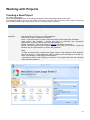
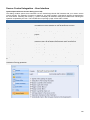
Working with Projects ............................................................................................................................. 73 Creating a New Project ...................................................................................................................... 73 Adding New Pages............................................................................................................................. 74 Saving a Project ................................................................................................................................. 75 Workspace ......................................................................................................................................... 76 Specifying Project Settings ................................................................................................................ 77 Connecting to Databases ................................................................................................................... 94 Source Control Integration ............................................................................................................... 116 Multiple Directories within a Project ................................................................................................. 131 Absolute and Relative URLs ............................................................................................................ 132 Using Master Pages ......................................................................................................................... 132 Using Artisteer Designs.................................................................................................................... 146 Using Form Templates ..................................................................................................................... 154 Using the Page Template................................................................................................................. 162 Working in Design Mode .................................................................................................................. 163 Editing HTML Source Code ............................................................................................................. 164 Using JavaScript/Jscript ................................................................................................................... 165 Editing Programming Language Source Code ................................................................................ 166 Using the AutoComplete Options..................................................................................................... 167 Styles................................................................................................................................................ 171 User Interface ................................................................................................................................... 172 Searching and Replacing ................................................................................................................. 180 Using Site Diagrams ........................................................................................................................ 184 Using External HTML Editors ........................................................................................................... 186 International Character Set and File Encodings .............................................................................. 187 Internationalization and Localization of Web Applications ................................................................... 189 Select a Locale................................................................................................................................. 191 User Interface ................................................................................................................................... 192 Page and Component Caching ........................................................................................................ 199 User Interface ................................................................................................................................... 201 Server Profiles .................................................................................................................................. 205 Deploying Projects................................................................................................................................ 211 Deploying ASP Applications ............................................................................................................ 211 Deploying PHP Applications ............................................................................................................ 212 Deploying PERL Applications .......................................................................................................... 215 Deploying ColdFusion Applications ................................................................................................. 216 Deploying Java & JSP Applications ................................................................................................. 218 Add Context element as a child to Host element in your resin.conf configuration file. ........................ 220 Deploying .Net Applications ............................................................................................................. 222 Working with Forms .............................................................................................................................. 225 Building Forms Manually .................................................................................................................. 225 The Directory Form .......................................................................................................................... 231 Form Data Source ............................................................................................................................ 234 Grid Form ......................................................................................................................................... 242 3
Record Form .................................................................................................................................... 243 Web Reporting and Report Form ..................................................................................................... 247 Editable Grid .................................................................................................................................... 251 Web Calendar .................................................................................................................................. 254 Login Form ....................................................................................................................................... 255 Search Form .................................................................................................................................... 257 Working with Controls........................................................................................................................... 259 Button Overview ............................................................................................................................... 259 Calendar Navigator .......................................................................................................................... 259 Checkbox Overview ......................................................................................................................... 259 Checkbox List Overview................................................................................................................... 259 Date Picker Overview....................................................................................................................... 260 CKeditor or FCKeditor ...................................................................................................................... 260 CKeditor or FCKeditor ...................................................................................................................... 263 File Upload Overview ....................................................................................................................... 265 Hidden Overview .............................................................................................................................. 269 Image Overview ............................................................................................................................... 270 Image Link Overview........................................................................................................................ 270 Include Page Overview .................................................................................................................... 270 Label Overview ................................................................................................................................ 271 Link Overview ................................................................................................................................... 271 List Box Overview ............................................................................................................................ 273 Navigator Overview .......................................................................................................................... 273 Panel ................................................................................................................................................ 275 Path Overview .................................................................................................................................. 276 Radio Button Overview .................................................................................................................... 276 ReportLabel Overview...................................................................................................................... 277 Report Sections................................................................................................................................ 278 Sorter Overview ............................................................................................................................... 279 Text Area Overview.......................................................................................................................... 279 Text Box Overview ........................................................................................................................... 280 Component Attributes ........................................................................................................................... 280 HTML Controls ..................................................................................................................................... 282 Bookmark ......................................................................................................................................... 282 Button ............................................................................................................................................... 282 Checkbox ......................................................................................................................................... 282 Dropdown ......................................................................................................................................... 283 Form ................................................................................................................................................. 283 Horizontal Rule................................................................................................................................. 283 Hyperlink .......................................................................................................................................... 284 Image Button .................................................................................................................................... 285 Label................................................................................................................................................. 286 Listbox .............................................................................................................................................. 286 Password ......................................................................................................................................... 286 4
Reset Button .................................................................................................................................... 286 Image ............................................................................................................................................... 287 ImageLink ......................................................................................................................................... 288 Space ............................................................................................................................................... 289 Submit Button ................................................................................................................................... 289 Line Break ........................................................................................................................................ 289 Radio Button .................................................................................................................................... 289 Paragraph Break .............................................................................................................................. 290 Text Area .......................................................................................................................................... 290 Text Box ........................................................................................................................................... 290 Working with Builders ........................................................................................................................... 291 Application Builder ........................................................................................................................... 291 Authentication Builder ...................................................................................................................... 315 Calendar Builder .............................................................................................................................. 317 Directory Builder............................................................................................................................... 321 Editable Grid Builder ........................................................................................................................ 323 Flash Chart Builder .......................................................................................................................... 332 Flash Chart Style Builder ................................................................................................................. 339 Gallery Builder .................................................................................................................................. 340 Grid Builder ...................................................................................................................................... 349 Grid and Record Builder................................................................................................................... 356 Master/Detail Builder ........................................................................................................................ 366 After selecting a style, click the Finish button to generate the form to the page. ................................. 376 Menu Builder .................................................................................................................................... 376 Creating menus based on static list of menu items ......................................................................... 378 Creating database-driven menus ..................................................................................................... 380 Record Builder ................................................................................................................................. 382 Web Report Builder .......................................................................................................................... 385 Search Builder .................................................................................................................................. 394 Using the Data Dictionary ..................................................................................................................... 398 Changing Control Properties in the Data Dictionary ........................................................................ 398 Working with Ajax ................................................................................................................................. 412 Ajax Feature Builders ....................................................................................................................... 412 AJAX Autocomplete Builder ............................................................................................................. 412 AJAX Autofill Builder ........................................................................................................................ 415 AJAX Dependent Listboxes Builder ................................................................................................. 418 AJAX Services and Service Builder ................................................................................................. 420 Ajax Features ....................................................................................................................................... 422 AJAX Autocomplete ......................................................................................................................... 422 InMotion Framework Support (VB.NET and C#) .................................................................................. 443 5
User's Guide
Introduction to CodeCharge Studio
Who Should Use CodeCharge Studio?
CodeCharge Studio allows users to automatically generate 80% to 100% of web applications and is an especially
powerful tool in the hands of software developers; even those unfamiliar with web technologies.
CodeCharge Studio can also be used by those who are new to programming. It is highly recommended that you be
familiar with programming concepts and database design or have an already existing database that you want to
integrate into a web site. Prior programming experience is recommended and sometimes required if you wish to
create complex applications. The section "Introduction to Web Programming" describes many concepts of web
development that can help you understand how web applications generally work and how they differ from the
standard client/server and desktop applications.
CodeCharge Studio is best suited for the following types of users:
Web Application Developers:
CodeCharge Studio provides developers with all the functionality necessary to create powerful, scalable and
secure web applications rapidly. Developers can focus on programming the essential business logic behind the
application rather than the core application framework. This group of users consists of corporate developers,
consulting companies, and individual programmers and consultants.
Database Developers:
Database developers who are comfortable with visual database and application design tools will appreciate the
natural, data-centric nature of CodeCharge Studio. Microsoft Access programmers will especially find the
CodeCharge Studio interface strikingly familiar.
Legacy Programmers:
Sophisticated and advanced system architects are often not familiar with web application development. Visual
Studio or other Windows programming environments are often too complex and do not offer an easy way to
understand Web application development. CodeCharge Studio simplifies and accelerates the process of web
application development through a variety of features including drag-and-drop components, application builders,
and pre-built business solutions.
Webmasters and Designers:
Webmasters and designers are realizing the benefits and need for storing web content in databases-especially
when faced with the prospect of maintaining hundreds of web pages. They are often expected to produce dynamic
content such as an employee directory or portal for their company. CodeCharge Studio addresses these needs and
allows anyone to create database-enabled applications without the need for extensive programming. For designers
comfortable with the host of existing design applications, CodeCharge Studio can work in conjunction with virtually
any HTML design tool.
Systems Integrators, VARs and ISVs:
Companies which produce, sell or support any software applications will find CodeCharge Studio valuable for
creating Web interfaces for their solutions. For example a CRM software vendor offering Windows solution can
easily create the Web equivalent of their product, or at a minimum, Web-enable parts of an application and its
functionality.
6
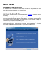
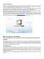
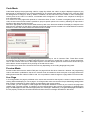
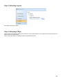
How it Works
CodeCharge Studio incorporates the features that enable developers to quickly build web applications. These
include builders that create pages and forms, and data-aware components and controls that can be placed on a
page.
CodeCharge Studio web-enables your databases by providing the foundation for information exchange between
databases and web browsers. A powerful Application Builder is also provided to get you started. The builder
automatically uses your database's structure to automatically create a set of web pages that use the database as
the back-end.
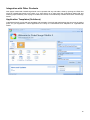
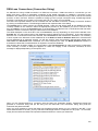
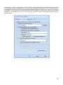
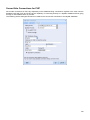
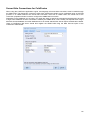
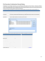
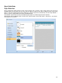
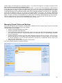
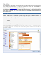
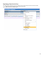
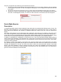
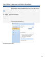
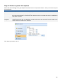
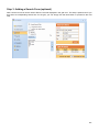
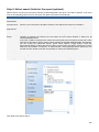
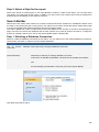
The following steps demonstrate how to create a basic application using the Application Builder:
Start CodeCharge Studio.
Create a new project.
Name the project and select Application Builder.
Specify project settings such as the programming language and path to the web server.
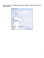
Specify the database connection type and establish a database connection. (Alternatively, you can select one of
the sample databases: Intranet or Internet.)
Configure site authentication by specifying the database table and columns that contain user login and password
information as well as security groups and roles.
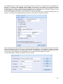
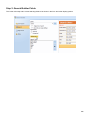
Select the database tables based upon which the web application will be created.
Specify the type of web page to be created for each of the previously selected database tables. Specify if you want
to create Search, Grid, Editable Grid and Record maintenance pages for each table.
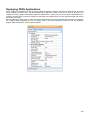
Specify a style to be applied to the site. The style defines the basic layout and appearance of different elements
within a page.
The Application Builder will automatically create a project with sets of pages that make up the web application. You
can then publish the pages to the server and test them.
If you wish, you can make further modifications to the created application by using the integrated development
environment (IDE).
CodeCharge Studio does not create or assist in the creation of databases. There are many other tools that already
perform that function. For example, you can easily create a database using Microsoft Access for Windows and
even export it to MySQL for use on Linux. CodeCharge Studio does come with two sample databases and several
web applications that use the included databases. They are perfect as a starting point for creating simple web
applications.
CodeCharge Studio runs exclusively on the Windows platform. The web applications that it generates are platformindependent and can run on any system (i.e., Windows, Mac, Linux and others) as long as the system has a
suitable server. Windows IIS server can execute ASP scripts while many Linux servers are pre-configured to run
PHP scripts. The programs generated by CodeCharge Studio do not require any custom components to be
installed and can run on virtually any applicable web server. It is recommended, and sometimes required, that the
latest scripting engine be installed (e.g., ASP3 or PHP4/5). The specific requirements are listed in the "System
Requirements" section.
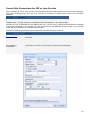
When you work with CodeCharge Studio you can usually connect to a remote database residing on your server. In
some cases, (e.g., when working with Microsoft ® Access ®) you may need to have a copy of the database stored
locally on your desktop since remote connection may not be possible. Each project within CodeCharge Studio can
have two distinct connection types. One connection type is the design-time connection, used during the
development process, and the other is the server-side connection, used by the generated pages after they have
been deployed. For example, if you are using MySQL/PHP, you might use an ODBC connection to design your
application, but when you deploy your application, use the MySQL native interface from PHP on the server where
your application is deployed. (Note, earlier versions of CodeCharge Studio did not include a native MySQL
interface in the IDE, so ODBC was required for design-side connections when the target platform was PHP or
PERL.)
7
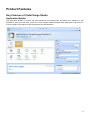
Product Features
Key Features of CodeCharge Studio
Application Builder
The Application Builder is perhaps the most advanced web development automation tool available to web
developers. With just a few clicks, users can create complex database-enabled Web applications with dozens-or
even hundreds-of web pages for data management and administration.
8
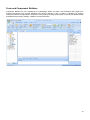
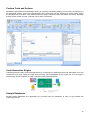
Integrated Development Environment (IDE)
CodeCharge Studio combines visual interface design tools with an integrated development environment (IDE) to
enable developers to create powerful and sophisticated web applications in record time. CodeCharge Studio
features powerful HTML and code editors, an HTML design component, project explorer, property browser,
dockable tool windows, and many other features desired by professional developers.
9
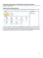
Form and Component Builders
Component Builders are key constituents of CodeCharge Studio and help users assemble Web pages from
multiple components such as Grid, Editable Grid, Record, Directory, Login, or Search. A Builder is a dynamic
wizard that creates the appropriate component on the page by allowing the developer to specify the database table
and fields that are used to display, validate or accept information.
10
Visual Query Builder
Developers can easily select tables and stored procedures or custom SQL as the data source for their data-aware
forms. A Visual Query Builder is provided for visual creation of SQL statements.
11
Security Management/Role-based Access Control
CodeCharge Studio goes the extra mile in protecting generated Web applications by implementing additional
security features that prevent users from externally modifying forms and submitting invalid data to the server.
CodeCharge Studio allows developers to define secure role-based access to each page or form.
Support for Multiple Programming Languages
CodeCharge Studio can generate programming code in C# and VB. Net (ASP.NET), VBScript (ASP), ColdFusion,
Java (Servlets or JSP), PHP, and PERL. Since the project model is stored in XML format, the programming
language can be changed at any time and the same project can be regenerated in multiple programming
languages.
Extensibility
CodeCharge Studio has an open architecture and is fully extensible. Most of the functionality is implemented as
HTML, JavaScript, XML, and XSL. Users can customize almost any part of the built-in functionality or develop their
own components, such as Builders, Components, Actions, and Styles. In the future, users will be able to obtain the
CodeCharge SDK and develop their own code generation templates.
12
Extensive Database Support
CodeCharge Studio supports most existing databases via JET and ODBC to establish the design-time connection.
The server-side connection can be made using JET, ODBC, JDBC, ADO, DBI and PHPLib to connect to databases
during run-time.
Multiple Database Connections
CodeCharge Studio supports multiple database connections to allow Web applications to utilize multiple data
sources, for example, to validate user access against an external user database.
13
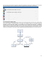
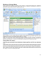
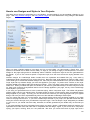
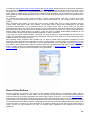
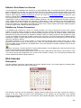
Site Diagram
The site diagram feature enables the developer to produce a visual representation of the pages within the site as
well as show how the pages are linked to one another.
14
Integration with Other Products
Web pages created with CodeCharge Studio can be opened with any web editor, either by opening the HTML files
saved by CodeCharge Studio on the disk, or by right-clicking on a page within the CodeCharge Studio IDE and
selecting Open Externally. After a page is modified and saved, it is automatically available back within CodeCharge
Studio.
Application Templates (Solutions)
CodeCharge Studio comes with ten templates and examples of pre-built web applications that can serve as starting
points for your applications. These applications are ready for customization and adaptation for organizational
needs.
15
Custom Code and Actions
Applications generated with CodeCharge Studio can be easily extended by adding custom code or by using any of
the predefined Actions. Actions are user-definable code components that are inserted into events. Many actions
are provided with the product, while additional actions can be created by users and shared with others. Internally,
actions consist of XML and XSL code that can be easily customized.
Code Generation Engine
CodeCharge Studio users create web applications by connecting to a database and placing data-aware forms and
components on a page. During the page design process, the representation of the project and all of its pages is
saved in XML format in addition to HTML code that contains the page design.
Sample Databases
Several sample databases and applications are provided with the distribution to help you get started with
CodeCharge Studio.
16
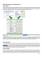
Editable Grid
The Editable Grid component enables the editing of multiple records simultaneously. It allows to create order
processing, inventory management, shopping cart, or any other ERP-type system whose integral functionality
involves the manipulation of multiple records.
17
Index/Directory
The Directory component facilitates the creation of a Yahoo style Directory or Index. The Directory is made up of a
hierarchy of categorized listings which the user can navigate through. This makes the Directory component
especially useful when creating Web portals where information is provided taxonomically.
18
Multi-Select ListBox
The listbox component has been improved to allow the end user to select multiple values within the listbox, unlike
in previous versions where only one value could be selected. The Multi-Select listbox can therefore be used in
database tables with one-to-many relationships.
19
Date Picker
The Date Picker component enables the user to specify date values by selecting a date from a pop-up calendar.
The pop-up calendar is a small browser window which contains a monthly view of dates and also has the capability
of scrolling backwards and forwards to other months.
20
File Upload
The process of transferring files from the end users machine to the server can now be accomplished by using the
File Upload component. This component generates the necessary code to enable an end user to select files from
their machine and submit the files so that they are uploaded to the server.
21
Example Pack
The CodeCharge Studio example pack comes in the form of a CodeCharge Studio project within which there are
different sub-projects which implement various programming techniques.
Ajax Features
CodeCharge Studio supports development of Ajax-enabled applications through a set of Ajax features, services
and builders.
22
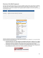
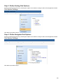
Menu Builder
Menu Builder provides a visual method for designing and including menus within Web pages. Menus can be based
on data from a database or static values specified in the builder.
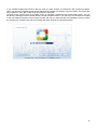
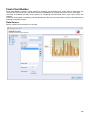
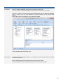
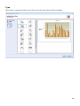
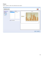
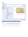
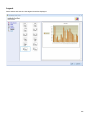
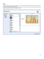
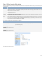
Flash Charts and Flash Chart Builder
Flash Chart Builder provides a visual method for designing and including Flash charts within a Web page. The
Flash Chart component retrieves data from the database at run-time and presents it as a visual graph.
ASP.NET InMotion Framework (C# and VB.NET)
CodeCharge Studio 5 includes support for 3rd party ASP.NET application framework (InMotion Framework) that
further simplifies C# and VB.NET development.
23
Benefits of CodeCharge Studio
CodeCharge Studio generates structured object-oriented code that is easy to maintain and extend. CodeCharge
Studio makes code generation very practical by taking the hassle out of the process of generating professionallevel code. Developers can easily modify any part of the generated code using a powerful code editor included with
CodeCharge Studio. Code that has been modified in the editor by the user is not overwritten during subsequent
code generation.
CodeCharge Studio offers an unprecedented way for users to quickly build powerful database-driven web
applications. By using a simple point and click interface, users can select desired components, programming
language, presentation schemes and database queries-without any programming or without the need to fully
understand the underlying web technologies.
What further sets CodeCharge Studio apart from all other products is sheer speed. For example, CodeCharge
Studio makes it possible to create a simple task management system in under five minutes. Several pre-built
application templates are included and can be adapted to the developer's needs and extended into full-featured
web systems.
Separation of Programming logic from the Presentation Layer
CodeCharge Studio fully supports the separation of programming logic from the presentation layer by generating
source code files (.asp, .php, .jsp, etc.), which are separate from their corresponding HTML files (HTML templates).
This approach allows web teams to utilize best practices by allowing designers to work separately and in parallel
with developers.
Many other technologies force developers to perform design tasks and designers to deal with code. The
CodeCharge Studio approach allows the developer to produce applications that can be further customized by
modifying the HTML template files within CodeCharge Studio's IDE or through a suitable design environment, all
this while leaving the code untouched.
Fast, Practical Code Generation
One of the biggest challenges of making code generation practical is to provide developers with full flexibility of
modifying the generated code while not losing the advantage of automation. CodeCharge Studio's core technology
handles these requirements very well and gives users the full flexibility of working with the generated code.
Modified portions of the code are locked from being overwritten during subsequent code generations, therefore
eliminating the need of importing modified code back into the application source.
When publishing a project or page, CodeCharge Studio generates source code that is then copied to the web
server to run the application. Users can choose and change the programming language at any time, for example,
generate an application in Active Server Pages on their local Windows computer, then generate the same
application in Java (as Servlet or JSP) for final deployment on any Java application server. The code generated by
CodeCharge Studio is very similar to human code and can be easily enhanced outside of CodeCharge Studio by
any developer. No other software on the market generates usable, practical programming code in as many
technologies as those supported by CodeCharge Studio.
24
System Requirements
It is highly recommended that you be familiar with database design or have an existing database that you want to
use as the basis for your web application. It is also desired that you have prior programming experience in any
programming language. This will greatly help you make program customizations that sometimes may be required.
CodeCharge Studio can automatically generate 100% of simple web applications used for data administration but
no tool can create complex applications without some level of custom coding. Many CodeCharge Studio users are
able to generate 80% to 90% of their web applications using CodeCharge Studio, then manually add programming
code that provides additional functionality (e.g., to send an email or update multiple database tables).
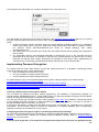
System Requirements
Development Environment Requirements
CodeCharge Studio is available for computers running the following operating systems and environments:
256 MB available RAM
200 MB available disk space
256-color monitor capable of 800 x 600 resolution
Windows 2000, XP, Vista, Windows 7, Windows 8, Windows Server 2012
Microsoft Internet Explorer 6 or higher
Microsoft .NET Framework 2.0
Databases Supported
CodeCharge Studio can connect to virtually any ODBC compliant database using the appropriate drivers installed
on the computer where CodeCharge Studio is present. Supported databases include:
Microsoft SQL Server
Oracle
MySQL
DB2
Microsoft Access
All other databases with an appropriate ODBC driver
The generated code does not require ODBC connectivity and connects to the database using the method
appropriate for the particular environment, for example ADO for ASP, JDBC for Java, PHPLib for PHP, or DBI for
PERL.
Server Requirements
Generated code runs on all operating systems with installed application servers capable of executing the following
programming languages:
ASP (runs on IIS and PWS servers with VBScript 5.5)
ASP.NET (C#)
ASP.NET (VB)
ColdFusion
PHP
J2EE
PERL 5
25
Contacting Product Support
Free and paid online support for CodeCharge Studio is offered worldwide in English, 24 hours a day at
http://support.yessoftware.com.
The available support programs are listed at http://www.yessoftware.com/purchase/product.php?product_id=1.
When submitting support issues or questions, please always specify the operating system, server and
programming environment you are using and describe the details of your issue. For example, if something doesn't
work, specify the exact error message or symptoms of the problem. Please also state if the issue is reproducible
and the steps to replicate it.
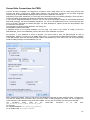
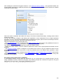
Terms and Definitions
Action
User-definable code generation component, which inserts a block of code into an event procedure. CodeCharge
Studio comes with several predefined Actions, which are installed into the following folder: (CodeCharge Studio
folder)\Components\Actions
Internally, actions consist of XML and XSL code that can be easily customized by experienced developers. The
utilized XSL code will be documented in a future SDK (Software Development Kit).
Authentication
The process of verifying if a user has sufficient security privileges to view a web page. If a web page requires
authentication and a user is not logged in, generated programs automatically redirect the user to a specifically
designated Login or Access Denied page. Once a user logs in, generated programs utilize Sessions to store user
access information for limited number of time.
Code Generation
The process of translating project model into executable programming code. CodeCharge Studio uses an open
XML file format to describe all project components and properties, while during code generation, it applies
proprietary code templates to the project model, which results in the final code output.
Component
A component is an object that makes up a Web page or a CCS project and can be used for displaying data and
accepting user input. Many components are assigned a data source to bind their controls.
Components can be divided into
Forms, such as Grid, Record, Directory and Editable Grid
Controls, including Label, TextBox, etc.
Supporting controls, such as Sorter, Navigator and Date Picker
Users may add, modify and delete components on a page, just like working with objects in Visual Basic and other
integrated development environments.
Components placed on a page make up the hierarchical structural of such page and are represented via HTML
within the page's HTML template, and via XML within the page's definition stored in the corresponding .ccp file.
When adding a component to a page, its position and layout are stored in the appropriate .html file, while its
properties and attributes are stored in the corresponding .ccp (CodeCharge page) file.
Control
A low-level component (object) that can be placed on a page and has a set of properties and events. Controls can
be used to receive user input or display dynamic content. They are also visible in Project Explorer, where together
with pages and forms they make up the object model of the Web application.
A Control cannot have child components. Example controls are Label, TextBox, TextArea and ListBox.
Certain controls can be further categorized as "supporting controls" because their purpose is to enhance and
support the functionality of forms, for example a Sorter and a Navigator can be used to allow users to sort and
navigate the data presented in a Grid form.
Design-Time
The process and the time of creating web applications by working with CodeCharge Studio, usually performed by a
developer.
26
Dynamic Content
The content that is not defined during design-time. Dynamic content is usually retrieved from the database during
run-time, but may also be calculated during program execution. Dynamic content is output directly to the browser or
can be embedded within HTML by replacing template blocks.
Event Procedure
A procedure automatically executed in response to an event initiated by the program code during execution.
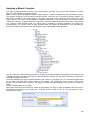
Form
A high-level component that is placed on a page to display and/or accept information from users, such as login
information or user data. Forms usually perform a specific task via a group of controls, which are its child
components. Example forms are Grid, Record, Editable Grid and Directory.
Object
A representation of a component (such as form or control) within the generated programs. Objects often have
properties, methods and events that can be used to alter its behavior or execute custom programming functions.
Page
A web page that holds components (forms and controls) and is used to present information to a user via a web
browser, or to accept and process user data. CodeCharge Studio creates one Program for each Page. Multiple
pages make up the web application. Pages are executed in one of the two following modes:
HTML Output mode - Parses HTML Template and shows resultant HTML output.
Data Processing mode - Receives Data submitted via form or URL and processes it accordingly.
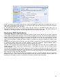
Generated Pages consist of the following sections (in execution order):
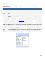
Section
Description
Include Common Files
Common files are loaded and included into the page.
Initialize Page Variables
Variables, events, connections, and controls are defined and initialized. Initial
values are assigned to variables.
Authenticate User (Pages with User authentication is performed. Unauthorized users are redirected to the
Restricted access only)
Access Denied page.
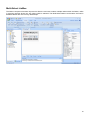
Initialize Objects
Execute Components
Processing mode only)
Database Connection objects, page controls, and events are defined and
initialized.
(Data Operation method is invoked for all record controls on the page. This causes the
submitted data to be processed by each control. If no data was submitted.
Go To Destination Page (Data If Operation method for all components was executed successfully, page
Processing mode only)
operation is stopped and the browser is redirected to another page.
Initialize HTML Template
Initializes Template object and loads template into web server memory for
processing.
Render Page
Processes all Controls and Components on the page, then outputs rendered
HTML to the web browser.
Unload Page
Defines the UnloadPage Subroutine. Clears page objects and controls.
Include External Pages
Includes external pages, such as Header and Footer.
Component Classes
Implements component classes for controls present on the page.
27
Property
A container that stores the information about specific component's configuration or controls its behavior. Certain
properties are read-only and cannot be altered during the run-time, while others can programmatically accessed
and modified during the program execution.
Run-Time
The time when generated web application is being run without dependence on CodeCharge Studio, for example to
allow users to interact with the generated application.
Run-time is also referred to as program execution.
Template
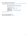
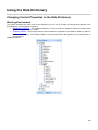
Specially formatted HTML file that generated programs process and output to the web browser. Template files
consist of standard HTML content, plus specially marked template blocks that are replaced with database values or
expressions during run-time. Templates are used by CodeCharge Studio during the design-time, and optionally are
utilized by generated programs during run-time.
Template use during design-time
Template is one of the key components in designing web applications with CodeCharge Studio. Working with
templates is the same as working with standard HTML, however CodeCharge Studio embeds template blocks
within the template to store additional information about components.
Template use during run-time
When working with Templated technologies such as PHP&Templates, during code generation CodeCharge Studio
publishes templates to the server 'as-is', which are later utilized by the generated programs during run-time.
Templated programs utilize templates as follows:
A user points their browser to a page on the web server, for example www.site.com/Default.asp
A program (Default.asp) is executed on the web server, which then loads the template into internal memory and
renders it by replacing template blocks with dynamic data.
The program then outputs rendered template to the browser.
When working with non-Templated technologies, such as PHP or ASP, Templates are not being used.
CodeCharge Studio converts templates during code generation to standard HTML and programming code
necessary to output information to the browser. Non-templated programs work as follows:
A user points their browser to a page on the web server, for example www.site.com/Default.asp
A program (Default.asp) is executed on the web server, which then outputs appropriate HTML to the browser and
embeds dynamic content within it.
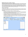
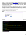
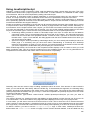
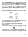
Template Block
Specially marked place within HTML Template usually used to mark the position of dynamic content within the
page. Template blocks are replaced during run-time with sub-content, such as variable or database output. Unused
blocks are removed. The following two types of template blocks are utilized by CodeCharge Studio:
Tags
CodeCharge Studio uses text within curly brackets to mark the position of dynamic content. Usually a tag is
replaced with the value of a database field that has the same name as the tag. An example of a tag is:
{employee_name}.
Blocks
Blocks mark HTML sections for possible replacement or removal during run-time. For example, forms generated
with CodeCharge Studio are embedded within HTML between block comments that indicate starting and ending
position of the form, thus making it a Block that later can be removed, for example to hide a form from unauthorized
users. The example below shows an Error Control block that is a part of a Search Form and displays error
message, for example if a required field doesn't contain data. An {Error} tag is also shown, which will be replaced
during run-time with an error message or removed if not needed.
<!-- BEGIN Error -->
<tr>
<td colspan="2" class="KnockoutDataTD">
{Error}
</td>
</tr>
<!-- END Error -->
28
Templated Technologies
The methodology utilized by CodeCharge Studio to separate programming code from HTML. CodeCharge Studio
generates two versions of most of the languages it works with: Templated, such as PHP&Templates or
ASP&Templates, where generated programs utilize templates Non-Templated, such as PHP or ASP, where HTML
is embedded within generated programs.
The main difference between the two is that Templated technologies utilize HTML templates during both the
design-time and run-time, while Non-templated technologies utilize HTML templates only during the design-time. A
Developer may switch between Templated or Non-templated technologies at any point during design of his web
application. The only difference will be in the generated code, where for example generating ASP&Templates
would result in 2 files: an .asp program and an .html template, while generating ASP would result in generating
single .asp program file.
Query string
Query string is a string containing variable names and their values. It is commonly used to pass some input
variables to a page by appending the string to the page's address. Query strings are unique to Web applications
(versus client-server and other forms of software applications) because Web applications are stateless and a
variable set on one Web page usually cannot be retrieved on another Web page unless it is passed between pages
in the form of a query string or a session variable or a cookie.
29
End User License Agreement
End-User License Agreement for CodeCharge Studio 5 ("Software")
Copyright (c) 2001-2013 YesSoftware, Inc.
All Rights Reserved.
BY DOWNLOADING AND/OR IMPLEMENTING THIS SOFTWARE YOU AGREE TO THE FOLLOWING
LICENSE:
DEFINITIONS
"You" and "Licensee" refers to the person, entity or organization which is using the Software known as
"CodeCharge Studio", and any successor or assignee of same.
"YesSoftware" refers to YesSoftware, Inc. and its successors, or manufacturer and owner of this Software.
AGREEMENT
After reading this agreement carefully, if you ("Customer") do not agree to all of the terms of this agreement, you
may not use this Software. Unless you have a different license agreement signed by YesSoftware that covers this
copy of the Software, your use of this Software indicates your acceptance of this license agreement and warranty.
All updates to the Software shall be considered part of the Software and subject to the terms of this Agreement.
Changes to this Agreement may accompany updates to the Software, in which case by installing such update
Customer accepts the terms of the Agreement as changed. The Agreement is not otherwise subject to addition,
amendment, modification, or exception unless in writing signed by an officer of both Customer and YesSoftware.
If you do not wish to agree to the terms of this Agreement, do not install or use this Software.
1. OWNERSHIP OF SOFTWARE AND COPYRIGHTS.
The Software is copyrighted and protected by the laws of the United States and other countries, and international
treaty provisions. You may not remove any copyright notices from the Software.
YesSoftware may make changes to the Software at any time without notice, but is not obligated to support or
update the Software.
Except as otherwise expressly provided, YesSoftware grants no express or implied right under YesSoftware
patents, copyrights, trademarks, or other intellectual property rights. You may transfer the Software only if the
recipient agrees to be fully bound by these terms and if you retain no copies of the Software.
2. GRANT OF LICENSE AND PROHIBITIONS.
Title to all copies of the Software remains with YesSoftware.
This Software is licensed to you. You are not obtaining title to the Software or any copyrights. You may not
sublicense, rent, lease, convey, translate, decompile, or disassemble the Software for any purpose.
The license may be transferred to another Licensee if you keep no copies of the Software. Permission must be
obtained before mirroring or redistributing the evaluation copies of the Software.
You may not convert this Software or its parts to a different computer language or environment, either manually, or
using an automated conversion tool, such that this Software or any modification thereof will run under any
language, software, or program other than implemented by YesSoftware. You agree that any modifications made to
this Software belong to YesSoftware and are permitted for your exclusive use during the period of this License
Agreement, and may not be transferred, sold or licensed to another entity.
3. USE AND EVALUATION PERIOD.
You may install and use one copy of this Software on one client computer for software development purposes.
Subsequent installations require you to obtain additional licenses unless you are transferring this Software to
another computer.
You may not network this Software or otherwise use it on more than one computer or computer terminal at one
time.
You may not lease or otherwise rent the Software, but you may transfer the Software and accompanying written
materials on a permanent basis provided the recipient agrees to the terms of this Agreement.
You may not sublicense or permit simultaneous use of the Software by more than one user.
If you are evaluating this software, you may use an evaluation copy for the maximum of twenty (20) days in order to
determine whether to purchase this Software.
4. LIMITED WARRANTY.
THE SOFTWARE IS PROVIDED AS IS AND YESSOFTWARE DISCLAIMS ALL WARRANTIES RELATING TO
THIS SOFTWARE, WHETHER EXPRESSED OR IMPLIED, INCLUDING BUT NOT LIMITED TO ANY IMPLIED
WARRANTIES OF MERCHANTABILITY AND FITNESS FOR A PARTICULAR PURPOSE.
30
5. LIMITATION ON CONSEQUENTIAL DAMAGES.
NEITHER YESSOFWARE NOR ANYONE INVOLVED IN THE CREATION, PRODUCTION, OR DELIVERY OF
THIS SOFTWARE SHALL BE LIABLE FOR ANY INDIRECT, CONSEQUENTIAL, OR INCIDENTAL DAMAGES
ARISING OUT OF THE USE OR INABILITY TO USE SUCH SOFTWARE EVEN IF YESSOFTWARE HAS BEEN
ADVISED OF THE POSSIBILITY OF SUCH DAMAGES OR CLAIMS. IN NO EVENT SHALL YESSOFTWARE'S
LIABILITY FOR ANY DAMAGES EXCEED THE PRICE PAID FOR THE LICENSE TO USE THE SOFTWARE,
REGARDLESS OF THE FORM OF CLAIM. THE PERSON USING THE SOFTWARE BEARS ALL RISK AS TO
THE QUALITY AND PERFORMANCE OF THE SOFTWARE.
IN NO EVENT WILL YESSOFWARE BE LIABLE FOR ANY AMOUNT GREATER THAN WHAT YOU ACTUALLY
PAID FOR THE SOFTWARE.
6. TERMINATION.
This Agreement is effective until terminated.
This Agreement terminates on the date of the first occurrence of either of the following events: (1) The expiration of
one month from written notice of termination from Customer to YesSoftware; or (2) At any time if you violate the
terms of this Agreement.
Upon termination you shall destroy the written materials and all copies of the Software, including modified copies, if
any.
You agree that monetary damages alone is not an adequate and just relief resulting from any breach of this
License, that a court order prohibiting any further breach of this License is necessary to prevent further damages,
and that you will not oppose any reasonable request for a temporary restraining order, preliminary injunction, or
other relief sought by YesSoftware in the event of a breach of this License.
YesSoftware shall not be required to notify you of any breach, nor make any demand or claim against you resulting
from any such breach, or for a demand to stop any use or distribution in violation of the terms of this License, and
you agree that any breach of this License and damages resulting therefrom shall relate back to the first and earliest
breach thereof. Failure of YesSoftware to enforce its rights pursuant to this License shall not constitute a waiver of
such rights, and shall not prejudice YesSoftware in any later enforcement of its rights or rights to seek damages
therefrom.
7. UPGRADES.
If you acquired this Software as an upgrade of a previous version, this Agreement replaces and supercedes any
prior Agreements. You may continue to use the previous version of the Software, provided that both the previous
version and the upgrade are installed on the same computer at all times. You may not have a previous version and
the related upgrade version installed on separate computers at any time.
8. ENTIRE AGREEMENT
This End-User Agreement is the entire agreement between you and YesSoftware relating to the Licensed
Software, and supercedes all prior written or oral statements, promises, representations and agreements.
9. GOVERNING LAW.
The agreement shall be governed by the laws of the State of California. Any action or proceeding brought by either
party against the other arising out of or related to this agreement shall be brought only in a state or federal court of
competent jurisdiction located in San Mateo County, California. The parties hereby consent to the personal
jurisdiction of such courts.
10. U.S. GOVERNMENT RESTRICTED RIGHTS.
This Software is provided with RESTRICTED RIGHTS. Use, duplication, or disclosure by the Government is
subject to restrictions as set forth in subparagraph (c)(1)(ii) of the Rights in Technical Data and Computer Software
clause at DFARS 252.227-7013 or subparagraphs (c)(1) and (2) of the Commercial Computer Software -Restricted Rights clause at 48 CFR 52.227-19, as applicable. Contractor is:
YesSoftware, Inc.
6330 S. Eastern Ave. #5
Las Vegas, NV 89119 USA
E-mail: [email protected]
31
For More Information
CodeCharge Studio provides a rich array of options for generating sites that correspond to common business
applications. The depth of automation in the process, the degree to which the resulting pages can be integrated
into an existing site, and the level of customization offered to the web designer support superior productivity with a
high degree of attractiveness in the end result.
If you have questions, go to the CodeCharge Studio user forums at http://forums.codecharge.com/ to get answers
and pointers. Or visit http://support.yessoftware.com for the latest bulletins, product updates or to submit email
support requests.
8275 S. Eastern Ave. Suite 200 Las Vegas, NV 89123 USA Telephone: + 1 (888) 241-7338 Fax: + 1 (866) 3128049 Email: [email protected] URL: http://www.yessoftware.com
32
Introduction to Web Programming
The Internet
The Internet is a network of computers. If you dial-in from home to America Online (AOL) or an Internet Service
Provider (ISP), your computer is connected to the Internet.
Every device on the Internet has a unique Internet Protocol (IP) address. This is a 32-bit number that allows your
computer to be found by other computers. This IP address is assigned to you dynamically by the ISP when you
connect to its computers, and may change each time you connect to the system. If you use a high-speed
connection, such DSL or cable, you may have a static IP address that never changes. You can usually view your IP
address on a Windows computer by using the command "ipconfig /all".
To find out who owns a particular IP address you can search for it at ARIN's web site (http://www.arin.net/), a nonprofit organization that assigns and maintains the IP addresses for North America.
Connecting to the Internet
If you are connected to the Internet at your workplace you are usually connected via a router which is used to join
two networks. A router that connects a private network to the Internet is also known as a gateway.
The router "routes" the traffic between computers and networks and sends the packets of information to the
destination through the shortest available path on the network. If you send information to the computer next to you,
for example, the router does not need to send anything to the Internet. If you want to view a web page on the
Internet the router will send your request to another gateway that it determines the closest to the destination server.
If you connect to the Internet from home, you will need a router, bridge, or a modem to translate signals from your
local computer or network to the format needed to enable data to travel to and from the Internet. The modem is
usually used to connect a single computer to the Internet via an ISP by converting digital data into analog signals
for transmission over a telephone line. If you use a DSL connection, you can connect to the DSL line via a DSL
bridge or router. The bridge converts the DSL signal to the format used by your local network and can be used to
directly connect several computers to the Internet. A DSL router is more expensive, but can provide an Internet
connection for your entire local area network.
A router can also include a proxy server that provides the ability to share a single IP address among multiple
computers connected to the Internet. This preserves the number of IP addresses you use and adds extra security
since the public IP address belongs to the router and your local computers cannot be accessed from the Internet
without a valid IP address. Another function of a proxy server is to store and cache the data, so that local
computers can obtain some of the frequently accessed information without connecting to the Internet.
Using a Firewall for Secure Internet Access
Computers that are publicly accessible via the Internet are exposed to various security risks such as hacking or
virus infections. Due to these risks, it is recommended that you use a firewall to filter unwanted requests that may
come via the Internet.
The firewall can be setup to meet specific criteria and filter both incoming and outgoing traffic. Many firewalls also
act as proxy servers and routers allowing you to use a single device for all your Internet connectivity needs. Due to
the increase in security risks, firewall popularity has grown exponentially and Windows XP currently includes a
simple built-in firewall.
Web Servers
Now that you have a better understanding of Internet connectivity, you should understand how an actual web site
functions on the Internet.
When you surf the Internet, your browser acts as the client that connects to various web servers and displays the
information returned from a server. Your computer can also act as a web server if you install and run a web server
application, such as Personal Web Server (PWS), IIS Internet Information Services) or Apache.
The web server listens for incoming Hypertext Transfer Protocol (HTTP) requests and responds by sending back
the appropriate information. HTTP is an Internet protocol that defines the format used to exchange information over
the Internet. HTTP requests usually come from browsers in the form of a URL, which is then used by the web
server to determine which file should be sent back to the browser, such as an HTML page or an image.
Many popular web servers are freely available. You can download Apache for Linux, Windows, or another platform
from http://httpd.apache.org/. IIS is included in Windows 2000, Windows 2003, Windows XP Professional, Windows
Vista and Windows 7. PWS is available for Windows 95/98 and Windows NT. Although Windows XP Professional
comes with a web server, unfortunately the Standard Windows XP doesn't come with a web server and setting one
up is very tricky.
33
Once your web server is up and running, you should be able to access it by starting the browser on the same
computer and using the URL http://localhost. You can also test the server from another browser by typing your
computer's IP address as the URL. If your computer is on a local network within a company, you can ask your
colleagues to try typing your computer's name into the address field in their browser. This should work as well and
display the default web page setup during server installation.
Running Programs on a Web Server
Besides serving static HTML pages, many web servers can also execute programs that create the HTML output for
the browser by running a server-side programming language. Some of the most popular languages are PHP, ASP,
Java, PERL, ColdFusion, and now VB.NET and C#.
The most popular web server, Apache, doesn't directly support any specific programming language, but is very
often configured to work with PHP, Java, or PERL. You can also install any of the other supported languages
yourself.
Windows based web servers usually support ASP (Active Server Pages) applications that are written in VBScript, a
simplified version of Visual Basic. The newer, .NET servers can execute VB.NET and C# programs.
If you do not have experience with these languages, you can use a code generator, such as CodeCharge
(http://www.codecharge.com) to generate your web applications in many popular technologies.
Obtaining a "Permanent" Web Server
Assuming that you already have, or plan to have, content that you'd like to make accessible to other Internet users,
you will need a web server that is always running. If you have a high-speed connection at your home you may be
able to run a web server on your local computer, as long as your computer always stays on (or whenever you want
your server to be accessible) and your IP address doesn't change. You'll need to find out from your ISP if your IP
address is static or dynamic.
A dynamic address is reassigned to you each time you connect to the Internet and the address will probably be
different on each connection. If you provide your dynamic IP address to access your web server you will need to
resend the IP address each time it changes.
A reliable and commonly used option is to find a web hosting company that has a web server installed and running
24 hours a day. Unless you purchase a dedicated server, you will obtain a space on a shared server that hosts
hundreds of web sites. This is called virtual hosting. The hosting company divides the space on their server's hard
drive into partitions which they allocate to the domain names they host. Visit TopHosts (http://www.tophosts.com)
to find a hosting company that matches your needs. If you plan to create Web applications, make sure that the plan
you choose includes database hosting such as MS Access, MS SQL, or MySQL.
Domain Names
When you purchase a hosting plan you will be asked to transfer or obtain a domain name for your web site. The
domain name is a string of characters and numbers, usually a set of words, that is easier to remember than the IP
address assigned to your computer.
The domain names are stored in a Domain Name Server (DNS), which is part of a distributed database system that
is queried whenever someone requests a URL or machine name. The DNS facilitates the location of a host where,
when you type a URL in your browser, the browser is able to lookup the IP address then send an HTTP request to
the correct web server.
To obtain a domain name, you need to find one that is available and purchase the rights to use it on an annual
basis. You can check the availability of the name you want at http://www.register.com and if your domain is
available you can buy it there. If you want to buy multiple domain names to reserve for future use use a less
expensive, bulk alternative, such as http://www.namebargain.com.
34
Creating HTML Content
Assuming that you have acquired a web service, the next step is to create content that you'd like other people to
see. The Internet is best suited for serving documents written in Hypertext Markup Language (HTML). HTML is a
very simple language that uses tags to specify the content of a page rendered in a browser (e.g., font size and
color, the position and size of images, and other elements on the page). The basic structure of HTML documents
consists of the tags and format.
<html>
<head>
<title>This is the document's title.</title>
</head>
<body>
This is the document's body
</body>
</html>
You can copy and paste the above text into notepad, save the file as test.html, and open it in your browser. You
should then see the message This is the document's body.
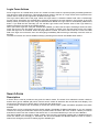
Instead of manually writing HTML, you can use any of the available HTML editors, such as Microsoft FrontPage,
Adobe GoLive, and Macromedia DreamWeaver to visually design the page then generate the HTML. Each of these
editors can easily be integrated into CodeCharge Studio for a familiar web development experience.
What is Dynamic HTML (DHTML)
Dynamic HTML (DHTML) is a script-based program executed by the web browser. Script-based programs can be
written in a client-side scripting language like JavaScript or VBScript. For example, the server can include VBScript
or JavaScript code within the HTML, which can be loaded and executed by the browser to perform various tasks
without contacting the server until a later stage. However, browsers don't have direct access to the database and
cannot read or update the data without sending a request to the server. DHTML, therefore, cannot be used by
itself to create database-enabled web applications. It can be used to offload certain tasks from the server that can
be performed by the client. For example, the validation of form field values can be performed entirely on the client
side. One negative aspect of using DHTML is the lack of standards among various browser types. Some Web
browsers may not be able to process specific DHTML pages, or may display them differently.
Publishing Web Content
You will need to publish content to your web site to be viewed on the web. You can do this by copying the files you
create to a specific location on your web server that is used specifically for web pages. Each web server has a
configuration screen or a file where you can specify the main disk folder that maps to the root of your web site.
The files placed in the folder, or its subfolders, automatically become available on the web. For example, if you
copy a file Page.html to the test sub-folder on your web server, this page should be accessible via a URL such as
http://www.mydomain.com/test/Page.html, where www.mydomain.com can be replaced with your own domain
name, or the IP address if desired. When users request the URL in their browser, the browser will contact the web
server, which will send the contents of the corresponding file back to the browser.
Type of Websites
Static
A static web site is one in which the pages contain hard-coded content. All of the content is edited and added using
a standard editor and saved as a file with a .htm or .html file. When a user accesses the page, the page is loaded
and displayed. Content is only changed through an editor by the page developer.
Dynamic
Dynamic web sites, also referred to as web applications, are programs that run on the web server and submit
HTML to a web browser on a client computer. These programs can be written in the same languages as standard
Windows and UNIX applications, although certain languages are better adapted to take advantage of the web.
One of the most popular programming languages, Visual Basic, was adapted for web use in the form of VBScript
on which most ASP programs are based. The latest modern web technologies utilize Java and .NET, both of which
have roots in C++. If you are already developing Windows or other client/server applications you should be able to
create web applications. The main difference lies in the output; in standard applications you print text at specific
35
screen coordinates or set the value of an object that is drawn on the screen; with web applications you would print
HTML formatting tags with the text mixed-in so that it is shown properly formatted in the desired place on the page.
Technologies like CodeCharge Studio make it possible to design the HTML page, then place various active objects
in desired positions on the page. This approach reduces the amount of time and effort required in creating full web
applications.
Benefits of Using Web Technologies
Web technologies confer many benefits over other technologies, including client/server. These include:
Less Expensive Infrastructure:
Since every desktop can be equipped with a free browser, the users only need inexpensive, low maintenance
computers that run the browser software.
Rapid Software Distribution:
Thanks to the web, there is no need to distribute new software to any of the client browsers. Once programs are
updated on the server, users can instantly see the changes the next time they load the page into their browser.
Troubleshooting is also improved since most issues can be investigated and resolved on the server.
Low Network Usage:
In a web environment, the client application (browser) doesn't access the database over the network to retrieve or
update the data. The browser only sends instructions to the server with as much information as necessary to
execute the server program. The server software is responsible for communicating with and retrieving any content
from the database and composing the page to be sent back to the client; there is no need to exchange large
amounts of data. This is why web applications often run faster than applications based on fat clients.
Platform Independence:
Most web applications can be accessed through a variety of web browsers like Internet Explorer, Firefox, Netscape
Navigator, Opera, and Lynx. Web browsers exist for virtually any operating system. Since they receive only the
HTML document it is irrelevant if the document is being viewed on Windows, Linux/UNIX, Mac, or any other
system. Additionally, certain web applications are accessible through wireless devices equipped with a browser
and Internet connection.
Usage Accounting:
Developers can find out how many times the web application is accessed, something which may not be possible
when distributing standalone applications to customers. The vendor can also offer a per-usage fee structure.
36
Challenges Encountered Using Web Technologies
Although it has many benefits, the Web also carries certain challenges:
Limited Interactivity:
Interactivity is limited since a web page cannot communicate with the server in real-time except when the page is
submitted to the server by the user. For example, if a program needs to populate a particular list box field, it needs
to refresh the whole page when the user reaches a particular field on the screen.
Lack of Skills:
The web is still foreign to many developers who have been busy developing mainframe, client/server, and
standalone applications. These developers are often unfamiliar with web technologies, web programming, and web
scalability issues.
Security Risks:
Utilizing the web exposes the company's network to new security risks and programming vulnerabilities that can
expose private data to the public.
Browser Compatibility:
Unfortunately, the competition between web browsers has resulted in many differences in supported standards,
thus creating confusion between users, and more importantly, compatibility issues with web applications. It is
recommended that you test your web application with several browser versions, on several operating systems. A
useful tool for this task is NetMechanic's Browser Photo service at http://www.netmechanic.com/browserindex.htm.
Lack of Web Development Tools Until Recently:
The development of web applications is time-consuming due to the lack of professional web development tools.
The available tools are usually coding environments that require a solid programming foundation and experience.
Only recently have new tools become available that facilitate the creation of web applications with little
programming experience. These include Macromedia Dreamweaver MX, Microsoft Visual Studio.NET, and
YesSoftware CodeCharge products. Of these, CodeCharge is perhaps the most useful because it automatically
generates programming code in a variety of programming languages, and enables users to learn by examining and
tweaking the code.
Architecture of Web Applications
In general, web applications use the client/server architecture (i.e., two-tier) where the browser acts as a thin client.
The three-tier architecture is becoming more popular and even necessary when implementing enterprise systems
that require better scalability.
Application Servers
An application server is the middle tier in the three-tier architecture. Application servers process the business logic
on the Web server and communicate between the web browser and the database or another system.
Web Services
Web Services are programs that do not output information to the screen or Web browser but instead send the
output to other programs in the form of XML. They do not take input from users via the keyboard, but rather read
the information sent to them by other Web services in XML format. Web services allow programs to exchange
information across the internet and run remote applications as part of a local software system.
Cookies
Cookies are small amounts of data sent by a program to the browser and stored on the user's machine to be
retrieved later. They are usually used to recognize users who come back to visit the same Website after several
hours, days or months.
Session Variables
Session variables are similar to standard local variables, but are used to store information that can be retrieved by
other pages during the course of a user session. Session variables usually store information in a special session
file on the server. You would usually create a session variable to store the ID of users when they log in. In fact, the
action of logging in often consists of creating a session variable by the server program.
37
Application Variables
Application variables are also available to all pages in one Web application. They can be accessed by all users, not
just the current session. They are cleared when the server is restarted.
GET and POST methods
When you create Web pages that contain data entry fields, the fields should appear between the <form> and
</form> tags which make up a form. The form tag has additional attributes, one of them being Method="GET" or
Method="POST". This method indicates how the information entered on the form should be submitted to the server
when the user clicks the "Submit" button. The "POST" method causes the information to be sent via a data stream,
invisible to the user. If "GET" method is used, the browser will redirect the page to a new URL, which will be
constructed from the base URL (also specified by a form parameter), followed by a question sign (?) and all form
information separated by an ampersand sign (&).
For example, if a form asks the user to provide the first name and the last name, after submitting the form, the user
would
be
redirected
to
a
URL
like
this
one:
http://www.mysite.com/page1.asp?first_name=James&last_name=Bond.
Users can manually emulate form submission by entering a URL into their browser that contains information similar
to the one submitted via a form. The server program that is being executed should accept and process only the
information that it uses.
Choosing Web Technology
Making technology choices is one of the most difficult and critical decisions facing any organizations. After the web
application is built future developments may require that the application to be converted to another programming
language or integrated with software that utilizes a different technology. CodeCharge Studio makes it easier to
convert a web application created with it from one language to another.
Technology decisions are often based on the available budget, the operating system preference and available
database. Here we describe how these factors influence your decision. Note that the following subsections are
meant for informative purposes to those who are new to web development and do not yet have a technology
preference. The final decision is up to you and you should always perform proper research before making longterm decisions.
Cost
If you're looking for the most inexpensive solution then you've probably heard that Linux with the Apache web
server, MySQL database, and PHP scripting engine can be obtained and installed for free. This is also the
technology of choice for many small web sites, though it is also used with large web projects, such as parts of the
Yahoo web site. Some flavors of Java for Linux can also be obtained at no cost, as well as PERL.
Another popular alternative is Windows with IIS and MS Access running ASP or .NET programs. This environment
can be installed at a cost below $500, but at some point you could outgrow MS Access as it is a limited database
sufficient for a small number of users. The CodeCharge community Website, http://www.gotocode.com
successfully used MS Access for over a year. However, we found that the server occasionally crashed when more
than 10 users submitted information at exactly the same time. Thus the recommended alternative for Windows
users is to use MS SQL database, although this brings the cost of the system to over $1,000 and even much more
if you plan on implementing a scalable, multi-server solution. If you're willing to spend the extra money then you
can also consider obtaining ColdFusion or Java for either Linux or Windows.
If you do not require to have your own dedicated server, then you can easily find many web hosting companies that
offer both Linux and Windows Web hosting plans for anywhere between $10 and $50, or more, for advanced
needs. The price usually covers support for a variety of technologies, including PHP, Java, PERL, and ColdFusion
for the Linux platform as well as ASP, .NET, Java, and ColdFusion for the Windows platform.
Operating System Preference
If you love the Linux operating system or your management requires the use of Linux for web hosting then you are
most likely to use the Apache web server and a MySQL database running PHP, Java, or ColdFusion applications.
Choose PHP if you're new to the web and do not have specific requirements. Otherwise, if you need to make a
long-term decision, then it is important that you research all available technologies.
If you prefer the Windows operating system, or Windows is your organization's standard, then you'll most likely use
it with the IIS web server and MS SQL database running ASP or .NET (C# or VB) programs. Choose ASP if you
need a technology that is easy to understand and learn, but keep in mind that Microsoft's current focus is on .NET
technologies, thus you should strongly consider using it sooner rather than later. It is also possible that ASP will be
slowly phased out and not available in future versions of Windows. If you're already familiar with any object38
oriented technologies, then .NET is probably the best choice for you anyway. C# is derived from C++, while
VB.NET is derived from Visual Basic but adapted to support object-oriented programming constructs similar to C#.
Database
If you already have an existing database and want to create a web interface for it, then your technology decision
may be related to the type of database. For example, if you use a Windows compatible database, such MS Access
or MS SQL, you should probably consider using the ASP or .NET technology on a Windows-hosted IIS server.
If your existing database is MySQL, then you are probably already familiar with Linux and you may want to
consider using it with PHP. If you do not have a database yet, then you should first become familiar with the
database concepts and create your database for use with CodeCharge Studio. Choose MS Access if a visual
interface and ease of use is important to you, or choose MySQL if you need better scalability and don't mind
learning a little bit of SQL.
39
Getting Started
Downloading CodeCharge Studio
You can acquire a copy of the CodeCharge Studio installation executable from the YesSoftware Web site at
http://www.yessoftware.com. The installation features a 30-day trial period that allows prospective users to test
CodeCharge Studio before purchasing the software. Both licensed users and trial users download a fully functional
version that is time-limited unless activated using a valid serial number.
Installing CodeCharge Studio
Please ensure that your system meets the requirements stipulated in the "Prerequisites" section before beginning
the installation.
Before starting the installation process please make sure you are logged into Windows as an administrator. You
must have administrator privileges to install CodeCharge Studio. On Windows Vista we recommended turning off
the User Account Control.
To begin the installation process, locate and double-click the CodeCharge Studio setup file. You must agree to the
License Agreement before you can proceed with the installation process. Click on the Yes button to indicate your
acceptance of the License Agreement and click Next to proceed.
The next window presents you with fields to enter your name, company name, and serial number. To take
advantage of the 20-day trial period enter 'Trial Version' into the Serial Number field. Click Next to proceed.
Confirm or specify the destination folder where you want CodeCharge Studio to be installed. The default
recommended path for installing CodeCharge Studio is C:\Program Files\CodeCharge Studio. If you wish to
change this path click Browse and specify an alternate path. Once complet click Next to proceed.
After all the selected files have been installed and configured you will see a window that confirms the successful
installation. Click Finish to complete the installation process.
40
If you installed CodeCharge Studio in the trial mode you have 20-days to evaluate the fully functional software.
When you launch the software a flash screen will show the number of evaluation days that remain. The screen also
has four buttons. Click Try to start using the software in trial mode.
The flash screen will also have an Activation button to activate the software using a valid serial number. This can
be done by entering the serial number directly into the activation window. You can also use a browser to navigate
to the web address indicated in the activation window and use your Serial Number and Installation Code to acquire
an activation key. Enter the key into the Activation Key field. Click OK to complete activation.
41
Upgrading, Repairing or Uninstalling CodeCharge Studio
If your CodeCharge Studio installation is corrupted or otherwise damaged run the setup file to modify or repair the
installation or remove it entirely.
Starting CodeCharge Studio
To start CodeCharge Studio select Start | Programs | CodeCharge Studio 5| CodeCharge Studio 5 in Windows.
To create a new project (i.e., web application) select New project and click OK. To open an existing project click it
in the list of recently opened projects or select Open Projects... to browse and find the project on your computer.
If you are evaluating CodeCharge Studio a splash screen will appear with several options that allow you to view the
license agreement, try the product, activate it, or exit. If your evaluation period has expired the Try button will be
disabled and you will have a choice to activate the product or exit by selecting the Quit button.
42
Product Activation
When you purchase CodeCharge Studio you receive a Serial Number that allows you to activate the product and
remove the 30-day trial protection. Product activation also removes the message, "Generated with CodeCharge
Studio" that is included at the bottom of web pages generated by the trial version.
To activate CodeCharge Studio select Activate Product ... from the CodeCharge Studio menu or press the
Activation button on the initial splash screen that is shown after CodeCharge Studio is launched. In the
CodeCharge Studio Activation dialog, enter the information that identifies you as a registered user.
Note: The Name, Company, and Address are optional but the Serial Number is a required field. Once you enter the
Serial Number and other information click OK to activate the product via the Internet.
CodeCharge Studio attempts to connect to a server that validates the Serial Number and provides an Activation
Key. If you are behind a firewall or don't have Internet access from the host computer, auto-activation is not
possible. Uncheck the Auto-activation through the Internet option and visit the URL shown on the screen to obtain
the activation key. You can also email [email protected] to obtain the activation key via email. Pease
include your serial number and the Installation Code shown on the activation screen.
What You Need to Get Started
Once the CodeCharge Studio setup is complete you are almost ready to start generating and viewing dynamic
database driven web pages. To use CodeCharge Studio to produce web applications you will need the following:
Database
CodeCharge Studio works in concert with a database, which should be put in place before creating an application
with CodeCharge Studio. If you have a Windows web server, the database is usually MS Access or MS SQL. If
your production web server is hosted on Linux, Sun, or another UNIX flavor, then you will most likely use the
popular and free database-MySQL. Although MySQL can be accessed remotely you can also install it locally on
your Windows computer for testing your programs.
Test Web Server
The test web server is usually installed on the same desktop computer as CodeCharge Studio. It is used to test
web pages during the web application development process. For example, when you create a new page go to Live
Page to see how it works; CodeCharge Studio will generate and open the web page. You can use an externally
hosted web server for testing but it's much quicker to generate programs to your local hard drive and then have a
local web server run them.
Obtaining a web server is quite easy since many Windows operating system come with free IIS, while PWS
(Personal Web Server) is also freely available for Windows 95, 98 and Me. Refer to "Web Servers" for more
information.
43
Note: Some organizations also use a staging web server that allows end-users or customers to perform the final
testing before approving the launch of the site. This also gives developers the ability to continue making changes
and testing on the test web server. A staging web server is especially useful if there is already an existing live web
site that you don't want to replace until your customer or users approve the new web site.
Production or Live Web Server
This is the main web server where you will publish your final application.
In some cases this can be the same server as the test Web Server; in most cases you'd have a separate,
externally hosted Web server that is publicly accessible. There are various web hosting companies that offer
Windows-based web hosting from anywhere between $10 and $50 (or more for advanced needs).
Scripting Engine
Scripting Engines, such as ASP or PHP, are usually pre-installed on most systems that have a web server. If you
use a web hosting service it consists of a web server and one or more scripting engines. Check with your web
hosting provider to obtain the list of supported web technologies or refer to "Choosing Web Technology" if you need
help making this decision.
Setting up the work environment
CodeCharge Studio has several possible configurations based on the programming language and database being
used. Each combination of language and database has its own unique merits. In each of the following tables, we
examine some of the typical setups for each language.
Note: You can use setups beyond those show below.
ASP Setup
A common configuration for the development of ASP applications:
Development Environment (for the development and testing of applications):
A Windows desktop computer with an installation of CodeCharge Studio.
A local MS Access database (or a copy of a remote MS Access database) or a local or remote SQL server.
PWS or IIS Web Server with VBScript 5.5 support or higher.
Server Environment (for hosting the final application):
A Windows server, such as Windows NT Server, Windows 2000 Server or Windows 2003 Server.
An MS SQL database.
IIS Web Server with VBScript 5.5 support or higher.
The following table provides a list of applicable operating systems, web servers, databases, and language version
options for ASP and Templates.
ASP Setup
Server Operating
System
Windows NT, Windows 2000, Windows XP, Windows Vista, Windows 7
Web Server
Internet Information Services (IIS) 4.0 or higher, Personal Web Server
Scripting
Engine/Language
ASP 3.0 with VBScript 5.5+
Database Server
Microsoft Access, MS SQL Server, Oracle, MySQL, PostgreSQL, DB2, FoxPro, or other
database via ODBC
The following is a list of steps that should be performed to setup and test the environment where the ASP pages
will be published. These steps don't have to be followed strictly in the order in which they are presented below.
Install and configure the web server software
Some versions of Windows such as Windows NT Server, Windows 2000 Server, Windows 2003 Server and
Windows XP Professional have the option of installing IIS server during the operating system installation process or
later from the operating system setup CD. If your version of Windows does not allow the installation of IIS (e.g.
Windows 98) you can install Personal Web Server (PWS) which is a scaled down version of IIS Server. The
YesSoftware website has a tutorial that contains more information about installing and configuring PWS.
44
Test the Web Server
After installing the web server software, you should run a test to make sure that the server is functioning properly.
For a server that has been installed on the local machine, the URL http://localhost/ or
http://127.0.0.1/ can be used to test the server. When you type in this address you should be able to see the
default page in the root directory of the server. In particular, you should test a .asp page since this is the language
you will be generating pages in. By default, the IIS server will bring up the .asp page
(http://localhost/localstart.asp). Both IIS and PWS come with extensive documentation which you
should consult for detailed setup, configuration and testing instructions.
Setup the Database
Once you confirm that you have a fully functional web server make sure that you have a suitable database to use.
The easiest database to use for ASP is Access. In order for the web pages to be able to use the Access database,
the security settings for the database have to be setup correctly. Make sure that the database file is not opened in
exclusive mode by any other user. Using Windows Explorer, right-click on the database file and open the properties
dialog. Under the security tab, make sure everyone has access to the file, or at the least the IUSR_MachineName
account should have Read and Write Permissions on the file. The IUSR_MachineName account is the account that
is used by the web server to access the database.
If you are using a different database such as MS SQL server or Oracle, make sure that you have an account in the
database with which you can access the required tables.
Create and Test a CodeCharge Studio Project
CodeCharge Studio comes with a number of example projects that you can easily generate and publish as a way
of testing your setup. Each of these examples comes with an Access database as well as a database script file that
you can use to recreate the database. Please refer to the section on the example solutions for detailed instructions
on how to setup and use them.
You can also refer to the Quick Start section within the documentation for step-by-step instructions to create and
publish your first web application and the section on deploying ASP projects.
PHP Setup
A common configurations for the development of PHP applications:
Development Environment (for the development and testing of applications):
A Windows desktop computer with an installation of CodeCharge Studio.
Local or remote MySQL database.
MyODBC driver (required in earlier versions of CodeCharge Studio).
Apache Web server.
PHP 4.1 or higher.
Server Environment (for hosting the final application):
A Linux server.
MySQL database (local or remote).
Apache Web server.
PHP 4.1 or higher.
You can obtain the MyODBC driver from www.mysql.com. Note: Earlier versions of CodeCharge Studio did not
include a native interface to MySQL, so the MyODBC driver was needed during the application design stage when
the target platform was PHP or PERL. All versions support a server-side interface for deployed applications.
The following table provides a list of applicable operating systems, web servers, databases, and language version
options for PHP.
45
PHP Setup
Server Operating
System
Unix/Linux, Windows NT, Windows 2000, Windows XP, Windows Vista, Windows 7
Web Server
Apache, Internet Information Services (IIS) 4.0 or higher, Personal Web Server
Scripting
Engine/Language
PHP 4.1 or higher
Database Server
MySQL, PostgreSQL, Microsoft Access, MS SQL Server, Oracle, DB2, FoxPro, or other
database via ODBC
The following is a list of steps that should be performed to setup and test the environment where the PHP pages
will be published. These steps don't have to be followed strictly in the order in which they are presented below.
Install and configure the web server software
The PHP engine can be installed on a wide variety of web servers including IIS, PWS, and Apache. The procedure
for installing the PHP engine varies depending on the web server being used. The PHP engine can be downloaded
from http://www.php.net where you will also find information on how to perform the installation. You can also
download the free Apache web server along with its documentation from http://www.apache.org.
Test the Web Server
After installing the web server software, you should run a test to make sure that the server is functioning properly.
For a server that has been installed on the local machine, the root URL http://localhost/ or http://127.0.0.1/ can be
used to test the server. Please refer to the documentation for the server you have installed for information on how
to confirm that the installation was successful.
Setup the Database
It is common to use the MySQL database when publishing in PHP. You can download MySQL from
http://www.mysql.com where you will also find documentation for the database as well as a link to download the
MyODBC driver which can be used to make an ODBC connection to a MySQL database during design time
(required in earlier versions of CodeCharge Studio).
Create and Test a CodeCharge Project
CodeCharge Studio comes with a number of example projects that you can easily generate and publish as a way
of testing your setup. Each of these examples comes with an Access database and a database script file that you
can use to recreate the database. Please refer to the section on the example solutions for detailed instructions on
how to setup and use them.
You can also refer to the Quick Start section within the documentation for step-by-step instructions to create and
publish your first web application and the section on deploying PHP projects.
PERL Setup
A common configuration for the development of Perl applications:
Development Environment (for the development and testing of applications):
A Windows desktop computer with an installation of CodeCharge Studio.
Local or remote MySQL database.
MyODBC driver.
Apache Web server.
Perl 5.0 or higher.
Server Environment (for hosting the final application):
A Linux server.
MySQL database (local or remote).
Apache Web server.
Perl 5.0 or higher.
You can obtain the MyODBC driver from www.mysql.com. Note: Earlier versions of CodeCharge Studio did not
include a native interface to MySQL in the IDE, so a MyODBC driver was needed during application design. All
versions support a server-side interface for deployed applications.
The following table provides a list of applicable operating systems, web servers, databases, and language version
options for PERL.
46
PERL Setup
Server
System
Operating Unix/Linux, Windows NT, Windows 2000, Windows XP, Windows Vista, Windows 7
Web Server
Apache, Internet Information Services (IIS) 4.0 or higher, Personal Web Server.
Scripting
Engine/Language
PERL 5.0 or higher (i.e., some popular distributions of PERL include ActiveState PERL,
Mod_PERL for Apache, and Indigo PERL).
Database Server
MySQL, PostgreSQL, Microsoft Access, MS SQL Server, Oracle, DB2, FoxPro, or other
database via ODBC.
The following is a list of steps that should be performed to setup and test the environment where the Perl pages will
be published. These steps don't have to be followed strictly in the order in which they are presented below.
Install and configure and test the web server software
The Perl language comes in many distributions as shown in the table above. Among the most popular are
ActivateState Perl and Indigo Perl. You can also find more distributions at http://www.perl.com. Depending on the
distribution of Perl you decided to use, the accompanying documentation should contain information on how to
install, configure and test the server. Note: The Perl distribution is installed on top of a web server such as Apache
or IIS. If you already have a web server you can examine each of the distributions to see which is compatible with
your web server. If you don't have a web server download the free Apache web server from http://www.apache.org.
Most Perl distributions are compatible with Apache.
Setup the Database
Database connections in Perl require special modules known as database interfaces.
It is common to use the MySQL database when publishing in Perl. You can download MySQL from
http://www.mysql.com where you will also find documentation for the database as well as a link to download the
MyODBC driver which can be used to make an ODBC connection to a MySQL database.
Create and Test a CodeCharge Project
CodeCharge Studio comes with a number of example projects that you can easily generate and publish as a way
of testing your setup. Each of these examples comes with an Access database and a database script file that you
can use to recreate the database. Please refer to the section on the example solutions for detailed instructions on
how to setup and use them.
You can also refer to the Quick Start section within the documentation for step-by-step instructions to create and
publish your first web application and the section on deploying Perl projects.
ColdFusion Setup
A common configuration for the development of ColdFusion applications:
Development Environment (for the development and testing of applications):
A Windows desktop computer with an installation of CodeCharge Studio.
A local MS Access database (or a copy of a remote MS Access database) or a local or remote SQL server.
PWS or IIS Web Server with ColdFusion server.
Server Environment (for hosting the final application):
A Windows server, such as Windows NT Server, Windows 2000 Server or Windows 2003 Server.
An MS SQL database.
IIS Web Server with ColdFusion server.
The following table provides a list of applicable operating systems, web servers, databases, and language version
options for ColdFusion.
47
ColdFusion Setup
Server Operating
System
Windows NT, Windows 2000, Windows XP, Windows Vista, Windows 7, Unix/Linux
Web Server
Internet Information Services (IIS) 4.0 or higher, Personal Web Server, Apache server
Scripting
Engine/Language
ColdFusion 4.0.1, 4.5, ColdFusion 5.x, ColdFusion MX
Database Server
Microsoft Access, MS SQL Server, Oracle, MySQL, PostgreSQL, DB2, FoxPro, or other
database via ODBC
The following is a list of steps that should be performed to setup and test the environment where the ColdFusion
pages will be published. These steps don't have to be followed strictly in the order in which they are presented
below.
Install and configure the web server software
In order to deploy ColdFusion pages a web server with the ColdFusion engine installed is required. The minimal
ColdFusion version you can use is 4.0.1. This means that you can use any version higher than this i.e. 4.5, 5.0 and
MX. Each of these different versions can be installed on a variety of web servers ranging from Microsoft IIS and
PWS to Apache and Netscape Server. Please consult the documentation for the version that you intend to use to
find out which web servers are supported and how to install and configure the ColdFusion engine on the web
server.
Test the Web Server
After installing the web server software and the ColdFusion engine, you should run a test to make sure that the
server is functioning properly. Please refer to the ColdFusion server documentation, which includes directions on
how to test that the server is working correctly.
Setup Database
Database connections in ColdFusion can be made using ODBC DSN's or data sources that are configured in the
ColdFusion Administrator panel.
Create and Test a CodeCharge Project
CodeCharge Studio comes with a number of example projects that you can easily generate and publish as a way
of testing your setup. Each of these examples comes with an Access database and a database script file that you
can use to recreate the database. Please refer to the section on the example solutions for detailed instructions on
how to setup and use them.
You can also refer to the Quick Start section within the documentation for step-by-step instructions to create and
publish your first web application and the section on deploying ColdFusion projects.
JSP Setup
A common configuration for the development of Java applications:
Development Environment (for the development and testing of applications):
A Windows desktop computer with an installation of CodeCharge Studio.
Local or remote MySQL database.
MyODBC driver.
Tomcat server.
JDK 1.3 or higher.
Ant build tool.
Server Environment (for hosting the final application):
A Linux server.
MySQL database (local or remote).
MySQL JDBC driver.
Tomcat Web server.
JDK 1.3 or higher.
The following table provides a list of applicable operating systems, web servers, databases, and language version
options for JSP and Java Servlets.
48
Java Servlets and JSP Setup
Server Operating Unix/Linux, Windows NT, Windows 2000, Windows XP, Windows Vista, Windows 7
System
Web Server
Tomcat, Resin, BEA Weblogic, IBM Websphere, Macromedia JRun, Apache + Tomcat, Internet
Information Services (IIS) + Tomcat, or other Web Server that supports Servlet API version 2.2
Database Server
MySQL, PostgreSQL, Oracle, DB2, MS SQL Server, Informix, or other database via JDBC or
JDBC-ODBC Bridge
The following is a list of steps that should be performed to setup and test the environment where the JSP pages or
Java Servlets will be published. These steps don't have to be followed strictly in the order in which they are
presented below.
Install and configure the web server software
The Servlet engine is implemented by a variety of web servers including Tomcat, Resin, Sun ONE, Weblogic, and
WebSphere. The procedure for installing the Servlet engine depends on the web server being used. You can
download the free Tomcat web server along with its documentation from http://jakarta.apache.org/tomcat/.
Test the Web Server
After installing the web server software, you should run a test to make sure that the server is functioning properly.
For a server that has been installed on the local machine, the root URL http://localhost:8080/ or
http://127.0.0.1:8080/ can be used to test the server. Please refer to the documentation for the server you
have installed for information on how to confirm that the installation was successful.
Setup the Database
It is common to use the MySQL database when publishing in JSP. You can download MySQL from
http://www.mysql.com/ where you will also find documentation for the database and a link to download the
MyODBC driver that can be used to make an ODBC connection to a MySQL database during design time. You
must use either the native MySQL interface (default), or ODBC driver for the design-side connection, but JDBC for
the server-side. The MySQL JDBC driver can also be downloaded from http://www.mysql.com/.
Create and Test a CodeCharge Project
CodeCharge Studio comes with a number of example projects that you can easily generate and publish as a way
of testing your setup. Each of these examples comes with an Access database and a database script file that you
can use to recreate the database. Please refer to the section on the example solutions for detailed instructions on
how to setup and use them.
You can also refer to the Quick Start section within the documentation for step-by-step instructions to create and
publish your first web application and the section on deploying Java projects.
.NET Setup
A common configuration for the development of ASP.NET applications:
Development Environment : (for the development and testing of applications):
A Windows 2000 or Windows XP or Windows Vista desktop computer with an installation of CodeCharge Studio.
A local MS Access database (or a copy of a remote MS Access database) or MSDE or SQL Server 2005 Express
Edition(recommended) or remote SQL server.
IIS Web Server 5.0 or higher.
Microsoft .NET Framework 2.0
Optional - if using an ODBC connection with .NET Framework 1.0 - ODBC.NET Managed Provider.
Optional - if using an Oracle connection with .NET Framework 1.0 - Oracle.NET Managed Provider.
Server Environment (for hosting the final application):
A Windows 2000 or higher server computer.
Microsoft .NET Framework 2.0
IIS Web Server 5.0 or higher.
Optional - if using an ODBC connection with .NET Framework 1.0 - ODBC.NET Managed Provider.
Optional - if using an Oracle connection with .NET Framework 1.0 - Oracle.NET Managed Provider
The following table provides a list of applicable operating systems, web servers, databases, and language version
options for ASP.Net (C# and VB.Net) projects.
49
.NET Setup
Server Operating
System
Windows 2000, Windows XP, Windows 2003 Server (any edition), Windows Vista,
Windows 7
Web Server
Internet Information Services (IIS) 5.0 or higher, (requires installation of the Microsoft
.Net Framework 1.0.3705 or later)
Scripting
Engine/Language
Database Server
C# or Visual Basic.NET
Microsoft Access, MS SQL Server, Oracle, MySQL, PostgreSQL, DB2, FoxPro, or other
database via ODBC
The following is a list of steps that should be performed to setup and test the environment where the .Net pages will
be published. These steps don't have to be followed strictly in the order in which they are presented below.
Install and configure the web server software
In order to publish .Net pages an installation of the IIS 5.0 or higher server is required. The IIS server is available
on Windows 2000 and XP Professional operating systems and the Windows 2003 server. In addition to the IIS 5.0
server download and install the .Net Framework. This can either be the .Net Framework redistributable or the .Net
Framework SDK (http://www.asp.net/).
Test the Web Server
After installing the web server software run a test to make sure that the server is functioning properly. For a server
that has been installed on the local machine, the URL http://localhost/ or http://127.0.0.1/ can be
used to test the server. When you type in this address, you should be able to see the default page in the root
directory of the server.
In order to test whether the .Net Framework was successfully installed, you need to test a .aspx page. Please refer
to the documentation that accompanies the .Net Framework for information on how to test that the installation was
successful.
Setup the Database
Once you confirm that you have a fully functional web server make sure that you have a suitable database to use.
In the case of .Net, the easiest database to use is Access. In order for the web pages to be able to use the Access
database, the security settings for the database have to be setup correctly. Make sure that the database file is not
opened in exclusive mode by any other user. Using Windows Explorer, right-click on the database file and open the
properties dialog. Under the security tab, make sure everyone has access to the file, or at the least the "ASPNET"
or "NETWORK SERVICE" (in the case of using IIS 6.0) account should have Read and Write Permissions on the
file and folder where the file resides. This account is the account that is used by the web server to access the
database.
If you are using a different database such as MS SQL server or Oracle, make sure that you have an account in the
database with which you can access the required tables. If you intend to use an ODBC connection with .NET
Framework 1.0 you need to download and install the ODBC.Net managed provider as indicated in the table above.
Create and Test a CodeCharge Project
CodeCharge Studio comes with a number of example projects that you can easily generate and publish as a way
of testing your setup. Each of these examples comes with an Access database and a database script file that you
can use to recreate the database. Please refer to the section on the example solutions for detailed instructions on
how to setup and use them.
You can also refer to the Quick Start section within the documentation for step-by-step instructions to create and
publish your first web application.
Note: .Net projects have special publishing requirements that you can read about in the section on deploying .Net
projects.
50
Working Environment
Command Area
The Ribbon is designed to help you quickly find the commands that you need to complete a task. Commands are
organized in logical groups, which are collected together under tabs. To reduce clutter, some tabs are shown only
when needed. For example, the Table tab is shown only when a table is selected.
The main menu you can open after click at the CodeCharge Studio logo. Notice that the main menu names and
some of the sub-menus have an underlined letter. This is indication that that menu can be executed using a shortcut key combination by pressing the Ctrl key together with the underlined letter.
The title bar contains the name of the application (i.e., CodeCharge Studio) and the open project. The right end of
the title bar contains buttons to minimize, maximize, or close the application window and buttons: Fullscreen,
Options, Help.
There are three basic components to the Ribbon:
Commands are arranged in groups. A command can be a button, a menu, or a box where you enter information.
Groups are sets of related commands, displayed on tabs. They pull together all the commands you're likely to need
for a type of task, and they remain on display and readily available, giving you rich visual aids.
Tabs sit across the top of the Ribbon. Each one represents core tasks you do in a given program. Availible tabs:
Home, Data Dictionary, Builders, Forms, Edit, Table.
51
Home
Standard Dialog Functions
Command
Description
Create a new Page
Includable Page
Login Page
Application Builder
Designs
Publish the project
Publish the current page
Home Page
Source Countrol
View
Select the server for the project
Open an existing Page
Save the current page
Save all changes made in multiple documents
Delete
Undo the last action
Redo the last action that was undone
Cut the current selection and place it in the clipboard
Copy the current selection to the clipboard
Paste the current contents of the clipboard
Open the Project Settings window
Add Connection
Add Diagram
Settings
Publishing Settings
52
Server Connections
Quick Live Page
Live Page in Browser
Quick Live Page in Browser
Home Page in Browser
Toolbox
The Toolbox consists of three tabbed windows featuring a series of commands for adding various components to a
page. From Figure 10-11, the toolboxes are described as follows:
Builders: Series of dialogs spanning the process of creating a page or form.
Forms and Controls: Section of a page containing normal content, markup and/or labels.
HTML Controls: HTML Elements which can be customized using the options.
Depending on how familiar you are with the various options on the Toolbox you can opt whether or not to have it
display text along with the Icons. You can also enable tooltips to be displayed when the mouse pointer hovers over
a particular option. Right-click within the Toolbox to bring up a popup menu where you can toggle these features.
53
Data Dictionary
Icon
Command
Open Connectios
Relations
Add Query
Query Type
Add Table to FROM
Add Condition to WHERE
Rebuld SQL
Add Parameter To SQL
Edit connection
Refresh
Export
Import
Table
SQL
Stored Procedure
Insert Brackets
Remove Brackets
Edit Condition
Group By
Order By
Delete
Add Parameter
Parameter Property
Delete Parameter
54
Builders
A builder is essentially a series of dialogs spanning the process of creating a page or form. The user configures the
various options available in the series of dialogs. At the end of which the builder generates forms based on the
selections made.
Icon
Command
Description
Grid Builder
Used to create grid forms that can optionally have a related search form.
Record Builder
Used to automate the process of creating record forms where database content
can be inserted, edited or deleted.
Report Builder
Used to create report forms.
Calendar Builder
Used to create calendar forms.
Menu Builder
Used to create menus.
Autocomplete Builder
Used for simplify the process of adding an Autocomplete feature to forms.
Dependant ListBoxes Used for simplify the process of adding an Dependant ListBoxes feature to forms.
Builder
Autofill Builder
Used for simplify the process of adding an Autofill feature to forms.
Search Builder
Used to enter values into controls such that when the values are submitted.
Directory Builder
Used to create a directory on the page based on the database table.
Authentication Builder
Used to input authentication details (Login and Password) that are required to
grant access to users in sites that implement security.
Master/Detail Builder
Used to display a list of all the items while a record and editable grid form display
detailed information about a selected item.
Grid
and
Builder
Record Used to display multiple records and a link is provided from the grid form records
to the record.
Editable Grid Builder
Used to create grid forms with multiple line inputs.
Gallery Builder
Used to to create Web-based Image Gallery.
Service Builder
The Service Builder allows you to create AJAX service pages.
55
Forms and Controls
A form refers to a section of a page containing normal content, markup, labels and optionally may contain an HTML
form element with form controls in it. A CodeCharge Studio form is visually demarcated using one or more HTML
tables with various content appearing in the table rows and columns.
Controls are dynamic elements placed on a page and are often used to display database content. Controls play a
central role in any given form that deals with database content. Controls and their values can also be controlled
programmatically.
Icon
Command
Description
Grid Form
Used to display multiple records of data.
Record Form
Used to add, edit or delete database content.
Report Form
Used to present the report.
Panel
Used to present the panel.
Flash Chart
Provides a visual method for designing and including Flash charts within a Web page.
Include Page
Used to include pages, e.g. header and footer pages.
Inline
Picker
Date Used to toggle the date selector.
Label
Used to represent a wide variety of content.
Link
Used extensively in grid forms whereby you can have a simple link that links to another
page.
Text Box
Used to provide single line input.
Editable Grid
Used to present the multiple line inputs placed inside the table.
Directory
Used to present the directory.
Calendar
Used to present the calendar.
Sorter
Used exclusively on grid forms. It allows the data within the grid to be sorted according to
a particular field.
Navigator
Used exclusively on grid forms. A navigator provides functionality that allows the
database records within a grid to be browsed.
Path
Used to represent a path.
Update Panel
Panel component with an assigned AJAX feature also called "Update Panel" that causes
any forms placed within the panel to interact without page refresh.
Dialog Panel
Displays panel content in a separate window overlay.
Template Panel Create panels for every placeholder on selected template page.
Tabbed View
The Tabbed View enables a panel to include navigable tabbed views of content.
56
Tabbed Tab
The Tabbed Tab displays panel content as a tab of a Tabbed View.
Placeholder
Placeholder controls define regions where replaceable content will appear.
Slider
The slider is a control that allows the user to change the values of another control by
moving an icon along a gradient scale.
Captcha
Captcha requires that the user type letters or digits from a distorted image that appears
on the screen.
Numeric
Down
Up Text Box component with 'Up' and 'Down' icons. Supports different formats for numeric,
date or time data.
Pop-Up
Picker
Date Used to toggle the date selector.
Hidden
Equivalent of a Text Box except that a hidden field has no visual representation on the
rendered page.
Text Area
Used to when a large amount of data needs to be entered.
Check Box
Used to toggle the selection of an option.
Image
Used to embed an image into the current page.
Image Link
Used to represent the link, an image is used.
Radio Button
Used for the selection of mutually exclusive options.
List Box
Used to present a list of options from which the user can select one.
Button
Serves the purpose of submitting all the fields within the form to the designated action
page.
Check Box List
Used to toggle the list of option selections.
Add File Upload Used to add file upload component to the page.
Add CK editor
Used to add rich text WYSIWYG editor (CKeditor) to the page.
57
Edit
Icon
Command
Description
Paste
Paste the contents of the Clipboard.
Table
Insert table with selected size.
Label
Used to provide text that identifies other elements within the page.
Hyperlink
Link to another resource.
Controls
Insert HTML controls.
Tags
Insert HTML tags.
Font Face
Select a font
Font Size
Select a font size
Paste As Text
Paste the contents of the Clipboard as text.
Cut
Cut the selection and put it on the Clipboard.
Copy
Copy the selection and put it on the Clipboard.
Delete
Delete the selection.
Bold
Convert the selected text to bold typeface
Italic
Convert the selected text to italics typeface
Underline
Underline the selected text
Numbers
Insert line numbers
Bullets
Insert bullets
Decrease indent Decrease indentation
Increase indent
Increase indentation
Left align
Left align
Center
Center align
Right align
Right align
Font Color
Select a font color for the current text
Font Hightlight Select a background color for the current font
Color
Clear formatting Clear all formatting from your text and return your text to its default formatting
styles.
Reveal Tags
Show paragraph marks and other hidden formatting symbols.
Header
Select a format for the currently selected text
58
Insert Table
Open the Insert Table window.
Form
A form is a container object within which you can place other form controls that
submit values.
Text Box
Used to provide single line input.
Password
Same as Text Box except that all characters entered are masked using asterisks.
Text Area
Used when a large amount of data needs to be entered.
Checkbox
Used for the selection of options.
Radio Button
Used for the selection of mutually exclusive options.
Dropdown
Used to present a list of options from which the user can select one.
Listbox
Same as a dropdown with the distinction of being able to display multiple options.
Button
Performs a specified action when clicked.
Submit Button
Serves the purpose of submitting all the fields within the form to the designated
action page.
Reset Button
Used to return the fields in a form to the state they originally were in when the page
loaded.
Image Button
Graphical equivalent of the Submit Button.
Image
Used to embed an image in the current page.
ImageLink
Same as a HyperLink, an image is used to represent the link.
Space
Non-breaking space meaning that a line break cannot occur in its place.
Line Break
Ends the current line of text and continues the flow of content on the next line.
Horizontal Rule
Used to demarcate sections of a page.
Paragraph
Break
Represents a paragraph.
Bookmark
Named anchor that can be the destination of another link.
Comment
Represents a comment.
Find
The Find command is used to find instances of some text within a single file that is
opened in the document window.
Find in Files
Along with searches performed in multiple files.
Replace
The Replace command is used to find and replace instances of some text within a
single file that is opened in the document window.
Replace in Files Along with searches performed in multiple files, you can also search and replace
text within multiple files.
Go To
This dialog box allows you to move to a specific line in the active document.
59
Table Functions
The Table tab is shown only when a table is selected.
Command Description
Show borders
Insert a row above the current row
Insert a row below the current row
Insert a column left
Insert a column right
Move Column Left
Move Column Right
Move Row Up
Move Row Down
Merge Cells
Split Cell
Delete the current row
Delete the current column
Delete cells
Properties - Column
Properties - Row
60
The Project Explorer
The project explorer is essentially a hierarchical drop-down menu that provides access to the main components
that make up a project. If the Project Explorer is not visible, you can use the View menu to make it visible. The
Project Explorer window can be docked to the side of the application, against other windows such as the Toolbox,
or it can be a floating window.
The Project Explorer window works in conjunction with the Document window and the Properties window. Doubleclicking on a page within the Project Explorer window will cause it to be opened in the Document window. At the
same time, the Properties window displays the various properties for the currently selected component. Using the
Project Explorer, you can drill down to the basic elements of a project and execute various commands by right
clicking on an element to bring up a popup menu.
61
The Properties Window
The Properties window acts in conjunction with the Project Explorer and Document windows. The Properties
window consists of three tabs (i.e., Format, Data, Events). You will notice that the contents of each tab in the
Properties window changes according to the selected element in the Project Explorer or Document window.
When using the Properties window, a caption appears between the tabs and the list of properties with the type and
name of the selected element. For example, in the illustration below, a Grid form called events is the currently
selected element.
It is advisable to make a habit of checking the caption before setting any property or event values so changes are
not made to the wrong element.
All the items in the Format tab and the Data tab display properties and events in a Name-Value format. The name
of the property or event appears to the left of the window while its attendant value, if any, appears to the right. In
some of the properties, drop-down lists are used to specify a series of options to chose a value from; in others, you
can simply type in a value. Additionally some properties use popup dialogs of varying complexity and functionality
to specify the property's value.
Unlike the other windows that we have seen so far, the Properties window features its own Status bar that is used
to display helpful information about the selected property. For instance, in the illustration below, the status bar at
the bottom of the Properties windows displays information about the height property of the <TR> tag.
Data Tab:
Whereas the Format tab displays HTML/CSS properties and events, the properties displayed under the Data Tab
are implemented at the programming language level and can usually be controlled programmatically. As with the
Format tab, the properties displayed under the Data tab vary depending on the currently selected control in the
Project Explorer or Document window.
Format Tab:
The Format tab contains properties and events for various HTML/CSS elements. The Format tab is mainly used
when a page is opened in the Document window in HTML mode. In this case, selecting an HTML tag within the
document will cause the Format tab to display the Properties and events applicable to that particular tag.
Events Tab:
Events are designated points that occur during the process of code execution. Using the Events tab, it is possible
to add Actions or custom code that will be executed at the point in the code where the event occurs. Actions are
predefined snippets of code that perform common functions, such as validating a phone number or zip code or
sending an email message. However, since there cannot be actions for all the possible operations that you may
want to perform in an event, you can also enter your own custom code into an event.
Note: Any code added into a Server event is language specific. If you change the language that the project pages
are generated in, you have to write a new event code in that language. However, Client events are implemented
using browser scripting languages (JavaScript, JScript) and as such are universally applicable regardless of
programming language choice.
62
Message Window
The message window, usually docked at the bottom of the main window, provides feedback on the status of
operations occurring within the environment. Status information can include errors as well as the current build or
upload operation currently executing.
Working with Documents
Much of your time using CodeCharge Studio will involve the document window. The document window serves
multiple purposes depending on the mode it is currently set to. The five different modes the document window can
be set in are:
Design: This is a visual representation of the HTML content of a page as it would appear if rendered by a web
browser. The user is able to add, modify and remove different forms of the page. The Design mode is also known
as 'What You See Is What You Get' (WYSIWYG).
HTML: This shows the actual HTML code for a page as well as any style and Javascript code that might be on the
page. If you are familiar with HTML, you can add your own HTML code or adjust the existing code as desired.
Switching to Design mode will show the appearance of the HTML code when rendered in a browser.
Code: This shows the language specific code for a page. For instance, if using the ASP & Templates language, this
mode will display the ASP/VBScript code for a page.
Preview: This mode is used to preview a page without running it off the server. The page is shown without the
special tags or borders that are visible in Design mode. The user cannot make any changes to the page while in
Preview mode.
Live Page: This is used to execute the page from the server. Any database content, including pages and styles are
displayed in their entirety. The page is fully functional and can be used to navigate, post or adjust database content
or perform any other functionality included in the page. Error messages are displayed if problems are encountered
with any of the page code.
Design Mode
Design mode allows the user to construct a page and see the appearance of the different components on the page.
As the name implies, Design mode is more concerned with the appearance of the page and not the functionality.
Use the Toolbox to add various components to the page such as form controls, plain text and images. Tables and
cascading style sheets can be used to format the layout of the page.
The Properties window displays the pertinent properties based on the component that is selected in the document
window. You can set or adjust these properties as needed. In design mode, you can toggle the display of the HTML
tags icons by pressing the ctrl+/ shortcut key or using the View -> Reveal Tags menu option.
You will also notice that some of the text displayed will be enclosed within curly braces (e.g., {article}). The content
in curly braces are termed Blocks and are an indication that the text will be substituted for database content when
the page is viewed live. Care should be observed when handling any blocks. If a block is inadvertently changed the
corresponding database content would not be displayed. As a rule, always use the Properties window or the
Project Explorer window to change the properties of block content, rename or remove it. Note: You can change the
position of the blocks relative to the other page contents without causing any harm. What could be potentially
harmful is changing the block itself i.e. spelling, or deleting a block.
HTML Mode
This displays the raw HTML code for a page. Along with HTML content, there could be Javascript code that was
added manually or while using the events tab of the Properties window. For pages that make use of Cascading
Style Sheets (CSS), style content will also be visible depending on the method used to apply the style.
Like the Design mode, you will see content within the HTML code that is enclosed within curly braces. Caution
should be observed when editing this content and this should only be done using the Properties window or Project
Explorer window. In HTML mode, there is another form of block that is not evident in the Design mode. This occurs
in the form of HTML comments and is used to mark out the beginning and end of content that can be viewed as a
logical unit.
<!-- BEGIN blockname -->
Block contents go here
<!-- END blockname -->
There are numerous types of logical units that are represented by blocks. The common denominator is that there is
an HTML comment to mark their beginning and another to mark their end. Additionally, it is possible to have nested
blocks so that one block is within another. In this scenario, the naming of the blocks makes it clear where each of
the blocks begins and ends. Therefore, it is important to make sure that none of the block comments are altered or
removed otherwise the page would not function as correctly.
63
Any client side events that are added using the Events tab of the Properties window are also visible in HTML mode.
The script code appears at the top of the page in the <head> </head> section. The illustration below shows the
code that is added for an OnLoad event of a page to set focus to a field in a form.
<script language="JavaScript">
//Begin CCS script
function page_OnLoad() { //page_OnLoad @1-1C723708
//Set Focus @5-84B91275
document.Form1.TextBox1.focus();
//End Set Focus
} //Close page_OnLoad @1-FCB6E20C
//bind_events @1-F4D605D7
function bind_events() {
page_OnLoad();
}
//End bind_events
window.onload = bind_events;
//Assign bind_events @1-19F7B649
//End CCS script
</script>
Notice that event code is displayed with a different background color compared to the rest of the HTML content.
Usually the background color is light gray and signifies that the code was generated by CodeCharge Studio and
has not been altered. If you modify or add your own code anywhere within the gray background, the background
will change to white by default. This is an indication that the code is different from what CodeCharge Studio
generated.
64
Code Mode
Code Mode displays the programming code for a page. By default, the code in a page is displayed against a gray
background to indicate that it has not been altered from its original state. Making changes to the code will cause
the background to change to white by default. In addition, all the code will be color coded in order to distinguish
various parts of the code. For instance, commented code will appear in a different color compared to Strings or
even reserved words.
It is common to have pages with upwards of a thousand lines of code. To assist in navigating large amounts of
code, the document window makes it possible to jump to specific points in the code by selecting an object then a
member of the object to bring into focus.
Whenever appropriate, the two list-box fields at the top left of the document window will display the Objects in the
page and any members of that object. Selecting a particular Object and its member in the Code field will cause the
window to scroll to the location where the relevant code is located.
In each project, regardless of coding language, there is always a set of Common Files. These files contain
functionality that is needed in multiple pages and hence it is placed in central files. In order to access these files,
click on the Common Files Icon in the Project Explorer. The files will be opened in the document window and you
will be able to access a specific file by clicking on the tab with its name.
The number and names of the Common Files will vary depending on the coding language being used.
Preview Mode
Preview mode shows how the static HTML part of a page will look like when viewed in a browser. No programming
code is executed or published to the server. Preview mode is intended to show the layout of the page without the
editing features that are visible in HTML mode. It is not possible to make changes to a page while in Preview mode.
Live Page
In Live Page Mode, the page is published to the server and executed so that dynamic content is made available for
viewing. Before attempting to view a page in Live Page mode make sure that the Project Publishing settings have
been properly configured so that the pages are generated to the correct location.
In this mode, you can navigate to other pages and manipulate database content as you would if the page were
viewed using a browser window. If problems are encountered during the process of generating or publishing the
page, the Messages window will show appropriate error messages. Additionally, if the generated pages themselves
are not properly created, the document window will show the error message returned from the server.
65
Customizing the Workspace
Access the Options | Options... menu for additional configuration options that further customize the CodeCharge
Studio workspace. The Options window has a list of six categories each with a set of configurable options.
General Options
Server Profiles Options
Generator Options
Design Editor Options
HTML Formatting Options
Code Editor Options
Paths Options
Source Control Options
General
The general options establish the basic features and functionality of the environment.
General Settings
Parameter
Description
Sort Database
Tables
Alphabetically
Database tables used in the project will be ordered alphabetically rather than in the order
they appear in the database.
Sort Database
Columns
Alphabetically
Database fields listed in the CodeCharge Studio IDE during design time will be ordered
alphabetically rather than in the order they appear in the database. For instance, when using
the builders to create components, the fields will be shown alphabetically if this option is
selected.
Check for updates
on launch
CodeCharge Studio will connect to the internet and check for new software updates. If there
are new updates, a window will open with the details of the update including where to obtain
it.
Show text
Caption text will appear next to each of the buttons in the Toolbox
Show tooltips
Caption text will appear as a tooltip when the mouse pointer hovers over each of the buttons
in the Toolbox.
Show existing events The existing events will be shown in the Project Explorer.
Use external web
editor
Specify the path to an external editor that you would like to use to edit the HTML pages.
66
Server Profiles Options
The server profiles settings provide basic information used during web development and for publishing the
application.
Generator
The generator settings provide basic information for the visible functions of the code generator.
Generator Settings
Parameter
Description
Indent Type
Use spaces or tabs to indent the generated code
Indent
Number of spaces to be used for indenting
Synchronization
Mode
During the process of creating a page, the user often deletes some components from the page
and this is subsequently detected by CodeCharge Studio during the process of synchronization.
This option allows you to specify the action to be taken when synchronizing page content:
Show Confirm Dialog: A dialog appears asking the user to confirm the deletion of components
that were not found on the page.
Delete by default: Any components not found on the page are automatically deleted.
Don't Delete by Default: Components are not deleted from the page even if they are not found
in the page code.
Use Message
Window
Message window will also be used to display synchronization warnings.
Design Editor
The design editor settings provide basic information for the functional features of the design editor.
Design Editor Settings
Parameter
Description
Show All Tags
Line Break and Paragraphs Breaks will be shown using icons.
Show Borders
A border will be shown around all HTML tables in Design mode.
Delay before displaying tag or Set the amount of time to wait before switching the Properties window to the
component
in
Properties currently selected control.
Window (seconds)
Horizontal spacing
While in design mode, the document window has an imaginary "snap to grid" that
can be used to position elements on the page using the Positioning toolbar. Use
this option to specify how far apart the grid lines should be horizontally.
Vertical spacing
How far apart the lines of the snap to grid should be vertically.
67
HTML Formatting
The HTML formatting settings provide basic information for formatting of HTML within the editor.
HTML Formatting Settings
Parameter
Description
Indent Type
Use space or tab indenting.
Indent
Number of spaces to be used for indenting.
Margin
The maximum number of characters that a string in a page can span.
Break within tags
If a tag is longer than the Margin length, a line break will be inserted even if the tag
is not closed.
Break between tags
Line breaks for strings longer than the Margin length will only be inserted in
between tags.
Attribute names are in
lowercase
Attribute names for tags will be in lowercase.
Tag names are in lowercase
Tag names will be in lowercase.
Tags
Indent Contents
Specify whether a specific tag will be indented.
Line Breaks
Before Start
Insert a Line break before the start of the tag.
After Start
Insert a Line break after the start of the tag.
Before End
Insert a Line break before the end of the tag.
After End
Insert a Line break after the end of the tag.
Reset
Revert to the factory settings.
68
Code Editor
The code editor settings provide basic information for internal formatting of the code editor.
Code Editor Settings
Parameter
Description
Tab Width
Number of spaces to be used to represent a tab.
Auto Indent
Code will be indented automatically.
Show Line
Numbers
Line numbers are shown on the left margin of the code editor.
Show whitespace
White spaces are visually represented by periods (.) and tabs are represented using the
symbol >>.
Font & Colors
Font
Font for the code.
Size
Size of the font.
Display Items
Select either Normal Text or CodeCharge Blocks to configure their display options.
Foreground
Foreground color for the selected display item.
Background
Background color for the selected display item.
Sample
This shows a preview of the display item according to the selections made.
Paths
The paths settings provide basic information for internal formatting of the paths.
Path Settings
Parameters
Description
Default Server Path
Default path to the web server where pages will be published.
Default Server URL
HTTP URL that maps to the default server path mentioned above.
Components
Path where CodeCharge Studio components are located.
HTML Page Template Path to an HTML template page that will be used as the base for all newly created pages.
.Net SDK
Location of the .Net framework SDK if available.
Java JDK
Location of the Java JDK if available.
Java ANT
Location of the Java ANT if available.
69
Source Control
The source control settings provide basic information for internal formatting of the source control. See Source
Control Integration - User Interface.
Keyboard Accessibility
Many of the commands available on the Menu bar can be assessed using keyboard keys rather than the mouse.
This is done by using combination keys that map to particular menu options. Notice that each Menu bar option has
a single letter underlined. Hold down the Alt key and type the underlined letter has the same effect as clicking on
the menu option. For instance, typing the Alt+F keys will open the File menu shown below.
Menu Bar
Notice that within the menu option, some of the sub-options also have underlined letters. You can navigate further
to these sub-options by simply pressing the underlined letter. For instance, within the File menu, you can open a
page by pressing the O key followed by P.
Menu Shortcut Keys
Shortcuts can be configured in the Customize dialog from Options menu:
These are commands that are frequently used when working with documents and have dedicated access keys that
are not only used within CodeCharge Studio but would also be found in most Windows applications. The
commands are as follows:
70
Key Combinations
Command
Key Combination
File
New Project
Ctrl + Shift + N
New Page
Ctrl + N
Open Project
Ctrl + Shift + O
Open Page
Ctrl + O
Save
Ctrl + S
Print
Ctrl + P
Edit
Undo
Ctrl + Z
Redo
Ctrl + Shift + Z
Cut
Ctrl + X
Copy
Ctrl + C
Paste
Ctrl + V
Select All
Ctrl + A
Find ...
Ctrl + F
Find Next
F3
Find in Files
Ctrl + Shift + F
Replace ...
Ctrl + H
Replace in Files
Ctrl + Shift + H
Go to ...
Ctrl + G
Minimize or restore the Ribbon Ctrl + F1
Project
Publish Project
F9
Publish Page
F8
Quick Publish Page
Ctrl + F8
Live Page
F10
Quick Live Page
Ctrl + F10
Live Page in Browser
Shift + F10
Quick Live Page in Browser
Ctrl + Shift + F10
Home Page
F7
Home Page in Browser
Shift + F7
Table
Move Column Left
Alt + Left
Move Column Right
Alt + Right
Move Row Up
Alt + Up
Move Row Down
Alt + Down
Help
Help Topics
F1
71
IDE Translation
It is possible to localize CodeCharge Studio and the pages generated by using translation files. Within the
CodeCharge Studio installation folder, the Components folder has a folder called Translations that contains two
folders: IDE and Site.
The contents of the IDE folder are plains text files that contain the text that appears within the CodeCharge Studio
IDE. The IDE translation files are located in the following folder:
c:\Program Files\CodeChargeStudio5\Components\Translations\IDE\*.txt
Each line within the text files is a name-value pair representing an IDE component and its corresponding text. You
can create files for different languages by duplicating an existing file and altering the value that appears to the right
of the equals sign.
Once you create additional files select the language to the used by using the Language menu option.
72
Working with Projects
Creating a New Project
To create a new project:
Select the New project option in the dialog that appears when CodeCharge Studio is launched.
If CodeCharge Studio is open, you can create a new project using the menu option File | New | Project. This brings
up the Create a New Project dialog where you can configure project properties.
Property
Description
Name
Name of your project, similarly to creating a title of a document.
Location
Location/folder where the project should be saved on the disk.
Language
Programming language (or technology) for your web applications.
Standards
Web standards to be used in your web applications.
There are four options available for selection:
HTML - Choose this option to create projects that utilize HTML specification standards.
HTML Section 508 compliant - Choose this option to implement web accessibility
requirements covered by Section 508 of the Rehabilitation Act.
XHTML Transitional - Choose this option for XHTML Transitional compliance.
XHTML Transitional Section 508 compliant - Choose this option to use XHTML Transitional
standard with the implementation of Section 508 guidelines.
Notes:
- XHTML and Section 508 compliant Web pages usually contain additional HTML attributes,
such as ID and ALT. Other differences relate to utilizing more style features in XHTML vs.
HTML, for example for configuring fonts and borders.
- Implementing Section 508 compliancy will result in much larger HTML files than simplified
HTML generated otherwise.
73
Click OK. CodeCharge Studio will create and save the new project on the disk within the specified folder. The
project file name will be the same as the project name with the extension .ccs. For example, if your project name is
My Project then the file name will be named My Project.ccs. The .ccs file stores the global project settings in XML
format, which can be viewed or edited with any XML editor.
Adding New Pages
There are several ways of adding new pages to the project.
From the File menu select the New --> Page... option or press Ctrl+N
Click on the New Page button on the Toolbar
Right-click on a folder in the Project Explorer window and select the New Page option.
Regardless of the method you use to initiate the process, you will be presented with the Add New Page dialog
which has two tabs. The first tab is called Pages and allows you to create CodeCharge Studio pages (.ccp). Using
this page you can elect to:
Create one or more pages using the Application Builder
Create a Login Page that will automatically have a Login form. (The site Security settings must be configured
before selecting this option.)
Add different types of files which aren't in CodeCharge Studio format (.ccp) from the Files tab of the Add New
Page window.
74
Note: These files cannot be used to add CodeCharge Forms, Controls or Components from within the
CodeCharge Studio IDE. If you add Text, XML, or JScript files, you will be able to open and see the raw code
within the files. If you add a HTML file, you will be able to see the raw code as well as switch to Design and
Preview mode to see the code as it would appear in a browser window. With a HTML file, you can also use the
HTML tab of the Toolbox to add pure HTML controls. However, you cannot add any of the controls or components
listed under the Builders and Forms tab of the Toolbox. Note that for any of the HTML controls that you add, you
can use the Format tab of the Properties window to examine and modify their properties.
Saving a Project
You can save your project at any time.
Select File | Save All from the CodeCharge Studio menu
Click Save All in the top CodeCharge Studio toolbar.
75
Workspace
The workspace consists of several windows (panels) that you will work with. By dragging the windows (panels) you
can arrange the CodeCharge Studio workspace layout to fit your preferences.
You can detach (undock) the panels by double-clicking on their titles, which will make them appear to float freely.
You can also prevent re-attachments (docking) of panels into the edges or corners of CodeCharge Studio
workspace by dragging them while holding the CTRL key on your keyboard.
76
Specifying Project Settings
Caching Settings
CodeCharge Studio cache settings improve the performance of the generated application by re-using previously
generated output in subsequent requests. By enabling this setting it is possible to limit the number of database
queries and the need of re-generating the dynamic content with each request to the application.
Parameter
Description
Method
Defines the type of the caching method. It can be Database or Custom
Connection
Defines the connection using for connecting to the cache database.
Table
Defines the table that stores cache data.
Cache Key Field
Defines the column that stores the cache entry identifier (session ID).
Expiration Date Field
(numeric)
Defines the column that stores the data after which the session should be considered stale
and be ready to be removed by the garbage collector function.
Cache Content Field
Defines the column that stores the session data.
77
Locales & Encodings Settings
This section allows you to configure internationalization settings for your application.
Option
Description
File Encoding
Defines the character set used in the generated code.
Default HTML Encoding
Defines the character set used in the HTML files.
Date Display Format
Defines the default date display format if no format is defined for a control.
Site Locales
Defines site locales used by the project. They define different settings, e.g. number
or time formats.
Use Internationalization
Features
Enables CCS features that allow users to switch the generatated application's
locales during run-time.
78
General Project Settings
Each CodeCharge Studio project requires certain parameters to generate the proper programming code. Here you
specify the general project parameters.
Code Language
Specifies the programming code that you will generate from your project to create the web application. The
available programming languages are:
ASP 3.0 with Templates: Generates ASP 3.0 (VBScript) programs that use separate .html files as templates during
run-time.
ASP.Net C#: Generates .aspx files with C# code.
ASP.Net VB: Generates .aspx files with VB code.
CFML 4.0.1/MX: Generates ColdFusion 4.0.1 code.
CFML 4.0.1/MX with Templates: Generates ColdFusion 4.0.1 code (.cfm) and separate .html template files.
JSP 1.1 JDK 1.3: Generates JSP 1.1 code.
PERL 5.0 with Templates: Generates PERL 5.0 code and separate .html template files.
PHP4/PHP5 with Templates: Generates PHP code (.php) and separate .html template files.
Servlets 2.2 JDK 1.3 with Templates: Generates Java Servlet code that utilizes .html templates.
Home Page
Specifies the main page of your web application, which you can later launch with the F7 key or from the menu with
Project | Home Page. The specified home page will then be generated, published, and opened within CodeCharge
Studio in Live Page mode.
Form Templates
The Form Templates specifies the current location of the folder with custom HTML templates for generated forms.
Project Path
Specifies the current location of the project and its file name. This is for informational purposes and cannot be
edited from this dialog.
Exclude missing form fields/parameters from data updates
Specifies the default processing method for missing form fields and parameters. This feature was introduced in
CodeCharge Studio 3.1 to improve the functionality of the Record and Editable Grid components. When this option
is enabled, any fields that are hidden within a form (and therefore missing when submitted) will be excluded from
the INSERT or UPDATE statement and therefore preserving previous database values. When disabled, hidden
fields will be saved into database with null values, clearing any previous value already in the database. Fields may
be hidden either by placing them within panels or by setting field's Visible property to "No" or "Dynamic".
Note: this option doesn't apply to Custom Insert and Custom Update features as they provide corresponding
options and can be used to override this default value at form level.
79
Configuring Publishing Settings
When you publish a page or an entire project, CodeCharge Studio first generates the programming code to the
same folder where your project is stored, then it copies the generated files to the web server. The Publishing
settings allow you to specify the folder where CodeCharge Studio should output the generated files during the
publishing process. You can generate the web application files locally to your hard drive or network, or to external
web servers via FTP/SFTP/SSH.
CodeCharge Studio supports publishing to different servers. This allows the developers to publish their applications
to different local or remote servers, e.g. first publish the project to a test server (or location) and after the tests
complete, switch the publishing server to the deployment one.
Active server
Defines the server for which the settings are to be changed. There can be more than one publishing server defined
within a project. It is also possible to read server's setting from an existing CCS project file.
80
Publishing Files Locally
You can publish the generated files to a local or network web server by selecting the Location "Local/Network" and
then configuring the parameters.
Parameter Description
Server
Path
The file system path where the generated files should be published. In case you use the IIS web
server, the server path is usually c:\Inetpub\wwwroot\(project name). If you use Apache, locate the
DocumentRoot variable in your configuration file, httpd.conf, and set it to the desired web folder (e.g.,
c:/web) then set the Server Path in CodeCharge Studio to the same folder. You can also specify a
network path here, such as \\network computer\web\My Project.
Server
URL
This is the web address corresponding to the Server Path. This URL will be used to view the page in
Live Page mode. By default, local web servers can be accessed using the URL http://localhost,
therefore the Server URL for your project should be http://localhost/MyProject.
You can also use the IP address of your computer, such as http://68.100.100.100/MyProject or the domain name,
like http://mydomain.com/MyProject.
The Server URL parameter is also used in the generated programs, for example to redirect users with insufficient
privileges to the Login page.
Publishing Files By FTP
You can publish the generated files to a remote Web server by setting Location property to "FTP" and then
configuring the following FTP parameters:
Parameter
Description
Server
The location of your FTP server which can be identified by the domain name or IP address, for
example ftp://codecharge.com or ftp://123.123.123.123 etc.
Path/Folder
This is the relative folder on your FTP server where the published files should be placed. This
path can start with a "/" if your FTP server logs you in at the root folder or if you are aware that the
path should start at the FTP server's root.
Login
The username to be used to login to the FTP server.
Password
The password corresponding to the user login name used to login to the FTP server.
Live site URL
This is the web address corresponding to the Server Path. This URL will be used to view the
page in Live Page mode. By default, local web servers can be accessed using the URL:
http://localhost, therefore the Server URL for your project should be <http://localhost/MyProject>.
You can also use the IP address of your computer, such as http://68.100.100.100/MyProject or
the domain name, like http://mydomain.com/My Project.
Secure
connection
(SFTP / SSH)
When this option is checked CodeCharge Studio will utilize the SSH protocol rather than standard
FTP to publish files to remote location. You can also specify the port number by adding it to the
server name after a colon, for example "myserver.com:22".
Passive mode
Defines if CCS should connect to the server using the passive mode which is useful when the
developer's machine is behind a firewall and can't access the server directly.
The Server URL parameter is also used in the generated programs, for example to redirect users with insufficient
privileges to the Login page.
81
Specifying the Files to Publish
In addition to specifying the local or remote/FTP publishing settings, you can also indicate which types of files you
want to publish to the Web server.
Parameter
Description
Project Files (code, This is the default and recommended option for publishing. It copies to the web server all file
template and
types that are commonly used by web applications. For example in case of PHP, these files
database files)
are: .php (PHP programs), .html (templates), .js (JavaScript), .gif and .jpg (images), and .css
(cascading style sheets). And if you store your MS Access database (.mdb) in the project
folder, it will be copied to the web server as well. This is also the fastest publishing option.
All files with
extensions
This option can be used to publish files with specified extensions, for example if you utilize
custom file extensions in your project and want to publish them. Note: this publishing option
works slower than the publishing Project Files option since CodeCharge Studio needs to
search the project folder for all specified file extensions.
All files excluding
extensions
This option can be used to publish all files, but exclude files with specific extensions. For
example to avoid copying MS Access databases to the server each time the project is
published. Note: this publishing option works slower than the publishing Project Files option
since CodeCharge Studio needs to search the project folder for all specified file extensions.
82
Server and programming language settings
The Server Settings sections allows you to configure settings relevant to the selected programming language. It will
show different settings for different languages.
ASP 3.0 with Templates
Option
Description
Code Page
Sets the numeric character set that will be used when displaying dynamic content. Different
locales may use override it and use different code pages.
Locale Identifier
Sets the Locale Identifier (LCID) that specifies a location according to which the dates, times,
and currencies are formatted.
Charset
The name of character encoding (for example, ISO-LATIN-7) output by the application, which
will be appended to the Content-Type header during HTTP transmission.
File Upload
Component
The type of a file upload component to be used on pages that support file upload functionality.
Email Component The type of component to be used for sending emails.
#include type
Whether common files will be included via absolute virtual paths or paths relative to the server's
root.
Template Folder
The location where HTML templates should be placed on the server, relative to the project
folder.
CKeditor Base
Path
The path to the CKeditor installation folder on the server, absolute (starting with /) or relative to
the project folder. For example "/CKeditor" or "CKeditor".
83
PHP4/PHP5 with Templates
Option
Description
Code File Extension
Defines the file extension that will be used for generated pages. It should be set to the
same value as the file extension defined within the web server for the selected
programming language, for example .php for the PHP language.
Encode Extension
Specifies the module used for character encoding conversion.
Improved HTTP Caching Enables or disables the improved caching. If set to Yes, the application will remove any
HTTP headers that disable browser caching.
Charset
Defines the character encoding output by the application.
Output File Format
Defines the new line characters. For Windows, it is <CR><LF>, for Unix/Linux it is <LF>.
PHP Version
The location where HTML templates should be placed on the server, relative to the
project folder.
Template Folder
The location of HTML templates on the server, relative to the project folder. The saved
HTML templates will be published to this folder.
CKeditor Base Path
The path to the CKeditor installation folder on the server, absolute (starting with /) or
relative to the project folder. For example "/CKeditor" or "CKeditor".
Perl 5.0 with Templates
Option
Description
Server API
The type of Server API to be used.
Library Prefix
Library prefix used with mod_perl.
Server Path
The path to the root of the web folder where mod_perl scripts should be run.
Code File Extension
Perl file extension.
Output File Format
Format of the output files.
Perl Path
The Perl path.
Session Files Path
Absolute or relative path to the directory to store temporary session files.
Session Timeout
Session Timeout (minutes).
Session Files Clean
Rate
This variable specifies how often session files will be checked for expiration and expired
files will be deleted. If 'Sessions Files Clean Rate' = 100, this check will be performed for
each 100th page being loaded. You might want to increase this value to improve the
performance.
Charset
The name of character encoding (for example, ISO-LATIN-7) output by the application,
which will be appended to the Content-Type header during HTTP transmission.
Display Errors
Display the script errors on the page.
CKeditor Base Path
The path to the CKeditor installation folder on the server, absolute (starting with /) or relative
to the project folder. For example "/CKeditor" or "CKeditor".
84
CFML 4.01/MX
Option
Description
CF Server
Base SSL URL, used to access pages configured for SSL access.
CKeditor Base
Path
The path to the CKeditor installation folder on the server, absolute (starting with /) or relative to the
project folder. For example "/CKeditor" or "CKeditor".
CFML 4.01/MX with Templates
Option
Description
CF Server
Base SSL URL, used to access pages configured for SSL access.
CKeditor Base
Path
The path to the CKeditor installation folder on the server, absolute (starting with /) or relative to the
project folder. For example "/CKeditor" or "CKeditor".
JSP 1.1 JDK 1.3
Option
Description
Use Data Source
Extension
Specifies whether the Data Source extension should be used.
Path to logfile
Full path to logfile. Value 'out' means System.out, 'err' means System.err
Level of Logging
The level of logging. DEBUG shows all messages.
Class Path
%CLASSPATH% environment variable will be added to the specified Class path.
Maximum Heap
Size
The maximum size of the memory (in megabytes) available for the Java Virtual Machine,
when javac runs.
Runtime libraries
Semicolon separated file list. These files will be copied to the WEB-INF\lib directory of your
application.
Model Folder
Specifies the model folder.
RegExp API
Specifies the RegExp API.
Target server
Host server where your application will be deployed.
Deploy webapp as
Specifies if the files will be output into the folder or will be packed into the .war file.
Admin Console
URL
The URL for the admin console.
Admin login
The user name for the admin console.
Admin password
The password for the admin console.
Context Path
The context path (including the leading slash) of the application e.g. /Sample.
Server Path
The path to the application files on the server. Leave it empty for local publishing.
CKeditor Base Path The path to the CKeditor installation folder on the server, absolute (starting with /) or relative
to the project folder. For example "/CKeditor" or "CKeditor".
85
Servlets 2.2 JDK 1.3 with Templates
Option
Description
Use Data Source
Extension
Specifies whether the Data Source extension should be used.
Path to logfile
Full path to logfile. Value 'out' means System.out, 'err' means System.err
Level of Logging
Level of Logging. DEBUG shows all messages.
Class Path
%CLASSPATH% environment variable will be added to the specified Class path.
Maximum Heap
Size
The maximum size of the memory (in megabytes) available for the Java Virtual Machine,
when javac runs.
Runtime libraries
Semicolon separated file list. These files will be copied to the WEB-INF\lib directory of your
application.
Template Folder
Specifies the template folder.
RegExp API
Specifies the RegExp API.
Target server
Host server where your application will be deployed.
Deploy webapp as
Specifies if the files will be output into the folder or will be packed into the .war file.
Manager URL
Tomcat application manager URL. This property is used only if Tomcat is the target server.
Manager login
Connection Login for Tomcat application manager. This property is used only if Tomcat is the
target server.
Manager password
Connection Password for Tomcat application manager. This property is used only if Tomcat is
the target server.
Context Path
The context path (including the leading slash) of the web application you are dealing with.
This property is used only if Tomcat is the target server.
Server Path
The server path to the published files. This property is used only if Tomcat is the target
server.
CKeditor Base Path The path to the CKeditor installation folder on the server, absolute (starting with /) or relative
to the project folder. For example "/CKeditor" or "CKeditor".
86
ASP.NET C#
Option
Description
Secure Server
URL
Base SSL URL, used to access pages configured for SSL access.
Target Version
Target .NET Framework version.
Target Schema
Target Schema for ASPX pages.
.NET Debug
Mode
Specifies whether the code-linked error messages should be output.
References
Semicolon-separated list of project references.
Assemblies
Semicolon-separated list of project assemblies.
Create IIS
Application
Whether to automatically create IIS application during project publishing.
CKeditor Base
Path
The path to the CKeditor installation folder on the server, absolute (starting with /) or relative to
the project folder. For example "/CKeditor" or "CKeditor".
ASP.NET VB
Option
Description
Secure Server
URL
Base SSL URL, used to access pages configured for SSL access.
Target Version
Target .NET Framework version.
Target Schema
Target Schema for ASPX pages.
.NET Debug
Mode
Specifies whether the code-linked error messages should be output.
References
Semicolon-separated list of project references.
Assemblies
Semicolon-separated list of project assemblies.
Create IIS
Application
Whether to automatically create IIS application during project publishing.
CKeditor Base
Path
The path to the CKeditor installation folder on the server, absolute (starting with /) or relative to
the project folder. For example "/CKeditor" or "CKeditor".
87
Source Control Settings
CodeCharge Studio allows many developers to work on a project concurrently and allows for code versioning. This
is achieved by interfacing with source control applications: CVS and SourceOffSite.
Parameter Description
Provider
Defines the application to be used for source control.
CVS Root Defines the CVS Root folder that is used by CVS to store the versioning information for the project.
Path
Defines the path to the folder storing the versioning information for the project.
Login
Defines the username to be used to log into the SourceOffSite server.
Implementing Security
A necessary prerequisite to the implementation of any security within a project is the creation of a login page to
authenticate users.
To create a security login page:
Select the Login Page from the Home tab.
If you want to add a login form to an existing page, you can use the Authentication Builder to create the form within
the page. Once you have a login page in the project, you can configure the project security settings.
88
Project Security Settings
To setup security for a project:
You need to specify the database table and fields that contain the user information. This is done using the Security
and Security Groups sections of the Project Settings windows.
In the Security section, you have to specify the database table that contains the user details as well as the fields
within the table that contain particular information. This information includes:
the ID field which holds the unique ID for each user,
the login and password fields which contains the username/password combination to be used during authentication
and optionally,
a group level field which indicates the group to which each user belongs.
By clicking the "Advanced..." button you can open the Advanced Security Settings dialog where you can configure
additional parameters, such as the names of session variables associated with an authenticate user, password
encryption, and the 'Remember Me' feature.
By default, session variables are created for the User ID Variable, User Login Variable and Group ID Variable only.
If other session variables are to be used you need to write custom code for them. Please see the Create Custom
Session Variables example.
89
Security Groups
If the site users are categorized into different groups, you can use the Security Groups section to setup group ID's
and names. The Group ID values should correspond to the database field that specifies the group to which each
user belongs.
The group ID's are setup in a hierarchical manner such that users with a higher group ID have more security
clearance than users with a lower ID. If this is the case, you can check the Higher Level Inclusive of Lower Levels
checkbox so that users with a higher group ID can access all the pages that are accessible by users with a lower
group ID.
You can uncheck the Higher Level Inclusive of Lower Levels checkbox if you want each group ID to be strictly
allowed to access pages designated for that group only. In this case, a user with a group ID such as 3 will not be
able to access a page designated for any other group ID.
Page Level Security
You can specify the users who are allowed to access a page by using the Restricted property of the page in the
page Properties window. When the Restricted property is set to No, all users can access the page without having
to login.
If the Restricted property is set to Yes, you can click [...] next to the property to further specify the groups that are
allowed to access the page.
The Page Security Groups window shows the various groups that are currently setup and allows you to specify
which groups should be able to access the page. For instance, users belonging to the Admin group can access the
page but not users belonging to the User group. You can also click on the Groups... button to add new groups.
90
Form Level Security
Apart from setting security at the page level, you can also set form level security. This is done using the Restricted
property of the form.
Click [...] next to the Restricted property to set the groups that should be allowed to access the form. The extent to
which the groups can be configured depends on the type of form.
In the case of record forms, you can set group access based on the different operations that can be performed in a
record form. The four operations are Read, Insert, Update, and Delete. A group with Full access is able to perform
all the four operations.
When setting security at the form or the page level, note that giving access to all groups is not the same as not
setting any security at all. If all groups have access, each member of any of the groups is still required to login. This
means that people who are not registered in the database will not be able to access the form or page.
91
Advanced Security Settings
The "Advanced Security Settings" dialog provides extended security configuration options, which further improve
the usability and security of your Web application. The following options are provided:
Parameter
Description
Session
Variables
In this section you can specify the names of three session variables listed below, which will be
created automatically upon a user's login and preserved for the duration of the user session. A
user is considered to be logged in as long as these variables are present.
For security reasons it is recommended that you use different variable names for different
applications hosted on the same server, especially if served via a single domain name. This will
prevent a user from having access to multiple applications after logging in into one.
User Id
Variable
Defines the name of the session variable that stores the id of the currently logged-in user.
You can also use this session variable as form data source parameter, for example to display data
that belongs to the current user.
User Login
Variable
Defines the name of the session variable that stores the login of the currently logged-in user.
Group ID
Variable
Defines the name of the session variable that stores the security group of the currently logged-in
user. This session variable is then used to determine if the current user has access to restricted
pages and forms.
[x] Encrypt
passwords
using
Enable this feature if:
User passwords are (or will be) stored in the database in an encrypted format..
You want to store passwords in the database in an encrypted format when entered by users on
user registration and user maintenance forms (optional).
By enabling this feature the login page will validate each user's password by encrypting it and
searching for a matching encrypted password in the database. The passwords must already be
encrypted in the database, or you must create a user registration form that saves passwords in an
encrypted format as described in Implementing Password Encryption.
CodeCharge Studio provides two methods of protecting password confidentiality: encrypting
passwords using a database function or programming code (code expression).
Notes:
Enabling, disabling, or changing the encryption method may invalidate all passwords already
stored in the database using a previous encryption method.
Using encryption can make it more difficult to validate user passwords by external applications
that may not support encryption or utilize a different encryption algorithm.
Database
Function
Database encryption function or database expression to be used to encrypt the password string.
Provide the name of a database function that supports single string value to be encrypted,
however, you do not need to include the string argument.
Sample values for MySQL:
MD5
PASSWORD
SHA1
Alternatively, you can specify a database expression and include {password} as the argument in
place of the string to be encrypted.
Sample values for MySQL:
MD5({password})
PASSWORD({password})
SHA1({password})
Note: User passwords transferred from one database type to another, for example from MySQL to
MS SQL Server, may become invalid if the new database doesn't support a compatible encryption
function.
92
Code
Expression
Programming code to be used to encrypt the password string. Specify an encryption function and
include {password} in place of the string to be encrypted.
Examples of code expressions for supported programming languages:
Language
Expression
ASP
MD5({password})
PHP
md5({password})
Perl
md5_hex({password})
ColdFusion Hash({password})
VB.Net
SecurityUtility.MD5({password})
C#
SecurityUtility.MD5({password})
Java
Utils.MD5 ({password})
[x] Enable
'Remember
Me' feature
Enables the Remember Me feature on login forms and allows the application to skip the login
process during subsequent login attempts.
Cookie Name
Defines the name of the cookie that stores user login information.
Expiring in
(Numeric)
Specifies the number of days before the cookie expires. The user will be prompted to login again
after this period.
Sliding
Expiration
Specifies whether the cookie expiration should be reset to the "Expiring in" value upon each
successful login. This will extend the life of the cookie each time when the user is successfully
authenticated.
Encryption Key 128-bit encryption key used to encrypt the user login and password before storing them in a
cookie. CCS automatically generates a default encryption key, unique for each project, which then
can be changed in this dialog. However, changing the encryption key will reset the 'Remember
me' feature by requiring users with previously saved passwords to re-login manually during their
next visit.
93
Connecting to Databases
The ability to easily put database content on the web is one of the main features that makes CodeCharge Studio
stand out from other web development tools. There is a wide range of applicable options each with its own pro's
and con's. It would be inconceivable to accommodate all or the vast majority of the different options if each were
unique. Thankfully, this is not the case since the Structured Query Language (SQL) provides a uniform way of
interacting with databases and their content. In general, four main components make up the database experience:
Database Software:
Otherwise known as archive or repository (e.g. Access, Oracle, MySQL, etc).
Driver/provider To Connect to the Database:
Essentially, this acts as a bridge between the database and the language being used. (e.g. ODBC, OLE-DB, PERL
DBI).
Programming Language:
The programming language includes programming constructs that enable it to establish connections to the
database and execute SQL commands against it. (e.g. ASP, PHP, PERL, etc).
SQL Language used to Instruct the Database:
It is important to make the distinction that it is SQL and not the programming language that actually instructs the
database. The programming language is used to establish a connection to the database and sends SQL
commands to be executed over the opened connection. The SQL transmitted is largely standard but different
products do have proprietary SQL commands above and beyond the standard commands.
Various factors influence the choice of database used. These include but are not limited to:
the amount of information being stored;
the speed and versatility required of the resultant application;
security, backup and recovery concerns;
price as well as operating cost of the database;
compatibility with the intended programming language;
availability of database drivers to connect to the database using the chosen programming language;
availability of enhanced functionality such as stored procedures, procedural programming, replication, etc.;
availability of a web host who supports the database; and
ease of use.
Having selected the database to use and ensured that all the necessary components are in place, the next step is
to make the connection within CodeCharge Studio. Note that you are not limited to a single database, but can use
multiple databases within the same project.
Database Connections
Within CodeCharge Studio, a connection is a link to a database for the purpose of creating pages based on the
structure and contents of the database. The majority of the forms and field controls used within CodeCharge Studio
draw their content from database fields. CodeCharge Studio uses database connections for two major purposes:
a design-side connection is used for designing pages within CodeCharge Studio; and
a server-side connection is used by the generated pages to communicate with the database.
The design connection is the connection that CodeCharge Studio uses to communicate with the database. For
example, the Application Builder in CodeCharge Studio connects to the database and then automatically creates a
set of Web pages that are based on your database tables and fields. The most common design-time techniques of
connecting to a database include ODBC/DSN and JET.
The server-side connection is used by the generated pages to communicate with the database. Often times, the
design connection is the same as the server-side connection. However, various situations warrant the use of a
server-side connection that is different from the design connection. This is usually the case when remote database
access is undesired or not allowed. For example, if you use PHP and MySQL, you may want your generated
programs to use the PHPLib database connectivity library to connect directly to MySQL without the use of drivers.
94
Creating a New Database Connection
There are several ways of creating a database Connection.
Select the Add Connection button on the ribbon bar.
Select the Settings button on the ribbon bar to display the Project settings. Select the Connections button and click
Add....
Right-click on the Connections icon in the Project Explorer pane, and select New Connection
Right-click on Connections in Project Explorer and select New Connection from the pop-up menu.
95
Configuring the Design-Side Database Connection
There are two types of connections you can configure to use with CodeCharge Studio: design-side and serverside. Design-side refers to connections that you use with the IDE (i.e. CodeCharge Studio) to develop your
application. Server-side refers to connections that your application uses after your application is published. This
section describes design-side connections. Refer to Configuring the Server-Side Database Connection for the
other type of connection.
Some ODBC drivers and OLEDB providers are part of your Windows OS installation (e.g. Access). Before you
can use ODBC, or OLEDB, you must make sure that you have the proper driver/provider installed, and
you will need the documentation for those connectors (e.g. MyODBC for MySQL) so you know what information is
needed to define a database connection. You will need to refer to the database vendor's website to download the
appropriate connector and documentation.
Depending on the database, you may be able to use one or several database connection methods. The common
methods include ODBC/DSN and DSN-less. Normally for an ODBC connection, you define a DSN (Data Source
Name), which is simply a configuration you define and name using the ODBC Administrator.
Afterwards, programs such as CodeCharge Studio can refer to the named DSN to make a connection to the
database. The ODBC Administrator and ODBC driver handle locating and loading the configuration parameters
from the DSN.
You can also connect to a database using a connection string. DSN-less refers to connections using connection
strings. A connection string can only be used for OLEDB type connections. For ODBC connections, you must use
a DSN. CodeCharge Studio provides a convenient way to build a connection string without having to know the
particulars of the connector used, or the database type. The following are the common configuration options
available for the design-side Connection.
Parameter
Description
Connection
Name
This unique user-selected name identifies the connection. No two connections within the same
project can have identical names. You can use multiple connections with different names to, for
example, use multiple databases in your project.
Use ODBC
Data Source
Name
This option should be selected if the connection to the database will be through ODBC. Using the
list box field, you can select one of the ODBC DSN's that is currently registered on the machine.
Alternatively, you can create a new ODBC DSN by clicking on the New... button. CodeCharge
Studio automatically installs two ODBC DSNs for the sample databases installed with the IDE
called 'CCSIntranet' and 'CCSInternet'.
Use Connection This option should be selected if you plan not to use ODBC. This option specifies a connection
String
string that contains the details necessary to make a connection to the database. Some of the
details normally included in the connection string are: database driver to be used, location of the
database file, and the username and password needed to connect to the database. If you are an
experienced user, you can simply type in the proper connection string into the provided field.
However, CodeCharge Studio provides a convenient way to build a connection string using the
Build button and the Data Link Properties windows to create the connection string.
User Name
Specify the username required to login to the database. This is required for connections that
require a login to access the database. This is required if you have not defined a User Name in
your DSN, or you do not include a use id parameter in your connection string.
User Password
Specify the password required to login to the database. This is required for connections that
require a login to access the database. This is required if you have not defined a Password in
your DSN, or you do not include a password parameter in your connection string.
96
ODBC Data Sources
Open Database Connectivity (ODBC) is a driver interface that allows CodeCharge Studio and the generated
programs to communicate with the database. A database connection requires specific parameters before the
driver can connect to the database, such as the name of the database server and/or the name of the database
instance. When you configure a Data Source, the connection information is normally stored in a common area,
such as the registry, or a file, so client programs, such as CodeCharge Studio only need to refer to the Data Source
by name. You do not need to know where this information is stored; this is handled by the driver and the ODBC
Administrator.
This has a number of advantages since your CodeCharge Studio projects only need to include the name of the
Data Source, rather than all of the configuration information.
Therefore, several projects, or
published applications, can have the same name, but different database connections. You can also change the
database connection configuration without having to change your CodeCharge Studio project.
Creating an ODBC DSN
CodeCharge Studio provides a convenient way that you can create a new ODBC DSN. You can also create a
DSN by running the ODBC Administrator available from your system Control Panel. In either case, the steps
involved are essentially identical.
To create an ODBC DSN from CodeCharge Studio,
The first step is to open the Add New Connection dialog. This can be done by right-clicking on the Connections
option in the Project Explorer window and selecting New Connection from the pop-up menu. Select the Use
ODBC Data Source Name radio button to indicate your intention to use an ODBC DSN then click New... to begin
the process of creating the DSN. This starts the "ODBC Data Source Administrator", which is a separate task.
Note, until you finish, or cancel the Administrator, you will see this message whenever you switch back to the IDE.
This is likely to occur if you switch windows or tasks before closing the Administrator. If you see this message,
switch back to the Administrator window, complete or cancel your actions, close the window and select 'Retry'.
97
In the ODBC Data Source dialog, select the System DSN tab and click Add to create the new data source (You
can also create User and File DSNs, but a System DSN allows all users on the machine to use this DSN). You are
presented with a list of ODBC drivers, as shown below, that are currently installed on the local machine. Scroll
through the list to locate the driver for the database you intend to use. Select the driver and click OK or Finish.
98
Depending on the driver you selected, you may be required to enter additional information. For an Access
database driver, you are presented with a window to specify the name of the DSN, an optional description, and the
location of the Access database to be associated with the DSN.
99
Creating an ODBC DSN for other databases such as MSSQL, Oracle, and Microsoft Excel involve similar steps.
Each type of database normally requires specific configuration information particular to the database and the
ODBC driver. Once you have created a DSN, you can use it in multiple projects by simply selecting it from among
the list of available DSN's displayed by CodeCharge Studio.
Using the ODBC Connection in your CodeCharge Studio Project
Unless your target platform is PHP or PERL, when you create a connection in CodeCharge Studio, you should see
this version of the Add New Connection dialog. In the illustration, we create a connection to one of the sample
databases installed with CodeCharge Studio called 'Intranet', using the 'CCSIntranet' DSN (which is installed with
CodeCharge Studio).
100
Parameter
Description
Connection Name Name of your choice.
Database
This is the type of database you are connecting to. This lets CodeCharge Studio know the
dialect of SQL to use and other options specific to the database. Even if you are using the
Access ODBC driver, this should be set to Access.
Use ODBC
Select the ODBC DSN from the drop down list.
Datasource Name
Username
User account to be used to access the database. This is required if your database needs a
username and password login. This is required if your DSN has not been configured with a
username.
Password
User password to be used to access the database. This is required if your database needs a
username and password login. This is required if your DSN has not been configured with a
password.
Advanced Tab
When you are developing your application, there are many instances where you'll need to select a Table from your
database. This tab allows you to narrow or expand the list of tables displayed by CodeCharge Studio. For
example, Views, by default, are included in any Table lists. if you want to exclude Views, unselect the 'Show
Views' option. The options you select here depend on the type of database you select. For example, some
databases support Catalogs and Schemas, while others do not.
Server Tab
Refer to Configuring the Server-Side Database Connection for more details.
101
Design Time Connection to a MySQL Database
Earlier versions of CodeCharge Studio did not include a native MySQL interface in the IDE, so it was necessary to
use an ODBC connection at design-time. This is no longer required. Now, by default, CodeCharge Studio uses a
native interface when the target platform is PHP or PERL. Also by default, the design-side and the server-side
connections are assumed to be the same, so you only define one connection.
You are not constrained to use native interface, or use a single connection. You can configure the design-side
connection to use ODBC, OLEDB, or any other database type besides MySQL.
Parameter
Description
Connection Name
Name of your choice.
MySQL server,
port
IP address or the name of the server instance (e.g. localhost), and the port number (default is
3306)
User Name
User account to be used to access the database.
Password
Password corresponding to the User name.
Database
Database instance to connect to.
To configure a different type of connection, select 'Expert mode' on the default connection dialog. From this point,
you have 3 options for configuring a connection to your MySQL database: ODBC, connection string, or Directly to
MySQL (native interface). You can switch back to just the native interface by setting the 'Connection Type' to
'Directly to MySQL', and selecting 'Simple Mode' (not available on the other connection types).
There are 3 versions of the 'Add New Connection' dialog in Expert Mode depending the Connection Type you
select.
102
Native MySQL Interface
Parameter
Description
Connection
Name
Name of your choice.
Database
This is the type of database you are connecting to. This lets CodeCharge Studio know the dialect
of SQL to use, and other options specific to the database. Even if you are using the native
interface to MySQL, this should be set to MySQL.
Connection
Type
This indicates if you are using an ODBC DSN, a connection string, or the native MySQL interface.
MySQL
server, port
IP address or the name of the server instance (e.g. localhost), and the port number (default is
3306)
Username
User account to access the database.
Password
Password corresponding to the User name.
Database
Database instance to connect to. If you have defined the proper connection info, including
username and password, this should display a list of database instances on the server you
specified.
Besides the native interface, you can use any type of connection and database supported by the IDE (e.g.
MyODBC driver). Also, in Expert mode, you can configure a different type of connection for your server-side
connections. If you change the Connection Type to ODBC, or Connection String, completing the Add New
Configuration is identical to configuring ODBC or DSN-Less connections as described here.
103
DSN-Less Connections (Connection String)
An alternative to using a DSN connection is a DSN-Less connection. DSN-Less refers to a connection you can
define that uses a string of parameters containing all the details necessary to establish a connection to the
database. The makeup of a connection string varies depending on the database being used as well as the OLEDB
provider, or other connector. While it is possible to simply type out a proper connection string, CodeCharge Studio
provides a convenient way to create a connection string for you, when you use OLEDB.
The Data Link Properties window can be accessed from the Add New Connection or Modify Connection windows
by clicking on the Build button. The following list defines the important tabs of the dialog:
The Provider tab is used to specify the OLEDB provider. Under this tab will be listed all the database providers
currently installed on the machine. Select the appropriate provider for the database you want to connect to and
then click Next to move to the Connection tab. In the illustration, the Microsoft Jet 4.0 OLE DB Provider has been
selected to create a connection string to a Microsoft Access database.
The fields displayed on the other tabs, such as Connection, will vary depending on the provider selected in the
Provider tab. You may need to refer to the database vendor's website for more information. In the case where the
Microsoft Jet 4.0 OLE DB Provider was selected, the Connection tab will resemble the illustration. It is necessary
to enter a path to the Microsoft Access database file in the Select or enter a database name field. If the Microsoft
Access database file is password secured, you will also need to enter the necessary authentication details in the
User name and Password fields. Otherwise, as is most frequently the case, the Blank password checkbox is
activated to indicate that no authentication is required to access the database.
After entering the necessary details, it is a good idea to click Test Connection to make sure that the configuration
works correctly. If correct, a dialog box appears to confirm the integrity of the connection; otherwise, an error
message is displayed depending on the specific error.
When you are finished defining a connection with the Data Link Properties window, CodeCharge Studio will
generate a connection string and put the string into the field under 'Use Connection String' and pre-fill the
username and password fields.
Note, you must complete or cancel the Data Link Properties window before you can continue in the IDE. If you
switch windows back to the IDE, you may find that CodeCharge Studio is unresponsive to any input. To avoid this,
simply find and select the Data Link Properties window and finish or cancel your selections.
104
Configuring the Server-Side Database Connection
There are two types of connections you can configure to use with CodeCharge Studio: design-side and serverside. Design-side refers to connections that you use with the IDE (i.e. CodeCharge Studio) to develop your
application. Server-side refers to connections that your application uses after your application is published to the
server. Within your published application, code is generated by CodeCharge Studio to open and maintain the
database connection, and retrieve and update data. Therefore, the connection options available to use within your
application will differ depending on the target platform (server) for your application. The connection may be
different from the design-side connection especially if you are publishing your web application to a remote web
server. Before defining the server-side connection you should know some details about how the server is
configured, such as which connectors (ODBC, OLEDB, .NET) are installed on the server, the type and location of
the database, etc.
Note that the process of configuring the server-side database connection is different for different target platforms
(programming languages).
Server-Side Connections for ASP
When using ASP, there are two common methods used to create the server-side connection. The first method
involves using an OLE DB provider such as the Microsoft Jet 4.0 OLE DB Provider, used to connect to Access
databases. The other method involves making a connection with an ODBC DSN. When using an ODBC DSN, the
DSN must be configured on the machine where the pages will be published. You can then simply specify the
ODBC DSN name when configuring the connection. Refer to Configuring the Design-Side Database Connection
for more details about configuring a DSN.
105
Parameter
Description
Date Format
This property specifies the format of date types expected in the database. This is
part of the database configuration.
Boolean Format
This property specifies the format of boolean types expected in the database. This
is part of the database configuration.
Use LIMIT/TOP
This option specifies whether or not the LIMIT or TOP clauses should be used to
limit amount of data returned from SQL queries. You should use this option when
you have large tables and your queries typically return a large number of rows.
Same as Design
Use the same Connection Settings specified in the Design Tab. Your server
database connections will use the same database connection configuration you
specified for design-side connections.
Use ODBC Data Source Name This option should be selected if the connection to the database will be through
ODBC. Using the list box field, you can select one of the ODBC DSN's that is
currently registered on the machine. Alternatively, you can create a new ODBC
DSN by clicking on the New... button.
Use Connection String
This option specifies a connection string that contains the details necessary to
make a connection to the database. Some of the details included in the connection
string are: database driver to be used, location of the database file, and the
username and password needed to connect to the database. If you are an
experienced user, you can simply type in the proper connection string into the
provided field. However, most people would find it necessary to click the Build
button and use the Data Link Properties windows to create the connection string.
Login
The user account to be used to access the database.
Password
The password corresponding to the Login name.
The process of creating a connection based on an OLE DB provider varies based on the type of the database as
well as the provider being used. However, the common denominator is that the process ends with the creation of a
connection string. Basically, a connection string is a group of attribute-value pairs which specify the parameters for
the connection string such as the name of the provider and the location of a database.
For example, the connection string for Microsoft Access is usually of the form:
Provider=Microsoft.Jet.OLEDB.4.0;User ID=Admin;
Data Source=C:\CodeChargeStudio\Projects\TaskMan\Intranet.mdb;
Persist Security Info=False
In the sample connection string, notice that the location of the database file is specified using a file system path.
The implication here is that if you are publishing the site to a server, you need to know the path to the Microsoft
Access database files.
Note that the path cannot be specified as an URL or a relative path (e.g., ../database.mdb). When the Data Link
Properties dialog is used to create the connection string, the path to the database file is entered under the
Connection tab.
In certain cases when an ASP site is published to an external server, such as a commercial ISP host, it is not
always possible to know the file system path to the Microsoft Access database. In such cases, you can use of the
Server.MapPath() ASP function to automatically retrieve the path to the file. In this case, the function call is
embedded directly into the connection string:
Provider=Microsoft.Jet.OLEDB.4.0;User ID=Admin;
Data Source=" & Server.MapPath(Intranet.mdb) & ";
Persist Security Info=False
106
If you use the Server.MapPath() function, make sure that the Access database file resides in the same location as
the Common.asp file. Also note that the Server.MapPath() function can only be used for the server-side
connection, never the design-time connection.
When connecting to databases other than Microsoft Access, the process of creating the server-side connection is
essentially the same, with variances based on the parameters required to create the connection string. For
example, when using a Microsoft SQL Server or Oracle database, you can either use an ODBC DSN or an OLE
DB Provider. The choice, of course, depends on whether you have the ODBC driver or OLE DB provider available
on the machine where the pages will be published. Additionally, under certain conditions, some drivers yield better
performance than others. In these cases, you would need to refer to the documentation that comes with the driver
for details on its performance.
107
The following is a typical configuration for a Microsoft SQL server database using the Microsoft OLE DB Provider
for SQL Server. When connecting to SQL Server and Oracle databases, among others, you must always specify a
username and password that has access to the tables used within the project. Some user accounts have access to
the database, but not access to the required tables within the database. Note that if you intend to use a MySQL
database for a published ASP site, you must make the connection using an ODBC DSN created using the
MyODBC driver.
108
Server-Side Connections for PHP
Server side connections in PHP vary depending on the database being connected to. MySQL is the most common
database used with PHP and PHP has the capability of connecting directly to a MySQL database without going
through an intermediate driver or provider.
The following are the settings that need to be made for the server-side connection to the MySQL database:
109
Parameter
Description
Use LIMIT/TOP
This option specifies if the LIMIT or TOP clause should be used to limit the
size of SQL result sets. You should select this option when you have large
tables and you anticipate that your SQL queries may return a large amount
of data.
PHP Database Library
Select the library for the database.
Database or ODBC connection name Enter the name of the MySQL database.
Host
Enter the IP address or hostname of the machine where the MySQL server
is located.
Port
Leave blank, unless using a port other than the default (3306).
Login
The user account to be used to access the database.
Password
The password corresponding to the Login name.
Persistent Connection
Select this option so that opened connections are reused whenever
available.
Use ODBC Cursor
Select this option to use the ODBC cursor when creating the connection to
the database, it maybe necessary for some ODBC drivers. For more
information please see the PHP help: odbc_connect function.
Apart from MySQL, PHP can also used in conjunction with other databases such as Microsoft Access with an
ODBC DSN as well as Oracle and Microsoft SQL server. When using a database such as Oracle or Microsoft SQL
server, you should first ensure that the server has been compiled with support for the database or the extension for
the database is enabled within the PHP.ini configuration file. If the server does not have the necessary extension,
an error will be generated when you attempt to view the page. The error usually states that you attempted to use a
undeclared function, which is indication that the server does not have the required extension.
The configuration for other databases in PHP is similar to the configuration for a MySQL database. However, the
PHP Database Library field should be adjusted to indicate the type of the connected database. In the event that
you want to use an ODBC DSN to connect to a database such as Microsoft Access, the PHP Database Library
field should be set to ODBC. In this case a new field called Database appears so that you can select the type of
connected database.
110
Server-Side Connections for PERL
Just like all other languages, the design-time connection when using PERL can be made using an OLE DB
provider and driver or through an ODBC DSN. However, the server-side connection for the PERL language
requires that you install additional packages that implement the database connectivity.
Depending on the PERL distribution you are using, there are different ways of installing packages. There are also a
number of publicly accessible sites where the packages can be downloaded from.
If you have the IndigoStar distribution of PERL, you can use the GUI package manager to automatically download
and install packages. For the ActivateState distribution, you can run the PPM.bat file from a command prompt and
use it to browse, download and install packages. For other distributions, please consult the documentation that
accompanies the software.
The packages required for PERL database connectivity are:
The database Interface called DBI.
A database driver for the specific database you are using. The name of the drivers is usually of the form
DBD:database_name, where database_name is the name of the database concerned.
For instance, if your database of choice is MySQL, you would need to have the DBI package as well as
DBD:MySQL. Similarly, to connect to an ODBC data source, you would need the DBD:ODBC package in addition
to the DBI package. Note that the DBI package needs to be installed only once, after which you can incrementally
install the DBD packages for the databases you use.
Within CodeCharge Studio, setting up the Server side database connection is pretty straight forward. To begin with,
note that the design-time connection does not use the DBI or DBD packages but rather can be configured to
connect directly to the database using OLE DB or ODBC. It is only the server-side connection that uses DBI.
The
connection
string
used
for
the
server-side
connection
is
of
the
form:
DBI:database_driver_name:database_name
For example,
for a MySQL database: DBI:MySQL:MySQLDBName
For an ODBC DSN: DBI:ODBC:DSNName
111
Server-Side Connections for ColdFusion
When using the ColdFusion application engine, and language, all server-side connections must be made through
an ODBC DSN. The design-time connection used within CodeCharge Studio can be configured using an OLE DB
provider or an ODBC DSN but the server-side connection must use an ODBC DSN. The Server tab of the
connection properties window is used to configure the ODBC DSN connection.
Depending on the database you are using, you might also have to specify the username and password to be used
to login to the database once the connection is made by the ODBC driver. This is usually not required when using a
Microsoft Access database, but other databases such as Oracle and MS SQL Server require authentication details.
Users of ColdFusion MX server should also register the ODBC DSN using the Data Sources option of the
ColdFusion Administrator.
112
Server-Side Connections for JSP or Java Servlets
When publishing in JSP or Java Servlets, the server-side connection differs significantly from the other languages.
You have to explicitly specify the driver to be used for the connection as well as enter a URL for the connected
database.
Parameter
Description
JDBC Driver:
The name of the driver to be used, (e.g., sun.jdbc.odbc.JdbcOdbcDriver)
Database URL: The URL pointing to the database to be connected (e.g., jdbc.odbc:intranet)
Note that you are not restricted to using JDBC drivers only. You can use any valid driver provided that it is installed
and properly configured on your system. If you are not familiar with Java database drivers and URL's, you can refer
to the Java documentation for more detailed information.
Note that, in addition the following optional parameters can also be used as required:
Parameter
Description
Use LIMIT/TOP
This option specifies if the LIMIT or TOP clause should be used to limit the size of SQL
result sets.
User Name
The username to be used to login to the database.
User Password
The password corresponding to the Login user name.
Max Number of
Connections
The maximum number of connections to be allowed to the database.
Connection Timeout
The duration of time after which an idle or unresponsive connection will be terminated.
Database properties
Some drivers allow other properties to be specified.
113
Also you can use the JDBC DataSource extension:
Set the Use Data Source Extension property of the Project to Yes. This option is in your Project settings, under
the Server/Script category of settings.
Based on the used application server specify the value for the JNDI Name field.
Optionally specify the User Name and User Password.
Server-Side Connections for .Net
In the IDE, CodeCharge Studio uses non-managed (non-.Net) ODBC drivers, or OLEDB providers. These are the
only type of connections you can select from when deciding what to use for a design-side connection. These may,
or may not be installed on your Windows platform. For instance, if you want to use the MyODBC (MYSQL) ODBC
driver, you will need to install the driver from www.mysql.com.
Your sever-side connection can use either managed, or unmanaged providers. If you select the Same as Design,
CodeCharge Studio will generate the code necessary to use the non-managed connectors, but if you do not select
this option, you need to use a managed provider, and you will need to ensure that the provider is installed on your
target server. For example, if you choose to use an ODBC connection, you have to download and the install the
Microsoft ODBC .Net Data Provider. This is not installed by default with the .Net framework SDK. If you attempt to
publish a project, and the ODBC .Net data provider is not installed, you will receive a compilation error stating that
Microsoft.Data.Odbc.dll could not be found. This is one of the files that comes with the Microsoft ODBC .Net data
provider.
The server-side connection can be configured to use several different types of .Net providers. The 'system'
providers refer to connectors that are normally already installed on your server. If the connector you select doesn't
work, make sure that the provider is installed on the server, and the machine.config file on the server is properly
configured. You can find more details about the system providers at www.msdn.microsoft.com.
System.Data.OleDb - .Net Framework Data Provider for OleDb
System.Data.SqlClient - .Net Framework Data Provider for SQL Server
System.Data.ODBC - .Net Framework Data Provider for ODBC
System.Data.OracleClient - .Net Framework Data Provider for Oracle
Using a Custom Provider
Apart from the .Net data providers, other database vendors may introduce other drivers beyond those that come
with the .Net framework SDK. For instance, Oracle introduced the ODP .Net data provider that provides native
support for connecting to Oracle databases. The ODP .Net provider offers better performance than the OLE DB or
ADO drivers since it taps into the native Oracle API without using an automation layer such as that used by OLE
DB or ADO.
Note: While working with Oracle it is strongly recommended that you not use the OleDB provider since this may
cause serious problems. Please use the ODP .Net data provider instead.
114
In the event that you use a native vendor provider, refer to their documentation for instructions on how to configure
the connection. Note that if your CodeCharge Studio project is pre-compiled before publishing, the binaries for
the provider may have to be present and properly registered in the machine where the compilation takes place (i.e.
where you are running CodeCharge Studio) even though you may not be using that type of connection for
designing your application.
When you are using a vendor supplied provider, you have to provide certain information before CodeCharge Studio
can use that connector.
Parameter
Description
Use custom
provider
Select this option to use a vendor-supplied provider.
Name
This is a description of the connection. This can be any text you want to supply.
Invariant
This is a unique name assigned to the provider in your machine.config or web.config file. If you know
the provider is installed on the server, and you want to use the installed provider, enter the 'invariant'
name as it appears in the server's machine.config file and do not enter a 'type' string. Adding a 'type'
string means that CodeCharge Studio will add an entry in your web.config file to define another
provider. If you provide a 'type' string, you must use an 'invariant' name that doesn't conflict with the
installed provider.
Type
Do not define this if you know the provider is installed on the server, and you want to use that
provider. If you know the provider is NOT installed on the server, enter a unique string for the
'invariant' name (this can be anything but it must be unique for all the providers on the server), and
define a 'type' string. You can find an example of a 'type' string in your machine.config file. A 'type'
string is similar to an assembly name. It uniquely identifies the assembly for the provider you want to
use. When you provide a 'type' string, CodeCharge Studio adds a DbProviderFactories entry to your
web.config file, therefore it is important that you: 1) use a unique 'invariant' name so it doesn't conflict
with the 'invariant' names of other providers, 2) specify a correct 'type' string, 3) make sure the
assemblies for the provider are published with your application (e.g. placing them in your /bin
folder). Refer to your vendor documentation and www.msdn.microsoft.com for more details.
115
Source Control Integration
Using the Source Control
Source Control integration is one of the new CodeCharge Studio 5 features making collaborative web site
development a breeze. Integration with popular Software Configuration Management packages that are in use by
most software development companies makes the CodeCharge Studio 5 professional IDE ideal for teams working
on large web systems. CodeCharge Studio 5 integrates basic operations for retrieving current version, committing
new versions and updating files in shared remote repositories.
Source control basics
Software Configuration Management includes two important aspects: keeping track of any changes made to project
files and providing access to project files for team members. Version tracking means that the Software
Configuration Management system makes it possible to retrieve any historical version of any project file or even a
state of the files at some moment in time.
Most Software Configuration Management packages rely on a central installation called Repository that stores all
the information about file changes, including the time and users making these changes.
Users working on the files in the repository need to download its current state locally to their computers. This
operation is usually called Update or Get Lastest Version and creates a working copy. Before a file can be modified
it has to be locked for editing using Edit or Check Out operation, depending on the Software Configuration
Management package being used. To publish the changes to the repository, Commit or Check In operation must
be executed. These operations are also required after adding new files to the repository.
Reserved vs. unreserved checkout systems
There are generally two kinds of Software Configuration Management systems. Packages with reserved checkout
prevent multiple users from editing the same file at the same time. This is assured by putting a lock on a file before
editing. Other users must wait for the editor to release the lock before they can edit the file. Source Control
packages with unreserved checkout allow editing of any files in use by another user. Potential problems and
conflicts are detected during the commit stage. The system checks if different users have not committed newer file
version than the file being committed is based on. If this situation is detected, the committing user is left to perform
a manual merge operation between the new file in the repository and the version that is being committed.
Most popular Software Configuration Management systems
Microsoft Visual SourceSafe
Visual SourceSafe is a Software Configuration Management package sold by Microsoft. It is a reserved checkout
system often used with Microsoft Visual Studio because of good integration.
http://msdn2.microsoft.com/en-us/vstudio/aa718670.aspx
SourceGear SourceOffSite
Third-party solution developed by SourceGear to access remote Visual SourceSafe repositories over the Internet.
Improved security and performance over Visual SourceSafe client. Uses reserved checkout.
http://www.sourcegear.com/sos/
Concurrent Versioning System
Concurrent Versioning System (CVS) is one of the most popular Software Configuration Management solutions
available for free (and with source code). CVS is used in thousands of projects and has been made available by
many hosting providers. This system uses unreserved checkouts with alternative file locking. Mature and reliable
solution. The support for this tool is built-in inside CodeCharge Studio.
http://www.nongnu.org/cvs/
Note: There are many other Software Configuration Management systems available. They can be used with
CodeCharge Studio provided their developer or a third-party has implemented Microsoft's SCC API handler to
access their functionality from an IDE. Both Microsoft Visual SourceSafe and SourceGear SourceOffSite are
accessed through such handlers and are listed in CodeCharge Studio only after installing client applications for
these tools.
File status indicators available in CodeCharge Studio 5
Files in CodeCharge Studio 5 controlled project may have different statuses. The current status is represented by
an indicator icon displayed in the Project Explorer right beside the item's icon. The indicators are available in both
Page and File views.
116
Note: The page node sometimes represents multiple files and additional indicators are available to show that some
files under the page node have a different status than the page file itself (exclamation mark indicator).
Indicator Meaning
The page/file is not under Source Control.
The page/file has been added. (CVS only)
The page has been added. (CVS only) There are files with different statuses for this page.
The page/file is ready for editing. (CVS only)
The page is ready for editing. (CVS only) There are files with different statuses for this page.
The page/file is locked in server/checked in.
The page is locked in server/checked in. There are files with different statuses for this page.
The page/file was changed locally/checked out.
The page was changed locally/checked out. There are files with different statuses for this page.
The page/file is checked out to another user.
File state transition diagram (CVS)
The CVS Software Configuration Management system uses unreserved checkout and offers more complex locking
and file state transition. CodeCharge Studio 5 CVS plug-in uses additional states for uncommitted added files
(repository is notified that a file is added, but file contents have not been committed yet) and for changed file
(changed locally, not committed, potentially in conflict with new version available in the repository). The operation
names used by CVS plug-in are also different from the names used by other Source Control providers. Commit
operation is used for sending new file version to the repository and Update operation is used to retrieve current file
version from the repository. CVS built-in locking is supported with Edit/UnEdit operations to lock and unlock a file.
117
File state transition diagram (non-CVS)
Non-CVS Source Control providers use simpler state transition assuming file is locked exclusively for editing
(reserved checkout). Check In operation is used to put new file version into repository and Check Out operation is
used to lock file for editing. Current file version can be retrieved using Get Latest Version operation.
Comparison of operations available for CVS and non-CVS Source Control providers
CVS command
non-CVS command
Description
Commit
Check In
Upload new version to the repository.
Edit
Check Out
Lock file for local editing.
UnEdit
Undo Check Out
Unlock file restoring original version
Update
Get Latest Version.
Get current version from repository
Add to Source Control Add to Source Control Add new file to the repository
Working with Source Control
How to create a new project or open an existing project under source control?
1. Make sure default Source Control provider is configured properly.
2. Open existing project or create new project using File/New/Project menu item.
3. Open Project Settings dialog and choose Source Control section or right-click project node in the Project
Explorer choosing Add to Source Control command to use default Source Control provider.
4. Select the option Enable Version Control for the project and configure chosen Source Control provider.
5. Depending on the Source Control, a dialog will be displayed for the user to choose files to be added to
version control.
How to retrieve existing project from the repository?
1. Create new project matching the project's name from the repository and remove blank NewPage1 page
created by default.
2. Open Project Settings dialog and choose Source Control section or right-click project node in the Project
Explorer choosing Add to Source Control command to use default Source Control provider.
3. Select the option Enable Version Control for the project and configure chosen Source Control provider.
4. Let CCS retrieve the files from the repository or use Get Latest Version/Update operation selecting the
project node.
5. Right-click project root node in the Project Explorer view and choose Refresh command to get the tree
refreshed with downloaded files.
How to add new page to source control?
1. Make sure your project is added to Source Control.
2. Choose a folder you want to add page to in the Project Explorer.
3. Right-click the folder and choose New Page command or use File/New/Page menu.
4. Configure page name and template confirming page creation.
5. Depending on the Source Control setup dialog will be displayed to choose the files to add to the repository.
6. If add prompt is disabled page files can be manually added to the repository right-clicking the new page
and choosing Add to Source Control command.
7. When using CVS plug-in pages need to be Committed before editing.
118
How to modify a page under source control?
1. If a page is locked or partially locked it needs to be marked for editing choosing Check Out (non-CVS) or
Edit (CVS) commands from the context menu.
2. Page can be modified now. If events are added to the page, a prompt may appear asking to add new
event-related files to the repository.
3. After making changes, the page should be inserted into repository using Check In (non-CVS) or Commit
(CVS) commands.
How to commit new project version?
1. Unlock, modify or add pages and files needed for new functionality keeping them unlocked until tested.
2. Right-click project node in the Project Explorer to execute Check In/Commit operation for all the files in the
project at once.
3. Make sure to provide comment to describe the functionality and modifications made.
119
Source Control Integration - User Interface
Options/Options/Source Control dialog (non-CVS)
This dialog contains options that customize how the CodeCharge Studio IDE interacts with your chosen source
control provider. The selection of options is shared for non-CVS providers. CVS-specific options are described in
the next section. Selecting the Prompt [...] option will display file selection dialog that includes files matching the
operation requested by the user. This includes files composing a page or files within a folder.
Option
Description
Provider
The list includes built-in CVS Plugin entry and Microsoft SCC APIcompatible providers installed on the development machine.
Login
Login username used for Source Control interactions.
Advanced...
Displays dialog to setup provider-specific options.
Get files when opening the project.
The latest version of the project files is retrieved upon opening the
project.
Check files in when closing the project.
Project's files are automatically checked in when closing the project.
Prompt to add files when inserted.
Decides whether prompt is displayed to add any new project files to the
repository (they will be added automatically when unchecked).
Prompt to get latest version.
Displays dialog to select files for Get Latest Version operation.
Prompt to check files out.
Displays dialog to select files for Check Out operation.
Prompt to check files in.
Displays dialog to select files for Check In operation.
Prompt to undo files check out.
Displays dialog to select files for Undo Checkout operation.
Add new projects to the source control.
Automatically adds any new projects created with CCS to the repository.
Keep items checked-out when checking
in.
Preserves files locked for editing after checking them in.
Automatically check in files that were
checked out during generation.
omits files changed during generation to the repository.
120
Tools/Options/Source Control dialog (CVS Plugin)
CodeCharge Studio integrates with CVS using separate non-SCC API plug-in. The selection of options available
for this Source Control provider is slightly different and different wording is used to match CVS concepts.
CodeCharge Studio uses cvs.exe executable to run CVS commands and the full path to this file needs to be
provided. Selecting the Prompt [...] option will display file selection dialog that includes files falling into the operation
requested by user. This includes files composing a page or files within a folder.
Option
Description
Provider
The list includes CVS plug-in entry.
Login
Login username used for CVS interactions.
Advanced...
Displays dialog to setup additional CVS options.
CVS executable
Path to the cvs.exe executable.
Merge application
Path to the application used to resolve version conflicts.
Update files when opening the project.
Project files are updated from the repository upon opening the project.
Commit files when closing the project.
Project's files get automatically committed when closing the project.
Prompt to add files when inserted.
Decides whether prompt is displayed to add any new project files to the
repository (they will be added automatically when unchecked).
Prompt to Update files.
Displays dialog to select files for Update operation.
Prompt to Commit files.
Displays dialog to select files for Commit operation.
Prompt to Edit files.
Displays dialog to select files for Edit operation.
Prompt to UnEdit files.
Displays dialog to select files for UnEdit operation.
Add new projects to the source control. Automatically adds any new projects created with CCS to the repository.
Automatically Commit files that were
changed during generation.
Commits files changed during generation to the repository.
121
Project settings/Source Control (Visual SourceSafe)
Upon checking Enable Version Control for the project checkbox and choosing Microsoft Visual SourceSafe in the
Provider list-box the following configuration options are available to configure Visual SourceSafe access:
Option
Description
Database Path to the .ini file describing Visual SourceSafe connectivity.
...
Browse button to lookup the .ini file.
Test
Button to test Visual SourceSafe connectivity functional.
Path
Path within the repository where the project is/will be located.
Login
Login information used to authenticate repository access (password saved separately).
Detailed Visual SourceSafe connection settings including database name and login information are configured
using SourceOffSite-specific dialogs displayed upon connecting the repository (after project reloads).
122
Project Settings/Source Control (SourceGear SourceOffSite)
Upon checking Enable Version Control for the project checkbox and choosing SourceGear SourceOffSite in the
Provider list-box the following configuration options are available to configure SourceOffSite access:
Option Description
Path
Path within the repository where the project is/will be located.
Login
Login information used to authenticate repository access (password saved separately).
Detailed SourceOffSite connection settings are configured using SourceOffSite-specific dialogs displayed upon
connecting the repository (after project reloads).
123
Project Settings/Source Control (CVS)
Upon checking Enable Version Control for the project checkbox and choosing CVS plug-in in the Provider list-box
the following configuration options are available to configure CVS access:
Option Description
CVS
Root
CVSROOT string used to specify remote or local CVS location. The template for this connection string is:
[:method:][[user][:password]@]hostname[:[port]]/path/to/repository
Build... Opens CVSROOT building dialog.
Test
Initiates test connection to the CVS repository configured with specified CVS Root.
124
CVSROOT Builder dialog
The CVSROOT Builder dialog assists in creating a connection string to specify a local or remote CVS repository
location, the protocol to be used, and other connection details. The available property options depend on the
connection protocol chosen in the Protocol listbox. The protocols available include:
Protocol Description
ext
Using rsh protocol with external client application to connect remote repository.
fork
Using local repository without initiating network connection.
gserver Using GSSAPI generic interface to network security systems.
local
Using local repository.
pserver Using password-protected protocol.
server
Using rsh protocol internal client.
sserver
Using SSL encrypted authentication.
ssh
Using ssh protocol.
sspi
Using SSPI protocol.
For connecting to CVS repository located on the developer's machine local protocol is recommended. Most remote
repositories use pserver support connection methods. Contact your CVS administrator for information about
connecting to your remote repository.
Note: local and fork protocols for accessing local repositories cannot be built using CVSROOT Builder dialog. They
need to be typed in the CVS Root textbox directly using the following format:
:local:c:/path/to/repository
:fork:c:/path/to/repository
Make sure backslashes in Windows paths are replaced with forward slashes.
125
File/Source Control menu reference (CVS)
After opening a project controlled with the CVS Source Control, the File menu provides a context-sensitive Source
Control submenu for executing CVS commands. It includes several items that are enabled or disabled depending
on the selection made in the Project Explorer.
The menu items include commands which are also available from Project Explorer nodes' context menu (rightclicking).
Operation
Description
Add to Source
Control...
Checks if there are new non-versioned files within selected context (folder, page or project PE
node) and prompts to mark them for adding in the next Commit operation.
Update
Prompts to retrieve up-to-date file versions from the repository for the selected context, if new
version is detected in the repository for a file modified locally a conflict is indicated which needs to
be resolved using merge tool.
Commit
Prompts for modified files to be uploaded to the repository creating new file versions
Edit
Prompts to select files to lock for local editing.
UnEdit
Prompts to remove editing lock from a local copy restoring a version from the repository.
File/Source Control menu reference (non-CVS)
After opening a project controlled with a non-CVS Source Control, the File menu provides a context-sensitive
Source Control submenu for executing versioning commands. It includes several items which are enabled or
disabled depending on the selection made in the Project Explorer.
The menu items include commands which are also available from Project Explorer nodes' context menu (rightclicking) and several other advanced and SCC API-specific commands.
Operation
Description
Get Latest
Version...
Retrieves the latest file version from the repository.
Check Out...
Retrieves the latest file version from the repository and attempts to lock it for editing locally,
before acquiring lock it is checked if the file isn't already locked.
Check In...
Uploads modified files into repository creating new version.
Undo Check
Out...
Rejects local changes made to locked files, restores latest file version from the repository and
releases edit lock.
Add to Source
Control...
Checks if there are new non-versioned files within selected context (folder, page or project PE
node) and checks them in.
Remove from
Source
Control...
Removes specified files from the remote repository preserving their change history.
History
Displays provider-specific history window showing all file versions that were checked in during
project lifetime, the window layout and details available are provider-specific, but offer usually
Check In date and time details, ability to retrieve historical version from the repository and Diff
command for determining changes made between two file versions.
Show
Differences
Displays provider-specific file comparison window showing changes made between local
modified file version and the current remote file version.
Properties
Displays provider-specific window displaying Source Control-related file details including date
and time modification details, lock details, location in the remote repository and development
machine.
Refresh Status
Refreshes file status from the repository, it is useful for quering if file is locked by another user.
126
Repository Connection Dialogs
Visual SourceSafe
The Visual SourceSafe Login dialog is displayed upon connecting to the Visual SourceSafe repository. Basic
Username and Password authentication fields and Database name field are required. To specify a new database
click Browse... and choose srcsafe.ini file location for a different Visual SourceSafe database.
After clicking Browse... the Open SourceSafe Database dialog is displayed. It lists preconfigured Visual
SourceSafe repository connections and enables to select a new connection ini file (Browse... button) and default
Username settings.
After successful connection to Visual SourceSafe repository module/folder choosing Add to SourceSafe Project
dialog is displayed. If a folder has already been created for newly created CodeCharge Studio project it should be
selected in the folders tree clearing the Project textbox used for specifying new folder name. If folder has not been
created, parent folder should be selected in the folders tree and the name should be provided in the Project
textbox. New folder is created after clicking Create button (without closing the dialog) or after clicking OK button
confirming selection.
127
SourceGear SourceOffSite
1. Upon connecting Source Control repository using SourceGear SourceOffSite provider the Connect To
Server dialog is displayed. It specifies remote SourceOffSite host properties, namely Server and Port.
2. Note: Avoid selecting Connect automatically checkbox as it prevents database selection dialog from being
displayed and repository operations will be only limited to the last used Source Control database.
3. After connecting the SourceOffSite repository login dialog is displayed to provide Username and Password
information and to choose Database to use on the remote repository.
4. After successful login Add/Connect to SourceSafe Project dialog is displayed. Folders tree is presented to
choose existing folder for CodeCharge Studio new project or create new one. Refresh Project Tree button
can be used to retrieve updated repository structure from the server. Selection is confirmed by clicking OK
button.
5. Note: When choosing existing folder for CodeCharge Studio project files, make sure Project textbox is
empty to avoid creating subfolder after clicking OK button.
CVS
When creating new CodeCharge Studio project with CVS Source Control configured and "Add New Project to
Source Control" option selected the following dialog is displayed:
It includes the same options as D2c Project Settings/Source Control dialog with CVS provider selected. CVS Root
for connecting the repository can by typed in the combo box or new CVS Root can be built using Build... button.
Test button can be used to check if the connection succeeds.
128
File Operation Confirmation Prompt Dialog
Depending on the settings configured in the CodeCharge Studio Source Control options, various file operation
confirmation prompt dialogs will be displayed after executing operations from the context or File/Source Control
menus. These dialogs share common layout with only few a specific features and serve for selecting which files will
fall into the Source Control operation initiated by developer.
The file list includes checkboxes for selecting and unselecting files to execute Source Control operation on:
Operation
Description
OK
Confirms the selection and operation.
Cancel
Stops the Source Control operation from executing at all.
Comment
Text area to provide textual Description to be attached to the file version in the repository.
Keep checked out Checkbox preserves files locked for editing after operation completes.
Advanced...
Used to display additional provider-specific options.
The following table summarizes which features are available in operation's prompt dialog:
Operation
File list Comment Keep checked out Advanced...
Add to Source Control (CVS)
x
Commit (CVS)
x
Edit (CVS)
x
UnEdit (CVS)
x
Update (CVS)
x
x
Add to Source Control (non-CVS) x
x
x
Check In (non-CVS)
x
x
x
Check Out (non-CVS)
x
x
Get Latest Version (non-CVS)
x
x Details
Undo Check Out
x
x Details
x Details
129
Advanced Operation Options Dialogs (Visual SourceSafe)
Advanced Check Out Options Dialog
Operation
Description
`
Action that should be taken when trying to overwrite writable file during Get operation
(Ask/Replace/Skip/Merge)
Set time
Timestamp that should be assigned to the retrieved file (Current/Modification/Check In).
Don't get local copy
Prevents check out operation from getting the most recent version from server.
Allow multiple
checkouts
Overrides default reserved checkout mode.
Advanced Get Options Dialog
Operation
Description
Replace
writable
Action that should be taken when trying to overwrite writable file during Get operation
(Ask/Replace/Skip/Merge)
Set timestamp
Timestamp that should be assigned to the retrieved file (Current/Modification/Check In).
Make writable
Makes files got from the server writable.
Undo Check Out Advanced Options Dialog
Operation
Description
Local
copy
Determines what action should be taken with the local file copy during Undo Check Out operation
(Replace).
130
Multiple Directories within a Project
Typically, all the pages within a given project are contained within the same folder. Any links between the project
pages are simple relative links with just the name of the linked page. Most projects usually have an images folder
and a themes folder that contain resources such as images and external cascading style sheets. If necessary, you
can create a project with multiple nested folders, but there are some considerations that you have to bear in mind.
When an existing page within a project is moved to a different folder, CodeCharge Studio prompts you whether the
links to the page should be adjusted accordingly. You should select Yes so that other pages that link to the
relocated page are adjusted to reflect the new location of the page. The links within the relocated page, such as
image links, are also adjusted to refer to the correct location of the resources.
Using Include Pages
During the process of creating a site, there is usually some content that has to appear on every page. For instance,
the navigation controls used to access the different pages within the site should appear on each page so that the
user can easily move between pages. To provide a uniform and centralized way of including common content into
multiple pages, CodeCharge Studio allows pages to be designated as includable.
This is done by:
1. Setting the Includable property for a page to Yes in the page Properties window.
2. After defining an includable page, include the page within other pages. To do this, open the page where
the include page is to be added and place the cursor at the point where the include page should appear.
Then click Include Page under the Forms tab of the Toolbox.
3. The dialog will appear so that you can select the page to be included. You can assign a name for the
include page control object that is used for reference purposes within the site code.
4. Include pages can be added to as many pages as desired within the site. The main advantage of using
include pages is that changes to the common content need to be made in one location only. After changing
the contents of an include page, the changes will be reflected in all the other pages where the page is
included. This makes it easier to maintain consistent functionality and appearance as well as reduce the
size of pages that share common content.
131
Absolute and Relative URLs
Concerning includable pages, it is possible to include a page located in a different folder. However, the included
page should not have manually created relative links to other pages or resources. For instance, a relative link is
provided in the pages as follows:
<img src="logo.gif">
Note that the relative link would not work if the includable page was included into another page in a different folder.
This is because the relative URL would no longer point to the correct resource. However, a fully qualified URL
would work regardless of the location of the includable page. For instance, the following is an example of an fully
qualified URL:
<img src="http://www.mysite.com/images/logo.gif">
If an includable page is used in multiple folders and the page contains manually created links, the URL's should be
absolute or you should have local copies of the includable page in the folder where the page is included.
Using Master Pages
Master pages allow you to create a consistent layout and styling for the pages in your application. Master pages
are important because you can design the layout and formatting of various content sections in one page, then
apply the same styling to separate content pages in your web project instead of designing each web page
separately. When users request the content pages, the pages are merged with a master page to produce output
that combines the layout of the master page with the content from the content page. The built-in Artisteer designs
that are installed with CodeCharge Studio are a good example of master pages and how they work. You can find
these designs in your installation folder under the 'designs' folder. See Using Artisteer Designs for more details
about using designs.
Master pages, and master templates (described below) use panels to structure the content and map the content to
the template. Any panel that is mapped to a placeholder is a 'content' panel. When you apply a design, the content
of your page is moved to a content panel, which is mapped to a placeholder on the master page.
With Artisteer you can create elaborate designs that work seamlessly with your CodeCharge Studio application,
however it is not strictly necessary to have Artisteer to use these features. The rest of this section describes how
you can create your own templates without Artisteer and apply them to your projects. This is a description of
creating and using templates, not a full explanation of creating a design, since 'design' refers to the collection of
template pages, stylesheets, images, and other files that define your project design. To create template pages and
stylesheets you will need to know HTML and CSS.
Normally the way you apply a master page, is the same as applying a design to a page. You select the page, then
in either Design, or HTML mode, right click the mouse and select the "Apply Design to this page" option. This will
apply the current default design. If you follow the conventions described in this section, you can create a master
page that will appear alongside the built-in Artisteer designs, which you can select from to set the default page.
Note, after you apply a design, you can also use the context menu to remove the design. This will undo the
creation of all the panel structures created on your page for the design. Be careful though, when you remove a
design since all of your content is moved back to the page and your content panels are removed. Remember that
when you apply a design, CodeCharge Studio creates a content panel for every placeholder in your master page,
but the content of your page is moved to just the panel called 'content'. Your placeholders normally define the
layout of your page (e.g. 'block' placement). If you want certain content (e.g. 'search' form) to appear in a particular
location, you need to move the content to the right content panel. For example, suppose your page has a Search
form but you want the form to appear in the Block1 position (some arbritrary position). When you apply a design to
your page, CodeCharge Studio will create a panel called 'Content' and move the Search form to this panel. It will
also create a Block1 panel (if you master page has a placeholder called 'Block1'), but initially the panel has no
content. To make the Search form appear in the Block1 location, you will need to cut&paste the Search form into
the Block1 panel.
You can apply a design manually, without using this menu, by assigning properties to your page and panels, but
you have to thoroughly understand how to create a panel structure that corresponds to your master page, and how
to assign the properties correctly as described in the following sections.
132
How Master Pages Work
A master page is a regular CodeCharge Studio page you have created with a predefined layout that can include
CSS, static text, HTML controls, HTML elements, etc. The page becomes the layout and formatting for the content
of your page. A master page is a key part of any design, but not the only element. You can find examples of master
pages in the built-in Artisteer designs. Instead of designing the styling applied to each web page of your project, the
styling can be defined in one template page, then applied to one or more other pages, called content pages. This
way, you can concentrate more on the forms and controls of your web pages, and also the application logic behind
your web site without having to consider the layout and formatting.
A page with an assigned 'Master Page' property is a content page. You use a content page to define the web
pages of your CodeCharge Studio application. They contain forms, controls and other components that define your
application. There is no particular order that your design and content pages have to be developed. You can create
a CodeCharge Studio project, then apply a design to your pages, or you can apply a design to new pages you
create and then add your content (e.g. forms) later, or you can do a combination of both. Normally, you start by
creating the master page first, then adding placeholders for the content you want to map to the page.
Note, there are no restrictions in the CodeCharge Studio IDE on how you can use master pages and content
pages. They behave like any other CodeCharge Studio pages you have worked with, but the convention, and the
logic, is that you use a master page as an HTML template for the design of your project, and you use content
pages to contain the controls, forms and other content that is mapped to your design. Although the IDE does not
enforce this, you should not, for example, add forms, controls, or components to template pages. Your master page
should contain only HTML and CSS to layout and style your content, and placeholders for the content to want to
include in the page. Similarly, you should not use a content page as a template. Although the IDE does not enforce
this, it is not likely to work.
The master page must have at least one placeholder. A placeholder is a component you add to a page which is
then later mapped to and replaced by content at run time. When you apply a design to your content page,
CodeCharge Studio automatically creates a panel on your content page for every placeholder in your master page.
Also, it always creates a content panel called 'content' and one called 'head'.
Your design can also include master templates. Master templates are similar to master pages except they are
intended to be used to format sections of a page, rather than the overall page. Master templates also include
placeholders. When your content page is requested, first the content is mapped to any master templates, then the
container panels for the templates are merged with your master page.
Most of how CodeCharge Studio works with designs is based on the Artisteer framework. It is not necessary to
have Artisteer to use master pages and master templates, but there are certain conventions that you should be
aware of that CodeCharge Studio follows. This will make it easier for you to understand and implement your own
designs.
Every design is in a separate folder under the 'designs' folder in your project. Your design can be
anywhere, but if you do not follow this convention, your design will not appear in the menus and dialogs of
the CodeCharge Studio IDE.
Every master page in a design is called 'MasterPage'. Your master page can be called anything, but if you
do not follow this convention, your design will not appear in the menus and dialogs of the IDE.
Every master page must have at least one placeholder. You add placeholders to your templates using the
Forms tab and PlaceHolder icon on the ribbon bar.
Whenever you create or change a template (e.g. MasterPage), always save your page before using.
Every master page is assumed to have two placeholders called 'content', 'and 'head'. Any time you apply
your design to a content page, CodeCharge Studio creates a panel structure that includes a panel for each
one of these placeholders. This occurs even if your master page does not have these placeholders.
These placeholders have special meaning when you apply a design to a content page. Even if your master
page does not have a placeholder called 'content', CodeCharge Studio will create a content panel called
'content' and move everything between the <body> tags on your content page into this panel. The content
panel is mapped to the 'content' placeholder, so if your master page does not have this placeholder, your
page will not appear correctly. Therefore, you should always include a placeholder called 'content' on your
master page. Similarly, CodeCharge Studio always creates a content panel called 'head' that is mapped to
the 'head' placeholder on your master page. When you apply a design to a page, all of the code between
the <head> tags on your content page is moved to this panel.
Content placeholders can be called anything so long as they match the right panel's 'placeholder' property.
When applying a design, CodeCharge Studio creates a content panel for every placeholder in the master
page, but the content is only moved automatically to the 'content' panel (the one called 'content'). If you
decide that you don't need some of the panels created, you can remove them from your page. For
instance, if you apply one of the 'built-in' Artisteer designs, you may not need all of the content panels that
are created. But, make sure that each content panel left on your content page is mapped to one
placeholder in the master page otherwise your published web page will not appear correctly at run time.
133
You can dynamically select a design at runtime, but ONLY if all of your designs have the same consistent
mapping between your content pages and the placeholders in the templates and master page. If you do
not assign a design at run time, the design applied is the 'default' design you selected in the IDE (using
Designs icon on the ribbon bar).
You should be aware that the IDE does not distinguish between content pages, master pages, master
templates, form templates, etc., from other types of pages, but there are certain conventions you should
follow such as, you should not try to include forms and controls in template pages.
A Simple Example
This is a simple "Hello World!" example to show how the master page and content page work:
Create a folder called 'designs/mysite' in your project folders. In this folder, create a new page called 'masterpage'.
On the master page, use the PlaceHolder button under the Forms tag on the ribbon bar to add a placeholder called
'content', and one called 'head', then save your page. It is IMPORTANT to save your master pages whenever you
make a change otherwise your master page may not be applied correctly. Whenever you get an error, make sure
you have saved your master page. After you are done, the HTML for your master page should look something like
this:
<head>
<meta http-equiv="content-type" content="text/html; charset=windows-1252">
<title>masterpage</title>
{head}
</head>
<body>
{content}
</body>
In the Project Explorer, add a new page to your web project, then add some static text to the page: "Hello world!".
Select the page and the Data tab under the page properties. Select the 'Master Page' property, then find and select
the master page you just created above.
Refresh the Project Explorer and you will notice that a new panel has been created in your page called 'content'
and the content of your page ("Hello world!") has been moved to the new panel. For this example, the master page
has a placeholder called 'content'. But, if you did not have a placeholder called 'content', CodeCharge Studio would
have created a panel called 'content' anyway. Note though, this wouldn't have worked because without a content
placeholder called 'content', the content would never be mapped to the master page and your web page would not
be rendered correctly.
Select the 'content' panel and look at the properties pane. You will notice that the 'placeholder' property has been
updated to 'content'. This placeholder refers to the 'content' placeholder in your master page. This property is what
CodeCharge Studio uses to map content panels to the placeholders on your master page. You can change the
placeholder name and 'placeholder' property but they must match so your web page is rendered correctly.
The HTML for your content page should look something like this:
<!-- BEGIN Panel content -->
<p>Hello World!</p>
<!-- END Panel content -->
<!-- BEGIN Panel head -->
<meta name="GENERATOR" content="CodeCharge Studio 5.0.0.12000">
<!-- END Panel head -->
When this page is requested, after it is published to the server, CodeCharge Studio will replace the placeholders in
the master page with the content from these panels and render the HTML to create a new page.
This example is very trivial because the master page doesn't include any styling, but we could define the layout and
formatting around the placeholder called 'content' in the master page and have it apply to any content mapped to it
in our web page. For example, we could change the font for the 'content' placeholder like this:
<font color="blue" size="12">{content}</font> {title}{head}
134
Creating a New Master Page
You create a master page as you would any other CodeCharge Studio page (Home | Pages | Blank page). As
mentioned before, you need to add PlaceHolders (Forms | Components | PlaceHolders) to map your content
panels to your template, but otherwise, the template should only be used to style the page (i.e. not contain forms,
or controls, etc.). Also, you should follow these conventions when you create the page.
Name your page 'masterpage' and place it in a different folder from the rest of your pages. Naming your
page 'masterpage' is important if you want to include your master page in the gallery of built-in designs, or
other designs you have created with Artisteer.
On your master page, always include a placeholder called 'content', and 'head'. Applying the master page
moves the existing HTML from your content page to these new panels as follows:
o Moves all the HTML between the <head> tags to a panel called 'head'.
o Moves all the HTML between the <body> tags to a panel called 'content'
Again, if your master page does not include these placeholders, they will be created automatically when
you apply the design, however unless you map the 'placeholder' property to the correct placeholders on the
master page, this will not work.
Do not modify or delete the placeholder tags directly in your master pages (e.g. {content}, {head}). You can
modify the HTML around the tags, but do not rename the tags, delete the tags or add tags of your own
directly. If you create your template, say with another editor, it is sometimes useful to write the tags directly
in HTML. This is useful for identifying where your placeholders should be in the template, but later you will
need to replace this code by inserting the placeholders in the IDE using the ribbon bar (Forms |
Components | PlaceHolder). This is because PlaceHolder components are represented by tags in the
HTML but their definition is kept in the CodeCharge Studio page. The IDE cannot create the components
from just the tags in the HTML.
Your design stylesheet should appear at the top of the master page and you should remove any other
stylesheets (e.g. any CodeCharge Studio 'Style' stylesheets).
Do not modify the template markers in your content page (e.g. <!-- BEGIN Panel content -->). These
denote where your content exists for each panel and should not be changed.
Make sure that your master page is published with your project. This should occur automatically, but
depending on your project settings, not all resources (e.g. images, stylesheets) might be published to the
server with your project.
Optionally, add other placeholders for other parts of your web page, such as a menu, sidebar, frameset,
etc.
Optionally, add master templates for applying different layouts and formatting to different sections of your
master page. See Using Master Templates for more details.
Always make sure to save your master page when you make any changes.
Applying and Removing a Master Page
There are two ways to apply (or remove) a master page from your content page. The simplest way is to change the
'master page' property. Select the content page, then the Data tab in the Properties pane. Find the 'master page'
property and enter (or browse to) the master page you want to apply.
If you have created your master page following the conventions described above, you can also set your master
page as the default design using the Designs icon on the ribbon bar. Then, you can also apply your master page to
a page by right-clicking on the page content (Design or HTML mode) and select 'apply design to this page' from the
context menu. The master page used is based on the default design, which you assign with the Designs icon.
You remove a master page from your content page by either deleting and setting the property to blank, or right click
on the page in Design or HTML mode and select 'remove design from this page'. Removing the master page has
the reverse effect of applying the master page. That is, the panels, such as 'head', 'content', etc. are removed from
the page and the content in each panel is moved back to the content page.
One other thing takes place when you apply a design to a page. Normally when you create a CodeCharge Studio
page, the initial HTML generated is based on a template (which you can change in your project settings) that
contains the basic amount of code to render a web page. It contains a <body> section, a <head> section and other
declarations. When you add content (e.g. a grid form), CodeCharge Studio generates other HTML in conjunction
with the components it adds to the page. When you apply a design to a page, the HTML changes. Now instead of
the standard HTML declarations, there are template blocks that mark off where the content panels exist on the
page.
<!-- BEGIN Panel content --> <p>Hello World!</p> <!-- END Panel content -->
<!-- BEGIN Panel head -->
<meta name="GENERATOR" content="CodeCharge Studio 5.0.0.0">
<!-- END Panel head -->
If you have any special code that was part of your HTML template, you may need to add or move this code to your
master page.
135
Master Page Property & CCS_PathToMasterPage
When you apply a design from the ribbon bar, CodeCharge Studio automatically updates the 'master page'
property on your content page, using the internal variable 'CCS_PathToMasterPage' variable. This variable is the
path to the selected default design folder. When you use this variable, you can use dynamic design selection with
your published web site, when you have more than one master page (design) in your project. If you do not use the
'CCS_PathToMasterPage' property, you cannot use dynamic selection (e.g. if you set the 'master page' property
directly on the page instead of applying the design from the gallery).
See Using Artisteer Designs for more details about using this variable and dynamic design selection. Note though,
like the built-in designs, the 'design' name you specify in dynamic selection is the name of the folder where your
master page resides. If the master page cannot be found on the server (i.e. the design was not published with your
project), CodeCharge Studio will apply the default design instead.
How Content is Mapped to your Templates
This section describes how the content on your content page is mapped to the master page in your design.
A content page contains the components, such as forms and controls that you want merged with the master page.
It doesn't matter what order you create the content. You could start off by simply creating a CodeCharge Studio
page, add whatever forms you want included in the page, then apply your design. Or, you could create a blank
page, apply a design, then add your content as you would any CodeCharge Studio page. Or, you could do a
combination of both.
As described previously, your master page contains a set of placeholders. When you apply a design to a page,
CodeCharge Studio creates a panel for each placeholder on your master page. It also creates a couple other
placeholders (see description above) for 'content', and 'head' even if your master page does not include these
placeholders. The 'placeholder' property for each of these panels specifies which placeholder in the master page,
the panel is mapped to.
A panel with a 'placeholder' property is called a content panel because everything within the panel (as you can see
in the folder tree, or HTML), is used to replace a placeholder in the template (i.e. master page).
When your content page is requested, each of the content panels are mapped to the master page and replace the
placeholder tags within the HTML code. This is done according to the panel's 'placeholder' property. If a panel on
the page does not have a defined 'placeholder' property, or if a placeholder for that property does not exist on the
master page, the panel is not merged with the master page. Similarly, any content (e.g. grid form) that exists on the
page but outside a content panel that is mapped to the master page, does not get rendered on your page; it is, as
if, it does not exist.
It is important to remember that the mapping between the panels on your content page is based on the
'placeholder' property, not their name. For example, even if my master page has a placeholder called 'content', and
my content page has a panel called 'content', my 'content' panel must have a 'placeholder' property named
'content', otherwise it will not be merged with the master page correctly.
When you already have content on a page (e.g. a grid form), but no design, when you apply a master page, all the
content on your existing page is moved to a panel called 'content'. Even if your master page is missing this
placeholder, when you apply a design to a page, this 'content' panel is created automatically. Typically, you won't
want all of your content mapped to one placeholder. Typically, you want to have several different placeholders
which are laid out and formatted differently. Once everything is moved to the 'content' panel, you need to cut and
paste the content (e.g. forms) to other panels. And, as mentioned before, you need to make sure that your content
panels are mapped to the master page correctly using the 'placeholder' property.
If you have content that you may want to reuse on your web pages, you may find it useful to move the content to an
'include' page, then add a reference to the include page on the panels mapped to your placeholders. For example,
if you have a Search form which you want to reuse on different pages, put the Search form in an 'include' page,
then add a reference to the 'include' page on the content panel mapped to the section of your master page where
you want the Search form to appear (e.g. sidebar block).
Your placeholders in the master page define different sections where content is inserted from your content page.
Typically the styling on your page (CSS stylesheet) applies to the page and the individual sections but not the
content that may appear in each section. For example, you might define a block of your page to contain a sidebar
containing content related to, but not the main content of the page. The sidebar might contain other content
elements such as search forms, links, calendars, etc. To maintain a consistent appearance of items in the sidebar
you might want to define a particular styling to individual segments within the sidebar. You can define this thru
another template called a master template, which describes the appearance of the content that appears within a
particular section. Master templates are described in the next section. To use a master template with a master
page, select the content panel on your content page (e.g. select a form in HTML mode) and apply the master
template property, or move the content on your content page to an 'include' page, add a reference to the 'include'
page in a content panel on your content page, then apply the master template to the content panel.
136
Using Master Templates
A Master template can be used to develop a consistent appearance within fragments of a page. For each section of
your master page, you can develop a separate styling for the content. A master template is a CodeCharge Studio
page that contains HTML and a set of placeholders representing sections of content that are mapped from your
content page.
A content panel is a panel with content, such as forms and controls that you want mapped to a master page or
master template. A template panel is a panel that is mapped to a master template and contains the content panels
that are mapped to the master template thru the placeholders.
The template panel is used just like a container panel. It contains other panels that are mapped to placeholders in
the master template. The 'master template' property identifies which master template to use. Like a master page,
each of the content panels within a template panel are mapped to the master template using the 'placeholder'
property. Which template they apply to (master page or master template) depends on whether or not the panels are
contained in the page, or the template panel (i.e. a structure of panels).
A master template and a master page are very similar. However, a content page is mapped to a master page
template using the 'master page' property. The content panels within a content page are mapped to the master
page template using the 'placeholder' property. A panel with an a 'master template' property is a template panel.
Template panels also contain content panels which are mapped to the placeholders in the master template with the
'placeholder' property. Even though every panel has both a 'placeholder' property and a 'master template' property,
do not assign both properties at the same time. Also, all of the content panels within a template panel should map
to the same master template. That is, if one of your content panels within a template panel refers to a placeholder
that is not in the master template, it will not be rendered on your page at run time.
A master template can be used to style any portion of a CodeCharge Studio page. It does not have to be used in
conjunction with a master page.
Most of the built-in Artisteer designs include one or more master templates with each design. When you apply one
of the designs to a page, CodeCharge Studio creates a content panel on your page for every placeholder on the
master page (i.e. title, content, head, body, menu, etc.). You should notice that every one of these panels is
mapped to the master page with the 'placeholder' property. But, in addition to the master page, the designs also
usually include several master templates you can use to style each of the content panels. For example, if your
page has a menu, the design normally includes a MenuTemplate that can be used to style the content panel for
your menu.
If you look at the solution examples, particularly the 'blog' and 'store' solutions, there are two ways that the menu
content is created: as a menu component ('blog'), or a list of links ('store'). In both cases, the menu is actually part
of an include page that is part of a content panel that is mapped to a placeholder in the master page. The include
page contains a template panel that is mapped to a master template in the design. The template panel contains
another panel that contains the actual menu and is mapped to a placeholder in the master template.
The built-in designs created with Artisteer include template pages intended to format sections within the master
page of the design. To know which ones you want to use depends on the orientation of each section and the styling
(design stylesheets), and the template HTML code.
137
Creating a New Master Template
Like a master page, a master template is a CodeCharge Studio page with placeholders for content you want to
replace. Typically, you design your master template to style parts of your master page (but you can apply it to any
page). You create a blank master template in the same way as any other CodeCharge Studio page, but like master
pages, these pages are not intended to contain forms, controls, etc.
Note, when you create a new template, your page may look like the following since CodeCharge Studio does not
distinguish between template pages and content pages, or other types of pages. In this example, a stylesheet
("Basic") has been assigned because there is a default style in the project and CodeCharge Studio automatically
applied the Style when the page was created. If you look at the HTML for the templates in one of the built-in
Artisteer designs, you will notice that you do not need any of this code. To eliminate the code and prevent
CodeCharge Studio from regenerating it later, select the page you created and set the 'includable' option to 'yes',
then delete all the HTML in the page. That is, make master templates 'includable' pages.
<!DOCTYPE HTML PUBLIC "-//W3C//DTD HTML 4.01 Transitional//EN" "http://www.w3.org/TR/html4/loose.dtd">
<html>
<head>
<meta name="GENERATOR" content="CodeCharge Studio 5.0.0.12000">
<meta http-equiv="content-type" content="text/html; charset=windows-1252">
<title>NewPage1</title>
<link rel="stylesheet" type="text/css" href="Styles/Basic/Style_doctype.css">
</head>
<body>
</body>
</html>
You can name your template anything you want but generally you should put your templates in the same folder as
the master page. This is important if you use dynamic assignment since CodeCharge Studio uses an internal
variable called 'CCS_PathToMasterPage' to locate both the master page and the master template.
Your master template does not have to include any placeholders, but obviously without them you will not be able to
merge any content panels into the rendered page
This example has two placeholders called 'Title' and 'Content'. The <div> classes are supposed to work in
conjunction with the CSS rules in the designs stylesheet to format and orient the content in the section.
<div class="art-Block">
<div class="art-Block-tl"></div>
<div class="art-Block-tr"></div>
<div class="art-Block-bl"></div>
<div class="art-Block-br"></div>
<div class="art-Block-tc"></div>
<div class="art-Block-bc"></div>
<div class="art-Block-cl"></div>
<div class="art-Block-cr"></div>
<div class="art-Block-cc"></div>
<div class="art-Block-body">
<div class="art-BlockHeader">
<div class="l"></div>
<div class="r"></div>
<div class="art-header-tag-icon">
<div class="t">{Title}</div>
</div>
</div>
<div class="art-BlockContent">
<div class="art-BlockContent-body">
<div class="art-BlockContent">{Content}</div>
</div>
</div>
</div>
</div>
138
Applying a Master Template
You apply a master template to portions of an existing page. The page, may or may not be mapped to a master
page (i.e. have a design applied to the page).
Again, content panels are mapped to either a master page or a master template using the 'placeholder' property.
The following example is from the 'Blogs' example solution. This uses one of the built-in Artisteer designs. The
Main page is mapped to the master page in the design. The page contains several content panels (e.g. 'title',
'head', 'content', etc.) which are all mapped to different placeholders in the master page. Some content panels
contain just content (e.g. 'Block1Container'), while others contain template panels that contain other content panels
(e.g. 'Content'). Each template panel (e.g. 'Panel_Post') is mapped to a specific template in the design (e.g.
'PostTemplate'). The content panels in each template panel are mapped to placeholders in the template (e.g.
'Panel_Post_title' is mapped to the 'title' placeholder in the 'PostTemplate' master template).
You can create this entire structure manually by creating each panel separately and assigning the properties, but
CodeCharge Studio provides several ways to make this easier, though you may often find that you still need to
manually change the structures.
There are couple ways to apply a master template to the content on your page. First, you can add a template panel
to your page, then add some content panels to the template, and content (e.g. form) to each content panel.
Second, you can select some content on your page, then apply a master template to the content (e.g. forms) you
select.
To add a template panel to your page:
Select the Forms tab on the ribbon bar. Select the page where you want to create a template panel, and click on
theTemplate Panel button on the ribbon bar. In Design mode or HTML mode, you can also place the cursor
anywhere on the page.
139
The options you see for master templates are based on the default master page (design) selected, not necessarily
the design applied to your page (if there is one). See Using Artisteer Designs for more information about setting the
default design. If your project has no default design, the drop down list will be blank. You will need to browse and
select the template page. When you want to apply a master template that you have created, typically you will need
to browse and select the template. Otherwise, if you are working with a master page you created, make your
master page the default design and the list of master templates you have created will appear in this drop down list.
Do not use a master page as the template.
When you select a master template, CodeCharge Studio will add a template panel to your page and update the
'master template' property for the panel automatically, then create content panels within the template panel
corresponding to the placeholders in the master template, and update the 'placeholder' property for each panel. For
example, if your master template has two placeholders called 'title' and 'content', CodeCharge Studio will create an
inner content panel for each one. You are responsible for defining or moving any content within each of the content
panels.
To select some content first (e.g. form), and then move it to a template panel:
Select some content that you want to apply the template to and select the Template Panel button from the ribbon
bar. In Design or HTML mode, select the content you want to add.
In Design mode, the current selection has a series of move and reshape icons ("boxes") around the outline of the
selection.
You can also select your content in HTML mode. HTML mode should be used instead of Design Mode since it is
often difficult to select the content properly, and when this occurs, the generated HTML code for the page may not
be correct.
140
When you have selected content that you want to add, select the Template Panel button on the ribbon bar and you
should see the following form:
The options you see for master templates are based on the default master page (design) selected, not necessarily
the design applied to your page (if there is one). If your project does not have a default selection, the drop down list
of templates will be blank. You will need to browse and select the template page. Once the template page is
selected, for 'Select PlaceHolder' you should see a list of placeholders for the selected template. Select the
placeholder within the template where you want the content you selected to be moved.
Note, the 'Select PlaceHolder' drop down list only appears when you have selected some content in your page. If
you haven't selected the content correctly, this field will not appear in the dialog.
You can also change or specify the master template and the mapped placeholders in the panel properties. Select
the panel you want to use as the template panel, and then define the master template that applies to this panel. For
each panel in the template panel that is mapped to the master template placeholder, select the panel, then define
the placeholder name that the panel is mapped to in the master template.
When you set the 'master template' property directly, normally it will be a relative path to where the master template
is located in your application folders on the server. If you use the dialogs described above to create the template
panel, the property will use the 'CCS_PathToMasterPage' internal variable. When you use this variable, you can
use dynamic design selection at run time (as described below).
Unlike a master page, you can not undo applying a master template to a panel. That is, with a master page, if you
remove the design, CodeCharge Studio moves the content in the various panels back to the page and then
removes the content panels that were mapped to the master page. This happens automatically when you remove
the design. A master template does not work this way. You have to move the content yourself, and remove any
template panels you have created if you want to undo the application of the template.
Master Template Property & CCS_PathToMasterPage
When you apply a master template using the Template Panel icon on the ribbon bar, CodeCharge Studio
automatically creates a template panel, then content panels for each placeholder in the master template. It also
automatically updates the 'master template' property for the template panel, and the 'placeholder' property for each
of the content panels. You could do this manually, but when CodeCharge Studio defines the master template
property, it automatically adds the 'CCS_PathToMasterPage' property.
The 'CCS_PathToMasterPage' variable is the run time folder location for your master page. If you put your
templates in the same location, you can dynamically change templates at run time. For example, most of the 'builtin' Artisteer designs include master templates you can use to style different parts of the page. The designs share
the same names for the master templates and the templates are located in the same location within the design
folder. This allows some applications to dynamically assign a design at run time.
Example: Converting an Application Created with an Earlier Version of
CodeCharge Studio
This example is based on an application originally created with the 'Forums' solution template in version 4.3. If you
want to follow along, you should create a new project based on this solution. Make sure the project target is 'C# InMotion Framework'.
In this example, we will convert the application to 5.0, then apply one of the built-in Artisteer designs to the project.
This example demonstrates how to apply a design and use the master templates to style different sections of the
web page.
Open the application and convert it to 5.0.
141
Open the Header page and edit the HTML to change the header to just a list of links, so we delete the graphics
(since this will be part of the design), and eliminate all the formatting. The result should look something like this:
Delete the Footer page since this is part of the design we will add. Also, delete the 'include' reference to the footer
on the 'default' page.
Create an 'include' page called 'Search' and then cut and paste the search form on the 'default' page to this new
'include' page. 'Cut&paste' the form as a 'record', not as text.
Change the field caption from 'Topic or Message' to 'Message', and change the style of the form 'Sand Beach' to
'No Style'. The new search form should look something like this:
Add the 'farm song' design to the project and make sure it is the default design. Refresh the Project Explorer so the
design appears in the folder tree.
142
Select the 'default' page and change the Style for the Page from 'Sand Beach' to 'No Style', and then apply the
'farm song' design to the page using the 'Apply design to this page' option in the context menu as described before.
You will notice that this is not entirely what we want. The formatting is not correct. The header does not appear as
a menu, and there is no search form.
Cut and paste the 'include' page 'header' from the 'Content' panel to the 'Menu' panel.
The design we are using includes a placeholder on the master page called 'Menu', and a master template called
'MenuTemplate'. The 'header' contains a list of hyperlinks we want to create a menu from. To do this, we want to
apply the 'MenuTemplate' to the 'header'.
Select the Forms tab on the ribbon bar, then navigate to the include page 'Header', and mark&select the hyperlinks
in the page. Select the Template Panel icon on the ribbon bar, select the MenuTemplate, and then MenuItems for
the placeholder. This will create a template panel with two subpanels; one for the menu title and one for the menu
items.
This will also move the hyperlinks to the menu items panel.
We are not quite done with this. You may notice in the preview window that the links appear vertically instead of
horizontally across the page. If you look at the menu template, the menu is described as an unordered list, but we
haven't defined the links as line items so it is unlikely the menu will be formatted correctly. We need to change the
links to line items and preview the window again.
143
In the master page, there is a placeholder called 'sidebar1'. We want to put the Search form in this sidebar and
then use the Block Template in the design to format this block.
Select the 'Sidebar1' panel in the default page and add a reference to the include page, 'Search'.
Find and navigate to the include page, 'Search'. Like you did with the hyperlinks above, mark&select the search
form, then select Template Panel from the ribbon bar. For the master template, select the Block Template, and for
the placeholder, select 'Content'. This will create a template panel and two subpanels; one for the title, and one for
the content (i.e. the 'search' form).
So far, the default page should look something like this:
The "Headline" and "Slogan text" can be changed in the master page.
To change the title, 'Forum Messages' so it appears above the table instead of inside the table, change this code:
with this code:
<table class="Header" border="0" cellspacing="0" cellpadding="0">
<tr>
<td class="HeaderLeft"><img alt="" src="{CCS_PathToMasterPage}Images/Spacer.gif"></td>
<td class="th"><strong>Forum Messages</strong></td>
<td class="HeaderRight"><img alt="" src="{CCS_PathToMasterPage}Images/Spacer.gif"></td>
</tr>
</table>
The template panel we used to format the Search form has a 'title' and 'content'. We moved the search form to the
'content' panel, so now add a title to the 'title' panel:
<!-- BEGIN Panel Title -->Search<!-- END Panel Title -->
144
Our Search form already has a form title ('Search'), so since this is redundant, delete this code on the search form:
<table border="0" cellspacing="0" cellpadding="0">
<tr>
<td><img border="0" alt="" src="{page:pathToRoot}Styles/None/Images/Spacer.gif"></td>
<td><strong>Search</strong> </td>
<td><img border="0" alt="" src="{page:pathToRoot}Styles/None/Images/Spacer.gif"></td>
</tr>
</table>
Also, change the alignment of the button so it appears in line with the rest of the fields:
<td align="left">
The final page should look something like this:
145
Using Artisteer Designs
Designs are master pages created with the Artisteer web designer that you can apply to web pages in your project.
CodeCharge Studio is installed with a number of built-in designs you can use, but you can also create and add new
designs with Artisteer. See www.artisteer.com for more details about creating designs you can add to your projects.
For more details about master pages, please refer to Using Master Pages.
146
Adding Designs to your Project
Before you can use a design, you must add the design to your project. There are several ways you can add
designs.
Copy one or more of the built-in design folders (e.g BlueSkies) from the installation folder (under 'Designs')
to your project folder. The designs must be copied to a folder called 'Designs', unless you change your
project settings (Changing the Designs Folder). If you have created a custom design with Artisteer, copy
your Artisteer created design folder to your project.
Add a built-in design from the ribbon bar. Select the Home tab and the Designs button (Project group) on
the ribbon bar. Click on the '+' icon, and then select one of the built-in designs. CodeCharge Studio will
copy the built-in design to your project folder.
Select one of your pages in the Project Explorer pane, then right click on the page in Design mode and
select 'Apply Design to this Page' from the context menu. If your project does not currently have any
designs, CodeCharge Studio will copy and apply the first design found in the installation folder and add it to
your project, otherwise it will apply the currently selected default design.
Note, when you add a design, you may need to refresh the folder tree in the Project Explorer before your changes
are visible. To refresh the folder tree, right click on the project name in the folder tree and select the Refresh option.
If there are other designs you want to add to your project, or remove from your project, select the Designs button
again on the ribbor bar and then the 'Settings...' option. This will open the design options in your project settings.
From your project settings, you can add or remove designs to your project, and set the default design. The default
design is what gets applied to your web pages when you select the 'Apply design to this page' option from the
context menu in Design mode.
147
You can also select a design when you run the Application Builder. The builder will list all of the built-in designs
installed with CodeCharge Studio. When you select one of the designs from the list, the design is copied to your
project and applied to the pages created with the builder.
Applying a Design to a Web Page
Once you have some designs in your project, you can apply, or change a design to your web page in several ways.
When you create a new page, the new page dialog has an option to apply a design when the page is
created. Selecting this option applies the currently selected default design to the new page. Note, it is not
necessary to have any designs in your project to apply this option. If no designs have been added yet,
CodeCharge Studio will copy the first built-in design found in your installation folder (under 'Designs').
To apply a design to an existing page, first open the page from the Project Explorer. Click on the Home tab
and then the 'Designs' button (Project group) on the ribbon bar, then select the design you want applied. If
a design has not already been applied to this page, you will need to select the Designs button again and
select the 'Apply design to this page' option. Otherwise, if a design is already assigned to this page, simply
change the selected default design.
The 'Apply design to this page' option is also an available selection in the context menu in Design, or HTML
mode. Selecting this option applies the currently selected default design to the page. Clicking on one of the
designs displayed under the Designs button on the ribbon bar changes the default design.
148
You can also apply a design manually by modifying the 'Master Page' property for a Page component. If
you want to apply a design directly,click on the ellipsis (...) next to the Master Page property, then find and
select the master page corresponding to the design you want to apply.
Do not apply a design this way if you already have applied a design using one of the other methods (e.g.
from the Designs icon on the ribbon bar). Before changing the design, remove the previous design first,
otherwise your page content may be corrupted.
When you apply a design directly with the 'Master Page' property, the 'Add design to this page', and
'Remove design from this page' options are not available. These options are only available when you let
CodeCharge Studio modify the component properties. To remove a design that you have applied directly,
delete the 'Master Page' property by setting the property value to all blanks.
149
Changing the Design Applied to a Web Page
If you select Preview mode for your page, CodeCharge Studio will show you how the design will affect your page.
You can view the effect other designs will have by selecting the Designs button on the ribbon bar and hovering the
cursor over different designs. Once you have found a design you want to use, simply click on the design to make it
the default and CodeCharge Studio will apply the design to the page. Note, this will not work unless you have a
design applied to the page and you are using the {CCS_PathToMasterPage} variable to specify the location of the
master page for the design (Using Master Pages, Using the CCS_PathToMasterPage Variable )
Remove a Design Applied to a Web Page
You can remove a design from a web page in two ways:
Select the Designs button on the ribbon bar and then select the 'Remove design from this page' option.
In Design or HTML mode, right click on the page, and select the 'Remove design from this page' option
from the context menu.
You can remove designs from your project in your project settings, but you cannot remove the default design since
some of your pages may be using this design.
150
Changing the Designs folder
Typically the files for your designs are placed in a folder called 'Designs', however you can select a different folder
in your project settings. Select Home | Settings on the ribbon bar, then the Designs tab.
151
Applying designs dynamically at run-time
The designs in your project can be selected dynamically when users request your web pages. Like CodeCharge
Studio styles, you have several options you can configure that determine how a specific design is requested. These
options are configured in your project settings. Note, for dynamic selection to work correctly, the designs in your
project,specifically the 'designs' folder, must be published entirely with your project.
152
Option
Description
Designs
folder
This is the name of the folder in your project where the designs can be found. Note, this folder must
be published with your project otherwise the design selection will fail.
Query String
parameter
Select this option if you would like the design to be selected via an URL (Query String) parameter.
The name of the design is the same as the folder name where the design exists (e.g.
?design=blueskies)
Parameter
name
The name of the URL parameter to be used for selecting a design. The default is "design".
Session
variable
Select this option if you would like the design to be selected via a session variable. If the "Query
String parameter" option is also checked then the session variable will be automatically set when a
design parameter is supplied in the URL. Otherwise, you will need to custom modify the code
generated by CodeCharge Studio to set the session variable.
Session
variable
name
The name of the session variable to be used for selecting a design. The default is "design".
Cookie
Select this option if you would like the design to be selected via a cookie. If the "Query String
parameter" or "Session variable" options are also checked then the cookie will be created and set
automatically when a design is selected via an URL parameter or session variable. Otherwise, you
will need to custom modify the code generated by CodeCharge Studio to set the cookie.
Cookie name The name of the cookie to be used for selecting a design. The default is "design".
Expiring in
The time duration that the cookie should live.
Sample steps to test the dynamic design assignment:
1. Go to Project Settings -> Designs, and click Add... to add and copy several different designs into your
project.
2. Set one of the designs to be the default using the Default button.
3. Press F9 to generate the application and publish the files, including the new designs.
4. View your live page and append design=DesignName to the URL.
For example:
http://localhost/NewProject1/NewPage1.php?design=BlueSkies
http://localhost/NewProject1/NewPage1.php?design=Casual
Once a design is specified by a user via an URL parameter, it will be saved automatically in a session variable or
cookie, if you enable them. This allows Web visitors to come back to your site and see the last applied design (i.e.
without resubmitting the design parameter in the URL), as long as the session or cookie has not expired.
Dynamic design selection only works so far as the designs are the same and consistent with your application. If
you change any panels, or you change how the content on your web pages map to the placeholders in the master
page, or templates, this may not work correctly.
Using the CCS_PathToMasterPage Variable
You may notice that when you apply a design, CodeCharge Studio updates the Master Page property for the
selected page. The path to the master page is based on the internal CCS variable called CCS_PathToMasterPage.
This variable reflects the currently selected default design. When you publish your website, this is the design that
will be selected by default. Using this variable instead of a relative folder location serves several purposes.
You can dynamically assign a design using an URL parameter as described above.
You can change a design for several pages in your project at one time. When you change the default
design in your project (by clicking on a different design from the ribbon bar), every page using
'CCS_PathToMasterPage' is updated to use that design. If you want your pages to have different designs
applied, don't use this variable. Instead, specify the the relative folder location of the master page (e.g.
Designs/BlueSkies/MasterPage.ccp). When you do this though, unlike the other pages that use the
CCS_PathToMasterPage, changing the default design does not affect the page. If you want to later apply a
different design to the page, you have to first remove the design, select the default design from the ribbon
bar and then select 'Apply design to this page', then change the Master Page property again to a relative
folder location without using the CCS_PathToMasterPage variable.
In Preview mode, you can move the cursor over all the designs in you project and see immediately how the
design would look on your web page (Changing the Design Applied to a Web Page).
Note, using this variable and dynamic design selection implies that all of your published designs are
consistent and include all the placeholders mapped to your web pages, otherwise you may get errors.
153
Using Stylesheets
When you run the Application Builder, you may notice that you can apply a design to a page, or a style, but not
both. This is because the CSS coding in the design, or in the style may conflict with each other. To prevent
problems, CodeCharge Studio only allows you to apply one or the other type of styling. However, this doesn't mean
that you cannot later apply both a style and a design to your web page, however it is recommended that if you use
styles, apply them to components only, not the whole page, and avoid setting a default style (except Basic) since
all new pages will be created with this style. Refer to Working with Styles for more information about working with
Styles and designs.
Using Form Templates
Form Templates are CodeCharge Studio pages you can use to create a customized appearance for the forms
generated by the CodeCharge Studio Builders, such as the Grid builder and the Record builder. You can use form
templates to add/change/delete HTML elements, such as separators, or just change the layout and styling of your
forms.
The builders you can apply templates to are: Authentication (i.e. Login form), Editable Grid (i.e. Grid and Search
forms), Grid and Record (i.e. Grid, Record and Search forms), Gallery (Gallery form), Grid (i.e. Grid and Search
forms), Record, and Search.
CodeCharge Studio comes with a number of built-in templates which are located in the 'Templates' folder of your
installation path. The built-in templates include those corresponding to the layout choices previously available in
the builders, plus additional templates with extra layouts and styling.
Editing Form Templates
The form template uses specially marked blocks of HTML code, called template blocks, plus predefined tags used
to represent dynamic content. The template blocks begin and end with an HTML comment (e.g. BEGIN Error, END
Error). They mark special code that the builder expects to find in the template. For example, the template block
called 'ControlContent in the 'Horizontal' template for a Record form is replaced by the builder with the controls and
captions defined by the datasource you selected in the builder. The whole section represents one data row. When
the form is generated by the builder on your web page, the tag {ControlTitle} is replaced with the field caption for
the data row, and the {ControlTemplate} is replaced with the control corresponding to the the data item. The
default caption and control type is defined in the Data Dictionary, and can be optionally overridden in the builder.
The HTML for the caption and control in the form template coincides with the default stylesheets that CodeCharge
Studio generates for your project in the 'styles' folder.
{Error}
{ControlTitle} {ControlTemplate}
{Buttons}
Form templates are intended to be used to control the layout and styling applied to the form in the builder.
Although they exist as CodeCharge Studio pages, you should not use them in this way. You should not add
CodeCharge Studio components to a template. The reason is that when you add a component, CodeCharge
Studio creates the HTML to render the component, plus the properties that affect the state of the component,
and the source code that defines the behavior and appearance. All of this is stored and represented in different
ways in your project. However, when you apply a form template, only the HTML is used by the builder.
Specifically, the special template blocks and template variables are replaced with text and components by the
builder. If you added a component, such as a TextBox to the form template, the resulting form would lack the code
and properties for the component in the result and you would likely get errors when you published your pages since
the code and HTML rendering would not be in sync. Modify only the HTML that describes the layout of the form.
The built-in templates are provided as a reference to start customizing the layout and styling of your form. When
you customize one of these templates, you can use either CodeCharge Studio, or an external editor, but either way
you change the template, you must take care when removing or changing the special template blocks.
If you delete a template block, make sure you delete everything, including the block markers, within the whole
block; do not leave any unmatched beginning or ending block markers. If you remove one of these blocks, the
builder will not generate that section of the form on your web page. Also, if you change any of the styling or 'class'
definitions you must consider how the stylesheets apply to your changes.
The following example is from the 'tabular' template for a Grid. The 'ControlTitle' section represents the caption row
generated at the top of the grid. Without this section, there is no 'caption' row. The 'Row' and 'ControlContent'
sections are the rest of the rows of the grid. Both sections are required to generate the Grid.
154
<tr class="Caption">
<!-- BEGIN ControlTitle -->
<th scope="col">{Sorter}</th>
<!-- END ControlTitle -->
</tr>
<!-- BEGIN Separator --><!-- END Separator -->
<!-- BEGIN Row -->
<tr class="Row">
<!-- BEGIN ControlContent -->
<td>{ControlTemplate} </td>
<!-- END ControlContent -->
</tr>
<!-- END Row -->
Like the HTML template blocks, the builder also relies on some predfined tag definitions. Some of these are used
by the builder when generating a form on your web page (e.g. {ControlTitle}), while others are content that is
replaced at run time (e.g. {Error}).
Tag
Description
{Title}
Form caption. This is either from the Data Dictionary, or from the builder.
{Error}
Used at run time to display error messages when processing the form (e.g. not entering a
value for a required field).
{ControlTitle}
The field caption for the data item displayed on the form. This is based on the datasource you
specify in the builder and the Data Dictionary properties.
{ControlTemplate}
Placeholder for the control type generated for the data item. This is based on the datasource
you specify in the builder and the Data Dictionary properties.
{Buttons}
Placeholder for the buttons on the form based on the 'sorter' options you selected in the
builder.
{Navigator}
Placeholder for the 'navigator' options on a grid form. This is based on the 'navigator' options
you selected in the builder.
{Sorter}
Placeholder for the 'sorter' options on a grid form. This is based on the options you selected in
the builder.
{NoRecords}
Placeholder for the 'NoRecords' message that you specify in the builder.
{countControls}
Placeholder for attribute 'colspan' from tag <td>. This is based on the datasource you specify
in the builder.
{ClearLink}
Placeholder for the 'Clear Link' options on a Search form.
HTMLFormName, These are template variables important to the internal handing of an editable grid form. These
Action, FormState, should not be modified.
FormScript
XXX_TotalRecords Placeholder for the 'display total number of records' option in the builders.
One final note, make sure that the HTML in the template is valid since CodeCharge Studio needs to parse the
HTML when you run the builder and any inconsistencies may not be handled correctly.
155
Adding Form Templates to your Project
There are three ways you can add a form template to your project. You can copy and paste one of the built-in
templates from the CodeCharge Studio 'installation' folder, or you can use the CodeCharge Studio project explorer
to create a template by creating a new page and editing the HTML.
You can also add a template to your project simply by selecting one of the built-in form templates in the builder. If
the template does not already exist, the template will be copied to your project.
When you run the builder, you have the option of selecting a particular layout (which normaly corresponds to one of
the built-in templates), selecting a built-in template from the installation folder, or selecting a template that has been
added to your project. For form templates in your project, the builder will only display the files found in the
'templates' folder under the folder corresponding the builder (e.g. Record, Grid, etc.). If you keep your project
templates in a different location, you will need to browse and select the specific template file (using the ellipsis ...).
If you create a form template, or copy and paste one of the built-in templates from the installation folder, you need
to be aware of a few issues.
156
If you copy and paste the template from the 'installation' folder, make sure you copy both the .ccp and .html
files.
Make sure your template page includes all of the template blocks and content tags required for your project
and the builder.
Always save your template pages before using.
Place your template files in the 'templates' folder, and corresponding component folder (e.g. Record, Grid,
etc.) where they can be found by the builder.
Although, a template is also a CodeCharge Studio page, do not add components to your template (e.g.
Grid, Record, Panel, etc). Only the HTML text of the form template is applied to the form generated on
your web page. The normal properties of the page, form and other controls that you might add or change
in the Project Explorer are not applied to any new forms and may cause problems when you publish your
pages.
If you create a new template starting with a new CodeCharge Studio page, you will notice that
CodeCharge Studio adds sections to the HTML that are normally part of a new page (see below), but
ignored by the builder since they are not part of the template blocks. For a template page, set the
'includable' property for the page to 'yes' and then delete any remaining HTML. This will prevent
CodeCharge Studio from recreating the code. As you can see, if you examine one of the built-in templates
(e.g. 'Grid\Tabular'), the only code you need in your template is the template blocks, template variables,
and HTML to describe the layout and styling.
<!DOCTYPE HTML PUBLIC "-//W3C//DTD HTML 4.01 Transitional//EN" "http://www.w3.org/TR/html4/loose.dtd">
<html>
<head>
<meta name="GENERATOR" content="CodeCharge Studio 5.0.0.11675">
<meta http-equiv="content-type" content="text/html; charset=windows-1252">
<title>NewPage1</title>
<link rel="stylesheet" type="text/css" href="Styles/Basic/Style_doctype.css">
</head>
<body>
</body>
</html>
157
Applying a Form Template in the Builder
When you run one of the builders, one or more forms are created and added to your page. The number of forms
generated depends on the builder and whether or not you have included a search form. For example, the Grid and
Record builder generates a grid form, a record form, and a search form (if you have enabled this option). For each
of these forms when you run the builder, you have the option of selecting a built-in form template, or supplying a
template from your project.
How 'Styles' apply to your template depends how you wrote the template. A particular Style created by
CodeCharge Studio consists mainly of two parts. One part is the CSS stylesheet that defines all the formatting
rules. The other part is the generated HTML for your forms and components that are based on the stylesheet
(CSS). In CodeCharge Studio, a 'page' type style means the CSS formatting rules apply to all the components
(e.g. forms) on the page, while a 'component' style type only applies to a particular component. Which type of
style that you select affects how the HTML is generated so that it coincides with the 'page' or 'component' type
style. If you are using a custom form template, you need to make sure the template is consistent with the
stylesheet you use. This also applies if you are using a Design. Whenever you have a Design applied to a page,
you can always choose to use the CSS in your design instead of one of the Style profiles. If you choose this
however, you need to make sure that the Design you select is consistent and complete for the HTML generated
from your template.
Example
This example shows how you can create the most basic type of form template to generate a form containing just
the content of the database, then use another template to format the output at run time.
First, create a new folder called 'Templates/Grid' if it does not already exist in your project. Create a new
page called 'MyGrid' and set the 'Includable' option on the page to 'Yes'. Remove any HTML code that
may exist on the page so you start with a blank page. Paste the following code into the page. This HTML
represents the most basic form. Save the page.
158
<!-- BEGIN Row -->
<!-- BEGIN ControlContent -->
{ControlTemplate}
<!-- END ControlContent -->
<!-- END Row -->
Add a custom Master Template to your project. Create a new folder called 'Designs/MyDesigns' if it does
not already exist in your project. Create a new page called 'entries' and set the 'Includable' option on the
page to 'Yes'. Remove any HTML code that may exist on the page so you start with a blank page. Paste
the following code into the page. This represents the template and styling to format the database content.
Save the page.
<div class="top-banner">
<div class="content">
<div class="entries">
<div class="entry">
<h2>{title}</h2>
<p>{text}<a href="./#top" class="back-to-top">Back to top ↑</a> </p>
</div>
</div>
</div>
</div>
This code has two placeholders called '{title}' and '{text}' but at this point CodeCharge Studio does not recognize
them as placeholders because they are defined only in the HTML. CodeCharge Studio will not create placeholders
from these tags; you have to add the placeholders from the ribbon bar. In HTML mode, delete the template
variable {title} and then add a placeholder in its place using the Forms | Placeholder icon on the ribbon bar. Do the
the same for the {text} template variable.
Create a stylesheet called 'entries.css' with 'notepad' or any other external editor. Copy and paste the
following CSS code into the stylesheet. Put the stylesheet into the 'styles' folder in your project.
.entries .entry:after
{
content: ".";
display: block;
height: 0;
clear: both;
visibility: hidden;
font-size: 0;
}
.entries .entry
{
display: inline-block;
}
.entries .entry
{
display: block;
-height: 1px;
}
.content H1
{
clear: both;
}
.entries .entry
{
border: 1px solid #E5E9EF;
/*+border-radius:5px;*/
-moz-border-radius: 5px;
-webkit-border-radius: 5px;
-khtml-border-radius: 5px;
border-radius: 5px 5px 5px 5px;
padding: 15px;
margin: 0 20px 20px;
background-color: #F8F9FA;
}
.entries H2
{
159
padding-bottom: 10px;
font-size: 12pt;
}
.entries P, .entries UL, .entries OL
{
padding: 0 0 10px;
color: #6D798C;
font-size: 10pt;
}
.entries DFN
{
color: #000000;
}
.entries LI
{
margin-left: 25px;
}
.entries .back-to-top
{
display: block;
float: right;
font-size: 9.5pt;
text-decoration: none;
}
.entries .back-to-top:hover
{
text-decoration: underline;
}
Add a link to the stylesheet at the top of your form template and save the page.
<link href="{page:PathToRoot}Styles/entries.css" rel="stylesheet" type="text/css">
Save all changes up this point and then add a new page to your project and run the Grid builder. Select
the 'Internet' database, and the 'blog_posts' table. Remove all the fields except 'post_title' and
'post_body'. Do not include a Search form. When prompted for a Layout, select the grid template you
created in 1) above.
160
The HTML for the grid should look something like this:
<!-- BEGIN Grid blog_posts -->
<!-- BEGIN Row -->
{post_title} {post_body}
<!-- END Row -->
<!-- END Grid blog_posts -->
If you Preview the result at this point, only the content is returned without any styling. To format the
content, you need to apply the Master template created in 2) above. To apply the template, open the page
in HTML mode and mark and select the two template variables in the grid ({post_title} and {post_body}). Do
not select anything except the two template variables. Now select the Template Panel icon under the
Forms tab on the ribbon bar, then find and select the template page you created in 2) above ('entries.ccp')
and select 'Text' as the placeholder.
This will create 3 panels underneath the grid in the Project Explorer tree. The first panel, called 'TemplatePanel' is
the panel that is mapped to the Master template called 'entries'. The other two panels are the content panels that
are mapped to each of the placeholders in the Master template. At this point, the two template variables (the Labels
{post_title} and {post_body}) have been moved to the panel called 'Text'. This is correct for the 'post_body' Label
but we want the 'post_title' Label mapped to the placeholder called 'Title', so cut & paste the 'post_title' Label into
the 'Title' panel. Your page in the Project explorer should look something like this:
Select the 'post_body' label and change the Label property 'content' from 'text' to 'HTML'. i.e. the content should be
interpreted as HTML.
And the result in Preview mode should look like this:
Publish your pages and make sure that the stylesheet you added in 3) above is published with your pages. If you
want the images to appear, you will need to copy them from the Examples folder in your installation folder.
161
Using the Page Template
When new pages are created in a project, the pages are based on an empty HTML page with no content, apart
form a few basic HTML tags.
<html>
<head>
<title>NewPage1</title>
</head>
<body>
</body>
</html>
It is possible to designate a different HTML page to be used as the basis for creating new pages within a project.
This is done by specifying the path to the template page. Select the Options button on the ribbon bar, then the
Options... selection menu. In the dialog, select the Paths option.
The page template is useful when you want the pages created in a project to have a common look and feel. In
particular, the template page can be used to create pages that contain customized meta tags to describe the
content and nature of the page. For example, the following contains example meta tags for a page template.
<meta http-equiv="expires" content="0">
<meta http-equiv="Age" content="699">
<meta name="author" content="Enter Author Name">
<meta name="robots" content="all">
<meta name="keywords" content="Enter keywords here">
<meta name="description" content="Enter a description here.">
The HTML template page can contain HTML code as well as client side script code such as JavaScript. However,
the page cannot contain server-side code such as ASP or PHP.
162
Working in Design Mode
Within the document window the Design mode presents a what-you-see-is-what-you-get (WYSIWYG)
representation of an HTML page template. Design mode is suited for adding and manipulating the contents of a
page without interacting directly with the underlying HTML code.
When a selection is made in Design mode, the Properties window displays the corresponding properties for the
selected element. You can use the Properties window in conjunction with Design mode to alter the various
properties for an element and immediately see the effect of the change.
Design mode is also ideally suited for applying the operations available in the Table, Formatting, and Positioning
toolbars. For instance, you can use the Formatting toolbar to set font properties such as size, emphasis and
alignment. If the toolbars are not visible, you can bring them up using the View | Toolbars menu option.
Using Tables for Layout
HTML tables can be used to enhance the appearances of pages by providing a convenient way to layout text,
graphics as well as other tables. The main components of a table (<table>) are rows (<tr>) and columns/cells
(<td>).
A table consists of one or more rows which in turn contain cells. When a table is initially created, each row has the
same number of cells but the table can then be adjusted to merge or split some of the cells. In addition to the rows
and cells, it is further possible to assign attributes to the <table>, <tr>, and <td> tags to enhance their appearance.
When a table is used to determine the layout of the page, the Border Size property is usually set to 0 so that the
table in invisible to the user. After creating the table, you can then proceed to add content into the table such as
text, images, or even forms containing other tables.
163
Editing HTML Source Code
When a page is opened in the HTML mode within the document window, the HTML code that makes up the page
template is available for viewing and editing. While most of the HTML code is standard HTML markup, typical of
any HTML page, there are some considerations that you need to remember if you edit the code manually.
Each page within CodeCharge Studio is composed of an HTML template whose contents are visible in the HTML
mode and programming code that can be viewed in Code mode. When the pages are published to the server and
requested by a user over a browser, the programming code opens and parses the HTML template code to create
the final page that is sent back to the users browser. The HTML template contains special blocks of HTML code
which form the basis of the parsing process. It is imperative that these blocks of HTML code be in a specific format
in order for the page to be parsed correctly.
The main template blocks within the HTML template are demarcated by HTML comments.
<!-- BEGIN Block Name -->
Components, objects, and other code contents go here.
<!-- END Block Name -->
The HTML comments mark the beginning and end of a block of HTML code that can be treated as a unique entity
during the parsing process. It is normal for a block to contain other nested blocks. For example, a block for a grid
form also contains blocks for the sorters, the row as well as the navigation controls for the grid. It should be evident
that, for the grid to be parsed correctly, the different blocks that make up the grid must be present and with their
correct names. Care should be taken when editing the HTML source code so as not to render the blocks unusable
by the programming code.
Along with the template blocks, an HTML template page also contains template variables that are always contained
within curly braces (i.e., {}). The following code demonstrates a row template block with five template variables
within the cells of a table row.
<!-- BEGIN Row -->
<tr>
<td>{task_name}</a></td>
<td>{project_id}</td>
<td>{priority_id}</td>
<td>{status_id}</td>
<td>{user_id_assign_to}</td>
</tr>
<!-- END Row -->
Template variables represent values are determined at run-time and substituted into the template page to create
the final page. For instance, each database field in a grid form has a corresponding template variable. When the
page is executed, the programming code retrieves values from the database and replaces the template variables
with the retrieved values. Just like template blocks, the names of template variables should not be altered or the
programming code will not be able to parse the variables. Template variables can be moved around to customize
or adjust the layout of the page but this should be done with care and prior knowledge of how the change will affect
the parsing of the page.
164
Using JavaScript/Jscript
Ordinarily, a page is mostly composed of HTML code that defines the static content within the page. This is the
content that is shown when a page is opened in HTML mode. In certain situations, it is desirable to make a page
more interactive, which can be accomplished by adding client-side scripts.
The execution of client-side scripts is largely dependent on events triggered when the user performs certain
actions. The script consists of a set of instructions for the action to be performed in response to the event.
The most popular language for writing client side scripts is JavaScript. JScript is a Microsoft flavor of JavaScript
that is specifically geared for execution on the Windows platform. Scripts can also be written in VBScript, but most
non-Microsoft browsers don't support VBScript.
Scripts are sometimes complicated by the fact that not all browsers support the same object model when it comes
to script execution. Basic script operations such as showing a popup window will usually execute seamlessly on
most browsers. As the scripts become more complex, you are bound to encounter instances where some portions
of a script are supported in one browser and not another. You can provide multiple implementations of the same
script for each browser type or inform the user of the preferred browser to use for optimal performance.
CodeCharge Studio provides a number of client-side scripts in the form of actions that can be added to
component events. This is accomplished using the Forms tab of the Toolbox. The client-side events are
listed under the Events tab of the properties window. To add an action, right-click on the event and select
the Add Action... option. Once selected, the dialog appears with the list of available actions from which you
can choose one to be added.
Apart from using the actions provided by CodeCharge Studio, you can manually add JavaScript code to an
HTML page. It is necessary that you have some basic understanding of JavaScript and JavaScript
reference documentation to guide you in the process. You should be aware of the extent to which the code
you write is supported in the browsers that you anticipate your viewers will use.
Within CodeCharge Studio, the Format tab of the Properties window displays a list of events to which you could
attach JavaScript code. This list of events contains most of the available events, but it is not guaranteed to be
comprehensive for all browsers and neither does it indicate browser compatibility.
Generally, there are two common ways of adding JavaScript code to an event. If the amount of code involved is
small, you can add all the code directly within the HTML tag. To demonstrate this approach, the following listing
contains JavaScript code attached to the onClick event of the submit button. The syntax of the code includes the
javascript keyword that identifies the type of script. A semicolon separates the javascript keyword from the actual
JavaScript code that is executed:
<input name="Cancel" type="submit" value="Cancel" onClick="javascript:confirm('Are you sure you want to
cancel?');">
The confirm() function is a JavaScript function that displays a popup window in which the user can click on an Ok
or a Cancel button. The function takes a string argument that is displayed in the body of the popup window.
In most cases, you will want to execute more that one line of code. This is where the use of functions becomes
useful. Just like in other languages, a JavaScript function is a group of one or more statements that can be invoked
as a single entity. A function has a name that is used to identify it and optionally, a function can receive arguments.
To define a function, you have to use the <script></script> tags. In most cases, JavaScript functions are
defined within the <head></head> section of a page. Once a function has been defined, it can be called from any
165
section of the page. In the example a function called myFunction(), which takes no arguments, is defined within
<script></script> tags.
<script language="JavaScript">
function myFunction() {
var test;
test = Confirm("Are you sure you want to Cancel?");
if (test) {
window.location.href = "newpage.asp";
}
}
</script>
The function can be invoked from an HTML event. For example, the function is executed with the onClick event. By
using functions in this way, you can execute complex operations through standard browser events.
<input name="Cancel" type="submit" value="Cancel" onClick="myFunction();">
A common use of client-side scripts, such as JavaScript, is to control the properties of various components within a
page. To do this, it is necessary to identify the components so that the code can reference them. In this regard, the
Properties window can be used to set, change or find out the names of various components by clicking on them in
Design or HTML mode. It is to your advantage to name the components in a manner that would be conducive to
using the names within script code.
Editing Programming Language Source Code
Opening a project page in the Code mode displays the code for the page. If the page has any server-side events
two pages are displayed; one is the main page and the other is the page containing the code for the events. Also,
all projects have a set of common files that can be accessed by double-clicking on the Common Files tab in the
Project Explorer window. The common files contain functionality that is shared by all of the pages in project.
By default, the programming code in a page is displayed using a gray back ground. If the code is manually edited
to differ from the code that was generated by CodeCharge Studio, the background color of the code changes to
white. The white background is an indication that the code will no longer be automatically updated by CodeCharge
Studio, but rather is under the control of the developer. This means that any changes you make to the page will not
affect the code with the white background unless you change the code manually. The screenshot below shows a
block that has been manually edited and another that is in its original state.
In most cases, events should be used to add any custom code rather that manually editing the generated code.
Using events ensures that CodeCharge Studio can still update the code automatically when changes are made to
the page. In the rare event that you have to change the generated code, you should clearly make a note of the
change made for the sake of future maintenance.
Note: You can revert to the originally generated code by deleting all the code then closing and opening the page.
This will cause CodeCharge Studio to re-generate all the original code for the page without the changes that were
made manually.
Within the source code, you will also notice that the blocks of code usually have a comment line containing some
value beginning with the ampersand symbol (e.g., @1-5EF49D21). These comment lines should not be altered or
removed since they aid in the placement of events at specific points within the code.
166
Using the AutoComplete Options
AutoComplete options provide quick access to valid member functions or variables, including global variables, by
means of the Members list. Selecting a member from the list inserts it into your code.
You can also use AutoComplete to view function declarations and variable type information.
By default, AutoComplete is turned on. However, you can turn it off when needed.
The following list is a summary of each AutoComplete option:
Members List
Members List displays a list of valid member variables or functions for the selected class or structure.
Selecting a member from the list inserts it into your code. If you invoke Members List with the insertion
point on a blank line, AutoComplete populates the Members list with global members, including functions,
classes, and local variables. For more information, see Using Members List.
Quick Info
Quick Info displays the complete declaration for any identifier in your code. When you place the cursor over
the identifier, its declaration appears in a ToolTip. For more information, see Using Quick Info.
Parameter Info
Parameter Info displays the complete declaration, including a parameter list, for the function to the left of
the cursor. The parameter in boldface indicates the next required parameter as a ToolTip during typing. For
more information, see Using Parameter Info.
Complete Word
Complete Word completes the variable's or function's name once enough characters to differentiate the
term have been entered. This can save you from having to repeatedly type long names. For more
information, see Using Complete Word.
167
Using Members List
Use the Members list to work with classes.
Type your class or structure declaration, and then type a period (.) or ->. AutoComplete displays all valid members
in a scrollable list.
You can use the arrow keys to move through the list, or, if you know the first few letters of the member name, begin
typing to go to the member in the list directly. If you type a word that is not in the list, the nearest match is
displayed.
To insert the selected member into your code, type a period characted (.) or ->, or press ENTER, TAB, or
CTRL+ENTER, or double-click on the member.
Press ESC at any time to close the Members list.
Use the Members list to work with Global Variables or Global Functions
With the insertion point on a blank line in your source file, press CTRL+SPACE. The Members list opens,
populated with only global variables, including global functions, classes, and local variables.
Members List Viewing
The following table shows the icons that appear in the Members list:
Icon Meaning
Class
Private member function
Protected member function
Public member function
Private member variable
Protected member variable
Public member variable
Public property
Public enumerator
Public structure
Public interface
Public namespace
Public delegate
Using Quick Info
To display type information, move the pointer over the identifier. E.g. for declared CCGetParam function:
function CCGetParam($parameter_name, $default_value = "")
{
// Implementation...
}
Quick Info tip:
168
Using Parameter Info
When typing a member function, enter an open parenthesis character (to see the parameter list. AutoComplete
displays the complete declaration for the function in a ToolTip. The first parameter in the list appears in boldface.
As you type the function parameters, the next parameter that you add becomes boldface.
For overloaded functions, the parameter list gives you a choice of which function you want to use. To switch
between functions, use the arrow keys.
Press ESC at any time to dismiss the list, or continue typing until you have completed the function. Typing the
closing parenthesis also dismisses the parameter list. If you dismiss the parameter list before completing the
function and want to view it again, press CTRL+SHIFT+SPACE.
Using Complete Word
The Complete Word types the rest of a variable or function name once you have entered enough characters to
differentiate the term. Type in the first few letters of the name, and then press CTRL+SPACE. AutoComplete
completes the name for you. If what you have typed cannot be resolved, the Members list appears, with the
nearest matching word highlighted. This can save you from having to repeatedly type long names.
AutoComplete Option Modification
By default, AutoComplete works automatically. However, you can turn it off.
Open Options/Options... dialog box on Code Editor tab. Uncheck "Enable AutoComplete" option.
If the option is unchecked, then CodeCharge Studio will not parse code sources and all AutoComplete
options will not appear.
Invoking AutoComplete Options from the Keyboard
You can invoke AutoComplete options using keyboard shortcuts.
Key Combination
Command
CTRL+SHIFT+SPACE
View parameter info
CTRL+SPACE
Completing the Current Word
CTRL+SPACE
Pressing on an empty line opens the Members list populated with global variables
CTRL+SPACE
Pressing after a period (.) or -> opens the Members list populated with all valid
members
UP and DOWN Arrow
Keys
Switch between overloaded functions
ESC
Press at any time to dismiss any AutoComplete option
When AutoComplete Is Unavailable
The following describes situations when the AutoComplete options may not work as you expect:
There is a code error above the cursor.
If there is an incomplete function or other coding error above the location of the insertion point,
AutoComplete will not be able to parse the code elements and therefore will not work. You can enclose the
faulty code in comment delimiters to enable AutoComplete again.
The insertion point is inside a code comment.
If the insertion point is within a comment in your source file, AutoComplete options will not be available.
The insertion point is inside a string literal.
If the insertion point is inside the quotation marks around a string literal, AutoComplete options will not be
available.
The insertion point is outside the script markers.
169
In ASP, PHP and JSP, if the insertion point is outside the script markers (<% ... %> or <? ... ?>),
AutoComplete options will not be available.
The insertion point is outside member declaration in a class.
In ASP, PHP, if the insertion point is within class declaration, but it's outside class members, AutoComplete
options will not be available.
Function result is not treated as an object. In PHP, the function result is not treated as an object, therefore
any expression of the "some_function()->" type will not render an AutoComplete list. In ASP, if the function
can return several objects (different classes), its result is not treated as an object.
Non-CCS Packages and .Net Framework classes are unavailable.
The content of the linked non-CCS packages will not be supported by the AutoComplete for Java. .Net
Framework and external libraries will not be supported by the AutoComplete for C# and VB.
170
Styles
Overview
CodeCharge Studio styles are made from cascading style sheet (CSS) definition files (.css) and accompanying
graphics. Styles define fonts, colors, buttons, graphics, spacing and other layout formatting attributes.
CodeCharge Studio eliminates most of the detailed work and complexity involved in defining stylesheets. In
CodeCharge Studio, styles are a particular set of stylesheet rules that you can refer to by name and apply in one
step to either a page or component. CodeCharge Studio includes several predefined styles, plus a powerful Style
Builder that allows developers to visually create new styles or modify existing ones. Internally each Style is
implemented as a standard cascading stylesheet file with the extension .css, plus accompanying images.
CodeCharge Studio also utilizes themes, which are similar to styles but in a more specialized format. They are no
longer supported by CodeCharge Studio 5 but included for compatibility with previous product versions.
A style can be applied to a whole page or to individual components such as a grid, record, calendar, etc. However,
it is recommended that you use only one style per page to simplify the HTML and assure cross-browser
compatibility. A style can also be applied to a whole project, in which case, styles assigned to all pages within the
project will be replaced with the newly selected style. A default style for the project can also be specified in your
project settings, in which case the style will be applied automatically to newly created pages.
Styles are stored in the "Styles" sub-folder of your web project and are published to the web server in the same
way. The "Styles" folder is further divided into folders named the same way as each style, for example
"Styles\SandBeach", which include the corresponding .css (cascading stylesheet files) and additional sub-folders
with images. Graphical images are stored in the "Images" sub-folder, for example "Styles\SandBeach\Images",
while images representing text (e.g. button text) are stored in a subfolder named the same as the language code,
for example "Styles\SandBeach\Images\en" for English.
CodeCharge Studio also supports dynamic styles denoted as "(Dynamic)" in the style selection dialogs . By
assigning this style to a page or component you will be able to dynamically assign a specific style at run-time.
When assigning dynamic styles to a component or page, CodeCharge Studio replaces the style name within the
HTML with the text {CCS_Style}. This is used as a tag that is replaced with the actual stylesheet when your web
page is requested:
<link href="Themes/{CCS_Style}/Style.css" type="text/css" rel="stylesheet">
<img src="Styles/{CCS_Style}/Images/Spacer.gif">
171
User Interface
Style Selection
Many CodeCharge Studio builders include a style selection step. To apply a style, simply select it from the list of
available styles. At the same time you may use the "Apply to" option if you want to apply the style to the whole
page, or only the component that you're creating (e.g. record or grid form). Alternatively, click the "Style Builder..."
button to open the Style Builder and modify the selected style.
The selected style will also be set as the default project style if no default style has been selected.
Note that the list of available styles contains three special styles named "(No Style)", "(Dynamic)", and "Basic".
Their purpose is as follows:
172
Style
Description
(No Style) No style will be applied and a simplified HTML will be created. If you do not apply a style, you
cannot change this later (unless you re-edit with the builder). Select this option only if you are certain
that you do not need to use a style.
'No style' does not mean that there is NO styling applied to your code. 'No style' refers to a special and
particular style, which includes a stylesheet, and icons which you can find in your project folder,
however the CSS is missing most of the formatting rules as in the other styles. You cannot change the
style with the 'change style' option in the page context menu, but you can change the style later if you
re-edit your form with the builder.
(Dynamic) A temporary style will be applied with specially formatted HTML that allows a different style to be
selected at run-time by Web application users.
'Dynamic' refers to the way in which the HTML is generated. Instead of referring to a particular style in
the code, the code includes a tag variable that is replaced when the web page is requested (i.e.
runtime). This way the stylesheet included with the rendered page can be selected at run time (e.g.
link rel="stylesheet" type="text/css" href="Styles/{CCS_Style}/Style_doctype.css"), as well as some
elements of the forms (src="Styles/{CCS_Style}/Images/Asc.gif").
Note: the (Dynamic) style can only be applied to the whole page, not to individual components.
Basic
A simplified, basic style that can be selected when no style is needed right now, but you may want to
assign a style later. This option is similar to "(No Style)" but the HTML will be formatted in the same
way as if using a style, which makes it possible to specify a different style later (e.g. using the 'change
style' menu choice in the context menu).
As you can see in the dialog, you can select either a 'page', or 'component' type of styling to apply to the forms
generated by the builder. This refers to the HTML generated for the forms. As mentioned above, if you select
'Page', the builder will generate a type of HTML that uses one stylesheet for the whole page. When you select
'Page', you are also selecting, or changing the page stylesheet for the whole page, therefore, this could change
how other forms appear on the page, if they also were created with the 'Page' type of styling. If you select
'Component', the builder will generate a type of HTML that uses a stylesheet just for that particular form. This only
affects the code generated by the builder for this form, not any other code that exists for other forms on the page.
After you run the builder, and the code has been generated on your page, you change the style selection by right
clicking on the component or page in design mode, and selecting the "Change style..." option in the context menu.
You can specify a different style for the page or component depending on which object you select. That is, if you
select the page, you can change only the page style. If you select a form (e.g. record form), you can change only
the component style. If the form was originally generated using the 'page' style', changing the style to 'component'
will also generate new HTML for the form. That is, you can change the HTML for a form from 'page' to
'component', but not 'component' to 'page'. In design mode, you may not be able to visually see the difference in
styling. If you are not certain about the styling generated for the component (e.g. Grid), look at the HTML, and refer
to this section, How Styles Apply to Your HTML Code.
As mentioned before, the 'Change style..." option is not available, if you specifically assigned '(No Style)' to the
page or component (e.g. Grid).
173
How to use Designs and Styles in Your Projects
The dialog shown above for the builders (e.g. Grid builder), changes slightly if you have applied a 'Design' to your
page. See Using Artisteer Designs, and Using Master Pages for more details about using 'Designs' and 'Master
Pages'.
When you have a Design applied to your page, and you run the builder, you cannot apply a 'Page' style. Your
options in the builder are to either use the CSS (i.e. style) in your design to apply to all components, or use the
Design for the page styling and then individually select a different 'Component' style for the form generated from
the builder. If you do not choose a specific 'Component' style, then the forms all use the styling defined in the
Design.
Artisteer designs for CodeCharge Studio include their own stylesheet and related files (e.g. icons used by
CodeCharge Studio components, such as the Grid form). Because 'Page' style depends on generic HTML, which
is the same type of method that Artisteer designs use, there may be conflicts between forms you have created with
'Page' style and any Artisteer design you have also applied to your page. To prevent such conflicts, a new 'style'
has been added to the dialog called 'Use styles from Design'. This is not really a style, like the other styles you can
select from. When you select this option, the HTML for your forms is generated mostly in the same way as it would
for 'Page' style, however the stylesheet used is from the design applied to your page, not any of the CodeCharge
Studio styles in your project.
If you want your generated forms to have a particular styling, select 'component' style. The builder will generate
specific HTML code for your selected style, and there should not be any conflict with the style you selected and the
design applied to your page. This way you can have both the content of your web page styled with your applied
design, and have your forms styled differently with one of the selected CodeCharge Studio styles.
You may notice that when you run the builder, the preview window shows how the design applied to your page
looks for the page and the form. If you have a default style selected in your project, the preview window will also
show your forms in this style, as if you selected 'Component' style. There is always a 'style' assigned by the builder
to your form, so you should check this step, otherwise, the HTML generated by the builder may not be what you
want.
If your page already has some generated forms before you apply a design, CodeCharge Studio will replace your
stylesheet and HTML code with code that is compatible with the design. Again, if your forms have 'component'
styling, your layout, coloring, fonts, etc. are preserved. But since you cannot have both a 'page' style, and a
174
'design' style on the same page, this code may change. If you remove a design from your page, the styling reverts
back to whatever it was before you applied the design.
Note, when you create a new project, the default style is 'basic'. If you run one of the builders (e.g. grid) and select
a new 'page' style, this will also change the default style. Every time you create a new page afterwards, this will be
the default style for the page. When you create a new page, you may not notice that a stylesheet has been applied
to the page because some CodeCharge Studio styles have a background definition and some do not. Regardless,
there may be situations where you do not want a stylesheet added to the page. For example, CodeCharge
Studio does not distinguish between template files and master pages in your design and other CodeCharge Studio
pages. So when you create a new template file or master page, a stylesheet will be added that you may not want,
and may conflict with any CSS (e.g. other stylesheets) in your design. To remove this, find and remove this link:
<link rel="stylesheet" type="text/css" href="Styles/Basic/Style_doctype.css">
Managing Project Styles and Settings
Every time you apply a style to a page or component it is added to the list of project styles. The list of styles and
related settings can be managed in the project settings.
The style options can be used to:
review all the styles used within the project
manage styles used within the project
select or show the default style for the project. Note, once you have defined a default setting, every page
you create will have that style. A default stylesheet may be assigned, once you have selected a stylesheet
in one of the builders.
CodeCharge Studio will add a link to the default stylesheet at the top of every new page. Once you have
defined a default style, you will always have some stylesheet added to your page even if you do not intend
to use that stylesheet. If you do not want a stylesheet, comment out, or delete the link at the top of your
page, or in your master page.
change how the 'dynamic style assignment' feature works
This is the available features in the project settings:
175
Feature
Description
Project Styles
The list of styles assigned to the project. Listed styles will be published to the web server
and available for both static and dynamic use.
Add
Add a new style to the style list, so that it can be published to the web server with your
project. Styles are added into the project automatically when first used, however, this option
is especially useful when utilizing dynamic styles since you can add any number styles to
your published project that you may want available to users.
Replace
Replace the selected style with another style. All pages within the project will be searched
for the selected style and the new style selection will be applied.
Style Builder
Launch the Style Builder to modify the selected style or create a new one.
Remove
Remove the selected style. This is not available if the default style is selected.
Set default
Set the selected style to be the default style for the project. The default style is applied
automatically to create new pages.
Rebuild
Rebuild cascading stylesheet files (.css) and corresponding images. This option can be
useful, for example, after modifying a style or adding a new language.
Refresh List
Refresh the list of project styles in use by the project. This may be necessary if you have
applied or changed a style in your project but it doesn't appear in the list.
Dynamically modify
styles
Select thisoption if you want to enable the 'dynamic assignment' feature. By default, when
this option is selected, the style can be applied using either an URL parameter (e.g.
?style=basic), or a session variable.
Advanced
Specify additional dynamic style selection options, which define the method of assigning a
style dynamically.
Use Styles/Themes
Specify whether you want to use both the styles and themes within your project. Themes are
deprecated and provided for backward compatibility with CodeCharge Studio 2.x projects. It
is recommended that this option is set to "Styles" for new projects created with CodeCharge
Studio 5 for clarity. If Themes or Styles and Themes option is selected then themes will be
shown in the style selection dialog, usually shown as the last step of component builders.
176
Style Builder
The Style Builder is a utility included with CodeCharge Studio and used for creating and modifying styles that are
used to enhance the visual appearance of your page, such as forms, menus, buttons, etc. . The style builder is a
convenient way to create styles without writing complicated CSS.
The builder can be accessed from several areas of CodeCharge Studio (e.g. from the style selection steps in
the builders, or from project style settings). The Style Builder window consists of 3 areas: options, value selection,
and preview area. The preview area shows a sample HTML page preview based on the currently selected style
option. You click on an option, such as Color Scheme, choose one of the available selections, and the preview
pane shows the results.
The following is the list of available options:
Option
Description
Color
Scheme
Set of colors to be used by the style. You can double click on one of the color schemes, or select the
'Modify' button to further modify and refine how the color scheme is applied to your page. For
example, in the color scheme editor, you can change the foreground and background colors for the
captions on your forms by changing the colors for 'Header' and 'Header Text'.
Saturation
Color saturation and brightness.
Table
All forms are created with HTML tables. This option lets you change the shape, size, and other visual
options.
Button
Visual aspects of buttons.
Menu
Visual aspects of menus.
Other
Text font scheme used and page background pattern.
Additionally, Style Builder provides "Build Random Style" button, which you can use to create random styles by
applying random values to the above settings. This can be useful to generate alternative style patterns that you
may not have considered.
177
Applying styles dynamically at run-time
You may want to provide functionality within your web site to allow your visitors to change the style in which
your web site appears. CodeCharge Studio can help you support such functionality by allowing you to assign the
dynamic style to your web pages, using either an URL parameter, a session variable, or a cookie to define the
style. To enable this functionality, first set the "dynamically modify styles" option in your project settings, and use
the "Advanced..." button to specify the method to be used to select styles at run-time. The following options are
available:
Option
Description
Query String Select this option if you would like style to be selected via an URL (Query String) parameter . (e.g.
parameter
?style=basic)
Parameter
name
The name of the URL parameter to be used for selecting a style. The default is "style".
Session
variable
Select this option if you would like the style to be selected via a session variable. If the "Query
String parameter" option is also checked then the session variable will be automatically set when a
style parameter is suppliedin the URL.
Session
The name of the session variable to be used for selecting styles. The default is "style".
variable name
Cookie
Select this option if you would like the style to be selected via a cookie. If the "Query String
parameter" or "Session variable" options are also checked then the cookie will be created and set
automatically when a style is selected via URL parameter or session variable.
Cookie name
The name of the cookie to be used for selecting a style. The default is "style".
Expiring in
The time duration that the cookie should live.
Sample steps to test the dynamic style assignment:
Go to Project Settings -> Styles, and click Add... to add and copy several different styles into your project.
Set one of the styles to be the default using the Default button.
Enable the Use Dynamic Styles option
Create a page that uses Dynamic style.
Press F9 to generate the application and publish the files, including the new stylesheet files.
View your live page and append style=StyleName to the URL.
For example:
http://localhost/NewProject1/NewPage1.php?style=School
http://localhost/NewProject1/NewPage1.php?style=Modern
http://localhost/NewProject1/NewPage1.php?style=Simple
http://localhost/NewProject1/NewPage1.php?style=Innovation
Once a style is specified by a user via an URL it will be saved automatically in a session variable or cookie, if you
enable them. This allows Web visitors to come back to your site and see the last applied style (i.e. without the style
parameter in the URL), as long as the session or cookie has not expired.
To provide users with a visual way to chose a style, implement a set of a links or a listbox that will redirect users
back to your site style parameter specified in the URL, as shown in above examples.
How Styles Apply to Your HTML Code
A particular 'style' created by CodeCharge Studio consists of two main parts. One part is the CSS
stylesheet, images, and related files that define the 'style'. The other part is the generated HTML for the
components (e.g. Grid) which the 'style' applies to. In CodeCharge Studio, a 'page' type style means that the CSS
formatting rules apply to all the components (e.g. forms) on the page, while a 'component' style only applies to a
particular component. The best way to understand this is by looking at an example.
The following are two snippets of code that describe the Grid caption using the 'Cozy' style.
178
Page Style:
<table class="Grid" cellspacing="0" cellpadding="0">
<tr class="Caption">
<th scope="col">
<!-- BEGIN Sorter Sorter_country_id --><span class="Sorter"><a href="{Sort_URL}"
id="countriesSorter_country_id">Id</a>
<!-- BEGIN Asc_On --><img alt="Ascending" src="Styles/Cozy/Images/Asc.gif"><!-- END Asc_On -->
<!-- BEGIN Desc_On --><img alt="Descending" src="Styles/Cozy/Images/Desc.gif"><!-- END Desc_On -->
</span><!-- END Sorter Sorter_country_id --></th>
Component Style:
<table class="GridCozy" cellspacing="0" cellpadding="0">
<tr class="CaptionCozy">
<th scope="col">
<!-- BEGIN Sorter Sorter_country_id --><span class="Sorter"><a href="{Sort_URL}"
id="countriesSorter_country_id">Id</a>
<!-- BEGIN Asc_On --><img alt="Ascending" src="Styles/Cozy/Images/Asc.gif"><!-- END Asc_On -->
<!-- BEGIN Desc_On --><img alt="Descending" src="Styles/Cozy/Images/Desc.gif"><!-- END Desc_On -->
</span><!-- END Sorter Sorter_country_id --></th>
Visually, on the rendered web page, the 'page' style and the 'component' style may look the exactly the same. To
tell what type of styling is applied to a form, you will have to look at the code in HTML mode. In the example
above, the 'page' style for the grid form contains specific references to icons in the style (same as 'component'), but
the HTML code does not refer to the style by name. For example, forms (e.g. Grid) are described as HTML tables,
so the generic 'page' stylesheet defines rules for all HTML tables, or rules related to named elements (e.g.
class="Row", class="Caption" etc.). With 'component' style, the HTML for the Grid is the same but now special
attributes have been added to the HTML so the stylesheet can target this particular form. The elements of the
table describing the form are named by stylesheet (e.g. class="GridCozy").
Using Styles with Form Templates
Different rules apply to the builders when you are using a form template. Normally, when you run one of the
builders, you can assign a 'Page' or 'Component' style to the page or form. Which type of Style you choose affects
the HTML generated for the form.
When you select 'Page' style, the HTML generated is the same as any other form created with the 'Page' style.
This way, you can change the style for more than one form at a time on the page since they share the same HTML
code. When you choose a 'Component' style, the HTML generated is specific to that particular style and form. If
you later change the 'Page' style, it does not affect any forms created with the 'Component' style. You can change
the 'Component' style for a form, but the change only affects that form, not any other forms on the page, even if
they share the same style.
When you use a form template, the rules change since the HTML code is not generated entirely by the builder.
Refer to Using Form Templates for more information.
If you have a Design applied to the page, you cannot assign a style in the builder, either 'Page' or 'Component'
style. This is because the HTML generated for your form is based on the template you supply, therefore it does
not contain the code that maps to the CSS rules in the stylesheet. Also, to prevent conflicts between the styles
defined in your design and the styles defined in one of the CodeCharge Studio styles, you are not allowed to select
a different 'Page' style. Similarly, if you do not have a Design applied to the page, you can change the 'Page' style
but not the 'Component' style since the component style depends on generating specific HTML code for the form
that makes it unique to that style. The CSS rules in your stylesheet only work so far as the rules in the stylesheet
refer to elements or attributes of the code in the template, which is something you defined when you created the
template. If you want your forms to appear correctly, your template code should be consistent with however way
you intend to style your pages.
179
Searching and Replacing
CodeCharge Studio provides facilities to search and replace occurrences of specified text within a single file or
multiple files. You can access these facilities using the Edit | Find and Replace menu option.
Find
The Find command is used to find instances of some text within a single file that is opened in the document
window.
Parameter
Description
Find What
Enter the text or regular expression to search for.
Match whole word Perform a search for whole words as opposed to parts of larger words.
only
Match case
Perform a search which distinguishes between uppercase and lowercase letters.
Regular Expression
Activate this checkbox if the text entered in the Find what field is a regular expression.
Direction
Specify the direction in which the search should be performed, based on the current position
of the cursor.
Find Next
Find the next occurrence of the search text.
Mark All
Perform a search and place a bar mark to the left of each line where the text is found.
Cancel
Terminate the search and close the dialog box.
Note: When you are working in Design mode, the Regular Expression and Mark All options are not available.
These two options appear when in HTML or Code mode.
180
Replace
The Replace command is used to find and replace instances of some text within a single file that is opened in the
document window.
Parameter
Description
Find what
Enter the text or regular expression to search for.
Replace with
Enter the text which will be used as the replacement text.
Match whole word Perform a search for whole words as opposed to parts of larger words.
only
Match case
Perform a search which distinguishes between uppercase and lowercase letters.
Regular
Expression
Activate this checkbox if the text entered in the Find what field is a regular expression.
Replace In
Selection: This option is available if there is some highlighted text in which case the
replacement is restricted within the highlighted text.
Whole File: The find and replace is performed for the contents of the entire file.
Find Next
Find the next occurrence of the text to be replaced.
Replace
Replaces the selected instance of the search criteria.
Replace All
Replaces all instances of the search criteria.
Cancel
Terminate the search and close the dialog box.
181
Find In Files
In addition to searches performed within a single document, CodeCharge Studio makes it possible to search for
text within multiple files. To perform this type of search use the Edit | Find and Replace | Find In Files menu option
to bring up the Find In Files dialog.
Field
Description
Find what
Enter the text or regular expression to search for.
Match whole word only Perform a search for whole words as opposed to parts of larger words.
Match case
Perform a search which distinguishes between uppercase and lowercase letters.
Regular Expression
Activate this checkbox if the text entered in the Find what field is a regular expression.
Look In
Current Document: Perform the search in the current document only.
All Open Documents: Perform the search in all opened documents.
Current Project: Perform the search in files belonging to the current project.
File types
Enter a wildcard expression to determine the file types to be searched.
Find
Find the next occurrence of the text to be replaced.
Stop
Stop the current search.
Close
Close the dialog box.
182
Replace in Files
Along with searches performed in multiple files, you can also search and replace text within multiple files. To
perform this type of search use the Edit | Find and Replace | Replace In Files menu option to bring up the Replace
In Files dialog.
Parameter
Description
Find what
Enter the text or regular expression to search for.
Replace with
Enter the text which will be used as the replacement text.
Match whole word only Perform a search for whole words as opposed to parts of larger words.
Match case
Perform a search which distinguishes between uppercase and lowercase letters.
Regular Expression
Activate this checkbox if the text entered in the Find what field is a regular expression.
Look In
Current Document: Perform the search in the current document only.
All Open Documents: Perform the search in all opened documents.
Current Project: Perform the search in files belonging to the current project.
File types
Enter a wildcard expression to determine the file types to be searched.
Find Next
Find the next occurrence of the text to be replaced.
Replace
Replaces the selected instance of the search criteria.
Replace All
Replaces all instances of the search criteria.
Skip File
Do not perform replacements in the current file.
Close
Close the dialog box.
183
Using Site Diagrams
A site diagram is a visual representation of all or some of the pages within a project. A site diagram could also be
thought of as a map of the pages within a project and the links that join the pages.
To create a new site diagram:
Use the Project | Add Diagram menu option or right-click on the Diagrams option in the Project Explorer
and select New Diagram.
When the Select Pages dialog appears select the pages that you want to show in the site diagram.
Click on a page to select it. To select multiple pages, hold down the Ctrl key while you click on each of the
pages. You can also select a range of pages by clicking on the first page then holding down the Shift key
while clicking on the last page in the range. Once you have selected all of the pages, click OK to create the
diagram.
CodeCharge Studio creates a diagram based on the pages selected and shows how they are linked. To improve
the readability of the diagram you can click and drag the individual page icons to move them around. You can also
hold down the Ctrl key when clicking on multiple page icons to select all of them and move them as a group.
The diagram window also has another of buttons in the toolbar which you can use to perform the various
operations. You can also access most of the functions listed by right clicking anywhere within the diagram window
to bring up a popup menu.
184
Button
Description
Add a page to the current diagram.
Hide a page that is currently in the diagram.
Refresh the diagram to reflect any changes that may have been made to the pages.
Set the zoom level of the diagram.
Specify the level of detail to be displayed in the diagram (High, Medium, Low)
Undo the last operation that was performed on the diagram.
For rapid navigation within the project, you can open any page displayed in the site diagram. While within the
diagram, open a page by right-clicking on the page icon and selecting the Open Page option.
185
Using External HTML Editors
Besides using Microsoft® FrontPage® to edit HTML content, you can also configure CodeCharge Studio to work
with the HTML editor of your choice.
Go to the Tools -> Options... menu to specify the location of the program you want to use.
Once you specify the external web editor to be used open a page in that editor by right-clicking on the page
name within the Project Explorer and selecting the Open Externally option.
You can proceed to make changes and adjustments to the document. Be cautious not to alter any of the
CodeCharge Studio blocks that appear within curly braces or in HTML comments. When you are finished
save and close the document in the external editor and switch back to CodeCharge Studio. A window will
appear prompting you that the document was altered outside CodeCharge Studio. Click on the Yes button
to reload the document with the changes made in the external editor.
186
International Character Set and File Encodings
According to the World Wide Web Consortium (W3C) "If a user agent (eg. a browser) is unable to detect the
character encoding used in a Web document, the user may be presented with unreadable text. This information is
particularly important for those maintaining and extending a multilingual site, but declaring the character encoding
of the document is important for anyone producing XHTML/HTML or CSS."
To understand character sets and character encodings in more detail we recommend that you refer to the WC3
document at http://www.w3.org/TR/i18n-html-tech/#ri20030510.102757952
When working with CodeCharge Studio you will deal with character encodings at several levels:
modifying and saving HTML templates- modifying and saving programming code files (ASP, PHP, etc.);
displaying HTML content in users' Web browsers.
Modifying and saving HTML templates (HTML Encoding)
When working with HTML templates, CodeCharge Studio will save the HTML page using the character encoding
specified by the META element. When creating new pages, the META declaration is inserted automatically based
on the 'Default HTML Encoding' setting in your project settings. If such META declaration is removed from the page
then the system encoding will be used.
It is recommended that all HTML pages are created and saved using the same encoding as the File Encoding,
described below. When your page needs to contain characters in a different encoding you can use the META
declaration to specify a different encoding for the HTML documents, for example:
<META http-equiv="Content-Type" content="text/html; charset=EUC-JP">
When saving an HTML template CodeCharge Studio will then parse the HTML content and use the specified
character set to encode the HTML file being saved. It should be noted that using such META declaration is an
accepted standard that will also allow other programs (for example Macromedia® Dreamweaver®) to open and
save the same HTML file using the specified encoding.
Note: when using the META declaration within includable pages the META tags will automatically be removed
during project publishing since the parent's page charset encoding should be applied. The META declaration within
includable pages will be used only to specify the encoding when editing the page using external HTML editors.
Modifying and saving programming code files (File Encoding)
When working with the programming source code, CodeCharge Studio by default saves the files using the
encoding specified in the 'File Encoding' setting of the project.
Displaying HTML content in user's Web browser
During run-time a web application created with CodeCharge Studio reads the HTML template file, replaces the
template tags (such as {Label1}) with dynamic database content and then sends the HTML output to the Web
browser. You can specify the META declaration for the HTML page so that the web browser will use the character
set specified for the page.
In certain programming languages, such as ASP and PHP, the META declaration will also be used to specify the
response encoding, which is used to set the character set (for example ISO-LATIN-7) appended to the ContentType header of the corresponding object.
187
For more information on character sets and encoding please refer to:
http://www.w3.org/TR/i18n-html-tech/#ri20030510.102757952
http://msdn.microsoft.com/en-us/goglobal/bb688114.aspx
http://msdn2.microsoft.com/en-us/library/ms531361.aspx
Note: The above information about encoding currently does not apply to .NET. The HTML templates are converted
to ASPX files and they utilize the same encoding as the files containing programming code. This is especially
needed for compatibility with Visual Studio .NET. All.NET files (.html, .aspx, .cs and .vb) are saved in the encoding
specified using the File Encoding setting of the project.
188
Internationalization
Applications
and
Localization
of
Web
Overview
Many web sites need to be adapted to a local or global audience. This can be accomplished by internationalization
and localization of the web site and CodeCharge Studio supports web site internationalization (I18N) and
localization (L10N). Internationalization consists of preparing a web site to display language and country specific
(localized) content; localization consists of managing and creating localized data and resources, such as translation
strings and formats. An internationalized web site is not usable unless it is localized to at least one language and
country locale.
In summary, both processes consist of:
Specifying language and country (locale) settings, including formats and output encoding
Placing translation resource keys on Web pages
Creating translation resources (translated texts)
Specifying how users will select their language when viewing the web site
When internationalizing a web site, a language and country are usually used as a combination that is referred to as
the region, locale or culture. CodeCharge Studio and this document use the term "locale" for the language and
country combination. A country selection is optional. When a country is not specified the locale is considered
neutral or can be referred to as just a language. Examples of neutral locales that consist of a language are
"French" and "Spanish", while country specific locales might be "French-Canada", "French-France", "SpanishMexico", or "Spanish-Spain".
When configuring a neutral locale, CodeCharge Studio requires that you select a country whose formats should be
used by default, so that even when the country is unknown the data can still be displayed in some acceptable
format, like "yyyy-mm-dd" for dates. It is also a recommended practice to use neutral locales to store common text
translations, while adding country specific locales to store additional translation strings that are spelled differently in
each country. This way you don't need to duplicate the same translation strings. Your application will automatically
select a translation from the neutral locale, such as French, whenever a translation is not found in the currently
specified language and country, like French-Canada.
All internationalized web sites created with CodeCharge Studio utilize a set of attributes and resources for each
language and country, such as:
Output Encoding
Language resource file, containing translated text strings
Date, boolean and numeric formats
The internationalization features and resources are always available in CodeCharge Studio, even when you create
a single-language web site. You can internationalize your web site when using a single language, or you can
choose to have certain pages internationalized but not others. The internationalization consists mainly of the
developer inserting translation keys during application design and replacing them with translated text by the
application at run-time. When creating or changing captions on your web pages you have the choice to type the
text directly, or insert a translation resource key that corresponds to a translation string in the language resource
file. All CodeCharge Studio builders include the internationalization option, and, when selected, will place on your
web page the translation resource keys rather than plain text.
The language you select during installation becomes the language of the CodeCharge Studio IDE. This is also the
default language when you create a new project. To change the language you are working in, select the
CodeCharge Studio button above the ribbon bar, and select the Language option. Note, when you change
languages, you will have to restart your project. The language you are working with in the IDE has no relationship
to the internationalization or localization settings in your project (i.e. you can work in English, but develop websites
in Spanish).
CodeCharge Studio is installed with a set of translation files for several languages. Each file is a database of
commonly used strings used within a project (e.g. captions, button text) and the language specific string that goes
with each one. CodeCharge Studio does not translate words automatically from one language to another. The
default translation files are located in the installation folder under "Components\Translations\Site". In this file are a
set of resource keys. Each key is assigned a text string. These strings are used by CodeCharge Studio in your
web pages (e.g. form titles, button text, etc.). By changing the default locale in your project settings, you can
decide which of these translation files, are used to render your web pages when the page is requested.
When you create a new project, CodeCharge Studio will copy one of these files, corresponding to your default
language, to your project folder (e.g. English - en.txt). When you add translations strings to your project, your
strings and the resource keys are appended to this file. You can add or remove languages to your project thru your
project settings. To add a language, go into your project settings, select the "Locales & Encodings" option, then
"Add..." to add a new site locale. This will copy and include the translation file (e.g. French - fr.txt) to your project.
189
The default locale is the language currently in use when you build your page. You can change the default locale at
any time.
Your project can have multiple language translations (translation files). When you add or modify a translation key,
you can select from, or define, the translation in any of the languages that you have added to your project (e.g.
English & French). When your project is published, a copy of your translation files are published with your web
pages. Which translation file is selected when your page is rendered depends on how your web page is requested
from the server (Select a Locale).
You should make sure before you publish your project that you have the same set of translations in every language
file, unless you want specific translations that are particular to a given locale. If you don't, your web pages may not
be rendered properly when they are requested. When you add a language to your project, CodeCharge Studio
copies the translation file from your installation folder to your project folder. Any custom translations you have
made to other languages in your project are not automatically included in the new language file. Also, whenever
you add a resource key and text to one language file, the entry is not added automatically to the other languages.
If you make an entry in one language file, you should add a similar entry in the other. For example, let's say you
change the caption of your form and add English and French translations. If you later add Spanish, you will need
to manually edit the Spanish translation file and add a new caption for your form so that all the translations are
consistent. Note too, when you run one of the builders and 'internationalized' is selected, the builder may add
entries to your translation file automatically, but if you later add a locale to your project, the translation file for that
locale will not contain those translations unless you add them.
There are several ways in which text ends up on your web page. You can add text directly to the page. The text
may be part of a control added by CodeCharge Studio, or it may be part of one or more controls added by one of
the builders (Working with Builders). The forms that are generated by the builders have two types of text; text that
is part of the form (e.g. form caption, button text, etc.), and text corresponding to your database items. For
example, when you run the Record Builder, the caption for the record form includes, by default, the text
'Add/Edit'. This type of text depends on the default language selected and the translation text in the translation
file. The caption for the Record form uses the 'CCS_RecordFormPrefix' key in the translation file. If your default
locale is English, the string added to your web page is from the English translation file. If your default locale is
French, then the text 'Ajouter/Editer' from the French translation file is added to your web page. Which text
appears on the web page, depends on how the web page is requested, as described below.
The other text, such as a field caption, is based on the database items the form is bound to (e.g. the caption for the
database field product_name is, by default, "Product Name"). These strings are not based on the translation file,
or translated in any way. The text appears however way the item is defined in the database.
The builders have a 'Internationalized' option (under the 'Connection' settings) that affects how the builder places
the text on the page. If this option is not selected, the text is inserted as described above; some text (e.g. form
title) is inserted from the translation file and some text (e.g. field caption) is copied from the database description.
If the 'Internationalized' option is selected, the builder inserts a resource key in the page instead of text. What you
see in the document page is a resource key (e.g. {res:product_name}) for every text string inserted by the
builder. The builder automatically adds entries to the translation file for every piece of text that it generates on the
web page (i.e. form title, field captions, button text, etc). These entries are only added to the translation file
corresponding to the default locale (e.g. English). You must add the entries to the other translation files if you want
the language translations to be consistent.
Note, the 'Internationalized' option is automatically selected if your project has more than one language translation
file. You cannot select or unselect the option.
On the web page, you see only the resource keys (e.g. {res:product_name}). What your users see when the page
is displayed is the translated text ("Product Name") from the translation file. Wherever there is text on your web
page, you can substitute a resource key for the text, and define a translation string (Placing translation resource
keys on Web).
190
Select a Locale
Selecting the locale determines how text is translated on your web page. When you publish your project, you can
use several methods to specify the locale to be used. The following locale selection methods are available:
URL parameter
The locale can be specified by the locale parameter "locale" in the URL, for example, to specify French use
"locale=fr". A sample URL may look like: "www.website.com/page1.php?locale=fr".
The locale URL parameter automatically sets the session variable and cookie, if you select to use them as well.
This allows you to create a single URL that activates specific locale that is then preserved for the duration of the
session and/or the cookie.
Session variable
The locale can be specified by the session variable "locale". For example, setting the session variable's value to "fr"
will activate the French locale. The session variable will be set automatically when the locale URL parameter
activates a specific locale. The same session variable may also be used to select locale-specific content from the
database using session-based WHERE parameter or stored procedure parameter.
Cookie
A locale can also be saved in a user cookie so that visitors coming back to a web site can view it in the locale that
they last selected.
If enabled, the cookie will be set automatically when the language URL parameter activates a specific language.
HTTP Header (Accept-Language)
This is the default language preference automatically provided by Web browsers. The locale will be selected
automatically when your Web application detects an acceptable locale selection in the HTTP header sent to the
server by a Web browser. For more information please refer to HTTP Accept-Language.
Note: The variable names that set the active locale can be customized via the Advanced Locale Settings dialog.
191
User Interface
Creating Locales
You can localize your web site at any time during project creation by adding support for additional languages
and/or countries in the "Locales & Encoding" section of the project settings. The process of creating a locale
consists of the following steps (which do not need to be performed in the same order):
From the menu select Project -> Settings -> Locales & Encoding
You will be presented with a dialog where you will see the following options:
192
Option
Description
File Encoding
Global, non-language specific option that specifies the character encoding to be used when
saving programming code files, such as .php and .asp.
Default HTML
Encoding
Global, non-language specific option that specifies the character encoding to be used when
creating and saving HTML files. This encoding will be specified in the HTML files in the form
of a META tag <meta http-equiv="content-type" ...>. Although an encoding META tag can
be removed from the HTML pages, it is recommended that each HTML page contain an
encoding META tag, so that it can be edited with external Web editors and uses proper
encoding when opening and later saving the file.
This default HTML encoding is inserted as a META tag only into new pages when they are
created. You can later change the encoding of individual pages by altering the META tag
value. Furthermore, in multi-lingual applications the HTML META tag may be overwritten at
run-time by the Output Encoding specific to the active language.
When the encoding is not specified here and not present as META tag within HTML, the
files will be saved in the system's default encoding.
Date Display Format
Global option that specifies the default date format to be used when displaying dynamic
data in date format on all Web pages. You can specify either a non-language specific date
format, such as "mm/dd/yyyy", or language specific format such as "ShortDate", which will
be replaced at run-time with the format specific to the active language or locale.
Note: The global date display format can be overridden by specifying the date display
format for individual controls, such as Textbox or Label, in their properties.
Site Locales
The list of languages and countries (locales) available in the project for localization
purposes. Each of the locales is associated with additional attributes and text translations
that can be edited separately by clicking the "Add", "Edit" and "Translations..." buttons.
The "Set default" button is also provided to specify which language should be used by
default when the user or the application at run-time specifies none.
Use
Internationalization
Features
This option enables internationalization features within your application. It allows you to
generate and publish an internationalized application that can be localized without using
CodeCharge Studio, even if you have setup only one language within CodeCharge Studio,
such as English.
If selected, the following features will be incorporated into your application:
The text translations (resources) will be published as standalone files, separate from the
application code. Therefore, even if you make your generated application code available for
sale without CodeCharge Studio, your clients will be able to edit the text or create new
translations by editing the resource files on the sever.
Ability to accept locale selection requests (via HTTP, cookie, session variable or URL
parameter) and activate the corresponding locale.
Pages will be displayed in the output encoding corresponding to the active Locale.
If this option is not selected, the text translations will be included as part of the
programming code in common files (Common.asp, Common.php, etc.)
Notes:
This option is selected automatically when you have added more than one language in your
CodeCharge Studio project.
This option affects only the generated applications, as internationalization features are
always available in CodeCharge Studio’s IDE and do not depend on this option.
Pages will be displayed in the output encoding specified via the META tag within the page
Advanced
Additional options for advanced users are described below.
193
Advanced Locale Settings - Locale Selection
The advanced locale settings contain additional internationalization options, which allow you to specify how the
web application should set the active locale at run-time.
Option
Description
Query String
parameter
Parameter name that you'd like to use in the URL to specify the locale or language (neutral
locale). For example, when the parameter name is "locale" and the URL contains the string
"locale=fr" then the French language will be selected and its corresponding locale activated.
Refer to the section on Locale Selection and Fallback Process for more details about language
and locale selection.
The locale URL parameter automatically sets the session variable and cookie if you select to use
them. This allows you to create a single URL that activates a specific language that is preserved
for the duration of the session and/or the cookie.
Session
variables
Name of the session variables that you'd like to use to specify the locale and language.
Cookie
Name of the cookie that you'd like to use to specify the locale, and specify its duration in days.
HTTP Header
(AcceptLanguage)
If specified, the locale will be selected automatically when your Web application detects an
acceptable locale selection in the HTTP header sent to the server by a Web browser. For more
information please refer to HTTP Accept-Language.
In multiple and conflicting locale selection attributes are specified, the higher positioned attributes will override
those positioned below them in the order shown in the above dialog. For example, the URL locale parameter will
override the locale specified in the session variable, cookie or HTTP Header.
Specifying Locale Settings
The locale (language and country) settings are specified when adding a new locale or editing an existing one from
the Locales and Encoding configuration dialog.
The Add/Edit Language dialog shown allows you to specify the following attributes:
Option
Description
Language
Language associated with a set of translations, characters, and rules for presenting information in
a localized format.
Country
Country that further defines the locale or region, and is associated with a set of translations
(resource file). This is optional and if a country is not specified, the associated resource file will be
used as the default for the current language.
Country
Formats
Country that defines the date, boolean and numeric formatting. This option is needed only as a
default when the Country is not specified. If a user selects a language without a country the
values can be displayed in these default formats.
Output
Encoding
Character encoding associated with text translations specific to the selected Language and
Country. The Output Encoding overrides the HTML encoding specified via the META tag.
Locale ID
String that activates the selected locale (Language and Country) at run-time. The Locale ID
cannot be modified.
Formatted data Examples of numeric, boolean, and date/time data formatted according to the Country or Country
samples
Formats specified above.
The Edit Locale dialog also contains the [Customize...] button that opens the Customize Formats dialog, allowing
you to associate custom formats with the selected locale.
The options available in this dialog are self-explanatory and similar to regional settings in Microsoft Windows. The
Code Settings dialog allows you to specify the Locale for ASP, PHP and .NET. This is an advanced feature that
can be used to override the formats defined by CodeCharge Studio with formats defined by the .NET, ASP or PHP
environments and associated with the specified Locale.
194
Placing Translation Resources on Web pages
You internationalize a web application by placing translation resource keys throughout the web pages. You can
localize the page at the same time by specifying the appropriate translation text for each key. All builders can also
place commonly used resource keys if you select the "Internationalized" option when running a builder. To place a
translation string on a page in the Design or HTML mode, right-click anywhere on the page and select "Insert
translation". To convert existing text to a resource key, highlight the text, right click, and select "Insert translation".
You can also define a translation using the Properties pane. Wherever you would specify a string, you can
substitute a resource string and a translation. For example, you can define a translation for the 'Default Value'
property of a Label.
195
Creating Translation Resources
Central to localizing a web site is to create text translations for each of the locales or languages that can be
selected on the web site. CodeCharge Studio includes a translation editor that can be used to create, edit, import
and export locale specific translations. The translation editor can be accessed either from the Project Settings ->
Locales & Encodings dialog, or from the Project Explorer -> Resources -> Locales folder by double-clicking on the
specific locale name.
The following functionality is available in the translation editor:
Feature/Column
Description
Language
(selector)
Locale you want to work with. (All) will show you all the translations for the locales added to
your project. If you only want selected locales to appear in the editor, select (Multiple...) to
access the list of all available locales. You can add several locales by holding the CTRL or
SHIFT button.
Not translated
Show only those keys for which translation in not defined.
Look for
Search feature to display only those keys and translations where the specified keyword is found.
Add/Delete
Add or delete a translation resource key and associated translations.
Export/Import
Export or import translated resources to or from a comma-separated CSV file.
Key
The translation resource key that identifies a translation string. A single key is used with multiple
translation strings that have the same meaning across multiple locales.
Locale (column)
Displays the locale associated with the translation string.
Text
Translation string that will be used to display information at run-time, in place of the key.
196
Note, some translations, such as Chinese may not appear as displayable text in the editor. This is because the
characters are in Unicode. To view or edit this text, click on the translation next to the key, and select the ellipsis
(...) next to the text. This will open an editor where you can modify the text in the native characters.
The translation resource files are stored in the project folder in Unicode/UTF-8 files, which are similar to ASCII text
but can contain international Unicode characters. They hold key and text string pairs, in the format of:
Key=Translation, where 'Key' is the translation resource key and 'Translation' is the translated text associated with
the key. Each locale utilizes a different resource file name, in the format Locale.txt, where 'Locale' is the Locale ID,
such as en-US (en-US.txt) for English-United States, or just "en" for the English language (neutral locale).
Language Selection and Fallback Process
When you publish a localized application it will display information using the default locale and formats until the
application or a user selects a different locale. There are several locale selection methods that can be enabled in
your web application. The most basic allows the users to specify their preferred region in their operating system or
language in their web browser configuration. For example, on Windows computers users can specify their region in
the Regional and Language Options. Internet Explorer users can override those settings by selecting preferred
languages in IE: Tools -> Internet Options -> Languages. The web browser will then include the user's region or
language preferences in the HTTP headers sent when communicating with a web server to access a web site. If
you do not enable this method or if you do not want to support locales specified by the user's browser, you may
allow users to select a locale directly on your web site via a list-box or link/URL added to your web pages. For
example, you can add a list box or Link parameter that changes the local setting using an URL parameter, session
variable, or cookie. All available methods of specifying a locale are listed in the Advanced Locale Settings section.
CodeCharge Studio includes examples that demonstrate how to implement a list-box with language selection.
In some cases a user's web browser may indicate the preference of a language without specifying the country (a
neutral locale); in other cases the selected language or locale may not be supported by your application but can be
substituted by another language or locale. Web applications created with CodeCharge Studio handle these
situations by utilizing locale defaults activated via the resource fallback process.
Resource Fallback Process
In an internationalized web application you will need to specify the default Site Locale, which is the language and
country to be used when the web browser does not provide the language preference or a requested locale is not
available. You may also offer neutral translations as a substitute for country specific translations, for example, you
may provide generic Spanish text to all users who prefer Spanish-Mexico, Spanish-Spain, or any other flavor of
Spanish. The process of selecting the generic language text is automatic as long as you create an equivalent
generic locale in CodeCharge Studio. Technically speaking, each locale has a code in the format xx-yy where xx is
the neutral locale code and yy is the country code.
The fallback process uses those codes, as follows: When a country (yy) is not specified, or an unknown country
(yy) is specified the application automatically selects a translation from the non-country specific, fallback locale
code xx. And when the xx country code is not found then the application retrieves text translation from the default
locale.
Example:
Given the site locales configured in CodeCharge Studio: English (default), English-US, Spanish; and the
corresponding locale codes are: en, en-US, sp. The following table represents the mapping of sample locales
requested by users to the corresponding locales available in the application:
Requested Locale Selected Locale
(none)
en
en-US
en-US
en-UK
en
sp-SP
sp
fr
en
fr-CA
en
You can find the list of all country locale codes on the Internet at http://msdn2.microsoft.com/enus/library/ms533052.aspx.
The fallback process is employed for each resource that needs to be translated. This offers the powerful benefit of
being able to translate only those resources that differ between countries. A locale may not be permanently
selected because if one resource key is missing then the translation will be taken from the neutral or default locale,
but another resource key can be found in the specified locale and then the specified locale's translation will be
used. This allows you to place the majority of text translations into a single neutral locale file like English, while
placing only non-shared translations into a separate locale file, like English-UK.
197
It's important to know that the above fallback process applies independently to text resources and formats;
therefore, you can create a locale without any text translations and with formats that are specific to each country.
For example, you may create a generic resource with English translations and display dates and numbers in
different formats if the selected locale is English-US vs. English-UK.
Keep in mind that each locale, including the neutral ones like English and Spanish, must have some formats
associated with them. For that reason, CodeCharge Studio allows you to specify Country-specific Formats when
you add a new neutral locale and no country is selected per se.
Glossary
I18N - An abbreviation for the word internationalization (the letter I, followed by 18 letters, followed by N).
Internationalization - the process of producing an application that can be localized for a particular country without
any changes to the program code. Internationalized applications store their text in external resources.
L10N - An abbreviation for the word localization (the letter L, followed by ten letters, followed by n).
Locale - a combination of a language and country, also known as region or culture.
Localization - the process of converting a program to run in a particular locale or country, so that all text is
displayed in the native language, and native conventions are used for formatting.
Translation resource key - short string used as a key corresponding to the translated text.
Language resource file - a file containing the pairs of translation resource keys and corresponding translated texts.
198
Page and Component Caching
Overview
You may already be familiar with Web caching methods based on HTTP Headers and HTML Meta tags. They allow
previously viewed pages to be stored on users’ computers. These caches are especially useful when users hit
the Back button in their Web browser, or otherwise recall a page that they've previously viewed.
Other types of caches, such as proxy or gateway, are often setup between the server and the user. They can serve
the same content to thousands of users without the need for the server to execute the program that displays the
same page for each user. In many cases you can install external software that handles server-side caching, such
as Squid or caching features of the Apache Web server.
Sometimes you may not have full access to your server's configuration, or you may want to implement simple
caching of only "slow" pages. For this, CodeCharge Studio provides server side application caching. This is a
powerful feature that can greatly improve your server's performance by storing and reusing the representation of a
live page instead of executing the code and SQL statements during each page request. It is especially useful when
applied to pages that perform complex SQL queries, such as pages that contain Directory or Calendar
components. Caching can be even more powerful when applied to includable pages, which then act as cached
components reusable across multiple Web pages.
Using the application caching features improperly may lead to hard–to-detect problems and are therefore only
recommended to experienced users, and within a limited number of website pages or features.
For practical reasons CodeCharge Studio supports the storage of cached pages in the database (except for .NET)
without the risk of dealing with improper file permissions. CodeCharge Studio also supports custom caching
storage, allowing experienced users to implement and share file-based and other types of cache storage.
Note: When using .NET technologies such as VB.NET and C#, the .NET built-in caching is used- not the
application-based caching features. When working with .NET projects in CodeCharge Studio the database caching
is not available and the following features are not used:
Session variables are not used as cache parameters
There is no distinction between URL and Form parameters
The "On Caching" event is called only when the page is loaded
Execution of Cached Pages
During application execution, when a page with enabled caching is requested, the application first checks if a
cached version of the page exists, based on the page name and specified parameters. If a cached version is found
and not expired, the page is retrieved from the cache and output to the user's Web browser. If a cached version is
not found, then the page is executed, output and saved into the cache for future reuse. You can set the cache to
expire after a specified time.
Note: When a cached version of a page is used the controls on the page are not initialized and events not fired,
except for the On Cache event.
Cache Key
Each cached object (page) is stored as a set of three components: cache key, expiration date (stored as a
number), and the cached data itself. The key is used to find a specific cache, similar to using key fields in a
database to find specific records. A simple example of a cache key is the page name, but more complex keys are
used in practice as each page may display different information based on the URL, form parameters or session
variables.
Each cache key consists of:
Page name, including relative path, such as "folder1/page1"
Set of parameter values, for example "product_id=5"
For internationalized pages CodeCharge Studio automatically includes the current language as one of the
parameters in the key.
Due to the potential large size of cache keys they are converted to their 128-bit representation (also known as
hash, CRC or checksum) using an MD5 encryption algorithm and the result further converted to a 32-byte
hexadecimal value. This allows the encrypted cache key to be unique without storing large amounts of data. Each
of the above sets of attributes (page name and parameters values) are encrypted separately and separated by
period (.) to allow all cache keys for a specific page to be deleted when needed. In the end the exact makeup of a
cache key is as follows:
cache_key = hex(md5(path_and_page_name)) + "." + hex(md5(parameters))
The resulting cache key is 65 bytes long.
Cache Events
199
The process of caching pages or retrieving the cache is associated with the “On Cache†event and executed
whenever cache related functionality is performed. The On Cache event is executed before the cache key is being
sought and cache retrieved, and before a page is being saved into the cache. Additionally, the CacheAction
($CacheAction) variable is set respectively to "Fetch" or "Store" to help you determine which of the actions are
being performed.
The On Cache event can be used to alter the way the caching process is performed. Examples include: creating
complex cache keys, disabling the cache under certain circumstances, logging user traffic even when pages are
cached, and executing additional code during the caching process.
Cache Actions
CodeCharge Studio includes the "Manage Cache" action. Manage Cache can perform tasks including: clearing the
whole cache, removing expired cache objects, or removing a cached page that displays updated information. You
may want to place the Manage Cache action on restricted administrative pages so only authorized users can
remove the cached data.
Recommendations
Page cache configuration should be the last step in the application building process after the functionality is
finalized and the testing completed.
Do not cache pages that use a lot of parameters and require large cache keys assembled from many
cache parameters. It's best to cache only pages that may be slow to execute like a Calendar or Directory
with many items or static pages that do not utilize any URL parameters, such as page headers and footers,
menus, and article-type content.
Remember to clear the cache when publishing new versions of your Web application to the server.
Do not cache data maintenance pages with record forms used for modifying the data.
Divide large pages into multiple includable pages and cache only pages that display the data (not pages
that are used to submit data).
Make sure that cache parameters are configured to cover different states of all components on the page.
200
User Interface
Global Cache Settings
To utilize cache functionality in your project enable the caching feature and configure the cache settings by
selecting: Project -> Settings -> Caching.
You may need to create a database table that will be used for storing cached data. The table design needs to
correspond to the cache options described below.
Option
Description
Enable
Enables the caching features in your project.
Method
Select "Database" if you'd like the cache to be stored in the database and managed by CodeCharge
Studio generated code. This option is not available in .NET projects.
In .NET projects select "Internal" to use the .NET built-in caching.
Select "Custom" if you'd like to implement your own cache management functionality via custom
code. CodeCharge Studio will generate the cache management class framework in the common
files (for example Classes.asp or Classes.php), which you can modify.
Connection
Database connection to the database that will store cached pages.
Table
Database table that will store cached pages.
Cache Key
Field
Key table field that will store the cache key. This should be a 65-byte long text/char type field.
Expiration
Date Field
Numeric field that will store the expiration date and time of each cached page as the number of
seconds since the Unix Epoch (January 1 1970 00:00:00 GMT). This should be a 4-byte integer
field that will be able to store integer values in the range of approximately 1 billion to 2 billion.
Examples of appropriate field types are:
Database
Field Type
MS Access
Long Integer
MS SQL Server int, bigint
MySQL
INT, BIGINT
Oracle
PLS_INTEGER, NUMBER(10)
Sybase
integer, numeric(10,0)
Cache
BLOB text type field (Memo, Text) thatwill store the cached page output.
Content Field
201
Page-Specific Cache Settings
Enable caching property
"Enable Caching" is a page property that allows you to specify whether an individual page should be cached.
Select "Yes" if you would like to enable caching for the page or click the [...] button to access extended cache
options and parameters.
Extended cache options
Option
Description
Enable Caching
Enables the caching feature for the current page.
Duration
Amount of time before the cached object (page) will expire. If the value is left empty or set to
zero the cache will never expire.
+/-/Properties
Buttons for creating, removing and accessing cache parameter properties.
Name/Source/Target Grid columns containing cache parameter property values.
Cache Parameters
Configuring cache parameters is a very important part of the cache configuration process. Parameters must be
setup properly for the cache to work reliably. If you cache a page that displays user-specific information, for
example, "Hello James", and do not specify any cache parameters the application will retrieve the cached page
from the database and display the “Hello James†text - to everybody. To handle each case properly make
sure the variables that are used to display different information on the page are a part of the key - for this example
202
the UserID session variable would be used. Understanding this example is important in order to use the caching
features properly.
Another example is a calendar of community events on a page. Assuming that all users will view the same
calendar, you can cache the calendar page and serve the cached version to all users. To display information for
different months the application needs to store the page output in the cache for each month. To enable this
functionality specify the cache parameter that is the same as the URL parameter that selects the month (for
example "eventDate").
You can also place the Calendar as a standalone component within an includable page and include that page
within other pages. This strategy allows you to create cached components that are independent of pages. If the
page or included header displays a user-specific message like "Hello James", which you don't want cached, the
content of the component will be cached independently. Since the code that displays the calendar doesn't need to
be executed again the calendar performance will improve.
Cache parameter configuration options available in the "Cache Parameter" dialog.
Option Description
Name
The name of the parameter, for example, "product_id" or "eventDate". You may also enter a code
expression to be used instead of a parameter, or assemble several parameter values.
Source The type of parameter specified in the Name field.
URL - corresponds to a parameter included within the page URL.
Form - corresponds to a form field and submitted via a Web form.
Session - corresponds to a session variable.
Expression - code expression, function or variable name.
Target The following parameter targets are available:
Include value in cache key - Parameter values will be used as a part of the cache key.
Nonempty value bypasses the cache - If parameter value is empty the page will be executed normally
and the cache will not be used.
Examples of individual cache parameter configurations
Parameter Configuration
Behavior Description
Name: calendarDate
Source: URL
Target: Include value in cache key
Includes the value of the URL variable "calendarDate" in the cache
key.Separate page caches are created when different dates are
selected.
Name: ccsForm
Source: URL
Target: Nonempty value bypasses the
cache
Disables cache when a form is submitted, as submitted forms add
"cssForm" parameter to the URL.
Name: $global_disable_caching
Source: Expression
Target: Nonempty value bypasses the
cache
If variable named $global_disable_caching (PHP) contains a value,
such as 1, the caching feature will not be used on the page. A null or
zero value will enable the cache again.
Name: file_exists(RelativePath .
"/disable_cache")
Source: Expression
Target: Nonempty value bypasses the
cache
Cache will be disabled when a file named "disable_cache" is placed in
the root folder of the application.
Name: CCGetFromPost("param1") &&
CCGetFromPost("param2") ? 0 : 1
Source: Expression
Target: Nonempty value bypasses the
cache
Enable cache only when both parameters "param1" and "param2" have
non-empty values. Disable the cache when any of the two parameters
are empty.
The example below shows how to configure cache parameters for a page containing "Grid1" grid and a search form
implemented in ASP or PHP. The cache parameters are configured to use the URL parameters submitted by the
Grid's navigator and sorters, and a keyword submitted by the Search form. Note: Caching components with that
many parameters may require a lot of database or disk space and may not be effective. This example is provided
only for informational purposes.
203
Parameter Configuration
Behavior Description
Name: ccsForm
Source: URL
Target: Nonempty value
bypasses the cache
Do not cache the page during the processing of the submitted search form. "ccsForm"
is a temporary URL parameter used by Web applications to determine if a form was
submitted and needs to be validated and processed.
Name: s_keyword
Source: URL
Target: Include value in
cache key
Include the search keyword in the cache key, assuming that the search field is named
"s_keyword".
Name: Grid1PageSize
Source: URL
Target: Include value in
cache key
Include in the cache key the specified number of grid records to show on a page (page
size).
Name: Grid1Page
Source: URL
Target: Include value in
cache key
Include in the cache key the specified page number.
Name: Grid1Order
Source: URL
Target: Include value in
cache key
Include in the cache key the field name used to sort the grid. The field name is a value
assigned to "Grid1Order" parameter when a user clicks a sorter icon.
Name: Grid1Dir
Source: URL
Target: Include value in
cache key
Include in the cache key the specified sort direction. The value "ASC" or "DESC" is
assigned to "Grid1Dir" parameter when a user clicks a sorter icon.
204
"Manage Cache" Action
The "Manage Cache" action can perform the following tasks:
Task
Description
Clear whole cache
Clears the whole cache by removing all cache keys and data. It can be used, for example,
when major parts of the Website are modified or regenerated.
Remove
selected Use when page layout or information has changed and cached content is no longer valid.
page from the cache When you select this option you also need to select the page in the "Page" property of the
action.
Remove all expired Cleans up the system by deleting expired cache objects.
pages from cache
An example of the Manage Cache action is to place it on an article maintenance page and configure the action to
remove the page that displays articles from the cache when a new article is added or an existing article is updated.
You can also use the Manage Cache action with a URL parameter. For example, type
"admin/page.php?_cache=clear" to clear the whole cache during testing, after content updates, or if you detect
Website problems that might be related to the cache. We also recommend that the "Manage Cache" action is
placed on restricted administrative pages, so only authorized users can remove the cached data.
Server Profiles
Introduction
CodeCharge Studio can store publishing settings for several servers that are used during web development and for
publishing the application. The most common scenario is that you are testing your application locally (you have
web server and runtime environment configured on your development machine) and after passing the tests the files
are uploaded to the production server. Any other scenarios with greater number of server configurations are
possible with CodeCharge Studio. Local development, testing, staging and production servers are possible to
configure, each keeping its settings in a configuration unit called a Server Profile. SP stores publishing settings and
database connections settings which may differ across different servers the application is published to and run on.
Each SP specifies a different set of publishing properties depending on the publishing method selected
(Local/Network publishing vs FTP/SFTP/SSH publishing). Also the range of database connection settings depends
on the database you are connecting to and API used to connect.
Changing Server Profiles
Server Profiles defined within current project scope are available through a listbox in the CodeCharge Studio
toolbar:
The listbox contains server configurations defined in the current project scope. Listbox selection specifies the active
profile which is used when publishing project files. By default each CodeCharge Studio project defines two profiles:
Server1 stores default local publishing settings;
Server2 stores the alternate FTP publishing settings.
Managing Server Profiles
To define, duplicate or rename a server profile Servers dialog is used. To access it choose Edit Servers... option in
the toolbar Server Profiles switching listbox or click Edit Servers... button in the Project settings dialog's Publishing
section.
205
The Servers dialog lists Server Profiles defined in the project scope. The list presents Server Name and Type
columns specifying Server Profile's name and publishing method chosen. The active Server Profile is marked with
(Active) following its name.
Button
Functionality
New...
This button displays a dialog to specify a new Server Profile name.
Note:
Double-clicking an empty (non-item) area in the
After specifying the name new Server Profile is created and depending on the global Server Profile
settings a reminder message is displayed informing to configure publishing and connections'
settings for the new Server Profile.
If the name specified is not unique within project scope the notification is displayed.
Add from file... This button displays common file open dialog that allows to select another project's .CodeCharge
Studio file which includes its Server Profiles to extract and copy to the current project scope.
New Server Profile entries are created in the current project as a copy of the original project's
settings. If extracted Server Profile names are already defined in the current project they are
renamed to maintain uniqueness.
Similarly to adding a profile, an Server Profile reminder dialog is displayed if configured globally.
Rename...
This button displays Rename profile window for the Server Profile selected in the list. It can be
used for customization of an existing Server Profile's name.
Note: Double-clicking an item in the Server Profiles list has the same effect.
Duplicate...
This button duplicates the currently selected SP by copying its settings into a new SP. The new
SP's name defaults to ServerN, where N is a consecutive number (the SP can be renamed
afterwards).
Set active
This button defines the SP to be used for generating code and publishing operations. This
operation is equivalent to switching active server profile using toolbar's Server Profiles listbox.
The currently active server profile is marked with (Active) following its name in the list.
Remove
This button removes the currently selected Server Profile. The settings are lost unless Cancel
button is pressed to cancel dialog's editing operations.
Note: The button is only enabled for non-active Server Profiles. Active Server Profile cannot be
removed.
Help
This button displays help topics related to the Servers dialog and Server Profiles.
OK
Clicking this button approves changes made to the Server Profiles lists.
Cancel
Clicking this button rejects all changes made to the Server Profiles list during dialog session. The
list is reverted to the state before opening the dialog.
206
Configuring Server Profiles
Global Settings
Publishing Settings
207
Database Connection Settings
Using the 'Remember Me' Feature
The "Remember Me" feature allows users to store their login information on their local computer, allowing them to
skip the login process when coming back again to the Website. When a user chooses to be remembered, the
authentication information will be stored in an encrypted format for the specified time period as a Web browser
cookie. During subsequent Website visits the login credentials will be retrieved, decrypted and automatically used
to initiate a new login session. Further identification is required only when the cookie becomes invalid, for example
when the encryption mechanism is modified, the user explicitly signs out, or when the login cookie expires.
To implement the "Remember me" feature create a new Login form using the Authentication Builder, or select the
"Login Page" option when creating a new page. You will then be presented with the option Create 'Remember me'
checkbox, as shown below:
208
Once selected, the "Remember me" checkbox will appear on the new login form:
The "Remember me" feature should be further configured in the Advanced Security Settings where you can specify
the login cookie expiration time and an encryption key for encrypting the information stored in it.
Notes:
Cookies are domain specific, therefore visiting the same Website via different domains or IP addresses
would require filling out the Login form again and storing authentication information in separate cookies.
For example visiting http://www.MyDomain.com would be treated differently than visiting
http://MyDomain.com.
The "Remember me" functionality won't work if the user's Web browser security settings are configured to
reject cookies.
Any functionality where a user's personal information is stored locally on his or her computer cannot be
guaranteed to be fully secure, for example in cases where a potential attacker may gain access to a user's
computer and retrieve local cookies. Developers are advised to exert caution when implementing the
"Remember me" functionality for applications that deal with financial or other sensitive data.
Implementing Password Encryption
For improved security many Web systems encrypt user passwords stored in a database. CodeCharge Studio
supports the following types of user authentication:
plain-text password storage (low security)
two-way password encryption (medium security)
one-way password encryption (highest security)
An implementation of any of the supported password encryption methods consists of the following steps:
Choosing a desired password encryption method
Configuring password encryption support in CodeCharge Studio Project Settings
Creating a user registration, user maintenance and password update forms that save encrypted passwords
Encrypting existing passwords in a database
Choosing a desired password encryption method
You can utilize any password encryption method supported by your database or programming language, for
example MySQL PASSWORD function, or PHP md5() function. For the list of available encryption functions please
refer to your programming language or database documentation.
You can also use two-way encryption function CCEncryptString (ASP, PHP, Perl) included in CodeCharge Studio
or any standard encryption functions of other programming languages, for example if you want to be able to
decrypt passwords later or email them to end-users.
If using PHP with MySQL, consider using the MD5 function which is supported in a compatible way by both PHP
and MySQL. This will make it easier to convert your application to a different database type or programming
language, should you find a need to do so in the future.
Configuring password encryption support in CodeCharge Studio Project Settings
To configure the authentication (login) functionality to utilize encrypted passwords, navigate to Project Settings ->
Security -> Advanced and configure the encrypted password validation settings. Refer to Advanced Security
Settings for more information.
Creating a user registration, user maintenance and password update forms that save encrypted passwords
209
After enabling the Password Encryption feature in the Advanced Security Settings , the Application Builder and
Record Builder will display an additional password encryption option when creating new forms based on the default
users table as shown below.
When this option is selected, the builder will create a form with all related functionality, including certain actions
assigned to events.
You can also manually configure a pre-existing user registration or user maintenance form to support password
encryption. To do so, use the Record Builder with the password encryption option turned on and analyze how the
page and events are structured. Here are a few things to watch for:
New User Registration Forms (Insert mode only)
- The Encrypt Password action is assigned to the Before Execute Insert event (when using database function for
encryption) or Before Build Insert event (when using code expression for encryption).
User Maintenance or Password Change forms (Insert and Update modes)
- Hidden field called Shadow control is created to preserve the value of the original password retrieved from the
database
- The Preserve Password action is assigned to the Before Show event to copy the password value from the
password field to the Shadow control and to reset the password field to the default value specified in action
properties.
- The Encrypt Password action is assigned to the Before Execute Insert and Before Execute Update events (when
using database function for encryption), or Before Build Insert and Before Build Update events (when using code
expression for encryption).
Encrypting existing passwords in a database
If your database already contains plain text passwords you can convert them to an encrypted format if you are
using a Database Function method for encryption. The following sample SQL statement encrypts the user_pass
field stored in the users table, using MySQL PASSWORD function:
UPDATE users SET user_pass=PASSWORD(user_pass);
210
Deploying Projects
Deploying ASP Applications
Before you publish a project make sure the server has the correct version of the VBScript engine. CodeCharge
Studio generates ASP 3.0 which corresponds to VBScript 5.5 or higher. Most IIS servers have the correct version
of VBScript installed, but if you are using Personal Web Server (PWS) you might need to upgrade the VBScript
engine. The latest version of the VBScript engine can be downloaded from the Microsoft Windows Script site.
Also note that at the time of publication the latest release of the ChiliSoft ASP server, which can be run on Unix
flavor machines, supports ASP 2.0 and NOT the required ASP 3.0.
Your target server must also have the necessary ODBC DSN drivers needed to connect to the database. If you are
using a commercial host, the literature on their site should indicate which databases are supported. Sometimes the
host supports ODBC connections, in which case you have to request that an ODBC DSN be created for you. Once
the DSN has been created, you can configure the server-side database connection to use the remote DSN.
For a DSN-less connection like a Microsoft Access database, the server-side database connection has to be
configured to reflect the location of the Microsoft Access database on the server. In the case where you know the
exact file system location of the database file, you can simply copy the design-time connection string, paste it under
the Server tab, and change the file location. For instance, if the Microsoft Access file is located at
C:\Inetpub\databases\project1\database.mbd, the corresponding connection string would be:
Server Connection String
Provider=Microsoft.Jet.OLEDB.4.0;User ID=Admin;
Data Source=C:\Inetpub\databases\project1\database.mbd;
Persist Security Info=False
If you don't know the file system location of the database use the VBScript Server.MapPath() function to
automatically retrieve the path to the file. You will need to edit the connection string within the Server tab of the
connection settings window and include a call to the function. An example connection string using the
Server.MapPath() function would be:
Using MapPath to Define file Path
Provider=Microsoft.Jet.OLEDB.4.0;User ID=Admin;Data Source=" &
Server.MapPath("database.mdb") & ";Persist Security Info=False
The database file resides in the same location as the generated common.asp page. The Server.MapPath() function
retrieves the appropriate file system path and includes it in the connection string.
If you opened the common.asp file, you would see the connection string appearing:
Connection String in Common.asp
ConnectionString = "Provider=Microsoft.Jet.OLEDB.4.0;
User ID=Admin;Data Source=" & Server.MapPath("database.mdb") & ";Persist Security Info=False"
If you are publishing to the same machine where CodeCharge Studio is installed, you can simply specify that the
server-side connection string is the same as the design connection string.
After configuring the connection string properly, make sure that the Publish tab of the Project Settings window
specifies the correct location where the files should be published. Unless you are using a virtual folder, the Server
Path folder should specify a location within the root of your web server.
211
Press F9 or click on the Publish Project button to begin the publishing process. Once completed open one of the
pages within CodeCharge Studio and switch to Live Page mode to view the finished page. Note that the browser
opens the .asp page and not the .html page.
If you anticipate that your users might access the site using an unqualified domain URL such as
http://www.mydomain.com/, then you should configure the server so that it opens up a .asp page by default as
opposed to a .html page. Otherwise, the .asp page would need to be specified in the URL.
Deploying PHP Applications
The process of deploying PHP projects is relatively straight forward provided that there is a properly configured
server where the pages will be published. A server such as Apache or IIS, which has the PHP engine installed, is
capable of serving ordinary PHP pages that have been placed within the server root. In some cases, the PHP
engine needs to have extensions installed or activated. For instance, if you use an Oracle database the PHP
engine should have been compiled with Oracle support or the PHP.ini file should be configured to enable Oracle
support.
Another issue that often comes up with PHP is the use of session variables. The security mechanism implemented
by CodeCharge Studio makes use of session variables to store user information. Session variables must be
properly configured and working on the server if the project implements security.
The PHP.ini file specifies the location where the session variable files are stored. This is in a variable called
session_save_path. Make sure that this variable refers to a valid folder or the server will not be able to create
session variables.
If you are using a remote host, which means that you do not have access to the PHP.ini file, you can ask your host
if they allow user defined .htaccess files. In an Apache server, a .htaccess file placed in the users directory can be
used to override the default properties configured in files such as the PHP.ini file. For more information about these
files, please refer to the Apache documentation.
When deploying a PHP project the server-side database connection is always different from the design-time
database connection. This is unlike ASP and .Net where the server and design connections can be the same. This
means that in all projects you have to configure the server side connection before publishing.
212
The server-side database connections in PHP are implemented using database libraries. Each library contains
code that encapsulates the functions needed to carry out database operations. Currently, there are libraries for
Interbase, mSQL, MySQL, Improved MySQL, ODBC, Oracle, Oracle OCI, PostgreSQL, SQL Server, SQL
Anywhere and Sybase.
213
If the database that you intend to use is not among the list find out if there is an ODBC driver for the database so
that you can connect to the database through ODBC. For instance, if you intend to use a Microsoft Access
database you could create an ODBC DSN for the database then configure the server-side connection to connect
through ODBC. Of course, a Microsoft Access database can only be located on a Windows machines so this
precludes deploying the database on a different platform other than Windows.
Most of the database connections in PHP require you to specify login details (e.g., username and password). For
instance, a connection to a MySQL database must have a username and password specified.
Along with the authentication details, a PHP connection typically requires you to specify the location of the machine
where the database is located. This value is entered in the Host parameter. If the database is located in the same
machine as the PHP pages you can simply enter localhost. If the database is not located in the same machine you
need to specify the IP address or domain address of the machine where the database is located. \
In CodeCharge Studio 5 added PHP MySQL Native Connection
214
Deploying PERL Applications
PERL projects are published to a CGI (Common Gateway Interface) directory of a PERL enabled server. There are
many variations of PERL which can be installed and configured to make a web server such as Apache or IIS
capable to serving .pl files. When PERL pages are published to a server and one of the pages is requested over a
browser, the web server invokes an instance of the PERL executable which runs the requested page and returns
the results to the user.
Before publishing a PERL project, there are certain properties that are unique to PERL that need to be configured.
To configure these properties click on the project name in the Project Explorer window so that the properties
appear under the Data tab of the Properties window.
215
PERL Configuration Parameters
Field
Description
Output File Specify whether the project is going to be published to a Windows or Linux/Unix machine.
Format
Perl Path
The path to the Perl executable; sometimes known as the shell-bang or hash bang line. This line
specifies the location of the Perl program and changes based on whether a Windows or Linux/Unix
machine is being used. An example path for windows would be #!perl while for Linux/Unix, a common
path is #!/usr/local/bin/perl. In Linux/Unix. You can find out the location of the Perl
executable by typing the command 'which perl' in the command prompt of a shell session. For
windows, the command Perl -h should produce information about the program including its path.
Session
Files Path
The file system path of a folder where the session variable information will be stored. This should be a
folder with read/write access.
Server Path The path of a folder where the application will be stored. If this value is not specified the FindBin
module will be used to determine this folder.
Session
Timeout
The time (in minutes) after which session variables in an inactive session will be terminated.
Session
The interval that session files are checked for expiration and subsequently deleted. A clean rate of
Files Clean 100 would mean that the check is performed after each 100th page in the application is requested. A
Rate
larger value results in a longer duration between checks while a lower value causes more frequent
checks.
After publishing a Perl project to a Linux/Unix server you need to check that the files have the right permissions.
Linux/Unix allows for three types of permissions: read, write and execute. In addition to these three permissions
there are three groups of people to whom the permissions can be uniquely applied: the file owner, members of the
file's group and everyone else.
If you have access to a Unix shell command prompt within the server you can find out the permissions for a file
using the command "ls -l filename.pl". The permissions are displayed as a set of ten characters representing the
permissions for the three groups of users e.g. -rw-r--rw-. The first character '-' indicates that a file rather than a
directory is being referred to. The permissions can also be expressed as a three digit number whereby each digit
represents the sum of permissions for each of the three categories of user's.
Permission Settings
Read(4) Write(2) Execute(1)
Owner x
x
x
7
Group x
x
5
Public x
x
5
For instance, 700 would assign read, write and execute permissions for the file owner and no permissions for the
other groups.
For the PERL scripts to be available to the users, you need to assign them the read and execute permissions (e.g.
755). This will give users other than the owner the ability to read and execute the scripts but not write to them.
Important note: If the project files are published to a location other than the "cgi-bin" folder the access to
"Common.pm" must be closed using the web server settings.
CodeCharge Studio does not provide a facility for changing the file permissions; most FTP clients do provide this
facility. If you have telnet access to the server you can execute the chmod command remotely to set the
appropriate file permissions.
Deploying ColdFusion Applications
The two main concerns when deploying a ColdFusion project are server compatibility and configuring the server
side connection string. The ColdFusion code generated by CodeCharge Studio requires a server that supports the
full set of tags in ColdFusion 4.01 or higher. This means that you cannot deploy the site to a ColdFusion Express
site. ColdFusion Express supports only a subset of the tags that are supported in the full version of ColdFusion
server.
216
Although the minimal server version required is 4.01, you can also deploy the pages to servers that have version
4.5, 5.0 or ColdFusion MX. The generated code is able to run properly on all these later versions. You can add
custom code specific to these later versions provided that the server you will deploy to supports the tags you add.
For example, if you deploy to a ColdFusion 5.0 or MX server, you can make use of the CFGraph/CFChart tags but
you would not be able to do this with a ColdFusion 4.01 server.
The ColdFusion 4.01 server side connection is unique in that it must be made via ODBC.
Before you publish your site to the server you need to create the ODBC DSN that you will connect to. If you publish
your site to a remote host, you will probably need to ask the host to create the DSN for you unless it has already
been configured. Once the DSN is created enter the DSN name and any optional parameters (i.e. username and
password) under the Server tab of the connections properties dialog.
If you use ColdFusion 5.0 or ColdFusion MX you are not limited to an ODBC DSN when making the server side
connection. However, you have to register a data source name in the ColdFusion Administrator for the database
you are using.
217
From the Data Sources window of the ColdFusion Administrator you can create data sources for DB2, Informix,
Access, ODBC Sockets, Oracle, SQL Server and Sybase. For detailed information on how to create the different
types of data sources, please refer to the ColdFusion Administrator documentation.
Once you have configured the data source you can specify the data source name when configuring the server side
connection in CodeCharge Studio. If you do not have access to the ColdFusion Administrator because you are
using a server belonging to a commercial host you will need to request that the data source be created for you.
Deploying Java & JSP Applications
Deploying Java projects is relatively straightforward because most modern Java servers support Web Application
Archive (WAR) standard for java applications deployment. The details of server configuration and deployment
process may vary from server to server. Generally you must only specify the path to the generated war file and
context path to the web application. Many servers support auto deployment and you only need to copy the
generated war file to the particular directory one the server and the server will do the remaining job for you.
CodeCharge Studio has several project properties that can affect the application deployment.
Class Path - Property that is needed for the compilation of a project. At minimum the Servlets API should present;
XML parser library and Regexp library may also be needed. See Java Application requirements section for more
information.
Runtime libraries - The libraries your application depends on that will be copied to the WEB-INF/lib directory and
eventually added to the application class path at run time.
Target server - This defines how your application will be deployed. Different servers have different deployment
options.
Deploy webapp as - This property has two options:
"as war file" - Standard WAR will be generated. This options works with most modern application servers
and the auto-deployment feature of several servers (see deployment scenarios below).
"unpacked" - The application will be published to folder unpacked. This option is helpful for changes in one
JSP page and its quick publishing (when only one page is published). Some older servers (that do not
support WAR archive files) may need this option too.
The last five properties are needed to configure Tomcat 4.0 manager application for remote Tomcat administration
(when Target server set to Tomcat 4.0). You may leave them empty for other target servers.
218
Normally you will have no problems with Java deployment with any Java Application Server that supports Servlets
version 2.2 specification from Sun. The details of the deployment process for several popular Java Application
servers follow.
Tomcat 4.0 scenarios
Check that the DB drivers are in the class path of your server. Choose the appropriate scenario and change the
properties marked red.
Scenario 1. Auto-deployment
extension is not used)
from
webapps
directory
(DataSource
Before code generation verify that the Use Data Source site property is set to No.
Fill in connection properties to indicate Driver class name, Database url, user login and password.
Ensure that your database driver is in your application server class path.
Place the generated war file to where appBase attribute of Virtual Host configuration element points to.
Generally it is <tomcat_home>/webapps.
Scenario 2. Deployment through Context configuration (DataSource
extension is not used)
Add Context element as a child to Host element in your server.xml configuration file.
</tomcat_home>
<Context path="/JSPPortal"docBase="JSPPortal.war">
</Context>
path - is the context path of your application. docBase is absolute or relative to appBase path to the war file.
Scenario 3. Deployment through Context configuration (DataSource
extension is used)
Before code generation verify that Use Data Source site property is set to Yes.
Set connection DataBase URL property to java:comp/env/jdbc/Connection1. Where Connection1 is
name of your connection.
Define Context element as described in previous scenario.
Add Resource child element with ResourceParams to the Context element:
<Resource name="jdbc/Connection1" auth="Container" type="javax.sql.DataSource"/>
<ResourceParams name="jdbc/Connection1">
<parameter>
<name>user</name>
<value>User Name</value>
</parameter>
<parameter>
<name>password</name>
<value>User Password</value>
</parameter>
<parameter>
<name>driverClassName</name>
<value>Driver Class Name</value>
</parameter>
<parameter>
<name>driverName</name>
<value>Database Connection URL</value>
</parameter>
</ResourceParams>
name is a JNDI name as indicated in your CCS Connection properties.
219
Resin 2.0 scenarios
Check that DB drivers are in class path of your server. Choose appropriate scenario and change properties marked
red.
Scenario 1. Auto-deployment from webapps directory (DataSource extension is
not used)
Before code generation verify that Use Data Source site property is set to No.
Fill in connection properties to indicate Driver class name, Database url, user login and password.
Ensure that your database driver is in your application server class path.
Place generated war file to where war-dir element of Virtual Host configuration element points to. Generally
it is <RESIN_HOME>/webapps.
Scenario 2. Deployment through web-app configuration (DataSource extension is
not used)
Add Context element as a child to Host element in your resin.conf configuration file.
<web-app id="/JSPPortal"
app-dir="c:/projects/Portal/JSPPortal.war"/>
id is the context path of your application. app-dir is absolute or relative to global app-dir path to the war file.
Scenario 3. Deployment through web-app configuration (DataSource extension is
used)
Before code generation verify that Use Data Source site property is set to Yes.
Set connection DataBase URL property to java:comp/env/jdbc/Connection1. Where Connection1 is
name of your connection.
Add resource-ref element as child of web-app element:
<resource-ref>
<res-ref-name>jdbc/Connection1</res-ref-name>
<res-type>javax.sql.DataSource</res-type>
<init-param driver-name="Driver Class Name"/>
<init-param url="Database connection URL"/>
<init-param user="User Name"/>
<init-param password="User Password"/>
<init-param max-connections="20"/>
<init-param max-idle-time="30"/>
<init-param enable-transaction="false"/>
</resource-ref>
res-ref-name is a JNDI name as indicated in your CCS Connection properties.
WebLogic 7.0 scenarios
Check that DB drivers are in class path of your server.
Choose appropriate scenario and change properties marked red.
Scenario 1. Auto-deployment from applications directory (DataSource extention is
not used)
Before code generation verify that Use Data Source site property is set to No.
Fill in connection properties to indicate Driver class name, Database url, user login and password.
You can quickly deploy your application on the administration server if auto-deploy is enabled by copying
war file into \applications directory of the administration server.
Scenario 2. Deployment through Administration Console
Set Use Data Source site property appropriately to indicate whether you want to use DataSources in your code.
If you want to work with DataSources and you have not configured it already add and configure JDBC Pool and
DataSource to your server as described in (http://e-docs.bea.com/wls/docs70/ConsoleHelp/jdbc.html#1104939 ).
Bear in mind that weblogic JNDIName property should be equal to JNDI Name property of CCS connection. Install
your application as described in (http://e-docs.bea.com/wls/docs70/ConsoleHelp/applications.html#1104914).
220
WebLogic 5.1 scenarios
CodeCharge Studio requires SAX 2.0 and JAXP 1.1 libraries to work with generated JSP. However WebLogic 5.1
goes with its own XML parser located in lib/weblogicaux.jar. You have to replace those libraries with the newer
ones from<http://xml.apache.org/> or <http://java.sun.com/xml/>.
To accomplish this you can:
Specify this libraries in Runtime libraries property of the project or run the following command:
wlconfig.exe -classpath c:\java\xerces-2_0_1\xercesImpl.jar;C:\java\xerces-2_0_1\xmlParserAPIs.jar
Restart the server.
Websphere 4.0 scenario
Because WebSphere 4.0 doesn't support autodeployment of war files, it is necessary to do the following:
Fill in all Java Site properties and Connection serverside properties.
Make sure that JDBC drivers are in application class path.
Get the latest version of JAXP 1.1 and SAX 2.0 for compilation and runtime execution of JSP files. You can
get them from the Ant installation.
In 'Runtime libs' Site property enlist absolute paths to jar files corresponding to JAXP and SAX libraries
spearated by semicolons. For example: "c:\ant\lib\jaxp.jar;c:\ant\lib\crimson.jar". These files will be
copied to the WEB-INF\lib directory of the application.
Select 'WebSphere 4.0' in 'Target server' Site property.
Specify 'Publishing/Server Path' property and publish your project.
Install your application through the WebSphere console. On the second screen of the Application
Installation Wizard select No for 'Precompile JSPs' property of your web module.
Start the new application from the WebSphere Admin console; restart the server if needed.
Tomcat + Apache scenario
Scenario 1. MOD_JK connector.
Download mod_jk.dll and libapr.dll and copy them to the apache/modules directory.
Create workers.properties file in the $CATALINA_HOME/conf/jk/ directory.
workers.tomcat_home=$(CATALINA_HOME)
workers.java_home=$(JAVA_HOME)
ps=\
worker.list=ajp13
worker.ajp13.port=8009
worker.ajp13.host=localhost
worker.ajp13.type=ajp13
At the end of httpd.conf LoadModule section add the following line:
LoadModule jk_module modules/mod_jk.dll
At the end of httpd.conf AddModule section add the following line:
AddModule mod_jk.c
At the end of httpd.conf add the following:
JkWorkersFile "$CATALINA_HOME/conf/jk/workers.properties"
JkLogFile "$CATALINA_HOME/logs/mod_jk.log"
JkLogLevel info
<VirtualHost localhost>
ServerName localhost
DocumentRoot $CATALINA_HOME/webapps/
JkMount /*.jsp ajp13
JkMount /*.do ajp13
</VirtualHost>
If needed uncomment the following delcarations in Tomcat server.xml config file:
<Connector className="org.apache.ajp.tomcat4.Ajp13Connector"
port="8009" minProcessors="5" maxProcessors="75"
acceptCount="10" debug="0"/>
In CCS set publishing path to $CATALINA_HOME/webapps/ and publish your project.
Start Tomcat and then Apache.
Scenario 2. WARP connector.
Download mod_webapp.so and libapr.dll and copy them to the apache/modules directory.
At the end of httpd.conf LoadModule section add the following line:
221
LoadModule webapp_module modules/mod_webapp.so
At the end of httpd.conf AddModule section add the following line:
AddModule mod_webapp.c
At the end of httpd.conf add the following:
WebAppConnection warpConnection warp localhost:8008
WebAppDeploy JSPPortal warpConnection /Portal/
If needed uncomment Tomcat-Apache service configuration in Tomcat server.xml config file.
In CCS set publishing path to $CATALINA_HOME/webapps/ and publish your project.
Start Tomcat and then Apache.
Deploying .Net Applications
To create a project based on one of the .Net languages (i.e., C# or VB.Net), there are certain prerequisites that
have to be in place. C# and VB.Net share a similarity with Java and JSP in that there is a compilation process that
occurs when the project is published. In most other languages such as ASP and PHP, the project pages are simply
published to the server where they can be accessed by a user. For C# and VB.Net, the .cs or .vb files are compiled
to create a windows dynamic link library (.dll) which is placed in the /bin folder of the published project.
To generate C# or VB.Net projects you must have a local copy of the ASP.Net Framework Redistributable or the
Framework SDK installed on the machine. Make sure that the version you obtain is 1.0.3705 or higher.
On
server
also
required
ASP.NET
AJAX
1.0.
It
can
be
downloaded
from:
http://www.microsoft.com/downloads/details.aspx?FamilyID=ca9d90fa-e8c9-42e3-aa19-08e2c027f5d6
Path Settings
After installing the .Net framework, you need to tell CodeCharge Studio where to find the compilers for C# and
VB.Net. To do so, open the Options | Options... menu and in the Options window, click on the Paths option. In the
field entitled .Net SDK, enter the path to the C# or VB.Net compiler file.
The C# compiler is a file called csc.exe while the VB.Net compiler is called vbc.exe. The path to this file depends
on the location where the .Net Framework is installed. An example path would be
%windir%\Microsoft.NET\Framework\v2.0.50727. Once you have specified the correct path, CodeCharge
Studio will be able to invoke the compiler when the project pages are published. If you enter the wrong path
CodeCharge Studio will inform you that it was not able to locate the compiler whenever you attempt to publish a
.Net project.
In addition to the compiler requirement all .Net projects must be published to a virtual folder configured in the web
server.
222
Virtual Directory Creation Wizard
To create a virtual folder open the Internet Information Services Manager and select the site where the project will
be published. Then use the Action | New | Virtual Directory menu option to open the Virtual Directory Creation
Wizard which will guide you through the steps of creating a virtual directory.
On the main wizard window, click Next to proceed to the next step.
Specify an alias that will be used to access the virtual folder. The alias name can be the same as the name
of the folder where the project will be published or a different name. The alias cannot contain spaces or
other special characters.
Specify the actual folder where the project pages will be published. The folder can be within the web server
root or any other folder on the machine.
223
Specify the access permissions for the virtual folder. Unless you have specific reasons you should accept
the default settings.
Click Finish to create the virtual folder.
Publishing Settings
Once you setup the virtual directory, open the Project Settings dialog within CodeCharge Studio. Under the
Publishing tab, specify the directory path for the virtual folder in the Server Path field. The Server URL field should
reference the alias name you entered for the virtual folder. The alias (i.e., NetProject) is assigned to the appropriate
path parameters in the settings.
Configure the other project settings as required. When you publish the project, the files will first be generated to a
temporary folder where they will be compiled. After compilation, the files, including the compiled .dll, will be
published to the specified path where they can be accessed in a browser window using the alias name of the virtual
folder.
224
Working with Forms
Building Forms Manually
The quickest way to create any type of form is to use one of the builders that automate the process. If you need to
create a form manually in order to gain maximum control of the forms function or appearance you can start with
one of the basic forms located under the Forms tab of the Toolbox.
Setting the Data Source
For a form that will contain database content the Connection and Data Source properties have to be configured to
indicate the table and SQL query or stored procedure that will be used to retrieve the data.
With the form selected in the Properties window:
Connection: Click on the Connection property and select the connection to be used. If you have not
configured a connection for the project you will need to do this before proceeding.
Data Source: Click on the [...]button to configure the Data Source.
Data Source Type: In the Visual Query Builder window set the Data Source Type property to Table, Procedure or
SQL.
If the data source type is a table select the appropriate table. For an SQL query enter the SQL statement that will
be used to retrieve the form fields.
If the data source type is a Stored Procedure select the procedure from the list provided; configure its parameters.
225
Within the Data Source window you can also configure input parameter if the form will receive parameters from
another form. If the data source type is a table you can also use the Order By field to select the field by which the
records in the form will be sorted by default.
After configuring the Data Source you can begin to add and configure fields in the form.
Configuring Form Fields
When the form was added to the page it contained two or more fields which are not configured by default. You can
change the field type and the names of these fields to better reflect their content.
To change a field to a different type: right-click on the field and use the Change To option to specify the
new type.
Assign the database fields to the form fields by using the Control Source property to select a database field
for the form field.
After setting the Control Source property the Data Type property should also be set to correspond to the
data type of the field specified in the Control Source property.
For some data types such as dates, float, and Boolean values you should also configure the Format
property which determines how the value will be displayed.
226
Adding Columns and Controls to the Form
The form created contains two columns with form fields. You can add more columns and fields.
To add columns to the existing table use the Insert Column options in the Table toolbar. The same toolbar
also has an Insert Row option to add rows to the table.
After you add columns to the table you can also add more controls from the Forms tab of the Toolbox.
As you add the controls configure their essential properties such as Name, Control Source and Format.
227
Adding Sorter Controls to the Form
You can also add sorter controls to Grid and Editable Grid forms so that the user can sort the form records based
on different fields. It is standard to add sorter controls in the top row of the table above the row containing the
actual controls.
Use the Sorter option under the Forms tab of the Toolbox to add the sorter.
After adding the sorter configure its properties. The Name property should be changed to a more
appropriate name based on the control that the sorter applies to.
In the Sort Order property select the database field that will be used to perform the sort when the sorter is
clicked.
Sorter controls can vary in complexity with the default being a simple link that the user can click. You can
change the format of the sorter by right clicking on it and selecting the Edit Sorter option. In the Edit Sorter
dialog select a different format for the sorter.
228
Adding Navigator Controls to the Form
If you are building a Grid or Editable Grid form you should also add a Navigator control to allow the user to browse
forms in which the records span more than one page. It is standard to add the Navigator control to the bottom row
of the table. If such a row does not exist you can use the Table toolbar to add a row.
To add the Navigator click on the Navigator option under the Data tab of the Toolbox.
When the Create Navigator dialog appears configure the options for the new navigator.
229
Specifying a Style for the Form
After adding all the components for the form specify a style to enhance the look of the form and its contents.
Right-click on the form title or icon and select the Edit option.
Select a style from the list of available styles.
230
The Directory Form
Description
The directory form is specifically intended for displaying hierarchical content. The content that is displayed in a
directory form is stored by top level items which have subsequent sub categories. The directory form implements a
drill down of information starting from parent categories and proceeding to successive subcategories. A good way
to conceptualize the directory form would be to think of the yahoo site directory or the directory of most search
engines.
The Directory Builder is the fastest and easiest way to create directory forms. Before you begin you must have a
database connection in your project which contains a table configured according to the specifications in the above
section. To begin creating the form, click the Directory Builder option under the Builders tab of the Toolbox.
A directory form is composed of two main components that operate synchronously to provide ease of navigation.
The first component is a Path which displays the sequences of categories that are currently being displayed by the
second component, the Directory.
Database Design
The directory form imposes certain requirements on the design of the database table that will contain information to
be displayed in the form. While the table can contain as many fields as the user requires, there are three specific
fields that must be present:
Parameter
Description
Category ID Each item displayed in the directory form must have a category ID field that uniquely identifies the
category. In other words, the category ID field must be the primary key field for the table.
Category
Name
Along with having a category ID field for identification, each category must also have a name field that
contains descriptive text for the category.
Parent
Category
Since the directory form displays hierarchical content, the table must have a field that indicates the
parent category to which each category belongs. In this parent category field top level categories are
marked using a special value such as zero. For all other categories that belong to a higher category,
the parent category field is populated with the category ID field of the parent category. Each category
that is not a top level category must have a value in its parent category field pointing to the category
to which it belongs.
You don't have to use any particular name for any of the above fields but they must exist in the table since you will
be required to identify them during the process of building the directory form.
231
Structure of the Path Component
The Path consists of links which the user can click on to navigate to specific points in the hierarchy of categories.
The value of the Path changes according to the links that the user clicks in the directory form. As the user
navigates deeper into a hierarchy, the Path adds links to all the categories leading up to the present category.
The properties for a Path can be exposed in the Properties window by clicking on the name of the Path in the
Project Explorer window.
Property
Description
Name
A unique name for the Path component.
Connection
Database connection used by the component.
Source Type Type of database resource that provides the data for the Path.
Data Source Table, SQL query or stored procedure that provides the data for the Path.
ID Field
Database field which contains the ID of the categories displayed in the Path.
Parent Field Database field which contains the Parent ID of the categories displayed in the Path.
The Path component is composed of two Link fields and one Label field.
The first Link field has the text "Main" and is used to return the user to the root categories. You can edit the HTML
for this Link field and change the text Main.
The second Link field in the Path component is populated dynamically to contain the list of parent
categories leading up to the current category. Notice that the text for this Link appears in curly braces
meaning that it represents a template variable. During runtime, the underlying code determines the parent
categories and uses them to populate the value of this Link field. This Link will not work if altered.
The thirds item in the Path component is a Label field which is populated dynamically to contain the name
of the category being viewed. The text for this Label is a template variable whose value is determined at
runtime depending on the links the user clicks. This field should also not be altered.
232
Structure of the directory Form
The properties of the directory form can be exposed in the Properties window by clicking on the name of the form in
the Project Explorer.
Property
Description
Name
A unique name for the directory form.
Connection
Database connection used by the form.
Source Type
Type of database resource that provides the data for the form.
Data Source
Table, SQL query or stored procedure that provides the data for the form.
Category
Field
ID Database field which contains the ID of the categories displayed in the Path.
Subcategory ID Database field which contains the ID of the subcategories. This is essentially the same as the
Field
Category ID field but the field comes from an alias table.
No. of Columns
Directory form displays categories in columns. Use this property to set the number of columns to
be used.
No.
of Each category in the directory form can have a number of subcategories. This property limits the
Subcategories
number of subcategories that could be displayed. A link is provided to access extra columns if
they are more than the limit.
Restricted
Specifies whether a user has to be authenticated in order to view the form.
The Data Source for the directory form is based on a join query that matches the category ID field against the
Parent Category ID field of the same table. As you can seen in the Visual Query Builder screenshot below, the
same table (yp_categories) is used, albeit with two different aliases (cat and sub). The relationship between the
table aliases is formed by the category_id field in the first table and the category_id_parent field in the second
table.
233
The main components of the directory form are three Link controls.
The first Link control in the directory form is used to place all root or top level categories. This Link appears
in bold typeface by default. All other subcategories belonging to a root category are listed below this first
Link control.
The second Link control in the directory form is used to place all subcategories below their root category.
The last Link control in the directory form appears only when there are more subcategories than the value
of the No. of Subcategories property. The user can click on this link to access the rest of the categories.
Form Data Source
Description
In CodeCharge Studio dynamic data is displayed using fields that are contained within different types of forms. The
data that could be displayed in a form field depends on the data source configured for the form. In other words, a
forms data source determines the selection of database fields that a field in that form could be configured to
display.
This section will examine how form data sources are configured. It will show how to configure a form data source
from scratch as opposed to using a form builder to automate the process of building the form and its data source.
A form data source is configured using the Visual Query Builder dialog window. The Visual Query Builder dialog
window can be accessed by the Data Source property of a form in the Data tab of the Properties window.
In addition to facilitating the configuration of a data source for a form the Visual Query Builder dialog window is
used to setup input parameters. Input parameters are values that are received by the form and used in the process
of filtering the data that is displayed in the form. Input parameters can be received from other forms, via the URL,
cookies or session variables.
For instance, a search form working in conjunction with a grid form makes uses of input parameters. The search
form submits the input parameters and the grid form receives them and uses them to filter the records that are
retrieved and displayed on the grid. All record forms have at least one input parameter defined in their Data
Source. This input parameter is used to receive the primary key value of the database record which the form
should retrieve. In most cases, the input parameter is received from a URL that originates from a Link field within a
grid form where the database records are listed.
234
Visual Query Builder Properties
Property
Description
Table
Select the type of data source to be used to obtain the data [Table, Procedure, SQL].
The name of the connection where the data will be retrieved. This can be any one of the connections
listed in the Project Explorer window.
Open the Connections window where you can add, modify, remove or test connections.
Update the window to reflect the current database status if changes are made while using the Data
Source window.
Display the list of tables available in the connection if you need to add a table.
Display the Join Link orTable Properties windows. The Join Link window contains the properties of
a join. Joins are the lines that appear between two tables to represent a relationship between the
tables. Click on a join line then click on this button to display the Join Link window.
If you click on the properties button when a table is selected the Table Properties window appears
and you can enter an alias name for the table. An alias is an alternate name that can be used, for
example, when you want to assign a shorter or more meaningful name to a database table.
Delete the selected table or join.
Display the SQL statement corresponding to the table and join setup in the Visual Query Builder.
This is the SQL statement will be executed during run-time to retrieve fields for the form.
Retrieve and display a sample of the database content based on the data source type selected . You
can specify the number of records returned by entering a value in the Row Count field and hitting
the Refresh button to retrieve the records.
Add a parameter to the where clause. Please refer to the section on Using the Table Parameter
window for more information.
Remove a parameter from the where clause.
View the configuration of an existing where clause parameter.
Move a parameter upwards in the order of appearance.
Move a parameter downwards in the order of appearance.
Enclose a parameter definition within brackets. Group together multiple parameters by holding down
the ctrl key while clicking each one. Then click on the button to place a bracket around all the
selected parameters.
Remove existing brackets around a parameter definition or multiple parameters.
Stored Procedure
Procedure
Select the stored procedure to be used as the data source.
Get
Parameters
Retrieve the stored procedure parameters from the database.
Add a stored procedure parameter. Please refer to the section on Using the Stored Procedure
Parameter window for more information.
235
Remove an existing stored procedure parameter.
View the configuration of an existing stored procedure parameter.
Move a stored procedure parameter upwards in the order of appearance.
Move a stored procedure parameter downwards in the order of appearance.
SQL Statement
SQL
Statement
The SQL statement to be used as the data source for the form.
Reset an SQL query to a previous state.
Add an SQL parameter. Please refer to the section on Using the SQL Parameter Window for more
information.
Remove an existing SQL parameter.
View the configuration of an existing SQL parameter.
Ok
Save the current configuration and exit.
Cancel
Close the window and discard any changes.
Using the Visual Query Builder
When a form is created the Data Source property of the form is used to specify the database fields that will be
available in the form. All the fields in a form often come from a single database table. In this case, the Data Source
property will list only this single form.
It is also common to create forms whose fields come from multiple database tables. One way to construct such a
form would be to manually specify an SQL statement which selects fields from all the necessary tables. However,
an easier way to select fields from multiple database tables would be to use the Visual Query Builder (VQB).
The Visual Query Builder enables your to visually select fields from multiple database tables. You do not have to
worry about constructing the SQL statement since the Visual Query Builder does this automatically.
There are many ways of getting to the Visual Query Builder. When building a form using any of the builders the
Build Query button can be used to open the Visual Query Builder. You can also get to the Visual Query Builder by
using the Data Source property of a form.
When the Visual Query Builder window appears another smaller window also appears that contains a list of the
database tables available in the current connection.
Select the tables that you want to use in your grid. You can select multiple tables by holding down the ctrl key while
clicking on the table name. Click Add to add the fields to the Visual Query Builder. Click Close to close the window.
The tables you select appear within the Visual Query Builder window; each in a small window containing a list of
the fields in the table. Depending on how the fields in the different tables are named, you might notice that some
tables are joined together by lines. These lines represent relationships between the tables. The relationship
between tables is based either on the actual database definition, or implicitly based on the names of the fields in
the table.
Some databases support what is called 'referential integrity' (e.g. SQL Server) which simply means that you can
define links between tables based on the Primary Key defined in the tables. The Primary Key is one or more fields
that uniquely identifies every record in the table. Other tables are linked to this table using a field called the Foreign
Key. The Foreign Key is a value that is compared against the Primary Key values in another table to find specific
records. e.g. use the project_id field in the Tasks table to find the project name in the Projects table. Referential
integrity insures that the values in the tables are consistent. i.e. ensures that you cannot have a project_id value
that does not have a corresponding project in the Projects table. Other databases (e.g. Access) do not support
referential integrity, but do allow you to relate tables by arbritrarily linking fields to each other between tables. Other
databases do not support any kind of table relationships.
Both the Data Dictionary and the Visual Query Builder will attempt to discover the relations between tables by
querying the database definition. Besides the database though, the Visual Query Builder will include any
relations that have been created in the Data Dictionary, plus any relations that may be inferred based on the
names of the fields in the tables. Where there are no relations between tables, or the the relations cannot be
236
discovered, the Visual Query Builder will attempt to infer any relations based on the field names. For example,
the Tasks table has a field called 'priority_id', and the Priorities table also has a field called 'priority_id'. Since one
of the fields (Priorities.'priority_id') is also a Primary Key, the Visual Query Builder infers these tables are linked
and the relation is shown in the window. The Visual Query Builder window automatically creates these links if it
encounters two tables with fields that are potential primary and foreign key fields, based on their name and data
type.
Within the Visual Query Builder, there is no way to determine if a link is based on the database definition, inferred
from the names of the fields, or part of the Data Dictionary description. However, when you open the database
for the first time and view the relations between tables in the Data Dictionary, what you see is what is either
defined in the database, or whatever the Data Dictionary was able to query about the database definition. It
does not automatically infer any relations between tables based on the field names unless you specifically ask for
them. If you want to create these implicit relations, you need to use the Suggest icon under the Data Dictionary
tab on the ribbon bar. The Suggest action will create links between tables based on the field names and add them
to the relationships that may, or may not, already exist. If you do not want these relationships, you use the Reset
icon on the ribbon bar to remove these relations.
After adding tables to the Visual Query Builder you can change the links between different tables.
If any relationships are wrong or not needed, delete them by right clicking on them and selecting the Delete Link
option.
You can create new join links by dragging a field from one table to another field in a different table. Once the join
link appears between the tables you can use the properties button to confirm the joined fields and set the join type
and the operator used for the join criteria [e.g. equals (=) , Less than (<), Is Null, etc].
Notice that the top field in all the tables has an asterisk instead of a field name. The asterisk is an SQL wildcard
that represents all the fields in the table. If you want to make use of all the fields in the table make sure the
checkbox adjacent to the asterisk is activated. Otherwise, select individual fields by activating their corresponding
checkboxes. Use the Review Data button to confirm that you have selected all the required fields.
You can maximize the Visual Query Builder window and move around the individual tables to achieve better
visualization of the relationships.
When dealing with Editable Grid and Record forms you have to indicate the primary key field for the table used in
the form. The primary key field is used to uniquely identify a record within the table. Within a table, the text for the
primary key field appears in bold typeface. The primary key for the countries table is country_id while the primary
key for the genders table is gender_id. You can designate a field in the table as the primary key field by rightclicking on it and selecting the Primary Key option.
You can also use the pop-up menu which appears when you right-click on a field to specify a Field Alias. A Field
Alias is essentially a substitute name to be used for the field. You can use an alias to define a more meaningful
name for a database field without having to change the actual field name in the databases. Aliases are also used
when two joined tables contain identically named fields. By assigning a unique alias to one of the fields no conflict
will occur when the fields are referenced in an SQL query.
237
Using the Table Parameter Window
The Table Parameter window is used to define input parameters when a table is being used as the data source.
Input parameters are used in the where clause of the SQL statement to determine the records to be retrieved from
the table. For instance, the values submitted by a search form are received as input parameters by a
corresponding grid or editable grid form and subsequently used to retrieve records based on the submitted search
criteria.
The options available in the Table Parameter window vary depending on the selection made in the Condition Type
field that appears at the top of the window. We shall first examine the available options when the Condition Type
field is set to Parameter.
Table Parameter Window Properties
Property
Description
Field
Name
Name of the database table field that will be matched against the input parameter.
Type
Data type of the field: [Text, Integer, Float, Date, Boolean, Memo]
Format
Format of the field if applicable e.g. a Boolean field could have the format 0;1 or Y;N
And/Or
Specify whether the field should be included in the where clause using the 'AND' operator or the
'OR' operator.
Condition
Condition to be used to match the field value and the parameter value: [equals (=), does not
equal (<>), less than (<), less than or equal (<=), greater than (>), greater than or equal (>=),
begin with (like '...'), does not begin with (not like '...%'), end with ('%...'), does not end with (not
like '%....'), contains (like '%;..%'), does not contain (not like '%...%'), is null (is null), not null (is
not null)]
Parameter Source
Name
Name of the input parameter or expression (block of code or a value in double quotes)
Type
Source of the parameter: [Expression, URL, Form, Session, Application, Cookie]
Format
Format of the parameter value if applicable e.g. a Boolean field could have the format
True/False or Yes/No.
Use
Default Default value to be used if no value is received for the parameter. You can opt to use the "Is
Value
if Null" expression whenever the parameter is empty.
parameter
is
empty
When theCondition Type field in the Table Parameter window is set to Expression the options in the window are
different compared to when the Condition Type is set to Parameter.
With the Condition Type set to Expression you can then enter any valid SQL expression and select whether the
SQL And or Or keyword should be used to add the expression to the rest of the where clause. An example of an
expression would be [Year_Of_Birth > "1920"] where Year_Of_Birth is a field in the table.
238
Using the Stored Procedure Parameter Window
The Stored Procedure Parameter window is used to define input parameters when a stored procedure is being
used as the data source.
Stored Procedure Parameter Window Properties
Property
Description
Stored Procedure parameter
Name
Name of the stored procedure parameter.
Data Type
Data type of the stored procedure parameter.
Data Size
Data size of the stored procedure parameter (if applicable).
Direction
Stored procedure parameters can be of different types. Select the type of the current parameter being
referred to [Input, Input/Output, Output, Return Value].
Scale
Number of decimal points for a number.
Precision
Number of digits for a number.
Parameter Source
Name
The name of the input parameter.
Data Type
Type of input parameter [Expression, URL, Form, Session, Application, Cookie]
Format
Format of the input parameter value e.g. a Date could have the format mm/dd/yyyy (if applicable).
Default
Value
Default value to be used incase no value is received for the input parameter.
Using the SQL Parameter Window
The SQL Parameter window is used to define input parameters when an SQL query is being used as the data
source.
SQL Parameter Window Properties
Property
Description
Variable
Name
Name of the SQL variable/field.
Type
Data type of the variable/field: [Text, Integer, Float, Date, Boolean, Memo]
Format
Format of the variable/field e.g. a Boolean parameter could have the format true;false (if applicable).
Parameter Source
Name
Name of the input parameter source.
Type
Type of the input parameter: [Expression, URL, Form, Session, Application, Cookie]
Format
Format of the input parameter value e.g. a Boolean field could have the format True/False or Yes/No
(if applicable).
Default
Value
Default value to be used in case no value is received from the input parameter source. It should be
valid string expression specific for selected code generation pattern.
Example (for PHP):
"Hello!"
Design
Value
Design default value to be used while reviewing data in Visual Query Builder. It should be valid SQL
expression specific for selected database.
239
Using Stored Procedures
When setting up the Data Source property of forms the norm is to have a database table as the Data Source Type.
However, situations arise where it would be more convenient to use a database stored procedure as the form data
source. Configuring a form to use a stored procedure for the data source is not much different than configuring a
table data source. The database you are using must support stored procedures and the particular stored procedure
to be used must already exist in the database.
To configure a grid form to use a stored procedure click on the [...] button of the Data Source property for the grid.
In the Data Source window set the Data Source Type field to Procedure. Once completed the Procedure dropdown
list will contain the stored procedures available in the current connection. Select the procedure you want to use.
After selecting the procedure click on the Get Parameters button to retrieve any parameters defined for the
procedure. In most cases, the parameters will be retrieved with their proper properties such as Direction and Data
Type. You can double-click on any parameter and change its properties if the default ones are not correct. In the
case of a grid form, the parameters are used to determine what records will be displayed in the grid so it is
important that the Direction, Data Type, Type and Source properties be configured correctly. After configuring the
properties, click Ok to close the Data Source window.
Once the Data Source is setup you can add fields to the form based on the fields returned by the procedure.
A stored procedure can also be used to insert, update or delete records using a record form or editable grid. You
will notice that in the Properties window a record or editable grid form has the following properties:
Custom Insert Type
Custom Insert
Custom Update Type
Custom Update
Custom Delete Type
Custom Delete
If, for example, you want to use a stored procedure to insert records you would set the Custom Insert Type
property to Procedure then use the Custom Insert property to configure the procedure in a similar manner as was
done using the Data Source property. Similarly, the other four properties can be used to configure stored
procedures to update and delete records respectively.
240
Note that a record or editable grid form can still have its Data Source property configured to use an ordinary table
and yet have procedures for the insert, update and delete operations. This is because the Data Source property is
different from the six properties mentioned above. Essentially, the Data Source property determines the means by
which data will be retrieved to appear in the form while the other six properties mentioned above determine the
means by which the data is manipulated depending on the operation (Insert, Update, Delete).
Stored procedures can also be used to populate ListBox and Radiolist controls. In this case, the List Source Type
property is set to Procedure then the List Data Source property is used to configure the stored procedure and its
parameters.
241
Custom SQL
If you use a custom SQL statement as the data source for a grid or editable grid there are certain nuances you
should be aware of. In order for the navigator control to be able to get a count of the number of records returned by
the SQL statement, the underlying code has to dynamically create a query to return the record count. In most
cases, the generated SQL query is able to execute correctly. However, if a complex SQL query is used, for
example, one that has a Group By clause, the total number of records cannot be calculated correctly and the
navigator control will not function properly.
In the event that you do use a complex SQL query you can manually edit the generated code where the CountSQL
variable for the form is defined. You will need to provide an alternate SQL statement to be used to retrieve the
proper record count.
Complex SQL queries also present problems for the sorter control which functions by appending an Order By
clause to the original SQL query. If the query uses complex features such as Unions and nested queries, it will not
be possible to dynamically create a correct SQL statement with the Order By clause. Try to use simple SQL
queries or manually edit the generated code to implement a custom sorting mechanism.
Stored Procedures
Stored procedures can be used with record forms and editable grids, either automatically or by configuring custom
insert, custom update and custom delete properties. However, stored procedures may not always work well with
grids since the SQL needs to be altered at runtime to implement navigation and sorting, while stored procedure
cannot be automatically altered or generated at runtime. For example the navigator control that is used to browse
through grid records cannot create a procedure for extracting record count and therefore it cannot display the
record or page count. You are restricted to using a simple navigator that has links only for browsing pages forward
and backward. Grid's sorter controls also cannot be used with stored procedures as they function by appending an
Order By clause to SQL statements.
CodeCharge Studio supports both input and output parameters of stored procedures.
Grid Form
Description
A grid form is used to display multiple rows of data within an HTML table. A grid should be used when you want to
display records but not edit them. A grid does not have the functionality to insert, update or delete database
records. If you need to perform any of these operations you should consider using a record form or an editable grid.
Typically, grid forms contain Link fields to corresponding record forms where a specified record can be edited.
Apart from displaying multiple records, a grid facilitates such operations as sorting the records based on different
columns in the grid or browsing multiple pages when the records to be displayed span more than one page.
Grid forms can be constructed using the Grid Builder or manually using the barebones grid form provided under the
Forms tab of the Toolbox. Unless you need to exercise full control over the creation of the grid, it is recommended
that you use the Grid Builder.
In terms of HTML markup, a grid form is made up mainly of an HTML table with different controls in its rows. The
illustration below shows a basic Grid form. This form is created when the Grid option in the Forms tab of the
Toolbox is clicked. The form has a title, a row for the field captions and another row where the database content is
displayed.
Grid Elements
Data Source
Each grid retrieves its data based on its data source, configured similarly to all other forms. The Data Source is a
property of a grid where you specify the database resource that will provide the data for the grid. This can be a
table, a SQL query or a stored procedure. To access the Data Source dialog, click on the [...] button next to the
Data Source property.
The Data Source dialog is also where you can specify input parameters. Input parameters are necessary when the
grid form receives values from another form such as a search form and uses the input parameters to filter the
records it displays. The search form submits the values then the grid form captures them for use in the where
clause of the SQL statement that retrieves the database records.
Grid Sorters
A grid form typically has sorter controls for each column in the grid. Sorters controls are used to facilitate sorting of
the records within the grid based on the columns of the grids. For instance, if a grid has name, email and title
242
columns, sorters could be used to sort the grid records based on any one of the three columns. Sorter controls are
usually located in the top-most row of the grid as shown below:
When you build a grid form using the Grid builders, you can elect to have the sorter controls automatically added to
the form. If you build the form manually, you can also add sorter controls using the Sorter option under the Forms
tab of the Toolbox. For more information on how to add and configure sorter controls, please refer to the section on
building forms manually.
Data Row
The controls which display data in a grid are usually contained in the second row of the grid. Usually the data
controls in a grid are Label controls that can display data but don't allow the user to alter or submit the data.
During runtime the data row in the grid is outputted for each record that needs to be shown. If the grid has 10 rows
to be shown the data row will be printed out 10 times, each time with different data being shown in the data
controls.
If you create a grid form using the Grid builders you can elect to have an alternate data row. One row would have a
different background color to emphasize the separation between consecutive rows.
The row which appears under the data row contains text which is displayed whenever there is no data to be shown
for the grid. This row is displayed conditionally, meaning that it is not shown when there is at least one row of data
in the grid. You can change the text within this row as you wish.
Navigator Row
The last row in a grid is usually reserved for the Navigator control. In a grid with records which span multiple pages,
the navigator provides a way to browse through all the available pages.
Grid Properties
You can click on glyphs surrounding a grid to expose the grid's design-time properties under the Data tab of the
Properties panel. Alternatively, you can click on the name of the grid in the Project Explorer. Certain grid properties
can also be modified dynamically at run-time.
The list of available design and run-time properties of a grid can be found in the Grid Form Reference.
Record Form
Description
A record form is used to add, edit or delete database content. The record form makes these operations possible by
providing three buttons that are used to initiate any one of the three operations. Unlike the grid or editable grid
forms which are capable of handling multiple records at the same time, the record form can deal with only one
database record at a time.
Record forms are usually used in conjunction with grid forms. To open a record the record form needs to be
provided with the primary key value of the record to be opened. A Link field from a grid form could be used to
submit the primary key value to the record form. For example, the following link has a URL parameter called userid
[<http://localhost/mySite/default.asp?userid=1>] which could be captured by the record form and
used to open the database record whose userid value is 1.
Record forms can be constructed using the Record builder or manually using the barebones record form provided
under the Forms tab of the Toolbox. It is recommended that you use the Record Builder unless you need to
exercise full control over the creation of the record form.
243
Record Form Properties
To expose the record form properties click on either of the glyphs under the Data tab of the Properties window or
click on the name of the record form in the Project Explorer.
Record Form Properties
Property
Description
Name
A unique name for the form.
Attributes
A collection of form attributes which are or can be used in the HTML template of the record
form.
Connection
The database connection used by the form.
Source Type
The type of database resource that provides the data for the form.
Data Source
The table, SQL query or stored procedure that provides the data for the form.
Return Page
The page to which the user is redirected to after the form has been submitted successfully.
Remove
Parameters
Specify a common separated list of form or URL parameters which should not be propagated
when the form is submitted.
Convert URL To
Specify whether the URL should be automatically converted to an absolute URL or secure URL
for the SSL protocol (https://)
Restricted
Specify whether users must be authenticated before being able to view the form.
Allow Insert
Specify where the form can be used to insert new data.
Allow Update
Specify where the form can be used to update existing data.
Allow Delete
Specify where the form can be used to delete existing data.
Preserve
Parameters
Specify whether Get or Post parameters should be preserved when the form is submitted.
Custom
Type
Insert If you wish to override the default insert mechanism, select the type of method to be used to
perform the insert operation.
Custom Insert
Custom
Type
Update If you wish to override the default update mechanism, select the type of method to be used to
perform the update operation.
Custom Update
Custom
Type
Specify the table, SQL query or stored procedure to be used for the custom insert.
Specify the table, SQL query or stored procedure to be used for the custom update.
Delete If you wish to override the default delete mechanism, select the type of method to be used to
perform the delete operation.
Custom Delete
Specify the table, SQL query or stored procedure to be used for the custom delete.
244
Data Source
Like other forms the Data Source property of a record form is used to specify the database resource that will
provide the data for the form. The data source can be a table, SQL query or a stored procedure. To access the
Data Source dialog click on the [...] button next to the Data Source property.
All record forms must have at least one input parameter specified under the Where section of the Data Source
window. An input parameter must be specified because the record form must receive a primary key value in order
for it to retrieve a record. In many cases, the primary key for a table is composed of a single field, however, it is
possible to have a database table with a complex primary key made up of multiple fields. If the primary key is
complex then the record form should have an input parameter for each of the fields that make up the complex
primary key.
When building a record form using Record Builder an input parameter is usually defined for the primary key field of
the underlining table, for example user_id field. You can also specify own parameters that make up the key to your
table, or that you like to use to retrieve the matching record. To add an input parameter click on the
button
under the Where section. You can also double-click on an existing input parameter to open the Table Parameter
window where it is configured.
Custom Operations
The Data Source for a record form will typically be a single database table. This is because the record form can
insert, update or delete records from a single table without requiring special configuration. If a single table is used
as the data source, a single SQL statement can be executed to perform any one of the three operations.
If the data source is a custom SQL query or stored procedure then each of the three operations (insert, update,
delete) must be configured separately. The custom SQL query or stored procedure used to select the record
cannot be used to insert, update or delete.
245
A record form has Custom Insert, Custom Update and Custom Delete properties which are specifically intended to
be used when the data source is not a single table. Each of these three properties has to be configured for record
forms that are not based on a single database table. If you want to have a record form which can view but not
insert, update or delete records you don't have to configure these properties. You should also set the Allow Insert,
Allow Update and Allow Delete properties to No so that the user does not attempt to perform an operation that is
not supported.
To configure the Custom Insert, Custom Update or Custom Delete property, click the [...] button next to the
property. The screenshot below shows the Custom Insert window where you can configure the Custom Insert
property.
When configuring the property you have the choice of using a table, SQL query or stored procedure. Use the
Custom Insert Type field to select your method. You will also need to specify input parameters for the fields
involved in the operation. In the screenshot above, the Custom Insert Type is set to Table and five input
parameters (first_name, last_name, title, email and city) have been defined. This means that the value of these five
input parameters will be used in the insert operation. Please note that if you place your control into panel and set
panel's design time Visible Property to Dynamic, when the panel is invisible Insert/Update operations for this
control won’t be performed unless otherwise specified in custom operations.
In the case of a custom delete operation, you would only need to specify an input parameter for the primary key
field(s). This is because when a record is being deleted the record form only needs to know the primary key value
in order to identify and delete the record.
When defining custom operations also consider how you want to handle empty parameters. Sometimes you will
need them to be registered in the database as NULL or empty values, however, often it is reasonable to ignore
empty parameters and do not include them in the corresponding SQL query. Especially when hiding panels you
may want to ignore fields hidden within the panels, rather than updating them with empty values. Refer to the
option "Exclude missing form fields/parameters from data updates" in Project Settings , and Custom Insert and
Custom Update for more information on handling empty parameters.
Record Form Buttons
For each operation a record form can perform (Insert, Update, Delete) there is a corresponding button which is
used to initiate the operation. In some cases, you can also have a Cancel button to cancel the current operation
and return the user to the page specified in the Return Page property of the form. If you use the Record builder to
construct the record form specify whether the generated record form should have all or some of the buttons.
During runtime, the underlying code determines which of the buttons should be shown. If the record form receives
an input parameter and is able to retrieve a database record, then the Update and Delete buttons are shown. If the
record form does not receive any input parameter or is unable to retrieve a record, then only the Insert button is
shown. If there is a Cancel button in the form, it is always shown regardless of the operations that could be
performed.
246
Web Reporting and Report Form
Description
Web reporting functionality in CodeCharge Studio provides a great way to present or print data in detailed and
grouped formats with automatically calculated fields. Reports can be based on single or multi-table queries as the
data source. The query used as the basis of a report can return either detailed or grouped data. In most cases the
detailed data is used and you create the necessary groupings within the report's design.
You can quickly create different types of reports using the Report Builder and later customize the report in the
Design or HTML mode and modify the properties of the report, individual report sections, or controls placed within
those sections.
CodeCharge Studio generates reports as a set of HTML files and files containing the programming code that
makes up the report engine. The HTML representation of a report can be modified in the design mode, or in the
HTML mode by adjusting the underlining HTML code. At run-time the report engine loads the HTML template,
replaces the dynamic control placeholders with dynamic data, and outputs the page to the Web browser.
Data Grouping
It is assumed that reports will often be used for presenting hierarchical, grouped data, where the report engine
rather than an SQL query performs the grouping. Each group is based on one field, which can be selected in the
Report Builder or in a report's "Group" property. When report groups are used, the data rows will be grouped into
collections with the same value of the grouped field in each collection. Each group also has a unique name,
associated group field, and the data sort order. After creating a new group the Group Header and Group Footer
sections will automatically be added into the report's HTML template.
Report Modes
The Report component supports two display modes: Print and Web. In Web mode the report contains navigation
links or buttons that users can click to navigate through multiple report pages. In Print mode all report pages are
shown at once in the Web browser, however, report pages are separated by invisible page break tags that result in
page breaks between printed pages when a user prints the report. Page breaking is implemented by inserting the
247
Panel component into the Page Footer section. The Panel contains the HTML paragraph tag <p> with the "PAGEBREAK-AFTER: always" style attribute.
Note: The report mode can be specified dynamically at run-time by including in the URL the parameter named
ShowMode with the value "Web" or "Print". You can specify the default mode in report's properties.
Report Paging
You can specify "Lines per Web page" and "Lines per Print page" for a report, which defines the page height in
Web and Print modes respectively. In Web mode the "Lines per Web page" value is used to determine where to
end the page and display the page footer and the navigator. In Print mode the "Lines per Print page" value is used
to determine where to end the page and show the page footer and the page break tag. The "Line" is an abstract
unit used because Web applications are not aware of the true pixel height of a report that is being output. Some of
the reasons for this include:
The page header section may be using several font styles and graphics with sizes that cannot be
determined by the Web application.
Report sections may be displaying dynamic content with variable height depending on the data.
You may want to design the report to be viewed at a specific screen resolution or printed on specific paper
size or in portrait or landscape mode.
It is left to the developer to determine the exact or approximate height of the report that should be output, either in
true units like pixels or abstract units like rows or lines. Once you decide on a specific unit type to use you will need
to determine and assign the height to each report section and specify the total number of units (lines) that the
report should display on each page. You may need to experiment with various section heights and the "Lines per
Web Page" until you determine the settings that work best for you and your users.
Note: The page size can be specified dynamically at run-time by including in the URL the parameter named
<Report Name>PageSize with the value that specifies the requested page size. You can limit this value in Web
mode by specifying the "Page Size Limit" in report's properties.
Report Sorting
The reporting engine supports the dynamic data sorting functionality via the Sorter component. Users can change
the sort order by clicking the sorter links or buttons. The sort order does not apply to groups and the data can be
dynamically sorted only within a group.
Report Form
A report form is used to present or print data. It does not have built-in functionality to insert, update or delete
database records. If you need to perform any of these operations consider using a record form or an editable grid.
In addition to displaying multiple data records a report facilitates operations like sorting the records based on
different columns in the report or browsing multiple pages when the data to be displayed spans more than one
page. Due to their internal complexity report forms are usually constructed using the Report Builder. In terms of
HTML markup, a grid form is made up mainly of an HTML structure with different controls.
248
Report Properties
Once you create a report, usually with the Report Builder, you may further customize the report behavior by
changing its properties. You can also change properties of individual report sections by selecting them in the
Project Explorer panel.
Property
Description
Name
Identifier name used in the generated code and HTML template.
Connection
Database connection name to be used for retrieving report data.
Data Source Type of the data source that provides the data for the form, such as a table, stored procedure or
Type
SQL.
Data Source
Table/view, SQL statement or stored procedure that the report is based on.
Groups
List of report groupings and sections. Click the [...] button to maintain the report groups or view its
sections.
Restricted
Whether to use authentication based on security access groups. Click the [...] button to specify user
groups that can view the report. The report will be hidden from all other users.
Lines
per The height of the report page displayed in a Web browser, measured in abstract line units assigned
Web Page
to each report section. Refer to Report_Paging section of the documentation for more information.
Page
Limit
Size Maximum number of line units shown on the page in Web view mode.
Enable Print Allow the report to be executed in print mode. When in print mode, the report will show all report
Mode
pages on one screen so users can print it from their Web browser.
Lines
per The height of the report page to be printed, measured in abstract line units assigned to each report
Print Page
section. Refer to Report_Paging section of the documentation for more information.
Default View Default report view mode: Web or Print. In Web mode the application will use the "Lines per Web
Mode
Page" property to display a specific number of records per page. In Print mode the application will
use the "Lines per Print Page" property to display a specific number of records per page, while all
report pages will be shown on one screen for users to be able to print it from their Web browser.
249
Report Sections
Every report is made up of multiple report sections where each section serves a different purpose and can be
adjusted separately.
Each active report section has the following properties:
Property Description
Name
Identifier name used in the generated code and HTML template.
Visible
Should the section be shown on the report page at run-time. Select "No" to hide it.
Height
The height of the report in abstract "line" units. You can imagine that a line is 1 pixel high and specify the
true pixel height, if known. In other cases you may decide to use data rows as a "line" and specify "1" as
the section height.. Refer to report properties for more information.
Report Label
The Report Label is the main control used to display data inside reports. This component is the extended version of
the Label component with all its functionality, plus report specific properties. To place a Report Label within a report
section, click the Label component in the Toolbox.
Report labels are similar to standard label controls; however, they contain additional properties that are reportspecific. The following report label properties are available:
Property
Description
Name
Identifier name used in the generated code and HTML template.
Control
Type
Source The type of data source that this control should be based on.
Control Source
Field name or expression to be used as label's data source.
Format
The type of values that the label holds, such as Text, Integer, Date, etc.
Text If Empty
Text to display when the label's value is empty. The text can be in HTML format if "Content"
property is set to "HTML".
Content
Select "HTML" if you would like to output the data as-is without converting it to text. Select "Text"
if you like to convert HTML content to text.
DBFormat
Label's value format as specified in the database - it will be used in SQL statements that retrieve
label's data.
Hide Duplicates
Whether to hide duplicate values, if you do not want to show the same value in multiple
consecutive rows.
Function
Function to be used if you want the value to be auto-calculated. The following functions are
available: Sum, Count, Min, Max, and Average.
Reset At
Specify when the function-based calculations should be reset - never, at page level, or at group
level.
Percent Of
Whether the label value should be shown as percentage of a higher-level group or the report.
250
Editable Grid
Description
Editable Grid form combines the functionality of typical grid and record forms. A grid form is designed to allow
browsing of multiple records without the capability of altering the records, while a record form is used to insert,
update or delete single records. The Editable Grid brings together the functionality of grid and record forms by
allowing the user to browse, insert, update or delete multiple records from the same form. The editable grid can be
used to make changes to multiple records using a single operation rather than dealing with each individual record.
The editable grid can be constructed using a builder or by dropping a barebones Editable Grid form onto a page.
The builder uses a series of dialogs to guide you through the steps of configuring various options for the Editable
Grid that is based on a single database table. You can also use the Visual Query Builder to construct a query that
retrieves fields from different related tables.
If you use the Forms tab of the Toolbox to place a barebones Editable Grid onto a page you have to manually
configure all the properties of the Editable Grid and add components such as Sorters and Navigator controls that
are not included in the initial form. You should use the builder to create the Editable Grid even if you intend to
customize it later. It is recommended you only use the barebones form if you want to exercise control over most of
the construction of the form.
251
Structure of the Editable Grid
The structure of an Editable Grid is a hybrid of the structure of a grid form and a record form. The form also
contains a title with descriptive text about the contents of the form. The user can change this text or remove it
entirely.
An Editable Grid contains an HTML hidden input field called FormState and a template variable called
FormScript. These two controls play a role in the internal functioning of the Editable Grid and should not be
altered or removed.
It might appear strange that the Editable Grid has two rows reserved for the display of error messages.
However, the two rows serve two different purposes. The first error row is used to display error messages
that pertain to the entire Editable Grid. Within the HTML mode, this first row is composed of HTML code
such as that shown below:
<!-- BEGIN Error -->
<tr>
<td class="ClearErrorDataTD" colspan="2">{Error}</td>
</tr>
<!-- END Error -->
The second error row is used to display errors that pertain to particular rows within the Editable Grid. For
example if a value in a submitted row does not pass the validation check upon submission, an error will be
displayed above the offending row when the form is displayed again. If multiple rows have errors, each row
will be preceded with an error row containing the appropriate error text. The HTML code for this second
row is of the form:
<!-- BEGIN RowError -->
<tr>
<td class="ClearErrorDataTD" colspan="4">{Error}</td>
</tr>
<!-- END RowError -->
Like the grid form, an editable grid has a row containing sorter controls and another row at the bottom that
contains the navigator controls.
In addition to the columns for each of the database fields that need to be shown, an editable grid has an
extra column that is used to indicate the records that should be deleted. This column contains a single
checkbox control which the user can activate before submitting the form so that the corresponding records
are deleted.
The bottom row of the editable grid also contains the Submit and Cancel buttons. The Submit button is used to
initiate insert, update and delete operations. The Cancel button is used to terminate any current operations based
on the contents of the rows within the editable grid. When the form is submitted, the underlying code determines
what operation to perform based on the submitted values.
252
Editable Grid Properties
The properties of an Editable Grid which are displayed under the Data tab of the Properties window are similar to
the properties of a record form. An Editable Grid has some unique properties such as Empty Rows and Delete
Control as shown below:
Editable Grid Properties
Property
Description
Name
The name of the form.
Connection
The database connection from which information will be retrieved.
Source Type
The type of data source or the method used to retrieve the data.
Data Source
The database tables, SQL Query or stored procedure from where the data will be retrieved.
Return Page
The page the user is directed to after the form has been processed successfully.
Remove
Parameters
Specify URL or Form parameters that should be removed when the form is submitted.
Convert URL To
Specify whether URLs should be automatically converted to absolute URLs or secure URLs for
the SSL protocol (https://).
Records
Page
Per Specify the default number of records that should be displayed per page.
Restricted
Specify whether users must be logged in before accessing the form.
Empty Rows
Specify the number of empty rows that will be provided at the bottom of the Editable Grid for the
purpose of inserting new records.
Allow Insert
Specify whether the form can be used to insert new data.
Allow Update
Specify whether the form can be used to update existing data.
Allow Delete
Specify whether the form can be used to delete existing data.
Delete Control
Specify the name of the Checkbox or Hidden control which is used to determine the records
that should be deleted.
Preserve
Parameters
Specify whether Get or Post parameters should be preserved.
Custom
Type
Insert For forms that require additional configuration for the insert operation, specify whether a table,
SQL query or stored procedure will be used.
Custom Insert
Custom
Type
Update For forms that require additional configuration for the update operation, specify whether a table,
SQL query or stored procedure will be used.
Custom Update
Custom
Type
Specify the table, SQL query or procedure to be used to insert data.
Specify the table, SQL query or stored procedure to be used to update data.
Delete For forms that require additional configuration for the delete operation, specify whether a table,
SQL query or stored procedure will be used.
Custom Delete
Specify the table, SQL query or stored procedure to be used to delete data.
Note: when configuring an editable grid the Data Source property must clearly indicate the primary key of the
database table the form is based upon. The primary key must be specified because the editable grid code needs to
uniquely identify records. To specify the primary key, click the [...] button next to the Data Source property to open
the Data Source window. In the Data Source window, click the Build Query button to open the Visual Query
Builder. The Visual Query Builder displays the fields in the current table and the primary key appears in bold. You
can designate a field as the primary key by right-clicking on it and selecting the Primary Key option.
253
Editable Grids Based on Queries
In its simplest form, an Editable Grid is based on a single database table. This means that all the fields within the
grid are retrieved from one table. Any other operations such as insert, update or delete are also based on the same
table. An Editable Grid can also be based on a join query that retrieves fields from different related tables. For
instance, when using the Editable Grid Builder the user can invoke the Visual Query Builder and specify a query
based on multiple tables such as that shown below.
The important point to note is that any Editable Grid that is not based on a single database table requires additional
configuration in order to support insert, update or delete operations. The SQL commands that are used to perform
insert, update and delete operations are restricted to single tables. A select statement can retrieve fields from
multiple tables but the insert, update and delete statements can operate only on a single table. All Editable Grids
that are not based on a single table must define the Custom Insert, Custom Update and Custom Delete properties
in order to support insert, update and delete operations.
DataSource Column Parameters
If an Editable Grid is based on a query or a stored procedure, you have to specify the Custom Insert, Custom
Update and Custom Delete properties in order to facilitate the insert, update and delete operations respectively.
When you specify the Custom Update and Custom Delete properties you have to provide a Where clause which
determines the records that need to be updated or deleted. Unlike an ordinary record form that operates on single
records, an Editable Grid deals with multiple records at the same time. This means that when the Editable Grid is
submitted for update or delete operations the form submits multiple primary keys corresponding to the records that
need to be updated or deleted.
The Where parameter for the Custom update or Custom delete properties cannot simply specify URL or Form
parameter types as the source of the primary keys. There is a special parameter type which is designed to deal
with the multiple values submitted by an Editable Grid. This is the DataSource Column parameter Type as shown
in the screenshot below.
Whenever you specify a Custom Update or Custom Delete operation for an Editable Grid, make sure that the Type
of the source parameter is set to DataSource Column.
Note: a Custom Insert operation simply inserts a new record into a table without the need for a where clause. There
is no need to specify input parameters for a Custom Insert operation, however, you must specify parameters with
Custom Update and Custom Delete operations.
Web Calendar
Description
The Web Calendar component outputs data in a monthly calendar format. This is best suited for presenting datespecific information like events, tasks, and birthdays.
The calendar component can be configured to display several monthly blocks on a page, as three (3) months, a
quarter or full year. These and other visual characteristics of the calendar can be specified in the calendar
component's properties. Right-click on it and select the "Edit Calendar Navigator Layout" option to change the look
of the calendar navigator.
254
To properly display event information within a calendar's date cells, it is required that the underlining data source
contain a date or datetime field, or separate date and time fields. The internal date format can be specified within
the database connection settings (server tab), or directly within the calendar's "Date DB Format" property.
Calendar Properties
You can click on glyphs surrounding a calendar to expose the calendar's design-time properties under the Data tab
of the Properties panel or click on the name of the calendar in the Project Explorer. Certain calendar properties can
also be modified dynamically at run-time. The list of available design and run-time properties of a calendar can be
found in the Web Calendar Component Reference.
Login Form
Description
A Login form is used to enter authentication credentials to access a restricted page or form. The login form
contains a field for the username and another for the password. When the login form is submitted its underlying
code checks that the credentials are authentic, giving the user can access the restricted page. If a user is not able
to provide authentic credentials they will not be able to proceed past the login form.
Like the search form, a login form is basically a record form whose insert, update and delete properties have been
disabled.
The Authentication Builder is the easiest and best way to create a login form, however, it is possible to build a login
form manually based on the barebones record form provided under the Forms tab of the Toolbox.
Before a login form can be created you have to configure the project security settings under the Security and
Security Groups tab of the Project Settings dialog window. These settings specify the database tables and fields
that are used during the authentication process.
Login Form Properties
To expose the login form properties click on either of the glyphs under the Data tab of the Properties window or
click on the name of the login form in the Project Explorer. Because a login form is a special type of record form,
the login form properties are identical to those of a record form although most of these properties are left blank.
255
Login Form Properties
Property
Description
Name
A unique name for the form.
Connection
A login form does not retrieve data from the database so this property is left blank. The Login form
uses the database settings specified in Security tab of the Project Settings dialog window.
Source Type
A login form does not retrieve data from the database so this property is left blank.
Data Source
A login form does not retrieve data from the database so this property is left blank.
Return Page
The page where the user will be redirected after successfully logging in. However, if the user was
trying to access a restricted page or form, they will be redirected to the page they were trying to
access prior to being redirected to the login page.
Remove
Parameters
Specify a common separated list of form or URL parameters which should not be propagated
when the form is submitted.
Convert
To
URL Specify whether the URL should be automatically converted to an absolute URL or secure URL for
the SSL protocol (https://).
Restricted
This property should always be set to No since the user should be able to access the login form
otherwise they would not be able to login.
Allow Insert
This property is always set to No since the login form does not handle database content.
Allow Update
This property is always set to No since the login form does not handle database content.
Allow Delete
This property is always set to No since the login form does not handle database content.
Preserve
Parameters
Specify whether Get or Post parameters should be preserved when the form is submitted.
Custom Insert This property is always left blank since the login form does not handle database content.
Type
Custom Insert
This property is always left blank since the login form does not handle database content.
Custom
Update Type
This property is always left blank since the login form does not handle database content.
Custom
Update
This property is always left blank since the login form does not handle database content.
Custom Delete This property is always left blank since the login form does not handle database content.
Type
Custom Delete This property is always left blank since the login form does not handle database content.
256
Login Form Actions
Since a login form is a scaled down version of a record form there must be a special property that distinguishes the
login form from other record forms. This special property comes in the form of a Login action which is placed on the
OnClick Server event of the Login button located in the login form.
The Login action adds code to the page. When the Login button is clicked the added code calls a CodeCharge
function which will perform the authentication operation and redirect the user based on the outcome of the login
attempt. When you build a login form using the Authentication Builder the Login action is automatically added to the
button. If you build the form manually you can add the Login action to the OnClick event of the Login button by
selecting the action from the list of available actions.
When you build a Login form using the Authentication Builder you also have the option of adding a SetFocus action
which sets focus to the first field in the login form. This action is placed in the OnLoad client event of the page
where the login form is contained. When the page loads at runtime, the action code moves the cursor to the first
field in the login form so that the user can start typing immediately without having to manually move the cursor to
the field.
The SetFocus action can also be added manually by selecting it from the list of available client actions.
Search Form
Description
A search form is used to provide an entry point for search criteria. The search form submits the search criteria to
another form (grid or editable grid) which uses the search criteria to determine the records that it will display. This
means that a search form is always used in conjunction with another form.
In actual sense, a search form is basically a record form whose insert, update and delete properties have been
disabled.
Search forms can be constructed using the Search builder, Grid Builder, Editable Grid Builder or you can manually
construct one using the barebones record form provided under the Forms tab of the Toolbox. Unless you need to
exercise full control over the creation of the search form, it is recommended that you use one of the Builders.
The Search Builder can be used to create a search form is there is an already existing grid or editable grid form
which the search form will apply to. Otherwise, the Grid and Editable Grid Builders allow the user to create a
search form during the process of creating a grid or editable grid.
257
Search Form Properties
You can click on either of these glyphs to expose the search form properties under the Data tab of the Properties
window. Alternatively, you can click on the name of the search form in the Project Explorer. Because a search form
is basically a special type of record form, the search form properties are identical to those of a record form.
Search Form Properties
Property
Description
Name
A unique name for the form.
Connection
A search form does not retrieve data from the database so this property is left blank.
Source Type
A search form does not retrieve data from the database so this property is left blank.
Data Source.
A search form does not retrieve data from the database so this property is left blank.
Return Page
The page where the search criteria will be submitted. This is also the page containing the form
that will use the values submitted by the search form.
Remove
Parameters
Specify a common separated list of form or URL parameters which should not be propagated
when the form is submitted.
Convert URL To
Specify whether the URL should be automatically converted to an absolute URL or secure URL
for the SSL protocol (https://).
Restricted
Specify whether users must be authenticated before being able to view the form.
Allow Insert
This property is always set to No since the search form does not handle database content.
Allow Update
This property is always set to No since the search form does not handle database content.
Allow Delete
This property is always set to No since the search form does not handle database content.
Preserve
Parameters
Specify whether Get or Post parameters should be preserved when the form is submitted.
Custom
Type
Insert This property is always left blank since the search form does not handle database content.
Custom Insert
Custom
Type
Update This property is always left blank since the search form does not handle database content.
Custom Update
Custom
Type
This property is always left blank since the search form does not handle database content.
This property is always left blank since the search form does not handle database content.
Delete This property is always left blank since the search form does not handle database content.
Custom Delete
This property is always left blank since the search form does not handle database content.
Because search forms are always used in conjunction with other forms, it is only in very rare occasions that you will
need to create a search form manually starting with a barebones record form. In order for a search form to operate
seamlessly with another form, there are a number of properties which have to be synchronized. Using the builders
to create the search form takes the hustle out of the process since the builder will configure both the search form
and the corresponding form which will receive the search criteria.
258
Working with Controls
Button Overview
HTML
<!-- BEGIN Button Button1 --><input type="submit" value="Button1" name="Button1"><!-- END Button Button1 -->
Image
Description
When placed within an HTML form, a submit button serves the purpose of submitting all the fields within the form to
the designated action page. A submit button submits only those fields within the form in which is it contained and
cannot be used to submit fields from multiple forms. In order for the submit button to work, it must be within an
HTML form whose action property specifies the location where the form will be submitted i.e. (<Form
action='page.htm'></form>). Login, record, search and editable grid forms all use submit buttons to submit form
values for processing.
Calendar Navigator
Description
Calendar Navigator controls the navigation area where users can select the year and month to be displayed by the
calendar.
Checkbox Overview
HTML
<input type="checkbox" name="Checkbox1" value="1" {Checkbox1}>
Image
Description
A checkbox is used to toggle the selection of an option. It can also be viewed as a Boolean or On/Off control. An
ordinary HTML checkbox always submits a value of 'on' when checked. If a checkbox is unchecked when the form
is submitted, the checkbox control is termed as unsuccessful and does not submit any value at all.
CodeCharge Studio expands on the functionality of the default HTML checkbox by enabling the user to specify
arbitrary values to be associated with the checked and unchecked states of a checkbox.
Checkbox List Overview
HTML
<input type="checkbox" value="{Value}" name="{CheckBoxList1_Name}"{Check}>{Description}
Image
Description
A Checkbox List is based on an HTML input of type checkbox. A Checkbox List control differs from the Checkbox
control in that a CheckBox List can be rendered into multiple checkboxes based on the data source. For example,
259
a Checkbox List could have a data source which contains a list of five projects in which case the control would
show:
A Checkbox List is very much like a Listbox with multiple options. If a Checkbox List control is associated with a
database column, the user can select only one value to be inserted or updated into the database.
Date Picker Overview
Description
The Date Picker component allows the user to select a date from a pop-up calendar. Each Date Picker is
associated with an input control such as a Textbox. When the user selects the date from the pop-up calendar, the
date value is automatically entered into the associated control.
The Date Picker provides a visual display of the days within a month and allows the user to browse other months.
The value returned by the Date Picker when a date is clicked is based on the format specified in the Format
property of the control. If the Format property is not defined, the date is returned in the format specified in the
Default Date Format property of the project. If both properties are empty, the date will be returned in the format
"mm/dd/yyyy".
A Date Picker can be added in Record or Editable Grid forms only.
CKeditor or FCKeditor
CKeditor is a third party rich text editor (WYSIWYG) that can be used instead of the HTML TextArea control.
CKeditor provides powerful visual text editing functionality for your pages.
CKeditor installation file as well as CKeditor documentation can be found at the CKeditor website.
There are two common methods of installing CKeditor for use in CCS projects.
The simplest way is to copy CKeditor files directly to your project folder on the server. In this case you do
not need to publish CKeditor files when publishing your CCS project.
Another method is to copy CKeditor files to a sub-folder of your CCS project. In this case you need to
configure your project publishing settings so that CKeditor files will be published to the server. Open CCS
project settings and on the Publishing tab select "All files with extensions", then add all of CKeditor file
extensions to the list. The downside to this method is that publishing CKeditor files will increase project
publishing time.
260
In CCS the CKeditor can be used by selecting it from the Forms tab of the Toolbox. When selected, the CKeditor
configuration dialog will appear as shown below.
The options shown in the dialog are same as in the Attach CKeditor action, which is automatically added the On
Load client event of the TextArea control created at the same time. Selecting this action exposes CKeditor
parameters configured via the above dialog where you can further modify them as needed. As you may suspect,
you could also add CKeditor to your page by manually attaching the Attach CKeditor action to the On Load client
event of an existing TextArea and configuring it.
261
Using CKeditor with Java (Servlets & JSP)
If you use Java, you should modify common classes after installing CKeditor because the file information about CK
connector servlets, their parameters and servlet mapping are to be specified in web.xml file.
Add the code below to server side classpath. Runtime libraries can be used for this project property.
<servlet>
<servlet-name>Connector</servlet-name>
<servlet-class>com.fredck.CKeditor.connector.ConnectorServlet</servlet-class>
<init-param>
<param-name>baseDir</param-name>
<param-value>/UserFiles/</param-value>
</init-param>
<init-param>
<param-name>debug</param-name>
<param-value>true</param-value>
</init-param>
<load-on-startup>2</load-on-startup>
</servlet>
<servlet>
<servlet-name>SimpleUploader</servlet-name>
<servlet-class>com.fredck.CKeditor.uploader.SimpleUploaderServlet</servlet-class>
<init-param>
<param-name>baseDir</param-name>
<param-value>/UserFiles/</param-value>
</init-param>
<init-param>
<param-name>debug</param-name>
<param-value>true</param-value>
</init-param>
<init-param>
<param-name>enabled</param-name>
<param-value>false</param-value>
</init-param>
<init-param>
<param-name>AllowedExtensionsFile</param-name>
<param-value></param-value>
</init-param>
<init-param>
<param-name>DeniedExtensionsFile</param-name>
<param-value>php|php3|php5|phtml|asp|aspx|ascx|jsp|cfm|cfc|pl|bat|exe|dll|reg|cgi</param-value>
</init-param>
<init-param>
<param-name>AllowedExtensionsImage</param-name>
<param-value>jpg|gif|jpeg|png|bmp</param-value>
</init-param>
<init-param>
<param-name>DeniedExtensionsImage</param-name>
<param-value></param-value>
</init-param>
<init-param>
<param-name>AllowedExtensionsFlash</param-name>
<param-value>swf|fla</param-value>
</init-param>
<init-param>
<param-name>DeniedExtensionsFlash</param-name>
<param-value></param-value>
</init-param>
<load-on-startup>3</load-on-startup>
</servlet>
<servlet-mapping>
<servlet-name>Connector</servlet-name>
<url-pattern>/<CKBase>/editor/filemanager/browser/default/connectors/jsp/connector</url-pattern>
</servlet-mapping>
262
<servlet-mapping>
<servlet-name>SimpleUploader</servlet-name>
<url-pattern>/<CKBase>/editor/filemanager/upload/simpleuploader</url-pattern>
</servlet-mapping>
CKeditor or FCKeditor
CKeditor is a third party rich text editor (WYSIWYG) that can be used instead of the HTML TextArea control.
CKeditor provides powerful visual text editing functionality for your pages.
CKeditor installation file as well as CKeditor documentation can be found at the CKeditor website.
There are two common methods of installing CKeditor for use in CCS projects.
The simplest way is to copy CKeditor files directly to your project folder on the server. In this case you do
not need to publish CKeditor files when publishing your CCS project.
Another method is to copy CKeditor files to a sub-folder of your CCS project. In this case you need to
configure your project publishing settings so that CKeditor files will be published to the server. Open CCS
project settings and on the Publishing tab select "All files with extensions", then add all of CKeditor file
extensions to the list. The downside to this method is that publishing CKeditor files will increase project
publishing time.
In CCS the CKeditor can be used by selecting it from the Forms tab of the Toolbox. When selected, the CKeditor
configuration dialog will appear as shown below.
263
The options shown in the dialog are same as in the Attach CKeditor action, which is automatically added the On
Load client event of the TextArea control created at the same time. Selecting this action exposes CKeditor
parameters configured via the above dialog where you can further modify them as needed. As you may suspect,
you could also add CKeditor to your page by manually attaching the Attach CKeditor action to the On Load client
event of an existing TextArea and configuring it.
Using CKeditor with Java (Servlets & JSP)
If you use Java, you should modify common classes after installing CKeditor because the file information about CK
connector servlets, their parameters and servlet mapping are to be specified in web.xml file.
Add the code below to server side classpath. Runtime libraries can be used for this project property.
<servlet>
<servlet-name>Connector</servlet-name>
<servlet-class>com.fredck.CKeditor.connector.ConnectorServlet</servlet-class>
<init-param>
<param-name>baseDir</param-name>
<param-value>/UserFiles/</param-value>
</init-param>
<init-param>
<param-name>debug</param-name>
<param-value>true</param-value>
</init-param>
<load-on-startup>2</load-on-startup>
</servlet>
<servlet>
<servlet-name>SimpleUploader</servlet-name>
<servlet-class>com.fredck.CKeditor.uploader.SimpleUploaderServlet</servlet-class>
<init-param>
<param-name>baseDir</param-name>
<param-value>/UserFiles/</param-value>
</init-param>
<init-param>
<param-name>debug</param-name>
<param-value>true</param-value>
</init-param>
<init-param>
<param-name>enabled</param-name>
<param-value>false</param-value>
</init-param>
264
<init-param>
<param-name>AllowedExtensionsFile</param-name>
<param-value></param-value>
</init-param>
<init-param>
<param-name>DeniedExtensionsFile</param-name>
<param-value>php|php3|php5|phtml|asp|aspx|ascx|jsp|cfm|cfc|pl|bat|exe|dll|reg|cgi</param-value>
</init-param>
<init-param>
<param-name>AllowedExtensionsImage</param-name>
<param-value>jpg|gif|jpeg|png|bmp</param-value>
</init-param>
<init-param>
<param-name>DeniedExtensionsImage</param-name>
<param-value></param-value>
</init-param>
<init-param>
<param-name>AllowedExtensionsFlash</param-name>
<param-value>swf|fla</param-value>
</init-param>
<init-param>
<param-name>DeniedExtensionsFlash</param-name>
<param-value></param-value>
</init-param>
<load-on-startup>3</load-on-startup>
</servlet>
<servlet-mapping>
<servlet-name>Connector</servlet-name>
<url-pattern>/<CKBase>/editor/filemanager/browser/default/connectors/jsp/connector</url-pattern>
</servlet-mapping>
<servlet-mapping>
<servlet-name>SimpleUploader</servlet-name>
<url-pattern>/<CKBase>/editor/filemanager/upload/simpleuploader</url-pattern>
</servlet-mapping>
File Upload Overview
Description
The File Upload component is used to upload files from a remote machine to a specified location on the Web
server. The component can be used to allow users to upload files to the server, for example. The component uses
an input control of type file (<input type="file">) which enables the end user to browse and select files on
their local machine for uploading. When a file is selected and submitted for uploading, the File Upload component
checks that the file size does not exceed a specified limit. The component can also be configured to allow or
disallow certain file types from being uploaded to the server. After a file is successfuploadlly uploaded to the server,
it is assigned a name in the form of "yyyymmddHHnnss#.<originalName>", where 'yyyymmddHHnnss' is the datetime value indicating the time when the file was uploaded. This date-time value ensures that the uploaded files
have unique names.
The File Upload component can be added to a Record form or an Editable Grid. Both of these forms are capable of
submitting values unlike a Grid form, which does not submit any values.
To add a File Upload component, use the File Upload option located under the Forms tab of the Toolbox.
Note: ASP 3.0 does not have native support for uploading files. When using ASP it is necessary to install third party
software to perform the upload when invoked by ASP code. However, this is not necessary if you decide to use the
script based pure ASP upload method. CodeCharge Studio is able to work with the following upload components:
265
A. COM based components
Persits Upload
CLSID: Persits.Upload
Company: Persits Software, Inc.
URL: http://www.persits.com
ABCUpload
CLSID: ABCUpload4.XForm
Company:WebSupergoo
URL: http://www.websupergoo.com
B. Script based components (does not require installation of a third party
component).
Pure ASP Upload
Author: Jacob "Beezle" Gilley
Email:[email protected]
Modified by: Will Bickford
Email: [email protected]
Script Upload using ADODB.Stream
The Uploading Script which uses ADODB.Stream is faster than the script based upload components. The secret to
the speed lies within ADO's Recordset and Stream objects. It is recommended to use "ASP/VBScript Upload using
ADODB.Stream", if COM based components are not available.
If using one of the COM based components, the component must be installed and properly configured on the
server where the ASP pages will be published. If an ASP project is going to have one or more File Upload
components in its pages, the File Upload Component property of the project must be set to indicate the file upload
component that is available on the server. To locate this File Upload Component property, click on the project
name in the Project Explorer window so that the project properties are exposed in the Properties window. If you set
the File Upload property of the project to blank, then the File Upload code will not be generated in Common Files.
266
Structure of the File Upload Component
When viewed in Design mode, the File Upload component appears as the following:
HTML Code
<!-- BEGIN FileUpload name -->
<input type="hidden" name="{ControlName}" value="{State}">
<!-- BEGIN Info --> {FileName} {FileSize} bytes <!-- END Info -->
<!-- BEGIN Upload --><input type="file" name="{FileControl}"><!-- END Upload -->
<!-- BEGIN DeleteControl --> Delete <input type="checkbox" name="{DeleteControl}" {DeleteChecked}><!-- END
DeleteControl -->
<!-- END FileUpload name -->
The File Upload component is made up of the following elements.
File Input Control
The first element in the File Upload component is a file input control. The HTML code for the file input control is:
<input type= "file" name= "{ControlName}">
The file input control allows the user to select a file from their local machine. The user views a page with the control
by clicking on the Browse... button to open a dialog window where the user can navigate to and select a file from
their local machine.
The file that is selected will then be uploaded to the server when the form is submitted. Before the file is stored on
the server, the File Upload component performs validation checks to ensure that the file does not exceed a
specified size limit or is of a type that is not allowed. If the validation fails, the form will appear again with an error
message and the file will not be saved to the server.
Note that the file input control appears when a new record is being inserted or there is no existing file associated
with the record being viewed. If the record being viewed has an existing file, the File Upload component will display
information about the file and hide the file input control.
The file input control is always displayed if the Required property of the form is set to 'Yes'. In this case the
information about the file and file input control is shown.
267
Hidden Input Control
The File Upload component also contains a hidden input control. The HTML code for the hidden input control is:
<input type= "hidden" value= "{ActualFileName} name= "{ControlName}">
This hidden input control is used when a record containing an existing file is being viewed. In this case, the value of
the input control is set to the actual filename of the file that is currently present. The user does not see the hidden
input control but the value it contains is used by the form when the form is submitted. This hidden input control
should not be altered or deleted or the component will not fuploadnction properly.
Template Variables
The File Upload component also contains two template variables called FileName and FileSize.
When the page is viewed by the user, these two variables are substituted with the following values:
FileName: If the current record being viewed has an existing file associated with it, the name of the file will
be displayed in this variable.
FileSize: If the current record being viewed has an existing file associated with it, the size of the file will be
displayed in this variable.
The FileName and FileSize template variables are empty whenever a new record is being added or an existing
record does not have an associated file. The variables will only appear when there is a file already associated with
the current record. These two template variables should not be altered or deleted or the component will not
fuploadnction properly.
Delete Checkbox
The last element in the File Upload component is a checkbox which is used to indicate whether an existing file
should be deleted from the server.
The checkbox will only appear if the current record being viewed is associated with an existing file. When the
checkbox is checked and the form is submitted using the Submit or Update button, the file will be deleted from the
server.
Note: if you want to delete the file only, you should use the Update button of the form with the checkbox checked.
However, if you want to delete the file as well as the database record associated with it, you should use the Delete
button of the form.
268
Hidden Overview
HTML
<input type="hidden" value="{Hidden1}" name="Hidden1">
Image
(only visible in design mode)
Description
A Hidden field is the equivalent of a Text Box, except that a hidden field has no visual representation on the
rendered page. Unless the user views the source HTML for a page, there is no visual indication of the existence of
a Hidden field. Hidden fields are often used to hold data that needs to be submitted or propagated but the user
should not or does not need to see the data.
Hidden fields are also useful when entering information that does not require user input. For example, you can
have a hidden field that contains the current date. The date is automatically entered into the field by using a
function to set the value of the Default property of the field. The user will not be aware of the fields existence and
does not have to enter the value, but the hidden field will submit the value when the form is submitted.
269
Image Overview
HTML
<img src="{Image1}">
Image
Description
The Image control is used to embed an image into the current page. Ideally, this control is used when the image
location is stored in a database column. When the form is processed at runtime, the image location is retrieved
from the database and used to create the actual img tag that displays the image on the page. If you simply need to
display a static image on the page, you should use the Image element under the HTML tab of the Toolbox.
Image Link Overview
HTML
<a href="{ImageLink1}"><img src="{ImageLink1_Src}" border="0"></a>
Image
Description
An Image Link is similar to an ordinary Link control. Instead of text an image is used to represent the link. Like an
ordinary link, an Image Link can be used to link to other pages or even the same page. At the same time image
links pass selected parameters to the destination pages.
Include Page Overview
HTML
{IncludePage1}
Image
Description
Certain pages are created specifically for the inclusion in other pages, such as the header and footer pages that
appear in many sites. The Include Page control is used for this purpose. Before a page can be included using the
Include Page control, the page to be included must be defined with the 'Includable' property set to 'Yes'.
It is necessary to set the Includable property so that other include files that are normally included in ordinary site
pages are not included twice thereby resulting in errors. An ordinary page always has a number of include files
such as those shown below in the case of an ASP page.
<%
'Include Common Files @1-D6EDE132
%>
<!-- #INCLUDE FILE=".\Common.asp"-->
<!-- #INCLUDE FILE=".\Cache.asp" -->
<!-- #INCLUDE FILE=".\Template.asp" -->
<!-- #INCLUDE FILE=".\Sorter.asp" -->
<!-- #INCLUDE FILE=".\Navigator.asp" -->
<%
'End Include Common Files
270
By setting the Includable property to 'Yes', these files are omitted since they will be available in the main page
where the Include Page control will be placed.
Label Overview
HTML
{Label1}
Image
Description
A label field is probably the simplest of the Controls although its flexibility allows it to be used to represent a wide
variety of content. It is important to understand that Label fields are not HTML controls such as Text Box or
Checkbox fields. A Label is simply plain text and cannot be used to submit a value in a form.
Due to their read-only nature, Labels are used to present content that should not be altered. For example, grid
forms are mainly composed of Label fields. Use Label fields to represent dynamic or static data that does not need
to be - or should not be - edited by the end user.
Link Overview
HTML
<a href="{Link1_Src}">{Link1}</a>
Image
Description
The Link control is composed of the two components shown in the HTML code above. The first component
({Link1_Src}">}) is the page to be linked to. The second component ({Link1}) is the text that will appear on the
browser to represent the link. Links are used extensively in grid forms where you can have a simple link to another
page, or a link with parameters that need to be passed to the linked page.
The Link parameters are specified in the Href Source property and depend on the Href Type property.
General Tab
For Href Type property = Page:
The text inserted instead the second component and appearing in the browser is specified in the Static
Text field. For multilaguage projects the Translation can be selected by clicking on the [...] near the field.
You can select a page or enter the URL in the Static address field.
For Href Type property = Database:
In the Text from Database field you can select a database field which value will be displayed in the broser.
You can also specify the Static Text field.
In the Address from Database you can select a database field which value will be used as a link.
Parameters
Used to add/edit the link parameters (variables passed through a link to the target page). Link parameters are
name=value pairs specified after ? (question mark) following link's target page name. Each name=value pair is
separated from another using & (ampersand) character. Example resulting link passing two parameters id and edit
could look like:
<a href="record.php?id=6372&edit=true">Record details</a>
A list of currently configured link parameters is displayed on the Parameters tab. It contains Parameter Name,
Source Type and Parameter Source columns representing each parameter's name and the way its value to pass is
271
extracted. Beside the list three buttons are available for adding new parameter (plus button), removing selected
one (minus button) and editing selected parameter's properties. Under the list a preview window provides insight
into how the resulting link will look like. Adding a new parameter or editing an existing one opens Link Parameter
dialog:
It provides a preview and fields to specify three parameter's properties:
Source Type, which specifies the way parameter's value is evaluated, the following selections are
available:
Expression is used to provide an expression evaluated using site's selected language syntax
URL is used to extract current page's parameters passed through URL
Form is used to retrieve values of the fields submitted to the current page using some form
Session is used to retrieve session variables persisted between user page loads
Application is used to retrieve application-scoped variables
Cookie is used to retrieve a value from client-side cookies
DataSource Column is used to retrieve a value from the parent component's Data Source, only available
for links located within data-bound component
DataSource Parameter us used to retrieve a parameter from the stored procedure configured as Data
Source, only available for links located within data-bound component
Parameter Source, which specifies the expression that depending on the Source Type selected will be
used to evaluate and retrieve parameter's resulting value; for Source Type=URL, Form, Session,
Application and Cookie Parameter Source specifies name of a variable to extract from the selected scope;
for Expression-typed parameters Parameter Source specifies expression to evaluate against the site's
selected language; with Source Type=DataSource Column/Parameter the Parameter Source is a
dropdown list with DataSource columns/parameters available for selection
Parameter name, which is a name of the parameter to attach to a link
Advanced Tab
In the Target Frame field of the Advanced Tab you can define where the linked document will be opened, for
example: if the target="_blank" the document will open the document in a new browser window. In the Screen Tip
field you can enter the text will be displayed in the browser for the link.
The second component ({Link1}) value can be specified using the Default Value property and can be set/changed
in the RunTime. Also the second component ({Link1}) can be changed for the plain text, but you will be unable to
change it in the RunTime.
<a href="{Link1_Src}">Home page</a>
For multilanguage projects the second component ({Link1}) can be a translation.
<a href="{Link1_Src}">{res:Link1}</a>
272
List Box Overview
HTML
<select name="ListBox1">
<option value="">Select Value</option>
{ListBox1_Options}
</select>
Image
Description
A List Box is used to present a list of options to the user. The user clicks on the dropdown arrow to view all the
options available. Using its format properties, a list box can be configured to display more than one value at a time
and allow the user to select multiple values.
The values displayed in the list box can come from database content or can be specified manually using a
semicolon separated list of values. List boxes are often used when displaying database tables which are related to
other tables. The properties for a List Box can be configured to display content from a database table whose
primary key is related to a field in the form where the List Box is placed.
Navigator Overview
Image
Description
The navigator is used exclusively on grid and editable grid forms, as is the Sorter control. A navigator provides
functionality that allows the database records within a form to be browsed. A navigator can be of varying complexity
ranging from very simple navigators with single links to move back and forth, to complex navigators that have links
for individual pages and display the total range of pages.
When you click on the Navigator Icon in the Toolbox, the Create Navigator window appears where you can
configure the properties of the Navigator.
Property
Description
Navigation Type
Select the link type of the navigator: Text links, Image buttons, Image buttons with text
First, Prev, Next, Last Activate the corresponding checkbox if you want to have a link for the option in the
navigator.
Disabled links are not Links for pages that cannot be navigated are not displayed e.g. when displaying page 1,
visible
the link for the First page will not be displayed.
273
Page Numbers
Property
Description
No
No Page numbers are shown.
Current page only
Only the current page number is shown.
Current page in the
center
A list of pages is shown with the current page appearing in the center.
Current page moving
A list of pages is shown with the current page appearing in plain text relative to the other
pages.
Number of page links
The number of pages that should be shown in the list of pages.
Show total pages
Show the total number of pages that can be browsed.
After adding a navigator control to a grid, you can adjust it using the Custom Navigator window. To access the
window, right-click within the navigator and select the Edit Navigator option. You can then configure various options
in the Custom Navigator window, which is similar in appearance to the Create Navigator window above.
Note: The Navigator cannot be placed in the repeated sections (Row, AltRow, or Separator) of the Grid and
Editable Grid components.
274
Panel
Description
The panel component creates a container for settings that control the visibility of one, or several, components of
HTML snippets in an application. For example, a panel can allow only management to view additional form fields
and exclude the option for non-management personnel. The panel component is often used with the Hide-Show
Component action, which can be assigned to a panel's Before Show event where you specify the condition of when
the panel should be shown or hidden.
A panel component can contain any CodeCharge Studio components of a form that are supported by that form. For
example, if a panel is added to a CodeCharge Studio form such as grid or record it can contain only form specific
components (the Include Page cannot be placed inside the Panel). For a panel to work correctly, it is necessary
that the panel does not contain structural elements of other components, such as component sections identified as
blocks within the HTML. For example, when using a grid form, the Row and AltRow blocks of the grid are structural
and therefore cannot be included into a panel.
Control Access within Panels
From the control access point of view the panel component is transparent. Panels can be considered non-existing
when programming visibility of child components. For example, let's assume the following page structure:
Page1
Grid1
Label1
Grid2
Panel1
Label1
The following code is used to specify values of Label1 (PHP):
//Grid1 before show row
$Grid1->Label1->SetValue('new value');
//End of Grid1 before show row
//Grid2 before show row
$Grid2->Label1->SetValue('new value');
//End of Grid2 before show row
You may notice the panel's transparency allows for panels to be easily removed or added to pages without any
code adjustments.
Panels vs. Visible property
Many CodeCharge Studio components provide the Visible property that can hide components. Setting this property
value to "Dynamic" hides the component programmatically by extending its block definition within the HTML. The
Visible property is a viable and simplified solution that allows users to hide components without using panels,
however, this method has the following disadvantages:
Difficulty of hiding multiple components simultaneously
Absence of visual representation of hideable components in the Design mode
Limited usability due to unclear scope
The panel component was introduced to overcome the limits of the Visible property of individual components. A
panel can contain any number of CodeCharge Studio controls and components that can be hidden/shown
simultaneously. Since the panel is a visual component, its boundaries are visible in the Design mode. The panel
can be easily added from the Toolbox like any other component. When placed on a page, panels are displayed in
the Project Explorer with all components contained within the Panel.
Known Limitations
Values of hidden controls are set to NULL when saving the data, whether controls are hidden directly or via a
panel. For example, you may create a record form with certain updateable fields hidden conditionally. When a user
submits the form, the Web browser will not submit the non-existing fields. As the result the form that is updated will
not receive those control values and will set them to NULL.
When updating existing records this problem can be solved by using custom code to retrieve the previous
record value(s) from the database and assigning those values back to the control, for example in the form's
Before Build Update event.
When inserting new records this problem can be solved by specifying default values in the control's
"Default Value" property.
275
Path Overview
HTML
<!-- BEGIN Path NewPath1 -->
<table width="100%">
<tr>
<td><a href="{PathBeginLink_Src}">Main</a>
<!-- BEGIN PathComponent -->
<a href="{PathCategory_Src}">{PathCategory}</a>
<!-- END PathComponent -->
<!-- BEGIN CurrentCategory -->
{CurrentCategory}
<!-- END CurrentCategory --></td>
</tr>
</table>
<!-- END Path NewPath1 -->
Image
Description
The Path component is mainly used in conjunction with the Directory form to provide a sequential list of links
leading up to a category within a hierarchy. The data source of a Path component corresponds to a listing of
hierarchical categories. As the user browses through the categories, the path component displays the path leading
up to the current category from the root category.
For further information about the Path component, please refer to the Directory Form section of the User's Guide.
Radio Button Overview
HTML
<!-- BEGIN RadioButton RadioButton1 -->
<input {Check} type="radio" name="RadioButton1" value="{Value}"> {Description}
<!-- END RadioButton RadioButton1 -->
Image
Description
Radio button controls are used for the selection of mutually exclusive options. A number of radio buttons with the
same name are presented so the user can select one. When a radio button control is rendered on the page, the
default behavior is to have all the radio buttons appearing horizontally as shown below:
276
You may have the individual radio buttons appear vertically by adding a break line <br> tag to the HTML code for
the radio control. The original code for the radio control would look like:
<!-- BEGIN RadioButton Label1 -->
<input {Check} type="radio" name="Label1" value="{Value}">{Description}
<!-- END RadioButton Label1 -->
A <br> tag should be added before the closing comment as in:
<!-- BEGIN RadioButton Label1 -->
<input {Check} type="radio" name="Label1" value="{Value}"> {Description} <br>
<!-- END RadioButton Label1 -->
With this adjustment, the radio buttons will display vertically as shown below:
ReportLabel Overview
HTML
{Label1}
Image
Description
The Report Label is the main control used to display data inside reports. This component is the extended version of
the Label component with all its functionality, plus report specific properties. To place a Report Label within a report
section, click the Label component in the Toolbox.
Report labels are similar to standard label controls; however, they contain additional properties that are reportspecific. The following report label properties are available:
Property
Description
Name
Identifier name used in the generated code and HTML template.
Control Source
Type
The type of data source that this control should be based on.
Control Source
Field name or expression to be used as label's data source.
Format
The type of values that the label holds, such as Text, Integer, Date, etc.
Text If Empty
Text to display when the label's value is empty. The text can be in HTML format if "Content"
property is set to "HTML".
Content
Select "HTML" if you would like to output the data as-is without converting it to text. Select "Text"
if you like to convert HTML content to text.
DBFormat
Label's value format as specified in the database - it will be used in SQL statements that retrieve
label's data.
Hide Duplicates
Whether to hide duplicate values, if you do not want to show the same value in multiple
consecutive rows.
Function
Function to be used if you want the value to be auto-calculated. The following functions are
available: Sum, Count, Min, Max, and Average.
Reset At
Specify when the function-based calculations should be reset - never, at page level, or at group
level.
Percent Of
Whether the label value should be shown as percentage of a higher-level group or the report.
277
Report Sections
Description
Every report is made up of multiple sections; each section serves a different purpose and can be adjusted
separately. Report sections are often used as containers for individual controls, such as Labels, but may also
include calculated fields based on Sum, Count, Min, Max, Average, Percent functions, or custom code. The report
sections have predefined names that allow the report engine to process and position each section appropriately;
therefore section names cannot be modified within CodeCharge Studio. In the design mode the report sections are
shown as bands that represent section boundaries. At run-time certain report sections may be repeated several
times and their position may be different from what's shown in CodeCharge Studio's design mode.
A typical report consists of the following sections:
Report
Section
Section Name
Report
Header
Report_Header This section is output at the beginning of the report. It usually contains the report name,
company logo and other general information like number of pages and user name.
Page
Header
Page_Header
Output at the top of each report page, except the first page where it is placed below the
Report Header section. This section is commonly used for showing column headers
and sorters.
Group
Header
{Group Name}
Output at the beginning of each data group. It is used to display data that is common to
the group or detail sections that follow.
Detail
Section
Detail
The main report section used for outputting each data row.
Group
Footer
{Group Name}
Output at the end of each data group. It often displays group totals.
Page
Footer
Page_Footer
Output at the bottom of each report page. It typically contains the Navigator component
for navigating pages in the Web output mode. It can also contain the Panel named
"PageBreak", which is a reserved panel name used for outputting page breaks in the
print mode. PageBreak panel is shown on all pages except the last one.
Report
Footer
Report_Footer
Output at the end of the report. It is often used to output report totals. This section can
also include the Panel component named "NoRecords", which is a reserved panel
name shown only when the database returns an empty data set.
Description
Report sections cannot be added from the CodeCharge Studio Toolbox; however, sections deleted accidentally
can sometimes be restored via the Groups property of the report. Click the [...] button within that property to open
the Groups dialog where the Restore button on the Section tab allows restoring removed sections. Keep in mind
that not all reports require all available sections.
278
Sorter Overview
Image
Description
Sorters are used exclusively on grid and editable grid forms. They allow the grid data to be sorted according to a
particular field. Usually a sorter is placed in the top row of an HTML table where grid data is displayed. You can
customize a sorter by right-clicking on it and selecting the Edit Sorter option.
The following options are available in the Edit Sorter window to customize the sorter.
Option
Description
The sorter has a link to initiate sorting. Clicking on the link will reverse the order of the sort.
The sorter has a link to initiate sorting. An image is used to indicate if the current order is ascending
or descending.
The sorter has four images, two that can be clicked to initiate sorting in ascending or descending
order and two that indicate the current order of the sort.
Text Area Overview
HTML
<textarea name="TextArea1">{TextArea1}</textarea>
Image
A Text Area field is used when a large amount of data needs to be entered or viewed in an editable control. The
control has scrollbars to allow adding text beyond the specified rows and columns. Use the "Rows" and "Cols"
properties that appear under the Format tab of the Properties window to set the number of rows and columns to be
displayed in the Text Area.
279
Text Box Overview
HTML
<input value="{TextBox1}" name="TextBox1">
Image
Description
A text box is used to provide single line input. It is used when a small amount of data needs to be entered. Text
Box controls are located in record, search and editable grid forms where they are used to submit values. There are
few cases when a Text Box or other form controls will be found in a grid form since it does not have the capability
to submit values.
Component Attributes
Applies to
Grid Form, Record Form, Report Form, Editable Grid Form, Directory Form, Calendar Form, Button,
CalendarNavigator, Checkbox, CheckBoxList, FileUpload, Hidden, Image, ImageLink, IncludePage, Label, Link,
ListBox, Navigator, Path, RadioButton, ReportLabel, ReportSection, Sorter, TextArea, TextBox
Description
Component attributes are dynamic HTML attributes and variables that can be modified at runtime, either
automatically or programmatically. They are introduced in CCS version 3.1 to make working with page layout more
flexible and simplify creating dynamic HTML output, especially where the Label control may not be functional.
Component attributes can be added outside or inside standard HTML tags for such purposes as dynamically
applying table row style, deactivating a field, displaying ALT text for an image, etc. They also can and should be
used in place of template variables, which was previously an internal feature of the generated code and therefore
not sufficiently flexible for custom use.
To insert a component attribute into HTML, switch to the HTML mode and right-click click on the place where you
want to insert it, then choose Insert attribute option. You will be presented with the attribute configuration dialog as
shown below.
The dialog allows you to create a new attribute, or select one of previously setup (existing) attributes. You create a
new attribute or modify an existing one by configuring the following fields:
280
Parameter
Description
Name
A unique name you want to assign to your attribute.
Source
Type
Type of the source that will provide data for the attribute, such as: Expression, URL, Form, Session,
Application, Cookie, or DataSource Column.
Leave this field blank if you will control the attribute value programmatically.
Source
Name
The name of the source containing the value to be assigned to the attribute.
For example source name "abc" used with the source type "URL" will dynamically retrieve attribute's
value from such URL as: www.mywebsite.com/page1.php?abc=test
When created, the new attribute will be inserted into the HTML in the following format:
{Component_Name:Attribute_Name}
Where the Component_Name prefix is either the name of the parent component, such as record or image, or the
word "page" if placed at the page level outside of any components. When subsequently modifying the HTML
manually, it is important to note that an attribute that corresponds to specific component must be placed within the
HTML template of that component, for example:
<input type="text" name="{TextBox1_Name}" value="{TextBox1}" style="{TextBox1:style}">
<!-- BEGIN TextBox TextBox1 -->{TextBox1:someAttr}<input type="text" name="{TextBox1_Name}"
value="{TextBox1}">!-- END TextBox TextBox1 -->
<!-- BEGIN Record NewRecord1 -->
...
<input type="text" name="{TextBox1_Name}" value="{TextBox1}" style="{NewRecord1:style}">
...
<-- END Record NewRecord1 -->
Examples of attributes placed incorrectly, outside component's template:
{TextBox1:someAttr}<input type="text" name="{TextBox1_Name}" value="{TextBox1}">
{TextBox1:someAttr}<!-- BEGIN TextBox TextBox1 --><input type="text" name="{TextBox1_Name}"
value="{TextBox1}">!-- END TextBox TextBox1 -->
Attributes placed at page level have predefined prefix named "page" which can be used anywhere on the page
without limitations. However, these attributes are always related to the master page, thus if you use page attribute
within an includable page its value will be retrieved from the master's page collection.
Examples
Example1
The following example demonstrates how to improve Web accessibility by applying ALT text to images, for
example in Web-based gallery.
Use the Gallery Builder to create a gallery based on the Employees table in the supplied Intranet database, then
switch to the HTML mode and find HTML code that represents image link, similar to the one below:
<a href="{picture}"><img src="{picture_Src}" border="0"></a>
Now edit the HTML to create an ALT attribute, and then add an attribute named AltAttr as shown below:
<a href="{picture}"><img src="{picture_Src}" border="0" alt="{picture:AltAttr}"></a>
Use the following attribute configuration:
Name
AltAttr
Source Type
DataSource column
Source Name emp_name
281
HTML Controls
Bookmark
HTML
<a name="Bookmark1"></a>
Description
A Bookmark is essentially a named anchor that can be the destination of another link. Anchors are often used in
long pages so that the user can conveniently jump to designated positions within the document by using links to the
anchors.
Button
HTML
<INPUT TYPE="button" ID="Button1" NAME="Button1" VALUE="Button1">
Image
Description
A Button is a control that performs a specified action when clicked. Usually, the OnClick event of the button is
assigned some script code that executes the desired function.
Checkbox
HTML
<INPUT type="checkbox" id="Checkbox1" name="Checkbox1">
Image
Description
A checkbox is used to toggle the selection of an option. It can otherwise be viewed as a Boolean or On/Off control.
282
Dropdown
HTML
<SELECT ID="Select1" NAME="Select1"><OPTION>Select1</OPTION></SELECT>
Image
Description
A Dropdown is used to present a list of options from which the user can select one. The user clicks on the
dropdown arrow to view all the options available.
Form
HTML
<form></form>
Description
A form is a container object within which you can place other form controls that submit values. In of itself, a form is
not useful but it is indispensable when you need to use controls that display and submit values for processing. A
Form element has an action property that is used to specify the page or resource to which the form values should
be submitted.
Horizontal Rule
HTML
<HR>
Image
Description
This is simply a customizable line often used to demarcate sections of a page to make their difference more
discernible.
283
Hyperlink
HTML
<a name="CodeCharge_Link" href="http://www.codecharge.com" target="newframe">Link to CodeCharge</a>
Image
Description
This is a link to another resource:
URL: Specify the location of the target resource
Target Frame: If using frames, enter the name of the frame where you want the linked resource to be
opened in.
Bookmark: If you want the link to be a named anchor, enter a unique name to identify it.
Text: This is the text the user will see and click on.
Note: To see the HTML tags use the special symbols (e.g. < > &), i.e. to display the following link How to
use the <Table> tag, you should enter the following: "How to use the <Table> tag" in the Text input.
284
Image Button
HTML
<input type="Image" id="ImageButton1" name="ImageButton1" src="home.gif">
Image
Description
This is the graphical equivalent of the Submit Button. When you click on the Image Button option in the Toolbox, a
dialog box appears where you can select the Image to be used to represent the button.
285
Label
HTML
<label></label>
Description
As the name suggests, Labels are used to provide text that identifies other elements within the page. They can
otherwise be termed as captions.
Listbox
HTML
<SELECT ID="Select1" NAME="Select1" SIZE="3"><OPTION>Select1</OPTION></SELECT>
Image
Description
A Listbox is essentially the same as a Dropdown with the distinction of being able to display multiple options. With
a listbox, it is also possible for the user to select more than one option by specifying the Multiple property.
Password
HTML
<INPUT TYPE="password" ID="Password1" NAME="Password1">
Image
Description
This is very similar to the Text Box except that all characters entered are masked using asterisks. Most login forms
will contain a password field.
Reset Button
HTML
<INPUT TYPE="reset" ID="Reset1" NAME="Reset1" VALUE="Reset">
Image
Description
A Reset button is used to return the fields in a form to the state they originally were in when the page loaded. For
instance, if a field was empty then a value was entered, clicking on the Reset button would clear the value.
286
Image
HTML
<IMG ID="Image1" NAME="Image1" src="admin.gif">
Image
Description
This is used to embed an Image in the current page. When you click on the Image option in the Toolbox, a dialog
box appears where you can navigate and select the Image file to be used.
287
ImageLink
HTML
<a href="http://www.codecharge.com"><img src="logo.gif" border="0"></a>
Image
Description
This is very similar to creating a HyperLink except that instead of having text to represent the link, an Image is
used. When you click on the ImageLink option in the Toolbox, a dialog box appears where you can select the
Image to be used.
After selecting an Image, you then have to specify the URL of the resource to be linked to. If applicable, you can
also enter the name of a frame where the link will be opened.
288
Space
HTML
Description
This is a non-breaking space meaning that a line break cannot occur in its place. It is used for instance when you
don't want a line break to occur between two words.
Submit Button
HTML
<INPUT TYPE="submit" ID="Submit1" NAME="Submit1" VALUE="Submit">
Image
Description
When placed within an
HTML
form, a Submit Button serves the purpose of submitting all the fields within the form to the designated action page.
The action page is specified in the action property of the Form element in which the Submit Button is placed.
Line Break
HTML
<BR>
Description
A Line Break forcibly ends the current line of text and continues the flow of content on the next line. A Line Break is
defined by a carriage return or a line feed. When in Design mode, you can enter a Line Break by typing the
shift+Enter keys together.
Radio Button
HTML
<INPUT TYPE="radio" ID="Radio1" NAME="Radio1">
Image
Description
Radio button controls are used for the selection of mutually exclusive options. A number of radio buttons with the
same name are presented and out of these, the user can select only one.
289
Paragraph Break
HTML
<P></P>
Description
A Paragraph Break represents a paragraph and has the effect of placing an empty space between two adjacent
paragraphs.
Text Area
HTML
<TEXTAREA ID="TextArea1" NAME="TextArea1" ROWS="4" COLS="15">Text Area</TEXTAREA>
Image
Description
A Text Area field is used when a large amount of data needs to be entered. It is possible to set the number of rows
as well as columns to be displayed. The control also has scrollbars to allow adding text beyond the specified rows
and columns.
Text Box
HTML
<INPUT TYPE="text" ID="TextBox1" NAME="TextBox1">
Image
Description
A Text Box is used to provide single line input. It is usually used when a small amount of data is to be entered.
290
Working with Builders
Application Builder
The Application Builder can be used to create multiple project pages based on the tables or queries in a designated
database connection. In some instances, the Application Builder can be used to create all the project pages. The
different steps of the Application Builder allow you to create grid, record and search forms for any of the tables
within a database connection. Once you've completed the Application Builder steps you can then publish your web
pages or edit them within CodeCharge Studio to include custom functionality.
The information provided in this section demonstrates the steps to create multiple project pages using the
Application Builder.
Accessing the Application Builder
There are two ways of accessing the Application Builder:
New Project: To create a new project, select in menu New Project. Select Application Builder and click
Create Project.
Add New Page: To add new pages to an existing project, select Application Builder.
CodeCharge Studio's Application Builder has nine steps for creating a new project.
291
Step 1: General Project Settings
The first step of the Application Builder is where you configure the project-wide settings for the following four
parameters:
Parameters
Description
Code
Language
Select the programming language for the project.
Site Language Select the spoken language for the project pages.
Server Path
Specify the server path were the pages will be published.
Server URL
Specify the URL that maps to the Server Path specified above. This is the URL you will type into a
browser in order to access the pages.
Load saved options
Click Next to proceed to step 2.
292
Step 2: Configuring a Database
You now have to configure a new database connection for the project or select one of the sample databases
included in CodeCharge Studio.
Parameters
Description
Use a new database
connection
Select this option if you want to configure a new database connection. You can then
click on the 'Create...' button to create the connection.
Select a sample database
connection
Select either the Internet or Intranet sample database to use for the project.
Data Dictionary
Additional options for tables and fields (captions, control types, actions, etc.). Read
more...
293
Creating a new database connection
If you opted to create a new database connection, click on the Create... button to open the Add New Connection
window. You can then create a database connection based on ODBC DSN or a Connection string.
294
Configuration DataDictionary (Optional)
295
Parameters Description
Fields
Values
Click Next to proceed to step 3.
296
Step 3: Builder Options Dialog Settings
297
There are a number of options that will determine how the builder will generate the finished pages.
Parameters
Description
Enable smart naming
With this option selected, the Builder will generate English like captions for the
database table and field names. For example, the grid form for a database table called
'employees' will have a caption 'List of Employees'. Additionally, fields with underscores
in them will be converted to column captions without the underscore e.g. 'task_name'
will be shown as 'Task Name'.
Autoincremented primary This option should be checked if the tables in your database have autoincremented
keys
primary keys. With autoincremented primary keys, new records are automatically
assigned unique primary key values by the database when you insert a record,
therefore a SQL insert/update should not attempt to modify this field. Note that both of
the sample databases have autoincremented primary keys.
Use single keyword field Select this option if you want search forms to have a single field that can be used to
for text and memo fields search against all the text and memo fields in the corresponding grid form. If this option
on Search
is not selected, the search form will have a field for each individual text and memo field.
Publish the site after Select this option if you want the generated pages to be published to the Server Path
Builder
completes specified in Step 1 immediately after the Builder completes creating the pages.
creating pages
Menu position
No Menu
If you don't want to have a menu page.
Standalone Menu Page
The menu will be placed in a standalone page where the user will be able to navigate to
the linked pages. This means that the individual pages will not have a menu and neither
will the header & footer pages.
Horizontal Menu Header
Creates a horizontal menu of the Header page.
Vertical Menu Header & A vertical menu is placed on the Header & Footer pages that subsequently appear at
Footer
the top and bottom of all the other pages.
Click Next to proceed to step 4.
298
Step 4: Setting Security
The next step involves setting the Access Authentication Dialog Settings, which are the security mechanism of the
project.
Parameters
Description
Use authentication
Select this option if you want your pages to have security authentication.
User Table
Select the table where user authentication information is contained.
User ID Field
Select the database field with the unique user ID's.
Login Field
Select the database field with the Login name of the users.
Password Field
Select the database field with the user passwords.
Level/Group Field
Select the field with the user security levels.
Security Groups
This table contains a list of all the security groups that registered users can belong to.
Group ID
The ID of the security group. This also serves as the level of the group.
Group Name
The descriptive name for the security group.
Higher Level Inclusive If this option is selected, users with higher level security groups will be able to access
of Lower Levels
pages with lower security levels (e.g. a user in security group 3 will be able to access
pages with security levels 2 or 1 but not 4).
Add...
Click this button to add a new security group.
Modify...
Click this button to modify an existing security group.
Remove
Click this button to remove an existing security group.
Click Next to proceed to step 5.
299
Step 5: Selecting Database Table and Field Settings
In this step, you select the tables in the database that you want to create pages for.
Parameters
Description
Available
tables
This is a list of the tables available in the database.
Selected
table
This is a list of the tables you have selected and will be able to create pages with forms based on
these tables.
Select an Available table then click this button to add it to the list of selected tables.
Click this button to add ALL Available tables to the Selected tables list.
Select a Selected table then click this button to remove it from the list.
Click this button to remove all Selected tables from the list.
Select a table then click this button to move it upwards in the order of appearance.
Select a table then click this button to move it downwards in the order of appearance.
If you make changes to the database during the process of using the builder, click this button to
refresh the connection and retrieve the latest state of the tables.
Click Next to proceed to step 6.
300
Step 6: Associating Forms to the Database
This is a pivotal step and involves selecting the types of forms to be created for each of the tables you selected in
the previous step.
Database Tables Settings
Parameters
Description
Tables
A list of the tables you selected. Click on a particular table to access more configuration details.
Grid Pages
Grid
Activate this option if you want to have a grid form for the table.
Editable Grid
Activate this option if you want to have a editable grid form for the table.
Search
Activate this option if you want to have a search form for the table.
Security Level Specify the security level required to access the form.
Record maintenance/view page
Record
Activate this option if you want to have a record form for the table.
Updateable
Activate this option if you want the record form to be able to update records.
Security Level Specify the security level required to access the form.
The Record form depends on being able to find a specific and single record in the datasource, which is normally by
the Primary Key of the table. If the Primary Key ('uniqueness') cannot be determined, you will see the following
message: "Set the following parameters for '<table name>' tables: Primary Key for the record". Please see
Incomplete Data message.
If you click on a particular table name under the Table column, the Details window appears in which you can
configure more details for the table.
301
Specifying the Search Details
The first tab in the Details window is the Search tab where you can configure an optional search form.
302
303
Table Search Details Settings
Parameters
Description
Search, Grid & Search, Grid and Record forms will appear on the same page.
Record on One
Page
Include in Menu
A link to this page will be added in the navigation menu page.
Active
Indicates your intention to create a search form.
Sorting list box
The search form will have two list-boxes for sorting. The first one will contain a list of all the
available fields so the user can select the field to sort by. The second will allow the user to
indicate the desired sort order (ASC, DESC).
Records
per The search form will have a list-box that can be used to specify the number of records to be
page list box
returned per page.
Orientation
Specify whether the search form should be vertically or horizontally oriented.
Advanced...
specify the advanced search option such as a submit method, type and other provided options.
If the ‘AND’ condition is selected, the search form will contain an input control (textbox or
listbox) for all selected database fields. If the ‘OR’ condition is selected, the search form
will include only one textbox control and a value entered into the textbox will be used to search
against all selected database fields. Alternatively, you can choose the “Advanced
Search†option which creates a single textbox, while also automatically adding a listbox with
search options, so that users can specify whether they want to search for “Any Words†,
“All Words†, or “Exact Phrase†. After specifying search options you can use the
'Preview' button to see the form preview to confirm the selected options.
Select an Available Field then click this button to add it to the form.
Click this button to add ALL Available Fields to the form.
Select a search form field then click this button to remove it from the form.
Click this button to remove all fields from the search form.
Select a form field then click this button to move it upwards in the order of appearance.
Select a form field then click this button to move it downwards in the order of appearance.
Control Type
Specify the control type to be used for each of the fields in the form.
304
Specifying the Grid
After configuring the search form, you can access configuration options for the grid form by clicking on the Grid tab
of the Details window.
305
Table Grid Details Settings
Parameters
Description
Active
Indicates your intention to create a grid form.
Grid Layout
Select the desired layout of the grid form: Tabular, Columnar, and Justified.
Sorting
Select the type of sorting controls you want to have on the grid form.
Page
Navigator
Select the type of navigation controls you want to have on the grid form.
Available
Fields
This list-box shows all the fields available in the table or view.
Fields for the These are the fields to be shown in the grid form. They are selected from among the Available
Grid
Fields.
Select an Available Field then click this button to add it to the form.
Click this button to add ALL Available Fields to the form.
Select a form field then click this button to remove it from the form.
Click this button to remove all fields from the form.
Select a form field then click this button to move it upwards in the order of appearance.
Select a form field then click this button to move it downwards in the order of appearance.
Opens the dialog to specify parameters used for joining with other tables. The Table/View identifies
the other to which the current table is bound by the Bound Column. The Text Column is the value
returned from the bound table.
Page Name
Specify the name of the page where the grid and search form will appear.
Order by
Select a field by which the records will be ordered by when initially displayed.
Alternate
records
Every other record in the grid will appear in a row with a different background color than the
preceding record.
Record
Separator
Each row where a record appears is followed by an empty row that separates it from the next row
with a record.
306
Linking the Grid to Records
In the 'Links' tab of the 'Details' window, you can specify how the records in the grid form will be linked to the
records in the record form.
Table Link Details Settings
Parameters
Description
Grid column
Uses one of the existing form fields as the link field. You can then specify the field to be used from
among the available fields.
New Grid
column
You can also create a new column in the Grid form specifically to link to the Record form. Enter
some text of your choice to be used for this new grid column.
307
Specifying the Editable Grid
Table Editable Grid Details Settings
Parameters
Description
Active
Indicates your intention to create a editable grid form.
Primary key
Grid layout
Sorting
Page Navigator
Select the type of navigation controls you want to have on the editable grid form.
Available Fields
This list-box shows all the fields available in the table or view.
Fields for the Editable These are the fields to be shown in the editable grid form. They are selected from among
Grid
the Available Fields.
Select an Available Field then click this button to add it to the form.
Click this button to add ALL Available Fields to the form.
Select a form field then click this button to remove it from the form.
Click this button to remove all fields from the form.
Select a form field then click this button to move it upwards in the order of appearance.
Select a form field then click this button to move it downwards in the order of appearance.
Opens the dialog to specify parameters used for joining with other tables. The Table/View
identifies the other to which the current table is bound by the Bound Column. The Text
Column is the value returned from the bound table.
Allow Insert
Number of empty rows
Allow Update
Allow Delete
Include Cancel Button
Page Name
Specify the name of the page where the editable grid and search form will appear.
Order by
Select a field by which the records will be ordered by when initially displayed.
Control type
308
Configuring the Record
After configuring the link to the record form, you can now proceed to configure options for the record form itself.
This is done under the Record tab of the Details window.
309
Link Details Settings
Parameters
Description
Active
Indicates your intention to create a record form.
Primary Key
Select the primary key field in the table.
Available Fields This list-box shows all the fields available in the table.
Fields for the These are the fields to be shown in the record form. They are selected from among the Available
Record
Fields.
Select an Available Field then click this button to add it to the form
Click this button to add ALL Available Fields to the form.
Select a form field then click this button to remove it from the form.
Click this button to remove all fields from the form
Select a form field then click this button to move it upwards in the order of appearance
Select a form field then click this button to move it downwards in the order of appearance
Opens the dialog with advanced properties. To activate the button select a field in the Fields for
the Record section.
Note: The following field types have advanced properties: CheckBox List, ListBox, Radio Button
and TextBox if the data type is date.
CheckBox List, ListBox or Radio Button - Clicking on the button will open the 'List DataSourse'
dialog illustrated below.
TextBox, datatype is date - Clicking on the button will open the dialog illustrated below. Specify
the 'Use pop-up date picker' option if you want to have a popup Data Picker/Selector for this
fields.
Control Type
Specify the control type to be used for each of the fields in the form.
Page Name
Specify the name of the page where the record form will appear. This option is not available when
the grid, search and record forms appear on the same page.
310
Previewing the Pages
After configuring all the forms, you can preview the final forms by using the Preview tab of the Details window. You
will have a chance to select a style at a later stage but at the moment, you can see the layout of the three forms
based on the selections you made.
Once you are satisfied with the appearance of the forms, click on the OK button to close the Details window and
return to the Application Builder window. If needed, you can click on another table name and access the 'Details'
window for that table.
You can also click on the All link in the Table column to apply global options for all the forms to be created:
311
Table Link Details Settings
Parameters
Description
Search, Grid & Record form on Select this option if you want the Search, Grid and Record forms to appear on
One Page
the same page for all pages.
Include in Menu
If selected, a link to all pages will be added in the navigation menu page.
Click Next to proceed to step 7.
312
Step 7: Selecting a Style
With all the other configurations in place, you now have the chance to select a style to be used for the forms
Page Layout Dialog Settings
Parameters
Description
Style
This is a list of available styles. Select the (No Style) option if you don't want to use a style.
Preview
This window shows how the forms would look based on the selected style.
Style Builder... This button starts the Style Builder.
Click Next to proceed to step 8.
313
Step 8: Generating the Project and Pages
This window displays a summary of the configurations that have been made to this point. Click Finish to generate
the pages and optionally publish them to the specified Server Path. Once the pages have been generated, the
Project Explorer window will show all the pages for the project. You can then open them and make any necessary
changes.
Save options
314
Authentication Builder
A login or authentication form is used to input authentication details (Login and Password) that are required to grant
access to users in sites that implement security. The Authentication builder is used to add login/logout functionality
to an existing page. Click on the Authentication Builder option in the Builders tab to begin the process.
Note: Please enable the Cookies in your web browser to make the Security work properly.
Step 1: Selecting the Authentication Type
Select the type of functionality you want to add to the page.
Directory Builder Category Settings
Parameters
Description
Login Form
Adds a login form to the current page.
Logout Link to this Page
Adds a logout link in the current page. The link points to the current page.
Logout Link to custom Adds a logout link in the current page. The link points to the page you select in the next
Page
step.
Logout
Page
action
on
this Adds a logout action to the current page. The action is added in the After Initialize event
of the page.
Step 2: Selecting Login Options
If you opted to add a Login form, the next step allows you to specify whether you want the login field in the login
form to have focus when the page loads. If the field is in focus, the user can begin typing into it immediately without
having to click on it first.
Additionally, the Remember Me option is available if enabled in the security settings of your application.
Alternatively, if you opted to add a Logout Link to a Custom Page, you now have to select the custom page to
where the link will refer.
Click Next to proceed to step 3.
315
Step 3: Selecting Layout
Select a layout to be used to display the form.
Layout Settings
Parameter
Description
Layout parameter You now have options to customize the component layout.
Click Next to proceed to step 4.
Step 4: Selecting a Style
The final step applies only if you are building a login form that involves the selection of a style for the form. Click the
Finish button to close the builder and generate the form.
316
Calendar Builder
Calendar Builder creates a Web calendar that is based on a table or query containing date-specific information. To
begin the process of creating a Web calendar, select it from the Toolbox panel.
Step 1: Selecting a database connection
Specify a database connection and builder options.
Option
Use an existing
connection
Description
database Select previously configured database connection.
Create...
Create a new database connection.
or select a sample database Use one of the example databases provided with CodeCharge Studio as an
(Internet/Intranet)
alternative to selecting an existing database connection. If this option is selected
the database connection will be created automatically.
No database used. Calendar The calendar will display only static information or an empty calendar template.
does not contain any events.
Internationalized
Create internationalized version of the calendar by using resource translation keys
in place of text.
Save builder options
Preserve the options selected in steps 1 through 4 of the builder. The options will
be automatically pre-selected the next time you use the Calendar Builder.
Click Next to proceed to step 2.
317
Step 2: Select a data source and fields for the calendar
Option
Description
Data Source
Table(s) for the calendar will be based on. Click Build Query to access the Visual
Query Builder and design your database query or enter an SQL query statement.
The table or query must contain at least one date or date-time type field.
Refresh the list of tables and fields in the database.
Event Date field
The database field containing dates of events to be shown in the calendar.
Improve performance Checking this box allows to improve performance by retrieving only records that
by retrieving only match current period.
records that match
current period
Time stored
separate field
in
a The event time is stored in a separate field in the database.
Event Time field
The database field containing times of events to be shown in the calendar.
Event Caption field
The database field containing captions to be shown in the calendar. These can be
event names, titles, descriptions, etc.
Click Next to proceed to step 3.
318
Step 3: Specify the calendar
Option
Description
Type
Type of calendar to build. It can be either an annual, quarterly, tri-monthly, or monthly calendar.
Month format
Format to be used to show month names in the calendar header. It can be a full month name,
abbreviated (Jan, Feb, Mar), or numeric.
The format can also be changed later within the "MonthDate" property.
Weekday
format
Format to be used to represent weekdays. It can be a full weekday name, abbreviated (Mon, Tue,
Wed), or single letter (M, T, W).
The format can also be changed later within the "Weekday Format" property.
Show days of Display days from the surrounding months. Otherwise the calendar's cells with dates of different
nearby months months will be empty.
Week
separator
Creates customizable area between week rows, implemented as an HTML table cell that by
default contains a horizontal line.
Highlight
current day
Highlight the calendar cell containing the current date. The highlighting is implemented via
separate styles (cascading style sheets), which may result in a different highlighted look depending
on the selected style. Certain styles may show a highlighted cell background in a different color,
others may place a thicker border around a highlighted cell.
Highlight
weekends
Highlight calendar cells containing weekends.
Show
event Display event captions within calendar cells, which will result in calendar cells displaying the text
captions
from the "Event caption field" selected in Step 2 of the builder. You can convert the label displaying
the event captions to a link that users can click to access another page showing selected event's
details.
Include
Events"
section
"No Include a section that will be shown when there are no events for a given date. By default this
section displays the text "No events".
Click Next to proceed to step 4.
319
Step 4: Navigation type
Option
Description
Navigation Type of navigation that you'd like to include for users to navigate through calendar periods. Several
standard navigation types are available, plus "Custom" which can be configured with more specific
options.
Click Next to proceed to step 5.
Step 5: Select a style
Select one of the existing styles that you'd like to apply to your calendar, or click Style Builder to modify an existing
style or create a new one. You can also select "(No Style)" if you don't want to use any style at all.
320
Directory Builder
The Directory Builder allows you to build multi-level category trees. The Category List can be displayed in two or
more columns. To begin the process of creating a Directory component, click on the Directory Builder option in
Builders tab.
Step 1: Selecting a Data Source
Select or create a database connection from where the data shown in the directory will be retrieved. You can select
one of the existing database connections, create a new connection or select one of the sample databases.
Click Next to proceed to step 2.
321
Step 2: Setup the properties of the category table
Directory Builder Category Settings
Parameters
Description
Category Table
Database table that stores the list of categories to be presented in a directory/index format
Category ID field
Category table field that stores the category id
Category Name field
Field that stores the category names or descriptions
Parent Category field Field that stores the parent category id
Root
identifier
Category A value of the Parent Category field for the root (highest-level) categories that do not have a
parent, for which you may need to designate a value, such as 0 or -1 used in the Parent
Category Id field of the root categories. The value will be set as default for the Data Source
property.
No
categories Message to be shown to users when the last (lowest-level) category is reached and there
message
are no additional sub-categories to browse.
Number of Columns
Number of columns to output the list of the categories. The value will be set as default for
the Number of Columns property.
Create
Directory When selected the Path component will be automatically configured and placed above the
Path for the current Directory component on the page. Otherwise the Path will not be created.
directory
Click Next to proceed to step 3.
Step 3: Selecting a Style
The final step is to select a style for the form.
Click Finish to close the builder and generate the form.
322
Editable Grid Builder
The simplest and most convenient way of building an Editable Grid is to use the Editable Grid builder located under
the Builders tab. Open or create a new page where the Editable Grid will be located then with the cursor placed at
the location where the form should appear, click on the Editable Grid option under the Builders tab of the Toolbox.
Step 1: Selecting a Data Source
Select or create a database connection from where the data to be edited or added using the record form is stored.
If you already have a connection configured for the project, you can select to use one of the tables in this
connection to create the Editable Grid. Alternatively, you can create a new connection or use one of the sample
databases.
The Autoincremented primary keys checkbox should be activated if the records that will be contained in the
Editable Grid will have autoincrement primary keys that are provided automatically by the database. With this
option selected, the Editable Grid will not have an editable or submittable control for the primary key since that
would result in a database error. Conversely, if primary keys are user provided, then this option should not be
selected. In this case, the Editable Grid would have a field where the user can enter a value for the primary key.
Click Next to proceed to step 2.
323
Step 2: Editable Grid Fields
You now have to select a data source as well as the fields to be included in the editable grid form.
324
Editable Grid Field Settings
Parameter
Description
Data
Source
Select the table or query that contains the fields to be used in the EditableGrid.
Build Query Opens the Visual Query Builder where you can construct a join query which retrieves fields from
multiple tables. Within the Visual Query Builder window, you can select multiple related tables then
select fields from those tables.
Primary Key Normally, the Primary Key will be automatically set if the database table is defined with a Primary Key
field. There may be cases with certain databases, or database connectors, where you may need to
define the key. If the table contains a compound primary key that is made up or more than one field
you must use the Build Query button described above to specify all the primary keys.
Within the Visual Query Builder dialog, right-click on each of the fields that make up the primary key
field and select the Primary Key option. The selected fields should then appear in bold.
Fields
for These are the fields to be shown in the Editable Grid form.
the Grid
Refreshes the connection if you make changes to the database while using the builder.
Select a form field then click this button to move it upwards in the order of appearance.
Select a form field then click this button to move it downwards in the order of appearance.
Click this button to add it some fields to the form.
Select a form field then click this button to remove it from the form.
Opens the dialog with advanced properties. To activate the button select a field in the Fields for the
Grid section.
Note: The following field types have advanced properties: CheckBox List, ListBox, Radio Button, Link
and Image Link.
CheckBox List, ListBox or Radio Button - Clicking on the button will open the 'List DataSourse' dialog
illustrated below.
Link and Image Link - Clicking on the button will open the dialog with link properties.
Control
Type
Specify the control type to be used for each of the fields in the form.
Order by
Select a field for the records to be ordered by when initially displayed.
After adding fields to the editable grid and setting the optional Order by field, you can click on the Finish button to
close the builder and generate the form.
Click Next to proceed to step 3.
325
Step 3: Adding Search Fields (optional)
Add a search form that can be used to filter the records displayed in the editable grid form. This step is optional. If
you don't want a corresponding search form for the editable grid, you can simply click the Next button to proceed to
the next step.
326
Editable Grid Search Field Settings
Parameter
Description
Create
Search/Filter
Activate this option to indicate your intention to create a search form.
Interactive
Search
Add autocomplete feature to every field.
Layout
Specifies vertical or horizontal orientation of the search form.
Records
per The search form will have a list-box that can be used to specify the number of records to be
page list box
returned per page.
Orientation
Specifies vertical or horizontal orientation of the search form.
Advanced...
Additional features for the search form. You can specify whether the form should be submitted
using the POST or GET method. You can also specify whether you want each database field to
be represented by a search form field or alternatively have one search form field which can be
used to search all database fields using the OR operator. You can also decide to use the
Advanced Search option which provides an opportunity for users to select a type of search they
want to perform. The “Advanced Search†option creates a single textbox, while also
automatically adding a listbox with search options, so that users can specify whether they want to
search for “Any Words†, “All Words†, or “Exact Phrase†. You can also opt to
use the “Clear†option to allow user to clear the search fields when clicked. Additionally,
you can specify that the search button be the default button so that hitting the enter key would be
the same as clicking the search button.
Search Fields
These are the fields to be shown in the search form. They are selected from among the Available
Fields.
Refreshes the connection if you make changes to the database while using the builder.
Select a form field then click this button to move it upwards in the order of appearance.
Select a form field then click this button to move it downwards in the order of appearance.
Click this button to add it some fields to the form.
Select a form field then click this button to remove it from the form.
Opens the dialog with advanced properties. To activate the button select a field in the Fields for
the Grid section.
Note: The following field types have advanced properties: CheckBox List, ListBox, Radio Button,
Link and Image Link.
CheckBox List, ListBox or Radio Button - Clicking on the button will open the 'List DataSourse'
dialog illustrated below.
Link and Image Link - Clicking on the button will open the dialog with link properties.
Control Type
Specify the control type to be used for each of the fields in the form.
You can try out various options and preview them before deciding on the appropriate one.
Click Next to proceed to step 4 .
327
Step 4: Sorting the Editable Grid
Parameter Description
Sorting
Select the type of sorting controls that you want to have in the grid.
Click Next to proceed to step 5 .
328
Step 5: Customizing the Editable Grid
At this juncture, you can further customize the editable grid form by selecting the caption to be used for sorting as
well as the navigational controls.
Editable Grid Field Settings
Parameter
Description
Page
Navigator
Select the type of Navigation controls that you want to have in the grid.
Modify
If you want to have custom navigation controls on the form, click Modify to open the Custom
Navigator window. You can customize the controls to suit your needs.
First - Text for the link to the first record
Previous - Text for the link to the previous record
Next - Text for the link to the next record
Last - Text for the link to the last record
Use images for links - To have images instead of text for the navigation links
Disabled links are not visible - Links to pages that cannot logically be browsed are not shown (e.g. if
you are on page one, you cannot browse using the first or previous links).
Page Numbers - Apart from having the four links mentioned above, specify whether you also want to
have links to the individual pages and how they should appear.
Number of Pages - Specify how many page links should be displayed.
Show total pages - Display the total number of pages that can be browsed.
Click Next to proceed to step 6.
329
Step 6: Options the Editable Grid
Editable Grid Field Settings
Parameter
Description
Records per page
Specify the default number of records to be shown per page
No
records
message
found Specify the message that will be displayed in the grid form if there are no records to be
shown.
Display the total number Display the total number of records that are retrieved in a form.
of records
Grid layout
Tabular layout represents data in an ordinary datasheet view.
Columnar layout places each data source field into one row with column caption on its
left.
Justified layout represents each data source field in two consecutive rows: field name is
placed in one row and the data is shown in the second row.
Custom HTML Template.
Click Next to proceed to step 7.
330
Step 7: Selecting Editable Grid Options
You now have to decide the kind of functionality that will be available in the editable grid form. You can uncheck
any of the options if you don't want the form to have the corresponding functionality.
Editable Grid Operations
Parameter
Description
Allow Insert
Specify whether the Editable Grid should allow the user to insert new records. Use the
Number of empty rows property to specify the number of empty rows that should be
provided for the purpose of inserting new records.
Allow Update
Specify whether the Editable Grid should allow the user to update existing records.
Allow Delete
Specify whether the Editable Grid should allow the user to delete existing records.
Allow Cancel
Specify whether the Editable Grid should have a cancel button which would abort any
current operation and return to the page specified in the Return Page property of the form.
Show
Confirmation Prompts the user to confirm the insert, update or delete operations.
dialog for Submit
Click Next to proceed to step 8.
Step 8: Selecting a Style (optional)
Select a style for the editable grid form. This step is optional.
Editable Grid Style Options
Parameter Description
Style
This element contains a list of styles to choose from.
After selecting a style, click the Finish button to generate the form to the page.
331
Flash Chart Builder
Flash Chart Builder provides a visual method for designing and including Flash charts within a Web page. The
created Flash Chart component will retrieve data from the database at run-time and present it as a visual graph.
The Flash Chart Builder provides various options for configuring the chart's data source, style, layout, colors and
captions.
The Flash Chart Builder is available under the Builders tab. After launching the builder you will be provided with the
following configurations steps.
Data Source
Specify a data source and fields to be charted.
332
Parameter
Description
Connection
Select or create a database connection to be used to retrieve data.
You can select one of existing database connections or create a new connection.
Data Source
Table, view, SQL query or Stored Procedure that provides values to be charted.
Click the [...] button to open the Visual Query Builder where you can design the database
query or provide your own SQL statement or Stored Procedure to be used as Data
Source.
Sample Data Source configuration via Visual Query Builder:
Value fields
The list of available fields that can be charted, provided by the Data Source. Select fields
to be presented graphically by the chart.
Caption field
Select field whose value contains captions for the charted data.
Order by
Select field by which the displayed data should be sorted.
Max records
Maximum number of records (values). For example you may limit the number of 20 data
records to be charted.
Data series in
Select Rows or Columns, depending on your data series.
Rows: specifies that your data series are from the rows of the data.
Columns: specifies that your data series are from the columns of the data.
333
Type
Select a type of chart that you like to use. Column, bar, linear, area and pie charts are available.
334
Series
Specify captions for each of the data series to be charted.
335
Options
Specify chart options.
Option
Description
Size
Desired size of the chart in pixels. Specify both width and height.
Chart title
Title to be shown at the top of the chart.
Legend
Specify whether to display the legend for data series (Y-axis)
Values
Specify whether to label chart values.
Grid lines
Specify whether to display grid lines.
X-Axis Label Direction Direction of labels shown below the chart (X-axis)
336
Layout
Select where and how the chart legend should be displayed.
337
Style
Select chart style, which controls the colors, fonts, animations and other visual attributes associated with the chart.
Styles can be reused across multiple charts.
You can also create custom chart styles and modify them via the built-in Flash Chart Style Builder. Select an
available style and click "Modify" to access this feature.
338
Flash Chart Style Builder
Flash Chart Style Builder provides global customization options for charts, which can be reused and applied across
multiple charts.
The default styles cannot be modified, however, you can click the "Save As" button to save the current changes as
a new style. The new custom styles can be further modified and saved via the OK button.
339
Gallery Builder
Gallery Builder is designed for creating a Web based image gallery as part of your application. The resulting gallery
displays images in horizontal grid-like format and in fact it is fully based on the standard CCS grid component. The
Gallery Builder creates a gallery by placing the grid component on the page and altering its HTML template to
produce horizontal layout. Additionally, the "Gallery Layout" action is applied to the grid's Before Show Row event,
which opens and closes grid's table row tag (<tr>) based on the desired number of columns to be used in the
gallery.
The Gallery Builder is available under the Builders tab. When launching it you will be provided with the following 6
simple steps to generate a gallery.
Step 1: Creating a Database Connection
Select or create a database connection from where the data shown in the gallery will be retrieved. Here you can
select one of the existing database connections, create a new connection or select one of the sample databases.
Click Next to proceed to step 2.
340
Step 2: Gallery Data Source
In this step you need to specify a data source and the fields to be included in the gallery.
341
Gallery Data Source Settings
Parameter
Description
Data Source
Select a table or view to base your gallery on.
Build Query
Opens Visual Query Builder where you can design the database query or provide your own SQL
statement or Stored Procedure to be used as gallery Data Source.
Available
Fields
The list of fields available in the specified table or query.
Gallery
Fields
These are the fields to be shown in the gallery. They are selected from among the Available Fields.
Select an Available Field then click this button to add it to the gallery.
Click this button to add ALL Available Fields to the gallery.
Select a gallery field then click this button to remove it from the gallery.
Click this button to remove all fields from the gallery.
Select a gallery field then click this button to move it upwards in the order of appearance.
Select a gallery field then click this button to move it downwards in the order of appearance./td>
Refreshes the list of tables and fields if you make changes to the database after having begun using
the builder.
Control Type Specify the control type to be used for each of the fields in the form. Here you should specify Image
or Image Link type for the picture field.
342
Any number of fields can be specified where at least one of them should contain the URLs of images to be
displayed, while others can contain image caption and any other information to be displayed above or below
images.
After fields have been selected, click Next to go on to step 3.
343
Step 3: Adding a Search Form (optional)
Step 3 is optional and should be used only if you want to provide a search form that will allow users to filter records
displayed in the gallery.
Gallery Search Settings
Parameter
Description
Create
Search/Filter
Activate this option if you decide to create a search form for your gallery.
Sorting list box
Adds to the search form two listboxes for sorting. The first listbox will contain a list of all the
available fields so that the user can select the field to sort by. The second listbox will indicate
the desired sort order (ASC, DESC).
Records
per If this option is selected the search form will have a listbox that can be used to specify the
page list box
number of records to be returned on each page.
Orientation
Specifies vertical or horizontal orientation of the search form.
Advanced...
Click this button to specify additional features for the search form such as submit method
(POST or GET), search type (meaning the ‘AND’ and ‘OR’ conditions, or
Advanced Search option), etc.
Available Fields
This listbox shows all the fields available in the table or view.
Search Fields
This listbox displays the fields that will be shown in the search form. They are selected from
among the Available Fields.
Select an Available Field then click this button to add it to the form.
Click this button to add ALL Available Fields to the form.
Select a form field then click this button to remove it from the form.
Click this button to remove all fields from the form.
Select a form field then click this button to move it upwards in the order of appearance.
Select a form field then click this button to move it downwards in the order of appearance.
Control Type
Specify the control type to be used for each of the fields in the form.
Click Next to proceed to step 4.
344
Step 4: Define Layouts Grid options
Select the desired design of the grid template and placement of components inside it. Here you have four layouts
to choose from:
Parameter
Description
Columns
Number of columns to be used in the gallery.
Rows
Number of rows to be displayed per page.
Note: the total number of records per page will be equal to the number of Columns multiplied by
the number of Rows.
Custom HTML Grid layout that represents data in datasheet view, i.e in a form of rectangular table with column
Template
captions across the top, row identifiers (usually listed down the left margin), and the data in the
cell where the row and column intersect.
Click Next to proceed to step 5.
345
Step 5: Define Gallery Options.
Step 5 allows you to define the following gallery layout options:
Gallery Options
Parameter Type
Description
Layout
Non-breaking
Inserts a non-breaking space ( ) into empty gallery cells. This option is used to
space in empty improve the gallery layout since some web browsers do not display cell borders
cells
when a cell is empty.
Display the total Add a label that displays the total number of records (images) retrieved by the
number
of gallery (data source).
records
No
records Message text to be displayed if there are no records (images) returned by the data
found message source.
Images
Images folder
Either absolute or relative path to the image folder on the server. If relative path is
specified, it should be relative to the folder of the current page. You can leave this
option blank if images are stored in the same folder as the current page, or if your
database contains absolute image URLs.
Use
original Select this option if you want to display images in their original size.
image size
Use
browser Select this option if you want to resize your images to match specific width or height.
scaling
The images will be resized by the Web browser, which may result in poor image
quality.
Width
Specifies pixel width of the image to be resized. Leave blank if you want the width to
be calculated based on the height specified below while preserving aspect ratio of
the original image.
Height
Specifies pixel height of the image to be resized. Leave blank if you want the height
to be calculated based on the width specified above while preserving aspect ratio of
the original image.
Click Next to go on to step 6.
346
Step 6: Define Sorting Options of Gallery
Further customize the gallery by selecting the caption type to be used for sorting as well as the navigational
controls.
Gallery Option Settings
Parameter Description
Sorting
Select the type of sorting controls that you want to use in the gallery.
Click Next to go on to step 7.
Step 7: Define Navigation Options of Gallery
Gallery Option Settings
Parameter
Description
Page Navigator Select the type of Navigation controls that you want to use in the gallery.
Modify
Opens 'Custom Navigator' window where you can configure custom navigation controls.
Click Next to proceed to step 8.
347
Step 8: Selecting a Style (optional)
The final step is optional and involves selecting a style to be applied to the Gallery. You can also select "(No Style)"
if you don't want to use any style or “(Dynamic)†if you want to assign a style dynamically at runtime.
Click the Finish button to close the builder and generate the form.
Press F9 to publish your project and enjoy!
348
Grid Builder
Use the Grid builder to create grid forms that can have an optional related search form. The builder provides many
options that would otherwise require a considerable amount of time to add manually. To begin the process, click on
the Grid Builder option in the Builders tab.
Step 1: Creating a Database Connection
Select or create a database connection from where the data shown in the grid will be retrieved. You can select one
of the existing database connections, create a new connection or select one of the sample databases.
Click Next to proceed to step 2.
Step 2: Grid Data Source
You now have to select a data source as well as the fields to be included in the grid.
349
Grid Data Source Settings
Parameter
Description
Data Source
Select the table or view to use as the data source.
Build Query
Opens the Visual Query Builder window where you can setup a SQL query that will act as the
grid data source.
Available Fields This list-box shows all the fields available in the table or view.
Fields
Grid
for
the These are the fields to be shown in the grid. They are selected from among the Available Fields.
Refreshes the connection if you make changes to the database while using the builder.
Select a form field then click this button to move it upwards in the order of appearance.
Select a form field then click this button to move it downwards in the order of appearance.
Click this button to add it some fields to the form.
Select a form field then click this button to remove it from the form.
Opens the dialog with advanced properties. To activate the button select a field in the Fields for
the Grid section.
Note: The following field types have advanced properties: CheckBox List, ListBox, Radio Button,
Link and Image Link.
CheckBox List, ListBox or Radio Button - Clicking on the button will open the 'List DataSourse'
dialog illustrated below.
Link and Image Link - Clicking on the button will open the dialog with link properties.
Order by
Select a field by which the records will be ordered by when initially displayed.
Previewing the Grid
Once the fields have been added to the grid, you can to view the final grid. For the above setup, the illustration
below shows how the grid will look with the current settings.
Note that if you are satisfied with the form at this point, you can click on the 'Finish' button to close the builder and
generate the form.
To continue, click Next to proceed to step 3.
350
Step 3: Adding a Search Form (optional)
Add a search form that can be used to filter the records displayed in the grid form. This step is optional and if you
don't want a corresponding search form for the grid, you can simply click the Next button to proceed to the next
step.
351
Grid Search Settings
Parameter
Description
Create
Search/Filter
Indicates your intention to create a search form.
Interactive
search
Add autocomplete to the search form.
Sorting list box
Gives the search form two list-boxes for sorting. The first one will contain a list of all the available
fields so that the user can select the field to sort by. The second list-box will indicate the desired
sort order (ASC, DESC).
Records
per The search form will have a list-box that can be used to specify the number of records to be
page list box
returned per page.
Orientation
Specifies vertical or horizontal orientation of the search form.
Advanced...
Click this button to specify the advanced search option such as a submit method, type and other
provided options. If the ‘AND’ condition is selected, the search form will contain an input
control (textbox or listbox) for all selected database fields. If the ‘OR’ condition is selected,
the search form will include only one textbox control and a value entered into the textbox will be
used to search against all selected database fields. Alternatively, you can choose the
“Advanced Search†option which creates a single textbox, while also automatically adding
a listbox with search options, so that users can specify whether they want to search for “Any
Words†, “All Words†, or “Exact Phrase†.
Available Fields This list-box shows all the fields available in the table or view.
Search Fields
These are the fields to be shown in the search form. They are selected from among the Available
Fields.
Refreshes the connection if you make changes to the database while using the builder.
Select a form field then click this button to move it upwards in the order of appearance.
Select a form field then click this button to move it downwards in the order of appearance.
Click this button to add it some fields to the form.
Select a form field then click this button to remove it from the form.
Opens the dialog with advanced properties. To activate the button select a field in the Fields for
the Grid section.
Note: The following field types have advanced properties: CheckBox List, ListBox, Radio Button,
Link and Image Link.
CheckBox List, ListBox or Radio Button - Clicking on the button will open the 'List DataSourse'
dialog illustrated below.
Link and Image Link - Clicking on the button will open the dialog with link properties.
Control Type
Specify the control type to be used for each of the fields in the form.
During the process of creating the search form, you can try out various options and preview them before deciding
on the appropriate ones.
Click Next to proceed to step 4.
352
Step 4: Define Layouts Grid options
Select the desired design of the grid template and placement of components inside it. Here you have four layouts
to choose from:
Parameter
Description
Tabular
Grid layout that represents data in datasheet view, i.e in a form of rectangular table with column
captions across the top, row identifiers (usually listed down the left margin), and the data in the cell
where the row and column intersect.
Columnar
Grid layout, with column captions placed to the left of the data row. Each data source field
corresponds to one row.
Justified
A layout where each data source field corresponds to two grid rows: field name is placed in one row
and the data is shown in the row below it.
Gallery
Style
Horizontal grid layout that is generally used for displaying an image gallery.
NOTE: When selecting the Gallery Style layout you may need to convert at least one of your controls
to an image. You can do this after completing all Builder steps by right-clicking on the control in the
Design mode and selecting Change To -> Image.
You can also configure the following options if desired:
Parameter
Description
Records per page
The number of records to be displayed per page by default.
Record separator
If checked, a template block called Separator will be inserted between rows
(and alternating rows).
Rows per page
(available when Gallery Style is
selected)
Number of gallery rows.
Columns per row
(available when Gallery Style is
selected)
Number of gallery columns.
Click Next to proceed to step 5.
353
Step 5: Define Sorting Grid Options
Further customize the grid form by selecting the caption to be used for sorting as well as the navigational controls.
Grid Option Settings
Parameter Description
Sorting
Select the type of sorting controls that you want to have in the grid.
Click Next to proceed to step 6.
Step 6: Define Navigator Grid Options
Further customize the grid form by selecting the caption to be used for sorting as well as the navigational controls.
Grid Option Settings
Parameter
Description
Page Navigator Select the type of Navigation controls that you want to have in the grid.
Modify
The 'Custom Navigator' window allows you to add custom navigation controls to the form.
Click Next to proceed to step 7.
354
Step 7: Define Common Grid Options
Further customize the grid form by selecting the caption to be used for sorting as well as the navigational controls.
Grid Option Settings
Parameter
Description
Title
Title for the Grid
No records found message
Specify the message that will be displayed in the grid form if there are no records to
be shown.
Non-breaking space in
empty cells
Inserts a non-breaking space ( ) into empty grid cells. This option is used to
make browsers display cell borders even if a cell is completely empty.
Display the total number of
records
Specify if the label which shows the total number of records in the record set should
be displayed above the grid.
Add Panels to each column Specify if all controls are taken into the blocks of the following type: <!-- BEGIN
(for Hide/Show functionality) ControlType ControlName --><!-- END ControlType ControlName --> It will be used
to dynamically hide/show controls on the page.
Alternate records
If this option is checked, every other record in the grid will appear in a row with a different style than the preceding
record. You can further choose how the alternate rows should be implemented. Selecting “Create alternate
controls†will create two data rows, where one row will have a different background color to emphasize the
separation between consecutive rows. Selecting “Use CSS style†applies the Set Row Style action to the
Before Show Row event of the grid, where in turn the main and alternate CSS style classes are specified. By
default the Set Row Style action will apply the Row style class to standard grid rows and the AltRow class to
alternate grid rows. Both these classes are defined within the "Style.css" file used by the current page or grid and
can be modified as needed.
Click Next to proceed to step 8.
355
Step 8: Selecting a Style (optional)
The final step is optional and involves selecting a style for the form.
Grid Style Settings
Parameter Description
Style
This element contains a list of styles to choose from.
The search form appears at the top with the grid right below it. Once done, click Finish to close the builder and
generate the form.
Grid and Record Builder
Often a grid form is used in conjunction with a record form to display multiple records and a link from the grid form
records to the record form where the details of the record can be viewed and edited. For this purpose, the Grid and
Record builder can be used to produce a grid form with an attendant record form. To begin, click on the Grid and
Record Builder option in the Builder tab.
Step 1: Selecting a Data Source
Select or create the database connection whose fields will be used in the two forms. You can select one of the
existing database connections, create a new connection or select one of the sample databases.
Grid and Record Builder Settings
Parameter
Description
Autoincremented
primary keys
If the database table has an autoincremented primary key field this prevents the builder
from creating a record form with the primary key field since it will be provided by the
database when a new record is inserted.
Click Next to proceed to step 2.
356
Step 2: Grid and Record Builder Fields
Select the fields to be shown in the grid form.
Grid and Record Builder Field Settings
Parameter
Description
Data Source
Select the table from where the data will be retrieved.
Build Query
Brings up the Visual Query Builder window where you can setup a SQL query that will act as the
grid data source.
Fields
Grid
for
the These are the fields to be shown in the grid. They are selected from among the Available Fields.
Refreshes the connection if you make changes to the database while using the builder.
Select a form field then click this button to move it upwards in the order of appearance.
Select a form field then click this button to move it downwards in the order of appearance.
Click this button to add it some fields to the form.
Select a form field then click this button to remove it from the form.
Opens the dialog with advanced properties. To activate the button select a field in the Fields for
the Grid section.
Note: The following field types have advanced properties: CheckBox List, ListBox, Radio Button,
Link and Image Link.
CheckBox List, ListBox or Radio Button - Clicking on the button will open the 'List DataSourse'
dialog illustrated below.
Link and Image Link - Clicking on the button will open the dialog with link properties.
Order by
Order the records in the grid will be initially displayed.
Click Next to proceed to step 3.
357
Step 3: Creating a Search Form (optional)
Step 3 is optional and should be used only if you want to have a search form that can filter the records displayed in
the grid. If a search form is not needed click Next to proceed to step 4.
358
Grid and Record Builder Search Settings
Parameter
Description
Create
Search/Filter
Indicates your intention to create a search form.
Interactive
Search
Add autocomplete feature to every field.
Records
per The search form will have a list-box that can be used to specify the number of records to be
page list box
returned per page.
Orientation
Specifies vertical or horizontal orientation of the search form.
Advanced...
Click this button to specify the advanced search option such as a submit method, type and other
provided options. If the "AND" condition is selected, the search form will contain an input control
(textbox or listbox) for all selected database fields. If the "OR" condition is selected, the search
form will include only one textbox control and a value entered into the textbox will be used to
search against all selected database fields. Alternatively, you can choose the "Advanced Search"
option which creates a single textbox, while also automatically adding a listbox with search
options, so that users can specify whether they want to search for "Any Words", "All Words", or
"Exact Phrase".
Search Fields
These are the fields to be shown in the search form.
Refreshes the connection if you make changes to the database while using the builder.
Select a form field then click this button to move it upwards in the order of appearance.
Select a form field then click this button to move it downwards in the order of appearance.
Click this button to add it some fields to the form.
Select a form field then click this button to remove it from the form.
Opens the dialog with advanced properties. To activate the button select a field in the Fields for
the Grid section.
Note: The following field types have advanced properties: CheckBox List, ListBox, Radio Button,
Link and Image Link.
CheckBox List, ListBox or Radio Button - Clicking on the button will open the 'List DataSourse'
dialog illustrated below.
Link and Image Link - Clicking on the button will open the dialog with link properties.
Control Type
Specify the control type to be used for each of the fields in the form.
Click Next to proceed to step 4.
359
Step 4: Selecting Layout Grid Options
Specify the type of layout in the grid form.
Grid and Record Builder Option Settings
Parameter
Description
Layout
Select layout for the grid form.
Records per page
Specify the default number of records to be shown per page.
Rows per page
Specify the default number of rows to be shown per page.
(available when Gallery Style is
selected)
Columns per row
Number of gallery columns.
(available when Gallery Style is
selected)
Record separator
If checked, a template block called Separator will be inserted between rows
(and alternating rows).
Click Next to proceed to step 5.
360
Step 5: Selecting Sorting Grid Options
Specify the type of sorting controls to appear in the grid form.
Grid and Record Builder Option Settings
Parameter Description
Sorting
Select the type of sorting controls that you want to have in the grid.
Click Next to proceed to step 6.
Step 6: Selecting Navigator Grid Options
Specify the type of navigation controls to appear in the grid form.
Grid and Record Builder Option Settings
Parameter
Description
Page Navigator Select the type of navigation controls that you want to have in the grid.
Modify
Opens the 'Custom Navigator' window where you can customize the controls to suit your needs.
Click Next to proceed to step 7.
361
Step 7: Define Common Grid Options
Further customize the grid form by selecting the caption to be used for sorting as well as the navigational controls.
Grid Option Settings
Parameter
Description
Page Navigator
Select the type of Navigation controls that you want to have in the grid.
Modify
The 'Custom Navigator' window allows you to add custom navigation controls to the
form.
No records found message
Specify the message that will be displayed in the grid form if there are no records to
be shown.
Non-breaking space
Inserts a non-breaking space ( ) into empty grid cells. This option is used to
make browsers display cell borders even if a cell is completely empty.
Display the total number of
records
Specify if the label which shows the total number of records in the record set should
be displayed above the grid.
Add Panels to each column Specify if all controls are taken into the blocks of the following type: <!-- BEGIN
(for Hide/Show functionality) ControlType ControlName --><!-- END ControlType ControlName --> It will be used
to dynamically hide/show controls on the page.
Alternate records
If this option is checked, every other record in the grid will appear in a row with a different style than the preceding
record. You can further choose how the alternate rows should be implemented. Selecting "Create alternate
controls" will create two data rows, where one row will have a different background color to emphasize the
separation between consecutive rows. Selecting "Use CSS style" applies the Set Row Style action to the Before
Show Row event of the grid, where in turn the main and alternate CSS style classes are specified. By default the
Set Row Style action will apply the Row style class to standard grid rows and the AltRow class to alternate grid
rows. Both these classes are defined within the "Style.css" file used by the current page or grid and can be
modified as needed.
Click Next to proceed to step 8.
362
Step 8: Linking the Grid to the Record
The last step in configuring the grid is selecting the field to be used to link the records in the grid to the details in
the record form. You can select any one of the fields that are already in the grid or specify a new column to act as
the link to the record form.
Click Next to proceed to step 9.
363
Step 9: Configuring the Record Form
The record form will be based on the same table as was the grid form but you have the option of selecting different
fields to appear in the record form. After adding the fields, you should also select the Control Type to be used for
each of the fields.
Click Next to proceed to step 10.
Step 10: Selecting Record Options
Select the type of operations you want the user to be able to perform using the record form. In the illustration
below, the 'Allow Delete' option is disabled meaning that the record form will not allow the user to delete any
existing records.
Click Next to proceed to step 11.
364
Step 11: Selecting Record Options
Specify the type of layout in the record form.
Grid and Record Builder Option Settings
Parameter Description
Layout
Select layout for the record form.
Click Next to proceed to step 12.
Step 12: Selecting a Style
Select a style to be used to display both forms. Click the Finish button to close the builder and generate the forms.
365
Master/Detail Builder
The simplest and most convenient way of building froms for edit Master/Detail record is to use the Master/Detail
Builder located under the Builders tab. Open or create a new page where the Master/Detail forms will be located
then with the cursor placed at the location where the form should appear, click on the Master/Detail option under
the Builders tab of the Toolbox. After launching the builder you will be provided with the following configurations
steps.
Step 1: Selecting a type for Master Record
Select existing Master Record or create new
Step 2: Selecting a Data Source for Master Record
Select or create a database connection from where the data to be edited or added using the record form is stored.
If you already have a connection configured for the project, you can select to use one of the tables in this
connection to create the Master/Detail Forms. Alternatively, you can create a new connection or use one of the
sample databases.
The Autoincremented primary keys checkbox should be activated if the records that will be contained in the Record
will have autoincrement primary keys that are provided automatically by the database. With this option selected,
the Record will not have an editable or submittable control for the primary key since that would result in a database
error. Conversely, if primary keys are user provided, then this option should not be selected. In this case, the
Record would have a field where the user can enter a value for the primary key.
Click Next to proceed to step 3.
366
Step 2: Record Builder Fields
Select a data source and the fields to be included in the record form.
Record Builder Field Settings
Parameter
Description
Data Source
Select the table to use as the data source.
Primary Key
Select the primary key field in the table.
Fields
for
Record
the These are the fields to be shown in the record form. They are selected from among the
Available Fields.
Refreshes the connection if you make changes to the database while using the builder.
Select a form field then click this button to move it upwards in the order of appearance.
Select a form field then click this button to move it downwards in the order of appearance.
Click this button to add it some fields to the form.
Select a form field then click this button to remove it from the form.
Opens the dialog with advanced properties. To activate the button select a field in the Fields for
the Record section.
Note: The following field types have advanced properties: CheckBox List, ListBox, Radio
Button, Link and Image Link.
CheckBox List, ListBox or Radio Button - Clicking on the button will open the 'List DataSourse'
dialog illustrated below.
Link and Image Link - Clicking on the button will open the dialog with link properties.
Control Type
Specify the control type to be used for each of the fields in the form.
Click Next to proceed to step 4.
367
Step 4: Selecting Record actions
You now have to decide the kind of functionality that will be available in the record form. You can uncheck any of
the options if you don't want the form to have the corresponding functionality.
Record Operations
Parameter
Description
Allow Insert
Specify whether the Record should allow the user to insert new records.
Allow Update
Specify whether the Record should allow the user to update existing records.
Allow Delete
Specify whether the Record should allow the user to delete existing records.
Allow Cancel
Specify whether the Record should have a cancel button which would abort any current operation
and return to the page specified in the Return Page property of the form.
Confirmation
dialog
Prompts the user to confirm the insert, update or delete operations.
Click Next to proceed to step 5.
Step 5: Selecting a type for Detail
Select existing Detail form (based on Record or Editable Grid) or create new
Parameter
Description
Add template panel
368
Click Next to proceed to step 6.
Step 6: Detail Fields
You now have to select a data source as well as the fields to be included in the detail form.
369
Editable Grid Field Settings
Parameter
Description
Data
Source
Select the table or query that contains the fields to be used in the EditableGrid.
Build Query Opens the Visual Query Builder where you can construct a join query which retrieves fields from
multiple tables. Within the Visual Query Builder window, you can select multiple related tables then
select fields from those tables.
Primary Key Normally, the Primary Key will be automatically set if the database table is defined with a Primary Key
field. There may be cases with certain databases, or database connectors, where you may need to
define the key. If the table contains a compound primary key that is made up or more than one field
you must use the Build Query button described above to specify all the primary keys.
Within the Visual Query Builder dialog, right-click on each of the fields that make up the primary key
field and select the Primary Key option. The selected fields should then appear in bold.
Fields
for These are the fields to be shown in the Editable Grid form.
the Grid
Refreshes the connection if you make changes to the database while using the builder.
Select a form field then click this button to move it upwards in the order of appearance.
Select a form field then click this button to move it downwards in the order of appearance.
Click this button to add it some fields to the form.
Select a form field then click this button to remove it from the form.
Opens the dialog with advanced properties. To activate the button select a field in the Fields for the
Grid section.
Note: The following field types have advanced properties: CheckBox List, ListBox, Radio Button, Link
and Image Link.
CheckBox List, ListBox or Radio Button - Clicking on the button will open the 'List DataSourse' dialog
illustrated below.
Link and Image Link - Clicking on the button will open the dialog with link properties.
Control
Type
Specify the control type to be used for each of the fields in the form.
Order by
Select a field for the records to be ordered by when initially displayed.
After adding fields to the editable grid and setting the optional Order by field, you can click on the Finish button to
close the builder and generate the form.
Click Next to proceed to step 7.
370
Step 7: Sorting the Editable Grid
Parameter Description
Sorting
Select the type of sorting controls that you want to have in the grid.
Click Next to proceed to step 8.
371
Step 8: Customizing the Navigation
Parameter
Description
Page Navigator
Select the type of Navigation controls that you want to have in the grid.
Modify
If you want to have custom navigation controls on the form, click Modify to open the Custom
Navigator window. You can customize the controls to suit your needs.
First - Text for the link to the first record
Previous - Text for the link to the previous record
Next - Text for the link to the next record
Last - Text for the link to the last record
Use images for links - To have images instead of text for the navigation links
Disabled links are not visible - Links to pages that cannot logically be browsed are not shown
(e.g. if you are on page one, you cannot browse using the first or previous links).
Page Numbers - Apart from having the four links mentioned above, specify whether you also
want to have links to the individual pages and how they should appear.
Number of Pages - Specify how many page links should be displayed.
Show total pages - Display the total number of pages that can be browsed.
Add Page Size Select the page size for the grid.
Selection
372
Step 9: Options the Editable Grid
Editable Grid Field Settings
Parameter
Description
Grid layout
Tabular layout represents data in an ordinary datasheet view.
Columnar layout places each data source field into one row with column caption on its
left.
Justified layout represents each data source field in two consecutive rows: field name is
placed in one row and the data is shown in the second row.
Records per page
Specify the default number of records to be shown per page
No
records
message
Record separator
found Specify the message that will be displayed in the grid form if there are no records to be
shown.
Add ability to specify the record separator.
Display the total number Display the total number of records that are retrieved in a form.
of records
373
Linking the Master and Detail
The last step in configuring the grid is selecting the field to be used to link the records in the master record to the
details in the record form. You can select any one of the fields that are already in the master record.
374
Select layout for Master and Detail (optional)
For Editable Grid:
For Record:
375
Step 8: Selecting a Style (optional)
Select a style for the editable grid form. This step is optional.
Editable Grid Style Options
Parameter Description
Style
This element contains a list of styles to choose from.
After selecting a style, click the Finish button to generate the form to the page.
After selecting a style, click the Finish button to generate the form to the page.
Menu Builder
Menu Builder provides a visual method for designing and including menus within Web pages. Menus can be based
on data from a database or static values specified in the builder.
The Menu Builder is available in CodeCharge Studio under the Builders tab and provides various options for
configuring the menu's data source, style and layout. After launching the builder you will be provided with the
following configurations steps.
376
Step 1: Specifying Type of Menu Items
Specify whether you want the menu should be based on database values or static values.
The following steps in the Menu Builder depend on your selection on the above screen:
Creating menus based on static list of menu items
Creating database driven menus
377
Creating menus based on static list of menu items
Step 2: Defining Static Menu
In this step you specify and configure menu items and their parameters. Click the "+" button to add a new menu
item within the currently selected item, or "-" to remove one. Use the up and down buttons to move selected menu
item position up or down.
Static Menu Items
Parameter Description
Caption
Text to be displayed as the menu item.
URL
Destination page or URL to open via the menu item.
Target
HTML "target" property to use for the menu item. This allows for the destination URL to be opened in
the same window, a new window, or an existing window or frame.
An empty target will open the destination URL in the same window.
After fields have been selected, click Next to go on to step 3.
378
Step 3: Selecting Menu Layout
Select desired menu layout, either horizontal, vertical or vertical tree.
The Layout Step is disabled in Menu Builder, if the Artisteer Design is applied to a page.
If the Menu Form is added to the Menu Panel (placeholder), then the Horizontal Menu Layout will be applied
automatically. Otherwise, if the Menu Form is added to other panels, like the Sidebar or the Content Panel, then
the VerticalMenu template will be used. If such template does not exist in the Design folder, that the simple list will
be added and the appearance will be shown according to the chosen design.
Step 4: Selecting Menu Style
The final step allows selecting a style to be applied to the Menu. You can select "(No Style)" if you don't want to
use any style or “(Dynamic)†if you want to assign a style dynamically at runtime.
Click the Finish button to finalize and created the menu component on your form.
379
Creating database-driven menus
Step 2: Specifying Database Connection
Select or create a database connection from where the data for the menu will be retrieved. You can select one of
the existing database connections, create a new connection or select one of the sample databases.
380
Step 3: Specifying Menu Data Source
In this step you specify and the database table and fields containing menu items and options.
Database-driven Menu Items
Parameter
Description
Menu Item Table
The database table or view containing menu items.
Key/Id field
The key field of the menu item table.
Parent Item Id field
Database field used to identify parents ids of menu items in a hierarchical menu structure.
Root identifier
Value of the parent parent id used to identify the highest level in item hierarchy. Leave
blank if you don't use parent ids or if an empty parent id indicates top level item.
Caption field
Table column containing menu item captions.
URL
field:
address
Static Page name or http address used as destination for all menu items.
URL field: Address Table column containing destination URLs for menu items.
from database
Step 4 and 5
Steps 4 and 5 provide menu layout and style options and are identical to steps 3 and 4 when defining static menu.
381
Record Builder
The Record Builder can be used to automate the process of creating record forms where database content can be
inserted, edited or deleted. To begin the process, click on the Record Builder option in the Builders tab.
Step 1: Selecting a Data Source
Select or create a database connection from where the data to be edited or added using the record form is stored.
You can select one of the existing database connections, create a new connection or select one of the sample
databases.
Click Next to proceed to step 2.
Step 2: Record Builder Fields
Select a data source and the fields to be included in the record form.
382
Record Builder Field Settings
Parameter
Description
Data Source
Select the table to use as the data source.
Primary Key
Select the primary key field in the table.
Available
Fields
This list-box shows all the fields available in the table.
Refreshes the connection if you make changes to the database while using the builder.
Select a form field then click this button to move it upwards in the order of appearance.
Select a form field then click this button to move it downwards in the order of appearance.
Click this button to add it some fields to the form.
Select a form field then click this button to remove it from the form.
Opens the dialog with advanced properties. To activate the button select a field in the Fields for
the Record section.
Note: The following field types have advanced properties: CheckBox List, ListBox, Radio Button,
Link and Image Link.
CheckBox List, ListBox or Radio Button - Clicking on the button will open the 'List DataSourse'
dialog illustrated below.
Link and Image Link - Clicking on the button will open the dialog with link properties.
Control Type
Specify the control type to be used for each of the fields in the form.
Click Next to proceed to step 3.
Step 3: Selecting Record Options
Set the functionality that will be available in the record form. You can uncheck any of the options if you don't want
the form to have the corresponding functionality.
Encrypt password value in database option is available only when both of the following conditions are met:
"Encrypt passwords in database using" option is enabled in Advanced Security Settings.
Record form contains an editable control based on the password field specified in Project Security Settings.
Click Next to proceed to step 4.
383
Step 4: Selecting Layout
Click Next to proceed to step 5.
Step 5: Selecting a Style
Select a style to be used to display the record form. The preview portion of the window shows how the final form
will look with the selected style.
Click on the Finish button to close the builder and generate the form.
384
Web Report Builder
Using the Report Builder
The Report Builder creates a report that is based on a table or query. Search/filtering functionality can also be
configured here. To start the Report Builder, select it from the Builders tab.
The Report Builder consists of the following nine steps:
Step 1: Specify a database connection and builder options.
Select or create a database connection from where the data shown in the Report will be retrieved. You can select
one of the existing database connections, create a new connection or select one of the sample databases.
Internationalization option is also provided as described below.
Option
Description
Use an existing database Select previously configured database connection.
connection
Create...
Create a new database connection.
Select a sample database Use one of the example databases provided with CodeCharge Studio as an
(Internet/Intranet)
alternative to selecting an existing database connection.
If this option is selected the database connection will be created automatically.
Internationalized
Create an internationalized version of the report by using resource translation keys
in place of text.
Save builder options
Preserve the options that you're selecting on steps 1 through 9 of the builder. The
options will be automatically pre-selected the next time you use the Report Builder.
Click Next to proceed to step 2.
385
Step 2: Select a data source and fields for the report.
Option
Description
Data Source
Specify the table(s) or view(s) for the report to be based on, or click [Build Query] to access Visual
Query Builder where you can design your database query or enter an SQL query statement.
Build Query
Brings up the Visual Query Builder window where you can setup a SQL query that will act as the
report data source.
Fields for the The list of fields returned by the data source, selected to be included in the report.
Report
Refreshes the list of tables and fields in the database if you make changes to the database after
having begun using the builder.
Order By
Select the database field by which you'd like to order the data on the report. Select (Custom...)or
click [...] to select multiple fields or specify descending order.
Click Next to proceed to step 3.
386
Step 3: Create grouping levels for the report.
Specify the fields used for creating data groupings in the report. The inclusion of groups is not required and this
step is optional.
Option
Description
Groups
The list of fields you selected as groups.
The report data will be grouped using this field's values. For example, the report will display the
group header each time before "category_name" field's value changes, and the group footer after the
field's value changes. The group footer may contain some calculated fields, for example, to show the
number of items within the category.
You can select multiple groups; the order of selected groups decides how the groups will be
displayed and the data summarized. Higher positioned groups should reflect a higher level of
grouped data. For example, you might create groups in the following order: continent, country,
state/region, and city.
Sort Buttons Specifies ascending or descending sorting for the selected group.
(AZ)
and
(ZA)
Click Next to proceed to step 4.
387
Step 4: Select a report layout
Select a report layouts, which will determine the design of the report template and placement of components inside
it. The available layout options depend on if the report contains data groups or not.
Type
Option
Description
Title
Layout (Without
Groups)
Layout
Groups)
Set of options available when you are not using any groupings in your report.
Tabular
Grid-type report layout, with column captions placed within the Page Header
section.
Form
(Columnar)
Columnar report layout, with headers placed to the left of the detail. Each data
source field corresponds to one row.
Form Letter
Free-form report layout, where the data is formatted based on the user specified
template. The template is created in a separate builder step.
Justified
Justified report layout. Each data source field corresponds to two report rows
where field name is placed in a row and the data is shown in the row below it.
(With
Set of options available when you are using groups in your report.
Group Left and Report layout that places group field to the left and above the 1st column of the
Above
following group or detail. Field names (captions) are placed within Page Header.
Group Left
Report layout that places group field to the left of the 1st column of the following
group or detail. Field names (captions) are placed within Page Header.
Group Above
Report layout that places group field above the 1st column of the following
group or detail. Field names (captions) are placed within Group Header.
Group Outline
Report layout with indented group fields. Field names (captions) are placed
within Group Header.
Click Next to proceed to step 5.
388
Step 5: Specify summarized fields for the report
Specify the inclusion of totals and other calculated values within the report. All available math functions are enabled
for numeric fields, while the Count function can be used with other types of fields. Total values will be calculated for
each group and the report as a whole. Group based functions will be included in the corresponding Group Footer
sections. Grand totals will be placed into the Report Footer. If Sum function is available and selected, you can also
select the "Calculate percent of total for sums" option.
Option
Description
Sum/Count/Min/Max/Average
Select calculation types that you'd like to be performed for each field. They
correspond to common math functions that can be used to create and include
calculated fields on the report. The calculated fields will be created in the selected
group's footer section.
Show Detail and Summary
Select this option if you'd like both the detail and summary sections of the report to
be included in the report. This is a common selection.
Show Summary Only
This option is available in case you don't need the details to be included in the
report but forgot to use the GROUP BY statement in your underlining SQL data
source.
When this option is selected, the detail section of the report will be hidden
programmatically.
Hide Detail
Hides the detail section of the report. This option doesn't need to be used unless,
for example, you don't want to show detail rows and forgot or were unable to
create an SQL query that performs necessary groupings.
Calculate percent of total for Creates additional "Percent" fields below the sum fields, in the group's footer
sums
section.
Click Next to proceed to step 6.
389
Step 6: Define Sorting options of the report.
Option Description
Sorting The type of sort options to be available above the detail columns, in the page header.
Click Next to proceed to step 6.
Step 6: Define navigation options of the report.
Option
Description
Page
Navigator
Select the type of navigation controls to be included below the detail columns, in the page footer.
The navigator is used to navigate through report pages when all the data does not fit on one page.
Modify
Select Custom and then click [Modify...] to open the 'Custom Navigator' window where you can
customize the controls to suit your needs.
Click Next to proceed to step 7.
390
Step 7: Define report options.
Specify additional layout and behavior options for the report.
391
Option
Description
Lines per Web The height of the report page displayed in a Web browser, measured in abstract line units
page
assigned to each report section. Refer to the Report Paging section of the documentation for
more information.
Enable
mode
print Makes the report available in print mode, which will display all report pages within one HTML
page that can be printed. Print mode can be activated by appending "ShowMode=Print" into the
URL.
Lines per print The height of the report page to be printed, measured in abstract line units assigned to each
page
report section. Refer to the Report Paging section of the documentation for more information.
Create
"printable
version" link
Builder will create a link that users can click to view a printable version of the report.
The link will include the URL parameter "ShowMode=Print" and will be added at the top of the
page above the report. It can be repositioned later.
Total Records Displays the total number of records returned by the data source, by including a label that
Found
displays the total number of records found on your report page.
Page M of N
Use
paging
Record
separator
Add text to the Page Footer that displays the page number and the total number of pages, in the
format "Page 1 of 5".
This option is mainly used in Print mode where the Navigator is not shown.
client When this option is enabled the report will utilize special HTML and CSS syntax that when
printing causes the client computer (Web browser) to automatically perform page breaking. The
report pages will be printed based on the page size specified in client computer's printer settings.
A report that uses client paging can be displayed by default in Printable Mode and it will appear
on the screen as a single page with a single header and footer, however, when printed the Web
browser will automatically split the same report into multiple pages and repeat the page header
and footer on each page as needed.
One of the main benefits of using client paging is that the page size is determined automatically
by the Web browser and doesn't need to be predefined, while end users are able to configure
their own printer settings like orientation and margins.
Some of the downsides of using client paging may include inability to implement dynamic
functionality that depends on page size, dynamically alter page header/footer, or utilize the row
numbering feature with row numbers reset at page level.
The following report options and properties are disabled when using client paging: Page Size,
Page M of N.
Results in a special Panel being inserted between detail rows. This makes it easier to separate
detail sections and insert a line, graphics or text between detail rows.
Non-breaking
Inserts a non-breaking space ( ) into empty report cells and "Text If Empty" property of
space in empty Report Label. This option is used to improve the report layout. Web browsers often do not display
cells
cell borders if a cell is completely empty.
Current
Date Displays the current date and time at the bottom of the report (in the Page Footer). You must
and Time, as
specify if you want to display the Date, the Time, or both.
Row numbering, Displays a column with row numbers in the detail section of the report. You must specify if you'd
reset by
like to reset row numbering at the report, page, or group level.
No
records The text to be shown when there is no data to be shown, for example, if the report's data source
found message doesn't return any records.
Click Next to proceed to step 8.
392
Step 8: Select search fields for the report (optional)
Adds a search form that can be used to filter the records displayed in the report. This step is optional. If you don't
want a corresponding search form for the report click Next to proceed to the final step.
Option
Description
Create
Search/Filter
Indicates your intention to create a search form that will be used to filter the report's data.
Sorting list-box
Specify if you want users to be able to select the sort field for the report to be sorted by.
Records
per Specify if you want users to be able to specify how many records to display per report page.
page list-box
Orientation
Specifies vertical or horizontal orientation of the search form.
[Advanced...]
button
Specify advanced search options such as submit method, type and other properties. If the "AND"
condition is selected, the search form will contain an input control (textbox or listbox) for all
selected database fields.
If the "OR" condition is selected, the search form will include only one textbox control and a value
entered into the textbox will be used to search against all selected database fields. Alternatively,
you can choose the "Advanced Search" option which creates a single textbox, while also
automatically adding a listbox with search options, so that users can specify whether they want to
search for "Any Words", "All Words", or "Exact Phrase". After specifying search options you can
use the 'Preview' button to see the form preview to confirm the selected options.
Available Fields Fields that can be included in the search form as search fields.
Search Fields
Fields that you selected to be included in the search form.
Control Type
The type of control to be used for the currently selected search field(s).
Click Next to proceed to step 9.
393
Step 9: Select a Style for the report
Select from the list of existing styles or click Style Builder to modify or create a new theme. You can also select
"(No Style)" if you don't want to use a style, or "Basic" if you don't want to use a theme at this time but would like to
preserve theme compatibility for the report in the future.
Search Builder
Search forms are used to enter values into controls to search and retrieve records from a database. Search forms
are used in conjunction with grid or record forms. The search form is used to submit the search criteria and the grid
or record form displays the retrieved records that match the search criteria.
The Search Builder can create complex search forms that determine the number of records to be displayed per
page, the order the records are displayed and the SQL operator to be used to perform the search. To begin the
process of creating a search form, click on the Search Builder option in Builders tab.
Step 1: Selecting a Database Connection
Select or create the database connection for the search. You can select one of the existing database connections,
create a new connection or select one of the sample databases.
Option
Use an existing
connection
Description
database Select previously configured database connection.
Create...
Create a new database connection.
or select a sample database Use one of the example databases provided with CodeCharge Studio as an
(Internet/Intranet)
alternative to selecting an existing database connection.
If this option is selected the database connection will be created automatically.
Internationalized
Create internationalized version by using resource translation keys in place of
text.
Save builder options
Preserve the options selected in steps 1 through 4 of the builder. The options will
be automatically pre-selected the next time you use the Search Builder.
Click Next to proceed to step 2.
394
Step 2: Search Builder Fields
This is the main step and involves selecting fields to be shown in the form and other display options.
395
Search Builder Field Settings
Parameter
Description
Table
Database tables whose fields will be used in the search form.
Sorting list box Gives the search form two list-boxes for sorting. The first will contain a list of all the available fields
so that the user can select the field to sort by. The second list-box will indicate the desired sort
order (ASC, DESC).
Records
per The search form will have a list-box that can be used to specify the number of records to be
page list box
returned per page.
Orientation
Specifies vertical or horizontal orientation of the search form.
Advanced...
Click this button to specify the advanced search option such as a submit method, type and other
provided options. If the ‘AND’ condition is selected, the search form will contain an input
control (textbox or listbox) for all selected database fields.
If the ‘OR’ condition is selected, the search form will include only one textbox control and a
value entered into the textbox will be used to search against all selected database fields.
Alternatively, you can choose the “Advanced Search†option which creates a single
textbox, while also automatically adding a listbox with search options, so that users can specify
whether they want to search for “Any Words†, “All Words†, or “Exact
Phrase†.
Available
Fields
This list-box shows all the fields available in the table or view.
Search Fields
These are the fields to be shown in the search form. They are selected from among the Available
Fields.
Select an Available Field then click this button to add it to the form.
Click this button to add ALL Available Fields to the form.
Select a form field then click this button to remove it from the form.
Click this button to remove all fields from the search form.
Select a form field then click this button to move it upwards in the order of appearance.
Select a form field then click this button to move it downwards in the order of appearance.
Control Type
Control type to be used for each of the fields in the form.
Click Next to proceed to step 3.
396
Step 3: Selecting a Grid Form (optional)
Select a page and a grid form to which the search will apply. You can skip this step if the form is not yet available
or you intend to use the search form for a different purpose.
Click Next to proceed to step 4.
Step 4: Selecting a Style (optional)
Select a style to be used to display the form.
Click Finish to close the builder and generate the search form.
397
Using the Data Dictionary
Changing Control Properties in the Data Dictionary
Working Environment
This section illustrates the main areas of the workspace you can use to change the component properties in the
data dictionary. The workspace consists of:
Database Explorer - The Database Explorer is used to view the database catalog and select those
tables or fields you want to change.
Property Editor - The Property Editor is used to define the properties for the tables or fields you select in
the Database Explorer. The Property Editor is the document window that appears in the center portion of
the workspace.
Database Explorer:
398
View of the Employees table in the Property Editor.
The Data Dictionary complements the form builders. When you run one of the form builders, such as the Grid
builder, the builder uses a set of default controls and control properties to build the forms. There are two categories
of controls that the builder chooses from depending on the type of the forms generated by the builder. 'Input'
controls are components that are typically used to build forms that display data. 'Display' controls are components
that are typically used to build forms for displaying and editing data. For example, the Record builder builds a form
for inserting or modifying records in the database, so this type of builder uses the 'Input' categories of controls for
building the form. The Grid builder on the otherhand is used to display records of the database so this builder uses
the 'Display' category of controls. You can customize the way the builder creates forms by changing the control
properties for each type of control, but note, the category of control you select affects different builders.
Some components are 'Input' type of controls, but you'll notice that the components for 'Display' controls are also a
subset of the 'Input' controls. To change the control associated with a database field, you select the field in the
database explorer, or properties pane, then select the 'Display' or the 'Input' tab, and then select the component
type from the drop down menu next to the caption 'Display Control', or 'Input Control'. For example, suppose you
have a text field called 'name' and you want this displayed as a Link control whenever name is part of a Record
form, but you want this displayed as a Textbox control whenever you want 'name' to appear on an editable grid. So
you would select 'name' field from the database explorer, or properties window, then select 'Link' for the 'Display
Control', and 'Textbox' for the 'Input Control'.
You can accomplish the same task manually, but to do this requires running one of the form builders, changing the
properties of the controls on each form, and then repeating this for every form in your project, which is very tedious
and difficult to manage. The Data Dictionary allows you to define the default control properties for each field in your
database, keeping your changes in one location so they can be reused in the builders.
For example, whenever you refer to an employee's name in the database, you want the caption to read 'Employee
Name' where a name is displayed (Display type control), and 'Enter employee name:' where a user would normally
enter an employee name (Input type control). You can create a data dictionary where both types of captions are
defined and used by the builders you select to create your forms.
399
Database Explorer
The Database Explorer can be used to view the database catalog and select the tables and fields you want to
define in the data dictionary. The catalog is displayed as a familiar hierarchical folder tree.
If you right click on any field name, the context menu allows you add/delete the field as a primary key column, or
reset any changes you made in the data dictionary for that field. 'Reset' is useful if you want to revert your changes
back to the original state of that field in the data dictionary (e.g. to revert back to the original database setting). It
does not affect any other fields that you may have configured in the data dictionary.
400
To open the Data Dictionary Property Editor part of the workspace, double click on a table, or column from the
Database Explorer.
Defining a Primary Key
If you are running one of the builders that updates the database, it's necessary for CodeCharge Studio to uniquely
identify records in the database either with a primary key or a unique column. A primary key is normally one field in
the table, but you can have a primary key defined by multiple columns. When the primary key columns can be
detected automatically using the underlying database connector and datasource, CodeCharge Studio will use the
primary key by default. But, when the primary key cannot be determined, it is necessary to define a primary key, or
one or more columns that can be used in lieu of the primary key. Rather than define this each time you run one of
the builders, you can use the Database Explorer to define this for each table, however you must be careful to select
columns that uniquely identify the record, especially if you choose to override the primary key columns that are
already defined in the database.
To change the primary key columns for a table, right-click on the column you want to add, and select click on the
action "Is Primary Key". The added column should now have a 'key' icon next to the column name. To remove a
column from the primary key set, right-click on an existing key column and click on "Is Primary Key".
401
Defining a Relationship
When the data in one table relates to data in another table, the tables have a relationship expressed by the data.
e.g. each employee in the 'employees' table belongs to a department. Information about the department, such as
the department name, is in another table. In order to relate the employee to the department information, each
employee record in the 'employees' table contains a 'department_id' which is a unique value that can be used to
look up information about the department in the 'departments' table.
Relationships between tables is important to the way in which CodeCharge Studio builds queries. When a
relationship exists between tables, CodeCharge Studio uses the SQL JOIN operator to relate the tables. The JOIN
operator is used to look up and find information from one table based on information from another table. When you
run one of the builders (e.g. Grid builder) and select 'build query', this runs the Query Builder. If a relationship exists
between tables, the relationship is shown visually as a set of connected arrows between the tables, and also in the
actual SQL query created by the Query Builder.
SELECT employees.*, group_name, department_name
FROM (employees INNER JOIN groups ON employees.group_id = groups.group_id)
INNER JOIN departments ON employees.department_id = departments.department_id
This query displays the employee information, plus the name of the group and department they belong to.
In the Visual Query Builder, if you delete one or more relationships, the JOIN operator is dropped from the SQL
query.
SELECT employees.*, group_name, department_name
FROM employees, departments, groups
Without the join, this query cross tabulates all the records in the 'employees' table with all the records in both the
'departments' and 'groups' tables. This query does not have much usefulness since every employee is listed along
with all the deparments and groups that exist, not just those that the employee is assigned to.
The relationships between tables is not static. You can use the Visual Query Builder to delete or add relationships.
You should define relationships that make sense relative to the data in each field, but you are not constrained to do
so. You can relate any fields between any tables but the subsequent query generated by CodeCharge Studio will
probably not be correct so be careful when selecting the fields that should be referenced.
Relationships between tables are normally defined as foreign key constraints in the database, and most ODBC and
OLEDB providers support interfaces that expose how these relationships are defined. However, when the
relationships are not defined, or the connection is using a connector that doesn't have support for foreign keys,
CodeCharge Studio creates artificial relationships based on the field names in the tables. Specifically, when two
fields of a table have the same name, CodeCharge Studio assumes that a relationship exists between the tables.
The Visual Query Builder always relates tables by field names when CodeCharge Studio cannot discover the
relationships from the database, but the Data Dictionary will only do this if you request the relationships to be
added with the Suggest icon on the ribbon bar.
Relationships can also be added or deleted in the Database Explorer. The Database Explorer and the Visual Query
Builder are very similar, except the relationships you define in the Data Dictionary are permanent and reuseable.
When you change or define a relationship between tables in the Visual Query Builder, the relationship only exists
for that query. e.g. if you define a relationship between the 'employees' table and the 'departments' table on the
'department_id' field, where it didn't exist before, the relationship only exists for that query. When you define the
relationship in the data dictionary, the relation can be resused every time you run one of the builders.
402
To view the relationships between tables using the Database Explorer, select the 'Relationships' button on the
ribbon bar under the 'Data Dictionary' tab, then add tables to the document pane either by selecting them from the
drop lists at the bottom, or dragging and dropping tables from the folder tree to the document pane. If a relationship
already exists between two tables, it will be represented by a connecting line between the field in each table.
If you right click any area within the relationship window, the context menu will appear. Using this menu, you can
'add' a table, or 'add' all tables.
Like the Visual Query Builder, you can delete or redefine any relationship shown. This could be either an actual
constraint defined in the database, a previously defined relationship using the Database Explorer, or an artificial
relationship created by CodeCharge Studio based on the field names. Also, you can relate any fields between
tables, but you should be careful about picking fields since the relationships you define affects how CodeCharge
Studio generates SQL queries.
Defining a Query
Using the Database Explorer, you can define a query that can be used as the datasource for the forms you create.
This can be useful if you need to reuse a query, or use one query as a template for another.
To create a query, right-click on the 'Queries' folder in the folder tree and select 'Create Query'. This will start the
Visual Query Builder and from this point, you can define a custom query. See Form Data Source for more
information about using the Visual Query Builder.
To rename a query, right-click on the query in the folder tree and select 'Rename'.
To delete a query, right-click on the query in the folder tree and select 'Delete'.
When you create a query, the query becomes part of the list of available datasources when you define a form. For
example, if you create a query called 'query1' and then run the Grid builder, the query will appear under the list of
datasources to select from. If you select the query as the datasource, the datasource selected, at the top of the
drop down box, changes to the list of tables you have defined in the query. For example, suppose 'query1' is a
query against the 'employees' table, when you select 'query1' as the datasource, the name of the selected
datasource changes to 'employees' since the query is based on this table. The preview of your form is based on
the query you defined in the Data Dictionary and similarly, if you select 'build query', the query you see will be the
query you defined in the Data Dictionary and selected from the datasource list.
403
Note, your query is also linked to the connection and database. If you modify your connection, the query may no
longer be valid.
Wherever you can select a datasource, you can use a query you created in the Data Dictionary.
Note, deleted and renamed queries are not immediately removed from the list of datasources. To remove them
from the list of available datasources, click on the 'Refresh' button on the ribbon bar under the 'Data Dictionary' tab.
Using the ribbon bar, you can also change the query type, in the same way in which you would change the query
type in the Visual Query Builder. There are 3 types of queries you can define:
Table queries - These are queries you design using the Query by Example (QBE) interface in the Visual Query
Builder. With these types of queries, you do not have to know SQL since CodeCharge Studio generates the
specific SQL syntax based on the tables and fields you have selected for the query. If you wish to see the
generated SQL statement, select the SQL tab at the bottom of the window. You cannot edit a generated SQL
query.
SQL queries - This is a query you enter directly as text into the query builder. You can either change a generated
query to a custom query and modify the query, or enter a new query directly into the editor. By default, the query
type is 'table'. When you convert a 'table' type query, the query builder will prompt you to 'rebuild' the query. This is
the same as requesting the query builder to replace any custom definition of the query with a new generated query
based on the table and field definitions. Once you have created a custom query, you cannot change the type back
to 'table'.
Stored procedure - This is a query that is invoked thru a stored procedure.
See Form Data Source, for more details about creating queries and the visual query builder.
404
Data Dictionary Property Editor
You work with the property editor by selecting tables and fields. To open the property editor, double click on a table
or field in the database explorer.
You may notice that the panes of the Data Dictionary such as the Database Explorer and Property Editor all share
the same window space with other views of your project, such as the Properties pane. Don't confuse the Properties
pane with the properties you can can configure thru the Property Editor in the Data Dictionary. The properties in the
Properties pane are related to the Project Explorer only. Changing the properties in the Properties pane changes
the properties of components you have already created in your project. They are not part of the data dictionary.
The only way to change properties in the data dictionary is with the Data Dictionary Property Editor.
The property editor defines properties associated with the Code Charge Studio Builders. There are three
classifications of properties you can change: Table, Field, and Control Type.
Table - If you include this table in your datasource, you can customize the caption that appears on the forms
depending on the type of form generated (e.g. Display - Grid, Input - Editable Grid). You can also also assign
actions to events associated with these forms. You cannot define custom code, and the events you select are only
added to your page if you include this table in your datasource. For example, you can define a caption for a Record
form (Input), and assign actions to events related to handling the Record form. Any time you run the Record builder
this caption will be used for the form caption, and the events will be added to your page.
Database Columns - The 'database columns' pane is mostly for displaying database information about the table
you selected. You cannot change any properties except adding or removing a field from the primary key (right click
next to the field name).
Control - the 'control' pane is where you select the properties for the control type associated with the field you
select in the database columns. The properties for each control type is the same as the properties you would set
for a control in the Properties pane of the Project Explorer.
The 'Display' tab and the 'Input' tab refer to the set of controls that are generated by different builders. For example,
a Grid only includes 'Dislay' type controls since a grid is used to display data. A Record form is normally used to
collect data, so a Record form normally includes 'Input' type controls. The set of 'Display' controls is actually a
subset of 'Input' controls since some fields of input forms may also be designated to display data (e.g. a field of a
Record could be a Label control used just to display some database field that you want users to see but not
change). Just remember, 'Display' and 'Input' are related to the controls generated by default by the type of builder.
The 'control' pane is where you define the properties for each field. The tabs on this pane are 'Display' and 'Input'.
This refers to the type of control that appears on a form. For example, a Record form (Record builder) is normally
an input type form. The Record form is normally built as a row of TextBox or Listbox controls, from which you either
enter or select something. That is, the Record builder creates the form from a set of Input type controls. Which
control gets assigned to the field depends on the datasource and the field type in the record.
When you run the Record builder, every field is assigned to a default control. You can change the control type in
the builder for each field but this becomes very tedious if you create a lot of forms this way. The data dictionary
405
provides an alternative approach. For each field, you can select the default control type that will be assigned to this
field by the builder. You can also define the properties of the control. These are the same properties you would
assign to the control after the form was generated by the builder. Some properties, such as 'Caption' are shared by
all the input controls, so setting the caption for one input type control will set the caption for that field for every other
type of control assigned to the field. Other properties, such as 'Max Length' are unique just to certain types.
For example, to assign and configure the input control for the 'group_id' field in the Employees table, click on the
field and then the Input tab. The control type displayed is the one currently configured as the default. Normally for
'integer' fields, the default assignment in the data dictionary is 'TextBox'. You can see from looking at the tables,
that the 'group_id' relates to the 'groups' table. It is fairly common then that you would change this control on the
record to a ListBox and use the ListBox to display a list of Group names instead of forcing the user to enter a
numeric value for the group.
Change the Input control type for the 'group_id' field from 'TextBox' to 'ListBox', and change the caption from
'Group Id' to 'Group Name' since the record form will display names instead of ids.
You will notice that some properties were prefilled and did not have to be changed: Data Source, Bound Column,
Text Column. This is because there exists a relationship between the Groups table and the Employees table on the
'group_id' field. CodeCharge Studio uses this relationship to assume that you want to use the 'group_id' field to look
up something in the Groups table. See Database Explorer for more details about relationships.
When you create a Record form, and the Employees table is part of the data source, and you include the 'group_id'
field from the Employees table in the record, this field will be bound to a ListBox control. That is, everywhere
'group_id' appears on a form, the field will be represented as a ListBox.
But, when you add 'group_id' to a Grid form, it will appear as a Label control. This is because we never changed
the control type for 'Display' type forms, and the default control type is Label for display forms. You cannot assign a
ListBox control to this field for a Grid. Although you could display the ListBox as a selected item, it would not make
any sense to allow users to select a Group name since the record(s) from a Grid are never updated.
The form builders and the Application Builder do not utilize the Data Dictionary to build pages in the same way. By
default, the Application Builder always creates two pages; one to display data from an included table, 'list' page,
and one to update the table, 'maint' page. The two pages are linked by a unique field.
If you look at the Employees table, the 'emp_id' field uniquely identifies each record in the table. For this reason,
the Application Builder sets the control type for this field to a Link control, and configures the properties so when
this field is selected in the grid, the page is redirected to the 'maint' page and a query parameter is passed to
identify the record that should be queried and displayed (e.g. ?emp_id=11).
This is a common technique used to handle primary key fields (unique record columns), but the form builders, such
as the Grid builder do not make the same assumptions as the Application Builder. If you want to enable this by
default, you need to change the 'display' control type, and configure the properties for these database fields in the
Data Dictionary. The following section shows how to do this with a Link control.
406
Data Dictionary Example
This example shows you a simple case where you may use the Data Dictionary to configure the default properties
of the forms and controls generated by the builders.
Changing Captions and Defining a Link Parameter
This example is just a simple demonstration of configuring the Data Dictionary to change the default controls,
captions and titles of forms. We will use the 'departments' and 'employees' table of the 'intranet' sample database
to display a list of departments and the employees that belong to each department. We will configure our changes
in the data dictionary first, then run the Grid builder to create two forms like the ones shown below. The page
should display a list of department names. When we click on one of the departments, the second grid will display a
list of all the employees within the department.
CodeCharge Studio comes with two sample Access databases, plus corresponding ODBC DSN definitions that are
installed automatically when you install CodeCharge Studio. The sample database files are located in the
installation folder. There are also several SQL scripts to create the databases in other formats. See Connecting to
Databases. For this example, create a connection to the 'Intranet' sample database called 'intranet'. Which type of
connection (e.g. OLEDB, ODBC, SQL Server, MySQL, etc.) should not matter as long as the database definition is
the same.
Click on the 'Data Dictionary' tab and select 'Open Connection', then the connection for 'intranet'.
Double click on the 'departments' table.
407
Click on 'department_name' in the middle part of the Property Editor. This changes the current database field and
updates the list of properties accessible in the Data Dictonary Property Editor . You can also change the selected
database field, by clicking on the column in the Database Explorer.
At the top of the Property Editor, change the 'Form Title (Display)' property to: 'Department List'
Click on the 'display' tab in the Property Editor and select 'Link' for the default control when this database item is
used for display. We want to use the department name as a link parameter for submission to other forms.
Although we won't use the other properties in this example, some other properties we might want to change for
now are: 'Display Caption', 'Input Caption', and 'Form Title (Input)'.
The Data Dictionary at this point should look like this:
When users click on the department name, we want to submit an URL parameter, so click on the Href Source and
the ellipsis (...) in this field, and define a parameter like this:
408
The 'Static address' for the web page is just a placeholder. You want to redirect the browser to the page containing
the form you want to pass the parameter to (e.g. the current page in this example), but since you have not created
the page yet, it is not possible to select this value. In your own applications, if you know the page you want to direct
the browser to, select it for the address.
Ordinarily, you would select a database field for the source of the parameter, however since this control is not part
of a form yet (e.g. a Grid), there is no datasource, so set the 'Source Type' to an expression. Once you have added
this database field to a form, you will need to change the 'Source Type' to a 'datasource column'.
Next, we want to change the default title that will appear on the 'employee' list. Click on the 'employees' table and
for this example, change the 'Form Title (Display)' to 'Employee List'.
409
The employee list is displayed in a grid with captions running across the top of the grid. We want to change the
captions of each column to be more expressive than the defaults so change the captions as shown below. For
each caption, select the column of the employees table, then click on the 'Display' tab at the bottom of the Property
Editor and then change the 'Caption' property in the grid. For this example, we'll change the captions to:
From: Emp Id
To: Id
From: Emp Login
To: Login
From: Emp Password To:Password
From: Emp Name
To: Employee Name
From: Emp Title
To: Title
From: Phone Home
To: Home Phone
From: Phone Work
To: Work Phone
From: Phone Cell
To: Cell Phone
Instead of 'group_id' and the 'department_id' values, we want to display 'group' and 'department' names, so we will
join the 'departments', 'groups', and 'employees' tables when we build the grid for the Employee List and include
these fields from the other tables in the grid form.
Run the Grid Builder and for the datasource, select the 'departments' table, and build a query that returns both the
'department_name' and the 'department_id'. Use 'build query' to create the query. Remove the 'department_id' from
the grid form. That is, include 'department_id' in the query (datasource) but do not display it in the grid.
Do not include a 'search' form for this grid. The other options are unimportant for this example, but we included the
'sorter control' so the list could be arranged alphabetically. Remember, we changed the default title for the
'departments' table to 'Department List', so this should be the default title as it appears on the form. Also, we
defined the default control for 'department_name' as a Link control, so the the web page at this point should look
like the one below.
410
The field caption is optional.
When we configured the data dictionary, we could not set the specific page associated with the Link paramter, nor
determine the source for the parameter value. In Design mode, click on the 'department_name' control, and change
the properties of the Link. Open 'Href source' and change the 'Static address' by selecting the current page.
Change the 'Source Type' for the parameter to 'DataSource Column' and verify that the 'Parameter Source' is
'department_id' (the name of the database column). If you don't make these changes your application is likely to fail
(e.g. with compilation errors since the generated code is incorrect).
When the user clicks on a department name, the form will submit an URL parameter like so: 'dept_id=<the
'department_id' value>'
Run the Grid Builder again to add another grid for the Employee list. For the datasource, build a query in Design
mode that looks something like this by joining the Employee, Department, and Group tables, and adding a SQL
WHERE clause that returns the fields desired from the Employee table, including 'department_name' and
'group_name' from the 'department' and 'group' tables.
SELECT <all of the selected fields of the employees>, department_name, group_name
FROM employees
WHERE department_id = {dept_id}
where '{dept_id} is an URL parameter that will be submitted from the Department grid. The 'default value if
parameter is missing' should be -1. i.e. display the employees only when a department has been selected.
Rearrange the fields selected in the builder until the order and number of fields matches the 'Employee List' form at
the top of this section: department_name, group_name, emp_name, emp_login, emp_password, title, email,
phone_home, phone_work, phone_cell. Change the captions for 'department_name' and 'group_name' to
'Department' and 'Group'.
Notice that the control generated for 'department_name' is a Link control. This is because we configured it this way
in the data dictionary so the control type would be correct in the 'Department List' form. In Design mode, select this
control and change the control type to Label. It is not necessary to change any properties but this change is very
important; without it, your application will likely fail (e.g. compilation error) because, as you may recall, we did not
fully define the Link control properties in the data dictionary (e.g. parameter source type).
Because we joined multiple tables, the Grid Builder combined all of the default form titles into one heading. Modify
the title in the builder to 'Employee List'.
The other options in the Grid Builder are unimportant for this example. The final web page should look something
like the picture at the top of this section.
411
Working with Ajax
Ajax Feature Builders
AJAX Autocomplete Builder
The Autocomplete Builder simplifies the process of adding an Autocomplete feature to your forms.
To invoke the Autocomplete Builder, select the Builders tab at the top of the Toolbox ribbon bar.
Step 1: Choose a database connection and builder options
Option
Description
Use an existing database Select a previously configured database connection.
connection
Create...
Create a new database connection.
or
select
a
sample Use one of the example databases provided with CodeCharge Studio as an
database (Internet/Intranet) alternative to selecting an existing database connection. If this option is selected, the
database connection will be created automatically.
Internationalized
Use translation resources in place of text.
Save builder options
Preserve the options selected in the Builder for each step. The options will be
automatically pre-selected the next time you use the Builder.
412
Step 2: Configure Feature Data Source
The following options are available when configuring the Autocomplete feature.
413
Option
Description
Target
Control
The control to which the Autocomplete feature will be assigned to. After the Autocomplete feature is
designed, an icon for the feature will appear under this control in the Project Explorer. When text is
entered in this control, a list of items matching the user's entry will appear under the control. For
example, if the Target control is 'employee name', typing 'a' will return a list of employee names that start
with the letter 'a'.
Data
Source
The table to be used to create an AJAX service that will be used at runtime to retrieve the list of matching
records. This is the source of the data used in the presentation to the user.
A query can be created in place of a table by clicking the "Build Query" button which opens the Visual
Query Builder.
Value
Field
The database field to be searched for the text entered in the Target control. This field is usually the
same as the control source of the "Target Control" field. The Target control and the Value field should
be consistent but the text matching is ignorant of the content. e.g. if the Target control is 'employee
name' but the Value field is e-mail addresses, typing 'a' in the 'employee name' textbox will display a list
of e-mail addresses that begin with the letter 'a'.
Layout
Select how the Autocomplete list should be displayed. Built-in three variants:
414
AJAX Autofill Builder
The Autofill Builder simplifies the process of adding an Autofill feature to your forms.
To invoke the Autofill Builder, select the Builders tab at the top of the Toolbox ribbon bar.
Step 1: Choose a database connection and builder options
Option
Description
Use an existing database
connection
Select a previously configured database connection.
Create...
Create a new database connection.
or select a sample
Use one of the example databases provided with CodeCharge Studio as an
database (Internet/Intranet) alternative to selecting an existing database connection. If this option is selected, the
database connection will be created automatically.
Internationalized
Use translation resources in place of text.
Save builder options
Preserve the options selected in the Builder for each step. The options will be
automatically pre-selected the next time you use the Builder.
415
Step 2: Configure Feature Data Source
The following options are available when configuring the Autofill feature.
Option
Description
Target
Control
The control to which the Autofill feature will be assigned to. After the Autofill feature is defined, an
icon for the feature will appear under the control in the Project Explorer pane. The Autofill may be
activated after the value of this control changes, but you also control the activation of the Autofill feature
using the Start Event described below. See Autofill Properties for more details on changing properties.
Data
Source
The table to be used to create an AJAX service that will be used at runtime to retrieve the matching
record. This is the source of the data used to fill in the other controls of the form.
A query can be created in place of a table by clicking the "Build Query" button which opens the Visual
Query Builder.
Search
Field
The database field to be searched for the value entered in the Target control. e.g. if the Target control
is 'employee name', the value entered in this field is compared against the Search database field to find
the database record used to fill in the othercontrols of the form. This field is usually the same as the
control source of the "Target Control" field. The fields must be consistent otherwise the Autofill will fail.
e.g. comparing 'employee name' against a database field for e-mail addresses will likely fail.
Note, by default, the control 'value' is used as the source data for matching against the Search field.
However, after you finish defining the feature with the builder you can change the 'value' property on the
Autofill feature. The 'value' property defines the source of the value to be used, which could be 'value',
'innerHTML', or some other property of the control.
Filled
Controls
This is a list of the controls to be filled in when the Autofill feature is activated. This is described in
more detail below.
416
Adding Controls to be filled-in
When you define the Autofill feature, you have to specify the controls on the form that will be filled in when the
Autofill feature is activated. A table is provided in the builder to define these controls. When you click on one of the
fields of the table, a drop down list is displayed showing the possible controls, database fields, or Targets that can
be defined.
The Control name is the name of the control on the form. Unless you have renamed the control, the name is
usually the same as the database field.
Not all controls are displayed in the drop down list. If the control name doesn't appear in the list, you must enter the
name manually. For example, you can use the datasource from one form on your web page to update the fields of
another form on the same page. If you want to update a control that exists on a different form of the same page,
you must use the decorated name that CodeCharge Studio selects for the control. Normally, the name of the
control is the form name, followed by the control name, without spaces. e.g. store_productsprice where
'store_products' is the name of the form. When a web page is requested (e.g. from browser), all CodeCharge
Studio controls are rendered as HTML controls. The name generated must match the name of the HTML control
generated by CodeCharge Studio, so you may need to examine the rendered web page source first to determine
the name (e.g. store_products_ctl00_image_url). Also, if the control you want to update is a Label control, you will
need to add a <span> tag in order to uniquely identify the control.
e.g. {item_name}<span id="my_formitem_name"> </span>
The Field name is the name of the database field which depends on the datasource you have defined in the
Builder.
The Target is the HTML property of the Control you specified. When the web page is requested (e.g. in the
browser), all CodeCharge Studio controls are rendered as HTML controls. When Autofill is activated, this is the
417
property of the associated HTML control that is updated. You must select a target property that is consistent with
the type of HTML control that is rendered. e.g. for a Label, you would typically select 'innerHTML'. For a textbox,
you would normally select 'value'. For an image control, you would normally select 'src'. Not all of the possible
properties are listed here. If you need to specify a different property, then just enter the name of the property in the
table. However, the name you enter must be exactly the name of an HTML property, and the property you select
must be consistent with the HTML control.
AJAX Dependent Listboxes Builder
The Dependent Listboxes Builder simplifies the process of adding a Dependent Listboxes feature to your
forms.
To invoke the Dependent Listboxes Builder, select the Builders tab at the top of the Toolbox ribbon bar.
Step 1: Choose a database connection and builder options
Option
Description
Use an existing database Select a previously configured database connection.
connection
Create...
Create a new database connection.
or
select
a
sample Use one of the example databases provided with CodeCharge Studio as an
database (Internet/Intranet) alternative to selecting an existing database connection. If this option is selected, the
database connection will be created automatically.
Internationalized
Use translation resources in place of text.
Save builder options
Preserve the options selected in the Builder for each step. The options will be
automatically pre-selected the next time you use the Builder.
418
Step 2: Configure Feature Data Source
The following options are available when configuring the Dependent Listboxes feature.
Option
Description
Master
Listbox
The listbox containing parent records. Selecting an item from this list populates the Slave listbox.
Slave Listbox The listbox containing child records. The contents of this list depends on which item was selected
in the Master listbox.
Data Source
The table to be used to create an AJAX service that will be used at runtime to retrieve the matching
record. This is the source of the data for populating the Slave listbox.
A query can be created in place of a table by clicking the "Build Query" button which opens the
Visual Query Builder.
Bound
Column
The key column of the datasource.
Text Column
The data column containing values to be displayed in the slave listbox.
Dependent
field
The data column that relates to (depends on) the value of the master listbox.
419
AJAX Services and Service Builder
Overview
An AJAX service is a program or script that outputs and provides data to AJAX features (acting as AJAX clients).
In a standard Web application a Web page retrieves data by submitting user input to the server and the server
rebuilding the full page output with the new set of data. However, AJAX enabled Web pages rely on JavaScript to
communicate with "AJAX Services" that provide data in the background, without a need to refresh the regular page.
The AJAX service usually obtains data from a database, therefore it often acts as an additional layer between Web
pages and the database. This approach shifts responsibility of contacting the server to the AJAX service so that the
AJAX enabled page doesn't need to be directly submitted to the server and refreshed. Certain types of AJAX
services also support data updates, which means that a Web page can submit data to the AJAX service which in
turn will update the database.
The AJAX Service Builder simplifies the process of creating an AJAX service. The service you create can be used
with other AJAX features you add in CodeCharge Studio (thru the specific feature properties), or with custom
JavaScript you may add to your web pages.
Implementation
AJAX service pages are created using the AJAX Service Builder and automatically placed in "services" folder. The
AJAX service page is a simplified page that includes the grid component template to output specially formatted
data.
An AJAX service page includes a special hidden attribute that allows it to be generated without the usual HTML
<head> and <body> sections.
The AJAX services supported by CodeCharge Studio are compatible with external AJAX libraries and
components since they are based on common standards. This means that external AJAX components should be
able to obtain data from your AJAX Service built with CodeCharge Studio. Likewise, you should be able to use
external AJAX data within your CodeCharge Studio forms.
420
AJAX Service Builder
To create a new AJAX service page, select the "Service Builder" from the ribbon bar under the Builders tab, then
follow the steps on the screen by selecting the database table and fields to be the basis of your AJAX service.
To modify an existing AJAX service, select the service under the 'services' folder in the Project Explorer, and
change the properties of the service in the Properties pane, and/or modify the HTML source for the service page.
421
Ajax Features
AJAX Autocomplete
Description
The Autocomplete feature retrieves and displays a list of matching records from an AJAX service as a user types
an entry. For example it can be used within a search form to provide a list of suggested search terms.
The feature passes the value of the current control as URL parameter always named "term". An AJAX service can
then use the appropriate parameter to retrieve matching records.
Supported Components
Textbox
Properties
Property
Description
Enabled
Specifies whether the feature is active.
Name
User assigned name identifying the feature within HTML.
Service Page
AJAX Service page used to retrieve matching records.
Template
List of built-in templates. The [..] button allows you to customize selected template.
Value
The selected value
Sample Implementation
Configure custom template for Autocomplete list:
422
AJAX Autofill
Description
The Autofill feature retrieves a matching record from an AJAX service and populates selected fields within the
current form.
The current control value will be passed to the AJAX service as an URL parameter named "keyword". An AJAX
service can then use this parameter to retrieve the matching record.
The Autofill feature is implemented via the jQuery AJAX library and shown as JAutofill.
Supported Components
All controls
Properties
Property
Description
Enabled
Specifies whether the feature is active.
Name
User assigned name identifying the feature within HTML.
Controls
Controls to be populated with field values retrieved from an AJAX service.
You can also specify the HTML property as the target for each control if other than
"value". For example specify "src" to modify the image source for an Image control.
Start event
Client event or condition upon which the feature is executed. You can select one or more
events or conditions via the provided dialog.
Value field
HTML property of the current control whose value will be passed to the AJAX service as
criteria to find matching records.
Sample values: value, innerHTML, span.
The AJAX service can use this value in the form of URL parameter named "keyword".
Fill on start
Fill controls on load.
Service Page
AJAX Service page used to retrieve matching records.
423
Sample Implementation
Note, the Controls field is blank. To see the controls (Target controls) that are filled in by the Autofill feature, click
on the Controls field, then the ellipsis (...) next to the field.
424
ClientCustomCode
Description
Client custom code is custom JavaScript that you may want to add to your web page. If you add code directly into
the HTML source, the code may be deleted by CodeCharge Studio when the page is regenerated. If you add the
code as an AJAX feature, this does not occur.
When you add a ClientCustomCode feature to a component, CodeCharge Studio adds a code block to the
HTML source. To add your code, you open the page in HTML mode, then locate the code block that was added.
For example, suppose you added a ClientCustomCode feature named 'Panel1ClientCustomCode2' (CodeCharge
Studio generates names automatically for each feature you have but you can rename the feature). Then, you
would add your code after these lines in the HTML:
//Custom Panel1ClientCustomCode2 @83-2A29BDB7
// ------------------------// Write your own code here.
// -------------------------
Supported Components
All forms and controls
Properties
Property
Description
Enabled
Specifies whether the feature is active.
Start event
Client event or condition that starts the Custom Code execution.
Sample Implementation
425
AJAX - Condition (special feature)
Description
The Condition is a special feature that compares two values and then the result is used as criteria upon which other
AJAX features can be enabled or executed.
Condition can be used in a similar way to events, where a conditional event is fired when something no longer
meets a specific criteria. e.g. when a field value changes from "" (empty) to some other value.
Supported Components
All forms and controls
Properties
Property
Description
Condition
A boolean condition, such as "=" or less than, to be used when comparing two values.
Parameter 1
Name of the first variable whose value is to be compared.
Source Type
The type of the first variable containing the value to be compared. Available source types
are: Expression, URL, Cookie, Control.
Parameter 2
Name of the second variable whose value is to be compared.
Source Type
The type of the second variable containing the value to be compared.
Start event
Client event or condition upon which the comparison is being made. You can select one
or more events.
Sample Implementation
426
AJAX - Dependent Listbox
Related AJAX Libraries
Prototype
.NET AJAX (Atlas)
Description
The Dependent Listbox feature retrieves a selection from one list, then matches the selection against a table or
query to retrieve a set of values that are used to populate another listbox. e.g. "you want the user to select a
product category and product but you only want to display the products for the selected category"
Supported Components
Child listbox
Properties
Property
Description
Enabled
Specifies whether the feature is active.
Name
User assigned name identifying the feature within HTML.
Master Listbox
Listbox containing parent value for the current listbox. This selection is used to update
the dependent listbox.
Fill on start
Fill controls on load.
Service Page
AJAX Service page used to retrieve matching records.
Sample Implementation
427
InlineDatePicker
Description
The InlineDatePicker feature adds a date control associated with the component you assign the feature to. e.g.
suppose you have a Textbox on your form for collecting a 'date'. When you assign this feature to the control, a
'date' (calendar) control is displayed for selecting the date when the textbox is selected.
Supported Components
TextBox
Properties
Property
Description
Name
User assigned name identifying the feature within HTML.
Highlight weekends
Highlight calendar cells containing weekends.
Sample Implementation
Image
428
AJAX - Hide/Show
Description
The Hide/Show feature controls visibility of another component (form or control) on the page. It allows a
component to be shown or hidden depending on specified conditions.
Supported Components
All forms and controls
Properties
Property
Description
Enabled
Specifies whether the feature is active.
Name
User assigned name identifying the feature within HTML.
Control Id
Name of the form or control to be shown or hidden.
Show event
Client event or condition that makes the component visible. You can select one or
multiple events or conditions via the provided dialog. These events are HTML control
events.
Hide event
Client event or condition that makes the component hidden. You can select one or
multiple events or conditions via the provided dialog. These events are HTML control
events.
Sample Implementation
429
Numeric Up/Down
Description
The NumericUpDown feature is used to change a textbox to a graduating list. An 'up' and 'down' icon is added to
the textbox. When the user selects the 'up' arrow, values are automatically displayed and increased in the textbox
as the user continues to select the 'up' arrow. The starting value is the 'Mininum value' property defined below.
The 'down' arrow does the reverse. The feature can also be applied to show graduating 'date' or 'time' values in a
format specified for the feature.
Supported Components
TextBox
Properties
Property
Description
Enabled
Specifies whether the feature is active.
Name
User assigned name identifying the feature within HTML.
Minimum value
Maximum value
Increment
Step of increment
Alternate Increment
Increment value with pressed Shift button.
Type Date: in months.
Type Time: in hours.
Type
Type of content (Numeric, Date or Time)
Format
Format of data in PHP format. For example date format: m/d/Y
Sample Implementation
Image
430
RemoteCustomCode
Description
The RemoteCustomCode feature is used to add client-side code to initiate a request for information from the
server, and add server-side code to service the request. e.g. a simple database request.
Like the ClientCustomCode feature, CodeCharge Studio adds code stubs which you must find in the source in
order to add your code. e.g. if the RemoteCustomCode feature is named RemoteCustomCode1, then you search
the HTML source for the code stub like:
//RemoteCustomCode1 Parameters @77-C04C081F
// ------------------------// Add request parameters here.
// ------------------------//End RemoteCustomCode1 Parameters
//RemoteCustomCode1 Code @3-2A29BDB7
// ------------------------// Write your own code here.
// ------------------------//End RemoteCustomCode1 Code
and the server code for:
//RemoteCustomCode1 Displaying @72-2A29BDB7
// ------------------------// Write your own code here.
// ------------------------//End RemoteCustomCode1 Displaying
Supported Components
All forms and controls
Properties
Property
Description
Enabled
Specifies whether the feature is active.
Start event
Client event or condition that starts the Custom Code execution.
Asynchronous
Determines whether XMLHttpRequest is used asynchronously or not.
Sample Implementation
HTML
//RemoteCustomCode1 Parameters @77-C04C081F
method = "post";
parameters["article_id"] = "1";
//End RemoteCustomCode1 Parameters
//RemoteCustomCode1 Code @3-2A29BDB7
alert (transport.responseText);
//End RemoteCustomCode1 Code
431
Server code (ASP)
//RemoteCustomCode1 Displaying @72-2A29BDB7
Dim DB
Dim SQL
Dim RecordSet
Set DB = New clsDBInternetDB
DB.Open
SQL = "SELECT article_title FROM articles WHERE article_id=" & DB.ToSQL(CCGetFromPost("article_id", ""),
ccsInteger)
Set RecordSet = DB.Execute(SQL)
Response.Write("Article title: " & CCGetValue(RecordSet, "article_title"))
DB.Close
//End RemoteCustomCode1 Displaying
Server code (PHP)
//RemoteCustomCode1 Displaying @72-2A29BDB7
$db = new clsDBInternetDB();
$SQL = "SELECT article_title FROM articles WHERE article_id=" . $db->ToSQL(CCGetFromPost("article_id"),
ccsInteger);
$db->query($SQL);
if( $db->next_record() ) echo "Article title: " . $db->f("article_title");
$db->close();
//End RemoteCustomCode1 Displaying
Server code (Perl)
//RemoteCustomCode1 Displaying @72-2A29BDB7
$db = clsDBInternetDB->new();
$SQL = "SELECT article_title FROM articles WHERE article_id=" . $db->ToSQL(CCGetFromPost("article_id"),
ccsInteger);
$db->query($SQL);
if( $db->next_record() ) echo "Article title: " . $db->f("article_title");
$db->close();
//End RemoteCustomCode1 Displaying
Server code (ColdFusion)
<---RemoteCustomCode1 Displaying @72-2A29BDB7--->
<CFMODULE Template="CCToSQL.cfm" Value="#Form.article_id#" Type="#ccsInteger#" outputVar="fldArticleId"
Mode="SQL">
<CFSET strSQL="SELECT article_title FROM articles WHERE article_id=" & fldArticleId>
<CFMODULE Template="CCOpenRS.cfm" strName="ArticleId" sql="#strSQL#">
Article title: <cfoutput>#queryArticleId.article_title#</cfoutput>
<---End RemoteCustomCode1 Displaying--->
432
Server code (Java)
//RemoteCustomCode Displaying @8-CF03A764
public void remoteCustomCodeDisplaying( HttpServletRequest request, HttpServletResponse response,
ServletContext context ) {
try {
JDBCConnection conn = JDBCConnectionFactory.getJDBCConnection("InternetDB");
String
SQL
=
"SELECT
article_title
FROM
articles
WHERE
article_id="
+
conn.toSql(request.getParameter("article_id"), JDBCConnection.INTEGER);
DbRow row = conn.getOneRow(SQL);
response.getWriter().print("Article title: " + Utils.convertToString(row.get("article_title")));
conn.closeConnection();
} catch (Exception e) {
// do something meaningful here
System.out.println("Exception: " + e.toString());
}
}
//End RemoteCustomCode Displaying
Server code (C# InMotion)
//RemoteCustomCode RemoteCustomCode1 Displaying @4-2A29BDB7
try {
Connection conn = InMotion.Configuration.AppConfig.GetConnection("InternetDB");
DataCommand command = (DataCommand)conn.CreateCommand();
command.MTCommandType = MTCommandType.Table;
command.CommandText = "SELECT article_title FROM articles WHERE article_id = {article_id}";
command.Parameters.Clear();
command.Parameters.Add(new InMotion.Data.SqlParameter("article_id", DataType.Integer));
command.Parameters["article_id"].Value = parameters["article_id"].ToString();
result = "Article title: " + command.ExecuteScalar().ToString();
} catch (Exception e) {
// do something meaningful here
result = "Exception: " + e.ToString();
}
//End RemoteCustomCode RemoteCustomCode1 Displaying
433
RemoteDLookup
Description
The RemoteDLookup feature is used to execute a database query from the client-side without reloading the web
page.
Supported Components
All forms and controls
Properties
Property
Description
Enabled
Specifies whether the feature is active.
Name
User assigned name identifying the feature within HTML.
Expression
Field or expression to be used in the SELECT clause of the SQL statement to be
executed.
Domain
Table or view name to be used in the FROM clause of the SQL statement to be
executed.
Criteria
Criteria to be used in the WHERE clause of the SQL statement to be executed.
Connection
Connection from which the database value will be retrieved.
Convert result to
Data type to which the retrieved value should be converted. The type specified must
comply with the nature of the value to be retrieved i.e. a string cannot be converted to an
integer. The possible data types are Text, Integer, Float, Date, Boolean and Memo.
Start event
Client event or condition that starts the execution.
Target Name
Name of the variable which will receive the retrieved database value.
Type Of Target
Type of variable which will receive the retrieved database value [Control, variable,
expression, session, application, cookie].
Control Property
HTML atribute of the Control (value, innerHtml, etc.)
Sample Implementation
434
AJAX - Tabbed Tab
Description
The Tabbed Tab feature displays panel content as a tab of a Tabbed View.
Note: CodeCharge Studio also includes a component called TabbedTab which automatically adds a new panel
onto the page when the Tabbed Tab feature is assigned to it.
To create a tabbed section on your page, add a TabbedView component to your page, then add, and include,
multiple TabbedTab components within it. Alternatively you can assign the Tabbed View feature to an existing
panel, then include multiple panels and assign a Tabbed Tab feature to each of them.
Supported Components
Panel
Properties
Property
Description
Name
User assigned name identifying the feature within HTML.
Caption
Caption to be displayed with the tab.
Activate
Activate Tab control by action. You can select one or multiple events or conditions via the
provided dialog.
Sample Implementation
AJAX - Tabbed View
Description
The Tabbed View feature enables a panel to include navigable tabbed views of content. A panel utilizing this
feature acts as a container for that can contains multiple tabs implemented as Tabbed Tabs.
CodeCharge Studio also includes component called TabbedView which automatically adds a new panel into the
page with the Tabbed View feature assigned to it.
To create a tabbed section on your page, first add TabbedView component to your page, then add and include
multiple TabbedTab components within it. Alternatively you can assign Tabbed View feature to an existing panel,
then include multiple panels and assign Tabbed Tab feature to them.
Supported Components
Panel
Properties
Property
Description
Name
User assigned name identifying the feature within HTML.
435
Sample Implementation
AJAX - UpdateDB
Description
The UpdateDB feature allows for database interaction by inserting, updating or deleting database records.
Supported Components
All forms and controls
Properties
Property
Description
Enabled
Specifies whether the feature is active.
Name
User assigned name identifying the feature within HTML.
Connection
Database connection name.
Operation Type
Type of database interaction: Insert, Update or Delete.
Operation Parameters
Parameters that specify database table, fields and values to be updated (selectable via a
separate popup dialog).
Hide event
Client event or condition upon which the feature is executed. You can select one or
multiple events or conditions via the provided dialog.
Sample Implementation
436
437
Update Panel
Update Panel is the panel component with an assigned AJAX feature also called "Update Panel" that causes any
forms placed within the panel to interact without page refresh. For example placing a search form and grid form
within an update panel will result in the search and grid interacting with each other without page refresh. The grid
navigator will also work without refreshing the page.
To add an update panel to your page select it from the "Forms" tab of the Toolbox window. You can then copy and
paste other components into the update panel.
438
Alternatively you can highlight a part of HTML first and then select the update panel in the Toolbox. This will place
the selected HTML into the new update panel.
439
AJAX "Update Panel" Feature
As mentioned above the "Update Panel" is also the name of the AJAX feature that changes the panel's behavior.
This means that you can add or remove the "Update Panel" feature to/from existing panels. The following AJAX
feature properties can also be adjusted:
Property
Description
Enabled
Specifies whether the "Update Panel" feature should be active. When not enabled the panel will
behave like regular panel.
Children As Specifies whether the "Update Panel" content should be refreshed when actions are performed on
Triggers
components included within the panel.
When not enabled the panel will refresh its content only on events specified in the "Refresh"
property. e.g. entering a value in the 'search' field, or selecting one of the navigation buttons on the
'grid' form, triggers an update to the panel, such as update to the records displayed in the grid.
Refresh
List of events that activate panel refresh in addition to standard children actions enabled via "Children
As Triggers".
440
Dialog Panel
Description
The Dialog Panel feature displays panel content in a separate window overlay.
Supported Components
Panel
Properties
Property
Description
Name
User assigned name identifying the feature within HTML.
Title
Set the Title of a window overlay.
Modal
Is window Modal? Specifies whether the window is displayed as a Modal window or not.
A Modal window requires the user to close the window before the user can interact with
the web page underneath.
Visible
Sets whether or not the Panel is visible on the page (Panel uses the CSS "visibility"
property to control this).
Enabled
Specifies whether the feature is active.
Width
Sets the width of a window. No value - the panel is resized depending on the content.
Height
Sets the height of a window. No value - the panel is resized depending on the content.
Show event
Client event or condition that shows the modal window. You can select one or multiple
events or conditions via the provided dialog.
Hide event
Client event or condition that hides the modal window. You can select one or multiple
events or conditions via the provided dialog.
Sample Implementation
441
Slider
Description
The slider is a control that allows the user to change the values of another control by moving an icon along a
gradient scale.
Supported Components
All forms and controls
Properties
Property
Description
Name
User assigned name identifying the feature within HTML.
Enabled
Specifies whether the feature is active.
Length
Length of a Slider (in pixels)
Minimum value
Minimum Slider value
Maximum value
Maximum Slider value
Step
Value for every step
Position
Default position of slider
Orientation
This option determines whether the slider has the min at the left, the max at the right or
the min at the bottom, the max at the top. Possible values: 'Horizontal', 'Vertical'.
Default value
Default value of slider
Sample Implementation
Image
442
InMotion Framework Support (VB.NET and C#)
CodeCharge Studio 5 includes support for an open source 3rd party ASP.NET application framework (InMotion
Framework) that simplifies C# and VB.NET development and eliminates a need for generating code .
The InMotion Framework is shown as a technology choice when creating new projects.
Key benefits of using the InMotion Framework in your applications include:
Building Web applications instead of generating code
Rather than generating large amounts of ASP.NET code, CodeCharge Studio creates powerful ASP.NET
applications in the form of clear and standardized ASPX files that utilize the static code framework. This
eliminates a need for dealing with, understanding and modifying generated code.
Maximum code simplicity and reusability
Generated applications consist of simple ASPX files (Web pages) that utilize reusable framework
components and look familiar to all ASP.NET developers.
Great level of extensibility and customizability without a need for an SDK
Developers have full flexibility to modify the framework code and include the customized framework version
in their applications. All framework code is manually written and can be easily extended or updated by
anyone.
Portability to Visual Studio
Moving application development to Visual Studio is simple and easy since an InMotion Application looks no
different than an application created manually with Visual Studio. Both the framework code and ASPX files
build by CodeCharge Studio can be easily maintained with Visual Studio. However, importing modified
applications back to CodeCharge Studio is not supported once you modify the generated ASPX files in
Visual Studio.
A simple way to envision the functionality and benefits of the InMotion Framework is to treat it as a library of
reusable components utilized by Web pages, rather than generating code for each Web page.
Converting CodeCharge Studio applications from VB.NET or C# to InMotion is straightforward by changing the
programming language in project settings. However, any custom code will require manual conversion. The
InMotion Framework based applications utilize events for custom code, with coding syntax similar but not identical
to that of other VB.NET and C# applications. For coding documentation and examples please visit the InMotion
Framework Website.
Important note:
The InMotion Framework is developed by 3rd party and included in CodeCharge Studio only for convenience.
YesSoftware offers community forums and provides limited technical support for the InMotion Framework. Further
technical support and updates can be obtained from InMotion Framework developers.
443