1
Free Excel add-in for linear regression
and multivariate data analysis
USER MANUAL
1. Introduction
2. Defining variables as named ranges
3. Summary statistics and series plots
4. Correlations and scatterplot matrices
5. Specifying a regression model
6. The regression model output worksheet
7. Forecasting from a regression model
8. Variable transformations
9. Modifying a regression model
10. The model summary worksheet
11. Creating dummy variables
12. Displaying gridlines and column headings on the worksheet
13. Copying output to Word and Powerpoint files or other software
14. Setting page breaks for printing
15. A finance example: calculating betas for many stocks at once
1. INTRODUCTION: RegressIt © is a free Excel add-in that performs multivariate descriptive data
analysis and multiple linear regression analysis with presentation-quality output in native Excel
format.1 These are among the most commonly used methods in statistics, and Excel's built-in tools for
them are very primitive, so RegressIt is a useful addition for anyone who studies or applies these
methods in a setting where Excel is used to any extent. If your analysis requires other statistical tools or
you traditionally use other software for regression, you may still find RegressIt to be a valuable
companion for its data exploration and presentation capabilities. It has been designed to teach and
support good analytical practices, especially data and model visualization, tests of model assumptions,
appropriate use of transformed variables in linear models, intelligent formatting of tables and charts,
and keeping a detailed and well-organized audit trail.
The RegressIt program file is an Excel macro (xlam) file that is less than 500K in size. It runs on PC’s in
Excel 2007, 2010 and 2013. 2 It does not need to be permanently installed. Instead, just open the file in
any session in which you want to use it. You can launch it directly from the link on the RegressIt.com
web site if you wish, but it is recommended that you save the file to your desktop or another permanent
1
Regressit was developed at the Fuqua School of Business, Duke University, over the last 6 years by Professor
Robert Nau in collaboration with Professor John Butler at the McCombs School of Business, University of Texas.
The latest release is version 2.2.2 (May 7, 2015), and it can be downloaded at http://regressit.com/. The web
site also contains more information about its features and tips on how to use them. This document was last
updated on May 29, 2015.
2
To use it on a Mac, you must run it in the Windows version of Excel within a PC window, using VMware Fusion or
other virtualization software. A minimum of 4G of RAM is recommended, and more is better.
1
location on your computer and run it from there when needed, otherwise you will accumulate many
copies of it in your download or temp folders. 3
The original file name is RegressIt.xlam, and the first thing you should do after downloading it is to edit
the file name to add your name or some other identifying label after the word “RegressIt.” If you are
Francis Galton, you might name it “RegressIt Francis Galton.xlam”.
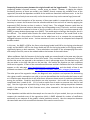
When you first launch the program, will see a macro security prompt pop up, and you should click
"Enable Macros." Next you will see a name label box which will initially show the name you appended
to the file name, if any. You can click through this box if you wish, or you can change it or add detail
concerning the analysis you are about to perform. For example, if you are going to analyze beer, you
might do this:
Whatever is entered here will be included in the date/time/name stamp on every analysis worksheet,
and by adding your name to it you can identify yourself (or your computer) as the source. If you have
not changed the file name and don’t enter anything in the name box, then “RegressIt 2.2.2” will appear
as the name label on your analysis worksheets.
When RegressIt is launched in an Excel session, it appears as a new toolbar on the top menu:
It is easy to operate, and if you are an Excel user who is already familiar with regression analysis, you
should find it to be self-explanatory. This handout provides a walk-through of its main features. The
examples shown here were created from the file called “Beer_sales.xlsx” that contains 52 weeks of sales
data for a well-known brand of light beer in 3 carton sizes (12-packs, 18-packs, 30-packs) at a small chain
of supermarkets. The prices and quantities have been converted into comparable units of cases (24
3
It is important to have your language and macro settings adjusted properly. Your macro security level must be
set to “Disable all macros with notification” and both your Windows and Office language settings should be some
version of English. (Other language settings may work but are not guaranteed. It is especially important for
number formats to use a period rather than a comma as the decimal separator, i.e., one-half should appear as
“0.5” rather than “0,5”.) If your macro settings are correct, a dialog box will pop up when you open the RegressIt
file, saying “Microsoft Office has identified a potential security concern.” Below it are buttons for “Enable macros”
and “Disable macros.” You should click ENABLE. Also, the Euro Currency Tools add-in should not be used with
RegressIt, and RegressIt will check for its presence and turn it off if necessary. It is easy to turn it on again: just go
to File/Options/Add-ins/Manage Excel add-ins/Go. More details are in the RegressIt installation instructions .
2
cans’ worth) of beer and average price per case. For example, the value of $19.98 for PRICE_12PK in
week 1 means that a 12-pack actually sold for $9.99 that week, and the value of 223.5 for CASES_12PK in
the same week means that 447 12-packs were sold.
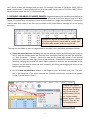
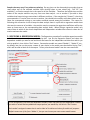
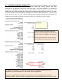
2. DEFINING VARIABLES AS NAMED RANGES: RegressIt expects your variables to be defined as
named column ranges in Excel, and variables which are to be used in the same analysis must be of same
length. It is usually most convenient to store all the variables on a single data worksheet in consecutive
columns with their names in the first row, as shown in the picture below, although this is not strictly
necessary.
Variables are defined as named ranges in Excel. They
should be organized in a single table on a single data
worksheet with variable names in the first row.
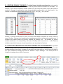
To assign the text labels in row 1 as range names for the data in the rows below, proceed as follows:
1. Select the entire data area (including the top row with the names) by positioning the cursor on
cell A1 and then holding down the Shift key while hitting the End key and then the Home key,
i.e.,“Shift-End-Home.” Caution: check to be sure that the lower right corner of the selected
(blue) area is really the lower right corner of the data area. Sometimes this automatic method of
selecting a range grabs an area with blank rows or columns or even the entire worksheet. If that
happens, you will need to select the area “manually” by clicking and dragging the cursor to the
bottom-right data value.
2. Hit the Create-Variable-Names button on the RegressIt menu and check (only) the “Top row”
box in the dialog box. (This button executes the Create-from-Selection command that appears
on the Formulas menu in Excel.)
To define the variables
for analysis, highlight the
table of data (including
the first row with the
variable names) and hit
the “Create Variable
Names” button. Check
only the “Top row” box
for creating names.
3
You can have any number of named ranges in your workbook, although you cannot use more than 50
variables at one time in the Data Analysis or Regression procedures. You can have up to 32500 rows of
data, although graphs may take a long time to draw if you have a huge number of rows. It is
recommended to NOT use the editable-graphs options for huge data sets, otherwise the graphs will
occupy a large amount of memory and it will be difficult to scroll up and down the worksheet while they
are continuously re-drawn.
The regression procedure has a range of options for output to produce. When only the default charts
and tables are produced, the running time for a regression with 50 variables and 32500 rows of data is
between 30 seconds and several minutes, depending on the computer’s speed and memory. Models
with more typical numbers of data rows and variables usually run in only a few seconds. Running times
are reasonably similar on a Mac with sufficient resources to devote to the virtual machine. On a Mac it
is especially important to close down other applications that may be competing for memory and CPU
cycles and use of the clipboard.
In general, if you encounter slow running times or Excel errors with RegressIt, the problem is usually
competition from other programs or add-ins that are running simultaneously. Re-booting the computer
and running RegressIt by itself usually solves such problems.
It is important that at the very beginning of your analysis, you should start from a “clean” workbook
that contains only data. It should not previously been used for any modeling or charting, and it should
not contain worksheets that have been directly copied from other workbooks where modeling or
charting has been done or where a crash previously occurred. When copying data from an existing
workbook to a new one for further analysis, the copy/paste-special/values command should be used in
order to paste only text and numbers onto a fresh worksheet in the new file. If the first data analysis or
regression that you run in a new workbook does not have "Data Analysis 1" or "Model 1" as the default
analysis name, you are not starting from clean data.
It is OK to re-open a workbook previously used for modeling, and then add more models to it, provided
that it was OK at the time you saved it. You just want to be sure that when you create a workbook in
which to begin a completely new analysis, the data that it contains should not be contaminated by any
modeling that may have been done somewhere else.
4
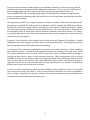
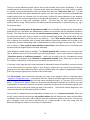
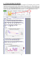
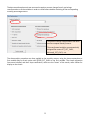
3. SUMMARY STATISTICS AND SERIES PLOTS: The Data Analysis procedure provides descriptive
statistics, correlations, series plots, and scatterplots for a selected group of variables. Simply click the
Data Analysis button on the RegressIt toolbar and check the boxes for the variables you wish to include.
The variable list that you see will only include variables containing at least some rows of numeric data.
In the Data Analysis
procedure, select the
variables you want to
analyze and choose plot
options. An identifying
analysis name can be
entered in the box at the
top, which will become the
name of the analysis
worksheet and also part of
the bitmapped audit trail
stamp on the sheet.
(Default names are of the
form "Data Analysis n.")
Scatterplots can be drawn
with or without regression
lines, with or without mean
values (center- of- mass
points), and they can be
restricted to plots having a
specified variable on the X
or Y axis, namely the
variable that is chosen to be
listed first in the summary
statistics table and
correlation matrix.
The results of running the Data Analysis procedure are stored on a new worksheet. The first row of the
worksheet contains a bitmapped date/time/username/analysis-name stamp that includes the name that
the user(s) entered at the name prompt when RegressIt was first loaded in the current Excel session.
Regression worksheets also include this. It identifies the analyst and/or the project for which the
analysis was done, and it contributes to the overall audit trail. For the purposes of this tutorial, the
default session name "RegressIt 2.2.2" was used, and "Statistics of sales and prices" was entered as the
name for this particular run of the data analysis procedure.
5
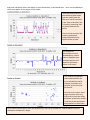
A bitmapped date/time/name
stamp appears at the top of
every analysis worksheet for
audit trail and user
identification purposes.
A complete table of
descriptive stats appears
at the top of the report.
Variables are sorted
alphabetically by
default, but you have the
option to choose the
variable to be listed first
in the tables and chart
arrays, in order to
emphasize the
dependent variable and
make it easy to find.
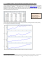
The series plots enable you to study
time patterns and to look for
notable events in the data history.
Here it is seen that occasional steep
increases in sales line up with steep
cuts in price for the same size
carton.
6
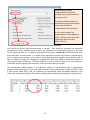
Descriptive stats and optional series plots appear in the upper part of the data analysis worksheet. The
correlation matrix and optional scatterplots appear below. We recommend that you always ask for
series plots in at least one of your data analysis runs, no matter how large the data set. These plots give
you a visual impression of each variable by itself and are vitally important if the variables are time series,
as they are here. The previous page shows a picture of the top portion of the Data Analysis report for
the variables selected above, which contains the descriptive statistics and series plots. Notice that sales
of all sizes of cartons spike upwards in some weeks, which usually are the weeks in which their prices are
reduced. (Some of the notable price drops and sales spikes for 12-packs have been circled.) Also, you
can see that the prices of 18-packs and 30-packs are manipulated more on a week-to-week basis than
those of 12-packs. These are properties of your data that you can clearly see when you look at the
series plots.
If you check the “Time series data” box (which was not done here), the output includes autocorrelation
statistics. which are the correlations of the variables with their own prior values. These “autos” are
provided for lags 1 through 7 and lag 12, which are the time lags that are of most interest in business
and economic data, where time series data may be sampled on a daily or monthly or quarterly basis and
there may be random-walk patterns or day-of-week patterns or monthly or quarterly seasonal patterns
4. CORRELATIONS AND SCATTERPLOT MATRICES: Below the summary statistics table and
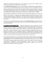
optional series plots, the Data Analysis procedure always shows you the correlation matrix of the
selected variables, i.e., all pairwise correlations between variables, which indicate the strength of their
linear relationships. Correlations less than 0.1 in magnitude, as well as the 1.0’s on the diagonal, are
shown in light gray, and those greater than 0.5 in magnitude are shown in boldface for visual emphasis.
(The color codes do not represent levels of statistical significance, which also depend on sample size.)
The correlation matrix is formatted with column
names down the diagonal to provide support for long
descriptive variable names, and font shading is used
to highlight the magnitudes of correlations. Here this
emphasizes that sales of each carton are most
strongly correlated with their own price.
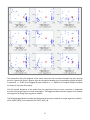
If you check the Show Scatter Plots box when running the Data Analysis procedure you will also get the
corresponding scatterplots, below the correlation matrix. You can choose to get a full matrix of all 2way scatterplots, or you can choose to generate only the scatterplots with a specified variable (the
optional “variable to list first”) on either the X or Y axis. Because this particular analysis includes 6
variables and the for-first-variable-only option was not used, the entire scatterplot matrix is a 6x6 array.
Here is a picture of the 3x3 submatrix of plots in the upper right corner, which shows the graphs of all
the cases-sold variables vs. all the price variables. The optional regression line and mean-value point (i.e.
the center of mass of the data) are included on each plot here:
7
Optional regression lines and meanvalue symbols have been included on
the scatterplots in this matrix.
Each individual plot in the matrix is a
separate Excel chart, fully labeled and
suitable for editing, resizing, and/or
copying to a report.
The X-axis title includes the correlation
and either its squared value or the slope
coefficient.
The plots are scaled to fit the minimum
and maximum values on each axis, to
spread the points out as much as
possible. This also shows what the min
and max values are for each variable.
Effectively each of these plots shows the
results of fitting a simple regression
model to the pair of variables.
In these correlations and scatterplots there is seen to be a significant negative relation between sales of
each size carton and its own price, as might be expected. The relation between the sales of one size
carton and the price of another size carton is positive—i.e., there appear to be “cross-elasticities”—
which is also in line with intuition, but it is a much less significant effect. The squares of the correlations
are the unadjusted R-squared values that would be obtained in simple regressions of one variable on
another. So, for example, the correlation of -0.859 between CASES_12PK and PRICE_12PK means that
you would get an unadjusted R-squared value of (-0.859)2 = 0.738 in a regression of one of these
variables on the other, as shown in the X-axis title for that scatterplot..
The scatterplots may take some time to draw if you choose to analyze a large number of variables at
once (e.g., 10 or more) and there are also many rows of data (e.g., 500 or more). If you run the
procedure and select n variables, you will get n2 plots, and the rate at which they are drawn depends on
the sample size. If you try this with 50 variables, you will get 2500 scatterplots on a single worksheet.
No kidding. The result is impressive to look at, but you may wait a while for it!
If the “Editable graphs” box is checked, the scatterplots can be edited later: they can be reshaped, their
point and line formats can be changed, and their chart and axis titles can be edited. The same is true of
all chart output in RegressIt. However, if your sample sizes are large, it may be more efficient to NOT
use this option in order in order to cut down on the time needed to re-draw charts as you scroll around
the worksheet. If this option is not chosen, all charts are simply bitmapped images.
8
Sample sizes may vary if any values are missing: On any given run the data analysis procedure ignores
rows where any of the selected variables have missing values or text values (e.g., “NA” for “not
available”), so that the sample size is the same for all the variables. Therefore the sample sizes and the
values of the sample statistics may vary from one data analysis run to another if you add or drop
variables that have missing or text values in different positions. If the sample size (“# cases”) is less than
you expected or if it varies from one run to another, you should look carefully at the data matrix to see if
there are unsuspected missing or text values scattered around among the variables. The reason for
following this convention is that it keeps the data analysis sheet in synch with a regression model sheet
that uses the same set of variables: the statistics used to compute the regression coefficients will be the
same as those seen on the corresponding data analysis sheet. When fitting a regression model, only
rows of data in which all the chosen dependent and independent variables have numeric values can be
used to estimate the model.
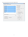
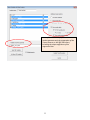
5. SPECIFYING A REGRESSION MODEL: The Regression procedure fits multiple regression models
and allows them to be easily compared side-by-side. Just hit the Regression button and select the
dependent variable you want to use and check the boxes for the independent variables from which you
wish to predict it, then hit the “Run” button. Consecutive models are named “Model 1”, “Model 2”, etc.,
by default, but you can also enter a name of your choice in the model name box before hitting “Run”,
and it will be used to label all of the output. "Linear price-demand model" was the name used here.
To run a regression, just select the dependent variable, check the boxes for the independent variables
you wish to include and any additional output options you would like, and hit the “Run” button.
Each model is assigned a name that is used to label all its tables and charts for audit trail purposes.
Default names are of the form “Model n”, but you can choose your own custom model names.
9
There are various additional output options that can be activated via the other checkboxes. If all your
variables consist of time series (i.e., variables whose values are ordered in time, such as daily or weekly
or monthly or annual observations), then you should also check the “Time series data” box. This will
connect the dots on plots where observation number is on the X-axis and it will also provide additional
model statistics that are relevant only for time series, namely the autocorrelations of the residuals,
which measure the statistical significance of unexplained time patterns. (Ideally they should be small in
magnitude with no strong and systematic pattern. The ones that are most important are the
autocorrelations at lags 1 and 2 and also the seasonal period if seasonality is a potential issue, e.g., lag 4
for quarterly data.)
If the “Forecast missing values of dependent variable” box is checked, forecasts will be automatically
generated for any rows where the independent variables are all present and the dependent variable is
missing. This check-box also activates the manual forecasting option in which data for forecasting can
be entered by hand after fitting a model, as will be demonstrated below. (The model sheet will not
include a forecast table at all if this box is not checked.) If the “Save residual table to model sheet”
box is checked, the complete table of actual and predicted values and residuals will be saved to the
model sheet, sorted in descending order of absolute value to place the largest errors at the top. There is
also an option to “Save residuals and predictions to data sheet” which allows you to consolidate your
forecasts and your original data on the same worksheet.
Other diagnostic model output is available. The “Normal quantile plot” provides a more sensitive visual
test of whether the errors of the model are normally distributed. You can also choose to display the
“Correlation matrix of coefficient estimates”, which can be used to test for redundancies among
predictors, and a complete set of “Residual vs. independent variable” plots, which can be used to test
for nonlinear relationships and factors that may affect the size of the errors.
If you have a very large data set (many thousands of rows and/or dozens of variables), you may not wish
to use these options in the early stages of your analysis, because they are more time-consuming to
generate than the other tables and charts, and the residual table and residual-vs-independent-variable
plots may occupy a large amount of space on the model sheet.
The “No constant” option forces the intercept to be zero in the equation, which is sometimes called
"regression through the origin". In the special case of a simple (1-variable) regression model, this means
that the regression line is a straight line that passes through the origin, i.e., the point (0, 0) in the X-Y
plane. If you use this option, values for R-squared and adjusted R-squared do not have the usual
interpretation as measures of percent-of-variance explained, and there are not universally agreed upon
formulas for them, so they may not be the same in all software. The formulas used by RegressIt in this
respect are the same as those used by SPSS and Stata.
You can also fit a model that has no independent variables at all, i.e., a constant-only model. When you
do this, you are merely performing a one-variable analysis that will calculate the mean of the variable,
confidence limits for the mean, and confidence limits for predictions based on the mean. You can also
get a histogram chart and normal quantile plot of a single variable in this way, along with the
Anderson-Darling test statistic for normality of its distribution.
10
6. THE REGRESSION MODEL OUTPUT WORKSHEET: The regression results for each model are
stored on a new worksheet whose name is whatever model name was entered in the name box on the
regression input panel when the model was run (either a default name such as “Model n” or a custom
name of your choice). Here’s a picture of a portion of the regression output which appears at the top of
the model sheet for the regression of CASES_18PK on PRICE_18PK. More tables and charts are below it.
The results for each model are stored on a new worksheet. At the top, the usual regression summary table
appears. For a simple (1-variable) regression model, a line fit plot with confidence bands is included. Here the
estimated slope of the line is -93, suggesting that a $1 increase in price will lead to a 93 case decrease in sales.
The confidence level in the upper right can be interactively adjusted and all statistics and charts on the sheet
will be instantly updated.
Every table and chart on the model sheet has a title that includes the model name, the dependent variable
name, and the sample size, allowing output to be traced to its source if it is copied to other documents.
11
In this model, the slope coefficient is -93, indicating that a $1 increase in price is predicted to yield a 93
case decrease in sales. The standard error of the regression, which is 130, is (roughly) the standard
deviation of the errors within the sample of data that was fitted. R-squared, which is the fraction by
which the sample variance of the errors is less than the sample variance of the dependent variable, is
0.75. This may look impressive ("75% of the variance has been explained!"), but a big R-squared does
not necessarily mean a good model, as closer inspection of this one will reveal.
The regression summary results (and line fit plot if any) are followed by a table of residual distribution
statistics, including the Anderson-Darling test for a non-normal error distribution and the minimum and
maximum standardized residuals (i.e., errors divided by the standard error of the regression). If the
“Time series data” box was checked, a table of residual autocorrelations is also shown.
Autocorrelations less than 0.1 in magnitude are shown in light gray and those greater than 0.5 are
shown in boldface, just for visual emphasis, not as an indicator of statistical significance.
If you click the “+” symbol that appears in the left sidebar in the row below “Dependent Variable,” you
will see the model equation printed out in text form, suitable for copying into a report, as well as the list
of independent variables in a single text string. The analysis-of-variance report is also hidden by default,
but it can be displayed by clicking the “+” next to its title row. Every table and chart on the model sheet
can be displayed or hidden in this fashion.
Here the model
equation and
analysis-of-variance
table have been
unhidden by clicking
the +’s next to their
first rows.
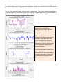
More charts appear farther down on the model sheet. The output always includes a chart of actual and
predicted values vs. observation number, residuals vs. observation number, residuals vs. predicted
values, residual histogram plot, and a line fit plot in the case of a simple (1-variable) regression model.
Forecasts, if any were produced, are shown in a table and also plotted. The normal quantile plot of the
residuals and plots of residuals vs. each of the independent variables are available as options.
The regression charts and tables are sized to be printable at 100% scaling on 8.5” wide paper, except
when very long variables stretch out some of the tables. The default print area is pre-set to include all
pages of output, so the entire output is printable on standard-width paper with a few keystrokes, leaving
a complete audit trail in hard-copy form. However, for presentation purposes, it is usually best to copy
12
and paste individual charts and tables to other documents, as discussed later. Here are the additional
charts that appear in the output of this model:
The actual-and-predicted-vsobservation # chart shows
how the model fitted the
data on a row-by-row basis.
If the “time series data” box
is checked, connecting lines
are drawn between the
points.
Here it can be seen that the
model systematically
underpredicted the very
highest values of sales.
The residual-vsobservation # chart is
formatted as a column
chart to highlight signs
and time patterns and
locations of extreme
values in the errors.
The residual-vs-predicted
chart shows whether the
errors exhibit bias and/or
changes in variance as a
function of the size of the
predictions.
Here the errors have a much
larger variance when very
high levels of sales are being
predicted, as was also evident
in the line fit plot and actualand-predicted-vs-obs# chart.
On all charts, marker (point) sizes are adjusted to fit the size of the data set: smaller marker sizes are
used when the data set is larger.
13
The residual histogram chart and optional
normal quantile plot indicate whether the
distribution of the errors is satisfactorily
close to a normal distribution.
The chart titles include the results of the
Anderson-Darling test for normality, along
with its P-value. A P-value close to zero
indicates a significantly non-normal
distribution.
Here the errors do not have a normal
distribution.
A histogram chart of the residuals is always included in the output. The optional normal quantile plot is a
plot in which the actual standardized residuals are plotted against their theoretical values for a sample
of the same size drawn from a normal distribution, and deviations from the (red) diagonal reference line
show the extent to which the residual distribution is non-normal. The (adjusted) Anderson-Darling
statistic tests the hypothesis that the residual distribution is normal. In this case the hypothesis of a
normal distribution is rejected at the 0.1% level of significance (P=0 means P<0.0005, because no more
than 3 decimal places are displayed).
For this particular model, none of the residual plots is satisfactory, and the line fit plot shows that it
actually predicts negative values of sales for prices greater than about $19.50 per case! The regression
standard error of 130 also cannot be taken seriously as the standard deviation of a typical forecast error,
particularly at higher price levels, because the number of cases sold is typically only around 50 in weeks
where there is not a significant price reduction. These issues suggest that some sort of transformation
of variables might be appropriate. An example of applying a nonlinear transformation to this data set
will be illustrated in section 8 below.
14
If the “Save residual table to model sheet” box is checked on the regression input panel, as it was here,
the bottom of the model sheet includes a table that shows actual and predicted values, residuals, and
standardized residuals for all rows in the data file. The table is sorted in descending order of absolute
values of the residuals, so that “outliers” appear at the top.
The residual table shows that the largest
error occurred in week 29, where the
highest sales value of the year was
significantly underpredicted.
A large overprediction occurred in row 18.
etc.
7. FORECASTING FROM A REGRESSION MODEL: If you wish to generate forecasts from your
fitted regression model, there are two ways to do it in RegressIt: manually and automatically. In the
manual forecasting approach, define your variables so that they contain only the sample data to be
used for estimating the model, not the data to be used for forecasting. After fitting a regression model
(with the “Forecast missing values of dependent variable” box checked), scroll down to the line on the
worksheet that says “Forecasts: Model n for… etc.”, and click the + in the left sidebar of the sheet in
order to maximize (i.e., open up) the forecast table. Then type (or copy-and-paste) values for the
independent variables into the cells at the right end of the forecast table, as in the PRICE_ 18PK column
in the table below, and then click the Forecasting button. The forecasts and their confidence limits will
then be computed and displayed in the cells to the left. A plot of the forecasts is also produced,
showing the forecasts together with confidence limits for both means and forecasts. The confidence
level is whatever value is currently entered in the cell at the top right corner of the model sheet (95% by
default). A confidence interval for the mean is a confidence interval for the true height of the
regression line for the given values of the independent variables. A confidence interval for the forecast
is a confidence interval for a prediction that is based on the regression line. The latter confidence
interval also takes into account the unexplained variations of the data around the regression line, so it is
always wider.
When forecasts are generated, they are also shown on the actual-and-predicted-versus-observation#
chart when the forecast table is maximized (visible). If you minimize the forecast table again, this chart
will be dynamically redrawn without the forecasts.
15
Yike!
If forecasts are produced, they are also shown
on the actual-and-predicted-vs-obs# chart if
the forecast table is currently maximized.
16
Notice that the lower 95% confidence limit of the forecast for a price of $18 is negative, another
reflection of the model's lack of realism that was noted earlier.
In the automatic forecasting approach, which is more systematic and more suitable for generating many
forecasts at once and/or generating forecasts from every model you fit, define your variables up front so
that they include rows for out-of-sample data from which forecasts are to be computed later. RegressIt
will automatically generate forecasts for any rows where all of the independent variables have values
but the dependent variable is missing (i.e., has a blank cell). The variables must all be ranges with the
same length, but the dependent variable will have some empty cells at the bottom or elsewhere.
The advantage of this approach is that you only need to enter the forecast data once, at the time the
data file is first created. It will then be used to generate forecasts from every model you fit (if the
forecast-missing-values box is checked) and it will automatically be transformed if you apply a data
transformation to the dependent variable later. Also, when using this method it is possible for forecasts
to be generated in the middle of the data set if missing values of the dependent variable happen to
occur there.
You can also use the automatic forecasting feature to do out-of-sample testing of a model by removing
the values of the dependent variable from a large block of rows and then comparing the forecasts to the
actual values afterward.
8. VARIABLE TRANSFORMATIONS: A regression model does not merely assume that “Y is some
function of X1, X2, ...” It makes very strong and specific assumptions about the nature of the patterns in
the data: the predicted value of the dependent variable is a straight-line function of each of the
independent variables, holding the others fixed, and the slope of this line doesn’t depend on what those
fixed values of the other variables are, and the effects of different independent variables on the
predictions are additive, and the unexplained variations are independently and identically normally
distributed. If your data does not satisfy all these assumptions closely enough for valid predictions and
inferences, it may be possible to fix the problem through a mathematical transformation of one or more
variables, and this is what makes linear regression so useful even in a nonlinear world.
At any stage in your analysis you can create new variables in additional columns by entering and copying
your own Excel formulas and assigning range names to the results. However, there is also a Variable
Transformation tool on the Data Analysis and Regression input panels that allows you to easily create
new variables by applying standard transformations to your existing variables, such as the natural log
transformation or exponential or power transformations. Here is the full list of available
transformations, including time series transformations (lag, difference, deflate, etc.) that are only
available if the “time series data” box was checked:
17
A wide array of variable
transformations is available,
and they can be performed with a
few mouse clicks.
The newly created variables are
automatically assigned descriptive
names that indicate the
transformation which was used.
In this case the natural log
transformation is being applied to
PRICE_12PK, and the transformed
variable will have the name
PRICE_12PK_LN.
You should not choose data transformations at random: they should be motivated by theoretical
considerations and/or standard practice and/or the appearance of recognizable patterns in the data.
For this particular data set, it would be appropriate to consider a natural log transformation for both
prices and sales, as shown above. In a simple linear regression of natural-log-of-sales on natural-log-ofprice, a small percent change in price leads to a proportional percent change in the predicted value of
sales, and effects of larger price changes are compounded rather than added, a common assumption in
the economic theory of demand. The slope coefficient in such a model is known as the “price elasticity”
of demand, and the log-log model assumes it to be the same at every price level.
The transformed variable appears in an additional column on the worksheet and is automatically
assigned a descriptive name. In this case, when the natural-log-transformation is applied to PRICE_12PK,
a new column called PRICE_12PK_LN containing the transformed values will appear adjacent to the
column for the original variable, and its column heading will be automatically assigned as a range name:
18
Now let's re-do the descriptive analysis using the six logged variables:
19
The series plots and scatterplots of the logged variables are shown below:
20
The scatterplots along the diagonal of the matrix show that the correlation between log sales and log
price for a given size carton is greater than the correlation between the corresponding original variables.
In particular, r = -0.942 for the logged 18-pack variables vs. r = -0.866 for the original 18-pack variables
(as shown in the titles of the plots).
Also the vertical deviations of the points from the regression lines are more consistent in magnitude
across the full range of prices in these scatterplots. The logged variables therefore appear to be a better
starting point for fitting linear regression models.
The following page shows the model specification and summary output for a simple regression model in
which CASES_18PK_LN is predicted from PRICE_18PK_LN.
21
In a simple regression model of the natural
logs of two variables, the slope coefficient is
interpretable as the percent change in the
dependent variable per percent change in
the independent variable, on the margin,
which is the price elasticity of demand.
Here the slope coefficient turns out to
be -6.705, which indicates that on the
margin a 1% decrease in price can be
expected to lead to a 6.7% increase in sales.
The log-log model predicts a compounding
of this effect for larger percentage changes.
The A-D stat is very satisfactory, indicating
an approximately normal error distribution,
and the lag-1 autocorrelation of the errors
(0.092) is much smaller than in magnitude
than that of the previous model (-0.222),
indicating less of a short-term pattern in
signs of the errors.
Shading of fonts for autocorrelations is the
same as that for correlations and does not
indicate statistical significance relative to
the sample size. Those less than 0.1 in
magnitude are light gray, and those greater
than 0.5 in magnitude are in in boldface,
merely for visual emphasis.
22
In this model, the relationship between independent and dependent variables appears to be quite linear,
with similar-sized errors for large and small predictions, and the very small A-D stat of 0.335 indicates
that the error distribution is satisfactorily normal for this sample size.
The rest of the graphical output of this model is shown below. The plots of actual-and-predicted-vsobserved, residuals-vs-row-number, residuals-vs-predicted, and normal quantiles are much superior to
those of the first model in terms of validating the assumptions of the regression model.
All of the chart output from this model
indicates that it satisfies the
assumptions of a linear regression
model much better than the previous
model did.
This model does a better job in
predicting the relative magnitudes of
increases in sales that occur when
prices are dropped, the errors are
consistent in size for large and small
predictions, and the error distribution
is not significantly different from a
normal distribution.
This model also makes smaller errors
in both real and percentage terms
after its forecasts are converted back
to units of cases sold, as shown with
some additional calculations in the
accompanying spreadsheet file.
23
Comparing forecast accuracy between the original model and the logged model: The bottom line in
comparing models is forecast accuracy: smaller errors are better! However, in judging the relative
forecasting accuracy of these two models, you CANNOT directly compare the standard errors of the
regressions, because the dependent variables of the models are measured in different units. In the first
model the units of analysis are cases sold, and in the second one they are the natural log of cases sold.
For a head-to-head comparison of the accuracy of these two models in comparable terms it would be
necessary to convert the forecasts from the second model back into real units of cases by applying the
exponential (EXP) function to them in order to “unlog” them. The unlogged forecasts could then be
subtracted from the actual values to determine the corresponding errors in real units, and their average
magnitudes could be compared to those of the first model in terms of (say) root-mean-squared error
(RMSE) or mean absolute percentage error (MAPE). This would require creating a few formulas, but it is
not difficult. The residual table contains the actual values and forecasts of the model fitted to the
logged data, and a few columns of formulas can be added next to it to compute the corresponding
unlogged forecasts and their errors. Various measures of error can then be computed and compared
between models
In this case, the RMSE is 128 for the linear price-demand model and 118 for the log-log price-demand
model, and the MAPE is 43% for the linear model and 30% for the log-log model, so the log-log model is
significantly better on both measures. These calculations are shown in the accompanying beer-saleswith-analysis Excel file, next to the residual tables at the bottom of the model sheets.
When confidence limits for forecasts of the log-log model are untransformed in the same way, they are
also much more realistic than those of the linear model. They are wider for larger forecasts, reflecting
the fact that errors are expected to be consistent in size in percentage terms, not absolute terms, and
they are wider on the high side than on the low side. Also neither the forecasts nor their confidence
limits can be negative. A chart of the untransformed forecasts and their confidence limits for this model
appears on this web page: http://people.duke.edu/~rnau/regex3.htm, and the details of how it was
produced are shown in this Excel file: http://regressit.com/Beer_sales_with_unlogged_forecasts.xlsx.
The other parts of the regression output--the diagnostic tests and plots--are important for determining
that a given model’s assumptions are valid, so you can be confident that it will predict the future as well
as it fitted the past data and that it will yield correct inferences about causal or predictive relationships
among the variables. Simplicity and intuition are also important: don’t make the model any more
complicated than it needs to be. (If it is hard to explain how it works to someone else, that’s a bad
sign.) But the single most important thing to keep your eye on when making comparisons between
models is the average size of their forecast errors, when measured in the same units for the same
sample of data.
If the dependent variable and the data sample are the same for all your models, then you can directly
compare the standard errors of the regressions (which is RMSE adjusted for number of coefficients
estimated) as one measure of the models’ relative predictive accuracy. Here the comparison between
the two models was a little more difficult because of the need to convert units.
24
9. MODIFYING A REGRESSION MODEL: It is easy to modify an existing model by adding or
removing variables. If you hit the Regression button while positioned on an existing model worksheet,
the variable specifications for that model are the starting point for the next model. You can add or
remove a variable relative to that model by checking or unchecking a single box. Here, the variable
transformation tool was used to create logged values of price and sales of 12-packs and 30-packs, and
the logged price variables for the other two size cartons were added to look for substitution effects. The
week indicator variable (the time index) was also included to adjust for trends in the variables:
Three more variables (prices of other size cartons and the
week number) have been added to the previous model.
Their coefficients are all significantly different from zero, as
indicated by t-statistics much greater than 2 in magnitude.
The coefficients of the other two price variables are “crossprice elasticities”, and they are both positive, which is in line
with intuition: increasing the price of another size carton
leads consumers to buy more 18 packs instead.
The trend variable (week number) turns out to be
significant. However, in a model with multiple independent
variables, the coefficient of the trend variable does not
literally measure the trend in the forecasts. Rather, it
adjusts for differences in trends among all the variables.
The A-D stat and residual autocorrelations also look good
for this model, indicating a normal error distribution and no
significant time patterns in the errors.
Most importantly, the standard error of the regression of
this model is 0.244, which is substantially less than the value
of 0.356 obtained in the previous model. (These numbers
can be directly compared because they are in the same units
and the data sample is the same.) If Model 3’s RMSE and
MAPE are also computed, they turn out to be 82 and 18%
respectively, compared to 118 and 30% for Model 2.
Note that the standard error of the Week coefficient
estimate is formatted with more decimal places because of
its very small size (less than 0.003). The number of decimal
places displayed by default is adjusted to the scale of the
numbers in blocks of 3 to avoid showing too many or too
few digits while keeping decimal points lined up to the
greatest extent possible. Of course, the double-precision
floating point values in the cells on the worksheet can be
manually reformatted to display as many significant digits
as you wish (up to 15).
25
10. THE MODEL SUMMARY WORKSHEET: An innovative feature of RegressIt is that it maintains
a separate “Model Summary” worksheet that shows side-by-side summary statistics and model
coefficients for all regression models that have been fitted in the same workbook. This allows easy
comparison of models, and it also provides an audit trail for all of the models you have fitted so far.
Models that used a different dependent variable are arranged side-by-side farther down on the sheet.
Here’s an example of the model summary worksheet for the three models fitted above. If you move the
mouse over one of the “run time” cells, you will get a pop-up window showing you the elapsed time
needed to run the model and produce the output, which was 2 seconds for the first model:
The model summary worksheet shows the
summary stats and coefficient estimates and
their P-values for all models in the workbook.
The run times can also be seen by mousing
over the date/time stamps as shown above.
The stats of models fitted to the same dependent variable are displayed side-by-side for easy
comparison, as illustrated here for the two models fitted to logged data.
In this case, the inclusion of the additional 3 variables in the last model affected the estimated
coefficient of PRICE_18PK_LN, but not by a huge amount. Its value changed (only) from -0.67 to -0.59.
26
11. CREATING DUMMY VARIABLES: The Make Dummy Variables transformation can be used to
create dummy (0-1) variables from variables that may consist either of numbers or text labels. For
example, if your data set includes a variable called “QTR” that consists of quarter-of-year data coded as
numbers 1 through 4, applying the create-dummy-variable transformation to it would result in the
creation of 4 additional columns with the names QTR_EQ_1, QTR_EQ_2, etc., like this:
Similarly, if you had monthly data in which a column called MONTH contained the months coded as
names (January, February, etc.), applying the make-dummy-variable transformation would create 12
variables with names MONTH_EQ_January, MONTH_EQ_February, etc. The MONTH_EQ_January
variable would have a 1 in every January row and a 0 in every other row, and so on. A set of dummy
variables created in this way can be used to perform a one-way analysis of variance.
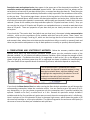
12. DISPLAYING GRIDLINES AND COLUMN HEADINGS ON THE SPREADSHEET: By default
the data analysis sheets and model sheets do not show gridlines and column headings, in order to make
the data stand out more clearly. However, if you wish to turn them back on, you can do so by going to
the “View” toolbar and clicking the boxes for “Gridlines” and/or “Headings.” This allows you to do
things like changing column widths if necessary.
27
13. COPYING OUTPUT TO WORD AND POWERPOINT FILES OR OTHER SOFTWARE
The various tables and charts produced by RegressIt have been designed in such a way that they can be
easily copied and pasted to document files, or saved to pdf files, and the table and chart titles all include
the name of the dependent variable and the model name so that they can be traced back to their source
in the Excel file.
When copying and pasting a chart or table (or a section of the worksheet containing multiple charts or
tables) into a Word or Powerpoint file, there are several alternatives. Select and copy the chart or the
desired section of the Excel worksheet to the clipboard, then go to Word or Powerpoint. On the Home
tab, the pull-down Paste menu has a row of icons for some predetermined options as well as a “paste
special” option. The icons for the predetermined options allow you to do things like paste tables in a
form that allows their contents to edited, give them the same format as either their source or
destination, and merge their contents into other tables. We suggest that you use the “picture” option,
which is on the right end of the list of icons, or else choose “paste special” and then choose one of the
picture formats (usually “bitmap” or “png” produces the best results ). This will paste the table or chart
as an image whose contents cannot be edited. It can be scaled up and down in a way that will keep
everything in proportion, and it will be secure against having its numbers changed later on.
You can also copy and paste the table or chart or cell range to a graphics program such as Microsoft
Paint and then save it as a separate file (say, in JPEG format) that could be imported into any other
software that handles graphics (e.g., Photoshop).
For exporting in pdf format, you can simply use the File/Save-as command to save the entire contents of
any given worksheet to a pdf file. To save only a portion (say, a single chart or table), copy and paste it
to a new worksheet first (picture format works best for this), then save that worksheet as a pdf file.
If you wish to edit your charts in ways other than just scaling up or down (changing colors, titles, point
and line formats, etc.), it is usually best to do this in the original Excel file and then copy and paste the
resulting chart to another program in picture format.
28
14. SETTING PAGE BREAKS FOR PRINTING
The regression model worksheet is pre-formatted for printing on 8.5" wide paper or pdf: just choose
File/Print from the menu and the entire model's output will be printed at once. Before doing this, you
should adjust the page breaks if necessary so that a table or graph will not get cut in half. This only takes
a few seconds. Go to View/Page Break Preview on the menu, then grab and move the blue dashed line
to place it just above a chart that is about to be cut in half. Then click the Normal button to return.
29
After doing this, you should find that the next 3 charts will exactly fit on the second page:
Data analysis worksheets are pre-formatted so that the summary statistics table and series charts will fit
in a single page width. Correlation matrices and scatterplot matrices may or may not fit, depending on
the number of variables, although it is easy to select custom ranges and scale factors if needed.
30
15. A FINANCE EXAMPLE: CALCULATING BETAS FOR MANY STOCKS AT ONCE
Here is another example that illustrates the use of data transformations and the features of the data
analysis procedure in RegressIt. The original data, in the file called Stock_returns.xlsx, consists of
beginning-of-month values of the S&P 500 index and the prices of three stocks—A&T, Microsoft, and
Nordstrom—from April 2010 to March 2015, downloaded from the Yahoo Finance web site.4 The first
few rows and last few rows look like this:
5 years of adjusted
monthly beginning
prices for 3 stocks and
the S&P 500 index.
Here are the series plots generated by the data analysis procedure, showing dramatic and fairly steady
price increases over this historical time range:
4
The four stock price series were downloaded in separate Excel files and then copied to a single worksheet. The price histories
obtained from Yahoo are adjusted for dividends and stock splits, so their monthly percentage changes are total returns.
31
The data transformation tool was next used to apply a percent-change-from-1-period-ago
transformation to all the variables in order to create new variables consisting of the corresponding
monthly percentage returns.
The percent-change transformation has been
used to compute monthly returns.
The transformed variables are automatically
assigned the names ATT_PCT_CHG1,
Microsoft_PCT_CHG1, etc.
The data analysis procedure was then applied to the monthly returns, using the show-scatterplots-vsfirst-variable-only-on-X-axis option with SP500_PCT_CHG1 as the first variable. The simple regression
lines were included, and their slope coefficients, which are the “betas” of the stocks, were chosen for
display on the charts:
32
The vs-first-variable-only option has been
used to generate only the scatterplots of the
3 stock returns vs. the S&P 500 return,
including the slope coefficients of the
regression lines.
33
The resulting data analysis sheet shows a
comparison of the simple regressions of the
three stock returns against the S&P500
return. The estimated slope coefficients
(betas) are 0.427 for AT&T, 0.811 for
Microsoft, and 1.258 for Nordstrom, as seen
in the chart titles.
According to the Capital Asset Pricing Model
(CAPM), beta is an indicator of the relative
risk and relative return of a stock, in
comparison to the market as a whole.
A stock whose beta is greater [less] than 1 is
more [less] risky than the market and should
be expected to yield proportionally greater
[smaller] returns on average.
Strictly speaking, betas should be calculated
using “excess” returns (differences between
the monthly return and the current risk-free
rate of interest) rather than nominal returns.
However, the risk-free rate of interest was so
close to zero during these years that it
doesn’t make much difference here.
Performing these four data transformations
and then running this procedure took less
than a minute and required only a few
keystrokes. It then took just a few more
keystrokes to fit all three models separately
with full output.
34
The upper part of the worksheet for the full AT&T regression model is pictured here. The AndersonDarling test indicates that the distribution of the errors is approximately normal.
The residual
autocorrelations are all very insignificant. Standard errors for autocorrelations are stored in the row just
below the autocorrelation table, although their font color is initially set to white to hide them by default.
Here the font color for the standard errors has been changed to black, and it can be seen that the
autocorrelations are well within two standard errors from zero.
35