1
GIS Mapping on Mussel Culture
ProFMos: Data Management, GIS Mapping and
Spatial Analysis of Mussel Growth in the Eastern Scheldt
Ingrid Wong
Vlissingen, July 2014
TABLE OF CONTENTS
1.0 INTRODUCTION ......................................................................................................... 2
1.1 RESEARCH LOCATION ........................................................................................................ 3
1.2 RESEARCH OBJECTIVES AND QUESTIONS .......................................................................... 4
2.0 APPROACHES ............................................................................................................. 6
2.1.1 EXCEL DATA MANAGEMENT .......................................................................................... 6
2.1.2 EXCEL DATA SORTING INTO INDIVIDUAL SPREADSHEETS .............................................. 7
2.1.3 EXCEL SPREADSHEET SET-UP REARRANGEMENT ........................................................... 9
2.2 ACCESS DATABASE CREATION ........................................................................................... 9
2.3 GIS MAP PRODUCTION .................................................................................................... 11
3.0 PRODUCTS AND RESULTS ........................................................................................ 13
3.1 INTERMEDIATE PRODUCTS ............................................................................................. 13
3.2 FINAL PRODUCTS AND RESULTS ...................................................................................... 14
4.0 DISCUSSION ............................................................................................................. 17
4.1 METHODS USED .............................................................................................................. 17
4.2 RESULTS DISPLAYED ON MAPS ........................................................................................ 18
4.3 ADDITIONAL DATA PROVIDED TO ANALYZE MUSSEL GROWTH ..................................... 20
5.0 CONCLUSION AND RECOMMENDATION ................................................................. 22
6.0 REFERENCES ............................................................................................................. 24
7.0 APPENDIX ................................................................................................................. 25
7.1 DETAILED STEPS: ACCESS DATABASE CREATION (SECTION 2.2) ..................................... 25
7.2 DETAILED STEPS: ACCESS SPECIFIC SEARCHES AND PLOT TRACKING (SECTION 2.2) ...... 31
7.3 DETAILED STEPS: ARCGIS MAP PRODUCTION (SECTION 2.3).......................................... 33
1.0 INTRODUCTION
Aquaculture is the farming of aquatic organisms such as fish, molluscs, crustaceans
and aquatic plants being practiced all around the world (FAO, 2014). Similar with
agriculture and grazing, the purpose of aquaculture is to use different forms of
intervention in stocking, feeding, predation and disease control, etc. to enhance
production mainly for consumption (FAO, 2014). In Europe, marine aquaculture is a
fast growing economic sector especially in coastal Atlantic countries such as Norway,
Spain, France, the Netherlands, Ireland, etc. Among all the different aquatic animal
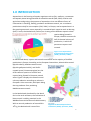
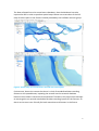
species being farmed in
Europe, shellfish accounts for
half of the total volume of
production, in which 90
percent are oysters and
mussels.
Figure 1: EU Aquaculture
Production by Product Type
(2009). (Eurostat, 2009).
As mentioned above, oysters and mussels contributes to the majority of shellfish
production in Europe. According to the European Commission, Atlantic blue mussel
(Mytilus edulis), Mediterranean mussel
(Mytilus galloprovincialis), and Pacific
cupped oyster (Crassostrea gigas) are the
three common species of mussels and
oysters being farmed in European coastal
areas. Figure 2 displays the overall mussel
culture production according to volume in
European Union countries, with Spain being
the top producer from producing
Mediterranean mussels.
In the Netherlands, bordered by the North
Sea in the north and west, the cultivation of
blue mussels is widely practiced in the
Wadden Sea and the Eastern Scheldt estuary.
With an annual production of around 80 x
106 kg, the Netherlands is one of the
Figure 2: EU Mussel Aquaculture
Production (2009). (Eurostat, 2009).
2
European countries that produces the largest amount of blue mussels. However,
recent studies showed that over the past fifteen years, the total production of mussels
in Europe has decreased by 50% (Smaal, Schellekens, van Stralen, & Kromkamp, 2013).
Therefore, researchers are trying to understand the factors that affect growth patterns
of mussels, such as farming methods, food availability, predation, other specific
environmental conditions, etc.
This project, named "Data Management, GIS Mapping and Spatial Analysis in the
Eastern Scheldt" is part of the "Production Factors of Mussel Culture in the Eastern
Scheldt Project" (ProFMos) hosted by the Aquaculture Research Group, part of the
Delta Academy of the HZ University of Applied Sciences. The objective of the ProFMos
project is to determine the production factors of mussel culture in the Eastern Scheldt
as to optimize production yield. Relying on the mussel growth data provided by a
group of mussel farmer representatives at different culture plots, the research group
seeks to use GIS as an aid to visualize and analyze mussel growth in the Eastern
Scheldt.
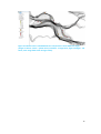
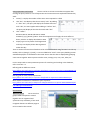
1.1 RESEARCH LOCATION
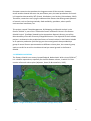
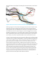
The Eastern Scheldt is an estuary located Zeeland, Netherlands. With a size of 350 km2,
it is a hub for aquaculture, especially for shellfish bottom culture, in which 22.5 km2
consists of mussel culture plots (Wijsman, Smaal, & Brummelhuis, 2007).
Figure 3 : Google Earth Map of the Eastern Scheldt. (Google Earth, 2014)
3
1.2 RESEARCH OBJECTIVES AND QUESTIONS
The ProFMos project aims to optimize the yield within the carrying capacity of the
Eastern Scheldt through improving the efficiency of the culture cycle. As to achieve
the main objective, nine specific research questions were set up, and this GIS project
is set up to focus on one of the nine questions:
What is the spatial distribution of growth and loss in the Eastern Scheldt?
It is expected that the ultimate product of this project is to have at least one GIS map
created that will be able to provide spatial information on the overall mussel growth
and loss in the Eastern Scheldt or the average growth rates of mussels on individual
mussel plots for the ProFMos research group. Using different layers of colours,
symbols or wordings, this project also aims to explore the following sub-question:
What is the best way to effectively display spatial information of mussel growth
and loss?
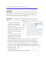
Before achieving the final product of this project, management of the data provided
by mussel farmers is required. To collect mussel measurements at different culture
plots operated by different farmers, each farmer is distributed with an electronic Excel
data spreadsheet, and they are required to fill out the spreadsheet according to the
growth stages, culture plot locations, seed origins, dates of measurements, amount in
standardized can, gross amount in tons, and treatments practiced. Below is an
example:
Figure 4: Excel spreadsheet of the data record sheet for mussel farmers.
4
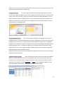
The data collected has to be sorted onto a database, then the database has to be
imported to GIS in order to produce spatial maps. Below are screenshots of the GIS
map of culture plots in the Eastern Scheldt provided by the ProFMos research group:
Figure 5: ArcGIS map view of the Eastern Scheldt with culture plots.
Furthermore, due to the reason that there is a lack of standardized data recording
formats on the spreadsheets, inputting the records into the research database
becomes more labour intensive and complicated. Therefore, this project also attempts
to rearrange the set-up and standardize the data recording system for the farmers. So
that it can be more user-friendly for both researchers and farmers in the future.
5
2.0 APPROACHES
This project was divided into three main parts of approaches according to the
software to be used – Microsoft Excel, Microsoft Access, and ESRI ArcGIS stages. The
following are all the activities that were conducted according to chronological order,
which also meant that part 2 started when part 1 was completed, vice versa. As the
methods used in this project are fairly specific and exclusive, a detailed user guide for
Access and ArcGIS were written in the appendix for future users that require similar
actions that was conducted in this project.
2.1.1 EXCEL DATA MANAGEMENT
This is the first sub-part of part 1, software involved: Microsoft Excel 2007-2013. The
work that was done was data check of the Excel spreadsheets the mussel farmers
submitted to the research group. In this section, all the data has to be modified into a
unified format and without any errors because it was mandatory to prevent data
duplication for database creation in part 2. Below are some screenshots of some of
the errors that needed to be fixed.
Figure 6: Excel datasheet from farmers plot name spelling error.
Figure 7 (above): Excel datasheet from
farmers - incorrect date format.
Figure 8 (right) : Excel datasheet
from farmers - inconsistent plot
name letter cases.
Due to the reason that the amount of data
was not large, most of the modifications were done manually instead of using built-in
functions.
Methods:
1. Sort: Group and sort the plot locations according to plot numbers so that data at
the same location is grouped together as to spot errors easier
6
2.
3.
Format check: Make sure all dates are of format “dd/mm/yyyy”, manually modify
discovered errors
Spell check: Spot spelling errors of location names, manually modify discovered
errors
4. Letter case check: Check location names and plot/section numbers, the same
location has to have the same case, manual modifications included:
'OSWD' cannot be 'oswd'
Beginning of full location names should be capitalized, e.g. ‘Hammen’ cannot
be ‘hammen’
Sub-sections should be in lower cases, e.g. 'OSWD 180b' not ‘OSWD 180B’
The completion of the above steps indicated the completion of this part, no
difficulties or errors were encountered.
2.1.2 EXCEL DATA SORTING INTO INDIVIDUAL SPREADSHEETS
This is the second sub-part of part 1, software involved: Microsoft Excel 2007-2013.
This part consists of creation of new Excel documents for each plot mainly to create a
better documentation system for future use. Each document consists of data for one
plot only. The data in each document should be sorted in chronological order as to
better organize the data as well as to display a timeline of mussel transfer and amount
in each plot.
Methods:
1. Extract list of unique plot names: After sorting of mussel measurement data
according to individual plot names and numbers where they were transported to
in the previous part, the following are the steps done to extract all the plots
appeared in the spreadsheets:
Some farmers might already have a list of the plots they registered in the
spreadsheets, check if a tab named 'perceelgegevens' is available, if not,
proceed to the next step
Advanced filter: To determine number and name of individual plots that exist
on each spreadsheet – Highlight
'Van Perceel' and 'Nummer'
together. Then click [Data] >
[Advanced filter] > [unique
records only]. It is possible to
either replace the filter results in
place or copy the filter results to
another location.
Figure 9: Excel spreadsheet advanced filtering unique plot values.
7
2.
After filtering, the results would be displayed like in Figure 10. Copy the unique
values and create a checklist of the plots like in Figure 11.
Figure 10 (left): Excel
spreadsheet advanced
filtered unique plot values.
Figure 11 (right): Excel
spreadsheet list of unique
plot values.
3.
Create new Excel documents manually according to
the plot names and numbers. Copy and paste sorted
information corresponding to the new Excel
documents.
4.
Sort measurement dates of data on the new Excel
documents from oldest to newest.
As it was anticipated that a large number of documents
would be created, during the making of the individual
documents, a new method came out that all the data is
to be grouped to one single Excel document. The
following are the descriptions of the newly designed
Excel document:
Each tab represents a registered plot.
The design of the plot spreadsheets are almost the same as the individual
documents, except that growth stages are grouped together instead of in
separate tabs.
Data validation: a drop down list was
created on the growth stages as to
prevent spelling errors. This method
has inspired the of the next sub-part
of the Excel data management
which will be introduced later.
Figure 12: Creation of data validation
drop down list.
8
2.1.3 EXCEL SPREADSHEET SET-UP REARRANGEMENT
This part is the third sub-part of part 1 and an optional sub-project to prevent
complication and labour-intensive sorting work for data recording in the future, such
as the data management work done in part 2.1.1. Software involved: Microsoft Excel
2007-2013. This part is to test if a better set-up of the Excel spreadsheet can be
established.
Methods explored:
1. A new document is created with validations added to restrict data input into
certain formats
"=EXACT(A1,UPPER(A1))" to create error to type in all caps
"=AND(CODE(LEFT(J2,1))>=65,CODE(LEFT(J2,1))<=90)" to create error to
type first letter in capital letter
Limit to a list of locations and sections to choose from, just like how it was
done in Figure 12
Although a new design is drafted, due to time limitations and the possibility of making
the design of the set-up even more complicated, this part is considered to be
incomplete. More exploration on how to secure and prevent validation settings from
being unintentionally modified by users. Furthermore, confirmation from the research
group on the design is required.
2.2 ACCESS DATABASE CREATION
After the Excel records are fixed with a unified format and each mussel plot has its
own Excel spreadsheet created, a database can be formed using Access. The database
is used to organize the data in a more systematic and convenient way for future
references as well as importing onto ArcGIS. Software involved: Microsoft Access
2010-2013.
The following are the data that were extracted from Excel to form the Access database,
with an English translation of the Dutch section names, and a brief explanation on
why the information was needed:
Name on
Document
English Translation
Description
Stadium:
Stages:
Indicate the growth stages of the mussels were
Zaaien
Verzaaien
Vissen voor veiling
Eigen metingen
Sow
Outgrow
Fishing for sale
Own measurements
in when measurements were made, used to
compare growth among different stages at the
same plot as well as to track mussel party
movements
9
Datum
Date
Dates measurements were made, important for
comparing mussel growth
Naar perceel
To plot
The most important data needed as
Nummer
Vak
Plot number
Plot section
measurements were conducted in those plots
Van Perceel
Van nummer
Van vak
Of Plot / Origin location
Of plot number
Of plot section
Important for mussel party tracking
Bruto mosselton
Tarra (%)
Gross musseltons
Tare (%)
Indicate gross amount of mussels placed in
plots, another crucial data for displaying spatial
patterns
Bustal
Can amount
(gestandaardizeerd (standardized can)
blik)
Indicate sizes the mussels measured by
counting the amount of mussels that was able
to fill up a standard-sized can
Behandeling
Treatment
Might have useful information regarding
growth differences of various plots
Bijzonderheden
Remarks
Might have useful information for mussel party
tracking
Table 13: Information from mussel farmers that formed the Access database.
Summarization of methods (detailed steps refer to section 7.1 and 7.2):
1. Create a new Access table (main table) that stores all the information needed for
the database through importing data from Excel.
Unique primary keys were assigned to each existing data
Link tables through relationships
2. Based on the main table, make simple queries to calculate the average,
maximum and minimum of the amount of mussels in each registered plot
according to individual plots, growth stages, and dates.
3. Make parameter queries using the main table as well to provide search boxes for
specific mussel parties and track their movements. A new field was created:
"Tracking ID" to indicate possible mussel parties through using queries to track
their movement. The ID is set according to the mussel party's original location
and the stage the data represents. The length of the ID has a minimum of seven
digits to maximum nine digits, an example of a tracking ID is "HAM055AcV".
Below are detailed descriptions of the composition of the tracking ID:
The first three digits are the first three letters of the plot location (e.g. HAM
for Hammen).
The next three digits (digits four to six) are the plot number (e.g. 055 for 55).
10
4.
The seventh digit refers to the zaaien (sow) stage using capital letters to
identify different parties, if the same party is divided and transported into
two different locations in their zaaien stage, add a number after the
alphabet (e.g. A to identify first party, and 2 to identify second group within
the first party). The number is removed in the ID for the same party in the
next stage.
The eighth digit refers to the verzaaien (outgrow) stage using lower-case
letters. (e.g. c to identify that it is the third sub-group of the original party).
The ninth digit refers to the vissen voor veiling stage by adding a capital "V"
to the end of the ID.
Convert the tables and queries created into forms. Then put all the forms
together to create a navigation form with main tabs on top and sub-tabs on the
left. The sections in the navigation form with their sub-sections are listed as
follow:
Main page: Welcome picture, List of locations, List of plot names
Complete data: All data, Hammen, Mastgat, Meep, Oosterom, OSWD,
Zandkreek, Specific plot search
Calculated-Plots: All data
Calculated-Stages: All stages, Zaaien (Sow), Verzaaien (Outgrow), Vissen
voor veiling (Fishing for sale), Eigen metingen (Own measurements)
Calculated-Dates: All dates, 2012, 2013, 2014
Tracking: Instructions, One plot tracking, Specific pair tracking, Tracking ID
To this point, the Access database is completed and can be imported onto ArcGIS.
2.3 GIS MAP PRODUCTION
When the Access database is established with the data necessary for map production,
it can be imported onto ArcGIS to produce spatial information. Software involved: ESRI
ArcGIS Version 10.2.1, specifically ArcCatalog and ArcMap. As not all mussel plots
contain mussel data, the plots with registered data will provide additional attributes
on the amount of mussel produced when imported into GIS. Through adding mussel
data into GIS, it is believed that trends of growth and loss can be displayed, thus
provide visualization of which areas in the Eastern Scheldt has the most and least
amount of mussels grown as well as spatial patterns on tracking and estimating effects
of translocations of mussel parties that are common during culture cycles.
Summarization of methods (detailed steps refer to section 7.3):
1. Access database input using ArcCatalog: This step is crucial to using Access
databases in ArcGIS. It is impossible to connect to an Access database on ArcMap
11
2.
3.
4.
5.
6.
7.
if it is not linked through OLE DB Connection on ArcCatalog first.
Once connection is made on ArcCatalog, the Access database can be opened on
ArcMap through the in-application ArcCatalog on ArcMap.
Merge blocks using editing tools as some plots are registered as combined
numbers: (Hammen 181-182, OSWD 62-63, OSWD 71-74, OSWD 105-108, OSWD
201-202, OSWD 239-242). Rename the merged plots the same way as how they
are named in the database.
Input table with registered average, minimum and maximum amount and sizes of
mussels in plots to map layer.
Join attributes: Join the Access table with the plot shape file using the “NAAM”
fields. Validate Join. Double check if all the fields in the Access table is
successfully joined with the GIS shape file, if not, there might be spelling
differences of the plot names that cause the data unable to join with each other.
Validate until all data entries are successfully joined, then the shape file should
have extra attribute fields added.
Save new shape file with joined attributes so that the joined data will be
permanent. This step also allows multiple layering of the same shape file for
different symbology displays in the next step.
Start spatial analysis using symbologies and test which spatial display provides
the best and clearest results. Below is a list of different symbologies attempted:
Categories - displaying unique values: As the number of plots with
registered data is not large, it is possible to display and sort unique values
from smallest to largest, then use colours to display intensities of amount
(e.g. green for smallest average amount and red for largest amount)
Quantities - graduated colours: Divide data into six classes according to
natural breaks (jenks) for mussel amount. Each class is represented with a
colour. As the intensity (amount of mussels in plot) increases, the darker the
colour gets.
Quantities - graduated symbols: Divide data into six classes according to
natural breaks (jenks) for mussel sizes. Each class is represented with a
circle symbol. As the intensity (size of mussel) increases, the bigger the
symbol gets.
Quantities - proportional symbols: Based on area of the plots, the average
amount is compared proportionally through dividing average amount by
area of the plots. Results are displayed as circular symbols, the more closer
to 1 the proportion of amount/area is, the larger the symbol is.
Steps 4 to 7 were repeated using data on growth stages for more precise comparisons.
12
3.0 PRODUCTS AND RESULTS
Although the aim of this project is to produce at least one GIS map and analyze the
spatial distribution of mussel growth and loss, there are a number of other products
that were created throughout different parts of the project, and they are being
divided into intermediate products and final products.
3.1 INTERMEDIATE PRODUCTS
1. Well sorted mussel measurement data: product of part 2.1.1.
2. Excel documents for individual plots: product of part 2.1.2.
Figure 14: All the new Excel documents created.
3.
New Excel document created with each plot as a tab: product of part 2.1.2.
Figure 15: Screenshot of one of the tabs of the newly designed Excel document.
4.
Tentative new design of data record spreadsheet for farmers: product of part
2.1.3.
13
3.2 FINAL PRODUCTS AND RESULTS
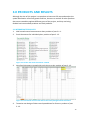
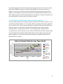
1. An Access database: product of part 2.2
There is a total of 310 specific data collected from 37 different plot locations
documented in the Access database. The database is open to editing and adding
of more data in the future.
Figure 16: Main page of the Access database.
2.
GIS maps produced that were chosen as the best in effectively showing mussel
data at different culture plots in the Eastern Scheldt: product of part 2.3.
Figure 17: Overall average amount (range from green to red) and overall average sizes
of mussels (in blue circular symbols, the darker the circle is, the bigger the sizes are)
measured in standardized cans in 2012-2014.
14
Figure 18: Mussel amount on plots in growth stage – zaaien (sow) (range from yellow
to dark purple).
Figure 19: Mussel amount on plots in growth stage – verzaaien (outgrow) (range from
yellow to dark purple).
Figure 20: Mussel amount on plots in growth stage – vissen voor veiling (fishing for
sale) (range from yellow to dark purple).
15
Figure 21: Mussel sizes in standardized cans comparison in three different stages
(stages in colours: zaaien - yellow tones, verzaaien - orange tones, eigen metingen - red
tones; sizes range from small to large circles).
16
4.0 DISCUSSION
The discussion session is divided into three main sections: methods used, results
displayed from maps, and an analysis of some additional data provided by the
ProFMos research group to seek answers for the research question of this project.
4.1 METHODS USED
Regarding part 2.1.1, as mentioned within the section, due to the reason that the
amount of data to be managed was small, therefore allows user to manually check
and fix errors. However, when working with a larger size of data, the use of built-in
functions might be necessary to save time and effort.
Regarding part 2.1.2, creating new Excel documents for each mussel plot might be the
best way to sort, store, search and modify data in Excel. The other method which is
the creation of the one big document with tabs of different plots can only apply to this
project, because in the future with more data recorded and plots registered, the
chance of Excel crashing or loss of data would increase. As in the future, where there
will only be more data being added, making separate documents of individual plots is
a safer way to document large amounts of data. Furthermore, for Access database
creation that base on importing Excel data, it is not required unifying all plots into
separate spreadsheet tabs in one Excel document.
In part 2.1.3, the listed ways of data validation was brainstormed and tested, and a
tentative new design is created. The reasons for stating that more considerations and
testing need to be put into actually establishing a new set-up is that: First, the
validation designs, especially for creating a drop-down list for farmers to choose from
instead of typing in, requires large amount of untouchable space on the same
spreadsheet to store the validation list options. With this limitation, a certain part of
the spreadsheet needs to be locked to ensure the validation list options are secure, if
not, the whole set-up of the spreadsheet might be disturbed unintentionally by users
who are inputting data. Secondly, regarding the quality of information received from
farmers, it needs to be accessed whether the current set-up, such as the type of
information requested to be measured and recorded, is helpful enough. It would be
very informative if farmers can provide feedback on the setup of the record
spreadsheets. It is also encouraged to discuss with farmers whether adding a tracking
column of mussel parties on the spreadsheet is feasible because it is the farmers that
know where the mussels they grow are being transported.
17
Both parts 2.2 and 2.3 required an extensive time doing online searches on
instructions and tutorials on how to use specific functions of the programs. Therefore,
as to make the work of future users more convenient, user guidelines were written on
all the steps and procedures conducted in these two parts to get the desired results.
The guidelines may not consist of the best methods, but it is believed that it can save
a lot of time trying to figure out how to obtain certain results from the two programs.
In part 2.2, it is very useful for the ProFMos research group because not only a
database was created to store all the data provided by farmers, searching and tracking
of specific group of mussel was made possible using queries. As mussel farmers
transport mussels to different locations when growing them in different stages,
movement tracking of mussel parties allow researchers to better observe growth or
loss of mussels at different locations. Nevertheless, without GPS tracking or
specifically labelled parties, it is inaccurate to only rely on educated guesses through
determining possible parties using Access queries. Furthermore, a better tracking
system needs to be established, the tracking ID being used in the database now is not
compatible to more complicated dividing and transporting of mussel parties, because
it is a better idea to use the origin location name or farmers’ name as a base for the
tracking ID, so that the base that is used in the database now (e.g. HAM055) can be
shorter and only be in alphabets. It is strongly suggested to start tracking mussel
parties the time they are seeded, and it would be best if farmers can directly involve
in tracking and identifying mussel parties.
For the last part of the project, part 2.3, there are four types of symbologies explored.
It is believed that the use of colours and symbols is effective in providing spatial
information for the mussel data collected from the farmers. For displaying mussel
average amount of mussels, using graded colour symbology is efficient in showing
intensities. Different symbol sizes is a simple and clear way to show mussel sizes
measured in standardized cans. The bigger the circular symbols, the larger the mussels
are. Combining colours and symbol layer displays, two kinds of information can be
displayed all at once - colours can refer to growth stage or average amount, and
symbol sizes refer to average mussel sizes. Stacking of symbol layers is a great method
to display changes of mussel sizes over different stages.
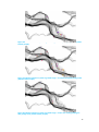
4.2 RESULTS DISPLAYED ON MAPS
Before discussing in depth on the results shown on the maps produced (Figures 17-21),
as to give a clearer background on the general locations of the plots that will be
18
discussed, below is a map (Figure 22) showing four main plot locations in the Eastern
Scheldt.
Figure 22: Mussel plot locations. Each block on the map is a plot, assigned with numbers.
Referring to Figure 17, which shows the average amount and sizes of mussels on the
registered culture plots, indicated that the area with the most average amount of
mussels placed in plot is the OSWD plots area. However, for average sizes of mussels,
the OSWD area consists of smaller average sizes, where the biggest sizes are mainly
grouped in the Hammen area. This map has shown a general picture that the OSWD
area is crowded with smaller mussels, and larger mussels are grown in the Hammen
area. However, more data is required to display a more accurate and clear result.
In Figure 21 which showed mussel sizes measured in different plots at different stages
using three layers of symbols stacked together, it effectively displayed size differences
of the mussels at different stages. Same as the analysis of Figure 17, the OSWD area
grows mostly smaller and younger mussels and the further towards west in the
Eastern Scheldt, the larger and later in stage the mussels tend to be. However, the
amount of data collected is still insufficient to determine which culture plots grew the
biggest sized mussels or mussels with the largest growth. Furthermore, the mussel
sizes measured at the plot might not represent the same group of mussels since
farmers rotate and transport mussels among several plots throughout the growing
period. It is inaccurate to conclude that a certain plot has the most growth or loss
using this map due to the high possibility of inconsistency by comparing different
groups of mussels that were grown under different conditions.
19
By comparing Figures 18 to 20 which show the average amount of mussels on culture
plots at three different stages, it explains and supports the results and claims on
Figures 17 and 21. The amount of mussels placed in plots during sow period is the
highest in the OSWD area, the mussels are then transported to the Hammen area in
their outgrow stage. From the maps produced in this project, it allows visualization of
the translocation of mussels within the Eastern Scheldt.
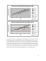
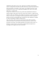
4.3 ADDITIONAL DATA PROVIDED TO ANALYZE MUSSEL GROWTH
From the data provided, the average, minimum and maximum yield of mussels in tons
could be calculated. However, it is not really sufficient enough to determine growth or
loss in specific areas. As the maps produced are not able to analyze mussel growth at
different locations in the Eastern Scheldt, the ProFMos project research group
provided data on nine groups of mussels in three stages (seed, half grown and
consumption) at various locations in the Eastern Scheldt that have been monitored by
the research group since March 2014. Below and on the next page, there are three
graphs (Figures 23, 24 and 25) produced according to the lengths measured from
March 2014 to July 2014.
Length of Mussels (mm)
Mussel Growth Monitoring (Type Zaad)
38
36
34
32
30
28
26
24
22
20
HAM68C
HAM180B
HAM102
OSWD10
MG22
OSWD80/81
OSWD182B
March
April
May
June
July
2014
ZK57/59
OSWD200
Figure 23: Mussel growth monitoring in seed stage.
20
Length of Mussels (mm)
Mussel Growth Monitoring (Type HW)
51
50
49
48
47
46
45
44
43
42
HAM68C
HAM180B
HAM102
OSWD10
MG22
OSWD80/81
OSWD182B
March
April
May
June
July
2014
ZK57/59
OSWD200
Figure 24: Mussel growth monitoring in half grown stage.
Mussel Growth Monitoring (Type cons)
Length of Mussels (mm)
58
HAM68C
57
HAM180B
56
55
HAM102
54
OSWD10
53
MG22
52
OSWD80/81
51
OSWD182B
50
March
April
May
June
July
2014
ZK57/59
OSWD200
Figure 25: Mussel growth monitoring in consumption stage.
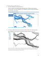
According to the overall trend displayed on all three graphs, all the locations are able
to sustain growth over a period of four months, even though loss occurred at some
locations, especially between the month of June to July. It appears that mussel length
is systematically higher at the Hammen area comparing with other areas, especially
for Hammen 102 and 180b, that area is on the west side of the Eastern Scheldt, where
it is the closest to the opening of the storm surge barriers to the North Sea. Sufficient
food source is likely a factor to the higher growths occur in the Hammen area.
21
5.0 CONCLUSION AND RECOMMENDATION
Although the project was conducted smoothly, the results were unable to fully answer
the research question: What is the spatial distribution of growth and loss in the
Eastern Scheldt? Instead, it provided spatial information on which areas have the
most average, maximum and minimum amounts and sizes of mussels. However, the
results shown on the visualization might be affected by the difference in the amount
of data collected from farmers as there is a possibility that a higher average amount or
size is displayed in the areas which data was sufficiently received (OSWD areas).
Therefore, more data is required to make accurate observations and conclusions.
The problem with being unable to answer the research question is also due to the
reason that it is difficult and almost impossible to determine growth and loss of
mussels without tracking of specific mussel parties, it is also difficult to set up an
effective tracking system with the large amount of plots and farmers involved. The
ProFMos research group started monitoring nine groups of mussels within the Eastern
Scheldt in March 2014 monthly, it is believed that trends of growth and loss can be
mapped out with the information collected. Due to time constraints, maps of the
monitored mussel data were not able to be produced within the time period of this
project.
As for the sub-question: What is the best way to effectively display spatial information
of mussel growth and loss? It is concluded that using colour and symbol layering
symbologies can effectively show which areas in the Eastern Scheldt generated the
most average yield and produced the largest mussels in size. These two types of
symbologies are easy and straightforward to use and clear to make spatial analysis.
Apart from achieving parts of the research question by generating maps, a database
on mussel data provided by farmers is created and a user manual is drafted for future
references in the appendix.
There are several recommendations for future continuation of developing the Access
mussel database and GIS maps for spatial analysis.
First of all, the spatial information shown on GIS would be more accurate if more
mussel data is collected. This would mean that would be better if it is possible to
cooperate with more farmers, so that more information on more different plots can
be received.
Secondly, create a better mussel party tracking system, the tracking system
22
established in this project is only a start. A great way to establish a good tracking
system is through farmers because they know where they transport and rotate mussel
parties among their culture plots. A new column can be added on the Excel record
spreadsheet for farmers to fill in tracking ID according to their name or the mussel
seed origin + a number code.
Thirdly, access whether the current set-up of the Excel spreadsheet for farmers is
helpful enough to make spatial analysis for mussel culture patterns. It might be more
helpful to collect more different types of data from the farmers, and more options and
analysis can be made. A new design of the Excel spreadsheets would be required to
prevent as much error during data input as possible, but more exploration is needed
to make the spreadsheet validation settings secure.
Lastly, this project requires long-term continuation as there will be more data
collected from farmers and the spatial information produced are useful for both
researchers and farmers. Even though a guideline was written for future users, it is
desirable to assign the tasks in this project to people with more experience or
knowledge with using Microsoft Access and ArcGIS.
23
6.0 REFERENCES
Capelle, J.J. (2014). ProFMos Projectvoorstel. HZ University of Applied Science.
European Commission. (2014). Aquaculture. Retrieved from: http://ec.europa.eu/
fisheries/cfp/aquaculture/index_en.htm.
ESRI. (2012). ArcGIS Desktop 10 Help Library. ArcGIS Resource Center. Retrieved from:
http://help.arcgis.com/en/arcgisdesktop/10.0/help/index.html#/Welcome_to_th
e_ArcGIS_Help_Library/00r90000001n000000/
Food and Agriculture Organization of the United Nations (FAO). (2014). Fishery
Statistical Collections: Global Aquaculture Production. Fisheries and Aquaculture
Department.
Kapetsky, J. M. & Aguilar-Manjarrez, J. (2007). Geographic information systems,
remote sensing and mapping for the development and management of marine
aquaculture. FAO Fisheries Technical Paper: 458. Food and Agriculture
Organization of the United Nations, Rome.
Royal Netherlands Institute for Sea Research. (2012). Monitoring Oosterschelde.
Retrieved from: http://www.nioz.nl/yes-mon-oosterschelde
Smaal, A.C. (2002). European mussel cultivation along the Atlantic coast: production
status, problems and perspectives. Hydrobiologia 484, 89-98. Kluwer Academic
Publishers, the Netherlands.
Smaal, A.C., Schellekens, T., van Stralen, M.R., & Kromkamp, J.C. (2013). Decrease of
the carrying capacity of the Oosterschelde estuary (SW Delta, NL) for bivalve
filter feeders due to overgrazing?. Aquaculture 404-405 (2013), 28-34.
Troost, T.A., Wijsman, J.W.M., Saraiva, S., & Freitas, V. (2010). Modelling shellfish
growth with dynamic energy budget models: an application for cockles and
mussels in the Oosterschelde (southwest Netherlands). Philosophical
Transactions of the Royal Society Biological Sciences (2010) 365.
Wijsman, J.W.M., Smaal, A.C., & Brummelhuis, E. (2007). Growth of Cultivated Mussels
and Oysters in the Oosterschelde Estuary. Unpublished.
Microsoft Corporation. (2014). Training courses for Access 2013. Retrieved from:
http://office.microsoft.com/en-ca/access-help/training-courses-for-access-2013HA104030993.aspx.
24
7.0 APPENDIX
7.1 DETAILED STEPS: ACCESS DATABASE CREATION (SECTION 2.2)
Why is an Access database required even though data is already on Excel?
There are four
advantages on creating an Access database: 1. More organized and safer to make large data
modifications; 2. Prevents data duplication and inputting errors; 3. Specific look up functions
and relational queries; 4. ArcGIS compatible.
This manual is written based on Microsoft Access 2010-2013 .accdb formatted databases. The
set ups and tools used might vary from other versions of the software.
Part 1: Tables
What are tables?
Tables are what form an Access database, they store all the
information that exists in the database. Tables must be created and fully organized to further
build a database with relationships and queries.
Building a new table.
A new table can be created through [Create] > [Table] or [Table
Design]. Both ways are fairly straightforward to use. Access tables are almost like tables in
Excel, only that there are more settings and restrictions involved.
Fields.
In a table, each column represents a data field, and on Access, each field must
have a field data type. When creating a new table, a column can only be used when a field
type is set in it. The most common types of fields are text and
number, other types are shown on the screenshot on the right.
Furthermore, there are field sizes to choose from within a type of
data (such as integer, long integer, double, etc. for numbers)
depending on how much data that the field has to store.
To add a field, in the datasheet view, click on [Click to Add] for a
new column, and a popup list would be shown and select the
desired field type. In the design view, type in field name, and select
the desired data type from the dropdown list.
For more detailed descriptions of field types go to:
http://office.microsoft.com/en-ca/access-help/introduction-to-data-types-and-field-propertie
s-HA010341783.aspx
Detailed descriptions of field sizes go to:
http://office.microsoft.com/en-ca/access-help/set-the-field-size-HA010341996.aspx?CTT=5&
origin=HA010341783
25
Keys.
Primary keys are what gives identification to each unique data. It is highly
recommended to give an ID to each data because that would make relationship building,
lookup field filling and query searches more convenient. Keys can be numbers or texts, as long
as they are unique. A convenient way of setting
keys is through Auto Numbering. When a new
table is created, the first column is usually already
set as an auto numbering key. Go to design view,
like the screenshot on the left, to manually set
auto numbering primary key.
Importing Excel files.
Data on Excel files can be imported onto Access through [External
Data] > [Excel]. There are three ways to import an Excel table as shown in the screenshot on
the right: Create a new table with the Excel data,
add the Excel data into an existing table, and link
the Excel data with a table. The methods of the
first two options will be introduced below.
First option:
Importing an Excel file into a new table has a
fairly straightforward wizard to go through.
Browse and select the Excel document [Ok]
Choose the worksheet/tab in the Excel
document to input data to Access [Next]
Usually, the first row contains column
headings. If so, check the box so that the first row would not be considered as part of
the data. Instead, the first row would automatically become the Access field column
headings [Next]
Field names and data type for each column can be modified in this step. Also fields can
be chosen to be imported or not [Next]
This step gives you three options to set primary keys: let access add an auto number
primary key, choose own primary key from the data being imported, or no primary key
[Next]
Last step, where the table can be named [Finish]
Second option:
Adding Excel data into an existing table in Access has very similar steps to the first
option, with less steps but slightly more precautions to make.
Before starting the wizard, double check whether the column names of the Excel
spreadsheet and Access table match, because they must be identical to go through a
successful build wizard.
26
As long as the column names match, run through the wizard that is the same as the first
option.
Dealing with errors when importing Excel files.
Access only identifies identical field name and format to allow importing of Excel data, if
an error pops out regarding non-identical or wrongly formatted data, double check every
field name and format of data in the Excel file
If importing Excel files to existing table and random errors pop out, try create new table
instead, then copy and paste the data from the newly created table to the original table
destination of the data, then delete the newly created table
Relationships.
A big difference between
Excel spreadsheets and Access tables is
relationships. It links tables that share common
fields, thus generate a relational database. One
big advantage of relationships is to create
lookup drop down list for a large database. It is
almost like validation list on Excel, it prevents
errors when inputting data by making the field
data type into a lookup list that refers to data
on another table in the database. To view and
edit relationships, go to [Database Tools] > [Relationships].
Using lookup wizard to create relationships.
Go to design view, select "Lookup Wizard"
from the data type dropdown menu for the field that a relationship wants to be created, like
the screenshot on the left. Then follow the following steps:
Select "I want the lookup field to get the values from
another table or query" [Next]
Choose the table or query the lookup field want to refer to
[Next]
Add fields from the table or query that the lookup field
should refer to [Next]
Sorting of field lookup options (usually just skip it) [Next]
Hiding or displaying key column, if the ID of the lookup is
known, it is better to uncheck the "Hide key column"
because it is more efficient to type in ID numbers later instead of choosing from a drop
down menu manually (this setting can be modified later) [Next]
Rename the lookup field if needed, and check "Enable Data Integrity" to create a one to
multiple relationship [Finish].
27
Official online tutorial for more detailed introduction to tables:
http://office.microsoft.com/en-001/access-help/introduction-to-tables-HA102749616.aspx
Part 2: Queries
What are queries?
Queries are used for several purposes: to calculate or summarize
data, to look up or filter specific criteria of the data, and to reorganize and group data in
different ways. As tables are used to store every single information in the database, queries
are used to take out data that are necessary for certain purposes.
Building a query.
A new query can be created through [Create] > [Query Wizard] or
[Query Design]. There will only be steps on using [Query Design] as it is more straightforward
to use.
After clicking on [Query Design], a new
query table will be created and the
design view will be displayed like the
screenshot on the right.
There are three view modes for queries:
Datasheet, SQL, and Design views. Under
the [File] button, the view modes can be
switched. This tutorial will not deal with
SQL codings.
The [Show Table] window automatically
pops out once a new query is created
through design mode, and the tables or
queries that need to be used can be
chosen. Or simply drag the wanted tables or queries to use from the nagivation pane into
the blank area where tables are shown as relationships in the screenshot on the right.
Select which field to appear in the query either by double clicking the field from the table
you added into the blank area or choose from the drop down list in the "Field" area in the
query/expression building area. The added fields would form form into a new table when
the query is run through.
After adding the wanted
fields, a simple query is
basically completed. Click
[Design] > [Run] or change into datasheet view to run the query.
28
Using expressions and criteria.
Criteria can be set to limit certain data to appear after
running the query. Below is a list of expressions and criteria that were explored and how they
work:
Count(*) : Display the number of the same name repeated in a field
Like "abc": This displays data that is exactly "abc". By adding
a * after "abc", the query will display all the data that starts
with "abc"; the same applies when adding a * before "abc",
the query will display all the data that ends with "abc"
Like "*2012*"
Between #01-01-2012# And #01-01-2013#
DatePart("yyyy";[Datum])=2012: These three expressions all apply the same effect to
dates, which is to display data dated in 2012
Simply type in a key under a field registered
with keys can display all the data registered
under that key
There is another function that allow data to be calculated without using functions. On the top
toolbar, click on [Design] > [Totals], a new row labelled as "Total" in the query building section
would be displayed. It is defaulted in the Totals section that the data is displayed by grouping
same names together. Other options include: count, average, min, max, sum, stdev, etc.
For the steps used to create parameter queries for searching and tracking in the database,
refer to section 7.2.
Official guide on different criteria:
http://office.microsoft.com/en-ca/access-help/apply-criteria-to-text-values-HA102809526.asp
x?CTT=5&origin=HA102836326
Official guide on how to build expressions:
http://office.microsoft.com/en-ca/access-help/build-an-expression-HA102749614.aspx
More detailed introduction to different types of queries:
http://office.microsoft.com/en-001/access-help/introduction-to-queries-HA102749599.aspx?
CTT=5&origin=HA104146756
Part 3: Forms
What are forms?
Forms are what
groups tables and queries created
together into an organized and
systematic way. Ultimately, a form with
navigation buttons to different pages is
to be created in this tutorial.
29
There are two main views that would be mainly used: Form View and Layout View. Form view
displays the formatting done in layout view.
Creating new forms.
It is very simple to create forms using existing tables or queries.
First way is to select the table or query in the navigation pane that needs to be converted into
a form, then click on [Create] > [Form]. A new form would be created immediately. If not all
fields in a table or query is needed, [Create] > [Form Wizard] would be the best option as it
allows more options to choose from. For the navigation form that will be created, the forms
are desirably be in datasheet form.
Create navigation forms.
There are templates available for navigation forms, but this
guideline will not be using templates. Select [Create] > [Navigation] > choose the layout of the
navigation form, in this case, it will be [Horizontal Tabs and Vertical Tabs, Left]. A new blank
navigation form would be created. It is better to have the whole navigation form designed out
before adding forms to it. To add forms that were created from tables and queries, simply
drag the forms over to the navigation button [Add New] area, then new buttons and display
tab with the form names would be created.
Reminder: Horizontal tabs must be created before adding vertical tabs. Access does not allow
creation of vertical tabs first.
Navigation button filtering.
There are filtering functions that can be added to navigation
buttons, so there will be no need create new queries and forms of filtered data. Open the
property sheet in the layout view: [Design] > [Property Sheet]. Click on the tab that a filter
would like to be added, then add [field name]= ”criteria” to the [Navigation Where Clause]
field under [Data] of the Property Sheet, just like the screenshot below.
30
Useful tips for building a database.
1.
It is always helpful to name the beginning of tables as ‘tb’, queries as ‘Q’, and forms as
‘frm’.
Official training course for Microsoft Access 2013:
http://office.microsoft.com/en-001/access-help/training-courses-for-access-2013-HA1040309
93.aspx
7.2 DETAILED STEPS: ACCESS SPECIFIC SEARCHES AND PLOT TRACKING (SECTION 2.2)
The use of queries is crucial to doing searches for specific data within the database and
conduct relationship tracking among information. The use of parameter queries will be
introduced in this session.
What are parameter queries?
It is a type of query that provides dialogue boxes which
require the user to type in parameters for the query to run and give results. It is similar with a
search box.
Tip: A smarter way to open parameter queries for modifications is to right click the query on
the navigation pane, then go to design view.
Building parameter expressions.
Create a new query, go to design view. Type in a
parameter expression under the field that needs to be queried.
Only one type of parameter expression was used in this project: Like [question that appear on
the parameter input box] & "*"
All the things that were typed in a square bracket would appear as a pop up box that require
the user to type in a parameter value. The symbol * indicates to show all the information that
fits with the parameter value inputted.
Criteria rows.
Make use of criteria rows in query design view to build parameter
expressions. Criteria rows are like asking “If” questions, so if the expressions A & B are placed
on the same criteria row, the query would display the data according to: if the data fits with
parameter A and parameter B. If the expressions A & B are placed on different criteria rows,
the query would display data according to: if the data fits with parameter A or parameter B.
Below are two screenshots of making use of criteria rows.
31
Showing fields.
There is also another function that allow showing or hiding of certain
fields but still has influence to the query. Simply click on the [Show] checkbox to show or hide
fields.
The search parameter fields were hidden in the screenshots above to not show the same
information several times in the query table, but the parameters searches were done
according to those fields.
32
7.3 DETAILED STEPS: ARCGIS MAP PRODUCTION (SECTION 2.3)
This manual is written based on ESRI ArcGIS 10.2.1. The set ups and tools used might vary
from other versions of the software.
Step 1: Connect Access database onto ArcGIS
Why is this step required?
Before combining data on an Access database with the
already-existing plot data on GIS, a connection between the Access database and ArcGIS must
be established through ArcCatalog. It is impossible to extract information from Access tables
without this step.
Format of Access database document.
It is recommended to use .mdb which is the older
format of Access databases (before Access 2007) instead of .accdb which is the newer format.
The reason is that ArcCatalog only recognizes .mdb files through the connection method that
will be introduced next. Simply convert .accdb databases into .mdb through [file] > [save as]
on Access. If an error occurred when converting file formats, create a blank new .mdb file,
then copy and paste all the tables, queries and forms over and save the new file.
Making the connection.
After making sure the format of the Access document is .mdb,
open ArcCatalog – another software program
installed with the ArcGIS package. Once the
program is launched, it is more convenient to
create a shortcut of [Add OLE DB Connection]
according to the screenshot on the right:
Once the shortcut is created, click on the
shortcut and continue on step 3 in the list
below:
33
These two screenshots show the OLE
DB connection window.
Launch ArcMap once the connection on ArcCatalog is made. Open the ArcCatalog
in ArcMap (shortcut button can be found in the top toolbars or on the right of the
window, next to the scrollbar). Once Catalog is open, the connected Access
database can be found under “Database Connections”. Right click the connected
.odc file and click “Connect”. Once the connection is made, the tables and queries
in the Access database can be dragged over and added to the map layers.
Step 2: Merging Blocks
Why is block merging required?
There are several culture plots that farmers
combined when placing and growing mussels. However, on the existing data in
ArcGIS, the combined culture plots are separated. If the plot blocks are not
merged, the data for combined plots will not be recognized when adding data to
the plot shape file through join attributes.
Using the Editor toolbar.
The Editor toolbar can be opened through [Customize] >
[Toolbars] > [Editor]. Once the Editor toolbar is activated, click on [Editor] drop down list >
[Start Editing]. Start merging blocks by selecting all the blocks that need to be merged. After
selection, click on [Editor] > [Merge], a pop up box would appear asking which feature with
34
which others features will be merged. Choose the feature that the attributes of the merged
block would be based on after merging, this step does not really matter because shape
attributes can be edited with the Editor mode on as well after merging, so that the plot names
can fit with the data on the Access database. Below is the attribute table and map view of a
merged block.
Step 3: Join Attributes
What is attribute joining?
On ArcGIS, spatial information are commonly stored as
attributes on shape files, such as culture plots in this case. Once After inputting Access
database onto the ArcMap layer and merging blocks, attributes from the database can be
joined with the plot shape file.
Joining attributes.
Once the Access table or query is dragged to the map layer, right click
on the shape file in the table of contents that the table or
query has to be linked with > [Joins and Relates] > [Join…].
A wizard would pop out like the screenshot on the right.
Go through the wizard (which is fairly self-explanatory)
then [Validate Join]. This part is where it is possible to
check if all the data on the database match with attributes
in the GIS shape file. There will be another pop-up
window after validation showing how many data were
matched.
35
If not all the data was matched, it is advised to compare the data on the database with the
attributes in the shape file before confirming the join.
This is the attribute table showing merged blocks and joined attributes. To open attribute
tables, right-click on the shape layer on the table of contents > [Open Attribute Table].
Step 4: Symbology
What are symbologies?
Symbologies are used to display attributes in shape files using
colours, symbols or charts. This function can classify and group attributes into different
classifications, or do calculations to show desired results for spatial analysis.
How to use symbologies.
Each layer can only display one type of symbology at a time.
Double click on the shape layer that requires symbology displays, a property table would pop
up, or simply right click on the layer > [Properties] > [Symbology].
There are five main categories of symbologies, and the recommended types to use in this
project are: Categories – unique values, Quantities – graduated colours and Quantities –
graduated symbols.
The unique values symbology is recommended to use
for a small number of attributes to be analyzed using
colours. Steps: click on [Categories] > [Unique Values]
> choose the Value Field that needs to be analyzed in
the drop down list > [Add All Values] > choose desired
colour to display in the colour ramp.
The graduated colours symbology is better for dealing
with a larger number of attributes using colours as well. Steps: click on [Quantities] >
36
[Graduated Colours] > choose the field to be analyzed > choose the classification system in
[Classify…] and number of classes in the Classification session > choose desired colour to
display in the colour ramp.
The graduated symbols symbology works the same way as graduated colours, but it displays
symbols instead. Steps: click on [Quantities] > [Graduated Symbols] > choose the field to be
analyzed > choose the classification system in [Classify…] and number of classes in the
Classification session > symbol sizes can be changed from the Symbol Size session, symbol
types and colours can be changed in the Template session. Background colours can be added
behind the symbols on the shape blocks in the Background session. For an advanced way to
modify symbol designs, double click on the symbol for each class to manually modify the
colours, types and sizes.
Map layers are shown according to how they are placed
in the table of contents. To change the layering of different shape files, go to the [List
by Drawing Order] display mode of the table of contents. Simply drag the map layers
up and down to reorder the layering.
Overlaying of symbologies
37