1
qooxdoo Documentation, Release 1.5.1
{
size : 12,
lineHeight : 1.4,
family : [ "Lucida Grande" ],
bold : true
}
}
});
It is important to note that you can only specify values available as property on qx.bom.Font or
qx.bom.webfonts.WebFont.
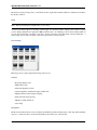
Icon Theme
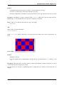
This theme is to define which icon set is used and normally consists only of 2 main keys (title and aliases).
The important one is the aliases key which points the generator to the location of the icon set. The icon alias,
which is used to reference icons in qooxdoo applications, is set to the value of this key. As qooxdoo uses the free
available Tango and Oxygen icon sets it is not necessary to extend these.
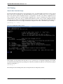
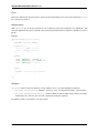
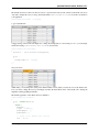
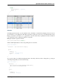
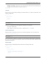
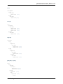
Complete code for the tango icon theme:
/**
* Tango icons
*/
qx.Theme.define("qx.theme.icon.Tango",
{
aliases : {
"icon" : "qx/icon/Tango"
}
});
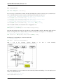
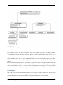
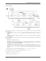
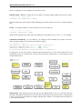
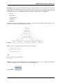
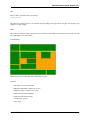
Appearance Theme
The appearance theme is by far the biggest theme. Its task is to describe every themable widget and their child controls.
Since the widgets are styled using decorators, colors, fonts and icons the appearance theme uses the definitions of all
the other themes namely the decoration, color, font and icon theme. You can think of the appearance theme as the
central meeting point where the other themes (decorator, color, font and icon) get together.
To discover the power of the appearance theme please take a look at the corresponding article which should let you
get an idea of the whole picture.
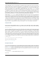
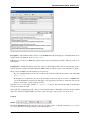
Applying Themes
Typically, your application will have a certain, pre-defined theme known at build-time. The best way to associate such
a default outlook with your application is to use the config.json variable QXTHEME inside the “let” section. Setting
this variable to a fully-qualified meta theme class lets the build process handle the proper inclusion and linkage of the
theme classes automatically. E.g.:
...
QXTHEME : my.theme.Cool,
...
It is also possible to set a certain appearance at runtime:
196
Chapter 4. GUI Toolkit