1
qooxdoo Documentation
Release 2.0
qooxdoo developers
June 21, 2012
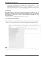
CONTENTS
1
2
Introduction
1.1 About . . . . . . . . . . . . . . . .
1.1.1
Framework . . . . . . . .
1.1.2
GUI Toolkit . . . . . . . .
1.1.3
Communication . . . . . .
1.1.4
More Information (online)
1.2 Feature Overview . . . . . . . . .
1.2.1
Runtimes . . . . . . . . .
1.2.2
Object-orientation . . . . .
1.2.3
Programming . . . . . . .
1.2.4
Internationalization . . . .
1.2.5
API reference . . . . . . .
1.2.6
Testing . . . . . . . . . .
1.2.7
Deployment . . . . . . . .
1.2.8
Migration . . . . . . . . .
1.3 Architectural Overview . . . . . .
1.4 Getting Started . . . . . . . . . . .
1.4.1
qx.Website . . . . . . . .
1.4.2
qx.Desktop . . . . . . . .
1.4.3
qx.Mobile . . . . . . . . .
1.4.4
qx.Server . . . . . . . . .
1.4.5
Others . . . . . . . . . . .
.
.
.
.
.
.
.
.
.
.
.
.
.
.
.
.
.
.
.
.
.
.
.
.
.
.
.
.
.
.
.
.
.
.
.
.
.
.
.
.
.
.
.
.
.
.
.
.
.
.
.
.
.
.
.
.
.
.
.
.
.
.
.
.
.
.
.
.
.
.
.
.
.
.
.
.
.
.
.
.
.
.
.
.
.
.
.
.
.
.
.
.
.
.
.
.
.
.
.
.
.
.
.
.
.
.
.
.
.
.
.
.
.
.
.
.
.
.
.
.
.
.
.
.
.
.
.
.
.
.
.
.
.
.
.
.
.
.
.
.
.
.
.
.
.
.
.
.
.
.
.
.
.
.
.
.
.
.
.
.
.
.
.
.
.
.
.
.
.
.
.
.
.
.
.
.
.
.
.
.
.
.
.
.
.
.
.
.
.
.
.
.
.
.
.
.
.
.
.
.
.
.
.
.
.
.
.
.
.
.
.
.
.
.
.
.
.
.
.
.
.
.
.
.
.
.
.
.
.
.
.
.
.
.
.
.
.
.
.
.
.
.
.
.
.
.
.
.
.
.
.
.
.
.
.
.
.
.
.
.
.
.
.
.
.
.
.
.
.
.
.
.
.
.
.
.
.
.
.
.
.
.
.
.
.
.
.
.
.
.
.
.
.
.
.
.
.
.
.
.
.
.
.
.
.
.
.
.
.
.
.
.
.
.
.
.
.
.
.
.
.
.
.
.
.
.
.
.
.
.
.
.
.
.
.
.
.
.
.
.
.
.
.
.
.
.
.
.
.
.
.
.
.
.
.
.
.
.
.
.
.
.
.
.
.
.
.
.
.
.
.
.
.
.
.
.
.
.
.
.
.
.
.
.
.
.
.
.
.
.
.
.
.
.
.
.
.
.
.
.
.
.
.
.
.
.
.
.
.
.
.
.
.
.
.
.
.
.
.
.
.
.
.
.
.
.
.
.
.
.
.
.
.
.
.
.
.
.
.
.
.
.
.
.
.
.
.
.
.
.
.
.
.
.
.
.
.
.
.
.
.
.
.
.
.
.
.
.
.
.
.
.
.
.
.
.
.
.
.
.
.
.
.
.
.
.
.
.
.
.
.
.
.
.
.
.
.
.
.
.
.
.
.
.
.
.
.
.
.
.
.
.
.
.
.
.
.
.
.
.
.
.
.
.
.
.
.
.
.
.
.
.
.
.
.
.
.
.
.
.
.
.
.
.
.
.
.
.
.
.
.
.
.
.
.
.
.
.
.
.
.
.
.
.
.
.
.
.
.
.
.
.
.
.
.
.
.
.
.
.
.
.
.
.
.
.
.
.
.
.
.
.
.
.
.
.
.
.
.
.
.
.
.
.
.
.
.
.
.
.
.
.
.
.
.
.
.
.
.
.
.
.
.
.
.
.
.
.
.
.
.
.
.
.
.
.
.
.
.
.
.
.
.
.
.
.
.
.
.
.
.
.
.
.
.
.
.
.
.
.
.
.
.
.
.
.
.
.
.
.
.
.
1
1
1
1
1
2
2
2
2
2
3
3
3
4
4
4
5
5
6
7
8
10
Core
2.1 Object Orientation . . . . . . . . . . . . .
2.1.1
Introduction to Object Orientation
2.1.2
Features of Object Orientation . .
2.1.3
Classes . . . . . . . . . . . . . .
2.1.4
Interfaces . . . . . . . . . . . . .
2.1.5
Mixins . . . . . . . . . . . . . . .
2.2 Properties . . . . . . . . . . . . . . . . . .
2.2.1
Introduction to Properties . . . . .
2.2.2
Properties in more detail . . . . .
2.2.3
Initialization Behavior . . . . . .
2.2.4
Property features summarized . .
2.3 Environment . . . . . . . . . . . . . . . .
2.3.1
Environment . . . . . . . . . . .
2.4 Data Binding . . . . . . . . . . . . . . . .
2.4.1
Data Binding . . . . . . . . . . .
.
.
.
.
.
.
.
.
.
.
.
.
.
.
.
.
.
.
.
.
.
.
.
.
.
.
.
.
.
.
.
.
.
.
.
.
.
.
.
.
.
.
.
.
.
.
.
.
.
.
.
.
.
.
.
.
.
.
.
.
.
.
.
.
.
.
.
.
.
.
.
.
.
.
.
.
.
.
.
.
.
.
.
.
.
.
.
.
.
.
.
.
.
.
.
.
.
.
.
.
.
.
.
.
.
.
.
.
.
.
.
.
.
.
.
.
.
.
.
.
.
.
.
.
.
.
.
.
.
.
.
.
.
.
.
.
.
.
.
.
.
.
.
.
.
.
.
.
.
.
.
.
.
.
.
.
.
.
.
.
.
.
.
.
.
.
.
.
.
.
.
.
.
.
.
.
.
.
.
.
.
.
.
.
.
.
.
.
.
.
.
.
.
.
.
.
.
.
.
.
.
.
.
.
.
.
.
.
.
.
.
.
.
.
.
.
.
.
.
.
.
.
.
.
.
.
.
.
.
.
.
.
.
.
.
.
.
.
.
.
.
.
.
.
.
.
.
.
.
.
.
.
.
.
.
.
.
.
.
.
.
.
.
.
.
.
.
.
.
.
.
.
.
.
.
.
.
.
.
.
.
.
.
.
.
.
.
.
.
.
.
.
.
.
.
.
.
.
.
.
.
.
.
.
.
.
.
.
.
.
.
.
.
.
.
.
.
.
.
.
.
.
.
.
.
.
.
.
.
.
.
.
.
.
.
.
.
.
.
.
.
.
.
.
.
.
.
.
.
.
.
.
.
.
.
.
.
.
.
.
.
.
.
.
.
.
.
.
.
.
.
.
.
.
.
.
.
.
.
.
.
.
.
.
.
.
.
.
.
.
.
.
.
.
.
.
.
.
.
.
.
.
.
.
.
.
.
.
.
.
.
.
.
.
.
.
.
.
.
.
.
.
.
.
.
.
.
.
.
.
.
.
.
.
.
.
.
.
.
.
.
.
.
.
.
.
.
.
.
.
.
.
.
.
.
.
.
.
.
.
.
.
.
.
.
11
11
11
12
18
24
27
29
29
33
43
44
46
46
52
52
.
.
.
.
.
.
.
.
.
.
.
.
.
.
.
.
.
.
.
.
.
.
.
.
.
.
.
.
.
.
.
.
.
.
.
.
.
.
.
.
.
.
.
.
.
.
.
.
.
.
.
.
.
.
.
.
.
.
.
.
.
.
.
i
3
4
ii
qx.Website
3.1 General . . . . . . . . . . . . . . . . . .
3.1.1
qx.Website Overview . . . . . .
3.2 Tutorials . . . . . . . . . . . . . . . . .
3.2.1
Tutorial: Building Notifications
3.3 Technical Topics . . . . . . . . . . . . .
3.3.1
Plugins . . . . . . . . . . . . .
3.3.2
Referring to the qx.bom API . .
.
.
.
.
.
.
.
.
.
.
.
.
.
.
.
.
.
.
.
.
.
.
.
.
.
.
.
.
.
.
.
.
.
.
.
.
.
.
.
.
.
.
.
.
.
.
.
.
.
.
.
.
.
.
.
.
.
.
.
.
.
.
.
.
.
.
.
.
.
.
.
.
.
.
.
.
.
.
.
.
.
.
.
.
.
.
.
.
.
.
.
.
.
.
.
.
.
.
.
.
.
.
.
.
.
.
.
.
.
.
.
.
.
.
.
.
.
.
.
.
.
.
.
.
.
.
.
.
.
.
.
.
.
.
.
.
.
.
.
.
.
.
.
.
.
.
.
.
.
.
.
.
.
.
.
.
.
.
.
.
.
.
.
.
.
.
.
.
63
63
63
66
66
70
70
71
qx.Desktop
4.1 Overview . . . . . . . . . . . . . . . . . . . . . . . . . .
4.1.1
Widgets . . . . . . . . . . . . . . . . . . . . . .
4.1.2
Composites . . . . . . . . . . . . . . . . . . . .
4.1.3
Roots . . . . . . . . . . . . . . . . . . . . . . .
4.1.4
Applications . . . . . . . . . . . . . . . . . . . .
4.1.5
Communication . . . . . . . . . . . . . . . . . .
4.2 Widgets Introduction . . . . . . . . . . . . . . . . . . . .
4.2.1
Widget . . . . . . . . . . . . . . . . . . . . . .
4.2.2
Basic Widgets . . . . . . . . . . . . . . . . . . .
4.2.3
Interaction . . . . . . . . . . . . . . . . . . . . .
4.2.4
Resources . . . . . . . . . . . . . . . . . . . . .
4.2.5
Selection Handling . . . . . . . . . . . . . . . .
4.2.6
Drag & Drop . . . . . . . . . . . . . . . . . . .
4.2.7
Inline Widgets . . . . . . . . . . . . . . . . . . .
4.2.8
Custom Widgets . . . . . . . . . . . . . . . . .
4.2.9
Form Handling . . . . . . . . . . . . . . . . . .
4.2.10 Menu Handling . . . . . . . . . . . . . . . . . .
4.2.11 Window Management . . . . . . . . . . . . . . .
4.2.12 HTML Editing . . . . . . . . . . . . . . . . . .
4.2.13 Table Styling . . . . . . . . . . . . . . . . . . .
4.2.14 Widget Reference . . . . . . . . . . . . . . . . .
4.3 Layouts . . . . . . . . . . . . . . . . . . . . . . . . . . .
4.3.1
Layouting . . . . . . . . . . . . . . . . . . . . .
4.4 Themes . . . . . . . . . . . . . . . . . . . . . . . . . . .
4.4.1
Theming . . . . . . . . . . . . . . . . . . . . . .
4.4.2
Appearance . . . . . . . . . . . . . . . . . . . .
4.4.3
Custom Themes . . . . . . . . . . . . . . . . . .
4.4.4
Decorators . . . . . . . . . . . . . . . . . . . . .
4.4.5
Web Fonts . . . . . . . . . . . . . . . . . . . . .
4.4.6
Using themes of contributions in your application
4.5 Technical Concepts . . . . . . . . . . . . . . . . . . . . .
4.5.1
The Event Layer . . . . . . . . . . . . . . . . .
4.5.2
HTML Element Handling . . . . . . . . . . . . .
4.5.3
The Focus Layer . . . . . . . . . . . . . . . . .
4.6 Tutorials . . . . . . . . . . . . . . . . . . . . . . . . . .
4.6.1
Tutorial Part 1: The Beginning of a twitter App .
4.6.2
Tutorial Part 2: Finishing the UI . . . . . . . . .
4.6.3
Tutorial Part 3: Time for Communication . . . .
4.6.4
Tutorial Part 4.1: Form Handling . . . . . . . . .
4.6.5
Tutorial Part 4.2: Custom Widgets . . . . . . . .
4.6.6
Tutorial Part 4.2.1: Basic Theming . . . . . . . .
4.6.7
Tutorial Part 4.3: Translation . . . . . . . . . . .
4.6.8
Tutorial Part 4.4: Unit Testing . . . . . . . . . .
4.6.9
Tutorial Part 4.4.1: Automated UI Testing . . . .
.
.
.
.
.
.
.
.
.
.
.
.
.
.
.
.
.
.
.
.
.
.
.
.
.
.
.
.
.
.
.
.
.
.
.
.
.
.
.
.
.
.
.
.
.
.
.
.
.
.
.
.
.
.
.
.
.
.
.
.
.
.
.
.
.
.
.
.
.
.
.
.
.
.
.
.
.
.
.
.
.
.
.
.
.
.
.
.
.
.
.
.
.
.
.
.
.
.
.
.
.
.
.
.
.
.
.
.
.
.
.
.
.
.
.
.
.
.
.
.
.
.
.
.
.
.
.
.
.
.
.
.
.
.
.
.
.
.
.
.
.
.
.
.
.
.
.
.
.
.
.
.
.
.
.
.
.
.
.
.
.
.
.
.
.
.
.
.
.
.
.
.
.
.
.
.
.
.
.
.
.
.
.
.
.
.
.
.
.
.
.
.
.
.
.
.
.
.
.
.
.
.
.
.
.
.
.
.
.
.
.
.
.
.
.
.
.
.
.
.
.
.
.
.
.
.
.
.
.
.
.
.
.
.
.
.
.
.
.
.
.
.
.
.
.
.
.
.
.
.
.
.
.
.
.
.
.
.
.
.
.
.
.
.
.
.
.
.
.
.
.
.
.
.
.
.
.
.
.
.
.
.
.
.
.
.
.
.
.
.
.
.
.
.
.
.
.
.
.
.
.
.
.
.
.
.
.
.
.
.
.
.
.
.
.
.
.
.
.
.
.
.
.
.
.
.
.
.
.
.
.
.
.
.
.
.
.
.
.
.
.
.
.
.
.
.
.
.
.
.
.
.
.
.
.
.
.
.
.
.
.
.
.
.
.
.
.
.
.
.
.
.
.
.
.
.
.
.
.
.
.
.
.
.
.
.
.
.
.
.
.
.
.
.
.
.
.
.
.
.
.
.
.
.
.
.
.
.
.
.
.
.
.
.
.
.
.
.
.
.
.
.
.
.
.
.
.
.
.
.
.
.
.
.
.
.
.
.
.
.
.
.
.
.
.
.
.
.
.
.
.
.
.
.
.
.
.
.
.
.
.
.
.
.
.
.
.
.
.
.
.
.
.
.
.
.
.
.
.
.
.
.
.
.
.
.
.
.
.
.
.
.
.
.
.
.
.
.
.
.
.
.
.
.
.
.
.
.
.
.
.
.
.
.
.
.
.
.
.
.
.
.
.
.
.
.
.
.
.
.
.
.
.
.
.
.
.
.
.
.
.
.
.
.
.
.
.
.
.
.
.
.
.
.
.
.
.
.
.
.
.
.
.
.
.
.
.
.
.
.
.
.
.
.
.
.
.
.
.
.
.
.
.
.
.
.
.
.
.
.
.
.
.
.
.
.
.
.
.
.
.
.
.
.
.
.
.
.
.
.
.
.
.
.
.
.
.
.
.
.
.
.
.
.
.
.
.
.
.
.
.
.
.
.
.
.
.
.
.
.
.
.
.
.
.
.
.
.
.
.
.
.
.
.
.
.
.
.
.
.
.
.
.
.
.
.
.
.
.
.
.
.
.
.
.
.
.
.
.
.
.
.
.
.
.
.
.
.
.
.
.
.
.
.
.
.
.
.
.
.
.
.
.
.
.
.
.
.
.
.
.
.
.
.
.
.
.
.
.
.
.
.
.
.
.
.
.
.
.
.
.
.
.
.
.
.
.
.
.
.
.
.
.
.
.
.
.
.
.
.
.
.
.
.
.
.
.
.
.
.
.
.
.
.
.
.
.
.
.
.
.
.
.
.
.
.
.
.
.
.
.
.
.
.
.
.
.
.
.
.
.
.
.
.
.
.
.
.
.
.
.
.
.
.
.
.
.
.
.
.
.
.
.
.
.
.
.
.
.
.
.
.
.
.
.
.
.
.
.
.
.
.
.
.
.
.
.
.
.
.
.
.
.
.
.
.
.
.
.
.
.
.
.
.
.
.
.
.
.
.
.
.
.
.
.
.
.
.
.
.
.
.
.
.
.
.
.
.
.
.
.
.
.
.
.
.
.
.
.
.
.
.
.
.
.
.
.
.
.
.
.
.
.
.
.
.
.
.
.
.
.
.
.
.
.
.
.
.
.
.
.
.
.
.
.
.
.
.
.
.
.
.
.
.
.
.
.
.
.
.
.
.
.
.
.
.
.
.
.
.
.
.
.
.
.
.
.
.
.
.
.
.
.
.
.
.
.
.
.
.
.
.
.
.
.
.
.
.
.
.
.
.
.
.
.
.
.
.
.
.
.
.
.
.
.
.
.
.
.
.
.
.
.
.
.
.
.
.
.
.
.
.
77
77
77
77
78
78
79
79
79
80
82
85
87
90
94
97
100
116
120
121
137
150
150
150
155
155
161
167
169
172
174
175
175
176
178
180
180
183
188
192
196
202
207
211
216
.
.
.
.
.
.
.
.
.
.
.
.
.
.
.
.
.
.
.
.
.
.
.
.
.
.
.
.
.
.
.
.
.
.
.
.
.
.
.
.
.
.
.
.
.
.
.
.
.
.
.
.
.
.
.
.
4.6.10
5
6
7
8
Tutorial Part 4.5: Virtual List . . . . . . . . . . . . . . . . . . . . . . . . . . . . . . . . . . 222
qx.Mobile
5.1 General . . . . . . . . . . . . . . . . . . . . . . . . . . . . . . .
5.1.1
Overview . . . . . . . . . . . . . . . . . . . . . . . . .
5.1.2
qx.Mobile Requirements . . . . . . . . . . . . . . . . .
5.1.3
Getting Started with qooxdoo qx.Mobile . . . . . . . . .
5.2 Tutorials . . . . . . . . . . . . . . . . . . . . . . . . . . . . . .
5.2.1
Tutorial: Creating a Twitter Client with qooxdoo mobile
5.3 Development . . . . . . . . . . . . . . . . . . . . . . . . . . . .
5.3.1
Mobile and tablet switch . . . . . . . . . . . . . . . . .
5.3.2
Theming . . . . . . . . . . . . . . . . . . . . . . . . . .
5.3.3
Debugging . . . . . . . . . . . . . . . . . . . . . . . .
5.4 Deployment . . . . . . . . . . . . . . . . . . . . . . . . . . . .
5.4.1
Deployment . . . . . . . . . . . . . . . . . . . . . . . .
.
.
.
.
.
.
.
.
.
.
.
.
.
.
.
.
.
.
.
.
.
.
.
.
.
.
.
.
.
.
.
.
.
.
.
.
.
.
.
.
.
.
.
.
.
.
.
.
.
.
.
.
.
.
.
.
.
.
.
.
.
.
.
.
.
.
.
.
.
.
.
.
.
.
.
.
.
.
.
.
.
.
.
.
.
.
.
.
.
.
.
.
.
.
.
.
.
.
.
.
.
.
.
.
.
.
.
.
.
.
.
.
.
.
.
.
.
.
.
.
.
.
.
.
.
.
.
.
.
.
.
.
.
.
.
.
.
.
.
.
.
.
.
.
.
.
.
.
.
.
.
.
.
.
.
.
.
.
.
.
.
.
.
.
.
.
.
.
.
.
.
.
.
.
.
.
.
.
.
.
.
.
.
.
.
.
.
.
.
.
.
.
.
.
.
.
.
.
.
.
.
.
.
.
.
.
.
.
.
.
.
.
.
.
.
.
.
.
.
.
.
.
.
.
.
.
.
.
227
227
227
230
231
231
231
240
240
243
245
246
246
qx.Server
6.1 Server Overview . . . . . . . .
6.1.1
Included Features . . .
6.1.2
Supported Runtimes .
6.1.3
Installation . . . . . .
6.1.4
Basic Example . . . .
6.1.5
Additional Scenarios .
6.2 qx.Server Requirements . . . .
6.2.1
Runtimes . . . . . . .
6.2.2
Installation . . . . . .
6.3 RequireJS Support . . . . . . .
6.3.1
Representable interface
6.3.2
Config file . . . . . . .
.
.
.
.
.
.
.
.
.
.
.
.
.
.
.
.
.
.
.
.
.
.
.
.
.
.
.
.
.
.
.
.
.
.
.
.
.
.
.
.
.
.
.
.
.
.
.
.
.
.
.
.
.
.
.
.
.
.
.
.
.
.
.
.
.
.
.
.
.
.
.
.
.
.
.
.
.
.
.
.
.
.
.
.
.
.
.
.
.
.
.
.
.
.
.
.
.
.
.
.
.
.
.
.
.
.
.
.
.
.
.
.
.
.
.
.
.
.
.
.
.
.
.
.
.
.
.
.
.
.
.
.
.
.
.
.
.
.
.
.
.
.
.
.
.
.
.
.
.
.
.
.
.
.
.
.
.
.
.
.
.
.
.
.
.
.
.
.
.
.
.
.
.
.
.
.
.
.
.
.
.
.
.
.
.
.
.
.
.
.
.
.
.
.
.
.
.
.
.
.
.
.
.
.
.
.
.
.
.
.
.
.
.
.
.
.
.
.
.
.
.
.
.
.
.
.
.
.
.
.
.
.
.
.
.
.
.
.
.
.
.
.
.
.
.
.
.
.
.
.
.
.
.
.
.
.
.
.
.
.
.
.
.
.
.
.
.
.
.
.
.
.
.
.
.
.
.
.
.
.
.
.
.
.
.
.
.
.
.
.
.
.
.
.
.
.
.
.
.
.
.
.
.
.
.
.
.
.
.
.
.
.
.
.
.
.
.
.
.
.
.
.
.
.
.
.
.
.
.
.
.
.
.
.
.
.
.
.
.
.
.
.
.
.
.
.
.
.
249
249
249
249
250
250
250
250
251
251
251
252
252
Communication
7.1 Low-level requests . . . . . . . . . . . . . . . .
7.2 Higher-level requests . . . . . . . . . . . . . . .
7.2.1
Higher-level requests . . . . . . . . . .
7.2.2
AJAX . . . . . . . . . . . . . . . . . .
7.3 REST . . . . . . . . . . . . . . . . . . . . . . .
7.3.1
REST (Representational State Transfer)
7.4 Remote Procedure Calls (RPC) . . . . . . . . .
7.4.1
RPC (Remote Procedure Call) . . . . .
7.4.2
RPC Servers . . . . . . . . . . . . . . .
7.5 Specific Widget Communication . . . . . . . . .
7.5.1
Using the remote table model . . . . . .
.
.
.
.
.
.
.
.
.
.
.
.
.
.
.
.
.
.
.
.
.
.
.
.
.
.
.
.
.
.
.
.
.
.
.
.
.
.
.
.
.
.
.
.
.
.
.
.
.
.
.
.
.
.
.
.
.
.
.
.
.
.
.
.
.
.
.
.
.
.
.
.
.
.
.
.
.
.
.
.
.
.
.
.
.
.
.
.
.
.
.
.
.
.
.
.
.
.
.
.
.
.
.
.
.
.
.
.
.
.
.
.
.
.
.
.
.
.
.
.
.
.
.
.
.
.
.
.
.
.
.
.
.
.
.
.
.
.
.
.
.
.
.
.
.
.
.
.
.
.
.
.
.
.
.
.
.
.
.
.
.
.
.
.
.
.
.
.
.
.
.
.
.
.
.
.
.
.
.
.
.
.
.
.
.
.
.
.
.
.
.
.
.
.
.
.
.
.
.
.
.
.
.
.
.
.
.
.
.
.
.
.
.
.
.
.
.
.
.
.
.
.
.
.
.
.
.
.
.
.
.
.
.
.
.
.
.
.
.
.
.
.
.
.
.
.
.
.
.
.
.
.
.
.
.
.
.
.
.
.
.
.
.
.
.
.
.
.
.
.
.
.
.
.
.
.
.
.
.
.
.
.
.
.
.
.
.
.
.
.
.
.
.
.
.
.
.
.
.
.
.
.
.
.
.
.
.
.
255
255
255
255
260
262
262
265
265
271
275
275
Development
8.1 Application Creation . . . . . . .
8.1.1
Application Skeletons . .
8.2 Debugging . . . . . . . . . . . .
8.2.1
Logging System . . . . .
8.2.2
Debugging Applications
8.3 Performance . . . . . . . . . . .
8.3.1
Memory Management .
8.3.2
Profiling Applications . .
8.4 Testing . . . . . . . . . . . . . .
8.4.1
Unit Testing . . . . . . .
8.4.2
Test Runner . . . . . . .
.
.
.
.
.
.
.
.
.
.
.
.
.
.
.
.
.
.
.
.
.
.
.
.
.
.
.
.
.
.
.
.
.
.
.
.
.
.
.
.
.
.
.
.
.
.
.
.
.
.
.
.
.
.
.
.
.
.
.
.
.
.
.
.
.
.
.
.
.
.
.
.
.
.
.
.
.
.
.
.
.
.
.
.
.
.
.
.
.
.
.
.
.
.
.
.
.
.
.
.
.
.
.
.
.
.
.
.
.
.
.
.
.
.
.
.
.
.
.
.
.
.
.
.
.
.
.
.
.
.
.
.
.
.
.
.
.
.
.
.
.
.
.
.
.
.
.
.
.
.
.
.
.
.
.
.
.
.
.
.
.
.
.
.
.
.
.
.
.
.
.
.
.
.
.
.
.
.
.
.
.
.
.
.
.
.
.
.
.
.
.
.
.
.
.
.
.
.
.
.
.
.
.
.
.
.
.
.
.
.
.
.
.
.
.
.
.
.
.
.
.
.
.
.
.
.
.
.
.
.
.
.
.
.
.
.
.
.
.
.
.
.
.
.
.
.
.
.
.
.
.
.
.
.
.
.
.
.
.
.
.
.
.
.
.
.
.
.
.
.
.
.
.
.
.
.
.
.
.
.
.
.
.
.
.
.
.
.
.
.
.
.
.
.
.
.
.
.
.
.
.
.
.
.
.
.
.
.
279
279
279
282
282
284
286
286
289
290
290
290
.
.
.
.
.
.
.
.
.
.
.
.
.
.
.
.
.
.
.
.
.
.
.
.
.
.
.
.
.
.
.
.
.
.
.
.
.
.
.
.
.
.
.
.
.
.
.
.
.
.
.
.
.
.
.
.
.
.
.
.
.
.
.
.
.
.
.
.
.
.
.
.
.
.
.
.
.
.
.
.
.
.
.
.
.
.
.
.
.
.
.
.
.
.
.
.
.
.
.
.
.
.
.
.
.
.
.
.
.
.
.
.
.
.
.
.
.
.
.
.
.
.
.
.
.
.
.
.
.
.
.
.
.
.
.
.
.
.
.
.
.
.
.
.
.
.
.
.
.
.
.
.
.
.
.
.
.
.
.
.
.
.
.
.
.
.
.
.
.
.
.
.
.
.
.
.
.
.
.
.
.
.
.
.
iii
.
.
.
.
.
.
.
.
.
.
.
.
.
.
.
.
.
.
.
.
.
.
.
.
.
.
.
.
.
.
.
.
.
.
.
.
.
.
.
.
.
.
.
.
.
.
.
.
.
.
.
.
.
.
.
.
.
.
.
.
.
.
.
.
.
.
.
.
.
.
.
.
.
.
.
.
.
.
.
.
.
.
.
.
.
.
.
.
.
.
.
.
.
.
.
.
.
.
.
.
.
.
.
.
.
.
.
.
.
.
.
.
.
.
.
.
.
.
.
.
.
.
.
.
.
.
.
.
.
.
.
.
.
.
.
.
.
.
.
.
.
.
.
.
.
.
.
.
.
.
.
.
.
.
.
.
.
.
.
.
.
.
.
.
.
.
.
.
.
.
.
.
.
.
.
.
.
.
.
.
.
.
.
.
.
.
.
.
.
.
.
.
.
.
.
.
.
.
.
.
.
.
.
.
.
.
.
.
.
.
.
.
.
.
.
.
.
.
.
.
.
.
.
.
.
.
.
.
.
.
.
.
.
.
.
.
.
.
.
.
.
.
.
.
.
.
.
.
.
.
.
.
.
.
.
.
.
.
.
.
.
.
.
.
.
.
.
.
.
.
.
.
.
.
.
.
.
.
.
.
.
.
.
.
.
.
.
.
.
.
.
.
.
.
.
.
.
.
.
.
.
.
.
.
.
.
.
.
.
.
.
.
.
.
.
.
.
.
.
.
.
.
.
.
.
.
.
.
.
.
.
.
.
.
.
.
.
.
.
.
.
.
.
.
.
.
.
.
.
.
.
.
.
.
.
.
.
.
.
.
.
.
.
.
.
.
.
.
.
.
.
.
.
.
.
.
.
.
.
.
.
.
.
.
.
.
.
.
.
.
.
.
.
.
.
.
.
.
.
.
.
.
.
.
.
.
.
.
.
.
.
.
.
.
.
.
.
.
.
.
.
.
.
.
.
.
.
.
.
.
.
.
.
.
.
.
.
.
.
.
.
.
.
.
.
.
.
.
.
.
.
.
.
.
.
.
.
.
.
.
.
.
.
.
.
.
.
.
.
.
.
.
.
.
.
.
.
.
.
.
.
.
.
.
.
.
.
.
.
.
.
.
.
.
.
.
299
303
305
305
307
307
308
313
313
313
317
317
320
324
324
326
.
.
.
.
.
.
.
.
.
.
.
.
.
.
.
.
.
.
.
.
.
.
.
.
.
.
.
.
.
.
.
.
.
.
.
.
.
.
.
.
.
.
.
.
.
.
.
.
.
.
.
.
.
.
.
.
.
.
.
.
.
.
.
.
.
.
.
.
.
.
.
.
.
.
.
.
.
.
.
.
.
.
.
.
.
.
.
.
.
.
.
.
.
.
.
.
.
.
.
.
.
.
.
.
.
.
.
.
.
.
.
.
.
.
.
.
.
.
.
.
.
.
.
.
.
.
.
.
.
.
.
.
.
.
.
.
.
.
.
.
.
.
.
.
.
.
.
.
.
.
.
.
.
.
.
.
.
.
.
.
.
.
.
.
.
.
.
.
.
.
.
.
.
.
.
.
.
.
.
.
.
.
.
.
.
.
.
.
.
.
.
.
.
.
.
.
.
.
.
.
.
.
.
.
.
.
.
.
.
.
.
.
.
.
.
.
.
.
.
.
.
.
.
.
.
.
.
.
.
.
.
.
.
.
.
.
.
.
.
.
.
.
.
.
.
.
.
.
.
.
.
.
.
.
.
.
.
.
.
.
.
.
.
.
.
.
.
.
.
.
.
.
.
.
.
.
.
.
.
.
.
.
.
.
.
.
.
.
.
.
.
.
.
.
.
.
.
.
.
.
.
.
.
.
.
.
.
.
.
.
.
.
.
.
.
.
.
.
.
.
.
.
.
.
.
.
.
.
.
.
.
.
.
.
.
.
.
.
.
.
.
.
.
.
.
.
.
.
.
.
.
.
.
.
.
.
.
.
.
.
.
.
.
.
.
.
.
.
.
.
.
.
.
.
.
.
.
.
.
.
.
.
.
.
.
.
.
.
.
.
.
.
.
.
.
.
.
.
.
.
.
.
.
.
.
.
.
.
.
.
.
.
.
.
.
.
.
.
.
.
.
.
.
.
.
.
.
.
.
.
.
.
.
.
327
327
327
328
328
329
330
330
330
331
331
332
333
339
344
10 Tooling
10.1 Introduction . . . . . . . . . . . . . . . . . . . . . . . .
10.1.1 Introduction to the SDK . . . . . . . . . . . . .
10.1.2 SDK Requirements . . . . . . . . . . . . . . . .
10.1.3 Hello World . . . . . . . . . . . . . . . . . . . .
10.1.4 SDK Structure . . . . . . . . . . . . . . . . . .
10.1.5 Application Structure . . . . . . . . . . . . . . .
10.1.6 Manifest.json . . . . . . . . . . . . . . . . . . .
10.1.7 Code Structure . . . . . . . . . . . . . . . . . .
10.2 Generator . . . . . . . . . . . . . . . . . . . . . . . . . .
10.2.1 Generator Overview . . . . . . . . . . . . . . .
10.2.2 Generator Usage . . . . . . . . . . . . . . . . .
10.2.3 Generator Configuration File . . . . . . . . . . .
10.2.4 Generator Script Optimizations . . . . . . . . . .
10.2.5 Generator Configuration Articles . . . . . . . . .
10.2.6 Generator Configuration Background Information
10.2.7 Tutorials . . . . . . . . . . . . . . . . . . . . . .
10.2.8 References . . . . . . . . . . . . . . . . . . . .
10.3 Lint . . . . . . . . . . . . . . . . . . . . . . . . . . . . .
10.3.1 Tutorials . . . . . . . . . . . . . . . . . . . . . .
10.4 Application Wizard . . . . . . . . . . . . . . . . . . . . .
.
.
.
.
.
.
.
.
.
.
.
.
.
.
.
.
.
.
.
.
.
.
.
.
.
.
.
.
.
.
.
.
.
.
.
.
.
.
.
.
.
.
.
.
.
.
.
.
.
.
.
.
.
.
.
.
.
.
.
.
.
.
.
.
.
.
.
.
.
.
.
.
.
.
.
.
.
.
.
.
.
.
.
.
.
.
.
.
.
.
.
.
.
.
.
.
.
.
.
.
.
.
.
.
.
.
.
.
.
.
.
.
.
.
.
.
.
.
.
.
.
.
.
.
.
.
.
.
.
.
.
.
.
.
.
.
.
.
.
.
.
.
.
.
.
.
.
.
.
.
.
.
.
.
.
.
.
.
.
.
.
.
.
.
.
.
.
.
.
.
.
.
.
.
.
.
.
.
.
.
.
.
.
.
.
.
.
.
.
.
.
.
.
.
.
.
.
.
.
.
.
.
.
.
.
.
.
.
.
.
.
.
.
.
.
.
.
.
.
.
.
.
.
.
.
.
.
.
.
.
.
.
.
.
.
.
.
.
.
.
.
.
.
.
.
.
.
.
.
.
.
.
.
.
.
.
.
.
.
.
.
.
.
.
.
.
.
.
.
.
.
.
.
.
.
.
.
.
.
.
.
.
.
.
.
.
.
.
.
.
.
.
.
.
.
.
.
.
.
.
.
.
.
.
.
.
.
.
.
.
.
.
.
.
.
.
.
.
.
.
.
.
.
.
.
.
.
.
.
.
.
.
.
.
.
.
.
.
.
.
.
.
.
.
.
.
.
.
.
.
.
.
.
.
.
.
.
.
.
.
.
.
.
.
.
.
.
.
.
.
.
.
.
.
.
.
.
.
.
.
.
.
.
.
.
.
.
.
.
.
.
.
.
.
.
.
.
.
.
.
.
.
.
.
.
.
.
.
.
.
.
.
.
.
.
.
.
.
.
.
.
.
.
.
.
.
.
.
.
.
.
.
.
.
.
.
.
.
.
.
.
.
.
.
.
.
.
.
.
.
.
.
.
.
.
.
.
.
.
.
347
347
347
348
350
355
356
358
358
360
360
362
364
368
372
387
393
400
400
400
401
8.5
8.6
8.7
8.8
9
iv
8.4.3
Simulator . . . . . . . . . . . . .
8.4.4
Simulator: Locating elements . . .
Code Organisation . . . . . . . . . . . . .
8.5.1
Custom Libraries . . . . . . . . .
Parts . . . . . . . . . . . . . . . . . . . .
8.6.1
Parts and Packages Overview . . .
8.6.2
Using Parts . . . . . . . . . . . .
8.6.3
Further Resources . . . . . . . . .
Internationalization . . . . . . . . . . . . .
8.7.1
Internationalization . . . . . . . .
Miscellaneous . . . . . . . . . . . . . . .
8.8.1
Image clipping and combining . .
8.8.2
Writing API Documentation . . .
8.8.3
Reporting Bugs . . . . . . . . . .
8.8.4
An Aspect Template Class . . . .
8.8.5
Internet Explorer specific settings
Standard Applications
9.1 Demo Applications . . . . . . . . . .
9.1.1
Demobrowser . . . . . . . .
9.1.2
Feedreader . . . . . . . . .
9.1.3
Playground . . . . . . . . .
9.1.4
ToDo . . . . . . . . . . . .
9.1.5
Portal . . . . . . . . . . . .
9.1.6
Showcase . . . . . . . . . .
9.1.7
Widgetbrowser . . . . . . .
9.2 Developer Tools . . . . . . . . . . .
9.2.1
API Viewer . . . . . . . . .
9.2.2
Testrunner . . . . . . . . . .
9.2.3
Inspector . . . . . . . . . .
9.2.4
Simulator . . . . . . . . . .
9.2.5
Feature Configuration Editor
.
.
.
.
.
.
.
.
.
.
.
.
.
.
.
.
.
.
.
.
.
.
.
.
.
.
.
.
.
.
.
.
.
.
.
.
.
.
.
.
.
.
10.4.1 Create Application . . . . . . . . . . . . . . . . . . . . . . . . . . . . . . . . . . . . . . . 401
10.5 Other Tools . . . . . . . . . . . . . . . . . . . . . . . . . . . . . . . . . . . . . . . . . . . . . . . . 403
11 Migration
405
11.1 Migration Guide . . . . . . . . . . . . . . . . . . . . . . . . . . . . . . . . . . . . . . . . . . . . . 405
12 References
12.1 Core . . . . . . . . . . . . . . . . .
12.1.1 Class Declaration Quick Ref
12.1.2 Interfaces Quick Ref . . . .
12.1.3 Mixin Quick Ref . . . . . .
12.1.4 Properties Quick Reference .
12.1.5 Array Reference . . . . . . .
12.1.6 Framework Generator Jobs .
12.2 GUI Toolkit . . . . . . . . . . . . . .
12.2.1 Widget Reference . . . . . .
12.2.2 Layout Reference . . . . . .
12.3 Tooling . . . . . . . . . . . . . . . .
12.3.1 Generator Default Jobs . . .
12.3.2 Generator Config Keys . . .
12.3.3 Generator Config Macros . .
12.3.4 Syntax Diagrams . . . . . .
12.4 Miscellaneous . . . . . . . . . . . .
12.4.1 Third-party Components . .
12.5 Glossary . . . . . . . . . . . . . . .
12.5.1 Glossary . . . . . . . . . . .
12.6 License . . . . . . . . . . . . . . . .
12.6.1 qooxdoo License . . . . . .
Index
.
.
.
.
.
.
.
.
.
.
.
.
.
.
.
.
.
.
.
.
.
.
.
.
.
.
.
.
.
.
.
.
.
.
.
.
.
.
.
.
.
.
.
.
.
.
.
.
.
.
.
.
.
.
.
.
.
.
.
.
.
.
.
.
.
.
.
.
.
.
.
.
.
.
.
.
.
.
.
.
.
.
.
.
.
.
.
.
.
.
.
.
.
.
.
.
.
.
.
.
.
.
.
.
.
.
.
.
.
.
.
.
.
.
.
.
.
.
.
.
.
.
.
.
.
.
.
.
.
.
.
.
.
.
.
.
.
.
.
.
.
.
.
.
.
.
.
.
.
.
.
.
.
.
.
.
.
.
.
.
.
.
.
.
.
.
.
.
.
.
.
.
.
.
.
.
.
.
.
.
.
.
.
.
.
.
.
.
.
.
.
.
.
.
.
.
.
.
.
.
.
.
.
.
.
.
.
.
.
.
.
.
.
.
.
.
.
.
.
.
.
.
.
.
.
.
.
.
.
.
.
.
.
.
.
.
.
.
.
.
.
.
.
.
.
.
.
.
.
.
.
.
.
.
.
.
.
.
.
.
.
.
.
.
.
.
.
.
.
.
.
.
.
.
.
.
.
.
.
.
.
.
.
.
.
.
.
.
.
.
.
.
.
.
.
.
.
.
.
.
.
.
.
.
.
.
.
.
.
.
.
.
.
.
.
.
.
.
.
.
.
.
.
.
.
.
.
.
.
.
.
.
.
.
.
.
.
.
.
.
.
.
.
.
.
.
.
.
.
.
.
.
.
.
.
.
.
.
.
.
.
.
.
.
.
.
.
.
.
.
.
.
.
.
.
.
.
.
.
.
.
.
.
.
.
.
.
.
.
.
.
.
.
.
.
.
.
.
.
.
.
.
.
.
.
.
.
.
.
.
.
.
.
.
.
.
.
.
.
.
.
.
.
.
.
.
.
.
.
.
.
.
.
.
.
.
.
.
.
.
.
.
.
.
.
.
.
.
.
.
.
.
.
.
.
.
.
.
.
.
.
.
.
.
.
.
.
.
.
.
.
.
.
.
.
.
.
.
.
.
.
.
.
.
.
.
.
.
.
.
.
.
.
.
.
.
.
.
.
.
.
.
.
.
.
.
.
.
.
.
.
.
.
.
.
.
.
.
.
.
.
.
.
.
.
.
.
.
.
.
.
.
.
.
.
.
.
.
.
.
.
.
.
.
.
.
.
.
.
.
.
.
.
.
.
.
.
.
.
.
.
.
.
.
.
.
.
.
.
.
.
.
.
.
.
.
.
.
.
.
.
.
.
.
.
.
.
.
.
.
.
.
.
.
.
.
.
.
.
.
.
.
.
.
.
.
.
.
.
.
.
.
.
.
.
.
.
.
.
.
.
.
.
.
.
.
.
.
.
.
.
.
.
.
.
.
.
.
.
.
.
.
.
.
.
.
.
.
.
.
.
.
.
.
.
.
.
.
.
.
.
.
.
.
.
.
.
.
.
.
.
.
.
.
.
.
.
.
.
.
.
.
.
.
.
.
.
.
.
.
.
.
.
.
.
.
.
.
.
.
.
.
.
.
.
.
.
.
.
.
.
.
.
.
407
407
407
408
409
410
411
412
414
414
458
469
469
476
495
497
497
497
498
498
500
500
515
v
vi
CHAPTER
ONE
INTRODUCTION
1.1 About
qooxdoo (pronounced [’kuksdu:]) is a universal JavaScript framework that enables you to create applications for a
wide range of platforms. With its object-oriented programming model you build rich, interactive applications (RIAs),
native-like apps for mobile devices, traditional web applications or even applications to run outside the browser.
You leverage its integrated tool chain to develop and deploy applications of any scale, while taking advantage of a
comprehensive feature set and a state-of-the-art GUI toolkit. qooxdoo is open source under liberal licenses, run by
one of the world’s leading web hosts 1&1, with a vibrant community.
1.1.1 Framework
The core of qooxdoo is entirely class-based and tries to leverage the features of object-oriented JavaScript. It is
largely based on namespaces to allow for easy integration with other libraries and existing user code. Most modern
browsers are supported (e.g. Firefox, Internet Explorer, Opera, Safari, Chrome). It comes with a comprehensive API
reference that is auto-generated from Javadoc-like comments. The fast and complete JavaScript parser not only allows
documentation generation but is an integral part of the automatic build process that makes optimizing, compressing,
linking and deployment of custom applications very user-friendly. Internationalization and localization of applications
for various countries and languages is a core feature and easy to use. More ...
1.1.2 GUI Toolkit
Despite being a pure JavaScript framework, qooxdoo is quite on par with GUI toolkits like Qt or SWT when it comes
to advanced yet easy to implement user interfaces. It offers a full-blown set of widgets that are hardly distinguishable
from elements of native desktop applications. Full built-in support for keyboard navigation, focus and tab handling
and drag & drop is provided. Dimensions can be specified as static, auto-sizing, stretching, percentage, weighted flex
or min/max, or even as combinations of those. All widgets are based on powerful and flexible layout managers which
are a key to many of the advanced layout capabilities. Interface description is done programmatically in JavaScript for
maximum performance.
No HTML has to be used and augmented to define the interface. The qooxdoo developer does not even have to know
CSS to style the interface. Clean and easy-to-configure themes for appearance, colors, borders, fonts and icons allow
for a full-fledged styling.
1.1.3 Communication
While being a client-side and server-agnostic solution, the qooxdoo project includes different communication facilities,
and supports low-level XMLHttpRequests (XHR) as well as an RPC API. An abstract transport layer supports queues,
1
qooxdoo Documentation, Release 2.0
timeouts and implementations via XHR, Iframes and Scripts. Like the rest of qooxdoo it fully supports event-based
programming which greatly simplifies asynchronous communication.
1.1.4 More Information (online)
There is more information available about the project on the project’s home page.
1.2 Feature Overview
A typical qooxdoo application is created by leveraging the integrated development tools and the client-side programming model based on object-oriented JavaScript. Developers can fully concentrate on creating application without
worrying about low-level cross-browser issues.
1.2.1 Runtimes
• qooxdoo supports a wide range of JavaScript environments:
– desktop browsers (Internet Explorer, Firefox, Opera, Safari, Chrome)
– mobile browsers (iOS, Android)
– browserless JS engines (node.js, Rhino, ...)
• No plugins required (neither ActiveX, Java, Flash nor Silverlight needed)
• Non-critical modifications of the native JavaScript objects to allow for easy integration with other libraries and
custom code
1.2.2 Object-orientation
• Framework is fully based on classes
• Minimal pollution by global variables due to namespacing
• Besides regular classes, it offers abstract, static or singleton classes
• Constructors and destructors
• Public, protected and private members by naming convention, that can (partly) be enforced during development
• Single inheritance, full polymorphism
• Java-like interfaces
• Ruby-esque mixins
• So-called dynamic properties, a very convenient and powerful way to have optimized setter and getter methods
generated from simple configuration
1.2.3 Programming
• Pure JavaScript
• No HTML knowledge required
• No CSS knowledge required
2
Chapter 1. Introduction
qooxdoo Documentation, Release 2.0
• No DOM knowledge required
• Complete support for event-based programming
• Development of qooxdoo applications fully supported on all platforms, e.g. Windows, Linux, all Unixes, Mac
OS X
• Skeletons as pre-configured basis for full-featured custom applications
• Many sample applications and examples
• Designed for high performance
• Aid in developing memory-leak free user applications
• Extensive logging capabilities (e.g. different log appenders, Firebug support)
• Straightforward debugging (e.g. object introspection, benchmarking)
• Browser history management, i.e. browser back/forward button, bookmarks
• Cookies
• Generic JavaScript pretty printer / code formatter for unified code style
• Alternative development platforms offered by third parties
1.2.4 Internationalization
• Built-in internationalization (i18n) and localization (l10n) support
• Supporting all languages and locales, at least of this planet
• Based on the comprehensive Unicode Common Locale Data Repository (CLDR)
• Well-known translation file format (.po)
• Support by professional, free translation tools (“po editors”) on all platforms
1.2.5 API reference
• Extended Javadoc-like source code comments
• Full API reference for both framework and custom application
• Online and offline API viewer application
• Search functionality
1.2.6 Testing
• Integrated unit testing framework Test Runner
• Integrated functional testing framework Simulator
1.2. Feature Overview
3
qooxdoo Documentation, Release 2.0
1.2.7 Deployment
• Generation of a self-contained and easily deployable “build” version
• Complexity of the build process hidden behind user-friendly commands
• JavaScript compression (removal of whitespaces, etc.)
• Automatic dependency resolution of JavaScript classes; no need for manual “require” statements or tweaking a
custom build
• Automatic linking of JavaScript classes (“JS linker”)
• Copying of required static resources like images or other external files into a self-contained build
• String extraction
• Shortening and obfuscating local variables and/or private members
• Optional browser-specific variant generation for selected feature sets (e.g. Firefox-only build)
• Generation of build versions depending on user-defined variants, which allows for different products from the
same code base
• Removal of debug statements within the application code before deployment
1.2.8 Migration
• Support for easy migration of custom applications from one framework release to another
• As painless as technically feasible
• Fully integrated into the regular build system
• All non-ambiguous changes are done automatically for maximum convenience and to avoid manual find/replace
errors
• All ambiguous or semantic changes that require some developer decision are put into a comprehensive checklist
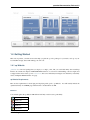
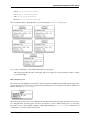
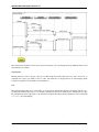
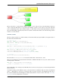
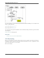
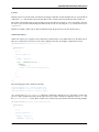
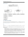
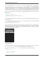
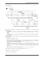
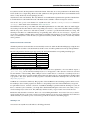
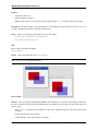
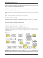
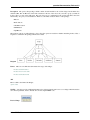
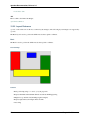
1.3 Architectural Overview
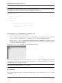
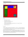
The following diagram tries to show the main aspects of qooxdoo and how they are organized in general. Please keep
in mind that this diagram does not inlcude all features of qooxdoo. You can see the four main areas for which qooxdoo
can be used and what layers are useful in that dedicated scenario.
4
Chapter 1. Introduction
qooxdoo Documentation, Release 2.0
1.4 Getting Started
This section provides you with resources that help you pick the qooxdoo package for your needs, set it up on your
local machine and get started with writing your own code.
1.4.1 qx.Website
qx.Website is a low-level package that you deploy as a single .js file, like you would with many other JavaScript
libraries. Its contents encompasses DOM and BOM abstractions, cross-browser event handling, a selector engine, and
a stripped-down version of the qooxdoo class system. It does not include any UI widgets. It is suitable if you basically
want to manipulate DOM elements on a page.
qx.Website Requirements
Here are the requirements for developing and deploying with qooxdoo qx.Website. You will usually include the
qx.Website library on an HTML page and then write code that utilizes its API.
Browsers
Code written against the qx.Website API will run in all major web browsers, particularly:
Internet Explorer 6+
Firefox 2+
Opera 9+
Safari 3+
Chrome 2+
1.4. Getting Started
5
qooxdoo Documentation, Release 2.0
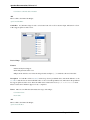
Installation and Setup
Download the qx.Website component from qooxdoo’s download page and place it in a suitable URI reachable from
your development environment. Then include this URI with a <script> tag in the HTML page that you are developing.
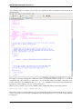
<html>
<head>
<script href="<uri_of_qx.Website_download>"/>
...
That’s it, you are ready to start working against the qx.Website API.
Getting Started with qooxdoo qx.Website
It’s easy to start using qx.Website. Create an HTML page and <script>-include the qx.Website library file, then
add code that uses its API. Here is a simple example:
<html>
<head>
<script href="<uri_to_qx.Website_file>"/>
</head>
<body>
<div>
Hello World!
</div>
<script>
alert(q("div").getHtml());
</script>
</body>
</html>
1.4.2 qx.Desktop
qx.Desktop contains the full scope of qooxdoo classes and infrastructure, like the class system, low-level DOM/BOM
layers, a theming system, and a rich set of UI widgets and controls. It is available through the SDK. It allows you to
create desktop-like, interactive web applications.
qx.Desktop Requirements
Here are the requirements for developing and deploying with qx.Desktop. Applications built with it run in a web
browser, so you need at least one of the supported browsers to check your work. During development time you will
also need the tools from qooxdoo’s SDK to create runnable versions of your application. But these tools are not
necessary once you have deployed it.
The cross-browser abstraction of qooxdoo not only benefits the users of your application, it allows also you as a
developer to pick your preferred development platform, i.e. combination of browser and operating system, and be
confident that the result will run on all other platforms.
qooxdoo qx.Desktop does not enforce any specific backend components, any server that is reachable through its I/O
layer should be fine. During development, loading your application from the file system should suffice, as long as your
application logic doesn’t enforce a server connection. Developers should note, though, that with some browsers, such
as Chrome and Firefox, there is a known constraint when loading reasonably complex qooxdoo applications (such as
the APIviewer or the Demobrowser) via the file:// protocol. Either consult your browser’s documentation (usually
6
Chapter 1. Introduction
qooxdoo Documentation, Release 2.0
there is a command-line option to change this), or use the HTTP protocol during development. In the latter case be
sure to read and understand this FAQ entry.
Browsers
An application comprising of the qooxdoo runtime and custom code written against its API runs across all major web
browsers, unaltered, and with identical look & feel:
Internet Explorer 6+
Firefox 2+
Opera 9+
Safari 3+
Chrome 2+
SDK
Working with qx.Desktop requires from you that you download and use qooxdoo’s SDK. See here for the SDK’s
requirements, and follow its Installation and Setup section. This requirement applies to the development phase only,
the final app is independent of the SDK.
Getting Started with qooxdoo qx.Desktop
The introduction to qooxdoo’s SDK covers all you have to know to get going with the qx.Desktop component.
1.4.3 qx.Mobile
qx.Mobile is used to develop applications for mobile platforms, like iOS and Android.It provides specific UI elements
and theming capabilities suitable for mobile devices. Like the qx.Desktop component it is available through the SDK.
qx.Mobile Requirements
qooxdoo qx.Mobile runs on iOS 2.0+ and Android 1.6+ devices. Working with qx.Mobile requires access to such
a mobile device, with a suitable mobile browser, or a mobile emulator for the respective platform that runs on your
desktop PC.
SDK
Working with qx.Mobile requires downloading and using qooxdoo’s SDK. See here for the SDK’s requirements, and
follow its Installation and Setup section. This requirement applies to the development phase only, the final app is
independent of the SDK.
Mobile Browsers
The following mobile browsers are supported:
1.4. Getting Started
7
qooxdoo Documentation, Release 2.0
Safari Mobile
Chrome for Android
Android Native Browser
Other mobile browsers like Opera Mini might work, but are not officially supported.
Desktop Browsers
As qooxdoo is based on web technologies, you will need a running instance of a browser (Google Chrome, Apple
Safari or Mozilla Firefox) on your system to run and test the application. An iOS or Android device is not necessarily
required.
The following desktop browsers are supported:
Apple Safari 5
Google Chrome 10+
Mozilla Firefox 10+
Getting Started with qooxdoo qx.Mobile
Working with qx.Mobile requires downloading and using qooxdoo’s SDK. See here for the SDK’s requirements, and
follow its Installation and Setup section. This requirement applies to the development phase only, the final app is
independent of the SDK.
The first step is to create a mobile skeleton, by calling the create-applicaton.py script from the command
line. Navigate to the qooxdoo folder and execute the following command:
./tool/bin/create-application.py --type=mobile --name=helloworld --out=..
A new folder “helloworld” will be created next to the qooxdoo folder, containing the mobile skeleton application.
Right now the application is pretty useless, until we create the source version of it. Navigate to the created folder
and call the qooxdoo generator with the following command:
./generate.py source
After a few seconds the generator has analyzed all class dependencies and created a source version of the application.
You can test the application by opening the source/index.html file in your Chrome / Safari browser. You should
see a page “Page 1” with a button “Next Page”. When you click on the button, the next page “Page 2”, with a “Back”
button in the upper left corner, is displayed.
Congratulations, you have just created your first qooxdoo mobile application!
Now it is your turn. Just open source/class/helloworld/Application.js and enhance your crossplatform mobile application.
If you need a more detailed tutorial, please have a look at our twitter tutorial:
qx.Mobile Twitter Client Tutorial
1.4.4 qx.Server
qx.Server is a library suitable for all environments that do not provide a DOM, such as Node.js and Rhino. But you
can also use it to program Webworkers. With no dependencies to external APIs (like a global window object), you get
the infrastructure of qooxdoo’s classes, mixins, properties, custom events and data binding.
8
Chapter 1. Introduction
qooxdoo Documentation, Release 2.0
qx.Server Requirements
qooxdoo qx.Server is a basic component that runs in many different contexts and environments, as it has very little
dependencies to the underlying runtime. For use in command-line tools and programs you will need a corresponding
JavaScript interpreter like Node.js or Mozilla Rhino. For use in HTML5 Web Workers you will need a browser that
supports this technology.
Runtimes
The following runtimes are supported:
• Node.js
• Rhino
Installation
These are the options to get qooxdoo qx.Server.
Manual download Download the qx.Server component from qooxdoo’s download page and place it in a suitable
path on your machine. Optimized and unoptimized versions are available.
Npm If you are using Node.js, there is an alternative installation using npm, the Node package manager. If you have
this installed, issue on your system shell:
$ npm install qooxdoo
This will install the qooxdoo package into your current folder from where you can include it easily into your applications.
In both cases, to verify the installation use your runtime’s loading primitive to include it in a program, e.g. for Node:
var qx = require(’qooxdoo’)
SDK You can also use the SDK to work with qx.Server. It provides a dedicated skeleton which you can utilize. This offers you additional features like dependency detection, optimization, API doc generation, unit testing and generated loaders that work under both Node.js and Rhino. As with all types of qooxdoo skeletons,
create-application.py is used to create a new custom application:
$ qooxdoo-2.0-sdk/tool/bin/create-application.py --name=myapp --type=basic
Getting Started with qooxdoo qx.Server
On the basic level, you can just load the qx.Server module into your own program, using your runtime’s loading
primitives. Here is a simple example for Node.js:
var qx = require(’qooxdoo’);
qx.Class.define("Dog", {
extend : qx.core.Object,
members : {
bark : function() {
1.4. Getting Started
9
qooxdoo Documentation, Release 2.0
console.log("Ruff!");
}
}
});
var dog = new Dog();
dog.bark();
1.4.5 Others
• You can find some community made tutorial videos on vimeo.
10
Chapter 1. Introduction
CHAPTER
TWO
CORE
qooxdoo Core is not a component on its own, but encompasses central features of the qooxdoo class library. The
elements described here are available in all qooxdoo components, be it Desktop, Mobile, Website or Server. Among
these features are a dedicated class system with custom class properties, data binding and a runtime environment.
We recommend that you at least make your way through the chapters Introduction to Object Orientation, Features of
Object Orientation and Classes from the Object Orientation section, which provide the foundation for working with
qooxdoo’s class system. The other chapters can be read when the need arises, and as reference material for the other
components’ documentation.
2.1 Object Orientation
2.1.1 Introduction to Object Orientation
qooxdoo allows you to easily leverage many key concepts of object-oriented programming without bothering about
limited native support in JavaScript.
The main actors of qooxdoo OO are:
• Classes
• Interfaces
• Mixins
When trying to get a grip of the framework code, you should probably understand all those three concepts. As a regular
application developer you often get by with ignoring interfaces and mixins when starting and just getting familiar with
classes.
Classes
A “class” is a central concept in most object-oriented languages, and as a programmer you are certainly familiar
with it. qooxdoo supports a “closed form” of class declaration, i.e. the entire declaration is provided within a
qx.Class.define(name, config) statement, where name is the fully-qualified class name, and config
is a configuration map with various keys (or “sections”).
There are several types of classes available, which are specified by the type key within the config map:
• regular class: May contain class variables/methods (in a statics section) and instance variables/methods (in
a members section). An instance of the class can be created using the new keyword, so a constructor needs to
be given in construct.
11
qooxdoo Documentation, Release 2.0
• static class: Only contains class variables and class methods. Often a helper or utility class. Use type :
"static".
• abstract class: Does not allow an instance to be created. Typically classes derive from it and provide concrete
implementations. type is abstract.
• singleton: Not more than a single instance of the class may exists at any time.
getInstance() returns the instance. Use type : "singleton".
A static method
Interfaces
qooxdoo’s interfaces are similar to the ones in Java. Similar to the declaration of class they are created by
qx.Interface.define(name, config). They specify an “interface” (typically a set of empty methods),
that classes must implement.
Mixins
Mixins are a very practical concept that not all programming languages provide. Unlike interfaces, which require a
class to provide concrete implementations to fulfill the interface contract, mixins do include code. This code needs to
be generic, if it is “mixed into” different existing classes. Mixins usually cover only a single aspect of functionality
and therefore tend to be small. They are declared by qx.Mixin.define(name, config).
Inheritance
Like most programming languages qooxdoo only supports single-inheritance for classes, not multiple-inheritance, i.e.
a class can only derive directly from a single super class. This is easily modeled by the extend key in the class
declaration map.
Since a class may implement/include one or many interfaces/mixins, which themselves can extend others, some advanced forms of multiple-inheritance can still be realized.
qooxdoo OO standalone
If you want to use qooxdoo OO layer standalone, take a look at the qxoo-build generator job of the framework.
2.1.2 Features of Object Orientation
Class definition
A class is defined by providing its name as a string:
qx.Class.define("my.cool.Class");
This example only creates a trivial class my.cool.Class. A typical class declaration contains OO features like
constructor, instance members, static members, etc. This additional information is provided as a second parameter in
form of a map. Since the entire class definition is given in qx.Class.define(), it is called a “closed form” of
class declaration:
qx.Class.define("my.cool.Class", {
// declare constructor, members, ...
});
A regular (non-static) class can simply be instantiated using the new keyword:
12
Chapter 2. Core
qooxdoo Documentation, Release 2.0
var myClass = new my.cool.Class;
Inheritance
In order to derive the current class from another class, the reference to the super class is provided by the key extend:
qx.Class.define("my.great.SuperClass", {
// I’m the super class
});
qx.Class.define("my.cool.Class", {
extend : my.great.SuperClass
});
Constructor
The constructor of a regular class is provided as a function declaration in key construct:
qx.Class.define("my.cool.Class",
{
extend : my.great.SuperClass,
construct : function() {
...
}
});
Static members
Static members (often called “class” members) are also part of the class definition and declared in a map to the
statics key. Static methods are given by providing a function declaration, while all other values declare static
attributes. Typically they are given in uppercase to distinguish them from instance members:
qx.Class.define("my.cool.Class",
{
statics :
{
FOO : VALUE,
BAR : function() { ... }
}
});
Static members, both methods and attributes, can be accessed by using the fully-qualified class name:
my.cool.Class.FOO = 3.141;
my.cool.Class.BAR();
Note: You can use static members as constants, but the value can be changed in the run time!!
Instance Members
Similar to static members, instance members are also part of the class definition. For them the members key is used:
2.1. Object Orientation
13
qooxdoo Documentation, Release 2.0
qx.Class.define("my.cool.Class",
{
members:
{
foo : VALUE,
bar : function() { ... }
}
});
The instance members can be accessed by using an actual instance of a class:
var myClass1 = new my.cool.Class;
myClass1.foo = 3.141;
myClass1.bar();
Accessing Static Members
Generic form. Requires no updates if class name changes. This code can optionally be optimized for performance in
build versions.
qx.Class.define("my.cool.Class",
{
statics : {
PI : 3.141
},
members : {
circumference : function(radius) {
return 2 * this.self(arguments).PI * radius;
}
}
});
Note: For this.self to be available, the class must have as a direct or indirect base class qx.core.Object.
Note: Static members aren’t inherited. For calling a superclass static method, use this.superclass, like in this
example:
qx.Class.define(’A’, {
statics: {
f: function() {}
}
});
qx.Class.define(’B’), {
extend: A,
members: {
e: function() {
this.superclass.self(arguments).f();
}
}
});
Static functions can access other static functions directly through the this keyword.
14
Chapter 2. Core
qooxdoo Documentation, Release 2.0
Calling the Superclass Constructor
Generic form. Requires no updates if super class (name) changes. This code can optionally be optimized for performance in build versions.
qx.Class.define("my.cool.Class",
{
extend : my.great.SuperClass,
construct : function(x) {
this.base(arguments, x);
}
});
Calling the Overridden Superclass Method
Generic form without using prototype. Requires no updates if super class (name) changes. This code can optionally
be optimized for performance in build versions.
qx.Class.define("my.cool.Class",
{
extend : my.great.SuperClass,
...
members : {
foo : function(x) {
this.base(arguments, x);
}
}
});
Destructor
As a logical match to any existing constructor given by the key construct, a destructor is explicitly given by the
destruct key:
qx.Class.define("my.cool.Class",
{
extend : my.great.SuperClass,
construct : function() {
...
}
destruct : function() {
...
}
});
Properties
qooxdoo comes with a very powerful feature called dynamic properties. A concise declaration of an age property
may look like the following:
qx.Class.define(
...
properties : {
age: { init: 10, check: "Integer" }
2.1. Object Orientation
15
qooxdoo Documentation, Release 2.0
}
...
This declaration generates not only a corresponding accessor method getAge() and a mutator method setAge(),
but would allow for many more features.
Interfaces
A leading uppercase I is used as a naming convention for interfaces.
qx.Interface.define("my.cool.IInterface");
Mixins
Leading uppercase M as a naming convention. A mixin can have all the things a class can have, like properties,
constructor, destructor and members.
qx.Mixin.define("my.cool.MMixin");
Attaching mixins to a class
The include key contains either a reference to an single mixin, or an array of multiple mixins:
qx.Class.define("my.cool.Class",
{
include : [my.cool.MMixin, my.other.cool.MMixin]
...
});
Attaching mixins to an already defined class
qx.Class.include(qx.ui.core.Widget, qx.MWidgetExtensions);
Access
By the following naming convention. Goal is to be as consistent as possible. During the build process private members
can optionally be renamed to random names in order to ensure that they cannot be called from outside the class.
publicMember
_protectedMember
__privateMember
Static classes
Explicit declaration allows for useful checks during development. For example. construct or members are not
allowed for such a purely static class.
qx.Class.define("my.cool.Class", {
type : "static"
});
16
Chapter 2. Core
qooxdoo Documentation, Release 2.0
Abstract classes
Declaration allows for useful checks during development and does not require explicit code.
qx.Class.define("my.cool.Class", {
type : "abstract"
});
Singletons
Declaration allows for useful checks during development and does not require explicit code.
getInstance() is added to such a singleton class.
A method
qx.Class.define("my.cool.Class",
{
type : "singleton",
extend : my.great.SuperClass
});
Immediate access to previously defined members
The closed form of the class definition does not allow immediate access to other members, as they are part of the
configuration data structure themselves. While it is typically not a feature used very often, it nonetheless needs to be
supported by the new class declaration. Instead of some trailing code outside the closed form of the class declaration,
an optional defer method is called after the other parts of the class definition have been finished. It allows access to
all previously declared statics, members and dynamic properties.
Note: If the feature of accessing previously defined members is not absolutely necessary, defer should not be used
in the class definition. It is missing some important capabilities compared to the regular members definition and it
cannot take advantage of many crucial features of the build process (documentation, optimization, etc.).
qx.Class.define("my.cool.Class",
{
statics:
{
driveLetter : "C"
},
defer: function(statics, members, properties)
{
statics.drive = statics.driveLetter + ":\\";
members.whatsTheDrive = function() {
return "Drive is " + statics.drive;
};
}
});
Browser specific methods
To maintain the closed form, browser switches on method level is done using environment settings. Since the generator
knows about environment settings it is (optionally) possible to only keep the code for each specific browser and remove
the implementation for all other browsers from the code and thus generate highly-optimized browser-specific builds.
It is possible to use an logical “or” directly inside a environment key. If none of the keys matches the variant, the
“default” key is used:
2.1. Object Orientation
17
qooxdoo Documentation, Release 2.0
members:
{
foo: qx.core.Environment.select("engine.name",
{
"mshtml|opera": function() {
// Internet Explorer or Opera
},
"default": function() {
// All other browsers
}
})
}
Events
qooxdoo’s class definition has a special events key. The value of the key is a map, which maps each distinct event
name to the name of the event class whose instances are passed to the event listeners. The event system can now
(optionally) check whether an event type is supported by the class and issue a warning if an event type is unknown.
This ensures that each supported event must be listed in the event map.
qx.Class.define("my.eventful.Class",
{
extend: qx.core.Target,
events :
{
/** Fired when the widget is clicked. */
"click": "qx.event.type.MouseEvent"
}
...
})
2.1.3 Classes
qooxdoo’s class definition is a concise and compact way to define new classes. Due to its closed form the JavaScript
code that handles the actual class definition already “knows” all parts of the class at definition time. This allows for
many useful checks during development as well as clever optimizations during the build process.
Declaration
Here is the most basic definition of a regular, non-static class qx.test.Cat. It has a constructor so that instances
can be created. It also needs to extend some existing class, here we take the root class of all qooxdoo classes:
qx.Class.define("qx.test.Cat", {
extend: qx.core.Object,
construct : function() { /* ... */ }
});
As you can see, the define() method takes two arguments, the fully-qualified name of the new class, and a configuration map that contains a varying number of predefined keys and their values.
An instance of this class is created and its constructor is called by the usual statement:
18
Chapter 2. Core
qooxdoo Documentation, Release 2.0
var kitty = new qx.test.Cat;
Members
Members of a class come in two flavors:
• Class members (also called “static” members) are attached to the class itself, not to individual instances
• Instance members are attached to each individual instance of a class
Class Members
A static member of a class can be one of the following:
• Class Variable
• Class Method
In the Cat class we may attach a class variable LEGS (where uppercase notation is a common coding convention) and
a class method makeSound(), both in a statics section of the class declaration:
qx.Class.define("qx.test.Cat", {
/* ... */
statics : {
LEGS: 4,
makeSound : function() { /* ... */ }
}
});
Accessing those class members involves the fully-qualified class name:
var foo = qx.test.Cat.LEGS;
alert(qx.test.Cat.makeSound());
Instance Members
An instance member of a class can be one of the following:
• Instance Variable
• Instance Method
They may be defined in the members section of the class declaration:
qx.Class.define("qx.test.Cat", {
...
members: {
name : "Kitty",
getName: function() { return this.name }
}
});
Accessing those members involves an instance of the class:
var kitty = new qx.test.Cat;
kitty.name = "Sweetie";
alert(kitty.getName());
2.1. Object Orientation
19
qooxdoo Documentation, Release 2.0
Primitive Types vs. Reference Types There is a fundamental JavaScript language feature that could lead to problems, if not properly understood. It centers around the different behavior in the assignment of JavaScript’s two data
types (primitive types vs. reference types).
Note: Please make sure you understand the following explanation to avoid possible future coding errors.
Primitive types include Boolean, Number, String, null and the rather unusual undefined. If such a primitive
type is assigned to an instance variable in the class declaration, it behaves as if each instance had a copy of that value.
They are never shared among instances.
Reference types include all other types, e.g. Array, Function, RegExp and the generic Object. As their
name suggests, those reference types merely point to the corresponding data value, which is represented by a more
complex data structure than the primitive types. If such a reference type is assigned to an instance variable in the class
declaration, it behaves as if each instance just pointed to the complex data structure. All instances share the same
value, unless the corresponding instance variable is assigned a different value.
Example: If an instance variable was assigned an array in the class declaration, any instance of the class could
(knowingly or unknowingly) manipulate this array in such a way that each instance would be affected by the changes.
Such a manipulation could be pushing a new item into the array or changing the value of a certain array item. All
instances would share the array.
You have to be careful when using complex data types in the class declaration, because they are shared by default:
members:
{
foo: [1, 2, 4]
}
// all instances would start to share this data structure
If you do not want that instances share the same data, you should defer the actual initialization into the constructor:
construct: function()
{
this.foo = [1, 2, 4];
// each instance would get assigned its own data structure
},
members:
{
foo: null
// to be initialized in the constructor
}
Access
In many object-oriented classes a concept exists that is referred to as “access” or “visibility” of members (well, or
even classes, etc.). Based on the well-known access modifiers of Java, the following three types exist for qooxdoo
members:
• public: To be accessed from any class/instance
• protected: To be accessed only from derived classes or their instances
• private: To be accessed only from the defining class/instance
Unfortunately, JavaScript is very limited in enforcing those protection mechanisms. Therefore, the following coding
convention is to be used to declare the access type of members:
• public: members may not start with an underscore
• protected: members start with a single underscore _
• private: members start with a double underscore __
20
Chapter 2. Core
qooxdoo Documentation, Release 2.0
There are some possibilities to enforce or at least check the various degrees of accessibility:
• automatic renaming of private members in the build version could trigger errors when testing the final app
• checking instance of this in protected methods
• ...
Special Types of Classes
Besides a “regular” class there is built-in support for the following special types:
Static Classes A static class is not instantiated and only contains static members. Setting its type to static makes
sure only such static members, no constructor and so on are given in the class definition. Otherwise error messages
are presented to the developer:
qx.Class.define("qx.test.Cat", {
type : "static"
...
});
Abstract Classes An abstract class may not be instantiated. It merely serves as a superclass that needs to be derived
from. Concrete classes (or concrete members of such derived classes) contain the actual implementation of the abstract
members. If an abstract class is to be instantiated, an error message is presented to the developer.
qx.Class.define("qx.test.Cat", {
type : "abstract"
...
});
Singletons The singleton design pattern makes sure, only a single instance of a class may be created. Every time
an instance is requested, either the already created instance is returned or, if no instance is available yet, a new one
is created and returned. Requesting the instance of such a singleton class is done by using the getInstance()
method.
qx.Class.define("qx.test.Cat", {
type : "singleton"
...
});
Inheritance
Single Inheritance
JavaScript supports the concept of single inheritance. It does not support (true) multiple inheritance like C++. Most
people agree on the fact that such a concept tends to be very complex and error-prone. There are other ways to shoot
you in the foot. qooxdoo only allows for single inheritance as well:
qx.Class.define("qx.test.Cat", {
extend: qx.test.Animal
});
2.1. Object Orientation
21
qooxdoo Documentation, Release 2.0
Multiple Inheritance
Not supported. There are more practical and less error-prone solutions that allow for typical features of multiple
inheritance: Interfaces and Mixins (see below).
Polymorphism (Overriding)
qooxdoo does, of course, allow for polymorphism, that is most easily seen in the ability to override methods in derived
classes.
Calling the Superclass Constructor It is hard to come up with an appealing syntax and efficient implementation
for calling the superclass constructor from the constructor of a derived class. You simply cannot top Java’s super()
here. At least there is some generic way that does not involve to use the superclass name explicitly:
qx.Class.define("qx.test.Cat", {
extend: qx.test.Animal,
construct: function(x) {
this.base(arguments, x);
}
});
Unfortunately, to mimic a super() call the special variable arguments is needed, which in JavaScript allows a
context-independent access to the actual function. Don’t get confused by its name, you would list your own arguments
just afterwards (like the x in the example above).
this.base(arguments, x) is internally mapped to arguments.callee.base.call(this, x) (The
.base property is maintained for every method through qooxdoo’s class system). The latter form can be handled by
JavaScript natively, which means it is quite efficient. As an optimization during the build process such a rewrite is
done automatically for your deployable application.
Calling an Overridden Method Calling an overridden superclass method from within the overriding method (i.e.
both methods have the same name) is similar to calling the superclass constructor:
qx.Class.define("qx.test.Cat", {
extend: qx.test.Animal,
members: {
makeSound : function() {
this.base(arguments);
}
}
});
Calling the Superclass Method or Constructor with all parameters This variant allows to pass all the parameters
(unmodified):
qx.Class.define("qx.test.Animal", {
members: {
makeSound : function(howManyTimes) {
....
}
}
});
qx.Class.define("qx.test.Cat", {
22
Chapter 2. Core
qooxdoo Documentation, Release 2.0
extend: qx.test.Animal,
members: {
makeSound : function() {
this.debug("I’m a cat");
/* howManyTimes or any other parameter are passed.
arguments.callee.base.apply(this, arguments);
}
}
});
We don’t need to know how many parameters a
Calling another Static Method Here is an example for calling a static member without using a fully-qualified class
name (compare to this.base(arguments) above):
qx.Class.define("qx.test.Cat", {
extend: qx.test.Animal,
statics : {
someStaticMethod : function(x) {
...
}
},
members: {
makeSound : function(x) {
this.constructor.someStaticMethod(x);
}
}
});
The syntax for accessing static variables simply is this.constructor.someStaticVar. Please note, for
this.constructor to be available, the class must be a derived class of qx.core.Object, which is usually the
case for regular, non-static classes.
Instead of this.constructor you can also use the alternative syntax this.self(arguments).
In purely static classes for calling a static method from another static method, you can directly use the this keyword,
e.g. this.someStaticMethod(x).
Usage of Interfaces and Mixins
Implementing an Interface
The class system supports Interfaces. The implementation is based on the feature set of Java interfaces. Most relevant
features of Java-like interfaces are supported. A class can define which interface or multiple interfaces it implements
by using the implement key:
qx.Class.define("qx.test.Cat", {
implement : [qx.test.IPet, qx.test.IFoo]
});
Including a Mixin
Unlike interfaces, Mixins do contain concrete implementations of methods. They borrow some ideas from Ruby and
similar scripting languages.
Features:
2.1. Object Orientation
23
qooxdoo Documentation, Release 2.0
• Add mixins to the definition of a class: All members of the mixin are added to the class definition.
• Add a mixin to a class after the class is defined. Enhances the functionality but is not allowed to overwrite
existing members.
• Patch existing classes. Change the implementation of existing methods. Should normally be avoided but, as
some projects may need to patch qooxdoo, we better define a clean way to do so.
The concrete implementations of mixins are used in a class through the key include:
qx.Class.define("qx.test.Cat", {
include : [qx.test.MPet, qx.test.MSleep]
});
Summary
Configuration
Key
type
Type
String
extend
implement
include
Class
Interface |
Interface[]
Mixin |
Mixin[]
Function
construct
statics
properties
members
environment
events
Map
Map
Map
Description
Type of the class. Valid types are abstract, static and singleton. If unset it
defaults to a regular non-static class.
The super class the current class inherits from.
Single interface or array of interfaces the class implements.
Single mixin or array of mixins, which will be merged into the class.
The constructor of the class.
Map of static members of the class.
Map of property definitions. For a description of the format of a property definition
see qx.core.Property.
Map of instance members of the class.
Map
Map of settings for this class. For a description of the format of a setting see
qx.core.Environment.
Map
Map of events the class fires. The keys are the names of the events and the values are
the corresponding event type class names.
Function that is called at the end of processing the class declaration. It allows access
to the declared statics, members and properties.
The destructor of the class.
defer
Function
destruct
Function
References
• Class Declaration Quick Ref - a quick syntax overview
• API Documentation for Class
2.1.4 Interfaces
qooxdoo supports Java like interfaces.
Interface definitions look very similar to normal class definitions.
24
Chapter 2. Core
qooxdoo Documentation, Release 2.0
Example:
qx.Interface.define("qx.test.ISample",
{
extend: [SuperInterfaces],
properties: {"color": {}, "name": {} },
members:
{
meth1: function() {},
meth2: function(a, b) {
this.assertArgumentsCount(arguments, 2, 2);
},
meth3: function(c) {
this.assertInterface(c, qx.some.IInterface);
}
},
statics:
{
PI : 3.14
},
events :
{
keydown : "qx.event.type.KeyEvent"
}
});
Definition
Interfaces are declared using qx.Interface.define. Interface names start by convention with an I (uppercase
“i”). They can inherit from other interfaces using the extend key. Multiple inheritance of interfaces is supported.
Properties
Properties in interfaces state that each class implementing this interface must have a property of the given name. The
property definition is not evaluated and may be empty.
Members
The member section of the interface lists all member functions which must be implemented. The function body is used
as a precondition of the implementation. By implementing an interface the qooxdoo class definition automatically
wraps all methods required by the interface. Before the actual implementation is called, the precondition of the
interface is called with the same arguments. The precondition should raise an exception if the arguments are don’t
meet the expectations. Usually the methods defined in qx.core.MAssert are used to check the incoming parameters.
Statics
Statics behave exactly like statics defined in mixins and qooxdoo classes, with the different that only constants are
allowed. They are accessible through their fully-qualified name. For example, the static varaiable PI could be used
like this:
2.1. Object Orientation
25
qooxdoo Documentation, Release 2.0
var a = 2 * qx.test.ISample.PI * (r*r);
Events
Each event defined in the interface must be declared in the implementing classes. The syntax matches the events
key of the class declaration.
Implementation
With implement key of the class declaration, a list of interfaces can be listed, which the class implements. The
class must implement all properties, members and events declared in the interfaces. Otherwise a runtime error will be
thrown.
Example:
qx.Class.define("qx.test.Sample",
{
implement: [qx.test.ISample],
properties: {
"color": { check: "color"},
"name": { check: "String"}
},
members:
{
meth1: function() { return 42; },
meth2: function(a, b) { return a+b },
meth3: function(c) { c.foo() }
}
events :
{
keydown : "qx.event.type.KeyEvent"
}
});
Validation
qx.Class contains several static methods to check, whether a class or an object implements an interface:
• qx.Class.hasInterface(): Whether a given class or any of its superclasses includes a given interface.
• qx.Class.implementsInterface(): Checks whether all methods defined in the interface are implemented in the class. The class does not need to implement the interface explicitly.
It is further possible to use interfaces as property checks.
26
Chapter 2. Core
qooxdoo Documentation, Release 2.0
Summary
Configuration
Key
extend
members
statics
properties
events
Type
Interface |
Interface[]
Map
Description
Single interface or array of interfaces this interface inherits from.
Map
Map
Map of statics of the interface. The statics will not get copied into the target class. This
is the same behavior as statics in mixins.
Map of properties and their definitions.
Map
Map of event names and the corresponding event class name.
Map of members of the interface.
References
• Interfaces Quick Ref - a syntax quick reference for interfaces
• API Documentation for Interface
2.1.5 Mixins
Mixins are collections of code and variables, which can be merged into other classes. They are similar to classes but
can not be instantiated. Unlike interfaces they do contain implementation code. Typically they are made up of only a
few members that allow for a generic implementation of some very specific functionality.
Mixins are used to share functionality without using inheritance and to extend/patch the functionality of existing
classes.
Definition
Example:
qx.Mixin.define("name",
{
include: [SuperMixins],
properties: {
"tabIndex": {check: "Number", init: -1}
},
members:
{
prop1: "foo",
meth1: function() {},
meth2: function() {}
}
});
2.1. Object Orientation
27
qooxdoo Documentation, Release 2.0
Usage
Here a short example to see, how to use mixins (MMixinA, MMixinB) with a class (ClassC).
The first mixin:
qx.Mixin.define("demo.MMixinA",
{
properties: {
"propertyA":
{
check: "String",
init: "Hello, I’m property A!\n"
}
},
members:
{
methodA: function() {
return "Hello, I’m method A!\n";
}
}
});
The second mixin:
qx.Mixin.define("demo.MMixinB",
{
properties: {
"propertyB":
{
check: "String",
init: "Hello, I’m property B!\n"
}
},
members:
{
methodB: function() {
return "Hello, I’m method B!\n";
}
}
});
The usage in the class:
qx.Class.define("demo.ClassC",
{
extend : qx.core.Object,
include : [demo1.MMixinA, demo1.MMixinB],
members :
{
methodC : function() {
return this.getPropertyA() + this.methodA()
+ this.getPropertyB() + this.methodB()
+ "Nice to meet you. Thanks for your help!";
}
28
Chapter 2. Core
qooxdoo Documentation, Release 2.0
}
});
The result is when calling the method methodC() of ClassC:
var classC = new demo.ClassC;
var result = classC .methodC();
/*
* Result:
* Hello, I’m property A!
* Hello, I’m method A!
* Hello, I’m property B!
* Hello, I’m method B!
* Nice to meet you. Thanks for your help!
*/
Summary
Configuration
Key
include
construct
destruct
statics
members
properties
events
Type
Mixin or
Mixin[]
Function
Description
Single mixin or array of mixins, which will be merged into the mixin.
Function
An optional mixin destructor.
Map
Map
Map of static members of the mixin. The statics will not get copied into the target class.
They remain accessible from the mixin. This is the same behaviour as for statics in interfaces
Map of members of the mixin.
Map
Map of property definitions.
Map
Map of events the mixin fires. The keys are the names of the events and the values are the
corresponding event type classes.
An optional mixin constructor. It is called when instantiating a class that includes this mixin.
References
• Mixin Quick Ref - a quick syntax reference for mixins
• API Documentation for Mixin
2.2 Properties
2.2.1 Introduction to Properties
qooxdoo comes with its own convenient and sophisticated property management system. In order to understand its
power we will first take a look at the ordinary property handling in plain JavaScript first.
2.2. Properties
29
qooxdoo Documentation, Release 2.0
Ordinary Property Handling
Let’s say we have a property width for an object obj.
As is a good practice in regular high-level programming languages you should not access object properties directly:
// NOT RECOMMENDED: direct access to properties
obj.width = 200; // setting a value
var w = obj.width; // getting the current value
Instead you should work with properties only through so-called accessor methods (“getters”) and mutator methods
(“setters”):
// direct access is no good practice
obj.setWidth(200); // setting a value
var w = obj.getWidth(); // getting the current value
Of course, directly accessing properties may be faster because no indirection by a function call is needed. Nonetheless,
in practice this does not outweight the disadvantages. Direct access to properties does not hide internal implementation
details and is a less maintainable solution (Well, you don’t program web applications in assembler code, do you?).
A typical implementation of the accessor and mutator methods would look like the following, where those instance
methods are declared in the members section of the class definition:
// ordinary example #1
members:
{
getWidth : function() {
return this._width;
},
setWidth : function(width)
{
this._width = width;
return width;
}
}
Something that is very familiar to the typical programmer of Java or any other comparable language. Still, it is not
very convenient. Even this trivial implementation of only the basic feature requires a lot of keystrokes. More advanced
features like type checks, performance optimizations, firing events for value changes, etc. need to be coded by hand.
An improved version of the setter could read:
// ordinary example #2
members:
{
setWidth : function(width)
{
if (typeof width != "number") {
// Type check: Make sure it is a valid number
throw new Error("Invalid value: Need a valid integer value: " + width);
};
if (this._width != width)
{
// Optimization: Only set value, if different from the existing value
this._width = width;
// User code that should be run for the new value
this.setStyleProperty("width", width+ "px");
30
Chapter 2. Core
qooxdoo Documentation, Release 2.0
};
return width;
}
}
Large part of the code found here is for managing the validation and storage of the incoming data. The propertyspecific user code is rather short.
qooxdoo Property Handling
Let’s see how the above example can be written using qooxdoo’s property implementation. The property itself is
declared in the properties section of the class definition. Only if some property-specific code needs to be run in
the setter, an additional apply method has to be given:
// qooxdoo version of ordinary example #2
properties : {
width : { check : "Number", apply : "applyWidth" }
}
members :
{
applyWidth : function(value) {
this.setStyleProperty("width", value + "px");
}
}
Compare that to the lengthy code of the ordinary code example above! Much shorter and nicer, also by objective
means. And it almost only contains the “real code”.
The apply method may optionally be defined for each property you add to your class. As soon as you define a key
“apply” in your property declaration map the method gets automatically called on each property modification (but not
during initial initialization). If you do not define an apply method, the property just handles the fundamental storage
of your data and its disposal.
Despite needing much less explicit code (keep in mind, for every property), it actually contains at least as many
features as the hand-tuned code: The type of the property is checked automatically (Number in the example above).
Moreover, new values are only stored (and the optional apply method called) if different from the existing values. A
tiny but important optimization.
Change Events
qooxdoo supports full-featured event-based programming throughout the framework. So-called change events are a
good example for this powerful concept.
Each property may optionally behave as an observable. This means it can send out an event at any time the property
value changes. Such a change event (an instance of qx.event.type.Data) is declared by providing a custom
name in the event key of the property definition. While you are free to choose any event name you like, the qooxdoo
framework tries to consistently use the naming convention "change + Propertyname", e.g. "changeWidth"
for a change of property width. In order to get notified of any value changes, you simply attach an event listener to
the object instance containing the property in question.
For example, if you would like the element property of a Widget instance widget to fire an event named
"changeElement" any time the value changes.
2.2. Properties
31
qooxdoo Documentation, Release 2.0
properties : {
element: { event: "changeElement" }
}
If this happens, you would like to set the DOM element’s content:
widget.addEventListener("changeElement", function(e) {
e.getValue().innerHTML = "Hello World";
});
The anonymous function acts as an event handler that receives the event object as variable e. Calling the predefined
method getValue() returns the new value of property element.
Available Methods
qooxdoo’s dynamic properties not only make sure that all properties behave in a consistent way, but also guarantee
that the API to access and manipulate properties are identical. The user is only confronted with a single interface,
where the method names are easy to understand. Each property creates (at least) the following set of methods:
• setPropertyName(): Mutator method (“setter”) to set a new property value.
• getPropertyName(): Accessor method (“getter”) that returns the current value.
Additionally, all properties of boolean type (declared by check:
methods:
"Boolean") provide the following convenience
• isPropertyName(): Identical to getPropertyName().
• togglePropertyName(): Toggles between true and false.
Property Groups
Property groups is a layer above the property system explained in the last paragraphs. They make it possible to set
multiple values in one step using one set call. qx.ui.core.Widget supports the property group padding.
padding simply sets the paddingLeft, paddingRight, paddingTop and paddingBottom property.
widget.setPadding(10, 20, 30, 40);
The result is identical to:
widget.setPaddingTop(10);
widget.setPaddingRight(20);
widget.setPaddingBottom(30);
widget.setPaddingLeft(40);
As you can see the property groups are a nice really convenient feature.
Shorthand support
One more thing. The property group handling also supports some CSS like magic like the shorthand mode for example.
This means that you can define only some edges in one call and the others get filled automatically:
// four arguments
widget.setPadding(top, right, bottom, left);
// three arguments
widget.setPadding(top, right+left, bottom);
32
Chapter 2. Core
qooxdoo Documentation, Release 2.0
// two arguments
widget.setPadding(top+bottom, right+left);
// one argument
widget.setPadding(top+right+bottom+left);
As you can see this can also reduce the code base and make it more userfriendly.
BTW: The values of a property group can also be given an array as first argument e.g. these two lines work identically:
// arguments list
widget.setPadding(10, 20, 30, 40);
// first argument as array
widget.setPadding([10, 20, 30, 40]);
Note: For more information regarding declaration, usage and internal functionality please see the the developer
documentation.
2.2.2 Properties in more detail
Note: Please take a look at Property features summarized first to get an compact overview of the available features.
Declaration
The following code creates a property myProperty and the corresponding functions like setMyProperty() and
getMyProperty().
qx.Class.define(
...
properties : {
myProperty : { nullable : true }
}
...
You should define at least one of the attributes init, nullable or inheritable. Otherwise, the first call to the
getter would stop with an exception because the computed value is not (yet) defined.
Note: As an alternative to the init key you could set the init value of the property by calling an initializing function
this.initMyProperty(value) in the constructor. See below for details.
Please also have a look at the Quick Reference.
Handling changes of property values
You have multiple possibilities to react on each property change. With change the modification of a property is meant,
where the old and the new values differ from each other.
As a class developer the easiest solution with the best performance is to define an apply method. As a user of a class
(the one who creates instances) it is the best to simply attach an event listener to the instance, if such an corresponding
event is provided in the property declaration.
2.2. Properties
33
qooxdoo Documentation, Release 2.0
Defining an apply method
To attach an apply method you must add a key apply to your configuration which points to a name of a function
which needs to be available in your members section. As the apply method normally should not be called directly, it
is always a good idea to make the method at least protected by prefixing the name with an underscore _.
The return value of the apply method is ignored. The first argument is the actual value, the second one is the former
or old value. The last argument is the name of the property which can come very handy if you use one apply mehtod
for more than one property. The second and third arguments are optional and may be left out.
Example
properties : {
width : { apply : "_applyWidth" }
},
members :
{
_applyWidth : function(value, old, name) {
// do something...
}
}
The applying method is only called when the value has changed.
Note: When using reference data types like Object or Array the apply method is always called, since these are
different objects and indeed different values. This is JavaScript functionality and not qooxdoo specific.
For a more technical description, take a look at the API documentation of qx.core.Property
Providing an event interface
For the users of a class it is in many cases a nice idea to also support an event to react on property changes. The event
is defined using the event key where the value is the name of the event which should be fired.
qooxdoo fires a qx.event.type.Data which supports the methods getData() and getOldData() to allow
easy access to the new and old property value, respectively.
Note: Events are only useful for public properties. Events for protected and private properties are usually not a good
idea.
Example
properties : {
label : { event : "changeLabel" }
}
...
// later in your application code:
obj.addListener("changeLabel", function(e) {
alert(e.getData());
});
34
Chapter 2. Core
qooxdoo Documentation, Release 2.0
Init values
Init values are supported by all properties. These values are stored separately by the property engine. This way it is
possible to fallback to the init value when property values are being reset.
Defining an init value
There are two ways to set an init value of a property.
Init value in declaration The preferred way for regular init values is to simply declare them by an init key
in the property configuration map. You can use this key standalone or in combination with nullable and/or
inheritable.
properties : {
myProperty : { init : "hello" }
}
Init value in constructor Alternatively, you could set the init value of the property in the constructor of the class.
This is only recommended for cases where a declaration of an init value as explained above is not sufficient.
Using an initializing function this.initMyProperty(value) in the constructor would allow you to assign
complex non-primitive types (so-called “reference types” like Array, Object) that should not be shared among
instances, but be unique on instance level.
Another scenario would be to use a localizable init value when internationalizing your application: Because
this.tr() cannot be used in the property definition, you may either use the static qx.locale.Manager.tr()
there instead, or use this.tr() in the call of the initializing function in the constructor.
Note: You need to add a deferredInit:true to the property configuration to allow for a deferred initialization
for reference types as mentioned above.
qx.Class.define("qx.MyClass", {
construct: function() {
this.initMyProperty([1, 2, 4, 8]);
},
properties : {
myProperty : { deferredInit : true}
}
};
Applying an init value
It is possible to apply the init value using an user-defined apply method. To do this call the init method
this.initMyProperty(value) somewhere in your constructor - this “change” will than trigger calling the
apply method. Of course, this only makes sense in cases where you have at least an apply or event entry in the
property definition.
If you do not use the init method you must be sure that the instances created from the classes are in a consistent state.
The getter will return the init value even if not initialized. This may be acceptable in some cases, e.g. for properties
without apply or event. But there are other cases, where the developer needs to be carefully and call the init method
because otherwise the getter returns wrong information about the internal state (due to an inconsistency between init
and applied value).
2.2. Properties
35
qooxdoo Documentation, Release 2.0
Like calling the this.initMyProperty(value) method itself, you could call the setter and use the defined init
value as parameter. This will call the apply method, not like in the usual cases when setting the same value which is
aready set.
construct : function()
{
this.base(arguments);
this.setColor("black"); // apply will be invoked
this.setColor("black"); // apply will NOT be invoked
},
properties :
{
color :
{
init : "black",
apply : "_applyColor"
}
},
members :
{
_applyColor : function(value, old) {
// do something...
}
}
This example illustrates how the behavior differs from the default behavior of the property system due to the already
mentioned inconsistency between init and applied value.
construct : function()
{
this.base(arguments);
// Initialize color with predefined value
this.initColor();
// Initialize store with empty array
this.initStore([]);
},
properties :
{
color :
{
init : "black",
apply : "_applyColor"
},
store : {
apply : "_applyStore"
}
},
members :
{
_applyColor : function(value, old) {
// do something...
36
Chapter 2. Core
qooxdoo Documentation, Release 2.0
},
_applyStore : function(value, old) {
// do something...
}
}
In the above example you can see the different usage possibilities regarding properties and their init values. If you
do not want to share “reference types” (like Array, Object) between instances, the init values of these have to be
declared in the constructor and not in the property definition.
If an init value is given in the property declaration, the init method does not accept any parameters. The init methods
always use the predefined init values. In cases where there is no init value given in the property declaration, it is
possible to call the init method with one parameter, which represents the init value. This may be useful to apply
reference types to each instance. Thus they would not be shared between instances.
Note: Please remember that init values are not for incoming user values. Please use init only for class defined
things, not for user values. Otherwise you torpedo the multi-value idea behind the dynamic properties.
Refining init values
Derived classes can refine the init value of a property defined by their super class. This is however the only modification
which is allowed through inheritance. To refine a property just define two keys inside the property (re-)definition:
init and refine. refine is a simple boolean flag which must be configured to true.
Normally properties could not be overridden. This is the reason for the refine flag . The flag informs the implementation that the developer is aware of the feature and the modification which should be applied.
properties : {
width : { refine : true, init : 100 }
}
This will change the default value at definition time. refine is a better solution than a simple set call inside the
constructor because it the initial value is stored in a separate namespace as the user value and so it is possible for the
user to fall back to the default value suggested by the developer of a class.
Checking incoming values
You can check incoming values by adding a check key to the corresponding property definition. But keep in mind
that these checks only apply in the development (source) version of the application. Due to performance optimization,
we strip these checks for the build version. If you want a property validation, take a look at the validation section.
Predefined types
You can check against one of these predefined types:
• Boolean, String, Number, Integer, Float, Double
• Object, Array, Map
• Class, Mixin, Interface, Theme
• Error, RegExp, Function, Date, Node, Element, Document, Window, Event
2.2. Properties
37
qooxdoo Documentation, Release 2.0
Due to the fact that JavaScript only supports the Number data type, Float and Double are handled identically to
Number. Both are still useful, though, as they are supported by the Javadoc-like comments and the API viewer.
properties : {
width : { init : 0, check: "Integer" }
}
Possible values
One can define an explicit list of possible values:
properties : {
color: { init : "black", check : [ "red", "blue", "orange" ] }
}
Note: Providing a list of possible values only works with primitive types (like strings and numbers), but not with
reference types (like objects, functions, etc.).
Instance checks
It is also possible to only allow for instances of a class. This is not an explicit class name check, but rather an
instanceof check. This means also instances of any class derived from the given class will be accepted. The class
is defined using a string, thereby to not influencing the load time dependencies of a class.
properties : {
logger : { nullable : true, check : "qx.log.Logger" }
}
Interface checks
The incoming value can be checked against an interface, i.e. the value (typically an instance of a class) must implement
the given interface. The interface is defined using a string, thereby not influencing the load time dependencies of a
class.
properties : {
application : { check : "qx.application.IApplication" }
}
Implementing custom checks
Custom checks are possible as well, using a custom function defined inside the property definition. This is useful for
all complex checks which could not be solved with the built-in possibilities documented above.
properties :
{
progress :
{
init : 0,
check : function(value) {
return !isNaN(value) && value >= 0 && value <= 100;
}
38
Chapter 2. Core
qooxdoo Documentation, Release 2.0
}
}
This example demonstrates how to handle numeric values which only accept a given range of numbers (here 0 .. 100).
The possibilities for custom checks are only limited by the developer’s imagination. ;-)
Alternative solution As an alternative to the custom check function, you may also define a string which will directly
be incorporated into the setters and used in a very efficient way. The above example could be coded like this:
properties :
{
progress :
{
init : 0,
check : "!isNaN(value) && value >= 0 && value <= 100"
}
}
This is more efficient, particularly for checks involving rather small tests, as it omits the function call that would be
needed in the variant above.
Transforming incoming values
You can transform incoming values before they are stored by using the transform key to the corresponding property
definition. The transform method occurs before the check and apply functions and can also throw an error if the value
passed to it is invalid. This method is useful if you wish accept different formats or value types for a property.
Example
Here we define both a check and transform method for the width property. Though the check method requires that the
property be a integer, we can use the transform method to accept a string and transform it into an integer. Note that we
can still rely on the check method to catch any other incorrect values, such as if the user mistakenly assigned a Widget
to the property.
properties :
{
width :
{
init : 0,
transform: "_transformWidth",
check: "Integer"
}
},
members :
{
_transformWidth : function(value)
{
if ( qx.lang.Type.isString(value) )
{
value = parseInt(value, 10);
}
return value;
2.2. Properties
39
qooxdoo Documentation, Release 2.0
}
}
Validation of incoming values
Validation of a property can prevent the property from being set if it is not valid. In that case, a validation error should
be thrown by the validator function. Otherwise, the validator can just do nothing.
Using a predefined validator
If you use predefined validators, they will throw a validation error for you. You can find a set of predefined validators
in qx.util.Validate. The following example shows the usage of a range validator.
properties : {
application : { validate : qx.util.Validate.range(0, 100) }
}
Using a custom validator
If the predefined validators are not enough for you validation, you can specify your own validator.
properties : {
application : { validate : function(value) {
if (value > 10) {
throw new qx.core.ValidationError(
"Validation Error: ", value + " is greater than 10."
);
}
}
}
}
Validation method as member
You can define a validation method as a member of the class containing the property. If you have such a member
validator, you can just specify the method name as a sting
properties : {
application : { validate : "_validateApplication" }
}
Enabling theme support
The property system supports multiple values per property as explained in the paragraph about the init values. The
theme value is another possible value that can be stored in a property. It has a lower priority than the user value and a
higher priority than the init value. The setThemed and resetThemed methods are part of qooxdoo’s theme layer
and should not be invoked by the user directly.
setter
setProperty(value)
40
value
^
user
resetter
|
resetProperty()
Chapter 2. Core
qooxdoo Documentation, Release 2.0
setThemedProperty(value)
initProperty([value])
|
Priority
|
|
theme
init
|
Fallback
|
v
resetThemedProperty()
n.a.
To enable theme support it is sufficient to add a themeable key to the property definition and set its value to true.
properties : {
width : { themeable : true, init : 100, check : "Number" }
}
Note: themeable should only be enabled for truely theme-relevant properties like color and decorator, but not for
functional properties like enabled, tabIndex, etc.
Working with inheritance
Another great feature of the new property system is inheritance. This is primarily meant for widgets, but should be
usable in independent parent-children architectures, too.
Inheritance quickly becomes nothing short of vital for the property system, if you consider that it can reduce redundancy dramatically. It is advantageous both in terms of coding size and storage space, because a value only needs to
be declared once for multiple objects inside an hierarchy. Beyond declaring such an inheritable property once, only
intended exceptions to the inherited values need to be given to locally override those values.
The inheritance as supported by qooxdoo’s properties is comparable to the inheritance known from CSS. This means,
for example, that all otherwise undefined values of inheritable properties automatically fall back to the corresponding
parent’s value.
Each property may also have an explicit user value of string "inherit". The inherited value, which is normally
only used as a fallback value, can thus be emphasized by setting "inherit" explicitly. The user may set a property
to "inherit" in order to enforce lookup by inheritance, and thereby ignoring init and appearance values.
To mark a property as inheritable simply add the key inheritable and set it to true:
properties : {
color : { inheritable : true, nullable : true }
}
Optionally, you can configure an init value of inherit. This is especially a good idea if the property should not be
nullable:
properties : {
color : { inheritable : true, init: "inherit" }
}
Inheritable CSS properties
To give you an idea for what kind of custom properties inheritance is particularly useful, the following list of prominent
CSS properties which support inheritance may be a good orientation:
• color
• cursor
• font, font-family, ...
• line-height
2.2. Properties
41
qooxdoo Documentation, Release 2.0
• list-style
• text-align
Note: This list of CSS properties is only meant for orientation and does not reflect any of qooxdoo widget properties.
Internal methods
The property documentation in the user manual explains the public, non-internal methods for each property. However,
there are some more, which are not meant for public use:
• this.resetProperty(value) : For properties which are inheritable. Used by the inheritance system to
transfer values from parent to child widgets.
• this.setThemedProperty(value) : For properties with appearance enabled. Used to store a separate value for the appearance of this property. Used by the appearance layer.
• this.resetThemedProperty(value) : For properties with appearance enabled. Used to reset the
separately stored appearance value of this property. Used by the appearance layer.
Defining property groups
Property groups is a convenient feature as it automatically generates setters and resetters (but no getters) for a group
of properties. A definition of such a group reads:
properties : {
location : { group : [ "left", "top" ] }
}
As you can see, property groups are defined in the same map as “regular” properties. From a user perspective the API
with setters and resetters is equivalent to the API of regular properties:
obj.setLocation( 50, 100);
// instead of
// obj.setLeft(50);
// obj.setTop(100);
Shorthand support
Additionaly, you may also provide a mode which modifies the incoming data before calling the setter of each group
members. Currently, the only available modifier is shorthand, which emulates the well-known CSS shorthand
support for qooxdoo properties. For more information regarding this feature, please have a look at the user manual.
The definition of such a property group reads:
properties :
{
padding :
{
group : [ "paddingTop", "paddingRight", "paddingBottom", "paddingLeft" ],
mode : "shorthand"
}
}
For example, this would allow to set the property in the following way:
42
Chapter 2. Core
qooxdoo Documentation, Release 2.0
obj.setPadding( 10, 20 );
//
//
//
//
//
}
instead of
obj.setPaddingTop(10);
obj.setPaddingRight(20);
obj.setPaddingBottom(10);
obj.setPaddingLeft(20);
.. _pages/defining_properties#when_to_use_properties:
When to use properties?
Since properties in qooxdoo support advanced features like validation, events and so on, they might not be quite as
lean and fast as an ordinarily coded property that only supports a setter and getter. If you do not need these advanced
features or the variable you want to store is extremely time critical, it might be better not to use qooxdoo’s dynamic
properties in those cases. You might instead want to create your own setters and getters (if needed) and store the value
just as a hidden private variable (e.g. __varName) inside your object.
2.2.3 Initialization Behavior
This document summarizes some thoughts about the behavior of the initialization of properties.
The Problem
Imagine a class containing a property named a with an init value, like the following:
qx.Class.define("A", {
extend : qx.core.Object,
properties : {
a : {
init : "b",
event : "changeA"
}
}
});
As you can see, the property a has an init value, b. Now, if you access a with its getter, you get the init value in return:
var a = new A();
a.getA(); // returns "b"
If you now set something different than the initial value, you get a change event, because the content of the property
changed.
a.setA("x");
// changeA fired
As far, everything behaves as desired. But if set the init value instead of a new value, the change event will be also
fired. The following code shows the problem:
var a = new A();
a.setA(a.getA()); // changeA fired (first set)
a.setA(a.getA()); // changeA NOT fired (every other set)
2.2. Properties
43
qooxdoo Documentation, Release 2.0
Why not just change this behaviour?
It’s always hard to change a behavior like that because there is no deprecation strategy for it. If we change it, it is
changed and every line of code relying on that behavior will fail. Even worse, the only thing we could use as a check
for the wrong used behavior is to search for all properties having an init value and either an apply function or an event.
Now you have to check if one of these properties could be set with the init value, before any other value has been
set. If it is possible that the init value is set as first value, check if the attached apply is required to run or any listener
registered to the change event of that property. A good example in the framework where we rely on the behavior is the
Spinner:
// ...
construct : function(min, value, max) {
// ...
if (value !== undefined) {
this.setValue(value);
} else {
this.initValue();
}
// ...
_applyValue: function(value, old)
// ...
this._updateButtons();
// ...
The example shows the constructor and the apply of the value property. The problem begins in this case with the
constructor parameter named value, which is optional. So we have three cases to consider.
1. The value argument is undefined: The initValue method is called, which invokes the apply function for the
property with the init value as value.
2. A value is given different as the init value: So the value is not undefined and the setter for the value property
will be called, which invokes the apply function.
3. A value is given and its exactly the init value: In this case, the setter will be called with the init value. The apply
method is called and invokes the _updateButtons method. This method checks the given value and enables
/ disabled the buttons for increasing / decreasing the spinner. So it is necessary that the apply method is at least
called once that the buttons have the proper states.
The problem with a possible change of this behavior is obvious. In the third case, the apply method is not called and
the buttons enabled states could be wrong without throwing an error. And they are only wrong, if the value is exactly
the init value and one of the minimum or maxiumum values is the same. Because only in that scenario, one of the
buttons need to be disabled.
When can it be changed?
Currently we don’t plan to change it because it can have some hard to track side effects as seen in the example above
and we don’t have any deprecation strategy. Maybe it can be change on a major version like 2.0 but currently there are
no plans to do so.
2.2.4 Property features summarized
Note: The chapter gives you an compact but extensive overview of the features offered by qooxdoo’s property system.
Please refer to Properties in more detail for an explanation of how to define and use properties.
44
Chapter 2. Core
qooxdoo Documentation, Release 2.0
Value checks
• Built-in types for most common things
• Runtime checks (development version only)
• Instance checks by simply define the classname of the class to check for (always use an instanceof operation - a
real classname is not available anymore)
• Custom check method by simply attaching a function to the declaration
• Custom check defined by a string which will be compiled into the resulting setters (faster than the above variant)
• Define multiple possible (primitive) values using an array
Validation
• Validation in both development and build version
• Predefined validators for default validation
• Throws a special validation error
Advanced value handling
• Multi value support. Support to store different values for init, inheritance, style and user including a automatic
fallback mechanism between them.
• Inheritance support. Inheritance of properties defined by a parent widget e.g. inherit enabled from a groupbox
to all form elements. Uses the inheritance if the computed value would be undefined or explicitly set to
"inherit". The getter simply returns "inherit" for inheritable properties which are otherwise unset.
• Blocks unintentionally undefined values in all setters with an exception. To reset a value one must use the
reset or unstyle method which are available too.
• Overriding of a value by setting a property explicitly to null
• Properties must be explicitly configured as "nullable" (like in .Net). The default is false which means
that incoming null values will result in an exception.
• Accessing nullable properties with undefined values will result in a normalization to null.
Convenience
• Convenient toggle method for boolean properties
Notification
• Support for a custom apply rountine
• Event firing with a custom named event
2.2. Properties
45
qooxdoo Documentation, Release 2.0
Initialization
qooxdoo automatically correctly initializes properties. This is true for both, properties which have defined an init
value and also for the other properties which are nullable. This means that after you have created an instance the
properties correctly reflect the applied value. Default values assigned by init also execute the configured apply
methods and dispatch configured events to inform already added listeners.
Initialization Behavior
Performance
Automatic optimization of all setters to the optimal highly-tuned result code. Impressive tailor made high performance
setters are the result.
Please note that after the definition point of a property the setters are not yet available. Wrappers for them will be
created with the first instance and the final code will be generated with the first use of such a setter. This first use will
also automatically unwrap the property setter to directly use the generated one.
Memory managment
Automatic memory management. This means all so-configured properties which contain complex data objects get
automatically disposed with the object disposal. The affected built-in types are already auto-configured this way. Also
all properties which need an instance of a class, defined by using a classname as check are automatically handled.
Note: Note that this does not actually call dispose() on the object but just removes the property value etc i.e. dereferences the object. You still need to call dispose() if necessary.
For all other properties which contain complex data the developer must add a dispose key with a value of true to
the property declaration. For example if there is no check defined or the check definition points to a function.
Note: This is not needed for primitive types like strings and numbers.
2.3 Environment
2.3.1 Environment
Introduction
The environment of an application is a set of values that can be queried through a well-defined interface. Values
are referenced through unique keys. You can think of this set as a global key:value store for the application. Values
are write-once, read-many, but there are also read-only values. If a value for a certain key can be set, it can be set in
various ways, e.g. by code, through build configuration, etc., usually during startup of the application, and not changed
later. Other environment values are automatically discovered when they are queried at run time, such as the name of
the current browser, or the number of allowed server connections. This way, the environment API also implements
browser feature detection, and these values cannot be arbitrarily set.
Environment settings are also used in the framework, among other things to add debug code in the form of additional
tests and logging, to provide browser-specific implementations of certain methods, asf. Certain settable environment
keys are pre-defined by qooxdoo, the values of which can be overridden by the application. Applications are also free
to define their own environment keys and query their values at run time.
46
Chapter 2. Core
qooxdoo Documentation, Release 2.0
So for the application developer, the environment represents a set of global values that mirrors the general parameters
under which the application runs. It can be used to both detect (e.g. browser features) as well as inject such parameters
(e.g. through build configuration). For global values that are not derived from the outside world in some way, just use
e.g. a static application class.
Motivation
Environment settings address various needs around JavaScript applications:
• Control initial settings of the framework, before the custom classes are loaded.
• Pass values from outside to the application.
• Trigger the creation of multiple build files.
• Query features of the platform at run time (browser engine, HTML5 support, etc.)
• Create builds optimized for a specific target environment, i.e. feature-based builds.
As there are a number of pre-defined settings in the framework, you can make use of them right away by querying
their values in your application code. The next section deals with that. Afterwards, you learn how to override default
values or define your own environment settings.
Querying Environment Settings
In general, there are two different kinds of settings, synchronous and asynchronous. The asynchronous settings are
especially for feature checks where the check itself is asynchronous, like checking for data: URL support. Both kinds
have two query methods at the qx.core.Environment class, .get() and select() for synchronous, and .getAsync() and
.selectAsync() for asynchronous settings.
Synchronous
Let’s first take a look at the synchronous API and the two possibilities of accessing the data:
qx.core.Environment.get("myapp.key");
The get method is likely the most important one. It returns the value for the given key, myapp.key in this example.
qx.core.Environment.select("myapp.key", {
"value1" : resvalue1,
"value2" : resvalue2,
"default" : catchAllValue
}
The select method is a way to select a value from a given map. This offers a convenient way to select an expression
for a given key value. It also allows you to specify the special map key “default”, that will be used if the current value
of the environment key does not match any of the other map keys. This is very handy when only one of the expected
values needs a special case treatment. In the example above, the resvalue(s) could be a function or any other
valid JavaScript expression.
Asynchronous
The asynchronous methods are a direct mapping of their synchronous counterparts.
2.3. Environment
47
qooxdoo Documentation, Release 2.0
qx.core.Environment.getAsync("myapp.key", function(result) {
// callback
}, context);
As the .getAsync does not return a result immediately, you have to specify a callback method which will be executed as
soon as the value for the environment key is available. Your callback will be passed this value as the single argument,
and the callback is responsible to integrate the result with your application.
This principle carries over to the corresponding select call:
qx.core.Environment.selectAsync("myapp.key", {
"value" : function(result) {
// callback value 1
},
"default" : function(result) {
// catch all callback
}
}, context)
In case of an asynchronous select the type of the values has to be a function, which will be called as soon as the key
value is available. Again, you can provide a “default” case. As with the callbacks used for .getAsync, the callbacks
used with .selectAsync will also get the key value as parameter, which might come handy especially in the “default”
case.
Caching
It sure happens in the live cycle of an application that some key get queried quite often, like the engine name. The
environment system caches every value to ensure the best possible performance on expensive feature tests. But in
some edge cases, it might happen that you want to redo the test. For such use cases you can invalidate the cache for a
given key, to force a re-calculation on the next query:
qx.core.Environment.invalidateCacheKey("myapp.key"}
This example would clear a previously calculated value for myapp.key.
Removal of Code
Usually, function calls like qx.core.Environment.get() are executed at run time and return the given value of the environment key. This is useful if such value is determined only at run time, or can change between runs. But if you want
to pre-determine the value, you can set it in the generator config. The generator can then anticipate the outcome of a
query and remove code that wouldn’t be used at run time.
For example,
function foo(a, b) {
if (qx.core.Environment.get("qx.debug") == true) {
if ( (arguments.length != 2) || (typeof a != "string") ) {
throw new Error("Bad arguments!");
}
}
return 3;
}
will be reduced in the case qx.debug is false to
48
Chapter 2. Core
qooxdoo Documentation, Release 2.0
function foo(a, b) {
return 3;
}
In the case of a select call,
qx.core.Environment.select("myapp.key", {
"value1" : resvalue1,
"value2" : resvalue2
}
will reduce if myapp.key has the value value2 to just
resvalue2
The generator documentation has more details on optimization of qx.core.Environment calls.
Pre-defined Environment Keys
qooxdoo comes with a set of pre-defined environment settings. You can divide those into two big groups. One is a set
of feature tests which cover browser features like support for certain CSS or HTML features. The second group are
simple settings for the qooxdoo framework which drive the inner workings of the framework.
For a complete list of predefined environment keys, take a look at the API documentation of the qx.core.Environment
class.
Defining New Environment Settings
Now to actually setting new or overriding existing environment settings. The value of an environment key can take one
of two forms, as a concrete literal value, or as a function that returns a value at run time. The former can be achieve in
various ways (see further), the latter only through application code. (An environment key with its current value is also
referred to as an environment setting). We go through both ways now.
As Literal Values
As already mentioned, there are various possibilities to assign a literal value, like "foo", 3 or true, to an environment key. You can define the setting
• in the class map
• in method code
• through inline <script> code in the index.html
• in the generator configuration
• via URL parameter
The list is sorted in ascending precedence, i.e. if a key is defined multiple times, mechanisms further down the list
take higher precedence. Those possibilities are explained in the following sections.
In the Class Map You can define a key and its value through the environment key of the map defining a qooxdoo
class:
2.3. Environment
49
qooxdoo Documentation, Release 2.0
qx.Class.define("myapp.ClassA",
{
[...]
environment : {
"myapp.key" : value
}
});
In Application Code You can define a key and its value in a class method using the qx.core.Environment.add
method:
qx.core.Environment.add("key", "value");
In the Loading index.html In the web page loading your qooxdoo application, and before the <script>
tag loading the initial qooxdoo file, add another <script> tag with code that assigns a map to
window.qx.$$environment, containing your environment settings.
<script>
window.qx =
{
$$environment : {
"myapp.key" : value
}
}
</script>
In the Generator Config You can define a key and its value in the environment key of the job with which you build
the script files of your application (e.g. source-script, build-script):
"myjob" :
{
[...]
"environment" : {
"myapp.key" : value
}
}
Using the generator config adds a special meaning to the provided environment settings. Specifying a list of values for
a key triggers the creation of multiple output files by the generator. E.g. replacing value with [value1, value2] in the
above example, the generator will create two output files. See the environment key for more information on multiple
output generation.
Via URL parameter Before using URL parameter to define environment settings, you have to specify another
environment setting in the generator configuration which is named qx.allowUrlSettings. If the application is
generated with this config setting in place, you can then use URL parameter to add further key:value pairs.
http://my.server.com/path/to/app/index.html?qxenv:myapp.key:value
The pattern in the URL parameter is easy. It has three parts separated by colons. The first part is the constant qxenv,
the second part is the key of the environment setting and the last part is the value of the setting.
Note: qx.allowUrlSettings and “variants” Optimization
50
Chapter 2. Core
qooxdoo Documentation, Release 2.0
Setting qx.allowUrlSettings to true in the configuration somewhat contradicts using the variants optimization
in builds. The variants optimization takes advantage of the values of environment settings given in the configuration, to
remove code like calls to qx.core.Environment.get() for such a setting and replace it with the corresponding
value. That means that changing the value of such a key via URL parameter later has no effect, as the call to retrieve
its value is no longer in the code. You can then only set environment values via URL parameter for those keys which
have not been given a value in the configuration.
Alternatively, you could disable variants optimization in the build, or remove the setting you want to change via
URL parameter from the config. In the latter case, you have other possibilities to set a default for this setting, by either
providing an environment key in the JavaScript class map, or a qx.core.Environment.add() call in the
class’ defer function.
If you set qx.allowUrlSettings to true and have the variants optimization enabled for a particular build,
the generator will issue a warning.
So much for setting simple key:value pairs. Now for providing a check function as the value of an environment key.
As a Check Function
As mentioned before, providing a function in place of a value can only be done in application code, so these environment settings are done at run time. The framework settings defined at run time are usually feature checks like checking
for dedicated CSS or HTML features. The check function is executed and is responsible for returning a proper value
when the environment key is queried later. These checks can be synchronous or asynchronous, and this corresponds
to how they are queried. Synchronous checks are queried with the .get() and .select() methods, asynchronous checks
with .getAsync() and .selectAsync() (see Querying Environment Settings).
Synchronous To add a synchronous check function, the standard .add() call is used:
qx.core.Environment.add("group.feature", function() {
return !!window.feature;
});
This example shows the same API used for adding a key:value setting. The only difference is that you add a function
as second parameter and not a simple value. This function is responsible for determining and returning the value for
the given environment key. In this example, if window.feature is defined, the check will return true.
Asynchronous To add an asynchronous check, use .addAsync():
qx.core.Environment.addAsync("group.feature", function(callback) {
window.setTimeout(function() {
callback.call(null, true);
}, 1000);
});
This example shows how to add a asynchronous feature check. A timeout is used to get the asynchronous behavior in
this simple example. That can be more complicated of course but the timeout is good enough to showcase the API. As
you can see in the check function we are adding, it has one parameter called callback which is the callback passed
by .getAsync() or .selectAsync() asynchronous queries. As before, the check function is responsible for computing the
value of the environment key. But rather than just returning the value (as in the synchronous case), it calls the callback
function and passes the value. The callback function is then responsible to integrate the result value with the querying
layer. In this simple example, the check waits a second and calls the callback with the result true.
2.3. Environment
51
qooxdoo Documentation, Release 2.0
2.4 Data Binding
2.4.1 Data Binding
Data binding is a concept by which two data items are bound, so that changes to one are propagated to the second, and
vice versa. This requires the possibility to detect such changes during runtime. In qooxdoo, class properties fulfil this
requirement.
Using data binding allows you to e.g. keep two widgets automatically synchronized over the runtime of your application, although they might be spatially separated and have wildly different visual representations (e.g. a text field and a
spinner).
Data Binding Introduction
Data binding is a functionality that allows to connect data from a source to a target. The entire topic can be divided
into a low-level part, called “single value binding”, and some higher-level concepts involving stores and controllers.
The main idea
The main idea of qooxdoo’s data binding component is best summarized by the following diagram.
As you can see data binding includes five major components, which will be described in more detail in the following
sections.
Data The data part is where the raw data is stored and can be retrieved from. This can be a plain local file, a regular
web server or even a web service. There are all sources of data possible depending on the implementation of the actual
store.
Store The store component is responsible for fetching the data from its source and for including it into a data model
of an application. For more info about the available store components see the stores section below.
Model The model is the centerpiece of data binding. It holds the data and acts as an integration point for the store
and for the controller. The stores provide a smart way to automatically the models classes during runtime. Take a look
at the models for details.
Controller The main task of the controller components is to connect the data in the model to the view components.
Details are available in the controller section. The base layer of all controllers, the Single Value Binding is explained
later.
52
Chapter 2. Core
qooxdoo Documentation, Release 2.0
View The views for data binding can be almost any widget out of qooxdoo’s rich set of widgets, depending on the
type of controller. qooxdoo’s data binding is not limited to some predefined data bound widgets. Please note that one
of the most prominent data centric widgets, the virtual Table, currently still has its own model based layer and is not
covered by the new data binding layer. The new infrastructure for virtual widgets is expected to nicely integrate the
upcoming data binding layer, though.
Demos, API and CheatSheet
You should now have a basic idea of qooxdoo’s data binding, so to see it in action, take a look at the online demos and the API reference. If you want to start programming, maybe the CheatSheet can help you during your
programming.
Single Value Binding
The purpose of single value binding is to connect one property to another by tying them together. The connection
is always in one direction only. If the reverse direction is needed, another binding needs to be created. The binding
will be achieved by an event handler which assigns the data given by the event to the target property. Therefore it is
necessary for the source event to fire a change event or some other kind of data event. The single value binding is
mostly a basis for the higher concepts of the data binding.
Binding a single property to another property
The simplest form of single value binding is to bind one property to another. Technically the source property needs
to fire a change event. Without that no binding is possible. But if this requirement is met, the binding itself is quite
simple. You can see this in the following code snippet, which binds two properties of the label value together:
var label1 = new qx.ui.basic.Label();
var label2 = new qx.ui.basic.Label();
label1.bind("value", label2, "value");
label1 is the source object to bind, with the following three arguments to that call:
1. The name of the property which should be the source of the binding.
2. The target object which has the target property.
3. The name of the property as the endpoint of the binding.
With that code every change of the value property of label1 will automatically synchronize the value property of
label2.
Binding a data event to property
In some cases in the framework, there is only a change event and no property. For that case, you can bind a data event
to a property. One common case is the TextField widget, which does not have a property containing the value of
the TextField. It only has getter / setter and a change event for that, so it has the stuff needed for the binding but
its not implemented as a property. Therefor you can use the changeValue event and bind that to a target property
as you can see in the example snippet. The API is almost the same as in the property binding case.
var textField = new qx.ui.form.TextField();
var label = new qx.ui.basic.Label();
textField.bind("changeValue", label, "value");
2.4. Data Binding
53
qooxdoo Documentation, Release 2.0
As you can see, the same method has been used. The difference is, that the first argument is a data event name and not
a property name.
Bind a property chain to another property
A more advanced feature of the single value binding is to bind a hierarchy of properties to a target property. To
understand what that means take a look at the following code. For using that code a qooxdoo class is needed which is
named Node and does have a child and a name property, both firing change events.
// create the object hierarchy
var a = new Node("a");
// set the name to „a“
var b = new Node("b");
// set the name to „b“
a.setChild(b);
// bind the property to a labels value
a.bind("child.name", label, "value");
Now every change of the name of b will change the labels value. But also a change of the child property of a to
another Node with another name will change the value of the label to the new name. With that mechanism a even
deeper binding in a hierarchy is possible. Just separate every property with a dot. But always keep in mind that every
property needs to fire a change event to work with the property binding.
Bind an array to a property
The next step in binding would be the ability to bind a value of an array. That’s possible but the array needs to be a
special data array because the binding component needs to know when the array changes one of its values. Such an
array is the qx.data.Array class. It wraps the native array and adds the change event to every change in the array.
The following code example shows what a binding of an array could look like. As a precondition there is an object a
having a property of the qx.data.Array type and that array containing strings.
// bind the first array element to a label’s value
a.bind("array[0]", labelFirst, "value");
// bind the last array element to a label’s value
a.bind("array[last]", labelFirst, "value");
You can use any numeric value in the brackets or the string value last which maps to length - 1. That way you
can easily map the top of a stack to something else. For binding of an array the same method will be used as for the
binding of chains. So there is also the possibility to combine these two things and use arrays in such property chains.
Options: Conversion and Validation
The method for binding introduced so far has the same set of arguments. The first three arguments are mostly the same. There
• converter: A own converter which is a function with four arguments returning the converted value. (See
the API for more details)
• onUpdate: A key in the options map under which you can add a method. This method will be called on a
validation case if the validation was successful.
• onSetFail: The counterpart to onUpdate which will be called if the validation fails.
In addition there is a built in default conversion which takes care of the default conversion cases automatically. Default
cases are, for example, string to number conversion. To get that working it is necessary to know the desired target
type. This information is taken from the check key in the property definition of the target property.
54
Chapter 2. Core
qooxdoo Documentation, Release 2.0
Managing bindings
If you want to manage the bindings, there are some ways to get that. First aspect of managing is showing the existing
bindings. You can find all these function on the static qx.data.SingleValueBinding class or parts of it on
every object.
• getAllBindingsForObject is a function which is in the data binding class and returns all bindings for the given
object. The object needs to be the source object.
• getAllBindings returns all bindings in a special map for all objects.
Another way of managing is removing. There are three ways to remove bindings.
• removeBindingFromObject removes the given binding from the given source object. As an id you should use
exactly the id returned during the creation of the binding.
• removeAllBindingsForObject removes all binding from the source object. After that, the object is not synchronized anymore.
• removeAllBindings removes all single value bindings in the whole application. Be careful to use that function.
Perhaps other parts of the application use the bindings and also that will be removed!
Debugging
Working with bindings is in most cases some magic and it just works. But the worse part of that magic
is, if it does not work. For that the data binding component offers two methods for debugging on the static
qx.data.SingleValueBinding class.
• showBindingInLog shows the given binding in the qooxdoo logger as a string. The result could look something
like this: Binding from ‘qx.ui.form.TextField[1t]’ (name) to the object ‘qx.ui.form.TextField[1y]’ (name). That
shows the source object and property and the target object and property.
• showAllBindingsInLog shows all bindings in the way the first method shows the bindings.
Tech notes
For everyone who is interested on how that whole thing works, here are some small notes on the inside of the data
binding. Every binding function maps to the event binding function. This is where the heart of the data binding lies.
In that function a listener will be added to the source object listening to the change event. The key part of the listener
is the following code part.
targetObject["set" + qx.lang.String.firstUp(targetProperty)](data);
In that line the listener sets the data given by the data event to the target property.
Controller
The general idea of controllers is connecting a view component to a set of data stored in a model. The kind of controller
you need depends on the view component. Currently there are four types of controller available:
• Object Controller
• List Controller
• Tree Controller
• Form Controller
2.4. Data Binding
55
qooxdoo Documentation, Release 2.0
You may miss the table controller. The currently available table will not be changed and therefore will not implement
data binding features. The new virtual table, which is currently under development, will be considered for data binding.
In the following section, the selection will be discussed because it’s a common feature of the list and tree controller.
The delegation mechanism is another common feature of those two controllers and will also be described. After that,
each of the available controllers will be discussed in detail.
Selection
Usually the selection of view components like the tree or the list handle their selection with tree folder or list items. As
a user of data binding, you don‘t want to convert the view widgets to the model widgets. Therefore, the controller does
that mapping for you. There is a selection array available on the controller containing the currently selected model
items. When using the selection of the controller, there is no need to deal with view widgets like ListItems. It is also
possible to change the array in place and add / remove something from the selection. As it is a data array, you can use
all methods defined by that array to manipulate the selection of the corresponding controller.
Delegate
The list and tree controller are responsible for creating and binding the child widgets of the views. But what if you
want to use something different in the list or bind not just the label and the icon. For that purpose, the delegation offers
the possibility to enhance the controller code without having to subclass it.
In total, there are three methods which relate to the topic of creating and binding the child view widgets.
configureItem The configureItem function is the function which you can use if you just want to modify the
created default widgets. This gives you the opportunity to set the labels to rich for example or modify anything else in
the child widget. But this is not the place where you want to change / add the binding behavior.
bindItem That place is the bindItem method. But you don’t want to use the single value binding all on your own
and bind the stuff. Therefore, the controller offers you a method called bindProperty, which takes the source path
to the data, the target property name and the options for the single value binding. The other two parameters will just
mapped through. But keep in mind that if you use this function, the default binding of the label and the icon is gone
and the properties used for those bindings do not work anymore. If you still want to have the default binding, use the
bindDefaultProperties method and pass the two given parameters through. But keep in mind that the bindings
set up with these two methods are unidirectional, from the model to the view. If you want to have b binding from the
view to the model, use the bindPropertyReverse which takes the same arguments as the bindProperty
method.
createItem The last method named createItem gives the user the chance to add something different as child
widgets to the view. In that method you just create the widget you want to see in the view and return the new item. But
keep in mind that the default bindings may not work on those widgets and the code will fail. So it is always a good
idea to also define its own bindings with the bindItem method.
The following code shows how such a delegate could look like.
var delegate = {
configureItem : function(item) {
item.setPadding(3);
},
createItem : function() {
return new qx.ui.form.CheckBox();
},
56
Chapter 2. Core
qooxdoo Documentation, Release 2.0
bindItem : function(controller, item, id) {
controller.bindProperty("name", "label", null, item, id);
controller.bindProperty("online", "checked", null, item, id);
}
};
The delegate defines, that CheckBox‘‘es should be used as child view items. As the
‘‘CheckBox‘‘es don’t have an icon, the ‘‘bindItem function needs to re-specify the bindings.
It binds the name and the online property of the model to the label and checked property of the CheckBox.
Object Controller
The most simple and lightweight controller is the object controller. It connects a model object with one or more
views. The data in the model can be anything a property can hold, i.e. a primitive data type like String or Number,
or a reference type like a map. With that you can for instance bind views like textfields, sliders and other widgets
visualizing primitive JavaScript types. But you can not only use views as targets. A target can be anything that has a
property with the proper type. Take a look at the following code example to see the object controller in action:
// create two sliders
var slider1 = new qx.ui.form.Slider();
var slider2 = new qx.ui.form.Slider();
// create a controller and use the first slider as a model
var controller = new qx.data.controller.Object(slider1);
// add the second slider as a target
controller.addTarget(slider2, "value", "value");
This code snippet ensures that every value set by slider1 will automatically be set as value of slider two. As you can
see, the object controller only wraps the fundamental single-value binding, trying to make its usage a little bit easier.
List Controller
A list controller could - as the name suggests - be used for list-like widgets. The supported list-like widgets in qooxdoo
are List, SelectBox and ComboBox, all in the qx.ui.form package. The controller expects a data array as a data model,
that contains the model objects. These objects are displayed in the list and can either have some primitive type or be
real qooxdoo objects. The following code snippet shows how to bind an array of strings to a list widget:
// create the model
var model = new qx.data.Array(["a", "b", "c", "d", "e"]);
// create a list widget
var list = new qx.ui.form.List();
// create the controller
var listController = new qx.data.controller.List(model, list);
Now every change in the model array will invoke a change in the list widget.
As a unique feature of the list controller a filtering method is included. You can assign a filter function to the controller
and the results will be filtered using your given function.
Tree Controller
Of course, also the tree does have its own controller. With that controller the Tree widget can automatically be filled
with data from qooxdoo objects containing the data. As model nodes for the tree, only qooxdoo objects are allowed
containing at least two properties, one for holding its own children in a data array and a second one holding the name
of the node which should be showed as the label of the tree folder widgets. Imagine that a model class called Node
2.4. Data Binding
57
qooxdoo Documentation, Release 2.0
(inheriting from qx.core.Object) is available containing the two already mentioned properties called ch for the children
and n for the name. The following code will bind a data model containing Node objects to a tree widget:
// create the model
var rootNode = new Node();
rootNode.setN("root");
var childNode = new Node();
childNode.setN("child");
rootNode.getCh().push(childNode);
// create the tree view
var tree = new qx.ui.tree.Tree();
// create the controller
var treeController = new qx.data.controller.Tree(rootNode, tree, "ch", "n");
After that code snippet, every change in the name or of the children will be automatically mapped into the tree view.
Selecting one of the tree folders will put the corresponding Node object into the selection array of the controller.
Form Controller
Also forms do have a special controller. The form controller uses a qx.ui.form.Form as target and a Object
controller for the bidirectional bindings. The usage equals to the usage of all other controllers. The main properties
of it are the model and target property. Given both, the controller connects the model and the target. An additional
feature of the form controller is the possibility to create the model for a given form. See the following code to get an
idea of using it.
// a form is available as ’form’
// create the controller
var formController = new qx.data.controller.Form(null, form);
// create the model
var model = formController.createModel();
If you nee additional information on forms, see form handling documentation. After executing this code, the controller
and the model variable do have the model available and therefore, the controller can set up the bindings.
Combining Controller
As a more advanced example we connect the selection of a tree to a list. Therefore we extend the code sample of the
tree controller section.
// create a list widget
var list = new qx.ui.form.List();
// create the controller
var listController = new qx.data.controller.List(null, list, "n");
// bind the selection of the tree to the list
treeController.bind("selection", listController, "model");
The example shows how the controller can work pretty well together with the single value binding. The trick is not
to set the model of the list controller at creation time. The model will be set by the single value binding from the tree
controllers selection. This works because the selection will be provided as data array.
Stores
The main purpose of the store components is to load data from a source and convert that data into a model. The task
of loading data and converting the data into a model has been split up. The store itself takes care of loading the data
58
Chapter 2. Core
qooxdoo Documentation, Release 2.0
but delegates the creation of model classes and instances to a marshaler. More information about the marsahling and
the models itself can be found in the models section.
JSON Store
The JSON store takes an URL, fetches the given data from that URL and converts the data using the JSON marshaler
to qooxdoo model instances, which will be available in the model property after loading. The state of the loading
process is mapped to a state property. For the loading of the data, a qx.io.request.Xhr will be used in the store.
The following code shows how to use the JSON data store.
var url = "json/data.json";
var store = new qx.data.store.Json(url);
After setting the URL during the creation process, the loading will begin immediately. As soon as the data is loaded
and converted, you can access the model with the following code.
store.getModel();
JSONP Store
The JSONP store is based on the JSON store but uses a script tag for loading the data. Therefore, a parameter name
for the callback and an URL must be specified.
The following code shows how to use the JSONP data store.
var url = "json/data.json";
var store = new qx.data.store.Jsonp(url, null, "CallbackParamName");
After setting the URL and the callback parameter name during the creation process, the loading will begin immediately.
YQL Store
YQL is the Yahoo! Query Language. Yahoo! describes it as “[...] an expressive SQL-like language that lets you
query, filter, and join data across Web services.” Based on the JSONP store, qooxdoo offers a YQL store, where you
can specify the YQL queries and qooxdoo handles the rest.
The following code demonstrates how to fetch some twitter messages.
var query = "select * from twitter.user.timeline where id=’wittemann’";
var store = new qx.data.store.Yql(query);
Offline Store
The Offline store uses HTML local or session storage to store the data on the client. That can be used for offline
storage as well as for other storage purposes on the client. You should use the Environment checks to make sure that
the used storage technology is supported by the environment you want to run your code in.
The following code demonstrates how to initialize the data store.
if (qx.core.Environment.get("html.storage.local") {
var store = new qx.data.store.Offline("my-test-key", "local");
if (store.getModel() == null) {
// initialize model ...
2.4. Data Binding
59
qooxdoo Documentation, Release 2.0
}
}
Combining with controllers
As described in the section above, you can access the model in the property after loading. The best solution is to use
the model with a controller and then bind the the model properties with Single Value Binding together. The code for
this could look something like this.
store.bind("model", controller, "model");
Using the Single Value Binding, the binding handles all the stuff related with the loading of the model data. That
means that the data will be available in the controller as soon as its available in the store.
Models
The model is the centerpiece of data binding. It holds the data and acts as an integration point for the stores and for the
controller. Almost all models are plain qooxdoo classes holding the data in simple properties, which are configured
to fire events on every change. These change events are the most important part of the models and the reason, why
plain JavaScript objects are not enough as models. The same is true for native JavaScript arrays. Since they do not fire
events when items are changed as well, a complementary array is added for data binding purposes. More details about
that in the data array section.
Still, there is no need to manually write own model classes for every data source you want to work with. The marshalers
provide a smart way to automatically create these classes during runtime. Take a look at the JSON marshaler for details.
In the following sections, we first take a look at the models basics and how they work. After that, we dig into the role
of arrays and how that is solved. As a last section, we check out how the model creation is done in qooxdoo, because
you don’t need to write all the simple models yourself.
Structure
As already mentioned in the introduction of this chapter, models are plain qooxdoo objects. The main idea of such a
model is to hold all data in properties, which fire change events as soon as new data is available. Lets take a look at a
simple example in which we use JSON data to demonstrate how models look. The data in the example looks like this:
{
s: "string",
b: true,
a: []
}
A corresponding model should now be an object, which class defines three properties, named s, b and a. Lets take a
look at the following qooxdoo code, in which we assume that we have a fitting model:
var model = new ExampleModel(); // this returns a fitting model
model.getS(); // return the value of the property ’s’ which is "string"
model.setB(false); // will fire a change event for the property ’b’
I guess it’s clear now, how models are structured. There is not much code or magic about them, but they are the most
important part in the whole binding scenario.
60
Chapter 2. Core
qooxdoo Documentation, Release 2.0
Data Array
If we take a second look at the example we used above, we also added an array as value of property a. This array should not be an plain JavaScript array, instead it should be a qooxdoo data array, which Class is located in
qx.data.Array. The reason for that should be quite obvious right now, the binding needs to get an event as soon
as some data changed to do all the necessary updates. As regular arrays can’t offer such notifications, we added our
own array implementation to the data binding layer. The data array is as close as possible to the native array but in
some core things, we needed to change the API. The major difference is the accessing of items in the array. The
following sample code, based on the sample above, shows the differences:
var array = model.getA();
array.setItem(0, "content"); // equals ’array[0] = "content"’ and fires a change event
array.getItem(0); // equals ’array[0]’ and returns "content"
array.lenght; // like the native API and returns ’1’
You see, the read and write access needs to be done with the designated methods to ensure the firing of the events. But
all the other API, like push, pop or splice is all the same and also capable of the events. Just take a look at the
API-Documentation of the array for more information.
Importance of events
The two sections above explained how models look and why. The most mentioned reason is the need for change events,
which gives them also an important role in the data binding. They are responsible for notifying every connected view
(which can be more than one) to update their representation of the data stored in the model. You can see the events as
a nervous system for your data bound app.
Disposing
Those of you familiar with qooxdoo and its objects should know, that disposing is necessary. This is also true for
model objects and data arrays. The model objects do have one special thing, the do a deep disposing, when created
with the marshaler, which we get to know in the following section.
JSON Marshaler
The marshaler takes care of converting JavaScript Objects into qooxdoo classes and instances. You can initiate each
of the two jobs with a method.
toClass This method converts a given JavaScript object into model classes. Every class will be stored and available
in the qx.data.model namespace. The name of the class will be generated automatically depending on the data
which should be stored in it. As an optional parameter you can enable the inclusion of bubbling events for every
change of a property. If a model class is already created for the given data object, no new class will be created.
toModel The method requires that the classes for the models are available. So be sure to call the toClass method
before calling this method. The main purpose of this method is to create instances of the created model classes and
return the model corresponding to the given data object.
createModel (static) This method is static and can be used to invoke both methods at once. By that, you can create
models for a given JavaScript objects with one line of code:
2.4. Data Binding
61
qooxdoo Documentation, Release 2.0
var model = qx.data.marshal.Json.createModel({a: {b: {c: "test"}}});
How to get my own code into the model?
What if you want to to bring your own code to the generated model classes or if you even want to use your own model
classes? Thats possible by adding and implementing a delegate to the data store. You can either
• Add your code by supporting a superclass for the created model classes.
• Add your code as a mixin to the created model classes.
• Use your own class instead of the created model classes.
Take a look at the API-Documentation of the qx.data.store.IStoreDelegate to see the available methods and how to
implement them.
62
Chapter 2. Core
CHAPTER
THREE
QX.WEBSITE
You use qx.Website to build light-weight, integrated, low-level components for web sites or other browser-like environments where you don’t want to add graphical elements with qooxdoo. It features a DOM selector engine (Sizzle),
BOM and HTML abstraction layers, and cross-browser keyboard and mouse events. As it does not contain visual
elements, it is independent of image resources and theming. Its code can be shrink-wrapped into a single JavaScript
file, and is available as an individual download. You can include it like any other JavaScript library in your projects.
This section provides tutorials and introductory material. For your daily work with qx.Website the only other thing
you need is the API reference.
3.1 General
3.1.1 qx.Website Overview
This page is an overview of qx.Website’s capabilities. It collects the existing documentation and tries to show the big
picture.
Basic Concept
The basic concept is simple. qx.Website offers one global object called q (short for query). This global object’s main
task is to query the DOM using selectors and offer convenience methods on the returned collection of elements.
q("#test").setStyle("color", "red");
As you can see in the example above, qx.Website’s idea of API design is to have an explicit API with a clear scope
and readable names. In most cases, methods come in pairs: a getter and a setter. Another API concept is chaining:
q("#test").setStyle("color", "red").appendTo(document.body);
Unless noted otherwise, methods return the collection for chaining, such as the setStyle method in the example. It
returns the collection created with q("#test") on which the append method is called.
q also offers static utility functions. These functions are usually attached to q in their own sub object. Let’s take a look
at a sample:
q.type.get(123); // returns "Number"
The sub object (which could also be called a namespace) in the sample is type and contains a function get which
will determine the type of a given argument.
63
qooxdoo Documentation, Release 2.0
The code base of q is organized in modules, as you can see in the API viewer for qx.Desktop. Using the generator,
you can build your own library containing only the modules you need. Similarly, it is possible to include your own
modules into a single, optimized file. Take a look at the Documentation of the qx.Website skeleton to learn more.
API Documentation
The best documentation is found in the API viewer for qx.Website. It offers a detailed documentation of all available
methods, sorted into modules.
CSS Selector Support
qx.Website uses the same CSS selector engine as jQuery, which is called Sizzle. Please check the Sizzle Documentation for more details.
q("#id"); // query for id
q("div"); // query for all div’s
Plugins
qx.Website supports a plugin mechanism. All modules are written as qx.Website plugins. For further details about
how to write plugins, take a look at the plugins documentation.
Included Modules
Animation
Animations can enhance the user experience and help create appealing and user interfaces that feel natural. With
modern browsers, CSS Animations and Transforms are emerging as new way of efficiently realizing this goal. No
need to do it programmatically in JavaScript.
To use animations with qx.Website, you can use the animation module. This is a cross-browser wrapper for CSS
Animations and Transforms with the goal to conform closely to the specifications wherever possible. If no CSS Animations are supported, a JavaScript solution will work in place offering the same API and almost the same functionality
as the CSS based solution.
For further details, take a look at the Animations and Transforms documentation.
q("#test").fadeIn();
Attributes
qx.Website offers an easy and elegant way to manipulate attributes and properties of DOM elements. This also includes
setting the HTML content of an element.
// sets the HTML content
q("#test").setHtml("<h2>TEST</h2>");
// returns the value of the placeholder attribute
q("#test").getAttribute("placeholder");
64
Chapter 3. qx.Website
qooxdoo Documentation, Release 2.0
CSS
Working with CSS can be easy with the help of qx.Website. The CSS module includes many convenient helpers to set
styles, classes, or dimensions.
// cross browser opacity setting
q("#test").setStyle("opacity", 0.5);
// checks if ’myClass’ is applied
q("#test").hasClass("myClass");
Environment
qx.Website covers most cross browser issues. Still, the environment module offers a lot of information about the
environment the app is running in. This includes simple checks like browser name as well as information about the
application itself.
// returns e.g. "webkit"
q.env.get("engine.name");
// can be used to remove debugging code from the deployment version
q.env.get("qx.debug");
Manipulating
The manipulating module provides helpers to change the structure of the DOM. Appending or creating elements is
also part of this module, as is manipulating the scroll position.
q("#test").setScrollTop(100);
q("#test").empty(); // removes all content
Polyfill
A polyfill is best explained by a quote from an informative blog post:
A polyfill, or polyfiller, is a piece of code (or plugin) that provides the technology that you, the developer,
expect the browser to provide natively. Flattening the API landscape if you will. What is a polyfill
A list of included polyfills can be found in the API documentation of the module.
Template
Templating is a powerful tool in web development. qx.Website uses mustache.js as its templating engine. For further
information, see the mustache.js documentation.
// returns a collection containing the new element
q.template.get("templateId", {data: "test"});
Traversing
In the traversing module, you’ll find helpers that work with the collection. A good example is the filter method, which
reduces the number of elements in the collection. Other methods of this module will find children, ancestors or siblings
of the elements in the collection.
3.1. General
65
qooxdoo Documentation, Release 2.0
// returns the children
q("#test").getChildren();
// returns all siblings having the class ’myClass’
q("#test").getSiblings(".myClass");
Communication
Pulling data from remote sources is another one of the most common use cases and usually the next logical step when
it comes to improving your existing JavaScript powered website / application. Of course, you expect the underlying
framework to provide you with a nice abstracted cross-browser solution that is easy to use. qx.Website offers multiple
implementations to pull data.
The first option is XHR. qx.Website comes with a wrapper around this widely used browser API which hides inconsistencies and works around browser bugs. The second option is to use JSONP. This approach enables you to overcome
same orgin policy restrictions and talk to any server which offers a JSON API like e.g Twitter. qx.Website provides a
nice and powerful API with the same interface as the XHR transport to let you easily access any JSONP API out there.
q.io.xhr(url).on("loadend", function(xhr) {});
Blocker
The blocker module offers a way to block elements. This means they won’t receive any native events until they are
unblocked.
q("#test").block();
Cookie
A convenient way to work with cookies is implemented in the cookie module. Setting, reading and deleting cookies is
supported across browsers.
q.cookie.set("key", "value");
Placement
Sometimes it can be necessary to place an element right beside another one. Think about a popup message or tooltip
offering some context sensitive help. The placement module offers a method to place one element relative to another
using one of several algorithms and taking available space into account.
q("#test").placeTo(target, "top-right");
3.2 Tutorials
3.2.1 Tutorial: Building Notifications
Introduction
In this tutorial we show some basic steps of using qx.Website. To do so, we build a simple notification system for
web pages. The system should expose one method which brings up a bubble on the screen containing the notification
66
Chapter 3. qx.Website
qooxdoo Documentation, Release 2.0
message. The bubble should go away after a period of time. You might be familiar with Growl for OSX which offers
similar functionality.
Basics
Let’s get started! As qx.Website is a simple JavaScript file, we first need to download the script file. After that, we’re
going to create a simple HTML file in the same directory as the downloaded script and include it:
<!DOCTYPE html>
<html>
<head>
<title>qx.Website tutorial</title>
<script type="text/javascript" src="q.min.js"></script>
</head>
<body>
</body>
</html>
Having done that, you can load the page in your favorite browser and check if the title is there and the qx.Website
library has been loaded. For instance, simply open a JavaScript console in your browser and see if q is defined. If so,
we’ve completed the first step and can start building the application.
Next, we need a script tag to place our code into. To keep it simple, we’ll just put it in the head of the HTML page,
right below the existing script tag.
<script type="text/javascript" charset="utf-8">
// your code here...
console.log("it works");
</script>
The console.log statement in the script will show us if it works. Reloading the page should bring up the log
message in the browser’s console. Now it’s time to formulate a simple plan covering the next steps. We should first
create the popup we want to show, then we can implement the notify method and finally, we can add some demo code
to showcase our work. The following code should be placed in the script tag to replace the previous content.
// create the notification popup
var popup;
// create the notification API
var notify = function(message, delay, callback) {
// do the notifying
}
// DEMO
notify("This is ...", 1000, function() {
notify("... a qx.Website notification demo.", 2000);
});
As you see, we’ve defined three arguments for the notify method:. First, the message to display, second a delay
in milliseconds and finally a callback function, which will be executed as soon as the popup is gone. The demo
code at the bottom shows how it should be used and should trigger two messages in sequence.
Popup
Let’s take care of the popup now. This is where the qx.Website library comes in handy. The popup is going to be a
simple div which can be added to the document’s body. So we can do something like the following:
3.2. Tutorials
67
qooxdoo Documentation, Release 2.0
var popup = q.create("<div>").appendTo(document.body);
This line line of code uses two essential methods of qx.Website. First, we create a new DOM element, which is
wrapped in a collection. On that object, we call the appendTo method, which adds the newly created element to
document.body. Now, reloading the page... brings up an error!?! Sure, we added our script in the head of the
HTML document, which means document.body is not yet ready when our code gets executed. We need to wait
until the document is ready until we can start. qx.Website offers a convenient way to do that. We just wrap the code
we’ve written in a function and give that to q.ready:
q.ready(function() {
// ...
});
Reloading the page, the error is gone but nothing else happens. How can we tell if it worked? Simple enough, we’ll
just style the div using CSS and make it visible. We won’t go into any detail about the CSS here, so just copy and
paste the following CSS rule into the HTML file’s head section.
<style type="text/css" media="screen">
.popup {
position: absolute;
top: 20px;
right: 20px;
width: 150px;
background-color: #aaa;
color: white;
padding: 10px;
font-family: "Lucida Grande", "DejaVu Sans", "Verdana", sans-serif;
font-size: 14px;
border: solid 1px #000000;
}
</style>
Now, the only thing missing is to set the CSS class for the popup div. That’s as easy as calling another method in our
previous code.
var popup = q.create("<div>").appendTo(document.body).addClass("popup");
Now reload and you should see the popup in the upper right corner. Hm, but the styling is not done, right? A real
popup has rounded corners! But wasn’t that one of the newer CSS keys which is usually vendor prefixed? Yes! That
means, we need to add a declaration for every known browser. No, wait a second. IE and Opera don’t use the vendor
prefix which means we only need to add the unprefixed key and one additional key each for WebKit and Mozilla.
-moz-border-radius: 5px;
-webkit-border-radius: 5px;
border-radius: 5px;
That was a lot of work for something as simple as a border radius! But we could have achieved that far more easily.
Using qx.Website to set the style will take care of all the vendor prefix stuff! Just set the style on the newly created
popup and you’re done.
var popup = q.create("<div>").appendTo(document.body).addClass("popup").setStyle("border-radius", "5p
That’s about it for the popup. Looks good enough for the first prototype.
notify
Next, let’s implement the notify method. We already added the function and only need to fill in the implementation.
First, we want to set the message and show the popup. But we want to show the popup with some style and fade it in.
68
Chapter 3. qx.Website
qooxdoo Documentation, Release 2.0
var notify = function(message, delay, callback) {
popup.setHtml(message);
popup.fadeIn();
};
That was easy. The first line simply applies the message as inner HTML of the popup. The second line fades in the
popup. This simple fadeIn applies a CSS animation in all browsers supporting CSS animations. If the browser doesn’t
support CSS animations, the fade in is done using JavaScript so you don’t need to worry about that either! Reload
the page and see your message in the popup fading in. As soon as the message is faded in, we should start a timer
to trigger the fade out. But when does the animation end? Specifically for that, qx.Website offers an event named
animationEnd which we can react to.
popup.fadeIn().once("animationEnd", function() {
console.log("end");
});
Again, we used the native console API to check if our code works. Running the code now should show the “end”
message in the console as soon as the popup is faded in. A little hint: Make sure you add the listener only once using
the once method. We don’t want to keep piling up listeners on the popup. Now we can start the timer which will be
a simple setTimeout offered by the browser. As soon as the time is over, we can fade out.
popup.fadeIn().once("animationEnd", function() {
window.setTimeout(function() {
popup.fadeOut();
}, delay);
});
Now we are almost there. The only thing missing is to execute the callback as soon as the fade out has ended.
Again, we listen to the animationEnd event and call the callback. But as this should be an optional parameter, we
should check its availability before executing.
popup.fadeIn().once("animationEnd", function() {
window.setTimeout(function() {
popup.fadeOut().once("animationEnd", function() {
callback && callback.call();
});
}, delay);
});
Giving it a try should show both notification messages in sequence. Well done! We have implemented a (very) simple
notification mechanism for web pages.
Summary
In this tutorial, we used a small part of the qx.Website API. First, we saw parts of the Manipulating module with
q.create and .appendTo. After that, we used the CSS module with .setStyle and .addClass and the
Attributes module with .setHtml. .fadeIn and .fadeOut are part of the Animation module and .once is
part of the Event module. There are more methods in the named modules and there are additional modules you can
experiment with.
3.2. Tutorials
69
qooxdoo Documentation, Release 2.0
3.3 Technical Topics
3.3.1 Plugins
The qx.Website library is built from separate modules. Each module offers a set of functionality covering a common
topic like CSS, (DOM) Traversing or Animations. You can see a listing of all modules in the overview. These modules
use the same plugin API that qx.Website offers to all developers. This developer API can be found in the API reference
as well but by default, these methods are hidden and can be displayed using the little link in the top right corner.
Common - The Prefix
Surely you’ve noticed that the plugin related methods have one thing in common: They’re all prefixed with $.
Regular Plugins
The core module offers a plugin API to write common plugins. This is the default case and can be used to extend the
static q object or the collections returned by the q function call.
Extending the static object is easily accomplished by using the $attachStatic function, which offers a convenient
way to attach static modules with conflict detection.
// attach a new module
q.$attachStatic({"doSomethingAwesome" : function() {}});
// use the module
q.doSomethingAwesome();
Extending the returned collection is more interesting but just as easy as the first sample.
// attach a new module
q.$attach({"doSomethingAwesome" : function() {}});
// use the module
q("div").doSomethingAwesome();
In the attached method, you can access the collection using the this keyword. This means that you have access to
all included methods and the items stored in the collection as well.
Event Normalization Plugins
Another kind of plugin is used to normalize events. qx.Website includes normalization for e.g. Keyboard or Mouse
events. The plugin API for that use case is included in the events module and offers one important method.
var normalizer = function(event, element) {};
q.$registerEventNormalization(["click"], normalizer);
After adding these two lines of code, the normalizer will be called on every click event, giving the plugin author the
chance to attach additional information to the event.
HowTo
Check out the qx.Website skeleton included in the SDK to get a starting point. This makes it easy to write unit tests
and documentation for your plugin.
70
Chapter 3. qx.Website
qooxdoo Documentation, Release 2.0
3.3.2 Referring to the qx.bom API
Technical view on the low-level APIs
Note: This document describes implementation details. The user API is covered in qx.Website and the corresponding
overview documentation.
qx.bom - Browser Object Model
The classes contained in the qx.bom namespace provide a cross-browser abstraction layer for object classes of the
browser JavaScript runtime.
The BOM classes mainly consists of the following three parts:
• DOM element manipulation
• wrappers for native layers/objects
• powerful low-level helper classes
See the API reference of qx.bom for more details.
DOM element manipulation The qx.bom.element package allows you to manipulate DOM elements in almost
any way you can think of. Each class is offering several static methods that take a DOM element as their first
argument. Since those BOM classes are static, no instances need to be created in order to manipulate a DOM element
in the document.
The following manipulations are offered by the qx.bom.element package:
• Dimension and location
• Box-sizing - supports the modes content-box (W3C model) and border-box (Microsoft model)
• Scroll and overflow
• Style querying and modification
• CSS class name support - supports multiple class names for each element
• Scroll elements into view
• powerful low-level decoration support
• cross-browser support for opacity - optimized for animations
• CSS3 transforms and animations
• Attribute/Property handling
• Background images and support for the clip property
• Cursor property
Wrapper for native layers/objects These classes offer an unique and powerful way to deal with native layers and
objects. Wrappers exist for:
• the current document
• DOM elements to be connected to qooxdoo’s event system
3.3. Technical Topics
71
qooxdoo Documentation, Release 2.0
• native event management
• flash embedding
• CSS font styles
• several native controls like iframe, form elements, label and image elements
As every object or layer is abstracted by a corresponding qooxdoo class you can use these BOM classes to interact
without worrying about the underlying browser used.
Additional classes These additional classes help in developing low-level, cross-browser applications.
Features include:
• unified XMLHttp transport implementation
• powerful client detection classes
• low-level Range and Selection API
• helper class for browser history
• wrapper for working with CSS stylesheets
• string utility class
• helper class for the client’s viewport
• helper class for VML
qx.dom - Cross-browser DOM manipulation
The Document Object Model (DOM) is a tree model that represents the document in a browser. The classes provided
by this packages allow you to query, to manipulate (i.e. add, remove, change order or replace) and to check the nodes
contained in the DOM.
Currently the qx.dom package consists of three classes:
• Element: manages children structures, inserts, removes and replaces nodes
• Hierarchy: for querying nodes
• Node: basic node creation and type detection
See the API reference of qx.dom for more details.
qx.xml - XML handling
This package is all about working with XML documents in a cross-browser way. Its three classes are:
• Document: creating an XML document
• Element: API to select, query and serialize XML elements
• String: escaping and unescaping of XML strings
See the API reference of qx.xml for more details.
72
Chapter 3. qx.Website
qooxdoo Documentation, Release 2.0
Client-side Storage
Note: This document is outdated and does not reflect the proposed way of working with qx.Website. The storage
module is still under development. As soon as the module is ready, this document will be updated as well.
A universal cross-browser storage API exists that offers client-side key-value pair storage. Most of the modern
browsers support the WebStorage API. There also is a fallback implementation for IEs below version 8 based on
userData. For all other runtimes, a fallback exists in the form of an in-memory storage. While the latter means you
don’t store the data in a persistent way, you still have the benefit of using the same API to access the storage.
API
The API is closely aligned with the native WebStorage API and offers some convenience on top of that. The main
class for you to use is qx.bom.Storage and comes with three different implementation classes, one for each of the
three implementations mentioned. Those implementations can be found in the qx.bom.storage namespace.
Basic Usage To get an idea of the basic API please have a look at the API docs, the MDC page or the W3C
specification.
Convenience on top
We added an forEach method, which can be used to execute a function for every stored item.
var storage = qx.bom.Storage.getLocal();
storage.forEach(function(key, value) {
// ... do whatever you want
});
Simple example
Here is a simple example: a counter that keeps track of how often you visited the page.
// get the local storage object
var storage = qx.bom.Storage.getLocal();
// load the number and parse it
var number = parseInt(storage.getItem("my-number-name"), 10) || 0;
// increment the number by one
number++;
// write back the number
storage.setItem("my-number-name", number);
Transforms and Animations (CSS3)
One of the big pieces in the whole CSS3 world are animations and transforms with all the hype about 3D, hardware
acceleration and the combinations of both of them. But as always, the various browser vendors don’t introduce these
new features at the same time, with divergent feature sets and using different CSS keys.
In order to address that, two classes have been added, one for transfoms (API) and one for animations (API). We kept
the API close to the CSS spec, thus all those of you familiar with it will recognize it quickly. For all of you who have
no idea about all that new CSS stuff yet, when you get in touch with the qooxdoo API, you will also learn parts of the
spec!
3.3. Technical Topics
73
qooxdoo Documentation, Release 2.0
Transforms
Transforms are basically defined by their transform function and are only good for transforming elements. They are
not responsible for any dynamic movement of elements. The basic transform functions will give you an idea what is
possible with transforms: Scale, Translate, Rotate, Skew.
But lets take a look at the transforms applied in the demo above.
var box = document.getElementById("scale");
qx.bom.element.Transform.scale(box, 0.8);
box = document.getElementById("translate");
qx.bom.element.Transform.translate(box, ["10px", "10px"]);
box = document.getElementById("rotate");
qx.bom.element.Transform.rotate(box, "45deg");
box = document.getElementById("skew");
qx.bom.element.Transform.skew(box, "25deg");
There is a lot of other stuff you can do with the new Transform class. A demo shows all the possibilities the native
Transform API has to offer and with that, also what is provided by the qooxdoo wrapper. For the best result, use a
webkit-based browser like Safari or Chrome to view the demo.
Animations
Only with animations does dynamic behavior come into the application. As you can expect, animations define a
change of something over a given amount of time. That’s the key feature of animations. But what can be changed and
how can we define that? The first question is easy to answer: We can change CSS properties. To answer the second
question, see the following code:
var desc = {duration: 1000, timing: "ease-out", keyFrames : {
0 : {"width" : "30px"},
70 : {"width" : "100px"},
100 : {"width": "30px"}
}};
var box = document.getElementById("box");
qx.bom.element.Animation.animate(box, desc);
The main part of this code is the key frames map, here with three entries. The first one defined by 0 specifies the
animations at the beginning of the animation. The next one defined by 70 holds the CSS properties at 70% of the
animation time. The last one specifies the animation’s state at 100% animation time. That is an easy animation which
only takes simple CSS properties into account. But you can also animate transforms, which brings both technologies
together.
74
Chapter 3. qx.Website
qooxdoo Documentation, Release 2.0
Take a look at this demo, showing a 3D rotation which you can try yourself. It shows the best results if you use a
webkit-based browser like Safari or Chrome.
Back-Button and Bookmark Support
Note: This document is outdated and does not reflect the proposed way of working with qx.Website. The history
module is still under development. As soon as the module is ready, this document will be updated as well.
Overview
Many Ajax applications break the browser back button and bookmarking support. Since the main page is never
reloaded, the URL of the application never changes and no new entries are added to the browser history.
Fortunately it is possible to restore the expected behavior with a JavaScript history manager like the one included with
qooxdoo (qx.bom.History).
Adding History support to an Application
To add history support to an application four basic steps are required:
• identify application states
• retrieve initial application state
• add event listener to history changes
• update history on application state changes
Identify Application States
The first step to add history support to an Ajax application is to identify the application states, which should be added
to the history. This state must be encoded into a string, which will be set as the fragment identifier of the URL (the
part after the ‘#’ sign).
What exactly the application state is depends on the application. It can range from coarse grained states for basic
application navigation to fine grained undo/redo steps. The API viewer uses e.g. the currently displayed class as its
state.
Retrieve Initial Application State
At application startup the initial state should be read from the history manager.
This enables bookmarks to specific states of the application, since the state is encoded into the URL. The URL
http://api.qooxdoo.org#qx.bom.History would for example open the API viewer with the initial state
of qx.client.History.
This is the code to read the initial state (getState API documentation):
var state = qx.bom.History.getInstance().getState();
3.3. Technical Topics
75
qooxdoo Documentation, Release 2.0
Add Event Listener to History Changes
Each time the history changes by hitting the browser’s back or forward button, the history manager dispatches a
request event. The event object holds information about the new state. The application must add an event listener
to this event and update the application state (request API documentation):
// ’this’ is a reference to your application instance
qx.bom.History.getInstance().addListener("request", function(e)
{
var state = e.getData();
// application specific state update (= application code)
this.setApplicationState(state);
}, this);
Update History on Application State Changes
Every time the application state changes, the history manager must be informed about the new state. A state change
in the API viewer would for example occur if the user selects another class (addToHistory API documentation).
qx.bom.History.getInstance().addToHistory(state, title);
The first parameter is the state encoded as a string, which will be set as the URL fragment identifier. The second
parameter is optional and may contain a string, which is set as the title of the browser window for this state.
76
Chapter 3. qx.Website
CHAPTER
FOUR
QX.DESKTOP
qooxdoo Desktop is the component to build rich and interactive, desktop-like applications. Its prominent feature is
the comprehensive set of GUI widgets and controls, like buttons, sliders, tabviews, trees and tables. Layout managers
organize the elements on the screen. Unified keyboard and mouse events provide cross-browser event handling. A
dedicated theming system allows the application of styles to the graphical elements independent of the behavioral
aspects. Text element like labels can be internationalized. qooxdoo Desktop requires that you use the qooxdoo SDK
with its tool chain. See Overview for a more in-depth introduction.
4.1 Overview
4.1.1 Widgets
Widgets are the basic building blocks of graphical user interfaces (GUIs) in qooxdoo. Each GUI component, such as a
button, label or window, is a widget and can be placed within an existing user interface. Each particular type of widget
is provided by a corresponding subclass of Widget, which is itself a subclass of LayoutItem.
Widget can be subclassed with minimal effort to create custom widgets. The entire layout handling and children
handling in this class is only available as “protected”. It is possible to add some public API as needed.
Another framework class which extends LayoutItem is Spacer. A spacer is an empty area, which may be used as a
temporary placeholder that is to be replaced later, or explicitly as a flexible part in certain dynamic UI designs.
To structure an interface it is common to insert widgets into each other. Each child is displayed within the screen area
occupied by its parent. The hierarchical structure is also used to hide or show specific areas. This means for instance,
that hiding a parent hides its children as well. Another example would be when a widget is being disposed, all the
child widgets it contains are automatically being disposed as well.
4.1.2 Composites
As mentioned a few sentences above the normal Widget does not have public methods to manage the children. This
is to allow the normal Widget to be used for inheritance. To allow the creation of structures in applications, the
Composite was created.
Composite extends Widget and publishes the whole children and layout management of the Widget to the public. Typically it is used as a container for other widgets. Children can be managed through the methods add(),
remove(), etc. In application code Composites are used to structure the interface.
77
qooxdoo Documentation, Release 2.0
4.1.3 Roots
A special category of widgets are the root widgets. These basically do the connection between the classic DOM and
the qooxdoo widget system. There are different types of roots, each individually tuned for the requirements in the
covered use case.
First of all every application developer needs to decide if an application should be standalone e.g. working with a
minimal set of classic HTML or will be integrated into an maybe full-blown web page. Developers of an standalone
application normally have no problem to give the control to the toolkit (maybe even enjoy it to give away this responsibility), but this would not work for integrating qooxdoo into an existing web page layout.
A standalone application normally only uses a really slimmed down set of HTML (in fact the file only functions as a
wrapper to load the application code). It normally does not include any CSS files and often comes with an empty body
element. In fact even simpler elements like headers, footers etc. are created using widgets (so they may benefit from
typical qooxdoo features like internationalisation, theming etc.).
• Application: Build full-blown application from scratch. Target audience are developers of a completely qooxdoo
based application.
• Page: Build applications as isles into existing content. Ideal for the more classic web developer. Needs to bring
in know how of HTML & CSS for non-qooxdoo content.
Both roots are attached directly to the document. The Application is automatically stretched to the full size of the
window and this way allows to position elements in relation to the right or bottom edge etc. This is not possible using
the Page root.
The instantiation of the required root widget is normally nothing the developer has to do. It is done by the application
class the developer chooses to extend. The next chapter will explain the concept behind applications in detail.
As even the Page root is attached to the document it would be still not possible to place children into a specific existing
column or box into the existing layout. However the developer of the web page may use any number of optional isles
to insert content into an existing layout (built with classic HTML markup). The isles are named Inline. They need an
existing DOM element to do their work (maybe using some type of getElementById). The reason for the overall
need, even when working with these isles, for the Page root is that all dynamically floating elements like tooltips,
menus, windows etc. are automatically placed into this root. This makes positioning of such elements a lot easier.
4.1.4 Applications
The application is the starting point of every qooxdoo application. Every qooxdoo application should also come with a
custom application class. The application is automatically initialized at the boot phase of qooxdoo (to be exact: when
all required JavaScript packages are loaded).
The first method each developer needs to get used to is the main method. It is automatically executed after the
initialization of the class. Normally the method is used to initialize the GUI and to load the data the application needs.
There are different applications which could be used as a starting point for a custom application:
• Standalone: Uses the Application root to build full blown standalone qooxdoo applications
• Inline: Uses the Page root to build traditional web page based application which are embedded into isles in the
classic HTML page.
• Native: This class is for applications that do not involve qooxdoo’s GUI toolkit. Typically they make only use
of the IO (“Ajax”) and BOM functionality (e.g. to manipulate the existing DOM).
78
Chapter 4. qx.Desktop
qooxdoo Documentation, Release 2.0
4.1.5 Communication
Developing a qooxdoo application does not require a server. Its static application contents (initial html file, JavaScript
files, images, etc.) may just be loaded from your local file system.
Of course, for the actual deployment of your final app you would use a web server to deliver the (static) contents.
For developing a qooxdoo app it is not a prerequisite to setup a web server, so you can start right away on your local
computer.
Any practical qooxdoo client application will communicate with a server, for instance to retrieve and store certain
application data, to do credit card validation and so on. qooxdoo includes an advanced RPC mechanism for direct
calls to server-side methods. It allows you to write true client/server applications without having to worry about the
communication details. qooxdoo offers such optional RPC backends for Java, PHP, Perl and Python. If you are missing
your favorite backend language, you can even create your own RPC server by following a generic server writer guide.
If you already have an existing backend that serves HTTP (or HTTPS) requests and you do not want to use those
optional RPC implementations, that’s fine. It should be easy to integrate your qooxdoo app with your existing backend
using traditional AJAX calls.
4.2 Widgets Introduction
4.2.1 Widget
This is the base class for all widgets.
Features
• Integration with event system
• Focus handling
• Drag and drop
• Auto sizing
• Theming
• Tool tips
• Context menus
• Visibility handling
• Sub widget management
Description
The widget is the base class for all qooxdoo widgets. It contains the widget system’s core functionality.
4.2. Widgets Introduction
79
qooxdoo Documentation, Release 2.0
Diagram
A widget consists of at least three HTML elements. The container element, which is added to the parent widget, has two child Elements: The “decoration” element and the “content” element. The decoration element has
a lower z-Index and contains markup to render the widget’s background and border using an implementation of
qx.ui.decoration.IDecorator. The content element is positioned inside the “container” element to respect
paddings and contains the “real” widget element.
Demos
There are no explicit widget demos since the widget is typically sub classed.
API
Here is a link to the API of the Widget:
qx.ui.core.Widget
4.2.2 Basic Widgets
Note: This chapter introduces some of the widgets found in qooxdoo. For a full list of widgets, please refer to the
Widget Reference.
Labels
Labels are one of the basic building blocks in applications. The qooxdoo Label supports two modes: One which
combines simple single line text content with the possibility to automatically render an ellipsis in cases where not
enough room is available. This is often the best choice for all types of simple labels and is the default mode in
qooxdoo. Through technical restrictions it is not possible to insert HTML in a so-configured instance. The other mode
allows rich content (HTML) and adds the option for multi-line content together with an advanced mechanism called
Height4Width which automatically re-wraps content based on the available width. This mode however cannot handle
automatic ellipsis (which makes less sense in multiline labels, but is also not technologically possible).
More details: Label
80
Chapter 4. qx.Desktop
qooxdoo Documentation, Release 2.0
Images
The second building block of applications. The image class in qooxdoo is quite sophisticated. PNG transparency is
available in all browsers. Image data (e.g. format and dimension) is automatically pre-cached by the build system and
distributed to the application for optional performance (avoiding page reflow during application startup for example).
This data also makes it possible to allow semi-automatic image sprites, a feature which becomes more important in
larger applications. Image sprites combine multiple images (perhaps even with multiple states) in a single image
instance. Only the relevant part is shown, all other states or images are cropped. This has positive effects on the
latency (e.g. number of HTTP requests needed) and also improves the runtime performance (switching a state in an
image sprite is much faster than replacing the source of an image instance). Image sprites can be introduced in any
application at any time without changing the application code. The original image path is automatically interpreted as
a clipped image source with the needed offsets. Please note that this feature largely depends on qooxdoo’s tool chain
which is required to generate the image data for the client.
A major restriction of this technology is that the options to resize images on the client side are crippled (the normal
image is rendered through a background-image definition and allows no stretching at all). The alternate mode renders
the image using a normal image element. This is a good alternative whenever a part of the application depends on this
scaling feature but should not be used unless necessary.
More details: Image
Atoms
Atoms have been in qooxdoo for quite some time now. Basically, this widget combines an Image with a Label
and allows some alignment options for them. Both content types are optional and toggle-able. The Atom supports
shrinking like the Label while keeping the image intact. Atoms are used by many higher level widgets like Buttons (in
Tab Views, Toolbars, ...) or List Items etc.
More details: Atom
Buttons
The Button is basically an Atom with some additional events. All relevant rendering features are already provided by
the Atom. Several variants of the Button are available: Repeat, Radio or Toggle Button.
The Button can be connected to a Command (a class to work with key bindings etc.) and fires an execute event when
clicked (or activated via the keyboard). The Repeat Button fires the execute event in an interval while being pressed.
The Toggle Button (which toggles between checked and unchecked) is an exception to this and fires a change event
on each transition of the checked property.
More details: Button
Text Fields
The Text Field is one of the most commonly used form elements. It fires two events: The input event is fired on
every keystroke or other type of text modification. This event fires “live”, i.e. whenever a modification is made. If
the application does not need this level of detailed information, it should use the change event which fires after the
modification is done, typically after the field has lost focus.
The Text Field supports basic label alignment to left, center or right. Preventing user inputs is possible
through the property enabled or readOnly. Disabling a widget greys it out and makes it unresponsive for all
types of interaction while readOnly only prevents the modification of the value and normally has no special visual
indication when enabled.
More details: TextField
4.2. Widgets Introduction
81
qooxdoo Documentation, Release 2.0
Popups
Popups and Tooltips are comparable in some way. Both are rendered above other content (while tooltips are even
above Popups). Both widgets are automatically inserted into the application root widget (can be overridden when
needed).
Popups may be used for notification panels or a type of modal sub dialog. Basically they are just a container (with a
configurable layout) which lays above normal content.
By default, popups are automatically hidden if the user interacts with some other part of the application. This behavior
is controllable through the autoHide property. Popups are automatically moved back inside the viewport. In fact, it
is not possible to place Popups outside the viewport (not even partly). This behavior makes sense in almost every case
and improves the usability of popups in general.
With bringToFront and sendToBack the popups’ zIndex can be controlled in relation to other visible popups.
More details: PopUp
Tooltips
Tooltips are basically Popups with an Atom in them. But Tooltips improve on many of the features of the normal
Popup. The automatic positioning support as mentioned for the Popups supports offsets as well and automatically
moves the Tooltip to the best possible side in relation to the mouse cursor’s position.
Although it’s generally not necessary, every popup can be configured with an individual timeout. This is useful when
building different type of tooltips e.g. to display system notifications etc.
More details: ToolTip
4.2.3 Interaction
Register listeners
To register listeners to a widget or other qooxdoo object just call addListener() with the given event type and
callback method on them. The method will be executed every time the event occurs. Some types of events will bubble
up the parent widget chain (such as mouse events, ...) while others are only fired on the original object (e.g. property
changes, ...). A typical registration might look like this:
obj.addListener("changeColor", this._onChangeColor, this);
The first parameter is the name of the event. The events supported by an object are listed in the API documentation
of each class in the “Events” section. The second argument is a pointer to a function to call. The function can also be
defined inline (in a closure). The third argument defines the context in which the function is executed. This argument
is optional and defaults to the object which is listened to, e.g. a listener on a button will call a function on the button.
The method is called with the event object as the first and only argument. The event object contains all information
about the target and state of the event and also contains some other useful data: Mouse events may contain mouse
coordinates while focus events may contain the focused element. Data events typically contain the current value of the
data field listened to.
Please note that event objects are automatically pooled after their dispatch. This is mainly for performance reasons;
event objects are reused during the application runtime. That’s why keeping references to event instances is not a good
idea! If some of the data is needed later during the application runtime it is best to store the actual data and not the
event object, e.g. store the coordinates instead of the mouse event object.
82
Chapter 4. qx.Desktop
qooxdoo Documentation, Release 2.0
Event Phases
In the browser most user input events like mouse or keyboard events are propagated from the target element up to
the document root. In qooxdoo these events bubble up the widget hierarchy. This event propagation happens in two
phases, the capturing and the bubbling event phase. The last parameter of the addListener(type, listener,
context, capture) method defines whether the listener should be attached to the capturing (true) or bubbling
(false) phase.
In the capturing phase, the event is dispatched on the root widget first. Then it is dispatched on all widgets down
the widget tree until the event target is reached. Now the event enters the bubbling phase. In this phase the event is
dispatched in the opposite direction starting from the event target up to the root widget.
Most of the time only the bubbling phase is used but sometimes the capturing phase can be very useful. For example
a capturing listener for “mousedown” events on the root widget is guaranteed to receive every “mousedown” event
even if the target widget calls stopPropagation() on the event. Further it can be used to block events from sub
widgets.
Mouse Events
qooxdoo supports all the typical mouse events: mousedown, mouseup, click and dblclick as well as
mouseover and mouseout. For most action-related widgets execute is the better choice than click (see the
section about basic widgets). All these events behave identically in all supported browsers, even the sequence in which
they are fired is identical. All of them come with a usable target and sometimes even with a relatedTarget for
mouseover and mouseout events.
Every mouse event propagates the screen (e.g. getScreenLeft()), document (e.g. getDocumentLeft())
or viewport (e.g. getViewportLeft()) coordinates through the available getters. The getWheelDelta()
delta method provides information about the scroll amount of a mousewheel event. Some widgets like Spinners or
SelectBoxes make use of this event already.
During every mouse event it is possible to check the status of modifier keys through the methods
isCtrlPressed(), isAltPressed() or isShiftPressed(). The pressed button can be detected by calling one of the methods isLeftPressed(), isMiddlePressed() or isRightPressed() on the mouse
event.
See the API documentation of the MouseEvent for a full list of all available methods.
Event Capturing
Usually only the widget underneath the mouse cursor will receive mouse events. This can be a problem in drag
operations where the mouse cursor can easily leave the dragged widget. This issue can be resolved in qooxdoo by
declaring this widget a capturing widget using the widget’s capture() method.
If a widget is a capturing widget, all mouse events will be dispatched on this widget, regardless of the mouse cursor’s
position. Mouse capturing is active until either a different widget is set to capture mouse events, the browser loses
focus or the user clicks the left mouse button. If a widget loses its capture state a losecapture event is dispatched
on the widget.
Internally, qooxdoo uses mouse capturing in menus, split panes or sliders for example.
Keyboard Support
DOM3-like event handling was the prototype for qooxdoo’s key event support. This means that key identifiers can be
used (instead of un-unified key codes) which is much more comfortable than what is known from most web application
4.2. Widgets Introduction
83
qooxdoo Documentation, Release 2.0
frameworks. Basically each key on the keyboard has a name like Ctrl, Shift, F3 or Enter. A complete list of all
supported keys is available in the API documentation.
All the typical key sequence events keyup, keydown and keypress support the key identifier. The keypress
event is repeated during the time the key is pressed. That’s why keypress is the best candidate for most action
related keyboard events. Only use keyup and keydown when you really depend on the status of the key.
To handle character inputs e.g. on text boxes, there is a special keyinput event which has nice unified accessors,
getChar() and getCharCode(), to detect the pressed character. This even automatically respects the effects
modifier keys have, supporting e.g. German umlauts. The API lists all available methods of the KeyInput event.
Working with Commands
Commands (API) are used to bundle a command to be used by multiple buttons. They can also be used to define a
global shortcut to be used for this action.
Creating new commands is as easy as it can be. A shortcut can simply be defined through the constructor, e.g.:
var find = new qx.event.Command("Ctrl+F");
find.addListener("execute", this._onFind, this);
The command can easily be attached to many types of Buttons etc. Some of them, like the MenuButtons, automatically display the configured shortcut as well. As seen above, the Commands also make use of the key identifiers.
Focus Handling
Good keyboard support also means good focus support. One major feature is the seamless integration between DOM
focus handling and qooxdoo’s focus handling. Both system communicate with each other. This makes it possible to
integrate qooxdoo into normal web pages while still supporting the advanced focus features qooxdoo has to offer in
qooxdoo-powered isles.
Focus handling in qooxdoo also means sophisticated support for the Tab key. While qooxdoo can also use the
functionality provided by the browser, it adds its own layer for tab focus handling by default. This layer supports
focus roots: A focus root is basically a widget which manages its own tab sequence. This is frequently used for
many types of windows inside complex applications: Instead of leaving the window when reaching the last of its child
widgets, the focus is moved back to the first child widget. The tab handling in qooxdoo is based on coordinates of
each widget on the screen. It follows the visible structure and not the internal application (or even markup) structure.
This is often seen as a huge benefit as it improves the usability of such applications out-of-the-box. It is also possible
to define a tabIndex on widgets which should be reachable in a static hard-coded way. It is not advisable to use
this feature too much. The automatic handling works quite well out of the box without hard-wiring every widget to a
specific tab position.
To make a widget focusable just enable the property focusable (API) on it. For most widgets, this will also
means that the widget is reachable using the Tab key, but this depends on the widget’s implementation of the method
isTabable().
Every widget can function as a focus root. To register a widget as a focus root just call the method addRoot() of
the FocusHandler like this:
qx.ui.core.FocusHandler.getInstance().addRoot(myWidget);
Activation is related to focus. While focus is limited to widgets which are marked as focusable, any widget can
be activated. Usually, the activation moves around while clicking on widgets (during the mouseup event). The
focus is applied to the next focusable parent while the activation directly happens on the widget that was clicked on.
Activation is mainly used for keyboard support (key events start bubbling from the active widget). Compared to the
focus, there is no visual highlighting for this state. To change the currently focused or active widget just call focus()
or activate():
84
Chapter 4. qx.Desktop
qooxdoo Documentation, Release 2.0
myInputField.focus();
The properties keepFocus and keepActive are targeted more towards advanced users and developers of custom
widgets. Both prevent the focus or active state from moving away (from the widget that currently has it) to the
widget which has the specified property disabled. This is appropriate for complex widgets like a ComboBox where
the activation should be kept on the ComboBox itself when selecting items from the dropdown list.
4.2.4 Resources
Resources comprise images, icons, style sheets, Flash files, helper HTML files, and so forth. The framework itself
provides many icons and some other useful resources you can use right away in your application without any customization. This article however explains how to specify and use custom resources for your application.
Technical overview
Resources live in the source/resource/<namespace> subtree of each library. You explicitly reference a resource in your application code by just naming the path of the corresponding file under this root (This is also referred
to as the resource id).
So
if
there
is
a
resource
in
your
“myapp”
application
under
the
path
myapp/source/resource/myapp/icons/tray.png you would refer to it in your application code
with myapp/icons/tray.png.
To find the corresponding file during a build, qooxdoo searches all those paths of all the libraries your application is
using. The first hit will be regarded as the resource you want to use. (During the generation of a build version of
your app, these resource files will be copied to the build folder, so your build version will be self-contained).
The libraries are searched in the order they are declared in your config.json file. This usually means that your own resource folder comes first, then the framework’s resource folder, and then the resource folders of all further libraries you
have included. This way, you can shadow resources of like names, e.g. by adding a file qx/static/blank.gif
under your source/resource folder you will shadow the file of the same resource id in the framework.
Declaring resources in the code
You have to declare the resources you wish to use in your application code in an #asset compiler hint near the top
of your source file.
/* ***
#asset(myapp/icons/16/folder-open.png)
*/
This is essential, since these hints are evaluated during the compile step, which searches for the corresponding files,
generates appropriate URIs to them and copies them to the build folder.
Instead of adding meta information for each individual resource, you may as well use simple (shell) wildcards to
specify a whole set of resources:
/* ***
#asset(myapp/icons/16/*)
*/
This is all you need to configure if your application code uses any of the icons in the given folder.
4.2. Widgets Introduction
85
qooxdoo Documentation, Release 2.0
Using resources with widgets
Once you’ve declared the resource in your code, you can equip any compatible widget with it.
Here’s an example:
var button = new qx.ui.form.Button("Button B", "myapp/icons/16/folder-open.png");
Using qooxdoo icons with widgets
If you want to use some of the icons as resources that are part of the icon themes that come with qooxdoo, there are
the following three ways to do so:
1. Copy the icons you are interested in from the original location in the qooxdoo framework to the local resource
folder of your application. You are now independent of the qooxdoo icon theme folders and can manage these
icons as you would any other custom images.
2. Use a fully-qualified path that points to the qooxdoo resource folder. This solution would contain the icon
theme’s name explicitly.
3. Use a macro to get the icons from the current theme. This would allow for a later change of icon themes at
the config file level, without the need to adjust any resource URIs in your application code. The Generator
documentation explains how to declare these macros.
/*
#asset(myapp/icons/16/utilities-dictionary.png)
#asset(qx/icon/Oxygen/16/apps/utilities-dictionary.png)
#asset(qx/icon/${qx.icontheme}/16/apps/utilities-dictionary.png)
*/
...
var button1 = new qx.ui.form.Button("First Button", "myapp/icons/16/utilities-dictionary.png");
var button2 = new qx.ui.form.Button("Second Button", "qx/icon/Oxygen/16/apps/utilities-dictionary.png
var button3 = new qx.ui.form.Button("Third Button", "icon/16/apps/utilities-dictionary.png");
When you use the third method above and you do not use the Modern theme, you must edit config.json in order
to have the meta theme’s icons and the explicitly given icon theme in sync:
{
"name"
: "myapp",
...
"let" :
{
"APPLICATION"
...
"QXTHEME"
"QXICONTHEME"
...
"ROOT"
}
: "myapp",
: "qx.theme.Classic",
: ["Oxygen"],
: "."
}
Obtaining the URL for a resource
To obtain a URL for a resource, use the ResourceManager:
86
Chapter 4. qx.Desktop
qooxdoo Documentation, Release 2.0
var iframe = new
qx.ui.embed.Iframe(qx.util.ResourceManager.getInstance().toUri("myapp/html/FAQ.htm"));
Modifying the resource or script URIs at runtime
In some usage scenarios, it can be necessary to modify the URIs used to reference code and resources after the
application was started. This can be achieved using the Library Manager:
qx.util.LibraryManager.getInstance().set("myapp", "resourceUri", "http://example.com/resources");
qx.util.ResourceManager.getInstance().toUri("myapp/html/FAQ.htm"); //returns "http://example.com/reso
4.2.5 Selection Handling
The framework contains several widgets which support selection handling. These are divided into widgets that support
Single Selection and others that support Multi Selection. A widget which supports multi selection also
supports single selection.
Here is a list of widgets which support single and/or multi selection:
• Multi Selection:
– Tree (API)
– List (API)
• Single Selection:
– SelectBox (API)
– RadioGroup (API)
– TabView (API)
– Stack (API)
Selection Interfaces
Event
Both selections fire a changeSelection event if the selection has changed. Listeners can register with the event
to be notified about the changes. The event contains an array with the newly selected widgets. If the array is empty,
that means no widgets are selected.
4.2. Widgets Introduction
87
qooxdoo Documentation, Release 2.0
list.addListener("changeSelection", function(e)
{
var selection = e.getData();
for (var i = 0; i < selection.lenght; i++) {
this.debug("Selected item: " + selection[i]);
}
}, this);
Selection Methods
The ISingleSelection interface specifies the methods for single selection handling. Since the methods of the
single selection interface are re-used, the IMultiSelection only extends the interface with methods for multi
selection handling.
Re-using the methods requires a uniform handling for setting and getting the current selection. This has been achieved
by using an array for the selection handling, see setSelection and getSelection.
Single Selection
The listed single selection widgets above implement the ISingleSelection. To implement the behavior they use
the MSingleSelectionHandling mixin. This mixin offers the methods for selection handling and also initializes the
manager for selection management.
The widget itself configures the mixin to allowing an empty selection or not. Dependent on the configuration,
resetSelection clears the current selection (empty array) or selects the first selectable element.
User interactions (mouse and keyboard) are managed from the widget, which only calls the selection methods if the
user interaction has an effect on the selection. So the selection management and the user interaction handling are
separated. This is one thing that has changed with the new selection API.
Multi Selection
The multi selection implementation has hardly changed at all. The widgets supporting multi selection, also listed
above, have already used a mixin called MSelectionHandling for selection handling. Like the mixin for the single
selection, it offers the selection methods and initializes the selection manager. The mixin has only been changed to
conform to the new IMultiSelection interface.
Selection Modes
Due to the small changes the configuration for the selection mode hasn’t changed. The widgets also support the
property selectionMode with these different modes:
• single: Only one element or none at all can be selected.
• one: Exactly one item is selected if possible. The first selectable item is selected per default.
• multi: Multiple items can be selected by using the modifier keys together with mouse or keyboard actions. This
type also allows empty selections.
• adaptive: Easy Web-2.0 selection mode: multiple items can be selected without modifier keys. Empty selections are possible.
Note: Multi and Adaptive selections dealing with selection ranges, Single and One dealing with one selected item.
88
Chapter 4. qx.Desktop
qooxdoo Documentation, Release 2.0
list.setSelectionMode("multi");
Selection Options
These options change the way a selection is created or modified. By default, items can be selected by holding down the
mouse button and hovering them or by holding down the modifier key and pressing the arrow keys to traverse them.
• Quick: One item can be selected by hovering it (no need to click on it or hit keys) Only possible for the modes
single and one.
• Drag: Multiselection of items through dragging the mouse in pressed states. Only possible for the modes multi
and additive.
list.setDragSelection(true);
How to use the selection API
Single Selection
The example below shows how to use the single selection API. This example uses the SelectBox widget:
// creates the SelectBox
var selectBox = new qx.ui.form.SelectBox();
this.getRoot().add(selectBox, {top: 20, left: 20});
// registers the listener
selectBox.addListener("changeSelection", function(event) {
this.debug("Selected (event): " + event.getData()[0].getLabel());
}, this);
// creates the items and select one of them
for (var i = 0; i < 10; i++)
{
var item = new qx.ui.form.ListItem("ListItem" + i);
selectBox.add(item);
if (i == 5) {
selectBox.setSelection([item]);
}
}
this.debug("Selected (selectBox): " + selectBox.getSelection()[0].getLabel());
The output should be:
(1) Selected (event): ListItem0
(2) Selected (event): ListItem5
(3) Selected (selectBox): ListItem5
The SelectBox’s implementation doesn’t allow empty selections, so if the first item is added to the SelectBox it will
be selected (1). (2) occurs due to the selection and (3) from getSelection.
Multi Selection
The next example uses the List widget:
4.2. Widgets Introduction
89
qooxdoo Documentation, Release 2.0
// creates the List and sets the selection mode
var list = new qx.ui.form.List();
list.setSelectionMode("multi");
this.getRoot().add(list, {top: 20, left: 20});
// registers the listener
list.addListener("changeSelection", function(event) {
this.debug("Selection (event): " + event.getData());
}, this);
// creates the items
for (var i = 0; i < 10; i++)
{
var item = new qx.ui.form.ListItem("ListItem" + i);
list.add(item);
}
// sets selection
list.setSelection([list.getChildren()[1], list.getChildren()[4]]);
this.debug("Selection (list): " + list.getSelection());
The output should look like this:
(1) Selection (event): qx.ui.form.ListItem[1p],qx.ui.form.ListItem[2a]
(2) Selection (list): qx.ui.form.ListItem[1p],qx.ui.form.ListItem[2a]
4.2.6 Drag & Drop
Drag & Drop is one of the essential technologies in today’s applications. An operation must have a starting point (e.g.
where the mouse was clicked), may have any number of intermediate steps (widgets that the mouse moves over during
a drag), and must either have an end point (the widget above which the mouse button was released), or be canceled.
qooxdoo comes with a powerful event-based layer which supports drag&drop with full data exchange capabilities.
Every widget can be configured to cooperate with drag&drop be it as sender (draggable), receiver (droppable) or both.
A sender (drag target) can send data to any receiver (drop target).
You may like to see an example first:
• Drag&Drop for Lists
Basics
To enable Drag & Drop the properties draggable and droppable must be enabled on the specific widgets. For list type
sources or targets it’s often enough to make the top-level widget drag- or droppable e.g. the list instead of the list
items.
var dragTarget = new qx.ui.form.List;
dragTarget.setDraggable(true);
var dropTarget = new qx.ui.form.List;
dropTarget.setDroppable(true);
The basic drag&drop should start working with these properties enabled, but it will show the no-drop cursor over all
potential targets. To fix this one needs to register actions (and optionally data types) supported by the drag target. This
can be done during the dragstart event which is fired on the drag target:
90
Chapter 4. qx.Desktop
qooxdoo Documentation, Release 2.0
dragTarget.addListener("dragstart", function(e) {
e.addAction("move");
});
The drop target can then add a listener to react for the drop event.
dropTarget.addListener("drop", function(e) {
alert(e.getRelatedTarget());
});
The listener now shows an alert box which should present the identification ID (classname + hash code) of the drag
target. Theoretically this could already be used to transfer data from A to B.
Data Handling
qooxdoo also supports advanced data handling in drag&drop sessions. The basic idea is to register the supported drag
data types and then let the drop target choose which one to handle (if any at all).
To register some types write a listener for dragstart:
source.addListener("dragstart", function(e)
{
e.addAction("move");
e.addType("qx/list-items");
e.addType("html/list");
});
This is basically only the registration for the types which could theoretically be delivered to the target. The IDs used
are just strings. They have no special meaning. They could be identical to typical mime-types like text/plain but
there is no need for this.
The preparation of the data (if not directly available) is done lazily by the droprequest event which will explained
later. The next step is to let the target work with the incoming data. The following code block appends all the dropped
children to the end of the list.
target.addListener("drop", function(e)
{
var items = e.getData("qx/list-items");
for (var i=0, l=items.length; i<l; i++) {
this.add(items[i]);
}
});
The last step needed to get the thing to fly is to prepare the data for being dragged around. This might look like the
following example:
source.addListener("droprequest", function(e)
{
var type = e.getCurrentType();
if (type == "qx/list-items")
{
var items = this.getSelection();
// Add data to manager
e.addData(type, items);
}
4.2. Widgets Introduction
91
qooxdoo Documentation, Release 2.0
else if (type == "html/list")
{
// TODO: support for HTML markup
}
});
Support Multiple Actions
One thing one might consider is to add support for multiple actions. In the above example it would be imaginable to
copy or move the items around. To make this possible one could add all supported actions during the drag event.
This might look like the following:
source.addListener("dragstart", function(e)
{
// Register supported actions
e.addAction("copy");
e.addAction("move");
// Register supported types
e.addType("qx/list-items");
e.addType("html/list");
});
The action to use is modifiable by the user through pressing of modifier keys during the drag&drop process.
The preparation of the data is done through the droprequest as well. Here one can use the action (call
e.getCurrentAction() to get the selected action) to apply different modifications on the original data. A
modified version of the code listed above might look like the following:
source.addListener("droprequest", function(e)
{
var action = e.getCurrentAction();
var type = e.getCurrentType();
var result;
if (type === "qx/list-items")
{
result = this.getSelection();
if (action == "copy")
{
var copy = [];
for (var i=0, l=result.length; i<l; i++) {
copy[i] = result[i].clone();
}
result = copy;
}
}
else if (case == "html/list")
{
// TODO: support for HTML markup
}
// Remove selected items on move
if (action == "move")
{
var selection = this.getSelection();
for (var i=0, l=selection.length; i<l; i++) {
92
Chapter 4. qx.Desktop
qooxdoo Documentation, Release 2.0
this.remove(selection[i]);
}
}
// Add data to manager
e.addData(type, result);
});
As known from major operating systems, exactly three actions are supported:
• move
• copy
• alias
which could be combined in any way the developer likes. qooxdoo renders a matching cursor depending on the
currently selected action during the drag&drop sequence. The event dragchange is fired on the source widget on
every change of the currently selected action.
Runtime checks
There are a few other pleasantries. For example it is possible for droppable widgets to ignore a specific incoming
data type. This can be done by preventing the default action on the incoming dragover event:
target.addListener("dragover", function(e)
{
if (someRunTimeCheck()) {
e.preventDefault();
}
});
This could be used to dynamically accept or disallow specific types of drop events depending on the application status
or any other given condition. The user then gets a nodrop cursor to signal that the hovered target does not accept the
data. To query the source object for supported types or actions one would call the methods supportsAction or
supportsType on the incoming event object.
Something comparable is possible during the dragstart event:
source.addListener("dragstart", function(e)
{
if (someRunTimeCheck()) {
e.preventDefault();
}
});
This prevents the dragging of data from the source widget when some runtime condition is not solved. This is especially useful to call some external functionality to check whether a desired action is possible. In this case it might also
depend on the other properties of the source widget e.g. in a mail program it is possible to drag the selection of the
tree to another folder, with one exception: the inbox. This could easily be solved with such a feature.
Drag Session
During the drag session the drag event is fired for every move of the mouse. This event may be used to “attach” an
image or widget to the mouse cursor to indicate the type of data or object dragged around. It may also be used to render
a line during a reordering drag&drop session (see next paragraph). It supports the methods getDocumentLeft and
getDocumentTop known from the mousemove event. This data may be used for the positioning of a cursor.
4.2. Widgets Introduction
93
qooxdoo Documentation, Release 2.0
When hovering a widget the dragover event is fired on the “interim” target. When leaving the widget the
dragleave event is fired. The dragover is cancelable and has information about the related target (the source
widget) through getRelatedTarget on the incoming event object.
Another quite useful event is the dragend event which is fired at every end of the drag session. This event is fired in
both cases, when the transaction has modified anything or not. It is fired when pressing Escape or stopping the session
any other way as well.
A typical sequence of events could look like this:
• dragstart on source (once)
• drag on source (mouse move)
• dragover on target (mouse over)
• dragchange on source (action change)
• dragleave on target (mouse out)
• drop on target (once)
• droprequest on source (normally once)
• dragend on source (once)
Reordering items
Items may also be reordered inside one widget using the drag&drop API. This action is normally not directly data
related and may be used without adding any types to the drag&drop session.
reorder.addListener("dragstart", function(e) {
e.addAction("move");
});
reorder.addListener("drop", function(e)
{
// Using the selection sorted by the original index in the list
var sel = this.getSortedSelection();
// This is the original target hovered
var orig = e.getOriginalTarget();
for (var i=0, l=sel.length; i<l; i++)
{
// Insert before the marker
this.addBefore(sel[i], orig);
// Recover selection as it gets lost during child move
this.addToSelection(sel[i]);
}
});
4.2.7 Inline Widgets
This page describes how you can use qooxdoo widgets inside HTML-dominated pages. This use case is different from
creating a regular, “standalone” qooxdoo application.
94
Chapter 4. qx.Desktop
qooxdoo Documentation, Release 2.0
Target Audience
Integrating qooxdoo widgets into existing HTML pages could be interesting to all users who already have (many)
existing pages, often some kind of “portal”, and therefore don’t want to transform these into a standalone rich Internet
application (RIA).
Online Demos
Take a look at the online demos to see the use of inline widgets in action.
• Absolute positioning demo
• Page flow using Inline
• Dynamic resize for Inline
• Inline window
Set Up An Inline Application
An inline application is set up by using the create-application script described in the Hello World section.
You just have to add the additional option -t with the value inline and you’re done.
/opt/qooxdoo-sdk/tool/bin/create-application.py -n myapp -t inline
Once executed you get a skeleton application which is ready-to-use to develop an inline application. The skeleton also
demostrates the different integration approaches which are described in the next section.
Ways of Integration
There are basically two ways to integrate a qooxdoo widget into an existing HTML-dominated page:
• positioning a widget with absolute coordinates (maybe overlaying existing content)
• adding the widget within the page flow by using an existing DOM node as an isle
Which way you should choose depends on what you wish to achieve. Technically both share the same foundation.
Instead of using qx.application.Standalone as a base application class you need to extend from
qx.application.Inline as a starting point. So basically your (empty) application looks like this:
qx.Class.define("myPortal.Application",
{
extend : qx.application.Inline,
members :
{
main: function()
{
this.base(arguments);
// your code follows here
}
}
});
4.2. Widgets Introduction
95
qooxdoo Documentation, Release 2.0
Absolute Positioning
Adding a widget to the page without regarding the page flow is a no-brainer. Just create the desired widget and add it
to the application root. As the application root is an instance of qx.ui.layout.Basic you can only use left and top
coordinates to position your widgets.
Note: Absolute positioning requires no existing DOM node in the target document.
qx.Class.define("myPortal.Application",
{
extend : qx.application.Inline,
members :
{
main: function()
{
this.base(arguments);
// add a date chooser widget
var dateChooser = new qx.ui.control.DateChooser();
// add the date chooser widget to the page
this.getRoot().add(dateChooser, { left : 100, top : 100 });
}
}
});
Page Flow
However, the former solution won’t fit for e.g. a portal where the page is divided into several parts. In this case you
won’t have any absolute coordinates you could work with reliably.
To add widgets at certain locations inside the page you can create or reuse DOM nodes which act as islands where the
qooxdoo widgets live in regard to the page flow.
Note: You need to define specific DOM nodes in your document which act as islands for the qooxdoo widgets.
Additionally if you use the dynamic mode (automatic resizing) it is important that the used DOM node is not styled
using CSS rules concerning the width and height attribute. Instead style your DOM node with inline styles, otherwise
the dynamic resizing won’t work correctly.
qx.Class.define("myPortal.Application",
{
extend : qx.application.Inline,
members :
{
main: function()
{
this.base(arguments);
// create the island by connecting it to the existing
// "dateChooser" DOM element of your HTML page.
// Typically this is a DIV as in <div id="dateChooser"></div>
96
Chapter 4. qx.Desktop
qooxdoo Documentation, Release 2.0
var dateChooserIsle = new qx.ui.root.Inline(document.getElementById("dateChooser"));
// create the date chooser widget and add it to the inline widget (=island)
var dateChooser = new qx.ui.control.DateChooser();
dateChooserIsle.add(dateChooser);
}
}
});
4.2.8 Custom Widgets
Most widgets are built using a combination of pre-existing, more basic widgets. This is also true for custom widgets
made for a specific application or as an extension to the existing feature set of qooxdoo.
Inheritance Structure
A more complex widget usually extends the base class qx.ui.core.Widget. A widget can manage children using
a set of protected methods. Extending from a richer widget often has the side effect that the final class contains APIs
which do not make sense in the derived class anymore. Also be sure not to extend from Composite or a widget based
on this class. This is mainly because it has public methods for the normally internal layout and children handling and
would propagate all the internal information to the outside when children are added or the layout is modified by the
derived class.
A good example: Most rich text editors implemented in JavaScript make use of an iframe. One could imagine using
the Iframe class as a base to build such a component. The problem is that most of the methods and properties like
setSource or reload do not make a lot of sense on an editor component. It’s better to embed the needed widgets
into the outer widget to hide their functionality in the custom class.
The qooxdoo Spinner for example extends the Widget as well and adds a TextField and two RepeatButton
instances. The layout is done by a Grid layout. All the children and the chosen layout are hidden from the outside.
There are no public accessors for the layout or the children. This makes sense as no one is interested in the children of
a Spinner widget. These methods would also mean a lot of bloat added to the API of such an widget.
Setup Content
The following methods may be used to manage children:
• _getChildren
• _add, _addAt, _addBefore, _addAfter
• _remove, _removeAt, _removeAll
It is possible to use any layout available. To set up the layout just use _setLayout. To access it afterwards use
_getLayout.
For details refer to the API documentation of qx.ui.core.Widget.
Child Controls
qooxdoo supports a mechanism called child controls. A child control is a widget as part of another widget. Child
controls were introduced to have a common way of accessing these controls and to make it easy to refine them when a
class should be extended. Each child control is accessible using an identifier which is basically a string. By convention
4.2. Widgets Introduction
97
qooxdoo Documentation, Release 2.0
these strings are all lower-case and use dashes to structure complex identifiers. Typical identifiers are button, icon
or arrow-up. Never slashes / as this might conflict with the appearance system.
Instances for the supported child controls are created dynamically as needed. A widget developer just needs to override
the method _createChildControlImpl, let the method work on the customized controls, and just call the super
class method when the incoming ID is not supported. For example, such a method might look like:
_createChildControlImpl : function(id)
{
var control;
switch(id)
{
case "icon":
control = new qx.ui.basic.Image;
this._add(control);
break;
}
return control || this.base(arguments, id);
}
Each child control should directly add itself to the parent. As mentioned before child controls are automatically created
as needed. This basically means that if nobody asks for a specific child control it is never created or added. This is
an important feature for dynamic widgets as it reduces the initial memory and CPU usage. A child control is always
created when some code asks for it. This can happen through different methods:
• getChildControl(id, notcreate): Returns the child control with the given ID. May return null if
the second argument is true. This is basically used to check if the child control has already been created and
then apply something to it. In some more complex scenarios this makes sense, but it can be ignored for the
moment.
• _showChildControl(id): Executes show() on the child control. This method also creates the control if
that hasn’t happened yet. It also returns the control so other properties can be applied to it.
• _excludeChildControl(id): Excludes the widget using exclude(). When the control is not yet
created the function does nothing. The method has no return value.
• _isChildControlVisible(id): Returns true if the child control with the given ID is created and
visible.
• hasChildControl(id): Returns true if the child control with the given ID has been created.
Styling
Child controls are automatically supported by the appearance system. For every child control a selector is generated
which starts with the first widget which is not a child control itself. Typical selectors look like:
• spinner/up-button
• groupbox/legend
• tree-item/icon
As a container for child controls may be a child control for another container as well, even more complex selectors are
possible:
• list/scrollbar-x/slider
• splitbutton/button/icon
98
Chapter 4. qx.Desktop
qooxdoo Documentation, Release 2.0
This means that even the deepest child control can be easily accessed by theme authors. Widget authors should
define the styling of a widget in the appearance theme and not in the widget itself. The widget and the
_createChildControlImpl method should only apply functional properties like zIndex or tabIndex, but
no decorations, colors or fonts for example.
As mentioned, a key always starts with the appearance of the first widget which is not itself a child control. Appearance
values of the inner widgets are ignored as long as they are used as a child control. Instead, the ID of the child control
is used. The / is used to separate the child controls. All widgets added through user code start with their own
appearance. For example, the items of the List widget have the appearance list-item. Their appearance key is
also list-item and not list/item.
For details about styling please refer to the theming article.
HTML Elements
A normal qooxdoo widget consists of at least two HTML Elements (API). The first one is the container element which
is the outer frame of each widget. The inner one is the content element which is the target for children added to the
widget. The content element is also used for the iframe element of the Iframe widget and the image element of the
Image widget. This means it may contain children or may be used by a native DOM element which does not allow
any children.
There might be some other elements depending on the configuration:
• shadow: Placed into the container with negative offsets to be visible behind the original widget.
• decorator: Placed into the container with the same size as the container. Used to render all kinds of decorators.
• protector: Helper to fix certain hover issues when changing decorators during event sequences, e.g. hover
effects.
For widget authors, the content element is normally the most important, followed by the container element. The other
elements are quite uninteresting. It is good to know that they are there, but one typically has little to do with them.
Both elements are instances of qx.html.Element so they come with a cross-browser fixed API to apply styles
and attributes to the DOM nodes. All of these things can be done without the DOM element needing to be created or
inserted. For details on qx.html.Element please have a look at the technical documentation.
The elements are accessible through the functions getContentElement() and getContainerElement(),
respectively. The elements are stored privately in each widget instance and are only accessible through these methods
in derived classes.
Custom Elements
qooxdoo normally generates a bunch of styled div elements. Some widgets like iframes or images need other
elements, though. Normally the only element which is replaced is the content element. To achieve this, the
method _createContentElement needs to be overwritten. The overwritten method should create an instance
of qx.html.Element (or a derived class), configure it with some static attributes or styles, and finally return it. For
most natively supported types there exists a class which can be used already. In special cases the widget author also
needs to write a special low-level class which is derived from qx.html.Element.
Working with Events
Events can be added to the HTML elements as well as to the child controls. The names of the methods assigned should
follow the following names for convention.
• For the HTML elements use: _onContentXXX or _onContainerXXX
4.2. Widgets Introduction
99
qooxdoo Documentation, Release 2.0
• For the child controls use: _onIconXXX or _onFieldXXX etc.
Where XXX stands for the name of the event or of the change that happens.
_onIframeLoad or _onContentInput.
This will result in names like
Anonymous Widgets
Anonymous widgets are ignored in the event hierarchy. This is useful for combined widgets where the internal structure does not have a custom appearance with a different styling from the enclosing element. This is especially true
for widgets like checkboxes or buttons where the text or icon are handled synchronously for state changes to the outer
widget.
A good example is the SelectBox widget where the mouseover event should affect the entire widget at once and
not the different child controls of which it consists. So setting the child controls (in this case an atom and an image
widget) to anonymous keeps these child control widgets from receiving any events and the event handling is done
completely by the parent widget (the SelectBox itself).
4.2.9 Form Handling
The qx.ui.form package contains several classes for the construction of forms. Some widgets – like Button,
List or TextField – may look familiar if you have worked with HTML before, but this package also contains more
complex widgets that you may know from your operating system and/or native desktop applications (e.g. Spinner,
Slider or DateField).
Idea
The idea of the form API is to make handling of form widgets as simple as possible, but also as generic as possible
within the entire framework. There has been a thorough discussion on what would be the best solution and how to
design a solid API. This is what we ended up with.
Demos
If you like to see some of qooxdoo’s form management in action, take a look at the following samples in the demo
browser:
Widgets
• All form widgets
• All form widgets with invalid states
Validation and Resetting
• Synchronous and asynchronous form validation
• Validation on different pages
100
Chapter 4. qx.Desktop
qooxdoo Documentation, Release 2.0
Rendering
• Single column form
• Double column form
• Single column form using placeholders
• Custom form layout
Data Binding
• Manual form binding
• Form Controller
Interfaces
The entire form API is defined by a couple of interfaces. These interfaces contain the most important methods and
events for the form widgets. The following listing shows the interfaces, their purpose and how you can benefit from
them.
Form
The interface qx.ui.form.IForm defines a set of methods and events for every visible form widget. It contains
the listed events and methods.
As you can see, the interface defines accessors for four different properties.
• The enabled property is usually inherited from the widget class and is used to deactivate a form element.
• The required property is just a boolean flag signaling that the form widget is required. This can be used by some
kind of form manager or parent widget to display the status of the widget.
• The valid property is a boolean flag containing true if the content of the widget is valid, but the form widgets
do not have any kind of code to set this property. It needs to be set from outside. If it is set to false, the
appearance will change automatically to properly signal the invalid state.
• The invalidMessage property should contain a message which will be shown in a tooltip if the valid flag is set
to false. If no message is given, no tooltip will appear.
4.2. Widgets Introduction
101
qooxdoo Documentation, Release 2.0
Executable
The qx.ui.form.IExecutable interface defines the essential components for all executable widgets. The best
example for an executable widget is a button. It defines the following events and methods.
As you can see, the interface defines accessors for only one property.
• The command property can take a qx.event.Command. The execute method executes the given command.
Range
The qx.ui.form.IRange interface defines the essential components for all widgets dealing with ranges. It defines
the following methods.
As you can see, the interface defines accessors for four properties.
• The minimum value of the range is defined by the Minimum property.
• The maximum value of the range is defined by the Maximum property.
• Each range has a single step value which is defined by the SingleStep property.
• Like the single step, there is a page step for every range which is defined by the PageStep property.
Number / String / Color / Date / Boolean
Each of the listed interfaces define the same methods and events. The only difference in the interfaces is - as the name
says - the type of the data processed by the implementing widget. With that solution, we have the same API for every
form widget but can still determinate which type of value the widget expects by checking for the different interfaces.
Interfaces
• Number : qx.ui.form.INumberForm
102
Chapter 4. qx.Desktop
qooxdoo Documentation, Release 2.0
• String : qx.ui.form.IStringForm
• Color : qx.ui.form.IColorForm
• Date : qx.ui.form.IDateForm
• Boolean : qx.ui.form.IBooleanForm
The color interface takes a string which has to be formatted like the common colors in qooxdoo.
As you can see, the interface can be implemented with only one property.
• The value property takes the value of the widget. This is for example a boolean in a checkbox widget or a string
in a text field widget.
Model / ModelSelection
Most of the form items handling a selection had a value property in the old API. We replaced that with a model property
since the the value property is used for user input values. The methods for accessing the model data are defined in an
interface called qx.ui.form.IModel.
The model property can be used to store additional data which is represented by the widget. The data does not need to
be a string like in the old value property. You can store references to objects, numbers, strings and so on. Accessing
the model is very easy. Every widget containing a widget implementing the qx.ui.form.IModel interface has its
own interface to access the current selected model.
4.2. Widgets Introduction
103
qooxdoo Documentation, Release 2.0
As you can see in the diagram, you can get the currently selected model and also set the selection using the models.
Widgets
The following listing shows the form widgets and their corresponding interfaces. To see more details about a widget,
take a look at the widgets documentation.
Sample Usage
The first example is a simple one, showing how to use two widgets implementing the IStringForm interface:
// create and add a textfield
var textfield = new qx.ui.form.TextField();
this.getRoot().add(textfield, {left: 10, top: 10});
// create and add a label
var label = new qx.ui.basic.Label();
this.getRoot().add(label, {left: 10, top: 40});
// set the text of both widgets
textfield.setValue("Text");
label.setValue("Text");
The second example shows how to react on a change in a widget implementing the INumberForm interface. The
value of the slider will be shown as a label:
// create and add a slider
var slider = new qx.ui.form.Slider();
slider.setWidth(200);
this.getRoot().add(slider, {left: 10, top: 10});
// create and add a label
var label = new qx.ui.basic.Label();
this.getRoot().add(label, {left: 220, top: 10});
// add the listener
slider.addListener("changeValue", function(e) {
// convert the number to a string
label.setValue(e.getData() + "");
}, this);
The last example shows how to use the IForm interface and how to mark a widget as invalid:
// create and add a slider
var slider = new qx.ui.form.Slider();
slider.setWidth(200);
slider.setValue(100);
this.getRoot().add(slider, {left: 10, top: 10});
// set the invalid message
slider.setInvalidMessage("Please use a number above 50.");
104
Chapter 4. qx.Desktop
qooxdoo Documentation, Release 2.0
// add the validation
slider.addListener("changeValue", function(e) {
if (e.getData() > 50) {
slider.setValid(true);
} else {
slider.setValid(false);
}
}, this);
All examples work in the Playground application.
Validation
Form validation is essential in most of the common use cases of forms. Thats why qooxdoo supports the application
developer with a validation component named qx.ui.form.validation.Manager. This manager is responsible for managing the form items which need to be validated. We tried to keep the API as minimal as possible but
simultaneously as flexible as possible. The following class diagram shows the user API of the component.
The events, properties and methods can be divided into three groups:
• Validation
– getValid()
– isValid()
– validate()
– validator - property
– complete - event
– changeValid - event
• Form Item Management
– add(formItem, validator)
– reset()
• Invalid Messages
– getInvalidMessages()
– invalidMessage - property
4.2. Widgets Introduction
105
qooxdoo Documentation, Release 2.0
The first part with which the application developer gets in contact is the add method. It takes form items and a validator.
But what are form items?
Requirements
Form items need two things. First of all, a given form item must be able to handle an invalid state and must have an
invalid message. This is guaranteed by the IForm interface already introduced. But that’s not all: The manager needs
to access the value of the form item. Therefore, the form item needs to specify a value property. This value property is
defined in the data specific form interfaces also introduced above. So all widgets implementing the IForm interface
and one of the value defining interfaces can be used by the validation. For a list of widgets and the interfaces they
implement, take a look at the widgets section in this document.
Now that we know what the manager can validate, it’s time to learn how to validate. In general, there are two different
approaches in validation. The first approach is client side validation, which is commonly synchronous. On the other
hand, server side validation is asynchronous in most cases. We will cover both possibilities in the following sections.
Synchronous
The following subsections cover some common scenarios of synchronous validation. See this code snippet as basis
for all the examples shown in the subsections.
var manager = new qx.ui.form.validation.Manager();
var textField = new qx.ui.form.TextField();
var checkBox = new qx.ui.form.CheckBox();
Required Form Fields One of the most obvious validations is a check for a non-empty field. This can be seen in
common forms as required fields, which are easy to define in qooxdoo. Just define the specific widget as required and
add it to the validation manager without any validator.
textField.setRequired(true);
manager.add(textField);
The validation manager will take all the necessary steps to mark the field as invalid as soon as the validate method is
invoked if the text field is empty.
Default Validator Another common use case of validation is to check for specific input types like email addresses,
URLs or similar. For those common checks, qooxdoo offers a set of predefined validators in qx.util.Validate.
The example here shows the usage of a predefined email validator.
manager.add(textField, qx.util.Validate.email());
Custom Validator Sometimes, the predefined validators are not enough and you need to create an applicationspecific validator. That’s also no problem because the synchronous validator is just a JavaScript function.
In this function, you can either return a boolean which signals the validation result or you can throw a
qx.core.ValidationError containing the message to be displayed as an invalid message. The validation
manager can handle both kinds of validators. The example here checks if the value of the text field has a length of at
least 3.
manager.add(textField, function(value) {
return value.length >= 3;
});
106
Chapter 4. qx.Desktop
qooxdoo Documentation, Release 2.0
Validation in the context of the form All shown validation rules validate each form item in its own context. But it
might be necessary to include more than one form item in the validation. For such scenarios, the manager itself can
have a validator too. The example here demonstrates how to ensure that the text field is not empty if the checkbox is
checked.
manager.setValidator(function(items) {
if (checkBox.getValue()) {
var value = textField.getValue();
if (!value || value.length == 0) {
textField.setValid(false);
return false;
}
}
textField.setValid(true);
return true;
});
Asynchronous
Imagine a scenario where you want to check if a username is already taken during a registration process or you want
to verify a credit card number. This type of validation can only be done by a server and not in the client. But you
don’t want the user to wait for the server to process your request and send the answer back. So you need some kind of
asynchronous validation.
For
all
asynchronous
validation
cases,
we
need
a
wrapper
for
the
validator,
the
qx.ui.form.validation.AsyncValidator. But that does not mean a lot work for the application
developer. Just take a look at the following example to see the AsyncValidator in action.
manager.add(textField, new qx.ui.form.validation.AsyncValidator(
function(validator, value) {
// here comes the async call
qx.event.Timer.once(function() {
// callback for the async validation
validator.setValid(false);
}, this, 1000);
}
));
The only difference to the synchronous case, at least from the application developer’s point of view, is the wrapping
of the validator function. Take a look at the following sequence diagram to get an insight on how the asynchronous
validation is handled.
4.2. Widgets Introduction
107
qooxdoo Documentation, Release 2.0
The asynchronous validation can not only be used for form items. Also, the manager itself can handle instances of the
AsyncValidator as validator.
Serialization
Entering data into a form is one part of the process. But usually, that entered data needs to be sent to the server. So
serialization is a major topic when it comes to forms. We decided not to integrate this in one form manager which
would be responsible for both validation and serialization.
Idea
The main idea behind this was to ensure that it cooperates nicely with features like the form widgets and the corresponding data binding components. So we decided to split the problem into two different parts. The first part is storing
the data held in the view components as a model. The second part takes that model and serializes its data. Sounds like
data binding? It is data binding!
108
Chapter 4. qx.Desktop
qooxdoo Documentation, Release 2.0
But you don’t have to connect all these widgets yourself. qooxdoo offers an object controller which can take care
of most of the work. But where do you get the model? Writing a specific qooxdoo class for every form sounds like
a bit of overkill. But qooxdoo has a solution for that, too. The creation of classes and model instances is already a
part of the data binding components and can also be used here. Sounds wierd? Take a look at the following common
scenarios to see how it works.
Common Scenarios
The most common scenario is to serialize a number of form items without any special additions. Just get the values of
the entire form and serialize them.
// create the ui
var name = new qx.ui.form.TextField();
var password = new qx.ui.form.PasswordField();
// create the model
var model = qx.data.marshal.Json.createModel({name: "a", password: "b"});
// create the controller and connect the form items
var controller = new qx.data.controller.Object(model);
controller.addTarget(name, "value", "name", true);
controller.addTarget(password, "value", "password", true);
// serialize
qx.util.Serializer.toUriParameter(model);
The result will be name=a&password=b because the initial values of the model are a and b.
This way, the serialization is separated from the form itself. So hidden form fields are as easy as it could be. Just add
another property to the model.
var model = qx.data.marshal.Json.createModel(
{name: "a", password: "b", c: "i am hidden"}
);
Keep in mind that you’re creating a model with that and you can access every property you created using the default
getters and setters.
You might be asking yourself “What if i want to convert the values for serialization? My server needs some different
values...”. That brings us to the topic of conversion. But as we have seen before, the mapping from the view to
the model is handled by the data binding layer which already includes conversion. Take a look at the data binding
documentation for more information on conversion.
4.2. Widgets Introduction
109
qooxdoo Documentation, Release 2.0
Need something special? In some cases, you might want to have something really special like serializing one value
only if another value has a special value or something similar. In that case, you can write your own serializer which
handles serialization the way you need it.
Resetting
A third useful feature of a form besides validation and serialization is resetting the entire form with one call. Doesn’t
sound complicated enough that a separate class is needed. But we decided to do it anyway for good reasons:
• The validation manager is not the right place for resetting because it handles only the validation.
• The form widget, responsible for layouting forms, is a good place, but we don’t want to force developers to use
it if they just want the reset feature.
So we decided to create a standalone implementation for resetting called qx.ui.form.Resetter.
Like the task of resetting itself, the API is not too complicated. We have one method for adding items, and another
one for resetting all added items.
How It Works
Technically, it’s not really a challenge thanks to the new form API. You can add any items either having a value
property defined by one of the data specific form interfaces or implementimg the selection API of qooxdoo. On every
addition, the resetter grabs the current value and stores it. On a reset all stored values are set.
Sample Usage
The following sample shows how to use the resetter with three input fields: A textfield, a checkbox and a list.
// create a textfield
var textField = new qx.ui.form.TextField("acb");
this.getRoot().add(textField, {left: 10, top: 10});
// create a checkbox
var checkBox = new qx.ui.form.CheckBox("box");
this.getRoot().add(checkBox, {left: 10, top: 40});
// create a list
var list = new qx.ui.form.List();
list.add(new qx.ui.form.ListItem("a"));
list.add(new qx.ui.form.ListItem("b"));
list.setSelection([list.getSelectables()[0]]);
this.getRoot().add(list, {left: 10, top: 70});
// create the resetter
var resetter = new qx.ui.form.Resetter();
// add the form items
resetter.add(textField);
resetter.add(checkBox);
resetter.add(list);
110
Chapter 4. qx.Desktop
qooxdoo Documentation, Release 2.0
// add a reset button
var resetButton = new qx.ui.form.Button("Reset");
resetButton.addListener("execute", function() {
resetter.reset();
});
this.getRoot().add(resetButton, {left: 120, top: 10});
Form Object
We’ve already covered most parts of form handling. But one thing we’ve left out completely until now is layouting
the form items. Thats where the qx.ui.form.Form widget comes into play.
What is it?
The qooxdoo form is an object which includes three main parts.
• Validation using the qx.ui.form.validation.Manager class
• Resetting using the qx.ui.form.Resetter class
• Handling the layout of the form
As we have already talked about the first two items, I’ll cover the last item in a more detailed way.
In most cases, a form’s layout is specific to the application. It depends on the space available in the application
and many other factors. Thats why qooxdoo has this flexible form layouting tool, which includes a set of default options to layout a form. On of the main requirements of the solution was extensibility so that anyone could
have the layout their application requires. To achieve this, we applied a pattern used widely across the qooxdoo framework, which moves all UI related code to renderer classes. These renderers are as lightweight as possible to make it easy for developers to write their own custom renderer, as you can see in this UML diagram:
4.2. Widgets Introduction
111
qooxdoo Documentation, Release 2.0
Renderer
As the diagram shows, qooxdoo provides an interface for FormRenderer, the IFormRenderer interface. It defines
two methods, one for adding a group of form items and one for adding buttons.
• addItems(items : qx.ui.form.IForm[], names : String[], title : String) : void
• addButton(button : qx.ui.form.Button) : void
Surely you’ve recognized the difference to the API of the form itself. Widgets are added to the form individually, but
the renderer always gets a group of widgets at once. This gives the renderer additional information which it may need
to render the form based on the number of groups rather then on the number of widgets.
You may ask yourself why we didn’t use the layouts we usually use in such scenarios if we ant to render widgets on
the screen. It may be necessary for a renderer to contain even more than one widget. Imagine a wizard or a form
spread out over multiple tabs. That wouldn’t be possible using layouts instead of renderer widgets.
The following sections show the renderers included in qooxdoo, which can be used out of the box.
Default (Single Column) If you don’t specify a renderer, the default is used, which is a single column renderer.
As you can see in the picture, the renderer adds an asterisk to every required field, adds a colon at the end of every
label and defines the vertical layout.
Double Column The double column renderer has the same features as the previously introduced single column
renderer but renders the fields in two columns, as you can see in the following picture.
112
Chapter 4. qx.Desktop
qooxdoo Documentation, Release 2.0
Single Column with Placeholer This renderer is more a of demo showing how easy it can be to implement your
own renderer. It has a limitation in that it can only render input fields which have the placeholder property. But the
result is pretty nice:
Sample Usage
After we’ve seen how it should look, here come some examples showing how it works. In this example, we want to
create a form for an address management tool. So we divide our input fields into two groups. The first group contains
two text fields, one for the first name and one for the last name. The second group contains some contact data like
email, phone number and company name. Finally, we want to add two buttons to the form, one for saving the data if
it is valid and another for resetting the form. So here we go...
First, we need a form object.
// create the form
var form = new qx.ui.form.Form();
After that, we can create the first two input fields. As these two fields are required, we should mark them as such.
// create the first two input fields
var firstname = new qx.ui.form.TextField();
firstname.setRequired(true);
var lastname = new qx.ui.form.TextField();
lastname.setRequired(true);
As you can see, the input fields are text fields as described above. Next, we can add those input fields to the form.
4.2. Widgets Introduction
113
qooxdoo Documentation, Release 2.0
// add the first group
form.addGroupHeader("Name");
form.add(firstname, "Firstname");
form.add(lastname, "Lastname");
First, we added a group header to create a headline above the two input fields. After that, we added them with a name
but without a validator. The required flag we set earlier is enough. We need to add another group of input fields for
the contact data.
// add the second group
form.addGroupHeader("Contact");
form.add(new qx.ui.form.TextField(), "Email", qx.util.Validate.email());
form.add(new qx.ui.form.TextField(), "Phone");
After adding the second group header, you’ll see the text field for the email address, which uses a predefined email
validator from the framework. The phone number does not get any validator at all. The last missing thing are the
buttons. First, add the save button.
// add a save button
var savebutton = new qx.ui.form.Button("Save");
savebutton.addListener("execute", function() {
if (form.validate()) {
alert("You can save now...");
}
});
form.addButton(savebutton);
The save button gets an execute listener which first validates the form and, if the form is valid, alerts the user. The
reset button is analogous.
// add a reset button
var resetbutton = new qx.ui.form.Button("Reset");
resetbutton.addListener("execute", function() {
form.reset();
});
form.addButton(resetbutton);
Now the form is complete and we can use the default renderer to render the form and add it to the document.
// create the view and add it
this.getRoot().add(new qx.ui.form.renderer.Single(form), {left: 10, top: 10});
Running this code will create a form as described above which will look like this:
If you want to get a different look and feel, you can create a different renderer.
114
Chapter 4. qx.Desktop
qooxdoo Documentation, Release 2.0
// create the view and add it
this.getRoot().add(
new qx.ui.form.renderer.SinglePlaceholder(form),
{left: 10, top: 10}
);
Just give it a try in the playground.
Form Controller
Data binding for a form certainly is a handy feature. Using a model to access data in the form brings form handling to
another level of abstraction. That’s exactly what the form controller offers.
The form controller is fully covered in the data binding documentation.
Sample Usage
The following example shows how to use the controller with a simple form, which contains three text fields: One for
salutation, one for first name and one for last name.
First, we create the form:
// create the form
var form = new qx.ui.form.Form();
In a second step we add the three text fields. The important thing here is that if no name is given - as in the first two
cases - each label will also be used as a name. For that, all spaces in the label are removed.
// add the first TextField ("Salutation" will be the property name)
form.add(new qx.ui.form.TextField(), "Salutation");
// add the second TextField ("FirstName" will be the property name)
form.add(new qx.ui.form.TextField(), "First Name");
// add the third TextField ("last" will be the property name)
form.add(new qx.ui.form.TextField(), "Last Name", null, "last");
After we add the text fields, we can add the view to the application root.
// add the form to the root
this.getRoot().add(new qx.ui.form.renderer.Single(form));
Now that the form has been created, we can take care of the data binding controller. We simply supply the form
instance as an argument to the constructor. But we don’t have a model yet, so we just pass null for the model.
// create the controller with the form
var controller = new qx.data.controller.Form(null, form);
The final step for data binding is to create the actual model.
// create the model
var model = controller.createModel();
Take
a
look
at
the
4.2. Widgets Introduction
following
sequence
diagram
to
see
how
it
works
internally.
115
qooxdoo Documentation, Release 2.0
Now we have managed to set up a form and a model connected by bidirectional bindings. So we can simply use the
model to set values in the form.
// set some values in the form
model.setSalutation("Mr.");
model.setFirstName("Martin");
model.setLast("Wittemann");
As you can see here, the properties (and therefore setters) are defined according to the names we gave the text fields
when adding them.
See the code in action in the playground.
Still to come...
• A way to create a form out from a JSON definition
4.2.10 Menu Handling
Menus are well-established user interface elements in GUIs. They are popup-like controls that provide simple or
cascading lists of buttons. Typical uses show menus opening off from buttons in tool bars, or popping up as context
menus on mouse right-clicks e.g. on a tree element.
Here are a few examples:
116
Chapter 4. qx.Desktop
qooxdoo Documentation, Release 2.0
The Demobrowser provides further examples.
Menus can be constructed in a qooxdoo application using widgets from the qx.ui.menu name space. The main class
from this package is Menu. Other classes allow you to tailor the appearance and the behaviour of the menu you create.
You can even use checkboxes and radiobuttons inside your menus.
Simple Example
Here is a simple menu example:
// Create the menu
var menu = new qx.ui.menu.Menu();
// Creates the command
var command = new qx.event.Command("Control+O");
command.addListener("execute", function() {
this.debug("Open action");
},this);
// Add some content
var openButton = new qx.ui.menu.Button("Open", "icon/16/actions/document-open.png", command);
var closeButton = new qx.ui.menu.Button("Close");
menu.add(openButton);
4.2. Widgets Introduction
117
qooxdoo Documentation, Release 2.0
menu.add(closeButton);
// Add behaviour
closeButton.addListener("execute", function() {
this.debug("Close action");
}, this);
// Create a button that will hold the menu
var button = new qx.ui.form.MenuButton("Menu", null, menu);
There are a couple of things to note here:
• The main widget is the menu of type qx.ui.menu.Menu.
• Menu buttons are of type qx.ui.menu.Button and are created individually.
• They are then added to the menu. The buttons will appear in the menu in the order they are added.
• The closeButton is created with the minimal set of parameters, namely just the string for the button label.
For a more advanced solution, see the openButton: you can optionally specify a button icon, and a command
qx.event.Command that is invoked if the button or the shortcut is pressed/selected.
• You can supply missing or updated features after the widget’s creation; e.g. the callback function for the
closeButton is provided in a separate method call to addListener().
• The canonical event for the selection of a menu button is the execute event. (This is in line with other button
flavors throughout the qooxdoo framework, e.g. the regular qx.ui.form.Button).
Complex Menu Sample
This example should show how to create a menu structure with submenu and how to handle with groups.
Qooxdoo has some widgets that need a menu to handle user interaction. For this sample we will chose the
qx.ui.toolbar.ToolBar to create the menu structure. To see a overview, witch widgets uses a menu, take
a look in the Menu.
This code snippet show how to create a “ToolBar” with to menu items “File” and “View”:
// Create the toolbar and add to the DOM
var toolBar = new qx.ui.toolbar.ToolBar();
this.getRoot().add(toolBar, {
left: 20,
top: 20,
right: 20
});
// Create "File" menu
var fileButton = new qx.ui.toolbar.MenuButton("File");
toolBar.add(fileButton);
var fileMenu = new qx.ui.menu.Menu();
fileMenu.add(new qx.ui.menu.Button("New", null, null, this.__getNewMenu()));
fileMenu.add(new qx.ui.menu.Button("Open...", "icon/16/actions/document-open.png"));
fileMenu.add(new qx.ui.menu.Separator());
fileMenu.add(new qx.ui.menu.Button("Save", "icon/16/actions/document-save.png"));
fileMenu.add(new qx.ui.menu.Button("Save As...", "icon/16/actions/document-save-as.png"));
fileMenu.add(new qx.ui.menu.Separator());
fileMenu.add(new qx.ui.menu.Button("Exit", "icon/16/actions/application-exit.png"));
fileButton.setMenu(fileMenu);
118
Chapter 4. qx.Desktop
qooxdoo Documentation, Release 2.0
// Create "View" menu
var viewButton = new qx.ui.toolbar.MenuButton("View");
toolBar.add(viewButton);
var viewMenu = new qx.ui.menu.Menu();
viewMenu.add(new qx.ui.menu.Button("Panes", null, null, this.__getPanesMenu()));
viewMenu.add(new qx.ui.menu.Button("Syntax", null, null, this.__getSyntaxMenu()));
viewMenu.add(new qx.ui.menu.Separator()); // First kind to add a separator
viewMenu.add(new qx.ui.menu.CheckBox("Show ruler"));
viewMenu.add(new qx.ui.menu.CheckBox("Show line numbers"));
viewMenu.addSeparator(); // A other kind to add a separator
viewMenu.add(new qx.ui.menu.Button("ASCII table..."));
viewButton.setMenu(viewMenu);
There are a couple of things to note here:
• The qx.ui.menu.Menu could get some different children (Button, Seperator, CheckBox, ...)
• The fourth parameter in qx.ui.menu.Button is also a menu. So it is possible to create submenus.
• There are tow kinds to add a separator to a menu. The first kind is to create a Separator instance and
add this to the menu. Or the other kind is to call the addSeparator method from the Menu instance.
The next code snipped should explain how to create a menu, which contain RadioButtons, but only one could be
selected:
__getSyntaxMenu : function()
{
var syntaxMenu = new qx.ui.menu.Menu();
var cDialectMenu = new qx.ui.menu.Menu();
cDialectMenu.add(new qx.ui.menu.RadioButton("C"));
cDialectMenu.add(new qx.ui.menu.RadioButton("C Sharp"));
cDialectMenu.add(new qx.ui.menu.RadioButton("C Plus Plus"));
var
var
var
var
htmlButton = new qx.ui.menu.RadioButton("HTML");
jsButton = new qx.ui.menu.RadioButton("JavaScript");
cdialectButton = new qx.ui.menu.Button("C Dialect", null, null, cDialectMenu);
pythonButton = new qx.ui.menu.RadioButton("Python");
syntaxMenu.add(htmlButton);
syntaxMenu.add(jsButton);
syntaxMenu.add(cdialectButton);
syntaxMenu.add(pythonButton);
// Configure and fill radio group
var langGroup = new qx.ui.form.RadioGroup();
langGroup.add(htmlButton, jsButton, pythonButton);
langGroup.add.apply(langGroup, cdialectButton.getMenu().getChildren());
return syntaxMenu;
}
You can see, that the menu contains RadioButton and all RadioButton should grouped in one RadioGroup,
but the RadioButton in the submenu “C Dialect” should also be considered in the RadioGroup.
To add a RadioButton to the RadioGroup call the add() method from the RadioGroup. The parameter from add() is a variable number of items which should be added. You can see that the code calls a
langGroup.add.apply() method to add the RadioButton from the “C Dialect” submenu. This is no qooxdoo construction, the apply() method is a construction from JavaScript and it is not important to know how thus the
method works.
4.2. Widgets Introduction
119
qooxdoo Documentation, Release 2.0
Additional Menu Topics
Menu positioning
Qooxdoo will go a long way to position a menu sensibly and with regard to the enclosing container, so that menu
buttons are always fully visible if the menu is opened.
The Placement demo shows how the menus are positioned.
4.2.11 Window Management
Window is a widget used to show dialogs or to realize a MDI (Multiple Document Interface) applications.
Windows can only be added to qx.ui.window.Desktop widgets, or to widgets which implement the
qx.ui.window.IDesktop interface.
Each Desktop widget must have a qx.ui.window.Manager. If none is provided, the default window manager
(qx.ui.window.Window#DEFAULT_MANAGER_CLASS) is used. The desktop uses the manager to handle the
contained windows.
The manager takes care of windows z-index order. Windows can be normal (default), always on top or modal. Always
on top windows stay on top of normal windows and modal windows appear in front of all other windows. If there are
a bunch of windows open and we close one, the manager will activate the window that is higher in the z-index order
stack.
Let’s see this in action. We’ll create a tabview with one page, create a desktop widget for the page, and add different
types of windows. You can see how the opened windows stack on each other and when you close one, the highest
z-index order window will get activated.
var
var
var
var
var
var
root = this.getRoot();
tabView = new qx.ui.tabview.TabView();
page = new qx.ui.tabview.Page("Desktop");
windowManager = new qx.ui.window.Manager();
desktop = new qx.ui.window.Desktop(windowManager);
aWindow = null;
page.setLayout(new qx.ui.layout.Grow());
page.add(desktop);
tabView.add(page);
root.add(tabView, {edge: 0});
//create 3 normal windows and add them to the page’s desktop
for (var i=0; i<3; i++)
{
aWindow = new qx.ui.window.Window("Normal Window #" +i).set({
width:300
});
desktop.add(aWindow);
aWindow.open();
}
//create 3 alwaysOnTop windows and add them to the page’s desktop
for (var i=0; i<3; i++)
{
aWindow = new qx.ui.window.Window("AlwaysOnTop Window #" +i).set({
width:300
});
aWindow.setAlwaysOnTop(true);
120
Chapter 4. qx.Desktop
qooxdoo Documentation, Release 2.0
desktop.add(aWindow);
aWindow.open();
}
//create a modal window and add it to the page’s desktop
aWindow = new qx.ui.window.Window("Modal Window #" +i).set({
width:300
});
aWindow.setModal(true);
desktop.add(aWindow);
aWindow.open();
Like I said, windows can be added to widgets which implement the IDesktop interface. This interface is implemented
by qx.ui.window.MDesktop mixin. You can use this mixin to make a custom widget behave like a Desktop.
This is exactly what the superclass of all root widgets (qx.ui.root.Abstract) does. This is why we can add
windows to a root widget.
var win = new qx.ui.window.Window("First Window");
var root = this.getRoot();
root.add(win);
win.open();
Related documentation
Window widget
Demos and API
To find out more, you can check the desktop demo and the API reference.
4.2.12 HTML Editing
HtmlArea is a html editing widget which is part of the framework. This widget is available as low-level and UIlevel implementation. The first targets traditional webpages / single-page applications and the latter Rich Internet
Applications (RIA) as preferred usecase.
Here you can find some interesting technical info.
Note: Please keep in mind that the HtmlArea component provides basic HTML editing functionality. It is not a
full-blown HTML editor and will not be developed towards it.
4.2. Widgets Introduction
121
qooxdoo Documentation, Release 2.0
Demo
Setup
One important step is necessary to get the HtmlArea up and running.
Note: If you setup the component without handing the source parameter you have to place a blank.html file next to
your applications index.html.
This is necessary due the Same-Origin Policy implemented by most browsers.
Features
Feature List
This page aims to describe the features of the HtmlArea component. Aims because there are for sure features which
are missing or considered as must-have to not enter the feature list as own entry.
This page should get you a good overview of what you can expect from this HTML editing component.
End-User Features
Text Formatting
• Bold
• Italic
• Underline
• Strikethrough
122
Chapter 4. qx.Desktop
qooxdoo Documentation, Release 2.0
• Text Color
• Background Color
• Font Size
• Font Family
Alignment
• Left
• Center
• Right
• Justify
Lists
• Unordered lists
• Ordered lists
Inserting
• Tables
• Images
• Horizontal rulers
• Hyperlink
• HTML code
Document Wide Formatting
• Background Image
• Background Color
Additional Features
• Removing format
• Select the whole content
• Indent / Outdent
• Undo / Redo
Developer Features
4.2. Widgets Introduction
123
qooxdoo Documentation, Release 2.0
Events
• Load / LoadingError and Ready
• Current cursor context
• Contextmenu
• Focus / Focus out
Content Manipulation
• Content as HTML output
• Post-process HTML output
• Current selected HTML
• Reset content
• Context Information of current focused node (e.g. to update a toolbar widget)
Advanced Paragraph-Handling
• Keeps formatting across multiple paragraphs
• Type of line-break adjustable (new paragraph or new line)
• Support for Shift+Enter and Ctrl+Enter to insert single line-break
Additional Features
• Hotkey Support
• Set own CSS for content at startup
• Access to content document and content body
• Access to editable iframe element
Technical Feature List
In comparison to the Feature List of the HtmlArea this page describes some technical insights of the component. If
you plan to get to know some details of how to develop a WYSIWYG component and want to learn the pitfalls of the
different browser implementations this is good place to start.
Startup The HtmlArea relies on a editable iframe. To take control over this iframe the component has to ensure that
the iframe’s document is fully loaded and accessible. For every browser the load event of the iframe object is used.
Only for IE it is necessary to poll the document if it’s not immediately available after the load event. The result of
the startup phase is the ready event which informs the application developer that the startup was successful.
Content Wrapping Since the application developer only sets the content of the HtmlArea and not the whole document the component needs to setup the rest of the content (DOCTYPE, HTML and BODY elements). The difficult
exercise here is to set the right style attribute at the right element for each browser.
The toughest thing is to get the right behaviour for native scrollbars. In IE for example the overflow handling with
overflow-x and overflow-y does not work correctly. When both style attributes are set IE does mix them up
by overwriting one with the others value.
124
Chapter 4. qx.Desktop
qooxdoo Documentation, Release 2.0
Anyway, the correct content wrap is important for
• document is taking the whole space of the iframe
• no margins and paddings are set
• scrollbars are only shown if the user enters more content than space is available
Editable Document Another pitfall is how to set the document of the iframe object editable. There are two properties
which can be be applied for an editable document: designMode and editable.
The designMode property is applied for all browsers and works at the document node of the iframe.
Setting the editable property is only needed for gecko browsers. And only if the HtmlArea was hidden and shown
again. The editable property is applied to the body element.
Internet Explorer For IE it is important to set the document design mode before the content is rendered. Once the
document is editable it does not loose this status even if the whole component is hidden and shown again.
Gecko, Webkit and Opera All three need to have rendered content to set the document design mode correctly.
Focus Management At least IE has problems whenever a native command (execCommand method) does manipulate
the content of the editable iframe and the iframe document does not have the focus. If an application developer want
to use a toolbar to offer the user an interface to manipulate the content he has to make sure that each of these buttons
need a special setup. Otherwise the button would steal the focus from the editing component whenever clicked.
Luckily qooxdoo does offer this customization out-of-the-box. The application developer only has to set the properties
keepFocus to true and focusable to false.
button.set({
focusable: false,
keepFocus: true
});
Advanced Key Events One major feature is to track the user input. To use the powerful key event handler in
qooxdoo the HtmlArea does listen to all key events at the body element and handles various actions depending on the
user’s input. This way it is possible to work with a keyIdentifier instead of the keyCode or charCode.
Integration Guide
Integrate the HtmlArea into your application
Note: This explanations mainly do address the 0.8+ based HtmlArea component.
This page does explain what you should consider when integrating the HtmlArea component in your application.
However, it does not explain how to setup the component itself, it’s rather an integration guide to avoid pitfalls.
Use Public API This one should be self-explaining. Do not use any internal API to get things done even it’s the easy
way to go. If it’s hidden from the application developer then by purpose, but if you need access to specific parts of the
component which is not offered don’t hesitate to file a bug report.
4.2. Widgets Introduction
125
qooxdoo Documentation, Release 2.0
Use Events The component does offer various events to work with e.g. the ready event to get informed of the
finished loading.
The bottom line is the same as for the public API: use these events to interact with the component. If an event is
missing feel free to file a bug report.
Lazy Initialization The HtmlArea widget is using a low-level editing component to offer a WYSIWYG editor
solution. The widget does initialize this editing component after the first appear of the widget. So if you use e.g. a
stack container which hides the HtmlArea keep in mind that the widget is only fully usable after it is shown.
Toolbar Details The HtmlArea does only offer the plain editing widget so if you do not use the HtmlEditor contribution and instead create your own toolbar you have to consider some specialities concerning the focus management
of qooxdoo.
Since the HtmlArea relies on that the focus is not lost to another widget (e.g. a toolbar button) during the execution
of a command you have to set two focus-specific properties on each widget which runs commands at the HtmlArea
component.
The two properties keepFocus and focusable have to be used together to get the correct behaviour. The more
important property is keepFocus which certainly ensures that the given widget never get the focus - even if this
widget is clicked. This will leave the focus at the HtmlArea component solving many focus-related issues successfully
(especially for IE browsers).
Example code snippet
button = new qx.ui.toolbar.Button(null, iconURL);
button.set({ focusable : false, keepFocus : true });
No Own Focus Management As already mentioned the focus management is important for HTML editing widgets
and there are special solutions necessary for the component already. Implementing an own focus management on
top in your application code can cause problems for your users. So if you encounter any issues that the component
e.g. does not perform a certain command even a button is clicked it’s probably a focus-related issue. As always: the
component is far from perfect, don’t hesitate to file a bug report for issues you encounter.
Keyboard Shortcuts Since you can use keyboard shortcuts to manipulate the content you should not implement
shortcuts with the same key bindings. A possibility to disable the shortcuts completely will soon be available. See
Bug #1193 for details.
Available Keyboard Shortcuts
The result of using the shortcuts Control + Enter and Shift + Enter are explained at the Paragraph Handling page.
The following keyboard shortcuts are implemented at the moment:
• Ctrl + A - Select the whole content
• Ctrl + B - Toggle the current selection to Bold / Normal text
• Ctrl + I and Ctrl + K - Toggle the current selection to Italic / Normal text
• Ctrl + U - Toggle the current selection to Underline / Normal text
If the Undo / Redo functionality is enabled the following shortcuts are additionally available:
• Ctrl + Z - Undo the last change
126
Chapter 4. qx.Desktop
qooxdoo Documentation, Release 2.0
• Ctrl + Y - Redo the last undo step
• Ctrl + Shift + Z - Redo the last undo step
Recommendations
This page should help developers using the HtmlArea to stick with some recommendations to avoid known issues or
to call attention how to use a specific feature.
Common Font Families Since the HtmlArea “only” is a editing component it does not offer a complete toolbar or
other features which an full-blown Html Editor might offer. So if you setup an own toolbar and decide to offer the
user a possibility to change the default font family you should be careful not to use a font family which is not widely
available. If the client computer does not has the listed font family installed it will certainly fall back to the systems
default. The user will be irritated by different choices which end up with the same result if he applies them to his
written content.
To avoid this problem you should play safe and offer the following font families:
• Arial
• Arial Black
• Verdana
• Courier New
• Courier
• Georgia
• Impact
• Comic Sans MS
• Tahoma
• Lucida Console
A nice list of the most common font families is listed at CodeStyle.org
InsertHtml Command This command lets you insert you HTML code directly into the component’s document. It
is powerful and can be an easy way to accomplish your goals, but you should keep in mind that this method should
only be used if there is no other possibility offered.
If you e.g. want to insert an image into the document use the dedicated insertImage command instead of putting
your HTML code together.
Avoid DIV elements with fixed width or height The problem with DIV elements which have width or height set
with CSS styles is that IE offers for those DIV elements resize/move handles. This is in the most cases not desired. So
better use margin, padding or top|left|right|bottom to position your DIV element.
Additionally if you set a width of 600px to a DIV element users with a small resolution (like 800 x 600 ) might end
up with horizontal scrollbars.
4.2. Widgets Introduction
127
qooxdoo Documentation, Release 2.0
Technical Background
HTML Editing In General
External Information
General infos
• Rich HTML editing - Part 1
Browsers
Mozilla (“Midas”)
• Midas specification
• Demo
• Migrationguide IE -> Gecko
• Documentation
• DOM Client Object Cross-Reference
IE (“HTML Edit”)
• MSDN Overview and tutorials
• Documentation
• Overview of Command Identifiers
• A Note about the DHTML Editing Control in IE7+
Opera
• Opera Browser Wiki
Safari
• WebKit: HTML Editing
• Quietly, Safari Finally Gains WYSIWYG Editing Powers
• execCommand list
Compatibility
• The Mozile project contains code which adapts Internet Explorer’s Selection object to an interface like Mozilla’s.
• Converting your app from IE to Midas
• execCommand compatibility
128
Chapter 4. qx.Desktop
qooxdoo Documentation, Release 2.0
General
• htmlarea.com
• cmsreview.com
• geniisoft.com
• Web-Based Rich Text Editors Compared
Overview of existing WYSIWYG editors Here is an overview table:
Editor
YUI
RTE
Xinha
RTE
RTEF
WYMEditor
dojo
TinyMCE
FCKEdit
License
BSD
Pro/Con
Pro: works with all well-known browsers ( IE / Gecko / Opera / Safari / Konquerer );
Con: Still in Beta (although the final release version should be out soon).
HTMLArea
(BSD based)
Creative
Commons
MIT
MIT/GPL
Pro: works with all well-known browsers ( IE / Gecko / Opera / Safari / Konquerer );
Con: no user-feedback e.g. which font or size is currently used.
Pro: produces XHTML, uses CSS; Con: currently only available for IE and Gecko.
BSD
LGPL
GPL, LGPL
and MPL
GPL
Solmetra
FreeRTE Creative
Commons
CMAGPL
Simple
XStanFreeware
dard
lite
Loki
GPL
Whizzywig
command
Bold
Italic
Underline
Strikethrough
Mozilla
x
x
x
x
IE
x
x
x
x
Opera
x
x
x
x
Safari
x
x
x
x
Color
BackColor
ForeColor
HiliteColor
x
x
x
x
x
x
x
x
x
x
Font Handling
Continued on next page
4.2. Widgets Introduction
129
qooxdoo Documentation, Release 2.0
Table 4.1 – continued from previous page
command
Mozilla
IE
Opera
FontName
x
x
x
FontSize
x
x
x
IncreaseFontSize
x
x
DecreaseFontSize
x
x
Subscript
x
x
x
Superscript
x
x
x
Formatting and CSS
ContentReadOnly
StyleWidthCSS
UseCSS
RemoveFormat
User actions
Copy
Paste
Cut
Delete
Undo
Redo
Print
SaveAs
x
x
x
x
x
x
x
x
x
x
x
x
x
x
x
x
x
x
x
x
Alignment
JustifyLeft
JustifyCenter
JustifyRight
JustifyFull
Indent
Outdent
x
x
x
x
x
x
x
x
x
Hyperlinks
CreateLink
Unlink
x
x
Lists
InsertOrderedList
InsertUnorderedList
Basic (formatting) elements
FormatBlock
Heading
InsertParagraph
InsertImage
InsertButton
InsertFieldset
InsertHorizontalRule
InsertHTML
InsertIFrame
Safari
x
x
x
x
x
x
x
x
x
x
x
x
x
x
x
x
x
x
x
x
x
x
x
x
x
x
x
x
x
x
x
x
x
x
x
x
x
x
x
x
x
x
x
x
x
x
x
x
x
x
x
x
x
x
x
x
x
x
x
x
x
x
x
x
Continued on next page
130
Chapter 4. qx.Desktop
qooxdoo Documentation, Release 2.0
command
Table 4.1 – continued from previous page
Mozilla
IE
Opera
Form elements
InsertInputButton
InsertInputCheckbox
InsertInputFileUpload
InsertInputHidden
InsertInputImage
InsertInputPassword
InsertInputRadio
InsertInputReset
InsertInputSubmit
InsertInputText
InsertSelectDropdown
InsertSelectListbox
InsertTextArea
InsertMarquee
x
x
x
x
x
x
x
x
x
x
x
x
x
x
Bookmarking
CreateBookmark
UnBookmark
x
x
Selection and status handling
SelectAll
Unselect
MultipleSelection
Overwrite
Refresh
Misc
2D-Position
AbsolutePosition
LiveResize
gethtml
contentReadOnly
insertBrOnReturn
enableObjectResizing
enableInlineTableEditing
x
x
x
x
x
x
x
x
Safari
x
x
x
x
x
x
x
x
x
x
Browser-specific overview of “execCommand”
Copy and Paste
For a HTML editor component it is important to get along with external content which is inserted with a Copy and
Paste operation. This is especially important if any filter for the external content should be applied before the content
is actually inserted in the editor.
However it is quite difficult to implement this across all major browsers. This short article should give a short overview
about the existing events in the different browsers.
To get the detailed overview on this topic check out the section at quirksmode.org
4.2. Widgets Introduction
131
qooxdoo Documentation, Release 2.0
IE This browser offers the most events. Besides onpaste and oncopy there are also events like beforepaste,
beforecopy and beforecut. Additionally all events are stoppable and are bubbling up the DOM hierarchy.
Safari Follows almost the implementation of IE and goes partly beyond it. Safari offers a wide range of events to
detect a Copy and Paste operation, but has currently no implementation at image elements.
Gecko In Firefox 2 there is no support for any event to detect a Copy and Paste operation directly. One can
detect the pressed shortcuts, but if the user paste some text via the menu/contextmenu there is possibility to catch
that. With the upcoming release of Firefox 3 this situation will improve. This version will have some support for such
events like onpaste or oncopy
Opera Same situation as Firefox 2: no working implementation for copy or paste events.
Text align
The text align of a selction can be modified using the following exec commands: JustifyLeft, JustifyCenter,
JustifyRight and JustifyFull.
Browsers
• IE: Text align is applied on the paragraph which contains the selection.
• Gecko and Opera: Text align is applied on selection only. The selection gets surrounded by a <div> tag
containing a text-align style attribute.
• Webkit: Applies text-align style attribute on every <div> element that is (partly) selected.
Problems
• If <br> tags are used for line breaks, the textalign will be applied on the <p> tag in IE, even if only a part of
this <p> has been selected!
• If <p> tags are used for line breaks, all style settings set will be “lost” after entering an other <p> tag in FF. It
is necessary to “save” these settings manually and apply them on the new paragraph.
Browser Bugs
Gecko
• Gecko 1.8 needs a <br> tag inside an element with contenteditable="true", even if the element is empty! If no such element existes, Gecko automatically adds it. These elements can be recognized by the proprietary attribute _moz_editor_bogus_node: <br _moz_editor_bogus_node="TRUE"
_moz_dirty=""/>
• Gecko 1.9 will always insert this <br> tag, if contenteditable="true" is set. Even if the element contains content! This <br> tag is removed, as soon as any input is entered by the user:
https://bugzilla.mozilla.org/attachment.cgi?id=119342
• Undo/Redo : it could happen that 2 content changes occuring right after another leading Gecko to remove both
of these 2 changes in one undo step. This is especially important for the undo/redo stacks of the HtmlArea.
132
Chapter 4. qx.Desktop
qooxdoo Documentation, Release 2.0
Internet Explorer
• If you want to use the pasteHTML() function, you have to select the textrange first using select().
Webkit/Safari
• Setting a background color for text on collapsed selection is not working like in Gecko or IE. Instead of setting
the background color and allowing the user to type ahead in the new background color (like in Gecko/IE)
nothing happens. The current solution in the HtmlArea is to select the word currently under the caret and to set
the background color on this selection. Working on a user-selection works as expected.
• Deleting a block element (e.g. an <p> tag) can cause an element to contain two text nodes:
This wrong behavior can cause problems with selections.
Default Paragraph Handling
This section describes how browsers and other applications react on different keys to enter line breaks or paragraphs.
P = paragraph (<p> tag)
LB = line break (<br /> tag)
Browsers
<enter>
<shift> + <enter>
<strg> + <enter>
Word processors / E-mail clients
Firefox
LB
LB
—
MSIE
P
LB
—
<enter>
<shift> + <enter>
<strg> + <enter>
Opera
LB
LB
—
Webkit
<div>
<div>
—
MS Word
P
LB
Page break
OO Writer
P
LB
P
Outlook
P
LB
—
Thunderbird
LB
LB
LB
Implementation Details
Undo and Redo
Limitations The implementation of undo/redo in the HtmlArea has some limitations you should be aware of. It is
possible to undo all of your steps but redo is only possible when no other action occured between the undo and the
redo action. If you undo several steps and e.g. enter some text you can not execute redo anymore.
4.2. Widgets Introduction
133
qooxdoo Documentation, Release 2.0
Note: If you use the Undo/Redo functionality you have to make sure you are not manipulating the content of the
HtmlArea by using the innerHTML property of an element.
This will break Undo/Redo functionality!
Implementation: Description on a high-level The implementation is split up into two different approaches.
For Internet Explorer the execCommand approach can’t be used anymore. The internal undo / redo stack gets broken
on every DOM manipulation. So, if any qooxdoo decorator is used this approach is a dead end. Instead an own
implementation using innerHTML is used for IE browsers.
For all other browsers the base of the Undo/Redo functionality is to use the execCommand method to manipulate
the content whenever possible. Each change which is performed with a call of execCommand is easy to undo/redo.
For any manipulation which cannot be achieved using the built-in execCommand a special implementation for each
browser is necessary (e.g. changing the background color of the whole document).
Using the Decorator Pattern To easily integrate the undo/redo management with the commands of the HtmlArea
the UndoManager class is a decorator of the CommandManager class. It takes the method calls from the HtmlArea
class, collects the info for undo the action and calls the decorated commandManager class to actually perform the
requested action. This keeps both implementations clean and separated.
Tracking changes using stacks Two stacks keep track of the changes which are done to the content: an undo stack
and the corresponding redo stack. Currently each stack holds four different types of changes:
• Command
• Content-block
• Custom
• Internal
Each entry in the stacks is represented by an object which holds additional info (the type above is among this info).
Command Every change which is performed with the execCommand method is equipped with this type. These
changes are the easiest to track and to undo/redo.
Content-block Each keypress event is observed to determine changes in the content and to mark a set of content
changes as an own block which is capable for an undo/redo step. For example IE and Gecko do both recognize text
changes as a content block if the text changes occured between two calls of execCommand.
Custom These changes are the ones which cannot be handled with the built-in execCommand method. For example
changing the background color of the whole document is a custom undo/redo step which needs to be handled in a
special way by each browser.
Internal These steps are included to keep the stacks intact if the user e.g. resizes an images with the handles provided
by the browsers. It is possible to undo/redo these internal changes with the common execCommand method. The
primary task here is to record these changes and add them to the stack(s).
134
Chapter 4. qx.Desktop
qooxdoo Documentation, Release 2.0
Paragraph Handling
The aim of the component is to facade all the browser differences concerning the behaviour when the user hits the
Enter, the Shift+Enter or the Control+Enter combination. And this is by far not an easy task since the
differences between the browsers are enormous.
Formatting across multiple paragraphs Every formatting infos like underline, bold, text color, text size etc. are
transferred to the new paragraph. It is likely that the user expects to write on with the same configuration/modifications
he applied to the former paragraph.
Alignment A paragraph in always aligned completely - the way a word processor also work. This can be irritating
at the first time of use if e.g. a paragraph contains multiple lines of text each separated by normal line-breaks, but
concerning alignment the paragraph is treated only as whole. So every line of the paragraph (=the whole paragraph)
is aligned and not only the line the cursor is currently located.
Customization The HtmlArea offers you two properties to customize the paragraph handling globally and thus
customize the behaviour of the component.
insertParagraphOnLinebreak The default value of this property is true. It controls whether a new paragraph or
a normal line-break is inserted when hitting the Enter key. Since the default behaviour of all word processors is to
insert a new paragraph it is recommended to leave this property value with its default.
Note: As every word processor the HtmlArea also supports inserting a normal line-break by using the key combination
Shift+Enter
insertLinebreakOnCtrlEnter This property also has a default value of true. Since some users are familiar with
the key combination Control+Enter to insert a normal line-break the HtmlArea component does support this. So
in the default setup Control+Enter and Shift+Enter will end up with the same result.
Technical Background
Paragraph-Handling in Firefox
Browser control Currently the HtmlArea does only take control and manage the paragraphs on its own if
• SHIFT and CTRL keys are not pressed
• caret is not within a word
• focus node is not an element (current line is not empty)
• the focus is inside a list
HtmlArea control If the HtmlArea with its paragraph handling takes control, the following actions are taken.
4.2. Widgets Introduction
135
qooxdoo Documentation, Release 2.0
Phase 1: Collecting styles
• computed styles of the focus node are collected
• these styles are grouped in the correct order (e.g. special handling for text-decoration because the text-decoration
is linked to the elements color value)
Phase 2: Style string creation
• a style attribute based on the computed styles is generated for the paragraph element -> only margin,
padding and text-align can be applied at paragraph-level. All other styles need to be applied at span
elements (=child elements)
• a string with nested span / font element string is created. This element string is applied to the paragraph
element. The nested structure is necessary because some styles need to be applied in the right order
Phase 3: Nodes creation The following string is applied with the “insertHtml” command
• an empty span element with an ID
• a p element with the paragraph style
• the nested span / font string to reflect the formatting which can’t be applied at paragraph level
Phase 4: Cleanup
• Gecko inserts a p element on his own even if we intercept. This element gets removed afterwards by selecting
this paragragph and inserting an empty DIV element at the selection
• the ID of the empty span is removed (Gecko will remove an empty span then automatically)
• if an empty paragraph is detected it will be removed to avoid rendering problems
Reasons for own paragraph handling
• support to keep formatting across multiple paragraphs or lists
• keep the caret always inside a p element
• keep control of the kind of line-breaking which is inserted
• normalize line-breaking
• act like MS Word
Issues
• DOM manipulations can break Undo/Redo since Gecko is expecting a DOM node which does not exist anymore
• edge cases can occur which are not targeted yet
• future browser implementation can change and mess up the current implementation
• MS Word behaviour can not be achieved in a browser, yet
136
Chapter 4. qx.Desktop
qooxdoo Documentation, Release 2.0
List Handling
The component offers ordered and unordered lists to group content.
If the user inserts a new list
• Enter on a non-empty item: inserts a new list item
• Enter on an empty item: stops the editing of list
• Shift+Enter: inserts a new line within the current list item
These actions/key bindings are reflecting the default behaviour of word processors.
4.2.13 Table Styling
Ever wanted to style the table widget and missed an overview what can by styled exactly? If so, then read on and learn
how to style the different parts of the table widget and which steps can be applied to customize the appearance of this
widget.
By default (talking about the Modern theme) the table looks like this:
This tutorial takes a look at the several visible parts of the table such as
• Table widget itself
• Header
• Header cells
• Column visibility button
• Pane
• Row and column styling
• Cell styling
• Selection
• Focus Indicator
• Statusbar
4.2. Widgets Introduction
137
qooxdoo Documentation, Release 2.0
• Scrollbar
• Editable Cells (controls like Textfield, SelectBox and ComboBox)
This tutorial assumes you’re implementing all styling changes of the table widget in your own application theme
classes. If you’re new to the theming layer of qooxdoo it’s a good idea to recap the manual section for the theming
layer.
If you’re familiar with the theming layer we can dive right into the first topic.
Note: Some of the examples are using CSS3 features, so they’re not applicable to all browsers. If you need to
achieve a styling which is almost completely identical (a pixel-perfect result is impossible) you have to use graphic
files whenver CSS3 features are not present.
Table Widget
Since this widget is the container of all sub-components the styling possibilities are naturally limited. However, limited
possibilites does not result in low importance. You can e.g. change the border of the widget which can have a great
visual impact. Since the border is a decorator you can use all possibilities like different kind of borders, shadows and
the like.
Sample of a table widget using a decorator with shadow:
To achieve this you can re-define the table decorator in your application theme as following:
"table" :
{
// the decorator ’MBoxShadow’ is only supported by modern browsers
// Firefox 3.5+, IE9+, Safari 3.0+, Opera 10.5+ and Chrome 4.0+
decorator: [
qx.ui.decoration.MSingleBorder,
qx.ui.decoration.MBoxShadow
],
style :
{
width : 1,
color : "table-border-main",
shadowBlurRadius : 5,
shadowLength : 4,
// color is ’#999999’
shadowColor : "table-shadow"
}
},
138
Chapter 4. qx.Desktop
qooxdoo Documentation, Release 2.0
Note: To get this example working you additionally have to define the colors table-border-main and
table-shadow in your color theme. It’s considered as best practice to define all colors as named color in your
color theme. This way you can use these named colors all over your application.
Header
Header styling
The header widget is a simple widget containing the header cells and the column visibility button. However, if you
want to change the e.g. the background of the whole header you’re here in the right place, since the container does the
styling of the background and not the header cells themselves.
// change the whole background of the header by changing the decorator
"table-scroller-header-css" :
{
decorator : [
qx.ui.decoration.MSingleBorder,
qx.ui.decoration.MBackgroundColor
],
style :
{
// color is ’#00AA00’
backgroundColor: "table-header-background",
widthBottom : 1,
colorBottom : "border-main"
}
}
Note: Make sure the color table-header-background is part of your color theme.
This code snippet will result in the following:
Additionally you can change the height of the whole header by using the headerCellHeight property. Changing
this property might make sense if you also want to customize the appearance of the header cells (e.g. using a larger
font).
Removing the header
You want to get rid off the whole header? That’s also possible by setting two additional themeable properties. So you
only have to drop those two line in your appearance theme and you’re done:
"table" :
{
alias : "widget",
4.2. Widgets Introduction
139
qooxdoo Documentation, Release 2.0
style : function(states)
{
return {
decorator : "table",
headerCellsVisible : false,
columnVisibilityButtonVisible : false
};
}
},
to get the following result
Header Cells
Customizing the appearance of the header cells can be divided into the following parts:
• Decorator for hover effects
• Padding
• Alignment
• Using a different sort icon
• Using a custom font
Beside the settings for alignment and paddings all other appearance customizations are directly applied to the header
cell appearance. If you want to e.g. change the hover effect for the header cell you can easily change the decorator
(and the padding if necessary) to get an custom styling. Exchanging the sort icon is also supported. The sort icons are
shown whenever the user does click at one header cell the very first time.
The default appearance for each header cell looks like this:
"table-header-cell" :
{
alias : "atom",
style : function(states)
{
return {
minWidth : 13,
minHeight : 20,
padding
: states.hovered ? [ 3, 4, 2, 4 ] : [ 3, 4 ],
decorator : states.hovered ? "table-header-cell-hovered" : "table-header-cell",
sortIcon : states.sorted ?
(states.sortedAscending ? "decoration/table/ascending.png" : "decoration/table/descending.
: undefined
};
}
},
140
Chapter 4. qx.Desktop
qooxdoo Documentation, Release 2.0
The default decorator for the hover effect does show a 1 pixel border at the bottom of the hovered header cell. If you
only want to change this color you can go ahead and add the table-header-hovered color in the color theme of
your application
"table-header-hovered" : "orange",
to get a result like this
A bigger change of the header cells might be to change the background color at hovering. To do so you can simply
modify the existing table-header-cell-hovered decorator like
"table-header-cell-hovered" :
{
decorator : qx.ui.decoration.Background,
style :
{
backgroundColor : "orange"
}
},
and you’re done!
Additionally, you can change the styling of the different child controls (label, icon and sort icon) of the header cells.
So if you want to change the font you can simply customize the label child control of the header cell to change the
alignment, existing padding and the like.
The default appearance of the child controls are defined as
"table-header-cell/label" :
{
style : function(states)
{
return {
minWidth : 0,
alignY : "middle",
paddingRight : 5,
paddingLeft: 5,
// change of the default font setting
font : "bold"
4.2. Widgets Introduction
141
qooxdoo Documentation, Release 2.0
};
}
},
"table-header-cell/sort-icon" :
{
style : function(states)
{
return {
alignY : "middle",
alignX : "right"
};
}
},
"table-header-cell/icon" :
{
style : function(states)
{
return {
minWidth : 0,
alignY : "middle",
paddingRight : 5
};
}
},
With the minor change above to the decorator and a font setting of the label you can achieve the following:
Pane
Pane Background
The pane itself is only styled using a background color and it is recommended to only change the background color in
order to harmonize the color with the used row colors. The pane widget gets only visible if there is more open space
left than occupied by the rows to show or at the very end of the table pane whenever scrollbars are necessary.
One picture says more than thousand words :) The pane with red background color to demonstrate:
142
Chapter 4. qx.Desktop
qooxdoo Documentation, Release 2.0
The corresponding code in the color theme of your application is a simple one-liner:
"table-pane" : "red",
Row And Column Styling
Removing The Grid Lines If you take a second look at the picture above you can already recognize a customization
of the row and column styling: the removal of the row and column lines.
Basically you can choose between two solutions:
• Setting the colors for the row and column line
• Writing your own cellrenderer and rowrenderer
The first solution path is the quick one which is done by customize color of the color theme and no
additional coding.
However, you have also limited possibilities to customize.
The second solution is
the coding one. Start right away and extend the classes qx.ui.table.rowrenderer.Default and
qx.ui.table.cellrenderer.Abstract, implement the necessary interfaces and create your very own apperance by putting together the necessary CSS styles.
Since the latter solution is a more complex one, I’ll only explain the first solution which helps you in styling the table
rows and columns in a quick way.
// these two lines have to inserted in your application color theme
// to remove the grid lines
"table-row-line" : "transparent",
"table-column-line" : "transparent",
Okay, we’re cheating here a bit by hiding and not removing them, but anyway the goal is achieved and this in a very
quick manner, right?
4.2. Widgets Introduction
143
qooxdoo Documentation, Release 2.0
Note: The use of transparent as a named color is not working for the IE6. If you want to support this browser
you have to write your own cellrenderer.
Text And Background Colors What about changing more than the grid lines of the cells? Like changing the colors
of the row background and so. I’m glad you ask this :)
Customizing these colors is as easy as hiding the grid lines. You can adapt the styling of the rows and columns by just
setting different colors. These colors are available and can be overwritten in your application color theme:
• table-pane - background color of the pane when less entries are used than avaialable space
• table-row - text color of the cells
• table-row-background-even - background color of even rows
• table-row-background-odd - background color of odd rows
By changing one or more of these colors you can e.g. achieve this:
by defining these colors:
"table-row-background-even" : "#CD661D",
"table-row-background-odd" : "#EEAD0E",
"table-row" : "#EEE9E9",
"table-row-line" : "transparent",
"table-column-line" : "transparent",
Selection If you customized the colors like above this is only the first part of it. Now the colors for the selection join
the game. If you don’t adapt these colors the result will for sure not satisfy you. So let’s dive into this topic.
• table-row-selected - text color for cells are selected but not focused
• table-row-background-selected - cells are selected but not focused
• table-row-background-focused-selected - cells are selected and focused
• table-row-background-focused - cells are focused but not selected
To better visualize this the following example does use colors which are easy to distinguish:
"table-row-selected" : "blue",
"table-row-background-selected" : "orange",
"table-row-background-focused-selected" : "green",
"table-row-background-focused" : "red",
144
Chapter 4. qx.Desktop
qooxdoo Documentation, Release 2.0
This shows an active selection:
The same with an inactive selection:
Cell Styling This section is rather for the sake of completness. If you want to have full control over the cell styling
you can create your own cellrenderer classes and apply them for each column of your table. This topic is more a
programmatic one and it does not fit in this scope of this article. However, a short introduction and a beginners guide
will fit in here :)
A list of existing cell renderer is available at the API Viewer. If one of these is suitable for you all you have to do to
use it is
var tcm = table.getTableColumnModel();
// Display a checkbox in column 3
tcm.setDataCellRenderer(3, new qx.ui.table.cellrenderer.Boolean());
to e.g. display a checkbox for the fourth column. This assumes the cell renderer fits with the provided data.
If that’s still no a solution for you, because you really need some extras for the cell rendering the solution has to be an
own cell renderer. To get into it it’s recommended to take a look at the existing cell renderers and the base class. So
basically you should study the implementation of the qx.ui.table.cellrenderer.Abstract class and as
first start the implementation of qx.ui.table.cellrenderer.Default to give a good overview of this topic.
Depending on your needs you can start right away by copying the default renderer and play around a bit to get a
impression of how to customize it.
Focus Indicator
This widget in default visible whenever a selection is present. There are two ways of customzing this widget:
4.2. Widgets Introduction
145
qooxdoo Documentation, Release 2.0
• change the decorator and the colors of this widget
• hide this indicator completely
The first possibility is the fast way for customization if you decided to keep the focus indicator visible. The available
decorator is a simple 2 pixel border one and the color table-focus-indicator is defining this border color of
the decorator. So either replacing the decorator by an own one or just changing the color has a direct effect. So let’s
look at an example where the decorator is changed:
"table-scroller-focus-indicator" :
{
decorator : qx.ui.decoration.Double,
style :
{
style : "dashed",
// color value is ’orange’
color : "table-focus-indicator",
width: 2,
innerColor : "yellow",
innerWidth : 2
}
},
Look’s really weird, but for demonstration purpose is quite good enough :)
Note: It’s better to stick with decorators which are only affecting the border for the focus indicator. A backgroundrelated decorator won’t have any impact because of the background color stying of the cells.
If you want to hide the focus indicator itself this is a one-liner
table.setShowCellFocusIndicator(false);
Resize Line
This is a minor topic, since it only can be customized by its color. You may ask: what is the resize line all about? Point
your mouse cursor to a column border and start the resizing of the column by clicking at the border. The vertical line
which gets visible is the resize line. So a table with a green resize line would like this:
"table-scroller/resize-line" :
{
style : function(states)
{
146
Chapter 4. qx.Desktop
qooxdoo Documentation, Release 2.0
return {
backgroundColor : "green",
width : 2
};
}
},
Statusbar
You might guessed it already: yes, the statusbar can also be hidden or customized by changing a decorator in your
decorator theme of your application. This kind of repetition is quite nice, because if you do understand those basic
things you can take a look at the Modern appearance or decorator theme and you quickly know what to include in
your own theme in order to change the styling of a component.
Hiding the statusbar is again an one-liner:
table.setStatusBarVisible(false);
And the default implementation of the corresponding decorator looks like
"table-statusbar" :
{
decorator : qx.ui.decoration.Single,
style :
{
widthTop : 1,
colorTop : "border-main",
style
: "solid"
}
},
As you can see there is no additional background and no other fancy stuff. If you like to change this e.g. setting an
own background gradient you can use the following
"table-statusbar" :
{
decorator : [
qx.ui.decoration.MLinearBackgroundGradient,
qx.ui.decoration.MSingleBorder
],
style :
{
widthTop : 1,
colorTop : "orange",
4.2. Widgets Introduction
147
qooxdoo Documentation, Release 2.0
style
: "solid",
gradientStart : [ "orange", 10 ],
gradientEnd : [ "red", 80 ]
}
},
The result of this little demo looks like:
Editable Cells
The table widget (respectively the cell renderer) do support inline editing of values. These widgets which are displayed
for the inline editing can also be cutomized using the theming layer of qooxdoo. The following appearances are predefined:
• table-editor-textfield
• table-editor-selectbox
• table-editor-combobox
Basically those appearances do include the corresponding widget appearance and only modify single properties. In
the Modern appearance theme this looks like this:
"table-editor-textfield" :
{
include : "textfield",
style : function(states)
{
return {
decorator : undefined,
padding : [ 2, 2 ],
backgroundColor : "background-light"
};
}
},
"table-editor-selectbox" :
{
include : "selectbox",
alias : "selectbox",
style : function(states)
{
return {
padding : [ 0, 2 ],
backgroundColor : "background-light"
};
}
148
Chapter 4. qx.Desktop
qooxdoo Documentation, Release 2.0
},
"table-editor-combobox" :
{
include : "combobox",
alias : "combobox",
style : function(states)
{
return {
decorator : undefined,
backgroundColor : "background-light"
};
}
As you can see: only minor changes to the existing appearances. And that’s also the hint for your customizations: start
with the existing appearances and only modify single properties by overwriting or adding them.
Here’s a litte example with an editable textfield with orange background color:
Scrollbars
Each widget which uses the scrolling capabilities (as the table pane scroller does) can use themed scrollbars. By using
them you can also style them, since they are rendered by decorators which are now quite common to you, right? So
this section won’t dive too deep into styling scrollbars and just gives hints at which appearance you have to get your
hands on. The default appearance of the scrollbars for the table is
"table-scroller/scrollbar-x": "scrollbar",
"table-scroller/scrollbar-y": "scrollbar",
so the scrollbars of the table-scroller widget integrates the scrollbars as child controls and does use the
same decorators as the default scrollbars. If you want to theme those scrollbars you should take a look at the
scrollbar appearance and all other child controls of this widget. As first step you can copy this definitions
and modify it to suit your needs. Instead of using the default scrollbars for the table you have to point the
table-scroller/scrollbar-x and table-scroller/scrollbar-y to your own appearance entries
and you’re done.
Here’s a quick reminder how the table does look like with themed scrollbars:
4.2. Widgets Introduction
149
qooxdoo Documentation, Release 2.0
4.2.14 Widget Reference
• Widget reference
4.3 Layouts
4.3.1 Layouting
Introduction
A Layout manager defines the strategy of how to position the child widgets of a parent widget. They compute the
position and size of each child by taking the size hints and layout properties of the children and the size hint of the
parent into account.
Whenever the size of one widget changes, the layout engine will ask the layout manager of each affected widget to
recompute its children’s positions and sizes. Layout managers are only visible through the effects they have on the
widgets they are responsible for.
It is possible to place and size all children directly to static positions using setUserBounds as well, but this is quite
uncommon and only used in very special cases. It is almost always better to position children using a layout manager.
The layout manager can be configured on any widget, but most classes only have the protected methods to control the
layout. In fact it doesn’t make sense to control the layout manager of a Spinner, ComboBox, etc. from outside. So
this scenario is quite common. Some widgets however publish the layout API. One of them is the above mentioned
Composite widget. It exposes the layout system and the whole children API.
The nature of layout managers is that each one has specialized options for its children. For example, one layout allows
specifying a left position of a child in the canvas while another one works with rows and cells instead. Given this fact,
the best place to handle these options is the layout itself. Every LayoutItem has the methods setLayoutProperties
and getLayoutProperties. Through this API the layout properties can be configured independendly from the layout.
150
Chapter 4. qx.Desktop
qooxdoo Documentation, Release 2.0
The validation of properties is lazy (compared to the classic qooxdoo properties). At the moment where a child with
layout properties is inserted into a parent widget with a layout, these properties are checked against the rules of the
layout. This validation is not possible earlier, e.g. at the definition of the wrong property, as at this moment the child
may not have a parent yet.
To make layout properties available in a convenient fashion each add() has an optional second parameter: A map with
all layout properties to configure. A basic example:
var canvas = new qx.ui.container.Composite(new qx.ui.layout.Canvas);
canvas.add(new qx.ui.form.Button("Say Hello"), {
left : 20,
top: 20
});
This example places a button at the position 20x20 of the composite created. As you can see, the Composite widget
has a convenient way – using the constructor – to define the layout it uses.
Panes
Some widgets extend the Composite widget above. Typical examples here are:
• TabView Page
• Popup
These have the same API like the composite. A slightly other type are so-called composite-like widgets. These widgets
offer the same type of children management and layout management to the outside, but they redirect these properties
to an inner pane.
Typical widgets in this category are:
• Window
• GroupBox
Sensible defaults
By default, widgets are intelligently auto-sized. This means that most of the time you can create a widget and it will
look nice. If you need greater control, you can override the defaults. Every property defined initially is also reconfigurable during the runtime of an application. When using layout managers any computed sizes are automatically
refreshed and the arrangement of children is updated.
Every automatically detected size can be overridden. Common settings of a widget (or spacers) are configured through
the widget itself. This for example includes properties like width or height. All these sizes are pixel values. Percent
and other complex values are only supported by a few layout managers so these are implemented as layout properties
(explained in detail later).
Automatic size detection means, that limits are detected as well. Any widget in qooxdoo knows how much it can
shrink and how much it can grow without interfering the functionality. The application developer can override these
min/max sizes as well. This is no problem as long as the new value is tougher than the automatically detected values
(e.g. lower limit of maximum width). When overriding the automatic sizes to reduce the limits layout problems may
occur. It is highly suggested to keep an eye on this to omit such scenarios.
One thing to keep in mind is that the width cannot override the minWidth or the maxWidth. Limitation properties
may be overridden by the property itself, but not by the normal size property. The minWidth can override the
minimal automatically detected size, but the width cannot. This decision makes the layout system more stable as
unintended overrides of the limitations are omitted in most cases.
4.3. Layouts
151
qooxdoo Documentation, Release 2.0
Often width and height are described as preferred sizes as the given size may not have an influence on the actual
rendered size of the widget. Even if the width is configured by the user, this does not mean that the widget always
get the desired width.
Growing & Shrinking
Dynamic GUIs often must work equally well in cases where not enough (or too much) room is available to render
the GUI in the way meant by the developer. This may include simple cases where the size of tabs is reduced in order
to handle the display of all open tabs without scrolling. More advanced cases are text which wraps to multiple lines
depending on the available width (and this way influences the position of following children).
In the first case we often see that an application reduces the size of the label and uses an ellipsis symbol to show
that the label was too long. This feature is built-in into both commonly used widgets: Label and Atom. When the
underlaying layout ask to reduce the width (or the developer using the width property) the widget tries to solve the
requirement dynamically. This certainly works for the height as well.
var label = new qx.ui.basic.Label().set({
value: "A long label text which has not enough room.",
width: 60
});
The second case is handled by the height for width support. Longly name but basically a really strong feature which is
required quite often. It means that the height may depend on the actual width available. This especially makes sense
for multi-line text where the wrapping may be influenced by the available width. The Label widget includes support
for this feature when using the rich output mode (HTML content).
var label = new qx.ui.basic.Label().set({
value: "A long label text with auto-wrapping. This also may
contain <b style=’color:red’>rich HTML</b> markup.",
rich : true,
width: 120
});
Finally this means that every widget can grow and shrink depending on the limitations given for the respective axis.
Two easy accessors which disable growing or shrinking respectively are allowGrowX and allowShrinkX. When the
growing is disabled the configured or automatically detected maximum size is ignored and configured to the preferred
size. When the shrinking is disabled the configured or automatically detected minimum size is ignored and configured
to the preferred size. Two convenient methods to controlling these features without knowing of the exact dimensions.
Overflow Handling
This leads to the next question: how to handle scenarios where the content needs more room than provided by the
parent but should not shrink. This is a common case for data widgets like Lists or Trees. Both extend the AbstractScrollArea to provide scrollbars to handle overflowing content.
The ScrollArea itself renders scrollbars in a custom way. It does not use the native scrollbars nor the native
overflowing capabilities of the browser. Benefits of this decision are:
• Scroll bars can be themed.
• Optimal integration into layout system.
• Own implementation overrides browser quirks
The scrollbars are controlable in a way that is comparable to CSS. It is possible to have both scrollbars marked as
auto to automatically detect the needs of the content. Or any other combination where a scrollbar may be statically
hidden or visible. Each bar can be controlled separately. It is possible to enable one scrollbar statically and make the
other one auto-displayed and vice-versa.
152
Chapter 4. qx.Desktop
qooxdoo Documentation, Release 2.0
var big = new qx.ui.form.TextArea;
big.setWidth(600);
big.setHeight(600);
var area = new qx.ui.container.Scroll;
area.setWidth(200);
area.setHeight(200);
area.add(big);
The ScrollArea provides all typically needed methods like scrollToX to scroll to an absolute position or scrollByX
to scroll by the given amount. The widget also supports the scrolling of any child into the viewport. This feature is
provided through the method scrollItemIntoView. It just needs any child of the widget (at any depth).
var list = new qx.ui.form.List();
var item;
for (var i=0; i<20; i++)
{
item = new qx.ui.form.ListItem("Item #" + i);
list.add(item);
if (i == 12) {
list.select(item);
}
}
One really interesting aspect of these scrolling features is, that they work all the time, even if the widget is not yet
rendered. It is possible to scroll any ScrollArea before even rendered. It is even possible to scroll any child into
view without the whole parent being visible. This is quite useful for selection handling (selected items should be
visible). Selections of a list for example can be modified during the normal application runtime and are automatically
applied and scrolled correctly after the first appearance on the screen.
Layout Properties
While there are a few core layout features which are normally respected by most layouts like the margin and alignment
properties (have a look to the LayoutItem for these), there are layout specific properties which only makes sense in
conjunction with the specified layout as well. These properties are called layout properties in qooxdoo.
These properties are normally defined with the addition to the parent widget. The children handling normally allows a
second optional parameter options. The layout properties are given through a simple map e.g.
parent.add(child, {left:20, top: 100});
This is still good readble and directly defines the properties where the children is added to the parent (and the parent’s
layout). While this is the common use pattern of layout properties in qooxdoo applications, it is still possible to define
layout properties afterwards using setLayoutProperties. The first parameter is like the second parameter in add and
accepts a map of layout properties.
Units of Layout Properties
Pixel
Usually all position and size values are defined as pixel values. For example the left and top layout properties of
the Basic layout are defined as pixel values.
4.3. Layouts
153
qooxdoo Documentation, Release 2.0
Flex
The flex value indicates the flexibility of the item, which implies how an item’s container distributes remaining empty
space among its children. Flexible elements grow and shrink to fit their given space. Elements with larger flex values
will be sized larger than elements with lower flex values, at the ratio determined by the two elements. The actual
flex value is not relevant unless there are other flexible elements within the same container. Once the default sizes of
elements in a box are calculated, the remaining space in the box is divided among the flexible elements, according to
their flex ratios. Specifying a flex value of 0 has the same effect as leaving the flex attribute out entirely.
The easiest use case is to make exactly one child consuming the remaining space. This is often seen in modern
application. For example the location field in common browsers are automatically configured to behave like this. To
do this add a flex value of 1 to the child. In order to make more children behave like this, one could make them flexible
the same way. The available space is automatically allocated between all of them. As flex allows integer values it
is also possible to define weighted values. A flex value of 2 means double importance over 1. The result is that from
100 pixel remaining space and two flexible children the one with 2 gets about 66 pixel and the other one 33 pixel.
Please note that in shrinking mode flex has an analogous effect. As a flex value of 2 means doubled importance
compared to 1 the child with 2 is shrunken less than the child with 1.
In contrast to qooxdoo 0.7 flex values are supplemental to the normal size values of a widget. First all children are
positioned using their regular size hints. If after this step the combined size of the children is larger or smaller than the
available size the flex value defines by how much each widget is stretched or shrunken.
The flex property is supported by both Box Layouts, the Dock Layout and the Grid (for columns and rows).
In some way the SplitPane supports flex as well, but it behaves a bit different there as it is regarded as an alternative to
the preferred size.
Percent
With the above mentioned flex feature the use of percents is quite uncommon in most qooxdoo applications. Still,
there are some cases where it might be interesting to define percent locations or dimensions.
The Canvas Layout for example allows a child’s position to contain a percent value (e.g. the layout property left
could be configured to 20%). When there are 1000 pixel available the so-configured child is placed at a left coordinate
of 200 pixel. The final coordinate is automatically updated when the outer dimensions are modified.
The LayoutItem‘s dimension properties only support integer values. To use percentage dimensions some qooxdoo
layout managers allow to define width and height using layout properties. This dimensions are then higher prioritized than the width and height configured in the child using the normal properties. The limitations defined through
minWidth etc. are still respected by the layout manager. Percentage dimensions are useful to allocate a specific part
of the available space to a given widget without being dependent on the configuration of the other children.
It is possible to combine flex with percent dimensions. This is good because it allows to define approximations like
3 times 33% instead of being forced to fill the 100% completely. With flex enabled the layout manager automatically
arranges the children to fill the remaining pixels.
The effects of percentage dimensions in box layouts are comparable to the result of flex in a SplitPane. The resulting
size is computed from the available space less all statically configured gaps like spacings or margins. Layout managers
with support for percentage dimensions are the already mentioned Box Layouts, but also the Canvas Layout as well as
the Dock Layout.
Pre-configured Widgets
There are a few containers in qooxdoo which use a predefined immutable layout for rendering their children. Currently
these containers are included:
154
Chapter 4. qx.Desktop
qooxdoo Documentation, Release 2.0
• Scroll: Provides auto-matic scrollbars for larger content. Does not influence the size of the content which is
rendered at the preferred size. Allows scrolling of the content. Supports advanced features like offset calculation
and scroll into view.
• Stack: Scales every widget to the available space and put one over another. Allows selection of which child
should be visible. Used internally by TabView etc.
• SlideBar: Comparable to the Scroll Container but only provides automatic forward and backward arrows. Supports only one axis per instance: horizontal or vertical. Buttons are automatically displayed as needed. Supports
automatic shrinking of the children (other than the Scroll Container).
• SplitPane: Divides the available space into two areas and provides a possibility to resize the panes for the user.
Automatically respects the limitations of each child.
Visibility Handling
Every widget can be hidden and shown at any time during the application runtime. In qooxdoo each widget’s visibility
might have three values: visible, hidden or excluded. While hidden and excluded both makes a widget
invisible there is still a difference: excluded ignores the widget in during the layout process while hidden simply
hides the widget and keeps the room for the widget during the layout process.
The visibility property is not commonly used in qooxdoo applications.There are a few nice accessor methods
for each widget:
• To check the status of a widget: isVisible(), isHidden() and isExcluded()
• To modify the visibility: show(), hide() and exclude()
Please note that for performance reasons invisible widgets are not rendered or updated to the DOM which means that
especially initially invisible parts could improve the startup of a qooxdoo application e.g. alternate Tab Pages, closed
Window instances, Menus, etc.
To work with multiple layers like in a Tab View it is suggested to use a Stack Container instead of doing the visibility
management on the own.
4.4 Themes
4.4.1 Theming
qooxdoo includes three themes:
• Modern - a graphically rich theme, showcasing many UI capabilities of qooxdoo 2.0
• Classic - MS Windows oriented theme
• Simple - a lightweight theme, which looks more like a website.
• Indigo - a theme, based on simple but offers the style of the qooxdoo.org website.
Here some screenshots:
4.4. Themes
155
qooxdoo Documentation, Release 2.0
156
Chapter 4. qx.Desktop
qooxdoo Documentation, Release 2.0
While those four themes run out-of-the-box, it is easy to create your own themes. Those custom themes can either be
created by extending existing ones or they can be created from scratch.
A complete theme (a so-called meta theme) consists of several special themes, each designed to play a dedicated role
and to setup the different parts of the whole theming. These special themes are described at the subsequent sections
followed by a description of how to create own themes.
Meta Theme
A meta theme describes the whole theme itself by defining the specific parts. Each meta theme consists of five keys
• appearance
• color
• decoration
• font
• icon
each of them referencing to a specialized theme. So you can think of a meta theme as of collection whose parts can
easily be changed.
Sample of a meta theme:
qx.Theme.define("qx.theme.Modern",
{
meta :
{
color : qx.theme.modern.Color,
decoration : qx.theme.modern.Decoration,
font : qx.theme.modern.Font,
appearance : qx.theme.modern.Appearance,
icon : qx.theme.icon.Tango
}
}
This section describes the different types of themes which are used for theming a whole application.
Color Theme
A color theme defines all colors used by the framework. Each color is defined by an unique name and a value which
can be written as hex, rgb or named color. This defined name is usable throughout the whole framework and your
4.4. Themes
157
qooxdoo Documentation, Release 2.0
application.
Note: The best way to organize your color names is to use semantic ones like background, text-input or
text-disabled. This way it is easier to use one color for multiple widgets.
Part of a sample color theme:
/**
* sample color theme
*/
qx.Theme.define("myApplication.theme.sample.Color",
{
colors :
{
/*
---------------------------------------------------------------------SAMPLE COLORS
---------------------------------------------------------------------*/
// color as hex value
"background-application" : "#DFDFDF",
// color as rgb array
"background-pane" : [ 128, 128, 128 ],
// color as named color
"background-light" : "gray",
}
});
Following names are recognized as named colors: black, white, silver, gray, maroon, red, purple,
fuchsia, green, lime, olive, yellow, navy, blue, teal, aqua, orange, brown.
The color values are set in the class qx.util.ColorUtil
Decoration Theme
Each widget can be equipped with an independent decoration which can be used to set a background-color or image, define a border, add a shadow and much more. In a decoration theme you can use several different decorators
depending on the results you wish to achieve. Please take a look at the decorator article to get more information.
Note: It is recommend to define the decorations inside the theme instead of creating manually decorator instances
inside your application code. This way the created decorators can be used by multiple widgets.
What a decoration theme can look like:
/* *********************************************
#asset(sample/decoration/myDecorationTheme/*)
************************************************/
/**
* sample decoration theme.
*/
158
Chapter 4. qx.Desktop
qooxdoo Documentation, Release 2.0
qx.Theme.define("myApplication.theme.sample.Decoration",
{
aliases : {
decoration : "myApplication/decoration/sample"
},
decorations :
{
"single" :
{
decorator: qx.ui.decoration.Single,
style :
{
width : 1,
color : "red",
colorLeft : "black",
colorRight : "white",
style : "solid"
}
},
"grid" :
{
decorator : qx.ui.decoration.Grid,
style :
{
baseImage : "decoration/pane/grid.png"
}
},
"combined" :
{
decorator : [
qx.ui.decoration.MBackgroundColor,
qx.ui.decoration.MBorderRadius
],
style :
{
backgroundColor : "button",
radius : 3
}
}
});
Noted the #asset at the top and the aliases key inside the theme declaration? This is needed to for the images
used within the theme. A description of how to work with resources is available here.
Note: The aliases key is especially important when defining an own decorator theme. This entry does add
a new alias at the AliasManager class and verifies that your images for the decoration theme are found by the
ResourceManager which is working with the resolve URLs of the AliasManager class.
4.4. Themes
159
qooxdoo Documentation, Release 2.0
Font Theme
This theme is all about the information of the fonts used throughout your application. As the number of types/variants
of fonts used with application isn’t that big the font theme is normally a compact one. Web fonts are also defined here.
See the article on web fonts for details.
Note: It is always a good idea to limit the number of types or variants of fonts to create a homogenous look.
To demonstrate how compact and powerful a font theme can look like, take a look at the example font theme:
/**
* The modern font theme.
*/
qx.Theme.define("qx.theme.modern.Font",
{
fonts :
{
"default" :
{
size : 11,
lineHeight : 1.4,
family : [ "Tahoma", "Liberation Sans", "Arial" ]
},
"bold" :
{
size : 12,
lineHeight : 1.4,
family : [ "Lucida Grande" ],
bold : true
}
}
});
It is important to note that you can only specify values available as property on qx.bom.Font or
qx.bom.webfonts.WebFont.
Icon Theme
This theme is to define which icon set is used and normally consists only of 2 main keys (title and aliases).
The important one is the aliases key which points the generator to the location of the icon set. The icon alias,
which is used to reference icons in qooxdoo applications, is set to the value of this key. As qooxdoo uses the free
available Tango and Oxygen icon sets it is not necessary to extend these.
Complete code for the tango icon theme:
/**
* Tango icons
*/
qx.Theme.define("qx.theme.icon.Tango",
{
aliases : {
"icon" : "qx/icon/Tango"
}
});
160
Chapter 4. qx.Desktop
qooxdoo Documentation, Release 2.0
Appearance Theme
The appearance theme is by far the biggest theme. Its task is to describe every themable widget and their child controls.
Since the widgets are styled using decorators, colors, fonts and icons the appearance theme uses the definitions of all
the other themes namely the decoration, color, font and icon theme. You can think of the appearance theme as the
central meeting point where the other themes (decorator, color, font and icon) get together.
To discover the power of the appearance theme please take a look at the corresponding article which should let you
get an idea of the whole picture.
Applying Themes
Typically, your application will have a certain, pre-defined theme known at build-time. The best way to associate such
a default outlook with your application is to use the config.json variable QXTHEME inside the “let” section. Setting
this variable to a fully-qualified meta theme class lets the build process handle the proper inclusion and linkage of the
theme classes automatically. E.g.:
...
QXTHEME : my.theme.Cool,
...
It is also possible to set a certain appearance at runtime:
qx.theme.manager.Meta.getInstance().setTheme(my.theme.Cool);
For appearance, color, border, icon and widget themes, you can use similar classes in the qx.theme.manager package.
4.4.2 Appearance
What is it?
An appearance theme is the main part of the theme. It contains all appearance definitions which are responsible for
holding all styling informations for the wigets. Usually the apperance theme is the biggest theme and uses all other
theme classes like the Decorator- or Font-theme.
Theme Structure
A theme normally consists of a set of entries. Each entry has a key which is basically some kind of selector which
matches to a specific widget. Missing selectors are presented as a warning when developing with debug code enabled.
qx.Theme.define("qx.theme.modern.Appearance",
{
appearances :
{
selector : entry,
[...]
}
});
Selectors
In the most basic form each selector is identical to an appearance ID. This appearance ID is the value stored in the
appearance property (API) of each widget.
4.4. Themes
161
qooxdoo Documentation, Release 2.0
The child control system ignores this appearance entry for widgets which function as a child control of another widget.
In these cases the selector is the combination of the appearance ID of the parent widget plus the ID of the child control.
In a classic Button there is a child control icon for example. The appearance selector for the image element which
represents the icon is button/icon. As you can see the divider between the appearance ID and the child control is
a simple slash (/).
It is also possible that a widget, which is a child control itself, uses another child control. Generally the mechanism
prepends the ID of each parent which is also a child control to the front of the selector. For example:
- pane
- level1
- level2
- level3
the generated selector would be pane/level1/level2/level3. For pane which is not a child control of any
other widget the appearance ID is used. For all others the child control ID is used. Again pane is not managed by any
other widget so it is basically added by the developer of the application to another widget while level1 to level3
are managed by some type of combined widget and are added to each other without the work of the application
developer.
A classic example for this is the Spinner widget. A Spinner is basically a Grid layout with a TextField and
two RepeatButtons. The three internal widgets are available under the sub control IDs textfield, upbutton
and downbutton. The selectors for these kind of child controls are then:
• spinner/textfield
• spinner/upbutton
• spinner/downbutton
Each of these selectors must be defined by the selected appearance. Otherwise a warning about missing selectors is
displayed.
Aliases
A entry can be defined with two different values, a string or a map. The first option is named “alias”, it is basically a
string, redirecting to another selector. In the Spinner example from above we may just want to use aliases for the
buttons. See the example:
qx.Theme.define("qx.theme.modern.Appearance",
{
appearances :
{
[...],
"spinner/upbutton" : "button",
"spinner/downbutton" : "button",
[...]
}
});
So we have mastered one essential part for appearance themes. It is basically the easiest part, but seen quite often.
Compared to CSS you always have a full control about the styling of such an child control. There is no type of implicit
inheritance. This may also be seen negatively, but most developers tend to like it more.
Such an alias also redirects all child controls of the left hand selector to the right hand selector. This means that the
icon inside the button is automatically redirected as well. Internally this mapping looks like this:
162
Chapter 4. qx.Desktop
qooxdoo Documentation, Release 2.0
"spinner/upbutton" => "button"
"spinner/upbutton/icon" => "button/icon"
"spinner/upbutton/label" => "button/label"
This is super convenient for simple cases and additionally it is still possible to selectively override definitions for
specific child controls.
qx.Theme.define("qx.theme.modern.Appearance",
{
appearances :
{
[...],
"myimage" : [...],
"spinner/upbutton" : "button",
"spinner/upbutton/icon" : "myimage",
[...]
}
});
Internally the above results into the following remapping:
"spinner/upbutton" => "button"
"spinner/upbutton/icon" => "myimage"
"spinner/upbutton/label" => "button/label"
Entries
The more complex full entry is a map with several sub entries where all are optional:
qx.Theme.define("qx.theme.modern.Appearance",
{
appearances :
{
[...],
"spinner/textfield" :
{
base : true/false,
include : String,
alias : String,
style : function(states, styles)
{
return {
property : states.hovered ? value1 : value2,
[...]
};
}
},
[...]
}
});
4.4. Themes
163
qooxdoo Documentation, Release 2.0
Style Method
Let’s start with the style sub entry. The value under this key should be a function which returns a set of properties to
apply to the target widget. The first parameter of the function is named states. This is a map containing keys with
boolean values which signalize which states are switched on. The data could be used to react on specific states like
hovered, focused, selected, etc. The second parameter styles is only avaliable if a include key is given.
If so, the styles parameter contains the styles of the included appearance. This may be very handy if you just want
to add some padding and don’t want to change it completely. In any case, you don’t need to return the given styles.
The returned styles and the styles argument will be merged by the appearance manager with a higher priority for
the local (returned) styles.
It is required that all properties applied in one state are applied in all other states. Something like this is seen as bad
style and may result in wrong styling:
style : function(states)
{
var result = {};
if (states.hovered) {
result.backgroundColor = "red";
}
// BAD: backgroundColor missing when widget isn’t hovered!
return result;
}
Instead, you should always define the else case:
style : function(states)
{
var result = {};
if (states.hovered) {
result.backgroundColor = "red";
} else {
// GOOD: there should be a setting for all possible states
result.backgroundColor = undefined;
}
return result;
}
Note: The undefined value means that no value should be applied. When qooxdoo runs through the returned map
it calls the reset method for properties with a value of undefined. In most cases it would be also perfectly valid
to use null instead of undefined, but keep in mind that null is stored using the setter (explicit null) and this way
it overrides values given through the inheritance or through the init values. In short this means that undefined is
the better choice in almost all cases.
One thing we have also seen in the example is that it is perfectly possible to create the return map using standard
JavaScript and fill in keys during the runtime of the style method. This allows to use more complex statements to
solve the requirements of today’s themes were a lot of states or dependencies between states can have great impact on
the result map.
164
Chapter 4. qx.Desktop
qooxdoo Documentation, Release 2.0
Includes
Includes are used to reuse the result of another key and merge it with the local data. Includes may also used standalone
without the style key but this is merly the same like an alias. An alias is the faster and better choice in this case.
The results of the include block are merged with lower priority than the local data so it just gets added to the map.
To remove a key from the included map just define the key locally as well (using the style method) and set it to
undefined.
Includes do nothing to child controls. They just include exactly the given selector into the current selector.
Child Control Aliases
Child control aliases are compared to the normal aliases mentioned above, just define aliases for the child controls.
They do not redirect the local selector to the selector defined by the alias. An example to make this more clear:
qx.Theme.define("qx.theme.modern.Appearance",
{
appearances :
{
[...],
"spinner/upbutton" :
{
alias : "button",
style : function(states) {
return {
padding : 2,
icon : "decoration/arrows/up.gif"
}
}
},
[...]
}
});
The result mapping would look like the following:
"spinner/upbutton" => "spinner/upbutton"
"spinner/upbutton/icon" => "button/image"
"spinner/upbutton/label" => "button/label"
As you can see the spinner/upbutton is kept in its original state. This allows one to just refine a specific outer
part of a complex widget instead of the whole widget. It is also possible to include the orignal part of the button into
the spinner/upbutton as well. This is useful to just override a few properties like seen in the following example:
qx.Theme.define("qx.theme.modern.Appearance",
{
appearances :
{
[...],
"spinner/upbutton" :
{
alias : "button",
include : "button",
4.4. Themes
165
qooxdoo Documentation, Release 2.0
style : function(states)
{
return {
padding : 2,
icon : "decoration/arrows/up.gif"
}
}
},
[...]
}
});
When alias and include are identically pointing to the same selector the result is identical to the real alias
Base Calls
When extending themes the so-named base flag can be enabled to include the result of this selector of the derived
theme into the local selector. This is quite comparable to the this.base(arguments, ...) call in member
functions of typical qooxdoo classes. It does all the things the super class has done plus the local things. Please note
that all local defintions have higher priority than the inheritance. See next paragraph for details.
Priorities
Priority is quite an important topic when dealing with so many sources to fill a selector with styles. Logically the
definitions of the style function are the ones with the highest priority followed by the include block. The least
priority has the base flag for enabling the base calls in inherited themes.
States
A state is used for every visual state a widget may have. Every state has flag character. It could only be enabled or
disabled via the API addState or removeState.
Performance
qooxdoo has a lot of impressive caching ideas behind the whole appearance handling. As one could easily imagine all
these features are quite expensive when they are made on every widget instance and more important, each time a state
is modified.
Appearance Queue
First of all we have the appearance queue. Widgets which are visible and inserted into a visible parent are automatically
processed by this queue when changes happen or on the initial display of the widget. Otherwise the change is delayed
until the widget gets visible (again).
The queue also minimizes the effect of multiple state changes when they happen at once. All changes are combined
into one lookup to the theme e.g. changing hovered and focused directly after each other would only result into
one update instead of two. In a modern GUI typically each click influence a few widgets at once and in these widgets
a few states at once so this optimization really pays of.
166
Chapter 4. qx.Desktop
qooxdoo Documentation, Release 2.0
Selector Caching
Each widget comes with an appearance or was created as a child control of another widget. Because the detection of
the selector is quite complex with iterations up to the parent chain, the resulting selector of each widget is cached. The
system benefits from the idea that child controls are never moved outside the parent they belong to. So a child controls
which is cached once keeps the selector for lifetime. The only thing which could invalidate the selectors of a widget
and all of its child controls is the change of the property appearance in the parent of the child control.
Alias Caching
The support for aliases is resolved once per application load. So after a while all aliases are resolved to their final
destination. This process is lazy and fills the redirection map with selector usage. This means that the relatively
complex process of resolving all aliases is only done once.
The
list
of
resolved
aliases
can
be
seen
when
printing
out
the
map
under
qx.theme.manager.Appearance.getInstance().__aliasMap to the log console. It just contains the
fully resolved alias (aliases may redirect to each other as well).
Result Caching
Further the result of each selector for a specific set of states is cached as well. This is maybe the most massive source
of performance tweaks in the system. With the first usage, qooxdoo caches for example the result of button with the
states hovered and focused. The result is used for any further request for such an appearance with the identical
set of states. This caching is by the way the most evident reason why the appearance has no access to the individual
widget. This would torpedate the caching in some way.
This last caching also reduces the overhead of include and base statements which are quite intensive tasks because
of the map merge character with which they have been implemented.
4.4.3 Custom Themes
There are certain circumstances when the built-in themes are no more sufficient for your application and your needs.
You need to create a custom theme because you have either self-written widgets you wish to style or you like to change
the theming of your application overall.
Basically you have two choices to create a custom theme depending on your needs and the amount you want to change.
The next two sections describe both briefly.
Extending Themes
If you want to stick with an existing theme and only like to add or modify some appearances, change colors or fonts
the best way to go is to extend a theme and to create an own meta theme which sets your extended theme.
For example you like to add some appearances (of your own widgets) to the Modern theme you can simply extend the
appearance theme of the Modern theme.
qx.Theme.define("myApplication.theme.Appearance",
{
extend : qx.theme.modern.Appearance,
title : "my appearance theme",
appearances :
{
4.4. Themes
167
qooxdoo Documentation, Release 2.0
"my-widget" :
{
alias : "atom",
style : function(states)
{
return {
width : 250,
decorator : "main"
};
}
}
}
});
To enable your own appearance theme you also have to extend the Meta theme and set your appearance theme.
qx.Theme.define("myApplication.theme.Theme",
{
title : "my meta theme",
meta :
{
color : qx.theme.modern.Color,
decoration : qx.theme.modern.Decoration,
font : qx.theme.modern.Font,
icon : qx.theme.icon.Tango,
appearance : myApplication.theme.Appearance
}
});
At last you have to tell the generator to actually use your meta theme. Therefore you have to edit your config.json
file and add/edit the key QXTHEME in the let block.
"let" :
{
"APPLICATION"
...
"QXTHEME"
...
},
: "myApplication",
: "myApplication.theme.Theme"
After editing your config.json the very last step is to generate your application sources and you’re done. Now
you can adjust and extend your appearance theme to suit your needs.
Note: These steps are also applicable for the other themes.
Define Custom Themes
A custom theme is an own meta theme and the corresponding themes build from scratch. The main part of this work
is mainly the appearance theme and the content of the other themes is mostly defined by the appearance theme, since
this theme is the one who uses fonts, icons, decorators and colors.
Creating the meta theme is a no-brainer and when creating the several themes you only have to consider some rules:
• every theme has its own root key which also defines its type. colors for a color theme, appearances for
an appearance theme and so on
168
Chapter 4. qx.Desktop
qooxdoo Documentation, Release 2.0
• every widget has to be equipped with an appearance, otherwise you’ll get a warning at application startup
• every used color, decorator or font has to be defined, otherwise you’ll get an error at application startup. So be
sure to define all used colors, fonts and decorators and to test your application always in the source version to
get the error messages
• be sure to include every image you use in your appearance theme by defining corresponding #asset directives.
• Be sure to check all build in widgets with all states. A Widget may have a different looks and feel when disabled
or invalid.
• Its a good idea to copy a existing appearance theme and edit all the stuff you need. That way, you can be sure
that you have all the appearance keys included the framework needs.
4.4.4 Decorators
Introduction
Decorations are used to style widgets. The idea is to have an independent layer around the widget content that can
be freely styled. This way you can have separate decorators that define all kinds of decoration (colors, background
image, corners, ...), and apply them to existing widgets, without interfering with the widget code itself.
Decorations are used for both, the shadow and the decorator property. They could be applied separately or
together. There is no dependency between them.
Using Decorators
Generally all decorators used should be part of the selected decorator theme. The convention is that each decorator
instance is stored under a semantic name. To use names which describe the appearance of the decorator is bad because
it may make themes less compatible to each other.
It is also regarded as bad style to make use of so-named inline decorators which are created by hand as part of a
function call. The reason for this is that generally decorators defined by the theme may be used in multiple places.
This means that widgets and application code should not directly deal with decorator instances.
Decoration Theme
As mentioned above, it is common to define the decorators in a decorator theme. This is really easy because you have
to specify only a few details about the decorator.
"main" :
{
decorator: qx.ui.decoration.Uniform,
style :
{
width : 1,
color : "background-selected"
}
},
The first thing you see is the name of the decorator, in this case, main. The specified decorator is available using
that name in the whole application code, especially in the appearance theme. The next thing you see in the map is
the decorator key, that defines the decorator to use. The last thing is the styles map which contains values for the
properties of the given decorator.
4.4. Themes
169
qooxdoo Documentation, Release 2.0
This is the way using prebuild decorators. You can also use the decorator mixins in the theme:
"scroll-knob" :
{
decorator : [
qx.ui.decoration.MBorderRadius,
qx.ui.decoration.MSingleBorder,
qx.ui.decoration.MBackgroundColor
],
style :
{
radius : 3,
width : 1,
color : "button-border",
backgroundColor : "scrollbar-bright"
}
},
The main difference here is that not a reference to a prebuild decorator is given. Instead, an array containing mixins
implementing single features are used. The theming system combines those mixins in a decorator. The styles map
should now containg values for properties defined by the mixins.
Sometimes it is very handy to change change only little details about the decorator. Imagine a special decorator for
hovered buttons. Inheritance comes in very handy in such a case.
"scroll-knob-pressed" :
{
include : "scroll-knob",
style :
{
backgroundColor : "scrollbar-dark"
}
},
As you can see here, we include the previously defined decorator and override the backgroundColor property. Thats
all you need to do!
Custom Decorators
Custom decorators are created by extending the decorator theme and adding new ones or overwriting existing ones.
Each decorator class comes with a set of properties for configuration of the instance. Following a short description of
the available decorators:
• Background: Renders a background image or color
• Uniform: Like Background, but adds support for a uniform border which is identical for all edges.
• Single: Like Background, but adds support for separate borders for each edge.
• Double: Like Single but with the option to add two separate border to each edge.
• Beveled: Pseudo (lightweight) rounded border with support for inner glow. May contain a background image /
gradient.
• HBox: Uses three images in a row with a center image which is stretched horizontally. Useful for widgets with
a fixed height, which can be stretched horizontally.
• VBox: Uses three images in a column with a center image which is stretched vertically. Useful for widgets with
a fixed width, which can be stretched vertically.
170
Chapter 4. qx.Desktop
qooxdoo Documentation, Release 2.0
• Grid: Complex decorator based on nine images. Allows very customized styles (rounded borders, alpha transparency, gradients, ...). Optionally make use of image sprites to reduce image number.
Each entry of the theme is automatically made available using the setDecorator/setShadow functions of the
widget class. The instances needed are automatically created when required initially. This mechanism keeps instance
numbers down and basically ignores decorators which are defined but never used.
Additionall to these explicit decorators, qooxdoo supplies a set of Mixins which supply separate features for decorators.
These mixins can be used to build a decorator on runtime by the theming system. All feature mixins can be used in
combination to get an individual decorator. The mixins also include some features not available in the standalone
decorators.
• MBackgroundColor: for drawing a background color
• MBackgroundImage: for drawing a background image
• MDoubleBorder: for drawing two borders around a widget
• MSingleBorder: for drawing a single border
• MBorderRadius: for adding a CSS radius to the corners
• MBoxShadow: for adding a CSS box shado to the widget (does not use the shadow property)
• MLinearBackgroundGradient: for drawing a linear gradient in the background
As you may have guessed, the last three mixins do not work cross browser due to the fact that they rely on CSS
propertes not available in all browsers. If you want more details, take a look at the API documentations of the mixins.
Writing Decorators
It is easily possible to write custom decorators. The interface is quite trivial to implement. There are only five methods
which needs to be implemented:
• getInsets: Returns a map of insets (space the decorator needs) e.g. the border width
• getMarkup: Returns the initial markup needed to build the decorator. This is executed by each widget using
the decorator. This method may not be used by some decorators and this way is defined as an empty method.
• init: Normally used to initialize the given element using getMarkup. Only executed once per element (read
per widget).
• resize: Resizes the given element to the given dimensions. Directly works on the DOM to manipulate the
content of the element.
• tint: Applies the given background color or resets it to the (optionally) locally defined background color. This
method may not be used by some decorators and this way is defined as an empty method.
One thing to additionally respect is that resize and tint should be as fast as possible. They should be as minimal
as possible as they are executed on every switch to the decorator (e.g. hover effects). All things which are possible to
do once, in getMarkup or init methods, should be done there for performance reasons. Decorators are regarded
as imutable. Once they are used somewhere there is no need to be able to change them anymore.
Each decorator configuration means exactly one decorator instance (created with the first usage). Even when dozens
of widgets use the decorator only one instance is used. To cache the markup is a good way to improve the initial time
to create new element instances. These configured elements are reused e.g. a hover effect which moves from “Button
1” to “Button 2” uses the same DOM element when reaching “Button 2” as it has used in “Button 1”. This way the
number of DOM elements needed is reduced dramatically. Generally each decorator instance may be used to create
dozens of these elements, but after some time enough elements may have been created to fulfill all further needs for
the same styling.
4.4. Themes
171
qooxdoo Documentation, Release 2.0
Writing Decorator Mixins
If you want to use your custom decorator with some build in decorator mixins, you can write you decorator as mixin
and use it in combination with all the other mixins. Its comparable to writing a standalone decorator. You are able to
implement the following methods:
• _style<yourName>: This method has a styles map as parameter which should be manipulated directly. That
way, you can just append your styles and thats it.
• _resize<yourName>: The resize method is a bit differnet than the resize of the standalone decorators. It
should return a map containing the desired position and dimension after the resize. The theme system then
calculates the new position for the combination of the mixins and appies it to the element.
• _tint<yourName>: The tint method is an easy one which will be called if available. It could be the same as
in the standalone case.
• _getDefaultInsetsFor<yourName>: This method should return the desired insets for this feaure.
Again, the system takes care of calculating the propper insets for the combination of the mixins.
• _generateMarkup: Is used to crate the markup as HTML string.
As you can see, every mixin can define its own methods for getMarkup, resize, tint and the insets. The
theme system combines all the methods given by the separate widgets to one big working method. A single special cas
is the _generateMarkup method, which can only be there once for the whole decorator. For example, the double
border Mixin already implements that because it needs to handle the generation itself.
4.4.5 Web Fonts
qooxdoo’s web fonts implementation is based on the @font-face CSS syntax. It attempts to abstract away crossbrowser issues as far as possible, but due to the browser differences in web font support, it’s up to the application
developer to provide fonts in the appropriate formats. Tools like FontForge or services like FontSquirrel’s font-face
generator can be used to convert fonts.
Theme Definition
Like any font that should be used in a qooxdoo application, web fonts are defined in the Font theme. They simply use
an additional sources key:
/* ************************************************************************
#asset(custom/fonts/*)
************************************************************************ */
qx.Theme.define("custom.theme.Font",
{
fonts :
{
"fancy" :
{
size : 11,
lineHeight : 1.4,
family : [ "Tahoma", "Liberation Sans", "Arial" ],
sources:
[
{
family : "YanoneKaffeesatzRegular",
source:
[
172
Chapter 4. qx.Desktop
qooxdoo Documentation, Release 2.0
"custom/fonts/yanonekaffeesatz-regular-webfont.eot",
"custom/fonts/yanonekaffeesatz-regular-webfont.ttf",
"custom/fonts/yanonekaffeesatz-regular-webfont.woff",
"custom/fonts/yanonekaffeesatz-regular-webfont.svg#YanoneKaffeesatzRegular"
]
}
]
}
}
});
There are a few things to note here:
• The value of sources is an Array. As with regular CSS font-family definitions, the first font in the list that is
available at runtime (meaning in this case it has been successfully downloaded) will be applied to widgets using
the “fancy” font.
• The value of the family key will also be added to the font-family style property of the widget’s content element
so there is a defined fallback path even if no web font at all could be loaded.
• Between one and four different formats of the same font can be provided depending on which browsers should
be supported. For SVG, it is necessary to add the font’s ID. This can be found by looking for the path
svg/defs/font/@id in the XML definition, or copied from the CSS template created by the FontSquirrel generator.
• Each source entry can be either a URI or a qooxdoo resource ID. The latter is generally preferable since font
files will then be copied to the output directory for the build version just like any other application resource.
Also, this prevents issues in Firefox which applies Same-Origin Policy restrictions to web fonts.
Once configured, web fonts are applied like any other font, either by referencing them in the Appearance theme, e.g.:
"window/title" :
{
style : function(states)
{
return {
cursor : "default",
font : "fancy",
marginRight : 20,
alignY: "middle"
};
}
}
or by calling a widget instance’s setFont method:
var label = new qx.ui.basic.Label("A web font label");
label.setFont("fancy");
Asynchronous loading considerations
As web fonts are loaded over HTTP, there can be a noticeable delay between adding the CSS rule to the document and
the font style being applied to DOM elements. This means text will be rendered in the first available fallback font, then
once the web font has finished downloading, affected widgets will recalculate their content size and trigger a layout
update, which can cause a visible “jump” in the GUI. While this effect is far less pronounced (if at all noticeable)
once the fonts are cached, it is still advisable to use web fonts sparingly. Of course, using no more than two or three
font-faces in an application is also good advice from a design point of view.
4.4. Themes
173
qooxdoo Documentation, Release 2.0
4.4.6 Using themes of contributions in your application
Note: This tutorial assumes you are using the latest GUI skeleton template which contains pre-defined theme classes.
Contributions are a powerful and easy way to enhance your application with e.g. widgets that had not (yet) found the
way into the qooxdoo core framework. Nevertheless it is a no-brainer to use them in your application.
But if a contribution is providing its own theme (in most cases its own appearance theme) you have to manage this
manually.
Note: A bug report to make this step superfluous is already filed ( see #1591 ), but in the meantime you can stick with
this little tutorial to get things done.
For an easiser understanding this tutorial explains the necessary setup at the example of the TileView widget.
Adjust your configuration
The interesting part of the config.json looks like this:
...
"jobs" :
{
"libraries" :
{
"library" :
[
{
"manifest" : "contrib://TileView/trunk/Manifest.json"
},
// as the tileView uses internally the FlowLayout you have
// to add this to set it up correctly
{
"manifest" : "contrib://FlowLayout/trunk/Manifest.json"
}
]
}
}
...
Include appearance theme
If you use the latest GUI skeleton template you will get an own appearance theme class (among all other theme classes)
already setup for you. All you need to do is to include the appearance class provided by the TileView widget into
your own appearance class.
Include the TileView appearance:
qx.Theme.define("yourApp.theme.Appearance",
{
extend : qx.theme.modern.Appearance,
// this include key does the magic
include : tileview.theme.Appearance,
// overwrite the appearances to customize the look of the modern theme
174
Chapter 4. qx.Desktop
qooxdoo Documentation, Release 2.0
// usually not needed
appearances :
{
}
});
So all you need to add is this little include key with the corresponding appearance class to include it into your
application.
Known issues
The following code which could reside in your Application class won’t work:
qx.Theme.include(qx.theme.modern.Appearance, tileview.theme.Appearance);
The reason is that this include above will be resolved at runtime which does not work anymore. The first solution is
resolved at loading time, so the include is already performed at startup. This issue is already filed under #1604.
4.5 Technical Concepts
4.5.1 The Event Layer
The class qx.event.Manager provides a per-document wrapper for cross-browser DOM event handling. The implementation of the event layer is inside the qx.event namespace.
The following features work in all supported browsers:
• Canceling events: stopPropagation()
• Skipping the browser’s default behavior: preventDefault()
• Unified event objects matching the W3C DOM 2 event interface
• Cross-browser event bubbling and capturing phase, even in Internet Explorer
• Mouse event capturing
• Port of the unified qooxdoo 0.7 key event handler to the 1.2 low-level layer. For a full list of available key
identifiers see the getKeyIdentifier() method documentation of the qx.event.type.KeySequence class.
• Unified mouse events
– Normalized double click event sequence mousedown -> mouseup -> click -> mousedown ->
mouseup -> click -> doubleclick in Internet Explorer
– Normalized right click sequence mousedown -> mouseup -> contextmenu in Safari 3 and Opera.
– Always fire click events if the mouseup happens on a different target than the corresponding
mousedown event. Natively only Internet Explorer behaves like that.
4.5. Technical Concepts
175
qooxdoo Documentation, Release 2.0
UML Class Diagram
4.5.2 HTML Element Handling
This document describes the ideas and concepts behind the classes in the qx.html namespace (API). qooxdoo also
comes with a basic low-level abstraction API for DOM manipulation. For details about this API please have a look at
the corresponding documentation.
Idea
The classes in qx.html are wrapper for native DOM elements, which basically were created to solve one major
issue:
Automatically keeping care of DOM manipulation and creation while dealing with large number of elements.
In details this means:
• Automatic performance: Programmatically constructing DOM hierarchies is hard to get fast because the order
in which elements are nested can heavily influence the runtime performance. What qx.html.Element does
is trying to keep the number of element instances to the minimum actually needed (DOM nodes are expensive,
both performance and memory aside) and to insert the DOM nodes in an efficient manner. Further all changes
to the DOM are cached and applied in batch mode, which improves the performance even more.
• Normalized API: Working with HTML DOM elements usually involves many browser switches. Especially
when it comes to reading and setting of attributes or styles. For each style one has to remember whether a
normalization method should be called or if the value can be set directly. qx.html.Element does this kind
of normalization transparently. The browser normalization is based on the existing low-level APIs.
176
Chapter 4. qx.Desktop
qooxdoo Documentation, Release 2.0
• Convenience methods: These elements have additional convenience API, which is not available on pure
DOM elements. They have e.g. the functionality to manage children with methods like addBefore() or
moveAfter().
Typical Use Cases
• Building a widget system on top
• Massively building DOM elements from data structures
It may be used for smaller things as well, but brings in quite some overhead. The size of the API, additional to a
basic low-level package of qooxdoo is about 20 KB (5 KB gzipped). Also it consumes a bit more memory when all
underlying DOM elements are created. Keep in mind that the instances are around all the time. Even when all jobs for
a instance are done at the moment.
Features
• Automatic DOM insertion and element management
• Full cross-browser support through usage of low-level APIs e.g. setStyle(), getAttribute(), ...
• Advanced children handling with a lot of convenience methods e.g. addAfter(), ...
• Reuse existing markup as a base of any element via useMarkup()
• Reuse an existing DOM node via useElement()
• Powerful visibility handling to include() or exclude() specific sub trees
• Support for scrolling and scroll into view (scrollTo(), scrollIntoView(), ...)
• Integration of text selection APIs (setSelection(), getSelection(), ...)
• Automatic interaction with event managers (addListener(), removeListener(), ...)
• Connection to focus/activation handler
Specific HTML Elements
Roots
A root is one essential element type when dealing with the API. Every user of qx.html.Element needs at least
one instance of qx.html.Root to insert children to it. The root is always marked as being visible and is typically
the body DOM element or any other directly inserted element. This element can be assigned to be used by the root
using the method useElement().
Labels
Used for all types of text content. Supports text or HTML content togglable using the setRich() method. When
using the text mode ellipsis is supports in all browsers to show an indication when the text is larger than the available
space. Highly depends on the API of qx.bom.Label.
4.5. Technical Concepts
177
qooxdoo Documentation, Release 2.0
Images
An element pre-configured as a IMG tag. Supports scaled and unscaled images. Supports image clipping (without
scaling) to more efficiently deal with a lot of images. Depends on the API brought in by qx.bom.element.Decoration.
Input
This element is used for all types of input fields. The type can be given using a constructor parameter. It allows
configuration of the value and the text wrapping (requires type textarea). Depends on the API brought in by
qx.bom.Input.
Iframe
This element is used to create iframes to embed content from other sources to the DOM. It wraps the features of
qx.bom.Iframe. Supports to configure the source of the iframe as well as its name. Comes with accessors to the
document or window object of the iframe.
Canvas
Renders a HTML5 Canvas to the DOM. Has methods to access the render context as well to configure the dimensions
of the Canvas.
The Queue
Internally most actions applied to the instances of qx.html.Element are applied lazily to the DOM. All style or
attribute changes are queued for example to set them at once. This is especially useful to allow to bump out changes
at once to the browser even when these happens in multi places and more important on more than one element.
Even things like focus handling or scrolling may be queued. It depends on if the element is currently visibible etc.
whether these are queued. focus makes often more sense when it is directly executed as the following code may
make assumptions that the changes are applied already. Generally qooxdoo allows it to apply most changes without
the queue as well using a direct flag which is part of most setters offered by qx.html.Element.
4.5.3 The Focus Layer
History
This document is meant to talk about some internals of the focus system in qooxdoo since 1.2. This is a technology documentation targeted to interested developers. There is no need to understand these details as a user of the
framework.
In previous versions of the focus handling we forced the application to our own implementation instead of working
together with the browser. This was quite straightforward because the topic itself is quite complex and the differences between the browsers are huge. So just ignoring all these differences and implementing an own layer is highly
attractive.
However this came with quite some costs. For example it’s quite hard to catch all the edge cases when a input field
loses the focus nor is it possible to recover the focus correctly when the browser does something after switching the
window (send back/bring to front etc.). To listen on the browser might improve some types of out-of-sync problems
in the previous versions. We caught most things correctly though, but it is quite hard to get 100% accuracy.
178
Chapter 4. qx.Desktop
qooxdoo Documentation, Release 2.0
Focus Support
With 1.2 the focus system was reimplemented using the new low level event stack. Compared to the old focus system
this basically means that the whole focus support is implemented low-level without any dependencies on the widget
system. It directly uses the new event infrastructure and integrates fine with the other event handlers.
The new system tries to connect with all available native events which could help with detecting were the browser’s
focus is moving to. The implementation makes use of native events like activate or focusin where available.
It uses a lot of browser behavior which is not explicitly documented or valid when reading the specifications, just to
solve the issue of detecting where the focus currently is or is moved to.
It supports the events focusin, focus, focusout and blur on DOM nodes. It also supports focus and blur
events on the window. There is support for activate and deactivate events on DOM nodes to track keyboard
activation. It has the properties focus and active to ask for the currently focused or activated DOM node.
Activation Support
The activation, as part of the focus system, is also done by this manager. The keyboard handler for example asks
the focus system which DOM element is the active one to start the bubble sequences for all keyboard events on this
element. As the keyboard layer sits on top of the DOM and implements the event phases on its own there is no need
to inform the browser about the active DOM node as it is simply not relevant when using this layer. It is also quite
important as in every browser tested the methods to activate a DOM node (if available at all) might also influence the
focus which creates some problems.
Window Focus/Blur
The handler also manages the focus state of the top-level window. It fires the blur and focus events on the window
object one can listen to. Natively, these events are fired all over just by clicking somewhere in the document. The issue
is to detect the real focus/blur events. This is implemented through some type of internal state representation.
Text Selection
Focus handling in qooxdoo also solves a lot of related issues. For example the whole support for unelectable text is
done with the focus handler as well. Normally all text content on a page is selectable (with some exceptions like native
form buttons etc.). In a typical GUI or during drag&drop sessions it is highly needed to stop the user from being able
to select any text.
The only thing needed for the focus handler here is to add an attribute qxSelectable with the value off to the
node which should not be selectable. I don’t know about a way which is easier to solve this need.
Behind the scenes qooxdoo dynamically applies styles like user-select or attributes like unselectable. There
are a lot of bugs in the browser when keeping these attributes or styles statically applied to the nodes so they are applied
as needed dynamically which works surprisingly well. In Internet Explorer the handler stops the event selectstart
for the affected elements.
Prevent Defaults
One thing we needed especially for the widget system, which is built on top, was support for preventing a widget or
in this case a DOM node from being able to get the focus. This sounds simpler at first than it is. The major issue is to
also keep the focus where it is while clicking somewhere else.
This is especially interesting when working with a text selection. Unfortunately in a browser the selection could only
be where the focus is. This is a major issue when trying to apply any change to the currently selected text like needed
for most kinds of editors (like a rich text editor used by a mail application for example). The type of fix we apply
4.5. Technical Concepts
179
qooxdoo Documentation, Release 2.0
in qooxdoo is not to allow the browser to focus a specific DOM node e.g. the “Bold” button of the text editor. This
makes it easy to add listeners to the button which work with the still existing selection of the editor field. The feature
could be applied easily to a DOM node like such a button just through an attribute qxKeepFocus with the value on.
It affects all children of the element as well, as long as these do not define anything else.
A similar goal is to keep the activation where it is when the user clicks at a specific section of the document. This is
mainly used to keep the keyboard processing where it is e.g. when clicking the opened list of a SelectBox widget.
This feature could be used for other scenarios like this as well. Like in the previous block it can be enabled simply by
setting the attribute qxKeepActive to on for the relevant DOM node. Internally, to stop the activation also means
to stop the focus. It was not solvable in another way because the browser otherwise sends activation events to the
focused DOM node which is contra productive in this case.
Another unwanted side effect of some browsers is the possibility to drag around specific types of content. There is
some type of native drag&drop support in most of today’s browsers, but this is quite useless with the current quality
of implementation. Still, the major issue remains: It is possible to drag around images for example which is often not
wanted in a GUI toolkit. These native features compromise the behavior implemented by the application developer on
top of them. To stop this, qooxdoo applies styles like user-drag on browsers that support it, or prevents the native
draggesture event where available.
Other then this, most of these prevention is implemented internally through a preventDefault call on the global
mousedown event when a specific target is detected. This has some side effects though. When preventing such a core
event it means that most browsers also stop any type of selection happening through the mouse. This also stops them
from focusing the DOM node natively. The qooxdoo code uses some explicit focus calls on the DOM nodes to fix
this.
Please note that some settings may have side effects on other things. For example, to make a text region selectable
but not activate able is not possible with the current implementation. This has not really a relevance in real-world
applications, but may be still interesting to know about.
Finally
Finally, the whole implementation differs nearly completely for the supported browsers. Hopefully you get an impression of the complexity of the topic. May the browser with you.
4.6 Tutorials
4.6.1 Tutorial Part 1: The Beginning of a twitter App
The Missing Manual
We have heard it a couple of times: Users are missing a tutorial a bit more complex than the simple “Hello World”
tutorial we already have. Today, we want to close that gap between the first tutorial and the demo applications included
in the framework like the Feedreader.
As you sure have read in the headline, we are building a simple twitter application. twitter is a well known service
for posting public short messages and has a good API for accessing data. The following mockup shows you how the
application should look like at the end.
180
Chapter 4. qx.Desktop
qooxdoo Documentation, Release 2.0
If you take a closer look at the mockup, you see a window containing a toolbar, a list, a text area and a button to post
messages. This should cover some common scenarios of a typical qooxdoo application.
In the first part you’ll learn how to create a new application and how to build a part of the main UI. But before we get
started, be sure you looked at the “Hello World” tutorial. We rely on some of the fundamentals explained there.
Getting started
The first step is to get a working qooxdoo application where we can start our development. You should already
have the qooxdoo SDK and know how to use create-application.py, so we just create an application called
twitter.
create-application.py --name=twitter
After that, we should check if everything works as expected.
Change the directory to twitter and
run ./generate.py.
Now the skeleton application is ready to run and you can open the index file located in the source directory.
After that, open the Application.js file located in
source/class/twitter/Application.js with your favorite editor and we are set up for development!
You should see the unchanged skeleton code of the application containing the creation of a button. We don’t need that
anymore so you can delete it including all the listener stuff.
The first part is to create a Window. As the Window contains all the UI controls, we should extend from the qooxdoo
Window and add the controls within that class. Adding a new class is as easy as creating a new file. Just create a file
parallel to the Application.js file named MainWindow.js. Now it is time to add some code to that file. We
4.6. Tutorials
181
qooxdoo Documentation, Release 2.0
want to create a class so we use the qooxdoo function qx.Class.define for that. Add the following lines to your
newly created file.
qx.Class.define("twitter.MainWindow",
{
extend : qx.ui.window.Window,
construct : function()
{
this.base(arguments, "twitter");
}
});
We have created our own class extending the qooxdoo Window. In the constructor, we already set the caption
of the window, which is the first constructor parameter of the qooxdoo window. So you already have guessed it,
this.base(arguments) calls the overridden method of the superclass, in this case the constructor. To test the
window, we need to create an instance of it in the main application. Add these two lines of code in the Application.js
file to create and open the window. Make sure to add it at the end of the main function in the application class.
var main = new twitter.MainWindow();
main.open();
Now its time to test the whole thing in the browser. But before we can do that, we need to run the generator once more
because we added the window class as new dependency. So run ./generate.py and open the page in the browser.
You should see a window in the top left corner having the name “twitter”.
Programming as Configuring
The last task of this tutorial part is to configure the window. Opening the window in the left corner does not look so
good, so we should move the window a bit away from the edges of the viewport. To do this add the following line to
your application file:
main.moveTo(50, 30);
Another thing we should configure are the buttons of the window. The user should not be able to close, minimize nor
maximize the window. So we add the following lines of code in our windows constructor.
// hide the window buttons
this.setShowClose(false);
this.setShowMaximize(false);
this.setShowMinimize(false);
The last thing we could change is the size of the window on startup. Of course the user can resize the window but we
should take care of a good looking startup of the application. Changing the size is as easy as hiding the buttons, just
tell the window in its constructor:
// adjust size
this.setWidth(250);
this.setHeight(300);
At this point, your application should look like this.
182
Chapter 4. qx.Desktop
qooxdoo Documentation, Release 2.0
Thats it for the first part. If you want to have the code from the tutorial, take a look at the project on github and just
fork the project. The next part of the tutorial will contain the building of the rest of the UI. If you have feedback or
want to see something special in further tutorials, just let us know!
4.6.2 Tutorial Part 2: Finishing the UI
In the first part of the tutorial, we built a basic window for our target application, a twitter client. In the second part of
the tutorial, we want to finish the UI of the application. So lets get started, we got a lot to do!
I hope you remember the layout of the application we are trying to build. If not, here is a little reminder.
4.6. Tutorials
183
qooxdoo Documentation, Release 2.0
The first thing we need to do is to set a layout for our window. You can see that the text area and the button are
side by side while all the other elements are ordered vertically. But all elements are aligned in a grid so we should
choose a grid layout for that. We can add the grid layout in our own window class. Just add these lines of code in
MainWindow.js:
// add the layout
var layout = new qx.ui.layout.Grid(0, 0);
this.setLayout(layout);
But a layout without any content is boring so we should add some content to see if it’s working. Lets add the first two
elements to the window, the toolbar and the list view.
Layout and Toolbar
First, we need to create the toolbar before we can add it. Creating the toolbar and adding it is straight forward.
// toolbar
var toolbar = new qx.ui.toolbar.ToolBar();
this.add(toolbar, {row: 0, column: 0});
This will add the toolbar to the grid layout of our main window. The only thing you should take care of is the second
parameter of .add(). It contains a map with layout properties. You can see the available layout properties in the API of
the layout, in this case of the grid layout. Here, we use only the row and column property to tell the layout that this is
the element in the first row and column (rows and columns start at index 0, you guessed it).
184
Chapter 4. qx.Desktop
qooxdoo Documentation, Release 2.0
List and Layout, again
Adding the list should look familiar now.
// list
var list = new qx.ui.form.List();
this.add(list, {row: 1, column: 0});
Now its time to see our work in the browser. But again, we have added new class dependencies so we need to invoke
the generator with ./generate.py. After that, we can see the result in the browser. I guess it’s not the way we like
it to be. You cannot see any toolbar, the list has too much padding against the window border and doesn’t fit the whole
window. That’s something we should take care of now.
First, get rid of that padding we don’t need. The window object has a default content padding which we just to set to
0.
this.setContentPadding(0);
Put that line in your windows constructor and the padding is gone.
Next, we take care of the size of the list. The layout does not know which column(s) or row(s) it should stretch. So we
need to tell the layout which one it should use:
layout.setRowFlex(1, 1);
layout.setColumnFlex(0, 1);
The first line tells the layout to keep the second row (the row for the list) flexible. The second row does the same for
the first column.
The last thing we need to fix was the invisible toolbar. If you know the reason why it’s not visible, you sure know how
to fix it. It contains not a single element so it won’t be visible. Fixing it means adding an element, in our case we just
add the reload button. We already know how to create and add widgets so just add the following lines of code.
// reload button
var reloadButton = new qx.ui.toolbar.Button("Reload");
toolbar.add(reloadButton);
Now its time to see if all the fixes work. But be sure to run the generator before you reload the browser page because
we added (again) another class (the button). Now everything should look the way we want it to be.
Text Area and Button
After that success, we can got to the next task, adding the text area and “Post” button. This is also straight forward
like we have seen in all the other adding scenarios.
// textarea
var textarea = new qx.ui.form.TextArea();
this.add(textarea, {row: 2, column: 0});
// post button
var postButton = new qx.ui.form.Button("Post");
this.add(postButton, {row: 2, column: 1});
This time, we have to add the button in the second column to get the button and the text area aligned horizontally. Its
time to test this... again generate and reload.
Like the last time, the result is not quite what we want it to be. The list and toolbar do not fill the whole window. But
that’s a home-made problem because we extended our grid to two columns by adding the post button. The list and the
4.6. Tutorials
185
qooxdoo Documentation, Release 2.0
toolbar need to span both available columns to have the result we want. But that’s easy too, add colSpan:
the layout properties used by adding the list and the toolbar. Your code should look like this:
2 to
this.add(toolbar, {row: 0, column: 0, colSpan: 2});
// ...
this.add(list, {row: 1, column: 0, colSpan: 2});
This time, we did not add a new class dependency so we can just reload the index file and see the result.
Breathing Life into the UI
The UI now looks like the one we have seen in the mockup. But how does the UI communicate with the application
logic? It’s a good idea to decouple the UI from the logic and use events for notifying the behaviour. If you take a look
we only have two actions where the UI needs to notify the rest of the application: reloading the tweets and posting a
tweet.
These two events we add to our window. Adding events is a two step process. First, we need to declare what kind of
event we want to fire. Therefore, we add an events section alongside to the constructor section of the window class
definition:
events :
{
"reload" : "qx.event.type.Event",
"post"
: "qx.event.type.Data"
},
As you can see in the snippet here, it ends with a comma. It always depends on what position you copy the section
if the comma is necessary. Just take care the the class definition is a valid JavaScript object. But now back to the
events. The reload event is a plain event which only notifies the receiver to reload. The post event is a data event which
contains the data to post to twitter. That’s why there are two different types of events used.
Declaring the events is the first step of the process. The second part is firing the events! Let’s take a look at the reload
event. It needs to be fired when the reload button was triggered (or “was executed” in qooxdoo parlance). The button
itself fires an event on execution so we could use this event to fire our own reload event.
reloadButton.addListener("execute", function() {
this.fireEvent("reload");
}, this);
Here we see two things: First, how to add an event listener and second, that firing an event is as easy as a method call.
The only parameter to .fireEvent() is the name of the event we have declared in the class definition. Another interesting
thing here is the third parameter of the addListener call, this. It sets the context of the callback function to our
window instance, so the this in this.fireEvent() is resolved correctly.
The next case is a bit different but also easy.
postButton.addListener("execute", function() {
this.fireDataEvent("post", textarea.getValue());
}, this);
This time, we call the fireDataEvent method to get a data event fired. The second parameter is the data to embed
in the event. We simply use the value of the text area. That’s it for adding the events. To test both events we add a
debug listener for each event in our application code, in the main() method of Application.js:
main.addListener("reload", function() {
this.debug("reload");
}, this);
main.addListener("post", function(e) {
186
Chapter 4. qx.Desktop
qooxdoo Documentation, Release 2.0
this.debug("post: " + e.getData());
}, this);
You can see in the event listener functions that we use the qooxdoo debugging function debug. Now it’s time to test
the whole UI. Open the index file in a browser you like and see the UI. If you want to see the debugging messages you
have to open either a the debugging tool of your chosen browser or use the qooxdoo debugging console. Press F7 to
get the qooxdoo console visible.
Finishing Touches
As a last task, we can give the UI some finishing touches. Wouldn’t it be nice if the text area had a placeholder text
saying you should enter your message here and ToolTips showing some more info to the user? Easy task!
reloadButton.setToolTipText("Reload the tweets.");
//..
textarea.setPlaceholder("Enter your message here...");
//..
postButton.setToolTipText("Post this message on twitter.");
Another nice tweak could be a twitter logo in the windows caption bar. Just download this logo from twitter and save
it in the source/resource/twitter folder of your application. Adding the logo is easy because the window
has also a property for an icon, which can be set in the constructor. Adding the reference to the icon in the base call
should do the job.
this.base(arguments, "twitter", "twitter/t_small-c.png");
This time, we added a new reference to an image. Like with class dependencies, we need to run the generator once
more. After that, the image should be in the windows caption bar.
Two more minor things are left to finish. First, the button does not look very good. Why don’t we just give it a fixed
width to fit its height.
postButton.setWidth(60);
The last task is a bit more complicated than the other tweaks before. As you probably know, twitter messages have a
maximum length of 140 characters. So disabling the post button if the entered message has more the 140 characters
could help us out in the communication layer. A twitter message with no text at all is also useless and we can disable
the post button in that case. To get that we need to know when the text was changed in the text area. Fortunately, the
text area has a data event for text changes we can listen to:
textarea.addListener("input", function(e) {
var value = e.getData();
postButton.setEnabled(value.length < 140 && value.length > 0);
}, this);
The event handler has only two rows. The first gets the changed text of the text area from the data event. The second
row sets the enabled property of the post button if the length of the message is lower than 140 characters and not 0.
Some of you might have a bad feeling about this code because the listener is called every time the user adds a character.
But that’s not a problem because the qooxdoo property system takes care of that. If the value passed into the setter is
the same as the existing value, it is ignored and no event is fired.
The last thing we should consider is the startup of the application. The text area is empty but the button is enabled.
Disabling the button on startup is the way to go here.
postButton.setEnabled(false);
Now go back to the browser and test your new tweaks. It should look like this.
4.6. Tutorials
187
qooxdoo Documentation, Release 2.0
That’s it for building the UI. Again, if you want to take a look at the code, fork the project on github. Next time we
take care of getting the data. If you have feedback on this post, just let us know!
4.6.3 Tutorial Part 3: Time for Communication
After we created the application and the main window in the first tutorial part and finished the UI in the second, we
will build the communication layer today. With that part the application should be ready to use.
Pre-Evaluation
First, we need to specify what’s the data we need to transfer. For that, we need to take a look what tasks our application
can handle:
1. Show the public twitter timeline.
2. Post a tweet.
So it’s clear that we need to fetch the public timeline (that’s how it is called by twitter), and we need to post a message
to twitter. It’s time to take a look at the twitter API so that we know what we need to do to communicate with the
service. But keep in mind that we are still on a website so we can’t just send some POST or GET requests due to
188
Chapter 4. qx.Desktop
qooxdoo Documentation, Release 2.0
cross-site scripting restrictions. The one thing we can and should do is take advantage of JSONP. If you have never
heard of JSONP, take some time to read the article on ajaxian to get further details.
Creating the Data Access Class
Now, that we know how we want to communicate, we can tackle the first task, fetching the public timeline. twitter
offers a JSONP service for that which we can use. Luckily, there is no login process on the server side so we don’t
need to bother with that in the client. The following URL returns the public timeline wrapped in a JavaScript method
call (that’s what JSONP is about):
http://api.twitter.com/1/statuses/public_timeline.json?callback=methodName
Now we know how to get the data from twitter. Its time for us to go back to the qooxdoo code. It is, like in the
case of the UI, a good idea to create a separate class for the communication layer. Therefore, we create a class
named TwitterService. We don’t want to inherit from any advanced qooxdoo class so we extend straight from
qx.core.Object. The code for that class should looks like this:
qx.Class.define("twitter.TwitterService",
{
extend : qx.core.Object,
members :
{
}
});
Fetching the Data
As you can see, we omitted the constructor because we don’t need it currently. But we already added a members block
because we want to add a method named fetchTweets:
fetchTweets : function() {
}
Now it’s time to get this method working. But how do we load the data in qooxdoo? As it is a JSONP service, we can
use the JSONP data store contained in the data binding layer of qooxdoo. But we only want to create it once and not
every time the method is called. Thats why we save the store as a private instance member and check for the existence
of it before we create the store. Just take a look at the method implementation to see how it works.
if (this.__store == null) {
var url = "http://api.twitter.com/1/statuses/public_timeline.json";
this.__store = new qx.data.store.Jsonp(url, null, "callback");
// more to do
} else {
this.__store.reload();
}
We already added the code in case the store exists. In that case, we can just invoke a reload. I also mentioned that the
instance member should be private. The two underscores (__) mark the member as private in qooxdoo. The creation
of the store or the reload method call starts the fetching of the data.
But where does the data go? The store has a property called model where the data is available as qooxdoo objects
after it finished loading. This is pretty handy because all the data is already wrapped into qooxdoo objects! Wait, hold
a second, what are qooxdoo properties? Properties are a way to store data. You only need to write a definition for a
property and qooxdoo will generate the mutator and accessor methods for that property. You will see that in just a few
moments.
4.6. Tutorials
189
qooxdoo Documentation, Release 2.0
We want the data to be available as a property on our own service object. First, we need to add a property definition
to the TwitterService.js file. As with the events specification, the property definition goes alongside with the
members section:
properties : {
tweets : {
nullable: true,
event: "changeTweets"
}
},
We named our property tweets and added two configuration keys for it:
• nullable describes that the property can be null
• event takes the name of the event fired on a change of the property
The real advantage here is the event key which tells the qooxdoo property system to fire an event every time the
property value changes. This event is mandatory for the whole data binding we want to use later. But that’s it for
setting up a property. You can find all possible property keys in the documentation.
Now we need to connect the property of the store with the property of the twitter service. That’s an easy task with the
single value binding included in the qooxdoo data binding. Just add the following line after the creation of the data
store:
this.__store.bind("model", this, "tweets");
This line takes care of synchronizing the two properties, the model property of the store and the tweets property of
our service object. That means as soon as data is available in the store, the data will also be set as tweets in the twitter
service. Thats all we need to do in the twitter service class for fetching the data. Now its time to bring the data to the
UI.
Bring the tweets to the UI
For that task we need to go back to our Application.js file and create an instance of the new service:
var service = new twitter.TwitterService();
You remember the debug listener we added in the last tutorial? Now we change the reload listener to fetch the tweets:
// reload handling
main.addListener("reload", function() {
service.fetchTweets();
}, this);
Thats the first step of getting the data connected with the UI. We talk the whole time of data in general without even
knowing how the data really looks like. Adding the following lines shows a dump of the fetched data in your debugging
console.
service.addListener("changeTweets", function(e) {
this.debug(qx.dev.Debug.debugProperties(e.getData()));
}, this);
Now it’s time for a test. We added a new classes so we need to invoke the generator and load the index file of the
application. Hit the reload button of the browser and see the data in your debugging console. The important thing you
should see is that the data is an array containing objects holding the items we want to access: the twitter message as
text and "user.profile_image_url" for the users profile picture. After evaluating what we want to use, we
can delete the debugging listener.
190
Chapter 4. qx.Desktop
qooxdoo Documentation, Release 2.0
But how do we connect the available data to the UI? qooxdoo offers controllers for connecting data to a list widget.
Thats the right thing we need in that case. But we currently can’t access the list of the UI. Thats something we need to
change.
Switch to the MainWindow.js file which implements the view and search for the line where you created the list.
We need to implement an accessor for it so its a good idea to store the list as a private instance member:
this.__list = new qx.ui.form.List();
Of course, we need to change every occurance of the old identifier list to the new this.__list. Next, we add
an accessor method for the list in the members section:
getList : function() {
return this.__list;
}
Data Binding Magic
That was an easy one! Now back to the application code in Application.js. We need to set up the already
mentioned controller. Creating the controller is also straight forward:
// create the controller
var controller = new qx.data.controller.List(null, main.getList());
The first parameter takes a model we don’t have right now so we just set it to null. The second parameter takes the
target, the list. Next, we need to specify what the controller should use as label, and what to use as icon:
controller.setLabelPath("text");
controller.setIconPath("user.profile_image_url");
The last thing we need to do is to connect the data to the controller. For that, we use the already introduced bind
method, which every qooxdoo object has:
service.bind("tweets", controller, "model");
As soon as the tweets are available the controller will know about it and show the data in the list. How about a test of
the whole thing right now? You need (again) to tell the generator to build the source version of the application.
After the application has been loaded in the browser, I guess you see nothing until you hit the reload button of the UI.
That’s one thing we have to fix: Load the tweets at startup. Two other things are not quite the way we want them to
be: The tweets get cut off at the end of the list, and the icons can be delivered by twitter in different sizes. So let’s fix
those three problems.
The first thing is quite easy. We just add a fetch at the end of our application code and that will initiate the whole
process of getting the data to the UI:
// start the loading on startup
service.fetchTweets();
The other two problems have to be configured when creating the items for the list. But wait, we don’t create the
list items ourselves. Something in the data binding layer is doing that for us and that something is the controller we
created. So we need to tell it how to configure the UI elements it is creating. For exactly such scenarios the controller
has a way to handle code from the user, a delegate. You can implement the delegate method configureItem to
manipulate the list item the controller creates:
controller.setDelegate({
configureItem : function(item) {
item.getChildControl("icon").setWidth(48);
item.getChildControl("icon").setHeight(48);
4.6. Tutorials
191
qooxdoo Documentation, Release 2.0
item.getChildControl("icon").setScale(true);
item.setRich(true);
}
});
You see that the method has one parameter which is the current UI element which needs to be configured. This item is
a list item which stores its icon as a child control you can access with the getChildControl method. After that,
you can set the width, height and the scaling of the icon. The last line in the configurator set the item to rich, which
allows the text to be wrapped. Save your file and give it a try!
Now it should be the way we like it to be. Sure it’s not perfect because it has no error handling but that should be good
enough for the tutorial.
Posting tweets
As you have seen in the last paragraphs, creating the data access layer is not that hard using qooxdoo’s data binding.
That is why we want you to implement the rest of the application: Posting of tweets. But I will give you some hints so
it does not take that much time for you.
• twitter does only offer an OAuth authentification. Don’t make your self too much work by implementing the
whole OAuth thing.
• Tweets can be set to twitters web view by just giving a decoded parameter to the URL:
http://twitter.com/?status=123
That should be possible for you right now! If you need to take a look at an implementation, you can always take a
look at the code on github or fork the project.
That’s it for the third part of the tutorial. With this tutorial, the application should be ready and we can continue our
next tutorial lines based on this state of the application. As always, if you have any feedback, please let us know!
4.6.4 Tutorial Part 4.1: Form Handling
Note: This tutorial is outdated! twitter changed its API and does not allow basic authentication anymore. Still, the
qooxdoo part is valid and worth trying even if you can not access your friends timeline anymore.
192
Chapter 4. qx.Desktop
qooxdoo Documentation, Release 2.0
In the previous steps of this tutorial, we laid the groundwork for a Twitter client application, gave it a neat UI and
implemented a communication layer. One thing this application still lacks is a nice way for users to input their Twitter
user name and password in order to post a status update. Fortunately, qooxdoo comes with a forms API that takes the
pain out of creating form elements and handling user input.
Before we get started, make sure you’re working on the version of the Twitter tutorial application tagged with “Step 3”
in the GitHub repository. This includes the posting part of the communication layer that we’ll be using in this tutorial.
The plan
We want to create a new window with user name and password fields that pops up when the Twitter application starts.
The values will be used to retrieve the user’s list of Tweets. Seems simple enough, so let’s get right down to business.
Creating the login window
We start by creating a new class called twitter.LoginWindow that inherits from qx.ui.window.Window, similar to the
MainWindow class from the first part of this tutorial:
qx.Class.define("twitter.LoginWindow",
{
extend : qx.ui.window.Window,
construct : function()
{
this.base(arguments, "Login", "twitter/t_small-c.png");
}
});
The Login window will only contain the form, which takes care of its own layout. So for the window itself, a Basic
layout will suffice. We’ll also make the window modal:
var layout = new qx.ui.layout.Basic();
this.setLayout(layout);
this.setModal(true);
Adding the Form
Now it’s time to add a form and populate it with a pair of fields:
var form = new qx.ui.form.Form();
var username = new qx.ui.form.TextField();
username.setRequired(true);
form.add(username, "Username", null, "username");
var password = new qx.ui.form.PasswordField();
password.setRequired(true);
form.add(password, "Password", null, "password");
Note how the fields are marked as required. This is a simple kind of validation and in this case it’s all we need, which
is why the third argument for form.add is null instead of a validation function. Required fields will be displayed
with an asterisk (*) next to their label.
The next step is to add a dash of data binding awesomeness:
var controller = new qx.data.controller.Form(null, form);
var model = controller.createModel();
4.6. Tutorials
193
qooxdoo Documentation, Release 2.0
Just like in the previous tutorial, we create a controller without a model. Then, we ask the controller to create a model
from the form’s elements. This model will be used to serialize the form data.
The form still needs a “submit” button, so we’ll add one, plus a “cancel” button to close the window:
var loginbutton = new qx.ui.form.Button("Login");
form.addButton(loginbutton);
var cancelbutton = new qx.ui.form.Button("Cancel");
form.addButton(cancelbutton);
cancelbutton.addListener("execute", function() {
this.close();
}, this);
That’s all the elements we need, let’s get them displayed. We’ll let one of qooxdoo’s built-in form renderer classes
worry about the form’s layout:
var renderer = new qx.ui.form.renderer.Single(form);
this.add(renderer);
The renderer is a widget, so we can just add it to the window. In addition to the standard renderers, it’s fairly simple
to create a cusstom renderer by subclassing qx.ui.form.renderer.AbstractRenderer, though that’s outside the scope of
this tutorial.
Accessing the form values
Similar to MainWindow, we’ll use an event to notify the other parts of our application of changes to the form. As
you’ll remember, the “event” section is on the same level as the constructor in the class declaration:
events : {
"changeLoginData" : "qx.event.type.Data"
},
Then we add a listener to the submit button that retrieves the values from the model object and attaches them to a data
event, making sure the form validates, i.e. both fields aren’t empty.
loginbutton.addListener("execute", function() {
if (form.validate()) {
var loginData = {
username : controller.getModel().getUsername(),
password : controller.getModel().getPassword()
};
this.fireDataEvent("changeLoginData", loginData);
this.close();
}
}, this);
Tying it all together
Now to integrate the login window with the other parts of the application. Twitter’s friends timeline uses .htaccess for
authentication so we can add the login details to the request sent by TwitterService.fetchTweets():
fetchTweets : function(username, password) {
if (this.__store == null) {
var login = "";
if (username != null) {
login = username + ":" + password + "@";
194
Chapter 4. qx.Desktop
qooxdoo Documentation, Release 2.0
}
var url = "http://" + login + "twitter.com/statuses/friends_timeline.json";
this.__store = new qx.data.store.Jsonp(url, null, "callback");
this.__store.bind("model", this, "tweets");
} else {
this.__store.reload();
}
},
All that’s left is to show the login window when the application is started and call fetchTweets with the information
from the changeLoginData event. In the main application class, we’ll create an instance of twitter.LoginWindow,
position it next to the MainWindow and open it:
this.__loginWindow = new twitter.LoginWindow();
this.__loginWindow.moveTo(320,30);
this.__loginWindow.open();
And finally, we’ll attach a listener to changeLoginData:
this.__loginWindow.addListener("changeLoginData", function(ev) {
var loginData = ev.getData();
service.fetchTweets(loginData.username, loginData.password);
});
Note how all the other calls to service.fetchTweets can remain unchanged: By making the login window
modal, we’ve made sure the first call, which creates the store, contains the login data. Any subsequent calls (i.e. after
reloading or posting an update) will use the same store so they won’t need the login details.
OK, time to run generate.py and load the application in a browser to make sure everything works like it’s supposed
to.
Twitter client application with login window
And that’s it for the form handling chapter. As usual, you’ll find the tutorial code on GitHub. Watch out for the next
chapter, which will focus on developing your own custom widgets.
4.6. Tutorials
195
qooxdoo Documentation, Release 2.0
4.6.5 Tutorial Part 4.2: Custom Widgets
In this tutorial we will deal with how to create a custom widget for our Twitter application. It is necessary that you
finished the tutorials part 1 through part 3 to work with this tutorial, but previous knowledge from tutorial 4.1 is not
needed.
Do you remember the mockup from tutorial part 1?
You can see that one tweet consists of a photo, a text and a creation date, but at the moment the Twitter application
doesn’t show the creation date of a tweet. This is because we use the default ListItem to show a tweet and a ListItem
can only show an image and/or label. To achieve our goal, we have to create a custom widget which we can use instead
of the ListItem.
Note: The code in this tutorial should also work when you haven’t completed the 4.1 tutorial because it doesn’t
depend on the code changes from tutorial 4.1. But if you have any problems to run the tutorial, you can also checkout
the code from tutorial 4.1 on github.
The plan
First of all we have to create a custom widget which fulfills our requirements from the mockup. We will achieve this
by combining a widget with two labels and one image. Afterwards we have to configure the controller so that it uses
our custom widget for the tweets.
196
Chapter 4. qx.Desktop
qooxdoo Documentation, Release 2.0
Create the custom widget class
You should know how to create a class from the previous tutorials.
So please create a class for
twitter.TweetView, but in our case we need to extend from qx.ui.core. Widget.
qx.Class.define("twitter.TweetView",
{
extend : qx.ui.core.Widget,
include : [qx.ui.form.MModelProperty],
construct : function() {
this.base(arguments);
}
});
The attentive reader noticed that we use the include key for the first time. include is used to include a mixin
in a class. This is necessary in our case to support Data Binding. Our Twitter application uses it and therefore it is
expected that the new widget implements the qx.ui.form.IModel interface. Otherwise the widget can’t be used with
Data Binding. But fortunately the mixin qx.ui.form.MModelProperty already implements it, so we can reuse
the implementation.
Define the needed properties
Our widget should show a Tweet as shown in the mockup. To achieve this, we need properties to save the data for a
Tweet. Add this definition to the TweetView class:
properties :
{
appearance :
{
refine : true,
init : "listitem"
},
icon :
{
check : "String",
apply : "_applyIcon",
nullable : true
},
time :
{
check : "Date",
apply : "_applyTime",
nullable : true
},
post :
{
check : "String",
apply : "_applyPost",
nullable : true
}
},
The properties icon, time and post contain the data from a tweet. In this definition you’ll also find a property
appearance. This property is needed for the theming, it tells the appearance system that the TweetView should
4.6. Tutorials
197
qooxdoo Documentation, Release 2.0
be styled like the ListItem. We could also use a new appearance id, but than we’d have to define an appearance for
it and that’s not part of this tutorial.
How to define properties was explained in tutorial part 3, so we don’t repeat it. But we use some unfamiliar keys for
definition and I will explain them:
• check: check ensures that the incoming value is of this type. But be careful, the check is only done in the source
version.
• apply: here you can define which method should be called when the value changes.
• refine: this is needed when an already defined property should be overridden.
• init: defines the initialized value of a property.
Using Child Control
qooxdoo has a special system to realize combined widgets like in our case. This system is called child controls and
you can find a detailed documentation in our manual.
Okay, back to our problem. To achieve the requirements we need an Image for the photo, a Label for the post and
another Label for the creation time. So three widgets, also called sub widgets, are needed for our custom widget. And
last but not least the familiar Grid layout for layouting, but that’s not created in the child control implementation. We
just need to keep it in mind when adding the child control with _add.
members :
{
// overridden
_createChildControlImpl : function(id)
{
var control;
switch(id)
{
case "icon":
control = new qx.ui.basic.Image(this.getIcon());
control.setAnonymous(true);
this._add(control, {row: 0, column: 0, rowSpan: 2});
break;
case "time":
control = new qx.ui.basic.Label(this.getTime());
control.setAnonymous(true);
this._add(control, {row: 0, column: 1});
break;
case "post":
control = new qx.ui.basic.Label(this.getPost());
control.setAnonymous(true);
control.setRich(true);
this._add(control, {row: 1, column: 1});
break;
}
return control || this.base(arguments, id);
}
},
The child control system has a special method to create sub widgets.
198
The method is called
Chapter 4. qx.Desktop
qooxdoo Documentation, Release 2.0
_createChildControlImpl and we override it to create our sub widgets. This method is called from the child
control system when it notices that a sub widget is needed but not already created.
In our case:
• icon: for the photo
• time: for the creation time
• post: for the text from the tweet
Dependent on the passed id we create the correct sub widget, configure it and add it to the Grid layout at the right
position. If an unknown id is passed, we delegate it to the superclass.
Finishing the constructor
Now i’ts time to finish the constructor.
// create a date format like "June 18, 2010 9:31 AM"
this._dateFormat = new qx.util.format.DateFormat(
qx.locale.Date.getDateFormat("long") + " " +
qx.locale.Date.getTimeFormat("short")
);
The property for the date saves only a date object and our requirement from the mockup describes a spacial format
and a simple toString usage is not enough. Therefore we need a special transformation which we can achieve by
using DateFormat.
// initialize the layout and allow wrap for "post"
var layout = new qx.ui.layout.Grid(4, 2);
layout.setColumnFlex(1, 1);
this._setLayout(layout);
Now we create a layout for our custom widget. This should be known from tutorial part 2.
// create the widgets
this._createChildControl("icon");
this._createChildControl("time");
this._createChildControl("post");
Time for our child control implementation. With these lines we trigger the subwidget creation which we implemented
before.
Adding the apply methods
We have already defined the properties, but we haven’t implemented the needed apply methods for them. So, time to
add the missing apply method for the properties to the members section.
// property apply
_applyIcon : function(value, old) {
var icon = this.getChildControl("icon");
icon.setSource(value);
},
_applyPost : function(value, old) {
var post = this.getChildControl("post");
post.setValue(value);
},
4.6. Tutorials
199
qooxdoo Documentation, Release 2.0
// property apply
_applyTime : function(value, old) {
var time = this.getChildControl("time");
time.setValue(this._dateFormat.format(value));
}
The apply methods for icon and post are trivial, we have to ensure that we delegate the value change to the correct
widget. To get the correct widget instance we can use the getChildControl method and afterwards we can set
the value on the widget.
The date, however, needs some extra love. We have to use the DateFormat instance to format the date before we set
the value.
Finishing the custom widget
At the end we have to add the attribute _dateFormat to the members section and a destructor to clean up the
created DateFormat instance.
Just add this line at the beginning of the members section:
_dateFormat : null,
And the destructor after the members section:
destruct : function() {
this._dateFormat.dispose();
this._dateFormat = null;
}
Great, now we have finished the custom widget.
Configure the List Controller
At the moment the controller doesn’t know that it should use our TweetView class. Therefore we have to change the
old controller configuration. Search for these lines of code in the Application.js file:
// create the controller
var controller = new qx.data.controller.List(null, main.getList());
controller.setLabelPath("text");
controller.setIconPath("user.profile_image_url");
controller.setDelegate({
configureItem : function(item) {
item.getChildControl("icon").setWidth(48);
item.getChildControl("icon").setHeight(48);
item.getChildControl("icon").setScale(true);
item.setRich(true);
}
});
First of all, remove these two lines:
controller.setLabelPath("text");
controller.setIconPath("user.profile_image_url");
Now to the delegate, just replace the current delegate with this one:
200
Chapter 4. qx.Desktop
qooxdoo Documentation, Release 2.0
controller.setDelegate({
createItem : function() {
return new twitter.TweetView();
},
bindItem : function(controller, item, id) {
controller.bindProperty("text", "post", null, item, id);
controller.bindProperty("user.profile_image_url", "icon", null, item, id);
controller.bindProperty("created_at", "time", {
converter: function(data) {
if (qx.core.Environment.get("browser.name") == "ie") {
data = Date.parse(data.replace(/( \+)/, " UTC$1"));
}
return new Date(data);
}
}, item, id);
},
configureItem : function(item) {
item.getChildControl("icon").setWidth(48);
item.getChildControl("icon").setHeight(48);
item.getChildControl("icon").setScale(true);
item.setMinHeight(52);
}
});
The concept of a delegate should be known from tutorial part 3, I will only explain the modifications.
You can see that we added a createItem method: With this method we can configure the controller to use our
TweetView for item creation. The method bindItem is used to configure the controller to keep the properties
of the model and the widget synchronized. In our case it is important to keep the photo, post and creation date
synchronous.
controller.bindProperty("text", "post", null, item, id);
Let us have a look at the above example. The bindProperty method is responsible for the binding between model and
widget. The first parameter is the path from the model, the second is the name of the property in the widget, the third
parameter is an options map to do e. g. a conversion, the fourth parameter is the widget and the last is the index.
In our case the photo and the post need no conversion because the source data and target data are of the same type. But
the creation time needs a conversion because the model contains a String with the UTC time while the widget expects
a date object. So we have to convert the data:
converter: function(data) {
if (qx.core.Environment.get("engine.name")) {
data = Date.parse(data.replace(/( \+)/, " UTC$1"));
}
return new Date(data);
}
The converter method creates a date object from the given String. Don’t be confused by the if statement. The Twitter
model has a format which is not standard UTC format in JavaScript and Internet Explorer has problems parsing the
String, therefore a short conversion is needed before the date object can be created.
The configureItem method should be known from tutorial part 3, there are only some improvements to keep the
same behavior as before.
Great, now we’ve got it! Run generate.py to create the application.
4.6. Tutorials
201
qooxdoo Documentation, Release 2.0
Again, if you want to take a look at the code, fork the project on github.
4.6.6 Tutorial Part 4.2.1: Basic Theming
This time, we continue with a very exciting topic for the tutorials: Theming. As you might already know, the theming
system in qooxdoo is not based on CSS which means you, as an application developer, don’t have to bother with cross
browser CSS. The qooxdoo framework takes care of all that for you. As a base for theming an app, we use the already
known twitter client we built in the former tutorials. On the left is a picture how it should look to get you started. The
the code of the tutorial on GitHub.
The plan
Giving the whole application a new look is too much detail and work for such a short tutorial. We concentrate on
some basic key aspects which are important to get you an idea how to use the theming system and get you started. So
I picked three basic tasks we could do to make the app look different.
202
Chapter 4. qx.Desktop
qooxdoo Documentation, Release 2.0
• Style the widget we created for showing tweets.
• Change the default theme.
• Change the look of a built-in widget
Lets get started with the first one:
Style the widget we created for showing tweets
In Tutorial 4.2, we created a custom widget for showing the tweets icons, content and date. As you can see on the
screenshot above, the time and the content have the same text color which might be irritating. That’s why we want to
change the time’s color to a lighter gray. So how should we do that?
First, we need to get some knowledge about the theming system itself. Every widget has a so called appearance,
which is used to identify the styling of a widget. In our case, we used the listitem appearance in the former
tutorial, which is defined in qooxdoo’s default theme, the Modern theme. But now we want to change that so we need
to edit the TweetView class and change the appearance property’s init value from listitem to a custom name we
choose, lets say tweet-view. The new code should look like this:
appearance :
{
refine : true,
init : "tweet-view"
},
Now, we have defined a custom appearance key for our own widget but the appearance definition is still missing. But
where should we put that definition?
The twitter application is based on a default GUI skeleton which has already a predefined custom theme. This can be
found in the theme namespace of the applications source code (source/class/twitter/theme/). Taking a
look at the namespace shows you five files in total:
• Appearance.js holds all appearance definitions
• Color.js holds all color definitions
• Decoration.js holds all decorator definitions
• Font.js holds all font definitions
• Theme.js meta theme which combines all others
Except the meta file, all other files are only a skeleton for adding custom theme definitions. So I guess you have
already seen the file we should modify now: Appearance.js. The basic outline of such an appearance definition
can be compared to a class definition. You can find a name, an extend key and something where the content should go
called appearances. Thats where we put our new appearance definition. First, we define a appearance definition
for the tweet-view key we defined. That definition can be empty because we only want to style the label showing
the date and time for the tweet. The code looks like this:
qx.Theme.define("twitter.theme.Appearance",
{
extend : qx.theme.modern.Appearance,
appearances :
{
"tweet-view" : {}
}
});
4.6. Tutorials
203
qooxdoo Documentation, Release 2.0
The last missing piece of our first task is to style the label. But how do we access it in the appearance theme if we
haven’t assigned a separate appearance key for it?
Luckily, we defined the label as child control named time (take a look at the custom widget tutorial for more details).
That way, we can assign a separate appearance key using that hierarchy:
"tweet-view/time" : {
style : function() {
return {
textColor: "#E0E0E0"
}
}
}
You can see a complete definition for the time label in the code above. The important part is the map, which is returned
by the style function. It contains a set of themeable properties for the widget which will be assigned. In our case, we
are styling a simple label, which has the property textColor. You can find all themeable properties in the API
viewer (Hint: themeable properties are marked with a little icon). Now we are done and can give the application a try,
which should result into something like this:
Now we have everything the way we want it to be but one little thing is still missing. We defined the color’s value
inline which is considered bad style because in case you want to use the same color somewhere else, you have to write
the value again which results in hard-to-maintain code. That’s where the color theme could help. We have already
seen a file called Color.js which is responsible for holding color definitions. As in the appearance file, we have
one main section but this time its called colors. Here we add a color definition for the color we want to use:
colors :
{
"tweet-time" : "#E0E0E0"
}
Now, we have defined a color alias for our color which can be used in the whole application, no matter if it’s in a
theme or in some application class. As a final step, we change the explicit color definition from "#E0E0E0" to
"tweet-time" in the custom appearance file.
204
Chapter 4. qx.Desktop
qooxdoo Documentation, Release 2.0
Change the default theme
As a next step, we want to change the default theme, which is the Modern theme, to the new Simple theme we
recently shipped with the 1.4 release. For that, we have to take another look at the files in the theme folder. You
might have already realized that all these files do have an “extend” key which extends from the Modern theme’s files.
Thats what we are going to change now. Just open all the files in the theme folder and change the extend key from
qx.theme.modern.xyz to qx.theme.simple.xyz with xyz as a placeholder for the name of the file you are
editing. There is only one file you don’t have to change which is the meta theme named Theme.js. It does not refer
to the framework theme so there is nothing to change. With that change, we included new dependencies to classes
and resources which means, we have to rebuild our application. Run ./generate.py in the root folder of your
application to rebuild the development version of the twitter application. After the process is done, we can reload the
application and see a dramatically changed application using the Simple theme.
4.6. Tutorials
205
qooxdoo Documentation, Release 2.0
Change the look of a built in widget
As a last and final step, I like to show you how to change the styling of a built in qooxdoo widget. As you can see on
the screenshot of the last step, the toolbar has the same background color as the windows caption bar. It might be nice
if the toolbar had the same color as the window’s inner border. So what we need to do is to override the appearance
of the toolbar. For that, we need to find out how the appearance key for the toolbar is named. You can find that in the
API viewer in the appearance property of toolbar. The init value is used for the styling, in this case, its toolbar.
If we now use that key in our custom appearance file, we can set our own keys for styling the toolbar.
"toolbar" : {
style : function() {
return {
backgroundColor : "window-border-inner"
}
}
}
Like in the former appearance we added, we define one property. In this case, we use the backgroundColor
property to set the background color of the toolbar. But what color is "window-border-inner"? This is a named
color which comes from the frameworks Simple theme. You can find all the colors of the theme in the framework
in the namespace qx.theme or qx.theme.simple for the Simple theme. A little hint: Before overriding an
appearance, check out the original appearance definition in the theme you are using. There might be some edge cases
considered you want to consider writing your own appearance. The final result should look like this:
206
Chapter 4. qx.Desktop
qooxdoo Documentation, Release 2.0
Job done
With the last step, we have finally managed to change the three basic things we wanted to change. If you are interessted
in more details about the theming possibilities in qooxdoo, check out the manual for more information. As always, the
code of the tutorial is on GitHub.
4.6.7 Tutorial Part 4.3: Translation
We’ve already covered quite a few of qooxdoo’s features to get to this point. In this tutorial, we want to internationalize
the twitter client. Additionally, we want to add a preferences dialog allowing users to change the language during
runtime. Adding a window containing a form should be familiar to you if you’ve read the form handling tutorial
The plan
The first step is to make the application aware of localization. We need to identify all the strings which need to change
on a language change. After that, we need to create translations for our initial string set. After that is done, we can add
a window containing a radio group with all available language options.
Identifying strings to translate
Now we can benefit from the good design of our application. We put all the view code in our main window which
means that’s the spot we need to look for strings. Here we can identify the following strings:
4.6. Tutorials
207
qooxdoo Documentation, Release 2.0
var reloadButton = new qx.ui.toolbar.Button("Reload");
// ...
reloadButton.setToolTipText("Reload the tweets.");
// ...
this.__textarea.setPlaceholder("Enter your message here...");
// ...
var postButton = new qx.ui.form.Button("Post");
// ...
postButton.setToolTipText("Post this message on twitter.");
qooxdoo offers a handy way to tell both the JavaScript code and the generator which strings need to be translated.
Wrapping the strings with this.tr() will mark them as translatable strings. That should be an easy task:
var reloadButton = new qx.ui.toolbar.Button(this.tr("Reload"));
// ...
reloadButton.setToolTipText(this.tr("Reload the tweets."));
// ...
this.__textarea.setPlaceholder(this.tr("Enter your message here...");)
// ...
var postButton = new qx.ui.form.Button(this.tr("Post"));
// ...
postButton.setToolTipText(this.tr("Post this message on twitter."));
Generating the translation files
For the next step, we need to tell the generator what languages we want to support. But why does the generator or the
tool chain in general care about that? The tool chain will help us by generating the files necessary for the translation.
So we need to edit the config.json file located at the root folder of our application, which is the configuration file for
the tool chain. As you can see, this is a plain JSON file which holds some predefined configuration data for the tool
chain. You will find a let section holding a LOCALES key. This key has an array as value holding exactly one locale
named en, right? In this example, I want to add a translation set for German so I need to add de to this array.
"LOCALES"
: [ "en" , "de" ],
Now we are set up to generate our translation files. For that, just invoke the generator with its translation job.
./generate.py translation
This will go through all the steps necessary to generate the translation files. But what are translation files anyway?
Take a look at the folder source/translation. There you’ll find the created files which as you’ll see end with
.po. You may be familiar with that file format from GNU gettext which is quite popular.
You should see two files, one for the default language, English (en.po), and one for the language you added, in my
case German (de.po). For now, we just need the file for our alternative language because English is already used in
the application so this should work right out of the box. Opening the second file, you’ll notice some details about it at
the top of the document. The important part starts with the following text.
#: twitter/MainWindow.js:30
msgid "Reload"
msgstr ""
The first line is a comment, which is a hint containing the class file and line number where the string is used. The
second line holds the identifier we used in our application. The third line currently holds an empty string. This is the
place where the translation should go for that specific string.
You may have already realized that the rest of the file is a list of blocks similar to this one. Now you should translate
all strings and add them in the right spots.
208
Chapter 4. qx.Desktop
qooxdoo Documentation, Release 2.0
Give it a try
After adding these translations, we should rebuild the application using ./generate.py and load it in any browser.
If your browser uses the locale you added by default, you should already see the application in the new language. If
not, just tell qooxdoo’s locale manager to switch the locale using e.g. the Firebug console.
qx.locale.Manager.getInstance().setLocale("de"); // or the locale you added
If you added a language like German in which most words are longer than in English, you may recognize that we
made a mistake in our main window. postButton.setWidth(60); may cut off the text in the button because
we set the width explicitly. Changing that to postButton.setMinWidth(60); will keep the layout flexible for
different content sizes.
Adding the preferences window
As you should already be familiar with creating new classes and subclassing a window from the form handling tutorial,
we won’t go into any detail about that again. Just add a new class, subclass the window and override the constructor.
qx.Class.define("twitter.SettingsWindow",
{
extend : qx.ui.window.Window,
construct : function()
{
this.base(arguments, this.tr("Preferences"));
// ... more to come
}
});
As you can see here, we added another string: The window’s caption, which should be translated as well. Keep in
mind that you have to use this.tr() on every string you add and want to have in your translation file.
For the next step, we need to fill the window with controls. As in the form example, we use a basic layout, a form and
some form elements. Add the following line to your constructor.
this.setLayout(new qx.ui.layout.Basic());
var form = new qx.ui.form.Form();
var radioGroup = new qx.ui.form.RadioButtonGroup();
form.add(radioGroup, this.tr("Language"));
// TODO: create a radio button for every available locale
var renderer = new qx.ui.form.renderer.Single(form);
this.add(renderer);
This code should be familiar to you except for the RadioButtonGroup, which is a container for radio buttons. It
also makes sure that only one of the buttons is selected at any time. So we don’t need to take care of that ourselves.
Again, we use a translated string as the label for the radio buttons.
The next step is to access all available locales and the currently set locale. For that, qooxdoo offers a locale manager,
as you’ll see in the following code part.
var localeManager = qx.locale.Manager.getInstance();
var locales = localeManager.getAvailableLocales();
var currentLocale = localeManager.getLocale();
It is pretty easy to get this kind of information. You surely know how to continue from here, but before that, I’ll show
you a little trick. We want to keep the name of the selectable language in the translation file itself. That’s a good place
4.6. Tutorials
209
qooxdoo Documentation, Release 2.0
to keep that string because otherwise, we would need a mapping from the locale (e.g. en) to its human readable name
(e.g. English). Instead we’ll, add a special translation key to our application.
// mark this for translation (should hold the langauge name)
this.marktr("$$languagename");
We will use this key as the label for our radio buttons and then go on, as you would have expected, with a loop for all
available locales.
// create a radio button for every available locale
for (var i = 0; i < locales.length; i++) {
var locale = locales[i];
var languageName = localeManager.translate("$$languagename", [], locale);
var localeButton = new qx.ui.form.RadioButton(languageName.toString());
// save the locale as model
localeButton.setModel(locale);
radioGroup.add(localeButton);
// preselect the current locale
if (currentLocale == locale) {
localeButton.setValue(true);
}
};
This code contains the rest of the trick. But let’s take a detailed look at what we’re doing here. The first line of the
loop just stores the current locale we want to process. Keep in mind that this is the exact value we need to change the
locale later. The second line tells the locale manager to translate the special id we set for the language name using the
current locale. This will return a LocalizedString which is important to know because these strings update their
content on locale switch. But that’s not what we want because otherwise, every language will have the same name.
Thats why we use the toString() method to get the plain string of the current translated value as the label for the
new radio button. With that, we exclude the labels for the radio buttons from being translated. The next two tasks are
pretty easy: 1) we store the locale as the model of the radio button and 2) we add the radio button to the radio group.
Preselecting the currently set locale is really easy as well.
The last thing missing in the window is changing the locale if the user selects a new radio button. For that, we stored
the locales in the model property. We can now use the modelSelection of the radio button group to react on
changes.
// get the model selection and listen to its change
radioGroup.getModelSelection().addListener("change", function(e) {
// selection is the first item of the data array
var newLocale = radioGroup.getModelSelection().getItem(0);
localeManager.setLocale(newLocale);
}, this);
First, we get the model selection array, which is a data array and has a change event for every change in the array.
The new locale is always the first element of the selection array itself, as you can see in the second line. You might
have noticed that we need to access the item with a special method instead of the bracket notation normally used with
arrays. That’s a special method you have to use for data arrays. The third line simply hands the new locale to the
manager, which will take care of all the necessary changes.
Accessing the preferences
With that, we are done with the preferences window, but we can’t access it yet. We should add a button to the main
window’s toolbar. Add this code right after where you added the reload button.
210
Chapter 4. qx.Desktop
qooxdoo Documentation, Release 2.0
// spacer
toolbar.addSpacer();
// settings button
var settingsWindow = null;
var settingsButton = new qx.ui.toolbar.Button(this.tr("Preferences"));
toolbar.add(settingsButton);
settingsButton.setToolTipText(this.tr("Change the applications settings."));
settingsButton.addListener("execute", function() {
if (!settingsWindow) {
settingsWindow = new twitter.SettingsWindow();
settingsWindow.moveTo(320,30);
}
settingsWindow.open();
}, this);
The first thing we do is to add a spacer to attach the preferences button to the right side of the toolbar. This should be
the only new thing you haven’t seen before, so we won’t go into details here.
Final steps
Now we have created some new code containing new strings to translate. Obviously, we need to add translations for
these as well. Just run the generator again and let it add the new strings to your po files.
./generate.py translation
Now you can edit the po files again and add the new translations. Don’t forget to add the translation for the special
$$languagename key in the english po file as well.
After generating the source version of the application again you should be set up for testing and all should run as
expected.
I hope you enjoyed this little exercise and gained an idea how easy it is to internationalize an application using
qooxdoo’s help. As always, you can find the entire code on GitHub. With that said, I want to encourage you to send
me pull requests containing alternative translations we could add. It would be interesting to have the twitter app in
many different languages. Really looking forward to your feedback and pull requests!
4.6.8 Tutorial Part 4.4: Unit Testing
In this tutorial, we’ll be taking a closer look at qooxdoo’s integrated unit testing framework. Armed with this new
knowledge, we’ll then define a few unit tests for the twitter application created in previous tutorials, generate the test
runner application, and watch the tests in action. As usual, the code can be found on GitHub.
Background
qooxdoo’s unit testing framework is similar to JSUnit but self-contained, so no external libraries are necessary. It
consists of two main components:
The classes in the qx.dev.unit namespace provide the interface against which tests are written and the infrastructure
needed to run them. The Testrunner component (located in the qooxdoo SDK’s component/testrunner directory)
provides a GUI to select and run tests and visualize the results.
4.6. Tutorials
211
qooxdoo Documentation, Release 2.0
Test class structure
The actual test code is contained in classes living within the namespace of the tested application, located in the
source/class/<$APPLICATION>/test directory by default. A fresh qooxdoo application skeleton (GUI,
Inline or Native flavor) contains a simple test class named DemoTest:
qx.Class.define("twitter.test.DemoTest",
{
extend : qx.dev.unit.TestCase,
members :
{
/*
--------------------------------------------------------------------------TESTS
--------------------------------------------------------------------------*/
/**
* Here are some simple tests
*/
testSimple : function()
{
this.assertEquals(4, 3+1, "This should never fail!");
this.assertFalse(false, "Can false be true?!");
},
/**
* Here are some more advanced tests
*/
testAdvanced: function ()
{
var a = 3;
var b = a;
this.assertIdentical(a, b, "A rose by any other name is still a rose");
this.assertInRange(3, 1, 10, "You must be kidding, 3 can never be outside [1,10]!");
}
}
});
All test classes share the same basic structure:
• They must inherit from qx.dev.unit.TestCase
• Individual tests must be defined as member functions with names beginning with test. Apart from that, they
can contain other member functions, properties and so on. Usually, test functions instantiate classes of the tested
application, invoke their methods and compare the results with expected values.
• Exceptions are used to communicate the test results back to the Testrunner. No exception means the test went
fine, throwing any exception from the test method signals a failure. Return values from the test methods are not
evaluated.
qx.dev.unit.TestCase includes the assertion functions from qx.core.Assert. These can be used to check values, e.g.
by comparing a tested method’s return value to an expected value. If the assertion fails, a qx.core.AssertionError is
thrown.
212
Chapter 4. qx.Desktop
qooxdoo Documentation, Release 2.0
Building and running the test application
In the top-level directory of the twitter tutorial application, run generate.py test. This command builds both a
stand-alone application containing the test classes (the AUT, or “application under test”) and the Testrunner GUI which
loads the AUT in an Iframe and visualizes the results. Load the Testrunner by opening the file test/index.html
in your favorite browser and click the “Run Tests” button.
Note: Some browsers, such as Google Chrome, severely restrict scripts from loading resources from the file system.
In this case, the Testrunner should be loaded from a web server.
Creating a new test class
Now that we’ve got the basics covered, let’s create some more meaningful tests for our Twitter application, starting with the twitter.TweetView class. As you’ll remember from the previous tutorials, it’s responsible for displaying a single Tweet along with the user’s icon. To this end, it has a property named icon with an apply method
that sets the source property on the TweetView’s icon child control. Our test will check if the icon property
value is correctly applied to the icon widget. First of all, create a corresponding class twitter.test.TweetView in the
source/class/twitter/test directory. (We won’t be needing the DemoTest class any more, so feel free to
delete it.)
/* ************************************************************************
#asset(twitter/test.png)
************************************************************************ */
qx.Class.define("twitter.test.TweetView",
{
extend : qx.dev.unit.TestCase,
4.6. Tutorials
213
qooxdoo Documentation, Release 2.0
members :
{
setUp : function()
{
this.__tweetView = new twitter.TweetView();
},
tearDown : function()
{
this.__tweetView.dispose();
this.__tweetView = null;
},
testSetIcon : function()
{
var expectedSource = qx.util.ResourceManager.getInstance().toUri("test.png");
this.__tweetView.setIcon(expectedSource);
var foundSource = this.__tweetView.getChildControl("icon").getSource();
this.assertEquals(expectedSource, foundSource, "Icon source was not set correctly!");
}
}
});
Setting up and tearing down
Note the setUp and tearDown methods. Each test class can contain either or both (or none). setUp is called before
each individual test function and is used to perform common initializations. Similarly, tearDown is called after each
test method (even if the test failed), e.g. to dispose objects created by setUp or the test itself. Together, they can be
used to make sure each test method runs in a “clean” environment: In this case, we create a new instance of the tested
class for each test and dispose it afterwards, which is a very common pattern in unit testing.
The tearDown logic is actually quite an important part of developing unit tests since tests that don’t clean up after
themselves can lead to nasty dependencies where test B will pass when run individually but fail when run after test
A. Singletons are particularly vulnerable since their state carries over between tests. So if, for example, test A checks
how a class reacts to a locale change by calling qx.locale.Manager.getInstance().setLocale while
test B relies on the locale still being the application’s default, B would fail whenever A ran first.
For cases where the generic class-wide tearDown isn’t enough, methods using the naming convention
tearDown<TestName> can be defined. A method named e.g. tearDownTestFoo would be called after
testFoo and the generic tearDown of the class were executed.
The test function
We need the URI of a valid image for this test, so we add an #asset hint to the class header that will cause the
Generator to add the file source/class/twitter/resource/test.png to the AUT’s resources. In the test
function, we first ask qooxdoo’s resource manager to resolve the resource ID into a valid URI. This is the expected
value for the icon child control’s source property. Next, we apply this value to the TweetView’s icon property, then
get the child control’s source property and compare the two values using assertEquals.
OK, time to build the AUT again. This time, run generate.py test-source instead of test. As you might
expect, this will generate a source version of the AUT, which, like the source version of the actual application, is far
better suited for development. Open the file test/index-source.html to load the Testrunner with the source
tests.
214
Chapter 4. qx.Desktop
qooxdoo Documentation, Release 2.0
Asynchronous Tests
As with many GUI applications, the various components of the twitter app use events to communicate. The
twitter.TweetService class, for example, has a method fetchTweets that causes a changeTweets event
to fire once the data store has finished (re)loading. We can’t know in advance just how long this takes, so we need
some way to instruct the test to wait until the event fires. This is where asynchronous testing comes in.
Once again, create a new test class named twitter.test.TwitterService. The setUp and tearDown methods are
mostly identical to the ones from twitter.test.TweetView, except of course they initialize/destroy an instance of twitter.TwitterService instead. Here’s the actual test function:
testFetchTweets : function()
{
this.__twitterService.addListener("changeTweets", function()
{
this.resume();
}, this);
this.__twitterService.fetchTweets();
this.wait(5000);
}
First, we register a listener for the changeTweets event. The callback function invokes the resume method, which
informs the Testrunner that the asynchronous test has finished. We could pass a function parameter to resume if, for
example, we wanted to check the data associated with the changeTweets event, but for now we just want to verify
that it fires at all.
Next, we invoke the fetchTweets method which should cause the event to fire.
Finally, the wait method informs the Testrunner that it should wait for a resume call. The first argument is the amount
of time to wait (in milliseconds) before the test is marked as failed. Note that wait must always be the last call in an
asynchronous test function. Any code that follows it will never be executed.
Now, if you run this test a couple times in quick succession, there’s a good chance it will at some point fail with
the error message “Error in asynchronous test: resume() called before wait()”. This is because due to the browser
caching the result of the Twitter API request sent by TweetService, the changeTweets listener callback is executed
immediately after calling fetchTweets. This is a common problem in asynchronous tests, encountered whenever the
tested code’s behavior can be synchronous or asynchronous depending on external factors. Luckily, there’s a simple
fix for it: We just wrap the problematic method call in a timeout to make sure it’s executed after wait():
qx.event.Timer.once(function() {
this.__twitterService.fetchTweets();
}, this, 100);
While we could use a simple window.setTimeout for this, it’s preferable to use Timer.once since it uses qooxdoo’s
global error handling to catch and log any exceptions that might be thrown in the callback code. Otherwise, these would
just land on the browser console.
Requirements
Finally, let’s take a quick look at test requirements. This is a way to define preconditions that must be satisfied before
a test can be run. If a requirement isn’t met, the test will be skipped (and marked as such in the Testrunner GUI).
Common requirements are:
• The test checks browser-specific behavior, so it should only be run in selected browsers
• The tested class performs secure backend communication, so the test should only execute if the AUT was loaded
over HTTPS
4.6. Tutorials
215
qooxdoo Documentation, Release 2.0
In order to use requirements, you need to include the Mixin qx.dev.unit.MRequirements in your test class. Requirements are defined by calling the require method with an array of requirement ID strings as the only parameter. Usually,
this will be the first call in either a test function or the setUp method. Requirement IDs are evaluated by looking for
a method name beginning with “has” followed by the requirement ID (starting with a capital letter) on the current test
class and its ancestors. The method is called and its return value is checked: true means the requirement is met and
the test can proceed, false means the test won’t be executed and the Testrunner GUI will list it as “skipped”.
While qx.dev.unit.MRequirements contains a number of “has” methods for common scenarios, requirements are often
application-specific and so test developers will implement their own checks in the test class itself, a common base
class or a mixin.
And that’s it for a first look at unit testing for qooxdoo applications. Note that qooxdoo comes with a wrapper for the
powerful Sinon.js testing framework, which offers spies, stubs and mock objects that allow testing the very internals
of a class, such as if and how many times a specific method was invoked. But that’s a topic for a separate tutorial.
4.6.9 Tutorial Part 4.4.1: Automated UI Testing
Having previously covered unit testing, it’s time to take a look at qooxdoo’s built-in facilities for automated UI testing.
Over the course of this tutorial, we’ll set up the required infrastructure and develop a test case that interacts with the
Twitter application from the previous tutorials.
216
Chapter 4. qx.Desktop
qooxdoo Documentation, Release 2.0
Simulator: Selenium support for qooxdoo
The Simulator component provides the infrastructure necessary to write GUI tests for qooxdoo applications and execute them in a real web browser by way of a Selenium server. The Simulator is based on those parts of the Selenium
project that were formerly known as “Selenium RC” and are now referred to as “Selenium 1”. While this tutorial
doesn’t require in-depth Selenium knowledge, you should at least familiarize yourself with its basic concepts and
capabilities before reading on.
The testing API: QxSelenium
Simulator Test cases are defined as qooxdoo classes inheriting from simulator.unit.TestCase. Similar to
unit tests, they live in the namespace of the application they’re testing and support the setUp/testSomething/tearDown
pattern. Test methods interact with an application by using the QxSelenium API. This consists of the DefaultSelenium
API plus several qooxdoo-specific additions. You can get an API reference for these by running generate.py api
in the qooxdoo SDK’s component/simulator directory and then opening /component/simulator/api/
in your browser.
Setting up the infrastructure
For the purposes of this tutorial, we’ll assume that you’re using a working directory named workspace which
contains the Twitter tutorial application in a subdirectory named qooxdoo-tutorial. Replace these paths with
your own as appropriate.
The test browser will load the application under test (AUT) over HTTP, so make sure you’re running a web server
and qooxdoo-tutorial is accessible. If you don’t want to install a full-blown HTTP server like Apache, you can use
Python’s built-in web server module. To do so, open a new shell in your workspace directory and run this command:
4.6. Tutorials
217
qooxdoo Documentation, Release 2.0
python -m SimpleHTTPServer
You
should
now
be
able
to
open
the
tutorial
application
http://localhost:8000/qooxdoo-tutorial/build/index.html.
by
browsing
to
Also, a regular Java Runtime Environment (JRE) is necessary on your machine to run Selenium.
Required Libraries
The Simulator depends on these external libraries:
• Mozilla Rhino: Download the ZIP archive, extract the ZIP and place js.jar in your workspace
• Selenium Server: Place selenium-server-standalone-2.5.0.jar in workspace
• Selenium Java Client Driver: Extract selenium-java-2.5.0.jar and the libs directory and place them
in workspace.
Starting the Selenium Server
In a real testing environment, the Selenium server will probably run on a separate machine - in fact, the same client
might use different servers to run tests e.g. in Internet Explorer on Windows, Safari on OS X and Firefox on Linux.
To keep this tutorial straightforward, however, we’ll run the server on the same machine as the AUT. Wherever
selenium-server.jar is located, in order to test qooxdoo-based applications it needs to use the qooxdoo user extensions for Selenium. They’re located in the Simulator component within the qooxdoo SDK, so start the server with the
-userExtensions option set accordingly by running this command in a new shell window:
java -jar selenium-server-standalone-2.5.0.jar -userExtensions <QOOXDOO_PATH>/component/simulator/too
The server should now be listening on the default port, 4444.
Test Configuration Settings
The Simulator needs several configuration settings in order to run:
• The paths for the Rhino and Selenium Client Driver JARs
• the host name and port of the Selenium server
• the browser to be used for the test
• and the URI for the application under test
• All these settings are defined by overriding the simulation-run job in config.json (don’t forget to uncomment the “jobs” section if necessary):
"simulation-run" :
{
"let" :
{
"SIMULATOR_CLASSPATH" : [
"../selenium-java-2.5.0.jar",
"../libs/*",
"../js.jar"]
},
"environment" :
218
Chapter 4. qx.Desktop
qooxdoo Documentation, Release 2.0
{
"simulator.selServer"
"simulator.selPort"
"simulator.testBrowser"
"simulator.autHost"
"simulator.autPath"
:
:
:
:
:
"localhost",
4444,
"*firefox",
"http://localhost:8000",
"/qooxdoo-tutorial/build/index.html"
}
}
The simulator.testBrowser key is particularly noteworthy. The value must be one of the browser launcher
strings supported by Selenium. *firefox (for Firefox 3+) and *googlechrome should work fine on any platform
provided you’re using Selenium 2.x as described in this tutorial. *safari usually only works on OS X. Internet
Explorer requires some additional configuration but generally works fine for what it is. Whichever browser you
choose, it must be installed on the machine that runs the Selenium Server.
The simulator.autHost and simulator.autPath settings are combined to form the URI of the tested application. Adjust these depending on your web server configuration. Also note that you can test either the source or build
version of the application - just make sure it’s generated before launching the test suite by running generate.py
build or generate.py source.
Making the jobs available
The Twitter tutorial application was created before the simulation-* generator jobs existed, so if you downloaded
the tutorial code from Github, you’ll get a “No such job” error if you try to run them. To fix this, you need to add both
simulation-build and simulation-run to the “export” list at the top of the application’s config.json file.
This is not necessary for application skeletons created by more recent qooxdoo SDKs (1.3 and later).
Defining a test case
Now that we’ve got our infrastructure set up, we can finally start writing tests. First, navigate to the subfolder named
simulation in qooxdoo-tutorial/source/class/twitter. This is the default location for Simulator
tests. In this folder, delete the predefined DemoSimulation.js and create a new file named Settings.js. This
will be our test case that is going to interact with the Twitter application’s settings dialog. For now, just add a test
method stub that will cause the test to fail:
qx.Class.define("twitter.simulation.Settings", {
extend : simulator.unit.TestCase,
members :
{
testChangeLanguage : function()
{
this.fail("Test not implemented!");
}
}
});
Building and running the test suite
Time to see the Simulator in action.
In the Twitter application’s directory, run generate.py
simulation-build to create the test application. Note that there is no simulation-source job (yet) so you must
run simulation-build every time you modify your test classes.
4.6. Tutorials
219
qooxdoo Documentation, Release 2.0
Once the build job is finished, run generate.py simulation-run. Assuming everything’s set up correctly, two Firefox
windows should (very briefly) open up and you should see the result of the failing test right on the shell:
---------------------------------------------------------------------------Initializing: qooxdoo-tutorial
--------------------------------------------------------------------------->>> Processing configuration
- Warning: ! Shadowing job "simulation-run" with local one
---------------------------------------------------------------------------Executing: simulation-run
--------------------------------------------------------------------------->>> Running Simulation...
>>> Load runtime: 87ms
>>> Loading tests...
>>> 1 tests ready
>>> Simulator run on Thu, 08 Sep 2011 14:22:29 GMT
>>> Application under test: http://localhost:8000/qooxdoo-tutorial/build/index.html
>>> Platform: Linux
>>> User agent: Mozilla/5.0 (X11; Linux i686; rv:6.0.2) Gecko/20100101 Firefox/6.0.2
>>> Running tests...
>>> Main runtime: 8887ms
>>> Finalize runtime: 0ms
>>> Assertion error! Test not implemented!: Called fail().
>>> Stack trace:
>>> ERROR twitter.simulation.Settings:testChangeLanguage
>>> Test not implemented!: Called fail().
>>>
>>>
>>>
>>>
Test suite finished.
0 passed, 1 failed, 0 skipped.
Simulator run finished in: 0 minutes 15 seconds.
Done (0m17.20)
You’ll notice a warning about the “simulation-run” job being shadowed. Since we’re doing that on purpose, we can
silence this warning by adding the top-level key “config-warnings” to config.json:
"config-warnings" :
{
"job-shadowing" : ["simulation-run"]
},
Test development
Let’s replace that stub with something useful now: We want Selenium to use the Twitter application’s preferences
window to change the language. But first, we should set Selenium’s execution speed (the delay after each command
is excuted) to a value that will allow us to actually see what’s going on, say one second. To do so, replace the
this.fail line:
testChangeLanguage : function()
{
this.getQxSelenium().setSpeed(1000);
}
The first real action of the test will be to click the “Preferences” button. This leads us to one of the main challenges
when developing Selenium tests: How to locate the right element.
220
Chapter 4. qx.Desktop
qooxdoo Documentation, Release 2.0
Locator strategies
Elements can be located using several different strategies, generic as well as as qooxdoo-specific ones. See the manual
for an overview:
Simulator: Locating elements
In this tutorial, we’ll focus on the qxhv locator. Just like qxh, it traverses the application’s widget hierarchy, using a
syntax similar to XPath to match the widgets it finds to criteria defined by the user.
Note: The Selenium IDE Firefox add-on and the qooxdoo Inspector can be very helpful tools for finding locators and
debugging Selenium tests.
The qxhv locator allows us to find any widget with a given “label” property value:
qxhv=*/[@label=Preferences]
A word about locales
As you’ll be aware if you’ve completed the Translation tutorial, the Twitter application is localized and will automatically switch the display language if the locale of the browser it’s opened in matches one of the supported
languages (German, English, French and Romanian). This means that depending on the locale of the browser
you’re using to run the test suite, you may have to adjust the target value of the Preferences label locator step, e.g.
qxhv=*/[@label=Einstellungen] for a German language browser.
Executing commands
To simulate a user clicking on the target identified by the locator, we need to combine it with the qxClick command:
// Click the Preferences button
var preferencesButtonLocator = "qxhv=*/[@label=Preferences]";
this.getQxSelenium().qxClick(preferencesButtonLocator);
This should open the Preferences window.
To make sure the command worked, we can employ the
isElementPresent command, then use an assertion so the test will fail if the window didn’t open:
// Check if the Preferences window opened
var settingsWindowLocator = "qxhv=[@classname=twitter.SettingsWindow]";
var settingsWindowPresent = this.getQxSelenium().isElementPresent(settingsWindowLocator);
this.assertTrue(settingsWindowPresent);
If the settings window was a qx.ui.window.Window, we could simply use the class name as the locator step. But that only works with classes from the qx.* name space. For a custom widget class like
twitter.SettingsWindow, we need to search by classname, a plain JavaScript attribute supported by all
qooxdoo objects. The @propertyName=value locator step covers these as well.
All right, time to execute the test again (don’t forget to run simulation-build again first). Assuming all
went well and the test passed, the next step is to select one of the language options from the Preferences window.
qx.ui.form.RadioButton also has a label property (inherited from qx.ui.basic.Atom), so we’ll use
that:
// Click the radio button for Romanian
var romanianLabelLocator = "qxhv=[@classname=twitter.SettingsWindow]/*/[@label=Romanian]";
this.getQxSelenium().qxClick(romanianLabelLocator);
4.6. Tutorials
221
qooxdoo Documentation, Release 2.0
Obviously, if your browser’s locale is Romanian, this option will already be selected so you should choose a different
one.
Following that, we want to close the Preferences window. The close button doesn’t have a label, but we can find it by
looking for the file name of its icon:
// Click the window’s close button
var windowCloseButtonLocator = "qxhv=[@classname=twitter.SettingsWindow]/qx.ui.container.Composite/[@
this.getQxSelenium().qxClick(windowCloseButtonLocator);
We don’t need to use the full resource ID of the icon since the [@property=value] step treats the value as a
regular expression.
Again, we’ll use isElementPresent to check the result:
// Check if the window was closed
settingsWindowPresent = this.getQxSelenium().isElementPresent(settingsWindowLocator);
this.assertFalse(settingsWindowPresent);
This would be a good time to re-generate and run the test to make sure everything works as expected.
Verifying the language change
For the final step of this tutorial, we’ll check if the language change was correctly applied to the twitter application.
The first approach might be to use isElementPresent to check for the Preferences button with the translated
label value (e.g. “Preferinte” for Romanian). That won’t work, however, since the value of the “label” property is a
qx.locale.LocalizedString object, so the [@property=value] locator step will try to call toString on it. This
will return the original, untranslated label so the check will fail. To get the visible, translated string, we need to call the
LocalizedString’s translate() method. That’s where QxSelenium.getRunInContext comes in: It takes a
locator and a snippet of JavaScript code which it uses as the body of a new function. This function will then be called in
the context of the widget identified by the locator, i.e. “this” will reference the widget instance. The function’s return
value is then serialized as JSON and returned by getRunInContext. We can use this to compare the translated
label value to what we’re expecting:
// Get the translated string for the Preferences button label
var translatedLabel = this.getQxSelenium().getRunInContext(preferencesButtonLocator,
"return this.getLabel().translate().toString()");
// Check if the label was translated
this.assertEquals("Preferinte", translatedLabel);
And that’s it for this introduction to the Simulator. If you have further questions or encounter any problems getting the
tutorial code to run, please contact us on the qooxdoo-devel mailing list.
4.6.10 Tutorial Part 4.5: Virtual List
This time we will have a look at the virtual widget stuff. The plan is to remove the normal List and use the virtual List.
Using the virtual list has a big advantage when we have to render a huge count of items. The virtual list only creates
widgets for visible items. This saves memory and execution time. As a base we use the already known twitter client
we built in the former tutorials.
222
Chapter 4. qx.Desktop
qooxdoo Documentation, Release 2.0
Change the instantiation
First, we have to use the virtual List instead. Open the twitter.MainWindow class and search for the list instantiation:
// list
this.__list = new qx.ui.form.List();
this.add(this.__list, {row: 1, column: 0, colSpan: 2});
And create a virtual List instead:
// list
this.__list = new qx.ui.list.List();
this.add(this.__list, {row: 1, column: 0, colSpan: 2});
Now we use the virtual List instead of the non virtual List. But before we can use the twitter application with the
virtual List we have to configure the usage with a delegate.
Configure the virtual List
The current implementation uses the list controller to bind the tweets with the list. This makes it easy to reuse the delegation implementation, because the delegation interface from the virtual List has the same methods for bindItem,
createItem, configureItem and filter. We only need to remove the controller stuff and use the virtual list
instead. The controller is not needed anymore, because the virtual list has its own controller implementation. Open
the twitter.Application and search for the controller instantiation:
// create the controller
var controller = new qx.data.controller.List(null, main.getList());
controller.setLabelPath("text");
controller.setIconPath("user.profile_image_url");
controller.setDelegate({
configureItem : function(item) {
item.getChildControl("icon").setWidth(48);
item.getChildControl("icon").setHeight(48);
item.getChildControl("icon").setScale(true);
item.setRich(true);
4.6. Tutorials
223
qooxdoo Documentation, Release 2.0
}
});
Instead of the controller use the virtual List:
// setup list binding
var list = main.getList();
list.setItemHeight(68);
list.setLabelPath("text");
list.setIconPath("user.profile_image_url");
list.setDelegate({
configureItem : function(item) {
item.getChildControl("icon").setWidth(48);
item.getChildControl("icon").setHeight(48);
item.getChildControl("icon").setScale(true);
item.setRich(true);
}
});
Now we have replaced the controller with the virtual List and reused the delegate implementation. We have only added
one line to configure the default item hight. This is necessary, because the virtual List has no auto sizing for the item
height. This is due to the huge count of model items.
Update list binding
Finally, we have to adapt the binding between the twitter service and the virtual list. The virtual list always needs a
model instance so we need to adapt the current binding:
service.bind("tweets", controller, "model");
We only use a converter which returns an empty model when the service returns null:
service.bind("tweets", list, "model", {
converter : function(value) {
return value || new qx.data.Array();
}
});
Now we only need to run the generator to resolve the new dependencies:
224
Chapter 4. qx.Desktop
qooxdoo Documentation, Release 2.0
The virtual List supports some more features like grouping, for additional details have a look at the virtual demos. As
always, the code of the tutorial is on github.
4.6. Tutorials
225
qooxdoo Documentation, Release 2.0
226
Chapter 4. qx.Desktop
CHAPTER
FIVE
QX.MOBILE
qx.Mobile is qooxdoo’s mobile framework. It provides specific UI classes for touch devices, handling of mobile events
like swiping, and specific styling. It is suitable for various mobile web browsers on iOS and Android platforms.
5.1 General
5.1.1 Overview
This is an introduction into qooxdoo’s mobile framework. qooxdoo mobile provides a optimized widget set to build
applications for mobile devices.
Supported Mobile Operating Systems
qooxdoo mobile was tested with the native browsers of the following operating systems:
• iOS
• Android 1.6+
• BlackBerry 10 OS (on BlackBerry PlayBook)
Supported Desktop Browsers
qooxdoo mobile was tested with the following desktop browsers:
• Safari 5
• Chrome 10+
• Firefox 10 (Experimental)
Features
• Mobile widget set
• Theming via CSS and LESS
• iOS theme
• Android theme
• Touch events: touchstart, touchmove, touchend, touchcancel
227
qooxdoo Documentation, Release 2.0
• Gesture events: swipe, tap
• Animations between pages
• Touch event emulation for debugging in desktop browsers
• Fixed toolbars and momentum scrolling via iScroll
• Basic PhoneGap support
API Documentation
• qx.application.Mobile: The mobile application.
• qx.ui.mobile: This package contains all mobile widgets. See the API documentation for more information.
Create a Mobile Application
To create a mobile application mobileapp in your home directory with your shell, change to your home directory
(just cd). With a qooxdoo SDK available at /opt/qooxdoo-2.0-sdk, call the script as follows:
/opt/qooxdoo-2.0-sdk/tool/bin/create-application.py --type=mobile --name=mobileapp --out=.
Have a look into the API documentation of qx.ui.mobile.page.Page to understand the basic concepts of qooxdoo
mobile.
To learn how to develop a basic mobile application, you should try the mobile Twitter client tutorial.
If you are new to qooxdoo, make sure you have read the getting started tutorial to understand the basics of qooxdoo.
Debugging
If you want to debug your qooxdoo mobile application on a mobile device, we propose using a web remote debugger
called “weinre”:
weinre. Web Inspector Remote
Remote debugging allows a developer to use the browsers developer tools from a desktop computer while inspecting
and manipulating the website on the mobile device.
Here are some hints for enabling remote debugging on your qooxdoo mobile application with weinre:
• Install weinre according to the weinre manual. Create a server.properties file, and change the port number to
8081 or similar.
• Add the following script tag to the index.html in your qooxdoo mobile application:
<script src="http://[ENTER_YOUR_HOST_IP_HERE]:8081/target/target-script-min.js"></scrip
• Replace ip placeholder with your desktop computer ip on your “index.html”.
• Start weinre.
• Call your qooxdoo mobile application from your mobile device.
Important: Please make sure, not having the character “#”, behind the “index.html” on your url. Weinre uses debug
ids, which are appended after the target url, just like ”..qooxdoo/foo/../index.html#anonymous”. On mac computers
“anonymous” is the default debug id. Any other debug id, results in a disconnect of target mobile device.
Unfortunately, there is a clash with qooxdoo mobile navigation logic. Qooxdoo navigation manager uses also the
number sign, for navigating through pages:
228
Chapter 5. qx.Mobile
qooxdoo Documentation, Release 2.0
”../mobileshowcase/source/index.html#/form”
So, if you navigate to a subpage with qooxdoo, and reload the page, weinre interprets “#/form” as the debug id “/form”.
On mac computers, only “anonymous” is allowed, so the target device disconnects from debug server.
This means, debugging with weinre works fine, as long as you do not reload a subpage of your qooxdoo mobile page.
Your starting point for remote debugging should always be the “index.html” without any strings attached.
Environment Keys
The following environment keys are available:
• qx.mobile.emulatetouch: true|false - Enables desktop browser touch emulation. Enable this
option if you want to debug the application in your desktop browser.
• qx.mobile.nativescroll:
true|false - Whether to use native scrolling or iScroll for scrolling.
Differences between Desktop Widgets
The qooxdoo mobile widget set is optimized for the use on mobile devices. In fact, the qooxdoo mobile widget set is
up to six times faster than the desktop widget set on mobile devices. We have tried to keep the differences of the API
as low as possible, so that a qooxdoo developer will have his first qooxdoo mobile application running within minutes.
Of course, respecting the speed advantage, not all features of the desktop widget set could be retained. There are some
differences, listed below:
• Theming: The theming is done via CSS files. Have a look into the existing themes, to see how the styling is done.
You can find the themes under framework/source/resource/qx/mobile/css/. To change the
theme, just change the included CSS file in the index.html and change the loaded assets in your mobile application. There is a index.html file for the build version as well. You can find it in the source/resource/
folder of your application.
• No layout item: Only a few, essential, styles are provided by a widget. You should set all other styles of a widget
via CSS, using the addCssClass method of a widget.
• No queues: Elements are created directly. There is no element, layout, display queue. Keep this in mind when
you create and add widgets.
• Layouts: Layouts are done vis CSS(3). HBox / VBox layouts are implemented using the flexible box layout
• qx.ui.mobile.page.Page: A page is a widget which provides a screen with which users can interact in order to do
something. Most times a page provides a single task or a group of related tasks. A qooxdoo mobile application
is usually composed of one or more loosely bound pages. Typically there is one page that presents the “main”
view.
Demo Applications
To see qooxdoo mobile applications in action or to see how to implement an application, you can have a look on the
following demo applications:
• Mobile Showcase - see all mobile widgets in action
• Mobile Feedreader - the feedreader as a mobile app. Using the same logic and models as the feedreader for
desktop browsers does.
All applications can be found in the application folder of your qooxdoo checkout.
5.1. General
229
qooxdoo Documentation, Release 2.0
How to contribute?
You can contribute in different ways:
• Testing: Test qooxdoo mobile on your mobile device and give us feedback.
• Theming: You can optimize the current CSS files or even create your own theme.
• Widgets: Widget / Feature missing? Create an widget an post it back to us.
• Bugs: If you have found a bug, or when you have fixed it already, please open a bug report in the qooxdoo
Bugzilla with the core-mobile component.
• Devices: If you have an old smartphone (Android, iPhone, Blackberry, Windows Phone, WebOS, etc.) that you
don’t need anymore, you could donate it to qooxdoo. We would be happy to test qooxdoo mobile on it.
• Discussion/Feedback: Please post questions to our mailing list.
5.1.2 qx.Mobile Requirements
qooxdoo qx.Mobile runs on iOS 2.0+ and Android 1.6+ devices. Working with qx.Mobile requires access to such
a mobile device, with a suitable mobile browser, or a mobile emulator for the respective platform that runs on your
desktop PC.
SDK
Working with qx.Mobile requires downloading and using qooxdoo’s SDK. See here for the SDK’s requirements, and
follow its Installation and Setup section. This requirement applies to the development phase only, the final app is
independent of the SDK.
Mobile Browsers
The following mobile browsers are supported:
Safari Mobile
Chrome for Android
Android Native Browser
Other mobile browsers like Opera Mini might work, but are not officially supported.
Desktop Browsers
As qooxdoo is based on web technologies, you will need a running instance of a browser (Google Chrome, Apple
Safari or Mozilla Firefox) on your system to run and test the application. An iOS or Android device is not necessarily
required.
The following desktop browsers are supported:
Apple Safari 5
Google Chrome 10+
Mozilla Firefox 10+
230
Chapter 5. qx.Mobile
qooxdoo Documentation, Release 2.0
5.1.3 Getting Started with qooxdoo qx.Mobile
Working with qx.Mobile requires downloading and using qooxdoo’s SDK. See here for the SDK’s requirements, and
follow its Installation and Setup section. This requirement applies to the development phase only, the final app is
independent of the SDK.
The first step is to create a mobile skeleton, by calling the create-applicaton.py script from the command
line. Navigate to the qooxdoo folder and execute the following command:
./tool/bin/create-application.py --type=mobile --name=helloworld --out=..
A new folder “helloworld” will be created next to the qooxdoo folder, containing the mobile skeleton application.
Right now the application is pretty useless, until we create the source version of it. Navigate to the created folder
and call the qooxdoo generator with the following command:
./generate.py source
After a few seconds the generator has analyzed all class dependencies and created a source version of the application.
You can test the application by opening the source/index.html file in your Chrome / Safari browser. You should
see a page “Page 1” with a button “Next Page”. When you click on the button, the next page “Page 2”, with a “Back”
button in the upper left corner, is displayed.
Congratulations, you have just created your first qooxdoo mobile application!
Now it is your turn. Just open source/class/helloworld/Application.js and enhance your crossplatform mobile application.
If you need a more detailed tutorial, please have a look at our twitter tutorial:
qx.Mobile Twitter Client Tutorial
5.2 Tutorials
5.2.1 Tutorial: Creating a Twitter Client with qooxdoo mobile
In this tutorial you will learn how to create a simple Twitter client with the new qooxdoo mobile widgets. The client
should display all tweets of a certain user. When a tweet is selected, the details of the tweet should be shown. You can
find the tutorial code here.
Requirements + Getting Started
Please visit the getting started section, and follow the introduction, which describes how to create a qx.Mobile Application.
qx.Mobile Getting Started
Creating your first Page
In this section we will create two pages, one page for entering the username whose tweets should be shown and another
page for displaying the tweets.
But first of all we have to define what a page is:
A page is a widget which provides a screen with which users can interact in order to do something. Most
times a page provides a single task or a group of related tasks. A qooxdoo mobile application is usually
composed of one or more loosely bound pages. Typically there is one page that presents the “main” view.
5.2. Tutorials
231
qooxdoo Documentation, Release 2.0
Open the “mobiletweets” folder in your favorite IDE, so that you can edit all the files. Navigate to the
“source/class/mobiletweets” folder, were all of the application class files are located. Now you are ready to create
the application.
First we have to create a new page class.
In order to do so, create a new folder “page” under
“source/class/mobiletweets”, representing a new “namespace” mobiletweets.page. In this folder create a new
JavaScript file named “Input.js”. This file will contain the “mobiletweets.page.Input” class. Define the class like this:
qx.Class.define("mobiletweets.page.Input",
{
extend : qx.ui.mobile.page.NavigationPage,
construct : function() {
this.base(arguments);
this.setTitle("Twitter Client");
}
});
The “Input” class inherits from qx.ui.mobile.page.NavigationPage, a specialized page that consists of a
qx.ui.mobile.navigationbar.NavigationBar including a title, back and action buttons, and a scrollable
content area. In the constructor of the class we set the title of the page to “Twitter Client”.
To show the “Input” page, we have to create an instance of the class and a page manager. The manager does the
layouting and displays our page on screen. Additionally the manager gives us the possibility to use our application in
a mobile or tablet device context. For our example, we just want to work in a mobile device context. That is why, we
construct the manager with false.
After creation of manager, we have to add the “Input” page into the manager. Then we call show method of “Input”
page, to display this page on start.
Open the “source/class/mobiletweets/Application.js” class file. You will find a comment in the main method “Below
is your actual application code. . . ” with example code below. As we don’t need this example code, we can safely
replace it with the following lines of code:
var manager = new qx.ui.mobile.page.Manager(false);
var inputPage = new mobiletweets.page.Input();
manager.addDetail(inputPage);
inputPage.show();
As we have changed the dependencies of our application, recreate the source version by calling the generator “source”
target as above.
Refresh the index.html in your browser. You will see a page with a navigation bar and a title “Twitter Client”. That is
all you have to do when you want to display a page.
Navigation between Pages
qooxdoo mobile comes with different animations for page transitions. Showing a second page is as easy as showing
one page. Just call the show method of the second page and qooxdoo will do the rest. To navigate back to the first
page you have to call, you have guessed it, the show method of the first page again. To play the animation of the page
transition “reversed”, call the show method with an object literal {reverse:true} as an argument. To change an
animation, just add an animation key to the passed object literal, e.g. {animation:fade}:
page.show(); // show the page; "slide" is the default animation
//or
page.show({reverse:true}); // show the page and reverse the animation of the transition
232
Chapter 5. qx.Mobile
qooxdoo Documentation, Release 2.0
//or
page.show({animation : "cube", reverse:true}); // show the page and reverse the "cube" animation
Page Lifecycle: A page has predefined lifecycle methods that get called by the page manager when a page gets shown.
Each time another page is requested to be shown the currently shown page is stopped. The other page, if shown
for the first time, will be initialized and started afterwards. For all called lifecylce methods an event is fired.
Calling the “show” method triggers the following lifecycle methods:
• initialize: Initializes the page to show
• start: Starts the page that should be shown
• stop: Stops the current shown page
IMPORTANT: Define all child widgets of a page when the “initialize” lifecycle method is called, either by listening
to the “initialize” event or overriding the _initialize method. This is because a page can be instantiated during
application startup and would then decrease performance if the widgets would be added during constructor call. The
initialize event and the _initialize lifecycle method are only called when the page is shown for the first time.
Lets try it! Create another page class “Tweets” in the “source/class/mobiletweets/page” folder:
qx.Class.define("mobiletweets.page.Tweets",
{
extend : qx.ui.mobile.page.NavigationPage,
construct : function() {
this.base(arguments);
this.set({
title : "", // will be replaced by username
showBackButton : true,
backButtonText : "Back"
});
}
});
In the constructor we show the back button and set the text to “Back” . The title will be replaced later by the given
username.
Now we need a button on the “Input” page, so that we can navigate between the two pages. Create a new instance of a
qx.ui.mobile.form.Button in the “Input” class and add it to the content of the page. By listening to the tap
event of the button, the application can handle when the user taps on the button. Add a new member section to the
class definition and override the protected lifecycle method _initialize to do that:
members : {
// overridden
_initialize : function() {
this.base(arguments);
// Create a new button instance and set the title of the button to "Show"
var button = new qx.ui.mobile.form.Button("Show");
// Add the "tap" listener to the button
button.addListener("tap", this._onTap, this);
// Add the button the content of the page
this.getContent().add(button);
}
}
As you can see, the tap listener has the _onTap method as a handler. This method has to be implemented in the
member section as well:
5.2. Tutorials
233
qooxdoo Documentation, Release 2.0
_onTap : function(evt)
{
this.fireDataEvent("requestTweet", null); // Fire a data event. Later we will send the entered "us
}
In the _onTap method we fire a data event “requestTweet”. The empty data will be replaced later with the username.
The only thing which is missing now is to define the event itself. Add a new events section to the “Input” class:
events : {
"requestTweet" : "qx.event.type.Data" // Define the event
}
In the “Application” class add the following code below the code we have just added:
// New instance of the Tweets page
var tweetsPage = new mobiletweets.page.Tweets();
// Add page to manager
manager.addDetail(tweetsPage);
// Show the tweets page, when the button is pressed
inputPage.addListener("requestTweet", function(evt) {
tweetsPage.show();
}, this);
// Return to the Input page when the back button is pressed
tweetsPage.addListener("back", function(evt) {
inputPage.show({reverse:true});
}, this);
After creating a new instance of our new “Tweets” class we listen to the requestTweet event of the “Input” page
instance. In the event handler we call the show method of the tweetsPage page object to display the page. In the
back event handler of the tweetsPage, the “Input” page will be shown with a reversed animation.
New classes mean new dependencies which means we have to generate the source code again. Refresh the application
in the browser and navigate between the pages by clicking on the “Show” and on the “Back” button. Nice!
We need Data, lots of Data!
Ok, here we are. You have learned how to create two pages and to wire them by reacting on defined events. That is
pretty cool, but without data to display our app is worthless. To display the tweets of a user we will use the public
Tweet service of Twitter. Data binding is a powerful concept of qooxdoo which you can leverage off in your mobile
applications as well. Extend the members section of the “Application” class by the following code:
__loadTweets : function() {
// Public Twitter Tweets API
var url = "http://twitter.com/statuses/user_timeline/" + this.getUsername() + ".json";
// Create a new JSONP store instance with the given url
var store = new qx.data.store.Jsonp(url);
// Use data binding to bind the "model" property of the store to the "tweets" property
store.bind("model", this, "tweets");
store.addListener("error", function(evt) {
// you can add error handling here, e.g. display a dialog or navigate back to the input page
}, this);
}
In the __loadTweets method we create a new JSONP store which will automatically retrieve the data from the
given URL. By binding the model property to the tweets property, the tweets property will be automatically
234
Chapter 5. qx.Mobile
qooxdoo Documentation, Release 2.0
updated whenever the model property of the store is updated.
As you might have noticed the __loadTweets method uses two properties, username and tweets, that are not
defined yet. We will define those properties now. Define a new section properties in the “Application” class and
add the following two properties:
properties :
{
tweets :
{
check : "qx.data.Array",
nullable : true,
init : null,
event : "changeTweets",
apply : "_applyTweets" // just for logging the data
},
username :
{
check : "String",
nullable : false,
init : null,
event : "changeUsername",
apply : "_applyUsername" // this method is called when the username property is set
}
}
In the apply method _applyUsername of the username property we will call the __loadTweets method. So
every time the username is set the tweets for this username are loaded. To see which data is set for the tweets
property, we will print the data in the debugging console. To do so, we call this.debug with the stringified value
in the apply method _applyTweets. Add the following code to the member section of the “Application” class:
// property apply
_applyUsername : function(value, old) {
this.__loadTweets();
},
_applyTweets : function(value, old) {
// print the loaded data in the console
this.debug("Tweets: ", qx.lang.Json.stringify(value));
}
Now the username has to be retrieved from the user input. To do so, we have to create an input form. The usage of the
form classes should be familiar to you if you have used the RIA widget set before. Open the “Input” class again and
place the following code, before the button instance in the _initialize method:
var title = new qx.ui.mobile.form.Title("Please enter a Twitter username");
this.getContent().add(title);
var form = this.__form = new qx.ui.mobile.form.Form();
var input = this.__input = new qx.ui.mobile.form.TextField();
input.setPlaceholder("Username");
input.setRequired(true);
form.add(input, "Username");
// Add the form to the content of the page, using the SinglePlaceholder to render
// the form.
this.getContent().add(new qx.ui.mobile.form.renderer.SinglePlaceholder(form));
5.2. Tutorials
235
qooxdoo Documentation, Release 2.0
First we add an instance of qx.ui.mobile.form.Title to the content of the page. To an instance of
qx.ui.mobile.form.Form, a qx.ui.mobile.form.TextField instance input is added. Both instances
are assigned to member variables as well, for further reuse. A text is set for the placeholder property of the
textfield. By setting the property required to true we indicate that the textfield requires an input. Finally we add the
form instance to the page content, by using a ‘‘ qx.ui.mobile.form.renderer.SinglePlaceholder‘‘ renderer. The renderer
is responsible for the look and feel of the form. In this case only the input fields with their placeholders are displayed.
In the _onTap method we have to retrieve now the value of the input field. Replace the code in the function body by
the following code:
// validate the form
if (this.__form.validate()) {
var username = this.__input.getValue();
this.fireDataEvent("requestTweet", username);
}
After successfully validating the form, we retrieve the value of the textfield from the member variable and pass it as
the data to the event.
As you surely remember we listen to the requestTweet event in the “Application” class. Open the Application
class and add the following line to the event listener:
this.setUsername(evt.getData());
We’ve come full circle. By setting the username the data will be loaded and we can proceed to display the data.
Rebuild the application and refresh it in the browser. Type in a valid twitter username (e.g. “qooxdoo”) and click the
“Show” button. Press the F7 key to display the qooxdoo logging window or use the console of the browser developer
tools. You will see the loaded tweets of the user.
Displaying the tweets
Now that we have the tweets for a certain user, it’s gonna be pretty easy to display them. All we need for that is a
qx.ui.mobile.list.List and to set up some data binding. Lets proceed with the tutorial.
First we have to add the following _initialize method to the members section of the “Tweets” page.
members : {
__list : null,
_initialize : function() {
this.base(arguments);
236
Chapter 5. qx.Mobile
qooxdoo Documentation, Release 2.0
// Create a new list instance
var list = this.__list = new qx.ui.mobile.list.List();
var dateFormat = new qx.util.format.DateFormat();
// Use a delegate to configure each single list item
list.setDelegate({
configureItem : function(item, value, row) {
// set the data of the model
item.setTitle(value.getText());
// we use the dataFormat instance to format the data value of the twitter API
item.setSubtitle(value.getUser().getName() + ", " + dateFormat.format(new Date(value.getCreat
item.setImage(value.getUser().getProfile_image_url());
// we have more data to display, show an arrow
item.setShowArrow(true);
}
});
// bind the "tweets" property to the "model" property of the list instance
this.bind("tweets", list, "model");
// add the list to the content of the page
this.getContent().add(list);
}
}
The created list instance (we store it in a member variable for further usage) will use a delegate to configure each
single list item. The delegate is set by the setDelegate method as a literal object. The configureItem method
is responsible for configuring the list items. It has three parameters:
• item: The list item renderer instance. Use this parameter to set the title, subtitle or icon of the list item.
• value: The value of the row. Entry of the model for the current row index.
• row: The row index.
In this case the list item renderer is the qx.ui.mobile.list.renderer.Default. This renderer has a
title, subtitle and a image property, which can be set individually per row. In addition to those properties, the showArrow property shows an arrow on the left corner of the row, indicating that we have more data to
display.
Finally the model of the list instance is bound to the tweets property, which we will add to the “Tweets” class right
above the member section:
properties : {
tweets : {
check : "qx.data.Array",
nullable : true,
init : null,
event : "changeTweets"
}
}
There are only two tasks left:
1. Bind the tweets property from the “Application” to the tweets property of the “Tweets” page instance.
2. Bind the username property form the “Application” to the title property of the “Tweets” page instance.
Open the “Application” class file and add under the instantiation of the “Tweets” page tweetsPage the following
code:
this.bind("tweets", tweetsPage, "tweets");
this.bind("username", tweetsPage, "title");
5.2. Tutorials
237
qooxdoo Documentation, Release 2.0
Generate the source code again and refresh you browser tab. Try the username “qooxdoo” and push the “Show” button.
It is magic!
Details of a tweet
Great, you have made it so far! In the last section we will display a tweet on a new page when the user selects a certain
tweet. Sometimes it can happen that a tweet is too long for a list entry. Ellipses are then shown at the end of the tweet.
That is why we want to give the user a chance to display the whole tweet. Lets create a simple “Tweet” page that only
shows a qx.ui.mobile.basic.Label with the selected tweet text. To do so, we bind the text property of the
tweet to the label value property. Create the page, like you have done before, in the “source/class/mobiletweets/page”
folder. The code of the page shouldn’t be something new for you:
qx.Class.define("mobiletweets.page.Tweet",
{
extend : qx.ui.mobile.page.NavigationPage,
construct : function() {
this.base(arguments);
this.set({
title : "Details",
showBackButton : true,
backButtonText : "Back"
});
},
properties:
{
tweet :
{
check : "Object",
nullable : true,
init : null,
event : "changeTweet"
}
},
members :
{
_initialize : function()
{
238
Chapter 5. qx.Mobile
qooxdoo Documentation, Release 2.0
this.base(arguments);
// Create a new label instance
var label = new qx.ui.mobile.basic.Label();
this.getContent().add(label);
// bind the "tweet.getText" property to the "value" of the label
this.bind("tweet.text", label, "value");
}
}
});
Now create the instance of the “Tweet” page in the Application main method and return to the “Tweets” page, when
the back listener is called.
var tweetPage = new mobiletweets.page.Tweet();
// Add page to manager
manager.addDetail(tweetPage);
// Return to the Tweets Page
tweetPage.addListener("back", function(evt) {
tweetsPage.show({reverse:true});
}, this);
Until now we will never see the “Tweet” page as its show method is never called. First we have to react in the
“Tweets” page on a selection change event of the list, by registering the changeSelection event on the list in the
_initialize method:
list.addListener("changeSelection", this.__onChangeSelection, this);
The __onChangeSelection method looks like this:
__onChangeSelection : function(evt)
{
// retrieve the index of the selected row
var index = evt.getData();
this.fireDataEvent("showTweet", index);
}
As you can see, a showTweet data event is fired here. This data event has to be defined in the events section of
the “Tweets” class:
events : {
showTweet : "qx.event.type.Data"
}
All we need to do now is to listen to the showTweet event in the “Application” class main method, retrieve the index
from the data event and to get the corresponding tweet from the data. Finally we show our “Tweet” page.
// Show the selected tweet
tweetsPage.addListener("showTweet", function(evt) {
var index = evt.getData();
tweetPage.setTweet(this.getTweets().getItem(index));
tweetPage.show();
}, this);
Rebuild the source code (or the ./generate.py build version), refresh the application in your browser and
enjoy your application! We are done here.
5.2. Tutorials
239
qooxdoo Documentation, Release 2.0
Now you are ready to develop your own applications. . .
After you have finished this tutorial, you have learned the basics of qooxdoo mobile. You have seen how easy it is to
develop qooxdoo mobile applications when you are familiar with qooxdoo. There are only some new concepts (e.g.
Pages) to learn and you are good to go. All qooxdoo mobile applications work on Android and iOS devices.
qx.Mobile Deployment with Apache Cordova
5.3 Development
5.3.1 Mobile and tablet switch
Tablet support out of the box
On tablet devices you have a bigger screen size and more layout space than on mobile devices. An application in a
tablet device context may even provide additional/other functions than on mobile device context.
qx.Mobile provides mobile and tablet distinction out of the box. It provides a detection of device type the application
runs on.
Based upon this distinction, you can tell our page manager whether it should layout its navigation pages optimized for
device class mobile (intended for mobile, 7” tablets) or device class tablet (tablets or desktop).
How to get device type
The device type is accessible by the environment variable device.type. It is able to detect 3 classes: mobile,
tablet and desktop.
var deviceType = (qx.core.Environment.get("device.type");
Device type mapping table :
The device type is detected by resolving user agent strings. Device class mapping is done by searching a specific
hardware class, an operation system or a browser type.
Tablets (returns tablet)
240
Chapter 5. qx.Mobile
qooxdoo Documentation, Release 2.0
• Android Tablet
• iPad
• Blackberry Playbook
• Amazon Kindle
• Silk
• Sony PSP
Mobile (returns mobile)
• Android mobile phones
• iPhone
• iPod
• Bada
• Maemo
• Symbian
• Windows Phone
• Opera Mobile
• Fennec
Desktop (returns desktop)
• All other devices
How to enable device-based layouting
The device-based layouting is handled by qx.ui.mobile.page.Manager. In our examples at mobile playground
and the tutorial, we always make usage of this manager to create a qx.Mobile application.
var isTablet = false;
var manager = new qx.ui.mobile.page.Manager(isTablet);
var page = new qx.ui.mobile.page.NavigationPage();
manager.addDetail(page);
page.show();
The manager has an optional constructor parameter isTablet. It indicates whether the page manager uses the
mobile or the tablet layouting mode. In this examples, we deactivated tablet layout mode with isTablet=false.
If parameter isTablet is not defined at constructor, the page manager always calls environment variable
device.type to determine the layout mode. Tablet layout mode is active by default, if environment variable is
desktop or tablet.
How page manager arrange pages
The class qx.ui.mobile.page.Manager works with instances of qx.ui.mobile.page.NavigationPage.
The manager arranges the pages on screen, based on flag isTablet and device orientation.
An device/window orientation change is detected by qx.Mobile and fires an orientationchange event, which is
handled by page manager.
5.3. Development
241
qooxdoo Documentation, Release 2.0
MasterPages and DetailPages
When page manager is on tablet mode, it arranges the NavigationPages in a different order than on mobile mode. For
this arrangement it needs to know, whether a NavigationPage is important for application flow, and which are not.
For this arrangement logic the instances of qx.ui.mobile.page.NavigationPage needs to be added as a
MasterPage or a DetailPage.
MasterPages are usually used as navigation. They control the appearance of several DetailPages. A MasterPage should
always be visible for controlling the application flow.
DetailPages do contain the content, or more precise: they show a detail information. It is not necessary for application
flow, that a DetailPage is always visible.
When no tablet support is necessary, every page can be added as a detailPage.
Page manager layout modes
There are 3 different layouting modes, used by qx.ui.mobile.page.Manager.
Mobile Layout
Used when isTablet of page manager is false.
All MasterPages and DetailsPages are added to DetailContainer.
Tablet Landscape Layout
Used when isTablet of page manager is true and orientation is portrait.
MasterPages are added to masterContainer. DetailPages are added to detailContainer.
Tablet Portrait Layout
Used when isTablet of page manager is true and orientation is landscape.
MasterPages are added to a PortraitMasterContainer. This container is hidden after orientation change.
Visibility of this container can be controlled by MasterButton. The caption of the MasterButton and the title of
PortraitMasterContainer are bound to shown MasterPage’s title.
242
Chapter 5. qx.Mobile
qooxdoo Documentation, Release 2.0
Example for a qx.Mobile application with tablet support
Now, that you gained this knowledge about qx.Mobile tablet support, you surely want to create an application using
this feature.
var manager = new qx.ui.mobile.page.Manager();
var masterPage = new qx.ui.mobile.page.NavigationPage();
var detailPage1 = new qx.ui.mobile.page.NavigationPage();
var detailPage2 = new qx.ui.mobile.page.NavigationPage();
manager.addMaster(masterPage);
manager.addDetail([detailPage1,detailPage2]);
masterPage.show();
detailPage1.show();
In the example above, we first create a page manager. To this manager we add masterPage. You could even add
multiple MasterPages.
This MasterPage could be used as a menu or overview page to control visibility of DetailPages. The DetailPages can
be added as an array, for convenience.
At last step you have to define which pages are visible at startup.
Page manager does not manage startup visibility, because this give you full control about application flow.
5.3.2 Theming
CSS and LESS
Theming in qooxdoo mobile is done with LESS and CSS. LESS is an extension for CSS to enable style sheets to be
more dynamic. In LESS you can you use variables, reuse CSS statement inside of CSS file, import CSS files and
create mixins.
If you want to extend or change the qooxdoo mobile themes, you always should modify LESS files (*.less) in folder
“framework/source/resource/qx/mobile/less”. After you modified LESS files, they have to be parsed into CSS.
The target CSS artefacts can be found in folder “framework/source/resource/qx/mobile/css”. Please notice: You should
not change these files.
Example usage of LESS in qooxdoo mobile
When you inspect LESS files of qooxdoo mobile, you will see that there are two main files (android and ios.less).
These two files consists out of several parts, which are imported with command:
@import "_base";
The files _android.less and _ios.less both import _base.less, which contains _mixins.less. The _mixins.less is a important part, because it contains most important mixins used in any LESS file. For example the LESS mixin for
border-radius:
.border-radius() {
-webkit-border-radius: @arguments;
-moz-border-radius: @arguments;
border-radius: @arguments;
}
5.3. Development
243
qooxdoo Documentation, Release 2.0
This mixin helps you creating border-radius for most browsers, just by writing something like:
.border-radius(4px);
Another mixin example for buttons can be found in file _android.less. In this case, mixins are used like inheritance
classes. There is a class with typical look and feel for Android buttons, called .standard-button.
.standard-button {
@button-color: #f4f4f4;
@height: 20px;
.border-radius(4px);
cursor: pointer;
width: auto;
height: 20px;
color: #222222;
text-align: center;
// Less "darken method" helps to make use of android-button easier.
// It takes button-color and darkens it. No second gradient color
// is needed.
#gradient > .vertical(@button-color, darken(@button-color, 20%));
border: 1px solid #555555;
line-height: @height;
font-size:12px;
}
The toolbar button extends this standard button, and adds some special values.
.toolbar-button {
.standard-button();
height: 50px;
font-size: 17px;
}
So you are able to use inheritance directly in LESS file, which might give you a better overview than applying multiple
CSS classes to one DOM element.
Parsing LESS files
There are different ways for parsing LESS files into CSS.
• LESS.js: If you are working on source variant of qooxdoo mobile, you can include less.js and link LESS in the
application index.html file directly. Just uncomment the following lines in the index.html file:
<!-- Uncomment the following block to use less.js -->
<!-- <link rel="stylesheet/less" type="text/css" media="screen" href="../../../framework/source/resou
<link rel="stylesheet/less" type="text/css" media="screen" href="resource/mobileshowcase/css/styles.c
<script type="text/javascript" src="https://raw.github.com/cloudhead/less.js/master/dist/less-1.1.6.m
• Guard-LESS: A guard extension that compiles .less files to .css files when changed. It listens on folders or a set
of LESS files for changes, and triggers re-compiling of CSS files automatically. This should be your choice, if
you are familar to guard.
• Simpless: Similar to functionality of Guard-LESS, but with more easier configuration and usage, because of a
graphical user interface. It also compiles LESS to CSS files automatically on file change. Simpless is available
for every platform (Windows, Mac OS, Linux).
244
Chapter 5. qx.Mobile
qooxdoo Documentation, Release 2.0
5.3.3 Debugging
Debugging with desktop browsers
You can easily debug your qooxdoo mobile applications on your machine, by using desktop browsers like Safari,
Chrome or Mozilla Firefox. In case of webkit browser you have to open the pre-installed developer tools. In Firefox
you must have installed the add-on “Firebug”.
Remote debugging with weinre
Sometimes there are errors, that only occur on the mobile device. Debugging CSS or runtime-specific JS code can be
challenging, if the application is running in the mobile browser or is deployed as a native app via PhoneGap.
If you want to debug your qooxdoo mobile application on a mobile device, we propose using a web remote debugger
called “weinre”:
weinre - Web Inspector Remote
Remote debugging allows a developer to use the browsers developer tools from a desktop computer while inspecting
and manipulating the website on the mobile device.
Here are some hints for enabling remote debugging on your qooxdoo mobile application with weinre:
• Install weinre according to the weinre manual. Create a server.properties file, and change the port number to
8081 or similar.
• Add the following script tag to the index.html in your qooxdoo mobile application:
<script src="http://[ENTER_YOUR_HOST_IP_HERE]:8081/target/target-script-min.js"></scrip
• Replace ip placeholder with your desktop computer ip on your “index.html”.
5.3. Development
245
qooxdoo Documentation, Release 2.0
• Start weinre.
• Call your qooxdoo mobile application from your mobile device.
Important: Please make sure, not having the character “#”, behind the “index.html” on your url. Weinre uses debug
ids, which are appended after the target url, just like ”..qooxdoo/foo/../index.html#anonymous”. On mac computers
“anonymous” is the default debug id. Any other debug id, results in a disconnect of target mobile device.
Unfortunately, there is a clash with qooxdoo mobile navigation logic. Qooxdoo navigation manager uses also the
number sign, for navigating through pages:
”../mobileshowcase/source/index.html#/form”
So, if you navigate to a subpage with qooxdoo, and reload the page, weinre interprets “#/form” as the debug id
“/form”. On mac computers, only “anonymous” is allowed, so the target device disconnects from debug server.
This means, debugging with weinre works fine, as long as you do not reload a subpage of your qooxdoo mobile page.
Your starting point for remote debugging should always be the “index.html” without any strings attached.
Using browser instead of weinre client
Instead of using the weinre debug client, you can also use your webkit desktop browser (Safari or Chrome) for remote
debugging.
The newest versions of webkit browsers and their debuggers might have more functions than the weinre debug client.
Just open the weinre debugging client with following URL:
http://localhost:8081/client/
5.4 Deployment
5.4.1 Deployment
Deploy your qx.Mobile application
You developed a great qx.Mobile application, and want to use or test it on your mobile device.
For this purpose, we propose using Apache Cordova.
It gives you the possibility to deploy native applications, that run the qooxdoo mobile JavaScript code in an wrapped
native browser, in the App Stores or directly on your mobile device. A free distribution of Cordova is also available, it
is called “PhoneGap”.
On Cordova website you find detailed tutorials available which describe the deployment on different mobile platforms:
Cordova Getting Started Tutorial
Configure Cordova for deploying your qx.Mobile application
After you installed cordova, and followed the introductions of Cordova Getting Started Tutorial, you are able to deploy
your qx.Mobile application on your mobile device.
Follow these steps:
1. Build your application with generate.py build.
246
Chapter 5. qx.Mobile
qooxdoo Documentation, Release 2.0
2. Duplicate content of your qx.Mobile build folder, into Cordova deploy folder assets/www including the
index.html.
3. Paste the following line in head part of assets/www/index.html:
<script type="text/javascript" charset="utf-8" src="cordova-1.6.0.js"></script>
4. Cross-check the version of the “cordova.js” in script tag, against the version you use.
That should do the trick. Now Cordova can deploy your qx.Mobile application on the connected Mobile Device. For
executing the deployment, have a look on Cordova Getting Started Tutorial.
Update application on your mobile device
If you want to update your qx.Mobile application, you just have to copy the folders resource and script into
Cordova’s deploy folder assets/www/. An update of the assets/www/index.html is not necessary.
5.4. Deployment
247
qooxdoo Documentation, Release 2.0
248
Chapter 5. qx.Mobile
CHAPTER
SIX
QX.SERVER
qooxdoo qx.Server is a basic component that runs in many different contexts and environments, with very little dependencies to the underlying runtime. It is suitable for development endeavors in environments that provide no DOM,
like Node.js and Rhino, but also HTML5 Webworkers. It offers the basic infrastructure of qooxdoo Core, so you can
e.g. create classes, interfaces and mixins, use properties and data binding.
6.1 Server Overview
This page is an overview of qooxdoo’s server capabilities. It shows which parts of qooxdoo can be used in a server
environment or comparable scenario. It also serves as an introduction to all interested in using qooxdoo on a JavaScript
server environment.
6.1.1 Included Features
This listing shows the core features of the qooxdoo qx.Server package. If you build your own package with the skeleton
way of using qooxdoo, the feature set might be extended depending on your application code.
• Object Orientation
– Classes
– Mixins
– Interfaces
– Properties
• Events
• Single Value Binding
Most of the features can be found in qooxdoo’s core layer and should be familiar to qooxdoo developers.
6.1.2 Supported Runtimes
We currently support two types of runtimes:
• node.js
• Rhino
249
qooxdoo Documentation, Release 2.0
6.1.3 Installation
See Requirements for details on how to obtain and install qooxdoo qx.Server.
6.1.4 Basic Example
The following example shows how to use the qooxdoo qx.Server package in a node environment, having installed the
package via npm.
var qx = require(’qooxdoo’);
// create anmial class
qx.Class.define("my.Animal", {
extend : qx.core.Object,
properties : {
legs : {init: 4}
}
});
// create dog class
qx.Class.define("my.Dog", {
extend : my.Animal,
members : {
bark : function() {
console.log("ARF! I have " + this.getLegs() + " legs!");
}
}
});
var dog = new my.Dog();
dog.bark();
Only two lines in this example are specific to the server environment: The first one, where you include the qooxdoo
package and the implementation of the bark function, which uses node’s console object. To run the example in
Rhino, simply change the first line to something like this:
load(["path/to/qx-oo.js"]);
and replace console.log with print.
The rest of the code is plain qooxdoo-style JavaScript which can be run in a browser, too. For more information on
that topic, take a look at the documentation about Object Orientation.
6.1.5 Additional Scenarios
The qooxdoo qx.Server package does not contain any server-dependent code so it can also be used in a browser e.g. to
have the features described above without the need to use the rest of qooxdoo. Another interesting scenario might be
to use the package in a web worker, which is also a DOM-less environment.
6.2 qx.Server Requirements
qooxdoo qx.Server is a basic component that runs in many different contexts and environments, as it has very little
dependencies to the underlying runtime. For use in command-line tools and programs you will need a corresponding
250
Chapter 6. qx.Server
qooxdoo Documentation, Release 2.0
JavaScript interpreter like Node.js or Mozilla Rhino. For use in HTML5 Web Workers you will need a browser that
supports this technology.
6.2.1 Runtimes
The following runtimes are supported:
• Node.js
• Rhino
6.2.2 Installation
These are the options to get qooxdoo qx.Server.
Manual download
Download the qx.Server component from qooxdoo’s download page and place it in a suitable path on your machine.
Optimized and unoptimized versions are available.
Npm
If you are using Node.js, there is an alternative installation using npm, the Node package manager. If you have this
installed, issue on your system shell:
$ npm install qooxdoo
This will install the qooxdoo package into your current folder from where you can include it easily into your applications.
In both cases, to verify the installation use your runtime’s loading primitive to include it in a program, e.g. for Node:
var qx = require(’qooxdoo’)
SDK
You can also use the SDK to work with qx.Server. It provides a dedicated skeleton which you can utilize. This offers
you additional features like dependency detection, optimization, API doc generation, unit testing and generated loaders
that work under both Node.js and Rhino. As with all types of qooxdoo skeletons, create-application.py is
used to create a new custom application:
$ qooxdoo-2.0-sdk/tool/bin/create-application.py --name=myapp --type=basic
6.3 RequireJS Support
Note: experimental
It is possible to use the generator to build a RequireJS compatible library using qooxdoo. Here is the description of
RequireJS taken from the project’s website:
6.3. RequireJS Support
251
qooxdoo Documentation, Release 2.0
“RequireJS is a JavaScript file and module loader. It is optimized for in-browser use, but it can be used in
other JavaScript environments, like Rhino and Node. Using a modular script loader like RequireJS will
improve the speed and quality of your code.”
—http://requirejs.org/
A couple of steps are necessary to accomplish this:
• You need a class which represents the common interface you want to offer as a require.js module
• and a customized generator config file to build your library.
6.3.1 Representable interface
Let’s assume you’ve implemented a class like the following:
qx.Bootstrap.define("my.super.Dog", {
extend : Object,
members : {
bark : function() {
alert("BARK!");
}
}
});
You want to export this class as a module usable with RequireJS. Usage could look something like this:
require("dog.js", function(dog) {
dog.bark();
});
That’s all you need to take care of on the JavaScript side.
6.3.2 Config file
There is some more work to be done on the config side (this might change at some point). Here is a sample config:
{
"let" :
{
"APPLICATION" : "library",
"QOOXDOO_PATH" : "../..",
},
"build" :
{
"library" : [{
"manifest" : "${QOOXDOO_PATH}/framework/Manifest.json"
}],
"include" : [
"my.super.Dog"
],
"environment" : {
"qx.export" : {"dog" : "my.super.Dog"}
},
252
Chapter 6. qx.Server
qooxdoo Documentation, Release 2.0
"compile-options" :
{
"paths" :
{
"file" : "dog.js",
"app-root" : ".",
"loader-template" : "${QOOXDOO_PATH}/tool/data/generator/require.loader.tmpl.js"
},
"uris" :
{
"script"
: ".",
"resource" : "."
},
"code" :
{
"format"
: true,
"optimize" : [ "variants", "base", "string", "privates", "variables" ],
"except"
: []
}
},
"compile" : { "type" : "build" }
}
}
}
We won’t go much into detail here because most of this is covered by the Generator Config Keys page and others.
But there are two things you should be aware of. First, a new loader template is set for the compile step. There’s a
special loader template for RequireJS which uses the other important thing: The qx.export environment key. It
holds a map specifying which class should be exported as a module. Running the build job will then generate a
RequireJS-compatible file named dog.js which exposes the dog class as a module.
6.3. RequireJS Support
253
qooxdoo Documentation, Release 2.0
254
Chapter 6. qx.Server
CHAPTER
SEVEN
COMMUNICATION
Sending HTTP requests and receiving responses is an important feature of almost every application running in the
browser. Most commonly, the technique used is termed Ajax. qooxdoo’s communication stack offers many ways to
facilitate HTTP communication at different levels of abstraction.
7.1 Low-level requests
At the very core, HTTP requests from the browser are made by interfacing with the HTTP client API or by
adding a script tag to the document. Classes dealing with those low-level transport methods can be found in the
qx.bom.request namespace. Usually they are not instantiated directly by the user.
Xhr is a wrapper of the HTTP client API offered by the browser. It’s purpose is to hide inconsistencies and to work
around bugs found in popular implementations. The interface of qx.bom.request.Xhr is similar to XMLHttpRequest, the HTTP client API specified by the W3C.
Script is a script loader. Internally, the class deals with adding and removing script tags to the document and keeping
track of the load status. Just like qx.bom.request.Xhr, the interface is modeled based on XMLHttpRequest.
Jsonp builds on the script loader and adds functionality needed to receive JSONP responses. JSONP stands for
JSON with padding and is a technique to safely receive remote data. It’s main advantage compared to to Xhr is that
cross-origin requests are supported in all browsers.
7.2 Higher-level requests
Classes found in qx.io.request build on the groundwork laid by qx.bom.request. Properties allow to conveniently setup a request and fine-grained events facilitate handling changes of the request’s status or response.
7.2.1 Higher-level requests
Choosing an appropriate transport
qooxdoo ships with two transport methods, interfaced by qx.io.request.Xhr and qx.io.request.Jsonp.
• Choose Xhr whenever you can. Xhr offers true HTTP client functionality and exposes metadata associated
with HTTP requests. It is agnostic of the data interchange format and does not make any specific demands on
the backend.
255
qooxdoo Documentation, Release 2.0
• If you are making cross-origin requests and need to support all popular browsers and/or the target server is
not configured to accept cross-origin request (Access-Control-Allow-Origin header), you will need
to use Jsonp. Only JSON is supported as data interchange format and the server needs to to wrap responses in
a JavaScript function call.
Xhr and Jsonp share a common interface. AbstractRequest defines the lowest common denominator of both
transport methods.
Basic Setup
Before a request can be send, it must be configured. Configuration is accomplished by setting properties. The most
commonly used properties include:
• url: The HTTP resource to request
• method: The HTTP method, sometimes also referred to as HTTP verb. Script only accepts the GET method.
• requestData: Data to be send as part of the request.
• requestHeaders: Headers to send with the request
For a complete list of properties, please refer to the API Documentation of qx.io.request:
// Instantiate request
var req = new qx.io.request.Xhr();
// Set URL (mandatory)
req.setUrl("/books");
// Set method (defaults to GET)
req.setMethod("POST");
// Alternative notation
// var req = new qx.io.request.Xhr("/books", "POST");
// Set request data. Accepts String, Map
// or qooxdoo Object.
req.setRequestData({"title": "The title"});
// Send request
req.send();
256
Chapter 7. Communication
qooxdoo Documentation, Release 2.0
Events and states
Once a request is sent using the send() method, it traverses various states. There are two ways to query the current
state of the request.
• getReadyState(): An integer (0-4) representing UNSENT, OPENED, HEADERS_RECEIVED, LOADING and
DONE.
• getPhase(): Symbolic state mapping to deterministic events (success, abort, timeout, statusError) and intermediate readyStates.
Events are fired when the request is progressing from one state to the other. The most important events in the lifecycle
of a request include:
• load: Request completed successfully.
• success: Request completed successfully (like load) and the response can be expected to contain the kind of
data requested. For Xhr this means the HTTP status of the response indicates success (e.g. 200). For Jsonp,
the script received executed the expected callback.
• statusError: Request completed successfully (like load) but the additional requirements for success are
not met. For Xhr this event is typically fired when the server reports that an erroneous or unknown resource
was requested (e.g. 500 or 404). For Jsonp, this event is associated with an invalid response for whatever
reasons.
• fail: Any kind of error occurred. Catches distinct events error, statusError and timeout.
For a complete list of events, please refer to the API Documentation of qx.io.request:
req.addListener("success", function(e) {
var req = e.getTarget();
var response = req.getResponse();
this.doSomething(response);
7.2. Higher-level requests
257
qooxdoo Documentation, Release 2.0
}, this);
// Send request
req.send();
Response
Once the request completed, a range of getters return details about the response.
• getResponse(): Response processed according to parser settings or content type (Xhr). Always JSON for
(Jsonp).
• getStatus(): The numerical status of the response. For Xhr the status is the HTTP status. Jsonp only knows
200 (when callback was executed) and 500 (when it was not).
Authentication
There are two ways to handle authentication. The lower-level approach is to manually set the adequate request headers.
The high-level, recommended way is to assign the authentication property an instance of a class that implements
the IAuthentication interface. This class defines the necessary request headers and can handle the authentication
logic. Basic implements the most basic kind of authentication (HTTP Basic) and serves as an example for more
advanced authentication methods.
Data binding
The request’s response can be bound to a widget, model or any other object using data binding. This feature is provided
by the changeResponse event, fired on change of the (parsed) response.
// Bind response to value of a label
//
// req is an instance of qx.io.request.*,
// label an instance of qx.ui.basic.Label
req.bind("response", label, "value");
Debugging
If you encounter odd behavior, it might help to enable debugging of the IO classes. Debugging is controlled with the
qx.debug.io setting. Provided you have allowed URL settings (allowUrlSetting), you can simply append
?qxenv:qx.debug.io:true to the URL of your application.
Specific to XHR
Features specific to Xhr.
Parsing
By default, response is populated with the response parsed according to the response content type. For the built-in
parsers, parsing always results in a JavaScript object.
The content type is read from Content-Type response header. If the response content type is unrecognized, no
parsing is done and response equals responseText. Parsers associated to a content type are:
258
Chapter 7. Communication
qooxdoo Documentation, Release 2.0
• JSON: application/json
• XML: application/xml
The parser can be explicitly set with setParser(). This can be useful if the content type returned from the server
is wrong or the response needs special parsing. The setter accepts either a symbolic string ("json" or "xml") or a
function. If a function is given, this function is called once the request completes. It receives the raw response as first
argument. The return value determines the response.
Response
• getResponseText(): Raw, unprocessed response
• getResponseHeader(header)
• getAllResponseHeaders()
Accepting
Some servers send distinct representations of the same resource depending on the content type accepted. For instance,
a server may respond with either a JSON, XML or a HTML representation while requesting the same URL. By default,
requests accept every content type. In effect, the server will respond with it’s default representation. If the server has
no default representation, it may respond with the status code 406 (Not Acceptable).
In order to choose a representation, set the accepted response content type with setAccept(). It is a good practice
to always set the preferred representation to guard against possible changes of the server’s default behavior.
For more details, see Accept header in the HTTP 1.1 specification.
Caching
Usually, one or more caches sit between the browser sending the request and the server answering the request. The
most important cache is arguably the browser cache, which is enabled by default in all modern browsers. Other caches
include various kinds of proxy servers. Understanding caches is vital to reduce latency and save bandwidth. However,
a detailed introduction of HTTP caching is beyond the scope of this section. For more information, refer to the Caching
tutorial.
To control the behavior of caches on the client-side, a number of HTTP Cache-Control directives can be sent as part
of the request by setting the cache property. To circumvent caching, a common trick is to add a random string to the
URL’s query part. This is accomplished by setting cache to false.
Specific to JSON
Features specific to Jsonp.
Callback
Callback handling is done behind the scenes but can be customized. If the service only accepts a special callback
parameter to read the desired callback function name from, this parameter can be set with setCallbackParam().
Some services do not allow custom callback names at all. In this case, setCallbackName() wires the request to
the fixed callback name.
7.2. Higher-level requests
259
qooxdoo Documentation, Release 2.0
Caching
No Cache-Control directives can be set, but caching can be disabled by setting cache to false. Works by adding a
random string to the URL’s query part.
Note that historically, qooxdoo comes with two transport layers. The old transport layer is described below.
7.2.2 AJAX
Note: qx.io.remote.Request will be deprecated in a future release. Use qx.io.request.Xhr instead.
This system is (as everything else in qooxdoo) completely event based. It currently supports communication by
XMLHttp, Iframes or Script. The system wraps most of the differences between the implementations and unifies
them for the user/developer.
For all your communication needs you need to create a new instance of Request:
var req = new qx.io.remote.Request(url, "GET", "text/plain");
Constructor arguments of Request:
1. URL: Any valid http/https/file URL
2. Method: You can choose between POST and GET.
3. Response mimetype: What mimetype do you await as response
Mimetypes supported
• application/xml
• text/plain
• text/html
• text/javascript
• application/json
Note: text/javascript and application/json will be directly evaluated. As content you will get the
return value.
If you use the iframe transport implementation the functionality of the type is more dependent on the server side
response than for the XMLHttp case. For example the text/html mimetypes really need the response in HTML and
can’t convert it. This also depends greatly on the mimetype sent out by the server.
Request data
• setRequestHeader(key, value): Setup a request header to send.
• getRequestHeader(key): Returns the configured value of the request header.
• setParameter(key, value): Add a parameter to send with your request.
• getParameter(key): Returns the value of the given parameter.
• setData(value): Sets the data which should be sent with the request (only useful for POST)
260
Chapter 7. Communication
qooxdoo Documentation, Release 2.0
• getData(): Returns the data currently set for the request
Note: Parameters are always sent as part of the URL, even if you select POST. If you select POST, use the setData
method to set the data for the request body.
Request configuration (properties)
• asynchronous: Should the request be asynchronous? This is true by default. Otherwise it will stop the
script execution until the response was received.
• data: Data to send with the request. Only used for POST requests. This is the actual post data. Generally this
is a string of url-encoded key-value pairs.
• username: The user name to authorize for the server. Configure this to enable authentication.
• password: The password to authenticate for the server.
• timeout: Configure the timeout in milliseconds of each request. After this timeout the request will be automatically canceled.
• prohibitCaching: Add a random numeric key-value pair to the url to securely prohibit caching in IE.
Enabled by default.
• crossDomain: Enable/disable cross-domain transfers. This is false by default. If you need to acquire data
from a server of a different domain you would need to setup this as true. (Caution: this would switch to
“script” transport, which is a security risk as you evaluate code from an external source. Please understand the
security issues involved.)
• fileUpload: Indicate that the request will be used for a file upload. The request will be used for
a file upload. This switches the concrete implementation that is used for sending the request from
qx.io.remote.transport.XmlHttp to qx.io.remote.IFrameTransport, because only the
latter can handle file uploads.
Available events
• sending: Request was configured and is sending data to the server.
• receiving: The client receives the response of the server.
• completed: The request was executed successfully.
• failed: The request failed through some reason.
• timeout: The request has got a timeout event.
• aborted: The request was aborted.
The last four events give you a qx.event.type.Data as the first parameter of the event handler. As always for
qx.event.type.Data you can access the stored data using getData(). The return value of this function is an
instance of qx.io.remote.Response.
Response object
The response object qx.io.remote.Response stores all the returning data of a qx.io.remote.Request.
This object comes with the following methods:
• getContent: Returns the content data of the response. This should be the type of content you acquired using
the request.
7.2. Higher-level requests
261
qooxdoo Documentation, Release 2.0
• getResponseHeader: Returns the content of the given header entry.
• getResponseHeaders: Return all available response headers. This is a hash-map using typical key-values
pairs.
• getStatusCode: Returns the HTTP status code.
Note: Response headers and status code information are not supported for iframe based communication!
Simple example
// get text from the server
req = new qx.io.remote.Request(val.getLabel(), "GET", "text/plain");
// request a javascript file from the server
// req = new qx.io.remote.Request(val.getLabel(), "GET", "text/javascript");
// Switching to POST
// req.setMethod("POST");
// req.setRequestHeader("Content-Type", "application/x-www-form-urlencoded");
// Adding parameters - will be added to the URL
// req.setParameter("test1", "value1");
// req.setParameter("test2", "value2");
// Adding data to the request body
// req.setData("foobar");
// Force to testing iframe implementation
// req.setCrossDomain(true);
req.addListener("completed", function(e) {
alert(e.getContent());
// use the following for qooxdoo versions <= 0.6.7:
// alert(e.getData().getContent());
});
// Sending
req.send();
Please post questions to our mailinglist.
7.3 REST
qx.io.rest.Resource is a client-side wrapper of a REST resource.
7.3.1 REST (Representational State Transfer)
Note: This is an experimental feature.
qx.io.rest.Resource allows to encapsulate the specifics of a REST interface. Rather than requesting URLs
with a specific HTTP method manually, a resource representing the remote resource is instantiated and actions are
invoked on this resource. A resource with its actions can be configured declaratively or programatically.
262
Chapter 7. Communication
qooxdoo Documentation, Release 2.0
Configuring actions
Given a REST-like interface with URLs that comply to the following pattern.
GET
PUT
DELETE
/photo/{id}
/photo/{id}
/photo/{id}
GET
POST
/photos
/photos
Note {id} stands for a placeholder.
This interface comprises of two resources: photo and photos.
To declare the specifics of the REST interface declaratively, pass a description to the constructor.
// Singular resource
var photo = new qx.io.rest.Resource({
// Retrieve photo
get: {
method: "GET",
url: "/photo/{id}"
},
// Update photo
put: {
method: "POST",
url: "/photo/{id}"
},
// Delete photo
del: {
method: "DELETE",
url: "/photo/{id}"
}
});
// Plural resource
var photos = new qx.io.rest.Resource({
// Retrieve list of photos
get: {
method: "GET",
url: "/photos"
},
// Create photo
post: {
method: "POST",
url: "/photos"
}
});
Or programmatically, for each action.
var photo = new qx.io.rest.Resource();
photo.map("get", "GET", "/photo/{id}");
7.3. REST
263
qooxdoo Documentation, Release 2.0
Invoking actions
Once configured, actions can be invoked. They are invoked by calling a method that is dynamically added to the
resource on configuration of the action.
photo.get({id: 1});
// Alternatively: photo.invoke("get", {id: 1});
// --> GET /photo/1
photos.get();
// Alternatively: photos.invoke("get");
// --> GET /photos
When an action is invoked, an appropriate request is configured and send automatically.
Parameters
If the URL contains parameters, the position where the parameters should be inserted can be specified by using URI
templates. Parameters are optional unless a check is defined. A default value can be provided.
var photo = new qx.io.rest.Resource();
photo.map("get", "GET", "/photo/{id}/{size=medium}", {id:
qx.io.rest.Resource.REQUIRED});
photo.get({id: 1, size: "large"});
// --> GET /photo/1/large
photo.get({id: 1});
// --> GET /photo/1/medium
photo.get();
// --> Error: Missing parameter ’id’
Data
Data that should be included in the request’s body can be given as second parameter. All types accepted by
qx.io.request.AbstractRequest#requestData are supported.
photo.put({id: 1}, {title: "Monkey"}); // URL encoded
photo.put({id: 1}, "title=monkey"); // Raw
photo.put({id: 1}, []);
Note that the behavior changes when the request body content type is switched to application/json.
photos.configureRequest(function(req) {
req.setRequestHeader("Content-Type", "application/json");
});
photos.map("post", "POST", "/photos/{id}");
photos.post({id: 1}, {location: "Karlsruhe"}); // JSON.stringify
Events
Events are fired by the resource when the request was successful or any kind of error occurred. There are general
resource events and action specific events. Handlers receive a qx.event.type.Rest event that, among other
properties, includes the response.
264
Chapter 7. Communication
qooxdoo Documentation, Release 2.0
photo.get({id: 1});
photo.put({id: 1});
// "success" is fired when any request associated to resource receives a response
photos.addListener("success", function(e) {
e.getAction();
// --> "get" or "put"
});
// "getSuccess" is fired when the request associated to the get action receives a response
photos.addListener("getSuccess", function(e) {
e.getAction();
// --> "get"
});
If the same action should be invoked multiple times and the events fired for each request be handled differently, it is
possible to remember the id of the action’s invocation. The Rest event includes this id.
var getPhotoId = photo.get({id: 1});
var getLargePhotoId = photo.get({id: 1, size: "large"});
photo.addListener("getSuccess", function(e) {
if (e.getId() === getLargePhotoId) {
// Handle large photo
}
});
Helpers
Helpers make it easy to accomplish common tasks when working with requests.
• refresh(action) Resend request associated to action. Uses parameters given before.
• poll(action, params) Periodically invoke action.
• longPoll(action) Use Ajax long-polling to update whenever new data is available.
Data binding
A qx.data.store.Rest store can be attached to an action. Whenever a response is received, the model property
of the store is updated with the marshaled response.
var store = new qx.data.store.Rest(photos, "get");
var list = new qx.ui.form.List();
var controller = new qx.data.controller.List(null, list);
store.bind("model", controller, "model");
photos.longPoll("get");
7.4 Remote Procedure Calls (RPC)
7.4.1 RPC (Remote Procedure Call)
qooxdoo includes an advanced RPC mechanism for direct calls to server-side methods. It allows you to write
true client/server applications without having to worry about the communication details.
7.4. Remote Procedure Calls (RPC)
265
qooxdoo Documentation, Release 2.0
The qooxdoo RPC is based on JSON-RPC as the serialization and method call protocol, and qooxdoo provides server
backends for Java, PHP, and Perl projects. A Python backend library is also provided by a third party. All parameters
and return values are automatically converted between JavaScript and the server-side language.
JSON-RPC Protocol
According to JSON-RPC (Wikipedia) “[JSON-RPC] is a very simple protocol (and very similar to XML-RPC), defining only a handful of data types and commands. In contrast to XML-RPC or SOAP, it allows for bidirectional communication between the service and the client, treating each more like peers and allowing peers to call one another
or send notifications to one another. It also allows multiple calls to be sent to a peer which may be answered out of
order.” The current servers do not yet support bi-directional communication.
Setup
To make use of the RPC, you need to set up a server backend first.
Configuration of each server backend needs slightly different treatment. Please see the backend relevant to you.
Your favorite language is missing? Feel free to write your own qooxdoo RPC server, consult the RPC Server Writer
Guide for details.
Making remote calls
Basic call syntax
To make remote calls, you need to create an instance of the Rpc class:
var rpc = new qx.io.remote.Rpc(
"http://localhost:8080/qooxdoo/.qxrpc",
"qooxdoo.test"
);
The first parameter is the URL of the backend (in this example a Java backend on localhost). The second is the name
of the service you’d like to call. In Java, this is the fully qualified name of a class. (The Java backend includes the
qooxdoo.test service used in the example. The class name is lowercase to keep it in sync with the PHP examples
- in Java-only projects, you would of course use standard Java naming conventions.)
When you have the Rpc instance, you can make synchronous and asynchronous calls:
// synchronous call
try {
var result = rpc.callSync("echo", "Test");
alert("Result of sync call: " + result);
} catch (exc) {
alert("Exception during sync call: " + exc);
}
// asynchronous call
var handler = function(result, exc) {
if (exc == null) {
alert("Result of async call: " + result);
} else {
alert("Exception during async call: " + exc);
}
};
rpc.callAsync(handler, "echo", "Test");
266
Chapter 7. Communication
qooxdoo Documentation, Release 2.0
For synchronous calls, the first parameter is the method name. After that, one or more parameters for this method may
follow (in this case, a single string). Please note that synchronous calls typically block the browser UI until the result
arrives, so they should only be used sparingly (if at all)!
Asynchronous calls work similarly. The only difference is an additional first parameter that specifies a handler function. This function is called when the result of the method call is available or when an exception occurred.
You can also use qooxdoo event listeners for asynchronous calls - just use callAsyncListeners instead of
callAsync. More details can be found in the API documentation.
One difference between the qooxdoo RPC and other RPC implementations are client stubs. These are small wrapper
classes that provide the same methods as the corresponding server classes, so they can be called like ordinary JavaScript
methods. In qooxdoo, there are no such stubs by default, so you have to provide the method name as a string. The
advantage is that there’s no additional build step for generating stubs, and it’s also not necessary to “register” your
server classes at runtime (which would be a prerequisite for dynamic stub generation). If you really want or need client
stubs, you currently have to write the stubs (or a generator for them) yourself. Future qooxdoo versions may include
such a generator.
Parameter and result conversion
All method parameters and result values are automatically converted to and from the backend language. Using the Java
backend, you can even have overloaded methods, and the correct one will be picked based on the provided parameters.
The following table lists the data types supported by the Java backend and the corresponding JavaScript types:
Java type
int, long, double, Integer, Long, Double
boolean, Boolean
String
java.util.Date
Array (of any of the supported types)
java.util.Map
JavaBean
JavaScript type
number
boolean
String
Date
Array
Object
Object
The first few cases are quite simple, but the last two need some more explanation. If a Java method expects a
java.util.Map, you can send any JavaScript object to it. All properties of the object are converted to Java and
become members of the Java Map. When a Map is used as a return value, it’s converted to a JavaScript object in a
similar way: A new object is created, and then all key/value pairs in the map are converted themselves and then added
as properties to this object. (Please note that “properties” is used here in the native JavaScript sense, not in the sense
of qooxdoo properties.)
JavaBeans are converted in a similar way. The properties of the JavaBean become JavaScript properties and vice versa.
If a JavaScript object contains properties for which no corresponding setters exist in the JavaBean, they are ignored.
For performance reasons, recursive conversion of JavaBeans and Maps is performed without checking for cycles! If
there’s a reference cycle somewhere, you end up with a StackOverflowException. The same is true when you try to
send a JavaScript object to the server: If it (indirectly) references itself, you get a recursion error in the browser.
Besides the fully-automatic conversions, there’s also a class hinting mechanism. You can use it in case you need to
send a specific sub-class to the server (see below for details). However, it can’t be used to instantiate classes without a
default constructor yet. Future qooxdoo versions may provide more extensive class hinting support.
Aborting a call
You can abort an asynchronous call while it’s still being performed:
7.4. Remote Procedure Calls (RPC)
267
qooxdoo Documentation, Release 2.0
// Rpc instantiation and handler function left out for brevity
var callref = rpc.callAsync(handler, "echo", "Test");
// ...
rpc.abort(callref);
// the handler will be called with an abort exception
Error handling
When you make a synchronous call, you can catch an exception to handle errors. In its rpcdetails property, the
exception contains an object that describes the error in more detail. The same details are also available in the second
parameter in an asynchronous handler function, as well as in the events fired by callAsyncListeners.
The following example shows how errors can be handled:
// creation of the Rpc instance left out for brevity
var showDetails = function(details) {
alert(
"origin: " + details.origin +
"; code: " + details.code +
"; message: " + details.message
);
};
// error handling for sync calls
try {
var result = rpc.callSync("echo", "Test");
} catch (exc) {
showDetails(exc.rpcdetails);
}
// error handling for async calls
var handler = function(result, exc) {
if (exc != null) {
showDetails(exc);
}
};
rpc.callAsync(handler, "echo", "Test");
The following origin‘s are defined:
Constant
Meaning
qx.io.remote.Rpc.origin.server
The error occurred on the server (e.g. when a non-existing method is called).
qx.io.remote.Rpc.origin.application
The error occurred inside the server application (i.e. during a method call in non-qooxdoo
code).
qx.io.remote.Rpc.origin.transport
The error occurred in the communication layer (e.g. when the Rpc instance was constructed
with an URL where no backend is deployed, resulting in an HTTP 404 error).
qx.io.remote.Rpc.origin.local
The error occurred locally (when the call timed out or when it was aborted).
The code depends on the origin. For the server and application origins, the possible codes are defined by the backend
implementation. For transport errors, it’s the HTTP status code. For local errors, the following codes are defined:
268
Chapter 7. Communication
qooxdoo Documentation, Release 2.0
Constant
qx.io.remote.Rpc.localError.timeout
qx.io.remote.Rpc.localError.abort
Meaning
A timeout occurred.
The call was aborted.
Cross-domain calls
Using the qooxdoo RPC implementation, you can also make calls across domain boundaries. On the client side, all
you have to do is specify the correct destination URL in the Rpc constructor and set the crossDomain property to
true:
var rpc = new qx.io.remote.Rpc("http://targetdomain.com/appname/.qxrpc");
rpc.setCrossDomain(true);
On the server side, you need to configure the backend to accept cross-domain calls (see the documentation comments
in the various backend implementations).
Writing your own services
Java
Writing your own remotely callable methods is very easy. Just create a class like this:
package my.package;
import net.sf.qooxdoo.rpc.RemoteService;
import net.sf.qooxdoo.rpc.RemoteServiceException;
public class MyService implements RemoteService {
public int add(int a, int b) throws RemoteServiceException {
return a + b;
}
}
All you need to do is include this class in your webapp (together with the qooxdoo backend classes), and it will be
available for calls from JavaScript! You don’t need to write or modify any configuration files, and you don’t need to
register this class anywhere. The only requirements are:
1. The class has to implement the RemoteService interface. This is a so-called tagging interface, i.e. it has no
methods.
2. All methods that should be remotely available must be declared to throw a RemoteServiceException.
Both requirements are there to protect arbitrary Java code from being called.
Accessing the session There is one instance of a service class per session. To get access to the current session, you
can provide an injection method called setQooxdooEnvironment:
package my.package;
import javax.servlet.http.HttpSession;
import net.sf.qooxdoo.rpc.Environment;
import net.sf.qooxdoo.rpc.RemoteService;
import net.sf.qooxdoo.rpc.RemoteServiceException;
7.4. Remote Procedure Calls (RPC)
269
qooxdoo Documentation, Release 2.0
public class MyService implements RemoteService {
private Environment _env;
public void setQooxdooEnvironment(Environment env) {
_env = env;
}
public void someRemoteMethod() throws RemoteServiceException {
HttpSession session = _env.getRequest().getSession();
}
}
The environment provides access to the current request (via getRequest) and the RpcServlet instance that is handling the current call (via getRpcServlet).
Debugging Backends
In order to debug your service methods on the backend independently of the client application, use the RpcConsole
contribution.
Creating mockup data
The RpcConsole also contains a mixin class for qx.io.remote.Rpc which allows to prepare code relying on a jsonrpc backend to work with static mockup data independently of the server. This allows to develop client and server
independently and to create static demos. For more information, see the documentation of the RpcConsole (project)
contribution.
qooxdoo JSON-RPC specification
In order to qualify as a qooxdoo json-rpc backend, a server must comply with the qooxdoo JSON-RPC server specifications. See the RPC Server Writer Guide for more details.
Adding to the standard
If you think that the standard is missing a feature that should be implemented in all backends, please add it as a bug,
marking it as a “core feature request”.
Extending the standard
If a server extends the standard with a certain optional behavior, please add a detailed description to it on the JSONRPC Extensions page, with information which server implements this behavior. Please also add a bug, marked as a
“extension” so that other server maintainers can discuss the pros and cons of adding the extension to their own servers.
270
Chapter 7. Communication
qooxdoo Documentation, Release 2.0
7.4.2 RPC Servers
RPC Server Writer Guide
Writing a new JSON-RPC server for use with qooxdoo is fairly easy. If you follow these rules, you should end up with
a conformant implementation. See also the other available qooxdoo RPC servers.
JSON
With the exception of the formatting of Javascript Date objects, all communication between client and server is
formated as JSON, as described and documented at http://json.org.
Date Objects Date objects are a problem in standard JSON encoding, because there is no “literal” syntax for a date
in Javascript. In Javascript, nearly everthing can be represented in literal form: objects by { ... }; arrays by [
... ]; etc. The only native type which can not be represented as a literal is a Date. For this reason, a format for
passing Dates in JSON is defined here so that all conforming servers can parse the data received from clients.
Date objects are sent as the following ‘tokens’.
• The string new Date(Date.UTC(
• The year, integer, e.g. 2006
• A comma
• The month, 0-relative integer, e.g. 5 is June
• A comma
• The day of the month, integer, range: 1-31
• A comma
• The hour of the day on a 24-hour clock, integer, range: 0-23
• A comma
• The minute of the hour, integer, range: 0-59
• A comma
• The second within the minute, integer, range: 0-59
• A comma
• The milliseconds within the second, integer, range: 0-999
• The string ))
A resulting Date representation might therefore be:
new Date(Date.UTC(2006,5,20,22,18,42,223))
Whitespace
• when generating these date strings, implementations SHOULD NOT add white space before/after/between any
of the fields within the date string
• when parsing these date strings, implementations SHOULD allow white space before/after/between any of the
fields within the date string
7.4. Remote Procedure Calls (RPC)
271
qooxdoo Documentation, Release 2.0
Numbers
• when generating these date strings, implementations MUST NOT add leading zeros to the numeric values in the
date string. Doing so will cause them to be parsed as octal values. Numbers MUST be passed in decimal (base
10) notation without leading zeros.
• when parsing these date strings, implementations MUST take the integer value of numeric portions of the string
as base 10 values, even if leading zeros appear in the string representation of the numbers..
Within the JSON protocol and in JSON messages between peers, Date objects are always passed as UTC.
RPC
Remote procedure calls are issued using JSON seralization. The basis for the objects used to send requests and responses are described and defined at http://json-rpc.org, specifically http://json-rpc.org/wiki/specification. This document introduces a number of differences to that specification, based on real-life implementation discoveries and needs.
This portion of this document is an edited version of the JSON-RPC specification.
request (method invocation) A remote method is invoked by sending a request to a remote service. The request is
a single object serialized using JSON.
It has four properties:
• service - A String containing the name of the service. The server may use this to locate a set of related
methods, all contained within the specified service. The format of the supported service strings is up to the
server implementation.
• method - A String containing the name of the method to be invoked. The method must exist within the specified
service. The format of the method string is up to the server implementation.
• params - An Array of objects to pass as arguments to the method.
• id - The request id. This can be of any type. It is used to match the response with the request that it is replying
to. (qooxdoo always sends an integer value for id.)
response When the method invocation completes, the service must reply with a response. The response is a single
object serialized using JSON.
It has three properties:
• result - The Object that was returned by the invoked method. This must be null in case there was an error
invoking the method.
• error - An Error Object if there was an error invoking the method. It must be null if there was no error.
Note that determination of whether an error occurred is based on this property being null, not on result being
null. It is perfectly legal for both to be null, indicating a valid result with value null.
• id - This must be the same id as the request it is responding to.
The Error Object
An error object contains two properties, origin and code:
272
Chapter 7. Communication
qooxdoo Documentation, Release 2.0
origin origin - An error can be originated in four locations, during the process of initiating and processing a
remote procedure call. Each possible origin is assigned an integer value, assigned to this property, as follows:
• 1 = the server can return errors to the client
• 2 = methods invoked by the server can return errors
• 3 = Transport (e.g. HTTP) errors can occur
• 4 = the client determined that an error occurred, e.g. timeout
A conforming server implementation MUST send value 1 or 2 and MAY NOT send any other value, for origin. A
client may detect Transport or locally-ascertained errors, but a server will never return those.
code code - An integer error code. The value of code is hierarchically linked to origin; e.g. the same code represents
different errors depending on the value of origin.
One of these values of code SHALL be sent if origin = 1, i.e. if the server detected the error.
• Error code, value 1: Illegal Service The service name contains illegal characters or is otherwise deemed unacceptable to the JSON-RPC server.
• Error code, value 2: Service Not Found The requested service does not exist at the JSON-RPC server.
• Error code, value 3: Class Not Found If the JSON-RPC server divides service methods into subsets (classes),
this indicates that the specified class was not found. This is slightly more detailed than “Method Not Found”,
but that error would always also be legal (and true) whenever this one is returned.
• Error code, value 4: Method Not Found The method specified in the request is not found in the requested
service.
• Error code, value 5: Parameter Mismatch If a method discovers that the parameters (arguments) provided to it
do not match the requisite types for the method’s parameters, it should return this error code to indicate so to the
caller.
• Error code, value 6: Permission Denied A JSON-RPC service provider can require authentication, and that
authentication can be implemented such the method takes authentication parameters, or such that a method or
class of methods requires prior authentication. If the caller has not properly authenticated to use the requested
method, this error code is returned.
If origin = 2, i.e. the application (invoked method) detected the error, the value of the code property is entirely by
agreement between the invoking client and the and invoked method.
message message - A free-form textual message describing the error.
Other Errors
Errors detected by the server which indicate that the received data is not a JSON-RPC request SHOULD be simple text
strings returned to the invoker, describing the error. A web browser user who accidentally hits the URL of a JSONRPC server should receive a textual, not Error Object, response, indicating that the server is expecting a JSON-RPC
request.
Transport
There are exactly two standard transport facilities potentially used by qooxdoo’s qx.io.remote.Rpc class:
7.4. Remote Procedure Calls (RPC)
273
qooxdoo Documentation, Release 2.0
• XmlHTTPRequest : The parameters of the remote procedure call are passed to the server using XmlHTTPRequest. The request will be issued using the POST method with Content Type: application/json.
The data provided by the client will be the JSON-serialized request object. The JSON-serialized result object
MUST be returned with Content Type: application/json. This transport will be used unless the
request is issued as cross-domain.
• Script : If the client application invokes a cross-domain request, the request will be issued by URL-encoding the
request object and wrapping it in a <script> tag. The request uses the GET method with Content Type:
text/javascript. The response to a request received via this method MUST be a call to the static method
qx.io.remote.transport.Script._requestFinished with parameters of the script id (a copy of
the value of the incoming parameter _ScriptTransport_id) and the JSON-serialized result object.
A server SHOULD issue an Other Error (textual reply) if it detects a method / content type pair other than the
two supported ones.
Testing A New Server
To validate that your new server is operating properly, the following test methods may be created at your server:
• echo - Echo the one and only parameter back to the client, in the form: Client said:
] where all text is literal except for <parameter>.
[ <parameter>
• sink - Sink all data and never return. (“Never” is a long time, so it may be simulated by sleeping for 240
seconds.
• sleep - Sleep for the number of seconds provided as the first parameter, and then return that parameter.
• getInteger - Return the integer value 1
• getFloat - Return the floating point value 1/3
• getString - Return the string "Hello world"
• getArrayInteger - Return an array containing the four integers [ 1, 2, 3, 4 ] in that order.
• getArrayString - Return an array containing the four strings [ "one", "two", "three",
"four" ] in that order
• getObject - Return some arbitrary object
• getTrue - Return the binary value true
• getFalse - Return the binary value false
• getNull - Return the value null
• isInteger - Return true if the first parameter is an integer; false otherwise
• isFloat - Return true if the first parameter is a float; false otherwise
• isString - Return true if the first parameter is a string; false otherwise
• isBoolean - Return true if the first parameter is either one of the boolean values true or false; return
false otherwise.
• isArray - Return true if the first parameter is an array; false otherwise
• isObject - Return true if the first parameter is an object; false otherwise
• isNull - Return true if the first parameter is the value null; false otherwise.
• getParams - Echo all parameters back to the client, in received order
• getParam - Echo the first parameter back to the client. This is a synonym for the echo method.
274
Chapter 7. Communication
qooxdoo Documentation, Release 2.0
• getCurrentTimestamp - Return an object which has two properties:
– now: An integer representing the current time in a native format, e.g. as a number of seconds or milliseconds since midnight on 1 Jan 1970.
– json: A Date object representing that same point in time
A test of all of the primitive RPC operations is available in the qooxdoo-contrib project RpcExample. The third tab
provides a test of the operations using synchronous requests, and the fourth tab tests the operations using asyncronous
requests. Note that the results are displayed in the debug log (in Firebug or in the debug console enabled by pressing
F7). You can look for true as a result of each request.
A future test will validate that all returned values are as expected, and display a single “passed/fail” indication.
7.5 Specific Widget Communication
7.5.1 Using the remote table model
The remote table should be used whenever you want to display a large amount of data in a performant way.
As this table model loads its data on-demand from a backend, only those rows are loaded that are near the area the
user is currently viewing. If the user scrolls, the rows that will be displayed soon are loaded asynchronously in the
background. All loaded data is managed in a cache that automatically removes the last recently used rows when it gets
full.
To get this model up and running you have to implement the actual loading of the row data by yourself in a subclass.
Implement your subclass
To correctly implement the remote table model you have to define/overwrite two methods _loadRowCount and
_loadRowData. Both are automatically called by the table widget.
qx.Class.define("myApplication.table.RemoteDataModel",
{
extend : qx.ui.table.model.Remote,
members :
{
// overloaded - called whenever the table requests the row count
_loadRowCount : function()
{
// Call the backend service (example) - using XmlHttp
var url = "http://localhost/services/getTableCount.php";
var req = new qx.io.remote.Request(url, "GET", "application/json");
// Add listener
req.addListener("completed", this._onRowCountCompleted, this);
// send request
req.send();
},
// Listener for request of "_loadRowCount" method
_onRowCountCompleted : function(response)
{
var result = response.getContent();
7.5. Specific Widget Communication
275
qooxdoo Documentation, Release 2.0
if (result != null)
{
// Apply it to the model - the method "_onRowCountLoaded" has to be called
this._onRowCountLoaded(result);
}
},
// overloaded - called whenever the table requests new data
_loadRowData : function(firstRow, lastRow)
{
// Call the backend service (example) - using XmlHttp
var baseUrl = "http://localhost/services/getTableRowData.php";
var parameters = "?from=" + firstRow + "&to=" + lastRow;
var url = baseUrl + parameters;
var req = new qx.io.remote.Request(url, "GET", "application/json");
// Add listener
req.addListener("completed", this._onLoadRowDataCompleted, this);
// send request
req.send();
},
// Listener for request of "_loadRowData" method
_onLoadRowDataCompleted : function(response)
{
var result = response.getContent();
if (result != null)
{
// Apply it to the model - the method "_onRowDataLoaded" has to be called
this._onRowDataLoaded(result);
}
}
}
});
Using your remote model
Now that you’ve set up the remote table model the table component can use it.
var remoteTableModelInstance = new myApplication.table.RemoteDataModel();
yourTableInstance.setTableModel(remoteTableModelInstance);
That’s all you need to ensure your table is using your remote model.
Sorting your data
The table component offers sortable columns to let users sort the data the way they like. You can enable this sorting
ability for each column. Since you have to pull the data into the table yourself you have to update the table data
once the user changes the sorting criteria. You have to enhance the _loadRowData method with this information to
inform your backend how to sort the data.
// "_loadRowData" with sorting support
_loadRowData : function(firstRow, lastRow)
{
276
Chapter 7. Communication
qooxdoo Documentation, Release 2.0
// Call the backend service (example) - using XmlHttp
var baseUrl = "http://localhost/services/getTableRowData.php";
var parameters = "?from=" + firstRow + "&to=" + lastRow;
// get the column index to sort and the order
var sortIndex = this.getSortColumnIndex();
var sortOrder = this.isSortAscending() ? "asc" : "desc";
// setting the sort parameters - assuming the backend knows these
parameters += "&sortOrder=" + sortOrder + "&sortIndex=" + sortIndex;
var url = baseUrl + parameters;
var req = new qx.io.remote.Request(url, "GET", "application/json");
// Add listener
req.addListener("completed", this._onLoadRowDataCompleted, this);
// send request
req.send();
}
Backend
The backend has to deliver the requested data in a JSON data structure in order to display the data correctly. The data
structure has to use the same IDs as the remote table model instance at the client-side.
For example
var remoteModel = new myApplication.table.RemoteDataModel();
// first param: displayed names, second param: IDs
remoteModel.setColumns( [ "First name", "Last name" ], [ "first", "last" ] );
Then the data delivered by the backend should have the following structure:
result = {[
{ "first" : "John", "last" : "Doe" },
{ "first" : "Homer", "last" : "Simpson"
{ "first" : "Charlie", "last" : "Brown"
...
]};
},
},
Moreover, the backend has to deliver the row count, i.
e.
the number of rows the table contains.
This is what the _loadRowCount function of your subclass expects to get.
Please make sure that the URLs http://localhost/services/getTableCount.php and
http://localhost/services/getTableRowData.php of your subclass point to the right location.
Summary
This short and very basic example is far from complete and in your application you will have to implement some more
features like error-handling, but it should give you a short overview of how to implement the remote table model in
qooxdoo.
Another basic implementation which uses the PHP RPC backend is available in qooxdoo-contrib. Take a look at the
RPCExample and setup the necessary RPC PHP backend.
7.5. Specific Widget Communication
277
qooxdoo Documentation, Release 2.0
278
Chapter 7. Communication
CHAPTER
EIGHT
DEVELOPMENT
This section touches on various aspects and tools related to development activities with qooxdoo. Topics range from the
various qooxdoo application types, over discussions of performance, unit testing and debugging, to internationalization
and parts, a specific means to partition and lazily load application components.
8.1 Application Creation
8.1.1 Application Skeletons
qooxdoo comes with several different application templates or skeletons. Each is meant for a specific usage scenario
and includes a different subset of the qooxdoo framework (see the architecture diagram for reference).
When creating a new application using create-application.py, the -t or –type parameter specifies the type of skeleton
to be used, e.g.
qooxdoo-2.0-sdk/tool/bin/create-application.py --name=custom --type=mobile
The following skeletons are available (The application types are in fact all lower-case, but are capitalized in the
following headings for better readability):
Desktop
For a GUI application that looks & feels like a native desktop application (often called “RIA” – Rich Internet Application).
Such a stand-alone application typically creates and updates all content dynamically. Often it is called a “single-page
application”, since the document itself is never reloaded or changed.
This is the default choice if the –type parameter is not specified.
Inherits from qx.application.Standalone
Included layers
• Core
• Runtime Abstraction
• Low-Level
• GUI Toolkit
279
qooxdoo Documentation, Release 2.0
Inline
For a GUI application on a traditional, HTML-dominated web page.
The ideal environment for typical portal sites which use just a few qooxdoo widgets, embedded into the page’s existing
HTML content.
Inherits from qx.application.Inline
Included layers
• Core
• Runtime Abstraction
• Low-Level
• GUI Toolit
Mobile
For a mobile application running in a WebKit-based browser on iOS or Android (and also on desktop machines).
Supports the mobile widget set.
Inherits from qx.application.Mobile
Included layers
• Core
• Runtime Abstraction
• Mobile UI
Native
For applications using custom HTML/CSS-based GUIs instead of qooxdoo’s widget layer.
Inherits from qx.application.Native
Included layers
• Core
• Runtime Abstraction
• Low-Level
Website
This is an alternative to working with the Website library directly, which is a single-file download containing all the
qx.Website API. If you deploy the download you use its API in your own code in a way that suits you, e.g. by adding
custom code in an HTML page that also loads the library.
280
Chapter 8. Development
qooxdoo Documentation, Release 2.0
Getting started
The ‘website’ skeleton provides you with the same development model, with additional options. It contains a prebuilt version of the Website library. You can just open the contained index.html file in a browser and see the default
application running (If this is not the case and you just get an “Application needs generation...” message, just run
generate.py on the shell). Then you start extending it, either in the index.html file directly or by creating other
JavaScript files that use it, and include those in the HTML file.
Both approaches (download or skeleton) pretty much match up, with the skeleton giving you a little head start. In both
cases you are using a static library file, and take care of organizing your application code yourself. Beyond that the
‘website’ skeleton provides you with some additional jobs:
• build-min: You can re-create the library file (located in script/ ), by running the generate.py
[build-min] job. This is interesting if you e.g. upgrade to a new qooxdoo SDK and want to make sure
you are working against the latest code.
• build: You can create a non-optimized version of the library, if you want to debug into its code. This is achieved
by running the generate.py build job. Mind, though, that you then need to include q.js in your HTML
code (rather than q.min.js which is the minified version).
• test, test-source: You can write unit tests for your custom code, and generate a local version of the Portable
Testrunner using generate.py test or generate.py test-source (The linked description of the
Portable Testrunner refers partly to the ready-built download version, hence it says “no compile step”). In order
to sensibly test your code, you should put it in its own .js file, rather than inline it in the index.html. This way,
you can load it both in the application index.html as well as in test/index.html where the unit tests are applied.
• api, api-data: These jobs re-create the qx.Website Apiviewer (or just the API data, respectively) in the skeleton.
This is useful if you want to have the API documentation close-by.
Included layers
• See the qx.Website documentation.
Server
For applications running in “browserless” or server-side environments such as node.js and Rhino. The skeleton follows
the normal qooxdoo development model, so you have a source/ folder with classes and resources, and can create source
and build versions of your app. It also supports other development jobs like “test”, “api” or “lint”. The special job
“library” allows you to re-create the qx.Server library locally.
Inherits from qx.application.Basic.
Getting started
This skeleton depends on a generated Server library, located in script/. If this was not delivered with your SDK you
can create it locally, by running generate.py library. (If you intend to create multiple ‘server’ skeletons, you
might want to change to ${QOOXDOO_PATH}/component/standalone/server and invoke generate.py build.
This will generate the library for further ‘server’ skeletons).
The library will be used together with the application code to make up the final application. You need to generate the application first, e.g. by running generate.py source. The generated source file is saved under
source/script/<custom>.js, the build file (with generate.py build) under build/script/<custom>.js. Those files
can then be executed.
8.1. Application Creation
281
qooxdoo Documentation, Release 2.0
Invoking the application
After you have created the source or build version of a basic application, you can run it through either Node or
Rhino. But as they have different loading primitives, Node allows you to run the app from a remote directory, while
Rhino needs to run the application from the current working directory. So e.g. after creating the source version of an
application foo, you can invoke it like this for Node:
$ node source/script/foo.js
or like this for Rhino:
$ cd source/script
$ java -cp path/to/js.jar org.mozilla.javascript.tools.shell.Main foo.js
Included layers
• See the qx.Server documentation.
Contribution
For a qooxdoo-contrib application, component or library. Enables integration with the Contribution Demo Browser.
8.2 Debugging
8.2.1 Logging System
The logging API allows for a definition of what is logged and where it is logged, while trying to keep usage as simple
as possible.
Writing Log Messages
Every qooxdoo object has four logging methods debug(), info(), warn() and error(). Each method takes
an arbitrary number of parameters which can be of any JavaScript data type: The logging system will create text
representations of non-string parameters.
The name of the method defines the log level your log message will get. If you want to log a message that is interesting
for debugging, then use debug(). If you want to log some general information, use info(). If you want to log a
warning, use warn(). Errors should be logged with error().
So to write a log message just call:
this.debug("Hello world");
All of qx.core.Object log methods delegates to qx.log.Logger. If you want to get into more details, you can check their
API.
Now that we know how to log a message, let’s see where it’s written.
282
Chapter 8. Development
qooxdoo Documentation, Release 2.0
Log Appenders
Log appenders tells the logging system where to write log messages. When you create a brand new qooxdoo application, you may stumble upon this piece of code in Application.js file.
// Enable logging in debug variant
if (qx.core.Environment.get("qx.debug")) {
qx.log.appender.Native;
qx.log.appender.Console;
}
By default, every qooxdoo application comes with 2 activated log appenders, Native and Console.
The Native appender logs messages to the browser’s console. For Firefox, that native console might be Firebug
Console, while for Chrome or Safari is the Developer Tools’ Console. The Console appender is a cross-browser
solution, logging messages to a top-left absolute positioned window that can be opened by pressing F7.
Here’s the complete list of appenders that qooxdoo provides by default:
• qx.log.appender.Native
• qx.log.appender.Console
• qx.log.appender.Element
• qx.log.appender.PhoneGap
• qx.log.appender.RhinoConsole
if none of the default appenders are right for you, you can also create a custom log appender.
Writing Custom Log Appenders
Writing your own appenders is easy. Here’s a blueprint to get you started.
qx.Class.define("qx.log.appender.MyCustomAppender", {
statics : {
init : function() {
// register to log engine
qx.log.Logger.register(this);
},
process : function(entry) {
//handle the entry map
}
}
});
As you can see, an appender is just a static class that implements a “process” method, and register itself to the logging
system.
The process method will be called by the logger with an “entry” map as the only parameter. Log appenders that need
only a text representation of the logged item(s) can pass this map to qx.log.appender.Util.toText. For
other use cases, this is what an entry map consists of:
Log Entry Map
• items Array of maps containing information about the logged items, see below
• time When the message was logged appender is a static class with at (JavaScript Date)
8.2. Debugging
283
qooxdoo Documentation, Release 2.0
• level The level of the log message
• object qx object registry hash of the object the log method was called on
• win The application’s DOM window (necessary for cross-frame logging)
• offset Time in milliseconds since application startup
Logged Item Map
• text Text representation of the logged item. If the logged item is an array, the value of text is an array containing
text representations of each of the logged array’s entries. For maps, the value is an array of maps with the
following fields:
• key The map key’s name
• text Representation of the corresponding value
• trace Stack trace (if the logged item is an Error object)
• type One of “undefined”, “null”, “boolean”, “number”, “string”, “function”, “array”, “error”, “map”, “class”,
“instance”, “node”, “stringify”, “unknown” “stringify”
8.2.2 Debugging Applications
You have several options at hand when it comes to debugging a qooxdoo application.
Introspection
• qx.io.Json.stringify()
• qx.dev.Debug()
Included in the latter is qx.dev.Debug.debugObject() which will print out a complete recursive hierarchy (or up to
some max level) of an object.
This is taken from a firebug interactive session:
>>> var myTest = {a:1, b:[2,3], c:4}
>>> qx.dev.Debug.debugObject(myTest)
1665905: Object, count=3:
-----------------------------------------------------------a: 1
b: Array
0: 2
1: 3
c: 4
==================================
Memory leaks
• Setting qx.debug.dispose.level
284
Chapter 8. Development
qooxdoo Documentation, Release 2.0
AJAX
• Setting qx.debug.io.remote
• Setting qx.debug.io.remote.data
Debugging Tools
Some browser-specific tools allow for a powerful and often convenient way of debugging applications.
Code Instrumentation Idioms
These are helpful idioms you might want to include in your code, i.e. you use them at programming time.
this.debug()
With this.debug() you can print out any string you want to see in the console during execution of your application.
Of course you might want to interpolate variable values in the output. If you pass an entire object reference, the whole
object will by stringyfied and printed. So beware: for big objects you get the entire instantiation in code printed out!
Example:
this.debug("I found this value for myVar: "+myVar);
console.log()
In contrast to this.debug(), if you pass an object reference to console.log() Firebug will provide you with a nice
hyperlink to the live object which you can follow to inspect the object in a structured way. This is much easier to
navigate than to skim through pages of source output.
var b = new qx.ui.form.Button();
console.log(b);
this.trace()
Will log the current stack trace using the defined logger. This can be useful to inspect from which method the current
function was called.
this.trace()
Getting at your Objects
This section shows you how to access objects of your application at run time, i.e. while it executes. Access to those
objects is possible through JavaScript, either in the form of another piece of JavaScript code, or - especially interesting
for debugging - from an interactive shell, like Firebug or Venkman, that allows for interactive input and execution of
JavaScript commands.
8.2. Debugging
285
qooxdoo Documentation, Release 2.0
qx.core.Init.getApplication()
In your running app, the singlton Init object provides you with the getApplication() method, to access the
root object of your application. All members and sub-members that you have attached to your application class in
your code are accessible this way.
qx.core.Init.getApplication();
Firebug Usage Idioms
“Inspect”
Getting at your application objects fast is a common requirement when debugging. A useful idiom (or usage pattern)
with Firebug is to press the “Inspect” button and select the visible page element you are interested in. This will take
Firebug to its HTML tab in a split-pane view. The left side holds the HTML code underlying your selection (which
is probably not very enlightening). The right side though has a “DOM” tab, among others. Selecting this will show a
display of the underlying DOM node, which features a qx_Widget attribute. This attribute is added to the outermost
HTML tag representing a qooxdoo widget. For complex widgets that are made up of nested HTML elements, make
sure to select the outermost container node that actually has this attribute qx_Widget. It takes you straight to the
qooxdoo object associated with the selected DOM node.
Inspect -> Web page element -> HTML tab -> right side -> DOM tab -> qx_Widget link
8.3 Performance
8.3.1 Memory Management
Introduction
Generally, qooxdoo’s runtime will take care of most of the issues around object disposal, so you don’t have to be too
anxious if you get those ‘missing destruct declaration’ messages from a verbose disposer run.
To destruct existing objects at the end of your application is an important feature in the ever growing area of web
applications. Widgets and models are normally handling a few storage fields on each instance. These fields need the
dispose process to work without memory leaks.
Normally, JavaScript automatically cleans up. There is a built-in garbage collector in all engines. But these engines are
more or less buggy. One problematic issue is that browsers differentiate between DOM and JavaScript and use different
garbage collection systems for each (This does not affect all browsers, though). Problems arise when objects create
links between the two systems. Another issue are circular references which could not be easily resolved, especially by
engines which rely on a reference counter.
To help the buggy engines to collect the memory correctly it is helpful to dereference complex objects from each other,
e.g. instances from maps, arrays and other instances. You don’t need to delete primitive types like strings, booleans
and numbers.
qooxdoo has solved this issue from the beginning using the included “dispose” methods which could be overridden
and extended by each class. qooxdoo 0.7 introduced a new class declaration. This class declaration supports real
“destructors” as known from other languages. These destructors are part of the class declaration. The new style makes
it easier to write custom destructor/disposer methods because there are many new helper methods and the whole
process has been streamlined to a great extend.
286
Chapter 8. Development
qooxdoo Documentation, Release 2.0
Disposing an application
You can dispose any qooxdoo based application by simply calling qx.core.ObjectRegistry.shutdown().
The simplest possibility is to use the command line included in Firebug. Another possibility is to add a HTML link or
a button to your application which executes this command.
You can look at the dispose behaviour of your app if you set the disposer into a verbose mode and then invoke it
deliberately while your app is running. This will usually render your app unusable, but you will get all those messages
hinting you at object properties that might need to be looked after. How-To instructions can be found here. But mind
that the disposer output contains only hints, that still need human interpretation.
Example destructor
destruct : function()
{
this._data = this._moreData = null;
this._disposeObjects("_buttonOk", "_buttonCancel");
this._disposeArray("_children");
this._disposeMap("_registry");
}
• _disposeObjects: Supports multiple arguments. Dispose the objects (qooxdoo objects) under each key
and finally delete the key from the instance.
• _disposeArray: Disposes the array under the given key, but disposes all entries in this array first. It must
contain instances of qx.core.Object only.
• _disposeMap: Disposes the map under the given key, but disposes all entries in this map first. It must contain
instances of qx.core.Object only.
How to test the destructor
The destructor code allows you an in-depth analysis of the destructors and finds fields which may leak etc. The DOM
tree gets also queried for back-references to qooxdoo instances. These checks are not enabled by default because of
the time they need on each unload of a typical qooxdoo based application.
To enable these checks you need to select a variant and configure a setting.
The environment setting qx.debug must be true. The setting qx.debug.dispose.level must be at least at
1 to show not disposed qooxdoo objects if they need to be deleted. A setting of 2 will additionally show non qooxdoo
objects. Higher values mean more output. Don’t be alarmed if some qooxdoo internal showing up. Usually there is
no need to delete all references. Garbage collection can do much for you here. For a general analysis 1 should be
enough, a value of 2 should be used to be sure you did not miss anything. You can use the following code to adapt
your config.json:
{
"jobs" :
{
// existing jobs ...
"source-disposerDebug" :
{
"desc" : "source version with ’qx.debug.dispose.level’ for destruct support",
"extend" : [ "source" ],
"environment" :
{
8.3. Performance
287
qooxdoo Documentation, Release 2.0
"qx.debug.dispose.level" : "2"
}
}
}
}
This snippet is also available at the Support for finding potential memory leaks .
Log output from these settings could look something like this:
35443 DEBUG: testgui.Report[1004]: Disposing: [object testgui.Report]FireBug.js (line 75)
Missing destruct definition for ’_scroller’ in qx.ui.table.pane.FocusIndicator[1111]: [object qx.ui.t
Missing destruct definition for ’_lastMouseDownCell’ in qx.ui.table.pane.Scroller[1083]: [object Obje
036394 DEBUG: testgui.Form[3306]: Disposing: [object testgui.Form]FireBug.js (line 75)
Missing destruct definition for ’_dateFormat’ in qx.ui.component.DateChooserButton[3579]: [object qx.
Missing destruct definition for ’_dateFormat’ in qx.ui.component.DateChooserButton[3666]: [object qx.
The nice thing here is that the log messages already indicate which dispose method to use: Every “Missing destruct...”
line contains a hint to the type of member that is not being disposed properly, in the “[object ...]” part of the line. As
a rule of thumb
• native Javascript types (Number, String, Object, ...) usualy don’t need to be disposed.
• for qooxdoo objects (e.g. qx.util.format.DateFormat, testgui.Report, ...) use _disposeObjects
• for arrays or maps of qooxdoo objects use _disposeArray or _disposeMap.
• be sure to cut all references to the DOM because garbage collection can not dispose object still connected to the
DOM. This is also true for event listeners for example.
Finding memory leaks
qooxdoo contains a built-in dispose profiling feature that finds undisposed objects. This is useful mainly for applications that create and destroy objects as needed during their lifetime (instead of creating them once and re-using them).
It cannot be used to find undisposed objects left over after the application was shut down.
Dispose profiling works by disabling a feature in qooxdoo’s Object Registry where the hash codes used to identify
objects are reused. That way, it is possible to iterate over all objects created between two specified points in the
application’s lifecycle and check if they’re disposed. Since hash reusing is a performance feature, dispose profiling
should only be activated for the development version of an application. It is activated by enabling the qx.debug.dispose
environment setting for a compile job, e.g. source-script:
"source-script" :
{
"environment" :
{
"qx.debug.dispose" : true
}
}
After building the application, the dispose debugging workflow is as follows:
• Call qx.dev.Debug.startDisposeProfiling before the code you wish to debug is executed. This effectively sets a
marker saying “ignore any objects created before this point in time”.
• Execute the code to be debugged, e.g. create a view component, then destroy it.
• Call qx.dev.Debug.stopDisposeProfiling. It will return a list of maps containing references to the undisposed
objects as well as stack traces taken at the time the objects were registered, which makes it easy to find where in
288
Chapter 8. Development
qooxdoo Documentation, Release 2.0
the code they were instantiated. Go through the list and add destroy and/or dispose calls to the application
as needed.
8.3.2 Profiling Applications
qooxdoo has built-in a cross-browser, pure JavaScript profiler. If the profiler is enabled, each call of a method defined
by qooxdoo’s class declaration can be measured. The profiler is able to compute both the total own time and the call
count of any method.
Since the profiler is implemented in pure JavaScript, it is totally cross-browser and works on any supported browser.
How to enable the Profiler
Basically set the environment setting qx.aspects to true and be sure to include the class qx.dev.Profile. The class
should be included before other classes. The easiest way to achieve that is to extend the profiling helper job in a
job that creates your application. For example, to enable profiling in the source version of your app, go to the "jobs"
section of your config.json, and add
"source-script" : {
"extend" : [ "profiling" ]
}
How to use the Profiler
The profiler can be controlled either hard-wired in the application code, or interactively using a JavaScript shell like
FireBug for Firefox or DebugBar for IE.
Profiling a certain action:
• Open the application in your browser
• At the JavaScript console type qx.dev.Profile.stop() to clear the current profiling data gathered during
startup
• Start profiling using qx.dev.Profile.start()
• Perform the action you want to profile
• Stop profiling using qx.dev.Profile.stop()
• Open the profiler output window: qx.dev.Profile.showResults(50). The parameter specifies how many items to display. Default value is set to 100. The output will be sorted by the total own time of each method. Alternatively you can work with the raw profiling data returned by
qx.dev.Profile.getProfileData().
Limitations
In order to interpret the results correctly it is important to know the limitations of this profiling approach. The most
significant limitation is due to the fact that the profiler itself is written in JavaScript and runs in the same context as
the application:
• The profiler adds some overhead to each function call. The profiler takes this overhead into account in the
calculation of the own time but there can still be a small inaccuracy.
• The result of new Date(), which is used for timing, has a granularity of about 10ms on many patforms, so it
is hard to measure especially small functions accurately.
8.3. Performance
289
qooxdoo Documentation, Release 2.0
• The application is slowed down because profiling is done by wrapping each function. Profiling should always
be turned off in production code before deployment.
Summary
The output of the profiler can be of great value to find hot spots and time-consuming code. The timing data should be
interpreted rather qualitatively than quantitatively, though, due to constraints of this approach.
Note: The application is slowed down because profiling is done by wrapping each function. Profiling should always
be turned off in production code before deployment.
8.4 Testing
8.4.1 Unit Testing
qooxdoo comes with its own, nicely integrated unit testing environment and the corresponding application called
Testrunner. While being similar to JSUnit, the solution that ships with the qooxdoo SDK does not require any additional software.
If you look at the component section of a qooxdoo distribution, you will find the Test Runner tailored to test the
functionality of the qooxdoo framework. It provides a convenient interface to test classes that have been written to that
end. You can run single tests, or a whole suite of them at once.
But the Test Runner framework can be deployed for your own application. It provides a GUI, a layer of infrastructure
and a certain interface for arbitrary test classes. You can write your own test classes and take advantage of the Test
Runner environment.
• Test Tools – an overview over test tools and approaches
• Test Runner – how to deploy the Testrunner component for your own application
8.4.2 Test Runner
“Test Runner” is a unit testing framework that fully supports testing qooxdoo classes. It is similar to but does not
require JSUnit or any other JavaScript unit testing framework. If you look at the component section of a qooxdoo
distribution under component/testrunner/, you will find the Test Runner sources, together with a mockup test
class. In the framework/ section you can create a Test Runner instance with all test classes from the qooxdoo
framework by running:
./generate.py test
Test Runner provides a convenient interface to test classes that have been written to that end. You can run single tests,
or run a whole suite of them at once.
290
Chapter 8. Development
qooxdoo Documentation, Release 2.0
Note: See the Test Runner in action in the online demo.
The Test Runner framework can also be deployed for your own application. It provides a GUI, a layer of infrastructure
and a certain interface for arbitrary test classes. So now you can write your own test classes and take advantage of the
Test Runner environment.
How to deploy Test Runner for your own development
This section assumes that your qooxdoo application bears on the structure of the qooxdoo skeleton application. Then
this is what you have to do:
Writing Test Classes
• You have to code test classes that perform the individual tests. These test classes have to comply to the following
constraints:
– They have to be within the name space of your application.
– They have to be derived from qx.dev.unit.TestCase.
– They have to define member functions with names starting with test*. These methods will be available
as individual tests.
– Apart from that you are free to add other member functions, properties etc., and to instantiate other classes
to your own content. But you will usually want to instantiate classes of your current application and invoke
their methods in the test functions.
8.4. Testing
291
qooxdoo Documentation, Release 2.0
– In order to communicate the test results back to the Test Runner framework exceptions are used. No
exception means the test went fine, throwing an exception from the test method signals a failure. Return
values from the test methods are not evaluated.
– To model your test method behaviour, you can use the methods
qx.dev.unit.TestCase which encapsulate exceptions in the form of assertions:
inherited
from
* assert, assertFalse, assertEquals, assertNumber, ... - These functions take values
which are compared (either among each other or to some predefined value) and a message string, and
raise an exception if the comparison fails.
* A similar list of methods of the form assert*DebugOn is available, which are only evaluated if
the debug environment setting qx.debug is on (see Environment).
* See the documentation for the qx.dev.unit.TestCase class for more information on the available assertions.
Generic setUp and tearDown Test classes can optionally define a setUp method. This is used to initialize common
objects needed by some or all of the tests in the class. Since setUp is executed before each test, it helps to ensure that
each test function runs in a “clean” environment. Similarly, a method named tearDown will be executed after each
test, e.g. to dispose any objects created by setUp or the test itself.
Specific tearDown For cases where the generic class-wide tearDown isn’t enough, methods using the naming
convention tearDown<TestFunctionName> can be defined. A method named e.g. tearDownTestFoo would
be called after testFoo and the generic tearDown of the class were executed.
Asynchronous Tests Asynchronous tests enable testing for methods that aren’t called directly, such as event handlers:
• Test classes inheriting from qx.dev.unit.TestCase have a wait() method that stops the test’s execution
and sets a timeout. wait() should always be the last function to be called in a test since any code following
it is ignored. wait() has two optional arguments: The amount of time to wait in milliseconds (defaults to
5000) and a function to be executed when the timeout is reached. If no function is specified, reaching the
timeout will cause an exception to be thrown and the test to fail.
• The resume() method is used to (surprise!) resume a waiting test. It takes two arguments, a function to be
executed when the test is resumed, typically containing assertions, and the object context it should be executed
in.
Here’s an example: In our test, we want to send an AJAX request to the local web server, then assert if the response is
what we expect it to be.
testAjaxRequest : function()
{
var request = new qx.io.request.Xhr("/index.html");
request.addListener("success", function (e) {
this.resume(function() {
this.assertEquals(200, request.getStatus());
}, this);
}, this);
request.send();
this.wait(10000);
}
292
Chapter 8. Development
qooxdoo Documentation, Release 2.0
Defining Test Requirements Requirements are conditions that must be met before a test can be run. For example,
a test might rely on the application having been loaded over HTTPS and would give false results otherwise. Requirements are defined for individual tests; if one or more aren’t satisfied, the test code won’t be executed and the test will
be marked as “skipped” in the Test Runner’s results list.
Using Requirements To make use of the requirements feature, test classes must include the MRequirements mixin.
The mixin defines a method require that takes an array of strings: The requirement IDs. This method is either
called from the setUp method or from a test function before the actual logic of the test, e.g.:
testBackendRequest : function()
{
this.require(["backend"]);
// test code goes here
}
require then searches the current test instance for a method that verifies the listed requirements: The naming
convention is “has” + the requirement ID with the first letter capitalized, e.g. hasBackend. This method is the
called with the requirement ID as the only parameter. If it returns true, the test code will be executed. Otherwise a
RequirementError is thrown. The Test Runner will catch these and mark the test as “skipped” in the results list. Any
test code after the require call will not be executed.
If no “has” method for a given feature is found, qx.core.Environment will be checked for a key that matches the feature
name. This way, any Environment key that has a boolean value can be used as a test requirement, e.g.:
this.require(["event.touch", "css.textoverflow"]);
Note that only Environment keys with synchronous checks are supported.
Spies, stubs and mocks Spies are test functions that records details for all its calls. Stubs are spies with preprogrammed behavior. Mocks are fake methods are like spies and stubs, but also come with pre-programmed expectations. Generally speaking, spies, stubs and mocks are fakes that allow fine-grained unit testing. They constitute
important tools for test driven development.
In order to use fakes in your tests, test classes must include the MMock mixin. Here are some example tests that
demonstrate the usage of spies and stubs.
"test: spy": function() {
var spy = this.spy();
spy();
this.assertCalled(spy);
},
"test: stub": function() {
var whoami = this.stub();
whoami.returns("Affe");
this.assertEquals("Affe", whoami());
}
MMock also provides custom assertions tailored to work with fakes. Whenever possible, custom assertions should be
used instead of lower level assertions because they provide more detailed error messages.
"test: assert called": function() {
var spy = this.sinon.spy();
// Fail test deliberately
// spy();
8.4. Testing
293
qooxdoo Documentation, Release 2.0
// Recommended
this.assertCalledOnce(spy);
// --> expected spy to have been called once but was called 0 times
// Lower level assertion
this.assertTrue(spy.called);
this.assertEquals(1, spy.callCount);
// --> Called assertTrue with ’false’
// --> Expected ’1’ but found ’0’!
}
Mocks are different from spies and stubs. They have pre-programmed expectations, meaning that unexpected calls fail
your tests. Mocks allow to enforce implementation details without explicit assertions.
"test: mock": function() {
var obj = {method: function() {}};
var mock = this.sinon.mock(obj);
mock.expects("method").once();
obj.method();
// Would fail test (Unexpected second call)
// obj.method();
mock.verify();
},
For more details, please refer to the API documentation of MMock.
qx.test.dev.unit.Sinon.
MMock is based on Sinon.JS. The
qx.dev.unit.Sinon.getSinon().
original
sinon
Additional examples can be found in
object
can
be
retrieved
by
calling
Sandboxing Stubs can override original behavior. To prevent tests from leaking, it is recommended to restore fakes
on tear down. Every fake (including stubs) created by MMock is contained within a sandbox. Here is how to restore
all fakes recorded in the sandbox.
tearDown: function() {
this.getSandbox().restore();
}
Faking XMLHttpRequest To replace the native implementation of XMLHttpRequest (XHR), call
useFakeXMLHttpRequest(). The fake implementation behaves just like the original implementation only that
no HTTP backend is required. Additional methods allow to simulate HTTP interaction. For example, the following
test demonstrates the basic functionality of XHR.
"test: GET with XMLHttpRequest": function() {
// Replace XMLHttpRequest host object with fake implementation
this.useFakeXMLHttpRequest();
var readyStates = [];
var req = new XMLHttpRequest();
req.open("GET", "/");
req.onreadystatechange = this.spy(function() {
readyStates.push(req.readyState);
});
req.send();
294
Chapter 8. Development
qooxdoo Documentation, Release 2.0
// Fake server response
// - Fires "readystatechange" event
// - Updates status, responseText properties
req.respond(200, {}, "Response");
this.assertCalled(req.onreadystatechange);
this.assertArrayEquals([1,2,3,4], readyStates);
this.assertEquals(200, req.status);
this.assertEquals("Response", req.responseText);
}
Usually, the unit under test does not directly expose requests. Rather, some other part of the programm calls the
XMLHttpRequest constructor. Whenever the request is not directly available within the test (or complicated to access),
each request created by the fake implementation can be retrieved with getRequests().
"test: GET with qx.io.request.Xhr": function() {
this.useFakeXMLHttpRequest();
var req = new qx.io.request.Xhr("GET", "/");
var fakeReq = this.getRequests()[0];
//
//
//
//
//
//
//
qx.io.request.Xhr indirectly uses an instance of XMLHttpRequest.
The test should not be concerned with the implementation detail
about how to retrieve the instance. Instead, getRequests()
above provides an implementation indepent way to retrieve the
used object.
this.assertEquals(fakeReq, req.getTransport().getRequest());
req.send();
this.assertEventFired(req, "statusError", function() {
fakeReq.respond(500, {}, "Error");
});
this.assertEquals(500, req.getStatus());
}
Create the Test Application
• Run generate.py test from the top-level directory of your application. This will generate the appropriate
test application for you, which will be available in the subfolder test as test/index.html. Open this file
in your browser and run your tests.
• Equally, you can invoke generate.py test-source. This will generate the test application, but allows
you to use the source version of your application to run the tests on. In doing so the test application links directly
into the source tree of your application. This allows for test-driven development where you simultaneously
develop your source classes, the test classes and run the tests. All you need to do is to change the URL of
the “test backend application” (the textfield in the upper middle of the Test Runner frame) from tests.html
(which is the default) to tests-source.html. (Caveat: If generate.py test-source is the first
thing you do, you might get an error when Test Runner starts, since the default tests.html has not been built; just
change the URL and continue). For example, the resulting URL will look something like this:
html/tests-source.html?testclass=<your_app_name>
After that, you just reload the backend application by hitting the reload button to the right to see and test your
changes in the Test Runner.
8.4. Testing
295
qooxdoo Documentation, Release 2.0
• If you’re working on an application based on qx.application.Native or qx.application.Inline (e.g. by starting
with an Inline skeleton), you can run generate.py test-native or generate.py test-inline
to create a test application of the same type as your actual application. The Test Runner’s index file will be
called index-native.html or index-inline.html, respectively.
Test Runner Views
The Test Runner architecture is split between the logic that executes tests and the view that displays the results and
allows the user to select which tests to run. Views are selected by overriding the TESTRUNNER_VIEW configuration
macro, specifying the desired view class. For example, to build the Test Runner using the HTML view, use the
following shell command:
./generate.py test -m TESTRUNNER_VIEW:testrunner.view.Console
Several views are included with the Test Runner:
Widget This is the default view used for the GUI, Native and Inline skeletons’ test and test-source jobs. It is the
most fully-featured and convenient to use, making heavy use of data binding to list available tests in a Virtual Tree and
to visualize the results. The downside is that can it feel sluggish in environments with poor JavaScript performance.
HTML
As the name indicates, this view uses plain (D)HTML instead of qooxdoo’s UI layer. It is intended for usage scenarios
where speed is more important than good looks.
296
Chapter 8. Development
qooxdoo Documentation, Release 2.0
Console Even more bare-bones than the HTML view, the Console view features no visual elements other than the
Iframe containing the test application. Tests are started using the browser’s JavaScript console. This is mostly intended
as a base for specialized views.
8.4. Testing
297
qooxdoo Documentation, Release 2.0
Performance This view visualizes the results of performance tests using the qx.test.performance.MMeasure mixin.
Take a look at the tests in the qx.test.performance namespace and the test-performance job in framework/config.json to see how you can implement performance tests measuring JavaScript execution and HTML rendering time for your application.
Reporter The Reporter is a specialized view used for automated unit test runs. Based on the Console view, it features
(almost) no GUI. The test suite is automatically started as soon as it’s ready. A method that returns a map of failed
tests is its only means of interaction:
qx.core.Init.getApplication().runner.view.getFailedResults()
URI parameters
The following URI parameters can be used to modify the Test Runner’s behavior:
• testclass Restrict the tests to be loaded. Takes a fully qualified class name or namespace that is a subset of the
classes included in the test application, e.g. custom.test.gui or custom.test.gui.PreferencesDialog
• autorun Automatically execute all selected tests as soon as the suite is loaded. Takes any parameter, e.g. 1.
Portable Test Runner
A stand-alone version of the qooxdoo’s unit testing sub-system, requiring no compile step and with no external
dependencies. It comes in the form of a single .js file that can simply be added to an HTML page along with the code
to be tested and unit test definitions (as inline JavaScript).
Its main purpose is to provide a comprehensive unit testing framework including Assertions, Sinon, Requirements and
a Test Runner GUI to developers working on non-qooxdoo JavaScript applications.
Example
The fictional non-qooxdoo JavaScript library foo.js provides a Bar class, with a constructor that takes a string
parameter. This test checks if the getName method returns that string:
<!DOCTYPE html>
<head>
<meta http-equiv="Content-Type" content="text/html; charset=utf-8" />
<title>Test Runner</title>
<script type="text/javascript" src="http://localhost/testrunner-portable.js"></script>
<script type="text/javascript" src="http://localhost/foo.js"></script>
<script type="text/javascript">
testrunner.define({
classname : "foo.Bar",
__bar : null,
setUp : function() {
this.__bar = new foo.Bar("baz");
},
testName : function() {
this.assertEquals("baz", this.__bar.getName());
}
});
298
Chapter 8. Development
qooxdoo Documentation, Release 2.0
</script>
</head>
<body>
</body>
</html>
The important thing to note here is the map argument for testrunner.define: It’s equivalent to the members
section of a class extending qx.dev.unit.TestCase and including qx.dev.unit.MMock and qx.dev.unit.MRequirements,
allowing full access to these APIs. Multiple test classes can be defined by additional calls to testrunner.define.
The classname key is optional. If present, its value will be used as the name of the test class, making it easier to
create logical groups of tests. Otherwise, the generated classes will be named TestN where N is the running count of
testrunner.define calls. All test classes will be grouped under the top-level name space test.
The Portable Test Runner can be downloaded from the Demo section of the qooxdoo website, or generated from within
the SDK:
cd component/testrunner
generate.py portable-build
8.4.3 Simulator
Overview
The purpose of the Simulator component is to help developers rapidly develop and run a suite of simulated user
interaction tests for their application with a minimum amount of configuration and using familiar technologies, e.g.
qooxdoo-style JavaScript. To do so it uses a combination of qooxdoo’s own toolchain, Mozilla’s Rhino JavaScript
engine and Selenium Remote Control.
Feature Highlights
The Simulator enables developers to:
• Define Selenium test cases by writing qooxdoo classes
• Use the JUnit-style setUp, test*, tearDown pattern
• Define test jobs using the qooxdoo toolchain’s configuration system
• Utilize the standard Selenium API as well as qooxdoo-specific user extensions to locate and interact with qooxdoo widgets
• Capture and log uncaught exceptions thrown in the tested application
• Use Selenium Server to run tests in many different browser/platform combinations
• Write custom log appenders using qooxdoo’s flexible logging system
How it works
Similar to unit tests, Simulator test cases are defined as qooxdoo classes living in the application’s source directory.
As such they support qooxdoo’s OO features such as inheritance and nested namespaces. The setUp, testSomething,
tearDown pattern is supported, as well as all assertion functions defined by qx.core.MAssert.
The main API that is used to define the test logic is QxSelenium, which means the DefaultSelenium API plus the
Locator strategies and commands from the qooxdoo user extensions for Selenium.
8.4. Testing
299
qooxdoo Documentation, Release 2.0
As with qooxdoo’s unit testing framework, the Generator is used to create a test runner application (the Simulator).
User-defined test classes are included into this application, which extends qx.application.Native and uses a simplified
loader so it can run in Rhino.
A separate Generator job is used to start Rhino and instruct it to load the Simulator application, which uses Selenium’s
Java API to send test commands to a Selenium server (over HTTP, so the server can run on a separate machine). The
Server then launches the selected browser, loads the qooxdoo application to be tested and executes the commands
specified in the test case.
Setting up the test environment
The following sections describe the steps necessary to set up Simulator tests for an application based on qooxdoo’s
GUI or Inline skeleton.
Required Libraries
The Simulator needs the following external resources to run:
• Java Runtime Environment: Version 1.6 is known to work.
• Selenium Server and Java Client Driver: Version 1.0.3 or later. Later versions should generally be OK as long
as the Selenium API remains stable.
• Mozilla Rhino: Version 1.7R1 or later.
The Java archives for the Selenium client driver and Rhino must be located on the same machine as the application
to be tested. For Rhino, this means js.jar. Older versions of Selenium provide a single archive (selenium-java-clientdriver.jar), while newer ones are split up into the actual driver (selenium-java-<x.y.z>.jar) and several external libraries
found in the “libs” folder of the ZIP archive.
The Selenium Server (selenium-server.jar, or selenium-server-standalone.jar for newer releases) can optionally run on
a physically separate host (see the Selenium RC documentation for details). The qooxdoo user extensions must be
located on the same machine as the server (see below).
Generator Configuration
Unlike other framework components, the Simulator isn’t ready to run out of the box: The application developer needs
to specify the location of the required external libraries (Selenium’s Java bindings and Mozilla Rhino). This is easily
accomplished by redefining the SIMULATOR_CLASSPATH macro (in the applicaton’s config.json file; be sure to heed
the general information about paths in config files):
"let" :
{
"SIMULATOR_CLASSPATH" :
[
"../selenium/selenium-java-2.22.0.jar",
"../selenium/libs/*",
"../rhino/js.jar"
]
}
The “environment” section of the “simulation-run” job configures where the AUT is located and how to reach the Selenium server that will launch the test browser and run the test commands. The following example shows the minimum
configuration needed to launch a Simulator application that will test the source version of the current application in
Firefox 3 using a Selenium server instance running on the same machine (localhost):
300
Chapter 8. Development
qooxdoo Documentation, Release 2.0
"simulation-run" :
{
"let" :
{
"SIMULATOR_CLASSPATH" :
[
"../selenium/selenium-java-2.22.0.jar",
"../selenium/libs/*",
"../rhino/js.jar"
]
},
"environment" :
{
"simulator.testBrowser" : "*firefox",
"simulator.selServer" : "localhost",
"simulator.selPort" : 4444,
"simulator.autHost" : "http://localhost",
"simulator.autPath" : "/${APPLICATION}/source/index.html"
}
}
See the job reference for a listing of all supported settings and their default values. Additional runtime options are
available, although their default settings should be fine for most cases. See the simulate job key reference for details.
Writing Test Cases
As mentioned above, Simulator test cases are qooxdoo classes living (at least by default) in the application’s
simulation name space. They inherit from simulator.unit.TestCase, which includes the assertion functions from
qx.core.MAssert. Simulator tests look very similar to qooxdoo unit tests as they follow the same pattern of setUp,
testSomething, tearDown. Typically, each test* method will use the QxSelenium API to interact with some part of
the AUT, then use assertions to check if the AUT’s state has changed as expected, e.g. by querying the value of a
qooxdoo property.
Locating Elements
In order to simulate interaction with a qooxdoo widget, Selenium needs to locate it first. This is accomplished by using
one or more of the locator strategies described on this page:
• Locating elements
Simulating Interaction
In addition to Selenium’s built-in commands, a number of qooxdoo-specific methods are available in the simulator.QxSelenium and simulator.Simulation classes. Run generate.py api in the component/simulator directory of the
qooxdoo SDK to create an API Viewer for these classes.
Test Development Tools
Selenium IDE
This Firefox plugin allows test developers to run Selenium commands against a web application, making it a very
useful to debug locators and check if commands produce the expected results. In order to use Selenium IDE with the
8.4. Testing
301
qooxdoo Documentation, Release 2.0
qooxdoo-specific locators and commands, open the Options menu and enter the path to the qooxdoo extensions for
Selenium in the field labeled Selenium Core extensions, e.g.:
C:\workspace\qooxdoo-1.4-sdk\component\simulator\tool\user-extensions\user-extensions.js
Inspector
qooxdoo’s Inspector component can provide assistance to test developers by automatically determining locators for
widgets.
Generating the Simulator
The “simulation-build” job explained above is used to generate the Simulator application (in the AUT’s root directory):
generate.py simulation-build
Note that the Simulator application contains the test classes. This means that it must be re-generated whenever existing
tests are modified or new ones are added.
Starting the Selenium server
The Selenium server must be started with the -userExtensions command line option pointing to the qooxdoo user
extenions for Selenium mentioned above:
java -jar selenium-server-standalone-2.22.0.jar -userExtensions <QOOXDOO-TRUNK>/component/simulator/t
Running the Tests
Once the Simulator application is configured and compiled and the Selenium server is running, the test suite can be
executed using the “simulation-run” job:
generate.py simulation-run
The Simulator’s default logger writes the result of each test to the shell as it’s executed. The full output looks something
like this:
============================================================================
EXECUTING: SIMULATION-RUN
============================================================================
>>> Initializing cache...
>>> Running Simulation...
>>> Load runtime: 360ms
>>> Simulator run on Thu, 02 Dec 2010 15:57:30 GMT
>>> Application under test: http://localhost/~dwagner/workspace/myApplication/source/index.html
>>> Platform: Linux
>>> User agent: Mozilla/5.0 (X11; U; Linux i686; en-US; rv:1.9.2.12) Gecko/20101026 Firefox/3.6.12
>>> PASS myapplication.simulation.DemoSimulation:testButtonPresent
>>> PASS myapplication.simulation.DemoSimulation:testButtonClick
>>> Main runtime: 11476ms
>>> Finalize runtime: 0ms
>>> Done
302
Chapter 8. Development
qooxdoo Documentation, Release 2.0
Testing multiple browser/OS combinations
General
Since the Simulator uses Selenium RC to start the browser and run tests, the relevant sections from the Selenium
documentation apply. Due to the special nature of qooxdoo applications, however, some browsers require additional
configuration steps before they can be tested.
Firefox, Chrome
Firefox and Chrome are generally well supported by Selenium, just make sure to use a Selenium version that isn’t
(much) older than the browser you intend to use for testing.
Internet Explorer 6, 7, 8 and 9
Starting the server When testing with IE, the Selenium server must be started with the -singleWindow option so
the AUT will be loaded in an iframe. This is deactivated by default so two separate windows are opened for Selenium
and the AUT. IE restricts cross-window JavaScript object access, causing the tests to fail.
java -jar selenium-server-standalone.jar -singleWindow -userExtension [...]
Launching the browser To launch IE, the *iexploreproxy launcher should be used. The *iexplore launcher starts
the embedded version of IE which in some ways behaves differently from the full-blown browser.
"simulation-run" :
{
"environment" :
{
"simulator.testBrowser" : "*iexploreproxy",
[...]
}
}
8.4.4 Simulator: Locating elements
Selenium locators
Selenium offers several built-in locator strategies.
• Identifier locators are very fast and reliable, but IDs must be assigned manually by the application developer,
e.g.:
firstButton.getContainerElement().getDomElement().id = "firstButton";
• XPath locators are not well suited for qooxdoo applications which usually consist of a great number of DOM
elements that can take quite a while to traverse, especially when using wildcards. More importantly, the DOM
is likely to change during the application’s runtime, making XPath locators unreliable.
• The same caveat applies to DOM locators
8.4. Testing
303
qooxdoo Documentation, Release 2.0
qooxdoo-specific locators
These are custom locator strategies designed specifically for qooxdoo applications.
qxh Locator: Search the qooxdoo widget hierarchy
This strategy locates elements within the application’s widget hierarchy by following relations between JavaScript
objects. In order to achieve this, it uses a syntax that is very similar to XPath, but also differs in significant ways.
A qxh locator is a sequence of one or more location steps, separated by /. No leading or trailing / is allowed. All
searches are anchored to the root object (which is either the Application object or the application root widget, see
further down). During the search each location step selects an object which will be used as the root for the rest of the
search. The following possibilities exist to specify a location step:
• <string> A simple string that cannot be resolved otherwise is taken to be the literal identifier of a JavaScript
property of the current object. So a locator step of mytoolbar will signify a JavaScript property named
mytoolbar on the current object.
qxh=mytoolbar
• qx. ... A string starting with qx. is taken to be a qooxdoo classname, e.g. qx.ui.basic.Label. It signifies a child
which is an instance of the given class.
qxh=qx.ui.form.Button
• child[N] Signifies the Nth child of the object returned by the previous step.
qxh=child[3]
• [@attrib{=value}] Selects a child that has a property attrib which has a value of value. The specification of a
value is optional. “Property” here covers both qooxdoo as well as generic JavaScript properties.
qxh=[@label=".*Label$"]
As for the values, only string comparisons are possible, but you can specify a RegExp as value as the comparisons will
be RegExp matches.
• The special token * is a wildcard operator. It covers the semantics of XPath’s // and descendant-or-self constructs. The wildcard can span zero to multiple levels of the object hierarchy. This saves you from always
specifying absolute locators, e.g.
qxh=*/[@label="My Button"]
This will recursively search from the first level below the search root for an object with a label property that matches
the string “My Button”. As you might expect, these recursive searches take more time than other searches, so it is
good advice to be as specific in your locator as possible. To that end, you can use mutliple wildcards in the same
locator, like
qxh=*/[@label="Section 3"]/[@page]/*/[@label="First Button"]
This will search recursively from the root for an object with label “Section 3” and then, assuming it is a ButtonView which has a page property, navigate to the corresponding page, where it again searches recursively for an item
with label “First Button”. This is much more effective than searching the entire object space with “*/[@label=“First
Button”]”.
• app: Three special operators at the beginning of a locator specify which object space you want to search:
– app: signifies the object space down from qx.core.Init.getInstance().getApplication()
304
Chapter 8. Development
qooxdoo Documentation, Release 2.0
– inline: signifies the object space down from the root widget of a “qooxdoo isle” in an inline application.
See this article for details.
– doc: (or anything else for that matter, including nothing) signifies the object space down from the application’s root widget, i.e. qx.core.Init.getApplication().getRoot().
As with all Selenium locators, there are no set-valued results (as with generic XPath), and each locator has to come
up with at most one result element. Therefore, for each location step, the first match wins, i.e. if there are multiple
children that match the current specification, the first child is taken as the root for the rest of the search. Backtracking
is only done for wildcard (*) searches.
qxhv Locator: Search visible widgets only
The qxhv= locator works just like qxh=, except that for each step, only qooxdoo widgets with the “visibility”
property set to “visible” are considered. This means that no descendants of invisible container widgets will be found.
In some cases, this can lead to unexpected results. For example, in many qooxdoo applications, the root folder of a
qx.ui.tree.Tree is set to be invisible. In that case, the qxhv locator would never find the root node’s descendants, even
though they are visible in the GUI.
qxidv Locator: Search visible widgets using HTML IDs
The qxidv= locator searches for an HTML element with the given ID and looks at the qooxdoo widget it belongs to.
Only if the widget is visible is the element returned, otherwise the locator will fail.
qxhybrid locator: Combine locator strategies
The qxhybrid= locator allows you to combine different locator strategies. It consists of multiple sub-locators
separated by double ampersands (&&), each of which is applied to the DOM element returned by the previous locator.
The first sub-locator can be of any supported type (qx* or any of Selenium’s built-in locator types) while the following
steps can be either qx* or XPath locators.
The primary use case for this strategy is testing applications where HTML IDs have been assigned to container widgets
but not to child widgets such as e.g. list items (that may be generated during the application’s runtime).
An example: Suppose an application contains a list widget (qx.ui.form.List) with the HTML ID “options”.
This is easy to find using Selenium’s default ID locator:
options
Now in order to find a list item which has the label text “Foo”, the following hybrid locator could be used:
qxhybrid=options&&qxh=[@label=Foo]
8.5 Code Organisation
8.5.1 Custom Libraries
Once your application has grown beyond a certain size, or when you start a second application that could re-use some
of the code of the first, you start thinking about factoring code out into separately manageable units. This is where
custom libraries come into play.
In qooxdoo, all application files are organized in what we call “libraries”. This affects source code, but also other
resources like images, media files with sound or video, or static HTML pages. In this sense, the framework class
8.5. Code Organisation
305
qooxdoo Documentation, Release 2.0
library and its resources is nothing more than a library. But also your application is in that sense a library. (The fact
that it has a “main” class which can be run as an application doesn’t matter here). Hence there is this little saying in
qooxdoo that “everything is a library”.
What constitutes a library is just its Manifest.json, which provides the main meta-data, and a source path with corresponding subdirectories that holds the class code and resources. That’s it, and this is exactly what most application
skeletons like “desktop” or “server” create. So once you’ve run create-application.py the result can immediately be
used as a library.
Creating a Custom Library
Just run create-application.py. The default application type (“desktop”) is good enough for this purpose. If you
have existing code that you want to put into the library, just move the files over to their new location under the
source/class/<namespace> path. Don’t forget to adapt the class name as given in the call to e.g. qx.Class.define. The
name passed in this call has to match the path suffix of the class file, like “<namespace>.Foo”.
If you don’t plan to develop a small demo application along with the library classes, you could put away with the
Application.js file that is part of every skeleton by default. But you could just as well keep this file, as it allows you to
build an application in your library directly (also see further).
Using the Library
In an existing application, to use your new library you have to do two things.
Make it known to the Generator
You need to make the new library known to the existing application so it knows where to look for resources. In
principle this means that every job that evaluates libraries (like source, build, etc.) needs to be informed about it
through the library configuration key.
To make it easier for you, so you don’t have to add the new library to each and every job individually, there is the
libraries job. If you override this one, all standard jobs that use the library key will automatically inherit it:
"libraries" : [
{
"manifest": "path/to/new/library/Manifest.json"
}
]
It suffices that you enter the new library, since other default libraries will be added automatically.
Use it in your Code
Now all you have to do is just to reference resources from the new library, e.g. a library class, in your code:
var c = new mylib.Foo();
“Building” the library itself
This was what you have to do to use the library in another application. But there is nothing to stop you from creating
a little demo application in the library as well. This is quite useful as it helps you to develop your library API
further without the need to test it in other (potentially complex) applications which include it. Just keep the default
306
Chapter 8. Development
qooxdoo Documentation, Release 2.0
Application.js class around and use it to instantiate and exercise classes from the library. You don’t have to change
anything in the library’s config.json, as the “local” library is always included.
Without the main Application.js there is not much sense in running the application-generating build jobs of the tool
chain in the library directly, like “source” or “build”. You can still run other jobs that do not create an application from
your code, like “api”, “test” or “lint”.
Sharing a Namespace
You can share a common namespace prefix across libraries. This is especially interesting if you split up a large
application into multiple libraries that can be developed independently. But it is important that every library has its
own, individual namespace.
Let’s illustrate that with an example. Imagine you have been developing your application to quite some size. You have
already organized the classes in subdirectories of the namespace root, e.g. like this
source/class/myapp
/model
Foo.js
/view
Bar.js
Application.js
Now you want to factor out the model and view components into their own libraries. In a suitable path you create two
new skeletons:
$ create-application.py -n my_model -s myapp.model
$ create-application.py -n my_view -s myapp.view
Now you can move Foo.js to the first library, into the source/class/myapp/model/ path, and Bar.js to the second, into the
source/class/myapp/view/ path. So together with you initial application you now have three libraries, with namespaces
myapp, myapp.model and myapp.view, respectively. They are all distinct, but share the common prefix myapp.
Mind that in the original situation Foo‘s class id was myapp.model.Foo. This hasn’t changed! The class id is the same
in the new library, so you don’t have to edit the class itself (it’s call to qx.Class.define), nor do you have to adapt any
location referencing Foo in other code (like in “var c = new myapp.model.Foo();”). But strictly speaking the class
was formerly allocated in a namespace myapp with a path of model/Foo.js, while now it is allocated in a namespace
myapp.model with a path of Foo.js.
8.6 Parts
8.6.1 Parts and Packages Overview
Note: This is still an experimental feature.
Motivation
Packages are a concept that allows you to partition your application physically. The idea is to spread the entire
application over multiple JavaScript files, in order to optimize download and startup behaviour. On page load only the
essential first part of the application is loaded (commonly called the boot part), while others remain on the server and
will only be loaded on demand. As a consequence, the initial code part is smaller, so it’s faster to download, consumes
less bandwidth and starts up faster in the browser. Other parts are then loaded on demand during the user session. This
8.6. Parts
307
qooxdoo Documentation, Release 2.0
incures a bit of latency when the user enters a certain application path for the first time and the correpsonding part has
to be loaded. On the other side, parts that pertain to a certain application path (e.g. an options dialogue) never have to
be downloaded if this application path is not entered during the running session.
Development Model
In order to realize this concept, you have the option to specify parts of your application, while the build process takes
care of mapping these (logical) parts to physical packages that are eventually written to disk. At run time of your
application, the inital package will contain loader logic that knows about the other parts.
There are two different but related terms here: You as the developer define parts of your application. These are logical
or visual related elements, like all elemens that make up a complex dialogue, or the contents of an interactive tab
pane. The build process then figures out all the dependencies of these parts and collects them into packages, which
eventually map to physical files on disk. Since some parts might have overlapping dependencies, these are optimized
so that they are not included twice in different packages. Also, you might want to specify which parts should be
collapsed into as few packages as possible, how small a package might be, and so forth. So you define the logical
partitioning of your application and specify some further constraints, and the build process will take care of the rest,
producing the best physical split of the entire app under the given constraints.
Loading Parts
In your application code, you then load the defined parts at suitable situations, e.g. when the user opens a dialogue
defined as a part, using qooxdoo’s PartLoader API. The PartLoader keeps track of which parts have already been
loaded, and provides some further housekeeping. But it is your responsibility to “draw in” a given part at the right
moment.
Consequently, the configuration of your application allows you to specify those logical parts of your application, by
giving a suitable name to each and listing the top-level classes or class patterns for each. You are using these part
names with the PartLoader in your application code. Further config keys allow you tailor more specifics, as mentioned
above. See the packages key reference section for the config key nitty-gritty.
8.6.2 Using Parts
Basic Usage
Parts allow you partition your application into multiple Javascript files.There is an initial part, the boot part, that is
loaded at application start-up. All other parts have to be loaded explicitly in your application code.
To use parts in your application, you have to do two things:
• declare the parts in your application’s config.json configuration file
• load each part other than the boot part explicitly at suitable situations in your application code
Here is an example:
Suppose you have a settings dialog in your application that is only needed occasionally. You want to save the memory
footprint of the involved classes, and only load the dialog on demand when the user hits an “Open Settings Dialog”
button during a session. If the user doesn’t invoke the dialog, the necessary classes are not loaded and the application
uses less memory in the browser. In all cases, application start-up is faster since less code has to be loaded initially.
308
Chapter 8. Development
qooxdoo Documentation, Release 2.0
Add Parts to your Config
In your configuration file, add the following job entries (assuming you are using a standard GUI application with a
name space of custom):
"my-parts-config":
{
"packages" :
{
"parts" :
{
"boot"
:
{
"include" : [ "${QXTHEME}", "custom.Application" ]
},
"settings" :
{
"include" : [ "custom.Settings" ]
}
}
}
},
"source" :
{
"extend" : [ "my-parts-config" ]
},
"build" :
{
"extend" : [ "my-parts-config" ]
}
This will inject your part configuration into the standard build jobs (source and build), instructing the generator to
generate JS files for the “boot” and the additional “settings” part (a single part may be made up of multiple JS files,
depending on cross class dependencies with other parts). In the boot part, you are repeating the main include list of
class patterns for you application (the example above mirrors this list of a standard GUI app). In the part you want
to separate from the initial boot part, like settings above, you carve out some top-level classes or name spaces that
constitute the part you want to specify. In our example, this is just the name of the top-level dialog class.
Add Part Loading to your Class Code
Next, you have to add code to your application to load any part other than the boot part. Carrying on with our example,
at a suitable spot in your application code, you have to load the settings part, e.g. when some “Open Settings Dialog”
button is pressed which is available from your main application class. We put the loading action in the click event
listener of the button:
var settingsButton = new qx.ui.toolbar.Button("Open Settings Dialog");
settingsButton.addListener("execute", function(e)
{
qx.io.PartLoader.require(["settings"], function()
{
// if the window is not created
if (!this.__settingsWindow)
{
8.6. Parts
309
qooxdoo Documentation, Release 2.0
// create it
this.__settingsWindow = new custom.Settings();
this.getRoot().add(this.__settingsWindow);
}
// open the window
this.__settingsWindow.center();
this.__settingsWindow.open();
}, this);
}, this);
The main thing to note here is that upon pressing the “Open Settings Dialog” button qx.io.PartLoader.require is invoked
to make sure the settings part will be loaded (It doesn’t hurt to invoke this method multiple times, as the PartLoader
knows which parts have been loaded already).
The first argument to the require method is a list containing the parts you want to be loaded (just “settings” in our
example). The second argument specifies the code that should be run once the part is successfully loaded. As you can
see, the custom.Settings class which is loaded with this part is being instantiated.
This section also shows that you cannot run the same application with and without parts. In order to use parts, you
have to “instrument” your application code with calls to qx.io.PartLoader.require, and currently there is no way these
calls can fail gracefully. You have to make a decision.
These are the essential ingredients to set up and use parts in your application. For full details on the packages configuration key, see the configuration reference. For some additional usage information relating to this key, see this article.
For a complete application that uses parts, check the Feedreader sources.
In Depth: Configuring the “include” Key of your Parts
The most crucial and at the same time most difficult aspect of using parts is configuring the parts in your config.json.
More specifically, the definition of the include key for each part requires thought and consideration to get right. This
section tries to give you a set of technical guidelines to help you with that.
“include” lists must be free of overlap Don’t list classes in the include list of one part which also appear in another.
This becomes less obvious when you use wildcards in your include lists: [ "foo.bar.*" ] overlaps with
[ "foo.bar.baz" ], and with [ "foo.*" ]! So think of what these expressions will expand to. The
generator will complain should two include lists overlap.
Don’t put load dependencies of one part in the “include” list of another This is even less obvious. The base line
is that you must not have classes in the include list of one part that are needed by classes of another part at load
time. (Mind that this is not only referring to the include list of the other part, but to all its classes!). A good
criterion to follow is: Stick to classes that are only used in some member method of another class. Then you
are ususally on the safe side, and are only using classes for your part definition that are required by others at run
time, not load time. (Counter examples would be classes that are used as super classes by others (they show up
in their extend entry), or are used in the defer section of another class, or are used to directly initialize a map
entry, like an attribute, of another class definition). The generator will complain if load dependencies of one part
are listed in the definition of another.
Don’t group classes “physically” That means: Don’t think about how classes are organized in terms of libraries
or name spaces. This is not a good defining principle for parts. Try to think in terms of logical or visual
components, and let the generator figure out which classes from which libraries and name spaces need to go into
that part. Visual or logical components usually map to execution paths in your running app. A dialog, a window,
a certain tab view that are only reached when the user makes some specific interactions with your application,
thus following a specific execution path in your code, those are good candidates for defining a part. Of course,
e.g. when you are using a library or contribution in your application which exhibits one class as its published
310
Chapter 8. Development
qooxdoo Documentation, Release 2.0
API and which you instantiate at one specific point in your application, this might also make for a good part, but
would be merely coincidential.
Don’t define parts with framework classes This is just a concrete example of the previous point, but happens so
often that it merrits its own mentioning. It is generally a bad idea to use framework classes to define a part.
Framework classes should be free to be added where they are needed by your classes’ dependencies. And
although there are high-level widgets in the framework, like the DateChooser or the HtmlArea, you always have
application code wrapped around them. Then it’s good practice to forge this code into its own custom class, and
make this class the entry point for a part.
Advanced Usage: Part Collapsing
This section reflects part collapsing as it is realized in qooxdoo version 0.8.3 and above.
Motivation and Background
You as the application developer define parts to partition your application. qooxdoo’s build system then partitions
each part into packages, so that each part is made up of some of the set of all packages. Each package contains class
code, and maybe some more information that pertains to it. So the classes making up a part are spread over a set of
packages. Several parts can share one or more packages. This way you obtain maximum flexibility for loading parts
in your application code. Whenever a part is requested through the PartLoader it checks which packages have already
been loaded with earlier parts, and loads the remaining to make the part complete. No class is loaded twice, and no
unnecessary classes are loaded with each part.
But there are situations where you might want to give up on this optimal distribution of classes across packages:
• when packages become too small; sometimes packages derived with the basic procedure turn out to be too small,
and the benefit of loading no unnecessary classes is outweight by the fact that you have to make an additional
net request to retrieve them.
• when you know the order in which parts are loaded during run time in advance; then it makes sense to be
“greedy” in retrieving as many classes as possible in a single package, as other parts needing the same classes
of the (now bigger) package, but are known to load later, can rely on those classes being loaded already, without
being affected by the extra classes that get loaded.
These are situations where part collapsing is usefull, where packages are merged into one another. This is discussed
in the next sections.
How Packages are Merged
(This is a more theoretical section, but it is kept here for the time being; if you are only looking for how-to information,
you can skip this section).
During what we call part collapsing, some packages are merged into others. That means the classes that are contained
a source package are added to a target package, and the source package is deleted from all parts referencing it.
Obviously, it is crucial that the target package is referenced in all those parts where the source package was referenced
originally, so that a part is not loosing the classes of the source package. This is taken care of by the selection process
that for any given source package picks an appropriate target package. (Target packages are searched for in the set of
already defined packages, and there are no new packages being constructed during the collapsing process).
After the source package has been merged into the target package, and has been removed from all parts, there are two
cases:
• For parts that referenced both (source and target) package initially, there is no difference. The same set of classes
is delivered, with the only difference that they come in one, as opposed to two, packages.
8.6. Parts
311
qooxdoo Documentation, Release 2.0
• Parts that only reference the target package now reference more classes then they really need. But this should
be acceptable, as either negligible (in the case of merging packages by size), since the additional weight is
marginal; or as without negative effect (in the case of merging by load order), since the “overladen” package is
supposed to be loaded earlier with some other part, and will already be available when this part is loaded.
Collapsing By Package Size
Collapsing by package size is straight forward. You can specify a minimal package size (in KB) that applies to all
packages of your application. If a package’s size, and it is its compiled size that matteres here, is beneath this threshold
the package will be merged into another. This avoids the problem of too much fragmentation of classes over packages,
and trades optimally distributing the classes (to always load only necessary classes) for minimizing net requests (when
loading packages for a part).
Collapsing by size is disabled by default. You enable it by specifying size attributes in your parts configuration:
"packages" :
{
"sizes"
:
{
"min-package" : 20,
"min-package-unshared" : 10
},
...
}
The min-package setting defines a general lower bound for package sizes, the min-package-unshared, which defaults
to min-package if not given, allows you to refine this value specifically for those packages which pertain to only one
part.
Collapsing By Load Order
Collapsing by load order is always useful when you know in advance the order of at least some of your parts, as they
are loaded during the app’s run time. This is e.g. the case when you have a part that uses other parts to do its work (a
big dialogue that has sub-controls like a tabview). The enclosing part is always loaded before its sub-parts can be used.
Or there is a part that is only accessible after it has been enabled in another part. These situations can be captured by
assigning a load order to (some of) your parts in your configuration.
"packages" :
{
"parts" :
{
"boot" :
{
"include"
: [ "${QXTHEME}", "app.Application" ]
},
"some-part" :
{
"include"
: [ "app.Class1", "app.Class2" ],
"expected-load-order" : 1
},
"other-part" :
{
"include"
: [ "app.Class3", "app.Class4" ],
"expected-load-order" : 2
},
...
312
Chapter 8. Development
qooxdoo Documentation, Release 2.0
},
...
}
The boot part has always the load index 0, as it is always loaded first. The other parts that have a load index (1 and
2 in the example) will be collapsed with the expectation that they are loaded in this order. Parts that don’t have an
expected-load-order setting are not optimized by part collapsing, and there are no assumptions made as to when they
are loaded during run time.
The important thing to note here is that the load order you define is not destructive. That means that parts are still
self-contained and will continue to function even if the expected load order is changed during run time. In such cases,
you only pay a penalty that classes are loaded with a part that are actually not used by it. But the overall functionality
of your application is not negatively affected.
8.6.3 Further Resources
• Generator Configuration
• qooxdoo API
8.7 Internationalization
8.7.1 Internationalization
We define internationalization (a.k.a. “I18N”) as composed of two distinct areas:
Localization Adapting software to suit regional customs regarding date, time and number formatting, names for time
units, countries, languages and so forth.
Translation Translating user-visible strings in software, like labels on buttons, pop-up messages, headings, help texts,
and so forth.
Localization largely relies on approved standards that are in use in any given regional and/or cultural area, and can
therefore take advantage of standardized data and information. Translation is much more application-specific, and the
relevant strings of an application have to be translated in any target language individually.
Localization
Localization is the effort of displaying data in a way that conforms to regional and/or cultural habits. This mostly
affects data of everyday life: monetary currencies, names and display formats used in dates and time, number formats
and naming conventions in general (e.g. names of countries and languages in the world), to list the most common use
cases. Writing a date as 01/31/1970 rather than 1970/01/31, or starting the week with Sunday rather than Monday fall
in this category.
A coherent set of these conventions taken together is usually referred to as a locale, and they are signified by a country
code or some derivative thereof. en, en_US and en_UK for example signify three distinct locales that are used in
English speaking countries. The understanding is that there is a sort of inheritance relation between more general and
more specific locales, so that e.g. en_US only needs to specify the items in which it deviates from the more general
en locale, and relies on the en settings for all other on which they agree. For historical reasons there is a common
“ancestor” to all locales which is called C. If not specified all locale settings fall back to those given in C (which is
mostly a copy of en). qooxdoo supports this fall-back chain of locale settings by looking up a specific item e.g first in
en_US (if that were the current locale), then en and then in C.
8.7. Internationalization
313
qooxdoo Documentation, Release 2.0
To support such regional settings, qooxdoo uses data from the CLDR project, the “Common Locale Data Repository”,
which collects data for known locales in a set of XML files. See the project’s home page and terms of use.
Translation
While translating a sentence from one human language into another is still a task mostly done by humans, qooxoo tries
to provide tools to help in managing this process. This section describes how to translate either a new or an existing
qooxdoo-based application. It shows how to prepare the application, extract the messages that shall be translated, and
finally update and run the translated application.
Prepare the Application
To translate an application, all translatable strings must be marked using one of the following functions:
• this.tr(): translate a message
• this.trn(): translate a message that supports a plural form
• this.trc(): translate a message and providing a comment
• this.marktr(): mark a string for translation, but do not perform any translation
You can use these methods right away for your own classes if they are derived from qx.ui.core.Widget
or qx.application.AbstractGui.
If that’s not the case you have to include the mixin
qx.locale.MTranslation manually:
qx.Class.define("custom.MyClass",
{
extend : qx.core.Object,
include : [qx.locale.MTranslation],
...
});
Example Change original code like this:
var button = new qx.ui.form.Button("Hello World");
to:
var button = new qx.ui.form.Button(this.tr("Hello World"));
Following, the four methods are explained in more detail:
tr Example:
var button = new qx.ui.form.Button(this.tr("Hello World"));
tr marks the string "Hello World" for translation (This string is often referred to as the message id, as it serves
as the lookup key for any provided translation). This means that the string itself will be extracted when the appropriate generator job is run (see further). During application run time, tr returns the translation of the given
string under the current locale. That means, the actual string you get at this point in time depends on the locale
in effect. If, on the other hand, the environment setting qx.dynlocale is set to “true”, tr returns an instance of
qx.locale.LocalizedString. The toString() method of the returned object performs the actual translation based on the current locale. This has the advantage that later changes to the locale (see further) are immediately
reflected in the widgets using this object, as most know how to handle and re-evaluate LocalizedString’s. But you only
need that setting if you plan to support locale switching during run time.
314
Chapter 8. Development
qooxdoo Documentation, Release 2.0
If the string given to tr does not have a translation under the current locale, the string itself will be returned.
There is one exception to the simple rule that all strings can just be replaced by wrapping them in an appropriate
this.tr() function call: If init values of dynamic properties are meant to be localizable, the init value has either
to be set in the class constructor using this.tr(), or qx.locale.Manager.tr() has to be used inside the
property declaration. See documentation on Defining an init value for details.
trn Example:
var n = 2;
var label = new qx.ui.basic.Label(this.trn("Copied one file.", "Copied %1 files.", n, n));
Like tr, translates a message but takes differences between singular and plural forms into account. The first argument
represents the singular form while the second argument represents the plural form. If the third argument is 1 the
singular form is chosen, if it is bigger than 1 the plural form is chosen. All remaining parameters are the inputs for the
format string.
trc Example:
var label = new qx.ui.basic.Label(this.trc("Helpful comment for the translator", "Hello World"));
Translates the message as the tr method, but provides an additional comment which can be used to add some contextual
information for the translator. This meaningful comment should help the translator to find the correct translation for
the given string.
marktr Sometimes it is necessary to mark a string for translation but not yet perform the translation. Example:
var s = this.marktr("Hello");
Marks the string Hello for translation and returns the string unmodified.
Format Strings Since sentences in different languages can have different structures, it is always better to prefer a
format string over string concatenation to compose messages. This is why the methods above all support format strings
like Copied %1 files as messages and a variable number of additional arguments. The additional arguments are
converted to strings and inserted into the original message. % is used as an escape character and the number following
% references the corresponding additional argument.
Extract the Messages
After the source code has been prepared, the desired languages of the application may be specified in config.json,
in the LOCALES macro within the global let section, for example
"let" :
{
// ...
"LOCALES"
},
: ["de", "fr"]
This would add a German and a French translation to the project. For a more exhaustive list of available locales see
here.
A run of
8.7. Internationalization
315
qooxdoo Documentation, Release 2.0
generate.py translation
will generate a .po file for each configured locale, with all translatable strings of the application (These files are
usually stored in the source/translation folder of the application).
If a specified translation does not yet exist, a new translation file will be created. In this example two files,
source/translation/de.po and source/translation/fr.po, would be created.
If such a file already exists, the newly extracted strings will be merged with this file, retaining all existing translations. Therefore, you can re-run generate.py translation as often as you want. You should re-run it at least
whenever you introduced new translatable strings into the source code, so they will be added to the .po files (see
further).
Translate the Messages
These .po files are the actual files you - or your translator ;-) - would have to edit. Since qooxdoo internally uses
well-established tools and formats for internationalization (GNU gettext via polib), any “po”-aware editor or even a
simple text editor can be used.
Some of the programs that support manipulation of .po files are:
• Poedit (Windows, Mac OS X, Linux)
• LocFactory Editor (Mac OS X)
• Lokalize (Linux)
• Gtranslator (Linux)
Update the Application
After editing and saving the .po files, the next generate.py source run integrates the translations into your
application’s source version. To get the effect of the new translations it can simply be reloaded in your browser.
If the source code changes, e.g. by adding, removing or changing translatable strings, it can be merged with the existing
translation files just by calling generate.py translation again. Moreover, each generate.py source or generate.py build if you are about to deploy your application - will pick up all current translatable strings
from the source files and will merge them on the fly with the information from the .po files, using the result for the
corresponding build job. This way, the generated application always contains all current translatable strings (But of
course only those from the .po files can have actual translations with them).
Run the translated Application
By default qooxdoo tries to use the browser’s default language as its locale. You can change the language of the
application by using qx.locale.Manager. For example, the following sets the language of the application to
French:
qx.locale.Manager.getInstance().setLocale("fr");
The qooxdoo widgets are supposed to update their contents on a locale change. Custom widgets may have to be
modified to allow for an update on locale change. To inform the application of a language change, qooxdoo fires a
changeLocale event.
A widget that needs custom update logic may listen to this event:
316
Chapter 8. Development
qooxdoo Documentation, Release 2.0
qx.locale.Manager.getInstance().addListener("changeLocale", this._update, this);
8.8 Miscellaneous
8.8.1 Image clipping and combining
qooxdoo integrates the support for clipping and combining images in the framework and both features are heavily used
within the framework mainly in the different themes like appearance or decoration theme.
Setup
Note: To be able to use image clipping and combining you need an installed ImageMagick package. The latest
version known to work is 6.6.1.
To use the two features you have to create a config file which can be used by the generator to clip or combine images.
Altough it is possible to integrate the jobs for clipping and combining in your config.json file of your application, the better way is to create an own config file for the image manipuations to separate it from the application
configuration.
Note: It is recommended to use the same file name for the config file as in the core framework to better reflect its
purpose: image.json
At the first look the configuration file for the image jobs is basically the same as a normal application configuration
file.
{
"jobs" :
{
"common" :
{
"let" :
{
"RESPATH" : "./source/resource/APPLICATION_NAME"
},
"cache" :
{
"compile" : "../../cache"
}
}
}
}
The described common is used to setup the basic settings which are used by the specific jobs image-clipping
and image-combine which are described at the following sections.
Image clipping
Clipping images is needed whenever you have a base image, e.g. a complete image for your button with rounded
borders, to strip them into several parts.
8.8. Miscellaneous
317
qooxdoo Documentation, Release 2.0
Note: Mainly, the clipping is needed to prepare the source image for the use as a baseImage for the grid decorator.
All clipped images of the core framework are used as baseImages for grid decorators.
"image-clipping" :
{
"extend" : ["common"],
"slice-images" :
{
"images" :
{
"${RESPATH}/image/source/groupBox.png" :
{
"prefix" : "../../clipped/groupBox",
"border-width" : 4
}
}
}
}
Each entry in the images block represents one source image to clip.
• value of the key has to be the path to this image
• the prefix entry will set the filename for all of your splitted images. The resulting images will follow the rule
prefix+imagepart where imagepart will be e.g. tl or br (for top-left and bottom-right)
• the entry border-width is to define the part of the image which the rounded border occupies. If you look
at your baseImage you can determine the “border-width” by select a rectangle (which your graphic tool) which
occupies the rounded border completely
For the case border-width: One image says more than thousand words :)
The selection rectangle has the size of 4 x 4 pixels, thus the border-width value of 4. Differing border width values
for each of the four sides are also supported. In that case, the value for border-width must be an array containing the
four values in this order: top, right, bottom, left.
Note: For more information see the slice-image section.
Image combining
Opposite to image clipping the image combining takes multiple images as source and generates one combined image
out of them.
318
Chapter 8. Development
qooxdoo Documentation, Release 2.0
"image-combine" :
{
"extend" : ["common"],
"combine-images" :
{
"images" :
{
"${RESPATH}/image-combined/combined.png":
{
"prefix" : [ "${RESPATH}" ],
"layout" : "vertical",
"input" :
[
{
"prefix" : [ "${RESPATH}" ],
"files" : [ "${RESPATH}/image/clipped/groupBox*.png" ]
}
]
}
}
}
}
Basically the structure is the same as for the image-clipping jobs. Let’s take a look at the details.
• value of the key has to the path of the combined image to create
• files is an array which takes the several images to combine as arguments - the use of wildcards like * or
[tb] are allowed
• the layout key takes the two possible values horizontal or vertical and determines the alignment of
the source images inside the combined images
Note: The layout depends on the sizes of the source images. Best suited for combining are always images with the
same sizes. For most cases the horizontal layout is the better choice
Note: For more information take a look at the combine-images section.
Run image jobs
If you are finished with the definition of your images to clip and/or to combine you can use the generator to actually
let them created for you.
./generate.py -c image.json image-clipping
./generate.py -c image.json image-combine
If you include the following job in your image.json jobs list
"images" :
{
"run" : [ "image-clipping", "image-combine" ]
},
the execution of
8.8. Miscellaneous
319
qooxdoo Documentation, Release 2.0
./generate.py -c image.json images
will run both jobs at once.
Benefits
There are several benefits for setting the image clipping and combining up
• less HTTP requests meaning better performance when using combined images
• widgets using the grid decorator are easier to use. If you do not use clipping you have to slice the baseImage
and name the parts manually
• state changes are faster with combined images as the browser does not have to change the source if the displayed
image. Instead he only changes the value of the CSS property background-position to display the desired
part of the combined image
8.8.2 Writing API Documentation
For documenting the qooxdoo API special comments in the source code (so-called “doc comments”) are used. The doc
comments in qooxdoo are similar to JSDoc comments or Javadoc comments. To account for some qooxdoo specific
needs there are certain differences to the two systems mentioned above.
The structure of a documentation comment
A doc comment appears right before the structure (class, property, method or constant) it describes. It begins with
/** and ends with */. The rows in between start with a * followed by the text of the particular row. Within this
frame there is a description text at the beginning. Afterwards attributes may follow, describing more aspects.
Description texts may also include HTML tags for a better structuring.
An example:
/**
* Shows a message to the user.
*
* @param text {string} the message to show.
*/
showMessage : function(text) {
...
}
This comment describes the method showMessage. At the beginning there is a short text, describing the method
itself. A @param attribute follows, describing the parameter text.
The docgenerator recognizes the following structures:
/** Class definitions (resp. constructors). */
qx.Class.define("mypackage.MyClass",
{
extend : blubb.MySuperClass,
construct : function() {
...
}
});
320
Chapter 8. Development
qooxdoo Documentation, Release 2.0
/** Property definitions. */
properties :
{
"myProperty" :
{
check : "Number",
init : 0
}
},
/** Method definitions. */
members :
{
myMethod : function(bla, blubb)
{
...
}
},
/** Static method definitions. */
statics :
{
myStaticMethod : function(bla, blubb)
{
...
},
MY_CONSTANT : 100
},
The class description is taken as the first comment in the file which starts with /**. Therefore if you have a comment
at the start of the file which has a first line of /**********, that will be taken as the class description, overriding
any comment above the class itself. Therefore use /* ********* or /* ========== etc.
Inline Markup
Running text can be formatted using inline markup which uses special characters around the target text:
• *strong* (will render as strong)
• __emphasis__ (will render as emphasis)
There is no escape character, so in order to e.g. enter a literal “@” into the text, use the HTML entity equivalent
(“@” in this case).
HTML
There is limited support for HTML markup. You should be able to use all of the character-level tags, like <a> or
<code>, as well as paragraph-level tags like <p> or <ul>. <pre> is particularly suited for code snippets, as it
allows you to add syntax highlighting for JavaScript with <pre class="javascript">.
Supported attributes
Within a doc comment the following attributes are supported:
8.8. Miscellaneous
321
qooxdoo Documentation, Release 2.0
@param
(only for methods and constructors)
Describes a parameter. @param is followed by the name of the parameter. Following that is the type in curly brackets
(Example: {Integer}), followed by the description text. Types are described more in detail in the next section.
When the parameter is optional, the curly brackets include the default value in addition to the type. The default value
implies the value that has to be passed in, in order to get the same effect as when omitting the parameter. Example:
{Boolean ? true}
You can also define multiple possible types. Example: {Boolean | Integer ?
0}
@return
(only for methods)
Describes the return value. After the @return comes the type in curly brackets followed by the description text.
@throws
(only for methods and constructors)
Describes in which cases an exception is thrown.
@see
Adds a cross reference to another structure (class, property, method or constant). The text is structured as follows: At
first comes the full name of the class to link to. If you want to link to a property, method or constant, then a # comes,
followed by the name of the property, method or constant.
If you refer to a structure within the same class, then the class name may be omitted. If you refer to a class in the
same package, then the package name before the class may be omitted. In all other cases you have to specify the fully
qualified class name (e.g. qx.ui.table.Table).
Some examples:
• qx.ui.form.Button refers to the class Button in the package qx.ui.form.
• qx.constant.Type#NUMBER links to the constant NUMBER of the class qx.constant.Type.
• qx.core.Init#defineMain refers to the method defineMain in the class qx.core.Init
After this target description an alternative text may follow. If missing the target description is shown.
@link
The @link attribute is similar to the @see attribute, but it is used for linking to other structures within description
texts. Unlike the other attributes, the @link attribute is not standalone, but in curly brackets and within the main
description text or a description text of another attribute.
322
Chapter 8. Development
qooxdoo Documentation, Release 2.0
@signature
Sometimes the API documentation generator is not able to extract the method signature from the source code. This
for example is the case when the method is defined using a qx.core.Environment selection, or if the method is
assigned from a method constant like qx.lang.Function.returnTrue.
In these cases the method signature can be declared inside the documentation comment using the @signature
attribute.
Example:
members :
{
/**
* Always returns true
*
* @return {Boolean} returns true
* @signature function()
*/
sayTrue: qx.lang.Function.returnTrue;
}
You can also add individual parameter names to the signature, but then need to provide @param entries for each of
them:
members :
{
/**
* Always returns false, but takes some parameters.
*
* @return {Boolean} returns false
*
* @signature function(foo, bar, baz)
* @param foo {String} ...
* @param bar {Integer} ...
* @param baz {Map} ...
*/
sayFalse: function() {
...
}
}
Example
Example for a fully extended doc comment:
/**
* Handles a drop.
*
* @param dragSource {qx.bla.DragSource} the drag source that was dropped.
* @param targetElement {Element} the target element the drop aims to.
* @param dropType {Integer ? null} the drop type. This is the same type as used in
{@link qx.bla.DragEvent}.
*
@return
{Boolean} whether the event was handled.
*
* @throws if the targetElement is no child of this drop target.
*
* @see #getDragEvent(dragSource, elem, x, y)
* @see com.ptvag.webcomponent.ui.dnd.DragEvent
8.8. Miscellaneous
323
qooxdoo Documentation, Release 2.0
*/
handleDrop : function(dragSource, targetElement, dropType) {
...
};
This comment is shown in the API viewer like this:
Handling of data types
Because JavaScript has no strong typing, the types of the parameters accepted by a method may not be read from the
method’s definition. For showing the accepted types in the API documentation the data type may be specified in the
doc attributes @param and @return.
The following types are accepted:
• Primitive: var, “void”, “undefined”
• Builtin classes: Object, Boolean, String, Number, Integer, Float, Double, Regexp, Function,
Error, Map, Date and Element
• Other classes: Here the full qualified name is specified (e.g. qx.ui.core.Widget). If the referenced class
is in the same package as the currently documented class, the plain class name is sufficient (e.g. Widget).
Arrays are specified by appending one or more [] to the type. E.g.: String[] or Integer[][].
__init__.js Files
While using doc comments in class files where they are interleaved with the class code is straight forward, this is not
so trivial if you want to provide documentation for a package, i.e. a collection of classes under a common name space
(like qx.ui.core, qx.util, etc.).
In order to fill this gap you can add a __init.js__ file to a package. This file should only contain a single doc comment
that describes the package as a whole. These files are then scanned during a generate.py api run and the
documentation is inserted at the package nodes of the resulting documentation tree.
8.8.3 Reporting Bugs
Note: Please see the general document on How to report bugs
8.8.4 An Aspect Template Class
Here is a code template which you may copy to your application namespace and adapt it to implement aspects in your
qooxdoo application. For a far more advanced sample look at qx.dev.Profile.
324
Chapter 8. Development
qooxdoo Documentation, Release 2.0
/**
* AspectTemplate.js -- template class to use qooxdoo aspects
*
* This is a minimal class template to show how to deploy aspects in qooxdoo
* applications. For more information on the aspect infrastructure see the API
* documentation for qx.core.Aspect.
*
* You should copy this template to your application namespace and adapt it to
* your needs. See the comments in the code for further hints.
*
* To enable the use of your aspect class, some extra settings need to be done
* in your configuration file.
* * Add a require of your aspects class to qx.Class
* * Set the environment setting qx.aspects to true
* * Set the environment setting qx.enableAspect to true
*
*/
/* ************************************************************************
#require(qx.core.Aspect)
#ignore(auto-require)
************************************************************************ */
/** Adapt the name of the class */
qx.Bootstrap.define("your.namespace.YourAspectClass", {
/** The class definition may only contain a ’statics’ and a ’defer’ member */
statics :
{
__counter : 0,
// Static vars are possible
/**
* This function will be called before each function call.
*
* @param fullname {String} Full name of the function including the class name.
* @param fcn {Function} Wrapped function.
* @param type {String} The type of the wrapped function (static, member, ...)
* @param args {Arguments} The arguments passed to the wrapped function.
*/
atEnter: function(fullName, fcn, type, args)
{
console.log("Entering "+fullName); // Adapt this to your needs
},
/**
* This function will be called after each function call.
*
* @param fullname {String} Full name of the function including the class name.
* @param fcn {Function} Wrapped function.
* @param type {String} The type of the wrapped function (static, member, ...)
* @param args {Arguments} The arguments passed to the wrapped function.
* @param returnValue {var} return value of the wrapped function.
*/
atExit: function(fullName, fcn, type, args, returnValue)
{
console.log("Leaving "+fullName); // Adapt this to your needs
}
8.8.
}, Miscellaneous
defer : function(statics)
{
325
qooxdoo Documentation, Release 2.0
A job in your configuration could look something like this:
"source" :
{
"require" :
{
"qx.Class" : ["aspects.Aop"]
},
"environment" :
{
"qx.aspects" : true,
"qx.enableAspect" : true
}
}
If you need some more information on configuring the generator, take a look at the Generator Config Keys.
8.8.5 Internet Explorer specific settings
This page describes all settings which are used/implemented by qooxdoo to workaround/solve IE-specific issues.
Document Mode in IE8
qooxdoo uses Internet Explorer 8 standard mode as the default for all generated applications. This is achieved by
setting a XHTML 1.2 Doctype to all index.html files provided by the framework.
Using alpha-transparent PNGs
IE7 and IE8 have built-in support for loading alpha-transparent PNGs. qooxdoo however does use the AlphaImageLoader for all IE versions whenever a PNG image has to be loaded. This has several reasons:
• Performance issues in IE8 - native alpha PNG support is slower when running IE8 standards mode
• Rendering bug in IE - reported at Bug #1287
URL-Rewriting under HTTPS
Every IE version does show a Mixed Content warning whenever a resource (image, script, etc.) is loaded with a
regular HTTP request when the containing page runs under HTTPS. However, this useful warning is also appearing
in situations it is not acceptable, e.g. for relative paths like ./path/to/my/resource. In order to solve these issues every
URL of a resource managed by qooxdoo is rewritten in IE under HTTPS to an absolute URL to prevent the warning.
See Bug #2427 for more details.
326
Chapter 8. Development
CHAPTER
NINE
STANDARD APPLICATIONS
qooxdoo comes with a set of web applications that showcase various features of qooxdoo, cover different application
types and scenarios, or provide helpful tools for application development.
9.1 Demo Applications
9.1.1 Demobrowser
Demobrowser is a runner frame application that hosts nearly 250 sample
applications. All those applications are full, stand-alone qooxdoo applications. They cover a wide range, from simple
layout test apps to more full-featured form applications. But the focus is usually to exercise a particular widget or
feature of the qooxdoo class library. So while they might be simple visually, they are good resources to see how a
specific feature can be used in an app. As they are generated in three variants, one for each of qooxdoo’s standard
themes, you can get an impression how the same application looks under the different themes.
To navigate these demo applications, the runner frame organizes them in a navigation tree that groups applications by
main feature (like data binding, layouts, events, etc.). It also allows you to search for demo titles and qooxdoo classes
used in the demos, so you can e.g. search for all demos that deploy qooxdoo’s List widget (qx.ui.form.List). For each
rendered app you can inspect the JavaScript source to see how it is done.
Contains many examples and tests for widgets, layouts and other framework functionality.
Online demo
327
qooxdoo Documentation, Release 2.0
9.1.2 Feedreader
Feedreader is a browser-based RSS feedreader. It allows you to read posts
of pre-defined feeds, but you can also add other feeds in a session. The indiviudal feeds are retrieved using YQL
queries. It also showcases switching the language for an application, offering seven languages to choose from. As
it uses internet access, internationalization and is organized in parts on the code level, it shows several features of
prototypical RIA applications.
A typical rich internet application (RIA) for displaying RSS feeds.
Online demo
9.1.3 Playground
The Playground application allows you to play with code in an edit pane, and see the result of running that
code in a preview pane. It comes with a set of pre-defined code samples, but many more are available
and can be saved in the playground. Code can also be bookmarked and the links saved and re-run, to recreate the sample you were working on. This allows for easy sharing of running code samples with others.
The scope of the
code you can enter in the edit pane is restricted to what you can do in the main() method of a standard qooxdoo
application class.
The app features two different modes, one for creating RIA apps and one for creating mobile apps (webkit browser
328
Chapter 9. Standard Applications
qooxdoo Documentation, Release 2.0
required).
Bookmarklet
Note: experimental
javascript:(function(s){try{s=document.selection.createRange().text}catch(e){s=window.getSelection().
Explore qooxdoo programming interactively: edit qooxdoo code in one pane, and see the result running
in another.
Online demo
9.1.4 ToDo
The ToDo application is a simple but yet powerful demonstration on how qooxdoo can be used to write a website, based on HTML and CSS. The app uses data binding, the
offline store, a controller and templating to get the best out of the website specific features of qooxdoo.
A DOM-oriented application using data binding and CSS styling.
Online demo
9.1. Demo Applications
329
qooxdoo Documentation, Release 2.0
9.1.5 Portal
Portal is a DOM-level application that doesn’t use any of qooxdoo’s GUI
widgets. It shows both what you can do using qooxdoo’s low-level API and how to build a rudimentary portal application. The various portlets can be freely re-arranged by dragging them to new positions. They also indicate how they
can be resized.
A low-level, DOM-oriented application without any high-level qooxdoo widgets.
Online demo
9.1.6 Showcase
The Showcase application contains a number of feature “applets” that are
actually parts of a single qooxdoo application. A thumbnails bar allows you to switch between the different demo
apps. The topics covered include tabling, themes, internationalization and data binding. With each app there comes
instructions and background information, how to exercise them, links to further demos and documentation.
A page-style application embedding a number of small showcase applications to highlight specific topics
like tables, theming or internationalization.
Online demo
9.1.7 Widgetbrowser
The Widgetbrowser application shows the widgets and themes available in
330
Chapter 9. Standard Applications
qooxdoo Documentation, Release 2.0
qooxdoo. Apart from giving an overview of the widgets and themes available, the application is especially useful for
theme authors.
Features the widgets and themes available in qooxdoo.
Online demo
9.2 Developer Tools
9.2.1 API Viewer
The API Viewer displays class API reference for
one or more libraries. The tree view pane offers the typical class hierarchy, organized by name spaces. Each package
(intermediate name space) has an overview description and links to the sub-packages or classes it contains. Descriptions usually contain cross links to relevant packages or classes. The entire reference is searchable through the search
tab.
The actual API descriptions are generated from JSDoc-style comments in the class code, and can be generated for
custom applications as well, so you can browse the API of your own classes.
Advanced Search
Search results can be filtered by type (Methods, Properties, etc.) and restricted to given namespaces. Regular Expressions are supported for both the item name and the namespace. Note that if a search term contains one or more
capital letters, the search will be case-sensitive.
Class Item Toggles
The visibility of various class items can be toggled using the buttons on the right hand side of the tool bar:
• Properties: Toggles generated property methods
• Includes: Members inherited from super classes and included from Mixins can be toggled separately
• Protected/Private/Internal: Separate toggles for each type of non-public member
9.2. Developer Tools
331
qooxdoo Documentation, Release 2.0
Linking Source Files
The API Viewer can show links to the source code, typically provided by the web interface of a source code management system, for classes, methods and static functions. To add these links for your own libraries, define the key
info/sourceViewUri in Manifest.json, e.g.:
"info" :
{
"name" : "Custom Application",
"version" : "trunk",
"qooxdoo-versions": ["trunk"],
//[...]
"sourceViewUri" : "https://github.com/someuser/custom/blob/master/source/class/%{classFilePath}#L%{
},
The following placeholders are supported:
• %{classFilePath} will be replaced with the fully qualified name of the class converted to a file path, e.g.
custom.model.OrderData would become custom/model/OrderData.js
• %{lineNumber} will be replaced by the line number where an item (member or static method) is defined in
the original source file.
API Doc Verification
The Generator checks API documentation for completeness while building the API Viewer. Errors, such as members
with missing doc comments or undocumented parameters will be displayed in the GUI: Affected name spaces and
classes will have an exclamation mark on their icon in the tree view, while the detail view will display an error
message for the affected class item.
Searchable API reference of the qooxdoo framework.
Online demo
9.2.2 Testrunner
Testrunner is a runner frame application for unit tests. Unit tests can be
written using framework classes from the qx.dev.unit.* name space. They follow the general scheme of JSUnit.
Test class are then gathered into a dedicated test application (the “Application under Test”). This test application is
loaded into the runner frame, which discovers and displays the contained tests, and allows you to run them all or
individually. Results and log entries are displayed in dedicated panes.
The online Testrunner loads qooxdoo’s own framework unit tests (approx. 2,400 unit tests currently), but a custom
testrunner can be created for each custom application, to run that application’s unit tests.
See the dedicated page for more information:
The qooxdoo Test Runner
332
Chapter 9. Standard Applications
qooxdoo Documentation, Release 2.0
Integrated unit testing framework similar to (but not requiring) JSUnit.
Online demo
9.2.3 Inspector
qooxdoo Inspector is a powerful development tool perfectly suited for live debugging and modifying qooxdoo applications.
See it in action, debugging the qooxdoo feedreader demo application.
If you know the Firebug extension for Firefox, you will be familiar with most of Inspector’s capabilities. But it is
much more than that: Since it is a qooxdoo application itself, it runs in all major browsers, including IE, Firefox,
Opera, Safari and Chrome. And it allows for truly qooxdoo-specific debugging, including displaying the UI hierarchy
and modifying the properties of qooxdoo widgets.
Usage
There are two ways to use the inspector (explained in more detail below):
• The first way is to run a simple generator job to create a local inspector instance for your custom application.
(See: Running the inspector job)
• Generate the build version of the inspector and open it in a (local) web server. (See: Running inspector with an
HTTP server)
Individual inspector from file system
First of all, make sure you’ve created a source version of your application. Then create the inspector:
generate.py inspector
Once the job is finished, you can open the index.html file from the created inspector application. You will find the
file in the newly generated inspector folder (inspector\index.html).
Shared inspector over a web server
To generate the build version of the inspector, change to the inspector home directory (in the SDK in folder
SDK\component\inspector). Then run its build job:
generate.py build
9.2. Developer Tools
333
qooxdoo Documentation, Release 2.0
Once the build job is finished you can access the inspector through your HTTP server to inspect different qooxdoo
applications. If you don’t already have an HTTP server like Apache installed or you don’t want to configure it, you
can startup a simple Python-based web server locally:
python -m CGIHTTPServer
Note: Make sure the qooxdoo SDK (inspector) and the custom applications to debug are accessible from the document
root! You can achieve this by starting up the Python command above from a directory that has both directories as
subdirectories.
Objects Window
The objects window lists all qooxdoo objects created by your app in a table. The inspector has full access to the
internal object registry of your application. Of course, the inspector’s objects are excluded from the display so they
won’t interfere with debugging your app. The objects can be sorted by hash, count or name and filtered by name. To
select an object listed in the table and to update the other views accordingly, simply click on its list entry.
Widgets Window
The widgets window displays the hierarchical structure of your application’s GUI as a tree. Each widget which was
added to the document (or into any deeper widget hierarchy) will be shown. Again, a simple click on a widget in the
334
Chapter 9. Standard Applications
qooxdoo Documentation, Release 2.0
tree selects it. Most of the widgets have a specific icon (corresponding to their type) in order to identify the widgets in
the tree faster. The name of the widget’s class and its hash value are shown as identifiers in the tree.
The widgets window has two display modes: By default, the application’s “public” widget hierarchy is displayed, i.e.
only those widgets that were explicitly added by the application developer using the parent widget’s “add” method.
Sub-widgets that are added by the parent widget itself (“child controls”) are hidden in this mode. That’s why it’s
possible to select a widget using the “Inspect widget” button or the Objects window without the Widgets tree displaying
it. In that case, use the button in the top right corner to switch to the internal widget hierarchy display mode and click
the “reload” button. After that, all sub-widgets including child controls will be displayed in the window.
Properties Window
The properties window is one of two windows whose main focus is on actually working with a previously selected
object. It shows all properties of the currently selected object. There are two different ways to sort the properties.
But it is not only about displaying properties, it also allows editing: To make this as convenient and least error-prone as
possible, form elements are chosen according to the property’s type. For instance, in many cases it is as easy as using
a checkbox (for a boolean value), a drop-down menu (for pre-defined values) or a color picker (for a color value). For
properties that support a wider range of values, regular text input fields are used.
If you want to know more about a certain property, select it and click the API button to open up the API documentation
for the selected property.
Console
The console is probably the most powerful Inspector window, as it allows viewing and modifying instances similar to
the properties window, but it also gives the developer a virtually unrestricted environment for debugging a qooxdoo
app.
9.2. Developer Tools
335
qooxdoo Documentation, Release 2.0
One part of the console is a generic JavaScript console, familiar to most Firebug users. At the prompt you can enter
arbitrary JavaScript code which is executed after pressing enter. The keyword “this” refers to the currently selected
object. That way it is very easy to inspect and modify the currently selected widget instance. To make it even more
convenient, auto-completion while entering code is available. This allows you to select one of the suggested methods
that are available for a specific object. Hit the CRTL+Space keys to display a list of available instance members.
Another part of the console window is a DOM browser, named as in Firebug. This browser allows you to inspect an
object interactively. You can “dive into” an object, down to arbitrary depth, following property values that refer to data
structures within the current object or pointing to ones within other objects.
Selenium Window
The Selenium window’s purpose is to help test developers in writing simulated interaction tests which will then be run
using the Selenium testing framework and qooxdoo’s Simulator component or the Simulator contribution it is based
on. Similar to the Selenium IDE Firefox plugin, it can be used to determine a locator string for any element (qooxdoo
widget in this case) and supports playback of test commands against the inspected application.
There is a dedicated page with extensive descriptions that demonstrates how to create a test case using the Selenium
window:
Using the Inspector to write Selenium tests
qooxdoo’s Inspector is not only a very useful tool for application developers, it can also help you write Selenium tests.
The Selenium window From qooxdoo 1.2 onward, the Inspector features a Selenium window that duplicates some
of the functionality of the Selenium IDE Firefox extension, with a qooxdoo twist. It can generate locator strings for
any qooxdoo widget and run Selenium commands against the inspected application. The result is a simple Selenium
test case that can be exported in the “Selenese” HTML format.
336
Chapter 9. Standard Applications
qooxdoo Documentation, Release 2.0
Prerequisites The Selenium window needs to load Selenium Core (the JavaScript part of Selenium) This can be
downloaded as a zip archive from the Selenium website.
If the Inspector is loaded over HTTP, the required scripts can be loaded directly from their online repository as described below.
Configuration Clicking the Options button (the only part of the Selenium window that is active initially) opens a
window where this setting can be defined. Enter the URI of a directory with the contents of the Selenium Core zip file.
The protocol used must be the same the Inspector is loaded over:
• If you’re loading the Inspector from your local file system, extract the archive locally and use a file system URI
(file:///...).
• If the Inspector is loaded from a web server, the Selenium Core directory must be accessed over HTTP. In this
case, Same Origin Policy restrictions do not apply, so the script directory needn’t be on the same server as the
Inspector itself. If it is, a relative path can be used.
In the latter case, you can simply click the Use default URI button. This will enter the URL of the Selenium
code repository in the text field.
Click “OK” after configuring the paths. The rest of the Selenium window’s GUI will be activated once the external
scripts are loaded. The configured URI is saved in a cookie so this step is only necessary once per browser.
Controls
Toolbar
Pressing the plus button will add a new line to the test case. This consists of a default command (qxClick) and a
qxh locator pointing to the widget currently selected in the Inspector.
9.2. Developer Tools
337
qooxdoo Documentation, Release 2.0
The minus button removes the currently selected lines from the test case.
The slider controls the delay between individual commands when playing back a test case. In some cases, e.g. clicking
a button that opens a new window, it will be necessary to set this to a higher value to make sure the application finishes
rendering before the next command executes.
The play button executes selected test commands. If no commands are selected, the will all be run.
While the record button is active, a new line will be added whenever a new widget is selected in the Inspector.
The import/export button opens a new window containing the current test case in Selenese format. To import a
Selenese test case, paste it into the text field and click Import.
The options button opens a dialog where external script paths can be configured.
Test Commands
The table underneath the toolbar lists the commands in the current test case. Select one or more rows to execute
their commands using the play button. Commands, locators and parameters can be edited by double clicking. Editing
commands will display a combo box listing all commands supported by Selenium Core.
Log The log area displays any messages generated by Selenium Core while running commands.
Selenese window
Opened by clicking the Import/Export button in the toolbar, the Selenese window displays the current test case in
Selenese format. This can be copied and pasted into a file, e.g. to be run by Selenium RC. Selenese import is also
supported by pasting the contents of a Selenese file in the text area and clicking Import. This will replace any
commands in the current test case with those from the pasted Selenese.
338
Chapter 9. Standard Applications
qooxdoo Documentation, Release 2.0
Tutorial To demonstrate the Selenium window, let’s write a small test case for the qooxdoo Feed Reader: We’ll
automate the procedure of adding a new user-defined feed.
For this we’ll need both the Feed Reader itself and the Inspector, of course: Generate both by running generate.py
source,inspector in the application/feedreader directory of your qooxdoo SDK or SVN checkout,
then open application/feedreader/inspector/index.html in your favorite browser.
Now configure the external scripts as described above.
Time to start automating: Click the Inspect Widget button in the Inspector’s toolbar, then click the Feed Reader’s
Add Feed button. qx.ui.toolbar.Button[xy] should now be listed as the inspected widget. If you clicked
the button’s icon or label, that’s fine too.
Click the plus button and a new line is added to the test case. Select that line and press play and the Add Feed window
should open. You might need to move some Inspector windows around to see it.
Now click the record button, select Inspect widget again and click the upper text field in the Add Feed window. The
new command will be added immediately. Select Inspect Widget again and click the second text field, then repeat the
process for the Add button. We’re done adding commands, so you can deactivate the record button and then close the
Add Feed window.
Of course we want to type in the text fields instead of clicking them, so we need to change the commands: Double
click the first column of the second row that currently says qxClick. Open the dropdown menu that appears and
select qxType. Now double click this command’s value cell and enter a title for the new feed to be added, e.g.
“Selenium Blogs”.
Repeat this step for the next row to define the new feed’s URL, e.g. “http://feeds.feedburner.com/Selenium”.
That’s all the steps we need, so let’s watch Selenium work. Set the slider to something around 1.5 seconds, select all
four commands in the table and press the play button. If all went according to plan, we can click the export button to
get a Selenese version of our test case to save.
A debugging tool to inspect a qooxdoo application, featuring an interactive console, an object and widget
finder, and a property editor.
Online demo
9.2.4 Simulator
Overview
The purpose of the Simulator component is to help developers rapidly develop and run a suite of simulated user
interaction tests for their application with a minimum amount of configuration and using familiar technologies, e.g.
qooxdoo-style JavaScript. To do so it uses a combination of qooxdoo’s own toolchain, Mozilla’s Rhino JavaScript
engine and Selenium Remote Control.
Feature Highlights
The Simulator enables developers to:
• Define Selenium test cases by writing qooxdoo classes
• Use the JUnit-style setUp, test*, tearDown pattern
• Define test jobs using the qooxdoo toolchain’s configuration system
• Utilize the standard Selenium API as well as qooxdoo-specific user extensions to locate and interact with qooxdoo widgets
• Capture and log uncaught exceptions thrown in the tested application
9.2. Developer Tools
339
qooxdoo Documentation, Release 2.0
• Use Selenium Server to run tests in many different browser/platform combinations
• Write custom log appenders using qooxdoo’s flexible logging system
How it works
Similar to unit tests, Simulator test cases are defined as qooxdoo classes living in the application’s source directory.
As such they support qooxdoo’s OO features such as inheritance and nested namespaces. The setUp, testSomething,
tearDown pattern is supported, as well as all assertion functions defined by qx.core.MAssert.
The main API that is used to define the test logic is QxSelenium, which means the DefaultSelenium API plus the
Locator strategies and commands from the qooxdoo user extensions for Selenium.
As with qooxdoo’s unit testing framework, the Generator is used to create a test runner application (the Simulator).
User-defined test classes are included into this application, which extends qx.application.Native and uses a simplified
loader so it can run in Rhino.
A separate Generator job is used to start Rhino and instruct it to load the Simulator application, which uses Selenium’s
Java API to send test commands to a Selenium server (over HTTP, so the server can run on a separate machine). The
Server then launches the selected browser, loads the qooxdoo application to be tested and executes the commands
specified in the test case.
Setting up the test environment
The following sections describe the steps necessary to set up Simulator tests for an application based on qooxdoo’s
GUI or Inline skeleton.
Required Libraries
The Simulator needs the following external resources to run:
• Java Runtime Environment: Version 1.6 is known to work.
• Selenium Server and Java Client Driver: Version 1.0.3 or later. Later versions should generally be OK as long
as the Selenium API remains stable.
• Mozilla Rhino: Version 1.7R1 or later.
The Java archives for the Selenium client driver and Rhino must be located on the same machine as the application
to be tested. For Rhino, this means js.jar. Older versions of Selenium provide a single archive (selenium-java-clientdriver.jar), while newer ones are split up into the actual driver (selenium-java-<x.y.z>.jar) and several external libraries
found in the “libs” folder of the ZIP archive.
The Selenium Server (selenium-server.jar, or selenium-server-standalone.jar for newer releases) can optionally run on
a physically separate host (see the Selenium RC documentation for details). The qooxdoo user extensions must be
located on the same machine as the server (see below).
Generator Configuration
Unlike other framework components, the Simulator isn’t ready to run out of the box: The application developer needs
to specify the location of the required external libraries (Selenium’s Java bindings and Mozilla Rhino). This is easily
accomplished by redefining the SIMULATOR_CLASSPATH macro (in the applicaton’s config.json file; be sure to heed
the general information about paths in config files):
340
Chapter 9. Standard Applications
qooxdoo Documentation, Release 2.0
"let" :
{
"SIMULATOR_CLASSPATH" :
[
"../selenium/selenium-java-2.22.0.jar",
"../selenium/libs/*",
"../rhino/js.jar"
]
}
The “environment” section of the “simulation-run” job configures where the AUT is located and how to reach the Selenium server that will launch the test browser and run the test commands. The following example shows the minimum
configuration needed to launch a Simulator application that will test the source version of the current application in
Firefox 3 using a Selenium server instance running on the same machine (localhost):
"simulation-run" :
{
"let" :
{
"SIMULATOR_CLASSPATH" :
[
"../selenium/selenium-java-2.22.0.jar",
"../selenium/libs/*",
"../rhino/js.jar"
]
},
"environment" :
{
"simulator.testBrowser" : "*firefox",
"simulator.selServer" : "localhost",
"simulator.selPort" : 4444,
"simulator.autHost" : "http://localhost",
"simulator.autPath" : "/${APPLICATION}/source/index.html"
}
}
See the job reference for a listing of all supported settings and their default values. Additional runtime options are
available, although their default settings should be fine for most cases. See the simulate job key reference for details.
Writing Test Cases
As mentioned above, Simulator test cases are qooxdoo classes living (at least by default) in the application’s
simulation name space. They inherit from simulator.unit.TestCase, which includes the assertion functions from
qx.core.MAssert. Simulator tests look very similar to qooxdoo unit tests as they follow the same pattern of setUp,
testSomething, tearDown. Typically, each test* method will use the QxSelenium API to interact with some part of
the AUT, then use assertions to check if the AUT’s state has changed as expected, e.g. by querying the value of a
qooxdoo property.
Locating Elements
In order to simulate interaction with a qooxdoo widget, Selenium needs to locate it first. This is accomplished by using
one or more of the locator strategies described on this page:
• Locating elements
9.2. Developer Tools
341
qooxdoo Documentation, Release 2.0
Simulating Interaction
In addition to Selenium’s built-in commands, a number of qooxdoo-specific methods are available in the simulator.QxSelenium and simulator.Simulation classes. Run generate.py api in the component/simulator directory of the
qooxdoo SDK to create an API Viewer for these classes.
Test Development Tools
Selenium IDE
This Firefox plugin allows test developers to run Selenium commands against a web application, making it a very
useful to debug locators and check if commands produce the expected results. In order to use Selenium IDE with the
qooxdoo-specific locators and commands, open the Options menu and enter the path to the qooxdoo extensions for
Selenium in the field labeled Selenium Core extensions, e.g.:
C:\workspace\qooxdoo-1.4-sdk\component\simulator\tool\user-extensions\user-extensions.js
Inspector
qooxdoo’s Inspector component can provide assistance to test developers by automatically determining locators for
widgets.
Generating the Simulator
The “simulation-build” job explained above is used to generate the Simulator application (in the AUT’s root directory):
generate.py simulation-build
Note that the Simulator application contains the test classes. This means that it must be re-generated whenever existing
tests are modified or new ones are added.
Starting the Selenium server
The Selenium server must be started with the -userExtensions command line option pointing to the qooxdoo user
extenions for Selenium mentioned above:
java -jar selenium-server-standalone-2.22.0.jar -userExtensions <QOOXDOO-TRUNK>/component/simulator/t
Running the Tests
Once the Simulator application is configured and compiled and the Selenium server is running, the test suite can be
executed using the “simulation-run” job:
generate.py simulation-run
The Simulator’s default logger writes the result of each test to the shell as it’s executed. The full output looks something
like this:
============================================================================
EXECUTING: SIMULATION-RUN
============================================================================
>>> Initializing cache...
342
Chapter 9. Standard Applications
qooxdoo Documentation, Release 2.0
>>>
>>>
>>>
>>>
>>>
>>>
>>>
>>>
>>>
>>>
>>>
Running Simulation...
Load runtime: 360ms
Simulator run on Thu, 02 Dec 2010 15:57:30 GMT
Application under test: http://localhost/~dwagner/workspace/myApplication/source/index.html
Platform: Linux
User agent: Mozilla/5.0 (X11; U; Linux i686; en-US; rv:1.9.2.12) Gecko/20101026 Firefox/3.6.12
PASS myapplication.simulation.DemoSimulation:testButtonPresent
PASS myapplication.simulation.DemoSimulation:testButtonClick
Main runtime: 11476ms
Finalize runtime: 0ms
Done
Testing multiple browser/OS combinations
General
Since the Simulator uses Selenium RC to start the browser and run tests, the relevant sections from the Selenium
documentation apply. Due to the special nature of qooxdoo applications, however, some browsers require additional
configuration steps before they can be tested.
Firefox, Chrome
Firefox and Chrome are generally well supported by Selenium, just make sure to use a Selenium version that isn’t
(much) older than the browser you intend to use for testing.
Internet Explorer 6, 7, 8 and 9
Starting the server When testing with IE, the Selenium server must be started with the -singleWindow option so
the AUT will be loaded in an iframe. This is deactivated by default so two separate windows are opened for Selenium
and the AUT. IE restricts cross-window JavaScript object access, causing the tests to fail.
java -jar selenium-server-standalone.jar -singleWindow -userExtension [...]
Launching the browser To launch IE, the *iexploreproxy launcher should be used. The *iexplore launcher starts
the embedded version of IE which in some ways behaves differently from the full-blown browser.
"simulation-run" :
{
"environment" :
{
"simulator.testBrowser" : "*iexploreproxy",
[...]
}
}
A framework to develop simulated interaction tests, using Selenium.
9.2. Developer Tools
343
qooxdoo Documentation, Release 2.0
9.2.5 Feature Configuration Editor
A tool designed to help developers create configurations for browser-specific builds. Detected feature sets from multiple clients can be imported and compared to find
common values. The selected features are displayed in JSON format and can be pasted straight into the application’s
config.json.
Browser-specific builds
By predefining environment keys that correspond to certain browser-specific features, builds can be tailored towards
certain clients. For example, legacy Internet Explorer versions (6,7 and 8) have very similar sets of features that are
highly unlikely to change. Due to their comparatively poor JavaScript performance, they also particularly benefit from
cutting down the size of the code that needs to be evaluated and the number of runtime feature checks, making them
prime candidates for a custom build.
Generator configuration
Regardless of the usage scenario, developers need to make sure to carefully choose the environment settings to be
hard-wired so as not to accidentally remove code needed by one of the target clients. The Feature Configration Editor
was designed to facilitate this process by allowing developers to compare the feature sets of multiple browsers and
create an environment configuration for common features.
The following job config example shows how to create an application variant customized for IE 6, 7 and 8:
"build-script-legacyie" :
{
"extend" : ["build-script"],
"environment" :
{
"browser.name":"ie",
"css.borderradius":false,
"css.boxmodel":"content",
"css.boxshadow":false,
"css.gradients":false,
"css.placeholder":false,
"css.rgba":false,
"css.textoverflow":true,
344
Chapter 9. Standard Applications
qooxdoo Documentation, Release 2.0
"css.translate3d":false,
"ecmascript.objectcount":false,
"engine.name":"mshtml",
"event.pointer":false,
"event.touch":false,
"html.audio":false,
"html.canvas":false,
"html.classlist":false,
"html.filereader":false,
"html.geolocation":false,
"html.svg":false,
"html.video":false,
"html.vml":true,
"html.webworker":false,
"html.xpath":false,
"html.xul":false
},
"compile-options" :
{
"paths":
{
"file" : "build/script/${APPLICATION}_ie.js"
}
}
}
By also running the default build-script job, an additional generic version of the application that makes no
assumptions about client features can be generated whenever build is run:
"build" :
{
"run" :
[
"build-resources",
"build-script",
"build-script-legacyie",
"build-files"
]
}
Loading a specific variant
Finally, the application’s index.html file must make sure the correct application variant is loaded based on the
browser, e.g. by performing a simple user agent check:
<!DOCTYPE html>
<html xmlns="http://www.w3.org/1999/xhtml" xml:lang="en">
<head>
<meta http-equiv="Content-Type" content="text/html; charset=utf-8" />
<title>customapp</title>
<script type="text/javascript">
var suffix = "";
if (/MSIE (6|7|8)\.0/.exec(navigator.userAgent)) {
suffix = "_ie";
}
9.2. Developer Tools
345
qooxdoo Documentation, Release 2.0
var scriptPath = "script/customapp" + suffix + ".js";
document.write(’<script type="text\/javascript" src="’ + scriptPath + ’"><\/script>’);
</script>
</head>
<body></body>
</html>
Editing tool for environment configurations used for browser-specific builds.
Online demo
346
Chapter 9. Standard Applications
CHAPTER
TEN
TOOLING
qooxdoo’s tool chain comes with the SDK and comprises tools that help you create and maintain your JavaScript
applications. They fall into two broad categories:
• command-line tools
• browser-based tools
Command-line tools are tools that run on your operating system’s command shell, like bash for MacOSX and Linux,
or cmd or PowerShell for Microsoft Windows. They generally require a Python installation on your system. Two
important examples of this category are create-application.py, sort of an application wizard which you use to create a
new application, and generate.py which you use during your development activities (and referred to as the “generator”),
e.g. to build a running application from your source code.
Browser-based tools run in a web browser. Among them are the Apiviewer, which provides an interactive API reference, the Testrunner, which allows running your unit test in a GUI, or the Inspector, which allows to inspect the visual
elements of your application and manipulate their properties.
As the browser-based applications are mostly described elsewhere, this section deals mainly with the command-line
tools. It also provides a general introduction into the qooxdoo SDK and its structure.
10.1 Introduction
10.1.1 Introduction to the SDK
While the Hello World tutorial shows you how to use it, this page walks you through the basic structure of the qooxdoo
SDK itself.
The SDK, when unpacked to your disk, is simply a structure of files and folders under a common root directory. Main
ingredients include the qooxdoo class library, sample and helper applications for the browser, and the scripts, modules
and data files of the tool chain.
• In the SDK’s root directory there is - besides readme.txt and license.txt - an index.html that gives you an overview
over and access to most of the SDK’s browser-based applications and components. Just be aware (as mentioned
on that page) that all of them need a generate.py build first in their respective directories. Only few like
the Apiviewer for the framework are shipped pre-built and can be invoked immediately.
• The physical structure of the SDK gives you a high-level view of its files and folders. As you can see there the
SDK has four main components represented through the subdirectories application, component, framework and
tool. Three of them, application, component and framework contain (either directly or in further subdirectories)
qooxdoo applications or libraries that follow the general scheme for a qooxdoo application.
347
qooxdoo Documentation, Release 2.0
• In each you will find a Manifest.json file which signifies the adherence to the skeleton scheme. They also all
contain a generate.py script which offers all or a subset of the standard qooxdoo jobs that you can run on a
library, like source, build, test or api.
• The fourth component, tool, comprises the tool chain and its various parts. You shouldn’t need to worry about
those files since you interact with the tool chain through its executable programs, like generate.py or createapplication.py.
10.1.2 SDK Requirements
qooxdoo offers a platform-independent and user-friendly tool chain, in form of an SDK. It comes with the qx.Desktop
and qx.Mobile downloads. For those components you use it for creating and developing a qooxdoo application. It is
not needed for running the application. For the qx.Website and qx.Server components there are pre-build libraries to
download, so you don’t need the SDK.
Python
The tool chain only requires a Python installation. Use a standard Python 2.x release, version 2.5 or above. Python
3 is currently not supported. (If in doubt you can query the version of your local Python installation by running the
command python -V). As a qooxdoo user you do not need any Python knowledge, it is merely a technology used
internally for the tools. Python comes either pre-installed on many systems or it can be installed very easily:
Windows
It is trivial! Just download and install the excellent ActivePython package. Its default settings of the installation
wizard are fine, there is nothing to configure. You can as well use the Windows package from Python.org, but this
might require additional manual configuration.
Cygwin
Cygwin can be used as an optional free and powerful Unix-like environment for Windows. You won’t need a native
Python installation, just make sure to include Cygwin’s built-in Python as an additional package when using Cygwin’s
setup program.
Mac
Python is pre-installed on Max OS X. No additional software needs to be installed, but on older systems it might need
an update.
Linux
Python often comes pre-installed with your favorite distribution, just make sure they’re still using a Python 2.x
version. If not, simply use your package manager to install a suitable package.
348
Chapter 10. Tooling
qooxdoo Documentation, Release 2.0
Disk Space
The unpacked SDK will require around 110 MB disk space (a big part of this is due to media files like images).
During runtime the tool chain also uses a subdirectory in your system’s TMP path, to cache intermediate results and
downloaded files. Depending on your activities this cache directory can become between 0.5 and 1.5 GB in size. If
the default cache path does not suite you, you can change it in your configuration.
Installation and Setup
Installation of the SDK is just going to the download section and grab the package suitable for your purpose. Choose
either the Desktop or Mobile download, which both come as an SDK archive. Unzip it to a suitable path on your hard
disk. The archive contains a single top-level folder, which in turn contains all the SDK’s files and sub-folders.
This is all as far as the SDK is concerned. As an additional convenience you might want to add the
<sdk-root-path>/tool/bin directory to your system environment PATH variable. This is a prerequisite for
invoking the executable programs of the tool chain without the need to address them with their path.
Installation Troubleshooting
SDK Installation Troubleshooting
Python Installation
Python 3.0 Please make sure that you use a regular Python 2.x release (v2.5 or above). Python 3.0 is currently not
supported.
Execute python -V in a console to get the installed Python version.
Windows
Making the interpreter available
Note: The following is only required when installing the Windows package from Python.org. When installing the
preferred ActivePython this installation step is conveniently handled within its graphical installation wizard.
After your successful Python installation, you need to add the installation folder to the so-called PATH environment
variable, which contains a list of directories that are searched for executables.
Suppose you installed Python to its default location C:\Python26, open a Windows command shell (choose menu
Start -> Run... and type cmd). The following command prepends the installation folder to the value of PATH,
separated by a semicolon:
set PATH=C:\Python26;%PATH%
When you now execute python -V, it should print out its version number.
The modification of the PATH variable as described above is only temporary. In order not to repeat the command
each time you open a new command shell, modify the PATH variable permanently: in Start -> Preferences
-> System choose Environment variables under the Advanced tab. Edit the system variable Path by
prepending C:\Python26;.
10.1. Introduction
349
qooxdoo Documentation, Release 2.0
File association
Note: The following is only required when installing the Windows package from Python.org. When installing the
preferred ActivePython this installation step is conveniently handled within its graphical installation wizard.
In a standard Python installation on Windows, the .py file extension gets associated with the Python interpreter. This
allows you to invoke .py files directly. You can check that in the following way at a command prompt:
C:\>assoc .py
.py=Python.File
If this doesn’t work, you can add a file association through Windows Explorer -> Extras -> Folder
Options -> File Types.
If for any reason you cannot use a file association for .py files, you can still invoke the Python interpreter directly,
passing the original command line as arguments. In this case, make sure to provide a path prefix for the script name,
even for scripts in the same directory, like so (this will be fixed later):
python ./generate.py source
Windows Vista To run qooxdoo’s Python-based tools without problems, it is important to have Python installed as
an administrator “for all” users.
Administrators installing Python “for all” users on Windows Vista either need to be logged in as user
Administrator, or use the runas command, as in:
runas /user:Administrator "msiexec /i <path>\<file>.msi"
Windows 7 It has been reported that you need to use the PowerShell that comes with Windows 7 for the tools to
work properly. The simple command shell doesn’t seem to be sufficient. To launch the PowerShell, hit the WIN+R
keys and enter powershell.
Mac OS X Older Macs (e.g. 10.4) may need an update of the pre-installed Python. See the following comment from
the Python on Mac page : “Python comes pre-installed on Mac OS X, but due to Apple’s release cycle, it’s often one
or even two years old. The overwhelming recommendation of the “MacPython” community is to upgrade your Python
by downloading and installing a newer version from the Python standard release page.”
If the generator is very slow on your Mac, it may be due to Spotlight or more precisely it’s indexing daemon mds.
mds can end up in an infinite loop resulting in very high disk load. While this is a general Mac issue, the generator
can trigger this behaviour. To end the infinite loop:
# Delete Spotlight cache
sudo rm -r /.Spotlight-V100
10.1.3 Hello World
This tutorial is a fast-paced, high-level tour de force, to get you acquainted with working with the SDK. For that
purpose we will create a minimal Desktop application.
Set up the Framework
To follow this, make sure your computer meets the requirements for the SDK as outlined on the SDK Requirements
page. Go to the download page and grab the latest stable Desktop component. After downloading, all you have to do
is to unzip the archive to a suitable path on your hard drive.
350
Chapter 10. Tooling
qooxdoo Documentation, Release 2.0
Create your Application
It is easy to setup your own application using the platform-independent script create-application.py in the
tool/bin path of the SDK. It will create a skeleton application in a directory you specify, that is automatically configured
to work with your version of the qooxdoo framework.
To create a new skeleton with create-application.py you will need to follow some initial platform-dependent
steps - even when the rest of your development is independent of the platform. Please see the appropriate section
below for Windows , Cygwin or Mac , Linux
Note: If you have any problems setting up the qooxdoo tool chain, please see some additional help for troubleshooting.
Windows
Open a command shell like cmd or PowerShell. Let’s create an application named custom in the current directory,
with the qooxdoo SDK available at C:\qooxdoo-2.0-sdk:
C:\qooxdoo-2.0-sdk\tool\bin\create-application.py --name=custom
Cygwin
Open a command shell like bash. To create your application custom in the current directory, with the qooxdoo SDK
available at C:\qooxdoo-2.0-sdk, call the script as follows:
/cygdrive/c/qooxdoo-2.0-sdk/tool/bin/create-application.py --name=custom
Mac
, Linux
Open a command shell like bash. To create an application custom in the current directory, with a qooxdoo SDK
available at /opt/qooxdoo-2.0-sdk, call the script as follows:
/opt/qooxdoo-2.0-sdk/tool/bin/create-application.py --name=custom
Run your Application
Now that your application is set up, let’s generate a version that can be opened in your browser. Change to the newly
created application directory and kick off the automatic build process:
cd custom
generate.py source-all
Under non-Windows systems you might have to prefix the command with the local directory, i.e.
./generate.py source-all instead.
execute
Now that the application has been generated, open the source/index.html file in your web browser to run your
application and click the button:
10.1. Introduction
351
qooxdoo Documentation, Release 2.0
Write Application Code
The folder source/class contains all application classes. When starting with a newly created application, there is
only a single file for application logic, custom/Application.js. Open it in your favorite editor or IDE.
The method main() contains the entire code of your little skeleton app. Even if you haven’t done any qooxdoo
programming before, you should be able to figure out what the code does. Get familiar with the code and change it,
e.g. modify the label of the button, move the button to another position or add a second button.
To see the changes, you just have to refresh your document in the browser, e.g. by hitting F5. During development there usually is no need to re-generate this so-called “source” version of your app. Only if you later introduce
new classes or if dependencies between classes change, you would have to re-generate your app. To do so, execute generate.py source-all (to include all source classes) or generate.py source (to only include the
required classes) before refreshing your browser.
Debugging
In your newly created application you should have noticed the following code:
if (qx.core.Environment.get("qx.debug"))
{
qx.log.appender.Native;
qx.log.appender.Console;
}
This code turns on two different ways of “logging”, i.e. capturing and printing out information about the operation of
your application.
qx.log.appender.Native uses the native logging capabilities of your client if available, e.g. Firebug in Firefox
(use F12 to toggle). If your browser doesn’t come with developer-friendly logging, qx.log.appender.Console
provides such a feature for all browsers: the console prints out the log messages in an area inside your browser window.
It also includes an interactive JavaScript shell (use F7 to toggle):
352
Chapter 10. Tooling
qooxdoo Documentation, Release 2.0
The reason for enclosing the two logging classes in a so-called “debug” variant is explained in more detail in the next
section. It ensures that logging is only turned on in the development version (i.e. “source” version) of your app. It will
automatically be turned off in the final version of your app that is to be deployed.
Deployment
The development version of a qooxdoo app is called the “source” version, the deployment version of an app is called
“build” version. The latter is similarly created by executing
generate.py build
After successful completion let the browser open index.html from the newly created build folder. Although you
probably won’t see a difference between this deployment version of your app and the previous “source” version, it
should have started up faster.
Unlike the “source” version, with its numerous unmodified JavaScript files, the “build” version only has to load a
single, optimized JavaScript file.
Manually creating such a “custom build” from your application class (or classes) would have been a very tedious and
complex job. In fact most other JavaScript libraries do provide built-in support to automate this task. Building your
app strips off unneeded whitespaces and comments, optimizes and reorganizes your code, uses a JS linker to only
include classes that your application needs, and many more refinements and optimizations as well.
A lot of debugging code is also removed when a “build” is generated that would only be useful during development
of your application, e.g. printing out informative warnings or coding hints. Just like the logging code in the section
above, you can put arbitrary code into such “variants”, which may then be automatically removed during “conditional
compilation” of the build process. This lets you receive information on your app when you’re developing it, but
removes this for your final code, so your end users don’t see it.
API Reference
qooxdoo supports inline comments that are similar to Javadoc or JSDoc comments. They allow for JavaScript and
qooxdoo specific features, and look like /** your comment */.
From those comments a complete, interactive API reference can be generated:
generate.py api
10.1. Introduction
353
qooxdoo Documentation, Release 2.0
To start the API Viewer application, open index.html from the newly created api folder in your browser. It
includes fully cross-linked and searchable documentation of your application classes as well as the framework classes.
Unit Testing
You might have noticed the test/DemoTest.js file in the source/class folder of your application. This class
demonstrates how to define “unit tests” for your application. qooxdoo comes with its own unit testing framework, it
does not require any additional software installation. Simply execute the following command:
generate.py test
Open index.html from the newly created top-level test folder in your browser. The Testrunner application
allows you to select and run the tests under your application namespace:
354
Chapter 10. Tooling
qooxdoo Documentation, Release 2.0
You may skip the rather advanced topic of unit tests while continuing to extend your custom application code. In
case you are interested in test-driven development and creating your own unit tests, please see the corresponding Unit
Testing documentation.
10.1.4 SDK Structure
When exploring the SDK tree, the following overview will give you an idea about the file structure of qooxdoo:
readme.txt - a quick information
license.txt - qooxdoo’s license information
index.html - an overview over and access to most of the SDK’s applications. Mind that in order to use them, you
might need to run a generate.py build in their respective directories first.
application/
• sample and demo applications and interactive tools (for end users) in their respective subfolders, like
demobrowser, feedreader or playground
component/
• helper applications and libraries (used internally), like apiviewer, testrunner or simulator.
documentation/ - documentation files
• manual - the user manual
10.1. Introduction
355
qooxdoo Documentation, Release 2.0
framework/ - qooxdoo’s class library
• source
– class - JavaScript classes
– resource
* qx - resources need to be namespaced, here it is qx
· decoration - images for the decorations, Modern and Classic
· icon - icon themes that come with qooxdoo, Oxygen and Tango
· static - other common resources like blank.gif
* source - contains original resources
– translation - language-specific data as po files
tool/ - tool chain of the framework
• bin - executable scripts are located here, most importantly generator.py
• data - lots of data to be used by different tools, e.g. for localization, migration, etc.
• pylib - Python modules used by the tool chain
10.1.5 Application Structure
Structural Overview
A qooxdoo application has a well-organized file structure. For an application named custom, everything is located
within the application folder custom. Indentation denotes file system nesting:
• source - this folder always exists, as it contains the development version of your app
– index.html - usually the only HTML file a qooxdoo application needs. Typically it hardly includes any
markup, as the entire qooxdoo application is available as an external JavaScript file
– class - all JavaScript classes
* custom - this is the top-level namespace of your classes, often identical to the application name
– resource - any static resources like images, etc. belong into this folder
* custom - resource handling requires all files to be organized in folders that correspond to namespaces. Typically, the resources of your app are stored in a folder of the same name as the top-level
namespace of your application classes
· test.png - sample resource
– script - this folder is created and/or updated for each development version of your app when executing
generate.py source (or one of the other source-* jobs)
* custom.js - this JavaScript file is included from index.html. It is a loader script that includes
all required files one-by-one.
– translation - if you choose to develop your app for multiple languages, translation files will be put
into this directory
* en.po - and the other .po files for the languages your app supports. The respective locale is used as
a file name, e.g. it.po, pt_BR.po, etc.
356
Chapter 10. Tooling
qooxdoo Documentation, Release 2.0
• build - this folder is created and/or updated for each deployment version of your app using generate.py
build
– index.html - identical to the one of the source version
– script - contains the generated JavaScript code of your application
* custom.js - this JavaScript file is included from index.html. In the build version this file
contains the loader plus JavaScript code your application requires, in a compressed and optimized
form. If you are developing a large-scale application, you can split it into so-called parts that can be
loaded on demand.
– resource - if your application classes contain appropriate compiler hints, those resources are automatically copied to this target folder. Your application is then self-contained and may be transferred to an
external hosting environment.
• api - contains a searchable API viewer specific to your application, created by running the command
generate.py api. As it is self-consistent, it may be copied anywhere and run offline.
• test - a standalone Test runner for unit tests you may create for your app, created by running generate.py
test.
• Manifest.json - every qooxdoo app has such a Manifest file for some meta information
• config.json - configuration file for the build process and all other integrated developer tools
• generate.py - use this script for all kinds of tasks and tools, most importantly to generate the development and
the deployment versions of your app.
Description
Here is a bit more prose regarding this structure. Of the basic structure, every application/library must contain a
config.json and a Manifest.json file in its top-level directory (In theory, you can deviate from this rule, but it’s much
easier to stick with it). From this directory, a source/class subdirectory is expected, which contains a name space
subdirectory and some class files therein. All other subdirectories in the top directory are then created during generator
runs (‘build’, ‘api’, ‘test’, ...).
The most important of these sudirectories is of course source since it contains your source code. Aside from the
class/<name space> subdirectory it has to have a resource subdir (for icons, style files, flash files, etc.) and a
translation subdir (for string translation files). All these are mandatory, but might be empty. During a ‘generate.py
source’ a source/script directory is created which contains the generator output (basically a Javascript file that references all necessary class files, icons, etc.). This one has to be referenced from the application’s index.html (usually
source/index.html).
The build dir (created with ‘generate.py build’) has a very similar structure as the source dir, with script, and resource
subdirs. The main difference is that everything that is necessary for your application to run is copied under this
common root, and that the generator output script(s) in build/script contains the actual class definitions, not just
references to their source files. The build dir is therefore self-contained, and doesn’t have references that point outside
of it.
Create some vanilla skeleton apps with create-application.py located in tool/bin and look at their initial file structure, to
get a feel for it. Tailor the source/class/<namespace>/Application.js as the main application class, add further classes
to your needs, and let the tool chain take care of the rest. You will have to run generate.py source initially
and whenever you use further classes in your code. You can try out your app by opening source/index.html directly in
your browser. You simply reload to see changes in the code. If you are comfortable with that, run a generate.py
build and open build/index.html in your browser. If that is fine, copy the whole build tree to your web server.
10.1. Introduction
357
qooxdoo Documentation, Release 2.0
10.1.6 Manifest.json
Manifest files serve to provide meta information for a library in a structured way. Their syntax is in JSON. They
have a more “informal” part (keyed info), which is more interesting for human readers, and a technical part (named
provides) that is used in the processing of generator configurations. Here is a brief sample with all the possible
keys:
{
"info" :
{
"name" : "Custom Application",
"summary" : "Custom Application",
"description" : "This is a skeleton for a custom application with qooxdoo.",
"keywords" : ["custom"],
"homepage" : "http://some.homepage.url/",
"license" : "SomeLicense",
"authors" :
[
{
"name" : "First Author (uid)",
"email" : "[email protected]"
}
],
"version" : "trunk",
"qooxdoo-versions": ["trunk"]
},
"provides" :
{
"namespace"
"encoding"
"class"
"resource"
"translation"
"type"
}
:
:
:
:
:
:
"custom",
"utf-8",
"source/class",
"source/resource",
"source/translation",
"application"
}
The file paths of the class, resource and translation keys are taken to be relative to the directory of the
Manifest file. To build applications, manifests are linked in the corresponding config.json (in the library key), to
identify the library they describe.
10.1.7 Code Structure
Outline
This is how a single source file should look like. Ahead of the detailed listing here are some general rules to follow
when you write your own classes:
• Define one class per file.
• The base class name (like “Application” in “custom.Application”) has to match the file name (e.g. “Application.js”).
358
Chapter 10. Tooling
qooxdoo Documentation, Release 2.0
• The class name space (like “custom” in “custom.Application”) has to match the directory path of the file
under the source/class root (like e.g. “custom/Application.js”).
– This applies recursively for sub-directories. E.g. a class in the file “custom/foo/Bar.js” has to be named
“custom.foo.Bar”.
Details
• UTF-8 encoding : All source files should be encoded in UTF-8.
• Header (optional) : A comment holding author, copyrights, etc.
• Compiler Hints (optional) : Enclosed in a block comment you can have any number of the following lines
(leading white space is ignored):
– #use(classname) : Other class that has to be added to the application; a “run” dependency that has to be
available when the current class is actually used (instantiation, method invocation). (There is one special
symbol, which is reserved for internal use and shouldn’t be used in normal application code:
* feature-checks : Use all known feature checks. This will add all known feature check classes as run
time dependencies to the current class.)
– #require(classname) : Other class that has to be added to the application before this class; a “load”
dependency that has to be available when the current class is loaded into the browser (i.e. its code is
being evaluated). (There is one special symbol, which is reserved for internal use and shouldn’t be used in
normal application code:
* feature-checks : Require all known feature checks. This will add all known feature check classes as
load time dependencies to the current class.)
– #ignore(symbol) : Unknown global symbol (like a class name) that the compiler should not care about (i.e.
you know it will be available in the running application). Ignored symbols will not be added to either the
run or load dependencies of the class, and will not be warned about. Besides proper identifiers there are
two special symbols you can use:
* auto-require : Ignore all require dependencies detected by the automatic analysis; they will not be
added to the class’ load dependencies
* auto-use : Ignore all use dependencies detected by the automatic analysis; they will not be added to
the class’ run dependencies
– #asset(resourcepattern) : Resources that are used by this class (required if the class uses resources such as
icons)
– #cldr : Indicates that this class requires CLDR data at runtime
• Single Definition : One call to a define() method, such as qx.(Class|Theme|Interface|Mixin|...).define().
Example:
/* ************************************************************************
Copyright:
License:
Authors:
************************************************************************ */
/* ************************************************************************
10.1. Introduction
359
qooxdoo Documentation, Release 2.0
#require(qx.core.Assert)
#use(qx.log.Logger)
#asset(custom/*)
#ignore(foo)
************************************************************************ */
qx.Class.define("custom.Application",
{
...
});
10.2 Generator
10.2.1 Generator Overview
This is a high-level overview of some important generator features.
Quick links:
• Generator Usage
• Configuration file details
Configuration
• Load project configuration from JSON data file
• Each configuration can define multiple so named jobs
• Each job defines one action with all configuration
• A job can extend any other job and finetune the configuration
• Each execution of the generator can execute multiple of these jobs
Cache Support
• Advanced caching system which dramatically reduces the runtime in repeated calls.
• The cache stores data on the disk using the pickle Python module.
• Invalidation of cache files happens through a comparison of modification dates.
• Cache filenames use hash keys to keep them short and unique.
• Among the information which is being cached by the generator there are
– class meta data
– syntax trees
– code dependencies
– compiler results
– api data
– localization data
360
Chapter 10. Tooling
qooxdoo Documentation, Release 2.0
Class Selection
• Use include/exclude lists to define the set of classes to use.
• Allows simple wildcards, e.g. qx.*.
• By default, prerequisite classes are added to the class set, except those specified by an exclude.
• This can be toggled using a = prefix. This switches to a mode where exactly the classes listed in the config are
included.
• As a fallback all known classes will be added when no includes are defined.
Variants
• From a single code base multiple variants can be created.
• This is controlled by environment variables, the values of which can be queried in the code.
• Given a set of environment bindings, code parts that are never executed as a consequence, can be pruned from
the final application, saving code size.
• It is possible to generate multiple variant combinations. This means that a single job execution can create
multiple files at once using different sets of environment bindings (“variant sets”).
• Variants are combinable and all possible combinations are automatically created. For example: gecko+debug,
mshtml+debug, gecko+nodebug, mshtml+nodebug.
API Data
• Creation of split API data which loads incrementally as needed.
• Creation of a searchable index containing all relevant names of the API (e.g. classes, properties, functions,
events, ...)
Internationalisation
• Creation and update of “po” files based on marked strings in the class files.
• Inclusion of translation information in the generated application.
• Dynamic creation of localization data based on the standardized informations available at unicode.org. The
“main” package of CLDR which is used, is locally mirrored in the SDK.
Parts
• Each part can be seen as a logical or visual component of the application.
• Each part may result in multiple packages (script output files).
• The number of packages could be exponential to the number of parts (but through the optimization this is often
not the case).
• Packages are merged given some constraints (e.g. minimal size), to reduce their overall number.
• The parts are defined in the application configuration, using a similar include key like the class selection.
• There is one signified initial part, named ‘boot’, that is loaded automatically at application startup, and contains
the initial set of functionality.
10.2. Generator
361
qooxdoo Documentation, Release 2.0
• Other parts are loaded explicitly by the application code, using a specific PartLoader API of the framework.
10.2.2 Generator Usage
The generator is a command-line utility which serves as the single entry front-end for all qooxdoo tool chain functions
(nearly; there are a few functions that are available through other programs, but these really serve special purposes).
The generator is started to execute various jobs. Those jobs represent the feature set of the tool chain. This page is
about how to invoke the generator.
Files and Folder Structure
The qooxdoo SDK has a dedicated tool folder that contains all elements that make up the tool chain. The general
structure is like this:
tool
||||-
app
bin
data
pylib
-----
helper apps
stand-alone programs and scripts
various data files
Python modules
The generator is actually the program tool/bin/generator.py.
generate.py
To make it easier to invoke the generator, each library in the SDK (framework, applications, components) contains a
generate.py script that is really just a proxy for the generator itself. It is also part of each project created by the
create-application.py wizard. The aim is to hide the actual path to the generator program. You can omit using it if you
add <QOOXDOO_PATH>/tool/bin to your PATH environment variable.
Command-line Options
Since the generator is nearly completely driven by its configuration files, there are rather few command-line options:
shell> generator.py -h
Usage: generator.py [options] job,...
Arguments:
job,...
x
a list of jobs (like ’source’ or ’copy-files’,
without the quotes) to run
use ’x’ (or some undefined job name) to get a
list of all available jobs from the configuration file
Options:
-h, --help
show this help message and exit
-c CFGFILE, --config=CFGFILE
path to configuration file containing job definitions
(default: config.json)
-q, --quiet
quiet output mode (extra quiet)
-v, --verbose
verbose output mode (extra verbose)
-w, --config-verbose verbose output mode of configuration processing
-l FILENAME, --logfile=FILENAME
log file
-s, --stacktrace
enable stack traces on fatal exceptions
362
Chapter 10. Tooling
qooxdoo Documentation, Release 2.0
-m KEY:VAL, --macro=KEY:VAL
define/overwrite a global ’let’ macro KEY with value
VAL
The most important options are the path of the config file to use (-c option), and the list of jobs to execute. The -m
option allows Json-type values, scalars like strings and numbers, but also maps {...} and lists [...] 1 .
Configuration Files
The single most important way to control the actions of the generator is through specialized configuration files. These
files have a JSON syntax and contain the definitions for the various jobs the generator is supposed to execute. There
is a whole section in this manual dedicated to these config files.
Usage Patterns
As a few quick hints on how you would invoke the generator, here are the most common use cases. All these examples
name a single job to run, and rely on the availability of the default config file config.json in the current directory:
• generate.py source – when you just started to create your application and every time you have added
new classes to it.
• generate.py build – when you have completed your application and/or want to create an optimized,
deployable version of it.
• generate.py api – when your application is getting complex and/or you want to have a local version of
the standard Apiviewer application that includes the documentation of all of your application classes.
• generate.py test – when you have created unit test classes for your application and want to run them in
the Testrunner frame application.
The Helloworld tutorial will give the complete steps how to start a project and get going.
Default Jobs
Arguments like source or api, as shown in the previous section, are so called jobs in qooxdoo lingo. If you are
working on a skeleton-based application you automatically get a whole list of such pre-defined jobs to work with. For
a quick overview, invoke the generator script with an undefined job argument, like
generate.py X
This gives you a list of all jobs available through your current config file, many of them with a few words of explanation
about what they do:
-
api
build
clean
distclean
fix
inspector
lint
migration
pretty
profiling
source
source-all
1
-------------
create api doc for the current library
create build version of current application
remove local cache and generated .js files (source/build)
remove the cache and all generated artefacts of this library (source, build, ...)
normalize whitespace in .js files of the current library (tabs, eol, ...)
(since 0.8.2) create an inspector instance in the current library
check the source code of the .js files of the current library
migrate the .js files of the current library to the current qooxdoo version
pretty-formatting of the source code of the current library
includer job, to activate profiling
create source version of current application
create source version of current application, with all classes
Caveat: The latter two might push you to the brink of your shell’s quoting capabilities :-) .
10.2. Generator
363
qooxdoo Documentation, Release 2.0
- test
- test-source
- translation
-- create a test runner app for unit tests of the current library
-- create a test runner app for unit tests (source version) of the current lib
-- create .po files for current library
For an exhaustive reference of these default jobs, see the default jobs page.
10.2.3 Generator Configuration File
Overview
The configuration file that drives the generator adheres to the JSON specification. It has the following general structure:
{
"name" :
"include
"jobs" :
{
"job1"
"job2"
...
"jobN"
}
...,
: ...,
: { ... },
: { ... },
: { ... }
}
The job names job1, ..., jobN are freely chooseable names but must form a valid key. JavaScript-style comments
(/*...*/ and //...) are permissible but only in rather robust places, like after a comma or directly after opening
or before closing parentheses, but e.g. not between a key and its value.
Quick links:
• Generator Config Keys
• Generator Config Macros
• Configuration Detail Articles
• Implementation Background Information
Example
Here is an example of a minimal config file that defines a single job to create the source version of an application:
{
"jobs" :
{
"source" :
{
"let" :
{
"QOOXDOO_PATH" : "../..",
"APPLICATION" : "custom"
],
"library" :
[
{
364
Chapter 10. Tooling
qooxdoo Documentation, Release 2.0
"manifest"
},
{
"manifest"
}
: "${QOOXDOO_PATH}/framework/Manifest.json"
: "./Manifest.json"
],
"compile-options" :
{
"paths" :
{
"file" : "./source/script/${APPLICATION}.js"
}
},
"compile" : { "type" : "source" },
"require" :
{
"qx.log.Logger" : ["qx.log.appender.Native"]
},
"environment" :
{
"qx.application" : "${APPLICATION}.Application"
},
"cache" :
{
"compile" : "../../cache2"
}
}
}
}
Syntax
Apart from the general Json rules, you can place ‘=’ in front of job and key names, to indicate that this feature should
prevail as specified when configs get merged. See here for more details on that. The config system also allows the use
of macros, details of which can be found here. If you use keys outside those listed here in your configuration, you will
be warned about them, and they will be ignored in the processing.
Valid Job Keys
The value of each job is a map where the keys are not freely chooseable, but are predefined.
Keys can be grouped into several categories:
• structure-changing - Keys that influence the configuration itself, e.g. the contents or structure of jobs,
the job queue, or the config file as a whole (e.g. extend, include (top-level), run).
• actions - Keys that if present trigger a certain action in the generator, which usually results in some output
(e.g. compile, api, localize).
• input/output-setting - Keys that specify input (e.g. classes or ranges of classes to deal with) and output
(e.g. packaging, variants) options (e.g. library, require, include).
10.2. Generator
365
qooxdoo Documentation, Release 2.0
• runtime-settings - Keys pertaining to the working needs of the generator (e.g. cache).
• miscellaneous - Keys that don’t fall in any of the other categories (e.g. desc).
First, here is an overview table, to list all possible keys in a job (if the key has a different context, this is explicitly
noted). Below that, you’ll find a structured listing of all possible configuration keys in their respective context, with
links to further information for each.
Action Keys
api
clean-files
collect-environment-info
combine-images
compile
copy-files
copy-resources
fix-files
lint-check
migrate-files
pretty-print
provider
shell
simulate
slice-images
translate
Description
Triggers the generation of a custom Apiviewer application.
Delete files and directories from the file system.
Prints various infos about the qooxdoo environment (version etc.)
Triggers creation of a combined image file that contains various images.
Triggers the generation of a source or build version of the app.
Triggers files/directories to be copied.
Triggers the copying of resources.
Fix white space in source files.
Check source code with a lint-like utility.
Migrate source code to the current qooxdoo version.
Format source files.
Collects classes, resources and dependency info in a directory tree.
Triggers the execution of one or more external command(s).
Triggers the execution of a suite of integration tests.
Triggers cutting images into regions.
Triggers updating of .po files.
Structure-changing Keys
default-job (top-level)
export (top-level)
extend
include (top-level)
jobs (top-level)
let
let (top-level)
run
Description
Default job to be run.
List of jobs to be exported to other config files.
Extend the current job with other jobs.
Include external config files.
Define jobs.
Define macros.
Define default macros.
Define a list of jobs to run.
Input/Output-setting Keys
add-script
asset-let
compile-options
dependencies
exclude
include
library
packages
require
environment
use
Description
Includes aritrary URIs to be loaded by the app.
Defines macros that will be replaced in #asset hints.
Various options that taylor the compile action.
Fine-tune dependency processing.
Exclude classes from processing of the job.
Include classes to be processed in the job.
Define libraries to be taken into account for this job.
Define packages for this app.
Define prerequisite classes (load time).
Define key:value pairs for the app.
Define prerequisite classes (run time).
Runtime-setting Keys
cache
config-warnings (experimental)
log
Description
Define the path to the cache directory.
Suppress warnings relating to configuration.
Tailor log output options.
Continued on next page
366
Chapter 10. Tooling
qooxdoo Documentation, Release 2.0
Table 10.1 – continued from previous page
Miscellaneous Keys
desc
name (top-level)
Description
A descriptive string for the job.
A descriptive string for the configuration file.
Listing of Keys in Context
This shows the complete possible contents of the top-level configuration map. Further information is linked from the
respective keys.
• name A name or descriptive text for the configuration file.
• include Include external config files. Takes a list of maps, where each map specifies an external configuration
file, and options how to include it. (See special section on the include key)
• let Define default macros. Takes a map (see the description of the job-level ‘let’ further down). This let map is
included automatically into every job run. There is no explicit reference to it, so be aware of side effects.
• export List of jobs to be exported if this config file is included by another.
• default-job The name of a job to be run as default, i.e. when invoking the generator without job arguments.
• config-warnings (experimental) Suppress warnings from configuration aspects which you know are ok.
• jobs Map of jobs. Each key is the name of a job.
– <jobname> Each job’s value is a map describing the job. The describing map can have any number of the
following keys:
* add-script A list of URIs that will be loaded first thing when the app starts.
* api Triggers the generation of a custom Apiviewer application.
* asset-let Defines macros that will be replaced in #asset hints in source files. (See special section on
the “asset-let” key).
* cache Define the path to cache directories, most importantly to the compile cache. (See special section
on the “cache” Key key).
* clean-files Triggers clean-up of files and directories within a project and the framework, e.g. deletion
of generated files, cache contents, etc.
* collect-environment-info Collects various information about the qooxdoo environment (like version,
cache, etc.) and prints it to the console.
* combine-images Triggers creation of a combined image file that contains various images.
* compile Triggers the generation of a source or build version of the application.
* compile-options Define various options that influence compile runs (both source and build version).
* config-warnings (experimental) Suppress warnings from configuration aspects which you know are
ok.
* copy-files Triggers files/directories to be copied, usually between source and build version.
* copy-resources Triggers the copying of resources, usually between source and build version.
* dependencies Fine-tune the processing of class dependencies.
* desc A string describing the job.
* environment Define key:value pairs for the application, covering settings, variants and features.
10.2. Generator
367
qooxdoo Documentation, Release 2.0
* exclude List classes to be excluded from the job. Takes an array of class specifiers.
* extend Extend the current job with other jobs. Takes an array of job names. The information of these
jobs are merged into the current job description, so the current job sort of “inherits” their settings.
(See the special section on “extend” semantics).
* fix-files Fix white space in source files.
* include List classes to be processed in the job. Takes an array of class specifiers.
* let Define macros. Takes a map where each key defines a macro and the value its expansion. (See the
special section on macros).
* library Define libraries to be taken into account for this job. Takes an array of maps, each map
specifying one library to consider. The most important part therein is the “manifest” specification.
(See special section on Manifest files).
* lint-check Check source code with a lint-like utility.
* log Tailor log output of job.
* migrate-files Migrate source code to the current qooxdoo version.
* packages Define packages for the application. (See special section on packages).
* pretty-print Triggers code beautification of source class files (in-place-editing). An empty map value
triggers default formatting, but further keys can tailor the output.
* provider Collects classes, resources and dependency information and puts them in a specific directory
structure under the provider root.
* require Define prerequisite classes needed at load time. Takes a map, where the keys are class names
and the values lists of prerequisite classes.
* run Define a list of jobs to run in place of the current job. (See the special section on “run” semantics).
* shell Triggers the execution of one or more external command(s).
* simulate Triggers the execution of a GUI test (simulated interaction) suite.
* slice-images Triggers cutting images into regions.
* translate Re-)generate .po files from source classes.
* use Define prerequisite classes needed at run time. Takes a map, where the keys are class names and
the values lists of prerequisite classes.
10.2.4 Generator Script Optimizations
When creating the JavaScript output for an application, the generator supports several optimizations. These optimizations can be enabled in the generator configuration using the optimize key. Each of them is described here in
detail.
basecalls
Calls to this.base(), which invoke the corresponding superclass method, are inlined, i.e. the superclass method call is
inserted in place of the this.base() call.
368
Chapter 10. Tooling
qooxdoo Documentation, Release 2.0
comments
The comments optimization is automatically included in any of the other optimizations, so really only makes a difference when given as the only optimization key for the given build. In that case, comments are stripped from the source
code, and the resulting text is passed to the script output, also retaining (most of the) white space of the source version.
What you get is a near-source code version in the running application that allows you to focus on the code, and is
lighter in terms of transfer size.
privates
This is less an optimization in space or time, but rather a way to enforce privates. Private members of a class (those
beginning with “__”) are replaced with generated names, and are substituted throughout the class. If some other class
is accessing those privates, these references are not updated and will eventually fail when the access happens. This
will lead to a runtime error.
There is a caveat with privates optimization: Apart from identifier references to the private, also string references in
the class code will be replaced. That means if a string literal contains of the exact sequence of characters as the private
key, the contents of the string will also be replace. This only affects complete matches, not partly matches in a larger
string.
__foo : function () {
this.debug("__foo");
this.debug("__foo called");
}
If __foo is replaced by, say, __a by the private optimization, the code will look like this after the optimization:
__a : function () {
this.debug("__a");
this.debug("__foo called");
}
The reason for this behaviour is that members, including private members, of a class are sometimes referenced by their
name string, particularly in definitions of properties, and as arguments to dispose methods, as used in the destruct
member of a class. Here is a longer code fragment to show where name references to members can be used:
properties : {
myprop : {
apply : "__myapply",
validate : "__myvalidate"
}
},
members : {
__foo : ...,
__myapply : function () {...},
__myvalidate : function () {...}
}
...
destruct : function () {
this._disposeObjects("__foo");
}
For more details where string references can occur, see e.g. the class and property quick refs.
10.2. Generator
369
qooxdoo Documentation, Release 2.0
strings
With the string optimization, strings are extracted from the class definition and put into lexical variables. The occurrences of the strings in the class definition is then replaced by the variable name. This mainly benefits IE6 and
repetitive references to the same string literal.
statics
(experimental)
The statics optimization tries to remove unused (“dead”) code, namely the code of methods of static classes. The reason
for this is that static methods are often invoked with their complete class name, e.g. as qx.bom.Cookie.get(),
which is easy to detect. Often, an application would only call a single method of a static class, so the other methods
of this class are unused, and can be removed.
As removing a method reduces the dependencies this method has to other classes, those dependencies are checked
themselves. If there are no other dependees, the dependent class feature can be removed as well. This pattern is
applied recursively until no more code can be removed. Classes which are no longer used at all are removed entirely.
(Technically, the generator uses reference counting to track the “usage count” of a class feature, and eventually constructs a reachability graph to remove entire trees of classes and their dependencies if they are not reachable by the
main application classes).
In the context of a dynamic language this is a very aggressive optimization, and the problem is the occurrence of false
positives. I.e. methods are judged as “not used” when in fact they are. This hinges on the highly dynamic nature of
JavaScript where methods can be aliased, passed around as parameters to other functions, stored as map values, and
so forth, all of which is hard to detect at compile time.
The cure is to add #require hints to force the inclusion of those methods that you know are used, although the
generator cannot detect this. E.g. in a class that has an undetected runtime dependency on qx.bom.Cookie.get()
you should add an appropriate hint in the this class:
/*
#require(qx.bom.Cookie#get)
*/
Warning: The statics optimization is highly experimental, and is not for use in normal application development.
If you use it, you should expect manual work and multiple iterations to get your classes working again. You best
provide a good test coverage in advance so you can convince yourself that all classes are indeed working when this
optimization is enabled.
variables
Local variable names are made short. Scoped variables (those declared with a var statement in a function) are replaced
by generated names that are much shorter (1-2 characters on average). Dependending on the original code, this can
result in significant space savings.
variants
With giving the variants optimization key, code will be removed that is not relevant for the current build. The decision
about relevance is based on the settings given in the job configuration’s environment key. Often, these settings will be
queried in class code to select a certain code branch. If the value of the setting is known at compile time, the correct
branch can be selected right away, and all other branches be removed. This allows to omit code that wouldn’t be
executed at run time anyway (“dead code removal”).
370
Chapter 10. Tooling
qooxdoo Documentation, Release 2.0
The way environment settings are queried in class code is through certain APIs of the qx.core.Environment class.
These API calls are searched for, and depending on context safe optimizations are applied. Here are the different calls
and how they are treated.
.get()
qx.core.Environment.get() refences the environment key as its first parameter. If this parameter is a literal, i.e. a string,
representing a known environment key, the call can be replaced by the environment key’s value. This is applied in all
situations, and saves the method call at run time:
var a = qx.core.Environment.get("myapp.foo");
If the value of the environment key is "bar", the expression is thus reduced to a simple assignment, where a is
assigned the value "bar":
var a = "bar";
If the call happens inside the condition of an if statement, and the call is the only expression, it is evaluated and the
whole if statement is replaced by either its then or its else branch, depending on the truth value of the environment
key.
if (qx.core.Environment.get("myapp.foo")) {
// some code if mayapp.foo evaluates to true
} else {
// some code if myapp.foo evalutates to false
}
The same holds true if the call to qx.core.Environment.get() is not the only expression in the if condition, but is part of
a simple compare where
• the condition operator is one of ==, ===, !=, !===
• the other operand is a literal value (like "foo", 3, or true)
if (qx.core.Environment.get("myapp.foo") == "bar") {
...
} else {
...
}
Again, the branch of the if statement is chosen according to the outcome of the comparison. If the condition evaluates
to false and there is no else branch, the if statement is removed.
.select()
With qx.core.Environment.select() you can choose an expression from a set of expressions according to the current
value of an environment key. The first parameter to the call is again the environment key, the second is a map that
maps possible values to arbitrary expressions.
Again, if the key is a literal string and can be found in the environment settings known to the generator, the whole
qx.core.Environment.select() expression is replaced by the corresponding expression from the map parameter.
var a = qx.core.Environment.select("myapp.foo", {
"bar" : function (x) { return x+3;},
"baz" : 24
}
10.2. Generator
371
qooxdoo Documentation, Release 2.0
Depending on the value of myapp.foo, the variable a will be assigned a function, or the number literal 24.
You can include the special key “default” in the map parameter to .select(). Its expression will be chosen if the value
of the environment key does not match any of the other concrete map keys. If the generator comes across a .select()
call where the environment value does not match any of the map keys and there is no “default” key, it will raise an
exception.
.filter()
Similar to .select(), qx.core.Environment.filter() takes a map. But this time the map keys are different environment keys (not possible values of a single key).
include : qx.core.Environment.filter({
"module.databinding" : qx.data.MBinding,
"module.logger"
: qx.core.MLogging,
"module.events"
: qx.core.MEvents,
"module.property"
: qx.core.MProperty,
"qx.debug"
: qx.core.MAssert
}),
Each key is checked, and if its value resolves to a true value, the corresponding map value is added to an array. At
the end, this array is returned. That means, .filter() turns a set of environment keys into a list of corresponding
expressions. For the generator, this means that if an environment value is known to be false at compile time, its entry
can be safely removed from the filter map. The benefit of this is that code dependencies that are in the map values are
removed, again saving dependencies that would never be used at runtime.
Note: Mind, though, that variants optimization somewhat conflicts with the qx.allowUrlSettings environment key. See there for more information.
whitespace
Whitespace (spaces, tabs, newlines) is removed. Semi-colons are inserted where necessary.
10.2.5 Generator Configuration Articles
This page contains various articles related to the generator JSON configuration.
Path Names
A lot of entries in a config file take path names as their values (top-level “include”, “manifest” keys of a library entry,
output path of compile keys, asf.). Quite a few of them, like the top-level include paths, are interpreted relative to the
config file in which they appear, and this relation is retained no matter from where you reference the config file.
This might not hold true in each and every case, though. For some keys you might have to take care of relative paths
yourself. The authoritative reference is always the corresponding documentation of the individual config keys. If a key
takes a path value it will state if and how these values are interpreted. Please check there.
A good help when dealing with paths is also to use macros, if you need to abstract away from a value appearing
multiple times. E.g.
"let" : {"MyRoot": ".", "BUILD_PATH" : "build"}
"myjob" : { ... "build_dir" : "${MyRoot}/${BUILD_PATH}" ... }
372
Chapter 10. Tooling
qooxdoo Documentation, Release 2.0
This should make it more intuitive to maintain a config file.
Paths with Spaces
Most file systems allow spaces in directory and file names these days, a notorious example of this being the
C:\\Documents and Settings path on Windows. To enter such paths safely in your configuration Json structure, you need to escape the spaces with back-slash (\). As the back-slash is also a meta-character in Json, it needs
to be escaped as well. So a path with spaces would look like this in your config: ".../foo/dir\\ with\\
spaces/bar/file\\ with\\ spaces.html".
Nota bene: As the configuration files are processed by Python, and Python is allowing forward-slash on Windows, the
initial example can more easily be given as "c:/Documents\\ and \\Settings" (rather than the canonical
"C:\\\\Documents\\ and\\ Settings").
Note: To Implementors:
The configuration handler (generator/config/Config.py) handles relative paths in the obvious cases, like
for the manifest entries in the library key, or in the top-level include key. But it cannot handle all possible
cases, because it doesn’t know beforehand which particular key represents a path, and which doesn’t. In a config entry
like "foo" : "bar" it is hard to tell whether bar represents a relative file or directory. Therefore, part of the
responsibility for relative paths is offloaded to the action implementations that make use of the particular keys.
Since each config key, particularly action keys, interpret their corresponding config entries, they know which
entries represent paths. To handle those paths correctly, the Config module provides a utility method
Config.absPath(self, path) which will calculate the absolute path from the given path relative to the config
file’s location.
File Globs
Some config keys take file paths as their attributes. Where specified, file globs are allowed, as supported by the
underlying Python module. File globs are file paths containing simple metacharacters, which are similar to but not
quite identical with metacharacters from regular expressions. Here are the legal metacharacters and their meanings:
Metacharacter
*
?
[]
Meaning
matches any string of zero or more characters (regexp: .*)
matches any single character (regexp: .)
matches any of the enclosed characters; character ranges are possible using a hyphen, e.g. [a-z]
(regexp: <same>)
Examples
Given a set of files like file9.js, file10.js, file11.js, here are some file globs and their resolution:
File Glob
file*
file?.js
file1[01].js
Resolution
file9.js, file10.js and file11.js
file9.js
file10.js and file11.js
10.2. Generator
373
qooxdoo Documentation, Release 2.0
Class Data
Besides code a qooxdoo application maintains a certain amount of data that represents some sort of resources. This
might be negligible for small to medium size applications, but becomes significant for large apps. The resources fall
roughly into two categories,
• Internationalization (I18N) Data This comprises two kinds of data:
– translated strings
– locale information (also CLDR data, such as currency, date and time formats, asf.)
• File Resources
– static files like PNG and GIF graphics, but also HTML and CSS files, sound and multimedia files, asf.
Many of these resources need an internal representation in the qooxdoo app. E.g. translated strings are stored as
key:value pairs of maps, and images are stored with their size and location. All this data requires space that shows up
in sizes of application files, as they are transfered from server to browser.
The build system allows you to tailor where those resources are stored, so you can optimize on your network consumption and memory footprint. Here is an overview:
• source version: - without dedicated I18N parts:all class data is allocated in the loader - with dedicated I18N
parts:class data is in dedicated I18N packages
• build version: - without dedicated I18N parts: class data is allocated in each individual package, corresponding
to the contained class code that needs it - with dedicated I18N parts: class data is in dedicated I18N packages
The term “dedicated I18N parts” refers to the possibility to split translated strings and CLDR data out in separate
parts, one for each language (see packages/i18n-with-boot). Like with other parts, those parts have to be actively
loaded by the application (using qx.io.PartLoader.require).
In the build version without dedicated I18N parts (case 2.1), those class data is stored as is needed by the code of the
package. This may mean that the same data is stored in multiple packages, as e.g. two packages might use the same
image or translated string. This is to ensure optimal independence of packages among each other so they can be loaded
independently, and is resolved at the browser (ie. resource data is stored uniquely in memory).
“cache” Key
Compile cache
The main payload of the cache key is to point to the directory for the compile cache. It is very recommendable to
have a system-wide compile cache directory so cache contents can be shared among different projects and libraries.
Otherwise, the cache has to be rebuilt in each enviornment anew, costing extra time and space.
The default for the cache directory is beneath the system TMP directory. To find out where this actually is either run
generate.py info, or run a build job with the -v command line flag and look for the cache key in the expanded
job definition, or use this snippet.
The compile cache directory can become very large in terms of contained files, and a count of a couple of thousand files
is not unusual. You should take care that your file system is equipped to comply with these demands. Additionally,
disk I/O is regularly high on this directory so a fast, local disk is recommendable. Don’t use a network drive :-) .
“let” Key
Config files let you define simple macros with the let key. The value of a macro can be a string or another JSONpermissible value (map, array, ...). You refer to a macro value in a job definition by using ${<macro_name>}.
374
Chapter 10. Tooling
qooxdoo Documentation, Release 2.0
"let": {"MyApp" : "demobrowser"}
...
"myjob" : { "environment" : {"qx.application" : "${MyApp}.Application"}}
If the value of the macro is a string you can use a reference to it in other strings, and the macro reference will be
replaced by its value. You can have multiple macro references in one string. Usually, these macro references will
show up in map values or array elements, but can also be used in map keys.
"myjob" : {"${MyApp}.resourceUri" : "resource"}
If the value of the macro is something other than a string, things are a bit more restrictive. References to those macros
can not be used in map keys (for obvious reasons). The reference has still to be in a string, but the macro reference has
to be the only contents of that string. The entire string will then be replaced by the value of the macro. That means,
you can do something like this:
"let" : {"MYLIST" : [1,2,3], ...},
"myjob" : { "joblist" : "${MYLIST}", ...}
and the “joblist” key will get the value [1,2,3].
A special situation arises if you are using a top-level let, i.e. a let section on the highest level in the config file, and
not in any job definition. This let map will be automatically applied to every job run, without any explicit reference
(so be aware of undesired side effects of bindings herein).
When assembling a job to run, the precedence of all the various let maps is
local job let < config-level let < ’extend’ job lets
With imported jobs top-level definitions will take precedence over any definitions from the external config file (as if
they were the ‘first’ let section in the chain).
OS Environment Variables as Configuration Macros
(experimental)
On startup, the generator will read the operating system environment settings, and provide them as configuration
macros, as if you had defined them with let. This can be handy as an alterative to hard-coding macros in a configuration
file, or providing them on the generator command line (with the -m command-line option).
Here is an example. Suppose in your config.json you have section like this:
"jobs" : {
"myjob" : {
"environment" : {
"myapp.foosetting" : ${FOOVALUE}
}
}
}
then you can provide a value for FOOVALUE by just providing an environment setting for it. E.g. if you are using
bash to invoke the generator, you could something like this:
bash> env FOOVALUE=17 ./generate.py myjob
which will result in myapp.foosetting getting the value 17.
A few things are important to note in this respect:
• The generator includes all the environment settings that the operating system provides. There is no filtering of
any kind. This can lead to surprises when you are not aware which settings are available and which not. If
10.2. Generator
375
qooxdoo Documentation, Release 2.0
in doubt use your operating system’s facilities to list the environment settings in effect when you launch the
generator.
• In the parsing of config files and the expansion of generator jobs, the environment settings have high priority.
They will take precedence over all settings giving in the configuration files given with let keys. Only macro
settings passed through the generator command-line option -m will take higher precedence, and will override
environment keys.
“log” Key
Logging is an important part of any reasonably complex application. The Generator does a fair bit of logging to the
console by default, listing the jobs it performs, adding details of important processing steps and reporting on errors
and potential inconsistencies. The log key lets you specify further options and tailor the Generator console output to
your needs. You can e.g. add logging of unused classes in a particular library/name space.
“extend” Key
Job resolution
extend and run keywords are currently the only keywords that reference other jobs. These references have to be
resolved, by looking them up (or “evaluating” the names) in some context. One thing to note here is that job names
are evaluated in the context of the current configuration. As you will see (see section on top-level “include”s),
a single configuration might eventually contain jobs from multiple config files, the local job definitions, and zero to
many imported job maps (from other config files), which again might contain imported configs. From within any map,
only those jobs are referenceable that are contained somewhere in this map. Unqualified names (like “myjob”) are
taken to refer to jobs on the same level as the current job, path-like names (containing “/”) are taken to signify a job in
some nested name space down from the current level. Particularly, this means you can never reference a job in a map
which is “parallel” to the current job map. It’s only jobs on the same level or deeper.
This is particularly important for imported configs (imported with a top-level “include” keyword, see further down).
Those configs get attached to the local “jobs” map under a dedicated key (their “name space” if you will). If in this
imported map there is a “run” job (see the next section) using unqualified job names, these job names will be resolved
using the imported map, not the top-level map. If the nested “run” job uses path-like job names, these jobs will be
searched for relative to the nested map. You get it?!
Extending jobs
Now, how exactly is a job (let’s call this the primary job) treated that says to “extend” another job (let’s call this the
secondary job). Here is what happens:
• The primary job provides sort of the master definition for the resulting job. All its definitions take precedence.
• The secondary job is searched in the context of the current “jobs” map (see above).
• Keys of the secondary job that are not available in the primary job are just added to the job definition.
• Keys of the secondary job that are already present in the primary job and have a scalar value (string, number,
boolean) are discarded.
• Keys of the secondary job that are already present in the primary job and have a list or map value are merged.
The extending rules are applied on the element level recursively, i.e. scalar elements are blocked, new elements
are added, composed element are merged. That means, those keys accumulate all their inner keys over all jobs
in the transitive hull of all extend jobs of the primary job.
376
Chapter 10. Tooling
qooxdoo Documentation, Release 2.0
• There is a way of preventing this kind of merge behaviour: If you prefix a job key with an equal sign (=) no
subsequent merging will be done on this key. That means all following jobs that are merged into the current will
not be able to alter the value of this key any more.
• Obviously, each secondary job is extended itself before being processed in this way, so it brings in its own full
definition. As stated before it is important to note that this extending is done in the secondary job’s own context,
which is not necessarily the context of the primary job.
• If there are more than one job in the “extend” list, the process is re-applied iteratively with all the remaining
jobs in the list. This also means that the list of secondary jobs defines a precedence list: Settings in jobs earlier
in the list take precedence over those coming later, so order matters.
Important to note here: Macro evaluation takes place only after all extending has been done. That is, macros are
applied to the fully extended job, making all macro definitions available that have accumulated along the way, with a
‘left-to-right’ precedence (macro definitions in the primary job take precedence over definitions in secondary jobs, and
within the list of secondary jobs, earlier jobs win over subsequent). But in contrast to job names that also means that
macros are explicitly not evaluated in the original context of the job. This makes it possible to tweak a job definition
for a new environment, but can also lead to surprises if you wanted to have some substitution taking place in the
original config file, and realize it doesn’t.
Job Shadowing and Partial Overriding
Additionally to the above described features, with the configuration system you can
• create jobs in your local configuration with same names as those imported from another configuration file. The
local job will take precedence and “shadow” the imported job; the imported job gets automatically added to the
local job’s extend list.
• extend one job by another by only partially specifying job features. The extending job can specify only the
specific parts it wants to re-define. The jobs will then be merged as described above, giving precedence to local
definitions of simple data types and combining complex values (list and maps); in the case of maps this is a deep
merging process. Here is a sample of overriding an imported job (build-script), only specifying a single
setting, and relying on the rest to be provided by the imported job of same name:
"build-script" : {
"compile-options" : {
"code" : {
"format" : true
}
}
}
You can again use = to control the merging:
• selectively block merging of features by using = in front of the key name, like:
...
{
"=open-curly" : ...,
...
}
...
• override an imported job entirely by guarding the local job with = like:
"jobs" : {
"=build-script" : {...},
...
}
10.2. Generator
377
qooxdoo Documentation, Release 2.0
“run” Key
“run” jobs are jobs that bear the run keyword. Since these are kind of meta jobs and ment to invoke a sequence of
other jobs, they have special semantics. When a run keyword is encountered in a job, for each sub-job in the “run”
list a new job is generated (so called synthetic jobs, since they are not from the textual config files). For each of
those new jobs, a job name is auto-generated using the initial job’s name as a prefix. As for the contents, the initial
job’s definition is used as a template for the new job. The extend key is set to the name of the current sub-job (it
is assumed that the initial job has been expanded before), so the settings of the sub-job will eventually be included,
and the “run” key is removed. All other settings from the initial job remain unaffected. This means that all sub-jobs
“inherit” the settings of the initial job (This is significant when sub-jobs evaluate the same key, and maybe do so in a
different manner).
In the overall queue of jobs to be performed, the initial job is replaced by the list of new jobs just generated. This
process is repeated until there are no more “run” jobs in the job queue, and none with unresolved “extend”s.
“asset-let” Key
The asset-let key is basically a macro definition for #asset compiler hints, but with a special semantics. Keys
defined in the “asset-let” map will be looked for in #asset hints in source files. Like with macros, references have to
be in curly braces and prefixed with $. So a “asset-let” entry in the config might look like this:
"asset-let" :
{
"qx.icontheme" : ["Tango", "Oxygen"],
"mySizes" : ["16", "32"]
}
and a corresponding #asset hint might use it as:
#asset(qx/icon/${qx.icontheme}/${mySizes}/*)
The values of these macros are lists, and each reference will be expanded into all possible values with all possible
combinations. So the above asset declaration would essentially be expanded into:
#asset(qx/icon/Tango/16/*)
#asset(qx/icon/Tango/32/*)
#asset(qx/icon/Oxygen/16/*)
#asset(qx/icon/Oxygen/32/*)
“library” Key and Manifest Files
The library key of a configuration holds information about source locations that will be considered in a job (much like
the CLASSPATH in Java). Each element specifies one such library. The term “library” is meant here in the broadest
sense; everything that has a qooxdoo application structure with a Manifest.json file can be considered a library in this
context. This includes applications like the Showcase or the Feedreader, add-ins like the Testrunner or the Apiviewer,
contribs from the qooxdoo-contrib repository, or of course the qooxdoo framework library itself. The main purpose of
any library entry in the configuration is to provide the path to the library’s “Manifest” file.
Manifest files
Manifest files serve to provide meta information for a library in a structured way. Their syntax is again JSON, and part
of them is read by the generator, particularly the provides section. See here for more information about manifest
files.
378
Chapter 10. Tooling
qooxdoo Documentation, Release 2.0
Contrib libraries
Contributions can be included in a configuration like any other libraries: You add an appropriate entry in the library
array of your configuration. Like other libraries, the contribution must provide a Manifest.json file with appropriate
contents.
If the contribution resides on your local file system, there is actually no difference to any other library. Specify the
relative path to its Manifest file and you’re basically set. The really new part comes when the contribution resides
online, in the qooxdoo-contrib repository. Then you use a special syntax to specify the location of the Manifest file. It
is URL-like with a contrib scheme and will usually look like this:
contrib://<ContributionName>/<Version>/<ManifestFile>
The contribution source tree will then be downloaded from the repository, the generator will adjust to the local path,
and the contribution is then used just like a local library. A consideration that comes into play here is where the files
are placed locally. The default location is a subdirectory from your cache path named downloads. You can modify
this through the downloads attribute of the cache key in your config.
So, for example an entry for the “trunk” version of the “Dialog” contribution would look like this:
{
"manifest" : "contrib://Dialog/trunk/Manifest.json"
}
You will rarely need to set the uri attribute of a library entry. This is only necessary if the relative path to the library
(which is automatically calculated) does not represent a valid URL path when running the source version of the final
app. (This can be the case if your try to run the source version from a web server that requires you to set up different
document roots). It is not relevant for the build version of your app, as here all resources from the various libraries are
collected under a common directory. For more on URI handling, see the next section.
“contrib://” URIs and Internet Access As contrib libraries are downloaded from an online repository, you need
Internet access to use them. Here are some tips on how to address offline usage and Internet proxies.
Avoiding Online Access If you need to work with a contrib offline, it is best to download it to your hard disk, and
then use it like any local qooxdoo library. Sourceforge offers the “ViewVC” online repository browser, so you can
browse the contrib online, e.g.
http://qooxdoo-contrib.svn.sourceforge.net/viewvc/qooxdoo-contrib/trunk/qooxdoo-contrib/Dialog/
Browse to the desired contrib version, like trunk, and hit the “Download GNU tarball” link. This will download
an archive of this part of the repository tree. Unpack it to a local directory, and enter the relative path to it in the
corresponding manifest config entry. Now you are using the contrib like a local library.
The only thing you are missing this way is the automatic online check for updates, where a newer version of the
contrib would be detected and downloaded. You need to do this by hand, re-checking the repository when you can,
and re-downloading a newer version if you find one.
Accessing Online from behind a Proxy If you are sitting behind a proxy, here is what you can do. The generator
uses the urllib module of Python to access web-based resources. This module honors proxies:
• It checks for a http_proxy environment variable in the shell running the generator. On Bash-like shells you can
set it like this:
http_proxy="http://www.someproxy.com:3128"; export http_proxy
• If there is no such shell setting on Windows, the registry is queried for the Internet Options.
10.2. Generator
379
qooxdoo Documentation, Release 2.0
• On MacOS, the Internet Config is queried in this case.
• See the module documentation for more details.
URI handling
URIs are used in a qooxdoo application to refer from one part to other parts like resources. There are places within the
generator configuration where you can specify uri parameters. What they mean and how this all connects is explained
in this section.
Where URIs are used The first important thing to note is:
Note: All URI handling within qooxdoo is related to libraries.
Within qooxdoo the library is a fundamental concept, and libraries in this sense contain all the things you are able to
include in the final Web application, such as class files (.js), graphics (.gif, .png, ...), static HTML pages (.htm, .html),
style sheets (.css), and translation files (.po).
But not all of the above resource types are actually referenced through URIs in the application. Among those that are
you find in the source version:
• references to class files
• references to graphics
• references to static HTML
• references to style sheet files
The build version uses a different approach, since it strives to be a self-contained Web application that has no outgoing
references. Therefore, all necessary resources are copied over to the build directory tree. Having said that, URIs are
still used in the build version, yet these are only references confined to the build directory tree:
• JS class code is put into the (probably various) output files of the generator run (what you typically find under
the build/script path). The bootstrap file references the others with relative URIs.
• Graphics and other resources are referenced with relative URIs from the compiled scripts. Those resources are
typically found under the build/resource path.
• Translation strings and CLDR information can be directly included in the generated files (where they need not
be referenced through URIs), or be put in separate files (where they have to be referenced).
So, in summary, in the build version some references might be resolved by directly including the specific information,
while the remaining references are usually confined to the build directory tree. That is why you can just pack it up and
copy it to your web server for deployment. The source version is normally used directly off of the file system, and
employs relative URIs to reference all necessary files. Only in cases where you e.g. need to include interaction with a
backend you will want to run the source version from a web server environment. For those cases the following details
will be especially interesting. Others might want to skip the remainder of this section for now.
Although the scope and relevance of URIs vary between source and build versions, the underlying mechanisms are
the same in both cases, with the special twist that when creating the build version there is only a single “library”
considered, the build tree itself, which suffices to get all the URIs out fine. These mechanisms are described next.
Construction of URIs through the Generator So how does the generator create all of those URIs in the final
application code? All those URIs are constructed through the following three components:
380
Chapter 10. Tooling
qooxdoo Documentation, Release 2.0
to_libraryroot [1]
+ library_internal_path [2] + resource_path [3]
So for example a graphics file in the qooxdoo framework might get referenced using the following components
• [1] ”../../qooxdoo-2.0-sdk/framework/”
• [2] “source/resource/”
• [3] “qx/static/blank.gif”
to produce the final URI ”../../qooxdoo-2.0-sdk/framework/source/resource/qx/static/ blank.gif”.
These general parts have the following meaning:
• [1] : URI path to the library root (as will be valid when running the app in the browser). If you specify the uri
parameter of the library’s entry in your config, this is what gets used here.
• [2] : Path segment within the specific library. This is taken from the library’s Manifest.json. The consumer of
the library has no influence on it.
• [3] : Path segment leading to the specific resource. This is the path of the resource as found under the library’s
resource directory.
Library base URIs in the Source version Part [1] is exactly what you specify with the uri subkey of an entry in the
library key list. All source jobs of the generator using this library will be using this URI prefix to reference resources
of that library. (This is usually fine, as long as you don’t have different autonomous parts in your application using the
same library from different directories; see also further down).
If you don’t specifying the uri key with your libraries (which is usually the case), the generator will calculate a value
for [1], using the following information:
applicationroot_to_configdir [1.1] + configdir_to_libraryroot [1.2]
The parts have the following meaning:
• [1.1] : Path from the Web application’s root to the configuration file’s directory; this information is derived from
the paths/app-root key of the compile-options config key.
• [1.2] : Path from the configuration file’s directory to the root directory of the library (the one containing the
Manifest.json file); this information is immediately available from the library’s manifest key.
For the build version, dedicated keys uris/script and uris/resource are available (as there is virtually only one “library”). The values of both keys cover the scope of components [1] + [2] in the first figure.
Since [1.2] is always known (otherwise the whole library would not be found), only [1.1] has to be given in the config.
The properties of this approach, compared to specifying just [1], are:
• The application root can be specified individually for each compile job. This means you could have more than
one application root in your project, e.g. when your main application offers an iframe, into which another
application from the same project is loaded; qooxdoo’s Demobrowser application takes advantage of exactly
this.
• Relative file system paths have to match with relative URIs in the running application. So this approach won’t
work if e.g the relative path from your config directory to the library makes no sense when the app is run from
a web server.
From the above discussion, there is one important point to take away, in order to create working URIs in your application:
Note: The generator needs either the library’s uri parameter ([1]) or the URI-relevant keys in the compile keys ([1.1])
in the config.
10.2. Generator
381
qooxdoo Documentation, Release 2.0
While either are optional in their respective contexts, it is mandatory to have at least one of them for the URI generation
to work. Mind though, that qooxdoo provides sensible defaults for the URIs in compile keys.
Overriding the ‘uri’ settings of libraries Libraries you specify in your own config (with the library key) are in
your hand, and you can provide uri parameters as you see fit. If you want to tweak the uri setting of a library entry
that is added by including another config file (e.g. the default application.json), you simply re-define the library entry
of that particular library locally. The generator will realize that both entries refer to the same library, and your local
settings will take precedence.
Specifying a “library” key in your config.json
You can specify library keys in your own config in these ways:
• You either define a local job which either shaddows or “extends” an imported job, and provide this local job
with a library key. Or,
• You define a local "libraries" job and provide it with a library key. This job will be used automatically
by most of the standard jobs (source, build, etc.), and thus your listed libraries will be used in multiple jobs (not
just one as above).
“packages” Key
For a general introduction to parts and packages see this separate document. Following here is more information on
the specifics of some sub-keys of the packages config key.
parts/<part_name>/include
The way the part system is currently implemented has some caveats in the way parts/*/include keys and the general
include key interact:
1. The general include key provides the “master list” of classes for the given application. This master list is
extended with all their recursive dependencies. All classes given in a part’s include, including all their dependencies, are checked against this list. If any of those classes is not in the master list, it will not be included in
the final app.
Therefore, you cannot include classes in parts that are not covered by the general include key. If you want to
use e.g. qx.bom.* in a part, you have to add "qx.bom.*" to the general include list. Otherwise, only classes
within qx.bom.* that actually derive from the general include key will be actually included, and the rest will be
discarded. Motto:
“The general include key is a filter for all classes in parts.”
2. Any class that is in the master list that is never listed in one of the parts, either directly or as dependency, will
not be included in the app. That means you have to actively make sure that all classes from the general include
get - directly or indirectly - referenced in one of the parts, or they will not be in the final app. Motto:
“The parts’ include keys are a filter for all classes in the general include key.”
Or, to put both aspects in a single statement: The classes in the final app are exactly those in the intersection
of the classes referenced through the general include key and all the classes referenced by the include keys of
the parts. Currently, the application developer has to make sure that they match, ie. that the classes specified
through the parts together sum up to the global class list!
There is another caveat that concerns the relation between include‘s of different parts:
382
Chapter 10. Tooling
qooxdoo Documentation, Release 2.0
3. Any class that is listed in a part’s include (file globs expanded) will not be included in another part. - But this
also means that if two parts list the same class, it won’t be included in either of them!
This is e.g. the case in a sample application, where the boot part lists qx.bom.client.Engine and the core part lists
qx.bom.* which also expands to qx.bom.client.Engine eventually. That’s the reason why qx.bom.client.Engine
would not be contained in either of those parts, and hence would not be contained in the final application at all.
i18n-as-parts
Setting this sub-key to true will result in I18N information (translations, CLDR data, ...) being put in their own
separate parts. The utility of this is:
• The code packages get smaller, which allows for faster application startup.
• Data is not loaded for all configured locales when a package is loaded (which is usually not necessary, as you
are mostly interested in a single locale across all packages). Rather, you can handle I18N data more individually.
Here are the details:
• By default, I18N data, i.e. translations from the .po files and CLDR data, is integrated as Javascript data with
the application packages (either as part of the first .js file of a package, or in its own .js file). This packagespecific data will encompass the data for all configured locales needed in this package (Think: Data cumulated
by package).
• Setting packages/i18n-as-parts: true removes this data from the packages. Rather, data for each individual
locale (en, en_US, de, de_DE, ...) will be collated in a dedicated part, the part name being that of the respective
language code (Think: Data cumulated by locale). As usual, each part is made up of packages. In the case
of an I18N part, these are the corresponding data package plus fall-back packages for key lookup (e.g. [”C”,
“en”, “en_US”] for the part en_US). Each package is a normal qooxdoo package with only the data section, and
without the code section.
So far, so good. With the config key set to true, this is the point where the application developer has to take over.
The application will not load the I18N parts by itself. You have to do it using the usual part loading API (e.g.
qx.io.PartLoader.require(["en_US"])). You might want to do that early in the application run cycle,
e.g. during application start-up and before the first translatable string or localizable data is to be displayed. After
loading the part, the corresponding locale is ready to be used in the normal way in your application. The Feedreader
application uses this technique to load a different I18N part when the language is changed in its Preferences dialog.
“include” Key (top-level) - Adding Features
Within qooxdoo there are a couple of features that are not so much applications although they share a lot of the
classical application structure. The APIViewer and TestRunner are good examples for those. (In the recent repository
re-org, they have been filed under component correspondingly). They are applications but receive their actual meaning
from other applications: An APIViewer in the form of class documentation it presents, the TestRunner in the form of
providing an environment to other application’s test classes. On their own, both applications are “empty”, and the goal
is it to use them in the context of another, self-contained application. The old build system supported make targets like
‘api’ and ‘test’ to that end.
While you can always include other applications’ classes in your project (by adding an entry for them to the library
key of your config), you wouldn’t want to repeat all the necessary job entries to actually build this external app in your
environment. So the issue here is not to re-use classes, but jobs.
Re-using jobs
So, the general issue we want to solve is to import entire job definitions in our local configuration. The next step is
then to make them work in the local environment (e.g. classes have to be compiled and resources be copied to local
10.2. Generator
383
qooxdoo Documentation, Release 2.0
folders). This concepts is fairly general and scales from small jobs (where you just keep their definition centrally, in
order to use them in multiple places) to really big jobs (like e.g. creating a customized build version of the Apiviewer
in your local project).
Practically, there are two steps involved in using external jobs:
1. You have to include the external configuration file that contains the relevant job definitions. Do so will result in
the external jobs being added to the list of jobs of your local configuration. E.g. you can use
generator.py ?
to get a list of all available jobs; the external jobs will be among this list.
2. There are now two way to utilize these jobs:
• You can either invoke them directly from the command line, passing them as arguments to the generator.
• Or you define local jobs that extend them.
In the former case the only way to influence the behaviour of the external job is through macros: The external job
has to parameterize its workings with macro references, you have to know them and provide values for them that are
suitable for your environment (A typical example would be output paths that you need to customize). Your values will
take precendence over any values that might be defined in the external config. But this also means you will have to
know the job, know the macros it uses, provide values for them (e.g. in the global let of your config), resolve conflicts
if other jobs happen to use the same macros, and so forth.
In the latter case, you have more control over the settings of the external job that you are actually using. Here as well,
you can provide macro definitions that parameterize the behaviour of the job you are extending. But you can also
supply more job keys that will either shaddow the keys of the same name in the external job, or will be extended by
them. In any case you will have more control over the effects of the external job.
Add-ins use exactly these mechanisms to provide their functionality to other applications (in the sense as ‘make test’
or ‘make api’ did it in the old system). Consequently, to support this in the new system, the add-in applications (or
more precisely: their job configuration) have to expose certain keys and use certain macros that can both be overridden
by the using application. The next sections describe these build interfaces for the various add-in apps. But first more
practical detail about the outlined ...
Add-In Protocol
In order to include an add-in feature in an existing app, you first have to include its job config. On the top-level of
the config map, e.g. specify to include the Apiviewer config:
"include" : [{"path": "../apiviewer/config.json"}]
The include key on this level takes an array of maps. Each map specifies one configuration file to include. The only
mandator key therein is the file path to the external config file (see here for all the gory details). A config can only
include what the external config is willing to export. Among those jobs the importing config can select (through the
import key) or reject (through the block key) certain jobs. The resulting list of external job definitions will be
added to the local jobs map.
If you want to fine-tune the behaviour of such an imported job, you define a local job that extends it. Imported jobs
are referenced like any job in the current config, either by their plain name (the default), or, if you specify the as
key in the include, by a composite name <as_value>::<original_name>. Suppose you used an "as" :
"apiconf" in your include, and you wanted to extend the Apiviewer’s build-script job, this could look like
this:
"myapi-script" :
{
"extend" : ["apiconf::build-script"]
384
Chapter 10. Tooling
qooxdoo Documentation, Release 2.0
...
}
As a third step, the local job will usually have to provide additional information for the external job to succeed. Which
exactly these are depends on the add-in (and should eventually be documented there). See the section specific to the
APIViewer for a concrete example.
API Viewer
For brevity, let’s jump right in into a config fragment that has all necessary ingredients. These are explained in more
detail afterwards.
{
"include" : [{"as" : "apiconf", "path" : "../apiviewer/config.json"}],
"jobs" : {
"myapi" : {
"extend" : ["apiconf::build"],
"let" : {
"ROOT" : "../apiviewer",
"BUILD_PATH" : "./api",
"API_INCLUDE" : ["qx.*", "myapp.*"],
"API_EXCLUDE" : ["myapp.tests.*"]
},
"library" : { ... },
"environment" : {
"myapp.resourceUri" : "./resource"
}
}
}
}
The myapi job extends the build job of APIViewer’s job config. This “build” job is itself a run job, i.e. it will be
expanded in so many individual jobs as its run key lists. All those jobs will get the “myapi” job as a context into
which they are expanded, so all other settings in “myapi” will be effective in those jobs.
In the let key, the ROOT, BUILD_PATH, API_INCLUDE and API_EXCLUDE macros of the APIViewer config are
overridden. This ensures the APIViewer classes are found, can be processed, and the resulting script is put into a local
directory. Furthermore, the right classes are included in the documentation data.
The library key has to at least add the entry for the current application, since this is relevant for the generation of
the api documentation for the local classes.
So in short, the ROOT, BUILD_PATH, API_INCLUDE and API_EXCLUDE macros define the interface between the
apiviewer’s “run” job and the local config.
“optimize” Key
The optimize key is a subkey of the compile-options key. It allows you to tailor the forms of code optimization that
is applied to the Javascript code when the build version is created. The best way to set this key is by setting the
OPTIMIZE macro in your config’s global let section. The individual optimization categories are described in their
own manual section.
10.2. Generator
385
qooxdoo Documentation, Release 2.0
“environment” Key
Variant-specific Builds
The environment configuration key allows you to create different variants from the same code base. Variants enable
the selection and removal of code from the build version. A variant is a concrete build of your application with a
specific set of environment values “wired in”. Code not covered by this set of values is removed, so the resulting
script code is leaner. We call this code variant-optimized. But as a consequence, such a variant usually cannot handle
situations where other values of the same environment keys are needed. The generated code is variant-specific. The
generator can create multiple variants in one go. Variants can be used to implement feature-based builds, or to remove
debugging code from the build version. It is comparable to conditional compilation in C/C++.
For any generation process of a build version of an app, there is a certain set of environment settings in effect. If variant
optimization is turned on, code is variant-optimized by looking at certain calls to qx.core.Environment that reference
an environment key that has an existing setting. See the optimization section for details about that.
How to Create Multiple Variants in One Go
The above section mentions the optimization for a single build output, where for each environment key there is exactly
one value. (This is also how the qooxdoo run time sees the environment). The generator configuration has an additional
feature attached to environment settings. If you specify more than one value for an environment key (in a list), the
generator will automatically generate multiple output files. Each of the builds will be created with one of the values
from the list in effect. Here is an example for such a configuration:
"environment" : {
"foo" : [13, 26],
"bar" : "hugo",
"baz" : true
}
The envrionment set for producing the first build output would be {foo:13, bar:"hugo", baz:true}, the
set for the second {foo:26, bar:"hugo", baz:true}.
For configurations with multiple keys with lists as values, the process is repeated for any possible combination of
values. E.g.
"environment" : {
"foo" : [13, 26],
"bar" : ["a", "b"],
"baz" : true
}
would result in 4 runs with the following environment sets in effect:
1. {foo:13, bar:"a", baz:true}
2. {foo:13, bar:"b", baz:true}
3. {foo:26, bar:"a", baz:true}
4. {foo:26, bar:"b", baz:true}
Caveat
The special caveat when creating multiple build files in one go is that you need to adapt to this in the configuration of
the output file name. If you have just a single output file name, every generated build script will be saved over the
386
Chapter 10. Tooling
qooxdoo Documentation, Release 2.0
previous! I.e. the generator might produce multiple output files, but they are all stored under the same name, so what
you get eventually is just the last of those output file.
The cure is to hint to the generator to create different output files during processing. This is done by using a simple
macro that reflects the current value of an environment key in the output file name.
"build-script" :
{
"environment" : {
"myapp.foo" : ["bar", "baz"]
},
"compile-options" : {
"paths": {
"file" : "build/script/myapp_{myapp.foo}.js"
}
}
}
This will two output files in the build/script path, myapp_bar.js and myapp_baz.js.
Browser-specific Builds
By predefining select environment keys, builds can be tailored towards specific clients. See the Feature Configuration
Editor article for instructions.
10.2.6 Generator Configuration Background Information
This page gives some background information about how the configuration system is deployed in the SDK. It is
interesting if you want to understand some of the inner workings and how things play together. It is not necessary to
know these details if you just want to use the configuration system.
Cascading Configurations
The configuration system of qooxdoo is fairly generic and versatile, and it allows you to write stand-alone configuration files from scratch, with just the configuration documentation at hand. But since a lot of configuration options
are boilerplate, have to be re-used in various parts of a config, and are applicable to a broad range of applications and
libraries, a significant effort has been put into making configuration settings re-usable, and shipping common configuration settings with the SDK. The two major tools in this regard are including one config file from another (through
the top-level include key), and re-using jobs (through run and extend keys).
If you create a new application with create-application.py you’ll find a pre-configured config.json in the application
directory that is ready to run. When you look into it, you’ll find that it provides - besides a handful of macro definitions
- only an include key to the SDK’s central application configuration file, application.json.
application.json and base.json
The configuration infrastructure of qooxdoo 2.0 is based on two main configuration files, both in the tool/data/config
folder, application.json and base.json.
base.json defines all the basic jobs that a normal application would want to deploy. Most significant are the source
and build jobs that create the source and build version of an application, respectively. Other jobs contained here are
concerned with cleaning up (clean and distclean), creating translation files (translate) or formatting the Javascript code
(pretty). It is also basic in the sense that it doesn’t rely on any other config file.
10.2. Generator
387
qooxdoo Documentation, Release 2.0
But there is a distinct class of jobs missing from base.json, those that create helper applications for the current project
and rely on additional libraries. Currently, this class is represented by the api and test jobs.
This is where application.json comes into play. application.json creates a superset of the jobs from base.json by
including it, so all of its jobs are available also through application.json. The added value of application.json is that
it also integrates the core configuration files of the Apiviewer and the Testrunner. These applications export jobs that
can be run in the context of other applications, in order to build customized Apiviewer and Testrunner applications,
within the respective project.
In order to achieve this, application.json tailors those component jobs to e.g. include the classes from the deploying
application. All applications including application.json in their config get access to all of these jobs.
Why splitting all those jobs into two configuration files? The answer is to disentangle the base jobs from the component
jobs. This way the components that provide jobs to application.json, and are therefore included with it, can still use
base.json for their own configuration, without worrying too much about cyclic inclusions. That’s it.
Naturally, all these standard jobs are tailored with some sensible defaults. These defaults should be fine for all but
a few custom applications. But of course the configuration system has to provide ways to deviate from the standard
settings, and without too much repetition. (These different needs of applications are even mirrored in the SDK itself,
where some applications are contempt with the default settings like the Feedreader, while others need more specific
settings, as is the case e.g. with the Demobrowser. See their configuration files for more details).
The Use of Macros
Within the configuration system, macros (defined with let keys) serve a couple of purposes:
• to keep the use of a specific value consistent within a configuration file (this is how macros are used in many
languages)
• to customize settings of imported jobs so they can be controlled by the importing configuration
• to pass parameters into jobs
The last usage is probably the most delicate. Jobs provided by external components or libraries to the deploying
application need to learn certain facts about this application, in order to do their job well. As a consequence some
components require dedicated macros to be set by the application, e.g the API_INCLUDE and API_EXCLUDE macros
that are required for the api job. This is a way of parameterizing jobs. Unfortunately, since every job winds up with a
flat set of macros that are available to it (you can think of it as a job having a “global name space” for macros), macros
have to be globally unique within the set of configuration files that is used for the particular application.
Application Startup
While this is not particularly a generator config topic, it has some implications on configuration issues just as well.
An “application” as seen from the qooxdoo point of view is just a set of classes that are run on top of what could be
called the qooxdoo runtime system. (In that respect qooxdoo is similar to other object-hosting frameworks, e.g. the
Perl Object Environment (POE) with the main difference being that POE can host multiple applications and switch
between them).
When the application is loaded, qooxdoo first establishes and starts a runtime environment. This comprises of things as
divers as defining a handful of global variables and data structures, to setting up its object system, to creating instances
of system classes e.g. for logging or event handling.
Once this is established, the qooxdoo runtime starts the main() method of the main application class (made known to
it through the qx.application setting). From there, the application classes take over and create the application, through
instantiating further classes (like IO classes or GUI widgets), setting properties and invoking methods on them.
388
Chapter 10. Tooling
qooxdoo Documentation, Release 2.0
Config Processing
This is an account of the principles that rule the processing of config files.
When the Config File is Read
• The Json data structure is parsed into an internal data structure; this is standard Json processing.
• If the config file contains a global let section these macros are expanded among themselves (for macros referencing other macros) temporarily. This intermediate let map is then used for other top-level keys, to expand
potential macros and finalize their values. E.g. a global include key might use macros to encode paths to other
config files. Then these macros are resolved with the local knowledge to derive real paths. The jobs key and the
let key itself are explicitly not expanded, to allow for later (re-) evaluation in another config file.
• If there is a global include key, the listed config files are included (next section).
When another Config File is Included
• The external config file is processes like the original file (previous section); i.e. the initial parsing and including
process is applied recursively. The process is checked for cyclic references.
• Then, every job in the jobs key of the external config file is processed in the following manner.
• For each external job, a new job for the current config file is created. This is to apply a local let section, so it
can take preference over the external’s job let settings. This is done next.
• A potential global let section is included into the new job, as if this was a normal let key of the job.
• Then, the external job is merged into the new job (see next section).
• A reference to the external config is added to the new job; this way, the original context is retained. This can be
important to resolve references to other jobs in the right context.
• For the new job a job name is constructed: * If the external config is included without “as” parameter, the
original name is used. If it is included with “as” parameter, its value is prependend to the original name. * If
no job of the same name already exists in the config, nothing further is done. * If, on the other hand, a job of
such name already exists, a new, conflict-free name is generated for the new job, and this name is added to the
conflicting job’s extend key, so the existing job will inherit the new job’s features.
• Finally, the new job is added to the current config’s list of jobs.
When Jobs are Merged
• When two jobs are merged, which happens during extend and run expansion, and config file inclusion, there is
a source job, which is merged into the target job, so there are distinct roles and a direction of the merging.
• The basic principle is that the target job takes preference over the settings in the source job, like with OO
inheritance where child classes can override parent features.
• If a key of the source job is missing in the target job, it is added to the target job.
• If a key of the source job is present in the target job, and has a “=” leading the key name, then the source key is
discarded, and is not taken into account for the merging.
• If a key of the source job is present in the target job, and is not protected by the “=” sigil, the following happens:
– If the key value is a scalar value (string, number, boolean), the target value takes precedence and the source
value is discarded.
10.2. Generator
389
qooxdoo Documentation, Release 2.0
– If the key value is a reference value (list or map) then
* in the case of a list, the elements of the source list are uniquely appended to the target list, i.e. duplicates are omitted in the process.
* in the case of a map, the merge process is applied recursively.
The Job Expansion Process
• After all include files have been processes, the list of jobs in this config is final. At this stage it can be decided
whether the requested jobs (the jobs that are passed as arguments to the generator) are among them and can be
run.
• Each job in the list of requested jobs (the “agenda” if you will) is expanded in the following way.
• Then, a potential run key has to be processed: * For each job in the run a new job is created (“synthetic jobs”).
This is so they can inherit stuff. The definition of the original job is used - with the run key stripped - as the
template for all of these jobs, so they have all the original job features. * Each job from the original run key is
then added to the extend key of its corresponding synthetic job, so they inherit from their run jobs. * The list of
synthetic jobs is now added to the agenda in place of the original job that had the run key.
• A potential extend key has to be processed: * For each element in the extend key, the corresponding job is
searched (see special section below). * Each of those jobs are merged into the current one, in the order they
appear in the list. This also means that features of each job in the list take precedence over those of jobs that
come right to it.
• The last two steps are repeated until no more jobs are on the agenda that have unresolved extend or run keys.
• Now each job has found its final job definition, and is run by the Generator.
How Job References are Resolved
• extend and run keys in a job reference other jobs by name. These names have to be resolved to their actual job
definitions, in order to complete the expansion of the referencing job.
• When name resolution has to be done, there are two contexts in which the referenced name is looked for:
– the current config
– the config in which the job was originally defined; this may be different from the current config, since the
job might have been obtained by inclusion of an external configuration file.
• The last point is interesting since a job in the current config might be referencing a job “foo” which might not
be present in the current config, e.g. due to filtering this job during import (there are various ways to do this).
So the job has to be looked for in one of the external config files. The original config file is chosen since there
might be more the one imported config file, and each of those might be defining a “foo” job.
How to add a new Component
qooxdoo comes with a set of helper applications, so called “components”, that can be custom-build for any standard
application. Examples are the Apiviewer, Testrunner and Inspector. Suppose we had a new such component, how
would this be made available as a standard job to skeleton-based applications? This section provides an implementation
view to the more end-user oriented introduction here.
390
Chapter 10. Tooling
qooxdoo Documentation, Release 2.0
Basics
Usually, you simply want to run a job already defined for the component, such as the build job that creates an optimized
version of it. But in virtually all cases such a component needs to be passed information about the application that
tries to build it. This ranges from simple things like the output path, where a script is stored, over the information
which class libraries the application uses (think of the application’s test classes for the Testrunner), up to arbitrary
modification of job settings (variants, compile options, ...). So, generally speaking, you need to pass some information
to, or parameterize, the component job. These kinds of modifications are discussed in this section.
The answer to the question how to pass information into a job is generally two-fold:
• Macros in global let sections
• Other Jobs
Macros in global let sections are included automatically into jobs within the current configuration file; they are directly
integrated into a job’s own let key. Jobs themselves can be related to each other, but for this you have to be aware of a
general property of jobs in the configuration system:
Note: Within the generator’s configuration system, there is only a single mechanism how two jobs can pass information between - and thus influence - each other: Through Job Extending.
That means one job has to extend the other, either directly or indirectly (via intermediate “extend” jobs), in order to
share information between the jobs.
This also means that the question which job extends which (the extension order, if you will) is curcial, as the settings in
the extending job always take precedence over those of any extended job. The extending job also has some possibilties
to control which keys are being modified by the extended jobs. Within the “extend” list of jobs, those to the left take
precedence over those on the right.
Preparing the component
On that basis we will look at concrete ways to apply this when invoking a component job. The job of the component
that is to be run is often referred to as the “remote job”, as it is defined remotely to the invoking application, which
will be referred to as the “invoking context”.
Using the basic principles outlined above, there are two practical ways how component jobs can receive information
from the invoking context:
• Macros
• Includer Jobs
In both cases, it is essential that both the invoking environment (custom application) and the providing component
agree on the way how information is passed. In clear terms this means, it has to be part of the documentation of the
component how it allows its job to be tailored. (This documentation for the existing component jobs of qooxdoo is
available from the list of default jobs).
Parameterizing a remote job through Macros Macros are a simple way to pass information around. The component job uses a macro in a place that should be parameterized, e.g. a part in a path.
A typical example is the BUILD_PATH macro. The component job stores its output in a file like this:
"outfile" : "${BUILD_PATH}/job_output.js"
The component will usually provide a sensible default for the macro, e.g.
10.2. Generator
391
qooxdoo Documentation, Release 2.0
"BUILD_PATH" : "./script"
The invoking context can now tailor the output path by overriding the BUILD_PATH macro:
"BUILD_PATH" : "my/other/path"
and running the component job with this macro binding will cause the output be written in the alternate directory.
Of course you have to make sure the new macro binding is in effect when the component job is being run (see also
further down for this). In the simplest case you just put the macro definition in the global let section of the application
config.json. As these let bindings are included in every job of the config, also to the jobs that are imported from other
configs, these bindings apply to effectively every job that is accessible through this config. As it is applied very early,
the binding in this let section take precedence over bindings of the same macros defined in imported jobs. Thus it is
possible to pass the new binding into a job defined in another configuration file.
If you want a more fine-grained control over the scope of a specific macro, you can add a new job definition into your
config of the same name as the job you want to tweak (but mind any name spacing of names introduced through the
as key in include keys, see further). Through automatic inheritance the remote job will become a parent of the local
job. If you give the local job a let section with the required macro, this binding will only take effect for the named job
(and those extending it), but not for others.
Parameterizing a remote job through Includer Jobs A more powerful but also more complex way to taylor a
remote job is through an includer job, a job that is included by others to add additional configuration to them. Used to
parameterize another job includer jobs are akin to dependency injection in programming languages.
The component job would extend the includer job in its own definition:
"extend" : [ "includer-job" ]
Again, the component would usually provide an includer-job of its own, with sensible defaults.
The invoking context can then tailor the remote job by tailoring the includer job:
"includer-job" :
{
"library" : { ... },
"environment" : { ... },
"compile-options" : { ... },
...
}
Supplying a job with the name of the includer job will make the component’s worker job use this definition for its
own extend list (through job shadowing). As with macros, the invoking application and the component have to agree
about the name of the includer job. After that, you can essentially pass all kinds of job keys into the remote job. There
is virtually no limit, but usually you will only want to set a few significant keys (Again, this is part of the protocol
between application and component and should be stated clearly in the component’s documentation). You should also
bear in mind the general rules fo job extending, particularly that the main job’s settings (the component job in our
case) will take precedence over the settings of the includer job, and that the main job can choose to block certain keys
from being modified by included jobs.
Adding a new job
So how would you typically use these mechanisms to a new default job for qooxdoo that will build the new component
in a custom application? Here is a list of the steps:
• Split the component’s config.json into two.This is usually helpful to keep config settings for the component
that are just necessary to develop the component itself, from the definitions that are interesing to other applica-
392
Chapter 10. Tooling
qooxdoo Documentation, Release 2.0
tions that want to run the “exported” job(s) of that component. See e.g. the Testrunner application, where the
configuration is split between the local config.json and the includeable testrunner.json.
• Include the export config of the component in application.json. This will usually be done with a dedicated name
space prefix, like
{
"path" : "path/to/component/component.json",
"as"
: "comp"
// something meaningful
}
• Create a new job in application.json.Choose a name as you would want it to appear to the end user when he
invokes generate.py x. Optionally, add a descriptive “desc” key that will appear next to the job’s name in
the listing.
• Make this job extend the component’s job you want to make available, e.g. like
"extend" : [ "comp::build" ] // "build" is the job you want in most cases
• Add further keys, like a let section with macros you want to override, or other job keys.
• If the component’s job honors an includer job, define such a job in application.json. You will usually also need
to prefix it with the component’s “as” prefix you used above:
"comp::<includer job name>" : { <includer job keys>... }
The component’s worker job will automatically include your includer job.
• Add the job to the export list in the skeletons that should support it.The skeletons’ config.json usually contain
an export key, to filter the list of jobs a user will see with generate.py x down to the interesting jobs. Adding the
new job name will make sure the users sees it.
10.2.7 Tutorials
Tutorial: Basic Tool Chain Usage
In various introductions and tutorials you were using the qooxdoo tool chain casually along the way. Now it’s about
time to take a more systematical look. The main interface to invoke the tool chain is the generate.py script that is
part of every skeleton, often colloquially referred to as “the generator”. In each qooxdoo library or application, it sits
next to the library’s Manifest.json and the default configuration file, config.json. The Manifest.json file is the main
declaration file for any qooxdoo app, it’s constitutional document if you will. config.json is the configuration file that
steers the generator and its actions. When invoked, the generator looks for a file of this name in the current directory
for default instructions, but you can supply an alternative configuration file with a command line option. Invoking
generate.py -h |--help
gives you a complete list of those options.
10.2. Generator
393
qooxdoo Documentation, Release 2.0
In the simplest case the generator takes the name of a job to perform as its sole argument. Supplying a non-existing
job name will result in the generator providing a list of known jobs which it can perform. You can try this by using a
made-up job name like “x”:
generate.py x
The ensuing list can be daunting at first, but we will pick out the most important jobs here.
394
Chapter 10. Tooling
qooxdoo Documentation, Release 2.0
Generating a Runnable App
The most important job of the generator is to create a version of your application that you can run in the browser. This
is surprising for many people at first. Why do I need to “generate” a working application, when I have written my
JavaScript and have an index.html handy? Why not just load the app right away? The answer is that qooxdoo is not a
prefabricated JS library that you just <script>-include in your HTML page. For each application exactly those classes
are selected that are necessary to run it. This avoids any overhead of carrying unnecessary code with your app. To
achieve this, an individual piece of JavaScript code is generated, the so-called loader. For any qooxdoo application,
this loader is the first file to be loaded and evaluated in the browser, and it makes sure all necessary component of the
application get loaded after it as well. Besides many other benefits that can be achieved, this is the central reason to
have a generation step before a qooxdoo app can be run.
Use the Source, Luke
The tool chain is able to generate your application in various flavors. This is reflected by the available generation jobs,
“source”, “hybrid”, “source-all” and “build”. The most important for starting and building up your app, are the source
jobs. Running
generate.py
will generate the so-called “source version” of your application in the default variant.
In general, the source version of an app is tailored towards development activities. It makes it easy to write code, run
the application, test, debug and inspect the application code, fix issues, add enhancements, and repeat.
In the source job, all the classes of the app are in their original source form, and loaded from their original file paths
on the file system. If you inspect your application in a JavaScript debugger like Firebug or Chrome Developer Tools,
10.2. Generator
395
qooxdoo Documentation, Release 2.0
you can identify each of your custom files individually, read its code and comments, set breakpoints, inspect variables
and so forth. This job is particular interesting when you want to debug classes outside your custom application, e.g. if
you are debugging another library along the way.
You only have to re-run this generator job when you introduce new dependencies, e.g. by instantiating a class you
haven’t used before. This changes the set of necessary classes for your application, and the generator has to re-create
the corresponding loader.
In the source-hybrid version, the generator will concatenate class files into a bunch of script files, except for your
application classes, which are loaded directly from their original path on the file system. This allows for a reasonable
loading speed of your application in the browser, while still providing convenient debug access to your own class files.
With source-all all existing classes will be included, be they part of your application, the qooxdoo framework, or any
other qooxdoo library or contribution you might be using. All those classes are included in the build, whether they are
currently required or not. This allows you develop your code even more freely as you don’t have to re-generate the
application when introducing new dependencies. All classes are already there, after all. The down-side is that due to
the number of classes your app loads slower in the browser, so it’s a trade-off between development speed and loading
speed.
So if you are just getting started with qooxdoo development, use the source-all version, which is the most convenient
if you are not too impatient. If you are concerned about loading speed during development, but don’t mind hitting the
up and return keys in your shell window once in a while, go with the default source-hybrid job. If your emphasis on
the other hand is on inspection, and you want to see exactly which class files get loaded into your app and which code
they provide, the source version might be your preference.
A Deployment Build
On the other end of the spectrum there is the build version of you app. The “build” version is what you want to
create at the end of a development cycle, when your app is stable and you want to deploy it into production. Running
generate.py build
will create a highly optimized version of your app. All necessary code is stripped, squeezed and compressed, and
put into as few JS files as possible. Everything is geared towards small size, fast transport, fast loading and minimal
memory footprint. Along with the code, all other required resources, such as icons and images, are collected together
under a common root directory, usually named build. The good thing here is that this makes the contents of this
directory self-contained so you can copy it to the document tree of a web server, zip it up and send it by mail, and
so forth. All necessary content will come along, and the app will just run when the contained index.hmtl is loaded.
For an example let’s suppose you have an application myapp and a web server instance running on a machine called
fooserv. Then, given suitable network connection and setup, the following command will copy your build version
to the web server:
scp -r build bar@fooserv:~/public_html/myapp
and you can load it in the browser with
http://fooserv/~bar/myapp/
Non-App-Generating Jobs
So now you know about the basic jobs to create a runnable application using the generator. There is a whole bunch of
jobs that is not concerned with creating a runnable version of your app, but do other things. One of those is addressed
in the Twitter tutorial which is concerned with internationalization of an application. The generator job in this context
is translation, and extracts translatable strings from your JavaScript source files into .po files. Here is a quick
topical overview of those kinds of jobs:
396
Chapter 10. Tooling
qooxdoo Documentation, Release 2.0
Internationalization:
• translation – extract translatable strings into .po files
Source Code:
• lint – check source code for potential issues
• fix – fix white space in source code
• pretty – re-format source code
Development:
• api – create an application-specific instance of the Apiviewer
• test – create an application-specific instance of the Testrunner
• inspector – create an application-specific instance of the Inspector
• simulation-build – create a GUI testing application (to be used with Selenium)
Files:
• clean – clean up generated files for this app
• distclean – clean up generated files for this app, and delete the generator cache
As mentioned before, for a full list of available jobs with short descriptions run generate.py x, or see the the list
of default jobs.
Tweaking Jobs
For most people the jobs that come with qooxdoo are good enough to get all necessary work done. But not for all.
Sometimes you want the output file be named differently; or the index.html that loads your qooxdoo app lives in some
other part of your web space; or you want to get rid of a specific optimization in your build version. Fortunately, the
tool chain of qooxdoo is very flexible and highly configurable. There is a set of built-in functionality that can be drawn
upon by job definitions, and jobs can be freely defined or altered. The system is in fact so configurable that we have
thought of means of limiting its flexibility, for the sake of an easier user interface. If you feel you want to change the
way in which the generator works, try the following three levels which go from simple (but less powerful) to advanced
(but more challenging):
1. Macros The first and simplest level to tweak the generator are configuration macros. These are simple strings
that can have a value, and that are used in job definitions where they are eventually replaced by their value.
2. Overriding Existing Jobs The next level would be to take an existing job (one that comes predefined with
qooxdoo), and change some of its settings so it better suits your needs. This is achieved by overriding or
“shadowing” an existing job in your own config.json.
3. Custom Jobs You can of course define entirely new jobs from scratch. This is the most challenging approach,
and requires you to understand a bit about how the generator works internally, and what settings you have to
specify in your job definition to make everything work out.
We will look at each of these levels in turn.
Macros
Macros are simple named placeholders that are used in generator configuration files. They make it easy to define
values that are used in multiple jobs in a single place (e.g. the application name), or expose a value in a specific job so
this value can be customized (e.g. a list of packages to ignore when building an application-specific Apiviewer). One
10.2. Generator
397
qooxdoo Documentation, Release 2.0
way to change a macro is to edit the config.json file of your application. Start your favourite text editor and load the
configuration file.
Let’s suppose you want to add support for additional locales to your application. Then locate the "let" entry in the
configuration map. The let key lets you define macros. Locate the macro named “LOCALES”, and add two more
locales so the value looks something like this: [ “en”, “fr”, “de” ]. With the next run of generate.py translation files
fr.po and de.po will be added to your source/translation directory.
There is also the possibility to pass a macro definition on the command line when you invoke the generator:
generate.py source --macro
CACHE:/tmp/cache
This tells the generator to use the path /tmp/cache for its caching. Passing macros in this manner allows you to change
a macro on a per-invocation basis. The command-line value will take precedence over a potential existing definition
in config.json.
398
Chapter 10. Tooling
qooxdoo Documentation, Release 2.0
Overriding Existing Jobs
The second approach that goes beyond just modifying a macro is to override an existing job. The default config.json
comes with a commented-out sample for this. Let’s suppose you want to get rid of the extra newlines that are sprinkled
throughout the build version of your app. In the “jobs” section of the config you find a job entry named “build-script”.
It has a sub-key compile-options/code/format (the “/” indicates nesting in the Json maps) which is set to false (the
default is true). Just uncomment this job and run generate.py build again, and you’ll find all newlines gone from the
generated code. This illustrates the general principle:
1. Identify the job you are not contempt with. This might require that you look at the generator output, or consult
the basic configuration file, tool/data/config/base.json, as some jobs which you can invoke with the generator
are broken down in sub-jobs.
2. Add an entry of the same name in your config.json. The generator, once you run it the next time, will indicate
this by issuing a hint in the console output that the respective job has been shadowed.
3. Add those keys to the job entry that you want to change, with suitable values. Use the default job’s definition
to find out which config key you need to tweak. To achieve this you can look at the job’s definition, e.g. in
base.json, or run the generator with the -w command line flag; this will print the full job definition before
the job is run.
As mentioned above, on the next time you run the generator it will indicate that you have successfully overridden a
predefined job. The message will be something like this:
- Warning: ! Shadowing job "build-script" with local one
(This is also helpful to prevent you from accidentially overriding an existing job with a custom job that is supposed to
be new).
Custom Jobs
Custom jobs are jobs that you freely define in your config.json. You add them to the “jobs” section just as in the
previous step, but making sure you are not using an existing name for them (check the generator console output when
you run the job to make sure). The challenge with a custom job is that you have to build it up from scratch, and
it might take you through some trial-and-error until you come up with a job definition that is fully functional. To
help you with that, many basic configuration entries that almost any job would need are available in dedicated job
definitions of their own (like "cache" or "libraries"), and we recommend using them. (This gives you another
hint at the configuration system of the tool chain: Jobs need not do anything useful; they can also just be containers for
configuration snippets that can be included in other jobs to make their definition more modular or compliant). Here is
a simple custom job that just copies two files to the build path of the application:
"myjob" :
{
"extend" : ["cache"],
"copy-files" :
{
"files" : ["foo1.txt", "foo2.txt"],
"source" : "/home/myhome/tmp",
"target" : "./build"
}
}
Don’t forget to add the entry “myjob” in your config’s "export" list, so it is available on the command line.
10.2. Generator
399
qooxdoo Documentation, Release 2.0
Further Resources
• If you want to embark on the effort of creating custom jobs you’re well-advised to make yourself familiar with
the general generator configuration overview, and
• the reference of configuration keys that can be used.
• Also, there is an example configuration file in tool/data/config/example.json to look at.
• The basic configuration file, tool/data/config/base.json,
• and the configuration files for the Testrunner (component/testrunner/testrunner.json)
• and Apiviewer (component/apiviewer/api.json) also provide good examples to learn from.
10.2.8 References
• Generator Default Jobs
• Generator Config Keys
• Generator Config Macros
10.3 Lint
10.3.1 Tutorials
Source Code Validation
qooxdoo includes its own Javascript validator, Ecmalint, which application developers can use to check their source
files for errors. It is started by running the lint generator job in an application directory:
./generate.py lint
Critical Warnings
Use of undefined or global identifier This warning indicates that an unknown global variable is used. This can be
caused by:
• The variable is not declared as local variable using var
• The variable name is misspelled
• It is OK to use this global but EcmaLint does not know about it. This can be fixed by passing the variable name
as known variable to the EcmaLint call or by adding a @lint ignoreUndefined(VARIABLE_NAME)
doc comment to the method’s API doc comment
Unused identifier
Map key redefined
400
Chapter 10. Tooling
qooxdoo Documentation, Release 2.0
Data field has a reference value Hint: If data fields are initialized in the members map with reference values like
arrays or maps they will be shared between all instances of the class. Usually it is better to set the value to ‘null’ and
initialize it in the constructor
Use of deprecated identifier
Critical Warning (for framework)
Potentially non-local private data field
Protected data field
and setter methods.
Hint: You should never do this.
Hint: Protected data fields are deprecated. Better use private fields in combination with getter
Comment: It appears that this isn’t an issue that is generically to be solved as the hint suggest. See the corresponding
bug report.
Undeclared private data field
Hint: You should list this field in the members section.
Coding Style Warnings
The statement of loops and conditions must be enclosed by a block in braces
Multiply declared identifier
Explicitly ignoring messages
The following doc comments can be used to explicitly ignore specific lint messages:
@lint
@lint
@lint
@lint
ignoreUnused(x, y)
ignoreDeprecated(alert)
ignoreUndefined(button1, foo)
ignoreReferenceField(field)
Before lint prints a warning it walks up the AST and looks for the next enclosing API doc comment. Usually these
comments should be placed in method JsDoc comments or in the class comment.
Suppressing additional warnings is not supported because they are always an error (e.g. duplicate map keys) or are
very hard to implement (e.g. protected warnings).
10.4 Application Wizard
10.4.1 Create Application
There is a command-line tool from the tool/bin directory named create-application.py that helps you start
a new application or library. It basically creates a folder structure with some essential files filled in. This basic setup
already comprises a minimal working application which you can build and run, with no changes. But of course the
intention is that you then go ahead and change the files’ contents, particularly the JavaScript source files, add new
classes, and evolve this skeleton into your desired application.
10.4. Application Wizard
401
qooxdoo Documentation, Release 2.0
The same file structure is suitable to hold a library, i.e. a set of classes that you want to reuse in several applications.
You can even have libraries that only hold images or other static resources, like CSS files.
You start it at the command prompt. The minimal set of options you have to provide is an output folder name (-n), and
optionally an application type (-t). Other options let you select an output directory, a different application namespace,
or a log file.
Here is a simple example:
$ create-application.py -n foo -t native
Several tutorials in this manual make use of create-application.py, e.g. the Hello World tutorial. There is also a
dedicated page that describes the various application types.
For the most current information about the options please refer to the interactive help you get with
create-application.py --help. Here is a sample capture:
$ create-application.py --help
Usage: create-application.py --name APPLICATIONNAME [--out DIRECTORY]
[--namespace NAMESPACE] [--type TYPE]
[-logfile LOGFILE] [--skeleton-path PATH]
Script to create a new qooxdoo application.
Example: For creating a regular GUI application ’myapp’ you could execute:
create-application.py --name myapp
Options:
-h, --help
show this help message and exit
-n APPLICATIONNAME, --name=APPLICATIONNAME
Name of the application. An application folder with
identical name will be created. (Required)
-o DIRECTORY, --out=DIRECTORY
Output directory for the application folder. (Default:
.)
-s NAMESPACE, --namespace=NAMESPACE
Applications’s top-level namespace. (Default:
APPLICATIONNAME)
-t TYPE, --type=TYPE Type of the application to create, one of: [’basic’,
’bom’, ’contribution’, ’gui’, ’inline’, ’mobile’,
’native’].’basic’ -- for non-browser run times like
Rhino, node.js; ’bom’ -- can be used to build lowlevel qooxdoo applications; ’contribution’ -- is
suitable for qooxdoo-contrib ; ’gui’ -- is a standard
qooxdoo GUI application; ’inline’ -- is an inline
qooxdoo GUI application; ’mobile’ -- is a qooxdoo
mobile application with full OO support and mobile GUI
classes; ’native’ -- is a qooxdoo application with
full OO support but no GUI classes. (Default: gui)
-l LOGFILE, --logfile=LOGFILE
Log file
-p PATH, --skeleton-path=PATH
(Advanced) Path where the script looks for skeletons.
The directory must contain sub directories named by
the application types. (Default:
/home/thron7/workspace/qooxdoo.git/component/skeleton)
--cache=PATH
Path to the cache directory; will be entered into
config.json’s CACHE macro (Default:
${TMPDIR}/qx${QOOXDOO_VERSION}/cache)
402
Chapter 10. Tooling
qooxdoo Documentation, Release 2.0
10.5 Other Tools
Some of the tools that come with the SDK are described elsewhere in this manual. Here are some pointers:
• API Viewer
• Test Runner
• Inspector
• Feature Configuration Editor
• Simulator
10.5. Other Tools
403
qooxdoo Documentation, Release 2.0
404
Chapter 10. Tooling
CHAPTER
ELEVEN
MIGRATION
11.1 Migration Guide
Migrating from a previous qooxdoo version to a current release often requires nothing more than just running the
migration job in your application. Yet, some changes between releases may involve manual modifications as
detailed in the migration guide of each individual release. The following guide cover both cases.
If you are migrating from a legacy verison of qooxdoo to 2.0, namely from a 0.8.2 or prior release, please do a two-step
migration to 2.0. Firstly, migrate to qooxdoo 0.8.3, following the instructions in the corresponding manual. You will
need a qooxdoo 0.8.3 SDK to go through the process, so fetch one from the download location. This is necessary
as there have been major changes in qooxdoo which require the infrastructure of the intermediate version to bridge.
Then, follow the remaining steps in this document.
• Backup
You might want to create a backup of your application files first. The migration process changes source files in
place, modifying your code base.
• Configuration
– Then, after you have unpacked the new qooxdoo SDK on your system, change references to it in
your config.json and possibly in generate.py to point to the new version (look for “QOOXDOO_PATH”). Make sure that the path ends in the root directory of the SDK (like .../qooxdoo-2.0-sdk).
– Check the current release notes and those of previous releases between your current version and 2.0 for
changes to the generator configuration, as they have to be done by hand. Make sure you apply them to
your config.json as far as they affect you. For example, with 0.8.1 the config.json macro QOOXDOO_PATH
does not include the trailing “framework” part anymore, so make sure to add that in references to the
qooxdoo class library. E.g. if you list the qooxdoo framework Manifest.json explicitly in your config
using QOOXDOO_PATH, it should read ${QOOXDOO_PATH}/framework/Manifest.json.
– Alternatively, particularly if you config.json is rather small, create a separate gui skeleton elsewhere and
copy its config.json over to your application, and port the config settings from your old configuration to
this file. This might be the simpler approach.
• Run Migration
Then change to your application’s top-level directory and invoke the command
generate.py migration
• Follow the instructions of the migration script, particularly allow the cache to be deleted. For more information
about this script, see the corresponding job description.
• Migration Log
405
qooxdoo Documentation, Release 2.0
Check the migration.log which is created during the run of the migration script. Check all hints and
deprecation warnings in the log and apply them to your code.
• Test
You now have an up-to-date source tree in your application. Run
generate.py source
to check that the generation process goes through and test your application in the browser.
406
Chapter 11. Migration
CHAPTER
TWELVE
REFERENCES
12.1 Core
12.1.1 Class Declaration Quick Ref
This is a quick reference for the various features of a qooxdoo class declaration. It uses an EBNF-like syntax.
Properties, a particular part of the class declaration, have quite an extensive sub-spec, and are therefore factored out to
their own page.
class_decl
:= ’qx.Class.define’ ’(’ ’"’ <name.space.ClassName> ’"’ ’,’
’{’ { feature_spec ’,’ } ’}’
’)’
feature_spec
:=
’type’
’extend’
’implement’
’include’
’construct’
’events’
’statics’
’properties’
’members’
’environment’
’destruct’
’defer’
’:’
’:’
’:’
’:’
’:’
’:’
’:’
’:’
’:’
’:’
’:’
’:’
type_spec
extend_spec
implement_spec
include_spec
construct_spec
events_spec
statics_spec
properties_spec
members_spec
environment_spec
destruct_spec
defer_spec
|
|
|
|
|
|
|
|
|
|
|
type_spec
:= ’static’ | ’abstract’ | ’singleton’
extend_spec
:= <name.of.SuperClass>
implement_spec
:= <name.of.Interface> |
’[’ <name.of.Interface1> ’,’ <name.of.Interface2> ’,’
... ’]’
include_spec
:= <name.of.Mixin> |
’[’ <name.of.Mixin1> ’,’ <name.of.Mixin2> ’,’ ... ’]’
construct_spec
:= js_function_value
statics_spec
:= c_map
407
qooxdoo Documentation, Release 2.0
properties_spec
:= ? see separate properties quick ref ?
members_spec
:= c_map
environment_spec := ’{’
{ ’"’ <environment_name> ’"’ ’:’
( js_primitive_value | js_reference_value ) ’,’ }
’}’
events_spec
:= ’{’
{ ’"’ <event_name> ’"’ ’:’ ’"’ qx_event_type ’"’ ’,’ }
’}’
defer_spec
:= js_function_value
destruct_spec
:= js_function_value
c_map
:= ’{’
{ <key> ’:’ ( js_primitive_value
js_reference_value
js_function_value
js_function_call
’}’
js_function_value
js_function_call
js_primitive_value
js_reference_value
qx_event_type
|
|
|
) ’,’ }
:= ? Javascript anonymous function ’function (...)
{...}’ ?
:= ? Javascript function call ’foo(...)’ ?
:= ? any value from the Javascript primitive types ?
:= ? any value from the Javascript reference types ?
:= ? any qooxdoo event type class name, e.g.
’qx.event.type.DataEvent’ ?
12.1.2 Interfaces Quick Ref
This is a quick reference for the various features of a qooxdoo interface declaration. It uses an EBNF-like syntax.
It is much like a class declaration, with a more limited set of features. Properties are just names with empty map
values.
interface_decl
:= ’qx.Interface.define’ ’(’ ’"’ <name.space.InterfaceName> ’"’ ’,’
{ feature_spec ’,’ }
’)’
feature_spec
:= ’extend’
’statics’
’properties’
’members’
’events’
extend_spec
:= <name.of.SuperInterface> |
’[’ <name.of.SuperInterface1> ’,’
<name.of.SuperInterface2> ’,’ ... ’]’
statics_spec
:= ’{’
{ ’"’ <upper_case_key> ’"’ ’:’ js_primitive_value ’,’ }
’}’
408
’:’
’:’
’:’
’:’
’:’
extend_spec
statics_spec
properties_spec
members_spec
events_spec
|
|
|
|
Chapter 12. References
qooxdoo Documentation, Release 2.0
properties_spec := ’{’
{ ’"’ <property_name> ’"’ ’:’ ’{}’ ’,’ }
’}’
members_spec
:= c_map
events_spec
:= ’{’
{ ’"’ <event_name> ’"’ ’:’ ’"’ qx_event_type ’"’ ’,’ }
’}’
c_map
:= ’{’
{ <key> ’:’ ( js_primitive_value
js_reference_value
js_function_value
js_function_call
’}’
js_function_value
js_function_call
js_primitive_value
js_reference_value
qx_event_type
|
|
|
) ’,’ }
:= ? Javascript anonymous function ’function (...)
{...}’ ?
:= ? Javascript function call ’foo(...)’ ?
:= ? any value from the Javascript primitive types ?
:= ? any value from the Javascript reference types ?
:= ? any qooxdoo event type class name, e.g.
’qx.event.type.DataEvent’ ?
12.1.3 Mixin Quick Ref
This is a quick reference for the various features of a qooxdoo mixin declaration. It uses an EBNF-like syntax.
It is much like a class declaration, with a more limited set of features. Properties are documented on their own page.
mixin_decl
:= ’qx.Mixin.define’ ’(’ ’"’ <name.space.MixinName> ’"’ ’,’
{ feature_spec ’,’ }
’)’
feature_spec
:=
’include’
’construct’
’statics’
’properties’
’members’
’events’
’destruct’
’:’
’:’
’:’
’:’
’:’
’:’
’:’
include_spec
construct_spec
statics_spec
properties_spec
members_spec
events_spec
destruct_spec
|
|
|
|
|
|
include_spec
:= <name.of.Mixin> |
’[’ <name.of.Mixin1> ’,’ <name.of.Mixin2> ’,’ ... ’]’
construct_spec
:= js_function_value
statics_spec
:= c_map
properties_spec := ? see separate properties quick ref ?
members_spec
:= c_map
events_spec
:= ’{’
{ ’"’ <event_name> ’"’ ’:’ ’"’ qx_event_type ’"’ ’,’ }
12.1. Core
409
qooxdoo Documentation, Release 2.0
’}’
destruct_spec
:= ’{’
{ ’this._disposeFields’
’(’ <fields_list> ’)’ ’;’ }
{ ’this._disposeObjects’
’(’ <fields_list> ’)’ ’;’ }
{ ’this._disposeObjectDeep’ ’(’ <deep_field> ’)’
}
’}’
c_map
:= ’{’
{ <key> ’:’ ( js_primitive_value
js_reference_value
js_function_value
js_function_call
’}’
js_function_value
js_function_call
js_primitive_value
js_reference_value
qx_event_type
|
|
|
) ’,’ }
:= ? Javascript anonymous function ’function (...)
{...}’ ?
:= ? Javascript function call ’foo(...)’ ?
:= ? any value from the Javascript primitive types ?
:= ? any value from the Javascript reference types ?
:= ? any qooxdoo event type class name, e.g.
’qx.event.type.DataEvent’ ?
12.1.4 Properties Quick Reference
This is a quick reference for the various property features available in qooxdoo.
Properties are declared in the constructor map of the class as a dedicated key-value pair (here called
properties_decl). This is the quick reference for properties_decl (expressed in an EBNF-ish way):
properties_decl
:= ’properties’ ’:’ properites_map
properties_map
prop_spec
:= ’{’ { prop_spec ’,’ } ’}’
:= ’"’ <property_name> ’"’ ’:’
’{’ { property_feature ’,’ } ’}’
property_feature := nullable_spec
apply_spec
event_spec
init_spec
refine_spec
check_spec
themeable_spec
inheritable_spec
group_spec
mode_spec
validate_spec
dereference_spec
|
|
|
|
|
|
|
|
|
|
|
nullable_spec
apply_spec
event_spec
init_spec
refine_spec
:=
:=
:=
:=
:=
bool_val
’"’ <FunctionName> ’"’
’"’ <EventName> ’"’
<InitVal>
bool_val
check_spec
:= ’check’
410
’nullable’
’apply’
’event’
’init’
’refine’
’:’
’:’
’:’
’:’
’:’
’:’ ’"’ type_spec ’"’
’"’ <ClassName> ’"’
|
|
Chapter 12. References
qooxdoo Documentation, Release 2.0
’"’ <InterfaceName> ’"’ |
enum_spec
|
inline_function
|
’"’ bool_expression ’"’
validate_spec
:= ’validate’
’:’ ’"’ <FunctionName> ’"’
’<Function>’
dereference_spec := ’dereference’
’:’ bool_val
themeable_spec
inheritable_spec
group_spec
mode_spec
:=
:=
:=
:=
type_spec
:= ’Boolean’
’Double’
’Mixin’
’RegExp’
’Element’
bool_val
enum_spec
inline_function
:= ’true’ | ’false’
:= ’[’ <val1>’,’ <val2> ’,’ ... ’,’ <valN> ’]’
:= ? JavaScript anonymous function ’function (..)
{ ... }’ ?
:= ? JavaScript expression evaluating to true/false ?
bool_expression
’themeable’
’inheritable’
’group’
’mode’
|
|
|
|
|
|
’:’
’:’
’:’
’:’
bool_val
bool_val
enum_spec
’"’ ’shorthand’ ’"’
’String’ | ’Number’
’Object’ | ’Array’
’Interface’
’Function’
’Document’
|
|
|
|
|
’Integer’
’Map’
’Theme’
’Date’
’Window’
|
|
|
|
|
’Float’
’Class’
’Error’
’Node’
’Event’
|
|
|
|
12.1.5 Array Reference
qooxdoo has a few classes that concern arrays. Some of them are special wrappers and others are extensions. Here is
a list of all classes which have something to do with arrays in qooxdoo.
Data binding specific array
• qx.data.Array: The data array is a special array used in the data binding context of qooxdoo. It does not extend
the native array of JavaScript but is a wrapper for it. All the native methods are included in the implementation
and it also fires events if the content or the length of the array changes in any way. Also the .length property is
available on the array.
Extension of the native array
• qx.type.BaseArray: This class is the common superclass for all array classes in qooxdoo. It supports all of the
shiny 1.6 JavaScript array features like forEach and map. This class may be instantiated instead of the native
Array if one wants to work with a feature-unified Array instead of the native one. This class uses native features
wherever possible but fills all missing implementations with custom code.
• qx.type.Array: An extended array class which adds a lot of often used convenience methods to the regular array
like remove or contains.
Utility methods
• qx.lang.Array: Provides static helper functions for arrays with a lot of often used convenience methods like
remove or contains.
12.1. Core
411
qooxdoo Documentation, Release 2.0
Extending the native array’s prototype
• qx.lang.Core: Adds some methods to array to lift every browser to the same level. The methods are:
– indexOf
– lastIndexOf
– forEach
– filter
– map
– some
– every
• qx.lang.Generics : Support string/array generics as introduced with JavaScript 1.6 for all browsers.
– join
– reverse
– sort
– push
– pop
– shift
– unshift
– splice
– concat
– slice
– indexOf
– lastIndexOf
– forEach
– map
– filter
– some
– every
12.1.6 Framework Generator Jobs
This page describes the jobs that are available in the framework. Mainly this is just a reference list with short descriptions of what the jobs do. To find out more about predefined jobs for custom applications, see the Generator Default
Jobs.
Framework Jobs
These jobs can be invoked in the framework/ directory with the generator, as generate.py <jobname>.
412
Chapter 12. References
qooxdoo Documentation, Release 2.0
api
Create api doc for the framework.
api-data
Create the api data for the framework. Can take individual class names as further arguments.
clean
Remove local cache and generated .js files.
distclean
Remove the cache and all generated artefacts of the framework (api, test, ...).
fix
Normalize whitespace in .js files of the framework (tabs, eol, ...).
images
Run the image clipping and combining of framework images.
lint
Check the source code of the frameworks .js files (except the tests).
lint-test
Check the source code of the test .js files of the framework.
qxoo-build
Creates a single file containing all the qooxdoo classes of the OO layer. This file can be used in non-browser environments.
qxoo-noopt
A non-optimized version of qxoo-build, for debugging.
test
Create a test runner app for unit tests of the framework.
12.1. Core
413
qooxdoo Documentation, Release 2.0
test-source
Create a test runner app for unit tests (source version) of the framework.
test-inline
Create an inline test runner app for unit tests of the framewrok.
translation
Create the .po files of the framework.
12.2 GUI Toolkit
12.2.1 Widget Reference
Core Widgets
Widget, Spacer, ScrollBar
Content Widgets
Label, Image, Atom, Tree, Table
Container Widgets
Composite, Scroll, Stack, SlideBar, Resizer
Building Blocks
Toolbar, TabView, SplitPane, GroupBox, MenuBar
Popups
PopUp, ToolTip, Menu, Window
Embed Widgets
Canvas, HTML Embed, Iframe, Flash
414
Chapter 12. References
qooxdoo Documentation, Release 2.0
Form Widgets
Button, ToggleButton, RepeatButton, HoverButton, SplitButton, MenuButton
TextField, PasswordField, Spinner, DateField, TextArea
ComboBox, SelectBox
CheckBox, List, Slider
Virtual Widgets
Virtual List, Virtual ComboBox, Virtual SelectBox, VirtualTree
Indicators
ProgressBar
Widget Reference List
Atom The Atom groups an image with a label with support for different alignments. It is a building block for many
other widgets like Buttons or Tooltips.
Preview Image
Features
• Configurable spacing between icon and label
• Toggle display of “image” “label” or “both”
• Configurable icon position
Demos Here are some links that demonstrate the usage of the widget:
• A simple Atom demo
API
Here is a link to the API of the Widget:
qx.ui.basic.Atom
Button A Button widget is used to display plain text and/or an icon. The button supports mouse and key events.
Preview Image
12.2. GUI Toolkit
415
qooxdoo Documentation, Release 2.0
Features
• Contain text and/or icon.
• Mouse and keyboard support.
• Ellipsis: If the label does not fit into the widget bounds an ellipsis (”...”) is rendered at the end of the label.
Description The button widget is a normal widget for a GUI. The button supports plain text and icon. Also it is
possible to handle user interactions with mouse and keyboard.
Demos Here are some links that demonstrate the usage of the widget:
• A button demo with differently configured buttons
• A window demo which using button
API
Here is a link to the API of the Widget:
qx.ui.form.Button
Canvas This widget embed the HTML canvas element.
Note: It does not work with Internet Explorer
Preview Image
Features Since this widget is embedding the HTML canvas element the core features of this widget are limited by
the canvas element itself respective by the implementation of the different browsers. However, the widget offers these
features on top:
• fires a redraw event whenever the dimensions of the canvas element has changed or the canvas element needs
an update
• update method for the canvas element
• width and height of the canvas element as properties
416
Chapter 12. References
qooxdoo Documentation, Release 2.0
• support for synronized widht and height coordinates
Description Taken from the WHATWG website: “The canvas element represents a resolution-dependent bitmap
canvas, which can be used for rendering graphs, game graphics, or other visual images on the fly.”
Demos Here are some links that demonstrate the usage of the widget:
• Canvas demo
API
Here is a link to the API of the Widget:
Canvas API
CheckBox A CheckBox widget for Boolean values.
Preview Image
Features
• Mouse and keyboard control.
• Ellipsis: If the label does not fit into the widget bounds an ellipsis (”...”) is rendered at the end of the label.
Description The CheckBox is a common widget found in many GUI applications. A CheckBox can be checked
or not checked, either by mouse or keyboard. When the tri-state mode is enabled, there is an additional third state.
The third state means that the CheckBox was neither checked nor unchecked, i.e. the state of the CheckBox is
undetermined.
The CheckBox supports an optional plain text.
Also it is possible to combine a CheckBox with a TreeItem to construct a complex widget.
Demos Here are some links that demonstrate the usage of the widget:
• CheckBoxes used in a GroupBox
• CheckBoxes used in a GroupBox to control a window
• A small dialog Demo
12.2. GUI Toolkit
417
qooxdoo Documentation, Release 2.0
• ComboBox combined with a TreeItem
API
Here is a link to the API of the Widget:
qx.ui.form.CheckBox
ComboBox A ComboBox widget is used to select items from a list or allow customer input. The items in a ComboBox supports plain text and/or icons.
Preview Image
Features
• Mouse and keyboard support.
• Items with plain text and/or icons
• Ellipsis: If the label does not fit into the widget bounds an ellipsis (”...”) is rendered at the end of the label.
Description A ComboBox is like a TextField with a drop down of predefined values. The main difference to the
SelectBox is that the user can enter individual values or choose from the predefined ones. The items in the predefined
list supports plain text and/or icons. The items which can be added to the list are qx.ui.form.ListItem items.
Please note that the ComboBox supports no auto- completion.
Demos Here are some links that demonstrate the usage of the widget:
• ComboBox demo
• Form demo
API
Here is a link to the API of the Widget:
qx.ui.form.ComboBox
418
Chapter 12. References
qooxdoo Documentation, Release 2.0
Composite The Composite is a generic container widget. It exposes all methods to set layouts and to manage child
widgets as public methods. Composites must be configured with a layout manager to define the way the widget’s
children are positioned.
Features
• Public methods to manage child widgets (add, remove, ...)
• Public setLayout method to define the Composite’s layout manager
Description Composites are used to manually compose widgets. They are always used in combination with a layout
manager. The general behavior of this widget is controlled by this layout manager.
Demos Any of the layout demos use Composites:
Here are some links that demonstrate the usage of the widget:
• The first layout demo. Any other layout demo uses Composites as well.
API
Here is a link to the API of the Widget:
qx.ui.container.Composite
DateField A DateField widget can be used for date input. The input can be done in to kinds. The first kind is to
chose a date from a date chose, which is a part of the DateField. The second kind is to write the date direct in the input
field. .. _pages/widget/datefield#preview_image:
Preview Image
Features
• Mouse and keyboard support.
• Own date format.
Description A DateField has a qx.util.format.DateFormat which is used to format the date to a string.
The formatted string is show in the input field. The input can be edit directly in the input filed or selecting a date with
the data chooser. The date chooser can be pop up by clicking the calender icon.
12.2. GUI Toolkit
419
qooxdoo Documentation, Release 2.0
Demos Here are some links that demonstrate the usage of the widget:
• DateField Demo
• Form demo
API
Here is a link to the API of the Widget:
qx.ui.form.DateField
GroupBox A Groupbox is a widget to group a set of form elements in a visual way.
Preview Image
Features
• Different legend types
• icon and text
• additional check boxes
• additional radio buttons
Description The GroupBox offers the possibility to visual group several form elements together. With the use of a
legend which supports both text and icon it is easy label the several group boxes to give the user a short description of
the form elements.
Additionally it is possible to use checkboxes or radio-buttons within the legend to enable or disable the connected
groupBox (and their child elements) completely. This feature is most important for complex forms with multiple
choices.
Demos Here are some links that demonstrate the usage of the widget:
• Demo showing all groupBox types
420
Chapter 12. References
qooxdoo Documentation, Release 2.0
API
Here is a link to the API of the Widget:
qx.ui.groupbox.GroupBox
HoverButton The HoverButton is an Atom, which fires repeatedly execute events while the mouse is over the widget.
Preview Image
Features
• Contain text and/or icon.
• Ellipsis: If the label does not fit into the widget bounds an ellipsis (”...”) is rendered at the end of the label.
• Event interval is adjustable.
Description The HoverButton is an Atom, which fires repeatedly execute events while the mouse is over the widget.
The interval time for the HoverButton event can be configured by the developer.
Demos Here are some links that demonstrate the usage of the widget:
• Button demo with all supported buttons
• Form showcase demo
API
Here is a link to the API of the Widget:
qx.ui.form.HoverButton
HTML Embed The Html widget embeds plain HTML code into the application.
Preview Image
12.2. GUI Toolkit
421
qooxdoo Documentation, Release 2.0
Features
• displays any valid HTML code
• CSS class support
• control whether the content is focusable
• control whether the content is selectable
• overflow support
• data event changeHtml is dispatched whenever content changes
Description The HTML embed can display any valid HTML code and implements some useful features like focusand selection-control on top of it.
If you want to display a large amount of HTML code you can additionally use the overflow control to prevent the widget
from eating up too much space within your application. This makes the seamless integration as easy as possible.
If you want to manipulate the styling of the displayed HTML code you can easily set a CSS class name to have the
full control of the HTML.
Demos Here are some links that demonstrate the usage of the widget:
• HTML embed demo
API
Here is a link to the API of the Widget:
HTML Embed API
Iframe Container widget for internal frames (iframes). An iframe can display any HTML page inside the widget.
Preview Image
422
Chapter 12. References
qooxdoo Documentation, Release 2.0
Features
• can display any HTML page
• fires a load event when the page fully loaded
• integrates a blocker element to prevents the iframe to handle key or mouse events
Description The iframe is a container widget for displaying any HTML page. It integrates seamlessly in your
application though it can be styled like any other qooxdoo widget and offers an load event to control the page that’s
loaded within the widget. And the built-in blocker element prevents the native iframe element to handle any key or
mouse event to ensure that e.g. the user navigates away by clicking a hyperlink.
Demos Here are some links that demonstrate the usage of the widget:
• Iframe demo
API
Here is a link to the API of the Widget:
API for Iframe
Flash Container widget for Flash.
Preview Image
12.2. GUI Toolkit
423
qooxdoo Documentation, Release 2.0
Description A flash movie can be controlled to a certain extent directly from JavaScript with a number of commands.
These commands do not cover all Flash commands, so if you need more functionality you have to fuse an ActionScript
with the Flash movie and start using the ExternalInterface to communicate.
To be able to use the JavaScript commands, three conditions must be full-filled:
1. the flash object must have been loaded to the DOM tree
2. the flash object must have received an id
3. the flash movie or document must have been enough loaded
To implement this functionality in qooxdoo we have added three events: “loading”, “loaded” and “timeout”. When
the event “loading” is fired the three conditions have not been full-filled, and therefore the commands can’t be used.
If you wanna make sure the flash object is fully loaded and ready to be used listen to the “loaded” event. When the
“loaded” event is fired you can start communicating directly with the Flash object. A “timeout” event is fired when
the flash objects fails to load. You can also use the method isLoaded() in code to make sure that the Flash object is
actually loaded.
Here’s an example that shows how you can control changing to previous frame of a flash movie.
var flashWidget = new qx.ui.embed.Flash("/flash.swf");
flashWidget.addListener("loaded", function() {
var flashFE = flashWidget.getFlashElement();
var currentFrame = flashFE.CurrentFrame();
var totalFrames = flashFE.TotalFrames();
var newFrame = parseInt(currentFrame) - 1;
if(totalFrames > 0 && newFrame >= 0)
{
flashFE.GotoFrame(newFrame);
}
});
Demos Here are some links that demonstrate the usage of the widget:
• Embeded Flash in qooxdoo
API
Here is a link to the API of the Widget:
qx.ui.embed.Flash
Image As the name suggest, the Image widget is used to display image files.
Preview Image
424
Chapter 12. References
qooxdoo Documentation, Release 2.0
Features
• Scaling the image
• Image clipping (combine multiple images into one single image)
• Auto sizing
• Configurable second image for the disabled state
• Support for PNG files with alpha transparency in all browsers (including IE6)
• Support for a loading event (only available for images loaded externally)
Demos Here are some links that demonstrate the usage of the widget:
• Image demo
API
Here is a link to the API of the Widget:
qx.ui.basic.Image
Label The Label widget is used to display either plain text or rich text with HTML markup.
Preview Image
Features
• Auto sizing
• Ellipsis: If the label does not fit into the widget bounds an ellipsis (”...”) is rendered at the end of the label.
(Only in text mode)
• “height for width”: If the widget’s width is too small to display the text in one line the text is wrapped and a
new size hint is calculated. (Only in HTML mode)
• Configurable fonts, text colors and text alignment
12.2. GUI Toolkit
425
qooxdoo Documentation, Release 2.0
Description The Label supports two different modes. The text and the HTML mode. The mode can be set by using
the rich property. Which mode to use depends on the required features. If possible the text mode should be preferred
because in this mode the text size calculation is faster.
Demos Here are some links that demonstrate the usage of the widget:
• A label demo with differently configured labels
• Height for width demo
• Label reflow
API
Here is a link to the API of the Widget:
qx.ui.basic.Label
List A List widget has items with plain text and/or icon.
Preview Image
Features
• Horizontal and vertical orientation.
• Single selection.
• Multi selection.
• Additive selection.
• One selection.
• Drag selection.
426
Chapter 12. References
qooxdoo Documentation, Release 2.0
• Quick selection.
• Items with plain text and/or icon.
• Context menu support.
Description A List widget can be used to show a list of items. These items could selected in different modes:
• single: Only one or none could be selected.
• multi: One, more or none could be selected.
• additive: The same selection like multi, but each item, which the user clicked on it is added or removed
to the selection.
• one: The same selection like single, but one must selected.
The item which are added to the list are ListItem. For more details see: ListItem.
Demos Here are some links that demonstrate the usage of the widget:
• List Demo
• Lists with Drag and Drop
• List with re-size support
API
Here is a link to the API of the Widget:
qx.ui.form.List
Menu The Menu is a widget that contains different widgets to create a classic menu structure. The menu is used
from different widget, that needs a menu structure e.q. MenuBar.
Preview Image
Features
• On demand scrolling if the menu doesn’t fit on the screen
• Menu items with text and/or icon.
• Each menu item can have a command for keyboard support.
• Menu items can have submenus.
The menu can contain different item types:
12.2. GUI Toolkit
427
qooxdoo Documentation, Release 2.0
• Normal buttons
• CheckBox buttons
• RadioButtons
• Separators
Description The Menu widget is used in combination with other widgets. The other widgets has an instance from
the menu and it’s shown by user interactions. Each item in a menu can get an command key, that is used to get
keyboard support for the user.
Here a some widgets that use a menu for user interaction:
• MenuBar
• Toolbar
• MenuButton
• SplitButton
• List
The package qx.ui.menu has a collection of needed classes for creating a menu structure.
The
qx.ui.menu.Menu class is the container class for the menu structure and has items as child. Here are some
item that can be used to create the structure:
• Button
• CheckBox
• RadioButton
• Separator
To create a submenu structure, each item (but not separator) can contain a menu to realize the submenu structure.
Diagram
Demos Here are some links that demonstrate the usage of the widget:
• Some different widgets that use the menu functionality
• Menus used in a MenuBar
API
Here is a link to the API of the Widget:
qx.ui.menu.Menu
MenuBar The MenuBar is a Widget to create a classic menu bar for an application.
428
Chapter 12. References
qooxdoo Documentation, Release 2.0
Preview Image
Features
• Buttons as menu items with label and/or icon.
Description The MenuBar contains items qx.ui.menubar.Button to open a submenu qx.ui.menu.Menu
that can handle user interactions. For more information about menus see Menu.
Demos Here are some links that demonstrate the usage of the widget:
• MenuBar with all features
API
Here is a link to the API of the Widget:
qx.ui.menubar.MenuBar
MenuButton The MenuButton looks like a normal button, but it opens a menu when clicking on it.
Preview Image
Features
• Contain text and/or icon.
• Mouse support.
• Ellipsis: If the label does not fit into the widget bounds an ellipsis (”...”) is rendered at the end of the label.
• Menu support.
12.2. GUI Toolkit
429
qooxdoo Documentation, Release 2.0
Description The MenuButton looks like a normal button, but it opens a menu when clicking on it.
For using a menu see: Menu
Demos Here are some links that demonstrate the usage of the widget:
• Menu demo that contains a MenuButton
• Form demo
API
Here is a link to the API of the Widget:
qx.ui.form.MenuButton
PasswordField The PasswordField widget is a special TextField witch show the input hidden.
Preview Image
Features
• Hide password
• Mouse and keyboard control.
• Set maximum input length.
• Read only support.
Description The PasswordField is a special TextField for password input. The PasswordField hide the text input.
The act is the same like the TextField, for more details see: TextField
Demos Here are some links that demonstrate the usage of the widget:
• Login dialog
• Show a form demo
API
Here is a link to the API of the Widget:
qx.ui.form.PasswordField
PopUp Popups are widgets, which can be placed on top of the application.
430
Chapter 12. References
qooxdoo Documentation, Release 2.0
Preview Image
Features
• Auto hide property
Description Popups are automatically added to the application root and are used to display menus, the lists of combo
or select boxes, tooltips, etc.
Demos Here are some links that demonstrate the usage of the widget:
• Simple example for the PopUp widget
API
Here is a link to the API of the Widget:
qx.ui.popup
ProgressBar The progress bar is an indicator widget.
Preview Image
Description The Progress bar is designed to simply display the current % complete for a process. It fires 2 events.
When the % changes or when the process is complete.
The Value is limited between 0 and Maximum value. It’s not allowed to set a Maximum value of 0. If you set a
Maximum value bigger than 0, but smaller than Value, it will be limited to Value.
Here’s an example. We create a default progress bar (value is 0, and the maximum value is 100). We then listen to
change event and complete event. The change event is fired every time the % complete is changed, so we can see the
new value. If the process is 100% complete the complete event is fired.
var pb = new qx.ui.indicator.ProgressBar();
this.getRoot().add(pb, { left : 20, top: 20});
pb.addListener("change", function(e) {
this.debug(e.getData()); // % complete
this.debug(pb.getValue()); // absolute value
});
pb.addListener("complete", function(e) {
this.debug("complete");
});
//set a value
pb.setValue(20);
12.2. GUI Toolkit
431
qooxdoo Documentation, Release 2.0
Demos Here are some links that demonstrate the usage of the widget:
• Simple example for the ProgressBar widget
API
Here is a link to the API of the widget:
qx.ui.indicator.ProgressBar
RepeatButton The RepeatButton is a special button, which fires an event, while the mouse button is pressed on the
button.
Preview Image
Features
• Contain text and/or icon.
• Mouse support.
• Ellipsis: If the label does not fit into the widget bounds an ellipsis (”...”) is rendered at the end of the label.
• Event interval is adjustable.
Description The RepeatButton is a special button, which fires an event, while the mouse button is pressed on the
button. The interval time for the RepeatButton event can be configured by the developer.
Demos Here are some links that demonstrate the usage of the widget:
• Button demo with all supported buttons
• Form showcase demo
API
Here is a link to the API of the Widget:
qx.ui.form.RepeatButton
Resizer The Resizer is a resizable container widget.
Preview Image
432
Chapter 12. References
qooxdoo Documentation, Release 2.0
Features
• Configurable whether all four edges are resizable or only the right and bottom edge
• Live resize or resizing using a resize frame (like in the screen shot)
• Sensitivity configurable i.e. The number of pixels on each side of a resize edge, where the resize cursor is shown.
Description The Resizer is a generic container just like a Composite, which can be resized by using the mouse.
Either all edges or only the right and bottom edge can be configured to be resizable.
Demos Here are some links that demonstrate the usage of the widget:
• Resizer demo
API
Here is a link to the API of the Widget:
qx.ui.container.Resizer
Scroll Scroll is a container, which allows vertical and horizontal scrolling if the content is larger than the container.
Preview Image
Features
• Themeable scroll bars
• Scroll bar visibility can be set independently for the X- and Y-axis. Possible values are auto (default), on and
off
Description This widget can be used if the container’s content is larger than the container itself. In this case vertical
or horizontal scroll bars are displayed as needed.
Note that this class can only have one child widget and no configurable layout. The layout is fixed and cannot be
changed.
12.2. GUI Toolkit
433
qooxdoo Documentation, Release 2.0
Demos Here are some links that demonstrate the usage of the widget:
• A simple scroll container demo
• After resize the content matches the size of the scroll container.
• Content and container size can be changed. Display of scroll bars configurable.
• Content and container size can be changed. Display of scroll bars configurable.
API
Here is a link to the API of the Widget:
qx.ui.container.Scroll
ScrollBar The scroll bar widget exists as a custom qooxdoo scroll bar and a native browser scroll bar widget.
Which one is used as default can be controlled by the qx.nativeScrollBars setting.
Scroll bars are used e.g. by the Scroll container. Usually a scroll bar is not used directly.
Preview Image
Features
• Fully themable scroll bar (qooxdoo scroll bar)
• Size of the scroll bar knob can be adjusted
Demos Here are some links that demonstrate the usage of the widget:
• Scroll bar demo
• A simple scroll container demo
API
Here is a link to the API of the Widget:
qx.ui.core.ScrollBar
qx.ui.core.NativeScrollBar
SelectBox The SelectBox has the same act like the ComboBox, but the SelectBox doesn’t allow user input only
selection is allowed.
434
Chapter 12. References
qooxdoo Documentation, Release 2.0
Preview Image
Features
• Mouse and keyboard support.
• Items with plane text and/or icons
• Ellipsis: If the label does not fit into the widget bounds an ellipsis (”...”) is rendered at the end of the label.
Description The SelectBox has the same act like the ComboBox, but the SelectBox doesn’t allow user input only
selection is allowed.
For more details about ComboBox see: ComboBox
Demos Here are some links that demonstrate the usage of the widget:
• SelectBox demo
• Other SelectBox demo
• Form demo
API
Here is a link to the API of the Widget:
qx.ui.form.SelectBox
SlideBar The SlideBar is a container widget, which provides scrolling in one dimension (vertical or horizontal).
Preview Image
Features
• Supports vertical and horizontal orientation
• Hides the scroll buttons if the content fits into the scroll container
12.2. GUI Toolkit
435
qooxdoo Documentation, Release 2.0
Description The SlideBar widget can be used as a replacement for a Scroll container if scrolling is only needed
in one direction. In contrast to the Scroll container the SlideBar uses RepeatButtons instead of scroll bars to do the
scrolling. It is used e.g. in tab views.
Demos Here are some links that demonstrate the usage of the widget:
• SlideBar demo
API
Here is a link to the API of the Widget:
qx.ui.container.SlideBar
Slider The Slider widget is the classic widget for controlling a bounded value.
Preview Image
Features
• Mouse support.
• Horizontal and vertical orientation.
• Configurable steps.
436
Chapter 12. References
qooxdoo Documentation, Release 2.0
Description The Slider widget is the classic widget for controlling a bounded value. It lets the user move a slider
handle along a horizontal or vertical groove and translates the handle’s position into an integer value within the defined
range.
Demos Here are some links that demonstrate the usage of the widget:
• Slider demo
• Form demo
API
Here is a link to the API of the Widget:
qx.ui.form.Slider
Spacer A Spacer is a “virtual” widget, which can be placed into any layout and takes the space a normal widget of
the same size would take.
Features
• Spacers are invisible and very light weight because they don’t require any DOM modifications
Demos Here are some links that demonstrate the usage of the widget:
• This demo shows how spacers can be used to configure vraiable spacing in a grid.
• This demo shows how spacers can be used to configure vraiable spacing in a box layout.
API
Here is a link to the API of the Widget:
qx.ui.core.Spacer
Spinner A Spinner widget is a control that allows you to adjust a numerical value, typically within an allowed range
e.g.: month of a year (range 1 – 12).
Preview Image
12.2. GUI Toolkit
437
qooxdoo Documentation, Release 2.0
Features
• Mouse support.
• Configurable steps.
• Supports number format.
Description A spinner widget has a field to display the current value and controls such as up and down buttons to
change that value. The current value can also be changed by editing the display field directly, or using mouse wheel
and cursor keys.
An optional NumberFormat allows you to control the format of how a value can be entered and will be displayed.
Demos Here are some links that demonstrate the usage of the widget:
• Spinner demo
• Form demo
API
Here is a link to the API of the Widget:
qx.ui.form.Spinner
SplitButton The SplitButton acts like a normal button, but it opens a menu when clicking on the arrow.
Preview Image
Features
• Contain text and/or icon.
• Mouse and keyboard support.
• Ellipsis: If the label does not fit into the widget bounds an ellipsis (”...”) is rendered at the end of the label.
• Menu support.
Description The SplitButton acts like a normal button, but it opens a menu when clicking on the arrow. The menu
could contain a history list or something similar.
For using a menu see: Menu
Demos Here are some links that demonstrate the usage of the widget:
• Menu demo that contains a SplitButton
• Form demo
438
Chapter 12. References
qooxdoo Documentation, Release 2.0
API
Here is a link to the API of the Widget:
qx.ui.form.SplitButton
SplitPane A SplitPane is used to divide two Widgets. These widgets can be resized by clicking the splitter widget
and moving the slider. The orientation property states if the widgets should be aligned horizontally or vertically.
Preview Image
Features
• Orientation
– vertical
– horizontal
• Autosizing with static or flex values
Description The most important class (and the class you will use mainly) inside the qx.ui.splitpane package
is the Pane. One can add two widgets (of any type) to it. Besides these two widgets a Pane also contains a
Splitter between them. By clicking on it (and holding down the mouse button), a Slider will appear and
follow the mouse to indicate where the Splitter‘‘s will be placed when the mouse button
is released. Once the mouse button is released the available space inside the
‘‘Pane is redivided to both widgets according to the Splitter‘s new position.
Demos Here are some links that demonstrate the usage of the widget:
• SplitPane that can toggle its orientation and hide/show panes
API
Here is a link to the API of the Widget:
qx.ui.splitpane
Stack The stack container is a container widget, which puts its child widgets on top of each other and only the
topmost widget is visible.
12.2. GUI Toolkit
439
qooxdoo Documentation, Release 2.0
Features
• Two size hint modes.
– dynamic:true: The stack’s size is the preferred size of the visible widget
– dynamic:false: The stack’s size height is the to the height of the tallest widget and the stack’s width
is set to the width of the widest widget
Description The stack is used if exactly one out of a collection of many widgets should be visible. This is used e.g.
in the tab view widget. Which widget is visible can be controlled by using the selected property.
Demos Here are some links that demonstrate the usage of the widget:
• Two stack containers. The first not dynamic, the second dynamic.
API
Here is a link to the API of the Widget:
qx.ui.container.Stack
Table The table package contains classes that allow you to build up virtual tables for showing data in a grid like
view.
Preview Image
Description A Table is a widget to show a set of data in a column based view. It is based on the idea of virtual
rendering. This means that only the visible rows will be rendered, which increases the performance of the widget and
makes the table capable of displaying thousands of rows. But it is important to know that the table has only virtual
rows, not columns. Having a huge number of columns can still decrease performance.
440
Chapter 12. References
qooxdoo Documentation, Release 2.0
Column Feature
Display grid data
Features
Set custom
header
Column sorting
Reorganizing of
columns
Change the
visibility of
columns
Contet menu
support
Meta Columns
Resizable
columns
Row Feature
Render for different
kinds of data types
Conditional rendering for
individual table cells
Row filtering
Virtual rendering for
rows
Highlight color for
hovered row
General Feature
Capable of
remote data
gathering
Different
selection modes
Editable cells
Focus indicator
Statusbar
Description
Takes an array containing an array for each row. The data in the row can be of almost any
type.
Pre-built header renderer for icons and lables. Can be easily extended to supply a custom
header cell renderer.
Built-in sorting accesable to the user by a click on the table header.
Columns can be reorganized by the user via Drag&Drop.
A special column visibility menu is included. It offers the user a way to show / hide single
columns.
The table supports content menus for each cell.
You can define one or more column which have a separate scrolling if any. E.g. you could
have the first column always visible, while the other columns scroll out of view.
The user can resize each column individually.
Special renderer for boolean, dates, HTML content, numbers, passwords and strings.
A conditional rendere is available which can render the data in different ways
dependent on the content, like applying a red text colors to negative numbers.
Filtering for specific data can be done with a filter method.
Only the rows visible will be rendered which increases the speed of the table.
The currently hovered row can be highlighted.
A remote data model can fetch data from the server. It fetches only the current visible data
which means not the whole data needs to be transfered to the client on startup.
The table offers single and multi selection in different variants.
The cells can be set to editable. Build in editors are CheckBox, ComboBox, PasswrodField,
SelectBox and TextField.
The currently selected cell can have a focus indicator.
The table has a status bar to show the number of rows and/or custom text.
Examples
Simple The most simple table can be build in five lines of code, as you cen see in this example:
// table model
var tableModel = new qx.ui.table.model.Simple();
tableModel.setColumns(["ID", "A number"]);
tableModel.setData([[1, 12.23],[3, 849759438750],[2, -2]]);
// table
var table = new qx.ui.table.Table(tableModel);
this.getRoot().add(table);
One of the importat parts of the table is the table model. The first line creates a simple table model. In the second and
12.2. GUI Toolkit
441
qooxdoo Documentation, Release 2.0
third line, we configure the table model with some column names and data. With that model, we can create a table and
add it to our application, as the example shows in the last two lines.
Editable Column Making for example the second column of our simple example editable can be done in one line:
// make second column editable
tableModel.setColumnEditable(1, true);
The first parameter here is the column (column numbering starts with 0), and the second one is to change the editable
state.
Sorting Also adding a default sort order for the table is easy in one single line:
// sort the table on startup
tableModel.sortByColumn(0, true);
Again, the first argument is the column. The second argument is responsible for the sort order, true for ascending.
Conditional Cell Rendering As a last addition to our example we build something more complex. We want to
render all negative numbers in red and all positive numbers in green:
// conditional rendering
var newRenderer = new qx.ui.table.cellrenderer.Conditional();
newRenderer.addNumericCondition(">", 0, null, "green");
newRenderer.addNumericCondition("<", 0, null, "red");
table.getTableColumnModel().setDataCellRenderer(1, newRenderer);
For that purpose, qooxdoo has a built-in conditional renderer. In the first line, we create such a renderer. The second
and third line set up our conditional rules. The last line tells the table column model to use that renderere for the
column with the index 1.
UML Diagram This diagram shows how the table uses the different kinds of classes you can find in the table
namespace. The diagram is divided in two sides. The left side is interesting for the user if he wants to extend the table
442
Chapter 12. References
qooxdoo Documentation, Release 2.0
or wants to use its custom cell renderer for example. The right side is usually a set of internal classes the tables uses
to get its general tasks done.
Further resources
• Table demos in the online Demobrowser.
• API documentation for qx.ui.table in the online APIViewer.
TabView The tab view stacks several pages above each other and allows to switch between them by using a list of
buttons.
The buttons are positioned on one of the tab view’s edges.
Preview Image
Features
• Tab positions: * top * bottom * left * right
• Overflow handling for tabs
Description A TabView widget consists of two parts:
• a qx.ui.container.SlideBar which contains a tab for every Page and can be positioned on every side
of the TabView.
• a qx.ui.container.Stack which contains the Pages which can be added and removed at runtime.
A Page contains widgets to be shown in a TabView and usually has a label and icon to identify it.
Demos Here are some links that demonstrate the usage of the widget:
• Horizontal and vertical TabViews with a different amount of pages
API
Here is a link to the API of the Widget:
qx.ui.tabview
TextArea A TextArea some long text. The TextArea is classic GUI element.
12.2. GUI Toolkit
443
qooxdoo Documentation, Release 2.0
Preview Image
Features
• Mouse and keyboard control.
• Configurable fonts and text alignment.
• Read only support.
• Automatic wrap around.
Description The TextArea is like a TextField, but for longer text input. So the TextArea supports a automatic wrap
around which can be deactivated, when it is undesired.
Demos Here are some links that demonstrate the usage of the widget:
• Shows different TextArea demos
• Shows a dialog demo with an TextArea
• Show a form demo
API
Here is a link to the API of the Widget:
qx.ui.form.TextArea
TextField The TextField widget is a classic GUI widget to edit text in a TextField.
444
Chapter 12. References
qooxdoo Documentation, Release 2.0
Preview Image
Features
• Mouse and keyboard control.
• Configurable fonts and text alignment.
• Set maximum input length.
• Read only support.
Description The TextField widget has properties to set an alignment for the orientation and a Font for styling. Also
is it possible to set the TextField read only and the maximum input length could be set.
Demos Here are some links that demonstrate the usage of the widget:
• Shows different TextField demos
• Shows a dialog demo with some TextFields
• Show a form demo
• Shows a browser demo
API
Here is a link to the API of the Widget:
qx.ui.form.TextField
ThemedIframe
Note: This widget is available since qooxdoo 0.8.3
Container widget for internal frames (iframes). An iframe can display any HTML page inside the widget.
Unlike qx.ui.embed.Iframe, which uses the browser’s native iframe, ThemedIframe (particularly its scrollbars)
can be visually modified according to the regular qooxdoo theming.
12.2. GUI Toolkit
445
qooxdoo Documentation, Release 2.0
ToggleButton The ToggleButton widget is a classic GUI ToggleButton with to states: pressed or not pressed.
Preview Image
Features
• Contain text and/or icon.
• Mouse and keyboard support.
• Ellipsis: If the label does not fit into the widget bounds an ellipsis (”...”) is rendered at the end of the label.
Description The button is a classic GUI element, that supports two states: pressed and not pressed. The state is
changed by a mouse (click) or keyboard (enter or space) event. There is an additional third state when the tri-state
mode is enabled. The third state means that the widget was neither pressed nor unpressed, i.e. the state of the button
is undetermined.
Demos Here are some links that demonstrate the usage of the widget:
• Button demo with all supported buttons
• Form showcase demo
API
Here is a link to the API of the Widget:
qx.ui.form.ToggleButton
Toolbar The ToolBar widget is responsible for displaying a toolbar in the application. Therefore it is a container for
Buttons, RadioButtons, CheckBoxes and Separators.
Preview Image
Features
• Buttons
– Regular
– Radio
– Toggle
– Menu
• Icons and / or labels for all buttons
• Separation into parts
• Separator handles
446
Chapter 12. References
qooxdoo Documentation, Release 2.0
Description The qx.ui.toolbar package, which contains all stuff needed for the toolbar widget, has the main class
called ToolBar. The ToolBar class is the main container for the rest of the classes. If you want to group your buttons
in the toolbar, you can do this with parts. The parts class acts as a subelement of the toolbar with almost the same
functionality. To a part you can add buttons. There are some kinds of buttons in the toolbar package:
• Buttons
• Radio buttons
• CheckBox buttons
• MenuButtons
• SplitButtons
These buttons can also be added directly to the toolbar if no parts are needed. For further structuring in the toolbar, a
Separator is available in the package which can be added.
Diagram
Demos Here are some links that demonstrate the usage of the widget:
• Toolbar with all features
• Toolbar in a browser demo
• Toolbar with other menus
API
Here is a link to the API of the Widget:
qx.ui.toolbar
ToolTip A Tooltip provides additional information for widgets when the user hovers over a widget. This information
can consist in plain text, but also include an icon and complex HTML code.
Preview Image
12.2. GUI Toolkit
447
qooxdoo Documentation, Release 2.0
Features
• ToolTip can contain an icon
• ToolTip’s label can contain HTML
• Show/hide delay
Description A ToolTip can be attached to one ore more widgets be creating a ToolTip and calling the
setToolTip() method with the ToolTip as argument on the widget. The ToolTip will be shown as soon as the
mouse overs the widget. A ToolTip can be configured to contain an icon and label and to be shown/hidden after a
certain amount of time.
Demos Here are some links that demonstrate the usage of the widget:
• Demonstrates regular and shared ToolTips
API
Here is a link to the API of the Widget:
complete package and classname
Tree The tree package contains classes that allow you to build up visual trees, like the ones you are familiar with e.g.
for browsing your file system. Expanding and collapsing tree nodes is handled automatically by showing or hiding the
contained subtree structure.
Preview Image
Features
• Different open and selection modes
• Toggle-able tree root
448
Chapter 12. References
qooxdoo Documentation, Release 2.0
Description A Tree contains items in an hierarchically structure. The first item inside a Tree is called the
root. A tree always contains one single TreeFolder as the root widget which itself can contain several other
items. A TreeFolder (which is also called node) can contain TreeFolder widgets or TreeFile widgets. The
TreeFile widget (also called leaf ) consists of an icon and a label.
UML Diagram
Dependencies
Demos Here are some links that demonstrate the usage of the widget:
• Complex demo which shows many features of the tree
• A multi column tree
API
Here is a link to the API of the Widget:
qx.ui.tree
Virtual List The virtual List is a widget based on the framework’s virtual infrastructure.
12.2. GUI Toolkit
449
qooxdoo Documentation, Release 2.0
Preview Image
Description The qx.ui.list.List is based on the virtual infrastructure and supports filtering, sorting, grouping, single selection, multi selection, data binding and custom rendering.
Using the virtual infrastructure has considerable advantages when there is a huge amount of model items to render:
Widgets are created only for visible items and reused. This saves both creation time and memory.
With the qx.ui.list.core.IListDelegate interface, it is possible to configure the list’s behavior (item and group renderer
configuration, filtering, sorting, grouping, etc.).
Note: At the moment we only support widget based rendering for list and group items, but we are planning to also
support HTML based rendering in a future release.
Code Example Here’s an example. We create a simple list example with 2500 items, sort the items (ascending),
select the 20th item and log each selection change.
//create the model data
var rawData = [];
for (var i = 0; i < 2500; i++) {
rawData[i] = "Item No " + i;
}
var model = qx.data.marshal.Json.createModel(rawData);
//create the list
var list = new qx.ui.list.List(model);
//configure the lists’s behavior
var delegate = {
sorter : function(a, b) {
return a > b ? 1 : a < b ? -1 : 0;
}
};
list.setDelegate(delegate);
//Pre-Select "Item No 20"
list.getSelection().push(model.getItem(20));
//log selection changes
list.getSelection().addListener("change", function(e) {
450
Chapter 12. References
qooxdoo Documentation, Release 2.0
this.debug("Selection: " + list.getSelection().getItem(0));
}, this);
Demos Here are some links that demonstrate the usage of the widget:
• Example for the virtual List widget
• Example showing the filtering feature
• Example showing the custom rendering
• Example showing the grouping feature
API
Here is a link to the API of the widget:
qx.ui.list.List
Virtual ComboBox The virtual ComboBox acts like the regular ComboBox, but is based on the framework’s virtual
infrastructure.
Preview Image
Features
• Mouse and keyboard support.
• Items with plain text and/or icons
• Ellipsis: If the label does not fit into the widget’s bounds an ellipsis (”...”) is rendered at the end of the label.
• Supports filtering, sorting, grouping, data binding and custom rendering like the Virtual List.
Mouse and keyboard behavior:
12.2. GUI Toolkit
451
qooxdoo Documentation, Release 2.0
keyboard
mouse
drop-down closed
keyboard
mouse
drop-down open
keyboard
mouse
open drop-down
close drop-down
open drop-down
close drop-down
select next
select previous
select first
select last
select next
select previous
select next
select previous
select first
select last
select next
select previous
wrap in list
preselect
select drop-down item on open
key down; key up;
esc; enter
click on arrow button
click on item; click outside drop-down
not possible
not possible
not possible
not possible
not possible
not possible
key down then enter
key up then enter
page up then enter
page down then enter
click on item
click on item
no
mouse over; key up; key down
yes, first item in the list which begins with value
Description The qx.ui.form.VirtualComboBox is based on the virtual infrastructure. The virtual SelectBox
has both a TextField and a Virtual List drop-down. The drop-down can be used to predefine values which the user can
select.
Using the virtual infrastructure has considerable advantages when there is a huge amount of model items to render:
Widgets are created only for visible items and reused. This saves both creation time and memory.
The virtual ComboBox uses the same qx.ui.list.core.IListDelegate interface as the Virtual List to configure the ComboBox’s behavior (item and group renderer configuration, filtering, sorting, grouping, etc.).
Note: At the moment we only support widget based rendering for list and group items, but we are planning to also
support HTML based rendering in a future release.
Code Example Here’s an example. We create a simple ComboBox example with 2500 items, sorting the items
(ascending) and log each value change.
//create the model data
var rawData = [];
for (var i = 0; i < 2500; i++) {
rawData[i] = "Item No " + i;
}
var model = qx.data.marshal.Json.createModel(rawData);
//create the SelectBox
var comboBox = new qx.ui.form.VirtualComboBox(model);
//configure the ComboBox’s behavior
var delegate = {
sorter : function(a, b) {
return a > b ? 1 : a < b ? -1 : 0;
}
};
comboBox.setDelegate(delegate);
452
Chapter 12. References
qooxdoo Documentation, Release 2.0
//log value changes
comboBox.addListener("changeValue", function(e) {
this.debug("Value: " + e.getData());
}, this);
Demos Here are some links that demonstrate the usage of the widget:
• ComboBox demo
API
Here is a link to the API of the widget:
qx.ui.form.VirtualComboBox
Virtual SelectBox The virtual SelectBox acts like the SelectBox, but is based on the framework’s virtual infrastructure.
Preview Image
Features
• Mouse and keyboard support.
• Items with plain text and/or icons
• Ellipsis: If the label does not fit into the widget’s bounds an ellipsis (”...”) is rendered at the end of the label.
• Supports filtering, sorting, grouping, data binding and custom rendering like the Virtual List.
Mouse and keyboard behavior:
12.2. GUI Toolkit
453
qooxdoo Documentation, Release 2.0
keyboard
mouse
drop-down closed
keyboard
mouse
drop-down open
keyboard
mouse
open drop-down
close drop-down
open drop-down
close drop-down
select next
select previous
select first
select last
select next
select previous
select next
select previous
select first
select last
select next
select previous
wrap in list
preselect
select drop-down item on open
key down; key up; space; enter
esc; enter
click on widget
click on item; click outside drop-down
not possible
not possible
not possible
not possible
not possible
not possible
key down then enter
key up then enter
page up then enter
page down then enter
click on item
click on item
no
mouse over; key up; key down
yes
Description The qx.ui.form.VirtualSelectBox is based on the virtual infrastructure. It can be used to
select one item and uses the Virtual List as a drop-down.
Using the virtual infrastructure has considerable advantages when there is a huge amount of model items to render:
Widgets are created only for visible items and reused. This saves both creation time and memory.
The virtual SelectBox uses the same qx.ui.list.core.IListDelegate interface as the Virtual List to configure the SelectBox’s behavior (item and group renderer configuration, filtering, sorting, grouping, etc.).
Note: At the moment we only support widget based rendering for list and group items, but we are planning to also
support HTML based rendering in a future release.
Code Example Here’s an example. We create a simple SelectBox example with 2500 items, sort the items (ascending), select the 20th item and log each selection change.
//create the model data
var rawData = [];
for (var i = 0; i < 2500; i++) {
rawData[i] = "Item No " + i;
}
var model = qx.data.marshal.Json.createModel(rawData);
//create the SelectBox
var selectBox = new qx.ui.form.VirtualSelectBox(model);
//configure the SelectBox’s behavior
var delegate = {
sorter : function(a, b) {
return a > b ? 1 : a < b ? -1 : 0;
}
};
selectBox.setDelegate(delegate);
454
Chapter 12. References
qooxdoo Documentation, Release 2.0
//Pre-Select "Item No 20"
selectBox.getSelection().push(model.getItem(20));
//log selection changes
selectBox.getSelection().addListener("change", function(e) {
this.debug("Selection: " + selectBox.getSelection().getItem(0));
}, this);
Demos Here are some links that demonstrate the usage of the widget:
• SelectBox demo
API
Here is a link to the API of the widget:
qx.ui.form.VirtualSelectBox
VirtualTree The VirtualTree is a widget based on the framework’s virtual infrastructure.
Preview Image
Description The qx.ui.tree.VirtualTree is based on the virtual infrastructure and supports single selection, multi selection, data binding and custom rendering.
Using the virtual infrastructure has considerable advantages when there is a huge amount of model items to render:
Widgets are created only for visible items and reused. This saves both creation time and memory.
12.2. GUI Toolkit
455
qooxdoo Documentation, Release 2.0
With the qx.ui.tree.core.IVirtualTreeDelegate interface it is possible to configure the tree’s behavior (item renderer
configuration, etc.).
Note: At the moment we only support widget based rendering for tree items, but we are planning to also support
HTML based rendering in a future release.
Code Example Here’s an example. We create a simple tree example with 2500 items and log each selection change.
//create the model data
var nodes = [];
for (var i = 0; i < 2500; i++)
{
nodes[i] = {name : "Item " + i};
// if its not the root node
if (i !== 0)
{
// add the children in some random order
var node = nodes[parseInt(Math.random() * i)];
if(node.children == null) {
node.children = [];
}
node.children.push(nodes[i]);
}
}
// converts the raw nodes to qooxdoo objects
nodes = qx.data.marshal.Json.createModel(nodes, true);
// creates the tree
var tree = new qx.ui.tree.VirtualTree(nodes.getItem(0), "name", "children").set({
width : 200,
height : 400
});
//log selection changes
tree.getSelection().addListener("change", function(e) {
this.debug("Selection: " + tree.getSelection().getItem(0).getName());
}, this);
Demos Here are some links that demonstrate the usage of the widget:
• Example for the VirtualTree widget
• Example with custom items as columns
• Example which loads items dynamically when a nodes is opened
API
Here is a link to the API of the widget:
qx.ui.tree.VirtualTree
Window The window widget is similar to Windows’ MDI child windows.
456
Chapter 12. References
qooxdoo Documentation, Release 2.0
Preview Image
Features
• Title support text and/or icon
• Support modal window
• Status bar support
• Minimize and maximize a window
• Open and close a window
• Resize a window
Description The window widget can be used to show dialogs or to realize a MDI (Multiple Document Interface)
Application.
The widgets implements all known metaphors from a window:
• minimize
• maximize
• open
• close
• and so on
The package qx.ui.window contains two other classes that can be used to create a MDI Application:
• The Desktop can act as container for windows. It can be used to define a clipping region for internal windows.
• The Manager handle the z-order and modality blocking of windows managed the connected desktop.
Demos Here are some links that demonstrate the usage of the widget:
• Demonstrate different window types
• Windows with using a Desktop
• A window containing a table demo
12.2. GUI Toolkit
457
qooxdoo Documentation, Release 2.0
• A calculator demo
API
Here is a link to the API of the Widget:
qx.ui.window.Window
12.2.2 Layout Reference
qooxdoo comes with some of the most common layout managers. The following layout managers are supported by
qooxdoo:
The Basic layout is used to position the children at absolute top/left coordinates.
Basic
The Basic is used to position the children at absolute top/left coordinates.
Preview Image
Features
• Basic positioning using left and top layout properties
• Respects minimum and maximum dimensions without skrinking/growing
• Margins for top and left side (including negative margins)
• Respects right and bottom margins in the size hint
• Auto-sizing
458
Chapter 12. References
qooxdoo Documentation, Release 2.0
Description
The basic layout positions each child at the coordinate given by the left and top layout properties.
The size hint of a widget configured with a Basic layout is determined such that each child can be positioned at the
specified location and can have its preferred size and margin.
Margins for left and top will shift the widget position by this amount (negative values are possible). Margins for right
and bottom are only respected while computing the size hint.
Layout properties
• left: The left coordinate in pixel (defaults to 0)
• top: The top coordinate in pixel (defaults to 0)
Alternative Names
• AbsoluteLayout (ExtJS)
Demos
Here are some links that demonstrate the usage of the layout:
• A demo of the Basic layout
API
Here is a link to the API of the layout manager:
qx.ui.layout.Basic
The Canvas layout is an extended Basic layout. It is possible to position a widget relative to the right or bottom edge
of the available space. The Canvas layout furthermore supports dimension and location measures in percent.
Canvas
The Canvas is an extended Basic layout. It is possible to position a widget relative to the right or bottom edge of the
available space. The Canvas layout further has support for percent dimensions and locations.
12.2. GUI Toolkit
459
qooxdoo Documentation, Release 2.0
Preview Image
Features
• Pixel dimensions and locations
• Percent dimensions and locations
• Stretching between left+right and top+bottom
• Minimum and maximum dimensions
• Children are automatically shrunk to their minimum dimensions if not enough space is available
• Auto sizing (ignoring percent values)
• Margins (also negative ones)
Description
In addition to the Basic layout the Canvas layout adds support for right and bottom layout properties. These allows
to position a child in distance from the right or bottom edge of the available space. The canvas also adds support for
percent locations and dimensions (layout properties width and height). Percents are defined as a string value
(otherwise using the same layout property) with a “%” postfix.
It is possible to stretch a between the left and right edge by specifying layout properties for both left and right.
The same is of cause true for top and bottom. To define a distance which is identially to each edge e.g. stretch a
child to between all sides there is the edge property. This property accepts the same values are supported by the other
location properties (including percents). Please keep in mind that often a Grow Layout might be the better choice
when edge was planned to use in conjunction with a Canvas Layout.
460
Chapter 12. References
qooxdoo Documentation, Release 2.0
The size hint of a widget configured with a Canvas layout is determined such that each child can be positioned at the
specified location and can have its preferred size and margin. For this computation the layout ignores all widgets,
which have a percent size or position, because These sizes depend on the actual rendered size and are not known
upfront.
Layout properties
• left (Integer|String): The left coordinate in pixel or as a percent string e.g. 20 or 30%.
• top (Integer|String): The top coordinate in pixel or as a percent string e.g. 20 or 30%.
• right (Integer|String): The right coordinate in pixel or as a percent string e.g. 20 or 30%.
• bottom (Integer|String): The bottom coordinate in pixel or as a percent string e.g. 20 or 30%.
• width (String): A percent width e.g. 40%.
• height (String): A percent height e.g. 60%.
Demos
Here are some links that demonstrate the usage of the layout:
• Canvas with pixel positions
• Canvas with percent positions and dimensions
• Canvas showing left and right attachment of children
• Canvas with children having minimum and maximum dimensions
API
Here is a link to the API of the layout manager:
qx.ui.layout.Canvas
The Box layouts arranges their children back-to-back. The horizontal box layout arranges widgets in a horizontal row,
from left to right, while the vertical box layout arranges widgets in a vertical column, from top to bottom.
HBox/VBox
The box layouts lay out their children one after the other. The horizontal box layout lays out widgets in a horizontal
row, from left to right, while the vertical box layout lays out widgets in a vertical column, from top to bottom.
12.2. GUI Toolkit
461
qooxdoo Documentation, Release 2.0
Preview Image
Features
• Respects Minimum and maximum dimensions
• Priorized growing/shrinking (flex)
• Margins with horizontal (HBox) resp. vertical (VBox) collapsing)
• Auto sizing (ignoring percent values)
• Percent widths (not size hint relevant)
• Alignment (Children property {@link qx.ui.core.LayoutItem#alignX} is ignored)
• Horizontal (HBox) resp. vertical (VBox) spacing (collapsed with margins)
• Property to reverse children ordering (starting from last to first)
• Vertical (HBox) resp. horizontal (VBox) children stretching (respecting size hints)
Description
Both box layouts lay out their children one after the other. This description will discuss the horizontal box layout.
Everything said about the horizontal box layout applies equally to the vertical box layout just with a vertical orientation.
In addition to the child widget’s own preferred width the width of a child can also be defined as percent values. The
percent value is relative to the inner width of the parent widget without any spacings. This means a horizontal box
layout with two children of width 50% and with a spacing will fit exactly in the parent.
The horizontal box layout tries to stretch all children vertically to the height of the box layout. This can be supressed
by setting the child property allowGrowY to false. If a child is smaller than the layout and cannot be stretched it will
be aligned according to its alignY value. The alignX property of the layout itself defines the horizontal alignment of
all the children as a whole.
The horizontal spacing can be defined using the property spacing. In addition to the spacing property each widget
can define left and a right margin. Margins and the spacing are always collapsed to the largest single value. It for
example the layout has a spacing of 10 pixel and two consecutive child widgets A and B - A with a right margin of 15
and B with a left margin of 5 - than the spacing between these widgets would be 15, the maximum of these values.
The preferred height of an horizontal box layout is determined by the highest child widged. The preferred with is the
sum of the widths of each child plus the spacing resulting from margins and the spacing property.
462
Chapter 12. References
qooxdoo Documentation, Release 2.0
Layout properties
• flex (Integer): Defines the flexibility (stretching factor) of the child (defaults to 0)
• width (String): Defines a percent width for the item. The percent width, when specified, is used instead of the
width defined by the size hint. The minimum and maximum width still takes care of the elements limitations. It
has no influence on the layout’s size hint. Percents are mainly useful for widgets which are sized by the outer
hierarchy.
Alternative Names
• QVBoxLayout (Qt)
• StackPanel (XAML)
• RowLayout (SWT)
Demos
Here are some links that demonstrate the usage of the layout:
• Simple HBox usage
• HBox with flex widths
• HBox with child margins
• HBox with percent widths
• HBox with switchable ‘’reversed” property
• HBox with separators
• HBox with vertical shrinking
• Simple VBox usage
• VBox with flex heights
• VBox with child margins
• VBox with percent heights
• VBox with switchable ‘’reversed” property
• VBox with separators
• VBox with horizontal shrinking
API
Here is a link to the API of the layout manager:
qx.ui.layout.HBox
qx.ui.layout.VBox
12.2. GUI Toolkit
463
qooxdoo Documentation, Release 2.0
The Flow layout places widget next to each other from left to right. If the available width is not sufficient an automatic
line break is inserted.
Flow
Note: This layout manager is available since qooxdoo 0.8.3.
A basic layout, which supports positioning of child widgets in a ‘flowing’ manner, starting at the container’s top/left
position, placing children left to right (like a HBox) until the there’s no remaining room for the next child. When out
of room on the current line of elements, a new line is started, cleared below the tallest child of the preceeding line – a
bit like using ‘float’ in CSS, except that a new line wraps all the way back to the left.
Preview Image
This image shows a gallery implemented using a Flow layout.
Features
• Reversing children order
• Manual line breaks
• Horizontal alignment of lines
• Vertical alignment of individual widgets within a line
• Margins with horizontal margin collapsing
• Horizontal and vertical spacing
• Height for width calculations
• Auto-sizing
Description
The Flow layout imitates the way text is rendered. Each child is placed horizontally next to each other. If the remaining
space is too small a new line is created and the child is placed at the start of the new line.
464
Chapter 12. References
qooxdoo Documentation, Release 2.0
It is possible to specify a horizontal alignment for all children. This is equivalent to center, left or right
alignment of text blocks. Further it is possible to specify the vertical alignment of each child in a line.
This layout supports height for width, which means that given a fixed width it can calculate the required height.
Layout properties
• lineBreak (Boolean): If set to true a forced line break will happen after this child widget.
Demos
Here are some links that demonstrate the usage of the layout:
• Flow layout demo
API
Here is a link to the API of the layout manager:
qx.ui.layout.Flow
A Dock layout attaches the children to the edges of the available space.
Dock
Docks children to one of the edges.
Preview Image
Features
• Percent width for left/right/center attached children
• Percent height for top/bottom/center attached children
• Minimum and maximum dimensions
• Prioritized growing/shrinking (flex)
• Auto sizing
• Margins and Spacings
12.2. GUI Toolkit
465
qooxdoo Documentation, Release 2.0
• Alignment in orthogonal axis (e.g. alignX of north attached)
• Different sort options for children
Description
The Dock layout attaches the children to the edges of the availble space. The space distribution respects the child
order and starts with the first child. Every added child reduces the available space of the other ones. This is important
because for example a left attached child reduces the available width for top attached children and vice-versa. This
layout is mainly used for the basic application layout structure.
Layout properties
• edge (String): The edge where the layout item should be docked. This may be one of north, east, south,
west or center. (Required)
• width (String): Defines a percent width for the item. The percent width, when specified, is used instead of
the width defined by the size hint. This is only supported for children added to the north or south edge or
are centered in the middle of the layout. The minimum and maximum width still takes care of the elements
limitations. It has no influence on the layout’s size hint. Percents are mainly useful for widgets which are sized
by the outer hierarchy.
• height (String): Defines a percent height for the item. The percent height, when specified, is used instead of the
height defined by the size hint. This is only supported for children added to the west or east edge or are centered
in the middle of the layout. The minimum and maximum height still takes care of the elements limitations. It
has no influence on the layout’s size hint. Percents are mainly useful for widgets which are sized by the outer
hierarchy.
Alternative Names
• BorderLayout (Qt)
• DockPanel (XAML)
• BorderLayout (Java)
• BorderLayout (ExtJS)
Demos
Here are some links that demonstrate the usage of the layout:
• Simple docks
• Docks with auto sizing and spacings
• Docks with flex sizes (growing)
• Docks with flex sizes (shrinking)
• Docks with child margins
• Docks with percent sizes
• Docks with separators
466
Chapter 12. References
qooxdoo Documentation, Release 2.0
API
Here is a link to the API of the layout manager:
qx.ui.layout.Dock
The Grid layout arranges items in a two dimensional grid. Widgets can be placed into the grid’s cells and may span
multiple rows and columns.
Grid
The grid layout manager arranges the items in a two dimensional grid. Widgets can be placed into the grid’s cells and
may span multiple rows and columns.
Preview Image
This image show two nested grids with column and row spans.
Features
• Flex values for rows and columns
• Minimal and maximal column and row sizes
• Manually setting of column and row sizes
• Horizontal and vertical alignment
• Horizontal and vertical spacing
• Column and row spans
• Auto-sizing
12.2. GUI Toolkit
467
qooxdoo Documentation, Release 2.0
Description
The grid arranges the child widgets in a two dimensional grid. Each child is associated with a grid column and row.
Widgets can span multiple cells by setting the colSpan and rowSpan layout properties. However each grid cell can
only contain one widget. Thus child widgets can never overlap.
The grid computes the preferred with/height of each column/row based on the preferred size of the child widgets. The
computed column widths and row heights can be overridden by explicitly setting them using setColumnWidth and
setRowHeight. Minimum and maximum sizes for columns/rows can be set as well.
By default no column or row is stretched if the available space is larger/smaller than the needed space. To allow certain
rows/columns to be stretched each row/column can have a flex value.
Layout properties
• row (Integer): The row of the cell the widget should occupy. Each cell can only contain one widget. This layout
property is mandatory.
• column (Integer): The column of the cell the widget should occupy. Each cell can only contain one widget.
This layout property is mandatory.
• rowSpan (Integer): The number of rows, the widget should span, starting from the row specified in the row
property. The cells in the spanned rows must be empty as well. (defaults to 1)
• colSpan (Integer): The number of columns, the widget should span, starting from the column specified in the
column property. The cells in the spanned columns must be empty as well. (defaults to 1)
Alternative Names
• QGridLayout (Qt)
• Grid (XAML)
• TableLayout (ExtJS)
Demos
Here are some links that demonstrate the usage of the layout:
• Simple grids
• Complex grids
• A grid with different cell alignments
• An animated grid
API
Here is a link to the API of the layout manager:
qx.ui.layout.Grid
The Grow layout stretches all children to the full available size but still respects limits configured by min/max values.
468
Chapter 12. References
qooxdoo Documentation, Release 2.0
Grow
The grow layout stretches all children to the full available size but still respects limits configured by min/max values.
Features
• Auto-sizing
• Respects minimum and maximum child dimensions
Description
The Grow layout is the simplest layout in qooxdoo. It scales every child to the full available width and height (still
respecting limitations of each child). It will place all children over each other with the top and left coordinates set to
0. This layout is usually used with only one child in scenarios where exactly one child should fill the whole content
(e.g. adding a TabView to a Window). This layout performs a lot better in these cases than for example a canvas layout
with edge=0.
Layout properties
The Grow layout does not have any layout properties.
Alternative Names
• FitLayout (ExtJS)
API
Here is a link to the API of the layout manager:
qx.ui.layout.Grow
There are a few more layouts bundled with the default qooxdoo distribution but those are mostly intended for use by
a specific component. For example the Atom uses the Atom Layout, the SplitPane uses the two split layouts HLayout
and VLayout.
Through the simple API it should be quite easy to write custom layouts if the included ones do not meet demands.
Simply derive from the Abstract layout and start with a refined version of the method renderLayout().
12.3 Tooling
12.3.1 Generator Default Jobs
This page describes the jobs that are automatically available to all skeleton-based applications (particularly, applications with config.json files that include the framework’s application.json config file). Mainly this is just a reference
list with short descriptions of what the jobs do. But in some cases, there is comprehensive documentation about the interface of this job and how it can be parametrized (This would usually require changing your config.json configuration
file).
12.3. Tooling
469
qooxdoo Documentation, Release 2.0
Action Jobs
These jobs can be invoked with the generator, e.g. as generate.py <jobname>.
api
Create api doc for the current library. Use the following macros to tailor the scope of classes that are going to show up
in the customized apiviewer application:
"API_INCLUDE" = ["<class_patt1>", "<class_patt2>", ...]
"API_EXCLUDE" = ["<class_patt1>", "<class_patt2>", ...]
The syntax for the class pattern is like those for the include config key.
Classes, which are not covered by API_INCLUDE, are nevertheless included in the api data with their full class
description if they are required for inheritance relationships (e.g. a class that is included derives from a class which is
not). If such a required class is explicitly excluded with API_EXCLUDE, a stub entry for it will be included in the api
data to just show the inheritance relationship.
api-data
Create the api data for the current library. This is included in the api job, but allows you to re-generate the api data
.json files for the classes without re-generating the Apiviewer application as well. Moreover, you can supply class
names as command line arguments to only re-generate the api data for those:
sh> generate.py api-data my.own.ClassA ...
Beware though that in such a case the tree information provided to the Apiviewer (i.e. what you see in the Apiviewer’s
tree view on the left) is also restricted to those classes (augmented by stubs for their ancestors for hierarchy resolution).
But this should be fine for developing API documenation for specific classes.
build
Create build version of current application.
clean
Remove local cache and generated .js files (source/build).
distclean
Remove the cache and all generated artefacts of this library (source, build, ...).
fix
Normalize whitespace in .js files of the current library (tabs, eol, ...).
470
Chapter 12. References
qooxdoo Documentation, Release 2.0
info
Running this job will print out various information about your setup on the console. Information includes your qooxdoo and Python version, whether source and/or build version of your app has been built, stats on the cache, asf.
inspector
Create an instance of the Inspector in the current application. The inspector is a debugging tool that allows you to
inspect your custom application while running. You need to run the source job first, the run the inspector job. You will
then be able to open the file source/inspector.html in your browser. The source version of your application
will be loaded into the inspector automatically.
lint
Check the source code of the .js files of the current library.
migration
Migrate the .js files of the current library to the current qooxdoo version.
Running the migration job Here is a sample run of the migration job:
./generate.py migration
NOTE:
To apply only the necessary changes to your project, we
need to know the qooxdoo version it currently works with.
Please enter your current qooxdoo version [1.0] :
Enter your qooxdoo version or just hit return if you are using the version given in square brackets.
MIGRATION SUMMARY:
Current qooxdoo version:
Upgrade path:
1.0
1.0.1 -> 1.1 -> 1.2
Affected Classes:
feedreader.view.Header
feedreader.view.Article
feedreader.view.Tree
feedreader.PreferenceWindow
feedreader.view.ToolBar
feedreader.FeedParser
feedreader.view.Table
feedreader.Application
feedreader.test.DemoTest
NOTE:
It is advised to do a ’generate.py distclean’ before migrating any files.
If you choose ’yes’, a subprocess will be invoked to run distclean,
and after completion you will be prompted if you want to
continue with the migration. If you choose ’no’, the distclean
step will be skipped (which might result in potentially unnecessary
files being migrated).
12.3. Tooling
471
qooxdoo Documentation, Release 2.0
Do you want to run ’distclean’ now? [yes] :
Enter “yes”.
WARNING: The migration process will update the files in place. Please make
sure, you have a backup of your project. The complete output of the
migration process will be logged to ’migration.log’.
Do you want to start the migration now? [no] :
Enter “yes”.
Check migration.log for messages that contain foo.js has been modified. Storing modifications ... to verify
changes to class code.
simulation-build
Creates a runner application (the Simulator) for Selenium-based GUI interaction tests of the current library.
simulation-run
Starts Rhino and executes a Simulator test application generated by simulation-build. The Simulator is configured using the “environment” key of this job. The following settings are supported:
• simulator.testBrowser (String, default: *firefox3)
– A browser launcher as supported by Selenium RC (see the Selenium documentation for details).
• simulator.autHost (String, default: http://localhost)
– Protocol and host name that Selenium should use to access the application to be tested
• simulator.autPath (String, default: /<applicationName>/source/index.html)
– Server path of the tested application.
• simulator.selServer (String, default: localhost)
– Host name of the machine running the Selenium RC server instance to be used for the test.
• simulator.selPort (Integer, default: 4444)
– Number of the port the Selenium RC server is listening on
• simulator.globalErrorLogging (Boolean, default: false)
– Log uncaught exceptions in the AUT.
• simulator.testEvents (Boolean, default: false)
– Activate AUT event testing support.
• simulator.applicationLog (Boolean, default: false)
– Capture the AUT’s log output.
Additional runtime settings are configured using the “simulate” key.
pretty
Pretty-formatting of the source code of the current library.
472
Chapter 12. References
qooxdoo Documentation, Release 2.0
source
Create a source version of the application, using the original file path for each class.
The source version of an application is tailored towards development activities. It makes it easy to write code, run the
application, test, debug and inspect the application code, fix issues, add enhancements, and repeat.
With the source job all the classes of the application are in their original source form, and their files are directly loaded
from their original paths on the file system. If you inspect your application in a JavaScript debugger like Firebug or
Chrome Developer Tools, you can identify each file individually, read its code and comments, set breakpoints, inspect
variables and so forth.
If you find yourself in a situation where you want to inspect more than your current application’s class files in the
debugger (e.g. because you are debugging another library along the way), this job is preferable.
You have to re-run this job when you introduce new dependencies, e.g. by instantiating a class you haven’t used before.
This changes the set of necessary classes for your application, and the generator has to re-create the corresponding
loader.
There are two variants of the source job available which you might find interesting. One is called source-all and
will include all available classes of all involved libraries, the other is source-hybrid which improves loading speed by
concatenating some of the class code. See their respective entries.
source-all
Create a source version of the application, with all classes.
source-all will include all known classes, be they part of your application, the qooxdoo framework, or any other qooxdoo library or contribution you might be using. All those classes are included in the build, whether they are currently
required or not. This allows you develop your code more freely as you don’t have to re-generate the application when
introducing new dependencies to existing classes. All classes are already there. You only have to re-run this job when
you add an entirely new class that you want to use.
The downside of this job is that due to the number of classes your application is larger and loads slower in the browser,
so it is a trade-off between development speed and loading speed.
source-hybrid
Create a source version of the application, concatenating some of the class code.
The source-hybrid job concatenates the contents of the classes that make up the application into a few files, only
leaving your own application classes separate. Having the other class files (framework, libraries, contribs) chunked
together you get the loading speed of nearly the build version, while at the same time retaining the accessibility of your
own application files for debugging. This makes this job ideal for fast and focussed development of the applicationspecific classes.
Only the classes that are actually needed for the application are included, so you have to re-run this job when you
introduce new dependencies.
To review the three different source jobs, if you are just getting started with qooxdoo development, use the source-all
version, which is the most convenient if you are not too impatient. If you are concerned about loading speed during
development, but don’t mind hitting the up and return keys in your shell window once in a while, go with the default
source-hybrid job. If your emphasis on the other hand is on inspection, and you want to see exactly which class files
get loaded into your application and which code they provide, the source version will be your choice.
12.3. Tooling
473
qooxdoo Documentation, Release 2.0
test
Create a test runner app for unit tests of the current library.
• Use the following macro to tailor the scope of classes in which unit test classes are searched for:
"TEST_INCLUDE" = ["<class_patt1>", "<class_patt2>", ...]
The syntax for the class pattern is like those for the include config key.
• The libraries from the libraries job will be included when building the test application (the application containing
your unit tests is a separate application which is loaded into the runner application).
• If you want to break out from the reliance on the libraries job altogether, or have very specific settings that must
be applied to the test application, you can provide a custom includer job common-tests which may contain a
custom library key and other keys. But then you have to make sure it contains the Testrunner library as well.
"common-tests" :
{
"extend"
: [ "libraries" ],
"let" :
{ "LOCALES" : ["de", "de_DE", "fr", "fr_FR" ] },
"library" :
[
{ "manifest" : "${QOOXDOO_PATH}/framework/Manifest.json" },
{ "manifest" : "${TESTRUNNER_ROOT}/Manifest.json" }
],
"include" : ["testrunner.TestLoader", "${TEST_INCLUDE}", "${QXTHEME}"],
"environment" :
{
"qx.theme" : "${QXTHEME}",
"qx.globalErrorHandling" : true
},
"cache" :
{
"compile" : "${CACHE}"
}
}
This allows you to tailor most of the parameters that influence the creation of the test application.
test-source
Create a test runner app for unit tests (source version) of the current library.
The same customization interface applies as for the default test job.
test-inline
Create an inline test runner app for unit tests of the current library.
The same customization interface applies as for the default test job.
474
Chapter 12. References
qooxdoo Documentation, Release 2.0
test-native
Create a native test runner app for unit tests of the current library.
The same customization interface applies as for the default test job.
translation
Create .po files for current library.
Includer Jobs
These jobs don’t do anything sensible on their own, so it is no use to invoke them with the generator. But they can be
used in the application’s config.json, to modify the behaviour of other jobs, as they pick up their definitions.
common
Common includer job for many default jobs, mostly used internally. You should usually not need to use it; if you do,
use with care.
libraries
This job should take a single key, library. The libraries job is filled by default with your application and the qooxdoo
framework library, plus any additional libraries you specify in a custom libraries job you added to your application’s
config.json. Here, you can add additional libraries and/or contributions you want to use in your application. See the
linked reference for more information on the library key. Various other jobs will evaluate the libraries job (like api,
test), to work on a common set of libraries.
"libraries" :
{
"library" : [ { "manifest" : "some/other/lib/Manifest.json" }]
}
profiling
Includer job, to activate profiling.
log-parts
Includer job, to activate verbose logging of part generation; use with the -v command line switch.
log-dependencies
Includer job, to activate verbose logging of class dependencies; use with the -v command line switch.
12.3. Tooling
475
qooxdoo Documentation, Release 2.0
12.3.2 Generator Config Keys
This page contains the complete list of configuration keys and their sub-structures.
Mandatory keys in a context are marked ‘(required)’, all other keys can be considered optional (most have default
values). Special note boxes starting with ‘peer-keys’ indicate interactions of the current key with other configuration
keys that should be present in the job for the current key to function properly. E.g. the key compile will use the peerkey cache in the job definition for its workings. Again, in many cases fall-back defaults will be in place, but relying
on them might lead to sub-optimal results.
add-css
Add CSS files to the application. Takes a list.
"add-css" :
[
{
"uri" : "<css-uri>"
}
]
Note: peer-keys: compile
• uri (required) : URI with which the css file will be loaded, relative to the index.html.
add-script
Add pre-fabricated JS files to the application. Takes a list.
"add-script" :
[
{
"uri" : "<script-uri>"
}
]
Note: peer-keys: compile
• uri (required) : URI with which the script will be loaded, relative to the index.html.
api
Triggers the generation of a custom Apiviewer application. Takes a map.
"api" :
{
"path"
: "<path>",
"verify" : [ "links" ]
}
Note: peer-keys: cache, include, library
476
Chapter 12. References
qooxdoo Documentation, Release 2.0
• path (required) : Path where the Apiviewer application is to be stored, relative to the current directory.
• verify : Things to check during generation of API data.
– links : Check internal documentation links (@link{...}) for consistency.
asset-let
Defines macros that will be replaced in #asset hints. Takes a map.
"asset-let" :
{
"<macro_name>" : [ "foo", "bar", "baz" ]
}
Each entry is
• <macro_name> : [<list of replacement strings>] Like with macros, references (through ‘${macro_name}’) to
these keys in #asset hints in source files will be replaced. Unlike macros, each listed value will be used, and the
result is the list of all ensuing expressions, so that all resulting assets will be honored.
Special section
cache
Define the paths to cache directories, particularly to the compile cache. Takes a map.
"cache" :
{
"compile"
: "<path>",
"downloads"
: "<path>",
"invalidate-on-tool-change" : (true|false)
}
Possible keys are
• compile : path to the “main” cache, the directory where compile results are cached, relative to the current
(default: “${CACHE}”)
• downloads : directory where to put downloads (e.g. contrib://* libraries), relative to the current (default:
“${CACHE}/downloads”)
• invalidate-on-tool-change : when true, the compile cache (but not the downloads) will be cleared whenever the
tool chain is newer (relevant mainly for trunk users; default: true)
Special section
clean-files
Triggers clean-up of files and directories within a project and the framework, e.g. deletion of generated files, cache
contents, etc. Takes a map.
"clean-files" :
{
"<doc_string>" :
[
"<path>",
"<path>"
12.3. Tooling
477
qooxdoo Documentation, Release 2.0
]
}
Note: peer-keys: cache
Each key is a doc string that will be used in logging when deleting the corresponding files.
• <doc_string> : arbitrary string
• <path> : file/path to be deleted; may be relative to config file location; file globs allowed
collect-environment-info
Triggers the collection of information about the qooxdoo environment, and prints it to the console. Takes a map.
"collect-environment-info" : {}
Note: peer-keys: cache
This key currently takes no subkeys, but you still have to provide an empty map. The information collected includes
the qooxdoo version, the Python version, the path to the cache, stats about the cache contents, whether the current
application has been built, asf.
combine-images
Triggers the creation of combined image files that contain various other images. Takes a map.
"combine-images" :
{
"montage-cmd" : "<string_template>",
"images" :
{
"<output_image>" :
{
"prefix": [ "<string>", "<altstring>" ],
"layout": ("horizontal"|"vertical"),
"input" :
[
{
"prefix" : [ "<string>", "<altstring>" ],
"files" : [ "<path>", "<path>" ]
}
]
}
}
}
Note: peer-keys: cache
Note: Unless you are generating a base64 combined image, this key requires an external program (ImageMagic) to
run successfully.
478
Chapter 12. References
qooxdoo Documentation, Release 2.0
• montage-cmd (experimental): command line for the ImageMagick montage command. If you create a binary
combined image (e.g. .png, .gif), the montage command line utility will be invoked. This command template
will be used to invoke it, and is exposed here so you can adjust it to your local ImageMagick installation. If you
tweak this template and shuffle things around, make sure the placholders %(<name>)s remain intact. Example
values are:
– "montage @%(tempfile)s -geometry +0+0 -gravity NorthWest -tile
%(orientation)s -background None %(combinedfile)s" (for ImageMagick v6.x)
– "montage -geometry +0+0 -gravity NorthWest -tile %(orientation)s
-background None @%(tempfile)s %(combinedfile)s” (for ImageMagick v5.x)
(default: “”)
• images : map with combine entries
– <output_image> : path of output file; may be relative to the config file location; the file ending determins
the file format; use .png, .gif, etc. for binary formats, or .b64.json for base64 combined image
* prefix (required): takes a list; the first element is a prefix of the path given in <output_image>, leading
up to, but not including, the library name space of the output image; this prefix will be stripped from
the ouput path, and will be replaced by an optional second element of this setting, to eventually obtain
the image id of the output image;
* layout : either “horizontal” or “vertical”; defines the layout of images within the combined image
(default: “horizontal”)
* input (required): list of groups of input files, each group sharing the same prefix; each group consists
of:
· prefix (required): takes a list; analogous to the prefix attribute of the ouput image, the first element
of the setting will be stripped from the path of each input file, and replaced by an optional second
element, to obtain the corresponding image id
· files : the list of input image files (file globs allowed); may be relative to config file location
The image id’s of both the input and output files will be collected in an accompanying <output_name>.meta file,
for later processing by the generator when creating source and build versions of the app. You may move these files
around after creation, but you’ll have to keep the combined image and its .meta file together in the same directory. At
generation time, the generator will look for an accompanying .meta file for every image file it finds in a library. The
combined image’s image id will be refreshed from its current location relative to the library’s resource path. But the
clipped images (the images inside the combined image) will be registered under the image id’s given in the .meta file
(and for browser that don’t support combined images, they’ll have to be available on disk under this exact image id).
compile
Triggers the generation of a source or build version of the app. Takes a map.
"compile" :
{
"type" : "(source|build|hybrid)"
}
Note: peer-keys: compile-options, cache, include, library
Generate Javascript file(s) for the application that can be loaded in the browser. This includes an inital file that acts as
the loader and needs to be included by e.g. the hosting index.html page, and possibly other JS files with class code,
I18N files, asf. All necessary settings for the compile run are given in the compile-options key, so make sure this one
is properly filled.
12.3. Tooling
479
qooxdoo Documentation, Release 2.0
Possible keys are
• type : which build type of the application should be generated (default: source); the types are:
– source : all class code and other resources (images etc.) required for the application are referenced in their
original source files on disk (e.g. application classes, framework classes, contrib/library classes, etc.); this
is optimal for development and debugging (per-file error messages, setting break-points, additional checks
and logging are enabled, etc.) but loads slower due to the many individual files; it is also less amenable to
loading the application through a web server, and should usually be run directly from the disk (using the
file:// protocol)
– hybrid : is also a development build type and combines some of the advantages of the build version with
the source version; as with the source build type, a selected set of classes are loaded directly from their
source files (as specified in compile-options/code/except); the other classes required by the application are
compiled together in common .js files; this allows for faster load times while retaining good debuggability
of the selected classes
– build : is the deployment build type; all classes are compiled into a set of common .js files, to minimize
load requests; the class code is optionally compressed and optimized (cf. compile-options/code/optimize);
resource files from all involved libraries are copied to the build directoy, so that it is fully functional and
self-contained, and can be copied to e.g. a web server; this build type is unsuitable for development
activities, as the code is hard to read and certain development features are optimized away, so it should
only be used for production deployment of the application
compile-options
Specify various options for compile (and other) keys. Takes a map.
"compile-options" :
{
"paths" :
{
"file"
:
"file-prefix"
:
"app-root"
:
"gzip"
:
"loader-template" :
},
"uris" :
{
"script"
:
"resource"
:
"add-nocache-param"
},
"code" :
{
"format"
:
"locales"
:
"optimize"
:
"decode-uris-plug"
"except"
:
}
}
"<path>",
"<path>",
"<path>",
(true|false),
"<path>"
"script",
"resource",
: (true|false)
(true|false),
["de", "en"],
["basecalls", "comments", "privates", "strings", "variables", "variants", "wh
: "<path>",
["myapp.classA", "myapp.util.*"]
The compile-options key informs all compile actions of the generator. Settings of this key are used e.g. by the jobs that
create the source and the build version of an application, though in varying degrees (e.g. the source job only utilizes a
few of the settings in this key, and ignores the others). Output Javascript file(s) are generated into the directory of the
paths/file value, with path/file itself being the primary output file. If paths/file is not given, the APPLICATION macro
480
Chapter 12. References
qooxdoo Documentation, Release 2.0
has to be set in the global let section with a proper name, in order to determine a default output file name. For further
information see the individual key descriptions to find out which build type utilizes it (in the descriptions, (<type>)
refers to the compile/type, e.g. source or build)
Possible keys are
• paths : paths for the generated output
– file : the path to the compile output file; can be relative to the config’s directory (default:
<type>/script/<appname>.js)
– file-prefix : path to a file containing JavaScript which will be inserted verbatim at the beginning of each
generated output file; this could be a comment with copyright headers (default: undefined)
– app-root : (source) relative (in the above sense) path to the directory containing the app’s HTML page
(default: ./source)
– loader-template : path to a JS file that will be used as an alternative loader template; for possible macros
and structure see the default (default: ${QOOXDOO_PATH}/tool/data/generator/loader.tmpl.js)
– gzip : whether to gzip output file(s) (default: false)
• uris : URIs used to reference code and resources
– script : (build) URI from application root to code directory (default: “script”)
– resource : (build) URI from application root to resource directory (default: “resource”)
– add-nocache-param : (source) whether to add a ?nocache=<random_number> parameter to the
URI, to overrule browser caching when loading the application; use the ADD_NOCACHE_PARAM macro
to tweak this setting for source builds (default: false)
• code : code options
– format : (build) whether to apply simple output formatting (it adds some sensible line breaks to the output
code) (default: false)
– locales : (build) a list of locales to include (default: [”C”])
– optimize : list of dimensions for optimization, max. [”basecalls”, “comments”, “privates”, “strings”,
“variables”, “variants”, “whitespace”] (default: [<all>]) special section
– decode-uris-plug : path to a file containing JS code, which will be plugged into the loader script, into the
qx.$$loader.decodeUris() method. This allows you to post-process script URIs, e.g. through
pattern matching. The current produced script URI is available and can be modified in the variable euri.
– except : (hybrid) exclude the classes specified in the class pattern list from compilation when creating a
hybrid version of the application
config-warnings
(experimental)
Taylor configuration warnings. This key can appear both at the config top-level, or at the job-level. Takes a map.
"config-warnings" :
{
"job-shadowing"
"tl-unknown-keys"
"job-unknown-keys"
"<config_key>"
}
12.3. Tooling
:
:
:
:
["source-script"],
["baz", "bar"],
["foo", "bar"],
["*"]
481
qooxdoo Documentation, Release 2.0
Turn off warnings printed by the generator to the console for specific configuration issues. The key is honored both at
the top level of the configuration map, and within individual jobs, but some of the sub-keys are only sensible if used
at the top-level (This is indicated with the individual key in the list below). Warnings are on by default (equivalent to
assigning e.g. [”*”] to the corresponding key). Like with the global let, a top-level config-warnings key is inherited by
every job in the config, so its settings are like job defaults. If a given key is not applicable in its context, it is ignored.
To turn off all warnings for a single generator run (independent of settings given in this key) use the generator -q
command line option.
• job-shadowing (top-level) : Job names listed here are not warned about if the current config has a job of this
name, and shadows another job of the same name from an included configuration.
• tl-unknown-keys (top-level) : List of config keys on the top-level configuration map which are unknown to the
generator, but should not be warned about.
• job-unknown-keys : List of config keys within a job which are unknown to the generator, but should not be
warned about.
• <config_key> : This is a generic form, where <config_key> has to be a legal job-level configuration key (Unknown keys, as stated above, are silently skipped). Currently supported keys are exclude, but more keys (like
“let”, “packages”, ...) might follow. The usual value is a list, where the empty list [] means that config warnings
for this key are generally on (none exempted), and [”*”] means they are generally off (all exempted). The
interpretation of the value is key dependent.
– exclude : [] List of class patterns in the exclude key that the generator should not warn about.
– environment : [] The key recognizes specific elements in its list value:
* non-literal-keys : Don’t warn if calls to qx.core.Environment use non-literal keys (e.g.
“qx.core.Environment.get(foo)” where foo is a variable).
* variants-and-url-settings : Don’t warn if the qx.allowUrlSettings:true environment is set while at
the same time variants optimization is on (the two sort of contradict each other).
copy-files
Triggers files/directories to be copied. Takes a map.
"copy-files" :
{
"files"
: [ "<path>", "<path>" ],
"source" : "<path>",
"target" : "<path>"
}
Note: peer-keys: cache
Possible keys are
• files (required) : an array of files/directories to copy; entries will be interpreted relative to the source key
value
• source : root directory to copy from; may be relative to config file location (default: “source”)
• target : root directory to copy to; may be relative to config file location (default: “build”)
copy-resources
Triggers the copying of resources. Takes a map.
482
Chapter 12. References
qooxdoo Documentation, Release 2.0
"copy-resources" :
{
"target" : "<path>"
}
Note: peer-keys: cache, include, library
Possible keys are
• target : root target directory to copy resources to; may be relative to the config file location (default: “build”)
Unlike copy-files, copy-resources does not take either a “source” key, nor a “files” key. Rather, a bit of implicit
knowledge is applied. Resources will be copied from the involved libraries’ source/resource directories (this
obviates a “source” key). The list of needed resources is derived from the class files (e.g. from #asset hints - this
obviates the “files” key), and then the libraries are searched for in order. From the first library that provides a certain
resource, this resource is copied to the target folder. This way you can use most resources from a standard library
(like the qooxdoo framework library), but still “shadow” a few of them by resources of the same path from a different
library, just by tweaking the order in which these libraries are listed in the library key.
default-job
Default job to be run. Takes a string.
"default-job" : "source"
If this key is present in a configuration file, the named job will be run by default when no job argument is passed to
the generator on the command line.
dependencies
Allows you to influence the way class dependencies are processed by the generator. Takes a map.
"dependencies" :
{
"follow-static-initializers"
"sort-topological"
}
: (true|false),
: (true|false)
• follow-static-initializers (experimental!): Try to resolve dependencies introduced in class definitions when
calling static methods to initialize map keys (default: false).
• sort-topological (experimental!): Sort the classes using a topological sorting of the load-time dependency graph
(default: false).
desc
Provides some descriptive text for the job.
"desc" : "Some text."
The descriptive string provided here will be used when listing jobs on the command line. (Be aware since this is a
normal job key it will be passed on through job inheritance, so when you look at a specific job in the job listing you
might see the job description of some ancestor job).
12.3. Tooling
483
qooxdoo Documentation, Release 2.0
environment
Define global key-value mappings for the application. Takes a map.
"environment" :
{
"<key>" : (value | [<value>, ... ])
}
The “environment” of a qooxdoo application can be viewed as a global, write-once key-value store. The environment
key in a configuration allows you to pre-define values for such keys. All key-value pairs are available at run time
through qx.core.Environment. There are pre-defined keys that are established by qooxdoo, and you can add userdefined keys. Both are handled the same.
Possible keys are
• <key> : a global key; keys are just strings; see qx.core.Environment for a list of pre-defined keys; if you provide
a user-defined key, make sure it starts with a name space and a dot (e.g. “myapp.keyA”); the entry’s value is
either a scalar value, or a list of such values.
As soon as you specify more than one element in the list value for a key, the generator will generate different builds
for each element. If the current job has more than one key defined with multiple elements in the value, the generator
will generate a dedicated build for each possible combination of the given keys. See special section.
Special section
exclude
Exclude classes from processing in the job. Takes an array of class specifiers.
"exclude" : ["qx.util.*"]
Classes specified through the exclude key are excluded from the job processing, e.g. from the generated build output.
The class specifiers can include simple wildcards like “qx.util.*” denoting class id’s matching this pattern, including
those from sub-name spaces.
export
List of jobs to be exported if this config file is included by another, or to the generator if it is an argument.
"export" : ["job1", "job2", "job3"]
Only exported jobs will be seen by importing config files. If the current configuration file is used as an argument to
the generator (either implicitly or explicitly with -c), these are the jobs the generator will list with generate.py x, and
only these jobs will be runnable with generate.py <jobname>.
extend
Extend the current job with other jobs. Takes an array of job names.
"extend" : [ "job1", "job2", "job3" ]
The information of these (previously defined) jobs are merged into the current job description. Keys and their values
missing in the current description are added, existing keys take precedence and are retained (with some keys that are
merged).
Special section
484
Chapter 12. References
qooxdoo Documentation, Release 2.0
fix-files
Fix white space in Javascript class files. Takes a map.
"fix-files" :
{
"eol-style" : "(LF|CR|CRLF)",
"tab-width" : 2
}
Note: peer-keys: library
fix-files will normalize white space in source code, by converting tabs to spaces, removing trailing white space in lines,
and unifying the line end character sequence.
Possible keys are
• eol-style : determines which line end character sequence to use (default: LF)
• tab-width : the number of spaces to replace tabs with (default: 2)
include
Include classes to be processed in the job. Takes an array of class specifiers.
"include" : ["qx.util.*"]
The class specifiers can include simple wildcards like ‘qx.util.*’ denoting all classes starting with the ‘qx.util’ name
space. A leading ‘=’ in front of a class specifier (e.g. ‘=qx.util.*’) means ‘without dependencies’. In this case, exactly
the listed classes are included (wildcards expanded), but not their dependencies. Otherwise, for the given classes their
dependencies are calculated recursively, and those classes are also included.
include (top-level)
Include external config files. Takes a list of maps.
"include" :
[
{
"path"
"as"
"import"
"block"
}
]
:
:
:
:
"<path>",
"<name>",
["job1", "job2", "job3"],
["job4", "job5"]
Within each specifying map, you can specify
• path (required): Path string to the external config file which is interpreted relative to the current config file
• as : Identifier that will be used to prefix the external job names on import; without it, job names will be imported
as they are.
• import : List of job names to import; this list will be intersected with the export list of the external config, and
the resulting list of jobs will be included. : A single entry can also be a map of the form {“name”: <jobname>,
“as”: <alias>}, so you can import individual jobs under a different name.
12.3. Tooling
485
qooxdoo Documentation, Release 2.0
• block : List of job names to block during import; this is the opposite of the import key and allows you to
block certain jobs from being imported (helpful if you want to import most but not all of the jobs offered by the
external configuration).
Special section
jobs
Define jobs for the generator. Takes a map.
"jobs" :
{
"<job_name>" : { <job_definition> }
}
Job definitions can take a lot of the predefined keys that are listed on this page (see the overview to get a comprehensive
list). The can hold “actions” (keys that cause the generator to perform some action), or just settings (which makes
them purely declarative). The latter case is only useful if those jobs are included by others (through the extend key,
and thus hold settings that are used by several jobs (thereby saving you from typing).
let
Define macros. Takes a map.
"let" :
{
"<macro_name>" : "<string>",
"<macro_name1>" : [ ... ],
"<macro_name2>" : { ... }
}
Each key defines a macro and the value of its expansion. The expansion may contain references to previously defined
macros (but no recursive references). References are denoted by enclosing the macro name with ${...} and can
only be used in strings. If the value of the macro is a string, references to it can be embedded in other strings (e.g.
like “/home/${user}/profile”); if the value is a structured expression, like an array or map, references to it must fill the
entire string (e.g. like “${MyList}”).
• <macro_name> : The name of the macro.
Special section
let (top-level)
Define default macros. Takes a map (see the other ‘let’). Everything of the normal ‘let’ applies here, except that this
let map is included automatically into every job run. There is no explicit reference to it, so be aware of side effects.
library
Define libraries to be taken into account for this job. Takes an array of maps.
"library" :
[
{
"manifest"
"uri"
486
: "<path>",
: "<from_html_to_manifest_dir>"
Chapter 12. References
qooxdoo Documentation, Release 2.0
}
]
Each map can contain the keys
• manifest (required) : path to the “Manifest” file of the library; may be relative to config file location; may use
contrib:// scheme
• uri : URI prefix from your HTML file to the directory of the library’s “Manifest” file
Special section
lint-check
Check Javscript source code with a lint-like utility. Takes a map.
"lint-check" :
{
"allowed-globals" : [ "qx", "${APPLICATION}" ]
}
Note: peer-keys: library, include
Keys are:
• allowed-globals : list of names that are not to be reported as bad use of globals
log
Configure log/reporting features. Takes a map.
"log" :
{
"classes-unused" : [ "custom.*", "qx.util.*" ],
"privates"
: ("on"|"off"),
"resources"
:
{
"file"
: "<filename>"
}
"filter"
:
{
"debug"
: [ "generator.code.PartBuilder.*" ]
},
"dependencies"
:
{
"type"
: ("using"|"used-by"),
"phase"
: ("runtime"|"loadtime"|null),
"include-transitive-load-deps" : (true|false),
"force-fresh-deps" : (true|false),
"format"
: ("txt"|"dot"|"json"|"provider"|"flare"|"term"),
"dot"
:
{
"root"
: "custom.Application",
"file"
: "<filename>",
"radius"
: 5,
"span-tree-only" : (true|false),
"compiled-class-size" : (true|false)
12.3. Tooling
487
qooxdoo Documentation, Release 2.0
},
"json"
{
"file"
"pretty"
},
"flare"
{
"file"
"pretty"
}
:
: "<filename>",
: (true|false)
:
: "<filename>",
: (true|false)
}
}
Note: peer-keys: cache, include, library, compile-options
This key allows you to enable logging features along various axes.
• classes-unused : Report unused classes for the name space patterns given in the list.
• privates : print out list of classes that use a specific private member
• resources: writes the map of resource infos for the involved classes to a json-formatted file
– file : output file path (default resources.json)
• filter : allows you to define certain log filter
– debug : in debug (“verbose”) logging enabled with the -v command line switch, only print debug messages from generator modules that match the given pattern
• dependencies : print out dependency relations of classes
– type (required): which kind of dependencies to log
* using: dependencies of the current class to other classes; uses the using key; supports txt, dot,
json and flare output formats
* used-by: dependencies of other classes to the current class; supports only txt format
– phase : limit logging to run-time or load-time dependencies; use null if you want to have both (default:
loadtime)
– include-transitive-load-deps : for load-time dependencies, whether transitive dependencies (i.e. dependencies that are not lexically in the code, but are required at load-time by some lexical dependency) should
be included (default: true)
– force-fresh-deps : force to re-calculate the class dependencies before logging them; this will take considerably longer but assures that the dependencies match exactly the latest state of the source trees (interesting
after statics optimization; default: false)
– format : format of the dependency output (default: txt)
* txt: textual output to the console
* dot: generation of a Graphviz dot file; uses the dot key
* json: “native” Json data structure (reflecting the hierarchy of the txt output class -> [run|load]); uses
the json key
* provider: similar to the json output, but all id’s are given as path suffixes (slashes between name
spaces, file extensions), and dependencies are extended with resource id’s and translatable string keys
(as translation#<key>); uses the json key
488
Chapter 12. References
qooxdoo Documentation, Release 2.0
* flare: Json output suitable for Prefuse Flare depencency graphs; uses the flare key
* term: textual output to the console, in the form of a term depends(<class>, [<load-deps>,...], [<rundeps>,...])
– dot:
* span-tree-only: only create the spanning tree from the root node, rather than the full dependency
graph; reduces graph complexity by limiting incoming edges to one (i.e. for all classes at most one
arrow pointing to them will be shown), even if more dependency relations exist
* root : the root class for the dot format output; only dependencies starting off of this class are included
* file : output file path (default deps.dot)
* radius : include only nodes that are within the given radius (or graph distance) to the root node
* compiled-class-size : use compiled class size to highlight graph nodes, rather than source file sizes;
if true classes might have to be compiled to determine their compiled size, which could cause the log
job to run longer; compile optimization settings are searched for in compile-options/code/optimize,
defaulting to none; (default true)
– json:
* file : output file path (default deps.json)
* pretty : produce formatted Json, with spaces and indentation; if false produce compact format (default: false)
– flare:
* file : output file path (default flare.json)
* pretty : produce formatted Json, with spaces and indentation; if false produce compact format (default: false)
Special section.
migrate-files
Migrate source files to current qooxdoo version. Takes a map.
"migrate-files" :
{
"from-version" : "0.7",
"migrate-html" : false
}
This key will invoke the mechanical migration tool of qooxdoo, which will run through the class files an apply successive sequences of patches and replacements to them. This allows to apply migration steps automatically to an existing
qooxdoo application, to make it better comply with the current SDK version (the version the key is run in). Mind
that you might have to do further adaptions by hand after the automatic migration has run. The migration tool itself is
interactive and allows entering migration parameters by hand.
• from-version : qooxdoo version of the code before migration
• migrate-html : whether to patch .html files in the application (e.g. the index.html)
name
Provides some descriptive text for the whole configuration file.
12.3. Tooling
489
qooxdoo Documentation, Release 2.0
"name" : "Some text."
packages
Define packages for this app. Takes a map.
"packages" :
{
"parts" :
{
"<part_name>" :
{
"include"
: [ "app.class1", "app.class2", "app.class3.*" ],
"expected-load-order"
: 1,
"no-merge-private-package" : (true|false)
}
},
"sizes" :
{
"min-package"
: 1,
"min-package-unshared" : 1
},
"init"
: "<part_name>",
"separate-loader" : (true|false),
"i18n-as-parts"
: (true|false),
"additional-merge-constraints" : (true|false),
"verifier-bombs-on-error"
: (true|false)
}
Note: peer-keys: compile, library, include
Keys are
• parts : map of part names and their properties
– <part_name> :
* include (required): list of class patterns
* expected-load-order : integer > 0 (default: undefined)
* no-merge-private-package : whether the package specific to that individual part should not be
merged; this can be used when carving out resource-intensive parts (default: false)
• sizes : size constraints on packages
– min-package : minimal size of a package in KB (default: 0)
– min-package-unshared : minimal size of an unshared package in KB (default: <min-package>)
• init : name of the initial part, i.e. the part to be loaded first (default: “boot”)
• separate-loader : whether loader information should be included with the boot package, or be separate; if set
true, the loader package will contain no class code (default: false)
• i18n-as-parts : whether internationalization information (translations, CLDR data) should be included with
the packages, or be separate; if set true, the code packages will contain no i18n data; rather, i18n data will be
generated in dedicated parts, which have to be loaded by the application explicitly; see special section (default:
false)
490
Chapter 12. References
qooxdoo Documentation, Release 2.0
• additional-merge-constraints : if set to false, the generator will be more permissive when merging one package
into another, which might result in fewer packages at the end, but can also result in consistencies which the part
verifier will complain about (default: true)
• verifier-bombs-on-error : whether the part verifier should raise an exception, or just warn and continue (default:
true)
Special section
pretty-print
Triggers code beautification of source class files (in-place-editing). An empty map value triggers default formatting,
but further keys can tailor the output.
"pretty-print" :
{
"general" :
{
"indent-string"
},
"comments" :
{
"block" :
{
"add" : true
},
"trailing" :
{
"keep-column"
"comment-cols"
"padding"
}
},
"code" :
{
"align-with-curlies"
"open-curly" :
{
"newline-before"
"indent-before"
}
}
}
: "
"
: false,
: [50, 70, 90],
: " "
: false,
: "m",
: false
Note: peer-keys: library, include
Keys are:
• general : General settings.
– indent-string : “<whitespace_string>”, e.g. “t” for tab (default: ” ” (2 spaces))
• comments : Settings for pretty-printing comments.
– block : Settings for block comments (“/*...*/”)
* add : (true|false) Whether to automatically add JSDoc comment templates, e.g. ahead of method
definitions (default: true)
12.3. Tooling
491
qooxdoo Documentation, Release 2.0
– trailing : Settings for pretty-printing line-end (“trailing”) comments (“//...”).
* keep-column : (true|false) Tries to fix the column of the trailing comments to the value in the original
source (default: false)
* comment-cols : [n1, n2, ..., nN] Column positions to start trailing comments at, e.g. [50, 70, 90]
(default: [])
* padding : “<whitespace_string>” White space to be inserted after statement end and beginning of
comment (default: ” ” (2 spaces))
• code : Settings for pretty-printing code blocks.
– align-with-curlies : (true|false) Whether to put a block at the same column as the surrounding/ending
curly bracket (default: false)
– open-curly : Settings for the opening curly brace ‘{‘.
* newline-before : “([aA]|[nN]|[mM])” Whether to insert a line break before the opening curly always
(aA), never (nN) or mixed (mM) depending on block complexity (default: “m”)
* indent-before : (true|false) Whether to indent the opening curly if it is on a new line (default: false)
provider
Collects application classes, resources, translateable strings and dependency information in a specific directory structure, under the provider root directory. Takes a map.
"provider" :
{
"app-root" : "./provider",
"include" : ["${APPLICATION}.*"],
"exclude" : ["${APPLICATION}.test.*"]
}
Note: peer-keys: library, cache
Keys are:
• app-root : Chose a different root directory for the output (default: ./provider).
• include : Name spaces for classes and resources to be included (default: ${APPLICATION}.*).
• exclude : Name spaces for classes and resources to be excluded (default: ${APPLICATION}.test.*).
require
Define prerequisite classes needed at load time. Takes a map.
"require" :
{
"<class_name>" : [ "qx.util", "qx.fx" ]
}
Each key is a
• <class_name> : each value is an array of required classes for this class.
492
Chapter 12. References
qooxdoo Documentation, Release 2.0
run
Define a list of jobs to run. Takes an array of job names.
"run" : [ "<job1>", "<job2>", "<job3>" ]
These jobs will all be run in place of the defining job (which is sort of a ‘meta-job’). All further settings in the defining
job will be inherited by the listed jobs (so be careful of side effects).
Special section
shell
Triggers the execution of external commands. Takes a map.
"shell" :
{
"command" : ("echo foo bar baz"|["echo foo", "echo bar", "echo baz"])
}
Note: peer-keys: cache
Possible keys are
• command : command string or list of command strings to execute by shell
Note: Generally, the command string is passed to the executing shell “as is”, with one exception: Relative paths are
absolutized, so you can run those jobs from remote directories. In order to achieve this, all strings of the command
are searched for path separators (e.g. ‘/’ on Posix systems, ‘\’ on Windows - be sure to encode this as ‘\\’ on Windows
as ‘\’ is the Json escape character). Those strings are regarded as paths and - unless they are already absolute - are
absolutized, relative to the path of the current config. So e.g. instead of writing
"cp file1 file2"
you should write
"cp ./file1 ./file2"
and it will work from everywhere.
simulate
Runs a suite of GUI tests (simulated interaction). Takes a map.
"simulate" :
{
"java-classpath" : ["../rhino/js.jar", "../selenium/selenium-java-client-driver.jar"],
"qxselenium-path" : "${SIMULATOR_ROOT}/tool",
"rhino-class" : "org.mozilla.javascript.tools.shell.Main",
"simulator-script" : "${BUILD_PATH}/script/simulator.js"
}
Possible keys are
• java-classpath (required): Java classpath argument for Rhino application. Takes an Array. Must point to the
Selenium client driver and Rhino JARs. (default: ${SIMULATOR_CLASSPATH})
• qxselenium-path (required): Location of the QxSelenium Java class. (default: ${SIMULATOR_ROOT}/tool)
12.3. Tooling
493
qooxdoo Documentation, Release 2.0
• rhino-class (required): Full name of the Mozilla Rhino class that should be used to run the simulation. Set
to org.mozilla.javascript.tools.debugger.Main to run the test application in Rhino’s visual debugger. (default:
org.mozilla.javascript.tools.shell.Main)
• simulator-script (required): Path of the compiled Simulator application to be run.
${ROOT}/simulator/script/simulator.js)
(default:
slice-images
Triggers cutting images into regions. Takes a map.
"slice-images" :
{
"convert-cmd" : "<string_template>",
"images" :
{
"<input_image>" :
{
"prefix"
: "<string>",
"border-width" : (5 | [5, 10, 5, 10]),
"trim-width"
: (true|false)
}
}
}
Note: peer-keys: cache
Note: This key requires an external program (ImageMagic) to run successfully.
• convert-cmd (experimental): command line for the ImageMagick convert command. If you create clippings of
an image, the convert command line utility will be invoked. This command template will be used to invoke it,
and is exposed here so you can adjust it to your local ImageMagick installation. If you tweak this template and
shuffle things around, make sure the placholders %(<name>)s remain intact. Example value:
– "convert %(infile)s -crop %(xoff)sx%(yoff)s+%(xorig)s+%(yorig)s
+repage %(outfile)s" (for ImageMagick v5.x, v6.x)
(default: “”)
• images : map with slice entries.
– <input_image> : path to input file for the slicing; may be relative to config file location
* prefix (required) : file name prefix used for the output files; will be interpreted relative to the input
file location (so a plain name will result in output files in the same directory, but you can also navigate
away with ../../.... etc.)
* border-width : pixel width to cut into original image when slicing borders etc. Takes either a single
integer (common border width for all sides) or an array of four integers (top, right, bottom, left).
* trim-width : reduce the width of the center slice to no more than 20 pixels. (default: true)
translate
(Re-)generate the .po files (usually located in source/translation) from source classes. Takes a map. The
source classes of the specified name space are scanned for translatable strings. Those strings are extracted and put into
494
Chapter 12. References
qooxdoo Documentation, Release 2.0
map files (.po files), one for each language. Those .po files can then be edited to contain the proper translations of the
source strings. For a new locale, a new file will be generated. For existing .po files, re-running the job will add and
remove entries as appropriate, but otherwise keep existing translations.
"translate" :
{
"namespaces"
"locales"
"pofile-with-metadata"
"poentry-with-occurrences"
}
:
:
:
:
[ "qx.util" ],
[ "en", "de" ],
(true|false)
(true|false)
Note: peer-keys: cache, library
• namespaces (required) : List of name spaces for which .po files should be updated.
• locales : List of locale identifiers to update.
• pofile-with-metadata : Whether meta data is automatically added to a new .po file; on existing .po files the
meta data is retained (default: true)
• poentry-with-occurrences : Whether each PO entry is preceded by #: comments in the .po files, which indicate
in which source file(s) and line number(s) this key is used (default: true)
use
Define prerequisite classes needed at run time. Takes a map.
"use" :
{
"<class_name>" : [ "qx.util", "qx.fx" ]
}
Each key is a
• <class_name> : each value is an array of used classes of this class.
12.3.3 Generator Config Macros
This page lists the macros which are pre-defined in qooxdoo, and can (mostly) be overridden in custom configuration
files. (Others, like PYTHON_CMD or QOOXDOO_VERSION, you would only want to reference, but not set).
12.3. Tooling
495
qooxdoo Documentation, Release 2.0
Macro
Description
name
ADD_NOCACHE_PARAM
turn compile-options/uris/add-nocache-param
on/off for source builds
API_EXCLUDElist of class pattern to exclude from the api
documentation
API_INCLUDE list of class pattern to include in the api
documentation
APPLICAapplication name space
TION
APPLICAapplication main class
TION_MAIN_CLASS
BUILD_PATH output path for the “build” job (can be rel. to
config dir)
CACHE
path to the compile cache (can be rel. to config
dir)
CACHE_KEY takes the value of a complete cache configuration
key (i.e. a map)
GENERATOR_OPTS
HOME
LOCALES
OPTIMIZE
(experimental) (read-only) string with the
command line options the generator was invoked
with (e.g. “-c myconf.json -q”)
(read-only) value of the (process) environment
variable “HOME”
list of locales for this application
list of optimization options for build version
QOOXpath to the qooxdoo installation root dir
DOO_PATH
QOOXthe current qooxdoo version
DOO_VERSION
QOOX(read-only) the current qooxdoo repository
DOO_REVISION
revision
QXICONicon theme to use for this application
THEME
QXTHEME
theme to use for this application
PYTHON_CMD(read-only) Python executable
ROOT
application root dir (rel. to config dir)
SIMULAclass pattern to search for GUI test classes
TION_INCLUDE
SIMULAJava classpath argument for GUI test runner
TOR_CLASSPATH
SIMULApath to the framework’s simulator component
TOR_ROOT
TEST_INCLUDE
class pattern to search for unit test classes
TEST_EXCLUDE
class pattern to exclude unit test classes
TESTS_SCRIPTscript file name for the test application (the
“AUT”)
TMPDIR
(read-only) path to tmp directory
USERNAME
496
(read-only) value of the (process) environment
variable “USERNAME”
Default value
false
[]
[”qx.*”, “${APPLICATION}.*”]
<undef>
${APPLICATION}.Application
./build
${TMPDIR}/cache
{ “compile” : “${CACHE}”, “downloads” :
“${CACHE}/downloads”,
“invalidate-on-tool-change” : true }
<undef>
”.” (for safety reasons)
[ “en” ]
[”basecalls”, “comments”, “privates”,
“strings”, “variables”, “variants”,
“whitespace”]
<undef>
2.0
(only defined in a repository checkout)
[”Tango”]
“qx.theme.Modern”
(your system’s default Python executable)
”.”
“${APPLICATION}.simulation.*”
“${SIMULATOR_ROOT}/tool/js.jar:
${SIMULATOR_ROOT}/tool/seleniumjava-client-driver.jar”
“${QOOXDOO_PATH}/ component/
simulator”
“${APPLICATION}.test.*”
“${APPLICATION}.test.oldtests.*”
“tests.js”
(platform-dependent, like /tmp etc.; run
generate.py info to find out)
<undef>
Chapter 12. References
qooxdoo Documentation, Release 2.0
12.3.4 Syntax Diagrams
A short summary of the elements used in syntax diagrams.
Syntax symbol
:=
{ ... }
[ ... ]
( ... )
... | ...
‘ ... ‘
< ... >
? ... ?
Description
production rule (“non-terminal can be expanded to ...”)
0..N occurrences (“*”)
0..1 occurrences (”?”)
grouping
alternative
literal
placeholder for literal
comment
12.4 Miscellaneous
12.4.1 Third-party Components
The qooxdoo project makes use of components and tools from other projects and endeavours. This applies to the
framework JavaScript class code, the tool chain, and static resources. This page gives an overview over those components which are included with the SDK or other deliverables. Please refer to the contained files for version information
of a particular component.
Besides foreign files we have included in the project, we also want to list the tools we use to either produce or consume
genuine files of our source tree (beyond basic text editors ;-), so it is easy to oversee all the project’s dependencies.
Framework JavaScript Code
These are components that are integrated into the JavaScript class code.
Component
Sizzle
mustache.js
SWFFix
Sinon.JS
parseUri
iScroll
License
MIT
MIT
MIT
BSD
MIT
MIT
Application JavaScript Code
These are components that are integrated into the JavaScript class code from our demo apps.
Component
ACE
License
MPL/GPL/LGPL
Resources
Static resource files, like images, CSS, etc..
12.4. Miscellaneous
497
qooxdoo Documentation, Release 2.0
Component
Tango Icons
Oxygen Icons
CLDR Data
JQTouch Project
iScroll
License
CC BY-SA 2.5
LGPLv3
Unicode Terms of Use
MIT
MIT
Tool Chain
These are the Python modules we use that are not self-written, nor part of a vanilla Python 2.x SDK:
Module
cssmin
elementtree
graph
polib
pyparsing
simplejson
textile
License
BSD-compat
old-style Python (HPND)
MIT
MIT
MIT
MIT
new BSD
Components or tools that are not included with the SDK
Tool
ImageMagick
Make
Mozilla Rhino
RRDTool
Selenium
Sphinx
TeX Live
License
GPL-compat
GPL 3.0 or later
MPL 1.1/GPL 2.0, Unnamed License
GPL
Apache License 2.0
BSD
mixed free licenses
12.5 Glossary
12.5.1 Glossary
API Viewer A popular qooxdoo application, the API Viewer is a class browser for the framework class hierarchy,
written in qooxdoo. It allows for customized views, where the framework classes are displayed together with
the classes of an application, in order to provide automated application documentation. The data displayed is
extracted from the JavaScript source code where it is maintained as JavaDoc-like comments.
Build Process qooxdoo comes with its own build system, usually referred to as the “build process” or “build system”. It is a collection of ‘’make” Makefiles and command line tools. Together they help to maintain a development environment and is seamlessly used throughout the framework, the standard applications that come with
qooxdoo, and is recommended for any custom application. Its features encompass checking of dependencies
and maintaining lists of used framework classes, generating files to “glue” everything together, copying code,
HTML, style and resource files around, pretty-formatting of source code, generating complete and compressed
JavaScript files, and creating distribution-ready, self-contained application folders. Particularly, the build system
helps to maintain a Source and a Build Version of a qooxdoo application.
498
Chapter 12. References
qooxdoo Documentation, Release 2.0
Build Version The “Build Version” of a qooxdoo application is the version where all application files together with
all relevant framework classes have been compressed and optimized, to provide a self-contained and efficient
Web application that can be distributed to any Web environment.
Class A JS object created with qx.Class.define().
Compiler A compiler is a tool that translates code written in some programming language into another language,
usually a lower-level one. In qooxdoo we are transforming JavaScript into optimized JavaScript, which is often
referred to as translation (as the target language is on the same level as the source language). But as it is the
more popular term, we usually refer to this process as compilation as well.
Constructor A class method that is run everytime a new instance of the class is created. Used to do initialisation on
the class instance. In qooxdoo this method is named construct.
Destructor A class method that is run everytime a class instance is deleted.
Event A notification that signals a special situation in time. Events usually take the form of concrete objects. Important for reactive systems like user interfaces, to notify parts of the software of a particular situation, e.g. a user
action like a keyboard stroke or a mouse click.
Execption An exceptional situation that prohibits the normal continuation of the program flow.
Framework A coherent collection of a library, documentation, tools and a programming model which application
developers use to create applications.
Generator The generator is the backbone of qooxdoo’s build process. It is the main tool that drives various other
tools to achieve the various goals of the build process, like dependency checking, compression and resource
management.
Initialization The process of setting up a certain software component, like an object, for its work, or the programming
code to achieve such a setting up.
Interface An Interface is “a class without implementation”, i.e. a class-like structure that only names
class features like attributes and methods without providing an implementation. It is created with
qx.Interface.define().
Key Keys are the “left-hand side” of the key-value pairs in a map. Map keys have to be unique within the map.
Layout, Map A data structure that contains key-value pairs. Each value can be looked up by using the key on the
map. In JavaScript, maps are also object literals, i.e. each map constitutes an object.
Member A class attribute, usually a method. Within qooxdoo, members usually refer to instance methods (as opposed to static methods).
Meta-Theme A theme that only references other themes.
Mixin A Mixin is a class you cannot instantiate, but provides a certain set of features. Mixins are the included in “proper” classes to add this feature set without the necessity to re-implement it. It is created with
qx.Mixin.define().
Package A JavaScript file that is loaded by an application.
Pollution Application-specific variables that are added to the global name space in the JavaScript interpreter.
Property A class attribute that is not accessed directly, but rather through automatic accessor methods (getters/setters/resetters, initializers, ...).
Quirks Mode “Quirks mode refers to a technique used by some web browsers for the sake of maintaining backwards
compatibility with web pages designed for older browsers, instead of strictly complying with W3C and IETF
standards in standards mode.” [Wikipedia]
RIA Rich internet application. A desktop-like application with menus, toolbars, etc. that runs over the Internet in a
browser.
12.5. Glossary
499
qooxdoo Documentation, Release 2.0
Ribbon “The ribbon is a graphical user interface widget composed of a strip across the top of the window that
exposes all functions the program can perform in a single place, with additional ribbons appearing based on
the context of the data.” [Wikipedia]
Skeleton A minimal qooxdoo application that serves as a starting point for custom applications. qooxdoo provides
several skeleton applications, according to intended application domain.
Source Version The “source version” of a qooxdoo application is the version where all class files are loaded individually and in their original source form. This is less efficient when loaded into the browser, but much better for
debugging and error tracing. Hence, it is the preferred development version.
Style A set of visual attributes that determin how a certain element is displayed. This encompasses things like
foreground and background colors, background images, font types and border styles.
Theme A comprehensive set of style definitions that can be used to give an application a consistent look and feel
through all of its visual elements.
Widget Visual user interface element, like a button, a text input field or a scroll bar. Usually, widgets have their own
specific behaviours, i.e. a way of reacting to user interaction, but there are also pure display widgets.
Window A distinct rectangular region on the screen, usually with borders and a top bar that allows to drag it around.
More specifically a browser window.
12.6 License
12.6.1 qooxdoo License
qooxdoo may be used under the terms of either the
• GNU Lesser General Public License (LGPL) http://www.gnu.org/licenses/lgpl.html
or the
• Eclipse Public License (EPL) http://www.eclipse.org/org/documents/epl-v10.php
As a recipient of qooxdoo, you may choose which license to receive the code under. Certain files or entire directories
may not be covered by this dual license, but are subject to licenses compatible to both LGPL and EPL. License
exceptions are explicitly declared in all relevant files or in a LICENSE file in the relevant directories.
Following are the license text of the two licenses.
GNU Lesser General Public License, version 2.1
GNU LESSER GENERAL PUBLIC LICENSE
Version 2.1, February 1999
Copyright (C) 1991, 1999 Free Software Foundation, Inc.
51 Franklin Street, Fifth Floor, Boston, MA 02110-1301 USA
Everyone is permitted to copy and distribute verbatim copies
of this license document, but changing it is not allowed.
[This is the first released version of the Lesser GPL. It also counts
as the successor of the GNU Library Public License, version 2, hence
the version number 2.1.]
500
Chapter 12. References
qooxdoo Documentation, Release 2.0
Preamble
The licenses for most software are designed to take away your
freedom to share and change it. By contrast, the GNU General Public
Licenses are intended to guarantee your freedom to share and change
free software–to make sure the software is free for all its users.
This license, the Lesser General Public License, applies to some
specially designated software packages–typically libraries–of the
Free Software Foundation and other authors who decide to use it. You
can use it too, but we suggest you first think carefully about whether
this license or the ordinary General Public License is the better
strategy to use in any particular case, based on the explanations below.
When we speak of free software, we are referring to freedom of use,
not price. Our General Public Licenses are designed to make sure that
you have the freedom to distribute copies of free software (and charge
for this service if you wish); that you receive source code or can get
it if you want it; that you can change the software and use pieces of
it in new free programs; and that you are informed that you can do
these things.
To protect your rights, we need to make restrictions that forbid
distributors to deny you these rights or to ask you to surrender these
rights. These restrictions translate to certain responsibilities for
you if you distribute copies of the library or if you modify it.
For example, if you distribute copies of the library, whether gratis
or for a fee, you must give the recipients all the rights that we gave
you. You must make sure that they, too, receive or can get the source
code. If you link other code with the library, you must provide
complete object files to the recipients, so that they can relink them
with the library after making changes to the library and recompiling
it. And you must show them these terms so they know their rights.
We protect your rights with a two-step method: (1) we copyright the
library, and (2) we offer you this license, which gives you legal
permission to copy, distribute and/or modify the library.
To protect each distributor, we want to make it very clear that
there is no warranty for the free library. Also, if the library is
modified by someone else and passed on, the recipients should know
that what they have is not the original version, so that the original
author’s reputation will not be affected by problems that might be
introduced by others.
Finally, software patents pose a constant threat to the existence of
12.6. License
501
qooxdoo Documentation, Release 2.0
any free program. We wish to make sure that a company cannot
effectively restrict the users of a free program by obtaining a
restrictive license from a patent holder. Therefore, we insist that
any patent license obtained for a version of the library must be
consistent with the full freedom of use specified in this license.
Most GNU software, including some libraries, is covered by the
ordinary GNU General Public License. This license, the GNU Lesser
General Public License, applies to certain designated libraries, and
is quite different from the ordinary General Public License. We use
this license for certain libraries in order to permit linking those
libraries into non-free programs.
When a program is linked with a library, whether statically or using
a shared library, the combination of the two is legally speaking a
combined work, a derivative of the original library. The ordinary
General Public License therefore permits such linking only if the
entire combination fits its criteria of freedom. The Lesser General
Public License permits more lax criteria for linking other code with
the library.
We call this license the “Lesser” General Public License because it
does Less to protect the user’s freedom than the ordinary General
Public License. It also provides other free software developers Less
of an advantage over competing non-free programs. These disadvantages
are the reason we use the ordinary General Public License for many
libraries. However, the Lesser license provides advantages in certain
special circumstances.
For example, on rare occasions, there may be a special need to
encourage the widest possible use of a certain library, so that it becomes
a de-facto standard. To achieve this, non-free programs must be
allowed to use the library. A more frequent case is that a free
library does the same job as widely used non-free libraries. In this
case, there is little to gain by limiting the free library to free
software only, so we use the Lesser General Public License.
In other cases, permission to use a particular library in non-free
programs enables a greater number of people to use a large body of
free software. For example, permission to use the GNU C Library in
non-free programs enables many more people to use the whole GNU
operating system, as well as its variant, the GNU/Linux operating
system.
Although the Lesser General Public License is Less protective of the
users’ freedom, it does ensure that the user of a program that is
linked with the Library has the freedom and the wherewithal to run
502
Chapter 12. References
qooxdoo Documentation, Release 2.0
that program using a modified version of the Library.
The precise terms and conditions for copying, distribution and
modification follow. Pay close attention to the difference between a
“work based on the library” and a “work that uses the library”. The
former contains code derived from the library, whereas the latter must
be combined with the library in order to run.
GNU LESSER GENERAL PUBLIC LICENSE
TERMS AND CONDITIONS FOR COPYING, DISTRIBUTION AND MODIFICATION
0. This License Agreement applies to any software library or other
program which contains a notice placed by the copyright holder or
other authorized party saying it may be distributed under the terms of
this Lesser General Public License (also called “this License”).
Each licensee is addressed as “you”.
A “library” means a collection of software functions and/or data
prepared so as to be conveniently linked with application programs
(which use some of those functions and data) to form executables.
The “Library”, below, refers to any such software library or work
which has been distributed under these terms. A “work based on the
Library” means either the Library or any derivative work under
copyright law: that is to say, a work containing the Library or a
portion of it, either verbatim or with modifications and/or translated
straightforwardly into another language. (Hereinafter, translation is
included without limitation in the term “modification”.)
“Source code” for a work means the preferred form of the work for
making modifications to it. For a library, complete source code means
all the source code for all modules it contains, plus any associated
interface definition files, plus the scripts used to control compilation
and installation of the library.
Activities other than copying, distribution and modification are not
covered by this License; they are outside its scope. The act of
running a program using the Library is not restricted, and output from
such a program is covered only if its contents constitute a work based
on the Library (independent of the use of the Library in a tool for
writing it). Whether that is true depends on what the Library does
and what the program that uses the Library does.
1. You may copy and distribute verbatim copies of the Library’s
complete source code as you receive it, in any medium, provided that
you conspicuously and appropriately publish on each copy an
appropriate copyright notice and disclaimer of warranty; keep intact
12.6. License
503
qooxdoo Documentation, Release 2.0
all the notices that refer to this License and to the absence of any
warranty; and distribute a copy of this License along with the
Library.
You may charge a fee for the physical act of transferring a copy,
and you may at your option offer warranty protection in exchange for a
fee.
2. You may modify your copy or copies of the Library or any portion
of it, thus forming a work based on the Library, and copy and
distribute such modifications or work under the terms of Section 1
above, provided that you also meet all of these conditions:
a) The modified work must itself be a software library.
b) You must cause the files modified to carry prominent notices
stating that you changed the files and the date of any change.
c) You must cause the whole of the work to be licensed at no
charge to all third parties under the terms of this License.
d) If a facility in the modified Library refers to a function or a
table of data to be supplied by an application program that uses
the facility, other than as an argument passed when the facility
is invoked, then you must make a good faith effort to ensure that,
in the event an application does not supply such function or
table, the facility still operates, and performs whatever part of
its purpose remains meaningful.
(For example, a function in a library to compute square roots has
a purpose that is entirely well-defined independent of the
application. Therefore, Subsection 2d requires that any
application-supplied function or table used by this function must
be optional: if the application does not supply it, the square
root function must still compute square roots.)
These requirements apply to the modified work as a whole. If
identifiable sections of that work are not derived from the Library,
and can be reasonably considered independent and separate works in
themselves, then this License, and its terms, do not apply to those
sections when you distribute them as separate works. But when you
distribute the same sections as part of a whole which is a work based
on the Library, the distribution of the whole must be on the terms of
this License, whose permissions for other licensees extend to the
entire whole, and thus to each and every part regardless of who wrote
it.
504
Chapter 12. References
qooxdoo Documentation, Release 2.0
Thus, it is not the intent of this section to claim rights or contest
your rights to work written entirely by you; rather, the intent is to
exercise the right to control the distribution of derivative or
collective works based on the Library.
In addition, mere aggregation of another work not based on the Library
with the Library (or with a work based on the Library) on a volume of
a storage or distribution medium does not bring the other work under
the scope of this License.
3. You may opt to apply the terms of the ordinary GNU General Public
License instead of this License to a given copy of the Library. To do
this, you must alter all the notices that refer to this License, so
that they refer to the ordinary GNU General Public License, version 2,
instead of to this License. (If a newer version than version 2 of the
ordinary GNU General Public License has appeared, then you can specify
that version instead if you wish.) Do not make any other change in
these notices.
Once this change is made in a given copy, it is irreversible for
that copy, so the ordinary GNU General Public License applies to all
subsequent copies and derivative works made from that copy.
This option is useful when you wish to copy part of the code of
the Library into a program that is not a library.
4. You may copy and distribute the Library (or a portion or
derivative of it, under Section 2) in object code or executable form
under the terms of Sections 1 and 2 above provided that you accompany
it with the complete corresponding machine-readable source code, which
must be distributed under the terms of Sections 1 and 2 above on a
medium customarily used for software interchange.
If distribution of object code is made by offering access to copy
from a designated place, then offering equivalent access to copy the
source code from the same place satisfies the requirement to
distribute the source code, even though third parties are not
compelled to copy the source along with the object code.
5. A program that contains no derivative of any portion of the
Library, but is designed to work with the Library by being compiled or
linked with it, is called a “work that uses the Library”. Such a
work, in isolation, is not a derivative work of the Library, and
therefore falls outside the scope of this License.
However, linking a “work that uses the Library” with the Library
creates an executable that is a derivative of the Library (because it
12.6. License
505
qooxdoo Documentation, Release 2.0
contains portions of the Library), rather than a “work that uses the
library”. The executable is therefore covered by this License.
Section 6 states terms for distribution of such executables.
When a “work that uses the Library” uses material from a header file
that is part of the Library, the object code for the work may be a
derivative work of the Library even though the source code is not.
Whether this is true is especially significant if the work can be
linked without the Library, or if the work is itself a library. The
threshold for this to be true is not precisely defined by law.
If such an object file uses only numerical parameters, data
structure layouts and accessors, and small macros and small inline
functions (ten lines or less in length), then the use of the object
file is unrestricted, regardless of whether it is legally a derivative
work. (Executables containing this object code plus portions of the
Library will still fall under Section 6.)
Otherwise, if the work is a derivative of the Library, you may
distribute the object code for the work under the terms of Section 6.
Any executables containing that work also fall under Section 6,
whether or not they are linked directly with the Library itself.
6. As an exception to the Sections above, you may also combine or
link a “work that uses the Library” with the Library to produce a
work containing portions of the Library, and distribute that work
under terms of your choice, provided that the terms permit
modification of the work for the customer’s own use and reverse
engineering for debugging such modifications.
You must give prominent notice with each copy of the work that the
Library is used in it and that the Library and its use are covered by
this License. You must supply a copy of this License. If the work
during execution displays copyright notices, you must include the
copyright notice for the Library among them, as well as a reference
directing the user to the copy of this License. Also, you must do one
of these things:
a) Accompany the work with the complete corresponding
machine-readable source code for the Library including whatever
changes were used in the work (which must be distributed under
Sections 1 and 2 above); and, if the work is an executable linked
with the Library, with the complete machine-readable “work that
uses the Library”, as object code and/or source code, so that the
user can modify the Library and then relink to produce a modified
executable containing the modified Library. (It is understood
that the user who changes the contents of definitions files in the
506
Chapter 12. References
qooxdoo Documentation, Release 2.0
Library will not necessarily be able to recompile the application
to use the modified definitions.)
b) Use a suitable shared library mechanism for linking with the
Library. A suitable mechanism is one that (1) uses at run time a
copy of the library already present on the user’s computer system,
rather than copying library functions into the executable, and (2)
will operate properly with a modified version of the library, if
the user installs one, as long as the modified version is
interface-compatible with the version that the work was made with.
c) Accompany the work with a written offer, valid for at
least three years, to give the same user the materials
specified in Subsection 6a, above, for a charge no more
than the cost of performing this distribution.
d) If distribution of the work is made by offering access to copy
from a designated place, offer equivalent access to copy the above
specified materials from the same place.
e) Verify that the user has already received a copy of these
materials or that you have already sent this user a copy.
For an executable, the required form of the “work that uses the
Library” must include any data and utility programs needed for
reproducing the executable from it. However, as a special exception,
the materials to be distributed need not include anything that is
normally distributed (in either source or binary form) with the major
components (compiler, kernel, and so on) of the operating system on
which the executable runs, unless that component itself accompanies
the executable.
It may happen that this requirement contradicts the license
restrictions of other proprietary libraries that do not normally
accompany the operating system. Such a contradiction means you cannot
use both them and the Library together in an executable that you
distribute.
7. You may place library facilities that are a work based on the
Library side-by-side in a single library together with other library
facilities not covered by this License, and distribute such a combined
library, provided that the separate distribution of the work based on
the Library and of the other library facilities is otherwise
permitted, and provided that you do these two things:
a) Accompany the combined library with a copy of the same work
based on the Library, uncombined with any other library
12.6. License
507
qooxdoo Documentation, Release 2.0
facilities. This must be distributed under the terms of the
Sections above.
b) Give prominent notice with the combined library of the fact
that part of it is a work based on the Library, and explaining
where to find the accompanying uncombined form of the same work.
8. You may not copy, modify, sublicense, link with, or distribute
the Library except as expressly provided under this License. Any
attempt otherwise to copy, modify, sublicense, link with, or
distribute the Library is void, and will automatically terminate your
rights under this License. However, parties who have received copies,
or rights, from you under this License will not have their licenses
terminated so long as such parties remain in full compliance.
9. You are not required to accept this License, since you have not
signed it. However, nothing else grants you permission to modify or
distribute the Library or its derivative works. These actions are
prohibited by law if you do not accept this License. Therefore, by
modifying or distributing the Library (or any work based on the
Library), you indicate your acceptance of this License to do so, and
all its terms and conditions for copying, distributing or modifying
the Library or works based on it.
10. Each time you redistribute the Library (or any work based on the
Library), the recipient automatically receives a license from the
original licensor to copy, distribute, link with or modify the Library
subject to these terms and conditions. You may not impose any further
restrictions on the recipients’ exercise of the rights granted herein.
You are not responsible for enforcing compliance by third parties with
this License.
11. If, as a consequence of a court judgment or allegation of patent
infringement or for any other reason (not limited to patent issues),
conditions are imposed on you (whether by court order, agreement or
otherwise) that contradict the conditions of this License, they do not
excuse you from the conditions of this License. If you cannot
distribute so as to satisfy simultaneously your obligations under this
License and any other pertinent obligations, then as a consequence you
may not distribute the Library at all. For example, if a patent
license would not permit royalty-free redistribution of the Library by
all those who receive copies directly or indirectly through you, then
the only way you could satisfy both it and this License would be to
refrain entirely from distribution of the Library.
If any portion of this section is held invalid or unenforceable under any
particular circumstance, the balance of the section is intended to apply,
508
Chapter 12. References
qooxdoo Documentation, Release 2.0
and the section as a whole is intended to apply in other circumstances.
It is not the purpose of this section to induce you to infringe any
patents or other property right claims or to contest validity of any
such claims; this section has the sole purpose of protecting the
integrity of the free software distribution system which is
implemented by public license practices. Many people have made
generous contributions to the wide range of software distributed
through that system in reliance on consistent application of that
system; it is up to the author/donor to decide if he or she is willing
to distribute software through any other system and a licensee cannot
impose that choice.
This section is intended to make thoroughly clear what is believed to
be a consequence of the rest of this License.
12. If the distribution and/or use of the Library is restricted in
certain countries either by patents or by copyrighted interfaces, the
original copyright holder who places the Library under this License may add
an explicit geographical distribution limitation excluding those countries,
so that distribution is permitted only in or among countries not thus
excluded. In such case, this License incorporates the limitation as if
written in the body of this License.
13. The Free Software Foundation may publish revised and/or new
versions of the Lesser General Public License from time to time.
Such new versions will be similar in spirit to the present version,
but may differ in detail to address new problems or concerns.
Each version is given a distinguishing version number. If the Library
specifies a version number of this License which applies to it and
“any later version”, you have the option of following the terms and
conditions either of that version or of any later version published by
the Free Software Foundation. If the Library does not specify a
license version number, you may choose any version ever published by
the Free Software Foundation.
14. If you wish to incorporate parts of the Library into other free
programs whose distribution conditions are incompatible with these,
write to the author to ask for permission. For software which is
copyrighted by the Free Software Foundation, write to the Free
Software Foundation; we sometimes make exceptions for this. Our
decision will be guided by the two goals of preserving the free status
of all derivatives of our free software and of promoting the sharing
and reuse of software generally.
NO WARRANTY
12.6. License
509
qooxdoo Documentation, Release 2.0
15. BECAUSE THE LIBRARY IS LICENSED FREE OF CHARGE, THERE IS NO
WARRANTY FOR THE LIBRARY, TO THE EXTENT PERMITTED BY APPLICABLE LAW.
EXCEPT WHEN OTHERWISE STATED IN WRITING THE COPYRIGHT HOLDERS AND/OR
OTHER PARTIES PROVIDE THE LIBRARY “AS IS” WITHOUT WARRANTY OF ANY
KIND, EITHER EXPRESSED OR IMPLIED, INCLUDING, BUT NOT LIMITED TO, THE
IMPLIED WARRANTIES OF MERCHANTABILITY AND FITNESS FOR A PARTICULAR
PURPOSE. THE ENTIRE RISK AS TO THE QUALITY AND PERFORMANCE OF THE
LIBRARY IS WITH YOU. SHOULD THE LIBRARY PROVE DEFECTIVE, YOU ASSUME
THE COST OF ALL NECESSARY SERVICING, REPAIR OR CORRECTION.
16. IN NO EVENT UNLESS REQUIRED BY APPLICABLE LAW OR AGREED TO IN
WRITING WILL ANY COPYRIGHT HOLDER, OR ANY OTHER PARTY WHO MAY MODIFY
AND/OR REDISTRIBUTE THE LIBRARY AS PERMITTED ABOVE, BE LIABLE TO YOU
FOR DAMAGES, INCLUDING ANY GENERAL, SPECIAL, INCIDENTAL OR
CONSEQUENTIAL DAMAGES ARISING OUT OF THE USE OR INABILITY TO USE THE
LIBRARY (INCLUDING BUT NOT LIMITED TO LOSS OF DATA OR DATA BEING
RENDERED INACCURATE OR LOSSES SUSTAINED BY YOU OR THIRD PARTIES OR A
FAILURE OF THE LIBRARY TO OPERATE WITH ANY OTHER SOFTWARE), EVEN IF
SUCH HOLDER OR OTHER PARTY HAS BEEN ADVISED OF THE POSSIBILITY OF SUCH
DAMAGES.
END OF TERMS AND CONDITIONS
How to Apply These Terms to Your New Libraries
If you develop a new library, and you want it to be of the greatest
possible use to the public, we recommend making it free software that
everyone can redistribute and change. You can do so by permitting
redistribution under these terms (or, alternatively, under the terms of the
ordinary General Public License).
To apply these terms, attach the following notices to the library. It is
safest to attach them to the start of each source file to most effectively
convey the exclusion of warranty; and each file should have at least the
“copyright” line and a pointer to where the full notice is found.
<one line to give the library’s name and a brief idea of what it does.>
Copyright (C) <year> <name of author>
This library is