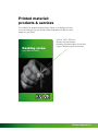
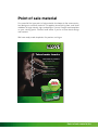
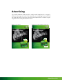
1
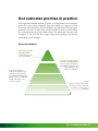
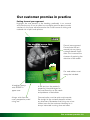
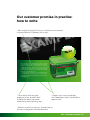
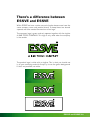
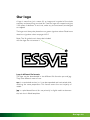
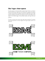
Graphic guidelines
Version 1.0
Graphic guidelines
Contents
1:0 Introduction – what and why?
2:0 Our customer promise in practice
2:1 How to write
3:0 ESSVE and ESSVE
4:0 Our logo
4:1 Positioning
4:2 Clear space
4:3 Size
5:0 Typeface
6:0 Graphic elements
6:1 Colour & decoration
6:2 Image background
6:3 Highlights
7:0 Images
7:1 Image library
7:2 Studio ESSVE
8:0 Printed material
8:1 Products & services
8:2 Campaign material
9:0 Point of Sale material
10:0 Advertising
11:0 All templates
What & why?
Everything we do affects the way customers see us: everything we say
and write, how we behave, how we present ourselves and our products, our
printed material and our advertising. In every context, we must reflect our
customer promise: “ESSVE provides smarter solutions for a good job faster.”
For all of us to be seen as part of the same company, we have to act uniformly and put forward the same strong arguments in the same consistent
manner. Doing this also allows us to benefit from the important synergies
generated by our centrally and locally produced communications. This enables all of us to get even more out of our efforts.
This manual contains practical graphic guidelines for our printed material
and our advertising. You will find clear examples of printed material, signs
and ads, along with information on the typefaces we use, logos, colour
samples and so on. Follow these guidelines for design and layout in all the
material you produce.
Magnus Nilsson
Communications Director
Introduction 1:0
Our customer promise in practice
Your argument, whether spoken or written, must be rooted in our customer
promise. It must always exemplify how we simplify our customers’ work
and make their life easier with our products and solutions. Everything we
produce in the form of ads, signs, printed material and so on must reflect
our customer promise and our core values. The words don’t always have
to appear in the text, but the images, layout and wording must always
exude quality and reliability.
Our brand platform
Customer promise
“ESSVE provides
smarter solutions for
a good job faster.”
Customer benefits
“A broad and deep range
of products and services;
constantly developing new
solutions for more effective
fixings that make sound
economic sense.”
The brand’s personality
“ESSVE is a stable partner
and an expert adviser that
is reliable, considerate and
understanding of the
customers’ situation.”
Insight
Time is money for the users.
Any time saved in assembly,
purchasing, delivery etc is
important.
Our customer promise 2:0
Our customer promise in practice
Putting forward your argument
Highlight the user benefit in the heading, preferably in an unusual
and inventive way. It has to reflect our customer promise about smarter
solutions. In this case, we’ve focused on the Cutter’s ease of sinking and
reduced risk of splits and splinters.
The decking screw that
makes kids happier.
One ad, one argument.
Concentrate the text
around just one strong
customer benefit if possible. This increases the
chances of capturing the
attention of the reader.
New!
No more kids in tears with splinters in their feet when
you use CuttersTM CorrSeal®. Smart twin threads and cutting grooves sink the whole screw into the wood with no
splitting and splinters. The groove and the screw’s wax
coating also mean that it goes in more easily. It takes 30%
less energy from you and your screwdriver*, which naturally
makes the job faster and easier.
You can also be sure that your screws will last as they
come with the top corrosion protection on the market –
CorrSeal – our patented and type approved surface treatment, Class C4.
Our web address must
always be included.
www.essve.se
In bodytext always
write ESSVE in
upper case.
In the text, turn the product’s
properties into advantages for
the user. Base this on the needs
and problems of the builder.
Always write from the
user’s perspective, avoid
using ‘we’.
Communication must be quick and concrete.
Go straight to the customer benefits without
any diversions. Remember that fixings are a lowinterest area for the customer. However, he is
always interested in saving time and effort.
Our customer promise 2:0
Our customer promise in practice:
how to write
We want to communicate the fact that we solve customers’ fixing problems
with our innovative and smart solutions, and that we have products for all
fixing needs in our broad and extensive range. If we can do this, we’ll win
the battle for customers. But saying that is not enough. After all, everyone
says that their products are innovative, unique etc… So we also have to
communicate a little better, a little more clearly and a little faster than our
competitors.
What to avoid. Avoid empty phrases and clichés, hackneyed words and
expressions that have lost all meaning, e.g. ‘high quality’, ‘ultramodern’, ‘cutting edge product’, ‘market leading’, ‘user friendly’ and so on. Also avoid
superlatives such as best, strongest and fastest (even if you have proof).
There is always a more attractive way to express this.
Bear in mind that we also don’t talk about cheap solutions, because that
sounds cheap and does not reflect our brand. However, we are happy to
talk about the economic sense in customers choosing our products (everything from time savings to less risk of mistakes, fewer fixings required
etc…).
The decking screw that
makes kids happier.
New!
No more kids in tears with splinters in their feet when
you use CuttersTM CorrSeal®. Smart twin threads and cutting grooves sink the whole screw into the wood with no
splitting and splinters. The groove and the screw’s wax
coating also mean that it goes in more easily. It takes 30%
less energy from you and your screwdriver*, which naturally
makes the job faster and easier.
You can also be sure that your screws will last as they
come with the top corrosion protection on the market –
CorrSeal – our patented and type approved surface treatment, Class C4.
www.essve.se
Our customer promise 2:1
The decking screw that
makes kids happier.
Our customer promise in practice:
how to write
• Get straight to the point. Focus on usefulness and concrete
customer benefits. Preferably with a twist.
New!
No more kids in tears with splinters in their feet when
you use CuttersTM CorrSeal®. Smart twin threads and cutting grooves sink the whole screw into the wood with no
splitting and splinters. The groove and the screw’s wax
coating also mean that it goes in more easily. It takes 30%
less energy from you and your screwdriver*, which naturally
makes the job faster and easier.
You can also be sure that your screws will last as they
come with the top corrosion protection on the market –
CorrSeal – our patented and type approved surface treatment, Class C4.
• Think about what the great
properties of our products lead
to. Write that down and create
credibility by then explaining why.
www.essve.se
• Support your claims, preferably
with independent tests, classifications,
approvals etc.
• Write as concisely as you can. Concentrate on
one key message per ad/letter/brochure.
Our customer promise 2:2
There’s a difference between
ESSVE and ESSVE
Within ESSVE we have a rather unusual situation because we have the
same company name and product brand. To keep these two brands
separate we have created two versions of our logo.
The company logo is green and only appears together with the tagline
A B&B TOOLS COMPANY. This logo is only used when the company
is the sender.
The product logo is white with no tagline. This is what you should use
in all your marketing material. Always try to use the green background.
If that’s not possible, use white.
ESSVE and ESSVE 3:0
Our logo
A logo is more than just a name. It’s an image and a symbol of the whole
company and everything we stand for. Treat our logo with respect and give
it the space it deserves. It must not, under any circumstances, be changed
or cropped.
The logo must always be placed on our green signature colour. Read more
about our signature colour on page sid 6:1.
Note: The ® symbol must always be included
with the logo. Do not remove it.
Logo in different file formats
The logo can be downloaded in two different file formats: eps and jpg.
They have different areas of use.
eps is a vectorised version, i.e. it can be expanded and contracted while
retaining the same proportions. This format covers the vast majority of
needs.
jpg is a pixel-based format for use primarily in digital media as banners
etc, but also in Word templates.
Our logo 4:0
Our logo: positioning
Wherever the logo appears, it must be easy to see and identify. We must be
consistent with the logo’s size, positioning, colour and spacing. It should be
placed in the right-hand corner: in the bottom corner of leaflets and in the
top corner of ads and signs.
On clothing, give-aways, signs and so on, the positioning may be decided
on a case-by-case basis. On clothing the positioning can also be a little
more discreet.
Decking screw
The logo is placed in the
top right-hand corner of
ads and signs.
Faster work. Less effort.
The decking screw that
makes kids happier.
New!
The logo is placed in the
bottom right-hand corner
of leaflets.
No more kids in tears with splinters in their feet when
you use CuttersTM CorrSeal®. Smart twin threads and cutting grooves sink the whole screw into the wood with no
splitting and splinters. The groove and the screw’s wax
coating also mean that it goes in more easily. It takes 30%
less energy from you and your screwdriver*, which naturally
makes the job faster and easier.
You can also be sure that your screws will last as they
come with the top corrosion protection on the market –
CorrSeal – our patented and type approved surface treatment, Class C4.
www.essve.se
Our logo 4:1
Our logo: clear space
The clear space is the empty field around the logo. There is a minimum
distance between the logo and surrounding text, images and margins
that you must respect. Our logo must never be squeezed into too tight
a space. If space is too tight, either reduce the size of the logo or move
the surrounding elements such as images, text etc. The clear space also
applies to the outer edges of the printed material and signs that you
produce.
It’s easy to work out how much clear space there should be. The space
should be equivalent to half the height of the logo’s upper case E in all
directions.
Our logo 4:2
Our logo: size
Always try to achieve a balance concerning the size of the logo. Too small
a logo is just as bad as too large a logo. It gives an uncertain and forced
impression. Follow these recommendations as far as possible.
The size is
measured in
upper case.
The minimum size is 6 mm.
Format of printed material
Logo size
A6 (105 x 148 mm)
12 mm
A5 (148 x 210 mm)
15 mm
A4 (210 x 297 mm)
21 mm
A3 (297 x 420 mm)
31 mm
50 x 70
44 mm
70 x 100
63 mm
Roll-up 1 x 2 m
90 mm
Our logo 4:3
Typeface
The typeface is also part of our graphic identity. That’s why we always use
the same typeface in all markets and in all contexts. Our typeface is called
Berthold Akzidenz Grotesk and is practical and functional, as well as being
modern and easy to read. It works well in all media and for all types of text,
in headings and bodytext and also in smaller sizes in tables, fact boxes etc.
Our typeface is available in all writing and layout programs. In headings we
use a bolder variant and in bodytext the normal one, called Regular. The
typeface can be downloaded from our media database Pablo.
Headings: Berthold Akzidenz Grotesk Bold/X Bold/Super
Bodytext: Berthold Akzidenz Grotesk Regular
Berthold Akzidenz Grotesk Bold
ABCDEFGHIJKLMNOPQRSTUVWXYZÅÄÖ
abcdefghijklmnopqrstuvwxyzåäö
Berthold Akzidenz Grotesk Medium
ABCDEFGHIJKLMNOPQRSTUVWXYZÅÄÖ
abcdefghijklmnopqrstuvwxyzåäö
Berthold Akzidenz Grotesk Regular
ABCDEFGHIJKLMNOPQRSTUVWXYZÅÄÖ
abcdefghijklmnopqrstuvwxyzåäö
Berthold Akzidenz Grotesk Super
ABCDEFGHIJKLMNOPQRSTUVWXYZÅÄÖ
abcdefghijklmnopqrstuvwxyzåäö
Berthold Akzidenz Grotesk Italic
ABCDEFGHIJKLMNOPQRSTUVWXYZÅÄÖ
abcdefghijklmnopqrstuvwxyzåäö
Typeface 5:0
Graphic elements
A unique graphic identity is a composition of many parts, including colours, pictures and so on. Everything combines to create the image of
ESSVE. Make sure that all the parts are included and that they follow
our uniform design in everything you yourself produce. This example is
an advertisement. It can be downloaded as a template from our media
database Pablo.
Read more about
the logo’s positioning,
clear space and size
in chapter 4:0.
The decking screw that
makes kids happier.
The typeface
for headings and
bodytext must
always follow our
graphic identity.
See chapter 5:0.
Read more about the
unique style of our
product images, our
image library and our
photo studio in chapter
7:0
New!
No more kids in tears with splinters in their feet when
you use CuttersTM CorrSeal®. Smart twin threads and cutting grooves sink the whole screw into the wood with no
splitting and splinters. The groove and the screw’s wax
coating also mean that it goes in more easily. It takes 30%
less energy from you and your screwdriver*, which naturally
makes the job faster and easier.
You can also be sure that your screws will last as they
come with the top corrosion protection on the market –
CorrSeal – our patented and type approved surface treatment, Class C4.
The green decoration at
the top and bottom is part
of our unique identity. Read
more about this in section
6:1.
We have ready-made
templates for highlights,
when you want to draw
particular attention to
something. See section
6:3
www.essve.se
The packaging is a natural
part of our product marketing.
The web address
must be included on
all our items.
Graphic elements 6:0
Graphic elements:
colour and decoration
The colour green has long been synonymous with ESSVE and gives us a
clear profile in the market. Unfortunately, it has been difficult achieving the
right shade in print. Things will now be easier with our separate sample
sheet, which you can take to the printer. We also recommend that you
always print on coated, preferably gloss, paper since uncoated paper absorbs the ink and affects the shade.
In our templates for advertisements, signs and leaflets, we have created a
coloured border that goes from dark green to light green. This makes it
easier to achieve the right shade of green. The coloured border is always
included in the templates. Use the solid green in print when
there are no ready-made templates. The colour border can
be downloaded from our media database Pablo.
Use our separate sample sheet in your contact with
the printer, advertising agency etc. You can get this
by contacting our marketing department.
The border with the colour scale is designed so that our ESSVE shade of
green always sits in the middle of the logo.
PMS: 369
EC: 100% yellow 73% cyan
NCS: S 2070-G 30 Y
PANTONE
369
®
100% yellow
73% cyan
RGB: R75 G168 B 41
HEX: #58AB27
Graphic elements 6:1
Graphic elements:
image background
On those occasions when you use transparent images in your advertising
and printed material, for example of products, stands, packaging etc, you’ll
find our image background extremely useful. It has been developed to highlight and bring the images to life, making them stand out better. The background is a vectorised template that can be downloaded from our media
database Pablo. To access it, go to our website, where there is a link and a
form for requesting a password.
Store Concept
2.0
Graphic elements 6:2
Graphic elements: highlights
When you want to emphasise something particular in your printed material
and ads, e.g. promotional prices, news, competitions, events, demos etc, use
our profiled highlights. These are available as ready-made templates from
our media database Pablo. Choose between green and red. Use them in
moderation. One per item is enough, otherwise you risk damaging the success
of the communication.
New!
CO M PETE
& WIN!
Page 8
RRP 645
499
Excl. VAT. 624 incl. VAT
Art. no. 226053
NOBB no. 21795567
Graphic elements 6:3
Graphic elements: images
The image is probably the strongest of our various graphic elements. We
can use it to arouse the customer’s interest and set us apart from our
competitors.
We have now created a large internal image library within ESSVE. Here
you’ll find product images, profiling images, situational images and packaging images – and the number is constantly growing. Contact the marketing department for a password and assistance. We have also launched our
own photo studio, which you can contact when you need to produce new
product images.
We have developed our own distinctive image style for presenting our
products. You’ll find a growing number of these images in our image
library. A link to the media database Pablo can be found on our website
www.essve.se
Images 7:0
Printed material
We produce a wide range of printed material, everything from small product
leaflets to point of sale material, sponsorship signs and whole catalogues.
They differ hugely in terms of scope and size. It is therefore important that
we maintain consistency in the design with a clear shared graphic identity.
This includes our signature green, the border at top and bottom, our image
style, our typeface and so on. Do what you can to keep to our profile. Our
ready-made templates will be extremely helpful in this respect.
NAILGUN CAMPAIGN
15/10/09 – 28/02/10
That’s
nailed it!
Complete packages
for professionals
Takes harder knocks
Ribbed FZV hot galvanized
For outdoor building work.
The friction surface of the ribbed nail
gives higher pull-out retention than a
round nail, ensuring a stronger join.
COMPETE & WIN! • PAGE 8
Produced in Scandinavia under the
strictest quality control.
100% ore-based quality nail.
For the ultimate hardness, the raw
steel contains no slag products.
Even and high carbon content coupled
with alloys of manganese and silicon
guarantees a hot galvanised layer of
at least 70 mµ.
Decking screw
Faster work. Less effort.
RRP 645
499
Excl. VAT. 624 incl. VAT
Art. no. 226053
NOBB no. 21795567
Printed material 8:0
Printed material:
products & services
Our leaflets for product presentations follow a set design that you
must not change. Use our ready-made templates and add as many
pages as you need.
Decking screw
Format 109 x 210 mm
Border top and bottom
Heading with descriptive line of text
Logo in bottom right-hand corner
Faster work. Less effort.
Printed material 8:1
Printed material: campaigns
Printed material for a campaign can take on a freer form. However the
green border and our highlights remain compulsory. The rules on the logo
and our font also still apply. We recommend using our templates as a starting point when designing your own campaign material.
NAILGUN CAMPAIGN
15/10/09 – 28/02/10
Example of campaign material:
Here our logo works like a
newspaper title.
The freer design allows for
multiple highlights.
The border at the top and bottom
follows our graphic guidelines.
That’s
nailed it!
Complete packages
for professionals
COMPETE & WIN! • PAGE 8
Printed material 8:2
Point of sale material
It is essential that your point of sale material also keeps to the same consistent design as our other material. This applies to everything from small shelf
wobblers to large stands, signs and posters. Use our images and templates
as your starting point. Contact head office if you’re unsure about design
and content.
We have ready-made templates for posters and signs.
Takes harder knocks
Ribbed FZV hot galvanized
For outdoor building work.
The friction surface of the ribbed nail
gives higher pull-out retention than a
round nail, ensuring a stronger join.
Produced in Scandinavia under the
strictest quality control.
100% ore-based quality nail.
For the ultimate hardness, the raw
steel contains no slag products.
Even and high carbon content coupled
with alloys of manganese and silicon
guarantees a hot galvanised layer of
at least 70 mµ.
RRP 645
499
Excl. VAT. 624 incl. VAT
Art. no. 226053
NOBB no. 21795567
Point of sale material 9:0
Advertising
Our media database Pablo contains ready-made templates for a range of
different ads, large and small. Use these for your marketing. If you can’t find
the exact ad format you want, start with the template that is closest to your
required format and proceed from there.
Example of a product ad
Example of a product ad with the reseller’s logo
The decking screw that
makes kids happier.
The decking screw that
makes kids happier.
New!
New!
No more kids in tears with splinters in their feet when
you use CuttersTM CorrSeal®. Smart twin threads and cutting grooves sink the whole screw into the wood with no
splitting and splinters. The groove and the screw’s wax
coating also mean that it goes in more easily. It takes 30%
less energy from you and your screwdriver*, which naturally
makes the job faster and easier.
You can also be sure that your screws will last as they
come with the top corrosion protection on the market –
CorrSeal – our patented and type approved surface treatment, Class C4.
www.essve.se
ESSVE Cutters are available from:
Reseller’s logo
www.essve.se
Advertising 10:0
All templates
All the templates are available from our media database Pablo. They are
produced in the programs InDesign, Illustrator or Photoshop CS3. Download them yourself or your advertising agency can do it.
A link to the media database Pablo can be found on our website
www.essve.se
All templates 11:0