1
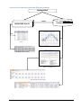
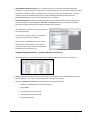
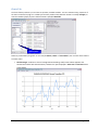
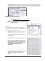
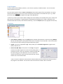
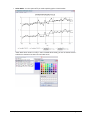
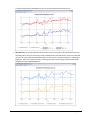
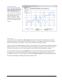
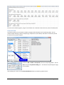
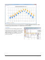
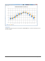
Since the chart included 4 graphs, you get 4 sets of data rows. Note that linear trends only consist of 2 data points.
Charts SD Tab
This feature allows you to visualise the median, average and the distribution of the underlying data. You can
choose multiple station(s), value(s) to display (e.g. temperatures, heat indexes) and select or create time periods
for which to carry out the analysis:
time periods
In order to Add or Delete a time period, click the corresponding button. You can
edit a time period by double-clicking on it. You edit the time period (year range)
in this window:
After making your choices click the Chart Distributions button to produce a graphic like this:
Hothaps Software 1.0.2.4
User Manual ©2012
Page 16 of 18