1
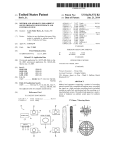
Option C User’s Guide How to Enter and Display Project Data Figure 3.3: Comparison of Actual $/SqFt graph for our Demo project. Total MMBtu by Utility type: This pie chart shows the fraction of total energy usage, in MMBtu, for each utility type. Meters from different areas and sites corresponding to the same utility type are combined in this graph. Figure 3.4: Total MMBtu by Utility type graph for our Demo project. Total $ by Utility type: 23