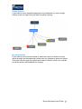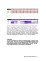
1
Smart Decisions User Guide V3.2.5 May 2015 A problem is the difference between where you are now and where you want to be Smart Decisions supports a structured approach to solving problems Smart Decisions User Guide 1 Contents Introduction 5 6 6 6 Framework Comparisons Editions Installation Basic Principles 7 8 10 10 10 10 10 14 14 15 15 18 18 Settings Focus Ribbon Formatting Ribbon Colour Coding Import Structure data Export Saving Models Restore Methodology Resource Allocation Further Information Define 19 19 19 20 21 21 22 29 30 5Ws+H Nine Windows Resources Stakeholders Ideality System Mapping Root Cause Analysis Export Explore 31 31 32 32 33 33 34 34 35 35 36 36 37 38 39 40 44 Brain Writing Common Themes Challenge Random Connections Superheroes Perspectives Analogy Inventive Principles Technical Contradictions Physical Contradictions Standard Solutions Trimming Functions Database Groupworks Ideas Bank Add Select 45 Options 45 Smart Decisions User Guide 2 45 46 47 48 49 49 50 50 52 52 Creating Options Option Notes Option Right Click Functions Categories Rating Options Ignoring Options Multiple Groups Reorder Options Option Views Mind Mapping Options Criteria 53 53 54 55 57 58 59 59 Creating Criteria Creating Topics (Nodes) Criteria Properties Textual Scales Our of Scale Range Setup Criteria Notes Multiple Value Trees Weights 60 60 60 61 64 64 Direct Weighting Pairwise Weighting Swing Weighting Top Down Weighting Weight Sets Scoring 65 65 65 65 66 66 66 67 67 67 67 67 68 68 Scoring Methods Numerical Slider Numerical Score Card Textual Slider Textual Radio Textual Scorecard Table Uncertainty View Scores Input Scores Mapped Values Heat Map Time Slices Priorities 69 69 69 70 70 70 70 74 76 77 77 Results Chart Three Point Estimate Highlight Sort Results Table Strengths and Weaknesses PERT Description for Uncertainty Scatter Axes Filter Smart Decisions User Guide 3 77 77 78 79 79 80 81 83 83 84 86 87 Display Labels Frontier Uncertainty Highlight Category Bubble Charts Value For Money Sensitivity Analysis Perspectives Criteria Weighting Correlation S-‐Mapping Execute 88 88 89 90 90 92 Project Brief Plan Actual Risks Issues Check 93 93 93 94 Benefits Data Benefits Profile Benefits Mapping Keep 96 Smart Decisions Platinum 97 Portfolio Definition View Relationships Buffers Portfolios Portfolio Analysis Feasible Set Display Category Display Scores Display Buy In Glossary 98 98 98 100 101 102 102 104 106 107 108 Smart Decisions User Guide 4 Introduction Smart Decisions is software for systematic problem solving. It provides assistance and guidance for solving all sorts of problems; whether technical, strategic or managerial. The software supports the Cogentus Framework, which is a well-proven methodology for problem solving which combines techniques from several different disciplines into a user-friendly and effective system. It moves in a stepwise manner through everything that is needed to get from where you are now to where you want to be. Cogentus Framework This user guide covers what the software does but doesn’t explain how best to solve a problem. We run training courses that supplement and enhance this document. A “problem” is anything for which it isn’t immediately obvious what to do and can apply to just about anything in all industries and sectors. The diagram below illustrates how the Cogentus Framework (and Smart Decisions software) ties in with two common frameworks for business improvement. You’ll see that we cover more on generating ideas and then prioritising them. Smart Decisions User Guide 5 Framework Comparisons Smart Decisions can be used for Lean and Six Sigma business improvement initiatives. It can also ben used for value analysis and value engineering. It can help in all areas of those frameworks, particularly in the identification of potential solutions and the prioritisation of them. Editions There are currently two editions available: Smart Decisions Gold: used for where there is a single choice option. Smart Decisions Platinum: used for multiple choice and combinations of options (resource allocation). Installation Download the software to your computer and follow the prompts to install. Please note the software is Windows only and uses the .NET Framework that is (usually) already installed on Windows machines. The installation process checks for the relevant files and prompts for downloading from the Microsoft website if required. You will be provided with a serial number that will be required for activation. Smart Decisions User Guide 6 Basic Principles The software is arranged with separate tabs to fulfil the necessary functions of the Cogentus Framework: • • • • • • • Define. Problem Definition Explore. Ideas Generation Select. Multi Criteria Decision Aiding (MCDA) Execute. Project Management Check. Benefits Management Keep. Record of Decision The software follows the standard Windows conventions with the circular button (top left) representing the traditional File menu. This is where you create a new file, open up existing ones or save files. Smart Decisions User Guide 7 Settings The Settings button allows you to change the default words or the default colours or the auto-save timings. Smart Decisions User Guide 8 Smart Decisions User Guide 9 Focus Ribbon The bottom ribbon has, to the left, buttons for focus. This is where you choose which Time Slice, Value Set, Weight Set and Group you want to look at. Formatting Ribbon On the bottom ribbon to the right hand side are buttons for formatting (making criteria and options double height, widening or narrowing options and criteria, copying the window image to clipboard, zooming and changing colours, showing the Notes Pane and showing Ideas Pane, etc. Colour Coding The software uses colours to assist in understanding the data. Blue font = input data (numbers only; text is black) Black font = calculation or fixed data Red background = mapped values Purple background – mapped and weighted background Import You can import data from a spreadsheet. Structure data The first thing you have to do is structure the data you are going to import in a way that will be "recognised". There are 3 data elements you can import: • options • criteria • scores It is important that the spreadsheet is organised correctly. You need options in the first column and then criteria in the other columns. If you have scores to import as well make sure that the spreadsheet cells are formatted Smart Decisions User Guide 10 correctly. A number must be a number and text must be text. If you leave it on the default GENERAL setting the import may not work correctly. Highlight the cells required to be imported and copy to the clipboard. Then in the software create a new model. Then go to the file menu and click Import from Clipboard or File. You can import data from previous models (.cpr) or from packed files. This brings up a new window as below Smart Decisions User Guide 11 Click “Paste from Clipboard” and it pastes in the table on the right hand side. Smart Decisions User Guide 12 In this table you should ensure that the columns are what you need. Right clicking on the top of each column gives a range of things that can be done. You should ensure that criteria are marked correctly as a Benefit or a Cost by looking at the Criterion Type. You can also change the criterion names and option names if you wish. Smart Decisions User Guide 13 When you’ve checked then click “Apply Changes” and then close the box. Options, Criteria and Scores will then be available. You can also import directly from Excel rather than pasting and also import Tab Separated Files just by clicking on the relevant button. In all cases you MUST go to the criteria properties and set up the measurement and value scales. You will also need to add weights. The process options allow you to update existing scores (if the current model is not blank and you need to update the data), add textual scores or even add new categories. Export You can export data from the prioritisation part of the model (options, criteria, weights, scores and notes) by going to the File menu and clicking “Report”. This gives a large range of combinations depending on what you want. Use the checkboxes to choose. You can save the output as a text file, excel or HTML. Saving Models Models are saved using the .cps extension. All models also have an associated folder, which is used to store information from Notes such as Smart Decisions User Guide 14 attachments and images. If you are sharing or moving files you need to have both the .cps file and the folder of the same name. Alternatively you can save as a “Saved Smart Decisions File) which will automatically create a zip file containing both the .cps file and its associated folder. Restore By default, the software automatically saves a back up. The time between saves and the number of saves before overwriting is adjusted in Settings. If you want to restore a previous version go to the File menu and click Restore. This will give you the choice of backups t use. Methodology Smart Decisions uses multi-criteria decision analysis (MCDA) for prioritising options. Smart Decisions specifically uses multi-attribute utility theory (MAUT) to aggregate data, first defined by Keeney and Raiffa in 1976. The foundation of MAUT is the use of utility functions. Utility functions transform criteria that have units (e.g. feet, pounds, gallons per minute, dollars, etc.) to ones without units (i.e. dimensionless). You cannot simply add criteria of diverse units together – they have to be dimensionless. Traditionally, the unit-less scale (value scale) is 0-100 but it can be any range you want. Smart Decisions User Guide 15 With MAUT, the decision is based on the overall utility of each option, which in turn is based on the sum of the weighted utilities for each of the criteria. The mathematical expression is: n U i = ∑ λ juij = λ1ui1 + ... + λnuin j =1 In the above, Ui is the overall utility of the i-th option and is determined by sum of the weighted utilities on each of the j criteria. The utility of one option against a particular criterion is derived by the evaluation of the score on the criterion, based on a specific mathematical function. This function expresses the utility, derived by the decision maker, of different levels of input data. For example the utility of money generally increases as the amount of money increases, even though this is not necessarily linear. What this means in practice is that for each criterion, you convert the measurement scale into a value scale. This mapping then allows you to calculate a value from a measurement that can then be added up. You typical set the top and bottom of the ranges to be the best and worst imaginable. So in the example above, you use the graph to deduce that a fuel consumption of 40 has a value of 50. The mappings do not have to be linear if there is very little value at the bottom end and also no extra value to be gained at the top end. The speed Smart Decisions User Guide 16 of a car is a good example where, normally, once you get above a certain speed it doesn’t matter if it can go faster. Speed 100 Value 80 60 40 20 0 0 20 40 60 80 100 Speed (mph) 120 140 160 The measurement scale does not have to be numerical with units. It can be textual, based on descriptions. These descriptions still have to be converted to a value scale so you can add a “Good” to a “Very Good” for instance. It is worth noting that scales such as 0-5 or 0-10 are really textual scales. The numbers themselves have no units and no meaning. It is implicit that these scales are linearly mapped so that a 4 is worth 20% more than a 3. In Smart Smart Decisions User Guide 17 Decisions, you can choose to have a non-linear scale instead which is often more appropriate. A 4 or 5 is often worth much more than a 3 for instance. Resource Allocation Smart Decision Platinum has a resource allocation capability. This is used to produce a graph of all the possible combinations of options, which can then be used to determine the most efficient mix for a given level of resource. This would commonly be used to choose a portfolio of projects within a limited budget. The methodology used is to calculate the benefit to cost ratio of each option. The software then calculates all the possible combinations using an exhaustive algorithm. The efficient frontier can then be calculated by plotting the combinations that offer the best benefit for its associated cost. Further Information Our website contains a significant amount of supporting material. • Support Page that has sections for software support but also information on creativity, Triz and decision-making. (http://www.cogentus.co.uk/support/) • Smart Decisions templates which contains a number of examples to help start the process (http://www.cogentus.co.uk/products/uses-forsmart-decisions/) • Online Help which covers in more detail some of the features and frequent questions. (http://www.cogentus.co.uk/support/online-help/) Smart Decisions User Guide 18 Define Definition is the place where the problem is analysed to understand exactly what the problem is. It is extremely common to assume you know what the problem is and then to look for solutions right away. However, experience suggests that the problem often lies somewhere else from the initial thinking that then results in solutions to the wrong problem. It is good practice to step back and spend some time looking at the perceived problem from a number of different directions. Smart Decisions contains a number of useful tools to help with this problem definition phase. The User Guide only describes how the software works. Training Courses are available to help understand how to use the tools. 5Ws+H This is a particularly good method to quickly try and get to understand the problem and the root causes. Simply answer the questions in space provided. You can minimise a question by clicking on the “minus” sign and expand again by clicking on the “plus” sign. Right click to attach relevant documents. Nine Windows This is a powerful technique to look with a broader perspective than normal. It looks at the problem in terms of time and space; first asking about the problem now, what is needed for the future and what it was like in the past. It Smart Decisions User Guide 19 then considers the broader picture – the super-system and then the parts that make up the current system – the sub system. Often the problem is best solved somewhere completely different to where you first look. Start in the centre box. Click on the box and respond to the questions provided. Click on the ‘Nine Windows” button to return to the start. Then repeat for the other boxes. If there is content, then the relevant box or boxes with have black lines shown. Resources Resources are things that are available to use to solve the problem that are free (or nearly free) to use. It is useful to understand what you already have to hand that may help rather than always bringing in something new. Click on the button and respond to the questions given. Smart Decisions User Guide 20 Stakeholders Stakeholders are people who have some involvement with the problem. They might be interested in the problem, affected by the solution or otherwise wield some influence over what goes on. It is good practice to understand the different groups to inform the final solution and also, for larger projects, help devise the communications plan. Click on the button and respond to the questions given. Ideality Ideality is where we want to be. It is the ideal solution that has everything we want and nothing we don’t want. As an equation Ideality = Benefit / (Costs + Harms). The prompts help to elicit the ideal solution and this information is used in the prioritisation stage to define criteria that will select between the best options. Click on the button and respond to the questions given. Smart Decisions User Guide 21 System Mapping This tool is used for mapping or modelling your problem. Developing a visual representation of the problem can be immensely useful in solving the problem later on. You can use this tool in a number of ways depending on your previous experience and preference. Functional Mapping This is the reference mapping methodology for Smart Decisions since it integrates into tools later on for generating ideas (particularly “Trimming”. In this methodology, the system is represented by three elements: SubjectAction-Object. The Subject and Object are the items or components in the systems and the Action is verb associated with what the Subject is doing to the Object. To generate a model of the systems first identify all the different components in the system. Double click in the workspace to open a window to enter the component. Smart Decisions User Guide 22 The different radio buttons are choices that change the colour of the resulting box. Item boxes are grey, Objective boxes are green and Input boxes are Black. You can drag the boxes around to move then within the window. You can add Notes to provide as much extra information as you need. Use the Notes Pane – either right click on the box or ring up from the menu on the bottom right hand side. Once you have all the components in the system mapped, you can draw lines between the boxes to represent the “Action”. Right click the “Subject” (one of the boxes) and choose “Link To” and then choose which box to link. This then opens up another window that allows you to choose the type of link you need. Enter the “Action” i.e. a verb that describes what the first component is doing to the second component and then what type of link you need. The default is a straightforward “Dependency” Smart Decisions User Guide 23 This then produces a black solid arrow between the two components with the Function shown in the yellow box. To edit the link, right click on the box. This is also where you can reverse the link and where you can add more detailed Notes. if you don’t want to show the box on a diagram uncheck the check box. The different links can be used in a number of ways to describe more clearly your problem. • • • • • Useful – a green solid arrow Insufficient – a green dotted arrow Excessive – a green double arrow Wasteful/Harmful – a red solid arrow Physical Contradiction – a purple arrow with circles at either end indicating that two opposites are needed Smart Decisions User Guide 24 • Technical Contradiction – a purple arrow with a Plus at one end and a Minus at the other representing a trade off If you want to reverse the line then right click on the function box or middle of the line and choose reverse from the menu. You can highlight boxes in two ways to draw attention to them. Either add a red border to illustrate an issue, concern, harm, etc. or add a yellow border to illustrate an area of focus. Right click on the box to change the border colour. For more complex mapping you can add multiple lines to join boxes. Smart Decisions User Guide 25 The function boxes can be coloured according to the type of function it is. This provides a mechanism for identifying similar functions within the system. To tidy the display, the boxes can be moved up and down each line simply by dragging. Finally, if the display is overly complex you can minimise the function boxes by right clicking and choosing the “Edit” and then clicking “Minimise Link”. Smart Decisions User Guide 26 You can, of course use the mapping tool to carry out different types of mapping that are briefly described below. You add the boxes and lines in exactly the same way as for Functional Modelling. Value Stream Mapping Value Stream Mapping (VSM) is used primarily in Lean and Six Sigma. The major difference is that the function AND the object/subject is written in the box. The links indicate the flow from one box to another box. Traditionally, different icons are used for different elements of the mapping, but in Smart Decisions you use the standard available boxes. In the example, we’ve added the method of transport and the timings for the flow (coloured blue). The information system is modelled in purple. As in system mapping, you can use the Trimming tool to identify areas for improvement. Smart Decisions User Guide 27 Su-Field Analysis Substance-Field mapping is used in Triz. In this representation the boxes are the “Substance” and the field is the link between the two. In this case, instead of writing the Function that describes the relationship you write the “Field” instead. Traditionally, the substances are shown in circles but in Smart Decisions you use the standard available boxes. The example above was taken from Triz Journal 2000 authored by John Terninko. There is a hydraulic hammer, in which a metal piston can be moved by the power of pulses of compressed air. And there is a rock. If the air pressure is turned off, or if the hammer is not in contact with the rock, nothing will happen. Our task is to break a rock. Function = Break Rock. Rock = S1 Hammer = S2 You can analyse the diagram to look for improvements and also use the Trimming tool. In this case, you’re looking at ways to reduce the harmful effects. Conflict Resolution Diagram This is a technique from the “Theory of Constraints” and is particularly useful in finding contradictions. Smart Decisions User Guide 28 In Smart Decisions purple lines represent the conflicts. You would then use either technical or physical contradictions from the Ideas Ribbon to look for suitable solutions. Multiple Maps You can create multiple maps in a similar way to additional tabs in a spread sheet. The software allows you to copy from other maps to save time in developing new ones. This feature is useful for value stream mapping where you generally have an “As Is” map and a “To Be” map. It’s also useful for system diagrams where you want to drill down from the super system to a system and then explain the various sub-systems. Root Cause Analysis Root Cause Analysis is a common technique and Smart Decisions uses a mapping technique. To add an item, double click in the window. It will bring up a box where you can enter a cause or the problem. If you choose Problem it will produce a Red box and if you choose Cause it will produce an oval box. Smart Decisions User Guide 29 Add as many causes as you need. To create links between right click on the box and choose the box you want to link to and it will bring up a box to choose the type of link. A Fact gives a solid red line and Opinion give a dashed line. By default no link box is shown but if desired you can add some text and show the box by checking the “Show Link Box” To edit the links (if you don’t have a link box to click) go to the box from where the arrow originates from and right click. Then choose “Edit link to” from the menu. Export The Export button exports the text from the Definition tools. It works on the window you have open at the time and saves a text file where you choose. The mapping diagrams can be copied to clipboard (using the button on the bottom right hand ribbon) and then pasted into your document. The copying takes an image of the whole visible window. Smart Decisions User Guide 30 Explore Generating ideas is the lifeblood of solving problem. The more ideas you have the more chance that you’ll hit upon a really good one. All too often, ideas are generated based on brainstorming – a group of people sit in a room and try to come up with solutions to the problem. Time and time again, research has proven that brainstorming is an extremely poor technique and is no better (and often worse) than a single individual trying to come up with ideas. The software has a number of tools that are ALL better than standard brainstorming. We run courses to make the most of understanding how these tools are best applied but this guide should help the knowledgeable user get the most out of the software. Brain Writing This technique is the staple for all group activities. Guaranteed to generate more ideas than traditional brainstorming with the added benefit of drawing in the quieter members of the group. This uses the same method to access the cards as in other Ideas Generation buttons. There’s a drop down to select the category and then a forward and backward either side of the image. Finally, there’s a random button below the image. Smart Decisions User Guide 31 Common Themes A technique for generating ideas from ideas already presented. This quickly increases ideas in many different directions. This uses the same method to access the cards as in other Ideas Generation buttons. There’s a drop down to select the category and then a forward and backward either side of the image. Finally, there’s a random button below the image. Challenge Challenge is all about asking questions. This is a very well proven technique, which uses the acronym SCAMPER. Smart Decisions User Guide 32 This uses the same method to access the cards as in other Ideas Generation buttons. There’s a drop down to select the category and then a forward and backward either side of the image. Finally, there’s a random button below the image. Random Connections This technique starts to move the thinking away from what is obvious to the less obvious. It is an extremely powerful technique to link the apparently unconnected. This uses the same method to access the cards as in other Ideas Generation buttons. There’s a drop down to select the category and then a forward and backward either side of the image. Finally, there’s a random button below the image. Superheroes This is another technique for teasing out the less obvious and more unusual ideas that uses the connection of something not real with the real world. This uses the same method to access the cards as in other Ideas Generation buttons. There’s a drop down to select the category and then a forward and backward either side of the image. Finally, there’s a random button below the image. Smart Decisions User Guide 33 Perspectives Looking at the problem from other people’s perspective can result in new ideas that wouldn’t have been thought of. This uses the same method to access the cards as in other Ideas Generation buttons. There’s a drop down to select the category and then a forward and backward either side of the image. Finally, there’s a random button below the image. Analogy This technique creates made-up worlds to explore in order to see if it generates new ideas. Smart Decisions User Guide 34 This uses the same method to access the cards as in other Ideas Generation buttons. There’s a drop down to select the category and then a forward and backward either side of the image. Finally, there’s a random button below the image. Inventive Principles These are categories of solutions that can be used to solve a problem where there is a contradiction. A contradiction is something where you want two things at once or you want one thing and the absence of another. This uses the same method to access the example as in other Ideas Generation buttons. There’s a drop down to select the inventive principle and then a choice of the available methods. Then, on the right are the examples with a forward and backward either side of the image. Technical Contradictions This is for contradictions where when one thing improves another one gets worse. By choosing the competing parameters the software will highlight the inventive principles that are most likely to solve the problem. Smart Decisions User Guide 35 This uses the same method to access the example as in other Ideas Generation buttons. There’s a drop down to select the parameter that gets better and the parameter that gets worse. The left hand column lists the inventive principles that apply and the middle column lists the choice of the available methods. Then, on the right are the examples with a forward and backward either side of the image. Physical Contradictions This is for contradictions where you have opposing parameters competing: hot and cold, strong and light, etc. By determining when the opposing parameters occur the software will highlight the inventive principles that are most likely to solve the problem. This uses the same method to access the example as in other Ideas Generation buttons. There’s a drop down to select the type of contradiction. This then generates a list if the inventive principles. Clicking on one of them gives a choice of the available methods. Then, on the right are the examples with a forward and backward either side of the image. Standard Solutions These are used for when there isn’t a contradiction – just a problem that needs to be solved. By choosing the type of problem and degree of flexibility to change, the software can highlight solutions that have been proven to be successful in the past. Smart Decisions User Guide 36 This uses the same method to access the example as in other Ideas Generation buttons. There’s a drop down to select the type of standard solution and the left hand column lists the ways to carry them out. The middle column lists the available methods. Then, on the right are the examples with a forward and backward either side of the image. Trimming Trimming is the technique of refining and improving an existing system. It uses, as its basis, the System Map from the Definition ribbon. So, whatever you have drawn there will be reflected in the Trimming window. It is a table with six columns, the first three of which come from the System Map. “A” and “B” are the components and “Does this to” is the Function. There is then space to add text and comments against each row in the final three columns. Here there are three questions to ask: • Is the function necessary? • Could “B” do it? • If the function is necessary is there a different technique available instead of the existing one? If you have used colour coding for the functions in the system map, these will also be reflected here. Smart Decisions User Guide 37 Functions Database Functional analysis is about looking at a problem based on what the goals of each element are. The software has a list of technologies that can carry out the same function on the same materials such that you can see if improvements can be made to the existing technology. This uses the same method to access the example as in other Ideas Generation buttons. There’s a drop down to select the Function. The left hand column lists the available materials that the Function is acting on. The middle column lists the available techniques for carrying out that function. Then, on the right are the examples with a forward and backward either side of the image. Robotics Database This is a more detailed version of the Functions Database. Its purpose is to provide a catalogue of technologies that could be useful in dealing with problems where there are significant safety issues. As such, human intervention is hazardous and some form of remote working is preferred. This could apply in a number of problems ranging from nuclear cleanup, chemical and biological incidents and explosive devices. The tool can be used to identify what technologies already exist to solve a similar problem and it is then up to the development team to see if the technology can be used for their particular problem. Or it might be possible to use a technology in combination with other technologies or slight modifications. The ability to Smart Decisions User Guide 38 reuse existing technologies to some extent will speed up development time considerably and save costs. Decontamination Database This database was designed mainly for the nuclear industry for the decontamination of contaminated plant and equipment. There is a huge number of techniques available and some are better than others for different circumstances. The ratings of performance have come from the US Department of Energy report (Decommissioning Benchmarking Report, 1997 Stephen Warren). This has been updated based on information from “Contamination Control Fixative List”, 2011 FIU and “Decontamination Agents/Materials for Radiological Surface Decontamination”, 2013, Leonel E. Lagos. Groupworks Groupworks is a list of cards that provide techniques and advice for working in groups. This is ideal for facilitators and managers who need to use the idea generation tools within a group environment. (see www.groupworksdeck.org for more information). Smart Decisions User Guide 39 This uses the same method to access the cards as in other Ideas Generation buttons. There’s a drop down to select the category and then a forward and backward either side of the image. Finally, there’s a random button below the image. Ideas Bank This is the place where all the ideas generated from using the tools listed earlier are stored so nothing is lost. There are two ways to add ideas. The first is to use the Ideas Pane (click on the button far right in the bottom ribbon). This brings up a window on the right hand side though you can move it to other areas of the screen if you wish. Smart Decisions User Guide 40 It is designed to be visible when using any of the Ideas Generation tools so that as you have an idea it can be recorded. Just type each new ide into the “New Ideas” box at the top and press return. This adds it to the list. You can add additional Notes using the Notes Pane if you need to explain more. You can see how many ideas you have by then going to the Ideas Bank button. It will show all ideas as hexagons. You can add ideas from here by double clicking in the window and typing from there. This will automatically update the Ideas Pane. You can, of course, drag the hexagons around the window. Smart Decisions User Guide 41 To group similar ideas together, click on an idea and then ctrl+click the other ideas. This turns all the fonts bold. Then right click and choose Create Idea Group This then puts a solid black line around the group. You can also drag the group around to create an “affinity map”. You can name the Group when creating them if required. Smart Decisions User Guide 42 The default colour for ideas is yellow but if you want to colour code them to differentiate them right click and choose a suitable colour. Finally, you can also turn an idea into a fully-fledged option for subsequent prioritisation. Right click an idea and choose “Convert to Option”. This turns the idea grey and it will automatically appear on the Options Tab. Smart Decisions User Guide 43 Add The “Add” button allows you to add new examples to the Triz databases provided you have purchased the necessary access. Import You can import ideas from a tab-separated file if you have captured data in an alternate way. The file format is: name tab R tab G tab B tab notes (may include tabs) carriage return. RGB are integers between 0 and 255 (inclusive) Smart Decisions User Guide 44 Select This stage is used for the evaluation of potential solutions. 1. 2. 3. 4. 5. 6. Options Criteria Weighting Scoring Analysis of Results Sensitivity Analysis Options Options are the ideas that are to be taken forward and evaluated and prioritised. Creating Options Click the options tab and it will open onto a workspace. Double click in the space and add an option name. Smart Decisions User Guide 45 Add more options as required by double clicking in a spare space on the page. Option Notes To add Notes to explain more about an option, right click an option box and choose Notes. This will bring up a window on the right hand side where you can add text, images, links to websites and attachments. Smart Decisions User Guide 46 Option Right Click Functions Smart Decisions User Guide 47 Categories For larger model with many options you can create categories to assist with subsequent data analysis. These are represented in light blue. To create a category, add an option and then right click and choose “convert to category). Drag it onto the top dark blue group. Then drag the options that are included in that category onto it. Smart Decisions User Guide 48 Rating Options If you wish to use a simplified approach to prioritisation (i.e. just a single criterion) you can right click and rate the option directly. Ignoring Options If you wish to use the same model to track the record of decision as you move through the downselection phase you can choose to ignore an option. This puts a line through the option and means it doesn’t show up in results but all the data is still available for viewing. Smart Decisions User Guide 49 Multiple Groups You can create multiple groups where you have a different “cut” of categories. This is useful of you want to look at the results from different perspectives. To create a new group click the “Add new group” button from the ribbon. The bottom (focus) ribbon is used to choose which one you look at. Reorder Options You can reorder the options, which may be useful for presentation purposes by clicking the “Reorder” button. Click on the option you want to move and then use the up and down arrows to position. Smart Decisions User Guide 50 Smart Decisions User Guide 51 Option Views There are several ways of viewing but not editing the options. These are useful to filter the view by clicking on the - sign Mind Mapping Options Use the “Brain” button to go back to the display where you can edit details and drag options around. This is the freeform view. You can tidy up the display if required by going to Layout. From this you can then drag options around again. Any changes will be lost if you redo the layout again. Smart Decisions User Guide 52 Criteria Criteria are the factors that are used to differentiate between options. This ribbon operates in a similar way to the options ribbon. You can create multiple value trees, reorder and view. Creating Criteria Click the criteria tab and it will open onto a workspace. Double click anywhere and a box will appear. Type your criteria into the box. Repeat this until you have all your criteria listed in the window. Smart Decisions User Guide 53 Then drag each of the criteria onto the top left box called “Value Set” to create the value tree. Creating Topics (Nodes) If you want to group criteria simply create a new criteria, attach it to the value tree, then right click and select “Convert criterion into a Topic. You’ll be reminded that any data associated with the criteria will be lost but click “yes” to continue. The box will turn a different colour and you can then drag the criteria you want to sit under that Topic onto it. Smart Decisions User Guide 54 Criteria Properties By default the scale for criteria is 0-10. You can change the scale type (and related value mapping) by right clicking and selecting “Properties”. This opens up a completely new window. Firstly you need to decide whether the criterion is a cost, a benefit or a harm. This choice affects the way the calculations and the results are displayed. Below that choice are two tabs that are used to set up the criterion. One is for how the criterion will be measured and the second is how the measurement will be valued. There are a number of boxes that are available: a) Property. This optional box is used to describe the property (attribute) of the criterion. So, a criterion might be called “Space”. The property might measure space in square centimetres, the number of suitcases it can hold or any other measure. b) Evidence. This optional box is used to record where the evidence for the measure will come from. i.e. how can you obtain the data so that it would stand up to an external review? c) Measurement Type? You choose whether the measurement is numerical, textual or preference. Depending on what criterion have already been added you can choose to copy one to save the effort in setting it up again. The Share allows you to share the attributes. d) If you have chosen a numerical scale you use the box to the right for adding the units and the number of decimal places to display. e) What question will you ask when scoring? This optional box allows you to create a question that will be shown in the scoring ribbon. It helps to clarify what is required. f) What display do you want for scoring? This allows you to choose the more appropriate display for the scoring ribbon. Smart Decisions User Guide 55 If you have a textual scale then you can chose what scale to use The multiple-choice button is used for adding your own text. Click “Add” and write the words. For an explanation, enter text into the large grey box. Then add a new one. Use the “Up and “Down” button to reorder. The second tab is for Value Mapping. This is the place where you convert the measurement scale into a value scale (so all the criteria have no scale / dimensionless which allows them to be added together). For numerical scales there is a range of mapping available. The default is linear (which means it’s a straight line from the bottom of the range to the top. The range can be altered by a) Fixed – you select what measurement value is the “best” (100) and what is the “worst” (0). b) Anchored – the software automatically makes the lowest score a zero. You select what score is worth the “best” (100) c) Relative – the software automatically makes the lowest score a zero and the highest score 100. d) Identity – all scores are in the range 0 to 100 and these are mapped o to 100. You can choose to invert the scale by click the check-box if, for instance, a bigger score is of less value. Note, do not do this if you’ve chosen the criterion to be a cost (or harm). Smart Decisions User Guide 56 The box at the bottom is optional and allows you to record your reasoning for choosing that particular measurement scale and value mapping. For non-linear mapping (custom) you can create what is called a utility curve. You can enter data directly into the table or click on the dot and move them to the right or left and up and down. Add new points by right clicking on an existing dot. Move them around (and use the table) until you create a curve that meets your values. Textual Scales For textual scales, the display is similar. You can drag the bars up and down to change the value. Smart Decisions User Guide 57 Our of Scale Range Setup If your eventual score is outside the range you’ve chosen for the criteria, the software will, by default, extrapolate the value. You can change the way this operates by clicking on the “Out of Range” button. Smart Decisions User Guide 58 Criteria Notes You can add notes to criteria to provide more information by right clicking on a criterion and choosing “Notes”. This brings up the Notes Pane to the right. Multiple Value Trees You can create multiple value trees to reflect the value systems of different stakeholders. You no longer need to get consensus and can determine the impact of different points of view on the final decision. You do this in the same manner as you would for creating multiple groups in options. Smart Decisions User Guide 59 Weights Weights are used in order to be able to add criteria together that have different units and scales. Though not strictly correct, weights are essentially related to the importance of criteria, where one criterion is more important than another. By default, the weights for each criterion are set to the same – equal - weights. You can alter then easily by going into the weights tab and directly entering the number into the table provided. Weighting correctly is one of the most important aspects of prioritisation. There are three different ways available depending on what is required (direct, pairwise and swing). Direct Weighting Add in the weights you want to use per criteria. You can start with them all at 100 and alter down from there in which case the software will automatically normalise the weights. Or you can choose to make them all add up to 100 Pairwise Weighting In pairwise comparison, you work through all combination of criteria. Use the left hand table. A common method is to use the following nine-point scale though you can use any scale you want. 1 – Equally important 3 – Slightly Better 5 – Better 7 – Much Better 9 – Definitely Much Better Complete the assessment for all the combinations. The right hand table shows you the calculated weights. When you are done and satisfied click the “Accept Calculated Weights” Smart Decisions User Guide 60 Swing Weighting Swing Weighting is the only weighting method that is truly correct for MAUT. That is to be able compare a 0-100 scale on one criteria with a 0-100 scale on another. Click on the swing weighting button to show the criteria and current weights on the left hand side and the fist criterion in the value tree on the right hand side. Smart Decisions User Guide 61 First, choose the yardstick (the weight against which all others will be compared. Right click on the criterion name and choose “Set as Yardstick”. Then click the criterion you want to compare. Click the name once and it will appear next to the yardstick. The way you read the right hand side is that £10,000 is worth the same as 60mpg. This can be seen more clearly (particularly if the starting position isn’t equal weights by clicking on the blue line. The software then plots the comparison. Smart Decisions User Guide 62 To weight correctly, you need to say how much fuel consumption is worth. In this case, you can actually calculate the value quite accurately. Assume you do 10,000 miles per year and fuel is £6.00 per gallon and the car does 60 mpg. That will cost £1,000. Therefore, drag the blue line down (click on the orange dot) until you reach £1,000 on the left hand scale. The weight is shown in the box below. i.e. 10% and not 100%. Smart Decisions User Guide 63 Although it is easiest if you have a yardstick that is in monetary units the principle applies to all criterion. You have to ask: “ We would be just as happy with a car that accelerated from 0-60 in 27 seconds as we would be with one that had a fuel economy of 60mpg. Increase, or decrease the right hand bar to meet what you would be preferred to accept. Top Down Weighting Top Down v Bottom Up. If you have a large value tree with many criteria and several topics it may be easier to do the weighting at the topic level rather than at the criteria level. The “Convert” button changes the weighting method. That way if one topic has twice as many criteria as another, in a top down method both topics are treated equal. Weight Sets You can create multiple different weights. This may be because different stakeholders place a different importance on criteria and you want to establish whether the decision is robust from these perspectives or you may wish to carry out sensitivity analysis; maybe be zero weighting one or more criteria to see its effect. You select which weight set is “in focus” using the bottom ribbon. Smart Decisions User Guide 64 Scoring Use the Back and Forward buttons to move through the criteria. The default view for scoring is set in criteria properties but can be changed using one of the buttons on the scoring method. Progress on scoring is shown by a progress bar. This is a percentage based on the number of options and number of criteria. Scoring Methods Numerical Slider To score, simply drag the orange dot to where it needs to be. Do this for each option and then click the “Forward” button to move to the next criteria. Carry on until all options for all criteria have been scored. You can also enter the scores in the space to the right of the slider. Numerical Score Card The score card input boxes instead of a slider, which is useful if the scores have a very large range. Smart Decisions User Guide 65 Textual Slider This looks the same as the numerical slider except that the scores are “snapped” to the nearest text. Textual Radio This uses radio buttons instead of a slider. Textual Scorecard This uses a drop down to enter data but has the advantage of the slider or radio buttons of showing the definitions for the textual points. Smart Decisions User Guide 66 Table This is a spread sheet style method of data entry. Uncertainty If the scoring has some uncertainty associated with it you can use the Uncertainty button. This uses three-point estimating to give a range rather than a single point estimate. Here you’ll be asked to score the “Most Likely”, “High” and “Low” either by actual score or a percentage of the most likely score. This data is used in the priorities tab to show the uncertainty around a particular score. View Scores You can view, but not edit, the data in three ways. Input Scores This shows a table of the scores. Mapped Values This shows the mapped values. The major usage for this view is to ensure that your model is set up as it should be. For each option and each criteria you should check that the value is in accordance to where it should be; namely that 100 is the “best” you can have and 0 is the “worst”. Smart Decisions User Guide 67 Heat Map This shows the mapped and weighted values. The major usage for this view is to compare how discriminatory the criteria are from one another. It is colour coded such that the darker the blue the higher the mapped and weighted value. Therefore, any colours that are similar in shade will give the same contribution to the overall score. If you analyse the colours vertically in a single column, you can see when options are all the same for a single criteria and it’s worth considering if, indeed, that is the case – particularly if the colour is dark since it will contribute a lot to the results yet won’t discriminate the options. Then you can compare two or more columns to see whether there are any that contribute little (light shade) which again indicates that that particular criteria is non-discriminatory. Time Slices You can score options over multiple time periods perhaps to carry out whatifs or to monitor have things have improved or deteriorated over time. Adding a new time slice gives you the option to score all the options again (you can copy previous scores and overwrite the ones that have changed). Use the bottom ribbon to choose which time-slice you’re looking at. Smart Decisions User Guide 68 Priorities Click the Priorities Tab to see which option gets the best score. The default chart is a bar chart. The longest bar is the most preferred option. The number at the end is the mapped and weighted value. Right clicking on the option name you can change it to a percentage – 100% is the best option and all others are compared to that. The button on the left is a dropdown that has the available graphs. Results Chart If you have set up the model with a value tree consisting of a number of topics or if you have multiple groups, you can use the drop downs to filter the display. The custom button allows you to choose exactly what is shown in the display providing unrivalled flexibility. Three Point Estimate If you have entered scores as a three-point estimate, the results are display with the range shown in blue and the PERT score as an orange diamond. Smart Decisions User Guide 69 Highlight You can highlight the contribution of individual criteria or topics Sort You can order the results in one of four ways Results Table This lists the results in tabular format. As in the previous display you can filter to show only what you want to. Strengths and Weaknesses This display is used for gap analysis. It allows you to see the differences between options on individual criteria. Click on the button and then choose two options to compare by clicking directly on the options. It will plot the mapped and weighted values with a Smart Decisions User Guide 70 different colour per option. A bigger score is better and shown higher up the graph. The background vertical lines reflect the weighting given to the criteria so a long line means a high weight. As in previous displays you can filter the options and criteria to show only what you want. In this display you can also use the sort buttons to reorder the displays in a number of ways. You can add to the display a number of different things Smart Decisions User Guide 71 Option Lines is used to show all the other options on the same graph. Background scales and differences are used when you use the comparison display. This allows you to compare in more detail two options. The green band means it is better and the red means it is worse. Smart Decisions User Guide 72 Adding background lines, option lines and differences provides a rich picture. Smart Decisions User Guide 73 PERT Description for Uncertainty Definitions Score: Most likely value for any single instance of the criteria. The most likely value is the mode of the distribution. Lower Bound: Most pessimistic value that yet has some small probability of happening. Upper Bound: Most optimistic value that also has some small probability of happening. For numeric criteria, the three points are input scores. The score for the upper and lower bounds may be stored as a number or calculated from an offset or percentage, depending on how the user has set it up. Smart Decisions User Guide 74 These scores are then treated exactly the same way as the actual score. That is, the input number is mapped onto a model value, and then weighted. So, any bound which falls outside the range of the mapping will be treated according to the rules of that mapping, just the same as ordinary scores. For textual criteria the three points are mapped values since it is not possible to calculate an offset from a word. They can be stored as mapped values, offsets or percentages. In the uncertainty tool you can edit the actual bound, the offset or the percentage offset, and the other columns will be updated accordingly. You can also specify how the bounds should change if you change the score. You may keep the same offset, the same percentage, or the same actual bound. In the last case, the bound will change if you move the score outside the range of lower bound to upper bound - because the score cannot be less than the lower bound or greater than the upper bound. In the Uncertainty tool, right click on the table title row to get a menu (with only one item in it) Advanced, to set up the three-point calculation mode. You can also set a fixed offset or percentage for all scores on the current criterion. This is a one-off process, and new scores will not be automatically set, for example when you add a new option. So the upper and lower bound give rise to two mapped values. Since the mapping may be inverse or non-linear, nothing can be deduced about their size relative the ordinary mapped value. For showing the uncertainty in the results, the range from the lowest of the three mapped (or weighted) values to the highest of the three mapped (or weighted) values is taken. To get bounds for topics the weighted values from the sub-topics or criteria are added up, using all the lowest values and then all the highest values. The methodology used is called PERT. This is an old method dating back to the 1960’s developed by NASA but has been surprisingly resilient and accurate in spite of advancements made in probabilistic assessments. It assumes a beta distribution and is calculated thus: PERT Average = (Upper Bound + 4xScore + Lower Bound)/6 Smart Decisions User Guide 75 So, for a scheduling problem, if the most likely duration is 13 days, the optimistic is 10 days and the pessimistic is 25 days, the PERT average = (10+52+25)/6 = 15 days. In the software this would then plot the upper bound as 25, the lower bound as 10. The single point “score” would be at 13 and the new “PERT Score” would be at 15. For information, the standard deviation can also be calculated using the formula SD = (Upper Bound – Lower Bound)/6. Scatter This chart allows you too look at the relationship between two criteria. The default display plots all the benefit criteria on the y-axis and the cost criteria along the x-axis. The circles are the options and clicking on them colours them in. The chart offers tremendous flexibility in what is shown. Smart Decisions User Guide 76 Axes You can change what two elements are displayed by using the Comparison block. Filter If you have multiple categories you can choose which ones to show from the dropdown. The custom button allows you to be extremely precise. Display You can alter the display considerably. First you can add grid lines. The default is a 2x2 matrix but you can make it 3x3, 4x4 or 5x5 if that helps to differentiate. By default the x-axis has the lowest value to the left. If you prefer to have this to the right then use the “reverse cost axis button. Labels These add the option title onto the display. Use the zoom to increase the font sixe if it’s too small. Smart Decisions User Guide 77 Frontier The “Frontier” button adds an overlay that plots the extent of where the options lie. Options on the frontier are the most efficient. i.e. for a given cost they are the best options to choose. Any options that lie within the grey are less good. Smart Decisions User Guide 78 Uncertainty The Uncertainty button adds an uncertainty box around the option and the Table button shows the table. The position of the options will move slightly when choosing uncertainty because the PERT value will be different from the single point estimate. Highlight Category If you have a number of categories you can use the Highlight Category button to show those. Smart Decisions User Guide 79 Bubble Charts You can add a third criterion to the display to create a bubble chart. Smart Decisions User Guide 80 Value For Money You can plot the actual input score on the axes that is particularly useful for looking at costs compared to benefits. Please note that this will only work by selecting a single criterion on a particular axis. Obviously, for multiple criteria you have to use mapped & weighted values in order to add them together. This also means the Frontier will not display. Smart Decisions User Guide 81 The B/C ratio on the table, if displayed reflects the benefit score divided by the cost. If the cost units are very large, it might display zero so consider using thousands or millions if that’s the case. In general terms, the bigger the number, the better value. Smart Decisions User Guide 82 Sensitivity Analysis This ribbon has three ways of looking at the sensitivity of the results to changes in input values. Perspectives Perspectives. This is used to looking at the sensitivity of the results to different stakeholder values – their weighting of individual criteria. It compares results for the different options based on different weight sets. If you have created different weight sets you can see if a single option “wins” every time or whether the results change depending on the different stakeholders. A robust decision would be insensitive to different weight sets but if there are differences you need to decide how to manage the (predicable) fall out when one stakeholder sees they don’t get the option they want! Click on the options on the left to compare two or more of the options. Filter As with the other displays, if you have complex models you can choose what criteria and what categories and options to display. You can use the sort block to arrange the order. Pie Charts and Highlight You can choose to highlight the contribution of a single criteria or topic. The proportion of weights is shown on the pie charts below. Smart Decisions User Guide 83 Criteria Weighting This display looks at the sensitivity of individual weights on the result. This is a more detailed look at weights and robust decisions will have the best option shown for a range of weights, which are very unlikely to exceed. If the line is short then it means a small change in weight will alter the result. Smart Decisions User Guide 84 Filter You can change which criteria or topic you want to look at using the filter drop down. Display There are a number of different things you can look at Ranges Displays the range where the weight change will alter the results What If Click on the left hand side to move the red line and change the weight. You can see how it alters the results Smart Decisions User Guide 85 Weight Space The darker colours represent the selected item. For a bottom up tree, this will form a triangle, zero at the left and full height at the right. If a node has been chosen, the individual criteria belonging to this node will be indicated by the varying shades, showing that all the weights on the criteria are reduced in proportion. The paler colours represent the rest of the tree. Correlation This display looks at the correlation between criteria. It uses Pearson correlation. Positive correlation is red, negative blue and unrelated is white. All coefficients below 0.5 are coloured grey. Those above are in three stages with the darkest being the strongest correlation. There is an Abort button available for very large models. Smart Decisions User Guide 86 S-Mapping This display creates an s-curve for each criterion’s value map and uses it to compare against the value mapping created by the user. In many cases, users default to a linear value mapping for ease yet this can often underplay the best options and overplay the middling options. An s-curve gives much higher value to the higher scores than those in the middle. The example below illustrates that the results change dramatically if the value mapping is changed meaning that more effort needs to be placed on the value mapping of criteria. Smart Decisions User Guide 87 Execute Having selected the most preferred option in the previous tabs, the organisation will implement it. Depending on the size of the implementation it will often be created as a project and the implementation will use standard project management methodologies. Note that traditional project management methodologies are primarily about efficiency. Is the project delivered to budget, time and quality? If, however, the scope is wrong the project will not be successful even though it may be delivered on time and to cost. Project Brief This is where you enter details about the project. • • • • • Project Title: use this to write down the title of the project that will be implemented in order to solve the original problem Background: use to explain more about the project and the objectives Scope of Work: use this section to outline the scope of work. List the activities to be carried out Deliverables: use this to write down the key deliverables Outline Business Case: use this to explain why the project is to be carried out and what the expected benefits will be Smart Decisions User Guide 88 • Expectation: Use this to state the cost, duration and benefit of the project. The costs and benefits should use the mapped and weighted values derived from the prioritisation carried out earlier. Plan This table is for adding the key activities being undertaken to implement the solution. The table has 4 columns to add the Date, Costs, Duration and Benefits. To start, split the project into sensible time slots – monthly is the most suitable unless the project is of extremely short duration. Add the different time slots into the first column. Then for each date, add in the costs expected to be spent by that date so that the final number matches the expected project cost shown in the project brief. Do the same for schedule. In this case you should put the expected duration (in months) remaining at each time slot. Finally, the fourth column is for the expected benefits accrued at the end of each month. In almost all projects, actual benefit won’t be seen until the project is finished and so every month will be zero. For the final month (or you can add extra months after the project is completed), the expected benefit is that shown in the project brief. Smart Decisions User Guide 89 Actual This table is for entering data on actual performance when implementing the solution. To use this, first enter the same dates as you put in the Plan table. Then, at the end of each month add in the actual costs, the duration remaining (noting that the project may start to run later than planned or earlier) and the benefits accrued. Add in the expected benefit at the end of the project as well. You can then use the plan table and the actual table to carry out a variance analysis on the project. Ask questions such as: • Are costs in line with plan? • Are we on track or running late? • Are we delivering the benefits we thought we would? Any substantial deviation from the plan will require management action on the project to attempt to bring it back into plan. Risks This is a risk register used for identifying and classifying the risks associated with the project. The risk register should be done before the project starts and reviewed regularly (normally monthly). Smart Decisions User Guide 90 The risk register is set out as a table where each row is a separate risk. The columns are: • • Risk: Write the risk in the space available. Risks should be events that could happen that will impact on the project. Probability: Use the drop-down to select the likelihood of the risk occurring. • Impact: Use the drop-down to select the impact on the project if the risk occurred. • Strategy: Use the drop-down to choose your mitigation strategy for the risk. • Action Plan: Use this cell for writing in what you propose to do to implement the strategy. What are the activities and who will be doing them. Once you have completed you risk register you should concentrate on the “High Risk” ones. These are risks that firstly have a high impact on the Smart Decisions User Guide 91 project. Then look at the ones with the highest probability. The combination of high probability and high impact are the highest risk. Issues The Issues Log records things that need to be done. Issues aren’t risks. They are problems that have already happened within the project and need to be resolved. It is good practice to have an up to date issues log in all projects in order to keep control of the myriad of issues that will cop up. As in the risk register, the issues log is a table with a number of columns to be completed. • • • Issue: Write the actual issue in the first column. Date Raised: Write the date the issue was first raised Severity. Use the drop-down to select how important the issue is to the success of the project • Action Plan: Write the activities (and who will be doing them) in order to resolve the issue. Smart Decisions User Guide 92 Check Once implemented the project will finish and the implemented solution will be used in day-to-day operation. Benefits management is then used to see whether the solution is in fact achieving what it set out to do. i.e. – has the solution been effective. This is also referred to as “Measures of Effectiveness” (MOE). Benefits Data This is where the benefit and cost data is collected. There are two mandatory points – “where we are” and “where we want to be”. Thereafter, you can add additional points depending on the date the measurement was taken. Benefits Profile This is the graphical representation of the benefit data entered earlier. “Where we are now” is represented by the red dot and the blue star represents “Where we want to be”. Typically the blue star should have greater benefits that the red dot and often will have less cost as well. Then the different time periods are represented by the yellow dots in various shades with the newest time period having the lightest colour. Smart Decisions User Guide 93 Benefits Mapping A Benefits Map shows how benefits relate to each other and to the project outputs and business changes that will enable them to be achieved. The dependency relationships in a Benefits Map show how project outputs ultimately lead to the achievement of strategic objectives. Ideally, this would be done in the stages prior to implementation as part of the selection & evaluation process. Often, however, benefits mapping is carried out subsequent to selection (or even implementation) in order to try and justify the decision in retrospect. The mapping tool uses the same methods as the other mapping tools such as system diagrams and root cause analysis. Double click in the window to create an object and drag the objects to create links. There are five different types of objects each of which is a different colour. A benefits map might look like the one below. Smart Decisions User Guide 94 Smart Decisions User Guide 95 Keep The final stage is to create the “Record of Decision”. For this you can export the content of the model into a formal report for subsequent issue. Choose the element or elements you want and follow the export prompts. Smart Decisions User Guide 96 Smart Decisions Platinum The Platinum version of Smart Decisions is used for resource allocation. This means it looks at combinations of options rather than looking at ranking. Combination of options is most often found in project or programme portfolios and this software is used to identify the best mix of projects for a given level of funding. Platinum is used in exactly the same way as Gold – you need to create options and criteria and then score everything. Platinum has everything from Gold plus a resource allocation capability. Smart Decisions Platinum is unlike any existing products in that you don’t need two packages to do ranking and resource allocation – the same product does both. The Priorities Tab is ranking and the Portfolio Analysis is resource allocation. Costs are treated differently in the background and it is only important for you to make sure that if a criterion is a cost then this box is ticked in the criteria properties box (right click on a criterion), Smart Decisions User Guide 97 Portfolio Definition This tab is used to set up the resource allocation model. In the first instance you need to have already created options and criteria and scored them. View Here you can select how the options are shown, which depends on the number you have and personal preferences. The layout drop-down allows for a variety of displays. Relationships If there are dependencies between the options you create them using Relationships. Although it is most common to have a single set of dependencies you can have multiple relationship groups (often to carry out what-if’s or different scenarios). To create a new group, click on the + icon at the top of the left hand column. Smart Decisions User Guide 98 If desired you can choose “At Least One Option” which will then force the model to have at least one option from each sub-category. To create a relationship you click “Insert”, the click the two options that are linked. Double click the line and you can choose what sort of relationship it is. • • • • Exclusion means you can’t have both together at the same time Dependency means you have to have both at the same time Modifier means that if you have both together at the same time the combined benefit and/or cost is different from simply adding them together (maybe you get greater benefit if two are carried out together for instance) Undefined means there’s a relationship but it still needs to be decided what sort it is. In the example below, we have created dependencies between options that are “Exclusions”. We have set up the model so that, for each option in grey under the blue category you can only ever have one of the options at any one time. You can drag the options about to make it easier to see relationships. Smart Decisions User Guide 99 The results of this will be seen later in the Portfolio Analysis tab. You choose which relationship group is in focus (i.e. what one is displayed and modelled) using the Focus Ribbon on the bottom left of the screen. It is the 5th one across. Buffers Buffers are options that you want to force in (or out). Maybe they are options that are “Must Do” for some reason or there are options you wish to exclude for analysis. In the same way as for other areas you can have multiple buffers. Buffer In changes the colour to green and buffer out changes the option to red. For the example, we will force in S1-1 and S2-1. We will exclude BL3 and BL4 It is good practice to record the rationale behind buffering in or out. What we might say for forcing in is that we have already purchased S1-1 and S2-1 and so won’t be using any of the alternatives (even though theoretically it might produce a better solution). We might argue that we will exclude BL3 and BL4 because these options are just broken and we need a different choice – but we’re not sure which one is best. To add a buffer, click on the + icon at the top of the left hand column. Choose a name and click okay. Then click the Buffer button on the top right which displays which options have been buffered. To buffer in, click the Buffer In button and then click the options you want always included – they’ll turn green. Smart Decisions User Guide 100 To buffer out, click the Buffer out button and then click the options you don’t want – they’ll turn red. The results of this will be seen later in the Portfolio Analysis tab. You choose which buffer is in focus (i.e. what one is displayed and modelled) using the Focus Ribbon on the bottom left of the screen. It is the 6th one across. Portfolios A portfolio is a combination of options generated manually. You choose a name for your portfolio and then select which options you want to include these are represented by blue circles. You can have multiple different portfolios. You use manually generated portfolios to compare proposed combinations with what the computer generated “most-efficient” portfolio suggests. They will almost always appear to be less efficient and the challenge is to understand why and whether you can improve the manual one. As for Relationship Groups and Buffers, you add a portfolio by clicking the + icon at the top of the left hand column and you view the solutions by click the button at the top of the right hand column. Smart Decisions User Guide 101 Once you’ve created a portfolio name you can add options to it by clicking insert and then clicking on the option. It will put a blue circle on the option. If you try to create a portfolio which has options included that can’t exist (e.g. because you’ve buffered them out) you’ll end up with grey circles instead which means you have to correct the error until they all go blue. The results of this will be seen later in the Portfolio Analysis tab. You choose which portfolio is in focus (i.e. what one is displayed and modelled) using the Focus Ribbon on the bottom left of the screen. It is the 7h one across. Portfolio Analysis This is the tab where the results can be seen and analysis takes place. Feasible Set Display It defaults to the “Football” which is a display of all the possible combinations of options. The lines represent the boundary of costs and benefits of these combinations. Smart Decisions User Guide 102 In the example below, this is the feasible set where we have no relationships, no buffers and no portfolios selected. To look at the model with the Relationships in place, choose the relevant one from the focus ribbon at the bottom. In this case, we’ll look at the model where we have “At Least One Option” from each category and each option within that category is mutually exclusive. You’ll notice the shape has changed and the origin no longer starts at zero. If you then add a buffer (the one where we forced in some options and forced out others, it will generate a smaller “football” – this time in green. It is smaller because the number of potential combinations is less. Smart Decisions User Guide 103 Finally, you can then see where the portfolios lie by choosing it from the “Display” button in the ribbon. It will then plot the portfolio in blue. Category Display You can show the options at the same time as the football by clicking “Category”. This is the display used to find out what options appear at different points in the football. For the example we will use the buffered display and no portfolio selected so make sure the current relationship group and buffer is selected then click Category. This will split the screen into two with the options on the left and the ‘football” on the right. There’ll also be a new block on the ribbon that allows you to choose what is displayed on the left hand side. Smart Decisions User Guide 104 The first action is to walk up the frontier. This shows which options are bought into first. Since we have created a model where there’ll always be one option per column, the first point is the combination that is cheapest. Click on the first point on the green football and then click the Frontier button in the category display block. This shows the combination of options at that point. Then use the “Up” arrow in the Move block to move up the frontier and see what combinations appear. In this model, there is a clear point at which you are getting no more benefit for spending more money. This is the most efficient portfolio you can construct. So, why not just go for this combination? The main reason is that even though it’s efficient you can’t afford it so you have to go for a combination that costs less but of course give you less benefit. Other reasons are that for practical purposes you might not be able to implement Smart Decisions User Guide 105 one of the options or (common in Government projects) that political pressure forces you to do something else. The purpose of the model is to establish how close you can get to efficient and demonstrate this point. It is rare to implement the most efficient portfolio. To compare the manually generated portfolio with the computer generated one, click Display Portfolio to show the portfolio on the football. The put that portfolio into focus via the bottom ribbon and finally choose the Portfolio button on the Category Display block. This will put blue circles on to the options on the left hand side. Move the up and down arrow to get to a point on the frontier that is roughly the same cost as the manually generated portfolio. Compare the green stars with the blue dots. In this example, you can get a portfolio that has more benefit yet is cheaper by choosing the green stars over the blue dots. You will need to investigate with the people who developed the manual portfolio whether the green stars could be used instead. Scores Display This displays the actual scores for each option. A total line at the top provides a summation that is used to generate overall cost data for the combination of options. You can view the input scores, mapped values or mapped & weighted values. Smart Decisions User Guide 106 Buy In This display show the order in which options appear using the benefit to cost ratio. The best ratio appears first. So in the example below, we’ve removed any buffers and portfolios and left the relationship group where you can have only one option per category. Thus, the first combination to appear is all the BL’s (they’re cheapest) and BL4 give the best benefit to cost ratio. You can also see that BL4 is bought in with all combinations up to #8 where it is then replaced by a different option S4-1. Smart Decisions User Guide 107 Glossary Buffer: Buffers enable you to focus on a particular area within the Solution space by calculating points using only the Options that you want included. This is particularly useful for excluding Options from a decision without removing them from the model entirely. It is also possible to use Buffers to always force in Options for example projects that you have already undertaken and therefore must be in all the Solutions. A Buffer can be created in a similar way to a Solution from the Model components section of the Main Window, the Solution space or Overview windows. Each buffer contains two sets of options. Buffered In - those that will always be included and Buffered Out - those that will never be included. The effect is to reduce the solution space to those options that MIGHT be included. The reasons are usually either the ratio of the option is very high and it always gets included or there is some factor outside the model which mandates that it is chosen even though it scores badly. Using buffers, both reduces the solution space and hence calculating time for the Full Frontier. It also gives you greater insight into the nature of the problem. Criteria: These are the factors that need to be taken into account when making the decision. All the criteria taken together represent the overall objective of the DM (Decision Maker). Example: For cars, Speed is a criterion associated with the attribute Maximum Speed. Dependency: If Option B cannot be in a solution unless Option A is also present then it is dependent on Option A. In Promax E we show this by a Green arrow linking Option A to B. All calculations then respect this link and prevent B being in a solution without A. Exclusion: An Exclusion Interaction between two Options means that only one of the Options linked can be included in a Solution. The Option included is likely to vary from Solution to Solution. Exclusions can be made between as many Options as you need, for example if you have ten Options and only want one of these in each Solution, every Option would need an Exclusion to the other nine Options. Mapping: Each criterion is associated with a measurable attribute. However, the actual scores of the options on the attribute might not represent the DM's (Decision Maker’s) preference for that option. A mapping is a value function that maps the score of an option on the attribute onto a value that represents the strength of the DM's preference for that option on the criterion. Smart Decisions User Guide 108 Example: The value of increasing a car's maximum speed from 90 to 100 is likely to be more valuable than increasing it from 150 to 160 (unless you are racing). So maximum speed cannot be used directly as a measure of the DM's preference on the criterion Speed. Modifiers: These capture the effects where if two options are included in a solution then some elements of their cost or benefit mapped world can be modified. When a Modifier Interaction is added between two Options it affects the combined Benefit and Cost the Options contribute to the Solutions they are in. For instance the effect of a mail shot can be enhanced if it is accompanied by television advertisements. Option: This is the label given to a physical object or a concept. Within the model these are the things that you make decisions about. Such as best supplier, next strategy or the right person for the job. Score: To identify the overall performance of the options against all the criteria, the options must be scored, by entering the level of the attribute that each option achieves. Scores can be factual speed, height, weight, time, cost or subjective judgment or preference. To identify the overall performance of the options scores are transformed to values with the use of the mapping scale, which is consequently multiplied by the weight to give the weighted mapped value of the option in each criterion. These are then added up to come up with the overall value of the option Value Tree: A tree that consists of branches and nodes representing all the criteria and criteria topics of the decision problem. Weighted Value: To enable the user to independently manipulate the importance of criterion, the weight is applied after the mapping to give a weighted value or contribution. Weights: Within the model every real world score is mapped onto a scale of 0-100. Weights allow users to adjust the relative scales so that 100 on one scale is equivalent to 100 on another scale. Smart Decisions User Guide 109