1
MATLAB®
Creating Graphical User Interfaces
R2015a
How to Contact MathWorks
Latest news:
www.mathworks.com
Sales and services:
www.mathworks.com/sales_and_services
User community:
www.mathworks.com/matlabcentral
Technical support:
www.mathworks.com/support/contact_us
Phone:
508-647-7000
The MathWorks, Inc.
3 Apple Hill Drive
Natick, MA 01760-2098
MATLAB® Creating Graphical User Interfaces
© COPYRIGHT 2000–2015 by The MathWorks, Inc.
The software described in this document is furnished under a license agreement. The software may be used
or copied only under the terms of the license agreement. No part of this manual may be photocopied or
reproduced in any form without prior written consent from The MathWorks, Inc.
FEDERAL ACQUISITION: This provision applies to all acquisitions of the Program and Documentation
by, for, or through the federal government of the United States. By accepting delivery of the Program
or Documentation, the government hereby agrees that this software or documentation qualifies as
commercial computer software or commercial computer software documentation as such terms are used
or defined in FAR 12.212, DFARS Part 227.72, and DFARS 252.227-7014. Accordingly, the terms and
conditions of this Agreement and only those rights specified in this Agreement, shall pertain to and
govern the use, modification, reproduction, release, performance, display, and disclosure of the Program
and Documentation by the federal government (or other entity acquiring for or through the federal
government) and shall supersede any conflicting contractual terms or conditions. If this License fails
to meet the government's needs or is inconsistent in any respect with federal procurement law, the
government agrees to return the Program and Documentation, unused, to The MathWorks, Inc.
Trademarks
MATLAB and Simulink are registered trademarks of The MathWorks, Inc. See
www.mathworks.com/trademarks for a list of additional trademarks. Other product or brand
names may be trademarks or registered trademarks of their respective holders.
Patents
MathWorks products are protected by one or more U.S. patents. Please see
www.mathworks.com/patents for more information.
Revision History
November 2000
June 2001
July 2002
June 2004
October 2004
March 2005
September 2005
March 2006
May 2006
September 2006
March 2007
September 2007
March 2008
October 2008
March 2009
September 2009
March 2010
September 2010
April 2011
September 2011
March 2012
September 2012
March 2013
September 2013
March 2014
October 2014
March 2015
Online Only
Online Only
Online Only
Online Only
Online Only
Online Only
Online Only
Online Only
Online Only
Online Only
Online Only
Online Only
Online Only
Online Only
Online Only
Online Only
Online Only
Online Only
Online Only
Online Only
Online Only
Online Only
Online Only
Online Only
Online Only
Online Only
Online Only
New for MATLAB 6.0 (Release 12)
Revised for MATLAB 6.1 (Release 12.1)
Revised for MATLAB 6.6 (Release 13)
Revised for MATLAB 7.0 (Release 14)
Revised for MATLAB 7.0.1 (Release 14SP1)
Revised for MATLAB 7.0.4 (Release 14SP2)
Revised for MATLAB 7.1 (Release 14SP3)
Revised for MATLAB 7.2 (Release 2006a)
Revised for MATLAB 7.2
Revised for MATLAB 7.3 (Release 2006b)
Revised for MATLAB 7.4 (Release 2007a)
Revised for MATLAB 7.5 (Release 2007b)
Revised for MATLAB 7.6 (Release 2008a)
Revised for MATLAB 7.7 (Release 2008b)
Revised for MATLAB 7.8 (Release 2009a)
Revised for MATLAB 7.9 (Release 2009b)
Revised for MATLAB 7.10 (Release 2010a)
Revised for MATLAB 7.11 (Release 2010b)
Revised for MATLAB 7.12 (Release 2011a)
Revised for MATLAB 7.13 (Release 2011b)
Revised for MATLAB 7.14 (Release 2012a)
Revised for MATLAB 8.0 (Release 2012b)
Revised for MATLAB 8.1 (Release 2013a)
Revised for MATLAB 8.2 (Release 2013b)
Revised for MATLAB 8.3 (Release 2014a)
Revised for MATLAB 8.4 (Release 2014b)
Revised for MATLAB 8.5 (Release 2015a)
Contents
Introduction to Creating UIs
1
2
About UIs in MATLAB Software
What Is a UI? . . . . . . . . . . . . . . . . . . . . . . . . . . . . . . . . . . .
1-2
How Does a UI Work? . . . . . . . . . . . . . . . . . . . . . . . . . . . .
1-4
Ways to Build MATLAB UIs . . . . . . . . . . . . . . . . . . . . . . .
1-5
How to Create a UI with GUIDE
Create a Simple UI Using GUIDE . . . . . . . . . . . . . . . . . .
Open a New UI in the GUIDE Layout Editor . . . . . . . .
Set the Window Size in GUIDE . . . . . . . . . . . . . . . . . .
Layout the Simple GUIDE UI . . . . . . . . . . . . . . . . . . . .
Code the Behavior of the Simple GUIDE UI . . . . . . . .
Open and Run the Simple GUIDE UI . . . . . . . . . . . . .
2-2
2-2
2-5
2-6
2-16
2-22
Files Generated by GUIDE . . . . . . . . . . . . . . . . . . . . . . .
Code Files and FIG-Files . . . . . . . . . . . . . . . . . . . . . . .
UI Code File Structure . . . . . . . . . . . . . . . . . . . . . . . .
Adding Callback Templates to an Existing UI Code File
About GUIDE-Generated Callbacks . . . . . . . . . . . . . .
2-24
2-24
2-24
2-25
2-26
v
A Simple Programmatic UI
3
Create a Simple UI Programmatically . . . . . . . . . . . . . .
Create a Code File for the Simple Programmatic UI . . .
Create a Figure for the Simple Programmatic UI . . . . .
Add Components to the Simple Programmatic UI . . . . .
Code the Simple Programmatic UI Behavior . . . . . . . . .
Verify Code and Run the Program . . . . . . . . . . . . . . .
3-2
3-3
3-3
3-4
3-6
3-10
Create UIs with GUIDE
4
5
vi
Contents
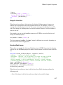
What Is GUIDE?
GUIDE: Getting Started . . . . . . . . . . . . . . . . . . . . . . . . . .
UI Layout . . . . . . . . . . . . . . . . . . . . . . . . . . . . . . . . . . .
UI Programming . . . . . . . . . . . . . . . . . . . . . . . . . . . . . .
4-2
4-2
4-2
GUIDE Tools Summary . . . . . . . . . . . . . . . . . . . . . . . . . . .
4-3
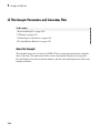
GUIDE Preferences and Options
GUIDE Preferences . . . . . . . . . . . . . . . . . . . . . . . . . . . . . .
Set Preferences . . . . . . . . . . . . . . . . . . . . . . . . . . . . . . .
Confirmation Preferences . . . . . . . . . . . . . . . . . . . . . . .
Backward Compatibility Preference . . . . . . . . . . . . . . .
All Other Preferences . . . . . . . . . . . . . . . . . . . . . . . . . .
5-2
5-2
5-2
5-4
5-4
GUIDE Options . . . . . . . . . . . . . . . . . . . . . . . . . . . . . . . . .
The GUI Options Dialog Box . . . . . . . . . . . . . . . . . . . . .
Resize Behavior . . . . . . . . . . . . . . . . . . . . . . . . . . . . . . .
Command-Line Accessibility . . . . . . . . . . . . . . . . . . . . .
5-8
5-8
5-9
5-9
Generate FIG-File and MATLAB File . . . . . . . . . . . . .
Generate FIG-File Only . . . . . . . . . . . . . . . . . . . . . . .
6
5-10
5-12
Lay Out a UI Using GUIDE
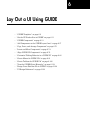
GUIDE Templates . . . . . . . . . . . . . . . . . . . . . . . . . . . . . . .
Access the Templates . . . . . . . . . . . . . . . . . . . . . . . . . .
Template Descriptions . . . . . . . . . . . . . . . . . . . . . . . . . .
6-2
6-2
6-3
Set the UI Window Size in GUIDE . . . . . . . . . . . . . . . . .
Prevent Existing Objects from Resizing with the
Window . . . . . . . . . . . . . . . . . . . . . . . . . . . . . . . . . .
Set the Window Position or Size to an Exact Value . . .
Maximize the Layout Area . . . . . . . . . . . . . . . . . . . . .
6-11
6-11
6-12
6-12
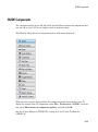
GUIDE Components . . . . . . . . . . . . . . . . . . . . . . . . . . . . .
6-13
Add Components to the GUIDE Layout Area . . . . . . . .
Place Components . . . . . . . . . . . . . . . . . . . . . . . . . . . .
User Interface Controls . . . . . . . . . . . . . . . . . . . . . . . .
Panels and Button Groups . . . . . . . . . . . . . . . . . . . . .
Axes . . . . . . . . . . . . . . . . . . . . . . . . . . . . . . . . . . . . . .
Table . . . . . . . . . . . . . . . . . . . . . . . . . . . . . . . . . . . . . .
ActiveX Component . . . . . . . . . . . . . . . . . . . . . . . . . . .
Resize GUIDE UI Components . . . . . . . . . . . . . . . . . .
6-17
6-17
6-23
6-44
6-50
6-54
6-65
6-67
Copy, Paste, and Arrange Components . . . . . . . . . . . . .
Select Components . . . . . . . . . . . . . . . . . . . . . . . . . . .
Copy, Cut, and Clear Components . . . . . . . . . . . . . . . .
Paste and Duplicate Components . . . . . . . . . . . . . . . .
Front-to-Back Positioning . . . . . . . . . . . . . . . . . . . . . .
6-70
6-70
6-71
6-71
6-72
Locate and Move Components . . . . . . . . . . . . . . . . . . . .
Use Coordinate Readouts . . . . . . . . . . . . . . . . . . . . . .
Drag Components . . . . . . . . . . . . . . . . . . . . . . . . . . . .
Use Arrow Keys to Move Components . . . . . . . . . . . . .
Set the Component's Position Property . . . . . . . . . . . .
6-74
6-74
6-75
6-76
6-76
vii
7
viii
Contents
Align GUIDE UI Components . . . . . . . . . . . . . . . . . . . . .
Align Objects Tool . . . . . . . . . . . . . . . . . . . . . . . . . . . .
Property Inspector . . . . . . . . . . . . . . . . . . . . . . . . . . . .
Grid and Rulers . . . . . . . . . . . . . . . . . . . . . . . . . . . . .
Guide Lines . . . . . . . . . . . . . . . . . . . . . . . . . . . . . . . . .
6-79
6-79
6-82
6-85
6-86
Customize Tabbing Behavior in a GUIDE UI . . . . . . . .
6-88
Create Menus for GUIDE UIs . . . . . . . . . . . . . . . . . . . . .
Menus for the Menu Bar . . . . . . . . . . . . . . . . . . . . . . .
Context Menus . . . . . . . . . . . . . . . . . . . . . . . . . . . . .
6-91
6-91
6-101
Create Toolbars for GUIDE UIs . . . . . . . . . . . . . . . . . .
Toolbar and Tools . . . . . . . . . . . . . . . . . . . . . . . . . . .
Editing Tool Icons . . . . . . . . . . . . . . . . . . . . . . . . . . .
6-108
6-108
6-116
View the GUIDE Object Hierarchy . . . . . . . . . . . . . . .
6-119
Design Cross-Platform UIs in GUIDE . . . . . . . . . . . . .
Default System Font . . . . . . . . . . . . . . . . . . . . . . . . .
Standard Background Color . . . . . . . . . . . . . . . . . . .
Cross-Platform Compatible Units . . . . . . . . . . . . . . .
6-120
6-120
6-121
6-121
UI Design References . . . . . . . . . . . . . . . . . . . . . . . . . .
6-123
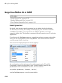
Save and Run a GUIDE UI
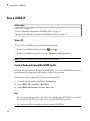
Save a GUIDE UI . . . . . . . . . . . . . . . . . . . . . . . . . . . . . . . .
Save a UI . . . . . . . . . . . . . . . . . . . . . . . . . . . . . . . . . . .
Create a Backward Compatible GUIDE Fig-File . . . . . .
Append New Callbacks to an Existing GUIDE Code
File . . . . . . . . . . . . . . . . . . . . . . . . . . . . . . . . . . . . . .
7-2
7-2
7-2
Create Programmatic Files from GUIDE Files . . . . . . .
7-4
Rename GUIDE UIs and Files . . . . . . . . . . . . . . . . . . . . .
7-5
7-3
8
9
Programming a GUIDE UI
Write Callbacks Using the GUIDE Workflow . . . . . . . . .
Callbacks for Different User Actions . . . . . . . . . . . . . . .
GUIDE-Generated Callback Functions and Property
Values . . . . . . . . . . . . . . . . . . . . . . . . . . . . . . . . . . . .
GUIDE Callback Syntax . . . . . . . . . . . . . . . . . . . . . . . .
Renaming and Removing GUIDE-Generated Callbacks .
8-2
8-2
Initialize UIs Created Using GUIDE . . . . . . . . . . . . . . . .
Opening Function . . . . . . . . . . . . . . . . . . . . . . . . . . . . .
Output Function . . . . . . . . . . . . . . . . . . . . . . . . . . . . . .
8-7
8-7
8-9
Callbacks for Specific Components . . . . . . . . . . . . . . . .
How to Use the Example Code . . . . . . . . . . . . . . . . . .
Push Button . . . . . . . . . . . . . . . . . . . . . . . . . . . . . . . .
Toggle Button . . . . . . . . . . . . . . . . . . . . . . . . . . . . . . .
Radio Button . . . . . . . . . . . . . . . . . . . . . . . . . . . . . . . .
Check Box . . . . . . . . . . . . . . . . . . . . . . . . . . . . . . . . . .
Edit Text Field . . . . . . . . . . . . . . . . . . . . . . . . . . . . . .
Slider . . . . . . . . . . . . . . . . . . . . . . . . . . . . . . . . . . . . . .
List Box . . . . . . . . . . . . . . . . . . . . . . . . . . . . . . . . . . . .
Pop-Up Menu . . . . . . . . . . . . . . . . . . . . . . . . . . . . . . .
Panel . . . . . . . . . . . . . . . . . . . . . . . . . . . . . . . . . . . . . .
Button Group . . . . . . . . . . . . . . . . . . . . . . . . . . . . . . .
Menu Item . . . . . . . . . . . . . . . . . . . . . . . . . . . . . . . . .
Table . . . . . . . . . . . . . . . . . . . . . . . . . . . . . . . . . . . . . .
Axes . . . . . . . . . . . . . . . . . . . . . . . . . . . . . . . . . . . . . .
8-11
8-11
8-12
8-12
8-13
8-14
8-14
8-15
8-16
8-18
8-20
8-21
8-22
8-25
8-26
Examples of GUIDE UIs . . . . . . . . . . . . . . . . . . . . . . . . .
8-29
8-4
8-5
8-5
Examples of GUIDE UIs
Modal Dialog Box in GUIDE . . . . . . . . . . . . . . . . . . . . . .
About the Example . . . . . . . . . . . . . . . . . . . . . . . . . . . .
Set Up the Close Confirmation Dialog Box . . . . . . . . . .
Set Up a UI with a Close Button . . . . . . . . . . . . . . . . .
9-2
9-2
9-2
9-3
ix
Run the Program . . . . . . . . . . . . . . . . . . . . . . . . . . . . .
How Close Confirmation Dialogs Work . . . . . . . . . . . . .
x
Contents
9-4
9-5
UI That Uses Persistent Data . . . . . . . . . . . . . . . . . . . . . .
About the Example . . . . . . . . . . . . . . . . . . . . . . . . . . . .
Calling Syntax . . . . . . . . . . . . . . . . . . . . . . . . . . . . . . .
MAT-file Validation . . . . . . . . . . . . . . . . . . . . . . . . . . . .
UI Behavior . . . . . . . . . . . . . . . . . . . . . . . . . . . . . . . . .
Overall UI Characteristics . . . . . . . . . . . . . . . . . . . . .
9-7
9-7
9-8
9-9
9-10
9-17
UI That Accepts Parameters and Generates Plots . . . .
About the Example . . . . . . . . . . . . . . . . . . . . . . . . . . .
UI Design . . . . . . . . . . . . . . . . . . . . . . . . . . . . . . . . . .
Validate Input as Numbers . . . . . . . . . . . . . . . . . . . . .
Plot Push Button Behavior . . . . . . . . . . . . . . . . . . . . .
9-20
9-20
9-22
9-24
9-27
Synchronized Data Presentations in a GUIDE UI . . . .
About the Example . . . . . . . . . . . . . . . . . . . . . . . . . . .
Recreate the UI . . . . . . . . . . . . . . . . . . . . . . . . . . . . . .
9-30
9-30
9-32
Interactive List Box in a GUIDE UI . . . . . . . . . . . . . . .
About the Example . . . . . . . . . . . . . . . . . . . . . . . . . . .
Implement the List Box . . . . . . . . . . . . . . . . . . . . . . .
9-46
9-46
9-47
Plot Workspace Variables in a GUIDE UI . . . . . . . . . . .
About the Example . . . . . . . . . . . . . . . . . . . . . . . . . . .
Read Workspace Variables . . . . . . . . . . . . . . . . . . . . .
Read Selections from List Box . . . . . . . . . . . . . . . . . . .
9-52
9-52
9-53
9-54
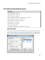
UI for Setting Simulink Model Parameters . . . . . . . . .
About the Example . . . . . . . . . . . . . . . . . . . . . . . . . . .
How to Use the UI . . . . . . . . . . . . . . . . . . . . . . . . . . .
Run the Program . . . . . . . . . . . . . . . . . . . . . . . . . . . .
Program the Slider and Edit Text Components . . . . . .
Run the Simulation from the UI . . . . . . . . . . . . . . . . .
Remove Results from List Box . . . . . . . . . . . . . . . . . .
Plot Results Data . . . . . . . . . . . . . . . . . . . . . . . . . . . .
The Help Button . . . . . . . . . . . . . . . . . . . . . . . . . . . . .
Close the UI . . . . . . . . . . . . . . . . . . . . . . . . . . . . . . . .
The List Box Callback and Create Function . . . . . . . .
9-57
9-57
9-58
9-59
9-60
9-62
9-64
9-64
9-66
9-66
9-67
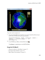
Animation with Slider Controls in GUIDE . . . . . . . . . .
About the Example . . . . . . . . . . . . . . . . . . . . . . . . . . .
9-68
9-68
Design the 3-D Globe UI . . . . . . . . . . . . . . . . . . . . . . .
Graphics Techniques Used in the 3-D Globe UI . . . . . .
9-69
9-74
Automatically Refresh Plot in a GUIDE UI . . . . . . . . .
About the Example . . . . . . . . . . . . . . . . . . . . . . . . . . .
The Timer Implementation . . . . . . . . . . . . . . . . . . . . .
9-79
9-79
9-81
Create UIs Programmatically
10
Lay Out a Programmatic UI
Structure of Programmatic UI Code Files . . . . . . . . . .
File Organization . . . . . . . . . . . . . . . . . . . . . . . . . . . .
File Template . . . . . . . . . . . . . . . . . . . . . . . . . . . . . . .
Run the Program . . . . . . . . . . . . . . . . . . . . . . . . . . . .
10-2
10-2
10-2
10-3
Create Figures for Programmatic UIs . . . . . . . . . . . . . .
10-4
Programmatic Components . . . . . . . . . . . . . . . . . . . . . .
10-6
Add Components to a Programmatic UI . . . . . . . . . . . .
User Interface Controls . . . . . . . . . . . . . . . . . . . . . . . .
Tables . . . . . . . . . . . . . . . . . . . . . . . . . . . . . . . . . . . .
Panels . . . . . . . . . . . . . . . . . . . . . . . . . . . . . . . . . . . .
Button Groups . . . . . . . . . . . . . . . . . . . . . . . . . . . . . .
Axes . . . . . . . . . . . . . . . . . . . . . . . . . . . . . . . . . . . . . .
ActiveX Controls . . . . . . . . . . . . . . . . . . . . . . . . . . . .
How to Set Font Characteristics . . . . . . . . . . . . . . . .
10-9
10-9
10-21
10-22
10-24
10-26
10-28
10-28
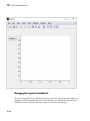
Lay Out a UI Programmatically . . . . . . . . . . . . . . . . . .
Component Placement and Sizing . . . . . . . . . . . . . . .
Managing the Layout in Resizable UIs . . . . . . . . . . .
Manage the Stacking Order of Grouped Components .
10-31
10-31
10-36
10-39
Adjust Programmatic UI Layouts Interactively . . . . .
Set Positions of Components Interactively . . . . . . . . .
Align Components . . . . . . . . . . . . . . . . . . . . . . . . . . .
10-40
10-41
10-51
xi
11
xii
Contents
Set Colors Interactively . . . . . . . . . . . . . . . . . . . . . . .
Set Font Characteristics Interactively . . . . . . . . . . . .
10-58
10-59
Customize Tabbing Behavior in a Programmatic UI .
How Tabbing Works . . . . . . . . . . . . . . . . . . . . . . . . .
Default Tab Order . . . . . . . . . . . . . . . . . . . . . . . . . . .
Change the Tab Order in the uipanel . . . . . . . . . . . .
10-62
10-62
10-62
10-64
Create Menus for Programmatic UIs . . . . . . . . . . . . .
Add Menu Bar Menus . . . . . . . . . . . . . . . . . . . . . . . .
Add Context Menus to a Programmatic UI . . . . . . . .
10-66
10-66
10-73
Create Toolbars for Programmatic UIs . . . . . . . . . . . .
Use the uitoolbar Function . . . . . . . . . . . . . . . . . . . .
Commonly Used Properties . . . . . . . . . . . . . . . . . . . .
Toolbars . . . . . . . . . . . . . . . . . . . . . . . . . . . . . . . . . . .
Display and Modify the Standard Toolbar . . . . . . . . .
10-79
10-79
10-79
10-80
10-83
Fonts and Colors for Cross-Platform Compatibility .
Default System Font . . . . . . . . . . . . . . . . . . . . . . . . .
Standard Background Color . . . . . . . . . . . . . . . . . . .
10-85
10-85
10-86
Code a Programmatic UI
Initialize a Programmatic UI . . . . . . . . . . . . . . . . . . . . .
Examples . . . . . . . . . . . . . . . . . . . . . . . . . . . . . . . . . . .
11-2
11-2
Write Callbacks Using the Programmatic Workflow . .
Callbacks for Different User Actions . . . . . . . . . . . . . .
How to Specify Callback Property Values . . . . . . . . . .
Callback Syntax . . . . . . . . . . . . . . . . . . . . . . . . . . . . .
11-5
11-5
11-7
11-9
12
Manage Application-Defined Data
Share Data Among Callbacks . . . . . . . . . . . . . . . . . . . . .
Overview of Data Sharing Techniques . . . . . . . . . . . . .
Store Data in UserData or Other Object Properties . . .
Store Data as Application Data . . . . . . . . . . . . . . . . . .
Create Nested Callback Functions (Programmatic
UIs) . . . . . . . . . . . . . . . . . . . . . . . . . . . . . . . . . . . . .
Store Data Using the guidata Function . . . . . . . . . . . .
Sharing Data Among Multiple GUIDE UIs . . . . . . . . .
13
12-5
12-6
12-9
Manage Callback Execution
Interrupt Callback Execution . . . . . . . . . . . . . . . . . . . .
How to Control Interruption . . . . . . . . . . . . . . . . . . . .
Callback Behavior When Interruption is Allowed . . . .
Example . . . . . . . . . . . . . . . . . . . . . . . . . . . . . . . . . . .
14
12-2
12-2
12-3
12-4
13-2
13-2
13-2
13-3
Examples of UIs Created Programmatically
Axes, Menus, and Toolbars in Programmatic UIs . . . .
About the Example . . . . . . . . . . . . . . . . . . . . . . . . . . .
View the Example Code . . . . . . . . . . . . . . . . . . . . . . .
Generate the Graphing Commands and Data . . . . . . .
Create the UI and Its Components . . . . . . . . . . . . . . .
Initialize the UI . . . . . . . . . . . . . . . . . . . . . . . . . . . . .
Define the Callbacks . . . . . . . . . . . . . . . . . . . . . . . . . .
Updating the Plot . . . . . . . . . . . . . . . . . . . . . . . . . . .
14-2
14-2
14-3
14-3
14-4
14-7
14-8
14-11
Synchronized Data Presentations in a Programmatic
UI . . . . . . . . . . . . . . . . . . . . . . . . . . . . . . . . . . . . . . . . .
Techniques Illustrated in the Example . . . . . . . . . . .
About the Example . . . . . . . . . . . . . . . . . . . . . . . . . .
14-12
14-12
14-12
xiii
View the Example Code . . . . . . . . . . . . . . . . . . . . . .
Set Up and Interact with the uitable . . . . . . . . . . . . .
14-14
14-14
Lists of Items in a Programmatic UI . . . . . . . . . . . . . .
About the Example . . . . . . . . . . . . . . . . . . . . . . . . . .
View the Example Code . . . . . . . . . . . . . . . . . . . . . .
Use the UI . . . . . . . . . . . . . . . . . . . . . . . . . . . . . . . .
Program List Master . . . . . . . . . . . . . . . . . . . . . . . . .
Add an “Import from File” Option to List Master . . . .
Add a “Rename List” Option to List Master . . . . . . . .
14-20
14-20
14-21
14-22
14-26
14-31
14-31
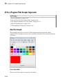
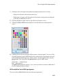
UI for a Program That Accepts Arguments . . . . . . . .
About the Example . . . . . . . . . . . . . . . . . . . . . . . . . .
Copy and View the Color Palette Code . . . . . . . . . . .
Local Function Summary for Color Palette . . . . . . . .
Code File Organization . . . . . . . . . . . . . . . . . . . . . . .
UI Programming Techniques . . . . . . . . . . . . . . . . . . .
14-32
14-32
14-34
14-34
14-35
14-36
Apps
15
xiv
Contents
Find Apps . . . . . . . . . . . . . . . . . . . . . . . . . . . . . . . . . . . . . . . . .
15-2
View App File List . . . . . . . . . . . . . . . . . . . . . . . . . . . . . . . . . .
Before Installing . . . . . . . . . . . . . . . . . . . . . . . . . . . . . . . . .
After Installing . . . . . . . . . . . . . . . . . . . . . . . . . . . . . . . . . .
15-3
15-3
15-3
Run, Uninstall, Reinstall, and Install Apps . . . . . . . . . . . . .
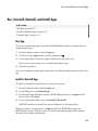
Run App . . . . . . . . . . . . . . . . . . . . . . . . . . . . . . . . . . . . . . .
Install or Reinstall App . . . . . . . . . . . . . . . . . . . . . . . . . . . .
Uninstall App . . . . . . . . . . . . . . . . . . . . . . . . . . . . . . . . . . .
15-5
15-5
15-5
15-6
Install Apps in a Shared Network Location . . . . . . . . . . . . .
15-7
Change Apps Installation Folder . . . . . . . . . . . . . . . . . . . . . .
15-8
16
Packaging GUIs as Apps
Apps Overview . . . . . . . . . . . . . . . . . . . . . . . . . . . . . . . . . . . . .
What Is an App? . . . . . . . . . . . . . . . . . . . . . . . . . . . . . . . . .
Where to Get Apps . . . . . . . . . . . . . . . . . . . . . . . . . . . . . . .
Why Create an App? . . . . . . . . . . . . . . . . . . . . . . . . . . . . . .
Best Practices and Requirements for Creating an App . . . . .
16-2
16-2
16-2
16-3
16-4
Package Apps . . . . . . . . . . . . . . . . . . . . . . . . . . . . . . . . . . . . . .
16-5
Modify Apps . . . . . . . . . . . . . . . . . . . . . . . . . . . . . . . . . . . . . . .
16-7
Share Apps . . . . . . . . . . . . . . . . . . . . . . . . . . . . . . . . . . . . . . . .
16-8
MATLAB App Installer File — mlappinstall . . . . . . . . . . . . .
16-9
Dependency Analysis . . . . . . . . . . . . . . . . . . . . . . . . . . . . . . .
16-10
xv
Introduction to Creating UIs
1
About UIs in MATLAB Software
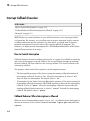
• “What Is a UI?” on page 1-2
• “How Does a UI Work?” on page 1-4
• “Ways to Build MATLAB UIs” on page 1-5
1
About UIs in MATLAB Software
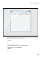
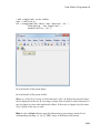
What Is a UI?
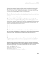
A user interface (UI) is a graphical display in one or more windows containing controls,
called components, that enable a user to perform interactive tasks. The user does not
have to create a script or type commands at the command line to accomplish the tasks.
Unlike coding programs to accomplish tasks, the user does not need to understand the
details of how the tasks are performed.
UI components can include menus, toolbars, push buttons, radio buttons, list boxes, and
sliders—just to name a few. UIs created using MATLAB® tools can also perform any type
of computation, read and write data files, communicate with other UIs, and display data
as tables or as plots.
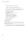
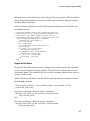
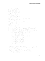
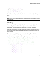
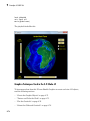
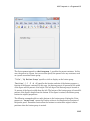
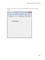
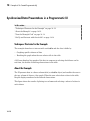
The following figure illustrates a simple UI that you can easily build yourself.
The UI contains these components:
• An axes component
• A pop-up menu listing three data sets that correspond to MATLAB functions: peaks,
membrane, and sinc
1-2
What Is a UI?
• A static text component to label the pop-up menu
• Three buttons that provide different kinds of plots: surface, mesh, and contour
When you click a push button, the axes component displays the selected data set using
the specified type of 3-D plot.
1-3
1
About UIs in MATLAB Software
How Does a UI Work?
Typically, UIs wait for a user to manipulate a control, and then respond to each user
action in turn. Each control, and the UI itself, has one or more callbacks, named for the
fact that they “call back” to MATLAB to ask it to do things. A particular user action,
such as pressing a screen button, or passing the cursor over a component, triggers the
execution of each callback. The UI then responds to these events. You, as the UI creator,
write callbacks that define what the components do to handle events.
This kind of programming is often referred to as event-driven programming. In eventdriven programming, callback execution is asynchronous, that is, events external to the
software trigger callback execution. In the case of MATLAB UIs, most events are user
interactions with the UI, but the UI can respond to other kinds of events as well, for
example, the creation of a file or connecting a device to the computer.
You can code callbacks in two distinct ways:
• As MATLAB language functions stored in files
• As strings containing MATLAB expressions or commands (such as 'c = sqrt(a*a
+ b*b);'or 'print')
Using functions stored in code files as callbacks is preferable to using strings, because
functions have access to arguments and are more powerful and flexible. You cannot
use MATLAB scripts (sequences of statements stored in code files that do not define
functions) as callbacks.
Although you can provide a callback with certain data and make it do anything you want,
you cannot control when callbacks execute. That is, when your UI is being used, you
have no control over the sequence of events that trigger particular callbacks or what
other callbacks might still be running at those times. This distinguishes event-driven
programming from other types of control flow, for example, processing sequential data
files.
1-4
Ways to Build MATLAB UIs
Ways to Build MATLAB UIs
A MATLAB UI is a figure window to which you add user-operated components. You can
select, size, and position these components as you like. Using callbacks you can make the
components do what you want when the user clicks or manipulates the components with
keystrokes.
You can build MATLAB UIs in two ways:
• Create the UI using GUIDE
This approach starts with a figure that you populate with components from within a
graphic layout editor. GUIDE creates an associated code file containing callbacks for
the UI and its components. GUIDE saves both the figure (as a FIG-file) and the code
file. You can launch your application from either file.
• Create the UI programmatically
Using this approach, you create a code file that defines all component properties
and behaviors. When a user executes the file, it creates a figure, populates it with
components, and handles user interactions. Typically, the figure is not saved between
sessions because the code in the file creates a new one each time it runs.
The code files of the two approaches look different. Programmatic UI files are generally
longer, because they explicitly define every property of the figure and its controls, as
well as the callbacks. GUIDE UIs define most of the properties within the figure itself.
They store the definitions in its FIG-file rather than in its code file. The code file contains
callbacks and other functions that initialize the UI when it opens.
You can create a UI with GUIDE and then modify it programmatically. However, you
cannot create a UI programmatically and then modify it with GUIDE.
The approach you choose depends on your experience, your preferences, and your goals.
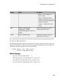
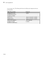
Here are some ways to achieve specific goals.
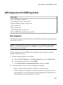
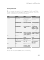
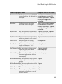
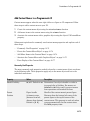
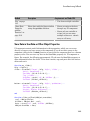
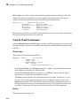
Goal
Description of Approach
Create a dialog box
Call a function that creates predefined
dialog box. For more information, see
“Predefined Dialog Boxes”.
Create a UI containing a few components
It is often simpler to create UIs
that contain only a few components
1-5
1
1-6
About UIs in MATLAB Software
Goal
Description of Approach
programmatically. You can fully define
each component with a single function call.
Create a moderately complex UI
GUIDE simplifies the creation of
moderately complex UIs.
Create a complex UI with many
components, or one that interacts with
another UI.
Creating complex UIs programmatically
lets you control exact placement of the
components and provides reproducibility.
2
How to Create a UI with GUIDE
2
How to Create a UI with GUIDE
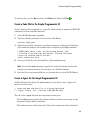
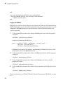
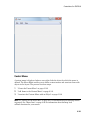
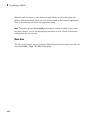
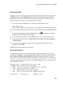
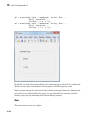
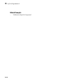
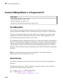
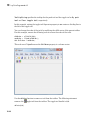
Create a Simple UI Using GUIDE
This example shows how to use GUIDE to create a simple user interface (UI), such as
shown in the following figure.
Subsequent topics guide you through the process of creating this UI.
If you prefer to view and run the code that created this UI without creating it, set your
current folder to one to which you have write access. Copy the example code and open it
in the Editor by issuing the following MATLAB commands:
copyfile(fullfile(docroot, 'techdoc','creating_guis',...
'examples','simple_gui*.*')),fileattrib('simple_gui*.*', '+w');
guide simple_gui.fig;
edit simple_gui.m
To run the UI, on the Editor tab, in the Run section, click Run
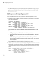
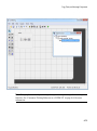
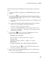
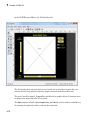
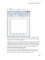
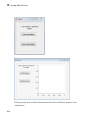
Open a New UI in the GUIDE Layout Editor
1
2-2
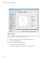
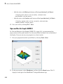
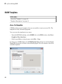
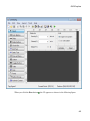
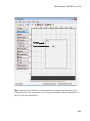
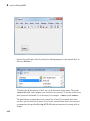
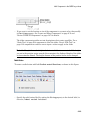
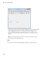
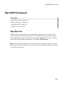
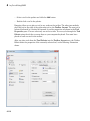
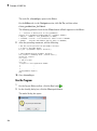
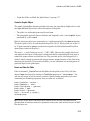
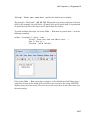
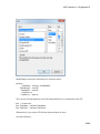
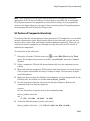
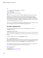
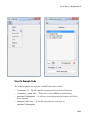
Start GUIDE by typing guide at the MATLAB prompt.
.
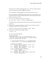
Create a Simple UI Using GUIDE
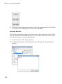
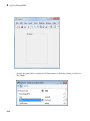
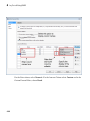
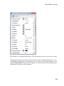
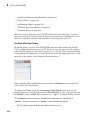
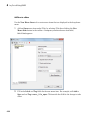
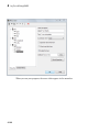
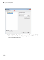
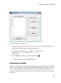
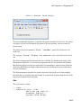
2
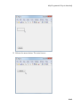
In the GUIDE Quick Start dialog box, select the Blank GUI (Default) template,
and then click OK.
2-3
2
How to Create a UI with GUIDE
3
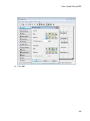
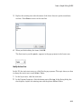
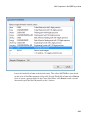
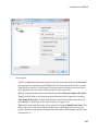
2-4
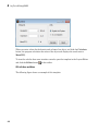
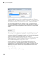
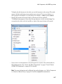
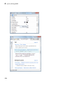
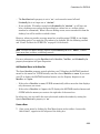
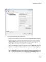
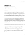
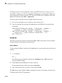
Display the names of the UI components in the component palette:
a
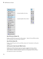
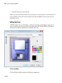
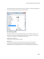
Select File > Preferences > GUIDE.
b
Select Show names in component palette.
c
Click OK.
Create a Simple UI Using GUIDE
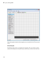
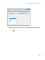
Set the Window Size in GUIDE
Set the size of the UI window by resizing the grid area in the Layout Editor. Click the
lower-right corner and drag it until the canvas is approximately 3 inches high and 4
inches wide. If necessary, make the canvas larger.
2-5
2
How to Create a UI with GUIDE
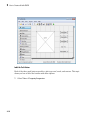
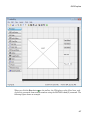
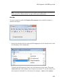
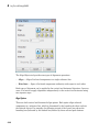
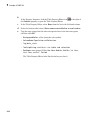
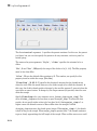
Layout the Simple GUIDE UI
Add, align, and label the components in the UI.
1
2-6
Add the three push buttons to the UI. Select the push button tool from the
component palette at the left side of the Layout Editor and drag it into the layout
area. Create three buttons, positioning them approximately as shown in the
following figure.
Create a Simple UI Using GUIDE
2
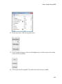
Add the remaining components to the UI.
• A static text area
• A pop-up menu
• An axes
Arrange the components as shown in the following figure. Resize the axes component
to approximately 2-by-2 inches.
2-7
2
How to Create a UI with GUIDE
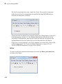
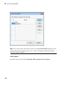
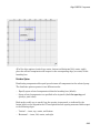
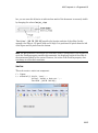
Align the Components
If several components have the same parent, you can use the Alignment Tool to align
them to one another. To align the three push buttons:
1
Select all three push buttons by pressing Ctrl and clicking them.
2
Select Tools > Align Objects.
3
Make these settings in the Alignment Tool:
• Left-aligned in the horizontal direction.
• 20 pixels spacing between push buttons in the vertical direction.
2-8
Create a Simple UI Using GUIDE
4
Click OK.
2-9
2
How to Create a UI with GUIDE
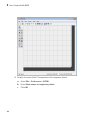
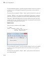
Label the Push Buttons
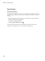
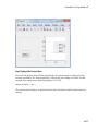
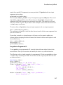
Each of the three push buttons specifies a plot type: surf, mesh, and contour. This topic
shows you how to label the buttons with those options.
1
2-10
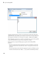
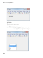
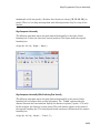
Select View > Property Inspector.
Create a Simple UI Using GUIDE
2
In the layout area, click the top push button.
3
In the Property Inspector, select the String property, and then replace the existing
value with the word Surf.
4
Click outside the String field. The push button label changes to Surf.
2-11
2
How to Create a UI with GUIDE
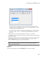
5
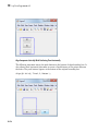
Click each of the remaining push buttons in turn and repeat steps 3 and 4. Label the
middle push button Mesh, and the bottom button Contour.
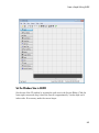
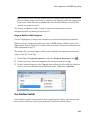
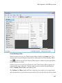
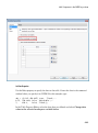
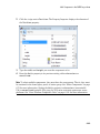
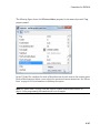
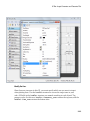
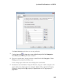
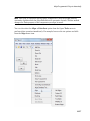
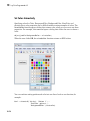
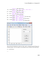
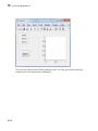
List Pop-Up Menu Items
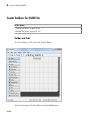
The pop-up menu provides a choice of three data sets: peaks, membrane, and sinc. These
data sets correspond to MATLAB functions of the same name. This topic shows you how
to list those data sets as choices in the pop-menu.
2-12
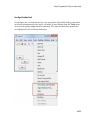
1
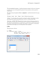
In the layout area, click the pop-up menu.
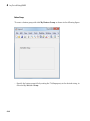
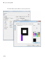
2
In the Property Inspector, click the button next to String. The String dialog box
displays.
Create a Simple UI Using GUIDE
3
Replace the existing text with the names of the three data sets: peaks, membrane,
and sinc. Press Enter to move to the next line.
4
When you finish editing the items, click OK.
The first item in your list, peaks, appears in the pop-up menu in the layout area.
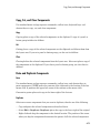
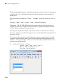
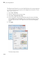
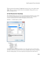
Modify the Static Text
In this UI, the static text serves as a label for the pop-up menu. This topic shows you how
to change the static text to read Select Data.
1
In the layout area, click the static text.
2
In the Property Inspector, click the button next to String. In the String dialog box
that displays, replace the existing text with the phrase Select Data.
2-13
2
How to Create a UI with GUIDE
3
Click OK.
The phrase Select Data appears in the static text component above the pop-up
menu.
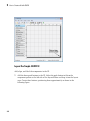
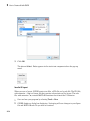
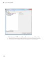
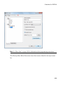
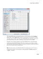
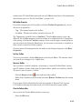
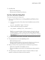
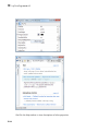
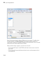
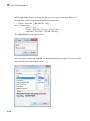
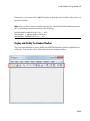
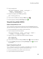
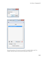
Save the UI Layout
When you save a layout, GUIDE creates two files, a FIG-file and a code file. The FIG-file,
with extension .fig, is a binary file that contains a description of the layout. The code
file, with extension .m, contains MATLAB functions that control the UI behavior.
2-14
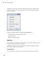
1
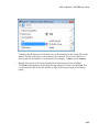
Save and run your program by selecting Tools > Run.
2
GUIDE displays a dialog box displaying: “Activating will save changes to your figure
file and MATLAB code. Do you wish to continue?
Create a Simple UI Using GUIDE
Click Yes.
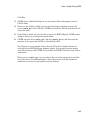
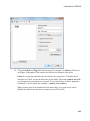
3
GUIDE opens a Save As dialog box in your current folder and prompts you for a
FIG-file name.
4
Browse to any folder for which you have write privileges, and then enter the file
name simple_gui for the FIG-file. GUIDE saves both the FIG-file and the code file
using this name.
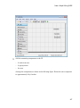
5
If the folder in which you save the files is not on the MATLAB path, GUIDE opens a
dialog to allows you to change the current folder.
6
GUIDE saves the files simple_gui.fig and simple_gui.m, and then runs the
program. It also opens the code file in your default editor.
The UI opens in a new window. Notice that the UI lacks the standard menu bar
and toolbar that MATLAB figure windows display. You can add your own menus
and toolbar buttons with GUIDE, but by default a GUIDE UI includes none of these
components.
When you run simple_gui, you can select a data set in the pop-up menu and click
the push buttons, but nothing happens. This is because the code file contains no
statements to service the pop-up menu and the buttons.
2-15
2
How to Create a UI with GUIDE
To run a program created with GUIDE without opening GUIDE, execute its code file by
typing its name.
simple_gui
You can also use the run command with the code file, for example,
run simple_gui
Note: Do not attempt to run your program by opening its FIG-file outside of GUIDE. If
you do so, the figure opens and appears ready to use, but the UI does not initialize and
its callbacks do not function.
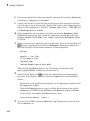
Code the Behavior of the Simple GUIDE UI
When you saved your UI in the previous topic, “Save the UI Layout” on page 2-14,
GUIDE created two files: a FIG-file simple_gui.fig that contains the UI layout and
a file, simple_gui.m, that contains the code that controls how the UI behaves. The
code consists of a set of MATLAB functions (that is, it is not a script). But the UI did not
2-16
Create a Simple UI Using GUIDE
respond because the functions contain no statements that perform actions yet. This topic
shows you how to add code to the file to make the UI functional.
Generate Data to Plot
This topic shows you how to generate the data to be plotted when the user clicks a
button. The opening function generates this data by calling MATLAB functions. The
opening function, which initializes a UI when it opens, is the first callback in every
GUIDE-generated code file.
In this example, you add code that creates three data sets to the opening function. The
code uses the MATLAB functions peaks, membrane, and sinc.
1
Display the opening function in the MATLAB Editor.
If the file simple_gui.m is not already open in the editor, open from the Layout
Editor by selecting View > Editor.
2
On the EDITOR tab, in the NAVIGATE section, click Go To, and then select
simple_gui_OpeningFcn.
The cursor moves to the opening function, which contains this code:
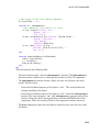
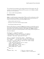
% --- Executes just before simple_gui is made visible.
function simple_gui_OpeningFcn(hObject, eventdata, handles, varargin)
% This function has no output args, see OutputFcn.
% hObject
handle to figure
% eventdata reserved - to be defined in a future version of MATLAB
% handles
structure with handles and user data (see GUIDATA)
% varargin
command line arguments to simple_gui (see VARARGIN)
% Choose default command line output for simple_gui
handles.output = hObject;
% Update handles structure
guidata(hObject, handles);
% UIWAIT makes simple_gui wait for user response (see UIRESUME)
% uiwait(handles.figure1);
3
Create data to plot by adding the following code to the opening function immediately
after the comment that begins % varargin...
% Create the data to plot.
handles.peaks=peaks(35);
handles.membrane=membrane;
[x,y] = meshgrid(-8:.5:8);
r = sqrt(x.^2+y.^2) + eps;
sinc = sin(r)./r;
2-17
2
How to Create a UI with GUIDE
handles.sinc = sinc;
% Set the current data value.
handles.current_data = handles.peaks;
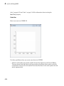
surf(handles.current_data)
The first six executable lines create the data using the MATLAB functions peaks,
membrane, and sinc. They store the data in the handles structure, an argument
provided to all callbacks. Callbacks for the push buttons can retrieve the data from
the handles structure.
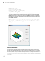
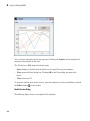
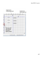
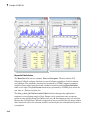
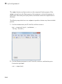
The last two lines create a current data value and set it to peaks, and then display
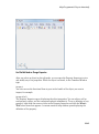
the surf plot for peaks. The following figure shows how the UI looks when it first
displays.
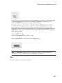
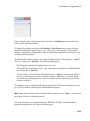
Code Pop-Up Menu Behavior
The pop-up menu presents options for plotting the data. When the user selects one of
the three plots, MATLAB software sets the pop-up menu Value property to the index of
the selected string. The pop-up menu callback reads the pop-up menu Value property to
determine the item that the menu currently displays , and sets handles.current_data
accordingly.
2-18
Create a Simple UI Using GUIDE
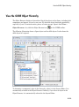
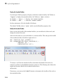
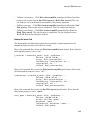
1
Display the pop-up menu callback in the MATLAB Editor. In the GUIDE Layout
Editor, right-click the pop-up menu component, and then select View Callbacks >
Callback.
GUIDE displays the UI code file in the Editor, and moves the cursor to the pop-menu
callback, which contains this code:
% --- Executes on selection change in popupmenu1.
function popupmenu1_Callback(hObject, eventdata, handles)
% hObject
handle to popupmenu1 (see GCBO)
% eventdata reserved - to be defined in a future version of MATLAB
% handles
structure with handles and user data (see GUIDATA)
2
Add the following code to the popupmenu1_Callback after the comment that begins
% handles...
2-19
2
How to Create a UI with GUIDE
This code first retrieves two pop-up menu properties:
• String — a cell array that contains the menu contents
• Value — the index into the menu contents of the selected data set
The code then uses a switch statement to make the selected data set the current
data. The last statement saves the changes to the handles structure.
% Determine the selected data set.
str = get(hObject, 'String');
val = get(hObject,'Value');
% Set current data to the selected data set.
switch str{val};
case 'peaks' % User selects peaks.
handles.current_data = handles.peaks;
case 'membrane' % User selects membrane.
handles.current_data = handles.membrane;
case 'sinc' % User selects sinc.
handles.current_data = handles.sinc;
end
% Save the handles structure.
guidata(hObject,handles)
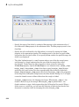
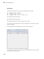
Code Push Button Behavior
Each of the push buttons creates a different type of plot using the data specified by
the current selection in the pop-up menu. The push button callbacks get data from the
handles structure and then plot it.
1
2-20
Display the Surf push button callback in the MATLAB Editor. In the Layout Editor,
right-click the Surf push button, and then select View Callbacks > Callback.
Create a Simple UI Using GUIDE
In the Editor, the cursor moves to the Surf push button callback in the UI code file,
which contains this code:
% --- Executes on button press in pushbutton1.
function pushbutton1_Callback(hObject, eventdata, handles)
% hObject
handle to pushbutton1 (see GCBO)
% eventdata reserved - to be defined in a future version of MATLAB
% handles
structure with handles and user data (see GUIDATA)
2
Add the following code to the callback immediately after the comment that begins %
handles...
% Display surf plot of the currently selected data.
surf(handles.current_data);
3
Repeat steps 1 and 2 to add similar code to the Mesh and Contour push button
callbacks.
2-21
2
How to Create a UI with GUIDE
• Add this code to the Mesh push button callback, pushbutton2_Callback:
% Display mesh plot of the currently selected data.
mesh(handles.current_data);
• Add this code to the Contour push button callback, pushbutton3_Callback:
% Display contour plot of the currently selected data.
contour(handles.current_data);
4
Save your code by selecting File > Save.
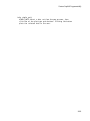
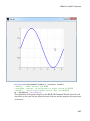
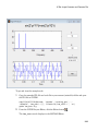
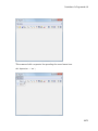
Open and Run the Simple GUIDE UI
In “Code the Behavior of the Simple GUIDE UI” on page 2-16, you programmed the
pop-up menu and the push buttons. You also created data for them to use and initialized
the display. Now you can run your program to see how it works.
2-22
1
Run your program from the Layout Editor by selecting Tools > Run.
2
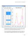
In the pop-up menu, select Membrane, and then click the Mesh button. The UI
displays a mesh plot of the MathWorks® L-shaped Membrane logo.
Create a Simple UI Using GUIDE
3
Try other combinations before closing the window.
2-23
2
How to Create a UI with GUIDE
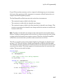
Files Generated by GUIDE
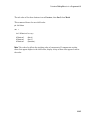
In this section...
“Code Files and FIG-Files” on page 2-24
“UI Code File Structure” on page 2-24
“Adding Callback Templates to an Existing UI Code File” on page 2-25
“About GUIDE-Generated Callbacks” on page 2-26
Code Files and FIG-Files
By default, the first time you save or run your program, GUIDE save two files:
• A FIG-file, with extension .fig, that contains a complete description of the UI layout
and each UI component, such as push buttons, axes, panels, menus, and so on. The
FIG-file is a binary file and you cannot modify it except by changing the layout in
GUIDE. FIG-files are specializations of MAT-files. See “Writing Custom Applications
to Access MAT-Files” for more information.
• A code file, with extension .m, that initially contains initialization code and templates
for some callbacks that control UI behavior. You generally add callbacks you write for
your UI components to this file. As the callbacks are functions, the UI code file can
never be a MATLAB script.
When you save your UI the first time, GUIDE automatically opens the code file in
your default editor.
The FIG-file and the code file must have the same name. These two files usually reside
in the same folder, and correspond to the tasks of laying out and programming the UI.
When you lay out the UI in the Layout Editor, your components and layout is stored in
the FIG-file. When you program the UI, your code is stored in the corresponding code file.
If your UI includes ActiveX® components, GUIDE also generates a file for each ActiveX
component.
For more information about FIG-files and code files, see “Save a GUIDE UI”.
UI Code File Structure
The UI code file that GUIDE generates is a function file. The name of the main function
is the same as the name of the code file. For example, if the name of the code file is
2-24
Files Generated by GUIDE
mygui.m, then the name of the main function is mygui. Each callback in the file is a local
function of that main function.
When GUIDE generates a code file, it automatically includes templates for the most
commonly used callbacks for each component. The code file also contains initialization
code, as well as an opening function callback and an output function callback. It is your
job to add code to the component callbacks for your program to work as you want. You
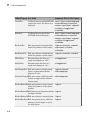
can also add code to the opening function callback and the output function callback. The
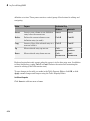
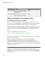
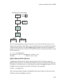
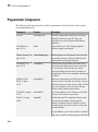
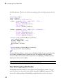
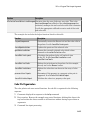
UI code file orders functions as shown in the following table.
Section
Description
Comments
Displayed at the command line in response to the help
command.
Initialization
GUIDE initialization tasks. Do not edit this code.
Opening function
Performs your initialization tasks before the user has access to
the UI.
Output function
Returns outputs to the MATLAB command line after the
opening function returns control and before control returns to
the command line.
Component and figure Control the behavior of the UI window and of individual
callbacks
components. MATLAB software calls a callback in response to a
particular event for a component or for the figure itself.
Utility/helper
functions
Perform miscellaneous functions not directly associated with an
event for the figure or a component.
Adding Callback Templates to an Existing UI Code File
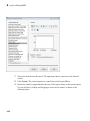
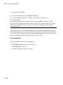
When you save the UI, GUIDE automatically adds templates for some callbacks to the
code file. If you want to add other callbacks to the file, you can easily do so.
Within GUIDE, you can add a local callback function template to the code in any of the
following ways. Select the component for which you want to add the callback, and then:
• Right-click the mouse button, and from the View callbacks submenu, select the
desired callback.
• From View > View Callbacks, select the desired callback.
2-25
2
How to Create a UI with GUIDE
• Double-click a component to show its properties in the Property Inspector. In the
Property Inspector, click the pencil-and-paper icon
callback you want to install in the code file.
next to the name of the
• For toolbar buttons, in the Toolbar Editor, click the View button next to Clicked
Callback (for Push Tool buttons) or On Callback, or Off Callback (for Toggle
Tools).
When you perform any of these actions, GUIDE adds the callback template to the UI
code file, saves it, and opens it for editing at the callback you just added. If you select a
callback that currently exists in the code file, GUIDE adds no callback, but saves the file
and opens it for editing at the callback you select.
For more information, see “GUIDE-Generated Callback Functions and Property Values”
on page 8-4.
About GUIDE-Generated Callbacks
Callbacks created by GUIDE for UI components are similar to callbacks created
programmatically, with certain differences.
• GUIDE generates callbacks as function templates within the code file.
GUIDE names callbacks based on the callback type and the component Tag property.
For example, togglebutton1_Callback is such a default callback name. If you
change a component Tag, GUIDE renames all its callbacks in the code file to contain
the new tag. You can change the name of a callback, replace it with another function,
or remove it entirely using the Property Inspector.
• GUIDE provides three arguments to callbacks, always named the same.
• You can append arguments to GUIDE-generated callbacks, but never alter or remove
the ones that GUIDE places there.
• You can rename a GUIDE-generated callback by editing its name or by changing the
component Tag.
• You can delete a callback from a component by clearing it from the Property
Inspector; this action does not remove anything from the code file.
• You can specify the same callback function for multiple components to enable them to
share code.
After you delete a component in GUIDE, all callbacks it had remain in the code file.
If you are sure that no other component uses the callbacks, you can then remove the
2-26
Files Generated by GUIDE
callback code manually. For details, see “Renaming and Removing GUIDE-Generated
Callbacks” on page 8-5.
2-27
3
A Simple Programmatic UI
3
A Simple Programmatic UI
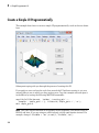
Create a Simple UI Programmatically
This example shows how to create a simple UI programmatically, such as the one shown
here.
Subsequent topics guide you through the process of creating this UI.
If you prefer to view and run the code that created this UI without creating it, set your
current folder to one to which you have write access. Copy the example code and open it
in the Editor by issuing the following MATLAB commands:
copyfile(fullfile(docroot, 'techdoc','creating_guis',...
'examples','simple_gui2*.*')), fileattrib('simple_gui2*.*', '+w');
edit simple_gui2.m
Note: This code uses dot notation to set graphics object properties. Dot notation runs in
R2014b and later. If you are using an earlier release, use the set function instead. For
example, change f.Visible = 'on'; to set(f,'Visible','on').
3-2
Create a Simple UI Programmatically
To run the code, go to the Run section in the Editor tab. Then click Run
.
Create a Code File for the Simple Programmatic UI
Create a function file (as opposed to a script file, which contains a sequence of MATLAB
commands but does not define functions).
1
At the MATLAB prompt, type edit.
2
Type the following statement in the first line of the Editor.
function simple_gui2
3
Following the function statement, type these comments, ending with a blank line.
(The comments display at the command line in response to the help command.)
% SIMPLE_GUI2 Select a data set from the pop-up menu, then
% click one of the plot-type push buttons. Clicking the button
% plots the selected data in the axes.
(Leave a blank line here)
4
At the end of the file, after the blank line, add an end statement.
Note You need the end statement to specify the end of the function because the
example uses nested functions. To learn more, see “Nested Functions”.
5
Save the file in your current folder or at a location that is on your MATLAB path.
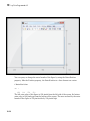
Create a Figure for the Simple Programmatic UI
Add the following lines before the end statement in your file to create a figure and
position it on the screen.
% Create and then hide the UI as it is being constructed.
f = figure('Visible','off','Position',[360,500,450,285]);
The call to the figure function uses two property/value pairs:
• The Visible property makes the window invisible so that the user cannot see the
components being added or initialized.
The window becomes visible when the UI has all its components and is initialized.
3-3
3
A Simple Programmatic UI
• The Position property is a four-element vector that specifies the location of the UI
on the screen and its size: [distance from left, distance from bottom, width, height].
Default units are pixels.
Add Components to the Simple Programmatic UI
Create the push buttons, static text, pop-up menu, and axes components to the UI.
1
Following the call to figure, add these statements to your code file to create three
push button components.
% Construct the components.
hsurf
= uicontrol('Style','pushbutton',...
'String','Surf','Position',[315,220,70,25]);
hmesh
= uicontrol('Style','pushbutton',...
'String','Mesh','Position',[315,180,70,25]);
hcontour = uicontrol('Style','pushbutton',...
'String','Countour','Position',[315,135,70,25]);
Each statement uses a series of uicontrol property/value pairs to define a push
button:
• The Style property specifies that the uicontrol is a push button.
• The String property specifies the label on each push button: Surf, Mesh, and
Contour.
• The Position property specifies the location and size of each push button:
[distance from left, distance from bottom, width, height]. Default units for push
buttons are pixels.
Each uicontrol call returns the handle of the push button created.
2
Add the pop-up menu and its static text label by adding these statements to the code
file following the push button definitions. The first statement creates a popup menu.
The second statement creates a text component that serves as a label for the popup
menu.
htext
= uicontrol('Style','text','String','Select Data',...
'Position',[325,90,60,15]);
hpopup = uicontrol('Style','popupmenu',...
'String',{'Peaks','Membrane','Sinc'},...
'Position',[300,50,100,25]);
3-4
Create a Simple UI Programmatically
The pop-up menu component String property uses a cell array to specify the three
items in the pop-up menu: Peaks, Membrane, and Sinc.
The text component, the String property specifies instructions for the user.
For both components, the Position property specifies the size and location of each
component: [distance from left, distance from bottom, width, height]. Default units
for these components are pixels.
3
Add the axes by adding this statement to the code file.
ha = axes('Units','pixels','Position',[50,60,200,185]);
The Units property specifies pixels so that the axes has the same units as the other
components.
4
Following all the component definitions, add this line to the code file to align all
components, except the axes, along their centers.
align([hsurf,hmesh,hcontour,htext,hpopup],'Center','None');
5
Add this command following the align command.
f.Visible = 'on';
Your code file should look like this:
function simple_gui2
% SIMPLE_GUI2 Select a data set from the pop-up menu, then
% click one of the plot-type push buttons. Clicking the button
% plots the selected data in the axes.
% Create and then hide the UI as it is being constructed.
f = figure('Visible','off','Position',[360,500,450,285]);
% Construct the components.
hsurf = uicontrol('Style','pushbutton','String','Surf',...
'Position',[315,220,70,25]);
hmesh = uicontrol('Style','pushbutton','String','Mesh',...
'Position',[315,180,70,25]);
hcontour = uicontrol('Style','pushbutton',...
'String','Countour',...
'Position',[315,135,70,25]);
htext = uicontrol('Style','text','String','Select Data',...
'Position',[325,90,60,15]);
3-5
3
A Simple Programmatic UI
hpopup = uicontrol('Style','popupmenu',...
'String',{'Peaks','Membrane','Sinc'},...
'Position',[300,50,100,25]);
ha = axes('Units','Pixels','Position',[50,60,200,185]);
align([hsurf,hmesh,hcontour,htext,hpopup],'Center','None');
%Make the UI visible.
f.Visible = 'on';
end
6
Run your code by typing simple_gui2 at the command line. You can select a data
set in the pop-up menu and click the push buttons, but nothing happens. This
is because there is no callback code in the file to service the pop-up menu or the
buttons.
Code the Simple Programmatic UI Behavior
Program the Pop-Up Menu
The pop-up menu enables users to select the data to plot. When a user selects one
of the three data sets in the pop-up menu, MATLAB software sets the pop-up menu
3-6
Create a Simple UI Programmatically
Value property to the index of the selected string. The pop-up menu callback reads the
pop-up menu Value property to determine which item is currently displayed and sets
current_data accordingly.
Add the following callback to your file following the initialization code and before the
final end statement.
%
%
%
%
Pop-up menu callback. Read the pop-up menu Value property to
determine which item is currently displayed and make it the
current data. This callback automatically has access to
current_data because this function is nested at a lower level.
function popup_menu_Callback(source,eventdata)
% Determine the selected data set.
str = source.String;
val = source.Value;
% Set current data to the selected data set.
switch str{val};
case 'Peaks' % User selects Peaks.
current_data = peaks_data;
case 'Membrane' % User selects Membrane.
current_data = membrane_data;
case 'Sinc' % User selects Sinc.
current_data = sinc_data;
end
end
Program the Push Buttons
Each of the three push buttons creates a different type of plot using the data specified
by the current selection in the pop-up menu. The push button callbacks plot the data
in current_data. They automatically have access to current_data because they are
nested at a lower level.
Add the following callbacks to your file following the pop-up menu callback and before
the final end statement.
% Push button callbacks. Each callback plots current_data in the
% specified plot type.
function surfbutton_Callback(source,eventdata)
% Display surf plot of the currently selected data.
surf(current_data);
end
function meshbutton_Callback(source,eventdata)
% Display mesh plot of the currently selected data.
mesh(current_data);
3-7
3
A Simple Programmatic UI
end
function contourbutton_Callback(source,eventdata)
% Display contour plot of the currently selected data.
contour(current_data);
end
Program the Callbacks
When the user selects a data set from the pop-up menu or clicks one of the push buttons,
MATLAB software executes the callback associated with that particular event. Use each
component's Callback property to specify the name of the callback with which each
event is associated.
1
To the uicontrol statement that defines the Surf push button, add the property/
value pair
'Callback',{@surfbutton_Callback}
so that the statement looks like this:
hsurf = uicontrol('Style','pushbutton','String','Surf',...
'Position',[315,220,70,25],...
'Callback',{@surfbutton_Callback});
Callback is the name of the property. surfbutton_Callback is the name of the
callback that services the Surf push button.
2
To the uicontrol statement that defines the Mesh push button, add the property/
value pair
'Callback',@meshbutton_Callback
3
To the uicontrol statement that defines the Contour push button, add the
property/value pair
'Callback',@contourbutton_Callback
4
To the uicontrol statement that defines the pop-up menu, add the property/value
pair
'Callback',@popup_menu_Callback
For more information, see “Write Callbacks Using the Programmatic Workflow” on page
11-5.
3-8
Create a Simple UI Programmatically
Initialize the Simple Programmatic UI
Initialize the UI, so it is ready for the user when the code makes the UI visible. Make
the UI behave properly when it is resized by changing the component and figure units to
normalized. This causes the components to resize when the UI is resized. Normalized
units map the lower-left corner of the figure window to (0,0) and the upper-right corner
to (1.0, 1.0).
Replace this code in editor:
% Make the UI visible.
f.Visible = 'on';
with this code:
% Initialize the UI.
% Change units to normalized so components resize automatically.
f.Units = 'normalized';
ha.Units = 'normalized';
hsurf.Units = 'normalized';
hmesh.Units = 'normalized';
hcontour.Units = 'normalized';
htext.Units = 'normalized';
hpopup.Units = 'normalized';
% Generate the data to plot.
peaks_data = peaks(35);
membrane_data = membrane;
[x,y] = meshgrid(-8:.5:8);
r = sqrt(x.^2+y.^2) + eps;
sinc_data = sin(r)./r;
% Create a plot in the axes.
current_data = peaks_data;
surf(current_data);
% Assign a name to appear in the window title.
f.Name = 'Simple GUI';
% Move the window to the center of the screen.
movegui(f,'center')
% Make the UI visible.
f.Visible = 'on';
3-9
3
A Simple Programmatic UI
Verify Code and Run the Program
Make sure your code appears as it should, and then run it.
1
Verify that your code file looks like this:
function simple_gui2
% SIMPLE_GUI2 Select a data set from the pop-up menu, then
% click one of the plot-type push buttons. Clicking the button
% plots the selected data in the axes.
% Create and then hide the UI as it is being constructed.
f = figure('Visible','off','Position',[360,500,450,285]);
% Construct the components.
hsurf
= uicontrol('Style','pushbutton',...
'String','Surf','Position',[315,220,70,25],...
'Callback',@surfbutton_Callback);
hmesh
= uicontrol('Style','pushbutton',...
'String','Mesh','Position',[315,180,70,25],...
'Callback',@meshbutton_Callback);
hcontour = uicontrol('Style','pushbutton',...
'String','Countour','Position',[315,135,70,25],...
'Callback',@contourbutton_Callback);
htext = uicontrol('Style','text','String','Select Data',...
'Position',[325,90,60,15]);
hpopup = uicontrol('Style','popupmenu',...
'String',{'Peaks','Membrane','Sinc'},...
'Position',[300,50,100,25],...
'Callback',@popup_menu_Callback);
ha = axes('Units','pixels','Position',[50,60,200,185]);
align([hsurf,hmesh,hcontour,htext,hpopup],'Center','None');
% Initialize the UI.
% Change units to normalized so components resize automatically.
f.Units = 'normalized';
ha.Units = 'normalized';
hsurf.Units = 'normalized';
hmesh.Units = 'normalized';
hcontour.Units = 'normalized';
htext.Units = 'normalized';
hpopup.Units = 'normalized';
% Generate the data to plot.
3-10
Create a Simple UI Programmatically
peaks_data = peaks(35);
membrane_data = membrane;
[x,y] = meshgrid(-8:.5:8);
r = sqrt(x.^2+y.^2) + eps;
sinc_data = sin(r)./r;
% Create a plot in the axes.
current_data = peaks_data;
surf(current_data);
% Assign the a name to appear in the window title.
f.Name = 'Simple GUI';
% Move the window to the center of the screen.
movegui(f,'center')
% Make the window visible.
f.Visible = 'on';
%
%
%
%
Pop-up menu callback. Read the pop-up menu Value property to
determine which item is currently displayed and make it the
current data. This callback automatically has access to
current_data because this function is nested at a lower level.
function popup_menu_Callback(source,eventdata)
% Determine the selected data set.
str = get(source, 'String');
val = get(source,'Value');
% Set current data to the selected data set.
switch str{val};
case 'Peaks' % User selects Peaks.
current_data = peaks_data;
case 'Membrane' % User selects Membrane.
current_data = membrane_data;
case 'Sinc' % User selects Sinc.
current_data = sinc_data;
end
end
% Push button callbacks. Each callback plots current_data in the
% specified plot type.
function surfbutton_Callback(source,eventdata)
% Display surf plot of the currently selected data.
surf(current_data);
3-11
3
A Simple Programmatic UI
end
function meshbutton_Callback(source,eventdata)
% Display mesh plot of the currently selected data.
mesh(current_data);
end
function contourbutton_Callback(source,eventdata)
% Display contour plot of the currently selected data.
contour(current_data);
end
end
3-12
2
Run your code by typing simple_gui2 at the command line. The initialization code
causes it to display the default peaks data with the surf function, making the UI
look like this.
3
In the pop-up menu, select Membrane, and then click the Mesh button. The UI
displays a mesh plot of the MathWorks L-shaped Membrane logo.
4
Try other combinations before closing the UI.
5
Type help simple_gui2 at the command line. MATLAB software displays the help
text.
Create a Simple UI Programmatically
help simple_gui2
SIMPLE_GUI2 Select a data set from the pop-up menu, then
click one of the plot-type push buttons. Clicking the button
plots the selected data in the axes.
3-13
Create UIs with GUIDE
4
What Is GUIDE?
• “GUIDE: Getting Started” on page 4-2
• “GUIDE Tools Summary” on page 4-3
4
What Is GUIDE?
GUIDE: Getting Started
In this section...
“UI Layout” on page 4-2
“UI Programming” on page 4-2
UI Layout
GUIDE is a development environment that provides a set of tools for creating user
interfaces (UIs). These tools simplify the process of laying out and programming UIs.
Using the GUIDE Layout Editor, you can populate a UI by clicking and dragging UI
components—such as axes, panels, buttons, text fields, sliders, and so on—into the layout
area. You also can create menus and context menus for the UI. From the Layout Editor,
you can size the UI, modify component look and feel, align components, set tab order,
view a hierarchical list of the component objects, and set UI options.
UI Programming
GUIDE automatically generates a program file containing MATLAB functions that
controls how the UI behaves. This code file provides code to initialize the UI, and it
contains a framework for the UI callbacks. Callbacks are functions that execute when
the user interacts with a UI component. Use the MATLAB Editor to add code to these
callbacks.
Note MATLAB software provides a selection of standard dialog boxes that you can create
with a single function call. For an example, see the documentation for msgbox, which
also provides links to functions that create specialized predefined dialog boxes.
4-2
GUIDE Tools Summary
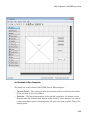
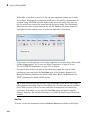
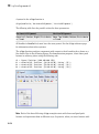
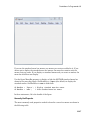
GUIDE Tools Summary
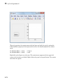
The GUIDE tools are available from the Layout Editor shown in the figure below. The
tools are called out in the figure and described briefly below. Subsequent sections show
you how to use them.
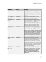
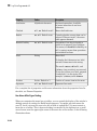
Use This Tool...
To...
Layout Editor
Select components from the component palette, at the left side of
the Layout Editor, and arrange them in the layout area. See “Add
4-3
4
What Is GUIDE?
Use This Tool...
To...
Components to the GUIDE Layout Area” on page 6-17 for more
information.
Figure Resize
Tab
Set the size at which the UI is initially displayed when you run it.
See “Set the UI Window Size in GUIDE” on page 6-11 for more
information.
Menu Editor
Create menus and context, i.e., pop-up, menus. See “Create Menus for
GUIDE UIs” on page 6-91 for more information.
Align Objects
Align and distribute groups of components. Grids and rulers also
enable you to align components on a grid with an optional snap-to-grid
capability. See “Align GUIDE UI Components” on page 6-79 for
more information.
Tab Order
Editor
Set the tab and stacking order of the components in your layout. See
“Customize Tabbing Behavior in a GUIDE UI” on page 6-88 for
more information.
Toolbar Editor
Create Toolbars containing predefined and custom push buttons and
toggle buttons. See “Create Toolbars for GUIDE UIs” on page 6-108
for more information.
Icon Editor
Create and modify icons for tools in a toolbar. See “Create Toolbars for
GUIDE UIs” on page 6-108 for more information.
Property
Inspector
Set the properties of the components in your layout. It provides a list of
all the properties you can set and displays their current values.
Object Browser Display a hierarchical list of the objects in the UI. See “View the
GUIDE Object Hierarchy” on page 6-119 for more information.
4-4
Run
Save the UI and run the program.
Editor
Display, in your default editor, the code file associated with the UI. See
“Files Generated by GUIDE” on page 2-24 for more information.
Position
Readouts
Continuously display the mouse cursor position and the positions of
selected objects
5
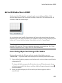
GUIDE Preferences and Options
• “GUIDE Preferences” on page 5-2
• “GUIDE Options” on page 5-8
5
GUIDE Preferences and Options
GUIDE Preferences
In this section...
“Set Preferences” on page 5-2
“Confirmation Preferences” on page 5-2
“Backward Compatibility Preference” on page 5-4
“All Other Preferences” on page 5-4
Set Preferences
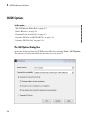
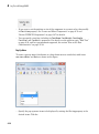
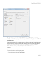
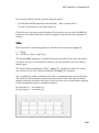
You can set preferences for GUIDE. From the MATLAB Home tab, in the Environment
section, click Preferences. These preferences apply to GUIDE and to all UIs you create.
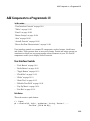
The preferences are in different locations within the Preferences dialog box:
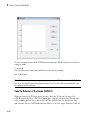
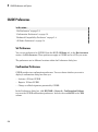
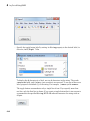
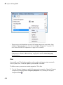
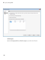
Confirmation Preferences
GUIDE provides two confirmation preferences. You can choose whether you want to
display a confirmation dialog box when you
• Activate a UI from GUIDE.
• Export a UI from GUIDE.
• Change a callback signature generated by GUIDE.
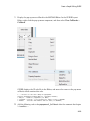
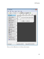
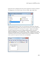
In the Preferences dialog box, click MATLAB > General > Confirmation Dialogs
to access the GUIDE confirmation preferences. Look for the word GUIDE in the Tool
column.
5-2
GUIDE Preferences
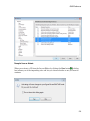
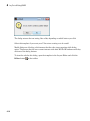
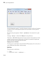
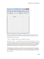
Prompt to Save on Activate
When you activate a UI from the Layout Editor by clicking the Run button , a dialog
box informs you of the impending save and lets you choose whether or not you want to
continue.
5-3
5
GUIDE Preferences and Options
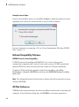
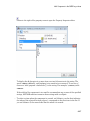
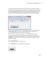
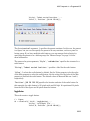
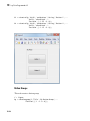
Prompt to Save on Export
From the Layout Editor, when you select File > Export, a dialog box informs you of the
impending save and lets you choose whether or not you want to continue.
For more information on exporting a UI, see “Create Programmatic Files from GUIDE
Files” on page 7-4.
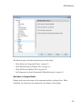
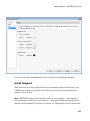
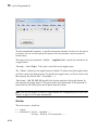
Backward Compatibility Preference
MATLAB Version 5 or Later Compatibility
UI FIG-files created or modified with MATLAB 7.0 or a later version are not
automatically compatible with Version 6.5 and earlier versions. GUIDE automatically
generates FIG-files, which are binary files that contain the UI layout information.
To make a FIG-file backward compatible, from the Layout Editor, select File >
Preferences > General > MAT-Files, and then select MATLAB Version 5 or later
(save -v6).
Note: The -v6 option discussed in this section is obsolete and will be removed in a future
version of MATLAB.
All Other Preferences
GUIDE provides other preferences, for the Layout Editor interface and for inserting code
comments. In the Preferences dialog box, click GUIDE to access these preferences.
5-4
GUIDE Preferences
The following topics describe the preferences in this dialog:
• “Show Names in Component Palette” on page 5-5
• “Show File Extension in Window Title” on page 5-6
• “Show File Path in Window Title” on page 5-6
• “Add Comments for Newly Generated Callback Functions” on page 5-6
Show Names in Component Palette
Displays both icons and names in the component palette, as shown below. When
unchecked, the icons alone are displayed in two columns, with tooltips.
5-5
5
GUIDE Preferences and Options
Show File Extension in Window Title
Displays the FIG-file file name with its file extension, .fig, in the Layout Editor window
title. If unchecked, only the file name is displayed.
Show File Path in Window Title
Displays the full file path in the Layout Editor window title. If unchecked, the file path is
not displayed.
Add Comments for Newly Generated Callback Functions
Callbacks are blocks of code that execute in response to actions by the user, such as
clicking buttons or manipulating sliders. By default, GUIDE sets up templates that
declare callbacks as functions and adds comments at the beginning of each one. Most of
the comments are similar to the following.
5-6
GUIDE Preferences
% --- Executes during object deletion, before destroying properties.
function figure1_DeleteFcn(hObject, eventdata, handles)
% hObject
handle to figure1 (see GCBO)
% eventdata reserved - to be defined in a future version of MATLAB
% handles
structure with handles and user data (see GUIDATA)
Some callbacks are added automatically because their associated components are part
of the original GUIDE template that you chose. Other commonly used callbacks are
added automatically when you add components. You can also add callbacks explicitly by
selecting them from View > View Callbacks menu or on the component's context menu.
If you deselect this preference, GUIDE includes comments only for callbacks that are
automatically included to support the original GUIDE template. GUIDE does not include
comments for callbacks subsequently added to the code.
See “Write Callbacks Using the GUIDE Workflow” for more information about callbacks
and about the arguments described in the preceding comments.
5-7
5
GUIDE Preferences and Options
GUIDE Options
In this section...
“The GUI Options Dialog Box” on page 5-8
“Resize Behavior” on page 5-9
“Command-Line Accessibility” on page 5-9
“Generate FIG-File and MATLAB File” on page 5-10
“Generate FIG-File Only” on page 5-12
The GUI Options Dialog Box
Access the dialog box from the GUIDE Layout Editor by selecting Tools > GUI Options.
The options you select take effect the next time you save your UI.
5-8
GUIDE Options
Resize Behavior
You can control whether users can resize the window and how MATLAB handles
resizing. GUIDE provides three options:
• Non-resizable — Users cannot change the window size (default).
• Proportional — The software automatically scales the components in the UI in
proportion to the new figure window size.
• Other (Use SizeChangedFcn) — Program the UI to behave in a certain way when
users resize the figure window.
The first two options set figure and component properties appropriately and require no
other action. Other (Use SizeChangedFcn) requires you to write a callback routine
that recalculates sizes and positions of the components based on the new figure size. For
a discussion and examples of using a SizeChangedFcn, see the GUIDE examples “Panel”
on page 8-20 and “UI That Uses Persistent Data” on page 9-7.
Command-Line Accessibility
You can restrict access to a figure window from the command line or from a code file with
the GUIDE Command-line accessibility options.
Unless you explicitly specify a figure handle, many commands, such as plot, alter the
current figure (the figure specified by the root CurrentFigure property and returned by
the gcf command). The current figure is usually the figure that is most recently created,
drawn into, or mouse-clicked. You can programmatically designate a figure h (where h is
its handle) as the current figure in four ways:
1
set(groot,'CurrentFigure',h) — Makes figure h current, but does not change
its visibility or stacking with respect to other figures
2
figure(h) — Makes figure h current, visible, and displayed on top of other figures
3
axes(h) — Makes existing axes h the current axes and displays the figure
containing it on top of other figures
4
plot(h,...), or any plotting function that takes an axes as its first argument, also
makes existing axes h the current axes and displays the figure containing it on top of
other figures
The gcf function returns the handle of the current figure.
5-9
5
GUIDE Preferences and Options
h = gcf
For a UI created in GUIDE, set the Command-line accessibility option to prevent
users from inadvertently changing the appearance or content of a UI by executing
commands at the command line or from a script or function, such as plot. The following
table briefly describes the four options for Command-line accessibility.
Option
Description
Callback (GUI becomes Current
Figure within Callbacks)
The UI can be accessed only from within a
callback. The UI cannot be accessed from
the command line or from a script. This is
the default.
Off (GUI never becomes Current
Figure)
The UI can not be accessed from a callback,
the command line, or a script, without the
handle.
On (GUI may become Current Figure
from Command Line)
The UI can be accessed from a callback,
from the command line, and from a script.
Other (Use settings from Property
Inspector)
You control accessibility by setting the
HandleVisibility and IntegerHandle
properties from the Property Inspector.
Generate FIG-File and MATLAB File
Select Generate FIG-file and MATLAB file in the GUI Options dialog box if you
want GUIDE to create both the FIG-file and the UI code file (this is the default). Once
you have selected this option, you can select any of the following items in the frame to
configure UI code:
• “Generate Callback Function Prototypes” on page 5-10
• “GUI Allows Only One Instance to Run (Singleton)” on page 5-11
• “Use System Color Scheme for Background” on page 5-11
See “Files Generated by GUIDE” on page 2-24 for information about these files.
Generate Callback Function Prototypes
If you select Generate callback function prototypes in the GUI Options dialog,
GUIDE adds templates for the most commonly used callbacks to the code file for most
components. You must then insert code into these templates.
5-10
GUIDE Options
GUIDE also adds a callback whenever you edit a callback routine from the Layout
Editor's right-click context menu and when you add menus to the UI using the Menu
Editor.
See “Write Callbacks Using the GUIDE Workflow” for general information about
callbacks.
Note This option is available only if you first select the Generate FIG-file and
MATLAB file option.
GUI Allows Only One Instance to Run (Singleton)
This option allows you to select between two behaviors for the figure window:
• Allow MATLAB software to display only one instance of the UI at a time.
• Allow MATLAB software to display multiple instances of the UI.
If you allow only one instance, the software reuses the existing figure whenever the
command to run your program is executed. If a UI window already exists, the software
brings it to the foreground rather than creating a new figure.
If you clear this option, the software creates a new figure whenever you issue the
command to run the program.
Even if you allow only one instance of a UI to exist, initialization can take place each
time you invoke it from the command line. For example, the code in an OpeningFcn will
run each time a GUIDE program runs unless you take steps to prevent it from doing so.
Adding a flag to the handles structure is one way to control such behavior. You can do
this in the OpeningFcn, which can run initialization code if this flag doesn't yet exist
and skip that code if it does.
Note This option is available only if you first select the Generate FIG-file and
MATLAB file option.
Use System Color Scheme for Background
The default color used for UI components is system dependent. This option enables you to
make the figure background color the same as the default component background color.
5-11
5
GUIDE Preferences and Options
To ensure that the figure background matches the color of the components, select Use
system color scheme for background in the GUI Options dialog.
Note This option is available only if you first select the Generate FIG-file and
MATLAB file option.
Generate FIG-File Only
The Generate FIG-file only option enables you to open figures and UIs to perform
limited editing. These can be any figures and need not be UIs. UIs need not have been
generated using GUIDE. This mode provides limited editing capability and may be useful
for UIs generated in MATLAB Versions 5.3 and earlier. See the guide function for more
information.
GUIDE selects Generate FIG-file only as the default if you do one of the following:
• Start GUIDE from the command line by providing one or more figure objects as
arguments.
guide(f)
In this case, GUIDE selects Generate FIG-file only, even when a code file with a
corresponding name exists in the same folder.
• Start GUIDE from the command line and provide the name of a FIG-file for which no
code file with the same name exists in the same folder.
guide('myfig.fig')
• Use the GUIDE Open Existing GUI tab to open a FIG-file for which no code file
with the same name exists in the same folder.
When you save the figure or UI with Generate FIG-file only selected, GUIDE saves
only the FIG-file. You must update any corresponding code files yourself, as appropriate.
If you want GUIDE to manage the UI code file for you, change the selection to Generate
FIG-file and MATLAB file before saving the UI. If there is no corresponding code file in
the same location, GUIDE creates one. If a code file with the same name as the original
figure or UI exists in the same folder, GUIDE overwrites it. To prevent overwriting an
existing file, save the UI using Save As from the File menu. Select another file name for
the two files. GUIDE updates variable names in the new code file as appropriate.
5-12
GUIDE Options
Callbacks for UIs without Code
Even when there is no code file associated with a UI FIG-file, you can still provide
callbacks for UI components to make them perform actions when used. In the Property
Inspector, you can type callbacks in the form of strings, built-in functions, or MATLAB
code file names; when your program runs, it will execute them if possible. If the callback
is a file name, it can include arguments to that function. For example, setting the
Callback property of a push button to sqrt(2) causes the result of the expression to
display in the Command Window:
ans =
1.4142
Any file that a callback executes must be in the current folder or on the MATLAB path.
For more information on how callbacks work, see “Write Callbacks Using the GUIDE
Workflow” on page 8-2
5-13
6
Lay Out a UI Using GUIDE
• “GUIDE Templates” on page 6-2
• “Set the UI Window Size in GUIDE” on page 6-11
• “GUIDE Components” on page 6-13
• “Add Components to the GUIDE Layout Area” on page 6-17
• “Copy, Paste, and Arrange Components” on page 6-70
• “Locate and Move Components” on page 6-74
• “Align GUIDE UI Components” on page 6-79
• “Customize Tabbing Behavior in a GUIDE UI” on page 6-88
• “Create Menus for GUIDE UIs” on page 6-91
• “Create Toolbars for GUIDE UIs” on page 6-108
• “View the GUIDE Object Hierarchy” on page 6-119
• “Design Cross-Platform UIs in GUIDE” on page 6-120
• “UI Design References” on page 6-123
6
Lay Out a UI Using GUIDE
GUIDE Templates
In this section...
“Access the Templates” on page 6-2
“Template Descriptions” on page 6-3
Access the Templates
GUIDE provides several templates that you can modify to create your own UIs. The
templates are fully functional programs.
You can access the templates in two ways:
• From the MATLAB toolstrip, on the HOME tab, in the FILE section, selectNew >
Graphical User Interface
• If the Layout Editor is already open, select File > New.
In either case, GUIDE displays the GUIDE Quick Start dialog box with the Create
New GUI tab selected as shown in the following figure. This tab contains a list of the
available templates.
6-2
GUIDE Templates
To use a template:
1
Select a template in the left pane. A preview displays in the right pane.
2
Optionally, name your UI now by selecting Save new figure as and typing the
name in the field to the right. GUIDE saves the UI before opening it in the Layout
Editor. If you choose not to name the UI at this point, GUIDE prompts you to save it
and give it a name the first time you run your program.
3
Click OK to open the UI template in the Layout Editor.
Template Descriptions
GUIDE provides four fully functional templates. They are described in the following
sections:
• “Blank GUI” on page 6-3
• “GUI with Uicontrols” on page 6-4
• “GUI with Axes and Menu” on page 6-6
• “Modal Question Dialog” on page 6-8
“Out of the box,” none of the UI templates include a menu bar or a toolbar. Neither can
they dock in the MATLAB desktop. You can, however, override these GUIDE defaults to
provide and customize these controls. See the sections “Create Menus for GUIDE UIs” on
page 6-91 and “Create Toolbars for GUIDE UIs” on page 6-108 for details.
Note To see how the templates work, you can view their code and look at their callbacks.
You can also modify the callbacks for your own purposes. To view the code file for any of
these templates, open the template in the Layout Editor and click the Editor button
on the toolbar.
Blank GUI
The following figure shows an example of this template.
6-3
6
Lay Out a UI Using GUIDE
Select this template when the other templates are not suitable for the UI you want to
create.
GUI with Uicontrols
The following figure shows an example of this template. The user interface controls
shown in this template are the push buttons, radio buttons, edit text, and static text.
6-4
GUIDE Templates
When you click the Run button , the UI appears as shown in the following figure.
6-5
6
Lay Out a UI Using GUIDE
When you enter values for the density and volume of an object, and click the Calculate
button, the program calculates the mass of the object and displays the result next to
Mass(D*V).
To view the code for these user interface controls, open the template in the Layout Editor
and click the Editor button on the toolbar.
GUI with Axes and Menu
The following figure shows an example of this template.
6-6
GUIDE Templates
When you click the Run button on the toolbar, the UI displays a plot of five lines, each
of which is generated from random numbers using the MATLAB rand(5) command. The
following figure shows an example.
6-7
6
Lay Out a UI Using GUIDE
You can select other plots in the pop-up menu. Clicking the Update button displays the
currently selected plot on the axes.
The UI also has a File menu with three items:
• Open displays a dialog box from which you can open files on your computer.
• Print opens the Print dialog box. Clicking OK in the Print dialog box prints the
figure.
• Close closes the UI.
To view the code for these menu choices, open the template in the Layout Editor and click
the Editor button on the toolbar.
Modal Question Dialog
The following figure shows an example of this template.
6-8
GUIDE Templates
When you click the Run button, the following dialog displays.
6-9
6
Lay Out a UI Using GUIDE
The dialog returns the text string, Yes or No, depending on which button you click.
Select this template if you want your UI to return a string or to be modal.
Modal dialogs are blocking, which means that the code stops executing while dialog
exists. This means that the user cannot interact with other MATLAB windows until they
click one of the dialog buttons.
To view the code for this dialog, open the template in the Layout Editor and click the
Editor button on the toolbar.
6-10
Set the UI Window Size in GUIDE
Set the UI Window Size in GUIDE
Set the size of the UI window by resizing the grid area in the Layout Editor. Click
the lower-right corner of the layout area and drag it until the UI is the desired size. If
necessary, make the window larger.
As you drag the corner handle, the readout in the lower right corner shows the current
position of the UI in pixels (regardless of the UI Units property setting). Existing objects
within the UI resize with the window if their Units are set to 'normalized'.
Note Setting the Units property to characters (nonresizable UIs) or normalized
(resizable UIs) gives the UI a more consistent appearance across platforms. See “CrossPlatform Compatible Units” on page 6-121 for more information.
Prevent Existing Objects from Resizing with the Window
Existing objects within the UI resize with the window if their Units are set to
'normalized'. To prevent them from resizing with the window, perform these steps:
1
Set each object’s Units property to an absolute value, such as inches or pixels before
enlarging the UI.
To change the Units property for all the objects in your UI simultaneously, drag a
selection box around all the objects, and then click the Property Inspector button
and set the Units.
2
When you finish enlarging the UI, set each object’s Units property back to
normalized.
6-11
6
Lay Out a UI Using GUIDE
Set the Window Position or Size to an Exact Value
1
In the Layout Editor, open the Property Inspector for the figure by clicking the
button (with no components selected).
2
In the Property Inspector, scroll to the Units property and note whether the current
setting is characters or normalized.
3
Click the down arrow at the far right in the Units row, and select inches.
4
In the Property Inspector, display the Position property elements by clicking the +
sign to the left of Position.
5
Change the x and y coordinates to the point where you want the lower-left corner of
the window to appear, and its width and height.
6
Reset the Units property to its previous setting, as noted in step 2.
Maximize the Layout Area
You can make maximum use of space within the Layout Editor by hiding the GUIDE
toolbar and status bar, and showing only tool icons, as follows:
6-12
1
From the View menu, deselect Show Toolbar.
2
From the View menu, deselect Show Status Bar.
3
Select File > Preferences, and then clear Show names in component palette
GUIDE Components
GUIDE Components
The component palette at the left side of the Layout Editor contains the components that
you can add to your UI. You can display it with or without names.
The following image shows the component palette with names displayed.
When you first open the Layout Editor, the component palette contains only icons. To
display the names of the UI components, select File > Preferences > GUIDE, check the
box next to Show names in component palette, and then click OK.
See also “Create Menus for GUIDE UIs” on page 6-91 and “Create Toolbars for
GUIDE UIs”
6-13
6
Lay Out a UI Using GUIDE
Component
6-14
Icon
Description
“Push Button”
on page 6-25
Push buttons generate an action when clicked. For
example, an OK button might apply settings and close
a dialog box. When you click a push button, it appears
depressed; when you release the mouse button, the push
button appears raised.
“Slider” on page
6-27
Sliders accept numeric input within a specified range by
enabling the user to move a sliding bar, which is called
a slider or thumb. Users move the slider by clicking the
slider and dragging it, by clicking in the trough, or by
clicking an arrow. The location of the slider indicates the
relative location within the specified range.
“Radio Button”
on page 6-29
Radio buttons are similar to check boxes, but radio buttons
are typically mutually exclusive within a group of related
radio buttons. That is, when you select one button the
previously selected button is deselected. To activate a
radio button, click the mouse button on the object. The
display indicates the state of the button. Use a button
group to manage mutually exclusive radio buttons.
“Check Box” on
page 6-31
Check boxes can generate an action when checked and
indicate their state as checked or not checked. Check
boxes are useful when providing the user with a number of
independent choices, for example, displaying a toolbar.
“Edit Text” on
page 6-32
Edit text components are fields that enable users to enter
or modify text strings. Use edit text when you want text
as input. Users can enter numbers but you must convert
them to their numeric equivalents.
“Static Text” on
page 6-34
Static text controls display lines of text. Static text is
typically used to label other controls, provide directions to
the user, or indicate values associated with a slider. Users
cannot change static text interactively.
“Pop-Up Menu”
on page 6-36
Pop-up menus open to display a list of choices when users
click the arrow.
“List Box” on
page 6-38
List boxes display a list of items and enable users to select
one or more items.
GUIDE Components
Component
Icon
Description
“Toggle Button”
on page 6-41
Toggle buttons generate an action and indicate whether
they are turned on or off. When you click a toggle button,
it appears depressed, showing that it is on. When you
release the mouse button, the toggle button remains
depressed until you click it a second time. When you do
so, the button returns to the raised state, showing that it
is off. Use a button group to manage mutually exclusive
toggle buttons.
“Table” on page
6-54
Use the table button to create a table component. Refer to
the uitable function for more information on using this
component.
“Axes” on page
6-50
Axes enable your UI to display graphics such as graphs
and images. Like all graphics objects, axes have properties
that you can set to control many aspects of its behavior
and appearance.
“Panel” on page
6-45
Panels arrange UI components into groups. By visually
grouping related controls, panels can make the user
interface easier to understand. A panel can have a title
and various borders.
Panel children can be user interface controls and axes as
well as button groups and other panels. The position of
each component within a panel is interpreted relative to
the panel. If you move the panel, its children move with it
and maintain their positions on the panel.
“Button Group”
on page 6-48
Button groups are like panels but are used to manage
exclusive selection behavior for radio buttons and toggle
buttons.
“Create Toolbars
for GUIDE UIs”
on page 6-108
You can create toolbars containing push buttons and
toggle buttons. Use the GUIDE Toolbar Editor to create
toolbar buttons. Choose between predefined buttons, such
as Save and Print, and buttons that you customize with
your own icons and callbacks.
6-15
6
Lay Out a UI Using GUIDE
Component
“ActiveX
Component” on
page 6-65
Icon
Description
ActiveX components enable you to display ActiveX controls
in your UI. They are available only on the Microsoft®
Windows® platform.
An ActiveX control can be the child only of a figure
window. It cannot be the child of a panel or button group.
6-16
Add Components to the GUIDE Layout Area
Add Components to the GUIDE Layout Area
In this section...
“Place Components” on page 6-17
“User Interface Controls” on page 6-23
“Panels and Button Groups” on page 6-44
“Axes” on page 6-50
“Table” on page 6-54
“ActiveX Component” on page 6-65
“Resize GUIDE UI Components” on page 6-67
Place Components
The component palette at the left side of the Layout Editor contains the components that
you can add to your UI.
Note See “Create Menus for GUIDE UIs” on page 6-91 for information about adding
menus to a UI. See “Create Toolbars for GUIDE UIs” on page 6-108 for information
about working with the toolbar.
To place components in the GUIDE layout area and give each component a unique
identifier, follow these steps:
1
2
Display component names on the palette.
a
On the MATLAB Home tab, in the Environment section, click Preferences.
b
In the Preferences dialog box, click GUIDE.
c
Select Show Names in Component Palette, and then click OK .
Place components in the layout area according to your design.
• Drag a component from the palette and drop it in the layout area.
• Click a component in the palette and move the cursor over the layout area. The
cursor changes to a cross. Click again to add the component in its default size, or
click and drag to size the component as you add it.
6-17
6
Lay Out a UI Using GUIDE
Once you have defined a UI component in the layout area, selecting it automatically
shows it in the Property Inspector. If the Property Inspector is not open or is not
visible, double-clicking a component raises the inspector and focuses it on that
component.
The components listed in the following table have additional considerations; read
more about them in the sections described there.
If You Are Adding...
Then...
Panels or button groups
See “Add a Component to a Panel or
Button Group” on page 6-20.
Menus
See “Create Menus for GUIDE UIs” on
page 6-91
Toolbars
See “Create Toolbars for GUIDE UIs” on
page 6-108
ActiveX controls
See “ActiveX Component” on page
6-65.
See “Grid and Rulers” on page 6-85 for information about using the grid.
3
Assign a unique identifier to each component. Do this by setting the value of the
component Tag properties. See“Assign an Identifier to Each Component” on page
6-23 for more information.
4
Specify the look and feel of each component by setting the appropriate properties.
The following topics contain specific information.
• “User Interface Controls” on page 6-23
• “Panels and Button Groups” on page 6-44
• “Axes” on page 6-50
• “Table” on page 6-54
• “ActiveX Component” on page 6-65
This is an example of a UI in the Layout Editor. Components in the Layout Editor are
not active.
6-18
Add Components to the GUIDE Layout Area
Use Coordinates to Place Components
The status bar at the bottom of the GUIDE Layout Editor displays:
• Current Point — The current location of the mouse relative to the lower left corner
of the grid area in the Layout Editor.
• Position — The Position property of the selected component, a 4-element vector:
[distance from left, distance from bottom, width, height], where distances are relative
to the parent figure, panel, or button group. All values are given in pixels. Rulers also
display pixels.
6-19
6
Lay Out a UI Using GUIDE
If you select a single component and move it, the first two elements of the position vector
(distance from left, distance from bottom) are updated as you move the component. If
you resize the component, the last two elements of the position vector (width, height) are
updated as you change the size. The first two elements may also change if you resize the
component such that the position of its lower left corner changes. If no components are
selected, the position vector is that of the figure.
For more information, see “Use Coordinate Readouts” on page 6-74.
Add a Component to a Panel or Button Group
To add a component to a panel or button group, select the component in the component
palette then move the cursor over the desired panel or button group. The position of the
cursor determines the component's parent.
GUIDE highlights the potential parent as shown in the following figure. The highlight
indicates that if you drop the component or click the cursor, the component will be a child
of the highlighted panel, button group, or figure.
6-20
Add Components to the GUIDE Layout Area
Note Assign a unique identifier to each component in your panel or button group by
setting the value of its Tag property. See “Assign an Identifier to Each Component” on
page 6-23 for more information.
6-21
6
Lay Out a UI Using GUIDE
Include Existing Components in Panels and Button Groups
When you add a new component or drag an existing component to a panel or button
group, it will become a member, or child, of the panel or button group automatically,
whether fully or partially enclosed by it. However, if the component is not entirely
contained in the panel or button group, it appears to be clipped in the Layout Editor.
When you run the program, the entire component is displayed and straddles the panel
or button group border. The component is nevertheless a child of the panel and behaves
accordingly. You can use the Object Browser to determine the child objects of a panel or
button group. “View the GUIDE Object Hierarchy” on page 6-119 tells you how.
You can add a new panel or button group to a UI in order to group any of its existing
controls. In order to include such controls in a new panel or button group, do the
following. The instructions refer to panels, but you do the same for components inside
button groups.
1
Select the New Panel or New Button Group tool and drag out a rectangle to have the
size and position you want.
The panel will not obscure any controls within its boundary unless they are axes,
tables, or other panels or button groups. Only overlap panels you want to nest, and
then make sure the overlap is complete.
2
You can use Send Backward or Send to Back on the Layout menu to layer the
new panel behind components you do not want it to obscure, if your layout has this
problem. As you add components to it or drag components into it, the panel will
automatically layer itself behind them.
Now is a good time to set the panel's Tag and String properties to whatever you
want them to be, using the Property Inspector.
3
Open the Object Browser from the View menu and find the panel you just added.
Use this tool to verify that it contains all the controls you intend it to group together.
If any are missing, perform the following steps.
4
Drag controls that you want to include but don't fit within the panel inside it to
positions you want them to have. Also, slightly move controls that are already in
their correct positions to group them with the panel.
The panel highlights when you move a control, indicating it now contains the control.
The Object Browser updates to confirm the relationship. If you now move the panel,
its child controls move with it.
6-22
Add Components to the GUIDE Layout Area
Tip You need to move controls with the mouse to register them with the surrounding
panel or button group, even if only by a pixel or two. Selecting them and using arrow
keys to move them does not accomplish this. Use the Object Browser to verify that
controls are properly nested.
See “Panels and Button Groups” on page 6-44 for more information on how to
incorporate panels and button groups into a UI.
Assign an Identifier to Each Component
Use the Tag property to assign each component a unique meaningful string identifier.
When you place a component in the layout area, GUIDE assigns a default value to the
Tag property. Before saving the UI, replace this value with a string that reflects the role
of the component in the UI.
The string value you assign Tag is used by code to identify the component and must be
unique in the UI. To set Tag:
1
Select View > Property Inspector or click the Property Inspector button
.
2
In the layout area, select the component for which you want to set Tag.
3
In the Property Inspector, select Tag and then replace the value with the string you
want to use as the identifier. In the following figure, Tag is set to mybutton.
User Interface Controls
User interface controls include push buttons, toggle buttons, sliders, radio buttons, edit
text controls, static text controls, pop-up menus, check boxes, and list boxes.
6-23
6
Lay Out a UI Using GUIDE
To define user interface controls, you must set certain properties. To do this:
1
Use the Property Inspector to modify the appropriate properties. Open the Property
Inspector by selecting View > Property Inspector or by clicking the Property
Inspector button
2
.
In the layout area, select the component you are defining.
Subsequent topics describe commonly used properties of user interface controls and offer
a simple example for each kind of control:
• “Commonly Used Properties” on page 6-24
• “Push Button” on page 6-25
• “Slider” on page 6-27
• “Radio Button” on page 6-29
• “Check Box” on page 6-31
• “Edit Text” on page 6-32
• “Static Text” on page 6-34
• “Pop-Up Menu” on page 6-36
• “List Box” on page 6-38
• “Toggle Button” on page 6-41
Note: See “GUIDE Components” on page 6-13 for descriptions of these components. See
“Callbacks for Specific Components” on page 8-11 for basic examples of programming
these components.
Commonly Used Properties
The most commonly used properties needed to describe a user interface control are shown
in the following table. Instructions for a particular control may also list properties that
are specific to that control.
6-24
Property
Value
Description
Enable
on, inactive, off. Default
is on.
Determines whether the
control is available to the user
Add Components to the GUIDE Layout Area
Property
Value
Description
Max
Scalar. Default is 1.
Maximum value.
Interpretation depends on the
type of component.
Min
Scalar. Default is 0.
Minimum value.
Interpretation depends on the
type of component.
Position
4-element vector: [distance
from left, distance from
bottom, width, height].
Size of the component and its
location relative to its parent.
String
String. Can also be a cell
array or character array of
strings.
Component label. For list
boxes and pop-up menus it is
a list of the items.
Units
characters, centimeters, Units of measurement used
to interpret the Position
inches, normalized,
pixels, points. Default is property vector
characters.
Value
Scalar or vector
Value of the component.
Interpretation depends on the
type of component.
For a complete list of properties and for more information about the properties listed in
the table, see Uicontrol Properties.
Push Button
To create a push button with label Button 1, as shown in this figure:
6-25
6
Lay Out a UI Using GUIDE
• Specify the push button label by setting the String property to the desired label, in
this case, Button 1.
To display the & character in a label, use two & characters in the string. The words
remove, default, and factory (case sensitive) are reserved. To use one of these as a
label, prepend a backslash (\) to the string. For example, \remove yields remove.
The push button accommodates only a single line of text. If you specify more than
one line, only the first line is shown. If you create a push button that is too narrow to
accommodate the specified String, MATLAB software truncates the string with an
ellipsis.
6-26
Add Components to the GUIDE Layout Area
• If you want to set the position or size of the component to an exact value, then modify
its Position property. See “Locate and Move Components” on page 6-74 and
“Resize GUIDE UI Components” on page 6-67 for details.
• To add an image to a push button, assign the button's CData property as an mby-n-by-3 array of RGB values that defines a truecolor image. You must do this
programmatically in the opening function of the UI code file. For example, the array
img defines a 16-by-64-by-3 truecolor image using random values between 0 and 1
(generated by rand).
img = rand(16,64,3);
set(handles.pushbutton1,'CData',img);
where pushbutton1 is the push button's Tag property.
Note See ind2rgb for information on converting a matrix X and corresponding
colormap, i.e., an (X, MAP) image, to RGB (truecolor) format.
Slider
To create a slider as shown in this figure:
6-27
6
Lay Out a UI Using GUIDE
• Specify the range of the slider by setting its Min property to the minimum value of
the slider and its Max property to the maximum value. The Min property must be less
than Max.
• Specify the value indicated by the slider when it is created by setting the Value
property to the appropriate number. This number must be less than or equal to Max
and greater than or equal to Min. If you specify Value outside the specified range, the
slider is not displayed.
• The slider Value changes by a small amount when a user clicks the arrow button,
and changes by a larger amount when the user clicks the trough (also called
the channel). Control how the slider responds to these actions by setting the
SliderStep property. Specify SliderStep as a two-element vector, [minor_step
major_step], where minor_step is less than or equal to major_step. Because
specifying very small values can cause unpredictable slider behavior, make both
minor_step and major_step greater than 1e-6. Set major_step to the proportion
of the range that clicking the trough moves the slider thumb. Setting it to 1 or higher
causes the thumb to move to Max or Min when the trough is clicked.
As major_step increases, the thumb grows longer. When major_step is 1, the
thumb is half as long as the trough. When major_step is greater than 1, the
thumb continues to grow, slowly approaching the full length of the trough. When a
slider serves as a scroll bar, you can uses this behavior to indicate how much of the
document is currently visible by changing the value of major_step.
6-28
Add Components to the GUIDE Layout Area
• If you want to set the location or size of the component to an exact value, then modify
its Position property. See “Locate and Move Components” on page 6-74 and
“Resize GUIDE UI Components” on page 6-67 for details.
The slider component provides no text description or data entry capability. Use a
“Static Text” on page 6-34 component to label the slider. Use an “Edit Text” on
page 6-32 component to enable a user to input a value to apply to the slider.
Note: On Mac platforms, the height of a horizontal slider is constrained. If the height
you set in the position vector exceeds this constraint, the displayed height of the slider
is the maximum allowed. The height element of the position vector is not changed.
Radio Button
To create a radio button with label Indent nested functions, as shown in this figure:
• Specify the radio button label by setting the String property to the desired label, in
this case, Indent nested functions.
6-29
6
Lay Out a UI Using GUIDE
To display the & character in a label, use two & characters in the string. The words
remove, default, and factory (case sensitive) are reserved. To use one of these as a
label, prepend a backslash (\) to the string. For example, \remove yields remove.
The radio button accommodates only a single line of text. If you specify more than
one line, only the first line is shown. If you create a radio button that is too narrow to
accommodate the specified String, MATLAB software truncates the string with an
ellipsis.
• Create the radio button with the button selected by setting its Value property to the
value of its Max property (default is 1). Set Value to Min (default is 0) to leave the
radio button unselected. Correspondingly, when the user selects the radio button, the
software sets Value to Max, and to Min when the user deselects it.
• If you want to set the position or size of the component to an exact value, then modify
its Position property. See “Locate and Move Components” on page 6-74 and
“Resize GUIDE UI Components” on page 6-67 for details.
• To add an image to a radio button, assign the button's CData property an mby-n-by-3 array of RGB values that defines a truecolor image. You must do this
programmatically in the opening function of the UI code file. For example, the array
img defines a 16-by-24-by-3 truecolor image using random values between 0 and 1
(generated by rand).
img = rand(16,24,3);
set(handles.radiobutton1,'CData',img);
6-30
Add Components to the GUIDE Layout Area
Note To manage exclusive selection of radio buttons and toggle buttons, put them in a
button group. See “Button Group” on page 6-48 for more information.
Check Box
To create a check box with label Display file extension that is initially checked, as
shown in this figure:
• Specify the check box label by setting the String property to the desired label, in this
case, Display file extension.
To display the & character in a label, use two & characters in the string. The words
remove, default, and factory (case sensitive) are reserved. To use one of these as a
label, prepend a backslash (\) to the string. For example, \remove yields remove.
6-31
6
Lay Out a UI Using GUIDE
The check box accommodates only a single line of text. If you specify a component
width that is too small to accommodate the specified String, MATLAB software
truncates the string with an ellipsis.
• Create the check box with the box checked by setting the Value property to the value
of the Max property (default is 1). Set Value to Min (default is 0) to leave the box
unchecked. Correspondingly, when the user clicks the check box, the software sets
Value to Max when the user checks the box and to Min when the user clears it.
• If you want to set the position or size of the component to an exact value, then modify
its Position property. See “Locate and Move Components” on page 6-74 and
“Resize GUIDE UI Components” on page 6-67 for details.
Edit Text
To create an edit text component that displays the initial text Enter your name here,
as shown in this figure:
6-32
Add Components to the GUIDE Layout Area
• Specify the text to be displayed when the edit text component is created by setting the
String property to the desired string, in this case, Enter your name here.
To display the & character in a label, use two & characters in the string. The words
remove, default, and factory (case sensitive) are reserved. To use one of these as a
label, prepend a backslash (\) to the string. For example, \remove yields remove.
• To enable multiple-line input, specify the Max and Min properties so that their
difference is greater than 1. For example, Max = 2, Min = 0. Max default is 1, Min
default is 0. MATLAB software wraps the string and adds a scroll bar if necessary. On
all platforms, when the user enters a multiline text box via the Tab key, the editing
cursor is placed at its previous location and no text highlights.
6-33
6
Lay Out a UI Using GUIDE
If Max-Min is less than or equal to 1, the edit text component admits only a single
line of input. If you specify a component width that is too small to accommodate the
specified string, MATLAB software displays only part of the string. The user can
use the arrow keys to move the cursor through the entire string. On all platforms,
when the user enters a single-line text box via the Tab key, the entire contents is
highlighted and the editing cursor is at the end (right side) of the string.
• If you want to set the position or size of the component to an exact value, then modify
its Position property. See “Locate and Move Components” on page 6-74 and
“Resize GUIDE UI Components” on page 6-67 for details.
• You specify the text font to display in the edit box by typing the name of a font
residing on your system into the FontName entry in the Property Inspector. On
Microsoft Windows platforms, the default is MS Sans Serif; on Macintosh and
UNIX® platforms, the default is Helvetica.
Tip To find out what fonts are available, type uisetfont at the MATLAB prompt; a
dialog displays containing a list box from which you can select and preview available
fonts. When you select a font, its name and other characteristics are returned in
a structure, from which you can copy the FontName string and paste it into the
Property Inspector. Not all fonts listed may be available to users of your UI on their
systems.
Static Text
To create a static text component with text Select a data set, as shown in this figure:
6-34
Add Components to the GUIDE Layout Area
• Specify the text that appears in the component by setting the component String
property to the desired text, in this case Select a data set.
To display the & character in a list item, use two & characters in the string. The
words remove, default, and factory (case sensitive) are reserved. To use one of
these as a label, prepend a backslash (\) to the string. For example, \remove yields
remove.
If your component is not wide enough to accommodate the specified String,
MATLAB software wraps the string.
6-35
6
Lay Out a UI Using GUIDE
• If you want to set the position or size of the component to an exact value, then modify
its Position property. See “Locate and Move Components” on page 6-74 and
“Resize GUIDE UI Components” on page 6-67 for details.
• You can specify a text font, including its FontName, FontWeight, FontAngle,
FontSize, and FontUnits properties. For details, see the previous topic, “Edit Text”
on page 6-32, and for a programmatic approach, the section “How to Set Font
Characteristics” on page 10-28.
Pop-Up Menu
To create a pop-up menu (also known as a drop-down menu or combo box) with items
one, two, three, and four, as shown in this figure:
• Specify the pop-up menu items to be displayed by setting the String property to the
desired items. Click the
6-36
Add Components to the GUIDE Layout Area
button to the right of the property name to open the Property Inspector editor.
To display the & character in a menu item, use two & characters in the string. The
words remove, default, and factory (case sensitive) are reserved. To use one of
these as a label, prepend a backslash (\) to the string. For example, \remove yields
remove.
If the width of the component is too small to accommodate one or more of the specified
strings, MATLAB software truncates those strings with an ellipsis.
• To select an item when the component is created, set Value to a scalar that indicates
the index of the selected list item, where 1 corresponds to the first item in the list. If
you set Value to 2, the menu looks like this when it is created:
6-37
6
Lay Out a UI Using GUIDE
• If you want to set the position and size of the component to exact values, then modify
its Position property. See “Locate and Move Components” on page 6-74 and
“Resize GUIDE UI Components” on page 6-67 for details. The height of a popup menu is determined by the font size. The height you set in the position vector is
ignored.
Note The pop-up menu does not provide for a label. Use a “Static Text” on page
6-34 component to label the pop-up menu.
List Box
To create a list box with items one, two, three, and four, as shown in this figure:
6-38
Add Components to the GUIDE Layout Area
• Specify the list of items to be displayed by setting the String property to the desired
list. Use the Property Inspector editor to enter the list. You can open the editor by
clicking the
button to the right of the property name.
6-39
6
Lay Out a UI Using GUIDE
To display the & character in a label, use two & characters in the string. The words
remove, default, and factory (case sensitive) are reserved. To use one of these as a
label, prepend a backslash (\) to the string. For example, \remove yields remove.
If the width of the component is too small to accommodate one or more of the specified
strings, MATLAB software truncates those strings with an ellipsis.
• Specify selection by using the Value property together with the Max and Min
properties.
• To select a single item when the component is created, set Value to a scalar that
indicates the index of the selected list item, where 1 corresponds to the first item
in the list.
• To select more than one item when the component is created, set Value to a vector
of indices of the selected items. Value = [1,3] results in the following selection.
6-40
Add Components to the GUIDE Layout Area
To enable selection of more than one item, you must specify the Max and Min
properties so that their difference is greater than 1. For example, Max = 2, Min
= 0. Max default is 1, Min default is 0.
• If you want no initial selection, set the Max and Min properties to enable multiple
selection, i.e., Max - Min > 1, and then set the Value property to an empty
matrix [].
• If the list box is not large enough to display all list entries, you can set the
ListBoxTop property to the index of the item you want to appear at the top when the
component is created.
• If you want to set the position or size of the component to an exact value, then modify
its Position property. See “Locate and Move Components” on page 6-74and
“Resize GUIDE UI Components” on page 6-67 for details.
Note The list box does not provide for a label. Use a “Static Text” on page 6-34
component to label the list box.
Toggle Button
To create a toggle button with label Left/Right Tile, as shown in this figure:
6-41
6
Lay Out a UI Using GUIDE
• Specify the toggle button label by setting its String property to the desired label, in
this case, Left/Right Tile.
To display the & character in a label, use two & characters in the string. The words
remove, default, and factory (case sensitive) are reserved. To use one of these as a
label, prepend a backslash (\) to the string. For example, \remove yields remove.
The toggle button accommodates only a single line of text. If you specify more than
one line, only the first line is shown. If you create a toggle button that is too narrow to
accommodate the specified String, MATLAB software truncates the string with an
ellipsis.
6-42
Add Components to the GUIDE Layout Area
• Create the toggle button with the button selected (depressed) by setting its Value
property to the value of its Max property (default is 1). Set Value to Min (default is 0)
to leave the toggle button unselected (raised). Correspondingly, when the user selects
the toggle button, MATLAB software sets Value to Max, and to Min when the user
deselects it. The following figure shows the toggle button in the depressed position.
• If you want to set the position or size of the component to an exact value, then modify
its Position property. See “Locate and Move Components” on page 6-74 and
“Resize GUIDE UI Components” on page 6-67 for details.
• To add an image to a toggle button, assign the button's CData property an mby-n-by-3 array of RGB values that defines a truecolor image. You must do this
programmatically in the opening function of the UI code file. For example, the array
img defines a 16-by-64-by-3 truecolor image using random values between 0 and 1
(generated by rand).
img = rand(16,64,3);
set(handles.togglebutton1,'CData',img);
where togglebutton1 is the toggle button's Tag property.
6-43
6
Lay Out a UI Using GUIDE
Note To manage exclusive selection of radio buttons and toggle buttons, put them in a
button group. See “Button Group” on page 6-48 for more information.
Panels and Button Groups
Panels and button groups are containers that arrange UI components into groups. If you
move the panel or button group, its children move with it and maintain their positions
relative to the panel or button group.
To define panels and button groups, you must set certain properties. To do this:
1
Use the Property Inspector to modify the appropriate properties. Open the Property
Inspector by selecting View > Property Inspector or by clicking the Property
Inspector button .
2
In the layout area, select the component you are defining.
Note See “GUIDE Components” on page 6-13 for descriptions of these components.
See “Callbacks for Specific Components” on page 8-11 for basic examples of
programming these components.
Subsequent topics describe commonly used properties of panels and button groups and
offer a simple example for each component.
• “Commonly Used Properties” on page 6-44
• “Panel” on page 6-45
• “Button Group” on page 6-48
Commonly Used Properties
The most commonly used properties needed to describe a panel or button group are
shown in the following table:
6-44
Property
Values
Description
Position
4-element vector: [distance
from left, distance from
bottom, width, height].
Size of the component and
its location relative to its
parent.
Add Components to the GUIDE Layout Area
Property
Values
Description
Title
String
Component label.
TitlePosition
lefttop, centertop,
righttop, leftbottom,
centerbottom,
rightbottom. Default is
lefttop.
Location of title string in
relation to the panel or
button group.
Units
characters,
centimeters, inches,
normalized, pixels,
points. Default is
characters.
Units of measurement used
to interpret the Position
property vector
For a complete list of properties and for more information about the properties listed in
the table, see the Uipanel Properties and Uibuttongroup Properties.
Panel
To create a panel with title My Panel as shown in the following figure:
6-45
6
Lay Out a UI Using GUIDE
• Specify the panel title by setting the Title property to the desired string, in this case
My Panel.
6-46
Add Components to the GUIDE Layout Area
To display the & character in the title, use two & characters in the string. The words
remove, default, and factory (case sensitive) are reserved. To use one of these as a
label, prepend a backslash (\) to the string. For example, \remove yields remove.
• Specify the location of the panel title by selecting one of the available
TitlePosition property values from the pop-up menu, in this case lefttop. You
can position the title at the left, middle, or right of the top or bottom of the panel.
• If you want to set the position or size of the panel to an exact value, then modify its
Position property. See “Locate and Move Components” on page 6-74 and “Resize
GUIDE UI Components” on page 6-67 for details.
Note For more information and additional tips and techniques, see “Add a Component
to a Panel or Button Group” on page 6-20 and the uipanel documentation.
6-47
6
Lay Out a UI Using GUIDE
Button Group
To create a button group with title My Button Group as shown in the following figure:
• Specify the button group title by setting the Title property to the desired string, in
this case My Button Group.
6-48
Add Components to the GUIDE Layout Area
To display the & character in the title, use two & characters in the string. The words
remove, default, and factory (case sensitive) are reserved. To use one of these as a
label, prepend a backslash (\) to the string. For example, \remove yields remove.
• Specify the location of the button group title by selecting one of the available
TitlePosition property values from the pop-up menu, in this case lefttop. You
can position the title at the left, middle, or right of the top or bottom of the button
group.
6-49
6
Lay Out a UI Using GUIDE
• If you want to set the position or size of the button group to an exact value, then
modify its Position property. See “Locate and Move Components” on page 6-74
and “Resize GUIDE UI Components” on page 6-67 for details.
Note For more information and additional tips and techniques, see “Add a
Component to a Panel or Button Group” on page 6-20 and the uibuttongroup
documentation.
Axes
Axes enable your UI to display graphics such as graphs and images using commands
such as: plot, surf, line, bar, polar, pie, contour, and mesh.
To define an axes, you must set certain properties. To do this:
1
6-50
Use the Property Inspector to modify the appropriate properties. Open the Property
Inspector by selecting View > Property Inspector or by clicking the Property
Inspector button .
Add Components to the GUIDE Layout Area
2
In the layout area, select the component you are defining.
Note See “GUIDE Components” on page 6-13 for a description of this component.
Subsequent topics describe commonly used properties of axes and offer a simple example.
• “Commonly Used Properties” on page 6-51
• “Create Axes” on page 6-52
Commonly Used Properties
The most commonly used properties needed to describe an axes are shown in the
following table:
Property
Values
Description
NextPlot
add, replace,
Specifies whether plotting
replacechildren. Default adds graphics, replaces
graphics and resets axes
is replace
properties to default, or
replaces graphics only.
Position
4-element vector: [distance
from left, distance from
bottom, width, height].
Units
normalized,
Units of measurement used
to interpret position vector
centimeters,
characters, inches,
pixels, points. Default is
normalized.
Size of the component and
its location relative to its
parent.
For a complete list of properties and for more information about the properties listed in
the table, see Axes Properties.
See commands such as the following for more information on axes objects: plot, surf,
line, bar, polar, pie, contour, imagesc, and mesh.
Many of these graphing functions reset axes properties by default, according to the
setting of its NextPlot property, which can cause unwanted behavior in a UI, such
as resetting axis limits and removing axes context menus and callbacks. See “Create
6-51
6
Lay Out a UI Using GUIDE
Axes” on page 6-52 and “Axes” on page 10-26 for information about setting the
NextPlot property.
Create Axes
Here is an axes in a GUIDE UI:
Use these guidelines when you create axes objects in GUIDE:
• Allow for tick marks to be placed outside the box that appears in the Layout Editor.
The axes above looks like this in the layout editor; placement allows space at the left
and bottom of the axes for tick marks. Functions that draw in the axes update the tick
marks appropriately.
6-52
Add Components to the GUIDE Layout Area
• Use the title, xlabel, ylabel, zlabel, and text functions in the UI code file to
label an axes component. For example,
xlh = (axes_handle,'Years')
labels the X-axis as Years. The handle of the X-axis label is xlh.
The words remove, default, and factory (case sensitive) are reserved. To use
one of these in component text, prepend a backslash (\) to the string. For example,
\remove yields remove.
6-53
6
Lay Out a UI Using GUIDE
• If you want to set the position or size of the axes to an exact value, then modify its
Position property. See “Locate and Move Components” on page 6-74 and “Resize
GUIDE UI Components” on page 6-67 for details.
• If you customize axes properties, some of them (or example, callbacks, font
characteristics, and axis limits and ticks) may get reset to default every time you
draw a graph into the axes when the NextPlot property has its default value of
'replace'. To keep customized properties as you want them, set NextPlot to
'replacechildren' in the Property Inspector, as shown here.
Table
Tables enable you to display data in a two dimensional table. You can use the Property
Inspector to get and set the object property values.
6-54
Add Components to the GUIDE Layout Area
Commonly Used Properties
The most commonly used properties of a table component are listed in the table below.
These are grouped in the order they appear in the Table Property Editor. Please refer to
uitable documentation for detail of all the table properties:
Group
Property
Values
Column
ColumnName
1-by-n cell array
The header label of
the column.
of strings |
{'numbered'} | empty
matrix ([])
ColumnFormat
Cell array of strings
Determines display
and editability of
columns
ColumnWidth
1-by-n cell array or
'auto'
Width of each
column in pixels;
individual column
widths can also be
set to 'auto'
ColumnEditable
logical 1-by-n matrix Determines data in a
| scalar logical value column as editable
| empty matrix ([])
Row
RowName
1-by-n cell array of
strings
Row header label
names
Color
BackgroundColor
n-by-3 matrix of
RGB triples
Background color of
cells
RowStriping
{on} | off
Color striping of
table rows
Data
Matrix or cell array
of numeric, logical,
or character data
Table data.
Data
Description
Create a Table
To create a UI with a table in GUIDE as shown, do the following:
6-55
6
Lay Out a UI Using GUIDE
Drag the table icon on to the Layout Editor and right click in the table. From the table’s
context menu, select Table Property Editor. You can also select Table Property
Editor from the Tools menu when you select a table by itself.
6-56
Add Components to the GUIDE Layout Area
Use the Table Property Editor
When you open it this way, the Table Property Editor displays the Column pane. You
can also open it from the Property Inspector by clicking one of its Table Property Editor
icons
, in which case the Table Property Editor opens to display the pane appropriate
for the property you clicked.
Clicking items in the list on the left hand side of the Table Property Editor changes the
contents of the pane to the right . Use the items to activate controls for specifying the
table's Columns, Rows, Data, and Color options.
The Columns and Rows panes each have a data entry area where you can type names
and set properties. on a per-column or per-row basis. You can edit only one row or column
6-57
6
Lay Out a UI Using GUIDE
definition at a time. These panes contain a vertical group of five buttons for editing and
navigating:
Button
Purpose
Accelerator Keys
Windows
Macintosh
Insert
Inserts a new column or row definition
entry below the current one
Insert
Insert
Delete
Deletes the current column or row
definition entry (no undo)
Ctrl+D
Cmd+D
Copy
Inserts a Copy of the selected entry in a
new row below it
Ctrl+P
Cmd+P
Up
Moves selected entry up one row
Ctrl+
uparrow
Cmd+
uparrow
Down
Moves selected entry down one row
Ctrl+
downarrow
Cmd+
downarrow
Keyboard equivalents only operate when the cursor is in the data entry area. In addition
to those listed above, typing Ctrl+T or Cmd+T selects the entire field containing the
cursor for editing (if the field contains text).
To save changes to the table you make in the Table Property Editor, click OK, or click
Apply commit changes and keep on using the Table Property Editor.
Set Column Properties
Click Insert to add two more columns.
6-58
Add Components to the GUIDE Layout Area
Select Show names entered below as the column headers and set the ColumnName
by entering Rate, Amount, Available, and Fixed/Adj in Name group. for the Available
and Fixed/Adj columns set the ColumnEditable property to on. Lastly set the
ColumnFormat for the four columns
6-59
6
Lay Out a UI Using GUIDE
For the Rate column, select Numeric. For the Amount Column select Custom and in the
Custom Format Editor, choose Bank.
6-60
Add Components to the GUIDE Layout Area
Leave the Available column at the default value. This allows MATLAB to chose based
on the value of the Data property of the table. For the Fixed/Adj column select Choice
List to create a pop-up menu. In the Choice List Editor, click Insert to add a second
choice and type Fixed and Adjustable as the 2 choices.
6-61
6
Lay Out a UI Using GUIDE
Note: For a user to select items from a choice list, the ColumnEditable property of the
column that the list occupies must be set to 'true'. The pop-up control only appears
when the column is editable.
Set Row Properties
In the Row tab, leave the default RowName, Show numbered row headers.
6-62
Add Components to the GUIDE Layout Area
Set Data Properties
Use the Data property to specify the data in the table. Create the data in the command
window before you specify it in GUIDE. For this example, type:
dat =
6.75,
7,
{6.125, 456.3457, true, 'Fixed';...
510.2342, false, 'Adjustable';...
658.2,
false, 'Fixed';};
In the Table Property Editor, select the data that you defined and select Change data
value to the selected workspace variable below.
6-63
6
Lay Out a UI Using GUIDE
Set Color Properties
Specify the BackgroundColor and RowStriping for your table in the Color tab.
6-64
Add Components to the GUIDE Layout Area
You can change other uitable properties to the table via the Property Inspector.
ActiveX Component
When you drag an ActiveX component from the component palette into the layout area,
GUIDE opens a dialog box, similar to the following, that lists the registered ActiveX
controls on your system.
Note If MATLAB software is not installed locally on your computer — for example, if
you are running the software over a network — you might not find the ActiveX control
described in this example. To register the control, see “Registering Controls and Servers”.
6-65
6
Lay Out a UI Using GUIDE
6-66
1
Select the desired ActiveX control. The right panel shows a preview of the selected
control.
2
Click Create. The control appears as a small box in the Layout Editor.
3
Resize the control to approximately the size of the square shown in the preview pane.
You can do this by clicking and dragging a corner of the control, as shown in the
following figure.
Add Components to the GUIDE Layout Area
When you select an ActiveX control, you can open the ActiveX Property Editor by rightclicking and selecting ActiveX Property Editor from the context menu or clicking the
Tools menu and selecting it from there.
Note: What an ActiveX Property Editor contains and looks like is dependent on what
user controls that the authors of the particular ActiveX object have created and stored in
the UI for the object. In some cases, a UI without controls or no UI at all appears when
you select this menu item.
Resize GUIDE UI Components
You can resize components in one of the following ways:
• “Drag a Corner of the Component” on page 6-67
• “Set the Component's Position Property” on page 6-68
Drag a Corner of the Component
Select the component you want to resize. Click one of the corner handles and drag it until
the component is the desired size.
6-67
6
Lay Out a UI Using GUIDE
Set the Component's Position Property
Select one or more components that you want to resize. Then select View > Property
Inspectoror click the Property Inspector button .
1
6-68
In the Property Inspector, scroll to the Units property and note whether the current
setting is characters or normalized. Click the button next to Units and then
change the setting to inches from the pop-up menu.
Add Components to the GUIDE Layout Area
2
Click the + sign next to Position. The Property Inspector displays the elements of
the Position property.
3
Type the width and height you want the components to be.
4
Reset the Units property to its previous setting, either characters or
normalized.
Note To select multiple components, they must have the same parent. That is, they must
be contained in the same figure, panel, or button group. See “Select Components” on page
6-70 for more information. Setting the Units property to characters (nonresizable
UIs) or normalized (resizable UIs) gives the UI a more consistent appearance across
platforms. See “Cross-Platform Compatible Units” on page 6-121 for more information.
6-69
6
Lay Out a UI Using GUIDE
Copy, Paste, and Arrange Components
This topic provides basic information about selecting, copying, pasting, and deleting
components in the layout area.
In this section...
“Select Components” on page 6-70
“Copy, Cut, and Clear Components” on page 6-71
“Paste and Duplicate Components” on page 6-71
“Front-to-Back Positioning” on page 6-72
Select Components
You can select components in the layout area in the following ways:
• Click a single component to select it.
• Press Ctrl+A to select all child objects of the figure. This does not select components
that are child objects of panels or button groups.
• Click and drag the cursor to create a rectangle that encloses the components you want
to select. If the rectangle encloses a panel or button group, only the panel or button
group is selected, not its children. If the rectangle encloses part of a panel or button
group, only the components within the rectangle that are child objects of the panel or
button group are selected.
• Select multiple components using the Shift and Ctrl keys.
In some cases, a component may lie outside its parent's boundary. Such a component is
not visible in the Layout Editor but can be selected by dragging a rectangle that encloses
it or by selecting it in the Object Browser. Such a component is visible in the active UI.
See “View the GUIDE Object Hierarchy” on page 6-119 for information about the
Object Browser.
Note You can select multiple components only if they have the same parent. To
determine the child objects of a figure, panel, or button group, use the Object Browser.
6-70
Copy, Paste, and Arrange Components
Copy, Cut, and Clear Components
Use standard menu and pop-up menu commands, toolbar icons, keyboard keys, and
shortcut keys to copy, cut, and clear components.
Copy
Copying places a copy of the selected components on the clipboard. A copy of a panel or
button group includes its children.
Cut
Cutting places a copy of the selected components on the clipboard and deletes them from
the layout area. If you cut a panel or button group, you also cut its children.
Clear
Clearing deletes the selected components from the layout area. It does not place a copy of
the components on the clipboard. If you clear a panel or button group, you also clear its
children.
Paste and Duplicate Components
Paste
Use standard menu and pop-up menu commands, toolbar icons, and shortcut keys to
paste components. GUIDE pastes the contents of the clipboard to the location of the last
mouse click. It positions the upper-left corner of the contents at the mouse click.
Consecutive pastes place each copy to the lower right of the last one.
Duplicate
Select one or more components that you want to duplicate, then do one of the following:
• Copy and paste the selected components as described above.
• Select Edit > Duplicate. Duplicate places the copy to the lower right of the original.
• Right-click and drag the component to the desired location. The position of the cursor
when you drop the components determines the parent of all the selected components.
6-71
6
Lay Out a UI Using GUIDE
Look for the highlight as described in “Add a Component to a Panel or Button Group”
on page 6-20.
Front-to-Back Positioning
You can group components inside of panels and button groups. Doing so can enhance the
appearance of your UI and make it easier to navigate.
Use the Object Browser to control the front-to-back order, or stacking order, of panels,
button groups, and the components they contain:
1
Select View > Object Browser.
2
In the layout, select the component you want to appear on top and move it slightly
over the component you want to appear behind it. Moving a component slightly over
another one makes the top component become a child of the one behind it. Notice
that the listing of components in the Object Browser changes when you do this. The
component you move to the top in the layout becomes indented and is listed below
the component that is behind it. This reflects the new parent and child order.
For example, selecting and moving this button slightly over the panel ensures that it
appears on top of the panel in the UI.
6-72
Copy, Paste, and Arrange Components
Note Changing front-to-back positioning of components might change their tabbing
behavior. See “Customize Tabbing Behavior in a GUIDE UI” on page 6-88 for more
information.
6-73
6
Lay Out a UI Using GUIDE
Locate and Move Components
You can locate or move components in one of the following ways:
In this section...
“Use Coordinate Readouts” on page 6-74
“Drag Components” on page 6-75
“Use Arrow Keys to Move Components” on page 6-76
“Set the Component's Position Property” on page 6-76
Another topic that may be of interest is
• “Align GUIDE UI Components” on page 6-79
Use Coordinate Readouts
Coordinate readouts indicate where a component is placed and where the mouse pointer
is located. Use these readouts to position and align components manually. The Position
readout shows the position of the selected component as the vector, [x y width
height]. These values are displayed in units of pixels, regardless of the coordinate units
you select for the component.
The Current Point readout displays the current mouse position in pixels.
The size of this push button is 101-by-38 pixels. The lower left corner of the button is
located at x,y = (50,260). The mouse pointer is located at x,y = (156,255).
6-74
Locate and Move Components
When you select multiple components, the Position readout displays numbers for x, y,
width and height only if the objects have the same respective values; in all other cases
it displays 'MULTI'.
Drag Components
Select one or more components that you want to move, then drag them to the desired
position and drop them. You can move components from the figure into a panel or button
group. You can move components from a panel or button group into the figure or into
another panel or button group.
The position of the cursor when you drop the components also determines the parent of
all the selected components. Look for the highlight as described in “Add a Component to
a Panel or Button Group” on page 6-20.
6-75
6
Lay Out a UI Using GUIDE
In some cases, one or more of the selected components may lie outside its parent's
boundary. Such a component is not visible in the Layout Editor but can be selected by
dragging a rectangle that encloses it or by selecting it in the Object Browser. Such a
component is visible in the active UI.
See “View the GUIDE Object Hierarchy” on page 6-119 for information about the
Object Browser.
Note To select multiple components, they must have the same parent. That is, they must
be contained in the same figure, panel, or button group.
Use Arrow Keys to Move Components
Select one or more components that you want to move, then press and hold the arrow
keys until the components have moved to the desired position. Note that the components
remain children of the figure, panel, or button group from which you move them, even if
they move outside its boundaries.
Set the Component's Position Property
Select one or more components that you want to move. Then open the Property Inspector
from the View menu or by clicking the Property Inspector button .
1
6-76
In the Property Inspector, scroll to the Units property and note whether the current
setting is characters or normalized. Click the button next to Units and then
change the setting to inches from the pop-up menu.
Locate and Move Components
2
Click the + sign next to Position. The Property Inspector displays the elements of
the Position property.
6-77
6
Lay Out a UI Using GUIDE
3
If you have selected
• Only one component, type the x and y coordinates of the point where you want
the lower-left corner of the component to appear.
• More than one component, type either the x or the y coordinate to align the
components along that dimension.
4
Reset the Units property to its previous setting, either characters or
normalized.
Note Setting the Units property to characters (nonresizable UIs) or normalized
(resizable UIs) gives the UI a more consistent appearance across platforms. See “CrossPlatform Compatible Units” on page 6-121 for more information.
6-78
Align GUIDE UI Components
Align GUIDE UI Components
In this section...
“Align Objects Tool” on page 6-79
“Property Inspector” on page 6-82
“Grid and Rulers” on page 6-85
“Guide Lines” on page 6-86
Align Objects Tool
The Align Objects tool enables you to position objects with respect to each other and to
adjust the spacing between selected objects. The specified alignment operations apply
to all components that are selected when you press the Apply button. To open the Align
Objects tool in the GUIDE Layout Editor, select Tools > Align Objects.
Note To select multiple components, they must have the same parent. That is, they must
be contained in the same figure, panel, or button group. See “Select Components” on page
6-70 for more information.
6-79
6
Lay Out a UI Using GUIDE
The Align Objects tool provides two types of alignment operations:
• Align — Align all selected components to a single reference line.
• Distribute — Space all selected components uniformly with respect to each other.
Both types of alignment can be applied in the vertical and horizontal directions. In many
cases, it is better to apply alignments independently to the vertical and horizontal using
two separate steps.
Align Options
There are both vertical and horizontal align options. Each option aligns selected
components to a reference line, which is determined by the bounding box that encloses
the selected objects. For example, the following picture of the layout area shows the
bounding box (indicated by the dashed line) formed by three selected push buttons.
6-80
Align GUIDE UI Components
All of the align options (vertical top, center, bottom and horizontal left, center, right)
place the selected components with respect to the corresponding edge (or center) of this
bounding box.
Distribute Options
Distributing components adds equal space between all components in the selected group.
The distribute options operate in two different modes:
• Equally space selected components within the bounding box (default)
• Space selected components to a specified value in pixels (check Set spacing and
specify a pixel value)
Both modes enable you to specify how the spacing is measured, as indicated by the
button labels on the alignment tool. These options include spacing measured with respect
to the following edges:
• Vertical — inner, top, center, and bottom
• Horizontal — inner, left, center, and right
6-81
6
Lay Out a UI Using GUIDE
Property Inspector
About the Property Inspector
In GUIDE, as in MATLAB generally, you can see and set most components' properties
using the Property Inspector. To open it from the GUIDE Layout Editor, do any of the
following:
• Select the component you want to inspect, or double-click it to open the Property
Inspector and bring it to the foreground
• Select View > Property Inspector.
• Click the Property Inspector button
The Property Inspector window opens, displaying the properties of the selected
component. For example, here is a view of a push button's properties.
6-82
Align GUIDE UI Components
Scroll down to see additional properties. Click any property value or icon to set its value.
The Property Inspector provides context-sensitive help for individual properties. To see
a definition of any property, right-click the name or value in the Property Inspector and
click the What's This? menu item that appears. A context-sensitive help window opens
displaying the definition of the property.
6-83
6
Lay Out a UI Using GUIDE
6-84
Align GUIDE UI Components
Use the Property Inspector to Align Components
The Property Inspector enables you to align components by setting their Position
properties. A component's Position property is a four-element vector that specifies
the size and location of the component: [distance from left, distance from bottom,
width, height]. The values are given in the units specified by the Units property of the
component.
1
Select the components you want to align. See “Select Components” on page 6-70 for
information.
2
Select View > Property Inspector or click the Property Inspector button
3
In the Property Inspector, scroll to the Units property and note its current setting,
then change the setting to inches.
4
Scroll to the Position property. This figure shows the Position property for
multiple components of the same size.
5
Change the value of x to align their left sides. Change the value of y to align their
bottom edges. For example, setting x to 2.0 aligns the left sides of the components 2
inches from the left side of the window.
6
When the components are aligned, change the Units property back to its original
setting.
.
Grid and Rulers
The layout area displays a grid and rulers to facilitate component layout. Grid lines are
spaced at 50-pixel intervals by default and you can select from a number of other values
6-85
6
Lay Out a UI Using GUIDE
ranging from 10 to 200 pixels. You can optionally enable snap-to-grid, which causes any
object that is moved close to a grid line to jump to that line. Snap-to-grid works with or
without a visible grid.
Use the Grid and Rulers dialog (select Tools > Grid and Rulers) to:
• Control visibility of rulers, grid, and guide lines
• Set the grid spacing
• Enable or disable snap-to-grid
Guide Lines
The Layout Editor has both vertical and horizontal snap-to guide lines. Components snap
to the line when you move them close to the line.
Guide lines are useful when you want to establish a reference for component alignment
at an arbitrary location in the Layout Editor.
Creating Guide Lines
To create a guide line, click the top or left ruler and drag the line into the layout area.
6-86
Align GUIDE UI Components
6-87
6
Lay Out a UI Using GUIDE
Customize Tabbing Behavior in a GUIDE UI
A UI's tab order is the order in which components of the UI acquire focus when a user
presses the Tab key on the keyboard. Focus is generally denoted by a border or a dotted
border.
You can set, independently, the tab order of components that have the same parent. The
figure window, each panel, and each button group has its own tab order. For example,
you can set the tab order of components that have the figure as a parent. You can also set
the tab order of components that have a panel or button group as a parent.
If, in tabbing through the components at the figure level, a user tabs to a panel or button
group, then subsequent tabs sequence through the components of the panel or button
group before returning to the level from which the panel or button group was reached.
Note Axes cannot be tabbed. From GUIDE, you cannot include ActiveX components in
the tab order.
When you create a UI, GUIDE sets the tab order at each level to be the order in which
you add components to that level in the Layout Editor. This may not be the best order for
the user.
Note Tab order also affects the stacking order of components. If components overlap,
those that appear lower in the tabbing order, are drawn on top of those that appear
higher in the order. See “Front-to-Back Positioning” on page 6-72 for more information.
The figure in the following UI contains an axes component, a slider, a panel, static text,
and a pop-up menu. Of these, only the slider, the panel, and the pop-up menu at the
figure level can be tabbed. The panel contains three push buttons, which can all be
tabbed.
6-88
Customize Tabbing Behavior in a GUIDE UI
To examine and change the tab order of the panel components, click the panel
background to select it, then select Tools > Tab Order Editor in the Layout Editor.
6-89
6
Lay Out a UI Using GUIDE
The Tab Order Editor displays the panel's components in their current tab order. To
change the tab order, select a component and press the up or down arrow to move the
component up or down in the list. If you set the tab order for the first three components
in the example to be
1
Surf push button
2
Contour push button
3
Mesh push button
the user first tabs to the Surf push button, then to the Contour push button, and then
to the Mesh push button. Subsequent tabs sequence through the remaining components
at the figure level.
6-90
Create Menus for GUIDE UIs
Create Menus for GUIDE UIs
In this section...
“Menus for the Menu Bar” on page 6-91
“Context Menus” on page 6-101
You can use GUIDE to give UIs menu bars with pull-down menus as well as context
menus that you attach to components. You can create both types of menus using the
Menu Editor. Access the Menu Editor from the Tools menu or click the Menu Editor
button
.
Menus for the Menu Bar
• “How Menus Affect Figure Docking” on page 6-92
6-91
6
Lay Out a UI Using GUIDE
• “Add Standard Menus to the Menu Bar” on page 6-93
• “Create a Menu” on page 6-93
• “Add Items to a Menu” on page 6-96
• “Additional Drop-Down Menus” on page 6-98
• “Cascading Menus” on page 6-98
When you create a drop-down menu, GUIDE adds its title to the menu bar. You then
can create menu items for that menu. Each menu item can have a cascading menu, also
known as a submenu, and these items can have cascading menus, and so on.
How Menus Affect Figure Docking
By default, when you create a UI with GUIDE, it does not create a menu bar for that
UI. You might not need menus for your UI, but if you want the user to be able to dock or
undock the UI window, it must contain a menu bar or a toolbar. This is because docking
is controlled by the docking icon, a small curved arrow near the upper-right corner of the
menu bar or the toolbar, as the following illustration shows.
Figure windows with a standard menu bar also have a Desktop menu from which the
user can dock and undock them.
To display the docking arrow and the Desktop > Dock Figure menu item, use the
Property Inspector to set the figure property DockControls to 'on'. You must also set
the MenuBar and/or ToolBar figure properties to 'figure' to display docking controls.
The WindowStyle figure property also affects docking behavior. The default is
'normal', but if you change it to 'docked', then the following applies:
• The UI window opens docked in the desktop when you run it.
6-92
Create Menus for GUIDE UIs
• The DockControls property is set to 'on' and cannot be turned off until
WindowStyle is no longer set to 'docked'.
• If you undock a UI window created with WindowStyle 'docked', it will have not
have a docking arrow unless the figure displays a menu bar or a toolbar (either
standard or customized). When it has no docking arrow, users can undock it from the
desktop, but will be unable to redock it there.
However, when you provide your own menu bar or toolbar using GUIDE, it can display
the docking arrow if you want the UI window to be dockable. See the following sections
and “Create Toolbars for GUIDE UIs” on page 6-108 for details.
Note: UIs that are modal dialogs (figures with WindowStyle set to 'modal') cannot
have menu bars, toolbars, or docking controls.
For more information, see the DockControls, MenuBar, ToolBar, and WindowStyle
property descriptions in Figure Properties.
Add Standard Menus to the Menu Bar
The figure MenuBar property controls whether your UI displays the MATLAB standard
menus on the menu bar. GUIDE initially sets the value of MenuBar to none. If you want
your UI to display the MATLAB standard menus, use the Property Inspector to set
MenuBar to figure.
• If the value of MenuBar is none, GUIDE automatically adds a menu bar that displays
only the menus you create.
• If the value of MenuBar is figure, the UI displays the MATLAB standard menus and
GUIDE adds the menus you create to the right side of the menu bar.
In either case, you can enable the user to dock and undock the window by setting the
figure's DockControls property to 'on'.
Create a Menu
1
Start a new menu by clicking the New Menu button in the toolbar. A menu title,
Untitled 1, appears in the left pane of the dialog box.
6-93
6
Lay Out a UI Using GUIDE
Note By default, GUIDE selects the Menu Bar tab when you open the Menu Editor.
2
6-94
Click the menu title to display a selection of menu properties in the right pane.
Create Menus for GUIDE UIs
3
Fill in the Label and Tag fields for the menu. For example, set Label to File and
set Tag to file_menu. Click outside the field for the change to take effect.
Label is a string that specifies the text label for the menu item. To display the &
character in a label, use two & characters in the string. The words remove, default,
and factory (case sensitive) are reserved. To use one of these as labels, prepend a
backslash (\) to the string. For example, \remove yields remove.
Tag is a string that is an identifier for the menu object. It is used in the code to
identify the menu item and must be unique in your UI code file.
6-95
6
Lay Out a UI Using GUIDE
Add Items to a Menu
Use the New Menu Item tool to create menu items that are displayed in the drop-down
menu.
6-96
1
Add an Open menu item under File, by selecting File then clicking the New
Menu Item button in the toolbar. A temporary numbered menu item label,
Untitled, appears.
2
Fill in the Label and Tag fields for the new menu item. For example, set Label to
Open and set Tag to menu_file_open. Click outside the field for the change to take
effect.
Create Menus for GUIDE UIs
You can also
• Choose an alphabetic keyboard accelerator for the menu item with the Accelerator
pop-up menu. In combination with Ctrl, this is the keyboard equivalent for a menu
item that does not have a child menu. Note that some accelerators may be used for
other purposes on your system and that other actions may result.
• Display a separator above the menu item by checking Separator above this item.
• Display a check next to the menu item when the menu is first opened by checking
Check mark this item. A check indicates the current state of the menu item. See
the example in “Add Items to the Context Menu” on page 6-103.
• Enable this item when the menu is first opened by checking Enable this item. This
allows the user to select this item when the menu is first opened. If you clear this
option, the menu item appears dimmed when the menu is first opened, and the user
cannot select it.
6-97
6
Lay Out a UI Using GUIDE
• Specify a string for the routine, i.e., the Callback, that performs the action
associated with the menu item. If you have not yet saved the UI, the default value is
%automatic. When you save the UI, and if you have not changed this field, GUIDE
automatically sets the value using a combination of the Tag field and the UI file
name. See “Menu Item” on page 8-22 for more information about specifying this
field and for programming menu items.
The View button displays the callback, if there is one, in an editor. If you have not yet
saved the UI, GUIDE prompts you to save it.
• Open the Property Inspector, where you can change all menu properties, by clicking
the More Properties button. For detailed information about the properties, see
Uimenu Properties.
Note See “Menu Item” on page 8-22 and “How to Update a Menu Item Check” on
page 8-24 for programming information and basic examples.
Additional Drop-Down Menus
To create additional drop-down menus, use the New Menu button in the same way you
did to create the File menu. For example, the following figure also shows an Edit dropdown menu.
Cascading Menus
To create a cascading menu, select the menu item that will be the title for the cascading
menu, then click the New Menu Item button. In the example below, Copy is a cascading
menu.
6-98
Create Menus for GUIDE UIs
Note See “Menu Item” on page 8-22 for information about programming menu items.
The following Menu Editor illustration shows three menus defined for the figure menu
bar.
6-99
6
Lay Out a UI Using GUIDE
When you run your program, the menu titles appear in the menu bar.
6-100
Create Menus for GUIDE UIs
Context Menus
A context menu is displayed when a user right-clicks the object for which the menu is
defined. The Menu Editor enables you to define context menus and associate them with
objects in the layout. The process has three steps:
1
2
3
“Create the Parent Menu” on page 6-102
“Add Items to the Context Menu” on page 6-103
“Associate the Context Menu with an Object” on page 6-106
Note See “Menus for the Menu Bar” on page 6-91 for information about defining menus
in general. See “Menu Item” on page 8-22 for information about defining local
callback functions for your menus.
6-101
6
Lay Out a UI Using GUIDE
Create the Parent Menu
All items in a context menu are children of a menu that is not displayed on the figure
menu bar. To define the parent menu:
6-102
1
Select the Menu Editor's Context Menus tab and select the New Context Menu
button from the toolbar.
2
Select the menu, and in the Tag field type the context menu tag
(axes_context_menu in this example).
Create Menus for GUIDE UIs
Add Items to the Context Menu
Use the New Menu Item button to create menu items that are displayed in the context
menu.
1
Add a Blue background color menu item to the menu by selecting
axes_context_menu and clicking the New Menu Item tool. A temporary
numbered menu item label, Untitled, appears.
6-103
6
Lay Out a UI Using GUIDE
2
6-104
Fill in the Label and Tag fields for the new menu item. For example, set Label to
Blue background color and set Tag to blue_background. Click outside the
field for the change to take effect.
Create Menus for GUIDE UIs
You can also modify menu items in these ways:
• Display a separator above the menu item by checking Separator above this item.
• Display a check next to the menu item when the menu is first opened by checking
Check mark this item. A check indicates the current state of the menu item. See
the example in “Add Items to the Context Menu” on page 6-103. See “How to
Update a Menu Item Check” on page 8-24 for a code example.
• Enable this item when the menu is first opened by checking Enable this item. This
allows the user to select this item when the menu is first opened. If you clear this
option, the menu item appears dimmed when the menu is first opened, and the user
cannot select it.
• Specify a Callback for the menu that performs the action associated with the menu
item. If you have not yet saved the UI, the default value is %automatic. When you
save the UI, and if you have not changed this field, GUIDE automatically creates a
6-105
6
Lay Out a UI Using GUIDE
callback in the code file using a combination of the Tag field and the UI file name.
The callback's name does not display in the Callback field of the Menu Editor, but
selecting the menu item does trigger it.
You can also type an unquoted string into the Callback field to serve as a callback. It
can be any valid MATLAB expression or command. For example, the string
set(gca, 'Color', 'y')
sets the current axes background color to yellow. However, the preferred approach to
performing this operation is to place the callback in the UI code file. This avoids the
use of gca, which is not always reliable when several figures or axes exist. Here is a
version of this callback coded as a function in the UI code file:
function axesyellow_Callback(hObject, eventdata, handles)
% hObject
handle to axesyellow (see GCBO)
% eventdata reserved - to be defined in a future version of MATLAB
% handles
structure with handles and user data (see GUIDATA)
set(handles.axes1,'Color','y')
This code sets the background color of the axes with Tag axes1 no matter to what
object the context menu is attached to.
If you enter a callback string in the Menu Editor, it overrides the callback for the item
in the code file, if any has been saved. If you delete a string you have entered in the
Callback field, the callback for the item in the UI code file is executed when the user
selects that item in the UI.
See “Menu Item” on page 8-22 for more information about specifying this field and
for programming menu items. For another example of programming context menus in
GUIDE, see “Synchronized Data Presentations in a GUIDE UI” on page 9-30.
The View button displays the callback, if there is one, in an editor. If you have not yet
saved the UI, GUIDE prompts you to save it.
• Open the Property Inspector, where you can change all menu properties except
callbacks, by clicking the More Properties button. For detailed information about
these properties, see Uicontextmenu Properties.
Associate the Context Menu with an Object
6-106
1
In the Layout Editor, select the object for which you are defining the context menu.
2
Use the Property Inspector to set this object's UIContextMenu property to the name
of the desired context menu.
Create Menus for GUIDE UIs
The following figure shows the UIContextMenu property for the axes object with Tag
property axes1.
In the UI code file, complete the local callback function for each item in the context menu.
Each callback executes when a user selects the associated context menu item. See “Menu
Item” on page 8-22 for information on defining the syntax.
Note See “Menu Item” on page 8-22 and “How to Update a Menu Item Check” on
page 8-24 for programming information and basic examples.
6-107
6
Lay Out a UI Using GUIDE
Create Toolbars for GUIDE UIs
In this section...
“Toolbar and Tools” on page 6-108
“Editing Tool Icons” on page 6-116
Toolbar and Tools
To add a toolbar to a UI, select the Toolbar Editor.
You can also open the Toolbar Editor from the Tools menu.
6-108
Create Toolbars for GUIDE UIs
The Toolbar Editor gives you interactive access to all the features of the uitoolbar,
uipushtool, and uitoggletool functions. It only operates in the context of GUIDE;
you cannot use it to modify any of the built-in MATLAB toolbars. However, you can use
the Toolbar Editor to add, modify, and delete a toolbar from any UI in GUIDE.
Currently, you can add one toolbar to your UI in GUIDE. However, your UI can also
include the standard MATLAB figure toolbar. If you need to, you can create a toolbar
that looks like a normal figure toolbar, but customize its callbacks to make tools (such as
pan, zoom, and open) behave in specific ways.
Note: You do not need to use the Toolbar Editor if you simply want your UI to have a
standard figure toolbar. You can do this by setting the figure's ToolBar property to
'figure', as follows:
6-109
6
Lay Out a UI Using GUIDE
1
Open the UI in GUIDE.
2
From the View menu, open Property Inspector.
3
Set the ToolBar property to 'figure' using the drop-down menu.
4 Save the figure
If you later want to remove the figure toolbar, set the ToolBar property to 'auto'
and resave the UI. Doing this will not remove or hide your custom toolbar. See “Create
Toolbars for Programmatic UIs” on page 10-79 for more information about making
toolbars manually.
If you want users to be able to dock and undock a UI window on the MATLAB desktop,
it must have a toolbar or a menu bar, which can either be the standard ones or ones you
create in GUIDE. In addition, the figure property DockControls must be turned on. For
details, see “How Menus Affect Figure Docking” on page 6-92.
Use the Toolbar Editor
The Toolbar Editor contains three main parts:
• The Toolbar Layout preview area on the top
• The Tool Palette on the left
• Two tabbed property panes on the right
6-110
Create Toolbars for GUIDE UIs
To add a tool, drag an icon from the Tool Palette into the Toolbar Layout (which
initially contains the text prompt shown above), and edit the tool's properties in the Tool
Properties pane.
When you first create a UI, no toolbar exists on it. When you open the Toolbar Editor and
place the first tool, a toolbar is created and a preview of the tool you just added appears
in the top part of the window. If you later open a UI that has a toolbar, the Toolbar
Editor shows the existing toolbar, although the Layout Editor does not.
Add Tools
You can add a tool to a toolbar in three ways:
• Drag and drop tools from the Tool Palette.
6-111
6
Lay Out a UI Using GUIDE
• Select a tool in the palette and click the Add button.
• Double-click a tool in the palette.
Dragging allows you to place a tool in any order on the toolbar. The other two methods
place the tool to the right of the right-most tool on the Toolbar Layout. The new tool is
selected (indicated by a dashed box around it) and its properties are shown in the Tool
Properties pane. You can select only one tool at a time. You can cycle through the Tool
Palette using the tab key or arrow keys on your computer keyboard. You must have
placed at least one tool on the toolbar.
After you place tools from the Tool Palette into the Toolbar Layout area, the Toolbar
Editor shows the properties of the currently selected tool, as the following illustration
shows.
6-112
Create Toolbars for GUIDE UIs
Predefined and Custom Tools
The Toolbar Editor provides two types of tools:
• Predefined tools, having standard icons and behaviors
• Custom tools, having generic icons and no behaviors
Predefined Tools
The set of icons on the bottom of the Tool Palette represent standard MATLAB figure
tools. Their behavior is built in. Predefined tools that require an axes (such as pan and
zoom) do not exhibit any behavior in UIs lacking axes. The callback(s) defining the
behavior of the predefined tool are shown as %default, which calls the same function
that the tool calls in standard figure toolbars and menus (to open files, save figures,
change modes, etc.). You can change %default to some other callback to customize the
tool; GUIDE warns you that you will modify the behavior of the tool when you change a
callback field or click the View button next to it, and asks if you want to proceed or not.
Custom Tools
The two icons at the top of the Tool Palette create pushtools and toggletools. These
have no built-in behavior except for managing their appearance when clicked on and
off. Consequently, you need to provide your own callback(s) when you add one to your
toolbar. In order for custom tools to respond to clicks, you need to edit their callbacks to
create the behaviors you desire. Do this by clicking the View button next to the callback
in the Tool Properties pane, and then editing the callback in the Editor window.
Add and Remove Separators
Separators are vertical bars that set off tools, enabling you to group them visually. You
can add or remove a separator in any of three ways:
• Right-click on a tool's preview and select Show Separator, which toggles its
separator on and off.
• Check or clear the check box Separator to the left in the tool's property pane.
• Change the Separator property of the tool from the Property Inspector
After adding a separator, that separator appears in the Toolbar Layout to the left of
the tool. The separator is not a distinct object or icon; it is a property of the tool.
Move Tools
You can reorder tools on the toolbar in two ways:
6-113
6
Lay Out a UI Using GUIDE
• Drag a tool to a new position.
• Select a tool in the toolbar and click one of the arrow buttons below the right side of
the toolbar.
If a tool has a separator to its left, the separator moves with the tool.
Remove Tools
You can remove tools from the toolbar in three ways:
• Select a tool and press the Delete key.
• Select a tool and click the Delete button on the UI.
• Right-click a tool and select Delete from the context menu.
You cannot undo any of these actions.
Edit a Tool’s Properties
You edit the appearance and behavior of the currently selected tool using the Tool
Properties pane, which includes controls for setting the most commonly used tool
properties:
• CData — The tool’s icon
• Tag — The internal name for the tool
• Enable — Whether users can click the tool
• Separator — A bar to the left of the icon for setting off and grouping tools
• Clicked Callback — The function called when users click the tool
• Off Callback (uitoggletool only) — The function called when the tool is put in the off
state
• On Callback (uitoggletool only) — The function called when the tool is put in the on
state
See “Write Callbacks Using the GUIDE Workflow” on page 8-2 for details on
programming the tool callbacks. You can also access these and other properties of the
selected tool with the Property Inspector. To open the Property Inspector, click the More
Properties button on the Tool Properties pane.
Edit Tool Icons
To edit a selected toolbar icon, click the Edit button in the Tool Properties pane, next
to CData (icon) or right-click the Toolbar Layout and select Edit Icon from the
6-114
Create Toolbars for GUIDE UIs
context menu. The Icon Editor opens with the tool’s CData loaded into it. For information
about editing icons, see “Use the Icon Editor” on page 6-116.
Edit Toolbar Properties
If you click an empty part of the toolbar or click the Toolbar Properties tab, you can
edit two of its properties:
• Tag — The internal name for the toolbar
• Visible — Whether the toolbar is displayed in your UI
The Tag property is initially set to uitoolbar1. The Visible property is set to on.
When on, the Visible property causes the toolbar to be displayed on the UI regardless
of the setting of the figure’s Toolbar property. If you want to toggle a custom toolbar as
you can built-in ones (from the View menu), you can create a menu item, a check box, or
other control to control its Visible property.
To access nearly all the properties for the toolbar in the Property Inspector, click More
Properties.
Test Your Toolbar
To try out your toolbar, click the Run button in the Layout Editor. The software asks if
you want to save changes to its .fig file first.
Remove a Toolbar
You can remove a toolbar completely—destroying it—from the Toolbar Editor, leaving
your UI without a toolbar (other than the figure toolbar, which is not visible by default).
The are two ways to remove a toolbar:
•
Click the Remove button
on the right end of the toolbar.
• Right-click a blank area on the toolbar and select Remove Toolbar from the context
menu.
If you remove all the individual tools in the ways shown in “Remove Tools” on page
6-114 without removing the toolbar itself, your UI will contain an empty toolbar.
Close the Toolbar Editor
You can close the Toolbar Editor window in two ways:
• Press the OK button.
6-115
6
Lay Out a UI Using GUIDE
• Click the Close box in the title bar.
When you close the Toolbar Editor, the current state of your toolbar is saved with the UI
you are editing. You do not see the toolbar in the Layout Editor, but you can run your
program to see it.
Editing Tool Icons
GUIDE includes its own Icon Editor, a dialog for creating and modifying icons such as
icons on toolbars. You can access this editor only from the Toolbar Editor. This figure
shows the Icon Editor loaded with a standard Save icon.
Use the Icon Editor
The Icon Editor dialog includes the following components:
6-116
Create Toolbars for GUIDE UIs
• Icon file name — The icon image file to be loaded for editing
• Import button — Opens a file dialog to select an existing icon file for editing
• Drawing tools — A group of four tools on the left side for editing icons
• Pencil tool — Color icon pixels by clicking or dragging
• Eraser tool — Erase pixels to be transparent by clicking or dragging
• Paint bucket tool — Flood regions of same-color pixels with the current color
• Pick color tool — Click a pixel or color palette swatch to define the current color
• Icon Edit pane — A n-by-m grid where you color an icon
• Preview pane — A button with a preview of current state of the icon
• Color Palette — Swatches of color that the pencil and paint tools can use
• More Colors button — Opens the Colors dialog box for choosing and defining colors
• OK button — Dismisses the dialog and returns the icon in its current state
• Cancel button — Closes the dialog without returning the icon
To work with the Icon Editor,
1
Open the Icon Editor for a selected tool’s icon.
2
Using the Pencil tool, color the squares in the grid:
• Click a color cell in the palette.
• That color appears in the Color Palette preview swatch.
• Click in specific squares of the grid to transfer the selected color to those squares.
• Hold down the left mouse button and drag the mouse over the grid to transfer the
selected color to the squares that you touch.
• Change a color by writing over it with another color.
3
Using the Eraser tool, erase the color in some squares
• Click the Eraser button on the palette.
• Click in specific squares to erase those squares.
• Click and drag the mouse to erase the squares that you touch.
• Click a another drawing tool to disable the Eraser.
4
Click OK to close the dialog and return the icon you created or click Cancel to close
the dialog without modifying the selected tool’s icon.
6-117
6
Lay Out a UI Using GUIDE
The Toolbar Editor and Icon Editor are shown together below.
6-118
View the GUIDE Object Hierarchy
View the GUIDE Object Hierarchy
The Object Browser displays a hierarchical list of the objects in the figure, including both
components and menus. As you lay out your UI, check the object hierarchy periodically,
especially if your UI contains menus, panes, or button groups. Open it from View >
Object Browser or by click the Object Browser icon
on the GUIDE toolbar.
The following illustration shows a figure object and its child objects. It also shows the
child objects of a uipanel.
To determine a component's place in the hierarchy, select it in the Layout Editor. It is
automatically selected in the Object Browser. Similarly, if you select an object in the
Object Browser, it is automatically selected in the Layout Editor.
6-119
6
Lay Out a UI Using GUIDE
Design Cross-Platform UIs in GUIDE
In this section...
“Default System Font” on page 6-120
“Standard Background Color” on page 6-121
“Cross-Platform Compatible Units” on page 6-121
Default System Font
By default, user interface controls (uicontrols) use the default font for the platform
on which they are running. For example, when displaying your UI on PCs, uicontrols
use MS San Serif. When your program runs on a different platform, it uses that
computer's default font. This provides a consistent look with respect to your UI and other
applications.
If you have set the FontName property to a named font and want to return to the default
value, you can set the property to the string default. This ensures that the software
uses the system default at run-time.
You can use the Property Inspector to set this property:
As an alternative, use the set command to set the property in the UI code file.
For example, if there is a push button in your UI and its handle is stored in the
pushbutton1 field of the handles structure, then the statement
set(handles.pushbutton1,'FontName','default')
sets the FontName property to use the system default.
6-120
Design Cross-Platform UIs in GUIDE
Specify a Fixed-Width Font
If you want to use a fixed-width font for a user interface control, set its FontName
property to the string fixedwidth. This special identifier ensures that your UI uses the
standard fixed-width font for the target platform.
You can find the name of the fixed-width font that is used on a given platform by
querying the root FixedWidthFontName property.
get(groot,'FixedWidthFontName')
Use a Specific Font Name
You can specify an actual font name (such as Times or Courier) for the FontName
property. However, doing so may cause your UI to not look as you intended when run
on a different computer. If the target computer does not have the specified font, it will
substitute another font that may not look good in your UI or may not be the standard
font used for UIs on that system. Also, different versions of the same named font may
have different size requirements for a given set of characters.
Standard Background Color
The default component background color is the standard system background color on
which the UI is displaying. This color varies on different computer systems, e.g., the
standard shade of gray on the PC differs from that on UNIX system, and may not match
the default UI background color.
If you use the default component background color, you can use that same color as the
background color for your UI. This provides a consistent look with respect to your UI and
other applications. To do this in GUIDE, check Options > Use system color scheme
for background on the Layout Editor Tools menu.
Note This option is available only if you first select the Generate FIG-file and
MATLAB File option.
Cross-Platform Compatible Units
Cross-platform compatible UIs should look correct on computers having different screen
sizes and resolutions. Since the size of a pixel can vary on different computer displays,
6-121
6
Lay Out a UI Using GUIDE
using the default figure Units of pixels does not produce a UI that looks the same on
all platforms.
For this reason, GUIDE defaults the Units property for the figure to characters.
System-Dependent Units
Character units are defined by characters from the default system font. The width
of a character unit equals the width of the letter x in the system font. The height of
a character unit is the distance between the baselines of two lines of text. Note that
character units are not square.
Units and Resize Behavior
If you set the resize behavior from the GUI Options dialog box, GUIDE automatically
sets the units for the UI components in a way that maintains the intended look and feel
across platforms. To specify the resize behavior option, select Tools > GUI Options, and
select an item from the Resize behavior pop-up menu:
• If you choose Non-resizable, GUIDE defaults the component units to characters.
• If you choose Proportional, GUIDE defaults the component units to normalized.
• If you choose Other (Use SizeChangedFcn), GUIDE defaults the component units
to characters. However, you must provide a SizeChangedFcn callback to customize
the resize behavior.
The Non-resizable and Proportional options enable your UI to automatically adjust
the size and relative spacing of components when the UI displays on different computers.
Note GUIDE does not automatically adjust component units if you modify the figure's
Resize property programmatically or in the Property Inspector.
At times, it might be convenient to use a more familiar unit of measure, e.g., inches
or centimeters, when you are laying out the UI. However, to preserve the look of your
UI on different computers, remember to change the figure Units property back to
characters, and the components' Units properties to characters (nonresizable UIs)
or normalized (resizable UIs) before you save the UI.
6-122
UI Design References
UI Design References
Many Web sites such as the following provide guidelines for designing UIs:
• AskTog — Essays on good design and a list of First Principles for good user interface
design. The author, Bruce Tognazzini, is a well-respected user interface designer.
http://www.asktog.com/basics/firstPrinciples.html.
• GUI Design Handbook — A detailed guide to the use of UI controls. http://www.fastconsulting.com/desktop.htm.
• Usability Glossary — An extensive glossary of terms related to UI design, usability,
and related topics. http://www.usabilityfirst.com/glossary/main.cgi.
• UsabilityNet — Covers design principles, user-centered design, and other usability
and design-related topics. http://www.usabilitynet.org/management/b_design.htm.
6-123
7
Save and Run a GUIDE UI
• “Save a GUIDE UI” on page 7-2
• “Create Programmatic Files from GUIDE Files” on page 7-4
• “Rename GUIDE UIs and Files” on page 7-5
7
Save and Run a GUIDE UI
Save a GUIDE UI
In this section...
“Save a UI” on page 7-2
“Create a Backward Compatible GUIDE Fig-File” on page 7-2
“Append New Callbacks to an Existing GUIDE Code File” on page 7-3
Save a UI
To save a UI in GUIDE, use any of the following methods:
• On the Layout Editor toolbar, click Save
or Run .
• On the Layout Editor menu bar, select the FileSave or Save as options
Note: GUIDE UIs cannot run correctly from a private folder.
Create a Backward Compatible GUIDE Fig-File
FIG-files that are created or modified with MATLAB 7.0 or a later MATLAB version, are
not automatically compatible with Version 6.5 and earlier versions.
Perform these steps to make a FIG-file backward compatible:
1
From the Layout editor, select File > Preferences.
2
Select MATLAB > General > MAT-Files.
3
Select MATLAB Version 5 or later (save -v6)
Note:
• Because button groups, panels, and tables were introduced in MATLAB 7, you should
not use them in UIs that you expect to run in earlier MATLAB versions.
• The -v6 option will be removed in a future version of MATLAB
7-2
Save a GUIDE UI
Append New Callbacks to an Existing GUIDE Code File
If you save a GUIDE UI to an existing file, GUIDE displays a dialog box that asks you if
you want to replace the existing FIG-file. If you click Yes, GUIDE displays a dialog that
asks if you want to replace the existing code file or append to it. The most common choice
is Replace.
If you choose Append, GUIDE adds callbacks to the existing code file for components in
the current layout that are not present within it. Before you append the new components,
ensure that their Tag properties do not duplicate Tag values that appear in callback
function names in the existing code file.
7-3
7
Save and Run a GUIDE UI
Create Programmatic Files from GUIDE Files
You can export a GUIDE FIG-file and code file to a single programmatic code file.
Executes the resulting code file displays the UI, and no FIG-file is required.
To export a UI that is open in GUIDE, select File > Export.
If the UI contains binary data (for example, icons or UserData), exporting it sometimes
generates a MAT-file containing that data. The resulting code file contains instructions
for reading the MAT-file. The MAT-file must be on the MATLAB search path when the
code file executes.
7-4
Rename GUIDE UIs and Files
Rename GUIDE UIs and Files
To rename a UI, rename the FIG-file using Save As from the Layout Editor File menu.
GUIDE renames both the FIG-file and the UI code file, updates any callback properties
that contain the old name to use the new name, and updates all instances of the file
name in the body of the code.
Note: Do not rename GUIDE files by changing their names outside of GUIDE or the UI
will not function properly.
7-5
8
Programming a GUIDE UI
• “Write Callbacks Using the GUIDE Workflow” on page 8-2
• “Initialize UIs Created Using GUIDE” on page 8-7
• “Callbacks for Specific Components” on page 8-11
• “Examples of GUIDE UIs” on page 8-29
8
Programming a GUIDE UI
Write Callbacks Using the GUIDE Workflow
In this section...
“Callbacks for Different User Actions” on page 8-2
“GUIDE-Generated Callback Functions and Property Values” on page 8-4
“GUIDE Callback Syntax” on page 8-5
“Renaming and Removing GUIDE-Generated Callbacks” on page 8-5
Callbacks for Different User Actions
UI and graphics components have certain properties that you can associate with specific
callback functions. Each of these properties corresponds to a specific user action. For
example, a uicontrol has a property called Callback. You can set the value of this
property to be a handle to a callback function, an anonymous function, or a string
containing MATLAB commands. Setting this property makes your UI respond when the
user interacts with the uicontrol. If the Callback property has no specified value, then
nothing happens when the end user interacts with the uicontrol.
This table lists the callback properties that are available, the user actions that trigger
the callback function, and the most common UI and graphics components that use them.
8-2
Callback Property User Action
Components That Use This Property
ButtonDownFcn End user presses a mouse button
while the pointer is on the
component or figure.
axes, figure, uibuttongroup,
uicontrol, uipanel, uitable,
Callback
uicontextmenu, uicontrol,
uimenu
End user triggers the component.
For example: selecting a menu
item, moving a slider, or pressing
a push button.
CellEditCallback End user edits a value in a table
whose cells are editable.
uitable
CellSelectionCallback
End user selects cells in a table.
uitable
ClickedCallback End user clicks the push tool or
toggle tool with the left mouse
button.
uitoggletool, uipushtool
CloseRequestFcn The figure closes.
figure
Write Callbacks Using the GUIDE Workflow
Callback Property User Action
Components That Use This Property
CreateFcn
Callback executes when MATLAB axes, figure, uibuttongroup,
creates the object, but before it is uicontextmenu, uicontrol,
displayed.
uimenu, uipushtool, uipanel,
uitable, uitoggletool,
uitoolbar
DeleteFcn
Callback executes just before
MATLAB deletes the figure.
axes, figure, uibuttongroup,
uicontextmenu, uicontrol,
uimenu, uipushtool, uipanel,
uitable, uitoggletool,
uitoolbar
KeyPressFcn
End user presses a keyboard key
while the pointer is on the object.
figure, uicontrol, uipanel,
uipushtool, uitable,
uitoolbar
KeyReleaseFcn
End user releases a keyboard key
while the pointer is on the object.
figure, uicontrol, uitable
OffCallback
Executes when the State of a
toggle tool changes to 'off'.
uitoggletool
OnCallback
Executes when the State of a
toggle tool changes to 'on'.
uitoggletool
SizeChangedFcn End user resizes a button group,
figure, or panel whose Resize
property is 'on'.
figure, uipanel,
uibuttongroup
SelectionChangedFcn
End user selects a different radio
button or toggle button within a
button group.
uibuttongroup
WindowButtonDownFcn
End user presses a mouse button
while the pointer is in the figure
window.
figure
WindowButtonMotionFcn
End user moves the pointer within figure
the figure window.
WindowButtonUpFcn
End user releases a mouse button. figure
WindowKeyPressFcn
End user presses a key while the
pointer is on the figure or any of
its child objects.
figure
8-3
8
Programming a GUIDE UI
Callback Property User Action
Components That Use This Property
WindowKeyReleaseFcn
End user releases a key while the
pointer is on the figure or any of
its child objects.
figure
WindowScrollWheelFcn
End user turns the mouse wheel
while the pointer is on the figure.
figure
GUIDE-Generated Callback Functions and Property Values
How GUIDE Manages Callback Functions and Properties
After you add a uicontrol, uimenu, or uicontextmenu component to your UI, but
before you save it, GUIDE populates the Callback property with the value, %automatic.
This value indicates that GUIDE will generate a name for the callback function.
When you save your UI, GUIDE adds an empty callback function definition to your UI
code file, and it sets the control’s Callback property to be an anonymous function. This
function definition is an example of a GUIDE-generated callback function for a push
button.
function pushbutton1_Callback(hObject,eventdata,handles)
% hObject
handle to pushbutton1 (see GCBO)
% eventdata reserved - to be defined in a future version of MATLAB
% handles
structure with handles and user data (see GUIDATA)
end
If you save this UI with the name, myui, then GUIDE sets the push button’s Callback
property to the following value:
@(hObject,eventdata)myui('pushbutton1_Callback',hObject,eventdata,guidata(hObject))
This is an anonymous function that serves as a reference to the function,
pushbutton1_Callback. This anonymous function has four input arguments. The
first argument is a string containing the name of the callback function. The last three
arguments are provided by Handle Graphics®, and are discussed in the section, “GUIDE
Callback Syntax” on page 8-5.
Note: GUIDE does not automatically generate callback functions for other UI
components, such as tables, panels, or button groups. If you want any of these
components to execute a callback function, then you must create the callback by rightclicking on the component in the layout, and selecting an item under View Callbacks in
the context menu.
8-4
Write Callbacks Using the GUIDE Workflow
GUIDE Callback Syntax
All callbacks must accept at least three input arguments:
• hObject — Handle to the UI component that triggered the callback.
• eventdata — A variable that contains detailed information about specific mouse or
keyboard actions.
• handles — A struct that contains handles to all the objects in the UI. GUIDE uses
the guidata function to store and maintain this structure.
For the callback function to accept additional arguments, you must put the additional
arguments at the end of the argument list in the function definition.
The eventdata Argument
The eventdata argument provides detailed information to certain callback functions.
For example, if the end user triggers the KeyPressFcn, then MATLAB provides
information regarding the specific key (or combination of keys) that the end user
pressed. If eventdata is not available to the callback function, then MATLAB passes
it as an empty array. The following table lists the callbacks and components that use
eventdata.
Callback Property Name
Component
WindowKeyPressFcn
WindowKeyReleaseFcn
WindowScrollWheel
figure
KeyPressFcn
figure, uicontrol, uitable
KeyReleaseFcn
figure, uicontrol, uitable
SelectionChangedFcn
uibuttongroup
CellEditCallback
CellSelectionCallback
uitable
Renaming and Removing GUIDE-Generated Callbacks
Renaming Callbacks
GUIDE creates the name of a callback function by combining the component’s Tag
property and the callback property name. If you change the component’s Tag value, then
GUIDE changes the callback's name the next time you save the UI.
8-5
8
Programming a GUIDE UI
If you decide to change the Tag value after saving the UI, then GUIDE updates the
following items (assuming that all components have unique Tag values).
• Component's callback function definition
• Component’s callback property value
• References in the code file to the corresponding field in the handles structure
To rename a callback function without changing the component’s Tag property:
1
Change the name in the callback function definition.
2
Update the component’s callback property by changing the first argument passed
to the anonymous function. For example, the original callback property for a push
button might look like this:
@(hObject,eventdata)myui('pushbutton1_Callback',...
hObject,eventdata,guidata(hObject))
In this example, you must change the string, 'pushbutton1_Callback' to the new
function name.
3
Change all other references to the old function name to the new function name in the
UI code file.
Deleting Callbacks
You can delete a callback function when you want to remove or change the function that
executes when the end user performs a specific action. To delete a callback function:
1
Search and replace all instances that refer to the callback function in your code.
2
Open the UI in GUIDE and replace all instances that refer to the callback function
in the Property Inspector.
3
Delete the callback function.
More About
•
8-6
“Anonymous Functions”
Initialize UIs Created Using GUIDE
Initialize UIs Created Using GUIDE
In this section...
“Opening Function” on page 8-7
“Output Function” on page 8-9
Opening Function
The opening function is the first callback in every UI code file. It is executed just before
the UI is made visible to the user, but after all the components have been created, i.e.,
after the components' CreateFcn callbacks, if any, have been run.
You can use the opening function to perform your initialization tasks before the user
has access to the UI. For example, you can use it to create data or to read data from an
external source. MATLAB passes any command-line arguments to the opening function.
Function Naming and Template
GUIDE names the opening function by appending _OpeningFcn to the name of the UI.
This is an example of an opening function template as it might appear in the myui code
file.
% --- Executes just before myui is made visible.
function myui_OpeningFcn(hObject, eventdata, handles, varargin)
% This function has no output args, see OutputFcn.
% hObject
handle to figure
% eventdata reserved - to be defined in a future version of MATLAB
% handles
structure with handles and user data (see GUIDATA)
% varargin
command line arguments to myui (see VARARGIN)
% Choose default command line output for myui
handles.output = hObject;
% Update handles structure
guidata(hObject, handles);
% UIWAIT makes myui wait for user response (see UIRESUME)
% uiwait(handles.myui);
Input Arguments
The opening function has four input arguments hObject, eventdata, handles, and
varargin. The first three are the same as described in “GUIDE Callback Syntax”
on page 8-5. the last argument, varargin, enables you to pass arguments from the
8-7
8
Programming a GUIDE UI
command line to the opening function. The opening function can take actions with
them (for example, setting property values) and also make the arguments available to
callbacks by adding them to the handles structure.
For more information about using varargin, see the varargin reference page and
“Support Variable Number of Inputs”.
Passing Object Properties to an Opening Function
You can pass property name-value pairs as two successive command line arguments
when you run your program. If you pass a name-value pair that corresponds to a figure
property, MATLAB sets the property automatically. For example, my_gui('Color',
'Blue') sets the background color of the UI window to blue.
If you want your program to accept an input argument that is not a valid figure property,
then your code must recognize and handle that argument. Otherwise, the argument
is ignored. The following example is from the opening function for the Modal Question
Dialog template, available from the GUIDE Quick Start dialog box. The added code opens
the modal dialog with a message, specified from the command line or by another program
that calls this one. For example, this command displays the text, 'Do you want to
exit?' on the window.
myui('String','Do you want to exit?')
To accept this name-value pair, you must customize the opening function because
'String' is not a valid figure property. The Modal Question Dialog template file
contains code to performs these tasks:
• Uses the nargin function to determine the number of user-specified arguments
(which do not include hObject, eventdata, and handles)
• Parses varargin to obtain property name/value pairs, converting each name string to
lower case
• Handles the case where the argument 'title' is used as an alias for the figure Name
property
• Handles the case 'string' , assigning the following value as a String property to
the appropriate static text object
function modalgui_OpeningFcn(hObject, eventdata, handles, varargin)
.
.
.
% Insert custom Title and Text if specified by the user
% Hint: when choosing keywords, be sure they are not easily confused
8-8
Initialize UIs Created Using GUIDE
% with existing figure properties. See the output of set(figure) for
% a list of figure properties.
if(nargin > 3)
for index = 1:2:(nargin-3),
if nargin-3==index, break, end
switch lower(varargin{index})
case 'title'
set(hObject, 'Name', varargin{index+1});
case 'string'
set(handles.text1, 'String', varargin{index+1});
end
end
end
.
.
.
The if block loops through the odd elements of varargin checking for property names
or aliases, and the case blocks assign the following (even) varargin element as a value
to the appropriate property of the figure or one of its components. You can add more
cases to handle additional property assignments that you want the opening function to
perform.
Initial Template Code
Initially, the input function template contains these lines of code:
• handles.output = hObject adds a new element, output, to the handles
structure and assigns it the value of the input argument hObject, which is the figure
object.
• guidata(hObject,handles) saves the handles structure. You must use the
guidata function to save any changes that you make to the handles structure. It is
not sufficient just to set the value of a handles field.
• uiwait(handles.myui), initially commented out, blocks program execution until
uiresume is called or the window is closed. Note that uiwait allows the user access
to other MATLAB windows. Remove the comment symbol for this statement if you
want the UI to be blocking when it opens.
Output Function
The output function returns, to the command line, outputs that are generated during its
execution. It is executed when the opening function returns control and before control
returns to the command line. This means that you must generate the outputs in the
opening function, or call uiwait in the opening function to pause its execution while
other callbacks generate outputs.
8-9
8
Programming a GUIDE UI
Function Naming and Template
GUIDE names the output function by appending _OutputFcn to the name of the UI.
This is an example of an output function template as it might appear in the myui code
file.
% --- Outputs from this function are returned to the command line.
function varargout = myui_OutputFcn(hObject, eventdata,...
handles)
% varargout cell array for returning output args (see VARARGOUT);
% hObject
handle to figure
% eventdata reserved - to be defined in a future version of MATLAB
% handles
structure with handles and user data (see GUIDATA)
% Get default command line output from handles structure
varargout{1} = handles.output;
Input Arguments
The output function has three input arguments: hObject, eventdata, and handles.
They are the same as described in “GUIDE Callback Syntax” on page 8-5.
Output Arguments
The output function has one output argument, varargout, which it returns to the
command line. By default, the output function assigns handles.output to varargout.
You can change the output by taking one of these actions:
• Change the value of handles.output. It can be any valid MATLAB value including
a structure or cell array.
• Add output arguments to varargout. The varargout argument is a cell array. It
can contain any number of output arguments. By default, GUIDE creates just one
output argument, handles.output. To create an additional output argument, create
a new field in the handles structure and add it to varargout using a command
similar to
varargout{2} = handles.second_output;
8-10
Callbacks for Specific Components
Callbacks for Specific Components
Coding the behavior of a UI component involves specific tasks that are unique to the type
of component you are working with. This topic contains simple examples of callbacks for
each type of component. The examples are written for GUIDE unless otherwise stated.
For general information about coding callbacks, see “Write Callbacks Using the GUIDE
Workflow” or “Write Callbacks Using the Programmatic Workflow”.
In this section...
“How to Use the Example Code” on page 8-11
“Push Button” on page 8-12
“Toggle Button” on page 8-12
“Radio Button” on page 8-13
“Check Box” on page 8-14
“Edit Text Field” on page 8-14
“Slider” on page 8-15
“List Box” on page 8-16
“Pop-Up Menu” on page 8-18
“Panel” on page 8-20
“Button Group” on page 8-21
“Menu Item” on page 8-22
“Table” on page 8-25
“Axes” on page 8-26
How to Use the Example Code
If you are working in GUIDE, then right-click on the component in your layout and select
the appropriate callback property from the View Callbacks menu. Doing so creates
an empty callback function that is automatically associated with the component. The
specific function name that GUIDE creates is based on the component’s Tag property, so
your function name might be slightly different than the function name in the example
code. Do not change the function name that GUIDE creates in your code. To use the
example code in your UI, copy the code from the example’s function body into your
function’s body.
8-11
8
Programming a GUIDE UI
If you are creating a UI programmatically, (without GUIDE), then you can adapt the
example code into your code. To adapt an example into your code, omit the third input
argument, handles, from the function definition. Also, replace any references to the
handles array with the appropriate object handle. To associate the callback function
with the component, set the component's callback property to be a handle to the callback
function. For example, this command creates a push button component and sets the
Callback property to be a handle to the function, pushbutton1_callback.
pb =
uicontrol('Style','pushbutton','Callback',@pushbutton1_Callback);
Push Button
This code is an example of a push button callback function in GUIDE. Associate this
function with the push button Callback property to make it execute when the end user
clicks on the push button.
function pushbutton1_Callback(hObject, eventdata, handles)
% hObject
handle to pushbutton1 (see GCBO)
% eventdata reserved - to be defined in a future version of MATLAB
% handles
structure with handles and user data (see GUIDATA)
display('Goodbye');
close(gcf);
The first line of code, display('Goodbye'), displays the string, 'Goodbye', in the
Command Window. The next line gets a handle to the UI window using gcf and then
closes it.
Toggle Button
This code is an example of an example of a toggle button callback function in GUIDE.
Associate this function with the toggle button Callback property to make it execute
when the end user clicks on the toggle button.
function togglebutton1_Callback(hObject,eventdata,handles)
% hObject
handle to togglebutton1 (see GCBO)
% eventdata reserved - to be defined in a future version of MATLAB
% handles
structure with handles and user data (see GUIDATA)
% Hint: get(hObject,'Value') returns toggle state of togglebutton1
button_state = get(hObject,'Value');
8-12
Callbacks for Specific Components
if button_state == get(hObject,'Max')
display('down');
elseif button_state == get(hObject,'Min')
display('up');
end
The toggle button’s Value property matches the Min property when the toggle button
is up. The Value changes to the Max value when the toggle button is depressed. This
callback function gets the toggle button’s Value property and then compares it with the
Max and Min properties. If the button is depressed, then the function displays 'down' in
the Command Window. If the button is up, then the function displays 'up'.
Radio Button
This code is an example of a radio button callback function in GUIDE. Associate this
function with the radio button Callback property to make it execute when the end user
clicks on the radio button.
function radiobutton1_Callback(hObject, eventdata, handles)
% hObject
handle to radiobutton1 (see GCBO)
% eventdata reserved - to be defined in a future version of MATLAB
% handles
structure with handles and user data (see GUIDATA)
% Hint: get(hObject,'Value') returns toggle state of radiobutton1
if (get(hObject,'Value') == get(hObject,'Max'))
display('Selected');
else
display('Not selected');
end
The radio button’s Value property matches the Min property when the radio button is
not selected. The Value changes to the Max value when the radio button is selected. This
callback function gets the radio button’s Value property and then compares it with the
Max and Min properties. If the button is selected, then the function displays 'Selected'
in the Command Window. If the button is not selected, then the function displays 'Not
selected'.
Note Use a button group to manage exclusive selection behavior for radio buttons. See
“Button Group” on page 8-21 for more information.
8-13
8
Programming a GUIDE UI
Check Box
This code is an example of a check box callback function in GUIDE. Associate this
function with the check box Callback property to make it execute when the end user
clicks on the check box.
function checkbox1_Callback(hObject, eventdata, handles)
% hObject
handle to checkbox1 (see GCBO)
% eventdata reserved - to be defined in a future version of MATLAB
% handles
structure with handles and user data (see GUIDATA)
% Hint: get(hObject,'Value') returns toggle state of checkbox1
if (get(hObject,'Value') == get(hObject,'Max'))
display('Selected');
else
display('Not selected');
end
The check box’s Value property matches the Min property when the check box is not
selected. The Value changes to the Max value when the check box is selected. This
callback function gets the check box’s Value property and then compares it with the Max
and Min properties. If the check box is selected, the function displays 'Selected' in the
Command Window. If the check box is not selected, it displays 'Not selected'.
Edit Text Field
This code is an example of a callback for an edit text field in GUIDE. Associate this
function with the uicontrol’s Callback property to make it execute when the end user
types inside the text field.
function edit1_Callback(hObject, eventdata, handles)
% hObject
handle to edit1 (see GCBO)
% eventdata reserved - to be defined in a future version of MATLAB
% handles
structure with handles and user data (see GUIDATA)
% Hints: get(hObject,'String') returns contents of edit1 as text
%
str2double(get(hObject,'String')) returns contents as double
input = get(hObject,'String');
display(input);
When the end user types characters inside the text field and presses the Enter key, the
callback function retrieves the string value and displays it in the Command Window.
8-14
Callbacks for Specific Components
To enable users to enter multiple lines of text, set the Max and Min properties to numeric
values that satisfy Max - Min > 1. For example, set Max to 2, and Min to 0 to satisfy
the inequality. In this case, the callback function triggers when the end user clicks on an
area in the UI that is outside of the text field.
Retrieve Numeric Values
If you want to interpret the contents of an edit text field as numeric values, then convert
the characters to numbers using the str2double function. The str2double function
returns NaN for nonnumeric input.
This code is an example of an edit text field callback function that interprets the user’s
input as numeric values.
function edit1_Callback(hObject, eventdata, handles)
% hObject
handle to edit1 (see GCBO)
% eventdata reserved - to be defined in a future version of MATLAB
% handles
structure with handles and user data (see GUIDATA)
% Hints: get(hObject,'String') returns contents of edit1 as text
% str2double(get(hObject,'String')) returns contents as a double
input = str2double(get(hObject,'string'));
if isnan(input)
errordlg('You must enter a numeric value','Invalid Input','modal')
uicontrol(hObject)
return
else
display(input);
end
When the end user enters values into the edit text field and presses the Enter key, the
callback function gets the value of the String property and converts it to a numeric
value. Then, it checks to see if the value is NaN (nonnumeric). If the input is NaN, then
the callback presents an error dialog box.
Slider
This code is an example of a slider callback function in GUIDE. Associate this function
with the slider Callback property to make it execute when the end user moves the
slider.
function slider1_Callback(hObject, eventdata, handles)
8-15
8
Programming a GUIDE UI
% hObject
% eventdata
% handles
handle to slider1 (see GCBO)
reserved - to be defined in a future version of MATLAB
structure with handles and user data (see GUIDATA)
% Hints: get(hObject,'Value') returns position of slider
%
get(hObject,'Min') and get(hObject,'Max') to determine...
slider_value = get(hObject,'Value');
display(slider_value);
When the end user moves the slider, the callback function gets the current value of the
slider and displays it in the Command Window. By default, the slider’s range is [0, 1]. To
modify the range, set the slider’s Max and Min properties to the maximum and minimum
values, respectively.
List Box
Populate Items in the List Box
If you are developing a UI using GUIDE, use the list box CreateFcn callback to add
items to the list box.
This code is an example of a list box CreateFcn callback that populates the list box with
the items, Red, Green, and Blue.
function listbox1_CreateFcn(hObject, eventdata, handles)
% hObject
handle to listbox1 (see GCBO)
% eventdata reserved - to be defined in a future version of MATLAB
% handles
empty - handles not created until after all CreateFcns
% Hint: listbox controls usually have a white background on Windows.
if ispc && isequal(get(hObject,'BackgroundColor'), ...
get(0,'defaultUicontrolBackgroundColor'))
set(hObject,'BackgroundColor','white');
end
set(hObject,'String',{'Red';'Green';'Blue'});
The last line, set(hObject,'String',{'Red';'Green';'Blue'}), populates the
contents of the list box.
If you are developing a UI programmatically (without GUIDE), then populate the list box
when you create it. For example:
function myui()
8-16
Callbacks for Specific Components
figure
uicontrol('Style','Listbox',...
'String',{'Red';'Green';'Blue'},...
'Position',[40 70 80 50]);
end
Change the Selected Item
When the end user selects a list box item, the list box’s Value property changes to a
number that corresponds to the item’s position in the list. For example, a value of 1
corresponds to the first item in the list. If you want to change the selection in your UI
code, then change the Value property to another number between 1 and the number of
items in the list.
For example, you can use the handles structure in GUIDE to access the list box and
change the Value property:
set(handles.listbox1,'Value',2)
The first argument, handles.listbox1, might be different in your code, depending on
the value of the list box Tag property.
Write the Callback Function
This code is an example of a list box callback function in GUIDE. Associate this function
with the list box Callback property to make it execute when a selects an item in the list
box.
function listbox1_Callback(hObject, eventdata, handles)
% hObject
handle to listbox1 (see GCBO)
% eventdata reserved - to be defined in a future version of MATLAB
% handles
structure with handles and user data (see GUIDATA)
% Hints: contents = cellstr(get(hObject,'String')) returns contents
% contents{get(hObject,'Value')} returns selected item from listbox1
items = get(hObject,'String');
index_selected = get(hObject,'Value');
item_selected = items{index_selected};
display(item_selected);
When the end user selects an item in the list box, the callback function performs the
following tasks:
• Gets all the items in the list box and stores them in the variable, items.
8-17
8
Programming a GUIDE UI
• Gets the numeric index of the selected item and stores it in the variable,
index_selected.
• Gets the string value of the selected item and stores it in the variable,
item_selected.
• Displays the selected item in the MATLAB Command Window.
The example, “Interactive List Box in a GUIDE UI” on page 9-46 shows how to
populate a list box with directory names.
Pop-Up Menu
Populate Items in the Pop-Up Menu
If you are developing a UI using GUIDE, use the pop-up menu CreateFcn callback to
add items to the pop-up menu.
This code is an example of a pop-up menu CreateFcn callback that populates the menu
with the items, Red, Green, and Blue.
function popupmenu1_CreateFcn(hObject, eventdata, handles)
% hObject
handle to popupmenu1 (see GCBO)
% eventdata reserved - to be defined in a future version of MATLAB
% handles
empty - handles not created until after all CreateFcns
% Hint: popupmenu controls usually have a white background on Windows.
if ispc && isequal(get(hObject,'BackgroundColor'),...
get(0,'defaultUicontrolBackgroundColor'))
set(hObject,'BackgroundColor','white');
end
set(hObject,'String',{'Red';'Green';'Blue'});
The last line, set(hObject,'String',{'Red';'Green';'Blue'}), populates the
contents of the pop-up menu.
If you are developing a UI programmatically (without GUIDE), then populate the pop-up
menu when you create it. For example:
function myui()
figure
uicontrol('Style','popupmenu',...
'String',{'Red';'Green';'Blue'},...
'Position',[40 70 80 20]);
end
8-18
Callbacks for Specific Components
Change the Selected Item
When the end user selects an item, the pop-up menu’s Value property changes to a
number that corresponds to the item’s position in the menu. For example, a value of 1
corresponds to the first item in the list. If you want to change the selection in your UI
code, then change the Value property to another number between 1 and the number of
items in the menu.
For example, you can use the handles structure in GUIDE to access the pop-up menu
and change the Value property:
set(handles.popupmenu1,'Value',2)
The first argument, handles.popupmenu1, might be different in your code, depending
on the value of the pop-up menu Tag property.
Write the Callback Function
This code is an example of a pop-up menu callback function in GUIDE. Associate this
function with the pop-up menu Callback property to make it execute when the end user
selects an item from the menu.
function popupmenu1_Callback(hObject, eventdata, handles)
% hObject
handle to popupmenu1 (see GCBO)
% eventdata reserved - to be defined in a future version of MATLAB
% handles
structure with handles and user data (see GUIDATA)
% Hints: contents = cellstr(get(hObject,'String')) returns contents...
%
contents{get(hObject,'Value')} returns selected item...
items = get(hObject,'String');
index_selected = get(hObject,'Value');
item_selected = items{index_selected};
display(item_selected);
When the end user selects an item in the pop-up menu, the callback function performs
the following tasks:
• Gets all the items in the pop-up menu and stores them in the variable, items.
• Gets the numeric index of the selected item and stores it in the variable,
index_selected.
• Gets the string value of the selected item and stores it in the variable,
item_selected.
• Displays the selected item in the MATLAB Command Window.
8-19
8
Programming a GUIDE UI
Panel
Make the Panel Respond to Button Clicks
You can create a callback function that executes when the end user right-clicks or leftclicks on the panel. If you are working in GUIDE, then right-click the panel in the layout
and select View Callbacks > ButtonDownFcn to create the callback function.
This code is an example of a ButtonDownFcn callback in GUIDE.
function uipanel1_ButtonDownFcn(hObject, eventdata, handles)
% hObject
handle to uipanel1 (see GCBO)
% eventdata reserved - to be defined in a future version of MATLAB
% handles
structure with handles and user data (see GUIDATA)
display('Mouse button was pressed');
When the end user clicks on the panel, this function displays the text, 'Mouse button
was pressed', in the Command Window.
Resize the Window and Panel
By default, GUIDE UIs cannot be resized, but you can override this behavior by selecting
Tools > GUI Options and setting Resize behavior to Proportional.
Programmatic UIs can be resized by default, and you can change this behavior by setting
the Resize property of the figure on or off.
When your UI is resizable, the position of components in the window adjust as the user
resizes it. If you have a panel in your UI, then the panel’s size will change with the
window’s size. Use the panel’s SizeChangedFcn callback to make your UI perform specific
tasks when the panel resizes.
This code is an example of a panel’s SizeChangedFcn callback in a GUIDE UI. When the
end user resizes the window, this function modifies the font size of static text inside the
panel.
function uipanel1_SizeChangedFcn(hObject, eventdata, handles)
% hObject
handle to uipanel1 (see GCBO)
% eventdata reserved - to be defined in a future version of MATLAB
% handles
structure with handles and user data (see GUIDATA)
set(hObject,'Units','Points')
panelSizePts = get(hObject,'Position');
panelHeight = panelSizePts(4);
8-20
Callbacks for Specific Components
set(hObject,'Units','normalized');
newFontSize = 10 * panelHeight / 115;
texth = findobj('Tag','text1');
set(texth,'FontSize',newFontSize);
If your UI has nested panels, then they will resize from the inside-out (in child-to-parent
order).
Note: To make the text inside a panel resize automatically, set the fontUnits property
to 'normalized'.
Button Group
Button groups are similar to panels, but they also manage exclusive selection of radio
buttons and toggle buttons. When a button group contains multiple radio buttons or
toggle buttons, the button group allows the end user to select only one of them.
Do not code callbacks for the individual buttons that are inside a button group. Instead,
use the button group’s SelectionChangedFcn callback to respond when the end user
selects a button.
This code is an example of a button group SelectionChangedFcn callback that
manages two radio buttons and two toggle buttons.
function uibuttongroup1_SelectionChangedFcn(hObject, eventdata, handles)
% hObject
handle to the selected object in uibuttongroup1
% eventdata structure with the following fields
% EventName: string 'SelectionChanged' (read only)
% OldValue: handle of the previously selected object or empty
% NewValue: handle of the currently selected object
% handles
structure with handles and user data (see GUIDATA)
switch get(eventdata.NewValue,'Tag') % Get Tag of selected object.
case 'radiobutton1'
display('Radio button 1');
case 'radiobutton2'
display('Radio button 2');
case 'togglebutton1'
display('Toggle button 1');
case 'togglebutton2'
display('Toggle button 2');
end
8-21
8
Programming a GUIDE UI
When the end user selects a radio button or toggle button in the button group, this
function determines which button the user selected based on the button’s Tag property.
Then, it executes the code inside the appropriate case.
Note: The button group’s SelectedObject property contains a handle to the button
that user selected. You can use this property elsewhere in your UI code to determine
which button the user selected.
Menu Item
The code in this section contains example callback functions that respond when the end
user selects Edit > Copy > To File in this menu.
8-22
Callbacks for Specific Components
% -------------------------------------------------------------------function edit_menu_Callback(hObject, eventdata, handles)
% hObject
handle to edit_menu (see GCBO)
% eventdata reserved - to be defined in a future version of MATLAB
% handles
structure with handles and user data (see GUIDATA)
display('Edit menu selected');
% -------------------------------------------------------------------function copy_menu_item_Callback(hObject, eventdata, handles)
8-23
8
Programming a GUIDE UI
% hObject
handle to copy_menu_item (see GCBO)
% eventdata reserved - to be defined in a future version of MATLAB
% handles
structure with handles and user data (see GUIDATA)
display('Copy menu item selected');
% -------------------------------------------------------------------function tofile_menu_item_Callback(hObject, eventdata, handles)
% hObject
handle to tofile_menu_item (see GCBO)
% eventdata reserved - to be defined in a future version of MATLAB
% handles
structure with handles and user data (see GUIDATA)
[filename,path] = uiputfile('myfile.m','Save file name');
The function names might be different in your UI, depending on the tag names you
specify in the GUIDE Menu Editor.
The callback functions trigger in response to these actions:
• When the end user selects the Edit menu, the edit_menu_Callback function
displays the text, 'Edit menu selected', in the MATLAB Command Window.
• When the end user hovers the mouse over the Copy menu item, the
copy_menu_item_Callback function displays the text, 'Copy menu item
selected', in the MATLAB Command Window.
• When the end user clicks and releases the mouse button on the To File menu item,
the tofile_menu_item_Callback function displays a dialog box that prompts the
end user to select a destination folder and file name.
The tofile_menu_item_Callback function calls the uiputfile function to prompt
the end user to supply a destination file and folder. If you want to create a menu item
that prompts the user for an existing file, for example, if your UI has an Open File
menu item, then use the uigetfile function.
When you create a cascading menu like this one, the intermediate menu items trigger
when the mouse hovers over them. The final, terminating, menu item triggers when the
mouse button releases over the menu item.
How to Update a Menu Item Check
You can add a check mark next to a menu item to indicate that an option is enabled. In
GUIDE, you can select Check mark this item in the Menu Editor to make the menu
item checked by default. Each time the end user selects the menu item, the callback
function can turn the check on or off.
This code shows how to change the check mark next to a menu item.
8-24
Callbacks for Specific Components
if strcmp(get(hObject,'Checked'),'on')
set(hObject,'Checked','off');
else
set(hObject,'Checked','on');
end
The strcmp function compares two strings and returns true when they match. In this
case, it returns true when the menu item’s Checked property matches the string, 'on'.
See “Create Menus for GUIDE UIs” for more information about creating menu items in
GUIDE. See “Create Menus for Programmatic UIs” for more information about creating
menu items programmatically.
Table
This code is an example of the table callback function, CellSelectionCallback.
Associate this function with the table CellSelectionCallback property to make it
execute when the end user selects cells in the table.
function uitable1_CellSelectionCallback(hObject, eventdata, handles)
% hObject
handle to uitable1 (see GCBO)
% eventdata structure with the following fields
%
Indices: row and column indices of the cell(s) currently selected
% handles
structure with handles and user data (see GUIDATA)
data = get(hObject,'Data');
indices = eventdata.Indices;
r = indices(:,1);
c = indices(:,2);
linear_index = sub2ind(size(data),r,c);
selected_vals = data(linear_index);
selection_sum = sum(sum(selected_vals))
When the end user selects cells in the table, this function performs the following tasks:
• Gets all the values in the table and stores them in the variable, data.
• Gets the indices of the selected cells. These indices correspond to the rows and
columns in data.
• Converts the row and column indices into linear indices. The linear indices allow you
to select multiple elements in an array using one command.
• Gets the values that the end user selected and stores them in the variable,
selected_vals.
8-25
8
Programming a GUIDE UI
• Sums all the selected values and displays the result in the Command Window.
This code is an example of the table callback function, CellEditCallback. Associate
this function with the table CellEditCallback property to make it execute when the
end user edits a cell in the table.
function uitable1_CellEditCallback(hObject, eventdata, handles)
% hObject
handle to uitable1 (see GCBO)
% eventdata structure with the following fields
% Indices: row and column indices of the cell(s) edited
% PreviousData: previous data for the cell(s) edited
% EditData: string(s) entered by the user
% NewData: EditData or its converted form set on the Data property.
% Empty if Data was not changed
% Error: error string when failed to convert EditData
data = get(hObject,'Data');
data_sum = sum(sum(data))
When the end user finishes editing a table cell, this function gets all the values in the
table and calculates the sum of all the table values. The ColumnEditable property must
be set to true in at least one column to allow the end user to edit cells in the table. For
more information about creating tables and modifying their properties in GUIDE, see
“Add Components to the GUIDE Layout Area”.
Axes
The code in this section is an example of an axes ButtonDownFcn that triggers when the
end user clicks on the axes.
8-26
Callbacks for Specific Components
function axes1_ButtonDownFcn(hObject, eventdata, handles)
% hObject
handle to axes1 (see GCBO)
% eventdata reserved - to be defined in a future version of MATLAB
% handles
structure with handles and user data (see GUIDATA)
pt = get(hObject,'CurrentPoint')
The coordinates of the pointer display in the MATLAB Command Window when the end
user clicks on the axes (but not when that user clicks on another graphics object parented
to the axes).
8-27
8
Programming a GUIDE UI
Note: Most MATLAB plotting functions clear the axes and reset a number of axes
properties, including the ButtonDownFcn, before plotting data. To create an interface
that lets the end user plot data interactively, consider providing a component such as
a push button to control plotting. Such components’ properties are unaffected by the
plotting functions. If you must use the axes ButtonDownFcn to plot data, then use
functions such as line, patch, and surface.
8-28
Examples of GUIDE UIs
Examples of GUIDE UIs
The following are examples that are packaged with MATLAB. The introductory text for
most examples provides instructions on copying them to a writable folder on your system,
so you can follow along.
• “Modal Dialog Box in GUIDE” on page 9-2
• “UI That Uses Persistent Data” on page 9-7
• “UI That Accepts Parameters and Generates Plots” on page 9-20
• “Synchronized Data Presentations in a GUIDE UI” on page 9-30
• “Interactive List Box in a GUIDE UI” on page 9-46
• “Plot Workspace Variables in a GUIDE UI” on page 9-52
• “UI for Setting Simulink Model Parameters” on page 9-57
• “Animation with Slider Controls in GUIDE” on page 9-68
• “Automatically Refresh Plot in a GUIDE UI” on page 9-79
8-29
9
Examples of GUIDE UIs
• “Modal Dialog Box in GUIDE” on page 9-2
• “UI That Uses Persistent Data” on page 9-7
• “UI That Accepts Parameters and Generates Plots” on page 9-20
• “Synchronized Data Presentations in a GUIDE UI” on page 9-30
• “Interactive List Box in a GUIDE UI” on page 9-46
• “Plot Workspace Variables in a GUIDE UI” on page 9-52
• “UI for Setting Simulink Model Parameters” on page 9-57
• “Animation with Slider Controls in GUIDE” on page 9-68
• “Automatically Refresh Plot in a GUIDE UI” on page 9-79
9
Examples of GUIDE UIs
Modal Dialog Box in GUIDE
In this section...
“About the Example” on page 9-2
“Set Up the Close Confirmation Dialog Box” on page 9-2
“Set Up a UI with a Close Button” on page 9-3
“Run the Program” on page 9-4
“How Close Confirmation Dialogs Work” on page 9-5
About the Example
This example shows how to create a modal dialog box to work with a UI that has a Close
button. Clicking the Close button displays the modal dialog box, which asks Are you
sure you want to close?.
Set Up the Close Confirmation Dialog Box
9-2
1
On the Home tab, in the Environment section, click Preferences > GUIDE >
Show names in component palette.
2
In the Command window, type guide.
3
In the GUIDE Quick Start dialog box, select Modal Question Dialog. Then, click
OK.
Modal Dialog Box in GUIDE
4
In the Layout Editor, right-click the static text, Do you want to create a
question dialog?, and select Property Inspector.
5
Change the String property value to Are you sure you want to close?
6
In the Layout Editor select File > Save.
7
In the Save As dialog box, in the File name field, type modaldlg.fig.
Set Up a UI with a Close Button
To set up a separate UI with a Close button:
1
In the GUIDE Layout Editor, select File > New.
2
In the GUIDE Quick Start dialog box, select Blank GUI (Default). Then, click OK.
3
From the component palette on the left, drag a push button into the layout area.
4
Right-click the push button and select Property Inspector.
5
Change the String property value to Close.
6
Change the Tag property value to close_pushbutton.
7
From the File menu, select Save.
8
In Save As dialog box, in the File name field, type closedlg.fig. Then, click
Save.
9-3
9
Examples of GUIDE UIs
The code file, closedlg.m, opens in the Editor.
On the Editor tab, in the Navigate section, click Go To, and then select
close_pushbutton_Callback.
The following generated code for the Close button callback appears in the Editor:
% --- Executes on button press in close_pushbutton.
function close_pushbutton_Callback(hObject, eventdata, handles)
% hObject
handle to close_pushbutton (see GCBO)
% eventdata reserved - to be defined in a future version of MATLAB
% handles
structure with handles and user data (see GUIDATA)
9
After the preceding comments, add the following:
% Get the current position from the handles structure
% to pass to the modal dialog.
pos_size = get(handles.figure1,'Position');
% Call modaldlg with the argument 'Position'.
user_response = modaldlg('Title','Confirm Close');
switch user_response
case {'No'}
% take no action
case 'Yes'
% Prepare to close application window
%
.
%
.
%
.
delete(handles.figure1)
end
10 Save closedlg.m.
Run the Program
1
On the Layout Editor toolbar, click the Run button
2
In the closedlg dialog box, click the Close push button.
The modal dialog box opens.
9-4
.
Modal Dialog Box in GUIDE
3
Click Yes or No.
• Yes closes both dialog boxes.
• No closes just the Confirm Close dialog box.
How Close Confirmation Dialogs Work
This section describes how the dialogs work:
1
When you click the Close button, the close_pushbutton_Callback performs
these tasks:
a
Gets the current position of the window from the handles structure with the
command:
pos_size = get(handles.figure1,'Position')
b
Calls the modal dialog box with the command:
user_response = modaldlg('Title','Confirm Close');
Tip This is an example of calling a UI with a property value pair. In this case,
the figure property is 'Title', and its value is the string 'Confirm Close'.
Opening modaldlg with this syntax displays the text “Confirm Close” at the top
of the dialog box.
2
The modal dialog box opens with the 'Position' obtained from the code that calls
it.
3
The opening function in the modal modaldlg code file:
• Makes the dialog box modal.
• Executes the uiwait command, which causes the dialog box to wait for you to
click Yes or No, or click the close button (X) on the window border.
4
When you click one of the two push buttons, the callback for the push button:
• Updates the output field in the handles structure.
• Executes uiresume to return control to the opening function where uiwait is
called.
5
The output function is called, which returns the string Yes or No as an output
argument, and deletes the dialog box with the command:
9-5
9
Examples of GUIDE UIs
delete(handles.figure1)
6
When the UI with the Close button regains control, it receives the string Yes or
No. If the string is 'No', it does nothing. If the string is 'Yes', the Close button
callback closes the UI with the command:
delete(handles.figure1)
9-6
UI That Uses Persistent Data
UI That Uses Persistent Data
In this section...
“About the Example” on page 9-7
“Calling Syntax” on page 9-8
“MAT-file Validation” on page 9-9
“UI Behavior” on page 9-10
“Overall UI Characteristics” on page 9-17
About the Example
This example shows how to manage MAT-file data using local functions in a GUIDE
code file. It steps you through the code that reads and displays data from a MAT-file. In
addition, the UI provides a File menu for saving a MAT-file (or loading a new one), and a
Contact menu for adding entries to the MAT-file.
To get and view the example code:
1
Copy the example FIG-file and code file to your current (writeable) folder and open
the FIG-file in GUIDE:
9-7
9
Examples of GUIDE UIs
copyfile(fullfile(docroot, 'techdoc','creating_guis',...
'examples','addr*.*')),...
fileattrib('addr*.*', '+w');
guide address_book.fig;
2
In the GUIDE Layout Editor, click the Editor button
.
The address_book.m code file opens in the MATLAB Editor.
Calling Syntax
The “address_book_OpeningFcn” on page 9-8 code in address_book.m
interprets the input arguments:
• If you call the address_book function with no arguments, the UI displays the
default address book.
• If you call the address_book function with a pair of arguments (for example,
address_book('book','my_list.mat')) , the first argument, 'book', is a key
word that the code looks for in the opening function. If the key word matches, the code
uses the second argument as the MAT-file for the address book.
address_book_OpeningFcn
function address_book_OpeningFcn(hObject, eventdata, ...
handles, varargin)
% Choose default command line output for address_book
handles.output = hObject;
% Make figure non-dockable
% set(hObject,'DockControls','off')
set(hObject,'WindowStyle','normal')
set(hObject,'HandleVisibility','callback')
% Update handles structure
guidata(hObject, handles);
if nargin < 4
% Load the default address book
Check_And_Load([],handles);
% If first element in varargin is 'book' and the second element is a
% MATLAB file, then load that file
elseif (length(varargin) == 2 && ...
9-8
UI That Uses Persistent Data
strcmpi(varargin{1},'book') && ...
(2 == exist(varargin{2},'file')))
Check_And_Load(varargin{2},handles);
else
errordlg('File Not Found','File Load Error')
set(handles.Contact_Name,'String','')
set(handles.Contact_Phone,'String','')
end
MAT-file Validation
To be a valid address book, the MAT-file must contain a structure called Addresses that
has two fields called Name and Phone. The “Check_And_Load” on page 9-9 function
in address_book.m validates and loads the data as follows:
• Loads the specified file or the default if no file is specified.
• Determines if the MAT-file is a valid address book.
• Displays the data if it is valid. If the data is not valid, displays an error dialog box
(errordlg).
• Returns 1 for valid MAT-files and 0 if invalid (used by the Open menu callback).
• Saves the following items in the handles structure:
• The name of the MAT-file
• The Addresses structure
• An index pointer indicating which name and phone number are currently
displayed in the UI
Check_And_Load
function pass = Check_And_Load(file,handles)
% Initialize the variable "pass" to determine if this is
% a valid file.
pass = 0;
% If called without any file then set file to the default
% file name. Otherwise if the file exists then load it.
if isempty(file)
file = 'addrbook.mat';
handles.LastFile = file;
guidata(handles.Address_Book,handles)
9-9
9
Examples of GUIDE UIs
end
if exist(file,'file') == 2
data = load(file);
end
% Validate the MAT-file
% The file is valid if the variable is called "Addresses"
% and it has fields called "Name" and "Phone"
flds = fieldnames(data);
if (length(flds) == 1) && (strcmp(flds{1},'Addresses'))
fields = fieldnames(data.Addresses);
if (length(fields) == 2) && (strcmp(fields{1},'Name'))...
&& (strcmp(fields{2},'Phone'))
pass = 1;
end
end
% If the file is valid, display it
if pass
% Add Addresses to the handles structure
handles.Addresses = data.Addresses;
% Display the first entry
set(handles.Contact_Name,'String',data.Addresses(1).Name)
set(handles.Contact_Phone,'String',data.Addresses(1).Phone)
% Set the index pointer to 1
handles.Index = 1;
% Save the modified handles structure
guidata(handles.Address_Book,handles)
else
errordlg('Not a valid Address Book','Address Book Error')
end
UI Behavior
• “Open and Load MAT-File” on page 9-11
• “Retrieve and Store Data” on page 9-11
• “Data Update Confirmation” on page 9-13
• “Paging Through Entries — Prev/Next” on page 9-14
• “Save File” on page 9-15
• “Clear UI Fields” on page 9-17
9-10
UI That Uses Persistent Data
Open and Load MAT-File
The address book UI contains a File > Open menu option for loading address book MATfiles.
When you select this option, “Open_Callback” on page 9-11 in address_book.m
opens a dialog box that enables you to browse for files.
The dialog box returns the file name and the path to the file, which are passed
to fullfile to ensure the path is properly constructed for any platform. The
Check_And_Load function validates and loads the new address book.
For information on creating the menu, see “Create Menus for GUIDE UIs” on page 6-91.
Open_Callback
function Open_Callback(hObject, eventdata, handles, varargin)
[filename, pathname] = uigetfile( ...
{'*.mat', 'All MAT-Files (*.mat)'; ...
'*.*','All Files (*.*)'}, ...
'Select Address Book');
% If "Cancel" is selected then return
if isequal([filename,pathname],[0,0])
return
% Otherwise construct the full file name and _and load the file.
else
File = fullfile(pathname,filename);
% if the MAT-file is not valid, do not save the name
if Check_And_Load(File,handles)
handles.LastFIle = File;
guidata(hObject,handles)
end
end
Retrieve and Store Data
The Contact Name text box displays the name of the address book entry. If you type
in a new name and press enter, the “Contact_Name_Callback” on page 9-12 in
address_book.m does the following:
• If the name exists in the current address book, the corresponding phone number
displays.
• If the name does not exist, a question dialog box asks you if you want to create a new
entry, or cancel and return to the name previously displayed.
9-11
9
Examples of GUIDE UIs
• If you create a new entry, you must save the MAT-file using the File > Save menu.
The Contact_Name_Callback callback uses the handles structure to access the
contents of the address book and to maintain an index pointer (handles.Index)
that enables the callback to determine what name is displayed before you enter
a new one. The index pointer indicates what name is currently displayed. The
Check_And_Load function adds the address book and index pointer fields when you run
the address_book function.
If you add a new entry, the callback adds the new name to the address book and updates
the index pointer to reflect the new value displayed. The updated address book and index
pointer are again saved (using guidata) in the handles structure.
Contact_Name_Callback
function Contact_Name_Callback(hObject, eventdata, handles, varargin)
% Get the strings in the Contact Name and Phone text box
Current_Name = get(handles.Contact_Name,'string');
Current_Phone = get(handles.Contact_Phone,'string');
% If empty then return
if isempty(Current_Name)
return
end
% Get the current list of addresses from the handles structure
Addresses = handles.Addresses;
% Go through the list of contacts
% Determine if the current name matches an existing name
for i = 1:length(Addresses)
if strcmp(Addresses(i).Name,Current_Name)
set(handles.Contact_Name,'string',Addresses(i).Name)
set(handles.Contact_Phone,'string',Addresses(i).Phone)
handles.Index = i;
guidata(hObject,handles)
return
end
end
% If it's a new name, ask to create a new entry
Answer=questdlg('Do you want to create a new entry?', ...
'Create New Entry', ...
'Yes','Cancel','Yes');
9-12
UI That Uses Persistent Data
switch Answer
case 'Yes'
Addresses(end+1).Name = Current_Name; % Grow array by 1
Addresses(end).Phone = Current_Phone;
index = length(Addresses);
handles.Addresses = Addresses;
handles.Index = index;
guidata(hObject,handles)
return
case 'Cancel'
% Revert back to the original number
set(handles.Contact_Name,'string',Addresses(handles.Index).Name)
set(handles.Contact_Phone,'String',Addresses(handles.Index).Phone)
return
end
Data Update Confirmation
The Contact Phone # text box displays the phone number of the entry listed in the
Contact Name text box. If you type in a new number and click one of the push buttons,
“Contact_Phone_Callback” on page 9-13 in address_book.m opens a question dialog
box that asks you if you want to change the existing number or cancel your change.
This callback uses the index pointer (handles.Index) to update the new number in the
address book and to revert to the previously displayed number if you click Cancel in the
question dialog box. Both the current address book and the index pointer are saved in the
handles structure so that this data is available to other callbacks.
Contact_Phone_Callback
function Contact_Phone_Callback(hObject, eventdata, handles, varargin)
Current_Phone = get(handles.Contact_Phone,'string');
% If either one is empty then return
if isempty(Current_Phone)
return
end
% Get the current list of addresses from the handles structure
Addresses = handles.Addresses;
Answer=questdlg('Do you want to change the phone number?', ...
'Change Phone Number', ...
'Yes','Cancel','Yes');
switch Answer
9-13
9
Examples of GUIDE UIs
case 'Yes'
% If no name match was found create a new contact
Addresses(handles.Index).Phone = Current_Phone;
handles.Addresses = Addresses;
guidata(hObject,handles)
return
case 'Cancel'
% Revert back to the original number
set(handles.Contact_Phone,'String',Addresses(handles.Index).Phone)
return
end
Paging Through Entries — Prev/Next
By clicking the Prev and Next buttons you can page back and forth through the
entries in the address book. The Callback property of both push buttons are set to call
“Prev_Next_Callback” on page 9-14 in address_book.m.
The Prev_Next_Callback defines an additional argument, str, that indicates which
button, Prev or Next, is clicked. The Prev button Callback property includes 'Prev'
as the last argument. The Next button Callback string includes 'Next' as the last
argument. The value of str is used in case statements to implement each button's
function.
The Prev_Next_Callback gets the current index pointer and the addresses from
the handles structure and, depending on which button you click, the index pointer
decrements or increments and the corresponding address and phone number display. The
final step stores the new value for the index pointer in the handles structure and saves
the updated structure using guidata.
Prev_Next_Callback
function Prev_Next_Callback(hObject, eventdata, handles, str)
% Get the index pointer and the addresses
index = handles.Index;
Addresses = handles.Addresses;
% Depending on whether Prev or Next was clicked,
% change the display
switch str
case 'Prev'
% Decrease the index by one
i = index - 1;
% If the index is less than one then set
9-14
UI That Uses Persistent Data
% it equal to the index of the
% last element in the Addresses array
if i < 1
i = length(Addresses);
end
case 'Next'
% Increase the index by one
i = index + 1;
% If the index is greater than the size of the array then point
% to the first item in the Addresses array
if i > length(Addresses)
i = 1;
end
end
% Get the appropriate data for the index in selected
Current_Name = Addresses(i).Name;
Current_Phone = Addresses(i).Phone;
set(handles.Contact_Name,'string',Current_Name)
set(handles.Contact_Phone,'string',Current_Phone)
% Update the index pointer to reflect the new index
handles.Index = i;
guidata(hObject,handles)
Save File
When you make changes to an address book, the File submenus Save and Save As
enable you to save the current MAT-file, or save it as a new MAT-file. These menus
were created with the Menu Editor (Tools > Menu Editor, and use the same callback,
Save_Callback.
“Save_Callback” on page 9-16 in address_book.m uses the menu Tag property
(also specified in the Menu Editor) to identify whether Save or Save As is the callback
object (that is, the object whose handle is passed in as the first argument to the
Save_Callback).
The handles structure contains the Addresses structure, which the UI must
save (handles.Addresses) as well as the name of the currently loaded MATfile (handles.LastFile). When you change a name or number in the UI,
9-15
9
Examples of GUIDE UIs
the Contact_Name_Callback or the Contact_Phone_Callback updates
handles.Addresses.
If you select Save, the save function is called to save the current MAT-file with the new
names and phone numbers.
If you select Save As, a dialog box displays which enables you to select the name of an
existing MAT-file or specify a new file. The dialog box returns the selected file name and
path. The final steps include:
• Using fullfile to create a platform-independent path name.
• Calling save to save the new data in the MAT-file.
• Updating the handles structure to contain the new MAT-file name.
• Calling guidata to save the handles structure.
Save_Callback
function Save_Callback(hObject, eventdata, handles, varargin)
% Get the Tag of the menu selected
Tag = get(hObject,'Tag');
% Get the address array
Addresses = handles.Addresses;
% Based on the item selected, take the appropriate action
switch Tag
case 'Save'
% Save to the default addrbook file
File = handles.LastFile;
save(File,'Addresses')
case 'Save_As'
% Allow the user to select the file name to save to
[filename, pathname] = uiputfile( ...
{'*.mat';'*.*'}, ...
'Save as');
% If 'Cancel' was selected then return
if isequal([filename,pathname],[0,0])
return
else
% Construct the full path and save
File = fullfile(pathname,filename);
save(File,'Addresses')
handles.LastFile = File;
9-16
UI That Uses Persistent Data
guidata(hObject,handles)
end
end
Clear UI Fields
The Create New menu clears the Contact Name and Contact Phone # text fields to
facilitate adding a new name and number. The New_Callback callback sets the text
String properties to empty strings:
function New_Callback(hObject, eventdata, handles, varargin)
set(handles.Contact_Name,'String','')
set(handles.Contact_Phone,'String','')
Overall UI Characteristics
The UI window is nonblocking and nonmodal because it is designed to be displayed while
you perform other MATLAB tasks. There are various options, which you can view by
selecting Tools > GUI Options in GUIDE:
• Resize behavior: Other (Use SizeChangedFcn)
This sets the figure's SizeChangedFcn property to:
@(hObject,eventdata)address_book('Address_Book_SizeChangedFcn',...
hObject,eventdata,guidata(hObject))
• Command-line accessibility: Off
• Generate FIG file and MATLAB file (selected)
• Generate callback function prototypes (selected)
• GUI allows only one instance to run (singleton) (selected)
Window Resize Behavior
When you resize the UI, MATLAB calls the SizeChangedFcn callback. In this case, the
name of the SizeChangedFcn callback is Address_Book_SizeChangedFcn.
The SizeChangedFcn callback enables you to make the UI window wider, so it can
accommodate long names and numbers. However, you cannot make the UI window
narrower than its original width and you cannot change the height. These restrictions
simplify the callback, which must maintain the proper proportions between the figure
size and the components in the UI.
9-17
9
Examples of GUIDE UIs
When the you resize the window and release the mouse, the SizeChangedFcn callback
executes. Unless you have maximized the figure, the SizeChangedFcn callback enforces
the height of the window and resets the width of the Contact Name field. The following
sections describe how this calculation works.
Width Changes
If the new width is greater than the original width, set the figure to the new width.
The size of the Contact Name text box changes in proportion to the new figure width.
This is accomplished by:
• Obtaining the figure width as a ratio of its original width.
• Expanding or contracting the width of the Contact Name field proportionally.
If the new width is less than the original width, use the original width. The code relies on
the fact that the original width of the Contact Name field is 72 character units.
Height Changes
The height and width of the UI window is specified in pixel units. Using units of pixels
enables maximizing and minimizing the figure to work properly. The code assumes
that its dimensions are 470-by-250 pixels. If you attempt to change the height, the code
restores the original height. However, because the resize function is triggered when
you release the mouse button after changing the size, the resize function cannot
always determine the original position of the window on the screen. Therefore, the resize
function applies a compensation to the vertical position (second element in the figure
Position vector) by adding the vertical position to the height when you release the
mouse and subtracting the original height.
When you resize the UI window from the bottom, the window stays in the same position.
When you resize from the top, the window moves to the location where you release the
mouse button.
SizeChangedFcn
% uicontrol units are in 'characters'
Figure_Size = get(hObject,'Position');
% This is the figure's original position in pixel units
Original_Size = [350 700 470 250];
% If the figure seems to be maximized, do not resize at all
pix_pos = get(hObject,'Position');
scr_size = get(groot,'ScreenSize');
if .99*scr_size(3) < pix_pos(3)
% Apparently maximized
9-18
UI That Uses Persistent Data
% When docked, get out
return
end
% If resized figure is smaller than original figure, then compensate.
% However, do not change figure size if it is docked; just adjust
% uicontrols
if ~strcmp(get(hObject,'WindowStyle'),'docked')
if Figure_Size(3) < Original_Size(3)
% If the width is too small then reset to origianl width
set(hObject,'Position',[Figure_Size(1) ...
Figure_Size(2) ...
Original_Size(3) ...
Original_Size(4)])
Figure_Size = get(hObject,'Position');
end
if abs(Figure_Size(4) - Original_Size(4)) > 10 % pixels
% Do not allow the height to change
set(hObject,'Position',[Figure_Size(1) ...
Figure_Size(2)+Figure_Size(4)-Original_Size(4) ...
Figure_Size(3) ...
Original_Size(4)])
end
movegui(hObject, 'onscreen')
end
% Get Contact_Name field Position for readjusting its width
C_N_pos = get(handles.Contact_Name,'Position');
ratio = Figure_Size(3) / Original_Size(3);
% Reset it so that its width remains proportional to figure width
% The original width of the Contact_Name box is 72 (characters)
set(handles.Contact_Name,'Position',[C_N_pos(1) ...
C_N_pos(2) ...
ratio * 72 ...
C_N_pos(4)])
Keeping Resized Figure On Screen
The SizeChangedFcn callback calls movegui to ensure that the resized UI is on screen
regardless of where you release the mouse.
The first time it runs, the UI displays at the size and location specified by the figure
Position property. This property was set with the Property Inspector when the UI was
created and it can be changed it in GUIDE at any time.
9-19
9
Examples of GUIDE UIs
UI That Accepts Parameters and Generates Plots
In this section...
“About the Example” on page 9-20
“UI Design” on page 9-22
“Validate Input as Numbers” on page 9-24
“Plot Push Button Behavior” on page 9-27
About the Example
This example shows how to create a GUIDE UI that accepts input parameters and plots
data in two axes. The parameters define a time-varying and frequency-varying signal.
One plot displays the data in the time domain, and the other plot displays the data in the
frequency domain.
9-20
UI That Accepts Parameters and Generates Plots
To get and view the example code:
1
Copy the example FIG-file and code file to your current (writeable) folder and open
the FIG-file in GUIDE:
copyfile(fullfile(docroot, 'techdoc','creating_guis',...
'examples','two_axes*.*')), fileattrib('two_axes*.*', '+w')
guide two_axes.fig
2
From the GUIDE Layout Editor, click the Editor button
.
The two_axes.m code displays in the MATLAB Editor.
9-21
9
Examples of GUIDE UIs
If you run the two_axes program and click the Plot button, the UI appears as shown
in the preceding figure. The code evaluates the expression displayed at the top of the UI
using parameters that you enter in the f1, f2, and t fields. The upper line graph displays
a Fourier transform of the computed signal displayed in the lower line graph.
UI Design
This UI plots two graphs depicting three input values:
• Frequency one (f1)
• Frequency two (f2)
• A time vector (t)
When you click the Plot button, the program puts these values into a MATLAB
expression that is the sum of two sine functions:
x = sin(2*pi*f1*t) + sin(2*pi*f2*t)
Then, the program calculates the FFT (fast Fourier transform) of x and plots the data in
the frequency domain and the time domain in separate axes.
Default Values for Inputs
The program provides default values for the three inputs. This enables you to click the
Plot button and see a result as soon as you run the program. The defaults indicate
typical values.
The default values are created by setting the String property of the edit text. The
following figure shows how the value was set for the time vector.
9-22
UI That Accepts Parameters and Generates Plots
Identify the Axes
Since there are two axes in this UI, you must specify which one you want to target
when plotting data. Use the handles structure to access the target axes in your
code. All fields in the handles structure are named according to each object’s Tag
property value. In this case, handles.frequency_axes returns the top axes, and the
handles.time_axes returns the bottom axes.
9-23
9
Examples of GUIDE UIs
Validate Input as Numbers
When you UI displays, you can type parameters into three edit text fields as strings
of text. If you type an invalid value, the graphs can fail to inform or even to generate.
Preventing bad inputs from being processed is an important function of almost any UI
that performs computations. This UI code validates these inputs:
• Ensure all three inputs are positive or negative real numbers
• Ensures that the t (time) input is a vector that increases monotonically and is not too
long to display
Validate all three inputs are positive or negative real numbers
In this example, each edit text control callback validates its input. If the input fails
validation, the callback disables the Plot button, changes its String to indicate the
type of problem encountered, and restores focus to the edit text control, highlighting
the erroneous input. When you enter a valid value, the Plot button reenables with its
String set back to 'Plot'. This approach prevents plotting errors and avoids the need
for an error dialog box.
The str2double function validates most cases, returning NaN (Not a Number) for
nonnumeric or nonscalar string expressions. An additional test using the isreal
function makes sure that a text edit field does not contain a complex number, such as
'4+2i'. The f1_input_Callback contains the following code to validate input for f1 :
function f1_input_Callback(hObject, eventdata, handles)
% Validate that the text in the f1 field converts to a real number
f1 = str2double(get(hObject,'String'));
if isnan(f1) || ~isreal(f1)
% isdouble returns NaN for non-numbers and f1 cannot be complex
% Disable the Plot button and change its string to say why
set(handles.plot_button,'String','Cannot plot f1')
set(handles.plot_button,'Enable','off')
% Give the edit text box focus so user can correct the error
uicontrol(hObject)
else
% Enable the Plot button with its original name
set(handles.plot_button,'String','Plot')
set(handles.plot_button,'Enable','on')
end
Similarly, f2_input_Callback code validates the f2 input.
Validate the Time Input Vector
The time vector input, t, is more complicated to validate. As the str2double function
does not operate on vectors, the eval function is called to convert the input string into
9-24
UI That Accepts Parameters and Generates Plots
a MATLAB expression. Because you can type many things that eval cannot handle,
the first task is to make sure that eval succeeded. The t_input_Callback uses try,
catch blocks to do the following:
• Call eval with the t_input string inside the try block.
• If eval succeeds, perform additional tests within the try block.
• If eval generates an error, pass control to the catch block.
• In that block, the callback disables the Plot button and changes its String to
'Cannot plot t'.
The remaining code in the try block makes sure that the variable t returned from eval
is a monotonically increasing vector of numbers with no more than 1000 elements. If t
passes all these tests, the callback enables Plot button and sets its String to 'Plot'. If
it fails any of the tests, the callback disables the Plot button and changes its String to
an appropriate short message. Here are the try and catch blocks from the callback:
function t_input_Callback(hObject, eventdata, handles)
% Disable the Plot button ... until proven innocent
set(handles.plot_button,'Enable','off')
try
t = eval(get(handles.t_input,'String'));
if ~isnumeric(t)
% t is not a number
set(handles.plot_button,'String','t is not numeric')
elseif length(t) < 2
% t is not a vector
set(handles.plot_button,'String','t must be vector')
elseif length(t) > 1000
% t is too long a vector to plot clearly
set(handles.plot_button,'String','t is too long')
elseif min(diff(t)) < 0
% t is not monotonically increasing
set(handles.plot_button,'String','t must increase')
else
% All OK; Enable the Plot button with its original name
set(handles.plot_button,'String','Plot')
set(handles.plot_button,'Enable','on')
return
end
% Found an input error other than a bad expression
% Give the edit text box focus so user can correct the error
uicontrol(hObject)
catch EM
% Cannot evaluate expression user typed
set(handles.plot_button,'String','Cannot plot t')
% Give the edit text box focus so user can correct the error
uicontrol(hObject)
end
9-25
9
Examples of GUIDE UIs
The edit text callbacks execute when you enter text in an edit field and press Return
or click elsewhere in the UI. Even if you immediately click the Plot button, the edit text
callback executes before the plot button callback activates. When a callback receives
invalid input, it disables the Plot button, preventing its callback from running. Finally,
it restores focus to itself, selecting the text that did not validate so that you can re-enter
a value.
For example, here is the response to input of a time vector, [1 2 6 4 5 7 9], that does
not monotonically increase.
9-26
UI That Accepts Parameters and Generates Plots
In this figure, the two plots reflect the last successful set of inputs, f1 = 31.41, f2
= 120, and t = [1 2 3 4 5 7 9]. The time vector [1 2 6 4 5 7 9] appears
highlighted so that you can enter a new, valid, value. The highlighting results from
executing the command uicontrol(hObject) in the preceding code listing.
Plot Push Button Behavior
When you click the Plot button, the plot_button_Callback performs three basic
tasks: it gets input from the edit text components, calculates data, and creates the two
plots.
Get Input
The first task for the plot_button_Callback is to read the input values. This involves:
• Reading the current values in the three edit text boxes using the handles structure
to access the edit text handles.
• Converting the two frequency values (f1 and f2) from strings to doubles using
str2double.
• Evaluating the time string using eval to produce a vector t, which the callback used
to evaluate the mathematical expression.
The following code shows how the plot_button_Callback obtains the input:
% Get user input
f1 = str2double(get(handles.f1_input,'String'));
f2 = str2double(get(handles.f2_input,'String'));
t = eval(get(handles.t_input,'String'));
Calculate Data
After constructing the string input parameters to numeric form and assigning
them to local variables, the next step is to calculate data for the two graphs. The
plot_button_Callback computes the time domain data using an expression of sines:
x = sin(2*pi*f1*t) + sin(2*pi*f2*t);
The callback computes the frequency domain data as the Fourier transform of the time
domain data:
y = fft(x,512);
For an explanation of this computation, see the fft function.
9-27
9
Examples of GUIDE UIs
Plot Data
The final task for the plot_button_Callback is to generate two plots. This involves:
• Targeting plots to the appropriate axes. For example, this code directs a graph to the
time axes:
plot(handles.time_axes,t,x)
• Providing the appropriate data to the plot function
• Turning on the axes grid, which the plot function automatically turns off
Note: Performing the last step is necessary because many plotting functions (including
plot) clear the axes and reset properties before creating the graph. This means that
you cannot use the Property Inspector to set the XMinorTick, YMinorTick, and grid
properties in this example, because they are reset when the callback executes plot.
In the following code listing, notice how the handles structure provides access to the
handle of the axes, when needed.
Plot_Button Callback
function plot_button_Callback(hObject, eventdata, handles, varargin)
% hObject
handle to plot_button (see GCBO)
% eventdata reserved - to be defined in a future version of MATLAB
% handles
structure with handles and user data (see GUIDATA)
% Get user input
f1 = str2double(get(handles.f1_input,'String'));
f2 = str2double(get(handles.f2_input,'String'));
t = eval(get(handles.t_input,'String'));
%
x
y
m
f
Calculate data
= sin(2*pi*f1*t) + sin(2*pi*f2*t);
= fft(x,512);
= y.*conj(y)/512;
= 1000*(0:256)/512;
% Create frequency plot in proper axes
plot(handles.frequency_axes,f,m(1:257))
set(handles.frequency_axes,'XMinorTick','on')
grid on
% Create time plot in proper axes
plot(handles.time_axes,t,x)
set(handles.time_axes,'XMinorTick','on')
grid on
9-28
UI That Accepts Parameters and Generates Plots
Resize and Command-Line Options
Select Tools > GUI Options to set these options in your UI:
• Resize behavior: Proportional
Selecting Proportional as the resize behavior enables you to resize the UI window.
Using this option setting, when you resize the UI, everything expands or shrinks
proportionately, except text.
• Command-line accessibility: Callback
When UIs include axes, their handles should be visible from other objects' callbacks.
This enables you to use plotting commands like you would on the command line.
Callback is the default setting for command-line accessibility.
For more information, see “GUIDE Options” on page 5-8.
9-29
9
Examples of GUIDE UIs
Synchronized Data Presentations in a GUIDE UI
In this section...
“About the Example” on page 9-30
“Recreate the UI” on page 9-32
About the Example
This example shows how to program a UI that has the following features:
• Initializes a table and a plot.
• Plots selected data in real time as you select data observations.
• Generates line graphs that display different views of data.
This UI plots different kinds of graphs into different axes for an entire data set or
selections of it, and shows how Fourier transforms can identify periodicity in time series
data.
You can use this UI to analyze and visualize time-series data containing periodic events.
9-30
Synchronized Data Presentations in a GUIDE UI
To get and view the example code:
1
Copy the example FIG-file and code file to your current (writeable) folder and open
the FIG-file in GUIDE with the following commands:
copyfile(fullfile(docroot, 'techdoc','creating_guis',...
'examples','tablestat*.*')), fileattrib('tablestat*.*', '+w');
guide tablestat.fig;
9-31
9
Examples of GUIDE UIs
2
In the GUIDE Layout Editor, click the Editor button
.
The tablestat.m code file opens in the MATLAB Editor.
Recreate the UI
In the GUIDE Layout Editor, the tablestat UI looks like this.
9-32
Synchronized Data Presentations in a GUIDE UI
Perform the following steps in GUIDE and in the Property Inspector to generate the
layout:
1
In the Command Window, type guide, select the Blank GUI template, and then
click OK.
2
Use the Panel tool,
, to drag out the three uipanels into the positions shown
above. Keep the defaults for their Tag properties (which are uipanel1, uipanel2,
and uipanel3). Create, in order:
a
A long panel on the left. In the Property Inspector, set its Title property value
to Data Set.
b
A panel on the lower right, half the height of the first panel. In the Property
Inspector, set its Title property value to Data Statistics.
renaming its Title to in the Property Inspector.
c
3
A panel above the Data Statistics panel. In the Property Inspector, set its
Title property to Sunspots v. Year Plots. This panel changes its name
when the type of plot changes.
Use the Table tool,
, to drag a uitable inside the Data Set panel. Use the
Property Inspector to set the property values as follows:
• ColumnName: Year and Sunspot.
• Data: As described in “Initialize the Data Table” on page 9-37.
• Tag: data_table.
• TooltipString: Drag to select a range of 11 or more
observations.
• CellSelectionCallback: data_table_CellSelectionCallback.
Click the pencil-and-paper
icon to have GUIDE set this property value
automatically and declare it in the code file.
4
Drag a second uitable inside the Data Statistics panel. Use the Table Property
Editor to set row values as follows:
a
Double-click the Data Statistics table to open it in the Property Inspector.
9-33
9
Examples of GUIDE UIs
b
In the Property Inspector, click the Table Property Editor icon
the RowName property to open the Table Property Editor.
c
In the Table Property Editor, select Rows from the list in the left-hand column.
d
Select the bottom radio button, Show names entered below as row headers.
e
Type the nine strings listed in order on separate lines in the data entry pane,
and then click OK.
to the right of
• BackgroundColor: yellow (using the color picker).
• ColumnName: Population and Selection.
• Tag: data_stats.
• TooltipString: statistics for table and selection.
• RowNameto nine strings: N, Min, Max, Mean, Median, Std Dev, 1st Year,
Last Year, and Est. Period.
The Table Property Editor looks like this before you close it.
9-34
Synchronized Data Presentations in a GUIDE UI
The Data Statistics table does not use any callbacks.
5
Use the Axes tool
to drag out an axes within the top half of the Sunspots v.
Year Plots panel, leaving its name as axes1.
6
Drag out a second axes, leaving its name as axes2 inside the Sunspots v. Year
Plots panel, directly below the first axes.
Leave enough space below each axes to display the x-axis labels.
7
Identify the axes with labels. Using the Text tool, drag out a small rectangle in the
upper right corner of the upper axes (axes1). Double-click it, and in the Property
Inspector, change its String property to Population and its Tag property to
poplabel.
9-35
9
Examples of GUIDE UIs
8
Place a second label in the lower axes (axes2), renaming this text object Selection
and setting its Tag property to sellabel.
9
Create a title for the UI. Using the Text tool, drag out a static text object at the top
left of the layout, above the data table. Double-click it, and in the Property Inspector,
change its String property to “Zurich” Sunspot Statistics, 1700-1987 and
its FontWeight property to bold.
10 Add a prompt above the axes; place a text label just above the Sunspots v. Year
Plots panel, near its right edge. Change its Tag property to newfig, its String
property to Right-click plots for larger view and its FontAngle property
to Italic.
11 Make a pop-up menu to specify the type of graph to plot. Using the Pop-up Menu tool
, drag out a pop-up menu just above the Sunspots v. Year panel, aligning it to
the panel's left edge. In the Property Inspector, set these properties:
• String:
Sunspots v. Year Plots
FFT Periodogram Plots
• Tag: plot_type
• Tooltip: Choose type of data plot
Then, click the Callback property's icon. This creates a declaration called
plot_type_Callback, to which you add code later on.
12 Select the Push Button tool
, and drag out a push button in the upper right of
the figure. In the Property Inspector, rename it to Quit and set up its callback as
follows:
• Double-click it and in the Property Inspector, set its Tag property to quit and its
String property to Quit.
• Click the Callback property to create a callback for the button in the code file
tablestat.m. GUIDE sets the Callback of the Quit item to quit_Callback.
• In the code file, for the quit_Callback function. enter:
close(ancestor(hObject,'figure'))
13 Save the UI in GUIDE, naming it tablestat.fig. This action also saves the code
file as tablestat.m.
9-36
Synchronized Data Presentations in a GUIDE UI
Initialize the Data Table
Although you can use the Opening Function to load data into a table, this example uses
GUIDE to put data into the Data Set table. This way, the data becomes part of the
figure after you save it. Initializing the table data causes the table to have the same
number of rows and columns as the variable that it contains:
1
Access the sunspot example data set. In the Command Window, type:
load sunspot.dat
The variable sunspot, a 288-by-2 double array, displays in the MATLAB workspace.
2
Open the Property Inspector for the data table by double-clicking the Data Set table.
3
In the Property Inspector, click the Table Editor icon
property to open the Table Property Editor.
4
In the Table Property Editor, select Table from the list in the left-hand column.
5
Select the bottom radio button, Change data value to the selected workspace
variable below.
6
From the list of workspace variables in the box below the radio button, select
sunspot and click OK.
to the right of the Data
GUIDE inserts the sunspot data in the table.
Compute the Data Statistics
The Opening Function retrieves the preloaded data from the data table and calls the
local function, setStats, to compute population statistics, and then returns them. The
data_table_CellSelectionCallback performs the same action when you select
more than 10 rows of the data table. The only difference between these two calls is what
input data is provided and what column of the Data Statistics table is computed. Here
is the setStats function:
function stats = setStats(table, stats, col, peak)
% Computes basic statistics for data table.
%
table The data to summarize (a population or selection)
%
stats Array of statistics to update
%
col
Which column of the array to update
%
peak
Value for the peak period, computed externally
stats{1,col} =
size(table,1);
% Number of rows
9-37
9
Examples of GUIDE UIs
stats{2,col} =
min(table(:,2));
stats{3,col} =
max(table(:,2));
stats{4,col} =
mean(table(:,2));
stats{5,col} = median(table(:,2));
stats{6,col} =
std(table(:,2));
stats{7,col} =
table(1,1);
stats{8,col} =
table(end,1);
if ~isempty(peak)
stats{9,col} = peak;
end
% First row
% Last row
% Peak period from FFT
Note: When assigning data to a uitable, use a cell array, as shown in the code for
setStats. You can assign data that you retrieve from a uitable to a numeric array,
however, only if it is entirely numeric. Storing uitable data in cell arrays enables tables
to hold numbers, strings of characters, or combinations of them.
The stats matrix is a 9-by-2 cell array in which each row is a separate statistic
computed from the table argument. The last statistic is not computed by setStats; it
comes from the plotPeriod function when it computes and plots the FFT periodogram
and is passed to setStats as the peak parameter.
Specify the Type of Data Plot
From the UI, you can choose either of two types of plots to display from the plot_type
pop-up menu:
• Sunspots v. Year Plots — Time-series line graphs displaying sunspot occurrences year
by year (default).
• Periodogram Plots — Graphs displaying the FFT-derived power spectrum of sunspot
occurrences by length of cycle in years.
When the plot type changes, one or both axes refresh. They always show the same kind of
plot, but the bottom axes is initially empty and does not display a graph until you select
at least 11 rows of the data table.
The plot_type control callback is plot_type_Callback. GUIDE generates it, and
you must add code to it that updates plots appropriately. In the example, the callback
consists of this code:
function plot_type_Callback(hObject, eventdata, handles)
9-38
Synchronized Data Presentations in a GUIDE UI
% hObject
% eventdata
% handles
handle to plot_type (see GCBO)
reserved - to be defined in a future version of MATLAB
structure with handles and user data (see GUIDATA)
% ---- Customized as follows ---% Determine state of the pop-up and assign the appropriate string
% to the plot panel label
index = get(hObject,'Value');
% What plot type is requested?
strlist = get(hObject,'String');
% Get the choice's name
set(handles.uipanel3,'Title',strlist(index)) % Rename uipanel3
% Plot one axes at a time, changing data; first the population
table = get(handles.data_table,'Data'); % Obtain the data table
refreshDisplays(table, handles, 1)
% Now compute stats for and plot the selection, if needed.
% Retrieve the stored event data for the last selection
selection = handles.currSelection;
if length(selection) > 10 % If more than 10 rows selected
refreshDisplays(table(selection,:), handles, 2)
else
% Do nothing; insufficient observations for statistics
end
The function updates the Data Statistics table and the plots. To perform the updates, it
calls the refreshDisplays function twice, which is a custom function added to the UI
code file. In between the two calls, the refreshDisplays function retrieves row indices
for the current selection from the currSelection member of the handles structure,
where they were cached by the data_table_CellSelectionCallback.
You can see the effect of toggling the plot type in the two illustrations that follow. The
one on the left shows the Sunspots v. Year plots, and the one on the right shows the FFT
Periodograms Plots. The selection in both cases is the years 1901–1950.
9-39
9
Examples of GUIDE UIs
Respond to Data Selections
The Data Set table has two columns: Year and Sunspots. The data tables's Cell
Selection Callback analyzes data from its second column, regardless of which columns
you highlight. The setStats function (not generated by GUIDE) computes summary
statistics observations from the second column for insertion into the Data Statistics
table on the right. The plotPeriod function (not generated by GUIDE) plots either the
raw data or a Fourier analysis of it.
The data_table_CellSelectionCallback function manages the application's
response to you selecting ranges of data. Ranges can be contiguous rows or separate
groups of rows; holding down the Ctrl key lets you add discontiguous rows to a selection.
Because the Cell Selection Callback is triggered as long as you hold the left mouse button
down within the table, the selection statistics and lower plot are refreshed until selection
is completed.
9-40
Synchronized Data Presentations in a GUIDE UI
Selection data is generated during mouseDown events (mouse drags in the data table).
The uitable passes this stream of cell indices (but not cell values) via the eventdata
structure to the data_table_CellSelectionCallback callback. The callback's code
reads the indices from the Indices member of the eventdata.
When the callback runs (for each new value of eventdata), it turns the event data into a
set of rows:
selection = eventdata.Indices(:,1);
selection = unique(selection);
The event data contains a sequence of [row, column] indices for each table cell
currently selected, one cell per line. The preceding code trims the list of indices to a list
of selected rows, removing column indices. Then it calls the unique MATLAB function to
eliminate any duplicate row entries, which arise whenever you select both columns. For
example, suppose eventdata.Indices contains:
1
2
3
3
4
1
1
1
2
2
This indicates that you selected the first three rows in column one (Year) and rows three
and four in column two (Sunspots) by holding down the Ctrl key when selecting numbers
in the second column. The preceding code transforms the indices into this vector:
1
2
3
4
This vector enumerates all the selected rows. If the selection includes less than 11 rows
(as it does here) the callback returns, because computing statistics for a sample that
small is not useful.
When the selection contains 11 or more rows, the data table is obtained, the selection is
cached in the handles structure, and the refreshDisplays function is called to update
the selection statistics and plot, passing the portion of the table that you selected:
table = get(hObject,'Data');
handles.currSelection = selection;
guidata(hObject,handles)
refreshDisplays(table(selection,:), handles, 2)
9-41
9
Examples of GUIDE UIs
Caching the list of rows in the selection is necessary because changing plot types can
force selection data to be replotted. As the plot_type_Callback has no access to the
data table's event data, it requires a copy of the most recent selection.
Update the Statistics Table and the Graphs
The code must update the Data Statistics table and the graphs above it when:
• The UI is initialized, in its tablestat_OpeningFcn.
• You select cells in the data table, in its data_table_CellSelectionCallback.
• You select a different plot type, in the plot_type_Callback.
In each case, the refreshDisplays function is called to handle the updates. It in turn
calls two other custom functions:
• setStats — Computes summary statistics for the selection and returns them.
• plotPeriod — Plots the type of graph currently requested in the appropriate axes.
The refreshDisplays function identifies the current plot type and specifies the axes
to plot graphs into. After calling plotPeriod and setStats, it updates the Data
Statistics table with the recomputed statistics. Here is the code for refreshDisplays:
function refreshDisplays(table, handles, item)
if isequal(item,1)
ax = handles.axes1;
elseif isequal(item,2)
ax = handles.axes2;
end
peak = plotPeriod(ax, table,...
get(handles.plot_type,'Value'));
stats = get(handles.data_stats, 'Data');
stats = setStats(table, stats, item, peak);
set(handles.data_stats, 'Data', stats);
set(ax,'FontSize',7.0);
If you are reading this document in the MATLAB Help Browser, click the names of
the functions underlined above to see their complete code (including comments) in the
MATLAB Editor.
Display Graphs in New Figure Windows
The tablestat UI contains code to display either of its graphs in a larger size in a
new figure window when you right-click either axes and selects the pop-up menu item,
9-42
Synchronized Data Presentations in a GUIDE UI
Open plot in new window. The static text string (tagged newfig) above the plot panel,
Right-click plots for larger view, informs you that this feature is available.
The axes respond by:
1
Creating a new figure window.
2
Copying their contents to a new axes parented to the new figure.
3
Resizing the new axes to use 90% of the figure's width.
4
Constructing a title string and displaying it in the new figure.
5
Saving the figure and axes handles in the handles structure for possible later use or
destruction.
Note: Handles are saved for both plots, but each time a new figure is created for
either of them, the new handles replace the old ones, if any, making previous figures
inaccessible from the UI.
Create Two Context Menus
To create the two context menus, from the GUIDE Tools menu, select the Menu Editor.
After you create the two context menus, attach one to the each axes, axes1 and axes2.
In the Menu Editor, for each menu:
1
2
Click the Context Menus tab to select the type of menu you are creating.
Click the New Context Menu icon
.
This creates a context menu in the Menu Editor workspace called untitled. It has
no menu items and is not attached to any UI object yet.
3
Select the new menu and in the Tag edit field in the Menu Properties panel, type
plot_axes1.
4
Click the New Menu Item icon
.
A menu item is displayed underneath the plot_axes1 item in the Menu Editor
workspace.
5
In the Menu Properties panel, type Open plot in new window for Label and
plot_ax1 for Tag. Do not set anything else for this item.
6
Repeat the last four steps to create a second context menu:
9-43
9
Examples of GUIDE UIs
• Make the Tag for the menu plot_axes2.
• Create a menu item under it and make its Label Open plot in new window
and assign it a Tag of plot_ax2.
7
Click OK to save your menus and exit the Menu Editor.
For more information about using the Menu Editor, see “Create Menus for GUIDE UIs”
on page 6-91.
Attach Context Menus to Axes
Add the context menus you just created to the axes:
1
In the GUIDE Layout Editor, double-click axes1 (the top axes in the upper right
corner) to open it in the Property Inspector.
2
Click the right-hand column next to UIContextMenu to see a drop-down list.
3
From the list, select plot_axes1.
Perform the same steps for axes2, but select plot_axes2 as its UIContextMenu.
Code Context Menu Callbacks
The two context menu items perform the same actions, but create different objects. Each
has its own callback. Here is the plot_ax1_Callback callback for axes1:
function plot_ax1_Callback(hObject, eventdata, handles)
% hObject
handle to plot_ax1 (see GCBO)
% eventdata reserved - to be defined in a future version of MATLAB
% handles
structure with handles and user data (see GUIDATA)
%
% Displays contents of axes1 at larger size in a new figure
% Create a figure to receive this axes' data
axes1fig = figure;
% Copy the axes and size it to the figure
axes1copy = copyobj(handles.axes1,axes1fig);
set(axes1copy,'Units','Normalized',...
'Position',[.05,.20,.90,.60])
% Assemble a title for this new figure
str = [get(handles.uipanel3,'Title') ' for ' ...
get(handles.poplabel,'String')];
title(str,'Fontweight','bold')
% Save handles to new fig and axes in case
9-44
Synchronized Data Presentations in a GUIDE UI
% we want to do anything else to them
handles.axes1fig = axes1fig;
handles.axes1copy = axes1copy;
guidata(hObject,handles);
The other callback, plot_ax2_Callback, is identical to plot_ax1_Callback, except
that all instances of 1 in the code are replaced by 2, and poplabel is replaced with
sellabel. The poplabel and sellabel objects are the Population and Selection
labels on axes1 and axes2, respectively. These strings are appended to the current
Title for uipanel3 to create a title for the plot in the new figure axes1fig or
axes2fig.
Use Plot in New Window Feature
Whenever you right-click one of the axes in the UI and select Open plot in new
window, a new figure is generated containing the graph in the axes. The callbacks do
not check whether a graph exists in the axes (axes2 is empty until you select cells in the
Data Set) or whether a previously opened figure contains the same graph. A new figure
is always created and the contents of axes1 or axes2 are copied into it. For example, you
could right-click a periodogram in axes1 and select Open plot in new window.
It is your responsibility to remove the new window when it is no longer needed. The
context menus can be programmed to do this. Because their callbacks call guidata to
save the handle of the last figure created for each of the axes, another callback can delete
or reuse either figure. For example, the plot_ax1_Callback and plot_ax2_Callback
callbacks could check guidata for a valid axes handle stored in handles.axes1copy or
handles.axes2copy, and reuse the axes instead of creating a new figure.
Related Examples
•
“Fast Fourier Transform (FFT)”
•
“The FFT in One Dimension”
9-45
9
Examples of GUIDE UIs
Interactive List Box in a GUIDE UI
In this section...
“About the Example” on page 9-46
“Implement the List Box” on page 9-47
About the Example
This example shows how to create a list box to display the files in a folder. When you
double click a list item, MATLAB opens the item:
• If the item is a file, MATLAB opens the file using the appropriate application.
• If the item is a folder, MATLAB reads the contents of that folder into the list box.
To get and view the example code:
1
Copy the example FIG-file and code file to your current (writeable) folder and open
the FIG-file in GUIDE and the with the following commands:
copyfile(fullfile(docroot, 'techdoc','creating_guis',...
'examples','lbox2*.*')), fileattrib('lbox2*.*', '+w')
guide lbox2.fig
9-46
Interactive List Box in a GUIDE UI
2
From GUIDE Layout Editor, click the Editor button
.
The lbox2.m code displays in the MATLAB Editor.
Implement the List Box
The following sections describe the implementation:
• “Specify the Folder” on page 9-47 — shows how to pass a folder path as an input
argument when the program runs.
• “Load the List Box” on page 9-48 — describes the local function that loads the
contents of the folder into the list box. This local function also saves information about
the contents of a folder in the handles structure.
• “Code List Box Behavior” on page 9-49 — describes how the list box is coded to
respond to double clicks on items in the list box.
Specify the Folder
By default, UI code files generated by GUIDE open the UI when there are no input
arguments, and call a local function when the first input argument is a character string.
This example changes the behavior so that if you put the example files, lbox2.m and
lbox2.fig, on the MATLAB path you can run the lbox2 program to display the
contents of a particular folder. To do so, pass the dir function as a string for the first
input argument, and a string that specifies the path to the folder for the second input
argument. For instance, from the Command Window, run the following to have the list
box display the files in C:\myfiles:
lbox2('dir','C:\my_files')
The following code from lbox2.m shows the code for lbox2_OpeningFcn, which sets the
list box folder to:
• The current folder, if no folder is specified.
• The specified folder, if a folder is specified.
function lbox2_OpeningFcn(hObject, eventdata, handles, varargin)
% This function has no output args, see OutputFcn.
% hObject
handle to figure
% eventdata reserved - to be defined in a future version of MATLAB
% handles
structure with handles and user data (see GUIDATA)
% varargin
command line arguments to untitled (see VARARGIN)
% Choose default command line output for lbox2
handles.output = hObject;
9-47
9
Examples of GUIDE UIs
% Update handles structure
guidata(hObject, handles);
if nargin == 3,
initial_dir = pwd;
elseif nargin > 4
if strcmpi(varargin{1},'dir')
if exist(varargin{2},'dir')
initial_dir = varargin{2};
else
errordlg({'Input argument must be a valid',...
'folder'},'Input Argument Error!')
return
end
else
errordlg('Unrecognized input argument',...
'Input Argument Error!');
return;
end
end
% Populate the listbox
load_listbox(initial_dir,handles)
Load the List Box
A local function loads items into the list box. This local function accepts the path to a
folder and the handles structure as input arguments and performs these steps:
• Changes to the specified folder so that the code can navigate up and down the tree, as
required.
• Uses the dir command to get a list of files in the specified folder and to determine
which name is a folder and which is a file. dir returns a structure (dir_struct)
with two fields, name and isdir, containing this information.
• Sorts the file and folder names (sortrows) and saves the sorted names and other
information in the handles structure so that this information can be passed to other
functions.
The name structure field is passed to sortrows as a cell array, which is transposed
to get one file name per row. The isdir field and the sorted index values,
sorted_index, are saved as vectors in the handles structure.
• Calls guidata to save the handles structure.
• Sets the list box String property to display the file and folder names and set the
Value property to 1, ensuring that Value never exceeds the number of items in
String, because MATLAB software updates the Value property only when a
selection occurs; not when the contents of String changes.
9-48
Interactive List Box in a GUIDE UI
• Displays the current folder in the text box by setting its String property to the
output of the pwd command.
The load_listbox function is called by the opening function, as well as by the list box
callback.
function load_listbox(dir_path, handles)
cd (dir_path)
dir_struct = dir(dir_path);
[sorted_names,sorted_index] = sortrows({dir_struct.name}');
handles.file_names = sorted_names;
handles.is_dir = [dir_struct.isdir];
handles.sorted_index = sorted_index;
guidata(handles.figure1,handles)
set(handles.listbox1,'String',handles.file_names,...
'Value',1)
set(handles.text1,'String',pwd)
Code List Box Behavior
The listbox1_Callback code handles only one case: a double-click of an item. Double
clicking is the standard way to open a file from a list box. If the selected item is a file, it
is passed to the open command; if it is a folder, the program navigates to that folder and
lists the contents.
• Define how to open file types
The open command can handle a number of different file types, however, the callback
treats FIG-files differently. Instead of opening the FIG-file as a standalone figure, it
opens it with guide for editing.
• Determine which item was selected
Since a single click of an item also invokes the list box callback, you must query the
figure SelectionType property to determine when you have performed a double
click. A double-click of an item sets the SelectionType property to open.
All the items in the list box are referenced by an index from 1 to n. A value of 1 refers
to the first item, and a value of n is the index of the nth item. The software saves this
index in the list box Value property.
The callback uses this index to get the name of the selected item from the list of items
contained in the String property.
9-49
9
Examples of GUIDE UIs
• Determine whether the selected item is a file or directory
The load_listbox function uses the dir command to obtain a list of values that
indicate whether an item is a file or folder. These values (1 for folder, 0 for file)
are saved in the handles structure. The list box callback queries these values to
determine if current selection is a file or folder and takes the following action:
• If the selection is a folder — change to the folder (cd) and call load_listbox
again to populate the list box with the contents of the new folder.
• If the selection is a file — get the file extension (fileparts) to determine if it is a
FIG-file, which is opened with guide. All other file types are passed to open.
The open statement is called within a try, catch block to capture errors in an error
dialog box (errordlg), instead of returning to the command line.
You can extend the file types that the open command recognizes to include any file
having a three-character extension. Do this by creating a MATLAB code file with the
name openxyz.m. xyz is the file extension for the type of files to be handled. Do not,
however, take this approach for opening FIG-files, because openfig.m is a MATLAB
function which is needed to open UIs. For more information, see open and openfig.
listbox1_Callback code
function listbox1_Callback(hObject, eventdata, handles)
get(handles.figure1,'SelectionType');
% If double click
if strcmp(get(handles.figure1,'SelectionType'),'open')
index_selected = get(handles.listbox1,'Value');
file_list = get(handles.listbox1,'String');
% Item selected in list box
filename = file_list{index_selected};
% If folder
if handles.is_dir(handles.sorted_index(index_selected))
cd (filename)
% Load list box with new folder.
load_listbox(pwd,handles)
else
[path,name,ext] = fileparts(filename);
switch ext
case '.fig'
% Open FIG-file with guide command.
guide (filename)
otherwise
9-50
Interactive List Box in a GUIDE UI
try
% Use open for other file types.
open(filename)
catch ex
errordlg(...
ex.getReport('basic'),'File Type Error','modal')
end
end
end
end
9-51
9
Examples of GUIDE UIs
Plot Workspace Variables in a GUIDE UI
In this section...
“About the Example” on page 9-52
“Read Workspace Variables” on page 9-53
“Read Selections from List Box” on page 9-54
About the Example
This example shows how to create a UI that uses a list box to display names of variables
in the base workspace, and then plot them. Initially, no variable names are selected in
the list box. The UI contains controls that perform these tasks:
• Update the list.
• Select multiple variables in the list box. Exactly two variables must be selected.
• Create linear, semilogx and semilogy line graphs of selected variables.
The program evaluates the plotting commands in the base workspace. It does no
validation before plotting. When you use this UI, you are responsible for selecting pairs of
variables that can be plotted against one another. The top-most selection is used as the xvariable, the lower one as the y-variable.
9-52
Plot Workspace Variables in a GUIDE UI
To get and view the example code:
1
Copy the example FIG-file and code file to your current (writeable) folder and open
the FIG-file in GUIDE with the following commands:
copyfile(fullfile(docroot, 'techdoc','creating_guis',...
'examples','lb.*')), fileattrib('lb.*', '+w')
guide lb.fig
2
From GUIDE Layout Editor, click the Editor button
.
The lb.m code displays in the MATLAB Editor.
Read Workspace Variables
When the UI initializes, it queries the workspace variables and sets the list box String
property to display these variable names. Adding the following local function to the UI
code, lb.m, accomplishes this using evalin to execute the who command in the base
workspace. The who command returns a cell array of strings, which are used to populate
the list box.
9-53
9
Examples of GUIDE UIs
function update_listbox(handles)
vars = evalin('base','who');
set(handles.listbox1,'String',vars)
The function input argument is the handles structure set up by the GUIDE. This
structure contains the handle of the list box, as well as the handles of all other
components in the UI.
The callback for the Update Listbox push button also calls update_listbox.
Read Selections from List Box
To use the UI, select two variables from the workspace and then choose one of three plot
commands to create a graph: plot, semilogx, or semilogy.
No callback for the list box exists in the code file. One is not needed because the plotting
actions are initiated by push buttons.
Enable Multiple Selection
Use the Property Inspector to set these properties on the list box. To enable multiple
selection in a list box, change the default values of the Min and Max properties so that
Max - Min > 1.
Selecting Multiple Items
List box selection follows the standard for most systems:
• Ctrl+click left mouse button — noncontiguous multi-item selection
• Shift+click left mouse button — contiguous multi-item selection
Use one of these techniques to select the two variables required to create the plot.
Return Variable Names for the Plotting Functions
The local function, get_var_names, returns the two variable names that are selected
when you click one of the three plotting buttons. The function does these tasks:
• Gets all the items in the list box from the String property.
• Gets the indices of the selected items from the Value property.
9-54
Plot Workspace Variables in a GUIDE UI
• Returns two string variables, if there are two items selected. Otherwise
get_var_names displays an error dialog box stating that you must select two
variables.
Here is the code for get_var_names:
function [var1,var2] = get_var_names(handles)
list_entries = get(handles.listbox1,'String');
index_selected = get(handles.listbox1,'Value');
if length(index_selected) ~= 2
errordlg('You must select two variables',...
'Incorrect Selection','modal')
else
var1 = list_entries{index_selected(1)};
var2 = list_entries{index_selected(2)};
end
Callbacks for the Plotting Buttons
The callbacks for the plotting buttons call get_var_names to get the names of the
variables to plot and then call evalin to execute the plot commands in the base
workspace.
For example, here is the callback for the plot function:
function plot_button_Callback(hObject, eventdata, handles)
[x,y] = get_var_names(handles);
evalin('base',['plot(' x ',' y ')'])
The command to evaluate is created by concatenating the strings and variables, and
looks like this:
try
evalin('base',['semilogx(',x,',',y,')'])
catch ex
errordlg(...
ex.getReport('basic'),'Error generating semilogx plot','modal')
end
The try/catch block handles errors resulting from attempting to graph inappropriate
data. When evaluated, the result of the command is:
plot(x,y)
9-55
9
Examples of GUIDE UIs
The other two plotting buttons work in the same way, resulting in semilogx(x,y) and
semilogy(x,y).
9-56
UI for Setting Simulink Model Parameters
UI for Setting Simulink Model Parameters
In this section...
“About the Example” on page 9-57
“How to Use the UI” on page 9-58
“Run the Program” on page 9-59
“Program the Slider and Edit Text Components” on page 9-60
“Run the Simulation from the UI” on page 9-62
“Remove Results from List Box” on page 9-64
“Plot Results Data” on page 9-64
“The Help Button” on page 9-66
“Close the UI” on page 9-66
“The List Box Callback and Create Function” on page 9-67
About the Example
This example shows how to create a GUIDE UI that sets the parameters of a Simulink
model, runs the simulation, and plots the results in a figure window. The following figure
shows the UI after running three simulations with different values for controller gains.
9-57
9
Examples of GUIDE UIs
To get and view the example code:
1
Copy the example FIG-file and code file to your current (writeable) folder and open
the FIG-file in GUIDE with the following commands:
copyfile(fullfile(docroot, 'techdoc','creating_guis','examples',...
'f14ex*.*')), fileattrib('f14ex*.*', '+w')
guide f14ex.fig
2
From GUIDE Layout Editor, click the Editor button
.
The f14ex.m code displays in the MATLAB Editor.
How to Use the UI
Note: You must have Simulink installed for this program to run. The first time you run
the program, Simulink opens (if it is not already running) and loads the f14 example
model. This can take several seconds.
The UI has a Help button. Clicking it opens an HTML file, f14ex_help.html, in the
Help Browser. This file, which resides in the examples folder along with the UI files,
contains the following five sections of help text:
F14 Controller Gain Editor
You can use the F14 Controller Gain Editor to analyze how changing the gains used in
the Proportional-Integral Controller affect the aircraft's angle of attack and the amount
of G force the pilot feels.
Note that the Simulink diagram f14.mdl must be open to run this program. If you
close the F14 Simulink model, the program reopens it whenever it requires the model to
execute.
Change the Controller Gains
You can change gains in two blocks:
9-58
1
The Proportional gain (Kf) in the Gain block
2
The Integral gain (Ki) in the Transfer Function block
UI for Setting Simulink Model Parameters
You can change either of the gains in one of the two ways:
1
Move the slider associated with that gain.
2
Type a new value into the Current value edit field associated with that gain.
The block's values are updated as soon as you enter the new value in the UI.
Run the Simulation
Once you have set the gain values, you can run the simulation by clicking the Simulate
and store results button. The simulation time and output vectors are stored in the
Results list.
Plot the Results
You can generate a plot of one or more simulation results by selecting the row of results
(Run1, Run2, etc.) in the Results list that you want to plot and clicking the Plot button.
If you select multiple rows, the graph contains a plot of each result.
The graph is displayed in a figure, which is cleared each time you click the Plot button.
The figure's handle is hidden so that only the UI can display graphs in this window.
Remove Results
To remove a result from the Results list, select the row or rows you want to remove and
click the Remove button.
Run the Program
The UI window is nonblocking and nonmodal because it is designed to be used as an
analysis tool.
Resize and Command-Line Settings
The UI has the following GUIDE options selected to control the resize and command-line
behavior. Select Tools > GUI Options to view these settings.
• Resize behavior: Non-resizable
• Command-line accessibility: Off
• Check box items selected:
9-59
9
Examples of GUIDE UIs
• Generate callback function prototypes
• GUI allows only one instance to run
Open the Simulink Block Diagrams
This example is designed to work with the f14 Simulink model. Because the program
sets parameters and runs the simulation, the f14 model must be open when the UI
is displayed. When the program runs, the model_open local function executes. The
model_open function performs these tasks:
• Determines if the model is open (find_system).
• Opens the block diagram for the model and the subsystem where the parameters are
being set, if not open already (open_system).
• Changes the size of the controller Gain block so it can display the gain value
(set_param).
• Brings the UI window forward so it is displayed on top of the Simulink diagrams
(figure).
• Sets the block parameters to match the current settings in the UI.
Here is the code for model_open:
function model_open(handles)
if isempty(find_system('Name','f14')),
open_system('f14'); open_system('f14/Controller')
set_param('f14/Controller/Gain','Position',[275 14 340 56])
figure(handles.F14ControllerEditor)
set_param('f14/Controller Gain','Gain',...
get(handles.KfCurrentValue,'String'))
set_param(...
'f14/Controller/Proportional plus integral compensator',...
'Numerator',...
get(handles.KiCurrentValue,'String'))
end
Program the Slider and Edit Text Components
Each slider is coupled to an edit text component to accomplish these tasks:
• Display the current value of the slider in the edit text box.
• Update the slider when you enter a value into the edit text box.
• Update the appropriate model parameters when you interact with the slider and edit
text box.
9-60
UI for Setting Simulink Model Parameters
Slider Callback
The UI uses two sliders to specify block gains because these components enable the
selection of continuous values within a specified range. When you change the slider
value, the callback performs these tasks:
• Calls model_open to ensure that the Simulink model is open so that simulation
parameters can be set.
• Gets the new slider value.
• Sets the value of the Current value edit text component to match the slider.
• Sets the appropriate block parameter to the new value (set_param).
Here is the callback for the Proportional (Kf) slider:
function KfValueSlider_Callback(hObject, eventdata, handles)
% Ensure model is open.
model_open(handles)
% Get the new value for the Kf Gain from the slider.
NewVal = get(hObject, 'Value');
% Set the value of the KfCurrentValue to the new value
% set by slider.
set(handles.KfCurrentValue,'String',NewVal)
% Set the Gain parameter of the Kf Gain Block to the new value.
set_param('f14/Controller/Gain','Gain',num2str(NewVal))
While a slider returns a number and the edit text requires a string, uicontrols
automatically convert the values to the correct type.
The callback for the Integral (Ki) slider follows an approach similar to the
Proportional (Kf) slider's callback.
Current Value Edit Text Callback
The edit text box enables you to enter a value for the respective parameter. When you
click another component in the UI after entering data into the text box, the edit text
callback performs these tasks:
• Calls model_open to ensure that the Simulink model is open so that it can set
simulation parameters.
• Converts the string returned by the edit box String property to a double
(str2double).
• Checks whether the entered value is within the range of the slider:
9-61
9
Examples of GUIDE UIs
If the value is out of range, the edit text String property is set to the value of the
slider (rejecting the number you entered).
If the value is in range, the slider Value property is updated to the new value.
• Sets the appropriate block parameter to the new value (set_param).
Here is the callback for the Kf Current value text box:
function KfCurrentValue_Callback(hObject, eventdata, handles)
% Ensure model is open.
model_open(handles)
% Get the new value for the Kf Gain.
NewStrVal = get(hObject, 'String');
NewVal = str2double(NewStrVal);
% Check that the entered value falls within the allowable range.
if isempty(NewVal) || (NewVal< -5) || (NewVal>0),
% Revert to last value, as indicated by KfValueSlider.
OldVal = get(handles.KfValueSlider,'Value');
set(hObject, 'String',OldVal)
else % Use new Kf value
% Set the value of the KfValueSlider to the new value.
set(handles.KfValueSlider,'Value',NewVal)
% Set the Gain parameter of the Kf Gain Block
% to the new value.
set_param('f14/Controller/Gain','Gain',NewStrVal)
end
The callback for the Ki Current value follows a similar approach.
Run the Simulation from the UI
The Simulate and store results button callback runs the model simulation and stores
the results in the handles structure. Storing data in the handles structure simplifies
the process of passing data to other local function since this structure can be passed as an
argument.
When you click the Simulate and store results button, the callback performs these
tasks:
• Calls sim, which runs the simulation and returns the data that is used for plotting.
• Creates a structure to save the results of the simulation, the current values of the
simulation parameters set by the UI, and the run name and number.
9-62
UI for Setting Simulink Model Parameters
• Stores the structure in the handles structure.
• Updates the list box String to list the most recent run.
Here is the Simulate and store results button callback:
function SimulateButton_Callback(hObject, eventdata, handles)
[timeVector,stateVector,outputVector] = sim('f14');
% Retrieve old results data structure
if isfield(handles,'ResultsData') &
~isempty(handles.ResultsData)
ResultsData = handles.ResultsData;
% Determine the maximum run number currently used.
maxNum = ResultsData(length(ResultsData)).RunNumber;
ResultNum = maxNum+1;
else % Set up the results data structure
ResultsData = struct('RunName',[],'RunNumber',[],...
'KiValue',[],'KfValue',[],'timeVector',[],...
'outputVector',[]);
ResultNum = 1;
end
if isequal(ResultNum,1),
% Enable the Plot and Remove buttons
set([handles.RemoveButton,handles.PlotButton],'Enable','on')
end
% Get Ki and Kf values to store with the data and put in the
results list.
Ki = get(handles.KiValueSlider,'Value');
Kf = get(handles.KfValueSlider,'Value');
ResultsData(ResultNum).RunName = ['Run',num2str(ResultNum)];
ResultsData(ResultNum).RunNumber = ResultNum;
ResultsData(ResultNum).KiValue = Ki;
ResultsData(ResultNum).KfValue = Kf;
ResultsData(ResultNum).timeVector = timeVector;
ResultsData(ResultNum).outputVector = outputVector;
% Build the new results list string for the listbox
ResultsStr = get(handles.ResultsList,'String');
if isequal(ResultNum,1)
ResultsStr = {['Run1',num2str(Kf),' ',num2str(Ki)]};
else
ResultsStr = [ResultsStr;...
{['Run',num2str(ResultNum),' ',num2str(Kf),' ', ...
num2str(Ki)]}];
end
set(handles.ResultsList,'String',ResultsStr);
9-63
9
Examples of GUIDE UIs
% Store the new ResultsData
handles.ResultsData = ResultsData;
guidata(hObject, handles)
Remove Results from List Box
The Remove button callback deletes any selected item from the Results list list box. It
also deletes the corresponding run data from the handles structure. When you click the
Remove button, the callback performs these tasks:
• Determines which list box items are selected when you click the Remove button and
remove those items from the list box String property by setting each item to the
empty matrix [].
• Removes the deleted data from the handles structure.
• Displays the string <empty> and disables the Remove and Plot buttons (using the
Enable property), if all the items in the list box are removed.
• Save the changes to the handles structure (guidata).
Here is the Remove button callback:
function RemoveButton_Callback(hObject, eventdata, handles)
currentVal = get(handles.ResultsList,'Value');
resultsStr = get(handles.ResultsList,'String');
numResults = size(resultsStr,1);
% Remove the data and list entry for the selected value
resultsStr(currentVal) =[];
handles.ResultsData(currentVal)=[];
% If there are no other entries, disable the Remove and Plot
button
% and change the list string to <empty>
if isequal(numResults,length(currentVal)),
resultsStr = {'<empty>'};
currentVal = 1;
set([handles.RemoveButton,handles.PlotButton],'Enable','off')
end
% Ensure that list box Value is valid, then reset Value and String
currentVal = min(currentVal,size(resultsStr,1));
set(handles.ResultsList,'Value',currentVal,'String',resultsStr)
% Store the new ResultsData
guidata(hObject, handles)
Plot Results Data
The Plot button callback creates a plot of the run data and adds a legend. The data to
plot is passed to the callback in the handles structure, which also contains the gain
9-64
UI for Setting Simulink Model Parameters
settings used when the simulation ran. When you click the Plot button, the callback
performs these tasks:
• Collects the data for each run selected in the Results list, including two variables
(time vector and output vector) and a color for each result run to plot.
• Generates a string for the legend from the stored data.
• Creates the figure and axes for plotting and saves the handles for use by the Close
button callback.
• Plots the data, adds a legend, and makes the figure visible.
Plot Into the Hidden Figure
The figure that contains the plot is created as invisible and then made visible after
adding the plot and legend. To prevent this figure from becoming the target for other
plotting commands, its HandleVisibility and IntegerHandle properties are set to
'off'. This means the figure is also hidden from the plot and legend commands.
Follow these steps to plot into a hidden figure:
1
Save the figure object when you create it.
2
Create an axes, set its Parent property to the figure object, and save the axes object.
3
Create the plot (which is one or more line objects), save these line objects, and set
their Parent properties to the handle of the axes.
4
Make the figure visible.
Plot Button Callback Listing
Here is the Plot button callback.
function PlotButton_Callback(hObject, eventdata, handles)
currentVal = get(handles.ResultsList,'Value');
% Get data to plot and generate command string with color
% specified
legendStr = cell(length(currentVal),1);
plotColor = {'b','g','r','c','m','y','k'};
for ctVal = 1:length(currentVal);
PlotData{(ctVal*3)-2} =
handles.ResultsData(currentVal(ctVal)).timeVector;
PlotData{(ctVal*3)-1} =
handles.ResultsData(currentVal(ctVal)).outputVector;
numColor = ctVal - 7*( floor((ctVal-1)/7) );
PlotData{ctVal*3} = plotColor{numColor};
legendStr{ctVal} = ...
[handles.ResultsData(currentVal(ctVal)).RunName,'; Kf=',...
num2str(handles.ResultsData(currentVal(ctVal)).KfValue),...
9-65
9
Examples of GUIDE UIs
'; Ki=', ...
num2str(handles.ResultsData(currentVal(ctVal)).KiValue)];
end
% If necessary, create the plot figure and store in handles
% structure
if ~isfield(handles,'PlotFigure') ||...
~ishandle(handles.PlotFigure),
handles.PlotFigure = ...
figure('Name','F14 Simulation Output',...
'Visible','off','NumberTitle','off',...
'HandleVisibility','off','IntegerHandle','off');
handles.PlotAxes = axes('Parent',handles.PlotFigure);
guidata(hObject, handles)
end
% Plot data
pHandles = plot(PlotData{:},'Parent',handles.PlotAxes);
% Add a legend, and bring figure to the front
legend(pHandles(1:2:end),legendStr{:})
% Make the figure visible and bring it forward
figure(handles.PlotFigure)
The Help Button
The Help button callback displays an HTML file in the MATLAB Help browser. It uses
two commands:
• The which command returns the full path to the file when it is on the MATLAB path
• The web command displays the file in the Help browser.
This is the Help button callback.
function HelpButton_Callback(hObject, eventdata, handles)
HelpPath = which('f14ex_help.html');
web(HelpPath);
You can also display the help document in a Web browser or load an external URL. For a
description of these options, see the documentation for the web function.
Close the UI
The Close button callback closes the plot figure, if one exists and then closes the UI
window. The plot figure and the UI window are available from the handles structure.
The callback executes two steps:
• Checks to see if there is a PlotFigure field in the handles structure and if it
contains a valid figure handle (you could have closed the figure manually).
9-66
UI for Setting Simulink Model Parameters
• Closes the UI figure.
This is the Close button callback:
function CloseButton_Callback(hObject, eventdata, handles)
% Close the UI and any plot window that is open
if isfield(handles,'PlotFigure') && ...
ishandle(handles.PlotFigure),
close(handles.PlotFigure);
end
close(handles.F14ControllerEditor);
The List Box Callback and Create Function
This UI does not use the list box callback, but the push buttons reference the list
box in their callbacks (Simulate and store results, Remove, and Plot). GUIDE
automatically inserts an empty callback function when you add the list box to the layout.
It also sets the Callback property to execute this local function whenever users interact
with the list box.
You can delete the listbox callback function from the UI code and also delete the list box’s
Callback property value in the Property Inspector.
Set the Background to White
The list box create function enables you to determine the background color of the list box.
The following code shows the create function for the list box that is tagged ResultsList:
function ResultsList_CreateFcn(hObject, eventdata, handles)
% Hint: listbox controls usually have a white background, change
%
'usewhitebg' to 0 to use default. See ISPC and COMPUTER.
usewhitebg = 1;
if usewhitebg
set(hObject,'BackgroundColor','white');
else
set(hObject,'BackgroundColor',...
get(groot,'defaultUicontrolBackgroundColor'));
end
9-67
9
Examples of GUIDE UIs
Animation with Slider Controls in GUIDE
In this section...
“About the Example” on page 9-68
“Design the 3-D Globe UI” on page 9-69
“Graphics Techniques Used in the 3-D Globe UI” on page 9-74
About the Example
This example shows how to create a UI with 3-D axes in which the Earth spins on its
axis. It accepts no inputs, but it reads a matrix of topographic elevations for the whole
Earth. The UI provides controls to perform these tasks:
• Start and stop the rotation.
• Change lighting direction.
• Display a latitude-longitude grid (or graticule).
• Save the animation as a movie in a MAT-file.
• Exit the application.
9-68
Animation with Slider Controls in GUIDE
To get and view the example code:
1
Copy the example FIG-file and code file to your current (writeable) folder and open
the FIG-file in GUIDE with the following commands:
copyfile(fullfile(docroot, 'techdoc','creating_guis','examples',...
'globegui*.*')), fileattrib('globegui*.*', '+w')
guide globegui.fig
2
From GUIDE Layout Editor, click the Editor button
.
The globegui.m code displays in the MATLAB Editor.
Design the 3-D Globe UI
• “Alternate the Label of a Push Button” on page 9-71
• “Interrupt the Spin Callback” on page 9-72
• “Make a Movie of the Animation” on page 9-73
9-69
9
Examples of GUIDE UIs
In the GUIDE Layout Editor, the UI looks like this.
The UI includes three uipanels that you can barely see in this figure because they are
entirely black. Using uipanels helps the graphic functions work more efficiently.
The axes CreateFcn (axes1_CreateFcn) initializes the graphic objects. It executes once,
no matter how many times the UI is opened.
The Spin button's callback (spinstopbutton_Callback), which contains a while loop
for rotating the spherical surface, conducts the animation.
9-70
Animation with Slider Controls in GUIDE
The two sliders allow you to change light direction during animation and function
independently, but they query one another's value because both parameters are needed
to specify a view.
The Show grid check box toggles the Visible property of the graticule surface object.
The axes1_CreateFcn initializes the graticule and then hides it until you select this
option.
The Spin button's callback reads the Make movie check box value to accumulate movie
frames and saves the movie to a MAT-file when rotation is stopped or after one full
revolution, whichever comes first. (You must select Make movie before spinning the
globe.)
The Property Inspector was used to customize the uicontrols and text by:
• Setting the figure Color to black, as well as the BackgroundColor,
ForegroundColor, and ShadowColor of the three uipanels. (They are used as
containers only, so they do not need to be visible.)
• Coloring all static text yellow and uicontrol backgrounds either black or yellow-gray.
• Giving all uicontrols mnemonic names in their Tag string.
• Setting the FontSize for uicontrols to 9 points.
• Specifying nondefault Min and Max values for the sliders.
• Adding tooltip strings for some controls.
The following sections describe the interactive techniques used in the UI.
Alternate the Label of a Push Button
The top right button, initially labeled Spin, changes to Stop when clicked, and back to
Spin clicked a second time. It does this by comparing its String property to a pair of
strings stored in the handles structure as a cell array. Insert this data into the handles
structure in spinstopbutton_CreateFcn, as follows:
function spinstopbutton_CreateFcn(hObject, eventdata, handles)
handles.Strings = {'Spin';'Stop'};
guidata(hObject, handles);
The call to guidata saves the updated handles structure for the figure containing
hObject, which is the spinstopbutton push button object. GUIDE named this object
pushbutton1. It was renamed by changing its Tag property in the Property Inspector.
As a result, GUIDE changed all references to the component in the UI' code file when the
9-71
9
Examples of GUIDE UIs
UI was saved. For more information on setting tags, see “Identify the Axes” on page 9-23
in the previous example.
The handles.Strings data is used in the spinstopbutton_Callback function,
which includes the following code for changing the label of the button:
str = get(hObject,'String');
state = find(strcmp(str,handles.Strings));
set(hObject,'String',handles.Strings{3-state});
The find function returns the index of the string that matches the button's current
label. The call to set switches the label to the alternative string. If state is 1, 3-state
sets it to 2. If state is 2, it sets it to 1.
Interrupt the Spin Callback
If you click the Spin/Stop button when its label is Stop, its callback is looping through
code that updates the display by advancing the rotation of the surface objects. The
spinstopbutton_Callback contains code that listens to such events, but it does not
use the events structure to accomplish this. Instead, it uses this piece of code to exit the
display loop:
if find(strcmp(get(hObject,'String'),handles.Strings)) == 1
handles.azimuth = az;
guidata(hObject,handles);
break
end
Entering this block of code while spinning the view exits the while loop to stop the
animation. First, however, it saves the current azimuth of rotation for initializing the
next spin. (The handles structure can store any variable, not just handles.) If you click
the (now) Spin button, the animation resumes at the place where it halted, using the
cached azimuth value.
When you click Quit, the UI destroys the figure, exiting immediately. To avoid errors due
to quitting while the animation is running, the while loop must know whether the axes
object still exists:
while ishandle(handles.axes1)
% plotting code
...
end
You can write the spinstopbutton_Callback function without a while loop, which
avoids you having to test that the figure still exists. You can, for example, create a timer
9-72
Animation with Slider Controls in GUIDE
object that handles updating the graphics. This example does not explore the technique,
but you can find information about programming timers in “Use a MATLAB Timer
Object”.
Make a Movie of the Animation
Selecting the Make movie check box before clicking Spin causes the application to
record each frame displayed in the while loop of the spinstopbutton_Callback
routine. When you select this check box, the animation runs more slowly because the
following block of code executes:
filming = handles.movie;
...
if ishandle(handles.axes1) && filming > 0 && filming < 361
globeframes(filming) = getframe; % Capture axes in movie
filming = filming + 1;
end
Because it is the value of a check box, handles.movie is either 0 or 1. When it is 1, a
copy (filming) of it keeps a count of the number of frames saved in the globeframes
matrix (which contains the axes CData and colormap for each frame). You cannot toggle
saving the movie on or off while the globe is spinning, because the while loop code does
not monitor the state of the Make movie check box.
The ishandle test prevents the getframe from generating an error if the axes is
destroyed before the while loop finishes.
When the while loop terminates, the callback prints the results of capturing movie
frames to the Command Window and writes the movie to a MAT-file:
if (filming)
filename = sprintf('globe%i.mat',filming-1);
disp(['Writing movie to file ' filename]);
save (filename, 'globeframes')
end
Note: Before creating a movie file with the UI, make sure that you have write permission
for the current folder.
The file name of the movie ends with the number of frames it contains. Supposing the
movie's file name is globe360.mat, you play it with:
9-73
9
Examples of GUIDE UIs
load globe360
axis equal off
movie(globeframes)
The playback looks like this.
Graphics Techniques Used in the 3-D Globe UI
To learn more about how this UI uses Handle Graphics to create and view 3-D objects,
read the following sections:
• “Create the Graphic Objects” on page 9-75
• “Texture and Color the Globe” on page 9-75
• “Plot the Graticule” on page 9-76
• “Orient the Globe and Graticule” on page 9-76
9-74
Animation with Slider Controls in GUIDE
• “Light the Globe and Shift the Light Source” on page 9-77
Create the Graphic Objects
The axes1_CreateFcn function initializes the axes, the two objects displayed in it, and
two hgtransform objects that affect the rotation of the globe:
• The globe is a surfaceplot generated by surface.
• The geographic graticule (lines of latitude and longitude), also a surfaceplot object,
generated by a call to mesh.
Data for these two objects are rectangular x-y-z grids generated by the sphere function.
The globe's grid is 50-by-50 and the graticule grid is 8-by-15. (Every other row of the 15by-15 grid returned by sphere is removed to equalize its North-South and East-West
spans when viewed on the globe.)
The axes x-, y-, and z-limits are set to [-1.02 1.02]. Because the graphic objects are
unit spheres, this leaves a little space around them while constraining all three axes to
remain the same relative and absolute size. The graticule grid is also enlarged by 2%,
which is barely enough to prevent the opaque texture-mapped surface of the globe from
obscuring the graticule. If you watch carefully, you can sometimes see missing pieces of
graticule edges as the globe spins.
Texture and Color the Globe
Code in the axes1_CreateFcn sets the CData for the globe to the 180-by-360 (one
degree) topo terrain grid by setting its FaceColor property to 'texturemap'. You
can use any image or grid to texture a surface. Specify surface properties as a struct
containing one element per property that you must set, as follows:
props.FaceColor= 'texture';
props.EdgeColor = 'none';
props.FaceLighting = 'gouraud';
props.Cdata = topo;
props.Parent = hgrotate;
hsurf = surface(x,y,z,props);
colormap(cmap)
Tip You can create MATLAB structs that contain values for sets of parameters and
provide them to functions instead of parameter-value pairs, and save the structs to MATfiles for later use.
9-75
9
Examples of GUIDE UIs
The surface function plots the surface into the axes. Setting the Parent of the surface
to hgrotate puts the surface object under the control of the hgtransform that spins
the globe (see the illustration in “Orient the Globe and Graticule” on page 9-76). By
setting EdgeColor to 'none', the globe displays face colors only, with no grid lines
(which, by default, display in black). The colormap function sets the colormap for the
surface to the 64-by-3 colormap cmap defined in the code, which is appropriate for terrain
display. While you can use more colors, 64 is sufficient, given the relative coarseness of
the texture map (1-by-1 degree resolution).
Plot the Graticule
Unlike the globe grid, the graticule grid displays with no face colors and gray edge color.
(You turn the graticule grid on and off by clicking the Show grid button.) Like the
terrain map, it is a surfaceplot object; however, the mesh function creates it, rather than
the surface function, as follows:
hmesh = mesh(gx,gy,gz,'parent',hgrotate,...
'FaceColor','none','EdgeColor',[.5 .5 .5]);
set(hmesh,'Visible','off')
The state of the Show grid button is initially off, causing the graticule not to display.
Show grid toggles the mesh object's Visible property.
As mentioned earlier, enlarging the graticule by 2 percent before plotting prevents the
terrain surface from obscuring it.
Orient the Globe and Graticule
The globe and graticule rotate as if they were one object, under the control of a pair of
hgtransform objects. Within the figure, the HG objects are set up in this hierarchy.
9-76
Animation with Slider Controls in GUIDE
HG Hierarchy for the Example
Uipanel
Axes
Inserted
objects
Light
tilt
xform
rotate
xform
globe
surface
graticule
surface
The tilt transform applies a rotation about the x-axis of 0.5091 radians (equal to 23.44
degrees, the inclination of the Earth's axis of rotation). The rotate transform initially has
a default identity matrix. The spinstopbutton_Callback subsequently updates the
matrix to rotate about the z-axis by 0.01745329252 radians (1 degree) per iteration, using
the following code:
az = az + 0.01745329252;
set(hgrotate,'Matrix',makehgtform('zrotate',az));
drawnow
% Refresh the screen
Light the Globe and Shift the Light Source
A light object illuminates the globe, initially from the left. Two sliders control the
light's position, which you can manipulate whether the globe is standing still or rotating.
The light is a child of the axes, so is not affected by either of the hgtransforms. The call
to light uses no parameters other than its altitude and an azimuth:
hlight = camlight(0,0);
After creating the light, the axes1_CreateFcn adds some handles and data that other
callbacks need to the handles structure:
9-77
9
Examples of GUIDE UIs
handles.light = hlight;
handles.tform = hgrotate;
handles.hmesh = hmesh;
handles.azimuth = 0.;
handles.cmap = cmap;
guidata(gcf,handles);
The call to guidata caches the data added to handles.
Moving either of the sliders sets both the elevation and the azimuth of the light source,
although each slider changes only one. The code in the callback for varying the elevation
of the light is
function sunelslider_Callback(hObject, eventdata, handles)
hlight = handles.light;
sunaz = get(handles.sunazslider,'value');
sunel = get(hObject,'value');
lightangle(hlight,sunaz,sunel)
%
%
%
%
Get handle to light object
Get current light azimuth
Varies from -72.8 -> 72.8 deg
Set the new light angle
The callback for the light azimuth slider works similarly, querying the elevation slider's
setting to keep that value from being changed in the call to lightangle.
9-78
Automatically Refresh Plot in a GUIDE UI
Automatically Refresh Plot in a GUIDE UI
In this section...
“About the Example” on page 9-79
“The Timer Implementation” on page 9-81
About the Example
This example shows how to refresh a display by incorporating a timer in a UI that
updates data. Timers are MATLAB objects. Programs use their properties and methods
to schedule tasks, update information, and time out processes. For example, you can set
up a timer to acquire real-time data at certain intervals, which your UI then analyzes
and displays.
The UI displays a surface plot of the peaks function and contains three uicontrols:
• The Start Randomizing push button — Starts the timer running, which executes
at a rate determined by the slider control. At each iteration, random noise is added to
the surface plot.
• The Stop Randomizing push button — Halts the timer, leaving the surface plot in
its current state until you click the Start Randomizing button again.
• The Timer Period slider — Speeds up and slows down the timer, changing its period
within a range of 0.01 to 2 seconds.
9-79
9
Examples of GUIDE UIs
To get and view the example code:
1
Copy the example FIG-file and code file to your current (writeable) folder and open
the FIG-file in GUIDE with the following commands:
copyfile(fullfile(docroot, 'techdoc','creating_guis','examples',...
'ex_guide_timergui*.*')), fileattrib('ex_guide_timergui*.*', '+w')
guide ex_guide_timergui.fig
2
From the GUIDE Layout Editor, click the Editor button
.
The ex_guide_timergui.m code displays in the MATLAB Editor.
The following figures show the UI when you run it. The left figure shows the initial state
of the UI. The right figure shows the UI after running the timer for 5 seconds at its
default period of 1 count per second.
9-80
Automatically Refresh Plot in a GUIDE UI
For details about timer properties, methods, and events, see “Use a MATLAB Timer
Object” and the timer reference page.
The Timer Implementation
Each callback in the UI either creates, modifies, starts, stops, or destroys the timer
object. The following sections describe what each callbacks does.
• “ex_guide_timergui_OpeningFcn” on page 9-82
• “startbtn_Callback” on page 9-82
• “stopbtn_Callback” on page 9-82
• “periodsldr_Callback” on page 9-82
• “update_display” on page 9-83
• “figure1_CloseRequestFcn” on page 9-83
9-81
9
Examples of GUIDE UIs
ex_guide_timergui_OpeningFcn
ex_guide_timergui_OpeningFcn creates the timer using the following code:
handles.timer = timer(...
'ExecutionMode', 'fixedRate', ...
% Run timer repeatedly
'Period', 1, ...
% Initial period is 1 sec.
'TimerFcn', {@update_display,hObject}); % Specify callback
The opening function also initializes the slider Min, Max, and Value properties, and sets
the slider label to display the value:
set(handles.periodsldr,'Min',0.01,'Max',2)
set(handles.periodsldr,'Value',get(handles.timer('Period'))
set(handles.slidervalue,'String',...
num2str(get(handles.periodsldr,'Value')))
A call to surf renders the peaks data in the axes, adding the surfaceplot handle to the
handles structure:
handles.surf = surf(handles.display,peaks);
Finally, a call to guidata saves the handles structure contents:
guidata(hObject,handles);
startbtn_Callback
startbtn_Callback calls timer start method if the timer is not already running:
if strcmp(get(handles.timer, 'Running'), 'off')
start(handles.timer);
end
stopbtn_Callback
stopbtn_Callback calls the timer stop method if the timer is currently running:
if strcmp(get(handles.timer, 'Running'), 'on')
stop(handles.timer);
end
periodsldr_Callback
periodsldr_Callback is called each time you move the slider. It sets the timer period
to the slider current value after removing unwanted precision:
% Read the slider value
9-82
Automatically Refresh Plot in a GUIDE UI
period = get(handles.periodsldr,'Value');
% Timers need the precision of periods to be greater than about
% 1 millisecond, so truncate the value returned by the slider
period = period - mod(period,.01);
% Set slider readout to show its value
set(handles.slidervalue,'String',num2str(period))
% If timer is on, stop it, reset the period, and start it again.
if strcmp(get(handles.timer, 'Running'), 'on')
stop(handles.timer);
set(handles.timer,'Period',period)
start(handles.timer)
else
% If timer is stopped, reset its period only.
set(handles.timer,'Period',period)
end
The slider callback must stop the timer to reset its period, because timer objects do not
allow their periods to vary while they are running.
update_display
update_display is the callback for the timer object. It adds Gaussian noise to the
ZData of the surface plot:
handles = guidata(hfigure);
Z = get(handles.surf,'ZData');
Z = Z + 0.1*randn(size(Z));
set(handles.surf,'ZData',Z);
Because update_display is not a GUIDE-generated callback, it does not include
handles as one of its calling arguments. Instead, it accesses the handles structure
by calling guidata. The callback gets the ZData of the surface plot from the
handles.surf member of the structure. It modifies the Z matrix by adding noise using
randn, and then resets the ZData of the surface plot with the modified data. It does not
modify the handles structure.
figure1_CloseRequestFcn
MATLAB calls the figure1_CloseRequestFcn when you click the close box on the UI
window. The callback cleans up the application before it exits, stopping and deleting the
timer object and then deleting the figure window.
% Necessary to provide this function to prevent timer callback
% from causing an error after code stops executing.
% Before exiting, if the timer is running, stop it.
if strcmp(get(handles.timer, 'Running'), 'on')
stop(handles.timer);
9-83
9
Examples of GUIDE UIs
end
% Destroy timer
delete(handles.timer)
% Destroy figure
delete(hObject);
9-84
Create UIs Programmatically
• “Lay Out a UI Programmatically”
• “Create Menus for Programmatic UIs”
• “Create Toolbars for Programmatic UIs”
• “Create a Simple UI Programmatically”
• “Write Callbacks Using the Programmatic Workflow”
• “Callbacks for Specific Components”
• “Share Data Among Callbacks”
10
Lay Out a Programmatic UI
• “Structure of Programmatic UI Code Files” on page 10-2
• “Create Figures for Programmatic UIs” on page 10-4
• “Programmatic Components” on page 10-6
• “Add Components to a Programmatic UI” on page 10-9
• “Lay Out a UI Programmatically” on page 10-31
• “Adjust Programmatic UI Layouts Interactively” on page 10-40
• “Customize Tabbing Behavior in a Programmatic UI” on page 10-62
• “Create Menus for Programmatic UIs” on page 10-66
• “Create Toolbars for Programmatic UIs” on page 10-79
• “Fonts and Colors for Cross-Platform Compatibility” on page 10-85
10
Lay Out a Programmatic UI
Structure of Programmatic UI Code Files
In this section...
“File Organization” on page 10-2
“File Template” on page 10-2
“Run the Program” on page 10-3
File Organization
Typically, a UI code file has the following ordered sections. You can help to maintain the
structure by adding comments that name the sections when you first create them.
1
Comments displayed in response to the MATLAB help command.
2
Initialization tasks such as data creation and any processing that is needed to
construct the components. See “Initialize a Programmatic UI” on page 11-2 for
more information.
3
Construction of figure and components. For more information, see “Create Figures
for Programmatic UIs” on page 10-4 and “Add Components to a Programmatic
UI” on page 10-9.
4
Initialization tasks that require the components to exist, and output return. See
“Initialize a Programmatic UI” on page 11-2 for more information.
5
Callbacks for the components. Callbacks are the routines that execute in response
to user-generated events such as mouse clicks and key strokes. See “Write Callbacks
Using the Programmatic Workflow” on page 11-5 for more information.
6
Utility functions.
File Template
This is a template you can use to create a UI code file:
function varargout = myui(varargin)
% MYUI Brief description of program.
%
Comments displayed at the command line in response
%
to the help command.
% (Leave a blank line following the help.)
10-2
Structure of Programmatic UI Code Files
%
Initialization tasks
%
Construct the components
%
Initialization tasks
%
Callbacks for MYUI
%
Utility functions for MYUI
end
Save the file in your current folder or at a location that is on your MATLAB path.
Run the Program
You can display your UI at any time by executing the code file. For example, if your UI
code file is myui.m, type
myui
at the command line. Provide run-time arguments as appropriate. The file must reside on
your path or in your current folder.
When you execute the code, a fully functional copy of the UI displays on the screen. If the
file includes code to initialize the UI and callbacks to service the components, you can
manipulate components that it contains.
10-3
10
Lay Out a Programmatic UI
Create Figures for Programmatic UIs
In MATLAB software, a UI is a figure. Before you add components to it, create the
figure explicitly and obtain a handle for it. In the initialization section of your file, use a
statement such as the following to create the figure:
fh = figure;
where fh is the figure handle.
Note If you create a component when there is no figure, MATLAB creates a figure
automatically but does not return the figure handle.
When you create the figure, you can also specify properties for the figure. The most
commonly used figure properties are shown in the following table:
10-4
Property
Values
Description
MenuBar
figure, none. Default is figure. Display or hide the MATLAB
standard menu bar menus. If none
and there are no user-created
menus, the menu bar itself is
removed.
Name
String
Title displayed in the figure
window. If NumberTitle is on,
this string is appended to the
figure number.
NumberTitle
on, off. Default is on.
Determines whether the string
'Figure n' (where n is the figure
number) is prefixed to the figure
window title specified by Name.
Position
4-element vector: [distance from
left, distance from bottom, width,
height].
Size of the UI figure and its
location relative to the lower-left
corner of the screen.
Resize
on, off. Default is on.
Determines if the user can resize
the figure window with the mouse.
Toolbar
auto, none, figure. Default is
auto.
Display or hide the default figure
toolbar.
Create Figures for Programmatic UIs
Property
Values
Description
• none — do not display the
figure toolbar.
• auto — display the figure
toolbar, but remove it if a user
interface control (uicontrol) is
added to the figure.
• figure — display the figure
toolbar.
Units
pixels, centimeters,
characters, inches,
normalized, points, Default is
pixels.
Units of measurement used to
interpret position vector
Visible
on, off. Default is on.
Determines whether a figure is
displayed on the screen.
For a complete list of properties and for more information about the properties listed in
the table, see Figure Properties.
The following statement names the figure My UI, positions the figure on the screen, and
makes the UI invisible so that the user cannot see the components as they are added or
initialized. All other properties assume their defaults.
f = figure('Visible','off','Name','My UI',...
'Position',[360,500,450,285]);
Related Examples
•
“Lay Out a UI Programmatically”
•
“Add Components to a Programmatic UI” on page 10-9
•
“Create Menus for Programmatic UIs” on page 10-66
•
“Create Toolbars for Programmatic UIs” on page 10-79
10-5
10
Lay Out a Programmatic UI
Programmatic Components
The following table describes the available components and the function used to create
each programmatically.
Component
Function
Description
ActiveX
actxcontrol
ActiveX components enable you to display
ActiveX controls in your UI. They are
available only on the Microsoft Windows
platform.
“Check Box” on
page 10-12
axes
Axes enable your UI to display graphics
such as graphs and images.
“Button Groups” on uibuttongroup
page 10-24
Button groups are like panels, but are used
to manage exclusive selection behavior for
radio buttons and toggle buttons.
“Check Box” on
page 10-12
uicontrol
Check boxes can generate an action when
checked and indicate their state as checked
or not checked. Check boxes are useful
when providing the user with a number of
independent choices, for example, displaying
a toolbar.
“Editable Text
Field” on page
10-16
uicontrol
Edit text components are fields that enable
users to enter or modify text strings. Use an
edit text when you want text as input. Users
can enter numbers, but you must convert
them to their numeric equivalents.
“List Box” on page
10-19
uicontrol
List boxes display a list of items and enable
users to select one or more items.
“Panels” on page
10-22
uipanel
Panels arrange UI components into groups.
By visually grouping related controls,
panels can make the user interface easier
to understand. A panel can have a title and
various borders.
Panel children can be user interface controls
and axes, as well as button groups and other
10-6
Programmatic Components
Component
Function
Description
panels. The position of each component
within a panel is interpreted relative to the
panel. If you move the panel, its children
move with it and maintain their positions on
the panel.
“Pop-Up Menu” on
page 10-18
uicontrol
Pop-up menus open to display a list of
choices when users click the arrow.
“Push Button” on
page 10-9
uicontrol
Push buttons generate an action when
clicked. For example, an OK button might
apply settings and close a dialog box.
When you click a push button, it appears
depressed; when you release the mouse
button, the push button appears raised.
“Radio Button” on
page 10-10
uicontrol
Radio buttons are similar to check boxes,
but radio buttons are typically mutually
exclusive within a group of related radio
buttons. That is, when you select one button
the previously selected button is deselected.
To activate a radio button, click the mouse
button on the object. The display indicates
the state of the button. Use a button group
to manage mutually exclusive radio buttons.
“Slider” on page
10-13
uicontrol
Sliders accept numeric input within a
specified range by enabling the user to move
a sliding bar, which is called a slider or
thumb. Users move the slider by clicking
the slider and dragging it, by clicking in the
trough, or by clicking an arrow. The location
of the slider indicates the relative location
within the specified range.
“Static Text” on
page 10-15
uicontrol
Static text controls display lines of text.
Static text is typically used to label other
controls, provide directions to the user,
or indicate values associated with a
slider. Users cannot change static text
interactively.
10-7
10
Lay Out a Programmatic UI
Component
Function
Description
“Tables” on page
10-21
uitable
Tables contain rows of numbers, text
strings, and choices grouped by columns.
They size themselves automatically to fit
the data they contain. Rows and columns
can be named or numbered. Callbacks are
fired when table cells are selected or edited.
Entire tables or selected columns can be
made user-editable.
“Toggle Button” on
page 10-11
uicontrol
Toggle buttons generate an action and
indicate whether they are turned on or off.
When you click a toggle button, it appears
depressed, showing that it is on. When you
release the mouse button, the toggle button
remains depressed until you click it a second
time. When you do so, the button returns to
the raised state, showing that it is off. Use a
button group to manage mutually exclusive
radio buttons.
Toolbar Buttons
uitoolbar,
uitoggletool,
uipushtool
Non-modal UIs can display toolbars,
which can contain push buttons and toggle
buttons, identified by custom icons and
tooltips.
Components are sometimes referred to by the name of the function used to create them.
For example, a push button is created using the uicontrol function, and it is sometimes
referred to as a uicontrol. A panel is created using the uipanel function and may be
referred to as a uipanel.
10-8
Add Components to a Programmatic UI
Add Components to a Programmatic UI
In this section...
“User Interface Controls” on page 10-9
“Tables” on page 10-21
“Panels” on page 10-22
“Button Groups” on page 10-24
“Axes” on page 10-26
“ActiveX Controls” on page 10-28
“How to Set Font Characteristics” on page 10-28
User interface controls are common UI components, such as buttons, check boxes,
and sliders. Tables present data in rows and columns. Panels and button groups are
containers in which you can group together related elements in your UI. ActiveX
components enable you to display ActiveX controls.
User Interface Controls
• “Push Button” on page 10-9
• “Radio Button” on page 10-10
• “Toggle Button” on page 10-11
• “Check Box” on page 10-12
• “Slider” on page 10-13
• “Static Text” on page 10-15
• “Editable Text Field” on page 10-16
• “Pop-Up Menu” on page 10-18
• “List Box” on page 10-19
Push Button
This code creates a push button:
f = figure;
pb = uicontrol(fh,'Style','pushbutton','String','Button 1',...
'Position',[50 20 60 40]);
10-9
10
Lay Out a Programmatic UI
The first uicontrol argument, f, specifies the parent container. In this case, the parent
is a figure, but you can also specify the parent to be any container, such as a panel or
button group.
The name-value pair arguments, 'Style','pushbutton', the uicontrol to be a push
button.
'String','Button 1' add the label, Button 1 to the push button.
'Position',[50 20 60 40] specifies the location and size of the push button. In this
example, the push button is 60 pixels wide and 40 high. It is positioned 50 pixels from
the left of the figure and 20 pixels from the bottom.
Displaying an Icon on a Push Button
To add an icon to a push button, assign the button's CData property to be an m-by-n-by-3
array of RGB values that define a truecolor image.
Radio Button
This code creates a radio button:
f = figure;
r = uicontrol(fh,'Style','radiobutton',...
10-10
Add Components to a Programmatic UI
'String','Indent nested functions.',...
'Value',1,'Position',[30 20 150 20]);
The first uicontrol argument, f, specifies the parent container. In this case, the parent
is a figure, but you can also specify the parent to be any container, such as a panel or
button group. If you have multiple radio buttons, you can manage their selection by
specifying the parent to be a button group. See “Button Groups” on page 10-24 for
more information.
The name-value pair arguments, 'Style','radiobutton' specifies the uicontrol to a
radio button.
'String','Indent nested functions.' specifies a label for the radio button.
'Value',1 selects the radio button by default. Set the Value property to be the value
of the Max property to select the radio button. Set the value to be the value of the Min
property to deselect the radio button. The default values of Max and Min are 1 and 0,
respectively.
'Position',[30 20 150 20] specifies the location and size of the radio button. In
this example, the radio button is 150 pixels wide and 20 high. It is positioned 30 pixels
from the left of the figure and 20 pixels from the bottom.
Toggle Button
This code creates a toggle button:
f = figure;
tb = uicontrol(f,'Style','togglebutton',...
'String','Left/Right Tile',...
'Value',0,'Position',[30 20 100 30]);
10-11
10
Lay Out a Programmatic UI
The first uicontrol argument, f, specifies the parent container. In this case, the parent
is a figure, but you can also specify the parent to be any container, such as a panel or
button group.
The name-value pair arguments, 'Style','togglebutton', specify the uicontrol to be
a toggle button.
'String','Left/Right Tile' puts a text label on the toggle button.
The 'Value',0 deselects the toggle button by default. To select (raise) the toggle button,
set Value equal to the Max property. To deselect the toggle button, set Value equal to the
Min property. By default, Min = 0 and Max = 1.
'Position',[30 20 100 30] specifies the location and size of the toggle button. In
this example, the toggle button is 100 pixels wide and 30 pixels high. It is positioned 30
pixels from the left of the figure and 20 pixels from the bottom.
Note: You can also display an icon on a toggle button. See “Displaying an Icon on a Push
Button” on page 10-10 for more information.
Check Box
This code creates a check box:
f = figure;
c = uicontrol(f,'Style','checkbox',...
'String','Display file extension',...
10-12
Add Components to a Programmatic UI
'Value',1,'Position',[30 20 130 20]);
The first uicontrol argument, f, specifies the parent container. In this case, the parent
is a figure, but you can also specify the parent to be any container, such as a panel or
button group.
The name-value pair arguments, 'Style','checkbox', specify the uicontrol to be a
check box.
The next pair, 'String','Display file extension' puts a text label on the check
box.
The Value property specifies whether the box is checked. Set Value to the value of the
Max property (default is 1) to create the component with the box checked. Set Value to
Min (default is 0) to leave the box unchecked. Correspondingly, when the user clicks the
check box, MATLAB sets Value to Max when the user checks the box and to Min when
the user unchecks it.
The Position property specifies the location and size of the check box. In this example,
the check box is 130 pixels wide and 20 high. It is positioned 30 pixels from the left of the
figure and 20 pixels from the bottom.
Slider
This code creates a slider:
f = figure;
s = uicontrol(fh,'Style','slider',...
'Min',0,'Max',100,'Value',25,...
'SliderStep',[0.05 0.2],...
'Position',[30 20 150 30]);
10-13
10
Lay Out a Programmatic UI
The first uicontrol argument, f, specifies the parent container. In this case, the parent
is a figure, but you can also specify the parent to be any container, such as a panel or
button group.
The name-value pair arguments, 'Style','slider' specifies the uicontrol to be a
slider.
'Min',0 and 'Max',100 specify the range of the slider to be [0, 100]. The Min property
must be less than Max.
'Value',25 sets the default slider position to 25. The number you specify for this
property must be within the range, [Min, Max].
'SliderStep',[0.05 0.2] specifies the fractional amount that the thumb moves
when the user clicks the arrow buttons or the slider trough (also called the channel). In
this case, the slider’s thumb position changes by the smaller amount (5 percent) when the
user clicks an arrow button. It changes by the larger amount (20 percent) when the user
clicks the trough.
Specify SliderStep to be a two-element vector, [minor_step major_step]. The
value of minor_step must be less than or equal to major_step. To ensure the best
results, do not specify either value to be less than 1e-6. Setting major_step to 1 or
higher causes the thumb to move to Max or Min when the trough is clicked.
As major_step increases, the thumb grows longer. When major_step is 1, the thumb
is half as long as the trough. When major_step is greater than 1, the thumb continues
to grow, slowly approaching the full length of the trough. When a slider serves as a scroll
10-14
Add Components to a Programmatic UI
bar, you can uses this behavior to indicate how much of the document is currently visible
by changing the value of major_step.
'Position',[30 20 150 30] specifies the location and size of the slider. In this
example, the slider is 150 pixels wide and 30 high. It is positioned 30 pixels from the left
of the figure and 20 pixels from the bottom.
Note: On Mac platforms, the height of a horizontal slider is constrained. If the height you
set in the Position property exceeds this constraint, the displayed height of the slider is
the maximum allowed by the system. However, the value of the Position property does
not change to reflect this constraint.
Static Text
This code creates a static text component:
f = figure;
t = uicontrol(f,'Style','text',...
'String','Select a data set.',...
'Position',[30 50 130 30]);
10-15
10
Lay Out a Programmatic UI
The first uicontrol argument, f, specifies the parent container. In this case, the parent
is a figure, but you can also specify the parent to be any container, such as a panel or
button group.
The name-value pair arguments, 'Style','text' specify the uicontrol to be static text.
'String','Select a set' specifys the text that displays. If you specify a component
width that is too small to accommodate the specified String, MATLAB wraps the string.
'Position',[30 50 130 30] specifies the location and size of the static text. In this
example, the static text is 130 pixels wide and 20 high. It is positioned 30 pixels from the
left of the figure and 50 pixels from the bottom.
Editable Text Field
This code creates an editable text field, txtbox:
f = figure;
txtbox = uicontrol(f,'Style','edit',...
'String','Enter your name here.',...
'Position',[30 50 130 20]);
The first uicontrol argument, f, specifies the parent container. In this case, the parent
is a figure, but you can also specify the parent to be any container, such as a panel or
button group.
The name-value pair arguments, 'Style','edit', specify the style of the uicontrol to
be an editable text field.
10-16
Add Components to a Programmatic UI
'String','Enter your name here', specifies the default text to display.
The next pair, 'Position',[30 50 130 20] specifies the location and size of the text
field. In this example, the text field is 130 pixels wide and 20 pixels high. It is positioned
30 pixels from the left of the figure and 50 pixels from the bottom.
To enable multiple-line input, the value of Max - Min must be greater than 1, as in the
following statement.
txtbox = uicontrol(f,'Style','edit',...
'String','Enter your name and address here.',...
'Max',2,'Min',0,...
'Position',[30 20 130 80]);
If the value of Max - Min is less than or equal to 1, the editable text field allows only a
single line of input. If the width of the text field is too narrow for the string, MATLAB
displays only part of the string. The user can use the arrow keys to move the cursor over
the entire string.
10-17
10
Lay Out a Programmatic UI
Pop-Up Menu
This code creates a pop-up menu:
f = figure;
pm = uicontrol(f,'Style','popupmenu',...
'String',{'one','two','three','four'},...
'Value',1,'Position',[30 80 130 20]);
10-18
Add Components to a Programmatic UI
The first uicontrol argument, f, specifies the parent container. In this case, the parent
is a figure, but you can also specify the parent to be any container, such as a panel or
button group.
The name-value pair arguments, Style,'popupmenu', specify the uicontrol to be a popup menu.
'String',{'one','two','three','four'} defines the menu items.
'Value',1 sets the index of the item that is selected by default. Set Value to a scalar
that indicates the index of the selected item. A value of 1 selects the first item.
'Position',[30 80 130 20] specifies the location and size of the pop-up menu. In
this example, the pop-up menu is 130 pixels wide. It is positioned 30 pixels from the left
of the figure and 80 pixels from the bottom. The height of a pop-up menu is determined
by the font size; the height you set in the position vector is ignored.
List Box
This code creates a list box:
f = figure;
lb = uicontrol(f,'Style','listbox',...
'String',{'one','two','three','four'},...
'Position',[30 20 130 80],'Value',1);
10-19
10
Lay Out a Programmatic UI
The first uicontrol argument, f, specifies the parent container. In this case, the parent
is a figure, but you can also specify the parent to be any container, such as a panel or
button group.
The name-value pair arguments, 'Style','listbox', specify the uicontrol to be a list
box.
'String',{'one','two','three','four'} defines the list items.
'Position',[30 20 130 80] specifies the location and size of the list box. In this
example, the list box is 130 pixels wide and 80 high. It is positioned 30 pixels from the
left of the figure and 20 pixels from the bottom.
The final pair of arguments, Value,1 sets the list selection to the first item in the list.
To select a single item, set the Value property to be a scalar that indicates the position of
the item in the list.
To select more than one item, set the Value property to be a vector of values. To enable
your users to select multiple items, set the values of the Min and Max properties such
that Max - Min is greater than 1. Here is a list box that allows multiple selections and
has two items selected initially:
lb = uicontrol(f,'Style','listbox',...
'String',{'one','two','three','four'},...
'Max',2,'Min',0,'Value',[1 3],...
'Position',[30 20 130 80]);
10-20
Add Components to a Programmatic UI
If you want no initial selection, set these property values:
• Set the Max and Min properties such that Max - Min is greater than 1.
• Set the Value property to an empty matrix [].
If the list box is not large enough to display all list entries, you can set the ListBoxTop
property to the index of the item you want to appear at the top when the component is
created.
Tables
This code creates a table and populates it with the values returned by magic(5).
f = figure;
tb = uitable(f,'Data',magic(5));
The first uitable argument, f, specifies the parent container. In this case, the parent
is a figure, but you can also specify the parent to be any container, such as a panel or
button group.
The name-value pair arguments, 'Data',magic(5), specifies the table data. In this
case, the data is the 5-by-5 matrix returned by the magic(5) command.
You can adjust the width and height of the table to accommodate the extent of the data.
The uitable’s Position property controls the outer bounds of the table, and the Extent
property indicates the extent of the data. Set the last two values in the Position property
to the corresponding values in the Extent property:
tb.Position(3) = tb.Extent(3);
tb.Position(4) = tb.Extent(4);
10-21
10
Lay Out a Programmatic UI
You can change several other characteristics of the table by setting certain properties:
• To control the user’s ability to edit the table cells, set the ColumnEditable property.
• To make your application respond when the user edits a cell, define a
CellEditCallback function.
• To add or change row striping, set the RowStriping property.
• To specify row and column names, set the RowName and ColumnName properties.
• To format the data in the table, set the ColumnFormat property.
See Uitable Properties for the entire list of properties.
If you are building a UI using GUIDE, you can set many of the uitable properties using
the Table Property Editor. For more information, see “Create a Table”.
Panels
This code creates a panel:
f = figure;
p = uipanel(f,'Title','My Panel',...
'Position',[.25 .1 .5 .8]);
10-22
Add Components to a Programmatic UI
The first argument passed to uipanel, f, specifies the parent container. In this case,
the parent is a figure, but you can also specify the parent to be any container, such as
another panel or a button group.
'Title','My Panel' specifies a title to display on the panel.
'Position',[.25 .1 .5 .8] specifies the location and size of the panel as a fraction
of the parent container. In this case, the panel is 50 percent of the width of the figure and
80 percent of its height. The left edge of the panel is located at 25 percent of the figure’s
width from the left. The bottom of the panel is located 10 percent of the figure’s height
from the bottom. If the figure is resized, the panel retains its original proportions.
The following commands add two push buttons to the panel. Setting the Units property
to 'normalized' causes the Position values to be interpreted as fractions of the parent
panel. Normalized units allow the buttons to retain their original proportions when the
panel is resized.
10-23
10
Lay Out a Programmatic UI
b1 = uicontrol(p,'Style','pushbutton','String','Button 1',...
'Units','normalized',...
'Position',[.1 .55 .8 .3]);
b2 = uicontrol(p,'Style','pushbutton','String','Button 2',...
'Units','normalized',...
'Position',[.1 .15 .8 .3]);
Button Groups
This code creates a button group:
f = figure;
bg = uibuttongroup(f,'Title','My Button Group',...
'Position',[.1 .2 .8 .6]);
10-24
Add Components to a Programmatic UI
The first argument passed to uibuttongroup, f, specifies the parent container. In this
case, the parent is a figure, but you can also specify the parent to be any container, such
as a panel or another button group.
'Title','My Button Group' specifies a title to display on the button group.
'Position',[.1 .2 .8 .6] specifies the location and size of the button group as a
fraction of the parent container. In this case, the button group is 80 percent of the width
of the figure and 60 percent of its height. The left edge of the button group is located at
10 percent of the figure’s width from the left. The bottom of the button group is located 20
percent of the figure’s height from the bottom. If the figure is resized, the button group
retains its original proportions.
The following commands add two radio buttons to the button group. Setting the Units
property to 'normalized' causes the Position values to be interpreted as fractions of
the parent panel. Normalized units allow the buttons to retain their original relative
positions when the button group is resized.
10-25
10
Lay Out a Programmatic UI
rb1 = uicontrol(bg,'Style','radiobutton','String','Red',...
'Units','normalized',...
'Position',[.1 .6 .3 .2]);
rb2 = uicontrol(bg,'Style','radiobutton','String','Blue',...
'Units','normalized',...
'Position',[.1 .2 .3 .2]);
By default, the first radio button added to the uibuttongroup is selected. To override this
default, set any other radio button’s Value property to its Max property value.
Button groups manage the selection of radio buttons and toggle buttons by allowing only
one button to be selected within the group. You can determine the currently selected
button by querying the uibuttongroup’s SelectedObject property.
Axes
This code creates an axes in a figure:
10-26
Add Components to a Programmatic UI
f = figure;
ax = axes('Parent',f,'Position',[.15 .15 .7 .7]);
The first two arguments passed to the axes function, 'Parent',f specify the parent
container. In this case, the parent is a figure, but you can also specify the parent to be
any container, such as a panel or button group.
'Position',[.15 .15 .7 .7] specifies the location and size of the axes as a fraction
of the parent figure. In this case, the axes is 70 percent of the width of the figure and
70 percent of its height. The left edge of the axes is located at 15 percent of the figure’s
width from the left. The bottom of the axes is located 15 percent of the figure’s height
from the bottom. If the figure is resized, the axes retains its original proportions.
Prevent Customized Axes Properties from Being Reset
Data graphing functions, such as plot, image, and scatter, reset axes properties
before they draw into an axes. This can be a problem when you want to maintain
consistency of axes limits, ticks, colors, and font characteristics in a UI.
10-27
10
Lay Out a Programmatic UI
The default value of the NextPlot axes property, 'replace' allows the graphing
functions to reset many property values. In addition, the 'replace' property value
allows MATLAB to remove all callbacks from the axes whenever a graph is plotted.
If you create an axes in a UI window, consider setting the NextPlot property to
'replacechildren'. You might need to set this property prior to changing the contents
of an axes:
ax.NextPlot = 'replacechildren';
ActiveX Controls
ActiveX components enable you to display ActiveX controls in your UI. They are available
only on the Microsoft Windows platform.
An ActiveX control can be the child only of a figure. It cannot be the child of a panel or
button group.
See “Creating an ActiveX Control” about adding an ActiveX control to a figure. See
“Creating COM Objects” for general information about ActiveX controls.
How to Set Font Characteristics
Use the FontName property to specify a particular font for a user interface control, panel,
button group, table, or axes.
Use the uisetfont function to display a dialog that allows you to choose a font, style,
and size all at once:
myfont = uisetfont
10-28
Add Components to a Programmatic UI
uisetfont returns the selections as a structure array:
myfont =
FontName:
FontWeight:
FontAngle:
FontSize:
FontUnits:
'Century Schoolbook'
'normal'
'normal'
9
'points'
You can use this information to set font characteristics of a component in the UI:
btn = uicontrol;
btn.FontName = myfont.FontName;
btn.FontSize = myfont.FontSize;
Alternatively, you can set all the font characteristics at once:
set(btn,myfont);
10-29
10
Lay Out a Programmatic UI
Related Examples
•
10-30
“Callbacks for Specific Components”
Lay Out a UI Programmatically
Lay Out a UI Programmatically
You can adjust the size and location of components, and manage front-to-back order
of grouped components by setting certain property values. This topic explains how
to use these properties to get the layout you want. It also explains how to use the
SizeChangedFcn callback to control the UI’s resizing behavior.
In this section...
“Component Placement and Sizing” on page 10-31
“Managing the Layout in Resizable UIs” on page 10-36
“Manage the Stacking Order of Grouped Components” on page 10-39
Component Placement and Sizing
A UI layout consists of a figure and one or more components that you place inside
the figure. Accurate placement and sizing of each component involves setting certain
properties and understanding how the inner and outer boundaries of the figure relate to
each other.
Location and Size of Outer Bounds and Drawable Area
The area inside the figure, which contains the UI components, is called the drawable
area. The drawable area is inside the outer bounds of the figure, but does not include
the menu bar or tool bar. You can control the location and size of the drawable area by
setting the figure’s Position property as a four-element row vector. The first two elements
of this vector specify the location. The last two elements specify the size. By default, the
figure’s Position values are in pixels.
This command creates a figure and sets the Position value. The left edge of the drawable
area is 258 pixels from the left side of the screen. Its bottom edge is 132 pixels up from
the bottom of the screen. Its size is 560 pixels wide by 420 pixels high:
f = figure('Position',[258 132 560 420]);
10-31
10
Lay Out a Programmatic UI
You can query or change the outer bounds of the figure by using the OuterPosition
property. Like the Position property, the OuterPosition is a four element row vector:
f.OuterPosition
ans =
250
124
576
512
The left outer edge of this figure is 250 pixels from the left side of the screen. Its bottom
outer edge is 124 pixels up from the bottom of the screen. The area enclosed by the outer
bounds of the figure is 576 pixels wide by 512 pixels high.
10-32
Lay Out a UI Programmatically
Explicitly changing the Position or OuterPosition causes the other property to change.
For example, this is the current Position value of f:
f.Position
ans =
258
132
560
420
Changing the OuterPosition causes the Position to change:
f.OuterPosition = [250 250 490 340];
f.Position
ans =
10-33
10
Lay Out a Programmatic UI
258
258
474
248
Other UI components, such as uicontrols, uitables, and uipanels have a Position
property, which you can use to set their location and size.
Units of Measure
The default units associated with the Position property depend on the component you are
placing. However, you can change the Units property to lay out your UI in the units of
your choice. There are six different units of measure to choose from: inches, centimeters,
normalized, points, pixels, and characters.
Always specify Units before Position for the most predictable results.
f = figure('Units','inches','Position',[4 3 6 5]);
Your choice of units can affect the appearance and resizing behavior of the UI:
• If you want the components inside the figure to scale proportionally with the figure
when the user resizes the window, set the Units property of the components inside the
figure to 'normalized'.
• If you are developing a cross-platform UI, then you can set the Units property to
'points' or 'characters' to make the layout consistent across all platforms.
• There might be other situations in which you want to lay out your UI using
nondefault units. For example, you might need to specify height and width values in
inches in order to conform to a specification.
• When the value of the Units property is 'inches', 'centimeters', 'points',
'pixels', or 'characters', the component does not scale with the figure when
the user resizes the UI. To enable automatic scaling, set the Units property to
'normalized' after the code that specifies the Position in the other units.
Example of a Simple Layout
Here is the code for a simple UI containing an axes and a button. To see how it works,
copy and paste this code into the editor and run it.
function myui
% Add the UI components
hs = addcomponents;
10-34
Lay Out a UI Programmatically
% Make figure visible after adding components
hs.fig.Visible = 'on';
function hs = addcomponents
% add components, save handles in a struct
hs.fig = figure('Visible','off',...
'Resize','off',...
'Tag','fig');
hs.btn = uicontrol(hs.fig,'Position',[10 340 70 30],...
'String','Plot Sine',...
'Tag','button',...
'Callback',@plotsine);
hs.ax = axes('Parent',hs.fig,...
'Position',[0.20 0.13 0.71 0.75],...
'Tag','ax');
end
function plotsine(hObject,callbackdata)
theta = 0:pi/64:6*pi;
y = sin(theta);
plot(hs.ax,theta,y);
end
end
This code performs the following tasks:
• The main function, myui, calls the addcomponents function. The addcomponents
function returns a structure, hs, containing the handles to all the UI components.
• The addcomponents function creates a figure, an axes, and a button, each with
specific Position values.
• Notice that the Resize property of the figure is 'off'. This value disables the
resizing capability of the figure.
• Notice that the Visible property of the figure is 'off' inside the addcomponents
function. The value changes to 'on' after addcomponents returns to the calling
function. Doing this delays the figure display until after MATLAB adds all the
components. Thus, the resulting UI has a clean appearance when it starts up.
• The plotsine function plots the sine function inside the axes when the user clicks
the button.
10-35
10
Lay Out a Programmatic UI
Managing the Layout in Resizable UIs
To create a resizable UI and manage the layout when the user resizes the window, set
the figure’s SizeChangedFcn property to be a handle to a callback function. Code the
callback function to manage the layout when the window size changes.
10-36
Lay Out a UI Programmatically
If your UI has another container, such as a uipanel or uibuttongroup, you can manage
the layout of the container’s child components in a separate callback function that you
assign to the SizeChangedFcn property.
The SizeChangedFcn callback executes only under these circumstances:
• The container becomes visible for the first time.
• The container is visible while its drawable area changes.
• The container becomes visible for the first time after its drawable area changes. This
situation occurs when the drawable area changes while the container is invisible and
becomes visible later.
Note: Typically, the drawable area changes at the same time the outer bounds change.
However, adding or removing menu bars or tool bars to a figure causes the outer bounds
to change while the drawable area remains constant. Therefore, the SizeChangedFcn
callback does not execute when you add or remove menu bars or tool bars.
This UI is a resizable version of the simple UI defined in “Example of a Simple Layout”
on page 10-34. This code includes a figure SizeChangedFcn callback called resizeui.
The resizeui function calculates new Position values for the button and axes when the
user resizes the window. The button appears to be stationary when the user resizes the
window. The axes scales with the figure.
function myui
% Add the UI components
hs = addcomponents;
% Make figure visible after adding components
hs.fig.Visible = 'on';
function hs = addcomponents
% Add components, save handles in a struct
hs.fig = figure('Visible','off',...
'Tag','fig',...
'SizeChangedFcn',@resizeui);
hs.btn = uicontrol(hs.fig,'String',...
'Plot Sine',...
'Callback',@plotsine,...
'Tag','button');
hs.ax = axes('Parent',hs.fig,...
10-37
10
Lay Out a Programmatic UI
'Units','pixels',...
'Tag','ax');
end
function plotsine(hObject,callbackdata)
theta = 0:pi/64:6*pi;
y = sin(theta);
plot(hs.ax,theta,y);
end
function resizeui(hObject,callbackdata)
% Get figure width and height
figwidth = hs.fig.Position(3);
figheight = hs.fig.Position(4);
% Set button position
bheight = 30;
bwidth = 70;
bbottomedge = figheight - bheight - 50;
bleftedge = 10;
hs.btn.Position = [bleftedge bbottomedge bwidth bheight];
% Set axes position
axheight = .75*figheight;
axbottomedge = max(0,figheight - axheight - 30);
axleftedge = bleftedge + bwidth + 30;
axwidth = max(0,figwidth - axleftedge - 50);
hs.ax.Position = [axleftedge axbottomedge axwidth axheight];
end
end
The resizeui function sets the location and size of the button and axes whenever the
user resizes the window:
• The button height, width, and left edge stay the same when the window resizes.
• The bottom edge of the button, bbottomedge, allows 50 pixels of space between the
top of the figure and the top of the button.
• The value of the axes height, axheight, is 75% of the available height in the figure.
• The value of the axes bottom edge, axbottomedge, allows 30 pixels of space between
the top of the figure and the top of the axes. In this calculation, the max function
limits this value to nonnegative values.
10-38
Lay Out a UI Programmatically
• The value of the axes width, axwidth, allows 50 pixels of space between the right side
of the axes and the right edge of the figure. In this calculation, the max function limits
this value to nonnegative values.
Notice that all the layout code is inside the resizeui function. It is a good practice to
put all the layout code inside the SizeChangedFcn callback to ensure the most accurate
results.
Also, it is important to delay the display of the entire UI window until after all the
variables that a SizeChangedFcn callback uses are defined. Doing so can prevent the
SizeChangedFcn callback from returning an error. To delay the display of the window,
set the Visible property of the figure to 'off'. After you define all the variables that
your SizeChangedFcn callback uses, set the Visible property to 'on'.
Manage the Stacking Order of Grouped Components
If your UI has components grouped inside of uipanels, uibuttongroups or uitabs, then you
might need to manage their front-to-back order, or stacking order, to make the UI look
the way you want. The default stacking order of components is as follows:
• Axes and other Graphics objects appear at the bottom.
• Other UI components appear in the order in which you create them. They can stack in
any order.
Use the Parent property to control the front-to-back order (stacking order) of grouped
components. To move a component on top of another component, set its Parent property
to the object you want to appear beneath it.
The Children property of a uipanel, uibuttongroup, or uitab lists the child objects inside
the container according to their stacking order.
10-39
10
Lay Out a Programmatic UI
Adjust Programmatic UI Layouts Interactively
In this section...
“Set Positions of Components Interactively” on page 10-41
“Align Components” on page 10-51
“Set Colors Interactively” on page 10-58
“Set Font Characteristics Interactively” on page 10-59
Laying out a programmatic UI can take time and involves many small steps. For
example, you must position components manually—often several times—to place them
exactly where you want them to be. Establishing final settings for other properties and
coding statements for them also takes time. You can reduce the effort involved by taking
advantage of built-in MATLAB tools to establish values for component properties. The
following sections describe some of the tools.
Mode or Tool
Use it to
Commands
Plot edit mode
Interactively edit and annotate
plots
plotedit
Property Editor
Edit graphical properties of
objects
propedit, propertyeditor
Property
Inspector
Interactively display and edit
most object properties
inspect
Align Distribute Align and distribute components
Tool
with respect to one another
align
Color Selector
Choose a color from a palette of
colors and obtain its value
uisetcolor
Font Selector
Preview character font, style, and
size and choose values for them
uisetfont
Some of these tools return property values, while others let you edit properties
interactively without returning their values. In particular, the Property Inspector lets
you interactively set almost any object property. You then can copy property values and
paste them into the Command Window or a code file. However, when you capture vectorvalued properties, such as Color or Position, the Inspector only lets you copy values one
number at a time.
10-40
Adjust Programmatic UI Layouts Interactively
Note: The following sections describe some techniques for interactively refining the
appearance of UIs. If you are building a UI that opens a saved FIG-file, re-saving that
file will preserve most of the properties you interactively change. If your program file
creates a new figure whenever you open it, then you must specify all changed properties
in the program file itself to keep the UI up-to-date.
Set Positions of Components Interactively
If you do not like the initial positions or other properties of UI components, you can make
manual adjustments to them. By placing the figure in plot edit mode, you can use your
mouse to move, resize, align, and change various components properties. Then, you can
read out the values of properties you changed and copy them into your UI code file to
initialize the components.
To set position in plot edit mode:
1
Enter plot edit mode. Click the Arrow tool
, or select Edit Plot from the Tools
menu. If your figure has no menus or toolbar, type plotedit on in the Command
Window.
2
Select a component. Click the left mouse button while over the component you are
editing.
3
Move and resize the component. Click within it and drag to move it to a new location.
Click a square black handle and drag to change its shape. Use arrow keys to make
small adjustments.
4
Make sure that you know the handle of the component you have manipulated. In the
following code, the handle is a variable named object_handle.
5
Get the component’s Position value from the Property Inspector. Execute this
command to open the Property Inspector.
inspect
Or, use dot notation to get the value at the command prompt.
object_handle.Position
ans =
15.2500 333.0000 106.0000
6
20.0000
Assign the Position property to that value (ans).
object_handle.Position = [15.2500 333.0000 106.0000 20.0000];
10-41
10
Lay Out a Programmatic UI
Tip Instead of using a separate set command, after you decide upon a position for the
object, you can modify the statement in your code file that creates the object to include
the Position parameter and value.
To position components systematically, you can create a function to manage the process.
Here is a simple example function called editpos:
function rect = editpos(handle)
% Enters plot edit mode, pauses to let user manipulate objects,
% then turns the mode off. It does not track what user does.
% User later needs to output a Position property, if changed.
if ~ishghandle(handle)
disp(['=E= gbt_moveobj: Invalid handle: ' inputname(1)])
return
end
plotedit(handle,'on')
disp('=== Select, move and resize object. Use mouse and arrow keys.')
disp('=== When you are finished, press Return to continue.')
pause
rect = handle.Position;
inspect(handle)
To experiment with the function, enter the following code in the Command Window:
hfig = figure;
hsl = uicontrol('Style','slider')
editpos(hsl)
After you call editpos, the following prompt appears:
=== Select, move and resize the object. Use mouse and arrow keys.
=== When you are finished, press Return to continue.
When you first enter plot edit mode, the selection is figure itself. Click the slider to select
it and reposition it. For example, move it to the right side of the figure and orient it
vertically, as shown in the following figure.
10-42
Adjust Programmatic UI Layouts Interactively
Use Plot Edit Mode to Change Properties
After you select an object in plot edit mode, you can open the Property Inspector to view
and modify any of its properties. While the object is selected, in the Command Window
type:
inspect
You also can use the functional form to pass in the handle of the object you want to
inspect, for example:
inspect(hsl)
The Property Inspector opens, displaying the object properties. You can edit as well as
read property values, and the component updates immediately. To see a definition of any
property, right-click the name or value in the Property Inspector and click the What's
This? menu item that appears. A context-sensitive help window opens displaying the
definition of the property.
10-43
10
Lay Out a Programmatic UI
Scroll in the help window to view descriptions of other properties.
10-44
Adjust Programmatic UI Layouts Interactively
The following Inspector image illustrates using the Inspector to change the Max property
of a slider uicontrol from its default value (1.0) to 10.0.
Edit with the Property Editor
The Property Editor has a more graphical interface than the Property Inspector. The
interface is convenient for setting properties that affect the appearance of components.
To open it for a component, in the Command Window type:
propedit(object_handle)
Alternatively, omit the argument and type:
plotedit on
The figure enters plot edit mode. Select the object you want to edit and change
any property that the Property Editor displays. The following figure shows the
BackgroundColor and String properties of a list box altered using the Property Editor.
10-45
10
Lay Out a Programmatic UI
Most of the properties that the Property Editor can set are cosmetic. To modify values
for other properties, click More Properties. The Property Inspector opens (or, if
already open, receives focus) to display properties of the selected object. Use it to change
properties that the Property Editor does not display.
When you finish setting a property, you need to save its value:
• If your program file opens a saved FIG-file each time it runs, save (or re-save) the
figure itself.
• If your program file creates the figure each time it runs, save the property value in
your program file.
10-46
Adjust Programmatic UI Layouts Interactively
You can obtain the new property value using dot notation and the property name. For
example, this command gets the BackgroundColor property value of object_handle
and stores it in the variable, bc.
bc = object_handle.BackgroundColor;
Sketch a Position Vector
rbbox is a useful function for setting positions. When you call it, you drag out a rubber
band box anywhere in the figure. You receive a position vector for that box when you
release the mouse button. Be aware that when rbbox executes,
• A figure window must have focus.
• The mouse cursor must be within the figure window.
• Your left mouse button must down.
Because of this behavior, you must call rbbox from a function or a script that waits for
you to press the mouse button. The returned position vector specifies the rectangle you
draw in figure units. The following function, called setpos, calls rbbox to specify a
position for a component. It returns the position vector you drag out and also places it on
the system clipboard:
function rect = setpos(object_handle)
% Use RBBOX to establish a position for a UI component.
% object_handle is a handle to a uicomponent that uses
% any Units. Internally, figure Units are used.
disp(['=== Drag out a Position for object ' inputname(1)])
waitforbuttonpress % So that rbbox does not return immediately
rect = rbbox;
% User drags out a rectangle, releases button
% Pressing a key aborts rbbox, so check for null width & height
if rect(3) ~= 0 && rect(4) ~= 0
% Save and restore original units for object
myunits = object_handle.Units;
object_handle.Units = get(gcf,'Units');
object_handle.Position = rect;
object_handle.Units = myunits;
else
rect = [];
end
clipboard('copy', rect)
% Place set string on system
% clipboard as well as returning it
10-47
10
Lay Out a Programmatic UI
The setpos function uses figure units to set the component Position property. First,
setpos gets and saves the Units property of the component, and sets that property to
figure units. After setting the object position, the function restores the original units of
the object.
The following steps show how to use setpos to reposition a button away from its default
position:
1
Put this statement into your UI code file, and then execute it:
btn1 = uicontrol('Style','pushbutton',...
'String','Push Me');
2
Put the following statement in your UI code file, execute it, and then drag out a
Position for object btn1.
rect = setpos(btn1)
10-48
Adjust Programmatic UI Layouts Interactively
3
Release the mouse button. The control moves.
10-49
10
Lay Out a Programmatic UI
4
The button Position is set, returned and placed on the system clipboard:
rect =
37
362
127
27
Add a Position parameter and empty value to the uicontrol command from step 1
in your UI code file, as follows:
btn1 = uicontrol('Style','pushbutton',...
'String','Push Me','Position',[])
With the cursor inside the brackets [], type Ctrl+V to paste the setpos output as
the Position parameter value:
btn1 = uicontrol('Style','pushbutton',...
'String','Push Me','Position',[37 362 127
27])
You cannot call setpos when you are creating a component because setpos requires the
handle of the component as an argument. However, you can create a small function that
lets you position a component interactively as you create it. The function waits for you
to press the mouse button, then calls rbbox, and returns a position rectangle when you
release the mouse button:
function rect = getrect
disp('=== Click and drag out a Position rectangle.')
waitforbuttonpress % So that rbbox does not return immediately
rect = rbbox;
% User drags out a rectangle, releases button
clipboard('copy', rect)
% Place set string on system
%
clipboard as well as returning it
To use getrect:
1
In the editor, place the following statement in your UI code file to generate a push
button. Specify getrect within it as the value for the Position property:
btn1 = uicontrol('Style','pushbutton','String','Push Me',...
'Position',getrect);
10-50
2
Select the entire statement in the editor and execute it with the F9 key or by rightclicking and selecting Evaluate Selection.
3
In the figure window, drag out a rectangle for the control to occupy. When you
have finished dragging, the new component displays in that rectangle. (If you type
a character while you are dragging, rbbox aborts, you receive an error, and no
uicontrol is created.)
4
In the editor, select getrect in the uicontrol statement, and type [] in place of it.
The statement now looks like this:
Adjust Programmatic UI Layouts Interactively
btn1 = uicontrol('Style','pushbutton','String','Push Me',...
'Position',[]);
5
Place your cursor between the empty brackets and type Ctrl+V, or right-click and
select Paste. Allowing for differences in coordinate values, the statement looks like
this one:
btn1 = uicontrol('Style','pushbutton','String','Push Me',...
'Position',[55 253 65 25]);
Remember that rbbox returns coordinates in figure units ('pixels', in this example).
If the default Units value of a component is not the same as the figure, specify it to be
the same when you make the component. For example, the default Units of a uipanel is
'normalized'. To sketch a uipanel position, use code that uses figure Units, as in the
following example:
pnl1 = uipanel('Title','Inputs',...
'Units',get(gcf,'Units'),...
'Position',getrect)
Two MATLAB utilities for composing UIs can assist you in specifying positions. Use
getpixelposition to obtain a position vector for a component in units of pixels
regardless of its Units setting. The position origin is with respect to the parent of the
component or the enclosing figure. Use setpixelposition to specify a new component
position in pixels. The Units property of the component remains unchanged after calling
either of these functions.
Align Components
• “Use the align Function” on page 10-51
• “Use Align Distribute Tools” on page 10-55
After you position components, they still might not line up perfectly. To make final
adjustments, use the align function from the Command Window. As an interactive
alternative, use the Align Distribute tool, which is available from the figure menu. The
following sections describe both approaches.
Use the align Function
Use the align function to align user interface controls and axes. This function enables
you to line up the components vertically and horizontally. You can also distribute the
components evenly across their span or specify a fixed distance between them.
10-51
10
Lay Out a Programmatic UI
A syntax for the align function is
align(HandleList,'HorizontalAlignment','VerticalAlignment')
The following table lists the possible values for these parameters.
HorizontalAlignment
VerticalAlignment
None, Left, Center, Right, Distribute, None, Top, Middle, Bottom, Distribute,
or Fixed
or Fixed
All handles in HandleList must have the same parent. See the align reference page
for information about other syntaxes.
The align function positions components with respect to their bounding box, shown as a
blue dashed line in the following figures. For demonstration purposes, create three push
buttons in arbitrary places using the following code.
fh
b1
b2
b3
=
=
=
=
figure('Position',[400 300 300
uicontrol(fh,'Position',[30 10
uicontrol(fh,'Position',[50 50
uicontrol(fh,'Position',[10 80
150])
60 30],'String','B1');
60 30],'String','B2');
60 30],'String','B3');
Note: Each of the three following align examples starts with these unaligned push
buttons and repositions them in different ways. In practice, when you create buttons with
10-52
Adjust Programmatic UI Layouts Interactively
uicontrol and do not specify a Position, their location is always [20 20 60 20] (in
pixels). That is, if you keep creating them with default positions, they lie on top of one
another.
Align Components Horizontally
The following statement moves the push buttons horizontally to the right of their
bounding box. It does not alter their vertical positions. The figure shows the original
bounding box.
align([b1 b2 b3],'Right','None');
Align Components Horizontally While Distributing Them Vertically
The following statement moves the push buttons horizontally to the center of their
bounding box and adjusts their vertical placement. The 'Fixed' option makes the
distance between the boxes uniform. Specify the distance in points (1 point = 1/72 inch).
In this example, the distance is seven points. The push buttons appear in the center of
the original bounding box. The bottom push button remains at the bottom of the original
bounding box.
align([b1 b2 b3],'Center','Fixed',7);
10-53
10
Lay Out a Programmatic UI
Align Components Vertically While Distributing Them Horizontally
The following statement moves the push buttons to the bottom of their bounding box. It
also adjusts their horizontal placement to create a fixed distance of five points between
the boxes. The push buttons appear at the bottom of the original bounding box.
align([b1 b2 b3],'Fixed',5,'Bottom');
10-54
Adjust Programmatic UI Layouts Interactively
Use Align Distribute Tools
If your figure has a standard menu bar, you can perform align and distribute operations
on selected components directly in plot edit mode. Several options from the Tools menu
save you from typing align function commands. The align and distribute menu items
are highlighted in the following illustration.
10-55
10
Lay Out a Programmatic UI
The following steps illustrate how to use the Align Distribute tool to arrange components
in a UI. The tool provides the same options as the align function. discussed in “Use the
align Function” on page 10-51.
1
Select Tools > Edit Plot.
2
Select the components that you want to align.
3
Select Tools > Align Distribute Tool.
4
In the Vertical panel, choose the third Distribute option (the same as the align
function Middle VerticalAlignment option). In the Horizontal panel, choose the
first Align option (the same as the align function Left HorizontalAlignment
option)
5
Click Apply.
The buttons align as shown.
10-56
Adjust Programmatic UI Layouts Interactively
Note: One thing to remember when aligning components is that the align function
uses units of points while the Align Distribute tool uses units of pixels. Neither method
changes the Units property of the components you align, however.
You can also select the Align or Distribute option from the figure Tools menu to
perform either operation immediately. For example, here are the six options available
from the Align menu item.
10-57
10
Lay Out a Programmatic UI
Set Colors Interactively
Specifying colors for Color, ForegroundColor, BackgroundColor, FontColor, and
plotting object color properties can be difficult without seeing examples of colors. The
uisetcolor function opens a dialog that returns color values you can use to set these
properties. For example, this command opens a dialog that allows the user to choose a
color:
object_handle.BackgroundColor = uisetcolor;
When the user clicks OK, the uisetcolor function returns an RGB values.
You can combine setting position and color into one line of code or one function, for
example:
btn1 = uicontrol('String', 'Button 1',...
'Position',getrect,...
'BackgroundColor',uisetcolor)
10-58
Adjust Programmatic UI Layouts Interactively
When you execute the statement, first getrect executes to let you set a position using
rbbox. When you release the mouse button, the uisetcolor dialog opens for you to
specify a background color.
Set Font Characteristics Interactively
The uisetfont dialog gives you access to the characteristics of all fonts on your system.
Use it to set font characteristics for any component that displays text. It returns a
structure containing data that describes the property values you chose.
FontData = uisetfont(object_handle)
FontData =
FontName:
FontWeight:
FontAngle:
FontSize:
FontUnits:
'Arial'
'bold'
'normal'
10
'points'
uisetfont returns all font characteristics at once. You cannot omit any of them unless
you delete a field from the structure. You can use uisetfont when creating a component
that has a String property. You can also specify the string itself at the same time by
10-59
10
Lay Out a Programmatic UI
calling inputdlg, which is a dialog that allows you to enter text strings. Here is an
example that creates static text and sets the font properties.
f = figure('Position',[300 300 385 285]);
txt1 = uicontrol(f,...
'Style','text',...
'String',inputdlg('String','Static Text'),...
uisetfont,'Position',[50 200 150 40]);
The inputdlg dialog box appears first.
After you enter a string and click OK, the uisetfont dialog box opens for you to set font
characteristics for displaying the string.
10-60
Adjust Programmatic UI Layouts Interactively
When you specify a font, style, and size and click OK, the text appears in the figure
window.
10-61
10
Lay Out a Programmatic UI
Customize Tabbing Behavior in a Programmatic UI
In this section...
“How Tabbing Works” on page 10-62
“Default Tab Order” on page 10-62
“Change the Tab Order in the uipanel” on page 10-64
How Tabbing Works
The tab order is the order in which components of the UI acquire focus when the user
presses the keyboard Tab key. Focus is generally denoted by a border or a dotted border.
Tab order is determined separately for the children of each parent. For example, child
components of the figure window have their own tab order. Child components of each
panel or button group also have their own tab order.
If, in tabbing through the components at one level, a user tabs to a panel or button group,
then the tabbing sequences through the components of the panel or button group before
returning to the level from which the panel or button group was reached. For example, if
a figure window contains a panel that contains three push buttons and the user tabs to
the panel, then the tabbing sequences through the three push buttons before returning to
the figure.
Note You cannot tab to axes and static text components. You cannot determine
programmatically which component has focus.
Default Tab Order
The default tab order for each level is the order in which you create the components at
that level.
The following code creates a UI that contains a pop-up menu with a static text label, a
panel with three push buttons, and an axes.
fh = figure('Position',[200 200 450 270]);
pmh = uicontrol(fh,'Style','popupmenu',...
'String',{'peaks','membrane','sinc'},...
10-62
Customize Tabbing Behavior in a Programmatic UI
'Position',[290 200 130 20]);
sth = uicontrol(fh,'Style','text','String','Select Data',...
'Position',[290 230 60 20]);
ph = uipanel('Parent',fh,'Units','pixels',...
'Position',[290 30 130 150]);
ah = axes('Parent',fh,'Units','pixels',...
'Position',[40 30 220 220]);
bh1 = uicontrol(ph,'Style','pushbutton',...
'String','Contour','Position',[20 20 80 30]);
bh2 = uicontrol(ph,'Style','pushbutton',...
'String','Mesh','Position',[20 60 80 30]);
bh3 = uicontrol(ph,'Style','pushbutton',...
'String','Surf','Position',[20 100 80 30]);
You can obtain the default tab order for a figure, panel, or button group by looking at its
Children property. For the example, this command gets the children of the uipanel, ph.
ch = ph.Children
ch =
10-63
10
Lay Out a Programmatic UI
3x1 UIControl array:
UIControl
UIControl
UIControl
(Surf)
(Mesh)
(Contour)
The default tab order is the reverse of the child order: Contour, then Mesh, then Surf.
Note Displaying the children in this way shows only those children that have their
HandleVisibility property set to 'on'. Use allchild to retrieve children regardless of
their handle visibility.
In this example, the default order is pop-up menu followed by the panel's Contour,
Mesh, and Surf push buttons (in that order), and then back to the pop-up menu. You
cannot tab to the axes component or the static text component.
Try modifying the code to create the pop-up menu following the creation of the Contour
push button and before the Mesh push button. Now execute the code to create the UI
and tab through the components. This code change does not alter the default tab order.
This is because the pop-up menu does not have the same parent as the push buttons. The
figure is the parent of the panel and the pop-up menu.
Change the Tab Order in the uipanel
Get the Children property of the uipanel, and then modify the order of the array
elements. This code gets the children of the uipanel and stores it in the variable, ch.
ch = ph.Children
ch =
3x1 UIControl array:
UIControl
UIControl
UIControl
(Surf)
(Mesh)
(Contour)
Next, call the uistack function to change the tab order of buttons. This code moves the
Mesh button up one level, making it the last item in the tab order.
uistack(ch(2),'up',1);
10-64
Customize Tabbing Behavior in a Programmatic UI
The tab order of the three buttons is now Contour, then Surf, then Mesh.
This command shows the new child order.
ph.Children
ans =
3x1 UIControl array:
UIControl
UIControl
UIControl
(Mesh)
(Surf)
(Contour)
Note Tab order also affects the stacking order of components. If components overlap,
those that appear higher in the child order, display on top of those that appear lower in
the order.
10-65
10
Lay Out a Programmatic UI
Create Menus for Programmatic UIs
In this section...
“Add Menu Bar Menus” on page 10-66
“Add Context Menus to a Programmatic UI” on page 10-73
Add Menu Bar Menus
Use the uimenu function to add a menu bar menu to your UI. A syntax for uimenu is
mh = uimenu(parent,'PropertyName',PropertyValue,...)
Where mh is the handle of the resulting menu or menu item. See the uimenu reference
page for other valid syntaxes.
These topics discuss use of the MATLAB standard menu bar menus and describe
commonly used menu properties and offer some simple examples.
• “Display Standard Menu Bar Menus” on page 10-66
• “Commonly Used Properties” on page 10-67
• “How Menus Affect Figure Docking” on page 10-68
• “Menu Bar Menu” on page 10-70
Display Standard Menu Bar Menus
Displaying the standard menu bar menus is optional. This figure’s menu bar contains the
standard menus.
10-66
Create Menus for Programmatic UIs
If you use the standard menu bar menus, any menus you create are added to it. If you
choose not to display the standard menu bar menus, the menu bar contains only the
menus that you create. If you display no standard menus and you create no menus, the
menu bar itself does not display.
Use the figure MenuBar property to display or hide the MATLAB standard menu bar
shown in the preceding figure. Set MenuBar to figure (the default) to display the
standard menus. Set MenuBar to none to hide them.
fh.MenuBar = 'figure';
fh.MenuBar = 'none';
% Display standard menu bar menus.
% Hide standard menu bar menus.
In these statements, fh is the handle of the figure.
Commonly Used Properties
The most commonly used properties needed to describe a menu bar menu are shown in
the following table.
10-67
10
Lay Out a Programmatic UI
Property
Values
Description
Accelerator
Alphabetic character
Keyboard equivalent. Available
for menu items that do not have
submenus.
Checked
off, on. Default is off. Menu check indicator
Enable
on, off. Default is on.
Controls whether a menu item can be
selected. When set to off, the menu
label appears dimmed.
HandleVisibility
on, off. Default is on.
Determines if an object's handle is
visible in its parent's list of children.
For menus, set HandleVisibility to
off to protect menus from operations
not intended for them.
Label
String
Menu label.
To display the & character in a label,
use two & characters in the string.
The words remove, default, and
factory (case sensitive) are reserved.
To use one of these as a label, prepend
a backslash (\) to the string. For
example, \remove yields remove.
Position
Scalar. Default is 1.
Position of a menu item in the menu.
Separator
off, on. Default is off. Separator line mode
For a complete list of properties and for more information about the properties listed in
the table, see Uimenu Properties.
How Menus Affect Figure Docking
When you customize the menu bar or toolbar, you can control the display of the window's
docking controls by setting the DockControls property. You might not need menus for
your UI, but if you want the user to be able to dock or undock the UI, it must contain a
menu bar or a toolbar. This is because docking is controlled by the docking icon, a small
curved arrow near the upper-right corner of the menu bar or the toolbar, as the following
illustration shows.
10-68
Create Menus for Programmatic UIs
Figure windows with a standard menu bar also have a Desktop menu from which the
user can dock and undock them.
To display the docking arrow and the Desktop > Dock Figure menu item, the figure
property DockControls must be set to 'on'. You can set this property in the Property
Inspector. In addition, the MenuBar and/or ToolBar figure properties must be set to 'on'
to display docking controls.
The WindowStyle figure property also affects docking behavior. The default is 'normal',
but if you change it to 'docked', then the following applies:
• The UI opens docked in the desktop when you run it.
• The DockControls property is set to 'on' and cannot be turned off until WindowStyle
is no longer set to 'docked'.
• If you undock a UI created with WindowStyle set to 'docked', the window will have
not have a docking arrow unless the figure displays a menu bar or a toolbar. When
the window has no docking arrow, users can undock it from the desktop, but will be
unable to redock it.
To summarize, you can display docking controls with the DockControls property as long
as it is not in conflict with the figure's WindowStyle property.
Note: Modal dialogs (figures with the WindowStyle property set to 'modal') cannot have
menu bars, toolbars, or docking controls.
For more information, see the DockControls, MenuBar, ToolBar, and WindowStyle
property descriptions on the Figure Properties page.
10-69
10
Lay Out a Programmatic UI
Menu Bar Menu
The following statements create a menu bar menu with two menu items.
mh = uimenu(fh,'Label','My menu');
eh1 = uimenu(mh,'Label','Item 1');
eh2 = uimenu(mh,'Label','Item 2','Checked','on');
fh is the handle of the parent figure.
mh is the handle of the parent menu.
The Label property specifies the text that appears in the menu.
The Checked property specifies that this item is displayed with a check next to it when
the menu is created.
If your UI displays the standard menu bar, the new menu is added to it.
If your UI does not display the standard menu bar, MATLAB creates a menu bar if none
exists and then adds the menu to it.
10-70
Create Menus for Programmatic UIs
This command adds a separator line preceding the second menu item.
eh2.Separator = 'on';
10-71
10
Lay Out a Programmatic UI
The following statements add two menu subitems to Item 1, assign each subitem a
keyboard accelerator, and disable the first subitem.
seh1 = uimenu(eh1,'Label','Choice 1','Accelerator','C',...
'Enable','off');
seh2 = uimenu(eh1,'Label','Choice 2','Accelerator','H');
The Accelerator property adds keyboard accelerators to the menu items. Some
accelerators may be used for other purposes on your system and other actions may result.
The Enable property disables the first subitem Choice 1 so a user cannot select it when
the menu is first created. The item appears dimmed.
Note After you have created all menu items, set their HandleVisibility properties off by
executing the following statements:
menuhandles = findall(figurehandle,'type','uimenu');
menuhandles.HandleVisibility = 'off';
See the section, “Menu Item”, for information about programming menu items.
10-72
Create Menus for Programmatic UIs
Add Context Menus to a Programmatic UI
Context menus appear when the user right-clicks on a figure or UI component. Follow
these steps to add a context menu to your UI:
1
Create the context menu object using the uicontextmenu function.
2
Add menu items to the context menu using the uimenu function.
3
Associate the context menu with a graphics object using the object's UIContextMenu
property.
Subsequent topics describe commonly used context menu properties and explain each of
these steps:
• “Commonly Used Properties” on page 10-73
• “Create the Context Menu Object” on page 10-74
• “Add Menu Items to the Context Menu” on page 10-74
• “Associate the Context Menu with Graphics Objects” on page 10-75
• “Force Display of the Context Menu” on page 10-77
Commonly Used Properties
The most commonly used properties needed to describe a context menu object are shown
in the following table. These properties apply only to the menu object and not to the
individual menu items.
Property
Values
Description
HandleVisibility
on, off. Default is on. Determines if an object's handle is visible in
its parent's list of children. For menus, set
HandleVisibility to off to protect menus
from operations not intended for them.
Parent
Figure handle
Handle of the context menu's parent figure.
Position
2-element vector:
[distance from left,
distance from bottom].
Default is [0 0].
Distances from the bottom left corner of the
parent figure to the top left corner of the
context menu. This property is used only when
you programmatically set the context menu
Visible property to on.
10-73
10
Lay Out a Programmatic UI
Property
Values
Description
Visible
off, on. Default is
off
• Indicates whether the context menu is
currently displayed. While the context menu
is displayed, the property value is on; when
the context menu is not displayed, its value is
off.
• Setting the value to on forces the posting of
the context menu. Setting to off forces the
context menu to be removed. The Position
property determines the location where the
context menu is displayed.
For a complete list of properties and for more information about the properties listed in
the table, see Uicontextmenu Properties.
Create the Context Menu Object
Use the uicontextmenu function to create a context menu object. The syntax is
handle = uicontextmenu('PropertyName',PropertyValue,...)
The parent of a context menu must always be a figure. Use the Parent property to
specify the parent of a uicontextmenu. If you do not specify the Parent property, the
parent is the current figure as specified by the root CurrentFigure property.
The following code creates a figure and a context menu whose parent is the figure. At this
point, the figure is visible, but not the menu.
fh = figure('Position',[300 300 400 225]);
cmenu = uicontextmenu('Parent',fh,'Position',[10 215]);
Note “Force Display of the Context Menu” on page 10-77 explains the use of the
Position property.
Add Menu Items to the Context Menu
Use the uimenu function to add items to the context menu. The items appear on the
menu in the order in which you add them. The following code adds three items to the
context menu created above.
10-74
Create Menus for Programmatic UIs
mh1 = uimenu(cmenu,'Label','Item 1');
mh2 = uimenu(cmenu,'Label','Item 2');
mh3 = uimenu(cmenu,'Label','Item 3');
You can specify any applicable Uimenu Properties when you define the context menu
items. See the uimenu reference page and “Add Menu Bar Menus” on page 10-66 for
information about using uimenu to create menu items. Note that context menus do not
have an Accelerator property.
Note After you have created the context menu and all its items, set their
HandleVisibility properties to 'off' by executing the following statements:
cmenuhandles = findall(figurehandle,'type','uicontextmenu');
cmenuhandles.HandleVisibility = 'off';
menuitemhandles = findall(cmenuhandles,'type','uimenu');
menuitemhandles.HandleVisibility = 'off';
Associate the Context Menu with Graphics Objects
You can associate a context menu with the figure itself and with all components that
have a UIContextMenu property. This includes axes, panel, button group, all user
interface controls (uicontrols).
This code adds a panel and an axes to the figure. The panel contains a single push
button.
ph = uipanel('Parent',fh,'Units','pixels',...
'Position',[20 40 150 150]);
bh1 = uicontrol(ph,'String','Button 1',...
'Position',[20 20 60 40]);
ah = axes('Parent',fh,'Units','pixels',...
'Position',[220 40 150 150]);
10-75
10
Lay Out a Programmatic UI
This code associates the context menu with the figure and with the axes by setting the
UIContextMenu property of the figure and the axes to the handle cmenu of the context
menu.
fh.UIContextMenu = cmenu;
ah.UIContextMenu = cmenu;
% Figure
% Axes
Right-click on the figure or on the axes. The context menu appears with its upper-left
corner at the location you clicked. Right-click on the panel or its push button. The context
menu does not appear.
10-76
Create Menus for Programmatic UIs
Force Display of the Context Menu
If you set the context menu Visible property on, the context menu is displayed at the
location specified by the Position property, without the user taking any action. In this
example, the context menu Position property is [10 215].
cmenu.Visible = 'on';
The context menu displays 10 pixels from the left of the figure and 215 pixels from the
bottom.
10-77
10
Lay Out a Programmatic UI
If you set the context menu Visible property to off, or if the user clicks outside the
context menu, the context menu disappears.
10-78
Create Toolbars for Programmatic UIs
Create Toolbars for Programmatic UIs
In this section...
“Use the uitoolbar Function” on page 10-79
“Commonly Used Properties” on page 10-79
“Toolbars” on page 10-80
“Display and Modify the Standard Toolbar” on page 10-83
Use the uitoolbar Function
Use the uitoolbar function to add a custom toolbar to your UI. Use the uipushtool
and uitoggletool functions to add push tools and toggle tools to a toolbar. A push tool
functions as a push button. A toggle tool functions as a toggle button. You can add push
tools and toggle tools to the standard toolbar or to a custom toolbar.
Syntaxes for the uitoolbar, uipushtool, and uitoggletool functions include the
following:
tbh = uitoolbar(fh,'PropertyName',PropertyValue,...)
pth = uipushtool(tnh,'PropertyName',PropertyValue,...)
tth = uitoggletool(tbh,'PropertyName',PropertyValue,...)
The output arguments, tbh, pth, and tth are the handles, respectively, of the resulting
toolbar, push tool, and toggle tool. See the uitoolbar, uipushtool, and uitoggletool
reference pages for other valid syntaxes.
Subsequent topics describe commonly used properties of toolbars and toolbar tools, offer
a simple example, and discuss use of the MATLAB standard toolbar:
Commonly Used Properties
The most commonly used properties needed to describe a toolbar and its tools are shown
in the following table.
Property
Values
Description
CData
3-D array of values
between 0.0 and 1.0
n-by-m-by-3 array of RGB values
that defines a truecolor image
10-79
10
Lay Out a Programmatic UI
Property
Values
Description
displayed on either a push button or
toggle button.
HandleVisibility
on, off. Default is on.
Determines if an object's handle is
visible in its parent's list of children.
For toolbars and their tools, set
HandleVisibility to off to protect
them from operations not intended
for them.
Separator
off, on. Default is off.
Draws a dividing line to left of the
push tool or toggle tool
State
off, on. Default is off.
Toggle tool state. on is the down, or
depressed, position. off is the up, or
raised, position.
TooltipString
String
Text of the tooltip associated with
the push tool or toggle tool.
For a complete list of properties and for more information about the properties listed
in the table, see the Uitoolbar Properties, Uipushtool Properties, and Uitoggletool
Properties.
Toolbars
The following statements add a toolbar to a figure, and then add a push tool and a toggle
tool to the toolbar. By default, the tools are added to the toolbar, from left to right, in the
order they are created.
% Create the toolbar
fh = figure;
tbh = uitoolbar(fh);
% Add a push tool to the toolbar
a = [.20:.05:0.95];
img1(:,:,1) = repmat(a,16,1)';
img1(:,:,2) = repmat(a,16,1);
img1(:,:,3) = repmat(flipdim(a,2),16,1);
pth = uipushtool(tbh,'CData',img1,...
'TooltipString','My push tool',...
'HandleVisibility','off');
10-80
Create Toolbars for Programmatic UIs
% Add a toggle tool to the toolbar
img2 = rand(16,16,3);
tth = uitoggletool(tbh,'CData',img2,'Separator','on',...
'TooltipString','Your toggle tool',...
'HandleVisibility','off');
fh is the handle of the parent figure.
th is the handle of the parent toolbar.
CData is a 16-by-16-by-3 array of values between 0 and 1. It defines the truecolor image
that is displayed on the tool. If your image is larger than 16 pixels in either dimension, it
may be clipped or cause other undesirable effects. If the array is clipped, only the center
16-by-16 part of the array is used.
Note See the ind2rgb reference page for information on converting a matrix X and
corresponding colormap, i.e., an (X, MAP) image, to RGB (truecolor) format.
10-81
10
Lay Out a Programmatic UI
TooltipString specifies the tooltips for the push tool and the toggle tool as My push
tool and Your toggle tool, respectively.
In this example, setting the toggle tool Separator property to on creates a dividing line to
the left of the toggle tool.
You can change the order of the tools by modifying the child vector of the parent toolbar.
For this example, execute the following code to reverse the order of the tools.
oldOrder = allchild(tbh);
newOrder = flipud(oldOrder);
tbh.Children = newOrder;
This code uses flipud because the Children property is a column vector.
Use the delete function to remove a tool from the toolbar. The following statement
removes the
delete(tth)
10-82
toggle tool from the toolbar. The toggle tool handle is tth.
Create Toolbars for Programmatic UIs
If necessary, you can use the findall function to determine the handles of the tools on a
particular toolbar.
Note After you have created a toolbar and its tools, set their HandleVisibility properties
off by executing statements similar to the following:
toolbarhandle.HandleVisibility = 'off';
toolhandles = toolbarhandle.Children;
toolhandles.HandleVisibility = 'off';
Display and Modify the Standard Toolbar
You can choose whether or not to display the MATLAB standard toolbar (highlighted in
red below). You can also add or delete tools from the standard toolbar.
10-83
10
Lay Out a Programmatic UI
Display the Standard Toolbar
Use the figure Toolbar property to display or hide the standard toolbar. Set Toolbar to
'figure' to display the standard toolbar. Set Toolbar to 'none' to hide it.
fh.Toolbar = 'figure';
fh.Toolbar = 'none';
% Display the standard toolbar
% Hide the standard toolbar
In these statements, fh is the handle of the figure.
The default ToolBar value is 'auto', which uses the MenuBar property value.
Modify the Standard Toolbar
Once you have the handle of the standard toolbar, you can add tools, delete tools, and
change the order of the tools.
Add a tool the same way you would add it to a custom toolbar. This code gets the handle
of the standard toolbar and adds a toggle tool to it.
tbh = findall(fh,'Type','uitoolbar');
tth = uitoggletool(tbh,'CData',rand(20,20,3),...
'Separator','on',...
'HandleVisibility','off');
To remove a tool from the standard toolbar, determine the handle of the tool to be
removed, and then use the delete function to remove it. The following code deletes the
toggle tool that was added to the standard toolbar above.
delete(tth)
If necessary, you can use the findall function to determine the handles of the tools on
the standard toolbar.
10-84
Fonts and Colors for Cross-Platform Compatibility
Fonts and Colors for Cross-Platform Compatibility
In this section...
“Default System Font” on page 10-85
“Standard Background Color” on page 10-86
Default System Font
By default, user interface controls (uicontrols) use the default font for the platform on
which they are running. For example, when displaying your UI on PCs, user interface
controls use MS San Serif. When your UI runs on a different platform, they use that
computer's default font. This provides a consistent look with respect to your UI and other
applications on the same platform.
If you have set the FontName property to a named font and want to return to the default
value, you can set the property to the string, 'default'. This ensures that MATLAB
software uses the system default at run-time.
pbh1.FontName = 'default';
Specify a Fixed-Width Font
If you want to use a fixed-width font for a user interface control, set its FontName
property to the string, 'fixedwidth'. This special identifier ensures that your UI uses
the standard fixed-width font for the target platform.
You can find the name of the fixed-width font that is used on a given platform by
querying the root FixedWidthFontName property.
get(groot,'FixedWidthFontName')
Use a Specific Font Name
You can specify an actual font name (such as Times or Courier) for the FontName
property. However, doing so may cause your UI to appear differently than you intended
when run on a different computer. If the target computer does not have the specified
font, it substitutes another font that may not look good in your UI or may not be the
standard font used on that system. Also, different versions of the same named font may
have different size requirements for a given set of characters.
10-85
10
Lay Out a Programmatic UI
Standard Background Color
MATLAB uses the standard system background color of the system on which the UI
is running as the default component background color. This color varies on different
computer systems, e.g., the standard shade of gray on the PC differs from that on UNIX
system, and may not match the default UI background color.
You can make the UI background color match the default component background color.
This code gets the default component background color and assign it to the figure.
defaultBackground = get(groot,'defaultUicontrolBackgroundColor');
fh.Color = defaultBackground;
10-86
11
Code a Programmatic UI
• “Initialize a Programmatic UI” on page 11-2
• “Write Callbacks Using the Programmatic Workflow” on page 11-5
11
Code a Programmatic UI
Initialize a Programmatic UI
Programs that present a UI might perform these tasks when you launch them:
• Define default values
• Set UI component property values
• Process input arguments
• Hide the figure window until all the components are created
When you develop a UI, consider grouping these tasks together in your code file. If an
initialization task involves several steps, consider creating a separate function for that
task.
Examples
Declare Variables for Input and Output Arguments
These are typical declarations for input and output arguments.
mInputArgs = varargin; % Command line arguments
mOutputArgs = {};
% Variable for storing output
See the varargin reference page for more information.
Define Custom Property/Value Pairs
This example defines the properties in a cell array, mPropertyDefs, and then initializes
the properties.
mPropertyDefs = {...
'iconwidth', @localValidateInput, 'mIconWidth';
'iconheight', @localValidateInput, 'mIconHeight';
'iconfile',
@localValidateInput, 'mIconFile'};
mIconWidth = 16;
% Use input property 'iconwidth' to initialize
mIconHeight = 16; % Use input property 'iconheight' to initialize
mIconFile = fullfile(matlabroot,'toolbox/matlab/icons/');
% Use input property 'iconfile' to initialize
Each row of the cell array defines one property. It specifies, in order, the name of the
property, the routine that is called to validate the input, and the name of the variable
that holds the property value.
11-2
Initialize a Programmatic UI
The fullfile function builds a full filename from parts.
The following statements start the Icon Editor application. The first statement creates a
new icon. The second statement opens existing icon file for editing.
cdata = iconEditor('iconwidth',16,'iconheight',25)
cdata = iconEditor('iconfile','eraser.gif');
iconEditor calls a routine, processUserIputs, during the initialization to accomplish
these tasks:
• Identify each property by matching it to the first column of the cell array
• Call the routine named in the second column to validate the input
• Assign the value to the variable named in the third column
Make the Figure Invisible
When you create the figure window, make it invisible when you create it. Display it only
after you have added all the UI components.
To make the window invisible, set the figure Visible property to 'off' when you
create the figure:
hMainFigure = figure(...
'Units','characters',...
'MenuBar','none',...
'Toolbar','none',...
'Position',[71.8 34.7 106 36.15],...
'Visible','off');
After you have added all the components to the figure window, make the figure visible:
hMainFigure.Visible = 'on';
Most components have a Visible property. Thus, you can also use this property to make
individual components invisible.
Return Output to the User
If your program allows an output argument, and the user specifies such an argument,
then you want to return the expected output. The code that provides this output usually
appears just before the program’s main function returns.
In the example shown here,
11-3
11
Code a Programmatic UI
1
A call to uiwait blocks execution until uiresume is called or the current figure is
deleted.
2
While execution is blocked, the user creates the icon.
3
When the user clicks OK, that push button’s callback calls the uiresume function.
4
The program returns the completed icon to the user as output.
% Make the window blocking.
uiwait(hMainFigure);
% Return the edited icon CData if it is requested.
mOutputArgs{1} = mIconCData;
if nargout>0
[varargout{1:nargout}] = mOutputArgs{:};
end
mIconData contains the icon that the user created or edited. mOutputArgs is a cell
array defined to hold the output arguments. nargout indicates how many output
arguments the user has supplied. varargout contains the optional output arguments
returned by the program. See the complete Icon Editor code file for more information.
11-4
Write Callbacks Using the Programmatic Workflow
Write Callbacks Using the Programmatic Workflow
In this section...
“Callbacks for Different User Actions” on page 11-5
“How to Specify Callback Property Values” on page 11-7
“Callback Syntax” on page 11-9
Callbacks for Different User Actions
UI and graphics components have certain properties that you can associate with specific
callback functions. Each of these properties corresponds to a specific user action. For
example, a uicontrol has a property called Callback. You can set the value of this
property to be a handle to a callback function, an anonymous function, or a string
containing MATLAB commands. Setting this property makes your UI respond when the
user interacts with the uicontrol. If the Callback property has no specified value, then
nothing happens when the end user interacts with the uicontrol.
This table lists the callback properties that are available, the user actions that trigger
the callback function, and the most common UI and graphics components that use them.
Callback Property User Action
Components That Use This Property
ButtonDownFcn End user presses a mouse button
while the pointer is on the
component or figure.
axes, figure, uibuttongroup,
uicontrol, uipanel, uitable,
Callback
uicontextmenu, uicontrol,
uimenu
End user triggers the component.
For example: selecting a menu
item, moving a slider, or pressing
a push button.
CellEditCallback End user edits a value in a table
whose cells are editable.
uitable
CellSelectionCallback
End user selects cells in a table.
uitable
ClickedCallback End user clicks the push tool or
toggle tool with the left mouse
button.
uitoggletool, uipushtool
CloseRequestFcn The figure closes.
figure
11-5
11
Code a Programmatic UI
Callback Property User Action
Components That Use This Property
CreateFcn
Callback executes when MATLAB axes, figure, uibuttongroup,
creates the object, but before it is uicontextmenu, uicontrol,
displayed.
uimenu, uipushtool, uipanel,
uitable, uitoggletool,
uitoolbar
DeleteFcn
Callback executes just before
MATLAB deletes the figure.
axes, figure, uibuttongroup,
uicontextmenu, uicontrol,
uimenu, uipushtool, uipanel,
uitable, uitoggletool,
uitoolbar
KeyPressFcn
End user presses a keyboard key
while the pointer is on the object.
figure, uicontrol, uipanel,
uipushtool, uitable,
uitoolbar
KeyReleaseFcn
End user releases a keyboard key
while the pointer is on the object.
figure, uicontrol, uitable
OffCallback
Executes when the State of a
toggle tool changes to 'off'.
uitoggletool
OnCallback
Executes when the State of a
toggle tool changes to 'on'.
uitoggletool
SizeChangedFcn End user resizes a button group,
figure, or panel whose Resize
property is 'on'.
figure, uipanel,
uibuttongroup
SelectionChangedFcn
End user selects a different radio
button or toggle button within a
button group.
uibuttongroup
WindowButtonDownFcn
End user presses a mouse button
while the pointer is in the figure
window.
figure
WindowButtonMotionFcn
End user moves the pointer within figure
the figure window.
WindowButtonUpFcn
End user releases a mouse button. figure
WindowKeyPressFcn
End user presses a key while the
pointer is on the figure or any of
its child objects.
11-6
figure
Write Callbacks Using the Programmatic Workflow
Callback Property User Action
Components That Use This Property
WindowKeyReleaseFcn
End user releases a key while the
pointer is on the figure or any of
its child objects.
figure
WindowScrollWheelFcn
End user turns the mouse wheel
while the pointer is on the figure.
figure
How to Specify Callback Property Values
To associate a callback function with a UI component, set the value of one of the
component’s callback properties to be a reference to the callback function. Typically, you
do this when you define the component, but you can change callback property values
anywhere in your code.
Specify the callback property value in one of these ways:
• “Specify a Function Handle” on page 11-7.
• “Specify a Cell Array” on page 11-8. This cell array contains a function handle
as the first element, followed by and any input arguments you want to use in the
function.
• “Specify a String of MATLAB Commands (Not Recommended)” on page 11-9
Specify a Function Handle
Function handles provide a way for you to represent a function as a variable. You define
the function as a local or nested function in the same file as the code, or you can write
it in a separate program file that is on the MATLAB path. The function definition
must define two input arguments, hObject and callbackdata. Handle Graphics
automatically passes hObject and callbackdata when it calls the function. For more
information about these arguments, see “Callback Syntax” on page 11-9.
This code creates a slider component and specifies its callback as a function handle. To
see how it works, copy and paste this code into an editor and run it.
function myui()
figure
uicontrol('Style','slider','Callback',@display_slider_value);
end
function display_slider_value(hObject,callbackdata)
newval = num2str(hObject.Value);
11-7
11
Code a Programmatic UI
disp(['Slider moved to ' newval]);
end
This callback function displays the value of the slider when the end user adjusts it.
A benefit of specifying callbacks as function handles is that MATLAB checks the
function for syntax errors and missing dependencies when you assign the callback to the
component. If there is a problem in the callback function, then MATLAB returns an error
immediately instead of waiting for the end user to trigger the callback. This behavior
helps you to find problems in your code before the end user encounters them.
Note: If you want to use an existing function that does not support the hObject and
callbackdata arguments, then you can specify it as an anonymous function. For
example,
uicontrol('Style','slider','Callback',@(hObject,callbackdata)myfunction(x));
In this case, x is an input argument to the function, myfunction. See “Anonymous
Functions” for more information.
Specify a Cell Array
Use a cell array to specify a callback function that accepts input arguments that you
want to use in the function. The first element in the cell array is a function handle.
The other elements in the cell array are the input arguments to the function, separated
by commas. For example, this code creates a push button component and specifies its
callback to be a cell array containing the function handle, @pushbutton_callback, and
one input argument, myvar. To see how it works, copy and paste this code into an editor
and run it.
function myui()
myvar = 5;
figure
uicontrol('Style','pushbutton',...
'Callback',{@pushbutton_callback,myvar});
end
function pushbutton_callback(hObject,callbackdata,x)
display(x);
end
The function definition must define two input arguments, hObject and callbackdata,
followed by any additional arguments the function uses. Handle Graphics automatically
passes the hObject and callbackdata arguments when it calls the function. If you
define additional input arguments, then the values you pass to the callback must exist in
the workspace when the end user triggers the callback.
11-8
Write Callbacks Using the Programmatic Workflow
Like callbacks specified as function handles, MATLAB checks callbacks specified as cell
arrays for syntax errors and missing dependencies when you assign the callback to the
component. If there is a problem in the callback function, then MATLAB returns an error
immediately instead of waiting for the end user to trigger the callback. This behavior
helps you to find problems in your code before the end user encounters them.
Specify a String of MATLAB Commands (Not Recommended)
You can use string callbacks for a few simple commands, but the callback can become
difficult to manage if it contains more than a few commands. The string you specify must
consist of valid MATLAB expressions, which can include arguments to functions. For
example:
hb = uicontrol('Style','pushbutton',...
'String','Plot line',...
'Callback','plot(rand(20,3))');
The callback string, 'plot(rand(20,3))', is a valid command, and MATLAB
evaluates it when the end user clicks the button. If the callback string includes a
variable, for example,
'plot(myvar)'
The variable, myvar, must exist in the base workspace when the end user triggers the
callback, or it returns an error. The variable does not need to exist at the time you assign
callback property value, but it must exist when the end user triggers the callback.
Unlike callbacks that are specified as function handles or cell arrays, MATLAB does not
check string callbacks for syntax errors or missing dependencies. If there is a problem
with the code in your string, it remains undetected until the end user triggers the
callback.
Callback Syntax
All callback functions that you reference as function handles or cell arrays must
accept the at least two input arguments, hObject and callbackdata. All other input
arguments must appear after hObject and callbackdata in the function definition.
The hObject argument is a handle to the UI component that triggered the callback.
The callbackdata argument provides additional information to certain callback
functions. For example, if the end user triggers the KeyPressFcn, then MATLAB
provides information regarding the specific key (or combination of keys) that the end user
pressed. If callbackdata is not available to the callback function, then MATLAB passes
11-9
11
Code a Programmatic UI
it as an empty array. The following table lists the callbacks and components that use
callbackdata.
11-10
Callback Property Name
Component
WindowKeyPressFcn
WindowKeyReleaseFcn
WindowScrollWheel
figure
KeyPressFcn
figure, uicontrol, uitable
KeyReleaseFcn
figure, uicontrol, uitable
SelectionChangedFcn
uibuttongroup
CellEditCallback
CellSelectionCallback
uitable
12
Manage Application-Defined Data
12
Manage Application-Defined Data
Share Data Among Callbacks
In this section...
“Overview of Data Sharing Techniques” on page 12-2
“Store Data in UserData or Other Object Properties” on page 12-3
“Store Data as Application Data” on page 12-4
“Create Nested Callback Functions (Programmatic UIs)” on page 12-5
“Store Data Using the guidata Function” on page 12-6
“Sharing Data Among Multiple GUIDE UIs” on page 12-9
Overview of Data Sharing Techniques
Many UIs contain interdependent controls, menus, and graphics objects. Since each
callback function has its own scope, you must explicitly share data with those parts of
your UI that need to access it. The table below describes several different methods for
sharing data within your UI.
12-2
Method
Description
Requirements and Trade-Offs
“Store Data in
UserData or
Other Object
Properties” on
page 12-3
Use dot syntax,
object.property, to store or
retrieve the value of an object
property.
• Requires access to the
component to set or retrieve
the properties.
“Store Data
as Application
Data” on page
12-4
Associate data with a specific
• Requires access to the
component using the setappdata
component to set or retrieve
the application data.
function. You can access it later
using the getappdata function.
• Can share multiple variables.
“Create Nested
Callback
Functions
(Programmatic
Nest your callback functions
inside your main function. This
gives your callback functions
access to all the variables in the
main function.
• UserData holds only one
variable at a time, but you
All UI components have a
can store multiple values as a
UserData property that can store
struct array or cell array.
any MATLAB data.
• Requires callback functions to
be coded in the same file as the
main function.
• Not recommended for GUIDE
UIs.
Share Data Among Callbacks
Method
UIs)” on page
12-5
Description
Requirements and Trade-Offs
• Can share multiple variables.
“Store Data
Using the
guidata
Function” on
page 12-6
Share data with the figure window • Stores or retrieves the data
using the guidata function.
through any UI component.
• Stores only one variable at
a time, but you can store
multiple values as a struct
array or cell array.
Store Data in UserData or Other Object Properties
UI components contain useful information in their properties, which you can access
directly as long as you have access to the component. If you do not have access to the
component, then use the findobj function to search for the component that has a known
property value. You can store any data in the UserData property of a UI component or
figure. For example, the following programmatic UI code uses the UserData property to
share information about the slider. To see how it works, copy and paste this code into an
editor and run it.
function my_slider()
hfig = figure();
slider = uicontrol('Parent', hfig,'Style','slider',...
'Units','normalized',...
'Position',[0.3 0.5 0.4 0.1],...
'Tag','slider1',...
'UserData',struct('val',0,'diffMax',1),...
'Callback',@slider_callback);
button = uicontrol('Parent', hfig,'Style','pushbutton',...
'Units','normalized',...
'Position',[0.4 0.3 0.2 0.1],...
'String','Display Difference',...
'Callback',@button_callback);
end
function slider_callback(hObject,eventdata)
sval = hObject.Value;
diffMax = hObject.Max - sval;
data = struct('val',sval,'diffMax',diffMax);
hObject.UserData = data;
12-3
12
Manage Application-Defined Data
end
function button_callback(hObject,eventdata)
h = findobj('Tag','slider1');
data = h.UserData;
display([data.val data.diffMax]);
end
When the user moves the slider, the slider_callback function stores the current
slider value and the difference between the current and maximum values in the
UserData property. When the user clicks the push button, the button_callback
function finds the component containing the Tag property, 'slider1'. Then, the last
two commands in the button_callback function get and display the values stored in
the slider’s UserData property, respectively.
You can store any MATLAB variable in the UserData property. The syntax for storing
and retrieving data is the same for GUIDE and programmatic UIs.
Store Data as Application Data
You can share data using application data. To store application data, call the
setappdata function:
setappdata(obj,name,value);
The first input, obj, is the graphics object in which to store the data. The second input,
name, is a string that identifies the value. The third input, value, is the value you want
to store.
To retrieve application data, use the getappdata function:
data = getappdata(obj,name);
The component, obj, must be the graphics object containing the data. The second input,
name, must match the string you used to store the data. Unlike UserData, which only
holds only one variable, you can use setappdata to store multiple variables.
The following programmatic UI code uses application data to share two values. To see
how it works, copy and paste this code into an editor and run it.
function my_slider()
hfig = figure();
setappdata(hfig,'slidervalue',0);
setappdata(hfig,'difference',1);
12-4
Share Data Among Callbacks
slider = uicontrol('Parent', hfig,'Style','slider',...
'Units','normalized',...
'Position',[0.3 0.5 0.4 0.1],...
'Tag','slider1',...
'Callback',@slider_callback);
button = uicontrol('Parent', hfig,'Style','pushbutton',...
'Units','normalized',...
'Position',[0.4 0.3 0.2 0.1],...
'String','Display Values',...
'Callback',@button_callback);
end
function slider_callback(hObject,eventdata)
diffMax = hObject.Max - hObject.Value;
setappdata(hObject.Parent,'slidervalue',hObject.Value);
setappdata(hObject.Parent,'difference',diffMax);
end
function button_callback(hObject,eventdata)
currentval = getappdata(hObject.Parent,'slidervalue');
diffval = getappdata(hObject.Parent,'difference');
display([currentval diffval]);
end
When the user moves the slider, the slider_callback function calls setappdata to
save the new slider value using the name, 'slidervalue'. The next line of code calls
setappdata to save another value, diffMax, using the name, 'difference'. Both
calls to setappdata store the data in the figure.
When the user clicks the push button, the button_callback function calls getappdata
to retrieve the values named 'slidervalue' and 'difference'. Then, the final
command in the button_callback function displays those values.
If you are developing a UI using GUIDE, you can use setappdata and getappdata in
the same way.
Create Nested Callback Functions (Programmatic UIs)
You can nest callback functions inside the main function of a programmatic UI. When
you do this, the nested callback functions share a workspace with the main function. As a
result, the nested functions have access to all the UI components and variables defined in
the main function. The following example code uses nested functions to share data about
12-5
12
Manage Application-Defined Data
the slider position. To see how it works, copy and paste this code into an editor and run
it.
function my_slider()
hfig = figure();
data = struct('val',0,'diffMax',1);
slider = uicontrol('Parent', hfig,'Style','slider',...
'Units','normalized',...
'Position',[0.3 0.5 0.4 0.1],...
'Tag','slider1',...
'Callback',@slider_callback);
button = uicontrol('Parent', hfig,'Style','pushbutton',...
'Units','normalized',...
'Position',[0.4 0.3 0.2 0.1],...
'String','Display Difference',...
'Callback',@button_callback);
function slider_callback(hObject,eventdata)
sval = hObject.Value;
diffMax = hObject.Max - sval;
data.val = sval;
data.diffMax = diffMax;
end
function button_callback(hObject,eventdata)
display([data.val data.diffMax]);
end
end
The main function defines a struct array called data. When the user moves the slider,
the slider_callback function updates the val and diffMax fields of the data
structure. When the end user clicks the push button, the button_callback function
displays the values stored in data.
Note: Nested functions are not recommended for GUIDE UIs.
Store Data Using the guidata Function
The guidata function provides a way to share data with the figure window. You can
store or retrieve the your data in any callback through the hObject component. This
means that, unlike working with UserData or application data, you do not have to
12-6
Share Data Among Callbacks
search for a specific UI component to access your data. Call guidata with two input
arguments to store data:
guidata(object_handle,data);
The first input, object_handle, is any UI component (typically hObject). The second
input, data, is the variable to store. Every time you call guidata using two input
arguments, MATLAB overwrites any previously stored data. This means you can only
store one variable at a time. If you want to share multiple values, then store the data as
a struct array or cell array.
To retrieve data, call guidata using one input argument and one output argument:
data = guidata(object_handle);
The component you specify to store the data does not need to be the same component that
you use to retrieve it.
If your data is stored as a struct array or cell array, and you want to update one
element without changing the other elements, then retrieve the data and replace it with
the modified array:
data = guidata(hObject);
data.myvalue = 2;
guidata(hObject,data);
Use guidata in a Programmatic UI
To use guidata in a programmatic UI, store the data with some initial values in the
main function. Then you can retrieve and modify the data in any callback function.
The following code is a simple example of a programmatic UI that uses guidata to share
a struct array containing two fields. To see how it works, copy and paste this code into
an editor and run it.
function my_slider()
hfig = figure();
guidata(hfig,struct('val',0,'diffMax',1));
slider = uicontrol('Parent', hfig,'Style','slider',...
'Units','normalized',...
'Position',[0.3 0.5 0.4 0.1],...
'Tag','slider1',...
'Callback',@slider_callback);
button = uicontrol('Parent', hfig,'Style','pushbutton',...
'Units','normalized',...
12-7
12
Manage Application-Defined Data
'Position',[0.4 0.3 0.2 0.1],...
'String','Display Values',...
'Callback',@button_callback);
end
function slider_callback(hObject,eventdata)
data = guidata(hObject);
data.val = hObject.Value;
data.diffMax = hObject.Max - data.val;
guidata(hObject,data);
end
function button_callback(hObject,eventdata)
data = guidata(hObject);
display([data.val data.diffMax]);
end
When the user moves the slider, the slider_callback function calls guidata to
retrieve a copy of the stored struct array. The next two lines of code modify the struct
array. The last line in the function replaces the stored struct array with the modified
copy.
When the end users clicks the push button, the button_callback function calls
guidata to retrieve a copy of the stored struct array. Then it displays the two values
stored in the array.
Use guidata in a GUIDE UI
GUIDE uses guidata to store a struct array called handles, which contains all the
UI components. MATLAB passes the handles array to every callback function. If you
want to use guidata to share additional data, then add fields to the handles structure
in the OpeningFcn callback. To modify your data in a callback function, modify the
handles array, and then store it using guidata. This slider callback function shows
how to modify and store the handles array in a callback function.
function slider1_Callback(hObject,eventdata,handles)
handles.myvalue = 2;
guidata(hObject,handles);
end
To see a full example of a GUIDE UI that uses the guidata function, follow these steps
to copy and examine the code.
1
12-8
Set your current folder to one to which you have write access.
Share Data Among Callbacks
2
Copy the example code.
copyfile(fullfile(docroot, 'techdoc','creating_guis',...
'examples','sliderbox_guidata.*')),...
fileattrib('sliderbox_guidata.*', '+w');
3
Display this example in the GUIDE Layout Editor:
guide sliderbox_guidata.fig
4
View the code in the Editor by clicking the Editor button,
5
Run the program by clicking the Run Figure button,
.
.
Sharing Data Among Multiple GUIDE UIs
Example of Sharing Data Between Two UIs
To see a full-featured example that uses application data and the guidata function to
share data between two separate UIs, use these steps to copy, run, and examine the code.
1
Set your current folder to one to which you have write access.
2
Copy the example code with this command:
copyfile(fullfile(docroot, 'techdoc','creating_guis','examples'...
,'changeme*.*')),fileattrib('changeme*.*', '+w');
3
Display the UIs in two GUIDE Layout Editors with these commands:
guide changeme_main
guide changeme_dialog
4
View the code in the editor by clicking the Editor button,
5
Run the changeme_main program by clicking Run Figure button,
Layout Editor.
, in both Layout Editors.
, in that UI’s
Example of Sharing Data Among Three UIs
To see a full-featured example that uses guidata and UserData data to share data
among three UIs, use these steps to copy, run, and examine the code.
1
Set your current folder to one to which you have write access.
2
Copy the example code with this command
12-9
12
Manage Application-Defined Data
copyfile(fullfile(docroot, 'techdoc','creating_guis',...
'examples','guide*.*')),...
fileattrib('guide*.*', '+w');
3
Display the UIs in three GUIDE Layout Editors with these commands:
guide guide_iconeditor;
guide guide_toolpalette;
guide guide_colorpalette;
4
View the code in the editor by clicking the Editor button,
5
Run the guide_iconeditor program by clicking Run Figure button,
UI’s Layout Editor.
More About
•
12-10
“Nested Functions”
, in each Layout Editor.
, in that
13
Manage Callback Execution
13
Manage Callback Execution
Interrupt Callback Execution
In this section...
“How to Control Interruption” on page 13-2
“Callback Behavior When Interruption is Allowed” on page 13-2
“Example” on page 13-3
MATLAB lets you control whether or not a callback function can be interrupted while
it is executing. For instance, you can allow users to stop an animation loop by creating
a callback that interrupts the animation. At other times, you might want to prevent
potential interruptions, when the order of the running callback is important. For
instance, you might prevent interruptions for a WindowButtonMotionFcn callback that
shows different sections of an image.
How to Control Interruption
Callback functions execute according to their order in a queue. If a callback is executing
and a user action triggers a second callback, the second callback attempts to interrupt
the first callback. The first callback is the running callback. The second callback is the
interrupting callback.
Two property values control the response to an interruption attempt:
• The Interruptible property of the object owning the running callback determines if
interruption is allowed. A value of 'on' allows the interruption. A value of 'off'
does not allow the interruption. The default value is 'on'.
• If interruption is not allowed, then the BusyAction property (of the object owning the
interrupting callback) determines if MATLAB enqueues or discards the interrupting
callback. A value of 'queue' allows the interrupting callback to execute after the
running callback finishes execution. A value of 'cancel' discards the interrupting
callback. The default value is 'queue'.
Callback Behavior When Interruption is Allowed
When an object’s Interruptible property is set to 'on', its callback can be interrupted at
the next occurrence of one of these commands: drawnow, figure, getframe, waitfor,
or pause.
13-2
Interrupt Callback Execution
• If the running callback contains one of these commands, then MATLAB stops the
execution of the running callback and executes the interrupting callback. MATLAB
resumes executing the running callback when the interrupting callback completes.
• If the running callback does not contain one of these commands, then MATLAB
finishes executing the callback without interruption.
For more details about the interruptible property and its effects, see the Interruptible
property description on the Uicontrol Properties page.
Example
This example shows how to control callback interruption using the Interruptible and
BusyAction properties.
Copy the Source File
1
In MATLAB, set your current folder to one in which you have write access.
2
Execute this MATLAB command:
copyfile(fullfile(docroot,
'techdoc','creating_guis','examples',...
'callback_interrupt.m')),fileattrib('callback_interrupt.m',
'+w');
Run the Example Code
Execute the command, callback_interrupt. The program displays two windows.
13-3
13
Manage Callback Execution
Clicking specific pairs of buttons demonstrates the effect of different property value
combinations :
13-4
Interrupt Callback Execution
• Callback interruption — Click Wait (interruptible) immediately followed by either
button in the second window: Surf Plot (queue) or Mesh Plot (cancel). The wait
bar displays, but is momentarily interrupted by the plotting operation.
• Callback queueing — Click Wait (uninterruptible) immediately followed by Surf
Plot (queue). The wait bar runs to completion. Then the surface plot displays.
• Callback cancellation — Click Wait (uninterruptible) immediately followed by
Mesh Plot (cancel). The wait bar runs to completion. No plot displays because
MATLAB discards the mesh plot callback.
Examine the Source Code
The Interruptible and BusyAction properties are passed as input arguments to the
uicontrol function when each button is created.
Here is the command that creates the Wait (interruptible) push button. Notice that the
Interruptible property is set to 'on'.
h_interrupt = uicontrol(h_panel1,'Style','pushbutton',...
'Position',[30,110,120,30],...
'String','Wait (interruptible)',...
'TooltipString','Interruptible = on',...
'Interruptible','on',...
'Callback',@wait_interruptible);
Here is the command that creates the Wait (uninterruptible) push button. Notice that
the Interruptible property is set to 'off'.
h_nointerrupt = uicontrol(h_panel1,'Style','pushbutton',...
'Position',[30,40,120,30],...
'String','Wait (uninterruptible)',...
'TooltipString','Interruptible = off',...
'Interruptible','off',...
'Callback',@wait_uninterruptible);
Here is the command that creates the Surf Plot (queue) push button. Notice that the
BusyAction property is set to 'queue'.
hsurf_queue = uicontrol(h_panel2,'Style','pushbutton',...
'Position',[30,200,110,30],...
'String','Surf Plot (queue)',...
'BusyAction','queue',...
'TooltipString','BusyAction = queue',...
'Callback',@surf_queue);
13-5
13
Manage Callback Execution
Here is the command that creates the Mesh Plot (cancel) push button. Notice that the
BusyAction property is set to 'cancel'.
hmesh_cancel = uicontrol(h_panel2,'Style','pushbutton',...
'Position',[30,130,110,30],...
'String','Mesh Plot (cancel)',...
'BusyAction','cancel',...
'TooltipString','BusyAction = cancel',...
'Callback',@mesh_cancel);
See Also
drawnow | timer | uiwait | waitfor
Related Examples
13-6
•
“Automatically Refresh Plot in a GUIDE UI”
•
“Use a MATLAB Timer Object”
14
Examples of UIs Created
Programmatically
• “Axes, Menus, and Toolbars in Programmatic UIs” on page 14-2
• “Synchronized Data Presentations in a Programmatic UI” on page 14-12
• “Lists of Items in a Programmatic UI” on page 14-20
• “UI for a Program That Accepts Arguments” on page 14-32
14
Examples of UIs Created Programmatically
Axes, Menus, and Toolbars in Programmatic UIs
In this section...
“About the Example” on page 14-2
“View the Example Code” on page 14-3
“Generate the Graphing Commands and Data” on page 14-3
“Create the UI and Its Components” on page 14-4
“Initialize the UI” on page 14-7
“Define the Callbacks” on page 14-8
“Updating the Plot” on page 14-11
About the Example
When you run this example program, it initially displays a plot of five random numbers
generated by the MATLAB rand(5) command.
14-2
Axes, Menus, and Toolbars in Programmatic UIs
You can select other plots in the pop-up menu. Clicking the Update button displays the
currently selected plot on the axes.
The File menu has three options:
• Open displays a dialog from which you can open files on your computer.
• Print opens the Print dialog. Clicking Yes in the Print dialog prints the plot.
• Close closes the window.
The toolbar has two buttons:
• The Open button
performs the same function as the Open menu option. It displays
a dialog from which you can open files on your computer.
• The Print button
performs the same function as the Print menu option. It opens
the Print dialog. Clicking Yes in the Print dialog prints the plot.
View the Example Code
Follow these steps to get copies of the example files:
1
Set your current folder to one to which you have write access.
2
Copy the example code and display the example code files in the Editor by executing
these MATLAB commands:
copyfile(fullfile(docroot, 'techdoc','creating_guis',...
'examples','axesMenuToolbar.m')),...
fileattrib('axesMenuToolbar.m', '+w');
copyfile(fullfile(docroot, 'techdoc','creating_guis',...
'examples','iconRead.m')),fileattrib('iconRead.m', '+w');
edit axesMenuToolbar.m
edit iconRead.m
Generate the Graphing Commands and Data
The program file, axesMenuToolbar.m, defines two variables mOutputArgs and
mPlotTypes.
mOutputArgs is a cell array that holds output values that are optionally returned by the
function.
mOutputArgs = {};
14-3
14
Examples of UIs Created Programmatically
mPlotTypes is a 5-by-2 cell array that specifies graphing functions and data. The first
column contains the strings that are used to populate the pop-up menu. The second
column contains functions (anonymous functions) for creating the plots.
mPlotTypes = {...
% Example plot
'plot(rand(5))',
'plot(sin(1:0.01:25))',
'bar(1:.5:10)',
'plot(membrane)',
'surf(peaks)',
types shownI
@(a)plot(a,rand(5));
@(a)plot(a,sin(1:0.01:25));
@(a)bar(a,1:.5:10);
@(a)plot(a,membrane);
@(a)surf(a,peaks)};
Because these variables are created in the main function, they are accessible from within
the nested callback functions in the same file.
Create the UI and Its Components
Like the mOutputArgs and mPlotTypes variables, the UI components are created inside
the main function, so they are accessible from within the nested callback functions in the
same file.
The Main Figure
This command creates the figure window:
hMainFigure = figure(...
% The main figure
'MenuBar','none', ...
'Toolbar','none', ...
'HandleVisibility','callback', ...
'Color', get(groot,...
'defaultuicontrolbackgroundcolor'));
• Setting the MenuBar and Toolbar properties to 'none' prevents the default menus
from displaying and hides the default toolbar.
• Setting the HandleVisibility property to 'callback' ensures that the figure
object can be accessed only from within a callback.
• The Color property defines the background color of the figure. In this case, it is set
to be the same as the default background color of uicontrol objects, such as the
Update push button. The factory default background color of uicontrol objects is
the system default and can vary from system to system. This statement ensures that
the figure's background color matches the background color of the components.
The Axes
This command creates the axes:
14-4
Axes, Menus, and Toolbars in Programmatic UIs
hPlotAxes = axes(...
% Axes for plotting the selected plot
'Parent', hMainFigure, ...
'Units', 'normalized', ...
'HandleVisibility','callback', ...
'Position',[0.11 0.13 0.80 0.67]);
• The axes function creates the axes. Setting the axes Parent property to
hMainFigure makes it a child of the main figure.
• Setting the Units property to 'normalized' ensures that the axes resizes
proportionately when the user resizes the figure window.
• The Position property is a 4-element vector that specifies the location of the axes
within the figure and its size: [distance from left, distance from bottom, width,
height].
The Pop-Up Menu
This command creates the pop-up menu:
hPlotsPopupmenu = uicontrol(... % List of available types of plot
'Parent', hMainFigure, ...
'Units','normalized',...
'Position',[0.11 0.85 0.45 0.1],...
'HandleVisibility','callback', ...
'String',mPlotTypes(:,1),...
'Style','popupmenu');
• The uicontrol function creates various user interface controls based on the value of
the Style property. Here, the Style property is set to 'popupmenu'.
• For a pop-up menu, the String property defines the list of items in the menu. Here it
is defined as a 5-by-1 cell array of strings derived from the cell array mPlotTypes.
The Update Push Button
This command creates the Update push button:
hUpdateButton = uicontrol(... % Button for updating selected plot
'Parent', hMainFigure, ...
'Units','normalized',...
'HandleVisibility','callback', ...
'Position',[0.6 0.85 0.3 0.1],...
'String','Update',...
'Callback', @hUpdateButtonCallback);
• The uicontrol function creates various user interface controls based on the value
of the Style property. This statement does not set the Style property because its
default is 'pushbutton'.
14-5
14
Examples of UIs Created Programmatically
• For a push button, the String property defines the label on the button. Here it is
defined as the string, 'Update'.
• Setting the Callback property to @hUpdateButtonCallback specifies the function,
hUpdateButtonCallback to be the function that executes when the user presses the
push button. This callback function is a nested function in the same file.
The File Menu and Its Menu Items
These statements define the File menu and the three items it contains.
hFileMenu
=
hOpenMenuitem
=
hPrintMenuitem
=
hCloseMenuitem
=
uimenu(...
% File menu
'Parent',hMainFigure,...
'HandleVisibility','callback', ...
'Label','File');
uimenu(...
% Open menu item
'Parent',hFileMenu,...
'Label','Open',...
'HandleVisibility','callback', ...
'Callback', @hOpenMenuitemCallback);
uimenu(...
% Print menu item
'Parent',hFileMenu,...
'Label','Print',...
'HandleVisibility','callback', ...
'Callback', @hPrintMenuitemCallback);
uimenu(...
% Close menu item
'Parent',hFileMenu,...
'Label','Close',...
'Separator','on',...
'HandleVisibility','callback', ...
'Callback', @hCloseMenuitemCallback);
• The uimenu function creates both the main menu, File, and the menu items under
it. For the main menu and each of its items, set the Parent property to the handle of
the desired parent to create the menu hierarchy you want. Here, setting the Parent
property of the File menu to hMainFigure makes it the child of the main figure. This
statement creates a menu bar in the figure and puts the File menu on it.
For each of the menu items, setting its Parent property to the handle of the parent
menu, hFileMenu, causes it to appear on the File menu.
• The Label property defines the text label for each menu item.
• Setting the Separator property to 'on' for creates a separator line above a menu
item.
14-6
Axes, Menus, and Toolbars in Programmatic UIs
• For each of the menu items, the Callback property specifies the callback that
services that item. These callbacks are defined as nested functions in the same file.
The Toolbar
These statements define the toolbar and the two buttons it contains:
hToolbar = uitoolbar(...
% Toolbar for Open and Print buttons
'Parent',hMainFigure, ...
'HandleVisibility','callback');
hOpenPushtool = uipushtool(...
% Open toolbar button
'Parent',hToolbar,...
'TooltipString','Open File',...
'CData',iconRead(fullfile(matlabroot,...
'toolbox\matlab\icons\opendoc.mat')),...
'HandleVisibility','callback', ...
'ClickedCallback', @hOpenMenuitemCallback);
hPrintPushtool = uipushtool(...
% Print toolbar button
'Parent',hToolbar,...
'TooltipString','Print Figure',...
'CData',iconRead(fullfile(matlabroot,...
'toolbox\matlab\icons\printdoc.mat')),...
'HandleVisibility','callback', ...
'ClickedCallback', @hPrintMenuitemCallback);
• The uitoolbar function creates the toolbar.
• The uipushtool function creates the two push buttons in the toolbar.
• The uipushtool TooltipString property assigns a tool tip that displays when the
user moves the mouse pointer over the button and leaves it there.
• The CData property specifies a truecolor image that displays on the button. For these
two buttons, the utility iconRead function supplies the image.
• For each of the uipushtools, the ClickedCallback property specifies the callback
that executes when the user clicks the buttons.
Initialize the UI
This code creates the plot that appears when the UI initially displays. This code also
checks to see if the user provided an output argument.
% Update the plot with the initial plot type
localUpdatePlot();
% Define default output and return it if it is requested by users
mOutputArgs{1} = hMainFigure;
if nargout>0
[varargout{1:nargout}] = mOutputArgs{:};
14-7
14
Examples of UIs Created Programmatically
end
• The localUpdatePlot function creates a plot in the axes. The localUpdatePlot
function gets the pop-up menu’s Value property to determine which plot the user
selected.
• The default output argument is the handle of the main figure.
Define the Callbacks
This topic defines the callbacks that make the UI respond to user interactions. Because
the callback functions are nested inside the main function, they have access to all data
and components defined in the main function.
Although the UI has six components that are serviced by callbacks, there are only four
callback functions. This is because the Open menu item and the Open toolbar button
share the same callbacks. Similarly, the Print menu item and the Print toolbar button
share the same callbacks.
Update Button Callback
The hUpdateButtonCallback function services the Update push button. Clicking the
Update button triggers the execution of this callback function.
function hUpdateButtonCallback(hObject, eventdata)
% Callback function run when the Update button is pressed
localUpdatePlot();
end
Open Menu Item Callback
The hOpenMenuitemCallback function services the Open menu item and the Open
toolbar button . Selecting the menu item or clicking the toolbar button triggers the
execution of this callback function.
function hOpenMenuitemCallback(hObject,eventdata)
% Callback function run when the Open menu item is selected
file = uigetfile('*.m');
if ~isequal(file, 0)
open(file);
end
14-8
Axes, Menus, and Toolbars in Programmatic UIs
end
The hOpenMenuitemCallback function first calls the uigetfile function to open the
standard dialog box for retrieving files. This dialog box lists all files having the extension
.fig. If uigetfile returns a file name, the function then calls the open function to
open it.
Print Menu Item Callback
The hPrintMenuitemCallback function services the Print menu item and the Print
toolbar button
. Selecting the menu item or clicking the toolbar button triggers the
execution of this callback function.
function hPrintMenuitemCallback(hObject, eventdata)
% Callback function run when the Print menu item is selected
printdlg(hMainFigure);
end
14-9
14
Examples of UIs Created Programmatically
The hPrintMenuitemCallback function calls the printdlg function. This function
opens the standard system dialog box for printing the current figure. Your print dialog
box might look different than the one shown here.
Close Menu Item Callback
The hCloseMenuitemCallback function services the Close menu item. It executes
when the user selects Close from the File menu.
function hCloseMenuitemCallback(hObject, eventdata)
% Callback function run when the Close menu item is selected
selection = ...
questdlg(['Close ' hMainFigure.Name '?'],...
['Close ' hMainFigure.Name '...'],...
'Yes','No','Yes');
if strcmp(selection,'No')
return;
end
14-10
Axes, Menus, and Toolbars in Programmatic UIs
delete(hMainFigure);
end
The hCloseMenuitemCallback function calls the questdlg function to create and
open the question dialog box shown in the following figure.
If the user clicks the No button, the callback returns. If the user clicks the Yes button,
the callback closes the window.
Updating the Plot
Here is the code for the localUpdatePlot function. Because it is a nested function,
localUpdatePlot has access to the same data and UI components as the other callback
functions.
function localUpdatePlot
% Helper function for plotting the selected plot type
mPlotTypes{hPlotsPopupmenu.Value, 2}(hPlotAxes);
end
The localUpdatePlot function gets the pop-up menu Value property to identify the
selected menu item from the first column of the mPlotTypes 5-by-2 cell array. Then,
localUpdatePlot calls the corresponding anonymous function from the second column
in the cell array.
See Also
Axes Properties | Figure Properties | Uicontrol Properties
More About
•
“Anonymous Functions”
14-11
14
Examples of UIs Created Programmatically
Synchronized Data Presentations in a Programmatic UI
In this section...
“Techniques Illustrated in the Example” on page 14-12
“About the Example” on page 14-12
“View the Example Code” on page 14-14
“Set Up and Interact with the uitable” on page 14-14
Techniques Illustrated in the Example
The example shows how to interact with a uitable and the data it holds by:
• Graphing specific columns of data
• Brushing the graph when the user selects cells in the table
A 2-D axes displays line graphs of the data in response to selecting check boxes and in
real time, the results of selecting observations in the table.
About the Example
The UI presents data in a three-column table (a uitable object) and enables the user to
plot any column of data as a line graph. When the user selects data values in the table,
the plot displays markers for the selected observations.
This figure shows the results of plotting two columns and selecting a subset of values in
each column.
14-12
Synchronized Data Presentations in a Programmatic UI
The program displays and removes line plots when the user selects and clears the three
check boxes. The circle markers appear and disappear dynamically as the user selects
cells in the table. The user need not plot lines to display the markers.
The table displays MATLAB sample data (count.dat) containing hourly counts of
vehicles passing three locations. The example does not provide a way to change the data,
except by modifying the tableplot.m main function to read in a different data set.
14-13
14
Examples of UIs Created Programmatically
View the Example Code
To obtain copies of the program files for this example, follow these steps:
1
Set your current folder to one to which you have write access.
2
Copy the example code and display it in the Editor by issuing the following MATLAB
commands:
copyfile(fullfile(docroot, 'techdoc','creating_guis',...
'examples','tableplot.m')),...
fileattrib('tableplot.m', '+w');
edit tableplot.m
Set Up and Interact with the uitable
This example has one file, tableplot.m, that contains its main function plus two local
functions (uicontrol callbacks). The main tableplot function creates a figure and
populates it with uicontrols and one axes.
The function hides the figure's menu bar because it is not needed.
% Create a figure that will have a uitable, axes and checkboxes
figure('Position', [100, 300, 600, 460],...
'Name', 'TablePlot',... % Title figure
'NumberTitle', 'off',... % Do not show figure number
'MenuBar', 'none');
% Hide standard menu bar menus
The main tableplot function sets up the uitable immediately after loading a data
matrix into the workspace. The table's size adapts to the matrix size (matrices for
uitables must be 1-D or 2-D).
% Load some tabular data (traffic counts from somewhere)
count = load('count.dat');
tablesize = size(count);
% This demo data is 24-by-3
% Define parameters for a uitable (col headers are fictional)
colnames = {'Oak Ave', 'Washington St', 'Center St'};
% All column contain numeric data (integers, actually)
colfmt = {'numeric', 'numeric', 'numeric'};
% Disallow editing values (but this can be changed)
coledit = [false false false];
% Set columns all the same width (must be in pixels)
colwdt = {60 60 60};
14-14
Synchronized Data Presentations in a Programmatic UI
% Create a uitable on the left side of the figure
htable = uitable('Units', 'normalized',...
'Position', [0.025 0.03 0.375 0.92],...
'Data', count,...
'ColumnName', colnames,...
'ColumnFormat', colfmt,...
'ColumnWidth', colwdt,...
'ColumnEditable', coledit,...
'ToolTipString',...
'Select cells to highlight them on the plot',...
'CellSelectionCallback',{@select_callback});
The tableplot function performs these tasks:
• Passes the count matrix to the table as the Data parameter.
• Specifies the column names using the ColumnName property
• Specifies that all columns hold numeric data using the ColumnFormat property
• Specifies that all columns have a width of 60 pixels
MATLAB always interprets the ColumnWidth property in pixels
• Provides a tooltip string for the table
• Accepts default values for most of the remaining Uitable Properties.
In the next block of code, the tableplot function sets up an axes on the right side of the
figure. It plots lines and markers in response to the user's actions.
% Create an axes on the right side; set x and y limits to the
% table value extremes, and format labels for the demo data.
haxes = axes('Units', 'normalized',...
'Position', [.465 .065 .50 .85],...
'XLim', [0 tablesize(1)],...
'YLim', [0 max(max(count))],...
'XLimMode', 'manual',...
'YLimMode', 'manual',...
'XTickLabel',...
{'12 AM','5 AM','10 AM','3 PM','8 PM'});
title(haxes, 'Hourly Traffic Counts')
% Describe data set
% Prevent axes from clearing when new lines or markers are plotted
hold(haxes, 'all')
In the next block of code, the tableplot function plots the lineseries for the markers
with a call to plot. The plot function graphs the entire count data set (which remains
14-15
14
Examples of UIs Created Programmatically
in the workspace after being copied into the table). However, the function hides the
markers immediately, only to be revealed when the user selects cells in the data table.
% Create an invisible marker plot of the data and save handles
% to the lineseries objects; use this to simulate data brushing.
hmkrs = plot(count, 'LineStyle', 'none',...
'Marker', 'o',...
'MarkerFaceColor', 'y',...
'HandleVisibility', 'off',...
'Visible', 'off');
The main function defines three check boxes to control plotting of the three columns
of data and two static text strings. You can see the code for this if you display
tableplot.m.
The Cell Selection Callback
The select_callback function for the CellSelectionCallback property, shows
and hides markers on the axes. When the user selects data values in the table, the plot
displays markers for the selected observations. This technique is called data brushing.
However, the data brushing performed by this program does not rely on MATLAB data
brushing feature.
Here is the select_callback code:
function select_callback(hObject, eventdata)
% hObject
Handle to uitable1 (see GCBO)
% eventdata Currently selected table indices
% Callback to erase and replot markers, showing only those
% corresponding to user-selected cells in table.
% Repeatedly called while user drags across cells of the uitable
% hmkrs are handles to lines having markers only
set(hmkrs, 'Visible', 'off') % turn them off to begin
% Get the list of currently selected table cells
sel = eventdata.Indices;
% Get selection indices (row, col)
% Noncontiguous selections are ok
selcols = unique(sel(:,2)); % Get all selected data col IDs
table = hObject.Data; % Get copy of uitable data
% Get vectors of x,y values for each column in the selection;
for idx = 1:numel(selcols)
col = selcols(idx);
14-16
Synchronized Data Presentations in a Programmatic UI
xvals = sel(:,1);
xvals(sel(:,2) ~= col) = [];
yvals = table(xvals, col)';
% Create Z-vals = 1 in order to plot markers above lines
zvals = col*ones(size(xvals));
% Plot markers for xvals and yvals using a line object
hmkrs(col).Visible = 'on';.
hmkrs(col).XData = xvals;
hmkrs(col).YData = yvals;
hmkrs(col).ZData = zvals;
end
end
The function passes the rows and columns of the user-selected cells in
eventdata.Indices and copies them into sel. For example, if the user selects all three
columns in row 3 of the table, then
eventdata =
Indices: [3x2 double]
sel =
3
3
3
1
2
3
If the user selects rows 5, 6, and 7 of columns 2 and 3, then
eventdata =
Indices: [6x2 double]
sel =
5
5
6
6
7
7
2
3
2
3
2
3
After hiding all the markers, the callback performs these tasks:
1
Identifies the unique columns that the user selected.
2
Iterates over the unique columns to find the row indices for the selection.
3
Sets the x-values for all row indices that do not appear in the selection to empty.
4
Uses the vector of x-values to copy y-values from the table and specify dummy zvalues.
14-17
14
Examples of UIs Created Programmatically
Setting the z-values ensures that the markers plot on top of the lines.
5
Assigns x-, y-, and z-values to the XData, YData, and ZData of each vector of
markers, and makes the markers visible again.
Only markers with nonempty data display.
The Plot Check Box callback
The three Plot check boxes all share the same callback, plot_callback. It has a
column argument in addition to the standard hObject and eventdata parameters. The
column argument identifies which box (and column of data) the callback is for.
The plot_callback also uses handles found in the function workspace for the following
purposes:
• htable — To fetch table data and column names for plotting the data and deleting
lines; the column argument identifies which column to draw or erase.
• haxes — To draw lines and delete lines from the axes.
• hprompt — To remove the prompt (which only displays until the first line is plotted)
from the axes.
Keying on the column argument, the callback takes the following actions:
• Extracts data from the table and calls plot, specifying data from the given column as
YData, and setting its DisplayName property to the column's name.
• Deletes the appropriate line from the plot when a check box is deselected, based on
the line's DisplayName property.
Here is the plot_callback code:
function plot_callback(hObject, eventdata, column)
% hObject
Handle to Plot menu
% eventdata
Not used
% column
Number of column to plot or clear
colors = {'b','m','r'}; % Use consistent color for lines
colnames = htable.ColumnName;
colname = colnames{column};
if (hObject.Value)
% Turn off the advisory text; it never comes back
hprompt.Visible = 'off';
14-18
Synchronized Data Presentations in a Programmatic UI
% Obtain the data for that column
ydata = htable.Data;
haxes.NextPlot = 'Add';
% Draw the line plot for column
plot(haxes, ydata(:,column),...
'DisplayName', colname,...
'Color', colors{column});
else % Adding a line to the plot
% Find the lineseries object and delete it
delete(findobj(haxes, 'DisplayName', colname))
end
end
14-19
14
Examples of UIs Created Programmatically
Lists of Items in a Programmatic UI
In this section...
“About the Example” on page 14-20
“View the Example Code” on page 14-21
“Use the UI” on page 14-22
“Program List Master” on page 14-26
“Add an “Import from File” Option to List Master” on page 14-31
“Add a “Rename List” Option to List Master” on page 14-31
About the Example
This example program creates and manages lists, such as to-do lists, phone numbers, or
any set of items. It has these features:
• Ability to create new UIs from an existing List Master UI
• A scrolling list box containing a numbered or unnumbered sequence of items
• A text box and push buttons enabling users to edit, add, delete, and reorder list items
• Capability to import and export list data and to save a list by saving the UI.
• A File menu for creating, opening, and saving UIs.
The left image below shows the items available under the File menu. The right image
shows a sample list.
The File Menu Items
14-20
UI Containing a Sample List
Lists of Items in a Programmatic UI
View the Example Code
The example includes one code file, two MAT-files and a text file:
• listmaster.m — The UI code file, containing all required local functions
• listmaster_icons.mat — Three icons, used as CData for push buttons
• senators110cong.mat — A cell array containing phone book entries for United
States senators
• senators110th.txt — A text file containing the same data as
senators110cong.mat
14-21
14
Examples of UIs Created Programmatically
List Master looks for the listmaster_icons.mat MAT-file when creating a new UI
(from File > New menu). The files senators110cong.mat and senators110th.txt
are not required to create or operate a UI; you can use either one to populate a new List
Master UI with data using File > import list.
To obtain copies of the files for this example, follow these steps:
1
Set your current folder to one in which you have write access.
2
Copy the example files and open listmaster.m in the Editor by executing these
commands:
copyfile(fullfile(docroot,'techdoc','creating_guis','examples',...
'listmaste*.*'),pwd), fileattrib('listmaste*.*','+w'),
copyfile(fullfile(docroot,'techdoc','creating_guis','examples',...
'senators110*.*'),pwd),fileattrib('senators110*.*','+w'),
edit listmaster.m
Use the UI
The UI can create new instances of itself with File > New at any time, and any number
of these instances can be open at the same time.
Start List Master
To start using List Master, make sure listmaster.m is on your path, and run the main
function.
1
>> listmaster
ans =
1
The function opens a blank UI with the title ListMaster and a File menu and
returns its figure handle.
2
Select New from the File menu to start a new list.
The program presents a dialog box (using inputdlg).
3
Type a name for the list you want to create and click OK.
The New menu item's callback, lmnew, prompts the user for a list name and creates the
UI window with all the UI components.
14-22
Lists of Items in a Programmatic UI
Because the positions of all controls are specified in normalized Units, the UI is
resizable. Only the button icons and the text fonts have a fixed size.
14-23
14
Examples of UIs Created Programmatically
Import Data into List Master
You can import data into the UI at any time. If the UI already contains data, the data
you import replaces it.
You can import data from a cell array in the MATLAB workspace. Each element of the
cell array must contain a line of text corresponding to a single list item. For example, you
can define a list of grocery items as follows:
groceries = {'1 dozen large eggs';
'1/2 gallon milk';
'5 lb whole wheat flour';
'1 qt. vanilla ice cream';};
If you load the example MAT-file senators110cong.matand display it in the Variables
editor, you can see it is structured this way.
Use spaces as separators between words in lists. If a list contains tab characters, the list
box does not display them.
As it exists, you cannot import data from a text file using the List Master example code
as supplied. It does contain a commented-out File menu item for this purpose and a
callback for it (lmfileimport) containing no code. See “Add an “Import from File”
Option to List Master” on page 14-31 for more information.
You do not need to import data to work with List Master. The UI allows you to create
lists by selecting the Add radio button, typing items in the edit text box one at a time,
and pressing Return to add each one to the list. You can export any list you create.
Export Data from List Master
To export the current list as a cell array, select File > Export list > to workspace. The
lmwsexport function calls the assignin function to create the variable after you specify
its name. If you only want to export a single list item, perform these steps:
1
Click on the list box item you want to copy or select the item's text in the edit box.
2
Type Ctrl+C to copy the item.
3
Open a document into which you want to paste the item
4
Place the cursor where you want to paste the item and type Ctrl+V.
You cannot paste from the system clipboard into the list box, because the content of a list
box can only be changed programmatically, by setting its String property. This means
14-24
Lists of Items in a Programmatic UI
that to paste new items into a list, you must add them one at a time via the edit text box.
It also means you cannot copy the entire list and then paste it into another document.
You can save the entire contents of a list to a text file using File > Export list > to file.
That menu item's callback (lmfileexport) opens a standard file dialog to navigate to a
folder and specify a file name. Then, lmfileexport calls fopen, fprintf, and fclose
to create, write, and close the file.
Save the UI
You do not need to export a list to save it. The Save and Save as menu options save
lists by saving the entire UI. They call the saveas function to write the figure and all
its contents as a FIG-file to disk. You can reopen the saved UI by double-clicking it in
the Current Folder browser, or by calling hgload('figfilename.fig') from the
Command Line.
14-25
14
Examples of UIs Created Programmatically
Program List Master
The List Master UI code file contains 22 functions, organized into five groups, which are
described below.
List Master Main Program
The main function, listmaster, opens a figure window. Then, listmaster calls the
local function, lm_make_file_menu, to create the File menu. The following table
describes the menu items and lists their callbacks.
Menu Item
How Used
Callback
Open...
Opens an existing List Master figure
lmopen
New...
Creates a List Master by adding controls
to the initial UI or to a new figure if the
existing one already contains a list
lmnew
Import
list...
Loads list data from a workspace cell array
lmwsimport
Export
list...
Creates a cell array or text file containing the lmwsexport,
current list
lmfileexport
Save
Saves current List Master and its contents as lmsave
a FIG-file
Save as...
Saves current List Master to a different FIG- lmsaveas
file
Quit
Exits List Master, with option to save first
lmquit
After creating a blank UI with a File menu, the listmaster function exits.
The main function sets up the figure as follows:
fh = figure('MenuBar','none', ...
'NumberTitle','off', ...
'Name','ListMaster', ...
'Tag','lmfigtag', ...
'CloseRequestFcn', @lmquit, ...
'Units','pixels', ...
'Position', pos);
Turning off the MenuBar eliminates the default figure window menus, which the
program later replaces with its own File menu. NumberTitle is turned off to eliminate a
figure number in its title bar.
14-26
Lists of Items in a Programmatic UI
Here is the code that calculates the initial position of the UI window:
su = get(groot,'Units');
set(groot,'Units','pixels')
scnsize = get(groot,'ScreenSize');
scnsize(3) = min(scnsize(3),1280); % Limit superwide screens
figx = 264; figy = 356;
% Default (resizable) size
pos = [scnsize(3)/2-figx/2 scnsize(4)/2-figy/2 figx figy];
...
set(groot,'Units',su)
% Restore default root screen units
The Open menu option only opens figures created by listmaster.m. Every List Master
figure has its Tag set to lmfigtag. When the program opens a FIG-file, it uses this
property value to determine that figure is a List Master UI. If the Tag has any other
value, the program closes the figure and displays an error.
The Quit menu option closes the UI after checking whether the figure needs to be saved.
If the contents have changed, its callback (lmquit) calls the lmsaveas callback to give
the user an opportunity to save. The figure's CloseRequestFcn also uses the lmquit
callback when the user clicks the figure's close box.
List Master Setup Functions
Although the initial UI has no controls other than a menu, the user can select File >
Save as to save a blank UI as a FIG-file. Opening the saved FIG-file has the same result
as executing the listmaster function.
The user can create a new list by selecting File > New. This executes setup functions
that populate the UI with uicontrols. The lmnew callback manages these tasks, calling
setup functions in the following sequence. The three setup functions are listed and
described below.
Setup Function
How Used
lm_get_list_name
Calls inputdlg to get name for new list, enforcing size limit
of 32 characters
lm_make_ctrl_btns
Creates three push buttons for list navigation and a check
box to control line numbering. This function also loads
listmaster_icons.mat and adds icons to the to push
buttons. Finally, it sets each button’s callback functions.
lm_make_edit_panel
Creates a button group with two radio buttons that control
the editing mode. This function also places default text in
the edit text box.
14-27
14
Examples of UIs Created Programmatically
lmnew then calls the enable_updown function. The enable_updown function sets the
Enable property of the pair of push buttons that migrate items higher or lower in the
list box. It disables the Move Up button when the selected item is at the top of the list. It
also disables the Move Down button when the selected item is at the bottom of the list.
Then, the enable_updown function copies the current list selection into the edit text
box. Finally, it sets the “dirty” flag in the figure's application data to indicate that the
UI's data or state has changed.
Having set up the UI to receive data, the lmnew function enables the File > Import list
menu option and its submenu
List Master Menu Callbacks
List Master has seven menu items and three submenu items. To obtain user input, the
menu callbacks call these MATLAB functions:
• errordlg (Open, Export list to workspace, Export list to file)
• inputdlg (New, Export list to workspace)
• listdlg (Import list)
• questdlg (Export list to workspace, Quit)
• uigetfile (Open)
• uiputfile (Export list to file, Save as)
The New menu item has two modes of operation, depending on whether the UI is blank
or already contains a list box and controls. The lmnew callback determines the state of
the UI by examining the figure's Name property:
• If the UI is blank, the name is “ListMaster”.
• If the UI contains a list, the name is “Listmaster-” followed by a list name.
Called from a blank UI, the function requests a name, and then populates the figure with
all controls. Called from a UI that contains a list, lmnew calls the main listmaster
function to create a new UI, and uses that figure's handle (instead of its own) when
populating it with controls.
14-28
Lists of Items in a Programmatic UI
List Master List Callbacks
The six callbacks not associated with menu items are listed and described in this table.
Callback Function
How Used
move_list_item
Called by the Move Up and Move Down push buttons to
nudge items up and down list
enable_updown
Called from various local functions to enable and disable
the Move Up and Move Down buttons and to keep the edit
text box and list box synchronized.
delete_list_item
Called from the Delete button to remove the currently
selected item from the list; it keeps it in the edit text box in
case the user decides to restore it.
enter_edit
A KeypressFcn called by the edit text box when the user
types a character; it sets the application data Edit flag
when the user types Return.
commit_edit
A Callback called by the edit text box when a user types
Return or clicks elsewhere; it checks the application data
Edit flag set by enter_edit and commits the edit text
to the list only if Return was the last key pressed. This
avoids committing edits inadvertently.
toggle_list_numbers
Callback for the lmnumlistbtn check box, which prefixes
line numbers to list items or removes them, depending on
value of the check box
Identify Component Handles
A common characteristic of these and other List Master local functions is their way of
obtaining handles for components. Rather than using the guidata function, which many
programs use to share objects and other data for UI components, these local functions
get handles they need dynamically by looking them up from their Tags, which are hardcoded and never vary. The code that finds handles uses the following pattern:
% Get the figure handle and from that, the listbox handle
fh = ancestor(hObject,'figure');
lh = findobj(fh,'Tag','lmtablisttag1');
Here, hObject is whatever object issued the callback that is currently executing, and
'lmtablisttag1' is the hard-coded Tag property of the list box. Always looking up
the figure handle with ancestor assures that the current List Master is identified.
14-29
14
Examples of UIs Created Programmatically
Likewise, specifying the figure handle to findobj assures that only one list box handle
is returned, regardless of how many List Master instances are open at the same time.
List Master Utility Functions
Certain callbacks rely on four small utility functions that are listed and described in this
table.
Utility Function
How Used
number_list
Called to generate line numbers whenever a list
updates and line numbering is on
guidirty
Sets the Boolean dirty flag in the figure's application
data to true or false to indicate difference from saved
version
isguidirty
Returns logical state of the figure's dirty flag
make_list_output_name
Converts the name of a list (obtained from the figure
Name property) into a valid MATLAB identifier, which
serves as a default when saving the UI or exporting its
data
List numbering works by adding five spaces before each list entry, then substituting
numerals for characters 3, 2, and 1 of these blanks (as needed to display the digits) and
placing a period in character 4. The numbers are stripped off the copy of the current
item that displays in the text edit box, and then prepended again when the edit is
committed (if the Number list check box is selected). This limits the size of lists that
can be numbered to 999 items. You can modify number_list to add characters to the
number field if you want the UI to number lists longer than that.
Note: You should turn off the numbering feature before importing list data if the items
on that list are already numbered. In such cases, the item numbers display in the list,
but moving list items up or down in the list does not renumber them.
The guidirty function sets the figure's application data using setappdata to indicate
that it has been modified, as follows:
function guidirty(fh,yes_no)
% Sets the "Dirty" flag of the figure to true or false
14-30
Lists of Items in a Programmatic UI
setappdata(fh,'Dirty',yes_no);
% Also disable or enable the File->Save item according to yes_no
saveitem = findobj(fh,'Label','Save');
if yes_no
if isgraphics(saveitem)
saveitem.Enable = 'on';
end
else
if isgraphics(saveitem)
saveitem.Enable = 'off';
end
end
The isguidirty function queries the application data with getappdata to determine
whether the figure needs to be saved in response to closing the window.
Add an “Import from File” Option to List Master
If you want to round out List Master's capabilities, try activating the File > Import list
> from file menu item. You can add this feature yourself by removing comments from
lines 106-108 (enabling a File > Import list > from file menu item) and adding your
own code to the callback. For related code that you can use as a starting point, see the
lmfileexport callback for File > Export list > to file.
Add a “Rename List” Option to List Master
When you import data to a list, you replace the entire contents of the list with the
imported text. If the content of the new list is very different, you might want to give
a new name to the list. (The list name appears above the list box). Consider adding a
menu item or context menu item, such as Rename list. The callback for this item might
perform these tasks:
• Call lm_get_list_name to get a name from the user (perhaps after modifying it to
let the caller specify the prompt string.)
• Do nothing if the user cancels the dialog.
• Obtain the handle of the uipanel with tag 'lmtitlepaneltag'.
• Set the Title property of the uipanel to the string that the user specifies.
After renaming the list, the user can save the to a new FIG-file by selecting Save as. If
the UI had been saved previously, saving it to a new file preserves that version of the UI
with its original name and contents.
14-31
14
Examples of UIs Created Programmatically
UI for a Program That Accepts Arguments
In this section...
“About the Example” on page 14-32
“Copy and View the Color Palette Code” on page 14-34
“Local Function Summary for Color Palette” on page 14-34
“Code File Organization” on page 14-35
“UI Programming Techniques” on page 14-36
About the Example
This example shows how to create a UI that supports optional input and output
arguments. The example also shows how to present a standard color selection dialog box
to the user.
Use the Color Palette
These are the basic steps for using the color palette.
14-32
UI for a Program That Accepts Arguments
1
Clicking a color cell toggle button makes the program perform these actions:
• Display the selected color in the preview area.
• Display the red, green, and blue values for the newly selected color are displayed
in the R, G, and B fields in the UI.
2
Clicking the Eraser toggle button is equivalent to selecting no color.
3
Clicking the More Colors button displays a second dialog box containing more
colors.
4
Clicking the close box on the main dialog returns a function handle. You can call the
returned function to get the RGB values of the selected color. For example, this code
calls the ColorPalette program, which returns a function handle in the variable,
getmycolor. The second line calls getmycolor to get the RGB values.
getmycolor = colorPalette;
rgb = getmycolor();
The getmycolor function returns a 1-by-3 vector of values. It returns a NaN value if
the user selects the Eraser button.
Call the colorPalette Function With Input Arguments
You can call the colorPalette function with input arguments:
14-33
14
Examples of UIs Created Programmatically
mGetColorFcn = colorPalette('Parent',hPaletteContainer)
The colorPalette function accepts property name-value pairs as input arguments.
Only the Parent is supported. This property specifies the handle of the parent figure
or panel that contains the color palette. If the call to colorPalette does not specify a
parent, it uses the current figure, gcf. Unrecognized property names or invalid values
are ignored.
Copy and View the Color Palette Code
To obtain copies of the program files for this example, follow these steps:
1
Set your current folder to one for which you have write access.
2
Copy the example code to your folder. Then, open colorPalette.m in the Editor:
copyfile(fullfile(docroot, 'techdoc','creating_guis','examples',...
'colorPalette.m')), fileattrib('colorPalette.m', '+w');
copyfile(fullfile(docroot, 'techdoc','creating_guis','examples',...
'iconRead.m')), fileattrib('iconRead.m', '+w');
copyfile(fullfile(docroot, 'techdoc','creating_guis','examples',...
'eraser.gif')), fileattrib('eraser.gif', '+w');
edit colorPalette.m
Caution Do not modify and save the files to the examples folder from which you copied
them.
Local Function Summary for Color Palette
The color palette example includes the callbacks listed in the following table.
Function
Description
colorCellCallback
Called by hPalettePanelSelectionChanged when any
color cell is clicked.
eraserToolCallback
Called by hPalettePanelSelectionChanged when the
Eraser button is clicked.
hMoreColorButtonCallback
Executes when the More Colors button is clicked. It calls
uisetcolor to open the standard color-selection dialog box,
and calls localUpdateColor to update the preview.
14-34
UI for a Program That Accepts Arguments
Function
Description
hPalettePanelSelectionChangedExecutes when the user clicks on a new color. This is the
SectionChangeFcn callback of the uibuttongroup that
exclusively manages the tools and color cells that it contains.
It calls the appropriate callback to service each of the tools
and color cells.
The example also includes the helper functions listed in this table.
Function
Description
layoutComponent
Dynamically creates the Eraser tool and the color cells in
the palette. It calls localDefineLayout.
localUpdateColor
Updates the preview of the selected color.
getSelectedColor
Returns the currently selected color which is then
returned to the colorPalette caller.
localDefineLayout
Calculates the preferred color cell and tool sizes
for the UI. It calls localDefineColors and
localDefineTools
localDefineTools
Defines the tools shown in the palette. In this example,
the only tool is the Eraser button.
localDefineColors
Defines the colors that are shown in the array of color
cells.
processUserInputs
Determines if the property in a property-value pair is
supported. It calls localValidateInput.
localValidateInput
Validates the value in a property-value pair.
Code File Organization
The color palette code uses nested functions. Its code file is organized in the following
sequence:
1
Comments displayed in response to the help command.
2
Data creation. Because the example uses nested functions, defining this data at the
top level makes the data accessible to all functions without having to pass them as
arguments.
3
Command line input processing.
14-35
14
Examples of UIs Created Programmatically
4
Figure window and component creation.
5
UI initialization.
6
Callback definitions. These callbacks, which service the UI components, are local
functions of the colorPalette main function and so have access to the data and
component handles created at the top level, without their having to be passed as
arguments.
7
Helper function definitions. These helper functions are local functions of the
colorPalette main function and so have access to the data and component handles
created at the top level, without their having to be passed as arguments.
UI Programming Techniques
This topic explains the following UI programming techniques as they are used in the
creation of the colorPalette.
• “Pass Input Arguments to the Program” on page 14-36
• “Pass Output to a Caller on Returning” on page 14-37
Pass Input Arguments to the Program
Inputs to the program are custom property-value pairs. colorPalette allows one such
property: Parent. The names are case-insensitive. The colorPalette syntax is
mGetColorFcn = colorPalette('Parent',hPaletteContainer)
Definition and Initialization of the Properties
The colorPalette function first defines a variable mInputArgs as varargin to accept
the input arguments.
mInputArgs = varargin;
% Command line arguments
The colorPalette function then defines the valid custom properties in a 3-by-3 cell
array.
mPropertyDefs = {...
% The supported custom property/value
% pairs
'parent',
@localValidateInput, 'mPaletteParent';
• The first column contains the property name.
• The second column contains a function handle for the function,
localValidateInput, that validates the input property values.
14-36
UI for a Program That Accepts Arguments
• The third column is the local variable that holds the value of the property.
colorPalette then initializes the properties with default values.
mPaletteParent = [];
% Use input property 'parent' to initialize
Process the Input Arguments
The processUserInputs helper function processes the input property-value pairs.
colorPalette calls processUserInputs before it creates the components, to
determine the parent of the components.
processUserInputs();
1
processUserInputs sequences through the inputs, if any, and tries to match each
property name to a string in the first column of the mPropertyDefs cell array.
2
If it finds a match, processUserInputs assigns the value that was input for the
property to its variable in the third column of the mPropertyDefs cell array.
3
processUserInputs then calls the helper function specified in the second column
of the mPropertyDefs cell array to validate the value that was passed in for the
property.
Pass Output to a Caller on Returning
If a function calls the colorPalette function with an output argument, it returns a
function handle that you can call to get the currently selected color.
The function calls colorPalette only once. The call creates the color palette in the
specified parent and then returns the function handle.
The data definition section of the colorPalette code file creates a cell array to hold the
output:
mOutputArgs = {};
% Variable for storing output
Just before returning, colorPalette assigns the function handle,
mgetSelectedColor, to the cell array mOutputArgs and then assigns mOutputArgs to
varargout to return the arguments.
mOutputArgs{} = @getSelectedColor;
if nargout>0
[varargout{1:nargout}] = mOutputArgs{:};
end
14-37
15
Apps
• “Find Apps” on page 15-2
• “View App File List” on page 15-3
• “Run, Uninstall, Reinstall, and Install Apps” on page 15-5
• “Install Apps in a Shared Network Location” on page 15-7
• “Change Apps Installation Folder” on page 15-8
15
Apps
Find Apps
Apps are included in some MATLAB products (such as Curve Fitting Toolbox™, Signal
Processing Toolbox™, and Control System Toolbox™). In addition, you can write your
own apps.
The apps gallery presents all the currently installed apps. To view the gallery, click the
Apps tab and then, at the end of the Apps section, click the arrow.
If you install additional apps that you wrote or received from someone else, they appear
in the apps gallery under My Apps.
The MATLAB Central File Exchange contains apps covering a range of applications.
From there, you can download an app, install it in your apps gallery, and then run it with
a single click.
15-2
View App File List
View App File List
In this section...
“Before Installing” on page 15-3
“After Installing” on page 15-3
Before Installing
Before installing an app you or someone else wrote, you can view the list of app files:
1
In the Current Folder browser, navigate to the folder to which you downloaded the
app.
2
Right-click the .mlappinstall file and select Show Details.
3
At the bottom of the Current Folder browser, in the Details panel, click the View
File List expander .
MATLAB displays the list of files in the app.
After Installing
After installing an app you or someone else wrote, you can see the list of app files and the
contents of each file:
1
Click the desktop Apps tab.
2
Click the down arrow at the end of the Apps section
3
Under My Apps, hover over the installed app.
4
Within the tooltip, click the View File List expander
.
.
MATLAB displays a list of links to the source files.
5
Click a file link.
The file opens in the MATLAB Editor.
Note: If you modify the files in an app, the app behavior can change. If you
modify files, and then want to revert to the original app, reinstall the original
15-3
15
Apps
.mlappinstall file. For information on locating the.mlappinstall file, see
“Change Apps Installation Folder” on page 15-8.
15-4
Run, Uninstall, Reinstall, and Install Apps
Run, Uninstall, Reinstall, and Install Apps
In this section...
“Run App” on page 15-5
“Install or Reinstall App” on page 15-5
“Uninstall App” on page 15-6
Run App
To run an installed app (apps that install with MathWorks products and apps that you
installed separately):
1
On the desktop toolstrip, click the Apps tab.
2
At the end of the Apps section, click the down arrow
3
In the apps gallery, browse the apps to find the one you want to run.
.
Hover over an app button to see a tooltip describing the app.
4
Click the app button.
You can run multiple custom apps concurrently, including multiple instances of the same
app.
Install or Reinstall App
To install or reinstall an app that you or someone else wrote:
1
On the desktop toolstrip, click the Apps tab.
2
In the File section, click Install App.
3
In the Install App dialog box, specify a MATLAB app installer (.mlappinstall)
file, and then click Open.
4
In the App Installer dialog box, click Install or Reinstall.
MATLAB installs or reinstalls the app and displays it in the apps gallery.
When you install an app using the .mlappinstall file, MATLAB manages the
MATLAB path for you. Therefore, you can run the app from the apps gallery without
adjusting your desktop environment.
15-5
15
Apps
Uninstall App
To uninstall an app that appears in the apps gallery under My Apps:
1
On the desktop toolstrip, click the Apps tab.
2
On the far right of the Apps section, click the down arrow
3
In the apps gallery, under My Apps, right-click the app, and select Uninstall.
.
Hover over an app button to see a tooltip describing the app.
MATLAB deletes the app code from disk and removes the app from the apps gallery.
15-6
Install Apps in a Shared Network Location
Install Apps in a Shared Network Location
If you are responsible for administering MATLAB software for your business group,
consider installing apps in a shared network location. This practice can be useful, for
instance, if a member of your technical staff creates and packages apps that several staff
members use. You control installation, upgrades, and deinstallation to ensure that every
staff member uses the same version of each app.
1
Install each app within the same write-protected, shared network folder.
2
Direct staff members to change their apps preferences to specify the network folder
as the apps installation folder.
For details, see “Change Apps Installation Folder”.
As needed, reinstall an app to upgrade it to a new version or revert it to an earlier
version. When an app is no longer used, you can uninstall it. For details see, “Install or
Reinstall App” on page 15-5 and “Uninstall App” on page 15-6.
15-7
15
Apps
Change Apps Installation Folder
By default, MATLAB installs apps from .mlappinstall files in the userpath \Apps
\appname folder. The userpath is the path returned by userpath, and appname is the
name of the installed app (sometimes with an additional character added to the name).
To change the apps installation folder:
1
On the Home tab, in the Environment section, click Preferences > MATLAB >
Apps.
2
In the Apps Install Folder field, specify a folder name to which you have write
access.
3
Click OK.
Note: If you change the app installation folder, then apps installed before the change are
no longer accessible from the apps gallery. Apps installed with MATLAB products are an
exception. To make inaccessible apps accessible again, move their appname folders and
contents to the new installation folder, and then restart MATLAB.
15-8
16
Packaging GUIs as Apps
• “Apps Overview” on page 16-2
• “Package Apps” on page 16-5
• “Modify Apps” on page 16-7
• “Share Apps” on page 16-8
• “MATLAB App Installer File — mlappinstall” on page 16-9
• “Dependency Analysis” on page 16-10
16
Packaging GUIs as Apps
Apps Overview
What Is an App?
A MATLAB app is a self-contained MATLAB program with a user interface that
automates a task or calculation. All the operations required to complete the task —
getting data into the app, performing calculations on the data, and getting results are
performed within the app. Apps are included in many MATLAB products. In addition,
you can create your own apps. The Apps tab on the MATLAB Toolstrip displays all
currently installed apps.
Note: You cannot run MATLAB Apps using MATLAB Compiler™ Runtime (MCR). Apps
are for MATLAB to MATLAB deployment. To run code using MCR, the code must be
packaged using MATLAB Compiler.
Where to Get Apps
There are two key ways to get apps:
16-2
Apps Overview
• MATLAB Products
Many MATLAB products, such as Curve Fitting Toolbox, Signal Processing Toolbox,
and Control System Toolbox include apps. In the apps gallery, you can see the apps
that come with your installed products.
• Create Your Own
You can create your own MATLAB app and package it into a single file that you can
distribute to others. The apps packaging tool automatically finds and includes all the
files needed for your app. It also identifies any MATLAB products required to run
your app.
You can share your app directly with other users, or share it with the MATLAB
user community by uploading it to the MATLAB File Exchange. When others install
your app, they do not need to be concerned with the MATLAB search path or other
installation details.
Watch this video for an introduction to creating apps:
Packaging and Installing MATLAB Apps (2 min, 58 sec)
Tip User-contributed code (including some apps) is available from the MATLAB File
Exchange. You can also find functions and example code there that can be useful as a
foundation for an app you want to build.
Why Create an App?
When you create an app package, MATLAB creates a single app installation file
(.mlappinstall) that enables you and others to install your app easily.
In particular, when you package an app, the app packaging tool:
• Performs a dependency analysis that helps you find and add the files your app
requires
• Reminds you to add shared resources and helper files
• Stores information you provide about your app with the app package. This
information includes a description, a list of additional MATLAB products required by
your app, and a list of supported platforms
• Automates app updates (versioning)
16-3
16
Packaging GUIs as Apps
In addition when others install your app:
• It is a one-click installation.
• Users do not need to manage the MATLAB search path or other installation details.
• Your app appears alongside MATLAB toolbox apps in the apps gallery.
Best Practices and Requirements for Creating an App
Best practices:
• Write the app as an interactive application with a user interface written in the
MATLAB language.
• All interaction with the app is through the user interface.
• Make the app reusable. Do not make it necessary for a user restart the app to use
different data or inputs with it.
• Ensure the main function returns the handle of the main figure. (The main function
created by GUIDE returns the figure handle by default.)
Although not a requirement, doing so enables MATLAB to remove the app files from
the search path when users exit the app.
• If you want to share your app on MATLAB File Exchange, you must release it under a
BSD license. In addition, there are restrictions on the use of binary files such as MEXfiles, p-coded files, or DLLs.
Requirements:
• The main file must be a function (not a script).
• Because you invoke apps by clicking an icon in the apps gallery, the main function
cannot have input arguments. (It can, however, take optional arguments.)
16-4
Package Apps
Package Apps
Package apps you create into an app package for sharing with others. When you create
an app package, MATLAB creates a single app installation file (.mlappinstall). The
installation file enables you and others to install your app and access it from the apps
gallery without concern for installation details or the MATLAB path.
Note: As you enter information in the Package Apps dialog box, MATLAB creates and
saves a .prj file continuously. A .prj file contains information about your app, such
as included files and a description. Therefore, if you exit the dialog box before clicking
the Package button, the .prj file remains, even though a .mlappinstall file is not
created. The .prj file enables you to quit and resume the app creation process where you
left off.
To create an app installation file:
1
On the desktop Toolstrip, click the Apps tab.
2
In the File section, click Package App.
3
Click Add main file and specify the file that you use to run the app you created.
The main file must be callable with no input, and must be a function or method, not
a script. MATLAB analyzes the main file to determine other MATLAB files on which
the main file depends. For more information, see “Dependency Analysis” on page
16-10.
Tip The main file must return the figure handle of your app for MATLAB to remove
your app files from the search path when users exit the app. For more information,
see “What Is the MATLAB Search Path?”
(Functions created by GUIDE return the figure handle.)
4
Add additional files required to run your app, by clicking Add files/folders.
Such files are data, image, and other files that were not included via dependency
analysis.
16-5
16
Packaging GUIs as Apps
You can include external interfaces, such as MEX-files, ActiveX, or Java® in the
.mlappinstall file, although doing so can restrict the systems on which your app
can run.
5
Describe your app.
Minimally, specify an app name. If you install the app, MATLAB uses the name for
the .mlappinstall file and to label your app in the apps gallery.
Click the icon to the left of the App Name field to select an icon for your app or to
specify a custom icon. MATLAB automatically scales the icon for use in the Install
dialog box, App gallery, and quick access toolbar.
After you create the package, when you select a .mlappinstall file in the Current
Folder browser, MATLAB displays the app description in the Details panel. If you
share you app in the MATLAB Central File Exchange, the description also displays
there. The screen shot you select represents your app in File Exchange.
6
Click Package.
As part of the app packaging process, MATLAB creates a .prj file that contains
information about your app, such as included files and a description. The .prj
file enables you to update the files in your app without requiring you to respecify
descriptive information about the app.
7
In the Build dialog box, note the location of the installation file (.mlappinstall),
and then click Close.
For information on installing the app, see “Install or Reinstall App” on page 15-5.
16-6
Modify Apps
Modify Apps
When you update the files included in a .mlappinstall file, you recreate and overwrite
the original app. You cannot maintain two versions of the same app.
To update files in an app you created:
1
In the Current Folder browser, navigate to the folder containing the project file
(.prj) that MATLAB created when you packaged the app.
By default, MATLAB writes the .prj file to the folder that was the current folder
when you packaged the app.
2
From the Current Folder browser, double-click the project file for your app package,
appname.prj
The Package App dialog box opens.
3
Adjust the information in the dialog box to reflect your changes by doing any or all of
the following:
• If you made code changes, add the main file again, and refresh the files included
through analysis.
• If your code calls additional files that are not included through analysis, add
them.
• If you want anyone who installs your app over a previous installation to be
informed that the content is different, change the version.
Version numbers must be a combination of integers and periods, and can include
up to three periods — 2.3.5.2, for example.
Anyone who attempts to install a revision of your app over another version is
notified that the version number is changed. The user can continue or cancel the
installation.
4
Click Package.
16-7
16
Packaging GUIs as Apps
Share Apps
To share your app with others, give them the .mlappinstall file. All files you
added when you packaged the app are included in the .mlappinstall file. When the
recipients install your app, they do not need to be concerned with the MATLAB path or
other installation details. The .mlappinstall file manages that for them.
You can share your app with others by attaching the .mlappinstall file to an email
message, or using any other method you typically use to share files. Such methods can
include uploading to MATLAB Central File Exchange. Provide instructions on installing
your app by referring them to “Install or Reinstall App” on page 15-5.
Note: While .mlappinstall files can contain any files you specify, MATLAB Central
File Exchange places additional limitations on submissions. Your app cannot be
submitted to File Exchange when it contains any of the following:
• MEX-files
• Other binary executable files, such as DLLs or ActiveX controls. (Data and image files
are typically acceptable.)
16-8
MATLAB App Installer File — mlappinstall
MATLAB App Installer File — mlappinstall
A MATLAB app installer file, .mlappinstall, is an archive file for sharing an app
you created using MATLAB. A single app installer file contains everything necessary to
install and run an app: the source code, supporting data, information (such as product
dependencies), and the app icon.
An .mlappinstall file is a compressed package that conforms to the Open Packaging
Conventions (OPC) interoperability standard. You can search for and install
.mlappinstall files using your operating system file browser. When you select an
.mlappinstall file in Windows Explorer or Quick Look (Mac OS), the browser displays
properties for the file, such as Authors and Release. Use these properties to search for
.mlappinstall files. Use the Tags property to add custom searchable text to the file.
For information on creating an app installer file for an app you created, see “Package
Apps”.
16-9
16
Packaging GUIs as Apps
Dependency Analysis
When you create an app package, MATLAB analyzes your main file and attempts to
include all the MATLAB files that it uses in the app package. However, MATLAB does
not guarantee to find every dependent file. MATLAB does not find files for functions that
your code references as strings (for instance, as arguments to eval, feval, and callback
functions). In addition, MATLAB can include some files that the main file never calls
when it runs.
Dependency analysis searches for executable files, such as:
• MATLAB files
• P-files
• .fig files
• MEX-files
Dependency analysis does not search for data, image, or other binary files, such as Java
classes and .jar files. Add such files manually when you package your app. The Package
Apps dialog box provides an option for doing so.
16-10