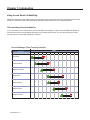
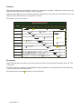
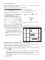
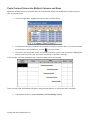
1
Milestones Simplicity 2010 User Manual i Copyright ©Copyright KIDASA Software, Inc. 2010. All rights reserved. No part of this publication may be reproduced, transmitted, transcribed, stored in a retrieval system, or translated into any language in any form without the written permission of KIDASA Software Inc. Trademarks Milestones Professional® and Milestones Simplicity® are registered trademarks of KIDASA Software, Inc. Microsoft® and Windows® are registered trademarks of Microsoft Corporation. Word® for Windows, Microsoft® Excel, Microsoft® Office, NetMeeting®, Microsoft® PowerPoint, and Microsoft® Access are registered trademarks of Microsoft Corporation. Printed in the USA. KIDASA Software, Inc. 1114 Lost Creek Blvd. Suite 300 Austin, Texas 78746 (512) 328-0168 (512) 328-0247 (FAX) E-Mail: [email protected] Web site: http://www.kidasa.com ISBN 0-9623182-0-5 ii Table of Contents Chapter 1: Introduction ............................................................................................................1-1 Easy-to-use, Basic Scheduling 1-1 Click-and-drag to build schedules Make changes in seconds Organize your schedule with outlining Easily show progress Dependencies SmartColumns Calendar view 1-1 1-2 1-2 1-3 1-3 1-4 1-5 Easy Publishing, Presentation and Distribution Include schedules in other documents Publish Internet-ready schedules Free Milestones Viewer Find and replace text 1-5 1-5 1-6 1-7 1-7 Extensive Text Entry and Graphics Options 1-8 Symbol text Symbol notes Freeform text Column text Spell checking Graphics Bookmarks 1-8 1-8 1-8 1-8 1-8 1-9 1-9 Flexible Symbology 1-10 Toolboxes Standard Toolbox Combo Toolbox Sidebar Wide assortment of symbols User-defined symbols Multiple independent milestones Huge variety of horizontal bar shapes Three-level symbol and bar positioning 1-10 1-10 1-10 1-10 1-11 1-11 1-12 1-13 1-13 Flexible Formatting 1-14 Physical sizing Many time-scale options Templates for instant formatting Full international support ISO week numbering Custom page numbering Gradient fill patterns Weekend shading More custom shading 1-14 1-15 1-15 1-16 1-16 1-16 1-16 1-17 1-17 Chapter 2: The Basics ..............................................................................................................2-1 The Milestones Simplicity Window 2-2 Sidebar 2-3 Sidebar options 2-3 Toolboxes 2-4 Combo Toolbox Standard Toolbox 2-4 2-5 iii Toolbox “tools” 2-5 Add Symbols and Bars using the Toolboxes 2-6 Which toolbox should you use? Add a task bar with start and end symbols using the Combo Toolbox Add a single symbol using the Combo or Standard Toolbox Add a bar and symbol to an existing symbol using the Combo or Standard Toolbox Add a bar between two existing symbols using the Combo or Standard Toolbox Vertical Links 2-6 2-6 2-7 2-7 2-7 2-8 Add a vertical link using the Combo or Standard Toolbox Move an Existing Symbol on your Schedule 2-8 2-8 Change a symbol’s date using the mouse Add a symbol or change the symbol’s date with a date SmartColumn Other methods to change a symbol’s date Delete Symbols, Bars, and Links from your Schedule 2-8 2-8 2-8 2-9 Delete a symbol Delete a horizontal bar Delete a vertical link 2-9 2-9 2-9 Add Text to your Schedule 2-9 Add text to a column Add text to a symbol Add a note to a symbol Add freeform text 2-9 2-9 2-10 2-10 Customize a Symbol in the Toolbox 2-10 Customize a Horizontal Bar in the Toolbox 2-11 Customize a Vertical Link in the Toolbox 2-11 Columns, Column Headings and Task Rows 2-12 Enter text in a task row’s column cell Move between column cells Add or edit a column or SmartColumn Change the column heading properties Change the column properties 2-12 2-12 2-12 2-13 2-13 Bookmark Task Rows 2-13 Bookmark a task row Display Bookmark icons Jump to a bookmarked task row Delete one or more bookmarks 2-13 2-14 2-14 2-14 Set the Project Start and End Dates 2-14 Current Date, Current Date Line, and Status Line 2-15 Display the current date and current date line Display and format the status line 2-15 2-15 The Date Headings 2-16 Add Graphics to the Schedule 2-16 Keyboard Shortcuts 2-17 Right-Click “Context Sensitive” Menus 2-19 Schedule Setup Wizard 2-20 Save a Schedule 2-20 Viewing Options 2-21 Gantt views Gantt - Calendar View Views by Time Period 2-21 2-21 2-22 iv Chapter 3: Customizing the Toolbox and Sidebar ................................................................3-1 Sidebar 3-1 Display the sidebar Remove the sidebar Add and remove selected sidebar icons 3-1 3-1 3-1 Combo and Standard Toolboxes 3-2 Set Toolbox Size and Type 3-3 Toolbox: Free-floating or Anchored in the Sidebar 3-3 Display a free-floating toolbox Display the toolbox within the sidebar 3-3 3-4 Set Drawing Tools Defaults 3-4 Line drawing tool Box drawing tool Circle drawing tool 3-4 3-4 3-5 Set Symbol Defaults 3-5 Choose symbol shape, type, letter mark and user-defined symbols Choose symbol color, pattern, marking, after status color, shadow Choose positioning for symbol text, date, marking letter, symbol Symbol Positioning Example Choose default symbol text Override Settings of Symbols Placed on the Schedule Override a symbol’s color, date/text placement, size and more Override symbol text color and styles, line-by-line Hide all symbol date and text displays Symbol date prefix and suffix Set Horizontal Bar Defaults 3-5 3-6 3-6 3-7 3-8 3-8 3-8 3-9 3-9 3-9 3-10 Change bar shape, pattern, colors, fade effect, and shadow Override a bar’s default fill color “Always on top” bars Set Vertical Link Defaults 3-10 3-10 3-11 3-11 Chapter 4: Working with an Outlined Schedule ....................................................................4-1 Outlining Tools and Formatting 4-2 Set the indentation amount for column text Outlining tools Outline tasks as you enter them Outline existing tasks 4-2 4-2 4-2 4-3 Outline Level SmartColumn 4-3 To add an Outline Level SmartColumn: 4-3 Summary Row Display 4-3 Chapter 5: Dependencies and Vertical Links .........................................................................5-1 Dependency Mode and Display 5-1 Turn Dependency Mode on and off Show or hide the vertical links 5-2 5-2 Symbol Dependencies and Movement 5-2 Move dependent symbols based on duration Add and Edit a Vertical Link Add a vertical link using the toolbar Add vertical links between symbols on multiple task rows Edit an existing vertical link Remove Vertical Links 5-3 5-4 5-5 5-5 5-6 5-6 v Remove a single vertical link Remove vertical links from all symbols on a single task row Remove vertical links from all symbols, selected task rows Remove selected vertical links from a single symbol 5-6 5-6 5-7 5-7 Chapter 6: Formatting and Layout ..........................................................................................6-1 Layout 6-1 Change the chart size and margins Rows per page and row height Scaling the chart size to the current paper size Change the number of columns Column numbering Hide and unhide columns 6-1 6-1 6-1 6-2 6-2 6-2 Legend 6-2 Create a legend Format a legend Legend background color and font settings Legend entries 6-2 6-3 6-3 6-4 Columns 6-5 Insert a column Move a column Delete a column Right-click to edit column 6-5 6-5 6-5 6-6 Chart Title 6-6 Date Headings 6-7 Format the Date Headings Date heading Start number Date heading Frequency number 6-7 6-7 6-8 Chapter 7: Printing ...................................................................................................................7-1 Print Preview 7-1 Print Setup 7-1 Printing Options 7-2 General tab Print tab Exclude columns when printing Default printer 7-2 7-3 7-3 7-4 Chapter 8: Working with other Applications ..........................................................................8-1 Paste Text and Numbers into Single Columns or Cells Copy and paste text into column cells Copy and paste text into column cells below existing text Copy and paste text into a single column cell You can also paste copied cells into a single column cell in Milestones Simplicity. Copy and paste column text and numbers into other columns 8-1 8-1 8-2 8-2 8-2 8-2 Paste Text and Values into Multiple Columns and Rows 8-3 Link and Embed Schedules in other Applications 8-4 Embed a schedule in another document Link a schedule into another document Is linking or embedding the best approach? 8-4 8-5 8-5 Paste a Picture of the Schedule into another Application 8-6 Copy all Pages to PowerPoint 8-6 Chapter 9: Custom Formatting for Presentation ..................................................................9-1 vi Charts and Templates 9-1 Format a blank schedule with a selected template Format an existing schedule with a selected template Setup Wizard templates Create and save a template Patterns and Gradient Fills 9-2 9-2 9-3 9-3 9-3 Patterns Gradient fills 9-3 9-4 Task Gridlines and Shading Formatting 9-4 Horizontal gridlines and shading for entire schedule Gridlines and shading for selected task rows 9-4 9-5 Column and Column Heading Shading and Text 9-6 Column text and shading Column text color override for individual column cell Column heading text and shading 9-6 9-6 9-7 Vertical Gridlines 9-7 Chapter 10: Distribute and Present Schedules ..................................................................10-1 Publishing for the Internet/Intranet 10-1 Graphics Output Options and Bitmap Options Create a graphic only of each schedule page Create an HTML file with graphics 10-1 10-2 10-2 Free Milestones Viewer 10-3 Save to PDF 10-4 Appendix A: Quick Reference Tables .................................................................................... A-1 Scheduling Basics Adding Graphics, Text and Legend Setting Up the Schedule Format Making Changes Making Changes - Deleting Items Customizing Milestones Simplicity Working with Other Applications Printing Your Schedules A-1 A-2 A-3 A-3 A-4 A-5 A-5 A-6 Appendix B: Support and Where to Get More Information ................................................. B-1 Help Reference Information Online Support E-Mail Support Technical Support by Telephone Web Site Movies B-1 B-1 B-1 B-1 B-1 B-1 vii viii Chapter 1: Introduction Easy-to-use, Basic Scheduling Milestones Simplicity makes planning and communicating your projects fast and easy. Designed for anyone who needs to create basic Gantt charts, Milestones Simplicity makes fast work of your scheduling efforts. Click-and-drag to build schedules If you know how to use a mouse, then you can use Milestones Simplicity. That’s because Milestones Simplicity uses the same simple click-and-drag technique you’re already familiar with. You can click-and-drag your way through even the most detailed projects in minutes! ! !! " Introduction 1-1 ! Make changes in seconds With Milestones Simplicity, you’ll find that it’s a breeze to update and change any existing schedule in seconds! Use to change a date, move a task row, and more. See Chapter 2 for more information. Below, a column is being dragged from the left side of the schedule to the right. Organize your schedule with outlining Milestones Simplicity offers an easy-to-use outlining capability. Organize projects into steps and sub-steps. Shade selected task rows, all task rows, or odd/even task rows. See Chapter 4 for more information. Outline Level 1 Task Jan Feb Mar Apr May Jun Project A 2 Task A1 2 Task A2 3 SubTask 3 SubTask 1 2 Project B Task B1 3 SubTask 3 SubTask 2 2005 Task B2 Introduction 1-2 Easily show progress The Fill to Status Date feature is an easy way to show progress. When this option is turned on for symbols and/or Bars, the fill color will automatically change after the current date, as shown here. The fill color that appears after the status date is white. See Chapter 2 for more information. Individual tasks can be adjusted to reflect whether they are on schedule, behind schedule or ahead of schedule by entering the number of days the task is behind or ahead of schedule. Dependencies Easily create dependency relationships (predecessor/successor) between tasks. In the following example, Production cannot start until Setup is complete. With dependency mode turned on, if the Setup end date is delayed, then the dependent task Production will shift by the same amount of time. Tie the two steps together with a variety of Bars, just a few of which are shown here: Up to 5 upward or downward “Bars” can be established from any symbol. This allows a manufacturing cycle schedule in which several processes are Bared, as shown below. See Chapter 5 for more information. Introduction 1-3 With dependency mode turned on, when the start or end point for the “Primary” bar is moved, all the other bars will move by the same amount of time. SmartColumns Any of the schedule’s 20 possible columns can be a SmartColumn. These are columns that you designate for a specific use. These SmartColumn types are possible: Start Date, End Date, Task Number, and Outline Level, as shown below. See Chapter 2 for more information. SmartColumns will automatically display information contained in and based on your schedule. Some SmartColumns, such as Start Date, when edited, will update the schedule. ! " # Introduction 1-4 Calendar view A monthly calendar view of important events can be generated for any schedule. The schedule title and symbols, along with the text associated with the symbols, are displayed. See Chapter 2 for more information. Here is an example: January 2008 Sun Mon Tue Wed Thu Fri Sat 30 31 1 2 3 4 Find Location 5 6 7 8 9 10 11 12 13 14 15 16 Status-Part A 17 18 Dept meeting 19 Project A ends 20 21 22 23 24 25 Project B begin 26 27 28 29 30 31 1 2 3 4 5 6 7 8 9 Easy Publishing, Presentation and Distribution Milestones Simplicity offers many ways for you to distribute and present your schedules. • Print your schedule to a variety of devices, from pocket-size to wall-size! • Easily publish any single schedule for the Internet/Intranet. • Include your schedules in other documents, such as PowerPoint presentations, Word or Excel documents, and even PDF files. • Milestones Simplicity’s free schedule Viewer lets others view schedules you e-mail to them or save on your company’s server. Include schedules in other documents It’s easy to include schedule pages in your presentations, reports, proposals, spreadsheets and more. Just “Copy All Pages to PowerPoint” to instantly create a presentation; or, save to PDF for easy distribution. You can send these documents to others even if they don’t have Milestones Simplicity on their system. See Chapter 10 for more information. Introduction 1-5 Publish Internet-ready schedules The Internet Publishing Wizard will guide you through producing an HTML file perfect for publishing on the Internet or your company Intranet. The HTML document contains a picture of each page of the schedule and, optionally, a table of schedule data. Or, just choose to create a picture of the schedule for distribution. See Chapter 10 for more information. Introduction 1-6 Free Milestones Viewer For those who need to view and print a Milestones Simplicity schedule without making changes to it, the Milestones Viewer is the perfect solution. A free Viewer is distributed with every copy of Milestones Simplicity. The viewer can be freely distributed to others who have a need to view schedules produced with Milestones Simplicity. The Viewer can also be downloaded from KIDASA’s web site at www.kidasa.com. E-mail your schedule as an attachment or keep schedules in a shared folder. Use the Viewer to open the Milestones Simplicity file to see the latest schedule update. Print the schedule, view symbol notes, and more. See Chapter 10 for more information. ! "#$# %&% ! $ ! " # % $ ! " # % $ ! " # % $ ! " " # % $ ! # % Find and replace text Use Find and Replace to quickly make detailed text changes to large schedules. Apply Find and Replace to column text, freeform text, symbol notes, and symbol text. Choose Edit | Find, Replace, Go to Page | Find and Replace to launch the Find and Replace dialog box. Your last Find and Replace is saved and can be accessed by choosing Edit | Find, Replace, Go to Page | Find again... Introduction 1-7 Extensive Text Entry and Graphics Options Symbol text Symbol notes Enter up to three lines of symbol text. This text moves with the symbol. Position the text anywhere around the symbol or center it on the bar. Enter up to 10,000 characters in the symbol notes field. This text is embedded in the symbol, and appears when the cursor hovers over the symbol. Optionally, a separate notes page prints with the schedule Freeform text Column text Type text anywhere on the schedule. Format the appearance of the text box. This text does not move with symbols or rows. Use up to 20 columns to enter text, values, dates, and other schedule information. See Chapter 2 for more information on adding and editing text. Click and type Quickly enter text by clicking a cell, a symbol, the chart title, a column heading, or free-form text, then start typing. The relevant dialog box launches as you type the text. Spell checking Milestones Simplicity has a built-in spell checker. All of the following languages are installed: English (United States), English (UK), English (Canada), French (Quebec), French (France), German, Spanish, Italian, Dutch, Swedish, Norwegian. Introduction 1-8 Graphics Paste graphics anywhere in the schedule. Include up to 5 graphics in a template. Graphics can show on top of the schedule, behind the schedule information, and on all pages. Graphics can be pasted in (via the Windows clipboard) or inserted from a file using one of these formats: JPG, JP2, PNG, DXF, EPS, IMG, WPG, PCX, TGA, WMF, TIF, and GIF. See Chapter 2 for more information. !" # $%%&' ()*) % $%%, ()*) %% ) " #$ ) !+,- ( (( () $ " *#$ $ ) ./ $ ) " #$ $ %#"$ " *(#$() !0 $ ( " *( #$( ( $ ./ $*% ()*) %% $%*&' ()*) % !" #$ %# #$ $%,%&' ()%) *% $%,*&' ()%) *% )( ( $%* ()*) *,' $*%- ()*) *) &' $%+&' ()*) % $%%&' ()%) *% ( " *#$ $ )) " *#$ $() Bookmarks Add a bookmark name to any task row and then jump to that task row by choosing the bookmark name from a list of bookmarks. The task row which is “jumped to” will be highlighted. Especially helpful in large schedules, this feature allows you to quickly jump to specific schedule areas. Bookmarked tasks can show Introduction 1-9 indicators for easy identification. Flexible Symbology Toolboxes The Milestones Simplicity toolbox contains 3 tools, 32 symbols, 16 horizontal Bars, 8 Vertical Links, and 3 drawing tools to quickly build any schedule using the click-drag-and-drop method. The Plus, Arrow, and Text tools exemplify the intuitive nature of Milestones Simplicity: Need to add a symbol or Bar? First click the Plus tool. Need to move a symbol on the schedule? First click the Arrow tool. Need to type text? First click the Text tool. Two styles of toolboxes are available: Standard Toolbox Combo Toolbox Symbols and Bars are separated. Symbols can be used by themselves or in any combination with bars and other symbols. Symbols and horizontal bars are combined in symbol+bar+symbol combinations. By using one of the small plus tools on the left to select a combination, you can quickly click-drag-and-drop a start symbol, bar, and end symbol. Symbols and bars can still be added independently. Tools Drawing Tools Tools Drawing Tools Symbols Symbol+ Bar + Symbol combinations Horizontal Bars Vertical Links Vertical Links Use the drawing tools to draw lines, arrows, circles and boxes. Format the color background, shape outline, fade effects and more. Sidebar The optional sidebar is an extra toolbar anchored to the left or right side of the Milestones Simplicity window. The sidebar contains the toolbox (which is normally freefloating) and a user-defined list of shortcut buttons for a variety of activities, including navigating, sharing, and publishing your schedule. See Chapter 3 for more information. Introduction 1-10 Wide assortment of symbols The flexibility and customizability of Milestones Simplicity symbology is second to none, with over 120 symbol shapes filled with any color. Symbols can have any one of nine symbol “marking” patterns such as these: Symbols can have a small, medium or large shadow of any color. More formatting choices: User-defined symbols Not enough symbol shapes? Milestones Simplicity has a built-in Symbol Maker that lets you design simple or multi-part shapes. See Chapter 3 for more information. Introduction 1-11 • Outline pattern • Outline color • Fill pattern • Marking letters • Custom size override • Default text If that’s not enough, you can insert any bitmap symbol. Custom symbols can be embedded in the schedule, making distribution of the schedule easier. Helicopter Hazard Rocket Pinwheel Shamrock Cowboy Boot Falcon Launch Atom Pencil Arrow Steps Truck Oil Rig Airplane Bulldozer N-S-E-W Space Shuttle Battleship Multiple independent milestones As many as 500 milestones can be added to any task row on your schedule. They can be stand-alone milestones or can represent a series of start and end dates. Design Prototype CDRL 1 PDR CDRL 2 CDR CDRL 3 DEL CDRL 4 CDRL 5 7/5 7/6 You can have many milestones on a bar... 7/1 7/2 7/3 7/4 7/7 ...or have many bars represent several sub-tasks, plus their start and end dates, on one row. Tasks Starter Prototype January Design February March Develop May April Test Introduction 1-12 Huge variety of horizontal bar shapes In addition to the many possible built-in symbol shapes, a large variety of horizontal bars and vertical links are included. Three-level symbol and bar positioning Symbols can be positioned at an upper, middle, or lower level on one task row. The bars automatically follow the positioning of the symbols. In the example below, an otherwise dense and cluttered schedule is distinct and clear with three symbol positions and a variety of symbol date and text positions. 2007 Jan Feb Mar Apr May Jun Jul Aug Sep Oct Nov Dec Overlapping Tasks Multiple Milestones 4/17 8/3 2/6 11/30 6/1 2/28 10/3 5/20 8/3 10/16 Milestones and Task Bar 2/1 Introduction 1-13 4/6 6/27 9/8 11/16 Further customize bars with the “Always on top” setting to control which bar appears on the surface, as shown below: See Chapter 3 for more information on symbol and bar positioning. Flexible Formatting You completely control the size and format of your schedules, including the physical page size of the schedule, the number and width of the columns, the number and height of the rows, the size of the optional legend, margin sizes and more. See Chapter 6 for more information. Physical sizing It is possible to create schedules… …as small as a postage stamp… Academic Scheduler Hours Days Class 8-9 MWF 7 8 9 10 11 12 1 2 3 4 5 Building Designation Fleming Dept Chair ENG 101 8:00 B 103 Newton ENG 101 B 101 Heinzelman Asst Prof MWF ENG 101 1:00 2:00 A 104 Fleming Grad Asst 1-2 MWF ENG 101 1:00 2:00 B 302 Elder Professor 1-2:30 TTh Eng 101 1:00 A 303 Boyd 8-9:30 TTh BIO 202 C 101 10-11 MWF BIO 202 C 101 3-4 MWF BIO 504 C 105 Butler Professor 8-9 MWF CALC 302 A 103 Wagenman Grad Asst TTh 9:00 TTh CALC 404 4-5 MWF CALC 404 TTh ARCH 101 MWF ARCH 101 10:00 8:00 2:30 9:30 10:00 11:00 3:00 8:00 4:00 9:00 CALC 302 3-4:30 9-10:30 1-2 9:00 9:00 10:00 A 11:30 3:00 4:30 4:00 9:00 1:00 DEPARTMENTS Module 7 5:00 10:30 2:00 101 Instructor 8:00 MWF MWF 1-2 10-11:30 A Room ENG 101 8-9 9-10 Bailey Bailey Professor Asst Prof Asst Prof Professor 101 McLeod B 102 Wagenman Professor D 305 McLeod Dept Chair D 305 Jones Grad Asst Professor D 102 Fleming Dept Chair Language Arts Science Mathematics Architecture Module 5 Module 6 Module 8 Module 9 Module 10 Module 11 Module 12 Module 13 …or wall size! Academic Scheduler Hours Days Class Buildin Room Instructor Designation 8-9 MWF ENG 101 8:00 9:00 A 101 Fleming Dept Chair 8-9 MWF ENG 101 8:00 9:00 B 103 Newton 9-10 MWF ENG 101 B 101 Heinzelman Asst Prof 1-2 MWF ENG 101 1:00 2:00 A 104 Fleming Grad Asst 1-2 MWF ENG 101 1:00 2:00 B 302 Elder Professor 1-2:30 TTh Eng 101 8-9:30 TTh BIO 202 10-11 MWF BIO 202 3-4 MWF BIO 504 8-9 MWF CALC 302 10-11:30 TTh CALC 302 3-4:30 TTh CALC 404 4-5 MWF CALC 404 9-10:30 TTh ARCH 101 MWF ARCH 101 1-2 DEPARTMENTS Module 7 7 8 9 10 9:00 11 12 1 2 3 4 5 10:00 1:00 8:00 2:30 9:30 10:00 11:00 3:00 8:00 4:00 9:00 10:00 11:30 3:00 5:00 10:30 1:00 A 303 C 101 Bailey Asst Prof C 101 Bailey Professor C 105 Butler Professor A 103 Wagenman Grad Asst A 101 McLeod Grad Asst B 4:30 4:00 9:00 2:00 Boyd Professor Asst Prof 102 Wagenman Professor D 305 McLeod Dept Chair D 305 Jones D 102 Fleming Professor Dept Chair Language Arts Science Mathematics Architecture Module 5 Module 6 Module 8 Module 9 Module 10 Module 11 Module 12 Module 13 Introduction 1-14 Many time-scale options Schedules can show standard time scales ranging from minutes to years, and custom, user-defined periods. Choose minutely, hourly, or daily for symbol placement; top and/or bottom of the schedule for date heading placement; and any period frequency (e.g. every 5 years). A few possibilities: Years, months, quarters, weeks from start of schedule 2004 January February March April May Q1 1 2 3 4 5 6 7 June Q2 8 9 10 11 12 13 14 15 16 17 18 19 20 21 22 23 24 25 26 27 Hours and minutes Fiscal years and quarters 2000 2001 Q3 Q4 Q1 Q2 2002 Q3 Q4 FY01 Q1 Q1 2003 Q2 Q3 Q4 FY02 Q2 Q3 Q4 Q1 Q2 Q1 Q2 Q3 Q4 FY03 Q3 Q4 Q1 Q2 Templates for instant formatting Templates save time by preserving the customized toolbox, columns, column headings, page layout, and more. Templates retain the formatting (the “look” of a chart) while charts preserve schedule details (task row entries, dates, column value entries, etc.). Choose from dozens of Milestones Simplicity’s Standard Templates, and create Personal Templates to be used by your whole division or company. Begin with a template or overlay an existing schedule with a template. The working schedule (below, left) is instantly transformed into a stunning presentation schedule (below, right)—all with the use of a template. See Chapter 9 for more information. ! "#$# %&% ! "#$# %&% ! $ ! " " " # # # $ % ! " # % $ $ % $ % ! " # % $ ! " # % $ ! ! " # % $ Introduction 1-15 $ % ! ! ! % ! " # $ " # ! " # % Full international support If English is not your language of choice, or if your preference is the metric measurement system, Milestones Simplicity can support you. It provides the capability to set up custom language templates for any language. Milestones Simplicity also picks up your date format and measurement type choices directly from the Windows Control Panel Regional Settings. ISO week numbering Milestones Simplicity supports the International Standards Organization’s standards for week numbering. The ISO week number heading type is available in our list of date headings. Custom page numbering Customize the page number of a Milestones Simplicity schedule to match the pagination of your report, and then insert the schedule as a part of the report. • Set the starting page number. “Page __ of 6,000” • Set the end display number. “Page 1 of __” • Exclude the standard “of…” phrase. “Page 1” instead of “Page 1 of 10” • Set a page number prefix string. “Page 3-1” (the prefix is “3-”) Gradient fill patterns Gradient fills allow you to fade the background or fill color from one color to white. These “special effects” can be chosen for many parts of your schedule, including bars, date headings, column headings, task shading, legends, and more. FADE TO RIGHT FADE TO BOTTOM FADE TO TOP FADE TO CENTER (V) FADE TO LEFT FADE TO CENTER (H) Introduction 1-16 Weekend shading Saturdays and Sundays can be shaded in user-chosen colors. Valley Commercial Construction Smith Interior Remodel 2004 4745 Palm Ave. • Fullerton, CA Job No.: 980045.05 • Cmpl.: 04/15/02 February 2 9 16 March 23 1 8 15 Critical ? April 22 29 5 12 19 26 Soft Demo Sawcut & Demo-Structural HVAC-Rough Wall Saw & Demo Structural Concrete-Rebar Skylights Electrical-Rough/Finish Overhead Doors Inspection-Structural Rebar Structural Concrete-Pour Service/Repair Elevator Structural Steel-Install T-bar Grid Repair Inspection-Walls Inspection-Drywall Screw Mud & Tape Mezzanine Demo Doors/Frame/Hardware Spiveco Equip Move-In T.C.O. from City Ceiling Tile Inspection-Ceiling Paint Carpet Inspection-Elec, Mech & Fire Inspection-Building Final Critical Path Project Status Review More custom shading Customize the background colors in a variety of areas: • Odd or even task rows • Selected task rows • Columns • Column headings • Schedule background • Schedule title • Date headings • Legend • Drawn boxes • Free-form text Introduction 1-17 Critical Milestone Critical Task Normal Task Introduction 1-18 Chapter 2: The Basics This chapter contains valuable information concerning the basics of Milestones Simplicity- the layout of the screen, essential terminology, and some of the fundamental operations of the program. More extensive and interactive documentation on these topics can be found in the Help menu under Help Files | Help Topics. In this chapter you will learn about the following functions: The Milestones Simplicity Window Sidebar – contains the toolbox and extra shortcut buttons Toolboxes – The Combo Toolbox and the Standard Toolbox Toolbox “tools” Add symbols and bars using the toolboxes. Add vertical links Change the date of a symbol (move a symbol) Delete symbols, bars, and vertical links from the schedule Add text to the schedule – column text, symbol text and notes, freeform text. Customize a symbol in the toolbox Customize a horizontal bar in the toolbox Customize a vertical link in the toolbox Columns, column headings and task rows Schedule date range Date headings Current date and status lines Bookmark task rows Add graphics Keyboard shortcuts Right-click menus Schedule Setup Wizard Save a schedules View mode options If you are a new user, the best way to learn how to use Milestones Simplicity is to go through each of the Tutorials located in the toolbar under Help | Help Files | Tutorials. These tutorials are designed to get you up and running smoothly. The Basics 2-1 The Milestones Simplicity Window While using Milestones Simplicity, you will see a screen similar to the one below: • The Enhanced Toolbar is used to access frequently used options. • The schedule Title Area can be used to provide your project title. • Choose from dozens of Date heading styles from minutes, years, or custom entries. • The SmartColumns automatically fill according to schedule data or entered data • The Schedule Area is where task bars, milestones, and vertical links can be added. • The Sidebar contains the Toolbox and a user-defined list of Shortcut buttons for a variety of common activities. The Toolbox provides the tools you need to build your schedule- including symbols, horizontal bars, and vertical links. • The Legend contains user-entered definitions for bars and symbols. • The Status Bar provides useful feedback to you while you work with your schedule. Enter text such as project activities, notes, and resource names in a Text Column. The Basics 2-2 Sidebar The optional sidebar is an extra toolbar anchored to the left or right side of the Milestones window. The sidebar contains the toolbox and a user-defined list of shortcut buttons for a variety of activities including moving from page to page, creating web pages, filtering, applying a color theme, creating a master schedule, and much more. Sidebar options Under the Tools menu in the Customize section, choose Sidebar Options to make changes to the sidebar. Changes to the Sidebar Options dialog box apply to all schedules. Choose Show Sidebar on left, Show Sidebar on right, or Do not show Sidebar (in which case the toolbox becomes free-floating). You must close and restart Milestones for these changes to take effect. Choose to Remove shortcut buttons from the list of Current Sidebar icons, and Add buttons from the list of Available Sidebar icons. If you cannot see all of the sidebar shortcut icons you selected, note that the number of visible sidebar icons is determined by the toolbox size, screen resolution, and Milestones window size. The fewer rows of symbols, bars, and links in the toolbox, the more sidebar shortcut icons are visible. A screen resolution of 1280x1024 will show more sidebar shortcut icons than a screen resolution of 800x600. Also, a maximized Milestones window will display more sidebar shortcut icons than a minimized window. The Basics 2-3 Toolboxes Milestones Simplicity offers two types of customizable toolboxes. Both types contain the same schedule buildingblocks for creating gantt bars, milestones, and task dependencies. Toolbox settings are unique to each schedule. To choose where the toolbox is displayed within the schedule, right-click the toolbox and choose Sidebar Options. Choose to show the sidebar on the left or right side of the schedule; otherwise, the toolbox will be free-floating. Combo Toolbox With the Combo Toolbox, it’s easy to add task bars in one step—simply click a small plus, then click-and-drag in the schedule area to add a symbol, horizontal bar, and symbol in one continuous mouse action. About the Combo Toolbox: Plus, Arrow and Text tools • Double-click a symbol or bar in the toolbox to change its shape, color, and other properties. • Each of your schedules can have a different toolbox, customized with different symbols and bars. • A Combo Toolbox can have up to 16 rows of symbol/bar/symbol combinations (32 symbols and 16 bars), and 8 vertical links. • Right-click the toolbox and choose Toolbox Properties to change its size. Drawing tools Symbols and horizontal bars • You can set-up a default toolbox that will appear every time you create a new schedule. Do this by saving a “template” called Default.mtp. • Vertical Links The Basics 2-4 Hide the toolbox by removing the check from the View | Optional Items | Toolbox option. You can also right-click the toolbox and choose Hide Toolbox. The toolbox will only hide if it is free-floating. Standard Toolbox The Standard Toolbox makes it easy to add symbols and bars in separate steps. About the Standard Toolbox: • Double-click a symbol or bar in the toolbox to change its shape, color, and other properties. Drawing tools • Each of your schedules can have a different toolbox, customized with different symbols and bars. Symbols • A Standard Toolbox can have up to 32 symbols, 16 horizontal bars, and 8 vertical links. • ight-click the toolbox and choose Toolbox R Properties to change its size. • ou can set up a default toolbox that will appear Y every time you create a new schedule. Do this by saving a “template” called Default.mtp. • Hide the toolbox by removing the check from the View | Optional Items | Toolbox option. You can also right-click the toolbox and choose Hide Toolbox. The toolbox will only hide if it is freefloating. Plus, Arrow and Text tools Horizontal Bars Vertical Links Toolbox “tools” On the first two lines of the toolbox, you will find six buttons or “tools.” These are described in the following table: Tool Use this tool to: Plus Tool Add symbols; connect symbols; add horizontal bars and vertical links. Arrow Tool Change the date of a symbol; move graphics and freeform text; select an object. Text Tool Add or edit text. Line Tool Draw lines and arrows on your chart. (Not recommended for drawing links or dependencies between symbols.) Box Tool Draw squares and rectangles on your chart. Circle Tool Draw circles and ellipses on your chart. The Basics 5 Add Symbols and Bars using the Toolboxes Horizontal bars show the time span of a task for an activity in your project. A symbol must be on each end of the horizontal bar. Symbols can also be added individually, independent of a bar. Which toolbox should you use? Using the Combo Toolbox, you can add a task bar with start and end symbols in one click-drag-and-drop movement of the mouse. Using the Standard Toolbox, you must first add a symbol, and then add the bar and another symbol to the end of the bar. Both toolboxes allow you to add single symbols, a symbol and bar to an existing symbol, or a bar between two existing symbols. Add a task bar with start and end symbols using the Combo Toolbox 1. In the toolbox, click once on the small plus next to the symbol/bar/symbol combination you want to add. (All clicks are with the left mouse button.) When you click in the toolbox, notice that the selection is sunken and highlighted. 2. Move the cursor to a task row in the schedule area under the date heading. Notice that the date is displayed next to the “crosshairs” cursor. This feature is part of the Milestones tooltips and can be toggled off and on in the Tools | Program Options | Help menu. 3. Next, click and hold the mouse at the start date, drag to the right, and release at the task’s end date. Here, the end date is displayed next to the cursor, as well as the duration. This information can also be found at the bottom left of the Milestones window in the status bar. The Basics 2-6 The Basics 2-6 Add a single symbol using the Combo or Standard Toolbox 1. In the toolbox, click once on the big Combo Plus tool, then once on the symbol you want to add. Standard When you click in the toolbox, notice that the selection is sunken and highlighted. 2. Move the cursor to a task row in the schedule area. Notice that the cursor is a “crosshairs” cursor. 3. Next, click and hold the mouse, drag to the right or left, then release at the date you want. The date is displayed next to the cursor as you drag, looking for the correct date. By default this tooltips feature is on but can be toggled off in the Tools | Program Options | Help menu. Add a bar and symbol to an existing symbol using the Combo or Standard Toolbox Use this method when you already have a starting symbol on the schedule and want to add an ending symbol with a bar between start and end. 1. Click once on the big Plus tool in the toolbox. 2. In the toolbox, click once on the bar that you want to add. When you click in the toolbox, notice that the selection is sunken and highlighted. 3. In the toolbox, click once on the symbol that you want to add. 4. On the schedule, position your cursor directly on top of the start symbol. Click (and hold the mouse button) on the start symbol and drag to the right. Release the mouse button on the end date. Add a bar between two existing symbols using the Combo or Standard Toolbox 1. In the toolbox, click once on the big Plus tool. 2. On the schedule, click once on the first (leftmost) symbol you want to connect. 3. In the toolbox, click once on the horizontal bar you want to add. 4. On the schedule, click once on the second symbol—the two symbols will then be connected. OR... 1. In the toolbox, click once on the big Arrow tool. 2. On the schedule, click once on the first (leftmost) symbol you want to connect. 3. Hold the SHIFT button down on your keyboard and click once on the second symbol you want to add. The two symbols should now be highlighted. 4. In the Selection tab, choose then be connected. Connect from the left side of the menu. The two symbols will The Basics 2-7 Vertical Links Vertical links are used to show a relationship or predecessor/successor link between schedule activities. The toolbox provides up to eight vertical links for use on the schedule. Change the shape, line pattern, color, and other properties by double-clicking on a vertical link in the toolbox. Choose from more than 15 link shapes. Up to five vertical links can originate from a single symbol on the schedule. Add a vertical link using the Combo or Standard Toolbox 1. In the toolbox, click once on the big Plus tool. All clicks are single, left mouse clicks. 2. On the schedule, click once on the symbol where the vertical link will originate. 3. In the toolbox, click once on the vertical link you want to add. 4. On the schedule, click once on the symbol (on a different task row) where the vertical link will end. The two symbols will then be connected. For more on vertical links and task dependencies, see Chapter 5. Move an Existing Symbol on your Schedule Once a symbol is placed on the schedule, several methods are available for moving the symbol to a different date. Change a symbol’s date using the mouse 1. In the toolbox, select the arrow tool. 2. On the schedule, click on the symbol and drag it to a new date. Release the mouse button. Add a symbol or change the symbol’s date with a date SmartColumn If your schedule has a date SmartColumn, manually type a date or use the date selection calendar to enter a new date or change an existing date in the column cell. A new date (where none existed before) results in a symbol appearing on the schedule. Changing a date moves the existing start or end symbol. When using this method, dependent symbols will not move. Insert a date SmartColumn by selecting Insert | Rows, Columns | New Column and choose from Start Date, or End Date. Display calendar icons in date SmartColumns by clicking any column heading. This will display the Selection menu. Choose Current Object | Switch to Column. Then choose Date SmartColumn Display Settings | Show calendar icons. Other methods to change a symbol’s date 1. Select the tool from the toolbox. 2. Click on the symbol in the schedule that you wish to change. This will display the Selection menu. 3. Choose Selection | Current Object: Symbol | -orThe Basics 2-8 . Select the calendar icon to change the date. 1. Click . 2. Single-click on the symbol. 3. Hold the Shift key while using the left and right arrow keys on the keyboard. -or1. Click . 2. Single-click on the symbol. 3. Choose Ctrl+E on the keyboard. 4. Key a new date in the dialog box that appears. Delete Symbols, Bars, and Links from your Schedule Delete a symbol 1. In the toolbox, select the arrow tool. 2. On the schedule, click on the symbol and press the Delete key on your keyboard. Delete a horizontal bar 1. In the toolbox, select the arrow tool. 2. On the schedule, right-click on the symbol from which the horizontal bar starts. 3. Choose Clear Horizontal Bars. Delete a vertical link 1. In the toolbox, select the arrow tool. 2. On the schedule, right-click on the symbol from which the vertical link starts. 3. Choose Clear Vertical Links. Add Text to your Schedule Include text in these areas of your Milestones schedule: column text, symbol text, symbol notes, and freeform text. Add text to a column Create a column to display text by choosing Insert | Rows, Columns | New Column | Text. 1. Select the Text tool in the toolbox. 2. Click once in a column cell. 3. Once you see the flashing cursor, you can begin typing. Use the arrow keys on the keyboard to move from column cell to cell. Add text to a symbol Symbol text is displayed adjacent to a symbol and moves with the symbol. 1. Select the text. tool in the toolbox. On the schedule, click once on the symbol that will contain the symbol 2. Select the Text tab in the toolbar and enter up to three lines of symbol text. Press the Apply Text Changes button. The Basics 2-9 Add a note to a symbol Enter up to 10,000 characters in the symbol notes field. This text is embedded in the symbol, and appears when the cursor hovers over the symbol. Optionally, print symbol notes with the schedule. Choose File | Printing | Printing Include Symbol Notes Page. Options | 1. Select the tool in the toolbox. On the schedule, click once on the symbol that will contain the notes. 2. Select the Notes tab in the toolbar and enter the text. Press the Apply Text Changes button. For longer text in the notes field, make sure Expanded Symbol Hover information display is checked under Tools | Program Options | Help. Add freeform text Freeform text is text that is not associated with symbols, task rows, columns, or any other specific area of the schedule. Therefore, it does not move when those areas move. 1. Select the Text tool in the toolbox. 2. Click once somewhere inside or outside of the schedule, but not on an object.Once you see the flashing cursor, you can begin typing. Customize a Symbol in the Toolbox Any symbol in the toolbox can be changed to another shape, color, or size. A variety of other attributes can also be applied. Double-click a symbol in the toolbox to make changes. When a symbol in the toolbox is changed, all occurrences of that symbol on the schedule also change. Most overrides for symbols on the schedule will revert to these new changes, unless you choose otherwise. See Chapter 3 for more details about symbol formatting. Choose from these symbol formatting options: Shape, letter marking on symbol, user-defined symbol 3D Look" for highlights and shadows Fill color/pattern, outline color/ pattern, symbol mark/color Override size Shadow Symbol text and date position and background Symbol position: upper, middle, or lower part of the task row Default symbol text The Basics 2-10 Customize a Horizontal Bar in the Toolbox Any horizontal bar in the toolbox can be changed to another shape, color, and pattern. A variety of other attributes can also be applied. Double-click a horizontal bar in the toolbox to make changes. When a bar in the toolbox is changed, all occurrences of that bar on the schedule also change. See Chapter 3 for more details about horizontal bar formatting. Choose from these bar formatting options: Bar type Fill pattern and color Line pattern and color Fading from a fill color to white Arrow size, where applicable Shadow Customize a Vertical Link in the Toolbox Any vertical link in the toolbox can be changed to another shape, color, or line pattern. A variety of other attributes can also be applied. Double-click a vertical link in the toolbox to make changes. When a link in the toolbox is changed, all occurrences of that link on the schedule also change. See Chapter 3 for more details about vertical link formatting. Choose from these link formatting options: Shape Color Line pattern Arrow size, where applicable Set size relative to symbol size Rounded corners The Basics 2-11 Columns, Column Headings and Task Rows Display as many as ten columns on the left side of the schedule and ten columns on the right side of the schedule. Columns can easily be inserted, deleted, moved or resized. The column heading contains many formatting controls, including the column and column heading formats, and SmartColumn settings. See Chapters 6 for complete coverage of formatting columns and rows. Display 2 to 300 task rows per schedule page. Row heights can be adjusted individually. This option can be toggled Allow Task Row Height Adjustments. on an off in Tools | Program Options | Edit | !" Column Heading Column Task Row Enter text in a task row’s column cell 1. Select the tool in the toolbox. 2. Click within one of the cells in the column area and begin typing. Move between column cells Press the arrow keys on your keyboard to move between columns and cells. Add or edit a column or SmartColumn Schedule columns are used to display text or specialized information (SmartColumn). A Text column displays user-entered text, such as project activities, notes, resource names, and more. To add a column, choose Insert | Rows, Columns | New Column and choose from the following SmartColumns:Start Date, End Date, Outline Level, and Task Number. • To change an existing column to another column type, double-click the column heading, choose the Column Type (SmartColumn) Settings tab and change the SmartColumn Definition. • To edit an existing SmartColumn’s properties, double-click the column heading, and choose the Column Type (SmartColumn) Settings tab. The Basics 2-12 • To change an existing column to another column type, click the column heading once, choose Switch to Column from Current Object: Column Heading section, then use the drop-down menu in the Column Type and Format section to change the SmartColumn Definition. To edit an existing SmartColumn’s properties, click the column heading once, choose Switch to Column, then click Column Type and Format | Properties. » If the column is a Date SmartColumn, additional properties can be found in the Date SmartColumn Display Settings section of the same menu. Choose to Show Time as 24 Hours; Hide Year; Hide Month, Day, and Year; Hide Time; Show calendar icons; or Use Custom Date Format. Change the column heading properties Click once on the column heading section (the upper cell of the column). This will display the Selection menu in the toolbar. 1. Under the Column Heading Text section, enter up to 2 lines for the column name. Click Apply Text Changes. 2. Apply Changes to all column headings to format all column headings like this one. 3. Set the column heading text alignment and text highlights in the Column Heading Text Display Settings section. 4. Choose a Background Color. 5. Choose a Special Effects setting to fade from the column heading color to white. 6. Select a font size for the column heading text. Change the column properties Column properties options control the column’s background color, text font size, currency display, decimals, outlining indentation amount and more. 1. Click once on the column heading. This will display the Selection menu. 2. Choose Current Object: Column Heading | Switch to Column. - In the Column Type and Format section 3. Choose column Text Style, Text Size, and Alignment. 4. For outlining purposes, enter a value in inches to Indent per Outline Level for the column text. - In the Column Background section 5. Change the Background Color for the column. 6. Choose Background Color Special Effects for the fade setting (fades from Background Color to white). The Basics 2-13 Bookmark Task Rows Add a bookmark name to any task row and then jump to that task row by choosing the bookmark name from a list of bookmarks. Especially helpful in large schedules, this feature allows the user to quickly jump to specific schedule areas. Bookmark a task row 1. In the toolbox, click the arrow tool . 2. Right-click once on the task row to be bookmarked. Bookmarks in the right-click menu. 3. Choose 4. Select Create a new Bookmark. 5. Key a Name: The text in the text column closest to the schedule area on the left will display as the default bookmark text. The bookmark name is limited to 29 characters. 6. Click Create a Bookmark Now to bookmark the task row. Display Bookmark icons Show Bookmark indicator on task row display to show the icon. The icon will be displayed in the column directly to the left of the schedule area on the bookmarked task row. Jump to a bookmarked task row 1. Right-click any task row and choose 2. Select Bookmarks. Jump to a Bookmark or Delete a Bookmark. 3. Under Select Bookmark, choose from the list of bookmark names. 4. Click Jump to a Bookmark Now. Delete one or more bookmarks 1. Right-click any task row and choose 2. Select Bookmarks. Jump to a Bookmark or Delete a Bookmark. 3. Under Select Bookmark, choose a bookmark name to be deleted. 4. Choose Delete Selected Bookmark Now or Delete all Bookmarks Now 5. Choose OK / Leave to exit the dialog box. The Current Task line number or Task line of Bookmark number indicates the row location of the selected task. Numbering is 1-based, begins with the top-most task row, and includes any hidden tasks. Set the Project Start and End Dates The project start and end dates control the visible date range that appears in the Milestones window. 1. Choose Dates | Start and End Dates from the toolbar. 2. Under Displayed Start Date, enter a date. Press the apply button . Click the for a date selection calendar. 3. Under Displayed End Date, enter a date. Press the apply button You can still add symbols and bars outside of this range by scrolling forward and backwards with the Shift+PgUp and Shift+PgDown keys or in Date | Date Range Tools | Shift displayed range backward / Shift displayed range forward. The Basics 2-14 Change the amount of days by which the scroll buttons move through the calendar by going to Dates | Start and End Dates | More Settings... | Yearly/Monthly/Fiscal Year Settings | Calendar Range Scrolling | Working days to scroll with Shift+PgUp/PgDn. , you’ll find other Schedule Details By clicking on Dates | Start and End Dates | More Settings options, including a place to change fiscal year formatting, shade weekends, and allow hourly detail. Current Date, Current Date Line, and Status Line Display the current date and current date line The current corner of appropriate date, as set by your computer’s clock or an override date, can be displayed above the upper right the schedule (by default). The current date line is drawn vertically down the schedule area at the date heading location. 1. Choose Dates | Current Date from the toolbar. 2. Display Date to show the current date. 3. Display Date Line to show the date line. 4. To access other Date Line properties, choose More Current Date Options , In the Date Line section, choose the line type, thickness, and color. Place the line behind the horizontal bars in the schedule area. Display and format the status line Show at-a-glance ahead/behind status with the status line. The status line extends vertically along the current date line and bulges to the left or right according to each task row’s status date. 1. Choose Dates | Current Date. 2. Display Status Line. 3. To access other Status Line properties, choose More Current Date Options . In the Status Line section, choose the line thickness and color. 4. To make sure the status line displays bulges correctly, make sure the options Symbols: Fill to Status Date or Bars: Fill to Status Date are checked under Dates | Date Related Settings. The Basics 2-15 The Date Headings Display up to four date heading levels with formats ranging from minutes to years to custom entries. 1. To change the date heading display, click once on the date heading within the schedule. This will display the Selection menu. Optionally, choose Dates | Date Headings | Date Headings Full Dialog 2. For each level, choose from more than 35 Heading Types (yearly, monthly, etc.). 3. Align each heading’s text. 4. Choose a Start number for the heading. This feature is useful to start a schedule on a specific number that does not relate directly to the dates on the schedule. For example, if your schedule starts in January, you can use a start number of 5 to show that January is the 5th month since the start of the contract. 5. Choose a Frequency for the heading. For example, in a yearly heading of a project whose start date is 1/1/2008, with a frequency of 2, the yearly heading would be 2008, 2010, 2012, etc. 6. Choose to display the date headings at the top and/or bottom of the schedule. See Chapter 6 for more information on date headings, including custom headings. Add Graphics to the Schedule You can paste graphics anywhere on your schedule. 1. Copy the image (e.g. by right-clicking on an image and choosing “copy”). 2. In Milestones, choose Edit | Paste | Picture. 3. The Paste Picture cursor appears: . 4. Move the cursor to the appropriate location, and then click to paste the image. -or1. Choose Insert | Picture, Legend | Picture from file. 2. Browse to the graphics file, select it, and choose Open. 3. The Paste Picture cursor appears: . 4. Move the cursor to the appropriate location, and then click to paste the image. To resize the graphic, click once on it, hold down the Shift key, click-and-hold on a corner of the graphic, and drag to make it larger or smaller. (The Shift key keeps it in proportion.) The Basics 2-16 World-Wide Airways Corp Maintenance Planning Forecast 2002 Aircraft January February March April C Check/Paint K202TZ-B737-2A5 4/7 (202) 2/21 1/22 May June 7/30 C&Q Check K208TZ-B737-2A5 2/22 July C Check Pheonix (208) 3/23 6/3 August September October November Rem #1 Eng s/n 72908 Install Eng s/n 72910 11/17 December (202) 12/8 #2 Eng s/n 78478 Install #2 78489 C Check K221MA-B737-4D2 3/24 (221) 4/18 K235MA-B737-31Z 4/19 K204TZ-B727-34F 2/8 #3 Eng s/n 74869 Rework (TX) (235) 5/13 7/8 #3 Eng C-12 s/n 78748 Emergency (204) 6/18 5/14 Engine Overhaul C Check AZ K212TZ-B727-34F (212) 7/20 6/19 K325LP-B737-3N7 1/22 #2 Eng C-5 s/n 79568 Return throttle box 7/20 (325) 8/19 10/25 #2 Eng C-15 s/n 758458 C Check AZ K345MA-B737-4D2 8/19 K213TZ-B727-34F 2/28 (345) 9/21 #3 Eng C-12 s/n 78748 9/21 K203TZ-B737-2A5 6/24 (213) 10/16 #3 Eng C-10 s/n 78756 10/17 (203) 11/16 Keyboard Shortcuts Keyboard shortcuts are useful when editing a schedule. The following is an abbreviated list of function and key combination shortcuts. For complete shortcut documentation, consult the Help Topics available under Help | Help Files | Help Topics. Index keyword: “shortcuts.” Pressing this key… Causes this action… Escape key Halts current activity when possible. Tab (or Shift + Tab) Indents (or outdents) one outline level if the Use Tab key for Outlining option is selected – See Tools | Program Options | Edit menu. F1 Starts Help. If in dialog box, displays context help for selected control. F8 Continuous View (toggle). F9 Redraws the current schedule. F11 Switches between Fit in Window view and current Zoom setting. F12 Toggles through the first six tools in the toolbox. Alt+F12 Select horizontal bar in toolbox Alt+Shift+Right Arrow Indents (promotes) a task by one outline level. Alt+Shift+Left Arrow Outdents (demotes) a task by one outline level. Ctrl+F12 Select next vertical link in toolbox Ctrl+Spacebar Select next column The Basics 2-17 Pressing this key… Causes this action… Ctrl+W Change vertical link coming from selected symbol to type currently selected in toolbox Alt+Spacebar Select next task row Ctrl+Alt+Spacebar Select next column heading Ctrl+Shift+Spacebar Select next Date heading Alt+Shift+F7 Displays a screen which enables you to selectively reset symbol settings for all symbols. Ctrl+Alt+*(on number pad) Show all task rows. Shift+F10 Display right-click menu for selected item Shift F12 Select next symbol in toolbox. If an entire row in the Combo toolbox is highlighted, then Shift+F12 highlights the next row. Shift+Right Arrow When a symbol is selected, changes date forward by one minute, hour, day or week (depending upon the setting in Tools | Program Options | Dates menu.) Shift+Left Arrow When a symbol is selected, changes date back by one minute, hour, day or week (depending upon the setting in Tools | Program Options | Dates menu.) Page Down Moves to the next page on your schedule Page Up Moves to the previous page Ctrl+Home Moves to the first page Ctrl+E Edits currently selected item Ctrl+F View Full-screen toggle Ctrl+End Moves to the last page Ctrl+L Select next left cell (if a task row or cell is currently selected). Selection will only move on one side of the schedule. Ctrl+M Change selected symbol to type currently selected in toolbox Ctrl+N Start new schedule Ctrl+O Open file Ctrl+R Select next right cell (if a task row or cell is currently selected). Selection will only move on one side of the schedule. Ctrl+U Change selected horizontal bar to type currently selected in toolbox Ctrl+Alt+G Switch to Calendar View Ctrl+Alt+S Start Symbol Maker Program Ctrl+Z Undo The Basics 2-18 Right-Click “Context Sensitive” Menus A right-click on any part of the schedule will display a shortcut menu with a list of options. Right-click a column heading to hide it, show all column, access column properties and more. Right-click the toolbox to change its properties, access the sidebar options, and more. Below are the detailed options for two right-click areas: Right-click on a task row’s column cell to access these functions: Zoom Turn Dependency Mode On/Off Outdent/Promote Task Indent/Demote Task Insert task row Cut task(s)/Copy task(s) Cut/Copy/Paste Cell Text Delete Task(s) Delete Text in Selected Cell Clear Horizontal Bars/Vertical Links/Symbols Blank SmartColumn Cells Edit Tasks Date Offset Shift Dates Bookmarks Gridline/Shade Font Insert page break Right-click a symbol on the schedule to access these functions: Zoom Edit Tasks Turn Dependency Mode On/Off Edit Notes Copy Symbol/Bar for Paste Edit Size or Color Delete Edit Text or Date Position Clear Horizontal Bars Font Select symbol and bar in toolbox Select Task Schedule Recurring Task Highlight/Dehighlight Dependent Symbols The Basics 2-19 Schedule Setup Wizard To launch the Milestones Simplicity Setup Wizard, choose File | Files and Templates: Open and Save Options | Wizard. This wizard will walk you through the setup of your schedule step-by-step or guide you through using a pre-designed template. Follow the Wizard’s prompts to successfully complete the desired layout for your new schedule. Choose the formatted. Select Predesigned Template option to select from a wide variety of templates that are pre- Save a Schedule Save Milestones schedules under the same name, a new name, or in the previous version’s format. Choose File | Files and Templates: Open and Save Options | Save or Save As | Chart. For faster saving or opening across a network, choose Tools | Program Options | Files and Automation and check Two Stage File Saves... and Two Stage File Reads... The Basics 2-20 Viewing Options Gantt views A Milestones Simplicity schedule can be toggled between two Gantt chart view modes. To switch from one Gantt view to another choose View | Viewing Options | Chart Type. Gantt - Calendar View You can show any schedule in Calendar View. Choose View | Viewing Options | Chart Type | Gantt - Calendar View. Milestones and symbol text in the schedule area are displayed in Calendar View. If a single task row has been selected prior to entering Calendar View, then the bars as well as the symbols on the row will be shown in the Calendar View. If no rows are selected then all symbols will be shown (horizontal bars are not displayed due to space limitations). Any free-form text entered in Gantt view will not be shown. Any text entered in Calendar View will be shown just in Calendar View. If two or more task rows are selected, only symbols from those task rows will be displayed in Calendar View. If some task rows are hidden, then only visible task rows’ symbols will be displayed. Use the PageUp and PageDown keys to scroll from month to month. Administrative Division January 2004 Sun Mon Tue Wed Thu Fri Sat 28 29 30 31 1 2 3 Resource review 4 5 Staff meeting 6 7 8 9 Dept meeting 11 12 Staff meeting 13 14 15 16 Design Review 17 18 19 20 Design Review 21 Staff meeting 22 23 Design Review 24 25 26 Monthly report 27 28 29 Dept meeting 30 31 1 2 3 4 5 6 7 10 The Basics 2-21 Views by Time Period Instantly switch the time period displayed in the date headings to a daily, weekly, monthly, quarterly, or yearly view. For example, expand the viewable schedule area to a large time-frame (Yearly View) or contract to a small-timeframe (Daily View). Simply right-click the date heading and select a view, including your original view. The schedule’s start date remains the same when switching between views, while the number of days, weeks, months, quarters or years displayed is based on font size and the amount of horizontal space available to display the selected time periods. If the schedule is saved and closed before choosing Switch back to Original View, then the Original View time period cannot be recovered. Original View Switch to monthly view !"#$%""&%$'#()"!" '**' *' + , '**' . ! "# // *' $# + , -* . // !"#$%""&%$'#()"!" '**' *' + , -* The Basics 2-22 !"#$%""&%$'#()"!" -* Switch to weekly view . // Chapter 3: Customizing the Toolbox and Sidebar The toolbox contains the building blocks of your schedule: symbols, horizontal bars, and vertical links. Any of these symbols and bars can be changed to a different shape, size, type, color, or pattern. All of the toolbox settings are unique to the current schedule. Thus, if you make a toolbox change in one schedule, it does not affect any of your other schedules. » You can copy and paste the toolbox into other schedules or save the file as a personal template so that all toolbox settings are retained for future use. To copy the toolbox, right click and choose Copy Toolbox. If the sidebar option is selected, the toolbox automatically appears within the sidebar. Sidebar The optional sidebar is an extra toolbar anchored to the left or right side of the Milestones window. The sidebar contains the toolbox and a user-defined list of shortcut buttons for a variety of activities. Changes made in the Sidebar Options dialog box apply to all schedules. Display the sidebar 1. Choose Tools | Customize | Sidebar Options. 2. Select either Show Sidebar on left or Show Sidebar on right. 3. You must close and restart Milestones for this change to take effect. Remove the sidebar 1. Choose Tools | Customize | Sidebar Options. 2. Select Do not show Sidebar. This will make the toolbox free-floating. 3. You must close and restart Milestones for these changes to take effect. Add and remove selected sidebar icons 1. Choose Tools | Customize | Sidebar Options. 2. Add sidebar icons: Select from the list of Available Sidebar icons and then click Add>>. 3. Remove sidebar icons: Select from the list of Current Sidebar icons and then click <<Remove. Customizing the Toolbox 3-1 Combo and Standard Toolboxes There are two versions of the toolbox. The Standard Toolbox groups the symbols and bars separately, while the Combo Toolbox combines two symbols and one horizontal bar on each row for symbol/bar/symbol combinations. The Plus tool, Arrow tool, Text tool, drawing tool, and vertical link sections are the same: Combo Toolbox Standard Toolbox Add, move, and text tools. Click to select. Drawing Tools. Click to select. Double-click to change default settings. Combined symbols and horizontal bar rows. Symbols Click to select. Double-click to change. Click small plus to select entire row and insert a symbol/bar/symbol. Click once on a symbol or bar to select (like the Standard Toolbox). Double-click on any symbol or bar to change it. Horizontal bars Click to select. Double-click to change. Vertical links Click to select. Double-click to change. Customizing the Toolbox 3-2 Set Toolbox Size and Type Since the toolbox can take up a significant amount of screen space, you can customize it to remove rows of tools, symbols, and bars that you do not need for the schedule you are working on. 1. Right-click the toolbox and choose Toolbox Properties. 2. Choose Use Standard Toolbox or Use Combo Toolbox. 3. For the Standard Toolbox, select the number of symbols and horizontal bars that should display. For the Combo Toolbox, select the number of symbol/bar/symbol rows that should display. 4. The Combo Toolbox offers the option of activating the Arrow Tool when this schedule is opened. This prevents accidentally adding symbols and bars. 5. 6. Extra Highlighting provides a black outline for selected items in the toolbox. Show Light Blue Background for Current Selection provides a blue background for selected items in the toolbox. 7. Choose to show or hide the drawing tools. 8. Choose to display 0, 1, or 2 rows of Vertical Links. Toolbox: Free-floating or Anchored in the Sidebar Choose to display the toolbox as free-floating or choose to display the sidebar, in which case the toolbox is automatically displayed within the sidebar. You cannot display the sidebar without the toolbox within it. You cannot display a free-floating toolbox and a sidebar. Display a free-floating toolbox 1. Choose Tools | Customize | Sidebar Options. 2. Select Do not show Sidebar. 3. You must close and restart Milestones for these changes to take effect. Customizing the Toolbox 3-3 Display the toolbox within the sidebar 1. Choose Tools | Customize | Sidebar Options. 2. Select either Show Sidebar on left or Show Sidebar on right. 3. You must close and restart Milestones for these changes to take effect. Sidebar Freefloating toolbox Set Drawing Tools Defaults The default settings for lines, boxes, and circles that you add to a schedule are black for color and lightweight for line type. You can alter these default values by double-clicking on the Line, Box, or Circle tool in the toolbox. Line drawing tool Change the Line Color, Line Pattern, and Line Ends (to create an arrow). Box drawing tool Change the Border Color, Border Pattern, Background Color, Target Color, and fading Special Effects. The Special Effects setting will fade the Background Color into the Target Color. Customizing the Toolbox 3-4 Circle drawing tool Change the Border Color, Border Pattern, and Background Color. To add any of these shapes to your schedule, click once on the tool, then click-and-drag in the schedule area to draw. Once placed on a schedule, lines, boxes, and circles do not move unless dragged with the arrow tool to a different location. You can customize the attributes of any line, box, or circle that is already on your schedule by double-clicking directly on the object. When you do, a similar dialog box appears that lets you change the setting of just that object. Set Symbol Defaults To change the attributes of a symbol in the toolbox, double-click on the symbol in the toolbox. Any changes to the symbol in the toolbox will affect all occurrences of that symbol on the schedule. That is, when the new changes replace the old, all occurrences of the old symbol type on the schedule are replaced by the new settings. Choose symbol shape, type, letter mark and user-defined symbols To set a symbol’s defaults: 1. Double-click a symbol in the toolbox. 2. Click the Symbol Shape tab. 3. Click a drop-down arrow options. to view the The Sample Symbol changes to match your selections as you make them. Choose from 130 Standard Shapes. Apply “3D Look” attributes. 3D Look highlights a symbol with a simulated light source and adds a shadow. Not all symbols allow the 3D Look. Letter Marking: Enter one letter or number to appear with the symbol. Select Symbol Shape #28 or #33 to show just the letter marking as the symbol. If you have created your own symbol, and that symbol is in the Symbols folder, select it under UserDefined Shapes. Optionally, choose to embed it in the schedule so that the symbol is available when sending or sharing the chart. Customizing the Toolbox 3-5 Choose symbol color, pattern, marking, after status color, shadow To set a symbol’s defaults: 1. Double-click a symbol in the toolbox. 2. Click the Color/Pattern/Size/ Shadow tab. 3. Click a drop-down menu options. to view the The Sample Symbol changes to match your selections, as you make them. Choose the Line Pattern and Outline Color that encompasses the symbol. Choose a Fill Pattern and Fill Color that fills the inside of the symbol. Choose a symbol Marking pattern and Mark Color, such as \ or \\ through the symbol, a box or circle enclosing the symbol, and more. Choose a Shadow color and size. Set an Override Size for this symbol only. This override will apply to all symbols of this type that already exist on the schedule (optionally) and all future symbols of this type that are placed on the schedule. Note that bars continue to be displayed at the size that is based upon the symbol size for the entire schedule. Choose positioning for symbol text, date, marking letter, symbol Set the position of the symbol date, symbol text, marking letter, and the symbol itself. Choose the symbol text background colors as well as the text and date background degree of transparency. To set a symbol’s defaults: 1. Double-click a symbol in the toolbox. 2. Click the Text and Date Properties tab. The Sample Symbol changes to match your selections, as you make them. Customizing the Toolbox 3-6 Set the Date Placement as Above, Middle, Below (vertical positioning); and Left, Center, Right (horizontal positioning). Optionally, Hide the date. Set the Text Placement as Above, Middle, Below (vertical positioning); and Left, Center, Right, or Bar (horizontal positioning). Optionally, Hide the text. For Date Background and Text Background: » Opaque causes a solid background to appear under the text to keep underlying lines from going through the text. » Transparent causes the text to not obscure any underlying graphics. » Default is usually the same as Opaque. For Symbol Position, choose Upper, Middle, or Lower as the vertical placement within a task row. For Marking Letter, choose Upper, Middle, or Lower as the vertical placement within the symbol. Check Draw text at angle to force symbol text to display at the angle set in Tools | Program Options | Edit. This override will apply to all symbols of this type that already exist on the schedule (optionally). To change the angle of the angled text, choose Tools | Program Options | Edit | Angle for Angled Symbol Text. Symbol Positioning Example This schedule has three task rows. Within each task row, the symbols are positioned vertically as upper, lower, and middle. The bars follow the positioning of the symbols to which they are attached. Change a symbol’s position 1. Click once on the symbol on the schedule. 2. Hold the Shift key. 3. Press the up arrow key or down arrow key to shift the symbol position. If you change the settings for a symbol in the toolbox and that symbol already exists on the schedule, all the affected symbols are checked to see if they have individual settings that differ from the new default settings. If so, you are given the opportunity to keep the individual override settings by checking or unchecking the items you wish to override on the Select Items to Change dialog box. Customizing the Toolbox 3-7 Choose default symbol text Assign up to three lines of text to each symbol in the toolbox. When a symbol with Default Text is added to the schedule, both the symbol and the text appear. The text is based on user-entered text or text from a selected column. To set a symbol’s defaults: Text 1. Double-click a symbol in the toolbox. 2. Click the Default Text tab. 3. Click a drop-down menu names. to view column Enter up to 56 characters for each default text line. attached to any symbol already on the schedule will not be affected by changes to the Default Text. That is, changes to the Default Text only affect symbols that subsequently get added, not those already on the schedule. For user-entered text, under Line, enter the text to appear when this symbol is added to the schedule. For a column's text to appear as the default text, under Insert Text from Column below, select an existing column from the drop-down list, then press Insert. Repeat by assigning user-entered text and/or column-based text for up to three lines of symbol text. !" # $ " % &' '" $( Override Settings of Symbols Placed on the Schedule Symbol settings can be overridden on a symbol-by-symbol basis once a symbol is placed on the schedule. Override a symbol’s color, date/text placement, size and more Override the symbol fill color, date and text placement, transparent or opaque background setting, symbol size, symbol’s vertical position within the task row, and symbol text color. 1. Click the tool. 2. Click once on the symbol within the schedule. The Selection menu in the toolbar is now displayed. 3. In the Text tab, add or edit text, change the font, date and text placement, text alignment, transparent or opaque background setting, and angled symbol text as well as angled symbol dates. 4. In the Size/Color tab, change the symbol fill color, bar color, symbol size, and vertical symbol position within the task row Customizing the Toolbox 3-8 Override symbol text color and styles, line-by-line Each symbol can have three lines of symbol text. Each of those text lines can be individually formatted, as an override to the default symbol text settings. 1. Click the tool. 2. Click once on the symbol on the schedule. The Selection menu in the toolbar is now displayed. 3. In the Text tab, click the Text Overrides button for a symbol text Line. 4. Set color and text attributes, including bold, italic, and underline. 5. Repeat as needed for other symbol text entries. Click Apply Text Changes. Hide all symbol date and text displays To hide date and text display for all symbols on the schedule, choose View | Other | Override Symbol Text and Symbol Date Display. Under Dates, choose to Hide all symbol dates on the schedule. Under Text, choose to Hide all symbol text on the schedule. This setting overrides toolbox settings and individual settings for each symbol on the schedule. Revert to the toolbox and individual symbol settings by selecting Use Toolbox and individual symbol date/text settings. Symbol date prefix and suffix Once a symbol has been placed on the schedule, you can enter any text to appear before and/or after that symbol’s date display. 1. Click the button in the toolbox. 2. On the schedule, click once on a symbol. 3. In the Text tab, next to Date Prefix, enter characters to appear before the symbol date. 4. In the Text tab, next to Date Suffix, enter characters to appear after the symbol date. Enter a backslash (\) after the entry of the prefix to hide the date display, e.g. TBD\ Add a blank space after the prefix text or before the suffix text to provide separation between the text and the date display. Stage 1: 1/29 TBD SoftDate 3/24 4/27 or TBD Customizing the Toolbox 3-9 Set Horizontal Bar Defaults To change the attributes of a horizontal bar in the toolbox, double-click on the bar in the toolbox. Any changes to the bar in the toolbox will affect all occurrences of that bar on the schedule. Change bar shape, pattern, colors, fade effect, and shadow To set a bar’s defaults: 1. Double-click a bar in the toolbox. 2. Click a drop-down menu the options. to view The Sample Bar changes to match your selections, as you make them. Choose from more than 40 Bar Types. Choose from more that 50 Fill Patterns. » Marbled bar fill patterns are full-colored bitmaps which will ignore any Fill Color settings. These horizontal bar fill patterns increase the size of printer files and metafiles, especially on highresolution printers. Thus, printing time may be increased. Choose a Fill Color that fills the inside of the bar. Choose the Line Pattern and Line Color that encompasses the bar. Choose an Arrowhead Size if the bar is a line with an arrow ending. Choose the Shadow Settings color and size. Choose a Type of Effect to fade from the Fill Color to white. Override a bar’s default fill color The bar fill color can be overridden on a bar-by-bar basis once a bar is placed on the schedule. 1. Click the tool. 2. On the schedule, click once on the left-most symbol to which the bar is attached. The Selection menu in the toolbar is now displayed. 3. Under the Size/Color tab, find the Override Symbol and Bar Colors section. 4. For 1st Bar Color, click the Customizing the Toolbox 3-10 box to the right to choose a color 5. For 2nd Bar Color, click the box to the right to choose a color Below, the top bar is the 1st bar, since it was added first. “Always on top” bars This feature controls which bar appears “on top,” when two bars overlap. Before To change, for example, the longer, thinner bar to be “on top”: 1. Click the tool. 2. On the schedule, click once on the left-most symbol to which the bar is attached. In this example, the leftmost symbol would be the purple circle. 3. In the Selection menu, click the Size/Color tab. 4. Horizontal bars from this symbol are on top of other bars. After Set Vertical Link Defaults To change the attributes of a vertical link in the toolbox, double-click on the link in the toolbox. Any changes to the vertical link in the toolbox will affect occurrences of that link on the schedule. To set a link’s defaults: 1. Double-click a vertical link in the toolbox. 2. Click the drop-down menu options. to view the 3. The sample link changes to match your selections, as you make them: Choose a vertical link Color. Choose from a variety of Line Patterns. Choose from more than 15 vertical link Shapes. Choose an Arrowhead Size if the link has an arrow ending. Optionally, check Adjust (arrowhead size) for chart symbol size to scale the arrowheads based on the chart’s symbol size setting. Without this checked, arrowheads may look too large on charts where the symbol size is less than one. Rounded Corners is a global setting that affects all other vertical links in the toolbox. Customizing the Toolbox 3-11 Customizing the Toolbox 3-12 Chapter 4: Working with an Outlined Schedule Outlining is useful for organizing your schedule at different levels. Usually you want to outline your schedule to enough levels so that at the actual task level there is a clear, definable item of work that can be identified, assigned, and tracked. An example of an outlined schedule with an Outline Level SmartColumn and Task Number SmartColumn is shown below: !$ %& "# ( ( '( * ( ! )! ! "# "" " This example is outlined to three levels. The “Projects” column uses the outline level indent feature. The “Outline Level” column is an Outline Level SmartColumn that automatically fills according to outline level of each task. The Task Number SmartColumn numbers the tasks. The summary bars are manually drawn. Working with an Outlined Schedule 4-1 Outlining Tools and Formatting To create an outlined schedule, at least one of your columns should display indented text in order to see which tasks are outlined to which levels—as in the “Projects” column on the previous page. Set the indentation amount for column text 1. Click once on the column heading with the arrow tool. This will display the Selection menu. 2. Under Current Object: Column Heading, choose Switch to Column. 3. Under Column Type and Format | Indenting per Outline Level, enter an amount in inches, such as .25 or .30. Press the apply button This is the amount of space that each successive outline level will be indented for this column. For example, outline level 2 will be indented .30 inches from the cell’s left margin, level 3 will be indented .60 inches from the left, and so on. 4. If you use one of the methods described on the following pages to outline task rows without first setting the text indentation amount for a column, the Indent Column dialog box will appear. This will allow you to choose which column you would like to indent and the indent amount. Outlining tools 1. The Tab key on your keyboard can be used to indent tasks for outlining purposes. This feature can be turned on and off as follows: • Choose Tools | Program Options | Edit. • • Use TAB key for Outlining. Now, by selecting a task row and then pressing Tab, the outline level increases by 1 (e.g. from level 2 to 3). By pressing Shift+Tab, the outline level decreases by one (e.g. from level 3 to 2). 1. By selecting a task row with the arrow tool, you can quickly indent task rows using the and (indent) icons found in Selection | Task Row Settings | Outline Level. (outdent) 2. Yet another way to indent for outlining is using Alt+Shift+Left Arrow key for outdenting and Alt+Shift+Right Arrow key for indenting. Outline tasks as you enter them 1. Click the tool in the toolbox. 2. Click once in the first cell below the column heading, and type an Outline Level 1 task name. 3. Click the key on your keyboard to go to the next cell in the column. 4. Press the Tab key (or click the Outline Level 2 task name. icon), and type the 5. Click the key on your keyboard to go to the next cell in the column (cursor is displayed). 6. Use Tab or , and enter the next task name. Working with an Outlined Schedule 4-2 Outline existing tasks If the task names are already entered, you can outline those existing tasks. 1. Click the tool in the toolbox. 2. Hold the Ctrl key on your keyboard. 3. In the task column, click once on all tasks that should be indented (below left). 4. In Selection | Task Row Settings, Click the (below right). button. The selected tasks indent one outline level Outline Level SmartColumn This column is a great tool to keep track of each task row’s outline level, yet it is not necessary in order to outline. As each task row is indented/outdented, the Outline Level SmartColumn’s numbers changes automatically. To add an Outline Level SmartColumn: 1. Choose Insert | Rows, Column | New Column | Outline Level. 2. To edit the column’s properties (such as column title), click once on the new column’s heading. This will display the Selection menu. As you indent/outdent your schedule tasks, the outline level value changes automatically. Likewise, when you enter a value in the Outline Level SmartColumn, the tasks indent/outdent accordingly. Summary Row Display Summary bars do not automatically appear on upper task levels. You can manually add summary bars as you would any other symbol+bar+symbol combination. Working with an Outlined Schedule 4-3 Working with an Outlined Schedule 4-4 Chapter 5: Dependencies and Vertical Links Milestones Simplicity’s dependency (predecessor/successor; parent/child) capabilities enable you to link task dates so that when one date changes, the dates that are dependent upon that date also change. Within any one schedule, symbols on different task rows are linked using vertical links, as shown in the example below. Any of 15+ vertical link shapes can be used. Any symbol can have up to 5 vertical links extending from it. Dependency Mode and Display Dependency Mode may be on or off. If Dependency Mode is on, then symbols that are dependent upon other symbols (successors) will move when the parent (predecessor) symbol moves. When Dependency Mode is off, then dependent symbols do not move. The on/off status of Dependency Mode is shown in the Status Bar at the bottom of the Milestones Simplicity screen, as circled below: Dependencies 5-1 Turn Dependency Mode on and off Dependency Mode is either on or off for the whole schedule. It is a global setting. Dependency Mode. • Choose Dates | Date Related Settings | • A check mark by Dependency Mode indicates that it is on. - or 1. Click the tool in the toolbox. 2. Right-click any symbol. 3. Choose Turn On Dependency Mode or Turn Off Dependency Mode. • Even though you only selected one symbol and turned the dependency mode on or off, this setting applies to the whole schedule. Show or hide the vertical links The task links (vertical links) which establish dependencies may by visible or hidden. 1. Choose View | Optional Items | Task Links. • A check mark next to the Task Links option means that vertical links are currently being displayed. • If there is no check mark, then click the menu once to make the check mark appear. • Even when the vertical links are hidden, the rules for the movement of parent (predecessor) and dependent (successor) symbols still apply. Symbol Dependencies and Movement When Dependency Mode is on, a symbol is dependent (successor) if it comes after (to the right of) the parent symbol (predecessor) on the same line, or if a vertical link runs from the parent symbol to the dependent symbol on another task row. Vertical links can go both up and down, so dependent symbols can actually be on task rows above the parent symbol. In the example on the first page of this chapter, a vertical link with a “from-to” arrowhead is used to easily see the direction of the dependencies. • If Dependency Mode is on, then dependent symbols will always shift if the parent symbol is moved with the mouse. • If you try to change an individual symbol’s date in the Selection menu or the Symbol Properties dialog box, you will be prompted to allow/not allow dependent symbols to shift. • If you right-click a symbol when dependency mode is on, choose Highlight Dependent Symbols to easily see all symbols dependent on the selected symbol. • If you change an end date in a SmartColumn, dependent symbols will shift accordingly. Dependencies 5-2 If the February 8th symbol is moved to the right, the triangle symbol will move an equal amount. The 2/3 symbol will not move because it is to the left of the 2/8 symbol. Thus, the 2/8 symbol is the parent symbol, and the 2/15 symbol is dependent on its movement. The vertically linked symbols are also dependent symbols. Here, the 2/8 symbol is moved 10 days to the right, as shown in the tooltip box that appears as the symbol is moved. All symbols linked to the parent symbol and to the right of the parent symbol on the same task row are dependent and should move an equal amount. All dependent symbols have shifted 10 working days, matching the movement of the parent symbol. The 2/3 symbol remained in place because it is to the left of the parent symbol. Move dependent symbols based on duration By default, when moving a symbol (predecessor), that symbol’s dependent symbols (successors) may be moved to a date outside the workday time period or to a non-working day. By checking Always move dependent symbols based upon duration as found under Tools | Program Options | Dates, the dependent tasks will move the amount of working time the parent symbol was moved. This prevents tasks from being pushed into non-working times and ensures duration values remain constant for the dependent tasks. Example: In this example, the task begins on Monday and ends on Friday. The weekends are shaded and are non-working days. With Always move dependent symbols based upon duration, moving the start date forward by one day would result in the end date moving ahead one day, to the next working day, as shown to the left. The duration would remain as five days. Dependencies 5-3 With Always move dependent symbols based upon duration, moving the start date forward by one day would result in the end date moving ahead one day, to the next day regardless of working/non-working days, as shown to the right. The duration would change to four days if weekends are non-working days. Add and Edit a Vertical Link There are three methods for adding vertical links between symbols on different task rows: (1) Add a vertical link between two symbols using the mouse; (2) add a vertical link between two symbols using the Selection menu; (3) add vertical links between symbols on selected task rows using the Insert menu. Follow the directions in the schedule below to add a vertical link with the mouse: $$& %&#'$$ ! &#'$$ $& (&#'$$) '& *&#'$$ $& ! " #$ $ If this exact order is used, then the chosen vertical link will appear between the two symbols, as shown to the right: If you continue to add links after these four steps, then you can skip step 1 and begin the next link procedure with step 2. If other actions are performed (e.g. moving a symbol), then you should begin with step 1 when adding another vertical link. If your vertical links are not displayed, make sure the option to display task links is checked. Refer to page 5-2 for more information. Dependencies 5-4 Add a vertical link using the toolbar Use this method if you would prefer to use the toolbar rather than the plus tool to create a single vertical link. This method is best when you want no more than one link extending from each symbol. and once on the parent symbol of the vertical link you wish to add. This will 1. In the toolbox, click once on display the Selection menu for that symbol. 2. Go to Selection | Vertical Links | Create New Vertical Link. 3. Press the Set button on the From Symbol line. The boxes on this line should turn from red to green. 4. In the toolbox, click once on and once on the dependent symbol of the vertical link you wish to add. This will display the Selection menu for that symbol. 5. Go to Selection | Vertical Links | Create New Vertical Link. 6. Press the Set button on the To Symbol line. The boxes on this line should turn from red to green. 7. Press . Add vertical links between symbols on multiple task rows This method is best when each of your task rows contains one start symbol and/or one end symbol. 1. In the toolbox, click once on and once on the vertical link you wish to add. 2. Hold the Ctrl key on the keyboard, and then click on each of the task rows whose symbols will be vertically linked (click in the column area of the task row). The chosen task rows (here, lines 1, 2, 4, and 6) will highlight in black, as shown to the right: Hold the Shift key if you need to select a range of task rows. 3. Choose Insert | Vertical Links | Vertical Links between selected task rows. • Choose to make Upward or Downward links between symbols. • Choose the type of link: Finish-to-Start, Start-to-Start, Start-to-Finish, Finish-to-Finish. Dependencies 5-5 This is the result of a Finish-to-Start choice: Edit an existing vertical link Chapter 3 discusses how to change the default settings for vertical links. Here is how to change a single vertical link that is already on the schedule, from one type to another. 1. In the toolbox, click the tool. 2. On the schedule, click once on the symbol from which the link extends. 3. In the toolbox, click once on the new vertical link. The new vertical link appears. Remove Vertical Links Vertical links can be removed from their originating symbols by selecting either a single symbol, a task row containing multiple parent symbols, or multiple task rows containing vertical links. Remove a single vertical link 1. In the toolbox, click the tool. 2. On the schedule, right-click the parent symbol from which the link extends. 3. Choose Clear Vertical Links. Remove vertical links from all symbols on a single task row 1. Right-click the task row (in the column area) that contains parent symbols whose vertical links you wish to remove. 2. Choose Clear Vertical Links. Dependencies 5-6 Remove vertical links from all symbols, selected task rows 1. In the toolbox, click the tool. 2. Hold the Ctrl key and click once on each task row (in the column area) that contains parent symbols whose vertical links you wish to remove. This will display the Selection menu. 3. Choose Selection | Task Row Settings | More Task Row Options | Clear Vertical Links. Remove selected vertical links from a single symbol 1. In the toolbox, click the tool. 2. Click once on the parent symbol from which the links extend. 3. Choose the Vertical Links tab. The vertical links are numbered under Link. Linked to Task Row indicates the task row number at which the vertical link ends. Linked to Symbol indicates the symbol at which the vertical link ends. The number is the symbol’s position counting from left to right with a base of 1. 4. Click the Break Link button for the appropriate vertical link. Dependencies 5-7 Dependencies 5-8 Chapter 6: Formatting and Layout Milestones Simplicity offers the most complete and flexible layout of any project management package available. You have complete control over page size, rows per page, individual row height, and all other layout aspects of your schedule. Layout In the new Enhanced Toolbar, choose the Layout tab to access formatting choices such as page size, legend size, row size, and symbol size. Change the chart size and margins 1. Choose Layout | Page Size. 2. Next to Chart Size, enter a horizontal and vertical value in inches. 3. Next to Margins, enter a value in inches for the Left, Right, Top and Bottom margin areas. 4. Next to Printer Orientation, choose Landscape or Portrait. 5. Next to Rows per Page, enter the number of rows that should appear on each page. Apply Setting Changes button. You must press the apply 6. Select the button in order for all changes made to the Layout | Page Size menu to take effect. Rows per page and row height Display 2 to 300 rows per page. If you override the height of one or more individual rows, then the actual number of rows on that page may be more or less than the rows per page value in Layout. That is, if a row height is decreased, then the rows per page may increase; if the height is increased, the rows per page may decrease. The default row height is based upon the available space for rows divided by the number of rows per page. If you choose Layout | Row/Symbol Sizes | Reset all rows to default height, then any row heights that you modified will be reset to the default value. The number of rows per page will also be restored. Scaling the chart size to the current paper size To access the current paper size, click on the Full Page Layout dialog button found in the bottom right of the Page Size section. Create stamp-size to wall-size schedules. The maximum horizontal and vertical chart size is approximately 300 inches, or 25 feet. When the schedule prints, Milestones Simplicity will either scale each page of your schedule to fit within the Current Paper Size, or it will allow each page to span as many sheets of paper as needed, depending upon the printing options you select. To avoid the need for scaling, it is best to make sure that your Chart Size exactly matches the Current Paper Size. The measurements in the Page Layout dialog box are shown in U.S. inches. If your regional settings are set to use metric, then the measurements will be shown in centimeters. Formatting and Layout 6-1 The yellow border surrounding the sample chart (seen here or in the File | Printing | Print Preview screen) shows the unusable area of the paper where the printer cannot print, as reported by your current printer. You should keep the margins large enough so that no part of the sample goes into the yellow area. Change the number of columns Milestones Simplicity allows for up to 20 columns—10 on each side of the schedule. Columns may contain text, dates, values, and symbols. 1. Choose Layout | Page Size | Full Page Layout Dialog. Click on the Columns and Rows tab. 2. Under Left Text Column Widths, enter a value in inches in order to create a column on the left side of the schedule. 4. Under Right Text Column Widths, enter a value in inches in order to create a column on the right side of the schedule. The number and size of columns directly affects the amount of space available in the schedule area under the date headings. By increasing the horizontal chart size, you gain more horizontal space for columns and for the schedule area. 5. A under a column number means that column will be hidden. Column numbering Columns are numbered from 1 to 10 on the left side of the schedule, and from 11 to 20 on the right side of the schedule, as shown in the column numbering graphic under the Columns and Rows tab. Column 10 is closest to the schedule area on the left side of the schedule; column 11 is closest to the schedule area on the right side of the schedule. For example, if only one column is on the left side of the schedule, it would be column number 10. Hide and unhide columns If you check the box to hide a column, then the width will be remembered and restored if you later unhide the column. Columns of zero width are automatically not displayed; however, zero width columns must always be on the outer edges of the schedule. For example, if column 10 is marked as 0.0 width and column 9 is marked as 1.0 width, after you press OK, the 1.0 will be moved to column 10. It is best to use the hide check boxes if you need to hide a column that has data in it, instead of entering a 0.0 width value to essentially “hide” a column. Unhidden columns marked as 0.0 width will eventually have their data blanked out. Legend Create a legend The legend is the area reserved for documenting the usages of the various symbols, horizontal bars and vertical links on your schedule. The only meaning of a symbol or bar is that which you give it. Formatting and Layout 6-2 You can access the full legend properties in two ways. The first is to stay within the Page Layout dialog box as depicted on the previous page. Choose the Legend tab to edit its properties. The second way is described below. 1. Choose Layout | Legend Size. Next to Enter Legend Height, enter a value in inches. 2. Choose the Apply Legend Changes button. 3. Choose the Full Legend Settings button to access more Legend options. This will display the Selection menu for full legend properties. Format a legend When the full legend settings are accessed, there are many options available for customization. 1. The legend symbols and bars use the default symbol size setting. Enter a value next to Legend Symbol Size Override to override the default setting for legend entries. 2. Use the drop-down menu next to Entries Per Row to enter the number of legend entries to display on each row in the legend. 3. Choose Show Legend Text Under Symbols to place legend text directly underneath the legend symbols. This helps to condense overcrowded legend entries. 4. Floating Legend to be able to position the legend anywhere. • 5. Optionally, Limit the Floating Legend to just the following pages to assign a floating legend to particular pages within the schedule. Enter in the page numbers separated by commas and press the Apply button. Frame Legend to draw a border around the legend area. 6. Draw Shadow to display a shadow around the legend. Select the shadow size from the drop-down menu and choose a Shadow color by selecting the color box next to the reset button. 5. Leave Gap between Chart and Legend to separate the last task row in the schedule from the legend border. Legend background color and font settings In the Background section, click on the color box next to Background Color to change the color of the legend. To fade that color to white, choose from one of the Special Effects for the two colors to fade together. In the Font Settings section, choose the legend font, font size, text style, and legend text color. Formatting and Layout 6-3 Legend entries The Legend height should be large enough to hold the number of entries that you plan to have. Legend entries are placed left to right, in the order in which they are created. Once created, these entries can be edited, moved, or deleted. Add a legend entry 1. Choose Insert | Picture, Legend | New Legend Entry. 2. Next to Line 1 and Line 2, enter the Legend Text. Press the Apply Text Changes button. 3. Override Text Color and Override Symbol Size will change the text color or symbol display size for this legend entry only. The bar size is not affected. 4. Select any or all of the Show Symbol One, Show Bar, and Show Symbol Two options; or select a Show Vertical Link to appear with the text. • All symbols and bars in the drop-down boxes under Show Symbol One, Show Bar, Show Symbol Two, and Show Vertical Link are those available in the toolbox. If the symbol or bar is not available in the legend entry dialog box, then add it to the toolbox 5. Click a drop-down arrow to view and make selections. 6. Choose an optional Override Color for symbols and horizontal bars. Move a legend entry Once two or more legend entries are present, simply click-and-drag to move them. 1. In the toolbox, click the tool. 2. Position the cursor over the legend entry to be moved. 3. Click and hold the left-mouse button, and then drag to a new location in the legend. As you move the mouse, the cursor will look like this: 4. Release the mouse button, and the legend entry will appear, shifting all other entries to the right and down, if there is more than one row of entries. Move and resize a floating legend Resize a floating legend by moving the cursor to the right or left edge or a corner, then click-and-drag with the or cursor. Move a floating legend by moving the cursor to the bottom or top edge of the legend, then click-anddrag with the cursor. Delete a legend entry To delete a Legend entry, either right-click on the entry and select the Delete Legend Entry option, or click once on it and select the Delete This Entry option from the Selection menu (or press the Delete key on your keyboard). Formatting and Layout 6-4 Columns You can use the Columns and Rows tab in the Full Page Layout Dialog box to insert columns by simply changing a width from 0.0 to some other value, but the easiest way to insert columns is to simply use the Insert menu. Insert a column To insert a column next to the schedule area (then you can move it): • Choose Insert | Rows, Columns | New Column and select from the list of column types. The column will appear closest to the schedule area, on the left side. When the left side of the schedule contains 10 columns (maximum number allowed), the new column will appear on the right side. To insert a column between two existing columns: tool. 1. Click the 2. Right-click the column heading and choose Insert Column. The new column will appear to the left of the selected column. Move a column 1. Click the tool. 2. Move the cursor to the top edge of the column to be moved, until the cursor becomes a . 3. Click and hold the mouse button, and then drag to the new location. As you drag, a faint outline of the column moves with the cursor. 4. An insert point will appear, showing you where the column will appear when you release the mouse button. When you move a column to the far left or far right edge, you may need to grab the column near the column’s left or right edge to allow room for the column to clear the edge of the chart. Remember that the total width of all the columns together takes away from the area reserved for the schedule. If your column widths must be so wide that there is no room left over for the schedule, then you need to consider changing your chart width. Delete a column 1. Click the tool. 2. Right-click the column heading and choose Delete Column. -or1. Click the tool. 2. Select the column by left-clicking the mouse at the bottom of the column heading cell, as shown to the right. 3. Press the Delete key on your keyboard. Formatting and Layout 6-5 Right-click to edit column When the cursor turns to an arrow for selection of a column and you right-click, the menu display offers many editing choices. Choose Clear Column Text to delete text in the column cells without deleting the column. Choose Reset Column Font and Font Colors to Default to revert to default column text font, color and size settings in the selected column. Color themes do not override a column’s cell-by-cell settings. To reset all individual overrides made to column cell text color and size back to the schedule defaults, choose Reset all Row and Cell Font/Color Overrides for all Columns. Chart Title Enter up to three lines of text for the chart title. The title can have a background color, frame, shadow, text highlights, and special effects shading. 1. To add a chart title, choose Insert | Title | Insert/Edit Chart Title. 2. Under Title Text, click once and enter text. 3. Under Title Background Color Override, click Change and choose a color. 4. Choose fade Effects for fading from the background color to the target color. 5. Choose a text Justification. 7. Under Border, Title Width, Shadow, choose to Draw Border around the title. The border can extend the width of the Title Text or the width of the Schedule. 8. Choose to Draw Shadow and choose its Color and Size. 9. Under Text Highlights, choose None, Engrave, Emboss, or Shadow. 11. Insert Extra Space Under Chart Title to increase the amount of space between the title and the schedule. The options above would result in the following chart title: Formatting and Layout 6-6 Date Headings You can have up to 4 levels of Date Headings on your schedule, shown above the schedule area, below the schedule area, or both. The Date Headings are used as a reference point for the symbols and bars on your schedule. You should select headings that are appropriate for the time span of your schedule and the amount of horizontal space over your schedule area. For example, daily headings in a schedule displaying one year would not be appropriate for an 8.5” by 11” page size, since it would be difficult to squeeze 365 daily divisions into the amount of space available. Format the Date Headings To bring up the menu for formatting the date headings: 1. On the schedule, click the once on the date heading. This should display the Selection menu. This menu can also be found under Dates | Date Headings | Date Headings Full Dialog. The following menu appears: 2. For any of the four available headings, click the drop-down arrow and choose a heading type. Choose from 35 standard date heading styles ranging from years to minutes and 4 user-created custom headings. 3. Choose Align month start with week starting day in order to line up the month headings with the week headings. 4. Under Background, click the the color box and choose a background color. Choose an optional Effects for fading from the background color to white. Date heading Start number If the date heading type is a series of non-repeating numbers, then you can choose a Start number. For example, the heading Monthly 1, 2, 3,…12, 1 cycles from 1 to 12, then begins again at 1. A Start number would be ignored with this heading type. The heading Monthly 1, 2, 3,…12, 13 begins with 1 and does not start over; therefore, you can use a Start number. This is the setting for such a date heading: Formatting and Layout 6-7 This is the result of this date heading in a one-year schedule: For a countdown heading, enter a negative Start number, such as –12 instead of 3: Date heading Frequency number Any of the standard heading types can have the Frequency altered. For example, for a schedule that covers fifty years, you might want to set the frequency to 10, so that on a yearly heading, only every 10th year is displayed, such as 2000, 2010, 2020, etc. Below is the result of a date heading format in which the Frequency has been changed to 10. In this example, the schedule dates are from 1/1/2000 to 12/31/2059. The 2000 heading spans from 1/1/2000 to 12/31/2009; the 2010 heading spans from 1/1/2010 to 12/31/2019; and so on. Formatting and Layout 6-8 Chapter 7: Printing With Milestones Simplicity you can print stamp-size to wall-size schedules using a variety of printing options. Print Preview Use the Print Preview feature to see a sample of how the schedule will print. 1. Choose File | Printing | Print Preview 2. Click the Prev and Next buttons to move from schedule page to page. 3. Click Printing Options for output format selections (addressed in the next section). 4. Click Page Layout to change the chart size, margins, and rows per page. 5. Point the cursor to a part of the schedule and zoom-in by clicking the left mouse button; zoom-out with the right mouse button. The light blue dashed line around the edges shows the margins that you have selected. The yellow border identifies the unprintable portion of the schedule. If your chart extends into this yellow area, it may be cut off when it is printed. Print Setup Use the Print Setup option to change to a different printer or to make changes to your current printer’s settings. Choose File | Printing | Print Setup and the page Orientation. . Choose the Printer, the printer properties, the Paper Size and Source, Printing 7-1 Printing Options To format the printing output of your schedule, choose File | Printing | Printing Options . General tab • Symbol Notes and Collapse/Expand Indicators • Color • Specify Output Size Within these options, you can choose to: Include Symbol Notes Page to print a separate page containing the Symbol Notes entries. These will be numbered according to the numbered symbols on the schedule, so that you can match the notes to the symbols. Only Print Symbol Notes for Printed Symbols to print only notes within the specified date range (as set under the Print by Date Range tab); thus ignoring notes from symbols that are outside the date range being printed. Include Collapse/Expand Indicators on Output to print summary roll-up indicators if they are shown on the schedule. Always include note indicators on prints and metafiles to print symbol note indicators if they are shown on the schedule. Print Colors in Shades of Gray to cause the software to use shades of gray on non-color printers. Generally, this should be selected. Force Color Output to ensure that color commands are sent to color printers. It is ignored on non-color printers. Generally, this should be selected. Background Colors (Also Affects Column Background) Include on Prints and Metafiles to print the background color as set in Format | Frame, Highlights | Background color, border, frame corners. Interior Areas Only to print the background color only within the schedule frame. Areas outside of this frame will not be shaded. Use Specified Size to retain the schedule’s horizontal and vertical size settings as set in the Layout menu. This setting allows the schedule page to span across multiple sheets of paper. This option is also important to choose if you have placed graphics or free-form text on your schedule. Scale to Fit Selected Paper Size to force the size of the schedule to scale down or up to the size of the printing paper. Use Custom Scaling Specified to increase or decrease the horizontal and vertical scale of the schedule. For example, change the Horizontal factor to .5 to reduce the schedule size horizontally by 50%. The default scaling factor of 1 is for 100%. Note that if you use custom scaling, you cannot make a schedule page span across multiple sheets of paper. Only the Use Specified Size option allows that. If you call up the Printing Options dialog box while in Print Preview, the option Preview Selected Lines Only is visible. This option allows you to preview selected task rows within the Print Preview screen. Printing 7-2 Print tab Choose to print the entire schedule date range or a specific date range portion of the schedule. Print Entire Date Range to print the schedule from start date to end date as set under Dates | Start and End Dates. Print Date Range Below Only to specify the start and end date range to be printed. Enter a Start Date and End Date, or click the calendar icons to choose each date. Print Using the Time Periods Below to select a time period to be printed on each page. Exclude columns when printing Under the Exclude Columns tab, check each column that should be hidden while printing. Column heading text appears next to column numbers. In this example, all but the “Project Activities” column is hidden for printing purposes: Printing 7-3 Default printer The Default Printer tab is useful if you normally use a different printer for Milestones than the printer you have set as the default on your computer. If you check Use this printer as the default, then each time Milestones starts, it pre-selects this printer as the current Milestones printer. Printing 7-4 Chapter 8: Working with other Applications Milestones Simplicity interacts with other applications in several ways. You can copy and paste a Milestones Simplicity schedule into another application such as Word, Excel, and PowerPoint. The schedule can be a picture or an embedded or linked object. You can also copy and paste information from another application, such as an Excel spreadsheet, into Milestones Simplicity. Paste Text and Numbers into Single Columns or Cells Milestones Simplicity allows you to copy and paste single columns or cells of data into Milestones Simplicity columns. Copy and paste text into column cells If you have a column of cells or a single cell in another application, such as Excel, you can easily paste that data into any Milestones Simplicity schedule column. 1. In the other application, highlight and copy the column of text, as shown to the right. 2. In Milestones, select the column that will receive the text, as shown below. The Selection menu will display for that column. 3. Choose Selection | Column Type and Format | More Column Options | Paste Column Text. The results are shown to the right. Any text already existing in the column will be over-written with the pasted text. Working with Other Applications 8-1 Copy and paste text into column cells below existing text If you have a column of cells or a single cell in another application, such as Excel, you can easily paste that data into any Milestones Simplicity schedule column, below existing column text. 1. In the other application, highlight and copy the column of text, as shown to the right. 2. In Milestones Simplicity, click the tool in the toolbox. 3. Click once in the cell below the existing text—pause—then click again to highlight just that cell, as shown below. 4. Choose Selection | Cell Text Settings | Paste. • The results are shown to the right. Copy and paste text into a single column cell You can also paste copied cells into a single column cell in Milestones Simplicity. 1. In the other application, highlight and copy the column of text (or single text entry). 2. In Milestones Simplicity, click the text tool in the toolbox. 3. Click once in the cell in which the text should appear. 4. Choose Selection | Cell Text Settings | Paste. • The results are shown to the right. • Any text already existing in the column will NOT be over-written with the pasted text. Copy and paste column text and numbers into other columns You can copy an entire Milestones Simplicity column to the clipboard by first selecting the entire column and then selecting Selection | Column Type and Format | More Column Options | Copy Column Text. Once your column of text is on the clipboard, you can paste it into a spreadsheet, another Milestones Simplicity column, or any program that allows columns to be pasted in from the clipboard. Working with Other Applications 8-2 Paste Text and Values into Multiple Columns and Rows Milestones Simplicity allows you to paste cells from a spreadsheet directly into the Milestones Simplicity column cells, across many rows. 1. In the other application, highlight and copy the cells, as shown below. 2. In a Milestones Simplicity schedule that is prepared to accept this specific data (i.e. the columns match the information in the spreadsheet), click the tool in the toolbox. 3. Click once in the cell that will “anchor” the pasted information—pause—then click again to highlight just that cell, as shown below. This cell is where the pasting of information will begin. In this example, the Excel spreadsheet has 4 cells horizontally and 5 cells vertically. These cells will paste into Milestones Simplicity using that same pattern—4 cells across and 5 rows down. 4. In Milestones Simplicity, choose Selection | Cell Text Settings | Paste. Working with Other Applications 8-3 The results for this example are below: Link and Embed Schedules in other Applications Because Milestones Simplicity is an Object Linking and Embedding server, it is possible to paste entire schedules into other OLE compliant applications, such as the Microsoft Office applications. Once embedded or linked, you can launch the schedule from that application, by double-clicking the schedule. Embed a schedule in another document An embedded schedule becomes a part of the document in which it is embedded. The embedded schedule is not linked to the original source schedule—meaning a change in the source schedule does not equate to a change in the embedded schedule. 1. In Milestones Simplicity, choose Connections | Clipboard | Copy Schedule to Clipboard. 2. In your other Windows document (Word, Excel, or any other OLE application), click Edit | Paste Special. The document’s Paste Special dialog box appears. 3. Choose Paste and Milestones Professional Schedule Object and then click OK. 4. Close the Milestones Simplicity schedule used in Step 1, and then double-click on the embedded schedule. The schedule opens in Milestones. If you make changes to the embedded schedule, then those changes will be retained in the embedded schedule in the Windows document (not the source file in Milestones) when the schedule is closed. Link a schedule into another document When a Milestones Simplicity schedule is inserted into a document as a “linked object,” a connection is maintained between the source schedule and the inserted schedule—meaning a change in the source schedule equates to a change in the schedule that was inserted in the document. 1. In your Windows document (Word, Excel, or any other OLE application), click Insert | Object. 2. Under the Create New tab, scroll down the Object type list, and choose Milestones Professional Schedule. Working with Other Applications 8-4 3. Under the Create from File tab, click the Browse button. 4. Locate the schedule, click once on it, and then click the Insert button. 5. Link to file and then OK. [Go to Step 9.] -or6. In Milestones Simplicity, choose Connections | Clipboard | Copy Schedule to Clipboard. 7. In your other Windows document (Word, Excel, or any other OLE application), click Edit | Paste Special. The document’s Paste Special dialog box appears. 8. Choose Paste Link and Milestones Professional Schedule Object and then click OK. 9. Double-click on the linked schedule. The schedule will open within Milestones. Changes to the source schedule will appear in the linked schedule. Is linking or embedding the best approach? Use linking if you want to automatically update the linked schedule in the destination document when the schedule is updated. Linking is the best approach if you need to maintain the schedule separately from the document you are including it in. Remember, however, that if you move a document containing links to other objects from your computer to another computer, you will need to re-link any linked documents. Embedding is a better choice if you want to keep your document portable. If different pages of the schedule need to be displayed in another document, then use neither linking nor embedding—instead paste each schedule page as a picture, as described in the following section. Paste a Picture of the Schedule into another Application When you only need a static image of the schedule, generate a metafile (enhanced picture) of the schedule and paste it into another application. Compared to linking/embedding, metafiles take up less space in the other application’s file, since just the picture is pasted and not the entire Milestones Simplicity file. Further, linking and embedding do not support the inclusion of different Milestones Simplicity schedule pages in the target application. 1. Open Milestones Simplicity and the application in which the metafiles will be pasted. 2. In Milestones Simplicity, choose Connections | Clipboard | Copy Metafile (Picture) to Clipboard. 3. Click OK when the Chart (metafile only) is now on the Clipboard message appears. 4. In the other application (Word, Excel, etc.), choose Edit | Paste Special. 5. Choose Picture (Enhanced Metafile), and then OK. 6. Resize the schedule graphic by clicking and dragging the image’s corners and edges. 7. Repeat for other schedule pages in Milestones Simplicity. Working with Other Applications 8-5 Copy all Pages to PowerPoint In addition to copying and pasting single metafiles of schedule pages, it is possible to copy all pages to a PowerPoint presentation with one click. PowerPoint 2000 or later must be installed. 1. Choose Connections | Microsoft PowerPoint | Copy all pages to PowerPoint. 2. You will be prompted to choose whether or not you would like the Milestones pages to be pasted in a new PowerPoint presentation or after the selected slide in an active (open) PowerPoint presentation. Choose Yes to create a new presentation; choose No to paste in the open presentation. Working with Other Applications 8-6 Chapter 9: Custom Formatting for Presentation One of the key strengths of Milestones Simplicity is its excellent customization and presentation capability. Virtually every aspect of your schedule, including background colors, shading patterns, special fading effects, symbol colors, bar colors, and chart size can be customized. Apply a template to quickly change the look of the schedule. Charts and Templates Templates retain the formatting (the “look” of a chart) while charts preserve schedule details (such as task names, dates, value entries, etc.) and the schedule format. You can overlay a blank schedule (a chart) with a template and then fill-in the schedule data, or overlay an existing chart with a template. Standard Templates come with the software and can be applied at any time, even while using the Milestones Simplicity Setup Wizard, found by clicking File | Files and Templates: Open and Save Options | Wizard. Personal Templates are user-created, saved, and then applied to charts. When saving a file as a Personal Template or Standard Template, these elements of the schedule are saved with the template: • The schedule layout - chart size, margins, column widths, legend height, rows per page • Background color, frame and shadow • Calendar icons in date SmartColumns • Chart title text format and background format (but not the chart title text) • Default text styles • Dependency mode setting • Embedded graphics • Gridline settings • Legend entries and legend format • Month and weekday name overrides • Column headings and SmartColumn settings • Override Symbol Date and Text Display options • Current date line and text display • Page number display • Date headings and all timescale settings • Status line display toggle and properties • Date sensitivity options • • Default symbol size Symbol date format Toolbox settings, including the size of the toolbox, and the symbols and bars used When saving a file as a Personal Template or Standard Template, these elements of the schedule are NOT saved with the template: Custom Formatting for Presentation 9-1 Bookmarks Number and currency formats Freeform text Schedule title Graphics files that are not embedded Hidden menu items (this is a global setting applied to all schedules) Sidebar and toolbar shortcut button list (this is a global setting applied to all schedules) Symbols and bars on the schedule Task names on the schedule and any text entered into columns Lines, circles or boxes drawn with the drawing tools Format a blank schedule with a selected template Click File | Files and Templates: Open and Save Options | New to open a blank schedule. Choose File | Files and Templates: Open and Save Options | Open Template. Click on the file name of the template you want and then click Open (an .MTP file). | Personal Template or Standard Format an existing schedule with a selected template Open an existing schedule. Then open a template that instantly formats the schedule! The columns in the existing schedule should match the column arrangement and column types in the template, as shown in the example below. The only exception: the template can have extra columns positioned at the far right or left. The template’s symbols replace those of the original schedule, according to their positions in the toolbox To format an existing schedule (chart) with a template: 1. Open your schedule if it is not already open. 2. Choose File | Files and Templates: Open and Save Options | Open | Personal Template or Standard Template. 3. Locate the template (MTP file) that you want. 4. Click on the file name, and then click Open. Custom Formatting for Presentation 9-2 Setup Wizard templates When starting a new schedule using the Milestones Setup Wizard, choose from dozens of ready-to-go schedule templates. 1. Choose File | Files and Templates: Open and Save Options | Wizard. 2. Select Predesigned Template 3. Under Templates in current template folder, select a template. 4. Choose Next, then enter a schedule title. 5. Choose Next, then select a schedule start date. 6. Click Finish. Most templates have basic instructions on how to use the schedule. These instructions are in a freeform text box that can be deleted by clicking on the box once with the arrow tool and pressing the Delete button on your keyboard. Create and save a template Open a blank schedule and format it—see the beginning of this section for schedule areas whose format is retained by a template. Or, open an existing schedule that is already formatted to your liking. 1. Chose File | Files and Templates: Open and Save Options | Save As... | Personal Template. 2. Enter a template name in the field labeled File Name. 3. If you wish to use this template as the default, choose File | Files and Templates: Open and Save Options | Save As... | Standard Template and name the template default.mtp. 4. Click Save. If the template was saved as default.mtp, when you click File | Files and Templates: Open and Save Options | New, the new default template will appear. Patterns and Gradient Fills Patterns In addition to the many symbol and bar shapes, you can also fi ll the symbols and bars with a wide variety of colors and patterns. This sample shows some of the patterns for horizontal bars: Marbled fill patterns are full-colored bitmaps which will ignore any color fill settings. Use of marbled fill patterns increases the size of printer files and metafiles, especially on high-resolution printers. Thus, printing time may be increased. Gradient fills Gradient fills allow you to fade the background or fil color from one color to white, in many directions (to top, bottom, center, and more). These “special effects” can be chosen for many parts of your schedule, including horizontal bars, date headings, column headings, task shading, legends, and more, as shown below: Custom Formatting for Presentation 9-3 Task Gridlines and Shading Formatting Milestones offers many task row gridlines and shading options, including: • Default gridline and shading settings for all, only odd, or only even task rows. These settings are accessed in Format | Gridlines | Horizontal Gridlines and Shading... • Override individual gridline and shading settings for selected task rows. These settings are accessed by selecting the rows to be overridden and using the Selection tab of the enhanced toolbar. Horizontal gridlines and shading for entire schedule You can customize the horizontal gridlines between task rows, as well as shade all task rows, selected task rows, or odd or even task rows. Horizontal gridlines between task rows 1. Choose Format | Gridlines | Horizontal Gridlines and Shading The following dialog box appears: 2. Click the Gridlines tab. Apply New Selections to all Three Sections to quickly format all three areas of the schedule—Left Columns, Graph/Schedule Area and Right Columns. Any choice in one section is applied to the other two sections. OR choose from the following: Left Columns - all columns to the left of the schedule area Custom Formatting for Presentation 9-4 Graph/Schedule Area - the area in which the symbols and bars are located Right Columns - all columns to the right of the schedule area 3. Under Left Columns, Show Gridlines to display gridlines between tasks 4. Under Line Type, choose a gridline pattern. 5. Under Line Color, click the Change button and choose a gridline color. Horizontal task row shading 1. Click the Shading tab. Apply New Selections to all Three Sections to quickly format all three areas of the schedule—Left Columns, Graph/Schedule Area and Right Columns. Any choice in one section is applied to the other two sections. 2. Under Left Columns, Shade the Task Row to shade task rows to the left of the schedule area. 3. Under Shade Color, click the Change button and select a background color. 4. Choose a Special Effects fading option. 5. Under Alternating Pattern, choose to shade only Odd Rows or Even Rows. 6. Click OK to apply the selections Gridlines and shading for selected task rows You can set the gridlines and shading options for specific task rows. 1. Click the arrow tool in the toolbox. 2. While holding the Ctrl key, click once on the appropriate task rows (click in the column area). Use the Shift key to select a range of task rows. This will display the Selection menu. 3. Choose Selection | Task Row Settings | More Task Row Options | Gridline/Shade. 4. In the Horizontal Grid Properties for Selected Task Rows dialog box, make gridline and shading selections. Custom Formatting for Presentation 9-5 Column and Column Heading Shading and Text Set the shading and text properties for the columns and column headings. Column text and shading Change the default setting for text and values displayed in all columns (not column heading text) under Format | Default Text | Column Text. To override the default column text and background settings for an individual column: 1. Click once on the column heading whose column properties you wish to change. This should display the Selection menu. Choose Selection | Current Object: Column Heading | Switch to Column. 2. In Selection | Column Background, choose the Background Color. 3. In Selection | Column Background, change the Background Color Special Effects. 4. In Selection | Column Type and Format, make selections for Text Style, Text Color, Alignment, and Text Size to override the defaults. 5. Under Indenting per Outline Level, enter a value in inches to indent the text by outline level. Press the apply button. Column text color override for individual column cell Text in column cells can be formatted for a specified color, on a line-by-line basis, for the first five lines in the cell. 1. Click the arrow tool in the toolbox. 2. Click once on the column cell. This should display the Selection menu. Choose Selection | Current Object: Task Row | Switch to Selected Cell. 3. Choose Selection | Cell Text Settings | Set Line by Line Text Color Overrides. 4. For each of the first five lines of text in the column cell, choose an override color. 5. Choose OK to return to the schedule. Custom Formatting for Presentation 9-6 Column heading text and shading 1. Click once on the column heading whose properties you wish to change. This should display the Selection menu. 2. In Selection | Column Heading Text, enter up to two lines of text. Press the apply button. 3. In Selection | Column Heading Text Display Settings, make selections for Text Style, Horizontal Alignment, and Vertical Alignment Apply Changes to all column headings to apply the format settings to all other column headings. 4. Choose a Text Color. 5. Select a Size for the column heading text. 6. Next to Background Color, click the box to change the color. 7. Select Background Color Special Effects for fading, Vertical Gridlines Vertical gridlines are aligned along time boundaries (years, fiscal years, quarters, months, weeks, days, hours, minutes) and extend from the date heading to the bottom of the schedule. 1. Choose Format | Gridlines | Vertical Gridlines. 2. Check the gridline boundaries to display. 3. Choose a Frequency. For example, Monthly and a Frequency of 2 display a vertical gridline between every two months. 4. Choose a Line Type and a Line Color. Custom Formatting for Presentation 9-7 Custom Formatting for Presentation 9-8 Chapter 10: Distribute and Present Schedules Milestones Simplicity schedules can be presented and distributed in a wide variety of methods and formats: • Quickly format a schedule for presentation by applying a template (see Chapter 9). • Print a wall-size schedule for viewing (see Chapter 7). • Copy and paste a schedule to other Windows applications (see Chapter 8). • Create Internet-ready documents containing your schedules. • E-mail a Milestones Simplicity schedule to a client or colleague, who can then use the free Milestones Viewer to open and print the schedule, along with other functionality, without allowing editing rights. • Finally, use the Save to PDF feature to create a PDF file that can be viewed with the free Adobe Acrobat® Reader or any other PDF viewer. Publishing for the Internet/Intranet Milestones Simplicity’s built-in Internet Publishing Wizard gives you the following output options: • Create a picture of each page of the Milestones Simplicity schedule. • Create a single HTML document that contains a picture of each page of the schedule; a table of schedule data; the start and end date of the schedule; the schedule title; as well as symbol notes. Graphics Output Options and Bitmap Options All of the following settings are available in the Internet Publishing Wizard. When applicable, refer to these suggestions and explanations for making optimal choices. • Create a Bitmap for each page of the schedule or Include a bitmap of each page: Generates a picture of each schedule page. • Bitmap Format for the graphics output: PNG is usually the best choice if the image will be viewed with a browser. Not all browsers support BMP files. GIF is limited to only 256 colors, so any included bitmaps or gradient fills will degrade in quality. JPEG is a lossy format best suited for photos, not charts and graphs. All browsers support PNG (Portable Network Graphics) files; it is not limited to 256 colors; and is a lossless format; and is a good alternative to GIF. PNG files are about the same size as GIF files. • JPEG Compression factor: A factor from 10 to 99 (or none). The lower the JPEG Compression number you select, the smaller the file will be. However, the image quality will degrade accordingly. • Image Scale ratio: Determines how large the resultant bitmap is. 1.0 is full size according to the Page Size set in the Layout tab. 0.5 is 50% of the Page Size. • Graphic File Name Starter: Adds a letter which prefixes all graphics file names, e.g. G0001.jpg. Distribute and Present Schedules 10-1 Create a graphic only of each schedule page With the Internet Publishing Wizard, create a picture (bitmap) of each page of the schedule. 1. Choose Connections | Other | Internet Publishing Wizard. 2. Choose 3. Graphic File Only, then Next. Create a bitmap for each page of the schedule to create a graphic file for all schedule pages. create a graphic file of the first page only. to 3. See Graphics Output and Bitmap Options on page 10-1 for choosing Graphic Output Options. Choose Next. 4. Choose Browse to find a folder for the output files, then Next. 5. Review your selections and press Finish. Create an HTML file with graphics With the Internet Publishing Wizard, create a picture of each page of the schedule and display those graphics in a web page. 1. Choose Connections | Other | Internet Publishing Wizard. 2. HTML file with optional graphics. 3. Choose Next. 4. Click Change to choose a Background Color for the HMTL page, then Next. 5. Enter a Title for the HTML page, then Next. For no title, just key an HTML command, such as <br>. 6. See Graphics Output and Bitmap Options on page 10-1 for choosing Bitmap Options. 7. Choose Next. • Exclude Symbols from Task Table to exclude symbol dates in the Task Table portion of the HTML file. The Task Table is a table of schedule data, with one row per task. • Exclude Task Table from HTML File to exclude the entire Task Table from the HTML file. • In the Task Table, all symbol dates for a row are shown after the column text entries. For example, if you have Start and End Date SmartColumns, then you would probably check exclude symbols, since they would just repeat the dates from the SmartColumns. Distribute and Present Schedules 10-2 8. Choose Browse to select the file name and location for the HTML and graphics files.HTML files or images created that are based upon filenames that have blanks, will have underscores where the blanks were. This is done because some browsers cannot handle blanks in filenames. Exclude File Name from HTML File to exclude the name of the Milestones file from the • HTML file. • Exclude Start and End Dates from HTML file to exclude the schedule start and end date (as set under Dates | Start and End Dates) in the HTML file. 9. Choose Next. 10. Review your selections and press Finish. When you do, the imaging and HTML process will begin. The Status Bar indicates the progress. When the process is complete, a Message Box appears asking if you want to view the output. If you press Yes, then your browser is started with the first HTML page created. Free Milestones Viewer Using the free Milestones Viewer, your clients and co-workers can view Milestones schedules. The free Viewer shares these features with Milestones Simplicity: • Open a Milestones schedule. • Full printing and preview options • Right-click to view symbol notes. • Copy a metafile of the schedule to the clipboard (then paste into another application). • Tooltip and hover time control • Target shared charts and symbols folders for better collaboration. • Zoom controls • Calendar mode In the Viewer, schedules cannot be edited, nor can they be saved. Set folder locations, tooltip options, color settings, and more under File | Preferences. To Window-over to another schedule that is open in the Viewer, choose from other files listed at the bottom of the File menu. Distribute and Present Schedules 10-3 Save to PDF The Save option Save As PDF enables Milestones Simplicity to directly save to a PDF file. Users can create PDF files from a schedule without needing a PDF printer such as Adobe PDF®. Simply select File | Files and Templates: Open and Save Options | PDF and enter a filename; then, when the file has been created, click OK to view the new PDF. Milestones will attempt to launch the file using the default PDFviewer. The PDF file automatically includes a bookmark section made up of any bookmarks in the schedule, and optional buttons for hyperlinks. Only the first hyperlink on each symbol or task row is included. Distribute and Present Schedules 10-4 Appendix A: Quick Reference Tables Scheduling Basics TO ADD OR SET: DO THIS: Project step or other column text Using the typing. Symbol tool, click once on the symbol in the Using the toolbox to add, click and hold down the mouse in the schedule area, and drag. Horizontal bar between two symbols Using the tool, click once on the left-most symbol. Click once on the bar type in the toolbox. Then, click once on the right-most symbol. Vertical link Using the tool, click once on the “from” (top) symbol. Click once on the vertical link type in the toolbox. Then, click once on the “to” (bottom) symbol. Task row, in-between two existing task rows tool, select the task row above which you Using the want to insert the new row. Choose Insert | Rows, Columns | New Task Row. Current date line Choose Dates | Current Date from the menu. Date headings Click once on the date headings within the schedule with the arrow tool. This will display the Selection menu. Or choose Dates | Date Headings. Start and/or end date for the schedule Choose Dates | Start and End Dates to format. Click on the tool, click in the column area and begin icon to view the calendar. Hours displayed Choose Dates | Start and End Dates | More Settings. Then click the Hourly/Minute tab. Allow Hourly Detail, then enter the working hours and the hours to display. To turn on date sensitivity Click Dates | Date Related Settings, then on Symbols: Fill to Status Date. Repeat for Bars: Fill to Status Date. This causes bars and/or symbols to display a white fill color after the current date.. Set up a column for indenting Click once on the column heading. Choose Selection | Switch to Column, then under Column Type and Format, enter a value for Indent per outline level. Press the apply button. Change the outline level of task row(s) Click the tool. Select the task row you want to indent or outdent. The outline level settings are located under Selection | Task Row Settings. To indent: click To outdent: click , or press the Tab key. , or press the Tab key. Work and display weekends Choose Dates | Start and End Dates | More Settings. Click the Weekly/Daily tab. Work-week starting day Choose Dates | Start and End Dates | More Settings. Click the Weekly/Daily tab. Quick Reference Tables A-1 Fiscal year starting month Choose Dates | Start and End Dates | More Settings. Then click the Yearly/Monthly tab. Page number format Click the tool. Click once on the page number at the top left part of the schedule. If the page numbers are not displayed, choose View | Optional Items | Page Number then repeat the above steps. Adding Graphics, Text and Legend TO ADD: DO THIS: Title Select Insert | Title | Insert/Edit Chart Title. Freeform text Click the tool. Click in the area you want to place the text, and begin typing. Text to a symbol Click the tool. Click once on the symbol on the schedule. Click the Text tab. Symbol notes Click the tool. Click once on the symbol on the schedule, then click the Notes tab. Symbol notes can be viewed by hovering over the symbol. Current date, system date, page number, etc tool, type: Using the &date for the current chart date &sysdate for the computer date &curpage for the current page number &maxpage for the maximum page # &filename for the name of the chart &systime for the computer time Line, box or circle Using the (line) tool, the (box) tool or the (circle) tool click and drag on the schedule to add a line, a box or a circle. Legend Choose Layout | Legend Size and enter 1.0 (or more) for Enter Legend Height. Press the apply button. Legend entry Choose Insert | Picture, Legend | New Legend Entry. Graphic Choose Insert | Picture, Legend | Picture from File. Or, copy the graphic to the clipboard from another application. Choose Edit | Paste | Picture. Note: To convert a graphic file to an embedded graphic, click once on the graphic, then choose Selection | Properties | Convert to Embedded Graphic. Column heading Click once on the column heading and edit text. Setting Up the Schedule Format TO ADD OR CHANGE: DO THIS: Chart size Choose Layout | Page Size | Chart Size. Number of rows per page Choose Layout | Page Size | Rows per Page Quick Reference Tables A-2 Page to a schedule Choose Insert | Page | Insert a New Page before Current Page or Insert a New Page After the Last Page. Column Choose Insert | Rows, Columns | New Column. Background color or frame options Choose Format | Frame, Highlights | Background color, border, frame corners. Margins Choose Layout | Page Size | Margins. Column width tool, click and drag on the column edge Using the with your mouse. Date format for symbol dates Choose Dates | Date Related Settings | Set Symbol Date Format. Date headings Click once on the date headings. Or, click Dates | Date Headings. Gridlines Choose Format | Gridlines | Horizontal Gridlines for entire schedule. Then choose the Gridlines tab. Shading Choose Format | Gridlines | Horizontal Gridlines for entire schedule. Then choose the Shading tab. Weekend shading Choose Format | Vertical Shading | Weekend Shading... Default symbol size Choose Format | Frame, Highlights | Symbol Size. SmartColumns Choose Insert | Rows, Columns | New Column, or click once on an existing column heading, choose Switch to Column Heading, then use the drop down menu under Column Type and Format to choose one of the SmartColumn Definitions. Default text styles Choose Format | Default Text. A page break Click the tool. Right-click the task row you want at the top of the next page, and then click Insert Page Break. Making Changes TO CHANGE: DO THIS: A legend entry Click once on the legend entry you want to change. To move a legend entry, use the tool. Click on the legend entry, drag to the new location and drop. Bar(s) to a new type Using the tool, select the left-most symbol (or in the case of vertical links, select the symbol from which it originates). Click once on the new bar type in your toolbox. Symbol(s) to a new type Using the tool, select the symbol(s) to be changed (hold down Shift to select more than one symbol). Next, click once on the new symbol type in your toolbox. The dates of a group of tasks linked Choose Dates | Date Related Settings | Dependency Mode. A check by Dependency Mode indicates that it is turned on. Then, use the tool to click-and-drag a symbol. All dependent symbols will move by the same amount. Quick Reference Tables A-3 Dates of all the milestones on your schedule Choose Dates | Date Range Tools | Shift all task dates to shift all symbol dates forward or backward by a specified number of days. Text size of an individual symbol Click the tool. Select the item to be changed. Next, choose the Text tab and change the Size or Color. Individual symbol color Click the tool. Select the symbol on the chart. Next, choose the Size/Color tab and change the Symbol Fill Color. The date of a milestone symbol tool. Then click-and-drag the symbol on Click the the schedule. Or, click once on the symbol you want to change. Enter a new date under Selection | Current Object: Symbol (1 Selected). Or, click the tool. Click once on the symbol on the schedule and release the mouse button. Hold down the Shift key and press the left or right arrow keys. Making Changes - Deleting Items TO DELETE: DO THIS: Symbol(s) Click the tool. Select the symbol to be deleted. Press the Delete key on your keyboard. To delete several symbols at once, hold down the Shift key while selecting the symbols. Then press the Delete key. Horizontal bar(s) tool. Right-click the symbol on the left most Click the end of the bar. Click Clear Horizontal Bars. Vertical link(s) Click the tool. Right-click the starting symbol for the vertical link. Click Clear Vertical Links. Task row(s) Click the tool. Right-click a task row. Then click Delete Task(s). To delete several task rows, hold down the Shift key while selecting the task rows and then press the Delete key. To delete several non-contiguous task rows, hold down the Ctrl key while selecting the task rows and then press the Delete key. Legend entry Using the tool, click once on the legend entry you want to delete. Press the Delete key. Column tool, select the column you want to delete. Using the Press the Delete key. Page on your schedule Choose Edit | Delete | Current Page. Customizing Milestones Simplicity TO CUSTOMIZE: DO THIS: The starting template Create the format you need, including customization of your toolbox and page layout. Quick Reference Tables A-4 Click File | Files and Templates: Open and Save Options | Save As... Next, click Standard Template. Save the schedule with the name default. mtp. From now on every time you click New, a blank schedule template using your format and toolbox settings will be displayed. The default file locations Choose Tools | Program Options | Folders. Click the Browse button to set the default locations. A bar in your toolbox Double-click on a horizontal bar or vertical link in the Toolbox. A symbol in your toolbox Double-click on a symbol in the toolbox. The toolbox size, other options Double-click on the word Toolbox and choose the number of symbol/bar/symbol combinations, and other options. Month and week day names Choose Format | International | International, Number, and Currency Settings. Pick from Month Names, Weekday Names, and Page n of n. Working with Other Applications TO DO THIS: DO THIS: Copy a picture of the schedule to a document Choose Edit | Copy Schedule | Copy Metafile to Clipboard. In your other application, click Paste Special. Choose Enhanced Metafile. Embed a schedule into another document Choose Edit | Copy Schedule | Copy Schedule to Clipboard (OLE). In your other Windows application, click Paste Special. Or, locate the schedule using Windows Explorer. Click and drag the schedule name to the other application’s window and release. Copy a schedule with transparent background Before copying the schedule to the clipboard, choose Format | Frame, Highlights | Background, color, border, frame corners. Uncheck Include on Prints and Metafiles. Printing Your Schedules TO DO THIS: DO THIS: Print the schedule using the default settings Choose File | Printing | Print Print the schedule and choose options Choose File | Printing | Printing Options. Print a large chart on one sheet In the Printing Options dialog box, choose Scale to Fit Selected Paper Size. Print a large chart in “pieces” In the Printing Options dialog box choose Use Specified Size. Enlarge a small schedule to fit on a larger paper size In the Printing Options dialog box, choose Scale to Fit Selected Paper Size. Quick Reference Tables A-5 . Scale your schedule by horizontal and vertical scaling factors you set In the Printing Options dialog box, choose Use Custom Scaling Specified. Next, enter a scaling factor for Horizontal and Vertical. Print color schedules on a black and white printer In the Printing Options dialog box, Shades of Gray. Print all open schedules Choose File | Printing | Print All Pages. Set up your printer Choose File | Printing | Printer Setup Exclude certain columns when printing In the Printing Options dialog box, choose the Exclude Columns tab. Check the columns to exclude from printing. Print symbol notes on a separate page In the Printing Options dialog box, Notes Page. Print your schedule by time period. In the Printing Options dialog box, click the Print tab. Print Using the Time Periods Below. Next, choose a frequency from the left list box and a time period from the right list box. Print a certain date range In the Print Options dialog box, click the Print tab. Print Date Range Below Only. Next, specify both a start date and an end date for the range you want to print. Print Colors in . Include Symbol Quick Reference Tables A-6 Appendix B: Support and Where to Get More Information Help Reference Information Milestones Simplicity offers extensive reference information in an easy-to-use manner. In fact, the Milestones Simplicity Help Topics contain more detail than this manual. To access the reference information, just choose Help | Help Files | Help Topics. Browse the Contents, or search for keywords under the Index tab. Help is well organized and extensive, giving you precise answers and instructions. Online Support Choose Help | Internet Support for a list of useful links to our website, including the main support page, sample schedules, our online Q&A database, the latest news, and more. E-Mail Support You can e-mail us at [email protected] with any questions or suggestions that you may have. We try to answer e-mail questions 7 days a week. Technical Support by Telephone You can call us at 512-328-0168 between 8:30 am and 5:00 pm Central Time on normal workdays. There is no charge for technical support. Web Site Our web site is at http://www.kidasa.com. It contains a significant amount of information: white papers, question and answer sections, movies, samples, and additional documentation. Movies Choose Help | Internet Support | Online Movies to go to our movies page on our website. Support B-1 Support B-2 Index A add columns 6-5 graphics 2-16 horizontal bar 2-6, 2-7 SmartColumn 2-12 symbol+bar 2-7 symbols+bar combination 2-6 task bar 2-6 text column 2-12 text, options 2-9 text to column 2-12 vertical links 2-8, 5-4 allow hourly detail 2-15 applications interaction with other applications 8-1 arrow tool 2-5 B bars. See horizontal bars adding 2-7 delete 2-9 formatting 2-11, 3-10 options 2-8 baseline symbol 3-5 blank-out SmartColumn cells 2-19 bookmarks add to a task row 2-13 delete 2-13 display icons 2-13 jump to bookmark 2-13 box tool 2-5 browser 10-3 C calendar icons display 2-8 Calendar View 2-21 cell indenting 4-2 charts 9-1 chart size 6-1 chart title 6-6 circle tool 2-5, 3-5 clear column text 6-6 collaboration 10-1 color themes reset column text before applying theme 6-6 column area add text 2-12 column heading 2-14 Index C-1 formatting 9-7 properties 2-14 text 9-7 columns 2-12 add 2-12, 6-2, 6-5 copy and paste 8-3 delete 6-5 edit 2-12, 6-6 exclude when printing 7-3 insert 6-5 move 6-5 move between column cells 2-12 numbering 6-2 paste text and numbers 8-1 properties 2-14 shading 9-6 show/hide 6-2 text column 2-9, 2-12 text, default styles 9-6 text formatting 9-6 column text add 2-12 color overrides 9-6 default styles 9-6 overrides for single column 9-6 reset font overrides 6-6 column title 2-14, 9-7 Combo Toolbox 2-4 customize 3-2 comment symbol 3-5 connect button horizontal bar 2-7 vertical link 5-5 Continuous View mode shortcut 2-17 copy all pages to powerpoint 8-6 column text 8-2 metafile to clipboard 8-6 toolbox 3-1 current date 2-15 current date line 2-15 D date headings 2-2, 6-7 edit 2-16 frequency number 6-8 start number 6-7 date heading scroll buttons 2-14 date range 2-14 dates hide all symbol dates 3-9 project start and end 2-14 symbols 2-8, 2-9 Dates SmartColumns 2-8 default printer 7-4 default symbol text 3-8 delete bars 2-9 column 6-5 symbols 2-9 vertical links 2-9 dependencies 2-8 show/hide 5-2 dependency mode 5-1 movement rules 5-2 distribute schedules 10-1 distribution publish to Internet/HTML 10-2 Save to PDF 10-4 Viewer 10-3 drawing tools 2-4 customize 3-4 E pattern 3-10 shadow 3-10 hourly detail allow 2-15 I import single column 8-1 indenting 4-2 shortcut 2-17 indenting tasks 4-2 insert column 6-5 internet publishing create graphics and web pages 10-2 create graphics only 10-2 graphics options 10-1 K keyboard shortcuts 2-17 L embedding 8-4 enhanced toolbar 2-2 F fiscal year edit starting month 2-15 formatting presentation schedules 9-1 schedule layout 6-1 toolbox 3-1 freeform text add 2-9, 2-10 free viewer 10-3 frequency for date heading 6-8 G Gantt views 2-21 graphics insert 2-16 metafiles 8-6 gridlines formatting, default 9-5 vertical 9-7 M metafiles 8-6 Microsoft PowerPoint 8-6 Milestones Viewer 10-3 N H headings date headings 6-7 hierarchy of tasks 4-1 horizontal bars 3-10 adding 2-7 always-on-top 3-11 default settings 3-10 fill color 3-10 formatting 2-11 landscape 6-1 layout 6-1 legend 2-2, 6-2 add legend entry 6-4 delete legend entry 6-4 floating 6-3, 6-4 format 6-3 move legend entry 6-4 line tool 5, 3-5 linking OLE 8-5 links add vertical 5-4 link tasks 5-1 link tasks vertically 2-8 network faster open and save 2-20 O Object Linking and Embedding 8-4 OLE 8-4 link versus embed 8-5 open schedule across network 2-20 Outline Level SmartColumn 4-3 Index C-2 outlining 4-1 entering tasks 4-3 green arrows 4-2 indent/outdent 4-2 Outline Level SmartColumn 4-3 tab key 4-2 tools 4-2 overrides horizontal bar 3-10 select items to change 3-7 symbol 3-8 P page layout 6-1 page Margins, 6-1 page size 6-1 paste column text 6-6 graphics 2-16 into PowerPoint 8-6 multiple column cells 8-3 schedule as a graphic 8-6 single column 8-1 single column cell 8-2 PDF Save as 10-4 pictures insert 2-16 Plus tool 2-5 PowerPoint copy all pages to... 8-6 copy all pages to PowerPoint 8-6 predecessor/successor 2-8, 5-1 presentation schedules 9-1 presenting the schedule 10-1 printer default 7-4 orientation 6-1 printing options 7-1 custom scaling 7-2 date range 7-3 exclude columns 7-3 scale to fit 7-2 specified size 7-2 symbol notes 7-2 time periods 7-3 print preview 7-1 print setup 7-1 project start and end dates 2-14 R rectangle tool 2-5 redraw screen 2-17 relationship between tasks 2-8 reset all row/cell overrides 6-6 reset column font 6-6 right-click menus 2-19 Index C-3 row height reset to default 6-1 rows per page 6-1 S save across network 2-20 Save to PDF 10-4 schedule new 2-20 schedule area 2-2 schedule title 6-6 scroll the date range 2-14 select items to change 3-7 Setup Wizard 2-20 templates 9-3 shading column heading 9-7 task row, default 9-5 task rows, selected 9-5 weekends 2-15 shortcuts keyboard 2-17 sidebar 2-3, 3-1 sidebar 2-2, 2-3, 3-1 display 3-1 icons 3-1 remove 3-1 toolbox 3-3 SmartColumns 2-2 add 2-12 available SmartColumns 2-12 blank-out cell entry 2-19 Dates 2-8 edit 2-12 Outline Level 4-3 Standard Toolbox 5 customize 3-2 start and end dates entire schedule 2-14 start for date heading 6-7 status bar 2-2 status line 2-15 successor/predecessor 2-8, 5-1 summary bar 4-3 summary row 4-3 symbol dates change 2-8 hide all 3-9 prefix 3-9 suffix 3-9 symbol notes add 2-10 printing 7-2 symbol position 3-7 change 3-7 symbols 3D Look 3-5 adding 2-6, 2-7 changing date 2-8, 2-18 default settings 3-5 default symbol text 3-8 delete 2-9 embedded 3-5 fill color 3-6 formatting 2-10 letter marking 3-5 override default settings 3-8 override text color 3-9 positioning 3-7 shape 3-5 size override 3-6 text 2-9 text and date positions 3-6 text background colors 3-6 type 3-5 user defined shapes 3-5 symbol text add 2-9 based on column text 3-8 default symbol text 3-8 draw at angle 3-7 hide all 3-9 override colors 3-9 transparent 3-7 T task row bookmarks 2-13 gridlines by outline level 9-5 gridlines, default 9-5 shading, default 9-5 shading selected tasks 9-5 templates 9-1 create 9-3 format a blank schedule 9-2, 9-3 format existing schedule 9-2 save 9-3 save as default 9-3 schedule setup wizard 9-3 what templates do not retain 9-2 what templates retain 9-1 text add 2-9 column heading 9-7 column text 2-12 hide all symbol text 3-9 text tool 5 timeline date headings 6-7 toolbox 2-4, 3-1 Arrow tool 2-5 box tool 2-5 circle tool 2-5 Combo Toolbox 2-4, 2-6, 3-2 copy 3-1 customizing 2-5 customizing the size 3-3 default 2-4, 5 floating 3-3 hide the toolbox 2-4 line tool 2-5 Plus tool 2-5 properties 3-3 sidebar 2-4, 3-3 size 3-3 Standard Toolbox 2-5, 2-6, 3-2 Text tool 2-5 tools 2-5, 2-17 type 3-3 tutorials 2-1 V vertical gridlines 9-7 vertical links 2-8, 5-1 adding 2-8, 5-4 default settings 3-11 delete 2-9, 5-6 formatting 2-11, 3-11 show/hide 5-2 size 3-11 Viewer 10-3 view options Calendar 2-21 Gantt 2-21 W weekends shading 2-15 wizard new schedule 9-3 Schedule Setup 2-20 template 9-3 working with other applications 8-1 Index C-4 Index C-5 Index C-6