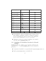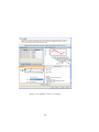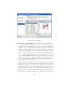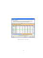
1
GeneSpring GX Manual 2 Contents 1 GeneSpring GX Installation 1.1 Supported and Tested Platforms . . . . . . . . . . . . . . . . 1.2 Installation on Microsoft Windows . . . . . . . . . . . . . . . 1.2.1 Installation and Usage Requirements . . . . . . . . . . 1.2.2 GeneSpring GX Installation Procedure for Microsoft Windows . . . . . . . . . . . . . . . . . . . . . . . . . 1.2.3 Activating your GeneSpring GX . . . . . . . . . . . 1.2.4 Uninstalling GeneSpring GX from Windows . . . . 1.3 Installation on Linux . . . . . . . . . . . . . . . . . . . . . . . 1.3.1 Installation and Usage Requirements . . . . . . . . . . 1.3.2 GeneSpring GX Installation Procedure for Linux . . 1.3.3 Activating your GeneSpring GX 9.x . . . . . . . . . 1.3.4 Uninstalling GeneSpring GX from Linux . . . . . . 1.4 Installation on Apple Macintosh . . . . . . . . . . . . . . . . 1.4.1 Installation and Usage Requirements . . . . . . . . . . 1.4.2 GeneSpring GX Installation Procedure for Macintosh 1.4.3 Activating your GeneSpring GX 9.x . . . . . . . . . 1.4.4 Uninstalling GeneSpring GX from Mac . . . . . . . 1.5 License Manager . . . . . . . . . . . . . . . . . . . . . . . . . 1.5.1 Utilities of the License Manager . . . . . . . . . . . . 23 23 23 23 2 GeneSpring GX Quick Tour 2.1 Introduction . . . . . . . . . . . . . 2.2 Launching GeneSpring GX . . . 2.3 GeneSpring GX User Interface . 2.3.1 GeneSpring GX Desktop 2.3.2 Project Navigator . . . . . 2.3.3 The Workflow Browser . . . 2.3.4 The Legend Window . . . . 41 41 41 41 42 43 44 44 3 . . . . . . . . . . . . . . . . . . . . . . . . . . . . . . . . . . . . . . . . . . . . . . . . . . . . . . . . . . . . . . . . . . . . . . . . . . . . . . . . . . . . . . . . . . . . . . . . . . . . . . . . . 24 26 27 28 28 29 29 31 31 31 32 33 35 35 37 2.4 2.5 2.6 2.7 2.8 2.9 2.3.5 Status Line . . . . . . . . . . . . . . . . . . . . . . . . Organizational Elements and Terminology in GeneSpring GX . . . . . . . . . . . . . . . . . . . . . . . . . . . . . . . . 2.4.1 Project . . . . . . . . . . . . . . . . . . . . . . . . . . 2.4.2 Experiment . . . . . . . . . . . . . . . . . . . . . . . . 2.4.3 Sample . . . . . . . . . . . . . . . . . . . . . . . . . . 2.4.4 Technology . . . . . . . . . . . . . . . . . . . . . . . . 2.4.5 Experiment Grouping, Parameters and Parameter Values . . . . . . . . . . . . . . . . . . . . . . . . . . . . . 2.4.6 Conditions and Interpretations . . . . . . . . . . . . . 2.4.7 Entity List . . . . . . . . . . . . . . . . . . . . . . . . 2.4.8 Active Experiments and Translation . . . . . . . . . . 2.4.9 Entity Tree, Condition Tree, Combined Tree and Classification . . . . . . . . . . . . . . . . . . . . . . . . . 2.4.10 Class Prediction Model . . . . . . . . . . . . . . . . . 2.4.11 Script . . . . . . . . . . . . . . . . . . . . . . . . . . . 2.4.12 Pathway . . . . . . . . . . . . . . . . . . . . . . . . . . 2.4.13 Inspectors . . . . . . . . . . . . . . . . . . . . . . . . . 2.4.14 Hierarchy of objects . . . . . . . . . . . . . . . . . . . 2.4.15 Right-click operations . . . . . . . . . . . . . . . . . . 2.4.16 Search . . . . . . . . . . . . . . . . . . . . . . . . . . . 2.4.17 Saving and Sharing Projects . . . . . . . . . . . . . . . 2.4.18 Software Organization . . . . . . . . . . . . . . . . . . Exporting and Printing Images and Reports . . . . . . . . . . Scripting . . . . . . . . . . . . . . . . . . . . . . . . . . . . . . Configuration . . . . . . . . . . . . . . . . . . . . . . . . . . . Update Utility . . . . . . . . . . . . . . . . . . . . . . . . . . 2.8.1 Product Updates . . . . . . . . . . . . . . . . . . . . . 2.8.2 Data Library Updates . . . . . . . . . . . . . . . . . . 2.8.3 Automatic Query of Update Server . . . . . . . . . . . Getting Help . . . . . . . . . . . . . . . . . . . . . . . . . . . 44 45 45 46 46 47 47 48 50 51 52 53 53 53 54 55 56 61 65 65 65 66 66 66 67 67 69 69 3 GeneSpring GX Data Migration from GeneSpring GX 7 75 3.1 Migrations Steps . . . . . . . . . . . . . . . . . . . . . . . . . 75 3.2 Migrated Objects . . . . . . . . . . . . . . . . . . . . . . . . . 78 4 Data Visualization 81 4.1 View . . . . . . . . . . . . . . . . . . . . . . . . . . . . . . . . 81 4.1.1 The View Framework in GeneSpring GX . . . . . . 81 4.1.2 View Operations . . . . . . . . . . . . . . . . . . . . . 82 4 4.2 4.3 4.4 4.5 4.6 4.7 4.8 4.9 4.10 4.11 4.12 4.13 The Spreadsheet View . . . . . . . . . 4.2.1 Spreadsheet Operations . . . . 4.2.2 Spreadsheet Properties . . . . . The Scatter Plot . . . . . . . . . . . . 4.3.1 Scatter Plot Operations . . . . 4.3.2 Scatter Plot Properties . . . . MVA Plot . . . . . . . . . . . . . . . . The 3D Scatter Plot . . . . . . . . . . 4.5.1 3D Scatter Plot Operations . . 4.5.2 3D Scatter Plot Properties . . The Profile Plot View . . . . . . . . . 4.6.1 Profile Plot Operations . . . . 4.6.2 Profile Plot Properties . . . . . The Heat Map View . . . . . . . . . . 4.7.1 Heat Map Operations . . . . . 4.7.2 Heat Map Toolbar . . . . . . . 4.7.3 Heat Map Properties . . . . . . The Histogram View . . . . . . . . . . 4.8.1 Histogram Operations . . . . . 4.8.2 Histogram Properties . . . . . The Bar Chart . . . . . . . . . . . . . 4.9.1 Bar Chart Operations . . . . . 4.9.2 Bar Chart Properties . . . . . . The Matrix Plot View . . . . . . . . . 4.10.1 Matrix Plot Operations . . . . 4.10.2 Matrix Plot Properties . . . . . Summary Statistics View . . . . . . . 4.11.1 Summary Statistics Operations 4.11.2 Summary Statistics Properties The Box Whisker Plot . . . . . . . . . 4.12.1 Box Whisker Operations . . . . 4.12.2 Box Whisker Properties . . . . The Venn Diagram . . . . . . . . . . . 4.13.1 Venn Diagram Operations . . . 4.13.2 Venn Diagram Properties . . . . . . . . . . . . . . . . . . . . . . . . . . . . . . . . . . . . . . . . . . . . . . . . . . . . . . . . . . . . . . . . . . . . . . . . . . . . . . . . . . . . . . . . . . . . . . . . . . . . . . . . . . . . . . . . . . . . . . . . . . . . . . . . . . . . . . . . . . . . . . . . . . . . . . . . . . . . . . . . . . . . . . . . . . . . . . . . . . . . . . . . . . . . . . . . . . . . . . . . . . . . . . . . . . . . . . . . . . . . . . . . . . . . . . . . . . . . . . . . . . . . . . . . . . . . . . . . . . . . . . . . . . . . . . . . . . . . . . . . . . . . . . . . . . . . . . . . . . . . . . . . . . . . . . . . . . . . . . . . . . . . . . . . . . . . . . . . . . . . . . . . . . . . . . . . . . . . . . . . . . . . . . . . . . . . . . . . . . . . . . . . . . . . . . . . . . . . . . . . . . . . . . . . . . . . . . . . . . . . . . . . . . . . . . . . . . . . . . . . . . . . . . . . . . . . . . . . . . 91 94 95 99 100 101 107 107 109 110 113 114 115 119 120 124 126 129 131 131 135 136 137 141 141 142 145 147 147 152 153 155 158 158 158 5 Analyzing Affymetrix Expression Data 161 5.1 Running the Affymetrix Workflow . . . . . . . . . . . . . . . 161 5.2 Guided Workflow steps . . . . . . . . . . . . . . . . . . . . . . 168 5.3 Advanced Workflow . . . . . . . . . . . . . . . . . . . . . . . 184 5 5.3.1 5.3.2 5.3.3 5.3.4 5.3.5 5.3.6 5.3.7 Creating an Affymetrix Expression Experiment Setup . . . . . . . . . Quality Control . . . . . . . . . . . Analysis . . . . . . . . . . . . . . . Class Prediction . . . . . . . . . . Results . . . . . . . . . . . . . . . Utilities . . . . . . . . . . . . . . . Experiment . . . . . . . . . . . . . . . . . . . . . . . . . . . . . . . . . . . . . . . . . . . . . . . . . . . . . . . . . . . . . . . . . . . . . . 184 189 192 195 198 198 198 6 Affymetrix Summarization Algorithms 201 6.1 Technical Details . . . . . . . . . . . . . . . . . . . . . . . . . 201 6.1.1 Probe Summarization Algorithms . . . . . . . . . . . . 201 6.1.2 Computing Absolute Calls . . . . . . . . . . . . . . . . 206 7 Analyzing Affymetrix Exon Expression Data 7.1 Running the Affymetrix Exon Expression Workflow . . . . . 7.2 Guided Workflow steps . . . . . . . . . . . . . . . . . . . . . 7.3 Advanced Workflow . . . . . . . . . . . . . . . . . . . . . . 7.3.1 Creating an Affymetrix ExonExpression Experiment 7.3.2 Experiment setup . . . . . . . . . . . . . . . . . . . . 7.3.3 Quality Control . . . . . . . . . . . . . . . . . . . . . 7.3.4 Analysis . . . . . . . . . . . . . . . . . . . . . . . . . 7.3.5 Class Prediction . . . . . . . . . . . . . . . . . . . . 7.3.6 Results . . . . . . . . . . . . . . . . . . . . . . . . . 7.3.7 Utilities . . . . . . . . . . . . . . . . . . . . . . . . . 7.3.8 Algorithm Technical Details . . . . . . . . . . . . . . . . . . . . . . . . . 207 207 214 230 230 236 236 239 240 240 240 241 8 Analyzing Illumina Data 8.1 Running the Illumina Workflow: 8.2 Guided Workflow steps . . . . . . 8.3 Advanced Workflow: . . . . . . . 8.3.1 Experiment Setup . . . . 8.3.2 Quality control . . . . . . 8.3.3 Analysis . . . . . . . . . . 8.3.4 Class Prediction . . . . . 8.3.5 Results . . . . . . . . . . 8.3.6 Utilities . . . . . . . . . . . . . . . . . . . 243 243 250 266 269 271 274 277 277 277 . . . . . . . . . . . . . . . . . . . . . . . . . . . . . . . . . . . . . . . . . . . . . . . . . . . . . . . . . . . . . . . . . . . . . . . . . . . . . . . . . . . . . . . . . . . . . . . . . . . . . . . . . . . . . . . . . . . . . . . . . . . . . . . . . . . . . . . 9 Analyzing Agilent Single Color Expression Data 279 9.1 Running the Agilent Single Color Workflow . . . . . . . . . . 279 9.2 Guided Workflow steps . . . . . . . . . . . . . . . . . . . . . . 284 6 9.3 Advanced Workflow . . . 9.3.1 Experiment Setup 9.3.2 Quality Control . . 9.3.3 Analysis . . . . . . 9.3.4 Class Prediction . 9.3.5 Results . . . . . . 9.3.6 Utilities . . . . . . . . . . . . . . . . . . . . . . . . . . . . . . . . . . . . . . . . . . . . . . . . . . . . . . . . . . . . . . . . . . . . . . . . . . . . . . . . . . . . . . . . . . . . . . . . . 10 Analyzing Agilent Two Color Expression Data 10.1 Running the Agilent Two Color Workflow . . . . 10.2 Guided Workflow steps . . . . . . . . . . . . . . . 10.3 Advanced Workflow . . . . . . . . . . . . . . . . 10.3.1 Experiment Setup . . . . . . . . . . . . . 10.3.2 Quality Control . . . . . . . . . . . . . . . 10.3.3 Analysis . . . . . . . . . . . . . . . . . . . 10.3.4 Class Prediction . . . . . . . . . . . . . . 10.3.5 Results . . . . . . . . . . . . . . . . . . . 10.3.6 Utilities . . . . . . . . . . . . . . . . . . . 11 Analyzing Generic Single Color Expression 11.1 Creating Technology . . . . . . . . . . . . . 11.2 Advanced Analysis . . . . . . . . . . . . . . 11.2.1 Experiment Setup . . . . . . . . . . 11.2.2 Quality Control . . . . . . . . . . . . 11.2.3 Analysis . . . . . . . . . . . . . . . . 11.2.4 Class Prediction . . . . . . . . . . . 11.2.5 Results . . . . . . . . . . . . . . . . 11.2.6 Utilities . . . . . . . . . . . . . . . . 12 Analyzing Generic Two Color Expression 12.1 Creating Technology . . . . . . . . . . . . 12.2 Advanced Analysis . . . . . . . . . . . . . 12.2.1 Experiment Setup . . . . . . . . . 12.2.2 Quality Control . . . . . . . . . . . 12.2.3 Analysis . . . . . . . . . . . . . . . 12.2.4 Class Prediction . . . . . . . . . . 12.2.5 Results . . . . . . . . . . . . . . . 12.2.6 Utilities . . . . . . . . . . . . . . . 7 . . . . . . . . . . . . . . . . . . . . . . . . . . . . . . . . . . . . . . . . . . . . . . . . . 300 305 305 308 311 311 311 . . . . . . . . . . . . . . . . . . . . . . . . . . . . . . . . . . . . . . . . . . . . . . . . . . . . . . 319 . 319 . 327 . 341 . 347 . 347 . 350 . 352 . 354 . 354 Data . . . . . . . . . . . . . . . . . . . . . . . . . . . . . . . . . . . . . . . . . . . . . . . . . . . . . . . . . . . . . . . . . . . . . . . . . . . . . . . . . . . . . . . . 383 . 383 . 392 . 396 . 398 . 401 . 404 . 404 . 404 Data . . . . . . . . . . . . . . . . . . . . . . . . . . . . . . . . . . . . . . . . . . . . . . . . . . . . . . . . . . . . . . . . . . . . . . . . 361 361 371 375 375 378 382 382 382 13 Advanced Workflow 13.1 Experiment Setup . . . . . . . . . . . . . . . . . 13.1.1 Quick Start Guide . . . . . . . . . . . . . 13.1.2 Experiment Grouping . . . . . . . . . . . 13.1.3 Create Interpretation . . . . . . . . . . . 13.2 Quality Control . . . . . . . . . . . . . . . . . . . 13.2.1 Quality Control on Samples . . . . . . . . 13.2.2 Filter Probesets by Expression . . . . . . 13.2.3 Filter probesets by Flags . . . . . . . . . 13.3 Analysis . . . . . . . . . . . . . . . . . . . . . . . 13.3.1 Statistical Analysis . . . . . . . . . . . . . 13.3.2 Fold change . . . . . . . . . . . . . . . . . 13.3.3 Clustering . . . . . . . . . . . . . . . . . . 13.3.4 Find similar entities . . . . . . . . . . . . 13.3.5 Filter on Parameters . . . . . . . . . . . . 13.3.6 Principal Component Analysis . . . . . . 13.4 Class Prediction . . . . . . . . . . . . . . . . . . 13.4.1 Build Prediction model . . . . . . . . . . 13.4.2 Run prediction . . . . . . . . . . . . . . . 13.5 Results Interpretation . . . . . . . . . . . . . . . 13.5.1 GO Analysis . . . . . . . . . . . . . . . . 13.5.2 GSEA . . . . . . . . . . . . . . . . . . . . 13.6 Find Similar Objects . . . . . . . . . . . . . . . . 13.6.1 Find Similar Entity lists . . . . . . . . . . 13.6.2 Find Similar Pathways . . . . . . . . . . . 13.7 Utilities . . . . . . . . . . . . . . . . . . . . . . . 13.7.1 Save Current view . . . . . . . . . . . . . 13.7.2 Genome Browser . . . . . . . . . . . . . . 13.7.3 Import BROAD GSEA Genesets . . . . . 13.7.4 Import BIOPAX pathways . . . . . . . . 13.7.5 Differential Expression Guided Workflow . . . . . . . . . . . . . . . . . . . . . . . . . . . . . . . . . . . . . . . . . . . . . . . . . . . . . . . . . . . . . . . . . . . . . . . . . . . . . . . . . . . . . . . . . . . . . . . . . . . . . . . . . . . . . . . . . . . . . . . . . . . . . . . . . . . . . . . . . . . . . . . . . . . . . . . . . . . . . . . . . . . . . . . . . . . . . . . . . . . . . 407 . 408 . 408 . 408 . 410 . 413 . 413 . 415 . 416 . 420 . 420 . 429 . 433 . 433 . 436 . 439 . 445 . 445 . 445 . 447 . 447 . 447 . 447 . 447 . 448 . 448 . 448 . 449 . 449 . 449 . 449 14 Statistical Hypothesis Testing and Differential Expression Analysis 451 14.1 Details of Statistical Tests in GeneSpring GX . . . . . . . 451 14.1.1 The Unpaired t-Test for Two Groups . . . . . . . . . . 451 14.1.2 The t-Test against 0 for a Single Group . . . . . . . . 452 14.1.3 The Paired t-Test for Two Groups . . . . . . . . . . . 452 14.1.4 The Unpaired Unequal Variance t-Test (Welch t-test) for Two Groups . . . . . . . . . . . . . . . . . . . . . . 452 8 14.1.5 The Unpaired Mann-Whitney Test . . . 14.1.6 The Paired Mann-Whitney Test . . . . 14.1.7 One-Way ANOVA . . . . . . . . . . . . 14.1.8 Post hoc testing of ANOVA results . . . 14.1.9 Unequal variance (Welch) ANOVA . . . 14.1.10 The Kruskal-Wallis Test . . . . . . . . . 14.1.11 The Repeated Measures ANOVA . . . . 14.1.12 The Repeated Measures Friedman Test 14.1.13 The N-way ANOVA . . . . . . . . . . . 14.2 Obtaining P-Values . . . . . . . . . . . . . . . . 14.2.1 p-values via Permutation Tests . . . . . 14.3 Adjusting for Multiple Comparisons . . . . . . 14.3.1 The Holm method . . . . . . . . . . . . 14.3.2 The Benjamini-Hochberg method . . . . 14.3.3 The Benjamini-Yekutieli method . . . . 14.3.4 The Westfall-Young method . . . . . . . 15 Clustering: Identifying Genes and Conditions Expression Profiles with Similar Behavior 15.1 What is Clustering . . . . . . . . . . . . . . . . 15.2 Clustering Wizard . . . . . . . . . . . . . . . . 15.3 Graphical Views of Clustering Analysis Output 15.3.1 Cluster Set or Classification . . . . . . . 15.3.2 Dendrogram . . . . . . . . . . . . . . . . 15.3.3 U Matrix . . . . . . . . . . . . . . . . . 15.4 Distance Measures . . . . . . . . . . . . . . . . 15.5 K-Means . . . . . . . . . . . . . . . . . . . . . . 15.6 Hierarchical . . . . . . . . . . . . . . . . . . . . 15.7 Self Organizing Maps (SOM) . . . . . . . . . . 15.8 PCA-based Clustering . . . . . . . . . . . . . . . . . . . . . . . . . . . . . . . . . . . . . . . . . . . . . . . . . . . . . . . . . . . . . . . . . . . . . . . . . . . . . . . . . . . . . . . . . . . . . . . . . . . . . . . . . . . . . . . . . . . . . . . . . . . . . . 453 453 453 455 456 456 457 458 458 459 459 460 461 461 461 461 with Similar 463 . . . . . . . . 463 . . . . . . . . 464 . . . . . . . . 469 . . . . . . . . 469 . . . . . . . . 473 . . . . . . . . 481 . . . . . . . . 483 . . . . . . . . 485 . . . . . . . . 486 . . . . . . . . 487 . . . . . . . . 489 16 Class Prediction: Learning and Predicting Outcomes 16.1 General Principles of Building a Prediction Model . . . 16.2 Prediction Pipeline . . . . . . . . . . . . . . . . . . . . . 16.2.1 Validate . . . . . . . . . . . . . . . . . . . . . . . 16.2.2 Prediction Model . . . . . . . . . . . . . . . . . . 16.3 Running Class Prediction in GeneSpring GX . . . . . 16.3.1 Build Prediction Model . . . . . . . . . . . . . . 16.3.2 Run Prediction . . . . . . . . . . . . . . . . . . . 16.4 Decision Trees . . . . . . . . . . . . . . . . . . . . . . . . 9 . . . . . . . . . . . . . . . . . . . . . . . . . . . . . . . . . . . . . . . . 491 491 492 492 494 494 494 499 500 16.5 16.6 16.7 16.8 16.4.1 Decision Tree Model Parameters . 16.4.2 Decision Tree Model . . . . . . . . Neural Network . . . . . . . . . . . . . . . 16.5.1 Neural Network Model Parameters 16.5.2 Neural Network Model . . . . . . . Support Vector Machines . . . . . . . . . 16.6.1 SVM ModelParameters . . . . . . Naive Bayesian . . . . . . . . . . . . . . . 16.7.1 Naive Bayesian Model Parameters 16.7.2 Naive Bayesian Model View . . . . Viewing Classification Results . . . . . . . 16.8.1 Confusion Matrix . . . . . . . . . . 16.8.2 Classification Report . . . . . . . . 16.8.3 Lorenz Curve . . . . . . . . . . . . . . . . . . . . . . . . . . . . . . . . . . . . . . . . 17 Gene Ontology Analysis 17.1 Working with Gene Ontology Terms . . . . . 17.2 Introduction to GO Analysis in GeneSpring 17.3 GO Analysis . . . . . . . . . . . . . . . . . . 17.4 GO Analysis Views . . . . . . . . . . . . . . . 17.4.1 GO Spreadsheet . . . . . . . . . . . . 17.4.2 The GO Tree View . . . . . . . . . . . 17.4.3 The Pie Chart . . . . . . . . . . . . . 17.5 GO Enrichment Score Computation . . . . . 18 Gene Set Enrichment Analysis 18.1 Introduction to GSEA . . . . . . . 18.2 Gene sets . . . . . . . . . . . . . . 18.3 Performing GSEA in GeneSpring 18.4 GSEA Computation . . . . . . . . 19 Pathway Analysis 19.1 Introduction to Pathway Analysis . 19.2 Importing BioPAX Pathways . . . 19.3 Adding Pathways to Experiment . 19.4 Viewing Pathways in GeneSpring 19.5 Find Similar Pathway Tool . . . . 19.6 Exporting Pathway Diagram . . . 10 . . . . . . GX . . . . . . . . . . . . GX . . . . . . . . . . . . . . . . . . . . . . . . . . . . . . . . . . . . . . . . . . . . . . . . . . . . . . . . . . . . . . . . . . . . . . . . . . . . . . . . . GX . . . . . . . . . . . . . . . . . . . . . . . . . . . . . . . . . . . . . . . . . . . . . . . . . . . . . . . . . . . . . . . . . . . . . . . . . . . . . . . . . . . . . . . . . . . . . . . . . . . . . . . . . . . . . . . . . . . . . . . . . . . . . . . . . . . . . . . . . . . . . . . . . . . . . . . . . . . . . . . . . . . . . . . . . . . . . . . . . . . . . . . . . . . . . . . . . . . . . . . . . . . . 502 503 504 504 505 507 508 510 511 512 512 513 514 514 . . . . . . . . 517 . 517 . 517 . 518 . 521 . 521 . 521 . 524 . 530 . . . . 533 . 533 . 533 . 534 . 539 . . . . . . 541 . 541 . 541 . 543 . 543 . 545 . 546 20 The Genome Browser 20.1 Genome Browser Usage . . . . . . . . . . . . . . . . . 20.2 Tracks on the Genome Browser . . . . . . . . . . . . . 20.2.1 Profile Tracks . . . . . . . . . . . . . . . . . . . 20.2.2 Data Tracks . . . . . . . . . . . . . . . . . . . . 20.2.3 Static Tracks . . . . . . . . . . . . . . . . . . . 20.3 Adding and Removing Tracks in the Genome Browser 20.3.1 Track Layout . . . . . . . . . . . . . . . . . . . 20.4 Track Properties . . . . . . . . . . . . . . . . . . . . . 20.4.1 Profile Track Properties . . . . . . . . . . . . . 20.4.2 Static Track Properties . . . . . . . . . . . . . 20.4.3 Static Track Properties . . . . . . . . . . . . . 20.5 Operations on the Genome Browser . . . . . . . . . . . . . . . . . . . . . . . . . . . . . . . . . . . . . . . . . . . . . . 549 . 549 . 549 . 549 . 551 . 551 . 553 . 553 . 553 . 553 . 556 . 556 . 556 21 Scripting 561 21.1 Introduction . . . . . . . . . . . . . . . . . . . . . . . . . . . . 561 21.2 Scripts to Access projects and the Active Datasets GeneSpring GX . . . . . . . . . . . . . . . . . . . . . . . . . . . 562 21.2.1 List of Project Commands Available in GeneSpring GX . . . . . . . . . . . . . . . . . . . . . . . . . . . . 562 21.2.2 List of Dataset Commands Available in GeneSpring GX . . . . . . . . . . . . . . . . . . . . . . . . . . . . 567 21.2.3 Example Scripts . . . . . . . . . . . . . . . . . . . . . 572 21.3 Scripts for Launching View in GeneSpring GX . . . . . . . 574 21.3.1 List of View Commands Available Through Scripts . . 574 21.3.2 Examples of Launching Views . . . . . . . . . . . . . . 576 21.4 Scripts for Commands and Algorithms in GeneSpring GX 579 21.4.1 List of Algorithms and Commands Available Through Scripts . . . . . . . . . . . . . . . . . . . . . . . . . . . 579 21.4.2 Example Scripts to Run Algorithms . . . . . . . . . . 581 21.5 Scripts to Create User Interface in GeneSpring GX . . . . 581 21.6 Running R Scripts . . . . . . . . . . . . . . . . . . . . . . . . 584 22 Table of Key Bindings and Mouse Clicks 22.1 Mouse Clicks and their actions . . . . . . . . . . . . . . . . 22.1.1 Global Mouse Clicks and their actions . . . . . . . . 22.1.2 Some View Specific Mouse Clicks and their Actions 22.1.3 Mouse Click Mappings for Mac . . . . . . . . . . . . 22.2 Key Bindings . . . . . . . . . . . . . . . . . . . . . . . . . . 22.2.1 Global Key Bindings . . . . . . . . . . . . . . . . . . 11 . . . . . . 585 585 585 586 586 586 586 12 List of Figures 1.1 1.2 1.3 1.4 1.5 1.6 1.7 1.8 Activation Failure . . . . . . . Activation Failure . . . . . . . Activation Failure . . . . . . . The License Description Dialog Confirm Surrender Dialog . . . Confirm Surrender Dialog . . . Change License Dialog . . . . . License Re-activation Dialog . . . . . . . . . . . . . . . . . . . . . . . . . . . . . . . . . . . . . . . . . . . . . . . . . . . . . . . . . . . . . . . . . . . . . . . . . . . . . . . . . . . . . . . . . . . . . . . . . . 27 31 35 36 38 38 39 40 2.1 2.2 2.3 2.4 2.5 2.6 2.7 2.8 GeneSpring GX Layout . . . . . The Workflow Window . . . . . . . The Legend Window . . . . . . . . Status Line . . . . . . . . . . . . . Confirmation Dialog . . . . . . . . Product Update Dialog . . . . . . Data Library Updates Dialog . . . Automatic Download Confirmation . . . . . . . . . . . . . . . . . . . . . . . . . . . . Dialog . . . . . . . . . . . . . . . . . . . . . . . . . . . . . . . . . . . . . . . . . . . . . . . . . . . . . . . . . . . . . . . . . . . . . . . . . . . . . . . . . . . . . . . . 42 43 44 44 67 68 70 70 4.1 4.2 4.3 4.4 4.5 4.6 4.7 4.8 4.9 4.10 4.11 4.12 Export submenus . . . . . . . . . . . . . . . . . . . Export Image Dialog . . . . . . . . . . . . . . . . . Tools −→Options Dialog for Export as Image . . . Error Dialog on Image Export . . . . . . . . . . . . Menu accessible by Right-Click on the plot views . Menu accessible by Right-Click on the table views Spreadsheet . . . . . . . . . . . . . . . . . . . . . . Spreadsheet Properties Dialog . . . . . . . . . . . . Scatter Plot . . . . . . . . . . . . . . . . . . . . . . Scatter Plot Properties . . . . . . . . . . . . . . . . Viewing Profiles and Error Bars using Scatter Plot MVA Plot . . . . . . . . . . . . . . . . . . . . . . . . . . . . . . . . . . . . . . . . . . . . . . . . . . . . . . . . . . . . . . . . . . . . . . . . . . . . . . . . . . . . 84 . 85 . 86 . 87 . 89 . 92 . 93 . 95 . 99 . 102 . 105 . 108 13 . . . . . . . . . . . . . . . . . . . . . . . . . . . . . . . . . . . . . . . . 4.13 4.14 4.15 4.16 4.17 4.18 4.19 4.20 4.21 4.22 4.23 4.24 4.25 4.26 4.27 4.28 4.29 4.30 4.31 4.32 4.33 3D Scatter Plot . . . . . . . . . 3D Scatter Plot Properties . . . Profile Plot . . . . . . . . . . . Profile Plot Properties . . . . . Heat Map . . . . . . . . . . . . Export submenus . . . . . . . . Export Image Dialog . . . . . . Error Dialog on Image Export . Heat Map Toolbar . . . . . . . Heat Map Properties . . . . . . Histogram . . . . . . . . . . . . Histogram Properties . . . . . . Bar Chart . . . . . . . . . . . . Matrix Plot . . . . . . . . . . . Matrix Plot Properties . . . . . Summary Statistics View . . . Summary Statistics Properties Box Whisker Plot . . . . . . . . Box Whisker Properties . . . . The Venn Diagram . . . . . . . The Venn Diagram Properties . . . . . . . . . . . . . . . . . . . . . . . . . . . . . . . . . . . . . . . . . . . . . . . . . . . . . . . . . . . . . . . . . . . . . . . . . . . . . . . . . . . . . . . . . . . . . . . . . . . . . . . . . . . . . . . . . . . . . . . . . . . . . . . . . . . . . . . . . . . . . . . . . . . . . . . . . . . . . . . . . . . . . . . . . . . . . . . . . . . . . . . . . . . . . . . . . . . . . . . . . . . . . . . . . . . . . . . . . . . . . . . . . . . . . . . . . . . . . . . . . . . . . . . . . . . . . . . . . . . . . . . . . . . . . . . . . . . . . . . . . . . . . . . . . . . . . . . . . . . . . . . . . . . . . . . . . . . . . . . . . . . . . . . . . . . . . . . . . . . . . . . . . . . . . . . . . . . . . . 108 111 113 116 120 121 123 124 125 126 130 132 135 140 142 146 148 152 154 159 160 5.1 5.2 5.3 5.4 5.5 5.6 5.7 5.8 5.9 5.10 5.11 5.12 5.13 5.14 5.15 5.16 5.17 5.18 Welcome Screen . . . . . . . . . . Create New project . . . . . . . . Experiment Selection . . . . . . . Experiment Description . . . . . Load Data . . . . . . . . . . . . . Choose Samples . . . . . . . . . . Reordering Samples . . . . . . . Summary Report . . . . . . . . . Experiment Grouping . . . . . . Edit or Delete of Parameters . . Quality Control on Samples . . . Filter Probesets-Single Parameter Filter Probesets-Two Parameters Rerun Filter . . . . . . . . . . . . Significance Analysis-T Test . . . Significance Analysis-Anova . . . Fold Change . . . . . . . . . . . . GO Analysis . . . . . . . . . . . . . . . . . . . . . . . . . . . . . . . . . . . . . . . . . . . . . . . . . . . . . . . . . . . . . . . . . . . . . . . . . . . . . . . . . . . . . . . . . . . . . . . . . . . . . . . . . . . . . . . . . . . . . . . . . . . . . . . . . . . . . . . . . . . . . . . . . . . . . . . . . . . . . . . . . . . . . . . . . . . . . . . . . . . . . . . . . . . . . . . . . . . . . . . . . . . . . . . . . . . . . . . . . . . . . . . . . . . . . . . . . . . . . . . . . . . . . . . . . . . . . . . . . . . . . . . . . . . . . . . . . . . . . . . . . . . . . . . . . . . . . . . . . . . 162 162 163 165 166 167 167 169 171 172 173 175 176 176 180 181 183 185 14 5.19 5.20 5.21 5.22 5.23 5.24 5.25 5.26 5.27 Load Data . . . . . . . . . . . . . . . . . . . Select ARR files . . . . . . . . . . . . . . . Summarization Algorithm . . . . . . . . . . Normalization and Baseline Transformation Quality Control . . . . . . . . . . . . . . . . Entity list and Interpretation . . . . . . . . Input Parameters . . . . . . . . . . . . . . . Output Views of Filter by Flags . . . . . . Save Entity List . . . . . . . . . . . . . . . . . . . . . . . . . . . . . . . . . . . . . . . . . . . . . . . . . . . . . . . . . . . . . . . . . . . . . . . . . . . . . . . . . . . . . . . . . . . . . . . . . . . . . . . . . 186 187 190 191 192 194 195 196 197 7.1 7.2 7.3 7.4 7.5 7.6 7.7 7.8 7.9 7.10 7.11 7.12 7.13 7.14 7.15 7.16 7.17 7.18 7.19 7.20 7.21 7.22 7.23 Welcome Screen . . . . . . . . . . . . . . . . Create New project . . . . . . . . . . . . . . Experiment Selection . . . . . . . . . . . . . Experiment Description . . . . . . . . . . . Load Data . . . . . . . . . . . . . . . . . . . Choose Samples . . . . . . . . . . . . . . . . Reordering Samples . . . . . . . . . . . . . Summary Report . . . . . . . . . . . . . . . Experiment Grouping . . . . . . . . . . . . Edit or Delete of Parameters . . . . . . . . Quality Control on Samples . . . . . . . . . Filter Probesets-Single Parameter . . . . . . Filter Probesets-Two Parameters . . . . . . Rerun Filter . . . . . . . . . . . . . . . . . . Significance Analysis-T Test . . . . . . . . . Significance Analysis-Anova . . . . . . . . . Fold Change . . . . . . . . . . . . . . . . . . GO Analysis . . . . . . . . . . . . . . . . . Load Data . . . . . . . . . . . . . . . . . . . Select ARR files . . . . . . . . . . . . . . . Summarization Algorithm . . . . . . . . . . Normalization and Baseline Transformation Quality Control . . . . . . . . . . . . . . . . . . . . . . . . . . . . . . . . . . . . . . . . . . . . . . . . . . . . . . . . . . . . . . . . . . . . . . . . . . . . . . . . . . . . . . . . . . . . . . . . . . . . . . . . . . . . . . . . . . . . . . . . . . . . . . . . . . . . . . . . . . . . . . . . . . . . . . . . . . . . . . . . . . . . . . . . . . . . . . . . . . . . . . . . . . . . . . . . . . . . . . . . . . . . . . . . . . . . . . . . . . . . . . . . . . . . . . . . . . . . . . . . . . . . . . 208 208 209 211 212 213 213 215 217 218 219 221 221 222 226 227 228 230 232 233 235 237 238 8.1 8.2 8.3 8.4 8.5 8.6 Welcome Screen . . . . . Create New project . . . Experiment Selection . . Experiment Description Load Data . . . . . . . . Choose Samples . . . . . . . . . . . . . . . . . . . . . . . . . . . . . . . . . . . . . . . . . . . . . . . . . . . . . . . . . . . . . . . . . 244 245 245 247 248 249 . . . . . . . . . . . . . . . . . . 15 . . . . . . . . . . . . . . . . . . . . . . . . . . . . . . . . . . . . . . . . . . . . . . . . 8.7 8.8 8.9 8.10 8.11 8.12 8.13 8.14 8.15 8.16 8.17 8.18 8.19 8.20 8.21 8.22 8.23 8.24 8.25 Summary Report . . . . . . . . . Experiment Grouping . . . . . . Edit or Delete of Parameters . . Quality Control on Samples . . . Filter Probesets-Single Parameter Filter Probesets-Two Parameters Rerun Filter . . . . . . . . . . . . Significance Analysis-T Test . . . Significance Analysis-Anova . . . Fold Change . . . . . . . . . . . . GO Analysis . . . . . . . . . . . Load Data . . . . . . . . . . . . . Identify Calls Range . . . . . . . Preprocess Options . . . . . . . . Quality Control . . . . . . . . . . Entity list and Interpretation . . Input Parameters . . . . . . . . . Output Views of Filter by Flags Save Entity List . . . . . . . . . . . . . . . . . . . . . . . . . . . . . . . . . . . . . . . . . . . . . . . . . . . . . . . . . . . . . . . . . . . . . . . . . . . . . . . . . . . . . . . . . . . . . . . . . . . . . . . . . . . . . . . . . . . . . . . . . . . . . . . . . . . . . . . . . . . . . . . . . . . . . . . . . . . . . . . . . . . . . . . . . . . . . . . . . . . . . . . . . . . . . . . . . . . . . . . . . . . . . . . . . . . . . . . . . . . . . . . . . . . . . . . . . . . . . . . . . . . . . . . . . . . . . . . . . . . . . . . . . . . . . . . . . . . . . . . . . . . . . . . . . . . . . . . . . . . . . . . . . . . . . . . . . 251 253 254 255 257 257 258 262 263 264 266 268 268 270 272 273 274 275 276 9.1 9.2 9.3 9.4 9.5 9.6 9.7 9.8 9.9 9.10 9.11 9.12 9.13 9.14 9.15 9.16 9.17 9.18 9.19 9.20 Welcome Screen . . . . . . . . . . Create New project . . . . . . . . Experiment Selection . . . . . . . Experiment Description . . . . . Load Data . . . . . . . . . . . . . Choose Samples . . . . . . . . . . Reordering Samples . . . . . . . Summary Report . . . . . . . . . Experiment Grouping . . . . . . Edit or Delete of Parameters . . Quality Control on Samples . . . Filter Probesets-Single Parameter Filter Probesets-Two Parameters Rerun Filter . . . . . . . . . . . . Significance Analysis-T Test . . . Significance Analysis-Anova . . . Fold Change . . . . . . . . . . . . GO Analysis . . . . . . . . . . . Load Data . . . . . . . . . . . . . Advanced flag Import . . . . . . . . . . . . . . . . . . . . . . . . . . . . . . . . . . . . . . . . . . . . . . . . . . . . . . . . . . . . . . . . . . . . . . . . . . . . . . . . . . . . . . . . . . . . . . . . . . . . . . . . . . . . . . . . . . . . . . . . . . . . . . . . . . . . . . . . . . . . . . . . . . . . . . . . . . . . . . . . . . . . . . . . . . . . . . . . . . . . . . . . . . . . . . . . . . . . . . . . . . . . . . . . . . . . . . . . . . . . . . . . . . . . . . . . . . . . . . . . . . . . . . . . . . . . . . . . . . . . . . . . . . . . . . . . . . . . . . . . . . . . . . . . . . . . . . . . . . . . . . . . . . . . . . . . . . . . . . . . . . . . . . 280 280 281 283 284 285 285 286 289 290 291 292 293 293 296 297 298 300 302 303 16 9.21 9.22 9.23 9.24 9.25 9.26 Preprocess Options . . . . . . . . Quality Control . . . . . . . . . . Entity list and Interpretation . . Input Parameters . . . . . . . . . Output Views of Filter by Flags Save Entity List . . . . . . . . . . . . . . . . . . . . . . . . . . . . . . . . . . . . . . . . . . . . . . . . . . . . . . . . . . . . . . . . . . . . . . . . . . . . . . . . . . . . . . . . . . . . . . . . . . . . . . . . . 304 306 308 309 310 310 10.1 Welcome Screen . . . . . . . . . . 10.2 Create New project . . . . . . . . 10.3 Experiment Selection . . . . . . . 10.4 Experiment Description . . . . . 10.5 Load Data . . . . . . . . . . . . . 10.6 Choose Samples . . . . . . . . . . 10.7 Reordering Samples . . . . . . . 10.8 Dye Swap . . . . . . . . . . . . . 10.9 Summary Report . . . . . . . . . 10.10Experiment Grouping . . . . . . 10.11Edit or Delete of Parameters . . 10.12Quality Control on Samples . . . 10.13Filter Probesets-Single Parameter 10.14Filter Probesets-Two Parameters 10.15Rerun Filter . . . . . . . . . . . . 10.16Significance Analysis-T Test . . . 10.17Significance Analysis-Anova . . . 10.18Fold Change . . . . . . . . . . . . 10.19GO Analysis . . . . . . . . . . . 10.20Load Data . . . . . . . . . . . . . 10.21Choose Dye-Swaps . . . . . . . . 10.22Advanced flag Import . . . . . . 10.23Preprocess Options . . . . . . . . 10.24Quality Control . . . . . . . . . . 10.25Entity list and Interpretation . . 10.26Input Parameters . . . . . . . . . 10.27Output Views of Filter by Flags 10.28Save Entity List . . . . . . . . . . . . . . . . . . . . . . . . . . . . . . . . . . . . . . . . . . . . . . . . . . . . . . . . . . . . . . . . . . . . . . . . . . . . . . . . . . . . . . . . . . . . . . . . . . . . . . . . . . . . . . . . . . . . . . . . . . . . . . . . . . . . . . . . . . . . . . . . . . . . . . . . . . . . . . . . . . . . . . . . . . . . . . . . . . . . . . . . . . . . . . . . . . . . . . . . . . . . . . . . . . . . . . . . . . . . . . . . . . . . . . . . . . . . . . . . . . . . . . . . . . . . . . . . . . . . . . . . . . . . . . . . . . . . . . . . . . . . . . . . . . . . . . . . . . . . . . . . . . . . . . . . . . . . . . . . . . . . . . . . . . . . . . . . . . . . . . . . . . . . . . . . . . . . . . . . . . . . . . . . . . . . . . . . . . . . . . . . . . . . . . . . . . . . . . . . . . . . . . . . . . . . . . . . . . . . . . . . . . . . . . . . . . . . . . . . . . . . . . . . . . . . . . . . . 320 320 321 323 324 325 326 326 328 330 331 332 334 334 335 337 338 339 341 343 344 345 346 348 350 351 352 353 11.1 11.2 11.3 11.4 . . . . . . . . . . . . . . . . . . selections . . . . . . . . . . . . . . . . . . . . . . . . . . . . . . . . . . . . . . . . 362 364 365 366 Technology Name . . . . . . . Format data file . . . . . . . . Select Row Scope for Import SingleColor one sample in one 17 . . . . . . file 11.5 Annotation Column Options . . 11.6 Welcome Screen . . . . . . . . . . 11.7 Create New project . . . . . . . . 11.8 Experiment Selection . . . . . . . 11.9 Experiment Description . . . . . 11.10Load Data . . . . . . . . . . . . . 11.11Preprocess Options . . . . . . . . 11.12Quality Control . . . . . . . . . . 11.13Entity list and Interpretation . . 11.14Input Parameters . . . . . . . . . 11.15Output Views of Filter by Flags 11.16Save Entity List . . . . . . . . . . . . . . . . . . . . . . . . . . . . . . . . . . . . . . . . . . . . . . . . . . . . . . . . . . . . . . . . . . . . . . . . . . . . . . . . . . . . . . . . . . . . . . . . . . . . . . . . . . . . . . . . . . . . . . . . . . . . . . . . . . . . . . . . . . . . . . . . . . . . . . . . . . . . . . . . . . . . . . . . . . . . . . . . . . . . . . . . . . . . . . . . . . . . . . . . . 368 369 369 370 370 373 374 376 378 379 380 381 12.1 Technology Name . . . . . . . . . 12.2 Format data file . . . . . . . . . . 12.3 Select Row Scope for Import . . 12.4 Two Color Selections . . . . . . . 12.5 Annotation Column Options . . 12.6 Welcome Screen . . . . . . . . . . 12.7 Create New project . . . . . . . . 12.8 Experiment Selection . . . . . . . 12.9 Experiment Description . . . . . 12.10Load Data . . . . . . . . . . . . . 12.11Choose Dye-Swaps . . . . . . . . 12.12Preprocess Options . . . . . . . . 12.13Quality Control . . . . . . . . . . 12.14Entity list and Interpretation . . 12.15Input Parameters . . . . . . . . . 12.16Output Views of Filter by Flags 12.17Save Entity List . . . . . . . . . . . . . . . . . . . . . . . . . . . . . . . . . . . . . . . . . . . . . . . . . . . . . . . . . . . . . . . . . . . . . . . . . . . . . . . . . . . . . . . . . . . . . . . . . . . . . . . . . . . . . . . . . . . . . . . . . . . . . . . . . . . . . . . . . . . . . . . . . . . . . . . . . . . . . . . . . . . . . . . . . . . . . . . . . . . . . . . . . . . . . . . . . . . . . . . . . . . . . . . . . . . . . . . . . . . . . . . . . . . . . . . . . . . . . . . . . . . . . . . . . . . . . . . . . . . . . . . . . . . . . . . . . . . . . . . . . 384 386 387 388 389 390 391 391 392 394 395 397 399 400 401 402 403 . . . . . . . . . . 4) 4) 4) 4) . . . . . . . . . . . . . . . . . . . . . . . . . . . . . . . . . . . . . . . . . . . . . . . . . . . . . . . . . . . . . . . . . . . . . . . . . . . . . . . . . . . . . . . . . . 409 411 412 413 414 416 417 418 419 13.1 13.2 13.3 13.4 13.5 13.6 13.7 13.8 13.9 Experiment Grouping . . . . . . . . . . Edit or Delete of Parameters . . . . . . Create Interpretation (Step 1 of 3) . . . Create Interpretation (Step 2 of 3) . . . Create Interpretation (Step 2 of 3) . . . Filter probesets by expression (Step 1 of Filter probesets by expression (Step 2 of Filter probesets by expression (Step 3 of Filter probesets by expression (Step 4 of 18 13.10Input Parameters . . . . . . . . . . . . 13.11Select Test . . . . . . . . . . . . . . . 13.12p-value Computation . . . . . . . . . . 13.13Results . . . . . . . . . . . . . . . . . . 13.14Save Entity List . . . . . . . . . . . . 13.15Input Parameters . . . . . . . . . . . . 13.16Pairing Options . . . . . . . . . . . . . 13.17Fold Change Results . . . . . . . . . . 13.18Object Details . . . . . . . . . . . . . 13.19Input Parameters . . . . . . . . . . . . 13.20Output View of Find Similar Entities 13.21Save Entity List . . . . . . . . . . . . 13.22Input Parameters . . . . . . . . . . . . 13.23Output View of Filter on Parameters . 13.24Save Entity List . . . . . . . . . . . . 13.25Entity List and Interpretation . . . . . 13.26Input Parameters . . . . . . . . . . . . 13.27Output Views . . . . . . . . . . . . . . . . . . . . . . . . . . . . . . . . . . . . . . . . . . . . . . . . . . . . . . . . . . . . . . . . . . . . . . . . . . . . . . . . . . . . . . . . . . . . . . . . . . . . . . . . . . . . . . . . . . . . . . . . . . . . . . . . . . . . . . . . . . . . . . . . . . . . . . . . . . . . . . 421 421 422 424 425 430 431 432 434 435 437 438 440 441 442 443 444 446 15.1 Clustering Wizard: Input parameters . . . . . . . 15.2 Clustering Wizard: Clustering parameters . . . . 15.3 Clustering Wizard: Output Views . . . . . . . . 15.4 Clustering Wizard: Object details . . . . . . . . 15.5 Cluster Set from K-Means Clustering Algorithm 15.6 Dendrogram View of Clustering Clustering . . . 15.7 Export Image Dialog . . . . . . . . . . . . . . . . 15.8 Error Dialog on Image Export . . . . . . . . . . . 15.9 Dendrogram Toolbar . . . . . . . . . . . . . . . . 15.10U Matrix for SOM Clustering Algorithm . . . . . . . . . . . . . . . . . . . . . . . . . . . . . . . . . . . . . . . . . . . . . . . . . . . . . . . . . . . . . . . . . . . . . . . . . . . 465 466 467 468 469 474 476 477 478 482 16.1 Classification Pipeline . . . . . . . . . . . . . . 16.2 Build Prediction Model: Input parameters . . . 16.3 Build Prediction Model: Validation parameters 16.4 Build Prediction Model: Validation output . . 16.5 Build Prediction Model: Training output . . . 16.6 Build Prediction Model: Model Object . . . . . 16.7 Run Prediction: Prediction output . . . . . . . 16.8 Axis Parallel Decision Tree Model . . . . . . . 16.9 Neural Network Model . . . . . . . . . . . . . . 16.10Model Parameters for Support Vector Machines . . . . . . . . . . . . . . . . . . . . . . . . . . . . . . . . . . . . . . . . . . . . . . . . . . . . . . . . . . . . . . . . . . . . . . 493 495 496 497 498 499 501 503 506 510 19 . . . . . . . . . . . . . . . . . . . . . . . . . . . . . . . . . . . . . . . . . . . . . . . . . . . . . . . . . . . . . . . . . . . . . . . . . . . . . . . . . . . . . . . . . . . . . . . . . . . . 16.11Model Parameters for Naive Bayesian Model . . 16.12Confusion Matrix for Training with Decision Tree 16.13Decision Tree Classification Report . . . . . . . . 16.14Lorenz Curve for Neural Network Training . . . . . . . . . . . . . . . . . . . . . . . . . . . . . . . . 512 513 514 516 17.1 17.2 17.3 17.4 17.5 17.6 17.7 Input Parameters . . . . . . . . Output Views of GO Analysis . Spreadsheet view of GO Terms. The GO Tree View. . . . . . . Properties of GO Tree View. . Pie Chart View. . . . . . . . . Pie Chart Properties. . . . . . . . . . . . . . . . . . . . . . . . . . . . . . . . . . . . . . . . . . . . . . . . . . . . . . . . . . . . . . . . . . . . . . . . . . . . . . . . . . . . . . . . . . . . . . . . . . . . . . . . . . . . . . . . . . . . . . . . . . . . . . 519 520 522 523 525 526 529 18.1 18.2 18.3 18.4 Input Parameters . Pairing Options . . Choose Gene Lists Choose Gene Lists . . . . . . . . . . . . . . . . . . . . . . . . . . . . . . . . . . . . . . . . . . . . . . . . . . . . . . . . . . . . . . . . . . . . 535 536 537 538 . . . . . . . . . . . . . . . . . . . . . . . . . . . . 19.1 Imported pathways folder in the navigator . . . . . . . . . . . 543 19.2 Some proteins are selected and shown with light blue highlight545 19.3 Find similar pathways results window . . . . . . . . . . . . . 546 20.1 20.2 20.3 20.4 20.5 20.6 Genome Browser . . . . Static Track Libraries . The KnownGenes Track Tracks Manager . . . . . Profile Tracks Properties Data Tracks Properties . 21.1 Scripting Window . . . . . . . . . . . . . . . . . . . . . . . . . . . . . . . . . . . . . . . . . . . . . . . . . . . . . . . . . . . . . . . . . . . . . . . . . . . . . . . . . . . . . . . . . . . . . . . . . . . . . . . . . . . . . . . . . . . . . . . . . . . . . . 550 552 552 554 555 557 . . . . . . . . . . . . . . . . . . . . . . . . 562 20 List of Tables 2.1 2.2 Interpretations and Views . . . . . . . . . . . . . . . . . . . . Interpretations and Workflow Operations . . . . . . . . . . . 5.1 5.2 5.3 5.4 5.5 5.6 5.7 5.8 Sample Grouping and Significance Tests I . . . . Sample Grouping and Significance Tests II . . . . Sample Grouping and Significance Tests III . . . Sample Grouping and Significance Tests IV . . . Sample Grouping and Significance Tests V . . . . Sample Grouping and Significance Tests VI . . . Sample Grouping and Significance Tests VII . . . Table of Default parameters for Guided Workflow . . . . . . . . . . . . . . . . . . . . . . . . . . . . . . . . . . . . . . . . . . . . . . . . . . . . . . . . 177 177 177 178 178 179 179 188 7.1 7.2 7.3 7.4 7.5 7.6 7.7 7.8 Sample Grouping and Significance Tests I . . . . Sample Grouping and Significance Tests II . . . . Sample Grouping and Significance Tests III . . . Sample Grouping and Significance Tests IV . . . Sample Grouping and Significance Tests V . . . . Sample Grouping and Significance Tests VI . . . Sample Grouping and Significance Tests VII . . . Table of Default parameters for Guided Workflow . . . . . . . . . . . . . . . . . . . . . . . . . . . . . . . . . . . . . . . . . . . . . . . . . . . . . . . . 222 222 223 223 224 224 224 231 8.1 8.2 8.3 8.4 8.5 8.6 8.7 8.8 Sample Grouping and Significance Tests I . . . . Sample Grouping and Significance Tests II . . . . Sample Grouping and Significance Tests III . . . Sample Grouping and Significance Tests IV . . . Sample Grouping and Significance Tests V . . . . Sample Grouping and Significance Tests VI . . . Sample Grouping and Significance Tests VII . . . Table of Default parameters for Guided Workflow . . . . . . . . . . . . . . . . . . . . . . . . . . . . . . . . . . . . . . . . . . . . . . . . . . . . . . . . 258 259 259 260 260 261 261 267 9.1 Quality Controls Metrics . . . . . . . . . . . . . . . . . . . . . 313 21 72 73 9.2 9.3 9.4 9.5 9.6 9.7 9.8 9.9 9.10 Sample Grouping and Significance Tests I . . . . Sample Grouping and Significance Tests II . . . . Sample Grouping and Significance Tests III . . . Sample Grouping and Significance Tests IV . . . Sample Grouping and Significance Tests V . . . . Sample Grouping and Significance Tests VI . . . Sample Grouping and Significance Tests VII . . . Table of Default parameters for Guided Workflow Quality Controls Metrics . . . . . . . . . . . . . . . . . . . . . . . . . . . . . . . . . . . . . . . . . . . . . . . . . . . . . . . . . . . . . . . . . . . . . . . . . . . . . 314 314 314 314 315 315 315 316 317 10.1 Quality Controls Metrics . . . . . . . . . . . . . . 10.2 Sample Grouping and Significance Tests I . . . . 10.3 Sample Grouping and Significance Tests II . . . . 10.4 Sample Grouping and Significance Tests III . . . 10.5 Sample Grouping and Significance Tests IV . . . 10.6 Sample Grouping and Significance Tests V . . . . 10.7 Sample Grouping and Significance Tests VI . . . 10.8 Sample Grouping and Significance Tests VII . . . 10.9 Table of Default parameters for Guided Workflow 10.10Quality Controls Metrics . . . . . . . . . . . . . . . . . . . . . . . . . . . . . . . . . . . . . . . . . . . . . . . . . . . . . . . . . . . . . . . . . . . . . . . . . . . . . . . . . . . . 355 356 356 356 356 357 357 357 358 359 13.1 13.2 13.3 13.4 13.5 13.6 13.7 13.8 13.9 . . . . . . . . . . . . . . . . . . . . . . . . . . . . . . . . . . . . . . . . . . . . . . . . . . . . . . . . . . . . . . . 420 426 426 427 427 428 428 429 429 Sample Sample Sample Sample Sample Sample Sample Sample Sample Grouping Grouping Grouping Grouping Grouping Grouping Grouping Grouping Grouping and and and and and and and and and 16.1 Decision Tree Table 22.1 22.2 22.3 22.4 22.5 Significance Significance Significance Significance Significance Significance Significance Significance Significance Tests Tests Tests Tests Tests Tests Tests Tests Tests I . . I . . II . . III . IV . V. . VI . VII . VIII . . . . . . . . . . . . . . . . . . . . . . . . . . . . . . . . . . . . . . . . . 500 Mouse Clicks and their Action Scatter Plot Mouse Clicks . . . 3D Mouse Clicks . . . . . . . . Mouse Click Mappings for Mac Global Key Bindings . . . . . . 22 . . . . . . . . . . . . . . . . . . . . . . . . . . . . . . . . . . . . . . . . . . . . . . . . . . . . . . . . . . . . . . . . . . . . . . . . . . . . . . . . . . . . . 585 586 586 586 587 Chapter 1 GeneSpring GX Installation This version of GeneSpring GX is available for Windows, Mac OS X (PowerPC and IntelMac), and Linux. This chapter describes how to install GeneSpring GX on Windows, Mac OS X and Linux. Note that this version of GeneSpring GX can coexist with GeneSpring GX 7.x on the same machine. 1.1 Supported and Tested Platforms The table below gives the platforms on which GeneSpring GX has been tested. 1.2 1.2.1 Installation on Microsoft Windows Installation and Usage Requirements Supported Windows Platforms Operating System: Microsoft Windows XP Service Pack 2, Microsoft Windows Vista, 32-bit and 64-bit operating systems. Pentium 4 with 1.5 GHz and 1 GB RAM. Disk space required: 1 GB 23 Operating System Microsoft Windows XP Service Pack 2 Microsoft Windows XP Service Pack 2 Microsoft Windows Vista Microsoft Windows Vista Red Hat Enterprise Linux 5 Red Hat Enterprise Linux 5 Debian GNU/Linux 4.0r1 Debian GNU/Linux 4.0r1 Apple Mac OS X v10.4 Apple Mac OS X v10.4 Hardware Architecture x86 compatible architecture x86 64 compatible architecture x86 compatible architecture x86 64 compatible architecture x86 compatible architecture x86 64 compatible architecture x86 compatible architecture x86 64 compatible architecture x86 compatible architecture PowerPC 32 Installer genespringGX windows32.exe genespringGX windows64.exe genespringGX windows32.exe genespringGX windows32.exe genespringGX linux32.bin genespringGX linux64.bin genespringGX linux32.bin genespringGX linux64.bin genespringGX mac.zip genespringGX mac.zip At least 16MB Video Memory. Check this via Start →Settings →Control Panel →Display →Settings tab →Advanced →Adapter tab →Memory Size field. 3D graphics may require more memory. Also changing Display Acceleration settings may be needed to view 3D plots. Administrator privileges are required for installation. Once installed, other users can use GeneSpring GX as well. 1.2.2 GeneSpring GX Installation Procedure for Microsoft Windows GeneSpring GX can be installed on any of the Microsoft Windows platforms listed above. To install GeneSpring GX, follow the instructions given below: You must have the installable for your particular platform genespringGX_windows.exe. Run the genespringGX_windows.exe installable file. 24 Operating System Microsoft Windows XP Service Pack 2 Microsoft Windows XP Service Pack 2 Microsoft Windows Vista Microsoft Windows Vista Hardware Architecture x86 compatible architecture x86 64 compatible architecture x86 compatible architecture x86 64 compatible architecture Installer genespringGX windows32.exe genespringGX windows64.exe genespringGX windows32.exe genespringGX windows32.exe The wizard will guide you through the installation procedure. By default, GeneSpring GX will be installed in the C:\Program Files\Agilent\GeneSpringGX\ directory. You can specify any other installation directory of your choice during the installation process. At the end of the installation process, a browser is launched with the documentation index, showing all the documentation available with the tool. Following this, GeneSpring GX is installed on your system. By default the GeneSpring GX icon appears on your desktop and in the programs menu. To start using GeneSpring GX, you will have to activate your installation by following the steps detailed in the Activation step. By default, GeneSpring GX is installed in the programs group with the following utilities: GeneSpring GX, for starting up the GeneSpring GX tool. Documentation, leading to all the documentation available online in the tool. Uninstall, for uninstalling the tool from the system. 25 1.2.3 Activating your GeneSpring GX Your GeneSpring GX installation has to be activated for you to use GeneSpring GX. GeneSpring GX imposes a node-locked license, so it can be used only on the machine that it was installed on. See Figure 1.3 You should have a valid OrderID to activate GeneSpring GX. If you do not have an OrderID, register at http://genespring.com An OrderID will be e-mailed to you to activate your installation. Auto-activate GeneSpring GX by connecting to GeneSpring GX website. The first time you start up GeneSpring GX you will be prompted with the ‘GeneSpring GX License Activation’ dialog-box. Enter your OrderID in the space provided. This will connect to the GeneSpring GX website, activate your installation and launch the tool. If you are behind a proxy server, then provide the proxy details in the lower half of this dialog-box. The license is obtained by contacting the licenses server over the Internet and obtaining a node-locked, fixed duration license. If your machine date and time settings are different and cannot be matched with the server date and time settings you will get an Clock Skew Detected error and will not be able to proceed. If this is a new installation, you can change the date and time on your local machine and try activate again. Manual activation. If the auto-activation step has failed due to any other reason, you will have to manually get the activation license file to activate GeneSpring GX, using the instructions given below: – Locate the activation key file manualActivation.txt in the \bin\license\ folder in the installation directory. – Go to http://ibsremserver.bp.americas.agilent.com/gsLicense/ Activate.html, enter the OrderID, upload the activation key file, manualActivation.txt from the file-path mentioned above, and click Submit. This will generate an activation license file (strand.lic) that will be e-mailed to your registered e-mail address. If you are unable to access the website or have not received the activation license file, send a mail to informatics [email protected] with the subject Registration Request, with manualActivation.txt 26 Figure 1.1: Activation Failure as an attachment. We will generate an activation license file and send it to you within one business day. – Once you have got the activation license file, strand.lic, copy the file to your \bin\license\ subfolder. – Restart GeneSpring GX. This will activate your GeneSpring GX installation and will launch GeneSpring GX. – If GeneSpring GX fails to launch and produces an error, please send the error code to informatics [email protected] with the subject Activation Failure. You should receive a response within one business day. 1.2.4 Uninstalling GeneSpring GX from Windows The Uninstall program is used for uninstalling GeneSpring GX from the system. Before uninstalling GeneSpring GX, make sure that the application and any open files from the installation directory are closed. To start the GeneSpring GX uninstaller, click Start, choose the Programs option, and select GeneSpringGX. Click Uninstall. Alternatively, click Start, select the Settings option, and click Control Panel. Double-click the Add/Remove Programs option. Select GeneSpringGX from the list of products. Click Uninstall. The Uninstall GeneSpring GX wizard displays the features that are to be removed. Click Done to close the Uninstall Complete wizard. GeneSpring GX will be successfully uninstalled from the Windows system. Some files and folders like log files and data, samples and templates folders that have been created after the installation of GeneSpring GX would not be removed. 27 1.3 Installation on Linux Supported Linux Platforms Operating System Red Hat Enterprise linux 5 Red Hat Enterprise linux Debian GNU/Linux 4.0r1 Debian GNU/Linux 4.0r1 1.3.1 Hardware Architecture x86 compatible architecture x86 64 compatible architecture x86 compatible architecture x86 64 compatible architecture Installer genespringGX linux32.bin genespringGX linux64.bin genespringGX linux32.bin genespringGX linux64.bin Installation and Usage Requirements RedHat Enterprise Linux 5.x. 32-bit as well as 64-bit architecture are supported. In addition certain run-time libraries are required for activating and running GeneSpring GX. The required run-time libraries are libstdc++.so.5. To confirm that the required libraries are available for activating the license, go to Agilent/GeneSpringGX/bin/packages/cube/license/x.x/lib and run the following command ldd liblicense.so Check that all required linked libraries are available on the system. Pentium 4 with 1.5 GHz and 1 GB RAM. Disk space required: 1 GB At least 16MB Video Memory. Administrator privileges are NOT required. Only the user who has installed GeneSpring GX can run it. Multiple installs with different user names are permitted. 28 1.3.2 GeneSpring GX Installation Procedure for Linux GeneSpring GX can be installed on most distributions of Linux. To install GeneSpring GX, follow the instructions given below: You must have the installable for your particular platform genespringGX_linux.bin or genespringGX_linux.sh. Run the genespringGX_linux.bin or genespringGX_linux.sh installable. The program will guide you through the installation procedure. By default, GeneSpring GX will be installed in the $HOME/Agilent/GeneSpringGX directory. You can specify any other installation directory of your choice at the specified prompt in the dialog box. At the end of the installation process, a browser is launched with the documentation index, showing all the documentation available with the tool. GeneSpring GX should be installed as a normal user and only that user will be able to launch the application. Following this, GeneSpring GX is installed in the specified directory on your system. However, it will not be active yet. To start using GeneSpring GX , you will have to activate your installation by following the steps detailed in the Activation step. By default, GeneSpring GX is installed with the following utilities in the GeneSpring GX directory: GeneSpring GX, for starting up the GeneSpring GX tool. Documentation, leading to all the documentation available online in the tool. Uninstall, for uninstalling the tool from the system 1.3.3 Activating your GeneSpring GX 9.x Your GeneSpring GX installation has to be activated for you to use GeneSpring GX. GeneSpring GX imposes a node-locked license, so it can be used only on the machine that it was installed on. 29 You should have a valid OrderID to activate GeneSpring GX. If you do not have an OrderID, register at http://genespring.com An OrderID will be e-mailed to you to activate your installation. Auto-activate GeneSpring GX by connecting to GeneSpring GX website. The first time you start up GeneSpring GX you will be prompted with the ‘GeneSpring GX License Activation’ dialog-box. Enter your OrderID in the space provided. This will connect to the GeneSpring GX website, activate your installation and launch the tool. If you are behind a proxy server, then provide the proxy details in the lower half of this dialog-box. The license is obtained by contacting the licenses server over the Internet and obtaining a node-locked, fixed duration license. If your machine date and time settings are different and cannot be matched with the server date and time settings you will get an Clock Skew Detected error and will not be able to proceed. If this is a new installation, you can change the date and time on your local machine and try activate again. Manual activation. If the auto-activation step has failed due to any other reason, you will have to manually get the activation license file to activate GeneSpring GX, using the instructions given below: – Locate the activation key file manualActivation.txt in the \bin\license\ folder in the installation directory. – Go to http://ibsremserver.bp.americas.agilent.com/gsLicense/ Activate.html, enter the OrderID, upload the activation key file, manualActivation.txt from the file-path mentioned above, and click Submit. This will generate an activation license file (strand.lic) that will be e-mailed to your registered e-mail address. If you are unable to access the website or have not received the activation license file, send a mail to informatics [email protected] with the subject Registration Request, with manualActivation.txt as an attachment. We will generate an activation license file and send it to you within one business day. – Once you have got the activation license file, strand.lic, copy the file to your \bin\license\ subfolder. – Restart GeneSpring GX. This will activate your GeneSpring GX installation and will launch GeneSpring GX. 30 Figure 1.2: Activation Failure – If GeneSpring GX fails to launch and produces an error, please send the error code to informatics [email protected] with the subject Activation Failure. You should receive a response within one business day. 1.3.4 Uninstalling GeneSpring GX from Linux Before uninstalling GeneSpring GX, make sure that the application is closed. To uninstall GeneSpring GX, run Uninstall from the GeneSpring GX home directory and follow the instructions on screen. 1.4 Installation on Apple Macintosh bf Supported Mac Platforms Operating System Apple Mac OS X v10.4 Apple Mac OS X v10.4 1.4.1 Hardware Architecture x86 compatible architecture PowerPC 32 Installer genespringGX mac.zip genespringGX mac.zip Installation and Usage Requirements Mac OS X (10.4 or later) 31 Support for PowerPC as well as IntelMac with Universal binaries. Processor with 1.5 GHz and 1 GB RAM. Disk space required: 1 GB At least 16MB Video Memory. (Refer section on 3D graphics in FAQ) Java version 1.5.0 05 or later; Check using ”java -version” on a terminal, if necessary update to the latest JDK by going to Applications →System Prefs →Software Updates (system group). GeneSpring GX should be installed as a normal user and only that user will be able to launch the application. 1.4.2 GeneSpring GX Installation Procedure for Macintosh You must have the installable for your particular platform genespringGX_mac.zip. GeneSpring GX should be installed as a normal user and only that user will be able to launch the application. Uncompress the executable by double clicking on the .zip file. This will create a .app file at the same location. Make sure this file has executable permission. Double click on the .app file and start the installation. This will install GeneSpring GX 9.x on your machine. By default GeneSpring GX will be installed in $HOME/Applications/Agilent/GeneSpringGX or You can install GeneSpring GX in an alternative location by changing the installation directory. To start using GeneSpring GX, you will have to activate your installation by following the steps detailed in the Activation step. At the end of the installation process, a browser is launched with the documentation index, showing all the documentation available with the tool. Note that GeneSpring GX is distributed as a node locked license. For this the hostname of the machine should not be changed. If you are using a DHCP server while being connected to be net, you have to set a fixed hostname. To do this, give the command hostname 32 at the command prompt during the time of installation. This will return a hostname. And set the HOSTNAME in the file /etc/hostconfig to your_machine_hostname_during_installation For editing this file you should have administrative privileges. Give the following command: sudo vi /etc/hostconfig This will ask for a password. You should give your password and you should change the following line from HOSTNAME=-AUTOMATICto HOSTNAME=your_machine_hostname_during_installation You need to restart the machine for the changes to take effect. By default, GeneSpring GX is installed with the following utilities in the GeneSpring GX directory: GeneSpring GX, for starting up the GeneSpring GX tool. Documentation, leading to all the documentation available online in the tool. Uninstall, for uninstalling the tool from the system GeneSpring GX uses left, right and middle mouse-clicks. On a single button Macintosh mouse, here is how you can emulate these clicks. Left-click is a regular single button click. Right-click is emulated by Control + click. Control-click is emulated by Apple + click. 1.4.3 Activating your GeneSpring GX 9.x Your GeneSpring GX installation has to be activated for you to use GeneSpring GX. GeneSpring GX imposes a node-locked license, so it can be used only on the machine that it was installed on. You should have a valid OrderID to activate GeneSpring GX. If you do not have an OrderID, register at http://genespring.com An OrderID will be e-mailed to you to activate your installation. 33 Auto-activate GeneSpring GX by connecting to GeneSpring GX website. The first time you start up GeneSpring GX you will be prompted with the ‘GeneSpring GX License Activation’ dialog-box. Enter your OrderID in the space provided. This will connect to the GeneSpring GX website, activate your installation and launch the tool. If you are behind a proxy server, then provide the proxy details in the lower half of this dialog-box. The license is obtained by contacting the licenses server over the internet and obtaining a node-locked, fixed duration license. If your machine date and time settings are different cannot be matched with the server date and time settings you will get an Clock Skew Detected error and will not be able to proceed. if this is a new installation, you can change the date and time on your local machine and try activate again. Manual activation. If the auto-activation step has failed due to any other reason, you will have to manually get the activation license file to activate GeneSpring GX, using the instructions given below: – Locate the activation key file manualActivation.txt in the \bin\licence subfolder of the installation directory. – Go to http://ibsremserver.bp.americas.agilent.com/gsLicense/ Activate.html, enter the OrderID, upload the activation key file, manualActivation.txt from the file-path mentioned above, and click Submit. This will generate an activation license file (strand.lic) that will be e-mailed to your registered e-mail address. If you are unable to access the website or have not received the activation license file, send a mail to informatics [email protected] with the subject Registration Request, with manualActivation.txt as an attachment. We will generate an activation license file and send it to you within one business day. – Once you have got the activation license file, strand.lic, copy the file to your \bin\license\ subfolder of the installation directory. – Restart GeneSpring GX. This will activate your GeneSpring GX installation and will launch GeneSpring GX. – If GeneSpring GX fails to launch and produces an error, please send the error code to informatics [email protected] with the subject Activation Failure. You should receive a response within one business day. 34 Figure 1.3: Activation Failure 1.4.4 Uninstalling GeneSpring GX from Mac Before uninstalling GeneSpring GX, make sure that the application is closed. To uninstall GeneSpring GX, run Uninstall from the GeneSpring GX home directory and follow the instructions on screen. 1.5 License Manager After successful installation and activation of GeneSpring GX, you will be able to use certain utilities to manage the license. These utilities are available from Help −→License Manager on the top menu bar of the tool. Choosing Help −→License Manager from the top menu will launch the License Description dialog. The top box of the License Manager shows the Order ID that was used to activate the license. If you are using a floating server to activate and license GeneSpring GX, you will see the port and the host name of the license server. You may need to note the license Order ID to change the installation, or to refer to your installation at the time of support. GeneSpring GX is licensed as a set of module bundles that allow various functionalities. The table in the dialog shows the modules available in the current installation along with their status. Currently the modules are bundled into the following categories: avadis platform: This provides the basic modules to launch the product and manage the user interfaces. This module is essential for the tool. 35 Figure 1.4: The License Description Dialog 36 avadis analytics: This module contains advanced analytics of clustering, classification and regression modules. Gene expression analysis: This module enables the following gene expression analysis workflows: – Affymetrix® 3’ IVT arrays, – Affymetrix Exon arrays for expression arrays, – Agilent single-color arrays, – Agilent two-color arrays, – Illumina® gene expression arrays, – Generic single-color arrays – Generic two-color arrays. Based on the modules licensed, appropriate menu items will be enabled or disabled. 1.5.1 Utilities of the License Manager The License Manager provides the following utilities. These are available from the License Description dialog. Surrender : Click on this button to surrender the license to the license server. You must be connected to the internet for surrender to operate. The surrender utility is used if you want to check-in or surrender the license into the license server and check out or activate the license on another machine. This utility is useful to transfer licenses from one machine to another, like from an office desktop machine to a laptop machine. Note that the license can be activated from only one installation at any time. Thus, when you surrender the license, the current installation will be in-activated. You will be prompted to confirm your intent to surrender the license and clicking OK will surrender the license and shut the tool. If you want to activate your license on another machine, or on the same machine, you will need to store the Order ID and enter the Order ID in the License Activation Dialog. If you are not connected to the Internet, or if you are unable to reach the license server, you can do a manual surrender. You will 37 Figure 1.5: Confirm Surrender Dialog Figure 1.6: Confirm Surrender Dialog be prompted with a dialog to confirm manual surrender. If you confirm, then the current installation will be deactivated. Follow the on screen instructions. Upload the file <install_dir>/Agilent/GeneSpringGX/bin/license/surrender.bin to http://ibsremserver.bp.americas.agilent.com/gsLicense/Activate. html. This will surrender the license which can be reused on another machine. Change : This utility allows you to change the Order ID of the product and activate the product with a new Order ID. This utility is used to procure a different set of modules or change the module status and module expiry of the current installation. If you had a limited duration trial license and would like to purchase and convert the license to an annual license, click on the Change button. This will launch a dialog for Order ID. Enter the new Order ID obtained Agilent. This will activate GeneSpring GX with the new Order ID and all the modules and module status will confirm to the new Order ID. Re-activate : To reactivate the license, click on the Re-activate button on the License Description Dialog. This will reactivate the license from 38 Figure 1.7: Change License Dialog the license server with the same Order ID and on the same machine. The operation will prompt a dialog to confirm the action, after which the license will be reactivated and the tool will be shut down. When the tool is launched again, the tool will be launched again with the license obtained for the same Order ID. Note that reactivation can be done only on the same machine with the same Order ID. This utility may be necessary if the current installation is and license have been corrupted and you would like to reactivate and get a fresh license on the same Order ID on the same machine. Or you have Order ID definition and corresponding modules have changed and you have been advised by support to re-activate the license. If you are not connected to the Internet, or if you are unable to reach the license server, you can re-activate manually. You will be prompted with a dialog stating that the reactivation failed and if you want to reactivate manually. If you confirm, then the current installation will be deactivated. Follow the on screen instructions to re-activate your tool. <install_dir>/Agilent/GeneSpringGX/bin/license/surrender.bin to http://ibsremserver.bp.americas.agilent.com/gsLicense/Activate. html. 39 Figure 1.8: License Re-activation Dialog 40 Chapter 2 GeneSpring GX Quick Tour 2.1 Introduction This chapter gives a brief introduction to GeneSpring GX, explains the terminology used to refer to various organizational elements in the user interface, and provides a high-level overview of the data and analysis paradigms available in the application. The description here assumes that GeneSpring GX has already been installed and activated properly. To install and get GeneSpring GX activated, see GeneSpring GX Installation. 2.2 Launching GeneSpring GX To launch GeneSpring GX, you should have activated your license and your license must be valid. Launch the tool from the start menu or the desktop icon on Windows, or from the desktop icon on Mac and Linux. On first launch of GeneSpring GX, a demo project get registered in the system. GeneSpring GX opens up with the demo project. On subsequent launches, the tool is initialized and shows a startup dialog. This dialog allows you to create a new project, open an existing project or open a recent project from the drop-down list. If you do not want the startup dialog uncheck the box on the dialog. You can restore the startup dialog by going to Tools −→Options −→Miscellaneous −→Startup Dialog 2.3 GeneSpring GX User Interface A screenshot of GeneSpring GX with various experiment and views is shown below. See Figure 2.1 41 Figure 2.1: GeneSpring GX Layout The main window consists of four parts - the Menubar, the Toolbar, the Display Pane and the Status Line. The Display Pane contains several graphical views of the dataset, as well as algorithm results. The Display Pane is divided into three parts: The main GeneSpring GX Desktop in the center, The project Navigator on the left, The GeneSpring GX Workflow Browser, and the Legend Window on the right. 2.3.1 GeneSpring GX Desktop The desktop accommodates all the views pertaining to each experiment loaded in GeneSpring GX. Each window can be manipulated independently to control its size. Less important windows can be minimized or iconised. Windows can be tiled or cascaded in the desktop using the Windows menu. One of the views in the desktop is the active view. 42 Figure 2.2: The Workflow Window 2.3.2 Project Navigator The project navigator displays the project and all the experiments in the project. The top panel is the project navigator and each experiment has its own navigator windows. The project navigator window shows all the experiments in the project. The experiment navigator window shows by default a Samples folder, an Interpretation folder and an Analysis folder. 43 Figure 2.3: The Legend Window Figure 2.4: Status Line 2.3.3 The Workflow Browser The workflow browser shows the list of operations available in the experiment. The workflow browser is organized into groups of operations to help in the analysis of micorarray data. 2.3.4 The Legend Window The Legend window shows the legend for the current view in focus. RightClick on the legend window shows options to Copy or Export the legend. Copying the legend will copy it to the Windows clipboard enabling pasting into any other Windows application using Control-V. Export will enable saving the legend as an image in one of the standard formats (JPG, PNG, JPEG etc). 2.3.5 Status Line The status line is divided into four informative areas as depicted below. See Figure 2.4 Status Icon The status of the view is displayed here by an icon. Some 44 views can be in the zoom or the selection mode. The appropriate icon of the current mode of the view is displayed here. Status Area This area displays high-level information about the current view. If a view is selection enabled, the status area shows the total number of rows or columns displayed and the number of entities / conditions selected. If the view is limited to selection, it will show that the view is limited to selection. Ticker Area This area displays transient messages about the current graphical view (e.g., X, Y coordinates in a scatter plot, the axes of the matrix plot, etc.). Memory Monitor This displays the total memory allocated to the Java process and the amount of memory currently used. You can clear memory running the Garbage Collector by Left-Click on the Garbage Can icon on the left. This will reduce the memory currently used by the tool. 2.4 Organizational Elements and Terminology in GeneSpring GX Work in GeneSpring GX is organized into projects. A project comprises one or more related experiments. An experiment comprises samples (i.e., data sources), interpretations (i.e., groupings of samples based on experimental parameters), and analyses (i.e., statistical steps and associated results, typically entity lists). Statistical steps and methods of analysis are driven by a workflow which finds prominent mention on the right side of GeneSpring GX . These concepts are expanded below. 2.4.1 Project A project is the key organizational element in GeneSpring GX. It is a container for a collection of experiments. For instance, researcher John might have a project on Lung Cancer. As part of this project, John might run several experiments. One experiment measures gene expression profiles of individuals with and without lung cancer, and one experiment measures the gene expression profiles of lung cancer patients treated with various new drug candidates. A single “Lung Cancer” project comprises both of these experiments. The ability to combine experiments into a project in GeneSpring 45 GX allows for easy interrogation of “cross-experimental facts”, e.g., how do genes which are differentially expressed in individuals with lung cancer react to a particular drug. A new project can be created from Project −→New Project by just specifying a name for the project and optionally any user notes. An already created project can be opened from Project −→Open Project, which will show a list of all projects in the system. Recently opened projects are accessible from Project −→Recent Projects. GeneSpring GX allows only one project to be open at any given point in time. Hence the above options can only be tried when any open project is first closed from Project −→Close Project. A project could have multiple experiments that are run on different technology types, and possibly different organisms as well. 2.4.2 Experiment An experiment in GeneSpring GX represents a collection of samples for which arrays have been run in order to answer a specific scientific question. A new experiment is created from Project −→New Experiment by loading samples of a particular technology and performing a set of customary pre-processing steps like, normalization, summarization, baseline transform, etc., that will convert the raw data from the samples to a state where it is ready for analysis. An already created experiment can be opened and added to the open project from Project −→Add Experiment. A GeneSpring GX project could have many experiments. You can choose to selectively open/close each experiment. Each open experiment has its own section in the Navigator. GeneSpring GX allows exactly one of the open experiments to be active at any given point in time. The name of the active experiment is reflected in the title bar of the GeneSpring GX application. An experiment consists of multiple samples, with which it was created, multiple interpretations, which group these samples by user-defined experimental parameters, and all other objects created as a result of various analysis steps in the experiment. 2.4.3 Sample An experiment comprises a collection of samples. These samples are the actual hybridization results. Each sample is associated with a chip type or its technology and will be imported and used along with a technology. 46 When an experiment is created with the raw hybridization data files, they get registered as samples of the appropriate technology in GeneSpring GX. Once registered, samples are available for use in other experiments as well. Thus an experiment can be created with new raw data files as well as samples already registered and available with GeneSpring GX. 2.4.4 Technology A technology in GeneSpring GX contains information on the array design as well as biological information about all the entities on a specific array type. Technology refers to this package of information available for each array type, for e.g., Affymetrix HG-U133 plus 2 is one technology, Agilent 12097 (Human 1A) is another and so on. An experiment comprises samples which all belong to the same technology. A technology initially must be installed for each new array type to be analyzed. For standard arrays from Affymetrix, Agilent and Illumina, technologies have been created beforehand and GeneSpring GX will automatically prompt for downloading these technologies from Agilent’s server whenever required. For other array types, technologies can be created in GeneSpring GX via the custom technology creation wizard from Tools −→Create Custom Technology. 2.4.5 Experiment Grouping, Parameters and Parameter Values Samples in an experiment have associated experiment parameters and corresponding parameter values. For instance, if an experiment contains 6 samples, 3 treated with Drug X and 3 not treated, you would have one experimental parameter which you could call “Treatment Type”. Each sample needs to be given a value for this parameter. So you could call the 3 no treatment samples “Control” and the 3 treated samples “Drug X”. “Treatment Type” is the experimental parameter and “Control”/“Drug X” are the values for this parameter. An experiment can be defined by multiple experimental parameters. For instance, the samples could be divided into males and females, and each of these could have ages 1, 2, 5 etc. With this experimental design, there would be 2 experimental parameters, “Gender” and “Age”. “Gender” takes values “male” and “female” and “Age” takes the values “1”, “2” etc. Experimental parameters and values can be assigned to each sample from the Experiment Grouping link in the workflow browser. These can 47 either be entered manually, or can be imported from a text file, or can be imported from sample attributes. Once these values are provided, you could also the parameters from left to right and also order parameter values within each parameter. All views in GeneSpring GX will automatically reflect this order. Suppose you have experimental parameters “Gender” and “Age” and you want your profile plots to show all females first and then all males. Furthermore you would like all females to appear in order of increasing age from left to right and likewise for males. To achieve this, you will need to do the following. First, order the experimental parameters so “Gender” comes first and “Age” comes next. Then order the parameter values for parameter “Gender,” so “Female” comes first and “Male” comes next. Finally, order the parameter values for parameter “Age” so that these are in increasing numeric order. 2.4.6 Conditions and Interpretations An interpretation defines a particular way of grouping samples into experimental conditions for both data visualization and analysis. When a new experiment is created, GeneSpring GX automatically creates a default interpretation for the experiment called “All Samples”. This interpretation just includes all the samples that were used in the creation of the experiment. New interpretations can be created using the “Create New Interpretation” link in the workflow browser. Once a new interpretation is created, the interpretation will be added to the Interpretations folder within the Navigator. First, identify the experimental parameters by which you wish to group samples. GeneSpring GX will now show you a list of conditions that would result from such grouping. For example, if you choose two parameters, “Gender” and “Age”, and each sample is associated with parameter values Female or Male, and Young or Old, GeneSpring GX will take all unique combinations of parameter values to create the following conditions: Female,Old; Female,Young; Male,Old; and Male,Young. Samples that have the same Gender and Age values will be grouped in the same experimental condition. Samples within the same experimental conditions are referred to as “replicates”. You can choose to ignore certain conditions in the creation of an interpretation. Thus, if you want to analyze only the conditions Female,Old and Female,Young, you can do that by excluding the conditions Male,Old and Male,Young in the creation of the interpretation. You can also choose whether or not to average replicates within the experimental conditions. If you choose to average, the mean intensity value 48 for each entity across the replicates will be used for display and for analysis when the interpretation is chosen. If you choose not to average, the intensity value for each entity in each sample will be used for display and for analysis when the interpretation is chosen. Every open experiment has one active interpretation at any given point in time. The active interpretation of each experiment is shown in bold in the navigator for that experiment. By default, when an experiment is opened, the “All Samples” interpretation shows active. You can make a different interpretation active, by simply clicking on it in the Navigator. Invoking a view from the View menu will open the view and automatically customize it to the current active interpretation wherever applicable. Most steps in the Workflow browser also take the active interpretation as default and automatically customize analysis to this interpretation, wherever applicable. An interpretation can be visualized graphically by double-clicking on it. This will launch a profile plot which shows expression profiles corresponding to the chosen interpretation, i.e., the x-axis shows conditions in the interpretation ordered based on the ordering of parameters and parameter values provided in the Experiment Grouping. Interpretations and Views Most views in GeneSpring GX change their behavior depending on the current active interpretation of the experiment. The table below lists these changes. Refer Table 2.1. Interpretations and Workflow Operations Most of the analysis steps in the workflow browser depend on the current active interpretation of the experiment. These dependencies are tabulated below. The steps not mentioned in the table do not depend on the active interpretation. Refer Table 2.2. Changes in Experiment Grouping and Impact on Interpretations Note that Experiment Grouping can change via creation of new parameters or edits/deletions of existing parameters and parameter values. Such changes made to Experiment Grouping will have an impact on alreadycreated interpretations. The following cases arise. Deleting a parameter: If all parameters used in an interpretation have been subsequently deleted, or even renamed, the interpretation’s be- 49 havior defaults to that of the “All Samples” interpretation. If however, only a part of the parameters used in an interpretation have been changed, for e.g., if an interpretation uses parameters Gender and Age, and say, Age has been deleted, then the interpretation behaves as if it was built using only the Gender parameter. If the interpretation had any excluded conditions, they are now ignored. If at a later stage, the Age parameter is restored, the interpretation will again start functioning the way it did when it was first created. Change in parameter order: The order of parameters relative to each other can be changed from the Experiment Grouping workflow step. If for e.g., Age is ordered before Gender, then the conditions of an interpretation which includes both Gender and Age, will automatically become Old,Female; Young,Female; Old,Male and Young,Male. Deleting a parameter value: The interpretation only maintains the conditions that it needs to exclude. So, if for example, the parameter value Young is changed to Adolescent, an interpretation on the parameter Age without any excluded conditions will have Adolescent and Old as its conditions. Another interpretation on the parameter Age, that excluded the condition Young will also have as its new conditions Adolescent and Old. Change in order of parameter values: If the order of parameter values is changed, the conditions of the interpretation are also accordingly re-ordered. Thus for parameter Age, if value Young is ordered before Old, the conditions of an interpretation with both Gender and Age, will likewise become Female,Young; Female,Old; Male,Young and Male,Old. The key point to note is that an interpretation internally only maintains the names of the parameters that it was created with and the conditions that were excluded from it. Based on any changes in the Experiment Grouping, it logically recalculates the set of conditions it represents. 2.4.7 Entity List An Entity List comprises a subset of entities (i.e., genes, exons, genomic regions, etc.) associated with a particular technology. When a new experiment is created, GeneSpring GX automatically creates a default entity list called the “All Entities” entity list. This entity list includes all the 50 entities that the experiment was created with. In most cases, all entities present in the samples loaded into the experiment will also be the same as the entities of the technology associated with the samples. In the case of an Exon Expression experiment however, it contains the Core/Full/Extended transcript cluster ids depending on which option was chosen to create the experiment. New entity lists are typically created in GeneSpring GX as a result of analysis steps like “Filter probesets by Flags” for example. One could also manually create a new entity list by selecting a set of entities in any of the views and then using the Create Entity List toolbar button. Note that entities selected in one view will also show selected in all other views as well. Every open project has utmost one active entity list at any given point in time. When an experiment of the project is opened, the “All Entities” entity list of that experiment becomes the active entity list of the project. You can make a different entity list active, simply by clicking on it in the Navigator. The user experience key to GeneSpring GX is the fact that clicking on an entity list restricts all open views to just the entities in that list, making for fast exploration. This experience is further enhanced across experiments of different technologies/organisms via the notion of Translation. 2.4.8 Active Experiments and Translation GeneSpring GX could have multiple experiments open at the same time. Exactly one of these experiments is active at any time. The desktop in the center shows views for the active experiment. The name of the active experiment shows bold in the title bar of the experiment in the Navigator; and the title bar of GeneSpring GX also shows the name of the current active experiment. You can switch active experiments by either clicking on the title bar of the experiment in the Navigator, or by clicking on the tab title of the experiment in the main Desktop. When the active experiment is changed, the active entity list of the project is also changed to the “All Entities” entity list of that experiment. As mentioned before, if you click on another entity list of the active experiment, all views of that experiment are restricted to show only the entities in that entity list. In addition if you click on an entity list of an experiment other than the active one, the views are still constrained to show only that entity list. Note that if the two experiments do not correspond to the same technology then entities in the entity list will need to be translated to entities in the active experiment. GeneSpring GX does this translation seamlessly 51 for Human, Mouse and Rat expression technologies. This cross-organism translation is done via HomoloGene tables that map Entrez identifiers in one organism to Entrez identifiers in the other. 2.4.9 Entity Tree, Condition Tree, Combined Tree and Classification Clustering methods are used to identify co-regulated genes. Trees and classifications are the result of clustering algorithms. All clustering algorithms require a choice of an entity list and an interpretation, and allow for clustering on entities, conditions or both. Performing hierarchical clustering on entities results in an entity tree, on conditions results in a condition tree and on both entities and conditions results in a combined tree. Performing KMeans, SOM or PCA-based clustering on entities results in a classification, on conditions results in a condition tree, and on both entities and conditions result in a classification and condition tree. A classification is just a collection of disjoint entity lists. Double-clicking on a classification from the navigator results in the current active view to be split up based on the entity lists of the classification. If the active view does not support splitting up, for e.g., if it is already split, or if it is a Venn Diagram view, etc., then the classification is displayed using split up profile plot views. The classification is displayed according to the conditions in the active interpretation of the experiment. A classification can also be expanded into its constituent entity lists, by right-clicking on the classification and using the Expand as Entity list menu item. Double-clicking on the trees will launch the dendrogram view for the corresponding tree. For entity trees, the view will show all the entities and the corresponding tree, while the columns shown will correspond to the conditions in the active interpretation. For condition trees and combined trees, the same tree as was created will be reproduced in the view. However, it may be that the conditions associated with the samples of the tree are now different, due to changes in the experiment grouping. In this case a warning message will be shown. If any of the samples that were used to create the tree are no longer present in the experiment, after performing a Add/Remove Samples operation for e.g., then an error message will be shown and the tree cannot be launched. Refer to chapter 15 for details on clustering algorithms. 52 2.4.10 Class Prediction Model Class prediction methods are typically used to build prognostics for disease identification. For instance, given a collection of normal samples and tumor samples with associated expression data, GeneSpring GX can identify expression signatures and use these to predict whether a new unknown sample is of the tumor or normal type. Extending this concept to classifying different types of possibly similar tumors, class prediction provides a powerful tool for early identification and tailored treatment. Running class prediction involves three steps, validation, training and prediction. The process of learning expression signatures from data automatically is called training. Clearly, training requires a dataset in which class labels of the various samples are known. Performing statistical validation on these signatures to cull out signal from noise is called validation. Once validated these signatures can be used for prediction on new samples. GeneSpring GX supports four different class prediction algorithms namely, Decision Tree, Neural Network, Support Vector Machine and Naive Bayes. These can be accessed from the “Build Prediction Model” workflow step. Each of these algorithms create a class prediction model at the end of the training. These models can be used for prediction on a potentially different experiment using the “Run Prediction” workflow step. Refer to chapter 16 for details on the class prediction algorithms. 2.4.11 Script Python and R scripts can be created and saved in GeneSpring GX for performing custom tasks and to easily add and enhance features. To create a new python script, launch the Tools −→Script Editor, refer the chapter 21 on scripting to implement the script, and then save the script using the Save button on the toolbar of the Script Editor. This script can later be invoked on a potentially different experiment by launching a new Script Editor and clicking on the Open toolbar button to search for all existing scripts and load the already saved script. R scripts can be created and saved similarly using the Tools −→R Editor. Refer to the chapter 21 on R scripts for details on the R API provided by GeneSpring GX. 2.4.12 Pathway Pathways can be imported into GeneSpring GX from BioPax files using the “Import BioPax pathways” workflow step. Pathways in BioPax Level-2 53 format is supported. Once imported into the system, pathways can be added to the experiment from the search, or by using the “Find Similar Pathways” functionality. When a pathway view is opened in an experiment by double-clicking, some of the protein nodes will be hightlighted with a blue halo around them. These protein nodes have an Entrez ID that match at least one of the entities of the experiment. The pathway view listens to changes in the active entity list by highlighting the protein nodes that match the entities in that list using Entrez ids. The pathway view is also linked to the selection in other views, and the selected protein nodes show with a green halo by default. Refer to chapter 19 for details on pathway analysis in GeneSpring GX. 2.4.13 Inspectors All the objects mentioned above have associated properties. Some properties are generic like the name, date of creation and some creation notes, while others are specific to the object, e.g., entities in an entity list. The inspectors of the various objects can be used to view the important properties of the object or to change the set of editable properties associated with the object like Name, Notes, etc. The project inspector is accessible from Project −→Inspect Project and shows a snapshot of the experiments contained in the project along with their notes. The experiment inspector is accessible by right-clicking on the experiment and shows a snapshot of the samples contained in the experiment and the associated experiment grouping. It also has the notes that detail the pre-processing steps performed as part of the experiment creation. The sample inspector is accessible by double-clicking on the sample in the navigator or by right-clicking on the sample. It shows the experiment the sample belongs to, the sample attributes, attachments and parameters and parameter values from all experiments that it is part of. The name and parameters information associated with the sample are uneditable. Sample attributes can be added/changed/deleted from the inspector, as also the attachments to the sample. The technology inspector is accessible by right-clicking on the experiment and shows a snapshot of all the entities that belong to the tech- 54 nology. None of the properties of the technology inspector are editable. The set of annotations associated with the entities can be customized using the “Configure Columns” button, and can also be searched for using the search bar at the bottom. Further hyperlinked annotations can be double-clicked to launch a web browser with further details on the entity. The entity list inspector is accessible by double-clicking on the entity list in the navigator or right-clicking on the entity list. It shows the entities associated with the list, and user attributes if any. It also shows the technology of the entity list and the experiments that it belongs to. The set of displayed annotations associated with the entities can be customized using the “Configure Columns” button, and can also be searched for using the search bar at the bottom. Further, entities in the table can be double clicked to launch the entity inspector. The entity inspector is accessible by double clicking in an entity list inspector as above, or by double clicking on views like Profile Plot, etc., or by selecting an entity in any view and clicking on the “Inspect selected entity” toolbar button. The entity inspector shows a set of default annotations associated with the entity that can be customized by using the “Configure Columns” button. It also shows the raw and normalized data associated with the entity in all the samples of the experiment and a profile of the normalized data under the current active interpretation. Inspectors for Entity Trees, Condition Trees, Combined Trees, Classifications, Class Prediction Models are all accessible by double-clicking or right-clicking on the object in the navigator, and provide basic information about it. The name and notes of all these objects can be changed from the inspector. 2.4.14 Hierarchy of objects All the objects described above have an inherent notion of hierarchy amongst them. The project is right at the top of the hierarchy, and is a parent for one or more experiments. Each experiment is a parent for one or more samples, interpretations and entity lists. Each entity list could be a parent for other entity lists, trees, classifications, class prediction models, pathways, or folders containing some of these objects. The only exceptions to this hierarchy are technologies and scripts that do not have any parentage. 55 Additionally, many of these objects are first class objects that can exist without any parent. This includes experiments, entity lists, samples, class prediction models and pathways. Interpretations, trees and classifications, however cannot exist independently without their parents. Finally, the independent objects can have more than one parent as well. Thus an experiment can belong to more than one project, samples can belong to more than one experiment and so on. Note that in the case of independent objects, only those that do have a valid parent show up in the navigator. However all objects with or without parents show up in search results. 2.4.15 Right-click operations Each of the objects that show up in the navigator have several right-click operations. For each object, one of the right-click operations is the default operation and shows in bold. This operation gets executed if you doubleclick on the object. The set of common operations available on all objects include the following: Inspect object : Most of the objects have an inspector that displays some of the useful properties of the object. The inspector can be launched by right-clicking on the object and choosing the inspect object link. Share object : This operation is disabled in the desktop mode of GeneSpring GX. In the workgroup mode, this operation can be used to share the object with other users of the GeneSpring GX workgroup. Change owner : This operation is disabled in the desktop mode of GeneSpring GX. In the workgroup mode, this operation can be used by a group administrator to change the owner of the object. The other operations available on each of the objects are described below: Experiment Open Experiment : (default operation) This operation opens the experiment in GeneSpring GX. Opening an experiment opens up the experiment navigator in the navigator section of GeneSpring GX. The navigator shows all the objects that belong to the experiment, 56 and the desktop shows the views of the experiment. This operation is enabled only if the experiment is not already open. Close Experiment : This operation closes the experiment, and is enabled only if the experiment is already open. Inspect Technology : This operation opens up the inspector for the technology of the experiment. Create New Experiment : This operation can be used to create a copy of the chosen experiment. The experiment grouping information from the chosen experiment is carried forward to the new experiment. In the process of creating the copy, some of the samples can be removed, or extra samples can be added if desired. Remove Experiment : This operation removes the experiment from the project. Note that the remove operation only disassociates the experiment with this project. The experiment could still belong to other projects in the system, or it could even not belong to any project. Delete Experiment : This operation will permanently delete the experiment from the system. All the children of the experiment will also be permanently deleted, irrespective of whether they are used in other experiments or not. The only exception to this is samples. So, if an experiment contains ten samples, two of which are used in another experiment, this operation will result in deleting all the eight samples that belong only to this experiment. The remaining two samples will be left intact. Sample Inspect Sample : (default operation) This will open up the inspector for the sample. Download Sample : This operation enables downloading the sample to a folder of choice on the local filesystem. Samples Folder Add Attachments : This operation can be used to upload attachments to all the samples in the folder. Multiple files can be chosen to be added as attachments. GeneSpring GX checks the files to see if the name of any of the file (after stripping its extension) matches the name 57 of any sample (after stripping its extension) and uploads that file as an attachment to that sample. Files that do not match this condition are ignored. Note that if a file without a matching name needs to be uploaded as an attachment, it can be done from the sample inspector. Add Attributes : This operation can be used to upload sample attributes for all the samples in the folder. GeneSpring GX expects a comma or tab separated file in the following tabular format. The first column of the file should be the name of the samples. All the remaining columns will be considered as sample attributes. The column header of each column is taken as the names of the sample attribute. Each cell in this tabular format is assigned as the value for the corresponding sample (row header) and sample attribute (column header). Download Samples : This operation can be used to download all the raw files of the samples in bulk to a folder of choice on the local filesystem. Interpretation Open Interpretation : (default operation) This opens a profile plot view of the interpretation. Edit Interpretation : This allows for editing the interpretation. The parameters of the interpretation, conditions to exclude, name and notes can all be edited. Delete Interpretation : This operation deletes the interpretation from the experiment. Note that there is no notion of removing an interpretation, since an interpretation is not an independent object and always exists only within the experiment. Entity List Highlight List : This operation restricts all the views in the experiment to the entities of the chosen list. Export List : This operation can be used to export the entity list and associated data and annotations as a plain text file. One can choose an interpretation according to which the raw and normalized data will be exported, if chosen. If the experiment has flags, then can also choose to export the flags associated with the entities of this list. If the entity 58 list has data associated with it as a result of the analysis using which the list was created, these can also be exported. Finally, one can also choose which annotations to export with the entity list. Remove List : This operation removes the entity list from the experiment. Note that the remove operation only disassociates this entity list and all its children with the experiment, and does not actually delete the list or its children. The entity list and its children could still belong to other experiments in the system, or they may even exist independently without belonging to any experiment. Delete List : This operation will permanently delete the list and all its children from the system. Entity List Folder Rename Folder : This operation can be used to rename the folder. Remove Folder : This operation will remove the folder and all its children from the experiment. Note that the remove operation will delete the folder itself, but will only disassociate all the children from the experiment. The children could still belong to zero or more experiments in the system. Delete Folder : This operation will permanently delete the folder and all its children from the system. Classification Open Classification : (default operation) This operation results in the current active view to be split up based on the entity lists of the classification. If the active view does not support splitting up, for e.g., if it is already split, or if it is a Venn Diagram view, etc., then the classification is displayed using split up profile plot views. Expand as Entity List : This operation results in creating a folder with entity lists that each correspond to a cluster in the classification. Delete Classification : This operation will permanently delete the classification from the experiment. Note that there is no notion of removing a classification, since a classification is not an independent object and always exists only within the experiment. 59 Entity/Condition/Combined Tree Open Tree : (default operation) This operation opens up the tree view for this object. In the case of entity trees, the tree shows columns corresponding to the active interpretation. In the case of condition and combined trees, the tree shows the conditions that were used in the creation of the tree. Delete Tree : This operation will permanently delete the tree from the experiment. Note that there is no notion of removing a tree, since a tree is not an independent object and always exists only within the experiment. Class Prediction Model Remove Model : This operation removes the model from the experiment. Note that this operation only disassociates the model with the experiment and does not actually delete the model. The model could still belong to other experiments in the system, or may even exist without being part of any other experiment. Delete Model : This operation permanently deletes the model from the system. Pathway Open Pathway : (default operation) This operation opens up the pathway view. Protein nodes in the pathway view that have an Entrez id matching with an entity of the current experiment have a blue halo around them. Remove Pathway : This operation removes the pathway from the experiment. Note that this operation only disassociates the pathway with the experiment and does not actually delete the pathway. The pathway could still belong to other experiments in the system, or may even exist without being part of any other experiment. Delete Pathway : This operation permanently deletes the pathway from the system. 60 2.4.16 Search An instance of GeneSpring GX could have many projects, experiments, entity lists, technologies etc. All of these carry searchable annotations. GeneSpring GX supports two types of search - a simple keyword search and a more advanced condition based search. Search in GeneSpring GX is case insensitive. The simple keyword search searches over all the annotations associated with the object including its name, notes, etc. Leaving the keyword blank will result in all objects of that type being shown in the results. The advanced condition based search allows performing search based on more complex search criteria joined by OR or AND conditions, for e.g., search all entity lists that contain the phrase “Fold change” and created after a certain date. The maximum number of search results to display is configurable and can be changed from Tools −→Options −→Miscellaneous −→Search Results. Depending on the type of object being searched for, a variety of operations can be performed on results of the search. All the toolbar buttons on the search results page operate on the set of selected objects in the result. Search Experiments Inspect experiments : This operation opens up the inspector for all the selected experiments. Delete experiments : This operation permanently deletes the selected experiments and their children from the system. The only exception to this is samples, and samples will be deleted only if they are not used by another experiment in the system. If the experiment being deleted also belongs to the currently open project and it is currently open, it will be closed and will show with a grey font in the project navigator. Also, at a later stage, on opening a project that contains some of these deleted experiments, the experiments will show in grey in the navigator, as a feedback of the delete operation. Add experiments to project : This operation adds the selected experiments to the current project, if one is open. If any of the selected experiments already belong to the project, then they are ignored. Change permissions : This operation is disabled in the desktop mode of GeneSpring GX. In the workgroup mode, this operation allows sharing the experiment with other users of the workgroup. 61 Search Samples Inspect samples : This operation opens up the inspector for all the selected samples. Delete samples : This operation is disabled, since currently samples cannot exist in GeneSpring GX without belonging to any experiment. This operation will be enabled when GeneSpring GX supports the feature of independent sample upload. Create new experiment : This operation creates a new experiment with the set of selected samples. If the selected samples do not belong to the same technology an error message will be shown. This operation will close the search wizard and launch the new experiment creation wizard with the set of selected samples. Change permissions : This operation is disabled in the desktop mode of GeneSpring GX. In the workgroup mode, this operation allows sharing the samples with other users of the workgroup. View containing experiments : This operation shows a dialog with the list of experiments that the selected samples belong to. This dialog also shows an inverse view with the list of all samples grouped by the experiments that they belong to. One can select and add experiments to the current project from this view. Search Entity Lists Inspect entity lists : This operation opens up the inspector for all the selected entity lists. Delete entity lists : This operation will permanently delete the selected entity lists from the system. Note that only the selected entity lists will be deleted, and if they belong to any experiments, their children in each of those experiments will remain intact. If the entity lists being deleted belong to one or more of the currently open experiment, the navigator of the experiment will refresh itself and the deleted entity lists will show in grey. Change permissions : This operation is disabled in the desktop mode of GeneSpring GX. In the workgroup mode, this operation allows sharing the entity lists with other users of the workgroup. 62 View containing experiments : This operation shows a dialog with the list of experiments that the selected entity lists belong to. This dialog also shows an inverse view with the list of all entity lists grouped by the experiments that they belong to. One can select and add experiments to the current project from this view. Add entity lists to experiment : This operation adds the selected entity lists to the active experiment. The entity lists get added to a folder called “Imported Lists” under the All Entities entity list. Entity lists that do not belong to the same technology as the active experiment are ignored. Search Entities The search entities wizard enables searching entities from the technology of the active experiment. The first page of the wizard allows choosing the annotations to search on, and the search keyword. The second page of the wizard shows the list of entities that match the search criterion. A subset of entities can be selected here to create a custom list. On clicking next and then finish, an entity list gets created with all the entities that match the search criterion. This entity list is added under the All Entities entity list. Search Pathways Inspect pathways : This operation opens up the inspector for all the selected pathways. Delete pathways : This operation will permanently delete the selected pathways from the system. If the pathways being deleted belong to one or more of the currently open experiment, the navigator of the experiment will refresh itself and the deleted pathways will show in grey. Also, at a later stage, on opening an experiment that contains some of these deleted pathways, the pathways will show in grey in the navigator, as a feedback of the delete operation. Add pathways to experiment : This operation adds the selected pathways to the active experiment. The pathways get added to a folder called “Imported Pathways” under the All Entities entity list. Change permissions : This operation is disabled in the desktop mode of GeneSpring GX. In the workgroup mode, this operation allows sharing the pathways with other users of the workgroup. 63 Search Prediction Models Inspect models : This operation opens up the inspector for all the selected models. Delete models : This operation will permanently delete the selected models from the system. If the models being deleted belong to one or more of the currently open experiment, the navigator of the experiment will refresh itself and the deleted models will show in grey. Also, at a later stage, on opening an experiment that contains some of these deleted models, the models will show in grey in the navigator, as a feedback of the delete operation. Add models to experiment : This operation adds the selected models to the active experiment. The models get added to a folder called “Imported Models” under the All Entities entity list. Models that do not belong to the same technology as the active experiment are ignored. Search Scripts Inspect scripts : This operation opens up the inspector for all the selected scripts. Delete scripts : This operation will permanently delete the selected scripts from the system. Open scripts : This operation opens the selected scripts in Python or R Script Editor in the active experiment. Search Technology Inspect technologies : This operation opens up the inspector for all the selected technologies. Search All GeneSpring GX provides the ability to search for multiple objects at the same time using the Search All functionality. Inspect objects : This operation opens up the inspector for all the selected objects. 64 Delete objects : This operation will permanently delete the selected objects from the system. Samples that belong to any experiment will not be deleted. Change permissions : This operation is disabled in the desktop mode of GeneSpring GX. In the workgroup mode, this operation allows sharing the objects with other users of the workgroup. 2.4.17 Saving and Sharing Projects The state of an open project, i.e., all experiments and their respective navigators, are always auto-saved and therefore do not need to be saved explicitly. This is however not true of the open views, which unless saved explicitly are lost on shutdown. Explicit saving is provided via a Save Current View link on the workflow browser. What if you wish to share your projects with others or move your projects from one machine to another. GeneSpring GX provides a way to export out all the contents of selected experiments in a project as a zip file which can be imported into another instance of GeneSpring GX . This zip file is portable across platforms. 2.4.18 Software Organization At this point, it may be useful to provide a software architectural overview of GeneSpring GX . GeneSpring GX contains three parts, a UI layer, a database and a file system. The file system is where all objects are stored physically; these are stored in the app/data subfolder in the installation folder. A Derby database carries all annotations associated with the various objects in the file system (i.e., properties like notes, names etc which can be searched on); a database is used to drive fast search. Finally, the UI layer displays relevant objects organized into projects, experiments, analysis etc. 2.5 Exporting and Printing Images and Reports Each view can be printed as an image or as an HTML file: Right-Click on the view, use the Export As option, and choose either Image or HTML. Image format options include jpeg (compressed) and png (high resolution). 65 Exporting Whole Images. Exporting an image will export only the VISIBLE part of the image. Only the dendrogram view supports whole image export via the Print or Export as HTML options; you will be prompted for this. The Print option generates an HTML file with embedded images and pops up the default HTML browser to display the file. You need to explicitly print from the browser to get a hard copy. Finally, images can be copied directly to the clipboard and then pasted into any application like PowerPoint or Word. Right-Click on the view, use the Copy View option and then paste into the target application. Further, columns in a dataset can be exported to the Windows clipboard. Select the columns in the spreadsheet and using Right-Click Select Columns and then paste them into other applications like Excel using Ctrl-V. 2.6 Scripting GeneSpring GX has a powerful scripting interface which allows automation of tasks within GeneSpring GX via flexible Jython scripts. Most operations available on the GeneSpring GX UI can be called from within a script. To run a script, go to Tools →Script Editor. A few sample scripts are packaged with the demo project. For further details, refer to the Scripting chapter. In addition, R scripts can also be called via the Tools →R Script Editor. 2.7 Configuration Various parameters about GeneSpring GX are configurable from Tools →Configuration. These include algorithm parameters and various URLs. 2.8 Update Utility GeneSpring GX has an update utility that can be used to update the product or get data libraries needed for creating an experiment. These data library updates and product updates are periodically deployed on the GeneSpring GX product site and is available online through the tool. The update utility is available from the Tools −→Update Technology and Tools −→Update Product. This will launch the update utility that will contact the online update server, verify the license, query the sever and retrieve the update (if any) that are available. Note that you have to be connected to 66 Figure 2.5: Confirmation Dialog the Internet and should be able to access the GeneSpring GX update server to fetch the updates. In situations where you are unable to connect to the update server, you can do an update form a file provided by Agilent support. 2.8.1 Product Updates GeneSpring GX product updates are periodically deployed on the update server. These updates could contain bug fixes, feature enhancements and product enhancements. Choosing product update from Tools −→Update Product −→from Web will prompt a dialog stating that the application will be terminated before checking for updates. Confirm to close the application. This will launch the update utility that will contact the online update server, verify the license, query the sever and retrieve the product update (if any) available. See Figure 2.5 If updates are available, the dialog will show the available updates. LeftClick on the check box to select the update. If multiple updates are available, you can select multiple updates simultaneously. Details about the selected update(s) will be shown in the description box of the update dialog. LeftClick OK will download the update and execute the update to apply it on your product. When you launch the tool, these updates will be available. To verify the update, you can check the version of build number from the Help −→About GeneSpring GX . See Figure 2.6 2.8.2 Data Library Updates GeneSpring GX needs a sets of data libraries specific to the kind of arrays being analysed as well as other data libraries for some applications in the tool. For example, the Genome Browser would require different kinds of 67 Figure 2.6: Product Update Dialog 68 track data for different organisms to display the analysis results on the organism’s genome. Gene Ontology data is necessary for gene ontology analysis. Data on various Affymetrix chips detailing the layout of the chip and containing annotation information is necessary for analysis. These data libraries are constantly being updated by the manufacturers and other public information sites. The update utility in GeneSpring GX allows you to fetch and update the required data libraries. To see the available updates the go to Tools −→Update Data Library −→From Web. This will contact the update server, validate the license and show the data libraries available for update. Select the required libraries by Left-Click on the check box next to the data library. Details of the selected libraries will appear in the text box below the data library list. See Figure 2.7 You can Left-Click on the check box header to select or unselect all the data libraries. Left-Click on a check box will toggle the selection. Thus if the check box is unselected, Left-Click on it will select the row. If the row is selected, Left-Click on the check box will unselect the row. Shift-LeftClick on the check box will toggle the selection of all rows between the last Left-Click and Shift-Left-Click . You can sort the data library list on any column by Left-Click on the appropriate column header. 2.8.3 Automatic Query of Update Server When experiments are created, if the appropriate libraries are not available, the tool will inform the user that the appropriate library is not available. It will request confirmation for downloading the required data library before proceeding. See Figure 2.8 2.9 Getting Help Help is accessible from various places in GeneSpring GX and always opens up in an HTML browser. Single Button Help. Context sensitive help is accessible by pressing F1 from anywhere in the tool. All configuration utility and dialogs have a Help button. Left-Click on these takes you to the appropriate section of the help. All error messages with suggestions of resolution have a help button that opens the appropriate 69 Figure 2.7: Data Library Updates Dialog Figure 2.8: Automatic Download Confirmation Dialog 70 section of the online help. Additionally, hovering the cursor on an icon in any of the windows of GeneSpring GX displays the function represented by that icon as a tool tip. Help is accessible from the drop down menu on the menubar. The Help menu provides access to all the documentation available in GeneSpring GX. These are listed below: Help: This opens the Table of Contents of the on-line GeneSpring GX user manual in a browser. Documentation Index: This provides an index of all documentation available in the tool. About GeneSpring GX : This provides information on the current installation, giving the edition, version and build number. 71 View Scatter Plot Matrix Plot Histogram Profile Plot Box Whisker Plot Venn Diagram Spreadsheet Heat Map Entity Trees Condition Trees Entity Classification Behavior on active Interpretation Axes show only conditions in this interpretation for averaged interpretations, and individual samples for each condition in the interpretation, for non-averaged interpretations. Axes show only conditions in this interpretation for averaged interpretations, and individual samples for each condition in the interpretation, for non-averaged interpretations. Parameter markings are shown on the x-axis. Interpretation does not apply. Columns show only conditions in this interpretation for averaged interpretations, and individual samples for each condition in the interpretation, for non-averaged interpretations. When constructing entity trees, only conditions in this interpretation are considered for averaged interpretations, and individual samples for each condition in this interpretation are considered for non-averaged interpretations. When doubleclicking on an entity tree object in the Navigator, the columns corresponding to the current interpretation show in the tree. When constructing condition trees, only conditions in this interpretation are considered for averaged interpretations, and individual samples for each condition in this interpretation are considered for non-averaged interpretations. When double-clicking on a condition tree object in the Navigator, the current interpretation is ignored and the view launches with the interpretation used when constructing the tree. If the conditions of the original interpretation and their associated samples are no longer valid, a warning message to that effect will be shown. When constructing entity classifications, only conditions in this interpretation are considered for averaged interpretations, and individual samples for each condition in this interpretation are considered for non-averaged interpretations. When double-clicking on an entity classification object in the Navigator, the columns corresponding to the current interpretation show in the tree. Table 2.1: Interpretations and Views 72 Workflow Step Filter probesets by Expression Filter probesets by Flags Significance Analysis Fold Change GSEA Clustering Find Similar Entities Filter on Parameters Build Prediction Model Action on Interpretation Runs on all samples involved in all the conditions in the chosen interpretation; averaging is ignored except for purposes of showing the profile plot after the operation finishes. Runs on all samples involved in all the conditions in the chosen interpretation; averaging is ignored except for purposes of showing the profile plot after the operation finishes. The statistical test options shown depend on the interpretation selected. For instance, if the selected interpretation has only one parameter and two conditions then a T-Test option is shown, if the selected interpretation has only one parameter and many conditions then an ANOVA option is shown, and if the selected interpretation has more than one parameter then a multi-way ANOVA is run; the averaging in the interpretation is ignored. All conditions involved in the chosen interpretation are shown and the user can choose which pairs to find fold change between; the averaging in the interpretation is ignored. All conditions involved in the chosen interpretation are shown and the user can choose which pairs to find fold change between; the averaging in the interpretation is ignored. Only conditions in this interpretation are considered for averaged interpretations, and individual samples for each condition in this interpretation are considered for non-averaged interpretations. Only conditions in this interpretation are considered for averaged interpretations, and individual samples for each condition in this interpretation are considered for non-averaged interpretations. All samples involved in conditions in the chosen interpretation are considered irrespective of whether or not the interpretation is an averaged one. Next, the parameter to be matched is restricted to values on only these samples. Once the calculations have been performed, entities passing the threshold are displayed in a profile plot that reflects the chosen interpretation. All conditions involved in the chosen interpretation are used as class labels for building a model; the averaging in the interpretation is ignored. Table 2.2: Interpretations73and Workflow Operations 74 Chapter 3 GeneSpring GX Data Migration from GeneSpring GX 7 Experiments in GS7 can be migrated into GS9 via the following steps. 3.1 Migrations Steps Step 1. This step is needed only if GS7 and GS9 are installed on separate machines. In this case, copy the Data folder from GS7 to any location on (or accessible from) the machine where GS9 is installed. The Data folder for GS7 is located inside its installation folder. Step 2. Launch GS9 now and run Tools–>Export GS7 Experiments. Then provide the location of the Data folder described in Step 1 and click on the Start button. This launches a procedure with the following properties: This procedure prepares the Data folder for migration to GS9. Note that this procedure does not itself perform migration. This is a one-time procedure. Once finished, you can migrate experiments from GS7 to GS9 using the steps described further below; this can be done whenever needed and on an experiment by experiment basis without having to rerun Step 2. This procedure could be time consuming; a typical run comprising 28 experiments takes about 20 minutes. You can reduce the time 75 needed by running Step 2 only on specific genomes of interest. To do this, create a new folder called XYZ (anywhere), then simply copy the relevant genome subfolder of the Data folder to within XYZ. Finally, in the dialog for Step 2, provide XYZ instead of the Data folder. This procedure could give errors for two known reasons. The first situation is when it runs out of space in the system temporary folders (on Windows systems this would be on the C: drive typically). If this happens then clear space and start Step 2 again. The second situation is when the GS7 cache file encounters an internal error; this could reflect in Step 2 hanging. In this situation, delete the cache file inside the Data folder and restart Step 2. Step 3. This step and subsequent steps focus on a particular experiment of interest. To migrate this experiment from GS7 to GS9 , first recall which genome was used to create this experiment. An example of a genome would be HG U133 Plus2. There are two cases now depending upon what technology in GS9 this genome corresponds to. If this is a existing technology, then skip Step 4 and go to Step 5. On the other hand, if this is not an existing technology, then go to Step 4 to create a new technology. To obtain a list of all existing technologies, check Tools–>Update Technology as well as Search–>Technology–>Simple Search (for the latter, do a blank query); if you find your technology of interest amongst these then go to Step 5 otherwise go to Step 4. Tools– >Update Technology should get you technologies for all Affymetrix arrays and most Agilent arrays and Illumina arrays. Step 4. This step creates a new technology in GS9 from a genome in GS7 . To run this step, go to Tools–>Create Custom Technology–>Import GS7 Genome. Again provide the Data folder as in Step 2. GS9 will then automatically detect all GS7 genomes within this Data folder. Select your genome of interest and indicate the corresponding organism. The next page shows you a list of fields present in the selected GS7 genome. Each such field needs to be first selected (by checking the corresponding checkbox) and then marked with a tag that GS9 understands. Some fields are automatically selected and marked by GS9 . For all other (grayed out) fields, you can select the field and provide an appropriate mark if required. Note that while all selected fields will be present in the resulting technology, marks will enable further spe76 cific actions that these fields could drive. For instance, marking a field as an Entrez Gene Id or SwissProt enables it to participate in Find Similar Pathway searches, and in Translation of entity lists across experiments (i.e., selecting an entity list in one open experiment restricts views in another open experiment; this cross-experiment identification is done via Entrez Ids). Step 5. Use Project–>Import GS7 Experiment to finally perform the actual migration step. As in Step 4, provide the GS7 Data folder. GS9 will then automatically detect all GS7 genomes within this Data folder. Select your genome of interest. GS9 will then automatically detect all GS7 experiments for this genome; select your experiment of interest. Then specify whether this experiment is an Affymetrix Expression experiment, an Agilent Single color experiment, an Agilent Two Color experiment or an experiment of another type. The first 3 choices will make GS9 use a prepackaged technology. The last choice will make it use a technology created in Step 4 above. Note that the first three options work only in the following situations. Firstly, a prepackaged Affymetrix/Agilent technology for the GS7 genome in question must exist in GS9 . Second, the raw files used in GS7 to create this experiment must be supported by GS9 (which means they must be CEL/CHP files and not pivot tables etc for Affymetrix; likewise they must have FE versions 8.5 and 9.5 for Agilent). Third, these raw files must be available in the GS7 Data folder. If any of the above is not satisfied, the user will be asked to choose the last (other) option. Finally, Step 5 provides an option on generation of normalized signal values. There are two possible choices here: either these values can be imported directly from GS7 (checkbox on) or they can be regenerated in GS9 (checkbox off). The “others” option above will force the former while the first three options above will allow either choice. So if the normalized values checkbox is off, then normalized signal values will be regenerated from raw files using procedures and algorithms intrinsic to GS9 (which could be different from those in GS7 ). And if the normalized checkbox is on, then normalized signals will be identical to GS7 but for the following additional transformations: 77 GS9 works with data on the base 2 logarithmic scale while normalized values coming from GS7 are in linear scale; these are therefore converted to the log scale in GS9 . Prior to log transformation, GS9 will threshold the data so all values below 0.01 are thresholded to 0.01; this is consistent with GS7 as well. 3.2 Migrated Objects When a GS7 experiment is migrated to GS9, the following changes happen to objects contained therein. Data. As described above, normalized values in GS9 could be different from those in GS7 if the normalized signals checkbox is not checked in Step 5 above. And if this checkbox is indeed checked then the normalized signals will be identical to those in GS7 but presented in the log scale after thresholding to 0.01. Note that data migrated via technologies created in Step 4 could yield several missing values in the migrated experiment (due to the presence of genes in GS7 genomes which do not have associated experimental values). Since several operations in GS9 do not run in the presence of missing values, the migration process automatically creates a special entity list called Entities without any missing signals on which all algorithms are guaranteed to run. Samples. Samples are migrated into the GS7 database. These samples can then be used in other experiments subsequently, except in the case that they were imported using the “others” option in Step 5. Experimental Parameters and Interpretations. All experimental parameters, parameter values for each such parameter, and the order of these values for each such parameter are migrated. All interpretations are migrated as well. However keep in mind the following. GS7 and GS9 use interpretations slightly differently. GS9 does away with the notion of continuous/non-continuous etc causing profile plots launched on an interpretation to be slightly different. For instance, GS7 considers non-continuous parameters first and continuous parameters later in creating a profile plot, while GS9 considers parameters in the order in which they appear on the experimental grouping page. So if a profile plot in GS9 for a particular interpretation feels different from the corresponding plot in GS7 , try modifying the order of parameters and the order of parameter values 78 on the experimental grouping page; very often this will result in a similar plot in GS9. Entity Lists. Unlike GS9 , entity lists associated with a genome in GS7 are not necessarily associated to specific experiments. So GS7 picks up both entity lists specifically associated with the experiment being migrated as well as other entity lists associated with the genome in general. The user can pick and choose which of these lists he wants to import into the migrated experiment. Trees and Classifications. These are currently not migrated but may be migrated in future versions. Other Objects. Other objects like bookmarks, pathways etc are not migrated. 79 80 Chapter 4 Data Visualization 4.1 View Multiple graphical visualizations of data and analysis results are core features of GeneSpring GX that help discover patterns in the data. All views are interactive and can be queried, linked together, configured, and printed or exported into various formats. The data views provided in GeneSpring GX are the Spreadsheet, the Scatter Plot, the 3D Scatter Plot, the Profile Plot, the Heat Map, the Histogram, the Matrix Plot, the Summary Statistics, and the Bar Chart view. 4.1.1 The View Framework in GeneSpring GX In GeneSpring GX rich visualizations are used to present the results of algorithms. These views help in presenting the results of an algorithm to the user. The user can interact with these views, change parameters and re-run the algorithm to get better results. The views also help in examining and inspecting the results and once the user is satisfied, these entity lists, condition trees, classification models, etc can be saved. You can also interact with the views and create custom lists from the results of algorithms. Details of the views associated with the guided workflow and the advanced workflow links will be detailed in the following sections. In addition to presenting the results of algorithms as interactive views, views can also be launched on any entity list and interpretation available in the analysis from the view menu on the menu bar. The Spreadsheet, the Scatter Plot, the Profile Plot, the Heat Map, the Histogram, the Matrix Plot, and the Summary Statistics view can be launched from the view menu 81 on the menu bar. The views will be launched with the current active entity list and interpretation in the experiment. Note: The key driving force for all views derived from the view menu are the current active interpretation and the current active entity list in the experiment. The conditions in the interpretation provide the columns or the axes for the views and the current active entity list determines the entities that are displayed as rows or points in the view. Making another entity list in the same experiment the active entity list will dynamically display those entities in the current view. Clicking on an entity list in another experiment will translate the entities in that experiment to the entities in the current experiment (based upon the technology and the homologies) and dynamically display those entities. 4.1.2 View Operations All data views and algorithm results share a common menu and a common set of operations. There are two types of views, the plot derived views, like the Scatter Plot, the 3D Scatter plot, the Profile Plot, the Histogram, the Matrix Plot, etc.; and the table derived views like the spreadsheet, the Heat Map view, and various algorithm result views. Plot views share a common set of menus and operations and table views share a common set of operations and commands. In addition, some views like the Heat Map are provided with a tool bar with icons that are specific to that particular data view. The following section below gives details of the of the common view menus and their operations. The operations specific to each data view are explained in the following sections. Common Operations on Plot Views See Figure 4.5 All data views and algorithm results that output a Plot share a common menu and a common set of operations. These operations are from RightClick in the active canvas of the views. Views like the scatter plot, the 3D scatter plot, the profile plot, the histogram, the matrix plot, etc., share a common menu and common set of operations that are detailed below. Selection Mode: All plots are by default launched in the Selection Mode. The selection toggles with the Zoom Mode where applicable. In the 82 selection mode, left-clicking and dragging the mouse over the view draws a selection box and selects the elements in the box. Control + left-clicking and dragging the mouse over the view draws a selection box, toggles the elements in the box and adds to the selection. Thus if some elements in the selection box were selected, these would become selected and if some elements in the selection box were unselected, they would be added to the already present selection. Selection in all the views are lassoed. Thus selection on any view will be propagated to all other views. Zoom Mode: Certain plots like the Scatter Plot and the Profile Plot allow you to zoom into specific portions of the plot. The zoom mode toggles with the selection mode. In the zoom mode, left-clicking and dragging the mouse over the view draws a zoom window with dotted lines and expands the box to the canvas of the plot. Invert Selection: This will invert the current selection. If no elements are selected, Invert Selection will select all the elements in the current view. Clear Selection: This will clear the current selection. Limit to Selection: Left-clicking on this check box will limit the view to the current selection. Thus only the selected elements will be shown in the current view. If there are no elements selected, there will be no elements shown in the current view. Also, when Limit to Selection is applied to the view, there will is no selection color set and the the elements will be appear in the original color in the view. The status area in the tool will show the view as limited to selection along with the number of rows / columns displayed. Reset Zoom: This will reset the zoom and show all elements on the canvas of the plot. Copy View: This will copy the current view to the system clipboard. This can then be pasted into any appropriate application on the system, provided the other listens to the system clipboard. Export Column to Dataset: Certain result views can export a column to the dataset. Whenever appropriate, the Export Column to dataset menu is activated. This will cause a column to be added to the current dataset. 83 Figure 4.1: Export submenus Print: This will print the current active view to the system browser and will launch the default browser with the view along with the dataset name, the title of the view, with the legend and description. For certain views like the heat map, where the view is larger than the image shown, Print will pop up a dialog asking if you want to print the complete image. If you choose to print the complete image, the whole image will be printed to the default browser. Export As: This will export the current view as an Image, an HTML file or the values as a text, if appropriate. See Figure 4.18 Export as Image: This will pop-up a dialog to export the view as an image. This functionality allows the user to export a very high quality image. You can specify any size of the image, as well as the resolution of the image by specifying the required dots per inch (dpi) for the image. Images can be exported in various formats. Currently supported formats include png, jpg, jpeg, bmp or tiff. Finally, images of very large size and resolution can be printed in the tiff format. Very large images will be broken down into tiles and recombined after all the images pieces are written out. This ensures that memory is but built up in writing 84 Figure 4.2: Export Image Dialog large images. If the pieces cannot be recombined, the individual pieces are written out and reported to the user. However, tiff files of any size can be recombined and written out with compression. The default dots per inch is set to 300 dpi and the default size if individual pieces for large images is set to 4 MB and tiff image without tiling enabled. These default parameters can be changed in the tools −→Options dialog under the Export as Image. See Figure 15.7 and Figure 4.3 85 Figure 4.3: Tools −→Options Dialog for Export as Image 86 Figure 4.4: Error Dialog on Image Export Note: This functionality allows the user to create images of any size and with any resolution. This produces high-quality images and can be used for publications and posters. If you want to print vary large images or images of very high-quality the size of the image will become very large and will require huge resources. If enough resources are not available, an error and resolution dialog will pop up, saying the image is too large to be printed and suggesting you to try the tiff option, reduce the size of image or resolution of image, or to increase the memory available to the tool by changing the -Xmx option in INSTALL DIR/bin/packages/properties.txt file. On Mac OS X the java heap size parameters are set in in the file Info.plist located in INSTALL DIR/GeneSpringGX.app/Contents/Info.plist. Change the Xmx parameter appropriately. Note that in the java heap size limit on Mac OS X is about 2048M. See Figure 15.8 Export as HTML: This will export the view as a html file. Specify the file name and the the view will be exported as a HTML file that can be viewed in a browser and deployed on the web. Export as Text: Not valid for Plots and will be disabled. ’Export As’ will pop up a file chooser for the file name and export the 87 view to the file. Images can be exported as a jpeg, jpg or png and ’Export As Text’ can be saved as txt file. Trellis: Certain graphical views like the Scatter Plot, the Profile Plot, the Histogram, the Bar Chart, etc can be trellised on a categorical column of the dataset. This will split the dataset into different groups based upon the categories in the trellis by column and launch multiple views, one for each category in the trellis by column. By default, trellis will be launched with the trellis by column as the categorical column with the least number of categories. Trellis can be launched with a maximum of 50 categories in the trellis by column. If the dataset does not have a categorical column with less than 50 categories, an error dialog is displayed. Cat View The view as limited to selection along with the number of rows / columns displayed. Certain graphical views like the Scatter Plot, the Profile Plot, the Histogram, and the Bar Chart can launch a categorical view of the parent plot based on a categorical column of the dataset. The categorical view will show the corresponding plot of only one category in a categorical column. By default, the categorical column will be the categorical column with the least number of categories in the currently active dataset. The values in the categorical column will be displayed in a drop-down list and can be changed in the categorical view. A different categorical column for the Cat View can be chosen from the right-click properties dialog of the Cat View. Properties: This will launch the Properties dialog of the view as limited to selection along with the number of rows / columns displayed. the current active view. All Properties of the view can be configured from this dialog. Common Operations on Table Views See Figure 4.6 All data views and algorithm results that output a Table share a common menu and a common set of operations. These operations are accessed from Right-Click in the active canvas of the views. Table views like Spreadsheet, the Heat Map, the Bar Chart, etc., share a common menu and a common set of operations that are detailed below. 88 Figure 4.5: Menu accessible by Right-Click on the plot views Selection: The table views are by default launched in the Selection Mode. Either columns or rows or both can be selected on the Table. Selection on all views is lassoed. Thus selection on the table will be propagated to all other views of the data. All Table views allow row and column selection. Clicking on a cell in the table will select the column or row or both column and row of the table. If clicking on a cell selects rows, LeftClick and drag the mouse. This will select all the rows. To select a large amount of continuous rows. Left-Click on the first row. Then scroll to the last row to be selected and Shift-Left-Click on the row. All rows between the first row and the last row will be selected and lassoed. Ctrl-Left-Click toggles the selection and adds to the current selection. Thus Ctrl-Left-Click on selected rows will unselect it, and Ctrl-Left-Click on unselected rows will add these rows to the selection. Invert Row Selection: This will invert the current row selection. If no rows are selected, Invert Row Selection will select all the rows in the current table view. Clear Row Selection: This will clear the current selection. Limit to Selection: Left-Click on this check box will limit the table view 89 to the current selection. Thus only the selected rows will be shown in the current table. If there are no selected rows, there will be no rows shown in the current table view. Also, when Limit to Selection is applied to the table view, there will is no selection color set and the the rows will be appear in the original color in the table view. Select Column: This is a utility to select columns in any table view. Clicking on this will launch the Column Selector. To select columns in the table view, select the highlight the appropriate columns, move them to the Selected Items list box and click OK. This will select the columns in the table and lasso the columns in all the appropriate views. Invert Column Selection: This will invert the current column selection. If no columns are selected, Invert Column Selection will select all the columns in the current table view. Clear Column Selection: This will clear the current selection. Copy Selected Column: If there are any selected columns in the table, this will option will be enabled. Choosing this menu option will copy the selected column(s) on to the system clipboard. After copying to the clipboard, it will prompt an information messages saying it has Copied n column(s) to the clipboard. This can be later pasted into application that listens to the system clipboard and can be pasted to any table view in GeneSpring GX. Paste Columns: If there are columns that are copied to the system clipboard, then, this menu item will be enabled and you can paste these columns into the table. Clicking on this option, will append these columns as additional columns on the table and will prompt an information message saying, Pasted n column(s). Copy View: This will copy the current view to the system clipboard. This can then be pasted into any appropriate application on the system, provided the other listens to the system clipboard. Export Column to Dataset: Certain result views can export a column to the dataset. Whenever appropriate, the Export Column to dataset menu is activated. This will cause a column to be added to the current dataset. Print: This will print the current active view to the system browser and will launch the default browser with the view along with the dataset 90 name, the title of the view, with the legend and description. For certain views like the heat map, where the view is larger than the image shown, Print will pop up a dialog asking if you want to print the complete image. If you choose to print the complete image, the whole image will be printed to the default browser. Export As: This will the current view an Image, a HTML or as text. Export As will pop up a file chooser for the file name and export the view to the file. Images can be exported as a jpeg, jpg or png and Export as text can be saved as txt file. Trellis: Certain views like the Spreadsheet, and the Statistics View can be trellised on a categorical column of the dataset. This will split the dataset into different groups based upon the categories in the trellis by column and launch multiple views, one for each category in the trellis by column. By default, trellis will be launched with the trellis by column as the categorical column with the least number of categories. Trellis can be launched with a maximum of 50 categories in the trellis by column. If the dataset does not have a categorical column with less than 50 categories, an error dialog is displayed. Cat View Certain views like the Spreadsheet and the Statistics View can launch a categorical view of the parent plot based on a categorical column of the dataset. The categorical view will show the corresponding plot of only one category in a categorical column. By default, the categorical column will be the categorical column with the least number of categories in the currently active dataset. The values in the categorical column will be displayed in a drop-down list and can be changed in the categorical view. A different categorical column for the Cat View can be chosen from the Right-Click properties dialog of the Cat View. Properties: This will launch the Properties dialog of the current active view. All Properties of the view can be configured from this dialog. 4.2 The Spreadsheet View A spreadsheet presents a tabular view of the data. The spreadsheet is launched from the view menu with the active interpretation and the active entity list. It will display the normalized signal values of the conditions 91 Figure 4.6: Menu accessible by Right-Click on the table views in the current active interpretation as columns in the table. If the interpretation is averaged, it will show the normalized signal values averaged over the samples in the condition. The rows of the table correspond to the entities in the current active interpretation. Clicking on another entity list in the analysis tree will make that entity list active and table will be dynamically updated with the corresponding entity list. Thus if the current active interpretation in an experiment is a time averaged interpretation, where the normalized signal values for the samples are averaged for each time point, the columns in the table will correspond to these averaged normalized signal values at each time condition. The rows of the table will correspond to the active entity list. In addition, the identifier for the entity and the default set of entity annotation columns will be shown. The legend window shows the interpretation on which the scatter plot was launched. Clicking on another entity list in the experiment will make that entity list active and the table will dynamically display the current active entity list. Clicking on an entity list in another experiment will translate the entities in that entity list to the current experiment and display those entities in the 92 Figure 4.7: Spreadsheet 93 table. See Figure 4.7 4.2.1 Spreadsheet Operations Spreadsheet operations are available by Right-Click on the canvas of the spreadsheet. Operations that are common to all views are detailed in the section Common Operations on Table Views above. In addition, some of the spreadsheet specific operations and the spreadsheet properties are explained below: Sort: The Spreadsheet can be used to view the sorted order of data with respect to a chosen column. Click on the column header to sort the data based on values in that column. Mouse clicks on the column header of the spreadsheet will cycle though an ascending values sort, a descending values sort and a reset sort. The column header of the sorted column will also be marked with the appropriate icon. Thus to sort a column in the ascending, click on the column header. This will sort all rows of the spreadsheet based on the values in the chosen column. Also an icon on the column header will denote that this is the sorted column. To sort in the descending order, click again on the same column header. This will sort all the rows of the spreadsheet based on the decreasing values in this column. To reset the sort, click again on the same column. This will reset the sort and the sort icon will disappear from the column header. Selection: The spreadsheet can be used to select entities, and conditions Entities can be selected by clicking on any cell in the table. Conditions can be selected from the properties dialog of the spreadsheet as detailed below. The selection will be shown by the default selection color on the spreadsheet. Entity Selection: Entities can be selected by left-clicking on any cell and dragging along the rows. Ctrl-Left-Click selects subsequent entities and Shift-Left-Click selects a consecutive set of entities. The selected entities can be used to create a new entity list by left-clicking on ’Create entity list from Selection’ icon. This will launch an entity list inspector where you can provide a name for the entity list, add notes and choose the columns for the entity list. This newly created entity list from the selection will be added to the analysis tree in the navigator. 94 Figure 4.8: Spreadsheet Properties Dialog Trellis: The spreadsheet can be trellised based on a trellis column. To trellis the spreadsheet, click on Trellis on the Right-Click menu or click Trellis from the View menu. This will launch multiple spreadsheets in the same view based on the trellis column. By default the trellis will be launched with the categorical column with the least number of categories in the current dataset. You can change the trellis column by the properties of the trellis view. 4.2.2 Spreadsheet Properties The Spreadsheet Properties Dialog is accessible by right-clicking on the spreadsheet and choosing Properties from the menu. The spreadsheet view can be customized and configured from the spreadsheet properties. See Figure 4.8 95 Rendering: The rendering tab of the spreadsheet dialog allows you to configure and customize the fonts and colors that appear in the spreadsheet view. Special Colors: All the colors in the Table can be modified and configured. You can change the Selection color, the Double Selection color, Missing Value cell color and the Background color in the table view. To change the default colors in the view, Right-Click on the view and open the Properties dialog. Click on the Rendering tab of the properties dialog. To change a color, click on the appropriate color bar. This will pop-up a Color Chooser. Select the desired color and click OK. This will change the corresponding color in the Table. Fonts: Fonts that occur in the table can be formatted and configured. You can set the fonts for Cell text, row Header and Column Header. To change the font in the view, Right-Click on the view and open the Properties dialog. Click on the Rendering tab of the Properties dialog. To change a Font, click on the appropriate drop-down box and choose the required font. To customize the font, click on the customize button. This will pop-up a dialog where you can set the font size and choose the font type as bold or italic. Visualization: The display precision of decimal values in columns, the row height and the missing value text, and the facility to enable and disable sort are configured and customized by options in this tab. The visualization of the display precision of the numeric data in the table, the table cell size and the text for missing value can be configured. To change these, Right-Click on the table view and open the Properties dialog. Click on the visualization tab. This will open the Visualization panel. To change the numeric precision. Click on the drop-down box and choose the desired precision. For decimal data columns, you can choose between full precision and one to four decimal places, or representation in scientific notation. By default, full precision is displayed. You can set the row height of the table, by entering a integer value in the text box and pressing Enter. This will change the row height in the table. By default the row height is set to 16. 96 You can enter any a text to show missing values. All missing values in the table will be represented by the entered value and missing values can be easily identified. By default all the missing value text is set to an empty string. You can also enable and disable sorting on any column of the table by checking or unchecking the check box provided. By default, sort is enabled in the table. To sort the table on any column, click on the column header. This will sort the all rows of the table based on the values in the sort column. This will also mark the sorted column with an icon to denote the sorted column. The first click on the column header will sort the column in the ascending order, the second click on the column header will sort the column in the descending order, and clicking the sorted column the third time will reset the sort. Columns: The order of the columns in the spreadsheet can be changed by changing the order in the Columns tab in the Properties Dialog. The columns for visualization and the order in which the columns are visualized can be chosen and configured for the column selector. Right-Click on the view and open the properties dialog. Click on the columns tab. This will open the column selector panel. The column selector panel shows the Available items on the left-side list box and the Selected items on the right-hand list box. The items in the righthand list box are the columns that are displayed in the view in the exact order in which they appear. To move columns from the Available list box to the Selected list box, highlight the required items in the Available items list box and click on the right arrow in between the list boxes. This will move the highlighted columns from the Available items list box to the bottom of the Selected items list box. To move columns from the Selected items to the Available items, highlight the required items on the Selected items list box and click on the left arrow. This will move the highlight columns from the Selected items list box to the Available items list box in the exact position or order in which the column appears in the experiment. You can also change the column ordering on the view by highlighting items in the Selected items list box and clicking on the up or down arrows. If multiple items are highlighted, the first click will consolidate the highlighted items (bring all the highlighted items together) with the first item in the specified direction. Subsequent clicks on the up or 97 down arrow will move the highlighted items as a block in the specified direction, one step at a time until it reaches its limit. If only one item or contiguous items are highlighted in the Selected items list box, then these will be moved in the specified direction, one step at a time until it reaches its limit. To reset the order of the columns in the order in which they appear in the experiment, click on the reset icon next to the Selected items list box. This will reset the columns in the view in the way the columns appear in the view. To highlight items, Left-Click on the required item. To highlight multiple items in any of the list boxes, Left-Click and Shift-Left-Click will highlight all contiguous items, and Ctrl-Left-Click will add that item to the highlighted elements. The lower portion of the Columns panel provides a utility to highlight items in the Column Selector. You can either match by By Name or Column Mark wherever appropriate. By default, the Match By Name is used. To match by Name, select Match By Name from the drop down list, enter a string in the Name text box and hit Enter. This will do a substring match with the Available List and the Selected list and highlight the matches. To match by Mark, choose Mark from the drop down list. The set of column marks (i.e., Affymetrix ProbeSet Id, raw signal, etc.) will be in the tool will be shown in the drop down list. Choose a Mark and the corresponding columns in the experiment will be selected. Description: The title for the view and description or annotation for the view can be configured and modified from the description tab on the properties dialog. Right-Click on the view and open the Properties dialog. Click on the Description tab. This will show the Description dialog with the current Title and Description. The title entered here appears on the title bar of the particular view and the description if any will appear in the Legend window situated in the bottom of panel on the right. These can be changed by changing the text in the corresponding text boxes and clicking OK. By default, if the view is derived from running an algorithm, the description will contain the algorithm and the parameters used. 98 Figure 4.9: Scatter Plot 4.3 The Scatter Plot The Scatter Plot is launched from view menu on the main menu bar with the active interpretation and the active entity list in the experiment. The Scatter Plot shows a 2-D scatter of all entities of the active entity list along the first two conditions of the active interpretation by default. If the active interpretation is a unaveraged interpretation, the axes of the scatter plot will be the normalized signal values of the first two samples. If the interpretation is averaged, the axes of the scatter plot will be the averaged normalized signal values of the samples in each condition. The axes of the scatter plot can be changed from the axes chooser on the view. The points in the scatter plot are colored by the normalized signal values of the first sample (or the averaged normalized signal values of the first condition) and are shown in the scatter plot legend window. The legend window also display the interpretation on which the scatter plot was launched. Clicking on another entity list in the experiment will make that entity list active and the scatter plot will dynamically display the current active entity list. Clicking on an entity list in another experiment will translate the entities in that entity list to the current experiment and display those 99 entities in the scatter plot. The Scatter Plot is a lassoed view, and supports both selection and zoom modes. Most elements of the Scatter Plot, like color, shape, size of points etc. are configurable from the properties menu described below. See Figure 4.9 4.3.1 Scatter Plot Operations Scatter Plot operations are accessed by right-clicking on the canvas of the Scatter Plot. Operations that are common to all views are detailed in the section Common Operations on Plot Views. Scatter Plot specific operations and properties are discussed below. Selection Mode: The Scatter Plot is launched in the selection mode by default. In selection mode, Left-Click and dragging the mouse over the Scatter Plot draws a selection box and all entities within the selection box will be selected. To select additional entities, Ctrl-Left-Click and drag the mouse over desired region. You can also draw and select regions within arbitrary shapes using Shift-Left-Click and then dragging the mouse to get the desired shape. Selections can be inverted from the pop-up menu on Right-Click inside the Scatter Plot. This selects all unselected points and unselect the selected entities on the scatter plot. To clear the selection, use the Clear selection option from the Right-Click pop-up menu. The selected entities can be used to create a new entity list by leftclicking on ’Create entity list from Selection’ icon. This will launch an entity list inspector where you can provide a name for the entity list, add notes and choose the columns for the entity list. This newly created entity list from the selection will be added to the analysis tree in the navigator. Zoom Mode: The Scatter Plot can be toggled from the Selection Mode to the Zoom Mode from the right-click drop-down menu on the scatter plot. While in the zoom mode, left-clicking and dragging the mouse over the selected region draws a zoom box and will zoom into the region. Reset zoom from the right-click menu on the scatter plot, to revert back to the default, showing all the points in the dataset. 100 4.3.2 Scatter Plot Properties The Scatter Plot view offers a wide variety of customization with log and linear scale, colors, shapes, sizes, drawing orders, error bars, line connections, titles and descriptions from the Properties dialog. These customizations appear in three different tabs on the Properties window, labelled Axis, Visualization, Rendering, Description. See Figure 4.10 Axis: The axes of the Scatter Plot can be set from the Properties Dialog or from the Scatter Plot itself. When the Scatter Plot is launched, it is drawn with the first two conditions of the interpretation. These axes can be changed from the Axis selector in the drop down box in this dialog or in the Scatter Plot itself. The axis for the plot, axis titles, the axis scale, the axis range, the axis ticks, tick labels, orientation and offset, and the grid options of the plot can be changed and modified from the axis tabs of the scatter plot properties dialog. To change the scale of the plot to the log scale, click on the log scale option for each axis. This will provide a drop-down of the log scale options. None: If None is chosen, the points on the chosen axis is drawn on the linear scale Log:, If Log Scale is chosen, the points on the chosen axis is drawn on the log scale, with log of negative values if any being marked at missing values and dropped from the plot. (if x > 0), x = log(x) (if x <= 0), x = missing value Symmetric Log: If Symmetric Log is chosen, the points along the chosen axis are transformed such that for negative values, the log of the 1− absolute value is taken and plotted on the negative scale and for positive values the log of 1+ absolute value is taken and plotted on the positive scale. (if x >= 0), x = log(1 + x) (if x < 0), x = −log(1 − x) To use an explicit range for the scatter plot, check this option and set the minimum and maximum range. By default, the minimum and 101 Figure 4.10: Scatter Plot Properties 102 maximum will be set to the minimum and maximum of the corresponding axis or column of the dataset. If explicit range is explicitly set in the properties dialog, this will be maintained even if the axis columns are changed. The grids, axes labels, and the axis ticks of the plots can be configured and modified. To modify these, Right-Click on the view, and open the Properties dialog. Click on the Axis tab. This will open the axis dialog. The plot can be drawn with or without the grid lines by clicking on the ’Show grids’ option. The ticks and axis labels are automatically computed and shown on the plot. You can show or remove the axis labels by clicking on the Show Axis Labels check box. Further, the orientation of the tick labels for the X-Axis can be changed from the default horizontal position to a slanted position or vertical position by using the drop down option and by moving the slider for the desired angle. The number of ticks on the axis are automatically computed to show equal intervals between the minimum and maximum and displayed. You can increase the number of ticks displayed on the plot by moving the Axis Ticks slider. For continuous data columns, you can double the number of ticks shown by moving the slider to the maximum. For categorical columns, if the number of categories are less than ten, all the categories are shown and moving the slider does not increase the number of ticks. Visualization: The colors, shapes and sizes of points in the Scatter Plot are configurable. Color By: The points in the Scatter Plot can be plotted in a fixed color by clicking on the Fixed radio button. The color can also be determined by values in one of the columns by clicking the ’By Columns’ radio button and choosing the column to color by, as one of the columns in the dataset. This colors the points based on the values in the chosen columns. The color range can be modified by clicking the Customize button. Shape By: The shape of the points on the scatter plot can be drawn with a fixed shape or be based on values in any categorical column of the active dataset. To change the ’Shape By’ column, click on the drop down list provided and choose any column. Note that 103 only categorical columns in the active dataset will be shown list. To customize the shapes, click on the customize button next to the drop down list and choose appropriate shapes. Size By: The size of points in the scatter plot can be drawn with a fixed shape, or can be drawn based upon the values in any column of the active dataset. To change the ’Size By’ column, click on the drop down box and choose an appropriate column. This will change the plot sizes depending on the values in the particular column. You can also customize the sizes of points in the plot, by clicking on the customize button. This will pop up a dialog where the sizes can be set. Drawing Order: In a Scatter Plot with several points, multiple points may overlap causing only the last in the drawing order to be fully visible. You can control the drawing order of points by specifying a column name. Points will be sorted in increasing order of value in this column and drawn in that order. This column can be categorical or continuous. If this column is numeric and you wish to draw in decreasing order instead of increasing, simply scale this column by -1 using the scale operation and use this column for the drawing order. Error Bars: When visualizing profiles using the scatter plot, you can also add upper and lower error bars to each point. The length of the upper error bar for a point is determined by its value in a specified column, and likewise for the lower error bar. If error columns are available in the current dataset,this can enable viewing Standard Error of Means via error bars on the scatter plot. Jitter: If the points on the scatter plot are too close to each other, or are actually on top of each other, then it is not possible to view the density of points in any portion of the plot. To enable visualizing the density of plots, the jitter function is helpful. The jitter function will perturb all points on the scatter plot within a specified range, randomly, and the draw the points. the Add jitter slider specifies the range for the jitter. By default there is no jitter in the plots and the jitter range is set to zero. the jitter range can be increased by moving the slider to the right. This will increase the jitter range and the points will now be randomly perturbed from their original values, within this range. 104 Figure 4.11: Viewing Profiles and Error Bars using Scatter Plot Connect Points: Points with the same value in a specified column can be connected together by lines in the Scatter Plot. This helps identify groups of points and also visualize profiles using the scatter plot. The column specified must be a categorical column. This column will be used to group the points together. The order in which these will be connected by lines is given by another column, namely the ’Order By’ column. This ’Order By’ column can be categorical or continuous. See Figure 4.11 Labels: You can label each point in the plot by its value in a particular column; this column can be chosen in the Label Column dropdown list. Alternatively, you can choose to label only the selected points. Rendering: The Scatter plot allows all aspects of the view to be customized. Fonts, colors, offsets, etcetera can all be configured. Fonts: All fonts on the plot can be formatted and configured. To change the font in the view, Right-Click on the view and open the Properties dialog. Click on the Rendering tab of the Properties 105 dialog. To change a Font, click on the appropriate drop-down box and choose the required font. To customize the font, click on the customize button. This will pop-up a dialog where you can set the font size and choose the font type as bold or italic. Special Colors: All the colors that occur in the plot can be modified and configured. The plot Background color, the Axis color, the Grid color, the Selection color, as well as plot specific colors can be set. To change the default colors in the view, Right-Click on the view and open the Properties dialog. Click on the Rendering tab of the Properties dialog. To change a color, click on the appropriate arrow. This will pop-up a Color Chooser. Select the desired color and click OK. This will change the corresponding color in the View. Offsets: The bottom offset, top offset, left offset, and right offset of the plot can be modified and configured. These offsets may be need to be changed if the axis labels or axis titles are not completely visible in the plot, or if only the graph portion of the plot is required. To change the offsets, Right-Click on the view and open the Properties dialog. Click on the Rendering tab. To change plot offsets, move the corresponding slider, or enter an appropriate value in the text box provided. This will change the particular offset in the plot. Miscellaneous: The quality of the plot can be enhanced by anti aliasing all the points in the plot. this is done to ensure better print quality. To enhance the plot quality, click on the High Quality Plot option. Column Chooser: The column chooser can be disable and removed from the scatter plot if required. The plot area will be increased and the column chooser will not be available on the scatter plot. To remove the column chooser from the plot, uncheck the Show Column Chooser option. Description: The title for the view and description or annotation for the view can be configured and modified from the description tab on the properties dialog. Right-Click on the view and open the Properties dialog. Click on the Description tab. This will show the Description dialog with the current Title and Description. The title entered here appears on the title bar of the particular view and the description if any will appear in the Legend window situated in the bottom of 106 panel on the right. These can be changed by changing the text in the corresponding text boxes and clicking OK. By default, if the view is derived from running an algorithm, the description will contain the algorithm and the parameters used. 4.4 MVA Plot The MVA plot is a scatter plot of the difference vs. the average of probe measurements between two samples. This plot is specifically used to assess quality and relation between samples. The MVA plot is used more in the two-color spotted arrays to asses the relation between the Cy3 and the Cy5 channels of each hybridizations. The MVA plot is launched from the view menu on the main menu bar with the active entity list in the experiment. Launching the plot from the menu asks for the two samples or channels for the MVA plot. It then launches the plot with the chosen samples. The points in the MVA plot correspond to the entities in the active entity list. Clicking on another entity list in the experiment will make that entity list active and the MVA plot will dynamically display the current active entity list. Clicking on an entity list in another experiment will translate the entities in that entity list to the current experiment and display those entities in the scatter plot. The MVA Plot is a lassoed view, and supports both selection and zoom modes. Most elements of the MVA Plot, like color, shape, size of points etc. are configurable from the properties menu described in the properties section of scatter plot. See Figure 4.12 4.5 The 3D Scatter Plot The 3D Scatter Plot is launched only from the script editor by function script.view.3DScatterPlot().show(). The Scatter Plot shows a 3-D scatter of all entities of the active entity list along the first three conditions of the active interpretation by default. If the active interpretation is a unaveraged interpretation, the axes of the scatter plot will be the normalized signal values of the first three samples. If the interpretation is averaged, the axes of the 3D scatter plot will be the averaged normalized signal values of the samples in each condition. The axes of the Scatter Plot can be changed to show any three columns of the dataset from the drop down box of X-Axis, YAxis and Z-Axis in the 3D Scatter Plot. The points in the scatter plot are 107 Figure 4.12: MVA Plot Figure 4.13: 3D Scatter Plot 108 colored by the normalized signal values of the first sample (or the averaged normalized signal values of the first condition) and are shown in the scatter plot legend window. The legend window also display the interpretation on which the scatter plot was launched. Clicking on another entity list in the experiment will make that entity list active and the scatter plot will dynamically display the current active entity list. Clicking on an entity list in another experiment will translate the entities in that entity list to the current experiment and display those entities in the scatter plot. The 3D Scatter Plot is a lassoed view, and supports selection as in the 2D plot. In addition, it supports zooming, rotation and translation as well. The zooming procedure for a 3D Scatter plot is very different than for the 2D Scatter plot and is described in detail below. See Figure 4.13 Note: The 3D Scatter Plot view is implemented in Java3D and some vagaries of this platform result in the 3D Scatter Pot window appearing constantly on top even when another window is moved on top. To prevent this unusual effect, the 3D window is minimised whenever any other window is moved on top of it, except when the windows are in the tiled mode. Some similar unusual effects may also be noticed when exporting the view as an image or when copying the view to the windows clipboard; in both cases, it is best to ensure that the view is not overlapping with any other views before exporting. 4.5.1 3D Scatter Plot Operations 3D Scatter Plot operations are accessed by right-clicking on the canvas of the 3D Plot. Operations that are common to all views are detailed in the section Common Operations on Plot Views. 3D Scatter Plot specific operations and properties are discussed below. Note that to enable the Right-Click menu on the 3D Scatter Plot, you can to Right-Click in the column chooser drop down area, since Right-Click is not enabled on the canvas of the 3D Scatter plot. Selection Mode: The 3D scatter plot is always in Selection mode. LeftClick and dragging the mouse over the Scatter Plot draws a selection box and all points within the selection box will be selected. To select additional points, Ctrl-Left-Click and drag the mouse over desired region. Selections can be inverted from the pop-up menu on Right-Click inside the 3D Scatter Plot. This selects all unselected points and unselects 109 the selected points on the scatter plot. Clear selection from the pop-up menu on Right-Click inside the 3D Scatter Plot to clear all selection. Zooming, Rotation and Translation: To zoom into a 3D Scatter plot, press the Shift key and simultaneously hold down the middle mouse button and move the mouse upwards. To zoom out, move the mouse downwards instead. To rotate, use the left mouse button instead. To translate, use the right mouse button. Note that rotation, zoom and translation are expensive on the 3D plot and could take time for large datasets. This time could be even larger if the points on the plots are represented by complex shapes likes spheres. Thus, it is advisable to work with just dots or tetrahedra or cubes until the image is ready for export, at which point spheres or rich spheres can be used. As an optimization, rotation, zoom and translation will convert the points to dots at the beginning of the operation and convert them back to their original shapes after the mouse is released. Thus, there may be some lag at the beginning and at the end of these operations for large datasets. 4.5.2 3D Scatter Plot Properties The 3D Scatter Plot view allows change of axes, labelling, point shape, and point colors. These options appear in the Properties dialog and are grouped into three tabs, Axes, Visualization, Rendering and Description that are detailed below. See Figure 4.14 Axis: Axis for Plots: The axes of the 3D Scatter Plot can be set from the Properties Dialog or from the Scatter Plot itself. When the 3D Scatter Plot is launched, it is drawn with some default columns. If columns are selected in the spreadsheet, the Scatter Plot is launched with the first three selected columns. These axes can be changed from the axis selectors on the view or in this Properties Dialog itself. Axis Label: The axes are labelled by default as X, Y and Z. These default labelling can be changed by entering the new label in the Axis Label text box. Show Grids: Points in the 3d plot are shown against a grid at the background. This grid can be disabled by unchecking the appropriate check box. 110 Figure 4.14: 3D Scatter Plot Properties 111 Show Labels: The value markings on each axis can also be turned on or off. Each axis has two different sets of value markings; e.g., the z-axis has one set of value markings on the xz-plane and another set of value markings on the yz-plane. These markings can be individually switched on or off using the Show Label1 and Show Label2 check boxes. Visualization: Shape: Point shapes can be changed using the Fixed Shape drop down list of available shapes. The Dot shape will work fastest while the Rich Sphere looks best but works slowest. For large datasets (with over 2000 points), the default shape is Dot, for small datasets it is a Sphere. The recommended practice is to work with Dots, Tetrahedra or Cubes until images need to be exported. Color By: Each point can be assigned either a fixed customizable color or a color based on its value in a specified column. Only categorical columns are allowed as choices for the 3D plot. The Customize button can be used to customize colors for both the fixed and the By-Column options. Rendering: The colors of the 3D Scatter plot can be changed from the Rendering tab of the Properties dialog. All the colors that occur in the plot can be modified and configured. The plot Background color, the Axis color, the Grid color, the Selection color, as well as plot specific colors can be set. To change the default colors in the view, Right-Click on the view and open the Properties dialog. Click on the Rendering tab of the Properties dialog. To change a color, click on the appropriate arrow. This will pop-up a Color Chooser. Select the desired color and click OK. This will change the corresponding color in the View. Description: The title for the view and description or annotation for the view can be configured and modified from the description tab on the properties dialog. Right-Click on the view and open the Properties dialog. Click on the Description tab. This will show the Description dialog with the current Title and Description. The title entered here appears on the title bar of the particular view and the description if any will appear in the Legend window situated in the bottom of panel on the right. These can be changed by changing the text in the corresponding text boxes and clicking OK. By default, if the view is 112 Figure 4.15: Profile Plot derived from running an algorithm, the description will contain the algorithm and the parameters used. 4.6 The Profile Plot View The Profile Plot is launched from the view menu on the main menu bar. The profile plot (referred to as ’Graph View’ in earlier versions of GeneSpring GX) is one of the important visualizations of normalized expression value data against the chosen interpretation. In fact, the default view of visualizing interpretations is the profile plot launched by clicking on the interpretation in the experiment and making it the active interpretation. See Figure 4.15 When the profile plot is launched from the view menu, it is launched with the active interpretation and the active entity list in the experiment. The profile plot shows the conditions in the active interpretation along the x-axis and the normalized expression values in the y-axis. Each entity in the active entity list is shown as a profile in the plot. Depending upon the interpretation, whether averaged or unaveraged, the profile of the entity in 113 each group is split and displayed along the conditions in the interpretation. Profile Plot for All Samples: If the active interpretation is the default All Samples interpretation, then each sample is shown in the x-axis and the normalized expression values for each entity in the active entity list is connected across all the samples. Profile Plot of Unaveraged Interpretation: If the active interpretation is unaveraged over the replicates, then the samples in each condition are grouped together along the x-axis, and the profile plot of the entities in the active interpretation is continuous within the samples in a condition and split across the conditions. Profile Plot of Averaged Interpretation: If the active interpretation is averaged, over the replicates, then the conditions in the interpretation are plotted on the x-axis. The profile plot of the entities in the active entity list is displayed continuously with the averaged condition. And if there are multiple parameters in the interpretation, the profile plot will be split by the outer most parameter. Thus if the first parameter is dosage and the second parameter is Gender (Male and Female), and these two parameters combine to make conditions, then the profile will be continuous with dosage and split along Gender. Clicking on another entity list in the experiment will make that entity list active and the profile plot will dynamically display the current active entity list. Clicking on an entity list in another experiment will translate the entities in that entity list to the current experiment and display those entities in the profile plot. The Profile Plot supports both the Selection Mode and the Zoom Modes The profile plot is launched with the selection mode as default and colored by the values in the first condition. The interpretation of the profile plot and the color band are displayed in the legend window. 4.6.1 Profile Plot Operations The Profile Plot operations are accessed by right-clicking on the canvas of the Profile Plot. Operations that are common to all views are detailed in the section Common Operations on Plot Views. Profile Plot specific operations and properties are discussed below. Selection Mode: The Profile Plot is launched, by default, in the selection mode. While in the selection mode, left-clicking and dragging the mouse over the Profile Plot will draw a selection box and all profiles that intersect the selection box are selected. To select additional 114 profiles, Ctrl-Left-Click and drag the mouse over desired region. Individual profiles can be selected by clicking on the profile of interest. Zoom Mode: While in the zoom mode, left-clicking and dragging the mouse over the selected region draws a zoom box and will zoom into the region. Reset Zoom will revert back to the default, showing the plot for all the entities in the active entity list. Trellis: The Profile Plot can be trellised based on a trellis column. To trellis the Profile Plot, click on Trellis on the Right-Click menu or click Trellis from the View menu. This will launch multiple Profile Plot in the same view based on the trellis column. By default the trellis will be launched with the categorical column with the least number of categories in the current dataset. You can change the trellis column by the properties of the trellis view. 4.6.2 Profile Plot Properties The following properties are configurable in the Profile Plot. See Figure 4.16 Axis: The grids, axes labels, and the axis ticks of the plots can be configured and modified. To modify these, Right-Click on the view, and open the Properties dialog. Click on the Axis tab. This will open the axis dialog. The plot can be drawn with or without the grid lines by clicking on the ’Show grids’ option. The ticks and axis labels are automatically computed and shown on the plot. You can show or remove the axis labels by clicking on the Show Axis Labels check box. Further, the orientation of the tick labels for the X-Axis can be changed from the default horizontal position to a slanted position or vertical position by using the drop down option and by moving the slider for the desired angle. The number of ticks on the axis are automatically computed to show equal intervals between the minimum and maximum and displayed. You can increase the number of ticks displayed on the plot by moving the Axis Ticks slider. For continuous data columns, you can double the number of ticks shown by moving the slider to the maximum. For categorical columns, if the number of categories are less than ten, all the categories are shown and moving the slider does not increase the number of ticks. 115 Figure 4.16: Profile Plot Properties 116 Visualization: The Profile Plot displays the mean profile over all rows by default. This can be hidden by unchecking the Display Mean Profile check box. The colors of the Profile Plot can be changed from the properties dialog. The colors of the profile plot can be changed from this dialog. You can choose a fixed color or use one of the data columns to color the profile plot by choosing a column from the drop-down list. The colors range of the profile plot and the middle color can be customized by clicking on the Customize button and choosing the minimum color, the middle color and the maximum color. By default, the minimum color is set to the median value of the data column. Rendering: The rendering of the fonts, colors and offsets on the Profile Plot can be customized and configured. Fonts: All fonts on the plot can be formatted and configured. To change the font in the view, Right-Click on the view and open the Properties dialog. Click on the Rendering tab of the Properties dialog. To change a Font, click on the appropriate drop-down box and choose the required font. To customize the font, click on the customize button. This will pop-up a dialog where you can set the font size and choose the font type as bold or italic. Special Colors: All the colors that occur in the plot can be modified and configured. The plot Background color, the Axis color, the Grid color, the Selection color, as well as plot specific colors can be set. To change the default colors in the view, Right-Click on the view and open the Properties dialog. Click on the Rendering tab of the Properties dialog. To change a color, click on the appropriate arrow. This will pop-up a Color Chooser. Select the desired color and click OK. This will change the corresponding color in the View. Offsets: The bottom offset, top offset, left offset, and right offset of the plot can be modified and configured. These offsets may be need to be changed if the axis labels or axis titles are not completely visible in the plot, or if only the graph portion of the plot is required. To change the offsets, Right-Click on the view and open the Properties dialog. Click on the Rendering tab. To change plot offsets, move the corresponding slider, or enter an appropriate value in the text box provided. This will change the particular offset in the plot. 117 Quality Image: The Profile Plot image quality can be increased by checking the High-Quality anti-aliasing option. This is slow however and should be used only while printing or exporting the Profile Plot. Column: The Profile Plot is launched with a default set of columns. The set of visible columns can be changed from the Columns tab. The columns for visualization and the order in which the columns are visualized can be chosen and configured for the column selector. RightClick on the view and open the properties dialog. Click on the columns tab. This will open the column selector panel. The column selector panel shows the Available items on the left-side list box and the Selected items on the right-hand list box. The items in the right-hand list box are the columns that are displayed in the view in the exact order in which they appear. To move columns from the Available list box to the Selected list box, highlight the required items in the Available items list box and click on the right arrow in between the list boxes. This will move the highlighted columns from the Available items list box to the bottom of the Selected items list box. To move columns from the Selected items to the Available items, highlight the required items on the Selected items list box and click on the left arrow. This will move the highlight columns from the Selected items list box to the Available items list box in the exact position or order in which the column appears in the experiment. You can also change the column ordering on the view by highlighting items in the Selected items list box and clicking on the up or down arrows. If multiple items are highlighted, the first click will consolidate the highlighted items (bring all the highlighted items together) with the first item in the specified direction. Subsequent clicks on the up or down arrow will move the highlighted items as a block in the specified direction, one step at a time until it reaches its limit. If only one item or contiguous items are highlighted in the Selected items list box, then these will be moved in the specified direction, one step at a time until it reaches its limit. To reset the order of the columns in the order in which they appear in the experiment, click on the reset icon next to the Selected items list box. This will reset the columns in the view in the way the columns appear in the view. To highlight items, Left-Click on the required item. To highlight mul118 tiple items in any of the list boxes, Left-Click and Shift-Left-Click will highlight all contiguous items, and Ctrl-Left-Click will add that item to the highlighted elements. The lower portion of the Columns panel provides a utility to highlight items in the Column Selector. You can either match by By Name or Column Mark wherever appropriate. By default, the Match By Name is used. To match by Name, select Match By Name from the drop down list, enter a string in the Name text box and hit Enter. This will do a substring match with the Available List and the Selected list and highlight the matches. To match by Mark, choose Mark from the drop down list. The set of column marks (i.e., Affymetrix ProbeSet Id, raw signal, etc.) will be in the tool will be shown in the drop down list. Choose a Mark and the corresponding columns in the experiment will be selected. Description: The title for the view and description or annotation for the view can be configured and modified from the description tab on the properties dialog. Right-Click on the view and open the Properties dialog. Click on the Description tab. This will show the Description dialog with the current Title and Description. The title entered here appears on the title bar of the particular view and the description if any will appear in the Legend window situated in the bottom of panel on the right. These can be changed by changing the text in the corresponding text boxes and clicking OK. By default, if the view is derived from running an algorithm, the description will contain the algorithm and the parameters used. 4.7 The Heat Map View The Heat Map is launched from View Menu on the main menu bar with the active interpretation and the active entity list in the experiment. The Heat Map displays the normalized signal values of the conditions in the active interpretation for all the entities in the active entity list. The legend window displays the interpretation on which the heat map was launched. Clicking on another entity list in the experiment will make that entity list active and the heat map will dynamically display the current active 119 Figure 4.17: Heat Map entity list. Clicking on an entity list in another experiment will translate the entities in that entity list to the current experiment and display those entities in the heat map. The expression value of each gene is mapped to a color-intensity value. The mapping of expression values to intensities is depicted by a color-bar created by the range of values in the conditions of the interpretation. This provides a birds-eye view of the values in the dataset. The heat map allows selecting the entities (rows) and selecting the conditions (columns) and these are lassoed in all the views. See Figure 4.17 4.7.1 Heat Map Operations Heat Map operations are also available by Right-Click on the canvas of the heat map. Operations that are common to all views are detailed in the section Common Operations on Table Views above. In addition, some of the heat specific operations and the HeatMap properties are explained below: 120 Figure 4.18: Export submenus See Figure 4.18 Cell information in the Heat Map: The entities in the active entity list correspond to the rows in the Heat Map. The identifier in the heat map is the Gene Symbol of the entities in the active entity list. The columns in the heat map correspond to the active interpretation when the heat map was launched. The legend window shows the interpretation on which the heat map was launched. The mapping of values to colors can also be customized in the Properties view. Selection Mode: The Heat Map is always in the selection mode. Select rows by clicking and dragging on the HeatMap or the row labels. It is possible to select multiple rows and intervals using Shift and Control keys along with mouse drag. The lassoed rows are indicated in a green overlay. Columns can also be selected in a similar manner. Both rows and columns selections or selected entities and conditions are lassoed to all other views. Export As Image: This will pop-up a dialog to export the view as an image. This functionality allows the user to export very high quality image. You can specify any size of the image, as well as the resolution 121 of the image by specifying the required dots per inch (dpi) for the image. Images can be exported in various formats. Currently supported formats include png, jpg, jpeg, bmp or tiff. Finally, images of very large size and resolution can be printed in the tiff format. Very large images will be broken down into tiles and recombined after all the images pieces are written out. This ensures that memory is but built up in writing large images. If the pieces cannot be recombined, the individual pieces are written out and reported to the user. However, tiff files of any size can be recombined and written out with compression. The default dots per inch is set to 300 dpi and the default size if individual pieces for large images is set to 4 MB. These default parameters can be changed in the tools −→Options dialog under the Export as Image The user can export only the visible region or the whole image. Images of any size can be exported with high quality. If the whole image is chosen for export, however large, the image will be broken up into parts and exported. This ensures that the memory does not bloat up and that the whole high quality image will be exported. After the image is split and written out, the tool will attempt to combine all these images into a large image. In the case of png, jpg, jpeg and bmp often this will not be possible because of the size of the image and memory limitations. In such cases, the individual images will be written separately and reported. However, if a tiff image format is chosen, it will be exported as a single image however large. The final tiff image will be compressed and saved. Note: This functionality allows the user to create images of any size and with any resolution. This produces high-quality images and can be used for publications and posters. If you want to print vary large images or images of very high-quality the size of the image will become very large and will require huge resources. If enough resources are not available, an error and resolution dialog will pop up, saying the image is too large to be printed and suggesting you to try the tiff option, reduce the size of image or resolution of image, or to increase the memory available to the tool by changing the -Xmx option in INSTALL DIR/bin/packages/properties.txt file. On Mac OS X the java heap size parameters are set in in the file Info.plist located in INSTALL DIR/GeneSpringGX.app/Contents/Info.plist. Change the Xmx parameter appropriately. Note that in the java heap size limit on Mac OS X is about 2048M. 122 Figure 4.19: Export Image Dialog 123 Figure 4.20: Error Dialog on Image Export Note: You can export the whole heat map as a single image with any size and desired resolution. To export the whole image, choose this option in the dialog. The whole image of any size can be exported as a compressed tiff file. This image can be opened on any machine with enough resources for handling large image files. Export as HTML: This will export the view as an html file. Specify the file name and the the view will be exported as an HTML file that can be viewed in a browser and deployed on the web. If the whole image export is chosen, multiple images will be exported and can be opened in a browser. 4.7.2 Heat Map Toolbar The icons on the Heat Map and their operations are listed below: See Figure 4.21 124 Figure 4.21: Heat Map Toolbar Expand rows: Click to increase the row dimensions of the Heat Map. This increases the height of every row in the Heat Map. Row labels appear once the inter-row separation is large enough to accommodate label strings. Contract rows: Click to reduce row dimensions of the Heat Map so that a larger portion of the Heat Map is visible on the screen. Fit rows to screen: Click to scale the rows of the Heat Map to fit entirely in the window. A large image, which needs to be scrolled to view completely, fails to effectively convey the entire picture. Fitting it to the screen gives an overview of the whole dataset. Reset rows: Click to scale the Heat Map back to default resolution showing all the row labels. Note: Row labels are not visible when the spacing becomes too small to display labels. Zooming in or Resetting will restore these. Expand columns: Click to scale up the Heat Map along the columns. Contract columns: Click to reduce the scale of the Heat Map along columns. The cell width is reduced and more of the Heat Map is visible on the screen. 125 Figure 4.22: Heat Map Properties Fit columns to screen: Click to scale the columns of the Heat Map to fit entirely in the window. This is useful in obtaining an overview of the whole dataset. A large image, which needs to be scrolled to view completely, fails to effectively convey the entire picture. Fitting it to the screen gives a quick overview. Reset columns: Click to scale the Heat Map back to default resolution. Note: Column Headers are not visible when the spacing becomes too small to display labels. Zooming or Resetting will restore these. 4.7.3 Heat Map Properties The Heat Map views supports the following configurable properties. See Figure 4.22 126 Visualization: Color and Saturation: The Color and Saturation Threshold of the Heat Map can be changed from the Properties Dialog. The saturation threshold can be set by the Minimum, Center and Maximum sliders or by typing a numeric value into the text box and hitting Enter. The colors of Minimum, Center and Maximum can be set from the corresponding color chooser dialog. All values above the Maximum and values below the Minimum are thresholded to Maximum and Minimum colors respectively. The chosen colors are graded and assigned to cells based on the numeric value of the cell. Values between maximum and center are assigned a graded color in between the extreme maximum and center colors, and likewise for values between minimum and center. Label Rows By: Any dataset column can be used to label the rows of the Heat Map from the Label rows by drop down list. Color By: The row headers on the Heat map can be colored by categories in any categorical column of the active dataset. To color by by column, choose an appropriate column from the drop down list. Note that you can choose only categorical columns in the active dataset. Rendering: The rendering of the Heat Map can be customized and configured from the rendering tab of the Heat map properties dialog. To show the cell border of each cell of the Heat Map, click on the appropriate check box. To improve the quality of the heat map by anti aliasing, click on the appropriate check box. The row and column labels are shown along with the Heat Map. These widths allotted for these labels can be configured. The fonts that appear in the heat map view can be changed from the drop down list provided. Column: The Heat Map displays all columns if no columns are selected in the spreadsheet. The set of visible columns in the Heat Map can be configured from the Columns tab in properties. The columns for visualization and the order in which the columns are visualized can be chosen and configured for the column selector. Right-Click on the view and open the properties dialog. Click on the columns tab. This will open the column selector panel. The column 127 selector panel shows the Available items on the left-side list box and the Selected items on the right-hand list box. The items in the righthand list box are the columns that are displayed in the view in the exact order in which they appear. To move columns from the Available list box to the Selected list box, highlight the required items in the Available items list box and click on the right arrow in between the list boxes. This will move the highlighted columns from the Available items list box to the bottom of the Selected items list box. To move columns from the Selected items to the Available items, highlight the required items on the Selected items list box and click on the left arrow. This will move the highlight columns from the Selected items list box to the Available items list box in the exact position or order in which the column appears in the experiment. You can also change the column ordering on the view by highlighting items in the Selected items list box and clicking on the up or down arrows. If multiple items are highlighted, the first click will consolidate the highlighted items (bring all the highlighted items together) with the first item in the specified direction. Subsequent clicks on the up or down arrow will move the highlighted items as a block in the specified direction, one step at a time until it reaches its limit. If only one item or contiguous items are highlighted in the Selected items list box, then these will be moved in the specified direction, one step at a time until it reaches its limit. To reset the order of the columns in the order in which they appear in the experiment, click on the reset icon next to the Selected items list box. This will reset the columns in the view in the way the columns appear in the view. To highlight items, Left-Click on the required item. To highlight multiple items in any of the list boxes, Left-Click and Shift-Left-Click will highlight all contiguous items, and Ctrl-Left-Click will add that item to the highlighted elements. The lower portion of the Columns panel provides a utility to highlight items in the Column Selector. You can either match by By Name or Column Mark wherever appropriate. By default, the Match By Name is used. To match by Name, select Match By Name from the drop down list, enter a string in the Name text box and hit Enter. This will 128 do a substring match with the Available List and the Selected list and highlight the matches. To match by Mark, choose Mark from the drop down list. The set of column marks (i.e., Affymetrix ProbeSet Id, raw signal, etc.) will be in the tool will be shown in the drop down list. Choose a Mark and the corresponding columns in the experiment will be selected. Description: The title for the view and description or annotation for the view can be configured and modified from the description tab on the properties dialog. Right-Click on the view and open the Properties dialog. Click on the Description tab. This will show the Description dialog with the current Title and Description. The title entered here appears on the title bar of the particular view and the description if any will appear in the Legend window situated in the bottom of panel on the right. These can be changed by changing the text in the corresponding text boxes and clicking OK. By default, if the view is derived from running an algorithm, the description will contain the algorithm and the parameters used. 4.8 The Histogram View The Histogram is launched from View menu on the main menu bar with the active interpretation and the active entity list in the experiment. The view shows a histogram of one condition in the active interpretation as a bar chart of the frequency or number of entities in each interval of the condition. This is done by binning the normalized signal value of the condition into equal interval bins and plotting the number of entities in each bin. If the default All Samples interpretation is chosen, the histogram will correspond to the normalized signal values of the first sample. If an averaged interpretation is active interpretation, then the histogram will correspond to the averaged normalized signal values of the samples in the first condition. You can change the condition on which the histogram is drawn from the drop-down list on the view. The legend window displays the interpretation on which the histogram was launched. See Figure 4.23 Clicking on another entity list in the experiment will make that entity list active and the histogram will dynamically display the frequency of this entity list on the condition. Clicking on an entity list in another experiment will translate the entities in that entity list to the current experiment and 129 Figure 4.23: Histogram 130 display the frequency of those entities in the histogram. The frequency in each bin of the histogram is dependent upon the lower and upper limits of binning, and the size of each bin. These can be configured and changed from the Properties dialog. 4.8.1 Histogram Operations The Histogram operations are accessed by Right-Click on the canvas of the Histogram Operations that are common to all views are detailed in the section Common Operations on Plot Views. Histogram-specific operations and properties are discussed below. Selection Mode: The Histogram supports only the Selection mode. LeftClick and dragging the mouse over the Histogram draws a selection box and all bars that intersect the selection box are selected and lassoed. Clicking on a bar also selects the elements in that bar. To select additional elements, Ctrl-Left-Click and drag the mouse over the desired region. Trellis: The histogram can be trellised based on a trellis column. To trellis the histogram, click on Trellis on the Right-Click menu or click Trellis from the View menu. This will launch multiple Histograms in the same view based on the trellis column. By default the trellis will be launched with the categorical column with the least number of categories in the current dataset. You can change the trellis column by the properties of the trellis view. 4.8.2 Histogram Properties The Histogram can be viewed with different channels, user-defined binning, different colors, and titles and descriptions from the Histogram Properties Dialog. See Figure 4.24 The Histogram Properties Dialog is accessible by right-clicking on the histogram and choosing Properties from the menu. The histogram view can be customized and configured from the histogram properties. Axis: The histogram channel can be changed from the Properties menu. Any column in the dataset can be selected here. The grids, axes labels, and the axis ticks of the plots can be configured and modified. To modify these, Right-Click on the view, and open the 131 Figure 4.24: Histogram Properties 132 Properties dialog. Click on the Axis tab. This will open the axis dialog. The plot can be drawn with or without the grid lines by clicking on the ’Show grids’ option. The ticks and axis labels are automatically computed and shown on the plot. You can show or remove the axis labels by clicking on the Show Axis Labels check box. Further, the orientation of the tick labels for the X-Axis can be changed from the default horizontal position to a slanted position or vertical position by using the drop down option and by moving the slider for the desired angle. The number of ticks on the axis are automatically computed to show equal intervals between the minimum and maximum and displayed. You can increase the number of ticks displayed on the plot by moving the Axis Ticks slider. For continuous data columns, you can double the number of ticks shown by moving the slider to the maximum. For categorical columns, if the number of categories are less than ten, all the categories are shown and moving the slider does not increase the number of ticks. Visualization: Color By: You can specify a Color By column for the histogram. The Color By should be a categorical column in the active dataset. This will color each bar of the histogram with different color bars for the frequency of each category in the particular bin. Explicit Binning: The Histogram is launched with a default set of equal interval bins for the chosen column. This default is computed by dividing the interquartile range of the column values into three bins and expanding these equal interval bins for the whole range of data in the chosen column. The Histogram view is dependent upon binning and the default number of bins may not be appropriate for the data. The data can be explicitly rebinned by checking the Use Explicit Binning check box and specifying the minimum value, the maximum value and the number of bins using the sliders. The maximum - minimum values and the number of bins can also be specified in the text box next to the sliders. Please note that if you type values into the text box, you will have to hit Enter for the values to be accepted. Bar Width: the bar width of the histogram can be increased or decreased by moving the slider. The default is set to 0.9 times the 133 area allocated to each histogram bar. This can be reduced if desired. Channel chooser: The Channel Chooser on the histogram view can be disabled by unchecking the check box. This will afford a larger area to view the histogram. Rendering: This tab provides the interface to customize and configure the fonts, the colors and the offsets of the plot. Fonts: All fonts on the plot can be formatted and configured. To change the font in the view, Right-Click on the view and open the Properties dialog. Click on the Rendering tab of the Properties dialog. To change a Font, click on the appropriate drop-down box and choose the required font. To customize the font, click on the customize button. This will pop-up a dialog where you can set the font size and choose the font type as bold or italic. Special Colors: All the colors that occur in the plot can be modified and configured. The plot Background color, the Axis color, the Grid color, the Selection color, as well as plot specific colors can be set. To change the default colors in the view, Right-Click on the view and open the Properties dialog. Click on the Rendering tab of the Properties dialog. To change a color, click on the appropriate arrow. This will pop-up a Color Chooser. Select the desired color and click OK. This will change the corresponding color in the View. Offsets: The bottom offset, top offset, left offset, and right offset of the plot can be modified and configured. These offsets may be need to be changed if the axis labels or axis titles are not completely visible in the plot, or if only the graph portion of the plot is required. To change the offsets, Right-Click on the view and open the Properties dialog. Click on the Rendering tab. To change plot offsets, move the corresponding slider, or enter an appropriate value in the text box provided. This will change the particular offset in the plot. Description: The title for the view and description or annotation for the view can be configured and modified from the description tab on the properties dialog. Right-Click on the view and open the Properties dialog. Click on the Description tab. This will show the Description dialog with the current Title and Description. The title entered here 134 Figure 4.25: Bar Chart appears on the title bar of the particular view and the description if any will appear in the Legend window situated in the bottom of panel on the right. These can be changed by changing the text in the corresponding text boxes and clicking OK. By default, if the view is derived from running an algorithm, the description will contain the algorithm and the parameters used. 4.9 The Bar Chart The Bar Chart is launched from a script with the default interpretation. script.view.BarChart().show() By default, the Bar Chart is launched with all continuous columns in the active dataset. The Bar Chart provides a view of the range and distribution of values in the selected column. The Bar Chart is a tabular view and thus all operations that are possible on a table are possible here. The Bar Chart can be customized and configured from the Properties dialog accessed from the Right-Click menu on the canvas of the Chart. See Figure 4.25 Note that the Bar Chart will show only the continuous columns in the 135 current dataset. 4.9.1 Bar Chart Operations The Operations on the Bar Chart is accessible from the menu on RightClick on the canvas of the Bar Chart. Operations that are common to all views are detailed in the section Common Operations on Table Views above. In addition, some of operations and the bar chart properties are explained below: Sort: The Bar Chart can be used to view the sorted order of data with respect to a chosen column as bars. Sort is performed by clicking on the column header. Mouse clicks on the column header of the bar chart will cycle though an ascending values sort, a descending values sort and a reset sort. The column header of the sorted column will also be marked with the appropriate icon. Thus to sort a column in the ascending order, click on the column header. This will sort all rows of the bar chart based on the values in the chosen column. Also an icon on the column header will denote that this is the sorted column. To sort in the descending order, click again on the same column header. This will sort all the rows of the bar chart based on the decreasing values in this column. To reset the sort, click again on the same column. This will reset the sort and the sort icon will disappear from the column header. Selection: The bar chart can be used to select rows, columns, or any contiguous part of the dataset. The selected elements can be used to create a subset dataset by left-clicking on Create dataset from Selection icon. Row Selection: Rows are selected by left-clicking on the row headers and dragging along the rows. Ctrl-Left-Click selects subsequent items and Shift-Left-Click selects a consecutive set of items. The selected rows will be shown in the lasso window and will be highlighted in all other views. Column Selection: Columns can be selected by left-clicking in the column of interest. Ctrl-Left-Click selects subsequent columns and Shift-LeftClick selects consecutive set of columns. The current column selection on the bar chart usually determines the default set of selected columns used when launching any new view, executing commands or running 136 algorithm. The selected columns will be lassoed in all relevant views and will be show selected in the lasso view. Trellis: The bar chart can be trellised based on a trellis column. To trellis the bar chart, click on Trellis on the Right-Click menu or click Trellis from the View menu. This will launch multiple bar charts in the same view based on the trellis column. By default the trellis will be launched with the categorical column with the least number of categories in the current dataset. You can change the trellis column by the properties of the trellis view. 4.9.2 Bar Chart Properties The Bar Chart Properties Dialog is accessible by Right-Click on the bar chart and choosing Properties from the menu. The bar chart view can be customized and configured from the bar chart properties. Rendering: The rendering tab of the bar chart dialog allows you to configure and customize the fonts and colors that appear in the bar chart view. Special Colors: All the colors in the Table can be modified and configured. You can change the Selection color, the Double Selection color, Missing Value cell color and the Background color in the table view. To change the default colors in the view, Right-Click on the view and open the Properties dialog. Click on the Rendering tab of the properties dialog. To change a color, click on the appropriate color bar. This will pop-up a Color Chooser. Select the desired color and click OK. This will change the corresponding color in the Table. Fonts: Fonts that occur in the table can be formatted and configured. You can set the fonts for Cell text, row Header and Column Header. To change the font in the view, Right-Click on the view and open the Properties dialog. Click on the Rendering tab of the Properties dialog. To change a Font, click on the appropriate drop-down box and choose the required font. To customize the font, click on the customize button. This will pop-up a dialog where you can set the font size and choose the font type as bold or italic. 137 Visualization: The display precision of decimal values in columns, the row height, the missing value text, and the facility to enable and disable sort are configured and customized by options in this tab. The visualization of the display precision of the numeric data in the table, the table cell size and the text for missing value can be configured. To change these, Right-Click on the table view and open the Properties dialog. Click on the visualization tab. This will open the Visualization panel. To change the numeric precision. Click on the drop-down box and choose the desired precision. For decimal data columns, you can choose between full precision and one to four decimal places, or representation in scientific notation. By default, full precision is displayed. You can set the row height of the table, by entering a integer value in the text box and pressing Enter. This will change the row height in the table. By default the row height is set to 16. You can enter any a text to show missing values. All missing values in the table will be represented by the entered value and missing values can be easily identified. By default all the missing value text is set to an empty string. You can also enable and disable sorting on any column of the table by checking or unchecking the check box provided. By default, sort is enabled in the table. To sort the table on any column, click on the column header. This will sort the all rows of the table based on the values in the sort column. This will also mark the sorted column with an icon to denote the sorted column. The first click on the column header will sort the column in the ascending order, the second click on the column header will sort the column in the descending order, and clicking the sorted column the third time will reset the sort. Columns: The order of the columns in the bar chart can be changed by changing the order in the Columns tab in the Properties Dialog. The columns for visualization and the order in which the columns are visualized can be chosen and configured for the column selector. Right-Click on the view and open the properties dialog. Click on the columns tab. This will open the column selector panel. The column selector panel shows the Available items on the left-side list box and the Selected items on the right-hand list box. The items in the righthand list box are the columns that are displayed in the view in the 138 exact order in which they appear. To move columns from the Available list box to the Selected list box, highlight the required items in the Available items list box and click on the right arrow in between the list boxes. This will move the highlighted columns from the Available items list box to the bottom of the Selected items list box. To move columns from the Selected items to the Available items, highlight the required items on the Selected items list box and click on the left arrow. This will move the highlight columns from the Selected items list box to the Available items list box in the exact position or order in which the column appears in the experiment. You can also change the column ordering on the view by highlighting items in the Selected items list box and clicking on the up or down arrows. If multiple items are highlighted, the first click will consolidate the highlighted items (bring all the highlighted items together) with the first item in the specified direction. Subsequent clicks on the up or down arrow will move the highlighted items as a block in the specified direction, one step at a time until it reaches its limit. If only one item or contiguous items are highlighted in the Selected items list box, then these will be moved in the specified direction, one step at a time until it reaches its limit. To reset the order of the columns in the order in which they appear in the experiment, click on the reset icon next to the Selected items list box. This will reset the columns in the view in the way the columns appear in the view. To highlight items, Left-Click on the required item. To highlight multiple items in any of the list boxes, Left-Click and Shift-Left-Click will highlight all contiguous items, and Ctrl-Left-Click will add that item to the highlighted elements. The lower portion of the Columns panel provides a utility to highlight items in the Column Selector. You can either match by By Name or Column Mark wherever appropriate. By default, the Match By Name is used. To match by Name, select Match By Name from the drop down list, enter a string in the Name text box and hit Enter. This will do a substring match with the Available List and the Selected list and highlight the matches. To match by Mark, choose Mark from the drop down list. The set of column marks (i.e., Affymetrix ProbeSet Id, raw signal, etc.) 139 Figure 4.26: Matrix Plot will be in the tool will be shown in the drop down list. Choose a Mark and the corresponding columns in the experiment will be selected. Description: The title for the view and description or annotation for the view can be configured and modified from the description tab on the properties dialog. Right-Click on the view and open the Properties dialog. Click on the Description tab. This will show the Description dialog with the current Title and Description. The title entered here appears on the title bar of the particular view and the description if any will appear in the Legend window situated in the bottom of panel on the right. These can be changed by changing the text in the corresponding text boxes and clicking OK. By default, if the view is derived from running an algorithm, the description will contain the algorithm and the parameters used. 140 4.10 The Matrix Plot View The Matrix Plot is launched from the View menu on the main menu bar with the active interpretation and the active entity list. The Matrix Plot shows a matrix of pairwise 2D scatter plots for conditions in the active interpretation. The X-Axis and Y-Axis of each scatter plot corresponding to the conditions in the active interpretation are shown in the corresponding row and column of the matrix plot. See Figure 4.26 If the active interpretation is the default All Samples interpretation, the matrix plot shows the normalized expression values of each sample against the other. If an averaged interpretation is the active interpretation, then the matrix plot will show the averaged normalized signal values of the samples in each condition against the other. The points in the matrix plot correspond to the entities in the active entity list. The legend window displays the interpretation on which the matrix plot was launched. Clicking on another entity list in the experiment will make that entity list active and the matrix plot will dynamically display the current active entity list. Clicking on an entity list in another experiment will translate the entities in that entity list to the current experiment and display those entities in the matrix plot. The main purpose of the matrix plot is to get an overview of the correlation between conditions in the dataset, and detect conditions that separate the data into different groups. By default, a maximum of 10 conditions can be shown in the matrix plot. If more than 10 conditions are present in the active interpretation, only ten conditions are projected into the matrix plot and other columns are ignored with a warning message. The matrix plot is interactive and can be lassoed. Elements of the matrix plot can be configured and altered from the properties menu described below. 4.10.1 Matrix Plot Operations The Matrix Plot operations are accessed from the main menu bar when the plot is the active windows. These operations are also available by rightclicking on the canvas of the Matrix Plot. Operations that are common to all views are detailed in the section Common Operations on Plot Views. Matrix Plot specific operations and properties are discussed below. Selection Mode: The Matrix Plot supports only the Selection mode. LeftClick and dragging the mouse over the Matrix Plot draws a selection 141 Figure 4.27: Matrix Plot Properties box and all points that intersect the selection box are selected and lassoed. To select additional elements, Ctrl-Left-Click and drag the mouse over the desired region. Ctrl-Left-Click toggles selection. This selected points will be unselected and unselected points will be added to the selection and lassoed. 4.10.2 Matrix Plot Properties The matrix plot can be customized and configured from the properties dialog accessible from the Right-Click menu on the canvas of the Matrix plot. The important properties of the scatter plot are all available for the Matrix plot. These are available in the Axis tab, the Visualization tab, the Rendering tab, the Columns tab and the description tab of the properties dialog and are detailed below. See Figure 4.27 Axis: The Axes on the Matrix Plot can be toggled to show or hide the 142 grids, or show and hide the axis labels. Visualization: The scatter plots can be configured to Color By any column of the active dataset, Shape By any categorical column of the dataset, and Size by any column of the dataset. Rendering: The fonts on the Matrix Plot, the colors that occur on the Matrix Plot, the Offsets, the Page size of the view and the quality of the Matrix Plot can be be altered from the Rendering tab of the Properties dialog. Fonts: All fonts on the plot can be formatted and configured. To change the font in the view, Right-Click on the view and open the Properties dialog. Click on the Rendering tab of the Properties dialog. To change a Font, click on the appropriate drop-down box and choose the required font. To customize the font, click on the customize button. This will pop-up a dialog where you can set the font size and choose the font type as bold or italic. Special Colors: All the colors that occur in the plot can be modified and configured. The plot Background color, the Axis color, the Grid color, the Selection color, as well as plot specific colors can be set. To change the default colors in the view, Right-Click on the view and open the Properties dialog. Click on the Rendering tab of the Properties dialog. To change a color, click on the appropriate arrow. This will pop-up a Color Chooser. Select the desired color and click OK. This will change the corresponding color in the View. Offsets: The bottom offset, top offset, left offset, and right offset of the plot can be modified and configured. These offsets may be need to be changed if the axis labels or axis titles are not completely visible in the plot, or if only the graph portion of the plot is required. To change the offsets, Right-Click on the view and open the Properties dialog. Click on the Rendering tab. To change plot offsets, move the corresponding slider, or enter an appropriate value in the text box provided. This will change the particular offset in the plot. Page: The visualization page of the Matrix Plot can be configured to view a specific number of scatter plots in the Matrix Plot. If there are more scatter plots in the Matrix plot than in the page, scroll 143 bars appear and you can scroll to the other plot of the Matrix Plot. Plot Quality: The quality of the plot can be enhanced to be antialiased. This will produce better points and will produce better prints of the Matrix Plot. Columns: The Columns for the Matrix Plot can be chosen from the Columns tab of the Properties dialog. The columns for visualization and the order in which the columns are visualized can be chosen and configured for the column selector. Right-Click on the view and open the properties dialog. Click on the columns tab. This will open the column selector panel. The column selector panel shows the Available items on the left-side list box and the Selected items on the right-hand list box. The items in the righthand list box are the columns that are displayed in the view in the exact order in which they appear. To move columns from the Available list box to the Selected list box, highlight the required items in the Available items list box and click on the right arrow in between the list boxes. This will move the highlighted columns from the Available items list box to the bottom of the Selected items list box. To move columns from the Selected items to the Available items, highlight the required items on the Selected items list box and click on the left arrow. This will move the highlight columns from the Selected items list box to the Available items list box in the exact position or order in which the column appears in the experiment. You can also change the column ordering on the view by highlighting items in the Selected items list box and clicking on the up or down arrows. If multiple items are highlighted, the first click will consolidate the highlighted items (bring all the highlighted items together) with the first item in the specified direction. Subsequent clicks on the up or down arrow will move the highlighted items as a block in the specified direction, one step at a time until it reaches its limit. If only one item or contiguous items are highlighted in the Selected items list box, then these will be moved in the specified direction, one step at a time until it reaches its limit. To reset the order of the columns in the order in which they appear in the experiment, click on the reset icon next to the Selected items list box. This will reset the columns in the view in the way the columns appear in the view. 144 To highlight items, Left-Click on the required item. To highlight multiple items in any of the list boxes, Left-Click and Shift-Left-Click will highlight all contiguous items, and Ctrl-Left-Click will add that item to the highlighted elements. The lower portion of the Columns panel provides a utility to highlight items in the Column Selector. You can either match by By Name or Column Mark wherever appropriate. By default, the Match By Name is used. To match by Name, select Match By Name from the drop down list, enter a string in the Name text box and hit Enter. This will do a substring match with the Available List and the Selected list and highlight the matches. To match by Mark, choose Mark from the drop down list. The set of column marks (i.e., Affymetrix ProbeSet Id, raw signal, etc.) will be in the tool will be shown in the drop down list. Choose a Mark and the corresponding columns in the experiment will be selected. Description: The title for the view and description or annotation for the view can be configured and modified from the description tab on the properties dialog. Right-Click on the view and open the Properties dialog. Click on the Description tab. This will show the Description dialog with the current Title and Description. The title entered here appears on the title bar of the particular view and the description if any will appear in the Legend window situated in the bottom of panel on the right. These can be changed by changing the text in the corresponding text boxes and clicking OK. By default, if the view is derived from running an algorithm, the description will contain the algorithm and the parameters used. 4.11 Summary Statistics View The Summary Statistics View is launched from view menu on the main menu bar with the active interpretation and the active entity list in the experiment. This view shows the summary statistics of the conditions in the active interpretation with respect to the active entity list. Thus, each column of the summary statistics shows the mean, standard deviation, median, percentiles and outliers of the conditions in the active interpretation with active entity list. 145 Figure 4.28: Summary Statistics View If the active interpretation is the default All Samples interpretation, the table shows the summary statistics of each sample with respect to the active entity list. If an averaged interpretation is the active interpretation, the table shows the summary statistics of the conditions in the averaged interpretation with respect to the active entity list. The legend window displays the interpretation on which the summary statistics was launched. Clicking on another entity list in the experiment will make that entity list active and the summary statistics table will dynamically display the current active entity list. Clicking on an entity list in another experiment will translate the entities in that entity list to the current experiment and display those entities in the summary statistics table. This Summary Statistics View is a tabular view and thus all operations that are possible on a table are possible here. The summary statistics table can be customized and configured from the Properties dialog accessed from the Right-Click menu on the canvas of the Chart. See Figure 4.28 This view presents descriptive statistics information on the active interpretation, and is useful to compare the distributions of different conditions in the interpretation. 146 4.11.1 Summary Statistics Operations The Operations on the Summary Statistics View are accessible from the menu on Right-Click on the canvas of the Summary Statistics View. Operations that are common to all views are detailed in the section Common Operations on Table Views above. In addition, some of the Summary Statistics View specific operations and the bar chart properties are explained below: Column Selection: The Summary Statistics View can be used to select conditions or columns. The selected columns are lassoed in all the appropriate views. Columns can be selected by left-clicking in the column of interest. CtrlLeft-Click selects subsequent columns and Shift-Left-Click consecutive set of columns. The current column selection on the bar chart usually determines the default set of selected columns used when launching any new view, executing commands or running algorithms. The selected columns will be lassoed in all relevant views and will be shown selected in the lasso view. Trellis: The Summary Statistics View can be trellised based on a trellis column. To trellis the Summary statistics View, click on Trellis on the Right-Click menu or click Trellis from the View menu. This will launch multiple Summary Statistics View in the same view based on the trellis column. By default the trellis will be launched with the categorical column with the least number of categories in the current dataset. You can change the trellis column by the properties of the trellis view. Export As Text: The Export →Text option saves the tabular output to a tab-delimited file that can be opened in GeneSpring GX. 4.11.2 Summary Statistics Properties The Summary Statistics View Properties Dialog is accessible by right-clicking on the Summary Statistics View and choosing Properties from the menu. The Summary Statistics View can be customized and configured from the Summary Statistics View properties. See Figure 4.29 Rendering: The rendering tab of the Summary Statistics View dialog allows you to configure and customize the fonts and colors that appear in the Summary Statistics View view. 147 Figure 4.29: Summary Statistics Properties 148 Special Colors: All the colors in the Table can be modified and configured. You can change the Selection color, the Double Selection color, Missing Value cell color and the Background color in the table view. To change the default colors in the view, Right-Click on the view and open the Properties dialog. Click on the Rendering tab of the properties dialog. To change a color, click on the appropriate color bar. This will pop-up a Color Chooser. Select the desired color and click OK. This will change the corresponding color in the Table. Fonts: Fonts that occur in the table can be formatted and configured. You can set the fonts for Cell text, row Header and Column Header. To change the font in the view, Right-Click on the view and open the Properties dialog. Click on the Rendering tab of the Properties dialog. To change a Font, click on the appropriate drop-down box and choose the required font. To customize the font, click on the customize button. This will pop-up a dialog where you can set the font size and choose the font type as bold or italic. Visualization: The display precision of decimal values in columns, the row height and the missing value text, and the facility to enable and disable sort are configured and customized by options in this tab. The visualization of the display precision of the numeric data in the table, the table cell size and the text for missing value can be configured. To change these, Right-Click on the table view and open the Properties dialog. Click on the visualization tab. This will open the Visualization panel. To change the numeric precision. Click on the drop-down box and choose the desired precision. For decimal data columns, you can choose between full precision and one to four decimal places, or representation in scientific notation. By default, full precision is displayed. You can set the row height of the table, by entering a integer value in the text box and pressing Enter. This will change the row height in the table. By default the row height is set to 16. You can enter any a text to show missing values. All missing values in the table will be represented by the entered value and missing values can be easily identified. By default all the missing value text is set to an empty string. 149 You can also enable and disable sorting on any column of the table by checking or unchecking the check box provided. By default, sort is enabled in the table. To sort the table on any column, click on the column header. This will sort the all rows of the table based on the values in the sort column. This will also mark the sorted column with an icon to denote the sorted column. The first click on the column header will sort the column in the ascending order, the second click on the column header will sort the column in the descending order, and clicking the sorted column the third time will reset the sort. Columns: The order of the columns in the Summary Statistics View can be changed by changing the order in the Columns tab in the Properties Dialog. The columns for visualization and the order in which the columns are visualized can be chosen and configured for the column selector. Right-Click on the view and open the properties dialog. Click on the columns tab. This will open the column selector panel. The column selector panel shows the Available items on the left-side list box and the Selected items on the right-hand list box. The items in the righthand list box are the columns that are displayed in the view in the exact order in which they appear. To move columns from the Available list box to the Selected list box, highlight the required items in the Available items list box and click on the right arrow in between the list boxes. This will move the highlighted columns from the Available items list box to the bottom of the Selected items list box. To move columns from the Selected items to the Available items, highlight the required items on the Selected items list box and click on the left arrow. This will move the highlight columns from the Selected items list box to the Available items list box in the exact position or order in which the column appears in the experiment. You can also change the column ordering on the view by highlighting items in the Selected items list box and clicking on the up or down arrows. If multiple items are highlighted, the first click will consolidate the highlighted items (bring all the highlighted items together) with the first item in the specified direction. Subsequent clicks on the up or down arrow will move the highlighted items as a block in the specified direction, one step at a time until it reaches its limit. If only one item or contiguous items are highlighted in the Selected items list box, then 150 these will be moved in the specified direction, one step at a time until it reaches its limit. To reset the order of the columns in the order in which they appear in the experiment, click on the reset icon next to the Selected items list box. This will reset the columns in the view in the way the columns appear in the view. To highlight items, Left-Click on the required item. To highlight multiple items in any of the list boxes, Left-Click and Shift-Left-Click will highlight all contiguous items, and Ctrl-Left-Click will add that item to the highlighted elements. The lower portion of the Columns panel provides a utility to highlight items in the Column Selector. You can either match by By Name or Column Mark wherever appropriate. By default, the Match By Name is used. To match by Name, select Match By Name from the drop down list, enter a string in the Name text box and hit Enter. This will do a substring match with the Available List and the Selected list and highlight the matches. To match by Mark, choose Mark from the drop down list. The set of column marks (i.e., Affymetrix ProbeSet Id, raw signal, etc.) will be in the tool will be shown in the drop down list. Choose a Mark and the corresponding columns in the experiment will be selected. Description: The title for the view and description or annotation for the view can be configured and modified from the description tab on the properties dialog. Right-Click on the view and open the Properties dialog. Click on the Description tab. This will show the Description dialog with the current Title and Description. The title entered here appears on the title bar of the particular view and the description if any will appear in the Legend window situated in the bottom of panel on the right. These can be changed by changing the text in the corresponding text boxes and clicking OK. By default, if the view is derived from running an algorithm, the description will contain the algorithm and the parameters used. 151 Figure 4.30: Box Whisker Plot 4.12 The Box Whisker Plot The Box Whisker Plot is launched from View menu on the main menu bar with the active interpretation and the active entity list in the experiment. The Box Whisker Plot presents the distribution of the of the conditions in the active interpretation with respect to the active entity list in the experiment. The box whisker shows the median in the middle of the box, the 25th quartile and the 75th quartile. The whiskers are extensions of the box, snapped to the point within 1.5 times the interquartile. The points outside the whiskers are plotted as they are, but in a different color and could normally be considered the outliers. See Figure 4.30 If the active interpretation is the default All Samples interpretation, the box whisker plot the distribution of each sample with respect to the active entity list. If an averaged interpretation is the active interpretation, the box whisker plot shows the distribution of the conditions in the averaged interpretation with respect to the active entity list. The legend window displays the interpretation on which the box whisker plot was launched. Clicking on another entity list in the experiment will make that entity list active and the box whisker plot will dynamically display the current active 152 entity list. Clicking on an entity list in another experiment will translate the entities in that entity list to the current experiment and display those entities in the box whisker plot. The operations on the box whisker plot are similar to operations on all plots and will be discussed below. The box whisker plot can be customized and configured from the Properties dialog. If a columns are selected in the spreadsheet, the box whisker plot is be launched with the continuous columns in the selection. If no columns are selected, then the box whisker will be launched with all continuous columns in the active dataset. 4.12.1 Box Whisker Operations The Box Whisker operations are accessed from the toolbar menu when the plot is the active window. These operations are also available by rightclicking on the canvas of the Box Whisker. Operations that are common to all views are detailed in the section Common Operations on Plot Views. Box Whisker specific operations and properties are discussed below. Selection Mode: The Selection on the Box Whisker plot is confined to only one column of plot. This is so because the box whisker plot contains box whiskers for many columns and each of them contain all the rows in the active dataset. Thus selection has to be confined to only to one column in the plot. The Box Whisker only supports the selection mode. Thus, left-clicking and dragging the mouse over the box whisker plot confines the selection box to only one column. The points in this selection box are highlighted in the density plot of that particular column and are also lassoed highlighted in the density plot of all other columns. Left-clicking and dragging, and shift-left-clicking and dragging selects elements and Ctrl-Left-Click toggles selection like in any other plot and appends to the selected set of elements. Trellis: The box whisker can be trellised based on a trellis column. To trellis the box whisker, click on Trellis on the Right-Click menu or click Trellis from the View menu. This will launch multiple box whisker in the same view based on the trellis column. By default the trellis will be launched with the categorical column with the least number of categories in the current dataset. You can change the trellis column by the properties of the trellis view. 153 Figure 4.31: Box Whisker Properties 154 4.12.2 Box Whisker Properties The Box Whisker Plot offers a wide variety of customization and configuration of the plot from the Properties dialog. These customizations appear in three different tabs on the Properties window, labelled Axis, Rendering, Columns, and Description. See Figure 4.31 Axis: The grids, axes labels, and the axis ticks of the plots can be configured and modified. To modify these, Right-Click on the view, and open the Properties dialog. Click on the Axis tab. This will open the axis dialog. The plot can be drawn with or without the grid lines by clicking on the ’Show grids’ option. The ticks and axis labels are automatically computed and shown on the plot. You can show or remove the axis labels by clicking on the Show Axis Labels check box. Further, the orientation of the tick labels for the X-Axis can be changed from the default horizontal position to a slanted position or vertical position by using the drop down option and by moving the slider for the desired angle. The number of ticks on the axis are automatically computed to show equal intervals between the minimum and maximum and displayed. You can increase the number of ticks displayed on the plot by moving the Axis Ticks slider. For continuous data columns, you can double the number of ticks shown by moving the slider to the maximum. For categorical columns, if the number of categories are less than ten, all the categories are shown and moving the slider does not increase the number of ticks. Rendering: The Box Whisker Plot allows all aspects of the view to be configured including fonts, the colors, the offsets, etc. Show Selection Image: The Show Selection Image, shows the density of points for each column of the box whisker plot. This is used for selection of points. For large datasets and for many columns this may take a lot of resources. You can choose to remove the density plot next to each box whisker by unchecking the check box provided. Fonts: All fonts on the plot can be formatted and configured. To change the font in the view, Right-Click on the view and open the Properties dialog. Click on the Rendering tab of the Properties 155 dialog. To change a Font, click on the appropriate drop-down box and choose the required font. To customize the font, click on the customize button. This will pop-up a dialog where you can set the font size and choose the font type as bold or italic. Special Colors: All the colors on the box whisker can be configured and customized. All the colors that occur in the plot can be modified and configured. The plot Background color, the Axis color, the Grid color, the Selection color, as well as plot specific colors can be set. To change the default colors in the view, Right-Click on the view and open the Properties dialog. Click on the Rendering tab of the Properties dialog. To change a color, click on the appropriate arrow. This will pop-up a Color Chooser. Select the desired color and click OK. This will change the corresponding color in the View. Box Width: The box width of the box whisker plots can be changed by moving the slider provided. The default is set to 0.25 of the width provided to each column of the box whisker plot. Offsets: The bottom offset, top offset, left offset, and right offset of the plot can be modified and configured. These offsets may be need to be changed if the axis labels or axis titles are not completely visible in the plot, or if only the graph portion of the plot is required. To change the offsets, Right-Click on the view and open the Properties dialog. Click on the Rendering tab. To change plot offsets, move the corresponding slider, or enter an appropriate value in the text box provided. This will change the particular offset in the plot. Columns: The columns drawn in the Box Whisker Plot and the order of columns in the Box whisker Plot can be changed from the Columns tab in the Properties Dialog. The columns for visualization and the order in which the columns are visualized can be chosen and configured for the column selector. Right-Click on the view and open the properties dialog. Click on the columns tab. This will open the column selector panel. The column selector panel shows the Available items on the left-side list box and the Selected items on the right-hand list box. The items in the righthand list box are the columns that are displayed in the view in the exact order in which they appear. 156 To move columns from the Available list box to the Selected list box, highlight the required items in the Available items list box and click on the right arrow in between the list boxes. This will move the highlighted columns from the Available items list box to the bottom of the Selected items list box. To move columns from the Selected items to the Available items, highlight the required items on the Selected items list box and click on the left arrow. This will move the highlight columns from the Selected items list box to the Available items list box in the exact position or order in which the column appears in the experiment. You can also change the column ordering on the view by highlighting items in the Selected items list box and clicking on the up or down arrows. If multiple items are highlighted, the first click will consolidate the highlighted items (bring all the highlighted items together) with the first item in the specified direction. Subsequent clicks on the up or down arrow will move the highlighted items as a block in the specified direction, one step at a time until it reaches its limit. If only one item or contiguous items are highlighted in the Selected items list box, then these will be moved in the specified direction, one step at a time until it reaches its limit. To reset the order of the columns in the order in which they appear in the experiment, click on the reset icon next to the Selected items list box. This will reset the columns in the view in the way the columns appear in the view. To highlight items, Left-Click on the required item. To highlight multiple items in any of the list boxes, Left-Click and Shift-Left-Click will highlight all contiguous items, and Ctrl-Left-Click will add that item to the highlighted elements. The lower portion of the Columns panel provides a utility to highlight items in the Column Selector. You can either match by By Name or Column Mark wherever appropriate. By default, the Match By Name is used. To match by Name, select Match By Name from the drop down list, enter a string in the Name text box and hit Enter. This will do a substring match with the Available List and the Selected list and highlight the matches. To match by Mark, choose Mark from the drop down list. The set of column marks (i.e., Affymetrix ProbeSet Id, raw signal, etc.) will be in the tool will be shown in the drop down list. Choose 157 a Mark and the corresponding columns in the experiment will be selected. Description: The title for the view and description or annotation for the view can be configured and modified from the description tab on the properties dialog. Right-Click on the view and open the Properties dialog. Click on the Description tab. This will show the Description dialog with the current Title and Description. The title entered here appears on the title bar of the particular view and the description if any will appear in the Legend window situated in the bottom of panel on the right. These can be changed by changing the text in the corresponding text boxes and clicking OK. By default, if the view is derived from running an algorithm, the description will contain the algorithm and the parameters used. 4.13 The Venn Diagram The Venn Diagram is a special view that is used for visualizing entity lists in a venn diagram. The Venn Diagram is launched from view menu on the main menu bar. You can choose three entity lists from the same experiment and launch the venn diagram. This will launch the venn diagram with the three entity lists as three circles of the venn diagram. See Figure 4.32 4.13.1 Venn Diagram Operations The operations on venn diagram are accessible from the Right-Click menu on the venn diagram. These operations are similar to the menu available on any plot. The Venn diagram is a lassoed view. Thus you can select any area within the venn diagram. This will be shown with a yellow border and the genes in any in this area will be lassoed all across the project. Further, if you select any genes or rows from any other view, the venn diagram will show the number of genes that in each area that are selected to the total number of genes in the area. 4.13.2 Venn Diagram Properties The properties of the venn diagram is accessible by Right-Click on the venn diagram. See Figure 4.33 Visualization: the Venn diagram is drawn with chosen entity lists. These entity lists can be changed from the visualization tab of the venn 158 Figure 4.32: The Venn Diagram 159 Figure 4.33: The Venn Diagram Properties diagram. Click on the choose button for each entity list. This this will show the entity lists available on the current experiment. Rendering: The rendering tab of the venn diagram properties dialog allows you to configure and customize the colors of the different entity list shown displayed in the venn diagram. Description: The title for the view and description or annotation for the view can be configured and modified from the description tab on the properties dialog. Right-Click on the view and open the Properties dialog. Click on the Description tab. This will show the Description dialog with the current Title and Description. The title entered here appears on the title bar of the particular view and the description if any will appear in the Legend window situated in the bottom of panel on the right. These can be changed by changing the text in the corresponding text boxes and clicking OK. By default, if the view is derived from running an algorithm, the description will contain the algorithm and the parameters used. 160 Chapter 5 Analyzing Affymetrix Expression Data GeneSpring GX supports the Affymetrix GeneChip technology. Most of the Affymetrix GeneChips can be analyzed using GeneSpring GX . To obtain a list of the chips being supported currently, go to Tools −→Update Technology −→From Web. This will display the names of all the chip types. 5.1 Running the Affymetrix Workflow Upon launching GeneSpring GX , the startup is displayed with 3 options. 1. Create new project 2. Open existing project 3. Open recent project Either a new project can be created or else a previously generated project can be opened and re-analyzed. On selecting Create new project, a window appears in which details (Name of the project and Notes) can be recorded. Press OK to proceed. An Experiment Selection Dialog window then appears with two options 1. Create new experiment 2. Open existing experiment 161 Figure 5.1: Welcome Screen Figure 5.2: Create New project 162 Figure 5.3: Experiment Selection Selecting Create new experiment allows the user to create a new experiment (steps described below). Open existing experiment allows the user to use existing experiments from any previous projects in the current project. Choosing Create new experiment opens up a New Experiment dialog in which Experiment name can be assigned. The Experiment type should then be specified. The drop-down menu gives the user the option to choose between the Affymetrix Expression, Affymetrix Exon Expression, Illumina Single Color, Agilent One Color, Agilent Two Color and Generic Single Color and Two Color experiment types. Once the experiment type is selected, the workflow type needs to be selected (by clicking on the drop-down symbol). There are two workflow types 1. Guided Workflow 2. Advanced Analysis Guided Workflow is designed to assist the user through the creation and analysis of an experiment with a set of default parameters while in the Advanced Analysis, the parameters can be changed to suit individual requirements. Selecting Guided Workflow opens a window with the following options: 1. Choose Files(s) 2. Choose Samples 163 3. Reorder 4. Remove An experiment can be created using either the data files or else using samples. Upon loading data files, GeneSpring GX associates the files with the technology (see below) and creates samples. These samples are stored in the system and can be used to create another experiment via the Choose Samples option. For selecting data files and creating an experiment, click on the Choose File(s) button, navigate to the appropriate folder and select the files of interest. Select OK to proceed. There are two things to be noted here. Upon creating an experiment of a specific chip type for the first time, the tool asks to download the technology from the GeneSpring GX update server. Select Yes to proceed for the same. If an experiment has been created previously with the same technology, GeneSpring GX then directly proceeds with experiment creation. For selecting Samples, click on the Choose Samples button, which opens the sample search wizard. The sample search wizard has the following search conditions: 1. Search field: (which searches using any of the 6 following parametersCreation date, Modified date, Name, Owner, Technology, Type). 2. Condition: (which requires any of the 4 parameters- Equals, Starts with, Ends with and Includes Search value). 3. Value Multiple search queries can be executed and combined using either AND or OR. Samples obtained from the search wizard can be selected and added to the experiment using Add button, similarly can be removed using Remove button. After selecting the files, clicking on the Reorder button opens a window in which the particular sample or file can be selected and can be moved either up or down. Click on OK to enable the reordering or on Cancel to revert to the old order. Figures 5.4, 5.5, 5.6, 5.7 show the process of choosing experiment type, loading data, choosing samples and re-ordering the data files. The Guided Workflow wizard then appears with the sequence of steps on the left hand side with the current step being highlighted. The workflow allows the user to proceed in schematic fashion and does not allow the user to skip steps. 164 Figure 5.4: Experiment Description 165 Figure 5.5: Load Data 166 Figure 5.6: Choose Samples Figure 5.7: Reordering Samples 167 In an Affymetrix Expression experiment, the term ”raw” signal values refer to the data which has been summarized using a summarization algorithm. ”Normalized” values are generated after the baseline transformation step. The sequence of events involved in the processing of a CEL file is : Summarization, log transformation followed by baseline transformation. For CHP files: log transformation, normalization followed by baseline transformation is performed. 5.2 Guided Workflow steps Summary report (Step 1 of 7): The Summary report displays the summary view of the created experiment. It shows a Box Whisker plot, with the samples on the X-axis and the Log Normalized Expression values on the Y axis. An information message on the top of the wizard shows the sample processing details. By default, the Guided Workflow does RMA and Baseline Transformation to Median of all Samples. If the number of samples are more than 30, they are represented in a tabular column. On clicking the Next button it will proceed to the next step and on clicking Finish, an entity list will be created on which analysis can be done. By placing the cursor on the screen and selecting by dragging on a particular probe, the probe in the selected sample as well as those present in the other samples are displayed in green. On doing a right click, the options of invert selection is displayed and on clicking the same the selection is inverted i.e., all the probes except the selected ones are highlighted in green. Figure 5.8 shows the Summary report with box-whisker plot. Note:In the Guided Workflow, these default parameters cannot be changed. To choose different parameters, use Advanced Analysis. Experiment Grouping (Step 2 of 7): On clicking Next, the 2nd step in the Guided Workflow appears which is Experiment Grouping. It re168 Figure 5.8: Summary Report quires the adding of parameters to help define the grouping and replicate structure of the experiment. Parameters can be created by clicking on the Add parameter button. Sample values can be assigned by first selecting the desired samples and assigning the value. For removing a particular value, select the sample and click on Clear. Press OK to proceed. Although any number of parameters can be added, only the first two will be used for analysis in the Guided Workflow. The other parameters can be used in the Advanced Analysis. Note: The Guided Workflow does not proceed further without giving the grouping information. Experimental parameters can also be loaded, using Load experiment parameters from file icon, from a tab or comma separated text file, containing the Experiment Grouping information. The experimental parameters can also be imported from previously used samples, by icon. In case of file clicking on Import parameters from samples import, the file should contain a column containing sample names; in 169 addition, it should have one column per factor containing the grouping information for that factor. Here is an example of a tab separated file. Sample genotype dosage A1.txt A2.txt A3.txt A4.txt A5.txt A6.txt NT 20 T0 NT 20 T 20 NT 50 T 50 Reading this tab file generates new columns corresponding to each factor. The current set of newly entered experiment parameters can also be saved in a tab separated text file, using Save experiment parameters icon. These saved parameters can then be imported and reto file used for another experiment as described earlier. In case of multiple parameters, the individual parameters can be re-arranged and moved left or right. This can be done by first selecting a column by clicking on it and using the Move parameter left icon to move it left and icon to move it right. This can also be Move parameter right accomplished using the Right click −→Properties −→Columns option. Similarly, parameter values, in a selected parameter column, can be sorted and re-ordered, by clicking on Re-order parameter values icon. Sorting of parameter values can also be done by clicking on the specific column header. Unwanted parameter columns can be removed by using the Rightclick −→Properties option. The Delete parameter button allows the deletion of the selected column. Multiple parameters can be deleted at the same time. Similarly, by clicking on the Edit parameter button the parameter name as well as the values assigned to it can be edited. Note: The Guided Workflow by default creates averaged and unaveraged interpretations based on parameters and conditions. It takes average interpretation for analysis in the guided wizard. Windows for Experiment Grouping and Parameter Editing are shown in Figures 5.9 and 5.10 respectively. 170 Figure 5.9: Experiment Grouping 171 Figure 5.10: Edit or Delete of Parameters Quality Control on Samples (Step 3 of 7): The 3rd step in the Guided Workflow is the QC on samples which is displayed in the form of four tiled windows : Internal controls and experiment grouping tabs Hybridization controls PCA scores. Legend QC on Samples generates four tiled windows as seen in Figure 5.11. The views in these windows are lassoed i.e., selecting the sample in any of the view highlights the sample in all the views. Internal Controls view shows RNA sample quality by showing 3’/5’ ratios for a set of specific probesets which include the actin and GAPDH probesets. The 3’/5’ ratio is output for each such probeset and for each array in the experiment. The ratios for actin and GAPDH should be no more than 3. A ratio of more than 3 indicates sample degradation and is shown in the table in red color. The Experiment grouping 172 Figure 5.11: Quality Control on Samples 173 tab, present in the same view shows the samples and the parameters assigned. Hybridization Controls view depicts the hybridization quality. Hybridization controls are composed of a mixture of biotin-labelled cRNA transcripts of bioB, bioC, bioD, and cre prepared in staggered concentrations (1.5, 5, 25, and 100pm respectively). This mixture is spiked-in into the hybridization cocktail. bioB is at the level of assay sensitivity and should be called Present at least 50% of the time. bioC, bioD and cre must be present all of the time and must appear in increasing concentrations. The X-axis in this graph represents the controls and the Y-axis,the log of the Normalized Signal Values. Principal Component Analysis (PCA) calculates and plots the PCA scores. This plot is used to check data quality. It shows one point per array and is colored by the Experiment Factors provided earlier in the Experiment Grouping view. This allows viewing of separations between groups of replicates. Ideally, replicates within a group should cluster together and separately from arrays in other groups. The PCA components are numbered 1,2... according to their decreasing significance and can be interchanged between the X and Y axis. The PCA scores plot can be color customised via the Right-click−→Properties. The Add/Remove samples button allows the user to remove the unsatisfactory samples and to add the samples back if required. Whenever samples are removed or added back, summarization as well as baseline transformation is performed again on the newer sample set. Click on OK to proceed. The fourth window shows the legend of the active QC tab. Filter probesets (Step 4 of 7): This operation removes by default, the lowest 20 percentile of all the intensity values and generates a profile plot of filtered entities. This operation is performed on the raw signal values. The plot is generated using the normalized (not raw) signal values and samples grouped by the active interpretation. The plot can be customized via the right-click menu. This filtered Entity List will be saved in the Navigator window. The Navigator window can be viewed after exiting from Guided Workflow. Double clicking on an entity in the Profile Plot opens up an Entity Inspector giving the annotations corresponding to the selected profile. Annotations can be removed or added using Configure Columns button on the Entity Inspector. Additional tabs in the Entity Inspector give the raw and 174 Figure 5.12: Filter Probesets-Single Parameter the normalized values for that entity. The cutoff for filtering is set at 20 percentile and which can be changed using the button Rerun Filter. Newer Entity lists will be generated with each run of the filter and saved in the Navigator. Figures 5.12 and 5.13 are displaying the profile plot obtained in situations having single and two parameters. Significance Analysis (Step 5 of 7): Significance Analysis (Step 5 of 7): Depending upon the experimental grouping , GeneSpring GX performs either T-test or ANOVA. The tables below describe broadly the type of statistical test performed given any specific experimental grouping: Example Sample Grouping I: The example outlined in the table Sample Grouping and Significance Tests I, has 2 groups, the Normal and the tumor, with replicates. In such a situation, unpaired t-test will be performed. Example Sample Grouping II: In this example, only one group, the Tumor, is present. T-test against zero will be performed here. Example Sample Grouping III: When 3 groups are present 175 Figure 5.13: Filter Probesets-Two Parameters Figure 5.14: Rerun Filter 176 Samples S1 S2 S3 S4 S5 S6 Grouping Normal Normal Normal Tumor Tumor Tumor Table 5.1: Sample Grouping and Significance Tests I Samples S1 S2 S3 S4 S5 S6 Grouping Tumor Tumor Tumor Tumor Tumor Tumor Table 5.2: Sample Grouping and Significance Tests II (Normal, Tumor1 and Tumor2) and one of the groups (Tumour2 in this case) does not have replicates, statistical analysis cannot be performed. However if the condition Tumor2 is removed from the interpretation (which can be done only in case of Advanced Analysis), then an unpaired t-test will be performed. Samples S1 S2 S3 S4 S5 S6 Grouping Normal Normal Normal Tumor1 Tumor1 Tumor2 Table 5.3: Sample Grouping and Significance Tests III Example Sample Grouping IV: When there are 3 groups within an interpretation, One-way ANOVA will be performed. Example Sample Grouping V: This table shows an example of 177 Samples S1 S2 S3 S4 S5 S6 Grouping Normal Normal Tumor1 Tumor1 Tumor2 Tumor2 Table 5.4: Sample Grouping and Significance Tests IV the tests performed when 2 parameters are present. Note the absence of samples for the condition Normal/50 min and Tumor/10 min. Because of the absence of these samples, no statistical significance tests will be performed. Samples S1 S2 S3 S4 S5 S6 Grouping A Normal Normal Normal Tumor Tumor Tumor Grouping B 10 min 10 min 10 min 50 min 50 min 50 min Table 5.5: Sample Grouping and Significance Tests V Example Sample Grouping VI: In this table, a two-way ANOVA will be performed. Example Sample Grouping VII: In the example below, a two-way ANOVA will be performed and will output a p-value for each parameter, i.e. for Grouping A and Grouping B. However, the p-value for the combined parameters, Grouping A- Grouping B will not be computed. In this particular example, there are 6 conditions (Normal/10min, Normal/30min, Normal/50min, Tumor/10min, Tumor/30min, Tumor/50min), which is the same as the number of samples. The p-value for the combined parameters can be computed only when the number of samples exceed the number of possible groupings. Statistical Tests: T-test and ANOVA 178 Samples S1 S2 S3 S4 S5 S6 Grouping A Normal Normal Normal Tumor Tumor Tumor Grouping B 10 min 10 min 50 min 50 min 50 min 10 min Table 5.6: Sample Grouping and Significance Tests VI Samples S1 S2 S3 S4 S5 S6 Grouping A Normal Normal Normal Tumour Tumour Tumour Grouping B 10 min 30 min 50 min 10 min 30 min 50 min Table 5.7: Sample Grouping and Significance Tests VII T-test: T-test unpaired is chosen as a test of choice with a kind of experimental grouping shown in Table 1. Upon completion of T-test the results are displayed as three tiled windows. – A p-value table consisting of Probe Names, p-values, corrected p-values, Fold change (Absolute) and regulation. – Differential expression analysis report mentioning the Test description i.e. test has been used for computing p-values, type of correction used and P-value computation type (Asymptotic or Permutative). – Volcano plot comes up only if there are two groups provided in Experiment Grouping. The entities which satisfy the default p-value cutoff 0.05 appear in red colour and the rest appear in grey colour. This plot shows the negative log10 of p-value vs log(base2.0) of fold change. Probesets with large fold-change and low p-value are easily identifiable on this view. If no significant entities are found then p-value cut off can be changed using Rerun Analysis button. An alternative control group can be chosen from Rerun Analysis 179 Figure 5.15: Significance Analysis-T Test button. The label at the top of the wizard shows the number of entities satisfying the given p-value. Note: If a group has only 1 sample, significance analysis is skipped since standard error cannot be calculated. Therefore, at least 2 replicates for a particular group are required for significance analysis to run. ANOVA: Analysis of variance or ANOVA is chosen as a test of choice under the experimental grouping conditions shown in the Sample Grouping and Significance Tests Tables IV, VI and VII. The results are displayed in the form of four tiled windows: A p-value table consisting of Probe Names, p-values, corrected p-values and the SS ratio (for 2-way ANOVA). The SS ratio is the mean of the sum of squared deviates (SSD) as an aggregate measure of variability between and within groups. Differential expression analysis report mentioning the Test description as to which test has been used for computing p-values, 180 Figure 5.16: Significance Analysis-Anova type of correction used and p-value computation type (Asymptotic or Permutative). Venn Diagram reflects the union and intersection of entities passing the cut-off and appears in case of 2-way ANOVA. Special case: In situations when samples are not associated with at least one possible permutation of conditions (like Normal at 50 min and Tumour at 10 min mentioned above), no p-value can be computed and the Guided Workflow directly proceeds to the GO analysis. Fold-change (Step 6 of 7): Fold change analysis is used to identify genes with expression ratios or differences between a treatment and a control that are outside of a given cutoff or threshold. Fold change is calculated between any 2 conditions, Condition 1 and one or more other conditions are called as Condition 2. The ratio between Condition 2 and Condition 1 is calculated (Fold change = Condition 1/Condition 2). Fold change gives the absolute ratio of normalized intensities (no log scale) between the average intensities of the samples grouped. The entities satisfying the significance analysis are passed on for the fold change analysis. The wizard shows a table consisting of 3 columns: 181 Probe Names, Fold change value and regulation (up or down). The regulation column depicts whether which one of the group has greater or lower intensity values wrt other group. The cut off can be changed using Rerun Analysis. The default cut off is set at 2.0 fold. So it will show all the entities which have fold change values greater than 2. The fold change value can be increased by either using the sliding bar (goes up to a maximum of 10.0) or by putting in the value and pressing Enter. Fold change values cannot be less than 1. A profile plot is also generated. Upregulated entities are shown in red. The color can be changed using the Right-click−→Properties option. Double click on any entity in the plot shows the Entity Inspector giving the annotations corresponding to the selected entity. An entity list will be created corresponding to entities which satisfied the cutoff in the experiment Navigator. Note: Fold Change step is skipped and the Guided Workflow proceeds to the GO Analysis in case of experiments having 2 parameters. Fold Change view with the spreadsheet and the profile plot is shown in Figure 5.17. Gene Ontology Analysis (Step 7 of 7): The Gene Ontology (GO) Consortium maintains a database of controlled vocabularies for the description of molecular functions, biological processes and cellular components of gene products. The GO terms are displayed in the Gene Ontology column with associated Gene Ontology Accession numbers. A gene product can have one or more molecular functions, be used in one or more biological processes, and may be associated with one or more cellular components. Since the Gene Ontology is a Directed Acyclic Graph (DAG), GO terms can be derived from one or more parent terms. The Gene Ontology classification system is used to build ontologies. All the entities with the same GO classification are grouped into the same gene list. The GO analysis wizard shows two tabs comprising of a spreadsheet and a GO tree. The GO Spreadsheet shows the GO Accession and GO terms of the selected genes. For each GO term, it shows the number of genes in the selection; and the number of genes in total, along with their percentages. Note that this view is independent of the dataset, is not linked to the master dataset and cannot be lassoed. 182 Figure 5.17: Fold Change Thus selection is disabled on this view. However, the data can be exported and views if required from the right-click. The p-value for individual GO terms, also known as the enrichment score, signifies the relative importance or significance of the GO term among the genes in the selection compared the genes in the whole dataset. The default p-value cut-off is set at 0.01 and can be changed to any value between 0 and 1.0. The GO terms that satisfy the cut-off are collected and the all genes contributing to any significant GO term are identified and displayed in the GO analysis results. The GO tree view is a tree representation of the GO Directed Acyclic Graph (DAG) as a tree view with all GO Terms and their children. Thus there could be GO terms that occur along multiple paths of the GO tree. This GO tree is represented on the left panel of the view. The panel to the right of the GO tree shows the list of genes in the dataset that corresponds to the selected GO term(s). The selection operation is detailed below. When the GO tree is launched at the beginning of GO analysis, the GO tree is always launched expanded up to three levels. The GO tree shows the GO terms along with their enrichment p-value in brackets. 183 The GO tree shows only those GO terms along with their full path that satisfy the specified p-value cut-off. GO terms that satisfy the specified p-value cut-off are shown in blue, while others are shown in black. Note that the final leaf node along any path will always have GO term with a p-value that is below the specified cut-off and shown in blue. Also note that along an extended path of the tree there could be multiple GO terms that satisfy the p-value cut-off. The search button is also provided on the GO tree panel to search using some keywords Note : In GeneSpring GX GO analysis implementation we consider all the three component Molecular Function, Biological Processes and Cellular location together. Moreover we currently ignore the part-of relation in GO graph. On finishing the GO analysis, the Advanced Workflow view appears and further analysis can be carried out by the user. At any step in the Guided workflow, on clicking Finish, the analysis stops at that step (creating an entity list if any) and the Advanced Workflow view appears. The default parameters used in the Guided Workflow is summarized below 5.3 Advanced Workflow The Advanced Workflow offers a variety of choices to the user for the analysis. Several different summarization algorithms are available for probeset summarization. Additionally there are options for baseline transformation of the data and for creating different interpretations. To create and analyze an experiment using the Advanced Workflow, load the data as described earlier. In the New Experiment Dialog, choose the Workflow Type as Advanced. Clicking OK will open a New Experiment Wizard, which then proceeds as follows: 5.3.1 Creating an Affymetrix Expression Experiment An Advanced Workflow Analysis can be done using either CEL or CHP files. However, a combination of both file types cannot be used. 184 Figure 5.18: GO Analysis [New Experiment (Step 1 of 4): Load data] As in case of Guided Workflow, either data files can be imported or else pre-created samples can be used. For loading new CEL/CHP files, use Choose Files. If the CEL/CHP files have been previously used in experiments Choose Samples can be used. Step 1 of 4 of Experiment Creation, the ’Load Data’ window, is shown in Figure 5.19. New Experiment (Step 2 of 4): Select ARR files ARR files are Affymetrix files that hold annotation information for each sample CEL and CHP file and are associated with the sample based on the sample name. These are imported as annotations to the sample. Click on Next to proceed to the next step. Step 2 of 4 of Experiment Creation, the Select ARR files window, is depicted in the Figure 5.20. 185 Figure 5.19: Load Data 186 Figure 5.20: Select ARR files 187 Expression Data Transformation Filter by 1.Flags 2.Expression Values Significance Analysis Fold change GO Parameters Thresholding Parameter values Not Applicable Normalization Baseline Transformation Summarization Quantile Median of all Samples RMA Flags Retained (i) Upper Percentile cutoff (ii) Lower Percentile cutoff p-value computation Correction Test p-value cutoff Fold change cutoff p-value cutoff Not Applicable 100 20.0 Asymptotic Benjamini-Hochberg Depends on Grouping 0.05 2.0 0.1 Table 5.8: Table of Default parameters for Guided Workflow New Experiment (Step 3 of 4): This step is specific for CEL files. Any one of the Summarization algorithms provided from the drop down menu can be chosen to summarize the data. The available summarization algorithms are: The RMA algorithm due to Irazarry et al. [Ir1, Ir2, Bo]. The MAS5 algorithm, provided by Affymetrix [Hu1]. The PLIER algorithm due to Hubbell [Hu2]. The LiWong (dChip) algorithm due to Li and Wong [LiW]. The GCRMA algorithm due to Wu et al. [Wu]. Subsequent to probeset summarization, baseline transformation of the data can be performed. The baseline options include: Do not perform baseline Baseline to median of all samples: For each probe the median of the log summarized values from all the samples is calculated and subtracted from each of the samples. 188 Baseline to median of control samples: For each probe, the median of the log summarized values from the control samples is first computed. This is then used for the baseline transformation of all samples. The samples designated as Controls should be moved from the Available Samples box to Control Samples box in theChoose Sample Table. Clicking Finish creates an experiment, which is displayed as a Box Whisker plot in the active view. Alternative views can be chosen for display by navigating to View in Toolbar. Figure 5.21 shows the Step 3 of 4 of Experiment Creation. New Experiment (Step 4 of 4): This step is specific for CHP files only. It allows the user to enter the percentile value to which median shift normalization can be performed. Baseline Transformation is same as in the case of CEL files. Clicking Finish creates an experiment, which is displayed as a Box Whisker plot in the active view. Alternative views can be chosen for display by navigating to View in Toolbar. The final step of Experiment Creation (CHP file specific) is shown in Figure 5.22. Once an experiment is created, the Advanced Workflow steps appear on the right hand side. Following is an explanation of the various workflow links: 5.3.2 Experiment Setup Quick Start Guide: Clicking on this link will take you to the appropriate chapter in the on-line manual giving details of loading expression files into GeneSpring GX , the Advanced Workflow, the method of analysis, the details of the algorithms used and the interpretation of results. Experiment Grouping: Experiment parameters defines the grouping or the replicate structure of the experiment. For details refer to the section on Experiment Grouping Create Interpretation: An interpretation specifies how the samples should be grouped into experimental conditions both for visualization purposes and for analysis. For details refer to the section on Create Interpretation 189 Figure 5.21: Summarization Algorithm 190 Figure 5.22: Normalization and Baseline Transformation 191 Figure 5.23: Quality Control 5.3.3 Quality Control Quality Control on Samples Quality Control or the Sample QC lets the user decide which samples are ambiguous and which are passing the quality criteria. Based upon the QC results, the unreliable samples can be removed from the analysis. The QC view shows four tiled windows: – Correlation plots and correlation coefficients tabs – Internal Controls, Hybridization and Experiment grouping – PCA scores – Legend Figure 5.23 has the 4 tiled windows which reflect the QC on samples. The Correlation Plots shows the correlation analysis across arrays. It finds the correlation coefficient for each pair of arrays and then displays 192 these in textual form as a correlation table as well as in visual form as a heatmap. The heatmap is colorable by Experiment Factor information via Right-Click−→Properties. Similarly, the intensity levels in the heatmap are also customizable. The Internal Controls view depicts RNA sample quality by showing 3’/5’ ratios for a set of specific probesets which include the actin and GAPDH probesets. The 3’/5’ ratio is output for each such probeset and for each array. The ratios for actin and GAPDH should be no more than 3 (though for Drosophila, it should be less than 5). A ratio of more than 3 indicates sample degradation and is indicated in the table in red color. The Hybridization Controls view depicts the hybridization quality. Hybridization controls are composed of a mixture of biotin-labelled cRNA transcripts of bioB, bioC, bioD, and cre prepared in staggered concentrations (1.5, 5, 25, and 100 pm respectively). This mixture is spiked-in into the hybridization cocktail. bioB is at the level of assay sensitivity and should be present at least 50% of the time. bioC, bioD and cre must be Present all of the time and must appear in increasing concentrations. The Hybridization Controls shows the signal value profiles of these transcripts (only 3’ probesets are taken) where the X axis represents the Biotin labelled cRNA transcripts and the Y axis represents the log of the Normalized Signal Values. Experiment Grouping tab shows the parameters and parameter values for each sample. Principal Component Analysis(PCA) calculates the PCA scores, which is used to check data quality. It shows one point per array and is colored by the Experiment Factors provided earlier in the Experiment Groupings view. This allows viewing of separations between groups of replicates. Ideally, replicates within a group should cluster together and separately from arrays in other groups. The PCA components, represented in the X axis and the Y axis are numbered 1,2... according to their decreasing significance. The PCA scores plot can be color customized via Right-Click−→Properties. The fourth window shows the legend of the active QC tab. Unsatisfactory samples or those that have not passed the QC criteria can be removed from further analysis, at this stage, using Add/Remove Samples button. Once a few samples are removed, re-summarization of the remaining samples is carried out again. The samples removed 193 Figure 5.24: Entity list and Interpretation earlier can also be added back. Click on OK to proceed. Filter Probe Set by Expression: Entities are filtered based on their signal intensity values. For details refer to the section on Filter Probesets by Expression Filter Probe Set by Flags: This step is specific for analysis where MAS5.0 summarization has been done on samples. MAS5.0 generates flag values, the P(present), M(marginal) and A(absent), for each row in each sample. In the Filter Probe Set by Flags step, entities can be filtered based on their flag values. This is done in 4 steps: 1. Step 1 of 4 : Entity list and interpretation window opens up. Select an entity list by clicking on Choose Entity List button. Likewise by clicking on Choose Interpretation button, select the required interpretation from the navigator window. 2. Step 2 of 4: This step is used to set the Filtering criteria and the stringency of the filter. Select the flag values that an entity must satisfy to pass the filter. By default, the Present and Marginal 194 Figure 5.25: Input Parameters flags are selected. Stringency of the filter can be set in Retain Entities box. 3. Step 3 of 4: A spreadsheet and a profile plot appear as two tabs, displaying those probes which have passed the filter conditions. Baseline transformed data is shown here. Total number of probes and number of probes passing the filter are displayed on the top of the navigator window. (See Figure 5.26). 4. Step 4 of 4: Click Next to annotate and save the entity list. (See Figure 5.27). 5.3.4 Analysis Significance Analysis For further details refer to section Significance Analysis in the advanced workflow. 195 Figure 5.26: Output Views of Filter by Flags 196 Figure 5.27: Save Entity List 197 Fold change For further details refer to section Fold Change Clustering For further details refer to section Clustering Find Similar Entities For further details refer to section Find similar entities Filter on parameters For further details refer to section Filter on parameters Principal component analysis For further details refer to section PCA 5.3.5 Class Prediction Build Prediction model: For further details refer to section Build Prediction Model Run prediction: For further details refer to section Run Prediction 5.3.6 Results GO analysis For further details refer to section Gene Ontology Analysis Gene Set Enrichment Analysis For further details refer to section GO Analysis Find Similar Entity Lists For further details refer to section Find similar Objects Find Similar Pathways For further details refer to section Find similar Objects 5.3.7 Utilities Save Current View: For further details refer to section Save Current View Genome Browser: For further details refer to section Genome Browser Import BROAD GSEA Geneset: For further details refer to section Import Broad GSEA Gene Sets Import BIOPAX pathways: For further details refer to section Import BIOPAX Pathways 198 Differential Expression Guided Workflow: For further details refer to section Differential Expression Analysis 199 200 Chapter 6 Affymetrix Summarization Algorithms 6.1 Technical Details This section describes technical details of the various probe summarization algorithms, normalization using spike-in and housekeeping probesets, and computing absolute calls. 6.1.1 Probe Summarization Algorithms Probe summarization algorithms perform the following 3 key tasks: Background Correction, Normalization, and Probe Summarization (i.e. conversion of probe level values to probeset expression values in a robust, i.e., outlier resistant manner. The order of the last two steps could differ for different probe summarization algorithms. For example, the RMA algorithm does normalization first, while MAS5 does normalization last. In RMA and GCRMA the summarization is inherently on log scale, whereas in PLIER and MAS5 summarization works on linear scale. Further, the methods mentioned below fall into one of two classes – the PM based methods and the P M −M M based methods. The P M −M M based methods take P M −M M as their measure of background corrected expression while the PM based measures use other techniques for background correction. MAS5, MAS4, and Li-Wong are P M − M M based measures while RMA and GeneSpring GX are PM based measures. For a comparative analysis of these methods, see [1, 2] or [10]. A brief description of each of the probe summarization options available 201 in GeneSpring GX is given below. Some of these algorithms are native implementations within GeneSpring GX and some are directly based on the Affymetrix codebase. The exact details are described in the table below. RMA with probes only pm Implemented in GeneSpring GX GCRMA Implemented in GeneSpring GX MAS5 Licensed from Affymetrix Summarization licensed from Affymetrix, Normalization implemented in GeneSpring GX Implemented in GeneSpring GX PLIER LiWong Absolute Calls Licensed Affymetrix from Validated against R with bgversion=2 Validated against default GCRMA in R Validated against Affymetrix Data Validated against Affymetrix Data Validated against R Validated against Affymetrix Data Masked Probes and Outliers. Finally, note that CEL files have masking and outlier information about certain probes. These masked probes and outliers are removed. The RMA (Robust Multichip Averaging) Algorithm The RMA method was introduced by Irazarry et al. [1, 2] and is used as part of the RMA package in the Bioconductor suite. In contrast to MAS5, this is a PM based method. It has the following components. Background Correction. The RMA background correction method is based on the distribution of PM values amongst probes on an Affymetrix array. The key observation is that the smoothened histogram of the log(P M ) values exhibits a sharp normal-like distribution to the left of the mode (i.e., the peak value) but stretches out much more to the right, suggesting that the PM values are a mixture of non-specific binding and background noise on one hand and specific binding on the other hand. The above peak value is a natural estimate of the average background noise and this can be subtracted from all PM values to get background corrected PM values. However, this 202 causes the problem of negative values. Irizarry et al. [1, 2] solve the problem of negative values by imposing a positive distribution on the background corrected values. They assume that each observed PM value O is a sum of two components, a signal S which is assumed to be exponentially distributed (and is therefore always positive) and a noise component N which is normally distributed. The background corrected value is obtained by determining the expectation of S conditioned on O which can be computed using a closed form formula. However, this requires estimating the decay parameter of the exponential distribution and the mean and variance of the normal distribution from the data at hand. These are currently estimated in a somewhat ad-hoc manner. Normalization. The RMA method uses Quantile normalization. Each array contains a certain distribution of expression values and this method aims at making the distributions across various arrays not just similar but identical! This is done as follows. Imagine that the expression values from various arrays have been loaded into a dataset with probesets along rows and arrays along columns. First, each column is sorted in increasing order. Next, the value in each row is replaced with the average of the values in this row. Finally, the columns are unsorted (i.e., the effect of the sorting step is reversed so that the items in a column go back to wherever they came from). Statistically, this method seems to obtain very sharp normalizations [3]. Further, implementations of this method run very fast. GeneSpring GX uses all arrays to perform normalization on the raw intensities, irrespective of their variance. Probe Summarization. RMA models the observed probe behavior (i.e., log(P M ) after background correction) on the log scale as the sum of a probe specific term, the actual expression value on the log scale, and an independent identically distributed noise term. It then estimates the actual expression value from this model using a robust procedure called Median Polish, a classic method due to Tukey. The GCRMA Algorithm This algorithm was introduced by Wu et al [7] and differs from RMA only in the background correction step. The goal behind its design was to reduce the bias caused by not subtracting MM in the RMA algorithm. The GCRMA algorithm uses a rather technical procedure to reduce this bias and is based on the fact that the non-specific affinity of a probe is related to its base sequence. The algorithm computes a background value to be subtracted 203 from each probe using its base sequence. This requires access to the base sequences. GeneSpring GX packages all the required sequence information into the Chip Information Package, so no extra file input is necessary. The Li-Wong Algorithm There are two versions of the Li-Wong algorithm [6], one which is P M −M M based and the other which is P M based. Both are available in the dChip software. GeneSpring GXhas only the P M − M M version. Background Correction. No special background correction is used by the GeneSpring GX implementation of this method. Some background correction is implicit in the P M − M M measure. Normalization. While no specific normalization method is part of the Li-Wong algorithm as such, dChip uses Invariant Set normalization. An invariant set is a a collection of probes with the most conserved ranks of expression values across all arrays. These are identified and then used very much as spike-in probesets would be used for normalization across arrays. In GeneSpring GX, the current implementation uses Quantile Normalization [3] instead, as in RMA. Probe Summarization. The Li and Wong [6] model is similar to the RMA model but on a linear scale. Observed probe behavior (i.e., P M − M M values) is modelled on the linear scale as a product of a probe affinity term and an actual expression term along with an additive normally distributed independent error term. The maximum likelihood estimate of the actual expression level is then determined using an estimation procedure which has rules for outlier removal. The outlier removal happens at multiple levels. At the first level, outlier arrays are determined and removed. At the second level, a probe is removed from all the arrays. At the third level, the expression value for a particular probe on a particular array is rejected. These three levels are performed in various iterative cycles until convergence is achieved. Finally, note that since P M − M M values could be negative and since GeneSpring GX outputs values always on the logarithmic scale, negative values are thresholded to 1 before output. The Average Difference and Tukey-BiWeight Algorithms These algorithms are similar to the MAS4 and MAS5 methods [4] used in the Affymetrix software, respectively. 204 Background Correction. These algorithm divide the entire array into 16 rectangular zones and the second percentile of the probe values in each zone (both PM’s and MM’s combined) is chosen as the background value for that region. For each probe, the intention now is to reduce the expression level measured for this probe by an amount equal to the background level computed for the zone containing this probe. However, this could result in discontinuities at zone boundaries. To make these transitions smooth, what is actually subtracted from each probe is a weighted combination of the background levels computed above for all the zones. Negative values are avoided by thresholding. Probe Summarization. The one-step Tukey Biweight algorithm combines together the background corrected log(P M − M M ) values for probes within a probe set (actually, a slight variant of M M is used to ensure that P M − M M does not become negative). This method involves finding the median and weighting the items based on their distance from the median so that items further away from the median are down-weighted prior to averaging. The Average Difference algorithm works on the background corrected P M −M M values for a probe. It ignores probes with P M −M M intensities in the extreme 10 percentiles. It then computes the mean and standard deviation of the P M − M M for the remaining probes. Average of P M − M M intensities within 2 standard deviations from the computed mean is thresholded to 1 and converted to the log scale. This value is then output for the probeset. Normalization. This step is done after probe summarization and is just a simple scaling to equalize means or trimmed means (means calculated after removing very low and very high intensities for robustness). The PLIER Algorithm This algorithm was introduced by Hubbell [5] and introduces a integrated and mathematically elegant paradigm for background correction and probe summarization. The normalization performed is the same as in RMA, i.e., Quantile Normalization. After normalization, the PLIER procedure runs an optimization procedure which determines the best set of weights on the PM and MM for each probe pair. The goal is to weight the PMs and MMs differentially so that the weighted difference between PM and MM is nonnegative. Optimization is required to make sure that the weights are as close to 1 as possible. In the process of determining these weights, the method also computes the final summarized value. 205 Comparative Performance For comparative performances of the above mentioned algorithm, see [1, 2] where it is reported that the RMA algorithm outperforms the others on the GeneLogic spike-in study [19]. Alternatively, see [10] where all algorithms are evaluated against a variety of performance criteria. 6.1.2 Computing Absolute Calls GeneSpring GX uses code licenced from Affymetrix to compute calls. The Present, Absent and Marginal Absolute calls are computed using a Wilcoxon Signed Rank test on the (PM-MM)/(PM+MM) values for probes within a probeset. This algorithm uses the following parameters for making these calls: The Threshold Discrimination Score is used in the Wilcoxon Signed Rank test performed on (PM-MM)/(PM+MM) values to determine signs. A higher threshold would decrease the number of false positives but would increase the number of false negatives. The second and third parameters are the Lower Critical p-value and the Higher Critical p-value for making the calls. Genes with p-value in between these two values will be called Marginal, genes with p-value above the Higher Critical p-value will be called Absent and all other genes will be called Present. Parameters for Summarization Algorithms and Calls The algorithms MAS5 and PLIER and the Absolute Call generation procedure use parameters which can be seen at File −→Configuration. However, modifications of these parameters are not currently available in GeneSpring GX. These should be available in the future versions. 206 Chapter 7 Analyzing Affymetrix Exon Expression Data Affymetrix Exon chips are being increasingly used for assessing the expression levels of transcripts. GeneSpring GX supports this Affymetrix Exon Expression Technology. 7.1 Running the Affymetrix Exon Expression Workflow Upon launching GeneSpring GX , the startup is displayed with 3 options. 1. Create new project 2. Open existing project 3. Open recent project Either a new project can be created or else a previously generated project can be opened and re-analyzed. On selecting Create new project, a window appears in which details (Name of the project and Notes) can be recorded. Press OK to proceed. An Experiment Selection Dialog window then appears with two options 1. Create new experiment 2. Open existing experiment 207 Figure 7.1: Welcome Screen Figure 7.2: Create New project 208 Figure 7.3: Experiment Selection Selecting Create new experiment allows the user to create a new experiment (steps described below). Open existing experiment allows the user to use existing experiments from any previous projects in the current project. Choosing Create new experiment opens up a New Experiment dialog in which Experiment name can be assigned. The Experiment type should then be specified. The drop-down menu gives the user the option to choose between the Affymetrix Expression, Affymetrix Exon Expression, Illumina Single Color, Agilent One Color, Agilent Two Color and Generic Single Color and Two Color experiment types. Once the experiment type is selected, the workflow type needs to be selected (by clicking on the drop-down symbol). There are two workflow types 1. Guided Workflow 2. Advanced Analysis Guided Workflow is designed to assist the user through the creation and analysis of an experiment with a set of default parameters while in the Advanced Analysis, the parameters can be changed to suit individual requirements. Selecting Guided Workflow opens a window with the following options: 1. Choose Files(s) 2. Choose Samples 209 3. Reorder 4. Remove An experiment can be created using either the data files or else using samples. Upon loading data files, GeneSpring GX associates the files with the technology (see below) and creates samples. These samples are stored in the system and can be used to create another experiment via the Choose Samples option. For selecting data files and creating an experiment, click on the Choose File(s) button, navigate to the appropriate folder and select the files of interest. Select OK to proceed. There are two things to be noted here. Upon creating an experiment of a specific chip type for the first time, the tool asks to download the technology from the GeneSpring GX update server. Select Yes to proceed for the same. If an experiment has been created previously with the same technology, GeneSpring GX then directly proceeds with experiment creation. For selecting Samples, click on the Choose Samples button, which opens the sample search wizard. The sample search wizard has the following search conditions: 1. Search field: (which searches using any of the 6 following parametersCreation date, Modified date, Name, Owner, Technology, Type). 2. Condition: (which requires any of the 4 parameters- Equals, Starts with, Ends with and Includes Search value). 3. Value Multiple search queries can be executed and combined using either AND or OR. Samples obtained from the search wizard can be selected and added to the experiment using Add button, similarly can be removed using Remove button. After selecting the files, clicking on the Reorder button opens a window in which the particular sample or file can be selected and can be moved either up or down. Click on OK to enable the reordering or on Cancel to revert to the old order. Figures 7.4, 7.5, 7.6, 7.7 show the process of choosing experiment type, loading data, choosing samples and re-ordering the data files. The Guided Workflow wizard appears with the sequence of steps on the left hand side with the current step being highlighted. The workflow allows the user to proceed in schematic fashion and does not allow the user to skip steps. 210 Figure 7.4: Experiment Description 211 Figure 7.5: Load Data 212 Figure 7.6: Choose Samples Figure 7.7: Reordering Samples 213 In an Affymetrix ExonExpression experiment, the term”raw” signal values refer to the data which has been summarized using a summarization algorithm.”Normalized” values are generated after the baseline transformation step. All summarization algorithms also do a variance stabilization by adding 16. The sequence of events involved in the processing of a CEL file is : Summarization, log transformation followed by baseline transformation. For CHP files: log transformation, normalization followed by baseline transformation is performed. If the data in the CHP file is already log transformed, then GeneSpring GX detects it and proceeds with the normalization step. 7.2 Guided Workflow steps Summary report (Step 1 of 7): The Summary report displays the summary view of the created experiment. It shows a Box Whisker plot, with the samples on the X-axis and the Log Normalized Expression values on the Y axis. An information message on the top of the wizard shows the number of samples and the sample processing details. By default, the Guided Workflow performs ExonRMA on the CORE probesets and Baseline Transformation to Median of all Samples. In case of CHP files, the defaults are Median Shift Normalization to 75 percentile and Baseline transformation to median of all samples. If the number of samples are more than 30, they are only represented in a tabular column. On clicking the Next button it will proceed to the next step and on clicking Finish, an entity list will be created on which analysis can be done. By placing the cursor on the screen and selecting by dragging on a particular probe, the probe in the selected sample as well as those present in the other samples are displayed in green. On doing a right click, the options of invert selection is displayed and on clicking the same the selection is inverted i.e., all the probes except the selected ones are highlighted in green. Figure 7.8 shows the Summary report with box-whisker plot. Note: In the Guided Workflow, these default parameters cannot be changed. To choose different parameters use Advanced Analysis. 214 Figure 7.8: Summary Report Experiment Grouping (Step 2 of 7): On clicking Next, the 2nd step in the Guided Workflow appears which is Experiment Grouping. It requires the adding of parameters to help define the grouping and replicate structure of the experiment. Parameters can be created by clicking on the Add parameter button. Sample values can be assigned by first selecting the desired samples and assigning the value. For removing a particular value, select the sample and click on Clear. Press OK to proceed. Although any number of parameters can be added, only the first two will be used for analysis in the Guided Workflow. The other parameters can be used in the Advanced Analysis. Note: The Guided Workflow does not proceed further without giving the grouping information. Experimental parameters can also be loaded, using Load experiment parameters from file icon, from a tab or comma separated text file, containing the Experiment Grouping information. The experimental parameters can also be imported from previously used samples, by icon. In case of file clicking on Import parameters from samples 215 import, the file should contain a column containing sample names; in addition, it should have one column per factor containing the grouping information for that factor. Here is an example of a tab separated file. Sample genotype dosage A1.txt A2.txt A3.txt A4.txt A5.txt A6.txt NT 20 T0 NT 20 T 20 NT 50 T 50 Reading this tab file generates new columns corresponding to each factor. The current set of newly entered experiment parameters can also be saved in a tab separated text file, using Save experiment parameters icon. These saved parameters can then be imported and reto file used for another experiment as described earlier. In case of multiple parameters, the individual parameters can be re-arranged and moved left or right. This can be done by first selecting a column by clicking on it and using the Move parameter left icon to move it left and icon to move it right. This can also be Move parameter right accomplished using the Right click −→Properties −→Columns option. Similarly, parameter values, in a selected parameter column, can be sorted and re-ordered, by clicking on Re-order parameter values icon. Sorting of parameter values can also be done by clicking on the specific column header. Unwanted parameter columns can be removed by using the Rightclick −→Properties option. The Delete parameter button allows the deletion of the selected column. Multiple parameters can be deleted at the same time. Similarly, by clicking on the Edit parameter button the parameter name as well as the values assigned to it can be edited. Note: The Guided Workflow by default creates averaged and unaveraged interpretations based on parameters and conditions. It takes average interpretation for analysis in the guided wizard. 216 Figure 7.9: Experiment Grouping Windows for Experiment Grouping and Parameter Editing are shown in Figures 7.9 and 7.10 respectively. Quality Control (Step 3 of 7): The 3rd step in the Guided Workflow is the QC on samples which is displayed as three tiled windows when CHP files are used to create an experiment. They are as follows: Experiment grouping PCA scores Legend QC on Samples generates four tiled windows as seen in Figure 7.11. 217 Figure 7.10: Edit or Delete of Parameters In cases where CEL files have been used, an additional window, the Experimental Grouping window, also appears. The views in these windows are lassoed i.e., selecting the sample in any of the view highlights the sample in all the views. The Experiment Grouping view shows the samples and the parameters present. The Hybridization Controls view depicts the hybridization quality. Hybridization controls are composed of a mixture of biotin-labelled cRNA transcripts of bioB, bioC, bioD, and cre prepared in staggered concentrations (1.5, 5, 25, and 100pm respectively). This mixture is spiked-in into the hybridization cocktail. bioB is at the level of assay sensitivity and should be called Present at least 50% of the time. bioC, bioD and cre must be Present all of the time and must appear in increasing concentrations. The X-axis in this graph represents the controls and the Y-axis, the log of the Normalized Signal Values. Principal Component Analysis (PCA) calculates the PCA scores. The plot is used to check data quality. It shows one point per array and is colored by the Experiment Factors provided earlier in the Experiment Grouping view. This allows viewing of separations between groups of 218 Figure 7.11: Quality Control on Samples 219 replicates. Ideally, replicates within a group should cluster together and separately from arrays in other groups. The PCA components are numbered 1,2..according to their decreasing significance and can be interchanged between the X and Y axis. The PCA scores plot can be color customised via the Right-click −→Properties. The Add/Remove samples allows the user to remove the unsatisfactory samples and to add the samples back if required. Whenever samples are removed or added back, summarization as well as baseline transformation is performed again on the samples. Click on OK to proceed. The fourth window shows the legend of the active QC tab. Filter probesets (Step 4 of 7): This operation removes by default, the lowest 20 percentile of all the intensity values and generates a profile plot of filtered entities. This operation is performed on the raw signal values. The plot is generated using the normalized (not raw) signal values and samples grouped by the active interpretation. The plot can be customized via the right-click menu. This filtered Entity List will be saved in the Navigator window. The Navigator window can be viewed after exiting from Guided Workflow. Double clicking on an entity in the Profile Plot opens up an Entity Inspector giving the annotations corresponding to the selected profile. Newer annotations can be added and existing ones removed using the Configure Columns button. Additional tabs in the Entity Inspector give the raw and the normalized values for that entity. The cutoff for filtering is set at 20 percentile and which can be changed using the button Rerun Filter. Newer Entity lists will be generated with each run of the filter and saved in the Navigator. Figures 7.12 and 7.13 are displaying the profile plot obtained in situations having a single and two parameters. Re-run option window is shown in 7.14 Significance analysis(Step 5 of 7): Significance Analysis (Step 5 of 7): Depending upon the experimental grouping , GeneSpring GX performs either T-test or ANOVA. The tables below describe broadly the type of statistical test performed given any specific experimental grouping: Example Sample Grouping I: The example outlined in the table Sample Grouping and Significance Tests I, has 2 groups, the Normal and the tumor, with replicates. In such a situation, unpaired t-test will be performed. 220 Figure 7.12: Filter Probesets-Single Parameter Figure 7.13: Filter Probesets-Two Parameters 221 Figure 7.14: Rerun Filter Samples S1 S2 S3 S4 S5 S6 Grouping Normal Normal Normal Tumor Tumor Tumor Table 7.1: Sample Grouping and Significance Tests I Example Sample Grouping II: In this example, only one group, the Tumor, is present. T-test against zero will be performed here. Samples S1 S2 S3 S4 S5 S6 Grouping Tumor Tumor Tumor Tumor Tumor Tumor Table 7.2: Sample Grouping and Significance Tests II Example Sample Grouping III: When 3 groups are present (Normal, Tumor1 and Tumor2) and one of the groups (Tumour2 in this case) does not have replicates, statistical analysis cannot be performed. However if the condition Tumor2 is removed from the interpretation (which can be done only in case of Advanced Analysis), then an unpaired t-test will be performed. 222 Samples S1 S2 S3 S4 S5 S6 Grouping Normal Normal Normal Tumor1 Tumor1 Tumor2 Table 7.3: Sample Grouping and Significance Tests III Example Sample Grouping IV: When there are 3 groups within an interpretation, One-way ANOVA will be performed. Samples S1 S2 S3 S4 S5 S6 Grouping Normal Normal Tumor1 Tumor1 Tumor2 Tumor2 Table 7.4: Sample Grouping and Significance Tests IV Example Sample Grouping V: This table shows an example of the tests performed when 2 parameters are present. Note the absence of samples for the condition Normal/50 min and Tumor/10 min. Because of the absence of these samples, no statistical significance tests will be performed. Example Sample Grouping VI: In this table, a two-way ANOVA will be performed. Example Sample Grouping VII: In the example below, a two-way ANOVA will be performed and will output a p-value for each parameter, i.e. for Grouping A and Grouping B. However, the p-value for the combined parameters, Grouping A- Grouping B will not be computed. In this particular example, there are 6 conditions (Normal/10min, Normal/30min, Normal/50min, Tumor/10min, Tumor/30min, Tumor/50min), which is the same as the number of samples. The p-value for the combined parameters 223 Samples S1 S2 S3 S4 S5 S6 Grouping A Normal Normal Normal Tumor Tumor Tumor Grouping B 10 min 10 min 10 min 50 min 50 min 50 min Table 7.5: Sample Grouping and Significance Tests V Samples S1 S2 S3 S4 S5 S6 Grouping A Normal Normal Normal Tumor Tumor Tumor Grouping B 10 min 10 min 50 min 50 min 50 min 10 min Table 7.6: Sample Grouping and Significance Tests VI can be computed only when the number of samples exceed the number of possible groupings. Samples S1 S2 S3 S4 S5 S6 Grouping A Normal Normal Normal Tumour Tumour Tumour Grouping B 10 min 30 min 50 min 10 min 30 min 50 min Table 7.7: Sample Grouping and Significance Tests VII Statistical Tests: T-test and ANOVA T-test: T-test unpaired is chosen as a test of choice with a kind of experimental grouping shown in Table 1. Upon completion of T-test the results are displayed as three tiled windows. 224 – A p-value table consisting of Probe Names, p-values, corrected p-values, Fold change (Absolute) and regulation. – Differential expression analysis report mentioning the Test description i.e. test has been used for computing p-values, type of correction used and P-value computation type (Asymptotic or Permutative). – Volcano plot comes up only if there are two groups provided in Experiment Grouping. The entities which satisfy the default p-value cutoff 0.05 appear in red colour and the rest appear in grey colour. This plot shows the negative log10 of p-value vs log(base2.0) of fold change. Probesets with large fold-change and low p-value are easily identifiable on this view. If no significant entities are found then p-value cut off can be changed using Rerun Analysis button. An alternative control group can be chosen from Rerun Analysis button. The label at the top of the wizard shows the number of entities satisfying the given p-value. Note: If a group has only 1 sample, significance analysis is skipped since standard error cannot be calculated. Therefore, at least 2 replicates for a particular group are required for significance analysis to run. ANOVA: Analysis of variance or ANOVA is chosen as a test of choice under the experimental grouping conditions shown in the Sample Grouping and Significance Tests Tables IV, VI and VII. The results are displayed in the form of four tiled windows: A p-value table consisting of Probe Names, p-values, corrected p-values and the SS ratio (for 2-way ANOVA). The SS ratio is the mean of the sum of squared deviates (SSD) as an aggregate measure of variability between and within groups. Differential expression analysis report mentioning the Test description as to which test has been used for computing p-values, type of correction used and p-value computation type (Asymptotic or Permutative). Venn Diagram reflects the union and intersection of entities passing the cut-off and appears in case of 2-way ANOVA. 225 Figure 7.15: Significance Analysis-T Test Special case: In situations when samples are not associated with at least one possible permutation of conditions (like Normal at 50 min and Tumour at 10 min mentioned above), no p-value can be computed and the Guided Workflow directly proceeds to the GO analysis. Fold-change (Step 6 of 7): Fold change analysis is used to identify genes with expression ratios or differences between a treatment and a control that are outside of a given cutoff or threshold. Fold change is calculated between any 2 conditions, Condition 1 and one or more other conditions are called as Condition 2. The ratio between Condition 2 and Condition 1 is calculated (Fold change = Condition 1/Condition 2). Fold change gives the absolute ratio of normalized intensities (no log scale) between the average intensities of the samples grouped. The entities satisfying the significance analysis are passed on for the fold change analysis. The wizard shows a table consisting of 3 columns: Probe Names, Fold change value and regulation (up or down). The regulation column depicts whether which one of the group has greater or lower intensity values wrt other group. The cut off can be changed using Rerun Analysis. The default cut off is set at 2.0 fold. So it will show all the entities which have fold change values greater than 226 Figure 7.16: Significance Analysis-Anova 2. The fold change value can be increased by either using the sliding bar (goes up to a maximum of 10.0) or by putting in the value and pressing Enter. Fold change values cannot be less than 1. A profile plot is also generated. Upregulated entities are shown in red. The color can be changed using the Right-click−→Properties option. Double click on any entity in the plot shows the Entity Inspector giving the annotations corresponding to the selected entity. An entity list will be created corresponding to entities which satisfied the cutoff in the experiment Navigator. Note: Fold Change step is skipped and the Guided Workflow proceeds to the GO Analysis in case of experiments having 2 parameters. Fold Change view with the spreadsheet and the profile plot is shown in Figure 7.17. Gene Ontology analysis(Step 7 of 7): The Gene Ontology (GO) Consortium maintains a database of controlled vocabularies for the description of molecular functions, biological processes and cellular components of gene products. The GO terms are displayed in the Gene 227 Figure 7.17: Fold Change Ontology column with associated Gene Ontology Accession numbers. A gene product can have one or more molecular functions, be used in one or more biological processes, and may be associated with one or more cellular components. Since the Gene Ontology is a Directed Acyclic Graph (DAG), GO terms can be derived from one or more parent terms. The Gene Ontology classification system is used to build ontologies. All the entities with the same GO classification are grouped into the same gene list. The GO analysis wizard shows two tabs comprising of a spreadsheet and a GO tree. The GO Spreadsheet shows the GO Accession and GO terms of the selected genes. For each GO term, it shows the number of genes in the selection; and the number of genes in total, along with their percentages. Note that this view is independent of the dataset, is not linked to the master dataset and cannot be lassoed. Thus selection is disabled on this view. However, the data can be exported and views if required from the right-click. The p-value for individual GO terms, also known as the enrichment score, signifies the relative importance or significance of the GO term among the genes in the selection compared the genes in the whole dataset. The default 228 p-value cut-off is set at 0.01 and can be changed to any value between 0 and 1.0. The GO terms that satisfy the cut-off are collected and the all genes contributing to any significant GO term are identified and displayed in the GO analysis results. The GO tree view is a tree representation of the GO Directed Acyclic Graph (DAG) as a tree view with all GO Terms and their children. Thus there could be GO terms that occur along multiple paths of the GO tree. This GO tree is represented on the left panel of the view. The panel to the right of the GO tree shows the list of genes in the dataset that corresponds to the selected GO term(s). The selection operation is detailed below. When the GO tree is launched at the beginning of GO analysis, the GO tree is always launched expanded up to three levels. The GO tree shows the GO terms along with their enrichment p-value in brackets. The GO tree shows only those GO terms along with their full path that satisfy the specified p-value cut-off. GO terms that satisfy the specified p-value cut-off are shown in blue, while others are shown in black. Note that the final leaf node along any path will always have GO term with a p-value that is below the specified cut-off and shown in blue. Also note that along an extended path of the tree there could be multiple GO terms that satisfy the p-value cut-off. The search button is also provided on the GO tree panel to search using some keywords Note : In GeneSpring GX GO analysis implementation we consider all the three component Molecular Function, Biological Processes and Cellular location together. Moreover we currently ignore the part-of relation in GO graph. On finishing the GO analysis, the Advanced Workflow view appears and further analysis can be carried out by the user. At any step in the Guided workflow, on clicking Finish, the analysis stops at that step (creating an entity list if any) and the Advanced Workflow view appears. The default parameters used in the Guided Workflow is summarized below 229 Figure 7.18: GO Analysis 7.3 Advanced Workflow The Advanced Workflow offers a variety of choices to the user for the analysis. Several different summarization algorithms are available for probeset summarization. Additionally there are options for baseline transformation of the data and for creating different interpretations. To create and analyze an experiment using the Advanced Workflow, load the data as described earlier. In the New Experiment Dialog, choose the Workflow Type as Advanced. Clicking OK will open a New Experiment Wizard, which then proceeds as follows: 7.3.1 Creating an Affymetrix ExonExpression Experiment An Advanced Workflow Analysis can be done using either CEL or CHP files. However, a combination of both file types cannot be used. Only transcript summarized CHP files can be loaded in a project. New Experiment (Step 1 of 4): Load data As in case of Guided Workflow, either data files can be imported or else pre-created samples can be used. 230 Expression Data Transformation Filter by 1.Flags 2.Expression Values Significance Analysis Fold change GO Parameters Thresholding Parameter values 5.0 Normalization Baseline Transformation Summarization Quantile Median to all samples RMA Flags Retained (i) Upper Percentile cutoff (ii) Lower Percentile cutoff p-value computation Correction Test p-value cutoff Fold change cutoff p-value cutoff Not Applicable 100 20 Asymptotic Benjamini-Hochberg Depends on Grouping 0.05 2.0 0.1 Table 7.8: Table of Default parameters for Guided Workflow For loading new CEL/CHP files, use Choose Files. If the CEL/CHP files have been previously used in experiments Choose Samples can be used. Step 1 of 4 of Experiment Creation, the ’Load Data’ window, is shown in Figure 7.19. New Experiment (Step 2 of 4): Selecting ARR files ARR files are Affymetrix files that hold annotation information for each sample CEL and CHP file and are associated with the sample based on the sample name. These are imported as annotations to the sample. Click on Next to proceed to the next step. Step 2 of 4 of Experiment Creation, the Select ARR files window, is depicted in the Figure 7.20. New Experiment (Step 3 of 4): This step is specific for CEL files. Any one of the Summarization algorithms provided from the drop down 231 Figure 7.19: Load Data 232 Figure 7.20: Select ARR files 233 menu can be chosen to summarize the data. The available summarization algorithms are: The RMA Irazarry et al. [Ir1, Ir2, Bo]. The PLIER16 Hubbell [Hu2]. The IterativePLIER16 Subsequent to probeset summarization, baseline Transformation of the data can be performed. The baseline options include: Do not perform baseline Baseline to median of all samples: For each probe the median of the log summarized values from all the samples is calculated and subtracted from each of the samples. Baseline to median of control samples: For each probe, the median of the log summarized values from the control samples is first computed. This is then used for the baseline transformation of all samples. The samples designated as Controls should be moved from the Available Samples box to Control Samples box in theChoose Sample Table. This step also enables the user to select the meta-probeset list, using which the summarization is done. Three metaprobeset lists (sourced from Expression Console by Affymetrix) are pre-packaged with the data library file for the corresponding ExonChip.They are called the Core, Extended and Full. 1. The Core list comprises 17,800 transcript clusters from RefSeq and full-length GenBank mRNAs. 2. The Extended list comprises 129K transcript clusters including cDNA transcripts, syntenic rat and mouse mRNA, and Ensembl, microRNA, Mitomap, Vegagene and VegaPseudogene annotations. 3. The full list comprises 262K transcript clusters including ab-initio predictions from Geneid, Genscan, GENSCAN Suboptimal, Exoniphy, RNAgene, SgpGene and TWINSCAN. Clicking Finish creates an experiment, which is displayed as a Box Whisker plot in the active view. Alternative views can be chosen for display by navigating to View in Toolbar. Figure 7.21 shows the Step 3 of 4 of Experiment Creation. 234 Figure 7.21: Summarization Algorithm 235 New Experiment (Step 4 of 4): This step is specific for CHP files only. It allows the user to enter the percentile value to which median shift normalization can be performed. Baseline transformation is same as in case of CEL files. Clicking Finish creates an experiment, which is displayed as a Box Whisker plot in the active view. Alternative views can be chosen for display by navigating to View in Toolbar. The final step of Experiment Creation (CHP file specific) is shown in Figure 7.22. 7.3.2 Experiment setup Quick Start Guide Clicking on this link will take you to the appropriate chapter in the online manual giving details of loading expression files into GeneSpring GX , the Advanced Workflow, the method of analysis, the details of the algorithms used and the interpretation of results. Experiment Grouping: Experiment parameters defines the grouping or the replicate structure of the experiment. For details refer to the section on Experiment Grouping Create Interpretation: An interpretation specifies how the samples would be grouped into experimental conditions for display and used for analysis. For details refer to the section on Create Interpretation 7.3.3 Quality Control Quality Control on Samples Quality Control or the Sample QC lets the user decide which samples are ambiguous and which are passing the quality criteria. Based upon the QC results, the unreliable samples can be removed from the analysis. The QC view shows four tiled windows: – Experiment grouping – Correlation coefficients and Correlation plot tabs – PCA scores. – Legend Figure 7.23 has the 4 tiled windows which reflect the QC on samples. 236 Figure 7.22: Normalization and Baseline Transformation 237 Figure 7.23: Quality Control 238 Experiment Grouping shows the parameters and parameter values for each sample. The Correlation Plots shows the correlation analysis across arrays. It finds the correlation coefficient for each pair of arrays and then displays these in textual form as a correlation table as well as in visual form as a heatmap. The heatmap is colorable by Experiment Factor information via Right-Click−→Properties. The intensity levels in the heatmap can also be customized here. Principal Component Analysis (PCA) calculates the PCA scores and the plot is used to check data quality. It shows one point per array and is colored by the Experiment Factors provided earlier in the Experiment Grouping view. This allows viewing of separations between groups of replicates. Ideally, replicates within a group should cluster together and separately from arrays in other groups. The PCA components are numbered 1,2..according to their decreasing significance and can be interchanged between the X and Y axis. The PCA scores plot can be color customised via the Right-click −→Properties. The fourth window shows the legend of the active QC tab. Unsatisfactory samples or those that have not passed the QC criteria can be removed from further analysis, at this stage, using Add/Remove Samples button. Once a few samples are removed, re-summarization of the remaining samples is carried out again. The samples removed earlier can also be added back. Click on OK to proceed. Filter Probe Set by Expression Entities are filtered based on their signal intensity values. For details refer to the section on Filter Probesets by Expression Filter Probe Set by Flags No flags are generated during creation of exon expression experiment. 7.3.4 Analysis Significance Analysis For further details refer to section Significance Analysis in the advanced workflow. Fold change For further details refer to section Fold Change 239 Clustering For further details refer to section Clustering Find Similar Entities For further details refer to section Find similar entities Filter on parameters For further details refer to section Filter on parameters Principal component analysis For further details refer to section PCA 7.3.5 Class Prediction Build Prediction model: For further details refer to section Build Prediction Model Run prediction: For further details refer to section Run Prediction 7.3.6 Results GO analysis For further details refer to section Gene Ontology Analysis Gene Set Enrichment Analysis For further details refer to section GO Analysis Find Similar Entity Lists For further details refer to section Find similar Objects Find Similar Pathways For further details refer to section Find similar Objects 7.3.7 Utilities Save Current View: For further details refer to section Save Current View Genome Browser: For further details refer to section Genome Browser Import BROAD GSEA Geneset: For further details refer to section Import Broad GSEA Gene Sets Import BIOPAX pathways: For further details refer to section Import BIOPAX Pathways Differential Expression Guided Workflow: For further details refer to section Differential Expression Analysis 240 7.3.8 Algorithm Technical Details Here are some technical details of the Exon RMA16, Exon PLIER16, and Exon IterPLIER16 algorithms. Exon RMA 16. Exon RMA does a GC based background correction (described below and performed only with the PM-GCBG option) followed by Quantile normalization followed by a Median Polish probe summarization, followed by a Variance Stabilization of 16. The computation takes roughly 30 seconds per CEL file with the Full option. GCBG background correction bins background probes into 25 categories based on their GC value and corrects each PM by the median background value in its GC bin. RMA does not have any configurable parameters. Exon PLIER 16. Exon PLIER does Quantile normalization followed by the PLIER summarization using the PM or the PM-GCBG options, followed by a Variance Stabilization of 16. The PLIER implementation and default parameters are those used in the Affymetrix Exact 1.2 package. PLIER parameters can be configured from Tools −→Options −→Affymetrix Exon Summarization Algorithms −→Exon PLIER/IterPLIER. Exon IterPLIER 16. Exon IterPLIER does Quantile normalization followed by the IterPLIER summarization using the PM or the PM-GCBG options, followed by a Variance Stabilization of 16. IterPLIER runs PLIER multiple times, each time with a smaller subset of the probes obtained by removing outliers from the previous PLIER run. IterPLIER parameters can be configured from Tools −→Options −→Affymetrix Exon Summarization Algorithms −→Exon PLIER/IterPLIER. 241 242 Chapter 8 Analyzing Illumina Data GeneSpring GX supports the Illumina single color (Direct Hyb) experiments. GeneSpring GX supports only those projects from BeadStudio which were created using the bgx manifest files. To generate the data file, the Sample Probe Profile should be exported out from Bead Studio in GeneSpring GX format. These text files can then be imported into GeneSpring GX . From these text file, the Probe ID, Average Signal values and the detection p-value columns are automatically extracted and used for project creation. Typically, a single Illumina data file contains multiple samples. Beadstudio provides the option of performing normalization on the data, therefore if the data is already normalized, the workflow to be chosen is Advanced Analysis. This is because, Advanced Workflow allows the user to skip normalization steps whereas in Guided Workflow, normalization is performed by default. 8.1 Running the Illumina Workflow: Upon launching GeneSpring GX , the startup is displayed with 3 options. 1. Create new project 2. Open existing project 3. Open recent project Either a new project can be created or else a previously generated project can be opened and re-analyzed. On selecting Create new project, a window 243 Figure 8.1: Welcome Screen appears in which details (Name of the project and Notes) can be recorded. Press OK to proceed. An Experiment Selection Dialog window then appears with two options 1. Create new experiment 2. Open existing experiment Selecting Create new experiment allows the user to create a new experiment (steps described below). Open existing experiment allows the user to use existing experiments from any previous projects in the current project. Choosing Create new experiment opens up a New Experiment dialog in which Experiment name can be assigned. The Experiment type should then be specified. The drop-down menu gives the user the option to choose between the Affymetrix Expression, Affymetrix Exon Expression, Illumina Single Color, Agilent One Color, Agilent Two Color and Generic Single Color and Two Color experiment types. Once the experiment type is selected, the workflow type needs to be selected (by clicking on the drop-down symbol). There are two workflow types 244 Figure 8.2: Create New project Figure 8.3: Experiment Selection 245 1. Guided Workflow 2. Advanced Analysis Guided Workflow is designed to assist the user through the creation and analysis of an experiment with a set of default parameters while in the Advanced Analysis, the parameters can be changed to suit individual requirements. Selecting Guided Workflow opens a window with the following options: 1. Choose Files(s) 2. Choose Samples 3. Reorder 4. Remove An experiment can be created using either the data files or else using samples. Upon loading data files, GeneSpring GX associates the files with the technology (see below) and creates samples. These samples are stored in the system and can be used to create another experiment via the Choose Samples option. For selecting data files and creating an experiment, click on the Choose File(s) button, navigate to the appropriate folder and select the files of interest. Select OK to proceed. There are two things to be noted here. Upon creating an experiment of a specific chip type for the first time, the tool asks to download the technology from the GeneSpring GX update server. Select Yes to proceed for the same. If an experiment has been created previously with the same technology, GeneSpring GX then directly proceeds with experiment creation. For selecting Samples, click on the Choose Samples button, which opens the sample search wizard. The sample search wizard has the following search conditions: 1. Search field: (which searches using any of the 6 following parametersCreation date, Modified date, Name, Owner, Technology, Type). 2. Condition: (which requires any of the 4 parameters- Equals, Starts with, Ends with and Includes Search value). 3. Value 246 Figure 8.4: Experiment Description Multiple search queries can be executed and combined using either AND or OR. Samples obtained from the search wizard can be selected and added to the experiment using Add button, similarly can be removed using Remove button. After selecting the files, clicking on the Reorder button opens a window in which the particular sample or file can be selected and can be moved either up or down. Click on OK to enable the reordering or on Cancel to revert to the old order. Figures 8.4, 8.5, 8.6 show the process of choosing experiment type, loading data and choosing samples The Guided Workflow wizard appears with the sequence of steps on the left hand side with the current step being highlighted. The Workflow allows the user to proceed in schematic fashion and does not allow the user to skip 247 Figure 8.5: Load Data 248 Figure 8.6: Choose Samples 249 steps. The term ”raw” signal values refer to the data which has been thresholded and log transformed. ”Normalized” value is the value generated after the normalization (median shift or quantile) and baseline transformation step. The sequence of events involved in the processing of the text data files is: Thresholding, log transformation and Nor malization followed by Baseline Transformation 8.2 Guided Workflow steps Summary report (Step 1of 7): The Summary report displays the summary view of the created experiment. It shows a Box Whisker plot, with the samples on the X-axis and the Log Normalized Expression values on the Y axis. An information message on the top of the wizard shows the number of samples in the file and the sample processing details. By default, the Guided Workflow does a thresholding of the signal values to 5. It then normalizes the data to 75th percentile and performs baseline transformation to median of all samples. If the number of samples are more than 30, they are only represented in a tabular column. On clicking the Next button it will proceed to the next step and on clicking Finish, an entity list will be created on which analysis can be done. By placing the cursor on the screen and selecting by dragging on a particular probe, the probe in the selected sample as well as those present in the other samples are displayed in green. On doing a right click, the options of invert selection is displayed and on clicking the same the selection is inverted i.e., all the probes except the selected ones are highlighted in green. Figure 8.7 shows the Summary report with box-whisker plot. In the Guided Workflow, these default parameters cannot be changed. To choose different parameters use Advanced Analysis. 250 Figure 8.7: Summary Report Experiment Grouping (Step 2 of 7): On clicking Next, the 2nd step in the Guided Workflow appears which is Experiment Grouping. It requires the adding of parameters to help define the grouping and replicate structure of the experiment. Parameters can be created by clicking on the Add parameter button. Sample values can be assigned by first selecting the desired samples and assigning the value. For removing a particular value, select the sample and click on Clear. Press OK to proceed. Although any number of parameters can be added, only the first two will be used for analysis in the Guided Workflow. The other parameters can be used in the Advanced Analysis. Note: The Guided Workflow does not proceed further without giving the grouping information. Experimental parameters can also be loaded, using Load experiment parameters from file icon, from a tab or comma separated text file, containing the Experiment Grouping information. The experimental parameters can also be imported from previously used samples, by icon. In case of file clicking on Import parameters from samples 251 import, the file should contain a column containing sample names; in addition, it should have one column per factor containing the grouping information for that factor. Here is an example of a tab separated file. Sample genotype dosage A1.txt A2.txt A3.txt A4.txt A5.txt A6.txt NT 20 T0 NT 20 T 20 NT 50 T 50 Reading this tab file generates new columns corresponding to each factor. The current set of newly entered experiment parameters can also be saved in a tab separated text file, using Save experiment parameters icon. These saved parameters can then be imported and reto file used for another experiment as described earlier. In case of multiple parameters, the individual parameters can be re-arranged and moved left or right. This can be done by first selecting a column by clicking on it and using the Move parameter left icon to move it left and icon to move it right. This can also be Move parameter right accomplished using the Right click −→Properties −→Columns option. Similarly, parameter values, in a selected parameter column, can be sorted and re-ordered, by clicking on Re-order parameter values icon. Sorting of parameter values can also be done by clicking on the specific column header. Unwanted parameter columns can be removed by using the Rightclick −→Properties option. The Delete parameter button allows the deletion of the selected column. Multiple parameters can be deleted at the same time. Similarly, by clicking on the Edit parameter button the parameter name as well as the values assigned to it can be edited. Note: The Guided Workflow by default creates averaged and unaveraged interpretations based on parameters and conditions. It takes average interpretation for analysis in the guided wizard. 252 Figure 8.8: Experiment Grouping Windows for Experiment Grouping and Parameter Editing are shown in Figures 8.8 and 8.9 respectively. Quality Control (Step 3 of 7): The 3rd step in the Guided workflow is the QC on samples which is displayed in the form of four tiled windows. They are as follows: Correlation coefficients table and Experiment grouping tabs Correlation coefficients plot PCA scores. Legend QC on Samples generates four tiled windows as seen in Figure 8.10. The views in these windows are lassoed i.e., selecting the sample in any of the view highlights the sample in all the views. 253 Figure 8.9: Edit or Delete of Parameters The Correlation Plots shows the correlation analysis across arrays. It finds the correlation coefficient for each pair of arrays and then displays these in two forms, one in textual form as a correlation table and other in visual form as a heatmap. The heatmap is colorable by Experiment Factor information via Right-Click−→Properties. The intensity levels in the heatmap can also be customized here. The Experiment Grouping information is present along with the correlation table, as an additional tab. Principal Component Analysis (PCA) plots the PCA scores which is used to check data quality. It shows one point per array and is colored by the Experiment Factors provided earlier in the Experiment Grouping view. This allows viewing of separations between groups of replicates. Ideally, replicates within a group should cluster together and separately from arrays in other groups. The PCA components are numbered 1,2..according to their decreasing significance and can be interchanged between the X and Y axis. The PCA scores plot can be color customized via the Right-click−→Properties. The Add/Remove samples allows the user to remove the unsatisfactory samples and to add the samples back if required. Whenever samples 254 Figure 8.10: Quality Control on Samples 255 are removed or added back, normalization as well as baseline transformation is performed again on the samples. Click on OK to proceed. The fourth window shows the legend of the active QC tab. Filter probesets(Step 4 of 7): In this step, the entities are filtered based on their flag values P(present), M(marginal) and A(absent). Only entities having the present and marginal flags in at least 1 sample are displayed as a profile plot. The selection can be changed using Rerun Filter option. The flag values are based on the Detection p-values columns present in the data file. Values below 0.06 are considered as Absent, between 0.06-0.08 are considered as Marginal and values above 0.08 are considered as Present. To choose a different set of pvalues representing Present, Marginal and Absent, go to the Advanced Workflow. The plot is generated using the normalized signal values and samples grouped by the active interpretation. Options to customize the plot can be accessed via the Right-click menu. An Entity List, corresponding to this filtered list, will be generated and saved in the Navigator window. The Navigator window can be viewed after exiting from Guided Workflow. Double clicking on an entity in the Profile Plot opens up an Entity Inspector giving the annotations corresponding to the selected profile. Newer annotations can be added and existing ones removed using the Configure Columns button. Additional tabs in the Entity Inspector give the raw and the normalized values for that entity. The cutoff for filtering can be changed using the Rerun Filter button. Newer Entity lists will be generated with each run of the filter and saved in the Navigator. Double click on Profile Plot opens up an entity inspector giving the annotations corresponding to the selected profile. The information message on the top shows the number of entities satisfying the flag values. Figures 8.11 and 8.12 are displaying the profile plot obtained in situations having a single and two parameters. Re-run option window is shown in 10.15 Significance analysis (Step 5 of 7): Significance Analysis (Step 5 of 7): Depending upon the experimental grouping , GeneSpring GX performs either T-test or ANOVA. The tables below describe broadly the type of statistical test performed given any specific experimental grouping: Example Sample Grouping I: The example outlined in the 256 Figure 8.11: Filter Probesets-Single Parameter Figure 8.12: Filter Probesets-Two Parameters 257 Figure 8.13: Rerun Filter table Sample Grouping and Significance Tests I, has 2 groups, the Normal and the tumor, with replicates. In such a situation, unpaired t-test will be performed. Samples S1 S2 S3 S4 S5 S6 Grouping Normal Normal Normal Tumor Tumor Tumor Table 8.1: Sample Grouping and Significance Tests I Example Sample Grouping II: In this example, only one group, the Tumor, is present. T-test against zero will be performed here. Example Sample Grouping III: When 3 groups are present (Normal, Tumor1 and Tumor2) and one of the groups (Tumour2 in this case) does not have replicates, statistical analysis cannot be performed. However if the condition Tumor2 is removed from the interpretation (which can be done only in case of Advanced Analysis), then an unpaired t-test will be performed. Example Sample Grouping IV: When there are 3 groups within an interpretation, One-way ANOVA will be performed. 258 Samples S1 S2 S3 S4 S5 S6 Grouping Tumor Tumor Tumor Tumor Tumor Tumor Table 8.2: Sample Grouping and Significance Tests II Samples S1 S2 S3 S4 S5 S6 Grouping Normal Normal Normal Tumor1 Tumor1 Tumor2 Table 8.3: Sample Grouping and Significance Tests III Example Sample Grouping V: This table shows an example of the tests performed when 2 parameters are present. Note the absence of samples for the condition Normal/50 min and Tumor/10 min. Because of the absence of these samples, no statistical significance tests will be performed. Example Sample Grouping VI: In this table, a two-way ANOVA will be performed. Example Sample Grouping VII: In the example below, a two-way ANOVA will be performed and will output a p-value for each parameter, i.e. for Grouping A and Grouping B. However, the p-value for the combined parameters, Grouping A- Grouping B will not be computed. In this particular example, there are 6 conditions (Normal/10min, Normal/30min, Normal/50min, Tumor/10min, Tumor/30min, Tumor/50min), which is the same as the number of samples. The p-value for the combined parameters can be computed only when the number of samples exceed the number of possible groupings. Statistical Tests: T-test and ANOVA 259 Samples S1 S2 S3 S4 S5 S6 Grouping Normal Normal Tumor1 Tumor1 Tumor2 Tumor2 Table 8.4: Sample Grouping and Significance Tests IV Samples S1 S2 S3 S4 S5 S6 Grouping A Normal Normal Normal Tumor Tumor Tumor Grouping B 10 min 10 min 10 min 50 min 50 min 50 min Table 8.5: Sample Grouping and Significance Tests V T-test: T-test unpaired is chosen as a test of choice with a kind of experimental grouping shown in Table 1. Upon completion of T-test the results are displayed as three tiled windows. – A p-value table consisting of Probe Names, p-values, corrected p-values, Fold change (Absolute) and regulation. – Differential expression analysis report mentioning the Test description i.e. test has been used for computing p-values, type of correction used and P-value computation type (Asymptotic or Permutative). – Volcano plot comes up only if there are two groups provided in Experiment Grouping. The entities which satisfy the default p-value cutoff 0.05 appear in red colour and the rest appear in grey colour. This plot shows the negative log10 of p-value vs log(base2.0) of fold change. Probesets with large fold-change and low p-value are easily identifiable on this view. If no significant entities are found then p-value cut off can be changed using Rerun Analysis button. An alternative control group can be chosen from Rerun Analysis 260 Samples S1 S2 S3 S4 S5 S6 Grouping A Normal Normal Normal Tumor Tumor Tumor Grouping B 10 min 10 min 50 min 50 min 50 min 10 min Table 8.6: Sample Grouping and Significance Tests VI Samples S1 S2 S3 S4 S5 S6 Grouping A Normal Normal Normal Tumour Tumour Tumour Grouping B 10 min 30 min 50 min 10 min 30 min 50 min Table 8.7: Sample Grouping and Significance Tests VII button. The label at the top of the wizard shows the number of entities satisfying the given p-value. Note: If a group has only 1 sample, significance analysis is skipped since standard error cannot be calculated. Therefore, at least 2 replicates for a particular group are required for significance analysis to run. ANOVA: Analysis of variance or ANOVA is chosen as a test of choice under the experimental grouping conditions shown in the Sample Grouping and Significance Tests Tables IV, VI and VII. The results are displayed in the form of four tiled windows: A p-value table consisting of Probe Names, p-values, corrected p-values and the SS ratio (for 2-way ANOVA). The SS ratio is the mean of the sum of squared deviates (SSD) as an aggregate measure of variability between and within groups. Differential expression analysis report mentioning the Test description as to which test has been used for computing p-values, 261 Figure 8.14: Significance Analysis-T Test type of correction used and p-value computation type (Asymptotic or Permutative). Venn Diagram reflects the union and intersection of entities passing the cut-off and appears in case of 2-way ANOVA. Special case: In situations when samples are not associated with at least one possible permutation of conditions (like Normal at 50 min and Tumour at 10 min mentioned above), no p-value can be computed and the Guided Workflow directly proceeds to the GO analysis. Fold-change (Step 6 of 7): Fold change analysis is used to identify genes with expression ratios or differences between a treatment and a control that are outside of a given cutoff or threshold. Fold change is calculated between any 2 conditions, Condition 1 and one or more other conditions are called as Condition 2. The ratio between Condition 2 and Condition 1 is calculated (Fold change = Condition 1/Condition 2). Fold change gives the absolute ratio of normalized intensities (no log scale) between the average intensities of the samples grouped. The entities satisfying the significance analysis are passed on for the fold change analysis. The wizard shows a table consisting of 3 columns: 262 Figure 8.15: Significance Analysis-Anova Probe Names, Fold change value and regulation (up or down). The regulation column depicts whether which one of the group has greater or lower intensity values wrt other group. The cut off can be changed using Rerun Analysis. The default cut off is set at 2.0 fold. So it will show all the entities which have fold change values greater than 2. The fold change value can be increased by either using the sliding bar (goes up to a maximum of 10.0) or by putting in the value and pressing Enter. Fold change values cannot be less than 1. A profile plot is also generated. Upregulated entities are shown in red. The color can be changed using the Right-click−→Properties option. Double click on any entity in the plot shows the Entity Inspector giving the annotations corresponding to the selected entity. An entity list will be created corresponding to entities which satisfied the cutoff in the experiment Navigator. Note: Fold Change step is skipped and the Guided Workflow proceeds to the GO Analysis in case of experiments having 2 parameters. Fold Change view with the spreadsheet and the profile plot is shown 263 Figure 8.16: Fold Change in Figure 8.16. Gene Ontology analysis (Step 7 of 7): The Gene Ontology (GO) Consortium maintains a database of controlled vocabularies for the description of molecular functions, biological processes and cellular components of gene products. The GO terms are displayed in the Gene Ontology column with associated Gene Ontology Accession numbers. A gene product can have one or more molecular functions, be used in one or more biological processes, and may be associated with one or more cellular components. Since the Gene Ontology is a Directed Acyclic Graph (DAG), GO terms can be derived from one or more parent terms. The Gene Ontology classification system is used to build ontologies. All the entities with the same GO classification are grouped into the same gene list. The GO analysis wizard shows two tabs comprising of a spreadsheet and a GO tree. The GO Spreadsheet shows the GO Accession and GO terms of the selected genes. For each GO term, it shows the number of genes in the selection; and the number of genes in total, along with their percentages. Note that this view is independent of 264 the dataset, is not linked to the master dataset and cannot be lassoed. Thus selection is disabled on this view. However, the data can be exported and views if required from the right-click. The p-value for individual GO terms, also known as the enrichment score, signifies the relative importance or significance of the GO term among the genes in the selection compared the genes in the whole dataset. The default p-value cut-off is set at 0.01 and can be changed to any value between 0 and 1.0. The GO terms that satisfy the cut-off are collected and the all genes contributing to any significant GO term are identified and displayed in the GO analysis results. The GO tree view is a tree representation of the GO Directed Acyclic Graph (DAG) as a tree view with all GO Terms and their children. Thus there could be GO terms that occur along multiple paths of the GO tree. This GO tree is represented on the left panel of the view. The panel to the right of the GO tree shows the list of genes in the dataset that corresponds to the selected GO term(s). The selection operation is detailed below. When the GO tree is launched at the beginning of GO analysis, the GO tree is always launched expanded up to three levels. The GO tree shows the GO terms along with their enrichment p-value in brackets. The GO tree shows only those GO terms along with their full path that satisfy the specified p-value cut-off. GO terms that satisfy the specified p-value cut-off are shown in blue, while others are shown in black. Note that the final leaf node along any path will always have GO term with a p-value that is below the specified cut-off and shown in blue. Also note that along an extended path of the tree there could be multiple GO terms that satisfy the p-value cut-off. The search button is also provided on the GO tree panel to search using some keywords Note : In GeneSpring GX GO analysis implementation we consider all the three component Molecular Function, Biological Processes and Cellular location together. Moreover we currently ignore the part-of relation in GO graph. On finishing the GO analysis, the Advanced Workflow view appears and further analysis can be carried out by the user. At any step in the Guided workflow, on clicking Finish, the analysis stops at that 265 Figure 8.17: GO Analysis step (creating an entity list if any) and the Advanced Workflow view appears. The default parameters used in the Guided Workflow is summarized below. 8.3 Advanced Workflow: The Advanced Workflow offers a variety of choices to the user for the analysis. The detection p-value range can be selected to decide on Present and Absent calls, raw signal thresholding can be altered and either Median Shift or Quantile Normalization can be chosen. Additionally there are options for baseline transformation of the data and for creating different interpretations. To create and analyze an experiment using the Advanced Workflow, load the data as described earlier. In the New Experiment Dialog, choose the Workflow Type as Advanced. Click OK will open a new experiment wizard which then proceeds as follows: 1. New Experiment (Step 1 of 3): As in case of Guided Workflow, either data files can be imported or else pre-created samples can be 266 Expression Data Transformation Parameters Thresholding Parameter values 5.0 Normalization Median Shift to 75th percentile Median of all samples Not Applicable Baseline Transformation Summarization Filter by 1.Flags 2.Expression Values Significance Analysis Fold change GO Flags Retained (i) Upper Percentile cutoff (ii) Lower Percentile cutoff p-value computation Correction Test p-value cutoff Fold change cutoff p-value cutoff Present(P), Marginal(M) Not Applicable Asymptotic Benjamini-Hochberg Depends on Grouping 0.05 2.0 0.1 Table 8.8: Table of Default parameters for Guided Workflow used. For loading new text files, use Choose Files. If the txt files have been previously used in GeneSpring GX experiments Choose Samples can be used. Step 1 of 3 of Experiment Creation, the ’Load Data’ window, is shown in Figure 8.18. 2. New Experiment (Step 2 of 3): This step allows the user to determine the detection p-value range for Present and Absent flags. The Intermediate range will be taken as Marginal. The default values that are given for Present and Absent flags are 0.8 (lower cut-off) and 0.6 (upper cut-off) respectively. Step 2 of 3 of Experiment Creation, the Identify Calls Range window, is depicted in the Figure 8.19. 3. New Experiment (Step 3 of 3): Criteria for preprocessing of input data is set here. It allows the user to threshold raw signals to chosen 267 Figure 8.18: Load Data Figure 8.19: Identify Calls Range 268 values, selection of normalization algorithms (Quantile, Median shift, None), and to choose the appropriate baseline transformation option. In case of Median shift, the percentile to which median shift normalization can be performed (default is 75) should also be indicated. This option is disabled when Quantile normalization or no normalization is performed. The baseline options include: Do not perform baseline Baseline to median of all samples: For each probe the median of the log summarized values from all the samples is calculated and subtracted from each of the samples. Baseline to median of control samples: For each probe, the median of the log summarized values from the control samples is first computed. This is then used for the baseline transformation of all samples. The samples designated as Controls should be moved from the Available Samples box to Control Samples box in theChoose Sample Table. Clicking Finish creates an experiment, which is displayed as a Box Whisker plot in the active view. Alternative views can be chosen for display by navigating to View in Toolbar. Figure 8.20 shows the Step 3 of 3 of Experiment Creation. Once an experiment is created, the Advanced Workflow steps appear on the right hand side. Following is an explanation of the various workflow links: 8.3.1 Experiment Setup Quick Start Guide: Clicking on this link will take you to the appropriate chapter in the on-line manual giving details of loading expression files into GeneSpring GX , the Advanced Workflow, the method of analysis, the details of the algorithms used and the interpretation of results Experiment Grouping: Experiment parameters defines the grouping or the replicate structure of the experiment. For details refer to the section on Experiment Grouping 269 Figure 8.20: Preprocess Options 270 Create Interpretation: An interpretation specifies how the samples would be grouped into experimental conditions for display and used for analysis. For details refer to the section on Create Interpretation 8.3.2 Quality control Quality Control on samples. Quality Control or the Sample QC lets the user decide which samples are ambiguous and which are passing the quality criteria. Based upon the QC results, the unreliable samples can be removed from the analysis. The QC view shows four tiled windows: – Correlation plots and Correlation coefficients – Experiment grouping – PCA scores – Legend Figure 8.21 has the 4 tiled windows which reflect the QC on samples. The Correlation Plots shows the correlation analysis across arrays. It finds the correlation coefficient for each pair of arrays and then displays these in textual form as a correlation table as well as in visual form as a heatmap. The heatmap is colorable by Experiment Factor information via Right-Click−→Properties. Similarly, the intensity levels in the heatmap are also customizable. Experiment Grouping shows the parameters and parameter values for each sample. Principal Component Analysis (PCA) calculates the PCA scores which is used to check data quality. It shows one point per array and is colored by the Experiment Factors provided earlier in the Experiment Grouping view. This allows viewing of separations between groups of replicates. Ideally, replicates within a group should cluster together and separately from arrays in other groups. The PCA scores plot can be color customized via Right-Click−→Properties. The X axis and the Y axis are the PCA components and the required components can be selected for representation in the X and Y axis. The fourth window shows the legend of the active QC tab. Unsatisfactory samples or those that have not passed the QC criteria can be removed from further analysis, at this stage, using Add/Remove 271 Figure 8.21: Quality Control 272 Figure 8.22: Entity list and Interpretation Samples button. Once a few samples are removed, re-normalization and baseline transformation of the remaining samples is carried out again. The samples removed earlier can also be added back. Click on OK to proceed. Filter Probe Set by Expression Entities are filtered based on their signal intensity values. For details refer to the section on Filter Probesets by Expression Filter Probe Set by Flags In this step, the entities are filtered based on their flag values, the P(present), M(marginal) and A(absent). Users can set what proportion of conditions must meet a certain threshold. The flag values that are defined at the creation of the new experiment (Step 2 of 3) are taken into consideration while filtering the entities. The filtration is done in 4 steps: 1. Step 1 of 4 : Entity list and interpretation window opens up. Select an entity list by clicking on Choose Entity List button. Likewise by clicking on Choose Interpretation button, select the required interpretation from the navigator window. 273 Figure 8.23: Input Parameters 2. Step 2 of 4: This step is used to set the Filtering criteria and the stringency of the filter. Select the flag values that an entity must satisfy to pass the filter. By default, the Present and Marginal flags are selected. Stringency of the filter can be set in Retain Entities box. 3. Step 3 of 4: A spreadsheet and a profile plot appear as 2 tabs, displaying those probes which have passed the filter conditions. Baseline transformed data is shown here. Total number of probes and number of probes passing the filter are displayed on the top of the navigator window (See Figure 8.24). 4. Step 4 of 4: Click Next to annotate and save the entity list (See Figure 8.25). 8.3.3 Analysis Significance Analysis 274 Figure 8.24: Output Views of Filter by Flags 275 Figure 8.25: Save Entity List 276 For further details refer to section Significance Analysis in the advanced workflow. Fold change For further details refer to section Fold Change Clustering For further details refer to section Clustering Find Similar Entities For further details refer to section Find similar entities Filter on parameters For further details refer to section Filter on parameters Principal component analysis For further details refer to section PCA 8.3.4 Class Prediction Build Prediction model: For further details refer to section Build Prediction Model Run prediction: For further details refer to section Run Prediction 8.3.5 Results GO analysis For further details refer to section Gene Ontology Analysis Gene Set Enrichment Analysis For further details refer to section GO Analysis Find Similar Entity Lists For further details refer to section Find similar Objects Find Similar Pathways For further details refer to section Find similar Objects 8.3.6 Utilities Save Current View: For further details refer to section Save Current View Genome Browser: For further details refer to section Genome Browser Import BROAD GSEA Geneset: For further details refer to section Import Broad GSEA Gene Sets 277 Import BIOPAX pathways: For further details refer to section Import BIOPAX Pathways Differential Expression Guided Workflow: For further details refer to section Differential Expression Analysis 278 Chapter 9 Analyzing Agilent Single Color Expression Data GeneSpring GX supports Agilent Single Color technology. The data files are in .txt format and are obtained from Agilent Feature Extraction(FE) 8.X and 9.X. When the data file is imported into GeneSpring GX the following columns get imported: ControlType, ProbeName, Signal and Feature Columns. 9.1 Running the Agilent Single Color Workflow Upon launching GeneSpring GX , the startup is displayed with 3 options. 1. Create new project 2. Open existing project 3. Open recent project Either a new project can be created or else a previously generated project can be opened and re-analyzed. On selecting Create new project, a window appears in which details (Name of the project and Notes) can be recorded. Press OK to proceed. An Experiment Selection Dialog window then appears with two options 1. Create new experiment 2. Open existing experiment 279 Figure 9.1: Welcome Screen Figure 9.2: Create New project 280 Figure 9.3: Experiment Selection Selecting Create new experiment allows the user to create a new experiment (steps described below). Open existing experiment allows the user to use existing experiments from any previous projects in the current project. Choosing Create new experiment opens up a New Experiment dialog in which Experiment name can be assigned. The Experiment type should then be specified. The drop-down menu gives the user the option to choose between the Affymetrix Expression, Affymetrix Exon Expression, Illumina Single Color, Agilent One Color, Agilent Two Color and Generic Single Color and Two Color experiment types. Once the experiment type is selected, the workflow type needs to be selected (by clicking on the drop-down symbol). There are two workflow types 1. Guided Workflow 2. Advanced Analysis Guided Workflow is designed to assist the user through the creation and analysis of an experiment with a set of default parameters while in the Advanced Analysis, the parameters can be changed to suit individual requirements. Selecting Guided Workflow opens a window with the following options: 1. Choose Files(s) 2. Choose Samples 281 3. Reorder 4. Remove An experiment can be created using either the data files or else using samples. Upon loading data files, GeneSpring GX associates the files with the technology (see below) and creates samples. These samples are stored in the system and can be used to create another experiment via the Choose Samples option. For selecting data files and creating an experiment, click on the Choose File(s) button, navigate to the appropriate folder and select the files of interest. Select OK to proceed. There are two things to be noted here. Upon creating an experiment of a specific chip type for the first time, the tool asks to download the technology from the GeneSpring GX update server. Select Yes to proceed for the same. If an experiment has been created previously with the same technology, GeneSpring GX then directly proceeds with experiment creation. For selecting Samples, click on the Choose Samples button, which opens the sample search wizard. The sample search wizard has the following search conditions: 1. Search field: (which searches using any of the 6 following parametersCreation date, Modified date, Name, Owner, Technology, Type). 2. Condition: (which requires any of the 4 parameters- Equals, Starts with, Ends with and Includes Search value). 3. Value Multiple search queries can be executed and combined using either AND or OR. Samples obtained from the search wizard can be selected and added to the experiment using Add button, similarly can be removed using Remove button. After selecting the files, clicking on the Reorder button opens a window in which the particular sample or file can be selected and can be moved either up or down. Click on OK to enable the reordering or on Cancel to revert to the old order. Figures 9.4, 9.5, 9.6, 9.7 show the process of choosing experiment type, loading data, choosing samples and re-ordering the data files. The Guided Workflow wizard appears with the sequence of steps on the left hand side with the current step being highlighted. The workflow allows the user to proceed in schematic fashion and does not allow the user to skip steps. 282 Figure 9.4: Experiment Description 283 Figure 9.5: Load Data The term ”raw” signal values refer to the data which has been thresholded and log transformed. ”Normalized” value is the value generated after the normalization (median shift or quantile) and baseline transformation step. The sequence of events involved in the processing of the text data files is: Thresholding, log transformation and Normalization followed by Baseline Transformation. 9.2 Guided Workflow steps Summary report (Step 1 of 7): The Summary report displays the summary view of the created experiment. It shows a Box Whisker plot, with the samples on the X-axis and the Log Normalized Expression values on the Y axis. An information message on the top of the wizard shows the number of samples in the file and the sample processing 284 Figure 9.6: Choose Samples Figure 9.7: Reordering Samples 285 Figure 9.8: Summary Report details. By default, the Guided Workflow does a thresholding of the signal values to 5. It then normalizes the data to 75th percentile and performs baseline transformation to median of all samples. If the number of samples are more than 30, they are only represented in a tabular column. On clicking the Next button it will proceed to the next step and on clicking Finish, an entity list will be created on which analysis can be done. By placing the cursor on the screen and selecting by dragging on a particular probe, the probe in the selected sample as well as those present in the other samples are displayed in green. On doing a right click, the options of invert selection is displayed and on clicking the same the selection is inverted i.e., all the probes except the selected ones are highlighted in green. Figure 9.8 shows the Summary report with box-whisker plot. Note: In the Guided Workflow, these default parameters cannot be changed. To choose different parameters use Advanced Analysis. Experiment Grouping (Step 2 of 7): On clicking Next, the 2nd step in the Guided Workflow appears which is Experiment Grouping. It re286 quires the adding of parameters to help define the grouping and replicate structure of the experiment. Parameters can be created by clicking on the Add parameter button. Sample values can be assigned by first selecting the desired samples and assigning the value. For removing a particular value, select the sample and click on Clear. Press OK to proceed. Although any number of parameters can be added, only the first two will be used for analysis in the Guided Workflow. The other parameters can be used in the Advanced Analysis. Note: The Guided Workflow does not proceed further without giving the grouping information. Experimental parameters can also be loaded, using Load experiment parameters from file icon, from a tab or comma separated text file, containing the Experiment Grouping information. The experimental parameters can also be imported from previously used samples, by clicking on Import parameters from samples icon. In case of file import, the file should contain a column containing sample names; in addition, it should have one column per factor containing the grouping information for that factor. Here is an example of a tab separated file. Sample genotype dosage A1.txt A2.txt A3.txt A4.txt A5.txt A6.txt NT 20 T0 NT 20 T 20 NT 50 T 50 Reading this tab file generates new columns corresponding to each factor. The current set of newly entered experiment parameters can also be saved in a tab separated text file, using Save experiment parameters to file icon. These saved parameters can then be imported and reused for another experiment as described earlier. In case of multiple parameters, the individual parameters can be re-arranged and moved left or right. This can be done by first selecting a column by clicking 287 on it and using the Move parameter left icon to move it left and icon to move it right. This can also be Move parameter right accomplished using the Right click −→Properties −→Columns option. Similarly, parameter values, in a selected parameter column, can be sorted and re-ordered, by clicking on Re-order parameter values icon. Sorting of parameter values can also be done by clicking on the specific column header. Unwanted parameter columns can be removed by using the Rightclick −→Properties option. The Delete parameter button allows the deletion of the selected column. Multiple parameters can be deleted at the same time. Similarly, by clicking on the Edit parameter button the parameter name as well as the values assigned to it can be edited. Note: The Guided Workflow by default creates averaged and unaveraged interpretations based on parameters and conditions. It takes average interpretation for analysis in the guided wizard. Windows for Experiment Grouping and Parameter Editing are shown in Figures 9.9 and 9.10 respectively. Quality Control (Step 3 of 7): The 3rd step in the Guided workflow is the QC on samples which is displayed in the form of four tiled windows. They are as follows: Quality controls Metrics- Report and Experiment grouping tabs Quality Controls Metrics- Plot PCA scores. Legend QC on Samples generates four tiled windows as seen in Figure 9.11. The Metrics Report has statistical results to help you evaluate the reproducibility and reliability of your single color microarray data. The table shows the following: More details on this can be obtained from the Agilent Feature Extraction Software(v9.5) Reference Guide, available from http://chem.agilent.com. Quality controls Metrics Plot shows the QC metrics present in the QC report in the form of a plot. 288 Figure 9.9: Experiment Grouping 289 Figure 9.10: Edit or Delete of Parameters Principal Component Analysis (PCA) calculates the PCA scores and the plot is used to check data quality. It shows one point per array and is colored by the Experiment Factors provided earlier in the Experiment Grouping view. This allows viewing of separations between groups of replicates. Ideally, replicates within a group should cluster together and separately from arrays in other groups. The PCA components are numbered 1,2..according to their decreasing significance and can be interchanged between the X and Y axis. The PCA scores plot can be color customised via the Right-click−→Properties. The Add/Remove samples allows the user to remove the unsatisfactory samples and to add the samples back if required. Whenever samples are removed or added back, normalization as well as baseline transformation is performed again on the samples. Click on OK to proceed. The fourth window shows the legend of the active QC tab. Filter probesets (Step 4 of 7): In this step, the entities are filtered based on their flag values P(present), M(marginal) and A(absent). Only entities having the present and marginal flags in at least 1 sample are displayed in the profile plot. The selection can be changed using Rerun Filter option. The flagging information is derived from the Feature 290 Figure 9.11: Quality Control on Samples 291 Figure 9.12: Filter Probesets-Single Parameter columns in data file. More details on how flag values [P,M,A] are calculated can be obtained from http://www.chem.agilent.com. The plot is generated using the normalized signal values and samples grouped by the active interpretation. Options to customize the plot can be accessed via the Right-click menu. An Entity List, corresponding to this filtered list, will be generated and saved in the Navigator window. The Navigator window can be viewed after exiting from Guided Workflow. Double clicking on an entity in the Profile Plot opens up an Entity Inspector giving the annotations corresponding to the selected profile. Newer annotations can be added and existing ones removed using the Configure Columns button. Additional tabs in the Entity Inspector give the raw and the normalized values for that entity. The cutoff for filtering can be changed using the Rerun Filter button. Newer Entity lists will be generated with each run of the filter and saved in the Navigator. The information message on the top shows the number of entities satisfying the flag values. Figures 9.12 and 9.13 are displaying the profile plot obtained in situations having single and two parameters. Significance Analysis(Step 5 of 7): Significance Analysis (Step 5 of 7): 292 Figure 9.13: Filter Probesets-Two Parameters Figure 9.14: Rerun Filter 293 Depending upon the experimental grouping , GeneSpring GX performs either T-test or ANOVA. The tables below describe broadly the type of statistical test performed given any specific experimental grouping: Example Sample Grouping I: The example outlined in the table Sample Grouping and Significance Tests I, has 2 groups, the Normal and the tumor, with replicates. In such a situation, unpaired t-test will be performed. Example Sample Grouping II: In this example, only one group, the Tumor, is present. T-test against zero will be performed here. Example Sample Grouping III: When 3 groups are present (Normal, Tumor1 and Tumor2) and one of the groups (Tumour2 in this case) does not have replicates, statistical analysis cannot be performed. However if the condition Tumor2 is removed from the interpretation (which can be done only in case of Advanced Analysis), then an unpaired t-test will be performed. Example Sample Grouping IV: When there are 3 groups within an interpretation, One-way ANOVA will be performed. Example Sample Grouping V: This table shows an example of the tests performed when 2 parameters are present. Note the absence of samples for the condition Normal/50 min and Tumor/10 min. Because of the absence of these samples, no statistical significance tests will be performed. Example Sample Grouping VI: In this table, a two-way ANOVA will be performed. Example Sample Grouping VII: In the example below, a two-way ANOVA will be performed and will output a p-value for each parameter, i.e. for Grouping A and Grouping B. However, the p-value for the combined parameters, Grouping A- Grouping B will not be computed. In this particular example, there are 6 conditions (Normal/10min, Normal/30min, Normal/50min, Tumor/10min, Tumor/30min, Tumor/50min), which is the same as the number of samples. The p-value for the combined parameters can be computed only when the number of samples exceed the number of possible groupings. Statistical Tests: T-test and ANOVA 294 T-test: T-test unpaired is chosen as a test of choice with a kind of experimental grouping shown in Table 1. Upon completion of T-test the results are displayed as three tiled windows. – A p-value table consisting of Probe Names, p-values, corrected p-values, Fold change (Absolute) and regulation. – Differential expression analysis report mentioning the Test description i.e. test has been used for computing p-values, type of correction used and P-value computation type (Asymptotic or Permutative). – Volcano plot comes up only if there are two groups provided in Experiment Grouping. The entities which satisfy the default p-value cutoff 0.05 appear in red colour and the rest appear in grey colour. This plot shows the negative log10 of p-value vs log(base2.0) of fold change. Probesets with large fold-change and low p-value are easily identifiable on this view. If no significant entities are found then p-value cut off can be changed using Rerun Analysis button. An alternative control group can be chosen from Rerun Analysis button. The label at the top of the wizard shows the number of entities satisfying the given p-value. Note: If a group has only 1 sample, significance analysis is skipped since standard error cannot be calculated. Therefore, at least 2 replicates for a particular group are required for significance analysis to run. ANOVA: Analysis of variance or ANOVA is chosen as a test of choice under the experimental grouping conditions shown in the Sample Grouping and Significance Tests Tables IV, VI and VII. The results are displayed in the form of four tiled windows: A p-value table consisting of Probe Names, p-values, corrected p-values and the SS ratio (for 2-way ANOVA). The SS ratio is the mean of the sum of squared deviates (SSD) as an aggregate measure of variability between and within groups. Differential expression analysis report mentioning the Test description as to which test has been used for computing p-values, type of correction used and p-value computation type (Asymptotic or Permutative). 295 Figure 9.15: Significance Analysis-T Test Venn Diagram reflects the union and intersection of entities passing the cut-off and appears in case of 2-way ANOVA. Special case: In situations when samples are not associated with at least one possible permutation of conditions (like Normal at 50 min and Tumour at 10 min mentioned above), no p-value can be computed and the Guided Workflow directly proceeds to the GO analysis. Fold-change (Step 6 of 7): Fold change analysis is used to identify genes with expression ratios or differences between a treatment and a control that are outside of a given cutoff or threshold. Fold change is calculated between any 2 conditions, Condition 1 and one or more other conditions are called as Condition 2. The ratio between Condition 2 and Condition 1 is calculated (Fold change = Condition 1/Condition 2). Fold change gives the absolute ratio of normalized intensities (no log scale) between the average intensities of the samples grouped. The entities satisfying the significance analysis are passed on for the fold change analysis. The wizard shows a table consisting of 3 columns: Probe Names, Fold change value and regulation (up or down). The regulation column depicts whether which one of the group has greater 296 Figure 9.16: Significance Analysis-Anova or lower intensity values wrt other group. The cut off can be changed using Rerun Analysis. The default cut off is set at 2.0 fold. So it will show all the entities which have fold change values greater than 2. The fold change value can be increased by either using the sliding bar (goes up to a maximum of 10.0) or by putting in the value and pressing Enter. Fold change values cannot be less than 1. A profile plot is also generated. Upregulated entities are shown in red. The color can be changed using the Right-click−→Properties option. Double click on any entity in the plot shows the Entity Inspector giving the annotations corresponding to the selected entity. An entity list will be created corresponding to entities which satisfied the cutoff in the experiment Navigator. Note: Fold Change step is skipped and the Guided Workflow proceeds to the GO Analysis in case of experiments having 2 parameters. Fold Change view with the spreadsheet and the profile plot is shown in Figure 9.17. 297 Figure 9.17: Fold Change Gene Ontology Analysis(Step 7 of 7): The Gene Ontology (GO) Consortium maintains a database of controlled vocabularies for the description of molecular functions, biological processes and cellular components of gene products. The GO terms are displayed in the Gene Ontology column with associated Gene Ontology Accession numbers. A gene product can have one or more molecular functions, be used in one or more biological processes, and may be associated with one or more cellular components. Since the Gene Ontology is a Directed Acyclic Graph (DAG), GO terms can be derived from one or more parent terms. The Gene Ontology classification system is used to build ontologies. All the entities with the same GO classification are grouped into the same gene list. The GO analysis wizard shows two tabs comprising of a spreadsheet and a GO tree. The GO Spreadsheet shows the GO Accession and GO terms of the selected genes. For each GO term, it shows the number of genes in the selection; and the number of genes in total, along with their percentages. Note that this view is independent of the dataset, is not linked to the master dataset and cannot be lassoed. Thus selection is disabled on this view. However, the data can be 298 exported and views if required from the right-click. The p-value for individual GO terms, also known as the enrichment score, signifies the relative importance or significance of the GO term among the genes in the selection compared the genes in the whole dataset. The default p-value cut-off is set at 0.01 and can be changed to any value between 0 and 1.0. The GO terms that satisfy the cut-off are collected and the all genes contributing to any significant GO term are identified and displayed in the GO analysis results. The GO tree view is a tree representation of the GO Directed Acyclic Graph (DAG) as a tree view with all GO Terms and their children. Thus there could be GO terms that occur along multiple paths of the GO tree. This GO tree is represented on the left panel of the view. The panel to the right of the GO tree shows the list of genes in the dataset that corresponds to the selected GO term(s). The selection operation is detailed below. When the GO tree is launched at the beginning of GO analysis, the GO tree is always launched expanded up to three levels. The GO tree shows the GO terms along with their enrichment p-value in brackets. The GO tree shows only those GO terms along with their full path that satisfy the specified p-value cut-off. GO terms that satisfy the specified p-value cut-off are shown in blue, while others are shown in black. Note that the final leaf node along any path will always have GO term with a p-value that is below the specified cut-off and shown in blue. Also note that along an extended path of the tree there could be multiple GO terms that satisfy the p-value cut-off. The search button is also provided on the GO tree panel to search using some keywords Note : In GeneSpring GX GO analysis implementation we consider all the three component Molecular Function, Biological Processes and Cellular location together. Moreover we currently ignore the part-of relation in GO graph. On finishing the GO analysis, the Advanced Workflow view appears and further analysis can be carried out by the user. At any step in the Guided workflow, on clicking Finish, the analysis stops at that step (creating an entity list if any) and the Advanced Workflow view appears. 299 Figure 9.18: GO Analysis The default parameters used in the Guided Workflow is summarized below 9.3 Advanced Workflow The Advanced Workflow offers a variety of choices to the user for the analysis. Flag options can be changed and raw signal thresholding can bealtered. Additionally there are options for baseline transformation of the data and for creating different interpretations. To create and analyze an experiment using the Advanced Workflow, load the data as described earlier. In the New Experiment Dialog, choose the Workflow Type as Advanced. Click OK will open a new experiment wizard which then proceeds as follows: 1. New Experiment (Step 1 of 3): As in case of Guided Workflow, either data files can be imported or else pre-created samples can be used. For loading new txt files, use Choose Files. If the txt files have been previously used in GeneSpring GX experiments Choose Samples can be used. 300 Step 1 of 3 of Experiment Creation, the ’Load Data’ window, is shown in Figure 9.19. 2. New Experiment (Step 2 of 3): This gives the options for Flag import settings and background correction. The information is derived from the Feature columns in data file. User has the option of changing the default settings. Step 2 of 3 of Experiment Creation, the Advanced flag Import window, is depicted in the Figure 9.20. 3. New Experiment (Step 3 of 3): Criteria for preprocessing of input data is set here. It allows the user to threshold raw signals to chosen values, selection of normalization algorithms (Quantile, Median shift, None), and to choose the appropriate baseline transformation option. In case of Median shift, the percentile to which median shift normalization can be performed (default is 75) should also be indicated. This option is disabled when Quantile normalization or no normalization is performed. The baseline options include: Do not perform baseline Baseline to median of all samples: For each probe the median of the log summarized values from all the samples is calculated and subtracted from each of the samples. Baseline to median of control samples: For each probe, the median of the log summarized values from the control samples is first computed. This is then used for the baseline transformation of all samples. The samples designated as Controls should be moved from the Available Samples box to Control Samples box in theChoose Sample Table. Clicking Finish creates an experiment, which is displayed as a Box Whisker plot in the active view. Alternative views can be chosen for display by navigating to View in Toolbar. Figure 9.21 shows the Step 3 of 3 of Experiment Creation. Once an experiment is created, the Advanced Workflow steps appear on the right hand side. Following is an explanation of the various workflow links: 301 Figure 9.19: Load Data 302 Figure 9.20: Advanced flag Import 303 Figure 9.21: Preprocess Options 304 9.3.1 Experiment Setup Quick Start Guide: Clicking on this link will take you to the appropriate chapter in the on-line manual giving details of loading expression files into GeneSpring GX , the Advanced Workflow, the method of analysis, the details of the algorithms used and the interpretation of results Experiment Grouping: Experiment Parameters defines the grouping or the replicate structure of the experiment. For details refer to the section on Experiment Grouping Create Interpretation: An interpretation specifies how the samples would be grouped into experimental conditions for display and used for analysis. For details refer to the section on Create Interpretation 9.3.2 Quality Control Quality Control on Samples Quality Control or the Sample QC lets the user decide which samples are ambiguous and which are passing the quality criteria. Based upon the QC results, the unreliable samples can be removed from the analysis. The QC view shows four tiled windows: – Correlation plots and Correlation coefficients – Quality Metrics Report and Quality Metrics plot and experiment grouping tabs. – PCA scores – Legend Figure 9.22 has the 4 tiled windows which reflect the QC on samples. The Correlation Plots shows the correlation analysis across arrays. It finds the correlation coefficient for each pair of arrays and then displays these in textual form as a correlation table as well as in visual form as a heatmap. The heatmap is colorable by Experiment Factor information via Right-Click−→Properties. Similarly, the intensity levels in the heatmap are also customizable. The metrics report include statistical results to help you evaluate the reproducibility and reliability of your single microarray data. 305 Figure 9.22: Quality Control 306 More details on this can be obtained from the Agilent Feature Extraction Software(v9.5) Reference Guide, available from http://chem.agilent.com. Quality controls Metrics Plot shows the QC metrics present in the QC report in the form of a plot. Experiment Grouping shows the parameters and parameter values for each sample. Principal Component Analysis(PCA) calculates the PCA scores, which is used to check data quality. It shows one point per array and is colored by the Experiment Factors provided earlier in the Experiment Groupings view. This allows viewing of separations between groups of replicates. Ideally, replicates within a group should cluster together and separately from arrays in other groups. The PCA components, represented in the X axis and the Y axis are numbered 1,2... according to their decreasing significance. The PCA scores plot can be color customized via Right-Click−→Properties. The fourth window shows the legend of the active QC tab. Unsatisfactory samples or those that have not passed the QC criteria can be removed from further analysis, at this stage, using Add/Remove Samples button. Once a few samples are removed, re-normalization and baseline transformation of the remaining samples is carried out again. The samples removed earlier can also be added back. Click on OK to proceed. Filter Probe Set by Expression: Entities are filtered based on their signal intensity values. For details refer to the section on Filter Probesets by Expression Filter Probe Set by Flags: In this step, the entities are filtered based on their flag values, the P(present), M(marginal) and A(absent). Users can set what proportion of conditions must meet a certain threshold. The flag values that are defined at the creation of the new experiment (Step 2 of 3) are taken into consideration while filtering the entities. The filtration is done in 4 steps: 1. Step 1 of 4 : Entity list and interpretation window opens up. Select an entity list by clicking on Choose Entity List button. Likewise by clicking on Choose Interpretation button, select the required interpretation from the navigator window. This is seen in Figure 9.23 307 Figure 9.23: Entity list and Interpretation 2. Step 2 of 4: This step is used to set the Filtering criteria and the stringency of the filter. Select the flag values that an entity must satisfy to pass the filter. By default, the Present and Marginal flags are selected. Stringency of the filter can be set in Retain Entities box (See Figure 9.24). 3. Step 3 of 4: A spreadsheet and a profile plot appear as 2 tabs, displaying those probes which have passed the filter conditions. Baseline transformed data is shown here. Total number of probes and number of probes passing the filter are displayed on the top of the navigator window (See Figure 9.25) 4. Step 4 of 4: Click Next to annotate and save the entity list. See Figure 9.26 9.3.3 Analysis Significance Analysis For further details refer to section Significance Analysis in the advanced workflow. Fold change For further details refer to section Fold Change 308 Figure 9.24: Input Parameters 309 Figure 9.25: Output Views of Filter by Flags Figure 9.26: Save Entity List 310 Clustering For further details refer to section Clustering Find Similar Entities For further details refer to section Find similar entities Filter on parameters For further details refer to section Filter on parameters Principal component analysis For further details refer to section PCA 9.3.4 Class Prediction Build Prediction model: For further details refer to section Build Prediction Model Run prediction: For further details refer to section Run Prediction 9.3.5 Results GO analysis For further details refer to section Gene Ontology Analysis Gene Set Enrichment Analysis For further details refer to section GO Analysis Find Similar Entity Lists For further details refer to section Find similar Objects Find Similar Pathways For further details refer to section Find similar Objects 9.3.6 Utilities Save Current View: For further details refer to section Save Current View Genome Browser: For further details refer to section Genome Browser Import BROAD GSEA Geneset: For further details refer to section Import Broad GSEA Gene Sets Import BIOPAX pathways: For further details refer to section Import BIOPAX Pathways 311 Differential Expression Guided Workflow: For further details refer to section Differential Expression Analysis 312 Name of Metric eQCOneColor LinFitLogLowConc FE Stats Used eQCOneColor LogLowConc AnyColorPrcnt BGNonUnifOL AnyColorPrcnt BGNonUnifOL gNonCtrlMed ntCVBGSub Sig Prc- LinFit- rNonCtrlMed PrcntCVBGSubSig(red channel) gE1aMedCVBk SubSignal geQCMedPrcntCVBG SubSig gSpatialDetrend RMSFilteredMinusFit absGE1E1aSlope gSpatialDetrend RMSFilteredMinusFit Abs(eQCOneColor LinFitSlope) gNegCtrl AveBGSubSig gNegCtrl AveBGSubSig gNegCtrl Sig gNegCtrl Sig SDevBGSub- AnyColor NonUnifOL PrcntFeat- SDevBGSub- AnyColor NonUnifOL PrcntFeat- Table 9.1: Quality Controls Metrics 313 Description/Measures Log of lowest detectable concentration from fit of Signal vs. Concentration of E1a probes Percentage of LocalBkgdRegions that are NonUnifOlr in either channel The median percent CV of backgroundsubtracted signals for inlier noncontrol probes Median CV of replicated E1a probes: Green Bkgd-subtracted signals Residual of background detrending fit Absolute of slope of fit for Signal vs. Concentration of E1a probes Avg of NegControl Bkgd-subtracted signals (Green) StDev of NegControl Bkgd-subtracted signals (Green) Percentage of Features that are NonUnifOlr Samples S1 S2 S3 S4 S5 S6 Grouping Normal Normal Normal Tumor Tumor Tumor Table 9.2: Sample Grouping and Significance Tests I Samples S1 S2 S3 S4 S5 S6 Grouping Tumor Tumor Tumor Tumor Tumor Tumor Table 9.3: Sample Grouping and Significance Tests II Samples S1 S2 S3 S4 S5 S6 Grouping Normal Normal Normal Tumor1 Tumor1 Tumor2 Table 9.4: Sample Grouping and Significance Tests III Samples S1 S2 S3 S4 S5 S6 Grouping Normal Normal Tumor1 Tumor1 Tumor2 Tumor2 Table 9.5: Sample Grouping and Significance Tests IV 314 Samples S1 S2 S3 S4 S5 S6 Grouping A Normal Normal Normal Tumor Tumor Tumor Grouping B 10 min 10 min 10 min 50 min 50 min 50 min Table 9.6: Sample Grouping and Significance Tests V Samples S1 S2 S3 S4 S5 S6 Grouping A Normal Normal Normal Tumor Tumor Tumor Grouping B 10 min 10 min 50 min 50 min 50 min 10 min Table 9.7: Sample Grouping and Significance Tests VI Samples S1 S2 S3 S4 S5 S6 Grouping A Normal Normal Normal Tumour Tumour Tumour Grouping B 10 min 30 min 50 min 10 min 30 min 50 min Table 9.8: Sample Grouping and Significance Tests VII 315 Expression Data Transformation Parameters Thresholding Parameter values 5.0 Normalization Median Shift to 75 Percentile Median to all samples Not Applicable Baseline Transformation Summarization Filter by 1.Flags 2.Expression Values Significance Analysis Fold change GO Flags Retained (i) Upper Percentile cutoff (ii) Lower Percentile cutoff p-value computation Correction Test p-value cutoff Fold change cutoff p-value cutoff Present(P), Marginal(M) Not Applicable Asymptotic Benjamini-Hochberg Depends on Grouping 0.05 2.0 0.1 Table 9.9: Table of Default parameters for Guided Workflow 316 Stats eQCOneColor LogLowConc LinFit- AnyColorPrcnt BGNonUnifOL gNonCtrlMedPrcnt CVBGSub Sig gE1aMedCVBk SubSignal gSpatialDetrend RMSFilteredMinusFit absGE1E1aSlope gNegCtrlAve BGSubSig gNegCtrlSDev Sig AnyColorPrcnt NonUnifOL BGSub- Feat- FE Stats Used eQCOneColor LogLowConc Description/Measures LinFit- Log of lowest detectable concentration from fit of Signal vs. Concentration of E1a probes AnyColorPrcnt Percentage of LocalBGNonUnifOL BkgdRegions that are NonUnifOlr in either channel rNonCtrlMedPrcnt The median percent CVBGSubSig(red chan- CV of backgroundnel) subtracted signals for inlier noncontrol probes geQCMedPrcntCVBG Median CV of repliSubSig cated E1a probes: Green Bkgd-subtracted signals gSpatialDetrend RMS- Residual of background FilteredMinusFit detrending fit Abs(eQCOneColorLinFitSlope) Absolute of slope of fit for Signal vs. Concentration of E1a probes gNegCtrlAve BGSubSig Avg of NegControl Bkgd-subtracted signals (Green) gNegCtrlSDev BGSub- StDev of NegControl Sig Bkgd-subtracted signals (Green) AnyColorPrcnt Feat- Percentage of Features NonUnifOL that are NonUnifOlr Table 9.10: Quality Controls Metrics 317 318 Chapter 10 Analyzing Agilent Two Color Expression Data GeneSpring GX supports Agilent Two Color technology. The data files are in .txt format and are obtained from Agilent Feature Extraction(FE) 8.X and 9.X. When the data file is imported into GeneSpring GX the following columns get imported: ControlType, ProbeName, Signal(2 columns) and feature columns(2 sets). 10.1 Running the Agilent Two Color Workflow Upon launching GeneSpring GX , the startup is displayed with 3 options. 1. Create new project 2. Open existing project 3. Open recent project Either a new project can be created or else a previously generated project can be opened and re-analyzed. On selecting Create new project, a window appears in which details (Name of the project and Notes) can be recorded. Press OK to proceed. An Experiment Selection Dialog window then appears with two options 1. Create new experiment 2. Open existing experiment 319 Figure 10.1: Welcome Screen Figure 10.2: Create New project 320 Figure 10.3: Experiment Selection Selecting Create new experiment allows the user to create a new experiment (steps described below). Open existing experiment allows the user to use existing experiments from any previous projects in the current project. Choosing Create new experiment opens up a New Experiment dialog in which Experiment name can be assigned. The Experiment type should then be specified. The drop-down menu gives the user the option to choose between the Affymetrix Expression, Affymetrix Exon Expression, Illumina Single Color, Agilent One Color, Agilent Two Color and Generic Single Color and Two Color experiment types. Once the experiment type is selected, the workflow type needs to be selected (by clicking on the drop-down symbol). There are two workflow types 1. Guided Workflow 2. Advanced Analysis Guided Workflow is designed to assist the user through the creation and analysis of an experiment with a set of default parameters while in the Advanced Analysis, the parameters can be changed to suit individual requirements. Selecting Guided Workflow opens a window with the following options: 1. Choose Files(s) 2. Choose Samples 321 3. Reorder 4. Remove An experiment can be created using either the data files or else using samples. Upon loading data files, GeneSpring GX associates the files with the technology (see below) and creates samples. These samples are stored in the system and can be used to create another experiment via the Choose Samples option. For selecting data files and creating an experiment, click on the Choose File(s) button, navigate to the appropriate folder and select the files of interest. Select OK to proceed. There are two things to be noted here. Upon creating an experiment of a specific chip type for the first time, the tool asks to download the technology from the GeneSpring GX update server. Select Yes to proceed for the same. If an experiment has been created previously with the same technology, GeneSpring GX then directly proceeds with experiment creation. For selecting Samples, click on the Choose Samples button, which opens the sample search wizard. The sample search wizard has the following search conditions: 1. Search field: (which searches using any of the 6 following parametersCreation date, Modified date, Name, Owner, Technology, Type). 2. Condition: (which requires any of the 4 parameters- Equals, Starts with, Ends with and Includes Search value). 3. Value Multiple search queries can be executed and combined using either AND or OR. Samples obtained from the search wizard can be selected and added to the experiment using Add button, similarly can be removed using Remove button. After selecting the files, clicking on the Reorder button opens a window in which the particular sample or file can be selected and can be moved either up or down. Click on OK to enable the reordering or on Cancel to revert to the old order. Figures 10.4, 10.5, 10.6, 10.7 show the process of choosing experiment type, loading data, choosing samples and re-ordering the data files. The next step gives the option of performing Dye-Swap arrays on selected samples. (See Figure 10.8) The Guided Workflow wizard appears with the sequence of steps on the left hand side with the current step being highlighted. The workflow allows 322 Figure 10.4: Experiment Description 323 Figure 10.5: Load Data 324 Figure 10.6: Choose Samples 325 Figure 10.7: Reordering Samples Figure 10.8: Dye Swap 326 the user to proceed in schematic fashion and does not allow the user to skip steps. The term ”raw” signal values refers to the data which has been thresholded (for individual channels), whose ratio had been computed and which is log transformed. ”Normalized” value is the value generated after the baseline transformation step. The sequence of events involved in the processing of the text data files is: Thresholding, ratio computing, log transformation followed by Baseline Transformation. 10.2 Guided Workflow steps Summary report (Step 1 of 7): The Summary report displays the summary view of the created experiment. It shows a Box Whisker plot, with the samples on the X-axis and the Log Normalized Expression values on the Y axis. An information message on the top of the wizard shows the number of samples in the file and the sample processing details. By default, the Guided Workflow does a thresholding of the signal values to 5. It then normalizes the data to 75th percentile and performs baseline transformation to median of all samples. If the number of samples are more than 30, they are only represented in a tabular column. On clicking the Next button it will proceed to the next step and on clicking Finish, an entity list will be created on which analysis can be done. By placing the cursor on the screen and selecting by dragging on a particular probe, the probe in the selected sample as well as those present in the other samples are displayed in green. On doing a right click, the options of invert selection is displayed and on clicking the same the selection is inverted i.e., all the probes except the selected ones are highlighted in green. Figure 10.9 shows the Summary report with box-whisker plot. Note:In the Guided Workflow, these default parameters cannot be changed. To choose different parameters use Advanced Analysis. 327 Figure 10.9: Summary Report Experiment Grouping (Step 2 of 7): On clicking Next, the 2nd step in the Guided Workflow appears which is Experiment Grouping. It requires the adding of parameters to help define the grouping and replicate structure of the experiment. Parameters can be created by clicking on the Add parameter button. Sample values can be assigned by first selecting the desired samples and assigning the value. For removing a particular value, select the sample and click on Clear. Press OK to proceed. Although any number of parameters can be added, only the first two will be used for analysis in the Guided Workflow. The other parameters can be used in the Advanced Analysis. Note: The Guided Workflow does not proceed further without giving the grouping information. Experimental parameters can also be loaded, using Load experiment parameters from file icon, from a tab or comma separated text file, containing the Experiment Grouping information. The experimental parameters can also be imported from previously used samples, by icon. In case of file clicking on Import parameters from samples 328 import, the file should contain a column containing sample names; in addition, it should have one column per factor containing the grouping information for that factor. Here is an example of a tab separated file. Sample genotype dosage A1.txt A2.txt A3.txt A4.txt A5.txt A6.txt NT 20 T0 NT 20 T 20 NT 50 T 50 Reading this tab file generates new columns corresponding to each factor. The current set of newly entered experiment parameters can also be saved in a tab separated text file, using Save experiment parameters icon. These saved parameters can then be imported and reto file used for another experiment as described earlier. In case of multiple parameters, the individual parameters can be re-arranged and moved left or right. This can be done by first selecting a column by clicking on it and using the Move parameter left icon to move it left and icon to move it right. This can also be Move parameter right accomplished using the Right click −→Properties −→Columns option. Similarly, parameter values, in a selected parameter column, can be sorted and re-ordered, by clicking on Re-order parameter values icon. Sorting of parameter values can also be done by clicking on the specific column header. Unwanted parameter columns can be removed by using the Rightclick −→Properties option. The Delete parameter button allows the deletion of the selected column. Multiple parameters can be deleted at the same time. Similarly, by clicking on the Edit parameter button the parameter name as well as the values assigned to it can be edited. Note: The Guided Workflow by default creates averaged and unaveraged interpretations based on parameters and conditions. It takes average interpretation for analysis in the guided wizard. 329 Figure 10.10: Experiment Grouping Windows for Experiment Grouping and Parameter Editing are shown in Figures 10.10 and 10.11 respectively. Quality Control (Step 3 of 7): The 3rd step in the Guided workflow is the QC on samples which is displayed in the form of four tiled windows. They are as follows: Quality controls Metrics- Report and Experiment grouping tabs Quality controls Metrics- Plot PCA scores Legend QC on Samples generates four tiled windows as seen in Figure 10.12. 330 Figure 10.11: Edit or Delete of Parameters The metrics report include statistical results to help you evaluate the reproducibility and reliability of your microarray data. The table shows the following: More details on this can be obtained from the Agilent Feature Extraction Software(v9.5) Reference Guide, available from http://chem. agilent.com. Quality controls Metrics Plot shows the QC metrics present in the QC report in the form of a plot. Principal Component Analysis (PCA) shows the principal component analysis on the arrays. The Principal Component Analysis (PCA) scores plot is used to check data quality. It shows one point per array and is colored by the Experiment Factors provided earlier in the Experiment Grouping view. This allows viewing of separations between groups of replicates. Ideally, replicates within a group should cluster together and separately from arrays in other groups. The PCA components are numbered 1,2.. according to their decreasing significance and can be interchanged between the X and Y axis. The PCA scores plot can be color customised via the Rightclick−→Properties. The Add/Remove samples allows the user to remove the unsatisfactory 331 Figure 10.12: Quality Control on Samples 332 samples and to add the samples back if required. Whenever samples are removed or added back, summarization as well as baseline transformation is performed on the samples. Click on OK to proceed. The fourth window shows the legend of the active QC tab. Filter probesets (Step 4 of 7): In this step, the entities are filtered based on their flag values P(present), M(marginal) and A(absent). Only entities having the present and marginal flags in at least one sample are displayed as a profile plot. The selection can be changed using Rerun Filter option. The flagging information is derived from the Feature columns in data file. More details on how flag values [P,M,A] are calculated can be obtained from QC Chart Tool and http: //www.chem.agilent.com. The plot is generated using the normalized signal values and samples grouped by the active interpretation. Options to customize the plot can be accessed via the Right-click menu. An Entity List, corresponding to this filtered list, will be generated and saved in the Navigator window. The Navigator window can be viewed after exiting from Guided Workflow. Double clicking on an entity in the Profile Plot opens up an Entity Inspector giving the annotations corresponding to the selected profile. Newer annotations can be added and existing ones removed using the Configure Columns button. Additional tabs in the Entity Inspector give the raw and the normalized values for that entity. The cutoff for filtering can be changed using the Rerun Filter button. Newer Entity lists will be generated with each run of the filter and saved in the Navigator. Double click on Profile Plot opens up an entity inspector giving the annotations corresponding to the selected profile. The information message on the top shows the number of entities satisfying the flag values. Figures 10.13 and 10.14 are displaying the profile plot obtained in situations having single and two parameters. Significance Analysis (Step 5 of 7) Significance Analysis (Step 5 of 7): Depending upon the experimental grouping , GeneSpring GX performs either T-test or ANOVA. The tables below describe broadly the type of statistical test performed given any specific experimental grouping: Example Sample Grouping I: The example outlined in the table Sample Grouping and Significance Tests I, has 2 groups, the Normal and the tumor, with replicates. In such a situation, unpaired t-test will be performed. 333 Figure 10.13: Filter Probesets-Single Parameter Figure 10.14: Filter Probesets-Two Parameters 334 Figure 10.15: Rerun Filter Example Sample Grouping II: In this example, only one group, the Tumor, is present. T-test against zero will be performed here. Example Sample Grouping III: When 3 groups are present (Normal, Tumor1 and Tumor2) and one of the groups (Tumour2 in this case) does not have replicates, statistical analysis cannot be performed. However if the condition Tumor2 is removed from the interpretation (which can be done only in case of Advanced Analysis), then an unpaired t-test will be performed. Example Sample Grouping IV: When there are 3 groups within an interpretation, One-way ANOVA will be performed. Example Sample Grouping V: This table shows an example of the tests performed when 2 parameters are present. Note the absence of samples for the condition Normal/50 min and Tumor/10 min. Because of the absence of these samples, no statistical significance tests will be performed. Example Sample Grouping VI: In this table, a two-way ANOVA will be performed. Example Sample Grouping VII: In the example below, a two-way ANOVA will be performed and will output a p-value for each parameter, i.e. for Grouping A and Grouping B. However, the p-value for the combined parameters, Grouping A- Grouping B will not be computed. In this particular example, there are 6 conditions (Normal/10min, Normal/30min, Normal/50min, Tumor/10min, Tumor/30min, Tumor/50min), which is the same as 335 the number of samples. The p-value for the combined parameters can be computed only when the number of samples exceed the number of possible groupings. Statistical Tests: T-test and ANOVA T-test: T-test unpaired is chosen as a test of choice with a kind of experimental grouping shown in Table 1. Upon completion of T-test the results are displayed as three tiled windows. – A p-value table consisting of Probe Names, p-values, corrected p-values, Fold change (Absolute) and regulation. – Differential expression analysis report mentioning the Test description i.e. test has been used for computing p-values, type of correction used and P-value computation type (Asymptotic or Permutative). – Volcano plot comes up only if there are two groups provided in Experiment Grouping. The entities which satisfy the default p-value cutoff 0.05 appear in red colour and the rest appear in grey colour. This plot shows the negative log10 of p-value vs log(base2.0) of fold change. Probesets with large fold-change and low p-value are easily identifiable on this view. If no significant entities are found then p-value cut off can be changed using Rerun Analysis button. An alternative control group can be chosen from Rerun Analysis button. The label at the top of the wizard shows the number of entities satisfying the given p-value. Note: If a group has only 1 sample, significance analysis is skipped since standard error cannot be calculated. Therefore, at least 2 replicates for a particular group are required for significance analysis to run. ANOVA: Analysis of variance or ANOVA is chosen as a test of choice under the experimental grouping conditions shown in the Sample Grouping and Significance Tests Tables IV, VI and VII. The results are displayed in the form of four tiled windows: A p-value table consisting of Probe Names, p-values, corrected p-values and the SS ratio (for 2-way ANOVA). The SS ratio is the mean of the sum of squared deviates (SSD) as an aggregate measure of variability between and within groups. 336 Figure 10.16: Significance Analysis-T Test Differential expression analysis report mentioning the Test description as to which test has been used for computing p-values, type of correction used and p-value computation type (Asymptotic or Permutative). Venn Diagram reflects the union and intersection of entities passing the cut-off and appears in case of 2-way ANOVA. Special case: In situations when samples are not associated with at least one possible permutation of conditions (like Normal at 50 min and Tumour at 10 min mentioned above), no p-value can be computed and the Guided Workflow directly proceeds to the GO analysis. Fold-change (Step 6 of 7): Fold change analysis is used to identify genes with expression ratios or differences between a treatment and a control that are outside of a given cutoff or threshold. Fold change is calculated between any 2 conditions, Condition 1 and one or more other conditions are called as Condition 2. The ratio between Condition 2 and Condition 1 is calculated (Fold change = Condition 1/Condition 2). Fold change gives the absolute ratio of normalized intensities (no log scale) between the average intensities of the samples grouped. The 337 Figure 10.17: Significance Analysis-Anova entities satisfying the significance analysis are passed on for the fold change analysis. The wizard shows a table consisting of 3 columns: Probe Names, Fold change value and regulation (up or down). The regulation column depicts whether which one of the group has greater or lower intensity values wrt other group. The cut off can be changed using Rerun Analysis. The default cut off is set at 2.0 fold. So it will show all the entities which have fold change values greater than 2. The fold change value can be increased by either using the sliding bar (goes up to a maximum of 10.0) or by putting in the value and pressing Enter. Fold change values cannot be less than 1. A profile plot is also generated. Upregulated entities are shown in red. The color can be changed using the Right-click−→Properties option. Double click on any entity in the plot shows the Entity Inspector giving the annotations corresponding to the selected entity. An entity list will be created corresponding to entities which satisfied the cutoff in the experiment Navigator. Note: Fold Change step is skipped and the Guided Workflow proceeds to the GO Analysis in case of experiments having 2 parameters. 338 Figure 10.18: Fold Change Fold Change view with the spreadsheet and the profile plot is shown in Figure 10.18. Gene Ontology Analysis (Step 7 of 7): The Gene Ontology (GO) Consortium maintains a database of controlled vocabularies for the description of molecular functions, biological processes and cellular components of gene products. The GO terms are displayed in the Gene Ontology column with associated Gene Ontology Accession numbers. A gene product can have one or more molecular functions, be used in one or more biological processes, and may be associated with one or more cellular components. Since the Gene Ontology is a Directed Acyclic Graph (DAG), GO terms can be derived from one or more parent terms. The Gene Ontology classification system is used to build ontologies. All the entities with the same GO classification are grouped into the same gene list. The GO analysis wizard shows two tabs comprising of a spreadsheet and a GO tree. The GO Spreadsheet shows the GO Accession and GO terms of the selected genes. For each GO term, it shows the number of genes in the selection; and the number of genes in total, 339 along with their percentages. Note that this view is independent of the dataset, is not linked to the master dataset and cannot be lassoed. Thus selection is disabled on this view. However, the data can be exported and views if required from the right-click. The p-value for individual GO terms, also known as the enrichment score, signifies the relative importance or significance of the GO term among the genes in the selection compared the genes in the whole dataset. The default p-value cut-off is set at 0.01 and can be changed to any value between 0 and 1.0. The GO terms that satisfy the cut-off are collected and the all genes contributing to any significant GO term are identified and displayed in the GO analysis results. The GO tree view is a tree representation of the GO Directed Acyclic Graph (DAG) as a tree view with all GO Terms and their children. Thus there could be GO terms that occur along multiple paths of the GO tree. This GO tree is represented on the left panel of the view. The panel to the right of the GO tree shows the list of genes in the dataset that corresponds to the selected GO term(s). The selection operation is detailed below. When the GO tree is launched at the beginning of GO analysis, the GO tree is always launched expanded up to three levels. The GO tree shows the GO terms along with their enrichment p-value in brackets. The GO tree shows only those GO terms along with their full path that satisfy the specified p-value cut-off. GO terms that satisfy the specified p-value cut-off are shown in blue, while others are shown in black. Note that the final leaf node along any path will always have GO term with a p-value that is below the specified cut-off and shown in blue. Also note that along an extended path of the tree there could be multiple GO terms that satisfy the p-value cut-off. The search button is also provided on the GO tree panel to search using some keywords Note : In GeneSpring GX GO analysis implementation we consider all the three component Molecular Function, Biological Processes and Cellular location together. Moreover we currently ignore the part-of relation in GO graph. On finishing the GO analysis, the Advanced Workflow view appears and further analysis can be carried out by the user. At any step in the Guided workflow, on clicking Finish, the analysis stops at that 340 Figure 10.19: GO Analysis step (creating an entity list if any) and the Advanced Workflow view appears. The default parameters used in the guided workflow is summarized below 10.3 Advanced Workflow The Advanced Workflow offers a variety of choices to the user for the analysis. Flag options can be changed and raw signal thresholding can be altered. Additionally there are options for baseline transformation of the data and for creating different interpretations. To create and analyze an experiment using the Advanced Workflow, load the data as described earlier. In the New Experiment Dialog, choose the Workflow Type as Advanced Analysis. Click OK will open a new experiment wizard which then proceeds as follows: 1. New Experiment (Step 1 of 4): As in case of Guided Workflow, either data files can be imported or else pre-created samples can be used. For loading new txt files, use Choose Files. 341 If the txt files have been previously used in GeneSpring GX experiments Choose Samples can be used. Step 1 of 4 of Experiment Creation, the ’Load Data’ window, is shown in Figure 10.20. 2. New Experiment (Step 2 of 4): Dye-Swap arrays, if any, can be identified, in this step. Step 2 of 4 of Experiment Creation, the Choose Dye Swaps window, is depicted in the Figure 10.21. 3. New Experiment (Step 3 of 4): This gives the options for Flag import settings and background correction. This information is derived from the Feature columns in data file. User has the option of changing the default settings. Figure 10.22 shows the Step 3 of 4 of Experiment Creation. 4. New Experiment (Step 4 of 4): The final step of Experiment Creation is shown in Figure 5.22. Criteria for preprocessing of input data is set here. It allows the user to threshold raw signals to chosen values and to choose the appropriate baseline transformation option. The baseline options include: Do not perform baseline Baseline to median of all samples: For each probe the median of the log summarized values from all the samples is calculated and subtracted from each of the samples. Baseline to median of control samples: For each probe, the median of the log summarized values from the control samples is first computed. This is then used for the baseline transformation of all samples. The samples designated as Controls should be moved from the Available Samples box to Control Samples box in theChoose Sample Table. Clicking Finish creates an experiment, which is displayed as a Box Whisker plot in the active view. Alternative views can be chosen for display by navigating to View in Toolbar. 342 Figure 10.20: Load Data 343 Figure 10.21: Choose Dye-Swaps 344 Figure 10.22: Advanced flag Import 345 Figure 10.23: Preprocess Options 346 10.3.1 Experiment Setup – Quick Start Guide: Clicking on this link will take you to the appropriate chapter in the on-line manual giving details of loading expression files into GeneSpring GX , the Advanced Workflow, the method of analysis, the details of the algorithms used and the interpretation of results – Experiment Grouping: Experiment parameters defines the grouping or the replicate structure of the experiment. For details refer to the section on Experiment Grouping – Create Interpretation An interpretation specifies how the samples would be grouped into experimental conditions for display and used for analysis. Create Interpretation 10.3.2 Quality Control – Quality Control on Samples The view shows four tiled windows * Correlation plots and Correlation coefficients * Quality Metrics Report and Quality Metrics plot and experiment grouping tabs. * PCA scores * Legend Figure 10.24 has the 4 tiled windows which reflect the QC on samples. The Correlation Plots shows the correlation analysis across arrays. It finds the correlation coefficient for each pair of arrays and then displays these in two forms, one in textual form as a correlation table view, and other in visual form as a heatmap. The heatmap is colorable by Experiment Factor information via Right-Click−→Properties. The intensity levels in the heatmap can also be customized here. The metrics report include statistical results to help you evaluate the reproducibility and reliability of your microarray data. The table shows the following: More details on this can be obtained from the Agilent Feature Extraction Software(v9.5) Reference Guide, available from http: //chem.agilent.com. 347 Figure 10.24: Quality Control 348 Quality controls Metrics Plot shows the QC metrics present in the QC report in the form of a plot. Experiment grouping shows the parameters and parameter values for each sample. Principal Component Analysis (PCA) shows the principal component analysis on the arrays. The Principal Component Analysis (PCA) scores plot is used to check data quality. It shows one point per array and is colored by the Experiment Factors provided earlier in the Experiment Grouping view. This allows viewing of separations between groups of replicates. Ideally, replicates within a group should cluster together and separately from arrays in other groups. The PCA components are numbered 1,2.. according to their decreasing significance and can be interchanged between the X and Y axis. The PCA scores plot can be color customised via the Right-click−→Properties. The fourth window shows the legend of the active QC tab. The Add/Remove samples allows the user to remove the unsatisfactory samples and to add the samples back if required. Whenever samples are removed or added back, summarization as well as baseline transformation is performed on the samples. Click on OK to proceed. – Filter Probe Set by Expression: Entities are filtered based on their signal intensity values. For details refer to the section on Filter Probesets by Expression – Filter Probe Set by Flags: In this step, the entities are filtered based on their flag values, the P(present), M(marginal) and A(absent). Users can set what proportion of conditions must meet a certain threshold. The flag values that are defined at the creation of the new experiment (Step 3 of 4) are taken into consideration while filtering the entities. The filtration is done in 4 steps: 1. Step 1 of 4 : Entity list and interpretation window opens up. Select an entity list by clicking on Choose Entity List button. Likewise by clicking on Choose Interpretation button, select the required interpretation from the navigator window. 2. Select the flag values that an entity must satisfy to pass the filter. By default, the Present and Marginal flags are selected. 3. Step 2 of 4: This step is used to set the filtering criteria and the stringency of the filter. Select the flag values that an 349 Figure 10.25: Entity list and Interpretation entity must satisfy to pass the filter. By default, the Present and Marginal flags are selected. Stringency of the filter can be set in Retain Entities box. 4. Step 3 of 4: A spreadsheet and a profile plot appear as 2 tabs, displaying those probes which have passed the filter conditions. Baseline transformed data is shown here. Total number of probes and number of probes passing the filter are displayed on the top of the navigator window (See Figure 10.27). 5. Step 4 of 4: Click Next to annotate and save the entity list. (See Figure 10.28) 10.3.3 Analysis – Significance Analysis For further details refer to section Significance Analysis in the advanced workflow. – Fold change For further details refer to section Fold Change – Clustering 350 Figure 10.26: Input Parameters 351 Figure 10.27: Output Views of Filter by Flags For further details refer to section Clustering – Find Similar Entities For further details refer to section Find similar entities – Filter on parameters For further details refer to section Filter on parameters – Principal component analysis For further details refer to section PCA 10.3.4 Class Prediction – Build Prediction model: For further details refer to section Build Prediction Model – Run prediction: For further details refer to section Run Prediction 352 Figure 10.28: Save Entity List 353 10.3.5 Results – GO analysis For further details refer to section Gene Ontology Analysis – Gene Set Enrichment Analysis For further details refer to section GO Analysis – Find Similar Entity Lists For further details refer to section Find similar Objects – Find Similar Pathways For further details refer to section Find similar Objects 10.3.6 Utilities – Save Current View: For further details refer to section Save Current View – Genome Browser: For further details refer to section Genome Browser – Import BROAD GSEA Geneset: For further details refer to section Import Broad GSEA Gene Sets – Import BIOPAX pathways: For further details refer to section Import BIOPAX Pathways – Differential Expression Guided Workflow: For further details refer to section Differential Expression Analysis 354 Name of Metric absE1aObsVs ExpSlope FE Stats Used Abs(eQCObsVs pLRSlope ) gNonCntrlMedCVBk SubSignal gNonCntrlMedCVBk SubSignal rE1aMedCVBk SubSignal reQCMedPrcnt CVBGSubSig rNonCntrlMedCVBk SubSignal rNonCntrlMedCVBk SubSignal gE1aMedCVBk SubSignal geQCMedPrcnt CVBGSubSig gNegCtrlAve BGSubSig gNegCtrlAve BGSubSig rNegCtrlAve BGSubSig rNegCtrlAve BGSubSig gNegCtrlSDev Sig gNegCtrlSDev Sig BGSub- Ex- BGSub- rNegCtrlSDevBGSubSig rNegCtrlSDevBGSubSig AnyColorPrcnt BGNonUnifOL AnyColorPrcnt BGNonUnifOL AnyColorPrcnt NonUnifOL Feat- absE1aObsVs ExpCorr AnyColorPrcnt NonUnifOL Feat- Abs(eQCObsVs Corr ) Exp- Description/Measures Absolute of slope of fit for Observed vs. Expected E1a LogRatios Median CV of replicated NonControl probes: Green Bkgd-subtracted signals Median CV of replicated E1a probes: Red Bkgdsubtracted signals Median CV of replicated NonControl probes: Red Bkgd-subtracted signals Median CV of replicated E1a probes: Green Bkgd-subtracted signals Avg of NegControl Bkgd-subtracted signals (Green) Avg of NegControl Bkgd-subtracted signals (Red) StDev of NegControl Bkgd-subtracted signals (Green) StDev of NegControl Bkgd-subtracted signals (Red) Percentage of LocalBkgdRegions that are NonUnifOlr in either channel Percentage of Features that are NonUnifOlr in either channel Absolute of correlation of fit for Observed vs. Expected E1a LogRatios Table 10.1: Quality 355 Controls Metrics Samples S1 S2 S3 S4 S5 S6 Grouping Normal Normal Normal Tumor Tumor Tumor Table 10.2: Sample Grouping and Significance Tests I Samples S1 S2 S3 S4 S5 S6 Grouping Tumor Tumor Tumor Tumor Tumor Tumor Table 10.3: Sample Grouping and Significance Tests II Samples S1 S2 S3 S4 S5 S6 Grouping Normal Normal Normal Tumor1 Tumor1 Tumor2 Table 10.4: Sample Grouping and Significance Tests III Samples S1 S2 S3 S4 S5 S6 Grouping Normal Normal Tumor1 Tumor1 Tumor2 Tumor2 Table 10.5: Sample Grouping and Significance Tests IV 356 Samples S1 S2 S3 S4 S5 S6 Grouping A Normal Normal Normal Tumor Tumor Tumor Grouping B 10 min 10 min 10 min 50 min 50 min 50 min Table 10.6: Sample Grouping and Significance Tests V Samples S1 S2 S3 S4 S5 S6 Grouping A Normal Normal Normal Tumor Tumor Tumor Grouping B 10 min 10 min 50 min 50 min 50 min 10 min Table 10.7: Sample Grouping and Significance Tests VI Samples S1 S2 S3 S4 S5 S6 Grouping A Normal Normal Normal Tumour Tumour Tumour Grouping B 10 min 30 min 50 min 10 min 30 min 50 min Table 10.8: Sample Grouping and Significance Tests VII 357 Expression Data Transformation Filter by 1.Flags 2.Expression Values Significance Analysis Fold change GO Parameters Thresholding Parameter values 5.0 Normalization Baseline Transformation Summarization Not Applicable Not Applicable Not Applicable Flags Retained (i) Upper Percentile cutoff (ii) Lower Percentile cutoff p-value computation Correction Test p-value cutoff Fold change cutoff p-value cutoff Present(P), Marginal(M) Not Applicable Asymptotic Benjamini-Hochberg Depends on Grouping 0.05 2.0 0.1 Table 10.9: Table of Default parameters for Guided Workflow 358 Name of Metric absE1aObsVs ExpSlope FE Stats Used Abs(eQCObsVs pLRSlope ) gNonCntrlMedCVBk SubSignal gNonCntrlMedCVBk SubSignal rE1aMedCVBk SubSignal reQCMedPrcnt CVBGSubSig rNonCntrlMedCVBk SubSignal rNonCntrlMedCVBk SubSignal gE1aMedCVBk SubSignal geQCMedPrcnt CVBGSubSig gNegCtrlAve BGSubSig gNegCtrlAve BGSubSig rNegCtrlAve BGSubSig rNegCtrlAve BGSubSig gNegCtrlSDev Sig gNegCtrlSDev Sig BGSub- Ex- BGSub- rNegCtrlSDevBGSubSig rNegCtrlSDevBGSubSig AnyColorPrcnt BGNonUnifOL AnyColorPrcnt BGNonUnifOL AnyColorPrcnt NonUnifOL Feat- absE1aObsVs ExpCorr AnyColorPrcnt NonUnifOL Feat- Abs(eQCObsVs Corr ) Exp- Description/Measures Absolute of slope of fit for Observed vs. Expected E1a LogRatios Median CV of replicated NonControl probes: Green Bkgd-subtracted signals Median CV of replicated E1a probes: Red Bkgdsubtracted signals Median CV of replicated NonControl probes: Red Bkgd-subtracted signals Median CV of replicated E1a probes: Green Bkgd-subtracted signals Avg of NegControl Bkgd-subtracted signals (Green) Avg of NegControl Bkgd-subtracted signals (Red) StDev of NegControl Bkgd-subtracted signals (Green) StDev of NegControl Bkgd-subtracted signals (Red) Percentage of LocalBkgdRegions that are NonUnifOlr in either channel Percentage of Features that are NonUnifOlr in either channel Absolute of correlation of fit for Observed vs. Expected E1a LogRatios Table 10.10: Quality 359 Controls Metrics 360 Chapter 11 Analyzing Generic Single Color Expression Data GeneSpring GX supports Generic Single Color technology. Any custom array with single color technology can be analyzed here. However, a technology first needs to be created, based upon the file format being imported. 11.1 Creating Technology Technology creation is a step common to both Generic Single Color and Two color experiments. Technology creation enables the user to specify the columns (Signals, Flags, Annotations etc.) in the data file and their configurations which are to be imported. Different technologies need to be created for different file formats. Custom technology can be created by navigating to Tools in the toolbar and selecting Create Custom Technology −→Generic One/Two Color. The process uses one data file as a sample file to mark the columns. Therefore, it is important that all the data files being used to create an experiment should have identical formats. The Create Custom Technology wizard has multiple steps. While steps 1, 2, 3 and 9 are common to both the Single color and Two Color, the remaining steps are specific to either of the two technologies. – (Step 1 of 9) 361 Figure 11.1: Technology Name User input details, i.e., Technology type, Technology name, Organism, Sample data file location, Number of samples in a single data file and particulars of the annotation file are specified here. Files with a single sample or with multiple samples can be used to create the technology. Click Next. See Figure 11.1 – (Step 2 of 9) This allows the user to specify the data file format. For this operation, four options are provided, namely, the Separator, the Text qualifier, the Missing Value Indicator and the Comment Indicator. The Separator option specifies if the fields in the file to be imported are separated by a tab, comma or space. New separators can be defined by scrolling down to Enter New and providing the appropriate symbol in the textbox. Text qualifier is used for indicating characters used to delineate full text strings. This is typically a single or double quote character. The Missing Value 362 Indicator is for declaring a string that is used whenever a value is missing. This applies only to cases where the value is represented explicitly by a symbol such as N/A or NA. The Comment Indicator specifies a symbol or string that indicates a comment section in the input file. Comment Indicators are markers at the beginning of the line which indicate that the line should be skipped (typical examples is the # symbol). See Figure 11.2 – (Step 3 of 9) The data files typically contains headers which are descriptive of the chip type and are not needed for the analysis. Only those rows containing the data values are required. The purpose of this step is to identify which rows need to be imported. The rows to be imported must be contiguous in the file. The rules defined for importing rows from this file will then apply to all other files to be imported using this technology. Three options are provided for selecting rows: The default option is to select all rows in the file. Alternatively, one can choose to take a block of rows between specific row numbers (use the preview window to identify row numbers) by entering the row numbers in the appropriate textboxes. Remember to press the Enter key before proceeding. In addition, for situations where the data of interest lies between specific text markers, those text markers can be indicated. Note also that instead of choosing one of the options from the radio buttons, one can choose to select specific contiguous rows from the preview window itself by using Left-Click and Shift-Left-Click on the row header. The panel at the bottom should be used to indicate whether or not there is a header row; in the latter case, dummy column names will be assigned. See Figure 11.3 – (Step 4 of 9) This step is specific for file formats which contain a single sample per file. Gene identifier, background(BG) corrected signal and the flag columns are indicated here. Flag column can be configured using the Configure button to designate Present(P), Absent(A) or Marginal(M) values. See Figure 11.4 – (Step 5 of 9) This step is specific for file formats which contain multiple samples per file. Such file formats typically contain a single column having the identifier and multiple columns representing the samples (one data column per sample). In this step, the Identifier 363 Figure 11.2: Format data file 364 Figure 11.3: Select Row Scope for Import 365 Figure 11.4: SingleColor one sample in one file selections column has to be indicated. The signal and flag columns for each sample also should be identified here and moved from All column to Signal column and Flag column box respectively. This can be done by putting in the keyword for the Signal and the Flag columns and clicking Refresh. – (Steps 6 of 9) This step of the wizard is used in case of technology creation for 2-dye or 2-color samples. – (Steps 7 of 9) This step is similar to the step 2 of 9 and is used to format the annotation file. If a separate annotation file does not exist, then the same data file can be used as an annotation file, provided it has the annotation columns. – (Step 8 of 9) Identical to step 3 of 9, this allows the user to select row scope for import in the annotation file. – (Step 9 of 9) 366 Allows the user to mark and import annotations columns like the GeneBank Accession Number, the Gene Name, etc. See Figure 11.5 Click Finish to exit the wizard. After technology creation, data files satisfying the file format can be used to create an experiment. The following steps will guide you through the process of experiment creation. Upon launching GeneSpring GX , the startup is displayed with 3 options. 1. Create new project 2. Open existing project 3. Open recent project. Either a new project can be created or else a previously generated project can be opened and re-analyzed. On selecting Create New Project, a window appears in which details (name of the project and notes) can be recorded. Press OK to proceed. An Experiment Selection Dialog window then appears with two options. 1. Create new experiment 2. Open existing experiment Selecting Create new experiment allows the user to create a new experiment (steps described below). Open existing experiment allows the user to use existing experiments from any previous projects in the current project. Choosing Create new experiment opens up a New Experiment dialog in which Experiment name can be assigned. The Experiment type should then be specified (Generic Single Color), using the drop down button. The Workflow Type can be used to choose whether the workflow will be Guided or Advanced. Unlike the other technologies where Guided and Advanced analysis workflows are available, in case of Generic Two-color, only the Advanced Workflow is supported . Click OK will open a new experiment wizard. See Figure 11.9 367 Figure 11.5: Annotation Column Options 368 Figure 11.6: Welcome Screen Figure 11.7: Create New project 369 Figure 11.8: Experiment Selection Figure 11.9: Experiment Description 370 11.2 Advanced Analysis The Advanced Workflow offers a variety of choices to the user for the analysis. Raw signal thresholding can be altered. Based upon the technology, Quantile or Median Shift normalization can be performed. Additionally there are options for baseline transformation of the data and for creating different interpretations. To create and analyze an experiment using the Advanced Workflow, choose the Workflow Type as Advanced. Clicking OK will open a New Experiment Wizard, which then proceeds as follows: 1. New Experiment (Step 1 of 2): The technology (created as mentioned above) can be selected and the new data files or previously used data files in GeneSpring GX can be imported in to create the experiment. A window appears containing the following options: (a) (b) (c) (d) Choose Files(s) Choose Samples Reorder Remove An experiment can be created using either the data files or else using samples. Upon loading data files, GeneSpring GX associates the files with the technology (see below) and creates samples. These samples are stored in the system and can be used to create another experiment via the Choose Samples option. For selecting data files and creating an experiment, click on the Choose File(s) button, navigate to the appropriate folder and select the files of interest. The files can be either tab separated (.txt or .tsv) or could be comma separated (.csv). Select OK to proceed. There are two things to be noted here. Upon creating an experiment of a specific chip type for the first time, the tool asks to download the technology from the GeneSpring GX update server. Select Yes to proceed for the same. If an experiment has been created previously with the same technology, GeneSpring GX then directly proceeds with experiment creation. For selecting Samples, click on the Choose Samples button, which opens the sample search wizard. The sample search wizard has the following search conditions. 371 (a) Search field (which searches using any of the 6 following parameters- (Creation date, Modified date, Name, Owner, Technology, Type). (b) Condition (which requires any of the 4 parameters- (equals, starts with, ends with and includes Search value). (c) Value Multiple search queries can be executed and combined using either AND or OR. Samples obtained from the search wizard can be selected and added to the experiment using Add button, similarly can be removed using Remove button. After selecting the files, clicking on the Reorder button opens a window in which the particular sample or file can be selected and can be moved either up or down by pressing on the buttons. Click on OK to enable the reordering or on Cancel to revert to the old order. See Figure 11.10 2. New Experiment (Step 2 of 2): This gives the options for preprocessing of input data. It allows the user to threshold raw signals to chosen values, allows the selection of normalization (Quantile, Median shift, None). In case Median shift is used the user can also enter the percentile to which median shift normalization can be performed. In other cases this option is disabled. The baseline options include – Do not perform baseline – Baseline to median of all samples: For each probe the median of the log summarized values from all the samples is calculated and subtracted from each of the samples. – Baseline to median of control samples: For each probe, the median of the log summarized values from the control samples is first computed. This is then used for the baseline transformation of all samples. The samples designated as Controls should be moved from the Available Samples box to Control Samples box in theChoose Sample Table. See Figure 11.11 Clicking Finish creates an experiment, which is displayed as a Box Whisker plot in the active view. Alternative views can be chosen for display by navigating to View in Toolbar. 372 Figure 11.10: Load Data 373 Figure 11.11: Preprocess Options 374 – In a Generic Single Color experiment, the term “raw” signal values refers to the data which has been summarized, thresholded and log transformed. – “Normalized” values refer to the raw data which has been Normalized and baseline transformed. – The sequence of events involved in the processing of Single dye files are: Summarization, thresholding, log transformation, normalization and baseline transformation. 11.2.1 Experiment Setup – Quick Start Guide: Clicking on this link will take you to the appropriate chapter in the on-line manual giving details of loading expression files into GeneSpring GX , the Advanced workflow, the method of analysis, the details of the algorithms used and the interpretation of results – Experiment Grouping: Experiment parameters defines the grouping or the replicate structure of the experiment. For details refer to the section on Experiment Grouping – Create Interpretation An interpretation specifies how the samples would be grouped into experimental conditions for display and used for analysis. Create Interpretation 11.2.2 Quality Control – Quality Control on Samples The view shows four tiled windows 1. Correlation coefficients table and Correlation coefficients plot tabs 2. Experiment grouping 3. PCA scores 4. Legend See Figure 11.12 The Correlation Plots shows the correlation analysis across arrays. It finds the correlation coefficient for each pair of arrays and 375 Figure 11.12: Quality Control 376 then displays these in two forms, one in textual form as a correlation table view which also shows the experiment grouping information, and other in visual form as a heatmap. The heatmap is colorable by Experiment Factor information via Right-Click−→Properties. The intensity levels in the heatmap can also be customized here. Experiment Grouping shows the parameters and parameter values for each sample. Principal Component Analysis (PCA) shows the principal component analysis on the arrays. The PCA scores plot is used to check data quality. It shows one point per array and is colored by the Experiment Factors provided earlier in the Experiment Grouping view. This allows viewing of separations between groups of replicates. Ideally, replicates within a group should cluster together and separately from arrays in other groups. The PCA components are numbered 1,2..according to their decreasing significance and can be interchanged between the X and Y axis. The PCA scores plot can be color customised via the Rightclick−→Properties. The fourth window shows the legend of the active QC tab. Click on OK to proceed. – Filter Probe Set by Expression Entities are filtered based on their signal intensity values. For details refer to the section on Filter Probesets by Expression – Filter Probe Set by Flags In this step, the entities are filtered based on their flag values P(present), M(marginal) and A(absent). Users can set what proportion of conditions must meet a certain threshold. The flag values that are defined at the creation of the new technology (Step 4 of 9) are taken into consideration while filtering the entities. The filtration is done in 4 steps: 1. Step 1 of 4 : Entity list and interpretation window opens up. Select an entity list by clicking on Choose Entity List button. Likewise by clicking on Choose Interpretation button, select the required interpretation from the navigator window. 2. Step 2 of 4: This step is used to set the Filtering criteria and the stringency of the filter. Select the flag values that an entity must satisfy to pass the filter. By default, the Present and Marginal flags are selected. Stringency of the filter can be set in Retain Entities box. 377 Figure 11.13: Entity list and Interpretation 3. Step 3 of 4: A spreadsheet and a profile plot appear as 2 tabs, displaying those probes which have passed the filter conditions. Baseline transformed data is shown here. Total number of probes and number of probes passing the filter are displayed on the top of the navigator window. (See Figure 11.15). 4. Step 4 of 4: Click Next to annotate and save the entity list.(See Figure 11.16). 11.2.3 Analysis – Significance Analysis For further details refer to section Significance Analysis in the advanced workflow. – Fold change For further details refer to section Fold Change – Clustering For further details refer to section Clustering – Find Similar Entities For further details refer to section Find similar entities 378 Figure 11.14: Input Parameters 379 Figure 11.15: Output Views of Filter by Flags 380 Figure 11.16: Save Entity List 381 – Filter on parameters For further details refer to section Filter on parameters – Principal component analysis For further details refer to section PCA 11.2.4 Class Prediction – Build Prediction model: For further details refer to section Build Prediction Model – Run prediction: For further details refer to section Run Prediction 11.2.5 Results – GO analysis For further details refer to section Gene Ontology Analysis – Gene Set Enrichment Analysis For further details refer to section GO Analysis – Find Similar Entity Lists For further details refer to section Find similar Objects – Find Similar Pathways For further details refer to section Find similar Objects 11.2.6 Utilities – Save Current View: For further details refer to section Save Current View – Genome Browser: For further details refer to section Genome Browser – Import BROAD GSEA Geneset: For further details refer to section Import Broad GSEA Gene Sets – Import BIOPAX pathways: For further details refer to section Import BIOPAX Pathways – Differential Expression Guided Workflow: For further details refer to section Differential Expression Analysis 382 Chapter 12 Analyzing Generic Two Color Expression Data GeneSpring GX supports Generic Two color experiments, such as spotted cDNA arrays. However, a technology first needs to be created, based upon the file format being imported. 12.1 Creating Technology Technology creation is a step common to both Generic Single Color and Two color experiments. Technology creation enables the user to specify the columns (Signals, Flags, Annotations etc.) in the data file and their configurations which are to be imported. Different technologies need to be created for different file formats. Custom technology can be created by navigating to Tools in the toolbar and selecting Create Custom Technology −→Generic One/Two Color. The process uses one data file as a sample file to mark the columns. Therefore, it is important that all the data files being used to create an experiment should have identical formats. The Create Custom Technology wizard has multiple steps. While steps 1, 2, 3 and 9 are common to both the Single color and Two Color, the remaining steps are specific to either of the two technologies. – Technology Name (Step 1 of 9): User input details, i.e., Technology type, Technology name, Organism, Sample data file 383 Figure 12.1: Technology Name location, Number of samples in a single data file and particulars of the annotation file are specified here. Text files as well as gpr files can be imported. Click Next. See Figure 12.1 – Format data set (Step 2 of 9): This allows the user to specify the data file format. For this operation, four options are provided, namely, the Separator, the Text qualifier, the Missing Value Indicator and the Comment Indicator. The Separator option specifies if the fields in the file to be imported are separated by a tab, comma or space. New separators can be defined by scrolling down to Enter New and providing the appropriate symbol in the textbox. Text qualifier is used for indicating characters used to delineate full text strings. This is typically a single or double quote character. The Missing Value Indicator is for declaring a string that is used whenever a value is missing. This applies only to cases where the value is represented explicitly by a symbol 384 such as N/A or NA. The Comment Indicator specifies a symbol or string that indicates a comment section in the input file. Comment Indicators are markers at the beginning of the line which indicate that the line should be skipped (typical examples is the # symbol). See Figure 12.2 – Select Row Scope for Import (Step 3 of 9): The data files typically contains headers which are descriptive of the chip type and are not needed for the analysis. Only those rows containing the data values are required. The purpose of this step is to identify which rows need to be imported. The rows to be imported must be contiguous in the file. The rules defined for importing rows from this file will then apply to all other files to be imported using this technology. Three options are provided for selecting rows: The default option is to select all rows in the file. Alternatively, one can choose to take a block of rows between specific row numbers (use the preview window to identify row numbers) by entering the row numbers in the appropriate textboxes. Remember to press the Enter key before proceeding. In addition, for situations where the data of interest lies between specific text markers, those text markers can be indicated. Note also that instead of choosing one of the options from the radio buttons, one can choose to select specific contiguous rows from the preview window itself by using Left-Click and Shift-Left-Click on the row header. The panel at the bottom should be used to indicate whether or not there is a header row; in the latter case, dummy column names will be assigned. See Figure 12.3 – Create Custom technology (Step 6 of 9): After the rows to be imported have been identified, columns for the gene identifier, background(BG) corrected signals and flag values for Cy5 and Cy3 channels in the data file have to be indicated. In case of a file containing a single flag column (eg.gpr) either the flag Cy3 or flag Cy5 can be used to mark the same. Categories within the flag columns can be configured to designate Present (P), Absent(A) or Marginal(M) values. Grid column can be specified to enable block by block normalization. See Figure 12.4 Lowess sub-grid normalization can be performed by choosing the grid column. 385 Figure 12.2: Format data file 386 Figure 12.3: Select Row Scope for Import 387 Figure 12.4: Two Color Selections Annotation column options have to be specified from steps 7 to 9. – (Step 7 and 8 of 9): These steps are similar to the step 2 of 9 and is used to format the annotation file. If a separate annotation file does not exist, then the same data file can be used as an annotation file, provided it has the annotation columns. – (Step 8 of 9):Identical to step 3 of 9, this allows the user to select row scope for import in the annotation file. – (Step 9 of 9): Allows the user to mark and import annotations columns like the GeneBank Accession Number, the Gene Name, etc. See Figure 12.5 388 Figure 12.5: Annotation Column Options Click Finish to exit the wizard. After technology creation, data files satisfying the file format can be used to create an experiment. The following steps will guide you through the process of experiment creation. Upon launching GeneSpring GX , the startup is displayed with 3 options. See Figure 12.6 1. Create new project 2. Open existing project 3. Open recent project 389 Figure 12.6: Welcome Screen Either a new project can be created or else a previously generated project can be opened and re-analyzed. On selecting Create New Project, a window appears in which details (name of the project and notes) can be recorded. Press OK to proceed. See Figure 12.7 An Experiment Selection Dialog window then appears with two options 1. Create new experiment 2. Open existing experiment See Figure 12.8 Selecting Create new experiment allows the user to create a new experiment (steps described below). Open existing experiment allows the user to use existing experiments from any previous projects in the current project. Choosing Create new experiment opens up a New Experiment dialog in which Experiment name can be assigned. The Experiment type should then be specified (Generic two color), using the drop down button. The Workflow Type can be used to choose whether 390 Figure 12.7: Create New project Figure 12.8: Experiment Selection 391 Figure 12.9: Experiment Description the workflow will be Guided or Advanced. Unlike the other technologies where Guided and Advanced analysis workflows are available, in case of Generic Two-color, only the Advanced Workflow is supported . Click OK will open a new experiment wizard. See Figure 12.9 12.2 Advanced Analysis The Advanced Workflow offers a variety of choices to the user for the analysis. Raw signal thresholding can be altered. Based upon the technology, Lowess or sub-grid Lowess normalization can be performed. Additionally there are options for baseline transformation of the data and for creating different interpretations. To create and analyze an experiment using the Advanced Workflow, choose the Workflow Type as Advanced. Clicking OK will open a New Experiment Wizard, which 392 then proceeds as follows: The New Experiment Wizard has following steps: 1. New Experiment (Step 1 of 3): The technology (created as mentioned above) can be selected and the new data files or previously used data files in GeneSpring GX can be imported in to create the experiment. A window appears containing the following options: (a) Choose Files(s) (b) Choose Samples (c) Reorder (d) Remove An experiment can be created using either the data files or else using samples. Upon loading data files, GeneSpring GX associates the files with the technology (see below) and creates samples. These samples are stored in the system and can be used to create another experiment via the Choose Samples option. For selecting data files and creating an experiment, click on the Choose File(s) button, navigate to the appropriate folder and select the files of interest. Select OK to proceed. There are two things to be noted here. Upon creating an experiment of a specific chip type for the first time, the tool asks to download the technology from the GeneSpring GX update server. Select Yes to proceed for the same. If an experiment has been created previously with the same technology, GeneSpring GX then directly proceeds with experiment creation. For selecting Samples, click on the Choose Samples button, which opens the sample search wizard. The sample search wizard has the following search conditions: (a) Search field (which searches using any of the 6 following parameters- (Creation date, Modified date, Name, Owner, Technology, Type). (b) Condition (which requires any of the 4 parameters-Equals, Starts with, Ends with and includes Search value). (c) Value Multiple search queries can be executed and combined using either AND or OR. 393 Figure 12.10: Load Data Samples obtained from the search wizard can be selected and added to the experiment using Add button, similarly can be removed using Remove button. After selecting the files, clicking on the Reorder button opens a window in which the particular sample or file can be selected and can be moved either up or down by pressing on the buttons. Click on OK to enable the reordering or on Cancel to revert to the old order. See Figure 12.10 2. New experiment (Step 2 of 3): Dye swap arrays, if any, can be indicated in this step. See Figure 12.11 3. New experiment (Step 3 of 3): This gives the options for preprocessing of input data. It allows the user to threshold raw 394 Figure 12.11: Choose Dye-Swaps 395 signals to chosen values and the selection of Lowess normalization. The baseline options include: – Do not perform baseline – Baseline to median of all samples: For each probe the median of the log summarized values from all the samples is calculated and subtracted from each of the samples. – Baseline to median of control samples: For each probe, the median of the log summarized values from the control samples is first computed. This is then used for the baseline transformation of all samples. The samples designated as Controls should be moved from the Available Samples box to Control Samples box in theChoose Sample Table. Clicking Finish creates an experiment, which is displayed as a Box Whisker plot in the active view. Alternative views can be chosen for display by navigating to View in Toolbar. See Figure 12.12 – In a Generic Two Color experiment, the term “raw” signal values refers to the data which has been summarized. Lowess normalized, thresholded, log transformed and for which the ratios have been computed. – “Normalized” values refer to the raw data which has been baseline transformed. The sequence of events involved in the processing of Two dye files are: Summarization, normalization, thresholding, log transformation, ratio(difference) and baseline transformation. – Lowess parameters: Smoothing coefficient used is 0.2 with and without subgrids. 12.2.1 Experiment Setup – Quick Start guide: Clicking on this link will take you to the appropriate chapter in the on-line manual giving details of loading expression files into GeneSpring GX , the Advanced workflow, the method of analysis, the details of the algorithms used and the interpretation of results 396 Figure 12.12: Preprocess Options 397 – Experiment Grouping: Experiment parameters defines the grouping or the replicate structure of the experiment. For details refer to the section on Experiment Grouping – Create Interpretation: An interpretation specifies how the samples would be grouped into experimental conditions for display and used for analysis. For details refer to the section on Create Interpretation 12.2.2 Quality Control – Quality Control on Samples The view shows four tiled windows: 1. Correlation coefficients table and Correlation coefficients plot tabs 2. Experiment grouping 3. PCA scores 4. Legend See Figure 12.13 The Correlation Plots shows the correlation analysis across arrays. It finds the correlation coefficient for each pair of arrays and then displays these in two forms, one in textual form as a correlation table view which also shows the experiment grouping information, and other in visual form as a heatmap. The heatmap is colorable by Experiment Factor information via Right-Click−→Properties. The intensity levels in the heatmap can also be customized here. Experiment Grouping shows the parameters and parameter values for each sample. Principal Component Analysis (PCA) calculates the PCA scores plot which is used to check data quality. It shows one point per array and is colored by the Experiment Factors provided earlier in the Experiment Grouping view. This allows viewing of separations between groups of replicates. Ideally, replicates within a group should cluster together and separately from arrays in other groups. The PCA components are numbered 1,2..according to their decreasing significance and can be interchanged between the X and Y axis. The PCA scores plot can be color customised via the Right-click−→Properties. 398 Figure 12.13: Quality Control 399 Figure 12.14: Entity list and Interpretation The fourth window shows the legend of the active QC tab. Click on OK to proceed. – Filter Probe Set by Expression: Entities are filtered based on their signal intensity values. for details refer to the section on Filter Probesets by Expression – Filter Probe Set by Flags: In this step, the entities are filtered based on their flag values, the P(present), M(marginal) and A(absent). Users can set what proportion of conditions must meet a certain threshold. The flag values that are defined at the creation of the new technology (Step 2 of 3) are taken into consideration while filtering the entities. The filtration is done in 4 steps: 1. Step 1 of 4 : Entity list and interpretation window opens up. Select an entity list by clicking on Choose Entity List button. Likewise by clicking on Choose Interpretation button, select the required interpretation from the navigator window. This is seen in Figure 12.14 2. Step 2 of 4: This step is used to set the Filtering criteria and the stringency of the filter. Select the flag values that an 400 Figure 12.15: Input Parameters entity must satisfy to pass the filter. By default, the Present and Marginal flags are selected. Stringency of the filter can be set in Retain Entities box.(See Figure 12.15) . 3. Step 3 of 4: A spreadsheet and a profile plot appear as 2 tabs, displaying those probes which have passed the filter conditions. Baseline transformed data is shown here. Total number of probes and number of probes passing the filter are displayed on the top of the navigator window.(See Figure 12.16). 4. Step 4 of 4: Click Next to annotate and save the entity list. (See Figure 12.17). 12.2.3 Analysis – Significance Analysis 401 Figure 12.16: Output Views of Filter by Flags 402 Figure 12.17: Save Entity List 403 For further details refer to section Significance Analysis in the advanced workflow. – Fold change For further details refer to section Fold Change – Clustering For further details refer to section Clustering – Find Similar Entities For further details refer to section Find similar entities – Filter on parameters For further details refer to section Filter on parameters – Principal component analysis For further details refer to section PCA 12.2.4 Class Prediction – Build Prediction model: For further details refer to section Build Prediction Model – Run prediction: For further details refer to section Run Prediction 12.2.5 Results – GO analysis For further details refer to section Gene Ontology Analysis – Gene Set Enrichment Analysis For further details refer to section GO Analysis – Find Similar Entity Lists For further details refer to section Find similar Objects – Find Similar Pathways For further details refer to section Find similar Objects 12.2.6 Utilities – Save Current View: For further details refer to section Save Current View – Genome Browser: For further details refer to section Genome Browser 404 – Import BROAD GSEA Geneset: For further details refer to section Import Broad GSEA Gene Sets – Import BIOPAX pathways: For further details refer to section Import BIOPAX Pathways – Differential Expression Guided Workflow: For further details refer to section Differential Expression Analysis 405 406 Chapter 13 Advanced Workflow The Advanced Workflow in GeneSpring GX provides tremendous flexibility and power to analyze your microarray data depending upon the technology used, the experimental design and the focus of the study. Advanced Workflow provides several choices in terms of of summarization algorithms, normalization routines, baseline transform options and options for flagging spots depending upon the technology. All these choices are available to the user at the time of experiment creation. The choices are specific for each technology (Agilent, Affymetrix, Illumina and Generic Technologies) and are described under the Advanced Workflow section of the respective chapters. Additionally, Advanced Workflow also enables the user to create different interpretations to carry out the analysis. Other features exclusive to Advanced Workflow are options to choose the p-value computation methods (Asymptotic or permutative), p-value correction types (e.g., Benjamini-Hochberg or Bonferroni), Principal component Analysis (PCA) on the entities, Class Prediction, Gene Set Enrichment Analysis (GSEA), Importing BioPax pathways and several other utilities. The Advanced Workflow can be accessed by choosing Advanced as the Workflow Type, in the New Experiment box, at the start of the experiment creation. If the experiment has been created in a Guided mode, then the user does not have the option to choose the summarization, normalization and baseline transformation, i.e. the experiment creation options. However, one can still access the analysis options available from the Advanced Workflow, which opens up after the experiment is created and preliminary analysis done in Guided mode. 407 Described below are the sections of the Advanced Workflow: 13.1 Experiment Setup 13.1.1 Quick Start Guide Clicking on this link will take you to the appropriate chapter in the online manual giving details about: loading expression files into GeneSpring GX , Advanced Workflow, the method of analysis, the details of the algorithms used and the interpretation of results. 13.1.2 Experiment Grouping Experiment Grouping requires the adding of parameters to help define the grouping and replicate structure of the experiment. Parameters can be created by clicking on the Add parameter button. Sample values can be assigned by first selecting the desired samples and assigning the value. For removing a particular value, select the sample and click on Clear. Press OK to proceed. Any number of parameters can be added for analysis in the Advanced Analysis. Experimental parameters can also be loaded, using Load experiment icon, from a tab or comma separated text file, parameters from file containing the Experiment Grouping information. The experimental parameters can also be imported from previously used samples, by clicking on Import parameters from samples icon. In case of file import, the file should contain a column containing sample names; in addition, it should have one column per factor containing the grouping information for that factor. Here is an example of a tab separated file. Sample genotype dosage A1.txt A2.txt A3.txt A4.txt A5.txt A6.txt NT 20 T0 NT 20 T 20 NT 50 T 50 408 Figure 13.1: Experiment Grouping 409 Reading this tab file generates new columns corresponding to each factor. The current set of newly entered experiment parameters can also be saved in a tab separated text file, using Save experiment parameters icon. These saved parameters can then be imported and reto file used for another experiment as described earlier. In case of multiple parameters, the individual parameters can be re-arranged and moved left or right. This can be done by first selecting a column by clicking icon to move it left and on it and using the Move parameter left Move parameter right icon to move it right. This can also be accomplished using the Right click −→Properties −→columns option. Similarly, parameter values, in a selected parameter column, can be sorted and re-ordered, by clicking on Re-order parameter values icon. Sorting of parameter values can also be done by clicking on the specific column header. Unwanted parameter columns can be removed by using the Rightclick −→Properties option. The Delete parameter button allows the deletion of the selected column. Multiple parameters can be deleted at the same time. Similarly, by clicking on the Edit parameter button the parameter name as well as the values assigned to it can be edited. 13.1.3 Create Interpretation An interpretation specifies how the samples should be grouped into experimental conditions. the interpretation can be used for both visualization and analysis. Interpretation can be created using the Create interpretation wizard which involves the following steps: Step 1 of 3: Experiment parameters are shown in this step. In case of multiple parameters, all the parameters will be displayed. The user is required to select the parameter(s) using which the interpretation is to be created. Step 2 of 3: Allows the user to select the conditions of the parameters which are to be included in the interpretation. All the conditions (including combinations across the different parameters) are shown. By default all these experimental conditions are selected, click on the box to unselect any. Any combination of these conditions can be chosen to form an interpretation. If there 410 Figure 13.2: Edit or Delete of Parameters 411 Figure 13.3: Create Interpretation (Step 1 of 3) 412 Figure 13.4: Create Interpretation (Step 2 of 3) are multiple samples for a condition, users can use average over these samples by selecting the option Average over replicates in conditions provided at the bottom of the panel. Step 3 of 3: This page displays the details of the interpretation created. This includes user editable Name for the interpretation and Notes for description of the interpretation. Descriptions like creation date, last modification date, and owner are also present, but are not editable. 13.2 Quality Control 13.2.1 Quality Control on Samples Quality control is an important step in micro array data analysis. The data needs to be examined and ambiguous samples should be 413 Figure 13.5: Create Interpretation (Step 2 of 3) 414 removed before starting any data analysis. Since microarray technology is varied, quality measures have to be vendor and technology specific. GeneSpring GX packages vendor and technology specific quality measures for quality assessment. It also provides rich, interactive and dynamic set of visualizations for the user to examine the quality of data. Details of the QC metric used for each technology can be accessed by clicking on the links below. – Quality Control for Affymetrix expression analysis – Quality Control for Exon expression – Quality for Agilent Single color – Quality Agilent Two color – Quality Control for illumina – Quality Control for Generic Single color – Quality Control for Generic Two color 13.2.2 Filter Probesets by Expression Entities are filtered based on their signal intensity values. This enables the user to remove very low signal values or those that have reached saturation. Users can decide the proportion of conditions must meet a certain threshold. The Filter by Expression wizard involves the following 4 steps: Step 1 of 4: Entity list and the interpretation on which filtering is to be done is chosen in this step. Click Next. Step 2 of 4: This step allows the user to select the range of intensity value within which the probe intensities should lie. By lowering the upper percentile cutoff from 100%, saturated probes can be avoided. Similarly increasing the lower percentile cut off, probes biased heavily by background can be excluded. Stringency of the filter can be set in Retain Entities box. These fields allow entities that pass the filtering settings in some but not all conditions to be included in the filter results. Step 3 of 4: This window shows the entities which have passed the filter, in the form of a spreadsheet and a profile plot. Number of entities passing the filter is mentioned at the top of the panel. Click Next. 415 Figure 13.6: Filter probesets by expression (Step 1 of 4) Step 4 of 4 The last page shows all the entities passing the filter along with their annotations. It also shows the details (regarding Creation date, modification date, owner, number of entities, notes etc.) of the entity list. Click Finish and an entity list will be created corresponding to entities which satisfied the cutoff. Double clicking on an entity in the Profile Plot opens up an Entity Inspector giving the annotations corresponding to the selected profile. Additional tabs in the Entity Inspector give the raw and the normalized values for that entity. The name of the entity list will be displayed in the experiment navigator. Annotations being displayed here can be configured using Configure Columns button. 13.2.3 Filter probesets by Flags Flags are attributes that denote the quality of the entities. These flags are generally specific to the technology or the array type used. Thus the experiment technology type, i.e., Agilent Single Color, Agilent Two Color,Affymetrix Expression, Affymetrix Exon Expression, 416 Figure 13.7: Filter probesets by expression (Step 2 of 4) 417 Figure 13.8: Filter probesets by expression (Step 3 of 4) and Illumina Bead technology determine the flag notation. These technology specific flags are described in the respective technology specific section. For details refer to sections – Filter probesets for Affymetrix expression – Filter probesets for Exon expression – Filter probesets for agilest single color – Filter probesets for agilest two color – Filter probesets for illumina – Filter probesets for generic single color – Filter probesets for generic two color 418 Figure 13.9: Filter probesets by expression (Step 4 of 4) 419 13.3 Analysis 13.3.1 Statistical Analysis A variety of statistical tests are available depending on the experimental design. The Statistical Analysis wizard has 8 steps. Using the experimental design given below in the table as an example, the steps involved in the wizard are described below. This design would use t-test for the analysis. Samples S1 S2 S3 S4 S5 S6 Grouping Normal Normal Normal Tumor Tumor Tumor Table 13.1: Sample Grouping and Significance Tests I Step 1 of 8: Entity list and the interpretation on which analysis is to be done is chosen in this step. Click next. Step 2 of 8: This step allows the user to choose pairing among the groups to be compared, i.e. ”a” vs ”b” or ”b” vs ”a”. For the kind of experimental design (table above), several tests existt-test unpaired, t-test paired, t-test unpaired unequal variance, Mann Whitney unpaired and Mann Whitney paired. Choose the desired test. Steps 3, 4 and 5 of 8: The steps 3 , 4 and 5 are invoked in cases where ANOVA and t-test against zero are to be used. Based upon the experiment design, GeneSpring GX goes to the appropriate steps. Step 6 of 8: p-value computation algorithm and the type of p-value correction to be done are chosen here. Click next. Step 7 of 8: Results of analysis: Upon completion of T-test the results are displayed as three tiled windows. – A p-value table consisting of Probe Names, p-values, corrected p-values, Fold change (Absolute) and regulation. 420 Figure 13.10: Input Parameters Figure 13.11: Select Test 421 Figure 13.12: p-value Computation 422 – Differential expression analysis report mentioning the Test description i.e. test has been used for computing p-values, type of correction used and P-value computation type (Asymptotic or Permutative). – Volcano plot comes up only if there are two groups provided in Experiment Grouping. The entities which satisfy the default p-value cutoff 0.05 appear in red colour and the rest appear in grey colour. This plot shows the negative log10 of p-value vs log(base2.0) of fold change. Probesets with large fold-change and low p-value are easily identifiable on this view. If no significant entities are found then p-value cut off can be changed using Rerun Analysis button. An alternative control group can be chosen from Rerun Analysis button. The label at the top of the wizard shows the number of entities satisfying the given p-value. The views differ based upon the tests performed. Step 8 of 8: The last page shows all the entities passing the p-value cutoff along with their annotations. It also shows the details (regarding Creation date, modification date, owner, number of entities, notes etc.) of the entity list. Click Finish and an entity list will be created corresponding to entities which satisfied the cutoff. The name of the entity list will be displayed in the experiment navigator. Annotations can be configured using Configure Columns button. Depending upon the experimental grouping, GeneSpring GX performs either T-test or ANOVA. The tables below give information on the type of statistical test performed given any specific experimental grouping: Depending upon the experimental grouping , GeneSpring GX performs either T-test or ANOVA. The tables below describe broadly the type of statistical test performed given any specific experimental grouping: – Example Sample Grouping I: The example outlined in the table Sample Grouping and Significance Tests I, has 2 groups, the Normal and the tumor, with replicates. In such a situation, unpaired t-test will be performed. 423 Figure 13.13: Results 424 Figure 13.14: Save Entity List 425 Samples S1 S2 S3 S4 S5 S6 Grouping Normal Normal Normal Tumor Tumor Tumor Table 13.2: Sample Grouping and Significance Tests I – Example Sample Grouping II: In this example, only one group, the Tumor, is present. t-test against zero will be performed here. Samples S1 S2 S3 S4 S5 S6 Grouping Tumor Tumor Tumor Tumor Tumor Tumor Table 13.3: Sample Grouping and Significance Tests II – Example Sample Grouping III: When 3 groups are present (Normal, tumor1 and Tumor2) and one of the groups (Tumour2 in this case) does not have replicates, statistical analysis cannot be performed. However if the condition Tumor2 is removed from the interpretation (which can be done only in case of Advanced Analysis), then an unpaired t-test will be performed. – Example Sample Grouping IV: When there are 3 groups within an interpretation, One-way ANOVA will be performed. – Example Sample Grouping V: This table shows an example of the tests performed when 2 parameters are present. Note the absence of samples for the condition Normal/50 min and Tumor/10 min. Because of the absence of these samples, no statistical significance tests will be performed. – Example Sample Grouping VI: In this table, a two-way ANOVA 426 Samples S1 S2 S3 S4 S5 S6 Grouping Normal Normal Normal Tumor1 Tumor1 Tumor2 Table 13.4: Sample Grouping and Significance Tests III Samples S1 S2 S3 S4 S5 S6 Grouping Normal Normal Tumor1 Tumor1 Tumor2 Tumor2 Table 13.5: Sample Grouping and Significance Tests IV will be performed. – Example Sample Grouping VII: In the example below, a two-way ANOVA will be performed and will output a p-value for each parameter, i.e. for Grouping A and Grouping B. However, the p-value for the combined parameters, Grouping A- Grouping B will not be computed. In this particular example, there are 6 conditions (Normal/10min, Normal/30min, Normal/50min, Tumor/10min, Tumor/30min, Tumor/50min), which is the same as the number of samples. The p-value for the combined parameters can be computed only when the number of samples exceed the number of possible groupings. – Example Sample Grouping VIII: In the example below, with three parameters, a 3-way ANOVA will be performed. Note: If a group has only 1 sample, significance analysis is skipped since standard error cannot be calculated. Therefore, at least 2 replicates for a particular group are required for significance analysis to run. 427 Samples S1 S2 S3 S4 S5 S6 Grouping A Normal Normal Normal Tumor Tumor Tumor Grouping B 10 min 10 min 10 min 50 min 50 min 50 min Table 13.6: Sample Grouping and Significance Tests V Samples S1 S2 S3 S4 S5 S6 Grouping A Normal Normal Normal Tumor Tumor Tumor 10 10 50 50 50 10 min min min min min min Table 13.7: Sample Grouping and Significance Tests VI ANOVA: Analysis of variance or ANOVA is chosen as a test of choice under the experimental grouping conditions shown in the Sample Grouping and Significance Tests Tables IV, VI and VII. The results are displayed in the form of four tiled windows: – A p-value table consisting of Probe Names, p-values, corrected p-values and the SS ratio (for 2-way ANOVA). The SS ratio is the mean of the sum of squared deviates (SSD) as an aggregate measure of variability between and within groups. – Differential expression analysis report mentioning the Test description as to which test has been used for computing p-values, type of correction used and P-value computation type (Asymptotic or Permutative). – Venn Diagram reflects the union and intersection of entities passing the cut-off and appears in case of 2-way ANOVA. Special case: In situations when samples are not associated with at least one possible permutation of conditions (like Normal at 50 min 428 Samples S1 S2 S3 S4 S5 S6 Grouping A Normal Normal Normal Tumour Tumour Tumour Grouping B 10 min 30 min 50 min 10 min 30 min 50 min Table 13.8: Sample Grouping and Significance Tests VII Samples S1 S2 S3 S4 S5 S6 S7 S8 S9 S10 S11 S12 Grouping A Normal Normal Normal Normal Tumor1 Tumor1 Tumor1 Tumor1 Tumor2 Tumor2 Tumor2 Tumor2 Grouping B Female Male Male Female Male Female Female Male Female Female Male Male Grouping C 10 10 20 20 10 10 20 20 10 20 10 20 Table 13.9: Sample Grouping and Significance Tests VIII and Tumour at 10 min mentioned above), no p-value can be computed and the Guided Workflow directly proceeds to the GO analysis. 13.3.2 Fold change Fold Change Analysis is used to identify genes with expression ratios or differences between a treatment and a control that are outside of a given cutoff or threshold. Fold change is calculated between a condition Condition 1 and one or more other conditions Condition 2 treated as an aggregate. The ratio between Condition 2 and Condition 1 is calculated (Fold change = Condition 1/Condition 2). Fold change gives the absolute ratio of normalized intensities (no log scale) between the average intensities of the samples grouped. The entities satisfying the significance analysis are passed on for 429 Figure 13.15: Input Parameters the fold change analysis. The wizard has following steps: Step 1 of 4: This step gives an option to select the entity list and interpretation for which fold change is to be evaluated. Click Next. Step 2 of 4: The second step in the wizard provides the user to select pairing options based on parameters and conditions in the selected interpretation. In case of two or more groups, user can evaluate fold change either pairwise or wrt control by selecting “All conditions against control”. In the latter situation, the sample to be used as control needs to be specified. The order of conditions can also be flipped (in case of pairwise conditions) using an icon. Step 3 of 4: This window shows the results in the form of a spreadsheet and a profile plot. The columns represented in the spreadsheet are ProbeId, Fold change value and Regulation (up or down) for each fold change analysis. The regulation column depicts whether which 430 Figure 13.16: Pairing Options 431 Figure 13.17: Fold Change Results one of the group has greater or lower intensity values wrt other group. The label at the top of wizard shows the number of entities passing the foldchange cut-off. Fold change parameters can be changed by clicking on the change cutoff button and either using the slide bar (goes upto 10) or putting in the desired value and pressing enter. Fold change values cannot be less than 1. The profile plot shows the up regulated genes in red and down regulated genes in blue color. Irrespective of the pairs chosen for Fold change cutoff analysis, the X-axis of the profile plot displays all the samples. Double click on plot shows the entity inspector giving the annotations corresponding to the selected entity. A customized list out of the entities passed can be saved using Save Custom List button. 432 Step 4 of 4: This page shows all the entities passing the fold change cutoff along with their annotations.It also shows the details (regarding Creation date, modification date, owner, number of entities, notes etc.) of the entity list. Click Finish and an entity list will be created corresponding to entities which satisfied the cutoff. Double clicking on an entity in the Profile Plot opens up an Entity Inspector giving the annotations corresponding to the selected profile. Additional tabs in the Entity Inspector give the raw and the normalized values for that entity. The name of the entity list will be displayed in the experiment navigator. Annotations being displayed here can be configured using Configure Columns button. Note: If multiple conditions are selected for condition one, the fold change for each of the conditions in condition 1 will be calculated. 13.3.3 Clustering For further details refer to section Clustering 13.3.4 Find similar entities The above option allows the user to query a specific entity list or the entire data set to find entities whose expression profile matches that of a the entity of interest. On choosing Find Similar Entities under the Analysis section in the workflow, GeneSpring GX takes us through the following steps: Step 1 of 3: This step allows the user to input parameters that are required for the analysis. Entity list and interpretation are selected here. Next, the entity list displaying the profile of our interest has to be selected in the Choose Query Entity box. The similarity metric that can be used in the analysis can be viewed by clicking on the dropdown menu. The options that are provided are: 1. Euclidean: Calculates the Euclidean distance where the vector elements are the columns. The square root of the sum of the square of the A and the B vectors for each element is calculated and then the distances are scaled between -1 and +1. Result = (A-B).(A-B). 433 Figure 13.18: Object Details 434 Figure 13.19: Input Parameters 2. Pearson Correlation: Calculates the mean of all elements in vector a. Then it subtracts that value from each element in a and calls the resulting vector A. It does the same for b to make a vector B. Result = A.B/(—A——B—) 3. Spearman Correlation: It orders all the elements of vector a and uses this order to assign a rank to each element of a.It makes a new vector a’ where the i-th element in a’ is the rank of ai in a and then makes a vector A from a’ in the same way as A was made from a in the Pearson Correlation. Similarly, it makes a vector B from b. Result = A.B/(—A——B—).The advantage of using Spearman Correlation is that it reduces the effect of the outliers on the analysis. Step 2 of 3: This step allows the user to visualize the results of the analysis in the form of a profile plot. The expression profile of the target entity is shown in bold and along with the profiles of the entities whose correlation coefficients to the target profile are above the similarity cutoff. The default range for the cutoff is Min-0.95 and Max-1.0.The 435 cutoff can be altered by using the Change Cutoff button provided at the bottom of the wizard. After selecting the profiles in the plot,they can be saved as an entity list by using the option Save Custom List. Step 3 of 3: This step allows the user to save the entity list created as a result of the analysis and also shows the details of the entity list. Option to configure columns that enables the user to add columns of interest from the given list is present. Clicking onFinish creates the entity list which can be visualized under the analysis section of the experiment in the project navigator. 13.3.5 Filter on Parameters Filter on Parameters calculates the correlation between expression values and parameter values. This filter allows you to find entities that show some correlation with any of the experiment parameters. This filter only works for numerical parameters. On choosing Filter on Parameters under the Analysis section in the workflow,GeneSpring GX takes us through the following steps: Step 1 of 3: This step allows the user to input parameters that are required for the analysis. The entity list and the interpretation are selected here. Also the experiment parameter of our interest has to be selected in the Parameter box. The similarity metric that can be used in the analysis can be viewed by clicking on the dropdown menu.The options that are provided are: 1. Euclidean: Calculates the Euclidean distance where the vector elements are the columns. The square root of the sum of the square of the A and the B vectors for each element is calculated and then the distances are scaled between -1 and +1. Result = (A-B).(A-B). 2. Pearson Correlation: Calculates the mean of all elements in vector a. Then it subtracts that value from each element in a and calls the resulting vector A. It does the same for b to make a vector B. Result = A.B/(—A——B—) 3. Spearman Correlation: It orders all the elements of vector a and uses this order to assign a rank to each element of a.It makes a new vector a’ where the i-th element in a’ is the rank of ai in a and then makes a vector A from a’ in the same way as A was 436 Figure 13.20: Output View of Find Similar Entities 437 Figure 13.21: Save Entity List 438 made from a in the Pearson Correlation. Similarly, it makes a vector B from b. Result = A.B/(—A——B—).The advantage of using Spearman Correlation is that it reduces the effect of the outliers on the analysis. Step 2 of 3: This step allows the user to visualize the results of the analysis in the form of a profile plot. The profile of the parameter values is shown in bold and along with the profiles of the entities whose correlation coefficients to the parameter values are above the similarity cutoff. The default range for the cutoff is Min - 0.95 and Max - 1.0.The cutoff can be altered by using the Change Cutoff button provided at the bottom of the wizard.Also after selecting the profiles in the plot, they can be saved as an entity list by using the option Save Custom List. Step 3 of 3: Here, the created entity list and its details as a result of the analysis is displayed. There is also an option to configure columns that enables the user to add columns of interest from the given list. Clicking on Finish creates the entity list which can be visualized in the project navigator. 13.3.6 Principal Component Analysis Viewing Data Separation using Principal Component Analysis: Imagine trying to visualize the separation between various tumor types given gene expression data for several thousand genes for each sample. There is often sufficient redundancy in these large collection of genes and this fact can be used to some advantage in order to reduce the dimensionality of the input data. Visualizing data in 2 or 3 dimensions is much easier than doing so in higher dimensions and the aim of dimensionality reduction is to effectively reduce the number of dimensions to 2 or 3. There are two ways of doing this - either less important dimensions get dropped or several dimensions get combined to yield a smaller number of dimensions. The Principal Components Analysis (PCA) essentially does the latter by taking linear combinations of dimensions. Each linear combination is in fact an Eigen Vector of the similarity matrix associated with the dataset. These linear combinations (called Principal Axes) are ordered in decreasing order of associated Eigen Value. Typically, two or three of the top few linear combinations in this ordering serve as very good set of dimensions to project 439 Figure 13.22: Input Parameters 440 Figure 13.23: Output View of Filter on Parameters 441 Figure 13.24: Save Entity List 442 Figure 13.25: Entity List and Interpretation and view the data in. These dimensions capture most of the information in the data. GeneSpring GX supports a fast PCA implementation along with an interactive 2D viewer for the projected points in the smaller dimensional space. It clearly brings out the separation between different groups of rows/columns whenever such separations exist. The wizard has the following steps: Step 1 of 3: Entity list and interpretation for the analysis are selected here. Step 2 of 3: Whether PCA needs to be performed on entities or conditions is chosen here. Use this option to indicate whether the PCA algorithm needs to be run on the rows or the columns of the dataset. It also asks the user to specify pruning options. Typically, only the first few eigen-vectors (principal components) capture most of the variation in the data. The execution speed of PCA algorithm can be greatly enhanced when only a few eigenvectors are computed as compared to all. The pruning option determines how many eigenvectors are computed eventually. User can explicitly specify the exact number by selecting Number of Principal Components option, or specify that the algorithm compute as many eigenvectors as required to capture the specified Total Percentage Variation in the data. The normalization option allows the user to normalize all columns to zero mean and unit standard deviation before performing PCA. This is enabled by default. 443 Figure 13.26: Input Parameters Use this if the range of values in the data columns varies widely. Step 3 of 3: This window shows the Outputs of Principal Components Analysis. The output of PCA is shown in the following four views: 1. Principal Eigen Values: This is a plot of the Eigen values (E0, E1, E2, etc.) on X-axis against their respective percentage contribution (Y-axis). The minimum number of principal axes required to capture most of the information in the data can be gauged from this plot. The red line indicates the actual variation captured by each eigen-value, and the blue line indicates the cumulative variation captured by all eigen values up to that point. 2. PCA Scores: This is a scatter plot of data projected along the principal axes (eigenvectors). By default, the first and second PCA components are plotted to begin with, which capture the maximum variation of the data. If the dataset has a class label column, the points are colored w.r.t that column, and it is possible 444 to visualize the separation (if any) of classes in the data. Different PCA components can be chosen using the dropdown menu for the X-Axis and Y-Axis. Entities can be selected and saved using Save custom list button. 3. PCA Loadings: As mentioned earlier, each principal component (or eigenvector) is a linear combination of the selected columns. The relative contribution of each column to an eigenvector is called its loading and is depicted in the PCA Loadings plot. The X-Axis consists of columns, and the Y-Axis denotes the weight contributed to an eigenvector by that column. Each eigenvector is plotted as a profile, and it is possible to visualize whether there is a certain subset of columns which overwhelmingly contribute (large absolute value of weight) to an important eigenvector; this would indicate that those columns are important distinguishing features in the whole data. 4. Legend: This shows the legend for the respective active window. Click finish to exit the wizard. 13.4 Class Prediction GeneSpring GX has a variety of prediction models that include Decision Tree (DT), Neural Network (NN), Support Vector Machine (SVM), and Naive Bayesian (NB) algorithms. You can build prediction any of these prediction models on the current active experiment that will use the expression values in an entity list to predict the conditions of the interpretation in the current experiment. Once the model has been built satisfactorily, these models can be used to predict the condition given the expression values. Such prediction are being explored for diagnostic purposes from gene expression data. 13.4.1 Build Prediction model For further details refer to section Build Prediction Model 13.4.2 Run prediction For further details refer to section Run Prediction 445 Figure 13.27: Output Views 446 13.5 Results Interpretation This section contains algorithms that help in the interpretation of the results of statistical analysis. You may have arrived at a set of genes, or an entity list that are significantly expressed in your experiment. GeneSpring GX provides algorithms for analysis of your entity list with gene ontology terms. It also provides algorithms for Gene Set Enrichment Analysis or GSEA, which helps you compare your entity list with standard gene sets of known functionality or with your own custom gene sets. In this section, there are also algorithms that help you find entities similar to the chosen entity and to compare the gene lists with metabolic pathways. 13.5.1 GO Analysis Gene Ontology Analysis provides algorithms to explore the Gene Ontology terms associated with the entities in your entity list and calculates enrichment scores for the GO terms associated with your entity list. For a detailed treatment of GO analysis in the refer to the chapter on GO Analysis 13.5.2 GSEA Gene set enrichment analysis is discussed in a separate chapter called Gene Set Enrichment Analysis 13.6 Find Similar Objects 13.6.1 Find Similar Entity lists Similar entity lists are entity lists that contain a significant number of overlapping entities with the one selected. Given an entity list, users will be able to find similar entity lists for the same technology within the same project. The gene list could be from a particular organism and technology while the analysis could be from a different organism and technology. The wizard to perform this operation has two steps: 1. Step 1 of 2: This step allows the user to choose the entity list for which similar entity lists are to be found. 2. Step 2 of 2: Here the results in the form of a table. The columns present are Experiment, Entity list, Number of entities, Number matching and p-value. The p-value is calculated using the hypergeometric 447 probability. This equation calculates the probability of overlap corresponding to k or more entities between an entity list of n entities compared against an entity list of m entities when randomly sampled from a universe of u genes: n 1 X m (13.1) u i m i=k ! ! u−m . n−i To import significant entity list into the experiment, select the entity list and click custom save button. The p-value cut-off can also be changed using Change Cutoff button. Click Finish and all the similar entity lists will be imported into the active experiment. 13.6.2 Find Similar Pathways Here. a significant overlap between the selected entity and the entities in the imported pathways is calculated. The wizard has two steps: 1. Step 1 of 2: This step allows the user to choose the entity list for which similar pathways are to be found. click next. 2. Step 2 of 2: This step shows 2 windows: One shows a table comprising of Pathways, Number of nodes, Number of entities, Number of matching entities and p-values. Pathways in which a match cannot be made are listed in another window named Non-similar pathways. To modify the level of significance, click on Change Cutoff button. To import a significant pathway into the experiment, select the pathway and click Custom Save button. Click Finish and all the similar pathways will be imported into the active experiment. The p-value is calculate in the same way as in the case of Find Similar Entity Lists using the equation 13.1 13.7 Utilities This section contains additional utilities that are useful for data analysis. 13.7.1 Save Current view Clicking on this option saves the current view before closing the experiment so that the user can revert back to the same view upon reopening the experiment. 448 13.7.2 Genome Browser For further details refer to section Genome browser 13.7.3 Import BROAD GSEA Genesets GSEA can be performed using the 4 genesets which are available from the BROAD Institute’s website ( http://www.broad.mit.edu/gsea/). These genesets can be downloaded and imported into the GeneSpring GX to perform GSEA. Clicking on this option allows the user to navigate to the appropriate folder where the genesets are stored and select the set of interest. The files should be present either in .xml or .grp or .gmt formats. 13.7.4 Import BIOPAX pathways BioPax files required for Pathway analysis can be imported. The imported pathways can then be used to perform Find Similar Pathways function. Clicking on this option will allow the user to navigate to the appropriate folder where the files are stored and select the ones of interest. The files should be present in .owl format. 13.7.5 Differential Expression Guided Workflow Differential Expression Guided Workflow: Clicking on this option launches the Differential Expression Guided Workflow Wizard. This allows the user to switch to Guided Workflow from the Advanced Analysis when desired. 449 450 Chapter 14 Statistical Hypothesis Testing and Differential Expression Analysis A brief description of the various statistical tests in GeneSpring GX appears below. See [26] for a simple introduction to these tests. 14.1 Details of Statistical Tests in GeneSpring GX 14.1.1 The Unpaired t-Test for Two Groups The standard test that is performed in such situations is the so called t-test, which measures the following t-statistic for each gene g (see, e.g., [26]): 2 tg = smm1 −m −m 1 2 r (n −1)s2 +(n −1)s2 1 2 1 2 ( n11 + n12 ) is the unbiased pooled variwhere sm1 −m2 = n1 +n2 −2 ance estimate. Here, m1 , m2 are the mean expression values for gene g within groups 1 and 2, respectively, s1 , s2 are the corresponding standard deviations, and n1 , n2 are the number of experiments in the two groups. Qualitatively, this t-statistic has a high absolute value for a gene if the means within the two sets of replicates are very different and if each set of replicates has small standard deviation. Thus, the higher the t-statistic is in absolute value, the greater the confidence with which this gene can be declared as being differentially expressed. Note that this is a more sophisticated measure than the commonly used fold-change measure (which would just be m1 −m2 on the 451 log-scale) in that it looks for a large fold-change in conjunction with small variances in each group, The power of this statistic in differentiating between true differential expression and differential expression due to random effects increases as the numbers n1 and n2 increase. 14.1.2 The t-Test against 0 for a Single Group This is performed on one group using the formula tg = q 14.1.3 m1 s21 /n1 The Paired t-Test for Two Groups The paired t-test is done in two steps. Let a1 . . . an be the values for gene g in the first group and b1 . . . bn be the values for gene g in the second group. First, the paired items in the two groups are subtracted, i.e., ai − bi is computed for all i. A t-test against 0 is performed on this single group of ai − bi values. 14.1.4 The Unpaired Unequal Variance t-Test (Welch t-test) for Two Groups The standard t-test assumes that the variance of the two groups under comparison. Welch t-test is applicable when the variance are significantly different. Welch’s t-test defines the statistic t by the following formula: tg = q m1 − m2 s21 /n1 + s22 /n2 Here, m1 , m2 are the mean expression values for gene g within groups 1 and 2, respectively, s1 , s2 are the corresponding standard deviations, and n1 , n2 are the number of experiments in the two groups. The degrees of freedom associated with this variance estimate is approximated using the Welch-Satterthwaite equation: df = 2 s2 1 + s2 n1 n2 s4 s4 1 + 2 2 n2 −df1 n −df2 1 2 452 14.1.5 The Unpaired Mann-Whitney Test The t-Test assumes that the gene expression values within groups 1 and 2 are independently and randomly drawn from the source population and obey a normal distribution. If the latter assumption may not be reasonably supposed, the preferred test is the non-parametric Mann-Whitney test , sometimes referred to as the Wilcoxon Rank-Sum test. It only assumes that the data within a sample are obtained from the same distribution but requires no knowledge of that distribution. The test combines the raw data from the two samples of size n1 and n2 respectively into a single sample of size n = n1 + n2 . It then sorts the data and provides ranks based on the sorted values. Ties are resolved by giving averaged values for ranks. The data thus ranked is returned to the original sample group 1 or 2. All further manipulations of data are now performed on the rank values rather than the raw data values. The probability of erroneously concluding differential expression is dictated by the distribution of Ti , the sum of ranks for group i, i = 1, 2. This distribution can be shown to be normal mean mi = ni ( n+1 2 ) and standard deviation σ1 = σ2 = σ, where σ is the standard deviation of the combined sample set. 14.1.6 The Paired Mann-Whitney Test The samples being paired, the test requires that the sample size of groups 1 and 2 be equal, i.e., n1 = n2 . The absolute value of the difference between the paired samples is computed and then ranked in increasing order, apportioning tied ranks when necessary. The statistic T , representing the sum of the ranks of the absolute differences taking non-zero values obeys a normal distribution with mean m = 12 (n1 (n12+1) ) − S0 ), where S0 is the sum of the ranks of the differences taking value 0, and variance given by one-fourth the sum of the squares of the ranks. The Mann-Whitney and t-test described previously address the analysis of two groups of data; in case of three or more groups, the following tests may be used. 14.1.7 One-Way ANOVA When comparing data across three or more groups, the obvious option of considering data one pair at a time presents itself. The problem with this approach is that it does not allow one to draw any conclusions about the dataset as a whole. While the probability that each individual pair yields significant results by mere chance is small, the probability that any one 453 pair of the entire dataset does so is substantially larger. The One-Way ANOVA takes a comprehensive approach in analyzing data and attempts to extend the logic of t-tests to handle three or more groups concurrently. It uses the mean of the sum of squared deviates (SSD) as an aggregate measure of variability between and within groups. NOTE: For a sample of n observations X1 , X2 , ...Xn , the sum of squared deviates is given by SSD = n X Xi2 Pn − 2 i=1 Xi ) ( n i=1 The numerator in the t-statistic is representative of the difference in the mean between the two groups under scrutiny, while the denominator is a measure of the random variance within each group. For a dataset with k groups of size n1 , n2 , ...nk , and mean values M1 , M2 , ..., Mk respectively, One-Way ANOVA employs the SSD between groups, SSDbg , as a measure of variability in group mean values, and the SSD within groups, SSDwg as representative of the randomness of values within groups. Here, SSDbg ≡ k X ni (Mi − M )2 i=1 and SSDwg ≡ k X SSDi i=1 with M being the average value over the entire dataset and SSDi the SSD within group i. (Of course it follows that sum SSDbg + SSDwg is exactly the total variability of the entire data). Again drawing a parallel to the t-test, computation of the variance is associated with the number of degrees of freedom (df) within the sample, which as seen earlier is n − 1 in the case of an n-sized sample. One might then reasonably suppose that SSDbg has dfbg = k − 1 degrees of freedom and SSDwg , dfwg = k X ni − 1. The mean of the squared deviates (MSD) i=1 in each case provides a measure of the variance between and within groups SSD SSD respectively and is given by M SDbg = dfbgbg and M SDwg = dfwgwg . If the null hypothesis is false, then one would expect the variability between groups to be substantial in comparison to that within groups. Thus 454 M SDbg may be thought of in some sense as M SDhypothesis and M SDwg as M SDrandom . This evaluation is formalized through computation of the F − ratio = M SDbg /dfbg M SDwg /dfwg It can be shown that the F -ratio obeys the F -distribution with degrees of freedom dfbg , dfwg ; thus p-values may be easily assigned. The One-Way ANOVA assumes independent and random samples drawn from a normally distributed source. Additionally, it also assumes that the groups have approximately equal variances, which can be practically enforced by requiring the ratio of the largest to the smallest group variance to fall below a factor of 1.5. These assumptions are especially important in case of unequal group-sizes. When group-sizes are equal, the test is amazingly robust, and holds well even when the underlying source distribution is not normal, as long as the samples are independent and random. In the unfortunate circumstance that the assumptions stated above do not hold and the group sizes are perversely unequal, we turn to the Welch ANOVA for unequal variance case or Kruskal-Wallis test when the normality assumption breaks down. 14.1.8 Post hoc testing of ANOVA results The significant ANOVA result suggests rejecting the null hypothesis H0 = “means are the same”. It does not tell which means are significantly different. For a given gene, if any of the group pair is significantly different, then in ANOVA test the null hypothesis will be rejected. Post hoc tests are multiple comparison procedures commonly used on only those genes that are significant in ANOVA F-test. If the F-value for a factor turns out nonsignificant, one cannot go further with the analysis. This ’protects’ the post hoc test from being (ab)used too liberally. They are designed to keep the experiment wise error rate to acceptable levels. The most common post hoc test is Tukey’s Honestly Significant Difference or HSD test . Tukey’s test calculates a new critical value that can be used to evaluate whether differences between any two pairs of means are significant. One simply calculates one critical value and then the difference between all possible pairs of means. Each difference is then compared to the Tukey critical value. If the difference is larger than the Tukey value, the comparison isqsignificant. The formula for the critical value is: HSD = q M Snerror , where q is the studentized range statistic (similar to the t-critical values, but different). M Serror is the mean square error from 455 the overall F-test, and n is the sample size for each group. Error df is the df used in the ANOVA test. qSNK test is a less stringent test compared to Tukey HSD. SN K = qr M Snerror Different cells have different critical values. The r value is obtained by taking the difference in the number of steps between cells and qr is obtained from standard table. In Tukey HSD the q value is identical to the lowest q from the Newman-Keuls. 14.1.9 Unequal variance (Welch) ANOVA ANOVA assumes that the populations from which the data came all have the same variance, regardless of whether or not their means are equal. Heterogeneity in variance among different groups can be tested using Levine’s test (not available in GeneSpring GX ). If the user suspect that the variance may not be equal and the number of samples in each group is not same, then Welch ANOVA should be done. In Welch ANOVA, each group is weighted by the ratio of the number of samples and the variance of that group. If the variance of a group equals zero, the weight of that group is replaced by a large number. When all groups have zero variance and equal mean, the null hypothesis is accepted, otherwise for unequal means the null hypothesis is rejected. 14.1.10 The Kruskal-Wallis Test The Kruskal-Wallis (KW) test is the non-parametric alternative to the OneWay independent samples ANOVA, and is in fact often considered to be performing “ANOVA by rank”. The preliminaries for the KW test follow the Mann-Whitney procedure almost verbatim. Data from the k groups to be analyzed are combined into a single set, sorted, ranked and then returned to the original group. All further analysis is performed on the returned ranks rather than the raw data. Now, departing from the MannWhitney algorithm, the KW test computes the mean (instead of simply the sum) of the ranks for each group, as well as over the entire dataset. As in One-Way ANOVA, the sum of squared deviates between groups, SSDbg , is used as a metric for the degree to which group means differ. As before, the understanding is that the groups means will not differ substantially in case of the null hypothesis. For a dataset with k groups of sizes n1 , n2 , ..., nk each, n= k X ni ranks will be accorded. Generally speaking, apportioning these n i=1 ranks amongst the k groups is simply a problem in combinatorics. Of course 456 SSDbg will assume a different value for each permutation/assignment of ranks. It can be shown that the mean value for SSDbg over all permutations is (k −1) n(n−1) 12 . Normalizing the observed SSDbg with this mean value gives us the H-ratio, and a rigorous method for assessment of associated p-values: The distribution of the SSDbg H − ratio = n(n+1) 12 may be neatly approximated by the chi-squared distribution with k − 1 degrees of freedom. 14.1.11 The Repeated Measures ANOVA Two groups of data with inherent correlations may be analyzed via the paired t-Test and Mann-Whitney. For three or more groups, the Repeated Measures ANOVA (RMA) test is used. The RMA test is a close cousin of the basic, simple One-Way independent samples ANOVA, in that it treads the same path, using the sum of squared deviates as a measure of variability between and within groups. However, it also takes additional steps to effectively remove extraneous sources of variability, that originate in pre-existing individual differences. This manifests in a third sum of squared deviates that is computed for each individual set or row of observations. In a dataset with k groups, each of size n, SSDind = n X k(Ai − M )2 i=1 where M is the sample mean, averaged over the entire dataset and Ai is the mean of the kvalues taken by individual/row i. The computation of SSDind is similar to that of SSDbg , except that values are averaged over individuals or rows rather than groups. The SSDind thus reflects the difference in mean per individual from the collective mean, and has dfind = n − 1 degrees of freedom. This component is removed from the variability seen within groups, leaving behind fluctuations due to ”true” M SD random variance. The F -ratio, is still defined as M SDhypothesis , but while random M SDhypothesis = M SDbg = M SDrandom = SSDbg dfbg as in the garden-variety ANOVA. SSDwg − SSDind dfwg − dfind Computation of p-values follows as before, from the F -distribution, with degrees of freedom dfbg , dfwg − dfind . 457 14.1.12 The Repeated Measures Friedman Test As has been mentioned before, ANOVA is a robust technique and may be used under fairly general conditions, provided that the groups being assessed are of the same size. The non-parametric Kruskal Wallis test is used to analyst independent data when group-sizes are unequal. In case of correlated data however, group-sizes are necessarily equal. What then is the relevance of the Friedman test and when is it applicable? The Friedman test may be employed when the data is collection of ranks or ratings, or alternately, when it is measured on a non-linear scale. To begin with, data is sorted and ranked for each individual or row unlike in the Mann Whitney and Kruskal Wallis tests, where the entire dataset is bundled, sorted and then ranked. The remaining steps for the most part, mirror those in the Kruskal Wallis procedure. The sum of squared deviates between groups is calculated and converted into a measure quite like the H measure; the difference however, lies in the details of this operation. The numerator continues to be SSDbg , but the denominator changes to k(k+1) 12 , reflecting ranks accorded to each individual or row. 14.1.13 The N-way ANOVA The N-Way ANOVA is used to determine the effect due to N parameters concurrently. It assesses the individual influence of each parameter, as well as their net interactive effect. GeneSpring GX uses type-III sum of square (SS) in N-way ANOVA [27, 28]. This is equivalent to the method of weighted squares of means or complete least square method of Overall and Spiegel [?]. The type-III ss is defined as follows : Let A and B be the factors, each having several levels. The complete effects model for these two factors is yijk = µ + ai + bj + tij + eijk , where yijk is the k-th observation in ij-th treatment group, µ is the grand mean, ai (bj ) is additive combination and tij is the interaction term and eijk is the error term, which takes into account of the variation in y that cannot be accounted for by the other four terms on the right hand side of the equation. The difference in residual sum of square (RSS) of the models yijk = µ + ai + tij + eijk , and yijk = µ + ai + bj + tij + eijk , is the SS corresponding to factor B. Similarly, for other factors we take the difference of RSS of the model excluding that 458 factor and the full model. GeneSpring GX ANOVA can handle both balanced and unbalanced design, though only full factorial design is allowed. For more than three factors, terms only up to 3-way interaction is calculated, due to computational complexity. Moreover, GeneSpring GX calculates maximum 1000 levels, i.e., if the total number of levels for 3-way interaction model is more than 1000 (main + doublet + triplet), then GeneSpring GX calculates only up to 2-way interactions. Still if the number of levels is more than 1000 GeneSpring GX calculates only the main effects. Full factorial designs with no replicate excludes the highest level interaction (with previous constraints) to avoid over fitting. 14.2 Obtaining P-Values Each statistical test above will generate a test value or statistic called the test metric for each gene. Typically, larger the test-metric more significant the differential expression for the gene in question. To identify all differentially expressed genes, one could just sort the genes by their respective test-metrics and then apply a cutoff. However, determining that cutoff value would be easier if the test-metric could be converted to a more intuitive p-value which gives the probability that the gene g appears as differentially expressed purely by chance. So a p-value of .01 would mean that there is a 1% chance that the gene is not really differentially expressed but random effects have conspired to make it look so. Clearly, the actual p-value for a particular gene will depend on how expression values within each set of replicates are distributed. These distributions may not always be known. Under the assumption that the expression values for a gene within each group are normally distributed and that the variances of the normal distributions associated with the two groups are the same, the above computed test-metrics for each gene can be converted into p-values, in most cases using closed form expressions. This way of deriving p-values is called Asymptotic analysis. However, if you do not want to make the normality assumptions, a permutation analysis method is sometimes used as described below. 14.2.1 p-values via Permutation Tests As described in Dudoit et al. [25], this method does not assume that the test-metrics computed follows a certain fixed distribution. Imagine a spreadsheet with genes along the rows and arrays along columns, with the first n1 columns belonging to the first group of replicates and the 459 remaining n2 columns belonging to the second group of replicates. The left to right order of the columns is now shuffled several times. In each trial, the first n1 columns are treated as if they comprise the first group and the remaining n2 columns are treated as if they comprise the second group; the t-statistic is now computed for each gene with this new grouping. This 2 procedure is ideally repeated n1n+n times, once for each way of grouping 1 the columns into two groups of size n1 and n2 , respectively. However, if this is too expensive computationally, a large enough number of random permutations are generated instead. p-values for genes are now computed as follows. Recall that each gene has an actual test metric as computed a little earlier and several permutation test metrics computed above. For a particular gene, its p-value is the fraction of permutations in which the test metric computed is larger in absolute value than the actual test metric for that gene. 14.3 Adjusting for Multiple Comparisons Microarrays usually have genes running into several thousands and tens of thousands. This leads to the following problem. Suppose p-values for each gene have been computed as above and all genes with a p-value of less than .01 are considered. Let k be the number of such genes. Each of these genes has a less than 1 in 100 chance of appearing to be differentially expressed by random chance. However, the chance that at least one of these k genes appears differentially expressed by chance is much higher than 1 in 100 (as an analogy, consider fair coin tosses, each toss produces heads with a 1/2 chance, but the chance of getting at least one heads in a hundred tosses is much higher). In fact, this probability could be as high k ∗ .01 (or in fact 1 − (1 − .01)k if the p-values for these genes are assumed to be independently distributed). Thus, a p-value of .01 for k genes does not translate to a 99 in 100 chance of all these genes being truly differentially expressed; in fact, assuming so could lead to a large number of false positives. To be able to apply a p-value cut-off of .01 and claim that all the genes which pass this cut-off are indeed truly differentially expressed with a .99 probability, an adjustment needs to be made to these p-values. See Dudoit et al. [25] and the book by Glantz [26] for detailed descriptions of various algorithms for adjusting the p-values. The simplest methods called the Holm step-down method and the Benjamini-Hochberg step-up methods are motivated by the description in the previous paragraph. 460 14.3.1 The Holm method Genes are sorted in increasing order of p-value. The p-value of the jth gene in this order is now multiplied by (n − j + 1) to get the new adjusted p-value. 14.3.2 The Benjamini-Hochberg method This method [24] assumes independence of p-values across genes. However, Benjamini and Yekuteili showed that the technical condition under which the test holds is that of positive regression dependency on each test statistics corresponding the true null hypothesis. In particular, the condition is satisfied by positively correlated normally distributed one sided test statistics and their studentized t-tests. Furthermore, since up-regulation and downregulation are about equally likely to occur, the property of FDR control can be extended to two sided tests. This procedure makes use of the ordered p-values P(1) ≤ . . . ≤ P(m) . Denote the corresponding null hypotheses H(1) , . . . , H(m) . For a desired FDR level q, the ordered p-value P(i) is compared to the critical value q. mi . Let k = maxi : P(i) ≤ q. mi . Then reject H(1) , . . . , H(k) , if such k exists. In typical use, the former method usually turns out to be too conservative (i.e., the p-values end up too high even for truly differentially expressed genes) while the latter does not apply to situations where gene behavior is highly correlated, as is indeed the case in practice. Dudoit et al. [25] recommend the Westfall and Young procedure as a less conservative procedure which handles dependencies between genes. 14.3.3 The Benjamini-Yekutieli method For more general cases, in which positive dependency conditions do not P 1 apply, Benjamini and Yekuteili showed that replacing q with q/ m i=1 ( i ) will provide control of the FDR. This control is typically applied in GO analysis, since the GO terms have both positive and negative regression dependency. 14.3.4 The Westfall-Young method The Westfall and Young [29] procedure is a permutation procedure in which genes are first sorted by increasing t-statistic obtained on unpermuted data. Then, for each permutation, the test metrics obtained for the various genes in this permutation are artificially adjusted so that the following property holds: if gene i has a higher original test-metric than gene j, then gene i has 461 a higher adjusted test metric for this permutation than gene j. The overall corrected p-value for a gene is now defined as the fraction of permutations in which the adjusted test metric for that permutation exceeds the test metric computed on the unpermuted data. Finally, an artificial adjustment is performed on the p-values so a gene with a higher unpermuted test metric has a lower p-value than a gene with a lower unpermuted test metric; this adjustment simply increases the p-value of the latter gene, if necessary, to make it equal to the former. Though not explicitly stated, a similar adjustment is usually performed with all other algorithms described here as well. 462 Chapter 15 Clustering: Identifying Genes and Conditions with Similar Expression Profiles with Similar Behavior 15.1 What is Clustering Cluster analysis is a powerful way to organize genes or entities and conditions in the dataset into clusters based on the similarity of their expression profiles. There are several ways of defining the similarity measure, or the distance between two entities or conditions. GeneSpring GX’s clustering module offers the following unique features: A variety of clustering algorithms: K-Means, Hierarchical, Self Organizing Maps (SOM), and Principal Components Analysis (PCA) clustering, along with a variety of distance functions - Euclidean, Square Euclidean, Manhattan, Chebychev, Differential, Pearson Absolute, Pearson Centered, and Pearson Uncentered. Data is sorted on the basis of such distance measures to group entities or conditions. Since different algorithms work well on different kinds of data, this large battery of algorithms and distance measures ensures that a wide variety of data can be clustered effectively. A variety of interactive views such as the ClusterSet View, the Den- 463 drogram View, and the U Matrix View are provided for visualization of clustering results. These views allow drilling down into subsets of data and collecting together individual entity lists into new entity lists for further analysis. All views as lassoed, and enable visualization of a cluster in multiple forms based on the number of different views opened. The results of clustering algorithms are the following objects that are placed in the navigator and will be available in the experiment. – Gene Tree: This is a dendrogram of the entities showing the relationship between the entities. This is a data object generated by Hierarchical Clustering. – Condition Trees: This is a dendrograms of the conditions and shows the relationship between the conditions in the experiment. This is a data object generated by Hierarchical Clustering. – Combined Trees: This is a two-dimensional dendrograms that results from performing Hierarchical Clustering on both entities and conditions which are grouped according to the similarity of their expression profiles. – Classification: This is a cluster set view of entities grouped into clusters based on the similarity of their expression profiles. 15.2 Clustering Wizard Running a clustering algorithm launches a wizard that allows users to specify the parameters required for the clustering algorithm and produces the results of clustering analysis. Upon examining the results of the chosen clustering algorithm you can choose to change the parameters and rerun the algorithm. If the clustering results are satisfactory, you can save the results as data objects in the analysis tree of the experiment navigator. To perform Clustering analysis, click on the Clustering link within the Analysis section of the workflow panel. Input parameters for clustering: In the first page of the clustering wizard, select the entity list, the interpretation and the clustering algorithm. By default, the active entity list and the active interpretation of the experiment is selected and shown in the dialog. To select a different entity list and interpretation for the analysis, click on the Choose 464 Figure 15.1: Clustering Wizard: Input parameters button. This will show the tree of entity lists and interpretations in the current experiment. Select the entity list and interpretation that you would like to use for the analysis. Finally, select the clustering algorithm to run from the drop-down list and click Next. See Figure 15.1 Clustering parameters In the second page of the clustering wizard, choose to perform clustering analysis on the selected entities, on conditions defined by the selected interpretations, or both entities and conditions. Select the distance measure from the drop-down menu. Finally, select the algorithm specific parameters. For details on the distance measures, refer the section of distance measures. For details on individual clustering algorithms available in GeneSpring GX, see the following sections: K-Means, Hierarchical, Self Organizing Maps (SOM), Principal Components Analysis (PCA). Click Next to run the clustering algorithm with the selected parameters. See Figure 15.2 Output views The third page of the clustering wizard shows the output views of the clustering algorithm. Depending on the parameters chosen and the algorithm chosen, the output views would be a combination 465 Figure 15.2: Clustering Wizard: Clustering parameters 466 Figure 15.3: Clustering Wizard: Output Views of the following clustering views: ClusterSet View, the Dendrogram View, the and the U Matrix View. These views allow users to visually inspect the quality of the clustering results. If the results are not satisfactory, click on the Back button, change the parameters and rerun the clustering algorithm. Once you are satisfied with the results, click Next. See Figure 15.3 Object Details The final page of the clustering wizard shows the details of the result objects It gives a default name to the object, and shows the parameters with which the clustering algorithm was run. You can change the name of the object and add notes to clustering object. Depending on the clustering algorithm, the objects would be a classification object, gene trees, condition trees or combined trees. See Figure 15.4 467 Figure 15.4: Clustering Wizard: Object details 468 Figure 15.5: Cluster Set from K-Means Clustering Algorithm 15.3 Graphical Views of Clustering Analysis Output GeneSpring GX incorporates a number of rich and intuitive graphical views of clustering results. All the views are interactive and allows the user to explore the results and create appropriate entity lists. 15.3.1 Cluster Set or Classification Algorithms like K-Means, SOM and PCA-based clustering generate a fixed number of clusters. The Cluster Set plot graphically displays the profile of 469 each clusters. Clusters are labelled as Cluster 1, Cluster 2 ... and so on. See Figure 15.5 Cluster Set Operations The Cluster Set view is a lassoed view and can be used to extract meaningful data for further use. View Entities Profiles in a Cluster Double-click on an individual profile to bring up a entity inspector for the selected entity. Create Entity Lists from Clusters: Once the classification object is saved in the Analysis tree, Entity Lists can be created from each cluster by right-clicking on the classification icon in the navigator and selecting Expand as Entity List. Cluster Set Properties The properties of the Cluster Set Display can be altered by right clicking on the Cluster Set view and choosing Properties from the drop-down menu. The Cluster Set view, supports the following configurable properties: Trellis The cluster set is a essentially Profile Plot trellised on the cluster. The number of rows and columns in the view can be changed from the Trellis tab of the dialog. Axes The grids, axes labels, and the axis ticks of the plots can be configured and modified. To modify these, Right-Click on the view, and open the Properties dialog. Click on the Axis tab. This will open the axis dialog. The plot can be drawn with or without the grid lines by clicking on the ’Show grids’ option. The ticks and axis labels are automatically computed and shown on the plot. You can show or remove the axis labels by clicking on the Show Axis Labels check box. Further, the orientation of the tick labels for the X-Axis can be changed from the default horizontal position to a slanted position or vertical position by using the drop down option and by moving the slider for the desired angle. The number of ticks on the axis are automatically computed to show equal intervals between the minimum and maximum and displayed. You can increase the number of ticks displayed on the plot by moving 470 the Axis Ticks slider. For continuous data columns, you can double the number of ticks shown by moving the slider to the maximum. For categorical columns, if the number of categories are less than ten, all the categories are shown and moving the slider does not increase the number of ticks. Visualization Each cluster set can be assigned either a fixed customizable color or a color based on its value in a specified column. The Customize button can be used to customize colors. In the cluster set plots, a mean profile can be drawn by selecting the box named Display mean profile. Rendering The rendering of the fonts, colors and offsets on the Cluster set view can be customized and configured. Fonts: All fonts on the plot can be formatted and configured. To change the font in the view, Right-Click on the view and open the Properties dialog. Click on the Rendering tab of the Properties dialog. To change a Font, click on the appropriate drop-down box and choose the required font. To customize the font, click on the customize button. This will pop-up a dialog where you can set the font size and choose the font type as bold or italic. Special Colors: All the colors that occur in the plot can be modified and configured. The plot Background color, the Axis color, the Grid color, the Selection color, as well as plot specific colors can be set. To change the default colors in the view, Right-Click on the view and open the Properties dialog. Click on the Rendering tab of the Properties dialog. To change a color, click on the appropriate arrow. This will pop-up a Color Chooser. Select the desired color and click OK. This will change the corresponding color in the View. Offsets: The bottom offset, top offset, left offset, and right offset of the plot can be modified and configured. These offsets may be need to be changed if the axis labels or axis titles are not completely visible in the plot, or if only the graph portion of the plot is required. To change the offsets, Right-Click on the view and open the Properties dialog. Click on the Rendering tab. To change plot offsets, move the corresponding slider, or enter an appropriate value in the text box provided. This will change the particular offset in the plot. 471 Quality Image The Profile Plot image quality can be increased by checking the High-Quality anti-aliasing option. Columns The Profile Plot of each cluster is launched with the conditions in the interpretation. The set of visible conditions can be changed from the Columns tab. The columns for visualization and the order in which the columns are visualized can be chosen and configured for the column selector. Right-Click on the view and open the properties dialog. Click on the columns tab. This will open the column selector panel. The column selector panel shows the Available items on the leftside list box and the Selected items on the right-hand list box. The items in the right-hand list box are the columns that are displayed in the view in the exact order in which they appear. To move columns from the Available list box to the Selected list box, highlight the required items in the Available items list box and click on the right arrow in between the list boxes. This will move the highlighted columns from the Available items list box to the bottom of the Selected items list box. To move columns from the Selected items to the Available items, highlight the required items on the Selected items list box and click on the left arrow. This will move the highlight columns from the Selected items list box to the Available items list box in the exact position or order in which the column appears in the experiment. You can also change the column ordering on the view by highlighting items in the Selected items list box and clicking on the up or down arrows. If multiple items are highlighted, the first click will consolidate the highlighted items (bring all the highlighted items together) with the first item in the specified direction. Subsequent clicks on the up or down arrow will move the highlighted items as a block in the specified direction, one step at a time until it reaches its limit. If only one item or contiguous items are highlighted in the Selected items list box, then these will be moved in the specified direction, one step at a time until it reaches its limit. To reset the order of the columns in the order in which they appear in the experiment, click on the reset icon next to the Selected items list box. This will reset the columns in the view in the way the columns appear in the view. To highlight items, Left-Click on the required item. To highlight multiple items in any of the list boxes, Left-Click and Shift-Left-Click will highlight all contiguous items, and Ctrl-Left-Click will add that item 472 to the highlighted elements. The lower portion of the Columns panel provides a utility to highlight items in the Column Selector. You can either match by By Name or Column Mark wherever appropriate. By default, the Match By Name is used. To match by Name, select Match By Name from the drop down list, enter a string in the Name text box and hit Enter. This will do a substring match with the Available List and the Selected list and highlight the matches. To match by Mark, choose Mark from the drop down list. The set of column marks (i.e., Affymetrix ProbeSet Id, raw signal, etc.) will be in the tool will be shown in the drop down list. Choose a Mark and the corresponding columns in the experiment will be selected. Description The title for the view and description or annotation for the view can be configured and modified from the description tab on the properties dialog. Right-Click on the view and open the Properties dialog. Click on the Description tab. This will show the Description dialog with the current Title and Description. The title entered here appears on the title bar of the particular view and the description if any will appear in the Legend window situated in the bottom of panel on the right. These can be changed by changing the text in the corresponding text boxes and clicking OK. By default, if the view is derived from running an algorithm, the description will contain the algorithm and the parameters used. 15.3.2 Dendrogram Some clustering algorithms like Hierarchical Clustering do not distribute data into a fixed number of clusters, but produce a grouping hierarchy. Most similar entities are merged together to form a cluster and this combined entity is treated as a unit thereafter. The result is a tree structure or a dendrogram, where the leaves represent individual entities and the internal nodes represent clusters of similar entities. The leaves are the smallest clusters with one entity or condition each. Each node in the tree defines a cluster. The distance at which two clusters merge (a measure of dissimilarity between clusters) is called the threshold 473 Figure 15.6: Dendrogram View of Clustering Clustering 474 distance, which is measured by the height of the node from the leaf. Every gene is labelled by its identifier as specified by the id column in the dataset. When both entities and conditions are clustered, the plot includes two dendrograms - a vertical dendrogram for entities, and a horizontal one for conditions. Each of these can be manipulated independently. See Figure 15.6 Dendrogram Operations The dendrogram is a lassoed view and can be navigated to get more detailed information about the clustering results. Dendrogram operations are also available by Right-Click on the canvas of the Dendrogram. Operations that are common to all views are detailed in the section Common Operations on Table Views above. In addition, some of the dendrogram specific operations are explained below: Select Entities and Conditions Select entities by clicking and dragging on the heat map or the entities labels. It is possible to select multiple entities and intervals using Shift and Control keys along with mouse drag. The lassoed entities are indicated in a light blue overlay. Conditions can also be selected just like entities. Only the selected conditions and entities are highlighted (and not the entire row). Lasso Subtree in Dendrogram To select a sub-tree from the dendrogram, left-click close to the root node for this sub-tree but within the region occupied by this sub-tree. In particular, left-clicking anywhere will select the smallest sub-tree enclosing this point. The root node of the selected sub-tree is highlighted with a blue diamond and the sub-tree is marked in bold. Zoom Into Subtree Left-click in the currently selected sub-tree again to redraw the selected sub-tree as a separate dendrogram. The heat map is also updated to display only the entities (or conditions) in the current selection. This allows for drilling down deeper into the tree to the region of interest to see more details. Export As Image: This will pop-up a dialog to export the view as an image. This functionality allows the user to export very high quality image. You can specify any size of the image, as well as the resolution of the image by specifying the required dots per inch (dpi) for the image. Images can be exported in various formats. Currently supported formats include png, jpg, jpeg, bmp or tiff. Finally, images of very 475 Figure 15.7: Export Image Dialog large size and resolution can be printed in the tiff format. Very large images will be broken down into tiles and recombined after all the images pieces are written out. This ensures that memory is not built up in writing large images. If the pieces cannot be recombined, the individual pieces are written out and reported to the user. However, tiff files of any size can be recombined and written out with compression. The default dots per inch is set to 300 dpi and the default size if individual pieces for large images is set to 4 MB. These default parameters can be changed in the Tools −→Options −→Export as Image. See Figure 15.7 476 Figure 15.8: Error Dialog on Image Export Note: This functionality allows the user to create images of any size and with any resolution. This produces high-quality images and can be used for publications and posters. If you want to print vary large images or images of very high-quality the size of the image will become very large and will require huge resources. If enough resources are not available, an error and resolution dialog will pop us, saying the image is too large to be printed and suggesting you to try the tiff option, reduce the size of image or resolution of image, or to increase the memory available to the tool by changing the -Xmx option in INSTALL DIR/bin/packages/properties.txt file. On Mac OS X the java heap size parameters are set in in the file Info.plist located in INSTALL DIR/GeneSpringGX.app/Contents/Info.plist. Change the Xmx parameter appropriately. Note that in the java heap size limit on Mac OS X is about 2048M. See Figure 15.8 477 Figure 15.9: Dendrogram Toolbar Note: You can export the whole dendrogram as a single image with any size and desired resolution. To export the whole image, choose this option in the dialog. The whole image of any size can be exported as a compressed tiff file. This image can be opened on any machine with enough resources for handling large image files. Export as HTML: This will export the view as a html file. Specify the file name and the the view will be exported as a HTML file that can be viewed in a browser and deployed on the web. If the whole image export is chosen, multiple images will be exported which is composed and opened in a browser. Dendrogram Toolbar The dendrogram toolbar offers the following functionality: See Figure 15.9 Mark Clusters: This functionality allows marking the current selected subtree with a user-specified label, as well as coloring the subtree with a color of choice to graphically depict different subtrees corresponding to different clusters in separate colors. This information can subsequently used to create a Cluster Set view where each marked subtree appears as an independent cluster. 478 Create Cluster Set: This operation allows the creation of clusters from the dendrogram in two ways: Using marking information generated by the step described above, and creating a separate cluster for each marked subtree. Select the Use Marked Nodes checkbox and click on OK. This will produce as many clusters as there are marked subtrees. All unmarked entities will but put in a residual cluster called ’remaining’. by giving a choice of a threshold distance at which entities are considered to form a cluster. Move the slider to move the threshold-distance line in the dendrogram. All subtrees where the threshold distance is less than the distance specified by the red line will be marked with a red diamond, indicated that a cluster has been induced at that distance. Click on OK to generate a Cluster Set view of the data. Navigate Back: Click to navigate to previously selected subtree. Navigate Forward: Click to navigate to current (or next) selected subtree. Reset Tree Navigation: Click to reset the display to the entire tree. Zoom in rows: Click to increase the dimensions of the dendrogram. This increases the separation between two rows at the leaf level. Row labels appear once the separation is large enough to accommodate label strings. 479 Zoom out rows: Click to reduce dimensions of the dendrogram so that leaves are compacted and more of the tree structure is visible on the screen. The heat map is also resized appropriately. Fit rows to screen: Click to scale the whole dendrogram to fit entirely in the window. This is useful in obtaining an overview of clustering results for a large dendrogram. Reset row zoom: Click to scale the dendrogram back to default resolution. It also resets the root to the original entire tree. Zoom in columns: Click to increase the dimensions of the column dendrogram. This increases the separation between the columns at the leaf level. Column labels appear once the separation is large enough to accommodate the labels. Zoom out columns: Click to reduce the scale of the column dendrogram so that leaves are compacted and more of the tree structure is visible on the screen. The heat map is also resized appropriately. Fit columns to screen: Click to scale the whole column dendrogram to fit entirely in the window. This is useful in obtaining an overview of clustering results for a large dendrogram. Reset columns zoom: Click to scale the dendrogram back to default resolution. It also resets the root to the original entire tree. Dendrogram Properties The Dendrogram view supports the following configurable properties accessible from the right-click Properties dialog: 480 Color and Saturation Threshold Settings To access these settings, click on the dendrogram and select Properties from the drop down menu, and click on Visualization. Allows changing the minimum, maximum and middle colors as well the threshold values for saturation. Saturation control enables detection of subtle differences in gene expression levels for those entities, which do not exhibit extreme levels of under or over-expression. Move the sliders to set the saturation thresholds; alternatively, the values can be provided in the textbox next to the slider. Please note that if you type values into the text box, you will have to hit Enter for the values to be accepted. Label by Allows the choice of a column whose values are used to label the entities in the dendrogram. Identifier column is used to label entities by default if defined. Rendering The rendering tab allows changing the size of the row and column headers, as well the row and column dendrograms. To change the size settings, Move the sliders to see the underlying view change. Fonts All fonts on the plot can be formatted and configured. To change the font in the view, Right-Click on the view and open the Properties dialog. Click on the Rendering tab of the Properties dialog. To change a Font, click on the appropriate drop-down box and choose the required font. To customize the font, click on the customize button. This will pop-up a dialog where you can set the font size and choose the font type as bold or italic. Description Clicking on the Description under Properties displays the title and parameters of the clustering algorithm used. 15.3.3 U Matrix The U-Matrix view is used to display results of the SOM clustering algorithm. It is similar to the Cluster Set view, except that it displays clusters arranged in a 2D grid such that similar clusters are physically closer in the grid. The grid can be either hexagonal or rectangular as specified by the user. Cells in the grid are of two types, nodes and non-nodes. Nodes and non-nodes alternate in this grid. Holding the mouse over a node will cause that node to appear with a red outline. Clusters are associated only with nodes and each node displays the reference vector or the average expression profile of all entities mapped to the node. This average profile is plotted in 481 Figure 15.10: U Matrix for SOM Clustering Algorithm blue. The purpose of non-nodes is to indicate the similarity between neighboring nodes on a grayscale. In other words, if a non-node between two nodes is very bright then it indicates that the two nodes are very similar and conversely, if the non-node is dark then the two nodes are very different. Further, the shade of a node reflects its similarity to its neighboring nodes. Thus not only does this view show average cluster profiles, it also shows how the various clusters are related. Left-clicking on a node will pull up the Profile plot for the associated cluster of entities. See Figure 15.10 U-Matrix Operations The U-Matrix view supports the following operations. Mouse Over Moving the mouse over a node representing a cluster (shown by the presence of the average expression profile) displays more information about the cluster in the tooltip as well as the status area. Similarly, moving the mouse over non-nodes displays the similarity between the two neighboring clusters expressed as a percentage value. 482 View Profiles in a Cluster Clicking on an individual cluster node brings up a Profile Plot view of the entities/conditions in the cluster. The entire range of functionality of the Profile view is then available. U-Matrix Properties The U-Matrix view supports the following properties which can be chosen by clicking Visualization under right-click Properties menu. High quality image An option to choose high quality image. Click on Visualization under Properties to access this. Description Click on Description to get the details of the parameters used in the algorithm. 15.4 Distance Measures Every clustering algorithm needs to measure the similarity (difference) between entities or conditions. Once a entity or a condition is represented as a vector in n-dimensional expression space, several distance measures are available to compute similarity. GeneSpring GX supports the following distance measures: Euclidean: Standard sum of squared distance (L2-norm) between two entities. sX (xi − yi )2 i Squared Euclidean: Square of the Euclidean distance measure. This accentuates the distance between entities. Entities that are close are brought closer, and those that are dissimilar move further apart. X (xi − yi )2 i Manhattan: This is also known as the L1-norm. The sum of the absolute value of the differences in each dimension is used to measure the distance between entities. X |xi − yi | i 483 Chebychev: This measure, also known as the L-Infinity-norm, uses the absolute value of the maximum difference in any dimension. max |xi − yi | i Differential: The distance between two entities in estimated by calculating the difference in slopes between the expression profiles of two entities and computing the Euclidean norm of the resulting vector. This is a useful measure in time series analysis, where changes in the expression values over time are of interest, rather than absolute values at different times. sX [(xi+1 − xi ) − (yi+1 − yi )]2 i Pearson Absolute: This measure is the absolute value of the Pearson Correlation Coefficient between two entities. Highly related entities give values of this measure close to 1, while unrelated entities give values close to 0. P i (xi − x̄)(yi − ȳ) p P P ( i (xi − x̄)2 )( i (yi − ȳ)2 ) Pearson Centered: This measure is the 1-centered variation of the Pearson Correlation Coefficient. Positively correlated entities give values of this measure close to 1; negatively correlated ones give values close to 0, and unrelated entities close to 0.5. P (x −x̄)(yi −ȳ) pP i i P 2 ( i (xi −x̄) )( i (yi −ȳ)2 ) +1 2 Pearsons Uncentered This measure is similar to the Pearson Correlation coefficient except that the entities are not mean-centered. In effect, this measure treats the two entities as vectors and gives the cosine of the angle between the two vectors. Highly correlated entities give values close to 1, negatively correlated entities give values close to -1, while unrelated entities give values close to 0. P xi yi qP i P 2 i xi 2 i yi 484 The choice of distance measure and output view is common to all clustering algorithms as well as other algorithms like Find Similar Entities algorithms in GeneSpring GX. 15.5 K-Means This is one of the fastest and most efficient clustering techniques available, if there is some advance knowledge about the number of clusters in the data. Entities are partitioned into a fixed number (k) of clusters such that, entities/conditions within a cluster are similar, while those across clusters are dissimilar. To begin with, entities/conditions are randomly assigned to k distinct clusters and the average expression vector is computed for each cluster. For every gene, the algorithm then computes the distance to all expression vectors, and moves the gene to that cluster whose expression vector is closest to it. The entire process is repeated iteratively until no entities/conditions can be reassigned to a different cluster, or a maximum number of iterations is reached. Parameters for K-means clustering are described below: Cluster On Dropdown menu gives a choice of Entities, or Conditions, or Both entities and conditions, on which clustering analysis should be performed. Default is Entities. Distance Metric Dropdown menu gives eight choices; Euclidean, Squared Euclidean, Manhattan, Chebychev, Differential, Pearson Absolute, Pearson Centered, and Pearson Uncentered. The default is Euclidean. Number of Clusters This is the value of k, and should be a positive integer. The default is 3. Number of Iterations This is the upper bound on the maximum number of iterations for the algorithm. The default is 50 iterations. Views The graphical views available with K-Means clustering are Cluster Set View Dendrogram View Advantages and Disadvantages of K-Means: K-means is by far the fastest clustering algorithm and consumes the least memory. Its memory efficiency comes from the fact that it does not need a distance matrix. 485 However, it tends to cluster in circles, so clusters of oblong shapes may not be identified correctly. Further, it does not give relationship information for entities within a cluster or relationship information for the different clusters generated. When clustering with large datasets, use K-means to get smaller sized clusters and then run more computational intensive algorithms on these smaller clusters. 15.6 Hierarchical Hierarchical clustering is one of the simplest and widely used clustering techniques for analysis of gene expression data. The method follows an agglomerative approach, where the most similar expression profiles are joined together to form a group. These are further joined in a tree structure, until all data forms a single group. The dendrogram is the most intuitive view of the results of this clustering method. There are several important parameters, which control the order of merging entities and sub-clusters in the dendrogram. The most important of these is the linkage rule. After two most similar entities (clusters) are clubbed together, this group is treated as a single entity and its distances from the remaining groups (or entities) have to the re-calculated. GeneSpring GX gives an option of the following linkage rules on the basis of which two clusters are joined together: Single Linkage: Distance between two clusters is the minimum distance between the members of the two clusters. Complete Linkage: Distance between two clusters is the greatest distance between the members of the two clusters Average Linkage: Distance between two clusters is the average of the pairwise distance between entities in the two clusters. Centroid Linkage: Distance between two clusters is the average distance between their respective centroids. This is the default linkage rule. Ward’s Method: This method is based on the ANOVA approach. It computes the sum of squared errors around the mean for each cluster. Then, two clusters are joined so as to minimize the increase in error. Parameters for Hierarchical clustering are described below: 486 Cluster On Dropdown menu gives a choice of Entities, or Conditions, or Both entities and conditions, on which clustering analysis should be performed. Default is Entities. Distance Metric Dropdown menu gives eight choices; Euclidean, Squared Euclidean, Manhattan, Chebychev, Differential, Pearson Absolute, Pearson Centered, and Pearson Uncentered. The default is Euclidean. Linkage Rule The dropdown menu gives the following choices; Complete, Single, Average, Centroid, and Wards. The default is Centroid linkage. Views The graphical views available with Hierarchical clustering are Dendrogram View Advantages and Disadvantages of Hierarchical Clustering: Hierarchical clustering builds a full relationship tree and thus gives a lot more relationship information than K-Means. However, it tends to connect together clusters in a local manner and therefore, small errors in cluster assignment in the early stages of the algorithm can be drastically amplified in the final result. Also, it does not output clusters directly; these have to be obtained manually from the tree. 15.7 Self Organizing Maps (SOM) SOM Clustering is similar to K-means clustering in that it is based on a divisive approach where the input entities/conditions are partitioned into a fixed user defined number of clusters. Besides clusters, SOM produces additional information about the affinity or similarity between the clusters themselves by arranging them on a 2D rectangular or hexagonal grid. Similar clusters are neighbors in the grid, and dissimilar clusters are placed far apart in the grid. The algorithm starts by assigning a random reference vector for each node in the grid. An entity/condition is assigned to a node, called the winning node, on this grid based on the similarity of its reference vector and the expression vector of the entity/condition. When a entity/condition is assigned to a node, the reference vector is adjusted to become more similar to the assigned entity/condition. The reference vectors of the neighboring nodes are also adjusted similarly, but to a lesser extent. This process is repeated iteratively to achieve convergence, where no entity/condition changes its winning node. Thus, entity/condition with similar expression vectors get 487 assigned to partitions that are physically closer on the grid, thereby producing a topology that preserves the mapping from input space onto the grid. In addition to producing a fixed number of clusters as specified by the grid dimensions, these proto-clusters (nodes in the grid) can be clustered further using hierarchical clustering, to produce a dendrogram based on the proximity of the reference vectors. Cluster On Dropdown menu gives a choice of Entities, or Conditions, or Both entities and conditions, on which clustering analysis should be performed. Default is Entities. Distance Metric Dropdown menu gives eight choices; Euclidean, Squared Euclidean, Manhattan, Chebychev, Differential, Pearson Absolute, Pearson Centered, and Pearson Uncentered. The default is Euclidean. Number of iterations This is the upper bound on the maximum number of iterations. The default value is 50. Number of grid rows Specifies the number of rows in the grid. This value should be a positive integer. The default value is 3. Number of grid columns Specifies the number of columns in the grid. This value should be a positive integer. The default value is 4. Initial learning rate This defines the learning rate at the start of the iterations. It determines the extent of adjustment of the reference vectors. This decreases monotonically to zero with each iteration. The default value is 0.03. Initial neighborhood radius This defines the neighborhood extent at the start of the iterations. This radius decreases monotonically to 1 with each iteration. The default value is 5. Grid Topology This determines whether the 2D grid is hexagonal or rectangular. Choose from the dropdown list. Default topology is hexagonal. Neighborhood type This determines the extent of the neighborhood. Only nodes lying in the neighborhood are updated when a gene is assigned to a winning node. The dropdown list gives two choices - Bubble or Gaussian. A Bubble neighborhood defines a fixed circular area, 488 whereas a Gaussian neighborhood defines an infinite extent. However, the update adjustment decreases exponentially as a function of distance from the winning node. Default type is Bubble. Run Batch SOM Batch SOM runs a faster simpler version of SOM when enabled. This is useful in getting quick results for an overview, and then normal SOM can be run with the same parameters for better results. Default is off. Views The graphical views available with SOM clustering are U-Matrix Cluster Set View Dendrogram View 15.8 PCA-based Clustering Principal Components Analysis (PCA-based) clustering finds principal components (i.e. Eigen vectors of the similarity matrix of the entities) and projects each entity/condition to the nearest principal component. All entities/conditions associated with the same principal component in this way comprise a cluster. Parameters for PCA-based clustering are described below: Cluster On Dropdown menu gives a choice of Entities, or Conditions, or Both entities and conditions, on which clustering analysis should be performed. Default is Entities. Maximum Number of Clusters This is the number of clusters desired finally. It cannot be greater than the number of principal components, which itself is at most the number of entities or conditions, whichever is smaller. Center values to zero Checking this option will subtract all values in the column from the mean of that column. This will make the column have a mean value of zero. Scale to unit variance Checking this option will divide all values in the column by the variance of the column. The variance of the resulting column will this be 1. Views The graphical views available with PCA clustering are 489 Cluster Set View Dendrogram Advantages and Disadvantages of PCA Clustering: PCA clustering is fast and can handle large datasets. Like K-means, it can be used to cluster a large dataset into coarse clusters which can then be clustered further using other algorithms. However, it does not provide a choice of distance functions. Further, the number of clusters it finds is bounded by the smaller of the number of entities and number of conditions. 490 Chapter 16 Class Prediction: Learning and Predicting Outcomes 16.1 General Principles of Building a Prediction Model Classification algorithms in GeneSpring GX are a set of powerful tools that allow researchers to exploit microarray data for building prediction models. These tools stretch the use of microarray technology into the arena of diagnostics and understanding the genetic basis of complex diseases. Prediction models in GeneSpring GX build a model based on the expression profile of conditions. And with this model, try to predict the condition class of an unknown sample. For example, given gene expression data for different kinds of cancer samples, a model which can predict the cancer type for an new sample can be learnt from this data. GeneSpring GX provides a workflow link to build a model and predict the sample from gene expression data. Model building for classification in GeneSpring GX is done using four powerful machine learning algorithms - Decision Tree (DT), Neural Network (NN), Support Vector Machine (SVM), and Naive Bayesian (NB). Models built with these algorithms can then be used to classify samples or genes into discrete classes based on its gene expression. The models built by these algorithms range from visually intuitive (as with Decision Trees) to very abstract (as for Support Vector Machines). Together, these methods constitute a comprehensive toolset for learning, classification and prediction. 491 16.2 Prediction Pipeline The problem statement for building a prediction model is to build a robust model to predict known phenotypic samples from gene expression data. This model is then used to predict an unknown sample based upon its gene expression characteristics. Here the model is built with the dependent variable being the sample type and the independent variable being the genes and their expression values corresponding to the sample. To cite the example stated above, given the gene expression profiles of the different types of cancerous tissue, you want to build a robust model, where, given the gene expression profile of a unknown sample, you will be able to predict the nature of the sample from the model. Thus the model must be generalizable and should work with a representative dataset. The model should not overfit the data used for building the model. Once the model has been validated, the model can be saved and used to predict the outcome of a new sample from gene expression data of the sample. See Figure 16.1 Note: All classification algorithms in GeneSpring GX for prediction of discrete classes (i.e. SVM, NN, NB and DT) allow for validation, training and classification. 16.2.1 Validate Validation helps to choose the right set of features or entity lists, an appropriate algorithm and associated parameters for a particular dataset. Validation is also an important tool to avoid over-fitting models on training data as over-fitting will give low accuracy on validation. Validation can be run on the same dataset using various algorithms and altering the parameters of each algorithm. The results of validation, presented in the Confusion Matrix (a matrix which gives the accuracy of prediction of each class), are examined to choose the best algorithm and parameters for the classification model. Two types of validation have been implemented in GeneSpring GX. Leave One Out: All data with the exception of one row is used to train the learning algorithm. The model thus learnt is used to classify the remaining row. The process is repeated for every row in the dataset and a Confusion Matrix is generated. 492 493 Figure 16.1: Classification Pipeline N-fold: The classes in the input data are randomly divided into N equal parts; N-1 parts are used for training, and the remaining one part is used for testing. The process repeats N times, with a different part being used for testing in every iteration. Thus each row is used at least once in training and once in testing, and a Confusion Matrix is generated. This whole process can then be repeated as many times as specified by the number of repeats. The default values of three-fold validation and one repeat should suffice for most approximate analysis. If greater confidence in the classification model is desired, the Confusion Matrix of a 10-fold validation with three repeats needs to be examined. However, such trials would run the classification algorithm 30 times and may require considerable computing time with large datasets. 16.2.2 Prediction Model Once the results of validation are satisfactory, as viewed from the confusion matrix of the validation process, a prediction model can be built and saved. The results of training yield a Model, a Report, a Confusion Matrix and a plot of the Lorenz Curve. These views will be described in detail later. 16.3 Running Class Prediction in GeneSpring GX Class prediction can be invoked from the workflow browser of the tool. There are two steps in class prediction; building prediction models and running prediction. Each of these takes you through a wizard collecting inputs providing visual outputs for examination and finally saving the results of building and running prediction models. 16.3.1 Build Prediction Model The Build Prediction Model workflow link launches a wizard with five steps for building a prediction model. Input Parameters The first step of building prediction models is to collect the required inputs. The prediction model is run on an entity list and an interpretation. The model is built to predict the interpretation based upon the expression values in the entity list. The entity list should thus be a filtered and analysed entity list of genes that are 494 Figure 16.2: Build Prediction Model: Input parameters significant to the interpretation. Normally these entity lists that are filtered and significant at a chosen p-value between the conditions in the interpretation. Thus the entity list is the set of features that are significant for the interpretation. See Figure 16.2 In the first step, the entity list, the interpretation and the class prediction algorithm are chose. By default, the entity list is the active entity list in the experiment. To change the entity list, click on the Choose button and select an entity list from the tree of entity list shown in the experiment. The default interpretation is the active interpretation in the dataset. To build a prediction model on another interpretation in the experiment, click on Choose and select another interpretation from the interpretation tree shown in the active experiment. Choose the prediction model from the drop-down list and click Next. Validation Parameters The second step in building a prediction model is 495 Figure 16.3: Build Prediction Model: Validation parameters to choose the model parameters and the validation parameters. Here, the model specific parameters will be displayed and the validation type and parameters for validation can be chosen. For details on the model parameters see the section on Decision Tree (DT), Neural Network (NN), Support Vector Machine (SVM), and Naive Bayesian (NB). For details on the validation parameters see the section on Validate. See Figure 16.3 Validation Algorithm Outputs The next step in building prediction algorithms is to examine the validation algorithm outputs. These are a confusion matrix and a prediction report table. The confusion matrix gives the efficacy of the prediction model and the report gives details of the prediction of each condition. For more details, see the section on Viewing Classification Results. If the results are satisfactory, click Next or click Back to choose a different different model or a different set of parameters. Clicking Next will build the prediction model. See Figure 16.4 Training Algorithm Output The next step provides the output of the 496 Figure 16.4: Build Prediction Model: Validation output training algorithm. It provides a confusion matrix for the training model on the whole entity list, report table, the lorenz curve showing the efficacy of classification and prediction model. Wherever appropriate, a visual output of the classification model is presented. For more details refer to the section on Viewing Classification Results. For details on the model for each algorithm, go to the appropriate section. Decision Tree (DT), Neural Network (NN), Support Vector Machine (SVM), and Naive Bayesian (NB). If you want to rerun the model and change the parameters, click Back. Click Next to save the model. See Figure 16.5 Class Prediction Model Object The last step of building the prediction model is to save the class prediction model object in the tool. The view shows the model object with a default name and the notes showing the details of the prediction model and the parameters used. The view also shows a set of system generated fields that are stored with the model. You can change the name of the model and add additional notes in the text box provided. All these fields will be stored as annotations of the model can be searched and selected. Clicking Finish will save the 497 Figure 16.5: Build Prediction Model: Training output 498 Figure 16.6: Build Prediction Model: Model Object model in the tool and show it in the Analysis tree of the experiment navigator. This saved model can be used in any other experiment of the same technology in the tool. See Figure 16.6 16.3.2 Run Prediction The Run Prediction workflow link is used to run a prediction model in an experiment. Clicking on this link will show all the models in the tool that have been created on the same technology. select a model and click OK. This will run the prediction model on the current experiment and output the results in a table. The model will take the entities in the technology used to model, run the model on all the samples in the experiment and predict the outcome for each sample in the experiment. The predicted results will 499 be shown in the table along with a confidence measure appropriate to the model. For details on the prediction results and the confidence measures of prediction, see the appropriate sections Decision Tree (DT), Neural Network (NN), Support Vector Machine (SVM), and Naive Bayesian (NB). See Figure 16.7 Note: A prediction model created on a technology can be used only in experiments of the same technology. 16.4 Decision Trees A Decision Tree is best illustrated by an example. Consider three samples belonging to classes A,B,C, respectively, which need to be classified, and suppose the rows corresponding to these samples have values shown below: Sample 1 Sample 2 Sample 3 Feature 1 4 0 0 Feature 2 6 12 5 Feature 3 7 9 7 Class Label A B C Table 16.1: Decision Tree Table Then the following sequence of Decisions classifies the samples - if feature 1 is at least 4 then the sample is of type A, and otherwise, if feature 2 is bigger than 10 then the sample is of Type B and if feature 2 is smaller than 10 then the sample is of type C. This sequence of if-then-otherwise decisions can be arranged as a tree. This tree is called a decision tree. GeneSpring GX implements Axis Parallel Decision Trees. In an axis parallel tree, decisions at each step are made using one single feature of the many features present, e.g. a decision of the form if feature 2 is less than 10. The decision points in a decision tree are called internal nodes. A sample gets classified by following the appropriate path down the decision tree. All samples which follow the same path down the tree are said to be at the same leaf. The tree building process continues until each leaf has purity above a certain specified threshold, i.e., of all samples which are associated with this leaf, at least a certain fraction comes from one class. Once the tree building process is done, a pruning process is used to prune off portions of the tree to reduce chances of over-fitting. 500 Figure 16.7: Run Prediction: Prediction output 501 Axis parallel decision trees can handle multiple class problems. Both varieties of decision trees produce intuitively appealing and visualizable classifiers. 16.4.1 Decision Tree Model Parameters The parameters for building a Decision Tree Model are detailed below: Pruning Method The options available in the dropdown menu are - Minimum Error, Pessimistic Error, and No Pruning. The default is Minimum Error. The No Pruning option will improve accuracy at the cost of potential over-fitting. Goodness Function Two functions are available from the dropdown menu - Gini Function and Information Gain. This is implemented only for the Axis Parallel decision trees. The default is Gini Function. Allowable Leaf Impurity Percentage (Global or Local) If this number is chosen to be x with the global option and the total number of rows is y, then tree building stops with each leaf having at most x*y/100 rows of a class different from the majority class for that leaf. And if this number is chosen to be x with the local option, then tree building stops with at most x% of the rows in each leaf having a class different from the majority class for that leaf. The default value is 1% and Global. Decreasing this number will improve accuracy at the cost of over-fitting. Validation Type Choose one of the two types from the dropdown menu Leave One Out, N-Fold. The default is Leave One Out. Number of Folds If N-Fold is chosen , specify the number of folds. The default is 3. Number of Repeats The default is 1. The results of validation with Decision Trees are displayed in the dialog. They consist of the Confusion Matrix and the Lorenz Curve. The Confusion Matrix displays the parameters used for validation. If the validations results are good these parameters can be used for training. The results of model building with Decision Tree are displayed in the view. These consists of Decision Tree model, a Report, a Confusion Matrix, and a Lorenz Curve, all of which will be described later. 502 Figure 16.8: Axis Parallel Decision Tree Model 16.4.2 Decision Tree Model GeneSpring GX implements the axis parallel decision trees. The Decision Tree Model shows the learnt decision tree and the corresponding table. The left panel lists the row identifiers(if marked)/row indices of the dataset. The right panel shows the collapsed view of the tree. Clicking on the Expand/Collapse Tree icon in the toolbar can expand it. The leaf nodes are marked with the Class Label and the intermediate nodes in the Axis Parallel case show the Split Attribute. To Expand the tree Click on an internal node (marked in brown) to expand the tree below it. The tree can be expanded until all the leaf nodes (marked in green) are visible. The table on the right gives information associated with each node. The table shows the Split Value for the internal nodes. When a candidate for classification is propagated through the decision tree, its value for the particular split attribute decides its path. For values below the split attribute value, the feature goes to the left node, and for values above the split attribute, it moves to the right node. For the leaf nodes, the table shows the predicted Class Label. It also shows the distribution of features in each class at every node, in the last two columns. See Figure 16.8 To View Classification Click on an identifier to view the propagation of the feature through the decision tree and its predicted Class Label. 503 Expand/Collapse Tree: This is a toggle to expand or collapse the decision tree. 16.5 Neural Network Neural Networks can handle multi-class problems, where there are more than two classes in the data. The Neural Network implementation in GeneSpring GX is the multi-layer perceptron trained using the back-propagation algorithm. It consists of layers of neurons. The first is called the input layer and features for a row to be classified are fed into this layer. The last is the output layer which has an output node for each class in the dataset. Each neuron in an intermediate layer is interconnected with all the neurons in the adjacent layers. The strength of the interconnections between adjacent layers is given by a set of weights which are continuously modified during the training stage using an iterative process. The rate of modification is determined by a constant called the learning rate. The certainty of convergence improves as the learning rate becomes smaller. However, the time taken for convergence typically increases when this happens. The momentum rate determines the effect of weight modification due to the previous iteration on the weight modification in the current iteration. It can be used to help avoid local minima to some extent. However, very large momentum rates can also push the neural network away from convergence. The performance of the neural network also depends to a large extent on the number of hidden layers (the layers in between the input and output layers) and the number of neurons in the hidden layers. Neural networks which use linear functions do not need any hidden layers. Nonlinear functions need at least one hidden layer. There is no clear rule to determine the number of hidden layers or the number of neurons in each hidden layer. Having too many hidden layers may affect the rate of convergence adversely. Too many neurons in the hidden layer may lead to over-fitting, while with too few neurons the network may not learn. 16.5.1 Neural Network Model Parameters The parameters for building a Neural Network Model are detailed below: Number of Layers Specify the number of hidden layers, from layer 0 to layer 9. The default is layer 0, i.e., no hidden layers. In this case, the 504 Neural Network behaves like a linear classifier. Set Neurons This specifies the number of neurons in each layer. The default is 3 neurons. Vary this parameter along with the number of layers. Starting with the default, increase the number of hidden layers and the number of neurons in each layer. This would yield better training accuracies, but the validation accuracy may start falling after an initial increase. Choose an optimal number of layers, which yield the best validation accuracy. Normally, up to 3 hidden layers are sufficient. A typical configuration would be 3 hidden layers with 7,5,3 neurons, respectively. Number of Iterations The default is 100 iterations. This is normally adequate for convergence. Learning Rate The default is a learning rate of 0.7. Decreasing this would improve chances of convergence but increase time for convergence. Momentum The default is a 0.3. Validation Type Choose one of the two types from the dropdown menu Leave One Out, N-Fold. The default is Leave One Out. Number of Folds If N-Fold is chosen, specify the number of folds. The default is 3. Number of Repeats The default is 1. The results of validation with Neural Network are displayed in the dialog. They consist of the Confusion Matrix and the Lorenz Curve. The Confusion Matrix displays the parameters used for validation. If the validations results are good these parameters can be used for training. The results of training with Neural Network are displayed in the view. They consist of the Neural Network model, a Report, a Confusion Matrix, and a Lorenz Curve, all of which will be described later. 16.5.2 Neural Network Model The Neural Network Model displays a graphical representation of the learnt model. There are two parts to the view. The left panel contains the row identifier(if marked)/row index list. The panel on the right contains a representation of the model neural network. The first layer, displayed on the 505 Figure 16.9: Neural Network Model left, is the input layer. It has one neuron for each feature in the dataset represented by a square. The last layer, displayed on the right, is the output layer. It has one neuron for each class in the dataset represented by a circle. The hidden layers are between the input and output layers, and the number of neurons in each hidden layer is user specified. Each layer is connected to every neuron in the previous layer by arcs. The values on the arcs are the weights for that particular linkage. Each neuron (other than those in the input layer) has a bias, represented by a vertical line into it. See Figure 16.9 To View Linkages Click on a particular neuron to highlight all its linkages in blue. The weight of each linkage is displayed on the respective linkage line. Click outside the diagram to remove highlights. To View Classification Click on an id to view the propagation of the feature through the network and its predicted Class Label. The values adjacent to each neuron represent its activation value subjected to that particular input. 506 16.6 Support Vector Machines Support Vector Machines (SVM) attempts to separate conditions or samples into classes by imagining these to be points in space and then determining a separating plane which separates the two classes of points. While there could be several such separating planes, the algorithm finds a good separator which maximizes the separation between the classes of points. The power of SVMs stems from the fact that before this separating plane is determined, the points are transformed using a so called kernel function so that separation by planes post application of the kernel function actually corresponds to separation by more complicated surfaces on the original set of points. In other words, SVMs effectively separate point sets using non-linear functions and can therefore separate out intertwined sets of points. The GeneSpring GX implementation of SVMs, uses a unique and fast algorithm for convergence based on the Sequential Minimal Optimization method. It supports three types of kernel transformations - Linear, Polynomial and Gaussian. In all these kernel functions, it so turns out that only the dot product (or inner product) of the rows (or conditions) is important and that the rows (or conditions) themselves do not matter, and therefore the description of the kernel function choices below is in terms of dot products of rows, where the dot product between rows a and b is denoted by x(a).x(b). The Linear Kernel is represented by the inner product given by the equation x(a).x(b). The Polynomial Kernel is represented by a function of the inner product given by the equation (k1 [x(a).x(b)]+k2 )p , where p is a positive integer. The Gaussian Kernel is given by the equation e−( x(a)−x(b) 2 ) σ Polynomial and Gaussian kernels can separate intertwined datasets but at the risk of over-fitting. Linear kernels cannot separate intertwined datasets but are less prone to over-fitting and therefore, more generalizable. An SVM model consists of a set of support vectors and associated weights called Lagrange Multipliers, along with a description of the kernel function parameters. Support vectors are those points which lie on (actually, very close to) the separating plane itself. Since small perturbations in the separating plane could cause these points to switch sides, the number of support 507 vectors is an indication of the robustness of the model; the more this number, the less robust the model. The separating plane itself is expressible by combining support vectors using weights called Lagrange Multipliers. For points which are not support vectors, the distance from the separating plane is a measure of the belongingness of the point to its appropriate class. When training is performed to build a model, these belongingness numbers are also output. The higher the belongingness for a point, the more the confidence in its classification. 16.6.1 SVM ModelParameters The parameters for building a SVM Model are detailed below: Kernel Type Available options in the dropdown menu are - Linear, Polynomial, and Gaussian. The default is Linear. Max Number of Iterations A multiplier to the number of conditions needs to be specified here. The default multiplier is 100. Increasing the number of iterations might improve convergence, but will take more time for computations. Typically, start with the default number of iterations and work upwards watching any changes in accuracy. Cost This is the cost or penalty for misclassification. The default is 100. Increasing this parameter has the tendency to reduce the error in classification at the cost of generalization. More precisely, increasing this may lead to a completely different separating plane which has either more support vectors or less physical separation between classes but fewer misclassifications. Ratio This is the ratio of the cost of misclassification for one class to the cost of the misclassification for the other class. The default ratio is 1.0. If this ratio is set to a value r, then the cost of misclassification for the class corresponding to the first row is set to the cost of misclassification specified in the previous paragraph, and the cost of misclassification for the other class is set to r times this value. Changing this ratio will penalize misclassification more for one class than the other. This is useful in situations where, for example, false positives can be tolerated while false negatives cannot. Then setting the ratio appropriately will have a tendency to control the number of false negatives at the expense of possibly increased false positives. This is also useful in situations where the classes have very different sizes. In such situations, it may 508 be useful to penalize classifications much more for the smaller class than the bigger class Kernel Parameter (1) This is the first kernel parameter k1 for polynomial kernels and can be specified only when the polynomial kernel is chosen. Default if 0.1. Kernel parameter (2) This is the second kernel parameter k2 for polynomial kernels. Default is set to 1. It is preferable to keep this parameter non-zero. Exponent This is the exponent of the polynomial for a polynomial kernel (p). The default value is 2. A larger exponent increases the power of the separation plane to separate intertwined datasets at the expense of potential over-fitting. Sigma This is a parameter for the Gaussian kernel. The default value is set to 1.0. Typically, there is an optimum value of sigma such that going below this value decreases both misclassification and generalization and going above this value increases misclassification. This optimum value of sigma should be close to the average nearest neighbor distance between points. Validation Type Choose one of the two types from the dropdown menu Leave One Out, N-Fold. The default is Leave One Out. Number of Folds If N-Fold is chosen, specify the number of folds. The default is 3. Number of Repeats The default is 1. The results of validation with SVM are displayed in the dialog. The Support Vector Machine view appears under the current spreadsheet and the results of validation are listed under it. They consist of the Confusion Matrix and the Lorenz Curve. The Confusion Matrix displays the parameters used for validation. If the validations results are good then these parameters can be used for training. The results of training with SVM are displayed in the dialog. They consist of the SVM model, a Report, a Confusion Matrix, and a Lorenz Curve, all of which will be described later. 509 Figure 16.10: Model Parameters for Support Vector Machines Support Vector Machine Model For Support Vector Machine training, the model output contains the following training parameters in addition to the model parameters: See Figure 16.10 The top panel contains the Offset which is the distance of the separating hyperplane from the origin in addition to the input model parameters. The lower panel contains the Support Vectors, with three columns corresponding to row identifiers(if marked)/row indices, Lagranges and Class Labels. These are input points, which determine the separating surface between two classes. For support vectors, the value of Lagrange Multipliers is non-zero and for other points it is zero. If there are too many support vectors, the SVM model has over-fit the data and may not be generalizable. 16.7 Naive Bayesian Bayesian classifiers are parameter based statistical classifiers. They are multi-class classifiers and can handle continuous and categorical variables. They predict the probability that a sample belongs to a certain class. The Naive Bayesian classifier assumes that the effect of an attribute on a given class is independent of the value of other attributes. This assumption is 510 called the class conditional independence. The Naive Bayesian model is built based on the probability distribution function of the training data along each feature. The model is then used to classify a data point based on the learnt probability density functions for each class. Each row in the data is presented as an n dimensional feature vector, X = (x1 , x2 , . . . , xn ). If there are m classes, C1 , C2 , . . . , Cm . Given an unknown data sample X the classifier predicts that X belongs to the class having the highest posterior probability, conditioned on X. The Naive Bayesian assigns X to class Ci if and only if P (Ci |X) > P (Cj |X) for 1 <= j <= m, j 6= i Applying bayesian rule, and given the assumption of class conditional independence, the probability can be computed as P (X|Ci ) = n Y P (xk |Ci ) k=1 The Probabilities P (x1 |Ci , P (x2 |Ci ), . . . , P (xn |Ci is estimated from the training samples and forms the Naive Bayesian Model. 16.7.1 Naive Bayesian Model Parameters The parameters for building a Naive Bayesian Model are detailed below: Validation Type Choose one of the two types from the dropdown menu Leave One Out, N-Fold. The default is Leave One Out. Number of Folds If N-Fold is chosen, specify the number of folds. The default is 3. Number of Repeats The default is 1. The results of validation with Naive Bayesian are displayed in the dialog. They consist of the Confusion Matrix, Validation Report and the Lorenz Curve. The Confusion Matrix displays the parameters used for validation. If the validations results are good these parameters can be used to train and build a model. The results of the model with are displayed in the dialog. They consist of the NB Model Formula, a Report, a Confusion Matrix, and a Lorenz Curve, all of which will be described later. 511 Figure 16.11: Model Parameters for Naive Bayesian Model 16.7.2 Naive Bayesian Model View For Naive Bayesian training, the model output contains the row identifier(if marked)/row index on the left panel and the Naive Bayesian Model parameters in the right panel. The Model parameters consist of the Class Distribution for each class in the training data and parameters for each feature or column. For continuous features the parameters are the mean and standard deviation for the particular class and for categorical variables these are the proportion of each category in the particular class. See Figure 16.11 To View Classification Clicking on a row identifier/index highlights the classified class of the sample. It shows the computed posterior probability for the selected sample. The row will be classified into that class which shows the largest posterior probability. 16.8 Viewing Classification Results The results of classification consist of the following views - The Classification Report, and if Class Labels are present in this dataset, the Confusion Matrix and the Lorenz Curve as well. These views provide an intuitive feel for the results of classification, help to understand the strengths and weaknesses of models, and can be used to tune the model for a particular problem. For example, a classification model may be required to work very accurately for 512 Figure 16.12: Confusion Matrix for Training with Decision Tree one class, while allowing a greater degree of error on another class. The graphical views help tweak the model parameters to achieve this. 16.8.1 Confusion Matrix A Confusion Matrix presents results of classification algorithms, along with the input parameters. It is common to all classification algorithms in GeneSpring GX - classification.SVM, Neural Network, Naive Bayesian Classifier, and Decision Tree, appears as follows: The Confusion Matrix is a table with the true class in rows and the predicted class in columns. The diagonal elements represent correctly classified experiments, and cross diagonal elements represent misclassified experiments. The table also shows the learning accuracy of the model as the percentage of correctly classified experiments in a given class divided by the total number of experiments in that class. The average accuracy of the model is also given. See Figure 16.12 For validation, the output shows a cumulative Confusion Matrix, which is the sum of confusion matrices for individual runs of the learning algorithm. For training, the output shows a Confusion Matrix of the experiments using the model that has been learnt. For classification, a Confusion Matrix is produced after classification with the learnt model only if class labels are present in the input data. 513 Figure 16.13: Decision Tree Classification Report 16.8.2 Classification Report This report presents the results of classification. It is common to the three classification algorithms - Support Vector Machine, Neural Network, and Decision Tree. The report table gives the identifiers; the true Class Labels (if they exist), the predicted Class Labels and class belongingness measure. The class belongingness measure represents the strength of the prediction of belonging to the particular class. See Figure 16.13 16.8.3 Lorenz Curve Predictive classification in GeneSpring GX is accompanied by a class belongingness measure, which ranges from 0 to 1. The Lorenz Curve is used to visualize the ordering of this measure for a particular class. The items are ordered with the predicted class being sorted from 1 to 0 and the other classes being sorted from 0 to 1 for each class. The Lorenz Curve plots the fraction of items of a particular class encountered (Y-axis) against the total item count (X-axis). The blue line in the figure is the ideal curve and the deviation of the red curve from this indicates the goodness of the ordering. 514 For a given class, the following intercepts on the X-axis have particular significance: The light blue vertical line indicates the actual number of items of the selected class in the dataset. The light red vertical line indicates the number of items predicted to belong to the selected class. Classification Quality The point where the red curve reaches its maximum value (Y=1) indicates the number of items which would be predicted to be in a particular selected class if all the items actually belonging to this class need to be classified correctly. Consider a dataset with two classes A and B. All points are sorted in decreasing order of their belongingness to A. The fraction of items classified as A is plotted against the number of items, as all points in the sort are traversed. The deviation of the curve from the ideal indicates the quality of classification. An ideal classifier would get all points in A first (linear slope to 1) followed by all items in B (flat thereafter). The Lorenz Curve thus provides further insight into the classification results produced by GeneSpring GX. The main advantage of this curve is that in situations where the overall classification accuracy is not very high, one may still be able to correctly classify a certain fraction of the items in a class with very few false positives; the Lorenz Curve allows visual identification of this fraction (essentially the point where the red line starts departing substantially from the blue line). See Figure 16.14 Lorenz Curve Operations The Lorenz Curve view is a lassoed view and is synchronized with all other lassoed views open in the desktop. It supports all selection and zoom operations like the scatter plot. 515 Figure 16.14: Lorenz Curve for Neural Network Training 516 Chapter 17 Gene Ontology Analysis 17.1 Working with Gene Ontology Terms The Gene Ontology(GO) Consortium maintains a database of controlled vocabularies for the description of molecular functions, biological processes and cellular components of gene products. The GO terms are represented as a Directed Acyclic Graph (DAG) structure. Detailed documentation for the GO is available at the Gene Ontology homepage (http://geneontology. org). A gene product can have one or more molecular functions, be used in one or more biological processes, and may be associated with one or more cellular components. Since the Gene Ontology is a DAG, GO terms can be derived from one or more parent terms. In GeneSpring GX the technology provides GO terms associated with the entities in an experiment. For Affymetrix, Agilent and Illumina technologies GO terms are packaged with GeneSpring GX. For custom technologies, GO terms must be imported and marked while creating custom technology for using the GO analysis. GeneSpring GX is packaged with the GO terms and their DAG relationships as provided by the GO Ontology Consortium on their website (http://geneontology.org). These ontology files will be periodically updated and provided as data updates in the tool. They can be accessed from Tools −→Update Data Library −→From Web 17.2 Introduction to GO Analysis in GeneSpring GX GeneSpring GX has a fully-featured gene ontology analysis module that 517 allows exploring the gene ontology terms associated with the entities of interest. GeneSpring GX allows the user to visualize and query the GO Tree dynamically; view the GO terms at any level as a Pie Chart, dynamically drill into the pie, and navigate through different levels of the GO tree; compute enrichment scores for GO terms based upon a set of selected entities; and use enrichment scores and FDR corrected p-values to filter the selected set of entities. The results of GO analysis can then provide insights into the biology of the system being studied. In the normal flow of gene expression analysis, GO analysis is performed after identifying a set of entities that are of interest, either from statistical tests or from already identified gene lists. You can select a set of entities in the dataset and launch GO analysis from the results Interpretation section on the workflow panel. Note: To perform GO Analysis, GO terms associated with the entities should be available. These are derived from the technology of the experiment. For Affymetrix, Agilent and Illumina technologies, GeneSpring GX packages the GO Terms associated with the entities. For custom technologies, GO terms must be imported and marked while creating custom technology for using the GO analysis. The current chapter details the GO Analysis, the algorithms to compute enrichment scores, the different views launched by the GO analysis and methods to explore the results of GO analysis. 17.3 GO Analysis GO Analysis can be accessed from the following workflows: Illumina Single Color Workflow Affymetrix Expression Workflow Exon Expression Workflow Agilent Single Color Workflow Agilent Two Color Workflow Generic Single-dye Workflow, and 518 Figure 17.1: Input Parameters Generic Two-dye Workflow Clicking on the GO Analysis link in the Results Interpretationssection on the workflow panel will launch a wizard that will guide you through collecting the inputs for the analysis and creating an entity list with the significant entities. Input Parameters The input parameter for GO analysis is any entity list in the current active experiment. By default, the active entity list in the current experiment is shown as the chosen entity list. Clicking on Choose will show a tree of entity lists in the current experiment. You can choose any of the entity lists and launch GO Analysis. See Figure 17.1 Output Views The results of GO Analysis are shown in the view. Depending upon the experiment and the entity list, the entities that are enriched with a p-value cut-off of 0.1 are shown. If no entities satisfy the cut-off, click on the Change cutoff button and change the cut-off from the slider or in the text box. This will dynamically update the views. The output views shows a pie chart, a spreadsheet with the GO terms that satisfy the p-value cut-off and a GO Tree. You can examine the results from the views. All the views are interactive and are dynamically linked. This clicking on the pie chart with select the GO Term 519 Figure 17.2: Output Views of GO Analysis in the GO tree and will show the corresponding entities associated with the GO terms. Clicking on a GO term on the spreadsheet will highlight the corresponding term in the GO Tree and show the corresponding entities. For details on the views and navigation see the section on GO Analysis Views. See Figure 17.2 Examine the results from the output views and click Finish to save the entity lists in the analysis tree. This will create a folder called GO Analysis and save the entities under each GO term as separate entity lists. You can also manually select a set of entities and save them as a custom entity list. The p-value for individual GO terms, also known as the enrichment score, signifies the relative importance or significance of the GO term among the entities in the selection compared to the entities in the whole dataset. The p-value is determined by the following: Number of entities in the entity list with the particular GO term and its children; 520 The number of entities with the GO term in the experiment. GeneSpring GX takes GO components from Biological Processes, Molecular functions and Cellular components together; The total number of entities in the entity list, and The total number of entities in the experiment. For details on the computation of the enrichment score or p-value see below. 17.4 GO Analysis Views 17.4.1 GO Spreadsheet The GO Spreadsheet shows the GO Accession, GO terms that satisfy the cut-off. For each GO term, it shows the p-value, the corrected p-value of the GO term, the number of entities in the selection, and the number of entities in total, along with their percentages. Selection of GO terms in this table will select the corresponding GO terms in the GO Tree view and will show the entities associated with the GO term. See Figure 17.3 17.4.2 The GO Tree View The GO Tree view is a tree representation of the GO Directed Acyclic Graph (DAG) as a tree view with all GO Terms and their children. Thus there could be GO terms that occur along multiple paths of the GO tree. The GO tree is represented on the left panel of the view. The panel to the right of the GO tree shows the list of entities in the experiment that corresponds to the selected GO term(s). The selection operation is detailed below. See Figure 17.4 The GO tree is always launched expanded up to three levels. The GO tree shows the GO terms along with their enrichment p-value in brackets. The GO tree shows only those GO terms along with their full path that satisfy the specified p-value cut-off. GO terms that satisfy the specified pvalue cut-off are shown in blue, while others that are on the path and do not satisfy the cut-off are shown in black. Note that the final leaf node along any path will always have GO term with a p-value that is below the specified cut-off and shown in blue. Also 521 Figure 17.3: Spreadsheet view of GO Terms. 522 Figure 17.4: The GO Tree View. note that along an extended path of the tree there could be multiple GO terms that satisfy the p-value cut-off. The GO Tree provides a link between the GO terms and the entities in the experiment. Operations on the GO Tree are detailed below: Expand and Collapse the GO tree : The GO tree can be expanded or collapsed by clicking on the root nodes. GO Tree Labels : The GO tree is labelled with GO terms as default. You can change the GO tree to be labelled by either the GO Accession; the GO terms; or both from the right-click properties dialog. p-value and Count : The number in the bracket corresponding to a GO term shows the p-value or enrichment value of the GO term. You 523 can display the p-value, the actual counts of both the p-value and the actual counts for the GO term from the right-click properties dialog. The counts show two values. The first value shows the number of entities in the entity list contributing to any significant GO term in the hierarchy. The second count value shows the number of entities that contribute any significant GO term in the hierarchy in the experiment. Select Genes : Clicking on a GO term in the tree will select the entities in the entity list that contributed to any significant GO term in the hierarchy. You can choose multiple GO terms in the tree and and see All Genes that contributed to any significant GO term in the hierarchies. This will show a union of all the entities corresponding to the selected GO terms. Or you can choose multiple GO terms in the tree and select the Common Genes that contributed to any significant GO term in the hierarchies. This will show an intersection of the entities corresponding to the selected GO terms. See Figure 17.5 Selecting Show All Genes or Show Common Genes can be chosen from the right-click Properties menu of the GO tree. 17.4.3 The Pie Chart The pie chart view shows a pie of the GO terms with the number of entities that contribute to the any significant GO term in the hierarchy. When the pie chart is launched, it is launched with the top level GO terms of Molecular Function, Biological Process and Cellular Component. The slices of the pie is drawn with the number of entities in each of the three terms that contribute to any significant GO terms in whole hierarchy of GO terms. See Figure 17.6 The pie chart view is rich with functionality. It allows you to drill into the pie and reach any level of the GO tree, and navigate through the different drill levels. You can select the entities corresponding to the pies or the GO terms in any view. The pie chart allows you to zoom in and out of view, fit the pie chart to view, enable and delete callouts for the slices, add text and images to the view and create publication quality outputs. The functionality of the pie chart is detailed below: Default launch : The pie chart by default is launched with the three top level GO terms of Molecular Function, Biological Process and Cellular Component. 524 Figure 17.5: Properties of GO Tree View. Selecting Slices of the Pie : To select a slice of a pie, click on the slice of interest. To add to the selection Shift + Left-click on the pies of interest. All the selected pies will be shown with a yellow border. You can also select slices by clicking and dragging the mouse over the canvas. A selection rectangle will be shown and all the slices within the selection rectangle will be selected. Drill into pie : To drill into a GO term and traverse down the hierarchy, select the pie or pies of interest by clicking on it. Click the Drill Selected Pie icon on the toolbar. This will execute one of the four selected options that are chosen in the drop-down list of the Drill Selected Pie icon. Double-click on any pie has exactly the same effect as drilling down the slice according to the chosen option. Drill Pie One-Level : This option will replace the current pie chart with a new pie chart, with GO terms one level below the GO terms of the selected slices. For example, if Molecular Function is selected, and the Drill Pie One-Level option is chosen, then the current top level pie will be replaced a pie with the first level children of Molecular Function. This is the default option. 525 Figure 17.6: Pie Chart View. 526 Drill Pie All-Levels : This option will replace the current pie chart with a new pie chart, with all the GO terms of the selected slices(s) below the GO terms of the selected slice(s). This pie chart cannot be drilled down further since it has been expanded to the last level. Expand Slice One-Level : This option will expand the selected slice(s) with GO terms one level below the GO terms of the selected slices. The other unselected slices, their GO terms, and their counts will remain unaffected. However, the slice sectors may change depending upon the counts of the individual slices Expand Slice All-Levels : This option will expand the selected slice(s) with all the GO terms of the selected slice(s) below the GO term of the selected slice(s). The other unselected slices, their GO terms, and their counts will remain unaffected. However, the slice sectors may change depending upon the counts of the individual slices Zoom and fit to view To zoom in, zoom out or fit the pie chart view to the displayed canvas, click on the zoom in icon zoom out icon and Fit to view icon icons respectively. Navigating through pies In the course of exploring the GO Analysis pie chart, you may be drilled into different levels of selected slices using different drill methods detailed above. You can navigate between the different drilled states of the pie chart by clicking on the Back icon and Forward icon respectively. These icons will be enabled or disabled appropriately depending upon the current state of the pie chart. The pie chart can only remember a single path from the original top level pie to the current state. Thus, for example, if you had drilled into one slice, then went back, choose another slice to drill into then the previous drilled path will not be maintained. Callouts for slices The slices of the pie chart denote different GO terms. If you hover the mouse on the slice the tool-tip shows the associated GO ID; the GO term; the p-value of the GO term; and the count of the number of entities contributing to any significant GO term in the hierarchy. Note that GO terms could be present even if they did not pass the specified cut-off because a GO term that was lower in the 527 hierarchy satisfied the p-value cut-off. We use an asterisk (*) in the p-value to indicate this. You can create a callout for selected slices by selecting the slices of interest and clicking on the Show Callouts icon on the tool bar. This will create a callout with the GO ID; the GO term; the p-value of the GO term; and the count of the number of entities contributing to any significant GO term in the hierarchy. The callouts can be selected, moved, and resized. To delete a callout, select the callout and click icon icon. the Delete Add text and Image Texts can be added to the pie chart wherever required. To add text to the pie chart, click on the Switch Text Mode icon. This will change the cursor. You can click on the canvas of the pie chart and add text. Click on the icon again to toggle back to the selection mode. To add an image to the pie chart, click on the Insert Image icon. This will pop-up a file chooser. Choose the required image and add it to the pie chart. Right-click menu on the pie chart The right click menu on the pie chart has options to print the pie chart to a browser, export the pie chart as an image to any desired resolution; and access the properties of the pie chart. The properties options of the pie chart allows you to change the properties of the view as detailed below: See Figure 17.7 Visualization The Visualization tab of the properties dialog allow you to change the height of the pie chart from 0 to 100. the default is set at 100, when the pie chart is represented as a circle. The height can be decreased to make the pie chart an ellipse. The Minimum row count of the pie chart can be changed. The default is set to 1. If the count, or number of entities is less that that specified in this dialog, the slice will not be displayed. This can be used to filter out GO terms with only a small number of entities. Rendering The selection color, the border color, the background color, and the color of the slices of the pie can be changed. Description You can add any description to the pie chart from the Description tab. 528 Figure 17.7: Pie Chart Properties. 529 17.5 GO Enrichment Score Computation Suppose we have selected a subset of significant entities from a larger set and we want to classify these entities according to their ontological category. The aim is to see which ontological categories are important with respect to the significant entities. Are these the categories with the maximum number of significant entities, or are these the categories with maximum enrichment? Formally stated, consider a particular GO term G. Suppose we start with an array of n entities, m of which have this GO term G. We then identify x of the n entities as being significant, via a t-test, for instance. Suppose y of these x entities have GO term G. The question now is whether there is enrichment for G, i.e., is y/x significantly larger than m/n. How do we measure this significance? In most arrays each probeset is associated with single or multiple GO terms. Since some genes (Entrez-ids) are represented by multiple probesets, therefore GO term enrichment calculation gets biased toward genes having multiple probesets. Hence for unbiased calculation, multiple probesets corresponding to the same Entrez id are collapsed before running the GO analysis. A union of GO terms corresponding to multiple probesets for the same Entrez id is used for collapsed probeset. The following rule sets are followed for systematically condensing the probesets: If the entity has a single Entrez ID then take associated GO terms and associate it with this Entrez ID. If an entity has multiple Entrez IDs then if the Entrez ID has occurred previously and has an associated GO term, these are removed from the list. Each remaining Entrez ID get is then associated with GO terms. GeneSpring GX computes a p-value to quantify the above significance. This p-value is the probability that a random subset of x entities drawn from the total set of n entities will have y or more entities containing the GO term G. This probability is described by a standard hypergeometric distribution (given n balls, m white, n-m black, choose x balls at random, what is the probability of getting y or more white balls). GeneSpring GX uses the hypergeometric formula from first principles to compute this probability. Since very often large number of hypothesis will be tested, some form of correction is required. However, there is no simple or straight forward way to do that. The different hypotheses are not independent by virtue of the way that GO is structured and even with this difficulty addressed, we are most interested in patterns of p-values that correspond to a structure in GO 530 rather than single p-values exceeding some fixed threshold. In GeneSpring GX we have addressed the first issue using Benjamini Yekutelli correction [30, 31], which takes into account the dependency among the GO terms. Finally, one interprets the p-value as follows. A small p-value means that a random subset is unlikely to match the actually observed incidence rate y/x of GO term G, amongst the x significant entities. Consequently, a low p-value implies that G is enriched (relative to a random subset of x entities) in the set of x significant entities. NOTE: In GeneSpring GX GO analysis implementation we consider all the three component Molecular Function, Biological Processes and Cellular location together. Moreover we currently ignore the “part-of” relation in GO graph. 531 532 Chapter 18 Gene Set Enrichment Analysis 18.1 Introduction to GSEA Gene Set Enrichment Analysis (GSEA) is a computational method that determines whether an a priori defined set of genes shows statistically significant differences between two phenotypes. Traditional analysis of expression profiles in a microarray experiment involves applying statistical analysis to identify genes that are differentially expressed. In many cases, few genes pass the statistical significance criterion. When a larger number of genes qualify, there is often a lack of unifying biological theme, which makes the biological interpretation difficult. GSEA overcomes these analytical difficulties by focussing on gene sets rather than individual genes. It uses the ranked gene list to identify the gene sets that are significantly differentially expressed between two phenotypes. GSEA analysis in GeneSpring GX is based on the GSEA implementation by the Broad Institute (http://www.broad.mit.edu/gsea) The current chapter details the GSEA Analysis, the algorithms to compute enrichment scores and methods to explore the results of GSEA analysis in GeneSpring GX . 18.2 Gene sets A gene set from the Broad Institute is a group of genes, based on prior biological knowledge, that share a common biological function, chromosomal location or regulation. In GeneSpring GX, gene sets can also be defined 533 as any entity lists created in the application that are used for GSEA. The Broad Institute (http://www.broad.mit.edu/index.html) maintains a collection of gene sets. GeneSpring GX supports the import of MIT-Harvard-Broad gene sets in the following file formats: txt/csv: First line is header information and the remaining lines are genes. grp: Gene set file format where each gene is in a new line gmt: Gene Matrix Transposed file format where each row represents a gene set xml: Molecular signature database file format (msigdb *.xml) A detailed description of the file formats can be found at http://www. broad.mit.edu/cancer/software/gsea/wiki/index.php/Data formats. The Broad gene sets can be found at http://www.broad.mit.edu/gsea/msigdb/ msigdb index.html. Each individual gene set can be viewed, downloaded and imported into GeneSpring GX . Alternatively, after registering with the web-site, one can download the entire collection. Once Broad gene sets have been downloaded, they can be imported into GeneSpring GX. To import the Broad gene sets, click on the Import BROAD GSEA Gene sets link within the Utilities section of the Workflow panel. Importing gene sets in .grp, .gmt or .xml formats into GeneSpring GX converts them into GeneSpring GX Gene Lists which are automatically marked as Gene Symbol. (Note that importing the msigdb v2.xml into GeneSpring GX takes around 10 minutes as the XML file is parsed) Note: To perform GSEA, the Entrez ID or Gene Symbol mark is essential. These are derived from the technology of the experiment. For Affymetrix, Agilent and Illumina technologies, GeneSpring GX packages the Entrez ID and Gene Symbol IDs marks. For custom technologies, Entrez ID or Gene Symbol must be imported and marked while creating custom technology for using the GSEA. 18.3 Performing GSEA in GeneSpring GX GSEA can be accessed from the following workflows: 534 Figure 18.1: Input Parameters Illumina Single Color Workflow Affymetrix Expression Workflow Exon Expression Workflow Agilent Single Color Workflow Agilent Two Color Workflow Generic Single-dye Workflow, and Generic Two-dye Workflow Clicking on the GSEA link in the Result Interpretations section of the Workflow panel will launch a wizard that will guide you through GSEA in GeneSpring GX. Input Parameters The input parameters for GSEA analysis is an entity list and an interpretation in the current active experiment. By default, the active entity list and the active interpretation in the experiment are selected. Clicking on the Choose option will show a tree of entity lists or interpretations in the experiment. You can choose any of the entity lists and interpretation from the tree as inputs to the GSEA Analysis. See Figure 18.1 535 Figure 18.2: Pairing Options Pairing Options In the Pairing Options page, you can explicitly select pairs of conditions for GSEA, or, you can select all the conditions in the interpretation against a single control condition. If you choose pairs of conditions, the table shows all the pairs. Choose the pairs of conditions to test by checking off the corresponding boxes. If you choose all conditions against control, select the condition to use as the control from the drop-down menu. See Figure 18.2 Choose Gene Sets In the Choose Gene Sets options page, you can choose one or more of the BROAD gene sets that have been imported. Alternatively, you can select custom gene sets from entity lists that you have created in GeneSpring GX. To do this, click on the Advanced Search radio button, search for the entity lists of interest, and select the ones to be used as gene sets for GSEA. See Figure 18.3 536 Figure 18.3: Choose Gene Lists You can also specify the minimum number of genes that must match between the gene set and the input entity list for GSEA in order for the gene set to be considered in the analysis. The default is set at 15 genes. Thus, if a gene set has less than 15 genes matching the entity list, then this gene set will not be considered. The default number of permutations used for analysis is set at 100. Results from GSEA The Gene Sets satisfying minimum Gene requirement spreadsheet shows the gene sets with q values below the specified cutoff. The Gene Sets falling above minimum Gene requirement spreadsheet shows the gene sets with q values above the specified cutoff. You can change the q-value cut-off by clicking on the Change q-value cut-off button and entering a new value. See Figure 18.4 GSEA results spreadsheet reports the following columns of values: 537 Figure 18.4: Choose Gene Lists 538 Gene Sets: List of gene sets that pass the threshold criterion. Details: User supplied description associated with the gene set. Total Genes: Total number of genes in the gene set. Genes Found: Number of gene in the gene set that are also present in the dataset on which analysis is performed. P value: Nominal p-value (from null-distribution of the gene-set) Q value: False Discovery Rate q-value ES value: Enrichment score of the gene set for the indicated pairs of conditions. NES value: Normalized enrichment score of the gene set for the indicated pairs of conditions. Last four columns are repeated when multiple pairs of conditions are selected for analysis. Gene sets with q-values below the cutoff can be saved to the Navigator. Click Finish to save all the gene sets within the Gene Sets satisfying minimum Gene requirement spreadsheet. To save a subset of these gene sets, select the gene sets of interest and click Save Custom Lists. These gene sets will be automatically translated to the technology of the experiment and saved as entity lists in a GSEA folder within the Navigator. The saved entity lists are named according their respective gene set names. 18.4 GSEA Computation GSEA analysis works on a ranked list of genes to compute the enrichment scores for gene sets. GeneSpring GX uses difference in mean expression between groups to rank the genes in the dataset. Thus analysis is restricted to log summarized datasets. If a gene has multiple probes in the dataset, the probe with maximum inter quartile expression range value is considered to compute the mean. Inter quantile range is immune to baseline transformation and hence GSEA results on baseline transformed data and no baseline transformed data remains same. GSEA algorithm and computation of associated metric is detailed in the paper http://www.broad. mit.edu/gsea/doc/gsea pnas 2005.pdf. The permutative procedure described in the paper is used to compute the p-values and q-values. Number 539 of permutations can be configured from Tools −→Options −→Data Analysis Algorithms −→GSEA of the menu bar. 540 Chapter 19 Pathway Analysis 19.1 Introduction to Pathway Analysis Traditional analysis of gene expression microarray data involves applying statistical analysis to identify genes that are differentially expressed between the experimental conditions. However, it is difficult to extract a unifying biological theme from a list of individual genes that is obtained from such statistical analysis. Thus, after identifying genes of interest in GeneSpring GX, it is often desirable to put these statistically significant findings into a biological context. GeneSpring GX allows you to import and view BioPAX pathways within the context of your experimental data. GeneSpring GX can automatically map the entities within a user selected Entity List to the genes in the BioPAX pathways. This allows you to integrate information regarding the dynamics and dependencies of the genes within a pathway and how their expression changes across your experimental conditions. The Pathways tool allows you to quickly answer the questions; What pathways are my genes of interest found in? In which biological pathways is there a significant enrichment of my genes of interest? In doing so, you can quickly determine how the experimental conditions affect certain biological pathways and processes, and not just the expression of individual genes. 19.2 Importing BioPAX Pathways GeneSpring GX 9 supports the BioPAX pathways/network exchange format (OWL) and allows you to import hundreds of networks and pathways from a large number of sources such as KEGG, The Cancer Cell Map, BioCyc 541 and many other. See http://www.pathguide.org/ or http://biopax.org for more information on available pathways. Note: Import of KEGG pathways in the BioPax format requires nonacademic users to obtain a license through the licensor, Pathway Solution, Inc. ([email protected]). Other pathway/networks may require similar license agreements and Agilent Technologies, Inc. cannot be held responsible for unlicensed use of network or pathway data. Download one or more OWL files from these websites to your local computer. To import the networks or pathways, select the Import BioPax Pathway in the Utilities Advanced Workflow section. Navigate to the .owl file in the File Import dialog box and press Open. This will save the pathways in the system for future use. The pathways will not show up in the Navigator, but can be searched with the Pathways menu item in the Search menu or through the Find Similar Pathways function in the Results Interpretations Advanced Workflow section. The pathways in the BioPAX (OWL) format need to contain the correct annotation information, in order for GeneSpring GX to be able to match the proteins in the pathways to the correct entities in the Entity Lists. GeneSpring GX uses the Entrez Gene and SwissProt annotation mark to match the proteins to the entities so it is imperative that both the BioPAX pathways and the technologies for which the pathways are to be used, have the Entrez Gene or SwissProt annotation information. For the Affymetrix, and Illumina technologies, the Entrez Gene is used for matching entity lists with pathways, For Agilent technologies, the SwissProt annotations are used to match entity lists with pathway. For custom technologies, while creating the technology it is necessary to import and mark either Entrez Gene or SwissProt annotations for you to use the pathway functionality. Note:GeneSpring GX uses the Entrez Gene and SwissProt annotation mark to match the proteins to the Entities so it is imperative that both the BioPAX pathways and the Technologies for which the pathways are to be used, have the Entrez Gene or SwissProt annotation information. GeneSpring GX comes pre-loaded with a small set of immune signalling and cancer signalling pathways, courtesy of the Computational Biology Center at Memorial Sloan-Kettering Cancer Center, the Gary Bader’s lab at the University of Toronto for the ’Cancer Cell Map’, the PandeyLab 542 Figure 19.1: Imported pathways folder in the navigator at Johns Hopkins University and the Institute of Bioinformatics (Bangalore, India). 19.3 Adding Pathways to Experiment In order to be able to view a pathway or network, the pathway has to be added to the experiment. To add a pathway to an experiment, the pathway has to be searched first and then added to the experiment. Select the menu item Search −→Pathways to open the search window. This will allow you to search for the pathway by its name and/or possible attributes. In the Search Wizard window, select one or more pathways that you want to add to the experiment and press the Add selected pathways to the active experiment icon. This will create a folder in the analysis section, under the All Entities list, called Imported Pathways. See Figure 19.1 19.4 Viewing Pathways in GeneSpring GX To view a pathway in GeneSpring GX , double click on the pathway in the Navigator or select Open Pathway from the right click menu. This will 543 open the pathway view in the main GeneSpring GX window. The legend shows the graphical objects and their representation. The toolbar in the pathways view allows for manipulation of the view and the function of the icons is described below: Layout Graph: Changes the layout of the graphs. Choose one of the types of layout Dot Neato Fdp Twopi Dynamic Selection Mode: Switches to selection mode. Select on or more proteins by clicking on the node or dragging a box around the nodes. The selection gets broadcast across the entire application and an Entity List can be created from the selection. Zoom Mode: Switches to zoom mode. Left click and drag the mouse up and down to zoom Pan Mode: Switches to pan mode: Left click to select the complete pathway and move the mouse to the desired location. Select All: Selects all proteins. Invert Selection: Inverts the selection from the selected protein Zoom to fit visible area: Zooms the complete pathway to fit in the window Zoom in/Zoom out: Zooms in/out by a certain percentage Fit text to nodes: Will resize the protein objects to fit the complete name. Set default size to nodes: Resets the protein objects’ size to the default size Selecting an Entity List from the navigator by a single click will highlight those proteins for which the entities that are found in the Entity List encode. The highlight is indicated by a light blue ring around the protein. Only protein nodes are highlighted in this fashion. The selection will only work if both the pathways and the entities have either an Entrez Gene or SwissProt identifier. See Figure 19.2 544 Figure 19.2: Some proteins are selected and shown with light blue highlight 19.5 Find Similar Pathway Tool The Find Similar Pathway tool in GeneSpring GX allows users to identify pathways that show a significant overlap with entities in a user selected Entity List. In other words, this tool allows users to determine in which biological pathways there is a significant enrichment of my genes of interest. To perform Find Similar Pathways analysis, BioPAX pathways of interest must have been imported into GeneSpring GX and added to the current active experiment. Once this has been done, the Find Similar Pathways tool can be launched by clicking on the workflow link in the Results Interpretation section within the Workflow panel. The Find Similar Pathways wizard will launch, which will guide you through the analysis. Imputing Parameters The only input required for Find Similar Pathways analysis is the Entity List containing the entities that you would like to determine whether there is a significant overlap to pathways. By default, the active Entity List in the experiment is chosen. To change the Entity List, click on the Choose button and select an Entity List from the tree of Entity Lists shown in the window. By default, the analysis will be performed on all the pathways that have been added 545 Figure 19.3: Find similar pathways results window to the experiment. Viewing and Saving Results Pathways showing significant overlap with the entity list selected for analysis are displayed in the left-hand spreadsheet. By default, the Fisher’s Exact test and a p-value cutoff of 0.05 was automatically applied. To modify the level of significance, click on the Change cutoff button and enter a new p-value cutoff. The spreadsheet of results will be automatically updated to reflect the new p-value cutoff. Pathways in which a match cannot be made for any entities on the array are listed in the right-hand spreadsheet. See Figure 19.3 To save all significant pathways to the experiment, click on the Finish button. To save a subset of the significant pathways, select the pathways and click on the iCustom Save button. 19.6 Exporting Pathway Diagram The pathway diagrams can be exported as either a static image or as a navigatable HTML page. To export a pathway diagram as a static image, 546 select the Export as −→Image option from the right click menu. To create a HTML page in which each of the proteins and other objects can be clicked on for more information, select the ”Export as -¿ Navigable HTML” option. This will save an HTML page and a folder of related information which can be opened in any web browser. 547 548 Chapter 20 The Genome Browser The GeneSpring GX genome browser allows viewing of expression data juxtaposed against genomic features. 20.1 Genome Browser Usage The genome browser is available from the Genome Browser link in the Utilities section of the Workflow panel. Clicking on this link will launch the genome browser with the profile tracks of the active interpretation in the experiment. See Figure 20.1 Note: The Genome browser will be launched with the active interpretation in the experiment. All visualization will be drawn with respect to the interpretation with which the genome browser was launched. If you want to display profile and data tracks from another interpretation, you will first have to make it the active interpretation and then launch the genome browser. 20.2 Tracks on the Genome Browser The genome browser supports three types of data that can be displayed and viewed. 20.2.1 Profile Tracks To create a profile track of data in your experiment, you need to have two special columns with the following marks: chromosome number and chro549 Figure 20.1: Genome Browser 550 mosome start index. These columns must be available in the technology of the experiment. The Profile Track is the profile of the expression values of each condition in the currently selected interpretation on the selected entity list in the current experiment. These values are plotted as a profile along the particular chromosome, at the chromosome start index of the probe. Thus if the interpretation has three conditions, the profile track will show three profiles, one for each condition. These tracks are meant to visualize signal profiles with each data point represented by a single dot at the chromosomal start location of each probe. 20.2.2 Data Tracks To create a data track corresponding to a particular experiment in your project, you need to have 4 special columns with the following marks: chromosome number, chromosome start index, chromosome end index, and strand. These columns must be available in the technology of the experiment. Data Tracks display the chromosome start and end position of each gene that the entities within the selected entity list represent. These tracks are meant to visualize genes, with each gene represented by a rectangle drawn from the chromosomal start location to the chromosomal stop location, and overlapping rectangles staggered out. 20.2.3 Static Tracks Static track packages are available for Humans, Mice and Rats. For each of these organisms. There are multiple Static Track packages available. See Figure 20.2. GeneSpring GX packages Known Genes derived from the Table Browser at UCSC (which in turn is derived from RefSeq and GenBank). The latest versions available from the Table Browser at the time of the release are dated May 2004 for Humans, June 2003 for Rat, and Aug 2005 for Mouse. Another Static Track package is Affymetrix ExonChip Transcripts derived from NetAffx annotations for the Exon chips. In addition, for Humans, there is an HG U133Plus 2 static track as well. Each package can be downloaded using Tools −→Data Updates, and selecting the genome browser package for the organism of interest. See Figure 20.3 Static Tracks contain static information (i.e., unrelated to data) on genomic features, typically genes, exons and introns. 551 Figure 20.2: Static Track Libraries Figure 20.3: The KnownGenes Track 552 The genome browser requires the chromosome number, chromosome start index, chromosome end index, and strand columns for displaying profiles and data. GeneSpring GX packages these columns for the Affymetrix, Agilent and Illumina technologies. When creating a custom technology, these columns must be marked and imported. 20.3 Adding and Removing Tracks in the Genome Browser Click on the TracksManager icon to add or remove tracks in the genome browser. To add a Profile Track for an entity list, click on the Choose button opposite the Profile Tracks and select the entity list whose associated data will be displayed on the track. To add a Data Track for an entity list, click on the Choose button and select the entity list whose associated chromosome location information will be displayed in the track. To add a Static Track for which the genome browser package has been imported, click on the Choose button and select the package. Multiple tracks can be added to the browser. See Figure 20.4 20.3.1 Track Layout Data tracks are separated by chromosome strand with the positive strand appearing at the top and negative strand at the bottom. Static and Profile tracks are not separated by chromosome strand. In static tracks, transcripts are colored red for the positive strand and green for the negative strand. 20.4 Track Properties To set track properties, click on the track name, at the top left of the corresponding track. Alternatively, first select the track by clicking in any area of the track window. The selected track will be indicated by a blue outline. Click on the Track Properties icon in the tool bar of the Genome Browser. This opens a dialog appropriate to the type of the track. See Figure 20.5 20.4.1 Profile Track Properties Profile Tracks allow viewing of multiple selected condition in the same track; each condition is displayed as a profile whose height is adjustable based 553 Figure 20.4: Tracks Manager 554 Figure 20.5: Profile Tracks Properties 555 on the height parameter in the properties dialog. You can add or remove profiles from the list boxes in the dialog. Profiles for all selected conditions can be viewed together or staggered out, by checking the check-box in the properties dialog. In addition, profiles can also be smoothed by providing the length of the smoothing window (a value of x will average over a window of size x/2 on either side). Colors in the profile track can be changed by going to Change Track Properties −→Rendering tab. Profile Static tracks can be colored/labelled only by the set of conditions shown on the track. 20.4.2 Static Track Properties The colors, labels and heights on Data Tracks an be configured and changed from the properties dialog. Note that the Height By property on Data Tracks works as follows. If the selected column to Height By has only positive values then all heights will be scaled so the maximum value has the max-height specified; all features will be drawn facing upwards on a fixed base line. If all values are negative, then heights are scaled as above but features are drawn downwards from a fixed baseline. If the selected column has both negative and positive values, then the scaling is done so that the maximum absolute value in the column is scaled to half the max-height specified and features are drawn upwards or downwards appropriately on a central baseline. See Figure 20.6 20.4.3 Static Track Properties The label of the Static Track can be changed from the Properties dialog. You can choose not use a label, choose to label only selected areas, or pick a label from the drop-down list of available labels in the Static Track. Both Data and Static track features show details on mouse-over; the details shown are exactly those provided by the Label By property. Note that if a feature is not very wide then a label for it is not shown but the mouse-over will work nevertheless. Profile tracks show the actual profile value on mouse-over. 20.5 Operations on the Genome Browser Zooming into Regions of Interest: There are multiple ways to zoom into regions of interest in the genome browser. First, by entering appropriate numbers in the text boxes at the bottom, you can select a 556 Figure 20.6: Data Tracks Properties 557 particular chromosome, and a window in that chromosome. You can also right click and go to Zoom Mode and then draw a rectangle with the mouse to zoom into a specified region. The zoom in and out icons on the genome browser toolbar can also be used to zoom in and out of the track in the genome browser. Further, the red bar and the bottom can be dragged to scroll across the length of the chromosome. Sometimes if it has become too thin, then you will need to zoom out till it becomes thick enough to grab with a mouse and drag. Finally, the arrows at the left and right bottom can also be used to scroll across the chromosome. Selections: You can select features in any profile track or data track by going to selection mode on the right-click menu and dragging a region around the features of interest. All entities within the region will be selected in the corresponding dataset and also lassoed to all open datasets and views. Conversely, if you have entities selected in any dataset and you wish to focus on the corresponding features in a particular data track of the browser, then click on the NextSelected icon or the PrevSelected icon; the next/previous feature selected in the data track will be brought to focus on the vertical centerline. Note that sometime this feature may not be visible because of fractional width, in which case zooming in will show the feature. Additionally, note that if there are multiple data tracks then the above icons will move to the next/previous item selected in the topmost of these data tracks. Exporting Figures: All profiles within the active track (as indicated by the blue outline) can be exported using the Export As Image feature in the right-click menu. The image can be exported in a variety of formats, .jpg, .jpeg, .png, .bmp and .tiff. By default, the image is exported as an anti-alias (high-quality) image. For details regarding the print size and image resolution, see the chapter on visualization Creating Entity Lists: Entity lists can be created from selections on the genome browser. Examine the data track or the profile track by navigating and zooming into the track. If you want to save an set of entity lists in the profile track or data track, select the area on track by clicking and moving the mouse over the area. The entities that fall into the area will be selected. these can be saved from the Create Entity List icon on the tool bar. 558 Saving BED files: Use Save Selection as Text icon to create a BED file containing selected chromosomal locations in the active track. Linking to the UCSC Browser: Clicking on the UCSC icon on the toolbar will open the UCSC genome browser in a web browser window at the current location. Note that the default organism for this link is assumed to be human. If you have a different organism of interest, edit the UCSC URL appropriately in Tools −→Options −→Views −→UCSC Genome Browser. 559 560 Chapter 21 Scripting 21.1 Introduction GeneSpring GX offers full scripting utility which allows operations and commands in GeneSpring GX to be combined within a more general Python programming framework to yield automated scripts. Using these scripts, one can run transformation operations on data, automatically pull up views of data, and even run algorithms repeatedly, each time with slightly different parameters. For example, one can run a Neural Network repeatedly with different architectures until the accuracy reaches a certain desired threshold. To run a script, go to Tools −→Script Editor. This opens up the following window. See Figure 21.1 Write your script into this window and click on Run icon to execute the script. Errors, if any, in the execution of this script will be recorded in the Log window. This chapter provides a few example scripts to get you started with the powerful scripting utility available in GeneSpring GX. An exhaustive and extensive scripting documentation to exposes all functions of the product is in preparation and will be released shortly. Utility and example scripts from the development team as well as from GeneSpring GX users will be constantly updated at the product website. The example scripts are divided into 4 parts: Dataset Access, Views, Commands and Algorithms, each part detailing the relevant functions available. Note that to use these functions in a Python program, you will need some knowledge of the Python programming language. See http: //www.python.org/doc/tut/tut.html for a Python tutorial. 561 Figure 21.1: Scripting Window Note that tabs and spaces are important in python and denote a block of code. The scripts provided here can be pasted into the Script Editor and run. 21.2 Scripts to Access projects and the Active Datasets GeneSpring GX 21.2.1 List of Project Commands Available in GeneSpring GX ###################### PROJECT OPERATIONS # # ## commands and operations # # ########################################## # 562 ## Imports the package required for project calls # from script.project import * ########## getProjectCount # ## This return the number of projects that are open. # a = getProjectCount() print a ########## getProject(index) # ## This returns a project with the that index from [0,1...] # a = getProject(0) print a.getName() ########## getActiveProject():w # ## This return the active project. # b = getActiveProject() print b ########## setActiveProject(project) # ## This sets the active project to the one specified. ## The active project must be got with the getProject() command ## The project here is got by a = getProject(0) # setActiveProject(a) ########## removeProject(project) # 563 ## This removes the project from the tool. # removeProject(getProject(1)) ########## ACCESSING ELEMENTS IN PROJECT ############ # # ## commands and operations # # ########################################## ########## getActiveDatasetNode() # #This returns the active dataset node from the current project # a = getActiveDatasetNode() print a ## getActiveDataset() # # This return the active dataset on which operations can be performed. # a = getActiveDataset() print a ########## getFocussedViewNode() # ## This return node of the current focussed view. # a = getFocussedViewNode() print a ########## getFocussedView()‘ # ## This gets the current focussed view on which operations can performed 564 # a = getFocussedView() print a # ## ## ## # class PyProject: the methods defined here in this class work on an instance of PyProject which can be got using the getActiveProject() method defined in script.project ########## getName() # ## This returns the name of the current active project # p = getActiveProject() print p.getName() ########## setName(name) # ## This will set a name for the active project ## p.setName(’test’) ########## getRootNode() # ## This will return the root node (master dataset) on which ## operations can be performed. rootnode = p.getRootNode() print rootnode.name ########## getFocussedViewNode() # ## This will return the node of the current focussed view on ## which operations can be performed # 565 f = p.getFocussedViewNode() print f.name ########## getActiveDatasetNode() # ## This returns the current active dataset node in the project # d = p.getActiveDatasetNode() print d.name ########## setActiveDatasetNode(node) # ## This will take in a dataset node and set that as active # p.setActiveDatasetNode(p.getRootNode()) # ## ## ## # class PyNode: the methods defined here in this class work on an instance of PyNode which can be got using the get*****Node() methods defined in class PyProject ########## getName() # ## This will return the name of the node with which it is called # node = p.getFocussedViewNode() print node.getName() ########## getDataset() # ## This returns the dataset fro the dataset node with which it is ## called. # 566 node = p.getRootNode() dataset = node.getDataset() print dataset.getName() ########## getChildCount() # ## This returns the number of children of the node with which ## it is called. # count = node.getChildCount() print count ########## addChildFolderNode(node) # ## This will add a chile folder node with the name specified. # ########## addChildDatasetNode(name, rowIndices=None, columnIndices=None, setActive=1, add # ## This will create a subset dataset, with the given row and ## column indicies and add it as a child node. # node.addChildDatasetNode("subset", rowIndices=[1,2,3,4,5], columnIndices=[0,1], setActive= 21.2.2 List of Dataset Commands Available in GeneSpring GX ###################### DATASET OPERATIONS # # ## commands and operations # # 567 ########################################## from script.dataset import * ########## - parseDataset(file) # ## This allows creating a dataset by parsing the given file # ########## - writeDataset(dataset, file) # ## This allows to save a given dataset to a file # ########## - createIntColumn(name, data) # ## This allows to create a Integer column with the specified name ## having the given data as values # ########## - createFloatColumn(name, data) # ## This allows to create a Float column with the specified name ## having the given data as values ########## - createStringColumn(name, data) # ## This allows to create a String column with the specified name ## having the given data as values # # # # ## ## ## # class PyDataset: The methods defined here in this class work on an instance of PyDataset which can be got using the getActiveDataset() method defined in script.project ########## getRowCount() 568 # ## This returns the row count of the dataset # dataset = script.project.getActiveDataset() rowcount = dataset.getRowCount() print rowcount ########## - getColumnCount() # ## This returns the column count of the dataset # colcount = dataset.getColumnCount() print colcount ########## - getName() # ## This returns the name of the dataset # name = dataset.getName() print name ########## - index(column) # ## This returns the index of the specified column # col = dataset.getColumn(’flower’) idx = dataset.index(col) print idx ########## - __len__(): returns column count # ## This method is similar to the getColumnCount() method # 569 ########## - iteration c in dataset: # ## This iterates over all the columns in the dataset. # for c in dataset: name = c.getName() print name ########## - d[index] # ## This can be used to access the column occuring at the ## specified index in the dataset. # col = dataset[0] print col.getName() ########## - getContinousColumns() # ## This returns all countinuous columns in the dataset. # z = dataset.getContinuousColumns() print z ########## - getCategoricalColumns() # ## This returns all categorical Columns in the dataset. # z = dataset.getCategoricalColumns() print z ########## class PyColumn: The methods defined in this class ## work on an instance of PyColumn which can be got ## using the getColumn(name), getColumn(index) methods ## defined in the class PyDataset # 570 ## # ########## - getSize() # ## This returns the size of the column which is the same as the ## row count of the dataset. # col = dataset.getColumn(0) size = col.getSize() print size ########## - __len__() # ## This is the same as the getSize() method # ########## - getName() # ## This returns the name of the column # name = col.getName() print name ########## - setName(name) # ## This sets the name of the column to the specified value # col.setName(’test0’) print col.getName() ########## - iteration for x in c: # ## This iterates over all the elements in the column # 571 for x in col: print x ########## - access c[rowindex] # ## This can be used to access the element occuring at the ## specified row index in the column. # value = col[0] print value ########## - operations +, -, *, /, **, log, exp # ## This allows mathematical operations on each element in the column # d = dataset[1] + dataset[2] print d[0] 21.2.3 Example Scripts The first example below show how to select rows from the dataset based on values on a column. The second example shows how to append a column to the dataset based on some arithmetic operations and then launch views with those columns. #********************Example**************************** # # script to append columns using arithemetic operations on columns # 572 from script.view import ScatterPlot from script.omega import createComponent, showDialog d = script.project.getActiveDataset() # # # define a function for opening a dialog def openDialog(): A = createComponent(type=’column’, id=’column A’, dataset=d) B = createComponent(type=’column’, id=’column B’, dataset=d) C = createComponent(type=’column’, id=’color by’, dataset=d) g = createComponent(type=’group’, id=’MVA Plot’, components=[A, B, C]) result = showDialog(g) if result: return result[’column A’], result[’column B’], result[’column C’] else: return None # # define a function to show the plot with two columns of the # active dataset and show the results # def showPlot(avg, diff, color): plot = script.view.ScatterPlot(title = ’MVA Plot’, xaxis=avg, yaxis=diff) plot.colorBy.columnIndex = color plot.show() # # main 573 # # # # # This will open a dialog, and take inputs Compute the average and difference Appened the columns to the dataset Show the Plot result = openDialog() if result: a, b, col = result avg = (d[a] + d[b])/2 diff = d[a] - d[b] avg.setName(’average’) diff.setName(’difference’) d.addColumn(avg) d.addColumn(diff) x = d.indexOf(avg) y = d.indexOf(diff) color = d.indexOf(col) showPlot(x, y, color) 21.3 Scripts for Launching View in GeneSpring GX 21.3.1 List of View Commands Available Through Scripts The scripts below show how to launch any of the data views and how to close the view through a script. ###############Spreadsheet############### # View : Table # Creating... 574 view = script.view.Table() # Launching... view.show() # Closing... view.close() #############Scatter plot################## # View : ScatterPlot # Creating... view = script.view.ScatterPlot() # Launching... view.show() # Changing parameters view.colorBy.columnIndex=-1 # Closing... view.close() #############Heat Map####################### # View : HeatMap # Creating... view = script.view.HeatMap() # Launching... view.show() # Closing... view.close() #############Histogram######################## # View : Histogram # Creating Histogram with parameters... view = script.view.Histogram(title="Title", description="Description") # Launching... view.show() # Closing... #view.close() #############Bar Chart######################## 575 # View : BarChart # Creating... view = script.view.BarChart() # Launching... view.show() # Closing... view.close() #############Matrix Plot######################## # View : MatrixPlot # Creating... view = script.view.MatrixPlot() # Launching... view.show() # Closing... view.close() #############Profile Plot######################## # View : ProfilePlot # Creating... view = script.view.ProfilePlot() # Launching... view.show() # Setting parameters view.displayReferenceProfile=0 # Closing... #view.close() ############# 21.3.2 Examples of Launching Views The Example scripts below will launch a view with some parameters set. #********************Example**************************** # 576 # views that work on individual columns # # from script.view import * from script.framework.data import createIntArray # open ScatterPlot ScatterPlot(xaxis=1, yaxis=2).show() # open histogram on column#2 Histogram(column = 2).show() #********************Example**************************** # # views that work on multiple columns # indices = [1, 2, 3] # open box-whisker BoxWhisker(columnIndices=indices).show() # open MatrixPlot MatrixPlot(columnIndices = indices).show() # open Table Table(columnIndices=indices).show() # open BarChart BarChart(columnIndices=indices).show() # open HeatMap HeatMap(columnIndices = indices).show() # open ProfilePlot ProfilePlot(columnIndices = indices).show() 577 # open SummaryStatistics SummaryStatistics(columnIndices=indices).show() #********************Example**************************** # # script to open scatterplot with desired properties # # import all views from script.view import ScatterPlot from script.omega import createComponent, showDialog dataset = script.project.getActiveDataset() def openDialog(): x = createComponent(type=’column’, id=’xaxis’, dataset=dataset) y = createComponent(type=’column’, id=’yaxis’, dataset=dataset) c = createComponent(type=’column’, id=’Color Column’, dataset=dataset) g = createComponent(type=’group’, id=’ScatterPlot’, components=[x, y, c]) result = showDialog(g) if result: return result[’xaxis’], result[’yaxis’], result[’Color Column’] else: return None def showPlot(x, y, c): plot = script.view.ScatterPlot(xaxis=x, yaxis=y) plot.colorBy.columnIndex = c # set minColor to red. just giving RGB components is enough plot.colorBy.minColor = 200, 0, 0 # set maxColor to blue plot.colorBy.maxColor = 0, 0, 200 578 plot.show() result = openDialog() if result: x, y, c = result showPlot(x, y, c) 21.4 Scripts for Commands and Algorithms in GeneSpring GX 21.4.1 List of Algorithms and Commands Available Through Scripts ############# # Algorithm : KMeans # Parameters: clusterType, distanceMetric, numClusters, maxIterations, columnIndices, # Creating... algo = script.algorithm.KMeans() # Executing... algo.execute(displayResult=1) ############# # Algorithm : Hier # Parameters: clusterType, distanceMetric, linkageRule, columnIndices, # Creating... algo = script.algorithm.Hier() # Executing... algo.execute(displayResult=1) ############# # Algorithm : SOM # Parameters: clusterType, distanceMetric, maxIter, latticeRows, latticeCols, alphaInitial 579 # Creating... algo = script.algorithm.SOM() # Executing... algo.execute(displayResult=1) ############# # Algorithm : RandomWalk # Parameters: clusterType, distanceMetric, linkageRule, numIterations, walkDepth, # Creating... algo = script.algorithm.RandomWalk() # Executing... algo.execute(displayResult=1) ############# # Algorithm : Eigen # Parameters: clusterType, distanceMetric, cutoffRatio, columnIndices, # Creating... algo = script.algorithm.Eigen() # Executing... algo.execute(displayResult=1) ############# # Algorithm : PCA # Parameters: runOn, pruneBy, columnIndices, # Creating... algo = script.algorithm.PCA() # Executing... algo.execute(displayResult=1) ############# # Algorithm : MeanCenter # Parameters: shouldUseMeanCentring, centerValue, useHouseKeepingOnly, houseKeepi # Creating... algo = script.algorithm.MeanCenter() # Executing... algo.execute(displayResult=1) 580 ############# # Algorithm : QuantileNorm # Parameters: otherparams, columnIndices, # Creating... algo = script.algorithm.QuantileNorm() # Executing... algo.execute(displayResult=1) ############# 21.4.2 Example Scripts to Run Algorithms #********************Example**************************** # # run clustering algorithm KMeans on the active dataset # display the results # from script.algorithm import * algo = KMeans(numClusters=4) result = algo.execute() result.display() 21.5 Scripts to Create User Interface in GeneSpring GX It may be necessary to get inputs for the user and use these inputs to open views, run commands and execute algorithms. GeneSpring GX provides the a scripting interface to launch user interface elements for the user to provide inputs. The inputs provided can be used to run algorithms or launch views. In this section example scripts are provided that can create such user interfaces in GeneSpring GX. 581 #A LIST OF ALL UI COMPONENTS CALLABLE BY SCRIPT import script from script.dataset import * from script.omega import createComponent, showDialog from javax.swing import * def textarea(text): t = JTextArea(text) t.setBackground(JLabel().getBackground()) return t #----------------------------------------------------------------------#Components appear below #dropdown p = createComponent(type="enum", id="name", description="Enumeration",options=["d result=showDialog(p) print result #checkbox p = createComponent(type="boolean", id="name", description="CheckBox") result=showDialog(p) print result #radio p = createComponent(type="radio", id="name", description="Radio",options=["sdasd" result=showDialog(p) print result #filechooser p = createComponent(type="file", id="name", description="FileChooser") result=showDialog(p) print result #column choice dropdown p = createComponent(type="column", id="name", description="SingleColumnChooser",d result=showDialog(p) print result 582 #multiple column chooser p = createComponent(type="columnlist", id="name", description="MultipleColumnChooser",data result=showDialog(p) print result #textarea p = createComponent(type="text", id="name", description="TextArea",value="dfdfdffsdfsdfdsf result=showDialog(p) print result #string input, similarly use int and float p = createComponent(type="string", id="name", description="StringEntry",value="dfdfdffsdfs result=showDialog(p) print result #plain text message dummytext=""" Do you like what you see? """ p=createComponent(type="ui", id="name0", description="", component=textarea(dummytext)) result=showDialog(p) print result #group components together one below the other dummytext=""" Do you like what you see? """ p0=createComponent(type="ui", id="name0", description="", component=textarea(dummytext)) p1 = createComponent(type="string", id="name1", description="String",value="dfdfdffsdfsdfd p2 = createComponent(type="text", id="name2", description="Text",value="dfdfdffsdfsdfdsf") p3 = createComponent(type="columnlist", id="name3", description="Columns",dataset=script.p p4 = createComponent(type="file", id="name4", description="File") p5 = createComponent(type="radio", id="name5", description="Radio",options=["sdasd","sdasd panel= createComponent(type="group", id="alltogether", description="Group",components=[p0, result=showDialog(panel) print result["name0"],result["name1"],result["name2"],result["name3"],result["name4"],resu #group the same components above but in tabs this time panel= createComponent(type="tab", id="alltogether", description="Tabs",components=[p0,p1, result=showDialog(panel) 583 print result["name0"],result["name1"],result["name2"],result["name3"],result["nam #note: YOU CAN GROUP THINGS AND THEN CREATE GROUPS OF GROUPS ETC FOR GOOD FORM DE 21.6 Running R Scripts R scripts can be called from GeneSpring GX and given access to the dataset in GeneSpring GX via Tools −→Script Editor. You will need to first set the path to the R executable in the Miscellaneous section of Tools −→Options, then write or open an R script in this R script editor, and then click on the run button. A failure message below indicates that the R path was not correct. Example R scripts are available in the samples/RScripts subfolder of the installation directory; these show how the GeneSpring GX dataset can be accessed and sent to R for processing and how the results can be fetched back. 584 Chapter 22 Table of Key Bindings and Mouse Clicks All menus and dialogs in GeneSpring GX adhere to standard conventions on key bindings and mouse clicks. In particular, menus can be invoked using Alt keys, dialogs can be disposed using the Escape key, etc. On Mac GeneSpring GX confirms to the standard native mouse clicks. 22.1 Mouse Clicks and their actions 22.1.1 Global Mouse Clicks and their actions Mouse clicks in different views in GeneSpring GX perform multiple functions as detailed in the table below: Mouse Clicks Left-Click Left-Click Left-Click + Drag Shift + Left-Click Control + Left Click Right-Click Action Brings the view in focus Selects a row or column or element Draws a rectangle and performs selection or zooms into the area as appropriate Selects contiguous areas with last selection, where contiguity is well defined Toggles selection in the region Bring up the context specific menu Table 22.1: Mouse Clicks and their Action 585 22.1.2 Some View Specific Mouse Clicks and their Actions Mouse Clicks Shift + Left-Click Action Draw Irregular area to select Table 22.2: Scatter Plot Mouse Clicks Mouse Clicks Shift + Left-Click + Move Shift + Middle-Click + Move up and down Shift + Right-Click + Move Action Rotate the axes of 3D Zoom in and out of 3D Translate the axes of 3D Table 22.3: 3D Mouse Clicks 22.1.3 Mouse Click Mappings for Mac Mac Mouse Clicks Click Apple + Click Shift + Click Control + Click Alt + Click Equivalent Action in Windows/Linux Left-Click Control + Left-Click Shift + Left-Click Right-Click Middle-Click Table 22.4: Mouse Click Mappings for Mac 22.2 Key Bindings These key bindings are effective at all times when the GeneSpring GX main window is in focus. 22.2.1 Global Key Bindings 586 Key Binding Ctrl-N Ctrl-O Ctrl-X Action New Project Open Project Quit GeneSpring GX Table 22.5: Global Key Bindings 587 588 Bibliography [1] Rafael. A. Irizarry, Benjamin M. Bolstad, Francois Collin, Leslie M. Cope, Bridget Hobbs and Terence P. Speed (2003), Summaries of Affymetrix GeneChip probe level data Nucleic Acids Research 31(4):e15 [2] Irizarry, RA, Hobbs, B, Collin, F, Beazer-Barclay, YD, Antonellis, KJ, Scherf, U, Speed, TP (2003) Exploration, Normalization, and Summaries of High Density Oligonucleotide Array Probe Level Data. Biostatistics .Vol. 4, Number 2: 249-264 [Abstract, PDF, PS, Complementary Color Figures-PDF, Software] [3] Bolstad, B.M., Irizarry R. A., Astrand M., and Speed, T.P. (2003), A Comparison of Normalization Methods for High Density Oligonucleotide Array Data Based on Bias and Variance. Bioinformatics 19(2):185-193 Supplemental information [4] Hubbell, E., et al. Robust estimators for expression analysis. Bioinformatics. 2002, 18(12):1585-92 [5] Hubbell, E., Designing Estimators for Low Level Expression Analysis. http://mbi.osu.edu/2004/ws1abstracts.html [6] Li, C. and W.H. Wong (2001) Model based analysis of oligonucleotide arrays: Expression index computation and outlier detection, PNAS Vol. 98: 31-36. [7] Zhijin Wu, Rafael A. Irizarry, Robert Gentleman, Francisco Martinez Murillo, and Forrest Spencer, A Model Based Background Adjustment for Oligonucleotide Expression Arrays (May 28, 2004). Johns Hopkins University, Dept. of Biostatistics Working Papers. Working Paper 1. 589 [8] Affymetrix Latin Square Data. http://www.affymetrix.com/ support/technical/sample data/datasets.affx [9] GeneLogic Spike In Study. http://www.genelogic.com/media/ studies/spikein.cfm [10] Comparison of Probe Level Algorithms. http://affycomp. biostat.jhsph.edu [11] Bolstad BM, Irizarry RA, Astrand M, Speed TP: A comparison of normalization methods for high density oligonucleotide array data based on variance and bias. Bioinformatics, 19, 2, 185–193, 2003. [12] Hill AA, Brown EL, Whitley MZ, Tucker-Kellog G, Hunter CP, Slonim DK: Evaluation of normalization procedures for Oligonucleotide array data based on spiked cRNA controls, Genome Biology, 2, 0055.1-0055.13, 2001. [13] Hoffmann R, Seidl T, Dugas M: Profound effect of normalization on detection of differentially expressed genes in oligonucleotide microarray data analysis, Genome Biology. 3(7), 0033.1-0033.11, 2002. [14] Li C, Wong WH: Model-based analysis of oligonucleotide arrays: expression index computation and outlier detection. Proc Natl Acad Sci USA. 98, 31-36, 2000. [15] Li C, Wong WH: Model-based analysis of oligonucleotide arrays: model validation, design issues and standard error application, Genome Biology. 2(8), 0032.1-0032.11, 2001. [16] Irizarry, RA, Hobbs B, Collin F, Beazer-Barclay YD, Antonellis KJ, Scherf U, Speed T.P: Exploration, normalization and summaries of high density oligonucleotide array probe level data. Biostatistics. 4(2), 249-264, 2003. [17] The Bioconductor Webpage. http://www.bioconductor.org. Validation of Sequence-Optimized 70 Base Oligonucleotides for Use on DNA Microarrays, Poster at http://www.operon.com/ arrays/poster.php. [18] DChip: The DNA Chip Analyzer. http://www.biostat. harvard.edu/complab/dchip. 590 [19] Gene Logic Latin Square Data. http://qolotus02.genelogic. com. [20] The Lowess method. http://www.itl.nist.gov/div898/ handbook/pmd/section1/pmd144.htm. [21] Strand Life Sciences GeneSpring GX. http://avadis. strandls.com [22] T. Speed: Always log spot intensities and ratios, Speed Group Microarray Page. http://stat-www.berkeley.edu/ users/terry/zarray/Html/log.html. [23] Statistical Algorithms Description Document, Affymetrix Inc. http://www.affymetrix.com/support/technical/ whitepapers/sadd whitepaper.pdf. [24] Benjamini B, Hochberg Y: Controlling the false discovery rate: a practical and powerful approach to multiple testing. J. R. Statist. Soc. B. 57, 289-300, 1995. [25] Dudoit S, Yang H, Callow MJ, Speed TP: Statistical Methods for identifying genes with differential expression in replicated cDNA experiments, Stat. Sin. 12, 1, 11-139, 2000. [26] Glantz S: Primer of Biostatistics, 5th edition, McGraw-Hill, 2002. [27] Speed FM, Hocking RR and Hackney OP: Methods of Analysis of Linear Models with Unbalanced Data, J. Am Stat Assoc, 73, 361, (105-112), 1978. [28] Shaw RG and Olds TM: ANOVA for Unbalanced Data: An overview, Ecology, 74, 6, (1638-1645), 1993. [29] Westfall PH, Young SS: Resampling based multiple testing. John Wiley and Sons. New York, 1993. [30] Benjamini Y, and Yekutieli D: The control of false discovery rate under dependency, Ann Stat, 29, (1165-1188), 2001. [31] Reiner A, Yekutieli D and Benjamini Y, Identifying differentially expressed genes using false discovery rate controlling procedures, Bioinformatics, 19, 3, (368-375), 2003. 591