1
EViews Illustrated.book Page 1 Monday, February 25, 2013 10:06 AM
EViews Illustrated
for Version 8
Richard Startz
University of California, Santa Barbara
EViews Illustrated.book Page 2 Monday, February 25, 2013 10:06 AM
EViews Illustrated for Version 8
Copyright © 1994–2013 IHS Global Inc.
All Rights Reserved
ISBN:978-1-880411-19-3
This software product, including program code and manual, is copyrighted, and all rights are
reserved by IHS Global Inc. The distribution and sale of this product are intended for the use of
the original purchaser only. Except as permitted under the United States Copyright Act of 1976,
no part of this product may be reproduced or distributed in any form or by any means, or stored
in a database or retrieval system, without the prior written permission of IHS Global Inc.
Disclaimer
The authors and IHS Global Inc. assume no responsibility for any errors that may appear in this
manual or the EViews program. The user assumes all responsibility for the selection of the program to achieve intended results, and for the installation, use, and results obtained from the program.
Trademarks
EViews® is a registered trademark of IHS Global Inc. Windows and Excel are registered trademarks of Microsoft Corporation. All other product names mentioned in this manual may be
trademarks or registered trademarks of their respective companies.
IHS Global Inc.
4521 Campus Drive, #336
Irvine CA, 92612-2621
Telephone: (949) 856-3368
Fax: (949) 856-2044
e-mail: [email protected]
web: www.eviews.com
February 25, 2013
Editors: Meredith Startz and IHS Global Inc.
EViews Illustrated.book Page 3 Monday, February 25, 2013 10:06 AM
EViews Illustrated is dedicated to my students of many years, especially those who thrive on
organized chaos—and even more to those who don’t like chaos at all but who nonetheless
manage to learn a lot and have fun anyway.
Acknowledgements
First off, I’d like to thank the entire EViews crew at IHS EViews for their many suggestions—
and you’d like to thank them for their careful review of the manuscript of this book.
Next, thank you to David for letting me kibitz over the decades as he’s built EViews into the
leading econometric software package. Related thanks to Carolyn for letting me absorb
much of David’s time, and even more for sharing some of her time with me.
Most of all, I'd like to thank my 21-year-old editor/daughter Meredith. She's the world's best
editor, and her editing is the least important contribution that she makes to my life.
EViews Illustrated.book Page 4 Monday, February 25, 2013 10:06 AM
EViews Illustrated.book Page i Monday, February 25, 2013 10:06 AM
Table of Contents
FOREWORD . . . . . . . . . . . . . . . . . . . . . . . . . . . . . . . . . . . . . . . . . . . . . . . . . . . . . . . . . . . . . . . . . . 1
CHAPTER 1. A QUICK WALK THROUGH . . . . . . . . . . . . . . . . . . . . . . . . . . . . . . . . . . . . . . . . . . . . . . . . . . 3
Workfile: The Basic EViews Document . . . . . . . . . . . . . . . . . . . . . . . . . . . . . . . . . . . . . . . . . . . 3
Viewing an individual series . . . . . . . . . . . . . . . . . . . . . . . . . . . . . . . . . . . . . . . . . . . . . . . . . . 4
Looking at different samples . . . . . . . . . . . . . . . . . . . . . . . . . . . . . . . . . . . . . . . . . . . . . . . . . . 6
Generating a new series . . . . . . . . . . . . . . . . . . . . . . . . . . . . . . . . . . . . . . . . . . . . . . . . . . . . . . 8
Looking at a pair of series together . . . . . . . . . . . . . . . . . . . . . . . . . . . . . . . . . . . . . . . . . . . . . 11
Estimating your first regression in EViews . . . . . . . . . . . . . . . . . . . . . . . . . . . . . . . . . . . . . . . 13
Saving your work . . . . . . . . . . . . . . . . . . . . . . . . . . . . . . . . . . . . . . . . . . . . . . . . . . . . . . . . . 18
Forecasting . . . . . . . . . . . . . . . . . . . . . . . . . . . . . . . . . . . . . . . . . . . . . . . . . . . . . . . . . . . . . . 20
What’s Ahead . . . . . . . . . . . . . . . . . . . . . . . . . . . . . . . . . . . . . . . . . . . . . . . . . . . . . . . . . . . . 21
CHAPTER 2. EVIEWS—MEET DATA . . . . . . . . . . . . . . . . . . . . . . . . . . . . . . . . . . . . . . . . . . . . . . . . . . . . 23
The Structure of Data and the Structure of a Workfile . . . . . . . . . . . . . . . . . . . . . . . . . . . . . . . 24
Creating a New Workfile . . . . . . . . . . . . . . . . . . . . . . . . . . . . . . . . . . . . . . . . . . . . . . . . . . . . 25
Deconstructing the Workfile . . . . . . . . . . . . . . . . . . . . . . . . . . . . . . . . . . . . . . . . . . . . . . . . . . 26
Time to Type . . . . . . . . . . . . . . . . . . . . . . . . . . . . . . . . . . . . . . . . . . . . . . . . . . . . . . . . . . . . 27
Identity Noncrisis . . . . . . . . . . . . . . . . . . . . . . . . . . . . . . . . . . . . . . . . . . . . . . . . . . . . . . . . . 32
Dated Series . . . . . . . . . . . . . . . . . . . . . . . . . . . . . . . . . . . . . . . . . . . . . . . . . . . . . . . . . . . . . 34
The Import Business . . . . . . . . . . . . . . . . . . . . . . . . . . . . . . . . . . . . . . . . . . . . . . . . . . . . . . . 37
Adding Data To An Existing Workfile—Or, Being Rectangular Doesn’t Mean Being Inflexible . . 51
Among the Missing . . . . . . . . . . . . . . . . . . . . . . . . . . . . . . . . . . . . . . . . . . . . . . . . . . . . . . . . 56
Quick Review . . . . . . . . . . . . . . . . . . . . . . . . . . . . . . . . . . . . . . . . . . . . . . . . . . . . . . . . . . . . 57
Appendix: Having A Good Time With Your Date . . . . . . . . . . . . . . . . . . . . . . . . . . . . . . . . . . . 58
CHAPTER 3. GETTING THE MOST FROM LEAST SQUARES . . . . . . . . . . . . . . . . . . . . . . . . . . . . . . . . . . . 61
A First Regression . . . . . . . . . . . . . . . . . . . . . . . . . . . . . . . . . . . . . . . . . . . . . . . . . . . . . . . . . 61
The Really Important Regression Results . . . . . . . . . . . . . . . . . . . . . . . . . . . . . . . . . . . . . . . . 64
The Pretty Important (But Not So Important As the Last Section’s) Regression Results . . . . . . . 66
A Multiple Regression Is Simple Too . . . . . . . . . . . . . . . . . . . . . . . . . . . . . . . . . . . . . . . . . . . 73
Hypothesis Testing . . . . . . . . . . . . . . . . . . . . . . . . . . . . . . . . . . . . . . . . . . . . . . . . . . . . . . . . 74
Representing . . . . . . . . . . . . . . . . . . . . . . . . . . . . . . . . . . . . . . . . . . . . . . . . . . . . . . . . . . . . . 78
What’s Left After You’ve Gotten the Most Out of Least Squares . . . . . . . . . . . . . . . . . . . . . . . . 78
EViews Illustrated.book Page ii Monday, February 25, 2013 10:06 AM
ii— Table of Contents
Quick Review . . . . . . . . . . . . . . . . . . . . . . . . . . . . . . . . . . . . . . . . . . . . . . . . . . . . . . . . . . . . .81
CHAPTER 4. DATA—THE TRANSFORMATIONAL EXPERIENCE . . . . . . . . . . . . . . . . . . . . . . . . . . . . . . . . 83
Your Basic Elementary Algebra . . . . . . . . . . . . . . . . . . . . . . . . . . . . . . . . . . . . . . . . . . . . . . . .83
Simple Sample Says . . . . . . . . . . . . . . . . . . . . . . . . . . . . . . . . . . . . . . . . . . . . . . . . . . . . . . . .95
Data Types Plain and Fancy . . . . . . . . . . . . . . . . . . . . . . . . . . . . . . . . . . . . . . . . . . . . . . . . . 100
Numbers and Letters . . . . . . . . . . . . . . . . . . . . . . . . . . . . . . . . . . . . . . . . . . . . . . . . . . . . . . . 100
Can We Have A Date? . . . . . . . . . . . . . . . . . . . . . . . . . . . . . . . . . . . . . . . . . . . . . . . . . . . . . .106
What Are Your Values? . . . . . . . . . . . . . . . . . . . . . . . . . . . . . . . . . . . . . . . . . . . . . . . . . . . . . 109
Relative Exotica . . . . . . . . . . . . . . . . . . . . . . . . . . . . . . . . . . . . . . . . . . . . . . . . . . . . . . . . . . 112
Quick Review . . . . . . . . . . . . . . . . . . . . . . . . . . . . . . . . . . . . . . . . . . . . . . . . . . . . . . . . . . . . 114
CHAPTER 5. PICTURE THIS! . . . . . . . . . . . . . . . . . . . . . . . . . . . . . . . . . . . . . . . . . . . . . . . . . . . . . . . . . . .117
A Simple Soup-To-Nuts Graphing Example . . . . . . . . . . . . . . . . . . . . . . . . . . . . . . . . . . . . . . . 117
A Graphic Description of the Creative Process . . . . . . . . . . . . . . . . . . . . . . . . . . . . . . . . . . . . 126
Picture One Series . . . . . . . . . . . . . . . . . . . . . . . . . . . . . . . . . . . . . . . . . . . . . . . . . . . . . . . . . 131
Group Graphics . . . . . . . . . . . . . . . . . . . . . . . . . . . . . . . . . . . . . . . . . . . . . . . . . . . . . . . . . . . 137
Let’s Look At This From Another Angle . . . . . . . . . . . . . . . . . . . . . . . . . . . . . . . . . . . . . . . . . 155
To Summarize . . . . . . . . . . . . . . . . . . . . . . . . . . . . . . . . . . . . . . . . . . . . . . . . . . . . . . . . . . .156
Categorical Graphs . . . . . . . . . . . . . . . . . . . . . . . . . . . . . . . . . . . . . . . . . . . . . . . . . . . . . . . . 157
Togetherness of the Second Sort . . . . . . . . . . . . . . . . . . . . . . . . . . . . . . . . . . . . . . . . . . . . . . 164
Quick Review and Look Ahead . . . . . . . . . . . . . . . . . . . . . . . . . . . . . . . . . . . . . . . . . . . . . . . 166
CHAPTER 6. INTIMACY WITH GRAPHIC OBJECTS . . . . . . . . . . . . . . . . . . . . . . . . . . . . . . . . . . . . . . . . .167
To Freeze Or Not To Freeze Redux . . . . . . . . . . . . . . . . . . . . . . . . . . . . . . . . . . . . . . . . . . . . 168
A Touch of Text . . . . . . . . . . . . . . . . . . . . . . . . . . . . . . . . . . . . . . . . . . . . . . . . . . . . . . . . . . 168
Shady Areas and No-Worry Lines . . . . . . . . . . . . . . . . . . . . . . . . . . . . . . . . . . . . . . . . . . . . . 171
Templates for Success . . . . . . . . . . . . . . . . . . . . . . . . . . . . . . . . . . . . . . . . . . . . . . . . . . . . . .173
Point Me The Way . . . . . . . . . . . . . . . . . . . . . . . . . . . . . . . . . . . . . . . . . . . . . . . . . . . . . . . . 177
Your Data Another Sorta Way . . . . . . . . . . . . . . . . . . . . . . . . . . . . . . . . . . . . . . . . . . . . . . . . 178
Give A Graph A Fair Break . . . . . . . . . . . . . . . . . . . . . . . . . . . . . . . . . . . . . . . . . . . . . . . . . . 178
Options, Options, Options . . . . . . . . . . . . . . . . . . . . . . . . . . . . . . . . . . . . . . . . . . . . . . . . . . . 181
The Impact of Globalization on Intimate Graphic Activity . . . . . . . . . . . . . . . . . . . . . . . . . . . . 193
Quick Review? . . . . . . . . . . . . . . . . . . . . . . . . . . . . . . . . . . . . . . . . . . . . . . . . . . . . . . . . . . .194
CHAPTER 7. LOOK AT YOUR DATA . . . . . . . . . . . . . . . . . . . . . . . . . . . . . . . . . . . . . . . . . . . . . . . . . . . .195
Sorting Things Out . . . . . . . . . . . . . . . . . . . . . . . . . . . . . . . . . . . . . . . . . . . . . . . . . . . . . . . . 196
Describing Series—Just The Facts Please . . . . . . . . . . . . . . . . . . . . . . . . . . . . . . . . . . . . . . . . 197
EViews Illustrated.book Page iii Monday, February 25, 2013 10:06 AM
Table of Contents—iii
Describing Series—Picturing the Distribution . . . . . . . . . . . . . . . . . . . . . . . . . . . . . . . . . . . . 203
Tests On Series . . . . . . . . . . . . . . . . . . . . . . . . . . . . . . . . . . . . . . . . . . . . . . . . . . . . . . . . . . 210
Describing Groups—Just the Facts—Putting It Together . . . . . . . . . . . . . . . . . . . . . . . . . . . . 214
CHAPTER 8. FORECASTING . . . . . . . . . . . . . . . . . . . . . . . . . . . . . . . . . . . . . . . . . . . . . . . . . . . . . . . . . . . 223
Just Push the Forecast Button . . . . . . . . . . . . . . . . . . . . . . . . . . . . . . . . . . . . . . . . . . . . . . . 223
Theory of Forecasting . . . . . . . . . . . . . . . . . . . . . . . . . . . . . . . . . . . . . . . . . . . . . . . . . . . . . 225
Dynamic Versus Static Forecasting . . . . . . . . . . . . . . . . . . . . . . . . . . . . . . . . . . . . . . . . . . . . 228
Sample Forecast Samples . . . . . . . . . . . . . . . . . . . . . . . . . . . . . . . . . . . . . . . . . . . . . . . . . . . 229
Facing the Unknown . . . . . . . . . . . . . . . . . . . . . . . . . . . . . . . . . . . . . . . . . . . . . . . . . . . . . . 231
Forecast Evaluation . . . . . . . . . . . . . . . . . . . . . . . . . . . . . . . . . . . . . . . . . . . . . . . . . . . . . . . 232
Forecasting Beneath the Surface . . . . . . . . . . . . . . . . . . . . . . . . . . . . . . . . . . . . . . . . . . . . . . 235
Quick Review—Forecasting . . . . . . . . . . . . . . . . . . . . . . . . . . . . . . . . . . . . . . . . . . . . . . . . . 238
CHAPTER 9. PAGE AFTER PAGE AFTER PAGE . . . . . . . . . . . . . . . . . . . . . . . . . . . . . . . . . . . . . . . . . . . . 239
Pages Are Easy To Reach . . . . . . . . . . . . . . . . . . . . . . . . . . . . . . . . . . . . . . . . . . . . . . . . . . . 239
Creating New Pages . . . . . . . . . . . . . . . . . . . . . . . . . . . . . . . . . . . . . . . . . . . . . . . . . . . . . . . 240
Renaming, Deleting, and Saving Pages . . . . . . . . . . . . . . . . . . . . . . . . . . . . . . . . . . . . . . . . . 243
Multi-Page Workfiles—The Most Basic Motivation . . . . . . . . . . . . . . . . . . . . . . . . . . . . . . . . 244
Multiple Frequencies—Multiple Pages . . . . . . . . . . . . . . . . . . . . . . . . . . . . . . . . . . . . . . . . . 244
Links—The Live Connection . . . . . . . . . . . . . . . . . . . . . . . . . . . . . . . . . . . . . . . . . . . . . . . . 251
Unlinking . . . . . . . . . . . . . . . . . . . . . . . . . . . . . . . . . . . . . . . . . . . . . . . . . . . . . . . . . . . . . . 254
Have A Match? . . . . . . . . . . . . . . . . . . . . . . . . . . . . . . . . . . . . . . . . . . . . . . . . . . . . . . . . . . 255
Matching When The Identifiers Are Really Different . . . . . . . . . . . . . . . . . . . . . . . . . . . . . . . 258
Contracted Data . . . . . . . . . . . . . . . . . . . . . . . . . . . . . . . . . . . . . . . . . . . . . . . . . . . . . . . . . 262
Expanded Data . . . . . . . . . . . . . . . . . . . . . . . . . . . . . . . . . . . . . . . . . . . . . . . . . . . . . . . . . . 264
Having Contractions . . . . . . . . . . . . . . . . . . . . . . . . . . . . . . . . . . . . . . . . . . . . . . . . . . . . . . 266
Two Hints and A GotchYa . . . . . . . . . . . . . . . . . . . . . . . . . . . . . . . . . . . . . . . . . . . . . . . . . . 267
Quick Review . . . . . . . . . . . . . . . . . . . . . . . . . . . . . . . . . . . . . . . . . . . . . . . . . . . . . . . . . . . 267
CHAPTER 10. PRELUDE TO PANEL AND POOL . . . . . . . . . . . . . . . . . . . . . . . . . . . . . . . . . . . . . . . . . . . 269
Pooled or Paneled Population . . . . . . . . . . . . . . . . . . . . . . . . . . . . . . . . . . . . . . . . . . . . . . . 269
Nuances . . . . . . . . . . . . . . . . . . . . . . . . . . . . . . . . . . . . . . . . . . . . . . . . . . . . . . . . . . . . . . . 271
So What Are the Benefits of Using Pools and Panels? . . . . . . . . . . . . . . . . . . . . . . . . . . . . . . 272
Quick (P)review . . . . . . . . . . . . . . . . . . . . . . . . . . . . . . . . . . . . . . . . . . . . . . . . . . . . . . . . . 272
CHAPTER 11. PANEL—WHAT’S MY LINE? . . . . . . . . . . . . . . . . . . . . . . . . . . . . . . . . . . . . . . . . . . . . . . 275
What’s So Nifty About Panel Data? . . . . . . . . . . . . . . . . . . . . . . . . . . . . . . . . . . . . . . . . . . . . 275
EViews Illustrated.book Page iv Monday, February 25, 2013 10:06 AM
iv— Table of Contents
Setting Up Panel Data . . . . . . . . . . . . . . . . . . . . . . . . . . . . . . . . . . . . . . . . . . . . . . . . . . . . . . 276
Panel Estimation . . . . . . . . . . . . . . . . . . . . . . . . . . . . . . . . . . . . . . . . . . . . . . . . . . . . . . . . . . 278
Pretty Panel Pictures . . . . . . . . . . . . . . . . . . . . . . . . . . . . . . . . . . . . . . . . . . . . . . . . . . . . . . . 283
More Panel Estimation Techniques . . . . . . . . . . . . . . . . . . . . . . . . . . . . . . . . . . . . . . . . . . . . 284
One Dimensional Two-Dimensional Panels . . . . . . . . . . . . . . . . . . . . . . . . . . . . . . . . . . . . . . . 285
Fixed Effects With and Without the Social Contrivance of Panel Structure . . . . . . . . . . . . . . . . 287
Quick Review—Panel . . . . . . . . . . . . . . . . . . . . . . . . . . . . . . . . . . . . . . . . . . . . . . . . . . . . . . 289
CHAPTER 12. EVERYONE INTO THE POOL . . . . . . . . . . . . . . . . . . . . . . . . . . . . . . . . . . . . . . . . . . . . . . .291
Getting Your Feet Wet . . . . . . . . . . . . . . . . . . . . . . . . . . . . . . . . . . . . . . . . . . . . . . . . . . . . . .291
Playing in the Pool—Data . . . . . . . . . . . . . . . . . . . . . . . . . . . . . . . . . . . . . . . . . . . . . . . . . . . 297
Getting Out of the Pool . . . . . . . . . . . . . . . . . . . . . . . . . . . . . . . . . . . . . . . . . . . . . . . . . . . . . 302
More Pool Estimation . . . . . . . . . . . . . . . . . . . . . . . . . . . . . . . . . . . . . . . . . . . . . . . . . . . . . . 304
Getting Data In and Out of the Pool . . . . . . . . . . . . . . . . . . . . . . . . . . . . . . . . . . . . . . . . . . . . 309
Quick Review—Pools . . . . . . . . . . . . . . . . . . . . . . . . . . . . . . . . . . . . . . . . . . . . . . . . . . . . . . 312
CHAPTER 13. SERIAL CORRELATION—FRIEND OR FOE? . . . . . . . . . . . . . . . . . . . . . . . . . . . . . . . . . . .315
Visual Checks . . . . . . . . . . . . . . . . . . . . . . . . . . . . . . . . . . . . . . . . . . . . . . . . . . . . . . . . . . . . 317
Testing for Serial Correlation . . . . . . . . . . . . . . . . . . . . . . . . . . . . . . . . . . . . . . . . . . . . . . . . . 319
More General Patterns of Serial Correlation . . . . . . . . . . . . . . . . . . . . . . . . . . . . . . . . . . . . . . 322
Correcting for Serial Correlation . . . . . . . . . . . . . . . . . . . . . . . . . . . . . . . . . . . . . . . . . . . . . . . 323
Forecasting . . . . . . . . . . . . . . . . . . . . . . . . . . . . . . . . . . . . . . . . . . . . . . . . . . . . . . . . . . . . . . 327
ARMA and ARIMA Models . . . . . . . . . . . . . . . . . . . . . . . . . . . . . . . . . . . . . . . . . . . . . . . . . . 329
Quick Review . . . . . . . . . . . . . . . . . . . . . . . . . . . . . . . . . . . . . . . . . . . . . . . . . . . . . . . . . . . . 333
CHAPTER 14. A TASTE OF ADVANCED ESTIMATION . . . . . . . . . . . . . . . . . . . . . . . . . . . . . . . . . . . . . .335
Weighted Least Squares . . . . . . . . . . . . . . . . . . . . . . . . . . . . . . . . . . . . . . . . . . . . . . . . . . . . 335
Heteroskedasticity . . . . . . . . . . . . . . . . . . . . . . . . . . . . . . . . . . . . . . . . . . . . . . . . . . . . . . . . . 338
Nonlinear Least Squares . . . . . . . . . . . . . . . . . . . . . . . . . . . . . . . . . . . . . . . . . . . . . . . . . . . . 341
2SLS . . . . . . . . . . . . . . . . . . . . . . . . . . . . . . . . . . . . . . . . . . . . . . . . . . . . . . . . . . . . . . . . . . . 345
Generalized Method of Moments . . . . . . . . . . . . . . . . . . . . . . . . . . . . . . . . . . . . . . . . . . . . . . 347
Limited Dependent Variables . . . . . . . . . . . . . . . . . . . . . . . . . . . . . . . . . . . . . . . . . . . . . . . . . 349
ARCH, etc. . . . . . . . . . . . . . . . . . . . . . . . . . . . . . . . . . . . . . . . . . . . . . . . . . . . . . . . . . . . . . . 351
Maximum Likelihood—Rolling Your Own . . . . . . . . . . . . . . . . . . . . . . . . . . . . . . . . . . . . . . . 355
System Estimation . . . . . . . . . . . . . . . . . . . . . . . . . . . . . . . . . . . . . . . . . . . . . . . . . . . . . . . . . 357
Vector Autoregressions—VAR . . . . . . . . . . . . . . . . . . . . . . . . . . . . . . . . . . . . . . . . . . . . . . . . 361
Quick Review? . . . . . . . . . . . . . . . . . . . . . . . . . . . . . . . . . . . . . . . . . . . . . . . . . . . . . . . . . . .364
EViews Illustrated.book Page v Monday, February 25, 2013 10:06 AM
Table of Contents—v
CHAPTER 15. SUPER MODELS . . . . . . . . . . . . . . . . . . . . . . . . . . . . . . . . . . . . . . . . . . . . . . . . . . . . . . . . 365
Your First Homework—Bam, Taken Up A Notch! . . . . . . . . . . . . . . . . . . . . . . . . . . . . . . . . . 365
Looking At Model Solutions . . . . . . . . . . . . . . . . . . . . . . . . . . . . . . . . . . . . . . . . . . . . . . . . . 370
More Model Information . . . . . . . . . . . . . . . . . . . . . . . . . . . . . . . . . . . . . . . . . . . . . . . . . . . 372
Your Second Homework . . . . . . . . . . . . . . . . . . . . . . . . . . . . . . . . . . . . . . . . . . . . . . . . . . . 374
Simulating VARs . . . . . . . . . . . . . . . . . . . . . . . . . . . . . . . . . . . . . . . . . . . . . . . . . . . . . . . . . 378
Rich Super Models . . . . . . . . . . . . . . . . . . . . . . . . . . . . . . . . . . . . . . . . . . . . . . . . . . . . . . . . 380
Quick Review . . . . . . . . . . . . . . . . . . . . . . . . . . . . . . . . . . . . . . . . . . . . . . . . . . . . . . . . . . . 380
CHAPTER 16. GET WITH THE PROGRAM . . . . . . . . . . . . . . . . . . . . . . . . . . . . . . . . . . . . . . . . . . . . . . . . 381
I Want To Do It Over and Over Again . . . . . . . . . . . . . . . . . . . . . . . . . . . . . . . . . . . . . . . . . . 381
You Want To Have An Argument . . . . . . . . . . . . . . . . . . . . . . . . . . . . . . . . . . . . . . . . . . . . . 382
Program Variables . . . . . . . . . . . . . . . . . . . . . . . . . . . . . . . . . . . . . . . . . . . . . . . . . . . . . . . . 383
Loopy . . . . . . . . . . . . . . . . . . . . . . . . . . . . . . . . . . . . . . . . . . . . . . . . . . . . . . . . . . . . . . . . . 385
Other Program Controls . . . . . . . . . . . . . . . . . . . . . . . . . . . . . . . . . . . . . . . . . . . . . . . . . . . . 386
A Rolling Example . . . . . . . . . . . . . . . . . . . . . . . . . . . . . . . . . . . . . . . . . . . . . . . . . . . . . . . . 387
Quick Review . . . . . . . . . . . . . . . . . . . . . . . . . . . . . . . . . . . . . . . . . . . . . . . . . . . . . . . . . . . 388
Appendix: Sample Programs . . . . . . . . . . . . . . . . . . . . . . . . . . . . . . . . . . . . . . . . . . . . . . . . 388
CHAPTER 17. ODDS AND ENDS . . . . . . . . . . . . . . . . . . . . . . . . . . . . . . . . . . . . . . . . . . . . . . . . . . . . . . . 393
How Much Data Can EViews Handle? . . . . . . . . . . . . . . . . . . . . . . . . . . . . . . . . . . . . . . . . . . 393
How Long Does It Take To Compute An Estimate? . . . . . . . . . . . . . . . . . . . . . . . . . . . . . . . . 393
Freeze! . . . . . . . . . . . . . . . . . . . . . . . . . . . . . . . . . . . . . . . . . . . . . . . . . . . . . . . . . . . . . . . . 393
A Comment On Tables . . . . . . . . . . . . . . . . . . . . . . . . . . . . . . . . . . . . . . . . . . . . . . . . . . . . . 395
Saving Tables and Almost Tables . . . . . . . . . . . . . . . . . . . . . . . . . . . . . . . . . . . . . . . . . . . . . 396
Saving Graphs and Almost Graphs . . . . . . . . . . . . . . . . . . . . . . . . . . . . . . . . . . . . . . . . . . . . 396
Unsubtle Redirection . . . . . . . . . . . . . . . . . . . . . . . . . . . . . . . . . . . . . . . . . . . . . . . . . . . . . . 397
Objects and Commands . . . . . . . . . . . . . . . . . . . . . . . . . . . . . . . . . . . . . . . . . . . . . . . . . . . . 398
Workfile Backups . . . . . . . . . . . . . . . . . . . . . . . . . . . . . . . . . . . . . . . . . . . . . . . . . . . . . . . . 399
Updates—A Small Thing . . . . . . . . . . . . . . . . . . . . . . . . . . . . . . . . . . . . . . . . . . . . . . . . . . . 400
Updates—A Big Thing . . . . . . . . . . . . . . . . . . . . . . . . . . . . . . . . . . . . . . . . . . . . . . . . . . . . . 400
Ready To Take A Break? . . . . . . . . . . . . . . . . . . . . . . . . . . . . . . . . . . . . . . . . . . . . . . . . . . . 401
Help! . . . . . . . . . . . . . . . . . . . . . . . . . . . . . . . . . . . . . . . . . . . . . . . . . . . . . . . . . . . . . . . . . 401
Odd Ending . . . . . . . . . . . . . . . . . . . . . . . . . . . . . . . . . . . . . . . . . . . . . . . . . . . . . . . . . . . . . 401
CHAPTER 18. OPTIONAL ENDING . . . . . . . . . . . . . . . . . . . . . . . . . . . . . . . . . . . . . . . . . . . . . . . . . . . . . 403
Required Options . . . . . . . . . . . . . . . . . . . . . . . . . . . . . . . . . . . . . . . . . . . . . . . . . . . . . . . . 403
EViews Illustrated.book Page vi Monday, February 25, 2013 10:06 AM
vi— Table of Contents
Option-al Recommendations . . . . . . . . . . . . . . . . . . . . . . . . . . . . . . . . . . . . . . . . . . . . . . . . . 403
More Detailed Options . . . . . . . . . . . . . . . . . . . . . . . . . . . . . . . . . . . . . . . . . . . . . . . . . . . . . .406
Window Behavior . . . . . . . . . . . . . . . . . . . . . . . . . . . . . . . . . . . . . . . . . . . . . . . . . . . . . . . . . 407
Font Options . . . . . . . . . . . . . . . . . . . . . . . . . . . . . . . . . . . . . . . . . . . . . . . . . . . . . . . . . . . . . 408
Frequency Conversion . . . . . . . . . . . . . . . . . . . . . . . . . . . . . . . . . . . . . . . . . . . . . . . . . . . . . .408
Alpha Truncation . . . . . . . . . . . . . . . . . . . . . . . . . . . . . . . . . . . . . . . . . . . . . . . . . . . . . . . . . 409
Spreadsheet Defaults . . . . . . . . . . . . . . . . . . . . . . . . . . . . . . . . . . . . . . . . . . . . . . . . . . . . . . . 409
Workfile Storage Defaults . . . . . . . . . . . . . . . . . . . . . . . . . . . . . . . . . . . . . . . . . . . . . . . . . . . 410
Estimation Defaults . . . . . . . . . . . . . . . . . . . . . . . . . . . . . . . . . . . . . . . . . . . . . . . . . . . . . . . . 411
File Locations . . . . . . . . . . . . . . . . . . . . . . . . . . . . . . . . . . . . . . . . . . . . . . . . . . . . . . . . . . . . 412
Graphics Defaults . . . . . . . . . . . . . . . . . . . . . . . . . . . . . . . . . . . . . . . . . . . . . . . . . . . . . . . . . 412
Quick Review . . . . . . . . . . . . . . . . . . . . . . . . . . . . . . . . . . . . . . . . . . . . . . . . . . . . . . . . . . . . 413
INDEX . . . . . . . . . . . . . . . . . . . . . . . . . . . . . . . . . . . . . . . . . . . . . . . . . . . . . . . . . . . . . . . . . . . . .415
EViews Illustrated.book Page 1 Monday, February 25, 2013 10:06 AM
Foreword
Sit back, put up your feet, and prepare for the E(Views) ticket of your life.
My goal in writing EViews Illustrated is that you, the reader, should have some fun. You
might have thought the goal would have been to teach you EViews. Well, it is—but books
about software can be awfully dry. I don’t learn much when I’m bored and you probably
don’t either. By keeping a light touch, I hope to make this tour of EViews enjoyable as well
as productive.
Most of the book is written as if you were seated in front of an EViews computer session and
you and I were having a conversation. Reading the book while running EViews is certainly
recommended, but it’ll also work just fine to read—pretending EViews is running—while
you’re actually plunked down in your favorite arm chair.
Hint: Remember that this is a tutorial, not a reference manual. More is not necessarily
better. EViews comes with over 2,500 pages of first class reference material in four volumes. When details are better explained by saying “See the User’s Guide,” that’s what
we do.
And if 2,500 pages just isn’t enough (or is perhaps too much), you can always visit the
EViews Forum (http://forums.eviews.com) where you can find answers to commonly
asked questions, share information, and mingle with like-minded EViews users.
EViews is a big program. You don’t need to learn all of it. Do read Chapter 1, “A Quick Walk
Through” to get started. After that, feel comfortable to pick and choose the parts you find
most valuable.
EViews Illustrated for Version 8 is keyed to release 8 of EViews. Most, but not all of EViews
Illustrated applies to release 4 as well. EViews workfiles discussed in the book are available
for download from www.eviews.com or on a CD bundled with EViews Illustrated.
Despite all care, an error or two undoubtedly remain. Corrections, comments, compliments,
and caritas all gratefully received at [email protected].
Dick Startz
Castor Professor of Economics
University of Washington
Seattle
February 2012
EViews Illustrated.book Page 2 Monday, February 25, 2013 10:06 AM
2— Foreword
EViews Illustrated.book Page 3 Monday, February 25, 2013 10:06 AM
Chapter 1. A Quick Walk Through
You and I are going to start our conversation by taking a quick walk through some of
EViews’ most used features. To have a concrete example to work through, we’re going to
take a look at the volume of trade on the New York Stock Exchange. We’ll view the data as
a set of numbers on a spreadsheet and as a graph over time. We’ll look at summary statistics such as mean and median together with a histogram. Then we’ll build a simple regression model and use it for forecasting.
Workfile: The Basic EViews Document
Start up a word processor,
and you’re handed a blank
page to type on. Start up a
spreadsheet program, and a
grid of empty rows and columns is provided. Most programs hand you a blank
“document” of one sort or
another. When you fire up
EViews, you get a welcome
screen offering you some
choices about how you’d
like to get started. To get
some support before diving
into EViews, you can turn your attention to the section on the right, which offers various
tutorials and online help.
Being impatient to get started, let’s take the quick solution and load an existing workfile. If
you’re working on the computer while reading, you may want to load the workfile “nysevolume.wf1” by clicking on the Open an existing EViews workfile button. If you have saved
the workfile on your computer, navigate to its location and open it.
Hint: All the files used in this book are available on the web at www.eviews.com.
While word processor documents can start life as a generic blank page, EViews documents—called “workfiles”—include information about the structure of your data and therefore are never generic. Consequently, creating an EViews workfile and entering data takes a
EViews Illustrated.book Page 4 Monday, February 25, 2013 10:06 AM
4—Chapter 1. A Quick Walk Through
couple of minutes, or at least a couple of seconds, of explanation. In the next chapter we’ll
go through all the required steps to set up a workfile from scratch.
Now that a workfile’s loaded EViews looks
like this.
Our workfile contains information about
quarterly average daily trading volume on
the New York Stock Exchange (NYSE).
There’s quite a bit of information, with over
400 observations taken across more than a
century. The icon
indicates a data series
stored in the workfile.
Viewing an individual series
If you double-click on the series VOLUME
in the workfile window you’ll get a first
peek at the data.
Right now we’re looking at the spreadsheet
view of the series VOLUME. The spreadsheet view shows the numbers stored in
the series. On average in the first quarter of
1888, 159,006 shares were traded on the
NYSE. (The numbers for VOLUME were
recorded in millions.) Interesting, but perhaps a little outdated for understanding
today’s market?
EViews Illustrated.book Page 5 Monday, February 25, 2013 10:06 AM
Viewing an individual series—5
Scroll down to the bottom of the window to
see the latest datum in the series. 1.67 billion shares were traded on an average day
in the first quarter of 2004. Quite a change!
The more ways we can view our data the
better. EViews provides a collection of
“Views” for each type of object that can
appear in a workfile. (“Object” is a computer science buzz word meaning “thingie”.) The figures above are examples of the
spreadsheet view, which lets us see the
number for VOLUME at each date.
Another way to think about data is by looking at summary statistics. In fact, some
kind of summary statistic is pretty much
necessary in this kind of situation; we can’t
hope to learn much from staring at raw
data when we have 400 plus numbers. To
look at summary statistics for a series press
the
button and choose Descriptive
Statistics & Tests/Histogram and Stats.
Here, we see a histogram, which describes
how often different values of VOLUME
occurred. Most periods trading is light.
Heavy trading volume— say over a billion
shares—happened much less frequently.
To the right of the histogram we see a variety of summary statistics for the data. The average
(mean) volume was just over 93 million shares, while the median volume was 1.75 million.
The largest recorded trading volume was over 1.6 billion and the smallest was just over
100,000.
Now we’ve looked at two different views (Spreadsheet and Histogram and Stats) of a series
(VOLUME). We’ve learned that trading volume on the NYSE is enormously variable. Can we
say something more systematic, explaining when trading volume is likely to be high versus
low? A starting theory for building a model of trading volume is that trading volume grows
over time. Underlying this idea of growth over time is some sense that the financial sector of
the economy is far larger than it was in the past.
EViews Illustrated.book Page 6 Monday, February 25, 2013 10:06 AM
6—Chapter 1. A Quick Walk Through
Let’s create a line graph to give us a visual
picture of the relation between volume
and time. Hit the
button again: this
time choosing Graph... and selecting Line
& Symbol on the left-hand side of the dialog under Graph Type. EViews graphs the
date on the horizontal axis and the value
of VOLUME on the vertical. Unsurprisingly perhaps, the most important descriptive aspect of our data is that volume is a
heck of a lot bigger than it used to be!
Looking at different samples
We’ve learned that in the early 21st century NYSE volume is many orders of magnitude greater than it was at the close of the 19th.
In retrospect, the picture isn’t surprising given how much the economy has grown over this
period. Trading volume has grown enormously over more than a century; it’s grown so
much, in fact, that numbers from the early years are barely visible on the graph. Let’s try a
couple of different approaches to getting a clearer picture.
As a first pass, we’ll look at only the last three years or so of data. To limit what we see to
this period, we need to change the sample.
Click on the
button to get the dialog
box shown to the right. The upper field,
marked Sample range pairs (or sample object
to copy), indicates that all observations are
being used. Replace “@all” with the beginning
and ending dates we want. In this case use
“2001q1” for the first date, a space to separate
EViews Illustrated.book Page 7 Monday, February 25, 2013 10:06 AM
Looking at different samples—7
the dates, and the special code “@last” to pick up the last date available in the workfile.
When you’ve changed the Sample dialog as shown in the second figure, hit
.
Hint: Ranges of dates in EViews are specified in pairs, so “2001q1 @last” means all
dates starting with the first quarter of 2001 and ending with the last date in the workfile. EViews accepts a variety of conventions for writing a particular date. “2001:1”
means the first period of 2001 and “2001q1” more specifically means the first quarter
of 2001. Since the periods in our data are quarterly, the two are equivalent.
The Line Graph view changes to reflect
the new sample. Note how the date
scaling on the horizontal axis has
changed. Previously we could fit only
one label for each decade. This close up
view gives a label every quarter. For
example, “III” with “2002” below it
means year 2002, third quarter, which
is to say, July-September 2002. Because
the sample is so much more homogenous, we can now see lots of short-run
up and down spikes.
We could’ve also changed the sample
by resizing and dragging the slider bar
at the bottom of the window. Notice
that in the first graph, the slider bar was very wide, extending the width of the entire sample. Now its size and position reflect the new sample, which shows a small portion of the
latter part of our data.
Remember: when we changed the sample on the view, we have not changed the underlying
data, just the portion of the data that we’re viewing at the moment. The complete set of data
remains intact, ready for us to use any time we’d like.
EViews Illustrated.book Page 8 Monday, February 25, 2013 10:06 AM
8—Chapter 1. A Quick Walk Through
Hint: The new sample
applies to all our work
until we change it
again, not just this one
graph. Note the change
in the Sample: line of
the workfile window.
Generating a new series
Let’s turn to another approach to thinking about
trading volume. Our first line graph (before we
shortened the sample) presented a picture which
looks a lot like exponential growth over time. A
standard trick for dealing with exponential
growth is to look at the logarithm of a variable,
gt
relying on the identity y = e ⇔ log y = gt .
In order to look at the trend in the log instead of
in the level, we’ll create a new variable named
LOGVOL which equals the log of VOLUME. This
can be done either with a dialog or by typing a
command. We’ll do the former first. Choose the
menu item Quick/Generate Series… to bring up
a dialog box. In the upper field, type “logvol=log(volume)”. Notice that in the lower field
the sample is still set to use only the 21st century part of our data. This matters, as we’ll see
in a moment.
The workfile window now has a new object,
.
EViews Illustrated.book Page 9 Monday, February 25, 2013 10:06 AM
Generating a new series—9
Double-click
and then scroll the window so
that the beginning of 2000 is at the top. You’ll see a window looking something like the one shown here.
Starting in 2001 we see numbers. Before 2001, only the
letters “NA”. There are two lessons here:
• EViews operates only on data in the current sample.
When we created LOGVOL the sample began in
2001. No values were generated for earlier dates.
• EViews marks data that are not available with the
symbol NA.
Since we didn’t generate any values for the early
years for LOGVOL, there aren’t any values available. Hence the NA symbols.
Since we’re trying to look at all the available data, we want to
change the sample to include, well the whole sample. One way
to do this is to use the menu selection Quick/Sample….
Another way to change the sample is to double-click on the
sample line in the upper pane of the workfile window—right
where the arrow’s pointing in the picture on the right.
To illustrate another alternative, we’ll type our first command.
The workfile window and the series window appear in the
lower section of the master EViews window. The upper area is
reserved for typing commands, and, not surprisingly, is called
the command pane. The command smpl is used to set the sample; the keyword @all signals
EViews to use all available data in the current sample. Type the command:
smpl @all
in the command pane and end with the Enter key.
Hint: Almost everything in EViews can be done either by typing commands or by
choosing a menu item. The choice is a matter of personal preference.
EViews Illustrated.book Page 10 Monday, February 25, 2013 10:06 AM
10—Chapter 1. A Quick Walk Through
You can see that the sample in the
workfile window has changed back to
1888Q1 through 2004Q1.
Historical hint: Ever wonder why so many computer commands are limited to four letters? Back in the early days of computing, several widely used computers stored characters “four bytes to the word.” It was convenient to manipulate data a “word” at a
time. Hence the four letter limit and commands spelled like “smpl”.
Now that you’ve set the sample to include all the data, let’s generate LOGVOL again, this
time from the command line. Type:
series logvol = log(volume)
in the command pane and hit Enter. (This is the last time I’ll nag you about hitting the
Enter key. I promise.)
EViews Illustrated.book Page 11 Monday, February 25, 2013 10:06 AM
Looking at a pair of series together—11
Again double-click on LOGVOL to
check that we now have all our
data. Then use the View menu to
choose View/Graph... and select
Line graph. The line graph for
LOGVOL—the logarithm of our
original VOLUME variable—
appears. What we see is not quite
a straight line, but it’s a lot closer
to a straight line—and a lot easier
to look at—than our graph of the
original VOLUME variable.
Hint: Menu items, both in the menu bar at the top of the screen and menus chosen
from the button bar, change to reflect the contents of the currently active window. If
the menu items differ from those you expect to see, the odds are that you aren’t looking at the active window. Click on the desired window to be sure it’s the active window.
We might conclude from looking at our LOGVOL line graph that NYSE volume rises at a
more or less constant percentage growth rate in the long run, with a lot of short-run fluctuation. Or perhaps the picture is better represented by slow growth in the early years, a drop in
volume during the Great Depression (starting around 1929), and faster growth in the postWar era. We’ll leave the substantive question as a possibility for future thought and turn
now to building a regression model and making a forecast of future trading volume.
Looking at a pair of series together
Our line graph goes quite far in giving us a qualitative understanding of the behavior of volume over time. For a quantitative understanding, we’d like to put some numbers to the
upward trending picture of LOGVOL. If we have a variable t representing time (0, 1, 2, 3…),
then we can represent the idea of an upward trend with the algebraic model:
log ( volume t ) = a + bt
where the coefficient b gives the quarterly increase in LOGVOL.
EViews Illustrated.book Page 12 Monday, February 25, 2013 10:06 AM
12—Chapter 1. A Quick Walk Through
To get started we need to create the variable t. In the command pane at the top of the
EViews screen type:
series t = @trend
“@TREND” is one of the many functions built into
EViews for manipulating data. Double-click on
and
you’ll see something like the screen shown.
Since we want to think about how volume behaves over
time, we want to look at the variables T and LOGVOL
together. In EViews a collection of series dealt with
together is called a Group. To create a group including T
and LOGVOL, first click on
. Now, while holding
down the Ctrl-key, click on
. Then right-click
highlighting Open, bringing up the context menu as
shown and choose as Group.
The group shows time and log volume, that is, the series
T and LOGVOL, together. Just as there are multiple ways
to view a series, there are also a number of group views.
Here’s the spreadsheet view.
EViews Illustrated.book Page 13 Monday, February 25, 2013 10:06 AM
Estimating your first regression in EViews—13
Looking at a spreadsheet of a group with two
series leaves us in the same situation we were in
earlier with a spreadsheet view of a single series:
too many numbers. A good way to look for a relationship between two series is the scatter diagram. Click on the
button and choose
Graph.... Then select Scatter as the Graph Type
on the left-hand side of the dialog that pops up.
To add a regression line, select Regression line
from the Fit lines dropdown menu. The default
options for a regression line are fine, so hit
to dismiss the dialog.
We can see that the straight line gives a good
rough description of how log volume moves over
time, even though the line doesn’t hit very many points exactly.
The equation for the plotted line can be written algebraically as y = â + b̂t . â is the intercept estimated by the computer and b̂ is the estimated slope. Just looking at the plot, we
can see that the intercept is roughly -2.5. When t = 400, LOGVOL looks to be about 4.
Reaching back—possibly to junior high school—for the formula for the slope gives us an
approximation for b̂ .
4 – ( – 2.5 )
b̂ ≈ ------------------------ = 0.01625
400 – 0
An eyeball approximation is that LOGVOL rises sixteen thousandths—a bit over a percent
and a half—each quarter.
Estimating your first regression in EViews
The line on the scatter diagram is called a regression line. Obviously the computer knew the
parameters â and b̂ when it drew the line, so backing the parameters out by eye may bring
back fond memories, but otherwise is unnecessarily convoluted. Instead, we turn now to
regression analysis, the most important tool of econometrics.
You can “run a regression” either by using a menu and dialog or by typing a command. Let’s
try both, starting with the menu and dialog method. Pick the menu item Quick/Estimate
Equation… at the top of the EViews window. Then in the upper field type “logvol c t”.
Alternatively, type in the EViews command pane:
ls logvol c t
as shown below.
EViews Illustrated.book Page 14 Monday, February 25, 2013 10:06 AM
14—Chapter 1. A Quick Walk Through
In EViews you specify a regression
with the ls command followed by a
list of variables. (“LS” is the name
for the EViews command to estimate an ordinary Least Squares
regression.) The first variable is the
dependent variable, the variable
we’d like to explain—LOGVOL in
this case. The rest of the list gives
the independent variables, which
are used to predict the dependent
variable.
Hint: Sometimes the dependent variable is called the “left-hand side” variable and the
independent variables are called the “right-hand side” variables. The terminology
reflects the convention that the dependent variable is written to the left of the equal
sign and the independent variables appear to the right, as, for example, in
log ( volume t ) = a + bt .
Whoa a minute. “LOGVOL” is the variable we created with the logarithm of volume, and
“T” is the variable we created with a time trend. But where does the “C” in the command
come from? “C” is a special keyword signaling EViews to estimate an intercept. The coefficient on the “variable” C is â , just as the coefficient on the variable T is b̂ .
EViews Illustrated.book Page 15 Monday, February 25, 2013 10:06 AM
Estimating your first regression in EViews—15
Whether you use the menu or
type a command, EViews pops up
with regression results.
EViews has estimated the intercept â = – 2.629649 and the
slope b̂ = 0.017278 . Note that
our eyeballing wasn’t far off!
We’ve estimated an equation
explaining LOGVOL that reads:
LOGVOL = – 2.629649 + 0.017278t
Having seen the picture of the scatter diagram on page 13, we know this line does a decent
job of summarizing log ( volume ) over more than a century. On the other hand, it’s not
true that in each and every quarter LOGVOL equals – 2.629649 + 0.017278t , which is
what the equation suggests. In some quarters volume was higher and in some the volume
was lower. In regression analysis the amount by which the right-hand side of the equation
misses the dependent variable is called the residual. Calling the residual e (“e” stands for
“error”) we can write an equation that really is valid in each and every quarter:
LOGVOL = – 2.629649 + 0.017278t + e
Since the residual is the part of the equation that’s left over after we’ve explained as much
as possible with the right-hand side variables, one approach to getting a better fitting equation is to look for patterns in the residuals. EViews provides several handy tools for this task
which we’ll talk about later in the book. Let’s do something really easy to start the exploration.
EViews Illustrated.book Page 16 Monday, February 25, 2013 10:06 AM
16—Chapter 1. A Quick Walk Through
Just as there are multiple ways to
view series and groups, equations
also come with a variety of built
in views. In the equation window
choose the
button and pick
Actual, Fitted, Residual/Actual,
Fitted, Residual Graph. The view
shifts from numbers to a picture.
There are lots of details on this
chart. Notice the two different
vertical axes, marked on both the
left and right sides of the graph,
and the three different series that
appear. The horizontal axis
shows the date. The actual values
of the left-hand side variable—called “Actual”—and the values predicted by the right-hand
side—called “Fitted”—appear in the upper part of the graph. In other words, the thick upper
“line” marked “Actual” is log ( volume ) and the straight line marked “Fitted” is
– 2.629649 + 0.017278t .
Actual and Fitted are plotted along the vertical axis marked on the right side of the graph;
fitted values rising roughly from -2 to 8. Residual, plotted in the lower portion of the graph,
uses the legend on the left hand vertical axis.
Whether we look at the top or bottom we see that the fitted line goes smack though the middle of log ( volume ) in the early part of the sample, but then the fitted value is above the
actual data from about 1930 through 1980 and then too low again in the last years of the
sample. If we could get an equation with some upward curvature perhaps we could do a better job of matching up with the data. One way to specify a curve is with a quadratic equation such as:
log ( volume t ) = a + b 1 t + b 2 t 2 + e
For this equation we need a squared time trend. As in most computer programs, EViews
uses the caret, “^”, for exponentiation. In the command pane type:
series tsqr = t^2
EViews Illustrated.book Page 17 Monday, February 25, 2013 10:06 AM
Estimating your first regression in EViews—17
To see that this does give us a bit of
a curve, double-click
. Then
in the series window choose
View/Graph... and select Line to
see a plot showing a reassuring
upward curve.
Close the equation window and
any series windows that are cluttering the screen. (Don’t close the
workfile window.)
Now let’s estimate a regression
2
including t to see if we can do a
better job of matching the data.
EViews is generally quite happy to
let you use a mathematical expression right in the LS command, rather than having to first generate a variable under a new
name. To illustrate this capability type in the command pane:
ls log(volume) c t tsqr
We’ve typed in “log(volume)” instead of the series name LOGVOL, and could have typed
“t^2” instead of tsqr: thus illustrating that you can use either a series name or an algebraic
expression in a regression command.
EViews provides estimates for all three coefficients, â , b̂ 1 , and b̂ 2 .
2
Has adding t to the equation given
a better fit? Let’s take a look at the
residuals for this new equation.
Click View/Actual, Fitted, Residual/Actual, Fitted, Residual Graph
again. The fitted line now does a
much nicer job of matching the long
run characteristics of
log ( volume ). In particular, the
residuals over the last several
decades are now flat rather than
trending strongly upward. This new
equation is noticeably better at fitting recent data.
EViews Illustrated.book Page 18 Monday, February 25, 2013 10:06 AM
18—Chapter 1. A Quick Walk Through
Saving your work
Quite satisfactory, but this is getting to be thirsty
work. Before we take a break, let’s save our
equation in the workfile. Hit the
button on
the equation window. In the upper field type a
meaningful name.
Hint: Spaces aren’t allowed when naming an object in EViews.
Prior to this step the title bar of the equation window read “Equation: untitled.” Using the
button changed two things: the equation now has a name which appears in the title
bar, and more importantly, the equation object is stored in the workfile. You can see these
changes below. If you like, close the equation window and then double-click on
to re-open the equation. But don’t take the break quite yet!
EViews Illustrated.book Page 19 Monday, February 25, 2013 10:06 AM
Saving your work—19
Before leaving the computer, click on the workfile window. Use the File menu choice
File/Save As… to save the workfile on the disk.
Now would be a good time to take a break. In fact, take a few minutes and indulge in your
favorite beverage.
Back so soon? If your computer froze while you were gone you can start up EViews and use
File/Open/EViews Workfile… to reload the workfile you saved before the break.
Your computer didn’t freeze, did it? (But then, you probably didn’t really take a break
either.) This is the spot in which authors enjoin you to save your work often. The truth is,
EViews is remarkably stable software. It certainly crashes less often than your typical word
processor. So, yes, you should save your workfile to disk as a safety measure since it’s easy,
but there’s a different reason that we’re emphasizing saving your workfile.
EViews doesn’t have an Undo feature.
As you work you make changes to the data in the workfile. Sometimes you find you’ve gone
up a blind alley and would like to back out. Since there is no Undo feature, we have to substitute by doing Save As… frequently. If you like, save files as “foo1.wf1”, “foo2.wf1”, etc. If
you find you’ve made changes to the workfile in memory that you now regret you can
“backup” by loading in “foo1.wf1”.
You can also hit the Save button on the workfile window to save a copy of the workfile to
disk. This is a few keystrokes easier than Save As…. But while Save protects you from computer failure, it doesn’t substitute for an Undo feature. Instead it copies the current workfile
in memory—including all the changes you’ve made—on top of the version stored on disk.
Pedantic note: EViews does have an Undo item in the usual place on the Edit menu. It
works when you’re typing text. It doesn’t Undo changes to the workfile.
EViews Illustrated.book Page 20 Monday, February 25, 2013 10:06 AM
20—Chapter 1. A Quick Walk Through
Forecasting
We have a regression equation that
gives a good explanation of
log ( volume ) . Let’s use this equation
to forecast NYSE volume. Hit the
button on the equation window to open the forecast dialog.
Notice that we have a choice of forecasting either volume or
log ( volume ) . (When you use a
function as a dependent variable,
EViews offers the choice of forecasting
either the function or the underlying
variable.) The one we actually care
about is volume—taking logs was just
a trick to get a better statistical model.
Leave the dialog set to forecast volume. Uncheck Forecast graph, Forecast evaluation, and Insert actuals
for out-of-sample observations. In
the Forecast sample field enter
“2001q1 2004q1”. Your dialog should
look something like the one shown.
EViews Illustrated.book Page 21 Monday, February 25, 2013 10:06 AM
What’s Ahead—21
EViews creates a series of forecast values for volume, storing
them in the series VOLUMEF,
which now appears in the workfile window. Double-click on
. Choose
View/Graph... in the VOLUMEF
window and select Line in the
dialog to see the forecast values.
The first thing you’ll notice is
that nothing shows up on most of
the plot. We asked EViews to start
the forecast in January 2001 and
that’s what EViews did, so there
is no forecast for most of our historical period. Click the
button and enter “2000 @LAST”
in the upper field of the Sample
dialog. Alternately, use the slider
bar to set the sample from 2000q1
to 2004q1. The graph snaps to a
close up view of the last few
years.
You have a volume forecast.
NYSE volume is forecast to rise
over the forecast period from
about 750 million shares to nearly 1.2 billion. Mission accomplished.
What’s Ahead
This chapter’s been a quick stroll through EViews, just enough—we hope—to whet your
appetite. You can continue walking through the chapters in order, but skipping around is
fine too. If you’ll be mostly using EViews files prepared by others, you might proceed to
Chapter 3, “Getting the Most from Least Squares,” to dive right into regressions; to
EViews Illustrated.book Page 22 Monday, February 25, 2013 10:06 AM
22—Chapter 1. A Quick Walk Through
Chapter 7, “Look At Your Data,” for both simple and advanced techniques for describing
your data, or to Chapter 5, “Picture This!,” if it’s graphs and plots you’re after. If you like the
more orderly approach, continue on to the next chapter where we’ll start the adventure of
setting up your own workfile and entering your own data.
Now it’s time to take a break for real.
EViews Illustrated.book Page 23 Monday, February 25, 2013 10:06 AM
Chapter 2. EViews—Meet Data
When you embark on an econometric journey, your first step will be to bring your data into
EViews. In this chapter we talk about a variety of methods for getting this journey started on
the right foot.
Unlike the blank piece of paper that appears (metaphorically speaking) when you fire up a
word processor or the empty spreadsheet provided by a spreadsheet program, the basic
EViews document—the workfile—requires just a little bit of structuring information. We
begin by talking about how to set up a workfile. Next we turn to manual entry, typing data
by hand. While typing data is sometimes necessary, it’s awfully nice when we can just transfer the data in from another program. So a good part of the chapter is devoted to data
import.
To get started, here’s an excerpt from the file “AcadSalaries.wf1”. This file, available on the
EViews website, excerpts data from a September 1994 article in Academe, the journal of the
American Association of University Professors. The data give information from a survey of
salaries in a number of academic disciplines. The excerpt in Table 1: Academic Salary Data
Excerpt shows average academic salaries and corresponding salaries outside of academics.
Table 1: Academic Salary Data Excerpt
OBS
DISCIPLINE
SALARY
NONACADSAL
1
Dentistry
44,214
40,005
2
Medicine
43,160
50,005
3
Law
40,670
30,518
4
Agriculture
36,879
31,063
5
Engineering
35,694
35,133
6
Geology
33,206
33,602
7
Chemistry
33,069
32,489
8
Physics
32,925
33,434
9
Life Sciences
32,605
30,500
10
Economics
32,179
37,052
…
…
…
…
28
Library Science
23,658
15,980
EViews Illustrated.book Page 24 Monday, February 25, 2013 10:06 AM
24—Chapter 2. EViews—Meet Data
The Structure of Data and the Structure of a Workfile
Look at Table 1: Academic Salary Data Excerpt .
First thing to notice: data come arranged in rows and columns. Every column holds one
series of data; for example, the values of SALARY for every discipline. Every row holds one
observation; an example being the value of SALARY, NONACADSAL, and the name of the
discipline for “dentistry.” When data come arranged in a neat rectangle, as it does here, statisticians call the arrangement a “data rectangle.”
Hint: When thinking of an econometric model, a data series is often just called a “variable.”
Second thing to notice: the observations (rows) come in order. In the column marked “obs”
the observations are numbered 1, 2, 3, 4…28. The observation numbers are sometimes
called, well, “observation numbers.” Sometimes the entire set of observation numbers is
called an “identifier” or an “id series.” When appropriate, dates are used in place of plain
numbers.
Hint: Series (columns) don’t have any inherent order, but observation numbers (rows)
do. SALARY is neither before nor after DISCIPLINE in any important sense. In contrast,
2 really is the number after 1.
EViews needs to know how observations are numbered. When you set up a workfile, the
first thing you need to do is tell EViews how the identifier of your data is structured:
monthly, annual, just numbered 1, 2, 3, …, etc. Your second task is to tell EViews the range
your observations take: January 1888 through January 2004, 1939 through 1944, 1 through
28, etc.
And that’s all you need to know.
Hint: Every variable in an EViews workfile shares a common identifier series. You can’t
have one variable that’s measured in January, February, and March and a different
variable that’s measured in the chocolate mixing bowl, the vanilla mixing bowl, and
the mocha mixing bowl.
Subhint: Well, yes actually, you can. EViews has quite sophisticated capabilities for
handling both mixed frequency data and panel data. These are covered later in the
book.
EViews Illustrated.book Page 25 Monday, February 25, 2013 10:06 AM
Creating a New Workfile—25
Creating a New Workfile
Open EViews and use the menu to
choose File/New/Workfile… The
Workfile Create dialog pops up.
Hint: Alternatively, you can type
wfcreate
in the command pane to bring up the same dialog.
You’ll notice in the dialog that EViews defaults to “Dated – regular frequency” and
“Annual.” However, the data shown in Table 1: Academic Salary Data Excerpt are just numbered sequentially. They aren’t dated.
Choosing the Workfile structure type dropdown menu offers
three choices:
Hint: Changing the type of workfile structure can be mildly inconvenient, so it pays to
think a little about this decision. In contrast, simply increasing or decreasing the range
of observations in the workfile is quite easy.
Our data are Unstructured/Undated. Select this option. Later in this chapter we’ll discuss
Dated – regular frequency. (Balanced Panel is deferred to Chapter 11, “Panel—What’s My
Line?.”)
EViews Illustrated.book Page 26 Monday, February 25, 2013 10:06 AM
26—Chapter 2. EViews—Meet Data
Hint: Alternatively, we can enter
wfcreate u
in the command pane.
Unstructured/Undated instructs
EViews to number the observations
from 1 through however-many-observations-you-have. In our example we
have 28 observations. Enter “28” in
the field marked “Observations:” If
you’d like to give your workfile a
name you can enter the name in the
“WF:” field at the lower right. You
can also name the workfile when you
save it, so giving a name now or later
is purely a matter of personal preference.
Hit
and the workfile is created for you.
Hint: If you like, the workfile can be created with the single command
wfcreate u 28
Deconstructing the Workfile
There’s no data yet, but let’s dissect what EViews
starts you off with. The initial workfile window
looks something like the picture to the right.
The title bar shows the name of the workfile.
Since we didn’t enter a name for the workfile in
the dialog, EViews uses “UNTITLED” in the title
bar.
The workfile window has buttons at the top and
tabs at the bottom. The buttons provide menus linked to each EViews window type. The
tabs mark pages, essentially workfiles within a workfile. We’ll come back to pages in
Chapter 9, “Page After Page After Page”; they’re particularly useful for holding sets of data
with different indices.
EViews Illustrated.book Page 27 Monday, February 25, 2013 10:06 AM
Time to Type—27
Let’s look at the main window area, which is divided into a upper pane holding information
about the workfile and a lower pane displaying information about the objects—series, equations, etc.—that are held in the workfile.
Range tells you the identifying numbers or dates of the first and last observation in the
workfile—1 and 28 in this example—as well as the count of the number of observations.
Sample describes the subset of the observations range being used for current operations.
Since all we’ve done so far is to set up a workfile with 28 observations, both Range and
Sample are telling us that we have 28 observations. (Later we’ll see how to change the number of observations in the workfile by double-clicking on Range, and how to change the
sample by double-clicking on Sample.)
Display Filter is used to control which objects are displayed in the workfile window. Display Filter is useful if you have hundreds of objects: Otherwise it’s safely ignored.
Let’s move to the lower panel. Our brand new workfile comes with two objects preloaded:
and
. The series RESID is designated specially to hold the residuals from the
last regression, or other statistical estimation. (See Chapter 3, “Getting the Most from Least
Squares” for a discussion of residuals.) Since we have not yet run an estimation procedure,
the RESID series is empty, i.e., all values are set to NA.
An EViews workfile holds a collection of objects, each kind of object designated by its own
icon. Far and away the most important object is the series (icon ), because that’s where
our data are stored. You’ll have noted that the object C has a different icon, a Greek letter b .
Instead of a data series, C holds values of coefficients. Right now C is filled with zeros, but if
you ran a regression and then double-clicked on C you would find it had been filled with
estimated coefficients from the last regression.
Time to Type
One Series at a Time
We sit with an empty workfile. How to bring in the data? The easiest way to bring data in is
to import data that someone else has already entered into a computer file. But let’s assume
that we’re going to type the data in from scratch. Table 1: Academic Salary Data Excerpt displays three variables. You have a choice of entering one variable at a time or entering several
in a table format. We’ll illustrate both methods.
Suppose first we’re going to enter one series at a time, starting with NONACADSAL. We
want to create a new series and then fill in the appropriate values. The trick is to open a
window with an empty series (and then fill it up). There are a bunch of ways to get the
desired window to pop open.
These two methods pop open an Untitled series:
EViews Illustrated.book Page 28 Monday, February 25, 2013 10:06 AM
28—Chapter 2. EViews—Meet Data
• Type the command “series” in the command pane.
• Use the menu commands Object/New/Series
These two methods create a series named NONACADSAL and place it in the workfile:
• Type the command “series nonacadsal” in the command window.
• Use the menu commands Object/New/Series and
then enter NONACADSAL in the Name for object
field.
The latter two methods place
in
the workfile. Double-click to open a series
window. In contrast, the former two methods
open a window automatically, but don’t name
it. These methods open an untitled series window.
To name the untitled series, click on the
button and enter NONACADSAL.
• EViews doesn’t care about capitalization
of names. NONACADSAL and nonacadsal
are the same thing.
EViews Illustrated.book Page 29 Monday, February 25, 2013 10:06 AM
Time to Type—29
Hint: Naming a series (or other object) enters it in the workfile at the same time it
attaches a moniker. In contrast, Untitled windows are not kept in the workfile. If you
close an Untitled window: Poof! It’s gone. The key to remember is that named objects
are saved and that Untitled ones aren’t. This design lets you try out things without
cluttering the workfile.
Related hint: You can use the EViews menu item Options/General Options/Windows/Window Behavior to control whether you get a warning before closing an Untitled window. See Chapter 18, “Optional Ending.”
We’re ready to type numbers. But there’s a trick to entering your data. To protect against
accidents, EViews locks the window so that it can’t be edited. To unlock, click on the
button. Unlocked windows, as shown below for example, have an edit field just below the
button bar. One way to know that a window is locked against editing is to observe the
absence of the edit field. Alternatively, if you start typing and nothing happens, you’ll
remember that you meant to click on the
button—at least that’s what usually happens to the author.
Initially all the entries in the window are
NA, for not available. Click on the cell just
to the right of the
and type the
first data point for nonacademic salaries,
40005. Hit Enter to complete the entry.
Enter the rest of the data displayed at the
beginning of the chapter. You can use all
the usual arrow and tab keys as well as
the mouse to move around. In addition,
when a cell is selected you can edit its
contents in the edit field in the upper left
of the window.
Hint for the terminally obedient: For goodness sakes, don’t really enter all the data at
the beginning of the chapter. You’ll be bored out of your mind. Just type in a few numbers until you’re comfortable moving around in the window.
EViews Illustrated.book Page 30 Monday, February 25, 2013 10:06 AM
30—Chapter 2. EViews—Meet Data
Label View
We know that EViews provides several
different views for looking at a series. We
enter data in the spreadsheet view and if
we need to make a change we can come
back to the spreadsheet view to edit
existing data. Use the
button to
reach the label view where space is provided for you to enter a description,
source, etc.
EViews automatically fills in the name
and date the series was last updated. The
other fields are optional. EViews uses the
Display Name for labeling output, so it’s well worth filling out this field. Make the label
long enough to be meaningful, but short enough to fit in scarce space on a graph legend.
EViews will occasionally make an entry in the Remarks: field. When you start making
transformations to a series, a History: field is added with notes on the last ten or so
changes.
Hint: It’s worth the trouble to add as much documentation as possible in the series
label. Later, you’ll be glad you did.
Typing a Table at a Time
Now let’s turn to entering data in the form of a table. As an example, we’ll enter the name of
the academic discipline and the academic salary together. We begin with the same choice—
do we name the series before or after we open the window? If you like to name first, do the
following:
• Type the following commands in the command window:
series salary
alpha discipline
• Select DISCIPLINE and then SALARY in the workfile window (hold down the Ctrl key
to select both series), double-click and choose Open Group to open a group window.
Hint: Series in a group window are displayed from left to right in the same order as you
click on them in the workfile window.
EViews Illustrated.book Page 31 Monday, February 25, 2013 10:06 AM
Time to Type—31
Note that the series DISCIPLINE is displayed with the
icon to signal a series holding
alphabetic data, as contrasted with the
icon for ordinary numeric series.
Hint: You can name a group and store it in the workfile just as you can with a series.
Internally, a group is a list of series names. It’s not a separate copy of the data. A series
can be a member of as many different groups as you like.
If you like to open a window before creating a series, do the following:
• Use the menu Quick/Empty
Group (Edit Series). When the
window opens scroll up one line.
Then type DISCIPLINE in the cell
next to the cell marked
.
A dialog pops up so that you can tell what sort of series
this is going to be.
Since DISCIPLINE is text rather than numbers, choose
Alpha series. EViews initializes DISCIPLINE with blank
cells.
Move one cell to the right of DISCIPLINE
and enter SALARY, this time using the
radio button to indicate a numeric
series. EViews fills out the series with
NAs.
EViews Illustrated.book Page 32 Monday, February 25, 2013 10:06 AM
32—Chapter 2. EViews—Meet Data
Hint: EViews uses NA to indicate “not available” for numeric series and just an empty
string for a “not available” alpha value. The latter explains why the observations for
DISCIPLINE are blank.
Click the
button and type away. When editing a group window, the Enter key moves
across the row rather than down a column. This lets you enter a table of data an observation
at a time rather than one variable after the other; the observation at a time technique is frequently more convenient.
Hint: To change the left-to-right
order of series in a group use the
menu View/Group Members.
You’ll see a list of series in the
group. Edit the text—cut-and-paste
is useful here—re-arranging the
names into the desired order and click
to accept the changes. Alternatively,
there’s no law against closing the group window and opening a new one. Sometimes
that’s faster.
Identity Noncrisis
An important side effect of thinking of our data as being arranged in a rectangle is that each
row has an observation number that identifies each observation. In a group window as
above, or in a series window, the id series is called “obs” and appears on the left-hand side
of the window. Obs isn’t really a series, in that you can’t access it or manipulate it. It serves
to give a name to each observation.
When we set up an Unstructured/Undated workfile, EViews just numbers the observations
1, 2, 3, etc. (In dated workfiles, see below, dates are used for ids rather than sequence numbers.) Rather than calling data for dentistry “observation 1” and data for medicine “observation 2,” it might be a lot more meaningful to label them “dentistry” and “medicine.” EViews
lets us specify that one of the existing series—obviously DISCIPLINE is the sensible choice—
should be used as the id series.
EViews Illustrated.book Page 33 Monday, February 25, 2013 10:06 AM
Identity Noncrisis—33
Changing the id series requires
“restructuring” the workfile. This is
no big deal: “restructuring” amounts
essentially to telling EViews to use an
id series. Double-click on Range in
the upper pane of the workfile window or choose the menu item
Proc/Structure/Resize Current
Page…. Then choose Undated with
ID series and fill in the series you
want used for the id, as illustrated
here.
You’ll notice that the Range field in the workfile
window is now marked “(indexed).”
Now if we look at a spreadsheet view of SALARY the rows are
labeled with DISCIPLINE in place of an uninformative observation number.
EViews Illustrated.book Page 34 Monday, February 25, 2013 10:06 AM
34—Chapter 2. EViews—Meet Data
Hint: If you want to be able to see
more or less of the id series in the
left-hand column, just grab the column divider and drag it over to the
right. All column widths are adjustable in the same way.
Counting Hint: If you want to add
the observation number to the label
right-click and select ObsID +/-. To
return to the original display, just do
it again.
Dated Series
Let’s set aside our academic salary example for a bit and talk about more options for the
identification series and the parallel options for structuring a workfile.
EViews comes with a rich, built-in knowledge of the calendar. Lots of data—lots and lots of
data—is dated at regular intervals. Observations are taken annually, quarterly, monthly, etc.
EViews understands a variety of such frequencies. The only difference between creating an
undated workfile and a dated workfile is that for an undated workfile you enter the total
number of observations, while for a dated workfile you provide a beginning date and an
ending date.
Hint: Even when data are measured at regular intervals, measurements are sometimes
missing. Not a problem, just leave missing measurements marked NA.
EViews Illustrated.book Page 35 Monday, February 25, 2013 10:06 AM
Dated Series—35
Let’s create a couple of workfiles for
practice. As a first example, let’s make
an annual workfile for the Roosevelt
years (Franklin, not Teddy). Use the
menu command File/New/Workfile…
to bring up the Workfile Create dialog. Fill in the fields as shown.
Note that when the workfile window
pops open, Range shows 1933 to 1945 and that there
are 13 observations in the workfile.
A second example. Most national
income accounting macro data for the
United States is available on a quarterly basis starting in 1947. To set up a
quarterly workfile use
File/New/Workfile… and change the
drop down menu Date Specification/Frequency: to Quarterly. A new
issue arises: what are the formats for
specifying dates? Rules for date formats are one of those boring-but-necessary details that we’ll put off ’til a
boring-but-necessary appendix at the
end of the chapter.
Why add a date structure to a workfile? One minor reason is that it saves you the trouble of
figuring out that 1947q1 through 2004q4 includes exactly 232 observations. There are two
more important reasons:
• An understanding of the calendar is built into many operations, so it pays to tell
EViews how your information is dated. Two examples that we’ll look at later: EViews
EViews Illustrated.book Page 36 Monday, February 25, 2013 10:06 AM
36—Chapter 2. EViews—Meet Data
will convert between monthly and quarterly data, and will compute elapsed time
between two observations in order to compute annualized rates of return.
• EViews uses the id series to label all sorts of stuff, from series windows for editing
data, through graphs of variables over time, to recording the sample used for statistical estimation.
Notice how much easier it is to edit data with a meaningful
date label (right) and how much more meaning you get out of
a plot with the x-axis labeled with a date rather than just an
arbitrary observation number (below).
Tips for dating: In addition to the Annual and Quarterly frequencies that we’ve seen,
EViews offers a wide range of built-in dated regular frequencies for those of you with
dated data: (Multi-year, Annual, Semi-annual, Quarterly, Monthly, Bimonthly, Fortnight, Ten-day, Weekly, Daily - 5 day week, Daily - 7 day week, Daily - custom
week, Intraday), and a special frequency (Integer date) which is a generalization of
Unstructured/Undated.
(The Daily – 5 day week and intra-day frequencies are especially useful for Wall Street
data; the Daily – 7 day for keeping track of graduate student work hours.)
Dated Irregular
The Dated Irregular workfile structure stands in between the Dated – Regular Frequency and
the Unstructured/Undated structures. Each observation has a date attached, but the observations need not be evenly spaced in time. This sort of arrangement is especially useful for
financial data, where quotes are available on some days but not on others.
EViews Illustrated.book Page 37 Monday, February 25, 2013 10:06 AM
The Import Business—37
You can’t create a dated irregular structure
from the Workfile Create dialog. Instead,
you read the data into one of the available
structures and then restructure the workfile.
For example, the workfile
“Russell3000Regular.wf1” holds Daily – 5
day week data. A small excerpt is shown to
the right.
To change this to Dated-irregular, double-click on Range in the
workfile window or choose
Proc/Structure/Resize Current
Page… to bring up the Workfile
structure dialog. Pick Datedspecified by date series. Enter
the name of the series containing
observation dates in the Identifier series field.
Notice that after restructuring,
November 26, 1987 (which was previously
shown as NA) has disappeared from the data
set.
Hint: Date functions work as expected in Dated – irregular workfiles. However, lags
pick up the preceding observation (as in unstructured workfiles), not the preceding
date (as in regular dated workfiles). In our original file, one lag of 11/27/1987 was
11/26/1987, which happened to be NA. In our new file, one lag of 11/27/1987 is
11/25/1987.
The Import Business
Once you’ve created an empty workfile, you can turn to filling it up with your data.
EViews Illustrated.book Page 38 Monday, February 25, 2013 10:06 AM
38—Chapter 2. EViews—Meet Data
Frankly, the easiest way to get data into EViews is to start with data that someone else has
already entered into a computer file. EViews is very clever about reading data in a variety of
formats.
Let’s go back to the academic salary example to go over some methods of bringing in data
that’s already on the computer. EViews provides three different methods for loading data
from a “foreign” file:
• File/Open/Foreign Data as Workfile… translates any of a number of file formats into
an EViews workfile.
• You can set up a workfile as we’ve done above and then use File/Import to bring in
data from a spreadsheet program or text file (plus a couple of other specialized formats).
• You can use the standard Windows copy/paste commands to transfer data between a
Series window or a Group window and another program. EViews is quite smart about
interpreting the material you’re pasting.
If most of your data comes from a single source, using File/Open/Foreign Data as Workfile… is far and away the easiest method. If you’re cobbling together data from multiple
sources, try using File/Open/Foreign Data as Workfile… on the most complicated file and
then using File/Import or copy/paste to add from the other sources one at a time.
EViews is a fluent reader of many foreign file formats. Let’s walk through examples of several of the most common.
EViews Illustrated.book Page 39 Monday, February 25, 2013 10:06 AM
The Import Business—39
Make It Slightly Easier Hint: Instead of choosing the menu File/Open/Foreign Data as
Workfile… right click in any empty space inside EViews (not in the command pane or
inside an open window) and choose Open/Foreign Data as Workfile….
Make It Really Easy Hint: Just drag-and-drop any data file onto an empty space inside
EViews. If EViews understands the data in the file, the file will pop open, ready to
read. (You may have to answer a couple of questions first.)
EViews Illustrated.book Page 40 Monday, February 25, 2013 10:06 AM
40—Chapter 2. EViews—Meet Data
An Excel-lent Import Source
The second-lowest
common denominator file format is a
Microsoft Excel
spreadsheet. Here’s
an excerpt of
“academic salaries
by discipline.xls”
(available on the
EViews website).
Note that variable
names are conveniently provided in the first row of the file.
Use File/Open/Foreign Data as Workfile… and point to the
desired Excel file.
EViews does a quick
analysis of the Excel
file and opens the
Spreadsheet read dialog.
EViews Illustrated.book Page 41 Monday, February 25, 2013 10:06 AM
The Import Business—41
The Spreadsheet read
dialog displays lots of
options, but most of
the time if you just hit
EViews
will correctly guess
what you want done.
Note, for example,
that EViews has figured out that the first
line holds variable
names rather than
data. To see what
EViews is planning,
and make adjustments
if needed, hit
.
You can click in each
column to change the series name or enter a description for the series. In our example
EViews has correctly analyzed the file, so we can just hit
and EViews generates
our workfile.
EViews’ intuition is
pretty good when it
comes to reading
Excel files, so frequently the first step
is also the
step. Sometimes,
though, we have to
lend a hand. The file
“Treasury_Interest_Ra
tes.xls” (on the
EViews web site) provides a few examples.
If you drag-and-drop
“Treasury_Interest_Ra
tes.xls” onto EViews,
the Spreadsheet read
EViews Illustrated.book Page 42 Monday, February 25, 2013 10:06 AM
42—Chapter 2. EViews—Meet Data
dialog opens to let us choose which sheet to read from the file. It so happens we want the
second sheet, “Monthly,” which we can choose in the Predefined range dropdown.
Hint: EViews examines your spreadsheet and generally makes a pretty intelligent guess
about which part of the spreadsheet you’d like read. You can also set the range manually in the Spreadsheet read dialog. You’ll find it saves time if you define a named
range demarcating your data in Excel. In this way, you need only select the named
range when EViews reads in the spreadsheet.
The controls in the upper left hand corner of the second Spreadsheet read dialog provide a
number of options for customizing how EViews interprets the Excel spreadsheet. Which
option you need depends on how your file is structured. Here’s one example.
An excerpt from our
Excel file is shown
to the right. This
particular file has a
description of each
variable in the first
row and the name
of the variable in
the second row.
Since the default
assumption is that
only the variable
name is present,
this won’t do. We
need to provide
more information.
The Header type: dropdown gives options that can handle most common file arrangements. In this case, choose Names in last line and
away we go. (Names in last line means the names are at the end of the
header information, right before the data begins—a pretty common
arrangement.)
Hint: There’s no harm in trying out EViews’ first guess. If the results aren’t what you’re
looking for, throw them out, re-open the file, and set the controls the way you want in
the Spreadsheet read dialog.
EViews Illustrated.book Page 43 Monday, February 25, 2013 10:06 AM
The Import Business—43
Being Date Savvy
It’s not at all unusual for a data file to include the date of each observation. EViews does a
surprisingly good job of guessing that a particular column of data consists of dates that
ought to be used as identifiers in the workfile.
Here’s an excerpt from an Excel file, “NZ Unemployment.xls”, downloaded from Statistics New Zealand. The
data are quarterly unemployment, but note that each observation is labeled with the last month of the quarter and the
year, not with a quarter number. What’s more, the data
runs “backwards,” with the most recent observation coming first.
Drop-and-drag this file onto EViews and EViews will
not only figure out that it’s quarterly data, it’ll also
re-sort the data into the right order, so that it looks
like the data shown to the right.
While EViews won’t always figure out the “intent” of
dates in a file, it gets it right quite frequently—so it’s
worth a try. By the way, this works with many formats of input files, not just Excel.
Reading the Great Texts
If the second-lowest common denominator file format is a Microsoft Excel spreadsheet, what’s the lowest common denominator file format? A plain text
file of course!
Hint: “Text” data and files are variously described as “text,” “ASCII,” “alpha,” “alphanumeric,” or “character.” Sometimes the file extension “csv” is used for text data
where data values are separated by commas.
Tab delimited
Here’s an excerpt from “academic salaries by discipline.txt”, available at the usual website.
EViews Illustrated.book Page 44 Monday, February 25, 2013 10:06 AM
44—Chapter 2. EViews—Meet Data
As displayed, the symbol “»” represents a tab character, the raised dot, “ . ”, denotes a space,
and the paragraph mark “¶” marks the end of a line. EViews interprets the tab character as
separating one datum from the next, and displays the text lined up in columns.
The data in “academic salaries by discipline.txt” lines up pretty much the same way as did
the same data in the Excel file we looked at above. To pull text data directly into an workfile
use File/Open/Foreign Data as Workfile… and point to the appropriate text file. (You don’t
want File/Open/Text File…, that’s for bringing a file in as text, not for converting the text to
an EViews workfile.)
EViews pops up with
the ASCII Read dialog.
EViews has analyzed
our text file and made
a judgment call about
how to interpret the
data. A quick glance
shows that EViews
has hit it spot on, so
we can just hit
and we’ll
have our workfile.
Text files aren’t always
this easy to interpret.
When EViews reads in
a line it has to decide
which information goes with which variable. In this example, data are separated by tabs.
When EViews finds a tab it knows it’s done reading the current datum. In this context a tab
is called a “delimiter” because it marks de limit, or de boundary, of a column. EViews has a
built-in facility for using tabs or spaces for delimiters and also allows you to customize the
EViews Illustrated.book Page 45 Monday, February 25, 2013 10:06 AM
The Import Business—45
choice of delimiter. (These choices are found by hitting
log.)
in the ASCII Read dia-
Hint: If you have a choice, get your data tab delimited. Life is better with tab.
Space delimited
The most common format for text data is probably “space delimited.” That just means there
are one or more spaces between data fields. It’s common because it’s natural to us human
types to find spaces between words. (At least for most modern western languages.) So this
seems an ideal way to arrange data for the computer to read – and for the most part it works
fine. But consider the line:
Is the value for the second variable “30500,” or is it “Sciences?” We know the intended
answer is the former because we understand the context. But if you tell EViews that your
data are separated by spaces, it’s going to believe you—and there is a space between “Life”
and “Sciences.”
If you have complete control of the text file, either because you create it or because you can
edit it by hand, you can mark off a single text string by placing it between quotes. For example, put “Life Sciences” between quotes. EViews will treat quoted material as one long
string, which is what we want in this case.
The inverse problem happens with space delimited data when a data item
is missing. If a column is left blank for a particular observation we
humans assume there is a number missing. EViews will just see the blank
space as part of the delimiter. So while we understand that the text excerpt to the right
should be interpreted as “1, 2, 3” for the first observation and “4, NA, 6” for the second
observation, all EViews sees is a long, white space between the 4 and the 6 and interprets
the data as “1, 2, 3” followed by “4, 6, NA”. If the data are arranged in fixed columns, as is
the case in this excerpt, try the Fixed width fields option described in the next section.
EViews Illustrated.book Page 46 Monday, February 25, 2013 10:06 AM
46—Chapter 2. EViews—Meet Data
Fixed width fields
Another very
popular format, especially
with older data,
is to skip the
issue of delimiters entirely and
put each data
field in fixed
columns. DISCIPLINE might
be in columns 1
through 18,
NONACADSAL
in columns 19
through 360,
etc. If you
choose the
radio button Fixed width fields in the ASCII Read dialog, EViews will show you its best
guess as to where fields end.
In this example, EViews’
guess isn’t
quite right. Hit
so
that you can
drag the column dividers to
the right locations.
EViews Illustrated.book Page 47 Monday, February 25, 2013 10:06 AM
The Import Business—47
Now manually
adjust the columns. After
you have the
column boundaries where
they belong, hit
.
Hint: Telling EViews to use fixed column locations for each series replaces the use of
delimiters. This can get around the missing number problem described above. Similarly, it can solve the problem of alpha observations that include spaces that would be
mistaken for delimiters.
Explicit format
EViews provides a third, very powerful option for describing the layout of data. You can provide an Explicit Format which can be specified in EViews notation, or using notation from
either of two widely used computer languages: Fortran format notation or C scanf notation.
(See the User’s Guide for more information.)
EViews reads about two dozen other file formats, including files from many popular statistics packages. EViews does an excellent job of reading these formats while preserving labeling information. So if you are given data from Stata, TSP, SPSS, SAS, etc., try reading the
data directly using File/Open/Foreign Data as Workfile…. (See the User’s Guide for more
information about this too.)
EViews Illustrated.book Page 48 Monday, February 25, 2013 10:06 AM
48—Chapter 2. EViews—Meet Data
Hint: The counterpart to File/Open/Foreign Data as
Workfile… is File/SaveAs… A wide variety of file
formats are accessible in the Save as type: drop
down menu, part of which is shown to the right.
Coming in from the clipboard
Another useful option is to use
Copy/Paste. For example, some web
sites load data right onto the clipboard.
EViews is happy to create a new workfile from the contents of the clipboard.
Right-click on any blank spot in the
lower EViews pane and then choose
Paste as new Workfile. EViews will try
to use the top row of data for series
names. If that doesn’t work out, EViews
will name the series SERIES01,
SERIES02, etc., in which case you may
want to rename the series to something
more meaningful.
To rename a series, select the series in the workfile window, right-click and choose Rename….
Fill out the dialog with the new name. You can
enter a Display Name here as well.
Reading From the Web
EViews is just as happy to read a file from the
web as it is to read a file from your disk.
Although you can’t browse the web within
EViews the way you can browse your disk, you
can enter a url (i.e., a web address) in the open file dialog.
EViews Illustrated.book Page 49 Monday, February 25, 2013 10:06 AM
The Import Business—49
For example, my friend Fred posts data on
the 1-Year Treasury Constant Maturity
Rate at “http://research.stlouisfed.org/fred2/data/WGS1YR.txt”. In Internet Explorer, the data looks like the
picture to the right.
Choose
File/Open/Foreign Data as
Workfile… and
enter the url in
the File name:
field. Often, the
easiest way to
grab a url is to
copy it from the
address bar of
the web
browser.
EViews Illustrated.book Page 50 Monday, February 25, 2013 10:06 AM
50—Chapter 2. EViews—Meet Data
EViews does its usual nice job of
interpreting the data.
Hint: Sometimes the Open dialog remains open for what seems like a long time while
EViews processes the data from the web. Be patient.
Reading HTML
The file above is a standard text file which happens to reside on the web. More commonly,
files on the web are stored in HTML format. (HTML files can be stored on your local disk as
well, of course.) HTML files generally contain large amounts of formatting information
which is invisible when displayed in a web browser. EViews tries to work around this formatting information by looking for data presented using the HTML “table” format. If an
HTML file doesn’t read smoothly, it’s likely that the data has been formatted to look nice
when displayed, but that the table format wasn’t used.
Reading Is Funkadelic
Clever as EViews is at interpreting data, it’s not as smart as you are. We’ve seen that the dialogs include a large number of manual customization features. We’ve discussed some cases
where automatic recognition doesn’t work. Here’s a more inclusive—but by no means
exhaustive—list of issues. Most of the time you can use the customization features to read
data with these problems:
1. Multi-line observations.
2. Streamed observations.
3. Fixed width, but undelimited, data.
4. Dates split across multiple columns, for example month in one column and year in
another.
EViews Illustrated.book Page 51 Monday, February 25, 2013 10:06 AM
Adding Data To An Existing Workfile—Or, Being Rectangular Doesn’t Mean Being Inflexible—51
5. Multiple tables in one file.
6. Data in which one space is not a delimiter, but multiple spaces are.
7. Header lines that are interpreted as data.
Here are a couple of problems that you generally can’t fix in the read dialog:
1. Variable length alphabetic data recognizable only by context.
2. Data where the format differs from one observation to another.
3. Dates that aren’t in English. Verbum ianuarius non intellego.
Either read in the data the best you can and make corrections later, or re-arrange the data
before you read it in.
Hint: If your data are truly irregular, it’s possible that reading it directly into EViews is
just not a happening event. You may be better off lightly touching up the data organization in a text editor before bringing it into EViews.
Adding Data To An Existing Workfile—Or, Being Rectangular Doesn’t
Mean Being Inflexible
You have a workfile set up and you’ve populated it with data. How, you may ask, do I add
more data? It helps to split this into two separate questions: How do I add more observations
and how do I add more variables? In thinking about these questions, picture your data as
being formed into a rectangle and then lengthening the rectangle from top to bottom (adding
more observations) or widening the rectangle from left to right (adding more variables).
Pretend that our academic salary initially had only two variables (DISCIPLINE and SALARY)
and five observations (workfile range “1 5”). We could picture the data as being in a rectangle with two columns and five rows:
Dentistry
44214
Medicine
43160
Law
40670
Agriculture
36879
Engineering
35694
We now discover a sixth observation: Geology with a salary of $33,206. Putting in the new
observation takes two steps. First, we extend the workfile at the bottom. Next, we enter the
new observation in the space we’ve created.
EViews Illustrated.book Page 52 Monday, February 25, 2013 10:06 AM
52—Chapter 2. EViews—Meet Data
Double-click on Range in the
upper pane of the workfile window or choose Proc/Structure/Resize Current Page… to
bring up the workfile structure
dialog. This dialog lets you
change the range and/or the
structure of the workfile. Be careful not to change the structure by
accident. In our example we
want an unstructured workfile
with 6 observations, so the filled
out dialog looks like this.
Open a group window containing DISCIPLINE
and SALARY. You can see that a row with no data
has been added at the bottom. SALARY is marked
NA for “not available” and DISCIPLINE is an
empty string. An empty string just looks like a
blank entry in the table.
Now type in the new observation. It’s okay for
some of the new “entries” to be left as NA, just as
there can be NAs in the existing data.
Copy/Paste
You could, of course, have added a thousand new observations just as easily as one. Typing
1,000 observations would be rather tedious though. In contrast, Copy/Paste isn’t any harder
for 1,000 observations than it is for one. Go to the computer file holding your data. Copy the
data you wish to add, being sure that you’ve selected a rectangle of data. In EViews, open a
group with the desired variables, select the empty rectangle at the bottom that you want to
fill in, and choose Paste. EViews does a very smart job of interpreting the data you’ve copied
and putting it in the right spot. But if you find that Paste doesn’t do just what you want, try
Paste Special which has extra options.
Sometimes the easiest way to combine observations from different sources is to read each
source into a separate workfile, create a master workfile with a range large enough to hold
all your data, and then manually copy from each small workfile into the master workfile.
Suppose that our dentistry and medicine data originated in one source and law, agriculture,
and engineering in another. We’d begin by reading our data into two separate workfiles, one
with the first two observations and the other with the last three. Looking at an excerpt from
the two separate files we’d see
EViews Illustrated.book Page 53 Monday, February 25, 2013 10:06 AM
Adding Data To An Existing Workfile—Or, Being Rectangular Doesn’t Mean Being Inflexible—53
We want to extend the range of the first workfile and then copy in the data from the second.
Select the workfile window for “First Two.wf1”. Use File/SaveAs to change the name to “All
Data”. Now double-click on Range and change the range to 5 observations.
Hint: SaveAs before changing range. This way an error doesn’t mess up the original
version of “First Two.wf1”.
We need to be careful which workfile we’re working in now. Select the workfile window for
“Last Three.wf1”. Hit the
button and Select All (except C-Resid). Then open a group
window, which will look more or less like the second window above. Select all the data by
dragging the mouse. Then copy to the clipboard.
Click in “All Data.wf1” and open a group
with all the series just as we did for “Last
Three”. Hit
, highlight the last three
rows, and paste. The data copied from
“Last Three” replaced the NAs and we’re
done.
The same principle works with more than
two data sources. Make your “all data”
workfile big enough to hold all your data and then copy into the appropriate rows from each
smaller workfile sequentially.
Hint: Be careful that each group has all the series in the same order. EViews is just
copying a rectangle of numbers. If you accidentally change the order of the series,
EViews will accidentally scramble the data.
EViews Illustrated.book Page 54 Monday, February 25, 2013 10:06 AM
54—Chapter 2. EViews—Meet Data
Expanding from the middle out
Question: Can I insert observations in the middle of my file instead of at the end?
Response: Nope.
Further Response: Yep.
EViews expands a workfile by adding
space for new observations at the end of
the workfile range. Adding observations in
the middle requires two steps. First,
expand the workfile just as we’ve done
above. Second, move observations down to
the new bottom of the rectangle. To accomplish the latter, open a group including all
series in the workfile, select the rows that
should go to the bottom, and hit Copy. For
example, to move Agriculture and Engineering to the bottom select the two rows as shown
and select Copy.
Then, making certain that edit mode for
the group is on, paste into rows at the bottom of the workfile.
EViews Illustrated.book Page 55 Monday, February 25, 2013 10:06 AM
Adding Data To An Existing Workfile—Or, Being Rectangular Doesn’t Mean Being Inflexible—55
Finally, clear out the area you copied from
by selecting each cell in turn and hitting
the Delete key.
Hint: To prevent scrambling up the variables, be sure to move data for all your series at
the same time.
Hint: You can use the right-mouse menu item Insert obs... to move the data for you
automatically.
Adding new variables
Adding a new variable (or variables) is relatively easy. Think of adding a blank column to
the right of the data rectangle.
If the new variable is in an existing workfile—or if you can arrange to get it into one—adding the variable into the destination workfile is a cinch. EViews treats each series as a unified object containing data, frequency, sample, label, etc. Open the source workfile, select
the series you want, and select Copy. Open the destination workfile and Paste. All done.
Suppose, for example, you have data on the clipboard that you want to add to an existing
workfile. Use the Paste as new Workfile procedure we talked about earlier in the chapter to
create a new workfile. Then Copy/Paste series from the new workfile into the desired destination workfile.
Hint: In order to bring up the context menu with Paste as new Workfile be sure to
right-click in the lower EViews pane in a blank area, i.e., outside of any workfile window.
If the series you want to add isn’t in an EViews workfile, one alternative is to use
File/Import, which is designed to bring data into an existing workfile. File/Import is help-
EViews Illustrated.book Page 56 Monday, February 25, 2013 10:06 AM
56—Chapter 2. EViews—Meet Data
ful if the data are in a spreadsheet or a text file. It uses dialogs similar to the dialogs for
Spreadsheet Read or ASCII Read from File/Open/Foreign Data as Workfile…
One more clipboard alternative makes you do more work, but gives you a good deal of manual control. Use the Quick menu at the top of the EViews menu bar for the command
Quick/Edit Group (Empty Series). As you might infer from the suggestive name, this brings
up an empty group window all ready for you to enter data for one or more series. You can
paste anywhere in the window. Essentially you are working in a spreadsheet view, giving
you complete manual control over editing. This is handy when you only have part of a
series or when you’re gluing together data from different sources.
Among the Missing
Mostly, data are numbers. Sometimes, data are strings of text. Once in a while, data ain’t…
In other words, sometimes you just don’t know the value for a particular data point—so you
mark it NA.
Statistical hint: Frequently, the best thing to do with data you don’t have is nothing at
all. EViews’ statistical procedures offer a variety of options, but the usual default is to
omit NA observations from the analysis.
How do you tell EViews that a particular observation is not available? If you’re entering data
by typing or copy-and-paste, you don’t have to tell EViews. EViews initializes data to NA. If
you don’t know a particular value, leave it out and it will remain marked NA.
The harder issue comes when you’re reading data in from existing computer files. There are
two separate issues you may have to deal with:
• How do you identify NA values to EViews?
• What if multiple values should be coded NA?
Reading NAs from a file
There are a couple of situations in which EViews identifies NAs for you automatically. First,
if EViews comes across any nonnumeric text when it’s looking for a number, EViews converts the text to NA. For example, the data string “1 NA 3” will be read as the number 1, an
NA, and the number 2. The string “1 two 3” will be read the same way—there’s nothing
magic about the letters “NA” when they appear in an external file. Second, EViews will usually pick up correctly any missing data codes from binary files created by other statistical
programs.
If you have a text file (or an Excel file) which has been coded with a numerical value for
NA—“-999” and “0” are common examples—you can tell EViews to translate these into NA
EViews Illustrated.book Page 57 Monday, February 25, 2013 10:06 AM
Quick Review—57
by filling out the field Text representing NA in the dialog used to read in the data. EViews
allows only one value to be automatically translated this way.
Reading alpha series with missing values is slightly more problematic, because any string of
characters might be a legitimate value. Maybe the characters “NA” are an abbreviation for
North America! For an alpha series, you must explicitly specify the string used to represent
missing data in the Text representing NA field.
Handling multiple missing codes
Some statistical programs allow multiple values
to be considered missing. Others, EViews being
a singular example, permit only one code for
missing values. Suppose that for some variable,
call it X, the values -9, -99, and -999 are all suppose to represent missing data. The way to handle this in EViews is to read the data in without
specifying any values as missing, and then to
recode the data. In this example, this could be
done by choosing Quick/Generate Series…
and then using the Generate Series by Equation dialog to set the sample to include just
those values of x that you want recoded to NA.
If you prefer, you can accomplish the same task with the recode command, as in:
x=@recode(x=-9 or x=-99 or x=-999, NA, x)
If the logical condition in the first argument of @recode is true (X is missing, in this example), the value of @recode is the second argument (NA), otherwise it’s the third argument
(X).
Hint: It might be wiser to make a new series, say XRECODE, rather than change X
itself. This leaves open the option to treat the different missing codes differently at a
later date. If you change X, there’s no way later to recover the distinct -9, -99, and -999
codes.
Quick Review
The easiest way to get data into EViews is to read it in from an existing data file. EViews
does a great job of interpreting data from spreadsheet and text files, as well as reading files
created by other statistical programs.
EViews Illustrated.book Page 58 Monday, February 25, 2013 10:06 AM
58—Chapter 2. EViews—Meet Data
Whether reading from a file or typing your data directly into an EViews spreadsheet, think of
the data as being arranged in a rectangle—observations are rows and series are columns.
Appendix: Having A Good Time With Your Date
EViews uses dates in quite a few places. Among the most important are:
• Labeling graphs and other output.
• Specifying samples.
• In data series.
Most of the time, you can specify a date in any reasonable looking way. The following commands all set up the same monthly workfile:
wfcreate m 1941m12 1942m1
wfcreate m 41:12 42:1
wfcreate m "december 1941" "january 1942"
Hint: If your date string includes spaces, put it in quotes.
Canadians and Americans, among others, write dates in the order month/day/year. Out of
the box, EViews comes set up to follow this convention. You can change to the “European”
convention of day/month/year by using the Options/Dates & Frequency Conversion…
menu. You can also switch between the colon and frequency delimiter, e.g., “41:12” versus
“41m12”.
Hint: Use frequency delimiters rather than the colon. “41q2 “always means the second
quarter of 1941, while “41:2 “means the second quarter of 1941 when used in a quarterly workfile but means February 1941 in a monthly workfile.
Ambiguity is not your friend.
EViews Illustrated.book Page 59 Monday, February 25, 2013 10:06 AM
Appendix: Having A Good Time With Your Date—59
The most common use of dates as data is as the id series that
appears under the Obs column in spreadsheet views and on
the horizontal axis in many graphs. But nothing stops you
from treating the values in any EViews series as dates. For
example, one series might give the date a stock was bought
and another series might give the date the same stock was
sold. Internally, EViews stores dates as “date numbers”—the
number of days since January 1, 0001AD according to the
Gregorian proleptic (don’t ask) calendar. For example, the
series DATE, created with the command “series
date=@date”, looks like this.
Great for computers—not so great for humans. So EViews lets
you change the display of a series containing date numbers.
In a spreadsheet view, you can change the display by rightclicking on a column and choosing Display format…. You
can also open a series, hit the
button and change the
Numeric display field to one of the date or time formats.
Then more fields will appear to let you further customize the
format. This looks a lot better.
EViews will also translate text strings into dates when doing
an ASCII Read, and set the initial display of the series read to
be a date format.
Hint: Since dates are stored as numbers, you can do sensible date arithmetic. If the
series DATEBOUGHT and DATESOLD hold the information suggested by their respective names, then:
series daysheld = datesold - datebought
does just what it should.
So dates are pretty straightforward. Except when they’re not. If you want more details, the
Command and Programming Reference has a very nice 20+ page section for you.
EViews Illustrated.book Page 60 Monday, February 25, 2013 10:06 AM
60—Chapter 2. EViews—Meet Data
EViews Illustrated.book Page 61 Monday, February 25, 2013 10:06 AM
Chapter 3. Getting the Most from Least Squares
Regression is the king of econometric tools. Regression’s job is to find numerical values for
theoretical parameters. In the simplest case this means telling us the slope and intercept of a
line drawn through two dimensional data. But EViews tells us lots more than just slope and
intercept. In this chapter you’ll see how easy it is to get parameter estimates plus a large
variety of auxiliary statistics.
We begin our exploration of EViews’ regression tool with a quick look back at the NYSE volume data that we first saw in the opening chapter. Then we’ll talk about how to instruct
EViews to estimate a regression and how to read the information about each estimated coefficient from the EViews output. In addition to regression coefficients, EViews provides a
great deal of summary information about each estimated equation. We’ll walk through these
items as well. We take a look at EViews’ features for testing hypotheses about regression
coefficients and conclude with a quick look at some of EViews’ most important views of
regression results.
Regression is a big subject. This chapter focuses on EViews’ most important regression features. We postpone until later chapters various issues, including forecasting (Chapter 8,
“Forecasting”), serial correlation (Chapter 13, “Serial Correlation—Friend or Foe?”), and
heteroskedasticity and nonlinear regression (Chapter 14, “A Taste of Advanced Estimation”).
A First Regression
Returning to our earlier examination
of trend growth in the volume of
stock trades, we start with a scatter
diagram of the logarithm of volume
plotted against time.
EViews has drawn a straight line—a
regression line—through the cloud
of points plotted with
log ( volume ) on the vertical axis
and time on the horizontal. The
regression line can be written as an
algebraic expression:
log ( volume t ) = a + bt
EViews Illustrated.book Page 62 Monday, February 25, 2013 10:06 AM
62—Chapter 3. Getting the Most from Least Squares
Using EViews to estimate a regression lets us replace a and b with numbers based on the
data in the workfile. In a bit we’ll see that EViews estimates the regression line to be:
log ( volume t ) = – 2.629649 + 0.017278t
In other words, the intercept a is estimated to be -2.6 and the slope b is estimated to be
0.017.
Most data points in the scatter plot fall either above or below the regression line. For example, for observation 231 (which happens to be the first quarter of 1938) the actual trading
volume was far below the predicted regression line.
In other words, the regression line contains errors which aren’t accounted for in the estimated equation. It’s standard to write a regression model to include a term u t to account
for these errors. (Econometrics texts sometimes use the Greek letter epsilon, e , rather than
u for the error term.) A complete equation can be written as:
log ( volume t ) = a + bt + u t
Regression is a statistical procedure. As such, regression analysis takes uncertainty into
account. Along with an estimated value for each parameter (e.g., b̂ = 0.017 ) we get:
• Measures of the accuracy of each of the estimated parameters and related information
for computing hypothesis tests.
• Measures of how well the equation fits the data: How much is explained by the estimated values of a and b and how much remains unexplained.
• Diagnostics to check up on whether assumptions underlying the regression model
seem satisfied by the data.
We’re re-using the data from Chapter 1, “A
Quick Walk Through” to illustrate the features
of EViews’ regression procedure. If you want to
follow along on the computer, use the workfile
“NYSEVOLUME” as shown.
EViews Illustrated.book Page 63 Monday, February 25, 2013 10:06 AM
A First Regression—63
EViews allows you to run a
regression either by creating an
equation object or by typing
commands in the command
pane. We’ll start with the former
approach. Choose the menu
command Object/New
Object…. Pick Equation in the
New Object dialog.
The empty equation window
pops open with space to fill in
the variables you want in the
regression.
Regression equations are easily
specified in EViews by a list in
which the first variable is the
dependent variable—the variable the regression is to explain,
followed by a list of explanatory—or independent—variables. Because EViews allows an
expression pretty much anywhere a variable is allowed, we
can use either variable names or
expressions in our regression
specification. We want
log ( volume ) for our dependent variable and a time trend
for our independent variable.
Fill out the equation dialog by
entering “log(volume) c @trend”.
Hint: EViews tells one item in a list from another by looking for spaces between items.
For this reason, spaces generally aren’t allowed inside a single item. If you type:
log
(volume) c @trend
you’ll get an error message.
EViews Illustrated.book Page 64 Monday, February 25, 2013 10:06 AM
64—Chapter 3. Getting the Most from Least Squares
Exception to the previous hint: When a text string is called for in a command, spaces
are allowed inside paired quotes.
Reminder: The letter “C” in a regression specification notifies EViews to estimate an
intercept—the parameter we called a above.
Hint: Another reminder: @trend is an EViews function to generate a time trend, 0, 1,
2, ….
Our regression results appear below:
The Really Important Regression Results
There are 25 pieces of information displayed for this very simple regression. To sort out all
the different goodies, we’ll start by showing a couple of ways that the main results might be
presented in a scientific paper. Then we’ll discuss the remaining items one number at a
time.
A favorite scientific convention for reporting the results of a single regression is display the
estimated equation inline with standard errors placed below estimated coefficients, looking
something like:
EViews Illustrated.book Page 65 Monday, February 25, 2013 10:06 AM
The Really Important Regression Results—65
log ( volume t ) =
– 2.629649 + 0.017278 ⋅ t , ser = 0.967362, R 2 = 0.852357
( 0.089576 )
( 0.000334 )
Hint: The dependent variable is also called the left-hand side variable and the independent variables are called the right-hand side variables. That’s because when you write
out the regression equation algebraically, as above, convention puts the dependent
variable to the left of the equals sign and the independent variables to the right.
The convention for inline reporting works well for a single equation, but becomes unwieldy
when you have more than one equation to report. Results from several related regressions
might be displayed in a table, looking something like Table 2.
Table 2
(1)
(2)
Intercept
-2.629649
(0.089576)
-0.106396
(0.045666)
t
0.017278
(0.000334)
-0.000736
(0.000417)
2
—
6.63E-06
(1.37E-06)
—
0.868273
(0.022910)
ser
0.967362
0.289391
2
0.852357
0.986826
t
log(volume(-1))
R
Column (2)? Don’t worry, we’ll come back to it later.
Hint: Good scientific practice is to report only digits that are meaningful when displaying a number. We’ve printed far too many digits in both the inline display and in
Table 2 so as to make it easy for you to match up the displayed numbers with the
EViews output. From now on we’ll be better behaved.
EViews regression output is divided into three panels. The top panel summarizes the input
to the regression, the middle panel gives information about each regression coefficient, and
the bottom panel provides summary statistics about the whole regression equation.
EViews Illustrated.book Page 66 Monday, February 25, 2013 10:06 AM
66—Chapter 3. Getting the Most from Least Squares
The most important elements of EViews regression output are the estimated regression coefficients and the statistics associated with each coefficient. We begin by linking up the numbers in the inline display—or equivalently column (1) of Table 2—with the EViews output
shown earlier.
The names of the independent variables in the regression appear in the first column (labeled
“Variable”) in the EViews output, with the estimated regression coefficients appearing one
column over to the right (labeled “Coefficient”). In econometrics texts, regression coefficients are commonly denoted with a Greek letter such as a or b or, occasionally, with a
Roman b . In contrast, EViews presents you with the variable names; for example,
“@TREND” rather than “ b ”.
The third EViews column, labeled “Std. Error,” gives the standard error associated with
each regression coefficient. In the scientific reporting displays above, we’ve reported the
standard error in parentheses directly below the associated coefficient. The standard error is
a measure of uncertainty about the true value of the regression coefficient.
The standard error of the regression, abbreviated “ser,” is the estimated standard deviation
of the error terms, u t . In the inline display, “ser=0.967362” appears to the right of the
regression equation proper. EViews labels the ser as “S.E. of regression,” reporting its value
in the left column in the lower summary block.
Note that the third column of EViews regression output reports the standard error of the estimated coefficients while the summary block below reports the standard error of the regression. Don’t confuse the two.
2
2
The final statistic in our scientific display is R . R measures the overall fit of the regression line, in the sense of measuring how close the points are to the estimated regression line
2
in the scatter plot. EViews computes R as the fraction of the variance of the dependent
variable explained by the regression. (See the User’s Guide for the precise definition.)
2
2
Loosely, R = 1 means the regression fit the data perfectly and R = 0 means the regression is no better than guessing the sample mean.
2
Hint: EViews will report a negative R for a model which fits worse than a model consisting only of the sample mean.
The Pretty Important (But Not So Important As the Last Section’s) Regression Results
We’re usually most interested in the regression coefficients and the statistical information
provided for each one, so let’s continue along with the middle panel.
EViews Illustrated.book Page 67 Monday, February 25, 2013 10:06 AM
The Pretty Important (But Not So Important As the Last Section’s) Regression Results—67
t-Tests and Stuff
All the stuff about individual
coefficients is reported in the
middle panel, a copy of which
we’ve yanked out to examine on
its own.
The column headed “t-Statistic” reports, not surprisingly, the t-statistic. Specifically, this is
the t-statistic for the hypothesis that the coefficient in the same row equals zero. (It’s computed as the ratio of the estimated coefficient to its standard error: e.g.,
51.7 = 0.017 ⁄ 0.00033 .)
Given that there are many potentially interesting hypotheses, why does EViews devote an
entire column to testing that specific coefficients equal zero? The hypothesis that a coefficient equals zero is special, because if the coefficient does equal zero then the attached coefficient drops out of the equation. In other words, log ( volume t ) = a + 0 × t + u t is really
the same as log ( volume t ) = a + u t , with the time trend not mattering at all.
Foreshadowing hint: EViews automatically computes the test statistic against the
hypothesis that a coefficient equals zero. We’ll get to testing other coefficients in a
minute, but if you want to leap ahead, look at the equation window menu View/Coefficient Tests….
If the t-statistic reported in column four is larger than the critical value you choose for the
test, the estimated coefficient is said to be “statistically significant.” The critical value you
pick depends primarily on the risk you’re willing to take of mistakenly rejecting the null
hypothesis (the technical term is the “size” of the test), and secondarily on the degrees of
freedom for the test. The larger the risk you’re willing to take, the smaller the critical value,
and the more likely you are to find the coefficient “significant.”
Hint: EViews doesn’t compute the degrees of freedom for you. That’s probably
because the computation is so easy it’s not worth using scarce screen real estate.
Degrees of freedom equals the number of observations (reported in the top panel on
the output screen) less the number of parameters estimated (the number of rows in
the middle panel). In our example, df = 465 – 2 = 463 .
The textbook approach to hypothesis testing proceeds thusly:
1. Pick a size (the probability of mistakenly rejecting), say five percent.
2. Look up the critical value in a t-table for the specified size and degrees of freedom.
EViews Illustrated.book Page 68 Monday, February 25, 2013 10:06 AM
68—Chapter 3. Getting the Most from Least Squares
3. Compare the critical value to the t-statistic reported in column four. Find the variable
to be “significant” if the t-statistic is greater than the critical value.
EViews lets you turn the process inside out by using the “p-value” reported in the right-most
column, under the heading “Prob.” EViews has worked the problem backwards and figured
out what size would give you a critical value that would just match the t-statistic reported in
column three. So if you are interested in a five percent test, you can reject if and only if the
reported p-value is less than 0.05. Since the p-value is zero in our example, we’d reject the
hypothesis of no trend at any size you’d like.
Obviously, that last sentence can’t be literally true. EViews only reports p-values to four
decimal places because no one ever cares about smaller probabilities. The p-value isn’t literally 0.0000, but it’s close enough for all practical purposes.
Hint: t-statistics and p-values are different ways of looking at the same issue. A t-statistic of 2 corresponds (approximately) to a p-value of 0.05. In the old days you’d
make the translation by looking at a “t-table” in the back of a statistics book. EViews
just saves you some trouble by giving both t- and p-.
Not-really-about-EViews-digression: Saying a coefficient is “significant” means there is
statistical evidence that the coefficient differs from zero. That’s not the same as saying
the coefficient is “large” or that the variable is “important.” “Large” and “important”
depend on the substantive issue you’re working on, not on statistics. For example, our
estimate is that NYSE volume rises about one and one-half percent each quarter.
We’re very sure that the increase differs from zero—a statement about statistical significance, not importance.
Consider two different views about what’s “large.” If you were planning a quarter
ahead, it’s hard to imagine that you need to worry about a change as small as one and
one-half percent. On the other hand, one and one-half percent per quarter starts to add
up over time. The estimated coefficient predicts volume will double each decade, so
the estimated increase is certainly large enough to be important for long-run planning.
More Practical Advice On Reporting Results
Now you know the principles of how to read EViews’ output in order to test whether a coefficient equals zero. Let’s be less coy about common practice. When the p-value is under
0.05, econometricians say the variable is “significant” and when it’s above 0.05 they say it’s
“insignificant.” (Sometimes a variable with a p-value between 0.10 and 0.05 is said to be
“weakly significant” and one with a p-value less than 0.01 is “strongly significant.”) This
practice may or may not be wise, but wise or not it’s what most people do.
EViews Illustrated.book Page 69 Monday, February 25, 2013 10:06 AM
The Pretty Important (But Not So Important As the Last Section’s) Regression Results—69
We talked above about scientific conventions for reporting results and showed how to report
results both inline and in a display table. In both cases standard errors appear in parentheses
below the associated coefficient estimates. “Standard errors in parentheses” is really the first
of two-and-a-half reporting conventions used in the statistical literature. The second convention places the t-statistics in the parentheses instead of standard errors. For example, we
could have reported the results from EViews inline as
log ( volume t ) =
– 2.629649 + 0.017278 ⋅ t , ser = 0.967362, R 2 = 0.852357
( – 29.35656 )
( 51.70045 )
Both conventions are in wide use. There’s no way for the reader to know which one you’re
using—so you have to tell them. Include a comment or footnote: “Standard errors in parentheses” or “t-statistics in parentheses.”
Fifty percent of economists report standard errors and fifty percent report t-statistics. The
remainder report p-values, which is the final convention you’ll want to know about.
Where Did This Output Come From Again?
The top panel of regression output, shown on the right, summarizes the setting for the regression.
The last line, “Included observations,” is obviously useful. It
tells you how much data you have! And the next to last line
identifies the sample to remind you which observations you’re using.
Hint: EViews automatically excludes all observations in which any variable in the
specification is NA (not available). The technical term for this exclusion rule is “listwise deletion.”
EViews Illustrated.book Page 70 Monday, February 25, 2013 10:06 AM
70—Chapter 3. Getting the Most from Least Squares
Big (Digression)
Hint: Automatic
exclusion of NA
observations can
sometimes have surprising side effects.
We’ll use the data
abstract at the right
as an example.
Data are missing from observation 2 for X1 and from observation 3 for X2. A regression of Y on X1 would use observations 1, 3, 4, and 5. A regression of Y on X2 would
use observations 1, 2, 4, and 5. A regression of Y on both X1 and X2 would use observations 1, 4, and 5. Notice that the fifth observation on Y is zero, which is perfectly
valid, but that the fifth observation on log(Y) is NA. Since the logarithm of zero is
undefined EViews inserts NA whenever it’s asked to take the log of zero. A regression
of log(Y) on both X1 and X2 would use only observations 1 and 4.
The variable, X1(-1), giving the previous period’s values of X1, is missing both the first
and third observation. The first value of X1(-1) is NA because the data from the observation before observation 1 doesn’t exist. (There is no observation before the first one,
eh?) The third observation is NA because it’s the second observation for X1, and that
one is NA. So while a regression of Y on X1 would use observations 1, 3, 4, and 5, a
regression of Y on X1(-1) would use observations 2, 4, and 5.
Moral: When there’s missing data, changing the variables specified in a regression can
also inadvertently change the sample.
What’s the use of the top three lines? It’s nice to know the
date and time, but EViews is rather ungainly to use as a
wristwatch. More seriously, the top three lines are there so
that when you look at the output you can remember what
you were doing.
“Dependent Variable” just reminds you what the regression was explaining—
LOG(VOLUME) in this case.
“Method” reminds us which statistical procedure produced the output. EViews has dozens
of statistical procedures built-in. The default procedure for estimating the parameters of an
equation is “least squares.”
EViews Illustrated.book Page 71 Monday, February 25, 2013 10:06 AM
The Pretty Important (But Not So Important As the Last Section’s) Regression Results—71
The third line just reports the date and time EViews estimated the regression. It’s surprising
how handy that information can be a couple of months into a project, when you’ve forgotten in what order you were doing things.
Since we’re talking about looking at output at a later date, this is a good time to digress on
ways to save output for later. You can:
• Hit the
button to save the equation in the workfile. The equation will appear in
the workfile window marked with the
icon. Then save the workfile.
Hint: Before saving the file, switch to the equation’s label view and write a note to
remind yourself why you’re using this equation.
• Hit the
button.
• Spend output to a Rich Text Format (RTF) file, which can then
be read directly by most word
processors. Select Redirect: in
the Print dialog and enter a file
name in the Filename: field. As
shown, you’ll end up with
results stored in the file “some
results.rtf”.
• Right-click and choose Select
non-empty cells, or hit Ctrl-A—
it’s the same thing. Copy and
then paste into a word processor.
Freeze it
If you have output that you want to make sure won’t ever change, even if you change the
equation specification, hit
. Freezing the equation makes a copy of the current view in
the form of a table which is detached from the equation object. (The original equation is
unaffected.) You can then
this frozen table so that it will be saved in the workfile. See
Chapter 17, “Odds and Ends.”
EViews Illustrated.book Page 72 Monday, February 25, 2013 10:06 AM
72—Chapter 3. Getting the Most from Least Squares
Summary Regression Statistics
The bottom panel of the regression provides 12 summary statistics about the regression. We’ll
go over these statistics briefly,
but leave technical details to
your favorite econometrics text
or the User’s Guide.
We’ve already talked about the two most important numbers, “R-squared” and “S.E. of
regression.” Our regression accounts for 85 percent of the variance in the dependent variable and the estimated standard deviation of the error term is 0.97. Five other elements,
“Sum squared residuals,” “Log likelihood,” “Akaike info criterion,” “Schwarz criterion,” and
“Hannan-Quinn criter.” are used for making statistical comparisons between two different
regressions. This means that they don’t really help us learn anything about the regression
we’re working on; rather, these statistics are useful for deciding if one model is better than
another. For the record, the sum of squared residuals is used in computing F-tests, the log
likelihood is used for computing likelihood ratio tests, and the Akaike and Schwarz criteria
are used in Bayesian model comparison.
The next two numbers, “Mean dependent var” and “S.D. dependent var,” report the sample
mean and standard deviation of the left hand side variable. These are the same numbers
you’d get by asking for descriptive statistics on the left hand side variables, so long as you
were using the sample used in the regression. (Remember: EViews will drop observations
from the estimation sample if any of the left-hand side or right-hand side variables are NA—
i.e., missing.) The standard deviation of the dependent variable is much larger than the
standard error of the regression, so our regression has explained most of the variance in
log(volume)—which is exactly the story we got from looking at the R-squared.
Why use valuable screen space on numbers you could get elsewhere? Primarily as a safety
check. A quick glance at the mean of the dependent variable guards against forgetting that
you changed the units of measurement or that the sample used is somehow different from
what you were expecting.
2
“Adjusted R-squared” makes an adjustment to the plain-old R to take account of the num2
ber of right hand side variables in the regression. R measures what fraction of the variation in the left hand side variable is explained by the regression. When you add another
2
right hand side variable to a regression, R always rises. (This is a numerical property of
2
2
least squares.) The adjusted R , sometimes written R , subtracts a small penalty for each
additional variable added.
“F-statistic” and “Prob(F-statistic)” come as a pair and are used to test the hypothesis that
none of the explanatory variables actually explain anything. Put more formally, the “F-sta-
EViews Illustrated.book Page 73 Monday, February 25, 2013 10:06 AM
A Multiple Regression Is Simple Too—73
tistic” computes the standard F-test of the joint hypothesis that all the coefficients, except
the intercept, equal zero. “Prob(F-statistic)” displays the p-value corresponding to the
reported F-statistic. In this example, there is essentially no chance at all that the coefficients
of the right-hand side variables all equal zero.
Parallel construction notice: The fourth and fifth columns in EViews regression output
report the t-statistic and corresponding p-value for the hypothesis that the individual
coefficient in the row equals zero. The F-statistic in the summary area is doing exactly
the same test for all the coefficients (except the intercept) together.
This example has only one such coefficient, so the t-statistic and the F-statistic test
exactly the same hypothesis. Not coincidentally, the reported p-values are identical
2
and the F- is exactly the square of the t-, 2672 = 51.7 .
Our final summary statistic is the “Durbin-Watson,” the classic test statistic for serial correlation. A Durbin-Watson close to 2.0 is consistent with no serial correlation, while a number
closer to 0 means there probably is serial correlation. The “DW,” as the statistic is known, of
0.095 in this example is a very strong indicator of serial correlation.
EViews has extensive facilities both for testing for the presence of serial correlation and for
correcting regressions when serial correlation exists. We’ll look at the Durbin-Watson, as
well as other tests for serial correlation and correction methods, later in the book. (See
Chapter 13, “Serial Correlation—Friend or Foe?”).
A Multiple Regression Is Simple Too
Traditionally, when teaching about regression, the simple regression is introduced first and
then “multiple regression” is presented as a more advanced and more complicated technique. A simple regression uses an intercept and one explanatory variable on the right to
explain the dependent variable. A multiple regression uses one or more explanatory variables. So a simple regression is just a special case of a multiple regression. In learning about
a simple regression in this chapter you’ve learned all there is to know about multiple regression too.
Well, almost. The main addition with a multiple regression is that there are added right
hand-side variables and therefore added rows of coefficients, standard errors, etc. The model
we’ve used so far explains the log of NYSE volume as a linear function of time. Let’s add
two more variables, time-squared and lagged log(volume), hoping that time and timesquared will improve our ability to match the long-run trend and that lagged values of the
dependent variable will help out with the short run.
In the last example, we entered the specification in the Equation Estimation dialog. I find it
much easier to type the regression command directly into the command pane, although the
EViews Illustrated.book Page 74 Monday, February 25, 2013 10:06 AM
74—Chapter 3. Getting the Most from Least Squares
method you use is strictly a matter of taste. The regression command is ls followed by the
dependent variable, followed by a list of independent variables (using the special symbol
“C” to signal EViews to include an intercept.) In this case, type:
ls log(volume) c @trend @trend^2 log(volume(-1))
and EViews brings up the multiple
regression output shown to the
right.
You already knew some of the
numbers in this regression
because they appeared in the second column in Table 1 on page 65.
When you specify a multiple
regression, EViews gives one row
in the output for each independent variable.
Hint: Most regression specifications include an intercept. Be sure to include “C” in the
list of independent variables unless you’re sure you don’t want an intercept.
Hint: Did you notice that EViews reports one fewer observation in this regression than
in the last, and that EViews changed the first date in the sample from the first to the
second quarter of 1888? This is because the first data we can use for lagged volume,
from second quarter 1888, is the (non-lagged) volume value from the first quarter. We
can’t compute lagged volume in the first quarter because that would require data from
the last quarter of 1887, which is before the beginning of our workfile range.
Hypothesis Testing
We’ve already seen how to test that a single coefficient equals zero. Just use the reported tstatistic. For example, the t-statistic for lagged log(volume) is 37.89 with 460 degrees of freedom (464 observations minus 4 estimated coefficients). With EViews it’s nearly as easy to
test much more complex hypotheses.
EViews Illustrated.book Page 75 Monday, February 25, 2013 10:06 AM
Hypothesis Testing—75
Click the
button and choose Coefficient Diagnostics/Wald – Coefficient Restrictions… to bring
up the dialog shown to the right.
In order to whip the Wald Test dialog into shape
you need to know three things:
• EViews names coefficients C(1), C(2), C(3),
etc., numbering them in the order they appear
in the regression. As an example, the coefficient on LOG(VOLUME(-1)) is C(4).
• You specify a hypothesis as an equation restricting the values of the coefficients in the
regression. To test that the coefficient on LOG(VOLUME(-1)) equals zero, specify
“C(4)=0”.
• If a hypothesis involves multiple restrictions, you enter multiple coefficient equations
separated by commas.
Let’s work through some examples, starting with the one we already know the answer to: Is
the coefficient on LOG(VOLUME(-1)) significantly different from zero?
Hint: We know the results
of this test already, because
EViews computed the
appropriate test statistic for
us in its standard regression
output.
EViews Illustrated.book Page 76 Monday, February 25, 2013 10:06 AM
76—Chapter 3. Getting the Most from Least Squares
Complete the Wald Test dialog with C(4)=0.
EViews gives the test results as shown to the
right.
EViews always reports an F-statistic since
the F- applies for both single and multiple
restrictions. In cases with a single restriction, EViews will also show the t-statistic.
Hint: The p-value reported by EViews is computed for a two-tailed test. If you’re interested in a one-tailed test, you’ll have to look up the critical value for yourself.
Suppose we wanted to test whether the
coefficient on LOG(VOLUME(-1)) equaled
one rather than zero. Enter “c(4)=1” to find
the new test statistic.
So this hypothesis is also easily rejected.
EViews Illustrated.book Page 77 Monday, February 25, 2013 10:06 AM
Hypothesis Testing—77
Econometric theory warning: If you’ve studied the advanced topic in econometric theory called the “unit root problem” you know that standard theory doesn’t apply in this
test (although the issue is harmless for this particular set of data). Take this as a
reminder that you and EViews are a team, but you’re the brains of the outfit. EViews
will obediently do as it’s told. It’s up to you to choose the proper procedure.
EViews is happy to test a hypothesis involving
multiple coefficients and nonlinear restrictions. To
test that the sum of the first two coefficients
equals the product of the sines of the second two
coefficients (and to emphasize that EViews is perfectly happy to test a hypothesis that is complete
nonsense) enter
“c(1)+c(2)=sin(c(3))+sin(c(4))”.
Not only is the hypothesis nonsense, apparently it’s not true.
EViews Illustrated.book Page 78 Monday, February 25, 2013 10:06 AM
78—Chapter 3. Getting the Most from Least Squares
A good example of a hypothesis involving
multiple restrictions is the hypothesis that
there is no time trend, so the coefficients on
2
both t and t equal zero. Here’s the Wald
Test view after entering “c(2)=0, c(3)=0”.
The hypothesis is rejected. Note that EViews
correctly reports 2 degrees of freedom for
the test statistic.
Representing
The Representations view,
shown at the right, doesn’t
tell you anything you don’t
already know, but it provides
useful reminders of the command used to generate the
regression, the interpretation
of the coefficient labels C(1),
C(2), etc., and the form of
the equation written out with
the estimated coefficients.
Hint: Okay, okay. Maybe you didn’t really need the representations view as a
reminder. The real value of this view is that you can copy the equation from this view
and then paste it into your word processor, or into an EViews batch program, or even
into Excel, where with a little judicious editing you can turn the equation into an Excel
formula.
What’s Left After You’ve Gotten the Most Out of Least Squares
Our regression equation does a pretty good job of explaining log(volume), but the explanation isn’t perfect. What remains—the difference between the left-hand side variable and the
value predicted by the right-hand side—is called the residual. EViews provides several tools
to examine and use the residuals.
EViews Illustrated.book Page 79 Monday, February 25, 2013 10:06 AM
What’s Left After You’ve Gotten the Most Out of Least Squares—79
Peeking at the Residuals
The View Actual, Fitted, Residual provides several different
ways to look at the residuals.
Usually the best view to look at
first is Actual, Fitted, Residual/Actual, Fitted, Residual
Graph as illustrated by the
graph shown here.
Three series are displayed. The
residuals are plotted against the
left vertical axis and both the
actual (log(volume)) and fitted
(predicted log(volume)) series
are plotted against the vertical
axis on the right. As it happens,
because our fit is quite good and
because we have so many
observations, the fitted values
nearly cover up the actual values on the graph. But from the residuals it’s easy to see two facts: our model fits better in
the later part of the sample than in the earlier years—the residuals become smaller in absolute value—and there are a very small number of data points for which the fit is really terrible.
EViews Illustrated.book Page 80 Monday, February 25, 2013 10:06 AM
80—Chapter 3. Getting the Most from Least Squares
Points with really big positive or
negative residuals are called
outliers. In the plot to the right
we see a small number of
spikes which are much, much
larger than the typical residual.
We can get a close up on the
residuals by choosing Actual,
Fitted, Residual/Residual
Graph.
It might be interesting to look
more carefully at specific numbers. Choose Actual, Fitted,
Residual/Actual, Fitted, Residual Table for a look that
includes numerical values.
You can see enormous residuals
in the second quarter for 1933.
The actual value looks out of
line with the surrounding values. Perhaps this was a really
unusual quarter on the NYSE,
or maybe someone even wrote
down the wrong numbers when
putting the data together!
Grabbing the Residuals
Since there is one residual for each observation, you might want to put the residuals in a
series for later analysis.
Fine. All done.
Without you doing anything, EViews stuffs the residuals into the special series
each estimation. You can use RESID just like any other series.
after
EViews Illustrated.book Page 81 Monday, February 25, 2013 10:06 AM
Quick Review—81
Resid Hint 1: That was a very slight fib. EViews won’t let you include RESID as a
series in an estimation command because the act of estimation changes the values
stored in RESID.
Resid Hint 2: EViews replaces the values in RESID with new residuals after each estimation. If you want to keep a set, copy them into a new series as in:
series rememberresids = resid
before estimating anything else.
Resid Hint 3: You can store the residuals from an
equation in a series with any name you like by
using Proc/Make Residual Series… from the
equation window.
Quick Review
To estimate a multiple regression, use the ls command followed first by the dependent variable and then by a list of independent variables. An equation window opens with estimated
coefficients, information about the uncertainty attached to each estimate, and a set of summary statistics for the regression as a whole. Various other views make it easy to work with
the residuals and to test hypotheses about the estimated coefficients.
In later chapters we turn to more advanced uses of least squares. Nonlinear estimation is
covered, as are methods of dealing with serial correlation. And, predictably, we’ll spend
some time talking about forecasting.
EViews Illustrated.book Page 82 Monday, February 25, 2013 10:06 AM
82—Chapter 3. Getting the Most from Least Squares
EViews Illustrated.book Page 83 Monday, February 25, 2013 10:06 AM
Chapter 4. Data—The Transformational Experience
It’s quite common to spend the greater part of a research project manipulating data, even
though the exciting part is estimating models, testing hypotheses, and forecasting into the
future. In EViews the basics of data transformation are quite simple. We begin this chapter
with a look at standard algebraic manipulations. Then we take a look at the different kinds
of data—numeric, alphabetic, etc.—that EViews understands. The chapter concludes with a
look at some of EViews’ more exotic data transformation functions.
Your Basic Elementary Algebra
The basics of data transformation in EViews can be
learned in about two seconds. Suppose we have a
series named ONE_SECOND that measures—in
microseconds—the length of one second. (You can
download the workfile “BasicAlgebra.wf1”, from the
EViews website.) To create a new EViews series measuring the length of two seconds, type in the command pane:
series two_seconds = one_second +
one_second
EViews Illustrated.book Page 84 Monday, February 25, 2013 10:06 AM
84—Chapter 4. Data—The Transformational Experience
Deconstructing Two Seconds Construction
The results of the command are shown to the right.
They’re just what one would expect. Let’s deconstruct this terribly complicated example. The basic
form of the command is:
• the command name series, followed by a
name for the new series, followed by an “=”
sign, followed by an algebraic expression.
A number of EViews’ “cultural values” are implicitly
invoked here. Let’s go though them one-by-one:
• Operations are performed on an entire series at
a time.
In other words, the addition is done for each
observation at the same time. This is the general rule but we’ll see two variants a little later,
one involving lags and one involving samples.
• The “=” sign doesn’t mean “equals,” it means
copy the values on the right into the series on the left.
This is standard computer notation, although not what we learned “=” meant in
school. Note that if the series on the left already exists, the values it contains are
replaced by those on the right. This allows for both useful commands such as:
series two_seconds = two_seconds/1000 'change units to milliseconds
and also for some really dumb ones:
series two_seconds = two_seconds-two_seconds 'a really dumb
command
Hint: EViews regards text following an apostrophe, “'”, as a comment that isn’t processed. “'a really dumb command” is a note for humans that EViews ignores.
Hint: There’s no Undo command. Once you’ve replaced values in a series—they’re
gone! Moral: Save or SaveAs frequently so that if necessary you can load back a premistake version of the workfile.
EViews Illustrated.book Page 85 Monday, February 25, 2013 10:06 AM
Your Basic Elementary Algebra—85
• The series command performs two logically separate operations. It declares a new
series object, TWO_SECONDS. Then it fills in the values of the object by computing
ONE_SECOND+ONE_SECOND
We could have used two commands instead of one:
series two_seconds
creates a series in the workfile named TWO_SECONDS initialized with NAs. We
could then type:
two_seconds = one_second + one_second
Once a series has been created (or “declared,” in computer-speak) the command
name series is no longer required at the front of a data transformation line—
although it doesn’t do any harm.
Hint: EViews doesn’t care about the capitalization of commands or series names.
Some Typing Issues
The command pane provides a scrollable record of commands you’ve
typed. You can scroll back to see
what you’ve done. You can also edit
any line (including using copy-andpaste to help on the editing.) Hit
Enter and EViews will copy the line
containing the cursor to the bottom
of the command pane and then execute the command.
You may wish to use (CTRL+UP) to
recall a list of previous commands in
the order they were entered. The last
command in the list will be entered in the command window. Holding down the CTRL key
and pressing UP repeatedly will display the prior commands. Repeat until the desired command is recalled for editing and execution.
If you’ve been busy entering a lot of commands, you may press (CTRL+J) to examine a history of the last 30 commands. Use the UP and DOWN arrows to select the desired command
and press ENTER, or double click on the desired command to add it to the command window. To close the history window without selecting a command, click elsewhere in the
command window or press the Escape (ESC) key.
EViews Illustrated.book Page 86 Monday, February 25, 2013 10:06 AM
86—Chapter 4. Data—The Transformational Experience
The size of the command pane is adjustable. Use the mouse to grab the separator at the bottom of the command pane and move it up or down as you please. You may also drag the
command window to anywhere inside the EViews frame. Press F4 to toggle docking, or click
on the command window, depress the right-mouse button and select Toggle Command
Docking.
You can print the command pane by clicking anywhere in the pane and then choosing
File/Print. Similarly, you can save the command pane to disk (default file name “command.log”) by clicking anywhere in the pane and choosing File/Save or File/SaveAs….
Some folks have a taste for using menus rather
than typing commands. We could have created
TWO_SECONDS with the menu Quick/Generate Series…. Using the menu and Generate
Series by Equation dialog has the advantage
that you can restrict the sample for this one
operation without changing the workfile sample. (More on samples in the next section.)
There’s a small disadvantage in that, unlike
when you type directly in the command pane,
the equation doesn’t appear in the command
pane—so you’re left without a visual record.
Deprecatory hint: Earlier versions of EViews used the command genr for what’s now
done with the distinct commands series, alpha, and frml. (We’ll meet the latter
two commands shortly.) Genr will still work even though the new commands are preferred. (Computer folks say an old feature has been “deprecated” when it’s been
replaced by something new, but the old feature continues to work.)
Obvious Operators
EViews uses all the usual arithmetic operators: “+”, “-”, “*”, “/”, “^”. Operations are done
from left to right, except that exponentiation (“^”) comes before multiplication (“*”) and
division, which come before addition and subtraction. Numbers are entered in the usual
way, “123” or in scientific notation, “1.23e2”.
Hint: If you aren’t sure about the order of operations, (extra) parentheses do no harm.
EViews handles logic by representing TRUE with the number 1.0 and FALSE with the number 0. The comparison operators “>”, “<“, “=”, “>=” (greater than or equal), “<=”
(less than or equal), and “<>” (not equal) all produce ones or zeros as answers.
EViews Illustrated.book Page 87 Monday, February 25, 2013 10:06 AM
Your Basic Elementary Algebra—87
Hint: Notice that “=” is used both for comparison and as the assignment operator—
context matters.
EViews also provides the logical operators and, or, and not. EViews evaluates arithmetic
operators first, then comparisons, and finally logical operators.
Hint: EViews generates a 1.0 as the result of a true comparison, but only 0 is considered to be FALSE. Any number other than 0 counts as TRUE. So the value of the
expression 2 AND 3 is TRUE (i.e., 1.0). (2 and 3 are both treated as TRUE by the AND
operator.)
Using 1 and 0 for TRUE and FALSE sets up
some incredibly convenient tricks because it
means that multiplying a number by TRUE
copies the number, while multiplying by
FALSE gives nothing (uh, zero isn’t really
“nothing,” but you know what we meant). For
example, if the series ONE_2_3 and TWO_3_1
are as shown, then the command:
series bigger = (one_2_3>=two_3_1)*one_2_3 +
(one_2_3<two_3_1)*two_3_1
picks out the values of ONE_2_3 when ONE_2_3 is larger than TWO_3_1
( 1 × ONE_2_3 + 0 × TWO_3_1 ) and the values of TWO_3_1 when TWO_3_1 is
larger ( 0 × ONE_2_3 + 1 × TWO_3_1 ) .
Na, Na, Na: EViews code for a number being not available is NA. Arithmetic and logical operations on NA always produce NA as the result, except for a few functions specially designed to translate NAs. NA is neither true nor false; it’s NA.
The Lag Operator
Reflecting its time series origins a couple of decades back, EViews takes the order of observations seriously. In standard mathematical notation, we typically use subscripts to identify
one observation in a vector. If the generic label for the current observation is y t , then the
previous observation is written y t – 1 and the next observation is written y t + 1 . When there
isn’t any risk of confusion, we sometimes drop the t. The three observations might be written y – 1, y, y +1 . Since typing subscripts is a nuisance, lags and leads are specified in EViews
by following a series name with the lag in parentheses. For example, if we have a series
EViews Illustrated.book Page 88 Monday, February 25, 2013 10:06 AM
88—Chapter 4. Data—The Transformational Experience
named Y, then Y(-1) refers to the series lagged once; Y(-2) refers to the series lagged twice;
and Y(1) refers to the series led by one.
As an illustration, the workfile
“5Days.wf1” contains a series Y
with NASDAQ opening prices
for the first five weekdays of
2005. Looking at Tuesday’s data
you’ll see that the value for
Y(-1) is Monday’s opening price
and the value for Y(1) is
Wednesday’s opening price. Y(-1) for Monday and Y(1) for Friday are both NA, because they
represent unknown data—the opening price on the Friday before we started collecting data
and the opening price on the Monday after we stopped collecting data, respectively.
The group shown above was created with the EViews command:
show daynames y y(-1) y(1)
If we wanted to compute the percentage change from the previous day, we could use the
command:
series pct_change = 100*(y-y(-1))/y(-1)
Hint: In a regularly dated workfile, “5Days.wf1” for example, one lag picks up data at
t – 1 . In an undated or an irregularly dated workfile, one lag simply picks up the preceding observation—which may or may not have been measured one time period earlier.
Put another way, in a workfile holding data for U.S. states in alphabetical order, one
lag of Missouri is Mississippi.
The “Entire Series At A Time” Exception For Lags
A couple of pages back we told you that EViews operates on an entire series at a time. Lags
are the first exception. When the expression on the right side of a series assignment includes
lags, EViews processes the first observation, assigns the resulting value to the series on the
left, and then processes the second observation, and so on. The order matters because the
assignment for the first observation can affect the processing of the second observation.
Consider the following EViews instructions, ignoring the smpl statements for the moment.
smpl @all
series y = 1
smpl @first+1 @last
y = y(-1) + .5
EViews Illustrated.book Page 89 Monday, February 25, 2013 10:06 AM
Your Basic Elementary Algebra—89
The first assignment statement sets all the observations of Y to
1. As a consequence of the second smpl statement (Smpl limits
operations to a subset of the data; more on smpl in the section
Simple Sample Says), the second assignment statement begins
with the second observation, setting Y to the value of the first
observation (Y(-1)) plus .5 (1.0+0.5). Then the statement sets
the third observation of Y to the value of the second observation (Y(-1)) plus .5 (1.5+0.5). Contrast this with processing the
entire series at a time, adding .5 to each original lagged observation (setting all values of Y to 1.5)—which is what EViews
does not do.
Now we’ll unignore the smpl statements. If we’d simply typed
the commands:
series y = 1
y = y(-1) + .5
the first assignment would set all of Y to 1. But the second
statement would begin by adding the value of the zeroth observation (Y(-1))—oops, what zeroth observation? Since there is
no zeroth observation, EViews would add NA to 0.5, setting the
value of the first Y to NA. Next, EViews would add the first
observation to 0.5, this time setting the second Y to NA+0.5.
We would have ended up with an entire series of NAs.
Our original use of smpl statements to avoided propagating
NAs by having the first lagged value be the value of the first
observation, which was 0—as we intended.
Moral: When you use lagged variables in an equation, think carefully about whether
the lags are picking up the observations you intend.
Functions Are Where It’s @
EViews function names mostly begin with the symbol “@.” There are a lot of functions
which are documented in the Command and Programming Reference. We’ll work through
some of the more interesting ones below in the section Relative Exotica. Here, we look at the
basics.
Several of the most often used functions have “reserved names,” meaning these functions
don’t need the “@” sign and that the function names cannot be used as names for your data
EViews Illustrated.book Page 90 Monday, February 25, 2013 10:06 AM
90—Chapter 4. Data—The Transformational Experience
series. (Don’t worry, if you accidentally specify a reserved name, EViews will squawk
loudly.) To create a variable which is the logarithm of X, type:
series lnx = log(x)
Hint: log means natural log. To quote Davidson and MacKinnon’s Econometric Theory
and Methods:
In this book, all logarithms are natural logarithms….Some authors use
“ln” to denote natural logarithms and “log” to denote base 10 logarithms.
Since econometricians should never have any use for base 10 logarithms,
we avoid this aesthetically displeasing notation.
Hint: If you insist on using base 10 logarithms use the @log10 function. And for the
rebels amongst us, there’s even a @logx function for arbitrary base logarithms.
Other functions common enough that the “@” sign isn’t needed include abs(x) for absox
lute value, exp(x) for e , and d(x) for the first difference (i.e., d(x)=x-x(-1) ). The func2
tion sqr(x) means x , not x , for what are BASICally historical reasons (for squares, just
use “^2”).
EViews provides the expected pile of mathematical functions such as @sin(x), @cos(x),
@mean(x), @median(x), @max(x), @var(x). All the functions take a series as an argument
and produce a series as a result, but note that for some functions, such as @mean(x), the
output series holds the same value for every observation.
Random Numbers
EViews includes a wide variety of random number generators. (See Statistical Functions.)
Three functions for generating random numbers that are worthy of special attention are rnd
(uniform (0,1) random numbers), nrnd (standard normal random numbers), and rndseed
(set a “seed” for random number generation). Officially, these functions are called “special
expressions” rather than “functions.”
Statistical programs generate “pseudo-random” rather than truly random numbers. The
sequence of generated numbers look random, but if you start the sequence from a particular
value the numbers that follow will always be the same. Rndseed is used to pick a starting
point for the sequence. Give rndseed an arbitrary integer argument. Every time you use the
same arbitrary argument, you’ll get the same sequence of pseudo-random numbers. This
lets you repeat an analysis involving random numbers and get the same results each time.
EViews Illustrated.book Page 91 Monday, February 25, 2013 10:06 AM
Your Basic Elementary Algebra—91
What if you want uniform random numbers distributed between limits other than 0 and 1 or
normals with mean and variance different from 0 and 1? There’s a simple trick for each of
these. If x is distributed uniform(0,1), then a + ( b – a ) × x is distributed uniform(a, b). If x
2
is distributed N(0,1), then m + jx is distributed N (m,j ) . The corresponding EViews commands (using 2 and 4.5 for a and b , and 3 and 5 for m and j ) are:
series x = 2 + (4.5-2)*rnd
series x = 3 + 5*nrnd
Trends and Dates
The function @trend generates the sequence 0, 1, 2, 3,…. You
can supply an optional date argument in which case the trend
is adjusted to equal zero on the specified date. The results of
@trend(1979) appear to the right.
The functions @year, @quarter, @month, and @day return the
year, quarter, month, and day of the month respectively, for
each observation. @weekday returns 1 through 7, where Monday is 1. For instance, a dummy (0/1) variable marking the
postwar period could be coded:
series postwar = @year>1945
or a dummy variable used to check for the “January effect” (historically, U.S. stocks performed unusually well in January) could be coded:
series january = @month=1
The command:
show january @weekday=5
tells us both about January and about Fridays, as
shown to the right.
If?
In place of the “if statement” of many programming languages, EViews has the
@recode(s,x,y) function. If S is true for a particular observation, the value of @recode is X,
otherwise the value is Y. For example, an alternative to the method presented earlier for choosing
the larger observation between two series is:
series bigger =
@recode(one_2_3>=two_3_1,
one_2_3, two_3_1)
EViews Illustrated.book Page 92 Monday, February 25, 2013 10:06 AM
92—Chapter 4. Data—The Transformational Experience
Not Available Functions
Ordinarily, any operation involving the value NA
gives the result NA. Sometimes—particularly in
making comparisons—this leads to unanticipated
results. For example, you might think the comparison x=1 is true if X equals 1 and false otherwise.
Nope. As the example shows, if X is NA then x=1 is
not false, it’s NA.
“A foolish consistency is the hobgoblin of little
minds” hint: Logically, the result of the comparison x=na should always return NA in line
with the rule that any operation involving an
NA results in an NA. Logical perhaps, but useless. EViews favors common sense so this
operation gives the desired result.
EViews includes a set of special functions to help out with handling NAs, notably
@isna(X), @eqna(X,Y), and @nan(X,Y). @isna(X) is true if X is NA and false otherwise.
@eqna(X,Y) is true if X equals Y, including NA values. @nan(X,Y) returns X unless X is
NA, in which case it returns Y. For example, to recode NAs in X to -999 use X=@nan(X,999).
Q: Can I define my own function?
A: No.
Auto-Series and Two Examples
Pretty much any place in EViews that calls for the name of a series, you can enter an expression instead. EViews calls these expressions auto-series.
Showing an expression
For example, to check on our use of @recode on page 91, you can enter an expression
directly in a show command, thusly:
show one_2_3 two_3_1 @recode(one_2_3>=two_3_1, one_2_3, two_3_1)
EViews Illustrated.book Page 93 Monday, February 25, 2013 10:06 AM
Your Basic Elementary Algebra—93
Auto-series in a regression
Here’s an example which illustrates the
econometric theorem that a regression including a constant is equivalent to the same
regression in deviations from means excluding the constant. We can use the random
number generators to fabricate some “data”:
rndseed 54321
series x = rnd
series y = 2+3*x + nrnd
Then we can run the usual regression with:
ls y c x
The results are as expected: Both
the intercept and slope are close
to the values that we used in generating the data.
Now we can run the regression in
deviations from means and, not
incidentally, illustrate the use of
auto-series:
ls y-@mean(y)
x-@mean(x)
EViews Illustrated.book Page 94 Monday, February 25, 2013 10:06 AM
94—Chapter 4. Data—The Transformational Experience
Note that the output from this second regression is identical to the
first (demonstrating the theorem
but not having anything particular
to do with EViews). You’ll also
see that EViews has expanded
@mean(y) to @mean(y,
"1 100"). We’ll explain this
expansion of the @mean function
in just a bit.
Typographic hint: EViews thinks series are separated by spaces. This means that when
using an auto-series it’s important that there not be any spaces, unless the auto-series
is enclosed in parentheses. In our example, EViews interprets y-@mean(y) as the
deviation of Y from its mean, as we intended. If we had left a space before the minus
sign, EViews would have thought we wanted Y to be the dependent variable and the
first independent variable to be the negative of the mean of Y.
FRML and Named Auto-Series
Have a calculation that needs to be regularly redone as new data comes in, perhaps a calculation you do each month on freshly loaded data? Define a named auto-series for the calculation. When you load the fresh data, the named auto-series automatically reflects the new
data.
Named auto-series are a cross between expressions used in a command (y-@mean(y)) and
regular series (series yyy = y-@mean(y)). Since it’s simple, we’ll show you how to create a named auto-series and then talk about a couple of places where they’re particularly
useful.
Creation of a named auto-series is identical to the creation of an ordinary series, except that
you use the command frml rather than series. To create a named auto-series equal to
y-@mean(y) give the command:
frml y_less_mean = y-@mean(y)
The auto-series Y_LESS_MEAN is displayed in the workfile window with a variant of the
ordinary series icon,
.
EViews Illustrated.book Page 95 Monday, February 25, 2013 10:06 AM
Simple Sample Says—95
Hint: frml is a contraction of “formula.”
To understand named auto-series, it helps to know what EViews is doing under the hood.
For an ordinary series, EViews computes the values of the series and stores them in the
workfile. For a named auto-series, EViews stores the formula you provide. Whenever the
auto-series is referenced, EViews recalculates its values on the fly. A minor advantage of the
auto-series is that it saves storage, since the values are computed as needed rather than
always taking up room in memory.
The major advantage of named auto-series is that the values automatically update to reflect
changes in values of series used in the formula. In the example above, if any of the data in
Y changes, the values in Y_LESS_MEAN change automatically.
When we get to Chapter 8, “Forecasting,” we’ll learn about a special role that auto-series
play in making forecasts.
Simple Sample Says
As you’ve no doubt gathered by now, the statement “Operations are performed on an entire
series at a time” is a hair short of being true. The fuller version is:
• Operations are performed on all the elements of a series included in the current
sample.
A sample is an EViews object which specifies which observations are to be included in operations. Effectively, you can think of a sample as a list of dates in a dated workfile, or a list of
observation numbers in an undated workfile. Samples are used for operational control in
two different places. The primary sample is the workfile sample. This sample provides the
default control for all operations on series, by telling which observations to include. Specific
commands occasionally allow specification of a secondary sample which over-rides the
workfile sample.
When a workfile is first created,
the sample includes all observations in the workfile. The current sample is shown in the
upper pane of the workfile window. In this example, the workfile consists of five daily
observations beginning on Monday, January 3, 2005 and ending on Friday, January 7, 2005.
Here’s the key concept in specifying samples:
EViews Illustrated.book Page 96 Monday, February 25, 2013 10:06 AM
96—Chapter 4. Data—The Transformational Experience
• Samples are specified as one or more pairs of beginning and ending dates.
In the illustration, the pair “1/03/2005 1/07/05” specifies the first and last dates of the sample.
Hint: Above, we used the word “date.” For an undated workfile, substitute “observation number.” To pick out the first ten observations in an undated workfile use the
pair “1 10.”
To pick out Monday and Wednesday through Friday, specify the two pairs “1/03/2005
1/03/2005 1/05/2005 1/07/2005.” Notice that we picked out a single date, Monday, with a
pair that begins and ends on the same date.
EViews is clever about interpreting sample pairs as beginning and ending dates. In a daily
workfile, specifying 2005m1 means January 1 if it begins a sample pair and January 31 if it
ends a sample pair. As an example,
smpl 2005m1 2005m1
picks out all the dates in January 2005.
SMPLing the Sample
To set the sample, use the smpl command. (Not the related sample command, which we’ll
get to in a second.) The command format is the word smpl, followed by the sample you
want used, as in:
smpl 1/03/2005 1/03/2005 1/05/2005 1/07/2005
If you prefer, the menu Quick/Sample… or
the
button (which implements the
smpl command, not the sample command)
brings up the Sample dialog where you can
also type in the sample. The dialog is initialized with the current sample for ease of
editing.
SMPL Keywords
Three special keywords help out in specifying date pairs. @first means the first date in the
workfile. @last means the last date. @all means all dates in the workfile. So two equivalent commands are:
smpl @all
smpl @first @last
EViews Illustrated.book Page 97 Monday, February 25, 2013 10:06 AM
Simple Sample Says—97
Arithmetic operations are allowed in specifying date pairs. For example, the second date in
the workfile is @first+1. To specify the entire sample except the first observation use:
smpl @first+1 @last
The first ten and last ten observations in the workfile are picked by:
smpl @first @first+9 @last-9 @last
Smpl Splicing
You can take advantage of the fact that observations outside the current sample are unaffected by series operations to splice together a series with different values for different
dates. For example, the commands:
smpl @all
series prewar = 1
smpl 1945m09 @last
prewar = 0
smpl @all
first create a series equal to 1.0 for all observations. Then it sets the later observations in the
series to 0, leaving the pre-war values unchanged.
Hint: It is a very common error to change the sample for a particular operation and
then forget to restore it before proceeding to the next step. At least the author seems to
do this regularly.
SMPLing If
A sample specification has two parts, both of which are optional. The first part, the one
we’ve just discussed, is a list of starting and ending date pairs. The second part begins with
the word “if” and is followed by a logical condition. The sample consists of the observations
which are included in the pairs in the first part of the specification AND for which the logical condition following the “if” is true. (If no date pairs are given, @all is substituted for the
first part.) We could pick out the last three weekdays with:
smpl if @weekday>=3 and @weekday<=5
We could pick out days in which the NASDAQ closed above 2,100 (remember that the series
Y is the NASDAQ closing price) with:
smpl if y>2100
To select the days Monday and Wednesday through Friday in the first trading week of 2005,
but only for those days where the NASDAQ closed above 2,100, type:
smpl 1/03/2005 1/03/2005 1/05/2005 1/07/2005 if y>2100
EViews Illustrated.book Page 98 Monday, February 25, 2013 10:06 AM
98—Chapter 4. Data—The Transformational Experience
Sample SMPLs
Since the smpl command sets the sample, you won’t be surprised to hear that the sample
command sets smpls.
The sample command creates a new object which stores a smpl. In other words, while the
smpl command changes the active sample, the sample command stores a sample specification for future use. Sample objects appear in the workfile marked with a
icon. Thus the
command:
sample s1 1/03/2005 1/03/2005 1/05/2005 1/07/2005 if y>2100
stores
mand:
in the workfile. You can later reuse the sample specification with the com-
smpl s1
remembering that the specification is evaluated when used, not when stored. In fact, there’s
an important general rule about the evaluation of sample specifications:
• The sample is re-evaluated every time EViews processes data.
The example at hand includes the clause “if y>2100”. Every time the values in Y change,
the set of points included in the sample may change. For example, if you edit Y, changing
an observation from 2200 to 2000, that observation drops out of sample S1.
Three Simple SAMPLE & SMPL Tricks
To save the current sample specification,
give the command sample or use the
menu Object/New Object and pick Sample. Either way, the Sample dialog opens
with the current workfile sample as initial
values. Immediately hit
to save the
current specification in the newly defined
sample object.
Remember that the “if clause” in a sample
includes observations where the logical
condition evaluates to TRUE (1) and
excludes observations where the condition
evaluates to False (0).
Hint: In a sample “if clause,” NA counts as false.
EViews Illustrated.book Page 99 Monday, February 25, 2013 10:06 AM
Simple Sample Says—99
Freezing the current sample
To “freeze” a sample, so that you can reuse the same observations later even if the variables
in the sample specification change, first create a variable equal to 1 for every point in the
current sample.
series sampledummy = 1
Then set up a new sample which selects those data points for which the new variable
equals 1.
sample frozensample if sampledummy
Now any time you give the command:
smpl frozensample
you’ll restore the sample you were using.
Creating dummy variables for selected dates
To create a dummy (zero/one) variable that equals one for certain dates and zero for others,
first save a sample specification including the desired dates. Later you can include the sample in a series calculation, taking advantage of the fact that in such a calculation EViews
evaluates the sample as 1 for points in the sample and 0 for points outside. Try deconstructing the following example.
sample s2 @first+1 @last if y=y(-1)
smpl @all
series sameyasprevious = y*s2 - 999*(1-s2)
Got it? The first line defines S2 as holding a sample specification including all observations
for which Y equals its own lagged value. The second line sets the sample to include the
entire workfile range. The third line creates a new series named SAMEYASPREVIOUS which
equals Y if Y equals its own lagged value and -999 otherwise. The trick is that the sample S2
is treated as either a 1 or a 0 in the last line.
Nonsample SMPLs
Each workfile has a current sample which governs all operations on series—except when it
doesn’t. In other words, some operations and commands allow you to specify a sample
which applies just to that one operation. For these operations, you write the sample specification just as you would in a smpl command. In some cases, the string defining the sample
needs to be enclosed in quotes.
We’ve already seen one such example. The function @mean accepts a sample specification
as an optional second argument. Following along from the preceding example, we could
compute:
smpl @all
EViews Illustrated.book Page 100 Monday, February 25, 2013 10:06 AM
100—Chapter 4. Data—The Transformational Experience
series overallmean = @mean(y)
series samplemean1 = @mean(y,s2)
series samplemean2 = @mean(y,"@first+1 @last if y=y(-1)")
OVERALLMEAN gives the mean of Y taken over all observations. SAMPLEMEAN1 takes the
mean of those observations included in S2, as does SAMPLEMEAN2.
Data Types Plain and Fancy
Series hold either numbers or text. That’s it.
Except that sometimes numbers aren’t numbers, they’re dates. And sometimes the numbers
or text you see aren’t there at all because you’re looking at a value map instead. We’ll start
simply with numbers and text and then let the discussion get a teeny bit more complicated.
Numbers and Letters
As you know, the command series creates a new data series, each observation holding
one number. Series icons are displayed with the series icon,
. EViews stores numbers
with about 16 digits of accuracy, using what computer types call double precision.
Computer hint: Computer arithmetic is not perfect. On very rare occasion, this matters.
Data hint: Data measurement is not perfect. On occasion, this matters a lot.
EViews Illustrated.book Page 101 Monday, February 25, 2013 10:06 AM
Numbers and Letters—101
Number Display
By default, EViews displays numbers in a
format that’s pretty easy to read. You can
change the format for displaying a series
through the Properties dialog of the
spreadsheet view of the series. Check
boxes let you use a thousands separator
(commas are the default), put negative
values in parentheses (often used for
financial data), add a trailing “%”
(doesn’t change the value displayed, just
adds the percent sign), or use a comma to
separate the integer and decimal part of
the number.
Hint: Click on a cell in the spreadsheet
view to see a number displayed in full precision in the status line at the bottom of the
EViews window.
The Numeric display dropdown menu in the dialog provides
options in addition to the default Fixed characters. Significant digits drops off trailing zeros after the decimal. Using Fixed decimal,
you can pick how many places to show after the decimal. For example, you might choose two places after the decimal for data measured in dollars and cents. Scientific notation (sometimes called
engineering notation) puts one digit in front of the decimal and
includes a power of ten. For example, 12.05 would appear as
1.205E01. Percentage displays numbers as percentages, so 0.5 appears as 50.00. (To add a
“%” symbol, check the Trailing % checkbox.) Fraction displays fractions rather than deci-
EViews Illustrated.book Page 102 Monday, February 25, 2013 10:06 AM
102—Chapter 4. Data—The Transformational Experience
mals. This can be especially useful for financial data in which prices were required to be
rounded. For example, “10 1/8” rather than “10.125”.
EViews saves any display changes you make in the series window Properties dialog Display tab and uses them whenever you display the series. Remember that the Properties dialog changes the way the number is displayed, not the underlying value of the number.
Hint: To change the default display, use the menu Options/Spreadsheet Defaults….
See Chapter 18, “Optional Ending.”
Letters
EViews’ second major data type is text data, stored in an alpha series displayed with the
icon. You create an alpha series by typing the command:
alpha aname
or using the Object/New Object…/Series Alpha
menu.
Double-clicking an alpha series opens a spreadsheet
view which you can edit just as you would a numeric
series.
EViews Illustrated.book Page 103 Monday, February 25, 2013 10:06 AM
Numbers and Letters—103
Hint: If you use text in the command line, be sure to enclose the text in quotes. For
example,
alpha alphabet = "abc's"
To include a quote symbol in a string as part of a command, use a pair of quotes. To
create a string consisting of a single double quote symbol write:
alpha singledoublequote = """"
Hint: Named auto-series defined using frml work for alpha series just as they do for
numeric series.
Alpha series have two quirks that matter once in a great while. The first quirk is that the
“not available” code for alpha series is the empty string, “”, rather than NA. Visually, it’s
difficult to tell the difference between an empty string and a string holding nothing but one
or more spaces. They both have a blank look about them.
The second quirk is
that all alpha series
in EViews share a
maximum length.
Strings with more
than the maximum
permitted characters are truncated.
By default, 40 characters are permitted. While you can’t
change the truncation limit for an individual series, you
can change the
default through the
General Options/Series and Alphas/Alpha truncation dialog. And you should. Again, see
Chapter 18, “Optional Ending.”
EViews Illustrated.book Page 104 Monday, February 25, 2013 10:06 AM
104—Chapter 4. Data—The Transformational Experience
String Functions
String functions are documented in the Command and Programming Reference. An example here gives a taste. The series STATE
contains state names. Unfortunately, spellings vary.
Consider the following expressions:
show state state="Wash" @upper(state)="WASH"
@upper(@left(state,2))="WA"
The group window shows the
results of all
three comparisons. ‘state=
"Wash"’ is true
for observations
1, 2, and 4
(“Wash”), but
not for the third or fifth observation (“wash” and “WASH”), because upper and lower case
letters are not equal. The next comparison uses the function @upper, which produces an
uppercase version of a string, to pick up observations 1 through 5 by making the comparison using data converted to uppercase. Both upper and lower case are changed to upper
case before the comparison is made.
Converting everything to upper or lower case before making comparisons is a useful trick,
but doesn’t help with fundamentally different spellings such as “Wash” and “Washington.”
For this particular set of data, all spellings of Washington begin with “wa” and the spelling
of no other state begins with “wa.” So various spellings can be picked out by looking only at
the first two letters (in uppercase), which is what the function @left(state,2) does for
us. (@left(a,n) picks out the first n letters of string a. EViews provides a comprehensive
set of such functions. As we said above, see Appendix F of the Command and Programming
Reference.)
Embarrassing revelation: I once spent weeks on a consulting project producing wrong
answers because I didn’t realize “Washington” had been spelled about half a dozen
different ways. The first few hundred observations that I checked visually all had the
same spelling and I didn’t think to check further.
EViews Illustrated.book Page 105 Monday, February 25, 2013 10:06 AM
Numbers and Letters—105
There’s no general procedure for comparing
strings by meaning rather than spelling,
although the @youknowwhatimeant function
is eagerly awaited in a future release. In the
meantime, the One-Way Tabulation… view
(see Chapter 7, “Look At Your Data”) gives a
list of all the unique values of a series. This
offers a quick check for various spellings for
alpha series where a limited number of values are expected, as is true of state names.
Uncheck the boxes in the Tabulate Series dialog except for Show Count.
The view that pops up gives a nicely alphabetized list of
spellings.
One more string function is very useful, but doesn’t
look like a function. When used between alpha series,
“+” means concatenate. Thus the command
="a"+"b"+"c"
gives the string “abc”.
Hint: Typing an equal sign followed by an expression turns
EViews into a nice desk calculator. Results are shown in the
status line at the bottom of the
EViews window.
EViews Illustrated.book Page 106 Monday, February 25, 2013 10:06 AM
106—Chapter 4. Data—The Transformational Experience
Can We Have A Date?
Technically, EViews doesn’t have a “date type.” Instead, EViews has a bunch of tools for
interpreting numbers as dates. If all you do with dates is look at them, there’s no need to
understand what’s underneath the hood. This section is for users who want to be able to
manipulate date data.
The key to understanding EViews’ representation of dates is to take things one day at a day:
• An observation in a “date series” is interpreted as the number of days since Monday,
January 1, 0001 CE.
Date series are manipulated in three ways: you can control their display in spreadsheet
views, you can convert back and forth between date numbers and their text representation,
and you can perform date arithmetic.
Date Displays
Open a series T=0, 0.5, 1, 1.5, 2,… and you get the standard
spreadsheet view.
Use the
button to bring up the
Properties dialog. Choose Day-Time to
change the display to treat the numbers as
dates showing both day and time.
EViews Illustrated.book Page 107 Monday, February 25, 2013 10:06 AM
Can We Have A Date?—107
The display changes as shown to
the right. Notice that fractional
parts of numbers correspond to a
fraction of a day. Thus 1.5 is 12
noon on the second day of the
Common Era. Two Day and Time
formats are also shown by way of
illustration.
The Date format dropdown menu
provides a variety of date display formats.
Date to Text and Back Again
“January 1, 1999” is more easily understood by humans than is its
date number representation, “729754.” On the other hand, computers prefer to work with numbers. A variety of functions translate between numbers interpreted as dates and their text representation.
The function @datestr(x[,fmt]) translates the number in X into a text string. A second
optional argument specifies a format for the date. As examples, @datestr(731946) produces “1/1/2005”; @datestr(731946,"Month dd, yyyy") gives “January 1, 2005”; and
@datestr(731946,"ww") produces a text string representation of the week number, “6.”
More date formats are discussed in the User’s Guide.
The inverse of @datestr is @dateval, which converts
a string into a date number. @dateval is particularly
useful when you’ve read in text representing dates and
want a numerical version of the dates so that you can
manipulate them. The file “SPClose Text excerpt.txt”
has the closing prices for the S&P 500 for the first few
days of 2005. Reading this into EViews gives a numeric
series for SP500CLOSE and an alpha series for CLOSEDATE. The command:
series tradedate = @dateval(closedate)
gives a numerical date series which is then available for further manipulation.
@makedate translates ordinary numbers into date numbers, for example
@makedate(1999, "yyyy") returns 729754, the first day in 1999. The format strings used
for the last argument of @makedate are also discussed in the User’s Guide.
EViews Illustrated.book Page 108 Monday, February 25, 2013 10:06 AM
108—Chapter 4. Data—The Transformational Experience
The workfile “SPClose2005.wf1” includes S&P 500 daily closing prices (SP500CLOSE) on a
given YEAR, MONTH, and DAY. To convert the last three into a usable date series use the
command:
series tradedatenum = @makedate(year,month,day,"yyyy mm dd")
To turn these into a series that looks like ‘“January 3, 2005”’ (etc.), use the command:
alpha tradedate = """" + @datestr(tradedatenum,"Month dd, yyyy") +
""""
In this command the four quotes in a row are interpreted as a quote opening a string (first
quote), two quotes in a row which stand for one quote inside the string (middle two
quotes), and a quote closing the string (last quote). It takes all four quotes to get one quote
embedded in the string.
Date Manipulation Functions
Since dates are measured in days, you can add or subtract days by, unsurprisingly, adding
or subtracting. For example, the function @now gives (the number representing) the current
day and time, so @now + 1 is the same time tomorrow.
The functions @dateadd(date1,offset[,units_string]) and
@datediff(date1,offset[,units_string]) add and subtract dates, allowing for different units of time. The units_string argument specifies whether you want arithmetic to
be done in days (“dd”), weeks (“ww”), etc. (See the User’s Guide for information on “etc.”)
@dateadd(@now,1,"dd") is this time tomorrow, while @dateadd(@date,1,"ww") is this
time on the same day next week.
Suppose we want to compute annualized returns for our 2005 S&P closing price data. We
can compute the percentage change in price from one observation to the next with,
series pct_change = (sp500close-sp500close(-1))/sp500close(-1)
or with the equivalent built-in command @pch:
series pct_change = @pch(sp500close)
To annualize a daily return we could multiply by 365. (Or we could use the more precise
formula that takes compounding into account, ( 1 + pct_change ) 365 – 1 ). But some of our
returns accumulated over a weekend, and arguably represent three days’ earnings. Taking
into account that the number of days between observations varies, we can annualize the
return with:
series return = (365/@datediff(tradedatenum, tradedatenum(-1),"dd"))*pct_change
Let’s take this apart. The expression ‘@datediff(tradedatenum, tradedatenum(-1),"dd")’
returns the number of days between observations. Usually there’s one day between obser-
EViews Illustrated.book Page 109 Monday, February 25, 2013 10:06 AM
What Are Your Values?—109
vations, giving us 365/1. Over an ordinary weekend, the datediff function returns 3, so
we annualize by multiplying by 365/3.
Note two things about annualized returns.
First, typical daily returns imply very large
annual rates of change. In fact, the annual
rates are implausible. Second, we’ve captured
not only weekends, but also the January 17th
closing in honor of Dr. King.
What Are Your Values?
The workfile “CPSMAR2004Extract.wf1” is a cross section of individuals from the Current Population Survey. The series FE codes a
person’s gender. As you will remember from early biology lessons, humans have two genders—0 and 1.
Some of us prefer to think of humans as male and female, rather
than 0 and 1. EViews uses value maps to translate the appearance
of codes into something more pleasant to read. The codes themselves are unchanged—it’s their appearance that’s improved.
To create a new value map named GENDER, use Object/New
Object…/ValMap or type the command:
valmap gender
The ValMap editor view pops up
showing two columns. Values (0
or 1 in this case) go on the left
and the corresponding labels
(male, female) go on the right.
Two default mappings appear at
the top: blanks and NAs are displayed unchanged.
EViews Illustrated.book Page 110 Monday, February 25, 2013 10:06 AM
110—Chapter 4. Data—The Transformational Experience
To fill out the value map, enter a
list of codes on the left and labels
on the right. When you close the
valmap window,
is
stored in the workfile with an icon
that says “map.” (The values can
be either numeric or text, and
there’s no harm in providing maps
for values that aren’t used.) To tell
EViews to use the map just created, open the series FE, click the
button, choose the Value
Map tab and type in GENDER.
Displayed FE now uses much friendlier labels.
Hint: If you want to see FE’s underlying codes, switch the display type
menu in the series spreadsheet view from Default to Raw Data.
EViews will use the new labels wherever possible. For example, the command:
ls lnwage ed @expand(fe)
EViews Illustrated.book Page 111 Monday, February 25, 2013 10:06 AM
What Are Your Values?—111
which regresses a series containing log ( wage ) on education and
a dummy variable for each gender
produces nicely labeled output.
(More on the @expand function
under Expand the Dummies).
In fact, you can use the value
labels in editing a series. (Be sure
the Display type menu is set to
Default.) EViews checks to see if
an entry matches any of the labels
in the value map. If so, the corresponding value is entered. If not,
the new entry is used directly. As
a consequence, you can use either the label or underlying code to enter a new value—so
long as the underlying code hasn’t been used to label some other value.
Hint: Labels in the editor are case sensitive, e.g., “male” translates to 0 but “Male”
translates to NA.
Since a value map is just a translation from
underlying code to appearance, you’re free to
use the same value map for multiple series. To
help keep track of which series is using a given
value map, the Usage view of a value map
shows a list of all the series currently attached.
Hint: EViews doesn’t care what you use for a label. It will cheerfully let you label the
number “0” with the value map “1”. Don’t. For further discussion, see Origin of the
Species.
Hint: If you load data created in another stat program that has its own version of value
maps, EViews will create value maps and correctly hook them up to the relevant
series. However, there’s no general method using values in an alpha series as labels in
a value map.
EViews Illustrated.book Page 112 Monday, February 25, 2013 10:06 AM
112—Chapter 4. Data—The Transformational Experience
Many-To-One Mappings
Value maps can be used to group a range of codes for the purpose of display. Instead of a single value in the value map, enter a range in parentheses. For example “(-inf, 12)” specifies
all values less than 12. Parentheses are used to specify open intervals, square brackets are
used for closed intervals. So “(-inf, 12]” is all values less than or equal to 12.
The series ED in “CPSMAR2004Extract.wf1”
measures education in years. We could use the
value map shown to the right to group education into three displayed values.
The many-to-one mapping is only for
display purposes. If we analyze the
data, all the underlying categories are
still there. For example, here’s a tabulation of ED. Everyone with less than a
high school education is labeled “dropout,” but they’re still tabulated in separate categories according to the years of
education they’ve had. That’s why we
see seven “dropout” rows on the right.
Relative Exotica
EViews has lots of functions for transforming data. You’ll never need most of these functions, but the one you do need you’ll need bad.
Stats-By
We met several data summary functions such as @mean above in the section Functions Are
Where It’s @. Sometimes one wants a summary statistic computed by group. We might want
a series that assigned the mean education for women to women and the mean education for
men to men. This is accomplished with the Stats-By family of functions: @meansby(x,y),
@mediansby(x,y), etc. (See the Command and Programming Reference for more func-
EViews Illustrated.book Page 113 Monday, February 25, 2013 10:06 AM
Relative Exotica—113
tions.) These functions summarize the data in X according to the groups in Y. (Optionally, a
sample can be used as a third argument.) Thus the command:
show fe ed @meansby(ed,fe) @stdevsby(ed,fe)
shows gender and years of education
followed by the mean and standard
deviation of education for women if
the individual is female, and the
mean and standard deviation of education for men if the individual is
male.
Expand the Dummies
The @expand function isn’t really a data
transformation function at all. Instead,
@expand(x) creates a set of temporary
series. One series is created for each unique
value of X and the value of a given series is
1 for observations where X equals the corresponding value. For example, @expand(fe)
creates two series in the command:
show fe @expand(fe)
If you give @expand more than one series as
an argument, as in @expand(x,y,z), series are created for all possible combinations of the
values of the series.
The primary use of @expand is as part of a regression specification, where it generates a
complete set of dummy variables. Because it’s often desirable to omit one series from the
complete set, @expand can take an optional last argument, @dropfirst or @droplast. The
former omits the first category from the set of series generated and the latter omits the last
category. (For more detail, see the Command and Programming Reference).
@expand can also be used in algebraic expressions, with each resulting temporary series
being inserted in the expression in turn. The command,
ls lnwage c ed*@expand(fe)
is equivalent to:
ls lnwage c ed*(fe=0) ed*(fe=1)
EViews Illustrated.book Page 114 Monday, February 25, 2013 10:06 AM
114—Chapter 4. Data—The Transformational Experience
and estimates separate returns to education for men and women.
Statistical Functions
Uniform and standard normal random number generators were described earlier in the
chapter. EViews supplies families of statistical functions organized according to specific
probability distributions. A function name beginning with “@r” is a random number generator, a name beginning with “@d” evaluates the probability density function (also called the
“pdf”), a name beginning with “@c” evaluates the cumulative distribution function (or
“cdf”), and a name beginning with “@q” gives the quantile, or inverse cdf. In each case, the
@-sign and initial letter are followed by the name of the distribution.
As an example, the name used for the uniform distribution is “unif.” So @runif(a,b) generates random numbers distributed uniformly between A and B. (This means that @rnd is a
synonym for @runif(0,1).) We can make up an example with:
series x = @runif(0,2)
show x @dunif(x,0,2) @cunif(x,0,2) @qunif(@cunif(x,0,2),0,2)
which randomly resulted in the data
shown to the right. The first column, X, is a random number randomly distributed between 0 and 2.
The second column gives the pdf
for X, which for this distribution
always equals 0.5. The third column
gives the cdf. Just for fun, the last
column reports the inverse cdf of
the cdf, which is the original X, just
as it should be.
A variety of probability distributions are discussed in the Command and Programming Reference. Probably the most commonly used are “norm,” for standard normal, and “tdist,” for
Student’s t. Here are a few examples:
=@qtdist(.95, 30) = 1.69726
=@qtdist(0.05/2, 30) = -2.04227
=@qnorm(.025) = -1.95996
Quick Review
Data in EViews can be either numbers or text. A wide set of data manipulation functions are
available. In particular, the “expected” set of algebraic manipulations all work as expected.
You can use numbers to conveniently represent dates. EViews also provides control over the
EViews Illustrated.book Page 115 Monday, February 25, 2013 10:06 AM
Quick Review—115
visual display of data. Value maps and display formats play a big role in data display. In particular, value maps let you see meaningful labels in place of arbitrary numerical codes.
EViews Illustrated.book Page 116 Monday, February 25, 2013 10:06 AM
116—Chapter 4. Data—The Transformational Experience
EViews Illustrated.book Page 117 Monday, February 25, 2013 10:06 AM
Chapter 5. Picture This!
Interest rates over a wide spectrum of maturities—three months to 20 years—mostly move
up and down together. Long term interest rates are usually, although not always, higher
than short term interest rates. Long term interest rates also bounce around less than short
term interest rates. One picture illustrates all this at a glance.
This chapter introduces EViews graphics. EViews can produce a wide variety of graphs, and
making a good looking graph is trivial. EViews also offers a sophisticated set of customization options, so making a great looking graph isn’t too hard either. In this chapter we focus
on the kinds of graphs you can make, leaving most of the discussion of custom settings to
Chapter 6, “Intimacy With Graphic Objects.”
We start with a simple soup-to-nuts example, showing how we created the interest rate
illustration above. This is followed by simpler examples illustrating, first, graph types for
single series and, next, graph types for groups of series.
A Simple Soup-To-Nuts Graphing Example
The workfile “Treasury_Interest_Rates.wf1” contains monthly observations on interest rates
with maturities from three months to 20 years. Multiple series are plotted together in the
same way that EViews always analyzes multiple series together: as a group. To get started,
EViews Illustrated.book Page 118 Monday, February 25, 2013 10:06 AM
118—Chapter 5. Picture This!
create a group by selecting the three-month, one-year, and 20-year interest rate series, TM3,
TY01, and TY20, with the mouse, opening them as a group, and then naming the group
RATES_TO_GRAPH. (As a reminder, you select multiple series by holding down the Ctrl
key.) Equivalently, type the command:
group rates_to_graph tm3 ty01 ty20
and then doubleclick
to
open the group.
The menu
View/Graph…
brings up the
Graph Options
dialog. This master dialog can be
used to create a
wide variety of
graph types, and
also provides entry
for tuning a
graph’s appearance after it’s created.
For now, hit
to produce
a simple line graph. This graph
looks pretty good. You can print
it out or copy it into a word processor and be on your merry
way.
EViews Illustrated.book Page 119 Monday, February 25, 2013 10:06 AM
A Simple Soup-To-Nuts Graphing Example—119
Hint: Where did those nice, long descriptive names in the legend come from? EViews
automatically uses the DisplayName for each series in the legend, if the series has one.
(See “Label View” on page 30 in Chapter 2, “EViews—Meet Data.”) If there is no DisplayName, the name of the series is used instead.
Hint: If you hover your cursor over a data point on a line in the graph EViews will
show you the observation label and value. If you hover over any other point inside the
graph frame, EViews will display the values in the statusline located in the lower lefthand corner of your EViews window.
Get A Closer Look
Notice the slider bar at the
bottom of the graph? If we
want to look more closely at a
specific part of the data, we
can resize it and move it to
blow up a part of the graph. To
see the action during the peak,
we drag and resize the slider
bar to show data between
1978 and 1985.
You should be aware that
when you close the window,
the visible range will be reset.
If you’d like to capture what
you see, you might want to
consider freezing the graph.
To Freeze Or Not To Freeze
Before adding any customizations, we have a choice to make about whether to freeze the
graph. The group we’re looking at right now is fundamentally a list of data series, which we
happen to be looking at in a graphics view. If we change any of the underlying data, the
change will be reflected in the picture. Same thing if we change the sample. For that matter,
we can switch to a different graphics view or even a spreadsheet or statistical view. But a
group view does have one shortcoming:
EViews Illustrated.book Page 120 Monday, February 25, 2013 10:06 AM
120—Chapter 5. Picture This!
• When you close a group window or shift to another view, many customizations
you’ve made on the graph disappear.
Freezing a graph view creates a new object—a graph object—which is independent from the
original series or group you were looking at.
A graph object is fundamentally a picture that happens to have started life as a graphic view.
You make a graph object by looking at a graphic view, as we are at the moment, and hitting
the
button.
A dialog opens, allowing you to choose how
you want your new graph object to be tied to
the underlying data. Selecting Manual or
Automatic update will keep the graph object
tied to the data in the series or group that it
came from. When the data changes, the
graph object will reflect the new values. To
update the graph with any applicable
changes, select Automatic. To control when
the graph update occurs, select Manual. If
you’d rather freeze the graph as a snapshot
of its current state, select Off. Click
to create the graph object.
Hint: If you select Off and then decide you’d like to relate the graph object to its underlying data again, you can always change your selection later in the master Graph
Options dialog, in the Graph Updating section.
EViews Illustrated.book Page 121 Monday, February 25, 2013 10:06 AM
A Simple Soup-To-Nuts Graphing Example—121
A new window opens with the
same picture, but with “Graph” in
the titlebar instead of “Group,”
and with a different set of buttons
in the button bar. Named graph
objects appear in the workfile
window with a
icon. An
orange icon alerts us to a graph
that will update with changes in
the data, while a green icon indicates that updating is off.
Hint: Because a frozen graph with updating off is severed from the underlying data
series, the options for changing from one type of graph to another (categorical graph,
distribution plot, etc.) are limited. It’s generally best to choose a graph type before
freezing a graph if you intend to keep updating off.
Frozen graphs have two big advantages:
• Customizations are stored as part of the graph object, so they don’t disappear.
• You can choose whether or not you want the graph to change every time the data or
sample changes.
A good rule of thumb is that if you want any changes to a graph to last, freeze it.
Hint: To make a copy of a graph object, perhaps so you can try out new customizations without messing up the existing graph, click the
button and choose Copy
Object…., or press the
button to create a graph object with updating turned off.
A new, untitled graph window will open.
EViews Illustrated.book Page 122 Monday, February 25, 2013 10:06 AM
122—Chapter 5. Picture This!
A Little Light Customization
To add the title “US Treasury Interest Rates,”
click the
button. Enter the title in the
Text for label field and change Position to
Top.
The graph now looks almost like
the picture opening the chapter.
The remaining difference is that
all the series in this picture are
drawn with solid lines, while the
opening picture used a variety of
solid, dashed, and dotted lines.
(Actually, there’s one other difference. The opening graph is
stretched horizontally to make it
look more dramatic. See Frame &
Size in the next chapter.)
Hint: Unlike many customization options,
been frozen.
is only available after a graph has
Whenever more than one series appears on a graph, the question arises as to how to visually distinguish one graphed line from another. The two methods are to use different colors
and to use different line patterns. Different colors are much easier to distinguish—unless
your output device only shows black and white!
EViews Illustrated.book Page 123 Monday, February 25, 2013 10:06 AM
A Simple Soup-To-Nuts Graphing Example—123
Click the graph
window’s
button. Initially,
the dialog opens to
the Lines & Symbols section. The
default Pattern use
is Auto choice,
which uses solid
lines when EViews
renders the graph
in color and patterned lines when
EViews renders the
graph in black and
white. Using the
Auto choice
default, the graph appears in solid lines distinguished by colors on your display screen, but
patterned black lines are used if you print from EViews to a monochrome printer.
This default is usually the right choice. But imagine that you’re producing a graph for a document that some readers will read electronically, and therefore in color, while others will
read in a book, and therefore in black and white. Our best compromise is to use color and
line patterns. Readers of the electronic version will see the color, and readers in traditional
media will be able to distinguish the lines by their patterns. Change the Pattern use radio
button to Pattern always. (I’ll do this for graphs later in the chapter without further ado.)
The default line patterns are solid, short dashes, and long dashes. Click on
line 3 in the right side of the dialog to select the 20-year treasury rate. Then
select the Line pattern dropdown menu, and change the pattern to the
very long dashes appearing at the end of the list.
EViews Illustrated.book Page 124 Monday, February 25, 2013 10:06 AM
124—Chapter 5. Picture This!
Click
to see the third version of the graph, which is virtually identical to the one that
opened the chapter.
Graphic Auto-Tweaks
In making an aesthetically pleasing data graph, EViews hides the details of many complex
calculations. Graphic output is tuned with many small tweaks to make the graph look “just
right.” In particular, well done graphics scale nonlinearly. In other words, if you double the
picture size, picture elements don’t simply grow to twice their original size. If you plan to
print or publish a graphic, try to make it as close as possible to its final appearance while it’s
still inside EViews. Pay particular attention to color versus monochrome and to the ratio of
height versus width.
As an example, we switched the
graph above to be tall and skinny.
(See Frame & Size in the next chapter.) Notice that EViews switched the
tick labeling on both horizontal and
vertical axes to keep the labeling
looking pretty.
The aesthetic choices made by
EViews involve complicated interactions between space, font sizes, and
other factors. Although all the
options can be controlled manually,
it’s generally best to trust EViews’
judgment.
Print, Copy, Or Export
It’s not hard to print a copy of a graph—just click the
button. If you’re sending to a
color printer, check the Print in Color checkbox in the print dialog.
EViews Illustrated.book Page 125 Monday, February 25, 2013 10:06 AM
A Simple Soup-To-Nuts Graphing Example—125
To make a copy of a graph object inside an EViews workfile, use Object/Copy Object…, or
copy and paste the object in the workfile window. To make an external copy, you can either
copy-and-paste or save the graph as a file on disk.
Graph Copy-and-Paste
With the graph window active, you copy the graph onto the clipboard by hitting the
button and choosing Copy…, or by choosing Copy… from the right-click menu, or with the
usual Ctrl-C. Then paste into your favorite graphics program or word processor. EViews pictures are editable, so a certain amount of touch-up can be done in the destination program.
If you’d like to do even more editing after your graph is in your source document, you
should paste as an embedded graph. Embedded graphs are images which can be opened up
and edited in EViews. When you paste into your source document, choose Paste Special...
and select Paste as EViews Object in the dialog.
To keep EViews completely in the picture, you can paste as a link, which will be updated
whenever EViews changes. Select Paste Link as EViews Object in the Paste Special... dialog.
See the User’s Guide for a complete discussion of using OLE (Object Linking and Embedding).
Hint: Copying a graph object in the workfile window is different from copying from a
graph window. The latter puts a picture on the clipboard that can be pasted into
another program. The former copies the internal representation of the graph which
can only be pasted into an EViews workfile. The picture you want won’t show up on
the clipboard.
Exporting options are covered in some detail in Chapter 6, “Intimacy With Graphic Objects,”
but two options are used frequently enough that we mention them now.
By default, EViews copies in color. If the graph’s final destination is black-and-white, it’s
generally better to take a monochrome copy out of EViews, because EViews makes different
choices for line styles and backgrounds when it renders in monochrome.
The picture placed on the clipboard is provided as an enhanced metafile, or EMF. While this
is the best all-around choice, some graphics and typesetting programs prefer encapsulated
postscript, or EPS. This is particularly true for LaTeX and some desktop publishing programs. Although EViews won’t put an EPS picture on the clipboard, it will save a file in EPS
format using Proc/Save graph to disk… as described in the next section.
EViews Illustrated.book Page 126 Monday, February 25, 2013 10:06 AM
126—Chapter 5. Picture This!
Hint: It’s best to do as much graph editing as possible inside EViews—before exporting—so that EViews has a chance to “touch-up” the final picture. See Graphic AutoTweaks above.
Graph Save To Disk
The alternative to copy-and-paste
is to save a graph as a disk file.
Choose Save to disk… either
from the
button or the rightclick menu to bring up the
Graphics File Save dialog. From
here you can choose a file format
(including EMF, EPS, GIF, JPEG,
PNG, PDF, and BMP), whether or
not to use color, and whether or
not to make the background of
the graph transparent. You can
also adjust the picture size and,
of course, pick a location on the
disk to save the file.
Hint: There isn’t any way to read a graphic file into EViews, nor can you paste a picture from the clipboard into an EViews object.
A Graphic Description of the Creative Process
Graph creation involves four basic choices:
• What specific graph type should be used to display information? Line graph? Scatter
plot? Something more esoteric perhaps?
• Do you want to graph your raw data, or are you looking to graph summary statistics
such as mean or standard deviation?
• Do want a “basic” or a “categorical” graph, the latter graph type displaying your data
with observations split up into categories specified by one or more control variables?
For example, you might compare wage and salary data for unionized and non-unionized workers.
• If more than one group of data is being graphed, i.e. multiple series or multiple categories, how would you like them visually arrayed? Multiple graphs? All in one graph?
EViews Illustrated.book Page 127 Monday, February 25, 2013 10:06 AM
A Graphic Description of the Creative Process—127
While it’s helpful to think of these as four independent choices, there is some interaction
among them. For example, the number of series in the window determines the choices of
graph types that are available. (A scatter diagram requires (at least!) two series, right?) The
Graph Options dialog adjusts itself to display options sensible for the data at hand.
Stressing out: Making a graph is starting to sound awfully complicated.
Hakuna matata: Probably half the graphs ever produced in EViews are line graphs. As
you’ve already seen this requires you to:
1. Open a window with desired data.
2. Choose Graph… from the View menu.
3. Click
.
Thinking about the four basic choices in graph creation is a
useful organizing principle, but the truth is most graphs are
made with a couple of mouse clicks and where to click is usually pretty obvious. We’ve been showing our interest rate data in a single graph as a useful
way to show that interest rates of different maturities largely move together. To show each
series separately, set the Multiple series: dropdown menu to Multiple graphs. Presto!
EViews Illustrated.book Page 128 Monday, February 25, 2013 10:06 AM
128—Chapter 5. Picture This!
Or suppose we wanted a scatter plot of long rates against the short (3-month) rate? Just
choose the Scatter and accept the defaults settings.
to display the scatterplots:
EViews Illustrated.book Page 129 Monday, February 25, 2013 10:06 AM
A Graphic Description of the Creative Process—129
But here’s my favorite one-click wonder: Change the Graph type back to Line & Symbol
and then with a single click, change Graph data: to Means:
EViews Illustrated.book Page 130 Monday, February 25, 2013 10:06 AM
130—Chapter 5. Picture This!
The graph now flicks from raw
data to a particularly interesting
summary. Instead of a line graph
for each series, EViews plots the
mean for each series and connects
the means with a line. This view of
interest rates, called an average
yield curve, shows at a glance that
long term interest rates are typically higher than short-term rates,
with 20-year bonds paying on average about 2.5 percentage points
more than 3-month bonds.
Financial econometrics visualization alert: This average yield curve worked out neatly
because the series in the group “just happened to be” ordered from short maturity to
long maturity. If we’d chosen a different order for the series, the line connecting the
means wouldn’t have been meaningful. As is, the scaling on the horizontal axis is a little misleading. We probably think of the one-year rate as being close to the 3-month
rate, not halfway between the 3-month and 20-year rates.
My favorite two-click wonder takes
the previous graph and adds a click
on Bar to give us this version of
the same summary information.
EViews Illustrated.book Page 131 Monday, February 25, 2013 10:06 AM
Picture One Series—131
Picture One Series
Our soup-to-nuts example graphed three interest rates together. Now
we step back and for the sake of simplicity look at the various
graphic views available for a single series, all of which are available
by opening a series window and choosing View/Graph…. All these
graph types are available for Groups as well, as are additional types
discussed in Group Graphics below.
Line Graph (…and Dot Plots)
A series line graph is just like the
group line graph we saw above,
except it only shows a single
series. The line graph plots the
value of the series on the vertical
axis against the date on the horizontal axis.
EViews Illustrated.book Page 132 Monday, February 25, 2013 10:06 AM
132—Chapter 5. Picture This!
An EViews Dot Plot is a line
graph with the lines replaced
with little circles. Series in a dot
plot are indented a little to
improve their visual appearance.
Area Graph
An area graph is a line graph with
the area underneath the line filled
in. The same information is displayed in line and area graphs, but
area graphs give a sense that
higher values are “bigger.” Interest
rates are probably better depicted
as line graphs. In contrast, an area
graph of the federal debt held by
the public emphasizes that the
U.S. national debt is one whole
heck of a lot more than it used to
be.
EViews Illustrated.book Page 133 Monday, February 25, 2013 10:06 AM
Picture One Series—133
Bar Graph
A bar graph represents the height
of each point with a vertical bar.
This is a great format for displaying a small number of observations; and a crummy format for
displaying large numbers of observations. The figure to the right
shows federal debt for the first
observation in each decade. Note
that EViews has drawn vertical
lines to indicate breaks in the
sample.
Bar labels can be added with the
click of a radio button in the Fill
Areas tab of the Graph Options
dialog. An example is shown to
the right. Note that we have also
used the options page to add a
neat fade effect to the bars.
EViews Illustrated.book Page 134 Monday, February 25, 2013 10:06 AM
134—Chapter 5. Picture This!
Spike Graph
A spike graph is just like a bar
graph—only with really skinny
bars. It’s especially useful when
you have too many categories to
display neatly with a bar graph.
Here’s a version of our debt
graph, using spikes to show the
first quarter of each year with
padding for excluded obs.
Seasonal Graphs
The standard line graph to the
right shows U.S. retail and food
service sales over a dozen years.
Notice the regular spikes. How fast
can you say “Christmas?”
EViews Illustrated.book Page 135 Monday, February 25, 2013 10:06 AM
Picture One Series—135
Change the Graph
type to Seasonal
and the right-hand
side of the Graph
Option dialog
changes to give
you choices of two
kinds of seasonal
graphs.
Paneled lines &
means draws one line graph for
each season, and also puts in a
horizontal line to mark the seasonal mean. Since our retail
sales data (“Retail Sales.wf1”) is
in a monthly workfile, that
means twelve lines.
Using a Paneled lines & means
graph it’s easy to see that
December sales are relatively
high and that sales in January
and February are typically low.
EViews Illustrated.book Page 136 Monday, February 25, 2013 10:06 AM
136—Chapter 5. Picture This!
Multiple overlayed lines graphs
also provide one line for each
season, but use a common date
axis. For our retail sales data,
the Multiple overlayed lines
graph does a particularly good
job of showing how December
(higher) and January and February (lower) compare to the
remaining months.
Distribution, Quantile-Quantile, and Boxplots
Distribution graphs, quantile-quantile plots, and boxplots provide pictures of the statistical
distribution of the data, rather than plotting the observations directly. (A histogram is probably the most familiar example.) These graphs are discussed in Chapter 7, “Look At Your
Data”, on page 195.
Axis Borders
Even though discussion of distribution graphs
awaits Chapter 7, we’ll sneak in one marginal
comment. EViews lets you decorate the axes of
most graphs with small histograms or other distribution graphs by using the Axis borders:
menu. This is a great technique for looking at
raw data and distribution information together.
EViews Illustrated.book Page 137 Monday, February 25, 2013 10:06 AM
Group Graphics—137
The graph to the right has a histogram added to the line graph
for the 3-month Treasury bill
rate. The histogram provides a
reminder that interest rates
were close to zero for much of
our sample. The line graph
reveals that these extremely low
rates were a phenomenon of the
Great Depression and World
War II.
Group Graphics
Any graph type applicable to a single series can also be used to
graph all the series in a Group. EViews’ default setting is to plot
the series in a single graph, as in our interest rate example. As
you saw earlier you can switch the Multiple series: field in Graph Options to Multiple
graphs to get one series per graph.
EViews Illustrated.book Page 138 Monday, February 25, 2013 10:06 AM
138—Chapter 5. Picture This!
Each of the graphs in the window is a separate graphic sub-object. You can set options for
the graphs individually or all together. You can also grab the graphs with the mouse and
drag them around to re-arrange their locations in the window.
EViews Illustrated.book Page 139 Monday, February 25, 2013 10:06 AM
Group Graphics—139
Hint: If you prefer, EViews can auto-arrange the individual graphs into neat rows and
columns. Right-click on the graph window and choose Position and align graphs...
Stack ´Em High
Several graph types let you
“stack” multiple series, which is
sort of like adding the data values in the series vertically. The
first series is plotted in the usual
way. The second is plotted as the
sum of the first and the second
series. The third as the sum of
the first three series. And so
forth. Here’s an ordinary bar
graph (from the workfile “consumption sectors.wf1”) showing
the various pieces of U.S. consumption in 1999.
EViews Illustrated.book Page 140 Monday, February 25, 2013 10:06 AM
140—Chapter 5. Picture This!
Using the Multiple series: field
to tell EViews to Stack in single
graph gives a better sense of
how much total consumption
was, as well as packing in the
information while using less
space. Several graph types provide this kind of stacking option.
Other than deciding on window
arrangements, Line, Area, Bar,
and Spike graphs are the same
for a group as for a series, except
that you get one line (set of bars,
etc.) for each series in the group.
So we won’t discuss these further.
Left and Right Axes in Group Line Graphs
Well, truth-be-told, there’s one
element of group line graphs that
is worth discussing. The line
graph to the right (from
“Output_and_Unemployment.wf
1”) shows real GDP and the civilian unemployment rate. The first
thing you’ll notice about this
graph is that it’s completely useless. GDP and unemployment
have different units of measurement, GDP being measured in
billions of 2000 dollars and
unemployment in percentage
points. The former scale is so
much larger than the latter scale, that unemployment is all but invisible.
EViews Illustrated.book Page 141 Monday, February 25, 2013 10:06 AM
Group Graphics—141
Since the two series
have different units
of measurement,
we need two vertical axes so that
each series can be
associated with
meaningful units.
Click the
button and switch
to the Axes & Scaling group. Select
series 2 (Real GDP)
in the Series axis
assignment field
and click on the
Right radio button.
Now we have a meaningful
graph. We can see that GDP is
strongly trended while unemployment isn’t. We can also see
something of an inverse relation
between bumps in GDP and
unemployment.
One more option is immediately relevant. Return to the
Axes/Scales tab and click Overlap (lines cross) in the Vertical axes
labels field.
EViews Illustrated.book Page 142 Monday, February 25, 2013 10:06 AM
142—Chapter 5. Picture This!
The Overlap option—this will
not come as a great surprise—
allows the lines to overlap. Since
the lines “share” the vertical
space, they’re each a little easier
to read. The downside is that the
viewer’s attention may be drawn
to the line crossings, which for
these series aren’t meaningful.
Now let’s take a look at some
graph types that apply only
when there’s more than one
series.
Area Band
Area Band plots a band using
pairs of series by filling in the
area between the two sets of values. Band graphs are most often
used to display forecast bands or
error bands around forecasts.
EViews will construct bands
from successive pairs of series in
the group. If there is an odd
number of series in the group,
the final series will, by default,
be plotted as a line.
The example here shows high
and low prices for the Russell 3000 (a very broad index of U.S. stocks) in the later part of
1987.
EViews Illustrated.book Page 143 Monday, February 25, 2013 10:06 AM
Group Graphics—143
Mixed With Lines
Mixed with Lines plots the first
series in a group as an Area, Bar,
or Spike graph (your choice)
and the remaining series as
lines. We’ve used this feature to
put the U.S. national debt and
GDP together in one picture.
Note that we’ve used both left
and right axes for labels. Note
too how nicely mixing an Area
and a Line graph illustrates that
debt dropped dramatically in the
second Clinton administration
and rebounded in the first Bush
administration, even while GDP
growth was relatively steady.
High-Low — High-Low-Open-Close Graphs
High-Low graphs take observations from pairs of series and
draw vertical lines connecting
each pair, placing the value from
the first series at the top and the
value from the second series at
the bottom. The most common
use of the High-Low graph is to
show opening and closing prices
for a stock or other traded good,
but these graphs are nifty any
time you want to display a range
of values at each date. The
example here shows high and
low prices for the Russell 3000 in
the later part of 1987 (“Russell3000.wf1”). October 19th really stands out, doesn’t it!
Hint: The legend isn’t displayed on High-Low graphs, so be sure to include your own
label using the
button as we have here.
EViews Illustrated.book Page 144 Monday, February 25, 2013 10:06 AM
144—Chapter 5. Picture This!
High-Low graphs’ display of
pairs extends to display of triples
or quadruples. The first two
series in the group mark the top
and bottom of the vertical bar,
respectively. If there are three
series (perhaps the third series
represents closing prices), values
from the third series are shown
with a right facing horizontal
bar. If there’s a fourth series,
then it’s shown with a right-facing horizontal bar (perhaps representing closing prices) and the
third series gets the left-facing
bar.
These graphs carry a lot of information. They’re probably most
effective when limited to a small
number of data points. The version shown to the right covers
two weeks, whereas the previous
graph had four months of data.
This shorter graph does a better
job of showing market behavior
in the period right around the
1987 stock market crash.
Orderly hint: The order in which the series appear in the group matters for the HighLow graph. EViews puts series in the same order as you select them in the workfile
window, but the order is easily re-arranged by choosing the Group Members view and
manually editing the list. This is true for any group, but it’s especially important for
graphs such as the High-Low graph, where the order of the series affects their interpretation.
Be sure to click the
button when you’re done re-arranging.
EViews Illustrated.book Page 145 Monday, February 25, 2013 10:06 AM
Group Graphics—145
Error Bar Graphs
Error bar graphs are similar to High-Low graphs in that pairs of observations from the first
two series are used to mark the high and low values of vertical lines. They’re slightly different in that error bar graphs have small horizontal caps drawn at the top and bottom of each
line. When there’s a third series, its value is marked by placing a symbol on the vertical line.
Such triplet error bar graphs are commonly used for showing point estimates together with
confidence bands, for example, after forecasting a series.
Hint: Use an error bar graph whenever you want to draw primary attention to a central
point (the third series) and secondary attention to a range.
As an example, we estimated
log(GDP) as a function of unemployment and a time trend, and
then used EViews’ forecasting feature to put the forecast values of
GDP in the series GDPC96F and
the forecast standard errors in
GDPC96SE.
The command
show gdpc96f+1.96*gdpc96se gdpc96f-1.96*gdpc96se gdpc96f
EViews Illustrated.book Page 146 Monday, February 25, 2013 10:06 AM
146—Chapter 5. Picture This!
opened a group window which
we then switched to an Error
Bar graph. (We added the title
manually.)
Of course, EViews can also produce forecast graphs with confidence intervals automatically.
See Chapter 8, “Forecasting.”
Scatter Plots
Scatter plots are used for looking at the relation between two—or more—variables. We’ll use
data on undergraduate grades and LSAT scores for applicants to the University of Washington law school to illustrate scatter plots (“Law 98.wf1”).
Simple Scatter
At the default settings, Scatter
creates a scatter plot using the
first series in the group for X-axis
values and the second series for
the Y-axis. While there’s a tendency for higher undergraduate
grades to be associated with
higher LSAT scores, as shown on
the graph to the right, the relationship certainly isn’t a very
strong one. (If there were a really
strong relationship, law schools
wouldn’t need to look at both
grades and test scores.)
Hint: Scatter plots don’t give good visuals when there are too many observations. The
plots tend to get too “busy” to discern patterns. Additionally, scatter plots with very
large numbers of observations can take a very, very long time to render when the
graphs are copied outside of EViews.
EViews Illustrated.book Page 147 Monday, February 25, 2013 10:06 AM
Group Graphics—147
Scatter with Regression
EViews offers several options for fitting a line or curve to the data in a
scatter plot in the Fit Lines menu. Regression Line is the one most
commonly used. (To learn about the other options see the User’s
Guide.)
As you might expect, Regression Line adds a least squares
regression line to the scatter plot
we’ve just seen.
Hint: The equation for the line shown is, of course, the equation estimated by the command
ls lsat c gpa
If you want to fit the line to
transformed data, using logs
for example, choose
to
bring up the Scatterplot Customize dialog to choose from a
variety of transformations.
EViews Illustrated.book Page 148 Monday, February 25, 2013 10:06 AM
148—Chapter 5. Picture This!
Hint: Changing the axis scales to logarithmic is different than drawing the fitted line
using logs in the Scatterplot Customize dialog. The former changes the display of the
scattered points while the latter changes how the line is drawn. Changing the axis
scales is covered in Chapter 6, “Intimacy With Graphic Objects.”
Multiple Scatters
If the group has more than two series, EViews presents a
number of choices in the Multiple series: field of the Graph
Options dialog. The default is to add more scatterings to the
plot using the third series versus the first, the fourth series
versus the first, and so on. Alternatively, choosing Multiple
graphs - First vs. All puts each scatter in its own plot. You can also see all the possible pairs
of series in the group in individual scatter plots by choosing Scatterplot matrix. It’s clear
that the 3-month rate is more closely related to the 1-year rate than it is to the 20-year rate.
Not surprising, of course.
EViews Illustrated.book Page 149 Monday, February 25, 2013 10:06 AM
Group Graphics—149
Where Scatterplot matrix gives
each series a turn on both horizontal and vertical axes, Lower triangular matrix shows a single
orientation for each pair.
If you have four or more series in a
group, Scatter adds the choice
Multiple Graphs - XY Pairs which
plots a scatter of the second series
(on the vertical axis) versus the
first series (on the horizontal axis),
the fourth series versus the third
series, and so forth. Contrast with
Multiple graphs - First vs. All,
which uses the first series for the
horizontal axis and places all the remaining series on the vertical axis.
Togetherness of the First Sort
Scatter plots (XY Line plots too) have a special feature by which you can include multiple
fitted lines on one scatter plot. We’ll use this feature to illustrate what happens when you
misspecify the functional form in a regression.
First, we’ll generate some artificial data:
workfile u 100
series x = rnd
series log(y) = 2+3*x+rnd
Now we’ll make a scatter plot and
have EViews put in the standard
(misspecified) linear regression
line. Notice the predominance of
positive errors for both low and
high values of X.
EViews Illustrated.book Page 150 Monday, February 25, 2013 10:06 AM
150—Chapter 5. Picture This!
Clever observation: Did you notice that EViews cleverly solved for Y even though we
specified log(Y) on the left of the series command?
To add a second fitted line, click the
button
in the Details: field to bring up the Scatterplot
Customize dialog. Click
for a new regression line, this one using a log transformation on the
Y variable.
Using the right specification sure fits the data a lot better!
EViews Illustrated.book Page 151 Monday, February 25, 2013 10:06 AM
Group Graphics—151
Scatter Plots and Distributions
Scatter plots help us understand
the joint distribution of two
variables, answering questions
such as: “If variable one is high,
is variable two likely to be high
as well?” We can add information about the marginal distributions of each variable by
turning on Axis borders. We
can also add confidence ellipses
through the Fit lines: menu and
the
button. Here we’ve
added histograms to the axes in
our law school admission example, as well as two confidence
ellipses. The confidence ellipses enclose areas that would contain 90 percent and 95 percent,
respectively, of the sample if the sample was drawn from a normal distribution. Of course,
as you can see from the histograms, the data are not drawn from a normal distribution.
EViews Illustrated.book Page 152 Monday, February 25, 2013 10:06 AM
152—Chapter 5. Picture This!
XY Line and XY Area Graphs
XY Line graphs are really just
scatter plots where the consecutive points are connected, and
XY Area graphs are XY Line
graphs with the area below the
line filled in. Contrast a scatter
diagram (shown right) of inflation versus unemployment
(“Output_and_Unemployment.w
f1”) from 1959 through 1979
with the same data shown with
connecting lines (shown next).
The connecting lines give a
much clearer hint that we’re seeing a series of negatively sloped,
relatively flat lines that are moving up over time.
Let’s try a little trick for displaying pre-1970 and 1970’s inflation
separately on the same graph.
By making separate series for
inflation in different periods, we
can exploit the ability of XY Line
graphs to show multiple pairs.
We create our series with the
commands:
smpl 59 69
series inf_early = inflation
smpl 70 79
series inf_late = inflation
smpl 59 79
The series INF_EARLY has inflation from 1959 through 1969 and NAs elsewhere. Similarly,
INF_LATE is NA except for 1970 through 1979. Now we open a group with the unemployment rate as the first series and INF_EARLY and INF_LATE as the second and third series.
We can exploit the fact that EViews doesn’t plot observations with NA values to get a very
nice looking XY Line graph.
EViews Illustrated.book Page 153 Monday, February 25, 2013 10:06 AM
Group Graphics—153
Obscure graph type hint: The graph type XY Bar (X-X-Y triplets) lets you draw bar
graphs semi-manually. Vertical bars are drawn with the left edge specified by the first
series, the right edge specified by the second series, and the height given by the third
series.
Pie Graphs
Pie graphs don’t fit neatly into the EViews model of treating a series as the relevant object.
The Pie Graph command produces one pie for each observation. The observation value for
each series is converted into one slice of the pie, with the size of the slice representing the
observation value of one series relative to the same period’s observation for the other series.
For example, if there are three series with values p, p, and 2p , the first two slices will each
take up one quarter of the pie and the third slice will occupy the remaining half.
EViews Illustrated.book Page 154 Monday, February 25, 2013 10:06 AM
154—Chapter 5. Picture This!
Here’s a simple pie chart (“consumption sectors.wf1”) showing
the relative sizes of the consumption of durables, nondurables, and services in the United
States in 1959 and 1999. (We’ve
turned on Label Pies in the BarArea-Pie section of the Graph
Elements group in the Graph
Options dialog.) It’s easy to see
here the dramatic increase in the
size of the service sector.
Hint: In case you were wondering, there’s no way to automatically label individual
slices.
Most EViews graphs render pretty nicely in monochrome, even if you’ve created the graphs
in color. Pie graphs don’t make out quite so nicely, so you’ll want to do a little more customization for black and white images. The aesthetic problem is that pie graphs have large filled
in areas right next to each other. Colors distinguish; in monochrome, adjacent filled areas
don’t look so good. (If you have access to both the black and white printed version of this
book and the electronic, color version, compare the appearance of the pie chart above. Color
looks a lot better.)
The solution is further complicated because there are two ways to get a monochrome graph
out of EViews. You can tell EViews to render it without color by unchecking Use Color in
the appropriate Save or Copy dialogs, or by sending it directly to a monochrome printer.
When EViews knows that it’s rendering in black and white, it does a decent job of picking
grey scales. Alternatively, you can copy the image in color into another program and then let
the other program render it the best it can.
EViews Illustrated.book Page 155 Monday, February 25, 2013 10:06 AM
Let’s Look At This From Another Angle—155
If you want to use color but still
get acceptable monochrome renderings, change the colors in the
Fill Areas section in the Graph
Elements group of the Graph
Options dialog to ones with different “darkness levels.” Here
we’ve used blue, pink, and
white. You can also select different Grey shade levels, which
operate independently of the
color choice when EViews renders in black and white.
Hint: The same issue arises in any graph with adjacent filled areas. You can use the
same trick in any graph.
Let’s Look At This From Another Angle
To twist a graph on it’s side, choose Rotated - obs axis on left in the
Orientation combo of the Graph Type dialog. Below is a rotated version of the bar graph we saw on page 139.
EViews Illustrated.book Page 156 Monday, February 25, 2013 10:06 AM
156—Chapter 5. Picture This!
Hint: Rotated only works for some graph types. For types where it doesn’t, the
Rotated option won’t appear.
Hint: Frozen graphs with updating off don’t rotate.
Continuing hint: But if you wish, you can accomplish the same thing by going to the
Axes & Scaling section and reassigning the series manually.
To Summarize
To visually summarize your data, change the Graph data:
dropdown in the Details: field to a summary statistic of your
choice. For example, here’s a bar graph showing the median
level of wages and salaries for U.S. workers in 2004
(“cpsmar2004extract.wf1”).
Pretty boring, eh? Even if you’re fascinated by wage distributions, that’s a pretty boring
graph. All the choices other than Raw data produce a single summary statistic for each
group of data. If all you have is one series, there’s only one number to plot. Plotting summary statistics gets interesting when you compare statistics for different groups of data. We
saw this in the comparison of the means of three different interest rate series in the plot of
the average yield curve on page 130. We’ll see examples where the groups of data represent
different categories in the next section.
EViews Illustrated.book Page 157 Monday, February 25, 2013 10:06 AM
Categorical Graphs—157
Hint: As a general rule, different groups of data summarized in a single plot need to be
commensurable, meaning they should all have the same units of measurement. Our
three interest series are all measured in percent per annum. In contrast, even though
GDP and unemployment are both indicators of economic activity, it makes no sense to
compare a mean measured in billions of dollars per year with a mean measured in percentage points.
Hint: Details only works for some graph types. For types where it doesn’t, the Details
option won’t appear.
Categorical Graphs
So far, all our graphs have produced one plot per series. EViews can
also display plots of series broken down by one or more categories.
This is a great tool for getting an idea of how one variable affects
another. Categorical graphs work for both raw data and summary statistics and pretty much
all the graph types available under Basic graph are also available under Categorical graph.
For example, a bar graph of
median wages isn’t nearly so
interesting as is a graph comparing wages for union and nonunion workers. Union workers
get paid more. (But you knew
that.)
EViews Illustrated.book Page 158 Monday, February 25, 2013 10:06 AM
158—Chapter 5. Picture This!
Junk graphics alert: The graph appears to show that union workers are paid enormously more than are non-union workers. In generating a visually appealing graph,
EViews selected a lower limit of 24,000 for the vertical axis. Union wages are about 60
percent higher than non-union wages. But the union bar is about 10 times as large.
The visual impression is very misleading. We’ll fix this in Chapter 6, page 185.
Factoring out the categories
EViews allows multiple categorical variables, each
with multiple categories. This can mean lots and
lots of individual plots. EViews uses the Factors series defining categories field to sort out which
variables place plots within a graph and which
place plots across graphs. For the graph above, we
put UNION in the Within graph: box. This told
EViews to place the bars for all the categories of UNION (“nonunion” and “union”) within
the same graph.
In contrast, if we’d entered UNION in the Across
graphs: box EViews would have spread the bars
across plots, so that each UNION category appears
separately—as below.
Splitting up wages by gender as well as union membership, we have four plots with numerous arrangement possibilities. If we make “UNION FE” the within factors (FE codes gender),
we get the plot shown below.
EViews Illustrated.book Page 159 Monday, February 25, 2013 10:06 AM
Categorical Graphs—159
Note that the first categorical variable listed becomes the major grouping control. Switch the
within order to “FE UNION” and EViews switches the ordering in the graph as shown
below.
Hint: The graphs give identical information, but the first graph gives visual emphasis
to the fact that men are paid more than women whether they’re union or non-union.
The second graph emphasized the union wage premium for both genders.
EViews Illustrated.book Page 160 Monday, February 25, 2013 10:06 AM
160—Chapter 5. Picture This!
If we move the variable FE to the Across field, EViews splits the graph across separate plots
for each gender.
You can use as many within and across factors as you wish. We’ve added “highest degree
received” to the across factor in this graph.
EViews Illustrated.book Page 161 Monday, February 25, 2013 10:06 AM
Categorical Graphs—161
Hint: EViews will produce graphs with as complex a factor structure as you’d like.
That doesn’t make complex structures a good idea. Anything much more complicated
than the graph above starts to get too complicated to convey a clear visual message.
Multiple Series as Factors
Having multiple series in a graph is sort of like having multiple categories for a single series, in that
there’s more than one group of data to graph.
EViews recognizes this. Use the Treat multiple
series in this Group object as: menu to treat the
series (the series in this group were WSAL_VAL
and HRSWK) as a factor.
If we’d set Treat multiple series in this Group object as: First within factor both
WSAL_VAL and HRSWK would appear in the same plot, as shown below. Because of the difference in scales for the two series, First within factor wouldn’t be a sensible choice for this
application.
EViews Illustrated.book Page 162 Monday, February 25, 2013 10:06 AM
162—Chapter 5. Picture This!
Polishing Factor Layouts
For categorical
graphs, the Graph
Type group on the
left-hand side of
the dialog includes
a Categorical
options section
with a number of
fine-tuning
options. We discuss the most used
options here, leaving the rest to your
experimentation
(and to the User’s
Guide).
Hint: Categorical options aren’t available on frozen graphs if updating is disabled.
Distinguishing Factors
In the graph depicted earlier, all the bars are a single color and pattern. Contrast the graph to
the graph shown below, where “union” bars are shown in solid red and “nonunion bars”
come in cross-hatched blue. Turning on Within graph category identification instructs
EViews to add visual distinction to the within graph elements. We’ve done this to change
EViews Illustrated.book Page 163 Monday, February 25, 2013 10:06 AM
Categorical Graphs—163
the color in the graph to the right by changing Within graph category identification from
none to UNION.
EViews interprets “add visual distinction” for this graph as assigning a unique color for each
within category. This choice is ideal when the graph is presented in color, but we wanted
clear visual distinction for a monochrome version as well. So we added the cross-hatching
manually. To see how, see Fill Areas in the next chapter.
More Polish
Two more items are worthy of quick mention. The first item is that
you can direct EViews to maximize the use of either axis labels or
legends. Axis labels are generally better than using a legend, but
sometimes they just take up too much room. The graph above maximized label use. Here’s
the same graph maximizing legend use. In this example neither graph is hard to understand
nor terribly crowded, so which one is better mostly depends on your taste.
EViews Illustrated.book Page 164 Monday, February 25, 2013 10:06 AM
164—Chapter 5. Picture This!
The second item worth knowing about this dialog is that it uses @series as a special keyword. You can see an example in the dialog on page 162. When a graph has multiple series,
EViews will treat data coming from one series versus another analogously with data within a
series coming from one category versus another. In other words, the list of series can be
treated like an artificial categorical variable for arranging graph layouts. (Just as we saw in
Multiple Series as Factors.) The keyword @series is used to identify the list of series in the
graph.
Togetherness of the Second Sort
At this point you know lots of ways to create graphs. Graphs, however created, are easily
combined into a new, single graph.
Hint: Remember that a graph view of a series or group isn’t a graph object. A graph
object, distinguished by the
icon, is most commonly created by freezing a graph
view.
EViews Illustrated.book Page 165 Monday, February 25, 2013 10:06 AM
Togetherness of the Second Sort—165
Select the graph objects you want to combine just as you would select series for a group, or
use the show command, as in:
show tm3_ty01 tm3_ty20
where tm3_ty01 tm3_ty20 are names of graphs stored in the workfile, to open a new
graph object.
Using the mouse, you can re-arrange the position of the subgraphs within the overall graph
window. This allows you to produce some very interesting effects. For example, if you have
two graphs with identical axes, you can superimpose one on the other.
EViews Illustrated.book Page 166 Monday, February 25, 2013 10:06 AM
166—Chapter 5. Picture This!
You’ll note that this last picture has been messed with some: colors, titles, and axes have
changed. Such messing around techniques are covered in Chapter 6, “Intimacy With
Graphic Objects.”
Quick Review and Look Ahead
EViews makes visually pleasing graphs quite easily. All you need do is open a series or a
group and choose from the wide variety of graph types available. A variety of summary statistics can be graphed as easily as raw data. You can also have EViews make individual
plots for data falling into different categories. Customizing graphs by adding text or changing colors is similarly easy.
If your visual needs have been satisfied, then this chapter is all you need to know about
graphics. If more control is your style, then the next chapter will make you very happy.
EViews Illustrated.book Page 167 Monday, February 25, 2013 10:06 AM
Chapter 6. Intimacy With Graphic Objects
EViews does a masterful job of creating aesthetically pleasing graphs. But sometimes you
want to tweak the picture to get it “just so,” choosing custom labeling, axes, colors, etc. In
this chapter we get close-up and intimate with EViews graphics.
We organize our tweaking
exploration around four buttons
in the graph window:
,
,
, and
,
ordered from easiest to most
sophisticated. This last button,
, brings up the Graph
Options dialog, which itself has
well over a dozen sections.
If you prefer, you can reach the
same features by right-clicking anywhere in the graph
window and choosing from the context menu. The same
menu, along with a few others features, pops up if you
click on the
button.
The menu provides an editing feature that isn’t replicated
with a button: Draw arrow.
Hint: Double-click on almost anything in a graphics window and the appropriate dialog will pop open, presenting you with the options available for fine-tuning.
Hint: Double-click on nothing in a graphics window (i.e. in a blank spot) and the
Graph Options dialog will pop open. This is probably the easiest way to reach all the
fine-tuning options.
EViews Illustrated.book Page 168 Monday, February 25, 2013 10:06 AM
168—Chapter 6. Intimacy With Graphic Objects
Hint: Single-click on almost any thing in a graphics window and hit the Delete key to
make the thing disappear. Be careful—there’s no undo and no “Are you sure?” alert.
To Freeze Or Not To Freeze Redux
You’ll remember from the last chapter that a graph in a series or group window can be frozen to create a graph window. Freezing can be done with updating turned on or updating
turned off; freezing with updating turned off severs the graph from the original data.
In general, it’s better to freeze a graph before fine tuning. One option discussed in the current chapter, sorting, is only available after freezing with updating turned off. On the other
hand, some functions that you might think of as fine tuning EViews regards as part of the
graph creation process. Adding axis borders is one example. These don’t work once a graph
is frozen with updating turned off.
Hint: I find it convenient to freeze a graph before fine tuning, but to leave the original
series or group window open until I’m sure I won’t need to make any changes that
don’t work on completely frozen graphs. Alternately, you can freeze the graph with
updating turned on, and make desired changes. If you’d like, you can then copy the
result or turn updating off once you are certain that you are done.
Hint: To make side-by-side comparisons of different visual representations of a given
set of data, you have to freeze at least one window because you can only have a single
view open of a series or group. Freezing creates a new graph object, detached from the
original view.
A Touch of Text
Since adding text is the easiest touch-up, we’ll start there.
Hint: As you know, you must freeze a graph before you can add text to it.
EViews Illustrated.book Page 169 Monday, February 25, 2013 10:06 AM
A Touch of Text—169
Clicking
opens the Text Labels dialog. Enter the desired text, pick a location,
and hit
. Note that the Enter key is
intentionally not mapped to the
button, so that you can enter multi-line labels by
ending lines with Enter.
The options on the dialog mean pretty much
just what they say. Justification lets you
specify left, right, or center justification when
there are multiple lines in a single label.
The
button opens the Font/Color
dialog which has pretty standard options.
The checkbox Text in Box, and the Box fill
color: and Frame color: dropdowns are also
used in the obvious way.
The Position field is worth a comment or
two. Left-Rotated and Right-Rotated tilt text 90 degrees so. The default
position, User:, sticks the text inside the frame of the graph itself. The
location is measured in “virtual inches” (see “Frame & Size” on
page 182) with positive numbers moving down and to the right. Frankly,
sometimes it’s easiest to just stick the text any old place and then use the
mouse to re-position it.
EViews Illustrated.book Page 170 Monday, February 25, 2013 10:06 AM
170—Chapter 6. Intimacy With Graphic Objects
The figure to the right shows
labels in a variety of positions.
Take note that the default positioning is User:. You’ll probably find
yourself most often adding text to
put a title on the top or bottom of
the graph. Since EViews frequently sticks a legend at the bottom of the graph, you may find it
best to place the title at the top.
Hint: The six custom text items in the illustration were added by clicking
times.
six
EViews goes to a lot of trouble to make text look
nice. Each letter is carefully placed for the best
appearance. A side effect of this extra care is that
other programs may have trouble editing text
included inside graphs copied-and-pasted from
EViews. Sometimes trouble can be avoided, or at
least mitigated, by changing the graphics default through the menu Options/Graphics
Defaults…, clicking the Exporting section and setting Text labels to Keep label as a single
block of text so that it can be edited in other programs. Unfortunately, even this isn’t
guaranteed to work with one very popular Word processing program. The moral is: try to
completely polish your graphic in EViews before exporting it.
Hint: The Text Labels dialog is for the text you add to the graphic. Text placed by
EViews, such as legends and axis labels, is adjusted through the Graph Options dialog.
Uh, except for the occasional automatically generated title, which is tweaked through
Text Labels. Not to worry, double-click on text and the appropriate dialog opens.
EViews Illustrated.book Page 171 Monday, February 25, 2013 10:06 AM
Shady Areas and No-Worry Lines—171
Shady Areas and No-Worry Lines
Adding shaded areas or vertical or horizontal
lines to graphs is a very effective way of focusing your audience’s attention on specific
aspects of a plot. The
button brings
up the Lines & Shading dialog, which is used
to place both lines and shades.
Shades
Beginning in 1942 and ending
with the March 4, 1951 TreasuryFederal Reserve Accord, the Federal Reserve kept interest rates
low in support of the American
war effort. We can use shading to
highlight interest rates during
this period. Define a shaded area
by entering Left and Right observations in the Position field of
the Lines & Shading dialog.
Hint: To put in multiple shaded areas, use
repeatedly.
Hint: The Apply color to all vertical shaded areas checkbox lets you change the color
of all the vertical shades on a graph with one command. This checkbox morphs
according to the type of line or shade selected. For example, if you’ve set the combo
for Orientation to Horizontal - left axis, the checkbox reads Apply color, pattern, &
width to all left scale lines.
EViews Illustrated.book Page 172 Monday, February 25, 2013 10:06 AM
172—Chapter 6. Intimacy With Graphic Objects
Shading can also be applied horizontally. After the Bretton Woods
agreement on exchange rates
broke down, a number of European countries agreed to keep
their exchange rates from rising or
falling more than 2.25 percent.
Sometimes this worked and sometimes it didn’t. Shading visually
highlights a band of the appropriate width for the Belgian/Dutch
exchange rate in the figure to the
right.
Lines
Adding a vertical or horizontal
line, or lines, to a graph draws
the viewer’s eyes to distinguishing features. For example, long
term interest rates are usually
higher than short term interest
rates. (This goes by the term
called “normal backwardation,”
in case you were wondering.)
The reverse relation is sometimes
thought to signal that a recession
is likely. Here’s a graph that
shows the difference between the
one year and three month interest rates.
EViews Illustrated.book Page 173 Monday, February 25, 2013 10:06 AM
Templates for Success—173
Use
as shown.
to add a horizontal line at zero,
In the revised figure it’s much
easier to see how rare it is for the
longer term rate to dip below the
short rate.
Templates for Success
What’s really useful is to see
how the difference between long
and short term interest rates
compares to (shaded) periods of
recession. Periods in which the
long rate dips below the short
rate are associated with recessions. On the other hand, there
have been a number of recessions in which this didn’t happen.
In fact, adding shading for recessions has become something of a
EViews Illustrated.book Page 174 Monday, February 25, 2013 10:06 AM
174—Chapter 6. Intimacy With Graphic Objects
standard in the display of U.S. macro time series data. Including shades for the NBER recession dates is so easy that you may want to make it a regular practice. Just use the
button for each of the 32 recessions identified by the NBER.
You don’t really want to re-enter the same 32 sets of shade dates every time you draw a
graph, do you? Templates to the rescue!
A template is
nothing more
than a graphic
object from
which you can
copy option settings into
another graph.
Open the graph
sans shades and
click
.
(You may need
to widen the
graph window to
see this button
on the far right.)
The Graph
Options dialog
opens to the Templates & Objects section. I once made a graph with the NBER recessions
marked as shades, and saved that graph in the workfile with the name RECESSIONS. Choosing RECESSIONS, in the Graphs as templates: scroll area, makes available all the graphic
options—including shade bands—for copying into the current graph.
Hint: When you select a template, an alert pops open to remind you that all the
options in all the various Graph Options sections will be changed.
Hint: The list in Graphs as templates: shows graphs in the current workfile. If the template graph is in another workfile, it’s easy enough to copy it and then paste it into the
current workfile.
Once you hit the
button all the basic graphic elements are copied into the current
graph, with the exception of text objects, line and shade objects, some axis options, and legend text.
EViews Illustrated.book Page 175 Monday, February 25, 2013 10:06 AM
Templates for Success—175
Hint: Applying a template can make a lot of changes, and there’s no undo once you
exit the dialog. It can pay to use Object/Copy Object… to duplicate the graph before
making changes. Then try out the template on the fresh copy.
Text, lines, and shades in templates
Radio buttons offer three options for how text, line, and shade
objects are copied.
Do not apply means don’t copy these objects from the template.
Use this setting to change everything except text, line, and shades to
the styles in the template. Any text, line, or shade objects you add
subsequent to the choice of template will use the template settings.
Apply template settings to existing uses the template styles for
both existing and future text, line, and shades.
Replace text & line/shade wipes out existing text, line, and shade
objects and then copies these objects in from the template. In the
previous figure, we manually re-entered the zero line after the recession shading was
applied from the template. This was necessary because the template didn’t have a zero line,
and all lines get replaced.
Hint: If you regularly shade graphs to show periods of recession—something commonly done in macroeconomics—make a template with recession periods shaded and
then use Replace text & line/shade to copy the shaded areas onto new graphs.
Hint: Nope, there’s no way to copy text, line or shade objects from the template without replacing the existing ones.
Axis and legends in templates
Two checkboxes handle how axis and legend settings are copied.
Check the first box to apply axis settings from the template related to
the label and scale. The second checkbox will replace the current legend text with that of the template.
If neither is checked, these items will not be copied.
EViews Illustrated.book Page 176 Monday, February 25, 2013 10:06 AM
176—Chapter 6. Intimacy With Graphic Objects
Bold, wide, and English labels in templates
You will also be given the choice of applying the Bold, Wide, or English labels modifiers.
Bold modifies the template settings so that lines and symbols are bolder (thicker, and larger)
and adjusts other characteristics of the graph, such as the frame, to match, Wide changes
the aspect ratio of the graph so that the horizontal to vertical ratio is increased, and English
labels modifier changes the settings for auto labeling the date axis so that labels that use
month formatting will default to English month names (“Jan”, “Feb”, “Mar” instead of
“M1”, “M2”, “M3”).
Predefined Templates
EViews comes with a set of predefined templates that
provide attractive looking graphic styles. These appear
on the left in the Template selection field.
You can add any
graph you like to
the predefined
list so that it will
be globally available by going to
the Manage
templates page
of the Templates & Objects
section. Then
EViews Illustrated.book Page 177 Monday, February 25, 2013 10:06 AM
Point Me The Way—177
use the dialog to add the graph to the Predefined templates list. Note that predefined templates don't include text or lines/shades from the original graph.
You can make any template the default for all new graphs by going to the Options/Graphics
Defaults… menu and then choosing the desired template from the Apply template page.
Work around hint: Since predefined templates don’t include line/shades, you can’t just
add the Recessions graph to the Predefined template list and have recession shading
globally available. Hence, the hint on page 174 about copy-and-pasting a graph that
you wish to use as a template.
Point Me The Way
If you’d like to point out a certain observation in your data, you might want to select Draw
Arrow from the right-click menu or the Proc button. The mouse cursor will turn into a
crosshair. Click at the starting point, and while continuing to hold down the mouse button,
drag and release at the arrow endpoint.
You don’t have to be too careful
about how you initially draw
your arrow, because EViews
allows you to change its size and
position afterward. Whenever
you move your mouse over the
arrow, EViews will change the
cursor to indicate what action
will be taken if you drag. When
the cursor is a crosshair, you can
drag and relocate the arrow. If
your mouse is over the ends of
the arrow, the cursor indicates it
will resize the arrow if you drag.
You can then freely drag the endpoint in any direction, resizing
and reshaping the arrow as you please.
EViews Illustrated.book Page 178 Monday, February 25, 2013 10:06 AM
178—Chapter 6. Intimacy With Graphic Objects
Double click on the arrow to bring up the customization dialog. You can select different endpoints for the
arrow: none, filled arrow, hollow arrow, or perpendicular line. You can also set the arrow color, width,
and line properties.
To apply the settings to all arrows in the graph,
check the box at the bottom of the dialog.
If you’d like to delete an arrow, select it and press
the Delete key, just as with other EViews objects.
Your Data Another Sorta Way
You can sort a spreadsheet view. (See Sorting Things Out in Chapter 7, “Look At Your
Data.”) You can also sort the data in a frozen graph. Choose Sort… from the
button or
the right-click menu.
Hint: As mentioned earlier, you must freeze a graph before you sort it. Sort… rearranges the data, so if you try to sort a histogram or other plot where sorting isn’t sensible—EViews sensibly doesn’t do anything.
In addition to being able to sort according to the values in as many as three of your data
series, you can sort according the value of observation labels.
Give A Graph A Fair Break
If there’s a break in your sample, how would you like
that break to be displayed in a graph? EViews offers
three options in the Graph Options dialog. In order
to have something simple for an illustration, we’ve
created a series 1, 2, 3, 4, 5 and then set the sample
with smpl 1 2 4 5, so the middle observation is missing.
EViews Illustrated.book Page 179 Monday, February 25, 2013 10:06 AM
Give A Graph A Fair Break—179
• Drop excluded obs deletes
the missing part of the sample from the x-axis. Notice
that it looks like the distance between 2 and 4 is the
same as the distance
between 1 and 2 or 4 and 5.
This makes sense if the xcoordinates are ordinal, but
isn’t so good if they’re cardinal. In other words, dropping part of the x-axis
works if the measurements
are things like “strongly
agree,” “agree”, “indifferent,” but doesn’t work so well for measurements like “1 mile from the Eiffel Tower,”
“2 miles from the Eiffel Tower,” etc.
• Pad excluded obs leaves in
the part of the x-axis for
which data are missing. It’s
better for cardinal ordinates.
EViews Illustrated.book Page 180 Monday, February 25, 2013 10:06 AM
180—Chapter 6. Intimacy With Graphic Objects
• Segment with lines is a
stronger version of Drop
excluded, deleting more of
the missing x-axis, with an
added vertical lines to show
the break points. Segment
with lines is the most
“intellectually honest” display, because it makes sure
everyone knows where
breaks in the sample occur.
The two disadvantages are
that it’s not always the most
aesthetically pleasing picture (especially if there are
lots of breaks) and that the vertical line draws attention to the sample break, which
may or may not be a particularly interesting part of the data.
Hint: Checking Connect
adjacent for either of the
first two choices connects
points on either side of the
sample break. This frequently makes for a nicer
looking picture, but can be
misleading if it appears to
report data that isn’t there.
Hint: You control whether lines are connected
over NAs with the NA Handling option. You
can also use the broken sample options by
including not @isna(x) in the if part of
your smpl statement.
EViews Illustrated.book Page 181 Monday, February 25, 2013 10:06 AM
Options, Options, Options—181
Options, Options, Options
There are lots of options for fine-tuning the appearance of your graphs. The Graph Options
dialog has seven sections, each broken into pages filled with their own collection of details
you can change. Many of the options are obvious—clicking a button marked
lets
you mess with the font, right? In this section, we touch on the most important touch-ups.
The Command Line Option
Every option that can be set through dialogs can also be set by typing commands in the
command pane. In general, it’s a lot easier to use the dialogs. The command line approach
can be advantageous when you want to set the same options over and over. If the techniques covered in Templates for Success, above, and The Impact of Globalization on Intimate
Graphic Activity, below, aren’t powerful enough, take a look at the Command and Programming Reference.
Now, back to our discussion of tweaking–by–dialog.
Graph Type
From the Graph
Type section you
can change from
one type of graph
to another. The
only graph types
that appear are
those that are
permissible. For
example, if
you’re looking at
a single series
you won’t be
offered a scatterplot.
Hint: The Basic type page for a frozen graph that has updating off offers a limited set
of options, typically far fewer than are available for a graphical view of a series or
group.
EViews Illustrated.book Page 182 Monday, February 25, 2013 10:06 AM
182—Chapter 6. Intimacy With Graphic Objects
Frame & Size
The Frame &
Size section is
the place for setting options that
are essentially
unrelated to the
data being
graphed. The
Color & Border
page lets you set
specifications for
the frame itself.
On the left you
can set colors for
the area inside
the frame
(Frame fill:) and
the area outside
the frame (Background:). On the right you can set aspects of the frame border, even eliminating the border entirely if you wish.
The Size &
Indents page of
the Frame & Size
section lets you
set a margin for
the graph inside
the frame.
EViews Illustrated.book Page 183 Monday, February 25, 2013 10:06 AM
Options, Options, Options—183
The left side of the Size
& Indents page lets you
set the Frame size—
except that the frame size
on the screen doesn’t
change. What this field
really lets you choose is
the shape of the frame
(sometimes called the
aspect ratio), within the
size of the existing window. So if you choose 2
inches high and 8 inches
wide, you get a really
wide frame. (You can
also change the aspect
ratio of the graph by
click-and-dragging the bottom or right edges of the graph.)
In contrast, choosing 4
inches high and 3 inches
wide gives a high and narrow frame.
The frame shape is measured in “virtual inches.”
What’s really being determined is the width-toheight ratio and the font
size relative to the frame
size. In addition, these virtual inches are used as the
units of measurement for
placing text, determining
margins, etc. So if you
want to “User position” text half way across the frame you specify the x location as 4 inches
in a 8″ × 2″ and 1.5 inches in a 3″ × 4″ frame. One consequence of this is that changing
the frame size may cause user positioned text to re-locate itself.
EViews Illustrated.book Page 184 Monday, February 25, 2013 10:06 AM
184—Chapter 6. Intimacy With Graphic Objects
Axes & Scaling
You may find
that you visit the
Axes & Scaling
section frequently. Its features are both
useful and very
easy to use.
Assigning series
to axes
The Series axis
assignment field
on the Data scaling page lets you
assign each
series to either
the left or right
axis with a radio button click (or to the top and bottom axes for X-Y Graphs). This is especially important when graphing series with different units of measurement. (See “Left and
Right Axes in Group Line Graphs” on page 140 in Chapter 5, “Picture This!”)
The Edit axis menu controls whether the fields below apply to the
left, right, bottom or top axis. Switching the axis in the menu changes
the fields in the dialog.
Left and right axes
For axes scaled numerically, the scaling method dropdown lets you
pick between the standard linear scale, a linear scale that’s guaranteed
to include zero, a log scale, and normalized data. This last scale marks
the mean of the data as zero and makes one vertical unit equivalent to
one standard deviation.
Hint: Most often it’s the vertical axes that have numerical scaling, dates being shown
on the bottom. But sometimes, scatterplots are an example, numerical scales appear
on the x-axis.
EViews Illustrated.book Page 185 Monday, February 25, 2013 10:06 AM
Options, Options, Options—185
The log scale is especially useful
for data that exhibits roughly
constant percentage growth. As
an example, here’s a plot of U.S.
real GDP. By plotting on a log
scale, we see a nice, more-or-less
straight line.
For the two vertical axes, the
Axis scale endpoints dropdown has choices for automatic, data
minimum and maximum, and user specified. Most of the time
the automatic choice is fine, but once in a while you may prefer
to change the scale.
Honest graph alert: In
Chapter 5, page 157, we
saw a bar graph comparing
wages of union and nonunion workers. Automatic
selection chose a pretty,
but substantively questionable endpoint for the yaxis. Here’s a better version, where we’ve User
specified a lower limit of
zero.
In addition, on the Data axis labels page, the Data units & label format section allows you
to label your axis using scaled units or if you wish to customize the formatting of your labels.
The Ticks dropdown provides the obvious set of choices for displaying—or not displaying—tick marks on the axes.
EViews Illustrated.book Page 186 Monday, February 25, 2013 10:06 AM
186—Chapter 6. Intimacy With Graphic Objects
Top and Bottom Axes
The choices for
marking the top
and bottom axes
vary depending
on whether the
horizontal scale
displays numbers, in which
case the choices
are essentially
the same as the
ones we’ve just
seen, or if—as is
more common—
the bottom scale
shows dates. In
the latter situation, the choices
are the ones appropriate to dates and the exact choices depend on the frequency of the
workfile. Options for the date scale can be found on the Obs/Date axis page.
The Date format dropdown provides a variety of fairly selfexplanatory choices, including Custom for when you want to roll
your own. (See the User’s Guide.)
Observations to label similarly provides both a selection of builtin and custom options.
Hint: Just as numerical scales sometimes appear on the horizontal axes, dates sometimes appear on the vertical, rotated graphs are a notable example. The appropriate
marking options work as you would expect.
You can cause grid lines to be displayed from the Grid Lines page. The Obs/Date axis grid
lines field lets you customize the interval of grid lines for the date axis.
EViews Illustrated.book Page 187 Monday, February 25, 2013 10:06 AM
Options, Options, Options—187
Legend
The Legend section controls a
number of
options, the most
useful of which
is editing Legend
entries. Generally a series’ Display Name (you
can edit the display name from
the series label
view) is used to
identify the
series in the legend. If the series
doesn’t have a
Display Name,
the series name itself is used. Either way, this is the spot for you to edit the legend text.
On the Attributes page, the Legend Columns entry on the left side determines how many
columns are used in the legend. The default “Auto” (automatic) lets EViews use its judgment. Alternatively, select 1, 2, 3, etc. to specify the number of columns.
Legend Aesthetics
Setting the text for the legend
sometimes presents a trade-off
between aesthetics and information. The longer the text, the
more information you can cram
in. But shorter legends generally
look better. Here’s a graph with
a moderately long legend.
Rule of thumb: the legend should be shorter than the frame.
EViews Illustrated.book Page 188 Monday, February 25, 2013 10:06 AM
188—Chapter 6. Intimacy With Graphic Objects
Here’s the same graph with
shorter legend text. This graph
looks better, at the cost of dropping the information that the
rate quotes come from the secondary market. In general,
detailed information is probably
better in a footnote or figure caption. But the choice, of course, is
yours.
Graph Elements
The Graph Elements section contains options for specific graph types.
Lines & Symbols
The Attributes
field on the right
in the Lines &
Symbols page is
the place to pick
colors and patterns for the lines
and symbols for
each series. Click
on the numbered lines at the
far right to select
the series to
adjust. (Note
that the legend
label, “3-MONTH
TREASURY,”
appears at the
bottom of the Attributes field to identify the selected series.) The provided drop down menu
lets you choose whether to use a line, a symbol, or both, for each series.
The right-most field displays the representation for each series, showing how the series will
be rendered in color and how it will be rendered in black and white. The default pattern
uses the colors shown in the Color column of the Attributes field for color rendering and
EViews Illustrated.book Page 189 Monday, February 25, 2013 10:06 AM
Options, Options, Options—189
the line patterns shown under B&W for black and white rendering. The Pattern use radio
button on the left side of the page specifies whether to use the default (Auto choice:) or
force all rendering to solid or all to pattern. (See the discussion under A Little Light Customization in Chapter 5, “Picture This!”)
Two rules to remember:
•
Multiple colors are much better than patterns in helping the viewer distinguish
different series in a graph.
•
Multiple colors are not so great if the graph is printed in black and white.
Fill Areas
The Fill Areas
page does the
same job for
filled in areas—
in bar graphs for
example—that
the Lines &
Symbols page
does for lines.
In addition, the
Bar-Area-Pie
page is the place
to control labeling, outlining,
and spacing of
filled areas.
In Distinguishing Factors in the previous chapter we used Within graph category identification to have EViews automatically select visually distinct colors for different graph elements.
EViews’ automatic selection produced the graph below.
EViews Illustrated.book Page 190 Monday, February 25, 2013 10:06 AM
190—Chapter 6. Intimacy With Graphic Objects
Using the Fill Areas page to set hatching for the first “series” (the dialog says “series,” even
though the bars are really categories of a single series) produces the more visually distinctive version shown here.
EViews Illustrated.book Page 191 Monday, February 25, 2013 10:06 AM
Options, Options, Options—191
Boxplots
The BoxPlots
page offers lots
of options for
deciding which
elements to
include in your
boxplot, as well
as color and
other appearance controls for
these elements.
For a light review
of the various
elements, see
Boxplots in
Chapter 7, “Look
At Your Data.”
For more information, see the User’s Guide.
EViews Illustrated.book Page 192 Monday, February 25, 2013 10:06 AM
192—Chapter 6. Intimacy With Graphic Objects
Quick Fonts
In the Quick
Fonts page, you
can easily set the
font and font size
globally for all
axes, text
objects, observation labels,
and/or the legend. Use caution
with this quick
and easy
method; it cannot be undone
for text objects,
so be sure of
your edits before
clicking Apply.
Objects
The Object
options page
controls the
style, but not the
content, for
lines, shading,
and text objects.
You can set the
style for a given
object directly in
the Text Labels
and Lines &
Shading dialogs.
The Object
options page lets
you set the
default styles for
any new objects
in the graph at hand. You can also change the styles for existing objects in the graph by
checking the relevant Apply to existing box.
EViews Illustrated.book Page 193 Monday, February 25, 2013 10:06 AM
The Impact of Globalization on Intimate Graphic Activity—193
Graph Updating
The Graph
Updating section
lets you specify if
you would like
your graph to
update with
changes in the
underlying data.
If you select
Manual or Automatic the bottom
half of the page
becomes active,
where you may
specify the
update sample.
The Impact of
Globalization on Intimate Graphic Activity
If you do lots of similar graphs, you aren’t going to want to set the same options over and
over and over and over. Templates help some. You can also set global default options
through the menu Options/Graphic Defaults…, which brings up a Graph Options dialog
with essentially the same sections we’ve seen already. Changes made here become the initial settings for all future graphs.
EViews Illustrated.book Page 194 Monday, February 25, 2013 10:06 AM
194—Chapter 6. Intimacy With Graphic Objects
Exporting
The global
Graph Options
dialog has an
extra section—
Exporting. Make
changes here to
control the
defaults for
exporting graphics to other programs.
Quick Review?
Basically, EViews has a gazillion options for getting up-close and personal with graphics.
Fortunately, you rarely need this level of detail because EViews has sound artistic sensibilities. Nonetheless, when there’s a customization you do need, it’s probably available.
EViews Illustrated.book Page 195 Monday, February 25, 2013 10:06 AM
Chapter 7. Look At Your Data
Data description precedes data analysis. Failure to carefully examine your data can lead to
what experienced statisticians describe with the phrase “a boo boo.”
True story. I was involved in a project to analyze admissions data from the University of
Washington law school. (An extract of the data, “UWLaw98.wf1”, can be found on the
EViews website.) Some of my early results were really, really strange. After hours of frustration I did the sensible thing and went and asked my wife’s advice. She told me:
Look at your data!
So I quickly pulled up a histogram of the applicants’ grade
point averages (GPA). Notice the
one little data point all by its
lonesome way off to the right?
According to the summary table,
the highest recorded GPA was
39. Since GPAs in American colleges are generally on a 4.0
scale, it’s a pretty good bet that a
decimal point was omitted
somewhere.
In this chapter we’ll walk
through a number of techniques
for looking at your data. Since the border between describing data and beginning an analysis can be fuzzy, some of the topics covered here are useful in data analysis as well. Our discussion is split into univariate (describing one variable at a time) and multivariate
(describing several variables jointly). Maybe it’s easier to think of descriptive views of series
and descriptive views of groups.
Hint: Two important data descriptive techniques are covered elsewhere. Graphing
techniques are explored in Chapter 5, “Picture This!” And while one of the very best
techniques for looking at your data is to open a spreadsheet view and then look at it,
this doesn’t require any instructions—so past this reminder-sentence we won’t give
any…except for one little trick in the next section.
EViews Illustrated.book Page 196 Monday, February 25, 2013 10:06 AM
196—Chapter 7. Look At Your Data
Reminder Hint: Don’t forget that you can hover your cursor over points in a graph to
display observation labels and values.
Sorting Things Out
As you know, you can open a spreadsheet
view of a series or a group of series to get
a visual display. For example, the spreadsheet view of GPA is shown to the right.
Observations appear in order.
Push the
button to bring up the Sort
Order dialog, which gives you the option of
sorting by either observation number or the
value of GPA. You can sort in either Ascending
(low-to-high) or Descending (high-to-low)
order.
By sorting according to GPA, we can
instantly see where the problem value is
located.
EViews Illustrated.book Page 197 Monday, February 25, 2013 10:06 AM
Describing Series—Just The Facts Please—197
More generally, the Sort Order dialog for
groups lets you sort using up to three series to
order the observations.
Hint: Sorting changes the order in which the data is visually displayed. The actual
order in the workfile remains unchanged, so analysis is not affected. To restore the
appearance to its original order, sort using Observation Order and Ascending.
Describing Series—Just The Facts Please
Open a series and click the
button. The dropdown menu
shows the tools available for looking at the series. We begin
with the basic descriptive statistics.
Stats Panel from Histogram and Stats
Histograms and basic statistics are generated through the
Descriptive Statistics & Tests/Histogram and Stats menu
item. The data used for computing descriptive statistics is,
as always, restricted to the current sample. Let’s first eliminate reported grades that are almost certainly data errors.
smpl if gpa>1 and gpa<5
EViews Illustrated.book Page 198 Monday, February 25, 2013 10:06 AM
198—Chapter 7. Look At Your Data
As you can see, Histogram and Stats produces a histogram on
the left and a panel of
descriptive statistics on
the right. Let’s start with
the latter, coming back
to the picture part later.
The top of the statistics
panel gives the sample
in effect when the report
was made and the number of observations. If
you compare this report
with the one at the
beginning of the chapter, you might note that the smpl if command cut out two observations. Comparing the maximum and minimum between the two reports, we can deduce that
one GPA of 39 and one GPA of .26 was eliminated.
Was it a good idea to eliminate these two observations? This question can’t be answered by
statistical analysis—you need to apply subject area knowledge. In this case, we might have
chosen instead to “correct” the data by changing 39 to 3.9 and .26 to 2.6. (Although, one is
left with the nagging question of whether there might really have been an applicant with a
0.26 GPA.) When we eliminated two grade observations by changing the sample, we also
cut out data for other series for these two individuals. Their state of residence or LSAT
scores might still be of interest, for example. There’s no right or wrong about this “side
effect.” You just want to be aware that it’s happening.
Hint: If you want to eliminate data errors for one series without affecting which observations are used for other series in an analysis, change the erroneous values to NA
instead of cutting them out of the sample.
The remainder of the statistics panel reports characteristics of the data sample, mean,
median, etc.
EViews Illustrated.book Page 199 Monday, February 25, 2013 10:06 AM
Describing Series—Just The Facts Please—199
Export Hint: If you double-click on the
statistics panel, the Text Labels dialog
opens. This is the place to manipulate the
text display. (See Chapter 5, “Picture
This!”) You can also Edit/Copy the text
in the statistics panel and then paste the
text into your word processor.
The statistic at the bottom of the panel, the Jarque-Bera, tests the hypothesis that the sample
is drawn from a normal distribution. The statistic marked “Probability” is the p-value associated with the Jarque-Bera. In this example, with a p-value of 0.000, the report is that it is
extremely unlikely that the data follows a normal distribution.
Hint: There are relatively few places in econometrics where normality of the data is
important. In particular, there is no requirement that the variables in a regression be
normally distributed. I don’t know where this myth comes from.
One-Way
To look at the complete distribution of a
series use One-Way Tabulation…, which lets
you Tabulate Series. Initially, it’s best to
uncheck both Group into bins if checkboxes.
Eliminating binning ensures that we see a
complete list of every value appearing in the
series from low to high, as well as a count
and cumulative count of the number of
observations taken by each value.
EViews Illustrated.book Page 200 Monday, February 25, 2013 10:06 AM
200—Chapter 7. Look At Your Data
Tabulation of GPA provides lots of
information. It also illustrates a common problem—too many categories.
This is why the Tabulate Series dialog
defaults provides binning control.
Binning Control
The Group into bins if field is a threepart control over grouping individual
values into bins. Checking # of values
tells EViews to create bins if there are
more than the specified number of values and checking Avg. count means to
create bins if the average count in a
category is less than specified. Max #
of bins, not surprisingly, sets the maximum number of bins. Sometimes you
need to play around with these options
to get the tabulation that best fits your
needs.
As an example, here’s a GPA tabulation that shows broad categories. It’s now
easy to see that 15 percent of applicants
had below a 3.0 average and 10 applicants, 0.61 percent of the applicant pool,
did report GPAs above 4.0.
EViews Illustrated.book Page 201 Monday, February 25, 2013 10:06 AM
Describing Series—Just The Facts Please—201
Stats Table
The menu Descriptive Statistics/Stats Table creates a table
with pretty much the same information as is found in the statistics panel of Histogram and Statistics. This table format has the
advantage that it’s easier to copy-and-paste into your word processor or spreadsheet program.
Stats By Classification
A common first step on the road
from data description to data
analysis is asking whether the
basic series statistics differ for
sub-groups of the population.
Clicking Descriptive Statistics/Stats by Classification…
brings up the Statistics By Classification dialog. You’ll see a
field called Series/Group for
classify smack in the upper center of the dialog. Enter one or
more series (or groups) here, hit
, and you get summary
statistics computed for all the distinct combinations of values of the classifying series.
Here’s a simple example. In our workfile, the variable WASH equals one for Washington State residents and zero for everyone else. Using WASH as
the classifying variable gives the results shown to
the right. About 60 percent of applications (1028 out
of 1639) were from out of the state, and the out of
state applicants averaged a slightly higher GPA.
EViews Illustrated.book Page 202 Monday, February 25, 2013 10:06 AM
202—Chapter 7. Look At Your Data
If we wanted to see the effect of
state and having a relatively high
LSAT score (Law School Admission Test), we could fill out the
Series/Group for classify field
with both WASH and
LSAT>160.
Now we get a table showing
mean, standard deviation, and the number
of observations for all four combinations of
Washington resident/not resident and
high/low LSAT. The list of statistics
reported appears in the upper left-hand
corner of the statistics table so that you’ll
have a key handy for reading the results.
The left-hand side of the Statistics By Classification dialog has a series of checkboxes
for selecting the statistics you’d like to see.
The Output Layout field, on the right-hand
side, provides some control over the
appearance of the table and whether you want “margin” statistics— the “All” row and the
“All” column.
Looking at statistics by classification makes sense when the classifying variable has a small
set of distinct values. When the classifying variable takes on a large number of values, it’s
sometimes better to clump together values into a small number of groups or “bins.” The
Group into bins if field in the lower center of the dialog lets you instruct EViews to group
different values of the classifying variable into a single bin. (See Binning Control, later in
this chapter.)
EViews Illustrated.book Page 203 Monday, February 25, 2013 10:06 AM
Describing Series—Picturing the Distribution—203
Describing Series—Picturing the Distribution
Sometimes a picture is better than a number. Open a series (or
group of series) and choose the Graph… view (see Chapter 5, “Picture This!”). While all graphs look at data, the Distribution, Quantile-Quantile, and Boxplot options bear directly on understanding
how a set of data is distributed. The Distribution option offers a
whole set of options, the most familiar one being the Histogram.
Histograms
A histogram is a graphical representation of the distribution of a
sample of data. For the GPAs we
see lots of applications around 3.4
or 3.5, and very few around 2.0.
EViews sets up bins between the
lowest and highest observation
and then counts the number of
observations falling into each bin.
The number of bins is chosen in
order to make an attractive picture. Clicking the
button
leads to the Distribution Plot
Customize dialog, where several
customization options are provided. (See the User’s Guide.)
EViews Illustrated.book Page 204 Monday, February 25, 2013 10:06 AM
204—Chapter 7. Look At Your Data
All the features
described in
Chapter 5, “Picture
This!” and in
Chapter 6, “Intimacy With
Graphic Objects”
can be used for
playing with histograms. For example, we can make a
categorical graph
to compare GPAs
of Washington
State residents to
those of non-residents.
EViews Illustrated.book Page 205 Monday, February 25, 2013 10:06 AM
Describing Series—Picturing the Distribution—205
Cautionary hint for graphing multiple series: Individual series in a Group window may
have NAs for different observations. As a result distribution graphs may be drawn for
different samples. For example, the graph to the right makes it appear that 3-month
Treasury rates are much more likely than are 1-year rates to be nearly zero. In fact
what’s going on is that our sample includes 3-month, but not 1-year, rates from the
Great Depression. Looking at a line graph, with the same histograms on the axis border, it becomes evident that the 1-year rates enter our sample at a later date.
EViews Illustrated.book Page 206 Monday, February 25, 2013 10:06 AM
206—Chapter 7. Look At Your Data
Kernel Density Graphs
A kernel density graph is, in essence, a smoothed histogram. Often, a histogram looks
choppy because the number of observations in a given bin is subject to random variation.
This is particularly true when there are relatively few observations. The kernel density
graph smooths the variation between nearby bins. The User’s Guide describes the various
options for controlling the smoothing.
Using the default choices gives
a nice picture for our GPA data.
There’s no law about the best
way to accomplish this smoothing, but the default frequently
works well. We see again that
applicant grades are concentrated around 3.4 or 3.5, and
that there is a long lower tail.
Theoretical Distribution
EViews will fit any of a number of theoretical probability distributions to a series, and then
plot the probability density. (You can supply the parameters of the distribution if you prefer.) As an example, we’ve superimposed a normal distribution on top of the GPA histogram.
EViews Illustrated.book Page 207 Monday, February 25, 2013 10:06 AM
Describing Series—Picturing the Distribution—207
Empirical CDF, Survivor, and Quantile Graphs
Just as a histogram or kernel density plot gives an estimate of the probability density function (PDF), a Cumulative Distribution plot presents an estimate of the cumulative distribution function (CDF).
You may find it useful to think of
the histogram and kernel density
plots as graphical analogs to the
Percent column in the one-way
tabulation, shown above in OneWay, and the cumulative distribution plot as the graphical analog to the Cumulative Percent
column. Here’s the CDF for GPA.
Survivor and Quantile plots provide alternative ways of looking
at cumulative distributions.
The Distribution menu also provides links to a variety of Quantile-Quantile graphs and to a set of Empirical Distribution tests. Quantile-Quantile plots
graph the empirical distribution of a series against a variety of theoretical probability distributions (e.g., normal, uniform). Empirical distribution tests provide corresponding formal
tests of whether a series is drawn from a particular theoretical probability distribution. For
more on these topics, see the User’s Guide—or heck, just click on the relevant menu and see
what you get!
EViews Illustrated.book Page 208 Monday, February 25, 2013 10:06 AM
208—Chapter 7. Look At Your Data
Boxplots
Sometimes a picture is better
than a table.
Boxplots, also
called box and
whisker diagrams, pack a lot
of information
about the distribution of a series
into a small
space. The variety of options
are controlled in
the Graph Elements/Boxplots
page of the
Graph Options dialog. A boxplot of GPA using EViews’ defaults is shown here.
Opening the boxplot
The top and bottom of the box mark 75th and 25th percentile of the distribution. The distance between the two is called the interquartile range or IQR, because the 75th percentile
marks the top quartile (the upper fourth of the data) and the 25th percentile marks the bottom quartile (the bottom fourth of the data).
EViews Illustrated.book Page 209 Monday, February 25, 2013 10:06 AM
Describing Series—Picturing the Distribution—209
The width of the box can be set to mean nothing at all (the default) or to be proportional to
the number of observations or the square root of the number of observations. (Use the Box
width radio buttons in the dialog.)
The mean of the data is marked with a solid, round dot. The median of the data is marked
with a solid horizontal line. Shading around the horizontal line is used to compare differences between medians; overlapping shades indicate that the medians do not differ significantly. You can change the shading to a notch, if you prefer, as shown in the example
below.
The short horizontal lines are called staples. The upper staple is drawn through the highest
data point that is no higher than the top of the box plus 1.5 × IQR and, analogously, the
lower staple is drawn through the lowest data point that is no lower than the bottom of the
box minus 1.5 × IQR . The vertical lines connecting the staples to the box are called whiskers. Data points outside the staples are called outliers. Near outliers, those no more than
1.5 × IQR outside the staple, are plotted with open circles, and far outliers, those further
than 1.5 × IQR outside the staple, are plotted with filled circles.
There Can Be Less Than Meets the Eye Hint: Boxplots tell you a lot about the data, but
don’t jump to the conclusion that because a point is labeled an “outlier” that it’s necessarily got some kind of problem. Even when data is drawn from a perfect normal
distribution, just over half a percent of the data will be identified as an outlier in a boxplot.
EViews Illustrated.book Page 210 Monday, February 25, 2013 10:06 AM
210—Chapter 7. Look At Your Data
Boxplots By Categories
Boxplots give
quick visual comparisons of different
subpopulations. In
this plot we’re
again classifying
GPA by Washington residence using
the categorical
graph tools. We
also clicked the
notched and proportional to observations radio
buttons in the dialog. The distribution of grades is
higher for nonWashington residents, but the ranges for residents and non-residents mostly overlap.
Statistics don’t lie, but they can mislead. In this plot, the upper staple for non-residents is
higher than the staple for residents. A little investigation shows that, while GPA is measured
on a four point scale, one observation for a non-residents was recorded 4.1. Because some
schools use something other than a four point scale, we don’t know if this GPA is an error
or not. But we probably shouldn’t conclude anything about the difference between in- and
out-of-state applicants based on this one data point.
Tests On Series
Up to this point, we’ve been looking at ways to summarize
the data in a series. Now we move on to formal hypothesis
tests. The tests corresponding to the descriptive statistics
we’ve looked at are found under the Descriptive Statistics
& Tests menu. As an example, having found the mean
LSAT in our applicant pool, we might want to test whether
it differs from the national average.
EViews Illustrated.book Page 211 Monday, February 25, 2013 10:06 AM
Tests On Series—211
Simple Hypothesis Tests
Nationally, the average LSAT
score is about 152. Looking
at the data for University of
Washington applicants, we
see their average was higher,
just over 158. It would be
interesting to know whether
the difference is meaningful,
or whether it’s a random statistical fluke.
Formally, we want to test the hypothesis that the
mean University of Washington score equals 152
and ask whether there is sufficient evidence to
reject this hypothesis. We will perform this test
after setting the sample to include observations
where the GPA is within normal bounds and the
LSAT score exceeds 100. Choose Descriptive Statistics & Tests and Simple Hypothesis Tests and
then enter the hypothesized mean in the Series
Distribution Tests dialog.
Hint: If you’re only testing a mean, you don’t need to fill out any other fields. The
Variance and Median fields are for hypothesis tests on the variance or median. In particular, don’t enter a previously estimated standard deviation in the Enter s.d. if
known field. That’s only for the (unusual) case in which a standard deviation is
known, rather than having been estimated.
EViews Illustrated.book Page 212 Monday, February 25, 2013 10:06 AM
212—Chapter 7. Look At Your Data
EViews conducts a standard t-test for
this hypothesis, providing both the tstatistic and its associated p-value. In
this case, the p-value tells us that if
the true average LSAT in the applicant pool was 152, the probability of
observing the mean LSAT found in
our data, 158, is zero to four decimal
places. Clearly, applicants to the University of Washington’s (very good) law school are better than the average LSAT taker.
Buzzword hint: We’d say that the average UW applicant LSAT is statistically significantly different from the average of all test takers.
Tests By Classification
We know from our work earlier in the chapter
that out-of-state applicants have a slightly
higher average GPA than do in-state applicants.
Is the difference statistically significant? Open
the GPA series and use the menu Equality
Tests by Classification… to get to the Tests By
Classification dialog. We’ve filled out the
Series/Group for classify field with the series
WASH, since that’s the classifying variable of
interest.
EViews Illustrated.book Page 213 Monday, February 25, 2013 10:06 AM
Tests On Series—213
Since there are only two categories in
this problem, in-state and out-, we
need only look at the reported t-statistic and its associated p-value. If there
were more than two categories, we
would have to rely on the F-statistic;
with exactly two categories, the F- is
redundant with the t-.
While the difference between in-state
and out-of-state GPAs is very small,
statistically it’s highly significant.
Hint: Finding a difference that is statistically significant but very small demonstrates
the maxim that with enough data you can accurately identify differences too small for
anyone to care about.
Statistical hint: The basic Anova F-test for differences of means assumes that the subpopulations have equal variances. Most introductory statistics classes also teach the
Satterthwaite and Welch tests that allow for different variances for different subpopulations.
Time series tests
Five tests of the time-series properties of a series appear in the
View menu. Exploring these tests would take us too far afield
for now, but Correlograms and Unit Root Tests will be discussed in Chapter 13, “Serial Correlation—Friend or Foe?”
EViews Illustrated.book Page 214 Monday, February 25, 2013 10:06 AM
214—Chapter 7. Look At Your Data
Describing Groups—Just the Facts—Putting It Together
Many of the descriptive features for groups are the same as those
for series—except done for each of the series in the group. For
example, the descriptive statistics menu for a group offers two
choices: Common Sample, Individual Samples. The choices produce basic descriptive statistics for each series, with two different arrangements for choosing the sample.
If you want the same set of observations to go
into computing the statistics for each series in the
group, be sure to specify Common Sample. Using
Individual Samples, we can see that there were
quite a few applicants with valid LSAT scores but
not valid GPAs (1707 versus 1638 observations).
As a guess, this could reflect applications from
undergraduate schools that don’t compute grade
point averages.
The Tests of Equality… view for groups checks
whether the mean (or median, or variance) is the same for
all the series in the group. (The tests assume that the series
are statistically independent.) Here too, you can be sure the
same observations are used from each series by picking
Common sample.
Hint: Use Tests For Descriptive Statistics/Simple Hypothesis Tests for each individual series to test for a specific value, say that the mean equals 3.14159. Use Tests For
Descriptive Statistics/Equality Tests By Classification… to test that different subpopulations have the same mean for a series. Use Tests of Equality… for groups to see
if the mean is equal for different series.
EViews Illustrated.book Page 215 Monday, February 25, 2013 10:06 AM
Describing Groups—Just the Facts—Putting It Together—215
Correlations
It’s easy to find the covariances or correlations of all
the series in a group by
choosing the Covariance
Analysis... view. By
default, EViews will display
the covariance matrix for
the common samples in the
group, but you may instead
compute correlations, use
individual samples, or compute various other measures
of the associations and
related test statistics. For
example, to compute using
individual samples, you
should uncheck the Balanced sample (listwise deletion) box. This setting instructs EViews
to compute the covariance or correlation for the first two series using the observations available for both series, then the correlation between series one and series three using the
observations available for those two series (in other words, not worrying whether observations are missing for series two), etc.
Here, we see the correlation for the two series in
the group. Surprisingly, LSAT and GPA are not all
that highly correlated. A correlation of only 0.307
means that the information in LSAT is not redundant with the information in GPA, which is why
law schools look at both test scores and grades.
People use correlations a lot more because correlations are unit-free, while the units of covariances depend on the units of the underlying
series.
EViews Illustrated.book Page 216 Monday, February 25, 2013 10:06 AM
216—Chapter 7. Look At Your Data
Hint: Should one use a common sample or not? EViews requires a choice in several of
the procedures we’re looking at in this chapter.
The most common practice is to find a common sample to use for the entire analysis.
That way you know that different answers from different parts of the analysis reflect
real differences rather than different inputs. On the other hand, restricting the analysis
to a common sample can mean ignoring a lot of data. So there’s no absolute right or
wrong answer. It’s a judgment call.
Cross-Tabs
Cross-tabulation is a traditional method of looking at the relationship between categorical
variables. In the simplest version, we build a table in which rows represent one variable and
columns another, and then we count how many observations fall into each box. For fun,
we’ve created categorical variables describing grades (4.0 or better, above average but not
4.0, below average) and test scores (above average, below average) with the following commands:
series gradecat = (gpa>=4)*1 + (gpa>3.365 and gpa<4)*2 +
(gpa<=3.365)*3
series testcat = (lsat>158)*1 + (lsat<=158)*2
Since GRADECAT is arbitrarily coded as 1, 2, or 3 and TESTCAT is similarly, arbitrarily
coded as 1 or 2, we added a value map to each series to make the tables easier to read. See
What Are Your Values? in Chapter 4, “Data—The Transformational Experience.”
EViews Illustrated.book Page 217 Monday, February 25, 2013 10:06 AM
Describing Groups—Just the Facts—Putting It Together—217
Choosing the N-Way Tabulation…
view and accepting the defaults in the
Crosstabulation dialog produces the
output shown to the right. Let’s begin
with the table appearing at the bottom.
Table Facts
The first column of the table gives
counts for high test-scoring applicants:
5 had top grades, 552 had high—but
not “top”—grades, and 306 had low
grades—for a total of 863 applicants
with “high” (i.e., above average) test
scores. Reading across the first row, 5
of the students with top grades had
high LSATs, 5 were below average—so
there was a total of 10 students with
top grades.
Hint: The intersection of a row and column is called a cell. For example, there are 350
applicants in the High grade/Low test score cell.
The bottom row reports the totals for each column and the right-most column reports the
totals for each row. The Total-Total, bottom right, is the number of observations used in the
table.
Table Interpretation
In this applicant pool, there were 5 students with perfect grades and below average LSATs. That’s a true fact—but so
what? We might be interested in getting
counts, but usually what we’re trying to
do is find out if one variable is related to
another. For the data in hand, the obvious
question is “Do high test scores and high
grades go together?” To begin to answer
this question, we return to the N-Way
Tabulation… menu, this time checking
Table %, Row %, and Column % in the
Crosstabulation dialog.
EViews Illustrated.book Page 218 Monday, February 25, 2013 10:06 AM
218—Chapter 7. Look At Your Data
Take a look at the Top grade/Low
test score cell again. The first number in the cell tells us, as before, that
five applicants had this combination
of grade and LSAT. But now we have
three additional numbers. The first
new number, marked
, is the
Table %, 0.31% (=5/1638), which
tells us the fraction of observations
falling in this cell out of all the
observations in the table. The Row
%,
, tells us what fraction of top
grades (the row) also have low test
scores (5/10.) Analogously, the last
element in the cell,
, is the Column % (5/775).
In the same way, table, row, and
column percentage are given in the
Total column at the right and Total
row at the bottom. Looking at the
right, we see that perfect grades
came from 0.61% of all applicants;
that 100% of applicants with perfect
grades had perfect grades (telling us
that everything in the row is in the
row, which isn’t very surprising);
and that 0.61% of this column had
perfect grades (which we already
knew from the table % in this cell.)
Hint: The row and column percentages given in the Total column and row are sometimes called marginals because they give the univariate empirical distribution for
grade and test score respectively. So the row and column percentages correspond to
the marginal probability distributions of the joint probability distribution described by
the table as a whole.
Suppose that doing well on the LSAT and having good grades were independent. We’d
expect that the percentage of students having both top grades and low test scores would be
roughly the overall percentage having top grades times the overall percentage having low
test scores. For our data we’d expect 0.61% × 47.31% = 0.2886% to fall into this cell. In
EViews Illustrated.book Page 219 Monday, February 25, 2013 10:06 AM
Describing Groups—Just the Facts—Putting It Together—219
fact 0.31% do fall into this cell—the difference might easily be due to random variation. We
could do the same calculation for all the cells and use this as a basis for a formal test of the
hypothesis that grades and test scores are independent. That’s exactly what’s done in the
lines marked “Test Statistics” which appear above the table. Formally, if the two series were
independent, then the reported test statistics would be approximately x 2 with the indicated
degrees of freedom. The column marked “Prob” gives p-values. So despite what we found
in the Top grade/Low test cell, the typical cell percentage is sufficiently different from the
product of the marginal percentages that the hypothesis of independence is strongly
rejected.
Statistics hint: It’s not uncommon to find many cells containing very few observations.
As a rule of thumb, when cells are expected to have fewer than five observations, the
use of x 2 test statistics gets a little dicey. In such cases EViews prints a warning message, as it’s done here.
N-Way Tabulation with N>2
With two series in a group, the cells are laid out in a two-dimensional rectangle, with the
categories for the first series going down and categories for the second series going across.
With three series, EViews displays a three-dimensional hyper-rectangle. With four series,
the display is a four-dimensional hyper-rectangle, etc.
Fortunately, EViews is very clever at detecting older equipment. If you are still using a display limited to two dimensions, rather than one of the newer Romulan units, EViews splits
the hyper-rectangle into a series of two-dimensional slices.
As an example, open a group with GRADECAT, TESTCAT, and WASH to add the effect of
in-state residency into the mix. Then choose N-Way Tabulation… (Reporting of test statistics is turned off simply because the output became very long.)
EViews Illustrated.book Page 220 Monday, February 25, 2013 10:06 AM
220—Chapter 7. Look At Your Data
The first table shows counts for
grades and test scores for non-residents. For example, there were four
out-of-state residents with top grades
and low test scores. The second table
gives the same information for Washington residents. Together, these
tables describe the joint distribution
of grades and test scores conditional
on residency.
The third table gives the joint distribution of grades and test scores,
unconditionally with respect to residency. In other words, it’s the same
two-way table we saw before.
You can see that with lots of categories, an N-Way tabulation can be
really, really long. If our last series
had been 50 states instead of just
yes/no for Washington, we’d have
gotten 50 conditional tables and one
unconditional table. You can imagine
how much output there would be
with a fourth or fifth variable in the
cross-tabulation.
Does the order in which the series
appear in the group matter? The answer is “no and yes.” Whatever order you specify, you
get all the possible conditional cell counts. Since you get the same information regardless of
the order specified, there’s a sense in which the order is irrelevant. (However, which unconditional tables are shown does depend on the order.) However, the series order does affect
readability. It generally makes sense to put first the variables you’re most interested in comparing. These will be the ones that show up together on each table.
Another approach to improved readability is to arrange series for the easiest screen display.
The two rules are:
• The second series should have sufficiently few categories such that the categories can
go across the top of the table without forcing you to scroll horizontally. (If you’re
going to print, think about the width of your paper instead of the width of the screen.)
EViews Illustrated.book Page 221 Monday, February 25, 2013 10:06 AM
Describing Groups—Just the Facts—Putting It Together—221
• The first series should have as many categories as possible. It’s easier to look at one
long table rather than many short tables. This rule is sometimes limited by the desire
to get a complete table to fit vertically on a screen or printed page.
Hint: Sometimes you can get a more useful table by printing in landscape rather than
portrait mode.
Hint: Sometimes, when there are too many tables to manage visually, you should stop
and think about whether there are also too many tables to help you learn anything.
True Story to End the Chapter
When the author was a college student, he worked as a research assistant for a professor
from whom he learned a great deal about many things. One incident was particularly memorable. We had turned in a report, including relevant cross-tabulations, to the government
agency which had paid for the research project. Shortly thereafter, a somewhat snippy letter
came back pointing out that our analysis had covered a dozen (or so) variables and that the
contract required cross-tabulations of all the variables, not just those that the research team
thought mattered. And that we’d better comply. The letter was turned over to me.
I found my mentor the next day and pointed out that the sponsoring agency was asking for
about one million pages of printout. He laughed. Told me to mail them the first thousand
pages without comment, and said we’d never hear back. I did, and we didn’t.
EViews Illustrated.book Page 222 Monday, February 25, 2013 10:06 AM
222—Chapter 7. Look At Your Data
EViews Illustrated.book Page 223 Monday, February 25, 2013 10:06 AM
Chapter 8. Forecasting
Prediction is very difficult, especially about the future.
-Niels Bohr
Think what an easier time Bohr would have had if he’d had EViews, instead of just a Nobel
prize in physics!
Truth-be-told, the design of a good model on which to base a forecast can be “very difficult,” indeed. EViews’ role is to handle the mechanics of producing a forecast—it’s up to the
researcher to choose the model on which the forecasts are based. We’ll start off with an
example of just how remarkably easy the mechanics are, and then go over some of the more
subtle issues more slowly.
Just Push the Forecast Button
Our goal is to forecast the
growth rate of currency in the
hands of the public, G. (You can
find “currency.wf1” at the
EViews website.) A line graph of
the data in the series G appears
to the right.
For this example, we’re going to
model currency growth as a linear function of a time trend, lagged currency growth, and a
different constant for each month of the year. We need to estimate an equation for this
model before we can make a forecast. Here’s the relevant command:
ls g @trend g(-1) @expand(@month)
EViews Illustrated.book Page 224 Monday, February 25, 2013 10:06 AM
224—Chapter 8. Forecasting
The estimation results look fine.
Now, to produce a forecast, push
the
button.
When the Forecast dialog opens,
uncheck Forecast graph and Forecast evaluation. (We’ll talk about
these later.) Set the Forecast sample
at the lower right to 2000 through
the end of the sample. Hit
.
You’re done. The forecasts for G are
stored in the series GF.
EViews Illustrated.book Page 225 Monday, February 25, 2013 10:06 AM
Theory of Forecasting—225
To see how well we did, let’s
plot actual and forecast currency
growth together. Pretty good
forecasting, no? Perhaps leaning
a little too heavily on seasonal
fluctuations, but basically pretty
satisfactory.
You now know almost everything you need to forecast in
EViews. (We told you the
mechanics were easy!)
Theory of Forecasting
Let’s review a little forecasting theory and then see where EViews fits in.
There are three steps to making an accurate forecast:
1. Formulate a sound model for the variable of interest.
2. Estimate the parameters attached to the explanatory variables.
3. Apply the estimated parameters to the values of the explanatory variables for the forecast period.
Let’s call the variable we’re trying to forecast y . Suppose that a good way to explain y is
with the variable x and that we’ve decided on the model:
y t = a + bx t + u t ,
where in our opening example, x would represent the time trend, lagged currency growth,
etc.
Choosing a form for the model was Step 1. Now gather data on y t and x t for periods
t = 1…T and use one of EViews’ myriad estimation techniques—perhaps least squares,
but perhaps another method—to assign numerical estimates, â and b̂ , to the parameters in
the model. You can see the estimated parameters in the equation EQ01 above. That was Step
2.
Finally, let’s say that we want to forecast y t at all the
dates t starting at T F and continuing through T L .
This is the forecast sample, which is to say the entry
marked Forecast sample in the lower left part of the
Forecast dialog. Our forecast will be:
EViews Illustrated.book Page 226 Monday, February 25, 2013 10:06 AM
226—Chapter 8. Forecasting
ŷ t = â + b̂x t
In other words, Step 3 consists of multiplying each estimated coefficient from Step 2 by the
relevant x value in the forecast period, and then adding up the products. The formalism will
turn out to be convenient for our discussion below. For now, let’s use the example we’ve
been working with to forecast for November 2004.
The “ x ” variables in our equation are a time trend, growth the previous month, and a set of
dummy (0/1) variables for the month. To forecast, we need the values of each x variable
and the estimated coefficient attached to that variable. The required data appear in the following table.
Table 3
x
Value of x
Estimated
Parameters
Product
@TREND
0.001784
1047
1.87
G 2004m10
0.469423
3.4105
1.60
@MONTH=11
8.321732
1.0
8.32
Ĝ 2004m11
11.79
G 2004m11
12.42
forecast error
0.63
When you click the
button EViews does the same calculation—just faster and with
some extra doo-dads available in the output.
In-Sample and Out-Of-Sample Forecasts
In carrying out Step 3, there’s an implicit issue that deserves explicit attention. Before we
could start multiplying parameters times x variables in the table above we needed to know
the values of x in the forecast period.
In our table, the value of @TREND is 1047, the month number in our data for November
2004. (We cheated and looked the number up by giving the command show @trend, which
opens a spreadsheet view of @TREND.) The November value of lagged currency growth is
the October currency growth number, 3.4105. And @MONTH=11 always equals 1.0 in
November.
Suppose we had estimated a better model that used the inflation rate as an explanatory variable? To carry out the forecast, we would need to know the November 2004 inflation rate.
But suppose we were forecasting for November 2104? There’s no way we’re going to be able
to plug in the right value of inflation 100 years from now. No inflation rate, no forecast.
The cardinal rule of practical forecasting is:
EViews Illustrated.book Page 227 Monday, February 25, 2013 10:06 AM
Theory of Forecasting—227
• Know the values of the explanatory variables during the forecast period—or know a
way to forecast the required explanatory variables.
We’ll return to “know a way to forecast the required explanatory variables” in the next section.
Knowing that you will have to deal with the cardinal rule in Step 3 sometimes influences
what you do in Step 1. The corollary to the practical rule of forecasting is:
• There’s not much point in developing a great model for forecasting if you won’t be able
to carry out the forecast because you don’t know the required future values of all of the
explanatory variables.
This aspect of model development is important, but doesn’t really have anything to do with
using EViews—so we’ll leave it at that.
In our example above, we didn’t have to face this issue because we were making an in-sample forecast; a forecast where T L ≤ T . We knew the values of all the explanatory variables
for the forecast period because the forecast period was a subset of the estimation period. Insample forecasting has two advantages: you always have the required data, and you can
check the accuracy of your forecast by comparing it to what actually happened. We forecast
11.79 percent currency growth for November 2004. Currency growth was actually 12.42 percent, so the forecast error was a bit above a half a percent. Not too bad.
The alternative to in-sample forecasting is out-of-sample forecasting, where T F > T . You
have to obey the cardinal rule when forecasting out-of-sample. And sometimes, that’s a
problem because you lack out-of-sample values of some of the x variables. What’s more,
the history of forecasting is replete with examples that work well in-sample but fall apart
out-of-sample. A common compromise is to reserve part of the data by not including it in the
estimation sample, effectively pretending that the reserve sample is in the future. Then conduct an out-of-sample forecast over the reserved sample, taking advantage of the known
values of the explanatory variables and observed outcomes. We’ll walk through this sort of
exercise in Sample Forecast Samples.
One other disadvantage of in-sample forecasting: It’s really hard to get someone to pay you
to forecast something that’s already happened.
Practical hint: If you’re like the author, you usually set up the range of your EViews
workfile to coincide with your data sample. Then, when I forecast out-of-sample, I get
an error message saying the forecast sample is out of range. When this happens to
you, just double-click Range in the upper panel of the workfile window to extend the
range to the end of your forecasting period.
EViews Illustrated.book Page 228 Monday, February 25, 2013 10:06 AM
228—Chapter 8. Forecasting
Dynamic Versus Static Forecasting
Our currency data ends in April 2005. To forecast past that date we need to know the value
for @TREND (no problem), which month we’re forecasting for (no problem), and the value
of currency growth in the month previous to the forecast month (maybe a problem). It’s this
lagged dependent variable that presents a problem/opportunity. If we’re forecasting for May
2005, we’re okay because we know the April value. But for June or later we don’t have the
lagged value of currency growth.
A static forecast uses the actual values of the explanatory variables in making the forecast.
In our example, we can make static forecasts through May 2005, but no later.
A dynamic forecast uses the forecast value of lagged dependent variables in place of the
actual value of the lagged dependent variables. If we start a forecast in May 2005, the
dynamic forecast ĝ 2005m5 is identical to the static forecast. Both use g 2005m4 as an explanatory variable. The dynamic forecast for June uses ĝ 2005m5 . The static forecast can’t be computed because g 2005q5 isn’t known.
Hint: The “^” makes all the difference here. We always have ĝ t – 1 because that’s the
number we forecast in period t – 1 . We’re just “rolling the forecasts forward.” In contrast, once we’re more than one period past the end of our data sample g t – 1 is
unknown.
The Role of the Forecast Sample
In practice, the difference between static and dynamic forecasting depends on both data
availability and the specification of the forecast sample.
Hint: The data used for the explanatory variables in either static or dynamic forecasting is not in any way affected by the sample period used for equation estimation.
Static forecasting uses values of explanatory variables from the forecast sample. If any of
them are missing for a particular date, then nothing gets forecast for that date.
Dynamic forecasting pretends that you don’t have any information about the dependent
variable during the period covered by the sample forecast—even when you do have the relevant data. In the first period of the forecast sample, EViews uses the actual lagged dependent variables since these actual values are known. In the second period, EViews pretends it
doesn’t know the value of the lagged dependent variable and uses the value that it had just
forecast for the first period. In the third period, EViews uses the value forecast for the second period. And so on. One of the nice things about dynamic forecasting is that the fore-
EViews Illustrated.book Page 229 Monday, February 25, 2013 10:06 AM
Sample Forecast Samples—229
casts roll as far forward as you want—assuming, of course, that the future values of the
other right-hand side series are also known.
Mea-very-slightly-culpa: If you’ve been reading really, really closely you may have
noticed that the forecast for November 2004 in the graph shown in Just Push the Forecast Button doesn’t match the forecast in the table in Theory of Forecasting. The former
was a dynamic forecast (because that’s the EViews default) and the latter was a static
forecast (because that’s easier to explain).
Static Versus Dynamic in Practice
Static versus dynamic forecasting are used to simulate answers to two different questions.
Suppose in the future you are going to be tasked with forecasting next month’s currency
growth. When the date arrives you’ll have all the necessary data to do a static forecast even
though you don’t have the data now. Doing a static forecast now simulates the process
you’ll be carrying out later.
In contrast, suppose you are going to be tasked with forecasting currency growth over the
next 12 months. When the date arrives you’ll have to do a dynamic forecast. Doing a
dynamic forecast now simulates the process you’ll be carrying out later.
One last practical detail. You instruct EViews to do a static or
dynamic forecast by picking the appropriate radio button in the
Method field of the Forecast dialog. Alternatively, the command
fit produces a static forecast and the command forecast produces as dynamic forecast, as in:
forecast gf
Hint: The Structural (ignore ARMA) option isn’t relevant, in fact is grayed out, unless
your equation has ARMA errors. See Forecasting in Chapter 13, “Serial Correlation—
Friend or Foe?”
Sample Forecast Samples
To check how well your forecasting model works, you want to compare forecasts with what
actually happens. One option is to wait until the future arrives and see how things turned
out. But the standard procedure is to simulate data arrival by dividing your data sample into
an artificial “history” and an artificial “future.” Our monthly currency data runs from 1917
through 2005. We’ll call the complete sample WHOLERANGE; treat most of the period as
“history,” HERODOTUS; and reserve the last few years for a “future history,” HEINLEIN. If
an equation estimated over HERODOTUS does a good job of forecasting HEINLEIN, then we
EViews Illustrated.book Page 230 Monday, February 25, 2013 10:06 AM
230—Chapter 8. Forecasting
can have some confidence that we can re-estimate over WHOLERANGE and then forecast
out into the yet-unseen real future:
sample wholeRange @all
sample Herodotus @first 2000
sample Heinlein 2001 @last
’int not intended for Americans: Unless you were born in earshot of Bow bells, in
which case it’s ’oleRange, ’erodotus, and ’einlein—not that h’EViews will h’understand.
Using the command line, we create our forecasts with:
smpl herodotus
ls g @trend g(-1) @expand(@month)
smpl heinlein
fit ghein_stat
forecast ghein_dyn
plot g ghein_stat ghein_dyn
After a little touch up, our graph
looks like this. The static and
dynamic forecasts look similar
and track actual currency growth
well. So using this model to forecast the real future seems promising.
EViews Illustrated.book Page 231 Monday, February 25, 2013 10:06 AM
Facing the Unknown—231
Setting the Sample in the Forecast Dialog
The forecast dialog can be used if
you prefer it to typing commands.
Enter the forecast sample, HEINLEIN, in the Forecast sample field.
By default, Insert actuals for out-ofsample observations is checked.
Under the default, EViews inserts
observed G into GHEIN_DYN for
data points that aren’t included in
the HEINLEIN sample. Uncheck this
box to have NAs inserted instead.
The advantage of inserting actuals is
that it sometimes makes for a prettier plot of the forecast values. The
advantage of inserting NAs is that you won’t accidentally think you forecasted the values
outside HEINLEIN.
Facing the Unknown
So far, we’ve forecast a number for a particular date—a
point forecast. There is always some degree of uncertainty
around this point forecast. Assuming our model is correctly
specified, such uncertainty derives from two sources: coefficient uncertainty and error uncertainty. Our forecast for
date t is ŷ t = â + b̂x t while the actual value of the series
we’re forecasting will be y t = a + bx t + u t . The forecast error will be
y t – ŷ t = [ ( a – â ) + ( b – b̂ )x t ] + u t . The term in square brackets is the source of coefficient uncertainty. The error term at the forecast date, u t , causes error uncertainty. If you
enter a name next to S.E. (optional) in the Forecast dialog, EViews will save the standard
error of the forecast distribution in a series.
It’s not unusual to ignore coefficient uncertainty in evaluating a
forecast. If you want to exclude the effect of coefficient uncertainty, uncheck Coef uncertainty in S.E. calc in the dialog.
EViews Illustrated.book Page 232 Monday, February 25, 2013 10:06 AM
232—Chapter 8. Forecasting
We’ve stored the standard
error for our dynamic forecast
including coefficient uncertainty as GHEIN_DYN_SE_ALL
and analogously, without coefficient uncertainty, under
GHEIN_DYN_SE_NOCOEF.
Here’s a plot of the forecast
value and confidence bands,
measured as the forecast minus
1.96 standard errors through
the forecast plus 1.96 standard
errors. You can see that the difference between the confidence
intervals with and without
coefficient uncertainty is all but
invisible to the eye. That’s one
reason people often don’t bother including coefficient uncertainty.
For the record, here’s the command that produced the plot (before we added the title and
tidied it up):
plot ghein_dyn ghein_dyn-1.96*ghein_dyn_se_all ghein_dyn1.96*ghein_dyn_se_nocoef ghein_dyn+1.96*ghein_dyn_se_all
ghein_dyn+1.96*ghein_dyn_se_nocoef
Hint: This plot shows two forecasts and two associated sets of confidence intervals.
Usually, you want to see a single forecast and its confidence intervals. EViews can do
that graph automatically, as we’ll see next.
Forecast Evaluation
EViews provides two built-in tools to help with forecast evaluation: the Output field checkboxes Forecast graph and Forecast
evaluation.
EViews Illustrated.book Page 233 Monday, February 25, 2013 10:06 AM
Forecast Evaluation—233
The Forecast graph option automates the 95% confidence interval plot.
The Forecast evaluation option generates a small
table with a variety of statistics for comparing forecast and actual values. The Root Mean Squared
Error (or RMSE) is the standard deviation of the forecast errors. (See the User’s Guide for explanations of
the other statistics.)
Our forecasts aren’t bad, but the confidence intervals
shown in the graph above are fairly wide given the
observed movement of G. Similarly, the RMSE is not
small compared to the standard deviation of G. Looking back at our plot of out-of-sample
forecasts versus actuals, one is struck with the fact that the forecasts take wider swings than
the data. In the data plot that opened the chapter, you can see that the volatility of currency
growth was much greater in the pre-War period than it was post-War. The HERODOTUS
sample includes both periods. To get an accurate estimate, and thus an accurate forecast,
we like to use as much data as possible. On the other hand, we don’t want to include old
data if the parameters have changed.
We can rely on a visual inspection
of the plots we’ve made, or we can
use a more formal Chow test,
which confirms that a change has
occurred. (Once again, see the
User’s Guide).
If we define an “alternate history”
with:
EViews Illustrated.book Page 234 Monday, February 25, 2013 10:06 AM
234—Chapter 8. Forecasting
sample turtledove 1950 2000
smpl turtledove
and re-estimate, we find much
smaller seasonal effects and a much
2
higher R in the TURTLEDOVE
world than there was according to
HEROTODUS.
Glance back at the data plot which
opened the chapter. It shows an
enormous increase in currency
holdings right before the turn of the
millennium and a huge drop immediately thereafter. This means that a
dynamic forecast starting in the
beginning of 2000 uses an anomalous value for lagged G, a problem
which is carried forward. In contrast, a static forecast should only
have difficulty at the beginning of
the forecast period, since thereafter
actual lagged G picks up non-anomalous data.
Using this new estimate, shown
above to the right, as a basis for a
static forecast through the HEINLEIN
period, we can set the Forecast dialog to save a new forecast, to plot the
forecast and confidence intervals,
and to show us a new forecast evaluation.
EViews Illustrated.book Page 235 Monday, February 25, 2013 10:06 AM
Forecasting Beneath the Surface—235
When the Forecast graph
and the Forecast evaluation
options are both checked,
EViews puts the confidence
interval graph and statistics
together in one window.
We’ve definitely gotten a bit
of improvement from changing the sample.
One last plot. The seasonal
forecast swings are still somewhat larger than the actual seasonal effects, but the forecast is
really pretty good for such a
simple model.
Forecasting Beneath the Surface
Sometimes the variable you want to forecast isn’t quite the variable on the left of your estimating equation. There are often statistical or economic modeling reasons for estimating a
transformed version of the variable you really care about. Two common examples are using
logs (rather than levels) of the variable of interest, and using first differences of the variable
of interest.
EViews Illustrated.book Page 236 Monday, February 25, 2013 10:06 AM
236—Chapter 8. Forecasting
In the example we’ve been using, we’ve
taken our task to be forecasting currency
growth. If you look at the label for our
series G (see Label View in Chapter 2,
“EViews—Meet Data”), you’ll see it was
derived from an underlying series for the
level of currency, CURR, using the command “series g=1200*dlog(curr)”. Since
the function dlog takes first differences
of logarithms, we actually made both of
the transformations just mentioned.
Instead of forecasting growth rates, we could have been asked to forecast the level of currency. In principle, if you know today’s currency level and have a forecast growth rate, you
can forecast next period’s level by adding projected growth to today’s level. In practice,
doing this can be a little hairy because for more complicated functions it’s not so easy to
work backward from the estimated function to the original variable, and because forecast
confidence intervals (see below) are nonlinear. Fortunately, EViews will handle all the hard
work if you’ll cooperate in one small way:
• Estimate the forecasting equation using an auto-series on the left in place of a regular
series.
As a regular series, the information that G was created from “g=1200*dlog(curr)” is a historical note, but there isn’t any live connection. If we use an auto-series, then EViews
understands—and can work with—the connection between CURR and the auto-series. We
could use the following commands to define an auto-series and then estimate our forecasting equation:
frml currgrowth=1200*dlog(curr)
ls currgrowth @trend currgrowth(-1) @expand(@month)
EViews Illustrated.book Page 237 Monday, February 25, 2013 10:06 AM
Forecasting Beneath the Surface—237
When we hit
in the equation
window, we get a Forecast dialog
that looks just a little different. The
default choice in the dropdown
menu is Ignore formulae within
series, which means to forecast the
auto-series, currency growth in this
case.
The alternative choice is Substitute
formulae within series. Choose this
option and you’re offered the choice
of forecasting either the underlying
series or the auto-series. We’ve chosen to forecast the level of currency
(and set the forecast sample to match
the forecast sample in the previous
example).
Hint: If you use an expression, for example “1200*dlog(curr)”, rather than a named
auto-series as the dependent variable, you get pretty much the same choices, although
the dialogs look a little different.
EViews Illustrated.book Page 238 Monday, February 25, 2013 10:06 AM
238—Chapter 8. Forecasting
Our currency forecast is shown to
the right. Note that the forecast
turns out to be a little too high.
Quick Review—Forecasting
EViews is in charge of the mechanics of forecasting; you’re in charge of figuring out a good
model. You need to think a little about in-sample versus out-of-sample forecasts and
dynamic versus static forecasts. Past that, you need to know how to push the
button.
EViews Illustrated.book Page 239 Monday, February 25, 2013 10:06 AM
Chapter 9. Page After Page After Page
An EViews workfile is made up of pages. Pages extend our ability to organize and analyze
data in powerful ways. Some of these extensions are available with nothing more than a single mouse click, while others require quite a bit of thought. This chapter starts with a look
at the easy extensions and gradually works its way through some of the more sophisticated
applications.
As a practical matter, most workfiles have only a single page, and you’ll never even notice
that the page is there. We think of a workfile as a collection of data series and other objects
all stuffed together for easy access. In some technical sense, the default workfile contains a
single page and all the series, etc., are inside that page. Because almost all EViews operations work on the active page, and because when there is only one page that’s the page
that’s active, the page is effectively transparent in a single-page workfile. In other words,
you don’t have to know about this stuff.
On the other hand, flipping pages can be habit forming. Pages let you do a variety of neat
stuff like:
• Pull together unrelated data for easy accessibility. (Easiest)
• Hold multiple frequency data (e.g., both annual and quarterly) in a single workfile.
(Easy)
• Link data with differing identifier series into a single analysis. (Moderate)
• Data reduction. (Moderate to hard)
Pages Are Easy To Reach
Every EViews workfile has at least one page. Page
names appear as a series of tabs at the bottom of the
workfile window. When a workfile is created it contains a single page usually titled “Untitled.” You can
tell that Untitled is the active page—not only because
it’s the only page there is, but also because the tab for
the active page is displayed with a white background
and slightly in front of the other tabs.
EViews Illustrated.book Page 240 Monday, February 25, 2013 10:06 AM
240—Chapter 9. Page After Page After Page
Clicking on a page tab makes
that page active. What we
see in the workfile window is
actually the contents of the
active page. For example,
choosing the CPS tab in the
workfile “CPSMar2004 With
Pages.wf1” displays data on
136,879 individuals.
Click instead on the ByState
tab and we see data on states
instead. Both sets of data are
stored in the same workfile.
Typically we work with one
data set at a time, but one of
the things we do in this chapter is show how to link data
from one workfile page to
another.
Creating New Pages
To add a second page to a workfile, click on the New Page tab
to bring up a menu with a number of options. Three of the
menu options represent standard methods that are similar to
creating a workfile, except that what you actually get is a
page within a workfile instead of a new, separate workfile.
(We’ll get to the other two options later in the chapter.)
EViews Illustrated.book Page 241 Monday, February 25, 2013 10:06 AM
Creating New Pages—241
Creating A New Page From Scratch
Choosing Specify by Frequency/Range…
brings up the familiar Workfile Create dialog. You’ll see that the field for the workfile
name is greyed out, since you’re creating a
page rather than a workfile.
Hint: The Workfile Create dialog always gives you the opportunity to name the page
being created, even if you’re setting up a separate workfile rather than a page as in this
example. If you leave the Page field blank, EViews assigns “Untitled” or “Untitled1,”
etc., for the page name.
Creating A New Page From Existing Data
Paste from Clipboard as Page creates an untitled page by reading the data on the clipboard.
Paste from Clipboard as Page is analogous to right-clicking in an empty area of the EViews
window and choosing Paste as new Workfile, except that you get a page within the existing
workfile rather than a new, separate workfile.
You can achieve the same effect without using the clipboard by dragging a source file and
dropping it on the New Page tab. A plus (“+”) sign will appear when your cursor is over an
appropriate area.
Load Workfile Page… reads an existing workfile from the disk and copies each page in the
disk workfile into a separate page in the active workfile.
Hint: The name Load Workfile Page… notwithstanding, this command is perfectly
happy to load data from Excel, text files, or any of the many other formats that EViews
can read. It’s not limited to workfiles.
Creating A New Page Based On An Existing Page
Copy/Extract from Current Page brings up a cascading
menu with the two choices shown to the right. The two
options do essentially the same thing. We’ll defer a discus-
EViews Illustrated.book Page 242 Monday, February 25, 2013 10:06 AM
242—Chapter 9. Page After Page After Page
sion of “links” until the section Wholesale Link Creation later in this chapter, looking first at
By Value to New Page or Workfile….
Copy/Extract from Current Page copies data from the active workfile page into a new page
(or a standalone workfile, if you prefer). The command is straightforward once you get over
the name. This menu is accessed by clicking on the New Page tab, but “Current Page”
doesn’t mean the new page attached to the tab you just clicked on—it means the currently
active page. Just pretend that the command is named Copy/Extract from Active Page.
Choosing By Value to New Page or
Workfile… opens the Workfile Copy By
Value dialog, which has two tabs. The
first tab you see, Extract Spec, controls
what’s going to be copied from the active
page. By default, everything is copied. If
you like, you can change the sample,
change which objects are copied, or tell
EViews to copy only a random subsample.
The tab Page Destination lets you give
the about-to-be-created page a name of
your choice. This is also the spot for telling EViews whether you want a new
workfile or a page in the existing workfile.
EViews Illustrated.book Page 243 Monday, February 25, 2013 10:06 AM
Renaming, Deleting, and Saving Pages—243
If all you want to do is copy the contents of the existing page into a new page, simply dragging the page tab and dropping it on the New Page tab of any workfile. A plus (“+”) sign
will appear when your cursor is over an appropriate area.
Messing up hint: EViews doesn’t have an Undo function. When you’re about to make
a bunch of changes to your data and you’d like to leave yourself a way to back out,
consider using Copy/Extract from Current Page to make a copy of the active page.
Then make the trial changes on the copy. If things don’t work out, you still have the
original data unharmed on the source page.
Renaming, Deleting, and Saving Pages
To rename, delete, or save a page, right-click on the page tab to
bring up a context menu with choices to let you—no surprises
here—rename, delete, or save the page. The only mild subtlety is
that saving a page actually saves an entire workfile containing
that page as its only contents. You can also save a page as a
workfile on the disk by using the Proc/Save Current Page…
menu.
Hint: Save Workfile Page… will write Excel files, text files, etc., as well as EViews
workfiles.
Backwards compatibility hint: The page feature was first introduced in EViews 5.
There are three options if you want a friend with an earlier version to be able to read
the data:
•
Tell them to upgrade to the current release. There are lots of nifty new features.
•
Early versions of EViews will read the first page of a multi-page workfile just
fine, but ignore all other pages. So if the workfile has only a single page or if the
page of interest is the first one created (the left-most page on the row of page
tabs), then there’s no problem. If not, you can reorder the pages by dragging the
page tabs and dropping them in the desired position. Keep in mind that when
reading a file, earlier versions ignore object types that hadn’t yet been invented
when the earlier version was released.
•
Use Save Workfile Page… to save the page of interest in a standalone workfile.
EViews Illustrated.book Page 244 Monday, February 25, 2013 10:06 AM
244—Chapter 9. Page After Page After Page
Multi-Page Workfiles—The Most Basic Motivation
We’ll get to some fancy uses of pages shortly. But
don’t overlook the simplest reason for using multipage workfiles: If you have sets of data that you
want to keep in one collection, just make each one a
page in a workfile. As in the example appearing to
the right, it’s perfectly okay if the sets of data are
unrelated.
To use a particular page, click on the appropriate tab
at the bottom of the workfile window, and you’re in
business.
Multiple Frequencies—Multiple Pages
In Chapter 2, “EViews—Meet Data,” we wrote
Hint: Every variable in an EViews workfile shares a common identifier series. You
can’t have one variable that’s measured in January, February, and March and a different variable that’s measured in the chocolate mixing bowl, the vanilla mixing bowl,
and the mocha mixing bowl.
Subhint: Well, yes actually, you can. EViews has quite sophisticated capabilities for
handling both mixed frequency data and panel data. These are covered later in the
book.
It is now “later in the book.”
All the data in a page within a workfile share a common identifier. For example, one page
might hold quarterly data and another might hold annual data. So if you want to keep both
quarterly and annual data in one workfile, set up two pages. Even better, you can easily
copy data from one page to another, converting frequencies as needed.
Hint: EViews will convert between frequencies automatically, or you can specify your
preferred conversion method. More on this below.
The workfile “US Output.wf1” (available on the EViews website) holds data on the U.S.
Index of Industrial Production (IP) and on real Gross Domestic Product (RGDP). In contrast
to GDP numbers, which are computed quarterly, industrial production numbers are available monthly. For this reason, industrial production is the output measure of choice for comparison with monthly series such as unemployment or inflation. Since the industrial
EViews Illustrated.book Page 245 Monday, February 25, 2013 10:06 AM
Multiple Frequencies—Multiple Pages—245
production numbers are available more often and sooner, they’re also used to predict GDP.
Our task is to use industrial production to forecast GDP.
Hint: http://research.stlouisfed.org/fred2/ is an excellent source for U.S. macroeconomic data. Among other virtues, FRED can make you an Excel file that EViews will
read in about two seconds flat.
’nother hint: You can use EViews to search and read data directly from FRED. Select
File/Open/Database... from the main EViews menu and select FRED database.
EViews will open a window for examining the FRED database – click on the Easy
Query button to search the database for series using names, descriptions, or other
characteristics. Once you find the desired series, highlight the series names and rightmouse click or drag-and-drop to send the data into a new or existing workfile. See the
User’s Guide for more detail.
Initially, our workfile has two pages. Indpro has
monthly industrial production data and Gdpc96 has
quarterly GDP data.
To analyze the relation between RGDP and IP, we
have to get them into the same page for two reasons:
• Mechanically, only one page is active at a time,
so everything we want to use jointly had better
be on that page.
• To relate one series to another, at least if we
want to use a regression, observations have to match up. This implies that all the
series in a regression need to have the same identifier and therefore the same frequency.
EViews provides a whole toolkit of ways to move series between pages and to convert frequencies, which we’ll take a look at now.
EViews Illustrated.book Page 246 Monday, February 25, 2013 10:06 AM
246—Chapter 9. Page After Page After Page
Copy-and-Paste and Drag-and-Drop
Let’s decide to work at a monthly frequency.
One approach is to click on the Gdpc96 page
tab to make it the active page, then select
RGDP and use the right-click context menu to
Copy.
Next, click to activate on the Indpro page and
paste.
Equivalently, you can copy RGDP by dragand-drop the RGDP icon onto the Indpro
tab. The icon will display a small plus sign
when it is ready to be dropped.
EViews Illustrated.book Page 247 Monday, February 25, 2013 10:06 AM
Multiple Frequencies—Multiple Pages—247
However you copy the data, RGDP
appears in the Indpro page (not
shown). A dual-scale graph gives
a quick look at how the two series
relate.
SIP and RGDP are measured in
completely different units. IP is
simply an index set to 100 in
1997. RGDP is annualized and
measured in billions of 1996 dollars. To find a conversion formula, we regress the latter on the
former. So when the industrial
production number is announced
each month, we can get a sneak
preview of real GDP with the conversion:
RGDP = – 338 + 92 × IP .
Up-Frequency Conversions
Hold on one second. If GDP is only measured quarterly, how did we manage to use GDP
data in a monthly regression? After all, monthly GDP data doesn’t exist!
If you were hoping the good data fairy waived her monthly data wand—and will do the
same for you—well, sorry that’s not what happened. Instead, EViews applied a low-to-high
frequency data conversion rule. In this case, EViews used a default rule. Let’s go over what
rules are available, discuss how you can make your own choice rather than accept the
default, and then look at how the defaults get set.
EViews Illustrated.book Page 248 Monday, February 25, 2013 10:06 AM
248—Chapter 9. Page After Page After Page
Hint: Low-to-high frequency conversion means from annual-to-quarterly, quarterly-tomonthly, annual-to-daily, etc.
As background, let’s take a look at quarterly GDP values for the year 2004 and the monthly
values manufactured by EViews.
We can see that EViews copied the value of GDP in a given quarter into each month of that
quarter. That’s a reasonable thing to do. If all we know was that GDP in the first quarter was
running at a rate of a trillion dollars a year, then saying that GDP was running at a trillion a
year in January, a trillion a year in February, and a trillion a year in March seems like a good
start.
What else could we have done? The full set of options is
shown at the right. The first choice, Specified in series, isn’t
an actual conversion method: It signals to use whichever
method is set as the default in the series being copied.
Constant-match average
In the case we’re looking at, the conversion method applied
(by default) was Constant-match average. This instruction parses into two parts: “constant”
and “match average.” “Constant” means uses the same number in each month in a quarter.
“Match average” instructs EViews that the average monthly value chosen has to match the
quarterly value for the corresponding quarter.
At this point you may be muttering under your breath, “What do these guys mean, ‘the
average monthly value?’ There only is one monthly value.” You have a good point! When
converting from low-to-high frequency, saying “constant - match average” is just a convoluted way of saying “copy the value.” As we’ve seen, that’s exactly what happened above.
EViews Illustrated.book Page 249 Monday, February 25, 2013 10:06 AM
Multiple Frequencies—Multiple Pages—249
Later, we’ll see conversion situations where constant-match average is much more complex.
Constant-match sum
Suppose that instead of GDP measured at an annual rate, our low frequency variable happened to be total quarterly sales. In a conversion to monthly sales, we’d like the converted
January, February, and March to add up to the total of first quarter sales. Constant-match
sum takes the low frequency number and divides it equally among the high frequency
observations. If first quarter sales were 600 widgets, Constant-match sum would set January, February, and March sales to 200 widgets each.
Quadratic-match sum and Quadratic-match average
In 2004, GDP rose every quarter. It’s a little strange to assume that GDP is constant across
months within a quarter and then jumps at quarter’s end. Quadratic conversion estimates a
smooth, quadratic, curve using the data from the current quarter and the previous and succeeding quarters. This curve is then used to interpolate the data within the quarter. “Match
average” forces the average of the interpolated numbers to match the original quarterly figure, while “match sum” matches on the sum of the generated high frequency numbers.
Linear-match last and Cubic-match last
Both Linear-match last and Cubic-match last begin by copying the quarterly (more generally, the low frequency source value) into the last monthly observation in the corresponding
quarter (more generally, the last corresponding high frequency date). Values for the remaining months are set by linear interpolation between final-months-in-the-quarter for Linearmatch last and by interpolating along natural cubic splines (see the User’s Guide for a definition) for Cubic-match last.
Down-Frequency Conversions
There’s something slightly unsatisfying about low-to-high frequency conversion, in that
we’re necessarily faking the data a little. There isn’t any monthly GDP data. All we’re doing
is taking a reasonable guess. In contrast, high-to-low frequency conversion doesn’t involve
making up data at all.
If we copy IP from the monthly Indpro page and paste it into the quarterly Gdpc96 page we
see the following:
EViews Illustrated.book Page 250 Monday, February 25, 2013 10:06 AM
250—Chapter 9. Page After Page After Page
EViews has applied the default high-to-low frequency conversion procedure, which is to average the monthly observations
within each quarter. The meanings of the high-to-low frequency
conversion options are pretty straightforward. Sum observations adds up the monthly observations within a quarter. If we
had sales for January, February, and March we would use a
Sum observations conversion to get total first quarter sales.
First, Last, Max, and Min Observation all pick out one month within the quarter and use
the value for the quarterly value.
Hint: First observation and Last observation are especially useful in the analysis of
financial price data, where point-in-time data are often preferred over time aggregated
data.
Default Frequency Conversions
Every series has built-in default frequency
conversions, one for high-to-low and one
for low-to-high. These defaults are used
when you copy-and-paste from one page or
workfile to another. To change the default
choices, open the series and click the
button. Choose the Freq Convert
tab to access available choices.
The overall EViews default is changed
using the menu Options/General
Options/Series and Alphas/Frequency
Conversion….
EViews Illustrated.book Page 251 Monday, February 25, 2013 10:06 AM
Links—The Live Connection—251
Paste Special
Sometimes the default frequency
conversion method isn’t suitable.
Instead of using Paste to paste a
series, use Paste Special to bring up
all the available conversion options.
Drag-and-dropping after right-click
selecting will also bring up the
Paste Special menu.
You can choose the conversion
method from the fields on the right.
In addition, you can enter a new
name for the pasted series in the
field marked Pattern.
Nothing limits copy-and-paste or copy-and-paste-special to a single series. The Pattern field
lets you specify a general pattern for changing the name of the pasted series. For example,
the pattern “*_quarterly” would paste the series X, Y, and Z as X_quarterly, Y_quarterly, and
Z_quarterly. For further discussion, see the User’s Guide.
Links—The Live Connection
Copies of data and the original source are related conceptually, but mechanically they’re
completely unlinked. Humans understand that a quarterly series for industrial production
represents a view of an underlying monthly IP series. But as a mechanical matter, once the
copying is done EViews no longer sees any connection between the quarterly data and the
original monthly data. A practical consequence of this is that if you change the monthly
source data—perhaps because of data revisions, perhaps because you discovered a typo—
the derived quarterly data are unaffected. In contrast, EViews uses the concept of a “link” to
create a live connection between series in two pages.
A link is a live connection. If you define a quarterly IP series as a link to the monthly IP
series, EViews builds up an internal connection instead of making a copy of the data. Every
time you use the quarterly series EViews retrieves the information from the monthly original, making any needed frequency conversions on the fly. Any change you make to the original will appear in the quarterly link as well.
Aesthetic hint: The icon for a series link, , looks just like a regular series icon,
except it’s pink. If the link inside the series link is undefined or broken, you’ll see a
pink icon with a question mark, .
EViews Illustrated.book Page 252 Monday, February 25, 2013 10:06 AM
252—Chapter 9. Page After Page After Page
Inconsequential hint: Links save computer memory because only one copy of the data
is needed. They use extra computer time because the linked data has to be regenerated
each time it’s used. Modern computers have so much memory and are so fast that
these issues are rarely of any consequence.
Links can be created in three ways:
• Copy/Extract from Current Page/By Link to New Page… creates a new page from
the active page, linking the new series to the originals on a wholesale basis.
• Paste Special provides an option to paste in from the clipboard by linking instead of
making copies of the original EViews series.
• Type the command link to link in just one series.
Wholesale Link Creation
We looked at the copy part of Copy/Extract from Current Page in the section Creating New
Pages. We turn now to the By Link to New Page… option.
By Link to New Page… works just like Value to New Page or Workfile… except that links
are made for each series instead of copying the values into disconnected series in the destination page. That’s it.
Hint: You can link between pages inside a workfile but not across different workfiles.
One-Or-More-At-A-Time Link Creation
The most common way of creating a link is by copying series
on one page and then pasting special on the destination page.
Inside the Paste Special dialog, choose Link in the Paste as
field. Links for the series, with frequency conversions as specified, will be placed in the destination page.
Note that Copy/Extract from Current Page always uses the
default frequency conversion for each series. Paste Special has
the same default behavior, but provides an opportunity in the
Frequency conversion options field to make an idiosyncratic
choice.
EViews Illustrated.book Page 253 Monday, February 25, 2013 10:06 AM
Links—The Live Connection—253
Hint: If you’ve copied multiple series onto the clipboard, you can use the
,
,
, and
buttons in the Paste Special dialog to paste the
series in one at a time or to paste them in all at once.
Retail Link Creation
The methods above begin with an existing series, or
a whole handful of existing series, and create links
from them. You can also create a link in the active
page by choosing the Object menu or the
button and selecting New Object…/Series Link. Or you
can type link in the command pane, optionally followed by a name for the link. If you specify a name,
a new link appears in the workfile window, although
the link isn’t yet actually linked to anything. (If you
don’t specify a name, EViews pops open a view window for the new link and displays an annoying error
message “*** Unable to Perform Link ***.” Ignore
the message and switch to the Properties… view.)
Click on the
button,
switch to the Link Spec tab, and
enter the source series and source
workfile page in the Link to field.
You can also specify the frequency
method conversion to be used in
the Frequency conversion
options field.
Auto-Link
Or, you might not need to create a link object in your workfile page at all. Anywhere that
you can use a series, you can also use a series from another workfile page. If you are creat-
EViews Illustrated.book Page 254 Monday, February 25, 2013 10:06 AM
254—Chapter 9. Page After Page After Page
ing a link for use in an equation or expression, you can reference the series in another page
by name, using the form: workfile_page_name\series_name.
For example, say you have a workfile with two pages, MYPAGE1 and MYPAGE2, where the
first page has a series Y and the second page has a series X. If you want the values of Y to be
log(X), you can simply type
Y = log(mypage2\X)
in the command pane. EViews will take the log values of X from MYPAGE2, and initialize Y
in MYPAGE1 accordingly. And you haven’t cluttered your workfile with an extra link series.
If frequency conversion between the pages is necessary, default frequency conversion will
be used.
Unlinking
Suppose that the data in
your source page is regularly
updated, but you want to
analyze a snapshot taken at
a point in time in the destination page. To freeze the
values being linked in, open
the link and choose
or
and Unlink…. Alternatively, with the workfile
window active choose
Object/Manage Links &
Formulae…. The dialog lets
you manage links and formulae in your workfile. The
Break Links - convert into ordinary series button, detaches the specified links from their
source data and converts them into regular numeric or alpha series using the current values.
in all links or just those you list.
Hint: Of course, you can use the series command:
series frozen_copy_of_series = linked_series
to make a copy of a linked series as an alternative to breaking the link.
EViews Illustrated.book Page 255 Monday, February 25, 2013 10:06 AM
Have A Match?—255
Have A Match?
One key to thinking about which data should be collected in a single EViews page is that all
the series in a page share a common identifier. One page might hold quarterly series, where
the identifier is the date. Another page might hold information about U.S. states, where the
identifier might be the state name or just the numbers 1 through 50. What you can’t have is
one page where some series are identified by date and others are identified by state.
Reminder: The identifier is the information that appears on the left in a spreadsheet
view.
So far, the examples in this chapter have all used dates for identifiers. Because EViews has a
deep “understanding” of the calendar, it knows how to make frequency conversions; for
example, translating monthly data to quarterly data. So, while data of different frequencies
needs to be held in different pages, linking between pages is straightforward.
What do you do when your data series don’t all have an identifier in common? EViews provides a two-step procedure:
• Bring all the data which does share a common identifier into a page, creating as many
different pages as there are identifiers.
• Use “match-merge” to connect data across pages.
The workfile “Infant Mortality Rate.wf1” holds two pages with data by state. The page Mortality contains infant mortality rates and the page Revenue contains per capita revenue. Is
there a connection between the two? Excerpts of the data look like:
There are days when computers are incredibly annoying. The connection between pages is
obvious to us, but not to the computer, because the observations aren’t quite parallel in the
two pages. The infant mortality data includes an observation for the District of Columbia;
EViews Illustrated.book Page 256 Monday, February 25, 2013 10:06 AM
256—Chapter 9. Page After Page After Page
the revenue data doesn’t. The identifier for the former is a list of observation numbers 1
through 51. For the latter, the identifier is observation numbers 1 through 50. Starting with
Florida, there’s no identifier in common between the two series because Florida is observation 10 in one page and observation 9 in the other page. Just matching observations by identifier won’t work here. Something more sophisticated is needed.
Matching through Links
You can think of the match process as what computer scientists call a “table look-up.” Each
time we need a value for REV, we want EViews to go to the Revenue page and look up the
value with the same state name in the Mortality page.
We understand that “state” is the meaningful link between the data in the two different
pages. We’ll tell EViews to bring the data from the Revenue page into the Mortality page by
creating a link, and then filling in the Properties of the link with the information needed to
make a match.
Click on the Mortality tab to activate the Mortality page. Then create a new link named REV
using the menu Object/New Object/Series Link.
The object
appears in the workfile window with a pink background to indicate a link
and a question mark showing that the link hasn’t
been specified. Double-clicking
opens a
view with an error message indicating that the
properties of the link haven’t been specified yet.
Click the
button and then
the Link Spec tab. The default dialog asks about frequency conversions, which isn’t what we need.
Click the General match merge
criteria radio button in the Merge
by field.
EViews Illustrated.book Page 257 Monday, February 25, 2013 10:06 AM
Have A Match?—257
Notice that we now have a new set
of fields on the right side of the
dialog. Fill out the dialog with the
Source series and Workfile page
in the Link to field. Since we want
to match observations that have
the same state names, enter STATE
in both the Source index and Destination index fields. When you
close the dialog you’ll see that the
link icon has switched to
,
indicating that the link is now
complete.
Hint: You may find it more intuitive to think of the Link to field as the “Link from”
field. Remember that you’re specifying the data source here. The destination is always
the active page.
A quick glance at the data shows that EViews
has made the correct, obvious (to us) connection.
EViews Illustrated.book Page 258 Monday, February 25, 2013 10:06 AM
258—Chapter 9. Page After Page After Page
We can now use REV just like any
other series. EViews will bring data
in from the Revenue page each time
it’s needed. For example, a scatter
diagram of infant mortality against
per capita revenue shows a slight,
and surprising, positive association.
(The positive association is attributable to the one outlier. Drop Alaska
and the picture shifts to a slight negative relation.)
In this example we’ve used links to
match in a case where there really
was a common identifier, the computer just didn’t know it. Next we
turn to matching up series with fundamentally different identifiers.
Matching When The Identifiers Are Really Different
In this next example, our main data set holds observations on individuals. We’re going to
hook up these individual observations with data specific to each person’s state of residence.
In order to show off more EViews features, we’ll generate the state-by-state data by taking
averages from the individual level data.
For a real problem to work on, we’re going to try to answer whether higher unionization
rates raise wages for everyone, or whether it’s just for union members. We begin with a collection of data, “CPSMar2004Extract.wf1”, taken from the March 2004 Current Population
Survey. We have data for about 100,000 individuals on wage rates (measured in logs,
LNWAGE), education (ED), age (AGE), and whether or not the individual is a union member
(UNION, 1 if union member, 0 if not). The identifier of this data set is the observation number for a particular individual.
Our goal is to regress log wage on education, age, union membership, and the fraction of the
population that’s unionized in the state. The difficulty is that the unionized fraction of the
state’s population is naturally identified by state. We need to find a mechanism to match
individual-identified data with the state-identified data. We’ll do this in several steps.
EViews Illustrated.book Page 259 Monday, February 25, 2013 10:06 AM
Matching When The Identifiers Are Really Different—259
Let’s first make sure that unionization matters at least for the
person in the union. The regression results here show a very
strong union effect. Controlling
for education and age, being a
union member raises your wage
by about 25 percent!
Specifying A Page By Identifier Series
Our next step is to create a page holding data aggregated to
the state level. We want our new page to contain one observation for each of the states observed in the individual data.
Clicking on the New Page tab brings up a menu including the
choice Specify by Identifier Series…, which (not surprisingly) is just what we need to specify an identifier series for a
new page. In our original page the state identifier is in the
series GMSTCEN, so that’s what we’ll use as the identifier for the new page.
Choosing Specify by Identifier
Series… brings up the Workfile
Page Create by ID dialog. Enter
GMSTCEN in the Cross ID series:
field. It’s optional, but we’ve also
entered a name for the new page in
the Page field at the lower right.
EViews Illustrated.book Page 260 Monday, February 25, 2013 10:06 AM
260—Chapter 9. Page After Page After Page
The new page opens containing just the series GMSTCEN.
Okay, the new page also contains FM11X—but that’s only
because FM11X is a value map holding the names of each
state.
If we double-click on GMSTCEN, we see that GMSTCEN has
also supplied the identifier series for this page, which appears
in the left-most, shaded, column of the spreadsheet. Now that
we have a page identified by state, we need to fill it up with
state-by-state data. One easy method is copy-and-paste. Go
back to the individual data page (Cps). Ctrl-click on LNWAGE,
ED, AGE, and UNION to select the relevant series. Copy, and
then click back on the ByState tab.
Choose Paste from the context
menu. Because Paste and Paste
Special are the same here, this
brings up the Paste Special dialog.
We’ll discuss the Match merge
options further in a bit, but EViews
has done it’s usual good job of
guessing what we want done. For
now, just note that the field Contraction method is set to Mean and
hit the
button.
EViews Illustrated.book Page 261 Monday, February 25, 2013 10:06 AM
Matching When The Identifiers Are Really Different—261
EViews has pasted data into the ByState page using
what’s called a “match-merge.” In this case, we’ve
gotten the obvious and desired result. The ED series
in the ByState page gives the average number of
years of education in each state; the UNION series
gives the percent unionized, etc. Let’s back up and
talk separately about the “match” step and the
“merge” step.
Fib Warning: In fact, we haven’t gotten the desired result for a subtle reason involving
the sample. Finding the error lets us explore some more features in the next section,
Contracted Data. For the moment, we’ll pretend everything is okay.
Ex-post obvious hint: When you average a 0/1 variable like UNION, you get the fraction coded as a “1.” That’s because adding up 0/1 observations is the same as counting the number of 1’s. So taking the average counts the number of 1’s and then divides
by the number of observations.
The match step connects the identifiers across pages. In this case, we want to connect observations for individuals and observations for states according to whether they have the same
state (GMSTCEN) value.
The merge step maps the large number of observations for individuals into a single value for
each state in the ByState page. The default contraction method, Mean, is to average the values for individuals within a state.
EViews Illustrated.book Page 262 Monday, February 25, 2013 10:06 AM
262—Chapter 9. Page After Page After Page
Contracted Data
What we’ve done is called a contraction, because we’ve
mapped many data points into one. We can see that the
unionization rate in Arkansas—home of the world’s
largest private employer—is about a half percent and
the average education level is three-quarters of a year of
college. In Washington—where the state bird is the geoduck—the unionization rate is over three percent and
average education is about a year and a half of college.
Something’s wrong. Unionization
rates aren’t that low. To help investigate, let’s copy the data in using a
count merge instead of a mean
merge. We click on the tab to return
to the Cps page, re-copy the four
series, and paste into the ByState
page as before, except with two differences. In the Pattern field in the
Paste Special dialog we add the
suffix “count” to the variable
names, so that we don’t write over
the state means that we computed
previously. In the Contraction
method field, switch to Number of obs to get a count of how many observations are being
used for each series.
EViews Illustrated.book Page 263 Monday, February 25, 2013 10:06 AM
Contracted Data—263
We can see that education and unionization
always have the same underlying counts
within a state. But the count for LNWAGE is
different—and lower—than the count for ED
and UNION.
Here’s what happened in the mean merge.
The contraction computed the mean for each
series separately. The Current Population Survey isn’t limited to workers, so the state-bystate means have been computed as a fraction
of the population. We probably wanted only
those who are working. What’s more, the variable LNWAGE is coded as NA for anyone who
doesn’t report a positive salary, including all
non-workers. As a result, the state-by-state
means for LNWAGE were computed using roughly 25 percent fewer observations than the
other variables.
We want a common sample to be
used for computing the series
means for each state. This can be
accomplished by specifying an
appropriate sample in the Source
Sample field in the Paste Special
dialog. It happens that in this data
set the only difference in the sample
for the different series is that
LNWAGE has a lot of NAs. Toss out
the ByState page we made and
make a new one, this time entering
“if not @isna(lnwage)” in the
Source Sample field.
Hint: We could have edited the link specifications, but since we had several series, it
was faster to just toss the links and start over.
EViews Illustrated.book Page 264 Monday, February 25, 2013 10:06 AM
264—Chapter 9. Page After Page After Page
We now have a valid state-bystate dataset. Let’s repeat our
earlier regression using statelevel data. The results are basically the same. The estimated
effects of both education and age
are a little larger than for the
individual data. While the coefficients are highly significant, the
standard errors are larger than
before. That’s what we would
expect from the much smaller—
99,991 versus 51 observations—
sample.
In the state-by-state regression,
the interpretation of the union
coefficient has changed. Because UNION is measured as a fraction, the regression now tells
us that for each one percentage point increase in the unionization rate, the average wage
rises two and a half percent.
Econometric caution: We’re assuming that unionization drives wage rates. Maybe. Or
maybe it’s been easier for unions to survive in high income states. The latter interpretation would mean that our regression results aren’t causal.
Expanded Data
In order to separate out the effect of the average unionization rate from the effect of individual union membership, we need to include both variables in our individual level regression.
To accomplish this, we need to expand the 51 state-by-state observations on unionization
back into the individual page, linking each individual to the average unionization rate in her
state of residence.
EViews Illustrated.book Page 265 Monday, February 25, 2013 10:06 AM
Expanded Data—265
To expand the data, we make a link
going in the other direction. Copy
UNION from the ByState page and
Paste Special into the Cps page.
We’ll change the name of the pasted
variable to AV_UNION in order to
avoid any confusion with the individual union variable.
The first few observations in the
Cps page are shown to the right. Notice that
the fourth and fifth person are both from Connecticut. Even though the fourth person is a
union member and the fifth person isn’t, they
have the same value of AV_UNION. We’ve
succeeded in attaching the state-wide average
unionization rate to each individual observation.
And the answer is? Our regression results show that being a
union member raises an individual’s wages 23.5 percent. Every
additional percentage point of
unionization in a state raises
everyone’s wages 2.65 percent.
EViews Illustrated.book Page 266 Monday, February 25, 2013 10:06 AM
266—Chapter 9. Page After Page After Page
Hint: As usual, EViews knows more than one way to skin a cat. If we hadn’t had any
interest in seeing the state-by-state averages, we could have used the @MEANSBY
function discussed briefly in Chapter 4, “Data—The Transformational Experience.”
The following command would produce the same results as we’ve just seen:
ls lnwage c ed age union @meansby(union,gmstcen,"if not
@isna(lnwage)")
Having Contractions
“Contracting” data means mapping many data points into one.
Above, when EViews contracted our data from individual to statelevel, it used the default contraction method “Mean.” EViews provides a variety of methods, shown at the right, in the Contraction
method field.
Most of the contraction methods operate just as their names imply,
but No contractions allowed and Unique values are worth a bit of
extra comment. These last two options are primarily for error checking. Suppose, as above, that we want to link from state-by-state data
to individual data. There should only be one value from each state, so
the default contraction Mean just copies the state value. However,
what if we had somehow messed-up the state-by-state page so that there were two California entries? EViews would average the two entries without any warning. We could instead
specify No contractions allowed, which instructs EViews to copy the relevant value, but to
display an error message if it finds more than one entry for a state. Unique values is almost
the same as No contractions allowed, except that if all the values for a category are identical the link proceeds. In other words, if we had entered California twice with a unionization
value of 0.0303, Unique values would proceed while No contractions allowed would fail.
Q: Can I specify my own function in place of one of the built-in contraction methods?
A: No.
A': Mostly no.
You can’t provide your own contraction method, but you may be able to construct a workaround. EViews doesn’t provide for contraction by geometric average, for example, but you
can roll your own. A geometric average is defined as
EViews Illustrated.book Page 267 Monday, February 25, 2013 10:06 AM
Two Hints and A GotchYa—267
n
x̂ =
n
∏ xi
i=1
To do this by hand, define a series lnx=log(x) in the source page. Do a contraction using
the regular mean method. Finally, exponentiate the resulting series in the destination page,
as in geo_av=exp(lnx).
Sometimes, as in this example, this sort of work around is easy—sometimes it isn’t.
Two Hints and A GotchYa
In our examples, the Source ID and Destination ID each specified a single series with the
same name. It’s perfectly okay to have different names in these fields. EViews matches
according to the values found in the respective series. What’s more, you can put multiple
series in both fields. If we entered “AA BB CC” for the source and “One Two Three” for the
destination, EViews would match observations where the value of AA matched the value of
ONE and the value of BB matched the value of TWO and the value of CC matched the value
of THREE.
Normally, observations with NA in any of the Source ID or Destination ID series are tossed
out of matches. Check the checkbox Treat NAs as ID Category to tell EViews to treat NA as
a valid value for matching.
And then the “gotchya” risk. When you paste by value, the matching and merging is done
right away. When you use a link, the matching and merging is re-executed each time a value
of the link is called for. Remember that the link specification has a sample built into it and
that this sample is re-evaluated each time the link is recomputed. If the observations
included in this sample are changing, be sure that the change is as you intended. Sometimes
its better to break links to avoid such unintended changes.
Quick Review
A page is fundamentally a workfile within a workfile. You can use multiple pages simply as
a convenient way to store different sets of data together in one workfile.
The real power of pages lies in the fact that each page can have a different identifier. Series
can be brought from one page to another either by copying the values in the source page
into the destination page, or by creating a live link. If you create a link, EViews will fetch a
fresh copy of the data every time the link series is referenced.
Not only will EViews copy data, it will also translate data from one identifier to another.
Because EViews is big on calendars, it has a bag of tricks for converting one frequency to
another.
EViews Illustrated.book Page 268 Monday, February 25, 2013 10:06 AM
268—Chapter 9. Page After Page After Page
Even where the identifier is something other than time, you can contract data by supplying
a rule for selecting sets of observations and then summarizing them in a single number. For
example, you might contract data on individuals by taking state-wide averages. Inversely,
you can also expand data by instructing EViews to look up the desired values in a table.
EViews Illustrated.book Page 269 Monday, February 25, 2013 10:06 AM
Chapter 10. Prelude to Panel and Pool
So far, our data has come in a simple, peaceful arrangement. Each series in a workfile
begins at the first date in the workfile and ends at the last date in the workfile. What’s more,
the existence of one series isn’t related to the existence of some other series. That is, the
series may be related by economics and statistics, but EViews sees them as objects that just
happen to be collected together in one place. To pick a prospicient example, we might have
one annual data series on U.S. population and another on Canadian population. EViews
doesn’t “understand” that the two series contain related observations on a single variable—
population.
But it might be convenient if EViews did “understand,” no?
Not only does EViews have a way to tie together these sort of related series, EViews has two
ways: panels and pools. Panels are discussed in depth in Chapter 11, “Panel—What’s My
Line?” and we cover pools in Chapter 12, “Everyone Into the Pool.” Here we do a quick
compare and contrast.
A panel can be thought of as a set of cross-sections (countries, people, etc.) where each
place or person can be followed over time. Panels are widely used in econometrics.
A pool is a set of time-series on a single variable, observed for a number of places or people.
Pools are very simple to use in EViews because all you need to do is be sure that series
names follow a consistent pattern that tells EViews how to connect them with one another.
In other words, there’s a great deal of overlap between panels and pools. We look at an
example and then discuss some of the nuances that help choose which is the better setup
for a particular application.
Pooled or Paneled Population
We just happen to have annual data on U.S. and Canadian population. The workfile
“Pop_Pool_Panel.wf1” contains a page named Pool with the pooled population and a page
named Panel with the paneled population.
EViews Illustrated.book Page 270 Monday, February 25, 2013 10:06 AM
270—Chapter 10. Prelude to Panel and Pool
The picture on the left shows the pool approach, which is pretty straightforward. The data
run for 51 years, stretching from 1950 through 2000. The two series, POPCAN and POPUSA,
hold values for the Canadian and U.S. population, respectively. The object ISOCODE is
called a pool. ISOCODE holds the words “CAN” and “USA,” to tell EViews that POPCAN and
POPUSA are series measuring “POP” for the respective countries. In Chapter 12, “Everyone
Into the Pool” we meet a variety of features accessed through the pool object that let you
process POPCAN and POPUSA either jointly or separately. But if you didn’t care about the
pool aspect you could treat the data as an ordinary EViews workfile. So one advantage of
pools is that the learning curve is very low.
The picture on the right shows the panel approach, which introduces a kind of structure in
the workfile that we haven’t seen before. The Range field now reads “1950 2000 x 2.” The
data are still annual from 1950 through 2000, but the workfile is structured to contain two
cross sections (Canada and the U.S.). All the population measurements are in the single
series POP.
Here’s a quick peek at the data.
For the pooled data on the left, we see the first few observations for population for Canada
and the U.S., each in its own series. The two series have (intentionally and usefully) similar
names, but nothing is fundamentally different from what we’ve seen before.
EViews Illustrated.book Page 271 Monday, February 25, 2013 10:06 AM
Nuances—271
The panel on the right shows the single series, POP. But look at the row labels—they show
both the country name and the year! The rows shown—we’ve scrolled to roughly the middle of the series—are the Canadian data for the end of the sample followed by the U.S. data
for the early years. In a panel, the data for different countries are combined in a single
series. We get the all the observations for the first country first, followed by all the observations for the second country. Unlike pools, the panels do introduce a fundamentally new
data structure.
You can think of a pool as a sort of über-group. A pool isn’t a group of series, but it is a set
of identifiers that can be used to bring any set of series together for processing. If our workfile had also included the series GDPCAN and GDPUSA, the same ISOCODE pool that connects POPCAN and POPUSA would also connect GDPCAN and GDPUSA. In a panel in
contrast, the structure of the data applies to all series in the workfile.
One way to think about the difference between the two structures is seen in the steps
needed to include a particular cross section in an analysis. For a panel, all cross sections are
included—except for ones you exclude through a smpl statement. In a pool, only those cross
sections identified in the pool are included and a smpl statement is used only for the time
dimension. The flip side of this is that a panel has one fundamental structure built into the
workfile, while in the pool setup you can define as many different pool objects as you like.
Historical hint: Pools have been part of EViews for a long time, panels are a relatively
new feature.
Nuances
If you’re thinking that pools are easier to learn about, you’re absolutely right. But panels
provide more powerful tools.
Hint: Pools are designed for handling a modest number of time series bundled
together, while panels are better for repeated observations on large cross sections. One
rule of thumb is that data in which an individual time series has an “interesting” identity (Canada, for example) is likely to be a candidate to be treated as a pool, while
large, anonymous (e.g., survey respondent #17529) cross sections may be better analyzed as a panel.
Here’s another rule of thumb:
• If you think of yourself as a “time-series person” you’ll probably find pools the more
natural concept, but if you’re a “cross-section type” then try out a panel first.
Here’s a practical rule:
EViews Illustrated.book Page 272 Monday, February 25, 2013 10:06 AM
272—Chapter 10. Prelude to Panel and Pool
• If the number of cross sections is really large, you pretty much have to use a panel.
What’s “really large?” Remember that in a pool each cross-section element has a
series for every variable. If the cross section is large enough that typing the names of
all the countries (people, etc.) is painful, you should probably use a panel.
Hint: The similarities between pools and panels are greater than the differences, and in
any event, it’s not hard to move back-and-forth between the two forms of organization.
So What Are the Benefits of Using Pools and Panels?
We’ll spend the next two chapters answering this question. The big answer is that you can
control for common elements across observations—or not—as you choose. The smaller
answer is that all sorts of data manipulation are made easier because EViews understands
how different observations are tied together.
As a quick example from the poolside, here’s a set
of descriptive statistics done for each country for
the whole time series. What’s more, it would have
been no more trouble to produce these statistics for
20 countries than it was for two.
With one click of a different button, we can get
descriptive statistics done
for each year for all (two)
countries grouped
together.
Quick (P)review
If you have a cross-section of time series, put them into a pool. If you have repeated observations on cross-section elements, set up a panel.
EViews Illustrated.book Page 273 Monday, February 25, 2013 10:06 AM
Quick (P)review—273
Now that you’ve had a quick taste, proceed to Chapter 11, “Panel—What’s My Line?” and
Chapter 12, “Everyone Into the Pool” to get the full flavor.
EViews Illustrated.book Page 274 Monday, February 25, 2013 10:06 AM
274—Chapter 10. Prelude to Panel and Pool
EViews Illustrated.book Page 275 Monday, February 25, 2013 10:06 AM
Chapter 11. Panel—What’s My Line?
Time series data typically provide one observation in each time period; annual observations
of GDP for the United States would be a classic example. In the same way, cross section
data provide one observation for each place or person. We might, for example, have data on
2004 GDP for the United States, Canada, Grand Fenwick, etc. Panel data combines two
dimensions, such as both time and place; for example, 30 years of GDP data on the United
States and on Canada and on Grand Fenwick.
Broadly speaking, we want to talk about three things in this chapter. First, we’ll talk about
why panel data are so nifty. Next comes a discussion of how to organize panel data in
EViews. Finally, we’ll look at a few of EViews’ special statistical procedures for panel data.
What’s So Nifty About Panel Data?
Panel data presents two big advantages over ordinary time series or cross section data. The
obvious advantage is that panel data frequently has lots and lots of observations. The not
always obvious advantage is that in certain circumstances panel data allows you to control
for unobservables that would otherwise mess up your regression estimation.
Panels can be big
It’s helpful to think of the observations in a time series as being numbered from 1 to T, even
though EViews typically uses dates like “2004q4” rather than 1, 2, 3… as identifiers. Cross
section data are numbered from 1 to N, it being something of a convention to use T for time
series and N for cross sections. Using i to subscript the cross section and t to subscript the
time period, we can write the equation for a regression line as:
y it = a + bx it + u it
With a panel, we are able to estimate the regression line using N × T observations, which
can be a whole lot of data, leading to highly precise estimates of the regression line. For
example, the Penn World Table (Alan Heston, Robert Summers and Bettina Aten, Penn
World Table Version 6.1, Center for International Comparisons at the University of Pennsylvania (CICUP), October 2002) has data on 208 countries for 51 years, for a total of more
than 10,000 observations. We’ll use data from the Penn World Table for our first examples.
Using panels to control for unobservables
A key assumption in most applications of least squares regression is that there aren’t any
omitted variables which are correlated with the included explanatory variables. (Omitted
variables cause least squares estimates to be biased.) The usual problem is that if you don’t
observe a variable, you don’t have much choice but to omit it from the regression. When
EViews Illustrated.book Page 276 Monday, February 25, 2013 10:06 AM
276—Chapter 11. Panel—What’s My Line?
the unobserved variable varies across one dimension of the panel but not across the other,
we can use a trick called fixed effects to make up for the omitted variable. As an example,
suppose y depends on both x and z and that z is unobserved but constant for a given country. The regression equation can be written as:
y it = a + bx it + [ gz i + u it ]
where the variable z is stuffed inside the square brackets as a reminder that, just like the
error term u, z is unobservable.
Hint: The subscript on z is just i, not it, as a reminder that z varies across countries
but not time.
The trick of fixed effects is to think of there being a unique constant for each country. If we
call this constant a i and use the definition a i = a + gz i , we can re-write the equation
with the unobservable z replaced by a separate intercept for each country:
y it = a i + bx it + u it
EViews calls a i a cross section fixed effect.
The advantage of including the fixed effect is that by eliminating the unobservable from the
equation we can now safely use least squares. The presence of multiple observations for
each country makes estimation of the fixed effect possible.
We could have just as easily told the story above for a variable that was constant over time
while varying across countries. This would lead to a period fixed effect. EViews panel features allow for cross section fixed effects, period fixed effects, or both.
Setting Up Panel Data
The easiest way to set up a panel workfile is to start with a nonpanel workfile in which one
series identifies the period and one series identifies the cross section. The file
“PWT61Extract.wf1” has information on both real GDP relative to the United States and on
population for a large number of countries for half a century. It also contains a series, ISOCODE, that holds an abbreviation for each country and a series, YR, for the year.
Hint: If two dimensions can be used rather than one, why not three dimensions rather
than two? Why not four dimensions? EViews only provides built-in statistical support
for two-dimensional panels. In the section Fixed Effects With and Without the Social
Contrivance of Panel Structure, below, you’ll learn a technique for handling fixed
effects without creating a panel structure. The same technique can be used for estimating fixed effects in third and higher dimensions.
EViews Illustrated.book Page 277 Monday, February 25, 2013 10:06 AM
Setting Up Panel Data—277
The figure to the right shows observations
1597 through 1610, which happen to be the
last few observations for the Central African
Republic and the first few observations for
Canada. To us humans, it’s clear that these
are observations for i = CAF,CAN and
for t = 1994…2000 and then starting
over with t = 1950… . In order to set up a
panel structure, we need to share this kind
of understanding with EViews.
Structuring a panel workfile
To change from a regular to a
panel structure, use the
Workfile structure dialog.
Double click on Range in the
upper pane of the workfile
window, or use the menu
Proc/Structure/Resize Current Page. Choose Dated
Panel for the Workfile structure type and then specify
the series containing the cross
section (i) and date (t) identifiers. EViews re-organizes the
workfile to have a panel
structure (the re-organized workfile is available in the EViews web site as
“PWT61PanelExtract.wf1”).
EViews announces the panel aspect of
the workfile structure by changing the
Range field in the top panel of the
workfile window. We now have 208
cross sections for data from 1950
through 2000.
EViews Illustrated.book Page 278 Monday, February 25, 2013 10:06 AM
278—Chapter 11. Panel—What’s My Line?
More information about the structure
of the workfile is available by pushing the
button and choosing Statistics from the menu.
Let’s take another look at our data, this time
as displayed in the panel workfile. Now the
obs column correctly identifies each data
point with both country code and year.
That’s about all you need to know to set up
a panel workfile. One more option is worth
mentioning. Should you “balance?”
A panel is said to be balanced when every
cross section is observed for the same time
period. The Penn World Table data are balanced, since there are observations for 1950
through 2000 for every country—although
quite a few observations are simply marked NA (not available). If you look at the workfile,
you’ll see that all the data for the Central African Republic is missing until 1960. (The Central African Republic became independent on August 13, 1960.) The creators of the Penn
World Table might have simply omitted these years for the Central African Republic, giving
us an unbalanced panel. EViews default (if you leave the check box Balance between starts
& ends in the Workfile structure dialog checked) is to make a balanced workfile by inserting empty rows of data where needed. Use Balance between starts & ends unless you have
a reason not to do so. (See the User’s Guide for further discussion.)
Panel Estimation
Not that it was much trouble, but we didn’t restructure the workfile just to get a prettier display for spreadsheet views. Let’s work through an estimation example.
EViews Illustrated.book Page 279 Monday, February 25, 2013 10:06 AM
Panel Estimation—279
There’s a general notion from
classical Solow growth theory
that high population growth
leads to lower per capita output,
conditional on available technologies. We can test this theory by
regressing gross domestic product per capita relative to the
United States on the rate of population growth, measured as the
change in the log of population.
Results from a simple regression
seem to support such a theory.
At least, we can say that the
coefficient is statistically significant. In fact, looking at the pvalue, the coefficient is off-the-scale significant.
But is the effect of population growth important? We can try to get a better handle on this by
comparing a couple of countries; let’s use the Central African Republic and Canada, since
they’re at opposite ends of the development spectrum. Set the sample using:
smpl if isocode=”CAF” or ISOCODE=”CAN”
Reminder: Variable names aren’t case sensitive in EViews (“isocode” and “ISOCODE”
mean the same thing), but string comparisons using “=” are. In this particular data
set country identifiers have been coded in all caps. “CAN” works. “can” doesn’t.
Now open a window on population growth with the command:
show d(log(pop))
Hint in two parts: The function d() takes the first difference of a series, and the first
difference of a log is approximately the percentage change. Hence “d(log(pop))” gives
the percentage growth of population.
EViews Illustrated.book Page 280 Monday, February 25, 2013 10:06 AM
280—Chapter 11. Panel—What’s My Line?
Hint: Lags in panel workfiles work correctly—in other
words, EViews knows that a lag means the previous observation for the same country. Notice in the window to the
right that the 1950 value of D(LOG(POP)) is—correctly—
NA. Even though the observation for the year 2000 for Canada appears immediately before 1950 Switzerland in the
spreadsheet, EViews understands that the observations are
not sequential.
Use the
button to choose
Descriptive Statistics &
Tests/Stats by Classification….
Use ISOCODE as the classifying
variable.
The average value of population growth was 2.2 percent
per year in the Central African Republic and 1.6 percent in
Canada. If we multiply the difference in population growth
rates, 0.008, by the estimated regression coefficient, -901,
we predict that relative GDP in the Central African Republic should be 7 percentage points lower than in Canada.
Population growth appears to have a very large effect.
Convenience hint: It wasn’t necessary to restrict the sample to the two countries of
interest. Limiting the sample just made the output window shorter and easier to look
at.
EViews Illustrated.book Page 281 Monday, February 25, 2013 10:06 AM
Panel Estimation—281
Is the apparent effect of population growth on output real, or is it a spurious result? It’s easy
to imagine that population growth is picking up the effect of omitted variables that we can’t
measure. To the extent that the omitted variables are constant for each country, fixed effects
estimation will control for the omissions.
Econometric digression: The regression output includes a hint that something funky is
going on. The Durbin-Watson statistic (see Chapter 13, “Serial Correlation—Friend or
Foe?”) indicates very, very high serial correlation. This suggests that if the error for a
country in one year is positive then it’s positive in all years, and if it’s negative once
then it’s always negative. High serial correlation in this context provides a hint that
we’ve left out country specific information.
Setting the sample back to
everything except the United
States, click the
button and then choose the
tab. Set Effects
specification to Cross-section Fixed. This instructs
EViews to include a separate
intercept, a i , for each country.
EViews Illustrated.book Page 282 Monday, February 25, 2013 10:06 AM
282—Chapter 11. Panel—What’s My Line?
In our new regression results,
the effect of population growth
is reduced to about one 1/100th
of the previous estimate. This
confirms our suspicion that the
previous estimate had omitted
variables—and apparently ones
that mattered a lot.
Hint: Fixed/Random Effects Testing offers a formal test for the presence of fixed
effects. Look for it on the View menu.
We can take a look at the estimated values of the fixed
effects for each country by looking at the Fixed/Random Effects/Cross-section Effects view. The reported
values of the cross-section fixed effects are the intercept
for country i, a i , less the average intercept. So it’s not
very surprising that the effect for Canada is positive and
the effect for the Central African Republic is negative.
Hint: When using fixed effects, the constant term reported in regression output is the
average value of a i .
EViews Illustrated.book Page 283 Monday, February 25, 2013 10:06 AM
Pretty Panel Pictures—283
Since the results differ dramatically, it would be nice to have
some assurance that the fixed
effects are really there. Panel
estimates include extra coefficient testing views. Choose
Fixed/Random Effects Testing/Redundant Fixed Effects Likelihood Ratio. In this case,
the statistical evidence, as
shown by the p-value, is overwhelmingly in favor of keeping fixed effects in the model.
Pretty Panel Pictures
EViews offers extra ways of looking at the panel
structured data—especially in graphs. When you
select the Graph... view for data in a panel structured workfile, the dialog offers additional panel
options in the bottom right corner.
Choosing Combined cross sections gives the figure to the
right. Mean anything to you? Me
neither. There are just too many
darn lines in this picture.
EViews Illustrated.book Page 284 Monday, February 25, 2013 10:06 AM
284—Chapter 11. Panel—What’s My Line?
Looking at all possible cross sections isn’t always very informative. This is one case where too
much data means too little information. Combined cross sections works much better when
there are only a small number of
countries. If we limit the sample
to the Central African Republic
and Canada, as we did above,
the plot is much more informative.
Hint: EViews doesn’t produce a legend for this sort of graph by default. You can double-click on the graph, go to the legend portion of the dialog, and tell it do so.
Going through the same
process, we can choose
Individual cross sections
to get a different picture of
the same data. Where the
previous graph visually
emphasized the difference in income levels
between the Central African Republic and Canada,
this graph is better at
showing the relative
trends over time.
More Panel Estimation Techniques
We’ve merely brushed the surface of the panel estimation techniques that EViews provides,
discussing fixed effects models and a couple of panel-special graphing techniques. The
EViews User’s Guide devotes an entire chapter to panel estimation. Here are a few items you
may want to check out:
EViews Illustrated.book Page 285 Monday, February 25, 2013 10:06 AM
One Dimensional Two-Dimensional Panels—285
• Fixed effects in the time dimension, or in time and cross section simultaneously.
• Random effect models.
• A variety of procedures for estimating coefficient covariances.
• A variety of panel-oriented GLS (generalized least squares) techniques.
• Dynamic panel data estimation.
• Panel unit root tests.
One Dimensional Two-Dimensional Panels
Panels are designed for data that’s inherently two dimensional. Effectively, data are grouped
by both cross section and time period. Grouping data is sometimes useful even when there
is only one dimension to group along. In other words, sometimes it’s useful to pretend that
data comes in a panel even when it doesn’t. In particular, this can be a useful trick for estimating separate intercepts for each group.
Information on wages (in logs),
education (in years), age, race,
and state was collected as part of
the Current Population Survey
(CPS) in March 2004. The workfile
“CPSMAR2004extract.wf1” contains an extract with usable data
for about 100,000 individuals. We
can use this data to test the theory
that Asians earn more than others
after accounting for observable
differences such as education and
age. A standard method for looking at this kind of question is to
regress wages on education, age
and a dummy variable for being
Asian. We then ask whether the “Asian effect” is positive. Using the CPS data we get the
results shown here.
EViews Illustrated.book Page 286 Monday, February 25, 2013 10:06 AM
286—Chapter 11. Panel—What’s My Line?
Junk science alert: Asian-Americans are an especially diverse socio-economic group.
Other than the American tendency to use race to classify everything, it’s not clear why
fourth and fifth generation Japanese-Americans should be lumped together with recent
Hmong refugees. For a serious scientific investigation, we’d have to turn to a data
source other than the CPS in order to get a more meaningful socio-economic breakdown.
Our regression results suggest that Asians earn two-and-a-half percent more than the rest of
the population, after accounting for age and education (although the significance level is a
smidgen short of the 5 percent gold standard). However, the Asian population isn’t distributed randomly across the United States. If Asians are relatively more likely to live in high
wage areas, our regression might be unintentionally picking up a location effect rather than
a race effect.
We can look at this issue by including dummy variables for the 51 states (DC too, eh?). This
can be done directly (and we’ll do it directly in the next section) but it can be very convenient to pretend that each state identifies a cross section in a panel so that we can use
EViews panel estimation tools. In other words, let’s fake a panel.
Double-click on Range to bring
up the Workfile structure dialog. Set the dialog to Undated
Panel—since there aren’t any
dates—and uncheck Balance
between starts and ends—since
there isn’t anything to balance.
Now that we have a (pretend)
panel, we can re-run the estimation and then use the estimation
options to include cross section
fixed effects.
EViews Illustrated.book Page 287 Monday, February 25, 2013 10:06 AM
Fixed Effects With and Without the Social Contrivance of Panel Structure—287
Our new results estimate that
the Asian effect is negative
(although not significantly so)
rather than positive. Our speculation that the positive Asian
effect was picking up location
effects appears to be correct.
Fixed Effects With and Without the Social Contrivance of Panel Structure
EViews provides a large set of features designed for panel data, but fixed effects estimation
is the most important. In terms of econometrics, specifying fixed effects in a linear regression is a fancy way of including a dummy variable for each group (country or state in the
examples in this chapter). You’re free to include these dummy variables manually, if you
wish.
There is a special circumstance under which including dummies manually is required. Once
in a while, you may have three (or more) dimensional panel data. Since EViews panels are
limited to two dimensions, the only way to handle a third dimension of fixed effects is by
adding dummy variables in that third dimension by hand.
Hint: All else equal, choose the dimension with the fewest categories as the one to be
handled manually.
There is a fairly common circumstance under which including dummies manually may be
preferred. If all you’re after is fixed effects, why bother setting up a panel structure? Adding
dummies into the regression is easier than restructuring a workfile.
EViews Illustrated.book Page 288 Monday, February 25, 2013 10:06 AM
288—Chapter 11. Panel—What’s My Line?
There is one circumstance under which you should almost certainly use panel features
rather than including dummies manually. If you have lots and lots of categories, panel estimation of fixed effects is much faster. Internally, panel estimation uses a technique called
“sweeping out the dummies” to factor out the dummies before running the regression, drastically reducing computational issues. (The time required to compute a linear regression is
quadratic in the number of variables.) Additionally, when the number of dummy variables
reaches into the hundreds, EViews will sometimes produce regression results using panel
estimation for equations in cases in which computation using manually entered dummies
breaks down.
Manual dummies—How To
The easy way to include a large number of dummies is through use of the @expand function. @expand was discussed in Chapter 4, “Data—The Transformational Experience,” so
here’s a quick review. Add to the least squares command:
@expand(cross_section_identifier,@droplast)
where the option @droplast drops one dummy to avoid the dummy variable trap.
Econometric reminder: The dummy variable trap is what catches you if you attempt to
have an intercept and a complete set of dummies in a regression.
For example,
ls lnwage c ed age asian @expand(gmstcen, @droplast)
gives the results to the
right.
The regression is identical to our earlier
fixed effect results. You
do have to remember
that the constant term
has a different interpretation. In the fixed
effect panel estimation, the reported constant is the average a i
and the reported fixed
effects are the deviations from that average
for each category.
When using @expand,
EViews Illustrated.book Page 289 Monday, February 25, 2013 10:06 AM
Quick Review—Panel—289
the reported constant is the intercept for the dropped category and the reported dummy
coefficients are the difference between the category intercept and the intercept for the
dropped category.
Quick Review—Panel
The panel feature lets you analyze two dimensional data. Convenient features include prettier identification of your data in spreadsheet views and some extra graphic capabilities. The
use of fixed effects in regression is straightforward, and often critical to getting meaningful
estimates from regression by washing out unobservables. The examples in this chapter used
cross-section fixed effects, but you can use period fixed effects—or both cross section and
period fixed effects—just as easily. See Chapter 12, “Everyone Into the Pool” for a different
approach to two dimensional data. The User’s Guide describes several advanced statistical
tools which can be used with panels.
EViews Illustrated.book Page 290 Monday, February 25, 2013 10:06 AM
290—Chapter 11. Panel—What’s My Line?
EViews Illustrated.book Page 291 Monday, February 25, 2013 10:06 AM
Chapter 12. Everyone Into the Pool
Suppose we want to know the effect of population growth on output. We might take Canadian output and regress it on Canadian population growth. Or we might take output in
Grand Fenwick and regress it on Fenwickian population growth. Better yet, we can pool the
data for Canada and Grand Fenwick in one combined regression. More data—better estimates. Of course, we’ll want to check that the relationship between output and population
growth is the same in the two countries before we accept combined results.
Pooling data in this way is so useful that EViews has a special facility—the “pool” object—
to make it easy to work with pooled data. We begin this chapter with an illustration of using
EViews’ pools. Then we’ll look at some slightly fancy arrangements for handling pooled
data.
Getting Your Feet Wet
The file “PWT61PoolExtract.wf1” (available from
the EViews website) contains annual data on population and output (relative to the United States)
extracted from the Penn World Tables for the G7
countries (Canada, France, Germany, Great Britain,
Italy, Japan, and the United States). The first thing
you’ll notice is that there are lots of population and
output series, one for each country. We use pools to
study behavior common to all the countries. The
second thing you’ll notice is that series names have
two parts: a series component identifying the series,
and a cross-section component identifying the crosssection element—the country in this example. So
POPCAN is population for Canada and POPFRA is
population for France. YCAN is Canadian output
and YFRA is French output. There’s just one rule
you have to remember about series set up in a pool:
• Pooled series aren’t any different from any other series; they’re simply ordinary series
conveniently named with common components.
In other words, pool series have neither any special features nor any special restrictions.
The only thing going on is that their names are set up conveniently to identify the country
(or other cross-sectional element) with which they’re associated. For example, the command:
EViews Illustrated.book Page 292 Monday, February 25, 2013 10:06 AM
292—Chapter 12. Everyone Into the Pool
ls yfra c d(log(popfra))
gives us the regression of output on
population growth for France. The
reported effect of population
growth is statistically significant
and rather large. (Given historical
magnitudes in French rates of population growth, the effect accounts
for a decrease in output of about 10
percent relative to US output.)
Reverse causation alert: There’s good reason to believe that countries becoming richer
leads to lower population growth. Thus there’s a real issue of whether we’re picking
up the effect of output on population growth rather than population growth on output.
The issue is real, but it hasn’t got anything to do with illustrating the use of pools, so
we won’t worry about it further.
Into the Pool
• Pooled series aren’t any different from any other series, but Pool objects let us do
some nifty tricks with them.
The first step in pooled analysis is to give
EViews a list of the suffixes, CAN, FRA,
etc., that identify the countries. Click on
the
button, select New Object...
and choose Pool.
Hint: The cross-section identifier needn’t be placed as a suffix. You can stick it anywhere in the series name so long as you’re consistent.
EViews Illustrated.book Page 293 Monday, February 25, 2013 10:06 AM
Getting Your Feet Wet—293
Simply type the country identifiers—one per
line—into the blank area and then name the
pool by clicking on the
button. In our
example the window ends up looking as shown
to the right.
Click on the
button in
the Pool window. For this
first example, enter “Y?” in
the Dependent variable field
and “C D(LOG(POP?))” in the
Common coefficients field.
• In a pooled analysis,
the “?” in the variable
names gets replaced
with the ids listed in
the pool object.
Clicking
gives us a
regression that’s just like the
regression on French data reported
above— except that this time
we’ve combined the data for all six
countries. Let’s see what’s
changed. First, we have 280 observations instead of 50. Second, the
reported effect of population has
switched sign. The French-only
result was negative as theory predicts. The pooled result is positive.
EViews Illustrated.book Page 294 Monday, February 25, 2013 10:06 AM
294—Chapter 12. Everyone Into the Pool
Everyone Into the Pool May Not Be Fun
The advantage of pooling
data is that a great deal of
data is brought to bear on the
problem. The potential disadvantage is that a simple pool
forces the coefficients to be
identical across countries.
Does this make sense in our
example? We probably do
want the coefficient on population growth to be the same
for each country, because the
theory isn’t of much use if
population growth doesn’t
have a predictable effect. In
contrast, there’s no reason
for the intercept to be the
same for each country. We
know that countries have different levels of GDP for reasons unrelated to population
growth. Let’s retry this estimate with an individual intercept for each country. Go back to
the estimation dialog and move the constant from the Common coefficients field into
Cross-section specific coefficients.
Now we’re asking for a separate
intercept for each country. The
estimated effect of population
growth is negative as we had
expected. And the increased sample size has raised the t-statistic on
population growth from 3 to 5.
EViews Illustrated.book Page 295 Monday, February 25, 2013 10:06 AM
Getting Your Feet Wet—295
Observation about life as a statistician: Running estimates until you get results that
accord with prior beliefs is not exactly sound practice. The risk isn’t that the other guy
is going to do this intentionally to fool you. The risk is that it’s awfully easy to fool
yourself unintentionally.
There’s nothing special about moving the constant term into the Cross-section specific
coefficients field. You can do the same for any variable you think appropriate.
Fixed Effects
Okay—that first sentence was
a fib. There is something special about the constant. The
cross-section specific constant picks up all the things
that make one country different from another that aren’t
included in our model. Such
differences occur so frequently that EViews has a
built-in facility for allowing
for such country-specific constants. Country-specific constants are called fixed effects.
Push
again, take the
constant term out of the specification entirely and set Estimation method to Crosssection: Fixed.
Hint: The econometric issues surrounding fixed effects in pools are the same as for
panels. See Chapter 11, “Panel—What’s My Line?”
EViews Illustrated.book Page 296 Monday, February 25, 2013 10:06 AM
296—Chapter 12. Everyone Into the Pool
Fixed effect estimation puts in an
intercept for every country, and
changes slightly how the results are
reported. The intercept is now
reported in two parts. (Nothing else
in the report changes.) The line
marked “C” reports the average
value of the intercept for all the
countries in the sample. The lines
marked for the individual countries
give the country’s intercept as a
deviation from that overall average.
In this example the overall average
intercept is 76 and the intercept for
Canada is 96 (20 above 76).
Testing Fixed Effects
Fixed effects specifications are
common enough that EViews
builds in a test for country specific
intercepts against a single, common, intercept. After a pooled estimate specifying fixed effects,
choose
and then the menu
Fixed/Random Effects Testing/Redundant Fixed Effects 2
Likelihood Ratio. Both F- and x tests appear at the top of the view.
Since the hypothesis of a common
intercept is wildly rejected, there’s
more to the fixed effect specification than just that it gives results
that we like.
EViews Illustrated.book Page 297 Monday, February 25, 2013 10:06 AM
Playing in the Pool—Data—297
Playing in the Pool—Data
Pooled series are just plain-old series that share a naming convention. All the usual operations on series work as expected. But there are some extra features so that you can examine
or manipulate all the series in a pool in one operation.
Hint: It’s fine to have multiple pool objects in the workfile. They’re just different lists
of identifiers, after all.
Spreadsheet Views
Pools have two special spreadsheet views,
stacked and unstacked, chosen by pushing the
button or choosing the View/Spreadsheet
(stacked data)… menu. For either view, the first
step is to specify the desired series when the
Series List dialog opens. Enter the names of the
series you’d like to see, using the conventions
that a series with a question mark means replace
that question mark with each of the country ids
in turn. A series with no a question mark means use the series as usual, repeated for each
country. The way we’ve filled in the dialog here asks EViews to display D(LOG(POPCAN)),
D(LOG(POPFRA)), etc., for YCAN, YFRA, etc., and for D(LOG(POPUSA)) separately.
Stacked View
The spreadsheet opens with all the data for
Canada followed by all the data for France,
etc. The data for POPUSA gets repeated next
to each country. Notice how the identifier
in the obs column gives the crosssection identifier followed by the date—in
other words, country and year.
This is called the stacked view. You can imagine putting together all the data for Canada,
then stacking on all the data for France, etc.
We’ll return to the idea of a stacked view
when we talk about loading in pooled data
below.
EViews Illustrated.book Page 298 Monday, February 25, 2013 10:06 AM
298—Chapter 12. Everyone Into the Pool
Unstacked View
Re-arranging the spreadsheet into the “usual
order,” that is by date, is called the unstacked
view. Clicking the
button flicks backand-forth between stacked and unstacked
views.
Pooled Statistics
The Descriptive Statistics… view offers a number
of ways to slice and dice the data in the pool.
We’ve put two pooled series (with the “?” marks)
and one non-pooled series in the dialog so you can
see what happens as we try out each option.
First, look at the Sample radio buttons on the right.
The presence of missing data, NAs, means that the
samples available for one series may differ from the
sample available for another. You can see above,
for example, that Canada, France, and Great Britain
have data starting in 1950, but that German data
begins later. Common sample instructs EViews to
use only those observations available for all countries for a particular series, while Balanced
sample requires observations for all countries for all series entered in the dialog. Individual
sample means to use all the observations available.
EViews Illustrated.book Page 299 Monday, February 25, 2013 10:06 AM
Playing in the Pool—Data—299
Stacked Data Statistics
The default Data Organization is
Stacked data, which stacks the series for
all countries together for the purpose of
producing descriptive statistics. For
example, we see that GDP per capita in
our six pooled countries averaged just
over 70 percent of U.S. GDP per capita.
(Y is measured relative to U.S. GDP.)
Stacked - Means Removed
Specifying Stacked - means removed in
Descriptive Statistics produces some
pretty funny looking output, but it turns
out that this method is just what we
want for answering certain questions.
EViews subtracts the means for each
country before generating the descriptive
statistics. As a consequence, the means
are always zero, which looks pretty
funny.
The raison d’être for Stacked - means
removed is to see statistics other than
the means and medians. (The medians
aren’t zero, but they’re pretty close.)
According to the Stacked data statistics,
the standard deviation of annual U.S. population growth was 3/10ths of one percent, while
the standard deviation for the pooled countries was 6/10ths of one percent. This looks like
population growth was much more variable for the countries in the pooled sample. Whether
this is the correct conclusion depends on a subtle point. Some of the countries have relatively high population growth and some have lower growth. The standard deviation for
Stacked data includes the effect of variability across countries and across time, while the
standard deviation reported for the United States is looking only at variability across time.
The Stacked - means removed report takes out cross-country variability, reporting the time
EViews Illustrated.book Page 300 Monday, February 25, 2013 10:06 AM
300—Chapter 12. Everyone Into the Pool
series variation within a country, averaged across the pooled sample. This standard deviation is just over 4/10ths of one percent. So the typical country in our pooled sample has only
slightly higher variability in population growth than the United States.
The choice to remove means or not before computing descriptive statistics isn’t a right-orwrong issue. It’s a way of answering different questions.
Cross Section Specific Statistics
Choosing the Cross section specific radio button generates descriptive statistics for each
country separately, one column for each country for each series. In our example we have six
reports from D(LOG(POP?)), six from Y?, and one from D(LOG(POPUSA)), an excerpt of
which is shown below.
Empirical aside: If you’re following along on the computer, you can scroll the output
to see that three of the countries in the pooled sample have population growth standard deviations much lower than the U.S. and three have standard deviations a little
above that of the U.S.
EViews Illustrated.book Page 301 Monday, February 25, 2013 10:06 AM
Playing in the Pool—Data—301
Time Period Specific Statistics
Time period specific is the
flip side of Cross section specific. Time period specific
pools the whole sample
together and then computes
mean, median, etc., for each
date.
You can save the time period
specific statistics into series. Click the
button
and choose Make Periods Stats series….
Check boxes for the desired descriptive statistics
and EViews will (1) create the requested series,
YMEAN, YMED, etc., and (2) open an untitled
group displaying the new series.
EViews Illustrated.book Page 302 Monday, February 25, 2013 10:06 AM
302—Chapter 12. Everyone Into the Pool
Getting Out of the Pool
Pooled series are plain old series, so the pool object provides a number of tools for manipulating pooled plain old
EViews objects in convenient ways. A number of useful
procedures involving pools appear under the Proc menu.
Hint: If you don’t see the procedures for pools listed under the Proc menu, be sure that
the pool window is active. Clicking the
button in a pool window gets you to the
same menu.
Pool Series Generation
Much of our analysis on the pool has used percentage population growth, measured as
D(LOG(POP?)). We might want to generate this as a new series for each country. Manually,
we could give six commands of the form:
series dlpcan = d(log(popcan))
series dlpfra = d(log(popfra))
…
To automate the task, hit the
button and
enter the equation using a “?” everywhere you
want the country identifier to go. The entry “DLP?
= D(LOG(POP?))” generates all six series.
EViews Illustrated.book Page 303 Monday, February 25, 2013 10:06 AM
Getting Out of the Pool—303
Hint: genr is a synonym for the command series in generating data. Hence the name
on the button, “PoolGenr.”
Pool Series Degeneration
To delete a pile of series, choose Delete Pool
series…. from the Proc menu. This deletes the
series. It doesn’t affect the pool definition in any
way.
Making Groups
As you’ve seen, there are lots of ways to manipulate
a group of pooled series from the pool window. But
sometimes it’s easier to include all the series in a
standard EViews group and then use group procedures. Plotting pooled series is one such example.
Choose Make Group… from the Proc menu and
enter the series you want in the Series List dialog.
An untitled group will open.
If we like, we could make a
quick plot of Y for the pooled
series by switching the group
to a graph view. (See
Chapter 5, “Picture This!”)
EViews Illustrated.book Page 304 Monday, February 25, 2013 10:06 AM
304—Chapter 12. Everyone Into the Pool
More Pool Estimation
You won’t be surprised that estimates with pools come with lots of interesting options. We
touch on a few of them here. For complete information, see the User’s Guide.
Residuals
Return to the first pooled estimate in the chapter, the one with a common intercept for all
series. Pick the menu View/Residuals/Graphs. The first thing you’ll notice is that squeezing six graphs into one window makes for some pretty tiny graphs.
Residuals are supposed to be centered on zero. The second thing you’ll notice is that the
residuals for Canada are all strongly positive, those for Germany are mostly positive and
Italy’s residuals are nearly all negative, so the residuals are not centered on zero. That’s a
hint that the country equations should have different intercepts.
We can get different intercepts by specifying fixed effects. Let’s look at the residual plots
from the fixed effects equation we estimated. This time, each country’s residual is centered
around zero.
EViews Illustrated.book Page 305 Monday, February 25, 2013 10:06 AM
More Pool Estimation—305
Grabbing the Residual Series
If six graphs in one window is
looking a little hard to read,
think what sixty-six graphs
would look like! Proc/Make
Residuals generates series for
the residuals from each country, RESIDCAN, RESIDFRA,
etc., and puts them into a
group window. From there, it’s
easy to make any kind of
group plot we’d like. Here’s
one to which we’ve added a
title and zero line. It’s pretty
clear from this picture that the
fit for Japan is problematic.
Our model doesn’t take into account the post-War Japanese recovery - and it shows! (If this
were a real research project we’d have to stop and deal with the misspecification issue.
Employing the literary device suspension of disbelief, we’ll just proceed onward.)
EViews Illustrated.book Page 306 Monday, February 25, 2013 10:06 AM
306—Chapter 12. Everyone Into the Pool
Residual Correlations
Clicking on
View/Residuals/Correlation
Matrix gives us a
table showing the
correlation of the
residuals. The
correlations
involving Japan
and Italy are particularly high.
The menu
View/Residuals/Covariance
Matrix gives variances and covariances instead of
correlations. Note
that the variance
of the residuals
for Japan, 347.8, is ten times the variance for Canada.
Generalized Least Squares and Heteroskedasticity Correction
Relaxation hint: This is a book about EViews, not an econometrics tome. If the title of
this section just pushed past your comfort zone, skip ahead to the next topic.
One of the assumptions underlying ordinary least squares estimation is
that all observations have the same error variance and that errors are
uncorrelated with one another. When this assumption isn’t true
reported standard errors from ordinary least squares tend to be off and
you forego information that can lead to improved estimation efficiency.
The tables above suggest that our pooled sample has both problems: correlation across
observations and differing variances. EViews offers a number of options in the Weights
menu in the Pool Estimation dialog, shown to the right, for dealing with heteroskedasticity.
We’ll touch on a couple of them.
EViews Illustrated.book Page 307 Monday, February 25, 2013 10:06 AM
More Pool Estimation—307
Country Specific Weights
To allow for a different variance
for each country, choose Crosssection weights. Compare these
estimates to those we saw in
Everyone Into the Pool May Not Be
Fun, on page 294. The estimated
effect of growth is much smaller.
The standard error is also smaller,
but it shrunk by less than the coefficient did. It would have been
nicer if the t-statistic had become
larger rather than smaller, at least
if “nicer” is interpreted as providing support to our preconceived
notions.
As you might guess, the menu
choice Period weights is analogous to Cross-section weights,
allowing for different variances for
each time period instead of each
country.
EViews Illustrated.book Page 308 Monday, February 25, 2013 10:06 AM
308—Chapter 12. Everyone Into the Pool
Cross-country Correlations
To account for correlation of
errors across countries as well as
different variances, choose Crosssection SUR. This option requires
balanced samples —ones that all
have the same start and end dates.
So if your pool isn’t balanced—
ours isn’t—you’ll also need to
check the Balance Sample checkbox at the lower right of the dialog. The estimated effect of
population growth is now quite
small, but statistically very significant.
Nomenclature hint: SUR stands for Seemingly Unrelated Regression.
Period SUR provides the analogous model where errors are correlated across periods within
each country’s observations.
More Options to Mention
If you’re in an exploring mood, note that EViews will do random effects as well as fixed
effects (in the Estimation method field of the Specification tab of the Pool Estimation dialog) and Period specific coefficients just as it does Cross-section specific coefficients
(Regressors and AR() terms). The Options tab provides a variety of methods for robust
estimation of standard errors, and also options for controlling exactly how the estimation is
done. These are, of course, discussed at length in the User’s Guide.
EViews Illustrated.book Page 309 Monday, February 25, 2013 10:06 AM
Getting Data In and Out of the Pool—309
Getting Data In and Out of the Pool
Since pooled series are just ordinary series, you’re free to load them into EViews any way
that you find convenient. But there are two data arrangements that are common: unstacked
and stacked. These data arrangements correspond to the spreadsheet arrangements we saw
in Spreadsheet Views earlier in the chapter. Unstacked data are read through a standard
File/Open. (See Chapter 2, “EViews—Meet Data.”) EViews provides some special help for
stacked data.
Importing Unstacked Data
Here’s an excerpt of an Excel spreadsheet with unstacked data.
Since we have ordinary series with conveniently chosen names, load in the spreadsheet in
the usual way, create a pool object with suffixes CAN, FRA, etc., and bob’s your uncle.
Importing Stacked Data—The Direct Method
Here’s an excerpt of an Excel spreadsheet with
stacked data—stacked by cross-section. We’ve hidden some of the rows so you can see the whole pattern. All the data for the first country appears first,
stacked on top of the data for the second country,
etc. While Y and POP appear in the first row, the
country specific series names, such as YCAN, don’t
appear.
EViews Illustrated.book Page 310 Monday, February 25, 2013 10:06 AM
310—Chapter 12. Everyone Into the Pool
We want EViews to help out
by attaching the identifiers in
the first column to the series
names beginning with Y and
POP. With the pool window
active, choose the menu
Proc/Import Pool data
(ASCII,XLS,WK?)…. Fill out
the dialog with the names of
the series to import, as in the
example to the right. Hit
and EViews will get
everything properly
attached.
Not surprisingly, stacked by date is the flipped-onthe-side version of stacked by cross-section. Here’s
an excerpt. The same Proc/Import Pool data
(ASCII,XLS,WK?)… command works fine—just
choose the By Date radio button instead of By
Cross-section.
EViews Illustrated.book Page 311 Monday, February 25, 2013 10:06 AM
Getting Data In and Out of the Pool—311
Importing Stacked Data—The Indirect Method
Sometimes, a little indirection makes life go
more smoothly. In the case at hand, it’s often
easier to simply read your data into EViews by
the methods you’re already familiar with (for
example, we might read in our data by dragand-dropping the file onto the EViews desktop
and clicking on
to accept the
defaults) and then work with it in panel form
(see Chapter 11, “Panel—What’s My Line?”),
or transform it into pooled form using
Proc/Reshape Current Page/Unstack in New
Page…. and filling out the Workfile Unstack
dialog as shown.
Click
and you have a new page set
up in pooled form. In fact, to help out EViews has
even set up a pool object for you.
EViews Illustrated.book Page 312 Monday, February 25, 2013 10:06 AM
312—Chapter 12. Everyone Into the Pool
Exporting Stacked Data
Typically, unstacked data
are easier to operate on, but
sometimes stacked data are
easier for humans to read.
The inverse of Proc/Import
Pool data
(ASCII,XLS,WK?)… is
Proc/Export Pool data
(ASCII,XLS,WK?)….
Choose By Date or By
Cross-section and away
you go.
Hint: EViews includes the “?” in the series name in the output file. You might choose
to manually delete the “?” in the exported file to improve the appearance of the output.
Exporting Stacked Data—A Little Indirection Here Too
Not surprisingly, there’s an indirect
method for exporting, too. To stack data
in a new page in preparation for using
any of the usual export tools, choose
Proc/Reshape Current Page/Stack in
New Page…. In the Workfile Stack dialog, enter the name of the pool object.
Click
for a nicely stacked page.
Quick Review—Pools
The pool feature lets you analyze multiple series observed for the same variable, such as
GDP series for a number of countries. You can pool the data in a regression with common
EViews Illustrated.book Page 313 Monday, February 25, 2013 10:06 AM
Quick Review—Pools—313
coefficients for all countries. You can also allow for individual coefficients by cross-section
or by period for any variable. Fixed and random effect estimators are built-in. And because
pooled series are just plain old series with a clever naming convention, all of the EViews features are directly available. See Chapter 11, “Panel—What’s My Line?” for a different
approach to two dimensional data.
EViews Illustrated.book Page 314 Monday, February 25, 2013 10:06 AM
314—Chapter 12. Everyone Into the Pool
EViews Illustrated.book Page 315 Monday, February 25, 2013 10:06 AM
Chapter 13. Serial Correlation—Friend or Foe?
In a first introduction to regression, it’s usually assumed that the error terms in the regression equation are uncorrelated with one another. But when data are ordered— for example,
when sequential observations represent Monday, Tuesday, and Wednesday—then we won’t
be very surprised if neighboring error terms turn out to be correlated. This phenomenon is
called serial correlation. The simplest model of serial correlation, called first-order serial correlation, can be written as:
y t = bx t + u t
u t = ru t – 1 + e t,
0≤ r <1
The error term for observation t, u t , carries over part of the error from the previous period,
ru t – 1 , and adds in a new innovation, e t . By convention, the innovations are themselves
uncorrelated over time. The correlation comes through the ru t – 1 term. If r = 0.9 , then
90 percent of the error from the previous period persists into the current period. In contrast,
if r = 0 , nothing persists and there isn’t any serial correlation.
If left untreated, serial correlation can do two bad things:
• Reported standard errors and t-statistics can be quite far off.
• Under certain circumstances, the estimated regression coefficients can be quite badly
biased.
When treated, three good things are possible:
• Standard errors and t-statistics can be fixed.
• The statistical efficiency of least squares can be improved upon.
• Much better forecasting is possible.
We begin this chapter by looking at residuals as a way of spotting visual patterns in the
regression errors. Then we’ll look at some formal testing procedures. Having discussed
detection of serial correlation, we’ll turn to methods for correcting regressions to account for
serial correlation. Lastly, we talk about forecasting.
Fitted Values and Residuals
A regression equation expresses the dependent variable, y t as the sum of a modeled part,
bx t , and an error, u t . Once we’ve computed the estimated regression coefficient, b̂ , we
can make an analogous split of the dependent variable into the part explained by the regression, ŷ t ≡ b̂x t and the part that remains unexplained, e t ≡ y t – bx t . The explained part,
ŷ t , is called the fitted value. The unexplained part, e t , is called the residual. The residuals
EViews Illustrated.book Page 316 Monday, February 25, 2013 10:06 AM
316—Chapter 13. Serial Correlation—Friend or Foe?
are estimates of the errors, so we look for serial correlation in the errors ( u t ) by looking for
serial correlation in the residuals.
EViews has a variety of features for looking at residuals directly and for checking for serial
correlation. Exploration of these features occupies the first half of this chapter. Additionally,
you can capture both fitted values and residuals as series that can then be investigated just
like any other data. The command fit seriesname stores the fitted values from the most
recent estimation and the special series RESID automatically contains the residuals from the
most recent estimation.
Hint: Since RESID changes after the estimation of every equation, you may want to use
Proc/Make Residual Series… to store residuals in a series which won’t be accidentally overwritten.
As an example, the first command here runs a regression using data from the workfile
“NYSEVOLUME.wf1”:
ls logvol c @trend @trend^2 d(log(close(-1)))
The next commands save the fitted values and the residuals, and then open a group—which
we changed to a line graph and then prettied up a little.
fit logvol_fitted
series logvol_resid = logvol - logvol_fitted
show logvol logvol_fitted logvol_resid
EViews Illustrated.book Page 317 Monday, February 25, 2013 10:06 AM
Visual Checks—317
You’ll note that the model does
a good job of explaining volume
after 1940, where the residuals
fluctuate around zero, and not
such a good job before 1940,
where the residuals look a lot
like the dependent variable.
Econometric hint: We’re treating serial correlation as a statistical issue. Sometimes
serial correlation is a hint of misspecification. Although it’s not something we’ll investigate further, that’s probably the case here.
Visual Checks
Every regression estimate comes with views to make looking
at residuals easy. If the errors are serially correlated, then a
large residual should generally be followed by another large
residual; a small residual is likely to be followed by another
small residual; and positive followed by positive and negative
by negative. Clicking the
button brings up the Actual, Fitted, Residual menu.
Choosing Actual, Fitted, Residual
Graph switches to the view shown
to the right. The actual dependent
variable (LOGVOL in this case)
together with the fitted value appear
in the upper part of the graph and
are linked to the scale on the righthand axis. The residuals are plotted
in the lower area, linked to the axis
on the left.
The residual plot includes a solid
line at zero to make it easy to visually pick out runs of positive and
EViews Illustrated.book Page 318 Monday, February 25, 2013 10:06 AM
318—Chapter 13. Serial Correlation—Friend or Foe?
negative residuals. Lightly dashed lines mark out ± 1 standard error bands around zero to
give a sense of the scaling of the residuals.
It’s useful to see the actual, fitted,
and residual values plotted together,
but it’s sometime also useful to concentrate on the residuals alone. Pick
Residual Graph from the Actual,
Fitted, Residual menu for this view.
In this example there are long runs
of positive residuals and long runs
of negative residuals, providing
strong visual evidence of serial correlation.
Another way to get a visual check is
with a scatterplot of residuals
against lagged residuals. In the plot
to the right we see that the lagged
residual is quite a good predictor of
the current residual, another very
strong indicator of serial correlation.
The Correlogram
Another visual approach to checking
for serial correlation is to look
directly at the empirical pattern of
correlations between residuals and
their own past values. We can compute the correlation between e t and
e t – 1 , the correlation between e t and e t – 2 , and so on. Since the correlations are of the
residual series with its (lagged) self, these are called autocorrelations. If there is no serial
correlation, then all the correlations should be approximately zero—although the reported
values will differ from zero due to estimation error.
Hint: For the first-order serial correlation model that opens the chapter,
u t = ru t – 1 + e t , the autocorrelations equal r, r 2, r 3 … .
EViews Illustrated.book Page 319 Monday, February 25, 2013 10:06 AM
Testing for Serial Correlation—319
To plot the autocorrelations of the
residuals, click the
button
and choose the menu Residual
Diagnostics/Correlogram - Q-Statistics.... Choose the number of
autocorrelations you want to
see—the default, 36, is fine—and
EViews pops up with a combined
graphical and numeric look at the
autocorrelations. The unlabeled
column in the middle of the display, gives the lag number (1, 2, 3, and so on). The column
marked AC gives estimated autocorrelations at the corresponding lag. This correlogram
shows substantial and persistent autocorrelation.
The left-most column gives the autocorrelations as a bar graph. The
graph is a little easier to read if you rotate your head 90 degrees to
put the autocorrelations on the vertical axis and the lags on the horizontal, giving a picture something like the one to the right showing
slowing declining autocorrelations.
Testing for Serial Correlation
Visual checks provide a great deal of information, but you’ll probably want to follow up
with one or more formal statistical tests for serial correlation. EViews provides three test statistics: the Durbin-Watson, the Breusch-Godfrey, and the Ljung-Box Q-statistic.
Durbin-Watson Statistic
The Durbin-Watson, or DW, statistic
is the traditional test for serial correlation. For reasons discussed below,
the DW is no longer the test statistic
preferred by most econometricians.
Nonetheless, it is widely used in
practice and performs excellently in
most situations. The Durbin-Watson
tradition is so strong that EViews
routinely reports it in the lower
panel of regression output.
The Durbin-Watson statistic is
unusual in that under the null
hypothesis (no serial correlation)
EViews Illustrated.book Page 320 Monday, February 25, 2013 10:06 AM
320—Chapter 13. Serial Correlation—Friend or Foe?
the Durbin-Watson centers around 2.0 rather than 0. You can roughly translate between the
Durbin-Watson and the serial correlation coefficient using the formulas:
DW = 2 – 2r
r = 1 – ( DW ⁄ 2 )
If the serial correlation coefficient is zero, the Durbin-Watson is about 2. As the serial correlation coefficient heads toward 1.0, the Durbin-Watson heads toward 0.
To test the hypothesis of no serial correlation, compare the reported Durbin-Watson to a
table of critical values. In this example, the Durbin-Watson of 0.349 clearly rejects the
absence of serial correlation.
Hint: EViews doesn’t compute p-values for the Durbin-Watson.
The Durbin-Watson has a number of shortcomings, one of which is that the standard tables
include intervals for which the test statistic is inconclusive. Econometric Theory and Methods, by Davidson and MacKinnon, says:
…the Durbin-Watson statistic, despite its popularity, is not very satisfactory.… the
DW statistic is not valid when the regressors include lagged dependent variables, and
it cannot be easily generalized to test for higher-order processes.
While we recommend the more modern Breusch-Godfrey in place of the Durbin-Watson,
the truth is that the tests usually agree.
Econometric warning: But never use the Durbin-Watson when there’s a lagged dependent variable on the right-hand side of the equation.
Breusch-Godfrey Statistic
The preferred test statistic for checking for serial correlation is
the Breusch-Godfrey. From the
menu choose Residual
Diagnostics/Serial Correlation LM Test… to pop open a small
dialog where you enter the degree of serial correlation you’re
interested in testing. In other words, if you’re interested in firstorder serial correlation change Lags to include to 1.
EViews Illustrated.book Page 321 Monday, February 25, 2013 10:06 AM
Testing for Serial Correlation—321
The view to the right shows the results
of testing for first-order serial correlation. The top part of the output gives
the test results in two versions: an F2
statistic and a x statistic. (There’s no
great reason to prefer one over the
other.) Associated p-values are shown
next to each statistic. For our stock
market volume data, the hypothesis of
no serial correlation is easily rejected.
The bottom part of the view provides
extra information showing the auxiliary regression used to create the test
statistics reported at the top. This extra
regression is sometimes interesting, but
you don’t need it for conducting the
test.
Ljung-Box Q-statistic
A different approach to checking for serial correlation is to plot the correlation of the residual with the residual lagged once, the residual with the residual lagged twice, and so on. As
we saw above in The Correlogram, this plot is called the correlogram of the residuals. If there
is no serial correlation then correlations should all be zero, except for random fluctuation.
To see the correlogram, choose Residual Diagnostics/Correlogram - Q-statistics… from the
menu. A small dialog pops open allowing you to specify the number of correlations to
show.
The correlogram for the residuals
from our volume equation is
repeated to the right. The column
headed “Q-Stat” gives the LjungBox Q-statistic, which tests for a
particular row the hypothesis that
all the correlations up to and
including that row equal zero. The
column marked “Prob” gives the
corresponding p-value. Continuing
along with the example, the Q-statistic against the hypothesis that both the first and second
correlation equal zero is 553.59. The probability of getting this statistic by chance is zero to
three decimal places. So for this equation, the Ljung-Box Q-statistic agrees with the evi-
EViews Illustrated.book Page 322 Monday, February 25, 2013 10:06 AM
322—Chapter 13. Serial Correlation—Friend or Foe?
dence in favor of serial correlation that we got from the Durbin-Watson and the BreuschGodfrey.
Hint: The number of correlations used in the Q-statistic does not correspond to the
order of serial correlation. If there is first-order serial correlation, then the residual correlations at all lags differ from zero, although the correlation diminishes as the lag
increases.
More General Patterns of Serial Correlation
The idea of first-order serial correlation can be extended to allow for more than one lag. The
correlogram for first-order serial correlation always follows geometric decay, while higher
order serial correlation can produce more complex patterns in the correlogram, which also
decay gradually. In contrast, moving average processes, below, produce a correlogram
which falls abruptly to zero after a finite number of periods.
Higher-Order Serial Correlation
First-order serial correlation is the simplest pattern by which errors in a regression equation
may be correlated over time. This pattern is also called an autoregression of order one, or
AR(1), because we can think of the equation for the error terms as being a regression on one
lagged value of itself. Analogously, second-order serial correlation, or AR(2), is written
u t = r 1 u t – 1 + r 2 u t – 2 + e t . More generally, serial correlation of order p, AR(p), is written
ut = r1 ut – 1 + r2 ut – 2 + … + rp ut – p + et .
When you specify the number of lags for the Breusch-Godfrey test, you’re really specifying
the order of the autoregression to be tested.
Moving Average Errors
A different specification of the pattern of serial correlation in the error term is the moving
average, or MA, error. For example, a moving average of order one, or MA(1), would be written u t = e t + ve t – 1 and a moving average of order q, or MA(q), looks like
u t = e t + v 1 e t – 1 + … + v q e t – q . Note that the moving average error is a weighted average
of the current innovation and past innovations, where the autoregressive error is a weighted
average of the current innovation and past errors.
Convention Hint: There are two sign conventions for writing out moving average
errors. EViews uses the convention that lagged innovations are added to the current
innovation. This is the usual convention in regression analysis. Some texts, mostly in
time series analysis, use the convention that lagged innovations are subtracted
instead. There’s no consequence to the choice of one convention over the other.
EViews Illustrated.book Page 323 Monday, February 25, 2013 10:06 AM
Correcting for Serial Correlation—323
Conveniently, the Breusch-Godfrey test with q lags specified serves as a test against an
MA(q) process as well as against an AR(q) process.
Autoregressive Regressive Moving Average (ARMA) Errors
Autoregressive and moving average errors can be combined into an autoregressive-moving
average, or ARMA, process. For example, putting an AR(2) together with an MA(1) gives
you an ARMA(2,1) process which can be written as u t = r 1 u t – 1 + r 2 u t – 2 + e t + ve t – 1 .
For an ARMA(3,4) model, you would traditionally have to include a separate term for each
ARMA lag, such that you would write it in your equation as:
ls y c ar(1) ar(2) ar(3) ma(1) ma(2) ma(3) ma(4)
In EViews, you can just write:
ls y c ar(1 to 3) ma(1 to 4)
It works in the same way for lags; you can write y(-1 to -4) instead of having to write
y(-1) y(-2) y(-3) y(-4).
Correcting for Serial Correlation
Now that we know that our stock volume equation has serial correlation, how do we fix the
problem? EViews has built-in features to correct for either autoregressive or moving average
errors (or both!) of any specified order. (The corrected estimate is a member of the class
called Generalized Least Squares, or GLS.) For example, to correct for first-order serial correlation, include “AR(1)” in the regression command just as if it were another variable. The
command:
ls logvol c @trend @trend^2 d(log(close(-1))) ar(1)
gives the results shown. The first
thing to note is the additional line
reported in the middle panel of the
output. The serial correlation coefficient, what we’ve called r in writing
out the equations, is labeled “AR(1)”
and is estimated to equal about 0.84.
The associated standard error, t-statistic, and p-value have the usual
interpretations. In our equation, there
is very strong evidence that the serial
correlation coefficient doesn’t equal
zero— confirming all our earlier statistical tests.
EViews Illustrated.book Page 324 Monday, February 25, 2013 10:06 AM
324—Chapter 13. Serial Correlation—Friend or Foe?
Now let’s look at the top panel, where we see that the number of observations has fallen
from 430 to 429. EViews uses observations from before the start of the sample period to estimate AR and MA models. If the current sample is already at the earliest available observation, EViews will adjust the sample used for the equation in order to free up the pre-sample
observations it needs.
There’s an important change in the bottom panel too, but it’s a change that isn’t explicitly
labeled. The summary statistics at the bottom are now based on the innovations ( e ) rather
than the error ( u ) . For example, the R 2 gives the explained fraction of the variance of the
dependent variable, including “credit” for the part explained by the autoregressive term.
Similarly, the Durbin-Watson is now a test for remaining serial correlation after first-order
serial correlation has been corrected for.
Serial Correlation and Misspecification
Econometric theory tells us that if the original equation was otherwise well-specified, then
correcting for serial correlation should change the standard errors. However, the estimated
coefficients shouldn’t change by very much. (Technically, both the original and corrected
results are “unbiased.”) In our example, the coefficient on D(LOG(CLOSE(-1))) went from
positive and significant to negative and insignificant. This is an informal signal that the
dynamics in this equation weren’t well-specified in the original estimate.
Higher-Order Corrections
Correcting for higher-order autoregressive errors and for moving errors is just about as easy
as correcting for an AR(1)—once you understand one very clever notational oddity. EViews
requires that if you want to estimate a higher order process, you need to include all the
lower-order terms in the equation as well. To estimate an AR(2), include AR(1) and AR(2).
To estimate an AR(3), include AR(1), AR(2), and AR(3). If you want an MA(1), include
MA(1) in the regression specification. And as you might expect, you’ll need MA(1) and
MA(2) to estimate a second-order moving average error.
Hint: Unlike nearly all other EViews estimation procedures, MA requires a continuous
sample. If your sample includes a break or NA data, EViews will give an error message.
Why not just type “AR(2)” for an AR(2)? Remember that a second-order autoregression has
two coefficients, r 1 and r 2 . If you type “AR(1) AR(2),” both coefficients get estimated.
Omitting “AR(1)” forces the estimate of r 1 to zero, which is something you might want to
do on rare occasion, probably when modeling a seasonal component.
Autoregressive and moving average errors can be combined. For example, to estimate both
an AR(2) and an MA(1) use the command:
EViews Illustrated.book Page 325 Monday, February 25, 2013 10:06 AM
Correcting for Serial Correlation—325
ls logvol c @trend @trend^2 d(log(close(-1))) ar(1) ar(2) ma(1)
The results, shown to the right, give
both autoregressive coefficients and
the single moving average coefficient.
All three ARMA coefficients are significant.
Another Way to Look at the ARMA Coefficients
Equations that include ARMA parameters have
an ARMA Structure… view which brings up a
dialog offering four diagnostics. We’ll take a
look at the Correlogram view here and the
Impulse Response view in the next section.
EViews Illustrated.book Page 326 Monday, February 25, 2013 10:06 AM
326—Chapter 13. Serial Correlation—Friend or Foe?
Here’s the correlogram for the volume
equation estimated above with an
AR(1) specification. The correlogram,
shown in the top part of the figure,
uses a solid line to draw the theoretical
correlogram corresponding to the estimated ARMA parameters. The spikes
show the empirical correlogram of the
residuals - the same values as we saw
in the residual correlogram earlier in
the chapter.
Nomenclature Hint: The theoretical correlogram corresponding to the estimated ARMA
parameters is sometimes called the Autocorrelation Function or ACF.
The solid line (theoretical) and the top of the spikes (empirical) don’t match up very well,
do they? The pattern suggests that an AR(1) isn’t a good enough specification, which we
already suspected from other evidence.
Here’s the analogous correlogram
from the ARMA(2,1) model we estimated earlier. In this more general
model the theoretical correlogram
and the empirical correlogram are
much closer. The richer specification is probably warranted.
The Impulse Response Function
Including ARMA errors in forecasts sometimes makes big improvements in forecast accuracy a few periods out. The further out you forecast, the less ARMA errors contribute to
forecast accuracy. For example, in an AR(1) model, if the autoregressive coefficient is estimated as 0.9 and the last residual is e T , then including the ARMA error in the forecast adds
EViews Illustrated.book Page 327 Monday, February 25, 2013 10:06 AM
Forecasting—327
0.9e T , 0.81e T , 0.729e T … in the first three forecasting periods. As you can see, the
ARMA effect gradually declines to zero.
You can see that two elements determine the
contribution of ARMA errors to the forecast:
the value of the last residual and how
quickly the weights decline. The value of the
last residual depends on the starting date for
the forecast, but the weights can be plotted
using ARMA Structure…/Impulse
Response.
The weights are multiplied
either by the standard error of
the regression, if you choose
One standard deviation, or by
a value of your own choosing.
Here’s the plot for our AR(1)
model set to User specified:
1.0. Even after two years, 28
percent of the final residual
will remain in the forecast.
Forecasting
When we discussed forecasting in
Chapter 8, “Forecasting,” we put off
the discussion of forecasting with
ARMA errors—because we hadn’t yet
discussed ARMA errors. Now we have!
The intuition about forecasting with
ARMA errors is straightforward. Since
errors persist in part from one period
to the next, forecasts of the left-hand
side variable can be improved by
including a forecast of the error term.
EViews makes it very easy to include
the contribution of ARMA errors in
EViews Illustrated.book Page 328 Monday, February 25, 2013 10:06 AM
328—Chapter 13. Serial Correlation—Friend or Foe?
forecasts. Once you push the
button all you have to do is not do anything—in other
words, the default procedure is to include ARMA errors in the forecast. Just don’t check the
Structural (ignore ARMA) checkbox.
Static Versus Dynamic Forecasting With ARMA errors
When you include ARMA errors in your forecast, you still need to decide between “static”
and “dynamic” forecasting. The difference is best illustrated with an example. We have data
on NYSE volume through the first quarter of 2004. Let’s forecast volume for the last eight
quarters of our sample, based on the model including an AR(1) error. Since we know what
actually happened in that period, we can compare our forecast with reality to see how well
we’ve done.
Nomenclature hint: This is sometimes called in-sample forecasting, see Chapter 8,
“Forecasting.”
The first quarter of our forecast period is 2002q2. First, EViews will multiply the right hand
side variables for 2002q2 by their respective estimated coefficients. Then EViews adds in the
contribution of the AR(1) term: 0.8365 times the residual from 2002q1 (the final period
before the forecast began).
The second period of our forecast is 2002q3. Now EViews will multiply the right hand side
variables for 2002q3 by their respective estimated coefficients. Then there’s a choice: should
2
we add in 0.8365 times the residual from 2002q2, or should we use 0.8365 times the
residual from 2002q1? The former is called a static forecast and the latter a dynamic forecast.
The static forecast uses all information in our data set, while the dynamic forecast uses only
information through the start of the estimation sample. The static forecast uses the best
available information, so it’s likely to be more accurate. On the other hand, if we were truly
forecasting into an unknown future, dynamic forecasting would be the only option. Static
forecasting requires calculation of residuals during the forecast period. If you don’t know the
true values of the left-hand side variable, you can’t do that. Therefore dynamic forecasting is
generally a better test of how well multi-period forecasts would work when forecasting for
real.
EViews Illustrated.book Page 329 Monday, February 25, 2013 10:06 AM
ARMA and ARIMA Models—329
Using our AR(1) model, we’ve
constructed three forecasts:
dynamic, static, and structural
(ignore ARMA), this last forecast
leaving out the contribution of
the ARMA terms entirely. The
static and dynamic forecasts are
identical for the first period;
they’re supposed to be, of
course. In general, the static
forecast tracks the actual data
best, followed by the dynamic
forecast, with the structural forecast coming in last.
ARMA and ARIMA Models
The basic approach of regression analysis is to model the dependent variable as a function
of the independent variables. The addition of ARMA errors augments the regression model
with additional information about the persistence of errors over time. A widely used alternative—variously called Time Series Analysis or Box-Jenkens analysis, or ARMA or ARIMA
modeling—directly models the persistence of the dependent variable. Estimation of ARMA
or ARIMA models in EViews is very easy. We begin with a short digression into the “unit
root problem” and then work through a pure time series model of NYSE volume.
Who Put the I in ARIMA?
Series that explode over time
can be statistically problematic. Most of statistical theory
requires that time series be
stationary (non-explosive), as
opposed to nonstationary
(explosive). This is an oversimplification of some fairly
complex issues. But looking at
a graph of LOGVOL, it’s clear
that volume has exploded over
time. This suggests—but
doesn’t prove—that a time
series model of the level of
LOGVOL might be dicey. A
standard solution to this problem is to build a model of the first difference of the variable
EViews Illustrated.book Page 330 Monday, February 25, 2013 10:06 AM
330—Chapter 13. Serial Correlation—Friend or Foe?
instead of modeling the level directly. Given such a differenced model, we then need to
“integrate” the first differences to recover the levels. So an ARMA model of the first difference is an AR-Integrated-MA, or ARIMA, model of the level.
Hint: If you know dy 1 ≡ y 1 – y 0 , dy 2 ≡ y 2 – y 1 , etc., then you can find y 1 by adding
dy 1 to y 0 . You can find y 2 by adding dy 2 and dy 1 to y 0 , and so forth. Adding up
the first differences is the source of the term “integrated.”
Unit Root Tests
A series that’s stationary in first differences is said to possess a unit root.
EViews provides a battery of unit root
tests from the View/Unit Root Test…
menu. For our purposes, the default test
suffices. (The User’s Guide has an
extended discussion of both EViews
options and of the different tests available.)
For this test, the null hypothesis is
that there is a unit root. An excerpt
of our test results are shown to the
right. Because the hypothesis of a
unit root is not rejected, we’ll build
a model of first differences.
Hint: The first difference of LOGVOL can be written in two ways: D(LOGVOL) or
LOGVOL-LOGVOL(-1). The two are equivalent.
EViews Illustrated.book Page 331 Monday, February 25, 2013 10:06 AM
ARMA and ARIMA Models—331
Hint: Once in a great while, it’s necessary to difference the first difference in order to
get a stationary time series. If it’s necessary to difference the data d times to achieve
stationarity, then the original series is said to be “integrated of order d,” or to be an
I(d) series. The complete specification of the order of an ARIMA model is
ARIMA(p, d, q), where a plain old ARMA model is the special case ARIMA(p, 0, q).
By the way, the d() function generalizes in EViews so that d(y,d) is the dth difference of Y.
ARIMA Estimation
Here’s a plot of D(LOGVOL). No
more exploding.
Building an ARIMA model of
LOGVOL boils down to building
an ARMA model of D(LOGVOL).
It’s traditional to treat the dependent variable in an ARMA model
as having mean zero. One way
to do this is to use the expression
“D(LOGVOL)-@MEAN(D(LOGV
OL))” as the dependent variable,
but it’s just as easy to include a
constant in the estimate.
So with that build up, here’s
how to estimate an ARIMA(1,1,1) model in EViews:
ls d(logvol) c ar(1) ma(1)
EViews Illustrated.book Page 332 Monday, February 25, 2013 10:06 AM
332—Chapter 13. Serial Correlation—Friend or Foe?
That wasn’t very hard. The results
are shown to the right. Both ARMA
coefficients are off-the-scale signifi2
cant. The R isn’t very high, but
remember that we’re explaining
changes—not levels—of volume.
To estimate higher order ARIMA
models, just include more AR and
MA terms in the command line.
ARIMA Forecasting
Forecasting from an ARIMA model
pretty much consists of pushing the
button and then setting the
options in the Forecast dialog as you
would for any other equation. You’ll
notice one new twist: The dependent
variable is D(LOGVOL), but EViews
defaults to forecasting the level variable, LOGVOL.
EViews Illustrated.book Page 333 Monday, February 25, 2013 10:06 AM
Quick Review—333
Here’s our ARIMA-based forecast, together with the regression-based forecast generated
earlier. In the example at hand,
the ARIMA based forecast gets
a bit closer to the true data.
Quick Review
You can check for persistence in regression errors with a variety of visual aids as well as
with formal statistical tests. Regressions are easily corrected for the presence of ARMA
errors by the addition of AR(1), AR(2), etc., terms in the ls command.
ARMA and ARIMA models are easily estimated by using the ls command without including
any exogenous variables on the right. Forecasting requires nothing more than pushing the
button.
EViews Illustrated.book Page 334 Monday, February 25, 2013 10:06 AM
334—Chapter 13. Serial Correlation—Friend or Foe?
EViews Illustrated.book Page 335 Monday, February 25, 2013 10:06 AM
Chapter 14. A Taste of Advanced Estimation
Estimation is econometric software’s raison d’être. This chapter presents a quick taste of
some of the many techniques built into EViews. We’re not going to explore all the nuanced
variations. If you find an interesting flavor, visit the User’s Guide for in-depth discussion.
Weighted Least Squares
Ordinary least squares attaches equal weight to each observation. Sometimes you want certain observations to count more than others. One reason for weighting is to make sub-population proportions in your sample mimic sub-population proportions in the overall
population. Another reason for weighting is to downweight high error variance observations. The version of least squares that attaches weights to each observation is conveniently
named weighted least squares, or WLS.
In Chapter 8, “Forecasting” we
looked at the growth of currency in
the hands of the public, estimating
the equation shown here. We used
ordinary least squares for an estimation technique, but you may
remember that the residuals were
much noisier early in the sample
than they were later on. We might
get a better estimate by giving less
weight to the early observations.
EViews Illustrated.book Page 336 Monday, February 25, 2013 10:06 AM
336—Chapter 14. A Taste of Advanced Estimation
As a rough and ready adjustment after looking at the residual plot, we’ll choose to give
more weight to observations
from 1952 on and less to those
earlier.
We used a Stats By Classification… view of RESID to find error
standard deviations for each subperiod.
You can see that the residual standard deviation falls in
half from 1952. We’ll use this information to create a
series, ROUGH_W, for weighting observations:
series rough_w = 14*(@year<1952) +
6*(@year>=1952)
That’s the heart of the trick in instructing EViews to do
weighted least squares—you need to create a series
which holds the weight for every observation. When performing weighted least squares using the default settings,
EViews then multiplies each observation by the weight you supply. Essentially, this is equivalent to replicating each observation in proportion to its weight.
EViews Illustrated.book Page 337 Monday, February 25, 2013 10:06 AM
Weighted Least Squares—337
Hint: In fact, if the weight is w i , the EViews default scaling multiplies the data by
w i ⁄ w —the observation weight divided by the mean weight. In theory this makes no
difference, but sometimes the denominator helps with numerical computation issues.
The Weighted Option
Open the least squares equation
EQ01 in the workfile, click the
button, and switch to the
Options tab. In the Weights groupbox, select Inverse std.dev. from the
Type dropdown and enter the
weight series in the Weight series
field. Notice that we’ve entered
1/ROUGH_W. That’s because
1/ROUGH_W is roughly proportional to the inverse of the error
standard deviation. As is generally
true in EViews, you can enter an
expression wherever a series is
called for.
EViews Illustrated.book Page 338 Monday, February 25, 2013 10:06 AM
338—Chapter 14. A Taste of Advanced Estimation
The weighted least squares estimates include two summary statistics panels. The first panel is
calculated from the residuals from
the weighted regression, while the
second is based on unweighted
residuals. Notice that the
2
unweighted R from weighted
least squares is a little lower than
2
the R reported in the original
ordinary least squares estimate, just
as it should be.
Heteroskedasticity
One of the statistical assumptions
underneath ordinary least squares
is that the error terms for all observations have a common variance;
that they are homoskedastic. Varying variance errors are said, in contrast, to be heteroskedastic. EViews offers both tests for
heteroskedasticity and methods for producing correct standard errors in the presence of heteroskedasticity.
EViews Illustrated.book Page 339 Monday, February 25, 2013 10:06 AM
Heteroskedasticity—339
Tests for Heteroskedastic Residuals
The Residual Diagnostics/Heteroskedasticity Tests... view of an equation offers
variance heteroskedasticity tests, including two variants of the White heteroskedasticity test. The White test is essentially
a test of whether values of the right-hand
side variables—and/or their cross terms,
2
2
x 1 , x 1 × x 2 , x 2 , etc.—help explain the
squared residuals. To perform a White
test with only the squared terms (no cross
terms), you should uncheck the Include
White cross terms box.
Here are the results of the White
test (without cross terms) on our
currency growth equation. The F2
and x - statistics reported in the
top panel decisively reject the null
hypothesis of homoskedasticity.
The bottom panel— only part of
which is shown—shows the auxiliary regression used to compute the
test statistics.
EViews Illustrated.book Page 340 Monday, February 25, 2013 10:06 AM
340—Chapter 14. A Taste of Advanced Estimation
Heteroskedasticity Robust Standard Errors
One approach to dealing with heteroskedasticity is to weight observations such that the weighted data
are homoskedastic. That’s essentially what we did in the previous
section. A different approach is to
stick with least squares estimation,
but to correct standard errors to
account for heteroskedasticity. Click
the
button in the equation
window and switch to the Options
tab. Select either White or HAC
(Newey-West) in the dropdown in
the Coefficient covariance matrix
group. As an example, we’ll trumpet the White results.
Compare the results here to the least
squares results shown on page 335.
The coefficients, as well as the summary panel at the bottom, are identical. This reinforces the point that
we’re still doing a least squares estimation, but adjusting the standard
errors.
The reported t-statistics and p-values
reflect the adjusted standard errors.
Some are smaller than before and
some are larger. Hypothesis tests
computed using Coefficient Diagnostics/Wald-Coefficient Restrictions… correctly account for the
adjusted standard errors. The Omitted Variables and Redundant Variables tests do not use the adjusted
standard errors.
EViews Illustrated.book Page 341 Monday, February 25, 2013 10:06 AM
Nonlinear Least Squares—341
Nonlinear Least Squares
Much as Molière’s bourgeois gentilhomme was pleased to discover he
had been speaking prose all his life,
you may be happy to know that in
using the ls command you’ve been
doing nonlinear estimation all along!
Here’s a very simple estimate of
trend NYSE volume growth from the
data set “NYSEVolume.wf1”:
ls volume c @trend
Switch to the Representations view
and look at the section titled “Estimation
Equation.” The least squares command
orders estimation of the equation
volume = a + b × @trend , except that
since EViews doesn’t display Greek letters,
C(1) is used for a and C(2) is used for b .
If you double-click on
you’ll see that the
first two elements of C equal the just-estimated coefficients.
In fact, every time EViews estimates an equation it stores
the results in the vector C.
Hint: It may look curious that C(1), C(2), etc. seem to be labeled R1, R2, and so on. R1
and R2 are generic labels for row 1 and row 2 in a coefficient vector. The same setup is
used generally for displaying vectors and matrices.
The key to nonlinear estimation is:
• Feed the ls command a formula in place of a list of series.
If you enter the command:
ls volume = c(1) + c(2)*@trend
EViews Illustrated.book Page 342 Monday, February 25, 2013 10:06 AM
342—Chapter 14. A Taste of Advanced Estimation
you get precisely the same results as
above. The only difference is that the
formula in the command is reported
in the top panel and that C(1) and
C(2) appear in place of series names.
Hint: Unlike series where a number in parentheses indicates a lead or lag, the number
following a coefficient is the coefficient number. C(1) is the first element of C, C(2) is
the second element of C, and so on.
Naming Your Coefficients
Least squares with a series list always stores the estimated coefficients in C, but you’re free
to create other coefficient vectors and use those coefficients when you specify a formula. To
create a coefficient vector, give the command coef(n) newname, replacing n with the
desired length of the coefficient vector and newname with the vector’s name. Here’s an
example:
coef(1) alpha
coef(2) beta
ls volume = alpha(1) + beta(1)*@trend
EViews Illustrated.book Page 343 Monday, February 25, 2013 10:06 AM
Nonlinear Least Squares—343
The results haven’t changed, but the
names given to the estimated coefficients have. As a side effect, the
results are stored in ALPHA and
BETA, not in C.
Notice that the slope coefficient has
been stored in BETA(1), and that since we didn’t reference
BETA(2) nothing has been stored in it.
Hint: Since every new estimate specified with a series list replaces the values in C, it
makes sense to use a different coefficient vector for values you’d like to keep around.
Coefficient vectors aren’t just for storing results. They can also be used in computations. For
example, to compute squared residuals one could type:
series squared_residuals=(volume-alpha(1)-beta(1)*@trend)^2
Hint: It would, of course, been easier in this example to enter:
series squared_residuals=resid^2
But then we wouldn’t have had the opportunity to demonstrate how to use coefficients
in a computation.
EViews Illustrated.book Page 344 Monday, February 25, 2013 10:06 AM
344—Chapter 14. A Taste of Advanced Estimation
Making It Really Nonlinear
To estimate a nonlinear regression,
enter a nonlinear formula in the ls
command. For example, to estimate
b
the equation volume = at use
the command:
ls volume =
c(1)*(1+@trend)^c(2)
Notice the big improvement in R
over the linear model.
2
You can place most any nonlinear
formula you like on the right hand
side of the equation.
If you’re lucky, getting a nonlinear estimate is no harder than getting a linear estimate.
Sometimes, though, you’re not lucky. While EViews uses the standard closed-form expression for finding coefficients for linear models, nonlinear models require a search procedure.
The line in the top panel “Convergence achieved after 108 iterations” indicates that EViews
tried 108 sets of coefficients before settling on the ones it reported. Sometimes no satisfactory estimate can be found. Here are some tricks that may help.
Re-write the formula
b
b
Notice we actually estimated volume = a ( 1 + t ) instead of volume = at . Why? The
first value of @TREND is zero, and in this particular case EViews had difficulty raising 0 to
a power. This very small re-write got around the problem without changing anything substantive. Sometimes one expression of a particular functional form works when a different
expression of the same function doesn’t.
Fiddle with starting values
EViews begins its search with whatever values happen to be sitting in C. Sometimes a
search starting at one set of values succeeds when a search at different values fails. If you
have good guesses as to the true values, use those guesses for a starting point. One way to
change starting values is to double-click on
and edit in the usual way. You can also use
the param statement to change several coefficient values at once, as in:
param c(1) 3.14159 c(2) 2.718281828
EViews Illustrated.book Page 345 Monday, February 25, 2013 10:06 AM
2SLS—345
Change iteration limits
If the estimate runs but doesn’t converge, give the same command again. Since EViews
stores the last estimated coefficients in C, the second estimation run picks up exactly where
the first one left off.
Alternatively, click the
button and switch to the Options tab.
Try increasing Max iterations. You
can also put a larger number in the
Convergence field, if you’re willing to accept potentially less accurate answers.
2SLS
For consistent parameter estimation, the sine non qua assumption
of least squares is that the error
terms are uncorrelated with the right hand side variables. When this assumption fails,
econometricians turn to two-stage least squares, or 2SLS, a member of the instrumental variable, or IV, family. 2SLS augments the information in the equation specification with a list of
instruments—series that the econometrician believes to be correlated with the right-hand
side variables and uncorrelated with the error term.
As an example, consider estimation of the “new Keynesian Phillips curve,” in which inflation depends on expected future inflation and unemployment—possibly lagged. In the following oversimplified specification,
p t = a + bp
e
t+1
+ gun t – 1
EViews Illustrated.book Page 346 Monday, February 25, 2013 10:06 AM
346—Chapter 14. A Taste of Advanced Estimation
we expect b ≈ 1 and g < 0 . Using
monthly U.S. data in
“CPI_AND_UNEMPLOYMENT.wf1”,
we could try to estimate this equation by least squares with the command:
ls inf c inf(1)
unrate(-1)
Notice that the estimated coefficients
are very different from the coefficients predicted by theory. The coefficient on future inflation is
approximately 0.5, rather than 1.0,
and the coefficient on unemployment is positive. The econometric difficulty is that by using
actual future inflation as a proxy for expected future inflation, we introduce an “errors-invariables” problem. We’ll try a 2SLS estimate, using lagged information as instruments.
Econometric digression: If a right-hand side variable in a regression is measured with
random error, the equation is said to suffer from errors-in-variables. Errors-in-variables
leads to biased coefficients in ordinary least squares. Sometimes this can be fixed with
2SLS.
The 2SLS command uses the same equation specification as does least squares. The equation specification is followed by an “@” and the list of instruments. The command name is
tsls.
Hint: It’s tsls rather than 2sls because the convention is that computer commands
start with a letter rather than a number.
EViews Illustrated.book Page 347 Monday, February 25, 2013 10:06 AM
Generalized Method of Moments—347
Thus, to get 2SLS results we can
give the command:
tsls inf c inf(1)
unrate(-1) @ c
unrate(-1) inf(-1)
inf(-2)
The coefficient on future inflation
is now close to 1.0, as theory predicts. The coefficient on unemployment is negative, albeit small and
not significant.
Hint: By default, if you don’t include the constant, C, in the instrument list, EViews
puts one in for you. You can tell EViews not to add the constant by unchecking the
Include a constant box in the estimation dialog.
2
Did you notice the R in the 2SLS output? It’s negative. This means that the equation fits
the data really poorly. That’s okay. Our interest here is in accurate parameter estimation.
Generalized Method of Moments
What happens if you put together nonlinear estimation and two-stage least squares? While
EViews will happily estimate a nonlinear equation using the tsls command, nowadays
econometricians are more likely to use the Generalized Method of Moments, or GMM.
Two-stage least squares can be thought of as a special case of GMM. GMM extends 2SLS in
two dimensions:
• GMM estimation typically accounts for heteroskedasticity and/or serial correlation.
• GMM specification is based on an orthogonality condition between a (possibly nonlinear) function and instruments.
As an example, suppose instead of the tsls command above we gave the gmm command:
gmm inf c inf(1) unrate(-1) @ c unrate(-1) inf(-1) inf(-2)
EViews Illustrated.book Page 348 Monday, February 25, 2013 10:06 AM
348—Chapter 14. A Taste of Advanced Estimation
The resulting estimate is close to
the 2SLS estimate, but it’s not
identical. By default, EViews
applies one of the many available
options for estimation that is
robust to heteroskedasticity and
serial correlation.
Clicking the
button reveals
the GMM Specification tab. The
entire right side of this tab is
devoted to the choice of robust estimation methods. See the User’s
Guide for more information.
Orthogonality Conditions
The basic notion behind GMM is that each of the instruments is orthogonal to a specified
function. You can specify the function in any of three ways:
• If you give the usual—dependent variable followed by independent variables—series
list, the function is the residual.
• If you give an explicit equation, linear or nonlinear, the function is the value to the
left of the equal sign minus the value to the right of the equal sign.
• If you give a formula with no equal sign, the formula is the function.
See System Estimation, below, for a brief discussion of GMM estimation for systems of equations.
EViews Illustrated.book Page 349 Monday, February 25, 2013 10:06 AM
Limited Dependent Variables—349
Limited Dependent Variables
Suppose we’re interested in
studying the determinants of
union membership and that,
coincidentally, we have data on a
cross-section of workers in
Washington State in the workfile
“CPSMAR2004WA.wf1”. The
series UNION is coded as one for
union members and zero for
non-members. Between four and
five percent of workers in our
sample are members of a union.
Is age an important determinant
of union membership? We might run
a regression to see. According to the
least squares results, age is highly
significant statistically (the t-statistic
is 2.8), but doesn’t explain much of
the variation in the dependent vari2
able (the R is low).
We can also look at the regression
on a scatter plot. The dependent
variable is all zeros and ones. The
predicted values from the regression lie on a continuous line.
While the regression results aren’t
necessarily “wrong,” what does it
mean to say that predicted union
membership is 0.045? Either you
are a member of a union, or you
are not a member of a union!
This example is a member of a
class called limited dependent
EViews Illustrated.book Page 350 Monday, February 25, 2013 10:06 AM
350—Chapter 14. A Taste of Advanced Estimation
variable problems. EViews provides estimation methods for binary dependent variables, as
in our union membership example, ordered choice models, censored and truncated models
(tobit being an example), and count models. The User’s Guide provides its usual clear explanation of how to use these models in EViews, as well as a guide to the underlying theory.
We’ll illustrate with the simplest model: logit.
Logit
Instead of fitting zeros and ones, the logit model uses the right-hand side variables to predict
the probability of being a union member, i.e., of observing a 1.0. One can think of the model
as having two parts. First, an index s is created, which is a weighted combination of the
explanatory variables. Then the probability of observing the outcome depends on the cumulative distribution function (cdf) of the index. Logit uses the cdf of the logistic distribution;
probit uses the normal distribution instead.
The logit command is straightforward:
logit union c age
The coefficients shown in the output
are the coefficients for constructing
the index. In this case, our estimated
model says:
s = – 4.23 + 0.028 × age
prob ( union = 1 ) = 1 – F ( – s )
s
s
F(s)= e ⁄ (1 + e )
Textbook hint: Textbooks usually describe the relation between probability and index
in a logit with prob ( union = 1 ) = F ( s ) rather than
prob ( union = 1 ) = 1 – F ( – s ) . The two are equivalent for a logit (or a probit), but
differ for some other models.
EViews Illustrated.book Page 351 Monday, February 25, 2013 10:06 AM
ARCH, etc.—351
Logit’s Forecast dialog offers a choice
of predicting the index s, or the probability. Here we predict the probability.
The graph shown to the right plots
the probability of union membership as a function of age. For comparison purposes, we’ve added a
horizontal line marking the unconditional probability of union membership. A 60 year old is about
three times as likely to be in a
union as is a 20 year old.
ARCH, etc.
Have you tried About EViews on the Help menu and then clicked the
button? Only
one Nobel prize winner (so far!) appears in the credits list. Which brings us to the topic of
autoregressive conditional heteroskedasticity, or ARCH. ARCH, and members of the extended
ARCH family, model time-varying variances of the error term. The simplest ARCH model is:
y t = â + b̂x t + e t
2
jt = g0 + g1 e
2
t–1
In this ARCH(1) model, the variance of this period’s error term depends on the squared
residual from the previous period.
EViews Illustrated.book Page 352 Monday, February 25, 2013 10:06 AM
352—Chapter 14. A Taste of Advanced Estimation
The residuals from the currency data used earlier
showed noticeably persistent
volatility, a sign of a potential
ARCH effect. In EViews, all the
action in specifying ARCH
takes place in the Specification tab of the Equation Estimation dialog. To get to the
right version of the Specification tab, choose ARCH Autoregressive Conditional
Heteroskedasticity in the
Method dropdown of the Estimation settings field.
Hint: Unlike nearly all other EViews estimation procedures, ARCH requires a continuous sample. Define an appropriate sample in the Specification tab. If your sample
includes a break, EViews will give an error message. In this example, we had to use a
subset of our data to accommodate the continuous sample requirement.
EViews Illustrated.book Page 353 Monday, February 25, 2013 10:06 AM
ARCH, etc.—353
ARCH coefficients appear below the
structural coefficients. The ARCH
coefficient—our estimated g 1 —is
both large, 0.75, and statistically significant, t = 8.4 .
In addition to the usual results, the
View menu offers Garch Graph.
Garch Graph provides a plot of the
predicted conditional variance or the
conditional standard deviation.
Selecting Garch Graph/Conditional
Variance, we see that higher variances occur early and late in the
sample, plus an enormous spike in
1952.
Perhaps the variance spike is really
there, or perhaps ARCH(1) isn’t the best model. EViews offers a wide
choice from the extended ARCH family. The Model dropdown offers
four broad choices. Each broad choice is further refined with various
options. Most simply, you can specify the order of the ARCH or GARCH (Generalized ARCH)
model in the dialog fields just below Model.
EViews Illustrated.book Page 354 Monday, February 25, 2013 10:06 AM
354—Chapter 14. A Taste of Advanced Estimation
You can also choose from a variety of error distributions using the
Error distribution dropdown.
One of the most interesting applications of ARCH is to put the timevarying variance back into the structural equation. This is called ARCH-inmean, or ARCH-M, and is added to the specification using the ARCH-M dropdown menu in the upper right of the Specification tab.
Here we’ve changed the model to
GARCH(1,1) and entered the variance
in the structural equation. EViews
labels the structural coefficient of the
ARCH-M effect GARCH. Notice that
the structural effect of ARCH-M is
almost significant at the five percent
level.
EViews Illustrated.book Page 355 Monday, February 25, 2013 10:06 AM
Maximum Likelihood—Rolling Your Own—355
Is the 0.014 estimated GARCH-M
coefficient large? Again, we look at
the conditional variance using the
Garch Graph menu item. In a few
periods, the conditional variance
reaches 400 to 500, so the structural effect is on the order of 6 or 7
(the estimated coefficient multiplied by the estimated conditional
variance.) That’s larger than several of the monthly dummies. But
for most of the sample, the
GARCH-M effect is relatively
small.
Maximum Likelihood—Rolling Your Own
Despite EViews’ extensive selection of estimation techniques, sometimes you want to custom craft your own. EViews provides a framework for customized maximum likelihood estimation (mle). The division of labor is that you provide a formula defining the contribution
an observation makes to the likelihood function, and EViews will produce estimates and the
expected set of associated statistics. For an example, we’ll return to the weighted least
squares problem which opened the chapter. This time, we’ll estimate the variances and
coefficients jointly.
Our first step is to create a new LogL object, using either the Object/New Object… menu or
a command like:
logl weighted_example
Opening
brings up a text area for entering definitions. Think of the commands here as a series of series commands—only without the command name series
being given—that EViews will execute in sequential order. These commands build up the
definition of the contribution to the likelihood function. The file also includes one line with
the keyword @logl, which identifies which series holds the contribution to the likelihood
function.
EViews Illustrated.book Page 356 Monday, February 25, 2013 10:06 AM
356—Chapter 14. A Taste of Advanced Estimation
Let’s take apart our example specification shown to the right. We broke
the definition of the error term into
two parts simply because it was
easier to type. The first equation
defines the seasonal component.
The second equation is the difference between observed currency
growth and predicted currency
growth. The third equation defines
the error term standard deviation as coming from either the early-period variance, C(15), or
the late-period variance, C(16). Note that all these definitions depend on the values in the
coefficient vector C, and will change as EViews tries out new coefficient values.
The fourth line defines LOGL1, which gives the contribution to the log likelihood function,
assuming that the errors are distributed independent Normal. The last line announces to
EViews that the contributions are, in fact, in LOGL1.
Hint: We didn’t really type in that long seasonal component. We copied it from the
representations view of the earlier least squares results, pasted, and did a little judicious editing.
The maximum likelihood coefficients are close to the coefficients
estimated previously. We’ve gained
formal estimates of the variances,
along with standard errors of the
variance estimates.
The User’s Guide devotes an entire
chapter to the ins and outs of maximum likelihood estimation. Additionally, EViews ships with over a
dozen files illustrating definitions of
likelihood functions across a wide
range of examples.
EViews Illustrated.book Page 357 Monday, February 25, 2013 10:06 AM
System Estimation—357
Hint: Unlike nearly all other EViews estimation procedures, maximum likelihood
won’t deal with missing data. The series defined by @logl must be available for every
observation in the sample. Define an appropriate sample in the Estimation dialog. If
you accidentally include missing data, EViews will give an error message identifying
the offending observation.
System Estimation
So far, all of our estimation has been of the one-equation-at-a-time variety. System estimation, in contrast, estimates jointly the parameters of two or more equations. System estimation offers three econometric advantages, at the cost of one disadvantage. The first plus is
that a parameter can appear in more than one equation. The second plus is that you can
take advantage of correlation between error terms in different equations. The third advantage is that cross-equation hypotheses are easily tested. The disadvantage is that if one
equation is misspecified, that misspecification will pollute the estimation of all the other
equations in the system.
Worthy of repetition hint: If you want an estimated coefficient to have the same value
in more than one equation, system estimation is the only way to go. Use the same
coefficient name and number, e.g., C(3), in each equation you specify. The jargon for
this is “constraining the coefficients.” Note that you can constrain some coefficients
across equations and not constrain others.
To create a system object
either give the system command or use the menu
Object/New Object…. Enter
one or more equation specifications in the text area.
We’ve added data on the
growth in bank vault cash,
GV, to our data set on growth
in currency in the hands of
the public, G. The specification shown is identical for both cash components.
EViews Illustrated.book Page 358 Monday, February 25, 2013 10:06 AM
358—Chapter 14. A Taste of Advanced Estimation
Hint: It helped to copy-and-paste from the representations view of the earlier least
squares results, and then to use Edit/Replace to change the coefficients from “C” to
“K” and “J.”
Before we can estimate the system shown, we need to create the coefficient vectors K and
J. That can be done with the following two commands given in the command pane, not in
the system window:
coef(14) j
coef(14) k
EViews provides a long list of estimation methods which
can be applied to a system. Click the
button to bring
up the System Estimation dialog and then choose an estimation method from the Method dropdown.
EViews Illustrated.book Page 359 Monday, February 25, 2013 10:06 AM
System Estimation—359
Choosing Ordinary Least
Squares produces estimates for
both equations. (The output is
long; only part is shown here.)
Note that the results for currency in the hands of the public
are precisely the same as those
we saw previously. We asked
for equation-by-equation ordinary least squares, and that’s
what we got—the equivalent of
a bunch of ls commands.
EViews Illustrated.book Page 360 Monday, February 25, 2013 10:06 AM
360—Chapter 14. A Taste of Advanced Estimation
Instead of equation-by-equation least squares, we might try
a true systems estimator, such
as seemingly unrelated regressions (SUR). The upper portion
of the SUR results is shown to
the right.
The estimated coefficients haven’t changed much in
this example. The difference between the two estimates is that the latter accounts for correlation
between the two equations, while the former
doesn’t. The Residuals/Correlation Matrix view
shows the estimated cross-equation correlation. In
this case, there is very little correlation—that’s why
the SUR estimates came out about the same the estimates from equation-by-equation least squares.
Because coefficient estimates from all the equations are made jointly, cross-equation hypotheses
are easily tested. For example, to check the
hypothesis that the coefficients on trend are
equal for cash in the hands of the public and
vault cash, choose View/Coefficient Diagnostics/Wald Coefficient Tests… and fill out the
Wald Test dialog in the usual way.
EViews Illustrated.book Page 361 Monday, February 25, 2013 10:06 AM
Vector Autoregressions—VAR—361
The answer, which is unsurprising given
the reported coefficients and standard
errors, is “No, the coefficients are not
equal.”
Vector Autoregressions—VAR
In Chapter 8, “Forecasting,” we discussed predictions based on ARMA and ARIMA models.
This kind of forecasting generalizes, at least in the case of autoregressive models, to multiple
dependent variables through the use of vector autoregressions or VARs. While VARs can be
quite sophisticated (see the User’s Guide), at its heart a VAR simply takes a list of series and
regresses each on its own past values as well as lags of all the other series in the list.
Create a VAR object either through the
Object menu or the var command.
The
button opens the VAR
Specification dialog. Enter the variables to be explained in the Endogenous Variables field.
EViews Illustrated.book Page 362 Monday, February 25, 2013 10:06 AM
362—Chapter 14. A Taste of Advanced Estimation
EViews estimates least squares equations for
both series.
Impulse response
To answer the question “How do the series
evolve following a shock to the error term?”
click the
button. The phrase “following
a shock” is less straightforward than it
sounds. In general, the error terms will be
correlated across equations, so one wants to
be careful about shocking one equation but
not the other. And how big a shock? One unit?
One standard deviation?
You control how you deal with these
questions on the Impulse Definition
tab. For illustration purposes, let’s consider a unit shock to each error term.
Once we choose a specification, we get
a set of impulse response functions. We
get a plot of the response over time of
each endogenous variable to a shock in
each equation. In other words, we see
how G responds to shocks to both the G
equation and the GV equation, and similarly, how GV responds to shocks to
the GV equation and the G equation.
EViews Illustrated.book Page 363 Monday, February 25, 2013 10:06 AM
Vector Autoregressions—VAR—363
By default (there
are other options)
we get one figure
containing all four
impulse response
graphs. The line
graph in the upper
left-hand corner
shows that following a shock to the
G equation, G wiggles around for a
quarter or so, but
by the fifth quarter
the response has
effectively dissipated. In contrast,
the upper righthand corner graph
shows that G is
effectively unresponsive to shocks in the GV equation.
Hint: The dashed lines enclose intervals of plus or minus two standard errors.
Variance decomposition
How much of the variance in G is
explained by shocks in the G equation and
how much is explained by shocks in the
GV equation? The answer depends on,
among other things, the estimated coefficients, the estimated standard error of
each equation, and the order in which you
evaluate the shocks. View/Variance
Decomposition… leads to the VAR Variance Decompositions dialog where you
can set various options.
EViews Illustrated.book Page 364 Monday, February 25, 2013 10:06 AM
364—Chapter 14. A Taste of Advanced Estimation
The variance
decomposition
shows one graph
for the variance of
each equation
from each source.
The horizontal
axis tells the number of periods following a shock to
which the decomposition applies
and the vertical
axis gives the fraction of variance
explained by the
shock source. In
this example,
most of the variance comes from
the “own-shock” (i.e., G-shocks effect on G), rather than from the shock to the other equation.
Forecasting from VARs
In order to forecast from a VAR, you need to use the model object. An example is given in
Simulating VARs in Chapter 15, “Super Models.”
Vector error correction, cointegration tests, structural VARs
VARs have become an important tool of modern econometrics, especially in macroeconomics. Since the User’s Guide devotes an entire chapter to the subject, we’ll just say that the
VAR object provides tools that handle everything listed in the topic heading above this paragraph.
Quick Review?
A quick review of EViews’ advanced estimation features suggests that a year or two of
Ph.D.-level econometrics would help in learning to use all the available tools. This chapter
has tried to touch the surface of many of EViews advanced techniques. Even this extended
introduction hasn’t covered everything that’s available. For example, EViews offers a sophisticated state-space (Kalman filter) module. As usual, we’ll refer you to the User’s Guide for
more advanced discussion.
EViews Illustrated.book Page 365 Monday, February 25, 2013 10:06 AM
Chapter 15. Super Models
Most of EViews centers on using data to estimate something we’d like to know, often the
parameters of an equation. The model object turns the process around, taking a model
made up of linear or nonlinear, (possibly) simultaneous equations and finding their solution. We begin the chapter with the solution of a simple, familiar model. Next, we discuss
some of the ways that models can be used to explore different scenarios. Of course, we’ll
link the models to the equations you’ve already learned to estimate.
Your First Homework—Bam, Taken Up A Notch!
Odds are that your very first homework assignment in your very first introductory macroeconomics class presented a model something like this:
Y≡C+I+G
C = C + mpc × Y
Your assignment was to solve for the variables Y (GDP), and C (consumption), given information about I (investment) and G (government spending).
Cultural Imperialism Apologia: If you took the course outside the United States, the
national income identity probably included net exports as well.
But that consumption function is econometrically pretty unsophisticated. (We’ll carefully
avoid any questions about the sophistication of a model consisting solely of a national
income identity and a consumption function.) A more modern consumption function might
look like this:
ln C t = a + l ln C t – 1 + b ln Y t
EViews Illustrated.book Page 366 Monday, February 25, 2013 10:06 AM
366—Chapter 15. Super Models
The page Real in the workfile “Keynes.wf1” contains annual national
income accounting data for the U.S.
from 1959 through 2000. It also
includes an estimated equation,
, for this more modern
consumption function.
Creating A Model
This model isn’t so easy to solve as is
the Keynesian cross. The consumption function introduces both nonlinear ( ln Y t ) and dynamic ( C t – 1 )
elements. Fortunately, this sort of
number-crunching is a breeze with
EViews’ modeling facility.
To get started with making an EViews model, use Object/New Object… to generate a model
named KEYNESCROSS.
The new model object opens to an
empty window, as shown. We’re going
to type the first equation in manually,
so hit the
button.
Type in the national income accounting
identity. When you’re done, the window should look something like the
picture shown to the right.
Hint: Since C is a reserved name in EViews, we’ve substituted CONS for C.
Hint: In this example, we typed in one equation and copied another from an estimated
equation in the workfile. You’re free to mix and match, although in real work most
equations are estimated. In addition to linking in an equation object, you can also link
in SYS and VAR objects.
EViews Illustrated.book Page 367 Monday, February 25, 2013 10:06 AM
Your First Homework—Bam, Taken Up A Notch!—367
Let’s find out whether we and EViews
have had a meeting of the minds on
how to interpret the model. Click
to switch to the equations
view, which tells us what EViews is
thinking. (You may get a warning message about recompiling the model. It can be ignored.) One line appears for each equation.
(So far, there is only one equation.)
Double-click on an equation for more information;
for example, the Properties of the first equation
are shown to the right.
Since this is the national
income accounting identity, it should really be
marked as an identity.
Click the Identity radio
button on the lower right
of the dialog, and then
to return to the
equations view.
To complete the model, we
need to bring in the consumption function. The
estimated consumption function is stored in the
workfile as
. Select this equation in
the workfile window, and then copy-and-paste or
drag-and-drop it into the model window. EViews
checks to be sure that you really want to link the estimated consumption function into the
model. Since you do, choose
.
The model is now complete.
EViews Illustrated.book Page 368 Monday, February 25, 2013 10:06 AM
368—Chapter 15. Super Models
Solving the Model
So what’s the homework
answer? Click
. The Model
Solution dialog appears with
lots and lots of options. We’re
not doing anything fancy, so
just hit
. EViews will
find a numerical solution for the
simultaneous equation model
we’ve specified.
Two windows display new
information. The model solution messages window (below
right) provides information
about the solution. The workfile
window (below left) has
acquired two series ending with the suffix “__0.”
The model window gives details of the solution technique used. Complicated models can be
hard for even a computer to solve, but this model is not complex, so the details aren’t very
interesting. Note at the bottom of the window that EViews solved the model essentially
instantly.
Wow hint: The model is nonlinear. There is no closed form solution. This doesn’t
bother EViews in the slightest! (Admittedly, some models are harder for a computer to
solve.)
The model solver created new series containing the solution values. To distinguish these
series from our original data, EViews adds “_0” to the end of the name for each solved
EViews Illustrated.book Page 369 Monday, February 25, 2013 10:06 AM
Your First Homework—Bam, Taken Up A Notch!—369
series. That’s the source of the series CONS_0 and Y_0 that now appears in the workfile
window.
Hint: EViews calls a series with the added suffix an alias.
Open a group in the usual way to look at the solutions.
The solution for GDP is close to the real data, although it
isn’t perfect.
Making A Better Model
If we’d like the solution to be
closer to the real data, we
need a better model. In the
example at hand, we know
that we’ve left exports and
imports out of the model.
Switch to the text view and
edit the identity so it looks as shown here.
Hint: Discrepancy? What discrepancy? Well for our data, consumption, investment,
government spending, and net exports don’t quite add up to GDP.
Welcome to the real world.
Click
again.
EViews Illustrated.book Page 370 Monday, February 25, 2013 10:06 AM
370—Chapter 15. Super Models
Looking At Model Solutions
Since EViews placed
the results CONS_0
and Y_0 in the workfile, we can examine
our solution using any
of the usual tools for
looking at series. In
addition, the model
object has tools convenient for this task in
the Proc menu.
Choose Proc/Make
Graph… to bring up
the Make Graph dialog and click
.
The graph window that opens shows the time path for all the variables in our homework
model.
EViews Illustrated.book Page 371 Monday, February 25, 2013 10:06 AM
Looking At Model Solutions—371
If you prefer to see all the
series on a single graph,
choose the radio button
Group by Scenario/Actuals/Deviations/etc. in the
Make Graph dialog. To make
the graph prettier, we’ve
reassigned Y and CONS to
the right axis. (See Left and
Right Axes in Group Line
Graphs in Chapter 5, “Picture This!”)
Comparing Actual Data to the Model Solution
Return again to the Make
Graph dialog. This time
choose Listed variables,
enter Y in the text field, and
check the checkbox Compare and choose Actuals on
the dropdown menu. Click
Group by Model Variable so
that all the GDP data will
appear on the same graph. If
you’d like, also check
% Deviation: Active from
Compare.
EViews Illustrated.book Page 372 Monday, February 25, 2013 10:06 AM
372—Chapter 15. Super Models
You can see that we now do a
much better job of matching the
real data.
More Model Information
Before we see what else we can do
with a model, let’s explore a bit to
see what else is stored inside.
Model Variables
Click the
button to switch the
model to the variables view. We see
that CONS and Y are marked with an
icon, while the remaining variables are marked with an
icon to
distinguish the former as endogenous
from the latter, which are exogenous.
Teminology hint: Exogenous variables are determined outside the model and their values are not affected by the model’s solution. Endogenous variables are determined by
the solution of the model. Think of exogenous variables as model inputs and endogenous variables as model outputs.
Model Equations
Equations View
Return to the equations view.
The left column shows the
beginning of the equation. The
column on the right shows how
EViews is planning on solving
the model: income is a function
of consumption, investment,
and government spending; consumption is a function of income and consumption (well,
EViews Illustrated.book Page 373 Monday, February 25, 2013 10:06 AM
More Model Information—373
lagged consumption actually).
Hint: How come the equation shows only CONS+I+G? What happened to exports
and imports—not to mention that discrepancy thing? In the equation view, EViews
displays only enough of each equation so that you can remember which equation’s
which. To see the full equation, switch to the text view or look at the equation’s Properties.
Equation Properties
Double-click in the view
on
to bring up
the Properties dialog. As
you can see, the model
has pulled in the estimated coefficients as well
as the estimated standard
error of the regression.
We’re looking at a live
link. If we re-estimated
the consumption equation, the new estimates
would automatically
replace the current estimates in the model.
Hint: The estimated standard error is used when you ask EViews to execute a stochastic simulation, a feature we won’t explore, referring you instead to the User’s Guide.
EViews Illustrated.book Page 374 Monday, February 25, 2013 10:06 AM
374—Chapter 15. Super Models
Numerical accuracy
Computers aren’t nearly so bright
as your average junior high school
student, so they use numerical
methods which come up with
approximate solutions. If you’d like
a “more accurate” answer, you
need to tell EViews to be more
fussy. Click
and choose the
Solver tab. Change Convergence
to “1e-09”, to get that one extra
digit of accuracy.
Vanity hint: In the problem at hand, all we’re doing is making the answer look pretty.
In more complicated problems a smaller convergence limit has the advantage that it
helps assure that the computer reaches the right answer. The disadvantages are that
the solution takes longer, and that sometimes if you ask for extreme accuracy no satisfactory answer can be found.
Accurately understanding accuracy: Don’t confuse numerical accuracy with model
accuracy. The solver options control numerical accuracy. These options have nothing
to do with the accuracy of your model or your data. The latter two are far more important. Unfortunately, you can’t improve model or data accuracy by clicking on a button.
Your Second Homework
Odds are that your second homework assignment in your first introductory macroeconomics
class asked what would happen to GDP if G were to rise. In other words, how do the results
of this new scenario differ from the baseline results?
EViews Illustrated.book Page 375 Monday, February 25, 2013 10:06 AM
Your Second Homework—375
Making Scenarios
EViews puts a single set of
assumptions about the inputs to a
model together with the resulting
solution in a scenario. The solutions based on the original data
are called the Baseline. So the
solutions to our first homework
problem are stored in the baseline
scenario. Choosing Scenarios…
from the View menu brings up the
Scenario Specification dialog with
the Select Scenario tab showing.
The Baseline scenario that’s showing was automatically created
when we solved the model.
A look at the aliasing tab shows that
the suffix for Baseline results is
“_0.” The fields are greyed out
because EViews assigns the suffix
for the Baseline.
EViews Illustrated.book Page 376 Monday, February 25, 2013 10:06 AM
376—Chapter 15. Super Models
We want to ask what would happen in a world in which government spending were 10 (billion
dollars) higher than it was in the
real world. This is a new scenario,
so click
on
the Select Scenario tab. Scenario 1
is associated with the alias “_1”. If
you like, you can rename the new
scenario to something more meaningful or change the suffix, but
we’ll just click
for now.
We want to instruct EViews to use
different values of G in this scenario. We’ll create the series G_1
with the command:
series g_1 = g + 10
Hint: We chose the name “G_1” because the suffix has to match the scenario alias.
Overriding Baseline Data
Back in the model window click
and then right-click on G and
choose Properties….
EViews Illustrated.book Page 377 Monday, February 25, 2013 10:06 AM
Your Second Homework—377
On the Properties dialog,
check Use override in
series in scenario to
instruct EViews to substitute G_1 for G.
Now
.
Hint: You can override an exogenous variable but you cannot override an endogenous
variable because the latter would require a change to the structure of the model.
New series Y_1 and CONS_1
appear in the workfile.
Return to Proc/Make
Graph… in the model window, choose Listed Variables, list Y, and check
Compare. As you can see in
the dialog, many options are
available. We’re asking for a
comparison of the baseline
solution to the new scenario. We can show the difference between the two—
by checking one of the Deviations boxes—in either
units or as a percentage.
EViews Illustrated.book Page 378 Monday, February 25, 2013 10:06 AM
378—Chapter 15. Super Models
Our new graph (which we have
prettied-up) shows both baseline
and scenario 1 results. Putting
the deviation on a separate scale
makes it easier to see the effect
of this fiscal policy experiment.
With a little luck, these results
will get us a very good grade.
Simulating VARs
Models can be used for solving complicated systems of equations under different scenarios,
as we’ve done above. Models can also be used for forecasting dynamic systems of equations. This is especially useful in forecasting from vector autoregressions.
Hint: The
feature in equations handles dynamic forecasting from a single
equation quite handily. Here we’re talking about forecasting from multiple equation
models.
Open the workfile “currencymodel.wf1” which contains the
vector autoregression estimated
in Chapter 14, “A Taste of
Advanced Estimation.” Create a
new model object named
CURRENCY_FORECAST. Copy
the VAR object CASH from the workfile window and paste it into the model, which now
looks as shown to the right.
EViews Illustrated.book Page 379 Monday, February 25, 2013 10:06 AM
Simulating VARs—379
Double-click on the equation. The equation for G
(growth in currency in the
hands of the public) has
been copied in together with
the estimated coefficients
and the estimated standard
error of the error terms in
the equation. Remember,
this is a live link, so:
• If you re-estimate the
VAR, the model will
know to use the reestimated coefficients.
We can now use
the model to forecast from the
VAR. Click
,
set the Solution
sample to 2001
2005, and hit
. Then do
Proc/Make
Graph…. Check
both Actuals and
Active and set the
Sample for Graph
to 2000M1
2005M4.
In this particular
example, the vector autoregression did a good job of forecasting for several periods and essentially flatlined by a year out.
Hint: If you prefer, instead of creating a model and then copying in a VAR you can use
Proc/Make Model from inside the VAR to do both at once.
The model taught in our introductory economics course was linear because it’s hard for people to solve nonlinear models. Computers are generally fine with nonlinear models,
EViews Illustrated.book Page 380 Monday, February 25, 2013 10:06 AM
380—Chapter 15. Super Models
although there are some nonlinear models that are too hard for even a computer to solve.
For the most part though, the steps we just walked through would have worked just as well
for a set of nonlinear equations.
Rich Super Models
The model object provides a rich set of facilities for everything from solving intro homework
problems to solving large scale macroeconometric models. We’ve only been able to touch
the surface. To help you explore further on your own, we list a few of the most prominent
features:
• Models can be nonlinear. Various controls over the numerical procedures used are
provided for hard problems. Diagnostics to track the solution process are also available when needed.
• Add factors can be used to adjust the value of a specified variable. You can even use
add factors to adjust the solution for a particular variable to match a desired target.
2
• Equations can be implicit. Given an equation such as log y = x , EViews can solve
for y. Add factors can be used for implicit equations as well.
• Stochastic simulations in which you specify the nature of the random error term for
each equation are a built-in feature. This allows you to produce a statistical distribution of solutions in place of a point estimate.
• Equations can contain future values of variables. This means that EViews can solve
dynamic perfect foresight models.
• Single-variable control problems of the following sort can be solved automatically.
You can specify a target path for one endogenous variable and then instruct EViews
to change the value of one exogenous variable that you specify in order to make the
solved-for values of the endogenous variable match the target path.
Quick Review
A model is a collection of equations, either typed in directly or linked from objects in the
workfile. The central feature of the model object is the ability to find the simultaneous solution of the equations it contains. Models also include a rich set of facilities for exploring various assumptions about the exogenous driving variables of the model and the effect of
shocks to equations.
EViews Illustrated.book Page 381 Monday, February 25, 2013 10:06 AM
Chapter 16. Get With the Program
EViews comes with a built-in programming language which allows for very powerful and
sophisticated programs. Because the language is very high level, it’s ideal for automating
tasks in EViews.
Hint: Because EViews’ programming language is very high-level, it’s not very efficient
for the kind of tasks which might be coded in C or Java.
Hint: To become a proficient author, you read great literature. In the same vein, to
become a skilled EViews programmer you should read EViews programs. EViews
ships with a variety of sample programs. You can find them under Help/Quick Help
Reference/Sample Programs & Data. Appendix: Sample Programs at the end of these
chapters includes several of the sample programs with annotations.
I Want To Do It Over and Over Again
If you have repetitive tasks, create an EViews program and run it as needed. EViews programs are not objects stored in the workfile. You don’t make them with Object/New
Object…. An EViews program is held either in a program window created with
File/New/Program or in a text file on disk ending with the extension “.prg”.
Hint: Clicking the
button in a program window saves the file to disk with the
extension “.prg”. But you’re free to create EViews programs in your favorite text editor
or any word processor able to save standard ASCII files.
The program window at the right holds three
standard commands. Every time you click
these three commands are executed.
EViews Illustrated.book Page 382 Monday, February 25, 2013 10:06 AM
382—Chapter 16. Get With the Program
Hint: If you choose the Quiet radio button in the Run Program dialog (not shown
here; see below), programs execute faster and more peacefully. But Verbose is sometimes helpful in debugging.
As a practical matter, you probably don’t want to
run the same regression on the same series over
and over and over. On the other hand, you might
very well want to apply the same data transformation to a number of different data sets. For example, the Current Population Survey (CPS) records
various measures of educational attainment, but
doesn’t provide a “years of education” variable.
The program “transformcps_ed.prg” translates the
series A_HGA that appears in the data supplied in
the CPS into years of education, ED. When new
CPS data are released each March, we can run
transformcps_ed again to re-create ED.
Documentary Hint: It’s sometimes important to keep a record of your analysis. While
you can print lines typed in the command pane, or save them to disk as “COMMAND.log”, point-and-click operations aren’t recorded for posterity. Entering commands in a program and then running the program is the best way to create an audit
trail in EViews.
Documentation Hint: Anything to the right of an apostrophe in a program line is
treated as a comment. Writing lots of comments will make you happy later in life.
You Want To Have An Argument
You might want to run the same regression over and over again on different series. Our first
program regressed LNWAGE on ED and then looked to see if there is a relation between the
squared residuals and ED. Suppose we want to execute the same procedure with AGE and
then again with UNION as the right-hand side variable.
EViews Illustrated.book Page 383 Monday, February 25, 2013 10:06 AM
Program Variables—383
Instead of writing three separate programs, we write
one little program in which the right-hand side variable is replaced by an evaluated string variable argument. In an EViews program:
• A string variable begins with a “%” sign, holds
text, and only exists during program execution.
You may declare a string variable by entering
the name, an equal sign, and then a quote delimited string, as in:
%y = "abc"
• EViews automatically defines a set of string variables using arguments passed to the
program in the Program arguments (%0 %1…) field of the Run Program dialog.
The string variable %0 picks up the first string entered in the field. The string variable
%1 picks up the second string. Etc.
• You may refer to a string variable in a program using its name, as in “%Y”. EViews
will replace the string value with its string contents, “ABC”. In some settings, we may
be interested, not in the actual string variable value, but rather in an object named
“ABC”. An evaluated string is a string variable name placed between squiggly braces,
as in “{%0}”, which tells EViews to use the name, names, or name fragment given
by the string value.
For example, if we enter “age” in the Run Program dialog, EViews will replace “{%0}” in the
program lines,
ls lnwage c {%0}
series e = resid
ls e^2 c {%0}
and then execute the following commands:
ls lnwage c age
series e = resid
ls e^2 c age
If we had entered UNION in the dialog, the
regressions would have been run on UNION
instead of AGE.
Program Variables
String variables live only while a program is being executed. They aren’t stored in the workfile. While they live, you can use all the same string operations on string variables as you
can on an alpha series.
EViews Illustrated.book Page 384 Monday, February 25, 2013 10:06 AM
384—Chapter 16. Get With the Program
Hint: A string variable in a program is a single string—not one string per observation,
as in an alpha series.
Hint: If you want to keep your string after the program is executed and save it in the
workfile, you should use put it into a string object.
In addition to string variables, programs also allow control variables. A control variable
holds a number instead of a string, and similarly lives only while the program is alive. Control variables begin with an “!” as in “!I”.
Hint: And if you want to keep your number after the program is executed and save it
in the workfile, you should use put it into a scalar object.
String and control variables and string and scalar objects can be defined directly in a program.
Hint: When read aloud, the exclamation point is pronounced “bang,” as in “bang
eye.”
We’ve written a slightly silly program which runs four
regressions, although the real purpose is to illustrate
the use of control variables. Running this program is
equivalent to entering the commands:
smpl if fe=0
ls lnwage c ed
smpl if fe=1
ls lnwage c ed
smpl if fe=0
ls lnwage c age
smpl if fe=1
ls lnwage c age
EViews Illustrated.book Page 385 Monday, February 25, 2013 10:06 AM
Loopy—385
Loopy
Program loops are a powerful method of telling EViews to repeatedly execute commands
without you having to repeatedly type the commands. Loops can use either control variables or string variables.
A loop begins with a for command, with the rest of the line defining the successive values
to be taken during the loop. A loop ends with a next command. The lines between for and
next are executed for each specified loop value. Most commonly, loops with control variables are used to execute a set of commands for a sequence of numbers, 0, 1, 2,…. In contrast, loops with string variables commonly run the commands for a series of names that
you supply.
Number loops
The general form of the for command with a control variable is:
for !control_variable=!first_value to !last_value step !stepvalue
'some commands go here
next
If the step value is omitted, EViews steps the control variable by 1.
The program “count.prg” counts to 100, displaying the
count on the status line. Most econometricians can count to
100 on their own, so this program is rarely seen in the wild.
We captured this unusual specimen because it provides a
particularly pristine example of a numerical loop.
For something a bit more likely to be of practical use,
we’ve simplified “silly_program.prg” by putting the
values 0 and 1 in a loop instead of writing out each
statement twice. In “less_silly_program.prg”, !GENDER is the control variable, !FIRST_VALUE is 0 and
!LAST_VALUE is 1.
String Loops
A for command with a string variable has a string
variable followed by a list of strings (no equal sign).
EViews Illustrated.book Page 386 Monday, February 25, 2013 10:06 AM
386—Chapter 16. Get With the Program
Each string is placed in turn in the string variable and the lines between for and next are
executed.
for %string string1 string2 string3
'some commands go here
next
The commands between for and next are executed first with the string “string1” replacing
“%string”, then with “string2”, etc.
To further simplify “less_silly_program.prg” so that we
don’t have to write our code separately for ED and for
AGE, we can add a for command with a string variable.
Hint: Loops are much easier to read if you indent.
Other Program Controls
In addition to the command form used throughout EViews Illustrated, commands can also
be written in “object form.” In a program, use of the object form is often the easiest way to
set options that would normally be set by making choices in dialog boxes.
Sometimes you don’t want the output from each command in a program. For example, in a
Monte Carlo study you might run 10,000 regressions, saving one coefficient from each
regression for later analysis, but not otherwise using the regression output. (A Monte Carlo
study is used to explore statistical distributions through simulation techniques.) Creating
10,000 equation objects is inefficient, and can be avoided by using the object form. For
example, the program:
for !i = 1 to 10000
ls y c x
next
runs the same regression 10,000 times, creating 10,000 objects and opening 10,000 windows. (Actually, you aren’t allowed to open 10,000 windows, so the program won’t run.)
The program:
equation eq
for !i = 1 to 10000
EViews Illustrated.book Page 387 Monday, February 25, 2013 10:06 AM
A Rolling Example—387
eq.ls y c x
next
uses the object form and creates a single object with a single, re-used window.
Hint: Prefacing a line in a program with the word do also suppresses windows being
opened. do doesn’t affect object creation.
EViews offers other programming controls such as if-else-endif, while loops, and subroutines. We refer you to the Command and Programming Reference.
A Rolling Example
Here’s a very practical problem that’s easily handled with a short program. The workfile
“currency rolling.wf1” has monthly data on currency growth in the variable G. The commands:
smpl @all
ls g c g(-1)
fit gfoverall
estimate a regression and create a forecast. Of course, this example uses current data to estimate an equation, which is then used to forecast for the previous century. We might instead
perform a rolling regression, in which we estimate the regression over the previous year, use
that regression for a one year forecast, and then do the same for the following year.
The program “rolling_currency.prg”, shown to the
right, does what we want. Note the use of a for loop to
control the sample—a common idiom in EViews. Note
also that we “re-used” the same equation object for
each regression to avoid opening multiple windows.
EViews Illustrated.book Page 388 Monday, February 25, 2013 10:06 AM
388—Chapter 16. Get With the Program
For this particular set of data, the
rolling forecasts are much closer
to the actual data than was the
overall forecast.
Quick Review
An EViews program is essentially a list of commands available to execute as needed. You
can make the commands apply to different objects by providing arguments when you run
the program. You can also automate repetitive commands by using numerical and string
“for…next” loops. An EViews program is an excellent way to document your operations,
and compared to manually typing every command can save a heck of a lot of time!
Nearly all operations can be written as commands suitable for inclusion in a program. Simple loops are quite easy to use. A limited set of matrix operations are available for more
complex calculations. However, it’s probably best to think of the program facility as providing a very sophisticated command and batch scripting language rather than a full-blown
programming environment.
And if you come across a need for something not built in, see the—no, not the User’s Guide
this time—see the 900+page Command and Programming Reference.
Hint: If you want to learn more about writing EViews programs, start with Chapter 17,
“EViews Programming” in the User’s Guide.
Appendix: Sample Programs
Rolling forecasts
The dynamic forecast procedure for an equation produces multi-period forecasts with the
same set of estimated parameters. Suppose instead that you want to produce multi-period
forecasts by reestimating the parameters as new data become available. To be more specific,
suppose you want to produce forecasts up to 4 periods ahead from each subsample where
each subsample is moved 4 periods at a time.
EViews Illustrated.book Page 389 Monday, February 25, 2013 10:06 AM
Appendix: Sample Programs—389
The following program uses a for loop to step through the forecast periods. Notice how
smpl is used first to control the estimation period, and is then reset to the forecast period.
Temporary variables are used to get around the problem of the forecast procedure overwriting forecasts from earlier windows.
' set window size
!window = 20
' get size of workfile
!length = @obsrange
' declare equation for estimation
equation eq1
' declare series for final results
series yhat
' point estimates
series yhat_se' forecast std.err.
' set step size
!step = 4
' move sample !step obs at a time
for !i = 1 to !length-!window+1-!step step !step
' set sample to estimation period
smpl @first+!i-1 @first+!i+!window-2
' estimate equation
eq1.ls y c y(-1) y(-2)
' reset sample to forecast period
smpl @first+!i+!window-1 @first+!i+!window-2+!step
' make forecasts in temporary series first
eq1.forecast(f=na) tmp_yhat tmp_se
' copy data in current forecast sample
yhat = tmp_yhat
yhat_se = tmp_se
next
Monte Carlo
Earlier in the chapter, we briefly touched on the idea of a Monte Carlo study. Here’s a more
in depth example.
A typical Monte Carlo simulation exercise consists of the following steps:
1. Specify the “true” model (data generating process) underlying the data.
2. Simulate a draw from the data and estimate the model using the simulated data.
3. Repeat step 2 many times, each time storing the results of interest.
EViews Illustrated.book Page 390 Monday, February 25, 2013 10:06 AM
390—Chapter 16. Get With the Program
4. The end result is a series of estimation results, one for each repetition of step 2. We
can then characterize the empirical distribution of these results by tabulating the sample moments or by plotting the histogram or kernel density estimate.
The following program sets up space to hold both the simulated data and the estimation
results from the simulated data. Then it runs many regressions and plots a kernel density for
the estimated coefficients.
' store monte carlo results in a series
' checked 4/1/2004
' set workfile range to number of monte carlo replications
wfcreate mcarlo u 1 100
' create data series for x
' NOTE: x is fixed in repeated samples
' only first 10 observations are used (remaining 90 obs missing)
series x
x.fill 80, 100, 120, 140, 160, 180, 200, 220, 240, 260
' set true parameter values
!beta1 = 2.5
!beta2 = 0.5
' set seed for random number generator
rndseed 123456
' assign number of replications to a control variable
!reps = 100
' begin loop
for !i = 1 to !reps
' set sample to estimation sample
smpl 1 10
' simulate y data (only for 10 obs)
series y = !beta1 + !beta2*x + 3*nrnd
' regress y on a constant and x equation
eq1.ls y c x
' set sample to one observation
smpl !i !i
' and store each coefficient estimate in a series
series b1 = eq1.@coefs(1)
series b2 = eq1.@coefs(2)
EViews Illustrated.book Page 391 Monday, February 25, 2013 10:06 AM
Appendix: Sample Programs—391
next
' end of loop
' set sample to full sample
smpl 1 100
' show kernel density estimate for each coef
freeze(gra1) b1.kdensity
' draw vertical dashline at true parameter value
gra1.draw(dashline, bottom, rgb(156,156,156)) !beta1
show gra1
freeze(gra2) b2.kdensity
' draw vertical dashline at true parameter value
gra2.draw(dashline, bottom, rgb(156,156,156)) !beta2
show gra2
Descriptive Statistics By Year
Suppose that you wish to compute descriptive statistics (mean, median, etc.) for each year
of your monthly data in the series IP, URATE, M1, and TB10. One approach would be to
link the data into an annual page, see Chapter 9, “Page After Page After Page,” and then
compute the descriptive statistics in the newly created page.
Here’s another approach, which uses the statsby view of a series to compute the relevant
statistics in two steps: first create a year identifier series, and second compute the statistics
for each value of the identifier.
' change path to program path
%path = @runpath
cd %path
' get workfile
%evworkfile = "..\data\basics"
load %evworkfile
' set sample
smpl 1990:1 @last
' create a series containing the year identifier
series year = @year
' compute statistics for each year and
' freeze the output from each of the tables
for %var ip urate m1 tb10
%name = "tab" + %var
EViews Illustrated.book Page 392 Monday, February 25, 2013 10:06 AM
392—Chapter 16. Get With the Program
freeze({%name}) {%var}.statby(min,max,mean,med) year
show {%name}
next
More Samples
These sample programs were all taken from online help, found under Help/Quick Help Reference/Sample Programs & Data. Over 50 programs, together with descriptions and related
data, are provided. Reading the programs is an excellent way to pick up advanced techniques.
EViews Illustrated.book Page 393 Monday, February 25, 2013 10:06 AM
Chapter 17. Odds and Ends
An odds and ends chapter is a good spot for topics and tips that don’t quite fit anywhere
else. You’ve heard of Frequently Asked Questions. Think of this chapter as Possibly Helpful
Auxiliary Topics.
Daughter hint: Oh daddy, that’s so 90’s.
How Much Data Can EViews Handle?
EViews holds workfiles in internal memory, i.e., in RAM, as opposed to on disk. Eight bytes
are used for each number, so storing a million data points (1,000 series with 1,000 observations each, for example) requires 8 megabytes.
Data capacity isn’t an issue unless you have truly massive data needs, perhaps processing
public use samples from the U.S. Census or records from credit card transactions. Current
versions of EViews for 32-bit machines do have an out-of-the box limit of 4 million observations per series. If you are working on a 64-bit machine, you will be limited to 120 million
observations per series.
Hint: Student versions of EViews place limits on the amount of data that may be saved
and omit some of EViews’ more advanced features.
How Long Does It Take To Compute An Estimate?
Probably not long enough for you to care about.
On the author’s somewhat antiquated PC, computing a linear regression with ten right-hand
side variables and 100,000 observations takes roughly one eye-blink.
Nonlinear estimation can take longer. First, a single nonlinear estimation step, i.e., one iteration, can be the equivalent of computing hundreds of regressions. Second, there’s no limit
on how many iterations may be required for a nonlinear search. EViews’ nonlinear algorithms are both fast and accurate, but hard problems can take a while.
Freeze!
EViews’ objects change as you edit data, change samples, reset options, etc. When you have
table output that you want to make sure won’t change, click the
button to open a new
window, disconnected from the object you’ve been working on—and therefore frozen.
You’ve taken a snapshot. Nothing prevents you from editing the snapshot—that’s the stan-
EViews Illustrated.book Page 394 Monday, February 25, 2013 10:06 AM
394—Chapter 17. Odds and Ends
dard approach for customizing a table for example—but the frozen object won’t change
unless you change it.
Hint: Any untitled EViews object will disappear when you close its window. If you
want to keep something you’ve frozen, use the
button.
Frozen graphs offer more sophisticated
behavior than frozen tables. When you have
graphical output and click on the
button, EViews opens a dialog prompting you to
choose Auto Update Options. Selecting Off
means that the frozen graph acts exactly like
a frozen table; it is a snapshot of the current
graph that is disconnected from the original
object. If you choose Manual or Automatic
EViews will create a frozen (“chilled”) graph
snapshot of the current graphical output that
can update itself when the data in the original object changes.
Every frozen object is kept either as a table,
shown in the workfile window with the
icon, or a graph, shown with the
icon. No
matter how an object began life, once frozen you can adjust its appearance by using customization tools for tables or graphs.
EViews Illustrated.book Page 395 Monday, February 25, 2013 10:06 AM
A Comment On Tables—395
A Comment On Tables
Every object has
a label view providing a place to
enter remarks
about the object.
Tables take this a
step further. You
can add a comment to any cell
in a table. Select
a cell and choose
Proc/Insert/Edit
Comment… or
right-click on a
cell to bring up
the context
menu.
Cells with comments are marked with little red
triangles in the upper righthand corner. When the mouse
passes over the cell, the comment is displayed in a note box.
EViews Illustrated.book Page 396 Monday, February 25, 2013 10:06 AM
396—Chapter 17. Odds and Ends
Saving Tables and Almost Tables
It’s nice to look at output on the screen, but eventually you’ll
probably want to transfer some of your results into a word processor or other program. One fine method is copy-and-paste. You
can also save any table as a disk file through Proc/Save table to
disk… or the Save table to disk… context menu item when you
right-click in the table. Either way, you get a nice list of choices for the table format on disk.
If you’re planning on reading the table into a spreadsheet or database program, choose
Comma Separated Value or Tab Delimited Text-ASCII. If the table’s eventual destination is
a word processor, you can use Rich Text Format to preserve the formatting that EViews has
built into the table.
Hint: If you’re looking at a view of an object that would become a table if you froze
it—regression output or a spreadsheet view of a series are examples—Save table to
disk… shows up on the right-click menu even though it isn’t available from Proc.
Saving Graphs and Almost Graphs
Saving graphs works much like saving tables. In addition
to using copy-and-paste to transfer your graph into another
program, you can save any graph as a disk file through
Proc/Save graph to disk… or the Save graph to disk…
context menu item when you right-click in the graph. Simply select one of the available graph disk formats.
Hint: If you’re looking at a view of an object that would become a graph if you froze
it—Save graph to disk… shows up on the right-click menu.
EViews Illustrated.book Page 397 Monday, February 25, 2013 10:06 AM
Unsubtle Redirection—397
Unsubtle Redirection
Inside Output
You hit
and output goes out,
right? Not necessarily, as EViews
provides an option that allows you
to redirect printer output to an
EViews spool object. The spool
object collects output that would
otherwise go to the printer. This
gives you an editable record of the
work you’ve done.
The window below is scrolled so
that you can see part of a table and
part of a graph, each of which had
previously been redirected to this
spool. Objects are listed by name in
the left pane and object contents are displayed in the right pane.
EViews Illustrated.book Page 398 Monday, February 25, 2013 10:06 AM
398—Chapter 17. Odds and Ends
Outside Output
You hit
and output—at least output that doesn’t stay inside—goes to
the printer, right? Not necessarily, as
EViews provides an option that allows
you to redirect printer output to a disk
file instead. Choosing the Redirect
radio button in the Print dialog leads
to output destination choices. RTF file
adds the output to the end of the specified file in a format that is easily read
by word processing programs. Text file
writes text output as a standard (unformatted) text file and sends graphic output to the printer. Frozen objects
freezes the object that you said to “print” and stores it in the active workfile.
Hint: Use the command pon in a program (see Chapter 16, “Get With the Program”) to
make every window print (or get redirected) as it opens. Poff undoes pon. Unfortunately, pon and poff don’t work from the command line, only in programs.
Objects and Commands
When we type:
ls lnwage c ed
it looks like we’ve simply typed a regression command. But behind the scenes, EViews has
created an equation object just like those we see stored in the workfile with the
icon.
The difference is that the equation object is untitled, and so not stored in the workfile. Internally, all commands are carried out as operations applied to an object. Rather than give the
ls command, we could have issued the two commands:
equation aneq
aneq.ls lnwage c ed
The first line creates a new equation object named ANEQ. The second applies the ls operation to ANEQ. The dot between ANEQ and ls is object-oriented notation connecting the
object, aneq, with a particular command, ls.
The two lines could just as easily have been combined into one, as in:
equation aneq.ls lnwage c ed
EViews Illustrated.book Page 399 Monday, February 25, 2013 10:06 AM
Workfile Backups—399
So ls is actually an operation defined on the equation object. Similarly, output is a view of
an equation object.
The command:
aneq.output
opens a view of ANEQ displaying
the estimation output.
Do you need to understand the
abstract concepts of objects,
object commands, and object
views? No, everything can be
done by combining point-andclick with typing the straightforward commands that we’ve used
throughout EViews Illustrated. But
if you prefer doing everything via
the command line, or if you want
an exact record of the commands
issued, you may find the finegrain control offered by objects helpful.
The Command and Programming Reference includes extensive tables documenting each
object type and the commands and views associated with each.
Workfile Backups
When you save a workfile EViews keeps the previous copy on disk as a backup, changing
the extension from “.wf1” to “.~f1”. For example, the first time you save a workfile named
“foo,” the file is saved as “foo.wf1”. The second time you save foo, the name of the first file
is changed to “foo.~f1” and the new version becomes “foo.wf1”. The third time you save
foo, the first file disappears, the second incarnation is changed to “foo.~f1”, and the third
version becomes “foo.wf1”.
It’s okay to delete backup versions if you’re short on disk space. On the other hand, if something goes wrong with your current workfile, you can recover the data in the backup version by changing the backup filename to a name with the extension “wf1”. For example, to
read in “foo.~f1”. change the name to “hope_this_saves_my_donkey.wf1” and then open it
from EViews.
EViews Illustrated.book Page 400 Monday, February 25, 2013 10:06 AM
400—Chapter 17. Odds and Ends
Etymological Hint: “Foo” is a generic name that computer-types use to mean “any file”
or “any variable.” “Foo” is a shortened version of “foobar.” “Foobar” derives from the
World War II term “fubar,” which itself is an acronym for “Fouled Up Beyond All Recognition” (or at least that’s the acronymization given in family oriented books such as
the one you are reading). The transition from “fubar” to “foobar” is believed to have
arisen from the fact that if computer types could spell they wouldn’t have had to give
up their careers as English majors. (For further information, contact the Professional
Organization of English MajorsTM.)
Updates—A Small Thing
Objects in workfiles are somewhere between animate and inanimate. If you open a graph
view of a series and then change the data in the series, the graph will update before your
very eyes. If you open an Estimation Output view of an equation and then change the data
in one of the series used in the equation, nothing at all will happen.
Some views update automatically and some don’t.
Mostly, the update-or-not decision reflects design guesses as to what the typical user would
like to have happen. To be sure estimates, etc., reflect the latest changes you made to your
data, redo the estimates.
Updates—A Big Thing
Quantitative Micro Software (QMS) posts program updates to www.eviews.com as needed.
Bug fixes are posted as soon as they become available. Serious bugs are very rare, and bugs
outside the more esoteric areas of the program are very, very, rare.
QMS also posts free, minor enhancements from time to time and, once-in-a-while, posts
updated documentation. On occasion, QMS releases a minor version upgrade (5.1 from 5.0,
for example) free-of-charge to current users. Some of these “minor” upgrades include quite
significant new features. It pays to check the EViews website.
If you’d like, you can use the
automatic updating feature to
can check for new updates
every day, and install any
available updates. The automatic update feature can be
enabled or disabled from the
main Options menu under the
EViews Illustrated.book Page 401 Monday, February 25, 2013 10:06 AM
Ready To Take A Break?—401
EViews Auto-Update from Web menu item. Or manually check for updates from by selecting Check now... or by selecting EViews Update from the Help menu.
Ready To Take A Break?
If EViews is taking so long to compute something that you’d like it to give up, hit the Esc
(Escape) key. EViews will quit what it’s doing and pay attention to you instead.
Help!
It is conceivable that you’ve read EViews Illustrated and, nonetheless, may someday need
more help. The Help menu has all sorts of goodies for you. Complete electronic versions of
the User’s Guide, Command and Programming Reference, and Object Reference are just a
Help menu click away. Quick Help Reference provides quick links to summaries of commands, object properties, etc. EViews Help Topics… leads to extensive, indexed and
searchable help on nearly everything in EViews, plus nice explanations of the underlying
econometrics. Most of the material in the help system gives the same information found in
the manuals, but sometimes it’s easier and faster to find what you’re after in the help system.
Odd Ending
We hope EViews Illustrated has helped, but reading is rarely quite so enlightening as doing.
It’s time to click buttons and pull down menus and type stuff in the command pane and
generally have fun trying stuff out.
EViews Illustrated.book Page 402 Monday, February 25, 2013 10:06 AM
402—Chapter 17. Odds and Ends
EViews Illustrated.book Page 403 Monday, February 25, 2013 10:06 AM
Chapter 18. Optional Ending
EViews devotes an entire menu
to setting a myriad of Options. A
little bit of one-time customization makes EViews a lot more
comfortable, and detailed customization can really speed
along a big project.
We’ll explore options in three
levels of detail, starting in this
section with what you absolutely
have to know. The next section
gives you our personal recommendations for changing settings. The final section of the chapter walks through all the other important options.
Recapitulation note: Parts of the discussion here repeat advice given in earlier chapters.
Required Options
If it’s required, then it really isn’t an option—is it? That’s the message of this little subsection. Many users live fulfilled and truly happy lives without ever messing with the Options
menu. This is okay. EViews’ designers have chosen very nice defaults for the options. Feel
free to leave them as they are.
Option-al Recommendations
Here’s how you should reset your options. Trust me. We’ll talk about why later.
These options can be found under the General Options... menu item.
EViews Illustrated.book Page 404 Monday, February 25, 2013 10:06 AM
404—Chapter 18. Optional Ending
Window Behavior
In the Environment/Window behavior dialog, under Warn
on close uncheck
Series-Matrices-Coefficients, Groups, TablesGraphs, and EquationSys-VAR-Pool-Model.
Under Allow only one
untitled uncheck everything to cut down on
unnecessary alert
boxes.
Alpha Truncation
In the Series and
Alphas/Alpha truncation dialog, enter a
large number in the
Maximum number of
characters per observation field. Try 256, or
even 1,000
EViews Illustrated.book Page 405 Monday, February 25, 2013 10:06 AM
Option-al Recommendations—405
Workfile Storage Defaults
In the Data storage/Workfile Save dialog, check Use
compression. One
exception—don’t do
this if you need to
share workfiles with
someone using an older
(before 5.0) version of
EViews. Uncheck
Prompt on each Save.
Date Representation
If you’re American,
which includes Canadian for the very limited purpose of this
sentence, skip this
paragraph. Americans
write dates
Month/Day/Year. Most
of the world prefers the
order Day/Month/Year.
If you operate in the
latter area, click the
Day/Month/Year radio
button.
EViews Illustrated.book Page 406 Monday, February 25, 2013 10:06 AM
406—Chapter 18. Optional Ending
Spreadsheet Defaults
Americans can skip this
one too. Americans
separate the integer
and fractional parts of
numbers with a decimal point. If you prefer
a comma, check
Comma as decimal in
the Spreadsheets/Data display
dialog.
The Data displayed as
drop-down determines
what is shown in the
rest of the Numeric
display group. This allows you to set the numeric display characteristics individually for
each type of data in the list. To switch all your data to Comma as decimal, you’ll want to
switch to each item in the Data displayed as drop-down and select Comma as decimal. You
do not need to click OK and exit the dialog between each setting; EViews remembers each
group of settings individually until you click OK.
More Detailed Options
My personal recommendation? If you’ve made the changes above, don’t worry about other
option settings for now. As you become more of a power user, you will find some personal
customization helpful. The remainder of this chapter is devoted to customization hints.
EViews Illustrated.book Page 407 Monday, February 25, 2013 10:06 AM
Window Behavior—407
Window Behavior
When EViews opens a
new window, the window title is “Untitled”—
unless you’ve explicitly
given a name. Named
objects are stored in the
workfile; untitled
objects aren’t. Commands like ls and show
create untitled objects.
So does freezing an
object. If you do a lot of
exploring, you’ll create
many such untitled
objects.
Unchecking Warn on close lets you close throwaways without having to deal with a delete confirmation dialog. On the other hand, once in a while
you’ll delete something you meant to name and
save.
As suggested earlier, you’ll probably want to
uncheck most of the options in Allow only one untitled. Doing so lets you type a sequence
of ls commands, for example, without having to close windows between commands. The
downside is that the screen can get awfully cluttered with accumulated untitled windows.
Keyboard Focus
The radio button Keyboard focus directs whether typed characters are “sent” by default to
the command pane or to the currently active window. Most people leave this one alone, but
if you find that you’re persistently typing in the command pane when you meant to be editing another window, try switching this button and see if the results are more in line with
what your fingers intended.
EViews Illustrated.book Page 408 Monday, February 25, 2013 10:06 AM
408—Chapter 18. Optional Ending
Font Options
The Fonts dialog controls default fonts in the
workfile display, in
spreadsheets, and in
tables. Font selection is
an issue about what
looks good to you, so
turn on whatever turns
you on.
Frequency Conversion
The Series and
Alphas/Frequency
conversion dialog lets
you reset the default
frequency conversions.
Usually there’s a way to
control the conversion
method used for individual conversions.
Sometimes—copy-andpaste, for example—
there isn’t.
See Multiple Frequencies—Multiple Pages in
Chapter 9, “Page After
Page After Page” for an extended discussion of frequency conversion.
EViews Illustrated.book Page 409 Monday, February 25, 2013 10:06 AM
Alpha Truncation—409
Alpha Truncation
EViews sometimes
truncates text in alpha
series. You probably
don’t want this to happen. Unless you’re storing large amounts of
data in alpha series,
increase the maximum
number of characters
so that nothing ever
gets truncated. With
modern computers,
“large amounts of data”
means on the order of
5
6
10 or 10 observations.
Spreadsheet Defaults
Aside from the comments in Option-al Recommendations above,
there’s really nothing
you need to change in
the Spreadsheets
defaults section. Looking at the Layout page,
you may want to check
one or more of the Edit
mode on checkboxes. If
you do, then the corresponding spreadsheets
open with editing permitted. Leaving edit
mode off gives you a
little protection against making an accidental change and economizes on screen space by
suppressing the edit field in the spreadsheet. This is purely a matter of personal taste.
EViews Illustrated.book Page 410 Monday, February 25, 2013 10:06 AM
410—Chapter 18. Optional Ending
Workfile Storage Defaults
Back in the old days,
computer storage was a
scarce commodity. Data
was often stored in
“single precision,”
offering about seven
digits of accuracy in
four bytes of storage.
Today, data are usually
represented in “double
precision,” giving 16
digits of accuracy in
eight bytes of storage.
Since raw data aren’t
likely to be accurate to
more than seven digits,
single precision seems sufficient. However, numerical operations can introduce small errors.
EViews holds all internal results in double precision for this reason. Using double precision
when storing the workfile on the disk preserves this extra accuracy. Using single precision
cuts file size in half, but causes some accuracy to be lost.
Internally, each observation in a series takes up eight bytes of storage. There’s no great reason you should care about this as either you have enough memory—in which case it doesn’t
matter—or you don’t have enough memory—in which case your only option is to buy some
more. And as a practical matter, unless you’re using millions of data points the issue will
never arise.
Hint: Workfile Save Options have no effect on the amount of RAM (internal storage)
required. They’re just for disk storage.
Use compression tells EViews to squish the data before storing to disk. When much of the
data takes only the values 0 or 1, which is quite common, disk file size can be reduced by
nearly a factor of 64. This level of compression is unusual, but shrinkage of 90 percent happens regularly. Unlike use of single precision, compression does not cause any loss of accuracy.
The truth is that disk storage is so cheap that there’s no reason to try to conserve it. While
disk storage itself is rarely a limiting factor, moving around large files is sometimes a nuisance. This is especially true if you need to email a workfile.
EViews Illustrated.book Page 411 Monday, February 25, 2013 10:06 AM
Estimation Defaults—411
Earlier releases of EViews (before 5.0) can read single precision, but not compressed files.
Hint: There’s no reason not to use compression, so use it, unless someone using a version of EViews earlier than 5.0 needs to read the file, in which case—don’t.
Estimation Defaults
The Estimation
options dialog lets you
set defaults for controlling the iteration process and internal
computation of derivatives in nonlinear estimation. There’s
nothing wrong with the
out-of-the-box defaults,
although some people
do prefer a smaller
number for the Convergence value. You can
also set these controls
as needed for a specific
estimation problem, but if you do lots of nonlinear estimation, you may find it convenient to
reset the defaults here.
EViews Illustrated.book Page 412 Monday, February 25, 2013 10:06 AM
412—Chapter 18. Optional Ending
File Locations
As a rule, EViews users
never mess with the
File locations settings.
But you may be exceptional, since you’re
reading a chapter on
setting options. Power
users sometimes keep
around several different sets of options, each
fine-tuned for a particular purpose. The
EViews Paths dialog
lets you pick a path for
each option setting.
EViews automatically names its options-storing-file “EViews32.ini”. To store multiple versions of “EViews32.ini”, fine tune your options to suit a particular purpose, then reset the
Ini File Path to a unique path for each version you wish to save. There’s no browsing for
“EViews32.ini”, and the name “EViews32.ini” is hard-coded into the program, so to use
multiple option sets you need to remember the paths in which you’ve stored each set.
Graphics Defaults
Going back to the
Options menu and
clicking on Graphics Defaults, you’ll
see the Graph
Options dialog is
enormous, with
many sections.
These options set
the defaults used
for options when
you first create a
graph. The same
tabs appear on the
Graph Options dialog for an individ-
EViews Illustrated.book Page 413 Monday, February 25, 2013 10:06 AM
Quick Review—413
ual graph, so they’ve effectively already been discussed at length in Options, Options,
Options in Chapter 6, “Intimacy With Graphic Objects.” One of the pages, Exporting,
doesn’t appear as an option for an individual graph, but we discussed this tab in the same
chapter in The Impact of Globalization on Intimate Graphic Activity.
The default format for saving graphics is Enhanced Metafile (*.emf). EMF is almost always the best choice. However, you may want to switch to Encapsulated PostScript
(*.eps) if you send output to very high resolution devices.
If you’re a LaTeX user, you may also find eps files easier to
deal with. You may also save files to Graphics Interchange Format (*.gif), Portable Network Graphics (.png), Joint Photographic Experts
Group (*.jpg), Portable Document Format (*.pdf), and Bitmap (*.bmp) files. GIF and
PNG files are particularly useful if you wish to include graphs in web pages.
Quick Review
If fine-tuning doesn’t ring your chimes, you can safely avoid the Options menu entirely. On
the other hand, if you’re regularly resetting an option for a particular operation, the Options
menu will let you reset the option once and for all.
EViews Illustrated.book Page 414 Monday, February 25, 2013 10:06 AM
414—Chapter 18. Optional Ending
EViews Illustrated.book Page 415 Monday, February 25, 2013 10:06 AM
Index
Symbols
! (exclamation point) 384
^ (caret) symbol 228
? (question mark) in series names 297, 312
’ (apostrophe) 84
" (quotes) in strings 108
+ (plus) function 105
= (equal) function 84, 87, 105
A
academic salaries example 23–24
across plot 158
add factors 380
alert boxes, customizing 404
aliases 369
alpha series 102–103
alpha truncation 404, 409
annualize function 108–109
apostrophe (’) 84
ARCH (autoregressive conditional heteroskedasticity) 351–355
ARCH-in-mean (ARCH-M) 354
area graphs 132
arguments, program 382–383
ARIMA (AR-Integrated-MA) model 329–333
arithmetic operators 86, 87
arithmetic, computer 100
ARMA errors 229, 323, 324–329
ARMA model 329–333
Asian-Americans as group 286
aspect ratio 183
audit trail, creating 382
autocorrelations 318–319
autoregressive conditional heteroskedasticity
(ARCH) 351–355
autoregressive moving average (ARMA) errors 229,
323, 324–329
autoregressive moving average (ARMA) model 329–
333
auto-series 92–95, 103
averages, geometric 266–267
axes scales 141
axes, customizing graph 140–141, 148, 184–186
axis borders 136
axis labels 163
B
backing up data 243, 399
bang (!) symbol 384
bar graph 130
bar graphs 133
baseline model data 375, 376–378
binning. See grouping
BMP 126
box plots 208–210, 214
Box-Jenkins analysis 329–333
Breusch-Godfrey statistic 320–321
C
“C” keyword 14
canceling computations 401
capitalization 28, 85, 279
caret (^) symbol 228
case sensitivity 28, 85, 279
categorical graphs 157
CDF (cumulative distribution function) 207
cells 217
characters, limiting number of 404
charts. See graphs
Chow tests 233
classification
statistics by 201–210
testing by 212–213
coefficients
constraining 357
location 27
significant 68
testing 67, 75–78, 360
vectors 342–343
color graphs 125, 154–155, 188–192
columns, adjusting width 34
combining graphs 164
comma number separator 406
command pane 9, 85–86
commands
deprecated 86
EViews Illustrated.book Page 416 Monday, February 25, 2013 10:06 AM
416—Index
format 10
object 398–399
spaces in 63–64
use 9
See also specific commands
comments 84, 382, 395
common samples 215, 216
compression, data 410–411
confidence interval forecasting 231–235, 236
constant-match average conversion 248–249
constant-match sum conversion 249
contracting data 261–264, 266–267
control variables 384
controls, program 386–387
conversion
data 244, 246–251, 408
text/date 107–108
copying
data 38, 52–53, 55–56, 246–247, 250–251
graphs 125
correlations 215
correlograms 318–319, 321
count merges 262
covariances 215
creating
audit trail 382
links 252–253
models 366
pages 240–242
programs 381
record of analyses 382
scenarios 376
series 8–10, 27–28, 85, 113, 302–303
system objects 357
VAR objects 361
workfiles 25–26
critical values 67
cross-section data 275, 275
cross-section fixed effects 276
cross-section identifiers 292
cross-tabulation 216–221
cubic-match last conversion 249
cumulative distribution function (CDF) 207
cumulative distribution plot 207
cumulative distributions 207
customizing EViews 404–409
D
data
backing up/recovering 243, 399
capacity 393
contracting 261–264, 266–267
conversion 244, 246–251, 408
copying 38, 52–53, 55–56, 246–247, 250–251
expanding 264–265
importing. See importing 37
limitations 393
mixed frequency 244–251
normality of 199
pasting 38, 52–53, 55–56, 250–251
pooling. See pools
series. See series
sources of 245
storage 410–411
types 100–105
unknown 56–57
See also dates
data rectangles 24
dateadd function 108
dated irregular workfiles 36–37
dated series 34–37
datediff function 108
dates
converting to text 107–108
customizing format 405
display 58–59, 106–107
formats 405, 408
frequency conversion and 408
functions 91, 107–109
uses 58–59
datestr function 107, 108
dateval function 107
day function 91
degrees of freedom 67
deleting
graph elements 168
pages 243
series 303
dependent variables 14, 63, 65, 70
deprecated commands 86
desktop publishing programs, exporting to 125
display filter options 27
Display Name field 30
display type 110
distributions
EViews Illustrated.book Page 417 Monday, February 25, 2013 10:06 AM
F—417
cumulative 207
normal 114, 199
tdist 114
“do”, use in programs 387
documents. See workfiles
down-frequency conversion 249–250
Drag-and-drop
copy 246
new page 241, 243
dummies, including manually 287–289
dummy variables 99
Durbin-Watson (DW) statistic 73, 281, 319–320,
324
dynamic forecasting 228–229, 328–329
E
Econometric Theory and Methods (Davidson &
MacKinnon) 320
EMF 126
EMF (enhanced metafile) files 125
empirical distribution tests 207
encapsulated postscript (EPS) files 125
endogenous variables 372, 377
enhanced metafile (EMF) format files 125
EPS 126
EPS (encapsulated postscript) files 125
EQNA function 92
equal (=) function 84, 87, 105
error bar graphs 145–146
errors
ARMA 229, 323, 324–329
data 197–198
estimated standard 373
moving average 322–323, 324–325
standard 66, 69
errors-in-variables 346
Escape (Esc) key 401
estimated standard error 373
estimation
2SLS 345–347
ARCH 351–355
GMM 347–348
heteroskedasticity 338–340
limited dependent variables 349–351
maximum likelihood 355–357
nonlinear least squares 341–345
of standard errors 308
options 411
ordinary least squares 359–360
panels 279–283, 284–285, 287–289
pools 294, 304–308
random 308
regression 317
speed 393
system 357–361
weighted least squares 335–338
evaluated strings 383
EViews
automatic updates 400
customizing 404–409
data capacity 393
data limitations 393
help resources 401
speed 393
updates/fixes 400–401
EViews Forum 1
EViews.ini 412
Excel, importing data from 40–43
exclamation point (!) 384
exogenous variables 372, 377
expand function 113
expanding data 264–265
explanatory variables 226–227, 228
exponential growth 8
exporting
to file 243, 398
generally 199
graphs 125–126, 194, 396, 412–413
pooled data 312
tables 396
F
factor and graph layout options 162
factors 158
multiple series as 161
FALSE 86–87
far outliers 209
fill areas, graph 188–192
financial price data, conversion of 250
first differences 330–331
fit command 229
fit lines 147
multiple 149
fit of regression line value 66
fit options, global 148
fitted values 315–316
EViews Illustrated.book Page 418 Monday, February 25, 2013 10:06 AM
418—Index
fixed effects 275–276, 282–283, 287–289, 295–
296, 308
fixed width text files, importing from 46–47
fonts, selecting default 408
foo etymology 400
forecast command 229
forecast graphs 146
forecasting
ARIMA 332–333
ARMA errors and 327–329
confidence intervals 231–235, 236
dynamic 228–229, 328–329
example 20–21, 223–225
explanatory variables 226–227
in-sample 227
logit 351
out-of-sample 227
rolling 388
serial correlation 327–329
static 228–229, 328–329
steps 225–226
structural 328–329
transformed variables 235–238
uncertainty 231–235, 236
from vector autoregressions 378–379
verifying 229–231
freezing
graphs 119–121
objects 393–394
samples 99
frequency conversion 244, 246–251, 408
frml command 94–95, 103
F-statistics 76, 213
functions
data transforming 112–113
date 91, 107–109
defining 92
mathematical 90
NA values and 92
naming 89–90
random number 90–91, 114
statistical 114
string 104–105
G
Garch graphs 353
Generalized ARCH (GARCH) model 353
Generalized Method of Moments (GMM) 347–348
genr command 86, 303
geometric averages 266–267
GIF 126
global fit options 148
GMM (Generalized Method of Moments) 347–348
gmm command 347
graph
bar 157
boxplot tab 191
color 189
fill area tab 189
multiple scatters 148
scales 141
xy line 152
graph objects 120–121
graphic files, inability to import 126
graphing transformed data 147
Graphs
identifying information 119, 196
graphs
area 132
area band 142
automatic update 120
axis borders 136
background color 182
bar 133
box plots 214
color/monochrome 125, 154–155, 188–192
command line options 181
copying 125
correlograms 318–319, 321
cumulative distribution 207, 207
customizing 120–124, 167, 169–170, 175, 181–
192
default settings 193–194, 412–413
deleting elements 168
dot plot 132
error bar 145–146
exporting 125–126, 194, 412–413
forecast 146
frame tab 182
freezing 119–121
Garch 353
grouped 137–155
high-low 143–144
histograms 5, 197–199, 203–205
kernel density 206
line 6, 131, 140–142
lines in 122–123, 171, 172–173, 175, 188–192
EViews Illustrated.book Page 419 Monday, February 25, 2013 10:06 AM
L—419
mixed type 143
model solution 370–371
multiple 164–165
overlapping lines 141–142
panel data 283–284
pie 153–155
printing 124
quantile plots 207
quantiles 207
residual 304–305, 317–318
rotating 155
saving 126
scale 124, 140–141
scatter plots 13, 146–147
seasonal 134–136
shading 171–172, 175
spike 134
stacked graphs 140
survivor 207
survivor plots 207
templates 174–177
type, selecting 181
views, selecting 131
XY line 149–153
group views 119
grouping
classification and 202
panels 285–287
pools 303
series 30, 32, 214–221
H
Help
EViews Forum 1
help resources 401
heteroskedasticity 306–308, 338–340, 351–355
high-to-low frequency conversion 249–250
histograms 5, 197–199, 203–207
History field 30
HTML data, importing 50
hypothesis testing 67–68, 74–78, 211–212
I
id series 32, 36
identifiers 255
”if” in sample specification 97, 98
”if” statements 91
implicit equations 380
importing
from clipboard 48, 241
from Excel 40–43
graphics files 126
methods 37–38, 39
into pages 241
pooled 309–311
from other file formats 47
from text files 43–47
from web 48–51
impulse response 362–363
independent variables 14, 63, 65, 66
ini files 412
in-sample forecasting 227
interest rates 117
Internet, importing data from 48–51
ISNA function 92
J
Jarque-Bera statistic 199
JPEG 126
K
kernel density 206
keyboard focus 407
Keynesian Phillips curve 345–346
L
label views 30
lags 87–89, 280
LaTeX 125, 413
least squares
estimation 306, 335–338, 341–347, 359–360
regression 275–276
See also ls command
left function 104
left-hand side variable 65
left-to-right order, changing 32
legends 119, 187–188
letter data type 102–103
limited dependent variables 349–351
line graphs 6, 131, 140–142
See also seasonal graphs
linear-match last conversion 249
lines in graphs 122–123, 171, 172–173, 175, 188–
192
links
EViews Illustrated.book Page 420 Monday, February 25, 2013 10:06 AM
420—Index
contracting 261–264
creating 252–253
defined 251–252
matching with 256–261
NA values and 267
series names and 267
timing of 267
VARs and 379
Ljung-Box Q-statistic 321–322
locking/unlocking windows 29
logarithmic scales 148
logarithms 90
logical operators 86–87
logit model 350–351
loops, program 385–386, 387
low-to-high frequency conversion 247–248
ls command 14, 17, 74
M
MA (moving average) errors 322–323, 324–325
See also autoregressive moving average (ARMA)
errors
makedate function 107–108
matching 255–256
See also links
mathematical functions 90
maximum likelihood estimation (mle) 355–357
mean
graphing 129
mean function 99, 112
mean merges 261, 263
mean testing 211
means removed, statistics with 299–300
meansby function 112–113, 266
measurements
data 100
missing 34
median testing 211
mediansby function 112
menus 9, 11, 86
method 70
mixed frequency data 244–251
mle (maximum likelihood estimation) 355–357
models
accuracy of solution 374
ARIMA 329–333
ARMA 329–333
baseline data 375, 376–378
creating 366
features 380
first-order serial correlation 315
forecasting dynamic systems of equations 378–
379
GARCH 353
logit 350–351
scenarios 375–376
solving 366, 368
uses 365
variables 372, 377
viewing solution 370–371
monochrome graphs 154–155
Monte Carlo 386, 389
month function 91
moving average (MA) errors 322–323, 324–325
See also autoregressive moving average (ARMA)
errors
multiple graphs 127, 137
multiple regression 73–74
N
NA values 56–57, 69–70, 87, 92, 98, 103
named auto-series 94–95, 103
named objects 407
naming objects 18, 28–29
NAN function 92
near outliers 209
nonlinear least squares estimation 341–345
nonlinear models 380
normal distributions 114, 199
now function 108
number loops 385
numbers
data type 100–102
display of 101–102
displaying meaningful 65
separators 406
n-way tabulation 219–221
O
object views 398–399
objects
commands 398–399
creating system 357
creating VAR 361
defined 5
freezing 393–394
EViews Illustrated.book Page 421 Monday, February 25, 2013 10:06 AM
Q—421
generally 398–399
graph 120–121
named 407
naming 18, 28–29
paste pictures into, inability to 126
updating 400
views 398–399
obs series 32
observation numbers 32
observations
adding 54–55
order of 24
presentation of 58
small number of 219
one-way tabulation 105, 199–200
operations, multiple 84, 85
operators
arithmetic 86, 87
logical 86–87
order of 86–87
options, EViews 404–409
ordinary least squares estimation 359–360
outliers 80, 209
out-of-sample forecasting 227
overlapping graph lines 141–142
P
pages
accessing 239–240
creating 240–242
data conversion and 247–251
defined 26
deleting 243
earlier EViews versions and 243
importing into 241
mixed data 244–251
naming 241, 242, 243
saving 243
uses for 239, 244
panels
advantages 275–276
balanced/unbalanced 278
defined 275
estimation 279–283, 284–285, 287–289
fixed effects 295
graphs 283–284
grouping 285–287
setting up 276–278
uses 271, 272
versus pools 269
pasting data 38, 52–53, 55–56, 250–251
See also importing
pch function 108
perfect foresight models 380
period fixed effects 276
pie graphs 153–155
plus (+) function 105
PNG 126
poff command 398
point forecasts 231
pon command 398
pools
advantages/disadvantages 294
characteristics 291, 292, 297–301
deleting series 303
estimation 294, 304–308
example 291–293, 294
exporting data 312
fixed effects 295–296, 308
generating series 302–303
grouping 303
importing data 309–311
spreadsheet views 297–298
statistics 298–301
tools for 302
uses 271, 272
versus panels 269
See also panels
postscript files, encapsulated 125
presentation techniques 64–65
printing
to file 398
graphs 124
tables 221
programs 381–388
p-values 68, 69, 76
Q
Q-statistic 321–322
quadratic-match average conversion 249
quadratic-match sum conversion 249
quantile plots 207
quarter function 91
question mark (?) in series names 297, 312
quotes (") in strings 108
EViews Illustrated.book Page 422 Monday, February 25, 2013 10:06 AM
422—Index
R
racial groupings 286
random estimation 308
random number generators 90–91, 114
range 27
recessions, graphing 173–174, 175
recode command 57, 91
recovering data 243, 399
regression
analysis 13–17
auto-series in 93–94
coefficients 66
commands 17
distribution 199
estimates 317
least squares 275–276
letter "C" in 64, 74
lines 13
multiple 73–74
purpose 61
results 64–65, 67–73
rolling 387
scatter plots with 147
seemingly unrelated (SUR) 360
tools. See forecasting, heteroskedasticity, serial
correlation
VARs 361–364, 378–379
Remarks field 30
Representations View 78
reserved names 366
residuals 15, 17, 27, 78–81, 304–306, 315–318
restructuring workfiles 33
right-hand side variable 65
RMSE (root mean squared error) 233
rnd function 90, 114
rndseed function 90
rolling forecasts 388
rolling regressions 387
root mean squared error (RMSE) 233
rotation 155
S
salary example, academic 23–24
sample command 98
sample field 27
sample programs 381
samples
common 215, 216
defined 95
effect on data 9
freezing 99
selecting 6–8, 9
specifying 95–98, 99–100
saving
graphs 126, 396
pages 243
programs 381
tables 396
unnamed objects 407
scatter graphs 13, 146–147
See also XY line graphs
scatter plot 128
scenarios, model 375–376
seasonal graphs 134–136
seemingly unrelated regressions (SUR) 360
serial correlation
causes 317
correcting for 323–326
defined 315
first-order model 315
forecasting 327–329
higher-order 322
misspecification 324
moving average 322–323
statistical checks for 73, 319–322
visual checks for 317–319
series
columnar representation 58
correlating 215
creating 8–10, 27–28, 85, 113
dated 34–37
empty fields in 31–32
graphing multiple 148
in groups 30, 32, 214–221
icon indicating 4
identifying 32–34
labeling 30, 31
labelling 31
renaming 48
selecting multiple 118
stack in single graph 140
temporary 113
terminology 24
tests on 210–213
viewing 4–6, 11–13, 30
in workfiles 27
EViews Illustrated.book Page 423 Monday, February 25, 2013 10:06 AM
U—423
See also auto-series
series command 28, 100, 254
shading in graphs 171–172, 175
shocks, calculating response to 362–363
significance, statistical 212
simulations, stochastic 380
single-variable control problems 380
smpl command 96–97
sorting 196–197
space delimited text files, importing from 45
spaces in auto-series 94
special expressions 90
spellchecking 105
spike graphs 134
spreadsheets
customizing defaults 409
views of 4–5, 30, 195, 196, 297
stacked spreadsheet view of pool 297
standard errors 66, 69, 308
staples 209
static forecasting 228–229, 328–329
statistical significance 212
statistics
by classification 201–210
histogram and 197–199
risk of error in 295
summary 5
table 201
stochastic simulations 380
storage options, workfile 405, 410–411
string comparisons 279
string functions 104–105
string loops 385–386
string variables 383, 384
strings 102–103
structural forecasting 328–329
structural option 229
subpopulation means 213, 214
summary statistics 5
SUR (seemingly unrelated regressions) 360
survivor plots 207
system estimation 357–361
system objects, creating 357
T
tab delimited text files, importing from 43–45
table look-ups 255–256
See also links
tables
comments in 395
exporting 396
opening multiple 221
saving 396
tabulation 105, 199–200, 216–221
tdist distribution 114
templates, graph 174–177
testing
by classification 212–213
Chow 233
coefficients 67, 75–78, 360
empirical distribution 207
fixed/random effects 282
hypothesis 67–68, 74–78, 211–212
mean 211
median 211
series 210–213
time series 213
unit root 330
variance 211
White heteroskedasticity 339
text
converting to dates 107–108
in graphs 122, 169–170, 175
text files, importing data from 43–47
time series analysis 329–333
time series data 275
time series tests 213
trend function 12, 64, 91
TRUE 86–87
tsls command 346–347
t-statistics 67, 69, 76, 213
2SLS (two-stage least squares) estimation 345–347
two-dimensional data
analysis with panel. See panels
two-stage least squares (2SLS) estimation 345–347
U
undo 19, 84, 243
unionization/salary example 258–265
unit root problem 77
unit root testing 330
unlinking 254
unlocking windows 29
unobserved variables 275–276
unstacked spreadsheet view of pool 298
unstructured/undated data 26
EViews Illustrated.book Page 424 Monday, February 25, 2013 10:06 AM
424—Index
untitled windows 29
up-frequency conversion 247–249
upper function 104
usage view 111
V
valmap command 109
value maps 109–112
variables
adding 55–56
characteristics 24
dependent 14, 63, 65, 70
dummy 99
endogenous 372, 377
exogenous 372, 377
explanatory 226–227, 228
independent 14, 63, 65, 66
left-hand/right-hand side 65
limited dependent 349–351
model 372, 377
naming 279
program 383
string 383, 384
unobserved 275–276
variance decomposition 363–364
variance testing 211
vector autoregressions (VARs) 361–364, 378–379
views
graph 6, 131
group 119
label 30
models 370–371
object 398–399
pools 297–298
series 4–6, 11–13, 30
spreadsheet 4–5, 30, 195, 196, 297–298
W
Wald coefficient tests 75–78, 360
warning messages, customizing 404
web, importing data from 48–51
weekday function 91
weighted least squares (wls) 335–338
wfcreate command 25, 26
White heteroskedasticity test 339
windows, locking/unlocking 29
within plot 158
wls (weighted least squares) 335–338
workfile samples 95
workfiles
adding data 27–29
backing up 243, 399
characteristics 3–4, 239
creating 25–26
dated 34–37
loading 3
moving within 29
restructuring 33
saving 18–19
storage options 405, 410–411
structure 25–27
X
XY line graphs 149–152
Y
year function 91
yield curve 130


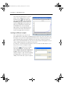
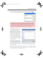
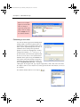

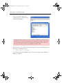
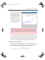


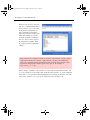


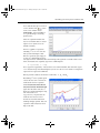
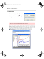

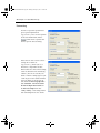
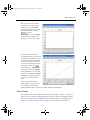


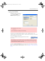
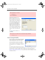

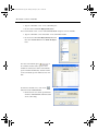

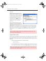
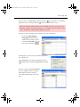


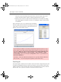


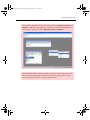


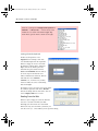
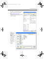


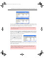


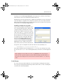


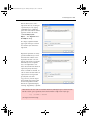


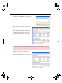


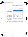
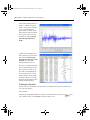


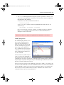


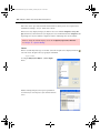
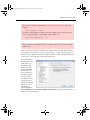


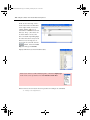


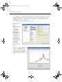
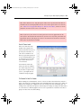

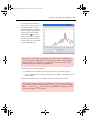
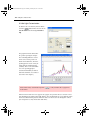

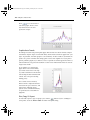

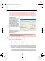

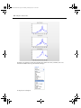
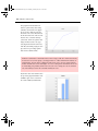
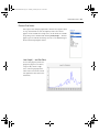
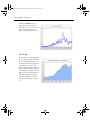

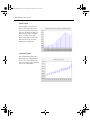
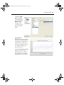
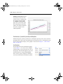
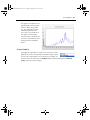
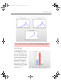

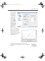
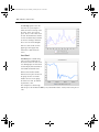
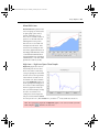


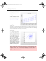
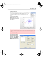

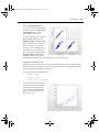
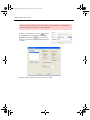
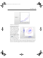
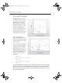


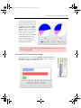
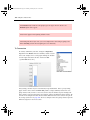


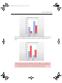
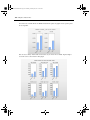

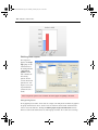


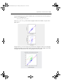

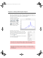


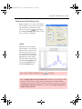
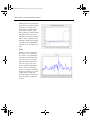
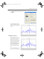
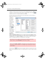

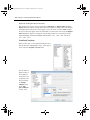


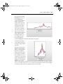

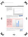

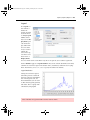
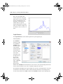
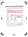
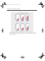
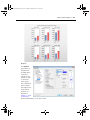
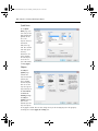


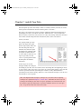
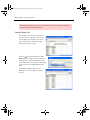


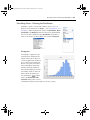
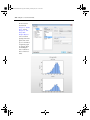
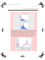
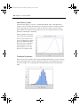


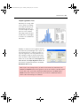


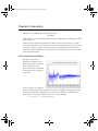


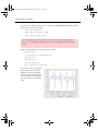


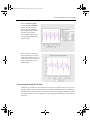

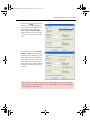
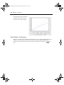

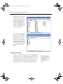


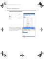
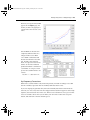


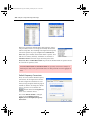


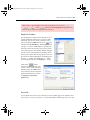


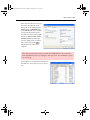
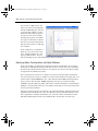

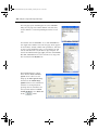


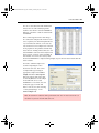


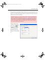

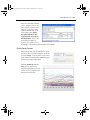
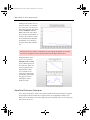


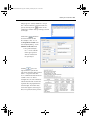

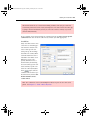


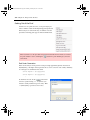
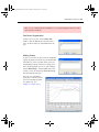
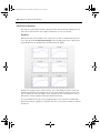
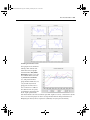


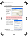


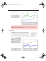
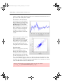


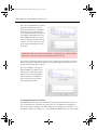
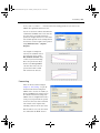

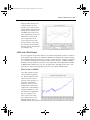

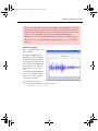

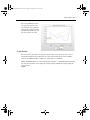


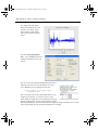


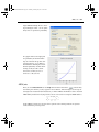

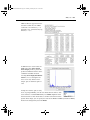


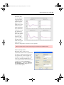


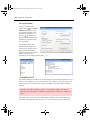

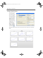
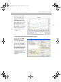
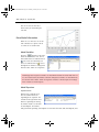
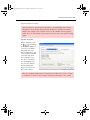


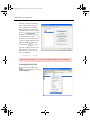
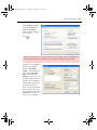
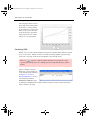
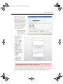


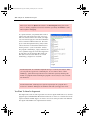
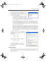
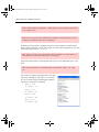


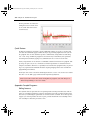


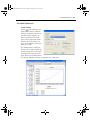


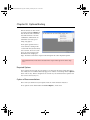

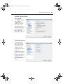


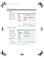


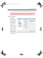
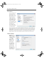


![2010 [FACILITATOR]](http://vs1.manualzilla.com/store/data/005655528_1-cab0d059d42c2f5dfa4b2de0f050c49f-150x150.png)