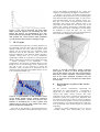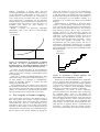
1
Visualising the potential of interactive systems
Harold Thimbleby
Middlesex University
LONDON, N11 2NQ
[email protected]
Abstract
is not necessarily what they will be happy using over a
period of time — and, if their unhappiness with use is
(or can be) sufficiently delayed after purchase, their
response may to buy a new product that promises to fix
the problems.
None of this might matter, except for the dangers
inherent in bad design. For example, car radios are as
complex as video recorders so their use inevitably
distracts drivers’ attention from the road conditions.
Indeed, car radios have been blamed for causing road
accidents and deaths. Medical equipment, aircraft
cockpits, nuclear power station controls, weapons
guidance systems: all are “similar” in basic conception
to the familiar consumer gadgets. All can be dangerous.
Thus the question arises: how can we design for
better interaction? As this is a conference on image
analysis, we shall suggest that (human) ways to visualise
interaction are essential, and we shall give some
suggestions. In particular, we shall emphasise the power
of simple visualisations that the reader of this paper can
try out easily — and no doubt extend — themselves.
Interactive systems are complex and often difficult to
use. Their complex design therefore presents ideal, and
worthwhile, material for visualising. Some of the
generic ways of visualising interaction, and some of the
pitfalls, are illustrated using simple techniques applied
to real examples. One problem with interactive devices,
particularly in the consumer market, is rapid
obsolescence: we visualise this as a performance-overtime graph, and show that doing so provides further
insight into the design process and its problems.
1.
Introduction
Computers and other systems would be pointless if
people could not interact with them. Although it is
trendy to consider how visualisation will change and
enhance how people interact with systems, the focus of
this paper is how visualisation will change how
designers are able to visualise interaction, and how,
thereby, they can design systems to be more usable.
How people are able to interact with systems is built
into those systems when they are designed, and this
constrains their future use. As the popular jokes about
the difficulty of using video recorders testify, even
relatively simple interactive systems are notoriously
hard to use. We joke that although we cannot use a
video recorder, our children can — thus disguising the
despair at being beaten by a complex gadget and an
impenetrable manual. Further, people redefine their
expectations so that difficult activities are avoided: few
people claim to need the percent key on a calculator,
many people claim they do not need to programme their
video recorder, many people “prefer” to switch their
mobile phone off than lock the keypad, and so on. Thus
asking users what they want in design is fraught with
problems.
Yet interactive systems, from multi-function watches
to costly desk-top workstations (and their complex
software) are sold successfully. People evidently “like”
what they are buying — although the continual churn in
the market (i.e., quick obsolescence) shows there is
longer-term dissatisfaction with system design. It is
clear that what users initially want, which sells products,
2.
Typical design environments
Most popular design environments provide no further
ways to visualise interaction than running the design.
This, of course, is essential for simulation studies, and
for working with users, possibly also for helping
technical authors write user manuals — but it provides
no leverage on the interaction design to enable designers
to do better.
Any interaction with a user is necessarily sequential:
they push a button (or make a menu selection, etc.),
something happens, they push another button … and so
on. That at each stage there were many other choices for
the dialogue are not visible. Therefore the designer does
not reason fully about the potential ways the design will
be used. This is crucial; any representation of an actual
interaction (such as a video transcript) is linear and has
no choice in it. It therefore represents a tiny fraction of
the design space: consider if the user chooses one out of
ten buttons to press leisurely once every minute — in a
working day, they have followed a short path inside a
state space of size 10300. No linear transcript can give a
1
significant impression of such a vast space. Designers
need something better.
Although a user only traverses a path through the
design space, the designer has to visualise the entire
space. W call the entire space, in distinction to any path
through it, the interaction potential [6]. Interaction
potential is a key concept in good design: consciousness
of it guards against being misled by demonstrations of
interactive systems, which present a possibly carefully
constructed path through the potential interaction. A
“good” demonstration, then, is drama, and the
boundaries of the stage get forgotten — but in design,
the edges of the stage are highly relevant to future users
(who may trip up). It is crucial that designers visualise a
representation of the whole potential, not just
attractively demonstrated paths.
Given human cognitive resources and perceptual
bandwidths, non-trivial appreciation of design issues
requires that interaction potential is represented
concisely. Visual media are more efficient than
sequential media, and given the scale of interaction
potential such efficiency is crucial.
Conventionally programming languages are the main
way to represent large run-time complexity using only a
modest visual area. The interaction potential of the
design is represented textually (though there are some
“visual languages”). Indeed, the more powerful
languages, such as C, are more compact than the weaker
languages, such as Cobol.
Programs grow to enormous size, and a lot of detail
in a program typically addresses issues that have little or
nothing to do with interaction. Moreover, standing back
a few metres from a program, to obtain the “big picture”
— literally, to gain a fresh perspective — just makes the
program illegible.
Thus, we are naturally led to considering visual (as
opposed to textual) representations of interactive
systems.1
3.
State diagrams
Finite state diagrams have long been used to represent
simple interactive systems. Unfortunately, diagrams of
more than, say, 20 states are incomprehensible (and
difficult to draw without error) — indeed finite state
diagrams are familiar to most people, but called mazes!
Note that even “simple” interactive systems have
thousands of states. (Finite state approaches also have a
bad reputation, because of a misunderstanding that finite
state machines are intrinsically weak.)
David Harel introduced Statecharts as a form of
structured finite state diagram [4]. Statecharts have
1
Formal methods attempts to provide overarching principles that
constrain design. These principles, being concise, compress the
interaction potential to a manageable size, even for text.
Unfortunately, few interactive systems consistently support more
than a few principles, and from the formal perspective, most
designs are ad hoc, and too hard to compress into a manageable
form.
numerous visual conventions for compressing the
representation, conveniently simplifying common
features of interactive systems.
For example, a personal digital assistant may have a
beep mode: its keyboard beep (key click) may be either
enabled or silent. In a conventional finite state diagram,
representing this feature doubles the size of the diagram.
It is hardly possible to draw it in a way that conveys the
simplicity of the concept (except in very small cases).
Worse, typical devices have more than one mode, and
each mode that is introduced at least doubles the size of
the diagram needed. In a Statechart, the original
personal digital assistant diagram is simply paired with a
trivial two-state diagram. Formally, the composite
Statechart represents a product — thus representing a
system twice as big, but only doing so with two
additional circles (and a couple of arrows).
ρ∆≡
Standby
+
–
H
+
1
+
8
–
+
7
–
–
–
+
2
6
+
–
–
–
3
+
∆
+
+
–
4
5
+
–
≡
4
ρ
≡
∆
≡
H
ρ
ρ
∆
Note.
ρ
ρ
≡ means either of the ≡+ or ≡– buttons;
∆ means either of the ∆+ or ∆– buttons
Figure 1a: Statechart of a Sony TV. From [6].
In Figures 1a and 1b, we show the Statecharts of a
television and the same television’s remote control.
Even a cursory glance shows that the two devices are
very different. A user has to learn two separate and
distinct systems, and the technical authors have to write
essentially two user manuals, rather than one. Is this a
design feature? Or is it a design error? Maybe it is a
cynical marketing feature: a user becomes accustomed
to using the remote control (thinking, the while, that
they can use the TV itself at any time); but when they
lose the remote control, they discover they do not in fact
know how to use the TV. Thus they buy another remote
control — and the manufacturer gets richer!
Looking more closely at the two Statecharts, what
else can we see? The TV has a time out: this is
represented by a tiny symbol. The implication for the
user of the TV is that to get out of some states, they
must do nothing for several seconds. Thus a user trying
to watch a programme will forever be stuck not
watching; only by giving up will they find out what to
do! This is arguably a usability design problem; but it is
not very clear from the Statechart. Indeed, many other
usability issues can be represented in a Statechart that a
careful analysis might reveal, but the design issues need
not be visually salient. In particular, the design issues
are unlikely to be salient to anyone other than a usability
expert who could have and should have spotted them by
some other method.
Off
Press
Press
H
Standby
Digit
Timer
Off
TT
Programmes
only
TV
Timer
Size
Normal
teletext
Teletext
only
TT
Teletext on
programme
TT
H
Size
30 minute
timer
Red
Large
top
Timer
60 minute
timer
Teletext
page
showing
Size
(found)
Timer
TT
Large
bottom
90 minute
timer
Digit
Green Yellow
Digit
Blue
One digit
showing
Digit
Digit
Two
digits
Searching
Digit
Channel
selected
Digit
-/-- -/--
+
H
Display – –
Digit
+
Sound
Sound
off
-/--
Sound
on
–
Sound
–
Display n –
H*
p+
Clock off
Clock
p+
Clock
Channels
1-8
Channels
9-59
p–
Clock on
p–
Figure 1b: Statechart of a Sony remote control.
From [6].
We’ve argued that sequential media and text,
including programming languages, are inadequate for
representing interaction potential for designers.
Statecharts are an improvement over finite state
diagrams, and they do reveal some, but not all usability
issues to designers.
What have we learnt? Interaction is a set of potential
paths through an unmanageable state space. This can
only be conceptualised if it is compressed in some way,
for instance by exploiting the constructs of a
programming language or of a Statechart.
Neither of these techniques take specific advantage of
human perceptual skills. To interpret a Statechart or to
interpret a program requires a sophisticated formal skill,
in fact, equivalent to mathematics. Yet we know that
humans are very good at understanding visual
representations, such as identifying textures, faces,
perspective, and so on. Can we exploit these perceptual
skills to leverage designers?
• We could use a machine learning (ML)
approach to learn usability issues, and then
these issues could be represented by more
direct means, such as graphs, faces, surfaces.
•
We could decide analytically what properties
to measure, and represent these conventionally,
as in graphs or contour diagrams.
• We could try arbitrary visualisations,
supplemented with sound and animation, in the
hope that patterns would emerge and be useful
to designerrs.
For the purposes of this paper, we shall not pursue the
last option further — though clearly it is a very
attractive research area: for example, to animate
Statecharts or Petri nets. Who knows what might be
revealed? The problem is that most usability issues are
critical. They are at best irritating to users, and in many
applications they may be mission critical or safety
critical. For example, if we made a colour space for a
fire alarm user interface could we guarantee the
designer would spot, say, post-completion errors?
4.
Networks
State diagrams and Statecharts are examples of
networks. A mathematical relation, namely the system
specification (or implying the specification), is drawn
(e.g., on paper) by using conventions such as a line
joining two points indicates that those points are in that
relation. The positions of the points on the paper do not
represent anything other than the convenience of the
drawing, for example to reduce the number of crossing
lines.
Typically, a network is drawn in such a way as to
minimise the number of line crossings and to achieve
certain aesthetic results. (One usually wishes to
eliminate all coincident lines and symbols, as these are
ambiguous.) A simple way to proceed is to draw the
network in a circle, so no lines are parallel, and
therefore none can be coincident. Often, this scheme
looks messy (Figure 2). There is a considerable
literature on drawing “good” networks, and even special
cases like trees can be very hard to draw well.
If a network can be drawn with no crossings (or
bridges), the diagram is said to be planar. The question
arises whether planarity “means” anything for the
designer of interactive systems. More particularly, is
there a usability property that can be extracted from a
design specification where planarity means anything
useful?
At one level this question sounds very vague, and at
another level very hopeful. Planar networks are very
easily characterised,2 so planarity is an easy concept
even for a computer to recognise. In everday life, we are
used to interacting with planar systems, such as
navigating around buildings, and we are rarely caught
out; but, conversely, large buildings (e.g., ones built on
hills) whose floor plans are not planar are notoriously
confusing.
2
Kuratowski’s theorem: a graph is planar if it does not contain a
subdivision of K5,5 or K3,3 as a subgraph.
Planar graphs have upper bounds on their number of
edges, and thus for a push button system, on the number
of buttons they can have for a given complexity.
worried that they may have gone round in circles or
missed bits of the manual. Thus an important aspect of a
“user-friendly” manual is to linearise a design; a
hypertext or VR manual, whatever other advantages it
might have, would not provide these useful guarantees
for a reader. More generally, call any sequential
representation of interaction a path. A complete user
manual must provide paths that together cover the
design. A manual that has interaction potential greater
than a single path itself requires visualising. Thus not all
visualisations solve the problem; conversely,
visualisations must be chosen with care!
5.
Figure 2: Nokia mobile phone drawn with each
function drawn on a circle, lines connecting
adjacent functions (i.e., representing one button
press). For clarity, the lines are undirected, and do
not indicate (e.g., with arrow heads) that
connections between states may be one way.
One representation of an interactive system is its user
manual. If we visualise this as a structured text, it is a
tree structure: sections containing subsections, and, at
the lowest level, paragraphs of instructions (or even
diagrams). Trees are planar. If a user manual requires
cross-references, then in general it will cease to be
planar. Further, a non-planar manual will be longer
when written in a natural language, since each “bridge”
will require an explicit cross-reference. It is self-evident
that systems that require longer manuals are not going to
be easier to use than systems with shorter manuals.
Thus we have hand-waving arguments that planarity
is a useful usability criterion — and planarity is a visual
concept, and readily discerned. More generally, the
thickness of a graph G is the minimum number of planar
graphs that need be superimposed to form G. The
thicker a system (or greater the minimum number of
bridges) the worse the usability make plausible
hypotheses that designers (or researchers) should
explore.
Note that because a user manual (without bridges) is
a sequential representation of a design it can be read
easily. The reader of a manual has a trivial algorithm for
learning about the design of a device: namely start
reading the manual, read each page, and continue to the
end. If the manual has too many bridges, the algorithm
becomes much more complex. The user becomes
Embedded networks
Only the topology of a network is relevant; the position
of symbols is a matter of convenience and aesthetics. In
contrast in an embedded network, the positions of
symbols is significant. Position is used to visualise
further properties of the design.
Figure 3 shows a ranked embedding. The x coordinate of a node represents the cost of a user getting to
it from the left-most node. The y co-ordinate is chosen
arbitrarily (at least in Figure 3) merely to avoid superposition of symbols. The ranked embedding
dramatically shows several interface features — for
instance that some parts of an interface are “outliers”
and much harder to get at than others; or that at a certain
point, the interface offers the user a far wider range of
choices.
Figure 3: Nokia mobile phone, drawn as a ranked
embedding, with “on” on the far left. Compare with
Figure 2.
With an interactive visualisation tool, one might
imagine the designer clicking on parts of the network
and the tool telling them what those parts represented. A
designer might click on a remote part of the network
(and since this is an embedded network, “remoteness” is
significant). The designer can then ask informed
questions: should, or should not, this part of the
interface be remote? Is it remote because it is to be
protected (by lock outs?), because it is infrequently
needed, or is it remote merely by oversight?
6.
Graphs
In a graph, the relation is represented by the position of
the points, rather than by a linkage between them. (This
is standard; we don’t wish to develop an axiomatic
approach to Cartesian graphics here.) Since paper is two
dimensional — and the image on the retina is two
dimensional — it is easy to portray two-variable
relations in graphs. For user interface design, the
question is which variables?
Usability is, basically, a measure of a system design
in terms that make sense to the user. How many tasks
can they complete in a given time? How many errors do
they make in a given time? How long does it take to
explore the system? How many errors per task do they
make? How likely is an error undoable and
unrecoverable from? What is the probability that a task
is completed? These are all scalar measures, and could
be represented by a frequency or a density graph. Or
they could be plotted against some parameter of the user
population, such as their age — thus showing, perhaps,
that older people make more errors per task.
The simplest parameters are arguably “cost” and
“time.” It happens that both are easy to measure, and
moreover can be measured at design time before any
users have been involved. This may sound against the
philosophy of “user centred design” (UCD) — no users!
— but it has the merit that something can be visualised
about a design before the design has been refined far
enough to involve users. For once a design is ready for
real humans to explore, it is practically ready to ship and
insights from empirical work are unlikely to influence
the eager marketers who wish to start selling the product
now it works well enough to be used.
Cost can be estimated by the number of button
presses (or mouse clicks, etc.) that the user has to make
to achieve stated goals. Time can be estimated by the
number of button presses a user makes: if they average
at 10 presses a minute, then presses and time are
proportional. It would seem, then, that a graph of
presses against time would be linear, a straight line. In
practice this is unlikely, since every error a user makes
increases the number of button presses required, and
hence the time they will take, but does not change the
number of presses required to achieve the intended goal
(unless the user interface is perverse, say, by penalising
errors it detects). Thus a plot of time against presses will
be super-linear (e.g., exponential); and the sharper the
curve rises, the worse the user interface (that is, for most
applications, perhaps not for games which deliberately
impose complications and puzzles).
We can call such graphs performance graphs. (Card,
Pirolli and Macinlay [2] describe a variant, which they
call cost-of-knowledge graphs.) The shape of a
performance graph will depend on, as well as the user’s
error behaviour, on the structure of the user interface. A
“combination lock” — which ensures that any error
takes the user back to the start of the interaction —
would exacerbate the penalties.
Also the shape will depend on the user’s presumed
knowledge: users make different sorts of error, some are
random, some are systematic, caused by incorrect
knowledge. A graph of performance against knowledge
would provide more insight for the designer. Figures 4
and 5 show examples, using a Markov model of the user
to model the user’s expertise. Figure 6 shows a similar
graph, but using perfect knowledge (rather than a
probabilistic knowledge).
Figure 4: Hyundai microwave cooker. Horizontal
axis is log mean time to access any state; vertical
axis is number of states accessible in at most that
time. The user model is Markov, with equiprobable
actions (i.e., the user has no knowledge).
Figure 5. Nokia mobile phone (cf. Figure 4).
Figure 6: Hewlett Packard calculator. Horizontal
axis is minimum time (in units of button presses) to
reach any state — and thus represents a “perfect
knowledge” user (or designer); vertical axis is
number of states accessible in at most that time.
Figure 7: The cost of accessing the entire state
space (vertical) against how accurately the user
knows the device. At knowledge=0, the user
presses buttons equiprobably; at knowledge=1, the
user presses the correct buttons (with probability
1), and therefore behaves like a designer might.
7.
converts the hidden 3D information into a serial time
sequence, revealed during the flight (or manipulation).
In Figure 9, we show a 3D surface (projected onto
2D) that shows the performance of a user plotted against
time taken and their initial knowledge. As can be seen,
with little knowledge, the user performs slowly (i.e.,
they take a lot of time to perform tasks); with more
knowledge, they become more efficient. This is not
surprising, but the details are: the curious step in the
surface, near “perfect” knowledge is interesting. What
does it mean with respect to the design? Can the design
be modified to avoid the step? (Or, for some
applications, would steps like this represent hurdles the
user would gain satisfaction from mastering?)
3D Graphs
A two dimensional graph shows a relation between two
sets (although it can show more than one relation, each
relation is between two sets), where any point of the
relation can be injected into any discernible visual
dimensions (such as hue, saturation, value, even with
temporal modulation), thus showing further dependent
variables. Going from two to three dimensions
significantly extends the compression of the graph (the
density of interaction potential it can usefully represent)
— human perception is not challenged — but
complications arise because of hidden surfaces. Even
though we see “in 3D” the images on our retinas are still
2D, and in fact we are restricted to seeing 2D
projections. Thus, not-quite-3D is achievable, but an
unrestricted 3D graph either has hidden surfaces or has
to be visualised in another way.
Figure 9: Hyundai microwave cooker (compare
with Figure 4, which is a slice through the right
front of this graph). The new axis (front-middle to
back-left) is user’s expertise. The surface shows
that as the user’s expertise increases, they are
able to access more of the device’s state space
more quickly.
8.
Figure 8: A representation of the transition matrix
of the Nokia mobile phone; heights represent
density of transitions. Clearly the phone’s user
interface is dominated by a menu system that
makes it easy to move to “near” states in the menu
(hence the prominent diagonal).
Using VR to “fly through” a 3D representation of a
relation, or using hands to manipulate the image, merely
Performance against time in the
long run
All the previous visualisations represented the
performance of a single interaction — conceptually a
single user at a single session (or an average over
several users and/or several sessions). The same
techniques can be used to visualise the performance of
interactive systems over longer times, measuring time
not in button presses but in units or versions of designs.
Now we can use the graphs to visualise the performance
of the technology, or of a design philosophy, rather than,
more specifically some specific design on a particular
technology.
Norman [5] credits Christensen [1] for a view of
“avoiding design” that, unfortunately, has become
endemic. Technology is getting better, and has
increasing performance over time. We can represent this
by the performance graph (Figure 8) using a line of
positive slope (it is not necessary for our purposes to
worry about the precise shape of the line, or exactly
what ‘performance’ is measuring). For any particular
task the user has, some minimum level of performance p
is required. From the graph it is clear that there is a
threshold point where the lines intersect, at
performance=p and time=t.
Before t, designs are delivering inadequate
performance; after t, they deliver at least adequate
performance.
Performance
p
“best,” but because not everyone can simultaneously
have the best, a feature-stepping race occurs. The result
is that few people ever benefit from their investment.
Systems and training becomes obsolete. (The millions of
tons of electronics the UK landfills annually is a
testament to the continual over-taking of once-leading
designs.)
Feature-stepping is illustrated in the graph below
(Figure 11). For simplicity, assume there are just two
users. One user has some required level of performance.
They get a message from the other user, who is using a
more advanced system, and so they are forced to
upgrade. However, by the time they upgrade, the
manufacturers have improved the performance of the
technology, so they upgrade beyond the level of the
other user. Then the situation between the users is
reversed, and the first user wants to upgrade … and so
on. Each user upgrades alternately, and if the
manufacturers play the game properly, the rate of
performance requirements increasing due to stepping
stays above the performance the technology can deliver.
Thus manufacturers can keep users permanently behind
the threshold time.
Required
Performance
t
Time
Figure 10. Performance of technology increases
with time. At time t performance exceeds a
threshold value p. The graph represents a period of
approximately ten years. Graph derived from [5].
So before the threshold time, all the manufactures
have to do is promise increased technical performance
(which is easy, since technology is getting better all the
time regardless).
After time t, products get distinguished not by their
performance but by being more subtly designed (e.g., to
be more usable). It is therefore in manufacturers’
interest to artifically increase p, because this will
postpone the threshold time.
For technologies like wrist watches, we are long past
the threshold, and watches are now fashion items. For
many interactive systems, like video recorders or mobile
phones, we should also be well beyond the threshold.
The next section tries to visualise why we are stuck …
9.
The tragedy of feature stepping
The tragedy of the commons is that farmers acting in
their own (selfish) best interests over-graze common
land. If the land is being over-grazed, the community
should hold back. But it is to the advantage of any
individual to graze a few more of their own animals,
especially if other people are removing theirs from the
common land. The same effect occurs with technologies
that are shared: each person benefits by having the
Time
Figure 11. Schematic of feature stepping. The
timescale is, for most products, in years.
People who use the latest standards force “backward”
users to upgrade. They then upgrade — but they buy
into technology that is the latest, and therefore ahead of
everyone else. So the co-stepping cycle goes. (Like the
tragedy of the commons, each individual’s sensible
behaviour is to the whole community’s detriment.)
Manufacturers are aware of these community
pressures and they may take further steps to encourage
the “upgrade habit.” Users of old designs are
encouraged to upgrade so they can use information from
their colleagues using later designs; worse, they may be
forced to upgrade by their “richer” colleagues because
later designs may deliberately not be compatible with
older versions. In other words, both old and new users
want old users to upgrade. This is a powerful way of
increasing p, especially when the stepping involves
many users spread around the world (as on the Internet);
there is no way (e.g., organisational purchase controls)
of controlling their understandable urges to keep up.
This seems somewhat cynical, but Microsoft (as an
example of a leading manufacturer) have admitted doing
it [3]: they are quoted as saying, “if we hadn’t brought
your processor to its knees, why else would you get a
new one?” Once a user buys the new processor, they are
in a position to put pressure on other users to upgrade to
keep up with them. It is interesting that most processor
purchases include bundled software: thus giving users
what seems like a free upgrade. Actually, it is marginal
for them, and expensive for everyone else who they
cause to step!
In short, consumers of complex computer systems
have been kept — for marketing reasons and so on — to
the left of the threshold. Kept “in their place” their job is
to consume, rather than to demand better systems, with
better quality interaction. Nobody is critical of bad
design, because their systems are anyway inadequate
and need upgrading …
missing large parts of analysis. Ironically the flight itself
becomes a design issue as well as a usability issue.
The schemes for visualising interaction potential of
single systems, over periods of perhaps hours, can also
be used to visualise performance over longer periods,
over a range of system designs. They thus visualise how
the technology progresses over longer periods, of years
or longer. Visualising progress at this level helps explain
market churn and why users are “happy” with inefficient
and badly designed user interfaces. It helps us realise
why designers need better visualisation tools. Once
designers find them useful, users will too — and their
greater insights will lead to commercial pressure and
positive feedback to improve design.
References
[1]
[2]
10. Conclusions
Visualisation can be used very effectively to provide an
efficient and insightful overview of a complex
phenomenon, such as the design of interactive systems.
However, effective visualisation is easily overwhelmed
and side-stepped by our emotional preferences for
submersive experience — the excitement of flying
through a VR visualisation of a complex system is great
fun. We argued, however, a flight — a path through the
space — runs the risk of converting an efficient holistic
visualisation into a serial presentation, and hence
[3]
[4]
[5]
[6]
C. M. Christensen, The Innovator's Dilemma: When
Technologies Cause Great Firms to Fail, Harvard
Business School Press, 1997.
S. K. Card, P. Pirolli and J. D. Macinlay, “The Costof-Knowledge Characteristic Function: Display
Evaluation for Direct-Walk Dynamic Information
Visualizations,” Proceedings of CHI'94, 238–244,
1994.
W. W. Gibbs, “Taking Computers to Task,” Scientific
American, 277(1): 64–71, 1997.
D. Harel and M. Politi, Modeling Reactive Systems
with Statecharts, McGraw-Hill, 1998.
D. A. Norman, The Invisible Computer, MIT Press,
1998.
H. Thimbleby, “Internet, Discourse and Interaction
Potential,” in L. K. Yong, L. Herman, Y. K. Leung &
J. Moyes, eds., First Asia Pacific Conference on
Human Computer Interaction, 3–18, 1996.