1
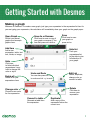
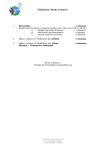
User Guide
Learn more about graphing functions, plotting tables of data,
evaluating equations, exploring transformations, and more! If you
have questions that aren’t answered in here, send us an email at
[email protected].
Getting Started with Desmos
Variables and Sliders
Graphable Expressions
Settings, Zoom, and Language
Tables
Lists and Statistics
Regressions
Notes, Folders, and Images
Supported Functions
Keyboard Shortcuts
facebook.com/desmosinc
@desmos
1
2
4
6
7
8
9
10
11
12
[email protected]
Getting Started with Desmos
Making a graph
Welcome to Desmos!! To create a new graph, just type your expression in the expression list bar. As
you are typing your expression, the calculator will immediately draw your graph on the graph paper.
Open Graph
Revisit your saved
graphs and example
graphs here.
Save As or Rename
Click here to save a copy of
your graph or rename it. You
can also press ctrl+shift+s.
Save
Click here to save
your graph or
press ctrl+s.
Add Item
Hide list
Add a new
expression, table, text
box, folder, or image.
Push your
expressions list
to the side to give
full attention to
your graph.
Hide
Click here
to hide individual
expressions. Longhold to change the
color or style.
Delete all
Delete all of your
expressions here.
Undo and Redo
You can also press ctrl +z
to undo and ctrl + y to redo.
Edit List
Delete, duplicate,
change color, or
convert to table.
Delete
Change color
Click here to
remove your
expression.
Choose a new color
for the expression.
Convert to table
Generate a table from
the expression.
Duplicate
Add a copy of the
expression below the
current one.
1
Variables and Sliders
You can graph a single line by entering an expression like y = 2x + 3. To make the graph more
dynamic, you can use parameters instead of constants: for example, y = mx + b. Add sliders for the
undefined parameters by clicking the prompt or define the parameters yourself by entering m=2 and
b=3. When you give constant values to parameters like m and b, the calculator will automatically
allow you to adjust their values with sliders. Adjusting m with the slider changes the slope of the line,
and adjusting b with the slider changes the intercept.
Any time you have free variables in an
expression, the calculator will offer to
let you define them with sliders:
You can use the same variables in several expressions to plot curves that will change together. For example:
The value of c defines two parallel lines that
move up and down together.
These two lines stay perpendicular to each
other for any value of m.
To adjust the limits and interval of your slider, click
either of the values at the ends of the slider bar.
Input your desired values and click the expression
or the graph to complete the adjustment.
2
To create a movable point, enter
a point with a variable for at least
one coordinate. Click and drag the
point around the graph to change
the value of the parameter(s). To
make graphs more interactive, use
parameters from your movable point in your expressions. For example, you can graph the line
y-b=m(x-a) and plot the movable point (a,b) to see the line move when you drag the point - don’t
forget to add sliders!
Saving a graph
You will need to be signed in to save and open your graphs.
Save a graph by pressing the
button located to the right
of the title bar or pressing ctrl+s on your keyboard.
Access your saved graphs by clicking
the my graphs icon:
Sharing a graph
Clicking
in the top toolbar will allow you to share your graphs.
Permalink
Underneath the social sharing options, you will
see a permalink for your graph. You can copy
this link and share it with anyone. When they
open it, they will see your graph and all of the
equations.
Image
Email
Email your graph by
clicking here. You
can send to multiple
recipients and even add
a custom message.
Embed
Grab a screenshot of your graph by clicking the
Image button. An image of your graph will open
in a new window, which you can print or rightclick to save as an image.
Copy the HTML embed code
to post your graph in a website
or wiki. You can also use the
BBCode for your graph to share
in any of our partner forums.
3
Graphable Expressions
Type of Graph
Example
Regular function y=2x+1
x in terms of y
x=√(1-y 2 )
Inequalities
x≤2y
2x 2 -1<y<4
Notes
Strict inequalities are
plotted with dashed
lines
r=sin(5θ)
Expressions with r
and theta (θ) will be
interpreted as polar
Piecewise
y={-1<x<1:-1, 1}
Use the {condition:
value, default} format for
piecewise functions.
Domain and range
restrictions
y=x{-2<x<2}
Polar
x=sin(y){-π<y<π}
Add the restriction at
the end of the equation.
Try the restrictions tour
in the help menu.
4
Type of Graph
Example
Notes
Point (1,0)
Use parentheses to plot
points
Point List
(1,1), (2,2), (3,3)
You can plot several
points by separating
them with commas
Movable Point (a,b)
Use a parameter for at
least one coordinate
(sin(2t), cos(3t))
Parametric equations
have the same form
as points. Any point
with functions of t for
coordinates will be plotted
as a parametric equation
Parametric
Implicit
x2 +y 2 =1
y 2 +sin(x)y+x=2
Solutions of equations
involving x and y can
be plotted without
solving for x or y
List Expressions
y = x + [1,3,5]
Learn more about lists on
page 8.
Regression
y1~ mx1+ b
Learn more about
regressions on page 9.
5
Settings, Zoom, and Language
Settings
Projector Mode
Using projector mode will make the graph and axes
lines thicker, and the number labels larger. This is great
for students sitting in the back of the classroom who are
looking at Desmos on the projector.
Graph Paper
In the graph paper section you can change the grid and
axes. Click the green circular icons to choose between
Cartesian and Polar grids and show or hide axes and
labels.
Click the gray arrow next to an axis to adjust the window
size, add a step (try “pi”), or add arrows.
Angles
Choose between radians and degrees here.
Zoom
You may zoom in and out of the calculator by using the zoom buttons in the zoom menu. If
your axes are no longer square, click the square option. To return to the default view, click
the default option.
Other ways to zoom:
If you are using a touch-enabled device, you may also use the pinch and zoom technique within the
graphing space. While using a computer with a mouse, you can use the scroll wheel for zooming.
Click and drag within the graphing window to pan your graph within the graphing space.
Language
To change the language of the calculator interface, click the icon and select your language from
the list. If you don’t see your language and would like to help with translation, email us at
[email protected].
6
Tables
Dive deeper into data with tables! You can create a new table or convert an existing expression into
a table. You can even copy/paste two column data from a spreadsheet into an empty expression box
to quickly create a new table.
Add Column
Make a new
column by hitting
the right arrow
key or clicking in
the top cell of the
column.
Add Table
Click the “Add Item”
button to create a
new table.
Add Row
Make a new row by hitting the down
arrow key or clicking in the cell.
Options Menu
Click the icon to
change color, connect
or hide the points, or
insert a new column.
Convert to Table
In edit mode, click the “convert to table” icon
to create a table from your expression.
7
Lists and Statistics
You can make lists in Desmos using square brackets like this: [1,1,2,3,5,8]
You can create lists with evenly spaced elements. [1,...,10] is a list of the integers
between 1 and 10. [1,3,...,11] is a list of the odd integers between 1 and 11.
You can use lists anywhere in expressions that
you would use a number.
Statistics functions like mean, median, min, max, and
stdev take a list as an argument and return a number.
Table columns are available as lists in the rest of the
system.
8
Regressions
~ is our magic regression symbol. Basically, if you connect two lists of data with a ~,
we adjust every free parameter to make the lists as close to each other as possible.
Since table columns are each lists, the easiest way to make a regression is to create
a new table of data, and then write an equation like y1~mx1+b. Here, we’ll adjust m &
b to find the best linear model. If you instead type y1~ax12+bx1+c, we’ll find the best
quadratic fit.
1
1
If x1 and y1 are table columns,
then y1 ~ m x1 + b is a
regression that finds the least
squares values of m and b
and plots the best fit line.
You can click
to plot residuals, or use residuals in other expressions. For example
2
mean(e1 ) is the mean of the squares of the residuals.
Try the regressions tour in the help menu for a
guided introduction to creating regressions in the
calculator.
9
Notes, Folders, and Images
In addition to expressions and tables, you can add helpful
non-math items to your expression list.
Note
Add a note from the expression drop down, or by pressing
the quote key “ in an empty expression box.
Folder
Folders allow grouping expressions, collapsing groups, and
showing/hiding a whole group at once.
Image
Add an image from the
drop down, or drag
your image into the
expression list.
You can drag equations
into the folder - a gray
line will show up to the
left of the equation to let
you know it’s in the folder. You can click the arrow next to
the folder name to expand/collapse the folder contents and
clicking the folder icon will show/hide the contents.
You can edit image position and size by
manually setting it in the expression list
or dragging the blue points on the graph
paper.
Amazing photo by Dan Meyer
10
Supported Functions
Exponents & Logs
Stats & Probability
Trig Functions
exp(x)
total(x1)
sin(x)
ln(x)
sum of all elements in a list
length(x1)
arcsin(x)
sinh(x)
cos(x) arccos(x)
cosh(x)
log(x)
number of elements in a list
tan(x)
arctan(x)
tanh(x)
log n(x)
mean(x1)
sec(x)
arcsec(x)
sech(x)
xn
median(x1 )
csc(x)
arccsc(x)
csch(x)
√x
min(x1)
cot(x)
arccot(x)
coth(x)
Precalc & Calculus
d/dx
∑
Π
Misc
lcm(a, b)
gcd(a, b)
mod(a, b)
max(x1)
quantile(x1, p)
mad(x1)
mean absolute deviation
stdev(x1)
sample standard deviation
stdevp(x1)
population standard deviation
var(x1)
variance
ceil(x)
cov(x1, x 2)
floor(x)
corr(x1, x2)
round(x)
abs(x)
sign(x)
covariance
Define your own function
You can also create your
own functions, which can be
defined with any letter (except
for the special ones, like
x,y,r, t, and e). Your custom
functions can then be used like
any other function on this list.
For example, if you type f(x) =
x^2, you can then graph y =
f(x+1), which
is the same
parabola but
shifted over
to the left:
Pearson correlation
coefficient of two lists
nCr(n, r)
Number of combinations
nPr(n, r)
Number of permutations
n!
Factorial
11
Keyboard Shortcuts
Open Graph: ctrl + o
Symbols
Save: ctrl + s
∑ : Type “sum”
Save-As or Rename: ctrl + shift + s
π : Type “pi”
Undo: ctrl + z
θ : Type “theta”
Redo: ctrl + y
√ : Type “sqrt”
New expression: Press “enter”
∏ : Type “prod”
Move up/down: Press the and
Move left/right: Press the
arrow keys
and
arrow keys
Add a new text box: Press the quotation keys (“ ”)
Delete an expression: Press “delete”
All done!
You’re ready to take off and explore Desmos! If you
have questions that we didn’t answer in here,
send us an email at [email protected].
12