1
SOHO Business Cards™
User’s Guide
Chronos LLC
January 29, 2006
1
© 2007 Chronos LLC. All rights reserved.
Under the copyright laws, this user guide may not be copied, in whole or in part, without the written consent of
Chronos. Your rights to the software are governed by the accompanying software license agreement.
Every effort has been made to ensure that the information in this user guide is accurate. Chronos is not responsible for printing or clerical errors.
Chronos LLC
www.chronosnet.com
SOHO Business Cards, the SOHO Business Cards logo, and the Chronos logo are trademarks of Chronos LLC.
Apple, iPhoto, Mac, Macintosh, Mac OS, and Finder are trademarks of Apple Inc., registered in the U.S. and other
countries.
Digital image content © 1997-2004 Hemera Technologies, Inc., All Rights Reserved.
Bitstream is a registered trademark and the Bitstream logo is a trademark of Bitstream Inc. Bank Gothic Light,
Bernhard Tango, Cloister Openface, Dom casual, Empire, Goudy Handtooled, Goudy Old Style, Kaufmann, Latin
Extra Condensed, Murray Hill, Onyx, Romana roman, Typo Upright, Liberty, Huxley Vertical, Stencil, and Engravers' Old English are trademarks of Kingsley-ATF Type Corporation. Blippo black is a trademark of FotoStar International. Bremen Bold and Mister Earl are trademarks of Bitstream Inc..
PaperDirect is a registered trademark of PaperDirect Inc.
Postscript is a registered trademark of Adobe Systems Inc.
All other trademarks, registered trademarks, service names, product and/or brand names are the sole property
of their respective owners. Mention of third-party products is for informational purposes only and constitutes
neither an endorsement nor a recommendation. Chronos assumes no responsiblity with regard to the performance or use of these products.
2
Chapter 1—Welcome
System Requirements
6
Upgrade Information
6
Features at a Glance
6
Installing SOHO Business Cards
8
Learning to Use SOHO Business Cards
9
Chapter 2—Overview
The Project Wizard
10
Preview & Design Modes
10
The Preview Mode Window
11
The Inspector Window
12
The Smart Inspector Window
13
Chapter 3—Creating and Printing Business Cards
Step 1: Select a Ready-Made Design
15
Step 2: Edit a Business Card
15
Step 3: Preview a Business Card
16
Step 4: Print a Business Card
16
Advanced: Custom Layouts
17
Advanced: Card Types
18
Chapter 4—The Design Canvas
Rulers
20
Grid
20
Zoom
21
Saving Your Work
21
Recovered Files
21
3
Chapter 5—Working With Text, Graphics and Shapes
Creating a Text Box
22
The Text Bin
22
Changing Basic Text Attributes
23
Tab Stops
24
Advanced Typography Options
24
Text Style Grabber
26
Working With Graphics and Shapes
26
Resizing, Moving, and Arranging Objects
28
Flipping Shapes & Graphics
29
Grouping Objects
29
Locking Objects
29
Layers
29
Alignment
32
Favorites Bin
32
Chapter 6—Changing Object Properties
Size, Location and Angle Properties
34
Smart Shape Properties
35
Graphic Properties
38
Text Properties
41
Advanced Properties
42
Background Properties
44
Chapter 7—Working With Fields
Using Fields
45
Me, Others, & Misc Fields
45
Specifying “Me”
46
4
Field Definitions
46
Barcode Fields
52
Counter or Automatic Numbering Fields
54
Importing Tab Delimited Files
55
Dependency Fields
56
One-Click Formatting
57
Field Formatting Options
58
Chapter 8—Printing
Printing Using Your Own Printer
61
Printing Using a Commercial Print Shop
62
Exporting Your Design
63
Printer Calibration
63
Envelope Printing
64
Printing Preferences
65
5
Chapter 1—Welcome
SOHO Business Cards is the fastest way to design and print professional-looking business cards on your Macintosh. First impressions are important and business cards are often the first promotional material a person receives from a company. SOHO Business Cards provides precision tools and professional ready-made designs to
make sure a great impression is conveyed the first time, every time!
System Requirements
✦
✦
✦
✦
Mac OS X v10.4 or later
40MB of available disk space (1.2GB for full clip art collection)
DVD-ROM drive for installation
Inkjet or laser printer optional. Stunning results from all popular ink jet, laser and color laser printers including
HP, Epson, Canon, Lexmark, etc.
Upgrade Information
SOHO Business Cards 2.x is backwards compatible with version 1.x. This means SOHO Business Cards 2.x can
open older business card documents so you can continue to use and edit your designs. To upgrade from 1.x to
2.x please do the following:
1) Install SOHO Business Cards 2.x as per the instructions in this chapter
2) Launch SOHO Business Cards 2.x. If SOHO Business Cards finds your old collection of 3,000+ ready-made designs
it will ask you if you want to convert them for use with version 2.x. If you answer in the affirmative, your designs
will be converted which means that you’ll no longer be able to use them with version 1.x.
Features at a Glance
The following is a list of some of the major features of SOHO Business Cards. For a complete list of features visit
http://www.chronosnet.com.
✦ Ready-Made Designs
• 13,000+ photographs & clip art graphics
• 50 Bitstream® fonts, PostScript® format
• 3,000+ professional ready-made designs
• Designs for 400+ unique professions
✦ Compatibility
• Compatible with virtually all business card stock from Avery, PaperDirect, Idea Art and more
• Supports horizontal, vertical, double-sided, folding and CD business card formats
• 700+ supported card stocks sizes
• U.S. Letter & European stock sizes
• Print to the edge (full bleed) support
• Order cards from commercial online printer (additional fees apply)
• Quickly search for card stocks and ready-made designs by typing a few keystrokes
✦ Integration & Management
• Smart Inspector
6
✦
✦
✦
✦
✦
• Project Wizard
• Integrates with the Mac OS X Address Book
• Photos and albums from iPhoto displayed in built-in Photo Browser for direct access
• Search graphics by category or keyword
• Import logos, photos and clip art in popular formats
• Built-in Favorites Bin stores favorite graphics, shapes, text for quick reuse
• Built-in Text Bin
• Create business cards for entire company using a single design
Powerful Design Tools
• 30+ Smart Shapes with individual shape controls
• Group/Un-group objects
• Unlimited layers including standard foreground/background layers
• Lock/Unlock objects
• Crop photos
• Real-time crop zooming
• Crop images to text and shapes
• Perspective tool
Layout Tools
• Rulers
• Grid Overlay and Underlay
• Snap-to-grid
• Supports inches, centimeters, picas
• Real-time alignment guides
• Arrange and align objects
• Rotate any object
• Zoom to any size
• Make objects same width, height, or symmetrical
• Double-sided and folding card canvases
Typography
• Use over 150 smart-fields to automatically place information from the Mac OS X Address Book directly on
your business cards. Smart-fields take care of the details like name, address and phone number formatting
so you don't have to. Plus, there are smart fields for almost everything including logos, initials, one-line addresses and more.
• Dynamic addresses
• Upper/lower case formatting
• 8 automatic text fitting options including shrink-to-fit, auto-expanding, etc.
• Perfect Balance
Special Effects
• 30+ special effects like Sepia, Motion Blur, Sparkle, and more
• Linear & circular gradients
• 100+ Super-Masks with custom controls
• Photo fine-tuning
• Transparency
• Shadows with adjustment controls
• Image tinting
Printing
• Print to ink jet, laser, and color laser printers
• Online commercial printing support
• Simple and unique printer calibration for perfect card stock alignment
• Prints professional-quality registrations marks and bleed area
7
Installing SOHO Business Cards
To install SOHO Business Cards from a DVD:
1) Insert SOHO Business Cards DVD into your computer’s optical drive.
2) Drag and drop the SOHO Business Cards application icon into your Applications folder or other folder of your
choice.
3) Optional: Double-click the Clip Art, Designs, and Fonts Installer icon if you wish to install all the clip art, readymade designs, and fonts. Installing these additional items are not required for the correct operation of the software.
To install SOHO Business Cards from a download:
1) Open the SOHO Business Cards disk image on your desktop
2) Drag and drop the SOHO Business Cards application icon into your Applications folder or other folder of your
choice.
What Gets Installed?
The SOHO Business Cards Installer will install the following items on to your hard disk.
✦ Chronos. This folder stores the clip art, ready-made designs and other related support files. The Chronos folder
will be installed into the “Application Support” folder of your main “Library” folder: /Library/Application Support/
✦ SOHO Business Cards Fonts. This folder contains the 50 included Bitstream® PostScript fonts as listed in the following table. This folder will be installed into the “Fonts” folder of your main “Library” folder: /Library/Fonts/
50 Bitstream® Fonts
BankGothic™ Light
Bank Gothic Medium
Belwe Bold
Belwe Condensed
Bernhard Tango™
Blippo™ Black
Bremen Black
Bremen™ Bold
Chianti Bold BT
Chianti Extra Bold BT
Chianti™ Roman BT
Cloister Openface™
CopperplateGothicCondensed
Dom™ Casual
Empire™
English 111 Presto
Engravers’ Old English™
Engravers’ Old English Bold
Engravers’ Roman
Engravers’ Roman Bold
Formal 436
Freehand 575
Goudy Handtooled™
Goudy Old Style™
Huxley Vertical™
Impress
Kaufmann™
Kaufmann bold
Latin Extra Condensed™
Letter Gothic 12 Pitch Bold
Letter Gothic 12 Pitch Roman
Liberty™
Lucia
Lydian Cursive
Mister Earl™
Murray Hill®
Murray Hill Bold
Onyx™
Orator 15 Pitch
Poster Bodni Roman BT
Poster Bodoni Italic BT
Romana Bold
Romana™ Roman
Staccato 222
Stencil™
Stuyvesant
Typo Upgright™
Umbra™
VAG Rounded
Venetian 301 demi italic
8
Uninstall SOHO Business Cards
The below steps describe how to uninstall all of the components related to SOHO Business Cards. Caution must
be taken when uninstalling the software since other Chronos software may share certain installed components
as noted.
1) Delete the SOHO Business Cards application. The SOHO Business Cards application was originally installed by
you, so you are the only one that knows where it is installed.
2) Delete the “Chronos/SOHO Business Cards” folder. This is located in the “Application Support” folder of your
home Library folder.
3) Delete the “Chronos/SOHO Business Cards” folder. This is located in the “Application Support” folder of your main
Library folder.
4) Delete the “Chronos/Clip Art” folder. This is located in the “Application Support” folder of your main Library
folder. See warning below.
5) Delete the “SOHO Business Cards Fonts” from the Fonts folder of the main Library folder.
6) Delete the “com.chronos.SOHOBusinessCards.plist” file. This file is located in the “Preferences” folder of your
home Library folder.
Warning: If you have installed other Chronos software, do not delete the “Chronos/Clip Art/ folder listed above.
Otherwise, the other Chronos software will no longer have access to the clip art.
Learning to Use SOHO Business Cards
To learn how to use SOHO Business Cards, consult these resources:
User’s Guide
This guide describes the features and shows how to use the software.
Onscreen Help
Help tags are available for many of the items you see in the software. To see the help tags, let the pointer rest
over an item for a couple of seconds.
Ready-Made Designs
The software ships with numerous ready-made designs for business cards. Examining how these ready-made
designs were put together will help you design your own.
Technical Support
Chronos provides various support options for its software products. See
http://www.chronosnet.com/Support/index.html for technical support options.
Web Resources
Go to http://www.chronosnet.com/Products/index.html to get the latest software and updates.
9
Chapter 2—Overview
This chapter introduces you to the windows and tools you’ll use to create stunning business cards. When you
create a new business card, you can choose an existing ready-made design or you can start with a blank canvas.
You can drag objects onto your card such as graphics, text, and shapes to customize your design. When you’re
ready to print, you can preview your design with your personal contact information that will automatically be
filled-in. You’ll be able to choose exactly how many cards you wish to print and you’ll see exactly how they’ll
appear on the printed page.
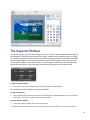
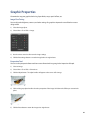
The Project Wizard
When you first launch the software, a new window will appear and display the Project Wizard.
The wizard walks you through a series of choices to quickly get you started. Each choice is accompanied by a
preview so there’s no guess-work to your decisions. There are three choices to make:
✦ The format of your card: horizontal, vertical, double-sided, folding, or CD.
✦ The business card stock you’re using: Avery 5371, Avery 5873, etc.
✦ The ready-made design you’d like to get started with (or a blank card).
Preview & Design Modes
You will work with your new project in one of two modes: Design and Preview. You design and edit your business card in Design mode. After you get your design just right, you use the Preview mode to see how your design looks with all of your contact information filled-in.
To switch to preview mode:
10
1) Click the Preview button on the toolbar. Preview mode is used to view your business cards just like they’ll be
printed. As soon as you switch to Preview mode, any contact fields on your business card will be populated with
contact information from the Mac OS X Address Book application based on the selected contact in the Me preference pane. Preview mode lets you choose how many business cards you wish to print and the starting card
position on the page so you don’t waste paper. As the name implies, Preview mode is for viewing only (no editing) and is typically used in preparation for printing.
To switch to design mode:
1) Click the Design button in the toolbar. Design mode is used to edit a business card. When you are in design
mode you can add text, graphics and other objects to your business card. You can also use the inspector tools to
change the attributes of objects on your business card.
The Preview Mode Window
When in Preview mode, the window changes to show you an exact preview of how your design will look on the
printed page. Controls are available to let you a) zoom in/out on the preview; b) change the number of cards
you wish to have printed; and c) choose the starting card position in case you want to re-use card stock.
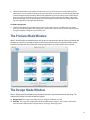
The Design Mode Window
When in Design mode, the window changes to provide you with a special environment for card design. The
content of the window is divided into two basic regions:
✦ Design Canvas. This region on the left is where you design and edit business cards.
✦ Parts Bin. This region on the right is divided into four different tabs: Graphics, Text, Contacts, and Favorites.
Each tab contains different parts or objects that you can drag to the Design Canvas.
11
The Inspector Window
The Inspector window is only available in Design mode and is a semi-transparent window that floats above all
other windows. The Inspector window includes all the tools needed for working with text, shapes, and graphics. It differs from Inspector windows found in other software programs in that it only shows the tools applicable to the selected object so you’re not burdened with a bunch of disabled options. You can open and use as
many Inspector windows as you need. Plus, there is a Smart Inspector window discussed in the next section
which works and looks like a regular Inspector window, but it only appears when and where needed.
To open an Inspector window:
1) Choose View > New Inspector. Repeat this step to open multiple Inspector windows.
You can move the Inspector window anywhere you would like.
To select a specific tool:
1) Select a tool from the pop-up menu in the title bar of the Inspector window. Optionally, you can choose View >
Show Tools > and choose a specific tool in the Inspector window.
To use the Inspector window:
1) Select a text, shape, or graphic object on the Design Canvas.
2) Open the Inspector window if it’s not already open and select a tool you wish to use on the selected object.
12
3) Use the tool according to the object you selected. For example, if you’re using the Dimensions tool you can precisely set the position and size of the selected object. As you make changes in the Inspector window they will be
applied immediately to the selected object.
The Smart Inspector Window
The Smart Inspector window differs from a regular Inspector window in that it only appears when an object is
selected and it only appears near the selected object. You can think of it as a “context-sensitive” Inspector window. The Smart Inspector offers four main advantages over a regular Inspector window.
✦ It frees up screen real-estate. You don’t have to find a permanent home for the Smart Inspector window on
your screen because it appears next to your selected object on the design canvas.
✦ It reduces screen clutter. Your screen won’t be cluttered with Inspector windows because it appears directly on
top of the Design Canvas when you need it.
✦ It’s unobtrusive. The Smart Inspector window only appears when an object is selected and disappears just as
quickly. Its unobtrusive nature makes it easier for you to focus on your design and not the software.
✦ Less mousing around. Because the Smart Inspector window appears near the selected object, you don’t have
to move your mouse as far to reach the tools you need. With a regular Inspector window, you typically have to
move the mouse across the screen to reach the Inspector window.
To show/hide the Smart Inspector window:
1) Choose View > Show/Hide Smart Inspector.
Please note that you can use the Smart Inspector window along side one or more regular Inspector windows.
To use the Smart Inspector window:
Once you’ve made the Smart Inspector window visible, it will appear anytime you select an object on the Design Canvas. The Smart Inspector automatically positions itself below the selected object and automatically
moves with the selected object.
1) Select an object on the Design Canvas.
2) Select a tool from the arrow pop-up menu. The Smart Inspector will expand to show you the complete set of
controls for the selected tool.
13
3) Click the Minus (-) button in the upper-left hand corner to collapse the Smart Inspector window back to a minimized state.
The state of the Smart Inspector window will be remembered from object to object. For example, if you minimize the Smart Inspector window after working on one object, when you select another object the Smart Inspector window will remain minimized and vice versa.
14
Chapter 3—Creating and Printing Business Cards
This chapter outlines the basic tasks and steps you might go through to create and print out professionalquality business cards. When you create a new project, your entire design including any graphics, text and
shapes is saved in document that can be easily moved from one computer to another.
Step 1: Select a Ready-Made Design
To start a new project, double-click the SOHO Business Cards icon to open the software. The software comes
with an extensive collection of ready-made designs. By using a ready-made design, you can start with a
cohesive-looking business card design that you can customize or use as-is. You can also choose a blank design
if you prefer to start from scratch.
To create a business card using a ready-made design:
1) Choose File > New.
2) Select a card type and click Continue. You can choose from Horizontal, Vertical, Double-Sided, Folding, and CD
card types. For more information on these card types, see Card Types.
3) Select a card stock manufacturer from the pop-up menu.
4) Select a card stock format from the list and click Continue.
5) Select a ready-made design category in the left column and then select the ready-made design you wish to use.
Select Blank Horizontal Card or Blank Vertical Card if you would like to design your business card completely
from scratch.
6) Click Choose.
To create a custom business card format:
1) Choose File > New.
2) Select a card type and click Continue. You can choose from Horizontal, Vertical, Double-Sided, Folding, and CD.
3) Click Custom Size.
4) Fill in the appropriate information for the layout settings. For a description of the various layout settings see the
Layout Definitions table below.
5) Click Choose.
To create a business card using a recent design:
1) Choose File > Open Recent, and select a recent design..
Step 2: Edit a Business Card
After you select a ready-made design, it will appear on the Design Canvas. If you like the way everything looks
at this point, you can skip to the next step. Otherwise, you can edit the design by customizing it with text,
shapes and graphics. Before you can edit the business card you will need to switch from Preview mode to Design mode (Choose View > Design Mode).
15
To add text to the business card:
✦ Double-click in an existing text box and type your text.
✦ Choose Edit > Place Text Box.
To add shapes and graphics:
1) Click the Graphics tab.
2) Click either the Shapes or Clip Art button.
3) Drag a shape or graphic object to your business card.
Step 3: Preview a Business Card
When you’re finished editing your design, you’ll probably want to view it laid out on the card stock you chose to
see how it will look when printed. When you switch to Preview mode, any contact fields in your business card
will be populated with contact information from the Address Book application based on the selected contact in
the Me preference pane. For more information on selecting a contact to use from the Address Book application,
see Specifying “Me”. There are also several options that you can use to control exactly what appears on the final
printout.
To preview your business card:
1) Choose View > Preview Mode, or click the Preview button in the toolbar.
To specify the number of business cards(s) to print:
1) Choose the number of card(s) you wish to print from the Repeat pop-up menu. Choose Full Page if you want a
single full sheet of cards.
To specify where on the card stock sheet you want the first card to appear:
1) Enter a start card position number. This option is useful if you’re reusing a partially used sheet of business card
stock.
Step 4: Print a Business Card
The final step is to set up your printer and print.
To setup the printer:
1) Choose File > Page Setup.
2) Verify that each of the settings are correct for your printer.
To print the business card(s):
1) Choose File > Print.
2) Verify that each of the settings are correct for your printer. Settings will vary from printer to printer so it’s important that you’re familiar with your printer’s settings.
3) Click Print.
You can also have your business cards printed at a commercial printer. For more information on using a commercial printer, see Printing.
16
Advanced: Custom Layouts
As you begin working with a business card, you can change the card stock format or its dimensions/orientation.
To change the layout of a business card:
1) Choose File > Change Layout.
2) Select a new card stock manufacturer and choose a card stock format.
3) OR click Custom Size to manually change the layout settings of the business card. For a description of the various layout settings see the Layout Definitions table below.
4) Click Choose.
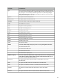
Layout Definitions
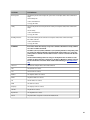
Setting Name
Definition
Layout Name
This pop-up menu allows you to choose or create a name for the custom layout.
Card type
This setting allows you to choose from different card types (Single-sided, Doublesided, Rounded, Rounded/Double-sided, Folding, and CD)
Orientation
This is the orientation of the cards on the card stock. If the cards are horizontal then
the card stock will be portrait. If the cards are vertical then the card stock will be
landscape.
Paper Size
This pop-up menu allows you to choose from common paper sizes.
Width
This is the width of the business card measured from left edge to the right edge.
Height
This is the height of the business card measured from top edge to the bottom edge.
Rows
This is the number of rows of business cards on the page.
Columns
This is the number of columns of business cards on the page.
Top
This is the top margin measurement. The top margin is a measurement of the space
from the top of the page to the top edge of the business cards in the first row.
Left
This is the left margin measurement. The left margin is a measurement of the space
from the left side of the page to the left edge of the business cards in the first column.
Horizontal
This is the measurement of blank space between the right edge of the business
cards in the first column and the left edge of the business cards in the second column.
Vertical
This is the measurement of blank space between the bottom edge of the business
cards in the first row and the top edge of the business cards in the second row.
Corner radius
This is the measurement of the corner radius. This measurement will usually be
provided by the card stock manufacturer. The corner radius measurement is only
used for rounded corner business cards.
Inner
This is the measurement of the diameter of the inner circle of a CD business card.
This measurement will usually be provided by the card stock manufacturer. The
inner measurement is only used for CD business cards.
17
Layout Definitions
Outer
This is the measurement of the diameter of the outer circle of a CD business card.
This measurement will usually be provided by the card stock manufacturer. The
Outer measurement is only used for CD business cards.
Advanced: Card Types
You can choose to create the following business card types: Horizontal, Vertical, Double-sided, Folding, and CD.
This section will briefly describe each card type and any special notes you should know about.
Horizontal & Vertical
Horizontal and vertical business cards are the most common types of business cards. Both can usually be
printed on the same card stock. The only difference is the orientation of the card.
Double-Sided & Folding
These business card types allow you to design both the front back side of a business card at the same time.
Once your design is complete, you can easily view and print each side. When designing both sides of a business
card you will see both the front and back of it at the same time in Design mode. This makes it easy to create a
complementary look for both sides. When you switch to Preview mode you can choose which side of the business card to view and print.
To adjust the spacing between the front and back side of a business card:
When in Design mode, you will see both the front and back sides of the business card on the Design Canvas.
The space between the front and back side of the business card is adjustable. You may want to increase this
space if there’s a design element such as a graphic that you need to bleed off the edge of one of the sides without bleeding onto the other side. Similarly, you may want to decrease this space if there’s a design element
that you want to appear on both the front and back sides.
1) Choose Format > Background > Double-sided Card Spacing.
2) Enter the amount of spacing between card sides.
To view and print the front and back side of a business card:
1) Choose View > Preview Mode.
2) Select Card Front at the bottom of the main window.
3) Set any printing options. For more information on printing options, see Printing.
4) Choose File > Print.
5) Click Print.
6) Flip the card stock paper and insert it back into your printer.
7) Select Card Back at the bottom of the main window.
8) Choose File > Print.
9) Click Print.
18
CD
CD business cards can be handy if you want to hand out a business card that also contains content such as a
promotional video clip about your company. The stock for this type of card is typically an adhesive label that
can be adhered to the business card CD.
19
Chapter 4—The Design Canvas
The Design Canvas is where most of your creative work takes place. This chapter describes a few basic tools that
the Design Canvas offers to make your life a little easier.
Rulers
As you move your text, shapes, or graphics around on the Design Canvas, you can turn on rulers to help you
precisely place objects. Rulers show you how far an object is from the top edge and the left edge of the design.
Also, as you drag objects around on the Design Canvas, guidelines will appear in the ruler to show you exactly
where the object will be placed.
To turn on rulers:
1) Choose View > Show Rulers.
To change the units of measurement in the rulers:
1) Choose SOHO Labels & Envelopes > Preferences, and click the General button.
2) Click the Units pop-up menu and select a unit of measurement.
Grid
As you drag text, shapes, or graphics around on the Design Canvas, you can enable the grid to help you precisely align and place objects. The grid shows you exactly where the object will be placed on the Design Canvas.
You can enable snap-to-grid to automatically align objects to the grid when you drop them on the Design Canvas or move them. Furthermore, you can choose to have the grid appear above or below the artwork on your
Design Canvas, adjust the spacing between each grid line, and adjust how often a guideline appears.
To enable the grid and snap-to-grid:
1) Choose View > Show Grid, and select either ABOVE artwork or BELOW artwork.
2) Choose View > Snap to Grid.
To adjust the spacing between grid lines:
1) Choose SOHO Labels & Envelopes > Preferences, and click the Appearance button.
2) Enter the amount of spacing you want in the Spacing field.
To adjust how often a guideline appears:
A guideline is a thicker grid line on the grid. You can adjust how often these guidelines appear.
1) Choose SOHO Labels & Envelopes > Preferences, and click the Appearance button.
2) Enter how often a guideline should appear in the “Guideline every” field.
20
Zoom
When working with your design you may want to zoom in or out to get a better view. There are two mechanisms for zooming in and out on your design.
✦ The zoom slide tool located at the bottom of the Design Canvas
✦ The zoom pop-up menu located in the bottom left corner of the Design Canvas.
Saving Your Work
When saving your design, all related objects such as shapes and graphics are saved in a single file. This makes it
convenient for backups and transferring files to other computers.
To save your design:
1) Choose File > Save.
2) Type a title for your design and choose the location where you want it saved.
3) Click Save.
Recovered Files
A backup of your design is periodically saved in case the computer crashes or a power outage occurs. If such an
event occurs, the next time you launch the software, it will automatically open any temporary backups it can
find and mark them as recovered files. You can then save them to your hard disk by choosing File > Save As.
To specify how often a backup is created:
1) Choose SOHO Labels & Envelopes > Preferences, and click the General button.
2) Choose an option from the Save AutoRecover File popup menu.
When the software creates an automatic backup of your design, it is saved in the following directory (where “~”
is your home directory): ~Library/Caches/com.chronos.SOHOBusinessCards/Temporary Files/
21
Chapter 5—Working With Text, Graphics and Shapes
Manipulating text, shapes and graphics on the Design Canvas is easy. This chapter describes in detail how to
work with these different types of objects.
Creating a Text Box
All text resides on the Design Canvas in a “text box”. You can have multiple text boxes on a single design.
To create a text box and enter text:
1) Choose Edit > Place Text Box, or click the New Text button in the toolbar. A new text box will be created in the
center of the Design Canvas.
2)
Double-click inside the text box on the text to begin editing.
3) Enter your text. The text box will grow dynamically as you type your text.
4) Click outside the text box when you’re finished typing to deselect the text box.
To edit text in a text box:
1)
Double-click in the text you wish to edit.
2) Edit the text.
3) Click outside of the text box when you are finished editing the text.
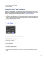
The Text Bin
The attributes assigned to a selection of text such as font, font size and color are collectively called the “style” of
the text. Changing the style of text in text boxes every time you create a new text box can be a time-consuming
task. The Text Bin makes it easy to save and re-use text styles that you use repeatedly.
To create a new text box using a style already in the Text Bin:
1) Click the Text tab. A list of text boxes will appear. Each text box will appear using its custom text attributes so
you can see exactly how it will appear on the Design Canvas.
2) Drag or double-click a text style to add it to your design.
To add a new text style to the Text Bin:
1) Create a text box and enter some text that describes the style.
2) Assign any text attributes to the text such as font, font size, color, alignment, etc.
3) Click the Text tab.
4) Drag and drop the text box from the Design Canvas to the list of text styles. A visual indicator will let you know
where in the list it will be added.
To delete a text style:
1) Click the Text tab.
22
2) Select a text style you wish to delete.
3) Press the Delete key.
Changing Basic Text Attributes
Once you have added text to your design, you may want to adjust its look including the font, font size, color,
etc. You can also create stunning visual effects with text by changing its shadow, background graphic and orientation on the screen. To learn more about these other effects, see Changing Object Properties.
To change the font , font size, text color, and alignment of text:
1) Select the text box or text you want to change. If you select the text box then any attributes you change will be
applied to all of the text in the text box. If you select individual text within the text box then any attributes you
change will only be applied to the selected text.
2) Choose View > Show Tools > Font.
3) Set the various settings that you want applied to the text.
To adjust the spacing between lines of text:
1) Select the text you want to change.
2) Choose View > Show Rulers
3) Click the Spacing button at the top of the window.
4) Select a spacing option.
To adjust the spacing between characters:
1) Select the text you want to change.
2) Choose Format > Font > Kern
3) Select Tighten if you want the characters closer together, or select Loosen if you want the characters farther
apart.
23
Tab Stops
All text boxes have default tab stops already set. You can see the tab stops on the horizontal ruler when you
choose View > Show Ruler and select text in a text box. By changing tab stops, you can indent text and create
lists that line up correctly.
To change a tab stop:
1) Select the text you want to adjust.
2) On the horizontal ruler, drag the tab stop to change its location.
To add a tab stop:
1) Select the text you want to adjust.
2) Drag the type of tab stop (left, center, etc.) you want onto the horizontal ruler.
To remove a tab stop:
1) Select the text you want to adjust.
2) Drag the tab stop off the horizontal ruler and release.
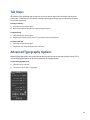
Advanced Typography Options
Powerful typography options are available to help you turn your text into an interesting design element. These
advanced typography options are all centrally located in the Typography tools.
To access the Typography tools:
1) Select the text or a text box.
2) Choose View > Show Tools > Typography.
24
Kerning (Spacing Between Letters)
You can increase or decrease the space between each letter in your text. For example, you can increase the letter spacing of the word “CHRONOS” to look like “C H R O N O S”.
To change the amount of spacing between letters:
1) Select the text you wish to kern.
2) Click the Kern buttons to increase or decrease the spacing in the Typography tools.
3) Click the Default button to return to the default kerning value.
Line Height
Line height is the distance from the top of a line to the top of the line below it. Use the line height multiplier to
change line height by multiplying the current line height by the specified amount. For example, choose a line
height multiplier of 2.0 for double spaced text. Use 1.0 to restore the text to its default line height.
To change the line height of text:
1) Select the text you wish to change the line height of.
2) Specify a line height multiplier using the Line multiplier control in the Typography tools.
Inter-line Spacing (Leading)
Inter-line spacing or leading is the distance from the bottom of a line to the top of the line below it.
To change the inter-line spacing of text:
1) Select the text you wish to change the inter-line spacing of.
2) Specify the inter-line spacing value in points using the Inter-line spacing control in the Typography tools.
Paragraph Spacing
Paragraph spacing is the distance from the bottom of a paragraph to the top of the first line in the paragraph
below it.
To change the paragraph spacing of text:
1) Select the text you wish to change the paragraph spacing of.
2) Specify the paragraph spacing value in points using the Paragraph spacing control in the Typography tools.
First Line Indenting
The left indent of the first line in a paragraph can automatically be indented without setting a tab stop.
To set first line indenting:
1) Select the text for which you wish to have the first line indented.
2) Specify the indent value in points using the First Line control in the Typography tools.
Other Lines Indenting
Not only can you left indent the first line of a paragraph, but you can independently left indent subsequent
lines as well.
To set indenting for lines other than the first line:
25
1) Select the text for which you wish to have lines other than the first indented.
2) Specify the indent value in points using the Other Lines control in the Typography tools.
Perfect Balance For Text
Use the Perfect Balance For Text option to automatically balance text within its bounding text box. This powerful option is especially useful for text boxes that contain fields since it’s impossible to predict in advance how
much or how little text will be in a text box after the fields are filled in. For example, you can create a text box
with right-justified text, and then center the final right-justified text in the text box once all the fields are filled
in.
Perfect Balance For Text lets you choose how the final text will be positioned horizontally and vertically. Bear in
mind that Perfect Balance For Text acts independently from left, center, right, and justified text alignment. In
other words, you can use both simultaneously. Consider, for example, a text box that contains fields for a contact from the Mac OS X Address Book. Some contacts have long names and addresses while others have short.
Use Perfect Balance For Text to make the final text box content look good on your design no matter the length
of the contact data.
To balance the final content in a text box:
1) Select the text box.
2) Click a horizontal and/or vertical balancing button in the Typography tools.
Text Case
When working with text you may want to change the text so it appear in all uppercase, all lowercase, or lowercase with just the first letter of each word capitalized.
To format text as all uppercase, all lowercase, or lowercase with the first letter of each word capitalized:
1) Select the text you wish to change the case of.
2) Click the Upper Case, Lower Case, or Capitalize buttons in the Typography tools.
Text Style Grabber
The attributes assigned to a selection of text such as font, font size and color are collectively called the “style” of
the text. It’s often useful to apply the style from one text selection to another without having to individually set
each text attribute manually.
To copy the text style from one selection of text to another:
1) Select the text you want to copy the style from.
2) Choose Format > Font > Copy Style.
3) Select the text you want to apply or paste the style to.
4) Choose Format > Font > Paste Style.
Working With Graphics and Shapes
You can add many types of graphics and shapes to your design including photos, graphic files from other applications, and designs that you draw directly on the Design Canvas. The software ships with thousands of clip art
26
graphics and many standard shapes. Plus, you can access your iPhoto albums and photos directly within the
software without switching to iPhoto. Most popular graphic file formats are supported including PICT, GIF,
JPEG, TIFF, PDF, BMP and EPS.
To access graphics and shapes:
1) Click the Graphics tab. Three buttons will appear at the top of the Graphics Pane giving you access to all the
shapes, clip art, and photos.
Shapes
The Shapes Bin contains a wide selection of popular shapes that you can use on your design.
To add a shape:
1) Click the Shapes button at the top of the Graphics Pane.
2) Drag a shape to the Design Canvas.
3) Drag the selection handles to resize the shape.
Once a shape is on the Design Canvas, you can change its stroke color, fill color, and other properties. To learn
more about changing the properties of a shape, see Changing Object Properties.
Graphics
The software ships with thousands of clip art graphics you can use on your design. In addition, you can directly
access your iPhoto albums and photos within the software without switching to iPhoto. You can search the clip
art library by keyword and filter by category to find just the right graphic. You can also use your own graphics.
To search for a graphic in the Clip Art Browser:
1) Click the Clip Art button at the top of the Graphics Pane.
2) Enter one or more keywords into the search field.
Every graphic has several keywords assigned to it. Control-click or right-click on a graphic to get a list of keywords assigned to it and to get additional information about the graphic. This will help you to know what keywords to use when searching for graphics.
To add a graphic to the Design Canvas:
1) Click the Clip Art button at the top of the Graphics Pane.
2) Drag a graphic from the Clip Art Browser to the Design Canvas.
To add a graphic from the Finder to the Design Canvas:
1) Choose File > Place Image File.
2) Locate and select the graphic you want to add and click the Open button. Optionally, you can drag and drop a
graphic from the Finder to the Design Canvas.
You can adjust the shadow, transparency and other attributes of graphic objects. To learn more about changing
the properties of a graphic, see Changing Object Properties.
iPhoto Integration
Use the built-in Photo Browser to directly access your iPhoto albums and photos without leaving the software.
To add a photo from iPhoto albums to a design:
27
1) Click the Photos button at the top of the Graphics Pane.
2) Locate the photo you want to add and drag it to the Design Canvas.
Resizing, Moving, and Arranging Objects
Once text, shapes or graphics are on the Design Canvas, they can be resized, moved and arranged in a similar
manner.
To resize an object:
1) Select the object to make the selection handles appear.
2) Drag a selection handle to expand or shrink the object in the direction of your drag.
3) OR choose View > Show Tools > Dimensions to resize an object more precisely.
Note: select the Constrain Selection button in the Dimensions tool to constrain the proportion of the resized
object. You can also hold down the Shift key during a drag-resize to have the opposite behavior of the Constrain Selection button. Images are constrained by default.
To move an object:
1) Select the object to make the selection handles appear.
2) Place the pointer somewhere towards the center of the object and drag the object to a new location. Avoid
dragging the object by the selection handles because you may inadvertently resize the object.
3) OR choose View > Show Tools > Dimensions to move an object more precisely.
To show or hide real-time alignment guides:
As you move your object around on the Design Canvas, you will notice alignment guides appearing and disappearing. These alignment guides will appear as blue dotted lines. These guides are built into the Design Canvas
to help you center and align objects with each other. They appear whenever the center or edge of an object
aligns with the center or edge of another object.
1) Choose SOHO Labels & Envelopes > Preferences
2) Click the Appearance button.
To arrange an object in front or in back of another object:
1) Select the object you would like to arrange.
2) Choose Format > Arrange > Bring Forward or Send Backward. Repeat this step to continue arranging the object
to the front or back until it’s in your desired position.
3) OR choose View > Show Tools > Arrange. Click the Bring Forward button or Send Backward button.
To arrange an object in front or in back of all other objects:
1) Select the object you want in front or in back of all other objects.
2) Choose Format > Arrange > Bring to Front or Send to Back.
3) OR choose View > Show Tools > Arrange. Click the Bring to Front button or Send to Back button.
28
Flipping Shapes & Graphics
Shapes and graphics can be flipped horizontally and vertically. This is useful, for example, if you want a person
in a photograph to face left instead of right.
To flip a shape or graphic:
1) Select the shape or graphic you wish to flip.
2) Move the pointer to a selection handle and click and hold it.
3) Drag the selection handle past its opposite horizontal or vertical edge. The shape or graphic will flip accordingly.
4) OR choose View > Show Tools > Rotation. Click the Flip Horizontally or Flip Vertically button.
Grouping Objects
You can group multiple objects together so that you can move, copy, resize, and arrange them as a single object. If you group a text box with a graphic object you will be able to edit the text in the text box, but you won’t
be able to assign various properties to the graphic object.
To group objects together:
1) Hold down the Shift key and select each object you want grouped together.
2) Choose Format > Group.
To ungroup a grouped object:
1) Select the grouped object.
2) Choose Format > Ungroup.
Locking Objects
You can lock objects on the Design Canvas so that they do not get moved on accident or modified in anyway.
Locked objects can’t be grouped with other objects. Further, object locking is done on a per layer basis.
To lock object(s):
1) Hold down the Shift key and select each object you wish to lock.
2) Choose Format > Lock.
To unlock objects:
1) Choose Format > Unlock All.
All locked objects will become unlocked.
Layers
Layers provide an easy way to work with related objects without disturbing other objects on the Design Canvas.
Think of a layer as a completely transparent sheet of material like a transparency. Objects can be placed on the
29
transparent sheet and you can have multiple transparent sheets of material stacked on top of each other. Layers work in a similar manner.
You can create an unlimited number of layers and you can order the layers from top to bottom however you
wish. Wherever there is no object on a layer, you will be able to see through to the other layers below. By default every Design Canvas starts out with two layers for your convenience: Foreground and Background. Typically, you will use the Background layer for a background image or colored shape. You can then use the Foreground layer for your name and address text boxes, company logo, etc. This approach lets you easily select and
move objects in the Foreground layer without accidentally selecting and moving objects in the Background
layer.
To open the Layers window:
Use the Layers window to add layers, delete layers, show/hide layers, merge layers, rearrange layers, etc.
1) Choose Edit Layers from the layers pop-up menu located at the bottom of the main window.
To choose which layer to work on:
You can only work with objects on a single layer at a time. This means you need to first choose which layer to
work on.
1) Choose a layer from the layers pop-up menu located at the bottom of the window.
2) OR select a layer in the Layers window.
When you select a layer you will still be able to see the objects on the other layers, but you won’t be able to
work with those objects in any way. You’ll only be able to work with objects that belong to the currently selected layer. The one exception to this rule is the Background layer. If you select the Background layer all other
layers and their objects will automatically be hidden for your convenience.
To add a layer:
1) Open the Layers window.
2) Click the Add (+) button.
3) Name the new layer.
4) Click OK.
To create a layer from a selection:
If you’re working with some objects and you decide that you want those objects in their own layer you can easily do that.
1) Hold down the Shift key and select all the objects you want in a new layer.
30
2) Open the Layers window.
3) Choose “New Layer With Selection” from the Action pop-up menu.
4) Name the new layer.
5) Click OK.
To duplicate a layer:
When you duplicate a layer all the objects that are part of that layer will be duplicated in addition to the layer
itself.
1) Open the Layers window.
2) Select the layer you wish to duplicate.
3) Choose Duplicate Layer from the action pop-up menu.
4) Name the new layer.
5) Click OK.
To merge down layers:
When you merge down layers the selected layer will be merged with the layer immediately below it. The objects on the selected layer are combined with the objects on the underlying layer and the underlying layer is
deleted.
1) Open the Layers window.
2) Select the layer that you want to merge with the layer below it.
3) Choose Merge Down from the Action pop-up menu.
To delete a layer:
When you delete a layer any objects on that layer will be deleted along with it.
1) Open the Layers window.
2) Select the layer you wish to delete.
3) Click the Minus (-) button.
The Background layer can’t be deleted.
To choose which layer(s) are visible:
As you work on your design you may want to hide some layers while keeping other layers visible. For example,
you might have two variations of a layout that you want to quickly switch between to see which you like best.
When a layer is visible, all objects on that layer will be be visible. Similarly, if a layer is not visible then all objects
on that layer will be hidden.
1) Open the Layers window.
2) Click the Visible check box next to each layer you wish to show/hide.
The current visibility of layers applies to both the Design and Preview modes. HIdden layers are not printed.
To rearrange the order in which layers appear:
You can rearrange the order in which layers appear in your design. If layer A is above layer B, then objects in
layer A will appear on top of objects in layer B.
31
1) Open the Layers window.
2) Click and drag a layer in the list to where you want it rearranged.
The Background layer is always the bottom layer.
Alignment
Once you have multiple objects on the Design Canvas, you may need to align certain objects so they look good
together. You may also want to make similar objects the same width and height or even symmetrical.
To align objects:
1) Select the first object you would like other objects to be aligned with.
2) Hold down the Shift key to select additional objects.
3) Choose Format > Align > Left Edges, Right Edges, Top Edges, Bottom Edges, Horizontal Centers, or Vertical Centers.
4) OR choose View > Show Tools > Arrange and then click the alignment buttons.
To make objects the same width and height:
1) Select the object whose width/height you would like to apply to other objects.
2) Hold down the Shift key to select additional objects.
3) Choose Format > Size > Make Same Width or Make Same Height.
4) OR choose View > Show Tools > Arrange and then click the Make Same Width or Make Same Height button.
To revert an object back to its natural size:
To revert an object back to its natural size means that the object will be restored to its natural width-to-height
ratio. An oval shape, for example, will be restored to its natural ratio of 1:1 which is a circle. A stretched photograph will be restored to its original ratio of 4:3 or whatever the original or natural ratio was so it no longer appears stretched.
1) Select the object(s) you would like to make symmetrical.
2) Choose Format > Size > Make Natural Size.
3) OR choose View > Show Tools > Arrange and then click the Natural Size button.
Favorites Bin
You can conveniently store objects that you have customized in the Favorites bin so you can reuse them later
on other designs. Suppose, for example, you have a text box laid out exactly how you want it or a cropped
graphic with a fancy drop shadow that you think you’ll need to use again. You can store these objects for later
use in the Favorites Bin. Plus, you can organize your favorite objects into collections that you create.
Objects stored in the Favorites Bin will be accessible every time you use the software. The objects in the Favorites Bins are stored in the following file on your your disk: ~/Library/Application Support/Chronos/SOHO Business Cards/Favorites, where “~” denotes your home directory.
To open the Favorites Bin:
32
1) Click the Favorites tab.
To add a collection:
A collection is a way to categorize the objects you wish to store. For example, you can create a collection named
“Business” and then store your business-related objects there.
1) Open the Favorites Bin.
2) Click the Add (+) button below the collections list.
3) Name your collection.
4) Click OK.
To remove a collection:
1) Open the Favorites Bin.
2) Select the collection you wish to delete from the collections list.
3) Click the Minus (-) button below the collections list.
To store an object in a collection for later use:
1) Open the Favorites Bin.
2) Select a collection from the collections list.
3) Drag the object from the Design Canvas to an empty cell in the Favorites Bin.
To import a graphics file into a collection for later use:
You can add your own graphic files to any of your collections.
1) Click the Add (+) button at the bottom of the Favorites Bin. A standard Open dialog window will appear.
2) Select the graphic file you wish to import.
3) Click Open.
To remove object(s) from the Favorites Bin:
1) Open the Favorites Bin.
2) Select the object you wish to delete or hold down the Shift key and select multiple objects you want to delete.
3) Click the Minus (-) button at the bottom of the Favorites Bin.
33
Chapter 6—Changing Object Properties
This chapter describes some of the more advanced features for customizing objects on the Design Canvas.
These include properties like transparency, shadow, color, line style, etc. This chapter will also discuss some
amazing effects you can apply to objects on your design including color gradients, Super-Masks, special effects,
etc.
Size, Location and Angle Properties
When you’re working with objects, you can change the object’s size, angle and location on the Design Canvas
using precision tools.
To place an object at a precise location on the design:
1) Select the object you wish to place at a precise location.
2) Choose View > Show Tools > Dimensions.
3) Enter the X coordinate.
4) Enter the Y coordinate.
The coordinates you enter are based on the unit of measurement specified in the Appearance preference pane
(Choose SOHO Labels & Envelopes > Preferences, and click Appearance). The origin of the coordinate system in
the design is the top left corner. For example, if you place a square in the top left corner of the design, the X, Y
coordinates will be (0,0).
To change the size of an object:
1) Select the object you wish to resize.
2) Choose View > Show Tools > Dimensions.
3) Enter the width and height.
4) Select the Constrain proportions checkbox if you want to keep the proportions of the object in tact.
The measurements you enter are based on the unit of measurement specified in the Appearance preference
pane (Choose SOHO Labels & Envelopes > Preferences, and click Appearance).
To rotate an object:
Shapes, graphics, and text can all be rotated at any angle.
1) Select the object you wish to rotate.
2) Choose View > Show Tools > Rotation.
34
3) Use the Rotate wheel to rotate the object; OR use the Angle field to select a common angle; OR enter an angle.
To rotate an object via a selection handle:
Shapes, graphics, and text can all be quickly rotated without using the Inspector window.
1)
Select the object you wish to rotate
2) Hold down the Command key and position the mouse cursor over one of the object’s selection handles. The
mouse cursor will change to a rotation cursor.
3) While holding down the Command key, click and drag the selection handle to rotate the object.
To flip an object:
Shapes, graphics, and text can all be flipped horizontally or vertically.
1) Select the object you wish to flip.
2) Choose View > Show Tools > Rotation.
3) Click the Flip buttons to flip the object either horizontally or vertically.
Smart Shape Properties
The software ships with a wide variety of Smart Shapes that can be customized in many way including fill color,
gradient fills, stroke color, stroke style, specialized settings, etc.
Fill Color & Stroke Color and Style
The interior of a shape can be filled with any color. You can choose a style and color for the line that delineates
the object (or the stroke). Or you can choose to have no stroke around the object.
To set the fill color of a shape:
1) Select the shape whose fill color you want to change.
2) Choose View > Show Tools > Color.
3) Select the Fill checkbox.
4) Select the fill color well to open the color selection window.
5) Select a color in the color selection window.
35
To set the stroke color and style for a shape:
1) Select the shape whose stroke you want to customize.
2) Choose View > Show Tools > Color.
3) Select the Stroke checkbox.
4) Click the stroke color well and choose a color.
5) Enter a stroke thickness or use the up/down arrows to adjust the thickness of the stroke.
6) Choose the stroke style from the style pop-up menu.
Gradients
The interior of a shape can also be filled with a linear or radial gradient which is a blend between two colors.
You can adjust the angle, size and location of the gradient.
To set the linear or radial fill gradient of a shape:
1) Select the shape whose gradient you want to set.
2) Choose View > Show Tools > Gradient.
3) Select either Linear or Radial Gradient.
4) Select the left color well to open the color selection window for the first color and select a color.
5) Select the right color well to open the color selection window for the second color and select a color.
6) Adjust the Center, Size, and Angle of the gradient.
To change the angle, location, size and to swap colors of the gradient fill for a shape:
1) Select the shape whose gradient you want to customize.
2) Choose View > Show Tools > Gradient.
3) Adjust the angle of the gradient using the angle wheel.
4) Adjust the location of the gradient within the shape using the Center Location slider.
5) Adjust the size of the gradient using the Center Size slider.
6) Click the Swap Colors button to swap the two colors of the gradient.
Specialized Settings
Certain shapes have specialized settings that can be applied to them that aren’t available to other shapes. For
example, the starburst shape allows you to adjust the number of points it has and the depth of the points.
36
To adjust the number of points on a shape:
1) Select the shape object.
2) Choose View > Show Tools > Points.
3) Use the slider to increase/decrease the number of points.
To adjust the number of sides on a shape:
1) Select the shape object.
2) Choose View > Show Tools > Sides.
3) Use the slider to increase/decrease the number of sides.
To add endpoints on a line shape:
1) Select the shape object.
2) Choose View > Show Tools > Endpoints.
3) Choose an endpoint style from the pop-up menu’s. You can add endpoints to both ends of the line or just one
end of a line.
4) Use the size controls to adjust how big or small you want the endpoint to be.
To change the proportion or size of a certain aspect of a shape:
1) Select the shape object.
2) Click and drag the red circle.
37
Graphic Properties
Customize the way your graphics look using Super-Masks, crops, special effects, etc.
Image Fine-Tuning
You can adjust the brightness, contrast, and other settings of a graphic to improve the overall look or create a
designer look.
1) Select the image object.
2) Choose View > Show Tools > Image.
3) Use the various controls to fine-tune the image settings.
4) Click the Reset Image button to reset the image back to its original state.
Perspective Tool
You can use the perspective feature to distort a two dimensional image to give the impression of depth.
1) Select an image.
2) Choose View > Show Tools > Dimensions.
3) Click the Adjust button. The adjust handles will appear at the corners of the image.
4) Click and drag any adjust handle to alter the perspective of the image. Hold down the Shift key to constrain the
plane.
5) Click the Reset button to return the image to its original state.
38
Crop
Cropping an image allows you to see only the portion of the image you’d like to keep. Cropping is nondestructive which means you can change the crop at any time without permanently altering the image.
To crop an image:
1) Select the image you wish to crop.
2) Choose Format > Crop Image, or click the Crop button in the toolbar.
3) Select a common constrain option from the Constrain pop-up menu. Or, drag the selection handles to resize the
cropped area manually. Hold down the Shift key if you do not want the proportions constrained when you’re
resizing the cropped area.
4) Click and drag on the crop to position it on the image.
5) OPTIONAL ZOOM FEATURE: use the Zoom slider to zoom in/out on the portion of the image visible in the crop.
6) OPTIONAL ROTATE FEATURE: Click on the image outside the crop and then hold down the Command key and
position the mouse cursor over one of the image’s selection handles. The mouse cursor will change to a rotation
cursor. While holding down the Command key, click and drag the selection handle to rotate the object. The image will rotate but the crop will remain as-is.
7) Click OK, or press the return key.
To uncrop a graphic:
1) Select the graphic you wish to uncrop.
2) Choose Format > Uncrop Image. The original image will be restored.
To change a crop:
1) Select the cropped graphic that you wish to change.
2) Choose View > Show Tools > Crop and then hange the crop as desired.
3) OR double-click the cropped image and then change the crop as desired.
Special Effects
You can easily apply many advanced special effects to graphics such as sepia, Gaussian blur, motion, etc. The
best way to see what an effect does to a graphic is to simply apply it and see if you like it. This section will show
you how to add effects to a graphic and will also show a few examples.
Please note that effects do not permanently alter the graphic so you can change or remove effects at any time
without altering the original image.
To add an effect to a graphic:
39
You can add as many effects to a graphic as you wish. Please be aware that adding effects to graphics can be a
very processor-intensive task. Depending on the speed of your computer, you may have to be patient a little
patient from the time you add an effect to a graphic to the time that you see the effect.
1) Select the graphic.
2) Choose View > Show Tools > Effects.
3) Choose an effect from the Effect pop-up menu. Once you choose an effect it will be applied to the graphic so
that you can see what it looks like.
4) Adjust any settings that are specific to the effect. For example, if you select the Sepia effect then you can use the
Intensity slider to adjust the intensity of the effect. Any changes you make will be applied instantly to the
graphic. The examples below will show you how to use some of the more advance settings that are available for
some effects.
5) Click the Add (+) button to add the effect to the graphic.
Repeat these steps for each effect you want to add to a graphic. When you click the Effect pop-up menu a dot will
appear next to each effect that has been applied to the graphic.
Example: To add the mask effect:
Masks filter what portion of an image appears on the Design Canvas. Because masks can contain a texture or
pattern, some interesting effects can be achieved. In addition to traditional mask effects, you can also use
Super-Masks to achieve even finer control over mask placement, size, and softness.
1) Select the graphic.
2) Choose View > Show Tools > Effects.
3) Choose Mask from the Effects pop-up menu.
4) Choose a mask shape from the Shape pop-up menu.
5) Click and drag the bull’s-eye icon on the graphic object to the part you want masked.
6) Adjust the size and softness of the mask.
7) Click the Reverse button to invert the mask.
40
8) Click the Rotate button to rotate the mask.
9) Click the Add (+) button to add the effect to the graphic.
Example: To add the sparkle effect:
The sparkle effect, like its name suggests, will add a sparkle to a graphic. You can control where the sparkle is
on the graphic and you can add as many sparkles as you would like. Furthermore, you can choose the sparkle’s
color, size, ray length, and more.
1) Select the graphic.
2) Choose View > Show Tools > Effects.
3) Choose Sparkle from the Effect pop-up menu. A single sparkle will be added to the center of the graphic.
4) Click and drag the bull’s-eye icon on the graphic object to where you want the sparkle located.
5) Click the color well button to change the color of glow that the sparkle gives off.
6) Adjust the Size, Ray Length, Ray Angle, Ray Opacity, and Ray Width of the sparkle.
7) Click the Add (+) button. The sparkle will be added to the graphic and a new sparkle will appear in the center of
the graphic.
8) Click the Minus (-) button to remove the second sparkle that was just added if you only want the first sparkle on
the graphic. Otherwise, repeat the above steps to add mores sparkles to the graphic.
To remove an effect from a graphic object:
1) Select the graphic object.
2) Choose View > Show Tools > Effects.
3) Choose the effect you wish to remove from the Effect pop-up menu.
4) Click the Minus (-) button.
Optionally, if you choose Original Image from the Effects pop-up menu it will remove all effects that have been
added to the graphic.
Text Properties
Text customization goes beyond the standard typographical functions such as font, font size, text color, etc.
Text Fills
When working with text objects, you can change the fill of text to either a linear or radial gradient. You can also
specify a background color and stroke for a text box.
41
To fill text with a gradient:
1) Select the text box you wish to fill.
2) Choose View > Show Tools > Gradient.
3) Select either Linear or Radial Gradient.
4) Select the left color well to open the color selection window for the first color and select a color.
5) Select the right color well to open the color selection window for the second color and select a color.
6) Adjust the Center, Size, and Angle of the gradient.
To set the background color of a text box:
1) Select the text box you wish to add a background color to.
2) Choose View > Show Tools > Color.
3) Select the Fill checkbox to enable a background color.
4) Select the Fill color well to select a color for the background from the color selection window.
To set the stroke of a text box:
1) Select the text box you wish to add a stroke to.
2) Choose View > Show Tools > Color.
3) Select the Stroke checkbox.
4) Click the stroke color well and choose a color.
5) Enter a stroke thickness or use the up/down arrows to adjust the thickness of the stroke.
6) Choose the stroke style from the style pop-up menu.
Advanced Properties
There are several advanced properties that can be applied to objects to create designer effects.
Transparency
You can adjust the transparency of any object. Transparency allows you to overlap objects so that objects behind others can be highly visible, partly obscured, or completely blocked from view depending on the transparency level.
To adjust the transparency of an object:
42
1) Select the object whose transparency you wish to adjust.
2) Choose View > Show Tools > Transparency.
3) Adjust the Transparency slider as desired.
Shadows
Adding a shadow to an object lets you introduce an element of depth to your design. You can adjust the shadows blur factor, the position of the shadow in relation to the object, etc.
To add a shadow to an object:
1) Select the object you wish to add a shadow to.
2) Choose View > Show Tools > Shadow.
3) Select the Shadow checkbox to add a shadow for the object.
4) Use the Offset controls to adjust the height of the shadow relative to the object.
5) Use the Angle wheel to adjust the angle of the shadow relative to the object.
6) Use the Blur controls to adjust the shadow’s blurriness.
7) Use the Opacity control to adjust the shadow’s opacity.
8) Click the color well and choose a color.
Image Fill
Shapes and text can be filled with images from the Clip Art Browser, Photo Browser, or your own. Please note
that when you fill text with an image, the interior of each letter in the text is filled with the image, not the text
box itself. If you have multiple lines of text, only the first line will be filled with the image.
To fill a shape or text with an image:
1) Add an image to the Design Canvas that you want to use to fill the text or shape with.
2) Add a text box or shape to the Design Canvas.
3) Hold down the Shift key and select both the image and text box or shape.
4) Choose Format > Crop With Shape/Text. The text box or shape will be moved on top of the image and the Crop
tools will appear in the Inspector window.
43
5) Select a constrain option from the Constrain pop-up menu. Or drag the selection handles on the text box or
shape over the part of the image you want to feature. Hold down the Shift key if you don’t want the proportions
of the text box or shape to be constrained.
6) Click OK, or press the return key.
To remove an image fill from an object:
1) Select the object that you wish to remove the image fill from.
2) Choose Format > Uncrop Image.
Background Properties
You can choose an image or color for the background of your design.
To set the background image:
1) Choose Format > Background > Choose Image, to use your own image. The standard open dialog box will appear where you can select your own image.
2) OR add an image from the Clip Art Browser to the Design Canvas and select it. Choose Format > Background >
Use Selected Image.
3) Choose Format > Background > Image Settings, and adjust the image position and transparency (at 0% the image fill will be opaque, at 100% the fill image fill will be completely transparent).
4) Click Done.
To remove a background image:
1) Choose Format > Background > Clear Image.
To set the background color:
1) Choose Format > Background > Color.
2) Click the color well and choose a color.
3) Select the Paper Color checkbox if you want the background to be set with a color, but you do not want the
color to be printed when you print your design.
4) Select the “Include Color in Printout” checkbox if you want the color to be printed when you print your design.
44
Chapter 7—Working With Fields
Fields allow you to populate your design with contact information. The software integrates directly with the
Mac OS X Address Book application so populating a design with contact information is easy and doesn’t require
contact data re-entry.
Using Fields
Adding fields to your design is very easy. This section will focus on the basics of accessing fields, adding fields,
and using fields.
To access fields:
1) Click the Contacts tab.
The fields are grouped by category, e.g. all the phone fields are in the phone category.
To access a particular field:
1) Click the disclosure triangle button next to a category name to see a list of the fields in that category.
To add fields to your design:
1) Click the Contact tab.
2) Click the disclosure triangle button to show a category of fields.
3) Drag the field you want to use from the Contacts pane to the Design Canvas. You may alternatively select the
field and then click the Insert In Text button to insert the field where the cursor is located in a text box.
Once a field is on the Design Canvas, it behaves exactly like ordinary text. You can move, resize, change the
color and modify other properties of the field just as you would any other text. This means you can add text to
the text box that contains the field. If you would like multiple fields to be aligned on your design, you should
consider creating a text box and placing all the fields to be aligned within the same text box. This way you only
have to align one text box instead of multiple text boxes. For more information on text and text boxes, see
Working With Text, Graphics and Shapes.
Me, Others, & Misc Fields
This section does not apply to SOHO Business Cards.
There are three sets of of fields: Me, Others, and Misc. Each type is described below:
✦ Me. The Me fields represent fields that correspond with your personal contact card in the Mac OS X Address
Book. Each of the Me fields will begin with “My” to distinguish them from other fields on the design canvas, e.g.
“MyFirst”, “MyLast”, etc. The most common place of using the Me fields is the return address on an envelope or
label.
✦ Others. The Others fields will be populated with contact information based on the selected contact(s) in Preview mode. Suppose you use the “Addr.home” field on a shipping label. Each contact that you select in Preview
mode will have its home address populate the field on the label.
✦ Misc. The Miscellaneous fields are fields that don’t have a direct correspondence with the Address Book. They
can be used to create barcodes, counters, serial numbers, etc.
45
Specifying “Me”
When fields are populated with contact data from the Mac OS X Address Book, the software needs to know
which contact to get the data from. You will need to specify which contact represents you. This is called the
“Me” contact.
To specify the “Me” contact:
1) Choose SOHO Labels & Envelopes > Preferences, and click the Me button.
2) Select your contact or the contact record that you want to use.
3) Click “Make This My Card”.
To add/remove a logo for “Me”:
You can set a logo for your contact. There is a corresponding logo field that you can add to the design and it will
be filled in with the logo you specify.
1) Choose SOHO Labels & Envelopes > Preferences, and click the Me button.
2) Click Set to choose an image from an Open dialog; or drag an image from the Finder to the logo image well.
3) Click Clear to remove the logo from the logo image well.
To add/remove a signature for “Me”:
You can set a signature for your contact. There is a corresponding signature field that you can add to the design
and it will be filled in with the signature you specify.
1) Choose SOHO Labels & Envelopes > Preferences, and click the Me button.
2) Click Set to choose an image from an Open dialog; or drag an image from the Finder to the signature image
well.
3) Click Create to have the software create a signature automatically for you.
4) Click Clear to remove the signature from the signature image well.
Field Definitions
This section will provide definitions for each of the fields that the software supports. Most of these fields correlate with the fields in the Mac OS X Address Book. Others are smart fields that extract portions of fields or
smartly combine multiple fields for ease of use.
Field Name
Field Definition
ADDRESS BLOCKS
Address Blocks smartly combine several Address Book fields and text into a pre-formatted
block that you can drag right onto your design. Further, once an address block is on your
design, the One-Click Formatting feature lets you change the format on-the-fly. For more
information on using Address blocks, see One-Click Formatting.
Name
The full name plus the complete address fields combined. Example:
John Doe
1345 E. Summerhill Lane
Las Vegas, NV 12345
46
Field Name
Field Definition
Prefix+Name
The prefix plus the full name plus and the complete address fields combined. Example:
Mr. John Doe
1345 E. Summerhill Lane
Las Vegas, NV 12345
CompanyAddress
The company name plus the complete address fields combined. Example:
ABC Company
1345 E. Summerhill Lane
Las Vegas, NV 12345
Name+Company
The full name plus the complete address fields combined. Example:
John Doe
ABC Company
1345 E. Summerhill Lane
Las Vegas, NV 12345
Company+Attention
The company name plus the text Attention plus the full name and the complete address
fields combined. Example:
ABC Company
Attention: John Doe
1345 E. Summerhill Lane
Las Vegas, NV 12345
Name+Title+Company
The full name plus the job title plus the company name and complete address fields
combined. Example:
John Doe
Manager
ABC Company
1345 E. Summerhill Lane
Las Vegas, NV 12345
Name+Dept+Company
The full name plus the department name plus the company name and complete address fields combined. Example:
John Doe
Auto Body Department
ABC Company
1345 E. Summerhill Lane
Las Vegas, NV 12345
Name+Title+Dept+Company
The full name plus the job title plus the department plus the company name and complete address
fields combined. Example:
John Doe
Manager
Auto Body Department
ABC Company
1345 E. Summerhill Lane
Las Vegas, NV 12345
47
Field Name
Field Definition
Name+Spouse
The full name plus the text “and” plus the spouse name and complete address fields combined. Example:
John and Betty Doe
1345 E. Summerhill Lane
Las Vegas, NV 12345
Family
The text “The” plus the last name plus the text “Family” and complete address fields combined. Example:
The Doe Family
1345 E. Summerhill Lane
Las Vegas, NV 12345
Wedding Invitation
The text “Mr. and Mrs” plus the full name and complete address fields combined. Example:
Mr. and Mrs. John Doe
1345 E. Summerhill Lane
Las Vegas, NV 12345
ESSENTIALS
Each of these fields either directly corresponds to an Address Book field or smartly combines
more than one Address Book field.
The Address, Phone, Fax, Email, and Address (1-line) fields by default use their primary value.
For example, the Address field will be populated with the primary address of a contact. The
primary address is defined as the first address listed for a contact record in the Mac OS X Address Book.
The One-Click Formatting features lets change on-the-fly which value of a field is used. For
example, the Phone field can be switched to use the Home or Work phone number on-the-fly.
For more information on Essentials Fields and One-Click Formatting, see One-Click Formatting.
First+Last
The first name field plus the last name field combined.
First
The first name of a contact.
Last
The last name of a contact.
Address
The complete address of a contact.
Phone
The phone number of a contact.
Fax
The fax number of a contact.
Email
The email of a contact.
Company
The company name of a contact.
Job Title
The job title of a contact.
Department
The department of a contact.
Picture
The picture that is assigned to a contact in the Address Book.
48
Field Name
Field Definition
Logo
The logo found in the Me preference. When the logo field gets filled in, it will always maintains the
aspect ratio of your logo. It will not distort the logo nor will it increase the size of the logo. For example, if your logo is 1” x 1” in size and you stretch the Logo field to 2” x 2”, when the logo field gets
filled in the logo will only be 1” x1”. However, if you make the logo field 1/2” x 1/2”, when the logo
field gets field in the logo will be 1/2” x 1/2”.
Signature
The signature found in the Me preference.
Address (1-line)
The complete address of a contact on one line.
PERSONAL
Each of these fields correspond to an Address Book field.
Middle
The middle name of a contact.
Prefix
The prefix of a contact (e.g. Mr., Dr.).
Suffix
The suffix of a contact (e.g. Jr., Sr.).
Nickname
The nickname of a contact.
Maiden
The maiden name of a contact.
PFirst
The phonetic first name of a contact.
PLast
The phonetic last name of a contact.
PMiddle
The phonetic middle name of a contact.
Birthday
The birth date of a contact.
Spouse
The spouse of a contact.
INITIALS
Each of these fields smartly extract just a portion of a corresponding Address Book field.
F
The first initial of the first name.
M
The first initial of the middle name.
L
The first initial of the last name.
C
The first initial of the company name.
ADDRESS (complete)
Each of these fields will be filled in with a complete address that has been smartly formatted
for the address’s country. A complete address includes all of the fields that make up an address such as a street, city, state, postal code, etc.
Addr. primary
The complete primary address. The primary address is the first address of a contact in
the Address Book.
Addr.1
The complete first address which is the first address listed in the Address Book.
Addr.2
The complete second address which is the second address listed in the Address Book.
Addr.home
The complete home address which is the address labeled as “Home” in the Address
Book.
Addr.work
The complete work address which is the address labeled as “Work” in the Address Book.
49
Field Name
Field Definition
ADDRESS (1-LINE)
Each of these fields will be filled in with the complete address that has been smartly formatted to fit on a single line. A complete address includes all of the fields that make up an address, such as a street, city, state, postal code, etc. Any carriage returns in an address will be
ignored.
Addr(1-line).primary
The complete primary address which is the first address listed in the Address Book.
Addr(1-line).1
The complete first address which is the first address listed in the Address Book.
Addr(1-line).2
The complete second address which is the second address listed in the Address Book.
Addr(1-line).home
The complete home address which is the address labeled as “Home” in the Address
Book.
Addr(1-line).work
The complete work address which is the address labeled as “Work” in the Address Book.
ADDRESS FIELDS
Each of these fields are the individual parts that make up an address. This list will only define
the individual parts of the primary address which is the first address listed in the Address
Book. The same definitions for these fields can be applied to the other fields in this group
which include home, work, etc.
Street
The street address of the primary address.
City
The city of the primary address.
State
The state of the primary address.
Code
The ZIP/postal code of the primary address.
Country
The country of the primary address.
CC
The country code of the primary address.
PHONE
Each of these fields will be filled in with the appropriate phone number.
Ph.primary
The first phone number listed in the Address Book.
Ph.1
The first phone number listed in the Address Book.
Ph.2
The second phone number listed in the Address Book.
Ph.work
The phone number labeled “Work” in the Address Book.
Ph.home
The phone number labeled “Home” in the Address Book.
Ph.mobile
The phone number labeled “Mobile” in the Address Book.
Ph.main
The phone number labeled “Main” in the Address Book.
Ph.homefax
The phone number labeled “Home Fax” in the Address Book.
Ph.workfax
The phone number labeled “Work Fax” in the Address Book.
Ph.pager
The phone number labeled “Pager” in the Address Book.
INTERNET
Each of these fields will be filled in with Internet related references.
Homepage
The URL labeled “Homepage” in the Address Book.
50
Field Name
Field Definition
Email.primary
The first email address listed in the Address Book.
Email.1
The first email address listed in the Address Book.
Email.2
The second email address listed in the Address Book.
Email.home
The email address labeled “Home” in the Address Book.
Email.work
The email address labeled “Work” in the Address Book.
MESSAGING
There are five types of messaging fields: AIM, Jabber, MSN, Yahoo and ICQ. Listed below are
the definitions for only the AIM related fields. The same definitions can be applied to the
other messaging types.
AIM
The first AIM account listed in the Address Book.
AIM.1
The first AIM account listed in the Address Book.
AIM.2
The second AIM account listed in the Address Book.
AIM.home
The AIM account labeled “Home” in the Address Book.
AIM.work
The AIM account labeled “Work” in the Address Book.
OTHER
Each of these fields either directly corresponds to an Address Book field, handles miscellaneous information or provides special functionality.
Note
The note listed in the Address Book.
Created
The created date of the contact in the Address Book.
Modified
The modified date of the contact in the Address Book.
UniqueID
The unique ID of the contact in the Address Book.
MISCELLANEOUS
There are several Miscellaneous field that don’t fall under any specific category including the
powerful dependency fields.
Long Date
The current date in the default long format as specified in the Mac OS X System Preferences > International. Example: Friday, January 20, 2004.
Short Date
The current date in the default short format as specified in the Mac OS X System Preferences > International. Example: 1/20/04.
Custom Date
The Custom Date lets you choose a custom date format using One-Click Formatting. For more information on the Custom Date field and One-Click Formatting, see One-Click Formatting.
Time
The current time in the default format.
Custom Time
The Custom Time lets you choose a custom time format using One-Click Formatting. For more information on the Custom Time field and One-Click Formatting, see One-Click Formatting.
[
Starts a text dependency. For more information on Text Dependencies, see Dependency Fields.
]
Ends a text dependency. For more information on Text Dependencies, see Dependency Fields.
LABELS
Each of the fields in the Label group displays the label for a particular field. For example, the
PhLabel.1, will display the label for the first phone number—not the phone number itself.
It’s best to use the label fields in conjunction with the fields they represent.
51
Barcode Fields
This section does not apply to SOHO Business Cards.
A wide variety of barcode formats can be added to a design. A barcode consists of bars and spaces that represent a number or combination of numbers and letters. For example, a POSTNET barcode represents a 5, 9, or 11
digit zip code. Once a barcode is added to a design it behaves like any other image and can be resized, rotated,
etc.
This section will discuss how to add a barcode to a design, different barcode options including how to specify
the data from which to generate the barcode, and the definitions for each barcode type.
To add a barcode to the design canvas:
1) Click the Contacts tab.
2) Click Misc to access the miscellaneous fields and then expand the Barcodes section.
3) Drag a barcode field to your design canvas.
Alternatively, the Preview mode contains a special control for adding POSTNET barcodes to designs just prior to
printing without affecting the original design. For more information on dynamic POSTNET barcode generation,
see Dynamic POSTNET Barcodes.
Barcode Data Source Options
Barcodes are generated from numeric or alpha-numeric data. This data can be acquired from three different
sources: manual entry, a tab-delimited file, or the Mac OS X Address Book. You can choose which method to use
on a barcode by barcode basis on your design. Once you switch to Preview mode, the barcode will change to
represent the actual data source specified.
To enter barcode data manually:
1) Select the barcode on the Design Canvas.
2) Choose View > Show Tools > Barcode.
3) Choose “Enter data string manually”.
4) Type the data into the box.
5) Click Enter to save the data.
Note: A single barcode containing the manually entered data will be generated in Preview mode. If you select
multiple contacts in Preview mode, then the design for each contact will use the same barcode.
To retrieve barcode data from an import file:
The following steps assume that a tab delimited file is already imported. If this is not the case, a tab delimited
file will need to be imported. For information on importing tab delimited files, see the section on importing
later in this chapter.
1) Select the barcode on the Design Canvas.
2) Choose View > Show Tools > Barcode.
3) Choose “Get from tab delimited import file”.
4) Select an import field from the pop-up menu.
52
A barcode will be generated in Preview mode for each record in the tab delimited file using the selected import
field.
To retrieve barcode data from the Address Book:
1) Select the barcode on the Design Canvas.
2) Choose View > Show Tools > Barcode.
3) Choose “Get from Address Book”.
4) Click the Zip/postal pop-up menu and select a code.
A barcode will be generated in Preview mode for each selected contact using the selected zip/postal code field.
Barcode Definitions
The following table contains a list of supported barcodes, their definitions, allowed characters, and the number
of characters supported. Please note that some barcodes contain checksum digits. When you provide the data
for such barcodes, the checksum digits are optional. If you don’t provide the checksum digits, the software will
calculate them for you. If you do include the checksum digits and the checksum digits are incorrect, the barcode will not be included in the Preview mode.
Barcode Name
Definition
Valid Characters
Length
POSTNET
A barcode symbology used primarily by the U.S. Postal Service for mail
sorting.
0123456789
5, 9, or 11
characters
PLANET
A barcode symbology that extends the POSTNET format. It’s primarily
used for mail sorting and tracking uses.
0123456789
12 or 14
characters
U.K. Royal Mail
A barcode symbology used primarily in the UK for mail sorting.
0123456789ABCDEFGHIJKLMNOPQSTUVWXYZ
Variable (No
fixed length)
Japan Post
A barcode symbology used primarily in Japan for mail sorting.
UPC-A
A barcode symbology used primarily in the retail industry for labeling
packages.
0123456789
12 or 8 characters
UPC-E
A barcode symbology that is shorter in length from UPC-A, and is primarily used for labeling small items.
0123456789
12 or 8 characters
EAN13
An international standard barcode symbology used primarily outside the
U.S. for retail food packages.
0123456789
13 characters
EAN8
An international barcode symbology used primarily outside the U.S. for
labeling small items.
0123456789
8 characters
Industrial 2 of 5
A barcode symbology used primarily in industrial applications and mechanical numbering systems.
0123456789
Variable (No
fixed length)
Interleaved 2 of 5
A barcode symbology primarily used in the warehouse industry.
0123456789
Variable (No
fixed length)
Modified Plessey
A barcode symbology primarily used in library applications.
0123456789
Variable (No
fixed length)
53
Barcode Name
Definition
Valid Characters
Length
Code 39
A barcode symbology primarily used in the non-retail environment.
0123456789[Spac
e]ABCDEFGHIJKL
MNOPQRSTUVWX
YZ-.$/+%
Variable (No
fixed length)
Code 39 Extended
A barcode symbology that extends the Code 39 format.
0123456789[Spac
e]ABCDEFGHIJKL
MNOPQRSTUVWX
YZ!#$%&'()*+,-./:;
<=>?@[\]^_`abcd
efghijklmnopqrst
uvwxyz{|}
Variable (No
fixed length)
Code 128
A barcode symbology primarily used by many industry applications such
as the shipping and packaging industries.
Nearly the complete ASCII character set including control characters
Variable (No
fixed length)
Codabar
A barcode symbology primarily used in libraries, medicine, and overnight
package delivery.
0123456789$:/.+
Variable (No
fixed length)
Counter or Automatic Numbering Fields
This section does not apply to SOHO Business Cards.
Counter or automatic numbering fields can be used to create raffle tickets, sheets of serial numbers, numbered
groups of shipping cartons, and more. Counter, Total, Count of Total, and Serial Number fields along with sophisticated options are all included for precise control.
Counter Field
The Counter field is used when each copy of your design needs to have a unique number on it. The Counter
field can begin counting at any number and increment by any value. For example, the Counter field an begin
counting at the number 5 and increment each time by 3: 5, 8, 11, 14, etc. Additionally, the Counter field can be
formatted with leading zeros: 00001, 00002, 00003, etc.
To specify the settings for the Counter field:
1) Drag the Counter field to the Design Canvas.
2) Move the cursor over the Counter field until the cursor changes to a pop-up triangle.
3) Click to open the Counter Settings sheet.
4) Enter the counter start value.
5) Enter the increment value.
6) Enable “Show leading zeros” if you want the counter to always be the same number of digits.
7) Click OK to save the settings.
54
Total Field
The Total field displays the total number of your design that are generated in Preview mode. For example, if 9
labels are generated, each of those labels will have its Total field populated with the number 9. The Total field
has formatting options similar to the Counter field and they can be accessed in a similar manner.
Count of Total Field
The Count of Total field displays the current count along with a total and is useful for shipping labels where
multiple cartons comprise a single shipment, e.g. Carton 1 of 2, Carton 2 of 2. The Count of Total field has formatting options similar to the Counter field and they can be accessed in a similar manner.
Serial Number Field
The SerialNumber field is nearly identical to a normal Counter field except that it by default shows leading zeros
when displayed. Since Counter fields and Serial Number fields operate independently from one another, they
can be used simultaneously with different start and increment valued.
Importing Tab Delimited Files
This section does not apply to SOHO Business Cards.
You can populate your design with data from a tab delimited file in addition the Mac OS X Address Book. A tab
delimited file is a text file that contains fields and records. Tab delimited files can be created from most applications including Microsoft Excel, FileMaker, Personal Organizer, etc. For information on how to create tab delimited files in other applications, you’ll need to consult their user manual or help system.
About Tab Delimited Files
In order to understand how the tab delimited import works, some terminology needs to be explained. A tab
delimited file, when viewed in a spreadsheet, is simply a collection of data organized in rows and columns. The
rows of the spreadsheet are called records. The columns of the spreadsheet are called fields. Each record is
comprised of fields. Within the tab delimited file itself, each row is separated by a return character and each
field is separated by a tab character (hence the name: tab delimited file). The software supports an unlimited
number of records with up to twenty fields per record.
The following table shows a sample tab delimited file in a spreadsheet. This tab delimited file is comprised of
three records and each record contains five fields (first name, last name, phone number, city, state).
First Name Field
Last Name Field
Phone Number Field
City Field
State Field
John
Smith
333-4444
Las Vegas
Nevada
Suzy
Goldberg
222-7777
Cheyenne
Wyoming
Tina
Jones
111-2222
Miami
Florida
Using a Tab Delimited File
There are two simple steps to using a tab delimited file. First, you must import the tab delimited file. Second,
you must place special import fields on your design to represent the imported data.
To import a tab delimited file:
55
The first thing to do when creating a design that will be populated with information from a tab delimited file is
to import the file.
1) Choose File > Import Tab Delimited File.
2) Select the tab delimited file from the Open dialog box.
3) Click OK to choose the tab delimited file.
4) Click Import to import the tab delimited file.
When a tab delimited file is imported, the information is stored in memory and saved with the document. The
information retrieved from the tab delimited file is not visible until the design is displayed in Preview mode.
To clear the tab delimited file from memory:
1. Choose File > Clear Import File
This will clear the tab delimited file from memory and another tab delimited file can be imported.
To populate a design with information from a tab delimited file:
Each record in a tab delimited file will create a copy of your design in Preview mode. In order to see the data in
each record, you’ll need to place special import fields on your design. There are a total of twenty possible Tab
Delimited Import fields: Import.1, Import.2, Import.3, etc. Each field will be populated with data from the corresponding field in the tab delimited file. For example, the Import.1 field corresponds to the first field in the tab
delimited file.
Dependency Fields
A contact in the Address Book may not have data entered in for a particular field that appears on your design.
In such cases, you may want to hide other text related to that field. The Start and End text dependency fields
allow you to not display certain text or fields if the contact does not have data for a particular field.
Suppose there are two contacts: John Doe and Suzy and Suzy does not have a last name in her contact record.
Further suppose that a particular design includes first and last name fields with the text labels “First” and “Last
preceding those fields.
Figure 1 shows the Design Canvas for this example before the fields are filled in with a contact’s information.
Figure 1.1 shows the design filled in with John Doe’s contact record. Figure 1.2 shows the design filled in with
Suzy’s contact record. Suzy does not have a last name in her contact record so the last name field is blank.
The dependency fields make it possible to omit the “Last” label and the last name field if a contact does not
have a last name entered in. Simply place a Start text dependency field before the “Last” label, and place an End
text Dependency field after the last name field as shown in Figure 2. The text dependency fields tell the software to not display any of the contents between the Start and End dependency fields if the last name field does
not contain information.
56
Figure 2.1 shows the design filled in with John Doe’s contact record. Figure 2.2 shows the design filled in with
Suzy’s contact record. Since Suzy does not have a last name entered in her contact record so neither the “Last”
label nor the last name field are displayed.
To add dependency fields to a design:
1) Click the Contacts tab.
2) Add a text box to the Design Canvas.
3) Drag the fields that you want to be dependent upon a value inside the text box.
4) Drag and place the Start text dependency field before the collection of text and text fields that you want to
make dependent.
5) Drag and place the End text dependency field after the collection of text and text fields that you want to make
dependent.
Note: There must be at least one field between the Start and End text dependency fields. If there is more than
one field between the Start and End text dependency fields, then the entire contents will be displayed if even
one field has data entered in for it.
One-Click Formatting
The One-Click Formatting features lets you change on-the-fly which value of a field is used without altering
your design. For example, the Phone field can be switched to use the Home or Work phone number on-the-fly.
One-Click Formatting can be used on Phone Fields, Address Blocks, Essentials Fields, and Custom Date and Time
Fields.
Phone Fields With One-Click Formatting
Phone formatting lets you specify how you’d like the digits in a phone number formatted independently of how
they’re entered in the contact record. For example, the telephone number “888-555-7777” can be formatted as
“888.555.7777”, “[888] 555-7777”, etc.
To apply formatting to a phone field:
1) Move the cursor over a phone field (the cursor will change to a pop-up menu triangle).
2) Click the mouse to open the pop-up menu.
3) Choose a phone number format.
Address Blocks With One-Click Formatting
Address Blocks smartly combines several Address Book fields and text into a pre-formatted block that you can
drag right onto your design. Once an address book block is on your design, you can use the One-Click Formatting feature to quickly change the format of the block on-the-fly. A wide variety of popular address formats are
provided.
57
To change the address format in an existing Address block:
1) Click the tab at the top of the Address Block to open the format pop-up menu.
2) Choose a new address format.
Essential Fields With One-Click Formatting
The Essential fields is a group of fields that represent basic contact information. Each of the Essential fields either directly corresponds to an Address Book field or smartly combines more than one Address Book field.
Some of the Essential fields including Address, Phone, Fax, Email, and Address (1-line) by default use their primary value. For example, the Address field will be populated with the primary address of a contact. The primary
address is defined as the first address listed for a contact record in the Mac OS X Address Book.
To select which value to use for one of the Essential fields:
1) Move the cursor over the field (the cursor will change to a pop-up menu triangle).
2) Click the mouse to open the pop-up menu.
3) Choose a value.
Custom Date and Custom Time Fields With One-Click Formatting
The Custom Date and Time fields can have many formats applied to them. For example, the Custom Date field
can be formatted to show the day of the week or the year first.
To select which format to use for the Custom Date and Time fields:
1) Move the cursor over the field (the cursor will change to a pop-up menu triangle).
2) Click the mouse to open the pop-up menu.
3) Choose a format.
Field Formatting Options
A powerful set of text formatting options is available to make sure text and text fields always look good. For
example, there are options to make sure text and text fields fit their enclosing text boxes.
Text Fitting
It’s sometimes hard to predict how much space a field will occupy once it is filled in with actual contact data.
The powerful text fitting features help you make sure your field data always fits and looks good in it enclosing
text box. Address fields provide a good example of how text fitting can be useful. Suppose you have an address
field in a small text box and choose to fill in the design with a contact that has a long address. The contact’s address probably won’t fit in the text box and will thus appear cut off in Preview mode. Text fitting allows you to
choose one of several options to make sure the contact’s address fits inside its enclosing the text box.
✦ You can specify that the font size of the text in the text box be automatically increased or decreased as necessary.
✦ You can specify that the spacing between letters in a text field be automatically increased or decreased as necessary.
✦ You can tell the text box to automatically expand one of its sides far enough to accommodate all the text.
To add text fitting to a text box:
58
1) Select the text box you wish to add text fitting to. Text fitting options only apply to text boxes that contain fields
since text boxes that don’t contain any fields know the size of their contents in advance.
2) Choose View > Show Tools > Contact Fields.
3) Select one of the text fitting options (multiple selections can be made depending on the options you select).
The following table provides a definition for each of the text fitting options.
Option
Definition
WIDER than the text box
When text fields are filled-in with actual contact data, if the result is
wider than the text box, use one of these options.
Expand text box left
This option expands the width of the text box far enough left to accommodate all of the
text.
Expand text box right
This option expands the width of the text box far enough right to accommodate all of
the text.
Reduce the font size
This option will reduce the size of the text font so that the text will fit
inside of the text box.
TALLER than the text box
When text fields are filled-in with actual contact data, if the result is taller than
the text box, use one of these options.
Expand text box up
This option expands the height of the text box far enough up to accommodate all of the
text.
Expand text box down
This option expands the height of the text box far enough down to accommodate all of
the text.
NARROWER than the text box
When text fields are filled-in with actual contact data, if the result is narrower
than the text box, use one of these options.
Increase the font size
This option will increase the font size so that the text will fit the size of the text box. If
this option is selected, the Expand text box down option will automatically be selected
so that the text box can accommodate the height change that comes from increasing
the font size.
Increase the letter spacing
This option will increase the letter spacing so that the text will fit the size of the text
box.
59
Field Case
When working with fields you may want to force the contents of a particular field displayed in all uppercase or
all lowercase. Note: forcing the case of a field to all uppercase or all lowercase does not change any of the actual data in the Mac OS X Address Book—it simply controls how the data is displayed in Preview mode.
To format text as all uppercase, all lowercase, or lowercase with the first letter of each word capitalized:
1) Select the field(s) you want to change the case of.
2) Choose View > Show Tools > Typography.
3) Click the Upper Case, Lower Case, or Capitalize buttons in the Typography tools.
60
Chapter 8—Printing
You can use your own printer or a commercial print shop to print your design. The purpose of this chapter is to
discuss the different options you have for printing your design and the tools you’ll need to achieve the best
results possible.
Printing Using Your Own Printer
When you use your own printer to print, there are a few things you should keep in mind:
✦ Use stock that your printer supports. Most, if not all consumer printers, do not support especially thick stock.
Consult your printer manual or manufacturer for information on the type of stock your printer supports. For especially thick stock you should consider using a commercial print shop.
✦ Use stock that is specific to your type of printer for best results. When choosing stock, the stock manufacturer
will let you know if the stock was designed for ink jet, monochrome laser or color laser printers.
To change the preferred printer:
Mac OS X lets you specify a default printer. However, the occasion frequently rises when you want to use a
printer other than the system default. You can specify a preferred printer that may be different than the system
default printer for convenience sake.
1) Choose File > Preferred Printer and select your preferred printer. The preferred printer menu will list the printers
that have been set up on your computer.
Note: If you’re printing on DYMO stock, the software will automatically select your DYMO printer.
To print business cards:
1) Choose the number of card(s) you wish to print from the Repeat pop-up menu.
2) Enter the Start Card box to specify where you would like the first card printed on the stock.
3) Choose File > Page Setup to verify the correct paper size and orientation is selected. Exit the Page Setup dialog.
4) Choose File > Print and verify each of the settings are correct for your printer.
5) Click Print.
To print labels:
1) Choose the number of times to repeat your design in Preview mode. If your design contains contact fields, the
value specified here refers to the number of times to repeat the design for each selected contact.
2) If your design contains contact fields, select the contact(s) from the Contact column that you wish to produce
your design for. Hold down the shift key to select multiple contiguous contacts. Hold down the command key
to select multiple contacts in a non-contiguous fashion. A copy of your design will be created and populated for
each selected contact.
3) Choose File > Page Setup.
4) Verify that each of the settings are correct for your printer and exit the Page Setup dialog.
5) Choose File > Print and verify each of the settings are correct for your printer.
6) Click Print.
61
To print letterhead:
1) Choose the number of times to repeat your design in Preview mode. If your design contains contact fields, the
value specified here refers to the number of times to repeat the design for each selected contact.
2) If your design contains contact fields, select the contact(s) from the Contact column that you wish to produce
your design for. Hold down the shift key to select multiple contiguous contacts. Hold down the command key
to select multiple contacts in a non-contiguous fashion. A copy of your design will be created and populated for
each selected contact.
3) Choose File > Page Setup.
4) Verify that each of the settings are correct for your printer and exit the Page Setup dialog.
5) Choose File > Print and verify each of the settings are correct for your printer.
6) Click Print.
To print envelopes:
1) Choose the number of times to repeat your design in Preview mode. If your design contains contact fields, the
value specified here refers to the number of times to repeat the design for each selected contact.
2) If your design contains contact fields, select the contact(s) from the Contact column that you wish to produce
your design for. Hold down the shift key to select multiple contiguous contacts. Hold down the command key
to select multiple contacts in a non-contiguous fashion. A copy of your design will be created and populated for
each selected contact.
3) Click Envelope Feed.
4) Verify that each of the settings are correct for your printer and exit the sheet.
5) Choose File > Print and verify each of the settings are correct for your printer.
6) Click Print.
When you print your design, if the design not line up correctly on the stock, see Printer Calibration.
Printing Using a Commercial Print Shop
Use the built-in support for online commercial printers to get your documents commercially printed. You can
also take your design to any local print shop of your choice. There are a few things to keep in mind when using
a commercial print shop:
✦ Print Quality should be set at 300 dpi or higher. Consult with the print shop first to see if they have any requirements for the dpi setting for graphics and other types of objects. For more information on print quality settings,
see Printing Preferences.
✦ Crop marks should be turned on. Crop marks provide a way for the print shops to know where to make the cuts
on the stock. For more information on crop mark settings, see Printing Preferences.
✦ Full bleed may need to be turned on. For more information on full bleed settings, see Printing Preferences.
✦ Most if not all print shops require designs to be submitted in PDF, JPEG, TIFF, or PNG format. This is easily accomplished with the software.
To have a commercial print shop print your project:
1) Choose View > Preview Mode, or click the Preview button in the toolbar.
2) Customize any print options, quantities, positions as you desire.
62
3) Choose File > Print Online.
4) Follow the on-screen instructions.
Exporting Your Design
You can export your design to PDF, JPEG, TIFF, or PNG format. This will be necessary to do if you have your design printed at a commercial print shop.
To export your design:
1) Choose File > Export.
2) Name the export file.
3) Depending on your project type, you will be asked to select whether you wish to export a single copy of your
design or a full sheet of your design. If you choose full sheet then the crop mark and bleed settings in the Printer
preference pane will be applied.
4) Choose the output format from the Format pop-up menu.
5) Adjust any other settings available to the format you you selected.
6) Click Save.
Printer Calibration
When you print your design, it may not line up correctly on the stock. There are several reasons this sometimes
happens:
✦ The stock is thick enough that it causes your printer to not pull it through perfectly.
✦ The printer alignment guides are off slightly.
✦ Glossy type stock may slip when it’s being fed into the printer.
The built-in printer calibration feature attempts to solve these common problems. Printer calibration may not
solve all problems, but it will improve the alignment issues as best it can. Printer calibration attempts to resolve
these issues by adjusting for the difference of what you see on the screen versus what is printed out.
To set up printer calibration:
1) Choose File > Printer Calibration.
2) Choose a printer from the pop-up menu.
3) Insert a sheet of stock into your printer.
4) Click the Print button. Some printer calibration marks will be printed on the stock.
5) Enter the value of the tick mark closest to the RIGHT side and BOTTOM side of the top left design on the stock
into the Horizontal and Vertical text boxes.
6) Click the OK button when finished.
You can set up calibrations for each printer that you use. This can be accomplished by going through each of
the steps in the Printer Calibration dialog for each printer.
The following note is not applicable to SOHO Business Cards: Printer calibration is not necessary for some projects
like envelopes, letterhead, et cetera or certain printers like DYMO® LabelWriters.
63
Envelope Printing
This section does not apply to SOHO Business Cards.
Envelope printing in the past has usually been a chore until now. Envelope printing difficulties stem from the
fact that many printer manufacturers choose different ways to feed envelopes into their printers. This requires
that you, the user, figure out how to make the necessary adjustments in the software you’re using to print correctly. The built-in Envelope Wizard solves this problem by providing easy-to-use visual tools to set up the software for your printer. Before you proceed, you should consult your printer owner’s manual or look at your
printer to find out how your printer handles envelopes.
To access the envelope printing options:
1) Choose View > Preview Mode, or click the Preview button in the toolbar.
2) Click Envelope Feed to access the envelope printing options.
As you make changes to the envelope printing options, the picture will change to provide visual feedback on
how the settings will be applied. This will greatly reduce any chance of the envelope printing incorrectly. Each
of the envelope settings will be discussed in the following table.
Envelope Setting
Definition
Alignment
The Alignment setting determines whether your printer or the software makes
the necessary adjustments for envelope printing. Many modern printers handle
envelope printing automatically in which case you don’t want the software to
take over.
Automatic
The printer will automatically adjust its settings for the envelope that is being printed.
This is the default selection when printing envelopes.
Manual
The software will make the necessary adjustments based on what is selected for Envelope Feed, Orientation, and Position settings.
Envelope Feed
The Envelope Feed setting determines where on the printer to feed the envelope.
Front loading
The envelope is fed from the front of the printer. Most laser printers feed the envelopes
from the front.
Top loading
The envelope is fed from the top of the printer. Most inkjet printers feed the envelopes
from the top.
Orientation
The Orientation setting determines if the envelope is fed face up or face down.
The face of the envelope contains the return/delivery address and stamp.
Face up
The envelope is fed into the printer face up.
Face down
The envelope is fed into the printer face down.
Position
The Position setting determines the location of the envelope when it’s fed into
the printer.
Left
The envelope is fed from the left-hand side of the printer.
Center
The envelope is fed from the center of the printer.
Right
The envelope is fed from the right-hand side of the printer.
To manually specify how envelopes are fed into a printer:
64
1) Choose View > Preview Mode, or click the Preview button in the toolbar.
2) Click the Envelope Feed button to access the envelope printing settings.
3) Select Manual to manually select how envelopes are fed into the printer.
4) Select the Envelope Feed, Orientation, and Position settings for your printer.
5) Click OK to save the settings.
Printing Preferences
The printing preferences includes tools to ensure that you get professional results from your own printer or a
commercial print shop. These tools include crop marks, print quality and bleed controls.
To access the printing preferences:
1) Choose SOHO Labels & Envelopes > Preferences.
2) Click Printing to open the Printing preferences.
Print Quality
The print quality setting allows you to set the dpi (dots per inch) for objects that include gradients. Such objects
will require a high dpi setting to look good when printed. Anything above 300 dpi will be sufficient for most
jobs. If you are having your design printed at a commercial print shop, they may offer suggestions for this dpi
setting.
Bleed Size
Full bleed support is built into the software. Full bleed is the printing of objects past the edge of the Design
Canvas to ensure that printing goes all the way to the edge of the design after the design is cut or removed.
This is useful when you want an object to print to the very edge of the design without any chance of unwanted
white space. When you create your design you will need to place and size objects past the edge of the Design
Canvas in order for full bleed to work. There are four bleed options: No bleed, Small, Medium and Large.
Crop Marks
Crop marks, also known as cut marks, are marks that are printed on the stock indicating where the cuts need to
be made. You should enable this option if you are sending your design to a commercial print shop.
65