1
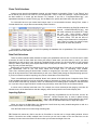
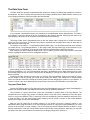
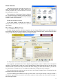
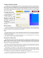
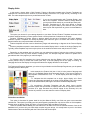
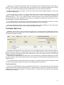
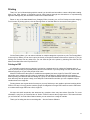
CleverCat by On-site Custom Software
Thank you for evaluating or purchasing this software. If you are only evaluating CleverCat, the Free Trial you
downloaded is fully-functional and all the data you enter during the evaluation period will still be there should you
later decide to purchase and activate the software. There is no Save button in CleverCat. As you edit data or
make design changes, your data is automatically saved at each step.
This document is not the complete User Manual but if you follow along with the steps described here, you
should be able to create your first catalog in less than one hour. The complete User Manual can be viewed as a
PDF by selecting User Manual from the Help Menu on the Menu Bar at the top of any form.
Getting Started
Many of our users have created their first catalog in less than one hour and the goal of this document is to
allow you to do the same. While CleverCat has many features for customizing and fine-tuning the appearance of
your printed catalog, this chapter will cover just the basic steps to enter your data, select a printing template and
print.
All the features of CleverCat will be covered in detail later but, by following the instructions here, you should
be able to quickly decide if CleverCat is the right product for you.
Print Preview Most forms in CleverCat have a Print Preview button. This allows you to view
the printed page on the screen without wasting paper. For complete control of all printing options,
start your printing jobs from the Printing Menu.
Importing Data
Importing data using the Data Mapping function is optional. It is much easier to simply Copy-and-Paste data
from a spreadsheet directly into the Data Window on the Data View form. However, if you intend to edit your
spreadsheet and use that to update the database, creating a Data Map will save some time later. If you would
like to try the Copy-and-Paste method, or do not have a spreadsheet to import, skip ahead to page 4.
To import your spreadsheet (or CSV), click the button – Import File Selection and then click the Find button to
select a file.
Important: This form provides a “Window” into the actual spreadsheet. You cannot open the same file with two
different programs so be sure to close Excel or any other program which may be using this file.
Formatting Errors
In the Preview Window on this form, you may notice that some of the data in your spreadsheet
is replaced with the characters: “#Num!”. This can occur if a column contains a mix of text,
numbers, currency or dates.
To check the entire spreadsheet for this common formatting problem, click the “Check for Errors” button. If an
error is found, the data in the indicated column must be converted to text before the spreadsheet can be
imported. Exit the Import Form before opening the spreadsheet in Excel.
In Excel, select the column to be converted by clicking the Column Header. Select “Text to Columns” from the
Data Menu to open the Formatting Wizard.
On step 1, set the Data Type to “delimited” and click the “Next” button.
On step 2, set the Delimeter to “Tab” and click “Next” again.
On step 3, select “Text” as the Column Data Format and click “Finish”.
Repeat these steps for all columns containing a mix of text and other data types.
If the “Check for Errors” function finds no problems, you are ready to proceed to the Data Mapping form. You
do not have to correct errors in columns which you do not intend to import. Also, you do not need to correct
formatting errors if you are Copying and Pasting data.
Data Mapping
“Data Mapping” refers to the process of selecting columns from
the spreadsheet and “mapping” them to fields in the database.
Most selections on this form are optional but you must make a
selection for the Category field for the “Map”. Click the drop-down
selection box next to the label “Category” to display a list of the
columns in your spreadsheet.
When you make a selection for Category, the same selection is
automatically added to the Category Label box although you can
select a different column for this.
Category names in CleverCat must be unique but they can share
a Category Label. The Category Label is the text that prints in the
Page Header if that option is selected.
For the Category selection, try to avoid using data containing special characters such as backslashes or
quotation marks. The Category name is used throughout CleverCat for purposes of sorting and selection and
some special characters may cause errors. Special characters can be used in the Category Label.
The selection, SubCategory, is used to separate a logical break between products within a category. It prints
between products when a Dynamic Template style is used and in the Page Header or Footer for other template
styles. For most users, if a subcategory is required, it will be recorded on every row in the spreadsheet although
it only needs to be recorded in the rows where the SubCategory changes.
If you need the subcategory to print with every product, you should select it as another data field selection.
The next selection, Category Group is currently only used for selecting groups of categories for printing. In
future versions, it may be expanded to other functions. If you need this information printed with every product,
you should select it as another data field selection.
Inventory Grouping
The Inventory Group selection is optional and the Sorting and Grouping function on the Data View form can
be used later to perform the same function described here. If this selection is left blank, the data will be imported
and numbered as flat (non-relational) data.
If used, this selection logically groups together related items and also creates the Detail Table structure for
more efficiently displaying related products under a single photo. In your spreadsheet, there may be several
columns with data which groups together related items. Related items typically share a common photo so this is
often a good choice for the grouping field. In the example below, Column D in the spreadsheet snippet contains
the product description which is common to the three available sizes.
Your own spreadsheet may have no data suitable for grouping
related items. In this case, you would leave the Inventory Group
field blank and create your own Printing and Sorting numbers.
For more information, see Sorting and Grouping on Page 10 or
Inventory Grouping Field on page 15 of the full User Manual.
In this example, there is a Print and a Sort column in the
spreadsheet. The data is organized in four groups of three
related products. The Print column groups the related rows
together with the same number and the sequential numbers in
the Sort column set the printing order within the groups.
By creating a numbering system as shown in this example, the
Detail Table structure will be created when these two columns
are imported as the Print Order and Sort Order selections.
If the Print Order selection is left blank, CleverCat will create its own Print and SubOrder numbers.
2
Photo Field Selections
Images are not stored in the database. Instead, only the filename is recorded in “Photo 1” and “Photo 2” and
this is used at print time to link to the file. The complete path – Drive, Folder and Filename - can be recorded but
the best method is to record just the filename. For example, if your file is “C:\myPhotos\Photo1.jpg”, your
spreadsheet should just contain “Photo1.jpg”. On the Data forms, specify the folder where files are stored.
For users who have not yet created their images, here is a recommended shortcut. Using Excel, create a
formula that will use unique data to automatically create filenames.
In this screenshot, the field G2 contains the
formula =CONCATENATE(F2,”jpg”) and
the result combines the contents of F2 with
the text “.jpg”. Using Excel’s AutoFill
function, drag and copy this formula down
the entire column. This has the effect of
creating unique filenames for each product.
Later, when you create your photos, simply
name them to match the products.
The selection, Inventory Index, is useful for updating the database from a spreadsheet. This is discussed in
greater detail in the User Manual.
Data Field Selections
There are twenty standard fields available to import your spreadsheet columns into. You do not have to make
a selection for each of these fields and it does not matter in what order you select them or even if you select
fields which you will not print. Later, during the Template Design process, you will decide which of your imported
fields you want to print. Many users import fields which are only used for reference – such as, a cost field, when
they only ever print the retail price.
Beside each of the twenty field selections, there is a descriptive field label. These will not correspond to your
own spreadsheet data so just click these labels and change them to something more suitable.
This is not a necessary step but should make it easier to recognize your own data. If you do enter labels here,
they will be imported as the Field Labels which you will use to identify fields during the template design process.
If you do not enter them before importing, they can be entered later on the Data forms.
There is an additional special field labelled “Notes” at the bottom of the third column of selection boxes. Each
of the standard data fields can hold an unlimited number of characters so “Notes” does not offer any advantage
over the other fields that way. However, there is an additional print formatting option available for the Notes field
so, if you have only a single field which contains long text strings, enter that column as the Notes selection.
A column can be selected more than once. For example, the column selected as the category could also be
selected as one of the data fields so that the category name can be printed in the Product Display Unit.
Importing Options
When importing a spreadsheet for the first time, choose “All
Records”. “Unique Records Only” is used to update existing
data in the database. After all the field selections have been
made, click the Add New Data button to begin the import.
When you return to the Main Menu, the Categories List will show any newly created categories as well as a
count of the number of records in that category.
Click the Data View form to follow along with this guide.
TIP: Double-click almost any field or text box in CleverCat to view the text in a larger editing window. All text
fields in CleverCat can contain multiple lines of text but you will not be able to see the extra lines on the
Inventory form and not on the Data View form unless you increase the height of the row.
3
The Data View Form
The Data View form provides a spreadsheet-like interface for entering or editing large numbers of records in
the database. This form is divided into two sections; the Category Window and the Data Window. Click any row
in the Category Window to view its records in the Data Window.
If you imported a spreadsheet already, the categories in the spreadsheet will be displayed here. To create a
new category, scroll to the bottom of the list of categories in the Category Window. Simply type the name of the
new category in the blank row at the bottom of the list and press the Enter key.
The Image Folder field is automatically filled in with the default folder. Change this to match the location
where you store your photos. The Image Folder value is combined with the Photo Name value to define the full
path and name of the image file.
For example, if the photo is: C:\myCatalog\myPhotos\Photo1.jpg it can be recorded several ways. Normally
you would record C:\myCatalog\myPhotos\ in the Image Folder field and Photo1.jpg as the filename but you
could also record C:\myCatalog\ in the Image Folder field and myPhotos\Photo1.jpg as the filename.
Each category can have a separate Image Folder. This is useful if you have a very large number of items and
need to organize the photos into more manageable numbers.
After creating your new category, use the Data Window to enter your records. The Data Window is similar to
an Excel spreadsheet. You can Copy-and-Paste data from a spreadsheet into the Data Window and use other
Excel editing functions such as Ctrl+F (Find) and Ctrl+H (Replace) or just type your data in the blank row at the
bottom of the list.
Customize the Data Window the same way you would an Excel spreadsheet. Change the widths of column
and the height of rows by placing your cursor at the dividing line where it will change into a double-headed
arrow. Re-order the columns by clicking the Column Header and then dragging the column to a new position. To
return the column order to its default position, select Reset Columns from the Data Menu on the Menu Bar.
Copy and Paste Data
Copying and Pasting data is much easier than using the Data Mapping form to import data. Data Mapping is
useful if you regularly update a spreadsheet and then use that to update the database.
The procedure for copying from Excel varies and is described in greater detail in the User Manual. The
easiest method is to simply copy groups or individual columns. Click the Column Header(s) in Excel and press
Ctrl+C to copy to the clipboard. Then, in CleverCat, click the corresponding Column Header(s) and press Ctrl+V
to paste the data. If you are working with a blank category, this will create a number of rows in the database
equal to the number of rows in the spreadsheet.
Data can only be pasted into an existing category, so you would not require a category column in your
spreadsheet when using this method. If you are copying by columns or copying an entire spreadsheet, you’ll end
up with all the records in a single category. This is still usually the easiest method because the Move or Copy
buttons at the bottom of the form can be used to put the data into the correct categories. Optionally, you can also
just select rows and Cut-and-Paste them into the correct category using Ctrl+X and Ctrl+V.
4
Deleting Data
To delete rows, click the Record Selector
for one or more rows or for one or more categories and
press the Delete key. You will be asked to confirm this action.
WARNING: There is no recovery from an accidental deletion. Make backups of your data frequently.
If you delete a category in the Category Window, all the records in that category as well as the category
settings (templates, headers, etc) will also be deleted.
If you are testing the import function or using Excel to edit or update and then replace your data, you should
select and delete just the data by clicking the sheet selector in the upper-left corner of the Data Window. This
way, when you re-import or re-paste the updated data, the category settings you made earlier will not be lost.
You can also delete all the data in every category in one step by clicking the All Data button at the bottom of
the form. This will display every record in every category in the same window. Click the sheet selector and press
the Delete Key. Using this method, the categories themselves will be retained.
Sorting and Grouping Data
The Print and Sub Order columns indicate the printing order as well as the grouping of related records.
Where each row in the Data Window is a separate product represented by a single photo, the Print Order
column will be a sequential number and the SubOrder number will always be “1”. Where multiple products of
different sizes, colors, etc. are represented by a single photo, the Print Order number will be common to a group
of records and the Sub Order number will be sequential, indicating the printing order of records in a Detail Table.
The Print and Sub Order numbers can be changed manually as required or automatically using the Sorting /
Grouping function.
Sorting data is similar to the process in Excel. Check the “Sort
Data” option and select one to three fields to sort your data by, in
ascending or descending alphabetical order. To group your data,
check the “Create Detail Tables” option in the Grouping section of
the form and select a “Group by” field.
If you selected an Inventory Grouping field on the Mapping form,
then you would normally select “Inv. Group” here. However, most
relational data will have something which is common to all related
records. In this example, the photo and the description are common
to the groups of items and either of these would be a good selection to group the different styles together.
Group By is normally used together with a Sorting
selection. For example, if your data was being
grouped on the Photo field and the data consisted of
three rows with Photo1.jpg, three rows of Photo2.gif
and three more rows of Photo1.jpg, sorting and
grouping the data by Photo would result in the two
groups shown on the left. If the data was not sorted,
but only grouped by Photo, the result would be the
three groups shown on the right.
When you click the Sort button, the Print and Sub Order numbers will be updated immediately and the results
can be seen in the Data Window without closing the Sorting / Grouping form. This function works on only the
current category so repeat these steps for all categories. Re-grouping of data is also performed automatically
when a new template is selected or the template type is changed, except when the “Group by” field is blank.
5
Photo Selection
In the upper-right corner of the Data View form is an
image box which displays the product image of the
currently selected row in the Data Window. Click this
box to search for a new file.
This screenshot is of the Browse Dialog in Windows
XP. Your window may be different but there should be
an option to view the files by Thumbnail. This will make
it easier to select the correct photo.
Double-click the photo to select it.
In the Data Window, double-click the Photo or
second Photo text field in any data row to open the
same Dialog.
The Category Editor Form
To make changes specific to individual categories, click the Category Editor button on the Main Menu and
then click the Find button to select a category. From the Data View or Inventory forms, open the Category Editor
form by double-clicking the Category Name in the Category Window.
For the purposes of this brief Getting Started Guide, use this form to set the Column Headers.
If you imported a spreadsheet, the Column Headers may already be set from the labels used to identify field
selections. These labels will be used later on the Template Editor to identify fields and they are also the Column
Headers that will be printed at the top of a Detail Table. Each category can have different labels or you can use
the Copy buttons to change them for one category and apply those changes across all categories.
The other selection that should be made on this form is the Printing Template. Select a Template from the
drop-down box and you are ready to print.
If you are evaluating this software, the steps you have taken so far may be enough to help you decide if
CleverCat is appropriate for your needs. If you want to explore it further, take a few more minutes to design a
basic Printing Template.
6
Creating a Printing Template
To get started, click the Template Designer button on the Main Menu and then select an existing template or
click the New button on the Templates Menu. If you create a new template, you will be prompted to provide a
name. You can create as many templates as you need. Most users will find that they will need to create only one
or two templates. In this case, the name really doesn’t matter. Depending on your data, you may find that you
need to create a separate template for each category. In this case you may find it easier to name each template
for the category it will print.
The Page Setup Form
The Page Setup form is where
you make selections common to
every page of a category.
These selections are grouped
onto
the
four
tabs;
Page,
Header/Footer, Display Units and
Formatting. The right side of the
form displays an Example Page
which shows a generalized view of
the printed page.
Click the Print Preview button to
see exactly what the printed page
will look like.
Working Category
For some users, the labels used to identify the fields vary between categories, so select a Working Category
to provide the expected labels. The Show Data from this Category option allows you to design a template using
the text from the first record in that category in place of the labels.
Page
The default margins are 0.35” or 6.35mm. Most printers should be able to work with these margins but
increase them if you find the edges of your data are being cut off or you see an error message indicating there is
not enough room on the page.
Top and Bottom Margins can be adjusted independently but Left and Right Margins (Inside and Outside)
must be equal as the content is always centered on the page.
Page Header and Page Footer
The Page Header is the area at the top of the page where a company logo and Category Label can be
displayed. Use the checkbox next to the Header label to enable or disable the Header. Change the height of the
Header to better fit your logo or banner. Your logo or banner will be automatically “zoomed” to fit the available
space. For example, if you are using a banner of 8” x 2” and set the Header height 1”, then the banner will be
shrunken to 4” x 1” so that it will not be distorted.
The controls for the Page Footer are similar to those for the Header. Use the drop-down boxes to select the
Header or Footer Option. The Example Page will display a rough preview of the selected option. Use the Print
Preview button at the bottom of the form to get an accurate preview.
Experimentation or “Trial-and-Error” is the best method for using this form. Explore different options to get the
look you want. Remember to make copies of Templates so that you can go back to previous settings. Depending
on the options you select, certain other options may or may not be available. For example, the option to include
the Subcategory Text in the header is available only if the Category Text is selected first.
If you need to increase the space between your catalog data and the Header or Footer, set the Header or
Footer spacer value to greater than zero and change the color to white.
7
Display Units
In this section, choose either a Grid, Dynamic, Feature or Summary template style. Dynamic Templates are
organized into columns and the number of Product Display Units that fit on a page will vary according to the
data. The other template styles have pre-defined number of Units.
If you are just experimenting with Template Design, start
with a Grid Template. These are easier to design because
you layout the fields exactly as you would have them print.
Dynamic Templates are a little more difficult to design
because you place fields by the minimum size you want
them to print and expect them to grow to accommodate the
data.
The option you choose for your catalog depends on your data. Grid and Feature Templates are better suited
to artistic catalogs because you have greater control over the placement of elements on the page.
Dynamic Templates are better suited to catalogs where the amount of descriptive text varies between
products. Dynamic Templates are usually the better option when the goal is to reduce the number of printed
pages because they compact the data most efficiently.
Feature templates are often used as Introductory Pages with advertising or diagrams in the Feature Display
Unit.
Summary templates repeat the same data from the smaller Display Units in a table in the larger Display Unit.
Typically, these templates may have only the photo in the small Units and the text and prices in the Table.
Depending on the template style you select, you may select the number of columns, the number of columns
and the number of rows or just the number of Display Units. The Example Page will continue to update with a
generalized view of the page as you make changes.
For Dynamic and Grid templates, the Layout selection sets how the Display Units are filled – Down then
Across (columns first) or Across then Down (rows first). If the last Display Unit on the page is missing, try
changing this first as the Display Unit height calculations are slightly different for each option.
For Feature and Summary templates, you select a Layout Number and the Example Page shows you the pattern
of Display Units for that Layout.
In this example, the Feature Unit (the +1 Unit) is in the center of the page and
there are 12 standard Display Units arranged around it. The Layout Pattern for
this template is described as “4 x 4 + 1” as the Display Units are arranged in a
4x4 grid.
“+1” indicates that this template has a single, larger display unit. Some
Feature and Summary templates do not have a larger Display Unit, it is the same
size as the standard Units, although it can still be modified independently.
For convenience, Summary Templates use the same Layout number
selection system but the number of Display Units does not equal the number of
products on a page. Because the products repeat in the Summary Unit, the
number of products is one less than the number of Display Units.
Fields Grow and Shrink
This option is discussed in greater detail in the User Manual. Briefly, text fields can grow to accommodate
variable text. This option is normally used only with Dynamic templates but can also be used on Grid templates.
Set this option so that No Fields, All Fields, or only the Detail Table and Notes Field grow.
There are 20 data fields available plus one Notes field. All fields can record an unlimited amount of text in the
database but if you have only one field which contains long text strings, it is usually better to put it in the Notes
field because of the extra flexibility with the Fields Grow and Shrink option.
8
Height Adjust
This option is used for fine-tuning the height of the Display Units. If there is a gap between the bottom of the
Display Units and the Page Footer, you can increase the height of each Display Unit by a few pixels to fill the
space. If the last Display Unit on the Page is cut off or missing, reduce this number or select a negative value.
Display Unit Margins is the Horizontal and Vertical space between the Display Units themselves.
Formatting
Any of the text elements on the page can be customized. Click the text on the Example Page and it will be
displayed in the “Active Cell” box. Now, click any of the attribute buttons or the color selectors to modify the
selected text.
Display Unit customizations are also made on this tab. There are four options for borders in CleverCat; Off,
Hairline, 1-Point and Rounded. Hairline and 1-Point are provided for compatibility with different laser printers. On
some printers, Hairline and 1-Point are identical. On others, Hairline is almost invisible. Thicker borders can be
created by using the Rounded Corners border option and setting the Radius to zero.
There are two “Corner Radius / Line Thickness” selections. The first applies to the Display Unit borders and
the second applies to all cells within the Display Units.
The Separating Lines selection is available only for certain template styles and the function changes for each
style. With a Dynamic template, the separating lines are vertical lines between columns. With a Summary
template, the separating lines are horizontal lines between rows in the Summary Unit.
When viewing a Print Preview, you may notice that borders may appear to overlap, disappear or not align
with other borders. These imperfections can change at different zoom levels but they only appear in Print
Previews. When printed on paper or to a PDF, the borders will print correctly.
Designing a Grid, Feature or Summary Display Unit
From the Page Setup form, open the Display Unit Design form by clicking the Display Unit button or doubleclicking any of the Display Units on the Example Page. Double-click the Feature or Summary Unit on the
Example Page to open the design form for the Feature or Summary Unit.
The Display Unit design form is where you select and place the fields you want to print. In the lower-left
corner of the form is the “Stack” of available fields, organized into two columns of labels and fields. Labels as
well as fields can be placed in the Display Unit. Each Label / Field pair is identified by the Header Name you
gave them on the Category Editor or Inventory form.
Field Placement
Simply “drag-and-drop” fields or labels from the stack and place them on the
Design Pad. Change the width or height of a field by moving your mouse cursor
to the edge of the field and “dragging” the border to the desired size.
Optionally, enter the field
dimensions manually. This
is useful if you are trying to
align fields exactly or if the
fields overlap.
When you click a field in the Display Unit, or its empty placeholder in the
Stack, its name appears in the “Active Cell” box. Enter its relative dimensions
and position in the four boxes – Left, Top, Width and Height. When a field is “Active”, you can also use the Left,
Right, Up and Down keys on your keyboard to reposition the field. Positions and dimensions are recorded in
percentages relative to the Display Unit, not the page. The shape of the Design Pad will closely match the shape
of the Display Units.
In the screenshot above, Photo1 is the Active Cell and its Left position is 0, the left edge of the Design Pad,
its top edge starts at a point 8% down the height of the Display Unit and its Width and Height are 54% and 56%
of the width and height of the Design Pad.
9
Depending on the template style and the shape of the Display Units, the Design Pad may be quite short or
narrow. To make it easier to use the Design Pad, you might want to select a different template style or change
the number of columns while designing and then change back to the correct selection for printing.
Display Units have their own margins. Increase the Vertical and Horizontal Margin settings to create more
room between Display Units.
The Grid value can be set from 1 to 10 and changes how fields are placed and sized by dragging. A Grid
value of 1 allows values of half of one percent – 9.5, 10.0, 10.5, 11.0, etc. A Grid value of 2 allows full
percentage values – 9, 10, 11, etc. Larger Grid values will make it easier to line up fields but make it harder to
fine-tune placement of fields. Using the Arrow Keys on your keyboard to reposition the cell will move it in the
selected direction in steps set by the Grid value.
If you decide that you do not want one of the fields that you have placed, click it again to make it the “Active
Cell” and click the “Return to Stack” button or just press the Delete key on your keyboard.
Font sizes displayed on this form do not exactly represent how they will be displayed on the actual printed
page. Use the Print Preview button to see how your customizations will print.
The Detail Table Form
Depending on your data, you may not need to use this form. If your data requires a Detail Table, drag the
“Detail Table” field onto the Design Pad. From the Display Unit form, double-click the Detail Table field or click
the Detail Table button to continue.
The Detail Table Design Pad is very similar to the one on the Display Unit form. There is the same “stack” of
fields and labels to choose from. Drag-and-drop fields onto the Detail Table and re-size them by dragging the
borders or entering percentage values directly. Reposition the “Active Cell” using the mouse or the Left and
Right Arrow Keys on your keyboard.
Only fields can be dragged onto the Detail Table. The Field Labels are automatically added above the fields
as Column Headers. Also, only the widths of fields can be changed. The field heights are automatically set to the
height of the row.
If you select the option “Detail Table has Column Headers”, your Detail Table will include a Header Row with
the Column Headers (Field Labels) you entered on the Category Editor or Data Forms.
The Comments Field
Each line in the Detail Table can have an additional Comments line. This line prints above or below the Data
Fields and will be the full width of the Detail Table. To enable this feature, simply select a Data Source from the
drop-down box. This field is displayed on the Design Pad as a single line but will expand to accommodate
multiple lines when printed.
10
Formatting Text
Both the Display Unit and Detail Table forms have a Formatting button. Click this to go the last form to
change the formatting of text and borders.
Click any field placed on the Display Unit or Detail Table to make it the Active Cell, and then click any button
for the attribute that you want to adjust. The best way to use this form is to experiment. Change an attribute and
then click the Print Preview button to see how it looks.
Text, Numbers, Currency and Barcodes
The default field type is Text. If you select a field and change its attribute to “Number” or “Currency”, when
printed, CleverCat will examine the field and format it as follows. If the field is empty, nothing will be printed. If
the value is zero, nothing will be printed. If the value is a number, then it will be formatted as a number or
currency as defined by your computer’s Regional Settings. If the value is not a number at all, but text, then the
text will be printed.
CleverCat does not create Barcodes. Barcodes are fonts like any other font installed on your computer. To be
scanned correctly, barcodes require additional characters for error checking. If you select the Barcode attribute,
CleverCat can add the error checking characters automatically. Each barcode font uses different error checking
characters so select the Barcode type on the Configuration form.
Alignment and Justification
By default, all text will be Left-Aligned but can be changed to Centered, Right-Aligned or Justified. The
alignment of the photo can also be changed. Unless your photos are exactly the same shape as the space
reserved for them, there will be some empty space on either side or below the photo. Use the Alignment buttons
to Left, Center or Right-align the photo.
For the photo, the Justification button has a special function. Normally, your photos are fitted to the reserved
space in such a way as to show them as large as possible without distortion. The Justification function fits your
photos exactly to the size of the reserved space. This could distort the photos so you would normally only use
this if your photos are very close to the required dimensions.
Colors and Backgrounds
The color of any text and the background (shading) of any field can be customized. Click the field you want to
change to make it the Active Cell and then click the Cell Borders or Color / Shading boxes.
Borders can be added to any cell but the color of individual Borders cannot be changed. All Field / Cell
Borders will be the same color.
In CleverCat, the color White is actually transparent when printed. If you need to create a field with a nontransparent, white background, use the Custom Color option to create a color just slightly off-white.
On the Detail Table Formatting form, there are some additional buttons for formatting Table Rows. Click the
Header or Detail buttons to see what Color Attributes can be changed. For example, if you click the Detail Button
beside Boxes / Rows, the Color text will be grayed-out to indicate that only a Background Shade can be set. If
you click the Detail Button beside Dividing Lines, the Shading text will be grayed-out to indicate that only a Color,
not a Background Shading can be selected
To make long Detail Tables easier to read, click the Alternating Rows Button and then select a Shading color.
To change the background color of the entire Detail Table, you will need to change the background for
Alternating Rows and also click the Detail button and change the Shading color for the other rows as well.
11
Printing
That’s it! If you’ve followed along with this tutorial, you should have been able to create a fairly basic catalog.
Most of the other features of CleverCat can be easily learned through the trial-and-error or experimenting
approach although they are described in detail in the full User Manual.
Return to any of the data-related forms; Category Editor, Inventory, etc, to Print Preview an entire category.
For full control of printing options, click the Printing button on the Main Menu to access the Printing Menu.
On the Printing Menu, you can select individual or multiple categories to preview or print. The Printing Menu
is the only form where you can send a print job directly to the printer instead of the screen. However, if you are
looking at a Preview from any other form, you can send the job to the printer by selecting Print from the File
Menu on the Menu Bar at the top of the form.
Printing to PDF
It is important to note that every category is printed as a separate print job, unless the Compact option is
used. If you are printing to a physical printer, this will not be noticed. If you are printing to a PDF Writer, the PDF
software will ask you to give each print job a file name.
Most PDF Writers have the option to combine these separate jobs into a single file. Some PDF writers will
pause after every category and you name or combine the files at that time. Others will print every category
without pausing and stack the filename dialogs in a group on the Windows taskbar and you select and combine
them after they have all printed. Lastly, some will print to individual files and then you use a separate utility to
combine them into a single file.
Printing photos uses a great deal of memory so you may find that you are unable to print and combine all the
PDFs in one step. You may need to combine groups of categories into larger PDFs and then use the PDF writer
to combine these larger PDFs into a final, single file.
We hope this brief introduction has answered any questions have may have about CleverCat. For more
information, every form in CleverCat has an “Online Tutorial” button at the top-right corner. This button will take
you to CleverCat’s YouTube Video Channel where you can select from a range of tutorials.
Thank you for taking the time to read this guide. ~ On-site Custom Software.
12