1
Logic Gui Professional
- Software Version 5.6
User Manual
English
User Manual Version 5.6
Page 2
Copyright
© LogicZone, 2006-2013. All rights reserved.
WWW.LOGICZONE.DE
First revision October 2008
Revised December 2008 – Changes 4.1
… New MaxGuiEx features, ProxyGadgets, Fontsizes...
Revised April 2009 – Changes 4.2
… Guide System, ListView Gadget and Type...
Revised September 2009 – Changes 5.0
… Type creation, Anchors, Notes, Proxy ScrollPanel, Visual Distance …
Revised December 2009 – Changes 5.1
… MaxGui Localization, Design Images, Better Preview, Drag & Drop on
Form Gadgets...
Revised May 2010 – Changes 5.2
… Panel types, Open Untitled, Graphics setting, Form Backup,
SmartButton Editor 1.3...
Revised August 2010 – Changes 5.3
… Three level snap, gadget to gadget snap, MaxGui IntelliSense,
Improved Event Editor with reverse lookup of event and gadget, Group by
parent structures, PANEL_RAISED style added...
Revised January 2011 – Changes 5.4
… Reflection Support, unmanaged tabber, improved Tform base type,
updated IntelliSense, better Process Output control, Set Editor, some
internal changes...
Revised November 2011 – Changes 5.5
… Custom Media Support, Logic Gui Resource Creator, UPX
Compression and Post Processing, Recent Files storage, Custom Folder
Structure, Simple and Advanced Find …
Revised May 2013 – Changes 5.6
… IconStrip Editor, Removed FreeImage dependencies, Improved
Thumbnails, ListView Update for batch processing, Improved IconStrip
handling, Removable Comments, Improved Intellisense, Better
Application Timer handling...
Page 3
User Manual Version 5.6
Table of Contents
1. Overview ...................................................................................................................................... 12
1.1 What is Logic Gui ................................................................................................................ 12
1.2 How does it work ................................................................................................................. 12
1.3 How does Logic Gui help you to arrange your form ........................................................... 12
1.4 What kind of gadgets are supported .................................................................................... 12
1.5 Source Code ......................................................................................................................... 12
1.6 The Program ........................................................................................................................ 12
2. Quick Start .................................................................................................................................... 13
2.1 The archive .......................................................................................................................... 13
2.2 The setup .............................................................................................................................. 13
Ready to start! ............................................................................................................................ 13
3. First steps ...................................................................................................................................... 14
3.1 Available gadgets ................................................................................................................ 14
3.2 Adding gadgets to the form ................................................................................................. 14
3.3 Select a gadget ..................................................................................................................... 14
3.4 Size a gadget ....................................................................................................................... 14
3.5 Move a gadget ..................................................................................................................... 15
3.6 Test the form ........................................................................................................................ 15
4. Workflow ...................................................................................................................................... 16
4.1 Concept ................................................................................................................................ 16
4.2 Designing a form ................................................................................................................. 16
4.3 Possible Workflow steps ...................................................................................................... 17
5. Logic Gui Program Structure ....................................................................................................... 18
5.1 Gadget Window ................................................................................................................... 18
5.1.1 File Menu ...................................................................................................................... 18
5.1.1.1 New ....................................................................................................................... 18
5.1.1.2 Import Form .......................................................................................................... 18
5.1.1.3 Export .................................................................................................................... 18
5.1.1.4 Open – Open Form ................................................................................................ 19
5.1.1.5 Open – Open as Untitled ....................................................................................... 19
5.1.1.6 Open – Open and insert in current form ................................................................ 19
5.1.1.7 Open – Open Form Folder (F6) ............................................................................. 19
5.1.1.8 Open Recent Forms ............................................................................................... 19
5.1.1.9 Save ....................................................................................................................... 20
5.1.1.10 Save As ................................................................................................................ 20
5.1.1.11 Create Source ...................................................................................................... 20
5.1.1.12 Build Options ...................................................................................................... 20
5.1.1.13 Window Setup ..................................................................................................... 21
5.1.1.14 Print ..................................................................................................................... 21
5.1.1.15 Quit ...................................................................................................................... 21
5.1.2 (Edit Menu &) Popup Menu ......................................................................................... 21
5.1.2.1 Undo / Redo ........................................................................................................... 22
5.1.2.2 Properties ............................................................................................................... 22
5.1.2.3 Convert To ............................................................................................................. 22
5.1.2.4 Align ...................................................................................................................... 22
5.1.2.5 Center in Form ....................................................................................................... 23
5.1.2.6 Distribute ............................................................................................................... 23
5.1.2.7 Stretch and Trim .................................................................................................... 24
User Manual Version 5.6
Page 4
5.1.2.8 Step & Repeat ........................................................................................................ 24
5.1.2.9 Duplicate Size ........................................................................................................ 24
5.1.2.10 Swap Gadgets ...................................................................................................... 25
5.1.2.11 Inside a Container - Fit Client Area .................................................................... 25
5.1.2.12 Inside a Container - Fit Inside Guides ................................................................. 26
5.1.2.13 Set ........................................................................................................................ 26
5.1.2.14 Select ................................................................................................................... 26
5.1.2.15 Deselect ............................................................................................................... 27
5.1.2.16 Cut ....................................................................................................................... 27
5.1.2.17 Copy ................................................................................................................... 27
5.1.2.18 Paste ..................................................................................................................... 28
5.1.2.19 Delete ................................................................................................................... 28
5.1.2.20 Grouping .............................................................................................................. 28
5.1.2.21 Order - Bring to Front / Send to Back ................................................................. 29
5.1.2.22 Locking ................................................................................................................ 30
5.1.2.23 Unlock ................................................................................................................. 30
5.1.3 View Menu .................................................................................................................... 31
5.1.3.1 Form PreView ....................................................................................................... 31
5.1.3.2 Gadgets .................................................................................................................. 31
Design Range (Single Gadgets) ....................................................................................... 31
5.1.3.3 Design Range (Multiple Gadgets) ......................................................................... 32
5.1.3.4 Guides .................................................................................................................... 32
5.1.3.5 Fontsize ................................................................................................................. 32
5.1.3.6 Process Output ....................................................................................................... 33
5.1.3.7 Draw Lines during sizing ...................................................................................... 33
5.1.3.8 Draw Lines during move ....................................................................................... 34
5.1.3.9 Visual feedback ..................................................................................................... 34
5.1.3.10 Visual Distance .................................................................................................... 35
5.1.3.11 Step in GridSize ................................................................................................... 35
5.1.3.12 Select container select children ........................................................................... 36
5.1.3.13 Show All Tool Windows ..................................................................................... 36
5.1.3.14 Hide All Tool Windows ...................................................................................... 36
5.1.3.15 Info Window ....................................................................................................... 36
5.1.3.16 Step & Repeat ...................................................................................................... 36
5.1.3.17 Grid Window ...................................................................................................... 37
5.1.3.18 Gadget Control Center ......................................................................................... 37
5.1.3.19 Magnifier Window .............................................................................................. 37
5.1.3.20 Process Output Window ...................................................................................... 37
5.1.3.21 Layer Window ..................................................................................................... 38
5.1.3.22 Language Window .............................................................................................. 38
5.1.3.23 Layout Window ................................................................................................... 39
5.1.3.24 Manager Window ................................................................................................ 39
5.1.3.25 Anchor Window .................................................................................................. 39
5.1.3.26 Menu Control Center Window ............................................................................ 39
5.1.4 Option Menu ................................................................................................................. 39
5.1.4.1 WorkSpace Autofocus ........................................................................................... 39
5.1.4.2 Clear Undo Buffer ................................................................................................. 40
5.1.4.3 Automatic Save ..................................................................................................... 40
5.1.4.4 Save On Exit .......................................................................................................... 40
5.1.4.5 Create Session Backups ......................................................................................... 40
Page 5
User Manual Version 5.6
5.1.4.6 Create also source when saving the form .............................................................. 40
5.1.5 Help Menu ..................................................................................................................... 40
5.1.5.1 About Window ...................................................................................................... 40
5.1.5.2 Logic Gui Homepage ............................................................................................ 40
5.1.5.3 LogicZone Support Forum .................................................................................... 40
5.1.5.4 Online User Manual .............................................................................................. 41
5.1.5.5 Shortcut Table ....................................................................................................... 41
5.2 Toolbar ................................................................................................................................. 41
5.2.1 Move and Size ............................................................................................................... 41
5.2.2 Insert New Gadgets ....................................................................................................... 41
5.2.3 Duplicate Height and Width .......................................................................................... 41
5.2.4 Swap Gadgets ................................................................................................................ 41
5.2.5 Measure ......................................................................................................................... 41
5.2.6 Run ................................................................................................................................ 42
5.2.7 Stop ............................................................................................................................... 42
5.2.8 PostProcessing .............................................................................................................. 42
5.3 Gadget TreeView ................................................................................................................. 43
5.3.1 Adding Gadgets ............................................................................................................. 43
5.3.2 How to set the default size of a gadget: ........................................................................ 43
6. WorkSpace Window ..................................................................................................................... 44
6.1.1 Form Design .................................................................................................................. 44
6.1.2 Full Code ....................................................................................................................... 44
6.1.3 Selected Code ................................................................................................................ 45
6.1.4 Edit Events .................................................................................................................... 45
6.1.5 Templates ...................................................................................................................... 47
6.1.6 Parser ............................................................................................................................. 47
7. Gadgets and Properties ................................................................................................................. 50
7.1 Windows .............................................................................................................................. 50
7.1.1 Standard Window .......................................................................................................... 50
7.1.2 Child Window ............................................................................................................... 50
7.1.3 Special Window Properties ........................................................................................... 50
7.1.3.1 General .................................................................................................................. 51
7.1.3.2 Style ....................................................................................................................... 51
7.1.3.3 View ...................................................................................................................... 52
7.1.3.4 TForm .................................................................................................................... 53
7.1.3.5 Timer ..................................................................................................................... 54
7.2 Buttons ................................................................................................................................. 54
7.2.1 Push Button ................................................................................................................... 54
7.2.2 OK Button ..................................................................................................................... 54
7.2.3 Cancel Button ................................................................................................................ 54
7.2.4 Radio Button ................................................................................................................. 55
7.2.5 Checkbox Button ........................................................................................................... 55
7.2.6 Special Properties .......................................................................................................... 55
7.2.6.1 Style ....................................................................................................................... 55
7.2.6.2 View ...................................................................................................................... 55
7.3 TextFields ............................................................................................................................ 56
7.3.1 Standard TextField ........................................................................................................ 56
7.3.2 Password TextField ....................................................................................................... 56
7.3.3 Special Properties .......................................................................................................... 56
7.3.3.1 Style ....................................................................................................................... 56
User Manual Version 5.6
Page 6
7.4 Panels ................................................................................................................................... 56
7.4.1 Panel as Group .............................................................................................................. 56
7.4.2 Panel plain style ............................................................................................................ 56
7.4.3 Panel with sunken border .............................................................................................. 57
7.4.4 Panel with raised border ................................................................................................ 57
7.4.5 Special Properties .......................................................................................................... 57
7.4.5.1 General .................................................................................................................. 57
7.4.5.2 TForm .................................................................................................................... 59
7.4.5.3 Timer ..................................................................................................................... 59
7.4.5.4 Style ....................................................................................................................... 59
7.4.5.5 View ...................................................................................................................... 60
7.5 Labels ................................................................................................................................... 60
7.5.1 Label plain style ............................................................................................................ 61
7.5.2 Label with simple border .............................................................................................. 61
7.5.3 Label with sunken border .............................................................................................. 61
7.5.4 Label as separator .......................................................................................................... 61
7.5.5 Special Properties .......................................................................................................... 61
7.5.6 Style .............................................................................................................................. 61
7.6 Sliders .................................................................................................................................. 62
7.6.1 Slider Scrollbar ............................................................................................................. 62
7.6.2 Slider Trackbar .............................................................................................................. 62
7.6.3 Slider Stepper ................................................................................................................ 62
7.6.4 Special Properties .......................................................................................................... 62
7.6.4.1 Style ....................................................................................................................... 62
7.6.4.2 Value ..................................................................................................................... 63
7.7 ComboBox ........................................................................................................................... 63
7.7.1 Standard ComboBox ..................................................................................................... 63
7.7.2 Editable ComboBox ...................................................................................................... 63
7.7.3 Special Properties .......................................................................................................... 63
7.7.3.1 Style ....................................................................................................................... 63
7.8 ListBox ................................................................................................................................. 64
7.8.1 Standard ListBox ........................................................................................................... 64
7.8.2 Multiselection Listbox .................................................................................................. 64
7.8.3 Special Properties .......................................................................................................... 64
7.8.3.1 Style Tab ................................................................................................................ 64
7.8.4 Special Properties .......................................................................................................... 64
7.8.4.1 View ...................................................................................................................... 64
7.9 TextArea .............................................................................................................................. 65
7.9.1 Standard TextArea ........................................................................................................ 65
7.9.2 Special Properties .......................................................................................................... 66
7.9.2.1 Style ....................................................................................................................... 66
7.9.2.2 Value ..................................................................................................................... 66
7.10 HTMLView ....................................................................................................................... 67
7.10.1 Standard HTMLView ................................................................................................. 67
7.10.2 Special Properties ........................................................................................................ 67
7.10.2.1 Style ..................................................................................................................... 67
7.10.2.2 View .................................................................................................................... 67
7.11 Progress Bar ....................................................................................................................... 68
7.11.1 Standard Progress Bar ................................................................................................. 68
7.11.2 Special Properties ........................................................................................................ 68
Page 7
User Manual Version 5.6
7.11.2.1 Value ................................................................................................................... 68
7.12 Canvas ................................................................................................................................ 68
7.12.1 Standard Canvas .......................................................................................................... 68
7.12.2 Special Properties ........................................................................................................ 69
7.12.2.1 View .................................................................................................................... 69
7.13 TreeView ........................................................................................................................... 69
7.13.1 Standard TreeView ..................................................................................................... 69
7.13.2 Special Properties ........................................................................................................ 69
7.13.2.1 Style ..................................................................................................................... 69
7.13.2.2 View .................................................................................................................... 70
7.14 Tabber ................................................................................................................................ 70
7.14.1 Standard Tabber ........................................................................................................ 70
7.15 Proxy Gadgets ................................................................................................................... 71
7.15.1 HyperLink Gadget ...................................................................................................... 71
7.15.2 Splitter Gadget (Proxy Gadget) ................................................................................... 72
7.15.2.1 Special Properties (View) .................................................................................... 73
7.15.3 ScrollPanel .................................................................................................................. 73
7.15.3.1 Style ..................................................................................................................... 74
7.15.3.2 View .................................................................................................................... 74
7.16 Special Gadgets .................................................................................................................. 74
7.16.1 Panel with Scrollbars .................................................................................................. 74
7.16.1.1 Special Properties (View) .................................................................................... 76
7.16.2 Windows Only! / Multicolumn ListBox ..................................................................... 76
7.16.2.1 Batch Processing ................................................................................................. 80
7.17 SmartButtons ..................................................................................................................... 80
7.17.1 Independent Events ..................................................................................................... 81
7.17.2 Config Files (*.smb) ................................................................................................... 81
7.18 Design only ........................................................................................................................ 82
7.18.1 Top Left Lines ............................................................................................................. 82
7.18.2 Horizontal Guide ......................................................................................................... 82
7.18.3 Vertical Guide ............................................................................................................. 83
7.18.4 Notes ........................................................................................................................... 83
7.18.5 Colors .......................................................................................................................... 85
7.18.6 Image ........................................................................................................................... 85
7.19 Legacy Gadgets .................................................................................................................. 85
7.19.1 Splitter Horizontal ....................................................................................................... 85
7.19.2 Special Properties ........................................................................................................ 87
7.19.2.1 Style ..................................................................................................................... 87
7.19.3 View ............................................................................................................................ 87
7.19.4 Splitter Vertical ........................................................................................................... 87
8. Tool Windows .............................................................................................................................. 88
8.1.1 The Info Window .......................................................................................................... 88
8.1.2 Step & Repeat ............................................................................................................... 88
8.1.3 The Grid Window ......................................................................................................... 90
8.1.3.1 Lines ...................................................................................................................... 90
8.1.3.2 Dots ....................................................................................................................... 90
8.1.3.3 Snap to Grid ........................................................................................................... 90
8.1.3.4 Grid Foreground / Background ............................................................................. 90
8.1.3.5 Grid Auto Hide ...................................................................................................... 90
8.1.3.6 Grid Origin ............................................................................................................ 90
User Manual Version 5.6
Page 8
8.1.3.7 Grid Spacing .......................................................................................................... 90
8.1.4 Gadget Control .............................................................................................................. 91
8.1.4.1 Using the Gadget Control Center .......................................................................... 91
8.1.4.2 Quick Access Icons ............................................................................................... 92
8.1.4.3 Distance Control .................................................................................................... 92
8.1.5 Magnifier ....................................................................................................................... 93
8.1.6 Process Output .............................................................................................................. 93
8.1.6.1 Show Error ............................................................................................................ 94
8.1.7 Layer ............................................................................................................................. 94
8.1.7.1 Add Layer .............................................................................................................. 94
8.1.7.2 Edit Layer Name ................................................................................................... 94
8.1.7.3 Move to selected Layer ......................................................................................... 94
8.1.7.4 Move Up / Move Down ......................................................................................... 95
8.1.7.5 Delete Layer .......................................................................................................... 95
8.1.7.6 Toggle Visibility .................................................................................................... 95
8.1.7.7 Select Gadgets of Layer ........................................................................................ 95
8.1.7.8 All Layers .............................................................................................................. 96
8.1.8 Language ....................................................................................................................... 96
8.1.8.1 Add Language ....................................................................................................... 96
8.1.8.2 Create XML Output ............................................................................................... 96
8.1.8.3 Delete Language .................................................................................................... 97
8.1.8.4 XML File creation ................................................................................................. 97
8.1.8.5 Import Language ................................................................................................... 97
8.1.8.6 Export As MaxGui Language ................................................................................ 97
8.1.9 Layout Control .............................................................................................................. 97
8.1.10 Manager ...................................................................................................................... 98
8.1.10.1 Media Manager .................................................................................................... 98
8.1.11 Anchor ....................................................................................................................... 101
8.1.12 Menu Control ............................................................................................................ 102
8.1.12.1 Menu Structure .................................................................................................. 103
8.1.12.2 Select Menu ....................................................................................................... 104
8.1.12.3 Menu Entry ........................................................................................................ 104
8.2 Properties Editor ................................................................................................................ 104
8.2.1 Gadget Chooser ........................................................................................................... 105
8.2.1.1 Application .......................................................................................................... 105
8.2.1.2 WorkSpace .......................................................................................................... 105
8.2.1.3 All Gadgets (Order) ............................................................................................. 105
8.2.1.4 All Gadgets (Sorted) ............................................................................................ 106
8.2.1.5 Visible Gadgets per Layer ................................................................................... 106
8.2.1.6 Grouped by Parents ............................................................................................. 106
8.2.1.7 Selected ............................................................................................................... 106
8.2.2 Info .............................................................................................................................. 106
8.2.3 Properties Tabber ........................................................................................................ 107
8.2.3.1 General Tab ......................................................................................................... 107
8.2.3.2 Attributes Tab ...................................................................................................... 108
8.2.3.3 Color Tab ............................................................................................................. 108
8.2.3.4 Font Tab .............................................................................................................. 109
8.2.3.5 Events Tab ........................................................................................................... 110
8.2.3.6 Items Tab ............................................................................................................. 112
8.2.3.7 Items+ Tab ........................................................................................................... 113
Page 9
User Manual Version 5.6
8.2.3.8 Menu Tab ............................................................................................................ 114
8.2.3.9 Toolbar Tab ......................................................................................................... 115
8.2.3.10 Filter Tab ........................................................................................................... 116
8.2.4 Application Tabs ......................................................................................................... 116
8.2.4.1 Naming ................................................................................................................ 116
8.2.4.2 Gadgets ................................................................................................................ 117
8.2.4.3 App. Events ......................................................................................................... 118
8.2.4.4 Info Tab ............................................................................................................... 119
8.2.4.5 Files Tab .............................................................................................................. 119
8.2.4.6 Timer ................................................................................................................... 122
8.2.4.7 XML Tab ............................................................................................................. 122
8.2.4.8 Types Tab ............................................................................................................ 123
8.2.4.9 Post Tab (PostProcessing) ................................................................................... 125
8.2.5 Event Editor ................................................................................................................ 127
8.2.5.1 Current Source Code / Help ................................................................................ 127
8.2.5.2 Current Event Source .......................................................................................... 128
8.2.5.3 Gadget Commander / Events ............................................................................... 130
8.2.5.4 Cancel, OK, Revert, Apply ................................................................................. 130
8.2.5.5 Popup Menu ........................................................................................................ 130
8.2.6 Gadget Commander .................................................................................................... 136
8.2.6.1 Action .................................................................................................................. 136
8.2.6.2 Examples ............................................................................................................. 137
9. Appendix .................................................................................................................................... 139
9.1 Logic Gui Resource Creator .............................................................................................. 139
9.2 IconStrip Editor .................................................................................................................. 140
9.3 Modules ............................................................................................................................. 141
9.3.1 LogicXML Module ..................................................................................................... 141
9.3.2 SmartButton Module ................................................................................................... 142
9.3.2.1 What is a SmartButton ........................................................................................ 142
9.3.2.2 What is so smart about it ..................................................................................... 142
9.3.2.3 What is a SmartButton hotspot region ................................................................ 142
9.3.2.4 What is a SmartButton action .............................................................................. 143
9.3.2.5 How to install the SmartButton module .............................................................. 143
9.3.2.6 Definition of a SmartButton ................................................................................ 143
9.3.2.7 The SmartButton Editor ...................................................................................... 143
9.4 Shortcuts ............................................................................................................................ 143
9.5 Automatic Save .................................................................................................................. 145
9.6 Drag & Drop ...................................................................................................................... 145
9.6.1 WorkSpace .................................................................................................................. 145
9.6.2 Event Editor ................................................................................................................ 146
9.6.3 Form Gadgets .............................................................................................................. 146
9.7 Customizing the ini file ...................................................................................................... 146
9.7.1 Gadgets ........................................................................................................................ 146
9.7.2 Call External Editor .................................................................................................... 147
9.7.3 Snap to Grid ................................................................................................................ 147
9.7.4 Use WorkSpace ........................................................................................................... 147
9.7.5 BlitzMax compiler path .............................................................................................. 147
9.7.6 Automatic Save ........................................................................................................... 148
9.7.7 Load last form on start ................................................................................................ 148
9.7.8 Form Previews ............................................................................................................ 148
User Manual Version 5.6
Page 10
9.7.9 GadgetCommander ..................................................................................................... 148
9.7.10 Edit All Events .......................................................................................................... 148
9.7.11 Highlighting .............................................................................................................. 148
9.7.12 Tab indent of source code ......................................................................................... 149
9.7.13 Guides ....................................................................................................................... 149
9.7.14 Naming Defaults ....................................................................................................... 149
9.7.15 Visual Distance Defaults ........................................................................................... 149
9.7.16 Plus + and Minus – Key ............................................................................................ 150
9.7.17 The canvas gadgetpaint initialization string ............................................................. 150
9.7.18 Menus ........................................................................................................................ 150
9.7.19 Set Graphics Driver ................................................................................................... 150
9.7.20 Gadget To Gadget Snap ............................................................................................ 150
9.8 How to upgrade from an older Logic Gui version ............................................................. 151
9.9 Parking Gadgets ................................................................................................................. 151
10. Logic Gui Files (Structure) ....................................................................................................... 152
10.1 The main program: ........................................................................................................... 152
10.2 Files internally used by Logic Gui: .................................................................................. 152
10.3 These files can be inserted into the code: ........................................................................ 152
10.4 Directories: ....................................................................................................................... 152
10.5 Others: .............................................................................................................................. 153
11. Demos ....................................................................................................................................... 154
11.1 Part 1: ............................................................................................................................... 154
11.1.1 http://jsp.logiczone.de/Videos/Calculator.htm .......................................................... 154
11.2 Part 2: ............................................................................................................................... 154
11.2.1 http://jsp.logiczone.de/Videos/Layer.htm ................................................................. 154
11.3 Part 3: ............................................................................................................................... 154
11.3.1 http://jsp.logiczone.de/Videos/TabSplitScroll.htm ................................................... 154
11.4 Part 4: ............................................................................................................................... 154
11.4.1 http://jsp.logiczone.de/Videos/MultiLanguage.htm .................................................. 154
11.5 Part 5: ............................................................................................................................... 154
11.5.1 http://jsp.logiczone.de/Videos/Guides.htm ............................................................... 154
11.5.2 http://jsp.logiczone.de/Videos/MediaManager.htm .................................................. 154
11.5.3 http://jsp.logiczone.de/Videos/Anchors.htm ............................................................. 154
11.6 ListView Demo ................................................................................................................ 154
11.6.1 http://jsp.logiczone.de/downloads/ListViewDemo.zip ............................................ 154
12. How To... .................................................................................................................................. 155
12.1 Archive/Backup Your Form ............................................................................................ 155
12.2 Create Independent Window and Panel Types ................................................................ 155
12.2.1 Concept Of Independent Types ................................................................................. 155
12.3 Reflection ......................................................................................................................... 158
13. External Types .......................................................................................................................... 160
13.1 TListView ........................................................................................................................ 160
13.2 TForm .............................................................................................................................. 160
13.2.1 Getters and Setters ................................................................................................... 160
13.2.2 Standard Methods ..................................................................................................... 160
13.2.3 Feedback ................................................................................................................... 160
13.2.4 Groups ....................................................................................................................... 160
13.2.5 Functions ................................................................................................................... 161
13.3 TFormTimer ..................................................................................................................... 161
13.3.1 Getter and Setter ........................................................................................................ 161
Page 11
User Manual Version 5.6
User Manual Version 5.6
Page 12
1. Overview
1.1
What is Logic Gui
Logic Gui is a Form Editor for MaxGui, the Blitzmax Gui module.
(Blitzmax and MaxGui is Copyright by Blitz Research Ltd www.Blitzbasic.com)
You can arrange a complete window with all gadgets and Logic Gui will then create the source code for you.
Thus its saves you a huge amount of time. Changing a position is now just as simple as moving the mouse.
Try several forms for your application without re-doing all the properties. Re-use your work again for new
projects. Saved forms can be inserted in new forms and serve as templates.
1.2
How does it work
Simply move and size gadgets with the mouse to the place you want.
Edit the properties of the gadget or use the default.
Create the source.
1.3
How does Logic Gui help you to arrange your form
Logic Gui has several tools which can assist you in positioning and sizing your items.
Use Align, Design Range, Stretch, Trim, Automatic Distribute, Step&Repeat, Grouping, Locking, Measure,
Grid... Or you use absolute and relative coordinates with automatic calculation relative to any of the items
edges to move your gadgets to the right position.
1.4
What kind of gadgets are supported
Logic Gui supports all gadgets at the time this text is written (Blitzmax Version 1.48 / MaxGui 1.42).
Additional you can make use of iconstrips, toolbars and menus (windows- and popupmenus). Several
windows can be managed in one go. Beside the MaxGui gadgets there are also Splitter, ScrollPanels and
SmartButtons available to enhance your form.
1.5
Source Code
A complete well sorted and aligned source code, consisting of gadget creation code, event queue and
function calls. Use the standard event loop or an OOP style as you like. An easy GUI assists you in setting
the properties for every gadget with a lot of options. The complete source is SuperStrict compatible. All used
variables can be defined as Local and will be transferred to the functions. The generated functions will
produce full debug information when compiled in debug mode. The created source can be compiled directly,
loaded into your editor, put to the clipboard or just saved to file.
Paths requested by Logic Gui for various things are all converted directly into relative paths if possible.
1.6
The Program
Logic Gui is written in Blitzmax for Windows. While the source code is created for Blitzmax with MaxGui
module, all forms are saved as XML files. But not the forms only, also every iconstrip, menu or toolbar
property can be saved as XML and re-used in other projects or also several times in the same project.
You can have a look at those files, i think they can be easily understood (hopefully). Feel free to build a
converter to other languages...
Page 13
User Manual Version 5.6
2. Quick Start
2.1
The archive
You receive Logic Gui with the current release notes packed in an archive (normally a standard .zip or .rar
file). Unpack the archive. Double click Logic Gui. That's it – nothing to install!
Logic Gui will open two windows the first time (Gagdet tree and WorkSpace). Some more tool windows are
available when chosen from the view menu.
Note: Logic Gui needs write access to it's ini file (defaults.xml), source code and form files. Adjust your
security settings accordingly.
2.2
The setup
Place any tool window you want and size them.
If you like, set your grid type and spacing.
Press the green RUN button in the toolbar of the gadget tree window to force a compile of the current (still
empty) form.
Note: The first time you try to run your editor or the BlitzMax compiler and Logic Gui can't find those at the
default location you will be ask to locate them manually. Use the file requester which opens to do so. The
result will be stored for the future in Logic Gui's config file.
That's all.
You should now quit and restart the program with the new settings from your environment!
All should show up as you defined it.
Ready to start!
User Manual Version 5.6
Page 14
3. First steps
When Logic Gui has started you will see at least two windows. One window shows a grid, this is the place
where you put your gadgets together (WorkSpace). And the other window has a treeview and menu visible.
The treeview is where you select, what kind of gadget you want to add to your form.
3.1
Available gadgets
Open the treeview nodes to see what's available.
As you can see, the category “Buttons” holds different types of buttons. Actually you are able to convert any
button into any other button type, but if you choose directly the needed one, it saves you some time and
additional there is a default size for every single item.
3.2
Adding gadgets to the form
Double click e.g. The “Push Button” inside the treeview and move the Mouse over to the WorkSpace window.
The mouse pointer has now changed to a cross and a transparent Button is visible. The cross represents an
edge of the gadget you want to place.
You can now decide between two possibilities:
A single click places the gadget with a default size onto the workspace. Or press down the left mouse button
and hold down while sizing the new gadget to the needed size (all directions).
Play around and place some more gadgets. Every gadget added will get a generic variable name and text.
While you of course would change the text to your needs, you should do the same also to the variable name
and give it some meaningful description for your program. Easiest way to do it is via the Gadget Control
Center window, you can open it from the view menu.
When you add parent or container gadgets, like panels, tabber, windows and such, they will be sorted
automatically in the background, other stuff automatically in the foreground.
3.3
Select a gadget
You will recognize that a selected gadget shows up with a red border. Select another gadget by single click
on it or create a frame around one or more gadgets (also multi select). Shift click (LMB) to add or subtract a
gadget from the selection.
When a parent or container gadget was selected, all child gadgets are selected as well. Ready to move or
size, all in one go. If you want to select the parent alone, press the CTRL button while left clicking on it.
De-select any item by clicking into the WorkSpace background (or press ESC)!
A green frame is shown for a multi selection. While creating the selection with the mouse all items which are
completely inside are detected on the fly and recognized in the inner green selection. Still every item which
is selected gets a red border. But one has an additional blue border which marks this one as the primary
gadget! Every action which needs a reference will use this primary gadget for it. As an example take the
Align Function: If you ask to Align to top, all other gadgets get moved to line up with the primary gadget.
3.4
Size a gadget
When a gadget is selected move the mouse inside and close to the border. At every edge and every side the
mouse pointer will change and show in which direction it's possible to resize the gadget (8 Directions). Press
and hold down the left mouse button to do so.
Manual Size: If you press Ctrl and one of the cursor keys, your selection grow one pixel in that direction and
together with shift if grows 5 pixel. If you press Alt and one of the cursor keys it will shrink in the opposite
direction one pixel and together with shift 5 pixel. Checkout also + and – keys for equal grow and shrink (see
shortcuts) in different directions.
Page 15
3.5
User Manual Version 5.6
Move a gadget
When you click on a gadget and and hold down the left mouse button you can move the gadget around. As
you can see, it's very easy to size and position any item. If you press Shift or CTRL the movement is limited to
horizontal or vertical directions.
During movement of a gadget the connection or disconnection to a parent gadget is done on the fly. The
only important rule to have this working is that the child gadget needs to be one pixel inside the parent
gadget.
Manual Move: If you press one of the cursor keys, your selection is moved one pixel in that direction. Hold
down shift and you move it 5 pixel. Use the Magnifier Window to determine how close you are.
When all gadgets are in place, we are ready to create the source of it.
3.6
Test the form
Have a “Standard Window” and some gadgets on top to get some output.
Press the green run button to compile the form (Can be found in the toolbar of the gadget tree window).
You will notice that a “Process Output” window pops up if not yet open and shows the output of the compile
process and debug information from the new form.
Congratulation! Your first form has been done.
Note: When you start playing with Logic Gui and compile different test forms, you may notice that the
WorkSpace itself can produces a window. This window is not meant as application window, it's for testing
only. You can switch it on/off in the Properties Editor.
User Manual Version 5.6
Page 16
4. Workflow
4.1
Concept
How long does it take to adjust gadgets manually? How long does it take to create a multi language form?
Logic Gui tries to give you all tools you need to create a form in a visual way, without wasting time.
While having a lot of tools, all should be clean and simple. We all work different and not everyone needs
everything offered by Logic Gui. The idea is, that things are put in tool windows and the user only opens what
he needs. You can start and work very simple, or dig deep into the design and use advanced features.
There are no shiny sounds or graphics, it's only implemented what does the job. There is no installer, where
you don't know what it's doing, just run it from your USB stick if you like. There are no entries written to your
registry and bloating it with strange keys, it's not needed and not wanted. There are no cryptic binary files for
your configuration or form files, they are human readable XML files you can edit with notepad. There is no
100% CPU usage and your computer fan is running wild, it's completely event based and doesn't use any
power if not needed.
The main purpose of Logic Gui is of course the GUI design, but if you ever try to change a GUI inside your
program, you know it is a pain. If it's possible, one should always try to keep the form intact (in sync) with the
rest of the program. Therefore Logic Gui does not only creates the form design code for you, but lets you add
all things needed to run your program. Thus a change in the GUI, does not break the code, because Logic
Gui knows where to put the changes.
When you add your own modules, types, functions and whatever is needed, those stuff is stored in external
files. This is done to give you the ability to have them opened in parallel in your favorite editor. That means
you can work on your form in Logic Gui and writing supporting functions in your own IDE and all will be put
together in the program source code.
4.2
Designing a form
Again, we are all different in doing our stuff and thus the way the GUI will be done would also differ.
1. Imagine you wrote a complete program, but the GUI part is missing. That would be perfect! You
know exactly what your program needs, because its ready. You only have to decide how the controls
should ask for the values you need as input and how to present the output.
2. Imagine you have an idea of the program and something done, but don't know yet how the final
version will look like. You start designing the form, but it has constantly to change as the program
grows.
3. Imagine you collect ideas for your program and add the gadgets needed for it to the form to check
how it would look like and after everything is in place, you start filling in the code to get it working.
To cover all those different ways, we can use available tools to get our GUI in a short time.
The design itself of the form would almost be the same. We move, size, align, distribute our gadgets. The
only difference is may be when you know already what you want and don't have to try some layouts.
For number one you can create the form and just copy the code you need, that's it.
For number two you can create the form and either copy the code or insert your program code into Logic
Gui. When the programs grows, you can use the Parser to sync the code with the form where possible.
For number three you could write your functions in parallel to Logic Gui and have them in the Append file.
While trying out different layouts or gadgets, use the gadget conversion or parking of gadgets.
While Logic Gui is only available for Windows, you may use the cross platform possibility of BlitzMax and use
the source created also on MacOs or Linux. If you develop for different platforms you may want to have the
GUI also slightly different. Use the layer technique in Logic Gui to have platform specific gadgets separated
and switch them on or off as you wish.
Page 17
4.3
User Manual Version 5.6
Possible Workflow steps
1. Use New to clear the current form and reload default settings from the ini file. Use 'Save As' to save
the still empty form to a new folder. All enabled application files are copied to the new location,
ready to alter them for the new form.
2. Decide which kind of source code should be produced. Standard WaitEvent() loop for all gadgets or
an independent Type for every window (OOP like).
3. Add your gadgets to the form. Use perhaps different layers, for instance put the children in a
sublayer of a parent gadget, thus you can switch it on/off independently.
4. Move and size the gadgets as needed.
5. Run the form and check the debug output for a first overview.
6. Rename the gadget variables to meaningful names, try not to leave the generic names (they are
only used to have a generic form without conflicts)
7. Add your text files, images, iconstrips and whatever is needed.
8. Fill the event functions with your code or call your own supporting functions. Use the Properties
Editor to customize the gadget (color, fonts, style, view...) and the events even further.
9. If the window will be resizable, use the Layout Window to adjust the layout rule for the gadgets when
the parent is resized.
10. Use the Media Manager to decide how the external medias are handled inside the source.
11. Add at any time multi language support.
12. Save your form and may archive it also via the export functionality.
User Manual Version 5.6
Page 18
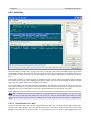
5. Logic Gui Program Structure
5.1
Gadget Window
The gadget window consists out of a menu, a toolbar and a treeview. The menu is used to load a form or
display extra tool windows or to check the version info. The toolbar allows you to switch between different
working modes and to test the current form. In the treeview you can select gadgets you want to add to your
form.
5.1.1 File Menu
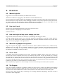
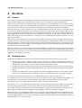
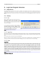
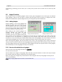
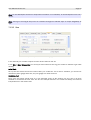
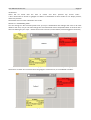
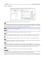
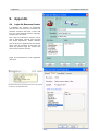
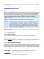
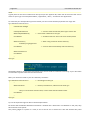
5.1.1.1 New
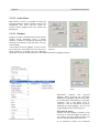
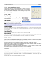
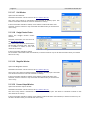
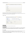
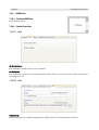
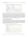
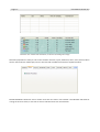
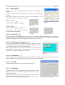
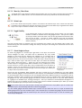
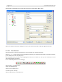
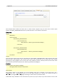
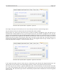
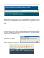
When choosing 'New' from the file menu to
start with a brand new form there is the
possibility to save or not to save the current
form. A requester will popup only if the code is
dirty (has changed).
If you proceed the current form will be deleted,
all loaded menus removed, gadget counter
reseted (responsible for the numbers at the
end of every gadget as default) and some Illustration 1: File / New - Save the old form before loading the new
default values loaded from the ini file.
one.
Note: This step cannot be undone!
5.1.1.2 Import Form
With Import Form you are able to load an exported Logic Gui file (*.ELG). The exported file will be unpacked,
the form file loaded and all paths adjusted. All files are ready to access as they are stored relative to the
form.
You can drop also a .ELG file on top of the workspace.
When you choose to import another form and your current code is marked as dirty a reminder will pop up
and let you choose to save the old form before loading a new one or skip the save or cancel loading.
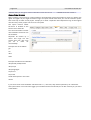
5.1.1.3 Export
Export Form
I added the ability to export the form with all external files. This function comes in quite handy when you
want to share your form with another Logic Gui user or maybe just with another computer you have Logic
Gui installed on. The export-folder contains all toolbars, list based gadget iconstrips, menu iconstrips,
textarea texts, button pixmaps, all external pictures or sounds of SmartButtons and pixmaps from panel
gadgets. Additional the source code of the form, the form itself as xml and a screenshot are stored. You can
compile the source immediately from inside this folder if needed, or import the form again. With every export
a logfile is created and saved. The logfile contains a line for every file and an OK or Error statement at the
beginning, thus you are able to immediately check if all operations were OK or not and which file belonged
to which gadget. At the end this folder is also zipped and stored as .ELG (Export Logic Gui File) which can be
imported again.
Note: This function can also be used to get rid of all absolute paths in your form.
Export XML Gui Setup File
Page 19
User Manual Version 5.6
This entry allows you to directly export a xml of your GUI to a chosen filename. A standard system
filerequester asks you for the file and directory, where to store the new xml file. The file will contain the XML
GUI Setup for the current form. This menu entry is may more natural than the dynamically created file from
the Properties/Application/XML tab. It also allows you easily to 'freeze' a certain xml output, while the
dynamically created file will be overwritten automatically during the next run (test compile of the form).
Export Gadget Creation Function
This will ask for a file and save only the gadget creation part as a function. The function name is taken from
the WorkSpace window name, thus you can change it to your needs.
Export All MaxGui Languages
You can export all used languages of your form as MaxGui language ini files from this menu. It is also
possible to export a single language from the Language Window. When exporting all at once, the default
names will be chosen.
5.1.1.4 Open – Open Form
Load a new Logic Gui form file. A file requester asks you for the new file to load. Alternatively you can drop
the 'form'.LG file or the 'form'.png onto the WorkSpace.
A requester warns you, when you try to load a form saved from a newer version. If the XML schema has
changed your current version will ignore all new stuff but can normally still load the form. So there is some
data lost, which was saved by the newer version and you can decide if you want that. Of course updating to
the newest version is always a good idea.
When you choose to import another form and your current code is marked as dirty a reminder will pop up
and let you choose to save the old form before loading a new one or skip the save or cancel loading.
5.1.1.5 Open – Open as Untitled
Opens the selected form as an untitled form. That makes it easier to start with something new and not to
overwrite the old form by mistake.
5.1.1.6 Open – Open and insert in current form
Insert a Logic Gui form file into the current form. A file requester asks you for the form name.
Note: Every saved form can act as a template to be inserted later.
Logic Gui loads the selected form and checks the names inside that form against the names in your current
form. If a conflict occurs you will be notified and the names in question are renamed. The inserted form will
be selected and can be moved to it's new position. Thus you can make use of all your templates. See also
Save As – Selected
5.1.1.7 Open – Open Form Folder (F6)
Sometimes you want to access the files you put in your folder where the Logic Gui form exists. Instead of
changing to windows and open 'MyComputer' and browsing to the correct place, you can just click on this
menu or press F6 and Logic Gui opens an explorer window with the direct path to the parent folder.
5.1.1.8 Open Recent Forms
As the name already says you will be able to open some of the recently used forms without browsing, but
open it directy. Up to ten form URLs are stored and additional also the date, time and size. All those info are
displayed and should help to identify the form you are looking for.
Any form you load will be recorded except the Untitled.LG and the 'Open Recent Forms' are updated
immediately. The newest form is always at the top, the oldest at the bottom. Every form info is saved only
once and the original info will be updated when changes occur.
User Manual Version 5.6
Page 20
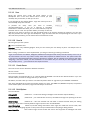
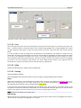
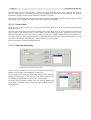
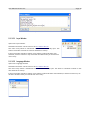
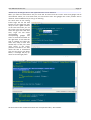
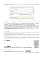
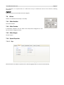
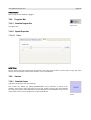
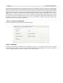
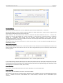
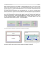
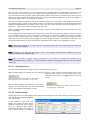
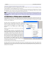
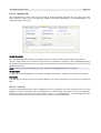
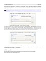
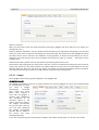
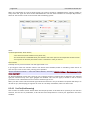
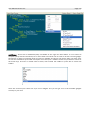
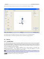
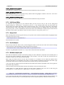
5.1.1.9 Save
Saves the current form under the name shown in the
WorkSpace title. If the form doesn't have a name yet (still
untitled) and you hit save, it asks you for one.
If not changed in the Options Menu, Logic Gui saves your form
automatically every few minutes.
A preview for every form you save is created
(YourFormName.png). If you do a save-all, a complete Illustration 2: Save - Logic Gui icon and preview
screenshot is taken and when you do a save-selected, only the
selected area is used. The preview allows you easily to find the
right form you want to work on. Use the thumbnail view of an explorer window for instance, you can also
drop the preview onto the Logic Gui WorkSpace, Logic Gui will insert the corresponding form if exist. If you
don't like extra previews, you can switch them off inside the ini file.
5.1.1.10 Save As
Save As gives you two options.
All - saves the whole form.
Selected - saves only selected gadgets. Thus you can create your own library of parts. Just Simple ones or
very complex ones.
When saving a partial form -Save As/Selected- you will get a warning if nothing is selected.
Logic Gui saves also the Header, GadgetIni, RawEvent and Append files if they exist and if they are in use, to
the new location. Thus it's may easier to keep those files separate for different forms. The paths of the files
in the form are adjusted depending if they are absolute or relative. This is probably more useful at the begin
designing a new form. When you are somewhere in the middle and you need all your files together (used
text, pixmaps, icons, ...) you should use the export function.
5.1.1.11 Create Source
The new source can be directed to different locations.
Save it to a file.
Put it into the clipboard.
Start an editor and load the file. Try it. It should start the MaxIDE if it's still at the default location. If you use
another editor you have to change the entry in the ini file.
Set Editor, sets the editor you want to use. Most important after an upgrade of your BlitzMax installation.
Run starts the Blitzmax compiler and shows quickly your form. The BMK.exe (BlitzMax Compiler) is expected
at the default path, if not found, Logic Gui will ask you to locate it.
5.1.1.12 Build Options
You can choose:
Debug Build
(default on – to show the debug messages in the Process Output Window),
Threaded Build
correct bmk.exe),
(default off – you need Bmax1.32 and up installed and Logic Gui pointing to the the
Build Gui App
(default off – thus the created exe will show a console window with your debug
messages, if you start it directly without Logic Gui) like in the normal MaxIDE.
Insert DebugLog
Switch on/off the debug information from Logic Gui inside the source code, thus
only your own DebugLogs appear in the process output window when compiling a debug version.
Insert Identifier
That means Logic Gui will create the source and suppress all :TGadget and other
Page 21
User Manual Version 5.6
identifier if not needed for SuperStrict-ness, when switched off.
Comments
Clear All Comments From Code Output
Clear Only Private !Comments From Code Output
The first option removes all comments starting with a ' while creating the output code, the comments will of
course stay in the original code! This can be used if you heavily commented a code but don't want to give
those comments away when distributing the code.
The second option clears/filters only private comments out of the code. A private comment starts by
definition with '!
The private comment option helps you to keep normal comments but removes your private stuff.
MaxGui Version
In the next MaxGui Version (1.34) the window gadget will calculate the client area
differently. The toolbarheight will then be taken into account, thus the coordinates for window child gadgets
need to be adjusted. To decide for which version of MaxGui you want the source code created for, there is
this switch 'Use Toolbarheight'. When switched on the toolbarheight will be used to calculate the client area.
All combinations are possible, thus you can also directly create a release version of your application out of
Logic Gui. All Build Options are saved in the ini file and loaded on startup.
Set BMax Version
This entry allows you to change the current BMax version for compiling your form on the fly.
5.1.1.13 Window Setup
When using different monitors you may like to have also different setups for your windows. You can save a
window setup and load it later when needed. All windows are saved except the Properties Editor and Event
Editor window.
Auto Adjust
Auto Adjust window position can be used if windows are off the screen. This could happen when switching
between different computers using the same Logic Gui (by USB Stick or network). It will call back any
window back to the primary display, also Properties and Event Editor windows. It can be found under the
Window Setup menu or can be initiated by pressing CTRL R when this window is also not reachable.
A key in the ini file allows you to switch the window 'Auto Adjust' on/off during start-up. It is on by default, so
any window off the screen will be automatically called back to the primary display. While that would work
probably for most users, there are some with dual monitors, they should switch this setting off (set to "0") to
allow (tool-) windows on the second display. Unfortunately I can't detect if the secondary display is active,
only a virtual display expander or real, thus you need to edit this setting depending on your monitor setup.
5.1.1.14 Print
The print menu offers two destinations, 'To File' and 'To Print'.
Choose a target depending where you want the output directed to.
When you output to a printer, Logic Gui will print your WorkSpace on the default printer via paint (needs to
be installed) in the background. Use CTRL-P (while the workspace is active) as shortcut.
5.1.1.15 Quit
Asks for confimation and quits Logic Gui. If not changed in the Options Menu, the form will be saved again
when altered since the last save.
5.1.2 (Edit Menu &) Popup Menu
The Edit menu is no longer available, only the pop up menu is used!
User Manual Version 5.6
Page 22
5.1.2.1 Undo / Redo
Undo and Redo show a small description what step will be undone/redone. Almost
all gadget related actions can be undone! Simple actions like select cannot, as it
is easy to change. All changes to gadgets done in the Properties Editor can be Illustration 3: Undo /
undone as well, by one simple undo afterwards, be careful if you have more than Redo Description
one Editor open though. There is no limit for undo and redo, only your memory. As shortcuts you have CTRLZ for undo and CTRL-Y for redo while the workspace is active. If you call back deleted gadgets they will be
put back in the workspace, but the order may lost. All other actions which are not gadget related will not
produce an entry in the undo buffer!
5.1.2.2 Properties
This opens the Properties Editor. When gadgets are selected they will be put in an extra group for fast
access. The same can be achieved by double clicking on a gadget or pressing F4 (WorkSpace active).
5.1.2.3 Convert To
This entry is only active when selecting either a TreeView, a ListBox or a ComboBox and
allows you to convert the selected (Primary) gadget to any other list based gadget
without data loss. Even if you convert to a gadget with less possibilities and save and
quit the form, you can get all data back when you later decide to convert to the original
gadget type. This is a nice time saver when trying several design variants. Just imagine
Illustration 4:
you choose a ListBox with all items and tips and while defining the look of our Convert To menu
application you realize there is not enough space. So now it's only a simple click and
the gadget is converted into a space saving ComboBox. All the item data, all the event function code is kept.
5.1.2.4 Align
As an example look at the pictures. The button Button5 and
textfield TextField1 are not really at the same level. Instead of
moving something by hand
leave that to the program
which can do it for you
much better and quicker.
Use the built in Align
Function. To reach it right
Illustration 6: Align unselected gadgets.
click somewhere on your
WorkSpace. You will get a
popupmenu with a lot of
options.
Illustration 7: Align selected gadgets.
Button5 is the primary gadget (blue
frame)
Choose the method you like
most and the gadgets will
line up. Remember, all
selected items will use the
primary gadget (blue frame)
as the reference!
Illustration 8: Align to top.
Illustration 9: Align to
left.
Illustration 5: Popup menu - Align
Page 23
User Manual Version 5.6
5.1.2.5 Center in Form
With Center in Form it is possible to center all
selected gadgets in width or height or both of the
WorkSpace. This could also be useful for
instance when gadgets were lost outside the
WorkSpace.
5.1.2.6 Distribute
Imagine you have a situation where several items
needed evenly distributed along a certain
distance. Instead of calculating manually what
should be the distance, Logic Gui does it for you
automatically.
I have taken here four gadgets, it can be more, Illustration 10: Before
Illustration 11: After distribute.
but at least you need three (you can also use a distribute.
guide instead of a gadget)! You can distribute
horizontal or vertical. In this example we will distribute those four gadgets vertical.
Illustration 12: Distribute a
group.
Distribution
supports
also
grouped
gadgets. When choosing the automatic
distribution of gadgets, Logic Gui will check
if you selected a whole group or only single
members. Only if the whole group is
selected it will be distributed as group
otherwise as single gadgets. You can mix
single gadgets and/or several groups.
How does it work:
Illustration 13: Popup menu - Distribute
Position the first gadget (or guide) to the
most top and the last gadget (or guide) to
the bottom. All other selected items will
then be distributed between those two!
If we distribute vertical, the horizontal
User Manual Version 5.6
Page 24
position isn't touched and vice versa.
On the right you can see how it will look afterwards.
And above you find the popup menu with the different options for
distribute. Mainly useful when having items of different sizes.
5.1.2.7 Stretch and Trim
Sometimes you need to justify specific elements. In that case use
Stretch and Trim. In the example here we want to stretch the
TextField1 to the left edge of the Button5. Select both and take care
that the primary gadget (blue frame) is our reference. Now select
the Stretch and Trim Function.
Illustration 14: Strech & Trim - gadgets
selected
Checkout the images.
Logic Gui automatically detects if a Stretch or a Trim is needed!
This works also with several gadgets, all selected gadgets will be
trimmed or stretched to the edge you defined.
Illustration 15: Strech & Trim - TextField1
streched to left edge.
5.1.2.8 Step & Repeat
Step and Repeat has it's own tool window for better control. This
menu entry calls the Step & Repeat Window. For detailed
information how this works look at the Step & Repeat tool window
explanation.
Illustration 16: Strech & Trim - TextField1
trimmed to right edge.
5.1.2.9 Duplicate Size
Actually you have already the possibilities to duplicate the size of certain elements by using Stretch and Trim
or via the Gadget Control Center to as many items you want, but for some more convenience i added this
more intuitive way.
Illustration 18: before
Duplicate Size - Width
Illustration 17: after
Duplicate Size - Width
First select the gadget from which the size should be taken. Then
right click somewhere on the workspace and choose Duplicate Size
from the popup menu.
In the example above we see that i took the width from the
Textfield2. Immediately afterwards the cursor changes it's icon to a
“SizeAll”.
With this pointer, click on every element which should get the new
width!
A slightly transparent blue line or rectangle underneath the cursor
shows the copied size as visual feedback!
Illustration 19: Popup menu - Duplicate Size
Page 25
User Manual Version 5.6
Illustration 20: before Duplicate Size - Height
Illustration 21: after Duplicate Size - Height
In the picture above i clicked on button OK7 and chose duplicate height. Button5 and Cancel8 are adjusted
accordingly. Notice that the top left corner of the gadgets are not touched and stays the same.
Illustration 22: before Duplicate Size - Both
Illustration 23: after Duplicate Size - Both
And lastly the BorderPanel example shows the duplicate both, thus width and height are copied to the other
selected gadgets.
The function duplicate both is also available as a one click mode from the toolbar – shortcut CTRL+D
(SizeAll icon).
Note: Click on a free place on the WorkSpace to stop the duplication or choose another working mode in the
toolbar of the gadget tree window.
5.1.2.10 Swap Gadgets
Swap gadgets let two gadgets swap it's place. Select the first gadget and choose Swap Gadgets from the
popup menu. The cursor changes to a hand. Now select the next gadget and immediately it will swap the
place with the previous gadget. If the gadgets are in different layers, this information is also swapped.
The swap function is also available in the toolbar (hand icon) of the gadget tree window.
Note: Click on a free place on the WorkSpace to stop the swap or choose another working mode in the
toolbar of the gadget tree window. The function ends automatically when the swap was done.
5.1.2.11 Inside a Container - Fit Client Area
Fit Client Area is used to stretch a gadget to it's parent client area. To use this feature you need to move your
gadget on top of a container. Click on 'Fit Client Area' and the gadget will be stretched to the biggest possible
area of the parent container without clipping your gadget. If this gadget is by chance a container with other
gadgets on top, just make it the 'Primary' (blue frame), only that one will be aligned! This is especially useful
Illustration 24: PlainPanel9
before Fit Client Area
Illustration 25: PlainPanel9
after Fit Client Area
Example here with a tabber and a panel (PlainPanel9) before and after 'Fit Client Area'.
User Manual Version 5.6
Page 26
when positioning panels on containers or for HTML View or TextAreas on Splitters, windows, tabbers,
groups... As this stretched gadget fills the whole area, you probably want it also resized with the parent, so
Logic Gui will set for you the Layout to align automatically to all edges. Makes the alignment very quick and
convenient.
This function works with all container gadgets (as parent) except the ScrollPanel, didn't find a good example
to what to align here.
5.1.2.12 Inside a Container - Fit Inside Guides
Whenever a gadget should cover all the space between guides, you can use the 'Fit Inside Guides' function
to stretch the selected gadget (primary only) to the maximum available space. If there is no guide before the
end of the WorkSpace, the edge of the WorkSpace is the border!
5.1.2.13 Set
Variable Type:
This should allow you to easily change all or selected gadgets to a certain variable
type. Every action can be undone if needed.
5.1.2.14 Select
As you can imagine the selection Illustration 26: Set of the right elements are a Variable type
fundamental thing. To make your
live easier use the select function, available when right
clicking on the workspace. This function selects only
gadgets on the WorkSpace.
Select Parent:
This is especially useful when there are several panels on
top of each other and you can't easy pick one in the
background. Now you can select just one child on top and
go backwards with every 'Select Parent'. That should be
much faster than searching the parent in the Source
Properties Editor. CTRL PageUp is the shortcut for it. The
Gadget Control Center is automatically updated and ready
to change the values of the selected parent.
Select Children:
If the selected gadget is a parent of child gadgets, they will
be selected. CTRL PageDown is the shortcut for it.
Select Hidden:
This will address all gadgets which have the hidden
attribute set.
Select Disabled:
Illustration 27: Popup menu - Select
This will address all gadgets which have the disabled
attribute set.
Select All:
Selects all gadgets on the WorkSpace.
Same Type:
If a button is selected, it selects all sort of buttons.
Same Style:
Page 27
User Manual Version 5.6
If a radio button is selected, it selects only all other radio buttons.
Same Layer:
Selects all gadgets from the same layer. Again only visible gadgets (for gadgets on an invisible tab or
scrolled away on a ScrollPanel i prohibit any action!).
Select Inside Form:
Selects everything visible in the WorkSpace
Select Outside Form:
Selects everything on top of the WorkSpace but not visible because outside the window.
Invert Selection:
Whatever is selected will be deselected and vice versa.
5.1.2.15 Deselect
Deselect will drop the current primary gadget from your selection. (Same as shift click that gadget, just
without keyboard). To deselect all gadgets you can use also ESC as shortcut.
5.1.2.16 Cut
Cuts all selected elements and holds them in a temporary buffer (Shortcut CTRL-X).
5.1.2.17 Copy
Copies all selected gadgets and puts them immediately into the workspace again. You can then move them
to the correct place. Copy does not put anything in the buffer!
Copy takes all options with the gadget, if it's a window with menu and toolbar, the new window will have it as
well! (Shortcut CTRL-C)
Copy gives the new gadget the same name like the old gadget and additional a “_CurrentNumber” string at
the end. Thus you can identify which gadget was the source and there is no conflict with double names. The
text of the gadget is copied without change to the new gadget. Rename both to your needs.
When copying a bunch of gadgets and some of them belonged to a group, the copy of those new gadgets
will grouped together as well. If your selection consists of several single gadgets and several groups, the
copy will be the same structure, which allows you to easily combine groups or build new ones.
Illustration 28: Copy - Select some single gadgets and some groups.
User Manual Version 5.6
Page 28
Illustration 29: Copy - After copying the same structure is present.
5.1.2.18 Paste
Paste the temporary buffer back to the WorkSpace. The pointer becomes again a cross (like if you add a new
item) – (Shortcut CTRL-V). The paste buffer can be resized (single gadgets only, multiple gadgets are resized
via there selection after paste to have full visual control) on the fly. Layers are taken into account during
paste.
It is also possible to paste an image from the clipboard to the WorkSpace. Use CTRL+V or 'Paste' from the
popupmenu and the cursor will switch to a cross as normal. Click on the gadget you want to paste the image
to, or click on the WorkSpace background to create a new Image-Gadget with the chosen image as content.
As the clipboard holds only some temporary content the image is saved as file with the name of the gadget
you chose in the form directory (png format). Not every image format stored in the clipboard can be
converted to a pixmap and pasted, try out if it works with your application!
5.1.2.19 Delete
Deletes all selected items. (Shortcut Del or Backspace)
5.1.2.20 Grouping
Grouping gadgets together.
Select all gadgets which should be taken into the new group using the Multi-Select functions.
Group:
Right click somewhere on the workspace and choose Group. You have now created a new group. There is no
limit in how many groups you can create. Every group can be easily recognized by a purple frame around.
Any selected group member can be recognized by a yellow frame.
If you select one group member, the whole group is selected. If you don't want your next action happen to all
members just cancel the selection of those who are not needed with shift-click. This way you are not forced
to group and ungroup elements all the time if you need to change single members.
Note: Members can belong to one group only.
Add to Group:
Choose your group by clicking on a group member and shift click to select some more gadgets and click on
"Add to Group" to bring them all together in one group.
Page 29
User Manual Version 5.6
Exit from Group:
Select your group and choose "Exit from Group" and the Primary Gadget
will leave the group.
Look at the picture to the left. While creating a new Multi-Selection via a
selection frame, you will be immediately notified by a purple frame, it you
catched a group member.
Illustration 30: Grouping - partly
selection
It's up to your choice if you do your next action only to those two items, or
if you want to select whole group.
In the last example i show how align works with
groups. To be maximum flexible i decided to stay
with the concept of my primary element. In the
picture to the left, i have aligned two groups. The
group who holds the primary will stay, all other will
move (align) to what you want.
You are able to align to every single object which is
selected as primary gadget. Here i aligned the left
group middle height to the Textfield2. Try out other
combinations to see how it works
Illustration 31: Grouping - group align
Note: Group and Ungroup for a selection of gadgets are
also available as Quick Access Icons in the Gadget Control
Center.
Illustration 32: Group / Ungroup Quick Access Icons.
5.1.2.21 Order - Bring to Front / Send to Back
As you may already noticed when moving gadgets around,
there is some sort of layering between the different
elements. And it becomes important when working with
container gadgets and nested items. Actually you should
not overlap any other gadgets as it gives bad code and
strange behavior. For your convenience every container
gadget will be automatically send back, because it should
not on
top of
“normal” gadgets. But sometimes you have to decide
which panel is may nested in another panel. You can do
so by selecting the specific gadget and choose “Send to
Illustration 33: Order - Send to Front / Send to Back
User Manual Version 5.6
Page 30
Back” from the popup menu.
In the picture here you can see, three different types of panels. The Group panel is on top of the BorderPanel
and underneath the PlainPanel. If the Group Panel should be put on top of the PlainPanel we need to “Send
it to Front” or the PlainPanel to “Back”. If you have the choice it's always better to use the “Send to Back”
option to container gadgets and the “Send to Front” to normal items.
You can see here also one other good thing. The Design Range is always on top and lets you easily decide if
something fits or not, even if it's hidden.
As you can see now, i have send the PlainPanel to the
“Back” and moved the Group on top.
This is especially important when creating the source,
because by only moving something inside a container
gadget it is bound to it and the source will be created
accordingly. You do not have to do any extra work, just
move it in or out and Logic Gui detects what you want.
There is no limit from Logic Gui in nesting gadgets in
gadgets in gadgets...
Illustration 35: Order Quick Access Icons
Illustration 34: Order - Panel1 send to back.
Note: Bring to Front and Send to Back for single gadgets are also available as Quick Access Icon in the
Gadget Control Center.
To be more precise in shuffling the gadgets around, you can use "Bring Forward" and "Send Backward" from
the Order Menu. This will move (only the selected Primary gadget) one step forward or backward in the
order.
5.1.2.22 Locking
Why locking? As you probably know it's very easy to move gadgets around, for sure i assume that you don't
make mistakes like me, but nevertheless you may like also the idea to lock items in size or position.
As the name already implies, lock size don't let you change the size until unlocked and lock position don't let
you move the gadget until unlocked.
Illustration 37:
Locking - single
gadget unlocked.
Illustration 36: Locking gadget position locked.
Illustration 38:
Locking - single
gadget locked.
If you lock a gadget with “Lock Size” the mouse pointer does not change it's icon anymore when close to the
gadget border!
If you select only one item you will see it's lock status in the Gadget Control Center.
You can even click on the lock to change it's status, but it does a full lock only (size and position).
5.1.2.23 Unlock
Unlock switches off the lock for size and position of all selected gadgets.
Page 31
User Manual Version 5.6
You can use also the Quick Access Icons to unlock all selected gadgets.
5.1.3 View Menu
5.1.3.1 Form PreView
All the panels have a certain color, this is of Illustration 39: Form PreView - off.
course only done to immediately recognize
where are the borders and to have enough contrast. Also every gadget in the form is identified by it's name
even when there is no label afterwards. The quick preview switches all colors back to standard and the
names not used off (and hides the grid if active). Thus you will get a good idea how it will look without
compiling the form. While the form is active you can also press the space bar as hotkey for this function. The
actual state is saved on exit.
5.1.3.2 Gadgets
Switch on or off the gadget to gadget snap for
fast visual alignment (separately for moving
and sizing – see also guide snap and grid
snap), or how to display the gadget design
range.
Illustration 40: Form PreView - on.
Design Range (Single Gadgets)
So what is it, this magic Design Range?
It's a quite nice feature. This Range, counted in pixel, creates a white frame around the gadget. You can
easily see if you have the correct distance to other objects! That's nice but wouldn't be so great if you
couldn't change it on the fly. You do so by using the mouse wheel. While changing the range it's shown on
the screen and even negative values are allowed. This way you could also see if items in a container are all
have the same distance from the container border. Try it. You probably don't want to work without anymore.
Illustration 42: Design Range - Outside
a button.
Illustration 41: Design Range Inside a panel.
Illustration 43: Design Range Group Panel
For the Group Panel i even insert a second Design Range which sits inside the group and should show at
which distance the active part starts. That means if you put a gadget inside such a group panel and you are
too close and touch the border, some pixel of your gadget are cut which doesn't look nice, so the inner
Design Range should help you there.
User Manual Version 5.6
Page 32
5.1.3.3 Design Range (Multiple Gadgets)
A second menu entry can be found underneath the Design Range menu
"Multiple Gadgets". By default this entry is switched off, but when switched
on, it shows the design range for the primary gadget in a multiple gadget
selection. This could be useful when you want to align visually a whole
group using one gadget as reference.
5.1.3.4 Guides
Snap while moving:
When moving gadgets close enough to a guide
the gadget will snap automatically, if 'Snap while
moving' is enabled.
Snap while sizing:
Illustration 44: Design Range Info display -> D = 10 pixel
When enabled in the menu 'Snap while sizing',
Illustration 45: Guides
you can snap your gadget also during resizing.
Note: If you snap while sizing or while moving, you
can do so also with several gadgets (multiple selection), the whole group is adjusted with the primary gadget
as reference. Snap to guides works in all directions.
Auto connect gadgets:
Press CTRL and click on a guide to select all snapped gadgets in one go and move it to the new position,
parents will select also it's children. You can switch this behavior also permanent on when choosing 'Auto
connect gadgets'.
Always show position:
Turns on the position flag of a guide all the time and not only during moving.
Guides snap to grid:
Guides can snap also to the grid while gadgets don't have to. You can still move your guides in steps of the
grid, while your gadgets are freely movable and snap only to the guides where necessary.
5.1.3.5 Fontsize
Logic Gui uses during drawing the standard 96dpi font size for the system text as default. You can change
your font size to better fit high resolution displays. 96, 120 and 144 dpi are available. You can also specify a
custom font if needed, via the ini file. The ini file contains a xml node:
CustomFont1 Font="verdana.TTF" FontSize="11" Display="Custom Font: Verdana 11pt - 96dpi"/
Define the font you like to use and the font size as shown in the example above. The 'Display' string will be
visible in the menu structure to identify your chosen font.
When you search for a nice font, please note that the name shown in the font directory of windows is NOT
the filename of the font! Use right click and properties to get the real filename!
Logic Gui searches in the %Windows%/fonts directory for the new font, so you only have to define the name
and extension.
When the font is not found there, Logic Gui looks in it's own directory. Thus you can drop fonts in there or in
a subdirectory. Look at the example below:
CustomFont1 Font="Fonts\almosnow.ttf" FontSize="36" Display="Custom Font: almosnow 36pt – 96dpi"/
Font="Fonts\almosnow.ttf", does mean it looks for the font in a Subdirectory Fonts in the Logic Gui
application folder.
FontSize="36", does mean the 36 pixel size should be loaded.
Page 33
User Manual Version 5.6
Display="Custom Font: almosnow 36pt – 96dpi", should be displayed in the menu. Although the 36 pixel
font is a quite big one, it should here still be used as 96dpi font, because it's a normal font but used for
decoration. Anyway, the text is only used as a reminder for yourself.
Please keep in mind, that the font size chosen has no effect to the gadget, it's only to visually adjust the size
and position of your gadgets for different user dpi settings of their display.
5.1.3.6 Process Output
There are two entries in this menu. 'Open Process Output Window On Run' and 'Close Process Output
Window On Stop'.
The first one opens the Process Output Window when using RUN, but it is also possible to suppress the
output window. The second option is useful when you are using Logic Gui in fullscreen mode and the
Process Output Window does hide your form after you stop the run mode. If both options are switched on, it
is possible to get all infos during testing from your application as the Process Output Window pops up on run
and closes immediately after stopping it, giving access to your form again.
The current state is saved and loaded as usual.
5.1.3.7 Draw Lines during sizing
Illustration 46: Draw Lines during sizing
If this function is enabled, you will get an help-line drawn at the
gadget you just resize. It's available for all directions.
If you match any other gadget edge while sizing, the line color will
change from dark grey to red, thus you can work quicker as you
immediately recognize when you are at the same position.
For those who don't like numbers, can now size the gadget and
visual align to anything useful. The actual state is saved to the ini
file during quit.
Illustration 47: Draw Lines during sizing match a edge.
User Manual Version 5.6
Page 34
Illustration 48: Draw lines during sizing - Several machtes while diagonal sizing.
5.1.3.8 Draw Lines during move
When you move a single item Logic Gui can draw lines for better alignment. You can switch this on or off via
the view menu and the last state will be saved to the ini file for the next session.
Visual feedback is also
available. Every side is
compared and drawn in red
if it matches any other
gadget edge/side. This way
you could move and
position your gadget easy
to e.g. two other edges.
The red line shows only that
long as the item is away
which matches. Thus you Illustration 49: Draw Lines during move - two sides do match.
can better see which item
is meant when several gadget edges are close together.
5.1.3.9 Visual feedback
When switched on, visual feedback is given although the "Draw lines during sizing" or “during move” is off,
that means every equal position as another gadget results in red lines. If all the lines on the screen were too
much, they will now only appear if there is a match. Only gadgets outside the selection will be detected for a
match!
Page 35
User Manual Version 5.6
5.1.3.10 Visual Distance
A new way to look at the distance between your primary gadget and the rest of the form. The current state
will be saved in the ini file. The visual distance is updated on the fly while moving the gadget. You see
Illustration 50: Visual Distance
directly where you are all the time. Only horizontal or vertical neighbors are taken into account. When
gadgets are too far away a clipping value stops showing too much lines. The internal default value for
clipping is 100 pixel and can be changed in the ini file or switched on/off in the menu.
Illustration 51: Visual Distance
5.1.3.11 Step in GridSize
As you know you can move/size a gadget precise 1 pixel by hitting one of the arrow keys and 5 pixel when
pressing also shift. When “Step in GridSize” is enabled you can now move/size a gadget in steps of the
chosen grid size. This changes only the step size when the modifier shift is pressed! If the grid spacing is
different between x and y this is also taken into account. You can for instance use the snap function to
position your gadget and afterwards step the gadget with this new feature to any other position but still
aligned to the grid. The status of the menu entry will be stored in the ini file and read in again next start of
Logic Gui.
User Manual Version 5.6
Page 36
Illustration 52: Step in GridSize - start
position.
Illustration 53: Step in GridSize - one step
to right and one step down.
5.1.3.12 Select container select children
When you select a container gadget like a window or panel, then all children inside will be selected as well,
when this option is turned on. This is useful and easy for move, size and other actions on your gadgets.
When you turn this off, you either have to select gadgets yourself or use for example the anchor feature to
connect your children to the parent and they will move and size accordingly.
5.1.3.13 Show All Tool Windows
Opens all available tool windows in one go.
5.1.3.14 Hide All Tool Windows
Hides all visible tool windows.
Note: Check out also the shortcut CTRL-T to toggle the current visible tool windows on or off which covering
the WorkSpace. This gives you a fast way to access the gadgets on the WorkSpace may hidden underneath
a tool window.
5.1.3.15 Info Window
Opens the Info window.
Detailed information can be found in the TOOL WINDOW CHAPTER.
The menu entry shows a checkmark if the window is already open. The
state of a window is saved on exit and restored on startup.
If the tool window should be visible, but is hidden underneath other tool
windows, it will be moved on top of all other windows when you choose this
menu entry.
5.1.3.16 Step & Repeat
Illustration 54: Info window.
Opens the Step & Repeat window.
Detailed information can be found in the TOOL WINDOW CHAPTER.
The menu entry shows a checkmark if the window is already open. The
state of a window is saved on exit and restored on startup.
If the tool window should be visible, but is hidden underneath other tool
windows, it will be moved on top of all other windows when you choose this
menu entry.
Illustration 55: Step & Repeat
window.
Page 37
User Manual Version 5.6
5.1.3.17 Grid Window
Opens the Grid window.
Detailed information can be found in the TOOL WINDOW CHAPTER.
The menu entry shows a checkmark if the window is already open. The
state of a window is saved on exit and restored on startup.
If the tool window should be visible, but is hidden underneath other tool
windows, it will be moved on top of all other windows when you choose this
menu entry.
Illustration 56: Grid window
5.1.3.18 Gadget Control Center
Opens the Gadget Control Center
window.
Detailed information can be found in
the TOOL WINDOW CHAPTER.
The menu entry shows a checkmark if
the window is already open. The state
of a window is saved on exit and
restored on startup.
Illustration 57: Gadget Control Center
If the tool window should be visible,
but is hidden underneath other tool windows, it will be moved on top of all other windows when you choose
this menu entry.
5.1.3.19 Magnifier Window
Opens the Magnifier window.
Detailed information can be found in the TOOL WINDOW CHAPTER.
The menu entry shows a checkmark if the window is already open. The state
of a window is saved on exit and restored on startup.
If the tool window should be visible, but is hidden underneath other tool
windows, it will be moved on top of all other windows when you choose this
menu entry.
5.1.3.20 Process Output Window
Opens the Process Output window.
Illustration 58: Magnifier
Detailed information can be found in the TOOL WINDOW CHAPTER.
The menu entry shows a checkmark if the window is already open. The state of a window is saved on exit
and restored on startup.
If the tool window should be visible, but is hidden underneath other tool windows, it will be moved on top of
all other windows when you choose this menu entry.
User Manual Version 5.6
Page 38
Illustration 59: Process Output
5.1.3.21 Layer Window
Opens the Layer window.
Detailed information can be found in the TOOL WINDOW CHAPTER.
The menu entry shows a checkmark if the window is already open. The
state of a window is saved on exit and restored on startup.
If the tool window should be visible, but is hidden underneath other tool
windows, it will be moved on top of all other windows when you choose this
menu entry.
Illustration 60: Layer
5.1.3.22 Language Window
Opens the Language window.
Detailed information can be found in the TOOL WINDOW CHAPTER.
The menu entry shows a checkmark if the window is already open. The state of a window is saved on exit
and restored on startup.
If the tool window should be visible, but is hidden underneath other tool windows, it will be moved on top of
all other windows when you choose this menu entry.
Illustration 61: Language
Page 39
User Manual Version 5.6
5.1.3.23 Layout Window
Opens the Layout window.
Detailed information can be found in the TOOL
WINDOW CHAPTER.
The menu entry shows a checkmark if the
window is already open. The state of a window is
saved on exit and restored on startup.
If the tool window should be visible, but is hidden
Illustration 62: Layout Control
underneath other tool windows, it will be moved
on top of all other windows when you choose this menu entry.
5.1.3.24 Manager Window
Opens the Manager window.
Detailed information can be found in the TOOL WINDOW CHAPTER.
The menu entry shows a checkmark if the window is already
open. The state of a window is saved on exit and restored on
startup.
If the tool window should be visible, but is hidden underneath
other tool windows, it will be moved on top of all other windows
when you choose this menu entry.
5.1.3.25 Anchor Window
Opens the Anchor window.
Illustration 63: Manager
Detailed information can be found in the TOOL WINDOW CHAPTER.
The menu entry shows a checkmark if the window is already open. The
state of a window is saved on exit and restored on startup.
If the tool window should be visible, but is hidden underneath other tool
windows, it will be moved on top of all other windows when you choose this
menu entry.
Illustration 64: Anchor Window
5.1.3.26 Menu Control Center Window
Opens the Menu Control Center window.
Detailed information can be found in the TOOL WINDOW CHAPTER.
5.1.4 Option Menu
5.1.4.1 WorkSpace Autofocus
Whenever a gadget is selected on the WorkSpace, the focus to the
WorkSpace is automatically caught when the mouse enters the
WorkSpace. This is done to have all shortcuts immediately working Illustration 65: Option Menu
without extra clicks.
This menu entry allows you to turn the auto focus off, because it steals the focus also from a toolwindow and
resets the values to the current values of the selected gadget when the mouse enters the WorkSpace. Set as
User Manual Version 5.6
Page 40
you like, the default is on.
5.1.4.2 Clear Undo Buffer
Clears the undo buffer to free some memory.
5.1.4.3 Automatic Save
Logic Gui saves your form regularly based on this AutoSave option.
5.1.4.4 Save On Exit
Saves the form when exiting Logic Gui. When you quit Logic Gui you will be asked if you want to save the
current form if 'Save On Exit' is disabled and the form was changed.
5.1.4.5 Create Session Backups
To be able to decide whether you want to have additional session backups created of your form or not.
When enabled (default) a backup of your form will be created before loading (up to 3), otherwise not. Form
files with the ending .old .older .oldest are created.
5.1.4.6 Create also source when saving the form
Default is off.
When selected and you save your form (.LG file)
Logic Gui also writes an .bmx source file out of the
current form. This could help to have the .bmx file
also open in an editor for debugging without
contantly using "Create Source to file..."
The .bmx file will not be written when an autosave
takes place or when using Save All or Save Selected,
only a normal save (or CTRL-S) does trigger!
5.1.5 Help Menu
5.1.5.1 About Window
The About window shows your current Logic Gui version and build number. At least the exact build number is
very important if you ask for support.
You find also your registration number and to whom it was licensed (person and/or company) in this
window.
The Check for Updates button opens your system browser and links to
normally stated on the Logic Gui home page or on the download page.
WWW.LOGICZONE.DE.
The latest version is
The Eula button opens the end-user license agreement.
5.1.5.2 Logic Gui Homepage
Opens a browser directly pointing to the Logic Gui homepage.
5.1.5.3 LogicZone Support Forum
Opens a browser pointing to the LogicZone Support Forum. Here you can ask questions, report bugs,
request features...
Page 41
User Manual Version 5.6
5.1.5.4 Online User Manual
Opens a browser pointing to the latest user manual. Be aware that it needs the acrobat reader installed to
display it. This makes of course only sense for people who have a fast and cheap Internet connection.
5.1.5.5 Shortcut Table
Opens a browser pointing to a page which shows all the available shortcuts in your current Logic Gui version.
5.2
Toolbar
The toolbar in the Gadget Tree Window is there to choose a
working mode and to see which one is selected. Additional
you can start compile and stop your form.
There are following modes:
5.2.1 Move and Size
Illustration 66: Gadget Tree Window - Toolbar.
This is the default mode. In this mode you can move and size your gadgets. When you double click a gadget
in the gadget tree to add another one, the mode is temporary switch to the insert mode and after adding it
will switch automatically back into this Move and Size mode. If you like to stop the insert mode in between,
just click on this Move and Size mode again and the insert will be cancelled.
5.2.2 Insert New Gadgets
If you choose this mode, a new gadget will be added. The cursor will change it's type into a cross to help you
positioning the new gadget. The type of the gadget is the last known type ever added to the form, if no
gadget was inserted since you started the current form a button is the default type.
This mode is also entered when you double click a gadget in the treeview.
5.2.3 Duplicate Height and Width
This mode can only be entered if a gadget is selected! The pointer changes in a SizeAll cursor. The height
and the width of the first gadget is copied to the next gadget(s) selected. Stop duplication with a click on the
WorkSpace or change to another mode. There is a slightly transparent blue line or rectangle underneath the
cursor to show the copied size as visual feedback.
To duplicate only the height or only the width, use the menu entry from the popup menu.
5.2.4 Swap Gadgets
This mode can only be entered if a gadget is selected! The pointer changes in a hand cursor. The selected
gadget will swap it's place with the next selected gadget. After that, the default mode is entered
automatically. The top left corner of the
gadgets will stay the same. Layer and order
is taken into account.
5.2.5 Measure
When you enter the measure mode, no
gadget can be selected. The pointer
changes to a cross for precise
measurement.
After measure you can immediately go on
working with the current selection. If the
info window was hidden then it pops up to
Illustration 67: Gadget Tree Window - Measure.
User Manual Version 5.6
Page 42
show the measured values.
A green frame and black direct line is drawn as reference. The starting point is marked also with the starting
coordinates x,y.
In the Measure section of Info window,
W: = width, H: = height, Z:= diagonal
Test your Form:
5.2.6 Run
To test your form, you can do a debug compile directly from Logic
Gui. The Process Output Window will popup if not yet open, to
show the compilation process and the debug output.
You will get a notification if you start a new test run of your form,
while there is still one running in the background. Choose
between OK to abort that and start your new test or CANCEL to
return to the form and leave the old test running.
The run shortcut is F5 (when form is active)
Illustration 68: Gadget Tree Window - Run.
5.2.7 Stop
Depending on your test form, you can normally end the form in itself (preferred), but sometimes this is not
possible – a possible hang or no end condition. You should use the Stop icon then (wherever applicable). It
will kill the process and return control to Logic Gui. This is far better than killing the process with the
Windows TaskManager.
5.2.8 PostProcessing
This is meant to create a release version of your form / application. The configuration of the post processing
can be done in the Properties Editor under Application and then choose the Post tab.
During the first step the form is compiled, but not executed. The debug option is forced to off and the GUI
option to on, so you can't forget to do it.
The second step is then the UPX compression when turned on.
The last step is the chosen command string from the post processing.
All output is send to the Process Output window.
Here is a simple example of an external command:
cmd /c Copy "[$ProjectDir]/[$ExeName].exe" "[$ProjectDir]/BlaBla.exe"
It will call the windows cmd.exe and /c is used to run the following command and exit afterwards. As you can
see placeholders are used to form the command string.
When you start just normally your form using the RUN button, Logic Gui will run in parallel and you can edit
your program while watching the output of the test run. Now with the new function to compile the release
version, this is not the case anymore. Any editing is prohibited to minimize the chance to collide with file
access while UPX compression or post processing.
Another important point is the external code, which could of course fail and thus hang Logic Gui. Probably
most true during the test and design phase. To prevent Logic Gui from working while the external code
stopped working, you will be able to hit the STOP button to force quit the errornous code. Only this STOP
button will be polled during execution, all others are disabled! Every of the three steps (building,
Page 43
User Manual Version 5.6
compressing, processing) can be force quit. If a step was quit the chain is broken and no other step will
follow.
5.3
Gadget TreeView
The treeview shows all available gadgets. Parent nodes group all gadgets of the same type but different
styles together. Click on the plus sign or double click the parent node to expand or collapse that node.
Beside the SmartButtons (special image buttons) you change the style also afterwards.
5.3.1 Adding Gadgets
Double clicking on one of the gadgets will
change the cursor into a cross and let you
add that gadget to the form. In the toolbar
the cross icon is active now to visualize that
you are in insert mode. Click on the pointer
icon in the toolbar to cancel the insert.
When adding a new container gadget, it is
checked whether you paste the new Illustration 69: Gadget TreeView Illustration 70: Gadget TreeView container on the workspace or another adding containers (parents).
adding containers result.
container, thus you can decide to have the
new container in the background or foreground. This will save you regularly time and clicks to bring the
container to front. On top there is a sorting of the new container, that means when you size the new
container on top of an existing one which holds already some other gadgets, the new container will sorted
underneath the gadgets but on top of the underlying container (layers are also taken into account).
When inserting new gadgets, they will be shown at the cursor. The new gadget will be drawn transparent
until you add it to the form. Click to insert the gadget with the default size or size it directly to what you want.
The new gadget will show the visual distance to other gadgets and also the top/left match to other gadgets,
that should help to insert the gadget correctly on the first try.
5.3.2 How to set the default size of a gadget:
Select an item inside the gadget treeview and right-click it.
An extra window will open.
Choose “Width” and “Height” of the gadget. Move the slider, edit the textfield or use the cursor keys to adjust
the numbers. What the “Range” stands for will be explained later.
When you apply your changes, they will be written to the config file and every new gadget of that type will
use it as new default.
Note: Every single gadget style can have it's own default size.
User Manual Version 5.6
Page 44
6. WorkSpace Window
The WorkSpace window is where you assemble your form.
You can choose between different tabs during work. Each tab supports you creating your form and are
explained in the next sub-chapters in detail.
Illustration 71: WorkSpace Window
When loading a form or using save as, the filename is displayed in the title. Logic Gui shows a "*" at the end
of the filename in the titlebar when the form has changed and not saved yet.
6.1.1 Form Design
This tab is activated by default when Logic Gui starts up. It shows the WorkSpace and on top your form.
Use the popup menu (right click) and the functions available there to adjust your gadgets.
When the WorkSpace is active you can use several shortcuts while your hands are at the keyboard. The
WorkSpace is also automatically activated when a gadget is selected and you enter the WorkSpace with the
mouse pointer.
Note: The WorkSpace itself can produce also a window in the source code, but this is for quick testing only
and not meant as application window.
When you click on a simple gadget (no container gadget), this gadget will now be sorted on top of the layer it
is in. As you need your gadgets normally always on top of containers, you now don't need to change the
order manually anymore. Simply click and drag, nice time saver.
When you select a group or just multiple gadgets and you want to change the primary gadget for the next
action to perform, simply click on it! The selection stays intact and you are ready to go.
When clicking in a container gadget, this container will be the primary gadget. When using the selection
frame nothing changed. Very useful when changing the properties.
We know already how easy it is to move even a bunch of gadgets to another place using the mouse. But
sometimes we need to be very accurate and it's may not so easy to move very few steps. For that situation
there two things available. First, you can open the Magnifier Window. So, now you can better see where you
are. Or, secondly use the cursor keys to move your selection.
6.1.2 Full Code
Switch to the Full Code tab when you want to see the actual created source code at any time. This is useful
when you want to check something or to copy something. The Full Code tab opens also automatically when a
fault occurs and you hit on Show Error in the Process Output Window.
The source output has different sections.
First section is the header. It's used to define things like “Strict” or Import or Include files.
Second section is the gadget creation part, where the sizes and positions of your original form are used.
Third section is the event queue. Only the default events are produced, read on to see how to change that.
Page 45
User Manual Version 5.6
Fourth consists of the functions called by the event queue. Add your own code to those functions and your
program is ready.
The fifth section is optional, it is similar to the Header and is taken to append extra code of your choice at
the end of the source code.
The StatusBar shows the current cursor position to help you find a certain region.
Right click in the TextArea to get a pop up menu which offers a copy of selected text or calling Find window.
The Find Window is explained in the Event Editor.
6.1.3 Selected Code
Selected Code does mean only selected gadgets and only the gadget creation code of it. This is especially
useful when your form was already done and you are working with the output of Logic Gui in your favorite
editor. At a certain point you may realize that you need a last minute change to a gadget or a group of
gadgets, now you just do the change, select the gadget(s), switch to 'Selected Code' and you can easily copy
the change to your IDE. If you select more than one gadget, every gadget code is separated by a newline. If
you select a container gadget, the container with all it's children is output and again every children
separately. If you select a container and there are gadgets and also other container on top, then you will get
the output of all, the output of every container (container are separated by two new lines) and the output of
the single gadgets, you can just pick what you need, you don't have to look around in the code where your
changes are!
Illustration 72: Selected Code - gadget creation code only.
Right click in the TextArea to get a pop up menu which offers a copy of selected text or calling Find window.
The Find Window is explained in the Event Editor.
6.1.4 Edit Events
Edit Events is just another view via the Event Editor onto the gadgets events, which offers some extra
functions. Instead of calling every gadget and then calling every single event, you can switch at any time to
the Event Editor and choose between all the gadget events. This should be especially useful when the form
is designed and you want to give the gadgets their behavior. That should save a lot of time and clicks. As the
Event Editor does not own a window, there is no pull down menu. The OK and CANCEL buttons are renamed
to 'Revert' and 'Apply', that means, if you 'Apply' a certain text it is saved to the event, if you press 'Revert' the
original text is restored or the text since the last apply. If you switch between events all changes are
automatically saved. To be faster while changing between the 'Form Design' and the 'Editor' any change you
do are automatically applied when you leave the Editor. That means you need to explicitly 'Revert' any
changes when you don't want them saved. Thus apply is only required when you want to save your changes
in between, but when you do so, the current full source code in the upper textarea is also updated to reflect
your modifications.
All tool windows will be automatically hidden when choosing the 'Edit Event' from the WorkSpace tabber and
the treeview for all the events are selected, thus you can immediately start to work on the gadget behavior.
The Window is also automatically sized to full screen, if you don't like that, it can be customized in the ini file.
Note: There is an extra undo step before the edit mode. But remember that the undo does only revert gadget
User Manual Version 5.6
Page 46
related stuff, all changes done to the application files are not affected!
When you leave the Edit Events tab your code will be stored and the current event and gadget will be
remembered. When you come back later, the last known event and gadget and cursor position will be
restored, if still available and you can go on working.
For those who do the coding
inside Logic Gui via the Edit
Events you can toggle the split
away to have a good overview
of the code and when you set
the cursor into the full source
code and right click "Edit This
Text", Logic Gui will select
automatically
the
corresponding gadget and
event in the Event-Treeview on
the right side. It will raise the
split if needed and show the
event text, ready to edit. This
should help to edit your code
more visual. If the cursor
position is located in an area
where the edit is somewhere
else, but not here in the Event
Editor, a message will pop up
where to find the right place.
Illustration 73: Edit Events - Event Editor - reverse lookup of gadget and event
Illustration 74: Edit Events - Event Edititor - Event chosen after reverse lookup.
All other Event Editor related stuff check out at Properties Editor / Event Editor.
Page 47
User Manual Version 5.6
6.1.5 Templates
The idea is that we have a folder called 'Templates' in the Logic Gui directory and when you click on the
Templates tab, this dir is read. As Logic Gui stores a picture with every form, all forms are shown as
thumbnails. Now you can simply click on a certain form and this inserts the template(-form) in your current
form. Fast and easy (and can be undone). As the form comes from the template folder, it is automatically
assumed to be inserted. As you could see the thumbnails before, it should be simple to identify the form
needed.
Name, Size and Date of the form is displayed when hovered with the mouse for more info.
If you like to try this, remember that every form is also a template. Just select a bunch of gadgets you like to
store and choose 'Save As - Selected' and as target now use the templates folder, that's it. If you like you can
also switch on the 'Force Display on Load' checkbox (Properties Editor/Application/Info) with an appropriate
note for this template, it will display the next time you load the template.
6.1.6 Parser
A MaxGui source code to Logic Gui form converter is available here! The idea is, that you will be able to drop
some MaxGui source code into Logic Gui and it will automatically create the gadgets and form for you.
Parsing all MaxGui commands is a quite complex thing and I try to catch as much information as possible,
but there are of course limits I can't overcome. First of all, all values computed during runtime Logic Gui
can't know during the parse and second, nested commands can't return values (although no problem to
parse). Beside those limits the functionality will be very very useful.
Just imagine you have created a form in Logic Gui and when ready, copied to your program code. Most of
the time small tweaks are necessary to the form during coding, but you didn't do it in Logic Gui and thus the
form got out of sync. When you later on need a bigger change, what can you do? Follow up the changes in
Logic Gui, easy to miss something? Do the big change directly in the code and bring the form even more out
of sync and it takes far more time? Now, with the new parser, you will be able to drop your code into Logic
Gui, which creates the form, move / add / change your gadgets and copy the result back, easy as that.
Another big advantage is of course any foreign code you may come across and you like to work on. You don't
have to recreate the form by reading the code to get a Logic Gui form out of it!
List of commands:
Reference what the parser knows till now:
SetPanelColor ,LoadPixmapJPG ,LoadPixmap ,SetTextAreaColor ,LoadIconStrip ,SetGadgetIconStrip
,DisableGadgetItem
,SetToolbarTips
,EnableGadgetItem
,AddTextAreaText
,SetGadgetFont
,ClearGadgetItems ,AddGadgetItem ,AddTreeViewNode ,ShowGadget ,EnableGadget ,ActivateGadget
,SetMaxWindowSize
,SetMinWindowSize
,ActivateWindow
,SetStatusText
,SetButtonState
,SetGadgetAlpha ,SetGadgetTooltip ,SetPanelPixmap ,HtmlViewRun ,HtmlViewGo ,SetGadgetLayout
,SetTextAreaFont
,SetGadgetTextColor
,SetGadgetColor
,SetGadgetSensitivity
,SetTextAreaTabs
,HideGadget ,DisableGadget ,UpdateProgBar ,SetSliderRange ,SetSliderValue ,SetTextAreaText
,SetGadgetText
,CreateTreeView
,CreateTextField
,CreateTextArea
,CreateTabber
,CreateSlider
,CreateProgBar
,CreatePanel ,CreateListBox
,CreateLabel
,CreateHTMLView ,CreateComboBox
,CreateCanvas ,CreateButton ,CreateWindow ,Global ,Local ,Field ,LoadGuiFont ,LoadPixmapPNG
,SetGadgetPixmap ,SetGadgetFilter, CheckMenu, UnCheckMenu, DisableMenu, EnableMenu, SetMenuText,
CreateHyperlink,
CreateSplitter
(MaxGui
ProxyGadget),
SplitterPanel,
SetSplitterOrientation,
SetSplitterPosition, SetSplitterBehavior, CreateScrollPanel, ScrollPanelClient, FitScrollPanelClient,
ScrollScrollPanel, ScrollPanelX, ScrollPanelY
There is also the support for comments. You can use Rem / EndRem or just the 'apostrophe to skip parts in
the source code which should not be parsed. Commands can be spread over several lines with the .. syntax
or combined on one line with the ; semicolon. Parentheses for commands are optional, so use them or not.
Menus:
When no variable name is used for a menu, Logic Gui will create one out of the text, as it is needed
internally. Also separators are handled, and as there is no text, they are just counted...
When a menu refers to a certain window a new menu structure is created inside Logic Gui and all submenus
User Manual Version 5.6
Page 48
are added. This new menu will get the name of the window in the menu list of the Menu Control Center, thus
easily to identify. When a menu refers to a window which does not yet exist, the menu will be named
“Parsed_Menu”.
One minor issue is with menu separators like: CreateMenu("",0,MyMenu). When parsed, i can only detect the
parent, but not which separator it is in an existing menu with several separators under 'MyMenu'. So in case
you re-parse the same menu twice, there could be surplus separators, which need to be removed manually.
In fact it's best when no or only one menu exist in the menu list to have any updates and assignments to the
right menu entry and to parse the whole menu in one go.
PopUpMenus:
Illustration 75: Parser Tab
The name of a popup menu is taken from the variable name of the top entry.
To use the parser click on the 'Parser' tab (or drag and drop a .bmx file on to the WorkSpace window). You
will see some buttons and a big TextArea. Copy the source code you want to parse into the TextArea. If the
code contains also other than the 'known' MaxGui commands, this is most of the time not relevant, but try to
cut, copy and paste full lines.
Illustration 76: Drag + Drop .bmx file onto the WorkSpace
Sometimes the TextArea itself don't recognize the correct linefeed from pasted code, adjust it before parsing
the code!
Page 49
User Manual Version 5.6
When ready, you can choose between 'Parse All' or 'Parse Selection'. As the name says, Parse All will go
through all the code and try to find the keywords to build the form, while Parse Selection parses only what
you have highlighted.
When you often paste new code into the TextArea, you can click on 'Clear TextArea' before, to wipe out the
old text and activate the TextArea for pasting (CTRL-V).
A combobox allows you to choose what should happen when a gadget is parsed again or already
exist. The default is "Overwrite Existing Gadgets". That means, if you change a setting of a gadget in the
source code and that particular gadget exists in your form and you parse that source code, then the gadget
is updated/synced with the current source code settings. If you choose "Don't Overwrite Gadgets" in the
combobox, then no existing gadget will be altered, but non existing gadgets will be created. "Don't Overwrite
Positions" will keep the original positions, but all other settings can change. For "Don't Overwrite Sizes" and
"Don't Overwrite Pos & Size" applies the same idea.
If there is a problem the parser can't recover from, an error pops up. But keep in mind that the parser does
not check if the code makes sense or if it complies to the MaxGui command syntax.
The parser marks the place where it could not recognize what's going on, but as you know from BlitzMax
itself the real problem could be before that place.
An undo state is stored before the parsing alters the gadgets and a second undo is perhaps created when
new gadgets were created. Both things can be taken back then individually if needed. The content of the
parser textarea is saved with the form.
To paste your text from the clipboard use CTRL-V or the popup menu of the parser textarea (offers also a
find. The Find Window is explained in the Event Editor.).
User Manual Version 5.6
Page 50
7. Gadgets and Properties
7.1
Windows
7.1.1 Standard Window
The standard window is the base for every form normally. Use this as your application window (and not the
WorkSpace window) and add gadgets on top.
Illustration 78: Window Gadget choose menu or toolbar.
Illustration 77: Window Gadget with menu and statusbar.
Illustration 79: Window Gadget - with
toolbar and code in statusbar.
A menu dummy will be in place on a Window when selected to show the space taken away by it. The root
entries of the menu are visible to check appearance. All child gadgets will get adjusted coordinates. A
toolbar dummy is also visible when used. The size will differ depending on the loaded toolbar icons. Icons
are displayed in the form as chosen in the toolbar tab. Be careful when looking at the parent relative
coordinates, the toolbar does not subtract any value here. A Statusbar is visible in the Windows when
enabled. That includes also the Statusbartext for the left, middle and right position. If you use Function
Return values three dots ... represent this in the form.
Note: When double clicking any of the new window dummys you will be automatically transfered to the right
place. Double click the title to open the window style dialog, double click the menu to open the Menu Control
Center, double click the toolbar to open the window toolbar dialog and finally doubleclick the statusbar to
open the window view dialog.
When using Client Coordinates as window style, Logic Gui calculates the inner client area and puts that into
the source code. That means i do not change the view of the window in the workspace. Advantage is, you
can see all as expected. Disadvantage, the width and height of the window in the Gadget Control Center
does not reflect the inner, but the outer area.
7.1.2 Child Window
Child windows are not anymore supported in MaxGuiEx! They will only work with the older MaxGui and left in
for legacy support.
Child Windows don't support menus and can't be moved outside it's parent in MaxGui.
7.1.3 Special Window Properties
The following properties are only valid for window gadgets.
Page 51
User Manual Version 5.6
7.1.3.1 General
Illustration 80: Special Properties - General - for window gadgets.
The General Tab for window gadgets has an extra combobox at the bottom to select an anchor point for the
window when created. Additional to the anchor point you can define an offset from that. Use the X and Y
textfield to enter a positive or negative value, which will be added to the calculated anchor point.
With the anchor and offset you can position your window independent from the desktop resolution. This
option is only available when the “Independent” flag of the window style is set!
An additional possibility lets you enter a parent. Choose via a combobox from all available window gadgets.
The default is 'Null', that means the window is completely independent from other windows, but when you
choose to take another window as parent then the current window will be minimized and restored with the
parent window. (Like what you see in Logic Gui when you minimize the WorkSpace and the tool-windows do
automatically follow.) The parent window will always stay in the background during runtime. If you delete the
parent window in the form, the default of 'Null' will be restored.
Note: The window independent style needs to be active!
7.1.3.2 Style
Illustration 81: Special Properties - Style - for window gadgets.
Select the window style as known from the MaxGui docs. Additional there are two extra checkboxes:
1. Child Window – this could be used by the old MaxGui module and was undocumented. The Child
Window could not leave the parent it was bound to. The new MaxGuiEx does not support it anymore!
If you need it, have a look in the user area, there is a win only api example.
2. Independent – This is a Logic Gui internal flag and can be set to identify a window which is not
parented to another gadget.
User Manual Version 5.6
Page 52
Note: For the WorkSpace window the independent checkbox is not available, as the WorkSpace never has a
parent.
Note: Turning on the Drag & Drop Event of a Window changes the Window style to accept Drag&Drop as
well.
7.1.3.3 View
Illustration 82: Special Properties - View - for window gadgets.
In the View tab you are able to adjust how the window will look and act.
In the Min. + Max. Window Size you can adjust how small and how big your window is allowed to get while
resizing.
Initial State
Set up how the window should be created. When you enable the “Set to active” checkbox, you should not
activate any other gadget after that, only one gadget can have the focus.
Set Status Text
Enter some text which should show up in the statusbar region of the window. Use one, two or all three
textfields to customize the later view. The text for example entered in the middle will always be centered
independent from the window size.
Page 53
User Manual Version 5.6
Illustration 83: Special Properties - View - set window icon.
SetGadgetPixmap for icon support of window gadgets is available in the 'View' tab (MaxGui status not official
yet!). Scroll down the scrollbar and at the bottom you will find the setting. The chosen icon is also visualized
in the form.
7.1.3.4 TForm
It will be used to set up some TForm and window type specific settings (only used when Type creation is
enabled). A requester pops up when you click on the TForm tab of a window property and the type creation
is not yet enabled. The requester lets you directly enable it if you like.
Two entries are similar to the event tab: First you can define the usage and code, which should go inside the
window type itself. This code will be inserted underneath the variable definition, but before any methods,
thus you can add your own Field and Global variables to this window type and also add your getter and
setter and other methods. Second, you can define the usage and code which should go inside the OnEvent
method, this is important only when you want to add your own self-made gadgets and types and act on the
events without own hook function. The code is saved with (inside) the form (no external files).
In the Event Editor these two entries for window gadgets added as 'User Data Inside Type' and the 'User Data
Inside OnEvent Method'.
Illustration 84: Special Properties - TForm
When you use a method called 'InitForm()' (exactly the same name please) in the 'Inside The Window Type',
then this method is called directly after the form creation. That should help to initialize your form without
extra calls or setup.
User Manual Version 5.6
Page 54
Illustration 85: Special Properties - TForm
In the TForm tab you will find a checkbox where you can enable the application events. For instance you
have several windows in you form, but only one of them is may the main window, all others are probably
child/tool-windows. If you want to act on the application suspended event for example, then this is normally
detected by the main routine/window, thus you should enable it for that certain window (but you are also
free to enable it in other windows if needed). In window types where this flag is detected all application
events which are enabled (Properties/Application/App.Events) are put into the OnEvent Method.
A comma separated list of group names can be entered in the Group textfield, this window belongs to. This
group field is available in the TForm type which is extended by the window type. When set, the group can be
taken to let act certain commands on several forms/windows in one go. For instance show or hide all
windows which belong to the group 'tools' or disable all windows for a modal dialogue and so on. The group
is just a string which should make sense to you.
7.1.3.5 Timer
A requester pops up now when you click on the Timer tab of a window property and the type creation is not
yet enabled. The requester lets you directly enable it if you like.
When Logic Gui creates single types out of every window you may need different timer settings in those
types, to do so you will find now a timer tab in every window. This timer tab allows you to create a timer for
exactly that window type.
If you need a global application timer checkout the TFormTimer type provided by Logic Gui (Properties
Editor/Application/Types tab, Timer tab and ExternalTypes folder...)
7.2
Buttons
7.2.1 Push Button
The standard push button. With MaxGuiEx you can make use of a button pixmap.
7.2.2 OK Button
A standard push button that is also activated when the user presses the RETURN key
Illustration 86:
Buttons
7.2.3 Cancel Button
A standard push button that is also activated when the user
presses the ESCAPE key
Illustration 87: Push Button - with a small pixmap.
Page 55
User Manual Version 5.6
7.2.4 Radio Button
Use more than one button to create a radio button group (best on a separate panel). Let one button default
to true (selected).
7.2.5 Checkbox Button
A check box button that displays a tick when it's state is TRUE.
7.2.6 Special Properties
Illustration 88: CheckBox Buttons - with colored
background.
7.2.6.1 Style
Illustration 89: Special Properties - Style - for button gadgets.
Switch between the different styles and the selected gadget will be converted automatically.
7.2.6.2 View
Illustration 90: Special Properties - View - for button gadgets.
Default Button State
For a checkbox or radio button you can set the default state, for other styles this has no effect.
SetGadgetPixmap
Set a picture on top of a button, either a small one which can stay together with the button text or a big one
without text as image button.
User Manual Version 5.6
7.3
Page 56
TextFields
TextFields can show fore and background color.
7.3.1 Standard TextField
Single line text input.
Illustration 91:
Textfields
7.3.2 Password TextField
Single line text input which hides the input (showing asterisks)
7.3.3 Special Properties
7.3.3.1 Style
Illustration 92: Special Properties - Style - for textfield gadgets.
Switch between the different styles and the selected gadget will be converted automatically.
7.4
Panels
Panels are mainly used to group other gadgets together, but can also used to
build own gadgets. They can have a background image and in MaxGuiEx also
an alpha value. Not often used, but still sometimes useful they can have a
toolbar attached, which can then be positioned everywhere independent from
the window. When in type creation mode a panel and it's gadgets on top can
also act as an independent type.
7.4.1 Panel as Group
Used as group with frame and title.
Illustration 93: Panels
They are drawn in Logic Gui with transparent background as it is done now in MaxGuiEx.
7.4.2 Panel plain style
Perfect usage as container gadget with other gadgets on top.
Illustration 94: Panels - Panel with toolbar
Page 57
User Manual Version 5.6
7.4.3 Panel with sunken border
A panel with a border...
7.4.4 Panel with raised border
(Windows only – status of MaxGui 1.4.1)
Illustration 95: Panel - Different types during the design phase.
7.4.5 Special Properties
7.4.5.1 General
Illustration 96: Panel - General Tab, important for independent type creation
When type creation is enabled in Properties / Application / Gadgets, you will find an extra checkbox in the
General tab of the panel gadget (and only then!). If this checkbox 'Create As Type' is enabled, the panel will
produce a type on output. The type will contain the variable declaration, the creation method, the OnEvent
method and all relevant event methods. While you toggle the 'Create As Type' checkbox, also the panel
comment field toggles it's behavoir, which is now used as extend for the new panel type.
User Manual Version 5.6
Page 58
Illustration 97: Panel - Genral Tab, Create As Type
As extend the standard "Extends TForm" is inserted, thus the panel type is automatically hooked in the
eventqueue on creation and managed by the base type. You can use of course your own stuff here if you
like.
Creating a panel type let's you add the same panel several times where ever you want in your code, it's like a
proxy gadget but already managed.
Additional the panel has two tabs, same as for window types, the TForm and Timer tab. In the TForm tab you
can add extra information which should appear between the variable declaration and the form creation
code. This is the right place for your own variables and own methods you like to have in that type. You can
also put extra code in the event queue, rarely used, this is for your own OnEvent function calls. Checkout
also the window type creation for more information.
A few things you need to be aware of:
A panel which sits somewhere in your form, that you are able to adjust position and size produces the code
for the current state and context. When you enable the type creation for that specific panel, it won't do that
any more, but produces the independent type. That means, that although you see the panel at a certain
position, it won't show up there until you call one instance and put it there!
When you put normally a panel outside a window on the WorkSpace, it is considered as parking and won't
produce output at all. But now, when a panel is selected to create an independent type, it will produce code
like a window!
The point is, that we are able to create a lot of independent form parts (may best saved as templates) and
we can add them to any new form as we need them on a single click. Those templates are more useful than
ever before, because they could completely closed and ready to use.
When you leave the panel inside the form for better adjustment, that's most of the time ok, but not
supported on Tabber and ScrollPanel! Once adjusted you should move them out on the WorkSpace and only
call the instances you need.
Page 59
User Manual Version 5.6
7.4.5.2 TForm
Illustration 98: Panel - TForm, Independent type creation
Setup your data inside the panel type. Only relevant when “Act As Type” is enabled in the General tab.
7.4.5.3 Timer
Illustration 99: Panel - Timer, Independent timer for inside the panel type
Setup timer, which acts only inside the panel type, when “Act As Type” is enabled. Checkout timer for more
information.
7.4.5.4 Style
User Manual Version 5.6
Page 60
Illustration 100: Special Properties - Style - for panel gadgets.
Switch between the different styles and the selected gadget will be converted automatically.
Activate Events will turn on the sensitivity of mouse and key actions on this panel. If not yet selected it will
be turned on when you switch on any of the available events.
7.4.5.5 View
Illustration 101: Special Properties - View - for panel gadgets.
SetPanelPixmap
Set a background picture to the panel, also shown in the form.
Pixmap properties
Choose which style you like to use to spread your pixmap onto the background. Tile - The panel is filled with
repeating tiles. Center - The pixmap is positioned at the center of the Panel. Fit - The pixmap is scaled to best
fit the Panel size. Stretch - The pixmap is stretched to fit the entire Panel. Fit2 – another “Fit” method.
7.5
Labels
All labels are now drawn with a transparent background unless you change the color from the Properties
Editor color tab. When changed the fore and background color is taken for the form and source.
The separator can not only drawn horizontal, but also vertical. Logic Gui checks if width or height is bigger
and sets always the other one accordingly.
Page 61
User Manual Version 5.6
When using labels, Logic Gui supports also multiple
lines. Insert your text for the label separated by spaces
and size your label on the form to fit exactly your
needs. Use Left, Center or Right alignment as needed.
You can immediately see how it will looks like.
Illustration 103: Label Gadget - multiple lines and alignment.
Illustration 102: Label Gadget horizontal and vertical
separators.
You can enter also “” inside the label text to quote something or use also a return/newline to arrange your
text.
7.5.1 Label plain style
Standard label.
7.5.2 Label with simple border
One pixel black line as border.
7.5.3 Label with sunken border
With etched border.
7.5.4 Label as separator
As separator line.
Since MaxGuiEx not only horizontally, but also vertically available.
Illustration 104:
Label Gadget - with
or without color.
7.5.5 Special Properties
7.5.6 Style
Illustration 105: Special Properties - Style - for label gadgets.
Switch between the different styles and the selected gadget will be converted automatically.
User Manual Version 5.6
Page 62
The “Separator” is a special form of a label and is only an etched box with no text useful for drawing
separators.
Alignment
Define how the text of the label should be aligned.
7.6
Sliders
Sliders are available horizontally or vertically.
7.6.1 Slider Scrollbar
Standard scrollbar.
7.6.2 Slider Trackbar
In MaxGuiEx trackbars are now drawn with transparent background or can
have a chosen background color.
Illustration 106: Slider
7.6.3 Slider Stepper
Simple stepper.
7.6.4 Special Properties
7.6.4.1 Style
Illustration 107: Special Properties - Style - for slider gadgets.
Switch between the different styles and the selected gadget will be converted automatically.
Page 63
User Manual Version 5.6
7.6.4.2 Value
Illustration 108: Special Properties - Value - for slider gadgets.
In the Value tab you can set the start, end and the initial value the gadget will be created with.
7.7
ComboBox
7.7.1 Standard ComboBox
Drop down list of items.
7.7.2 Editable ComboBox
Illustration 109:
Combobox
Combination of textField and ComboBox. Thus you could also add your own stuff easily to the ComboxBox
list.
7.7.3 Special Properties
7.7.3.1 Style
Illustration 110: Special Properties - Style - for combobox gadgets.
Select if you want to be able to edit the text the combobox displays.
User Manual Version 5.6
7.8
Page 64
ListBox
7.8.1 Standard ListBox
A box with a table of items.
7.8.2 Multiselection Listbox
The Listbox got an experimental gadget style - LISTBOX_MULTISELECT - which is not yet
documented in MaxGui, but as the name says, it allows to select more than one item Illustration 111:
(shift click for a range, or ctrl click for individual items). To set this in Logic Gui, the Listbox
Listbox properties has a Style tab where this option can be selected or not. If you need
directly at creation time more than one item selected, just set the 'Flags' combobox in the 'Item+' tab of the
Properties Editor to Default instead of Normal for every item which should be selected.
Checkout this: http://www.blitzbasic.com/Community/posts.php?topic=80314
7.8.3 Special Properties
7.8.3.1 Style Tab
Illustration 112: ListBox Gadget - Style tab.
7.8.4 Special Properties
7.8.4.1 View
Page 65
User Manual Version 5.6
Illustration 113: Special Properties - View - for listbox gadgets.
If you are working on a PC with Vista OS then you may like to enable the Vista theme of a listbox.
7.9
TextArea
7.9.1 Standard TextArea
Multi line texteditor.
While in Design Mode (-> not in 'PreView Mode') the TextArea shows now
the filename of the text loaded on startup in the upper left corner (only if
it was selected of course). Thus you have a visual feedback if that setting
was done.
Normally the text for the TextArea is loaded from a file on start or maybe Illustration 114: TextArea Gadget set by code at a later state, but sometimes you need only a few lines. load a file on creation.
Instead of setting this in an extra step in the GadgetIni file you can do it
during setup of the gadget in the Properties Editor (only for very short text). This is simple and fast and gives
also a better impression of the later view.
User Manual Version 5.6
Page 66
7.9.2 Special Properties
7.9.2.1 Style
Illustration 115: Special Properties - Style - for textarea gadgets.
Select the style of the textarea.
Wordwrap
Makes long lines of text flow onto following lines.
Read Only
The user is unable to modify the text.
7.9.2.2 Value
Illustration 116: Special Properties - Value - for textarea gadgets.
Tab Size
Set the tab size of the textarea. Zero means no change.
Load File
If you like to load a certain text into the textarea right after the creation to have it immediately available, use
the load file option.
Page 67
7.10
User Manual Version 5.6
HTMLView
7.10.1 Standard HTMLView
A web browser object.
7.10.2 Special Properties
7.10.2.1 Style
Illustration 117: HTMLView
Illustration 118: Special Properties - Style - for htmlview gadgets.
No Context Menu
The HTMLview's default context menu is disabled.
No Navigation
User navigation is disabled and events generated instead, thus you act yourself with a certain action when a
user clicks on a link.
7.10.2.2 View
Illustration 119: Special Properties - View - for htmlview gadgets.
HTMLViewGo
Set the initial URL of an HTMLView gadget after gadget creation to immediately visit a website.
User Manual Version 5.6
Page 68
HTMLViewRun
Run a script in this HTMLView gadget.
7.11
Progress Bar
7.11.1 Standard Progress Bar
A progress bar...
Illustration 120:
Progress bar
7.11.2 Special Properties
7.11.2.1 Value
Illustration 121: Special Properties - Value - for progress bar gadgets.
Initial Value
Set the initial value the progress bar should start with right after creation. Use the slider or type the value
directly into the textfield. Only values between 0 and 1 are allowed.
7.12
Canvas
7.12.1 Standard Canvas
A graphics context for real time drawing.
The canvas can deliver an EVENT_GADGETPAINT event, whenever it wants to be
redrawn. This event is often the place for your own update routine. Logic Gui initializes
the canvas by default with SetGraphics and SetViewPort, this initialization string can be
customized in the ini file if needed (see ini file explanation).
Illustration 122:
Canvas
Page 69
User Manual Version 5.6
7.12.2 Special Properties
7.12.2.1 View
Illustration 123: Special Properties - View - for canvas gadgets.
Force Active Canvas
This option is on by default and does nothing else than activate the canvas right after creation to get all
canvas events.
7.13
TreeView
7.13.1 Standard TreeView
An expandable list of nodes for hierarchy information.
7.13.2 Special Properties
Illustration 124:
Treeview
7.13.2.1 Style
An undocumented Drag and Drop feature for treeviews is available and implemented in Logic Gui. There is
probably a good reason this is not yet released (not cross platform and such ...) so use it with care, but
nevertheless I created already the needed structure, thus you can use or play with it. You will find also two
new event types in the Event tab for this.
User Manual Version 5.6
Page 70
Illustration 125: Special Properties - Style - for treeview gadgets.
7.13.2.2 View
Illustration 126: Special Properties - View - for treeview gadgets.
If you are working on a PC with Vista OS then you may like to enable the Vista theme of a treeview.
7.14
Tabber
7.14.1 Standard Tabber
The tabber provides a list of tabs. While MaxGui creates only this list of tabs, Logic Gui can also associate a
panel to every tab and switch automatically all your gadgets on top, while switching between the tabs.
Extra Tabs can be selected directly inside the form to switch them. You can put all Gadgets in every Tab as
you wish, no extra work needed! Logic Gui will create the correct source to switch the gadgets during
runtime. The Tabber supports also complete cloning. The Tabber itself, with all nested gadgets with all
toolbars, menues... and Tabber in Tabber in Tabber.
Page 71
User Manual Version 5.6
Illustration 127: Tabber Gadget
When resizing a tabber the panels inside also automatically resized.
A warning is displayed in the general tab when a tabber has no tabs defined and thus would not be
managed by Logic Gui.
Illustration 128: Unmanaged Tabber (without tabs)
You can have managed and unmanaged tabber. A managed tabber is what you normally want, where all the
setup is done from Logic Gui for you. An unmanged tabber is a tabber with no defined tabs in Logic Gui and
thus you have to take care yourself in your code. The code generated by Logic Gui to handle a managed tab
event is removed when using an unmanged tabber.
7.15
Proxy Gadgets
Proxy Gadgets are combinations of MaxGui gadgets, which form another useful gadget – same as the
special gadgets, but official. All proxy gadgets are extended from the main TGadget type and need to be
imported separately. Logic Gui will do the "Import MaxGUI.ProxyGadgets" for you automatically when at least
one proxy gadget is in use.
7.15.1 HyperLink Gadget
User Manual Version 5.6
Page 72
Illustration 129: Hyperlink Gadget - Style View
The HyperLink gadget is a label which calls Open_URL when clicked. You can use the label styles (except the
separator) and the normal label alignment. In the style tab you can enter also an optional text for the
HyperLink, which will appear as custom text instead of the URL itself. When chosen, the custom text is
visible inside the form and you can do your adjustments. The color tab works a bit different for the HyperLink
gadget, the foreground color sets the normal label color and the background color will be shown when you
hover over this link during runtime. When no color is chosen the HyperLink is blue and the roll-over color is
red (standard MaxGuiEx). Please notice that a HyperLink gadget has no events and no functions, everything
is set up with the creation. The URL, which is the normal gadget text, and the custom text are designed as
multi language able. Thus you can point with a certain language also to a web page with the same language.
All custom text languages are also exported to the application xml file when in use.
7.15.2 Splitter Gadget (Proxy Gadget)
Underneath the ProxyGadget node of the gadget treeview you can find also the MaxGuiEx Splitter. Again two
entries are available for horizontal and vertical direction. The default split is set to a 70/30 ratio, because
the Proxy Splitter acts a bit different as the 'old' Splitter. The new Splitter has always a main panel and a side
panel and the side panel by default can't grow over 50% of the available space. So, to differentiate between
the main and the side-panel the main is fixed at 70% of the size. The created script retrieves the main and
side-pane and puts all relevant gadgets on top. The split size is fixed to 10 pixel! You can set also a
foreground color for the split itself, the background color has no effect.
Illustration 130: Splitter Gadget (Proxy Gadget) - Style View
In the Style tab you can also define if the main and side panes should be flipped, but again remember the
Page 73
User Manual Version 5.6
sides will flip automatically during runtime when you move the side over the 50%. And there is also another
undocumented feature of the Proxy Splitter that when you click and hold down the mouse to drag the split
and you move the mouse to the end of the split, the splitter switches between horizontal and vertical
direction and vice versa (Limits were just removed in MaxGui SVN 114, see View tab below). When doing the
design with the splitter you should decide beforehand the orientation, because the gadgets on top will not
follow when you switch between horizontal/vertical or flipped/none flipped layout. When asking for a xml file
the splitter will be exported with all relevant values. There is no gadget sensitivity for the splitter and thus the
controls are greyed out. Please be aware that you must not mix the old splitter type and the new proxy
splitter type as they use the same class name.
7.15.2.1 Special Properties (View)
With seven options you can fine tune the splitter behavior!
Illustration 131: Proxy Gadget Splitter - View tab to set the behavior flag.
7.15.3 ScrollPanel
The Proxy TScrollPanel from MaxGui 1.33 is available in Logic Gui, but because we didn't have an official
ScrollPanel before in MaxGui, Logic Gui provided a ScrollPanel as 'Special Gadget' in the past. I will leave it
as it is, but please keep in mind not to mix them, that is not supported.
User Manual Version 5.6
Page 74
7.15.3.1 Style
Illustration 132: Proxy Gadget ScrollPanel - Style.
7.15.3.2 View
Illustration 133: Proxy Gadget ScrollPanel - View.
In the 'View' tab you can choose to use a fixed size for your scrollable clientarea. This is the bigger panel you
scroll around.
The values visible are pre set for your comfort at the time you click ALT+Leftclick on the ScrollPanel (bottom
right button), when you set up the size visually. You can set up manually of course also a bigger size. If you
don't use a fixed size, Logic Gui uses automatically the FitScrollPanelClient command to set up the client
area to the same size your gadgets on top uses.
The handling of the ScrollPanel inside the form is like we had it before, nothing changed.
7.16
Special Gadgets
These are gadgets unique to Logic Gui. They don't belong to MaxGui, but built out of combined MaxGui
gadgets (Similar to the proxy gadgets).
7.16.1 Panel with Scrollbars
This is a panel with attached scrollbars (vertically and / or horizontally). If you need more space than
available in your form, you can take this gadget to gain more virtual space.
Page 75
User Manual Version 5.6
You can define two different sizes, one for the gadget in the form and a second virtual size.
Illustration 136: ScrollPanel virtual size not yet set.
Illustration 135: ScrollPanel - virtual
size set.
Illustration 134: ScrollPanel - virtual
size is bigger than the visible size.
With vertical and or horizontal scrollbars you can then reach every region. You can move the virtual content
in small steps when clicking on the arrows, or in big steps when clicking below or above the slider. Moving
the slider will interactive scroll the content. Actually the ScrollPanel is more or less like any other container
gadget, but has some special features. After placing the ScrollPanel on the form you will see a light green
rectangle with a small button in the bottom right corner. At any time you can visual set the the virtual size of
the ScrollPanel by clicking on this button while pressing down the ALT key. As feedback the color will change
to some purple one. If you resize this ScrollPanel now to a bigger one, you will recognize easily the border of
your virtual area. If you resize to a smaller one, automatically scrollbars are generated.
To
customize
the
ScrollPanel you can choose
between a border outside,
inside or none and the
scrollbar thickness. To
reflect all those possibilities
in the source there is a
ScrollPanel Type, which is
then called during creation.
This type is quite flexibel.
Once created the type
hooks
itself
in
the
eventqueue. This way all
slider
movements
are
reflected on the fly and not Illustration 137: ScrollPanel - three ScrollPanels of different type nested into each other.
only when the mousebutton
is released. But the ScrollPanel catches not only the slider movement, it catches also the window resize
event. That means if you set the layout of the new ScrollPanel to resize with it's parent (e.g. window) then all
sliders are updated immediately and they also disappear or re-appear when the window is big enough or
shrunk again. Of course you can use this type also by your own code very easy.
As already mentioned the ScrollPanel is mainly a container gadget but behaves a bit different when resized.
When resized at the scrollbars (right or bottom) the content is not selected and all gadgets inside will belong
to the ScrollPanel even if they disappear, because the ScrollPanel was made smaller. If you want to resize
the complete visible content also, then you need to resize at the ScrollPanel button at the bottom right
corner.
The placeholder in Logic Gui works quite nice, but there is at least one drawback which you should be aware
of. When you resize the ScrollPanel and a gadget does not fit anymore completely into the ScrollPanel this
gadget will be hidden. This happens because it's needed for my recursive parser. The rule for the parser is,
that everything needs to be in a container at least one pixel! What does that mean to you: If you e.g. move
the scrollbars and a gadget is hidden, this place looks empty for another gadget which is in fact not true!!
Either put all your gadgets on top of the ScrollPanel when the ScrollPanel is sized to it's max and shrink it
afterwards or put your gadget and move the scrollbars to be sure that nothing else is covered.
User Manual Version 5.6
Page 76
Illustration 138: ScrollPanel - with only one
scrollbar.
If you need a ScrollPanel with only one scrollbar, this scrollbar should stay outside the virtual panel (purple
area). If you need both scrollbars you will always be inside the virtual panel, no problem.
7.16.1.1 Special Properties (View)
Illustration 139: Special Properties - View - for ScrollPanel gadgets.
The View tab is there to set the virtual panel size manually, thus possible to be a lot bigger than the screen
or the actual form. The border type and scrollbar thickness are also set here.
7.16.2 Windows Only! / Multicolumn ListBox
The multicolumn listbox (ListView) will allow you to create a listbox, as the name already says with more than
one column and a lot more. Actually it is a general purpose gadget which can be used for a lot of things,
because you can switch the view to present the information in different ways. A demo and exported form file
can be downloaded to visual checkout the possibilities the ListView gadget provides.
This multicolumn listbox needs the TListView type, which can be found in a subfolder in the Logic Gui
application folder. The usage can be controlled in the Properties Editor/Application/Types tab. The type
allows a few more options than available in the gui, if you like to use it for direct coding. Checkout the
comments inside the code.
Page 77
User Manual Version 5.6
Illustration 140: ListView inside the form
Illustration 141: ListView with checkboxes, small icons and background image.
Standard properties are ready to use for the ListView: General, Layout, Attributes, Color, Fonts, Events, Menu
can be used as known. While Style, Items+ and View tab are different and will be explained below.
Illustration 142: Special Properties – Style – Enable MultiSelect
Enable MultiSelect allows the user to select more than one item in the ListView. Use standard shift click for
a range of items to select, or ctrl click to add or subtract items from the selection.
User Manual Version 5.6
Page 78
Illustration 143: Special Properties - Items+ - Part 1 of 2
Column Headers
All columns are separated by a comma. Additional options can be defined with a ' character.
Column'150 defines a column width of 150 pixel. When no width is given for a certain column, Logic Gui will
calculate automatically one from the chosen text.
Other tokens at the end of the column name to customize the header behavior can be: 'L = column left
aligned, 'R = column right aligned, 'C = column centered, 'T = text sorting, 'N = numeric sorting, 'S = selection
sorting, 'B = checkBox state sorting. You can combine several settings in any order like this
ColumnName'100'R'N = the column with ColumnName should be generated with a fixed width of 100 pixel,
right aligned and numeric sorting.
This type of input is of course only meant for some very few lines, as i see the ListView actually filled by your
code during runtime.
Multi Column Content:
You can enter some content for the multi column listbox. Enter the data comma separated per column and
switch to the next row via a new line. You can use tabs to organize the input in the textarea, those tabs will
later be ignored.
Illustration 144: Special Properties - Items+ - Content organized with tabs
In the Multi Column Content group you can define an optional icon by using the same syntax as in the
column header. Append the icon number at the end of the item name like this: Item'5 = attach icon number
5 to the Item. The icon must exist in the chosen iconstrip and also in the optional large icon iconstrip. Small
and large icons use the same index (start at zero).
Small IconStrip:
Small icons, for example 16x16 pixel, are used in SmallIcon, List and Details view.
Large IconStrip:
Large icons, like thumbnails, are used in Icon and Tile View.
The maximum size of the complete graphic depends of the available resource from Windows-GDI and OS
and is ~ 32MB. That means under WinXP with a 32bit desktop resolution there is 2800x2800 pixel
available.
Page 79
User Manual Version 5.6
Illustration 145: Special Properties - Items+ - Part 1 of 2
Illustration 146: Special Properties - View - Part 2 of 2
Set Background Image:
The View tab allows you to set a background image of the ListView. Extra options are: Tile Background, X and
Y Offset in percent (0,0 = top left - 50,50 = centered image - 100,100 = bottom right)
Note: Only the path to the file in the filesystem is transferred and then used directly by the api. Unfortunately
the reason you cannot use an incbin file for it!
User Manual Version 5.6
Page 80
Illustration 147: Special Properties - View - Part 2 of 2
View + Behavior:
You can set different behavior of the ListView:
Grid Lines - switches on a grid between the items in Details View.
Header Drag & Drop - allows you to moves the columns.
Checkboxes - shows an extra checkbox in column zero or close to the icon, when in icon view.
Track Select - automatically selects the item under the mouse pointer after some delay.
Border Select - Shows a border around the icon, in icon view, instead of a selected icon.
7.16.2.1 Batch Processing
For ListView version 1.1. This new version contains the possibility to batch update the Listview without extra
redraws in between and is a lot faster the more items you add. Thanks goes to impi07 for implementing this!
There are two new Methods for this:
Method BatchAddListViewItem(text$[])
Method BatchGo()
Example:
For Local i:Int = 0 To 1999
ListView1_Type.batchaddListViewItem(["Julia" + i, " " + i, "31", "24", "field salad"])
Next
ListView1_Type.BatchGo
There are no extra settings inside the form as I don't think you will enter 2000 values there by hand, it's just
for setting up the ListView by code.
7.17
SmartButtons
SmartButtons are very flexible image buttons © by LogicZone. They don't belong to MaxGui! SmartButtons
can be assembled with the SmartButton Editor and saved as .smb file.
Page 81
User Manual Version 5.6
SmartButtons will consist out of one or more graphic files and a xml file which connects those together. The
xml definition file will be read in by Logic Gui from a subdirectory (../SmartButtons) located in the Logic Gui
folder. You can rename, delete or copy new buttons into this subdirectory, all changes will be detected on
the fly when opening the SmartButton node in the Gadget TreeView!
Automatically import the SmartButton config into Logic Gui via double click on the treeview reference of
the .smb file (inside the gadget treeview of Logic Gui added earlier), when adding the chosen SmartButton to
your form. The main SmartButton picture is shown with the name of the file (if the SmartButton width is big
enough) and a SmartButton number. Both texts will switch off in preview mode. When a SmartButton
without picture is loaded, only a white box with frame is displayed in the defined size and "Pic?" text will be
displayed.
Logic Gui creates the source code for the SmartButtons with all defined hotspot regions and related actions
(incl. events and functions). Creation values can also be pulled from the external Gui.xml file if used. Of
course the SmartButton module needs to be installed to run this code.
Logic Gui can add a defined menu as popup menu to a SmartButton (right click). A hotspot region needs to
be defined to get the event fired, thus you are able to steer where the popup menu is possible. You can
define an action for that region but you don't have to.
A SmartButton can also be a parent for other gadgets. Sometimes it's useful to have a SmartButton as
background panel, other stuff should be then on top. To be able to produce the correct source in that case a
flag in the attribute tab of the SmartButton is available 'Act as parent'. When selected the SmartButton will
behave like any other container gadget.
The SmartButton filename can be found in the comment field of the SmartButton, thus you have a reference
which config file was used. This is set only once when you add the SmartButton to the form, so you can use
your own comment afterwards which is not overwritten again.
7.17.1 Independent Events
Although the SmartButtons can work completely independent because all actions will be started via hooks
you are able to run your own code while using the events generated.
The EVENT_GADGETACTION Event is triggered when a region is left clicked. The event data contains the
number of the region and the extra:object contains the region itself.
The EVENT_GADGETSELECT event is triggered when the mousepointer entered the SmartButton or a region.
The event data contains the region number or 0 (zero) when the SmartButton is entered or -1 when the
SmartButton is left. When a region is hovered the the region is again in the event extra object.
The EVENT_GADGETMENU event is fired when the user right clicks on a region. Event data contains again
the region number and the event extra again the selected region.
The EVENT_GADGETOPEN event is generated when a mouse wheel up click is detected on a SmartButton
region.
The EVENT_GADGETCLOSE event is generated when a mouse wheel down click is detected on a
SmartButton region.
The EVENT_GADGETPAINT event is generated when the SmartButton timer ticks.
7.17.2 Config Files (*.smb)
Inside the Logic Gui program folder there is another folder called SmartButtons. This folder should contain
all the SmartButton config files/folders written by the SmartButton Editor you want to use in Logic Gui. Files
in this folder (and subfolders) are read in every time when the SmartButton node in the gadget treeview is
opened and will be displayed underneath this Config Files node. A double click reads the config file and adds
the SmartButton to the form.
User Manual Version 5.6
7.18
Page 82
Design only
7.18.1 Top Left Lines
This is a dummy gadget which does not produce any source output. It can be positioned in the form as
helper object.
7.18.2 Horizontal Guide
Add a guide like you would add a gadget. All guides will be automatically
placed in an extra layer, thus you can hide and show all guides by simply
double clicking the layer. Guides won't produce any source output. If it's
useful to move a guide into another layer, you can do so. Once added, the
guides are saved with the form.
Guides can be selected by clicking on them and then be moved up and down
or left and right. Use the Gadget Control Center to set a guide to a precise
position. You can also lock a guide using the normal lock icon from the
Gadget Control Center or via the popup menu.
When a guide is selected a small flag appears with the actual coordinate and
when locked this flag changes it's color to red, to indicate that. Turn all flags Illustration 148: Guides Layer
of all guides on, independent of selection, in the Guides Menu.
When moving gadgets close enough to a guide the gadget will snap automatically, if 'Snap while moving' is
enabled in the View Menu. The snap works in all directions, forward and backward.
Guides can also be used to align your gadgets and vice
versa. What does that mean: You can align a gadget
directly to a guide using for example the popup
menu/align functions. Also Stretch and Trim may useful
or distance control. A real highlight is the possibility to
use the guides as bounds for the automatic distribution!
But there is also something I forbid and that's the cut,
copy, paste - this doesn't do anything with guides. On the
other hand you can also adjust the position of the guide
itself with the align functions, even 'Center in Form'
makes sense here.
Once
you
moved
the
guide to a
certain place
and let some
gadgets snap
to it, you may
Illustration 149: Automatic distribution with guides Load and Save button vertically distributed against the
want to move
TextArea1 by selecting the guides as bounds,
all
together.
Although you
Illustration 150: Select snapped gadgets with
could do this with a multi selection, there is a shortcut which Ctrl-Click
makes it even easier. Press CTRL and click on a guide to select all
snapped gadgets in one go and move it to the new position,
parents will select also it's children. You can switch this behavior also permanent on when choosing 'Auto
connect gadgets'.
While a guide is selected and also the primary object in multi selection, the guide is drawn dark blue, while
the normal color is a light blue.
Press ALT and click on a guide to switch the guide between horizontal and vertical style.
Page 83
User Manual Version 5.6
When enabled in the menu 'Snap while sizing', you can snap your
gadget also during resizing. If you snap while sizing or while
moving you can do so also with several gadgets (multiple
selection), the whole group is adjusted with the primary gadget as
reference.
The Design Range is also usable with guides and lets you quickly
measure a certain distance from the guide.
Whenever a gadget should cover all the space between guides,
you can use the 'Fit Inside Guides' function to stretch the selected
gadget (primary only) to the maximum available space. If there is
no guide before the end of the WorkSpace, the edge of the
WorkSpace is the border! The function can be found under 'Inside
Illustration 151: Fit Inside Guides
a Container' in the popup menu.
Double clicking a guide does toggle 'the snap to this guide' on or off. To
indicate the current state, the guides changes its color to dark green
when snap is off
Green – Guide snap is switched temporarily off.
Blue – Guide snap is switched on.
Red – A red coordinates flag means this guide is locked (you can't move
it by mouse).
Illustration 152: Horizontal Guide
Note: Guides can simply be deleted by dropping them outside the WorkSpace, thus you don't have to use the
keyboard.
7.18.3 Vertical Guide
See Horizontal Guide.
7.18.4 Notes
You can add notes to your form. When you add a note and the cursor changes to the cross, click on a gadget
you want to assign this note to. The note will be anchored to the gadget you clicked on! The note can be
placed everywhere and a line points to the anchor, to show where this note belongs to. If you click on the
WorkSpace the anchor is suppressed.
The note itself consists out of three areas. First, the note header, which is the text
you can enter in the Gadget Control Center. Give it a short and descriptive name.
Second, the info part, contains the user name and date and time when this note
was added. Exchanging the form between several people, where everyone can left
his own notes is just easy now. The third section is then the message body, text you
entered in the comment of this 'note gadget'. You can resize the note as normal to Illustration 153: Note
fit all text inside.
Note: When you double click on the header area of the note, the note toggles between a small minimized
and the last full size version!
All notes are put in a layer, the 'Notes' layer. So, to switch all notes just off
during design, double click this layer. Of course you can assign this layer also
a reduced transparency level, which may makes sense to see the underlying
form.
As said above the note gets anchored to the gadget you clicked on, thus you
can move the gadget where you want, the anchor will follow. Also the note
can be moved or sized just normal and will always point to the gadget it was
Illustration 154: Notes Layer
User Manual Version 5.6
Page 84
anchored to.
Notes will be saved with the form of course and don't produce any source code...
I don't recommend to anchor to gadgets on tabber or ScrollPanel as their content is not always present,
which may confuse.
The default color of a note is defined in the ini file:
Search for: <STANDARD_NOTE>
You can change it if the standard yellow hurts your eyes. Nevertheless this changes the color of all notes
added to the form, but you can also change the color afterwards via the Properties Editor. A General and a
Color tab waiting for your input... double click on the note text (not the header, that will toggle the note size).
Illustration 155: Several Notes anchored to gadgets, one set to red color to indicate may something important
The anchor of 'Notes' are not drawn when the gadget it is anchored to, is not available or hidden.
Illustration 156: Note1 is minimized, gadgets are moved - the notes anchor followed
Page 85
User Manual Version 5.6
7.18.5 Colors
The Color Note is similar to the normal note, it has an anchor pointing to the location where you clicked on.
At that specific location the color is measured and the result is shown. This color note should help to adjust
a gadget's color to the background they stay on, for example a SmartButton or a panel. The Color Note
measures three different sizes, 1x1 / 3x3 / 5x5 pixel and calculates the average. The average of the 3x3
pixel area is also taken to draw a frame around the note, thus you can move the note to a certain point and
check if the color matches with other objects. Additional those values are also written to the text header.
When you shrink the note to it's minimized state you can still easily refer to the values. Again user and date/
time is recorded, so different user can annotate the form as they wish.
Illustration 157: Color Notes - The border shows the average color
7.18.6 Image
It is possible to add a simple image gadget. If you need a ScreenShot, a hand drawn and scanned in image
or a drawing as background to create the correct design it is quite easy. Cloning an existing form or
adjusting gadgets to an irregular shape is thus simpler than ever. You can either add an empty image frame
and browse for a file, or you can drop an image into a predefined frame, or you can just drop an image onto
the WorkSpace. When you use a predefined frame the image size is adjusted according to the image
properties. If you drop an image, the size of the frame will be set to the size of the image and locked, thus
you can't accidental change it. The image properties allows you setup the same as for panel images.
It is also possible to paste an image from the clipboard to the WorkSpace (windows). Use CTRL+V or 'Paste'
from the popupmenu and the cursor will switch to a cross as normal. Click on the gadget you want to paste
the image to, or click on the WorkSpace background to create a new Image-Gadget with the chosen image
as content. As the clipboard holds only some temporary content the image is saved as file with the name of
the gadget you chose in the form directory (png format). Not every image format stored in the clipboard can
be converted to a pixmap and pasted, try out if it works with your application!
7.19
Legacy Gadgets
As MaxGui grows, some of the old Logic Gui gadgets are not really needed anymore or superseded. As you
may still have some of them in use, they are parked here. Support is stopped for newer MaxGui versions,
thus they might not work anymore.
7.19.1 Splitter Horizontal
Splitter gadget with top and bottom area, where you can put your own gadgets and a split handle in the
middle which you can move to make the top or bottom area smaller and bigger. Your gadgets on top move
or stay accordingly (as set with the layout function).
User Manual Version 5.6
Page 86
When inserted you will see two colored areas, separated by a split. The splitter is of course a container
gadget and acts accordingly. Put your gadgets on top as needed. At any time you can change the split
position by click and drag on the split area itself. If you lock at least the "Size" then also the split postion will
be locked and cannot be moved by mistake. As usual till now you can have again nested container also with
splitters.. or splitter in splitter.
The Splitter supports Source Properties like: General-Settings, Style - that means you can switch between
horizontal and vertical on the fly and set the split size, Layout - the splitter can have it's own layout behaviour
and thus moves also with any container it is in, Attributes - you can hide or disable the splitter (no split move,
all nested gadgets disabled), View - allows you define a border for the complete splitter or any subpart, so
you don't have to put another border panel on top to have them. The splitter creates some event structure
on top of the event queue as it uses "raw" events and has it's own event queue in it's own TSplitter type
(example code from skidracer - changed to be SuperStrict comp.). While the splitter is a dynamic thing in
your form it is absolutely needed to set the correct layout behavior of the nested gadgets (e.g. for a full
TextArea Gadget which resize with the splitter, set all edges to "Align").
Illustration 158: Splitter - horizontal and vertical Splitter inside the form.
Example of Horizontal and Vertical Splitter with and without some borders.
Illustration 159: Splitter - with textarea and htmlview.
Illustration 160: Splitter - compiled (W2k style).
Example of a textarea and a htmlview on top of a splitter, once in the gui and the result.
Page 87
User Manual Version 5.6
7.19.2 Special Properties
7.19.2.1 Style
Illustration 161: Properties Editor - Style - of a Splitter gadget.
Set the general direction of the splitter and the split size.
7.19.3 View
Illustration 162: Properties Editor - View - of a HORIZONTAL Splitter gadget.
Enable the panel border for any of the Splitter panels if you like it.
7.19.4 Splitter Vertical
Splitter gadget with left and right area, where you can put your own gadgets and a split handle in the middle
which you can move to make the left or right area smaller and bigger. Your gadgets on top move or stay
accordingly (as set with the layout function).
See also Splitter Horizontal for more information.
User Manual Version 5.6
Page 88
8. Tool Windows
8.1.1 The Info Window
If not yet visible select in the View Menu -> Info Window
The Info Window is meant to give you just a quick overview.
WorkSpace X,Y coordinates and W,H for width and height.
The actual mouse position relative to the top left corner of the WorkSpace.
While moving it's updated immediately.
The mouse measure part starts counting the Width and Height and Z is
the diagonal of it, when creating a frame.
Illustration 163: Info window.
The last parameter is D and stand for the Design Range. This is the same Range we could change in the
defaults – here the current value.
8.1.2 Step & Repeat
Illustration 165: Step & Repeat – Button1 vertical.
Sometimes you need the same type of gadget more often and distributed
with same distance. In that case you could use Step and / or Repeat.
Illustration 164: Step & Repeat vertical.
In the following example i selected Button1 and choose to Step it vertical.
I open the Step & Repeat Window and put a four in the “Step vertical” Number field and a 30 pixel as offset
(Off). The offset counts from the top left corner.
As result you will get three (not four!) new buttons, immediately selected if you want to move them
somewhere else.
Every new button gets an extension _c2 to the name.
The _c stands for copy or clone and the number is just one counter of the gadget type.
Illustration 167: Step & Repeat - Button1 horizontal.
Illustration 166: Step & Repeat horizontal.
Page 89
User Manual Version 5.6
Here is the result of repeating button1 horizontally.
If you like, you could also here put a simple formula into any of the textfields (to calculate may be the offset:
size of gadget + extra space...).
Illustration 169: Step & Repeat vertical and horizontal.
Illustration 168: Step & Repeat - Button1 vertical and horizontal.
And here is an step and repeat together. Now you see why it's important that Step and Repeat always count
it's original together with it's copies.
Illustration 171: Step & Repeat - multi selection start.
Illustration 170: Step & Repeat selection.
This very good tool does not work with single gadgets only. You can select
as much elements as you want, but be careful how many copies you are
creating! The result of a repeat is below. It can be a huge time saver when needed. The create button shows
always how many gadgets will be added to the form.
Illustration 172: Step& Repeat - multi selection result.
User Manual Version 5.6
Page 90
8.1.3 The Grid Window
The grid window lets you customize a grid which helps you to arrange your
gadgets.
We have three sections in the grid window. A toolbar, grid origin and grid
spacing.
The toolbar consist out of five icons, which can be switched on / off
individually and represent different functions.
8.1.3.1 Lines
Illustration 173: The Grid
Window.
Grid lines are the default in Logic Gui.
8.1.3.2 Dots
Illustration 174: Grid
- grid lines
If you like dots as a grid, choose this one.
You can also mix lines and dots if you want
the intersections a bit darker!
8.1.3.3 Snap to Grid
Illustration 175: Grid
- grid dots
Illustration 176: Grid
- grid lines and dots
The snap works in all directions. When moving or sizing in a certain direction the gadget snaps to the grid
when close enough to the grid (below threshold (in ini file)). Be aware that the grid has the lowest priority.
Guides have the highest priority and gadget to gadget snap medium priority.
8.1.3.4 Grid Foreground / Background
You can have the grid in the background, thats the default, and also in
the foreground. To have the grid in the foreground can be quite useful,
when you want a grid on top of a container gadget.
When using grid lines on top of the form a lower alpha value is used.
Nevertheless i found lines better in the background and dots in the
foreground, but checkout whats your preference.
Illustration 177: Grid - dots in
foreground.
8.1.3.5 Grid Auto Hide
When enabled it shuts off the grid and will only be automatically visible while moving or sizing a gadget. The
state of "Always On" and "Auto Hide" is saved to the ini file for the next session.
8.1.3.6 Grid Origin
The grid origin lets you choose the starting point of the grid.
8.1.3.7 Grid Spacing
The value used in the grid spacing is immediately shown in the
WorkSpace. A value of two is the smallest. Of course x and y don't
have to be the same.
With a big x or y spacing you can have only horizontal or vertical
lines, if that makes sense in a certain situation – works quite good
together with snap, to move gadgets along a line.
Illustration 178: Grid - grid origin.
Page 91
Illustration 180: Grid
- vertical lines.
User Manual Version 5.6
Illustration 181: Grid
- horizontal lines.
Illustration 179: Grid different x and y spacing.
Note: You are able to put a simple formula as well in any of the textfields to let Logic Gui calculate the origin
or spacing.
8.1.4 Gadget Control
The Gadget Control Center window is
used to set the most common gadget
values in one go.
The following controls can be used:
Illustration 182: Gadget Control Center Window
1. Gadget Name = variable
name used in the source code. The label color does reflect the gadget variable definition.
Local=green, Global=orange, Field=blue.
2. Text = text or title of a gadget. Gadgets which don't use any text get a dummy title for the form only.
3. Radio Buttons = Every button stays for a gadget edge and the middle one for the center. The
coordinates use the selected radio button as reference. As default is the top left corner selected,
means the X and Y coordinates shown reflects the top left corner of the gadget. If you enter new
coordinates then the top left corner is set accordingly. But not only X and Y, also W and H use this
reference. If you set a new width or height then the selected edge is the anchor!
4. X = X-coordinate
5. Y = Y-coordinate
6. W = Width of the gadget.
7. H = Height of the gadget.
8. x = x coordinate measured from the parent the gadget sits in.
9. y = y coordinate measured from the parent the gadget sits in.
Illustration 183: Gadget Control Center
- Quick Access Icons (single selection)
10. % underneath W = enter a new width in percentages.
11. % underneath H = enter a new height in percentages.
12. Some Quick Access Icons where you can directly click on.
Illustration 184: Gadget Control Center
- Quick Access Icons (multi selection)
13. Update = takes the values entered and alters all selected gadgets in one go. RETURN is the
shortcut.
8.1.4.1 Using the Gadget Control Center
Select a single gadget and observe the values in the Gadget Control Center window. The coordinates are
shown and how big it is (width and height). You can now easily move or size the gadget with precise values.
This is a fast and efficient input of coordinates. If you don't like to use the mouse because it is not precise
enough this window is your friend.
Every radio button stays for a side/edge of the selected gadget. As default the top left radio button is used.
But when you select now a different one, the coordinates displayed are automatically updated.
User Manual Version 5.6
Page 92
You can enter a new position or a new size and click on Update button or hit RETURN or Tab to the next
field. To have some more comfort you are able to do simple calculation in every textfield. That means +-*/ .
If you combine that with the power of the radio buttons which corresponds to a certain side or edge, you can
select the upper middle radio button and type 640/2 (windowsize divided by 2) and the gadget is
autmatically positioned in the middle of the window.
The X and Y textfield is additional able to do relative positioning. So if you type -5 the gadget is moved from
the original position -5 pixel. If your gadget is close to another object and with a short check with the Design
Range (use MouseWheel) you need to move a few pixel, this is now that easy. If the first character is a +
(plus) or a – (minus) than relative positioning is assumed.
When you select a single gadget you can delete the text (for an empty label for instance), but you can't for a
group of gadgets.
In the Gadget Control Center Window you will see an remark that more than one gadget is selected. X and Y
are now representing the x and y of the green selection frame. The same applies to the width and height,
they show the complete size of the selection. If you change the width, all selected items will get the same
width! Even the text is spread to every gadget but not the Gadget Name as it is forbidden to have two times
the same variable name. As you can see this is a powerful tool to update a lot of gadgets in one go.
Note: A line break is shown as '~n' and a tab as '~t'. As well you can also enter those shortcuts (mainly for
labels) in the 'Text:' textfield.
Note: A textfilter is in place for the gadget name in the Gadget Control Center allowing only correct
characters entered, but suppress copy.
Note: When you position a gadget inside it's container at 0,0 or lower, an orange alert indicator will be
shown underneath the x,y (small x,y -> offset to parent), because your gadget are may cut by the parents
client area.
8.1.4.2 Quick Access Icons
They are used to directly accessing a function without opening the menu.
When a single gadget is selected you can bring this to front or send to back via direct access icons in the
Gadget Control Center. The lock shows the current
lock status and a click on it toggles between lock and
unlock.
Illustration 185: Gadget Control Center - Quick Access
Icons - Bring to Front - Send to Back - Lock/Unlock
When multiple gadgets are selected you can group/
ungroup or lock/unlock them via the corresponding
icons in the Gadget Control Center as well.
Illustration 186: Gadget Control Center - Quick Access Icons
- Group/Ungroup - Lock/Unlock
8.1.4.3 Distance Control
Another nice feature of the Gadget Control Center is the distance control. That means you have full control
over the distance between gadgets!
How does it work:
If you selected more than one
gadget, the Gadget Control Center
switched already the quick access
icons for grouping and locking.
Additionally the label name of the x:
and y: (Small letters -> Container
Illustration 187: Gadget Control Center - distance control.
Page 93
User Manual Version 5.6
relative coordinates) are changing now to w: and h: (width and height between gadgets). So if you can't use
the automatic distribution function, because you want a fix amount of pixels between the gadgets, this is
extremely useful. On top of this you can decide how to propagate the distance! Click on one gadget of your
selection to determine the 'Primary' gadget (blue frame). This gadget will stay as the reference and all other
will move. For a vertical adjustment: If the top gadget is selected as primary then all other gadgets in their
order will move down with the chosen distance (h: height) between them. If a middle gadget is selected as
primary then the upper gadgets will move up and the lower gadgets move down. If the bottom gadget is
selected as primary all other will move above that one in the chosen distance. The same applies of course to
the horizontal direction. You could even change both at the same time, although i would not recommend it
as it could be difficult to guess the result.
The counterpart to the distance control is the automatic calculation and display of the distance of two
selected gadgets. That means, when you have exactly selected two gadgets, Logic Gui calculates the
distance between them and shows them in the w: xxx and h: yyy fields of the Gadget Control Center. You can
easily check out several combinations with 'Shift' click on gadgets to add or subtract them from the multi
selection. Be aware that no negative values are shown, so only the real distance (width/height) between the
end of the first gadget to the beginning of the next gadget is shown, either in x or y direction.
Illustration 189: Distance Control from the middle.
Illustration 188: Distance Control from the
bottom.
8.1.5 Magnifier
When you position your gadgets more visually than per coordinates a
Magnifier window can assist you to find the right pixel/point.
The magnifier shows always the area around the mouse pointer. A trackbar
lets you choose the magnifier factor. A higher factor zooms in, a lower value
zooms out.
Position and factor of the Magnifier window are stored in the ini file.
8.1.6 Process Output
The Process Output Window is the connection between Logic Gui and the
testform you compile via Run. It catches all messages from the BlitzMax
compiler and thus all the debug information from our form.
Illustration 190: Magnifier
The Process Output Window can be resized and positioned to your needs, Window - Factor 1:2
all settings are stored in the ini file and will be remembered. The content of
the output window stays available till the next start of the compiler. When a
source code test is running, the Window is updated a few times a second and you can still work on your
form! The Process Output window shows also on the top which bmk.exe is used. Useful if you use different
BlitzMax versions simultaneously.
User Manual Version 5.6
Page 94
8.1.6.1 Show Error
An additional button 'Show Error' is available to jump directly to the position where the error occurred.
The WorkSpace tabber switches automatically to
the Full Code tab and highlights the line where the
error is detected. Thus you have immediately the
overview where the problem came from. This often
saves the time to call an external editor to check
the code. Nevertheless, this automatism works
only if the compiler could identify the exact place
and reports it back. An Unhandled Execption,
where your program breaks suddenly, can't be
shown.
Check out extra settings in the View Menu for this
Process Output Window.
Illustration 191: Process Output Window - compile the testform.
8.1.7 Layer
Putting your gadgets into different layer, let you easily create
otherwise complicated forms. Layers can be used to structure the
gadgets or to put gadgets in the same place, which should then
appear at different times.
A "Base" layer is already present for all gadgets. In the Layer
Window you are able to add and select a layer. Every layer has a
name and a transparency level for the gadgets stored in that
layer. The transparency level of the selected layer can be
adjusted with a slider on the right. Thus you are able to make the
top layer shine through and see the gadgets from the layer
underneath.
If you select a gadget in the workspace the Layer Window will
immediately show to which layer this gadgets belongs to and the
current level of transparency of that layer.
Illustration 192: Layer Window - Base and
sublayer.
8.1.7.1 Add Layer
Click on the "Add Layer" icon in the toolbar to get an extra
entry in the layer list. Where this entry is added depends
on your current selection, as i support also layer in layer! A new
line will be created in the list and is waiting for your input. (Here
underneath the selected Another Panel entry!) So give it a
meaningful name. When you hit enter or select anything else the
input will be closed.
8.1.7.2 Edit Layer Name
If you like to change the name at any time, select the layer
and click on the "Edit Layer Name" icon.
8.1.7.3 Move to selected Layer
After creation of a new layer you can move gadgets into.
To do so, select some gadgets, select the layer and click
on the "Move to selected Layer" Icon.
Illustration 193: Layer Window - adding a new
layer.
Page 95
User Manual Version 5.6
8.1.7.4 Move Up / Move Down
To decide which Layer should be drawn before another one you can select a certain Layer and click on
the "Move Up" or "Move Down" Icon and shuffle them about (only allowed in the same hierarchy).
8.1.7.5 Delete Layer
If you don't need a layer anymore, select it and click on the "Delete Layer" Icon. If there are still items
or sublayer items attached to this layer they will be put back into the Base Layer regardless if the Base
Layer or the Layer to delete is visible or not, nothing is lost.
8.1.7.6 Toggle Visibility
Illustration 194: Layer - On /
Off.
If you double click a layer (or select the layer and hit return) you can toggle
between a visible or invisible state of the gadgets inside – the eye icon in front
of the layer shows the actual state. Look at the App Window and Panel node,
the eye icon is black – the layer is visible. Different from that, the Buttons
layer, which has a grey eye icon in front – the layer is invisible (but the source
will be created!).
The layer window itself is re sizable! Logic Gui remembers the position, size and hidden state of the Layer
window during exit and recreates it during next startup. All Layers and settings are saved with the form and
can be reloaded.
8.1.7.7 Select Gadgets of Layer
To select all gadgets of a certain layer right click on the layer and choose
"Select Gadgets of Layer", all others will be deselected, but only visible
gadgets of that layer will be affected (for gadgets on an invisible tab or
scrolled away on a ScrollPanel i prohibit any action!). When you right click a
certain layer there are some more options: "Hide this Layer" does just what it
says. "Hide all other Layer" will hide all other layer and make the selected
layer visible. "Show this Layer" ... "Show all Layer" will make all layer visible.
"Create Output" is a toggle switch (Menu checked or not), enables you to turn
source output on or off for every layer. This is independent from the status of
visibility. A layer can be hidden but produces source output or is visible and
doesn't create any output! A small red sign in front of the layer icon shows you
if a layer does not produce output.
Illustration 195: Layer Window
- Popupmenu.
Layers can also be disabled. When disabled, the layer is shown but is not available for any other gadget
action (selected gadgets will be deselected in this layer)! A visual feedback is that the disabled layer will be
set automatically to 50% transparency (can be changed afterwards). With this feature it is possible to put for
example a window or other container in the background and you can't by mistake select it while working with
the gadgets on top. Every finished gadget can then be moved to that layer later on if you like. When clicking
on a gadget of a disabled layer, nothing will happen - like if you clicked on the WorkSpace background. A
hidden layer cannot be disabled and vice versa. A red eye icon indicates a disabled layer. When you double
click on a disabled layer, this layer will be enabled again.
Note: If you select "New" from the File Menu all layers are deleted and an empty Base Layer is created. This
new Base Layer is automatically selected to catch new gadgets.
Any new added gadget will check which layer is active and put itself into that. If no layer is selected any
added gadget will be put into the Base Layer. If the selected layer is invisible the gadget will also be hidden,
be careful! Paste will also take the selected layer into account! The selected layer can also be invisible, your
items will just disappear.
User Manual Version 5.6
Page 96
8.1.7.8 All Layers
All Layers are put together underneath a "All Layers" TreeView Node. Also this logical layer has some
functions. Double click it to toggle all layers underneath on or off. Single click it and change the
transparency level of all layers in one go. Thus you are able to hide all layer, add immediately a new visible
one, add new gadgets to this new layer, all very fast and easy. Or you have set different layer to different
transparency and you can reset them all together with one click on the slider.
If you select a container gadget (Window, Panel ...) now only gadgets which belong to the same layer or a
sublayer will also be selected. You can staple panels on top of each other all in different layer and they won't
interfere.
Open/Insert will also load the layer of the saved template and add them to the layer tree except the Base
Layer. All gadgets from the template inside the Base Layer are merged to the current Base Layer of the
active form. If you don't want to mix inserted gadgets with your current gadgets, save the template with no
gadgets in the Base Layer! As any new insert is automatically selected you can just add another layer and
click on “Move to selected Layer” and all inserted gadgets will be part of that new layer and don't interfere
with the old ones.
Note: When you move gadgets into a container, the connection to this container is only done when both are
in the same layer or the gadget is in a sublayer!
8.1.8 Language
Logic Gui lets you create a form with several languages for your gadgets.
Switch those languages during runtime or compile different versions with
different languages from one form.
The Multi-Language Support Window consist of a toolbar with some
functions and a ListBox for the used languages.
8.1.8.1 Add Language
The top left icon lets you add a new language, when you click on it
another ListBox appears at your cursor position to choose an
additional language. For the moment i put all 188 languages of the iso Illustration 196: Language
standard with a two character id in a language file Window - select a language.
(Lang.xml) where i then read from, but you can change this if you want and add
your favorite language. To navigate inside the ListBox use the standard keys:
Home - first entry, End - last entry, G - jumps to the first language starts with a G,
Page Up..., Page Down..., Cursor Up..., Cursor Down..., Cursor Wheel - as well for
up and down. The list shows you the English name of the language and the tip the
id. Double click a language to add it to the list and automatically activate it
Illustration 197: Language
(already used languages don't appear!).
Window - add a language.
Note: The form is updated and the gadgets who need a new text will show a "????".
To select another language just single click on it in the main language window, the form will be updated
immediately. To change a language double click it (the ListBox with all languages pops up) and choose
another one or right click to cancel.
8.1.8.2 Create XML Output
Illustration 198: Language Window
- icon usage.
In front of every language is an icon which represents if this language will
be written to the xml file during source creation. As default every added
language got a green checkmark, thus you will get xml output, to change
that right click the language and choose "Create XML Output" and uncheck
it. The icon in front of the language will get a small red cross. This is may
useful if you added a language but did not finish the translation yet.
Page 97
User Manual Version 5.6
8.1.8.3 Delete Language
If you decide that a certain language is no longer needed, select it and click on the delete icon. If you
did this by mistake, don't panic - your translations are not lost, just add it again and all will be fine. I
will hold any language in memory until you quit Logic Gui. Languages listed in the Language Window will be
saved in the form under the Application node. If you insert a (template) form all additional languages will
appear in the list and can be used. The current default language must not be deleted from the Language
Window (see below) and will result in an error message if you try it.
8.1.8.4 XML File creation
In the toolbar you will also find an icon for xml file creation, this is a shortcut to the
Properties/Application/XML/Use_XML button. Doesn't matter which one you click, they do both
the same. When enabled, Logic Gui saves all (green) marked languages to the specified xml file.
8.1.8.5 Import Language
Import a language file. How does it work: When you create a new form and add some languages but
don't know all the translations of your labels it is may wise to ask somebody who speak the language
in question as mother tongue. So now you can send the person your
executable and the language xml file. The person can fill all gaps in the
language file and send it back to you. Instead of copy and paste or re-enter
all data you can easily import such a file.
During import you can decide if you want to overwrite all entries from
this certain language (default) or only those which are not yet set
(????-Fields). Click on the 'Import Language' icon. A file requester will
open and ask you for the correct language xml file. When chosen, a
new window opens which shows you all available languages in that file.
Select one language and click on import (or double click). Logic Gui will
read in all relevant data (Text and Tip of all Gadgets, Items, Menus). Any
Illustration 199: Language
text which could not be assigned to an existing gadget will be ignored. You Window - import a language.
can then select another language to import or cancel to go back. If the
language didn't exist before import it will be added automatically to the language list. The imported language
will be selected and the form updated to show immediately the result.
Although the handling of a multi language form is straight forward, you need to understand how all the
pieces should go together. It is not that complicated, but complex. An example can be found in the user area
and a video can be downloaded here:
HTTP://JSP.LOGICZONE.DE/VIDEOS/MULTILANGUAGE.HTM
8.1.8.6 Export As MaxGui Language
It is possible to export a single language from the Language Window. When exporting a single
language you can choose the filename. You can also export all used languages of your form as
MaxGui language ini files from the File/Export menu.
8.1.9 Layout Control
A new tool window is available. This 'Layout
Control' window will help you to easily adjust
the gadget layout rule of a single gadget or a
bunch of gadgets for all most common
settings. You can see a graphical
representation of the layout rule. There is an
outer border which stays for your parent and
there is an inner area which stays for your
Illustration 200: Layout Control Window - set a layout.
User Manual Version 5.6
Page 98
gadget. In fact the inner area is a checkbox button which can be selected when you like to choose that rule.
The outer border shows you a black line and a red connection to the inner area, when this gadget side is
fixed aligned to it's parent side. And you will have a dotted line if that edge is adjusted relative to it's parent
side. If no border is given at a certain side, that side will stay centered. Also if you select some gadgets and
choose 'Reset' in the Layout control window all sides will reset to the default -> centered. If you click on a
certain rule all others will be deselected. If you click on set, all currently selected gadgets on the workspace
will get the new layout setting.
Most of the time you first design your form and afterwards set the layout rule of the gadgets, but that mean
you have to reopen every gadget property and select individual layout settings for each gadget side. Now you
are able to do this by just two clicks for a lot of gadgets simultaneously. The new window can be moved
together with all other tool windows using the CTRL- drag Workspace method. Position is saved on exit as
expected. The 'Reset' and 'Set' can be undone.
Note: When using a frame to select one or more gadgets the status of the Layout Control window is updated
on the fly, but shows it only for a single one (when the layout rule is one of the common settings, otherwise
all boxes are cleared).
8.1.10 Manager
The Manager Window is there to manage your form and gadgets.
8.1.10.1 Media Manager
The window contains a tabber and the first tab let you
choose 'Media'. This Media-Manager tab shows a TreeView of
sorted gadgets which uses external media files (pixmaps for
panels, textfiles for textareas, toolbars for windows,
iconstrips for list based gadgets and so on...). Every gadget
listed, shows underneath the type and filename of the
external media. The 'trick' is now to double click on a media
file and Logic Gui will automatically IncBin this file and
change the source code accordingly! A green check mark in
front of the media file will show you which one will be IncBined. A warning sign is displayed when a media is not available
anymore and thus can't be IncBin-ed. If you double click on a
listed gadget, the Properties Editor will be opened with the
chosen gadget. If you right click on a gadget or the media file
belonging to that gadget a popup menu opens. In the popup
menu you have several choices – Edit, Open Parent Folder,
Add to selection, Exit from selection, IncBin All Media and
IncBin None. Edit will open again the Properties Editor when
right clicked on a gadget, but this time it will add the gadget to the current
selection. When right clicked on a media file, edit will open that file. Open Parent
Folder of an external media opens an explorer.
'IncBin All Media' and 'IncBin None' will exactly do what it says. Thus you are able
to IncBin all external media with a simple click! Logic Gui will collect all paths from
all media files and create a header in front of the source code, after that every
access is directed to the IncBin media. The treeview gives you a good overview
over your external files and their availability and you can IncBin any single file, only
exception is a SmartButton and menu iconstrips. A SmartButton has a single
IncBin flag for all media contained. For the menu you can IncBin only all iconstrips
or none, but you can edit every single iconstrip.
'Set default editor', when selected it will ask for exactly that type of media, which program should be used for
edit, thus you can easily change your default at any time.
Note: When using several times the same media file in different gadgets and ask to incbin all of them, every
Page 99
User Manual Version 5.6
media file is checked and incbined only once when needed.
The primary gadget of the form is selected in the media treeview, thus you can see immediately, which
media belongs to a certain gadget when you selected it.
The tool window can be moved with all other tool windows and the workspace by pressing CTRL and moving
the WorkSpace. You can hide or show all tool windows using CTRL-T. The 'Manager' window can be resized
to match your needs. The last size and position will be stored on exit.
Note: When you choose to edit a media file, Logic Gui will check for the filename extension and search in the
ini file if a program is defined for this kind of media file. For the first time there is nothing defined and you
will be asked to do so. When a program is found or defined the media file will be opened for direct edit with
this program.
In the Media Manager you will find also a main group called 'Custom Media'.
It will enable you to add your own media files to your application and not only the media used by the form.
Underneath this main node in the media treeview you can add on right click any file you need for your
program. The main point is of course that the chosen file can be IncBin'd simply by a double click and Logic
Gui will do the management!
All other stuff is also working. Set an editor for your
media and open it directly from Logic Gui, or quickly
open the media's parent folder. Of course to open a
certain media like a ReadMe for your program makes
also sense if it is not IncBin'd, just to have a direct
access.
Media you added can also be removed, if you don't need
it any longer.
All absolute paths selected in the RequestFile explorer
will automatically converted to a relative path to be more
flexible. That means, that if you organize all your media
in subfolders underneath the main form folder you can
copy the whole stuff to another location and you will be
fine, but if you use media outside your form folder you
have to take care and may re-register those media. You
can also export your form using the "Export Form" from
the File menu and all registered media are exported as
well, regardless of the IncBin status! This works with
absolute and relative paths, because it collects all data
in a single folder (structure is lost).
Entries pointing to the same media will only be IncBin'd once.
And those who use the build in Event Editor don't have to remember the path of the media, because the
right click popup menu lets you choose your media and the corresponding IncBin Path is entered for you
automatically. This saves time and is less error prone, because the path needs to be exactly with case and
slashes, even on windows.
User Manual Version 5.6
The chosen media path will be inserted at the current cursor position.
Page 100
Page 101
User Manual Version 5.6
It is also possible to remove all media at once if needed, if you select the main parent treeview node and
choose 'Remove Custom Media'. You will get a security requester and if you agree the list is cleared. Of
course no physical media is deleted.
Note: If you try to IncBin a custom media file which was deleted in the meantime, you will get a warning
inside the source code indicating the problem. Same applies to the Event Editor, which inserts a warning if
the file in question was removed.
8.1.11 Anchor
When a child is anchored to an edge of its container, the distance between the child and the specified edge
remains constant when the container resizes. For example, if a child is anchored to the right edge of its
container, the distance between the right edge of the child and the right edge of the container remains
constant when the container resizes. A child can be anchored to any combination of child edges. If the
control is anchored to opposite edges of its container (for example, to the
top and bottom), it resizes when the container resizes.
To control the anchor, there is a new tool window. When open you will only
see some icons. The meaning is from left to right: Anchor all sides, anchor
no side, anchor left side, anchor top, anchor bottom and anchor right side.
The last icon indicates a link to the 'Layout' tab or SetGadgetLayout() Illustration 201: Anchor Window
command. If pressed (icon can be toggled on/off) every change will be
reflected to the gadget's layout. Every anchored edge will be set to 'Align' and every other edge to 'Centered'.
That should save you time in case you want the same behavior for the layout or you can decide to have the
form anchor completely separate from the layout. The state of the 'Link to Layout' is loaded from the ini file
on start and new, and saved and loaded with the form as it makes sense to turn it on for resizable windows
and otherwise off.
How do you work with this:
The anchor feature works best when you deselected 'Select container, selects children' from the view menu.
That means, if you select a window the children are not automatically selected as well, but to have them, for
example, move with the window you can anchor the children. Select the child and press the icons for anchor
to left and anchor to top in the Anchor window. The child anchors always to the parent it is currently in when
the anchor is set! When you start moving the window, the child will now follow without being selected. If you
resize the window the child won't be affected in it's size until you anchor opposite sides. That makes it easier
to work on the parent gadget (no need to press CTRL for parent selection for instance) and acts may more
like the later form.
You can move children outside the parent, they will still follow or resize, just as they were inside. To anchor
to a different parent, you first have to release the connection to the old, by pressing the icon for 'Anchor no
side'. Afterwards you can anchor again to whichever parent the child is in.
The anchor feature jumps in nicely also when using the distance control, or automatic distribution. Distribute
only the containers and the anchored children will follow without extra grouping or manual actions.
Whenever you select a gadget the anchor window shows the current state.
Illustration 202: Single gadget
selected with anchor set to left and
top.
Illustration 204: Multiple gadgets
selected and they have all left and
right anchor set and top and
bottom not.
Illustration 203: Multiple gadgets
selected and their anchor settings
are different.
User Manual Version 5.6
Page 102
An anchored gadget can be moved and sized as you wish, the new margins to the parent are stored on the
fly. If the parent is moved or sized then those new margins are taken as distance. If you lock a gadget which
is anchored, it will still move or size with the parent container, but omit any unintentional interaction from
the user.
When you select several gadgets, Logic Gui checks on the fly if they use the same anchor. If they do, the
Anchor Window shows the current setting of all selected gadgets and a remark '( Multi Selection! )' in the
window title. If the anchor setting of the selected gadgets differ from each other, the Anchor Window shows
nothing. At any time you can set a certain anchor to the selection, any previous anchor will then be deleted.
Limitation: Don't anchor gadgets on ScrollPanels as they have their own internal anchor.
When using the Anchor window to anchor your gadgets to parents, you may could be confused why the
gadget could not be anchored in a certain situation. This could happen when the parent gadget is in a wrong
layer. You will get a notification to remind you, because the layer window is may not open and thus not
obvious.
Illustration 205: Anchor - Don't work without valid parent.
Under the Gadget tab in Properties/Application you can find a new checkbox for the anchor. While adding
new gadgets to the form Logic Gui can anchor them for you automatically on the parent you clicked on, with
a top and left anchor. That should save you quite some time and let your child gadgets immediately follow
the parent. Any other behavior can then be set via the anchor window. It is recommended to switch this on,
when working with anchors instead of the 'container selects children' method. The state is loaded from the
ini file on start and new, and saved and loaded with the form.
Illustration 206: Anchor New Gadgets - automatically top and left to the parent
8.1.12 Menu Control
The Menu Control Center should help you in putting a suitable menu together. A menu can be saved as
single file for later re-use and be attached to any window in you current form if needed. Logic Gui will
automatically insert a proper Tag ID and manage it, if several windows will use the same menu.
Page 103
User Manual Version 5.6
The window is separated in three parts: Menu Structure, Select Menu, Menu Entry.
Illustration 207: Menu Control Center Window - menu structure.
When you finished creating or editing your menu, just close the window via the top right close button.
8.1.12.1 Menu Structure
The treeview on the left side represents the menu with all your existing submenus.
The four < > v ^ arrows (oh what lazy no graphics) will move your selected menu with all submenus around,
just to where you want, very easy, try it.
The ComboBox let's you choose the language the menu text is meant for, thus you can make your menus
also multi-language if needed.
Icons will identify different menu settings:
Red stands for a disabled entry.
Green for checked entry.
Gears for an enabled event.
A hand stays for a hotkey.
All other represent a combination of it.
User Manual Version 5.6
Page 104
8.1.12.2 Select Menu
The top entry with the menu name stays for the window itself. Every entry underneath will later on in the
window a menu to the right. Sounds too complicated? Just try it, it's easy.
Start on the top right and type a name for your first menu. Select “New” to create an active entry.
When ready save (optional- it's always saved with the form) and close the window and use your menu in one
of the source tabs as window or popup menu.
You could also load a menu from a single saved file or all nested menus from an existing form!
Alternatively you can drop the .MLG file onto the Workspace. The Menu Control Center will open and load
your chosen Menu File.
8.1.12.3 Menu Entry
You are now able to add new entries to this menu. Give every entry a name (again, this will be used for the
variables and must be unique! But only inside this menu though). Type a text which should show up later on
in the menu.
Check “Disable” to have the menu entry
grayed out and block interaction.
Check “Check” and this menu entry will
show up with an checkmark.
Choose a modifier like shift or control to
differentiate between hotkeys (hotkey
needed!).
Choose a hotkey which will call the same
event when pressed as the associated
menu entry.
Select the event to generate an event
queue entry and a function.
Choose an icon to every menu gadget. You
can load an iconstrip and choose via a
combobox which icon you want to use. This Illustration 208: Menu Control Center - Menu Entry.
can be done independently for every menu.
Thus you can use more than one iconstrip for your menus. If you group several icons together in an
iconstrip, the last loaded iconstrip can be used directly for the next menu item, avoiding extra clicks. All used
iconstrips are collected during source creation and put together as a header. The created menu afterwards
accesses then the different iconstrips and extracts the selected icons. Please keep in mind that icons should
not be bigger than 12x12 pixel and they don't show up in the root level (Logic Gui will not even produce the
output for icons of root level menu items).
Choose between Local, Global and Field as variable type for your menu gadget as you need. Again global
and field variables are placed in the header.
Add
adds the current entry underneath the selected entry of the treeview.
Apply
changes settings of an existing entry.
Remove
deletes the entry.
8.2
Properties Editor
The Properties Editor is mainly there to customize the usage of the gadgets. That means not only the
obvious handling of the gadgets itself, but also the application behavior and source code creation. The editor
Page 105
User Manual Version 5.6
can be opened by double clicking a gadget or right click on the WorkSpace and then chosen from the popup
menu.
The Properties Editor can be opened more than one time, use as many as you need, but this has one
drawback, Logic Gui needs to know which one has the focus and tracks this with the activated event. When
an editor window already exist, it will be automatically updated to reflect the latest status of the form, when
the event occurs. Unfortunately MaxGui is not consistent that a window activate event always occurs before
any event from a gadget inside this window. That means when you switch between different Properties
Editor Windows you should activate the window before clicking on any gadget inside to be sure that no event
is lost.
The window is divided in three parts and is resizable. On the left side you will find the Gadget Chooser where
you select the gadget you want to customize or select the application to change program wide properties.
The Info area indicates what you are going to change and the tabber is actually the place where the
parameters are set.
Note: While switching from one tab to another or from one gadget to another all settings will be saved
automatically. If you want to revert the changes you made to the gadget(s) use the undo.
8.2.1 Gadget Chooser
The Gadget Chooser shows a treeview where you are able to select what properties you want to change.
When you select a gadget, the tabber shows the available tabs/properties of that gadget type. If you switch
from one gadget to another in the Gadget Chooser and the same tab/property exist for the newly chosen
gadget, it will be selected automatically. Thus you can check and change
quite fast a certain range of gadgets.
8.2.1.1 Application
The application wide properties like naming conventions, variable preset,
application files and events, or also the xml setup.
8.2.1.2 WorkSpace
The WorkSpace is not only the place where you put your gadget on, but also
a window you can use to test quickly some layouts. Right click the
WorkSpace treeview entry to choose between on and off or use the
checkbox under Application/Gadgets.
Illustration 210: Properties Editor - toggle WorkSpace window.
Illustration 209: Properties Editor
- All Gadget.
When chosen, the WorkSpace window can be customized to a certain
extend, but has not the same functionality like a Standard Window (for instance no anchor points).
8.2.1.3 All Gadgets (Order)
Gadgets listed in the order they are inside all the layers (and thats the order they are drawn), including the
base layer, which is the default layer if you don't use any other. Select the gadget you want to modify or right
click one to select it in the form or to delete it (useful when difficult to select in the form). The gadget type is
shown in parentheses to easier identify it amongst others.
User Manual Version 5.6
Page 106
8.2.1.4 All Gadgets (Sorted)
Here you find again all the gadgets listed, but this time sorted by name. Of course you can find a certain
gadget now easier, but you can't say which one is in front or back of another gadget like when looking at the
order.
Note: Right click on the “All Gadgets (Sorted)” node to choose between ascending or descending sort.
8.2.1.5 Visible Gadgets per Layer
If you entered an additional layer parallel to the base layer in the Layer
Window, the Properties Editor lists all gadgets sorted by layer underneath
this node. Also layer in other layers are visible as subnodes in the treeview.
The order of the layers is maintained as defined in the Layer Window.
8.2.1.6 Grouped by Parents
When opened it will show all child to
parent connections which should help a
lot in bigger forms. When there is only
one container gadget on the WorkSpace
211: Properties
the corresponding node is already Illustration
Editor - Gadget per Layer.
opened for you and also all gadget
nodes underneath. When there are
more container on the WorkSpace all nodes are closed and you can
choose directly which one to open. If you open one, again all child
gadget nodes are opened automatically showing you the structure of
that parent.
Note: While you can choose at different locations the 'grouped by
parent' view there is one thing good to know. When using a tabber with
several tabs, they are shown as children of the tabber, but you know
this does not exist in MaxGui, so they are only there to help you. You
can't do anything with them! They visualize the structure of your form
only.
Illustration 212: Properties Editor Group by Parents.
8.2.1.7 Selected
All gadgets selected in the form will
be shown here again for fast edit. If
you double click a certain gadget the Properties Editor opens and the
“Selected” node in the treeview is expanded, showing all gadgets which
are selected inside the form. The gadget you clicked on is highlighted in
the treeview and the properties loaded into the tabber, ready for edit.
8.2.2 Info
In the info area you can see the name and the text of the gadget and
you can choose via the combobox on top right corner which language to
use.
Illustration 214: Properties Editor - Info.
Illustration 213: Properties Editor Selected.
Page 107
User Manual Version 5.6
8.2.3 Properties Tabber
The tabber is the actual place where you modify the gadget properties if you like or need. All changes you do
are automatically saved when leaving a tab! Use the undo function, after leaving the editor, if something
went wrong.
The tabber is customized depending of the gadget type you have selected. More or less tabs are shown
where you can do your modifications. There are a few tabs which are considered as main tabs, as they
normally look the same for all gadgets. These are: General, Layout, Color and Fonts. Those tabs are
available for almost every gadget. Other tabs more special and only visible if needed or slightly different for
each gadget type. I will explain the main and some common tabs here and all extra tabs can be looked up at
the corresponding gadget.
8.2.3.1 General Tab
The General tab shows
more and less the same as
you could see in the Gadget
Control Center, but a few
things are different. Here
you are able to set the
gadget type. Local is the
default in Logic Gui, but can
be set to any other type
under Application/Gadgets.
Whatever is set will be
taken, when you add a
gaget to the form. Use the Illustration 215: Properties Editor - Tabber General tab.
General tab to setup the
gadget in question every time it should be different from the default. The same color of the variable type can
also be found in the Gadget Control Center or in the default application settings for easier recognition.
Another difference is the comment field. It can be useful just for yourself to remember something important
or also for others as hint for a multi language form, where this comment is exported as well. Is a gadget
defined as “Global” or “Field”, the comment is also written into the source code behind the variable
declaration (single line only). If for any reason you need a longer text you can call the Event Editor when
clicking on the three dots button.
The X,Y,W,H textfileds can
be taken to set position and
size like in the Gadget
Control Center. You can
also use simple formulas to
calculate the correct value
on the fly. The values will be
reflected in the gadget
creation code.Layout Tab
The Layout tab lets you set
the rule how the gadget
should behave when the
parent is resized. The
default
is
CENTERED.
Setting any value other Illustration 216: Properties Editor - Tabber Layout tab.
than the default value results in a SetGadgetLayout() command inside the source code. Set the appropriate
value you need to get the right behavior you want.
This tab is useful when you need to change the layout of a single gadget, but for a multi selection it's better
to use the Layout Window.
User Manual Version 5.6
Page 108
8.2.3.2 Attributes Tab
The Attributes tab is mainly there to set the hide or disable attribute, because they are most often used.
Both attributes result in the corresponding MaxGui command HideGadget() and DisableGadget(), but
nothing changes to the form.
Illustration 217: Properties Editor - Attributes tab.
Gadget Sensitivity
The SetGadgetSensitivity makes your gadget sensitive for mouse and key actions (generating events).
You can easily switch on the Mouse or Key Events via checkboxes separately. The SetGadgetSensitivity()
command is still 'experimental' and not really cross platform. So use the command with care and test if the
gadget works with it.
Note: No event or function code will be crated, when the SetGadgetSensitivity() is turned on!
Gadget Alpha
For window and panel gadgets you can adjust the alpha transparency. A slider and checkbox controls this.
Set Tooltip
A tooltip can be entered for all non list based gadgets. The tooltip information in Logic Gui is multi language
able!
8.2.3.3 Color Tab
The Color Tab adds foreground and/or background color to the gadget. This is not supported yet on all of the
gadgets, check out the MaxGui docs. A big difference is between the old MaxGui and the new MaxGuiEx.
Setting any value other than the default value results in a SetGadgetColor() and SetGadgetTextColor()
command inside the source code. The reset button, sets all values to the default.
Page 109
User Manual Version 5.6
Illustration 218: Properties Editor - Color tab.
You can change directly the textfields if you know the values or open up the color chooser.
Illustration 219: Properties Editor - Color tab request color.
8.2.3.4 Font Tab
The Font Tab allows you to choose a font for your gadget text. You should use this very carefully as different
fonts than the standard not everywhere supported! Different fonts are not shown in the form.
Use this Font – turns on the selected font or uses the system standard font. Turning this feature on results
in a LoadGuiFont() and SetGadgetFont() inside the source code.
Change – opens the system fontrequester below.
User Manual Version 5.6
Page 110
Choose another font, the
style you need and a size.
Check the style in the right
“Set Style” group.
If you need bold, italic or
underline you can always
set it directly without using
the requester. The example
at the bottom shows right
away how it will look like.
The Example area is a
textarea, thus you can scroll
down when using bigger
fonts and you can type also
character not shown to test
them.
Illustration 220: Properties Editor - Font tab.
Illustration 221: Properties Editor - request a font.
8.2.3.5 Events Tab
Events are the heart of the gui system. When a user clicks, for example, on a button, an event is produced
and your program should then react on it. You can do so by filtering on the event in question and run your
own code. Depending on the gadget, events which are produced are different. Logic Gui shows under the
event tab all possible events this gadget has. Some are already switched on by default, this can be
customized in the ini file.
When you have a certain event switched on, this event will produce an entry in the event loop, thus
automatically filtering your event and gadget. To keep the event loop clean no code will be inserted here but
a function with all parameters will be called.
Page 111
User Manual Version 5.6
Illustration 222: Properties Editor - Common tab – Events - Button.
The example above shows the event tab of a button which supports only one event and is hence quite
simple. An EVENT_GADGETACTION event is produced when a user clicks on the button.
Event Loop:
Repeat
WaitEvent()
Select EventID()
Case EVENT_WINDOWCLOSE
Select EventSource()
Case Window1 Window1_WC( Window1:TGadget )
End Select
Case EVENT_GADGETACTION
Select EventSource()
Case Button1
Button1_GA( Button1:TGadget )
End Select
End Select
Forever
Here we see the event loop and can recognize the “Case EVENT_GADGETACTION” where we filter the event
type and with “Case Button1” the source of the event, this is important as we could have many events
produced by many gadgets and of course also many different buttons, which produce all the same event
type. And we can see the function call: “Button1_GA( Button1:TGadget )”
Function:
Function Button1_GA( Button:TGadget )
DebugLog "Button Button1 was pressed"
End Function
The function name is put together out of the gadget name and a shortcut of the event type. GA =
GadgetAction, WC = WindowClose and so on. So, when looking at a function you should be able to
immediately recognize to which gadget it belongs or which event is processed here.
Underneath every checkbox of an event there is a place to put your code, but you don't have to! For a small
User Manual Version 5.6
Page 112
line of code that is probably ok, but for more code to insert, call the Event Editor which will be activated
when you click on the [...] button at the end. There you have enough space, always a view on your full code,
syntax highlighting and much more. If you enter any code it will be inserted into the function called by the
event.
Note: When you switch off an event your code will stay for later use, but no event filter and no function will
be inserted into the created source code!
Illustration 223: Properties Editor - Common tab - Events - TextField.
Now we have a look onto the events of a textfield. We see again an EVENT_GADGETACTION, but this time
the meaning is a bit different. To help you differentiate those, a small description is displayed next to the
checkbox. While you may agree that this event is important as you want to know if a user typed some text,
the second event EVENT_GADGETLOSTFOCUS is not used that often and is switched off by default.
Illustration 224: Properties Editor - Common tab - Events - Panel.
Some gadgets can produce a lot of events, like panels or canvas. Scroll down to see all events of the
selected gadget (use scrollbar or mouse-wheel).
8.2.3.6 Items Tab
The Items Tab is a simple, fast and efficient way to put some values into a list based gadget.
Enter just all your items separated by a comma.
Page 113
User Manual Version 5.6
Illustration 225: Properties Editor - Common tab - Items - Listbased Gadgets.
If you enable the list, the source will be created accordingly, otherwise just stored for later use.
8.2.3.7 Items+ Tab
The Items+ tab is there to give you full control over the items in a list based gadget (Tabber, ListBox,
ComboBox, TreeView). That means including icons, tip and extra object.
When you have used the Items tab before, you will see the same content you entered previously and the
“Use Items” checkbox is enabled. Otherwise everything is disabled, except the “Use Items” checkbox or the
“Load” button. Using one of them enables what you could use next.
Note: If you enable everything else than “Use Items”, you can't edit the list anymore via the normal “Items”
tab!
Illustration 226: Properties Editor - Common tab - Items+ - Listbased Gadgets.
When icons are needed push the load button on top of the left listbox and choose your iconstrip. The icons
don't have to be in the correct order yet. While inserting new items you can choose which icon you need, only
exception is a toggle icon where the first and second icon need to stay together (MaxGui behavior), but
those iconstrips are normally used in toolbars only.
If a strip is loaded and you hover the Load button, the path to the strip is shown for later reference.
Note: When reloading a toolbarstrip the icons are automatically changed to reflect that, but if you made the
new strip smaller you may not see old references to now unavailable icons. All references to not existing
icons will default to icon 0 (the first icon of the newly loaded strip). All event functions, tips and extra
information will be kept. You can then delete all unused entries or rearrange the icon type.
User Manual Version 5.6
Page 114
The icon can also be changed at any time by first selecting the item and then just choose a different icon.
The new icon will appear immediately.
Name and tip of an item are supported for multi language. The tip is also visible while hovering the items in
the ltem listbox as quick reference.
Add
If you need more than one item with the same icon, it's now the time to select it. Add the item(s) you need
and the selected icon will also be added automatically.
Change
If you like to change some items afterwards, select the item, make you changes and push the change
button!
Remove
You can remove an item from the list by pushing the small [–] (minus) button on top of the item listbox.
When deleting a tabber tab, you will get a warning that all nested Gadgets for that tab are lost. All other tabs
are moved to close the gap accordingly.
Flags
The Flags combobox allows you to choose between a normal and a default item. You should select only one
item as default item. The default item will be selected/highlighted in the list based gadget.
Extra
The extra field of an item can hold of course any type you want. I don't know what your program later on
does, so Logic Gui defaults to a string you can enter here.
Usage
In the Usage Group just decide what type of source should be created.
Move items up and down in the list
The position of items can be moved. Two buttons for [^] up and [v] down lets you move an item inside the
listbox to a new position. If the list based gadget is from type tabber, all attached gadgets will move
accordingly. You can do as many moves as necessary in one go. This is quite handy when you want to insert
a new item in the middle, just add the new item and move it to the required position.
8.2.3.8 Menu Tab
The Menu Tab shows menus previously created! Menus are created in the Menu Control Center Window.
Double click the menu you want attach to the Window and check the checkbox. If you attach a menu to your
window the window style is also altered automatically to include the menu. Not only window menus, but also
popup menus (on right click, wherever available) are supported in Logic Gui.
Illustration 227: Properties Editor - Common tab - Menu - for window gadget.
Page 115
User Manual Version 5.6
8.2.3.9 Toolbar Tab
Illustration 228: Properties Editor - Common tab - Toolbar.
The Toolbar tab is quite similar to the Items+ tab, so let us look how it works:
Load
You need at least some icons, so you can load your iconstrip here. This will also enable the rest of the gui.
When loading the icons, they will be put also as default in the same order into the toolbar. So, if the order is
correct you only need to modify the extra information you need, otherwise select the toolbar item and then
one of the loaded icons and the icon of the toolbar will immediately change.
Note: Double clicking on an icon in the Icons listbox will add the icon to the toolbar, thus you can assemble
your own order, but be careful with toggle icons!
Remove
Select a toolbar entry and click on the [-] button at the top, this will remove that entry and select
automatically the previous entry, allowing you to delete several entries in one go.
Event
Enter here your code which should be run when the user clicked on that toolbar icon. As the space is quite
limited in this toolbar tab use the Event Editor [...] to do so and use the textfield only as visual feedback.
Tip
The toolbar tip which shows up when you hover over the icon in the toolbar, here also visible in the listbox.
Extra
The extra field of an toolbar icon can hold of course any type you want. I don't know what your program later
on does, so Logic Gui defaults to a string you can enter here.
Flags
The Flags combobox allows you to choose between a normal, default and toggle icon. The normal icon is a
standard not selected icon. The default icon is a selected icon and the toggle icon is an icon which can
toggle it's first state with the next icon in the strip, thus good for things which could not only be selected
once but can stay selected and showing this with a slightly different icon (could also be the same icon).
Usage
Turn on or off what you need in your source code and choose the type of the toolbar.
Load / Save
As a toolbar could be useful at different places, you can save and load it separately from the form. A XML file
will be created (does not include the iconstrip itself, only a link) with all meta data inside.
The next time you can load this ready to use toolbar and you are done. Even if you didn't save the toolbar
separately but it is contained in a form save, the load will find it and load (only the first). Alternatively you
User Manual Version 5.6
Page 116
can drop the .TLG (Toolbar) file onto the Workspace. The dropped Toolbar Set will be automatically added to
the WorkSpace window and applied.
Note: The form itself saves the toolbar settings always!
As there is no add button we also don't need a change button! Every change is done on the fly to the
selected toolbaritem.
8.2.3.10 Filter Tab
Illustration 229: Properties Editor - Common tab - Filter.
For TextFields and TextAreas there is a "Filter" tab. You can very easy filter your textinput and allow or deny
for numbers, capitals, lower case, tab key, return key and others and any combination of it. If you specify a
certain key that one will be included in your choice. This filter can be fast and easy for a lot of uses, but not
for everything, so if nothing fits your need just specify the Name of your own function and it will be included
in the source instead. Your own function should then be included via the Header or Append file.
8.2.4 Application Tabs
Under Application we will find all settings which act application wide. Either the setting varies the source
code directly or modifies how it's written. Here you can directly alter the files Logic Gui includes in the source
for instance.
8.2.4.1 Naming
This tab changes the output of the source as it puts a string before or after variable names or functions.
Page 117
User Manual Version 5.6
Illustration 230: Properties Editor - Application - Naming Tab.
What is it used for:
When you stay most of the time with the build-in-naming for gadgets and don't take your own (which you
shouldn't do, but...).
Button1, Button2, Textfield1... and you create the first window for your application everything is just fine. But
when you come back to Logic Gui and design the second window, the buttons and other gadgets will have
the same names. This of course is not allowed in one application. To overcome that problem you can for
example put a small string in front of your variables and functions e.g. Win1_ or Win2_ ... after that no more
conflicts occur.
Button1 will be Win1_Button1 and in the second output Win2_Button1 and so on.
The entries in the Naming tab are also stored in the form. The form overwrites the setting from the ini file (as
usual). That means you can have prefixes and suffixes different for every form and also different from the
defaults which are used on a new form only. Again, you should use good and descriptive names if possible,
also using the window type creation is another way to coordinate your naming space.
8.2.4.2 Gadgets
Some gadget related stuff is grouped together in the Gadgets tab.
GadgetCommander
The Gadget Commander is used to do certain actions on a bunch of gadgets in one go. This checkmark will
be automatically set when
you insert a Gadget
Commander
command
from inside the Event
Editor. Once enabled, a
TList with all gadgets is
created (the GadgetList)
and transferred to all
functions called by the
events. This list is used by
the Gadget Commander,
but you can take it also for
your own stuff. Additional
the Gadget Commander
function will be added to
the source and some Illustration 231: Properties Editor - Application - Gadgets Tab.
variable declaration.
If you don't need this anymore uncheck the checkbox. The default of this option can be set in the ini file.
User Manual Version 5.6
Page 118
Default Type
Define the default of the variable type - Local, Global, Field. Every new Gadget will use this default setting. If
you start a new form the setting is taken from the ini file "VariableType" 0=Local 1=Global 2=Field. The
VariableType is also saved and loaded with the form.
Default Language
Use the combobox to define the default language of your form. The default language will be added
automatically to your Language Window when not yet present. You can change the default language at any
time. The Logic Gui ini file is updated with a Language entry and set to "English". This default language is
used if you start with a new form, otherwise it is taken from the loaded form. If you change the ini file to your
mother-tongue please use the correct id as it is defined in the Lang.xml file!
Use XML or MaxGui style localization! (XML set up uses an extra tab)
The first checkbox enables you to have the source code generated with the MaxGui localization style. The
second checkbox let's you embed all existing languages into the source code. Either embed defined
languages or load them via the LoadLanguage:TMaxGuiLanguage( url:Object ) command from an ini file
created beforehand.
For MaxGui style localization, the Gadgets, GadgetItems and Menus are localized. A header will be created
to define all used languages and for every gadget the text and tooltip are set up as language tokens. The
source is changed to access the tokens and the gadget localization is turned on.
Source Creation
You can now disable the source code creation of the Workspace (Window). All windows directly on top of the
workspace will switch on the 'Independent' style and act completely stand alone. Gadgets directly on the
workspace but not in a window will not produce any code output. A default setting is available in the ini file
(added to the 'SourceCode' line) -> Use_WorkSpace = 0/1. This setting will be used during startup and when
starting with a 'New' form. Every form will store it's WorkSpace usage under the Application part and will be
loaded with the form. If you decide to work without the workspace, still give the window gadget name a valid
name, as it is used for example for all application events.
Type Creation
Independent types are generated for every window when enabled. The name of the type is generated by the
window gadget name and the window extend (comment field). For example: the window gadget name is
Win1 the resulting type would be 'TWin1'. The type extend (comment field) can be used for additional
keywords, for instance to extend the type: 'Twin1 Extends TForm'.
When switching on the type creation the default variable type for new added gadgets is changed to 'Field' if it
was 'Local' before and vice versa. If your default variable type is 'Global' nothing is changed and you need to
take care yourself.
When switching between type creation and the classical WaitEvent() loop, Logic Gui will check the variable
types. A requester will show up when 'Locals' or 'Globals' are found and may should be converted to 'Field' or
vice versa. Ok, does the conversion and Cancel leaves it to your responsibility to have the right variable type
for the chosen workflow.
An extra dialogue pops up when switching on the type creation, but your TForm Management type is still off
(and lets you turn it on). Also the WorkSpace window will be forced to off.
The TForm type will be automatically imported when Logic Gui type creation is enabled and the TForm type is
chosen in the types tab.
When you add a new window to the form, this window will automatically get the "Extends TForm" applied in
comment textfield. Existing windows with 'no comments yet' get also the "Extends TForm" applied in
comment textfield. This should save some typing and may help not to forget to define a window manager.
8.2.4.3 App. Events
Logic Gui supports also the Application Events (Suspend/Resume/Terminate).
Every Event when active will add also a function and every function can load an external function file as
Page 119
User Manual Version 5.6
known from the other events. The three function files are also available in the FunctionCode directory. Of
course all settings are stored and will be loaded with the form again.
Illustration 232: Properties Editor - Application - App. Events Tab.
8.2.4.4 Info Tab
You can enter an author info and a program description. Both infos are saved with the form. The author info
can be preset in the ini file. Both Infos are also put into the source when enabled via the checkbox button.
Illustration 233: Properties Editor - Application - Info Tab.
Another option is 'Force Display on Load'. When checked the text entered in the description will be displayed
when Logic Gui has load the form. Thus you can use the description also as a form note, which will be
displayed to anyone who loads this form. It can act as a reminder for yourself (for template forms perhaps),
or as an important description to others, if you share the form.
Illustration 234: Properties Editor - Application - Info - Force Display on Load.
8.2.4.5 Files Tab
To have some comfort in using external files you can enable, disable and choose which file should be used!
User Manual Version 5.6
Page 120
Those external files are included in different positions inside the source code.
Every form can have it's own files. When starting with a new form the preset is taken from the ini file. Via a
checkbox you can decide if you need a file or not. And you can immediately edit this file directly from Logic
Gui, thus very easy to add a variable or similar.
The path to those files can be relative or absolute. Export saves the files with your form and Import reads it
all in again. The current form will store state and url.
When you decide to use a certain file, you type the name or browse for the file. If the file doesn't exist Logic
Gui will prompt you to create one file or you could browse to the location where you want the file and just
right click in the (browse) window and choose a new (text) file.
Inside the Logic Gui folder we find the Header.txt and the Append.txt as an example (because often used),
but you could use any other name or location (Imports.bmx or so). Every form can have it's own header,
append, rawevent ... file! When you put your forms in different folders, you can use the same name, which
makes it a bit easier.
A good idea is may to put some template files in the Logic Gui folder. With template files I mean that you
could define some imports you always use and if you like Superstrict, or just only Strict – this could go into
the header file. And you could also define some functions you may have collected and always use with you
gui and put it in the append file...
When you start a new form those files are ready to use, but stop – if you alter them they are not so useful
any more. That's the reason you should use 'Save as' for your new form. All application files which are
selected for use are copied to the new location where you store your new form! Use a new extra folder for
the new form, don't put all the forms you create in the Logic Gui folder, separate them. Of course you can
add other files later.
Header File
The Header file is put on
top of the source code. This
is the right place for your
own imports, includes and
variable declaration.
Gadget File
The file is inserted between
the gadget creation part
and the event queue, thus
you are able to activate
certain gadgets or any
other gadget initialization.
Raw Event File
Illustration 235: Properties Editor - Application - Files Tab.
This extra file is inserted at the end of the event queue (but inside the queue), thus you are able to put
commands which are either not related to any event, or call your own on_event queues of external types.
Append File
The Append file will be attached to the source at the end of the generated source. Mainly used for gui
supporting functions, but you can add what ever you need.
Function Code Files
For every event there is .bmx file available in the FunctionCode directory. This .bmx file is included in the
function called by the corresponding event if available. So, you are able to insert always a fixed part of code
for every event.
You can select if you want to use the FunctionCode Files or not. If deselected no source code will be inserted
from those files ('start adding ... 'end of...) and no export of those files will take place. When selected, the
FunctionCode Directory is also exported and can be imported later.
Note: When using any of the Header, Gadget Ini, Raw Event or Append file and the path is not correct or not
Page 121
User Manual Version 5.6
available then you will get a similar notification inside the source: '> > > HEADER FILE NOT FOUND !!!
Custom Folder Structure
When creating a new project it is also possible to automatically create some folder structure you always use
again and again. As you might remember Logic Gui copies certain files when you use the 'Save As' option.
This is the way to make a new project. It helps you to have a separate and independent copy of the original
and thus every other project can serve as a template.
The option 'Custom Folder
Structure' is located at the
bottom of the Files tab.
You can enter folder or folder
and subfolder structures into
the TextArea.
Separate all entries by a
return and Logic Gui will
create them the next time
you do a 'Save As'
automatically.
Example of a list of folders:
gfx
sfx
Illustration 236: Properties Editor - Application - Files Tab. Custom Folder
data
skins
Example of folders and subfolders
data/level1/level2/level3
data/maps
data/languages
sfx/sound
sfx/music
Folder with spaces in the name
others
If you enter some of the forbidden characters like :<>| and such, they will be replaced by an underscore.
This option saves a lot of time the bigger your standard structure looks like, but is also useful if you just need
a few folders.
User Manual Version 5.6
Page 122
Illustration 237: Properties Editor - Application - Timer Tab.
8.2.4.6 Timer
First of all there are two different modes this application timers work in, but the GUI stays more or less the
same! Which mode is active is defined by the fact if you enabled type creation for your form or not.
If you don't use type creation from Logic Gui (Application/Gadgets/Type Creation) and you use a normal Wait
Event Loop then the timers are just normal BlitzMax TTimers.
You can add your own timer to the application/form. Every defined timer when enabled will create an entry
in the event queue and a corresponding function. If you define "Structure only" the timer will not start but
you have to do it manually somewhere in the code, otherwise the timer is started directly at application start.
For every timer there is the possibility to add your own function code and every function will include the
external function code file (FunctionCode/Timer_TIMERTICK.bmx) if available. The timer hertz tick can be
defined in Hertz, or Seconds when going below 0 Hertz. Click on the "+" button to create a new timer and
change the settings to your needs. Click on "-" to delete the selected timer. Click on a previously defined
timer to change the settings. All timers - if enabled or not - will be saved and loaded with the form and are
ready to use or to enable/disable. Choose between Local, Global and Field variable type as you need. Again
global and field variables are placed in the header.
But if you use type creation then a normal timer would not fit into the generated structure and a better and
more independent approach is chosen. Logic Gui comes with an extra type, the TFormTimer, which is used
and let you define a single function which is called on every timer tick. See more info below and an example
in the “Types” tab.
8.2.4.7 XML Tab
XML in Logic Gui is divided in two parts.
XML File
You can set the use and the
filename of an XML file
which Logic Gui then
creates for you. You can
predefine the values using
the ini file as usual. State
and url are also saved with
the form. Each gadget will
get an entry for it's shape
x,y,w,h, text and style and
so on. A list based gadget
will also have entries for
their items (text and tip).
The URL of every external
Illustration 238: Properties Editor - Application - XML Tab.
Page 123
User Manual Version 5.6
file is stored and also values for e.g. sliders. Menues are stored with their structure.
This file can then be used to read in again during runtime to set the gui. As the file is a normal textfile it can
be modified and thus the gui.
Source Code XML usage
Some checkboxes helps you fine tune the xml usage in your source code. If an item is checked, it means
instead of the static value out of Logic Gui the 'dynamic' value out of the xml file is taken during gadget
creation. E.g. Instead of CreateButton( "Klick Me" ,1,1,23,75,win)... Logic Gui produces
CreateButton( GetText("Button1"),1,1,23,75,win)... and thus the Label is taken from the XML file during
runtime. If you selected the Text checkbox only, to have the Gadget Label loaded, the static text is replaced
by the GetText() command but if you selected more options Logic Gui will load a special TguiGadget, which
then serves as input to the source. All those commands are in a mod written for Logic Gui called 'LogicXML'.
That means if you like to use the xml functions you need to install the module. If GadgetItems are enabled,
items are added to the list based gadget from what is stored in the XML file, but not the Tabber from Logic
Gui because there could be many other gadgets on top (manually you can though).
As LogicXML supports also menu loading from the xml file if the 'Menu' checkbox in the 'Source Code XML
usage' area is selected. The menu is then not anymore hardcoded but loaded during runtime from the xml
file and created. The source code will change to use the LogicXML commands to load the menu. Loading a
menu during runtime gives you quite more adaptive potential, but has one drawback: Logic Gui does not
know the menu gadget handle which is created and is thus not able to send this handle to the function as
parameter when an event occurs. Look at the function called by an event to see the difference (turn on / off
the xml menu checkbox). Often this handle is not used but when, then you need to retrieve it from the
GadgetList while using xml menus.
Illustration 239: LogicXML - Menu loading.
Logic Gui uses the SetWindowMenu command from LogicXML.
Illustration 240: LogicXML - menu function call.
Function Call when menu was created from LogicXML.
Illustration 241: Logic Gui - menu function call.
Function Call when menu was created by Logic Gui.
8.2.4.8 Types Tab
Here you can configure from where to load external types which should be included in Logic Gui and it's
usage. First type which can be automatically included is the TListView type. The usage is turned on by
default and the path set to 'ExternalTypes/TListView.bmx' in the Logic Gui folder. Normally this setting don't
need to be changed at all, it's just there to be flexible in case... When you switch off the usage, then you
need to take care yourself to include the type (for instance done in a general import already via the header
file). The type is not included in Logic Gui to allow you to edit the content if needed. If a new BMax or MaxGui
version forces you to implement some changes, you don't have to wait for a new Logic Gui version.
User Manual Version 5.6
Page 124
Illustration 242: Properties Editor - Application - Types Tab.
The usage of the type can be chosen per form. Any used type file will be copied during export.
Any set path are reset to the values found in the ini file when 'New' is clicked.
Second, there is a TForm type. The TForm type is meant as window management type. This type can be
selected when needed (default is off) or you could also enter your own window management here. The first
version of TForm handles the event handling between different instances of a certain form type. All created
gadgets are extended and registered and handled automatically. A hook function acts directly on emitted
events and sorts out where to sent them. Every form can have it's own TForm file. The TForm file can be
exported and imported as needed with the form. This is used together with the type creation option in
Properties/Application/Gadgets – have a look there as well.
Illustration 243: Properties Editor - Application - Types Tab. TFormTimer
In the 'Types' tab there is also an extra entry for a TFormTimer type. Choose the usage and path here. The
default path is set and points to the ExternalTypes directory, where a TFormTimer.bmx file is stored.
This timer type can be used as a general application timer. It hooks directly in the event queue and calls
your code in the specified interval. This type is independent from the rest of the form and other generated
window types. The TFormTimer type will be automatically imported when enabled and at least one global
timer is in use.
Page 125
User Manual Version 5.6
When you add/switch on such a general timer you need to specify a callbackfunction, which is called on
every timer tick. Type the name of the callbackfunction into the event textfield. For example 'MyFunction',
that's all. The function must of course exist and of following syntax:
Illustration 244: Properties Editor - Application - Timer Tab. Global Timer & Type creation
Code:
Function MyFunction( Timer:TTimer)
'Your code here (will be called on every timer tick)
'The Timer:TTimer is a BlitzMax timer just hooked in the event queue to be independent of other events
'it's only there as function parameter to have a reference in case you need it.
End Function
Probably best to put this function into the Append file or so.
If you forgot to enter the function name in the timers event textfield, which is mandatory, there will be an
error text put in the source code, pointing to the problem:
Global Timer8:TFormTimer = New TFormTimer.Create( "Timer8",1,,ERROR: Define a Functionname in the
timer event text! )
As global application timers don't need or use a certain structure, because that is defined in the external
type, the “Structure only” and “Type” gadgets are disabled. The “Use (ext. type)” is written in red to remind
you that it is not a standard timer but uses the external type to run.
When you add a timer and the external type should be used but is not yet enabled a requester will ask you to
do that for you, thus helping to suppress an error as it is easily overlooked, when not often used.
8.2.4.9 Post Tab (PostProcessing)
This is meant to define certain actions after the compile process. If the Post tab is opened you can see two
sections, the first one is predefined, it will call the UPX compression to crunch your application exe file if
enabled.
User Manual Version 5.6
Page 126
Illustration 245: Properties Editor - Application - Post Processing
When the path to the upx.exe is found the 'Use' checkbox is enabled and can be checked and a certain
compression level can be chosen from the ComboBox where 1=less compression but fast, 9=good
compression but slow, -best=best compression but very slow. In the Logic Gui distribution there is a new
subfolder called 'PostProcessing'. You can put your scripts or programs you want to run here, it is not a must,
but would help to keep all paths intact in case you move your Logic Gui installation or working from a USB
stick. Copy the upx.exe into this directory to use it.
You can download upx here:
http://upx.sourceforge.net
The second section let's you run any command you need after a compile, that could be a simple copy, a
batchfile or may a ftp to a webserver. It could create a new release package and so on. To help you create a
useful command string there are some variables which will replace used placeholders. Placeholders are:
[$Appdir] will be replaced by the Logic Gui main directory.
This is useful when you refer relativ to the Logic Gui installation to one of your programs you want to call.
[$ProjectDir] will be replaced by the folder you create the exe file in.
As normally any project (Logic Gui Form) should live in it's own directory this helps you to find the current
used one.
[$ExeName] will be replaced by the name of the exe file created by Logic Gui during compile
The name (without extension!) of your form and executable, of course most important for further processing.
The Placeholders are case sensitive!
Here is a simple example of an external command:
cmd /c Copy "[$ProjectDir]/[$ExeName].exe" "[$ProjectDir]/BlaBla.exe"
It will call the windows cmd.exe and /c is used to run the following command and exit afterwards. As you can
see placeholders are used to form the command string.
Page 127
User Manual Version 5.6
8.2.5 Event Editor
Illustration 246: Event Editor Window
The Event Editor is mainly there, as the name says, to edit the event functions/methods Logic Gui creates.
Nevertheless also the files Logic Gui uses can be edited with it as well. Dependent from which location the
Event Editor is called you will see in the right tabber only the Gadget Commander or additional the Events
tab.
The window consists out of three regions, is resizable and has a menu. The top and bottom region is divided
by a splitter and you can choose which part should be bigger, move the split accordingly. And also the right
side is put in a splitter which can be moved to your needs.
In the Event Editor both textareas are syntax highlighted. This still does not replace an IDE but for sure you
don't need to switch to your favorite editor if you only put a few lines. The color of the background and the
highlight colors can be customized in the ini file - the standard colors of the maxide are preset.
In the statusbar of the Event Editor the current line and character is displayed for Source code or Event Text.
Note: When opening the Event Editor it enables the corresponding event of that gadget if not yet done, that
saves not only one extra click but makes also sure that if you use your favorite editor the function you want
to work on is already created inside the complete source code, thus you can start using it. (Gadget Events
only)
8.2.5.1 Current Source Code / Help
Top left is mainly for the current source code generated by Logic Gui. It reflects how the code looks for your
current setup of the gadgets. You can't edit the source as it is created by Logic Gui upon your setup of the
gadgets. This textarea has a popup menu, to copy selected code or to lookup which gadget and event
User Manual Version 5.6
Page 128
belongs to a certain location in the source (Event Editor needs to be opened from the Edit Events tab of the
WorkSpace) and to let Logic Gui opens it for edit. Check out more information at Edit Events.
A second tab lets you view the help, if you never called for help the Blitzmax home page is shown. Press F1
twice on a command in the lower textarea. The Help tab opens and shows the full BlitzMax help of the
selected command.
Illustration 247: Event Editor - Help tab and StatusText Help.
8.2.5.2 Current Event Source
Bottom left is for your input. Type whatever should be done when the event occurs. This text will be put into
the function which is called by the event. And the text will show up underneath the debugging line(s) and if
present underneath the source added by an external function file! In the line above you can recognize which
event and which gadget the source will be added to.
When entering the Event Editor the bottom textarea is active by default and the cursor waits at the end of
the text ready for your input (or if possible at the last known position).
Use CTRL-Z for undo and CTRL-Y for redo (both unlimited), or choose the right point from the right click
popupmenu.
Press F1 once to get the syntax shown in the statustext of the Event Editor window (cursor needs to be on
the command you want the help for). Instead of pressing F1 you can also right click on the bottom textarea
and choose 'Help' from the popup menu.
There is also Drag and Drop Support for the Event Editor. You can drop .txt and .bmx files and they will be
replace the text in the lower textarea.
Page 129
User Manual Version 5.6
Illustration 248: Event Editor - Function parameter.
While entering data to an event function you may think what kind of parameters are available? The source
text is adjusted automatically and highlights the first two lines of the function (must exist) you are working
on (if you edit an external file like the Header file, the whole file content will be highlighted in the source
code). Unfortunately MaxGui is not aware of the fact that a textarea could be resized on the fly (as i do) and
calculates the offset a bit wrong, so the actual position depends a bit of you window size;). But still really
useful!
As i know that Logic Gui is a form editor and not an ide you might miss some functions in the Event Editor.
While the Event Editor is ok for some lines of code it is may too limited for bigger projects. To overcome this
there is a direct interaction with your favorite editor if you want, doesn't matter which one. While in the Event
Editor you can call at any time via right click (PopupMenu) or the file Menu your own editor! The text from
the event textarea is automatically transfered to your editor and can be edited as needed. When ready, just
close your editor and the new (if changed) text will re-appear in Logic Gui. Very simple, very powerful and you
can work in your normal environment. I suppose all ide's are able to open more than one file, so i do not only
transfer the event text but also the complete source code. In MaxIDE you will get both texts in different tabs
and you can easily test the complete code and program your function until ready. To customize this
integration you can find an entry in the ini file.
Call your favorite editor!
Logic Gui is waiting for the result.
The complete source (NameOfYourForm.bmx)
and your event code is loaded into the external
editor. Do your work and close the editor. Logic Illustration 249: Event Editor - waiting for external editor.
Gui will automatically be updated, no extra work needed!
Illustration 250: Event Editor - source transfered to MaxIDE
User Manual Version 5.6
Page 130
8.2.5.3 Gadget Commander / Events
The right side of the Event Editor is reserved for the Gadget Commander or the Events treeview. Check out
the Gadget Commander in the next Chapter.
The Events tab in the Event Editor is visible when the editor is
called directly from the WorkSpace and thus event independent.
The treeview will show all gadgets (sorted by parent) and
underneath every gadget the events this gadget can serve and
on top also the form files which can be included in the source
code.
Note: While you can choose now at different locations the
'grouped by parent' view there is one thing good to know. When
using a tabber with several tabs, they are shown as children of
the tabber, but you know this does not exist in MaxGui, so they
are only there to help you. You can't do anything with them! They
visualize the structure of your form only.
A green checkmark indicates an enabled event or a used file. A
red cross indicates a disabled event or unused file.
A double click on an event or file shows the stored text in the
event textarea at the bottom. If there was any other event open,
the current content is stored automatically. The upper source
code is scrolled to the function and highlights the first two line
to indicate the transferred parameters.
A right click on an event toggles the state from enabled to
disabled and vice versa. The source code is updated
automatically with the created/deleted function. When you
switch on a file, make sure it does exist, or you will get an error
message when you try to access the content (double click)!
Illustration 251: Edit Events - Events tab.
Open and close the treeview nodes of the 'Events' treeview of the Event Editor also via double click.
8.2.5.4 Cancel, OK, Revert, Apply
If you edit all events (Edit Events opened from WorkSpace) then you can Revert and Apply. For a single event
there is OK and Cancel.
Revert – Retrieves again what was stored for the event since last save.
Apply – Stores the current event to gadget.
Ok – takes your input and transfers it back to the event tab and stores it
into the gadget properties.
Cancel – gives just nothing back and drops all changes made.
Note: Switching between events will automatically store the current
content. Going back to the Form Design also stores your last changes, no
extra save is needed.
8.2.5.5 Popup Menu
Right click the Event TextArea to get the popup menu.
Help (or F1) – Called once it shows the command syntax of the command
the cursor stays on. Called twice the Help tab opens with the full help.
Paste – Paste the text from the clipboard.
Indent Code ( or CTRL+} ) Indent selected lines.
Illustration 252: Event Editor source text popup menu.
Page 131
User Manual Version 5.6
Outdent Code ( or CTRL+{ ) Outdent selected lines.
Illustration 253: Indent/Outdent Code of selected lines.
Rem Code (or CTRL+') Rem selected lines – adds an ' in front of the lines.
Illustration 254: Rem selected lines.
UnRem Code (or CTRL+;) Unrem selected lines – subtracts any ' in front of the lines.
Undo (or Ctrl+Z) – Undoing the last typing, cut, copy and pasting.
Redo (or Ctrl+Y) – Redoing the last typing, cut, copy and paste.
Load – Loads a file into the Event TextArea. You can also drop a file onto the TextArea.
Save – Saves the current Event Textarea to a file.
Print – Prints the Event Text. If you like to have the full source code printed, go to the 'File' menu! Here you
are able to choose between 'Print All Source' and 'Print Bottom TextArea'. (prints on the default printer only)
Call Editor – Calls your external editor and transfers the current event text.
Code Helper – For lazy people there is a "Code Helper" available in the pop up menu of the Event Editor
(right click the Event TextArea). The Code Helper can insert all standard programming constructs, like If
Then, For Next, Repreat Until... Advantage: it's quicker, automatically indent and you can't type the wrong
character.
User Manual Version 5.6
Page 132
Illustration 255: Event Editor - CodeHelper.
IntelliSense - Some sort of IntelliSense/help is available in the Logic Gui Event Editor. It is not meant to
complete partly entered commands, but to show what commands can be used at all with a certain gadget.
Sometimes it's hard to remember what command is available and how it was written when not often used.
To start the IntelliSense press CTRL and Space and it will open a ListBox. Choose a topic with the mouse or
the arrow keys, hit enter or double click to select, click outside the ListBox or press ESC to cancel the
ListBox.
Illustration 256: Event Editor - IntelliSense (Shortcut CTRL+SPACE)
There are several topics. Select the topic 'Form Gadgets' and you will get a list of all available gadgets
currently in your form.
Page 133
User Manual Version 5.6
Illustration 257: Event Editor - IntelliSense - List of current gadgets.
Select a certain gadget and a list of commands for that gadget is shown. The tooltip of the command shows
a short explanation of the command.
Illustration 258: Event Editor - IntelliSense - List of Commands of selected
gadget.
When you choose a command, it will be inserted at the current cursor position. The command is customized
for the gadget you have chosen, that means the gadget is already inserted in the command, thus you don't
have to type that again.
In the 'Main Menu' of the ListBox appears also an entry 'Self' when you are working inside a Function or
Method of a certain gadget. It refers to the current gadget and allows you to access commands specific for
this gadget type.
Other topics are 'Menu' for menu commands or 'Fonts' for font related commands and so on... You will find
also all TForm methods and functions listed, thus it will be easier to use them, when using independent
types.
All the information listed is read from a xml file 'IntelliSense.xml'. This file can easily be edited. Create your
User Manual Version 5.6
Page 134
own menus with your favorite commands or change the existing ones...
At the bottom you will find an empty sample for a menu and for a command entry. When adding a menu
entry it will appear the next time you open the IntelliSense Listbox (no need to restart Logic Gui).
<MenuEntry>
<Parent>Root</Parent>
<Name>MyOwnMenu</Name>
<Tip>Description whatever it does.</Tip>
</MenuEntry>
Add this new MenuEntry to the 'ExtraMenu' section at the bottom of the xml file and that's it. You can also
add new commands:
<MaxGuiCommand>
<Command>MyOwnCommand</Command>
<Tip>Description of MyOwnCommand</Tip>
<Reference>MyOwnMenu</Reference>
</MaxGuiCommand>
To have your command get listed under your own menu, the menu needs to be listed in the 'Reference' of
the command entry. You can also give more than one reference, just list them all (case sensitive) comma
separated.
When you look at some commands in the xml you will see sometimes also a placeholder: [Gadget]. Where
this appears the current or the selected gadget will be filled in. In the Reference you will find the
gadgetnames the commands belongs to, the keyword 'AnyGadget' means the command can be used with all
gadgets (although it does not make always sense).
Insert Gadget - to insert any gadget name or size, of the current form.
So, if you need any of those parameters it's now easy to retrieve even without knowing the exact name.
Whatever is chosen will be inserted at the current cursor position.
Page 135
User Manual Version 5.6
Illustration 259: Insert Gadget - Any of the available parameter can be inserted at the current
cursor position.
Insert IncBin Path (from CustomMedia)
See also more info at the Media Manager and CustomMedia support.
The chosen media path will be inserted at the current cursor position.
User Manual Version 5.6
Page 136
8.2.6 Gadget Commander
The Gadget Commander is there to run certain commands on a bunch of
selected gadgets.
Imagine a window with a lot of gadgets on top which should show up at
different times. Normally you either try to group them together as much
as possible and show or hide those groups or you have to act on
individual gadgets if thats not possible. Instead of writing a lot of
commands manually the Gadget Commander can do the work for you
just with some clicks.
Everyone is writing code different and thus the usage of global or local
variables are different. The default of Logic Gui is to use local variables
when creating new gadgets, but of course those variables are not known
in the functions called by the events. Logic Gui does create a list of all
gadgets when using/enabling the Gadget Commander. This list (when in
use) is transferred to every function and you can access any gadget if
needed and still keep them local. The usage is turned on automatically
when you once used the Gadget Commander, but can be turned on/off
manually in the application properties.
When you select several gadgets in the Gadget Commander, Logic Gui
will build an local array out of those gadgets. This array is taken as filter
against the list of created gadgets and if the gadget exist in the list the
chosen action is run. Independently of Logic Gui you can alter the list
yourself and add or remove gadgets from it.
To run an action via the Gadget Commander the gadget name as string is
used, thus easy to use as human. You can take advantage either from
the generated GadgetList (TList with all gadgets) for your own usage or
the generated local arrays or both together with the actions you can run.
Illustration 260: Gadget
Commander Window
8.2.6.1 Action
Choose an action to perform via the combobox and click on those gadget(s) you want the action for. A green
checkmark will indicate your current selection. When ready hit on insert and the relevant code will be put
into the Event Source textarea. You can edit it now or afterwards if needed. Once you use the Gadget
Commander it will switch on it's usage for the source code creation (if not yet turned on), that means a TList
of all Gadgets are created and given to the functions.
Please keep in mind that any code inserted is not updated anymore because it resides in the “user” area.
The Gadget Commander allows you very easy to access a lot of Gadgets at once and you can edit it even
outside of Logic Gui. All Gadgets will be put in a TList and their names are stored in the context of their own
TGadget. You don't need a handle but only the gadget name to perform an action.
Note: MaxGui uses the TGadget context for the textfilter, thus those gadgets can not be used for both
functions (Textfilter and GadgetList) and you have to decide what you need or want.
Underneath the gadget treeview there are three disabled buttons C-I-A. They are not yet implemented and
stand for (C)lear, (I)nvert and (A)ll to alter the selection.
When we look at the available actions, they are all MaxGui related except GetGadgetHandle and
RemoveFromList. That means the MaxGui command, for instance DisableGadget(), is there as “Disable” and
means that all selected gadgets should be disabled.
Illustration 261: Gadget
Commander - Actions 1
Illustration 262: Gadget
Commander - Actions 2
Page 137
User Manual Version 5.6
Note: Activate = ActivateGadget(TGadget), Check = SetButtonState(TGadget , True), Disable =
DisableGadget(TGadget), Enable = EnableGadget(TGadget), Free = FreeGadget(TGadget), Hide =
HideGadget(TGadget), Redraw = RedrawGadget(TGadget), SetText = SetGadgetText(TGadget,Text$), Show =
ShowGadget(TGadget), Uncheck = SetButtonState(TGadget , False).
The GetGadgetHandle action will retrieve the TGadget handle for a certain gadget from the GadgetList. That
means that the Gadget Commander returns a value. If you don't ask for a handle all other actions will return
NULL. With this new action command you have a simple way to access the gadget although you only know
the name.
The RemoveFromList command removes the selected gadgets from the TList.
8.2.6.2 Examples
As mentioned before every insert from the Gadget Commander create a local gadget array, this can be seen
here in the first line – GadgetArray1$[]. All your selected gadgets are member of this array. Every member is
just written as gadget name$, thus you can change, add or remove anything you like also without Logic Gui
or Gadget Commander later from your favorite editor.
The Gadget1 variable is only defined if you need the result of the Gadget Commander.
For both, Gadget1 and GadgetArray1$[], the Gadget Commander is using a counter which is increased on
every insert.
1) Local Gadget1:TGadget, GadgetArray1$[] = ["Button3","Ok4","Cancel5","Radio6"]
2) If GadgetList Gadget1:TGadget = GadgetCommander(Disable,GadgetArray1,GadgetList:TList)
When the GadgetList exist, the command 'Disable' will be processed for all gadgets in the array, if they also
exists in the list. Normally the GadgetList is available once you inserted some code from the Gadget
Commander, but you could have disabled it later in the application properties, without removing the code it
uses.
1) Local Gadget2:TGadget, GadgetArray2$[] = ["Window1"]
2) If GadgetList Gadget2:TGadget =
GadgetCommander(GetGadgetHandle,GadgetArray2,GadgetList:TList)
If you want to directly access the Window1 use the GetGadgetHandle, here stored in the local variable
Gadget2, for instance to set the gadget shape or so. Of course you could also make the window1 a global
variable and access it directly in your function, this here is only a different approach to keep things local, just
use what fits your needs.
1) Local Gadget3:TGadget, GadgetArray3$[] = ["Canvas1","Checkbox7"]
2) If GadgetList Gadget3:TGadget =
GadgetCommander(RemoveFromList,GadgetArray3,GadgetList:TList)
If you like to work with the GadgetList, but there are some gadgets which should not be member of it
anymore, you can use also the Gadget Commander with the RemoveFromList command to remove those
gadgets.
User Manual Version 5.6
Page 138
For instance: While using the GadgetList of the Gadget Commander to set or change data via the LogicXML
commands, you may decide not to change all of the gadgets. So, to remove easily a bunch of gadgets from
Illustration 263: Gadget Commander - insert code into Event Source.
the list you can use the Gadget Commander. The action command 'RemoveFromList' can be used to do the
job. Make a copy of the old complete list if you need. All chosen gadgets are removed and do nothing when
data is retrieved from the xml file, quite good for TextFields where the text entered should stay intact.
Page 139
User Manual Version 5.6
9. Appendix
9.1
Logic Gui Resource Creator
It simplifies the creation of application
resource files. Combine icon, manifest and
windows resource files with a click. Add
your own meta data like version, copyright,
company info and such.
The Logic Gui Resource Creator comes
with a descriptive manual and example
and works standalone. Create different
sets for all of your applications and update
them easily on demand. As this does not
need any special Logic Gui version this
tool can be useful for all user.
Login and download from the registered
user area.
Illustration 265: Get meta data info when hovering the
mouse over the application file.
Illustration 264: Get meta data info when using the windows properties
dialog.
User Manual Version 5.6
9.2
Page 140
IconStrip Editor
Illustration 266: IconStrip Editor - Main Window
The Logic Gui IconStrip Creator is meant as an easy to
use tool to quickly assemble an IconStrip.
But not only IconStrips for Gadgets can be created,
also AnimStrips and SmartButton-Strips.
Animations can immediately viewed in an animation
window with your settings.
You will also be able to convert GIF animations into
Animstrips with a single click. Knowing that there are
thousands of GIF animations available for free, you will
probably able to find something useful.
Extract a certain icon size from an Icon .ico file to use
in your application.
An IconStrip can be used for several MaxGUI Gadgets,
for example:
1. Toolbars for window gadgets
2. Icons for menus
3. ListBox,
GadgetItems
TreeView,
Tabber,
ComboBox
as
AnimStrips normally used in your programs for
animations.
SmartButton-Strips are used together with the
SmartButton module from Logic Gui. Make your own
GUI-Buttons with the great concept of this module
using regions, triggers and actions.
Page 141
User Manual Version 5.6
Open several animation windows to check your animstrip with different settings in parallel.
Illustration 267: IconStrip Editor - Animation window
The IconStrip Editor comes with a separate user manual. Check it out for all available options.
The IconStrip Editor is a standalone application and can used with any Logic Gui version.
9.3
Modules
9.3.1 LogicXML Module
For maximum flexibility from inside and outside of Logic Gui to access xml files, you can use the LogicXML
mod. You need to install this mod if you like to work with xml files as input to your gui. Several commands for
the multi language support, to make life even easier. Different types and functions to access xml data as
input for your gui (3 types, 28 commands). The module comes pre-compiled for windows and needs only be
moved to the BlitzMax/mod/pub.mod folder.
To have the commands from LogicXML highlighted and the help working, run docmods from
BlitzMax/bin/docmods.exe ! Other platforms may work when running 'Build Modules'. For further
information check out the help of the module from within the IDE.
Note: Logic Gui makes usage of the LogicXML module when needed (for instance if multi language or xml is
selected) and inserts all relevant commands automatically. Only for certain customization you have to add
commands yourself, but even then special comfort functions will help you.
LogicXML uses MaXML © by John Judnich as XML file parser.
User Manual Version 5.6
Page 142
It can be found here:
HTTP://WWW.ALSBONSAI.COM/JOHN/MAXML_V2.22.ZIP
(229kb)
Install MaXML the same way then LogicXML!
Example:
LogicXML has a function 'SetWindowMenu' which enables you to set a complete menu structure to a
window. Enter the window name and the menu to load, that's all. LogiXML will create the menu structure in
MaxGui for you. This allows you to move a menu item to everywhere in your menu tree without recompiling
the source. Other useful actions could be: Change the text to reflect a different meaning. Change the tag to
call another function during an event! Change the 'checked' or 'disabled' state. Change or add a HotKey...
Checkout out all commands in the module itself and use the demo video and example (download able in the
user area) to get familiar.
9.3.2 SmartButton Module
9.3.2.1 What is a SmartButton
A SmartButton is an image button based on a panel used in MaxGui and uses a BlitzMax module.
9.3.2.2 What is so smart about it
While a panel can only serve events in it's rectangular shape, the SmartButton is far more flexible. The user
can define one or more hotspot regions where the SmartButton should generate events.
9.3.2.3 What is a SmartButton hotspot region
Hotspot regions can be consist out of rectangles, circles, lines, ovals and polygons (any shape)! That means,
you don't need a panel for every event you want to catch, simply define more than one region. Every hotspot
region produces an event when a region is entered (hover), left mouse button up and down, right mouse
button up and down, mouse wheel up and down and you can run your own coded routines. Having said that,
you don't have to! As the SmartButtons supporting also certain actions. Additional you can use a timertick
with interval as trigger and special regions allows you to customize your SmartButton further:
Enter SmartButton
all actions in this region are run when the SmartButton itself is entered.
Useful when the SmartButton rectangle is suffice as hotspot.
Leave SmartButton
all actions in this region are run when the SmartButton is left.
Good to use to reset your graphics/SmartButton.
Page 143
User Manual Version 5.6
SmartButton creation all actions are run directly after the SmartButton is created.
Perfect when you need to initialize something or to start a timer.
SmartButton Timer
all actions which should run at certain intervals.
Run actions at different times without the need of a manually trigger.
9.3.2.4 What is a SmartButton action
An Action can be SetPicture, PlaySound, Simple Animation...
Every region can hold one or more actions. The trigger decides when to act. These actions once created are
completely independent. They will run every time the event is fired. All SmartButton actions and events are
hook based and will occur without delay.
9.3.2.5 How to install the SmartButton module
Unzip the SmartButton archive and put it in your BlitzMax mod folder. The structure should look at the end
like this: ..\BlitzMax\mod\logiczone.mod\smartbuttons.mod\..
Run ..\BlitzMax\bin\docmods.exe to update your BlitzMax documentation (simply double click). After that
the new commands from the SmartButton module are highlighted and the F1 help is available on your
system. The documentation can be found under 'Third Party Modules' in the Help section of the IDE. Logic
Gui imports the module automatically when at least one SmartButton is in use.
9.3.2.6 Definition of a SmartButton
To hold all the information needed for a SmartButton a xml config file is used. You can find all created
regions and defined actions with all paths to external media files in here. If you feed the SmartButton
module only by your own code, this xml config file is not needed at all. But when you want to use this
SmartButton in Logic Gui, this is the way to store the information. While it is not easy to build such a xml
config file manually a SmartButton Editor will do it for you automatically.
9.3.2.7 The SmartButton Editor
This editor let's you create visual the needed hotspot regions.
Adds actions to your regions.
Is able to store or load a SmartButton config file (*.smb).
Note: Checkout the SmartButton documentation for more information on how the SmartButton and Editor
works.
9.4
Shortcuts
WorkSpace shortcuts work only when the WorkSpace is active.
CTRL S
When the workspace is active CTRL S saves your form to the latest chosen
filename.
CTRL A
Save form as...
CTRL X
Cut selected gadgets
CTRL C
Copy selected gadgets and paste them immediately
CTRL V
Paste gadgets which were cut
Paste images from the clipboard to the WorkSpace or to gadgets
Delete
Delete selected gadgets
User Manual Version 5.6
Page 144
Backspace
Delete selected gadgets
CTRL N
Start with a new form
CTRL O
Open a new form
CTRL P
Print the form
This will print your workspace on the default printer via paint (needs to be
installed) in the background.
ESC
Deselect all gadgets, returns back to size and move mode
CTRL G
Group selection together
CTRL U
Ungroup selection
CTRL L
Lock selection ( it locks both, sizing and moving)
CTRL Shift L
Unlock selection
CTRL F
Bring primary gadget (blue frame) to front
CTRL B
Bring primary gadget to back
CTRL Y
Redo
CTRL Z
Undo
CTRL PageUp
Select parent of primary gadget
This is especially useful when there are several panels on top of each other and
you can't easy pick one in the background. Now you can select just one child on
top and go backwards with every 'Select Parent'. That should be much faster than
searching the parent in the Source Properties Editor. The Gadget Control Center is
automatically updated and ready to change the values of the selected parent.
CTRL PageDown
Select all children of container gadget
This is useful if the space to click on the container gadget is too small.
Space
Toggle between design and preview mode
Tab
Switch to next tab of the last selected tabber
Logic Gui remembers the last selected Tabber you don't need to select it again.
CTRL PrintScreen
Create screenshot as a file with date and time, in the folder of the form
File name will be 'Date+Time+ScreenShot.png'.
Shift click a gadget
Add or subtracts the gadget from the multi selection
CTRL click container
Select container gadget without children
Shift + move gadget
Move selecteds gadget only horizontal
CTRL + move gadget
Move selected gadgets only vertical
Arrow keys
Move selected gadgets one pixel
Shift + Arrow keys
Move a “big step”. This can be either 5 pixel or if enabled the grid spacing (View
menu/Step in Gridsize)
CTRL + Arrow keys
Grow the selected gadgets in that direction by one pixel
CTRL Shift + Arrow keys Grow the selected gadgets in that direction by one “big step”
ALT + Arrow keys
Shrink the selected gadgets in that direction by one pixel
ALT Shift + Arrow keys
Shrink the selected gadgets in that direction by one “big step”
ALT Click on ScrollPanel Set ScrollPanel maximum size without slider
CTRL
+
drag Move WorkSpace and all tool windows together
WorkSpace window
Page 145
User Manual Version 5.6
ALT F4
Close Logic Gui
F5
Compile and test the form (like clicking on the run icon)
CTRL T
Toggle all tool windows on/off which covering the WorkSpace
F1
Calls syntax help in Event Editor
CTRL + Click on Guide
Select all snapped gadgets and their children in one go
ALT + Click on Guide
Switch Guide between horizontal and vertical style and vice versa
F4
Open the Properties Editor
+
Grow gadget in all directions 1 Pixel
-
Shrink gadget in all directions 1 Pixel
Shift +
Grow gadget horizontally (left and right) 1 Pixel
CTRL +
Grow gadget vertically (top and bottom) 1 Pixel
Shift -
Shrink gadget horizontally (left and right) 1 Pixel
CTRL -
Shrink gadget vertically (top and bottom) 1 Pixel
F6
Opens the parent folder where the form exists in an explorer
CTRL+I
To insert the last inserted gadget again
CTRL+D
To duplicate height and width (Primary needs to be selected)
CTRL+W
Swap Gadgets (Primary needs to be selected)
CTRL+M
Switch to measure mode
Note: Shortcuts are also supported right Shift / Control / Alt for lefties.
9.5
Automatic Save
If not changed from the default setting, Logic Gui saves your form in regular intervals. You can customize the
saving in the ini file. To be even more secure, Logic Gui creates backups of your form when opened. There
will be up to three additional files, .old, .older, .oldest. The first time you open up a form, the original will be
copied and .old appended. The second time you open up the form .old will become .older, the original will be
copied again to .old and so on... Those files will give you a backup of the three latest sessions with Logic Gui
on that form and thus you can go back even if the undo can't help anymore.
Note: When automatic save is enabled, saving is skipped if Logic Gui is minimized!
9.6
Drag & Drop
9.6.1 WorkSpace
FormName.LG
Logic Gui form file
Loads the form or adds it to an existing one.
FormName.png
Screenshot of the form file
Loads the form.
Name.ELG
Exported Logic Gui form file
Unpacks the export archive and loads the form.
Name.MLG
Logic Gui menu file
Opens the Menu Control Center and loads the file.
Name.TLG
Logic Gui toolbar set
Opens the toolbar properties and loads the setting to
the WorkSpace window.
Name.bmx
BlitzMax code file
Opens the BlitzMax/MaxGui code parser and loads
the file.
IconName.ico
Windows Icon file
Opens a requester which reminds you to use the
external Logic Gui Resource Creator program to
User Manual Version 5.6
Page 146
generate your application icon resource files.
Note: Drag and Drop of Logic Gui Form Files will start the program and load the form. If you drop more than
one form file all additional forms will be loaded as if you do it via OPEN/INSERT.
9.6.2 Event Editor
Name.txt
Textfile
Replaces the text in the lower textarea.
Name.bmx
BlitzMax code file
Replaces the text in the lower textarea.
9.6.3 Form Gadgets
Drop files from the explorer directly onto gadgets inside the form.
Panel support drop of images.
Buttons support drop of images.
TextAreas support drop of files to load.
Windows support drop of icon image (Pixmap) and .mlg (Logic Gui saved menu files) menu files. Please keep
in mind that you can undo gadget changes, nothing else and when you drop a menu on a window that can
be undone as well, but the menu will stay in the list of available menus in the form.
9.7
Customizing the ini file
The ini file (defaults.xml) is there to load all defaults as system startup and store your personal settings.
Logic Gui does all this on it's own and you don't have to touch this file at all, if you don't like. Nevertheless
there are may some good reasons why you wanted to edit some settings and in that case it's better to know
what you will find.
The ini file is a normal xml file and can be opened with any text editor. I recommend to make a backup
before altering the file, just in case.
Note: Shut down Logic Gui first, or your changes will be overwritten by a temporarily used file.
A XML data structure is a "tree" of items (called "<nodes>"). Each node can contain data, such as a name,
value, and an unlimited number of attributes.
9.7.1 Gadgets
Let's have a look at the textfield entry in the ini file for instance and what we do find there.
<STANDARD_TEXTFIELD Default_Text="TextField" Design_Range="10" height="18" width="80"
EVENT_GADGETACTION="1"
EVENT_GADGETACTION_TEXT=""
EVENT_GADGETLOSTFOCUS="0"
EVENT_GADGETLOSTFOCUS_TEXT=""/>
STANDARD_TEXTFIELD
The node Logic Gui looks at when the textfield should be added to the form.
Default_Text
An attribute which describes the text which appears as default variable name and default text.
Design_Range="10" height="18" width="80"
Default size in pixel.
EVENT_GADGETACTION="1"
Event GadgetAction is “1” turned on automatically when this gadget is added.
Page 147
User Manual Version 5.6
EVENT_GADGETACTION_TEXT=""
No default text is added to the event function and thus added for every such event.
EVENT_GADGETLOSTFOCUS="0"
Event GadgetLostFocus is “0” switched off by default when this gadget is added to the form. Turn the 0
(zero) to 1 (one) to switch the event on.
EVENT_GADGETLOSTFOCUS_TEXT=""
No default text is added to the event function and thus added for every such event.
9.7.2 Call External Editor
To customize the integration of your external editor you can find an entry in the ini file <Edit_Event
ImExport_Path="C:\" Event_Text="" Use_Source_Text="1" /> The ImExport_Path sets the path where the
data is given to the editor and taken back to Logic Gui, Event_Text - if you enter a name here, it will always
used as filename, when empty Logic Gui will use a combined string out of gadget name and event type,
Use_Source_Text - if set to 1 (default) the full source code is also transfered, 0 means only the event text to
the editor! If your editor only allows to open one file at a time set Use_Source_Text to “0”.
9.7.3 Snap to Grid
When working with the snap to grid function you may like to have another threshold where the gadget snaps
to the grid. You can do so at:
<Snap SnapToGrid="0" Threshold="4"/>
The threshold is set in pixel.
9.7.4 Use WorkSpace
Every time you start via “New” a form, some settings will reset or load from the ini file. One of those settings
is the existence of the WorkSpace window during the test compile.
<SourceCode Indent="	" ReferenzTab="	" Use_WorkSpace="1"/>
Find the Use_WorkSpace and set it to “0” if you don't want that window by default.
9.7.5 BlitzMax compiler path
Run starts the Blitzmax compiler and shows quickly your form. Blitzmax is expected at the default path. If
not found you will be asked to enter the path to the compiler. If you like to have any special setup of
compiler or editor you can edit the below setting.
When Logic Gui saves the form as bmx file to compile it or to transfer it to an editor the default name
'TestGui' was taken (if not changed in the ini file). It is also possible to delete the name from the inifile, Logic
Gui will then take the form name as bmx file and as exe file. Thus you have three choices:
1.You could give an absolute path and all files will be written there with the specified name, this is good for
automation (e.g. hotfolder).
2.Only a specific name would always write the file relative to the form with that name.
3.Third option is to have the form name as bmx file name. Example entry from the ini file:<Test_Gui
InputFileName="" OutputFileName="" BMax_Path="" Console="1" Editor=""/>
<Test_Gui InputFileName="TestGUI.bmx" OutputFileName="TestGUI" BMax_Path="C:\Program
Files\BlitzMax.130\bin\bmk.exe" Console="1" Editor="C:\Program Files\BlitzMax.130\MaxIDE.exe"/>
If you once setup the path (and it's working) and you want to try out another blitzmax version/release, you
can choose to edit this entry or recall the path setup via the File/Build Options/ Set Bmax Version entry.
User Manual Version 5.6
Page 148
9.7.6 Automatic Save
Automatic Save is done when enabled. The Intervall can be set to any value in seconds bigger then 60 (1
Minute).
Automatic save on exit, when there are changes to the form. Default is set to on. You can change this
behavior. In the save entry look for "On_Exit" 1=On 0=Off.
<Save>
<AutomaticSave Active="1" Intervall_In_Seconds="600"/>
<On_Exit>1</On_Exit>
<LoadLastFormOnStart>1</LoadLastFormOnStart>
<LastForm>C:\Documents and Settings\ItsMe\Desktop\Dialogue.LG</LastForm>
<RecentForms/>
<SaveAPreviewWithForm>1</SaveAPreviewWithForm>
</Save>
9.7.7 Load last form on start
LoadLastFormOnStart - when set to "1" it will just load the last used form (default), otherwise Logic Gui starts
with a blank new form.
<LoadLastFormOnStart>1</LoadLastFormOnStart>
9.7.8 Form Previews
If you do a save-all, a complete screenshot is taken and when you do a save-selected, only the selected area
is used. These screenshots are saved with the form.
If you don't like extra previews, you can switch them off by
changing the
<SaveAPreviewWithForm>1</SaveAPreviewWithForm>
value to 0.
9.7.9 GadgetCommander
The GadgetCommander has an entry in the ini file, where you can set the general behavior (on/off - default
is off). This is read in when you start Logic Gui and every time you choose 'New', but overwritten from a form
loaded.
<Use_GadgetCommander>0</Use_GadgetCommander>
9.7.10 Edit All Events
When switching the WorkSpace tabber to 'Edit Events', this maximizes the window that you can work with a
full grown window, which gives a better overview. Set the AutoMaximizeWindow to “0” if you don't like that
option.
<Edit_AllEvents AutoMaximizeWindow="1" BiggestLogicGuiProportions="0"/>
9.7.11 Highlighting
The path for the commands.txt used by the keyword highlight is available in the ini file. This was needed as
the new BMax 1.26 version changed the path. Thus you can customize if you use the old or the new BMax
version and have the highlight working. The path you have to enter is the relative path from the BlitMax
folder.
Page 149
User Manual Version 5.6
For the old Version (up to 1.24) set CommandsTextPath="doc/bmxmods/commands.txt", for newer Versions
than 1.26 set CommandsTextPath="docs/html/Modules/commands.txt"
You can choose your favorite font and size. The default will be Courier in 10 points.
Put the three rgb values as a hex string, if you want to change it to your own colors ($FF8800 -> FF-red, 88green, 00-blue (search for 'HighLight')). Additional you can choose if the keywords should be 'capitalized'
when you write them in small letters. The highlight function can be switched on or off via the 'Active'
attribute of the highlight node. As i use the standard commands.txt from blitzmax (keyword reference) also
your personal implemented modules are recognized and highlighted.
<HighLight Active="1" BackgroundColor="$01516B" TextColor="$ffffff" CommentColor="$b1e7eb"
QuotedColor="$ff66"
KeywordColor="$ffff00"
Capitals="1"
Font="Courier"
FontSize="10"
CommandsTextPath="docs/html/Modules/commands.txt"/>
9.7.12 Tab indent of source code
The tab indent of the sorce code can be customized, for instance to two spaces to save some space. An
extra line will be added automatically with the default value "~t" a tab (xml syntax -> "	"). The indent
value will be read in during startup from line:
<SourceCode Indent="	" ReferenzTab="	" Use_WorkSpace="1"/>
Change it to whatever is useful for you. The ReferenzTab is just there to allow you to copy the xml notation of
a tab as you may not know by hard.
9.7.13 Guides
The guide system adds some attributes to the snap node:
<Snap SnapToGrid="0" Threshold="4" SnapToGuideWhileMoving="1"
AutoConnectGadgetsToGuide="0"
AlwaysShowGuidePosition="0"
GuideSelectionThreshold="3"/>
SnapToGuideWhileSizing="1"
GuideSnapThreshold="10"
Equivalent to the guide menu entries, so no need to change inside the ini file.
SnapToGuideWhileMoving="1"
SnapToGuideWhileSizing="1"
AutoConnectGadgetsToGuide="0"
AlwaysShowGuidePosition="0"
These two values are interesting, because it changes the guide behavior in the form:
GuideSnapThreshold="10" - When a gadget gets closer than 10 pixel it snaps to the guide.
GuideSelectionThreshold="3" - Three pixel around a guide, the guide can be selected with the mouse, to
make it easier to hit.
9.7.14 Naming Defaults
Default strings (just blank) are stored for the naming tab of the application properties.
<Naming VariablePreString="" VariablePostString="" FunctionPreString="" FunctionPostString=""/>
You can pre-set your own values here, which will be loaded when a new form is used.
9.7.15 Visual Distance Defaults
<Use_VisualDistance>1</Use_VisualDistance> 'normal entry
<Use_VisualDistance>1</Use_VisualDistance> 'entry with additional key: MaxClipping="200"
When MaxClipping="200” extra key is present, that value is loaded and used.
User Manual Version 5.6
Page 150
9.7.16 Plus + and Minus – Key
It is possible to grow and shrink your selected gadget(s) via the + and - keys. You can use the + and - from
the numpad or from the normal keys (for small keyboards or laptops), but there is a problem with the + from
the normal keyboard. The + key is located different and combined with other keys when looking at
keyboards with different languages. You can change the setting to reflect your keyboard you are using.
When looking on a standard English keyboard you would need to press shift and the equals key to reach the
+ sign, thus the equals scancode of 187 is stored as default.
To customize your keyboard you can change:
<PLUS_KEY Comment="Enter the scancode/keycode of the key where the +key is
located">187</PLUS_KEY>
9.7.17 The canvas gadgetpaint initialization string
will be read from the ini file and can thus be changed.
<Canvas_GadgetPaint_Init>SetGraphics CanvasGraphics ( Canvas ) SetViewport
0,0,GadgetWidth( Canvas ),GadgetHeight( Canvas )</Canvas_GadgetPaint_Init>
This is the part inside the canvas function called by the EVENT_GADGETPAINT. It fits for Max2d when using
DX or GL:
SetGraphicsDriver D3D7Max2DDriver()
SetGraphicsDriver D3D9Max2DDriver()
SetGraphicsDriver GLMax2DDriver()
But when using pure GL via the GLGraphicsDriver() then you could not set the viewport as it is a Max2d
command. In that case you can edit the string to your needs (e.g. for MiniB3d or Leadwerks engine setup or
your own GL engine...)
9.7.18 Menus
Since MaxGuiEx the event source of a menu event does also hold the menu gadget itself, before you were
forced to use the event data to sort out where the event came from. Logic Gui can also create the source
inside the event loop using the gadget itself. This is useful for window types with attached menus, but also
for the classical wait-event loops. Nevertheless the old way using the event data has also some advantages
and thus you can choose which way you want the source created. As this is a very seldom thing to change
there is only an attribute in the ini file which switches the behavior, search for Menu_TagOrType="1" 0=Tags
and 1=Types. The default will be types.
9.7.19 Set Graphics Driver
If applicable, set the driver to some other value. Auto, DX7, DX9 and OpenGL are available, Auto is the
default. Search for GraphicsDriver to find the setting.
<GraphicsDriver Comment="Use AUTO, DX7, DX9 or OPENGL. AUTO=default">OpenGl</GraphicsDriver>
9.7.20 Gadget To Gadget Snap
Use the GadgetSnapThreshold to adjust how much the gadgets attract each other.
<Gadget_To_Gadget_Snap While_Moving="1" While_Sizing="1" GadgetSnapThreshold="3"/>
Page 151
9.8
User Manual Version 5.6
How to upgrade from an older Logic Gui version
Note: Every time Logic Gui starts up, it's reading the config file and checks if it's up to date. The delivered
config file is only a framework and will be completed with your settings during the first start. This is also
important to know when you update from an older Logic Gui version. You can copy your config file into the
Logic Gui folder and keep your old settings.
9.9
Parking Gadgets
Parking gadgets means, they are setup with all settings and may also with event function and code, but they
are just sitting aside, waiting for use.
How to park your gadgets:
When you have switched off the WorkSpace window, then every gadget which does not sit inside a standard
window is considered to be parking and thus no source creation. In that case the whole WorkSpace around
a window is your gadget parking place and makes it again very easy to try things out.
Note: Gadgets which are parking can be found in the Event Editor and can be set as you want, but the code
and the created event functions only appear when moved inside a window.
User Manual Version 5.6
Page 152
10. Logic Gui Files (Structure)
When we look at the files used by Logic Gui, we will find the following:
10.1
The main program:
LogicGui.exe
10.2
Start the main program only once from a certain folder. Unpack the archive to
another place if you need a second copy running.
Files internally used by Logic Gui:
Defaults.xml
The config file for Logic Gui. It's a xml file, which holds all settings. An error
message pops up during start when this file is missing.
Defaults.xml.bak
A backup of your latest config is created on every start.
Lang.xml
All available languages are stored in this file.
IntelliSense.xmlA XML file which holds all menus, commands and tips for the IntelliSense
inside the Event Editor. You can add your own stuff, check out the Event
Editor how to do that.
10.3
These files can be inserted into the code:
Append.txt
For your own functions to append to the created source code. Name and
location can be changed.
GadgetIni.txt
Code in this file will be inserted between gadget creation code and the event
loop. Perfect to setup or customize the freshly created gadgets. Name and
location can be changed.
RawEvent.txt
All commands from this file are put directly into the event loop created by Logic Gui,
thus perfect for your own designed gadgets, or OnEvent functions.
Header.txt
The Header file will be put in front of the code and can contain your imports,
includes, variable definitions and such. Name and location can be changed.
TlistView.bmx
The ListView type will be included in the source code when the gadget is in use.
TForm.bmx
The base type for window type creation.
TFormTimer.bmx
An independent application timer.
10.4
Directories:
FunctionCode
A directory which holds a file for every gadget type. In those files you could
store static content which should always be included when a certain gadget is
used.
With these function files you are able to add some code to every event function.
Different Function files can be used for different events. So you are able to add
different code to a GADGETACTION event than to a GADGETSELECT event on
different gadgets. This could be nice if you like to do always same things on same
Page 153
User Manual Version 5.6
events on certain gadgets. It's configured via the ini file, but you need the structure
to see how it's works.
If a function file is available it is used! So, if you need only certain events move all
other to maybe a folder “unused” or something like that.
The general usage can be turned on or off via the application/files properties. The
default is off.
SmartButtons
A directory to store your SmartButton config files, which can then be read by
Logic Gui.
Templates
A place to save Logic Gui forms, which are directly accessible from the
designer and can be inserted by one click.
ExternalTypes
A directory to store some external types, which can be imported.
PostProcessing
A directory where you can store the UPX.exe for compression and your own post
processing scripts and executables.
10.5
Others:
ReleaseNotes.pdf
The latest release notes of this version.
SmartButton.pdf
Latest SmartButton document.
Eula.txt
End-user license agreement.
Untitled.LG
A Logic Gui form (.LG), which was not yet given a name.
FormName.LG.old
Backup of the Form before edit. There are also .older and .oldest files from prevoius
sessions may available (can be switched on/off from the options menu).
User Manual Version 5.6
11. Demos
11.1
Part 1:
Building a simple caculator
11.1.1
11.2
HTTP://JSP.LOGICZONE.DE/VIDEOS/CALCULATOR.HTM
Part 2:
How to work with the layering in Logic Gui
11.2.1
11.3
HTTP://JSP.LOGICZONE.DE/VIDEOS/LAYER.HTM
Part 3:
Explaining the special gadgets Tabber, Splitter and ScrollPanel.
11.3.1
11.4
HTTP://JSP.LOGICZONE.DE/VIDEOS/TABSPLITSCROLL.HTM
Part 4:
When building multi language forms, check out this tutorial.
11.4.1
11.5
HTTP://JSP.LOGICZONE.DE/VIDEOS/MULTILANGUAGE.HTM
Part 5:
11.5.1
HTTP://JSP.LOGICZONE.DE/VIDEOS/GUIDES.HTM
11.5.2
HTTP://JSP.LOGICZONE.DE/VIDEOS/MEDIAMANAGER.HTM
11.5.3
HTTP://JSP.LOGICZONE.DE/VIDEOS/ANCHORS.HTM
11.6
ListView Demo
Show the different views and capabilities of the TlistView gadget (Extended Multi Column ListBox)
11.6.1
HTTP://JSP.LOGICZONE.DE/DOWNLOADS/LISTVIEWDEMO.ZIP
Page 154
Page 155
User Manual Version 5.6
12. How To...
12.1
Archive/Backup Your Form
At a certain point in development of your form, you may want to archive all your data. You may ask yourself,
what is needed to have a safe backup.
All the text you typed in the application files are stored directly in those files.
All the text you typed in the gadget events, are stored inside the Logic Gui form (.lg).
All media used in the form are external and Logic Gui stores only a link to them.
All modules imported need to be there the next time you compile the form or it would fail.
All includes need to be accessible.
To backup your code/program the best option is to use the "Export" function of Logic Gui. It is made not only
for export, but also to archive your data.
The "Export" function does several things for you:
1. Collects all external files Logic Gui has a pointer to.
2. Creates relative paths out of absolute paths, thus computer independent.
3. Stores all (external and internal) files in a standard zip (but named .ELG = Export Logic Gui file),
which can then be send to others.
4. Writes a log file when and how the archive was written.
For all your programming environment you have to take care yourself. That means Bmax version, MaxGui
version, modules, include files.
12.2
Create Independent Window and Panel Types
If you are programming in OOP style you may appreciate that Logic Gui can provide you also with
independent window and panel types.
The main differences to the classical source code is:
Functions will become a Method, the gadget creation part will be in a CreateForm() Method and the event
queue part in a OnEvent() Method. The GadgetIni file will sit inside every type and hold your own gadget
initialization method(s) and other extensions. The form can extend the TForm type, to be handled by the
window management functions.
The Append file can call your form type instance.
As the OnEvent Method is directly called by the TForm hook function, you can immediately act on events
(e.g. slider events or window resize events).
When switching to type creation, for every window there is a 'Manage' field set which resides in the TForm
base type (window manager), as well as the GadgetExtra() of the window. While the Manage field holds the
window:TGadget reference, the current type is built for, the GadgetExtra holds the type instance itself. Those
extra information can be used by the window manager, or by yourself.
12.2.1 Concept Of Independent Types
When you enable the automatic type creation, then for every window an independent type is produced.
Panels produces an independent type only when in the properties the “Create As Type” is enabled.
Type Twindow1
'creates the window and gadgets and takes care about the method callback when an event occurs
User Manual Version 5.6
Page 156
End Type
The advantage is that you can call those types more than once if needed. The code and name-space is
separated from other stuff and thus easier reusable.
Every type does have an OnEvent() Method, similar to the known old event loop. The big difference is, that
this OnEvent() Method is hooked in the event queue. That means that no WaitEvent() is used and thus every
event is immediately processed! This is another important advantage over the classical way. Probably
everyone noticed already that certain events are only emitted after some actions, but not during the action.
For example a scrollbar change or a window resize as the most known ones. Now your program can
immediately act on those events, resize your gui while the user resizes the window.
To have the event routing working, there is a base type, the TForm type. The TForm acts not only as an event
router, but also as a window manager and brings an oop interface to your form.
Type TForm
'base type
End Type
Type TWindow1 Extends TForm
<--- Extending the base type
Field Window:TGadget
<--- Gadgets using events, should be defined as field
Method CreateForm()
<--- Normal creation code
End Method
Method OnEvent()
<--- Events processed here, called from the base type
End Method
...
End Type
The TForm type itself is 'hidden' from the source in an external directory and will only be imported when
needed. You can even write your own, if you like.
As you probably know a type has to be build otherwise it does nothing. So to create one instance of your
form you need to write:
New TWindow1.CreateForm()
New, creates a new type of TWindow1 and the .CreateForm() method initializes this new form with the actual
gadgets. If you need to access the form later, you can store the reference of this form in a variable like this:
Local MyFirstWindow:TForm = New TWindow1.CreateForm()
Storing the reference to your form allows you also to use the oop interface of the TForm Type. For Example:
MyFirstWindow.HideForm()
MyFirstWindow.ShowForm()
Check out all the available commands below in the documentation.
Another difference is, that there is no main loop any more, so unless you don't take care, the program will
end immediately!
To overcome this we can have a dummy loop, which gives all power to the system unless we get an event we
want to process.
While TForm.FormsExist()
WaitSystem
<--- Unless there is a form registered to the base TForm Type
<--- Control back to the OS
Page 157
User Manual Version 5.6
Wend
A good place for the form creation and dummy loop is the 'Append' file, which sits at the end of the source
code. To open it go to the Properties Editor / Application / Files / and look for the Append file.
To customize your independent type even further you can use the window properties from Logic Gui.
Type TWindow1 Extends TForm
Field Window:TGadget
Field MyOwnField1:int
Method MyOwnMethod()
<--- Use the 'Inside the Window/Panel Type' data to add
<--- extra Fields or Methods to the type
End Method
<--- available under the TForm tab of the window/Panel
Method InitForm()
<--- When using a method named 'InitForm()'
'Initialize your gadgets here
End Method
<--- it will be called automatically after CreateForm()
Method CreateForm
End Method
...
End Type
The Method InitForm is inserted automatically in the source code from Version 5.5 and up, so you don't have
to remember anymore what was the correct name.
When you need extra calls to your own OnEvent() functions:
Type TWindow1 Extends TForm
<--- Extending the base type
...
Method OnEvent
<--- Events processed here, called from the base type
'Call you own OnEvent functions here, via the 'Inside OnEvent Method' data.
End Method
...
End Type
Try out the exported Logic Gui files in the Examples folder!
Be aware that the Method CreateForm between a window and a Panel was a bit different in the past, they
have now the same syntax.
The parent gadget of a panel is a must, X and Y can be set or will be zero. Also the window this panel
User Manual Version 5.6
Page 158
belongs to (may not be the parent) can be set, which is needed for pop-ups, but can also be useful for other
stuff.
Panel -> Method CreateForm:TForm(Parent:TGadget,X:Int=0,Y:Int=0,WindowParent:TGadget=Null)
X and Y are of course there to position the new type immediately at the right position inside the chosen
parent.
12.3
Reflection
Using reflection, programs can 'inspect' objects and types at runtime. You can determine the fields and
methods contained in an object or type, set and get object fields and invoke - or 'call' - object methods.
What does that mean to Logic Gui and MaxGui?
When using Logic Gui's type creation you can access those types via reflection. Checkout below a possible
scenario.
When creating a user interface, one would try to make it as independent as possible, the same as the
functions you use again and again, just with different parameters. Imagine you have build a certain input
form, for example a textfield to enter a path, very simple. This form can be used several times in your
application, so a good idea to have it as a separate type. The same would be fine for a float, integer, color
chooser or the like.
Now, imagine a property grid where all kind of parameters are shown and the user is able to change the
values. The type and sequence of the parameters are determined by some other means, could be from an
ini file or even from another BlitzMax type and their fields.
So at that point the reflection comes in quite handy, because you can call the creation of a certain form just
by knowing the name of the form.
Let's have a look:
'First we create a new type. As we don't know which type is later used we choose Object as container.
Local NewType:Object
'Next step would be to find the correct type where we only know the name.
'The name can be read from an ini file or may stored as metadata of fields etc. here stored in NameOfType$
Local MyType:TTypeId =TTypeId.ForName( NameOfType$ )
'We will check if the finding of the type was successful and then we go to create a new instance
If MyType
NewType:Object =MyType.NewObject()
End If
'Of course the new instance will not yet give us immediately a new form, we need to call the CreateForm
Method.
'As we don't know what form exactly is meant – just imagine you have twenty forms and of one the name is
read from the ini file – we need to cast the NewType to the base TForm type.
TForm( NewType ).CreateForm( TheParentGadget,X,Y )
And voila the form is done! Without reflection we would have needed may twenty Select Case or If Then
statements with casting to find the correct form.
Page 159
User Manual Version 5.6
'To pass some parameters into the newly created form without knowing which form was chosen you can use
the SetParameters() method.
'Create a list...
Local Parameters:TList =New Tlist
'add some attributes
Parameters.Addlast(Attribute1)
Parameters.Addlast(Attribute2)
'add maybe also the calling type for later reference (and so on...)
Parameters.Addlast(Self)
'and set the parameters
TForm( NewType ).SetParameters( Parameters )
So what happens inside that type with you parameters? First of all, nothing!
The SetParameters is a method from the base type and you need to define your own method in your own
type to override it. Only then your method is called and is able to process the given attributes.
There is also a GetParameters available in the base type if you need to get something out...
User Manual Version 5.6
Page 160
13. External Types
13.1
TListView
Like a multicolumn listbox, but far more powerful, unfortunately windows only.
Used by Logic Gui.
13.2
TForm
The TForm type is there to act as a base type for all extended window types. It will also provide some OOP
interface and convenient functions. The TForm type will be automatically imported when Logic Gui type
creation is enabled and the TForm type is chosen in the types tab. Use the IntelliSense in the Event Editor
(CTRL+Space) to get a list of all commands at your fingertips.
13.2.1 Getters and Setters
For internal fields:
SetManage, GetManage, SetGroup, GetGroup, SetExtraObject,GetExtraObject
SetManage sets the gadget which should be managed by the window manager.
SetGroup sets the group(s) the extended type should belong to (String Array).
SetExtraObject is free for your own personal use.
SetParameter and GetParameter can be used to set or get an unlimited amount of values (via a TList) to or
from independent types.
The SetParamters takes a TList as parameter and the GetParameters returns a TList.
Method SetParameters( List:TList )
Method GetParameters:TList()
These methods can be overwritten inside the independent types created by LogicGui and allows you to pass
any amount of parameters in and out the types. This is useful when using reflection, to be generic and
flexible as possible. Of course only you know the meaning of those parameters you pass in and how to
process them
13.2.2 Standard Methods
Some standard methods you can use:
FreeForm, ShowForm, HideForm, ActivateForm, MinimizeForm, MaximizeForm, RestoreForm, EnableForm,
DisableForm, RedrawForm, SetTextForm, SetPositionForm, SetShapeForm
13.2.3 Feedback
Getting some infos back:
IsDisabled, IsHidden, IsMaximized, IsMinimized, FormX, FormY, FormWidth, FormHeight, FormText
13.2.4 Groups
GetGroupMembers, EnableGroup, DisableGroup, DisableAllOthers, ShowGroup, HideGroup, HideAllOthers,
MoveGroup, ContainsGroup, AddGroup
GetGroupMembers returns a list of forms belonging to a certain group.
Enable-, DisableGroup enables or disables all group members.
DisableAllOthers disables all other forms except the current (modal).
Page 161
User Manual Version 5.6
Show-, HideGroup shows or hides all group members.
HideAllOthers hides all forms except the current form.
MoveGroup moves all members of the group relative from their current position. Move all windows of a
group when moving one for example. You can define if only the children of a certain form should be moved.
Imagine you have a form say the MainWindow and this form has several child windows on top. So one can
easily use the MoveGroup command to move all child windows with the MainWindow. That's nice, but now
imagine the MainWindow is also an independent LogicGui type and you want to open more than one
MainWindow at a time. All child windows on top of those two MainWindows would have moved immediately
with any of the MainWindow because all are in the same group! When the parameter 'OnlyChildren' is set to
true, every instance of the MainWindow will only move it's own child windows on top.
ContainsGroup returns true when the current form belongs to the group you ask for.
AddGroup lets you add a form to another group on the fly.
13.2.5 Functions
Functions can be called from outside the type or independent of an instance:
For example use TForm.ShowAll() to show all registered forms.
HideAll(), ShowAll(), FreeAll(),FormExists:int(ThisForm:TForm)
13.3
TFormTimer
An independent application timer which will be automatically used from Logic Gui when enabled.
Of course you can use the timer also on your own, in that case you should have a look in the source code.
The advantage of this timer type is, that it hooks itself in the events and calls your program-function, even
when the normal event queue is halted (by a dialogue or pressed mouse button and such...)
For more information and an example see also the description under the application “Types” tab and the
application “Timer” tab.
13.3.1 Getter and Setter
GetName, SetName, GetTimer, SetTimer, GetHertz, SetHertz, GetEvent, SetEvent