1
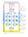
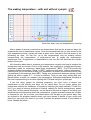
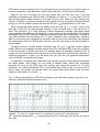
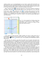
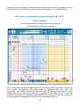
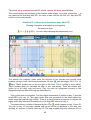
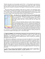
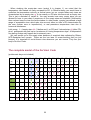
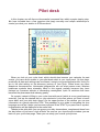
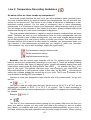
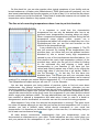
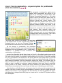
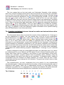
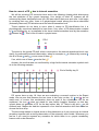
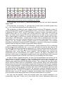
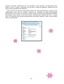
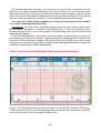
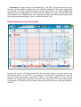
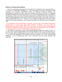
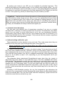
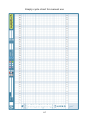
How to read the cycle chart?
>> Blue zone on the top (from left to right): The big number refers to the number of
cycles that you have recorded on sympto: in the sample chart it is the third cycle, followed
by the name or email of the sympto user, and an internal code. Next, you see the user’s
choice for her temperature taking method, here oral
, as well as her observation goal,
here contraception
. Other goals are: conception
, Fertility Awareness and cycle
knowledge
and “whatever may come” . In this example, the sympto user is achieving
pregnancy.
On the right side of these options, which have to be confirmed (or modified) in the
beginning of every new cycle, appear a small
and a big , the big “D” indicating that
fertility begins normally on that day in this specific cycle.
Finally, on the right side, you will see this symbol
meaning your shortest cycle and its
variance , which enables you to calculate your longest cycle and to know when you can
expect your next period. These two figures have no impact whatsoever on the calculations
of sympto. In this example, within the first six cycles, the shortest cycle counts 25 days and
the longest 25 + 11 = 36 days. As long as the variance does not exceed six days, the cycle
is considered regular. This cycle here is irregular. Some programs pretend to indicate your
next period. This is impossible. But with a regular cycle the variance gives you an idea of
the anticipated start of your next period. Here, regardless of the cycle being irregular, this
sympto user conceives, visible on the day of the baby face icon (day 40) in the yellow zone
at the bottom. Conception occurred through the intercourse on cycle day 13 or 15.
>> Middle: Here you can follow the evolution of the temperature curve. In the
background, you can see the fertility colors pink (infertile before ovulation), blue (fertile) and
yellow (fertile after ovulation). The blue phase is also called 'fertile window'. This is the time
for vigilant observation. In this space, you may also leave a daily note.
>> Below: Here you find classifications of your cervical fluid, called elixir (necessary for
the survival of sperm) , which can be observed visually or by touch. These appear on a
separate line above the internal sensation line. Underneath you can find the line reserved
for vaginal sensations such as feeling moist
or wet . The red hearts
indicate sexual
intercourse.
>> Bottom: In this portion, the sympto user can select one or more factors that may
have disturbed her temperature: for example the user of this chart modified her temperature
on day 14 due to insomnia (not visible any longer on this chart). She put the original
temperature in brackets in the 'Remark' field as a justification for the changed temperature
value.
5


![[1 ] StorageTek SL8500](http://vs1.manualzilla.com/store/data/005684950_1-d7f31af8d49e38e9e4476c8a63e026d0-150x150.png)