1
HedgeTools® User Manual
A real-time monitoring and analysis of the stocks on the NYSE and
NASDQ exchanges
Last update: July 10, 2014
Charles Brauer
Cypress Point Technologies, LLC
Carmel, California 93923
Copyright 2008-2013
HedgeTools®
A real-time monitoring and analysis of the stocks on the NYSE and
NASDQ exchanges
Overview
The HedgeTools system is a series of Tools that give the Hedge Fund manager a real-time view of
what is occurring on the NYSE and NASD exchanges. The applications in the HedgeTools system is an
implementation of the Arms Equivolume charting system, as well as a custom momentum model of the
market.
The Equivolume Charting system includes:
Big Box notification. This is a real-time monitoring of large Equivolume boxes that are occurring
during the trading day.
Equivolume screens for Ease-of-Movement.
Momentum screens that allow the researcher to find momentum trend reversals.
2
HedgeTools® User Manual
Copyright 2008-2013
HedgeTools Program
Splash Screen
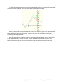
When the HedgeTools application is launched, a splash screen appears while the program is loading.
The splash screen looks like:
After a few seconds, the splash screen disappears and the HedgeTools main screen appears.
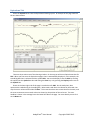
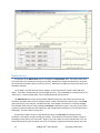
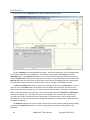
Market Meters
The main screen of the HedgeTools program begins with the Meters page, as shown below:
3
HedgeTools® User Manual
Copyright 2008-2013
At present, there are only Four meters that show the NYSE TRIN, NASD TRIN, S&P TRIN and the
Russell 2000 TRIN. The TRIN index was invented by Richard W. Arms, Jr. For more information on the
TRIN indicator, click on the Help Tab and then on the “Launch Reader” button under the Arms TRIN
Calculation.” Also shown next to each meter is a chart of the underlying index.
4
HedgeTools® User Manual
Copyright 2008-2013
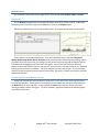
Equivolume Tab
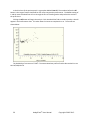
Select the Equivol tab to enter the Equivolume Charting system. An example of this page looks like
the one shown below.
There are three main areas of the charting window. On the top you will see an Equivolume chart for
RDY. When you first enter the Equivolume page a chart is automatically displayed. In this example, the
second Big-Box chart is selected with the symbol RDY. You can also display a chart for RDY by entering
the symbol into the Symbol text box and hitting the Enter key or by pressing the Display button next to
the Symbol box.
Shown in the lower right side of this page is a trade chart for RDY. On the trade chart, dots
represent the trades during in the trading day. Below each trade-dot is the volume for that trade. You
may also see a red arrow and a label of News. This means that there was a news item for the stock, and
the news announcement occurred at the time shown by the position of the red arrow. The news
headline is shown in the message bar at the lower left side on the page. For more details you can click
on the News tab.
5
HedgeTools® User Manual
Copyright 2008-2013
Buttons Panel
On the Buttons Panel of the Equivol page you will see four tabs: Scan, Buttons, News and Clean.
Buttons tab
On the Buttons tab page there is a text box that allows you to enter a ticker symbol. To draw the
Equivolume and Trade chart, either hit the Enter key or click on the Display button.
Below the symbol box you can see a drop-down menu. An example of this menu is shown below.
Shown above is an example of the menu. There are five default items in this menu: Big Boxes,
Watch, Watch-Longs, Watch-Shorts, Portfolio. Below these items are industrial group headings. When
you select one of the menu items, the buttons for each of the stocks in that group will appear, and the
first button will be highlighted, and the charts will appear. You can use your mouse to select the
buttons, and this will draw the chart for that symbol. You can also use the right-arrow on your keyboard
to bring up a chart for the next button. The left-arrow gives you the previous chart. The up and down
arrows are used to select the previous and next menu item. Personally, I find the arrow keys to be faster
than mouse selection.
Correlating News with Market Activity
Along with the trade and summary data for each stock, we also store news items that come to us
from our data provider. Shown below is an example of a news report that was obtained by clicking on
the News button on the trade chart. In this example, the News story reports a discovery of a new
natural gas field by Ivanhoe Energy Inc. This story resulted in significant volume that caused a Big Box
on the Equivolume Chart.
6
HedgeTools® User Manual
Copyright 2008-2013
The red arrow on the trade chart shows where the news announcement occurred. By selecting the
Get Story button on the News tab a display of all the current stories will appear.
Scan tab
The Scan tab of the Buttons panel looks like:
7
HedgeTools® User Manual
Copyright 2008-2013
Items on this panel are used to screen the database for Equivolume Ease-of-Movement and Big
Boxes. For more information on the theory behind these screens please refer to one of the many books
by Mr. Arms.
Along the bottom of this panel are buttons that let you step through all the stocks in the database.
To start at the beginning click the First button. Next and Previous buttons stop forward and backward
one stock at a time.
Clean tab
This panel contains options that are used by Administrators of the database. These options are used
to clean the databank. In this mode, all stocks are scanned for bad data, usually outliers that are
transmitted to us from our data provider. Shown below is an example of a suspected outlier.
The outlier has a red rectangle surrounding the trade. The Administrator has the option to delete
this trade from the database by hitting the Fix button. The scan will then continue.
Other examples are bad high-low ranges for the day. Each trade is read from the database and the
high and low price values are computed. The high and low for all the trades are then compared to the
high-low on the Equivolume chart. If the high or low does not agree with the trade data, the
Administrator has the option to choose the high-low from the trade chart. This also occurs by getting
bad data from our data supplier.
Trade Chart Price Scaling
In the lower right corner of the Equivolume page you will see a chart of today’s trading activity. This
chart shows all the trading activity so far during the trading day. The chart below was taken after the
close of the market. Normally, the chart’s price scale is based on the high and low as shown in the
example below.
8
HedgeTools® User Manual
Copyright 2008-2013
To activate a visual cue that shows 5% profit (green), and loss (red) bands, you can move your
mouse over the price scale on the right side of the chart. This region will change to a light gray color.
Select anywhere in this region (left mouse click), and the 5% bands will then appear as shown below. To
toggle back, click again.
If necessary, the Trade chart will re-scale to accommodate the 5% bands. When cleaning the trade
data (looking for outliers) I like to leave the 5% bands off to see more detail. However, during normal
chart viewing, I like to activate these bands to see the range the stock must move for a minimal net
profit.
Charting New Issues
When we add a stock that is a new issue there may not be enough history data to produce an
Equivolume chart. We need 80 days of data to compute an Equivolume chart. As a compromise, you
9
HedgeTools® User Manual
Copyright 2008-2013
will see a Candle chart instead. When 80 days of data is retrieved, the Equivolume chart will
automatically appear. A Candle chart will look similar to:
After 80 days of data is added to the database, the chart will automatically change to an Equivolume
chart.
Momentum tab
Selecting the Momentum tab will bring up a page that looks similar to the one shown below:
10
HedgeTools® User Manual
Copyright 2008-2013
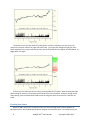
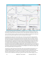
Momentum Chart
The purpose of the Momentum chart is to augment the Equivolume chart. The intent of this chart
is to show short term momentum swings in each stock. Momentum changes are denoted by red arrows
on the momentum model (shown as a Dark Cyan line). Momentum changes are close to Buy/Cover and
Sell/Short indicators.
The strategy is to trade the momentum changes. Arrows at the top of a trend are Sell and Short
trades. The trend is monitored until the trend again reverses. This is indicated by a red up arrow on the
model curve. A Cover and Buy order is then executed near this trend reversal.
The Momentum chart shown above contains 480 dot summaries, with 4 dot summaries per day.
Therefore, the above chart contains 120 days of data. Today’s dot summaries can be seen in the Trade
chart (lower right). Four samples are taken each day. Each sample is contained in a colored rectangle.
The computer color name for each rectangle is Dark Cyan. Because the open is very noisy, the first dot
summary is taken 10 trades into the trading day. The second and third samples are 1/3 and 2/3 into the
trading day. The last sample is at the close.
A proprietary model is shown on the Momentum chart as a Dark Cyan line through the dot
summaries. Also shown are two red and green bands. These bands are centered on today’s last price.
The height of each band is a 5% net profit. Shown in the chart above is a short-sale potential. The red
band is above the last price to show a loss of 5%, and likewise, the green band shows how far the stock
11
HedgeTools® User Manual
Copyright 2008-2013
would have to fall for a 5% net profit. Although it may not be immediately obvious from looking at the
Momentum chart above, the vertical scale is logarithmic. This means that a percentage distance is
constant in the vertical dimension. The profit/loss color bands are shown to give a quick visual
indication of the potential short term profit/loss relative to today’s last price.
Buttons Panel – Reversal Up (or Reversal Down)
When you first enter the Momentum display the Reversal Up tab will show some buttons. These
buttons will appear as a result of a background process that is running on the HedgeTools server. This
process runs four times per day. The process runs just after each Dot summary appears on the Day
trading chart. The background process looks for stocks that have a recent up-arrows (or down-arrows).
When the stock is found the Reversal Up tab will add a button for the stock in this panel. Likewise with
stocks that have a recent down-arrow.
Buttons Panel – Buttons tab – Portfolio Items
In the Buttons panel you can select the Portfolio item from the drop down menu. You can add or
delete symbols that are in your portfolio. Simply enter a symbol in the Symbol Text Box and hit the
Display button. This draws the charts for this symbol, and verifies that this symbol is in the database.
To delete a symbol from your portfolio, click on its button so that the symbol is entered into the
Symbol Text Box. Then click the Delete button. You will see that the button for that stock disappears.
In the example shown below, you will notice that the button labeled AGYS has a yellow background.
This is a warning that AGYS is also in the Trend Reversing Up or Trend Reversing Down list. Stocks in
these lists are possibly changing the direction of their trend. The yellow button indicates that since this
stock is in your portfolio, you should be ready to sell (or cover) this stock position.
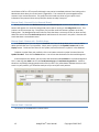
Buttons Panel – Scan tab
The contents of the Scan tab are shown below.
12
HedgeTools® User Manual
Copyright 2008-2013
You can manually bring up a chart by entering a ticker symbol into the Symbol box and clicking the
Display button. When this page first appears, the first symbol in the database is entered into the
Symbol box. You can also reset back to the first stock in the database by clicking on the First button
(bottom row).
You can also step through the stocks in the database by clicking First, Next and Previous.
The Start button starts a scan through the database for all stocks that have a momentum change
(i.e. a trend reversal), or stocks that are currently trending up or down.
During a scan, the text on the Start button changes to Next New. At any time you can abort the
scan by hitting the Cancel button.
After a stock is found and displayed, the Start button changes to Next New. You can continue the
scan by clicking on this button. The Previous and Next buttons step forward and backward though the
stocks in the database. If you have the time and patience, you can manually step though each stock in
the database using these two buttons.
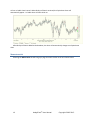
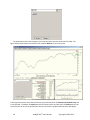
DayMomentum Chart
The motivation behind Day Momentum is to see if we can capture part of the sudden increase in
volume that produces an Equivolume Big Box. To do so, we need to extrapolate today’s volume-price
during the day to estimate if a Big Box is being formed. In the chart below you will see the
DayMomentum screen.
13
HedgeTools® User Manual
Copyright 2008-2013
The Day Momentum application is used to scan the database for stocks that meet buy criteria early in
the morning. The panel at the lower left allows the user to input parameters that affect the model. The
"Scan" and "Cancel" buttons are used to start and stop the scan. When the Day Momentum application
finds a stock that meets the model criteria, the scan is paused and charts appear.
The DayMomentum application consists of four charts. The chart at the top left is a day chart of the
NASDQ. Each dot on this chart is a one-minute summary. The smooth cyan line is a model of the price.
The chart at the top right is the Momentum chart that we discussed in the previous section. There are
two charts at the bottom. On the bottom left you will see yesterday’s day chart. On the bottom right is
what’s happening now. Of particular interest are the green LED lights below the company name. This is
the output of our day-trading model. The model is evaluated six times during the morning: 16, 21, 31,
41, 52 and 61 minutes into the trading day. A gray LED says that the model did not return a vote. A
green LED says that the model recognized a trending pattern and the trend went on to meet the goal of
2.5% profit. A red LED means that a trending pattern was recognized; but the trend has not yet reached
a goal. Notice a red horizontal line at 61 minutes into the trading day. This indicates how long the trade
was in the portfolio before the 2.5% goal was met.
The panel on the lower left shows some parameters that control the database scanning process. The
checkbox labeled "Envelopes" means that only stocks that trade above the smooth green line are
considered. If the Purge checkbox is selected, the scanning process will be pruned to only those stocks
that have a model vote (green or red LED). The Init checkbox re-initializes the list of stocks to be
scanned. The Run checkbox will show stocks that meet the model criteria without stopping. The "Vol
14
HedgeTools® User Manual
Copyright 2008-2013
Inc." box lets you select how much of an increase (in percent) the volume today's is over yesterday's
volume. The "Min Vol" lets you filter out stocks that do not yet have this much volume. The "ES" box lets
you select the minimum slope of the price trend curve (smooth orange line). During the trading day, this
line is extrapolated 15 minutes into the future, and you can select its slope. The "Min Mom." box lets
you select the minimum momentum (our custom momentum model). And finally, the "Min. Big. Box"
box lets you select a minimum on the Big Box Ratio calculation.
Click on the Scan button to begin the database scanning process. At any time, you can hit the Cancel
button to stop scanning. You can then adjust the scanning parameters and begin a new scan.
15
HedgeTools® User Manual
Copyright 2008-2013
Movers
Click on the Movers tab at the top to display the default Movers page as shown below.
Today’s Movers
The intent of this application is to show a chart of all industrial group performances, as well as the
top/bottom individual stock percentage gains/losses for today. The panel in the lower left part of the
page contains a pull-down menu of all the industrial group descriptions. Below this menu is an area that
will contain a button for each stock in the group, when a group is selected.
The group and individual stock performances are computed at the top of each hour during the
trading day. The latest results are shown in the chart to the right of the buttons panel. As you can see
in the figure above, the group performances are sorted in descending order, from best to worst. Use
the scroll bar to move down to the bottom of the performance chart.
For example, clicking on the down arrow of the drop-down menu will bring up a list of the industrial
groups as shown below.
16
HedgeTools® User Manual
Copyright 2008-2013
If the Agricultural Chemicals group is selected, buttons will appear for the stocks in this industrial
group. You can then click on any of the buttons to bring up a chart.
Movers – Group Chart
The chart next to the button panel shows Industrial group names and their relative performances.
Positive results are shown as rectangles to the right, and negative results have rectangles to the left.
When you move your mouse cursor over the industrial group name, or the performance rectangle, it will
turn red. When you select the item (left mouse button) the button panel will fill up with all the stocks in
that industrial group. In the figure shown below the mouse cursor was over Silver. This item was
selected and the buttons for the stocks in this group appeared. The Check-box for Detail was also
selected, and it launched the Movers Detail table that you see floating above the HedgeTools
application. This table shows the percentage gain/loss for each stock in the selected group. For you
convenience, you can either select a row in the table, or the stock button to bring up charts for that
stock. In the figure below, CDE was selected in the table. The trade chart, as well as the Equivolume
chart appeared. You can see that percentage gain for CDE was 6.67%
17
HedgeTools® User Manual
Copyright 2008-2013
The performance rectangles in the Movers chart are computed as follows:
1. Let N be the number of stocks in an industrial group.
2. Let Pi be the average percentage gain for the ith stock in the group. This is the percentage
difference between today’s last price and yesterday’s close.
For those of you that prefer a mathematical formula, the jth industrial group performance is:
𝑁
𝐺𝐴 = ∑
𝑃𝑗 =
𝐺𝐴
𝑁
100 (
𝑘=1
𝑙𝑎𝑠𝑡𝑘 − 𝑐𝑙𝑜𝑠𝑒𝑘
),
𝑐𝑙𝑜𝑠𝑒𝑘
where GA = Group Average Performance,
, where N=Number of stocks in group k.
Movers – Best/Worst Performing Stock Charts
When you click on the Stocks selection of the radio button (bottom of the buttons panel), the
performance chart will change to show the best/worst performers so far today. An example of the
Stocks radio button at the bottom of the button panel is shown below.
18
HedgeTools® User Manual
Copyright 2008-2013
The performance chart also changes to show the best/worst percent performers for today. The
figure shown below shows an example of the complete Movers screen at this point.
In this figure the mouse cursor was moved over the performance bar for Albany International Corp. and
it was selected. The button for AIN appeared in the button panel, and the charts for AIN appeared. You
can simply click on any of the performance bars (or stock ticker symbols) and new charts will appear.
19
HedgeTools® User Manual
Copyright 2008-2013
Trenders
The Trenders application shows how stocks are trending within their industrial groups. This analysis
is meant to show where the money is flowing by industrial groups over a period of time.
To access the Trenders application, click on the tab labeled Trenders on the top level tabs bar. This
page looks very similar to the Movers page that was talked about above.
The figure shown above is the result of clicking on the Home Furnishings & Fixtures item (shown
outlined in red). The Detail check box was also selected, and this caused a table to appear that shows all
the stocks in the selected industrial group. The percent trend for each stock is shown in this table. The
trend for the group is the average of all the trends shown in the Trend Details table. The row containing
symbol SCSS was also selected in the table. This caused the charts for SCSS to appear. You can also click
on the SCSS button to see the charts.
The motivation behind this analysis is to find out how stocks are trending as a group and the
direction of the trend. Money flowing into these stocks is driving the price upward, and hence, the
trend will be positive. Similarly, money flowing out to stocks in a particular group will drive the prices
lower and the direction of the trend will be downward (negative trend).
It is our hypothesis that when stocks trend as a group the result will be a more lucrative investment
opportunity.
How the trend averages are computed
20
HedgeTools® User Manual
Copyright 2008-2013
The figure below shows the model as the line through the dot summary data points. The magnitude
of the trend is then computed. The chart below shows an example of the model.
All the percent trends are averaged for all the stocks in each industrial group. The results are shown
in the graph as a sorted list of all the groups. Shown in this graph you can see the worst-to-best
performing industrial group trends.
After the computation is complete, the graph showing the raking will appear. You can either click on
the bar opposite the text, or on the text itself. This will fill the button box will all the stocks in that
industrial group. You can then click any of the buttons to see the Momentum chart for that stock.
21
HedgeTools® User Manual
Copyright 2008-2013
Symbols Tab
The Symbols application is accessed from the Symbols tab. This application is used to administer
the ticker symbols that are stored in the database. The Symbols screen looks like:
This application is mainly used to edit the company name and industrial group descriptions. The
other fields shown above are automatically set by other programs.
As of this writing there are about 3,000 stock symbols is the database. New symbols are added
under the following criteria:
1. Today’s closing price is between 4 and 800 Dollars.
2. The average daily volume for the last quarter is at least 200,000.
3. The market capitalization is at least 200 million dollars.
4. The stock today has a trade within every 1 ½ minutes.
Symbol changes occur at the rate of about one/day. Companies merge or are de-listed and new
companies now meet the criteria.
22
HedgeTools® User Manual
Copyright 2008-2013
To sort the columns on the table just click on one of the column headings. For example, clicking on
the Company heading will short the table by the stock’s company name. Clicking one more time will
change the sort from ascending to a descending sort.
23
HedgeTools® User Manual
Copyright 2008-2013
BackTest Tab
When you click on the BackTest tab, the BackTest application will appear.
The first Trending stock in the database will appear. As of this writing, there are 512 trending stocks
(out of about 3,000 stocks in the database). These stocks can be found in the Trends panel of the
Momentum tab. In the BackTest application, we are concerned with the quality of the trend reversal
marks. BackTest assumes that we will always be in the market. An uptrend mark (up arrow) means that
BackTest will cover a previous down reversal (down arrow) and the immediately go into a long position.
The next trade will be to sell at the next down trend reversal, and again, immediately go short.
The Start and Reset dates (shown as 500) are the starting time period for the BackTest run. At any
time, you can hit the Reset button to reinitialize all the data back to this start date. Remember that
there are four dot summaries per day. Six months is about 120 market days. Therefore, a start date of
500 is a start date of about six months ago. You may be wondering why the Start Date and Reset Date
textboxes are grayed-out. This means that they are not editable. The reason for this is because the
Trending stocks model is optimized for the values shown in these two boxes. The Trending model is
optimized by a process that runs outside the HedgeTools application, and the values in these two boxes
are chosen at that time.
The Symbol box allows you to enter a stock symbol. You can enter another trending stock by editing
the entry in the Symbol box (currently it contain symbol A, which is the first trending stock in the
database).
24
HedgeTools® User Manual
Copyright 2008-2013
Each trade in the simulation will be about $10,000.00 as shown in the Amt text box. Each trade will
also deduct a commission of $19.95 each way.
The Step + and Step – buttons moves the chart forward or backward on time period.
The Continue button will cause the computer to step forward until you reach the next trend
reversal. The Momentum chart will update each step showing you all the detail as you move forward in
time. Hitting the Continue button again will move to the next reversal.
The Next button moves to the next trend without showing all the intermediate steps. When the
next reversal is reached, the chart will show you the new results.
Each time you move to the next reversal, the Profit chart (lower right) will display the results of the
round trip trade. A dot will appear on the Profit chart. The horizontal axis shows the amount of time
the trade took to complete. The vertical axis shows the next profit (or loss) of the trade.
Shown below is the result of a complete run for stock A.
As you can see there were eight trades. The net amount of each trade was added to a Net total. In
the Profit chart above, the result of the eight trades was a net profit of $8,560.49.
The probability of success is shown to be 100%. This is defined to be the total number of positive
trades (above the zero line) divided by the total of all trades. This number is the multiplied by 100.
25
HedgeTools® User Manual
Copyright 2008-2013
In the third row of the options panel is a group box labeled: Run All. The numbers before the All
button is the range of stocks that BackTest will use to compute the performance. The default setting of
1 and 10 means that BackTest will run through the first 10 Trending stocks and produce the results in
the profit chart.
Clicking the All button will begin the analysis. Each time BackTest finds a round trip trade, a dot will
appear in the Performance chart. This takes about 2 minutes to complete the run. The results are
shown below:
The Probability of success was 77.38%. The accumulated net profits of each trade resulted in a net
total of $109,161.76.
26
HedgeTools® User Manual
Copyright 2008-2013
Summary
The advantages of the HedgeTools system are:
1. No software is installed on your local computer. The HedgeTools application is accessed via the
Internet using Windows Vista (or Windows XP), using the Remote Desktop application. You
have direct access to our server. A high speed network is not required.
2. HedgeTools is an intuitive collection of programs all contained within a single application.
3. HedgeTools gives the analyst a real-time view of how money is flowing into stocks on the NYSE
and NASDQ exchanges. Our charts show the analyst what stocks and industrial groups are
important during the trading day.
The HedgeTools system is constantly evolving and updates to the system are transparent to the
analyst.
27
HedgeTools® User Manual
Copyright 2008-2013
Appendix A. How to Access the HedgeTools Application
The HedgeTools application resides on the desktop of the Cypress Point Technologies server
{CypressPoint.com). It is accessed via Remote Desktop from any computer on the Internet that is
running Windows XP, or Windows Vista.
How to Launch the HedgeTools Application
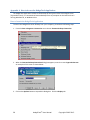
To access the HedgeTools server desktop from your computer, please do the following steps:
1. From the Start->Programs->Accessories menu choose: Remote Desktop Connection.
2. When the Remote Desktop Connection dialog box appears, enter the name: CypressPoint.com
An example of this screen is shown below:
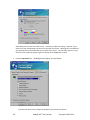
3. Click on the Options button to expand this dialog box. Click the Display tab.
28
HedgeTools® User Manual
Copyright 2008-2013
Show above, the size was set to Full Screen. I normally run with this setting. However, if you
want to see your own desktop, set the size to less than Full Screen. By doing this, the toolbar on
your desktop will still be visible after you connect to our server. This will allow you to run your
favorite screen capture program to get a hard copy of the HedgeTools screens.
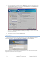
4. Click the Experience tab. The dialog box will appear as shown below:
From the pull-down menu, choose the speed of your Internet connection.
29
HedgeTools® User Manual
Copyright 2008-2013
5. If you are on Windows 7, please also click the Advanced tab. On the Pull-down menu, select
“Connect and don’t warn me”. At the bottom of the Advanced tab, click the Settings button.
The additional screen will appear as follows:
Make sure the “Automatically detect TS Gateway server settings” is selected. Click the OK
button to close the dialog.
6. You are done. You can now click the Connect button.
Login Dialog Box
After you successfully connect to the CypressPoint.com server, a Login Dialog Box like the one
shown below will appear. Enter your User name and Password and click the OK button.
After a successful login, you will be looking at the desktop of our server. After a few seconds, the
HedgeTools application will automatically appear.
30
HedgeTools® User Manual
Copyright 2008-2013
31
HedgeTools® User Manual
Copyright 2008-2013
Appendix B: The Arms TRIN index
32
HedgeTools® User Manual
Copyright 2008-2013