1
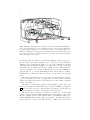
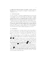
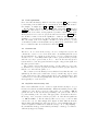
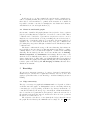
Applying Graph Theory to Interaction Design
Harold Thimbleby1 and Jeremy Gow2
1
University of Swansea, [email protected]
2
University College London, [email protected]
Abstract. Graph theory provides a substantial resource for a diverse
range of quantitative and qualitative usability measures that can be used
for evaluating recovery from error, informing design tradeoffs, probing
topics for user training, and so on.
Graph theory is a straight-forward, practical and flexible way to
implement real interactive systems. Hence, graph theory complements
other approaches to formal HCI, such as theorem proving and model
checking, which have a less direct relation to interaction.
This paper gives concrete examples based on the analysis of a real
non-trivial interactive device, a medical syringe pump, itself modelled as
a graph. New ideas to HCI (such as small world graphs) are introduced,
which may stimulate further research.
1
Introduction
A fundamental idea in HCI is that users build mental models of the devices they
interact with. Often one can do useful work with quite vague notions of mental
and device model, but low-level device features have high-level cognitive effects
[11]. For rigorous HCI work, and particularly with safety critical devices and
tasks, then, it is essential to have a very clear notion of what the device model
is. Unfortunately much work in design, specification and verification of interactive systems uses abstract or incomplete models of devices. What is needed is
an approach that can represent full, concrete devices and which has value for
analysis of interaction.
If we restrict ourselves to devices that are implemented by computer programs, then the programs (in their given languages) are the final arbiters of the
device models. Unfortunately, typical programs do not lend themselves to defining clear device models. Programs (and their specifications) are for instructing
computers, not for defining user interface behaviour, which in fact happens as a
side-effect of running them. Hardly any code in a typical program has anything
explicitly to do with the behaviour of the user interface, and typically the code
for the user interface is widely distributed throughout the program: there is no
single place where interaction is defined.
Graphs are a mathematical concept that lend themselves to analysis and
interpretation by program. A large class of interactive system can be built concisely from graphs—and it is a trivial theorem that any digital computer system
2
is isomorphic to a graph and a simple state variable. Significantly, as this paper shows, graphs lend themselves very well to a wide variety of analysis highly
relevant to HCI concerns. For example:
– Sequences of user actions are paths in a graph. A standard graph theoretic
concept is the shortest path between two vertices, which defines the most
efficient way a user can achieve a particular change of state. If there is no
such path, then a user cannot achieve the state change.
– The transition matrix M of a graph gives the number of ways a user can
cause a state transition by doing exactly one action. The matrix M n is the
number
of ways of achieving any state transition with exactly n actions; and
Pk
i
M
is the number of ways of achieving any transition with 1, 2, 3 . . . k
i=1
actions. The higher the number of ways of achieving a state transition, the
easier the state is for the user to reach. A safeP
(a secure interactive device)
would typically have only 0 and 1 entries in
M i , whereas a permissive
device [15] would have comparatively large entries.
In short, graphs very readily simultaneously define interactive systems and usability properties. Graph theory connects formal specification, runnable programs (or prototypes) and HCI. This paper backs up this claim with a wideranging analysis of a working simulation of a real, non-trivial interactive device.
1.1
Graph-based approaches
Although the use of transition systems to specify interactive systems was proposed as early as 1960 [10], they did not catch on as a ‘pure’ formalism because
of their apparent limitations for user interface management systems (UIMS)—
leading to a line of research [20, etc] that was overtaken by modern rapid application development (RAD) environments [9]. However, the drive behind both
UIMS and RAD environments was programmability and flexibility rather than
rigor. In rigorous HCI, one needs a programming framework that is both analytic and close to the user interface, if not identical with it: graphs achieve this
goal. Graph theory was proposed for use in HCI in [13, 14] as a means of analysis; other work includes using graph theory for providing interactive intelligent
help [18], and using flowgraph concepts to analyse user manuals as structured
programs [17].
Graph theory is a substantial area of mathematics, and many interesting
theorems and properties are known for graphs that can readily be programmed
on a computer (see, e.g., [2, 7, 12]). A graph is readily represented by drawing
vertices as dots, and arcs as arrows joining dots. Vertex and arc labels are written
as words adjacent to the vertices and arcs. If vertices are drawn as circles or other
shapes, their labels can be written inside the shapes. Small graphs are easy to
draw by hand and larger graphs can be drawn automatically using appropriate
tools [3]. To avoid clutter labels are sometimes omitted. Reflexive arcs (also
called trivial arcs) that point back to the same vertex are also often omitted for
clarity.
3
2
Graphs and interactive systems
We use labeled directed multigraphs in this paper, but what is a graph and how
does it relate to an interactive device?
A labeled directed multigraph is a set of objects called vertices V , a collection
of arcs A ⊆ V × V which are ordered pairs of vertices, and two total functions
`V : V → LV and `A : A → LA that map vertices, respectively arcs, to sets of
labels, which name the vertices and arcs.
The graph theoretic terms are vertices and arcs, but the device or programming terminology usually refers to vertices as states and arcs as transitions; the
user terminology refers to arcs as actions. Formally there is no difference. However, for most devices, the user cannot uniquely identify the state of the device.
Instead, the user can observe (hear or feel) indicators. We model this as a mapping O from vertices to the powerset of available indicators I, O: V → P
PI. That
is, in a given state s, O(s) is the set of indicators that are ‘shown’ to the user.
An interactive device can be represented straight forwardly as a directed
graph assuming: user actions are mapped into arcs, states are mapped into effects
the user can observe (for instance with sounds or indicator lights) and the device
must track the current state using a variable. When the user performs an action,
the current state A is changed to the next state B where there is a directed arc
from A to B labeled with that action. Arcs may point back to the same state,
and the transition then does not change the state; if the next state is A we say
that the action is guarded in A as no non-trivial transition occurs.
Graph models may be non-deterministic—either because of the underlying
system or because of constraints on the modeling process—in which case one of
several possible next states will be arrived at. Although useful, non-determinism
complicates many our of our graph metrics, and is beyond the scope of the
current paper.
Graph models can be extended with other concrete representational details
to relate them to actual interactive systems. For example an image can act as a
device’s skin, e.g., as used with the Java model shown in Figure 1. Changes to the
skin during use can be captured by indicator skins—changes to the skin which
correspond to the activation of individual indicators. Although an important
practical consideration, skins make little impact on our approach.
To be formal, devices are considered finite state automata represented by a
10-tuple hV, LV , `V , A, LA , `A , O, I, s0 , S, IS , iS i, with (in addition to the components already introduced above) s0 the initial state (the state a device is in
before it is first used), S the skin (which for our purposes is a colour image),
and IS a bijection from vertices to indicator skins iS . This level of formality
may look pedantic, but there is an important point: precisely this information is
sufficient to build a functioning interactive simulation (and even a user manual)
and to analyse its usability and other properties in depth. The fruitfulness of
this approach is explored throughout this paper.
In what follows, we will use the terms state and vertex interchangeably, but
stylistically we use state for user-related issues and vertex for graph theoretic
4
issues. Similarly, we will use action, press, etc, for user actions, but arc for the
corresponding graph concept. Typographically, we shall write State and Action .
2.1
Case study
A syringe is used to give patients injections of drugs. A syringe pump is an
automatic device that uses a motor to drive the syringe, and gives a patient an
injection usually over a period of hours or even days. The pump is set up by a
nurse or anæsthetist to deliver drugs for various conditions: for example, so that
it can be used on demand by a patient for pain management. Some pumps have
detailed models of drug uptake in the patient (the patient weight having been
entered), and may be used for anæsthesia. An ambulatory pump is one that a
patient can wear or carry around, and is typically used for pain management by
delivering calibrated dosages of drug on demand—within parameters set up by
the nurse, particularly so that the patient cannot overdose.
This paper uses as a running example a simulation of the main features of the
Graseby ambulatory syringe pump type 9500 [5]. The simulation of the Graseby
pump has been implemented as a Java program, constructed explicitly from a
graph model (of 54 vertices and 157 non-trivial arcs)—it is an example of a
realistic-scale, safety critical interactive system, and thanks to its graph-based
definition, with a formal specification that corresponds directly to its interaction
behaviour. See Figure 1 for a screen-shot of the Graseby simulation, and Figure 2
for a representation of its graph.
For reasons of space, we only use this one example system; in general a
designer would have a collection of systems and compare properties for variations
of the basic design. Clearly a very important practical use of graph theory is to
compare designs, particularly a design and iterative variations of it. For reasons
of space, we make no design comparisons here.
The remainder of the paper discusses some of the user issues that can investigated using graph theoretic properties—some of them standard, others of
special interest to HCI, and some of the potentially opening up new research
areas within HCI.
3
Navigation
First, we look at graph metrics related to the user’s ability to navigate the
device’s state space.
3.1
Reachability
A graph is strongly connected if there is a directed path connecting each pair of
vertices; in other words, the user can get from any state to any other state. There
are no dead-ends, and no unreachable states. The Graseby is indeed strongly
connected.
5
Fig. 1. Partial screen shot of the simulation—a user can mouse click on the buttons,
which are animated to give simple visual feedback of pressing. Note that graph theory
does not address all HCI issues, such as the naming or confusibility of buttons.
For many real devices, a weaker property is important: every state can be
reached from a certain set of states S, typically including a standby or off state.
For example, it is important that a fire extinguisher can be used from Standby,
but once used it cannot be returned to Standby by the user—it needs recharging. This property can be expressed in many ways, for example for every vertex
v ∈ S there is a spanning tree rooted at v. An example from desktop PCs is
that one wants to be able to write any document starting from a new, empty
document.
If a graph is not strongly connected, it will have at least two strongly connected components. If each strongly connected component is contracted to a
single vertex, the resulting graph must be acyclic (in fact a DAG). A designer
may use this concept in three ways: first, to check that all states are reachable
(otherwise the device has features that cannot be used); secondly, to determine
the set of states that can reach selected states.
All connectivity properties can be conveniently determined from the all-pairs
shortest paths matrix, P , readily found by Dijkstra’s algorithm. If there is a path
from u to v, then Puv will be finite, and moreover Puv is the minimum number
of user actions to perform the appropriate state transition. A graph is strongly
connected if and only if all elements of P are finite. The characteristic path
length, a property we use below (in §3.3), is the average of elements in P .
3.2
Diameter and radius
The diameter and radius of a graph are defined in terms of eccentricities. The
eccentricity of a vertex is the distance to the furthest vertex from it; more precisely it is the longest shortest path between it and all vertices. The diameter of
a graph is then its greatest eccentricity, and the radius is its least eccentricity.
6
Off
On
Press PURGE again for On
Value locked for On
Access code for On
Purging for On
PCEA bolus
Change lock for On
Press PURGE again for PCEA bolus
Purging for PCEA bolus
Access code for PCEA bolus
Value locked for PCEA bolus
Change lock for PCEA bolus
PCEA rate
Access code for PCEA rate
Change lock for PCEA rate
Value locked for Lockout time
Continuous
Value locked for Continuous
Purging for PCEA rate
Value locked for PCEA rate
Lockout time
Press PURGE again for Lockout time
Purging for Lockout time
Press PURGE again for Continuous
Reset
Press PURGE again for PCEA rate
Purging for Continuous
Press PURGE again for Reset
Access code for Reset
Purging for Reset
Change lock for Reset
Access code for Lockout time
Change lock for Lockout time
Access code for Continuous
Change lock for Continuous
Value locked for Reset
Good PCEA
Access code for Good PCEA
Change lock for Good PCEA
Press PURGE again for Good PCEA
Value locked for Good PCEA
Purging for Good PCEA
Reset totals
Value locked for Reset totals
Infusing
Bolus
Infusion suspended
Access code for Reset totals
Change lock for Reset totals
Press PURGE again for Reset totals
Purging for Reset totals
Access code for Infusing
Clinician bolus
Fig. 2. Illustrative visualisation, drawn by Dot concurrently with a running simulation.
The reduced diagram here is not particularly readable, but the graph visualisation
program allows the diagram to be zoomed and scrolled, so very large graphs can be
handled conveniently. In our system, previously visited states are shown in yellow, and
the current state is in red (though monochrome reproduction of this paper will may
make all such states look grey).
In usability terms, the diameter represents the difficulty, counted in actions, to
the user of the worst task (or tasks) they can do on the device. The radius is the
difficulty of the ‘easiest hardest’ thing to do. Of course, ‘difficulty’ is a formal
term; in fact, users will make mistakes, or not know the best way of achieving
their tasks—the eccentricity represents an optimal, error-free, fully knowledgeable user, and thus a lower bound on difficulty. However, it is not difficult for
graph measures to be conventional usability metrics, such as time; for example,
the Fitts law can estimate the time for the user to execute all actions along any
path.
The diameter and radius can be used to define two interesting sets of states,
based on eccentricity. The centre of a graph is the set of vertices with eccentricity
equal to the radius; whereas the periphery is the set of vertices with eccentricity
equal to the diameter.
The diameter of the Graseby graph is 8 and its radius is 5. The centre of the
Graseby is the single state On. This state is reached from Off by pressing the
On button; in other words, as soon as the Graseby is switched on, it is in the (as
it happens, unique) state where everything is as easy as it can be.
The Graseby has a periphery of 15 states, 8 of which are concerned with
patient controlled analgesia (PCA). Arguably, the patient features of the device
should be simpler in some sense than the nurse or anæsthetist features; the
analysis highlights this potential design concern. On the other hand, the Graseby
has several modes—it can be unlocked, half locked or fully locked—that restrict
7
to varying degrees what a patient can do. It would be possible to work out
the periphery under each lock condition, but we will not do so here (as we are
illustrating the use of the graph theory techniques for usability analysis, not
evaluating the device).
3.3
Small world graphs
A small world graph is one that has an unusually small average shortest path
between all pairs of vertices. The classic small world example is the social graph
of relationships: ‘six degrees’ is the (popular) mean least number of familiar
relations between any two people. Whether the number is exactly 6 or not, for a
graph with as many vertices as people and as sparsely connected, it is remarkable
that this characteristic path length (the mean shortest path length) is so low.
Small world metrics are relevant to HCI because a device may have a huge
number of states, but it should still have a modest expected cost of getting from
any state to any other. In other words, a small world device is usable—and easier
to use than an equal sized non-small world graph. There are many small world
metrics, all of which are easy to measure. Thus the characteristic path length of
the Graseby is 4.1, indicating a relatively small expected cost for navigating the
device. We discuss more benefits of small world graphs in §4.5 and §5.2.
3.4
Completeness
A complete graph has an arc connecting each pair of vertices; it is possible for a
user to get from any state to any other state in a single action. There must be
at least N − 1 user actions for an N state device. In particular, if there are at
least N actions, they may be conveniently labeled with the name of the target
state.
The complete graph Kn of n vertices is unique up to isomorphism. The
complete graph K2 is familiar as the on/off graph, and indeed the states are
usually called On and Off, and the action labels can be unambiguously called
On and Off .
A designer may wish to check the propery of directness, namely that every
arc label `A (uv) satisfies the property `A (uv) ⇒ `V (v), with ⇒ appropriately
defined to correspond to ‘perceptual’ or ‘cognitive’ implication. For example, in
the on/off device described above, if the user does On , they might expect the
device will enter the state On; or put formally, On ⇒ `V (On). Of course by
design we should have On = `A (Off On), as well as ⇒ `V (On).
In general, directness will make a device easy to use but it implies the device
has enough distinct actions, and for a complex device the designer will have to
choose which actions are direct and which indirect. For many devices, however
complex, Off is typically a direct action. On the other hand, directness permits a
device to have more action labels than states, for instance to provide alternative
ways to get to a state. A designer would probably require, further, that for every
arc label there is an appropriately labeled out-arc from every vertex—otherwise
some actions will not work in some states.
8
The advantage of a complete graph is that anything the user might want
to do can be done in exactly one action; conversely, there is a problem: the
user cannot be guarded from any side-effects, nor can there be any security
as no states can specifically guard any others. Furthermore, since there are at
least as many actions as states, the number of states may be limited for physical
reasons: on a push button interface, 100 states would require at least 100 buttons
which may be impractical simply in terms of space. A more interesting design
issue for a direct complete graph is that in every state there is one button that
does nothing—though the user can always press a button X to achieve state X
regardless of whether the device is in state X already.
Most devices are not complete, however. In this case, we can automatically
identify complete subgraphs, and then test the subgraphs for the appropriate
properties.
4
Errors
Graph theory lends itself to analysing the nature and costs of various error
scenarios a designer may be interested in.
4.1
Undo cost
The undo cost of a device can be defined as the average cost of recovering from
a single action error. If a user presses a button by mistake, on average, what
is the recovery cost for them? The undo cost is the average of the least cost
of recovering; in practice a user would take more than the undo cost because
they will be unlikely to know the device perfectly (and in any case they may
be stressed after making an error, and may make further errors). The undo cost
of the Graseby is 2.0; if it had an Undo button, the undo cost would be 1, and
the risk of user stress (and further keying errors) increasing the cost would be
eliminated.
The undo cost is measured by finding the all pairs shortest paths using them
to find the average cost of paths corresponding to every graph arc reversed.
There are clearly two sorts of undo cost: the basic undo cost is the average cost
of undoing any action—but of course, some actions do nothing (the arcs are
loops), so the normal undo cost is the average cost of undoing an action that has
done something. Further, the basic undo cost can be refined: if the user does not
notice an action has no effect, but they still want to undo it, then the undo cost
for that action is at least 1 not 0. We could also weight costs with the probability
the device is in particular states—for example, if it is less likely the user will
get the device in an Alarm state, then the cost recovering from errors in this
state should be weighted less. Which undo cost is the most insightful measure
for a device depends on the domain, or a designer may wish to compare different
undo costs to improve device performance, particularly if some forms of undo
cost are significantly higher than others which would indicate they deserve closer
inspection by the designer or analyst.
9
4.2
Undo equivalents
For a device like the Graseby, which does not have a specific Undo action, it may
be interesting to know which action or actions most often behave like an undo.
For example, one might expect UP and DOWN to be mutual undos.
For the Graseby, the most common action that behaves like Undo is in fact
Timeout : in other words, to recover from many errors, the user should simply
wait until the device times out. In graph theory terms, for all arcs (uv) on the
Graseby if there is a reverse arc (vu) most such arcs are labeled Timeout . The
user should be trained to know the significance of timeout, since trying to do
anything to recover from an error merely delays the device doing the timeout.
Also, the design of the device might be modified to tell the user (e.g., by way
of an indicator) that a non-trivial timeout is possible in the current state, and
moreover when the timeout would in fact behave like Undo .
4.3
Overrun cost
The undo cost of a device is the average cost of recovering from any error. In
contrast, the overrun cost of a device is the undo cost assuming that the errors
the user will undo are overrun errors: the average cost of recovering from doing
an action once too often. Many tasks require a user to press a button repeatedly,
and it is very easy to press a button once too often. Or the user may press a
button and not be sure they pressed it hard enough, so they press it again; now
they have pressed it twice.
The overrun cost is specified as the average over all possible recovery costs:
for all labels l, for every arc (uv) labeled l, if there is an arc (vw) also labeled l
find the cost of the shortest path w to v.
The overrun cost for the Graseby is 1.66, which is better than the undo cost
(which is 2). In other words, certain sorts of error (overrun being one) are easier
to undo than average. The designer should collect some empirical data to find
out what sort of errors users typically make. It is also important to know how
users typically recover from errors.
4.4
On/off or reset recovery cost
Often a user will switch a device off and on again in their attempt to recover
from an error (interviews with anæsthetists confirm it is standard practice). The
optimal cost of an off/on recovery procedure is the cost of getting to Off (in
general, at least one action) followed by returning to the previous state—there’s
no point returning to the error state. The appropriate cost measure is therefore
the average of: for every state u and arc (uv), the cost of the shortest path from
v to Off then Off to u. For the Graseby, this reset recovery cost is 4.85 with
a worst case cost of 7. Interestingly, these figures are little different from the
characteristic path length (4.1, and worst case 8), so a user switching this device
off and on again is not much worse than the average cost of doing anything—
the anæsthetists’ strategy seems sensible (and maybe a strategy one wishes to
deliberately support by design).
10
In all cases above, we have assumed the user knows the optimal ways to
achieve everything and that they can do the sequence of actions accurately, else
their choices of actions will not be optimal, as the measures above assume. It
is possible to measure costs based of assumptions of stochastic user behaviour,
and this has been done at length elsewhere [1].
4.5
Errors in small world graphs
One measure of small world graphs (discussed in §3.3) is the cluster coefficient
[21], the probability that two neighbours of a vertex are connected. The cluster
coefficient can be considered to represent how easy it is for a user to correct a
single incorrect action: that is, by doing something, they move from a state to
its neighborhood, and if they wanted to be somewhere else in the neighborhood
(anywhere else one action away from where they were), the coefficient is the
probability they can get there with just one further action. The Graseby’s cluster
coefficient is 0.6.
The cluster coefficient is the average of all vertex clustering, but it is interesting to find the worst cases, since low clustering makes a state harder to ‘adjust,’
certainly harder to move around in its neighborhood, than a state with high
clustering. For the Graseby, the three worst cases in this sense are Infusing,
Infusion suspended, and Continuous—interestingly, all these states occur
when the device is clinically active, where we can assume the operator does not
want to change its mode either easily or accidentally (and this property is indeed
what we find in the graph); whereas high clustering states are in fact highly ‘interactive’ parts of the Graseby, like Off, Purging and Bolus, all states whose
clinical use is transient.
5
Knowledge
We can expect interactive systems to be easier to learn and comprehend the
smaller they are, and the more regular their structure. We now look at other
graph properties that relate to user knowledge—and that identify key areas for
training.
5.1
Edge connectivity
The edge connectivity of a graph is the minimum number of edges whose deletion
would disconnect the graph; one distinguishes between connectivity and strong
connectivity (see §3.1), depending on whether edge direction is taken into account. For the Graseby, the strong edge connectivity is 1. This means that if a
user does not know one particular arc, the system (or, rather, the user’s model of
the system) is effectively disconnected, and therefore there are some operations
the user does not know how to do.
The minimum cut is the set of arcs (namely the bridges) that disconnects
the graph. For the Graseby, the minimum cut is a single arc, the On for the
11
state transition Off to On. We have thus automatically discovered what is (in
hindsight) an obvious fact: if a user does not know how to switch on the Graseby
(i.e., they do not know this action in this state), there are some operations they
certainly cannot do!
If a device is not going to be redesigned, the edge connectivity and its dual,
the vertex connectivity (and the set of hinges, vertices whose deletion disconnect the graph), highlight potential training issues. For many applications, most
important thing to teach the user is the minimum cut, for this is the ‘simplest’
knowledge not knowing which will make the device very hard if not impossible
to use.
5.2
Knowledge in small worlds graphs
Small world graphs (discussed in §3.3 and §4.5) have interesting properties relevant to usability. They are resilient to failure (‘network robustness’). If a user
does not know about some state, (on average) they can still find short paths
from where they are to where they want to go.
Small world graphs have characteristic vertices called hubs, which are very
strongly connected. If a user knows of one or more hubs, they will find a device
very easy to use, because knowing a hub makes connection to many other states
very easy. While not knowing about a hub can make a device very hard to use,
knowing it makes using it much easier. Hubs are therefore worth identifying for
training purposes. Not surprisingly, the main hub for the Graseby is the Off
state, followed by On and Infusing.
Small world graphs apparently have usability benefits (for reasons as outlined
above), and interestingly they arise naturally through incremental product development. For example, a new feature is likely to be attached adjacent to an
existing hub vertex, therefore strengthening its role as a hub. One might therefore expect an iterative design process to develop a small world graph—this may
be another reason to suppose that iterative design is a central design method for
good HCI [4].
5.3
Planar graphs and user comprehension
A colouring of a graph is an assignment of labels (e.g., red, green. . . ) to vertices
of a graph such that no adjacent vertex has the same colour. The chromatic
number of a graph G is the minimum number of labels that colours G. The most
famous theorem of graph theory is the Four Colour Theorem, first proposed in
1852 but only proved in 1976, which states that a planar graph (i.e., a graph
that can be drawn in the plane without any cross-overs, bridges or tunnels) has a
chromatic number at most 4. A graph with unavoidably crossing arcs may have
a higher chromatic number.
One reason to think planarity and chromatic numbers are relevant to usability
is a conjecture about user comprehension: if the transition diagram of a device
can be drawn with no crossing arcs, the diagram must in some sense be easier
to understand. In fact the Graseby is not a planar graph, so drawing it (as in
12
Figure 2) inevitably requires some crossing lines. We look at another application
of chromatic numbers in the next section.
6
Observability
We can use chromatic numbers (§5.3) to think about what the user can, in
the best case, observe about an interactive system. Although the Graseby is not
planar (see above), nevertheless its chromatic number is 4. If we imagine the user
could see each state’s colour and nothing else, then if fewer than 4 colours had
been used, the user would not be able to tell when the device changed between
some states. If the device displays the current state by some combination of
lights (e.g., LEDs) or text such as ‘pumping,’ ‘alarm,’ ‘on’ and so on, then its
chromatic number is the minimum number of combinations of indicators that
are required to communicate every state change to the user. More specifically, a
system with chromatic number k needs at least dlog2 ke indicators, e.g. lights or
different texts. In fact the Graseby has no lights, but it does have an LCD panel
that helps distinguish adjacent states.
6.1
Trackable and knowable systems
We may define a continuum of usability, delimited by three important properties
of a device being untrackable, trackable or knowable. A trackable device allows
the user to keep track of which state it is in, provided the user knows what they
are doing; a knowable device allows the user to determine which state the device
is in. If the number of distinct indicators in n, then a device is untrackable if
2n < k the chromatic number. A device is in principle trackable if 2n ≥ k, but
it is not knowable at least until 2n > N where N is the number of states.
In practice a device may allocate the n indicators in a peculiar way, so that
the bounds are not realised. Thus we distinguish between trackable in principle (i.e., there are enough indicators) and trackable in practice (the indicators
work such that every adjacent state has a different permutation of indicators);
knowable, of course, means that every state, whether adjacent or not, has a different permutation. If adjacent (respectively, any) states do not have different
indicators, then this suggests to the designer either there are too many states,
too many arcs, the indicators or the indicator mapping, O, are badly designed.
The Graseby is trackable but not knowable (in the sense defined above).
We can characterise trackable systems more precisely by looking at the average cost of knowing the state, i.e., the average number of user actions required
to uniquely identify the current state. The higher this is the more difficult a
user will find it to orient themselves when coming to the system in an arbitrary
state, say, after a distraction. The maximum cost of knowing the state is also of
interest here.
13
6.2
Chinese postman tour
The Chinese postman tour (abbreviated CPT) finds the shortest tour that visits
every arc of a graph [16]. A person (whether designer or user) who claims to know
a device must in principle know a Chinese postman tour—though in practice
they need not be able to describe it (a standard psychological issue of being
skilled but unable to explain the skill in detail—see the discussion below on the
‘practical’ CPT). The length of a CPT is a strict lower bound on the knowledge
needed to be certain a user (or designer) knows a device. Reducing the CPT
cost will therefore in general suggest or highlight potential improvements to a
designer.
The length of the CPT for the Graseby is 710 button presses, not counting
details such as password entry. This seems very long, and suggests the Graseby
is unlikely to be understood fully by any users unless it has been designed with
some systematic structure (which the CPT does not exploit). For example, the
CPT must check every Off action for every state; presumably most devices
are designed in such a way to ensure this property without needing to check it
explicitly.
The nature of the CPT is clear from the following extract from the middle
of a tour of the Graseby:
:
478 Try ON from "Off"
goes to "On"
479 Try DOWN from "On"
goes to "Value locked for On"
In state "Value locked for On", check unused buttons:
DOWN, OFF, PURGE, UP, STOP, KEY, ON do nothing
487 Do ENTER from "Value locked for On"
goes to "Continuous"
:
An implementor of a reverse-engineered device may wish to run through the CPT
on both the device and the simulator to check that they correspond. Notice that doing
a CPT may require testing many timeout transitions (24, or about five minutes total,
for the Graseby or, rather, 24 as known from the simulation—the real Graseby may
require more), and therefore checking may take a very long time! Note, also, that the
state names listed in the CPT are the implementation’s state names, and these may
or may not correspond closely to the device state names, if indeed the device makes it
clear to users what state it is in (the Graseby uses a large LCD, which mostly displays
text unique to the current state).
If a graph is Eulerian, it has a CPT of minimal length, namely a Eulerian tour,
with each arc traversed exactly once (a CPT in general traverses some arcs more than
once, therefore making it longer than a Euler tour). The Graseby is not Eulerian, and
therefore some arcs must be revisited in a CPT. The CPT algorithm can determine
the minimum number of arcs to adjoin to make a graph Eulerian; for the Graseby,
this number is 30. Therefore long revisited paths could be designed-out of the CPT
provided there are ‘spare’ out-arcs from vertices: namely, vertices with out-degree less
than the number of user actions. It is trivial to modify a CPT algorithm to identify
14
candidate pairs of vertices, but of course one would not necessarily want more arcs
out of, say, the state Off than the single arc labeled On ! Or again, some buttons have
labels that characterise the states they go to, such as On goes to the On state (if the
device was off); it does nothing else on the Graseby, but the CPT analysis suggests it
could do more—but a user would probably not want On to do anything else.
The designer must therefore use discretion in interpreting the suggestions—for the
Graseby, perhaps an arc labeled Start could usefully start an infusion even if the
device was off, thus adding one more arc to Off and reducing the length of the CPT,
and hence making the device easier to learn thoroughly.
6.3
Traveling salesman tour
The postman visits every arc (as it were, visiting every street/arc to deliver post),
whereas the salesman visits every vertex (as it were, selling stuff in every city/vertex).
The traveling salesman problem is to find the shortest tour that visits every vertex.
In user interface terms, this corresponds to visiting every state to check it works as
intended (if a designer) or that it is understood (if a user). Assuming the actions are
consistently designed, visiting every state may be sufficient to understand a device—the
CPT is overkill on this assumption, as it assesses too much detail.
6.4
Practical tours
If the CPT of the Graseby is 700+ user actions, this may be a useful indicator of
the complexity of the user interface, particularly when compared to other designs or
modified Graseby designs, but in practical terms the large number means a designer is
unlikely to be able to follow the tour without making errors; they are also unlikely to
be able to follow the tour in a single session. In either case, a more practical approach
is required.
The Graseby simulation tracks which states and actions have been visited and used.
Hence, rather than follow an error-free tour, the designer can follow a dynamicallygenerated tour that suggests their next action(s) to take the shortest path to the next
unchecked part of the device, given that the simulation knows which states and arcs
have already been checked (cf. Figure 2).
More generally, since a design may change (or a simulation modified to be made
more faithful to an actual device), the flags associated with every vertex and arc can
be reset if the design changes and the change affects that item. Thus a designer can
incrementally check a device, even while it changes, perhaps making errors or missing
actions, and still know what needs doing—and eventually cover the entire functionality
of the device.
The flags can be used in two further ways. During design, other documents may
be produced, such as user manuals. A technical author may wish to flag that they
have already documented certain parts of the device, and therefore that they must be
notified if the flagged parts of the device change. Another use is for an auditor, who
checks whether an implementation conforms to its specification. Again, they can use
flags to assert that a vertex (or arc) has been checked out and must not be changed
gratuitously. Both these ideas are implemented in [19].
15
7
History and undo
A disadvantage of graph theoretic formalisms is that there are some standard user
interface features that are cumbersome (but not impossible) to represent: history and
undo.
Many devices ‘remember’ what they were doing before they were switched off; when
they are switched on again, they go back to the state they were in before being switched
off. (Statecharts represent this history by using a special notation.) Graphs can only
represent this remembered history by embedding it as a subgraph within the Off state.
If there is only one state that maintains a history, this is not a serious issue, but when
there are several, the complexity of the subgraphs becomes hard to manage without
help.
Many desktop applications, but surprisingly few interactive devices, support undo—
which is curious given that undo has considerable benefits for users, and is particularly
easy to implement for interactive devices. The simplest way to implement a device
based on a graph was described above: the device tracks the current state using a variable s. To implement undo, the device model is changed from finite state automaton
(§2) to push down automaton, such that on every state change s is pushed on the stack.
The action Undo simply pops the stack to update s. If undo is implemented like this,
then the graph model does not represent undo, and it would be transparent to any
analysis based on the graph.
An alternative approach is to modify the basic graph to support undo. (This is
an example of the general procedure of taking a device specification as a graph and
introducing some required feature, in this case undo.) An undo graph can be defined
informally: given a graph g, the undo graph U (g) replaces every vertex v of g with a
set of n vertices U (v) where n is the in-degree of v. Each vertex in U (v) has exactly
one incident arc, and the same out arcs as v together with an additional arc labeled
undo that returns to the source of the incident arc. Generally U will be applied to a
subgraph—for example, we do not generally require Undo to work if the last action
was Off .
History (as in statecharts) is much harder to conceptualise in graph theoretic terms.
For every component of n vertices with a history, n copies of every other vertex must
be made; essentially if a graph has two components U and V , with V having a history,
then U must be replaced by U × V . In practice many devices have history. A common
example is a TV that returns to the last channel watched when it is switched on:
implying the Off state is a set of 100 or so vertices, so the single on transition from
each off vertex can return to the last-used channel.
8
Misconceptions
One might imagine that graphs have disadvantages because many graph properties
are computationally hard. For example, if we allow arcs to be conditional on arbitrary
conditions (as they are in statecharts and Kripke models) then many otherwise routine
graph theoretic properties turn on undecidable questions. Or finding the largest cycle
in a graph is an NP-complete problem. On the other hand, any such property would be
correspondingly hard in any other formalism too. In short, the disadvantage of graphs,
if any, is not that some properties are hard, but that it can be deceptively easy to
express hard properties!
16
An astronomical number of vertices may be needed to represent some programs.
One might therefore imagine that graphs for real systems would necessarily be enormous, and impractically so. This, however need not be a problem in practice, for at
least two reasons. First, we do not need to represent graphs explicitly: for example,
SMV has an underlying model (a Kripke model) but a typical user of SMV would
never see it, nor its efficient representation as a BDD. Second, whatever the theoretical potential for detailed representation, we as HCI evaluators need only use graphs to
model the user interface behaviour (not the underlying model in the MVC sense). Such
graphs are much smaller; indeed, a user interface that required a user to know or model
billions of states would certainly be unusable! Instead, users model an abstraction of
the implementation; to the extent we can capture that abstraction graphs will be an
ideal tool to model user interfaces.
9
Further work
Further work can be divided into three areas: the development of convenient APIs,
CASE tools or languages for programming interactive systems, the development of
convenient analysis tools (particularly ones that do not require mathematical expertise
to use), and further research into the underlying principles and the usability/model
correspondences.
As for specific further research, the following ideas might be considered:
– There are many ways in which user testing could validate the use of graph theory
in HCI and to provide a better understanding of its use in redesign, e.g., priorities
in different design contexts, relationship to other methods. Although graph theory
has strong face validity, and there are cases where its use may be critical to safety,
we do not know how useful it is given the huge number of other pressing design
issues that confront real projects; on the other hand, all graph theoretic measures
can be automated, and doing so would be a first step towards testing validity
experimentally.
– Of the ‘off the shelf’ graph theoretic properties that are useful for HCI, define
them in CTL or other logic (see [8] for some examples). Doing this would produce
a useful collection of design principles, and perhaps even a benchmark collection
for proposed HCI methods.
– Since history and undo are operations on graphs, an interesting research project
would be to optimise algorithmic graph theory for such graphs. For example, shortest paths are unchanged by undo, and therefore can be found as efficiently in a
graph with undo as without provided the underlying graph is known.
– The user model and the user manual can be represented as graphs. What properties
do such graphs have, and what are useful relations between these graphs and the
system implementation graph? For example: if the user model is a subgraph of the
system, the user need ‘never’ make a conceptual mistake with it; if the user manual
is a spanning tree of the system, it describes it ‘fully.’
– We identified small world graphs as being relevant to navigation, error and knowledge. These graphs, and scale-free networks, seem highly relevant to HCI, but this
relationship has not yet been explored thoroughly.
– The states On and Off occur frequently in results, which may reassure us that
the methods are picking up interesting states (graph theory does not know what
the names of these states mean, nor their purpose—so these states are picked out
17
by their structural significance), but it suggests that more useful analyses could
be made of subgraphs, for instance by deleting vertices the designer knows about,
such as Off. This is easy to do (unfortunately this paper did not have space to
explore the results), but it is not obvious how to generalise the idea, and therefore
raises a specific graph theoretic research agenda.
– Many of our analysis techniques could be extended to more accurate models of
interactive systems by using weighted vertices and edges, as we discussed for the
undo cost (see §4.1), and by accounting for non-determinism. And where average
metric values are used, more detailed information about an interactive system
could be found by looking at the distribution over all vertices or arcs.
10
Conclusions
Generally, working programs, user interfaces, HCI concerns and formal specifications
live in different worlds. If a program works and is therefore available for user testing,
iterative design and so forth it is very unlikely to still have an accurate specification.
Thus, programming, usability and formal methods in HCI have traditionally diverged,
and have few overlapping applications or case studies. This paper has shown that
graph theory provides an easy way to implement programs and to retain an explicit
specification, even as programs undergo modification; and that specification can be
readily analysed for various HCI concerns. Although graph theory is not unique in this
respect (e.g., consider statecharts and Statemate [6]), graph theory does provide a very
rich and fruitful domain to explore HCI properties as well as a very efficient model
to implement user interfaces. Unlike systems like Statemate, graph theory is standard
mathematics and is non-proprietary.
Our claims have been substantiated in this paper by providing a variety of graph
theoretic properties and discussing their significance to HCI design decisions, including
several diverse applications of small world graphs. We evaluated these properties from
a working implementation, namely a simulation of a Graseby 9500 syringe pump. The
case study showed how graph theoretic analysis raises many potential design questions,
as well as many user training issues. Our analysis introduced many interesting new
research questions, such as the relevance of small worlds models to HCI.
Acknowledgements Harold Thimbleby was a Royal Society-Wolfson Research Merit
Award Holder, and acknowledges this support for the research described here. The
authors are grateful for many collaborations with Michael Harrison and Paul Cairns,
and comments from several anonymous reviewers.
References
1. P. Cairns, M. Jones, and H. Thimbleby. Usability analysis with markov models.
ACM Transactions on Computer-Human Interaction, 8(2):99–132, 2001.
2. C. Chartrand and L. Lesniak. Graphs & digraphs. Chapman & Hall, 1996.
3. Emden R. Gansner and Stephen C. North. An open graph visualization system
and its applications to software engineering. Software—Practice and Experience,
30(11):1203–1233, 2000.
4. J. D. Gould and C. Lewis. Designing for usability: Key principles and what designers think. Communications of the ACM, 28(3):300–311, 1985.
18
5. Graseby Medical Ltd. 9500 Ambulatory Infusion Pump for Epidural Analgesia:
Instruction Manual, 2002.
6. D. Harel and M. Politi. Modeling Reactive Systems with Statecharts. McGraw-Hill,
1998.
7. D. E. Knuth. The Stanford GraphBase. Addison Wesley, 1994.
8. K. Loer. Model-based Automated Analysis for Dependable Interactive Systems.
PhD thesis, Dept of Computer Science, University of York, UK, 2003.
9. B. Myers. Past, present, and future of user interface software tools. In J. M. Carroll,
editor, Human-Computer Interaction in the New Millenium. Addison-Wesley, 2002.
10. D. L. Parnas. On the use of transition diagrams in the design of a user interface for
an interactive computer system. In Proceedings 24th. ACM National Conference,
pages 379–385, 1964.
11. S. J. Payne, H. R. Squibb, and A. Howes. The nature of device models: The yoked
state space hypothesis and some experiments with text editors. Human-Computer
Interaction, 5:415–444, 1990.
12. S. Pemmaraju and S. Skiena. Computational discrete mathematics. Cambridge
University Press, 2003.
13. H. Thimbleby. Combining systems and manuals. In BCS Conference on HumanComputer Interaction VIII, pages 479–488. Cambridge University Press, 1993.
14. H. Thimbleby. Formulating usability. ACM SIGCHI Bulletin, 26(2):59–64, 1994.
15. H. Thimbleby. Permissive user interfaces. International Journal of HumanComputer Studies, 54(3):333–350, 2001.
16. H. Thimbleby. The directed chinese postman problem. Software—Practice &
Experience, 33(11):1081–1096, 2003.
17. H. Thimbleby and M. A. Addison. Manuals as structured programs. In G. Cockton,
S. Draper, and G. Weir, editors, People and Computers IX, Proceedings of HCI
’94, pages 67–79. Cambridge University Press, 1994.
18. H. Thimbleby and M. A. Addison. Intelligent adaptive assistance and its automatic
generation. Interacting with Computers, 8(1):51–68, 1996.
19. H. Thimbleby and P. B. Ladkin. A proper explanation when you need one. In
M. Kirby, A. Dix, and J. Finlay, editors, People and Computers X, Proceedings of
HCI ’95, pages 107–118, 1995.
20. A. I. Wasserman. Extending state transition diagrams for the specification
of human-computer interaction. IEEE Transactions on Software Engineering,
11(8):699–713, 1985.
21. D. J. Watts and S. H. Strogatz. Collective dynamics of ‘small-world’ networks.
Nature, 393:440–442, June 1998.