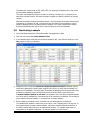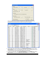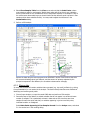
1
User Manual
MarkerView™ 1.2.1 Software User Manual
-1-
Revision: February, 2010
This document is provided to customers who have purchased AB SCIEX equipment to
use in the operation of such AB SCIEX equipment. This document is copyright protected
and any reproduction of this document or any part of this document is strictly prohibited,
except as AB SCIEX may authorize in writing.
Equipment that may be described in this document is protected under one or more
patents filed in the United States, Canada, and other countries. Additional patents are
pending.
Software that may be described in this document is furnished under a license agreement.
It is against the law to copy, modify, or distribute the software on any medium, except as
specifically allowed in the license agreement. Furthermore, the license agreement may
prohibit the software from being disassembled, reverse engineered, or decompiled for
any purpose.
Portions of this document may make reference to other manufacturers and/or their
products, which may contain parts whose names are registered as trademarks and/or
function as trademarks of their respective owners. Any such usage is intended only to
designate those manufacturers' products as supplied by AB SCIEX for incorporation into
its equipment and does not imply any right and/or license to use or permit others to use
such manufacturers' and/or their product names as trademarks.
AB SCIEX makes no warranties or representations as to the fitness of this equipment for
any particular purpose and assumes no responsibility or contingent liability, including
indirect or consequential damages, for any use to which the purchaser may put the
equipment described herein, or for any adverse circumstances arising therefrom.
For research use only. Not for use in diagnostic procedures.
The trademarks mentioned herein are the property of AB Sciex Pte. Ltd. or their
respective owners.
AB SCIEX™ is being used under license.
AB SCIEX
71 Four Valley Dr., Concord, Ontario, Canada. L4K 4V8.
AB SCIEX LP is ISO 9001 registered.
© 2010 AB SCIEX.
MarkerView™ 1.2.1 Software User Manual
-2-
Revision: February, 2010
1 Table of Contents
1
Table of Contents ..................................................................................................................3
2
Introduction and typical workflow ..........................................................................................4
3
Supervised processing of MALDI TOF data ..............................................................................6
4
5
3.1
Importing data ...............................................................................................................6
3.2
Reviewing the data .........................................................................................................8
3.3
Reviewing the samples and assigning groups ................................................................. 10
3.4
Saving the data for later retrieval .................................................................................. 11
3.5
Assigning a symbol for the groups ................................................................................. 12
3.6
Performing a t-test ....................................................................................................... 13
3.7
Reviewing the results .................................................................................................... 14
3.8
Inactivating a sample.................................................................................................... 15
3.9
Reviewing spectra ........................................................................................................ 16
3.10
Summary ..................................................................................................................... 18
Reviewing the data with PCA ............................................................................................... 19
4.1
Performing Principal Components Analysis ..................................................................... 19
4.2
Understanding the display ............................................................................................. 20
4.3
Interacting with the display ........................................................................................... 21
4.3.1
Displaying other PC’s ............................................................................................. 22
4.3.2
Excluding samples ................................................................................................. 22
4.3.3
Selecting and displaying the behavior of variables .................................................... 23
4.4
Interpreting the results ................................................................................................. 25
4.5
Summary ..................................................................................................................... 25
Unsupervised processing of LCMS data ................................................................................. 27
5.1
Importing data ............................................................................................................. 27
5.2
Assigning groups and symbols ....................................................................................... 30
5.3
Performing PCA and interpreting the results ................................................................... 32
5.3.1
6
Principal Component Variable Grouping Utility ......................................................... 37
5.4
Working with the excluded and interest lists................................................................... 40
5.5
Using Principal Components Analysis – Discriminant Analysis (PCA-DA)............................ 46
5.6
Summary ..................................................................................................................... 47
Miscellaneous ..................................................................................................................... 49
6.1
Generating and importing Peaks files ............................................................................. 49
6.1.1
Generating peak list files ........................................................................................ 49
6.1.2
Importing peak list files .......................................................................................... 50
6.2
Reviewing peak finder performance ............................................................................... 51
6.3
Aligning, normalizing and filtering data .......................................................................... 57
6.3.1
Aligning and normalizing ........................................................................................ 57
6.3.2
Filtering data ......................................................................................................... 59
6.4
Selecting discriminating t-test variables.......................................................................... 64
6.5
Combining t-test and PCA ............................................................................................. 68
MarkerView™ 1.2.1 Software User Manual
-3-
Revision: February, 2010
2 Introduction and typical workflow
The MarkerView™ Software is designed to allow the data from several samples to be compared so
that differences can be identified; typical applications include: metabolomics, biomarker discovery,
metabolite identification, impurity profiling, etc. This manual provides an overview of some of the
most common processing operations; a detailed description of the various commands, menus and
dialog boxes is contained in the Reference Manual.
The program uses multivariate analysis (MVA) techniques to compare the samples and provides both
supervised and unsupervised methods. Supervised methods use prior knowledge of the sample
groups (for example, healthy vs. diseased) to determine the variables that distinguish the groups. In
contrast, unsupervised methods allow the structure within the data to be determined and visualized.
The two approaches can be combined, i.e. unsupervised methods can be used to determine the
groups, and then supervised methods can be used to confirm the important variables.
A typical workflow is shown below:
Data files
Import, normalize and
align
Generate peaks
files
Assign groups
(optional)
Analyze data
Exclude variables
Interpret results
Further interpretation
MVA requires that the initial data be in the form of an array, hence the first step is importing the
data to generate the array:
MarkerView™ 1.2.1 Software User Manual
-4-
Revision: February, 2010
Sample 1
Sample 2
Sample 3
etc…
Variable 1
Variable 2
etc…
The content of a cell represents the value of the appropriate variable in the sample and can be zero
if the variable was not present. The rows represent variables found in at least one sample.
It is important that the variables represent the same quantity in every sample. This is
straightforward if distinct quantities have been measured (an example might be the intensity of a
specific mass at a particular retention time), but care must be taken if the variables are ‘found’ in
the data (for example centroid masses or the mass and retention time of an LCMS peak) since the
same variable may be assigned slightly different values in different samples. Ensuring that the
variables are correctly assigned is known as ‘alignment’ and is performed by the program as the
data is imported.
Similarly, it is also important to allow for differences in the values of the variables due to known or
expected changes in the data, for example different intensities of LCMS peaks due to differences in
the amount injected or the response of the instrument. This is known as ‘normalization’ and is also
performed during the import step.
If the data was obtained from known or suspected groups, the samples may be assigned to these
groups for supervised analysis or to allow better visualization of the results. It is useful to be able to
define different symbols for the groups so they may be easily recognized in subsequent plots and
graphs.
Variations in the data can arise from several sources, for example:
1) Experimental variations due to changes in the instrument or experimental conditions
2) Variations that are real but not of interest, for example, male vs. female subjects,
metabolites of a therapeutic agent, etc.
3) Relevant differences that reflect changes in the system being studied
During processing, the program allows variables of the first two types to be identified and excluded
from further processing. The excluded variables are tracked so that they can later be examined or
used for other processing. The program also allows ‘interesting’ variables to be saved for later
interpretation.
MarkerView™ 1.2.1 Software User Manual
-5-
Revision: February, 2010
3 Supervised processing of MALDI TOF data
The data for this example consists of two sets of TOF MS spectra that were exported from the 4700
database in ‘T2D’ format. One set of spectra was obtained from the tryptic digest of a betagalactosidase digest; the second set is from the same digest but spiked with a calibration standard.
The example illustrates importing and reviewing data, and analyzing the data with a t-test.
3.1
Importing data
1. Select MALDI Spectra (from T2D) from the File -> Import menu.
2. In the Select Samples dialog box that appears, click the Select Folder… button and locate
the folder containing the example MALDI spectra. This folder is installed to the
‘AB-Sciex\MarkerView\Sample Data’ subfolder of the ‘Program Files’ folder.
3. Select the folder ‘MALDI Spectra’ and click the button marked =>; alternatively you can drag
the folder to the right side of the display marked Selected.
MarkerView™ 1.2.1 Software User Manual
-6-
Revision: February, 2010
4. Click OK to import the files on the right side of the display.
In the Process Spectra Options dialog, select Find spectral peaks in profile spectra and
enter a Mass tolerance of 200 ppm, set Minimum required response to 100, Maximum
number of peaks to 5000 and ensure Use exclusion list is unchecked. Click OK; a dialog box
will indicate the progress of the importing operation.
5. When the import operation has finished, the data table will be displayed.
MarkerView™ 1.2.1 Software User Manual
-7-
Revision: February, 2010
The table contains a row for each variable and a column for every sample. Variables are identified by
a peak name, m/z and retention time; since these data are from mass spectra alone, there is no
retention time available and the peak name is simply the m/z value.
The table also contains a column which allows the variables to be assigned to a particular group.
When the application reads MS or LCMS data it attempts to determine the charge state of each
variable, based on the spacing of the isotope peaks, and assigns it to one of two groups:
·
Monoisotopic: charge was successfully assigned and this peak has the lowest m/z value of the
isotope cluster
·
Isotope: charge was assigned and this peak has a higher m/z value than the monoisotopic peak
If the group is blank then the charge state was not assigned, probably because the peak was small
and no other peaks with reasonable spacing could be identified.
A status bar at the bottom of the main window indicates how many samples and peaks were read in
(20 and 2390 respectively in this example).
The bar contains other fields that will be explained later.
3.2
Reviewing the data
You can use the controls in the toolbar at the top of the ‘Peaks’ window to graphically examine the
data before performing an analysis.
1. Select any column by clicking in its title and click the Plot Column icon (
). A plot of the data
for that sample will appear beneath the table. Note that this is not the raw mass spectrum, but a
plot of the most intense peaks found across all samples during the import process.
MarkerView™ 1.2.1 Software User Manual
-8-
Revision: February, 2010
If you click on the Link to Table button ( ) in the graph header, the graph will update when
different samples are selected. You can zoom or scroll the plot by dragging in the axes, as in the
Analyst® Software.
Click on the trash can button ( ) in the graph header to delete the graph.
2. Select a row by clicking in the row header to the left of the row number and click the Plot Row
icon ( ).
The graph shows how the value of the selected variable changes for every sample in the table.
Select the Link to Table button in the graph pane and then click in the table to make it active
(the active pane is indicated by an orange border). Select a new row in the table and the graph
will update to show the behavior of the selected variable for all samples. When the table is
active, you may also use the arrow keys to change rows and quickly review the data.
When you have finished reviewing the data, click the trash can icon to delete the graph.
MarkerView™ 1.2.1 Software User Manual
-9-
Revision: February, 2010
3.3
Reviewing the samples and assigning groups
1. Select Show Samples Table from the View menu. The Sample table will be displayed below
the Peaks table.
The table contains a row for each sample with columns indicating if the sample is to be used in
subsequent processing (Use), the scale factor for this sample, the associated group and other
optional information.
The Sample ID is obtained from the data file, as is the Acquisition Time if the data are being
imported from a .wiff file.
The Scale Factor can be adjusted to allow for overall differences in the amount of sample
used, and the RT Correction is used to adjust the retention time in LCMS analyses.
The Group information is used in supervised analyses and to select plotting symbols for the
samples so that differences are more apparent.
2. Select all of the rows for samples with names starting ‘A’ by dragging in the row headers (to the
left of the Row column), right-click and select Set Group for Selected Samples. In this case,
all of the samples in group A are beta galactosidase tryptic digests with calibrant spiked at a
particular level.
(Note: if the Sample ID column contains the group information, you may quickly copy it to the
Group column by clicking the column heading, hitting ctrl-C to copy the column, selecting the
Group column and hitting ctrl-V).
MarkerView™ 1.2.1 Software User Manual
- 10 -
Revision: February, 2010
3. In the resulting Group Name dialog enter ‘A’ for the group name and press OK.
4. Select all of the samples with names starting with ‘C’ and repeat the process, assigning ‘C’ as the
group name. The samples in group C are beta galactosidase tryptic digests with calibrant spiked
at a lower level than group A.
5. Click the trash can icon in the sample table to remove it from the display.
3.4
Saving the data for later retrieval
It is often useful to save the imported data so that it can be reprocessed later without having to reimport it since importing may be slow if there are many complex samples. The group information
you have just entered in the previous section will also be saved with the data.
1. From the File menu select Save As, select a folder to save the data, enter a name and click OK.
The data will be saved in a file with the extension ‘mrkvw’. In this example the file name is
‘Saved’.
MarkerView™ 1.2.1 Software User Manual
- 11 -
Revision: February, 2010
2. To retrieve the data later, select Open from the File menu, locate the appropriate file and click
OK.
3.5
Assigning a symbol for the groups
The results are easier to visualize if a unique symbol is associated with each group.
1. From the Edit menu select Options.
In the Options dialog box, select the Plot Symbols tab if it is not already selected.
Select the first empty cell in the Sample Group column and enter ‘A’. Enter ‘C’ in the Sample
Group cell in the next row.
You may change the shape, size and color of the symbol by clicking in the appropriate cell and
making a selection from the drop-down menu. Click in the color cell for the C row just added
and select the red color. All graphs and plots that show samples will now use filled blue circles
for group A and filled red circles for group C.
Note that there are five special categories – Default, Excluded, Selected, Monoisotopic and
Isotope – that are used when no other symbol is defined, for excluded samples and variables,
when particular samples are selected, or to indicate isotope peaks respectively. You cannot
change the names of these symbols but you can edit the shape, size and color.
MarkerView™ 1.2.1 Software User Manual
- 12 -
Revision: February, 2010
3.6
Performing a t-test
The t-test is applied to every variable in the table and determines if the mean for each group is
significantly different given the standard deviation and the number of samples.
1. From the Analyze menu, select Compare Groups with t-Test or click on the t-test button in
the toolbar below the menu bar ( ).
The following dialog appears:
2. Click OK.
The program automatically compares all groups in pairs and each group to all of the others; the
comparisons are accessed through the combo-box labeled ‘Compare’ at the top of the table. In
this case there are only two groups so the comparison is selected and the resulting table
displayed. The number of samples in each group (10 in both here) is also displayed.
MarkerView™ 1.2.1 Software User Manual
- 13 -
Revision: February, 2010
For every variable the table displays the calculated t-value, the corresponding p-value and
various metrics for both groups such as the mean (Mean 1, Mean2), the median, the difference
between the means (Delta), the fold change and the log of the fold change.
The t-value is a measure of how well the variable distinguishes the two groups whereas the pvalue is the probability that the delta value would occur by chance. If the value of t exceeds a
calculated critical value then the variable does distinguish the groups with some confidence
value; t can be positive or negative depending on the direction of the subtraction. The p-value is
always positive and the smaller the value the lower the probability that this is a chance
occurrence.
3.7
Reviewing the results
1. Click in the heading of the p-value column and click the Ascending sort button (
).
2. Select the first row of the t-test table by clicking in the area to the left of row 1, and click the
Plot profile button ( ).
The resulting display shows how the value of the selected variable changes across all the
samples (the profile). Since the data points are also labeled with the symbol defined in section
3.5, it is clear that this variable is indeed different for the two groups, and higher in group A.
MarkerView™ 1.2.1 Software User Manual
- 14 -
Revision: February, 2010
The peaks with nominal mass of 974, 1298, 1507, etc. with high probabilities are in fact peaks
from the spiked calibration standard.
This graph is automatically locked to the table, so clicking in another row, or using the arrow
keys when the table is active, will cause the graph to update to reflect the behavior of the new
variable.
Note that the display reveals an anomalous sample – the first sample at the lower intensity level
is labeled as an A sample (A9_MS_1.t2d) even though its behavior is more similar to group C
samples. Apparently there is a problem with this sample, or the name. Removing the sample
from future calculations will help to ensure that the values are correctly calculated.
3.8
Inactivating a sample
1. Close all windows except the initial Peaks window that tabulates the data.
2. From the View menu select Show Samples Table.
3. In the Samples table, locate the row containing sample A9_MS_1 and click the check box in the
Use column so that it is unchecked.
4. Repeat the t-test, ensuring that Remove samples marked as not used is checked, sort the
results and regenerate the profile graph using the plot row icon to verify that the sample is no
longer part of the display. (Zoom the graph if necessary by dragging in the horizontal axis). Sort
the table by ascending p-value as before and note that the first value is now much lower.
If Remove samples marked as not used is unchecked in the t-test dialog, excluded samples
will not be used to calculate the t-test values but will be retained in the displays. This provides a
way to classify unknown samples, i.e. compare them to known samples.
5. Sort the table by ascending t-value, select the first row and display the profile graph.
The variables with negative t values seem to be higher in the C samples than in the A group, i.e.
both groups appear to contain unique variables, not just the samples spiked with calibrant. In
this case, it seems likely that this is an experimental variation – for example suppression of
some peaks by the spiked compounds – so that they appear to be less intense.
MarkerView™ 1.2.1 Software User Manual
- 15 -
Revision: February, 2010
3.9
Reviewing spectra
1. Sort the table in ascending p-value order, and select the first row to generate the profile graph
using the plot profile icon.
2. Click and drag in the graph so that a few samples on both sides of the sharp intensity change
are selected.
MarkerView™ 1.2.1 Software User Manual
- 16 -
Revision: February, 2010
3. Right-click in the plot and select Spectra from the Show submenu.
A progress bar will appear while the program locates the raw data files and extracts the spectra,
followed by a graph showing the spectra.
MarkerView™ 1.2.1 Software User Manual
- 17 -
Revision: February, 2010
The graph is zoomed so that the selected peak is centered in the display. In this case it is clear
that the reported difference is real, i.e. that the peak at 972.57 is intense in samples from group
A and much less intense in those from group C. For this figure the Use Group Colors for
Traces option (from the Display submenu of the graph’s context menu) was selected so that
the group color is used for each trace, rather than a different color for each – this makes it
easier to tell at a glance to which group a given spectrum belongs.
You can click on the magnifying glass icon ( ) to make the pane containing the spectra fill the
display windows. When you have finished examining the data, click the icon again to return to
the normal display.
3.10 Summary
In this section you have:
·
Imported a set of MALDI TOF spectra and reviewed the sample and variable data
·
Reviewed the samples, assigned them to groups and created a symbol for each group
·
Performed a t-test to determine how well each variable distinguishes the two groups
·
Reviewed the behavior of certain variables for all samples
·
Used the raw data to confirm a difference between groups
·
Detected the presence of a suspicious sample and deactivated it from further calculations
These steps are the basis of all data processing in the application, and many of the operations are
common regardless of the data and the type of analysis.
The next section shows how the same data can be reviewed using unsupervised techniques to
confirm or identify groups, detect outliers, etc. You may also want to look at section 6.4, Selecting
discriminating t-test variables, to see additional ways of determining variables that best distinguish
the groups.
MarkerView™ 1.2.1 Software User Manual
- 18 -
Revision: February, 2010
4 Reviewing the data with PCA
In this section you will learn how to review the data using an unsupervised technique – Principal
Components Analysis (PCA).
Close any open windows and then open the data table you saved in section 3.4 by selecting File ->
Open and locating the saved data file. The data table will be displayed.
4.1
Performing Principal Components Analysis
1. Select Perform PCA from the Analyze menu:
The options dialog box will appear
PCA Preprocessing determines how the data will be treated prior to the actual PCA analysis.
PCA determines the variance of the data and is most affected by the largest data values; hence
it is normal to scale the data so that variables have equal importance regardless of the
magnitude. The most common method is known as Autoscaling and is available from the Scaling
menu. Experience has shown, however, that for mass spectrometry data Pareto scaling is a
good first choice; Pareto scaling reduces, but does not completely eliminate, the significance of
the intensity which is appropriate for MS because larger peaks are generally more reliable and all
variables are equivalent. Different scaling methods can reveal different features of the data and
it is worth experimenting with these settings to observe this behavior.
2. Select None for the Weighting and Pareto for the Scaling as shown. Make sure that the
Perform PCA-DA option is unchecked.
PCA determines combinations of the original variables that explain the variance in the data. The
first principal component (PC1) explains the greatest amount of variance; PC2 explains the next
largest amount and so on. The program will stop calculating PC’s when the amount of variance
explained is less than 0.5% of the total variance.
3. Click OK. After the PC’s are calculated, the following will be displayed
MarkerView™ 1.2.1 Software User Manual
- 19 -
Revision: February, 2010
4.2
Understanding the display
As mentioned above, PCA determines linear combinations (PC’s) of the original variables that explain
the variance in the data, i.e.:
PC1
= p1 x1 + p 2 x2 + p3 x3 ...
where the p’s are called the loadings and represent the importance of the variables (x) to the PC;
the larger the loading, the more important the variable. You can think of this as follows: if there are
n variables originally, then every sample corresponds to a point in the n-dimensional space defined
by the variables. PCA is equivalent to rotating the axes so that one – PC1 – lies along the line of
maximum variance. The loadings then indicate the direction of the new axes. Each sample can be
given a value on this new axis which is called the score, so we can look at the way the samples are
arranged according to this new axis.
The display obtained after performing PCA consists of 4 panes as numbered in the figure above:
1. A table of the scores for each sample and each PC – the Scores Table
2. A plot of the sample scores for PC1 and PC2 – The Scores Plot
3. A table of the loadings (contributions) for each variable and each PC – the Loadings Table
4. A plot of the loadings for PC1 and PC2 – the Loadings Plot
In the scores table (1) each of the PC’s has a separate column and the heading indicates the
percentage of the total variance that is explained by that particular PC. In this case PC1 explains
71.6% of the variance, PC2 7.4% and PC3 2.4%. Each sample has a row showing the scores for that
sample.
The scores plot (2) contains a point for each sample using the symbols assigned to the groups and
defined earlier (section 3.5). Several observations can be made from this plot:
·
The samples are divided into two groups along PC1 – the blue symbols (group A) have large
positive PC1 scores and the red samples (group C) have large negative scores
MarkerView™ 1.2.1 Software User Manual
- 20 -
Revision: February, 2010
·
There is also some variation that is explained by PC2, and this seems to affect both groups in a
similar manner. This variance is, however, only 7.4% of the total even though the plot visually
suggests it is more significant.
·
One of the blue samples (A9_MS_1.t2d) is more similar to group C (red) than it is to the other
members of group A. This is the sample that was also identified as an outlier during the t-test
(section 3.7) and subsequently excluded. (It is still included here because the data table was
saved before the sample was excluded)
The loadings table (3) also contains a column for each PC, but in this case the rows correspond to
variables and the values in the cells indicate the loading for the various PC’s.
The loadings plot (4) displays a point for each variable colored according to the groups assigned as
the data is imported and the symbols assigned to the default groups (see section 3.5); as illustrated,
monoisotopic peaks are represented by large green circles, other isotope peaks by small green
circles and unassigned peaks are blue. Coloring the variables in this way allows you to quickly
determine their importance. The loadings plot has some interesting features:
·
The vast majority of the points are clustered around the origin, i.e. they have small loadings and
contribute little to either PC1 or PC2
·
A number of variables have large positive values on PC1 and PC2. Since one group of samples
(A) is separated because it has large positive PC1 scores (as shown by the clustering of the
group A samples in the Scores plot), these variables with large positive PC1 loadings are
responsible.
·
There are also a number of variables that have negative PC1 and positive PC2 loadings; the
latter may contribute to the variation of the samples in the PC2 direction since some of them
have large positive PC2 scores.
·
Some variables tend to lie close to straight lines that pass through the origin, for example the
points labeled 1296.69, 1297.69 and 1298.69.
The behavior described in the last point arises because these points are correlated (they are all
isotopic forms of the same compound as indicated by the coloring) and we used Pareto scaling
which retains some of the intensity of the variable. Since the peaks are correlated they will have
very similar behavior on all PC’s, and thus lie on the same straight line, but the actual loading value
will depend on the intensity with the largest value having the biggest loading. Hence we can say the
following:
·
Correlated peaks, for example isotope peaks, adducts, fragments or multiply charged variants,
will have loadings such that the ratio of two PCs is the same, i.e. for a given peak:
(PC1 loading) / (PC2 loading) = constant
and will lie on a straight line through the origin.
·
The most intense peaks will be in intensity order along this line with the most intense furthest
from the origin.
So, in this example, 1296.69 is the most intense, the peak containing one
intense and the peak with two 13C atoms is least intense.
13
C atom is next most
Note: in many cases correlated variables are removed before performing PCA, but here their
presence helps to confirm that the observed behavior is real and not random. It also provides a way
to determine peaks that are related to the same compound since these will be correlated.
4.3
Interacting with the display
This section describes some of the features of the displays and ways in which you can interact with
them. The displays contain many powerful features and it is valuable to experiment with them.
MarkerView™ 1.2.1 Software User Manual
- 21 -
Revision: February, 2010
4.3.1 Displaying other PC’s
1. In the scores table (1) select the PC1 column by clicking its title, and then select PC3 by holding
the Control key down while clicking its heading (scroll the table sideways if necessary).
The display will update to show the scores and loadings for PC3 vs. PC1. The separation due to
PC1 is maintained, but there is also some separation along PC3 and a suggestion of two groups
– one with positive PC3 scores and one with negative scores – for both sample groups.
·
In the scores or loadings table, click the PC1 column heading and drag so that PC2 is also
selected; the original display will be restored.
4.3.2 Excluding samples
It is clear that sample A9_MS_1.t2d is unusual in some way and should be excluded from further
calculations. In section 3.8 we saw how to do this by deactivating it in the sample table; here we will
see how to do this from the scores plot.
1. In the scores plot, click and drag to make a selection rectangle around the abnormal sample.
2. Right-click within the selection rectangle and select Don’t Use Selected Samples for
Subsequent PCA.
MarkerView™ 1.2.1 Software User Manual
- 22 -
Revision: February, 2010
The sample symbol is replaced with an open circle. This is the default symbol for excluded
samples and variables, and can be changed as described in section 3.5 by altering the symbol
for the special group (Excluded).
3. Repeat the PCA analysis by selecting Perform PCA from the Analyze menu or by clicking on
the PCA button under the menu bar ( ).
4. In the options dialog, make sure Remove samples marked as unused is unchecked and click
OK.
The PC’s will be recalculated and the display regenerated. Note that the excluded sample is still
present in the display but is drawn using the excluded symbol and that this is reflected in the
plot legend (If the legend is not displayed, right-click in the scores plot, and select Display ->
Show legend). If Remove samples marked as unused had been checked the sample would
not have been included in the display.
If you save the data at this point, the resulting file will still contain the excluded sample but it
will be marked as unused.
4.3.3 Selecting and displaying the behavior of variables
As noted previously, the variables with large, positive PC1 loadings are the ones most likely to be
responsible for separating the two groups since one group has large, positive PC1 scores.
1. Draw a selection rectangle around the points representing the variables with the largest PC1 and
PC2 loadings (1296.69 and 1297.69)
2. Click the Plot profile button (
).
This will generate a new pane in the same window showing the intensity profiles of the selected
variables.
It is clear from the display that these two variables are present in group A samples at a high
level and only at a low level in group C samples. The excluded sample (A9_MS_1.t2d) also
shows a low level consistent with group C.
The intensity for the peak at mass 1297.69 is lower than the peak at 1296.69 in all samples as
expected for a 13C isotope peak at this mass and suggested by the scores.
3. In the loadings plot, click on the point for the variable 904.47 and the display will update to
show the profile of this peak.
MarkerView™ 1.2.1 Software User Manual
- 23 -
Revision: February, 2010
This is the default behavior when there is an active graph and a single point is selected; if you
hold the shift key down when clicking on a new variable point, the profile for the new variable
will be added to the existing display.
If you make a selection that includes several points you will need to click the Plot profile
button or right-click and choose Plot Profiles for Selected Peaks to generate the display. By
default, a new profile graph will be generated; if you hold the shift key down while generating
the display the existing plot will be replaced.
4. In the Profile Plot, select a region containing a few samples from the A group, hold the shift key
down and make a second selection from the C samples. Right-click in one of the selection
rectangles and select Spectra from the Show submenu.
The program will locate the original data files, extract the spectra for the samples you have
selected and zoom the display so that the active variable (904.47 in this case) is centered in the
display. The colors are different for each sample; to color them according to the group right-click
and select Display->Use Group Colors for Traces.
You may wish to enlarge the graph so that the small peaks are easier to see. This can be
achieved in one of the following ways:
·
Click the arrow ( ) in the top-left corner of the graph to shrink the title display to a single line
reflecting the active (front and labeled) trace. The active trace can be changed by clicking on
another trace in the graph and all titles redisplayed clicking the arrow again.
·
Click on the top border of the pane containing the display and drag the frame upwards to
enlarge the size of the pane. The cursor will change to a resizing tool when correctly positioned
over the border.
·
Click on the magnifying glass icon in the pane header. This will cause the display to switch to a
mode where each pane is displayed on a separate tabbed page. Clicking on a different tab will
change the active display, and the process can be reversed by clicking on the magnifying glass
again.
MarkerView™ 1.2.1 Software User Manual
- 24 -
Revision: February, 2010
5. In the loadings plot, select another variable by clicking on it. The sample graph will update but
the selection rectangles will remain in place.
Click in one of the selections and choose Spectra from the Show submenu while holding the
shift key down; the spectrum graph will update to show the raw data peak for the new variable.
Since these are spectral data and the spectra have already been retrieved from the files, the
display will update much faster.
If the shift key is not down a new spectrum pane will be generated using data newly retrieved
from the files.
6. Remove the graph and profile plots by clicking in the trash can icons in each pane.
4.4
Interpreting the results
So far we have learned that the variables with large positive PC1 loadings are mainly in the group A
(spiked) samples and absent, or at lower intensities, in the group C samples. But what causes some
variables to have negative PC1 values? What is the source of the variation displayed by PC2? Is it
significant?
Since PC1 separates the two groups, and variables with positive loadings are only in group A, it
seems likely that variables with negative loadings will only be in group C (or at a lower intensity in
group A). We can verify this by displaying the profiles for some of these variables:
1. In the loadings plot, select three variables with the largest positive PC2 and negative PC1
loadings (1083.52, 900.38 and 1299.64) and display the behavior of these variables by clicking
the Plot profile button. You may need to zoom-in to do this.
The most intense trace appears to be more intense in group C, but overall the plots suggest a
gradual increase in intensity going from left to right. This is also supported by the excluded peak
(open circle).
This kind of change is quite common and can be caused by a number of gradual changes in the
instrument or the samples.
In this case the data were acquired in the order they are displayed, i.e. all group A samples
were analyzed before group C, which can cause this kind of variation to appear as real
differences between the two groups. To avoid this, the samples should be acquired in a random
order so that members of both groups will be equally affected by experimental variation. This
simple example illustrates an important point – these techniques will find differences and can be
very sensitive to small changes between groups, but in order to determine ‘real’ biological
changes of interest, the experimental system should be as closely controlled as possible.
4.5
Summary
In this section you have:
·
Opened a saved data set
·
Performed a Principal Components Analysis (PCA) on the data
MarkerView™ 1.2.1 Software User Manual
- 25 -
Revision: February, 2010
·
Understood and interacted with the display
·
Excluded outliers or abnormal samples from a graph
·
Displayed the profiles of variables for all samples
·
Showed the raw data corresponding to the variables
·
Examined the data to reveal that there are some experimental variations
These are the basic operations for using PCA and will be used frequently. The next section will apply
these techniques to LCMS data and show how variables can be excluded from the calculations when
they are not of interest.
MarkerView™ 1.2.1 Software User Manual
- 26 -
Revision: February, 2010
5 Unsupervised processing of LCMS data
In section 4 you learned how to process data using PCA; this section applies this technique to more
complex samples resulting from the LCMS analyses of a time point study.
The data set1 was obtained by analyzing the urine from three rats at three different time points (0 –
8, 8 – 16 and 16 – 24 hour) before and after administration of vinpocetin2 at 10 mg/kg. Samples
were analyzed by LCMS on a QStar® XL.
5.1
Importing data
1. Form the File->Import menu select LC/MS Data (from wiff).
2. In the Select Samples dialog, navigate to the example data folder and drag the folder LCMS
Data to the Selected side of the dialog (see section 3.1 for additional details).
Note that the first sample (Rat1_0-8_Vinpo_A) is included in the file list twice. After the first
injection of this sample the chromatographic conditions were changed so this sample needs to
be removed.
3. In the right-hand display, select the first sample and click the <= button to move it back to the
left-hand side so it will not be imported.
You can verify that the sample has been removed by expanding the LCMS Data folder and data
file in the left-hand pane by clicking on the + signs.
1
Data courtesy of Dr. Gerard Hopfgartner, University of Geneva.
2
Vinpocetin is known as a memory enhancer; a treatment for Alzheimer’s disease; a treatment for stroke; it improves
circulation (especially to the brain); and it is a powerful antioxidant.
MarkerView™ 1.2.1 Software User Manual
- 27 -
Revision: February, 2010
4. Click OK to begin the import process.
Importing LCMS data occurs in two separate steps; the first step locates the peaks in the data
and the second step performs the alignment and normalization.
In the Peak Finding Options dialog box, set the parameters as follows:
Minimum retention time to 3.00 min (to ignore the void volume)
Subtraction offset unchecked
Minimum spectral peak width 5 ppm
Noise threshold 5
Minimum RT peak width 20 scans
Assign Charge States checked
These settings will allow the program to find small, narrow mass peaks that may be recombined
during alignment. These data were acquired using an unusually fast scan speed of 5
scans/second, so the LC peaks are wide in terms of scan numbers.
MarkerView™ 1.2.1 Software User Manual
- 28 -
Revision: February, 2010
5. Click OK. The dialog for the second step of the import process appears.
Set the Retention time tolerance to 1 min. and the Mass tolerance to 25 ppm; peaks that
are within these tolerance values, either between files or within a single file, will be aligned to
the same peak.
Leave the filtering parameters unchecked, and set the Maximum number of peaks to 8000.
Uncheck Perform sample normalization and Perform retention time correction.
6. Click OK. Once the import process is complete the data table will appear.
The data table is similar to the one for spectra (section 3.1), but now the retention time field is not
empty and the peak name is constructed by combining the m/z value and the retention time in
minutes. The name also contains an index value in brackets since it is sometimes easier to locate
variables using this number.
You can review the data by selecting rows (variables) or columns (samples) and clicking on the plot
column or plot row buttons at the top of the pane.
MarkerView™ 1.2.1 Software User Manual
- 29 -
Revision: February, 2010
5.2
Assigning groups and symbols
It is convenient to assign groups and symbols so that the pre- and post-dose samples can be
distinguished, as well as the different time points. We will assign the groups and symbols according
to the following table:
Time point (hr.)
0–8
8 – 16
16 – 24
Post-dose
group
1
2
3
Sample symbol
Closed blue circle
Closed red circle
Closed green circle
Pre-dose
group
blank1
blank2
blank3
Blank symbol
Open blue square
Open red square
Open green square
So that the time points are distinguished by color and the pre- and post-dose by shape.
We will start by assigning the symbols first; this saves some typing since the groups can then be
assigned by selecting them from a menu.
7. Select Options from the Edit menu. You can either manually fill-in the point symbols for the six
groups as shown in the figure below or import them from a file included with the program.
To import symbols from the example file, click the Import button and navigate to the
‘AB-Sciex\MarkerView\Sample Data\LCMS Data’ subfolder of the ‘Program Files’ folder in the
resulting ‘Open’ dialog. Select the LCMS Plot Symbols.ptsym file and then click OK to close
the Options dialog.
MarkerView™ 1.2.1 Software User Manual
- 30 -
Revision: February, 2010
8. From the View menu, select Show Samples Table.
9. In the sample table select the row containing the sample Rat1_0-8h_vinpo – A which
corresponds to the 0 – 8 hour post-dose sample from Rat1.
10. Hold the control key down and select the rows for Rat2_0-8h_vinpo – A and Rat3_08h_vinpo – A.
11. Right-click in the table and select Set Group for Selected Samples.
12. In the Group Name dialog, click on the pop-up menu, select ‘1’ and click OK.
13. Repeat the process assigning the groups as follows:
Samples
Group
Rat1_8-16h_vinpo – A
Rat2_8-16h_vinpo – A
Rat3_8-16h_vinpo – A
2
Rat1_16-24h_vinpo – A
Rat2_16-24h_vinpo – A
MarkerView™ 1.2.1 Software User Manual
- 31 -
Revision: February, 2010
Rat3_16-24h_vinpo – A
3
Rat1_0-8h_blk – A
Rat2_0-8h_blk – A
Rat3_0-8h_blk – A
Blank1
Rat1_8-16h_ blk – A
Rat2_8-16h_ blk – A
Rat3_8-16h_ blk – A
Blank2
Rat1_16-24h_ blk – A
Rat2_16-24h_ blk – A
Rat3_16-24h_ blk – A
Blank3
The finished sample table will look like:
14. Select Save As from the File menu and save the imported data in the LCMS Data folder with
the name LCMS Saved, overwriting the file if it already exists.
This will save the imported data and the assigned groups so they can be easily retrieved in
future.
5.3
Performing PCA and interpreting the results
1. Click the trash can icon in the sample table pane to close it
2. Click the PCA button or select Perform PCA from the Analyze menu.
3. In the PCA dialog, select None for the Weighting and Pareto for the Scaling and click OK.
MarkerView™ 1.2.1 Software User Manual
- 32 -
Revision: February, 2010
The resulting display will show the scores and loading in both tabular and graphical form as
described in detail section 4.2.
4. Click the magnifying glass button (
) in the scores plot so that it is easier to examine.
It is clear that PC1 (ca. 56.5% of the variance) separates the pre-dose samples (open squares)
from the post-dose (closed circles), with the 0 – 8 hour samples having the highest PC1 scores,
the 8 – 16 having the next highest and the 16 – 24 hour samples being closest to the pre-dose.
This suggests that the biggest change occurs in the first 8 hours and that the magnitude of the
change lessens over time.
PC2 (17.2%) appears to separate the samples according to the sampling interval with the 0 – 8
samples (pre- and post-dose) having the most negative values and the other time points being
MarkerView™ 1.2.1 Software User Manual
- 33 -
Revision: February, 2010
less well separated. This suggests that there is a diurnal variation in the samples that is
unaffected by administration of vinpocetin.
Click on the tab to display the loadings plot (PC1 Loading versus PC2 Loading).
As explained in section 4.2, Pareto scaling causes correlated variables to lie on straight lines that
pass through the origin. Examination of the loadings plot indicates the presence of several
families of correlated variables such as those shown above.
The families marked 1 and 2 have the highest positive PC1 loadings and will contribute most to
the separation of the post- and pre-dose samples, although families 3 and 4 may also have an
affect. The variables indicated by the line marked 7 may also contribute to this difference but in
the opposite sense – if 1 and 2 correspond to variables present in the post-dose but not the predose, variables in family 7 will be predominantly in the pre-dose samples.
The variables in family 4 seem most likely to be in the 0 – 8 hour samples (pre- and post-dose)
since these had the largest negative PC2 loadings, whereas 5 and 6 will be more prominent in
the 8 – 16 and 16- 24 hour samples.
We will start by exploring the diurnal variation.
5. Click the magnifying glass to return to the multi-pane display, select the variables that are
furthest away in the direction of arrow 4 and click the Plot Profile button.
MarkerView™ 1.2.1 Software User Manual
- 34 -
Revision: February, 2010
6. In the toolbar of the new graph, click on the downwards pointing arrow adjacent to the Sort
Order button and make sure Group Order is selected. The data will be drawn in group order
where the groups are sorted alphanumerically, i.e. in this case the order is: 1, 2, 3, blank1,
blank2, blank3.
The profile graph shows that the selected ions do behave as expected, i.e. they are more
intense in the 0 – 8 hour samples than the 8 – 16 and 16 – 24, and comparable in the pre- and
post-dose samples.
Click on other variables in the direction of family 4 to update the profile display, and note that
they all have similar behavior although the peaks get smaller, and the noise higher, closer to the
origin.
7. Click on a variable that is furthest from the origin in the direction of arrow 5, e.g. the variable
91.1/11.3.
Note that the variables in this direction show the opposite behavior to those in direction 4, i.e.
they are lowest in the 0 – 8 samples. In this case there may also be some difference between
the pre- and post-does samples.
8. Click on the variable furthest from the origin in direction 6 (353.3/20.7).
MarkerView™ 1.2.1 Software User Manual
- 35 -
Revision: February, 2010
At first sight, this variable appears to be present only in the rat 3 samples, and two of the rat 3
blanks have the largest negative PC1 scores, but there may be other explanations for this
behavior, for example a systematic variation.
To check this it is useful to switch the display so that the samples are arranged in index or
acquisition order.
9. In the Sort Order pull down list select Sample Index.
The graph illustrates that the samples were run in order, i.e. rat 1 followed by rat 2 and rat 3,
and that this variable appears to be a contaminant that occurs later in the analyses and is only
present in rat 3.
10. Hide the two tables and the scores plot by clicking in the Hide pane button ( ) in each of
these panes. This results in a display that consists of the loadings plot and the profile graph
making it easier to select variables.
11. Search for variables that have similar behavior by clicking on symbols in the direction of family
6, but closer to the origin. To make this easier, you may need to zoom the graph either by
dragging in the axes or by selecting a rectangle in the graph, right-clicking and selecting Zoom
Selection.
12. As the variables are encountered draw a small rectangle around them, right-click in the
rectangle and select Don’t use Selected Peaks for Subsequent PCA. The symbols will be
replaced by the symbol for excluded points (by default an open blue circle). The finished display
will resemble the one below.
MarkerView™ 1.2.1 Software User Manual
- 36 -
Revision: February, 2010
Repeat the PCA analysis by clicking the PCA button in the toolbar at the top of the window. The
resulting scores and loadings plots are very similar to those obtained earlier, the most obvious
difference being that the variance explained by PC1 has increased to ca. 61% (the exact value
will depend on the variables you excluded), and the 16-24 hour post-dose samples seem to be
grouped slightly more tightly.
5.3.1 Principal Component Variable Grouping Utility
The MarkerView™ software includes a utility which allows variables to be grouped in an automated
way to facilitate data interpretation.
Follow these steps:
1. First, select Options from the Edit menu and define plot symbols for groups numbered ‘1’
through ‘7’ as shown in the figure below. Note that you do not need to use identical symbols to
those shown here provided that you can distinguish these groups.
MarkerView™ 1.2.1 Software User Manual
- 37 -
Revision: February, 2010
2. Return the display to the state shown in step (4) above by closing the current window or by
activating the previous window. Ensure that the Loadings Plot is active.
3. Select the PC Variable Grouping menu item from the Utilities sub-menu of the Help menu
as shown below.
The window shown below is presented.
4. Fill-in the parameters as shown in the figure. In particular set the Number of PCs to ‘3’ and deselect the Only start a new group if PC with max. loading is used checkbox.
5. Click the Assign Groups button and close the window by clicking in its close box.
MarkerView™ 1.2.1 Software User Manual
- 38 -
Revision: February, 2010
The loadings plot should appear as shown below. The variables have been automatically
assigned to one of six groups (in addition to the ‘Default’ group for certain very small variables).
These groups roughly correspond to the numbered groups discussed in step (4) of the previous
section (section 5.3).
One reason that the grouping is not identical to the visually identified groups of the previous
section is because the automatic groups were assigned using information from the first three
principal components (as selected in the figure above), whereas the visual grouping was based
on only the two visible components. This is an important point since it allows a two-dimensional
display to be colored in such a way that additional variation not otherwise visible can be seen.
For a detailed discussion of this tool see the MarkerView™ Reference Manual. The concepts
underlying the grouping itself are discussed in the following paper:
Dimensionality Reduction and Visualization in Principal Component Analysis
Anal. Chem., 2008, 80 (13), pp 4933-4944
Which is available for download as a pdf file from:
http://pubs.acs.org/doi/abs/10.1021/ac800110w
MarkerView™ 1.2.1 Software User Manual
- 39 -
Revision: February, 2010
6. Use the magnifying glass tool (
) so that the Scores Plot is also visible.
7. Select any variable in the Loadings Plot (by drawing a selection box around it) and click the Plot
Profile button to generate a Profile Plot to display that (arbitrary) variable.
8. Click on the color spot to the immediate left of the text for group ‘5’ in the Loadings Plot (you
can also double-click the ‘5’ text itself). The display should appear as shown below.
The Profile Plot will update so that all variables assigned to group 5 are overlaid. This is a very
similar display to that shown in step (5) for the previous section (section 5.3). The main
difference is that traces for a larger number of variables are overlaid since all group members
are used, rather than the subset which as chosen in the manual case.
5.4
Working with the excluded and interest lists
The variables we have looked at so far seem to show 1) a diurnal variation, possibly somewhat
suppressed in the post-dose samples and 2) systematic variations that may be due to a
contaminant. We will now explore the variables with positive PC1 loadings that we believe are due to
metabolites of vinpocetin.
1. From the display which is the result of performing PCA with some variables excluded (you may
need to regenerate this plot if you closed it in the previous section), select a region of the
loadings plot containing variables in families 1, 2, 3, and 7 (earlier figure) and extending to a
PC1 loading of about 0.15, right-click and select Zoom Selection.
MarkerView™ 1.2.1 Software User Manual
- 40 -
Revision: February, 2010
2. Hide all panes except the loadings plot by clicking the Hide pane button, select one of the
variables with the largest negative PC2 loading (e.g. 359.1/10.8) and generate the profile plot.
3. Change the sorting to Group Order.
As we’ve seen before, these are the variables that demonstrate the diurnal variation. Some
other ‘families’ of variables are also apparent and are marked (A – F) in the figure below.
MarkerView™ 1.2.1 Software User Manual
- 41 -
Revision: February, 2010
4. As you click on other variable in the loadings plot, the profile graph will update to display the
selected variable. Check that Group Order is selected for sorting and explore the behavior of
other variables, such as those indicated with circles in the above figure; note that the intensity
pattern changes as you move counter-clockwise as shown below. (This figure was generated by
drawing selection rectangles around the variables, rather than clicking on them, and plotting the
profiles. The panes were arranged by dragging the moving truck icon).
The different families illustrate the different kinetics for different metabolites. Those lying along
line A occur only in the 0 – 8 hour samples, while the relative amounts in the 8 – 16 and 16 – 24
hour samples increase in going from A to D. For E the 8 – 16 hour intensity is greater than the 0
– 8, and greater still in panel F.
Thus the radial lines correspond to different variables that illustrate the different temporal
behavior of the metabolites. Vinpocetin fragments easily so many of the correlated ions are
fragments formed in the orifice. A good way to check the correlation is to generate profile plots
and use a relative, rather than absolute, y-axis.
5. Delete any profile graphs, click on the Home button ( ) in the loadings plot to restore
the full view, select some of the variables with the largest loadings in family C and
generate the profile plot. Click the % button in the toolbar.
MarkerView™ 1.2.1 Software User Manual
- 42 -
Revision: February, 2010
The similarity of the graphs shows that they have similar behavior in the different samples, i.e.
they are well correlated (as would be expected if they are all related).
In many cases we are interested in changes in the endogenous metabolites, rather than the
xenobiotic metabolites arising from the dosed compound, so we need to exclude the latter from
the display; these appear to be variables that have PC1 loadings greater than ca. 0.05.
6. Switch the profile display back to using an absolute scale by clicking the % button again.
7. Draw a selection rectangle that includes all of the variables with PC1 loading values greater than
ca. 0.005. The simplest way to do this is to start to the right, and slightly above, the point with
the largest PC1 loading and drag towards the origin. Right-click and select Don’t Use Selected
Points for Subsequent PCA. Note that the variables are now drawn with the excluded symbol
(and open blue circle by default).
MarkerView™ 1.2.1 Software User Manual
- 43 -
Revision: February, 2010
8. Select Show Excluded Peaks from the View menu and use the Truck icon to drag the
resulting list so that it is alongside the loadings plot. (When you are dragging the list pane, the
edge of the loadings plot pane will turn red to indicate where it will be drawn. Release the
mouse button when the right edge of the plot is red and the list will be drawn in the correct
position.)
Note that the list contains a Current column which is checked for some variables and not for
others.
Each PCA plot maintains a list of the variables that were excluded when the display was
generated (these do not have a check mark in the Current column) and a list of the peaks that
are excluded in the display but were in use when the display was generated (these have a check
mark). In the figure above, the first 20 variables were excluded before the display was
generated (i.e. steps 12 and 13 in section 5.3 above), the rest correspond to the ones selected
after these plots were generated.
This is also reflected in the status bar at the bottom of the main window
which, in this case, indicates that 20 variables were previously excluded and 171 have been
selected and excluded.
The Excluded Peaks list behaves as a normal table. You may sort on any column by clicking on
the column heading and then of one of the two sort buttons. You may select one or more
columns by dragging in the column headings and these can then be copied to the clipboard, by
typing ctrl-C or selecting Copy from the Edit menu, and pasted into another program such as
Excel.
9. Perform another PCA analysis and display the excluded peak list; verify that the new list has no
checkmarks indicating that all of the listed variables were excluded before generating the
display.
The analysis display will resemble the one shown below, however depending on exactly which
variables you have excluded, the display map flip about the PC2 axis..
MarkerView™ 1.2.1 Software User Manual
- 44 -
Revision: February, 2010
The 0 – 8 hour samples (pre- and post-dose) appear to be separated from the rest of the
samples with negative PC1 scores, and the majority of the remaining post-dose samples have
high positive PC1 scores. This suggests that the variables with high, positive PC1 loadings will be
more intense in the remaining (8-16 and 16-24) post-dose samples.
10. Select the variables with the highest positive PC1 loadings and plot the profiles.
These variables appear in most samples and the behavior is modified in those obtained postdose, being somewhat higher in the 8 – 16 and 16 – 24 hour samples and, perhaps, lower in the
0 – 8 hour samples. Since they all have the same retention time (11.3 min.) they are likely
related: m/z 387 is probably a dimer (2M + H+) of the ion at 194 (MH+) and 91.1 a fragment.
These may be variables that we want to process further, so we will transfer them to the interest
list.
11. The profile graph’s context menu allows some flexibility in editing the variables displayed and
adding them to the interest list. If you click on a data point in any trace, that trace will be made
active, i.e. it will appear at the top of the variable list at the left of the display and will be
labeled. You may remove it by selecting Remove Active Trace or add it to the list by selecting
Add Active Peak to Interest List. Removing traces in this way is useful if you have
accidentally displayed a variable that is not relevant, perhaps because its profile shows no
variation.
Right-click in the profile graph and select Add All Peaks to Interest List in the context menu.
MarkerView™ 1.2.1 Software User Manual
- 45 -
Revision: February, 2010
A dialog box will appear so that you may enter a comment; when you click OK the variables and
the comment will be added to the interest list.
12. From the View menu select Show Interest List.
You may manipulate the interest list (sort, copy, etc.) as with other tables. Unlike the exclusion
list, there is only one interest list.
The interest list contains other peak metrics such as the assigned variable group, charge state,
calculated mass (cf. m/z) etc. The calculated mass is obtained from m/z and charge assuming
that protons are gained in positive mode and lost in negative mode; isotope peaks have their
own mass not that of the monoisotopic peak.
Since displays are not removed as new ones are generated, it is possible to ‘back up’ to an
earlier display and continue exploring the data. Close the current window and the previous
window, including the selection region used to exclude variables will be revealed. Right-click in
the selection rectangle and select Use Selected Peaks for Subsequent PCA to restore those
variables.
If you save the data, probably with a different file name, the excluded samples and variables are
remembered so that the exclusion process does not need to be repeated.
5.5
Using Principal Components Analysis – Discriminant Analysis
(PCA-DA)
Discriminant analysis (DA), like the t-test, is a supervised method that is used to find differences
between known groups. The MarkerView™ Software allows DA to be combined with PCA by clicking
on the Perform PCA-DA (supervised) checkbox in the PCA Options dialog box (see section 5.3,
Performing PCA and interpreting the results).
When this box is checked, the software first performs PCA as normal using the weighting and scaling
parameters specified, which reduces the dimensionality of the data by generating a few PC’s that are
MarkerView™ 1.2.1 Software User Manual
- 46 -
Revision: February, 2010
combinations of the original variables. The PC’s are then combined with the group information to
find combinations that maximize the variance between groups while minimizing the variance within
groups. This can often dramatically enhance the appearance of the separation as shown by the
scores plot; the results are interpreted as before.
1. Close all open windows and open the data table that was saved in section 5.2.
2. Perform PCA with no weighting and Pareto scaling but click on the Perform PCA-DA
(supervised) checkbox to select it. The result is shown below.
Note that the labeling is now shown as D1, D2, etc. in order to distinguish this type of analysis
from normal PCA, and that only five discriminants are needed.
In this particular example the grouping in the scores plot does not change greatly (compare the
figure above with the scores and loadings plots in section 5.3). However members of the
individual groups are closer together and the separation between the 0 – 8 hr. samples and all
others is enhanced.
The loadings plot has changed to reflect the new processing but is interpreted as before.
By constructing artificial groups, PCA-DA can be used to determine and exclude variables that
correspond to changes that are not relevant to your study, for example the diurnal changes that
result in the 0 – 8 hr samples being separated from the others.
5.6
Summary
In this section you have learned how to
·
Import LCMS data and perform sample alignment
·
Assign multiple groups and symbols to allow better visualization of the results
·
Perform a PCA analysis and interpret the results
·
Detect and exclude variables that appear to arise from a systematic experimental variation
MarkerView™ 1.2.1 Software User Manual
- 47 -
Revision: February, 2010
·
Detect and exclude variables that appear to be xenobiotic metabolites (a careful examination
would require more detailed knowledge of the compound as well as its metabolic and
fragmentation behavior).
·
Review the excluded peaks and copy them for further processing
·
Add selected variables to an interest list for additional processing
·
‘Back up’ to an earlier state and continue processing
·
Use PCA-DA to enhance the separation of known groups
These sections have described the most common operations; more advanced topics are covered in
the following sections and more details on the various parameters, dialogs, etc. can be found in the
reference manual.
MarkerView™ 1.2.1 Software User Manual
- 48 -
Revision: February, 2010
6 Miscellaneous
This section describes some of the many additional features of the MarkerView™ Software. It
assumes that you have worked through the rest of this manual so only new material is described in
detail.
6.1
Generating and importing Peaks files
When you are working with large, complex LCMS data sets, the process of importing, aligning and
normalizing the data may be slow. The program allows you to divide this into two separate steps so
peak finding, which is the slowest part, need only be performed once and you can experiment more
easily with the alignment and normalization parameters. In addition, both steps have separate
minimum intensity parameters so you can use a very low threshold to find the peaks initially and
later reject small peaks that may be due to noise.
6.1.1 Generating peak list files
1. Select Create LC/MS Peaks Lists (from wiff) from the File menu.
A dialog box will explain the purpose of the command. Click OK to dismiss it.
2. In the Select Samples dialog select the LCMS data files, removing the first, as described in
section 5.1 and click OK.
3. The program will ask for a folder to receive the peak list files. In the Browse For Folder dialog,
locate a convenient folder (for example the original LCMS Data folder), click the Make New
Folder button and change the name of the new folder to LCMS Peaks. Click OK.
4. In the Peak Finding Options dialog, fill in the parameters as shown below.
5. Click OK. The files will be processed individually and a peak list file generated for each.
MarkerView™ 1.2.1 Software User Manual
- 49 -
Revision: February, 2010
Note: the folder named ‘Peaks’ already contains the peak lists for these samples so you can skip the
last step if you wish by clicking Cancel instead of OK.
6.1.2 Importing peak list files
1. From the File menu select LC/MS Peak Lists (*.peaks).
2. Locate the Peaks folder in the MarkerView\Example Data\LCMS data (or the folder you
created in section 6.1.1) and drag it to the right side of the display. Click OK.
3. The dialog box that appears resembles that seen in section 5.1 but has some additional
parameters to control the way the data is filtered. Fill in the fields as shown below and click OK.
MarkerView™ 1.2.1 Software User Manual
- 50 -
Revision: February, 2010
When the import process is complete the sample table (as in section 5.1) will appear.
Since importing peak lists is much faster than importing from the original data files, you may
want to experiment with the different parameters and observe the effect on the PCA displays.
Particularly important are the alignment parameters since these determine if peaks that are
close in m/z and or retention time will be combined or not. The intensity and minimum retention
time parameters can also have a significant effect, but will have no effect if set to values that
are less than those used to import the peaks initially.
6.2
Reviewing peak finder performance
Peak finding is a critical part of the program and it is important to set the parameters correctly to
generate the best results. This is invariably a compromise since including small noise peaks will add
no value to the calculations and may confuse the displays, while small real peaks may be critical to
the separation desired.
A good way to evaluate the peak finder is to import a small range of the data from a single sample
and observe the behavior using chromatograms and contour plots as described in this section.
1. From the File menu select Import -> LC/MS Data (from wiff).
2. Locate the LCMS data folder, expand the LCMS Data.wiff file by clicking on the ‘+’ sign
adjacent to the file name, drag the second sample to the right side of the display (Selected),
and click OK.
MarkerView™ 1.2.1 Software User Manual
- 51 -
Revision: February, 2010
3. Set the Minimum retention time to 12 min, click to check the Maximum retention
time check box and enter 14 min. Set the other parameters as shown below (these are the
same settings as used in section 5.1) and click OK.
4. The next dialog box allows you to set the alignment and filtering parameters. While the
purpose of alignment is mainly to ensure that peaks in separate files with similar m/z and
retention time values are assigned to the same variable, it is also applied to the peaks within
one sample. Set the Retention time tolerance to 1 min. and the Mass tolerance to 25
ppm. Click OK.
MarkerView™ 1.2.1 Software User Manual
- 52 -
Revision: February, 2010
When the import process is complete, a data table with a single sample column will be
generated. With the parameters given the table will contain 88 rows (peaks).
5. Close the table and re-import the data using a Retention time tolerance of 0.5 min. and a
Mass tolerance of 10 ppm. The resulting table will contain 104 rows indicating that there are
several peaks that are very close and were merged in the first operation.
6. In order to see these peaks, select Check Peak Alignment from the Analyze menu, enter a
Mass tolerance of 25 ppm and a Retention time tolerance of 1 min. and click OK.
MarkerView™ 1.2.1 Software User Manual
- 53 -
Revision: February, 2010
Rows in the table that are within these tolerance values will be highlighted in bold so you can
locate them and determine if they are separate peaks or not.
7. Scroll the table so that the rows containing the variables with m/z 399.2 are visible. In this case
the m/z values are very similar but the retention times are different by 0.79 min (47 sec.).
8. Select one of the cells in the only sample column, right-click and select Show XICs.
MarkerView™ 1.2.1 Software User Manual
- 54 -
Revision: February, 2010
The system will generate the extracted ion chromatogram (XIC) for a small mass window around
the selected m/z value; the region between the blue arrows in the x-axis indicates the range for
the peak selected. In this case it is clear that not only are the peaks at 12.35 and 13.1 min.
correct, but there is an additional peak at ca. 12.6 min. that was merged with the peak at 12.35
min.!
9. Click the Link to Table button at the top of the chromatogram pane and select another row in
the variable table, e.g. one of the rows for the peaks with m/z 381.2, and the chromatogram will
update to show the behavior of this variable.
While it may be possible to find parameters that separate closely eluting peaks (in this case a
retention time tolerance of 0.1 min. will allow the peak at 12.6 to be retained), this may not be
wise when there are several samples since small retention time shifts between the runs may
cause different peaks to be aligned. In complex samples it is definitely an advantage to
introduce an internal standard to allow the retention times to be corrected so smaller tolerances
can be used.
10. Click the trash can icon to delete the chromatogram window, right-click in any sample column
cell and select Show -> Contour. Drag in the x axis to select the 12 to 14 min range (as
imported) and in the y axis to select a region roughly 5 amu wide around m/z 400. If the color
selection tools are not visible, right-click in the contour and select Show Color Selection
Tools; set the max% value to 3 – this will change the way color and intensity are mapped so
that the smaller peaks are more visible.
MarkerView™ 1.2.1 Software User Manual
- 55 -
Revision: February, 2010
11. Right-click in the contour plot and select Show Peak regions for All Peaks. Ellipses will be
drawn around the areas where peaks were located and the extent will indicate the time duration
and m/z width of the peaks found. (The same command is available when more than one peak
has been imported, but in this case the ellipses will indicate the combined extent of the peaks in
all samples).
The display shows that for m/z 399.2 the peaks at 12.35 and 12.6 min. were found as a single
peak (the ellipse covers both) and the peak at 13.1 min. was also found. For m/z 400.2 only the
peak at 13.1 min. was found and there appear to be several other small peaks in the area that
were not found.
12. Right-click in the contour and select Show Tooltips. As you move the cursor in the contour plot
a tool tip will appear indicating the m/z, retention time and intensity (z) of the point under the
cursor. In this case, the intensity of the peaks in this area do not exceed 5, the value that we
initially used as a threshold when importing the data.
In addition to the intensity, there are a number of other reasons why small peaks may be
rejected by the peak finder, for example:
MarkerView™ 1.2.1 Software User Manual
- 56 -
Revision: February, 2010
§
§
§
The mass peak does not appear in enough contiguous scans (less than the Minimum RT
peak width defined when importing the data).
The m/z width of the peak is less than the Minimum spectral peak width.
If Subtraction offset was checked, for any given peak there may be another peak ahead
of it by the offset value used; when subtracted this may cause the target peak to be less
than the specified intensity thresholds.
The operation of the peak finder is described in detail in the reference manual and you are
encouraged to experiment with the parameters and observe the results using the tools and approach
described here.
6.3
Aligning, normalizing and filtering data
6.3.1 Aligning and normalizing
As indicated in the previous section, aligning peaks is essential for best performance.
If you have added one or more internal standards to the samples, you may specify these in the RT
Correction and Normalization sub-dialogs of the Alignment & Filtering dialog box. The
tolerances in these dialogs refer to the windows used to locate the internal standards and are
typically wider than the values used to actually align the data.
When importing data you select Perform retention time correction and/or Perform sample
normalization and the data will be aligned and normalized as it is being read.
MarkerView™ 1.2.1 Software User Manual
- 57 -
Revision: February, 2010
The alignment process is described in more detail in the reference manual, but if using more than
one retention time standard it is best to have them well separated and use Linear offset. With this
mode the program will calculate the offset as a function of retention time; standards that are close
in time can cause the slope of this function to be incorrect.
While alignment can only be performed as the data is imported, normalization (with or without
internal standards) can be performed on an existing data table. If you have used internal standards,
you can normalize the data by selecting Normalize LC/MS Using Internal Standards from the
Normalization sub-menu of the Analyze menu.
If you have not used internal standards you can still normalize the data, but this should be done
carefully since there is no real way to ensure that the selected peak(s) should indeed be constant for
all samples. The following describes the process for the vinpocetin data used in earlier sections.
1. Open the LCMS data file you saved in section 5.2, step 8.
Here are some tips for picking peaks to use to normalize in this way
§
§
§
§
The peak should appear in every sample and preferably be a single peak (i.e. have no close
isomers that may be picked incorrectly)
The intensity should not be very small (noise) or very large (possibly saturated)
There should be no, or little, dependence on the group
There should be no systematic variation (click the Sort Order button and select Sample
Index to look for this)
Examination of the data shows that the peak at m/z 384.1 and 10.5 min. appears in all samples
and although it may have some group dependence, this is not large and we will assume it is
suitable.
2. Select the row containing this peak and plot its profile using the Plot row button. Verify that
there is no systematic variation and the group dependence is relatively low.
3. Make sure the data table is the active pane and the 384.1/10.5 row is selected and select
Normalize Using Selected Peaks from the Normalization submenu of the Analyze menu.
A new data table will be generated containing the now normalized values.
MarkerView™ 1.2.1 Software User Manual
- 58 -
Revision: February, 2010
4. Select Show Samples Table from the View menu and note that the Scale Factor column
now contains a value for each sample. Ideally these values will all be close to one, indicating
that the peaks used for the normalization were of comparable intensity in all samples. If any of
the values seems abnormally large you should check that the reference peak is present in that
sample and has been selected correctly. You may need to adjust the tolerances in the
Normalization dialog.
5. Perform a PCA analysis.
Explore the data using the techniques and tools described in section 5 and confirm that while
the scores and loadings plots look different, and the amount of variance explained by the
principal components is also different, the conclusions drawn earlier still apply.
6.3.2 Filtering data
In many case the data will contain variables that are suspect (e.g. too small), artifacts (e.g. arising
from contamination) or not wanted in the analysis. This section briefly describes some methods of
identifying and removing such peaks.
1. Close all open windows, re-open the saved LCMS data and perform a PCA analysis.
2. One useful way to filter data is to exclude variables that do not appear in a certain minimum
number of samples. This is particularly relevant in data such as this since there are three
samples for each time point and dose, so variables appearing in just one are likely noise,
individual variation or misaligned.
Select Make Peaks Appearing in Few Samples Unused from the Analyze menu, and select
2 in the combo box in the resulting dialog.
MarkerView™ 1.2.1 Software User Manual
- 59 -
Revision: February, 2010
In the loadings plot a number of variables close to the origin will now be drawn as open circles
to show they have been excluded (you may need to zoom to see this). Since these are small
peaks a new PCA analysis will show little change.
3. Close all windows except the peaks table and select Show Peak Info from the View menu; the
peak info table appears in the lower part of the window:
This table contains detailed metrics for each of the variables in the data (these are explained in
the Reference Manual) and can be used to filter the variables.
4. Another way to exclude peaks appearing in only a few samples is as follows:
§
§
§
§
select the Samples > column
sort in ascending order
select the unwanted variables
right click and select Don’t Use Selected Peaks
5. You can also select and use any variable groups(s). For example, to use only the monoisotopic
peaks (this can also be performed directly from the peaks table) right click in the table and
chose Select Peaks For Group.
MarkerView™ 1.2.1 Software User Manual
- 60 -
Revision: February, 2010
6. The resulting dialog shows all the assigned variable groups; select (Monoisotopic) and click
OK.
7. This automatically selects all the peaks assigned to the Monoisotopic group; right-click in the
table, select Use ONLY Selected Peaks and perform a PCA analysis. The resulting display is
similar to those obtained earlier but with a much simplified loadings plot since there are far
fewer variables:
MarkerView™ 1.2.1 Software User Manual
- 61 -
Revision: February, 2010
8. The Peak Info table also contains a column for mass defect – the difference between the
measured m/z and the nearest integer. Simple metabolic changes made to xenobiotics tend to
shift the m/z value without substantially altering the defect, so looking for compounds with
similar mass defects to the parent drug can help identify metabolites. The table can be used to
filter compounds based on their mass defects.
Mass defect can be expressed in two ways:
§
§
Relative to the nearest integer. In this case some values will have negative values relative to
a higher integer, e.g. 300.8 would have a defect of -0.2.
Relative to the lower integer. In this case the defects are always positive, i.e. 300.8 has a
defect of 0.8
To change between the two modes, right click in the Peak Info table and click Signed Mass
Defect.
9. The Peak Info table also allows columns to be plotted, either individually or one may be plotted
against another. This can help visualize characteristics of the data or select particular variables,
for example, in choosing variables to use for normalization it might be appropriate to select
variables with relatively high values (mean or median) that are relatively constant (low standard
deviation); plotting sigma against mean can help select such variables.
10. In the peak Info table select the Mean column and drag to include the Median column; click the
two-way plot icon to get the following display (the sample table has been hidden for clarity):
If the variables are normally distributed we expect the mean and the median to be identical, i.e.
the plot should be a straight line with a slope of one. While there are many variables that meet
this condition, there are also several that have a lower median than expected (zero in some
cases). This arises when the data is not normally distributed, for example there may be two
groups with the variable absent (zero) in one group; in this case, depending on the number of
samples in each group, the median may be zero while the mean is not. In any case these are
likely to be interesting variables.
MarkerView™ 1.2.1 Software User Manual
- 62 -
Revision: February, 2010
11. Make a selection rectangle around the variable 266.1/12.8, right-click and select Show
Selected Points In Table, and then click the Plot Profile tool in the table’s toolbar. In the
profile plot click the Sort Order tool to get the following display
This is clearly a drug metabolite and the number of samples in which the variable is zero is the
same as the number where it is non-zero and the overall number of samples is even. Hence the
median will be the average of zero and the smallest non-zero value while the mean will be the
average of all samples; in this case the latter is higher. If the variable was zero in more samples
(for example because it is metabolized quickly) then the median would be zero.
12. Select one of the points with a large mean but close to the median = 0 axis. Since the table and
both plots are linked, the variable will be selected in the table and the profile plot generated.
Click the Sort Order button to get the display shown below.
In this case the variable corresponds to some contamination that appears late in the run and is
therefore most obvious in Sample Index order. Because the number of zero values is greater
than the number of non-zero values, the median is zero while the mean is still positive.
Zooming the display to better view the points that are close to the median = 0 axis and clicking
on variables, quickly reveals variables that belong in the above classes. If the sort order is left as
Sample Index the contamination peaks are very obvious and can be quickly excluded.
MarkerView™ 1.2.1 Software User Manual
- 63 -
Revision: February, 2010
6.4
Selecting discriminating t-test variables
The metric columns and plotting capabilities associated with the t-test table provide a number of
ways to asses the quality of variables and to select those that best differentiate groups.
1. Open the MALDI data that was saved in section 3.4, make sure that the anomalous sample
A9_MS_1.t2d is not used and perform a t-test.
The plot two columns button (
) allows you to select any two columns and plot one against
the other, but it also contains a combo-box that is accessed via the small downward pointing
arrow and provides quick access to some pre-defined plots.
2. Click the small arrow and select ‘Plot Log(Fold Change) vs. p-value’ from the context menu:
This generates a plot that is similar to the one shown below
MarkerView™ 1.2.1 Software User Manual
- 64 -
Revision: February, 2010
Here the x-axis is the log of the fold change (the ratio of the means of the two groups) and the
y-axis is the p-value. Variables that appear in one group but not in the other, i.e. that have an
infinite fold change, are drawn slightly beyond the real values (819.12 on the left and 774.18 on
the right for example).
Since small p-values indicate variables that distinguish the groups well, the most significant are
those that have low p-values but high fold changes – those that have high p-values and low fold
changes are not useful. If the variables are colored according to their isotopic status, you can
select the monoisotopic peaks, or ignore those that are unassigned.
3. Click on a variable with a large positive change to select it in the t-test results table and, in that
table, click the Plot Profile button to get the following:
MarkerView™ 1.2.1 Software User Manual
- 65 -
Revision: February, 2010
In this particular case (708.19 Da) the variable clearly represents only noise. Since the peak was
not detected for the ‘C’ samples the fold change was reported as infinite.
The plots and the table are linked so the profile plot will update as you select different variables
in the lower display.
By zooming the vertical axis of the p-value vs. log(fold change) display you can quickly select
the variables that provide the greatest discrimination between the two groups.
4. Delete the profile plot and zoom the p-value axis. Select all points with a p-value less than 1e-4
as shown below, right-click in the graph and select Show Points In Table.
MarkerView™ 1.2.1 Software User Manual
- 66 -
Revision: February, 2010
5. Right-click in the table (without making any other selection), select Use ONLY Selected Peaks
and perform a PCA analysis.
MarkerView™ 1.2.1 Software User Manual
- 67 -
Revision: February, 2010
Since the small variables with minimal separation power have been removed, the distinction
between the groups – and the variables responsible – is now very clear.
6.5
Combining t-test and PCA
In some cases the t-test can be used to remove, or select, variables before PCA is performed. For
example, in the LCMS data we have noticed that there is a significant diurnal variation and we may
wish to remove the variables that segregate the 0 – 8 hour sample (pre- and post-does) from all the
other samples. One way to do this is to create one group for the 0 – 8 hour samples and a second
group for all the other samples and use the t-test to determine the distinguishing variables.
1. Open the data table saved in section 5.2 as LCMS Saved and show the sample table by
selecting View -> Show Samples Table.
2. Click the heading of the Group column and select Edit -> Copy or type ctrl-C. This will copy
the settings for this column to the clipboard so we can retrieve them later.
3. Change all the 0 – 8 hour samples to be group 1 and the rest to group 2
4. Perform a t-test; the resulting table will contain one comparison indicating the variables that
distinguish group 1 from group 2. The variables that best differentiate these two groups are
likely those arising from the diurnal variation.
Sort the p-value column in ascending order, select the row with the lowest p-value and click the
Plot Profile button to review the profile of this variable. Use the arrow keys to review some of
the other top variables and notice that they are larger in one group than the other.
5. In the t-test result table select the variables with the lowest p-values, for example less than
0.001, right-click and select Don’t Use Selected Peaks.
6. Display the sample table, select the Group column and type ctrl-v. This will restore the original
group assignments. Perform a PCA analysis.
MarkerView™ 1.2.1 Software User Manual
- 68 -
Revision: February, 2010
Note that the scores and loading plots have changed and that the samples from rat 3 are now
well separated in the positive PC2 direction. The corresponding variables with large positive PC2
loadings are from the contamination that we noted earlier and can easily be excluded.
MarkerView™ 1.2.1 Software User Manual
- 69 -
Revision: February, 2010