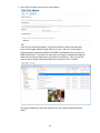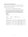
1
Hopkins Public Schools Website User Guide User Guide Prepared by Gorton Studios Last Updated: December, 2013 0B Table of Contents Table of Contents ...............................................................................................................1 Terms and Concepts ...........................................................................................................4 User Tasks...........................................................................................................................7 How to log in to the CMS................................................................................................7 Admin Nav Bar................................................................................................................7 How to log out ................................................................................................................9 How to change your password or email address............................................................9 Viewing Images uploaded on the site.............................................................................9 Editing and Creating Content ...........................................................................................11 Alert ..............................................................................................................................11 Bio.................................................................................................................................11 Download .....................................................................................................................12 Homepage ....................................................................................................................12 Homepage Banner........................................................................................................12 Link ...............................................................................................................................13 News .............................................................................................................................14 Page ..............................................................................................................................16 Policy ............................................................................................................................17 School ...........................................................................................................................19 Sidebar Item .................................................................................................................20 Video.............................................................................................................................20 Webform ......................................................................................................................21 How to view a list of existing content ..............................................................................22 1 How to edit existing content ............................................................................................23 How to create new content in context (as “children”).....................................................23 How to move a child when placed under a wrong parent ...............................................25 Missing Children ...............................................................................................................26 Text Grid: Children Order ............................................................................................27 Image Grid: Child Order ...............................................................................................27 Text Grid: Desc Date Order..........................................................................................28 Bios ...............................................................................................................................28 News .............................................................................................................................29 Policies..........................................................................................................................30 How to manage and populate your Homepage ...............................................................30 Homepage Banners ......................................................................................................30 School Address Block....................................................................................................31 Featured Nodequeue....................................................................................................31 News .............................................................................................................................31 Tools .............................................................................................................................32 Copyright Information ..................................................................................................33 The Content Edit Screen ...................................................................................................33 Titles .............................................................................................................................33 Display Titles.................................................................................................................33 Short Title .....................................................................................................................33 Subtitle .........................................................................................................................34 District Code # ..............................................................................................................34 Teaser & Thumbnail Images .........................................................................................34 Body Text......................................................................................................................35 Related Content (Node reference fields)......................................................................35 Featured Items .........................................................................................................36 District Featured Items .............................................................................................37 Related Content........................................................................................................37 Related School ..........................................................................................................37 News Categories .......................................................................................................38 Post Date ......................................................................................................................38 Images ..........................................................................................................................39 Select Lists ....................................................................................................................40 Link Fields .....................................................................................................................41 Call to Action Link .....................................................................................................42 File Attachments...........................................................................................................42 Page Visibility................................................................................................................44 Media Embed ...............................................................................................................44 15BHow to expand a hidden section............................................................................45 How to save your changes............................................................................................45 How to edit HTML with the WYSIWYG editor...............................................................45 WYSIWYG Paste through Word ....................................................................................48 Headers, Headers, Headers ..........................................................................................50 Soft Breaks (no space) ..................................................................................................51 How to use the format: Caption ..................................................................................51 How to use the format: Button ...................................................................................52 2 How to insert an image/file using the WYSIWIG ..........................................................52 Image Uploading...........................................................................................................54 How to insert a link using the WYSIWIG.......................................................................55 Anchor Links .............................................................................................................56 Table Tips......................................................................................................................56 Saving in Drupal ............................................................................................................57 Adding a Webform .......................................................................................................57 Placing Mollom (Spam control) on Webforms .............................................................64 Hidden/Collapsed Sections on edit screen .......................................................................65 Node Hierarchy.............................................................................................................65 Creating Menus through Node Hierarchy ....................................................................66 Deleting Menus ............................................................................................................67 Re-‐naming Menus.........................................................................................................68 Meta Tags .....................................................................................................................68 URL redirects ................................................................................................................69 URL path settings..........................................................................................................70 URL Default Patterns ................................................................................................71 Revisions.......................................................................................................................71 Authoring information..................................................................................................72 Publishing options ........................................................................................................72 Taxonomy .........................................................................................................................73 Multi-‐Parent Option on the Bio Content Type .................................................................74 Cloning a Webform...........................................................................................................75 Nodequeues .....................................................................................................................75 Homepage Nodequeue.................................................................................................76 Sidebar Items................................................................................................................76 Add/Remove an Item to a Queue.................................................................................76 URL Redirects....................................................................................................................78 URL Aliases .......................................................................................................................79 Contextual Links ...............................................................................................................79 Blocks................................................................................................................................80 Sending out Mass Mailings based on Roles......................................................................81 Users.................................................................................................................................83 Setting up Users............................................................................................................83 Resetting User Passwords ............................................................................................85 Block a User from Site ..................................................................................................85 Administrative Functions in Drupal ..................................................................................86 3 Terms and Concepts Your Content Management System (CMS) uses certain terms to mean specific things. The fundamental elements of the CMS are defined below. Throughout your use of the website or in this user manual you may hear the following terms. This is just a brief overview of some frequently used terms. Block Blocks are a method for positioning data within a page. You will not have control over the placement of the blocks but may hear this terminology throughout the user manual or while working on the site. Content Management System (CMS) A content management system is a tool that allows websites to be updated without requiring any technical knowledge. Your website was built using the Drupal CMS. This manual describes how to use your CMS to update your website. Content Often erroneously used in Drupal documentation as a synonym for node, content refers generically to the text, images, and other information on a web site. Some content on a typical Drupal site is not actually nodes, such as comments that are attached to nodes and file attachments. Content Types Every node belongs to a single 'node type' or 'content type' which defines various default settings for nodes of that type, such as whether the node is published automatically and whether comments are permitted. Drupal Drupal is the name of the CMS used to build your website. Drupal is an open source CMS written in PHP. For more information see http://drupal.org HTML Hyper Text Markup Language is the predominant markup language for web pages. It provides a means to create structured documents by denoting structural semantics for text such as headings, paragraphs, lists etc. as well as for links, quotes, and other items. It allows images and objects to be embedded and can be used to create interactive forms. It is written in the form of HTML elements consisting of "tags" surrounded by angle brackets within the web page content. It can include or can load scripts in languages such as JavaScript which affect the behavior of HTML processors like Web browsers; and Cascading Style Sheets (CSS) to define the appearance and layout of text and other material. Input Format When editing content in Drupal, you will often see an option to select an "input format" for a text/HTML area field. Input Format is a bit confusing. It really means is that when Drupal is displaying content from that text area, it will "filter" the text before displaying 4 it (so it's really more of an output format than an input format). When you install Drupal, you will typically have two input formats defined: Full HTML, which allows you to use any HTML formatting in your text, and Filtered HTML, which will remove all but a limited set of HTML tags from your text. In addition, both of these formats make some other changes, such as turning email addresses and web addresses into links, and converting blank lines into paragraph breaks. Meta Tags/Metadata Metadata is information about data. The <meta> tag provides metadata about the HTML document. Metadata will not be displayed on the page, but will be machine parsable. Meta elements are typically used to specify page description, keywords, author of the document, last modified and other metadata. The metadata can be used by browsers (how to display content or reload page), search engines (keywords), or other web services. Module A module is software (code) that extends Drupal features and/or functionality. Your Drupal site is built with multiple modules which together create the site. The core functionality of Drupal is pretty basic -‐-‐ it's more of a framework than a complete system for creating a web site. The Drupal framework can be extended by installing and activating add-‐on "modules" which are sets of PHP scripts that modify or extend the functionality of the core Drupal framework. The basic Drupal distribution contains several "optional core modules" which are modules that come with the distribution, but are not turned on by default. You can also download and install "contributed modules", which are modules written by members of the Drupal community. Finally, if you are a PHP/MySQL programmer (or hire one), you can also write your own custom modules. Most Drupal-‐based sites will make use of at least a few optional and contributed modules. Node A node is a piece of content in Drupal, typically corresponding to a single page on the site that has a Title, an optional Body, and perhaps additional fields. Every node also belongs to a particular content type, and can additionally be classified using the taxonomy system. Examples of nodes are pages, links, resources, images, etc. Nodequeue A Nodequeue is a queue that nodes can be placed in. These nodes are hand selected and deleted. Permissions Permissions control access to content creation, modification and site administration. User administrators assign permissions to roles and then assign roles to users. 5 Roles/Users Roles are sets of permissions that can be applied to individual users. Users can belong to more than one role. Everyone who interacts with your web site, from the visitors to the administrators, is considered a "user" in Drupal. Users can be given permission to access certain content and perform certain actions on your site; these permissions are granted by assigning users to "roles" and defining authorization permissions for each of those roles. Taxonomy/Category Taxonomy is literally "the science of classification". The Drupal taxonomy system enables authorized users to categorize content using both tags and administrator-‐ defined terms. It is a flexible tool for classifying content with many advanced features. • • • • term # -‐ a category or tag or keyword (i.e. what gets assigned to nodes). Terms can be structured as children and parents to create hierarchies. vocabulary # -‐ a collection of terms that share some sort of relationship with each other. Taxonomy -‐ the name of the whole system and the name of the module that implements it. In some versions of Drupal, that is also the name of the menu item in the admin menu. category # -‐ A synonym for taxonomy and the name of the menu item in some versions of Drupal. Your CMS uses taxonomy to describe the category system, which you can use to classify and organize content on your web site. Taxonomy terms are also referred to as “Categories” or “Vocabularies” within the system and in this document. Teaser A teaser gives users a glimpse of the content that they will see when they travel through to the complete node. URL A URL is the address that defines the route to locate an object on an Internet server. Generally, the syntax for a URL contains the scheme, host-‐name, port, path and filename, for example; http://www.drupal.org/node/937 WYSIWYG WYSIWYG is an acronym for What You See Is What You Get, used in computing to describe a method in which content is edited and formatted by interacting with an interface that closely resembles the final product. 6 User Tasks 8B How to log in to the CMS 1. Go to http://website.com/user. (Note that this URL may vary during the development of the site.) 2. Enter your username and password and click ‘Log in’ 3. If you have forgotten your password, you may request a new one be sent to the email address set for your account using the ‘Request new password’ link. Admin Nav Bar The Admin Nav bar that is discussed through-‐out the User manual is found in the left hand corner of the site. You can access it by clicking on the link that looks like a wrench. To collapse it, simply click on the x that replaces the wrench when open. Based on permissions and access level, the look, order and items included in 7 the Admin Nav bar will vary. 8 How to log out 1. Click the logout link at the bottom of the Nav Bar menu when in My Account. Note: Unless you click the logout link you will remain logged into the system (i.e.: your session will not be timed-‐out). It is recommended that you logout when you have finished using the system to prevent unauthorized access. How to change your password or email address 1. Go to my account in your Admin Nav bar or under the search area and click on “edit my account” 2. Enter your new information (make sure the passwords match) and click save to complete change. Viewing Images uploaded on the site 1. Go to my account in your Admin Nav bar and click on “view my account” 9 2. Enter the file browser and you can view images o n the site that have been added. You should be able to access and download most of the images added through fields on the site. We can’t control where image uploads are placed through the WYSIWYG (individuals have to choose the folder themselves) – but there are rules when the image is uploaded through the fields that are pretty evident when you look at the image list. This is one of the reasons that an image should be named well and easy to find, if needed. All images brought over from the old site are in the /legacy/sites/default/files folder. 10 Editing and Creating Content You must be logged into the system and assigned a role, to complete any of the tasks in this section. For more information on logging in, see How to Log In. We highly recommend that editing be done in Firefox or Google Chrome as they seem to be the browsers that are most compatible with the WYSIWYG editing system. Content Types Content Types have been created for your website which allows users to enter data and have it displayed based on the coding and theme for the site. Below is a list of content types on your site. Note that the content that you are allowed to enter, edit and delete are based on your assigned user role. How to use individual fields will be discussed later in the User Manual in the section titled: How to Manage Content. Alert An alert should be used when creating an item that is an urgent notice and will be placed at the top of the site as a Call to individuals. You will be able to select individual schools or site wide for the placement of the Alert. Remove an alert by unpublishing the node. You can create Alerts that can be reused as needed such as Snow Day, Conferences, etc. To add an alert to the site, use the “add content” area from the Admin Nav Bar. If no body text is added, the Alert will not link through to the additional details. If additional information is needed, add Body text. Bio A Bio should be used to add staff and Teacher bios and information. Travel to the Staff page that you would like to place it as a child and add it through the children links. This will be the primary parent that will be displayed when on the Bio detail page. You will be able to place a Bio on multiple staff pages, but there can only be one primary parent assigned to each Bio. How to add the Node to Multiple Parents is 11 discussed later in the User Manual. Download To add a download to the site, travel to the page that you would like to place it as a child and add it through the children links. Each download will automatically display its file size and type. Other content types allow files to be uploaded within it and that should be used, if available. When end users link to the download – they will be taken automatically to the file uploaded. Logged in users will travel to the detail page of the node so that they can edit it accordingly. Homepage This content type is used only for the base of the Homepage of the site. It should NOT be deleted or edited. Homepage Banner This content type is used to populate the homepage Banner block. To add a Banner, choose to Add Content in your Admin Nav Bar. Homepage Banners will automatically be placed as children of the homepage. You can change the order by going to the 12 “Homepage Banners” link under Content. Here you can drop and drag and place them into the order desired. Link To add an internal or external link to the site, travel to the page that you would like to place it as a child and add it through the children links. Each node will automatically link to the URL entered. External links will open in a new window/tab while internal links will open in the same tab. Logged in users will be able to access the detail page of the node so that they can edit it accordingly. 13 News Travel to the area that you want to add a News Item and add it as a child of the node. You will also be able to select other schools to tie the news item to. The parent node of the news item will set the menu and place that the node will sit and what will be displayed when on the detail page. 14 15 Page Pages should be used for structural parts of the website such as “About Us’ or “Base pages”. Always check first if an item will fit into another content type before you use the page content type. Travel to the area that you want to add a page and add it as a child of the node. 16 Policy To add a Policy to the site, travel to the node where it should be placed as a child and add the content there. When using the Policy children view on a Page, the Policies will be nested and function with an expanding and collapsing feature. Once you have placed a Top Level Policy (titled: 1000: Test Top Policy in the image above), the second layer Policies can be added as children of that Policy. Once they are uploaded as children, choose the Sub Policies to show up when the Policy is expanded. (1500 & 1600 in the image above) Those selections will show up when the Top Policy is expanded. 17 Add a Download to the Policy by first adding it as a child Download on the Policy and then referencing them in the Node Reference field in the edit screen: 18 School To add a School to the site, travel to the School page and add it as a child of the appropriate node. Information from the school will filter down through children of the school. When creating Children pages, make sure and use the Display Title and Title fields correctly so that the school name is visible in search and node reference areas. Additional information will be further in the User Manual. 19 Sidebar Item An informational piece to promote content on the left hand column of the site. Use the “add content” area from the Admin Nav Bar to add sidebar items. If multiple items are placed on the side of a node, sidebar items default to be placed into a nodequeue that you can use to place the items in order that you want them to show up on pages. This is Universal. The “Nodequeue” link can be found in the Admin/Structure area in your Admin Nav bar. The sidebar block which will contain any sidebar items on a node sits in the left sidebar column, so the changes in order will still keep items contained in that area. There are multiple options for the look of a Promo Tile. Video This content type was created and used for the Videos that are housed and viewed on the Hopkins webserver at: http://media.hopkinsschools.org. If you want to add additional video links, travel to the node that you want the video to add it as a child. 20 Webform Create a new form or questionnaire accessible to users. Submission results and statistics are recorded and accessible to privileged users. Travel to the area that you want to add a webform and add it as a child of the node. You also will be able to Clone a current Webform to incorporate all the fields. When cloning the webform you will manually need to move it to where you want it to sit using the node hierarchy parent selection. Additional information on Cloning a Webform is discussed later in the User Manual. 21 How to view a list of existing content Most content in the system can be navigated to the same way a public site user would. A Content link has been placed into your admin menu to assist you with accessing and filtering existing content in an additional way. 1. Click the “Content” link in your Admin Nav Bar under Administration. 2. You will see a list of content ordered by the date last updated. Click on the title to view the content item, click the ‘edit’ link to edit the page. You can narrow the list by applying filters using the filter tool at the top of the page. Items can be sorted by clicking on the column titles (ex. title, type, published, author, posted and updated columns). You can also filter by using the filters at the top of the table. 22 From this area, you can also mass change items using the Bulk Operations field: How to edit existing content 1. Navigate to the item you would like to edit or find the item in the Content list mentioned previously. 2. Click on the edit tab at the top of the page. Not all content types will have every tab as shown below. You also will not have tabs if the role you are assigned does not have permissions. 3. Make changes. 4. Save Changes. If you want to look at a new page before it goes onto the live site, unpublish the item as discussed in each content type. 12B How to create new content in context (as “children”) 1. Navigate to the section or page in which you would like your new content to exist. For instance, if you want to create a sub-‐page or “child” of the “About Us” page, navigate to the “About Us” page. 23 2. Click the children tab on the top of the page. 3. You will see a list of children currently in this section. At the bottom of this list, select the type of “content” you would like to create. Only allowed children options will be shown, but not all should be used everywhere. (See “content type” for any questions you may have on the individual Content Types.) 4. Add new content by referring to the Content Type directions in this manual. As a guide when trying to determine what type of content you should be using while you are learning how to use the site, you can view existing content to see what type they are. 5. Your newly created content will now appear at the bottom of the children list. To change where it appears in menus and listings throughout the system, you can use the cross to rearrange them in the children tab. (This will be overwritten by any special views that your site may have.) Make sure you save the new children order. You can also edit and delete content and view the children of the pages from this area. 24 How to move a child when placed under a wrong parent If a child is placed on a wrong parent, you do not need to recreate it, simply move it to where on the site it should be placed. To do this -‐ enter the edit screen of the item sitting in the wrong spot. 1. Enter the Node Hierarchy section at the bottom of the page in the edit screen of the content that you want to move. 2. Start to type the title of the node that you want to move the node into the parent node reference field. Options will start to autofill as you type the title showing you the hierarchy of the options. 3. When you find the parent node that you want to move the node to, travel down to the option and select it. When this is completed, the node number will fill automatically and tie the nodes together. 25 4. Save Missing Children If a child has been placed onto a parent item and they are not showing up, it most likely means that a view has not been selected for how the children should be displayed. Most views are set to populate new content, but you may need to add a view or change the way something is displayed. To do this -‐ enter the edit screen of the parent item that is not displaying its children. 1. Expand and enter the Node Hierarchy section. 2. Choose the view for the way that you want children to be displayed. 26 Text Grid: Children Order (displays children in the order that you have them in the children list in a Grid showing only Title, Subtitle and Teaser text) Image Grid: Child Order (displays children of the node in Child order showing only the Title, Subtitle and Image) 27 Text Grid: Desc Date Order (displays children in the reverse order that you created the nodes in a Grid showing only Title, Subtitle and Teaser text) Bios (use this view only for pages where only children Bio will be displayed. So good to use on a Staff Page. It displays children in the order using their last name.) 28 News (displays children news in descending date order based on the Post Date selected on the news item.) 29 Policies (nests children and their selected Node referenced items using the rules that were discussed in the User Manual above in the Policy section) How to manage and populate your Homepage Your homepage is created by views and blocks. Homepage Banners The section is created by displaying all published Homepage Banners. They are displayed in the child order which can be found by traveling to the Homepage Banner link in the content area of your Admin Nav Bar. 30 School Address Block This is a block that is displayed on all non-‐school sections of the site. It can be edited by using the contextual link over it. Featured Nodequeue The following content types can be featured in this area: Download, Link, News, Page or Webform. Nodes placed into the nodequeue will be placed on top while moving other nodes out of the view. The top four nodes in the nodequeue will be displayed. The remaining nodes in the nodequeue can be removed as needed. News This is a block with the District Twitter feed and a More News link to the District News page. It can be edited using the contextual link above it. 31 Tools This is a block that is has all the CSS for the Tool links that is shown on the Homepage and the School Base Pages. Use the Contextual link to edit (carefully). 32 Copyright Information The copyright information is in a block that you can edit using the contextual links. The Content Edit Screen Once you select an existing content item to edit or create a new item, you will enter the information you want using the edit screen. Below is information on fields that are used on different content types. Some fields are not addressed as they are self-‐explanatory in the edit screen. Titles (used and required in all content types) Titles are used to create the URL’s, the page titles, filters and the title placed into the node reference fields throughout the sites edit screens. When creating a Page node under a School, add the school name before the page title to show in search, etc. Example: Instead of “About Us”, title the page “Hopkins High School About Us”. The short title to display on the node should then be entered in as the display title field. See Web Style Guide for approved school names to use. The title for the Bio content type will create default titles based on the name components entered in. The title for the Homepage Banner and Sidebar item content types is only used internally, so use an informational title. Display Titles (used in Homepage Banners, Pages, Sidebar items) Display titles replace the Titles and are what will be displayed. If nothing is entered for the Sidebar item, a title will not display. If nothing is entered in for the Page, the title field will be displayed. Short Title (used in School) This title will be used for the Responsive Menu. Example: Ike versus Eisenhower Elementary. 33 Subtitle (used in Download, Link, News, Page, Video, Webform) Add a Subtitle, if desired. District Code # (used in policy) This is tied with the Policy title to form the full title of the node. Users will see: Teaser & Thumbnail Images (used in multiple content types) Teasers are an important part of leading visitors through your site. They give the visitor an idea of what is on a node before they click on it to learn more. Teaser text will only show up in certain children views. Don’t add images, links, bolding, or italics to a teaser. The point of a teaser is to quickly and clearly convey what’s on a page. Extra formatting and links can confuse the issue. Additional teaser information can be found 34 in the Style Guide. The thumbnail is the image that will show up in certain children views and lead site users to the full node. With thumbnail images as well as all other images uploaded through the image fields in the content types, once uploaded you should add Alt text for screen readers, search engines, or when the image cannot be loaded. This should be a short description of the image. Thumbnails crop and scale to center except when using the Bio Teaser view. Bio thumbnails in that view will size to 125 pixels in width with varying height. Body Text (used in multiple content types) Body text is the full information that you are sharing with your end users. This can sometimes be renamed to Bio Text, Overview text, etc. Typically these fields will have the editing tool, WYSIWYG, shown – which is discussed later in the manual. Related Content (Node reference fields) Within different Content Types, you will be able to select related nodes in order to tie items together. Each field is a bit different, but this explains how to use these node reference fields in order to select items correctly. Start to type the title (uses the title from the title field not the display field) of the item that you want to relate in the text box. All items that are the specific content type allowed in the field and created on the site will start to autofill. As you type more letters, the list will narrow. Travel to the correct selection and choose to insert it in the box. 35 The field is a node reference field that will display any of the nodes that has been created on the site and allowed to be referenced. If you desire to have an item show up that isn’t currently being displayed, you must enter them in as the specific content type. Simply open up another tab and choose to create the new item from the Create Content in your Admin Nav bar. Once it is submitted, it will become available in the node reference field. If you are not sure if the Item has already been entered, refer to the content list discussed earlier in the User Manual. When you have chosen correctly, a Node ID will be displayed behind the title (nid: 26). This is for internal use only and will not be visible by site users. You can change the order of the Items by placing your mouse on the cross and dragging it to the position desired. The order is not used for all the node reference fields in content types. If you need to add additional items, click on the Add another item button and additional node reference fields will appear. Featured Items (Used in Schools) This is used to place featured items on a school. This section is limited to 3 items. You can choose any Download, Link, News, Page, Video or Webform. This should be changed often to keep the school base page fresh. 36 District Featured Items (Used in Schools) This is used to place featured items on a school in the District section. This section is limited to 4 items. You can choose any Download, Link, News, Page, Video or Webform. Related Content (used in Bio, News, Page, Policy) This is used to cross reference items that may sit on a site elsewhere. You can choose any Bio, Download, Link, News, Page, Policy, Video or Webform. Items you select will show up in the Resource area of the node and be tied with any other reference fields. The field in the content type, Policy, is used differently and is explained previously under the Policy Content Type area. Related School (used in Bio, Download, News) Choose the schools that the node should be related to. Currently only the News is using this feature for functionality, but future enhancements could be incorporated into the Bio and Download content types. 37 News Categories (used in News) Choose the Category that the news node should be related to. This will be used to populate the filter on the news page. Post Date (used in News) This will default to today’s date when you create a new item. If you want it to be a different date, simply change it using the format shown or use the popup calendar to choose the date. This date will be used to order the News items when using the News Embed Child View. 38 Images (used in multiple content types) There are multiple image field uploads including thumbnails which were discussed previously. When added through these image upload fields, the images will scale and crop to specific sizes that fit the theme of each content type. Typically the images will crop to center, so it is best to keep this in mind when creating or uploading images. With all images uploaded through the image fields in the content types, once uploaded you should add Alt text for screen readers, search engines, or when the image cannot be loaded. This should be a short description of the image. Some image fields when uploaded may also have the option to add Captions, if desired. These will be displayed on the detail page of the node. The banner image field on a school content type will allow multiple image uploads for the theme. 39 Select Lists Some content types will have lists that you will use to select specific information for the node. This could be used simply to have it be displayed on the detail page, placed in a category or used in a filter. Some lists will be single select and some will allow multiple selections. 40 Link Fields (used in multiple content types) Link fields will vary depending on the specific link field in each content type, but the same rules will apply to all. To link to a page within the site, enter the full path, excluding the domain root (i.e.: contact-‐us instead of http://website.com/contact-‐us. To link to an external page, use the entire URL (i.e.: http://www.google.com/research). THIS IS ESPECIALLY IMPORTANT TO USE WHILE WORKING ON THE DEV SITE! If the link field includes a title input field, add the title that you would like displayed to your end Users. Users will see (note the link field is tied to other fields as well in this display): 41 Call to Action Link (used in School) This is a link and a title that will place the action on the District block on each school. Example: End Users will see: File Attachments (used in Download, News, Page) We recommend that before you upload a file, that it be named without any spaces. Example: In place of: 2011-‐2012 budget.pdf use 2011-‐2012_budget.pdf. End users may still be using a browser that would have an issue with the space in the title. Upload any file(s) that you want on the node. Once added, on specific content types -‐ enter in the title of the document that will be displayed to end users. The type and size are generated automatically. This field will tie in with the other Related Content field. 42 What end users will see: If you are going to be linking to a file in the body text on the node and do not want the file to be shown below, simply uncheck the display option and the file will not be displayed. You can then place a link into the body text using the following URL patterns: News: /sites/default/files/public/downloads/news/file name here.ext Page: /sites/default/files/public/downloads/page/file name here.ext Some content types will allow only one file to be uploaded due to functionality of that content types feature. 43 Page Visibility (used in Alert, Sidebar) To place it on the page, add the URL to the Page Visibility section. An asterisk will place the block on every page in the site but we recommend not doing this as there will be pages that you do not want it on. Patterns to use to place items: <front> = side of homepage events* = the sidebar item will show up on the events page and all its children events= the sidebar item will show up on that page events/* = the sidebar item will show up on all children of events but not on the events page Media Embed (used in Page, News) This area can be used to embed videos from YouTube and Vimeo. It is set up so that the WYSIWYG accepts and recognizes html code without trying to strip any of the needed components. 44 15B How to expand a hidden section 1. Some sections are hidden (collapsed) by default. These sections will be discussed in more detail later in the User Manual. You can view the selections and other options when you click on the item. Additional information is discussed later in the manual. 2. While you typically do not need to change anything in these sections, if you want to access a hidden section, expand it by clicking on the name of the section. You will then be able to edit the data in that section as normal. How to save your changes 1. Once you are done making changes, simply click the Save button at the bottom of the edit screen to commit those changes. Changes will go live immediately. Note nothing is saved until the Save button is selected. Do not use the browser to travel away from the editing item as changes will not be saved. How to edit HTML with the WYSIWYG editor The WYSIWYG (what-‐you-‐see-‐is-‐what-‐you-‐get) editor is a tool to help write the html code required to control the display of content on the web. The editor works best in the Firefox or Google Chrome browsers (Mac/PC/Linux). The WYSIWYG functions much like a word processor and should look familiar to anybody who has used Microsoft Word or a similar application. A formatting and style guide link (Web Style Guide) has been added to your Admin Nav Bar in the Content Management area to assist with questions you may have when using the WYSIWYG. Below the editor is a link to disable the editor (disable rich-‐text), which will allow you to enter raw html code. (Note it is in below the text area) 45 Much like a word processor, you can alter the style of text by selecting from one of the style buttons in the tool bar or insert structural or multimedia content by clicking one of the items insert buttons. The following table provides a description of each of the text formatting options: Icon Name Description Paste from When pasting anything from an Word/Text external source, use these Icons to paste (**see note below for protected formulas and how to remove them.) Paste through Text will delete all formatting. Bold, Italic, Underline Use these button to bold, italicize the selected text (keystroke alternates: PC Ctrl+B, Ctrl+I / Mac ) We recommend that items on the internet not be underlined as many users assume that these should be links. Align Text Use these buttons to left, right or center align the selected text. Bulleted List Use this button to covert the selected paragraphs to a bulleted list. A bulleted list uses a bullet character at the beginning of each new list item. Here is an example of a bulleted list: • • • Numbered List Use this button to convert the selected paragraphs to a numbered list. A numbered list numbers each list item automatically. 1. 2. 46 item one item two item three item one item two 3. Indent, Outdent Insert/edit Link Remove Link Anchor Styles item three Use this button to add or remove indenting from a selection. Use this button to add a hyperlink to selected text, or to edit an existing hyperlink. This button will only be active when text is selected (highlighted). Use this button to remove a link from selected text. This button will only be active when linked text is selected. An anchor is simply a link from one place in a document to another place in the same document. You'll find anchors to be a useful navigation tool to bring users to a specific area on your page without a lot of scrolling. Anchors are especially useful on long pages. Insert the name of an anchor in the link by using #nameofanchor. Use this to float pictures, tables or text. A caption class is also available. Use the button class to change links into a colored block. 47 Format Insert Image Remove Format This drop-‐down list provides a set of pre-‐defined styles, similar to those found in Word, or other text editors. You can use the formats to create a visual hierarchy in the text you are entering. The formats have been themed to incorporate the look of your site. For additional information on how to use headers – travel further into the User Manual or view the web style guide in your admin nav bar under content. Use this button to insert an image. Use this button to remove the formatting on the selected text. Disable/Enable rich-‐ Click this link (Underneath body text formatting section) to toggle between the rich-‐text formatting options and plain-‐text. Horizontal Line Insert Horizontal Ruler Undo, Redo Use these buttons to undo or redo the most recent changes you have made within the WYSIWYG Table Functions These buttons let you create and edit html tables. You can edit table properties; insert columns and rows and merge and existing cells. Most of these buttons are only active when an existing table or table cell is selected. Superscript/Subscript Add scripts as needed Spell Check Check the spelling of the content in the text field Add a Blockquote Blockquote WYSIWYG Paste through Word If you use the "Paste from Word" button in the WYSIWYG, your content will inherit the style of the website. For example, the font face, sizes, etc. You can tell when someone does not "Paste from Word", because the wrong font will appear. The "Paste from Word" button also strips out other code from Word that can be troublesome on a website. 48 Word is not HTML -‐-‐ the WYSIWYG does its best to convert what it receives, but it will never be able to display the content exactly as it appears in Word. After pasting content in using the Paste from Word button, you will have to do some manual formatting. It might seem a bit overwhelming in the beginning, but once you have more experience adding content, it will get a bit easier to identify what will need to be formatted by hand. When I am entering in content, I usually cut and paste using the Paste from Word button, and save the page. I take a look at how it is formatted and determine whether or not it needs additional (manual) formatting. I then go back in to the edit screen, format the remaining items that did not translate well, add my images and update any internal links. While Paste through Word is intended to easily conform pre-‐existing formatting to the site’s fonts and styles, there occasionally are issues with the Wysiwyg Paste through word function where it will not strip formatting coming in to it. Perhaps the item being copied has a protected format or hidden assets which cannot be overwritten. This is something we can’t control and note that it is an ongoing issue. Follow the steps below or use the Paste through Text feature. If after an item is saved and it still appears to have an issue and does not conform to the website font and size, complete these steps to take care of the issue: 1. Go back into the edit screen of the item and cut out the text. 2. Once cut out, disable the rich-‐text (below text box) and delete all the extra formatting that is in the field. Paste the previously cut out text into the disabled box. 3. Enable the rich-‐text. Enter in any formatting that you do want by using the WYSIWYG buttons. 49 Save the changes. NOTE: If a page shows up in the other browsers and not IE – this is a sign that there is most likely bad code pasted in somewhere on that page which is not allowing the other items on the page to show up. IE seems to be very picky with this issue versus other browsers. This is a sign that the text may not have been pasted in thru word. Go to the URL of the item that is not showing its content and go into the edit screen of the item. Disable the rich text in the different field with the WYSIWYG and scroll thru the text – the bad code becomes evident. It seems to usually start with: <!-‐-‐[if gte mso 9]><xml> and ends with: </xml><![endif]-‐-‐>. Delete all of the bad code and resave the page and everything should show up in IE. Headers, Headers, Headers An important element of keeping code clean throughout the site is utilizing headers instead of local styling (like font sizes and bolding). This will enable us to make global changes to headers and ensure that styles are consistent throughout the site. Use Headers Whenever you have a title by itself (with a hard break or return after it) that you want to stylize, use the header option. A style guide link has been placed in your Admin Nav Bar to view the header styles. Header Tips: It really is best to use headers in order, and not try to pick and choose which one looks best for the particular page. Here are a few reasons this is important: 1. Search engines attach meaning to headers. Using headers in order helps Google, Yahoo, etc… understand the structure and meaning of your page. 2. People using screen readers (e.g. people who are blind) often use headers to scan pages. This accessibility factor is a huge reason to use headers and keep them in order. 3. If you ever change the look/design of your site, you'll have to do a lot of hunting and pecking to get your headers back in order. Whereas, if everything is consistent, you can tweak things on a global basis. 4. The site will simply look more consistent. If you always use them in order, you won't suffer from different editors having different opinions on look and feel. 50 To create them: 1. Highlight the paragraph you want to style: 2. Choose the heading level you would like to apply. You can view how each heading will look by entering the Style Guide link in your Admin Nav Bar. Save Changes. Soft Breaks (no space) If you need a soft return and do not want a paragraph break, use the soft return (shift-‐ enter) versus a hard return (enter). How to use the format: Caption You can use the caption format by choosing it in the styles option in the WYSIWYG Travel to the area that you want in the caption. Make sure you have a soft return (shift-‐ enter) before you select or enter what you want in captions. Highlight the paragraph that you want to be in captions and then go up to the style dropdown and choose caption. This will place the sentence/paragraph into a caption. Save changes. 51 How to use the format: Button You can use the Button format by highlighting a linked item and then choosing it in the styles option in the WYSIWYG. You can also choose the class when adding the link in the popup. This will place the link into a button. Save changes. How to insert an image/file using the WYSIWIG 1. While using the WYSIWYG editor to edit content, place the cursor where you want the image and click on the image button. 2. All images added through the WYSIWYG should be sized to the exact size of the image to be uploaded and should be saved for web. Images should NOT be loaded in to the teaser area – use a thumbnail image if one is desired there. Use the detail image upload field unless you need to add it through the WYSIWYG. Due to the side column and other items on the nodes, we recommend that images not be wider than 450 pixels as larger images could negatively affect the column and the layout. 3. The image dialog will pop up. 4. You may type in a relative URL for an existing image or use the image browser by clicking the image browser button 5. The image browser button will pop up a new window containing a list of all of the available images in the images folder on the server. Choose the folder that you would like to place the image in from the folder options on the left hand side first and then upload the image. Either select the image from the existing list or to upload a new image, click on the upload button on the top left corner of the popup. You can then browse and upload the image. It is a good idea to name images with descriptive text so that they are easier to find at later dates, if 52 desired. 6. To upload an image from your computer, use the upload dialog button at the top of the window. Make sure that the image is named descriptively so that you can use it again, if needed. Browse and upload the image from your computer using the tools, if needed: The image will show up in the preview pane (bottom quadrant) of the file browser. 53 7. Clicking on an image name will make that image appear in the middle preview panel of the window, if you are going to be uploading an existing image. 8. Click on the image in the preview panel and that image URL will be inserted into the upload file. 9. Enter in the Image Description. Alignment settings should be handled directly through the WYSIWYG and the bottom 4 sections (dimensions, border, vertical space and horizontal space) can be left blank. NOTE: For accessibility reasons you should always enter an image description. 10. Click insert to insert the image into the page. 11. If you wish to have the text wrap around the image, select float left or right from the WYSIWIG, Styles selection, after the picture has been inserted. Image Uploading There are two ways to enter images onto the site: Through the WYSIWYG (as described above) or through a field within a content type (described in the content types section). When entering an Image through the WYSIWYG: Size the image to the size desired on the site. Save the image for Web using a descriptive title all lower case without spacing. If a space is desired, use the _ between the words. When entering an Image through an upload field in the Content Type: A little background... Drupal compresses images for you when inserted through an image field within the content types. This feature allows you to upload a wide range of image sizes, without having to resize them. However, it also means that low-‐quality or 54 already-‐compressed images will be reduced in quality (yet again) when you upload them. That creates watery marks which are known as "jpeg artifacts." Ways to avoid "artifacts “when using Drupal Never use Photoshop's "Save for Web" setting unless you are entering the image in the body of the page. Drupal is doing this work for you already when entering an image through a Content type field. Using Photoshop's optimization essentially doubles the compression, creating lots of artifacts on your nice images. Never increase the compression of a JPEG when you save it. JPEGS are known as "lossy" files which mean they lose quality every time you save them. (Always use the original if it's not extremely big). Just upload the file as-‐is. If you need to re-‐save a JPEG (for instance, cropping it in Photoshop), make sure you save it with the highest quality possible. How to insert a link using the WYSIWIG While using the WYSIWYG editor to edit content, select the text you wish to make a link Click on the link button if it will be an external link. Link tip: Never point people to do something with language like "above" or "below". And never say, "click here" to do something. It's unnecessary direction. And, in some circumstances, it hurts readability. Also, if you're referencing another page (e.g. Become an Intern) make that language into a link. 1. The link dialog will popup. Enter the URL of the link including the subdirectory. Exterior links are set up to automatically open in a new window, so the target does not need to be set for the link. Insert a title for the link for accessibility reasons. See notes below on link formatting. For internal links only insert the trailing slash and URL without the full link. If a 55 full URL is entered for an internal link, it will break when the site is moved to its final destination. Example: To link to a page within the site, enter the full path, excluding the domain (i.e.: /community-‐education/volunteer-‐partners/volunteers Instead of http://newdrupal.hopkinsschools.org/community-‐ education/volunteer-‐partners/volunteers To link to an external page, use the entire URL (i.e.: http://www.google.com/) If you are going to just be placing the URL as the link, simply place it into the body text without placing a link. If it is a recognized URL it will link automatically. Click Insert. To remove an existing link, select the link or place the cursor within the link text and use the remove link button To create a mail link, simply enter the URL into the body text and it will automatically place it as an email link when the item is submitted. E-‐mail Hint: There's nothing wrong with putting email addresses within text. It just makes us a bit nervous, because it's the sort of thing that never gets changed when a person leaves. A long term plan… You may consider setting up generic emails for your key contact positions, such as "[email protected]" that get transferred when the person leaves. Just something to think about. Anchor Links To create an anchor link (within the same page) use a straight anchor only symbol followed by the name of the anchor (i.e. #top) Table Tips You should format the table borders in Word before copying the table to the website. When you create a table in word, you see the table grid, but it might not show up or print in other formats unless you change the setting. • • • Select the entire table in the word document. Right click and select "Table Properties" from the drop down menu. Click the "Borders and Shading" tab in the Table Properties menu. 56 • • • Select "all" under "setting", a solid line under "style" and black (or whatever it should be) under "color." Hit OK. Copy the table into the way you normally would. Also, if you've already brought the table into the website, and you find it has no borders -‐ and you would just like to have a simple line border, you can do the following: Click on "Disable rich-‐text" Look for the table definition. It looks like this: <table border="0" cellspacing="0" cellpadding="0"><tbody>... Change the first "0" to a "1" so it looks like this: <table border="1" cellspacing="0" cellpadding="0"><tbody>... Click on "Enable rich-‐text" Saving in Drupal Always SAVE before moving away from a node. NOTHING IS SAVED UNTIL YOU PRESS THE SAVE BUTTON. Adding a Webform A webform can be a questionnaires, contact or request forms. Add the webform as a child where you want it to sit. Webforms can be very confusing – we recommend that you only create webforms if you have some knowledge or confidence doing so. 1. Enter a Title for your webform. 2. Enter subtitle, thumbnail, teaser, and body text, if desired. 3. Click save. ONCE YOU SAVE IT, YOU WILL SEE THE ADDITIONAL TABS TO ADD ALL THE COMPONENTS AND THE EMAIL INFORMATION: Form Components Tab 57 1. Choose the Form Components block that will now show up at the top of the edit screen. 2. Create Webform components. You can drag and move items around as needed. There are several fields that can be chosen when creating a form. I have a comparison for you on one of the current webforms on a different site. This will give you a feel of what looks like what from both ends. Any mandatory item is required to be completed before a form can be submitted. Mandatory items have the red asterisk in the below image. The above form is what it will look like when you enter it. The below is what the site user will see: 58 Note that the Conditional Emails are being used on this webform for the Subject Field. When adding the component for subject, the associated emails are tied into options: NOTE: Two subjects are going to the same person and by just changing one of the letters to a capital; the email can be used twice. The field options that can be used when creating a webform: • Date: Anytime you want a date to be entered • Email: Request for an email address 59 • • • • • • • • • • • • Fieldset: Group of fields in a box File: An uploaded file Grid: A Questioner Grid Hidden: Hidden field that cannot be edited by the user used for internal programming messages. I use this to put the subject of the webform. This will then be in the email sent to you. Markup: To add a piece of rich text Name: A set pattern for names that can be edited as needed. Number: A number field Pagebreak: Enter a pagebreak in the form Select Options: A pull down or multi select box Textarea: This is a larger area for comments and longer responses to be entered. You will note it is expandable for those longer comments. Textfield: A one line area. Time: When you want a time entered If you are adding a file field to upload large files, make sure and change the default maximum size (some limitations will come from the server), select the type of upload and also add a description of what is allowed to be uploaded. 60 Emails Tab 1. Choose the Emails block that will now show up at the top of the edit screen. 2. Enter in the Email address that the webform should be submitted to and choose Email options: 61 3. If you want a copy of the form sent to the email that is entered. Choose to send it to the Component Value and enter in the details that you would like in the email. 4. If emails need to be sent conditionally based on a component in the webform. Open the collapsed Conditional e-‐mail recipients and check the associated component (this has to be done after you have added all your components as they will not show in the list until added). Save the changes. Form Settings Tab 1. Choose the Form Settings tab that will now show up at the top of the edit screen. 2. Enter in the confirmation message that individual will get once they submit the form and/or a redirection location: 62 3. Make sure that both Anonymous and authenticated users can see the webform. Unless specific access for roles are desired. 4. Enter the Advanced Settings and if you want the submit button to say something else – enter the text into the Submit button text field. 5. Save. Nothing (including the components) is saved until it is submitted. If you want to view all webforms on the site and their submissions, travel to the Webforms tab in the Content in your Admin Nav Bar under Content 63 Management. Here you can monitor webform submissions. Placing Mollom (Spam control) on Webforms Travel to the Mollom link in your Admin bar under Content: Enter the Add form link Select the new webform that you created from the drop down list and hit next. Webforms will typically show at the bottom of the filter list as they are alphabetical. Do NOT add Mollom to any of the “Node” items show in the option list. 64 Choose the Captcha protection mode and leave all other settings as is. Save the Configuration change. This will place the captcha on the webform for logged out users and will help cut down on spam. If you are having issues with specific IP’s or User sending spam, you can add them to the blacklist found in the tabs at Mollom. Hidden/Collapsed Sections on edit screen Node Hierarchy This section is used for adding menus, moving children nodes and selecting children views. If you want to add an item to the menu system, make sure that the parent node is correctly set. When you create a node using the children links – this will be set automatically for you. Remember that most items should NOT go into the menu. Only top level items and the site structure should go into the menus. The Main menu is currently created for you on the website. Menu items should not be added to the primary Main Menu as there is limited room and primary links were 65 determined during IA and build of site. Children of these items can be added as needed. We recommend limiting items at the top level. Menu items directly under the Primary Menu will show up in the fly-‐out: Creating Menus through Node Hierarchy 1. Make sure that the Parent of where you want the menu to sit is chosen as the parent. Click on Node Hierarchy in the edit screen of the item you want in the menu and create a menu item, if needed. If you want a Menu title different than the page title, choose to customize the menu title and insert the Menu Title. If you want a description to hover over the menu item, enter in a menu item description. Do not use the expanded menu item option as this is not in the design of your site. Items that cannot be placed in a menu will not allow you to select anything. 66 Deleting Menus There may be a time when you decide that a Menu item you created should not be in the Navigational Bar. Go into the edit screen and expand the Node Hierarchy area. Un-‐Check the “create menu item” and submit changes. This will only delete the Menu item and will not delete the page. Submit changes. 67 Re-‐naming Menus There may be a time when you decide that a Menu item you created needs to be renamed. You can either change the title of the node and save the page or if you want to keep the name of the page the same and only change the menu. Go into the edit screen and expand the Node Hierarchy area and change the custom menu item. This is helpful when page titles are long and the menu looks best with a shortened version. Submit changes. Meta Tags Meta tags are snippets of informational code that have been located between your <HEAD> </HEAD> tags that are a part of the HTML page generated for your site. You are able to edit and add both Meta Tag descriptions and Keywords currently on your site. Meta Description The Meta Description tag gives a brief overview of the document. The Meta Description tag is a short, plain language description of the document, usually consisting of 20-‐25 words or less. Search engines that support the Meta Description tag will use the information to publish on their search results page, normally displaying below the Title of your site listing. So as not all search engines use the tags, the teaser text and body text may still be used and the metatag description may be visible. Many search engines use the meta description tag in their search results. Google is one of them. Recommendations of the Meta Description tag: We recommend always using the Meta Description tag. Make your Meta Description as compelling as you can, as that description is often the motivating factor 68 involved with getting your listings clicked in the search results. The Meta Description tag is particularly important if your document has very little text, is a frameset, or has extensive scripts at the top. If you don’t type in a Meta Description tag, we have set it up to pull from teaser and if no teaser, then the body text, in most cases. Meta Keywords The Meta Keywords tag is used to list keywords that define the content of your site. In addition to words from the title, document body, and other areas search engines use keywords to properly index your site. The Meta Keywords tag is typically used for synonyms and alternates of title words. Not all search engines use the keywords. Edit Screen directions: Expand the Meta Tags section and add keyword and description, if desired. If nothing is entered, the Meta tags will be generated from the Teaser Text automatically. URL redirects A list of any redirects that are applicable to the content you are on will be shown in the URL redirects section. If you want to add a redirect to the item that you are creating or editing, click on the Add URL redirect to this content link. Most redirects are added automatically for you and you will not need to do anything in this area. MAKE sure that 69 you have saved any edits before adding a URL as you will be moved away from the edit screen when adding a redirect this way. Enter in the URL that should be redirect to the node and hit save. URL redirects and aliases are discussed in more detail later in the manual. URL path settings Automatic path settings are set for the content types and will follow the path of where the item is placed. If you want to keep the automatic settings, simply leave the check in the box. If you want a custom URL, uncheck the box and add the custom URL. URL redirects and aliases are discussed in more detail later in the manual. 70 URL Default Patterns The following Pattern is set up for the site: Default for any node: [node:nodehierarchy:parent:url:path]/[node:title] Revisions Revisions are kept when changes are made on specific Content Types. If you do not want to keep a revision, when in an edit screen – simply uncheck “Create new revision” in the hidden section titled: Revision information before saving your changes. The default of most of the edit screen is to create a revision for changes. You can also add comments to what you are changing which will be for internal use only. If you need to view a past revision, go to the revisions tab at the top of the page. The tab will only show up if there is a revision to the node. The comments that were entered when a new revision was completed are listed there and you can revert back to a previous version or delete revisions. If you want to compare two revisions, check the two to compare and select the show diff button. 71 If you want to revert back to an older revision, choose the date of the Revision you want to revert too and choose to revert it. Authoring information Authoring information will fill automatically for you once the node is saved by the Drupal user that is entering the content and the date the node was authored on. This typically will not need to be changed unless you need to assign a base page to a School PTO user. If this is the case, change the Authored by to the User that should have control of that page. Publishing options If you are working on new content and need to complete it at a later date, you can save your changes and come back to finish it at a later date. Simply uncheck the published box in the Publishing Options collapsed section. This will save the content but will not publish it for end users to see. You can find the unpublished content by looking at the content list as described earlier in the User Manual. Do NOT unpublish an existing page on the site which is a top level item! 72 The other two options (Sticky & Promoted) are not being used on the site currently. Taxonomy Taxonomy is used for the News Categories selection list on the News content type. You can manage this by going to the Taxonomy link found in the Structure section under Administer in your Admin Nav Bar. Enter the “list terms” link to manage the list. The “News Category” taxonomy is a list of items that you can select when adding/editing a News item and use used to build the filter on News page. 73 To delete any of the terms or edit any of the terms, enter the list terms link. Add the new item by choosing the link at the top of the page: “add term”. You only need to fill in the title. Save the term Multi-‐Parent Option on the Bio Content Type Since Bios are not allowed in the menu and sit in various locations, they have the capability to have multiple parent nodes. To accomplish this, travel to the Bio node that you would like displayed in multiple places. Go to the node hierarchy section and choose the Primary Parent. This Primary parent is choosing the menu and other items that will be displayed when on the detail page of the Bio node. You can then choose to Add another parent. This is an autofill and so only allowed parents will show up in the list. 74 Cloning a Webform Travel to the Webform that you want to clone. Choose to clone the content Enter in all the new information including title, thumbnail, teaser and body text. Enter the node hierarchy section and move to a child of a different area, if desired. If you have the one you are cloning in the menu – also change this in the node hierarchy section while in the edit screen. If you don’t want to publish the new webform immediately, unpublish it until you are ready to use it. SAVE the changes before moving onto editing/changing the webform components. Once you complete the webform, make sure and add Mollom to it so a Captcha is in place for SPAM. Nodequeues Access the nodequeues by traveling to the section through their Admin Nav Bar under the Structure link in the Admin section. 75 There are two nodequeues on the site: Homepage Nodequeue The following content types can be featured in this area: Download, Link, News, Page, Webform. Nodes placed into the nodequeue will be placed at the top of the nodequeue and will be displayed by the order of the top 4 items in the nodequeue. Sidebar Items This nodequeue is just a way for you to order the sidebar items in the order of importance and how they should be displayed on pages. Every sidebar item created automatically is placed into the queue. Unpublished sidebar items will still be shown in this list but will not be displayed to your end users. The order is Universal. Add/Remove an Item to a Queue There are two ways to add/remove an item to/from the nodequeue. #1. Travel to the item that you want to add/remove from the queue and choose to add/remove it thru the Nodequeue tab. The option and tab will only show up on items that are allowed to be placed in the nodequeues. OR #2: Enter the nodequeue to add/delete items to by entering the view link. 76 a. If you want to delete an item from the nodequeue, chose to remove it. If you want to add an item, autofill the title of the items that you want to add to the nodequeue. Only titles of approved content types will autofill. Start to type the title of the item you want to add, selections will be shown below. Travel down to the correct item and select it to be placed in the add box. Note that when correctly selected a NID will show up behind the title. Hit the add node & save queue button to add it. From here you can alter the order that the features are displayed in and remove or add items to the queue. When items are placed in the queue they go to the top of the list in the queue. You can use the arrows to rearrange the order, as desired. You can choose to clear the whole queue, by hitting the clear button and then saving the change. Be careful using this feature as everything for that nodequeue clears out. 77 You can reverse the order of everything in the node by selecting the Reverse button and then saving the change. You can shuffle the items randomly by choosing the shuffle button and then saving the change. URL Redirects You must have the Super Admin role to complete the following tasks. Redirects can be entered in through the URL redirects link within the Content area in your Admin Nav Bar: Enter the Add Redirect tab or link Enter the URL of the old content in the FROM area and then enter in the URL of the placement of the new content in the TO area: Save the Redirect Once saved you can test if the redirect works by clicking on the first “from” link and making sure that the page that you go to is the correct redirected page. 78 You can enter the Fix 404 pages to view any pages that are directing to a 404 and may need a redirect. This is a good page for an Admin to check periodically to make sure that everyone is finding what they are looking for. If there is an item that is receiving high counts, add a redirect to resolve the issue. Do not change any of the settings in the settings tab. URL Aliases You must have the Super Admin role to complete the following tasks. Aliases can be entered in through the URL alias link under Search within the Configuration area in your Admin Nav Bar. This is helpful with Marketing links that are shorter that the user friendly URLS on the site. Do NOT change anything in the Patterns or Settings tabs. Enter the Add alias to add a new alias. Enter the path you wish to create the alias for, followed by the name of the new alias. Create the new alias Once saved you can test if the alias works by adding the alias that you created in the URL and making sure that it is goes to the correct page. Contextual Links You can edit items by hovering over in the left hand corner of the item. When you have the permissions, a cog will appear which will allow you to edit and item from this 79 location. Be careful that you edit the correct item as sometimes these can be confusing. Blocks You must have the Super Admin role to complete the following tasks. Blocks are used throughout the site to place items in specific locations. When in the block system, carefully change items as turning off and on blocks will create issues with the layout and theme of the site. If you need to edit an item in a block, travel to the blocks link in your Admin Nav Bar under Structure in the Admin section. You most likely will not need to edit a block. Do NOT delete any blocks as these build much of the base of your site. You can also get to the block edit screen by hovering over the upper right hand corner of a block that you want to edit. When in the hoover state a cog will appear with options for the editing of an item. Choose to configure the block Go to the block that you want to edit and choose to edit it by entering the configure link of the block. Do NOT change the Block Description, Region Settings, User settings or the Show Block on specific page settings. If the block does not have a title – do not enter one. 80 Sending out Mass Mailings based on Roles You must have the Super Admin role to complete the following tasks. Mass Contact Emails are sent based on a Category that is set up which includes the group who should receive the Email. You can modify the settings as you choose, which will be universal for all emails sent. To do so, travel to the Mass Contact Settings link in your Admin Nav Bar under the Admin – Content section. Before any mailings can be sent, categories must be set up for the mailings. Title them so that you can use them multiple times. Example would be “Testing of New Email Program” or “Tips on writing on the website”. To set up a Category, travel to the Mass Contact Settings link in your Admin Nav Bar under the Admin – Content section. Choose to Add a New Category and complete all the requested fields. 81 Choose to Add a New Category and complete all the requested fields. You are now set up to send a mailing. To do so, travel to the Send a Mass Contact Email link in your Admin Nav Bar under the Admin – Content section. Complete all the Settings and Choose to Send an Email: 82 Users Setting up Users You must have the Super Admin role to complete the following tasks. Do NOT change any of the settings in the Permissions, roles or User setting links. Go to the People link in your Admin Nav Bar 1. Click on “Add User”. Click on “Add User”. Do NOT change anything in the Permissions tab as this will create quite an issue on the site. 2. Enter the User name of the new user. 3. Enter the Users email address. An email address can only be used once for the site. 83 4. Enter the Users password and confirm password and all user information. 5. A user must be active to be able to log onto the site. When you no longer want a User on a site, do not delete them, simply block them. 6. Choose the role for the user to have. The Super Admin role should only be given to one or two individuals who understand programming items, access to all settings on the site are included with this role. The admin role can be given to individuals who will be maintaining the site and need access to the admin items. The PTO role should be given to individuals who can edit and unpublish only content that they own. You will need to set up the first base page for this role and assign it to them. From there – they can then add/edit their own content. 7. You can have the user receive a notification that you have set up the account by checking the notify block. 84 8. Create new account to complete setting up the user. Resetting User Passwords User passwords cannot be retrieved and could not be imported when users were moved to the new site. However, they can be reset. Users should request password resets which will be emailed to the email on the account. If they can’t remember their password or email address on account, you can reset their password. Note: Do not alter the admin user account in any way. 1. Click edit on the username whose password you would like to reset. 2. Enter the new password in both password fields. 3. Click Submit. Block a User from Site To take away a User’s login privileges, you can block the user from the site (this will not allow them to set up another account using the email on file). Do not delete any users that were assigned roles as the historical information can be retained. 1. Click on the edit button of the user that you want to block: 85 2. Change status to blocked. 3. Click Submit. Administrative Functions in Drupal If you are not sure if you should be in an area – you should verify with your Super Admin or a Drupal developer before completing any changes. 86