1
WEBFOCUS NEWSLETTER
Information Builders, Inc.
Vo l u m e 7 N u m b e r 1
T
H I S
I
Computes and Defines:
The Best of Both Worlds
S S U E
Computes and Defines:
The Best of Both Worlds
New Aggregation Methods
1
in Visual Discovery
1
From Where I Sit: Simplicity
2
Invoking Java Classes
Without Writing Java Code
Developer Studio:
Hierarchical Reporting
3
4
U
by Geneviève Monet
ntil now WebFOCUS users could use computes only by creating them inside of a report. In
WebFOCUS 7.1.3, Information Builders is adding
support for computes in master file descriptions.
Wait a minute, how can that work? That was the
first question that came to my mind. Soon, I
thought of other questions that may also come to
the minds of other WebFOCUS users.
Some of you also may wonder what is the difference between these new computes and the
defines that already are in master file descriptions.
Others may ask, Why would we want to do that?
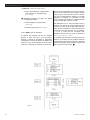
So let's start by looking at how WebFOCUS produces a report to see why defines and computes
are really quite different. In a nutshell, there are
three main steps to produce a WebFOCUS report.
Here is what happens:
•
1
From the Maintain Wizard:
Please Wait for Maintain
Creating Traces
for Developer Studio
Developer Studio Debugging Tool
ReportCaster 7.1.3
Advanced Feature Techniques
Scalability Tests, Benchmarking
and Capacity Planning
5
•
•
6
6
7
8
WebFOCUS transfers data to an internal
storage area much like a spreadsheet called
internal matrix. During this step, WebFOCUS
does the following:
•
•
2
•
Selects data from the data source using
selections that test fields that already
exist in the database (WHERE and IF).
Calculates defines on each record
(DEFINE).
Further selects data using selections that
test these defined fields (WHERE and IF).
Sorts, aggregates and transfers the selected data to the internal matrix (BY, SUM).
WebFOCUS processes the data in the internal
matrix. During this step, these things occur:
•
•
Computed fields are calculated, along with
prefix operators (COMPUTE).
Data is selected from the internal matrix
using selections that test computed field,
prefix operators or aggregated data
(WHERE TOTAL).
(continued on page 10)
Information Builders, Inc.
February 2006
New Aggregation Methods
in Visual Discovery
T
by Rado Kotorov
he technology behind Visual Discovery was
originally developed for monitoring and analyzing
telecommunications calls and network traffic.
Thus, not only the visualization techniques but
also the methods of aggregation were specifically
tailored to the telecommunications needs.
As customers across different industries started to
use Visual Discovery, we discovered, much to our
surprise, that the software did not perform and
display the net results of an aggregation. For
example, pie and bar charts break out disaggregated sales revenue data into sales (positive transactions) and returns (negative transactions). The
corresponding visualization displays only the sum
of positive transactions on a pie chart or both the
sum of the positive and the sum of the negative
transactions on a single bar of a bar chart. In
either case, the nets sum, which is what interests
users the most, is not displayed, making the tool
less useful for financial and transactional analysis.
Furthermore, many users requested the ability to
represent net aggregations with pie charts so they
could, for instance, display country or regional
profits as slices of the pie. This is a non-trivial
problem because net aggregations can result in
negative values that cannot be represented on
conventional pie charts. A pie chart typically represents distributions of the same kind, i.e., only
positive value distributions or only negative value
distributions, but not mixed distributions.
Recognizing the need not only for adding net
aggregation but also the relevance of the
request to improve pie charts, Information
Builders took an innovative approach to the
visualization of net aggregations that significantly
enhanced Visual Discovery techniques for financial
and transactional analysis.
Net Aggregation
The Net Aggregation method generates the sum
of all positive and negative values in a dataset,
and the Visual Discovery controls display the net
sum rather than the weighted sum.
(continued on page 11)
WEBFOCUS NEWSLETTER
From Where I Sit…
Simplicity
Larry Eiss
D
on't you just love throwing a Frisbee? Based on
a pie tin from the Frisbie Baking Co., the 1947 original plastic version was called the "Pluto Platter." It's
such a simple thing. There is no user manual; it
doesn't require special skills or training – you just
fling it. Thank you, Walter Frederick Morrison.
In the Summer of 1942 the Subsistence Research
Laboratory in Chicago spent just 30 days developing
a little piece of 1 1/2 inch stamped metal, multiples
of which were ultimately included with each case of
C-Rations delivered to our GIs. This little gadget,
officially called a "U.S. Army Pocket Can Opener,"
and unofficially called a P-38 or "John Wayne," is
amazingly simple. It comes with instructions, but
they are hardly needed. It can nest between keys in
your pocket, and it opens cans with ease.
No one appears to know who invented that wonderfully simple lesson in leverage – nail clippers. Great
for trimming nails, clipping fishing line, or (until
recently) creating a minor stir in airport security
lines, nail clippers are easy to use and highly effective.
We don't know how, and we don't know when, but
we know that Harvey Kennedy made $2.5 million on
the simple shoelace. Think about it, hook and loop
fasteners like Velcro are quick, but have by no means
threatened the preeminence of the humble shoelace.
Simple. Effective. Cheap. I wish I'd thought of it!
Walter Hunt's wonderful safety pin has saved many
from embarrassment since its invention in 1849.
Making a pin that holds material together and prevents one from being pricked is a great idea. Mr.
Hunt didn't think so, however, and he sold his patent
for $400 soon after it was issued.
One of America's 15 outstanding inventors with over
100 patents to his name was a grammar school
dropout by the name of Chester Greenwood. Mr.
Greenwood invented earmuffs in 1873 at the age of
15. As the maker of Greenwood's Champion Ear
Protectors, he made a fortune supplying Ear
Protectors to U.S. soldiers during World War I.
Earmuffs simply work.
2
Adm. Grace Hopper invented the first computer
"compiler" in 1952. Prior to her invention, computer
programmers had been required to write programming instructions in binary code. Grace Hopper also
developed a language called Common BusinessOriented Language or COBOL, now the most widely
used computer business language in the world.
While these inventions were not simple in themselves, they did simplify life for many. However, Adm.
Hopper invented one very simple thing when she
coined the phrase, "It's easier to ask forgiveness
than it is to get permission."
In 1979 Dan Bricklin and Bob Franksten invented
VisiCalc, the first computer spreadsheet. The two
started Software Arts to market the product, but
didn't become rich from it because software was
ineligible for patents until after 1981. VisiCalc later
sold to Lotus Development Corp. where it morphed
into Lotus 1-2-3. In November of 1981 Bricklin
received the Grace Murray Hopper Award from the
Association for Computing Machinery in honor of his
innovation.
The inventions above highlight the great value of
simplicity. The Shakers communicated the value they
placed on simplicity in the furniture they built.
Modern decorating styles strive to incorporate simple
lines and forms. Country life appeals to me very
deeply in part because it expresses simplicity in
beautiful ways.
WebFOCUS Release 7.1.3 contains new functionality
I find absolutely compelling. One of the simplest and
most useful feature sets we have ever added to
WebFOCUS in my opinion is our new Active Reports.
Its beauty lies in its simplicity. No training is required,
functionality abounds, and it works even if the computer on which it resides is not connected to a network. From where I sit it's the next best thing to the
Walk-A-Way Sundaes I used to get at the New York
State Fair as a kid. Be sure to take a look at this wonderfully simple creation. Have your account rep drop
by for coffee and a demo. What could be simpler? g
February 2006
WEBFOCUS NEWSLETTER
Invoking Java Classes
Without Writing Java Code
O
by Bob Hazelton
ne of the most innovative features of the
WebFOCUS GIS Adapter is the ability to create and
use symbol definitions for changing the appearance
of map layers.
When you first create a GIS configuration file for a
WebFOCUS application, several symbol definitions
are created to get you started. These are useful in
every GBIS application.
The main definitions are selectMapLine,
selectMapPoint, selectMapPolygon, draw
MapLine, drawMapPoint and drawMapPolygon.
The default symbols have been named to reflect
their respective uses. The "selectMap…" symbols are
very useful when invoked for reports that are filtered
with values from the map. They allow the user to
see the selection they made reflected on the map.
We'll explore the three that begin with "drawMap…"
in a bit.
Let's take a closer look at selectMapPolygon.
Within the EsriInfoEditor.jsp you can access
the symbol list by clicking the "Edit Symbols" button
and then clicking any of the links in the symbol list
(see Screen 1 on page 12).
N o t e : If you click the column name you will sort the
list based on the values in that column.
The Java Class that gets invoked is a really long
name for the code that is part of the ArcIMS Java
Connector.
Suffice
it
to
say
that
the
SimplePolygonSymbol class is used to change
the appearance of a polygon map layer.
The column labeled "Parameter" is used to pass
explicit values to the function name that appears on
the left. In the selectMapPolygon symbol, the
functions shown in Figure 1 receive values.
Taken together, the result is that any polygon map
layer that is changed with this symbol will have a
black outline. The polygon will be filled with red. The
red will be half transparent which will make it appear
pink. Setting the transparency on a map feature
allows other items that are "below" it to still be
visible in layer order.
To use this symbol definition, select it from the
"Symbol ID" dropdown list of an inbound layer while
creating a fex definition. When you select fex from
the toolbar menu of the map viewer, and a rectangle
or circle is used to select map features, they will turn
a pinkish color after the report is launched.
Information Builders, Inc.
The three symbols that begin with "drawMap…" can
be used to change each of the different map layer
types based on data retrieved via WebFOCUS. The
drawMapPoint symbol contains usage of most of
the replaceable parameters that the adapter can
handle.
The Java class SimpleMarkerSymbol is used to
change the appearance of point map layers.
With this symbol definition we see the usage of the
"Replace Parameter" column. The names in brackets
are references or pointers to the same name edit box
in the fex definition form.
In this symbol definition the functions shown in
Figure 2 receive values.
Figure 1
Function
setBoundaryColor
setFillColor
setTransparency
Figure 2
Function
setColor
setMarkerType
setOutline
setWidth
Parameter
0,0,0
255,0,0
.5
Replace Parameter
{COLOR}
{SHAPE}
Parameter
0,0,0
{SIZE}
Fexes that are used to change the appearance of
the map collect the data values from WebFOCUS
accessible data sources. The output is returned to
the GIS Adapter as XML. The map fex definition
creates the structured linkages that allow the
adapter to scan the XML for the data values to pass
as replaceable parameters to the symbol definition.
An example will help illustrate this.
Suppose you have a map fex that looks like this:
TABLE FILE CRIMEDATA
PRINT REPORTID
COMPUTE MYCOLOR/A15=…some IF-THEN-ELSE
logic for color choice;
COMPUTE MYSHAPE/A15=…some IF-THEN-ELSE
logic for shape choice;
COMPUTE MYSIZE/A5=…some IF-THEN-ELSE
logic for size choice;
COMPUTE MYTITLE/A255=…concatenate values
together for the legend;
END
(continued on page 14)
3
WEBFOCUS NEWSLETTER
Developer Studio:
Hierarchical Reporting
O
by Harry Lotrowski
ne of the key concepts in Business Intelligence
is multidimensional analysis: examining the enterprise from all necessary combinations of dimensions.
A dimension is defined as "organized hierarchies of
categories and (levels) that describe similar sets of
members."
capitalize on the hierarchical presentation and
pre-aggregation within cubes. It also will contain
mechanisms to adapt to the rules required by the different cube data sources.
You now have the ability to display information in the
same sequence as the hierarchy itself. This includes
the indentation usually associated with hierarchies.
The actual hierarchy members (and the resulting
paths) can be selected by screening on their
properties.
All types of filter tests are supported, and this allows including
hierarchical parents and children in the report for context
purposes. The report shows the
context of each selected hierarchy member up to the root of
the hierarchy.
The set of members selected for
a report by a WHEN test is augmented so that every member
of the hierarchy is shown within
its hierarchical context. The
WHEN statement controls which
hierarchy members are shown
on the report while the WHERE
test controls which data is
included in the totals for the displayed members.
Figure 1
Among the most commonly specified dimensions are
time, geography, products, organizations and financial charts of accounts, but the potential dimensions
are as endless as the varieties of enterprise activity.
The events or entities associated with a particular
set of dimension values are usually referred to
as measures.
These measures might be sales or purchases in units
or currency, profits, customer counts, production volumes, or anything else considered worth tracking.
In multidimensional databases, these measures
are pre-aggregated along the hierarchies for query
performance.
4
WebFOCUS Developer Studio release 7.1.3 has many
built-in elements that address some of the complexity of interacting with multidimensional databases.
The release will include new functionality to
The displayed sub-tree of hierarchy members is a contiguous
tree whose root is the root of
the whole hierarchy. The added
"context" members are shown
without totals. The application
controls the method of display
for hierarchy members.
Metadata Support
Multidimensional data sources differ from traditional
relational data sources when it comes to reporting.
Different cubes restrict operations, which may (in an
exact error message of one of the cubes) result in a
nonsensical report. Also, different vendors have different rules.
To attain the knowledge of operations permitted by
the individual cube, the metadata, produced by the
"create synonym" process, is recognized by
Developer Studio, which will use it to determine how
to display the object inspector (Figure 1), and how
to display the information within the dimension itself.
Certain operations may be restricted based on the
type of field (measure, dimension member,
attribute). These are requirements of the individual
(continued on page 15)
February 2006
WEBFOCUS NEWSLETTER
From the Maintain Wizard
W
Please Wait for Maintain
hen dealing with applications that manipulate
large amounts of data, sometimes the user has to
wait for a response. Displaying a "Please Wait" message may stop the user from clicking on the trigger
multiple times.
Maintain easily gives you this ability. You can set it up
so that the message pops up when the application
performs an action and then it disappears when control is passed back to the user.
To accomplish this, start by creating a text object on
your form. The size, color and font of the message
can be whatever you want it to be. Make sure that
you set the property Visible to 0 - No. We don't
want the object displayed when the form is
displayed. In addition, make sure you know the
name of the object. We will need it in our trigger
(see Screen 1).
Next
start
from
code
we create a trigger to display the object and
the data processing. I created a click trigger
a button. Your trigger can be anything. The
behind the trigger should look like this:
function OnButton1_Click ( )
Mark Derwin
{
document.getElementById("Text1").style.visibility = 'visible';
IWCTrigger("get_data");
}
Since this code is JavaScript, make sure to click the
J on top of the event handler box. In my example,
the name of the object is Text1, and the case I am
performing is get_data. Remember, case matters.
When the user presses the button, the "Please Wait"
message is displayed via JavaScript, and control is
passed to the case get_data in the Maintain procedure. When the get_data procedure is done, the
form refreshes and the "Please Wait" message automatically disappears.
This example shows just how easy it is to use
JavaScript to enhance Maintain applications. g
Screen 1
Information Builders, Inc.
5
WEBFOCUS NEWSLETTER
Creating Traces
for Developer Studio
J
by Dimitris Poulos
ust like the other components that make up or
are used by WebFOCUS – WebFOCUS Client,
Reporting Server, HTTP and/or application server –
have the ability to generate traces, so does
Developer Studio. Trace facilities enable software
engineers to debug software issues, see how the
software is failing and are useful when other troubleshooting techniques fail to correct a given issue.
The Developer Studio trace utility, Communication
Layer Trace, allows tracing of all the calls performed
by Developer Studio and captures instructions executed by the product. It is useful in debugging communication layer calls. For instance, it can be used to
tackle issues connecting to Reporting Server(s),
WebFOCUS Client, establishing a connection to an
HTTP or application server, or retrieving application
resources.
The Developer Studio trace utility is an independent
program that can be launched from the Developer
Studio program group, by selecting "Communication
Layer Trace" from the "WebFOCUS Developer Studio
Utilities" subfolder.
To minimize the amount of information that is captured, we recommend you enable tracing just prior
to the point that a process fails. For example, if applications are not listed under a configured Reporting
Server available from the data servers area, connect
to the Reporting Server, and enable traces just
before you click the "Applications" folder. If the product fails at start up, tracing should be enabled before
Developer Studio is launched.
As of Release 7, the Developer Studio trace utility can
also be used to troubleshoot issues related to the
Create Synonym tool. If issues are experienced in
this area, enable tracing and attempt to perform the
Create Synonym task that fails. Traces for this task
are generated under the following Developer Studio
subfolder:
install_drive:\ibi\DevStudio71\srv71\wfs\
etlgtemp\
The Developer Studio trace utility is very simple to
use: The developer simply needs to start this utility
by selecting the On option, keep the default Trace
Level option for All Levels and optionally alter
the location where the trace file will be created.
The generated trace file should be forwarded to
a technical support analyst for research and
analysis by the Information Builders software
engineering staff. g
6
Developer Studio
Debugging Tool
&
by Jamie Monroe
ECHO, the debugging tool we all know and
love, has made its debut in Developer Studio 7.1.3 as
the new Message Viewer. The tool makes it possible
to display error messages, informational messages,
commands, and Dialogue Manager control statements in a separate frame below the report output
whenever a request is run.
Happily, all this is available through the GUI, whether
you develop in a Managed Reporting, Local Projects,
or Data Servers environment.
The Message Viewer mode is selected from a dropdown list on the main toolbar in Developer Studio.
When you select an option it is saved and used for
all subsequent requests until you change it. All
Message Viewer options are available for all report
output formats.
The default option is "Message Viewer OFF." This disables the Message Viewer and suppresses the display of lines stacked for execution and Dialogue
Manager control statements.
"Message Viewer ON" displays messages such as
number of records and lines.
"Display command lines," the equivalent of
&ECHO=ON, displays messages and lines that are
expanded and stacked for execution.
"Display Dialogue Manager commands," the equivalent of &ECHO=ALL, displays messages and lines
that are expanded and stacked for execution while
also displaying all Dialogue Manager control statements.
In a WebFOCUS self-service application, the developer simply adds the parameter to the URL string as
in the following:
http://localhost/ibi_apps/WFServlet?IB
IF_ex=test&IBIWF_msgviewer=echoon
where
IBIWF_msgviewer=OFF,
ON,
ECHOON,
ECHOALL
Happy debugging, everyone. g
February 2006
WEBFOCUS NEWSLETTER
ReportCaster 7.1.3
Advanced Feature Techniques
A
by Vincent Lam
s an advanced ReportCaster administrator,
have you ever wished that you could limit certain
features in the GUI? How about adding the ability to
schedule a parameterized report on the fly?
ReportCaster 7.1.3 introduces several new techniques and features that make this possible.
Limiting Library Access Options
ReportCaster 7.1.3 introduces the ability to suppress
the "access options" and "e-mail for library" options
that appear in the Distribution tab of the
ReportCaster Scheduler when distributing scheduled
output to the Report Library.
An example of a situation in which this would be useful is when you have a schedule that distributes to
the Report Library with public access. If the e-mail
for library option is enabled, every user will receive
an e-mail whenever the schedule runs. In 7.1.3, you
can remove the option completely. Thus, the e-mail
for library option can be removed from the GUI and
e-mails will not be sent.
ReportCaster 7.1.3 introduces a new file named
frontend.cfg for these GUI behavior modifications. This file stores two keys: LIBRARY_ACCESS
and LIBRARY_EMAIL.
LIBRARY_ACCESS limits the access options that
appear in the Distribution tab. Available options are
as follows:
•
•
•
ALL: All access options (owner, public, access
list) appear. This is the default value.
OWNER: Only the owner option appears.
OWNER&ACCESSLIST: Only the owner and
access list options appear.
LIBRARY_EMAIL limits to whom the e-mail for
library option is available in the Distribution tab.
Available options are as follows:
•
•
•
•
ON: E-mail for library option is available for all
access options (owner, public, access list). This
is the default value.
OFF: E-mail for library option is removed for all
access options.
OWNER: E-mail for library option is available only
when the owner access option is selected.
OWNER&ACCESSLIST: E-mail for library option
is available only when the owner or access list
option is selected.
Information Builders, Inc.
The changes made in frontend.cfg are universally applicable to ReportCaster and affect both the
HTML and applet scheduling tools.
Adding a Schedule Button for Reports
Wouldn't it be nice if you could add a "schedule" button in Developer Studio to your forms? ReportCaster
7.1.3 introduces an advanced technique for adding
schedule capability to HTML Layout forms.
The great thing about this technique is that we provide all the code and documentation on how to
implement this feature. For many customers, the
default layout and options will be perfect. For customers that want to enhance or modify the GUI or
logic, the files are documented and commented to
facilitate this. Customers can customize this feature
to suit their needs.
Behind the scenes, this feature takes advantage of
the existing Java API of ReportCaster. What this
means is that you have the functionality of the entire
ReportCaster engine at your disposal.
Think of the possibilities! On the GUI end, all the
web interfaces are implemented using Java Server
Pages (JSPs). Any developer familiar with Java
should be immediately familiar with these industry
standards.
ReportCaster's new 7.1.3 feature set opens up the
ability to customize ReportCaster even further. With
the ability to limit features in the current out-of-thebox GUI, or even to create your own, customers
have the flexibility to tailor ReportCaster to their
environments. We can't wait to hear about the applications you'll make with these features! g
The WebFOCUS Newsletter is intended to disseminate a wide variety of
technical information to the entire WebFOCUS community. To submit an article,
send it via e-mail to Pedro Pereira at pedro_ [email protected]. If you would like
to be on our mailing list, send an email to wfn_response @ibi.com.
Editor Pedro Pereira
Design Paul Lin
The WebFOCUS Newsletter is published by Information Builders, Inc., Two Penn
Plaza, New York, NY 10121-2898.
Opinions expressed in the WebFOCUS Newsletter are solely those of the authors.
Information Builders, Inc. assumes no responsibility or liability for damages
resulting from errors or misuse of information contained herein. Vendor names
and products in this issue are trademarked by their providers.
All published WebFOCUS Newsletter material is copyrighted by Information
Builders, Inc. All rights reserved.
DN 7503250.0206
7
WEBFOCUS NEWSLETTER
Scalability Tests, Benchmarking
and Capacity Planning
O
by Joydeep Biswas
ccasionally we at Information Builders receive
requests about how to size hardware for WebFOCUS
Reporting Server when analyzing and planning
capacity. In this article, I will outline and explain how
we approach and clarify some important points related to benchmarks and scalability tests.
To start, let's answer the basic question: What is
benchmarking? A benchmark is a point of reference
or a standard against which measurements can be
compared. Where do we stand in this scenario?
Information Builders has conducted many benchmark tests with products from various hardware vendors such as IBM, Hewlett-Packard, Sun
Microsystems and Unisys.
We store all stress-test and benchmark data on an
internal database. These benchmark results show
the average response processing time taken by
WebFOCUS Reporting Server to finish a procedure
that fetches 3,000 rows of data from a database
table. Each table was loaded with more than 1 million rows of data. Benchmarks were run against 100,
200, 1,000 and 2,000 concurrent users.
We observed that Information Builders products
scale very well. We could even run a higher number
of concurrent users to process additional requests
whenever there was any horsepower left in the
machine used for the tests. The results provide an
idea of the response processing time we can expect
for a similar request running against our Reporting
Server in a similar environment. If the proposed
environment setup is different from what we have
benchmarked, we would have to conduct a quick
scalability test at a customer site. It is always recommended to do customer-specific scalability tests
for accurate capacity planning.
Capacity Planning and Hardware
Recommendations
Some of the questions you would need answered for
a hardware recommendation:
• What is the number of people expected to
use the application at the same time (in
other words, total number of concurrent
users)?
• Are they going to use the hardware dedi-
cated to WebFOCUS or share it with other
applications?
• What is the average response processing
time the customer expects for report
results to be returned by WebFOCUS applications (SLA commitments)?
• What is the data query size? Number of
reports? Size of reports? Formats? Etc.
• What's the proposed WebFOCUS architec-
ture? Does it call for an all-in-one machine
or a distributed environment?
Scalability results also depend on the performance
and capacity of the web server as well as the application servers, databases and network used for the
benchmarking. This topic, however, is beyond the
scope of this article.
Analyzing Results
Let’s analyze a particular set of benchmark results.
We start by comparing the average response time
(seconds) for processing a request against number
of CPUs v. the number of concurrent users (see
Figure 1). After we draw a chart out of this data we
can see the relationship between the total number of
CPUs (processors), total number of concurrent users
(threads) and the average response time in seconds.
The chart shows a trend that is similar for all platforms. Analyzing further, we see that four to eight
CPUs provide optimum response time. Refer to the
chart on Figure 2 on the next page.
(continued on the next page)
Figure 1
8
February 2006
WEBFOCUS NEWSLETTER
(Scalability continued)
Depending on the results, occasionally you might opt
for a 2x2-way, which means two processors each
with two CPUs, or 2x4=way2, which is two processors each with four CPUs. In this situation we would
have to use the WebFOCUS clustering feature.
Bottom line: If a customer has exactly the same
environment as the one with which TSS ran the
benchmarking, it is possible to take the data from
our database and extrapolate it to do capacity
planning. Otherwise, a scalability test would be
necessary. Every other day Information Builders
is adding more benchmark results to our internal
database.
What to remember when conducting scalability tests:
As you know, we can run reports and get results
from the Reporting Server either through a
WebFOCUS client application, which we call a servlet
test, or use a direct TCP/IP connection, which we call
backend test. It's very important to use a separate
machine to run a separate instance of the reporting
server (with the scalability tool), so that the stress
tests won’t skew the results. If both the tool and
server are on one box, they compete with each other
for resources.
It's recommended to have the database loaded with
at least 10,000 rows of data, we fetch large numbers
of data rows or run the risk of getting unreliable
results by fetching volumes that are too small. We
also have the database table indexed and the web
and application servers tuned up. We fine-tune the
JVM heap size. The maximum allowed number of
threads for this server should be high enough to handle the number of concurrent users against which we
stress-test.
We use a network with speeds of at least 100 MB,
2GB or T1 LAN and have plenty of memory for each
thread. Each thread usually takes 2MB, so it's
important to calculate all the expected total
concurrent users.
The reporting server (WF1) is stressed when a large
number of concurrent users run a report against it.
Each concurrent thread (users) would be running the
same procedure (FEX1) and fetching data from a
same database table (T1). Our scalability tool, which
is running on a separate machine with a separate
reporting server instance (WF2) would simulate the
thread connections to the WF1 server and would
save the reports as HTO files on the WF2 machine.
The HTO files shows that we bring back the actual
data. It's important to remember to define the WF1
as a remote node on the WF2 server, update the HTI
script to point to this remote server (that you are
going to stress-test). We use two types of HTI
scripts. One is for TCP/IP or backends test and the
other is for servlet or web tier tests. The TCP test
shows you how well the Reporting Server behaves
Information Builders, Inc.
under stress. Adding the web tier would increase the
response time because it takes additional resources
to process the same request.
Figure 2
We can use scalability tests for many purposes, such
as using it to identify where a bottleneck is. Is the
database slow or is the reporting server machine or
the web tier that is dragging down response times?
With the playback and recording feature in the
WebFOCUS scalability tool, the number of combinations to test has become unlimited. The WebFOCUS
scalability tool can be used to conduct stress tests
that mimic actual customer scenarios. We start
recording, carry out the steps a user would execute
to generate their reports and conduct other day-today activities and stop the recording.
We can then use the playback script to run a scalability test. In this test we would be using the EDA
Server with the scalability tool as a proxy, and it
would record user actions that are directed to any
web site. It's important to update IE proxy settings
with the host name and port with which EDA HTTP
listens.
So, as you can see, scalability tests and benchmarking at Information Builders are thorough processes
that help you get the most out of your computing
environment. g
9
WEBFOCUS NEWSLETTER
(Computes continued from page 1)
•
3
•
Data is sorted based on computed field,
prefix operators or aggregated data
(BY TOTAL).
WebFOCUS produces the report and applies
formatting and styling:
•
•
Places headings, footing and titles
(HEADING).
Calculates group totals (SUBTOTAL).
Look at Figure 1 for an illustration.
So defines and computes can be very different
because of when they occur in the processing.
Because a compute is calculated on aggregated,
sorted data it is often more efficient. A define is calculated on every single selected record but sometimes this is necessary as in testing an anniversary.
Defines are also much easier to format and manipulate in the user interface for report creation. Another
thing to keep in mind is that the result of a calculation can be slightly different because of rounding
depending on whether it is calculated on each
record, rounded and summed or calculated directly
on the summed data, and then rounded.
With WebFOCUS 7.13, it will be possible to issue a
compute, once and for all, inside the MFD. But how
will it work? I have found out that these MFD computes will still be handled the same way, during the
processing of the internal matrix. Also, if a selection
or a sort is made with the computed field,
WebFOCUS will know that it needs to generate a
WHERE TOTAL or a BY TOTAL.
So, by adding this new feature, we will give users the
efficiency of computes plus the added convenience
of being able to simply drag and drop the computed
field when creating a report much like a define. And
that is the best of both worlds! g
Figure 1
10
February 2006
WEBFOCUS NEWSLETTER
(Visual Discovery continued from page 1)
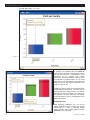
Screen 1 shows a pie chart displaying the profits
from three countries. In this example, Canada has a
loss, which is indicated by the slice texture, the line
along the side of the slice, and the parentheses
around the country name. Under this representation
there is no loss of information, as would be the case
if a weighted mode is used and Canada is omitted
from the chart. In a large dataset with many data
points the analyst may mistakenly miss some activities if the negative values are not displayed.
Hovering over, as shown on Screen 2, displays the
total loss and the negative contribution margin of
Canada, i.e., the percentage by which Canada's losses reduce total profit.
In bar charts the net mode can be appreciated more
by comparing it to the weighted mode, since net
mode is the default behavior for bar charts in conventional software like Excel. Having the two modes
available at the click of a mouse enhances the abilities of the analysts to comprehend completely the
underlying patterns in the data. Screen 3 on page
12 displays the net mode.
Screen 1
Screen 2
Information Builders, Inc.
11
WEBFOCUS NEWSLETTER
(Visual Discovery continued)
Screen 3
By contrast, the weighted mode (see Screen 4)
displays both the negative and the positive contribution and gives the user a representation of the
proportions of the negative and positive
transactions, allowing the analysts to quickly assess
the magnitude of negative effects. On one single
graph the user can toggle between two aggregation
modes and assess the relative magnitude of the
losses for every country.
In addition to the net mode, two more display methods were added to the pie chart, so that the user can
toggle between three display modes to see different
distributions in the same dataset. The toggle function eliminates the extra steps that the analysts
would have taken to gain full understanding of the
patterns in the data.
Contributors Only
12
Screen 4
When displaying contributors only, you get the
relative distribution only of countries with positive
contributions. It is useful in assessing relative
growth when the data includes negative numbers
(Screen 5 on the next page).
February 2006
WEBFOCUS NEWSLETTER
(Visual Discovery continued)
Screen 5
Positives Only
This display mode is useful for showing
the positive revenues regardless of the
losses in each region, allowing users to
compare quickly revenues regardless of
other operational factors that may
impact negatively profits (Screen 6).
All display methods are accessible
through the context-sensitive menu.
Making them accessible within the same
chart control empowers the user to discover multiple distribution patterns in
the same dataset and makes Visual
Discovery a powerful and easy-to-use
tool for complex financial and operational data analysis where activities
gains and losses are being monitored. g
Screen 6
Information Builders, Inc.
13
WEBFOCUS NEWSLETTER
(Java Classes continued from page 3)
Screen 1
The bracket reference for {COLOR} will cause the
adapter to look in the fex definition for the fieldname in the "Color" edit box. The adapter will use
the fieldname provided to search for values in the
XML output named MYCOLOR and pass them to the
setColor function. The same linkage occurs for the
setMarkerType/{SHAPE}
and setWidth/
{SIZE} functions. The setOutline function will
always receive 0,0,0, which will add a black outline
to each of the shapes that are used.
As each record in the XML output is processed, the
values for changing the color, shape and size of the
14
exact map feature identified are passed to the functions and the map image gets created. As you get
more advanced in your development and GBIS integration you may find that you want to design more
sophisticated symbol definitions. The WebFOCUS
GIS Adapter supports the creation of customized
symbols to fit your application.
It is possible to create a symbol definition that lets
you easily integrate your own JPEG or GIF images or
to refer to TrueType font characters as the way of
displaying your map-based results. We'll explore that
subject in future issue of the WebFOCUS Newsletter. g
February 2006
WEBFOCUS NEWSLETTER
(Hierarchical Reporting continued from page 4)
cube. In addition, the front end enforces certain
required operations (BW mandatory variables).
Hierarchy trees are used to display the structure of
file metadata as well as those areas that display the
actual data within the hierarchy. These features
enable a developer to provide reports utilizing hierarchy trees for both output and pick-list selection.
The same type of control used in FML for
parent/child selection is now available for parameter/values selection where a cube is involved.
The levels selection dialog, which completes the
criteria for displaying the cube, is the final piece of
the specification.
WebFOCUS has always had summarization capabilities built in. However, in the multidimensional world,
where aggregates are generally stored, we have to
choose which values to show the end user. Totals on
Information Builders, Inc.
the report can be either the amounts that are preaggregated in the cube or the totals for that data
that passed the specified WHERE/WHEN tests.
We allow for both methods.
Figure 2
Visual totals for each node are composed from the
totals of its hierarchical children shown on the same
report. Full total displays are the value found in the
cube data source. This value may not reflect the sum
of its displayed descendants if some descendants are
eliminated from the report output based on the WHEN
and SHOW options (Figure 2).
Our goal is to extend the Developer Studio paradigm
from relational data sources to multidimensional data
sources without changing the skill set required by
any substantial amount. Now the same tool that is
used against any of the existing data sources can
address this new multidimensional paradigm. g
15
WEBFOCUS NEWSLETTER
2
P e n n
P l a z a
N e w
Y o r k ,
N Y
1 0 1 2 1