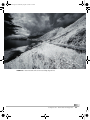
1
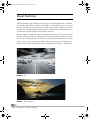
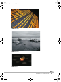
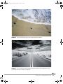
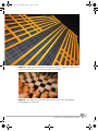
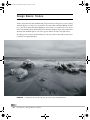
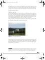
dp.book Page 59 Wednesday, August 10, 2005 9:53 PM
CHAPTER 2
Compose It
L
ighting makes the subject of your photograph visible. Composition makes it interesting. We’ve all seen plenty of photographs that shout the question, “Why was this
taken?” Perhaps you’ve even shot a few yourself. One of the benefits of digital photography is that you can delete pointless pictures easily, without having wasted money on
film and processing. But why waste time and disk space at all? This section helps you focus1
on what’s important to tell the story inherent in every shot, and to tell it in an interesting
and compelling way.
Sometimes the story is very short; sometimes it’s longer and more complex (Figure 2-1).
But the story is there, and, as the photographer, you’re the storyteller.
FIGURE 2-1
What stories do these pictures tell?
1. Pun intended.
Compose It
59
dp.book Page 60 Wednesday, August 10, 2005 9:53 PM
Visual Push-Ups
Visual storytelling begins with the basics of design. Great photographs share a common
set of visual design elements (Figures 2-2 through 2-6). Sometimes their use is overt and
obvious. Sometimes the design elements are subtle or subconscious. When you begin to
recognize these fundamental visual elements in the world around you and put them to creative work in your photographs, you will grow as an artist.
Most great images contain more than one fundamental element. The trick is to see them
wherever you look, and then to exploit them in your photographs for all they’re worth.
Let’s do some “visual push-ups.” We want you to start seeing the world in a new way. Our
goal is to exercise your eyes and your mind, so that you develop a habit of noticing the
design elements that are all around you. The fundamentals are out there—go find them!
60
FIGURE 2-2
Line
FIGURE 2-3
Shape and form
Compose It > Visual Push-Ups
dp.book Page 61 Wednesday, August 10, 2005 9:53 PM
FIGURE 2-4 Pattern
FIGURE 2-5
Texture
FIGURE 2-6
Color
Compose It > Visual Push-Ups
61
dp.book Page 62 Wednesday, August 10, 2005 9:53 PM
Design Basics: Line
Line is the most fundamental visual element (Figures 2-7 through 2-9). Without line, there
is nothingness. Lines are everywhere, in many forms: thick or thin, straight or curved, natural or man-made.
FIGURE 2-7
62
Sometimes the strongest lines aren’t in front of you; they’re above you.
Compose It > Design Basics: Line
dp.book Page 63 Wednesday, August 10, 2005 9:53 PM
FIGURE 2-8
Lines can be literal (the surf) or more subjective (the three pebbles).
Lines can draw you from the foreground into the far distance. Strong diagonal lines create
great energy and a sense of motion (see page 84).
FIGURE 2-9
Compose It > Design Basics: Line
63
dp.book Page 64 Wednesday, August 10, 2005 9:53 PM
Design Basics: Shape and Form
Basic two-dimensional shapes (often created by flat light or silhouettes) and three-dimensional forms (created by strong directional lighting) provide the next level of richness and
complexity in visual design. Figures 2-10 through 2-12 illustrate the use of shape and form.
FIGURE 2-10
Strong backlighting provided by the setting sun creates stark, dramatic two-dimensional
shapes
FIGURE 2-11
64
Whereas the hills are flat shapes, the clouds and waves have more body and fullness.
Compose It > Design Basics: Shape and Form
dp.book Page 65 Wednesday, August 10, 2005 9:53 PM
Directional lighting creates full, three-dimensional shapes in the foreground rocks, the
curling waves, and the bulging hillside.
FIGURE 2-12
Compose It > Design Basics: Shape and Form
65
dp.book Page 66 Wednesday, August 10, 2005 9:53 PM
Design Basics: Pattern
As shown in Figures 2-13 through 2-15, patterns are everywhere. Sometimes they are purposeful; sometimes they arise from random associations that create fortuitous results.
However they are formed, the predictability and repetitiveness of patterns reassure and
comfort us. Without pattern, there is chaos.
FIGURE 2-13
66
Nature creates a wealth of patterns, like we see in the sand behind this strand of kelp.
Compose It > Design Basics: Pattern
dp.book Page 67 Wednesday, August 10, 2005 9:53 PM
FIGURE 2-14 Patterns appear in architectural and industrial contexts. The combination of pattern and line
in this shot conveys both a sense of soaring energy and rock-solid stability.
FIGURE 2-15 Slow shutter speed coupled with a wide-angle zoom effect creates depth within the
repeating patterns on a chessboard.
Compose It > Design Basics: Pattern
67
dp.book Page 68 Wednesday, August 10, 2005 9:53 PM
Design Basics: Texture
Texture, more than any other fundamental design element, has the power to convey strong
emotion (Figures 2-16 and 2-17). It can also be the most subtle and most difficult element
to see. You need strong directional lighting to reveal texture, so you’ll need to seek it out
in the early morning or late afternoon if you’re shooting outdoors. If you seek texture when
shooting with artificial light, be sure to keep your camera off-axis to the light source.
We often perceive textures when shooting very close-up (macro) shots. But texture is also
revealed in sweeping landscapes.
FIGURE 2-16
68
Soft and hard. Smooth and rough. This shot offers several contrasting textures.
Compose It > Design Basics: Texture
dp.book Page 69 Wednesday, August 10, 2005 9:53 PM
You can almost feel the roughness of the sand between your toes. Consider the emotional
response that this creates as you look closely at the image.
FIGURE 2-17
Compose It > Design Basics: Texture
69
dp.book Page 70 Wednesday, August 10, 2005 9:53 PM
Design Basics: Color
The human response to color is varied and complex (Figure 2-18). Are you feeling blue?
Was she green with envy? Does income tax time make you see red?
FIGURE 2-18
70
Isolated color in these monochrome shots grabs your attention forcefully.
Compose It > Design Basics: Color
dp.book Page 71 Wednesday, August 10, 2005 9:53 PM
Color carries enormous emotional power (Figure 2-19). Be aware, however, that the connotations of particular colors vary widely by culture. White can suggest both purity and
death. Green connotes life and vigor, freshness and growth. Purple is the color of royalty
to many. Red suggests love, anger, heat, and pain. Blue is cool, deep, and calm. Yellow can
be lively or sickly, playful or cowardly.
Color can be a powerful storytelling tool.
FIGURE 2-19
Filling the frame with a riot of color creates energy and excitement.
Compose It > Design Basics: Color
71
dp.book Page 72 Wednesday, August 10, 2005 9:53 PM
The Golden Section
Human beings have an innate preference for order over chaos. We are always trying to
“make sense” out of what we perceive. The ancient Greeks codified this basic tendency into
rules for the visual arts and architecture that eventually came to be known as the “golden
section.” The principles behind the golden section are a strong underlying design influence
to this day.
Simply put, the golden section appears in rectangular shapes that are approximately twothirds wider than they are tall. This 2×3 aspect ratio is generally pleasing to most viewers.
(It’s no coincidence that 4×6-inch prints are the most popular snapshot size.)
If you divide a golden section into nine equal parts, you create a grid (Figures 2-20 and
2-21). We’ll use the grid in subsequent sections to guide your thinking about ways to make
shots most pleasing. Remember, though, that the grid is only a guide, and not a rule that
you must slavishly follow. Think of it as your personal design consultant, one who offers
good suggestions that you should not hesitate to ignore if you have a valid artistic intent!
FIGURE 2-20
72
The golden section
Compose It > The Golden Section
dp.book Page 73 Wednesday, August 10, 2005 9:53 PM
FIGURE 2-21
The golden section applies to vertical images, too.
Compose It > The Golden Section
73
dp.book Page 74 Wednesday, August 10, 2005 9:53 PM
The Rule of Thirds
The Greeks observed that people prefer groups of three. As you saw on page 72, the golden
section grid comprises three rows and three columns. If you use those rows and columns
to organize a shot’s elements, the visual design tends to be more pleasing.
The dominant elements in Figure 2-20 on page 72 are organized into three rows: the dark
foreground (bottom), tree and ridge lines (middle), and sky (top). Figure 2-21 on page 73
aligns its elements to the grid almost perfectly, too, illustrating that the golden section
works for vertical images as well as horizontal ones.
Look for boundaries and borders in your shots, and then imagine the golden section grid
to guide you toward a pleasing layout (Figure 2-22).
Sidewalk and shadow boundaries lie near the golden section horizontal grid lines. Likewise,
the tree and window are in the middle two columns.
FIGURE 2-22
74
Compose It > The Rule of Thirds
dp.book Page 75 Wednesday, August 10, 2005 9:53 PM
Positioning the Horizon
In landscape shots, your first impulse is to put the horizon right in the middle of the image.
If you place the horizon near the upper or lower horizontal grid line instead, the results
will be more pleasing (Figures 2-23 and 2-24).
FIGURE 2-23
The horizon falls near the lower grid row.
FIGURE 2-24 Moving the horizon off the center improves this shot’s balance (right).
Compose It > The Rule of Thirds
75
dp.book Page 76 Wednesday, August 10, 2005 9:53 PM
The Power Points
The grid in the golden section is more than rows and columns. The intersections of the
grid lines create power points that you can use to strengthen a composition. Consider placing dominant elements at one or more power points to give them extra thematic punch
(Figures 2-25 and 2-26).
FIGURE 2-25
76
The splash is anchored at the upper-right power point, giving the whole shot an added pop.
Compose It > The Power Points
dp.book Page 77 Wednesday, August 10, 2005 9:53 PM
The island at the lower-right power point and the arch at the lower grid line pull you into the
shot; the C curve in the upper row draws you into the distance.
FIGURE 2-26
Compose It > The Power Points
77
dp.book Page 78 Wednesday, August 10, 2005 9:53 PM
Control the Frame
Sometimes, there’s just too much in the shot. Consider Figure 2-27. The left and right edges
distract from the main subject. It’s time to crop, either by reframing the shot before you
shoot it or later, on the computer. Imagine cutting a diamond, facet by facet, to transform
a lump of carbon into a dazzling gem.
In Figure 2-28, the clutter at the edges is gone, allowing us to concentrate on the main subject without distraction.
FIGURE 2-27
The edges of this shot distract from the main
subject.
78
Compose It > Control the Frame
FIGURE 2-28
Ahhhh . . . that’s better.
dp.book Page 79 Wednesday, August 10, 2005 9:53 PM
It sounds obvious, but it’s critical. The viewfinder or monitor shows roughly what you’ll
get in your shot.2 Learn to see clearly what’s in the frame of the shot, and not what you
see when you look outside the camera. Treat your frame as an artist treats a canvas, and
be aware of all that lies inside it.
See What’s in the Shot
One of the most common errors you can make is to overlook objects that are right there
in your shot—especially objects in the foreground that seem invisible but then appear as
if by magic later. You’re concentrating so hard on the primary subject that you fail to see
extraneous objects cluttering the frame. Don’t be surprised by what shows up in your shot.
Check each shot immediately after you take it, and reshoot it if necessary.
Likewise, don’t miss a critical story element that you’ve inadvertently cut out of the shot
by poor framing. Change angles, or zoom a bit if necessary.
FIGURE 2-29
A classic (bad) landscape shot
Consider Figure 2-29. There may have been a pretty view of the mountains when the shot
was made. But you can’t tell it from this shot: The horizon is dead center; the light poles
in the foreground obscure the view; the baseball fields (?) are awkwardly cropped. What
other problems can you diagnose?
2. Most viewfinders on digital cameras match only about 90 percent of what you can expect to see in your
final image. The small electronic monitors on the back are a bit better. You’ll need to practice with your
camera to get a good sense of how closely the camera’s viewfinder and monitor match the final image.
Compose It > Control the Frame
79
dp.book Page 80 Wednesday, August 10, 2005 9:53 PM
Fill the Frame
Fill the frame with your subject. Eliminate clutter and noise and large expanses of nothingness that distract from or weaken the story. Ask yourself, “What’s most important in
this shot?” Resist the common urge to go for a wide shot to “get everything in.” Zoom in
on what’s important.
FIGURE 2-30 It’s tempting to shoot wide.
Figure 2-30 is pretty, but there is a lot of empty sky. Now, empty sky is not necessarily bad.
Perhaps your visual story is about loneliness or feeling lost. In that case, a single balloon
alone in an empty sky might have been a better choice.
Now consider Figure 2-31. The zoomed shot is much more powerful. It offers pattern and
color and texture that grab the eye and won’t let go. Fill the frame with your subject, and
the results will be far more interesting.
80
Compose It > Fill the Frame
dp.book Page 81 Wednesday, August 10, 2005 9:53 PM
FIGURE 2-31
Zoom in, and the shot becomes much stronger.
“Optical” Versus “Digital” Zoom—Caveat Emptor!
Having a digital camera with a zoom lens gives you more flexibility in framing interesting
shots than is possible with fixed-focal-length lenses. But not all zooms are created equal.
Optical zoom is really all that matters for serious photographers. Optical zoom measures
a lens’s ability to magnify an image using the optical elements inside the lens itself, without
sacrificing image resolution (quality). Digital zoom does nothing more than crop the
image in-camera so that it looks as if it’s bigger. But it’s not really. The cropped image has
the same resolution as the original, so the image that you eventually print or display will
typically be of lower quality.
Cameras that proclaim “30× Zoom! (3× optical, 10× digital)” really only offer 3× zoom
before image quality begins to suffer. Spend your money on a camera with the most optical
zoom that you can afford, and don’t fool with digital zoom. If you can’t zoom in enough
with the optical zoom, take the shot at the highest possible resolution and then crop it on
your computer. The results will be much better.
Shoe-Leather Zoom
One more tip: Use your feet! It’s perfectly fine to walk toward or away from your subject
if your lens won’t zoom in or out enough. In these days of remote control everything, it’s
easy to forget that we have functioning legs.
Compose It > Fill the Frame
81
dp.book Page 82 Wednesday, August 10, 2005 9:53 PM
Shot within a Shot
Great shots often contain other great shots lurking within them. If you’ve taken the time
to frame a great shot, take one more minute to explore. Look for shots within your shots
(Figures 2-32 and 2-33).
FIGURE 2-32 This wide shot tells of a mother’s love for an ailing child.
82
Compose It > Shot within a Shot
dp.book Page 83 Wednesday, August 10, 2005 9:53 PM
FIGURE 2-33
The shot within the shot is all about the cuteness of the infant and tender touch conveyed
by the hands.
Compose It > Shot within a Shot
83
dp.book Page 84 Wednesday, August 10, 2005 9:53 PM
The Power of Diagonals
Diagonal lines suggest motion and energy. They can breathe life into what might otherwise
be a conventional, uninteresting shot (Figure 2-34).
One simple way to harness the power of diagonals is to frame strong horizontal elements
and then just tilt your camera. You can create the same effect with your image-editing tool
by selecting a rectangular region and then rotating it. Be careful not to skew or deform the
rectangle when you rotate it unless the deformation is for a specific creative reason.
FIGURE 2-34 Strong diagonals heighten the playful energy. This shot also uses the “frame within the
frame” technique (see page 94).
Diagonals may be artificial or natural. You may not notice strong natural diagonals until
you frame a shot and see them in the viewfinder or monitor. In Figure 2-35, the contours
of the hillsides, riverbank, and roadway combine to create powerful diagonals that give the
shot considerable power and energy.
84
Compose It > The Power of Diagonals
dp.book Page 85 Wednesday, August 10, 2005 9:53 PM
FIGURE 2-35
Natural elements unite to form astonishing diagonal lines.
Compose It > The Power of Diagonals
85
dp.book Page 86 Wednesday, August 10, 2005 9:53 PM
The Power of Eyes
If there are people in a photograph, the first thing you look at is their eyes. It’s basic human
nature. Great photographers consistently use this principle to their advantage
(Figure 2-36).
FIGURE 2-36 What makes this portrait so irresistible? It’s the eyes, baby!
The attraction of eyes transcends age, culture, gender, and race. By
gazing directly into the camera, the little boy in Figure 2-37
demands our attention. It doesn’t hurt that he’s cute, too.
Perhaps your shot contains a group of people rather than a single
individual. If there are lots of eyes to choose from, as in Figure 2-38,
your gaze is drawn first to the eyes that are looking back at you.
FIGURE 2-37
86
Compose It > The Power of Eyes
Eyes are irresistible.
dp.book Page 87 Wednesday, August 10, 2005 9:53 PM
Where do you look first? Despite this shot’s many shortcomings, you can’t help looking at
the young man staring right at the camera.
FIGURE 2-38
It’s no accident that even beginning photographers shout at their subjects, “Look here and
smile!” A photograph is strongest when the people in it make eye contact with the people
viewing it.
It’s OK to talk to your subjects and encourage
them to look at you. You may even need to wait
for a few extra moments until the person or
people most important to the shot turn to the
camera (Figure 2-39). That’s OK, too. Patience
usually pays off.
Consider Figure 2-32 on page 82. Even though
the mother is much larger and more thematically dominant than the child, our attention is
drawn first to the infant’s eyes.
But there are lots of great photographs that
contain no eyes. The next several sections discuss other compositional tools you can use to
guide the viewer’s gaze into your shots.
Even when your subject is not
of your own species, eyes are hard to ignore.
FIGURE 2-39
Compose It > The Power of Eyes
87
dp.book Page 88 Wednesday, August 10, 2005 9:53 PM
The Power of Contrast
Areas of
highest contrast attract the
most attention.
FIGURE 2-40
If a shot is devoid of people and eyes, then the next most attractive property of an image
is contrast. In other words, our attention is drawn first to the objects that contrast most
with their backgrounds or with adjacent objects in the shot.
Here’s how your eye tends to travel through Figure 2-40:
1. You’re immediately drawn to the area of highest contrast: the bright background oval
surrounded by dark spaces and objects.
2. Next, you look down and left to the area of next highest contrast: the daisies.
Although people from Western cultures tend to read left to right, the contrast in this
shot pulls leftward.
3. Finally, your gaze moves rightward along the tabletop to the black telephone, which
contrasts sharply with the light background.
88
Compose It > The Power of Contrast
dp.book Page 89 Wednesday, August 10, 2005 9:53 PM
FIGURE 2-41
Low contrast tends to saturate color.
You don’t have to have a blue sky to get a beautiful outdoor shot. Overcast or foggy conditions are great opportunities to showcase colorful subjects. Low-contrast lighting makes
whatever color there is stand out. If Figure 2-41 had been shot beneath a cloudless sky, the
yellow in the flowers would have been washed away.
Compose It > The Power of Contrast
89
dp.book Page 90 Wednesday, August 10, 2005 9:53 PM
The Power of Focus
Focus is a powerful tool for directing the viewer’s attention. Objects that are in focus attract
much more attention than objects that are out of focus (Figure 2-42).
This shot draws attention to the product logo by throwing the surrounding objects out of
focus. The high contrast between the brilliant white square and the dark background also grabs your
attention. Contrast and focus—a double dose!
FIGURE 2-42
Dealing with Auto Focus
Professional-level digital cameras, especially those with interchangeable lenses, still offer
obvious manual focus options like focus rings on the lenses. But many consumer-level
cameras do not appear to give you that option. Those cameras pull focus automatically on
whatever lies at the center of the image using a variety of techniques, with varying degrees
of success. That may seem like a blessing in most circumstances, but if you really want to
be in charge of the results, you’ll need to take control.
One technique is to exploit depth of field, which derives from the size of the lens aperture
that you’re using. We talk more about this on page 109. The next section discusses other
ways to control focus yourself.
90
Compose It > The Power of Focus
dp.book Page 91 Wednesday, August 10, 2005 9:53 PM
Spot Focus and Manual Focus
There are alternatives to auto focus for those willing to dig into their camera manuals. Most
digital cameras offer both spot focus and manual focus features. Using those features takes
a bit more work, but gives you the control you may need.
Spot Focus
If your camera offers spot focus, you’ll be able to move a focus-targeting box around the
viewfinder. The camera then focuses on the highlighted target rather than on the center of
the image. This can be useful if you position your main subject off-center—perhaps at a
power point (see page 76). Then you use spot focus to get the main subject in focus.
Refer to your camera’s user manual for instructions on using spot focus.
Manual Focus
Your camera may give you complete focusing control, too. This is true manual focus. The
procedure varies, but typically it involves changing a camera setting to manual focus mode
and then adjusting the focus with a cursor, control knob, or rocker switch. Check your user
manual for specific instructions.
NOTE
You’ll need quite a bit of practice to focus “by eye.” We advise using a tripod to hold
the camera steady for repeated shots.
Unless your camera’s viewfinder offers a through the lens image, you won’t be able to use
it to judge whether or not you’ve focused correctly. You’ll have to rely on the monitor to
make a judgment. Unfortunately, the monitor is often too small, too dim, or too dirty to
provide enough useful feedback to make an intelligent focusing decision.
That’s where the tripod comes in handy. Pull focus and shoot; then use the monitor’s zoom
feature to zoom in on the shot you just took. With the image zoomed big enough, you can
finally see for sure whether or not the shot’s focus is what you intended. If it’s out of focus,
just smile, delete, and reshoot.
Compose It > Spot Focus and Manual Focus
91
dp.book Page 92 Wednesday, August 10, 2005 9:53 PM
A More Interesting Angle
You don’t have to settle for the same old, straight-on shot that you’ve shot a jillion times
before. A simple shift in your point of view can add drama and spice to an otherwise conventional image (Figures 2-43 through 2-46). Try kneeling or lying on your belly to get a
new view of the world. Or get above your subject and shoot down. Don’t just stand there
and shoot at eye level. It’s been done!
FIGURE 2-43
A typical group portrait shot at eye level (yawn . . .)
FIGURE 2-44 The same group shot from the top of a staircase. Changing the point of view creates a much
more interesting and dramatic shot.
92
Compose It > A More Interesting Angle
dp.book Page 93 Wednesday, August 10, 2005 9:53 PM
FIGURE 2-45
Here’s a different angle (left) on a common subject.
FIGURE 2-46
Look up and down, and not just side to side. You’ll be surprised and delighted at the shots
you’ll discover.
Compose It > A More Interesting Angle
93
dp.book Page 94 Wednesday, August 10, 2005 9:53 PM
Frame within a Frame
The physical borders of a shot form the most obvious “frame” around your subject. To add
interest, you can also use foreground elements within the shot to frame more distant
objects and draw greater attention to them (Figures 2-47 and 2-48).
FIGURE 2-47
Cactus frames Dead Man’s Chest island in the British Virgin Islands.
See Figure 2-34 on page 84 for another example of a frame-within-a-frame shot.
94
Compose It > Frame within a Frame
dp.book Page 95 Wednesday, August 10, 2005 9:53 PM
Here is a distant subject treated with two different techniques. (Top) The island lies at the
upper-left power point of the golden section. (Bottom) The island is framed by the trees and branches in
the foreground. Both shots are strong, but in different ways.
FIGURE 2-48
Compose It > Frame within a Frame
95
dp.book Page 96 Wednesday, August 10, 2005 9:53 PM
The Power of Altered Perspective
You can use your camera’s ability to shoot at relative extremes of wide angle and telephoto
to create unusual effects. For example, you typically use the lens’s widest angle to capture
a wide scene. By shooting wide and then pushing the camera in tight on your subject, you
force a different perspective on the shot or emphasize a different portion of the shot and
thus violate the viewer’s natural expectations. The results, if handled effectively, can create
an eye-catching effect (Figures 2-49 through 2-51).
A wide-angle shot pushed in tight from above
makes the man’s head and fingers appear too large for his
body.
FIGURE 2-49
FIGURE 2-50 A telephoto shot of this
construction scene compresses the
foreground objects against the infinitely
deep horizon. The sunset appears far bigger
than it really was.
96
Compose It > The Power of Altered Perspective
dp.book Page 97 Wednesday, August 10, 2005 9:53 PM
FIGURE 2-51
Another wide-angle shot pushed close to force an alternative view of reality. 12mm lens, f/4,
/ sec.
1 8
Compose It > The Power of Altered Perspective
97
dp.book Page 98 Wednesday, August 10, 2005 9:53 PM
The Power of the Foreground
You often shoot landscapes at wide angles to capture sweeping vistas. Sweeping vistas are
good. But they’re often even better when you add an interesting element to the foreground
(Figure 2-52). It creates an exciting visual tension as your eye moves back and forth
between foreground and background. It also helps to establish a sense of scale—a frame of
reference to give the viewer a better understanding of the size and scope of the landscape.
When you shoot at wide angles, you get greater apparent depth of field at a given aperture
(Figure 2-53). That means more of the shot is in focus. When the focal length is 24mm or
less and the aperture is at least f/8, essentially everything is in focus—from a few inches to
infinity.
This vast depth of field makes it easier to keep all objects in the close foreground and the
distant scenery in sharp focus.
The foreground rocks and pensive iguana add scale and a bit of humor to this beautiful
harbor landscape.
FIGURE 2-52
98
Compose It > The Power of the Foreground
dp.book Page 99 Wednesday, August 10, 2005 9:53 PM
FIGURE 2-53 The flowers make the valley deeper and more inviting. Notice, too, that just a hint of sky at
the top is all the sky the shot needs.
Compose It > The Power of the Foreground
99
dp.book Page 100 Wednesday, August 10, 2005 9:53 PM
Get Vertical
The vast majority of the shots taken are horizontal (Figure 2-54). That’s due in large part
to the way we’re forced to hold our cameras in our hands. But it doesn’t have to be that
way. After you’ve taken a great horizontal shot, turn your camera sideways and shoot vertical (Figure 2-55). There are great vertical shots just waiting to be taken, if you’ll only take
them.
And who knows? You may wind up with a great piece of stock. After all, almost every book
and magazine cover in print is vertical!
FIGURE 2-54
100
A typical horizontal composition
Compose It > Get Vertical
dp.book Page 101 Wednesday, August 10, 2005 9:53 PM
FIGURE 2-55
A vertical treatment of a shot similar to Figure 2-54
Compose It > Get Vertical
101
dp.book Page 102 Wednesday, August 10, 2005 9:53 PM
Bring It Into Balance
The shot in Figure 2-56 combines several of the fundamentals of composition to create a
compelling image:
• Even though the horizon is centered, the elements of sand, sea, and sky are organized
into three strong rows.
• The driftwood, sand, and rocks offer distinct and interesting textures.
• Dramatic lines and areas of sharp contrast create excitement.
• The foreground driftwood frames the horizon.
FIGURE 2-56
102
Line, texture, form, and contrast . . . all working together
Compose It > Bring It Into Balance
dp.book Page 103 Wednesday, August 10, 2005 9:53 PM
Summary
Composition makes a photograph interesting by clarifying the story within the picture.
Your shots will tell their stories more effectively if you follow these guidelines:
• Do your “visual push-ups” to begin seeing the fundamental visual design elements
that are all around you: light (Chapter 1), line, shape and form, pattern, texture, and
color.
• Use the golden section and the rule of thirds as guides for creating a pleasing composition.
• Power points in the golden section offer great places to position the main subject of
a shot.
• Control the frame and fill it with your subject. Resist the wide shot; zoom in on the
main elements.
• Be on the lookout for great shots that may be lurking within the main shot.
• Diagonals can breathe life into an otherwise static shot.
• Eyes are irresistible. They draw our attention immediately, even if the subject is not
a human being.
• Areas of contrast (relative difference in light and dark values) pull the viewer into
the shot.
• Areas in sharp focus draw more attention than areas of soft focus.
• An unusual camera angle can add interest to an otherwise ho-hum shot. We see the
world every day from eye level. Show us the world in a new light and at a different
angle, and you will be on your way to stronger creativity.
• Use a frame within a frame to add drama and emphasis to the main subject.
• Alter or force the perspective to create an unusual twist.
• Foreground objects can make background vistas more interesting.
• Don’t forget to “get vertical.”
Compose It > Summary
103
dp.book Page 104 Wednesday, August 10, 2005 9:53 PM