1
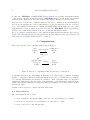
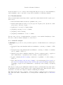
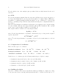
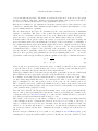
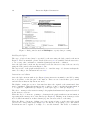
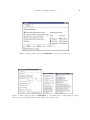
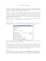
JSS
Journal of Statistical Software
February 2005, Volume 13, Issue 5.
http://www.jstatsoft.org/
Interactive Biplot Construction
Frederic Udina
Universitat Pompeu Fabra
Abstract
We analyze and discuss how a generic software to produce biplot graphs should be
designed. We describe a data structure appropriate to include the biplot description and
we specify the algorithm(s) to be used for several biplot types. We discuss the options
the software should offer to the user in two different environments. In a highly interactive
environment the user should be able to specify many graphical options and also to change
them using the usual interactive tools. The resulting graph needs to be available in several
formats, including high quality format for printing. In a web-based environment, the user
submits a data file or listing together with some options specified either in a file or using
a form. Then the graphic is sent back to the user in one of several possible formats
according to the specifications. We review some of the already available software and we
present an implementation based in XLISP-STAT. It can be run under Unix or Windows,
and it is also part of a service that provides biplot graphs through the web.
Keywords: biplot, interactive graphics, XLISP-STAT, principal components, correspondence
analysis.
1. Introduction
Biplots (Gabriel (1971), Gower and Hand (1996)), can be seen as the multivariate analogue
of scatter-plots: they give a graphical representation of a multivariate sample and they superimpose on the display a representation of the variables on which the sample is measured. In
order to display multivariate data in a few dimensions, some data reduction technique needs
to be applied to build the biplot. Biplots are useful both in the data exploration and data
description phases of data analysis. This implies that biplot production has to be interactive
and that good quality output is also needed. As Gower and Hand (1996) say, page 27,
The notion of inspecting, and perhaps discarding, biplot axes, implies the desirability of developing interactive software with appropriate facilities.
In this paper we describe how statistical software to produce biplots should be designed and
2
Interactive Biplot Construction
we introduce XLS-Biplot, an XLISP-STAT(Tierney (1990)) based package that includes many
of the desired features. A full description of XLS-Biplot may be found in the user manual
included in the distribution. It is also available through the WWW, see the Appendix.
In Section 2 we describe the computations involved in biplot construction in several statistical
models and we discuss some of the requirements for a biplot software.In Section 3 we review
some other available software and we explain why XLISP-STAT was the right choice for a first
implementation of the program. In Section 4 we introduce XLS-Biplot. In the Appendix we
include some technical information on how to obtain and install the software.
We do not include a full discussion of the different statistical methods than produce biplots.
As the biplot has different interpretations and uses in these different cases, a specialized work
such as Gower and Hand (1996) should be consulted.
2. Computations
The general layout of the computations is shown in Figure 1
transformed
data
transformation
matrix
matrix
Z
X
SVD biplot
singular values
results
& vectors
- coordinates
T
F, G
UΓV
Figure 1: Layout of computations involved in biplot construction
Computations start from a data matrix X that may be a cases (rows) by variables (columns)
matrix, or a frequency matrix. Usually this initial data needs to be transformed, for example
by centering (substracting the mean) the variables. Then a singular value decomposition
extracts the dimensions conveying most of the variability ot the information included in the
initial data matrix. A final step consists in scaling the resulting vectors and points to include
them in the biplot.
Details on these steps are considered in next subsections.
2.1. Data matrices
The data matrix X can be either
• cases × variables. We always assume cases are rows, and variables are columns.
• categories × categories, a cross tabulation or other table of counts;
• cases × categories, compositional data.
Journal of Statistical Software
3
At the moment we do not consider other settings that may use a biplot for data visualization,
such as multiple, joint or canonical correspondence analysis or redundancy analysis.
2.2. Transformations
Allowed transformations (it is important to apply these transformations in the sequence specified below):
• functional transformations such as logarithmic, sine, power.
• matrix transformations such as observed/expected frequency ratio (Pearson’s contingency ratio), odds ratio, logratio, . . . ;
• application of row and/or column weights;
• (weighted) centering of rows or columns;
• (weighted) double-centering;
• (weighted) normalization of rows or columns.
In some cases, a choice of transformations correspond to some standard analysis procedure.
We refer to this as “Canned Analysis”, see next section.
2.3. “Canned” analysis
In XLS-Biplot we provide for some predefined sequences of transformations for certain types
of data.
• Principal Components Analysis without normalization: centering of columns → SVD,
etc. . .
• Principal Components Analysis with normalization: centering of columns → normalization of columns → SVD, etc. . .
• Simple Correspondence Analysis: transform to Pearson contingency ratios → apply row
and column masses → (weighted) double-centring → (weighted) SVD, etc. . .
• Logratio analysis (Aitchison (1986)): transform to logarithms → double-centring →
SVD, etc. . .
• Ratio maps (Aitchison and Greenacre (2002)) or Spectral mapping (Lewi (1976), see
also Wouters, Göhlmann, Bijnens, Kass, Molenberghs, and Lewi (2003)): transform to
logarithms → apply row and column masses → (weighted) double-centring → (weighted)
SVD, etc. . .
The first two items prepare mulitvariate numerical data for a Principal Components biplot.
Normalization should be applied whenever the original variables have different scales of measurement to avoid the more disperse variables dominating the analysis.
The third item should only be applied to data representing a contingency table of frequencies.
The data table will be transformed for a Correspondence Analysis biplot, see Greenacre
(1993).
4
Interactive Biplot Construction
We also include some other analysis, quite specialized, that are fully discussed in the cited
references.
2.4. SVD
We perform (weighted) Singular Value Decomposition (SVD) via the eigendecomposition of
a cross-product matrix whose order depends on the number of columns of Z (i.e., ZT Z, since
the number of columns is usually less than the number of rows – if this is not so, then we will
merely be calculating a larger than necessary matrix and using more computational time for
the solution.
The most general situation we shall need is when there are weights r for the rows and weights
c for the columns, with associated diagonal matrices Dr and Dc . Defaults are Dr = (1/n)I
(each of the n rows is weighted equally by 1/n) and Dc = I
The weighted SVD is obtained by decomposing the matrix
Dr1/2 ZD1/2
= UΓVT
c
(1)
where Γ is the diagonal matrix of eigenvalues. Alternatively, if proceeding via the weighted
eigendecomposition,
T
1/2
D1/2
= VΓ2 VT
c Z Dr ZDc
where Γ2 is the diagonal matrix of eigenvalues, followed by the transformation to the left
vectors:
1/2
−1
U = D1/2
r ZDc VΓ
2.5. Computation of coordinates
There are three types of coordinates.
−1/2
Standard coordinates
Rows : Fs = Dr
Principal coordinates
Rows : Fp = Fs Γ
“Canonical” coordinates
−1/2
U
Columns : Gs = Dc
V
Columns : Gp = Gs Γ
Rows : Fc = Fs Γ1/2
Columns : Gc = Gs Γ1/2
Usual choices of coordinates give the following standard types of biplots or maps:
• Asymmetric map (form biplot) of the rows: plot Fp and Gs .
• Asymmetric map (covariance biplot) of the columns: plot Fs and Gp .
• Symmetric map (not a biplot): plot Fp and Gp .
• Symmetric or canonical biplot: plot Fc and Gc .
2.6. Building the biplot
Once the coordinates of the cases (rows) and the variables (columns) are computed according
to the previous sections, some important questions should be considered for the biplot to be
Journal of Statistical Software
5
correct and fully interpretable. The main one is that the scales used on the axes of the graph
should be identical. Otherwise, distances and angles (including orthogonal projections) are
not preserved and the interpretation of the graph will be incorrect.
Biplots are not limited to two dimensions, but in the current version of the software we only
consider two dimensions. Three dimensions biplots may be useful as data analysis tool, but
are not usually suitable for printing.
The two main axes in the biplot are determined by the orthogonal directions of maximum
variance or variability. The choice of the positive direction in those axes is quite arbitrary
and it is very convenient to allow the user to choose it. That is, the software should give the
user some way to reverse the axis directions once the initial solution has been obtained.
It is important to know, given a biplot, the quality of representation the biplot is giving. In
most cases this is achieved by measuring the percentage of the total variance or variability of
the original data that is represented in the graph, and it can be computed as the percentage
of the eigenvalues produced in (1) corresponding to each one of the two axes present in the
bi-dimensional biplot, relative to the total sum of the eigenvalues. So the program should
give the amount of variability captured by each axis as well as the sum of two axes being
biplotted. More precisely, these quantities are as follows, assuming that λ1 , λ2 , . . . , λp are the
eigenvalues obtained in (1) and that we want the quality for the biplot of dimensions 1 and 2,
qi =
λi
j λj
P
Q = q1 + q2
(2)
(3)
Cases (rows) are represented as points in the biplot or simply by their label. It is convenient
to give the user a choice of symbols sizes and colors to represent points, and this should be
possible to automate through specifications in the input data file.
Variables (columns) can be represented in several ways: point symbols, arrows or full length
lines. What is the more appropriate depends on the statistical procedure being used.
For example, in a PCA biplot the variables should be represented as arrows or axis. There
are three issues that justify this choice: 1) to interpret the value of a case for that variable
may be visualizaed by the orthogonal projection of the point onto the variable’s arrow, 2)
The correlation between two variables is visualized by the (cosinus of) the angle between its
arrows and 3) the (relative) length of the arrows gives an idea of the quality of representation
of the variables in the graph (see below).
In a CA biplot, instead, the interpretation is mainly based on the position and mutual distances of the points representing the rows and the vertices representing the columns of the
contingency table (see Greenacre (1993)). So both rows and columns should be represented
as points, preferably with different symbols and/or colors.
The length of the arrows (or the final coordinates of the points) representing variables
comes straight from the computations described in Section 2.5 according to the type of
biplot/coordinates selected by the user. In many cases, the arrow lengths is relevant only
relative to one another and it may be convenient to modify all the lengths proportionally,
an option the software should allow. Changing the length of a single arrow should not be
allowed.
In some cases (as commented above for PCA, see for example Gower and Hand (1996), p 26)
drawing axes to represent variables will be preferred. In this case, it is also desirable to draw
6
Interactive Biplot Construction
scaled axes showing the values of the variable being represented, a process called calibration.
The main problem with this option is that the plot can be overcrowded. One convenient
solution is to draw only small tick marks on the variable axes and show the value only when
the mouse is over the tick mark.
As a way to build richer biplots, a good tool could be the use of layers. Layers are groups of
cases and/or variables that share some properties and that can be included/discarded from
the biplot at once. For example, through the use of layers it should be easy to assign color,
a special symbol or a drawing style to points and arrows on a given layer, or to draw a line
connecting all points in a layer. It should be possible to define a layer by enumeration but
also by criteria based on variable values or the quality of representation of the elements in
the biplot. Layers should be easily shown/hidden.
3. Implementation
3.1. Software overview
We briefly comment some of the fatures and problems presented by some of the more popular
statistical packages and a couple of papers that deal with biplots.
Lipkovich and Smith (2002) presents a series of Microsoft Excel macros to draw biplots from
data in a spreadsheet. The strongest point of this package is obviously that it runs in a widely
used platform. It is also very complete, as it does biplots for principal components analysis,
correspondence analysis, canonical discriminant analysis, metric multidimensional scaling,
redundancy analysis, canonical correlation analysis and canonical correspondence analysis.
The weakest point of these macros is that they do not force the scales in the two axis to be
equal and thus the graphs it produces are not interpretable unless the user does the job of
getting the right aspect ratio. Nothing in the software or the documentation does mention this
point. Another problem with the macros is that the interactive modification of the elements
of the graph is quite difficult, and the production of good quality graphical output is not easy.
Bond and Michailides (1997) includes an extensive study on Homogeneity Analysis (that is
similar to Correspondence Analysis) and uses some biplots in the examples, but the goal of
the paper is not biplot building and therefore they not provide interactive tools to modify the
graph or good quality graphical output.
Most of the more popular statistical packages have some biplot building capability, many of
them in the form of contributed macros or extensions. Many of them have the same problem
mentioned before: the graphical scales in the biplot axis are not forced to be equal. We do
not know any package that may produce a correct biplot that can be modified interactively
to fit the user’s needs and that can be converted to a good quality output format.
SPSS (version 11.0), for example, has a factor loading plot for PCA that do not include the
points and represents the variables as points (making it difficult the interpretation mentionned
in the previous section). CA biplots, on the other hand, are correctly built, but interaction
is very limited. Modifying label positions or text, for example, is not allowed.
For the SAS system, as shown by Friendly (2000), there are good SAS/IML procedures
available to produce biplots, but interaction with them is not allowed.
The JMP software (JMP Discovery (2002)) is a commercial product well suited for exploratory
Journal of Statistical Software
7
analysis. In the 5.1.2 Demo version, getting a Principal Components Biplot is not that easy,
the user should go through the Iterative Clustering procedure and ask for the Biplot. The
resulting graphic is correctly built and displayed but then the user has complete freedom to
change the aspect ratio of the graph, and the scale for the arrows can not be changed. CA
biplots suffer from the same problems.
ViSta (et al. (2001)) is an ever-evolving package. The version currently available (6.4) do
not include principal component or correspondence analysis biplots in its main distribution,
but it has plug-ins available for both kinds of biplots (see the documents introducing it in
http://www.uv.es/valerop) and also issue 08 in this JSS volume. In a being developped
beta version (7b5) such biplots are included and correctly built and displayed. They are very
useful as exploratory tool but very limited as a quality publishing graphics: it is not possible
to edit the elements of the graph.
3.2. Why XLISP-STAT?
The environment to develop graphical software like the one we are describing need to have a
number of features.
• It should be object oriented to allow easy programming of a consistent user interface
and computational scheme.
• It should allow for fast prototyping and easy program maintenance.
• It should include easy to program interaction tools (mouse control, dialog windows,
menus, etc.)
• It should run in a variety of platforms.
• Free software based should be preferred to not restrict potential users.
XLISP-STAT has all these features and we know of no other statistical package with a so
versatile graphical interactive tools that may run on all the major operating systems. This
is the reason of the choice. But it is also clear that XLISP-STAT is a quite old environment
and it has no evolved in the last years to be in touch with some of the needed features. As
regarding XLS-Biplot, the main limitations of the GUI support in XLISP-STAT are: there is
no font control in the graphical windows, color support is quite limited, and access to the
system’s clipboard is very poor.
4. XLS-Biplot
In this section we give an overview of XLS-Biplot, the XLISP-STAT implementation of the
software described in the previous sections. Detailed information at the user level may be
found in the User’s Manual (see the Appendix).
4.1. Some examples
To show the features available in XLS-Biplot we include some examples in the figures below.
We deliberately mix in those figures several options that are not desirable in the same biplot.
8
Interactive Biplot Construction
Min
Man
Hungary
Rumania
Tc Ps
Con
Sps
Si
Agr
Fin
Figure 2: Some examples of the features included in XLS-Biplot
Figure 2 shows a Principal Components Biplot for a data set that consists of the percentage
in each sector of the economy of several European countries. To build the biplot as it is
shown, the horizontal axis has been reversed (to show better the main direction associated
with “Agr” (agriculture)). Then, some of the variables have been drawn “as axes” to make it
easier to project points orthogonally onto them. The points belonging to formerly communist
countries have been given a square as symbol to distinguish them from the rest that have an
“X” symbol. Finally, some countries have its label displayed and other do not.
C2
E2
E1
E4
E5
E3
C3
C1
Figure 3: Another example of the features included in XLS-Biplot
Figure 3 shows a correspondence analysis biplot representing the data set discussed in Greenacre
(1993), page 21. The data concern 312 people in a readership survey who have been classified
firstly into one of five education groups (E1 to E5) and secondly into one of three levels of
Journal of Statistical Software
9
readership of a certain newspaper (C1 to C3)
Figure 4: A biplot as it is shown in the XLS-Biplot window (left) and a window showing the
biplot data (right). In the lower part of the biplot window, several messages may appear,
depending on what element the mouse is pointing.
Figure 4 shows a XLS-Biplot window. The window has three main parts: the graph, the Tool
menu at the left and the message area at the bottom. As the mouse points to different parts
of the window the appropriate message is shown in the message area.
4.2. Overview of features
In this section we summarize the features already implemented in the current version of
XLS-Biplot among those described in section 2.
Data input
XLS-Biplot can make a biplot starting either from a simple data array, a data array with
labels in the first column and/or in the first row, or from a special format that can convey
all the needed information. The format is fully specified in the user manual and includes
provision for specifying variable types, label and weights; case labels and weights, kind of
data processing to apply and type of biplot to build. In the current version, no provision is
made to specify layers or other information on covariates, extra cases or lines joining cases.
Data processing
The process to apply to the data before singular value decomposition is specified in XLSBiplot using the dialog window shown in Figure 5. The user may use the menu in the upper
part to specify one of the five canned analysis described in section 2.2. Alternatively, the user
may use the lower part of the dialog window to specify how to do each one of the four phases
of the transformation.
10
Interactive Biplot Construction
Figure 5: Dialog window used in XLS-Biplot to specify data processing.
Building the biplot
The type of biplot desired may be specified by the user using the dialog window shown in
Figure 6. The four standard options described in section 2.5 are available, and the user is free
to choose any other combination of standard/principal/canonical coordinates.
Once the biplot has been shown, the user may reverse the direction of any of the two axes by
using the dialog window shown in Figure 7, left.
The aspect ratio of the graph is always fixed to 1 : 1 and the range of both axes is always the
same, according to the discussion in section 2.6.
Interaction and edition
Once the biplot is in its window (see Figure 4) user interaction is mainly controlled by using
the tools palette on the left part of the window. There are two buttons that open a menu
and six buttons that modify the mouse mode.
The Biplot... menu give access to data windows where the original or the transformed data
may be visualized. Using that menu, it is also possible to define or modify the transformation
to be applied to original data (see Figure 5) or the biplot type to draw (see Figure 6)
The Save... menu provides items for saving both graphical and numerical output as described
in the next two sections.
When the Info tool is in use, pointing to elements in the graph results in some information
appearing in the message area of the window (see Figure 4). Clicking on an element provides
more detailed information on that element (a point, an arrow,a label or the axis).
When the Edit tool is in use, clicking on a point, an arrow/axis or on the axis of the graph
gives access to dialog windows (see Figure 7) to modify the corresponding object. The desired
modifications can be applied to a single or to several elements. The Select tool makes it
Journal of Statistical Software
11
Figure 6: Dialog window used in XLS-Biplot to specify the biplot type.
Figure 7: Dialog windows used in XLS-Biplot to customize (left to right) axis properties,
arrows/axis representing variables and points representing cases.
12
Interactive Biplot Construction
possible to select several elements to be modified at once. This tool is also useful as a data
analysis tool: selecting any element (case or variable) is reflected also in the data window
(provided it is already open). Using these dialog windows it is also possible to set the current
properties for axes/arrows/points as default for future biplots.
The Move tool allows the user to modify the length of the arrows keeping fixed the relative
lengths to one another, or even to change the length of a single arrow. It is also possible to
move the labels to place them in a better position than the one assigned automatically by the
(a bit smart) default algorithm. This algorithm tries to place the labels for points and arrows
in an appropriate position, but it do not try to avoid overlapping after a first attempt. This
should be improved in a future version.
Finally the Coords tool is useful to show the coordinates of any click in the graph, and the
Help tool gives access to a context sensitive series of help screens.
Numerical output
Numerical output is accessible through the item Save biplot Report in the Save... menu button
(see Figure 8). The report can be directed to a text file or displayed in a window.
Figure 8: Dialog window used in XLS-Biplot to obtain a numerical report on the characteristics of the biplot and the data used to build it.
The report includes a brief summary of the data and the options used to build the biplot, and
the eigenvalues obtained in the SVD and the subsequent percentage of variability captured in
each dimension (see section 2) as well as the quality of the representation of the variables in
the plot. Optionally, the biplot report may include the data list, a statistical data summary,
case label listing, weight listing or transformed coordinates listing.
Graphical output
The screen-resolution (low quality) graph produced by XLS-Biplot in its window may be
used in many ways depending on the operating system it runs on. Under Linux/Unix it is
possible to save a postscript file containing the screen-resolution graph. Under MS-Windows,
Journal of Statistical Software
13
the graph may be printed or copied to the clipboard and then pasted to any MS-Window
application.
The XLS-Biplot graph may be saved in a variety of formats, the main one being the fig
format that can then be edited and converted by using xfig or fig2dev, see the Appendix
or the user’s manual for details. In this way high quality graphical output (postscript or pdf,
for example) may be obtained (see Figures 2 and 3 obtained by this way).
4.3. The Biplot Server on the Web
We have set up an experimental Biplot Web Server that makes XLS-Biplot graphs available
through the Internet by using any Browser. In its current state, the mechanism is very simple
and limited: by using a standard web browser (see the Appendix) the user should be able to
paste a simple data matrix (containing nothing but some lines of numbers delimited by tabs)
and send it. A page will be sent back with the biplot and some links to obtain postscript or
pdf versions of the graph.
4.4. Some technical details
In XLS-Biplot we make extensive use of the object-oriented programming system available in
XLISP-STAT. It is strongly needed to easy implementation of the interactive tools and it is
also very convenient for efficient implementation of the computation flow. For this, we use the
Class
(inherits from)
Description
bp-proto
(graph-proto)
The main object class, graphical methods in file
bp-window.lsp, computational methods in bpproto.lsp
toolbar-proto
(graph-overlay-proto)
Displays and manages the toolbar appearing in
the biplot window. See the file toolbar-ovlproto.lsp.
toolbar-button-proto
(*object*)
poor-text-window-proto
(graph-proto)
data-show-proto
(graph-window-proto)
menu-button-proto
(text-item-proto)
path-item-proto
(menu-button-proto)
The buttons that make up the toolbar. See the
same file above.
A window to show formatted text, with tabbed
columns.
It is needed because the textwindow-proto is not available in all XLISPSTAT incarnations. Implemented in file poortext.lsp
A spreadsheet-like window to show data tables.
Data can not be edited, but cells, row or columns
can be selected. It’s linked to the biplot window.
An item for dialog windows that includes a popup menu and mechanisms for interaction.
A menu-button object specialized to select path
to files.
Table 1: Object classes used in XLS-Biplot.
14
Interactive Biplot Construction
File format
Extensions
Text
delimited
.dat, .tab
Biplot
format
.bpdata
Biplot
report
.bpreport
Fig
graphics
Postscript
Adobe
Portable
document
format
MS-Windows
metafile
Jpeg and Png
.fig
Description
Created by
Data with
spaces or tabs
between data
pieces
Any text
processor,
Excel, etc.
Data with a
special format
(see 4.2.1)
Readable by
XLS-Biplot
XLS-Biplot
XLS-Biplot
A textual
report of the
Biplot
XLS-Biplot
Any text
proc., Excel
Graphics
description for
Xfig
XLS-Biplot,
xfig, jfig
xfig, jfig,
fig2dev
(translation
to ps)
.ps .eps
Page
description
fig2dev, etc.
Ghostscript,
Gsview,
pstoedit,
LATEX
.pdf
Page
description
Acrobat,
pstoedit,
gsview
Acrobat
Reader,
gsview
Graphics
description
pstoedit
from ps
under MSWindows
MS-Office
apps, etc.
Compressed
graphics,
Portable
Network
Graphics
XLS-Biplot
using gs or
fig2dev
Web
browser,
Photo
Editors, xv
.wmf .emf
.jpg, .jpeg, .png
Table 2: A summary of the different file formats involved in XLS-Biplot
Journal of Statistical Software
15
approach described in Udina (2000): the needed quantities and/or intermediate results are
computed just once when they are need and stored until anything they depend on changes,
and this is done by an automatic mechanism without the programmer care.
In Table 1, we list the object classes used in XLS-Biplot with a brief description of their
functionality. More detail on how to use these objects and XLS-Biplot from XLISP-STAT
programs may be found in the user’s manual, see the Appendix.
In Table 2 we list the different file formats involved in XLS-Biplot.
Acknowledgements
Work supported by Spanish Government Grant BMF-2003-03324. Comments from two referees have improved the final version of the paper. Michael Greenacre contributed in the initial
planning of the software.
References
Aitchison J (1986). The Statistical Analysis of Compositional Data. Chapman and Hall.
Aitchison J, Greenacre M (2002). “Biplots for Compositional Data.” Applied Statistics,
51(Part 4), 375–392.
Bond J, Michailides G (1997). “Interactive Correspondence Analysis in a Dynamic ObjectOriented Environment.” Journal of Statistical Software, 2(8), 1–30. URL http://www.
jstatsoft.org/v02/i08/.
Friendly M (2000). Visualizing Categorical Data. SAS Institute Inc., Carey, NC.
Gabriel FB (1971). “The Biplot Graphic display of matrices with application to principal
component analysis.” Biometrika, 58, 453–467.
Gower J, Hand D (1996). Biplots. Chapman and Hall, London.
Greenacre M (1993). Correspondence Analysis in Practice. Academic Press, London.
JMP Discovery (2002). JMP 5.1 Demo. SAS Institute Inc., Carey, NC. URL http://www.
jmp.com.
Lewi PJ (1976). “Spectral Mapping, a Technique for Classifying Biological Activity Profiles
of Chemical Compounds.” Arzneimittel Forschung (Drug Research), 26, 1295–1300.
c
Lipkovich I, Smith EP (2002). “Biplot and Singular Value Decomposition Macros for Excel.”
Journal of Statistical Software, 7(5), 1–15. URL http://www.jstatsoft.org/v07/i05/.
et al FWY (2001). “ViSta, Visual Statistics 6.4.” URL http://www.visualstats.org.
Tierney L (1990). Lisp-Stat: An Object-Oriented Environment for Statistical and Dynamic
Graphics. Wiley, New York.
16
Interactive Biplot Construction
Udina F (2000). “Implementing Interactive Computing in an Object-Oriented Environment.”
Journal of Statistical Software, 5(3), 1–20. ISSN 1548-7660. URL http://www.jstatsoft.
org/v05/i03/.
Wouters L, Göhlmann HW, Bijnens L, Kass SU, Molenberghs G, Lewi PJ (2003). “Graphical Exploration of Gene Expression Data: A Comparative Study of Three Multivariate
Methods.” Biometrics, 59, 1131–1139.
A. Finding the software and manual
The main site for XLS-Biplot is http://tukey.upf.es/xls-biplot. From there, it is possible to download the software for Unix and MS-Windows versions of XLISP-STAT. The MSWindows version includes an extended version of XLISP-STAT made by Forrest Young and
collaborators for ViSta that has some convenient extra utilities. The user’s manual, also included in the mentioned distributions, is accessible on-line at
http://tukey.upf.es/xls-biplot/users-manual/
The user’s manual includes full directions to install and run the software.
The biplot web server is accessible at
http://tukey.upf.es/bp-form.html
in its quite limited current version. From user provided data, it provides a principal components biplot in several graphics format (png, ps, pdf).
Affiliation:
Frederic Udina
Departament d’Economia i Empresa
Universitat Pompeu Fabra
Ramon Trias Fargas 25
08005 Barcelona, Spain
E-mail: [email protected]
URL: http://tukey.upf.es/
Journal of Statistical Software
February 2005, Volume 13, Issue 5.
http://www.jstatsoft.org/
Submitted: 2004-06-04
Accepted: 2005-01-15