1
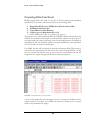
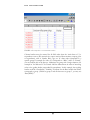
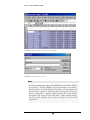
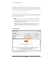
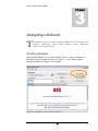
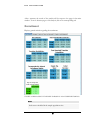
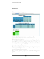
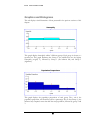
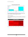
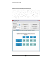
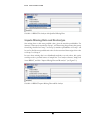
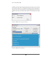
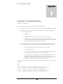
R D S
I N C O R P O R A T E D
Graphics and Histograms
This tab displays visual illustrations of data presented in the previous sections of this
chapter.
This graph displays homophily within 3 different groups. Each group is shown as a
separate bar. This graph illustrates that Group 2 (the middle bar) has the highest
homophily (roughly .3), followed by Group 1 (the leftmost bar) and Group 3
(rightmost).
This graph displays the population proportions of each group. The y axis is the
population proportion, and should be read as a percentage. We see that Group 1, (the
leftmost bar) comprises more than half the total population, followed by group 2 and
3.
33