1
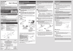
XYLab User Manual
© Matteo Ramazzotti, [email protected]
Introduction
XYLab has been written for the analysis and the real-time post labelling of multivariate data. It is basically an XY
plotter, with the additional feature of pop-up labels when the mouse rest over a plot point. Everything in the dataset can
be a label, including the other plottable (i.e. numerical) columns and non-plottable text labels (e.g. annotations).
Although below average in terms of graphics, XYLab offers unprecedented tools such as “text-in-plot” search with
dedicated point highlighting system and “select-n-paste”, which greatly helps in outliers’ characterization.
XYLab is free for non commercial use only. In all other cases, please contact the author.
Interface architecture
The program has four main areas:
1. menu: with controllers for adjusting the other areas.
2. plot area: where the data point are displayed.
3. paste area: where the points are annotated.
4. control area: where the control tools are placed.
Control area elements
Main data controllers
1.
2.
3.
X-column data selector : selects the column from which the x-axis values are taken.
Y- column data selector : selects the column from which the y-axis values are taken.
Labels data selector : selects the column from pop-up labels are taken.
Axis controllers
4.
5.
6.
7.
8.
9.
min-max: restrict the axis range setting up the extreme values.
Log : take the logarithm of the values (inactive in case of any value <= 0 in the column)
Norm : normalize the values between 0 and 1
Std : standardize the values with zi = (vi – avgV) / stdevV
Cent : center the data around an average of zero with ci = vi – avgV.
Value: real time values referring to cursor position on the plot.
Mouse left button controller
10. Copy-Zoom selector: switch the mouse cursor mode between zoom mode and copy mode.
Find line
11. Find string line : where the find string is specified. Find mode is activated when the [Enter] key is pressed.
Find controller
12. Lock/Unlock button: used to fix and unfix the highlighted results while changing the Label data selector.
13. Full/Restrict button: used to plot all the entities or only the found ones.
Input file
The XYLab input data is constituted by a plain text file containing tab separated data values organized in a table
with column headers as the first row. The current XYLab distribution contains a sample input file (Escherichia.txt)
with the typical format. It should be sufficiently self-explanatory. It contains 4240 rows x 18 columns = 76320 data
points. Columns 11,13,15, 16 are non-plottable. Their column headers should not appear in the X and Y controllers,
but only in the Label controller. In addition, XYLab recognizes GenePix .gpr files and skip non-data rows (header),
loading only useful data.
Basic plotter usage
At start up the program shows an empty plot area. The data are loaded with the specific command from the menu.
Otherwise the data can be pasted directly from external applications such as text files, MS Excel, OO Calc etc.
The program read the input data table (see below) and auto-detect the first two plottable columns (e.g. the ones with
numbers only) and the first non-plottable one (e.g. the one containing non numerical values).
The plot then appears with X, Y and Label controller set up to the detected columns: the data are plotted as black
circles. Their shape/size/colour can be adjusted from the Points menu.
When the X or Y columns are changed from the axes controllers, the plot updates accordingly (wow…)
If the mouse is left over a point for a little time (you can control this delay time with the PgUp and PgDn keys), a
pop-up labels appears, containing the value corresponding to that point in the column selected from the Label
controller. Obviously, the content of the label can be changed from this dedicated controller.
Changes in the X and Y min-max entries adjust the regions of the plot to be displayed, after the [Enter] key is
pressed in the keyboard.
With the left mouse button pressed, you can create a zooming rectangle in a defined are of the plot. When the left
button is released, the plot will be zoomed in the selected area. You can zoom in as much time as you want. The
right mouse button makes zoom out, step by step.
The find function
This function is pretty innovative for a plotter: it allows to use the column specified in the Labels controller for
keywords searching. To use this function the find line must be filled with some keyword string
When the [Enter] key is pressed, the keyword is searched.
The search result is graphically displayed on the plot: selected points will grow in size and change in color,
becoming easily identifiable in the plot area. The Lock/Unlock button is initially in the Unlock mode, meaning that
plotted entities will stay highlighted if you change the X and Y columns, but likely will change if you change the
Label column. As an example, if use the escherichia_dataset.txt input file you’ll have several points highlighted with
the “ribosomal” keyword if the Label column is “Annotation”, but if you change this column to COGClass no points
will become highlighted, simply because the COGClass column does not contain protein annotation, so no
“ribosomal” keyword will match.
When specifying queries you can use the modifiers available in the Perl language. For more info about pattern
searching see the Perl manpages at http://perldoc.perl.org/perlre.html and/or http:/perldoc.perl.org/perlreref.html.
In addition you can specify three specific modifiers:
some_text
tells the XYLab to show things that match “some_text”
!some_text
tells the XYLab to show things that do not match ”some_text”
>some_number
tells the XYLab to show things whose values is higher than or equal to “some_number”
<some_number
tells the XYLab to show things whose values is lower than or equal to “some_number”
Obviously if you search numbers in text-based labels or vice versa, you could expect strange results…and…please
avoid doing that.
To overcome the problem of missing pre-found entities when changing the annotation column, you can lock the
search results thanks to the dedicated button. The button turns red, meaning that the highlighted entities will be the
same even if you change the Label column. In other words, with “lock” you decide that you’re interested in these
entities, no matter the X Y or Labels you’ll use later. To unlock, simply press the Lock/Unlock button again.
If you’re really interested in the locked entities only, you can force the plot area to restrict the visualization to that
entities only. This option is turned on/off by the dedicated button.
When data are fixed and restricted, you can look at them moving in their multivariate environment, with the
preferred labels (wow…): it is like to explore three dimensions maintaining a fixed fourth dimension.
The select-n-paste procedure
The mouse controller in the control area allows you to switch on a very useful tool of the XYLab: when “Copy” is
on, no zoom is possible, but the same procedure used for zooming is used for selecting points in the plot. When the
left button is released, the X,Y and Label values of the selected points will be pasted in the copy-paste area of the
program.
You can freely edit this area by hand, and save its content to a text file with the menu Copy->Save copy buffer. The
copy-paste procedure can be controlled with the Copy menu: in single mode, only the currently selected X Y and
Label values will be pasted, while in Full mode the whole feature set will be pasted.
Adjusting the visualization
The plot area can be conveniently resized by using predefined shortcuts: holding down the Alt key on the keyboard
makes the arrow keys become size manager for the plot area (see table below). The amount of variation associated
with arrows depends on the specific configuration (see the XYLab.conf section below).
←
→
↑
↓
Alt+
Increase plot width
Decrease plot width
Increase plot height
Decrease plot height
Ctrl+
Increase x-axis margin
Decrease x-axis margin
Increase y-axis margin
Decrease y-axis margin
Thanks to this, one can easily adapt the program to fit a specific region of the screen. In addition, the ctrl+f shortcut
sends the plot to full-screen mode for the highest visibility, while a next press of ctrl-f revert to the normal
visualization.
Menu controls and options
Data
Load: select an input file to open, from which to extract data.
Paste: use data copied elsewhere as input.
Save current data: produce a text file with current X, Y and Label for all entities.
Save visible data: produce a text file containing the whole multivariate dataset but only for visible entities.
Copy
Single : paste in the copy-paste area only the currently selected X Y and Label for the copied entities.
Full: paste in the copy-paste area the full multivariate data for the copied entities.
Highlight copied: mark copied entities (those in copy buffer) in the plot.
Highlight while copying: mark copied entities on the fly in the plot.
Remove highlights: remove the entities marked by the two functions above (not that introduced by find!).
Save copy buffer: save the content of the copy-paste area.
Clear copy buffer: clear the content of the copy-paste area (no undo!!!).
X-Axis / Y-Axis
Labels on/off: display / hide the labels in the plot axes
Full: display the axis labels with maximal precision (lab = real)
Int: display the axis labels as the integer of the value (lab = int (real))
Sci: display the labels with scientific notation (with three decimals)
Increase font: increase the font size of the labels
Decrese font: decrease the font size of the labels
Labels
Single: pop-up labels containing only the value selected in the Label controller (affect also Find->Save).
Full: pop-up labels containing the full multivariate dataset (affect also Find->Save).
Permanent on/off: labels are not popped-up but always visible in the plot area.
Increase font: increase label font (used in permanent mode)
Decrease font: decrease label font (used in permanent mode)
Find
Mark last copied: used after a copy, highlight the last copied entities.
Save: save the found entities as text file.
Increase size: increase the size of the highlighted entity.
Decrease size: decrease the size of the highlighted entity.
Toggle empty/filled: change the display of the highlighted entity.
Toggle circle/square: change the shape of the highlighted entity.
Rotate red/black/blue/green: change the color change the shape of the highlighted entity.
Points
Increase size: increase the size of the entities.
Decrease size: decrease the size of the entities.
Toggle empty/filled: change the display of the entities.
Toggle circle/square: change the shape of the entities.
Rotate red/black/blue/green: change the color change the shape of the entities.
Config
Reload factory defaults: restore the display values used the first time XYLab was launched.
Show current conf: display the content of the XYLab.conf file in the copy-paste area, to be modified.
Save current conf: write the current configuration in the XYLab.conf file.
The configuration file: XYLab.conf
At the time of the first startup, XYLab places a configuration file in the user home folder (eg. /home/you/ in Linux
or c:\\Documents and Settings\you in windows). This .conf file stores your visualization preferences, i.e. the size of
the polt area, the proportion of that with axes and so on. Each time you interact with this geometry manager (with
the arrow keys or with dedicated functions in the Config menu, this file is updated. This means that the next time
you use the XYLab, it will remember you last geometry configuration. On the other hand, once you feel comfortable
with the interface and the plot area proportions, the conf file should be left unchanged. Here I’ll explain briefly this
.conf file. It contains something like this:
### XYLab configuration file ###
followed by several configuration parameters, that I’ll explain here briefly:
plot_width=800
plot_height=600
area_mov=10
x_ax_dist=10
y_ax_dist=10
axes_mov=1
copywin_height=5
x_label_size=8
y_label_size=8
ballon_label_size=5
label_delay = 100
: plot area width.
: plot area height.
: pixels associated to the Alt+arrows press (see above)
: % of the plot area from x-axis to the bottom margin
: % of the plot area from y-axis to the left margin
: % associated to the control+arrows press (see above)
: the initial height of the copy-paste window (in characters)
: size of the labels for the x-axis
: size of the labels for the y-axis
: size of the labels for the ballons that pop-up on mouse rest
: the delay time for the labels to pop-up
Availability
XYLab is mainly distributed as a script code to be used in OSs with Perl (5.8 or above) installed and equipped with
the Tk graphical interface. This is to maintain the highest portability. I can provide a fully functional PAR compiled
version to be used in Windows or Linux perl-free environments.
Warning: the XYLab is free for non commercial use only.
Caveats
Due to a graphic misbehaviour during initialization, when the XYLab is launched for the first time in linux, its
dimensions could appear exaggerate and the copy and control area below the bottom screen margin. To solve this
issue you’ll have to load a dataset, then refer to the paragraph “Adjusting the visualization” of this manual. Basically
you’ll have to manually resize the program until it fits your screen. This configuration will be saved for further
usage, so next time you start the XYLab everything should work fine.
Bug report
Please report any bug or suggestions to me, [email protected]. Recent releases of the XYLab have a new
function for writing a debug file while running. You can activate it by hitting the “ctrl-q” combination and a debug
file (XYLab.log) will be written in the same location where the XYLab.conf is placed. When reporting bugs, please
include the dataset you use when the errors were generated and the corresponding debug file.
XYLab: basic usage explained on escherichia.txt sample dataset.
00. Before launching the XYLab, open the Escherichia.txt file with a spreadsheet program (e.g. Excel) or with a text
editor, to familiarize with input format. Note that the are 4240 lines, that corresponds to points, described by 18
different variables: a total of 76320 data.
01. Launch the XYLab by double clicking on the program icon.
02. Open the test dataset (Menu - Data – Load. Select the Escherichia.txt file). The plot should appear immediately,
shaped like an exponential curve. X axis selector should be on “CAI”, Y axis selector should be on “gCAI”, while
labels should be on “Annotation”.
03. Place the mouse on the point with the highest Y value: in brief a label should pop up, saying “predicted stress
response protein”. This is the functional annotation of that point.
04. Change the Labels selector to “length” and repeat what done in 3. The pop up label now should indicate “210” that
is the length of that protein. Play with this selector to explore the different labels associated with different points.
05. From the menu, select Labels and click on Full. Repeat 3. Now the full variable set is popped-up. This is a
convenient way to control your dataset. Now turn off Full by selecting Single from the same menu.
06. Change the axes by playing with the axes selectors, e.g. choose the same variable in both axes. You should observe
a straight line that bisects the plot area. Not so informative, I know… Now play with the the X Y and Labels
controllers to enjoy the XYLab pop-up capability in different situations.
07. Select “Annotations” for the Labels controller. Now fill the “Find string” box with the term “ribosomal” and press
[Enter]. A number of points should grow in size and become red. In the status bar placed at the bottom of the
program window you should observe “63 elements found matching “ribosomal””.
08. Now change the label from the Labels controller, choose “NOST”. All the previously highlighted points should turn
back to original shape and color. This is because the NOST variable contain numerical values of normalized Codon
Adaptation Index, so it is evident that the term “ribosomal” cannot match anything inside that kind of variable.
09. Let’s come back to 6. Instead of “ribosomal” specify “!ribosomal” that, in the XYLab syntax, means “everything
but ribosomal”. You should reverse the highlight situation, and all points but 63 should be highlighted: the
statusbar should say that 4177 elements does not match ribosomal, since 4240 - 63 = 4177.
10. Let’s come back to 6. Press the “Full” button, that turn from green to red, indicating that the XYLab is in the
“Restrict” mode . This means that everything not responding to “ribosomal” should not be plotted, and exactly 63
big red points should be present in the plot. Now you can play with axes and look at ribosomal proteins move in
their multidimensional space. This is because the Label selector is on “Annotation”, and you’re not changing it. If
you change this, you change the dataset on which the “ribosomal” filter is applied.
11. Now press the “Unlock” function: it switches the XYLab to “Lock” mode. This means that the selection of
ribosomal protein is maintained also if you change the Label selector. Try to change it to “Length”. Set X axis to
gCAI and Y axis to CAI, and place the mouse over the point with the highest Y value. The pop-up label should
indicate 366, that is the length of that protein.
12. Now let’s change to another topic. Restore all controller buttons to green, i.e. in Full and Unlock mode and select
CAI as X axis and gCAI as Y axis. Look at the two topmost points, that are those in 3. Look at the “zoom/copy”
selector: it is now on zoom mode. Now zoom on those two points by drawing a rectangle around them with left
mouse button pressed. When the button is released the zoom is performed, and you should see the two points
isolated in the plot area. Look at the axes: they should be restricted to the selected area. Now unzoom by clicking
the right mouse button: look at the plot, it is restored to the previous one. So: left is zoom, right is unzoom.
13. Now change the “zoom/copy” selector to “copy”. Repeat the operation in 11, i.e. draw a rectangle around the two
topmost points. In the current configuration, you should get the CAI (X), gCAI (Y) and length of the two points in
the paste area. This is because of the axes selector’s choice. Change the Label selector to Annotation and repeat the
mouse selection. Now the information showed in the paste area should be different.
14. From the menu, select Copy and click on Full. Repeat 12. Now the full variable set should be present in the paste
area, ready to be pasted elsewhere. Take a look at what happened at point 5. Remember the Full in that case? Same
meaning in different situations.
This is a basic usage explained. There are many other features that you’ll have to experience with. Feel free to contact
me for any further explanation.