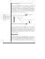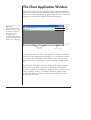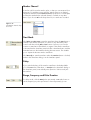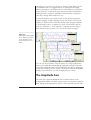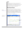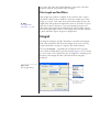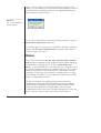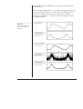
1
Char t So ftware Manual Chart version 5.2 for Windows 2000, XP e-corder ® www.eDAQ.com This document was, as far as possible, accurate at the time of printing. Changes may have been made to the software and hardware it describes since then, though: eDAQ reserves the right to alter specifications as required. Late-breaking information may be supplied separately. Document Number: UM-ES200W-0105 Copyright © January 2005 eDAQ Pty Ltd 6 Doig Avenue Denistone East, NSW 2112 Australia Trademarks of eDAQ Web:www.eDAQ.com Email:[email protected] e-corder and PowerChrom are registered trademarks of eDAQ Pty Ltd. The names of specific recording units, such as e-corder 201, are trademarks of eDAQ Pty Ltd. EChem is a trademark of eDAQ Pty Ltd. Chart and Scope are trademarks of ADInstruments Pty Ltd and used by eDAQ under license. All rights reserved. No part of this document may be reproduced by any means without the prior written permission of eDAQ Pty Ltd. Other Trademarks Apple, Mac, and Macintosh are registered trademarks of Apple Computer, Inc. Windows 2000 and Windows XP are either registered trademarks or trademarks of Microsoft Corporation. All other trademarks are the properties of their respective owners. ii Chart Software Contents 1 Getting Started 7 Learning to Use Chart 8 Where to Start 8 How to Use this Manual 8 Product Intention 9 Computer Requirements 10 The e-corder System 10 First Use 10 Basics of Data Acquisition 13 Sampling Rate 14 Filtering 15 Digitization 16 Range 17 Noise 18 Actual Display versus Expectations 19 2 Introduction to Chart 21 An Overview of Chart 22 Chart Files 24 Opening a Chart File 24 Closing a File or Exiting Chart 27 The Chart Application Window 28 Document Windows 29 The Chart View 30 The Toolbar 34 Recording 35 Chart Software Display while Recording 35 Blocks and Settings 35 Recording or Monitoring 36 Adding Comments while Recording 37 Background Recording 38 Duration of Recording 40 Data Buffering 41 Standby Mode 43 3 Setting Up Chart 45 Setting Sampling Rates 46 Maximum Sampling Rates 47 Channel Controls 48 The Input Amplifier 50 Signal Display 51 Filtering 51 Signal Input Controls 53 Other Features 54 eDAQ Amps and Pods 54 Units Conversion 55 Converting Quantities 56 Choosing Unit Names 58 Channel Settings 59 Triggering 63 Setting the Controls 63 Stimulation 67 Stimulator Mode 68 Setting the Controls 69 iii The Stimulator Panel 72 The Stimulator Output 73 Using Multiple e-corders 73 Synchronizing Recordings 74 Maximum Sampling Rates 75 4 Data Display 77 6 Data Analysis The Chart View 78 Changing Channel Size 78 The Split Bar 78 The Amplitude Axis 79 Display Settings 82 Channel Settings 86 Channel Titles 87 Color 87 Style 88 The Zoom View 88 Displaying Digital Read-outs 91 Organizing Chart Windows 92 5 Working With Files 95 The Experiments Gallery 96 Using the Experiments Gallery 96 Managing the Experiments Gallery 97 Selecting Data 98 Making Selections Directly 98 Using Set Selection 100 Deleting Data 102 Transferring Data 103 The Clipboard 103 Copy, Cut and Paste within Chart 103 Copying to other Applications 104 Opening Text Files 109 Saving Options 113 Saving a Selection 115 Appending Files 116 Printing 118 iv Page Setup 118 Print Preview 118 The Print Command 119 Comments 122 Backing Up Files 127 129 Measuring from the Waveform 130 Using the Marker 130 Finding Data 132 Search Criteria 133 Selection Criteria 134 Repeatedly Finding Data 135 The Data Pad 135 Adding Data to the Data Pad 137 Setting Up the Columns 139 Source Data for Rows 144 Printing 145 Saving as Text or Excel 145 Spreadsheet Functions 146 The XY View 147 The Spectrum Window 151 Spectrum Settings 152 The Notebook Window 156 Channel Calculations 158 Arithmetic 159 Cyclic Measurements 165 Derivative 170 Digital Filter 173 Integral 177 Shift 180 Smoothing 181 Computed Input 184 Sampling Rates 185 Signal Displays 185 Raw Data Controls 186 Computed Input Controls 189 Computed Input Functions 190 Chart Software 7 Customizing & Automating 199 Preferences 200 Default Settings 200 License Manager 201 e-corder Startup 201 Menus 202 Controls 204 Cursor 205 External Trigger Options 205 Special Access 205 Macros 206 Recording a Macro 207 Playing a Macro 209 Deleting a Macro 209 Options When Recording Macros 210 Macro Commands 212 Chart Extensions 218 Software Updates 219 A Menus & Shortcuts Data Pad 246 Derivative Channel Calculation 247 The problem of sampling rate 248 Data Headers for Reading Text 250 Command Line Options 252 D Data Pad Spreadsheet Functions 253 E Experiments Gallery Configuration Files 261 Sections Key Lines Comment Example 261 262 Lines 262 262 221 Menus 221 Keyboard and Mouse Shortcuts 225 Index B Troubleshooting Licensing & Warranty 229 265 275 Technical Support 229 Solutions to Common Problems 230 C Technical Notes 237 Calculation Details 237 The Spectrum Window FFT 237 The Derivative Calculation 241 The Digital Filter Calculation 242 The Mains Filter 244 The Smoothing Calculation 244 References 245 Measuring Signal Slopes 245 Contents v vi Chart Software 1 C H A P T E R O N E Getting Started Welcome to Chart for Windows, software that combines the familiar simplicity of a strip chart recorder with the powerful analysis features of a digital acquisition system. It is part of a range of eDAQ software that provide a multi-purpose data recording and analysis environment for use with a computer running Windows 2000 or XP. Please note that Chart 5 does not work with Windows Me, 98, or earlier versions. This chapter contains information on computer requirements. There is also a basic introduction to data acquisition for those new to the area. Chart Software 7 Learning to Use Chart Where to Start To install Chart for Windows and to use it, you should be familiar with the Windows environment. If you do not know how to use the mouse and keyboard, choose commands from the menus, copy or rename files, etc., please consult the guide that came with your computer. The software is designed to be easy to use, but familiarity with the operating system will make learning it a lot easier. If you have previously used Windows applications, you should find that menus, dialogs, and controls all work as you might expect. If you have used earlier versions of Chart, you should find that this version has much in common, although it has many improvements. You should start by reading the e-corder Manual (look for the pdf file installed on you hard disk) to be sure that you know how to connect your e-corder to your computer properly, and how to use your e-corder safely and effectively. Then continue with this chapter. ▼ Refer When using the PDF version of this manual on line, cross-references are shown in blue, and clicking on them will transport you to the reference. How to Use this Manual If you are in a hurry, read the rest of this chapter, and the overview of Chart in the next chapter. Start recording data, and refer to this manual when you encounter problems or unexpected results, or as you have the time to learn about the features you need. We recommend, that you gradually work through this manual in front of your computer. It may take more effort in the short term, but will end up saving you time and energy. Working through a manual like this, while slower, is a more effective learning process than just trying an application on the computer and seeing what happens. The information in the following chapters is set out in the order you will probably require it. First of all, though, read the rest of this chapter, which covers computer requirements, installing your copy of Chart, and the basics of data acquisition. 8 Chart Software Conventions Where convenient, Menu commands, shortcuts, etc., may be described using the conventions in Table 1–1. Note that shortcuts can appear in two forms: hyphenated in text, and with a + sign in tables, to make each clearer in context. Table 1–1 Shorthand usages referring to menu commands and shortcuts. Example phrase Meaning Edit > Preferences > Cursor… The Cursor… command of the Preferences submenu of the Edit menu Ctrl-S, or Ctrl + S Hold down the Ctrl (Control) key and type ‘s’ Alt-Shift-click, or Alt + Shift + click Hold down the Alt and Shift keys and click the mouse button Where to From Here? This book is a reference manual. It tells you how to use the software, and how everything works, but it does not include tutorials or extensive worked examples. There is further material availabl, including latest software versions and updates, and information on our products, from the eDAQ website, www.eDAQ.com. Product Intention Please note that products supplied by eDAQ are intended for use in teaching, research, and industrial applications and environments. They are not intended to be used as medical devices or in medical environments. Chapter 1 — Getting Started 9 Computer Requirements Basic Computer Requirements • A Pentium level processor • 64 MB RAM for Windows 2000, 128 MB RAM for Windows XP • 40 MB free hard disk space • A computer and monitor that support an 800 x 600, 256 color display or better • Microsoft Windows 2000 or XP • A CD-ROM drive (only required for installing the software, alternatively a network could be used) • A USB interface on your computer The e-corder System The e-corder system is an integrated system of hardware and software designed to record, display and analyze experimental data. The system consists of an e-corder recording unit and software (such as Chart and Scope) that run on the computer connected to the e-corder. Your e-corder unit has considerable computing power of its own and performs many tasks that are necessary during data recording. Once the e-corder transfers the data to the computer, the data are available for display, manipulation, printing, storage and retrieval. A variety of e-corder units are available with two, four, eight or sixteen input channels. First Use Ensure that the e-corder is connected properly to your computer (this is covered in the e-corder Manual) and turned on. Double-click the Chart desktop shortcut, or choose Chart from the All Programs menu of the taskbar’s Start button, under eDAQ (if Chart has been installed in the default location). 10 Chart Software Licensing Chart The first time you run Chart you will be presented with the dialog shown in Figure 1–1. Enter your name (minimum three characters), organization (minimum three characters) and you license code located on the back cover of the case that contains the Software Installer CD. Click OK to enter the license, or Exit to leave Chart. Figure 1–1 The Chart License dialog. e-corder Detection There may be a short delay while the program sets up the e-corder. If the e-corder is not properly connected or is turned off, then the dialog in Figure 1–2 will appear. If the dialog appears when the e-corder is connected and turned on, see the e-corder Manual for help. Some of the information from that guide on hardware start-up problems is repeated in Appendix B in this manual. If the dialog appears, and Chart is unable to find a connected e-corder when you click the Scan button, then exit the dialog (and Chart) by clicking the Exit button. Figure 1–2 The dialog that appears if an e-corder is not detected when Chart starts up. Chapter 1 — Getting Started 11 Website Resources Registration ▼ Refer Software Updates, p. 219 The first time you run Chart you will also have an opportunity to register your e-corder on the eDAQ website (Figure 1–3). Clicking the Yes button will launch your default web browser and open the Registration Form on the eDAQ website. Completing the form at this point saves you time when you first download an e-corder resource. If you do not register now you can do so later when you use Check for Updates… from the Help menu, or by going directly to the eDAQ website at www.eDAQ.com. Figure 1–3 Register for eDAQ Resources. Exiting Chart If you want to exit Chart after opening a file, choose Exit from the File menu. If you want to proceed with working through this manual, you can leave the file open, and proceed. 12 Chart Software Basics of Data Acquisition This is a general introduction for those new to data acquisition. It should help you to obtain the best results when recording with an e-corder system. The purpose of the e-corder system is to acquire, store and analyze data. Figure 1–4 summarizes the acquisition. Usually, the raw input signal is in the form of an analog voltage whose amplitude varies continuously over time. This voltage is monitored by the hardware, which can modify it by amplification and filtering, processes called ‘signal conditioning’. Signal conditioning may also include zeroing, for example the removal of an unwanted steady offset voltage from a transducer’s output. After signal conditioning, the analog voltage is sampled at regular intervals. The signal is then converted from analog to digital form before transmission to the attached computer (computers need digital data). The computer software usually displays the data directly; it plots the sampled and digitized data points and reconstructs the original waveform by drawing lines between the points. Digital data can be stored on disk for later retrieval. Software can also easily manipulate and analyze the data in a wide variety of ways. Most of the parameters that affect acquisition can be set by the user through the software. To make a good recording, the parameters must be appropriate for the signals being recorded. In some disciplines you may be able to find tables of suggested sampling rates, ranges and filter settings, but these should not be applied blindly. You still need to Figure 1–4 A graphical summary of data acquisition using an e-corder system. e-corder hardware Transduce Computer …101101… Mechanical signal Input Analog electrical signal Amplificatio Chapter 1 — Getting Started Digital signal Filtering Sampling Display 13 know the science (what you are recording, why you are recording it, and what relation it bears to real phenomena) and the technique (how best to record, and what limitations or compromises are inherent in the process). Sampling Rate Sampling replaces the original continuous analog signal by a series of discrete values (samples) taken at regular time intervals. The appropriate sampling rate depends on the signal to be measured. If the sampling rate is too low, information is irreversibly lost and the original signal will not be represented correctly. If it is too high, there is no loss of information, but the excess data increases processing time and results in unnecessarily large disk files. 20 /s Figure 1–5 Undersampling: recording a pressure signal at 20 /s and 200 /s, showing that slow sampling can fail to depict the signal accurately. 200 /s Recordings of periodic waveforms that have been sampled too slowly may be misleading as well as inaccurate because of aliasing. An analogy to aliasing can be seen in old films: spoked wagon wheels may appear to stop or even go backwards when their rate of rotation matches the film frame speed — obviously not an accurate record. To prevent aliasing, the sampling rate must be at least twice the rate of the highest expected frequency of the incoming waveform. This sampling rate is known as the Nyquist frequency, the minimum rate at which digital sampling can accurately record an analog signal. For example, if a signal has maximum frequency components of 100 Hz, 14 Chart Software the sampling rate needs to be at least 200 Hz to record it accurately. To provide a safety factor to guard against information loss, it is usual to sample at five to ten times the highest expected frequency rather than the minimum two times. Actual signal (3.5 Hz), at 40/s Figure 1–6 Aliasing: sampling a 3.5 Hz signal at 4 samples/second gives a misleading waveform, an apparent signal of 0.5 Hz (however, real-life effects tend to be more subtle). Aliased signal (0.5 Hz), at 4/s Sample points at 4/s In most cases, the highest expected frequency will be known. It may well be limited by the transducer used: a bridge transducer to measure mechanical force will not produce high frequencies, for instance. If you are unsure of the frequency range (bandwidth) of your signal, a useful rule of thumb is to choose a sampling rate high enough to allow at least 5 to 20 samples for any transient peaks or recurring waves in the signal. ▼ Refer The Spectrum Window, p. 151 The highest frequencies in a signal can be formally determined by sampling the signal at the maximum rate, and looking at the spectrum of the signal (using the Spectrum window). High-frequency components in the spectrum with less than 2% or so of maximum amplitude usually contribute little to recording accuracy. Filtering Any analog waveform can be described mathematically as the sum of a number of pure sine waves at various frequencies and amplitudes. Low frequencies characterize the slowly changing parts of a waveform; high frequencies, the quickly changing parts. A filter removes selected frequencies from a signal: for instance, a low-pass filter lets low frequencies pass and stops high frequencies. Low-pass filters are commonly used to help reduce noise and give a smoother signal. A Chapter 1 — Getting Started 15 high-pass filter removes any steady component of a signal; it also removes slow fluctuations. Filters are imperfect. A 200 Hz low-pass analog filter, say, might leave frequencies up to 150 Hz untouched, reduce a 200 Hz signal to 0.7 of its original amplitude (this is its cut-off frequency), and reduce higher frequencies more and more. If you were expecting useful frequencies of up to 100 Hz, you could sample at 400 samples per second and filter out any higher frequencies using a 200 Hz filter. If higher frequencies are left unfiltered, then they could possibly be aliased, resulting in the false appearance of lower frequencies. Figure 1–7 The effects of filtering on a mixed-frequency signal: a high-pass filter removes low frequencies; a lowpass filter removes high frequencies. Original signal (high and low frequencies) High-pass filter Low-pass filter Filtered signals Filtering can change the signal to some extent: its use must be balanced against the distortions it can remove, such as noise, baseline drift, and aliasing. If the filter settings overlap the bandwidth of a signal, then the signal will have components removed. If you were interested in a waveform with components down to 5 Hz and used a 20 Hz high-pass filter (filtering out 0 to 20 Hz signals), then vital information would be lost from the signal. Digitization When analog data such as voltage amplitude is converted to digital form for use by a computer, it must conform to a fixed number of values (for instance, a digital thermometer might only measure temperature to the nearest degree). Any analog values between these values are rounded up or down. The approximation is usually very good, since the 16 Chart Software Unfiltered Figure 1–8 A signal with various lowpass filter settings: some filtering cleans up noise, but too much unacceptably distorts the high-frequency spikes. Noise reduced Over-filtered number of values is very large. The analog-to-digital converters (ADCs) that perform the digitization usually generate a number of values equal to a power of two: an ADC with 12-bit resolution can resolve a signal into 212 or 4096 possible amplitude values; an ADC with 16-bit resolution can resolve a signal into 216 or 65 536 possible amplitude values. The e-corder hardware units uses a 16-bit ADC. Chart fits 64 000 of the 65 536 values to the ±10 V range, allowing some leeway above and below it for signal extremes. The values in the10 V range are divided into 64 000 fixed values from –10 V to +10 V; the minimum change in voltage that could be discerned at that range would be 0.3125 mV. At 10 mV range, the minimum discernible voltage change would be 0.3125 µV. Range Range is inversely proportional to gain, the amount of amplification, and is a more useful concept than gain since it relates directly to the signal being measured. The range can be set independently for each input on an e-corder recording unit. If the signal amplitude exceeds the range, there will be severe loss of information. (This is the same as ‘clipping’ in a stereo system where music is severely distorted when the amplitude exceeds the capabilities of the amplifier.) Any signal exceeding the range is ‘out of range’, a condition indicated where no amplitude can be given. If there is any Chapter 1 — Getting Started 17 possibility of this condition occurring, you should set the range to a larger value. For the best resolution, the maximum amplitude of the signal you are interested in should be reasonably close to the chosen range without exceeding it. That way, the minimum change in voltage discernible in digitization remains small in relation to the signal being measured (the signal is digitized after it is amplified). If a signal is very small in relation to the range, then its resolution will be degraded. In extreme cases, the recorded waveform may appear stepped rather than smooth. Even though you could see a ±380 mV signal easily enough at the default 10 V range, you would use the 500 mV range to measure it at maximum resolution. It would be safer in practice to use a 1 V or 2 V range, though, since unexpectedly large peaks could exceed the 500 mV range if the signal was not well-behaved. Changing the display of the waveform on screen (by enlarging it in the Zoom View or by stretching or shrinking its Amplitude axis, for instance) does not affect its resolution, just its appearance. Noise Noise is defined as ‘unwanted signal’. It is likely to be a problem at lower range settings, when you are trying to measure very small signals. Random noise, such as thermal noise, is inherent in all electronic circuits, including those of the e-corder recording unit, and generally must be filtered to minimize it. The trick is to choose a lowpass filter setting that removes most of the background noise without unduly changing the signal of interest. For some signals, differential inputs are preferred, and can reduce common-mode noise due to ground loops. (Ground loops occur where multiple connected pieces of recording equipment are connected to mains power grounds.) The e-corder single-sided inputs are ‘quasi- Figure 1–9 Noise in a signal (left) can mar the original signal (right), unless filtered out. 18 Chart Software differential’, and automatically neutralize up to a fraction of a volt of ground loop noise, the most that normally appears. Other important causes of noise are stray electromagnetic and electrostatic fields, and include interference (often at the mains frequency of 50 Hz or 60 Hz) from unshielded power lines, switching equipment, fluorescent tubes, transformers, computers, network cables, VDUs, etc. The interference can interact significantly with a recorded signal. Reasonable care in the arrangement and shielding of equipment and cables will reduce such interference. Particularly delicate measurements, however, may require special apparatus and a controlled environment. Actual Display versus Expectations Because the expected shape of a waveform is based on known examples from previous experiments, it may be difficult at first to interpret waveforms presented in a new manner, especially if they scaled at different factors. If the underlying data are valid and you want to make the appearance of the waveform seem more usual, then change the display settings (yaxis stretching and time axis compression), not the recording settings (sampling speed and full scale input range). Figure 1–10 A signal viewed with various display settings changed — this is actually the same waveform in each case. Chapter 1 — Getting Started 19 The screen display most computer monitors is generally about 72 dots per inch (dpi), so the apparent resolution may be poor if the display is kept small. The signal might appear jagged and unresolved on screen. However, the resolution of the underlying recorded data is independent of the resolution of the display: even if the channel display is very thin or not visible on screen, sampled data are recorded at full fidelity, as can be seen by expanding the display or examining the waveform in the Zoom View. Printing can also affect the appearce of your signals. In particular, highresolution printing can show the selected signal very accurately. Because of this, a printed signal might not appear as smooth as an old fashioned pen recorder might produce. In this case using Chart’s Smooth channel calculation, or a low pass digital filter to give a more standard-looking result. It is important to check display settings and axis labels carefully when examining a signal, to be sure of what you are looking at, especially if the settings on your machine might have been altered. A waveform may look very strange if it has been stretched vertically and compressed horizontally, say. 20 Chart Software 2 C H A P T E R T W O Introduction to Chart Chart is the application that, together with your e-corder, makes up the e-corder system This chapter provides a general overview of Chart, looks at the Chart Application window and the Chart View in detail, and deals with the basics of recording data. Chart Software 21 An Overview of Chart Chart, together with the e-corder hardware and a computer, gives you the capabilities of a multi-channel chart recorder and more. Depending on your e-corder model, you can record up to 16 signals on different channels at speeds of 20000 samples/s, or a single signal on one channel at rates up to 200 000 samples/s, page 47. Chart also provides a range of flexible display and powerful analysis features. Controls and Display The Chart Application window, page 28, and its Document windows, page 29, can be resized. The data display area can be compressed or expanded horizontally, or split into two panes, page 78, and the vertical size of each channel can be changed to suit, simply by dragging the dividing bars, page 78. Inputs for channels can be turned off, page 48, and channels can be hidden if they are not required, and their amplitude axes can be dragged, stretched, scaled or set through a dialog for optimum data display, page 79. Range, page 48, and filtering, page 51, options can be set independently for each channel’s input. You can type in appropriate channel titles, page 60, and define units of measurement, page 55, for each channel. Display colors, patterns and grids can be altered, page 82. A toolbar, page 34,allows common operations to be performed with a single click of the mouse. Recording You can not only view data as they are sampled, but also review past data while sampling in a split, page 38, or single window, page 92. Sampling rate and range can be changed while recording at lower sampling rates. You can start and stop sampling at any time, page 35, and build up a Chart file with many individual sections of data. Files are usually buffered to disk, page 41, and data recorded this way can survive a power failure — which is especially useful for lengthy recordings. Comments to mark events can be made during, page 37, or after, page 122, recording, on all or on specific channels. 22 Chart Software Saving, Printing and Editing Chart recordings can be printed, page 118, edited and saved to disk, for later review, page 23. You can save the settings of any Chart file, page 114, to enable an experiment to be repeated quickly and easily, without having to go through the process of setting it up again. You can print a selection or save it as a file — this allows for easy editing by extracting only that part of the recording you need. You can append files to the end of an open file, page 116, to produce recording summaries conveniently in a single file. You can even copy, cut, and paste data directly within a Chart file, page 103, or between files. Data can be transferred as text to other applications, such as spreadsheets or statistics programs, page 104. Analysis When you have finished recording, you can scroll through your data and make measurements directly from the recording, page 130 — you are given a direct read-out, with no chance of measurement errors. You can measure relative to a set reference point using the Marker, page 130. You can search channels for comments, peaks and troughs in the waveform, block boundaries, etc., and select data according to criteria you specify, page 132. The Data Pad, page 135, calculates and stores statistics about recorded data, and can be printed out or have its data transferred to other applications. You can plot data from one or two channels against another, either online or offline, using the XY View, page 147. In the Zoom View, page 88, you can examine a section of the recording in more detail, overlaying channels for direct comparison if you wish. The Spectrum window, page 151, allows flexible analysis of the frequency components of your waveform. Advanced Features Triggering functions, page 63, let you control when Chart starts and stops recording, using internal or external measurements. The Stimulator, page 67, allows you to set up a voltage output signal for an experiment, and the Stimulator Panel, page 72, allows this to be turned on or off or adjusted as required during recording. A range of channel calculations, page 158, can be applied to further analyze displayed data, for example data can be smoothed to remove unwanted high frequencies in the waveform. Chapter 2 — Introduction to Chart 23 Customizing Chart can be extensively customized, page 199, for your purposes. Controls and menus and their commands (and keyboard shortcuts) can be locked, hidden or altered, page 202, and Chart as a whole simplified, say, for student use. Chart files and related files such as documentation and multimedia files can be added to the Experiments Gallery, page 96, for easy access. Macros, page 206, can be created to speed up and to automate complex or repetitive tasks, and stored in any menu in a file. Customized menus, units, and macros are document-specific. Chart extensions, page 218, are available to add specialist analysis capability to Chart, and to provide data export options to other applications. Chart Files Figure 2–1 Chart data and settings file icons. There are two main types of Chart file: data files and settings files (Figure 2–1). Data files are used for recording data. Settings files do not contain recorded data, but store Chart settings such as sampling rate, input ranges, trigger settings and display settings. They can be used to create new data files with the desired settings, or can be applied to existing data files. Chart files are also referred to as Chart documents. Chart files may have a number of associated windows. All have a Chart View, in which data is recorded. They may also have other document windows that provide alternate views of the data, such as the Zoom View, XY View or the Spectrum window. When a file is opened or closed, all its associated document windows will open or close. Opening a Chart File It is a good idea to have a Chart file open if you are working through this manual, so that you can try the commands, controls, and settings as they are discussed in the text. First, make sure that the e-corder is properly connected to your computer, and is turned on. You may wish to learn Chart without the e-corder — if you have taken home a copy on your portable, for instance. In this case, on starting Chart, a dialog (Figure 1–2) will offer the Analysis option, which lets you use Chart 24 Chart Software Figure 2–2 Chart desktop shortcut: double-click it to open Chart. ▼ Refer The Experiments Gallery, p. 96 except for where the e-corder hardware is required, such as for recording. Unusable controls generally appear dimmed. You can start Chart with a file by double-clicking on the icon of a data file, or by double-clicking on the icon of a settings file, which will open up a new data file with the settings in the settings file. Alternatively you can start Chart without a file by double-clicking the Chart desktop shortcut (Figure 2–2) or by choosing Chart from the Programs menu of the taskbar’s Start button, under eDAQ (the default location). In either case there may be a short delay while Chart sets up the e-corder. If you start Chart without a file and the Experiments Gallery has been set up, the Experiments Gallery dialog may appear at this point: close the dialog and ignore it for now; its use is described in Chapter 5. When Chart opens, the Chart Application window will appear, containing the Chart View and any other document windows (such as the Zoom View) associated with the file. When Chart starts up, by default the Chart Application window will fill the screen, and the Chart View will fill the Chart Application window, but the size of each can be adjusted. Chart allows you to have up to eight documents open at once, but only one such file can be used for recording from the e-corder at any one time. You cannot open another document while Chart is recording. Once Chart is open, you can Choose New from the File menu to create and open a new Chart data file. If there is no document open, a new document is created using the default settings stored by the program (settings include the sampling rate, input ranges, channel areas, display settings, window sizes, etc.). If there is a document already open, the New Document dialog appears. It gives you the choice of using the default settings or using the settings from the active open document. If the checkbox is selected, then before the new document appears, the Figure 2–3 The New Document dialog. Chapter 2 — Introduction to Chart 25 Figure 2–4 The Open dialog. active open document is closed (you get to save any changes made to it). New documents are titled ‘Document1’, ‘Document2’, etc. Choose Open… from the File menu to open an existing file. The Open dialog appears. Use it to find the file on your computer that you want to open. Once you select the file in the dialog list, it highlights, its name appears in the File name text entry box, and clicking the Open button will open it. ▼ Refer Opening Text Files, p. 109 26 The Files of type drop-down list lets you choose the sort of file to open: only the chosen type will be visible in the scrolling list. The standard choices in the drop-down list are Chart Data File, Chart Settings File, Chart File (the default, which includes both data and settings files), Text and All Files — but others may be added in some circumstances. The All Files option allows you to open Chart files that have somehow lost the suffix that identifies them. (This filename suffix, or file extension, is always present in Windows, although you can choose to hide it.) Using a demonstration file as you work through this manual will show you some real data and perhaps give a better idea of what is going on in Chart. If you want to protect the original files, duplicate some demonstration files and rename them, and open the renamed files to experiment with. Chart Software The four most recently opened Chart files are listed at the bottom of the File menu. You can reopen a file in the list by selecting it from the menu, or by using Alt + the list number as a keyboard shortcut. If you select a file that is already open, it is maximized and brought to the front. Closing a File or Exiting Chart ▼ Refer The Experiments Gallery, p. 96 To close a Chart file, choose Close from the File menu. This will close all of the file’s associated document windows. You can close the document windows individually; in this case a file will not be closed until the last document window associated with it is closed. Note that when the last file in Chart is closed, the Experiments Gallery dialog (see Chapter 5) will appear (provided that it has been set up). To exit Chart (that is, quit the program and close all its windows), choose Exit from the File menu, click the close button of the Chart Application window, or type Alt-F4. In either case, if you have made any changes to a document, an alert will appear, asking you if you wish to save your work. Click Yes if you wish to keep the changes you have made. Click No if you want to discard the changes. Chapter 2 — Introduction to Chart 27 The Chart Application Window All essential controls for recording data are provided within the Chart Application window and the Chart View. These controls are discussed below, and, where appropriate, in greater detail elsewhere. The Chart Application window itself contains all document windows. Title bar Menu bar Toolbar Figure 2–5 The Chart Application window, with no visible document windows (if there are no open documents, the Commands and Macro menus and many Toolbar buttons do not appear). Progress bar Status bar Memory indicator The Menu bar at the top of the Chart Application window contains the Chart menus (see Appendix A), allowing you to set up and modify the way Chart looks and behaves. The toolbar provides shortcuts in the form of buttons for common tasks, such as opening or saving a Chart file. The left panel of the Status bar at the bottom of the window indicates the function of any menu command or toolbar button at which the pointer is pointing. The right panel indicates the state of Chart in some cases: recording a macro, for example. A memory indicator and progress bar indicate the amount of disk space available and how much the file has used. 28 Chart Software Document Windows Each Chart file may have associated with it a number of document windows. The Chart View is where data is recorded, and other document windows, such as the Zoom View, provide alternate views of the data. Document windows are contained within the Chart Application window, and can never escape or spill over onto the desktop: the Chart Application window acts like a desktop to them (Figure 2–6). Within these confines, they can be moved, resized, closed, maximized, restored, or shrunk to a minimized state. Figure 2–6 The Chart Application window, with some document windows. Chart Application window Chart View Minimized document windows Document windows can be maximized, thus effectively combining with the Chart Application window to act as one window, by clicking their maximize buttons. In this case document window titles are shown in the Chart Application window Title bar, in brackets after the application name (Figure 2–8). When Chart or a Chart file is opened, the Chart Application window appears by default with the Chart View filling the space available. For the most part, this manual assumes you are dealing with one active Chart View, not maximized, in which you record data. Chapter 2 — Introduction to Chart 29 Application buttons Figure 2–7 The components of the Chart View. Document buttons Date display (optional) Minimized channels (which can also be hidden) The Chart View Below the Title bar and Comments bar, there are three main areas in the Chart View, from left to right: the Amplitude axis area, which contains the scale for each channel; the data display area, which contains recorded data; and the channel control area (Figure 2–7). Navigating The scroll bar lets you move through the data in the Chart View. Click the left or right arrows, or drag the box in the scroll bar, to move smoothly left or right. Click in the region to either side of the box in the scroll bar to jump a screen left or right. You can move to the start or end of a recording by choosing Go to Start of Data or Go to End of Data from the Commands menu, or typing Ctrl-Left arrow or Ctrl-Right arrow respectively. Buttons in the toolbar also duplicate these functions. Compression Buttons The Compression buttons allow you to compress or re-expand the horizontal scaling of a file in the Chart View (the steps are 1, 2, 5, 10… up to 2000 to 1). To see more of the file on screen at once, click 30 Chart Software Figure 2–8 The Chart Application window, showing a maximized Chart View. File title Comments bar Waveform Pointer cursor Rate pop-up menu Rate/Time display Range/ Amplitude display Data display area Channel information Amplitude axis Range pop-up menu Channel separator Channel Function pop-up menu Scale pop-up menu Channel title Scaling buttons Start/Stop button Marker Split bar Time axis Scroll bar Scroll/Review Compression button buttons Record/Monitor button the left (far mountains) button to compress it. To expand the file out again, click the right (near mountains) button. The button between the two shows the scale: clicking on this button drops down a list letting you choose the extent of horizontal compression directly. If you print a horizontally compressed file or selection, then it will print at the compression at which you see it on screen. The Chart Axes The horizontal Time axis, above the Scroll bar along the bottom of the Chart View, records the time from the start of sampling or the absolute time in various forms, depending on the time format (which can be set using the Display Settings dialog). ▼ Refer The Amplitude Axis, p. 79 For each channel, the vertical Amplitude axis on the left of the window indicates the amplitude of the recorded waveform. Note that the axis area remains blank until some data are actually recorded. The scale for each channel is initially set by the Range pop-up menu on the right side Chapter 2 — Introduction to Chart 31 ▼ Refer Units Conversion, p. 55 of the window, but can be stretched or dragged using the pointer. Display options can be chosen from the Scale pop-up menu (this cannot be used if the channel has no visible data). The units of the active channel are shown in the axis. Units are volts by default, but may be changed to mmHg, Ω, kPa, or any other unit that you need, by using units conversion. Scaling Buttons The Scaling buttons are on the left side of each channel’s Amplitude axis. Click the + button to enlarge or the – button to reduce the vertical scale, halving or doubling what is shown each time. Channel Controls ▼ Refer Channel Controls, p. 48 The channel controls are located rightmost in the Chart View, at the right of the data display area. The Rate pop-up menu at the top right of the Chart View controls the sampling rate, which must be the same for all channels. There are two channel controls for each individual channel. Click the down arrow button to the left to choose the range from the Range pop-up menu. Click the down arrow button to the right of the channel title to choose options from the Channel Function pop-up menu. Sampling Parameter Display When the pointer is over the channel control area, the Rate/Time display shows the current sampling rate in samples per second. When the pointer is over the data display area or Time axis, the Rate/Time display shows the time at the cursor position. When the pointer is over the channel control area and the channel’s input is on, the Range/Amplitude display shows the current range of each channel. When the pointer is over the data display area or Time axis, the Range/Amplitude display shows the amplitude of the waveform at the cursor position. Channel Settings Information Clicking the Channel Information button displays a list of settings that will apply to newly recorded data including the range, filter settings, 32 Chart Software the e-corder input used, the sampling rate and details of any channel calculations. Click-holding in the data display area of a block displays a list of the settings that were used to record that block on that channel. Data Display Area Split bar Recorded data are shown in the area in the Chart View bounded by the channel control area on the right and the Amplitude axes on the left (see Figure 2–7). The data for each channel are bounded above and below by horizontal bars. These bars, or channel separators, can be dragged up or down to vary the size of the channel display areas (double-click them to restore their original positions). Split Bar The vertical Split bar, at the left side of the data display area, can be dragged to the right to split the data display area into two parts, each with its own scroll bar and Compression buttons, so that you can compare different sections of recorded data, or compare data already recorded with new data as they are sampled. The Marker The Marker can be found in a box at the bottom left of the Chart View. It can be dragged onto the data display area to set a particular data point on a waveform as a zero reference point, so that measurements can be made relative to that point. Double-click it or click its box to send it back home. Start Button To start sampling, click the Start button at the bottom right of the Chart View (or the equivalent button in the toolbar). The button label then changes to Stop: click it to stop sampling. There may be a short delay while sampling starts or stops. Chapter 2 — Introduction to Chart 33 Record/Monitor Button The Record/Monitor button at the bottom right of the Chart View, to the left of the Start button, controls whether data are recorded as they are sampled (the default) or merely displayed, and discarded when sampling stops. When monitoring (to get an idea of incoming signal characteristics, perhaps), a cross is shown. Click the button to switch between recording and monitoring. Scroll/Review Button The Scroll/Review button is at the bottom right of the Chart View, to the left of the Compression buttons. When it is depressed, data are scrolled while recording (the normal behavior). When it is raised, you can use the Scroll bar to review the recorded data even during recording. Pointer The pointer will change form as you move it about the Chart View, giving you an indication of its function in certain areas — it becomes an I-beam over a text entry area, for instance. The Toolbar ▼ Refer Toolbar Buttons, p. 204 The toolbar provides shortcuts for common tasks in Chart in the form of a row of buttons. The button functions are indicated if the pointer is held over them. Toolbar buttons can be hidden, and shown again, through the Menus dialog. Open Print Zoom View Data Pad Go to start of file Auto scale all channels Figure 2–9 The Toolbar (the Start button is not shown). New 34 Save to disk Chart View XY View Data Pad miniwindow Go to end of file Chart Software Recording To start recording, click the Start button at the bottom right of the Chart View. The button then changes to Stop: click it when you want to stop recording. Alternatively, you can type Ctrl-space bar. Display while Recording Figure 2–10 Displays of time and signal amplitude while recording. ▼ Refer General Display, p. 84 Chart uses the visual metaphor of a mechanical chart recorder: recorded data scroll across the data display area from the right of the window as if the display area were a roll of paper in such a device, with new data being drawn at the right and old data moving left. (This way of displaying data can be changed though, so that data do not scroll at all, by using the Scroll/Review button, or so that data are displayed in Sweep mode, set in the Display Settings dialog.) During recording, the amplitude of the signal being recorded (in the right pane if the window is split) is shown in the Range/Amplitude display at the right of each channel, unless sampling at higher rates. If units conversion is being used, the value is displayed in the set units rather than as a voltage. The time is also shown in the Rate/Time display at the top of the channel control area, in a form depending on the time display format (usually from the start of the block). These displays are updated every quarter of a second or so. Blocks and Settings A solid vertical line is drawn by default between two sections (user-defined ‘blocks’) of recorded data to indicate discontinuity, for instance if you stop recording and then start again. If you change the range of one or more inputs, a new scale is drawn between the two Figure 2–11 Blocks of data: left break, after stopping and starting; right, after changing a channel’s range. Chapter 2 — Introduction to Chart 35 blocks to show the new range for each channel. Blocks always apply across all channels, even if settings on only one have been changed. At slower rates, you can change the sampling rate and input range settings without having to stop and restart recording. Chart will simply start a new block at the point where the settings were changed, drawing a solid vertical line or a new scale as appropriate. The display will momentarily stop scrolling while you are making settings changes, then update once the operation is complete. Recording or Monitoring Figure 2–12 Record/Monitor button: left, data displayed and recorded; right, data displayed but not recorded. The Record/Monitor button at the bottom right of the Chart View, to the left of the Start button, controls whether sampled data are recorded (the default) or merely displayed on the screen, perhaps to get an idea of incoming signal characteristics. When monitoring, sampled data can be seen coming in, but the data are not actually recorded, and disappear once sampling stops. Clicking the button switches between recording and monitoring. The data display area is grayed while monitoring, so it is easy to distinguish monitoring from recording. The grayed area disappears (along with any sampled data in that area) once monitoring stops. You cannot add comments while monitoring, since there is no real record, so the Comments bar is dimmed, and typing has no effect. You can stop or start recording data into memory at any time during recording by clicking the Record/Monitor button. This is useful to see if incoming signals are behaving themselves before you actually record them. Status while Recording While sampling, the Title bar of the Chart View gives information on the recording status of Chart (see Figure 2–13): whether data are actually being recorded, or whether Chart is waiting for a trigger or for a post-trigger delay time to elapse. This gives you a quick visual indication of recording status. ‘Recording data’ means that data are being recorded. If data are not being recorded into memory and are only being displayed on the screen, ‘Monitoring data’ shows. If you have set up triggering, 36 Chart Software Figure 2–13 Title bar while sampling. ‘Recording: waiting for trigger’ shows while the e-corder is waiting for a trigger event to occur before it starts sampling. If you have set up a trigger delay, ‘Recording: post-trigger delay’ shows after triggering, while the e-corder is waiting for the delay to elapse. A few other messages may appear in some circumstances. Adding Comments while Recording During recording, comments can be entered as required, and are automatically numbered as they appear. The Comments bar, at the top of the Chart View below the Title bar, is usually used for this. Type the comment in the text entry area. Click the Add button at the right of the text entry area or press the Enter key to add the comment to the file at the time the action is taken. ▼ Refer Comments, p. 122 Figure 2–14 The Comments bar. By default, comments apply for all channels: when this is the case, the numbered comment box is preceded by an asterisk. Note that comments are reset to this default whenever sampling is started. To comment on a specific channel, either select the text in the Channel field and type the number of the channel, or click the channel you wish to comment on in the data display area. To apply a comment to all channels, type in an asterisk, or click in the Time axis area at the bottom of the Chart View. You can also click the small up and down arrows while recording to change channel numbers. Channel the comment applies to (* for all) Chapter 2 — Introduction to Chart Comment number box Text is inserted here as you type Click this button to add the comment 37 Comments are stored and saved along with recorded data. Comments are marked by a dashed vertical line, text and comment box inserted in the appropriate channel on the record (or across all channels if the comment applies to all channels). When you have finished recording, you can read the time and the full text (text of long comments may be truncated in the Chart View) of each comment by placing the pointer over the comment box and clicking: a box pops up displaying the comment. Comments can also be added after recording, by choosing Add Comment… from the Commands menu, and can be read, edited, deleted, found and printed from the Comments window. Comment boxes, lines and text can be hidden if this is desired. Figure 2–15 General and channel-specific comments, and the pop-up comment box. Background Recording Recording is not an all-or-nothing process; you can do other things while recording in Chart. You can review recorded data, compare old data with new by using the split-screen feature, or leave Chart recording in the background (even when the window is minimized) while you run other applications. This is useful for longer recordings, since the computer is not tied up doing one thing. You do generally need to be using Chart at slower or moderate sampling rates in most cases, especially with a slower computer. Recording while Reviewing Data Normally, when recording in Chart, the recorded data scroll across the data display area from the right of the window, with new data being drawn at the right and the old data moving left. In these circumstances, the Scroll bar is dimmed and inactive, and the Scroll/Review button is 38 Chart Software Figure 2–16 Control changes when reviewing while recording. You can scroll through data already recorded Scroll/Review button set to Review set to Scroll. When the button is clicked, it highlights and depresses, and reviewing becomes active (Figure 2–16). When reviewing while recording, you can use the Scroll bar to scroll through previously recorded data: the scrolling controls all work normally, and you can read the Time axis. Data are still being recorded, but the new data are only visible if you scroll to the right-hand end of the record. You can select data and thus use the Zoom View, XY View, Data Pad and Spectrum window, and can even print selections while recording. You cannot add comments using the Comments bar while reviewing, but you can use Add Comment… command from the Commands menu instead. Recording with a Split Data Display You can split the data display area before or during recording, by dragging the vertical Split bar to the right. Splitting the data display area allows the incoming data to be viewed alongside previously recorded data, so that you can compare the two. Note that there are separate Compression buttons for each pane, so the data in each can be shown at different horizontal compressions. There is also a Scroll/Review button in each pane. This means that while recording, you can set either pane to Review and the other to Figure 2–17 Using a split screen Split bar Chapter 2 — Introduction to Chart 39 Scroll. In the Review pane you can check waveforms of interest, make selections, use the Zoom View, XY View, Data Pad and Spectrum window, and even print selections. You can use the Add Comment… menu command to add comments to the previously acquired data there. In the Scroll pane you can make comments on newly acquired data using the Comments bar. Running other Applications while Recording ▼ Refer Data Buffering, p. 41 You can run other applications while Chart is recording in the background. A Chart View or the Chart Application window itself can be minimized and still record. You will need enough memory (RAM) in your computer to be able to run multiple applications at a reasonable speed, of course. You need to watch that you aren’t placing too many demands on the system. Data buffering settings can also affect performance. It helps if you have a fast computer: the faster your computer, the faster it can handle data from the e-corder, and hence the more time it can give to another application. How slowly your other applications run while background recording is going on, or whether or not they interrupt recording, depends on the sampling rate, as well as the speed of the computer and available memory. Chart does have a memory buffer set aside, so it should be able to record for a short time even when another application is using most available resources, but if you are using several greedy or CPU-intensive applications and haven’t got that much RAM, it is possible you could lose data at fast sampling rates. If the computer cannot keep up, then Chart will just stop sampling. If this occurs, avoid using those applications when recording critical data. At higher sampling rates, it may be best if Chart is the only application running. Duration of Recording How long you can record for depends primarily on the free space on the hard disk to which you are recording. Each sample takes at most two bytes of storage, so recording on one channel at 200 000 samples per second, for example, would use 1 × 200 000 × 2 = 400 000 bytes (400 K) of memory per second, or 12 megabytes per minute. Chart has some application limits as well. The maximum file sizes that can be recorded in one continuous session is about 1.0 GB under 40 Chart Software Windows 2000 or XP. File sizes of up to 2 GB under all systems can potentially be obtained by stopping and saving, then continuing, or by appending files. Although you can record very large files in Chart, to ensure optimum performance and manageability it is best to keep your files smaller than about 10 MB (5 000 000 data points) where possible — this shouldn’t be a problem for most users. It takes a long time to deal with the data in a gigabyte-sized file; for instance, saving could take many minutes, during which recording might not take place. In practice, you need to have as much space as a file takes up itself in order to save the file, so to save a 10 MB Chart file, you would need 20 MB of free space when you start recording. This is for a new file, so if space is constrained and you are recording to a very large existing file, you may not be able to save the resulting file in one piece. When Chart starts up, the amount of space available for recording is shown in a memory indicator at the bottom right of the Chart Application window. The memory indicator shows the amount of free space in megabytes. As you record, a progress indicator shows how much of this available space has been used: when it reaches the right edge (indicating that the file is at the maximum size that can be saved), Chart stops sampling, and puts up an alert to tell you what has happened. When a file is saved, the amount of space available for recording is recalculated and the memory indicator is reset. Data Buffering Data buffering allows you to choose where data will be stored while recording, and how disk buffering is done. This affects whether files in the process of being recorded can survive power failures, crashes, etc. The drive on which data are buffered can only be changed when all open Chart files have been saved. Close any open Chart file containing data and choose Edit>Preferences>Data Buffering… to choose where data will be buffered. The Data Buffering dialog appears (Figure 2–18). Buffer files can be stored on any local fixed disk: removable media or storage media on a network cannot be used. Select a storage disk from the drop-down list. The amount of free space available is displayed for each option when it is chosen. By default, data are stored on the disk with the most free space. When Chart starts recording, it creates a Chapter 2 — Introduction to Chart 41 Figure 2–18 The Data Buffering dialog. Select a disk to record to from this drop-down list Available space on the chosen disk Click here to choose how data are buffered buffer file in the root directory of the chosen disk. This temporary file is called ‘EDQ#.tmp’, where ‘#’ is an identifier assigned by the operating system. (Chart keeps track of it in another file.) If the Regularly update disk buffer checkbox in the Data Buffering dialog is selected, then blocks of data are written to the buffer file every 60 seconds when sampling. This may stop sampling at higher rates if the system cannot cope with demand. In the case of a problem that terminates sampling, Chart only loses the last minute of recording. The rest is stored in the buffer file. When Chart runs, it searches for a buffer file. If it finds one, an alert box indicates that the file being recorded prior to the problem needs recovery (since it will not have been saved properly). In most cases, the buffered data should be recoverable. If you choose to delete the data, it will be lost. Note that only recorded data will be recovered, and settings not part of a saved file will be lost. If the Regularly update disk buffer checkbox in the Data Buffering dialog is not selected, then performance will be better. In the unlikely event that Chart itself crashes, the operating system should still write the sampled data to the buffer file, where it should be recoverable. If there is a power failure or operating system crash, though, then the chances are that the data will be lost. Once recording has finished, you still must save the file using the standard Save command. When a file is saved, all the buffered data are written to it, and the buffer file is emptied, ready for the next 42 Chart Software recording session. When you exit Chart normally, the buffer file is erased. Figure 2–19 The warning that is displayed when you attempt to select Standby mode for the computer. Standby Mode When the computer is in standby mode communication with the e-corder can be disrupted. Chart prevents you from selecting standby mode (Start>Shut Down) for the computer whenever Chart is connected to an e-corder, and overrides any standby settings made in Control Panel>Power Options. This prevents you from inadvertently putting your data recording at risk, and the operating system from interrupting a recording when no other activity has occurred for a while. Chapter 2 — Introduction to Chart 43 44 Chart Software 3 C H A P T E R T H R E E Setting Up Chart Chart gives easy access to basic settings and also offers a flexible array of setups suitable for different types of data. This chapter describes basic controls for the sampling rate and the input range, together with features such as input amplification, units conversion, triggering, stimulation and sampling using multiple e-corders. Chart Software 45 Setting Sampling Rates You can choose the sampling rate directly, using the Rate pop-up menu. The sampling rate (the number of samples per second) is shown in the Rate/Time display beside it, at the top right of the Chart View, if the pointer is not over the data display area. The sampling rate is the same for all inputs. The Rate pop-up menu has a submenu which contains slower sampling rates, down to a rate of one sample every 10 minutes. Note that these slower rates are expressed as an interval between samples rather than as a rate. Rate/Time display Figure 3–1 The Rate pop-up menu and the Slow submenu. Slow submenu Select a sampling rate Display While Sampling Figure 3–2 The graticule: with the display at 1:1, it is one division wide. Division 46 Chart uses the visual metaphor of a mechanical chart recorder: normally recorded data scroll across the data display area from the right of the window as if the display area were a roll of paper in such a device, with new data being drawn at the right and old data moving left. As with the paper in mechanical chart recorders, the data display area is marked into divisions by a graticule, or grid. Divisions are usually 20 pixels wide at any horizontal scale, and are marked by the graticule in the data display area (they line up with unit divisions on the Time axis). The time taken for each graticule division to scroll past depends on both the sampling rate and the horizontal scale set using the Compression buttons. The compression indicated in the Compression buttons indicates the samples per pixel: at 1:1, each pixel represents one sample. The size of the divisions may be altered slightly (to 18, 24 or 25 pixels) to enable the unit divisions on the Time axis to Chart Software correspond to round numbers. This is most likely to occur at slow sampling rates and high horizontal compressions. If there are 20 samples per division, then at 20:1, each pixel represents 20 samples, and there are 400 samples per division. When you show time from the start of the day or the start of file, the position of the first unit division in a block will not necessarily be on the block boundary, but will be adjusted to fall at an exact time division (second or whatever) as measured from your computer clock. Maximum Sampling Rates The Rate pop-up menu is used to select the continuous sampling rate when recording is started. On e-corder 201, 401, 205 and 405 units the maximum speeds are • 200 000 samples per second on a single channel; • 100 000 samples per second on two channels; or • 40 000 samples per second on 3 or 4 channels. With e-corder 821 and 1621 units the maximum speeds are: • 200 000 samples per second on one or two channels; • 100 000 samples per second on 3 or 4 channels; • 40 000 samples per second on 5–10 channels; and • 20 000 samples per second on 11–16 channels. Maximum sampling rates may also be limited by the speed of the computer. When Chart starts up, it gauges the performance of the computer system at a range of tasks, and works out its probable limits when sampling data. Chart gives an alert if these limits are exceeded. Using digital filters on multiple channels may limit sampling rates because of the time taken to do the calculations. Running other applications, particularly if they are CPU-intensive, may limit the total data transfer rate. The slower the computer and the less RAM and hard disk space it has available, the more noticeable this will be. It is a good idea to test extended fast recording before a critical experiment, using the sampling rates at which you intend to record. If the computer cannot Chapter 3 — Setting Up Chart 47 cope with the amount of data being collected, Chart will stop recording and notify you of the problem. Channel Controls Each channel in the channel control area has two pop-up menus, Range and Channel Function. Clicking on the left down arrow button opens the Range pop-up menu, from which you select the channel’s input range. The default setting is 10 volts (this consistently means from -10 V to +10 V in Chart). For the best resolution, the amplitude of the signal you are interested in should be reasonably close to the chosen range without the risk of exceeding it. If the signal is too large or small at a particular range, choose a more appropriate one. Clicking on the right down arrow button (at the right of the channel title) displays the Channel Function pop-up menu, giving access to the other channel controls, described below. ➠ Figure 3–3 Channel menus. Click the down arrow buttons to open the Range pop-up menu (left) and the Channel Function pop-up menu (right). ➠ Turning Inputs Off and On In Chart, a distinction is made between an ‘input’ and a ‘channel’. ‘Input’ refers to a source of data that could be recorded; ‘channel’ refers to what is displayed in Chart. If an input is off, then no data is recorded from it. Even if an input is on, the recorded data may not be visible because it is obscured by a calculation set up on the corresponding channel. When Chart starts up, with its factory default settings, the number of channels which have their corresponding inputs turned on will be the 48 Chart Software same as the number of inputs on the connected e-corder. These channels will be set to record the raw data from the corresponding inputs. The rest of the channels, if any, will have their inputs turned off and can be used to display channel calculations. ▼ Refer Computed Input, p. 61 and p. 184 ▼ Refer Channel Settings, p. 59 When inputs for any spare channels (that is, those not corresponding to an input on the e-corder) are first turned on, they are automatically set to record the raw data from e-corder Input 1. This makes use of Computed Inputs and the Computed Input… command in the Channel Function pop-up menu is checked to indicate this. Choosing Turn Input Off from the Channel Function pop-up menu turns the corresponding input off. The menu command then becomes Turn Input On, and if chosen, turns the input on again. You can also use the On column in the Channel Settings dialog. Inputs can be turned off or on while you are recording — this creates a new block in the record. If an input is turned off, the Range/Amplitude display is replaced by ‘Input Off’. The data display areas of channels that have their input turned off appear gray, both while recording and afterwards (there is neither graticule nor data). While an input is turned off the Range popup menu is disabled. Figure 3–4 Data display after recording with a channel input turned off: the block line shows the discontinuity, and the gray area shows where nothing was recorded. Other Functions The other functions in the Channel Function pop-up menu are described briefly below, and more fully elsewhere. Channels with inputs turned off have no Input Amplifier access, and show ‘Input Off’ in the Range/Amplitude display. Chapter 3 — Setting Up Chart 49 ▼ Refer The Input Amplifier, p. 50 Computed Input, p. 184 Units Conversion, p. 55 Input Amplifier… opens the Input Amplifier dialog, which lets you change input settings, apply signal filtering, etc., and see the effects before recording. Computed Input… opens the Computed Input dialog box, which lets you process signals as they are recorded, converting the sampled raw data from any input into computed data. The menu command is ticked if the channel has computed input applied. Units Conversion… opens the Units Conversion dialog, which lets you scale or convert the standard voltage reading for a channel into useful units, such as mmHg, kPa, etc., and lets you use waveform measurements to calibrate the channel. No Calculation, when checked, means that the displayed data in the ▼ Refer Channel Calculations, p. 158 channel is the recorded data with no extra calculation applied. It is the default setting. If a channel calculation has been applied, then the menu command for that calculation will be checked. The Input Amplifier The Input Amplifier dialog allows software control of the input amplifiers and filters in the e-corder itself. Each input is set up independently. The signal present at an input is displayed so that you can see the effects of changes straight away. Signal amplitude Figure 3–5 The Input Amplifier dialog. Amplitude axis Range options Low pass filter options Signal input controls Filtering options Signal polarity 50 Chart Software The Input Amplifier dialog appears when you choose Input Amplifier… from the Channel Function pop-up menu (or click the Input Settings column in the Channel Settings dialog). By default, Chart channels record data from the corresponding e-corder inputs. To set up the inputs quickly, click the arrows by the dialog title, or press the right or left arrow keys on the keyboard, to move to the Input Amplifier dialogs for the adjacent channels. This skips channels that have their inputs turned off. Click OK to apply the settings shown in the dialog. Signal Display The input signal is displayed so you can see the effect of changing the settings — no data are in fact recorded when setting up the input amplifier. Slowly changing waveforms will be represented quite accurately, whereas quickly changing signals will be displayed as a solid area showing only the envelope (shape) of the signal formed by the minimum and maximum recorded values. The average signal amplitude is indicated by a horizontal dotted line, and its numeric value is shown at the top left of the display area. You can stop the signal scrolling by clicking the Pause button at the top right of the data display area (it looks like the pause button on a tape or CD player). Click the Scroll button (like the play button on a tape or CD player) to start scrolling again. The depressed button is the active one of the pair. ▼ Refer The Amplitude Axis, p. 79 You can shift and stretch the vertical Amplitude axis to make the best use of the available display area. Apart from being at the right rather than the left, it is much the same as the Amplitude axis in the main window, and the controls, such as the Scale pop-up menu, function identically. Changes made here are reflected in the Chart View. Filtering ▼ Refer Digital Filter, p. 173 The AC Coupled checkbox provides each input with a high-pass filtering option. Low-pass signal filtering options are provided by a Low pass drop-down list. The Mains filter checkbox provides the option of filtering mains hum. More filtering options are provided by the Digital Filter channel calculation. Chapter 3 — Setting Up Chart 51 AC coupled. Unless the AC coupled checkbox is selected, the input amplifier will be DC coupled, and pass both DC and AC signals. When AC coupling is used, a high-pass filter before the first amplification stage removes any DC and low-frequency components from the input. The cut-off frequency is 0.1–0.5 Hz, depending on the e-corder. The AC coupled option is useful to remove a slowly changing signal component (when recording a fast signal superimposed on a slowly drifting baseline, for instance). Low pass filtering. The Low pass drop-down menu gives a choice of low pass filters (from 2 kHz down to 1 Hz) to remove high-frequency components, such as noise, from an input signal. To turn them off altogether (the default setting) choose Off from the menu. ▼ Refer Digital Filter, p. 173 These are not anti-aliasing filters. Other filters can be applied after data collection with the Digital Filter channel calculation. Note that digital filtering calculations are done in the e-corder and use some processor power, so if you are using the digital filters on many inputs, you may not be able to use the fastest sampling rates, or you might have to turn off one or more inputs in order to sample. Mains filter. By selecting the Mains filter checkbox, you can filter out interference at the mains frequency (typically 50 or 60 Hz). Note that in general it is better to prevent interference at its source than to filter it. The mains filter is an adaptive filter which tracks the input signal over approximately 1 second. It analyzes the signal in such a way as to create a template of any interference due to the mains frequency (see Appendix C). Subtraction of the template from the incoming signal cancels most of the interference. ▼ Refer Noise, p. 18 In comparison with a conventional notch filter, this method produces little waveform distortion. It attenuates harmonics of the mains frequency as well as the 50 or 60 Hz fundamental, and therefore effectively removes non-sinusoidal interference, such as that commonly caused by fluorescent lights. The filter should not be used when: • the interference changes rapidly. The filter takes about 1 second to adapt to the present level. If interference is present and then is 52 Chart Software suddenly removed interference in the filtered signal will temporarily worsen. • your signal contains repetitive components at frequencies close to the mains frequencies. • your signal is already free from interference. If the signal-to-noise ratio is greater than about 64 the mains filter introduces more noise than it removes. • you are recording at close to maximum sampling rates. The mains filter uses some of the e-corder’s processing power and therefore reduces the maximum rate at which you can sample. The template is not fully generated until about 1 second after sampling starts and so the mains filter is not fully effective in the first second of each data block. Signal Input Controls The Range pop-up menu lets you select the input range or sensitivity of the input. Changing the range in the Input Amplifier dialog is equivalent to changing it in the Chart View. ▼ Refer Channel Controls, p. 48 The Single-sided and Differential options control a signal that is input through the differential inputs (i.e. the pod connectors). These options do not appear where the input for a channel is only single-sided — in this case, the input functions as if the Single-sided option were checked permanently. Single-sided. When this option selected, only the positive (non-inverting) input on the front of the e-corder is used, and a positive signal fed into it will be shown as a positive signal on the display. The inverting input is grounded. Differential. When the Differential option is selected, both positive (non- inverting) and negative (inverting) inputs for that channel are used, and neither is grounded. The signal shown on the display is the difference between the signals at the positive and negative inputs. If both input signals were the same, they would cancel each other out. The Invert checkbox lets you invert the signal on the screen. It provides a simple way to change the polarity of the recorded signal without having Chapter 3 — Setting Up Chart 53 to rewire a circuit or reconnect to the signal source. For example, you might be recording from a force transducer where an increase in force downwards gives a negative signal, but you want to have a downwards force shown as a positive signal on the screen. Selecting the Invert checkbox would change the display to do this. Other Features ▼ Refer Units Conversion, p. 55 Figure 3–6 The Input Offset dialog. Units. Clicking the Units… button opens the Units Conversion dialog, letting you specify the units for a channel, and, using waveform measurements, calibrate the channel. The waveform currently in the data display area of the Input Amplifier dialog is transferred to the data display area of the Units Conversion dialog. (Use the Pause button to capture any specific signal that you want to use.) Units conversion will only apply to subsequently recorded signals. This is the usual way to set up sampling parameters. Display Offset. Clicking the Display Offset… button causes the Input Offset dialog to appear. In the dialog, a voltmeter displays the signal currently being measured at an e-corder input (the input is indicated at the top of the dialog). If a transducer or some other external equipment has offset adjustment capabilities, you can use this to help see when the device is zeroed. A vertical arrow appears indicating the zero point if the offset is large. The Average checkbox slows the response of the indicator greatly, compensating for fluctuations in a signal. This dialog is not a control, just an indicator that acts like a voltmeter. It should be unavailable when the AC coupled checkbox is selected, since AC coupling removes all DC voltage, and there would be no offset to measure. Pod Scan. Clicking the Pod Scan button updates the dialog if it has been left open and a pod (a type of amplifier, see below) has been connected or disconnected. The Pod Scan button only appears if that input of the e-corder has a Pod connections (input channels 1 – 4). eDAQ Amps and Pods eDAQ Amps and Pods are amplifiers that provide additional amplification, filtering, isolation, and transducer support. When they are connected to e-corder inputs, the Input Amplifier dialog for those inputs may be replaced with a dialog specific to the device. This dialog 54 Chart Software may have extra controls for filtering, offsetting and zeroing, but most functions will be similar. When eDAQ Amps with zeroing capability (Bridge Amp, GP Amp, QuadStat) are connected, the command Zero All Inputs in the Setup menu is enabled. It allows you to simultaneously zero the signals from multiple eDAQ Amp channels, instead of having to zero them individually through their respective dialogs. For more details on controlling eDAQ Amps and Pods from within Chart, please consult their manuals. Units Conversion Units conversion lets you convert the standard voltage reading for a channel into suitable units for display. You can calibrate the channel using waveform measurements or known relationships. The conversion can be applied before recording, so that all subsequent recordings are scaled to the required units, or after recording, either to the entire channel (and all subsequent recordings) or to particular blocks of data. Each channel is set up independently. To open the Units Conversion dialog (Figure 3–7) directly, choose Units Conversion… from the appropriate Channel Function pop-up menu. You can also click the Units… button in the Input Amplifier dialog or click the Units column in the Channel Settings dialog. After you choose the Units Conversion… menu command directly, the selection in the Chart View is shown in the data display area of the dialog. That area appears gray or may contain a message if there is no selection or a discontinuous one (over two or more blocks). If there is an active point or selection, you can choose to convert the units of the selected block or blocks of data; otherwise the Selected Blocks radio button is dimmed and can’t be chosen. If the dialog is opened from the Input Amplifier or Channel Settings dialogs, you can convert only the units of subsequently recorded signals: you can’t convert blocks of data or the whole channel, and the dialog appears with the top and bottom radio buttons dimmed. Using the Units… button in the Input Amplifier dialog transfers the data shown there to the units conversion data display area. Chapter 3 — Setting Up Chart 55 Figure 3–7 The Units Conversion dialog. Difference button Value button Applied units Calibration mode Amplitude axis Voltage values New units values Units dropdown list Arrows indicate the maximum, mean and minimum values in the selection Units decimal places What is converted Converting Quantities The dialog has four text entry boxes: actual voltages go in the left boxes, and what those readings are equivalent to goes in the right boxes. Each box requires an entry, so that there are two sets of values to calculate the scaling between volts and the new unit. (It must be a linear relationship to work. Note that if the slope is negative, the Amplitude axis will be inverted.) You can type in some or all values in the boxes directly, or use some readings from the data display area in the left boxes and type in known conversion values in the right boxes. Click Apply to see what the converted data look like. Click OK to convert the data into the chosen units, or Cancel to close the dialog without making changes. 56 Chart Software Entering Values Figure 3–8 Selections in the data display area of the Units Conversion dialog. ➊ If you know the relationship between what is measured and the displayed voltage, then you can directly type in values in the four boxes (you can press Tab to move between the fields, left to right, top to bottom). For example, if you are using a temperature transducer and calibration shows that a temperature of 10 °C gives a reading of 1 volt, and 30 °C gives 3 V, say, then using the 2 Point Calibration mode, you can key in the values (left to right, top to bottom: 1 V, 10; 3 V, 30). Choose °C from the Units drop-down list and click Apply; the data will be displayed in terms of temperature (°C) instead of volts. To enter differences in the second row, use the Point and Difference mode: a delta prefix (∆) in the lower text entry boxes shows that differences rather than absolute values are being used. (The first row always has absolute values.) You can set up units conversion using values derived from sampled data. Particular data points, averages, or changes in the waveform in the data display area can be used. ➋ ➌ ➍ You can shift and stretch the vertical Amplitude axis to make the best use of the data display area. It is the same as the Amplitude axis in the Chart View, and the controls function identically. If you click in the data display area, a vertical line indicates a single-point selection, and an indicator arrow at the right of the data display shows the point of intersection with the waveform (Figure 3–8, ➊). If you make a selection in the data display area, the indicator arrow at the right of the data display shows the average amplitude of the waveform, and two markers above and below it indicate the maximum and minimum data points in the selection (Figure 3–8, ➍). If there is selected point or area in the data display area, then clicking the Value button enters the voltage value for a single-point selection, or the average voltage for a selected area, in the left box in its row. Clicking the Difference button enters the difference between the maximum and minimum of the selection in the left box in its row. Differences are indicated by a delta prefix (∆). In each case, the right box of the row is then selected so that you can type in the known value in the new units. As a shortcut, you can double-click in the data display area to transfer the data at a point in one step (doing this a second time sets the 2 Point Calibration mode and enters data in the unused row). Chapter 3 — Setting Up Chart 57 To calibrate a force transducer in a channel, for example, start recording and apply two known forces to the transducer, to get two voltages. Stop recording, select the area with the two readings, and choose Units Conversion… from the Channel Function pop-up menu for the channel. Using the 2 Point Calibration mode, select a point or area in the waveform corresponding to one force (Figure 3–8, ➋), click a Value button to enter its value in a left box, and type the known force in the right box beside it. Repeat the process for the other force (Figure 3– 8, ➌), entering data in the unused row. Value button Difference button There may be occasions where you know the relationship between what is measured and the displayed voltage, but don’t have exact values. For example, some temperature transducers produce a certain change in voltage for a given change in temperature (such as ∆20 mV ≡ ∆4 °C). If you have one absolute reading (at least one of the base values must be absolute), such as a calibration value, you can use the Point and Difference mode. Enter the calibration value in the top row, and then select an area in the data display where a known temperature change has been recorded (Figure 3–8, ➍). Use the Difference button to enter the difference in values in that area in the left box of the other row, and type the known change in the right box. Choosing Unit Names The Units drop-down list lets you choose, define or delete units. Units are just names, and the conversions are set independently, so you could have °C in two channels, say, with different conversions. Some frequently used units are provided. Units are document-specific, so defining or deleting them affects only the active document. To avoid having to redefine them, you can create standard sets of useful units and store them in Chart settings documents, or as default settings. Choose Define Unit… from the Units drop-down list to define a new unit. The Define Unit dialog appears, letting you type in the new unit name: its length is limited to the number of characters that fit in the text entry box, although long names may be truncated further for display. To get unusual symbols for the units, such as the degree (°) sign, use the Character Map accessory program (Start > Programs > Accessories > System Tools > Character Map — you may have to install the accessory if it is absent). 58 Chart Software Choose Delete Unit… from the Units drop-down list to delete units: the Delete Unit dialog appears. Select the unit to be deleted from the scrolling list and click the Delete button to delete it (Shift-click or Ctrl-click to select several at once for multiple deletion). Click OK to close the dialog and apply the deletions, or Cancel to ignore deletions. Figure 3–9 Dialogs for defining and deleting units. You can set the number of decimal places of the new units (from 0 to a maximum of 6), by entering text in the text box or clicking the arrow buttons of the Decimal places control, under the Units drop-down list. To see how the units conversion will be applied, click the Apply button (this will turn units conversion on). To apply the changes to the channel and return to the Chart View, click OK. You can turn units conversion off or on at any stage (for any block or all the data) without losing the values you have entered by clicking the Off or On radio buttons under the title of the dialog. Channel Settings The Channel Settings dialog lets you set up multiple channels conveniently: you can both see and specify recording and display settings for each channel in the one place. To open the dialog, choose Channel Settings… from the Setup menu or type Ctrl-Y. Note that when there is no e-corder connected, or when an input is off, the hardware settings (from Range to Computed Input) are blank and unusable. ▼ Refer Channel Controls, p. 48 The functions of this dialog and the dialogs it gives access to are described briefly below, and more fully elsewhere. (Most of the recording settings are discussed in detail in this chapter, and the display settings in the next.) Click OK to apply the changes and return to the Chart View. Chapter 3 — Setting Up Chart 59 Figure 3–10 The Channel Settings dialog. On The checkbox lets you turn the corresponding input for a channel off (deselected) or on (selected). It is equivalent to selecting the Turn Input Off or Turn Input On menu commands from the Channel Function pop-up menu for a channel. If an input is off, its recording settings are blank and unusable. Channel Title You can enter a title of up to 21 characters for each channel in its text entry box, replacing default titles such as ‘Channel 1’. ▼ Refer Channel Titles, p. 87 Range The drop-down lists in the Range column let you select the input range or sensitivity of each input. Changing the range is equivalent to changing it in the Chart View. Input Settings Click the Input Settings column to access the Input Amplifier dialog for an input, letting you change input settings, apply signal filtering, etc., and see the effects without recording. This is the same as choosing the Input Amplifier… command from a Channel Function pop-up menu. By default, Chart channels display data recorded from their corresponding 60 Chart Software ▼ Refer The Input Amplifier, p. 50 e-corder inputs. The column entry will change to show if an eDAQ Amp such as a Bridge Amp is connected. So this column can be used to check if multiple eDAQ Amps are connected properly to the e-corder, and are on. Units ▼ Refer Units Conversion, p. 55 Click the Units column to access the Units Conversion dialog for a channel, letting you change the standard voltage reading for a channel into useful units, such as mmHg and kPa. This is similar to choosing units conversion through the Input Amplifier dialog, and applies only to subsequently recorded data. Computed Input ▼ Refer Computed Input, p. 184 Click the Computed Input column to open the Computed Input dialog box, Figure 6–33 p. 184. This is the same as choosing the Computed Input… command from a Channel Function pop-up menu, Figure 3–3 p. 48. The dialog box lets you choose to process signals as they are recorded, converting the raw data from any input into computed data. Raw Data means the sampled data with no computed function applied, and is the default setting. The channel entry displays the computed function being applied, if any, and the input from which the raw data came. The column is a useful way to check what is going on in each channel. Color The drop-down list in the Color column simply lets you select the color of the data trace in a channel. ▼ Refer Display Settings, p. 82 Style The drop-down list in the Style column lets you select the thickness of the data trace and whether the data points are displayed joined by lines or as unjoined dots in the Zoom View. Calculation The drop-down list in the Calculation column lets you apply calculations to channels of recorded data. The options are the same as those in the Chapter 3 — Setting Up Chart 61 ▼ Refer Chart Extensions, p. 218 lower half of a Channel Function pop-up menu. No Calculation is the default setting, and means the displayed data in the channel are recorded data with no extra calculation applied. Chart extensions, such as Shift, can add extra channel calculations. The calculations do not replace the recorded data in a channel, and can be used in channels that have their inputs turned off. They may be online (you see the results as you sample) or offline (you see the results of the calculation only after sampling finishes). Number of Channels This control, at the bottom of the dialog, lets you choose the number of channels displayed in the Chart View. Click or press the up or down arrows to increment or decrement the number (the up and down arrows on the keyboard also work when the control is active), or type a value in the text box directly. The lower channels are hidden first. The control’s text entry box is highlighted when the dialog is first opened, so that you can just type a number and press Enter to quickly change the number of channels used by Chart. 62 Chart Software Triggering Triggering determines the way Chart starts and stops recording. A trigger is an event such as clicking the Start button, or a voltage above some preset threshold in an incoming waveform. To set up triggering, choose Trigger… from the Setup menu: the Trigger dialog (Figure 3–11) appears. You can use the controls to set up the type of trigger event you want, the delay until recording, the duration of recording, how many times to repeat triggering, etc. By default, the Stop control is set to User — controls not used under these conditions are hidden or appear dimmed. Choose the source for the trigger event Figure 3–11 The Trigger dialog. Use the text entry box or slider bar to set threshold values Choose the trigger state change: up for positive, down for negative Set the starting condition Set the stopping condition Choose a channel in which to mark an external trigger event Set triggering to repeat a number of times Use the arrow buttons or text entry boxes to set times Setting the Controls Trigger You can choose the event that triggers recording from the Trigger dropdown list, which gives you the choice of External Trigger, Internal Timer, User or one of the Chart channels. If you select Internal Timer or User, Chapter 3 — Setting Up Chart 63 Chart starts recording when you click the Start button (there are no special triggering conditions); when it stops depends on the Stop settings. If you select one of the other triggering options, clicking the Start button gets Chart ready to record: the document’s Title bar will show the message ‘Recording: waiting for trigger’, and the chosen trigger event then starts Chart recording. (If Chart is monitoring rather than recording, the message will read ‘Monitoring: waiting for trigger’.) If you select External Trigger, the event comes from an external source connected via the Trigger connector on the front of the e-corder. When External Trigger is selected in the Trigger dialog, an Options... button appears. Clicking this button allows you to choose between Normal mode as described above, and Contact Closure mode, which means Chart starts recording when contact is made between the two terminals of the input cable. The external trigger cannot be used at a sampling rate of 200 000 samples per second, because of hardware limitations. If you select Internal Timer, the Trigger time controls appear, and can be used to set the intervals at which recording starts. Click the up and down arrows to increment or decrement the numbers, or type values into the text boxes directly. The internal timer requires fixed-duration sampling. When you start Chart recording, the timer begins to count down the period set with the Trigger time controls, and Chart records a block of the duration set with the Stop time controls. When recording stops, the timer continues counting down and the document’s Title bar shows the message ‘Recording - waiting for internal timer’ and the time remaining. When the timer completes counting down Chart repeats the cycle, until the Stop button is clicked (or the set number of blocks have been recorded). For example, if you set an interval of 10 seconds in the Trigger time controls, and then set six seconds in the Stop time controls, Chart would sample for six seconds, stop and count down for four seconds, and then repeat the process. The internal timer is not intended for uses requiring very high accuracy. It should be accurate to a quarter second, as a rule, but since it is controlled from the computer, its accuracy depends on how fast the computer is, and how busy. For example, holding down a menu may delay the internal timer until the menu is released and, at higher sampling rates, making another window active may cause Chart to stop sampling. 64 Chart Software If you choose a channel as the trigger source, a voltage above some threshold in the signal of that channel will start Chart recording. (If you do not know in advance when signals of interest are going to occur, then Chart can act as a monitoring device to determine when to record.) The input for a channel must be turned on before the channel can be chosen as a triggering event. Slope and Level Up Down When External Trigger or a channel is selected in the Trigger drop-down list, the slope of the triggering voltage can be set. The trigger level is an absolute voltage: the slope determines whether triggering occurs when the voltage goes up (positive) or down (negative) through the trigger level. The active Slope button is the depressed one of the pair: click the inactive button to change the slope. The Level control is used to set the trigger level voltage for a channel when one is selected in the Trigger drop-down list. The range of voltages available depends on the range set for the trigger channel. The slider bar can be used to set the value in the normal way, by dragging the sliding handle or clicking the slider bar area. The value is displayed in the text entry box to the left of the slider bar. Alternatively, you can enter a value directly in the text entry box. Start When External Trigger or a channel is selected in the Trigger drop-down list, the Start drop-down list becomes active. It offers the choice of At Event, Post-Trigger or Pre-Trigger, to determine how Chart reacts to the trigger event, that is, whether there is a period of time between the triggering event and the start of recording. When At Event is selected, sampling starts as soon as the trigger event occurs, and the Start time controls are not displayed. When Post-trigger is selected, sampling starts after the trigger event occurs, at the time set with the Start time controls. This is useful in cases of delayed response, if the signals you want to record will occur some time after the trigger event. When Pre-trigger is selected, sampling starts before the trigger event occurs. This is useful to record the onset of an event before the trigger level voltage is reached. Pre-triggering relies on data buffered in memory, so the anticipation is limited by available memory at the time sampling starts. Pre-triggering may result in negative values in the Time Chapter 3 — Setting Up Chart 65 axis for the time preceding the trigger event (which takes place at zero time in some time modes). Pre-triggering ignores trigger events that occur before the pre-trigger time is up, rather than starting if a trigger event occurs within that time. If you set the pre-trigger time to 5 seconds, say, Chart will sample for 5 seconds before even looking for a trigger. The Start time controls are used to set the time before or after the trigger event at which recording starts, and are only active when either Posttrigger or Pre-trigger is selected in the Start drop-down list. Click the up and down arrows to increment or decrement the numbers, or type a value in the text boxes directly. If the time set exceeds the limit for pretriggering, then when sampling starts it will be reduced to a shorter time (and Chart will alert you to the fact). Stop ▼ Refer Trigger, p. 63 You can determine how Chart stops recording using the Stop drop-down list: User, Fixed Duration or End of Trigger. When User is chosen, recording continues until you click the Stop button (or memory runs out); the Stop time controls are unavailable. When Fixed Duration is chosen, recording continues for the set period after the trigger event occurs. Note that you must use the Fixed Duration option when Internal Timer is set in the Trigger drop-down list, otherwise you will get an alert when you try to sample. When End of Trigger is selected, recording starts at the trigger event, and continues for the set period after the end of the trigger event (when the voltage passes through the trigger level again). If multiple trigger events occur during recording, recording continues until the set period after the end of the last one (provided that the set period is longer than the time from the end of one trigger event to the start of the next). You might use this to record while a nerve was firing, for example, and for some time afterwards: recording would start when the nerve potential starts, and stop a set time after the nerve potential falls below a certain value. The Stop time controls are used to set the time period for which recording continues, and are only active when either Fixed Duration or End of Trigger is selected in the Stop drop-down list. Click the up and down arrows to increment or decrement the numbers, or type a value in the text boxes directly. If you are recording for a long time at a high sampling rate, check to see if there is enough memory to record for the time entered (to do this, see Duration of Recording, p. 40). 66 Chart Software When either Fixed Duration or End of Trigger is selected in the Stop dropdown list, you can specify the number of blocks you wish Chart to record by checking the Stop cycling after checkbox, and setting the number of blocks. While recording, the document’s Title bar will show the message ‘Recording data block x of y’. If the Stop cycling after checkbox is unchecked, Chart will record a block of data whenever the triggering event occurs, until you click the Stop button (or disk space is exhausted). External Trigger Marker It can be useful to mark an external trigger pulse, so that you can measure response times etc. To mark the point at which an external trigger pulse starts on a channel, select that channel from the External trigger marker drop-down list. A small spike will then be marked in the selected channel, overlaid on any data there. If you choose Off in the drop-down list, no mark is recorded. Figure 3–12 The External trigger marker drop-down list. Stimulation ▼ Refer The Stimulator Panel, p. 72 The Stimulator allows you to generate pulse or stepped waveforms, using the e-corder analog outputs. To set up stimulation, choose Stimulator… from the Setup menu: the Stimulator dialog will appear (Figure 3–13). Its controls set the stimulus type and properties. The stimulus (output waveform) is generated via the sockets marked ‘Output’ on the front of the e-corder. The stimulator settings are independent of the sampling rate, but stimuli can only be generated while the e-corder is sampling, or while the Computed Input dialog is open. Parameters can be changed while sampling occurs. By default, the stimulator is off: Off is selected in the Stimulator mode drop-down list, and the controls are inactive. The active controls in the dialog change with the chosen mode. You can turn stimulation off or on without losing the values you have entered. The Stimulator Panel (Setup>Stimulator Panel) lets you turn on and off and adjust stimulation while sampling. Chapter 3 — Setting Up Chart 67 Figure 3–13 The Stimulator dialog (for pulse mode). Choose between continuous stimulation and a set number of pulses Choose between pulse and step stimulus modes Choose a channel in which to mark the stimulus Set the number of pulses Set a delay between clicking the Start or Stimulate button, Click to start the stimulus (when Manually start mode is chosen) Use the slider bars or text entry boxes to set stimulus parameters Values set by the various controls are displayed in the text entry boxes Stimulator Mode The Stimulator mode drop-down list lets you choose the stimulus type: Pulse or Step. Once one is chosen, you can use the dialog controls to define its characteristics precisely. Pulse. This setting generates a rectangular pulse stimulus that starts at a baseline voltage, is raised or lowered to the set amplitude for the pulse duration, and then falls or rises to the baseline voltage again (Figure 3– 14, left). Step. This setting can generate two types of waveform: • A stepped ramp (Figure 3–14, center) that starts at a baseline voltage, is raised or lowered to the set amplitude in a series of steps, and then falls or rises to the baseline voltage again. • A variation on the stepped waveform can be made by setting the duration of the voltage at each level to less than the step width, resulting in ramped pulses (Figure 3–14, right). 68 Chart Software Figure 3–14 Types of stimulus waveform. Pulse mode Step mode: Stepped ramp Step mode: Ramped pulses Setting the Controls The slider bars for various stimulation parameters can be used to set the value in the normal way, by dragging the sliding handle. The value is displayed in the text entry box above the slider bar. You can also change the value by clicking the up and down arrows at the right of the text entry box (Ctrl-click to change the value in larger increments), or by entering a value directly. Continuous Waveforms By default, the stimulator gives a continuous stimulus waveform, and the top radio button (at the top left of the window) will be selected (Continuously for Pulse mode, Repetitive for Step mode). If you choose Step mode, you can specify how many steps, from 1 to 2000, you want in your stepped waveform. Discrete Waveforms If the lower of the two radio buttons (at the top left of the window) is selected (Set Number of Pulses for Pulse, Once Only for Step), then the stimulator will produce the number of pulses you set, or for Step mode, a single stimulus. If you choose Pulse from the Stimulator mode drop-down list, you can specify the number of pulses to be produced by the stimulator, from 1 to 2000, using the Number of pulses control. If you choose Step mode, the control is labeled Number of steps and you can specify how many steps, from 1 to 2000, you want in your stepped waveform. Chapter 3 — Setting Up Chart 69 Marker Channel It can be useful to mark a stimulus pulse, so that you can measure from that point. To mark the point at which a stimulus starts on a channel, select that channel from the Marker channel drop-down list. A small spike will then be marked in the selected channel, overlaid on any data there. If you choose Off in the drop-down list, no marks are recorded. Figure 3–15 The Marker channel dropdown list. Start Mode Click When recording starts to start the stimulator when the Start button is clicked. If the stimulus waveform is continuous, the Stimulator panel controls will then include Off and On buttons to allow you to turn the continuous stimulation off and back on again. If the stimulus waveform is discrete then the Stimulator panel includes a Stimulate button, and the Stimulate button in the Stimulator dialog becomes active. This enables you to repeat the discrete stimulus waveform. Click Manually to start the stimulator when the Stimulate button is clicked, either in the Stimulator dialog or in the Stimulator panel. Delay If you wish the delivery of the stimulus waveform to be delayed after you click Start in the Chart View, or Stimulate in the Stimulator dialog or the Stimulator panel, enter a delay time (from 0 to 100 seconds) into the text box. Range, Frequency and Pulse Duration For Pulse mode, click the PPM (pulses per minute) or Hz radio button to set the frequency in pulses per minute or hertz respectively. (It can 70 Chart Software sometimes be more convenient to have frequency stated in terms of minutes.) The Frequency control is used to set the pulse frequency, from 1 to 200 pulses per minute (about 0.0167 to 3.333 Hz) or per second (0.1 to 200 Hz), depending on the radio button chosen above. The Pulse duration control sets the time for which the pulse lasts. The time is dependent on the frequency set, since the pulse duration cannot exceed the period of the stimulus waveform. The resolution is 50 µs. Range, Step Width and Pulse Duration For Step mode, click the s or ms radio button to set the range for the Step width control to seconds or milliseconds respectively. The Step width controls set the exact duration for the step width within these ranges, from 1 s to 5 s for seconds, and 50 µs to 1 s for milliseconds. The scale on the Step width control is logarithmic. The Pulse duration control is set by default to the same value as the Step width control. If you leave the control set as it is, a stepped ramp waveform as shown in Figure 3–14 center will be generated. If you change the control to be less than the step width (it cannot be set to be greater), then a ramped pulse waveform as shown in Figure 3–14 right will be generated. Output Range, Amplitude and Baseline For Pulse mode, the Output range drop-down list lets you select the range for the Amplitude and Baseline controls. The available ranges are 200 mV, 500 mV, 1 V, 2 V, 5 V and 10 V. The Amplitude control is used to set the exact amplitude voltage, either positive or negative, within these ranges. The Baseline control sets the exact baseline voltage within the range: the pulse waveform just adds the (positive or negative) pulse to the baseline voltage. You can use the baseline voltage with no defined pulse (that is, with Off selected in the Stimulator mode drop-down list) to generate a continuous voltage from the e-corder outputs. Output Range, End Level and Start Level For Step mode, the Output range drop-down list lets you select the range for the End level and Start level controls. The available ranges are 200 Chapter 3 — Setting Up Chart 71 mV, 500 mV, 1 V, 2 V, 5 V and 10 V. The End level and Start level controls set the exact voltage level, for the starting and ending voltages of the step, within these ranges. The height of each step is then the difference between the End and Start levels, divided by the Number of steps, set at the top right of the dialog. The Stimulator Panel Once you have set up stimulation using the Stimulator dialog, you can easily start or stop stimulation or change settings while sampling, by using the Stimulator Panel miniwindow. Choose Stimulator Panel from the Setup menu to open it. Figure 3–16 The Stimulator Panel miniwindow. These buttons appear if the stimulus waveform is continuous, and stimulation starts when recording starts — click to stop or restart stimulation This button appears if the stimulus waveform is discrete, or if in Manual start mode — click to apply stimulus If you choose continuous stimulation, and When recording starts in the Start controls, then the Panel will have Off and On buttons, so you can turn stimulation off or on at will. If you choose discrete stimulation, or Manually in the Start controls, then the Panel will have a Stimulate button, so you can start stimulation. Note that even if you have chosen When recording starts in the Start controls, you still get a Stimulate button in the case where you have chosen discrete stimulation. This allows you to repeat a finite series of steps or pulses, after the first series that was output when recording started. Click the up or down arrows to increment or decrement the stimulus parameters. You can also just select the text in one of the text entry boxes and type in the value you want, then type Enter to make it take effect, or type Tab to enter the value and select text in the next text entry box. 72 Chart Software The Stimulator Output All stimulation voltage is generated by the e-corder via the output sockets on the front of the e-corder, giving a positive, negative, or differential stimulus, depending on the sockets used. When the positive output socket is used, a positive stimulus voltage will give a positive voltage output, and a negative voltage a negative one. When the negative output socket is used, the voltage outputs are inverted. When both output sockets are used, the stimulus will be the difference between the voltages at the positive and negative outputs: you could generate up to a 20-volt pulse, given a ±10 V stimulus. On e-corder 821 and 1621 e-corder models, Output 1 is the positive output socket and Output 2 is the negative one. Using Multiple e-corders Chart can be set up to record from more than one e-corder. This is useful if you wish to run a number of independent experiments using separate e-corders but sharing the same computer, or if you do not have enough channels on one e-corder to record all the parameters you want in a single experiment. For information on connecting multiple devices to your computer using USB, please consult the e-corder Manual on the Installer CD. Recording from multiple e-corders is done by using a single version of Chart with multiple documents open, each recording data from one e-corder. When you start Chart with multiple e-corders connected, a dialog appears asking you which e-corder you want to use. The list indicates the model of e-corder and it’s serial number. Choose which e-corder you wish to use and click OK. Figure 3–17 The Select e-corder dialog. Chapter 3 — Setting Up Chart 73 The Chart document that opens will show the selected e-corder in its Title bar (Figure 3–18). You can change the e-corder a document is using by choosing Select e-corder... from the Setup menu (this command only appears when multiple e-corders are connected). Note that if the e-corder is changed for an existing document, then settings may be lost if the new e-corder has different capabilities, such as different filter settings or a lower maximum sampling rate. If in doubt about the capabilities of different models, make sure the existing document is saved before changing the e-corder. Figure 3–18 A document Title bar showing which e-corder is selected, and the Select e-corder dialog displayed when a document is open. Synchronizing Recordings ▼ Refer Trigger, p. 63 You can synchronize the start of recording between multiple documents using an external trigger device connected to the Trigger inputs (using T-connectors) of each connected e-corder. The synchronization is not exact, because of uncertainty in the sampling time (this uncertainty is equal to the sampling interval set) and uncertainty in the trigger point. However, provided that the trigger voltage changes rapidly compared with the sampling rate, there should only be about one sample interval’s difference between different e-corders. For example, with a sampling rate of 10 000 /s, there should only be a difference of about 1/10 000 = 0.0001 s. If exact synchronization of signals is important to you, you should record all your signals on a single e-corder with enough inputs. 74 Chart Software Maximum Sampling Rates There are practical limits on maximum sampling rates and the number of channels you can use when using multiple e-corders. These are imposed by performance limitations of the computer and/or the USB interface. Chart cannot determine these limitations in advance and sampling will stop in one or more documents if the system fails to keep up with the sampling requirements. If high sampling rates are required on multiple e-corders, try the setup in advance to ensure adequate system performance. Experimenting with sampling rates in excess of what is actually required will give an indication of what is possible. Note that using other applications while Chart is sampling will limit Chart’s performance and may cause one or more documents to stop sampling if running close to system limits. Other applications can use significant processor time when running in the background, so if you are having problems, try exiting other applications, including screen savers and email packages. Chapter 3 — Setting Up Chart 75 76 Chart Software 4 C H A P T E R F O U R Data Display Chart allows you great flexibility in displaying data. You can change the lines, patterns, and colors of the data display. You can expand or reduce the horizontal and vertical scaling, split the screen, change the size of each channel’s display or hide channels. You can look at the overall trends in the recording, or look at a small section of data in great detail. This chapter describes the display options available in Chart, from scaling axes through to using the Zoom View and displaying digital read-outs. Chart Software 77 The Chart View As well as the essential controls for recording data, many controls to set the display format directly are provided within the Chart View. If the Chart View is not active, it can be brought to the front by choosing the Chart View command from the Window menu. Changing Channel Size To change the size of a channel’s display, position the pointer over one of the channel separators (anywhere along its length), so that it changes into the separator pointer. Drag the channel separator to the desired position — a line appears, to indicate where it will go — then release the mouse button. You can do this while recording. Figure 4–1 Changing a channel’s size: drag the channel separator to the desired position and release the mouse button. If you drag a channel separator past others, it will pick them up — for instance, if you drag the separator of a channel to the bottom of the data display area in the window, you will drag down all those of the channels below it as well. Double-clicking a channel separator divides the data display area evenly into the number of visible channels (as set using the Channel Settings dialog). Note that the resolution of the recorded data is independent of the resolution of the display. Unless an input is turned off, data will be logged in it at full fidelity during recording, even if the channel separators have been adjusted so that the channel is very thin and its data display area is not visible on the screen. The Split Bar You can split the data display area of the Chart View vertically, into two sections or panes, to compare different sections of recorded data, or to compare recorded data with newly sampled data. When 78 Chart Software recording, you can choose to record or review in either pane (use the Scroll/Review button to toggle between recording and reviewing). When reviewing you can perform most normal operations in the pane: make selections, use the Zoom View, Spectrum window and XY View, add and remove comments, add data to the Data Pad, copy data to other files, change data compression, etc. To split the window, position the pointer on the Split bar (anywhere along its height), so that it changes into the split pointer. The vertical Split bar is at the left side of the data display area. Drag the Split bar to the desired position, so that the two panes of the window are the sizes you want them — a line appears, to indicate where it will go — then release the mouse button. You can do this while recording. Figure 4–2 Splitting the data display area: drag the Split bar to the desired position and release the mouse button. You can use the Scroll bars of the two panes to scroll through the two views of recorded data independently; keyboard scrolling commands control the right-hand pane. Double-clicking the Split bar or dragging it as far left as it will go returns it to the ‘off’ position at the left of the data display area, and leaves you with a single pane once more. The Amplitude Axis The scale of the (vertical) Amplitude axis of each channel can be independently shifted, stretched, compressed or set exactly for optimum data display. Scale appearance options can be selected from the Scale Chapter 4 — Data Display 79 pop-up menu, the button for which is located at the top left of each channel’s Amplitude axis. Each axis also has Scaling buttons, and the axis can be dragged in various ways. These Amplitude axis features are also available on the vertical and/or horizontal axes of the Zoom View, XY View and the Spectrum window. You can also auto scale the axes in all channels simultaneously. This also works in the Zoom View. Scale Pop-up Menu Options Auto Scale. This option scales the waveform currently visible in the channel to fit it vertically to the display area: the upper limit of the scale is set to the value of the highest peak and the lower limit to the value of the lowest trough. (This applies even if the signal is very small, such as background electrical noise). Single Sided. This option can be used to view only positive voltage signals. It shifts the vertical axis so that zero volts is located at the bottom of the display area. Any readings below zero volts will be off the screen (to see them, select the Bipolar option or drag the scale). Bipolar. This is the default mode for each channel in Chart. It shows both positive and negative signals, with zero volts at the center of the vertical scale if no shifting or stretching has been applied. Invert. This option inverts both scale and signal, so that the waveform is flipped vertically about the midpoint of the channel, the bottom scale value is shown at the top of the scale, and vice versa. The menu command is checked if the channel has inversion applied. Set Scale…. This option allows you to adjust the Amplitude axis directly to show the range of values you want. It works whether units conversion is on or off. When you choose Set Scale…, the Set Scale dialog for that channel appears, allowing you to type in directly the upper and lower limits of the scale to be displayed. Figure 4–3 The Set Scale dialog. 80 Units of channel (or leftmost visible block) Chart Software Scaling Buttons The Scaling buttons are on the left side of each channel’s Amplitude axis. Click the + button to enlarge or the – button to reduce the vertical scale, halving or doubling what is shown each time. Holding down the Ctrl key while using the Scaling buttons keeps the bottom end of the scale fixed while halving or doubling what is shown. Holding down the Alt key while using the Scaling buttons keeps the top end of the scale fixed while halving or doubling what is shown. Dragscales The pointer changes as it is moved over the Amplitude axis area. At the left of the area, it is a normal, leftward-pointing arrow. To the right of the area, though, the pointer points to the right, and a small marker appears beside it, indicating its function. Between numbers on the scale, a double-headed arrow appears beside the cursor. Dragging up and down will shift the whole scale. Holding down the Shift key causes the double-headed arrow to be displayed at all times, wherever the cursor is on the scale. If the pointer is opposite a number on the scale and above the midpoint of the axis, two upward-pointing triangles appear beside the cursor. Dragging upward will stretch the scale, and dragging down will compress it, keeping the bottom end of the scale fixed in either case. Holding down the Ctrl key causes the upward-pointing triangles to be displayed at all times, wherever the cursor is on the scale. If the pointer is opposite a number on the scale and below the midpoint of the axis, two downward-pointing triangles appear beside the cursor. Dragging downward will stretch the scale, and dragging upward will compress it, keeping the top end of the scale fixed in either case. Holding down the Alt key causes the downward-pointing triangles to be displayed at all times, wherever the cursor is on the scale. If the pointer is opposite a number at the midpoint of the scale, two upward and two downward-pointing triangles appear beside the cursor. Dragging upward will stretch the scale keeping the bottom end of the scale fixed, and dragging downward will stretch the scale keeping the top end fixed. Chapter 4 — Data Display 81 Auto Scale All Channels You can auto-scale the Amplitude axis in all channels simultaneously by choosing Commands > Auto Scale, clicking the Auto Scale button in the toolbar, or using the Ctrl-U keyboard shortcut. This scales the data currently visible in each channel so that the upper limit of the scale is set to the value of the highest peak and the lower limit to the value of the lowest trough. Returning to the Original Scale When the scale is altered, the numbers indicating the scale in the Amplitude axis of the channel are changed to suit. Double-clicking in the Amplitude axis area returns the scale to its normal, unstretched position, with zero at the mid-point of the axis. Double-clicking again toggles between this Bipolar display, which has zero in the middle, and the Single Sided display, which has zero at the bottom of the display area. Note that this shortcut does not take units conversion into account: if it is on, then you may have to drag the scale to get the zero point to the desired location. Display Settings The Display Settings dialog lets you choose the form and units of the Time axis, whether blocks and comments are marked, whether the date is displayed in the Chart View window, and whether data is displayed scrolling from right to left or in sweep mode.You can also use it to change the color and form of the graticule (the display grid) in the Chart, Zoom and XY Views, and to choose the color and line style of the trace drawn in the XY View. Choose Display Settings… from the Setup menu to open the dialog. Time Format The Time format controls let you choose the form and units of the Time axis. This applies to the whole axis, and can be changed at will just by using the dialog, since all time information about a recording is stored. The time at the pointer position along the Time axis shown in the Rate/Time display will be in the form chosen here. 82 Chart Software From start of block. Time is measured relative to the start of each new block of data (this is the default setting). Time is reset to zero at the start of new blocks of data created by clicking the Start button or using the trigger. However when a new block marker is created by deleting data, the time axis values to the right of the new block marker are those of the original data recording. ▼ Refer Deleting Data, p. 102 From start of file. Time is measured relative to the start of the file. This is useful if you want to know the amount of time lost between sampling being stopped and started again. Note If you record new data in old files, and choose ‘From Start of File’, you might end up with very large numbers towards the right of the Time axis. If you append data from different files, you could even get negative times. Check the Date display for the dates of recordings. Time of day. Time is displayed as the time of day the sample was taken — it uses either 12-hour or 24-hour display depending on the settings in your computer. This is useful if you want to know the particular time of day that an event occurred. Time as UTC. This checkbox is disabled unless the Time of day radio button is active. If it is selected, time is displayed as the time of day the sample was taken with respect to coordinated universal time. The difference between local time and UTC depends on the settings in your computer. Color dropdown list Figure 4–4 The Display Settings dialog. Always seconds. When the time gets large enough in the Chart View (and always in the Data Pad), it is displayed in hours, minutes, and Chapter 4 — Data Display 83 seconds unless the Always seconds checkbox is selected, in which case the time is displayed in decimal seconds. ▼ Refer Displaying Digital Readouts, p. 91 Display date. When this checkbox is selected, the date display appears to the right of the Comments bar in the Chart View window. If the pointer is over the data display area or Time axis, the Date display shows the date at which the data points tracked by the Waveform Cursor were recorded. Even if the checkbox is deselected and no display appears, the date can still be shown in a DVM miniwindow. General Display By default, all the display control checkboxes are selected and active. Click a checkbox to toggle it off or on, and so disable or reinstate a particular feature. Lines between blocks. Normally Chart draws a solid vertical line between Figure 4–5 A recording comprising a series of short blocks Lines between blocks displayed No display of lines between blocks user-defined blocks of data to indicate some form of discontinuity, such as sampling being stopped and then restarted, an input being turned off, or the sampling rate being altered. You can turn off this control and have no separation line between blocks (Figure 4–5). This can be useful when you are recording for limited durations at fast sampling rates, and so getting very short blocks. Show comments. The numbered comment boxes, dashed line and comment text that appear when a comment is added during or after recording can all be hidden simultaneously by turning this control off. This may be useful for printing, if you don’t want data obscured. (By default, a numbered list of comments is included at the end of a printout anyway, with the time marked beside each comment; comments can also be printed independently.) Turning this control off also turns off (and dims) the Draw comment lines and Draw text labels controls. Draw comment lines. A dashed vertical line is usually drawn through the data point associated with a particular comment to make location easier. Turning this control off may be useful for printing, if you don’t want data obscured by this line. Turning this control off also turns off (and dims) the Draw text labels control, as without the guiding line the offset of the comment text could be misleading. ▼ Refer Printing Comments, p. 126 84 Chart Software Figure 4–6 A recording with comments and various settings. Show comments Draw comment lines Draw text labels on Draw text labels off Draw comment lines Draw text labels off Show comments off Draw text labels. The comment text is usually shown alongside a comment line. This control turns it off, and may be useful if the comment text is obscuring data. Sampling ▼ Refer Display While Sampling, p. 46 The radio buttons in the Sampling panel allow you to change the way sampled data are plotted on the screen. When the Scroll right to left option is selected (the default), data scrolls continuously from the right to the left of the data display area. When the Sweep mode option is chosen, data are drawn from left to right as they are recorded, much like an oscilloscope. A vertical line moves left to right across the data display area, tracking the front edge of the advancing waveform as it is drawn on screen. As with Scroll right to left mode, the speed at which this occurs is a function of both the sampling rate and the horizontal compression. Figure 4–7 Sampled data displayed in Sweep mode: a vertical line tracks the waveform as it is drawn from left to right. The Graticule ▼ Refer The Zoom View, p. 88 Chapter 4 — Data Display The graticule (the display grid) can be changed for the Chart and Zoom Views. Note that the graticule is displayed in the Zoom View for one or multiple stacked channels, but not for multiple overlaid channels, since they could have different amplitudes. Choosing the Hide radio button from the Graticule panel of the Display Settings dialog turns off the graticule in all three windows. 85 ▼ Refer The XY View, p. 147 The Color drop-down list for the graticule gives a choice of thirteen colors (or more if your system is set to 16-bit color depth or greater): it is the same as the Color drop-down list for the XY View (see Figure 4–8). Choose the Line graticule or Dot graticule radio buttons to show graticules as solid lines or dots in the Chart, Zoom and XY Views. Figure 4–8 Line styles and colors. Style drop-down list Color dropdown list Channel Settings The Channel Settings dialog lets you set up multiple channels conveniently: you can both see and specify recording and display settings for each channel in the one place. To open the dialog, choose Channel Settings… from the Setup menu or type Ctrl-Y. Note that when there is no e-corder connected, the hardware settings (from Range to Computed Input) are blank and unusable. In the previous chapter, the columns in the dialog are summarized, and most of the recording settings are discussed in detail. In this chapter, most of the display settings are discussed in detail. 86 Chart Software Figure 4–9 The Channel Settings dialog. Channel Titles Normally the titles for each channel displayed at the right of the Chart View are ‘Channel 1’, ‘Channel 2’, etc., down from the top. You can change the titles, if you wish, to indicate what you are recording. To do this, select the text entry box for a channel in the Channel Title column of the Channel Settings dialog, and type in a new title to overwrite the default one. Text in the text entry boxes can be edited normally. If entries are left blank, the default titles (‘Channel 1’ etc.) will reappear. The length of the title is limited to 21 characters or the number of characters that fit in the text entry box, whichever is smaller (this ensures the channel titles will display properly). Click OK to apply any changes to the channel titles (and any other changes) to the Chart View. Color The Color drop-down lists for the channels, in the Color column of the Channel Settings dialog, let you select the color of the data trace in a channel, (see Figure 4–8). Chapter 4 — Data Display 87 Style The Style drop-down lists for the channels, in the Style column of the Channel Settings dialog, let you select whether data points are displayed joined by lines or as unjoined dots (see Figure 4–8). Just click on the desired line style to choose it. The thickness of the line or dot applies only in the Zoom View, and not in the Chart View, where waveforms are always drawn as one-pixel-thick lines. The Zoom View ▼ Refer Selecting Data, p. 98 In the Zoom View, you can look at a small section of data in great detail, either in one channel or in several channels over the same period of the recording. To zoom in on a data selection, drag to select an area of interest in the Chart View (in the Time axis for multiple channels), and choose Zoom View from the Window menu or click the Zoom View button in the toolbar: the Zoom View appears (Figure 4–10). If there is no selection then the Zoom View will appear gray. A large selection will end up compressed. History buttons Overlay button Stack button Time and amplitude readings at waveform cursor position Figure 4–10 The Zoom View. Waveform Cursor Pointer Marker 88 Tracking channel Identification bars Channel Number buttons Chart Software By default, the Overlay button is on, and if multiple channels are selected, their waveforms are superimposed. Waveforms are drawn from the top channel first, so the lowest channel in a set will be in front of the rest. The numbers of the Channel Number buttons at the bottom left corner of the window correspond to channel numbers, and buttons for channels with no selected data in the Chart View appear dimmed. A short bar of the color chosen for the channel waveform is displayed above the Channel Number button to aid identification. You can repeatedly zoom in further on the data by making repeated selections in the Zoom View: each time the selected data fills the window. Once you have made multiple zooms, you can navigate back and forth between views by using the History (curved arrow) buttons at the top left of the window or by using the arrow keys, left and up for moving back through the zoom history and the right and down arrows for moving forward. The Stacked View If the Stack button is clicked, then the Overlay button is turned off, and selected channels are displayed stacked one below the other in much the same way that they are displayed in the Chart View. The height devoted to each channel is the same, regardless of the proportion in the Chart View, with channel titles and units shown at the left. (If there is not enough room to draw all the channels in this mode, enlarge the Stack button selected Figure 4–11 The Zoom View with the Stack button on — this is the same selection as shown in Figure 4–10. Chapter 4 — Data Display 89 ▼ Refer The Amplitude Axis, p. 79 Zoom View.) As in the Chart View, each channel’s Amplitude axis can be rescaled, offset or otherwise manipulated using the Scale pop-up menu, Scaling buttons or the pointers that appear when the cursor is over an Amplitude axis. Clicking the Overlay button turns off the Stack button and superimposes channel waveforms again. Data Display ▼ Refer Measuring from the Waveform, p. 130 The highlighted (depressed) Channel Number button indicates the waveform that the Waveform Cursor tracks (the active channel), whether the channels are overlaid or stacked. The time (t) and amplitude (channel title) readings at the tracking point are indicated at the top of the window, in the forms of time and units set using display settings and units conversion. The tracking channel can be changed by clicking one of the (undimmed) numbered buttons at the bottom of the window, or clicking on a different waveform. In either case, the button of the selected channel will be highlighted (depressed) to indicate the new tracking channel. ▼ Refer Using the Marker, p. 130 The Marker from the Chart View is duplicated in the Zoom View — moving it onto a waveform in one will do the same in the other, doubleclicking it will send it home, etc. Its behavior is also similar in the Zoom View, although there is a slight difference because the Waveform Cursor only tracks the active waveform, if there are several. When the Marker rests on the active waveform, relative measurements (preceded by ∆) are given in the readings for both time and amplitude; when the Marker rests on one of the other waveforms, the display shows relative times but absolute amplitude values. ▼ Refer General Display, p. 84 Comments from the Chart View are visible in the Zoom View. Settings made in the Display Settings dialog (Figure 4–4) affect the display of comments in the Zoom View as they do in the Chart View, but the comment pop-up box (Figure 5–24) is not available. Adding data to the Data Pad when the Zoom View is active adds relevant data from the selection that is shown in the Zoom View. If the selection in the Chart View is discontinuous (straddling two or more blocks), then the blocks are also shown in the Zoom View, unless you have chosen to turn off the display of lines between blocks, in which case there is a thin gap shown. 90 Chart Software Printing and Copying When the Zoom View is active, then the Print option in the File menu changes to Print Zoom View…, and if the command is selected, the contents of this window are printed rather than those of the Chart View. The Zoom View can also be copied as a picture for pasting into other applications, by choosing Copy Zoom View… from the Edit menu. Displaying Digital Read-outs The DVM submenu of the Window menu provides a digital voltmeter for each channel (hence the name), and read-outs of the sampling time and date, in the form of resizable miniwindows. The miniwindows can let you keep an eye on recorded values from the other side of the room, for instance. To open one, choose a menu command from the DVM submenu, or drag the Range/Amplitude display for a channel, the Rate/Time display, or (if visible) the Date display, to tear it off. The miniwindows are enlarged free-floating versions of these displays, and work just like them. Figure 4–12 DVM miniwindows — for Channel 1 and Rate/Time. A DVM miniwindow ‘floats’ in front of the active window, can be moved around by dragging its Title bar (even outside the bounds of the Chart Application window), and can only be dismissed by clicking its close box. It can be resized by dragging its borders, as usual. When the miniwindow is resized, the text changes size, so you can expand it to enable it to be read more easily. The text will be the same color as the data trace in its channel to help to identify it (or black for Rate/Time and Date). For the channel miniwindows, the Title bar indicates the channel to which the miniwindow applies. If the default channel title, such as Channel 1, has been replaced, the Title bar incorporates the channel name assigned in the Channel Settings dialog. This channel name applies in the DVM submenu as well. When recording, the Rate/Time miniwindow shows the time, in the mode chosen in the Display Settings dialog. Otherwise it shows the Chapter 4 — Data Display 91 time at the pointer position if the pointer is over the data display area or Time axis, or the current sampling rate in samples per second if the pointer is over the channel control area. When recording, the Date miniwindow shows the current date. Otherwise it shows the date at which the data points tracked by the Waveform Cursor were recorded if the pointer is over the data display area or Time axis, or is blank if the pointer is over the channel control area. When recording, the DVM channel miniwindows show the current input value in the units used for the channel; if an input is off, then ‘Input Off’ appears. Otherwise they show the current range of each channel if the pointer is over the channel control area, or the amplitude of the waveforms at the position of the pointer if it is over the data display area or Time axis. The miniwindows update a few times per second when recording. Organizing Chart Windows As you open documents and their associated windows in Chart, you can end up with a cluttered application window whose contents are difficult to find or to identify at a glance. The simplest solution is not to keep open too many windows at once, of course, but there are other ways to deal easily with any clutter. Chart offers the standard organizing commands to organize windows within the Chart Application window. Chart Document windows are contained within the Chart Application window, and can never escape or spill over onto the desktop. Within these confines, they can be moved, resized, closed, maximized, restored, shrunk to a minimized state, etc. The Chart View can be maximized, thus combining with the Chart Application window to act as one window, by clicking its maximize button or double-clicking its Title bar. It is then resized when the Chart Application window is resized, etc. Its title is shown in the Chart View Title bar, in brackets after the application name. Its minimize, maximize, and close buttons appear under those for the application window (see Figure 2–8). The same applies to most of the ancillary windows, such as the Data Pad, the XY View and the Zoom View. If you maximize one window in Chart, then all windows are maximized. Dialogs (with an OK button, or equivalent) and miniwindows (such as the Stimulator panel) can be moved outside the Chart application 92 Chart Software Figure 4–13 Cascaded windows in Chart. window. They are not affected by most window organization commands in the Windows menu. The lowest grouping in the Windows menu (see Figure A–10) lists all open windows in Chart numerically in the order they were opened. Choose any window listed in the menu to bring it to the front and make it active. To cycle through the open windows, making each active in turn, type Ctrl-Tab or Ctrl-F6. Note that the windows are titled so that you can tell which belongs to a particular document: in the window’s title, the name of the file is followed by a colon, then the name of the window. For a file named ‘pHandtemp’, the main Chart View would be titled ‘pHandtemp: Chart View’, the Zoom View ‘pHandtemp: Zoom View’, etc. The toolbar buttons for Chart, Zoom and XY Views make active the appropriate window of the active document. To clean up windows in Chart, choose Cascade or Tile from the Windows menu. Minimized windows are not affected by either of these menu commands. The Cascade command neatly lines up all open windows with their Title bars showing, each offset a little from the previous one (Figure 4–13).The Tile command divides up the space in the application window equally between all open windows (Figure 4–14). If you have more than a couple of windows, tiling them might make them too Chapter 4 — Data Display 93 squashed to be of much use; the command is more useful to compare two windows, or to expand one window to fill the space available without actually maximizing it (the Chart document window fills the space available like this by default when Chart is first started up). If you have minimized windows in the Chart application window, you can line them up neatly at the bottom of the window by choosing Arrange Icons from the Windows menu. For the ultimate clean-up, you can close all windows, including minimized ones, by choosing Close All from the Windows menu. Figure 4–14 Tiled windows in Chart. 94 Chart Software 5 C H A P T E R F I V E Working With Files Chart files can be easily accessed with the Experiments Gallery, and can be edited, printed and saved to disk in various formats. This saves you time in collating data and setting up experiments, and makes it easy to export data to other applications for further analysis. This chapter describes using the Experiments Gallery, editing and printing data, methods for transferring data to other applications, saving settings to allow easy repetition of an experiment, appending the data or settings of one file to another, opening text files, saving data as a text or Excel file and the use of comments. Chart Software 95 The Experiments Gallery The Experiments Gallery is a framework that provides easy access to Chart data and settings files, as well as any related material such as documentation, text files or multimedia files. It is particularly useful in a teaching environment as it allows teachers to organize files for different experiments and make them easily accessible to students. If you are a researcher you will also find it useful for organizing and getting easy access to your recordings. Using the Experiments Gallery Before you can use the Experiments Gallery, it must have been created and files or folders must have been added. This may have already been done in your version of Chart, but if not, see Managing the Experiments Gallery, p. 97. Once the Experiments Gallery is in place, the Experiments Gallery dialog will be displayed when you choose Experiments Gallery… from the File menu. If you select the Show Experiments Gallery at startup checkbox at the bottom of the dialog, it will also be displayed when: • You start Chart without a document (for example, when you doubleclick the Chart desktop shortcut) • You close the last open Chart document. The left-hand pane of the dialog contains a folder hierarchy of the Experiments Gallery contents. It is similar to the Microsoft Windows Explorer and is navigated in the same way, clicking on the plus icons to expand branches of the folder structure, for example. In the right-hand pane are shown the files in the folder selected in the left-hand pane. The selected file is indicated by a surrounding rectangle, and can be opened by clicking the Open button. Alternatively you can double-click files to open them. Depending on how the Experiments Gallery has been set up, there may be an information area above the file list (as shown in Figure 5–1), containing comments about the contents of the selected folders. 96 Chart Software Figure 5–1 The Experiments Gallery dialog. ▼ Refer Experiments Gallery Configuration Files, p. 261 Individual files may also have labels describing them, in addition to their file name. An Errors… button may appear at the bottom of the dialog if there are any problems with files or folders in the Experiments Gallery (for example, a file referenced in a configuration file is not present in the Experiments Gallery folder). Clicking on the button displays a message with further information. Managing the Experiments Gallery If you are a teacher or a researcher, you will probably want to create an Experiments Gallery tailored to your own needs. First, create a folder called ‘Experiments Gallery’ in the same folder as the Chart application (Figure 5–2). Note that this folder may already exist, depending on your version of Chart. Figure 5–2 Creating the Experiments Gallery folder. Chapter 5 — Working With Files 97 Add folders and files to the Experiments Gallery folder you have created (if there are no folders or files in the Experiments Gallery folder, the Experiments Gallery dialog won’t appear in Chart). You can organize the folders and files in a manner which suits the structure of your experiments. You can add shortcuts as well as files, to give access to files stored on a network, for example. Remember that it can be useful to add documentation, text files, multimedia files etc. to the Gallery. The folders and files will be displayed with the same hierarchy in the Experiments Gallery dialog. To delete the Experiments Gallery, and stop the dialog from appearing in Chart, either remove all the folders and files from the Experiments Gallery folder, or delete the Experiments Gallery folder entirely. ▼ Refer Experiments Gallery Configuration Files, p. 261 You can control the way the files in a folder contained in the Experiments Gallery appear by creating a ‘configuration file’ and including it in the folder. Details on creating configuration files, with an example, can be found in Appendix E. Selecting Data You will often need to make a selection of data in the Chart View as a first step to further manipulation or analysis, for example to zoom in on it or to transfer data to the Data Pad. Chart provides two approaches to making and adjusting selections – directly in the Chart View, and using the Set Selection dialog. Making Selections Directly Figure 5–3 An active point (upper) and a selection rectangle (lower) in a channel of the Chart View. If you click in the Time axis, a vertical line indicates the active point over all channels; if you click in a channel, the line and active point are confined to one channel (Figure 5–3, top). An active point is distinct from a selected area, and marks a position rather than selecting anything. It can be used for adding comments, transferring information on time or value at an active point’s position to the Data Pad, and the like. Since it is not a selection, though, you cannot copy the data to the Clipboard, zoom in on it, etc. To select an area of data in one channel, position the pointer and drag to highlight a rectangular area (Figure 5–3, bottom). Shift-click to extend the selection in the channel. The extent of vertical selection 98 Chart Software affects display in the Zoom View, but will not affect display in the XY View, Spectrum window, transfer of information to the Data Pad, copying or printing the selection, or saving the selection as a file: these operations will use the full array of data points over the recording period of the selection. Alt-drag to select the full height of a channel. To add channels to a selection, hold down the Shift key and drag in the display area of the channels you want: the vertical extent of the selected rectangle in other channels can be varied, but the horizontal extent will be the same as that in the first selected channel. (The recording period over which selections are made in multiple channels must always be the same.) Alt-Shift-click in the display area of a channel you want to add to select its full height. Figure 5–4 Selecting data in multiple channels: left, from the Time axis; right, Shiftdragging in the channel you want to add. Time axis pointer To select an area of data in all channels, position the pointer in the Time axis area: the pointer will change to a double-headed arrow. Drag in the Time axis area to highlight a rectangular area over all channels: Shift-click along the Time axis to extend (or contract) the selection from its nearest edge to the point at which you click. Shift-click in the display area of a selected channel to deselect it. Double-clicking in the Time axis selects an entire block of recorded data (the whole file, if it is continuous). Choose Select All from the Edit menu, or type Ctrl-A, to select the whole file. When there is a selection in the data display area, some of the menu commands available change to reflect this. In the File menu, the basic Print command changes to Print Selection…, and Save Selection… becomes undimmed. In the Edit menu, Copy Chart Data, Cut Chart Data and Clear Selection also become available. Chapter 5 — Working With Files 99 Using Set Selection Choosing Set Selection… from the Commands menu opens the Set Selection dialog (Figure 5–5). You can keep the dialog open while you work in the Chart View; selections made in the Chart View are represented in the dialog, and changes made in the dialog are displayed as a selection in the Chart View. Figure 5–5 The Set Selection dialog. ▼ Refer Time Format, p. 82 The Set Selection dialog allows you to set the time extent of a selection, and the channels involved. You can chose the format for the Start and End times at the top of the dialog; these options are similar to those of the Display Settings dialog. Select the Active point checkbox if you wish to set an active point in the Chart View rather than a selection. The End and Duration time controls become hidden; the other controls function as described below. Time Extent You set the time extent of a selection by specifying the Start time and either an End time or a Duration. Depending on the time format selected, you can make time, block, days and date settings in the dialog: Time. Settings can be adjusted by entering values directly into the text boxes or by using the nudge buttons. The nudge buttons alter the seconds component by an increment (or a decrement) determined by the sampling speed used to record the block, and act more quickly the longer you click on the control. Block and Days. Enter a block number or the number of days. 100 Chart Software Figure 5–6 Time controls. Nudge buttons Date.Click on the arrow to display a calendar from which to pick a date. The calendar only allows you to pick dates on which data were actually recorded. Select the Locked checkbox to fix the duration of the selection to a particular value. Changing a Start or End time, or using the nudge buttons, will now slide the selection. In the Chart View the cursor changes to a hand icon over the selection, which allows you to click and drag the selection. Channels You can choose which channels are included in the selection either by selecting from the options in the Channels drop-down list (Figure 5–7), or by typing channel numbers directly into the text box. When you select from the drop-down list you can check more than one channel. If selected channels are adjacent the channel numbers are displayed as a range (for example, ‘2-4’), otherwise channel numbers are separated by commas (for example, ‘1,3,6’). You can use this format to enter the numbers of the channels you want included in the selection, so typing ‘1,3-5’ will include channels 1, 3, 4 and 5. Figure 5–7 The Channels drop-down list. Chapter 5 — Working With Files 101 Deleting Data There are two sorts of data deletion available in Chart. You can clear a selected area of data for all channels, or you can clear all of the data recorded in a particular channel (you cannot just delete an area of data in one channel). These two options are only available when the Chart View is active, and you are not sampling. To delete an area of data common to all channels, drag along the Time axis to select the area corresponding to the period between two points on the axis, then choose Clear Selection from the Edit menu, or press the Delete key. In fact, if there is any selection in the Chart View in one or more channels, these actions will clear data from all channels over the period of the selection. (This is useful to delete stretches of a recording where nothing particularly interesting occurred.) ▼ Refer General Display, p. 84 The Cut Chart Data command (Edit menu) does much the same thing, but preserves on the Clipboard a copy of the data deleted from the Chart View (which means the data can be pasted elsewhere). Since you create a discontinuity in the record by deleting data over a specified period, a new block is defined and marked by a vertical line (unless display settings are set otherwise). The time axis values in the new block do not start at zero (as is the case when a new block is created by clicking the Start button), rather the time values of the originally recorded data are preserved. If there is only an active point rather than a selection in the Chart View, then pressing the Delete key does nothing and the Clear Selection and Cut Chart Data commands are dimmed. To clear all of the data from a particular channel, ensure that you have a selection or active point confined to that channel, and choose Clear Channel from the Edit menu. All data are cleared from that channel, and the channel appears gray. If the active point or selection in the Chart View extends over two or more channels, then the menu command is dimmed and cannot be chosen. If you do accidentally delete vital data, choose Undo from the Edit menu, or type Ctrl-Z, to undo the action and restore the cleared data or cleared channel. In fact, Chart can undo and redo a whole series of actions such as sampling, cutting and pasting, hiding channels, etc., letting you retrace steps and recover from particular mistakes. The Undo and Redo commands in the Edit menu change to reflect what can be 102 Chart Software accomplished. If you have saved the file previously, then if you close the file without saving changes straight away, the file will revert to the last version saved. You may lose some changes, but the data just deleted will be there on reopening the file. Transferring Data It may be useful at times to transfer data within Chart files, or from Chart to other applications, such as a spreadsheet or drawing program. Two general approaches are possible: • Saving the data as a standard text file which is able to be opened by any application that can import text, such as a spreadsheet, word processor, or statistics package. This can be done with a Chart file or selection, or the contents of the Data Pad, and is described in Saving Options, p. 113. • Copying selected data from Chart to the Windows Clipboard and pasting it directly to another location, either in the same or another Chart file, or in a different application. When transferring data to another application, you may have the option of pasting the data as text or as a picture, and of creating a live link between the Chart document and the other application. These options are described in the following sections. The Clipboard Whenever you cut or copy data from Chart, the information (or a reference to it) is stored on the Clipboard, where Windows keeps track of it in memory. Should you exit Chart with a lot of material on the Clipboard, the material will likely take up a lot of memory, so you will be asked if you want to retain it at that stage. If not, the Clipboard will be cleared. Copy, Cut and Paste within Chart You can paste cut or copied selections of Chart data directly into the same, or another, Chart document. This enables the quick creation of new files containing summarized results from much larger recordings. First make your selection in the Chart View, by dragging along the Time axis to select the area of interest between two points on the axis. Chapter 5 — Working With Files 103 Data are cut or copied from all channels over this period even if some are not selected. Choose from the Edit menu either Copy Chart Data, to leave the original data intact, or Cut Chart Data, to clear the original data. With the data then on the Clipboard, you can choose where to paste. Make the Chart View for the destination document active. Data on the Clipboard can be pasted anywhere there is an active point or selection in the Chart View, by choosing Paste from the Edit menu, or typing CtrlV. Data are added to the right of an active point or replace a selection. In either case, since you have created a discontinuity in the record, a new block is formed. It is marked by solid vertical lines at each end, or new scales if channels’ ranges change. If there is no active point or selection in the Chart View, then the Paste menu command is dimmed and cannot be chosen. To add the data to the right end of the document, as if the data were a newly recorded block, choose Paste At End from the Edit menu or type Ctrl-Shift-V. Copying to other Applications Once copied to the Clipboard, data can be pasted into another application, such as a word-processor or spreadsheet, which will use the data in its preferred form, as text in a word-processor, say, or as a bitmap in a painting program, or an object group in a drawing program. Using an OLE Link means that the pasted data will reflect changes to the data in the Chart document. Pasting Chart Data as Text You can copy data from the Chart View, the Data Pad, or other windows (such as the Zoom or XY View) to other applications as text. If the Chart View is active and you select an area of data, Copy Chart Data and Cut Chart Data are available in the Edit menu. When different windows are active the Copy command in the Edit menu changes to indicate the options available. If the Data Pad is the active window, then you can copy all of it, or selected rows, to the Clipboard as text. When you paste the Chart data into an application that expects text, such as Microsoft Word or Excel, Chart displays the Convert Chart Data to Text dialog (Figure 5–8). This allows you to control the following aspects of the appearance of the data. 104 Chart Software Figure 5–8 The Convert Chart Data to Text dialog. Channels. The Channel number buttons correspond to the numbers in the default channel titles, and are used to decide which channels are to be saved. The number of buttons shown is equal to the number of the last channel containing data (for example, if channels 1–4 and 6 contain data, but channels 5 and 7 do not, there will be six channel buttons). Highlighted (depressed) buttons indicate which channels will be included in the text (by default, all visible channels with data). Click the buttons to select or deselect channels. Channel data will appear as columns in the text, in numerical order, left to right, separated by tabs. Time. When the Time checkbox is selected, the time at which each sample was taken is listed as the first column in the destination file. Always Seconds. The Always Seconds checkbox is selected by default, and causes the time column to be written in seconds format, as required by most target applications. When the checkbox is clear times are written in hours:minutes:seconds format. Comments. When the Comments checkbox is selected, comments at any data point are included as the last column in the file. If there are no comments in the file, then the created text file will have tabs at the end of each line (since these would have preceded any recorded comments). Deselect the checkbox if you wish to prevent this. If the Comments checkbox is the only thing selected, a numbered list of comments is saved to the file. Channel settings. When the Channel settings checkbox is selected, then recording settings such as range and sampling rate are included as Chapter 5 — Working With Files 105 lines in the text file, at the beginning of the file, and at such times as changes have been made to these settings. Out-of-range data. These option buttons allow you to choose how to handle out-of-range data (sample points whose amplitude exceeds the channel range). Out-of-range data values may be clipped (set to the maximum or minimum value allowed by the range), or output as NaNs (Not-a-numbers, which are recognized by some applications). Reduction. By default, the text includes a data point for every sample in the file. You might not want all this detail, for instance, if you have recorded something at a very high sampling rate, and there are too many data points for your graphing application to cope with. By entering a number other than 1 (the default) in the Reduction box, you can choose to use fewer samples. If you enter 2, the text would include the data points for every second sample, if you enter 3, the text would include the data points for every third sample, etc. Comments are not lost, even if the particular data points they were attached to are not included. U.S. regional settings. Selecting this checkbox is equivalent to choosing English (United States) in the Windows Control Panel, replacing any other regional number, time and date formats. This may be useful if you intend to import from the text file into an application that requires U.S. regional settings. Pasting Chart Data as a Picture You can copy data from the Chart View, or some other windows (such as the Zoom or XY View), to some other applications as a picture. If the Chart View is active and you select an area of data, Copy Chart Data and Cut Chart Data are available in the Edit menu. When different windows are active the Copy command in the Edit menu changes to indicate the options available. In the destination application, position the cursor where you want the data to appear and choose Edit>Paste Special…. In the dialog that appears select the Paste option and choose Picture from the list. Click OK. The picture can then be formatted as required. 106 Chart Software Creating an OLE Link from Chart to Another Application Chart is able to act as an OLE server. This allows you to link data in a Chart document to another application that can act as an OLE client (or controller), for example Microsoft Excel or Word. OLE links are live or active in that changes to the Chart data, as the result of a calculation for example, are reflected in the data displayed in the destination document. The link can either be independent of later selections in Chart, or set up so that the data in the current Chart selection is displayed in the destination document. You can use OLE Linking from the Chart View and from the Data Pad; data are usually displayed as text, but that from the Chart View can also be displayed as a picture in some applications, such as Microsoft Word and Excel. To link Chart data to another application: 1. In the Chart View, select the data you wish to link. 2. Copy the selected data to the clipboard by choosing Copy Chart Data from the Edit menu (or Ctrl-C). 3. In the destination application, position the cursor (in Excel, select the cell) where you want the data to appear and select Paste Special… from the Edit menu. 4. In the Paste Special dialog that opens, select the Paste link option. Choose the format to use for the data (the options, Picture, Unformatted Unicode Text and Text, vary depending on the destination application). Click OK. 5. The Convert Chart Data to Text dialog opens (although it may be hidden - choose Chart from the Task bar). When linking as text, you can choose which channels should be included in the link, whether or not time, comments and channel settings are included and how out of range data are handled. The available options are described under Pasting Chart Data as Text, p. 104. Check the Link bound to selection checkbox if you want the data in the destination document to be updated whenever the current Chart selection changes in some way. Note that: • When making the Chart data selection, you can use the Set Selection dialog (choose Set Selection… in the Chart Commands menu) Chapter 5 — Working With Files 107 to change aspects of the selection, such as the start and end points and which channels are included. • You can have one or more links from one or more Chart data files into the destination document. • You can use the Edit Links dialog (choose Links… from the Edit menu of a destination application such as Microsoft Word) to manage the links into the document. The link characteristics that can be edited include the source for the link, whether updating is automatic or manual and options for when the application launches. Once bound (by checking the Link bound to selection checkbox in the Convert Chart Data to Text dialog), you can unbind a link from the latest selection by editing the link moniker (see below). • To Paste Link a Chart selection as a picture and as text into the same Excel document you need to Copy the data selection again (but you need not reselect the data) and also change one of the settings in the Convert Chart Data to Text dialog. • When you Paste Link a Chart selection into Excel, you may need to apply a custom format to time data, for example hh:mm:ss.000, where the zeroes indicate decimals for the seconds. To link Data Pad rows to another application: 1. Select and copy the Data Pad rows (row /column range if the Data Pad is in edit mode) you wish to be linked to the other application. 2. In the destination application position the cursor (in Excel, select the cell) where you want the data to appear and select Paste Special… from the Edit menu. 3. In the Paste Special dialog that opens select the Paste link option. Select the format with which to insert the contents of the clipboard. Data Pad data is text so the Picture option is not available, and the Convert Chart Data to Text dialog does not appear. Click OK. You can pre-link Data Pad rows to the destination document so that data added to the Data Pad, for example while recording, is also added to the destination document: 1. In Chart, select the Data Pad insertion row (just under the last added row of data) and sufficient additional rows for the data that will be added. The selection can include title rows. Selecting entire 108 Chart Software rows in the Data Pad to paste into Word and Excel can avoid the risk of overflow. Copy the selection. 2. In the destination document, position the cursor where you want the data to appear and select Paste Special… from the Edit menu. 3. In the Paste Special dialog that opens select the Paste link option. Select the format with which to insert the contents of the clipboard. Data Pad data is text so the Picture option is not available, and the Convert Chart Data to Text dialog does not appear. Click OK. Any title rows are pasted and rows to the number in the selection are highlighted. 4. If you now add data rows to the Data Pad, for example using Multiple Add to Data Pad… or Timed Add to Data Pad, the added data also appear in the destination document. Rows that overflow the original Data Pad selection do not get pasted into the destination document. ▼ Refer Opening a Chart File, p. 24 Chart Extensions, p. 218 Opening Text Files When you open a Chart file from the Open dialog, you can choose whether to open a data file, settings file or text file. (If you have certain Chart extensions installed, you may be able to open other types of files as well.) Chart for Windows can reimport data saved as text from Chart or Scope (Windows or Macintosh versions), or other data acquisition systems. Data can be manipulated before being imported, or even created to test a theory, in a spreadsheet or data analysis program. When opening text files, Chart expects each recorded sample to be stored as a row of numeric data readings, one for each channel, separated by tabs and ending in a return character (or line-feed character or both), that is, taking up a single line (Figure 5–9). Blank lines, or lines starting with the # character, are ignored. If time values are included, they should be the first entry in the row. A decrease in time values or a change in the time interval is taken to signify the start of a new block. Missing data points, or untranslatable data points, are represented by NaNs (Not-a-numbers). When reading a text file saved from Chart or Scope, Chart loads only the data, and possibly the sampling rate, range, units conversion Chapter 5 — Working With Files 109 Figure 5–9 A portion of a typical text file to be read into Chart, with the time value and data readings for four channels at that time in each line. 2.055 2.06 2.065 2.07 2.075 2.08 2.085 2.09 Time values 0.4025 0.5975 0.79 0.9825 1.1725 1.365 1.5525 1.74 1.3275 1.365 1.4025 1.4425 1.48 1.5175 1.555 1.595 -0.28 -0.1575 -0.035 0.085 0.205 0.325 0.445 0.56 -1.2775 -0.75 -0.165 0.425 0.97 1.42 1.725 1.8775 Data readings for Channels 1 to 4 information, recording dates and times, and comments as well. Display settings, apart from channel titles, are ignored. The Open Text File Dialog When a text file is selected in the Open dialog in Chart and the Open button is clicked, the Open Text File dialog appears (Figure 5–10). In it, you must specify the form of the data that Chart is to read in. Times in first column. If this checkbox is selected (the default) then Chart will read the first column of the text file as time values, and the Default rate drop-down list is disabled. Turn the checkbox off if there are no Figure 5–10 The Open Text File dialog, showing options in the Default Rate dropdown list. 110 Chart Software times with the data. In this case, the Default rate drop-down list becomes enabled and must be used to choose the sampling rate at which the data were recorded. The sampling rates are those supported by Chart (up to 200 000 samples per second). Ignore non-numeric lines. If this checkbox is selected (it is off by default), ▼ Refer Data Headers for Reading Text, p. 250 Chart ignores non-numeric lines in the text file, including settings information (data headers, indicating the sampling rate etc). Otherwise, each non-numeric line is checked to see if it is a data header starting with a recognized keyword: if not, an alert will appear. You should only select this checkbox if you are importing a file that contains irrelevant lines of text, for example column headings in a spreadsheet. Reading the Text Once you have chosen your options in the Open Text File dialog, click OK to read in the text file. Reading a text file into Chart can be slow. While text is being imported into Chart, a dialog indicating progress is shown. To stop the process, click Cancel in the dialog: your Chart file will retain the data loaded into it up until the time you stop. Data values can be in normal or scientific forms: 3, –2.34, 1.2e3 (for 1.2 x 10³), etc. A sequence of two tab characters is taken to mean that there is no data point for a reading (the channel is empty at that point). Time values can be in the form of decimal seconds, or hours, minutes, and seconds (such as 2:03:50.1); ‘a.m.’ and ‘p.m.’ are recognized as long as they are used in the format specified in your computer’s time settings in the Windows control panel. Blocks are created in the resultant Chart data when the sampling rate changes, when a new set of data headers is encountered, or when a channel becomes empty (as would occur if an input were turned off while recording). A change in the time interval must be more than 10% of the interval to be taken as the start of a new block (this allows for rounding errors). For each block that is read in, Chart examines the first 16 000 values (or the whole block, if it contains fewer than 16 000 values) and computes maximum and minimum values in each channel. The upper and lower limits of the Amplitude axis scales for each channel are then set to these maximum and minimum values. The default unit is volts (V). Chapter 5 — Working With Files 111 This automatic scaling, and the default units, may be overridden by data header lines (see Data Headers for Reading Text, p. 250). Problems Reading Text If problems are encountered, Chart displays a dialog and gives you the option to stop loading data. There are two common problems: a strange sampling rate, and invalid data. Chart only supports certain sampling rates (see Figure 5–10). If the sampling rate is not standard, then a dialog appears and asks you to choose a standard rate from its drop-down list (Figure 5–11). Figure 5–11 The dialog for a nonstandard sampling rate. Changing the rate will stretch or compress data with respect to time, which may not be what you had in mind. If waveform duration and timing are important, you should manipulate the data in a spreadsheet or data analysis program, through some appropriate interpolation, to get data at one of the standard Chart sampling rates. Numerous repeated alerts could mean that Chart is trying to interpret data as time values, that is, the first column contains data points, but the Times in first column checkbox in the Open Text File dialog was selected. If you think that this is happening, stop the procedure, check your text file, and reimport it with appropriate settings. Chart expects data to be in a particular form (see page 109), and expects lines not in that form to be data headers with particular keywords, giving Chart settings information. Invalid lines in the text file will cause an alert to appear (Figure 5–12). If you choose to continue, the offending line is taken to signify the start of a new block, but is otherwise ignored. Numerous repeated alerts mean that there is a lot of extraneous material in the text file. If you have this problem, stop the procedure by clicking No in the dialog. You 112 Chart Software Figure 5–12 The alert for an unexpected (invalid) line. should first check your text file, in case it’s not the file you thought it was. Then, you should either: • reimport the text file with the Ignore non-numeric lines checkbox in the Open Text File dialog selected. This will ignore data headers as well, so settings information will not be read in; or • edit the text file to remove extraneous material (column headings from a spreadsheet or whatever). An alert will inform you if no valid data at all were found in the text file. ▼ Refer Saving as Text or Excel, p. 145 (Data Pad) Saving as Text, p. 156 (Spectrum) Chart Extensions, p. 218 Saving Options To save a file of recorded data, choose Save from the File menu, type Ctrl-S, or click the Save button in the toolbar. When this is done, an existing file will have any changes made to it saved to disk. The first time that you save a file, or whenever you choose Save As… from the File menu, the Save As dialog appears. Figure 5–13 The Save As dialog. Chapter 5 — Working With Files 113 The available formats in the Save as type drop-down list for Chart data are Chart data file, settings file, and text file. You can also save the contents of the Data Pad as a text file or an Excel file, or save the contents of the Spectrum window as a text file. Other formats, such as WAV audio file, QuickTime movie, and MATLAB file can be added by Chart extensions. You can save multiple copies of a file in any format or formats, if the copies have different names or are in different places. You can even save while sampling, at slower sampling rates. Data File The data file format, the default, saves both data and settings (including macros). The file chronicles the entire recording, and is the usual way to save data. Settings File The settings file format does not save any recorded data, but stores the current settings. These include those that affect recording, such as the sampling rate, input ranges, triggering and stimulation settings, and those that affect the way the data looks, such as the window size, channel areas, display settings and menu layouts. Units, macros, Notebook text and Data Pad arrangements are also stored as settings. Using settings files, you can build up a library of settings for many different experiments, to enable quick and easy preparation for recording. ▼ Refer Appending Files, p. 116 Double-clicking on a settings file icon or opening a settings file using the Open directory dialog will create a new untitled Chart file with all the settings from that settings file. You can also apply a settings file to an existing file by appending the settings file. This affects the display of existing data and the recording settings for subsequent sampling. It does not affect the recording settings of, or alter, existing data: ranges, sampling rates, applied units, etc., are all left unchanged. Text File This format saves data as a standard text file able to be opened by any application that can import text, such as a word processor, spreadsheet or statistics package (or Chart itself). Each sample recorded is stored as a row of data readings for each channel, separated by tabs and 114 Chart Software ending in a return character (that is, taking up a single line). If you opt to save a Chart file as a text file, the Save Document As Text dialog appears when you click Save: it lets you choose how many columns of data you end up with, and what is in them. The controls in the dialog are the same as those in the Convert Chart Data to Text dialog. See “Pasting Chart Data as Text” on page 104. Figure 5–14 The Save Document As Text dialog, with Channels 1 and 2 selected for saving. Saving a Selection You can choose to save a selected area of data instead of the whole file, allowing you to extract only the part of the recording that you need and place it into a new file. All channels are included, even if some are not selected: only the horizontal extent of the selection is important. If you have an area of data selected in the Chart View, then the Save Selection… command in the File menu is available; otherwise it is dimmed and cannot be chosen. If you choose the command the Save Selection dialog appears. ▼ Refer Saving Options, p. 113 This dialog is similar to the Save As dialog, except that you have a choice of only three file formats from the Save as type drop-down list, data file, text file and Spectrum text file. Once you have typed in a name for the file and selected a file format from the Save as type dropdown list in the lower portion of the directory dialog, you can save the selected data as a file by clicking the Save button. In conjunction with the Append feature, you could use the ability to save a selection for quick creation of new files containing summarized results from much larger recordings. You can also paste copied Chapter 5 — Working With Files 115 Figure 5–15 The Save Selection dialog. selections of Chart data directly into a Chart document for this, probably a quicker option in most cases, but less able to be easily automated via macros, for instance. If you split the data display area of the Chart View vertically, into two sections or panes, you can save selections from the left-hand pane during sampling (at slower rates). This lets you deal with recently recorded data in a separate document while still recording. Appending Files Choose Append… from the File menu to append a file to an open data file. The File Append dialog will appear. Select the file to append to the currently open file and click the Open button to append it. The Files of type drop-down list lets you choose the sort of file to open: only the chosen type appears in the scrolling list. Chart data and settings files are usually the only choices. Note that appending works differently for the two file types. Appending a Chart data file to the end of an open file produces a single file containing the data of the open file followed by the data of the appended file. By combining this feature with Chart’s ability to save selections of data as files, summary files can be created using only those segments of recordings that have significance. All comments will be copied across and renumbered, following on after the last comment in the original file. Settings from the appended data file are not copied across, and the appended file’s Data Pad is not appended to the 116 Chart Software Figure 5–16 The File Append dialog. current file’s Data Pad. Each appended file is treated as a new userdefined block (or set of blocks), with a solid vertical line drawn in to mark its boundary, or a new scale if a input’s range is different. (Units set with units conversion are kept as part of that block.) Recording settings such as input ranges and sampling rate will be the same for subsequent recording as they were prior to appending the file. You can append data files to the currently open file as long as there is enough memory to perform the operation. Appending a Chart settings file applies its settings to the currently open file. Display settings are affected immediately, and subsequent recordings are made using the recording settings of the appended settings file. Chapter 5 — Working With Files 117 Printing Printing a Chart file or part of it gives you a hard copy of data for use in write-ups of experiments, reports, presentations etc. There are three menu commands in the File menu to do with printing: Page Setup…, Print Preview…, and the basic Print command (with a keyboard shortcut of Ctrl-P), which changes depending on what can be printed at the time. Page Setup Choose Page Setup… from the File menu to open the Page Setup dialog. Choose the paper size, tray, orientation and margins that you will be using. You can look at printer-specific features by clicking the Printer… button. The user’s guide that came with your printer should explain these features. Figure 5–17 The Page Setup dialog. This picture simply shows the page orientation (portrait or Print Preview If a Chart View is active, you can choose the Print Preview… command in the File menu to open the Print Preview dialog. This is a fairly standard dialog for Windows applications, and shows what the file will look like as printed pages. You can use the arrows at the top left of the 118 Chart Software dialog to move through the document’s pages, and the buttons beside them to view one or two pages at a time. Note that you can change a document’s horizontal compression to fit more or less on a page. Figure 5–18 The Print Preview dialog. The Print Command The Print command appears in various forms depending on which window is active and whether any selection has been made. Clicking the Print button in the toolbar is equivalent to choosing the basic Print command. Print Chart View… prints the whole Chart file. Print Selection… prints the selected area in the Chart View. If there is no selected area in the Chart View (only an active point, say), then Print Chart View… is the available command. If you have used the Compression buttons to compress a file horizontally (up to 2000:1), then the file or selection will print at the chosen compression. When printing the contents of the Zoom View, XY View or the Spectrum window, the Page Layout dialog appears, allowing you to adjust the size, location and proportions of the image. Drag the image to reposition it on the page (the gray border shows where it will go), and drag the gray borders of the image to adjust its size. If the Keep Shape checkbox is deselected, then the image can be reshaped at will. Chapter 5 — Working With Files 119 Otherwise the image is scaled in proportion to its original dimensions (which are those of the window) or the dimensions set when the checkbox was deselected. When you choose to print from the Chart View, Comments window, Data Pad or the Notebook window, the Print dialog (Figure 5–20) appears, offering some printing options. You can set the number of copies, choose your printer in the drop-down list, and work your way through printer-specific features by clicking the Properties… button. Table 5-1 Printing commands. Print Command Active View or Window What Prints Print Chart View… Chart The whole file Print Selection… Chart The selected area Print Zoom View… Zoom Zoom View contents Print XY View… XY XY View contents Print Comments… Comments List of comments in file Print Data Pad… Data Pad Data Pad contents Print Notebook… Notebook Notebook contents Print Spectrum… Spectrum Spectrum window contents Open the Page Setup dialog from here Figure 5–19 The Page Layout dialog. Drag the image to position it on the page Drag the gray borders to resize the image 120 Deselect this checkbox to reshape the image Page boundaries Chart Software Figure 5–20 The Print dialog (the options depend on what is being printed). Print Comments. This option is available in the Options panel when printing from the Chart View (either the whole file or a selection). If it is selected, comments will be printed on the data trace and as a numbered list following on from the end of the data print-out. If a selection is being printed, only comments in that selection will be included. Print range. This panel is available when printing from the Data Pad. The Print dialog lets you select a page range when printing the Data Pad. The Data Pad is printed out looking much like it does on screen, but empty columns are not included in the hard copy. If printing takes a while, a small dialog appears (Figure 5–21). Click its Cancel button to stop printing. You can cancel from Windows as well: click the taskbar’s Start button, and choose Printers from the Settings menu. Double-click the printer you are using in the window that appears to see what is being printed, and cancel it as required. Figure 5–21 The Printing dialog. You can print while sampling (at slower rates). If you split the data display area of the Chart View, you can make selections in the left-hand pane, and then print the selection itself, or the Zoom or XY Views of it. With all printouts, Chart includes a footer on each page consisting of a separating line, beneath which are the date and time of printing, the Chapter 5 — Working With Files 121 computer user’s name if it is in the system already (for network use), and the page number of the printed page. The file’s title appears at the top of each page. The Marker and pointer will not be drawn. When printing a file or selection, channel titles and units are included at the left of the print-out, and the ranges of the channels are also drawn, much as things appear in the Chart View. Comments are included as a numbered list at the end of the data. The date and time at the start of each block is shown along the top of the print-out, where the block is wide enough. Comments ▼ Refer The Notebook Window, p. 156 Comments allow you to annotate your recording, and provide a quick and accurate method of locating specific data points in a file. Comments are normally used to note, briefly, information specific to a particular time, channel or data selection (more detailed information can be recorded in the Notebook window). Comments can be edited in the Comments window. Using the Comments Bar During recording, comments can be entered as required, and are automatically numbered as they appear. The Comments bar, at the top of the Chart View below the Title bar, is usually used for this. Type the comment in the text entry area. Click the Add button at the right of the text entry area or press the Enter key to add the comment to the file at the time the action is taken. Figure 5–22 Comment entry during recording. Channel the comment applies to (* for all) Comment number box Text is inserted here as you type Click this button to add a comment By default, comments apply for all channels: when this is the case, the numbered comment box is preceded by an asterisk. To comment on a specific channel, either select the text in the Channel field and type the number of the channel, or click the channel you wish to comment on in the data display area. To apply a comment to all channels, type in an asterisk, or click in the Time axis area at the bottom of the Chart View. You can also click the up and down arrows to change channel 122 Chart Software numbers. Once the channel is selected, click in the text entry area and type what you want to say, then click the Add button or press the Enter key to add the comment. ▼ Refer Preset Comments, p. 211 ▼ Refer Display Settings, p. 82 You can also use macros to add predefined comments when an event you want to mark occurs, while recording, at the press of a Function key. (If you want to add a comment quickly, you could also just press the Enter key and then edit the comment in the Comments window. You can do this while sampling.) Comments are saved along with recorded data. Numbered comment boxes are inserted in the appropriate channel, or for comments applying to all channels, in the Time axis. Comments are also marked by a dashed vertical line with the comment text alongside. These options may be turned off in the Display Settings dialog. Adding Comments at Any Time Comments can be added during or after recording by choosing Add Comment… from the Commands menu, or by typing Ctrl-K, which displays the Add Comment dialog. Type in the comment and click the Add button, or press the Enter key, to add it to the file. Comments are numbered in the order in which they are added, and not necessarily left to right across a file. Figure 5–23 The Add Comment dialog. Channel drop-down list The radio buttons and channel drop-down list reflect the state of Chart when the dialog is displayed: • the Insert at selection radio button is selected if there is a selection or active point in the Chart View, and Chart is not recording, • the Insert at end of data radio button is selected if Chart is recording, or there is no selection or active point in the Chart View, • the channel drop-down list displays the title of the channel that contains the selection, or All if the selection in the Chart View involves more than one channel. Chapter 5 — Working With Files 123 Depending on which radio button is selected, the comment is either added at the active point (or at the midpoint of a selection), or at the end of the file. You can choose between the two, even when recording, but if Insert at selection is selected and there is no selection or active point, no comment is added when the Add button is clicked. You can use the channel drop-down list to change the channel the comment will apply to, or to apply the comment to all channels. A comment can be pasted into the text entry box. While a lot of text can be entered, more than 60 characters or so will not be clearly visible in the pop-up comment box. Reviewing Comments Once a recording has been made, you can read the full text of the comments in it by positioning the pointer over the comment boxes and pressing the mouse button (Figure 5–24). The pop-up comment box shows the number and text of the comment, as well as the time at which it is located along the Time axis (in the form set by display settings). To look at several comments at once, locate a comment in a large file, and delete or edit comments, you should use the Comments window. Figure 5–24 General and channelspecific comments, and the pop-up comment box. The Comments Window To open the Comments window, choose Comments from the Window menu, or type Ctrl-L. The comments are listed down the window in the order that they appear left to right across a file (and so not necessarily in numerical order). The comment numbers appear in boxes, as they do in the Chart View, with the box preceded by the number of the channel it applies to, or an asterisk if it applies to all channels. Use the scroll bars to go through long lists of comments or to read long comments. To help in searching large files, the Channel Number buttons at the top of the window let you choose which channel-specific comments appear 124 Chart Software Figure 5–25 The Comments window. Channel Number buttons Comment text is editable Channel the comment applies to (* for all) Comment number box in the list. Comments for channels with highlighted (depressed) buttons appear (by default, all of them): click to deselect or reselect a channel. Comments applying to all channels always appear. The Show Times checkbox (selected by default) shows the times that comments appear, in the Time column. If you deselect the checkbox, then times do not appear and the column is not visible. The Time column shows the times in the form set by display settings. Column widths can be changed, for instance to give more room if comments in the list are obscured. Position the pointer on the dividing line in the column header so that it changes into the resizing pointer, drag until the column is the desired width — a line appears, to indicate the new column position — then release the mouse button. Once a comment in the list is selected (by clicking it), then it may be edited, deleted, copied as text or located in the Chart View. The pointer changes to an I-beam over text in a single selected row, and the text can be edited normally. The channel identifier, comment number and time cannot be altered. If the Delete button is clicked, a selected comment is deleted. To choose multiple comments at the same time for deletion, Shift-click to select consecutive comments, or Ctrl-click to select or deselect multiple comments individually. To copy selected comments to the Clipboard as tab-delimited text (including all visible columns), choose Copy from the Edit menu. The copied comments can then be pasted into other applications. Chapter 5 — Working With Files 125 If a comment is selected and the Go To button is pressed, the Chart View becomes active, the comment is located and centered in the data display area, and an animation draws your attention to the comment box. This is very useful for locating commented features in the file. As a shortcut, you can double-click a comment to go to it as well. If you have multiple comments selected, the comment at the top of the selection is the one centered in the data display area. If Chart is sampling, then the comment is only located and centered if the Chart View is in Review mode. If the data display area is split into two panes, comments are located and centered in whichever pane is in Review mode (or in the right-hand pane if both are). Comment Numbering When comments are deleted, the numbers for the remaining comments in a file do not change (this helps to prevent confusion when editing files). When a file is appended to another file, the comments in the appended file remain in the same order, but are renumbered following on from the highest comment number in the file to which it was appended. Comments in a pasted selection retain their order within the selection, and are renumbered in the same way. Identifying a Data Point If the Marker is dragged to a comment box in the Chart View, the box will highlight. When released, the Marker will locate itself on a data point recorded when the comment was made. If the comment is channel-specific, the Marker will be located on the waveform of that channel; if the comment applies to all channels, the Marker will be located on the waveform of the uppermost channel. Printing Comments If the Print Comments checkbox is selected in the Print dialog (in the Options panel when printing from the Chart View), comments are printed following on from the end of the data print-out whether you are printing a whole file or a selection. If you are printing a selection, only the comments that appear in that selection are printed. Comments are printed out as a numbered list, with the numbers boxed as they are in the Chart View. 126 Chart Software When the Comments window is active, the print option in the File menu changes to Print Comments…, and if the command is selected, the contents of this window are printed rather than those of the Chart View. Again, comments are printed out as a numbered list, with the numbers boxed as they are in the Chart and Comments windows. Only those comments chosen for display using the Channel Number buttons in the Comments window will print. If the Show Times checkbox is deselected, then times will not be printed. This helps if you have long comments, since comment text longer than one line will not be printed (the text is truncated). Backing Up Files It is always good practice to back up computer files. Computers are reasonably reliable, but file corruption, disk failures and accidental deletion of data can still occur. You can get data backup software to back up your Chart files automatically, or you can set up a backup schedule yourself. Off-site and Internet-based backup services are also available. It helps if things are well organized, and your files and folders are sensibly named, so that you can find backups easily. Although Chart compresses data, you may save some space by archiving data files. Simply copying files to another disk is enough (having copies on the same disk doesn’t help if the disk fails). The most reliable backup media are recordable CDs, magneto-optical disks or hard disks (including servers, especially if they also have tape backup). Floppy disks are best treated as temporary media only. Whatever you do, you should test your backup procedures. Try backing up and retrieving files to make sure things work. Chapter 5 — Working With Files 127 128 Chart Software 6 C H A P T E R S I X Data Analysis Chart offers a wide range of online and offline calculations and makes it easy to extract parameters and statistics from your data. This chapter discusses these analysis options. You can measure absolute or relative quantities with the Waveform Cursor, and calculate, store and export further parameters with the Data Pad. You can link Chart data or data in the Data Pad to other applications that support OLE Linking, such as Microsoft Excel. You can plot data from one channel against that from another, either online or offline, using the XY View. You can arithmetically combine data in different channels, smooth data and analyze the cyclic components or the derivatives and integrals of your signals. This can be done during sampling or after recording, depending on the particular channel calculation applied. You can also use the Spectrum window to analyze the frequency components of your data. Chart Software 129 Measuring from the Waveform When you have finished recording (or if you have split the Chart View and are using the left or right pane) you can scroll through your data and make measurements directly from the recording — since everything is digital, you are given a direct read-out, with no chance of the measurement errors that could occur in analyzing a paper-and-ink record. You can make direct or relative measurements. ▼ Refer Displaying Digital Readouts, p. 91 Figure 6–1 Measuring waveform data. ▼ Refer Cursor, p. 205 When the pointer is over the data display area (or Time axis), the Waveform Cursor for each channel tracks the waveform at the time position of the pointer (Figure 6–1). In this case, the Rate/Time display shows the time at the pointer location, and the Range/Amplitude display for each channel shows the amplitude of the waveform at the Waveform Cursor location. The Waveform Cursor only gives discrete measurements, jumping from data point to data point (you can see this more clearly in the Zoom View). It cannot provide a reading on the line that is drawn between the points for display purposes. Pointer Time at pointer (and Waveform Cursor) position Waveform Amplitude at Waveform Cursor position The pointer appears as a cross over the data display area (or a doubleheaded selection arrow along the Time axis). The Waveform Cursor’s shape is a cross by default, but can be changed in the Preferences submenu of the Edit menu to suit the waveform. Using the Marker The Marker can be found in a box at the bottom left of the Chart View. It is used to set a particular data point as a zero reference point, so that relative measurements can be made with respect to that point. 130 Chart Software To set the reference point, drag the Marker into the channel of interest; it will lock onto the waveform there when you release the mouse button. Watch the changing numbers in the Rate/Time and Range/Amplitude displays to help to select a data point. If you need finer control of where the Marker ends up, use the Zoom View to look at a selection in more detail: the Marker is duplicated there, and can more easily be assigned to a particular data point. If there is a selection in the Chart View, you can choose commands from the Set Marker submenu of the Commands menu to locate the Marker where you want it: Minimum Point, Maximum Point, First Point or Last Point. The Marker is then moved to the lowest, highest, left-most or right-most points in the selection respectively, either in a specific channel, or the top one if several are selected. If there is an active point in the Chart View, any of the commands moves the Marker to the position of the active point. Once the Marker is in position, measurements relative to it (preceded by ∆) are given in the readings for time in the Rate/Time display as the pointer moves (Figure 6–2). The reading in the Range/Amplitude display for the channel where the Marker is located is also relative to the Marker, but the values at the Waveform Cursor positions for the waveforms in other channels are absolute. The ‘∆’ (delta) symbol before a value indicates it is a difference, not a direct reading. Derived values (in the Data Pad etc.) take the Marker into account when appropriate. Figure 6–2 Measuring relative waveform data. Time at pointer position relative to Marker Marker Amplitude at Waveform Cursor position relative to Marker Absolute amplitude (in different channels to Marker) The Rate/Time display indicates if the pointer is not in the same block as the Marker, and if the block has a different scale or different units to the one the Marker is in, the Range/Amplitude display reads ‘∆ Not Valid’ as well. Chapter 6 — Data Analysis 131 If the Marker is dragged to a comment box in the Chart View and released, the comment box highlights and the Marker locates itself on the data point recorded when the comment was made, either in the channel of a channel-specific comment, or the top channel otherwise. (This does not work in the Zoom View.) Double-clicking the Marker or clicking its box at the bottom left of the Chart (or Zoom) View sends it back to its box at the bottom left of the Chart View. Finding Data Compressing the data horizontally with the Compression buttons gives an overview of the data in which you can see longer-term trends, and find particular events on a large scale. However, the events you want to find may be of smaller scale, and may not be obvious in such an overview. Chart therefore provides another method to find and select data of interest in a recording, according to criteria you specify. It also helps in automating searching by macros. To find data, choose Find… from the Commands menu or type Ctrl-F: the Find and Select dialog appears. Figure 6–3 The Find and Select dialog. Channel to search General search criteria Search direction arrows Specific search criteria Explanation of selected option Selection criteria You can set up search and selection criteria as desired, to search any channel for comments, peaks and troughs in the waveform, block boundaries, etc., and to set the active point at the position found, or 132 Chart Software select data for a period before, around, or after it, for the active channel or all channels. Search Criteria You can search for an event in a specific channel or in the current channel (the default), that is, the one with a current selection or active point. If the active point or selection in the Chart View extends across multiple channels, then the topmost one is searched. Use the Channel drop-down list at the top left of the dialog to choose the search channel from the list of channel titles. Two scrolling lists let you select from the many forms of information that could be sought. The left-hand list gives the general type, and the right-hand one options available in that set. The selected option is briefly explained in a box beneath the two lists. The exact controls in the dialog depend on what is chosen in the scrolling lists. Go Go can find the start or end of the file or the current block within the file, the start of the next block or the end of the previous block. You can also move forward or backward through a file by a set time in seconds. If you select the Move forward or Move backward options, a text entry box appears, in which you can type any number. This always moves at least one data point, whatever the sampling rate. Find Data Find Data can search for local maxima or minima, or data points above or below a set value. The search direction is set by the direction arrows to the right of the Channel drop-down list. Click the right arrow to search forward, the left arrow to search backward. If you select the Local maxima or Local minima options, Find Data searches for peaks or troughs respectively. A text entry box appears, in which you can type in a number from just over 0 to 90 to set a noise threshold for the event, as a percentage of the range of the channel (the default value is 5%, which is 1 V for a ±10 V range). For a data point to be recognized as a peak or trough, the data points that follow it must decrease (for a local maximum) or increase (for a local minimum) by at least the noise threshold value. Local maxima and Chapter 6 — Data Analysis 133 minima in the waveform with smaller amplitudes than this value will be ignored. Raise the threshold to get rid of unwanted small fluctuations (noise etc.); lower it to detect missed events. If you select the Data above or Data below options, a text entry box appears, in which you can type any number to set the value, in whatever units are assigned to the search channel. The first matching data point above or below the set value is found. Find Comment Find Comment searches for text in comments. There is only one option in the right-hand list; the search direction is set by the direction arrows to the right of the Channel drop-down list. Click the right one to search forward, the left one to search backward. Two more controls appear beneath the scrolling lists: type text in the text entry box to find only comments containing that text (ignoring case and context, so ‘new’ also finds ‘New’ or ‘newer’). Select the Just this channel checkbox to find only comments that apply to the search channel; channel-specific comments in other channels are excluded. Clear it to find comments in any channel. Selection Criteria Once an event has been found, an active point or selected area is set in the Chart View, according to settings made in the lower part of the dialog. The Select all channels checkbox is clear by default, in which case the active point or selected area set by the command is confined to the search channel. Any selected area will extend to the full height of the channel or channels. When checked, the active point or selection area is set over all channels, just as if you had clicked or dragged in the Time axis. Choose the Set active point radio button to set an active point at the time of the event. Choose the Select to previous point radio button to set a selection area from the time of the event to the nearest boundary of the previous selected area, or the previous active point. 134 Chart Software If you choose the Select radio button, a text entry box and drop-down list become enabled. Type in a time from 0 to 100 000 seconds to set the horizontal extent (duration) of the selected area. Choose one of the options in the drop-down list: After, Around or Before. After selects an area from the time of the event forwards; Before selects an area from the time of the event backwards. Around selects an area of data symmetrically around the time of the event. The active point or selection area set is shown in the Chart View if it is not visible already. You can choose from the Data view drop-down list whether the found data are merely visible, or shown at the Left or Right of, or Centered in, the Chart data display area. Setting a fixed position is useful for repeatedly finding data, since you can keep looking at the same area of the screen as you go through the file. Repeatedly Finding Data Once the criteria for finding and selecting an event have been set up, you can choose Find Next from the Commands menu or use the Ctrl–F3 shortcut to find and select the next such event. You can repeat this command as needed to find multiple events (it will repeat at your keyboard’s auto-repeat rate if you hold the key down). This is easier than scrolling through manually to look for events, and is very useful in conjunction with macros, for instance, to select successive peaks in a channel automatically and log information to the Data Pad. If the Find… or Find Next commands fail to find an event (because the selection would move outside the file boundaries, for instance), then Chart should beep. The Data Pad The Data Pad is used to analyze waveform data. It is easy to set up and use; you can record up to 255 columns of data in it, either direct waveform values or calculated values from any channel, from active points or over selected areas. The Data Pad can store large amounts of data — up to 16 380 rows of data, with each cell of the 255 columns having a maximum of 255 characters. Its contents can be saved as a text file or Excel file, or copied in whole or part to the Clipboard for transfer elsewhere. To open the Data Pad, choose Data Pad from the Chapter 6 — Data Analysis 135 Window menu. You can leave the Data Pad visible (and constantly updated) but in the background, or tiled with the Chart View. Information on the current selection or active point is displayed just above and beneath the column headings: the readings in the top row beneath the column headings are separated from recorded data by a heavy line (this top row can be unfixed for editing, though). As data are added to the Data Pad, new rows of values are created below existing rows in the data area. Each cell contains only one entry, the value added to the Data Pad at the time the calculation for its column was made. The column heading shows the column label (A–Z, then AA, AB etc. through to IV) and the title of the channel from which the reading currently derives. Use the scroll bars to move down through rows or across columns. Note that NaNs, due for example to out-ofrange values in Chart, are represented in the Data Pad as 1.#QNB and will be exported like this when the Data Pad is saved as a text file. Figure 6–4 The Data Pad window. Row button Cell button Column headings Pop-up menu Data on the current selection Titles Recorded data The two tools used to deal with data in the Data Pad are chosen using buttons at the top left of the window. By default the Row tool is selected (and the left button, with the pointer-like arrow, highlighted): in this case, the pointer is a heavy cross when over the data area. Click to select a row, Shift-click or Shift-drag to select contiguous rows; the data can then be cleared, or cut or copied as tab-separated text, using the commands in the Edit menu. If the Cell button (with the A) is clicked, row numbers are shown in a column at the left of the Data Pad, and you can click to select an individual cell: just type to overwrite its 136 Chart Software contents, or edit its text by pressing the F2 Function key or typing in the editing bar that appears above the column headings. The drop-down list to the right of the window has several commands controlling aspects of layout and data selection. The Reselect Data, Recalculate… and Recalculate All… commands are described below (see “Source Data for Rows” on page 144). Selecting a row and choosing Replace Row with Current Values… allows you to replace those row values with the information on the current selection or active point, which is displayed just below the column headings in the Data Pad. This allows you to update values in a row by reselecting the row data, adjusting the extent of the selection, using the Set Selection… command for example, and then replacing the row values. The Add Blank Line and Add Titles commands let you add to the Data Pad either blank lines (rows), or the current column headings (without the column labels) as three lines — useful to keep track of changed settings, or when transferring data to other applications. By default, the Add Titles Automatically menu command is active: a check appears beside it in this case. This adds the current column headings to the Data Pad whenever a change is made to the type of data to be recorded. The Unfix Top Row (for editing) command is available when the Cell button is active. This lets the top row beneath the column headings scroll out of sight rather than remain fixed, and allows you to use the Data Pad as a spreadsheet, entering formulae into the top row just as you can in Microsoft Excel and similar programs. You can fix number formats by using the Format Selected Numbers command. The width of columns can be changed to suit the displayed data and headings. You might want to narrow columns to display more on screen, for example, or have a wide column to the right in which to add comments. Position the pointer on the dividing line between column headings, so that it changes into the resizing pointer, drag until the column is the desired width — a line appears, to indicate the new position — then release the mouse button. Adding Data to the Data Pad Chart offers three methods for adding data to the Data Pad. In each of these, the data added will depend on the choices made in the Data Pad Column Setup dialog. By default, the columns are set to record the mean of a channel (when there is an active point rather than a selection, this will be the value at the marked position on the Chapter 6 — Data Analysis 137 waveform). Any column can record data from any channel, though (so you could have a number of variables deriving from Channel 1, for instance). Add to Data Pad To add data on a selection or active point in the Chart View to the Data Pad, choose Add to Data Pad from the Commands menu or type Ctrl-D. As a shortcut, you can double-click in the data display area to transfer data at a point (double-clicking in the Time axis selects a block, though, and transfers no data). If a selection straddles two or more blocks with different units, then the selection will be noted as having multiple units rather than any calculation being attempted. Timed Add to Data Pad To add data parameters to the Data Pad repeatedly while sampling, choose Timed Add to Data Pad… from the Setup menu. In the dialog that appears (Figure 6–5) check the Add to Data Pad repeatedly while sampling checkbox and enter a value in seconds to specify the period to be used for each selection. Click OK to accept the settings and close the dialog. Whenever you now start sampling, Chart will repeatedly select the next available period of data, and add parameters to a new row in the Data Pad. Each new data selection period begins from the end of the previous one. Figure 6–5 The Timed Add to Data Pad dialog. Multiple Add to Data Pad To add data parameters to the Data Pad repeatedly once data has been recorded, choose Multiple Add to Data Pad… from the Commands menu. In the dialog that appears (Figure 6–6), set the period to be used for each repeated selection, and choose whether the selections are made from the whole file, from the block currently containing the active point or selection, or from within a selection. You can include data from a final shorter selection by checking the Allow partial selections checkbox. 138 Chart Software When you click OK, Chart makes consecutive selections from the data and adds parameters for the data to new rows in the Data Pad. Figure 6–6 The Multiple Add to Data Pad dialog. Setting Up the Columns The data recorded in the Data Pad will depend on the choices made in the Data Pad Column Setup dialog (Figure 6–7). This dialog appears on clicking a column heading, and will have the column label (A–IU) in its title. To move to the dialogs for adjacent columns (and set up many columns quickly), click the arrows beneath the dialog title. Two scrolling lists let you select from the many forms of information that could be recorded, whether derived or direct. The left-hand list shows the categories of information, and the right-hand list shows the specific options available in that set. The selected option is briefly explained in a box beneath the two lists. Some Chart extensions add further parameters to these lists. The channel from which data are taken is selected in the Channel drop-down list at the right of the dialog. Choosing Off in the left-hand list simply turns the column off: no data are recorded in it. This choice disables the Channel drop-down list. ▼ Refer Display Settings, p. 82 Note that times in the Data Pad are shown by default with colons and leading zeroes, as hours, minutes and seconds (0:00:02.34, say). This is to force spreadsheets such as Excel to recognize fractional seconds, since otherwise they can get it wrong. To show times as decimal seconds for use with graphing programs etc., turn on the Always Seconds option in the Display Settings dialog. The three radio buttons in the Data Recording Mode panel indicate when information is to be recorded. If the top one is selected, then if there are any data selected in the Chart View, information will be Chapter 6 — Data Analysis 139 Figure 6–7 The Data Pad Column Setup dialog. Click to go to and set up adjacent columns Recording options list (depends on selection in left-hand list) Show or hide miniwindow Explanation of selected option Selection list of the types of data available Conditions of recording data Dropdown channel selection menu recorded about the channel selected in the Channel drop-down list (if you have selected an area in Channel 2, information on Channel 3 would still be recorded, for instance). If the middle radio button is selected, information is recorded about the column channel only if that channel is included in the selection. If the bottom radio button is selected, information is recorded only about the lowest-numbered channel if more than one is selected (Channel 2 if Channels 2 to 4 are selected, for example). The Compact Data checkbox works together with the middle radio button: if you select data from different channels at different intervals after the same stimulus, say, it will place all the data on the same line in the Data Pad (if the checkbox is deselected, then each entry will be recorded on a new line). It doesn’t work if you record times as well, so it is only useful for simple data capture. Use this with care, if at all. In addition, resizable miniwindows can be created to display the current values of statistics or measurements set up in particular columns from the Data Pad. Click the Miniwindow checkbox in the Data Pad 140 Chart Software Column Setup dialog to show or hide the miniwindow for a column, or drag the column heading to tear it off. Just like a DVM miniwindow, a Data Pad miniwindow ‘floats’ in front of the active window, can be moved around by dragging its Title bar (even outside the bounds of the Chart application window), and can only be dismissed by clicking its close box. It can be resized by dragging its borders, as usual. When the miniwindow is resized, the text changes size, so you can expand it to enable it to be read more easily, to keep an eye on recorded values from the other side of the room, for instance. Click the body of the miniwindow to access its Data Pad Column Setup dialog again. Its Title bar contains its column label and heading, to indicate what it displays. Data Pad miniwindows can also be displayed by choosing the New Data Pad Miniwindow command from the Window menu, or by clicking the Data Pad Miniwindow button on the toolbar. This will display a Data Pad miniwindow for the first column whose miniwindow is not already displayed. Figure 6–8 A Data Pad miniwindow. Statistics Mean calculates the mean of the data points in the selection, or returns the value at the active point. Standard Deviation calculates the standard deviation of the data points in the selection. Standard Error calculates the standard error of the mean of the data points in the selection. Number of Points returns the number of data points in the selection (zero for an active point). Maximum Value returns the value of the largest data point in the selection. Time at Maximum returns the time at which the largest data point in the selection was recorded. Minimum Value returns the value of the smallest data point in the selection. Time at Minimum returns the time at which the smallest data point in the selection was recorded. Maximum – Minimum calculates the difference between the largest and the smallest data points in the selection. RMS calculates the RMS (root mean square) value of the data points in the selection, or returns the value at the active point. 1/3Max + 2/3Min calculates 1/3 of the maximum value plus 2/3 of the minimum value of the data points in a selection, or returns the value at an active point. Chapter 6 — Data Analysis 141 Selection & Active Point Time returns the start time of a selection, or the time at the active point. Date returns the start date of a selection, or the date at the active point.Value returns the value at the start of a selection, or at the active point. Selection Start returns the start time of a selection, or the time at the active point. Selection End returns the end time of a selection, or the time at the active point. Selection Duration returns the duration of a selection (zero for an active point). Number of Points returns the number of data points in the selection (zero for an active point). Comments Comment Time returns the time at a commented point. Comment Number returns the number of a comment. Extract Numbers in Comment Text extracts the first number from comment text (e.g. ‘Add 100 mL of 2 mM’ would return ‘100’). Full Comment Text extracts the full comment text. In each case, the Data Pad looks for the first comment to the left of an active point or from the right edge of a selection. Slope Average Slope returns the average slope (time derivative) of the data points in a selection, or the slope at an active point. The average slope is calculated from the least-squares line of best fit. (This fits to the number of points in the selection except for an active point or singlepoint selection, both of which fit to three points.) Maximum Slope returns the maximum slope of the data points in a selection, or the slope at an active point. Time at Maximum Slope returns the time at which the maximum slope in a selection occurs, or the time at an active point. Minimum Slope returns the minimum slope of the data points in a selection, or the slope at an active point. Time at Minimum Slope returns the time at which the minimum slope in a selection occurs, or the time at an active point. Integral Integral returns the integral of the selection, calculated as the sum of the data points multiplied by the sample interval; ∑y ∆t. Integral from Minimum returns the integral of the selection, calculated as the sum of the data points minus the lowest value in the selection, multiplied by the 142 Chart Software sample interval; ∑(y–ymin) ∆t. Integral from Start returns the integral of the selection, calculated as the sum of the data points minus the first value in the selection, multiplied by the sample interval; ∑(y–yfirst) ∆t. Integral from Baseline returns the integral of the selection, calculated as the sum of the data points minus the value on a baseline, multiplied by the sample interval; ∑(y–ybaseline) ∆t. The baseline is a straight line joining the first and last points in the selection. Block Information Block Range returns the range used when recording for the block containing the active point or selection. Sample Interval returns the time between samples for the block containing the active point or selection. Sampling Rate returns the sampling rate used when recording the block containing the active point or selection. Block Number returns the block number for the block containing the active point or selection. Block Duration returns the total time of the block containing the active point or selection. Samples in Block returns the total number of samples in the block containing the active point. Block Start Time returns the time of day at the start of the block containing the active point or selection. Block Start Date returns the date at the start of block containing the active point or selection. If a selection straddles two or more blocks, however, then it will be noted as discontinuous. Cyclic Measurements ▼ Refer Cyclic Measurements, p. 165 Cyclic Measurements parameters are for analyzing periodic waveforms. The calculation of each parameter is based on waveform cycles. When a Cyclic Measurements parameter is selected in the Data Pad Column Setup dialog, an Options… button appears. Clicking this button opens the Data Pad mode of the Cyclic Measurements dialog which allows you to set up the way in which waveform cycles are detected, in the same way as you do when using the Cyclic Measurements channel calculation. When you make cycle detection settings they apply to all cycle measurements calculated from that channel, whether set up in the Data Pad or as a Cyclic Measurements channel calculation. This means that multiple columns in the Data Pad showing various cyclic measurements based on a single channel only need to have their cycle detection parameters set up, or changed, once for the whole lot. Any changes made in the Data Pad to the cycle detection settings for a particular Chapter 6 — Data Analysis 143 channel will affect the Cyclic Measurements calculations based on that channel as well, and vice versa. Event Count counts the number of events in a selection. Cycle Count counts the number of full cycles in a selection. This will be zero if there is only one event. Average Cyclic Frequency calculates the average frequency of the cycles in the selection in cycles per second (Hz). Average Cyclic Rate calculates the average frequency of the cycles in the selection in beats per minute (BPM). Average Cyclic Period calculates the average period of the cycles in the selection. Minimum Cyclic Period calculates the minimum period of the cycles in the selection. Maximum Cyclic Period calculates the maximum period of the cycles in the selection. Average Cyclic Minimum calculates the average of the cyclic minima in the selection. Average Cyclic Maximum calculates the average of the cyclic maxima in the selection. Average Cyclic Height calculates the average of the cyclic maxto-min differences (maximum minus minimum) in the selection. Average 1/3 Max+2/3 Min calculates the average of the cyclic 1/3Max+2/3Min values in the selection. (1/3Max+2/3Min calculates 1/3 of the maximum value plus 2/3 of the minimum value of the data points in a cycle.) Source Data for Rows ▼ Refer Transferring Data, p. 103 Data Pad rows contain hidden information to link them back to the Chart data selection from which they were derived. To link Data Pad rows to other applications see page 104. The link allows you to: • reselect the source data for that row in the Chart window • recalculate the row data. These options are described below. Reselect To review the data source for a row, select the row in the Data Pad and choose Reselect Data from the Data Pad pop-up menu (or double-click anywhere in the row). If required, you can now adjust the extent of the selection, for example by Shift-clicking in the Time axis or by using Set Selection… from the Commands menu. Data about the current selection, displayed in the row just below the column headings, can be used to 144 Chart Software replace the values in any row by selecting the row and choosing Replace Row with Current Values… from the Data Pad pop-up menu. Recalculate To recalculate the row data, select one or more rows and choose Recalculate… from the Data Pad pop-up menu. Alternatively, to update all rows in the Data Pad at the same time, choose Recalculate All… from the pop-up menu. The row data is updated and will reflect any changes in the channel data (perhaps due to having applied units conversion or a channel calculation) or the data pad column setup. Deleting part or all of the data associated with a row breaks the link, and prevents reselection and recalculation. Deleting data in the document not associated with any link does not affect the correct reselection of data. Printing When the Data Pad window is active, then the print option in the File menu changes to Print Data Pad…, and if the command is selected, the contents of this window are printed rather than those of the Chart View. The Data Pad will print across two or more pages if it is wide enough, but individual columns will remain intact. Saving as Text or Excel You can save the contents of the Data Pad as a text file or as an Excel file, without saving the Chart file as well. To do this, choose Save As… from the File menu (with any window active) and select Data Pad Only as Text File or Data Pad Only as Excel File from the Save as type drop-down list. Figure 6–9 The Save as type dropdown list, showing options for saving the Data Pad as Text or Excel. If you save the Data Pad as text, each row of the Data Pad is stored as a row of readings separated by tabs and ending in a return character, and the text of the column headings appears at the top of the file. Chapter 6 — Data Analysis 145 Saving the Data Pad as an Excel file generates a normal Excel file with one sheet, with the text of the column headings appearing in the first few rows. Spreadsheet Functions In addition to all the Data Pad functions available from the Data Pad Column Setup dialog, the Data Pad supports a number of standard Microsoft Excel functions. When the Cell button is clicked, you can enter formulae using these functions into individual Data Pad cells, or you can set up a Data Pad column to produce an output based on one of these functions. A list of available functions can be found in Appendix D. If you save the Data Pad as an Excel file, any formulae entered will also be saved. To enter a formula in a cell, make sure the Cell button is clicked, and then select the required cell. Use an equals sign (=) at the start of the formula, as you would in standard spreadsheet programs. You can edit the formula in the editing bar above the column headers. If you wish to use the SUM function to sum a column of data, and you wish the sum to update as you add data to the Data Pad, you need to leave a blank cell below the last value in the column, and then include that cell when you specify the cell range over which you are summing, as shown in Figure 6–10. Figure 6–10 Summing columns in the Data Pad. 1. Blank cell included in sum range 146 2. Sum calculated on pressing the Enter key 3. New row of data added to Data Pad is included in sum Chart Software You can set up a column of the Data Pad with a custom formula using spreadsheet functions, provided that column is not already set up with a function from the Data Pad Column Setup dialog. To do this, make sure the Cell button is clicked, choose the Unfix Top Row command from the Data Pad drop-down list and then enter the formula into the top cell of the column. You can add a custom column heading by holding down the Control key and double-clicking a column header. This opens a dialog which allows you to type in a heading. The XY View The XY View displays a plot of data in one (or two) channel(s) against data in another over the same period of the recording, Figure 6–11. For example you could measure pressure and temperature versus time then use the XY View to graph pressure versus temperature. It can also show phase relationships, such as between flow and pressure signals. The XY View can be used online, displaying a plot as data is recorded, or offline, for the analysis of previously recorded data. Selection button Latest button Pause button Erase button Fade Mode button Direction Arrows button Line Style button Figure 6–11 The XY View. Persistence slider Scale popup menu Channel Number buttons Chapter 6 — Data Analysis 147 To open the XY View, choose the XY View option from the Window menu or click the XY View button in the toolbar. The values along the x-axis (x) and y-axes (y1, left, and y2, right) at the pointer position are indicated at the top of the window, in the units assigned to the channels. The XY View always works with the displayed data of the source channels. That data may be either the recorded signal or the result of a channel calculation such as Arithmetic or Smoothing. The Channel Number buttons on the bottom (horizontal) x-axis and vertical y-axes assign the channel to be displayed on that axis. Click the numbered buttons to change the assignment. ▼ Refer The Amplitude Axis, p. 79 ▼ Refer Display Settings, p. 82 The x- and y- axis controls are the same as those of the Amplitude axis in the Chart View: both axes have a Scale pop-up menu and Scaling buttons, and you can shift or stretch the various axes by moving the pointer over them and dragging. The buttons at the top of the window control the appearance and behavior of the trace in the XY View; how they work depends a little on whether you are using the XY View in online or offline mode. Two different channels can be assigned to the independent left and right hand y-axes. In this case, the signals form the two selected channels are shown overlaid versus the common x-axis, Figure 6–11. You can adjust the scaling of each y-axis independently to stack or overlay the signals. The color of each signal shown in the XY View is determined by the selection of the y-axis channel in the main Chart Window. If you alter the color of the signal on a channel in the main Chart Window it will also change in the XY view. If you are printing the XY View window using a black and white printer then adjust the line style of the signals (use the Line Style button) to be different so that they are easly discenible. Online Operation To view the dynamic XY plot while recording with Chart, it is convenient to tile the Chart and XY Views. This can be done either 148 Chart Software before or during the recording. Alternatively, you can open the XY View during recording; in this case it will appear in front of the Chart View, and it will be in Latest mode, by default. The buttons at the top of the window work as follows: When the Selection button is depressed, the XY View displays a selection of data if one has previously been made (you can make a selection of data while recording by using the Split bar). When the Latest button is depressed, the XY View displays the latest incoming data (the default situation). Clicking the Pause button freezes the XY View in its current state; clicking it again continues the XY View. Clicking the Erase button clears the current XY View. The Fade Mode button toggles on and off a mode in which the ‘age’ of the data points is indicated by the shade: new points are darkest, and old points are pale. The Direction Arrows button toggles on and off a mode in which arrows are drawn on the plot to show the direction of increasing time. The Persistence slider controls the maximum number of data points that can be shown in the XY View. This number is in the range 8–16 000. The text above the slider displays the persistence time that corresponds to this number, calculated as the number of points divided by the sampling rate, with the number of points in brackets. At its right-hand end, the slider value becomes infinite (∞); with this setting, points are not removed automatically, but remain until you click the Erase button. (If the window needs to be redrawn, the number of points stored is not unlimited, but up to a million points can be replotted.) Note that you can use the up- and down-arrow keys to increase or decrease the persistence setting in small increments, and the Page Up and Page Down keys to increase or decrease it in large increments. Note that large dots are drawn much more slowly than the others; thin lines are drawn the fastest. At very high sampling rates, drawing may Chapter 6 — Data Analysis 149 be unable to keep up with the new data points, which would cause Chart to stop sampling. In this circumstance, choose thin lines. Offline Operation To use the window in offline mode, make a selection (only the horizontal extent is relevant) in the Chart View and then open the XY View. The window opens in Selection mode, by default. Use the buttons at the bottom and right of the window to choose which channels to plot. When the Selection button is depressed, the data in the selection is shown and the Persistence slider is disabled. The Pause and Erase toolbar buttons are also dimmed. When the Latest button is depressed, a portion at the end of previously recorded data is shown. The size of the portion can be varied using the Persistence slider. The Pause button is dimmed, but you can still use the Erase button to clear the plot. The Fade Mode and Direction Arrows buttons are active, except when the Persistence slider value is infinite. If the window needs redrawing (as a result of a scale or window size change, for example), replotting points may take considerable time if the selection or Persistence setting is large. To avoid tying up Chart for long periods, the plot stops redrawing after a few seconds in this case, and Chart asks you whether you want it to continue drawing. Printing and Copying When the XY View is active, the print option in the File menu changes to Print XY View…, and if the command is selected, the contents of this window are printed rather than those of the Chart View. To copy an XY View in graphical form, ensure that the window is active and then choose the Copy XY View command from the Edit menu. The copied image can then be pasted into a graphics or wordprocessing document. 150 Chart Software The Spectrum Window ▼ Refer The Spectrum Window FFT, p. 237 Figure 6–12 The Spectrum window. The Spectrum window can calculate and display various power (or amplitude) spectra of selected data. The power (or amplitude) spectrum shows the intensitry of the various frequency components in a signal. These power (or amplitude) spectra are calculated using the discrete Fast Fourier Transform (FFT) algorithm to convert data from the time domain to the frequency domain. Technical details of the algorithm are in Appendix C, page 237. Settings button Default Axes button Zoom button Channel Number buttons FFT information Frequency and amplitude readings Scale pop-up menu Waveform Cursor Pointer To display spectra, select the area of interest in the Chart View and choose the Spectrum command from the Window menu. The Spectrum window appears. Only the horizontal extent of the selection affects the computation, so spectra can be computed for all channels that contain data over the time of the selection, even if some channels are not selected. If a selection is made over two or more blocks, spectra will only be calculated for the data in the left-most block. If the calculation takes more than a second or so, a dialog appears in which you can click Cancel to stop the calculation if you wish. Chapter 6 — Data Analysis 151 To choose a channel or channels for spectral analysis, click on one or more of the Channel Number buttons beneath the Title bar of the Spectrum window. Channels with highlighted (depressed) buttons are chosen for display. If a channel does not contain any data, its Channel Number button will be dimmed. The whole data display area will be grayed out if no channels are chosen for analysis, if there is no selected area, or if there is not enough room to show all the chosen channels. Individual channels will be grayed out if a selected area contains no data (if an input was turned off while recording, say). A message in the center of the grayed area will indicate the problem. To remedy a problem, select channels for analysis, select a suitable area in the Chart View, enlarge the Spectrum window or show fewer channels in the window. ▼ Refer The Amplitude Axis, p. 79 As the pointer is moved over the Spectrum data display area, Waveform Cursors track the data for each channel. The frequency and amplitude readings at their positions are displayed at the top of the channels’ spectra. Each spectrum is drawn in the data trace color used for the channel in the Chart View. You can zoom in on data by making a selection and then either clicking on the Zoom button or doubleclicking the selection. The axis controls are the same as those of the Amplitude axis in the Chart View: both axes have a Scale pop-up menu and Scaling buttons, and you can shift or stretch either axis by moving the pointer over them and dragging. On the horizontal axis, the stretching/compressing pointers work the same way as they do on the vertical axis, except that the arrows point to the left or right instead of down or up. After zooming or changing the scale, return to the default axis scales by clicking the Default Axes button at the top left of the window. Spectrum Settings Clicking the Settings button at the top left of the Spectrum window opens the Spectrum Settings dialog, where parameters for calculation and display of the spectrum can be set. The Spectrum Settings dialog can be kept open so that changes to settings can be observed in the Spectrum window: the spectrum will be recalculated or redrawn as you change settings. 152 Chart Software Figure 6–13 The Spectrum Settings dialog. FFT Size. The Fast Fourier Transform works on a discrete number of data points (the FFT Size) at a time over the selection to be analyzed. The larger the FFT size, the greater the frequency resolution (the number of frequency ‘bins’ into which the signal is resolved). Smaller FFT sizes give a higher amplitude accuracy, but a lower frequency resolution. The FFT sizes available are various powers of 2, from 128 to 128K data points (1K = 1024 points). Data window. Windowing functions reduce the importance of data at ▼ Refer Windowing Functions, p. 240 the edges of the data segments used by the FFT, thus preventing spurious peaks arising from edge-related effects. There are many such functions, but they are all basically similar. By default, Cosine-Bell is chosen in the Data window drop-down list, but you can choose the Cosine-Bell, Hamming, Blackman or Welch windowing functions. More details on the windowing functions can be found in Appendix C, page 237. To turn off the windowing functions, if none of them are suitable, choose None from the drop-down list. This is most appropriate for a large data selection, where data at the edges would be expected to have little effect, or for those signals easily distorted by the modulation due to windowing. Method. If the number of selected data points is greater than the FFT size, Spectrum determines the spectra of selected data for successive segments of a particular FFT size and then calculates an average spectrum from these FFTs. You can choose from the Method drop-down list whether successive windows follow one after another with No Overlap or 50% Overlap of the FFT size (the default). If a windowing function other than None is chosen, the Method of computing the spectrum changes to 50% Overlap. Chapter 6 — Data Analysis 153 If No Overlap were chosen from the Method drop-down list, a data selection of 1024 points with an FFT size of 512 points, for example, would be divided into two segments: points 1–512 and points 513–1024. If 50% Overlap were chosen for the same data, the segments would change to points 1–512, points 256–768, and points 513–1024. The 50% Overlap option gives a better approximation of the moving average of the selected data, by doubling the number of computations and overlapping the windows from which spectra are computed. On the other hand, the extra calculations take more time, and may slow things down appreciably (especially if a windowing function is applied as well, and the computer is an older model). Selection. There are two choices in this drop-down list. The Use Current option brings the total data points in a selection to a multiple of the FFT size by padding the data with zeroes (adding points with a value of zero) on the right-hand side. These trailing zeroes can generate spurious frequencies in strongly periodic data, so this option is not always suitable. The Adjust to Best Fit option adjusts Spectrum’s ‘internal’ data selection so that it is a multiple of the FFT size, by extending (symmetrically, if possible) the data points selected for use within the same block. Note that the selection in the Chart View is not altered, only Spectrum’s internal data selection. Display. Spectrum can calculate various forms of power or amplitude spectra: you can choose which is shown from the Display drop-down list. In each case, the height of the spectrum at a particular frequency is representative of the power or amplitude contained in the waveform at that frequency. The Power spectrum and the Amplitude spectrum are basic; other forms are derived from them. The power in a ‘bin’ of the spectrum is the modulus squared of the discrete Fourier transform at that frequency. The amplitude in a bin is the modulus of the discrete Fourier transform. Power and amplitude values are always positive or zero; they cannot be negative. Power Density and Amplitude Density show the power or amplitude per unit frequency. Density is calculated by dividing the computed values 154 Chart Software by the width of each horizontal frequency bin (this width narrows as the frequency resolution increases and a greater number of discrete frequencies are recognized). The units of power density are (y-axis units)2/Hz, and the amplitude density units are (y-axis units)/ Hz . The square and square root are written as ‘sq’ and ‘sqrt’ in the axis labels. The Log of Power and Log of Amplitude options show the power and amplitude spectra as true log10 values. The logarithmic display makes discernible smaller components that might otherwise be difficult to see in the graph because of a large dynamic data range. The Power Attenuation and Amplitude Attenuation options give a logarithmic display showing the relative attenuation of spectral lines with respect to a reference value (Pmax for a power spectrum, Amax for an amplitude spectrum). The reference value is always taken as the largest value in the spectrum and shows as 0 dB. Power attenuation is calculated as dB = 10 log10(Pi /Pmax), and amplitude attenuation as dB = 20 log10(Ai /Amax), where Pi is the ith power component and Ai is the ith amplitude component. Display as. FFTs are often drawn as bar graphs, with a vertical line or bar for each data point. You can use this drop-down list to display the FFT as lines, bars, or connected points. The Waveform Cursor will track the left edges of bars, when these are displayed. Lines Bars Connected Points Figure 6–14 An FFT displayed as lines, bars and connected points. Remove zero-frequency component. This option removes the zero-frequency value (that is, the DC offset or the average value of the original data) from the data before the spectrum is calculated. The checkbox is selected by default, since the zero-frequency component often has the largest amplitude of all components in a spectrum, and is usually unimportant. Click the checkbox to deselect or select it. Chapter 6 — Data Analysis 155 Printing and Copying When the Spectrum window is active, the print option in the File menu changes to Print Spectrum…, and if the command is selected, the contents of this window, rather than the Chart View, are printed. The Spectrum window can also be copied as a picture for pasting into other applications, by choosing Copy Spectrum… from the Edit menu. Saving as Text To save the Spectrum window contents as a text file, choose Save As… from the File menu and then choose Spectrum Text File from the Save as type drop-down list in the Save As dialog. The text file contains two columns separated by tabs, one column for frequency and one column for the height of the spectrum at that frequency. The Notebook Window The Notebook window is like a laboratory notebook: it lets you make detailed notes about a recording that are attached to (and saved along with) a Chart data or settings file. To open it, choose the Notebook option from the Window menu. The Notebook window (Figure 6–15) can be used whether or not Chart is sampling. Figure 6–15 The Notebook window. The title of the Notebook window includes the name of the Chart file that it belongs to. The Notebook window can contain up to 32 000 characters (including spaces). You can scroll vertically through the 156 Chart Software Notebook contents using the Scroll bar or you can use the up and down arrow keys to move through the text line by line. Click the Time or Date buttons at the bottom of the window to add the current time or date to your notes at the insertion point, in the format set for your computer. The commands Cut, Copy, Paste and Clear Selection… can be used to edit text, although you cannot paste graphics into the Notebook. Saving The contents of the Notebook window are saved with the settings of a Chart data or settings file when you save that file. This allows you to save information that may help explain a Chart file, such as the name of the experiment, experiment settings, protocols, macros, etc. The Notebook can be used as a simple template, to indicate conditions and results an experimenter should write down. If you append settings to an existing Chart file, the Notebook text is not replaced with that of the settings file. Printing When the Notebook window is active, the print option in the File menu changes to Print Notebook…, and if the command is selected, the contents of this window are printed rather than those of the Chart View. Chapter 6 — Data Analysis 157 Channel Calculations Figure 6–16 A Channel Function popup menu. The options in the lower half of a Channel Function pop-up menu let you choose to apply calculations to channels of recorded data. No Calculation is the default setting, and means the displayed data in the channel are recorded data with no extra calculation applied. The Arithmetic…, Cyclic Measurements…, Derivative…, Digital Filter…, Integral…, Shift… and Smoothing… calculations are built into Chart, and are described here. Other calculations may be added with Chart extensions. Channel calculations may be online (you see the results as you sample) or offline (you see the results of the calculation only after sampling finishes). To turn on a channel calculation, choose its menu command from a Channel Function pop-up menu. To revert to the data recorded in a channel (if any) choose No Calculation. A check beside the option shows which is active: only one can be at any time. Calculations apply to the entire length of the channel, and operate on the displayed data of the input source (Arithmetic can also operate on underlying recorded data). You can turn off a channel calculation without losing the values you enter in its dialog. You can easily set up many calculations at once, or check all channels at once to see if any calculations are applied, by using the Calculation column of the Channel Settings dialog. Common to most channel calculation dialogs is a Source drop-down list, which lets you choose either the channel input or the waveform in another Chart channel as the source to be processed. You are able, for example, to use one channel to display the source signal, and another to display the calculation, so as to compare the two. To display only the calculated signal, you would choose the input for the channel concerned. Hidden Data If a channel contains recorded data, and has a channel calculation applied, the displayed data will be the calculated data. The recorded data still remain underneath, and can be seen simply by turning the calculation off. Channel calculations normally work on the displayed data in a channel, so you can use them in sequence. For instance, you could 158 Chart Software smooth a waveform in one channel using the Smoothing calculation and then show the log of that smoothed waveform in another using the Arithmetic calculation. Some calculations, such as Arithmetic…, let you choose to work on the underlying recorded data of a channel as an alternative to the displayed data. Arithmetic The Arithmetic calculation allows you to arithmetically combine waveform data from different channels. It works online (during recording) as well as offline. Figure 6–17 The Arithmetic dialog — click OK to show the function in the display channel in the Chart View. Choosing the Arithmetic… command from a Channel Function pop-up menu opens the Arithmetic dialog (Figure 6–17). The channel from which the command is chosen, and in which results will be displayed, is indicated in the dialog title. Choose the functions below from this popup menu Expression text entry box Choose a channel here Set the Amplitude axis scale manually here Turn this on to set the scale automatically Chapter 6 — Data Analysis Enter units for the calculated channel here 159 Entering an Expression To enter an expression, click in the expression text entry box and type, or click the various buttons and choose channels and functions from the drop-down lists. For channel data, type ‘Channel1’ or ‘Ch1’ etc. (case is unimportant, but no spaces should be used), or choose a channel from the Channels pop-up menu. For functions, choose a function from the Functions pop-up menu, or type the text of the function as it appears there (case is unimportant). Any combination of channels, functions and operations can be entered. The normal order of operations applies, and brackets should be used as appropriate: 4*9+6 gives 42; 4*(9+6) gives 60. If you enter a simple arithmetic operation (say, 4*9+6) without references to channel data or time, you will get a straight line in the channel logging the result. By default, Arithmetic operates on the displayed data of the channels you specify. The data in these channels may be calculated by other channel calculations (for instance, smoothing may have been applied). You can choose to work on the recorded data of a channel input, ignoring any other calculations that may be active, by typing ‘R’ before the channel expression (‘RChannel1’ or ‘RCh1’), or choosing from the Recorded Data submenu in the Channels pop-up menu. The recorded data is the signal that comes from the e-corder to Chart before any channel calculations are applied. Checking the Expression Syntax When you click OK, Arithmetic checks to see if it can understand the expression. If it cannot, an error message will be displayed. Possible causes of problems are missing brackets or having nothing at all entered. Also, note that most functions that includes brackets, such as Abs(), require an argument (that is, something to operate on) within the brackets. (The exceptions are Random() and Gaussian(), where an argument is optional.) If you enter a function without an argument, the error message indicates the correct usage of the function, which can be useful if you are unsure what parameters are required as arguments. Calculation Errors A numeric error can occur in various circumstances, such as division by zero, the square root of a negative number or the logarithm of a non- 160 Chart Software positive number. In the event of such an error, the calculated result is indicated in the Chart channel as Out of Range. Internally, an error result is represented as a NaN (Not-a-Number). Math Functions Basic mathematics functions (+ add, – subtract, * multiply, / divide) can be entered by typing, using the buttons, or choosing from the Math submenu of the Functions pop-up menu. The power (^) function can also be typed or chosen from the Math submenu. It raises a number to the power of the number that follows the ^ symbol. Trigonometric Functions Trigonometric functions can be chosen from the Trig submenu of the Functions pop-up menu. Sin(), Cos(), and Tan() return the sine, cosine and tangent. These functions expect an argument in radians. ASin(), ACos(), and ATan() return the arc sine, arc cosine and arc tangent, that is, the angle whose sine, cosine, or tangent is equal to the given value. These functions are the inverse functions of sine, cosine, and tangent. The result is expressed in radians. ASin() and ACos() need arguments from 1 to –1 inclusive (since sine and cosine produce no values outside those limits), so you may need to scale data to fit. DegToRad() converts degrees to radians, and RadToDeg() converts radians to degrees (2π radians is equal to 360 degrees). Logarithmic Functions Logarithmic functions can be chosen from the Logs submenu of the Functions pop-up menu. Log10() returns the base 10 logarithm of a number. Ln() returns the natural, base-e, logarithm of a number. The constant e equals approximately 2.7182818. Exp() returns the exponential of a number, that is, ex (e raised to the power of the argument). The exponential is the inverse function of the natural logarithm. Chapter 6 — Data Analysis 161 Noise Functions Random() returns random numbers from a uniform distribution between –1.0 and 1.0 inclusive. Gaussian() returns random numbers from a normal distribution with a mean of 0.0 and a variance of 1.0. Note that with these two functions an argument is optional. The argument is a ‘seed parameter’ which varies the point at which the random number sequence begins, and can be any number from zero up to just over 2 000 000 000 (if you enter a non-integer number, it will be rounded down to the nearest integer, thereby specifying a point in the random number sequence). Other Functions The function Sign() returns the sign of a number, that is, Sign(x) = 1 if x ≥ 0, –1 if x < 0. Abs() returns the absolute value of a number, that is, negative numbers are made positive. Sqrt() returns the square root of a number. Pi simply applies the constant π, approximately 3.1415927, when used in an expression. SampleTime returns the time in decimal seconds from the start of the data block. Round() rounds a number to the nearest whole number (0.5 rounds up). Int() returns the integer part of a number, truncating any fractional part, regardless of sign. For instance, Int(2.999) will return 2. Mod() returns x modulo y, the remainder of x/y. The two arguments are separated by a comma, for example, Mod(Ch1,Ch2). Threshold() requires two arguments and returns 1 when a ≥ b, otherwise it returns zero. Window() requires three arguments and returns 1 whenever both a ≥ b and a < c, otherwise it returns zero. Window(a,b,c) Threshold(a,b) Figure 6–18 Example values returned by the Threshold() and Window() functions. Arguments may be constants or channels. 162 c b b a a Chart Software Channel Calculation Functions For convenience, the other channel calculations (except for Cyclic Measurements, which requires more detailed setup) are available from the Arithmetic dialog. This enables you to quickly combine calculated channels: for example you might want to average the derivatives of two channels. For the most part these functions work in exactly the same way as they do when accessed from a Channel Function pop-up menu. Any differences are noted here; brief details of required and optional arguments are also given. For more details enter these functions with no argument to determine the required syntax, and refer to the section in this manual on the equivalent channel calculation function. Differentiate() is the same as the Derivative channel calculation except that you can choose a derivative order of zero (which is equivalent to applying the Smoothing calculation using the Savitzky–Golay method), and you can choose the order of the fitted polynomial. A source channel is required as a parameter, optionally followed by window width (an odd number from three to 999), derivative order (an integer from zero to two) and the order of the fitted polynomial (an integer from one to five). For example, Differentiate(Ch3,17,2,5) returns the second derivative of Channel 3, using a window width of 17 points and a fitted polynomial of order five. By default the derivative order is 1, the order of the fitted polynomial is the same as the derivative order unless the derivative order is 0 (in which case the fit order is set to 1), and the window width is set to be greater than the fit order. The four integral functions Integrate(), IntegrateAbs(), IntegratePos() and IntegrateNeg() are equivalent to the four integral types available in the Integral channel calculation dialog, Figure 6–27. A source channel is required as a parameter; a number of other optional parameters can be specified, depending on the resetting mode chosen. The default values of these optional parameters are the same as in the Integral channel calculation, except that if you use the Timed Reset or Time Constant Decay resetting mode in Arithmetic, the default time is one second. Shift() is equivalent to the Shift channel calculation and requires a channel as a parameter. The time shift parameter is optional; as with the Shift channel calculation the default is zero seconds. Chapter 6 — Data Analysis 163 Smooth() is the same as the Smoothing channel calculation, except that it always uses a triangular Bartlett window. The Smooth() function requires a channel as a parameter. The window width parameter is optional; as with the Smoothing channel calculation the default is three points. The six filtering functions Lowpass(), Highpass(), Notch(), NarrowBandpass(), Bandpass() and Bandstop() are the same as the corresponding filters in the Digital Filter channel calculation, except that Bandpass() and Bandstop() allow you specify a different filter sharpness at the low and high frequency cut-offs. For all six filtering functions a source channel and at least one cut-off frequency (two for Bandpass() and Bandstop()) are required as parameters. Filter sharpness is an optional parameter or parameters; the default is the Auto adjust setting as described with the Digital Filter channel calculation. Units and Scaling If Units Conversion is applied in a channel used in an expression, Arithmetic ignores the units and just uses the displayed values in that channel for its calculations. Note, though, that the linear scaling performed by Units Conversion may affect numeric values. For this reason, you will be alerted if a channel used in an expression has different units in different blocks. Units conversion does not work in a channel where the Arithmetic calculation is active. So that units can be provided for a calculated channel where you want them, the Unit name text entry box lets you type in up to nine characters for a unit name. By default, the Auto scale checkbox is selected, which causes Arithmetic to estimate the most appropriate scale for the channel (when there is data to base a scale on). If channel data and operations are unusual and the checkbox is deselected, a scale can be assigned manually. You can type in directly the lower and upper limits of the scale to be displayed, in the Scale top and Scale bottom text entry boxes. (This deselects the Auto scale checkbox.) This option allows you to adjust the Amplitude axis directly to display a desired range of values, just as you can with the Set Scale dialog, available from the Scale pop-up menu in the Chart View. The scale will affect the accuracy (in significant figures) of the displayed numbers. Channel calculations in Chart use single-precision floating point arithmetic, so results are accurate to six decimal places. The number of 164 Chart Software decimal places set in the dialog, from 0 to 6, affects only the display, not the internal accuracy of the calculation. Using Unconverted Voltages Signals in volts, millivolts or microvolts (i.e. without units conversion applied), are all dealt with by the Arithmetic calculation as if they are in volts. This means care must be taken when using lower ranges, and when dealing with data recorded at ranges with different orders of magnitude. Depending on the data and the operations performed, the numbers calculated may be very large or very small. They can be adjusted to be easier to use by using a scaling factor in the expression. In general, you have to work out what you want the results displayed in and apply an appropriate scaling factor to the expression: 1000 if the data are to be in mV or 1 000 000 if the data are to be in µV. For example, if you recorded two signals on differenet channels using the the 10 mV range and used Arithmetic to add a two such channels together, the results would be expressed in volts, not in mV. To get a derived value in mV, you need to: • bracket the sum of the channels and multiply it by 1000, for example (Ch1+Ch2)*1000. This scales the expression correctly. Then • type ‘mV’ into the Unit name text entry box. Cyclic Measurements Cyclic Measurements is a calculation for analyzing periodic waveforms. It can be used online as well as offline. Cyclic Measurements detects cycles in the waveform, and then uses those detected cycles to perform various calculations (cyclic minimum, maximum, mean, rate, period etc.). You set cycle detection parameters, and choose an output measurement, in the Cyclic Measurements dialog (Figure 6–19). The dialog is opened by choosing the Cyclic Measurements… command from the Channel Function pop-up menu of the channel that is to display the results. The dialog has controls in five areas and are described here in the order you are likely to use them. Chapter 6 — Data Analysis 165 Input Choose the channel or input that has the data of interest from the Source drop-down list. The source data to be measured may be a signal available from an input, raw data already recorded in a channel, or the result of a channel calculation. Cycle Detection Preprocessing Cycle detection preprocessing is used to improve the reliability of cycle detection. It has no effect on the calculation of measurements. Smoothing can help to reveal a signal buried in noise or to reduce triggering the detection of cycles as a noisy signal passes through a threshold. Selecting the Smoothing checkbox displays the smoothed signal as a black waveform in the signal display area. You can change the period of the smoothing window using the text box or slider; the effect of your changes can be observed in the signal display area. Figure 6–19 The Cyclic Measurements dialog. The differentiated signal can be used for baseline tracking by triggering cycle detection from the slope of a peak rather than the absolute height of the peak, which may be drifting over time. Selecting the Differentiate checkbox applies a derivative calculation with a window size of three points. The derived waveform is displayed as a black waveform against Choose the measurement to be calculated and displayed in the Chart channel Cycle marker Choose the data source here Signal display area Preprocessing settings may display a second trace and the right-hand Amplitude axis 166 Indicates that these detection settings are shared with other channels or Data Pad columns Review and Monitor buttons Settings to detect and mark cycles Chart Software a second Amplitude axis at the right of the signal display area. You can chose whether cycle detection triggers on the maximum or the minimum of the derivative using the Trigger drop-down list at the lower right of the dialog. Detection Parameters Detection parameters relate to the waveform displayed in the signal display area. If any preprocessing (smoothing or differentiation) is applied then cycle detection is relative to the (black) preprocessed waveform and you may need to refer to the right-hand Amplitude axis for peak heights. The Minimum peak height you enter is the height the waveform must rise, after the previous peak, and then subsequently fall, for the current position to be taken as a peak. It should not be considered as a threshold for cycle detection. Setting a Minimum period prevents two peaks from both being recognized within that time period (the second peak will be ignored). Cycle markers are always shown for detected peaks in the signal display area, but are only shown in the Chart View if the Cycle markers checkbox is selected. The Trigger drop-down list allows you to chose whether cycle detection triggers on the maximum or the minimum point of the detected cycle. Preview Area The Preview area displays the selected source data, the effect of any applied preprocessing as well as markers to indicate detected cycles. It does not show the results of cyclic measurements – results are displayed in the Chart View. ▼ Refer The Amplitude Axis, p. 79 Chapter 6 — Data Analysis The Preview area can display two Amplitude axes as well as compression controls similar to those of the Chart View. It also has controls to allow you to review previously recorded data or to monitor the current signal at the input: 167 • When the Review button (Figure 6–19) is depressed the display area shows the data recorded in the selected channel up to the moment when the Cyclic Measurements dialog was opened. • When the Monitor button is clicked the display area shows new data sampled from the currently selected input. Clicking the Review button dumps the new data and displays the recorded data in the channel. The Pause button allows you to review the sampled data. The Sample button is inactive when Chart is sampling. Measurement The Measurement drop-down list gives the cyclic measurements that can be calculated from detected cycles. There are rate functions (Rate, Period and Frequency), amplitude functions (Mean, Minimum, Maximum, Height and 1/3 Max+2/3 Min), calculus functions (Integral, Minimum Derivative and Maximum Derivative) and Variance as well as a cycle marker (Unit Spikes at Events). The Scale drop-down list allows you to set the top and bottom limits of the Amplitude axis of the channel displaying the Cyclic Measurement results or to have Chart scale the channel automatically. Rate. Frequency, or rate, is the number of times that a given event occurs within a certain period. The Rate function gives output in beats per minute (BPM), and is suitable for lower-frequency periodic signals such as heartbeats. Period. A period is the time taken to complete one cycle of a regularly recurring waveform. This function determines the period between adjacent cycles in a waveform. Period can be more a useful measure than rate or frequency for waveforms with very slow cycles. Frequency. Frequency is the number of times that a given event occurs within a certain time. The Frequency function measures the frequency of the waveform in hertz (cycles per second), and is suitable for measuring periodic signals of higher frequency than those for which the Rate is used. Mean. A cyclic mean is the average amplitude of a waveform over a cycle. Variations indicate some form of asymmetry. The mean function sums the data points of the detected cycle and divides by the number of points. This is useful, say, for determining the displacement in mean 168 Chart Software Figure 6–20 Source (top channel) and the cyclic mean (bottom) calculated from it, for a block of data. blood pressure or respiration rate. The results you get from the mean are the same as if you selected an exact period of the source, integrated that selection, and then divided by the period. Calculations work from the first to last cycles in each block Minimum and Maximum. The cyclic minimum function displays the minimum value found within a cycle. The cyclic maximum function works similarly, except that the maximum value of a cycle is shown. Height. The cyclic height function calculates the difference between the maximum value and the minimum value in a cycle. 1/3 Max+2/3 Min. The 1/3 Max+2/3 Min function adds, for each cycle, one third of the maximum amplitude of the waveform to two thirds of the minimum, to give a form of approximate weighted mean. It has been used as an estimate of average blood pressure (mean arterial pressure). This function should not be confused with a true mean: more accurate information can be obtained using the Mean function. It is provided for compatibility with historical results and to check the estimates made by some manual calculations. Integral. The integral function measures the area under a waveform, calculated as the sum of the data points multiplied by the sample interval. The integral over time of a signal with equal positive and negative summed values would be zero. Minimum and Maximum Derivative. The derivative functions give the minimum and maximum first derivative values with respect to time in each cycle. Note that the derivative functions should be used with caution on an unsmoothed signal because of the way in which the derivative accentuates noise in a signal. Chapter 6 — Data Analysis 169 Variance. The variance function calculates the statistical variance of the data values in each cycle. Unit Spikes at Events. The unit spikes function displays spikes of one unit in amplitude for each detected cycle. Display in the Chart View Once the controls in the Cyclic Measurements dialog have been adjusted, click OK to apply the calculation to the display channel in the Chart View. The calculated measurement applies to the whole channel. Note that displaying cycle markers can markedly slow performance when many cycles are visible in the Chart View. Data Pad Functions ▼ Refer The Data Pad, p. 135 Cyclic Measurements also adds functions to the Data Pad. These functions are similar to those available as channel calculations, and are based on the same cycle detection settings. The Cyclic Measurements Data Pad functions are discussed in the Data Pad section of this chapter. Detection settings made or changed in either the Cyclic Measurements dialog or through the Data Pad are always associated with the source input, not the calculation display channel or the Data Pad column. Each input has one and only one corresponding set of detection settings. Updating the settings from a Channel Calculation or Data Pad column updates the dependent data in all other views. The sharing of detection settings by two or more channels or Data Pad columns is indicated in the Cyclic Measurements dialog as shown in Figure 6–19. Derivative Derivative calculates the first or second time derivative of the data in a channel. It works online (during recording) as well as offline. Choosing the Derivative… command from a Channel Function pop-up menu displays the Derivative dialog for that channel. As with most channel calculations, you specify a source channel in the Source channel drop-down list. 170 Chart Software Figure 6–21 The Derivative dialog, with default settings. The Window width control lets you set the number of points used to calculate the derivative. The width is always an odd number (the smoothed point and a variable number of points on either side). Click the up or down arrows to increment or decrement the number, or type in the number of points, from 3 to 255, in the text entry box. You may need to experiment with the window width to get a result which is not overly affected by bias or noise. The Derivative order drop-down list specifies calculation of either the first or second derivative of the waveform in the source channel. The first derivative is the slope; the second derivative is the rate of change of slope. The units of the differentiated waveform are based on those of the source channel. For example, if the source has units V (volts) then Figure 6–22 Pressure signal (top trace) with first and second derivatives calculated by the Derivative channel calculation. Chapter 6 — Data Analysis 171 ▼ Refer The Derivative Calculation, p. 241 the units will be V/s for a first derivative, or V/s/s for a second derivative. Details of the algorithms used to calculate the derivatives are given in Appendix C. Scaling By default, the Auto scale checkbox is selected, which causes Derivative to estimate the most appropriate scale for the channel (when there is data to base a scale on). If channel data is unusual and the checkbox is deselected, a scale can be assigned manually. You can type in directly the extent of the scale to be displayed, in the Set scale text entry box. (This deselects the Auto scale checkbox.) This option allows you to adjust the Amplitude axis directly to display a desired range of values, just as you can with the Set Scale dialog, available from the Chart View. The scale will affect the accuracy (in significant figures) of the displayed numbers. Note though, that it is difficult to decide on a sensible scale setting until you have seen what range the calculated data spans. Channel calculations in Chart use single-precision floating point arithmetic, so results are accurate to six decimal places. The number of decimal places set in the dialog, from 0 to 6, affects only the display, not the internal accuracy of the calculation. Choosing the Window Width Your choice of Window width will most often be made by trial and error. In making a choice, you should be aware of a ‘bias/variance tradeoff’. A Window width that is large in comparison with the time-span of changes in the signal slope will bias the calculation of the derivative, whereas a too-small width is likely to give a noisy derivative. Figure 6–23 shows a raw signal in the top channel with derivatives calculated by Derivative below, using window widths of three, five, seven, 13 and 55 points. The derivatives using window widths of three and five points are noisy. The derivative using a window width of 55 points is relatively noise-free, but the peaks are flattened because the window width is comparable with the peak width. The derivatives calculated with a window width of seven and 13 points are about right. 172 Chart Software Figure 6–23 A signal and its slope obtained with the Derivative calculation. In this example, each channel title has been named to show the window width used. Digital Filter ▼ Refer Filtering, p. 15 The Digital Filter… channel calculation provides six types of filter: lowpass, high-pass, notch, narrow band-pass, band-pass and band-stop. The filters work both online and offline. ▼ Refer The Input Amplifier, p. 50 In many ways the calculation offers more flexibility than the filtering options in the Input Amplifier: • You can specify any cut-off frequency and transition width (subject to practical limits). The Low pass drop-down list in the Input Amplifier dialog has only a finite number of selectable cut-off frequencies, and you cannot specify the transition width of the filter. High-pass filtering (available using the AC coupled checkbox) in the Input Amplifier is specifically designed for removing DC offset, and has a single cut-off frequency. • Digital Filter works offline, which means that you can record at the highest sampling rates and then filter later. Filters available in the Chapter 6 — Data Analysis 173 Input Amplifier work online only, which means that they use a significant amount of the e-corder’s processing power and therefore can limit maximum sampling rates. Choosing the Digital Filter… command from a Channel Function pop-up menu displays the Digital Filter dialog for that channel. As with most channel calculations, you specify a source channel in the Source channel drop-down list. Figure 6–24 The Digital Filter dialog, with the available filter types shown. Filter Types, Cut-off and Center Frequencies The Filter type drop-down list lets you choose one of six filter types. If you choose Lowpass or Highpass, you specify a cut-off frequency; if you choose Notch or Narrow Bandpass, you specify a center frequency; and if you choose Bandpass or Bandstop, you specify a high cut-off and a low cut-off frequency. Lowpass lets frequencies below the specified cut-off through and suppresses frequencies above it. Highpass lets frequencies above the specified cut-off through and suppresses frequencies below it. Notch suppresses frequencies close to the specified center frequency and lets other frequencies through. Narrow Bandpass lets frequencies close to the specified center frequency through and suppresses other frequencies. Bandpass lets frequencies between the specified high and low cut-offs through and suppresses other frequencies. Bandstop suppresses frequencies between the specified high and low cut-offs and lets other 174 Chart Software Figure 6–25 Frequency distributions of the same noise signal filtered with Digital Filter using. Frequency distributions were generated using the Spectrum window. Raw noise signal sampled at 1 kHz 50 Hz low-pass filter 150 Hz high-pass filter 100 Hz notch filter 100 Hz narrow band-pass filter Band-pass filter with 50 Hz/150 Hz low/high cut-off Band-stop filter with 50 Hz/150 Hz low/high cut-off frequencies through. The type of frequency response you get from each filter type is illustrated in Figure 6–25. Cut-off and center frequencies cannot be higher than half the sampling rate, and must be higher than 0.00005 of the sampling rate. For example, if the sampling rate is 1000 /s then the maximum cut-off frequency is 500 Hz, and the minimum is 0.05 Hz. When you leave the Digital Filter dialog, the software checks the cut-off frequency against the sampling rate for existing blocks and new data. If you have entered a cut-off (or center) frequency outside these limits then a message similar to that shown in Figure 6–26 appears. Chapter 6 — Data Analysis 175 If you click Yes, then for parts of the data where the sampling rate dictates, the cut-off frequency you have entered will be altered to fit within these limits. If you click No you are returned to the Digital Filter dialog and can modify the cut-off frequency to fit within limits. Note that if Digital Filter has already been applied, and the sampling rate is changed so that the cut-off frequency no longer falls within permissible limits, then a warning message is not possible and the adjustment is made ‘silently’. In addition, cut-off and center frequencies must lie within the absolute (independent of sampling rate) limits of 0.1 mHz and 100 kHz. If values outside this range are entered, you will be alerted, and they must be changed before applying the calculation. Figure 6–26 A cut-off frequency limits message box. Transition Width There are three options for Transition width (also known as filter sharpness or df), since this can be a critical parameter in determining both the time taken to do the calculation (the smaller df is, the longer the calculation takes) and the suitability of a filter for a particular purpose. Auto adjust means df is set to 20% of the cut-off frequency, unless this means that the computation is overly intense. In this event df is increased so that the filter length (see below) is no longer than 500 samples, to reduce the computation time. ▼ Refer The Digital Filter Calculation, p. 242 Set to 20% of cut-off frequency forces df to be 20% of the cut-off frequency, regardless of the intensity of the computation involved. User defined allows any value of df to be specified in the Transition width text box, within limits specified in Appendix C. Initial Online Delay The initial online delay shown is the time it will take after sampling starts (based on the currently set sampling rate) for the filter to generate 176 Chart Software any output. The value of the delay depends on the value of the filter transition width df, and updates if df is changed. Filter Length and End Effects ▼ Refer The Digital Filter Calculation, p. 242 Filter length is the number of samples in the ‘window’ that is used to calculate the filtered output sample for each input sample point. Filter length, in seconds, is the same as the initial online delay shown in the Digital Filter dialog. Because Digital Filter relies on a window of points (like other channel calculations, such as Derivative), there are end effects at the start and end of each data block. The end effect regions are half the filter length. Details of how Digital Filter calculates samples in these end-effect regions are given in Appendix C. Integral The Integral calculation provides the ability to calculate time-integrals both online and offline and allows the integral to be reset to zero by ‘events’ (threshold crossings of a signal in any Chart channel). Choosing the Integral… command from a Channel Function pop-up menu opens the Integral dialog for that channel (Figure 6–27), in which you choose the source channel, the type of integral, the resetting mode, the limits of the integral and the scale with which the integral is displayed. Figure 6–27 The Integral dialog. Checkbox to calculate the integral over defined time limits Chapter 6 — Data Analysis 177 Integral Type There are four types of integral that you can select from the Integral type drop-down list. Standard Integral calculates ∑y ∆t, where ∆t is the interval between samples. Absolute Value calculates ∑|y| ∆t. Positive Only calculates ∑y+ ∆t, where y+ = y if y > 0 and is zero otherwise. Negative Only calculates ∑y– ∆t, where y– = y if y < 0 but is zero otherwise. Reset Type Every integral is set to zero at the start of a data block. The nature of most data integrals is to increase (or decrease) continuously. It is, therefore, usually necessary to introduce a resetting mechanism to keep the integrated signal within bounds. Reset type options are: • No Reset. The integral is not reset. • Timed Reset. Reset to zero occurs regularly at an interval entered in a text box. • Reset Each Cycle. The integral is reset each time the source signal passes through zero to a positive value. • Time Constant Decay. The integral is not reset sharply, but tends to decline towards zero with a time constant as set in the text box. With no input to the integral, its value decays to about 37% (1/e) in each time constant. This is like a ‘leaky’ analog integrator. • Reset By Event is a generalization of Reset Each Cycle. The resetting event can be on any channel or threshold level on a rising or falling signal. You can also set a Skip time that locks out the event detection for a specified time after an event occurs. The Skip time is useful for Figure 6–28 The Event Options dialog. The level at which a resetting event will occur Channel in which the reset event is sought. Source channel means the same channel as the integral source data The logic detection of the slope Choose the threshold unit here Further reset events ignored until this time 178 Chart Software preventing premature resetting by certain multi-peaked repetitive waveforms. To set these options, click the Event Options… button, which displays the Event Options dialog (Figure 6–28). An Event channel may contain data that were recorded using several units. Any of these units can be chosen from the Threshold Unit drop-down list. Chart will display integrals for blocks of source data if corresponding blocks of data in the Event channel use the units chosen in the Threshold Unit drop-down list. If a block of data in the Event channel uses a unit other than that chosen in the Threshold Unit drop-down list, no integral will be shown for the corresponding source data (that block will appear empty). Integral Limits When the Integral limits checkbox is selected, all integrals are calculated as definite integrals over the indicated limits. At times less than the first limit, the integral is zero. At times later than the second limit, the integral holds its value constant. This mode is most likely to be useful in a recording with multiple data blocks. For example, in a series of electrical responses to nerve stimulation you may wish to set the first limit just later than the stimulus time, so that the stimulus artefact does not contribute to the integrated response. If you accidentally select the checkbox, with the default limits of 0 and 0, all integrals will be zero. Scaling By default, the Auto scale checkbox is selected, which causes Integral to estimate the most appropriate scale for the channel (when there is data to base a scale on). If channel data is unusual and the checkbox is deselected, a scale can be assigned manually. You can type in directly the lower and upper limits of the scale to be displayed, in the Scale top and Scale bottom text entry boxes. (This deselects the Auto scale checkbox.) This option allows you to adjust the Amplitude axis directly to display a desired range of values, just as you can with the Set Scale dialog, available from the Chart View. The scale will affect the accuracy (in significant figures) of the displayed numbers. Channel calculations in Chart use single-precision floating point arithmetic, so results are accurate to six decimal places. The number of Chapter 6 — Data Analysis 179 decimal places set in the dialog, from 0 to 6, affects only the display, not the internal accuracy of the calculation. Shift Shift is a channel calculation that allows data in a Chart channel to be shifted backwards or forwards in time. This can be useful when data have been recorded with a fixed time delay. Choosing the Shift… command from any Channel Function pop-up menu displays the Shift dialog (Figure 6–29) for that channel. Figure 6–29 The Shift dialog. As with most channel calculations, you specify a source channel in the Source channel drop-down list. When you click OK, the data in the source channel will be displayed, shifted to the right or left by the number of seconds entered in the Shift by text box. The maximum time shift that can be applied is 10 000 seconds, and data can only be shifted by an exact multiple of the sampling interval. Shift rounds the time shift to an integer number of sampling intervals before applying the shift. For example, if the sampling rate is 200 /s, Shift will round any time entered to the nearest 200th of a second (5 ms). Positive values for the time shift move data to the right. In this case a range of data points at the end of each data block is ‘shifted out’, that is, lost from display, and the start of each block is padded with the first recorded data value in the block, as in Figure 6–30. Negative values for the time shift move data to the left. In this case a range of data points at the start of each data block is shifted out, and the end of each block is padded with the last recorded data value in the block. 180 Chart Software Figure 6–30 Source data in Channel 1 and shifted data in Channel 2, with a shift parameter of 0.5 s. Note the padding at the start of the shifted block (0.5 s in this case) Smoothing Smoothing is a channel calculation that lets you remove unwanted high frequencies, noise or clutter from a waveform. It works both offline and online. Choosing the Smoothing… command from any Channel Function pop-up menu displays the Smoothing dialog (Figure 6–31) for that channel. Figure 6–31 The Smoothing dialog. As with most channel calculations, you specify a source channel in the Source channel drop-down list. ▼ Refer The Smoothing Calculation, p. 244 Chapter 6 — Data Analysis Two smoothing methods are available: a moving average with a triangular window, and Savitzky–Golay smoothing. 181 Moving average smoothing with a triangular (Bartlett) window works by taking the sample point together with a variable number of points on each side, weighting the values according to a scheme detailed in Appendix C, and averaging them to give the smoothed value at the sample point. Savitzky–Golay smoothing works by fitting a polynomial in a window around each sample point, using least squares fitting. You can specify the order of the polynomial, from two (a parabola) to six. Details on how the Savitzky–Golay method works can be found in Reference 2, given at the end of Appendix C. With both types of smoothing, the number of points influencing each smoothed value is governed by the Window width. Click the up or down arrows to increment or decrement the number, or type in the number of points (3–2000001 for triangular smoothing, 3–999 for Savitzky–Golay smoothing) in the text entry box. The Window width is always an odd number. Each smoothing method has its advantages over the other. Moving average smoothing with a triangular (Bartlett) window is faster, and computation time is independent of the window length (unlike Savitzky–Golay smoothing, where it is proportional to window width). Savitzky–Golay smoothing can be considered a gentler form of smoothing. It is very good at maintaining peak heights and areas, and signal slopes, even when only a few data points define a feature. If you find that you are using a very large number for window width (to get more extreme smoothing) you could probably get a similar result by using ordinary smoothing and a smaller window width. Choosing the Window Width In choosing the Window width, there is a similar trade-off to the one made using the Derivative calculation. A window width that is large in comparison with the time-span of changes in the signal slope will bias the calculation of the smoothed value, whereas a too-small width will not effectively remove noise. A signal recorded with a substantial high-frequency noise component is shown in Figure 6–32. Moving average smoothing with a window width of three or five points successfully removes much of the noise. 182 Chart Software With 19-point smoothing, noise suppression is even more effective, but short-lived peaks in the signal are flattened: their peak amplitude is reduced and their width increased. Figure 6–32 Noisy recording with no smoothing (top) and 3-, 5-, and 19-point moving average smoothing. Chapter 6 — Data Analysis 183 Computed Input By default, Chart samples and records a raw signal from a sensor, transducer, or amplifier. However, Chart has a number of computed input functions that allow such online processing of signals within the e-corder unit. For example it might be more useful to monitor the frequency of an oscillating signal rather than recording the raw signal itself. Figure 6–33 The Computed Input dialog box — click OK to apply the changes to the channel in the Chart View. The Computed Input dialog box (Figure 6–33) lets you process signals as they are recorded, converting the raw data from any e-corder input into computed data. Both raw and computed data are displayed there, for optimal settings adjustment. The dialog box appears if you choose Computed Input… from a Channel Function pop-up menu, or click the Computed Input column in the Channel Settings dialog box. The channel to which the dialog box applies is indicated in its Title bar (Display Channel 2, for instance). Channel number for the computed display Choose the e-corder input for raw data here Computed Function pop-up menu Sensitivity control Threshold control 184 Chart Software The Computed Input… command from a Channel Function pop-up menu is ticked if the channel has computed input applied. You can easily check all the channels at once to see the computed function applied, if any, by looking in the Computed Input column of the Channel Settings dialog box. The Computed Input dialog box has two main areas: the left side shows the signal display for the raw data (similar to that in the Input Amplifier dialog box), and the right shows the signal display for the computed data. Initially the right display is gray, and few controls appear; if something other than Raw Data is chosen from the Computed Function pop-up menu, then computed input is active, the computed signal is shown in the right signal display area, and more controls are available. Different functions may have different controls. Sampling Rates You might have to reduce the sampling rate or turn off channels to sample when using computed inputs, since they can use a lot of the e-corder’s processing power. Chart will give an alert if the sampling rate is too high for your setup. All computations are done on raw data taken at 2000 samples per second or higher in the e-corder and then processed to give derived values at the sampling rate set in Chart (this means that if you choose a sampling rate of 2000 /s or slower, computations use raw data sampled at 2000 /s, and if you choose a sampling rate above 2000 /s, computations use raw data sampled at the set rate). The sampling rate you can set is limited by the number and type of computed inputs chosen (since different functions use different amounts of processing power), as well as the computer and the connection. Signal Displays The raw and computed data are displayed so that you can see the effect of changing the settings. No data are actually recorded when setting up computed input, although stimuli can be generated while the dialog box is open (so that Stimulator output waveforms can be observed). The current signal value is displayed at the top left of each display area. Slowly changing waveforms will be represented quite accurately, whereas quickly changing signals will be displayed as a solid dark area showing only the envelope (shape) of the signal formed Chapter 6 — Data Analysis 185 by the minimum and maximum recorded values. You can shift and stretch the vertical Amplitude axis of each signal display to make the best use of the available display areas. Apart from being at the right, each display’s Amplitude axis is the same as the Amplitude axis in the Chart View, and the controls function identically. Raw Data Controls By default, Chart channels record the raw data for the corresponding e-corder inputs. When first turned on, higher-numbered channels with no matching physical inputs record the Ratemeter computed function based on the raw data of e-corder Input 1. The Raw Data Input pop-up menu lets you choose any e-corder input as the source signal upon which computations are performed. (Controls are only active if something other than Raw Data is chosen from the Computed Function pop-up menu.) This means that raw data from any e-corder input can be processed and the computed results displayed on any channel. You can show raw data on one channel and computed data on another, to compare them, or use several channels to show various computations based on raw data from the same input. Note that whenever you record computed data in a channel, you replace any raw data that would otherwise have been recorded there, so any original signal in that channel would be unavailable for further analysis. Clicking the Input Amplifier… button opens the Input Amplifier dialog box, allowing convenient access to filtering options, the display offset, and so on for the raw data signal. The Range pop-up menu lets you select the range of the input to get the best signal response. Changing the range in this dialog box is equivalent in all respects to changing it in the Chart View: the pop-up menu is duplicated here for convenience. The Threshold and Sensitivity controls are available when one of the cyclic rate functions (Ratemeter, Period, Frequency, and Counter) or cyclic amplitude functions (Cyclic Mean, Cyclic Minimum, Cyclic Maximum, and Cyclic Height) is selected. The Baseline Tracking control is available when one of these functions or the Int. Reset Each Cycle function is selected. 186 Chart Software Threshold and Sensitivity Threshold control Sensitivity control The Threshold control sets the minimum level at which the signal will trigger the computed input for a rate or cyclic function. The incoming signal must cross through the threshold level in order to register an event. The Sensitivity (or hysteresis) control allows you to adjust how sensitive the trigger is to small signal fluctuations. The Threshold control is initially set to zero: if the signal has a lot of noise in this region, it is best to move the trigger away from zero. You can drag the control up or down to change its settings — a dotted line appears, to indicate where it will go. When the line is in the desired position, release the mouse button to apply the new settings. The Sensitivity control is automatically moved with the Threshold control. It can itself be dragged up to adjust the sensitivity bandwidth symmetrically above and below the threshold level — dotted lines appear at the upper and lower bounds. When the lines are in the desired position, release the mouse button to apply the new settings. A highlighted area indicates the hysteresis region. For a signal to trigger the computed input function, it must go above the highlighted area and cross back through it: a signal remaining within the region will not trigger the computed function. Once the incoming signal is stabilized for cyclic rate and cyclic amplitude functions, a threshold and hysteresis should be defined. Because the signal is periodic for functions where this applies, it doesn’t matter in many cases where the threshold is, because it will occur in the same place in each cycle. It is best to move the threshold if there is a lot of noise around zero, though, or if the repeating waveform has multiple peaks. Valid trigger pulse Figure 6–34 Using the Sensitivity control to stop noise triggering the computed input. Hysteresis region Noise Chapter 6 — Data Analysis 187 Baseline Tracking Baseline tracking is used to remove any constant or slowly changing signal from the raw data before computed function triggering occurs. In effect, it acts as a variable-frequency high-pass filter, ensuring that the threshold and sensitivity settings follow the waveform. It works by applying a suitable averaging technique to the raw data and subtracting the result to modify the signal. The amount of averaging depends on the Baseline Tracking slider setting (Slow gives a little, Fast gives a lot). Modified data are shown in the data display. Data limit area Figure 6–35 Applying a sudden change to the input signal at slow and fast tracking speeds. Trigger band Slow tracking Fast tracking Figure 6–35 shows the differences at slow and fast tracking speeds when applying a sudden change to the input signal. The signal is outside the trigger band (hysteresis region) for much longer with slow tracking selected. When using the faster baseline tracking settings, the shape of the signal may become distorted, but because data are only being used for triggering when baseline tracking is available, the distortion does not affect calculation accuracy. Figure 6–36 shows the distortion of a square wave when fast tracking is selected. Data limit area Figure 6–36 A square wave (left) distorted at fast tracking speeds (right). The gray data limit area that can appear at the top and bottom of the data display area indicates the full scale of the e-corder input at the current range setting. If the gray area moves down and meets the signal, the input amplifier is overloaded (this is the same as having the 188 Chart Software signal go off scale in the Input Amplifier dialog box). If this occurs, select a higher input range value. In general, the baseline tracking rate should be set as fast as is possible without decreasing the reliability of triggering. Baseline tracking also has an Off setting, so it can be turned off. This is useful where tracking the waveform could be counterproductive: say, when recording a digital pulse. Computed Input Controls Figure 6–37 The Computed Function pop-up menu. The Computed Function pop-up menu gives the range of available functions. Raw Data means the sampled data with no computed function applied, and is the default setting. The other functions are in related groups: cyclic rate (Ratemeter, Period, Frequency, and Counter); cyclic amplitude (Cyclic Mean, Cyclic Minimum, Cyclic Maximum, and Cyclic Height); absolute value (Abs Smoothed and RMS smoothed); envelope (Envelope Minimum and Envelope Maximum); and calculus (Differential and the five forms of Integral: normal Integral (Int.), Int. Absolute Value, Int. Positive Only, Int. Negative Only, and Int. Reset Each Cycle). The functions are discussed in detail below. The Units and Range controls are available when one of the cyclic rate or calculus functions is selected, and the Average control is available when Ratemeter, Period, or Differential is selected. The Time controls are available when one of the integral functions is selected, with the exception of Int. Reset Each Cycle, and the Reset control is available for all of the integral functions. Clicking the Units… button opens the Units Conversion dialog box, letting you change the given units for the computed channel to the units of your choice. The waveform in the right-hand data display area is transferred to the data display area of the Units Conversion dialog box, if you do this. The conversion will only apply to subsequently recorded signals, so it is more limited than choosing units conversion directly, since you cannot convert individual blocks of data. Units conversion is performed on the computed data, not the raw data. The Range pop-up menu lets you select the range for the computed signal to get the best display. This range applies only to the computed signal, and is independent of the range for the raw data signal from the e-corder input. The Range pop-up menu for a channel in the Chart View duplicates this one when the computed function is applied to the channel, and the range can be changed in either place. Chapter 6 — Data Analysis 189 The Average control allows smoothing of the data when you want to see a trend in a Ratemeter or Period waveform rather than sample-bysample changes. Click the up or down arrows to increase or decrease the averaging: the sequence is 1, 2, 4, 8, with 1 being no averaging. The Average control is also available for the Differential computed function, with the sequence reaching 64. The control works by averaging the values of the specified number of preceding samples, and so may give rise to a slight phase shift in the waveform, especially with the Differential function. If you need to know exact times, you should record the raw data separately as well. The Time controls let you choose how an integral function resets to zero. For periodic waves, resetting corrects for cumulative errors, such as those due to DC offset. If No Reset is chosen in the pop-up menu, the Time text box is not present; otherwise you can enter a value of up to 3600 seconds for Timed Reset or Time Const, in increments of the sampling rate (0.1 seconds if you sample at 10 samples per second, say). Timed Reset resets the signal to zero after each multiple of the entered time. Time Const introduces an exponential decay, so that (given a zero input signal) the integral drops to 37% (1/e) of its initial value over the set time. The Reset button, next to the Cancel button at the bottom of the Computed Input dialog box, resets the signal in the computed input data display area to zero when clicked. It is only used for convenient zeroing of the display signal while in the dialog box. Computed Input Functions Ratemeter Frequency, or rate, is how often a given event occurs within a certain time. The Ratemeter function measures relatively low frequency periodic signals and gives the output in reciprocal minutes (/min). The Ratemeter function calculates the waveform period (see below) and then determines the reciprocal and scales the resulting signal. Since the period is the difference between valid triggering signals, if triggering is lost, then the period will get larger. The computed signal then falls asymptotically to zero (since it is based on the reciprocal of the period), which gives an indication that triggering has been lost. 190 Chart Software Figure 6–38 Ratemeter in action: left, the raw data (a heartbeat); right, the computed input in /min. Period A period is the time taken to complete one cycle of a regularly recurring waveform. The Period computed function is basically the Ratemeter without the reciprocal, and gives information about the periodic behaviour of a waveform. period period The Period function shows variations clearly Figure 6–39 Period: left, raw data; right, computed input for the same waveform. The period is the difference between valid triggering signals, so if triggering is lost, then the period will get larger, and will increase until the maximum period for the set range is reached. Chapter 6 — Data Analysis 191 Frequency Frequency is how often a given event occurs within a certain time. The Frequency function measures the frequency of the waveform in hertz (cycles per second) up to 2000 Hz, and is suitable for measuring periodic signals of higher frequency than those for which the Ratemeter is used. The calculation is done differently to that for the Ratemeter, to ensure accuracy. The Frequency function works by breaking each second into 20 ‘bins’. Each time the threshold is crossed from lower to higher, the count in the current bin is increased by one. (That is, it counts the number of times the signal crosses the threshold in one direction every 0.05 seconds.) Chart shows the sum from the last 20 bins. This gives a faster and smoother result than if summing were just done for one second. For example, if recording a 100 Hz signal that changed to 200 Hz over one second, you would see the frequency gradually changing from 100 Hz to 200 Hz. If results were summed over one second, you would just see a jump from 100 Hz to 200 Hz, with an intermediate value (the average of the two signals). Change from 100 to 200 Hz Change from 100 to 200 Hz Figure 6–40 Frequency: left, the gradual change used by Chart; right, if summation were coarser. 1 second 1 second Counter The Counter function just counts transitions from below to above the threshold, displaying up to 20 000 registered events versus time. It returns to zero when it reaches the range setting. For example if the range is set to 200, then after the count reaches 199, the count waveform will reset to 0 and the count will start again. The total cumulative count is obtained by adding the resets, multiplying by the range setting and adding the last number shown for the count. 192 Chart Software Cyclic Mean A cyclic mean is the average amplitude of a waveform over a cycle. Variations indicate some form of asymmetry in the waveform. The Cyclic Mean function sums the values of the data points between two successive threshold transitions and divides by the number of points summed. This calculation could be used, for example, to determine the mean displacement of object, whose motion has both oscillating and linear components, which is being measured with string potentiometer. Figure 6–41 Cyclic Mean: summed area (dark shading) for different thresholds (light shading). The position of the threshold control determines where the summation starts and ends, but because the input is a cyclic wave, the result should not depend on this. Only when the waveform has some other periodic signal superimposed on it does the actual threshold affect accuracy of calculation. The results you get from the cyclic mean are the same as if you selected an exact period of the raw data, integrated that selection, and divided the integral by the period. Note that in Figure 6–41, summing starts and ends at different times when the threshold is in different places, but the results are the same. It would be much better in this case to leave the threshold in the center of the waveform, because it will still work even if the amplitude of the signal changes slightly. In both parts of Figure 6–41, if the amplitude were much smaller, the triggering would be lost. Cyclic Maximum, Minimum, and Height In the Cyclic Maximum function, the trigger threshold identifies cycles. At the end of a cycle, the maximum data point found within that cycle is shown until another cycle has been measured. The Cyclic Minimum function works similarly, except that the minimum value of a cycle is found, and displayed during the next cycle. The Cyclic Height function determines the maximum minus the minimum value. These functions are useful for showing the cycle-by-cycle minima or maxima for quantities, or the difference between the two. Chapter 6 — Data Analysis 193 Maximum from previous cycle Figure 6–42 Cyclic maximum: the largest value attained by the waveform in the previous cycle is displayed. period Abs and RMS Smoothed Abs Smoothed smooths using the absolute values of the preceding data points over the time set in the Smooth pop-up menu. RMS Smoothed (root-mean-square) smooths using the square root of the average of the squared amplitudes of the preceding data points over the time set in the Smooth pop-up menu. (In each case, the data points are sampled at 2000 samples per second or faster.) These two functions effectively provide a form of modified moving average, and are useful in acoustic and vibration studies. Envelope Maximum and Minimum Envelope Maximum finds the maximum value of the data points over the time between samples set by the user, and displays it during the next sampling interval (remember that the e-corder always samples data for computed input at 2000 samples per second or more, even if the sampling rate set by the user for recording to disk is much less). For example, if you set a sampling rate of one sample per second in Chart, then the maximum value of the samples in the previous second would be shown each second in the display. Information is not required about cycles or periods in the incoming data, so the triggering controls don’t appear. The Envelope Minimum function works similarly except that the minimum value over a time is found, and displayed during the next time period. Envelope Maximum and Envelope Minimum are useful if the specifics of the signal are of no interest, but the maxima or minima are important, 194 Chart Software Maximum from time between previous e-corder samples Figure 6–43 Envelope maximum: note that the raw sampled data, shown as open circles, could be quite misleading in this case. sample times Time between samples since they let you record at a much lower sampling rate than would otherwise be the case (resulting in smaller files). As you can see from Figure 6–43, you would need to record at a far higher rate to get an accurate depiction of the waveform, but Envelope Maximum still provides information about the maximum values of the waveform. These functions could be used, for instance, to record the maximum and minimum amplitudes of a heartbeat waveform: no additional information is gained by sampling these more than once per beat. Differential The Differential function gives the first derivative with respect to time of a selected channel’s waveform. It is useful when the slope, or rate of change, of a signal is more informative than the raw signal itself. For example, the volume of fluid in a container could be weighed as it is collected, using a force transducer. The differential of this plot would give the rate of change of volume, that is, the flow rate. This function is particularly sensitive to noise, so the data smoothing provided by the Average control has been extended beyond that offered for Ratemeter or Period functions, with a choice of 1, 2, 4, 8, 16, 32, or 64 preceding samples being averaged. (Note that this may give rise to a slight phase shift in the waveform.) Figure 6–44 Differential: the derivative of a triangular wave (left) is simply a square wave (right). Chapter 6 — Data Analysis 195 Integral The Integral function measures the area under a waveform, calculated as the sum of the data points multiplied by the sample interval. You could integrate the signal from an instrument that measures flow rate to calculate volume, for instance. Figure 6–45 Integral: the integral of a square wave (left) is simply a triangular wave (right). The integral is available in five forms, each of which is useful for particular purposes. Int. (Integral). This, the normal integral, is simply calculated as the sum of the data points multiplied by the sample interval. The integral over time of a signal with equal positive and negative summed values would be zero. Int. Absolute Value is calculated as the sum of the absolute values of the data points multiplied by the sample interval. The integral over time of a signal with equal sums of positive and negative values would be double the sum of the positive values. Int. Positive Only is calculated as the sum of the positive values of the data points multiplied by the sample interval. The integral over time of a signal with positive and negative data points would only include the summed values of the positive data points. Int. Negative Only is calculated as the sum of the negative values of the data points multiplied by the sample interval. The integral over time of a signal with positive and negative data points would only include the summed values of the negative data points. Int. Reset Each Cycle, like the normal integral, is calculated as the sum of the data points multiplied by the sample interval. The integral over time of a signal with equal positive and negative summed values would be zero. This function also, however, resets the integral to zero every time the original waveform completes one cycle, so it is particularly useful for periodic waveforms subject to drift (with an uncontrolled offset voltage). If the raw signal has a DC offset it may take a few seconds for 196 Chart Software the integral to start resetting: the speed at which this happens depends on the Baseline Tracking slider setting. Resetting helps to compensate for drift that might otherwise take an integrated signal off the scale. The Int. Reset Each Cycle resets the integral each time the original waveform completes one cycle. The other four forms of integral reset the integral as specified in the Reset pop-up menu and the Time text box that appear when one these four is the chosen computed input function. If No Reset (the default) is selected in the Reset pop-up menu then there is no Time text box. If the integral goes out of the set range then it ‘wraps’ back to zero. Choosing Timed Reset in the Reset pop-up menu resets the signal to zero after each multiple of the entered time. This method copes with drift, and computes an accurate integral before the reset. Times entered in the Time text box smaller than the sampling interval may round down to zero, in which case no resets occur. Values should be longer than the interval over which integration is desired, in any case. Choosing Time Const in the Reset pop-up menu introduces an exponential decay, so that (given a zero input signal) the integral drops to 37% (1/e) of its initial value over the set time (up to 65 seconds). This avoids drift and sudden resets, but the resultant integral will be inaccurate: this inaccuracy increases as the time constant entered in the Time text box gets smaller. Original signal Figure 6–46 A steady offset and its integral, using two forms of resetting. Integral with timed reset Integral with time constant Chapter 6 — Data Analysis 197 198 Chart Software 7 C H A P T E R S E V E N Customizing & Automating Chart can be simplified or modified by locking, hiding or altering menus and menu commands. Macros that speed up and automate complex tasks, such as detecting all the peaks in a file and logging statistics about each one to the Data Pad, can be added to existing or new menus. Chart extensions add further functionality, such as the ability to export files to other data analysis applications, or the ability to analyze recordings. This chapter looks in detail at Chart preferences and macros, and introduces Chart extensions. Chart Software 199 Preferences The various options in the display settings and recording controls allow basic customizing of Chart. You can also choose to lock, hide or alter menus and menu commands (and their keyboard equivalents). This can be particularly useful in simplifying Chart for teaching purposes. ▼ Refer Software Updates, p. 219 The commands in the Edit menu and its Preferences submenu let you manage aspects of Chart’s behavior and data display, such as default settings, menus and cursors. You can also access the License Manager, which lists all your current licenses (generally you will only have one license for Chart), and allows you to add and delete licenses. Data buffering is discussed on page 41. Default Settings When new Chart documents are created (on starting Chart, if you don’t start up from an existing Chart document, and when the New menu command is chosen) they have certain base settings, such as the sampling rate, input ranges, the number of channels that appear and menu configuration. To alter them or revert to the original settings, choose Default Settings… from the Edit menu to open the Default Settings dialog. Figure 7–1 The Default Settings dialog. Click the Save button to use the settings in the active document as customized default settings for new Chart documents. Customized default settings are stored in a Chart settings document called ‘default’ in the same folder as Chart. Click the Revert button to use the factory original factory default settings of Chart, with all channels having a 10 volt range and so on (some settings depend on the attached e-corder). 200 Chart Software License Manager The Chart License Manager allows you to view, add and delete license codes for Chart. Choose Edit > Preferences > License Manager… to open the License Manager dialog (Figure 7–2). Figure 7–2 The License Manager dialog. Existing license codes and their descriptions are shown in the lower half of the dialog. Note that the last four characters of the license code are shown as ‘xxxx’ — you will have been provided with the full license code including the last four characters when you purchased the software. To add a license code, enter it into the License Code text box and click Add. The new code will appear in the dialog. To delete a license code, select it and then click Delete. You will be asked to confirm the deletion. If you delete your Chart license code, the next time you try to run Chart, you will be prompted to enter a valid license code. Chart will not run until you have done this. If you delete all the license codes shown in the License Manager dialog, you can edit the entries in the Name and Organization text boxes. e-corder Startup ▼ Refer Figure 1–2, p. 11 Normally, when Chart is started it checks for e-corders connected to any USB port of the computer. If no e-corder is found you are offered the choice of searching again or of using Chart in analysis mode, without an e-corder. To set startup options, choose Edit>Preferences>Hardware Unit Startup…. The e-corder Startup dialog that opens (Figure 7–3) allows you to set Chapter 7 — Customizing & Automating 201 which connection types are checked for attached e-corders during startup, or if you expect to be using analysis mode regularly, to turn off e-corder detection completely. Doing so can significantly reduce the time required for Chart to launch. Figure 7–3 The e-corder Hardware Startup dialog. To turn off e-corder detection in the Chart startup procedure, click the Always start in analysis mode radio button. To set which types of connection are checked for attached e-corders at startup, click the Search for Hardware Unit radio button and check the connection types you require. Menus Seven of the Chart menus (File, Edit, Setup, Commands, Macro, Window, Help) and their commands can be modified from the default settings by using the Menus dialog (Figure 7–4). Choose Edit > Preferences > Menus… to open this dialog. You can hide any menu, and hide or lock any menu command to create a very simple Chart setup, if you want to limit the actions that can be performed. This is particularly useful for teaching in a laboratory environment, for instance, where you might want students to be able to use some features of Chart, but not to edit, delete or change the data in files. The two scrolling lists in the dialog show the menus and menu commands that can be modified. The left-hand scrolling list, Menus, shows the menus available, including those added by macros and extensions. The right-hand scrolling list, Items, shows the menu commands and items in the menu selected in the Menus list. Click any menu in the list to select it and see its contents in the Items list. 202 Chart Software Figure 7–4 The Menus dialog. By default, the menus and menu items have a tick to their left, and all menu commands will have an open padlock beside them as well, indicating that everything is visible and unlocked. (Note that dividing lines between groups of commands have no padlocks beside them — they are not commands, and therefore it makes no sense to lock or unlock them.) Clicking a tick will change it to a cross, and hide the item beside it. Clicking the tick beside the menu title (in the Menus list) will hide the menu: it will not appear in the menu bar when you return to the Chart View, and any keyboard shortcuts in it will not work. Clicking the tick beside a menu command or a dividing line (in the Items list) hides it: it will not appear in the menu, and neither will any keyboard shortcut work. Clicking a cross will change it to a tick, and show the previously hidden item beside it. Clicking an open padlock (with a U for unlocked on it) changes it to a closed padlock (with an L for locked on it), and locks the menu command beside it. The command still appears in the menu, but if it is chosen or its keyboard shortcut typed (or its equivalent toolbar button is clicked), an alert notifies the user that it is locked and cannot be used. Clicking a closed padlock changes it to an open one, and unlocks the previously locked menu command beside it. Chapter 7 — Customizing & Automating 203 Keyboard Shortcuts ▼ Refer Keyboard and Mouse Shortcuts, p. 225 Keyboard shortcuts for menu commands can be added or changed. Click a menu command to select it: then click in the Key text box. Press the keys of the shortcut to enter it in the text box, and click the Set button to assign it. Keyboard shortcuts must be either a Function key, or the Control key with either a letter or Function key, and may optionally include the Shift key as well. You could thus have shortcuts such as F1, Shift-F2, Ctrl-T, Ctrl-Shift-T or Ctrl-F8, for instance (letters are automatically capitalized; invalid shortcuts will be rejected). If the menu command already has a keyboard shortcut, this appears in the text entry box, and you can either change it, or delete it so that no keyboard shortcut is available. If you choose a keyboard shortcut already in use, an alert box warns you. You have to remove the shortcut from a menu command before reassigning it. Appendix A lists Chart’s keyboard shortcuts. Toolbar Buttons ▼ Refer The Toolbar, p. 34 When a menu command that has a toolbar button is selected in the Menus dialog, the Show on toolbar checkbox becomes active. Deselecting the checkbox will hide the toolbar button for that command when the Menus dialog is closed. You can make the toolbar button reappear by selecting the appropriate menu item in the Menus dialog and selecting the checkbox again. Controls Choose Edit > Preferences > Controls… to open the Controls dialog (see Figure 7–5). Deselecting the Allow printing of whole file checkbox allows you to disable printing of a whole Chart file without disabling printing altogether. This could be useful in a teaching laboratory. Figure 7–5 The Controls dialog. 204 Chart Software Cursor Choose Edit > Preferences > Cursor… to open the Waveform Cursor dialog which presents you with four choices of cursor shape. Click a radio button to choose the cursor shape that you prefer, and click OK to confirm the choice. Figure 7–6 The Waveform Cursor dialog. Figure 7–7 The External Trigger Options dialog. External Trigger Options ▼ Refer Triggering, p. 63 Choose Edit > Preferences > External Trigger Options… to open the External Trigger Options dialog (the dialog is also available from the Trigger dialog). You can choose whether the e-corder external trigger input responds to a voltage level or to a contact closure. The Current State icon shows red when the trigger is activated, and shows ‘Ex’ otherwise. Special Access It is possible to change menu preferences so that vital menu commands are locked or menus themselves hidden. Use the Special Access dialog, which appears on typing either Ctrl-\ (the backslash character) or Ctrl-Shift-1. Chapter 7 — Customizing & Automating 205 Figure 7–8 The Special Access dialog. Clicking the Menu Editor… button accesses the Menus dialog, letting you show hidden menus, unlock menu commands, and otherwise alter settings. Click the Default Settings… button to access the Default Document Settings dialog. It lets you save the current settings in the file (including menu layouts etc.) as those Chart uses when it starts up. This is useful when you use Chart for routine work requiring the same settings day after day. It also means that exiting and restarting Chart will not face the user with a Chart file that could have quite different settings, and none of the safeguards you may have set up. Clicking the Save As… button accesses the Save As directory dialog, which allows you the complete range of options in saving a Chart file. It is useful where you have disabled the ability to save a file, and particularly to save the file as a Settings file with the hidden or locked menu items remaining as specified when the file was saved. Clicking the Data Buffering… button accesses the Disk Buffering dialog, letting you choose where data will be stored while recording, and how disk buffering is done. This is useful if you have accidentally disabled the Data Buffering… menu command. Macros Macros are used to group sets of commands together conveniently, enabling you to speed up repetitive and tedious tasks, such as changing the settings for various parts of an experiment. They can help to automate recording and analysis. They record the results of your actions step by step, then reproduce them when played back. If you find yourself regularly doing the same series of operations in Chart, whether simple or complex, macros can ease things considerably. Macros can record almost any Chart operation: setting dialog and 206 Chart Software window controls; changing the display format; copying waveform data to the Data Pad; saving data as a new file; printing the Zoom View display of selected data; etc. There are some differences between recorded and real operations but, in general, dialogs will guide you through the options. It is important to understand how macros work: they record the results of your actions, not individual keystrokes and mouse clicks, and record the simplest possible interpretation of those actions. Even if you spend some time fiddling with control settings during the recording of a macro, only the final settings you obtain will be used. Macros cannot be edited, and may be incompatible between different versions of Chart. You should keep a written record of the steps involved in your macros, and their purpose: it is easy to forget which macro does what when you haven’t used them for a few weeks. Noting the steps down before actually recording will help when constructing complex macros, since it can prove easy to miss out a step or end a repeated sequence in the wrong place, with detrimental effects. Macros are saved as part of a document, and are available when that document or one of its windows is active. When a file is saved, all currently available macros are saved with it, becoming part of the file. Recording a Macro To record a macro, choose Start Recording from the Macro menu, or type Ctrl-R (the menu command then changes to Stop Recording). When a macro is being recorded, for the most part Chart remembers rather than executes operations, but opening files, changing input ranges, or turning inputs off, for example, are done as you record. During the process, a ‘Recording Macro’ message is shown in the Status bar, to remind you that your actions are being recorded, not necessarily effected. Perform all actions to be recorded, then choose Stop Recording from the Macro menu, or type Ctrl-R again to finish. The New Macro dialog appears. The Menu drop-down list allows you to select the menu in which your macro will appear from a list of existing menus. By default, the macro will be added as a new menu command to the Macro menu. You can create a new menu by entering its title in the Menu text entry box: the Chapter 7 — Customizing & Automating 207 Figure 7–9 The New Macro dialog. Select an existing menu to which to add the macro, or type the name for a new menu Type a name for the macro Assign a keyboard shortcut menu will be added to the right of existing menus in the menu bar (unless it already exists). The name of the macro should be entered in the Menu item text entry box. Each name must be unique in its menu. ▼ Refer Keyboard and Mouse Shortcuts, p. 225 An optional keyboard shortcut can be assigned to the macro as well: click in the Key text box and press the keys of the shortcut to enter it in the text box. The shortcut is assigned when you click OK. Keyboard shortcuts must be either a Function key, or the Control key with either a letter or Function key, and may optionally include the Shift key as well. You could thus have shortcuts such as F1, Shift-F2, Ctrl-T, Ctrl-Shift-T or Ctrl-F8, for instance (letters are automatically capitalized; invalid shortcuts will be rejected). If you choose a keyboard shortcut already in use, an alert box warns you. You have to remove the shortcut from a menu command before reassigning it. Appendix A lists Chart’s keyboard shortcuts. The Steps and Size indicators tell you the number of steps recorded (useful if you can’t remember if you recorded all the steps of a long macro), and the memory used by the macro (which depends on the complexity of the procedure). Click Discard to discard the macro you have just recorded. Click Cancel to leave the dialog and record more steps in the macro. Click OK to add the macro to the bottom of the selected menu; the button is only active and undimmed when the macro has been named and a menu has been chosen. Until you save the file, the macro exists only in memory and is not permanently stored, so it is a good idea to save the file each time you create a macro. Macros are document-specific. 208 Chart Software Playing a Macro Once assigned a name and location, a macro acts much as if it were a menu command. To use one, select it from its menu or type its keyboard shortcut. While a macro plays, the Playing Macro dialog appears, and no other functions can be performed within Chart. If a macro is playing, you can click the Stop button in the dialog (or press the Esc key) to stop it at its current step. Figure 7–10 The Playing Macro dialog. Deleting a Macro To delete existing macros, choose the Delete Macro… command from the Macro menu: the Delete Macro dialog appears. Figure 7–11 The Delete Macro dialog. A scrolling list displays the name of the menu that the macro is in, a colon, and the name of the macro, for all available macros. Select the macro to be deleted from the scrolling list and click the Delete button to delete it (Shift-click or Ctrl-click to select several at once for mass deletion). Click the OK button to close the dialog and delete the macros you have removed from the list, or the Cancel button to ignore deletions. As already mentioned, macros are part of a particular file, and when a file is saved, all currently available macros are saved with it. When you delete a macro, you delete it from memory. If the macro is part of the current file, it is permanently deleted from that file only when the file is Chapter 7 — Customizing & Automating 209 saved (although it will not be available while the file remains open). Copies of the macro attached to other files are not deleted. Options When Recording Macros Operations involving files and dialogs can be made to behave differently when playing macros, depending on whether you want the macro to do the same thing all the time, allow user modification, etc. Changing Dialog Settings Macros can be used to change dialog settings to values specified when you record, or to open a dialog for the user to change settings when the macro is played. If you want a macro that changes the settings in a dialog, then select the dialog as you would normally while recording the macro. Change the settings and then click OK in the dialog. (If you click Cancel, changes made in the dialog are ignored.) When playing the macro, the settings are changed without displaying the dialog. When changing control values in dialogs, absolute values are recorded, not relative changes. For example, if you move a slider bar that increases voltage from 2 V to 3 V, the new voltage (3 V) is recorded, not the change in voltage (+1 V) or the percentage change in voltage (+50%). If you want a macro that lets the user change dialog settings when the macro is played, then while recording the macro, hold down the Shift key when selecting the command that shows the dialog. Do not make any setting changes, just click OK. When the macro is played back, the dialog is displayed so that its settings can be changed by the user. At that stage, clicking OK or Cancel in the dialog lets the macro continue, with the user-defined settings or the original settings respectively. Starting Sampling Macros can be used to control when sampling starts and stops. If you click the Start button when recording a macro, the Macro Sampling dialog will appear (Figure 7–12). In general, you would probably want to stop the macro while sampling, but in some cases you might want to perform steps as sampling proceeds (adjusting some settings, for example). The radio buttons in the Macro Sampling dialog allow you to 210 Chart Software choose between these two options. The lower part of the dialog allows you to specify when sampling stops. This could be useful to override, for a certain portion of an experiment, a fixed duration set in the Trigger dialog. Figure 7–12 The Macro Sampling dialog. Preset Comments ▼ Refer Comments, p. 122 Macros let you generate predefined comments while sampling, so that long comments can be entered by a user with a single keystroke (using Function keys as the keyboard shortcuts). To do this, record a macro opening the Add Comment dialog. Ensure the settings are what you want (for instance, the Insert at end of data radio button should most likely be on). Save the macro and assign a keyboard shortcut. Then rather than typing in comments in the Comments bar or Add Comment dialog while recording, say, you can simply use the keyboard shortcut to play the macro and add the preset comment, saving both typing and time. This is useful if you are doing a routine experiment or have typical things you note about recorded data. Macros That Call Other Macros Once a macro has been created, it can be used by other macros (when it is loaded in memory) as a step in the recording of the new macro. This enables modular construction of complex procedures. Macros can only be nested up to 10 deep, however. An alert box will appear during the playing of your macros if the combination becomes too recursive, and the macro sequence will stop at that stage. Chapter 7 — Customizing & Automating 211 Macro Commands Control structures for macros are provided in the Macro Commands submenu; the menu commands are only available while recording a macro. They let you provide user feedback using dialogs and sounds, set up repeat sequences, wait for a certain time, etc. Wait… Choosing the Wait… macro command accesses the Wait dialog. A drop-down list lets you select from three modes: • Wait For to wait for a set length of time (say, 55 seconds) • Wait Until to wait until a certain time (say, 11:20 a.m.), and • Wait Until The Next to wait until the next time division (say, at the next hour) before the macro continues. Figure 7–13 The Macro Wait dialog, showing the three wait modes. The Playing Macro dialog, which appears while a macro is playing, changes during a macro wait step to show a progress bar giving a visual indication of wait progress, and to indicate the time for which it is waiting (Figure 7–14). Figure 7–14 The Playing Macro dialog during a wait step. 212 Chart Software The macro wait feature is useful if you want to perform some steps of an experiment at certain intervals, or to record multiple sampling sequences with a specific interval between them. Play Sound… Choosing the Play Sound… macro command opens the Macro Play Sound dialog, which allows you to choose from the range of sounds available as files on your computer to set audible alerts in macros. (It is just a standard Open dialog that opens only sound files.) Click the name of a sound in the scrolling list to select it. To have the selected sound actually played in the macro, click the Open button (which closes this dialog). To choose more than one sound option, Shift-click or Shift-drag to select contiguous sounds in the list, or Ctrl-click to select or deselect multiple sounds individually. Figure 7–15 The Macro Play Sound dialog. To save time in creating multiple sounds, you can create a library of sound combination macros, and simply incorporate one or more of them in the macro that needs them. You might wish to have three beeps signal when the e-corder starts recording data, or a bell and a whistle when a trigger point has been reached. You can even record short verbal cues, if your computer has a microphone input and suitable software, and use these in your macros. If a macro step involves attempting to play a sound that is no longer present (created on a computer with a different setup or since removed from its original location), then the sound will not be played. Chapter 7 — Customizing & Automating 213 Message… If you select the Message… macro command, the Macro Message dialog appears. This allows you to cause message boxes requiring user response to appear at certain stages within the macro. You can type in the message of your choice (as many characters as fit in the text entry box). The message box produced will have an OK button, and if the Show “Cancel” button checkbox is selected, a Cancel button as well (for exiting the macro). When the macro is played back, the computer should beep as the alert box appears. Figure 7–16 The Macro Message dialog. There are three choices of icon, which you can use to indicate the urgency of a message: the middle one for information, the exclamation mark for an important alert and the cross for something critical. Click OK when you have chosen an icon and typed in the message. Repeat While In Block This macro command allows you to perform some operation while the selection or active point remains within a block of data. You should specify an End Repeat command after the instructions you want performed in the repeated sequence. For instance, you may want to find all the peaks from the start to the end of a block of data and record their heights in the Data Pad. You would make use of the Find… command for this: 1. Choose Start Recording from the Macro menu. 2. Choose Find… from the Commands menu, and set up the Find and Select dialog: Go, Start of this block, Set active point, OK. 214 Chart Software 3. Choose Repeat While In Block from the Macro Commands submenu. 4. Choose Find… again, and set up the Find and Select dialog for the search: Find Data, Next button, Local Maxima, Set active point, OK. 5. Choose Add to Data Pad from the Commands menu. 6. Choose End Repeat from the Macro Commands submenu. 7. Choose Stop Recording from the Macro menu. 8. Name the macro and assign a keystroke if you wish. Repeat Select Every… This macro command allows you to select sequential periods of data in a Chart file and to perform some operation on them. When you choose the Repeat Select Every… macro command, a dialog appears (Figure 7–17), allowing you to set a selection period (with a minimum of one sample interval) and choose whether the command applies to the whole file, the block currently containing the active point or the current selection in the Chart View. Figure 7–17 The Repeat Select Every dialog. You could, for example, transfer data to the Data Pad for every ten-second period of the recording. The checkbox lets you decide macro behaviour if the length of the file, block or selected data is not an exact multiple of the chosen selection period. If it is deselected, then any time left over less than the selection period is ignored. If it is selected, then the last selection will be a shorter time making up the balance — for example, if the block were 45 seconds long and the selection period 10 seconds, the last selection would be the remaining five seconds. Chapter 7 — Customizing & Automating 215 For instance, Figure 7–18 shows a macro selecting a period of data (0.1 seconds) sequentially through a Chart file: each selection of data is dealt with before moving on to the next one. When this macro command plays, it will scroll through the Chart file and highlight each new selection. Period of selection (0.1 seconds) Figure 7–18 The Repeat Select Every … macro command in action. You cannot nest this command within itself, but you could nest it within the Repeat Select Each Block command, say, if you wanted to copy the mean of a channel for each ten-second period in a block to the Data Pad, and write the data of each block to a new file. You should specify an End Repeat command after the instructions you want performed in the repeated sequence. Repeat Select Each Block This macro command allows you to perform some operation on each block of data in turn in the Chart file. For instance, you may want to get the mean of a channel for each block and copy the information to the Data Pad. When this macro command plays, it will select and highlight each block in the file in turn. As with all Repeat macro commands, you should specify an End Repeat after the instructions you want performed in the repeated sequence. Begin Repeat… The Begin Repeat… macro command is used to repeat steps in a macro. You can repeat any group of commands up to 100 000 times. You should specify an End Repeat command after the instructions you want performed in the repeated sequence. When you choose Begin Repeat… 216 Chart Software from the Macro Commands submenu, the Macro Repeat dialog appears. Enter the number of times you wish the following group of commands to be repeated and click OK. Figure 7–19 The Macro Repeat dialog. End Repeat Each Repeat macro command you specify should be paired with an End Repeat. If you do not specify enough End Repeats, they are automatically added when you select Stop Recording, but if you have a complex macro, the repeated sequences might not end up in the right places. Writing down the macro before recording it will help to avoid such problems. Wait While Sampling The Wait While Sampling macro command is used any time after sampling starts and suspends macro steps that follow it until sampling stops. For example, you might want to start recording, apply some stimuli (which must be done while sampling), record the results for a time, and give the user the choice to start another cycle of stimulation or stop the macro, using a macro message. You would need the message box to appear only after sampling had stopped, not immediately after the stimulus, so macro steps would have to be suspended at that stage. Essentially, the Wait While Sampling command allows refinement of the options given in the Macro Sampling dialog (Figure 7–12), which only allow you to suspend or continue with all other macro steps while sampling. Stop Sampling The Stop Sampling macro command is used to stop Chart sampling. Choose it from the submenu, at any stage in a macro, to provide a user stop (the Start button doesn’t actually start Chart sampling while you record a macro, so the Stop button does not appear). In some circumstances, if you switch back and forth between recording and Chapter 7 — Customizing & Automating 217 monitoring, or change multiple settings such as input ranges, this can result in the recording of very short blocks between the steps of the macro. Stopping sampling using this macro command before such steps prevents that problem. Chart Extensions Chart extensions are additions to the Chart program that add extra functionality, such as file translation capability or analysis and display capability. For example, the Export MATLAB Extension allows you to save Chart files in a format readable by the data analysis application MATLAB, and the Curve Fitting Extension allows you to fit experimental data with non-linear mathematical functions of best fit. Extensions are separate files that may be downloaded free from the eDAQ website (http://www.edaq.com/software_dnloads.html), along with documentation that describes how to use them. When Chart is installed, the ‘Chart5’ folder created on the hard disk (by default, C:\Program Files\eDAQ\Chart5) includes an Extensions folder. This folder should not be renamed or moved, otherwise any Chart extensions that are installed will not load. To install an extension, exit Chart and run the installer that was provided or downloaded (or place the extension file in the Extensions folder). Extensions in the Extensions folder will be loaded when Chart starts up. It is unlikely that you will want to use all the available Chart extensions, and they each add they each add extra commands to the the Chart software. ▼ Refer System Configuration Information, p. 229 218 Do NOT relocate extension files while Chart is running. When Chart is installed, an Extensions (unused) folder is also created in the Chart folder. Move the extension files between that folder and the Extensions folder to change the ones Chart will load: changes take effect when Chart restarts. To check which Chart extensions are installed, choose the Configuration… command from the Help menu to open the Configuration Information dialog, and click the Extensions tab. Chart Software Software Updates Check for new and updated eDAQ software on our web site at http://www.edaq.com/software_dnloads.html You need to be registered as an e-corder user at the eDAQ website before you can download software. When you register you are sent a user name and password and these must be provided when you download software. Chapter 7 — Customizing & Automating 219 220 Chart Software A A P P E N D I X A Menus & Shortcuts Menus The menus shown here are the default settings, and your copy of Chart may be set up differently, since Chart menus are able to be customized. Chart has seven of its own menus: File, Edit, Setup, Commands, Macro, Window and Help; more can be added with macros and extensions. There is also the Control menu common to all Windows applications, indicated by the icon to the left of the rest of the menus. Some of the menu commands shown will change or be disabled depending on the active window and what, if anything, is selected. If you hold the pointer over a menu command, text describing its function appears in the Status bar at the bottom of the Chart Application window: this text is also shown beside each menu command in the figures below. An ellipsis (…) after a menu command indicates that it opens a dialog; a check to its left indicates that it is currently active; and a keyboard shortcut, if there is one, is shown to its right. Figure A–1 The Control menu: this is common to all Windows programs. Restore the window to its previous size Move the window to another position (using arrow keys) Change the size of the window (using arrow keys) Reduce the window to an icon Enlarge the window to its maximum size Close the window Chart Software 221 Figure A–2 The File menu. Open the Experiments Gallery dialog Create a new document Open an existing document Append data/settings from another file Close this document Save this document Save with new name/location/format Save the selected data to a file Set up page attributes for printing Preview printing from active window Print the active window List of most recently used files. Use Alt+list number as keyboard shoutcut. Exit Chart Figure A–3 The Edit menu. Undo previous operation Redo the previously undone operation Cut the selection and place it on the Clipboard Copy the selection and place it on the Clipboard Paste the Clipboard contents at the insertion point Paste the Clipboard contents to the end of the file Delete the selected data Select all the data in the file Delete all data and comments from the selected channel Specify the settings of new Chart documents Customize Chart options (see submenu) Figure A–4 The Preferences submenu. 222 Open the License Manager dialog Set startup mode for Chart and e-corder detection Change how, and to which disk, data is buffered Hide or lock menus and menu items Allow or disallow printing of whole document Modify Waveform Cursor appearance Set trigger to respond to voltage level or contact closure Chart Software Figure A–5 The Setup menu. Select number of channels and settings Change appearances of other features Set trigger type and starting/stopping conditions Simultaneously zero signals (with some eDAQ Amps) Set up and control stimulator Control a subset of stimulator options Set frequency for adding to Data Pad while sampling Figure A–6 The Commands menu. Add a comment to the data at the selected time Place marker within selected data (see Figure A–7) Extract parameters for the selection to the Data Pad Set up repeated adding of parameters Go to start of data Go to end of data Auto scale data in all channels Adjust the parameters of the current selection Find and select data according to various criteria Repeat the last find Figure A–7 The Set Marker submenu. Figure A–8 The Macro menu. Place Place Place Place the the the the Marker Marker Marker Marker at at at at the the the the minimum point in the selection maximum point in the selection first point in the selection last point in the selection Start/Stop recording a macro Perform various macro commands (see submenu) Delete a macro from the current list of macros Figure A–9 The Macro Commands submenu. Appendix A — Menus & Shortcuts Pause the macro for a set time Set an audible alert using available sounds Display a customizable message box Repeat an action while selection is within a block Select regular periods of data for manipulation Select each block of data for manipulation Start a repeat sequence Finish a repeat sequence Leave remaining macro steps until sampling finishes Generate macro step to stop sampling 223 Figure A–10 The Window menu: the lowest group lists all the open windows in Chart. Bring the Chart View to the front Display a zoomed version of the selected data Plot data from one channel against another Display a list of all comments in the file Set up and display parameters for selected data View and/or enter notes about the file Display power (or amplitude) spectrum (FFT) Display digital time, date and channel readouts Display a new Data Pad miniwindow Cascade open windows Tile open windows Line up minimized windows Close all open windows (Make the named View or window active) Figure A–11 The Help menu. Launch Chart Online Help Open www.eDAQ.com in the default browser Open Chart software manual (requires Acrobat Reader) Display the contents of the Documentation folder Show system configuration and status information Check the eDAQ website for updated software Show information about the Chart software 224 Chart Software Keyboard and Mouse Shortcuts Keyboard and mouse actions in general apply to the active Chart document window. Keyboard shortcuts for menu commands can be added, changed, or assigned to user-defined actions (menu commands are listed alphabetically by shortcut so that you can see at a glance which keys have been used). Some of the shortcuts shown will change or be disabled depending on the active window and what, if anything, is selected. For convenience, each table below shows a group of related shortcuts. Menu Commands Table A-1: Chart menu command keyboard shortcuts. Action Shortcut Select all data in the window Copy to Clipboard Add information on selection to Data Pad Find and select data matching user criteria Find and select next data matching user criteria Set Selection dialog Add comment Comments window New Open Print Start/stop macro recording Save file Auto Scale all channels Paste Paste Chart data at (right) end of Chart document Cut selection Channel Settings dialog Undo last action Undo the undo Close the active window Delete selection Ctrl Ctrl Ctrl Ctrl Ctrl Ctrl Ctrl Ctrl Ctrl Ctrl Ctrl Ctrl Ctrl Ctrl Ctrl Ctrl Appendix A — Menus & Shortcuts + + + + + + + + + + + + + + + + A C D F F3 J K L N O P R S U V Shift + V Ctrl + X Ctrl + Y Ctrl + Z Ctrl + Shift + Z Ctrl + F4 Delete 225 Action Shortcut Cycle through open windows making each active in turn Exit Chart Open Chart Online Help Ctrl + F6 Alt + F4 F1 Navigation Table A-2: Chart navigation shortcuts. Action Shortcut Scroll left or right Go to start or end of file Go to a comment Left or right arrow Ctrl + left or right arrow Double-click comment in Comments window Data Selection Table A-3: Chart data selection shortcuts. 226 Action Shortcut Set active point in a channel Set active point over all channels Select area in a channel Extend selection in a channel Select full height of a channel Select area of additional channel Select full height of additional channel Select area over all channels Extend selection over all channels Deselect selected channel Select a block Click in channel Click in Time axis Drag in channel Shift + click in channel Alt + drag in channel Shift + drag in additional channel Alt + Shift + click in additional channel Drag in Time axis Shift + click in Time axis Shift + click in channel Double-click in Time axis Chart Software Display Table A-4: Chart display shortcuts. Action Shortcut Revert shifted or stretched vertical scale Cycle through scale display modes Drag from anywhere on vertical scale Stretch from anywhere on vertical scale Hide split bar (show Chart window with one pane) Give each channel the same area Double-click in Amplitude axis Double-click repeatedly in Amplitude axis Shift + drag in Amplitude axis Ctrl + drag in Amplitude axis Double-click split bar Double-click any channel separator Miscellaneous Table A-5: Miscellaneous Chart shortcuts. Action Shortcut Start/stop sampling (on most systems) Stop macro playing Special access to dialogs (Menu, Save As, etc.) Add information on a data point to Data Pad Make channel-specific comment while sampling Make non-specific comment while sampling Send Marker home Ctrl + Space Bar Esc key Ctrl + \ or Ctrl + Shift + 1 Appendix A — Menus & Shortcuts Double-click in channel Click in the channel, type in text, then Enter Click in the Time axis, type in text, then Enter Double-click Marker, or click Marker box 227 Windows Table A-6: Useful Windows shortcuts. Action Shortcut Select/deselect adjacent items in list Select/deselect separate items in list Change focus/change active control (for instance, move between text entry fields in dialogs) Accept (OK) dialogs Cancel dialogs Shift + click in list Ctrl + click in list Tab Enter Esc key There are many other Windows shortcuts, of course. See the system help for details. For instance, you can press the Alt key to activate menus, use the left or right arrow key to select a menu, and the down arrow key to show it. You can also, more directly, press the Alt key and then type the underlined letter in the menu title to show it. The menu commands also have underlined letters (often the first letter): you type that letter to choose the command in an active menu. This also works to activate controls with underlined letters in dialogs etc. You can also use the up and down arrow keys to select and highlight a menu command, and then press the Enter key to choose (activate) it. 228 Chart Software B A P P E N D I X B Troubleshooting Technical Support Chart has been extensively tested to make sure that it runs smoothly and without difficulties. Occasionally, however, problems may arise and this appendix gives a list of likely solutions. If you are experiencing difficulties with Chart that are not covered in this manual, or you need technical assistance with your e-corder system, then eDAQ and its authorized distributors are glad to help. You can also visit the eDAQ website (www.eDAQ.com) for general information and a list of local offices. System Configuration Information In general, we will need quite specific information about your hardware and software to help to isolate and to solve problems effectively. Since this type of information can be tedious to collate, Chart does it all for you. Choose Configuration… from the Help menu to open the Configuration Information dialog. The dialog gives information on which version of Chart is running, a detailed description of your computer, your e-corder and how it is connected, special hardware configurations, distributor contact information, and other information of note, in the form of a tabbed dialog. Click the various tabs to look at the information under that heading. Note that information about standard extensions is not listed under the Extensions tab, but is contained in the extended information that is copied to the Clipboard. Chart Software 229 Figure B–1 The Configuration Information dialog. The text can be copied from the scrolling lists for pasting into a letter, email or fax to your eDAQ distributor. General If you have comments or suggestions you would like to make about the Chart software, or other eDAQ products, please feel free to write to us directly at [email protected], or through your local eDAQ distributor. We value your responses, and they are taken into account when future products are released. Solutions to Common Problems Chart has an extensive array of dialog and alert boxes, and these will probably appear in most cases where problems arise. Very often they will suggest appropriate courses of action. Where they do not, or where the actions they suggest fail to alleviate the problem, this section of the manual should prove useful. Starting Up Start-up errors are mostly hardware problems, and are dealt with in detail in the e-corder Manual, but are briefly covered here. 230 Chart Software Chart starts up with strange settings, menus and macros You started Chart by opening a settings file, or a data file with custom settings. • Start up again from the application itself, choosing Chart from the Programs menu of the taskbar’s Start button (or double-clicking the program icon or its shortcut from wherever it was installed). Chart’s default document has been altered. • Choose Default Settings… from the Edit menu, and click the Revert button in the Default Document Settings dialog that appears. New Chart documents can then use the defaults originally set in Chart, with all channels having a 10 volt range and so on (some settings depend on the attached e-corder), until the default settings are changed again. You can customize the settings in the default document yourself, and create your own Chart settings files, to ensure that you have the settings, menus and macros that you want. Interface Problems Some data display areas show gray Chart channels show gray if they are turned off while recording, or if they are monitoring rather than recording. Most dialogs and windows require a selection of data in the Chart View to display a waveform. The Zoom View needs a selection in the Chart View, not an active point. • Select data in the Chart View if there is no selection. The Time axis shows very large or negative values The file with which you are working is an old one with new data recorded in it, or one created by appending files or selections, and the time is displayed from the start of the record. Chart remembers the date and time of all recordings (you can choose to display the date if you wish). Hence a section recorded before the one at the start of the file and subsequently appended to it, say, will appear with a negative time relative to the start of the record. Very large values to the right of the Time axis reflect a large lag between the time the record was created and the latest recording. Appendix A — Troubleshooting 231 • If the values are a problem, simply change the time mode display to show time from the start of each block (the default setting). Commands seem to have no effect, or a strange one Commands do not work in all circumstances. If you have no selection or active point in the Chart View, for instance, you cannot use commands to do with selections or active points, such as adding data to the Data Pad or printing a selection (you cannot print active points). • Make sure you have a selection or active point in the Chart View as needed, or otherwise have things appropriately set up. Macro recording might have been turned on, so that you record what you are doing rather than actually doing it. If so, then Stop Recording will be the first menu command in the Macro menu, and the Status bar at the bottom of the Chart Application window will read ‘Recording Macro’. • Choose Stop Recording from the Macro menu and discard the macro, since it will likely be of little use. Keyboard shortcuts don’t work, or do strange things Menu commands may have been deleted, or keyboard shortcuts reassigned to other menu commands or macros. • Look at the menus and compare them with Table 1, on page 225. See below for resetting procedures. Menus, controls or settings don’t resemble those in this manual You started Chart by opening a data file with custom settings or a Chart settings file. • Start up again from the application itself, choosing Chart from the Programs menu of the taskbar’s Start button (or double-clicking the program icon from wherever it was installed). Chart’s default document has been altered. • Choose Default Settings… from the Edit menu, and click the Revert button in the Default Document Settings dialog that appears. New Chart documents can then use the defaults originally set in Chart, with all channels having a 10 volt range and so on (some settings depend on the attached e-corder), until the default settings are changed again. 232 Chart Software You can customize the settings in the default document yourself, and create your own Chart settings files, to ensure that you have the settings, menus and macros that you want. I’ve altered menus and locked myself out, can’t save, etc. Type Ctrl-\ or Ctrl-Shift-1 to open a dialog that allows special (emergency) access to the Menus and Save As dialogs, etc. Recording Problems I keep getting alerts saying the sampling rate is too fast Chart has a maximum continuous sampling rate of 200 000 samples per second. Lower rates apply when more channels are used. The external trigger can’t be used at a sampling rate of 200 000 /s. • These are the system limits for e-corders, and can’t be changed. Turn off the external trigger when sampling at 200 000 /s, reduce the number of channels used at fast rates, etc. Faster computers allow faster sampling rates on more channels. • Ensure that the e-corder, computer and connection are appropriate to the sampling rates you want. • Turn off unused channels and digital filters. The extra work can limit Chart sampling rates. • Channels do not need to be visible to record data, so check that any bunched up in the Chart View are actually off. Background activities (other applications etc.) will decrease the ability of the computer to cope with the data from the e-corder. • Turn off anything other than Chart that could slow down or interrupt data sampling. • Ensure that your disk is not too full and is not fragmented: either slows down the speed of writing to disk. You can change the disk to which data is buffered, and how often data is buffered to that disk, to increase performance. Nothing seems to be recording The Record/Monitor button (bottom right of the Chart View, by the Start button) may be set to Monitor; there will be a cross through it if this is Appendix A — Troubleshooting 233 so, and the Chart View Title bar will read ‘Monitoring data’ after the document title, and incoming channels will be grayed. • Click the Record/Monitor button to make the cross disappear, and then data shown on screen will be recorded normally. Chart may be recording, but nothing visible is happening. This happens when Chart is reviewing rather than scrolling. The Chart View Title bar will read ‘Recording data’ after the document title, and the Scroll/Review button at the bottom right of the Chart View to the left of the Compression buttons, will be highlighted (depressed). • Simply click the Scroll/Review button to record normally. ▼ Refer Data Buffering, p. 41 You may be sampling at a very slow rate with a highly compressed horizontal scale, so that it takes a long time for data to appear. • Check sampling rates and Compression buttons, and change as needed. The Trigger may not be set to User, and Chart may be waiting for a trigger event: in this case the Chart View Title bar will read ‘Recording: waiting for trigger’, or similar, after the document title. • Choose Trigger… from the Setup menu, and set the Event in the Trigger dialog to User, or supply the trigger event. Macro Problems Macros behave unexpectedly • Make sure that you have the right macro, not a different one of the same name (in the case of name conflicts, the latest macro loaded into memory is used). • Check that you have the steps and effects recorded somewhere, and that you haven’t remembered them incorrectly — it is very easy to do. • If the macro is a new one, it is possible that a step was not recorded correctly, and in particular, that a repeated sequence was ended in the wrong place. Try recording it again. 234 Chart Software Crashes Chart quits unexpectedly, crashes or freezes If Chart quits unexpectedly or crashes, then there may be a system problem. If the behaviour is repeated, then some non-standard system configuration is most likely to be the cause. • See your e-corder Manual and the guide that came with your computer for more details on this problem and how to deal with it. You may need the help of a technical support person. The file you are using may have become corrupted, possibly through disk damage, especially if it was transferred from a floppy disk. • Use disk-checking software to find and fix the problem. It may be that the application has become damaged in some way. • Try reinstalling Chart from the original Software Installer CD. It could be that a computer virus is causing the problems. • Check your disk with anti-virus software. If you find a virus, you should check all potentially affected computers, disks, and backups, and eliminate the infection. It is possible that there is a problem with the program itself. • Check to see if the problem occurs again. If so, note down as many aspects of what you were doing as possible (use the Configuration Information dialog, and add any relevant details, such as sampling rates and the like) and notify eDAQ. Appendix A — Troubleshooting 235 236 Chart Software C A P P E N D I X C Technical Notes Calculation Details Depending on your data it may be useful to know the mathematical details behind some of Chart’s analysis functions, in order to get the best use out of them. This appendix gives details of the algorithms used by the Spectrum window, the Derivative channel calculation, the Digital Filter channel calculation and the Smoothing channel calculation. The Spectrum Window FFT Physical phenomena can be described in terms of time or its inverse: frequency. The functions describing a phenomenon in the time domain or frequency domain are effectively equivalent, and one can switch between them using certain linear transforms. Spectrum uses a discrete Fast Fourier Transform (FFT) algorithm to convert data from time to frequency domains. Spectrum divides the data into segments, with the number of data points in each segment equal to a power of two (a requirement of the algorithm): this is the FFT size shown in the Spectrum Settings dialog. Once a selection made in the Chart View is divided up into segments of this size, the transform is applied to each segment to calculate its spectrum. The spectrum plotted is the average of these partial spectra. Averaging improves the amplitude accuracy over a large selection. If the number of data points selected does not divide up exactly into a whole number of FFTs, and the selection is unadjusted (Use Current is Chart Software 237 chosen in the settings), or if not enough points exist within a data block, the remainder is padded with zeroes, which are added to the right side of the remaining data points of the selection before the transform is applied. The Spectrum window shows selection information above the graph area: the number of FFTs, the number of data points per FFT, and either the number of padded points (if any), or whether the selection was adjusted to give an integral number of unpadded FFTs. (This information changes with Spectrum’s settings.) Selection = 968 data points Figure C–1 A selection of 968 data points with FFTs of 256 (no overlap) divides into 3 FFTs with 200 left over, so Spectrum adds 56 zeroes at right to pad out data for the fourth FFT. 256 256 256 FFT FFT FFT Average 200 FFT +56 padded zeroes Display Spectrum’s Implementation of the FFT The treatment here is only a summary; see Press et al.2 for a more complete discussion. Chart takes samples at discrete intervals set by the sampling rate. If we look at a sequence of N consecutive samples, where N is an even number (for simplicity), with a sampling interval ∆, we can define a function hk ≡ h(tk) where the time when sample k is taken, tk ≡ k∆, and k is the series 0, 1, 2, … N–1. It is assumed that the function that describes the sampled points is representative of the entire waveform, that is, that there is some form of periodicity. The FFT transforms these N discrete samples in time, with h voltage (or derived units), to N discrete samples in frequency, with H frequency amplitude. The frequencies can be assigned the discrete values fn = n/(N∆), where n is the series –N/2, …, N/2–1. The discrete Fourier transform of the N points hk is defined by: 238 Chart Software N–1 Hn ≡ ∑ h k e 2πikn ⁄ N k=0 This transform maps N complex numbers hk into N complex numbers Hn (for data measured from physical phenomena, such as Chart deals with, numbers hk are real with the imaginary part set to zero). Hn are in the frequency domain, since the horizontal axis is measured in units of 1/∆, which represents frequency. Zero frequency corresponds to n = 0; positive frequencies correspond to values 1 ≤ n ≤ N/2–1. The function can be seen to be periodic in n with period N, with H–n = HN–n for values of n other than zero. If Re(Hn) and Im(Hn) are the real and imaginary parts of the nth frequency component of the FFT, then P(n), the power (modulus squared) of the nth frequency component may be expressed as: 2 2 ( Re ( H n ) + Im ( H n ) ) P ( n ) = ----------------------------------------------------N2 Adding the positive and negative frequency components gives p(m), the power of the mth frequency component of the spectrum: p(0) = P(0) p(m) = P(m) + P(N – m) N 0 < m < ----2 N N p ----- = P ----- 2 2 In the Spectrum window, p(m) is shown in units of V2, squared volts (or other squared units if Units Conversion is on). The vertical axis of the Spectrum can also be shown as PSD (power spectral density) with units of V2/Hz. Power spectral density is calculated as: p(m) PSD = -----------------------binwidth where bin width is measured in Hz. Note that the resolution in the frequency domain (bin width) depends on the sampling rate 1/∆, and the number N of points sampled. A large value of N increases the error in the estimate of the spectrum. A small value of N gives more accurate spectral estimates, but with less frequency resolution. Appendix A — Technical Notes 239 Cosine Bell window Figure C–2 Windowing functions used by Spectrum, and their definitions: k is a value between –N/2 and N/2–1, where N is the number of sampled points. Hamming window 1 1 0.08 0 –N/2 0 N/2–1 0 0 N/2–1 2πk w ( k ) = 0.54 + 0.46 cos ---------- N 2πk w ( k ) = 0.50 1 + cos ---------- N Welch window Blackman window 1 0 –N/2 1 –N/2 0 N/2–1 0 –N/2 0 N/2–1 2πk 4πk k – N ⁄ 2 ) 2 w ( k ) = 0.42 + 0.50 cos ---------- + 0.08 cos ---------- w ( k ) = 1 – (------------------------ N N N⁄2 Windowing Functions The FFT assumes that samples represent an integral number of cycles of a periodic waveform. The assumption of perfect periodicity can lead to problems. If, say, the first and last values of a waveform seen in the sampling window do not join smoothly together, then a spurious frequency reading will be detected at the edge of the sampling window by the FFT: this is known as an edge effect. Windowing functions reduce the importance of data at the edges of the window used by the FFT, thus preventing spurious peaks arising from edge effects. If a windowing function is used, the original data are multiplied by the windowing function w(k) to weight them: 1 H n ≡ ---------w av 240 N–1 ∑ w ( k )h k e 2πikn ⁄ N k=0 Chart Software Four of the more useful windowing functions have been provided in Spectrum, as shown in Figure C–2 (there are many others, as discussed in Reference 2). To compensate for the attenuation due to a windowing function when one is in effect, all power values P(n), calculated as shown earlier, are multiplied by a factor N ---------------------2 w ∑ (k) k Zero-padding If Spectrum’s internal data selection is not a multiple of the chosen FFT size, the data size is extended to the right by padding it with zero values. Windowing functions are applied to the true data, before its length is extended by zero-padding. The Derivative Calculation First Derivative The first derivative or slope at each point is calculated by least-squares fitting of a straight line y = a + bt to all points within the smoothing window. Then dy/dt = b is the returned value. Second Derivative The second derivative at each point is calculated by least-squares fitting of a parabola y = a + bt + ct2 to all points in the smoothing window. Then d2y/dt2 = 2c is the returned value. This calculation is performed using the Savitzky-Golay method, Press et al., page 245. End Effects Each derivative value is calculated from a range of preceding and following sample values. The calculation cannot, therefore, be applied to points that are too close to the start (or to the end) of a data block. Such points are represented by a constant value equal to the nearest calculated point. Thus with a Window width of 255, the first 128 points of a data block will all have the same calculated derivative, and similarly for the last 128 points of a data block. Appendix A — Technical Notes 241 The Digital Filter Calculation Definitions of f0 and df For low-pass, high-pass, band-pass and band-stop filters, the cut-off frequency f0 is the frequency (or frequencies, for band-pass and bandstop filters) where the output amplitude falls to half the input amplitude (the –6 dB or quarter power point). Transition width df is the frequency range for which the output amplitude is between 1% and 99% of the input amplitude. For narrow band-pass filters, f0 is the center frequency. At this frequency the output amplitude is at least 99.5% of the input amplitude (that is, there is no more than 0.04 dB of attenuation). df is the frequency range for which the output amplitude is greater than 1% of the input amplitude. For notch filters, f0 is the center frequency. At this frequency the output amplitude is no more than 0.5% of the input amplitude (that is, there is at least 46 dB of attenuation). df is the frequency range for which the output amplitude is less than 99% of the input amplitude. Limits on f0 and df The absolute maximum and minimum allowable values of f0 are 100 kHz and 0.1 mHz respectively. However, the realizable filter cutoff frequencies depend on the sampling frequency fs and are limited to a range from fs/20000 to fs/2. The minimum transition width df is limited to the largest of either fs/20000 or f0 /25, while the maximum is fs/2. Filter Implementation Low-pass and narrow band-pass filters are implemented as linear phase Finite Impulse Response (FIR) filters and designed using the ‘Window Method’1 with a Kaiser window (beta=4.86), giving pass and stop band ripple of less than 0.5%. Decimation followed by interpolation is used to reduce the calculation overhead when the filter cut-off frequency is less than fs/12. The other four types of filters (high-pass, notch, bandpass and band-stop) are generated arithmetically from one of these two 242 Chart Software types of filter, the reason being that this makes decimation practical for all filter types. A high-pass filter with a given cut-off frequency is generated by subtracting a low-pass filter output at the same cut-off frequency from the input data. Similarly, a notch filter with a given center frequency is generated by subtracting a narrow band-pass filter output at the same center frequency from the input data. A band-pass filter is generated by first using a high-pass filter at the lower of the two cut-off frequencies, and then filtering the output with a low-pass filter at the higher of the two cut-off frequencies. A band-stop filter is generated by subtracting a band-pass filter output from the input data. Filter Length and End-effects The effective length in number of samples of the FIR filter (not counting reduction by the decimation factor, if decimation is possible) is given by 3.84f l = -----------------s + 1 df Each block will begin and end with a number of samples for which the true filter output cannot be calculated due to the FIR filter window extending beyond the block boundaries. The length of these end-effect regions is half the filter length. For low-pass filters, these samples are generated by repeating the first and last valid output samples in the block. This results in a flat line at the beginning and end of each block. High-pass filters are generated by subtracting a low-pass filter output from the input data, so the endeffect regions will consist of the constant value from the low-pass filter end-effect samples subtracted from the input data. Similarly, the end-effect regions of narrow band-pass filters are generated by repeating the first and last valid output samples in the block, and the end-effect regions for notch filters are generated by subtracting these two values for the narrow band-pass filter from the input data. Band-pass filters are composed of a high-pass filter followed by a lowpass filter, so the end effect samples will be generated accordingly at Appendix A — Technical Notes 243 each stage. The end-effect regions for band-stop filters are generated by subtracting the end-effect values for the band-pass filter from the input data. Choosing df and f0 to Reduce Computation Time If the user desires a low cut-off frequency but does not need a sharp transition, then the computation time, filter length, and end-effect length can all be significantly reduced simply by choosing a value of df which is greater than 20% of f0. The calculation overhead is inversely proportional to df and is greatest when f0 > fs/12 so that decimation cannot be used. When a sharp transition is required (i.e. a small df), reducing f0 from above fs/12 to below fs/12 can decrease the computation time by a factor of three. The Mains Filter The mains filter is an adaptive comb filter. A template of mainsfrequency signal present in the input is computed as an ensemble moving average. The width of the ensemble is the mains power period (typically 16.6 or 20 ms) as determined from zero–crossings of the mains power. The width of the moving average is 64 mains periods. The template thus represents components of the incoming signal that were phase-locked to the mains frequency during the last 1 second (approximately). The filtered signal is obtained by subtracting the ensemble average from the incoming signal. The Smoothing Calculation The Triangular (Bartlett) Window An unweighted average is commonly used for smoothing, but has the severe disadvantage that it can invert (phase-reverse) a repetitive signal. The moving average option in the Smoothing calculation therefore weights the points with a triangular (Bartlett) window: the central point affects the result most strongly, with points further away affecting the result less and less. For 3-point smoothing, the weights are 1/4, 1/2, 1/4; for 5-point smoothing, the weights are 1/9, 2/9, 1/3, 2/9, 1/9; etc. 244 Chart Software End Effects Each smoothed value is calculated from a range of preceding and following sample values. The calculation cannot, therefore, be applied to points that are too close to the start (or too close to the end) of a data block. The Smoothing extension replaces such points by a constant value equal to the nearest smoothed point. Thus with a Window width of 255, the first 128 points of a data block will all have the same smoothed value, and similarly for the last 128 points of a data block. References 1. A. V. Oppenheim, and R. W. Schafer, Discrete-Time Signal Processing, second edition (Prentice Hall, Upper Saddle River, New Jersey, 1998). 2. W. H. Press, et al., Numerical Recipes in C: The Art of Scientific Computing, second edition (Cambridge University Press, Cambridge, Massachusetts, 1994). Measuring Signal Slopes The slope, or first time-derivative, of a signal is its rate of change. If the signal represents position or displacement, then its slope is velocity. If the signal represents volume, then its slope is flow. In some recording applications, the slope may be used as an approximation to a quantity that cannot be measured directly. Chart software offers two main ways of deriving slope information: • the Data Pad provides individual numerical values • the Derivative channel calculation displays slope as a time-varying signal. In all cases, the raw signal is sampled and digitized before the slope is determined. In measuring the slope it is often important to understand how sampling and digitization work, because the slope calculated at each time depends on (and is calculated from) the neighboring sampled points. In particular, you should avoid gross over-sampling, Appendix A — Technical Notes 245 that is sampling at a rate that is much higher than needed for fidelity of the raw signal. In the calculation of slope, high-frequency noise tends to be accentuated. You should ensure that the raw signal is as ‘clean’ as possible, and use appropriate low-pass filter settings to minimize recorded noise. Even with a good raw signal it is usually necessary to introduce some form of smoothing or averaging in the slope calculation. The overall effect is that the slope is calculated over a wide time interval, or from many points, and is less affected by point-to-point variations. Data Pad The Data Pad Slope calculation works by linear regression. A straight line y = a + b t is fitted by least squares to all the data points in the selection, using a modification of the standard formula given in textbooks of statistics. The value of b is then returned as the slope (Figure C–3). The amount of ‘smoothing’ in this value is controlled directly by the number of points in the data selection. Figure C–3 Slope measurement with the Data Pad. The slope of the line fitted to the selected points is displayed in the appropriate column of the Data Pad. 246 Chart Software If there is a single insertion point instead of a selection, two points are used to calculate the slope. The least-squares slope in this case reduces to a simple formula: y +1 – y –1 b = ---------------------2 ∆t [1] where y+1 is the data value after the insertion point, y–1 is the value before the insertion point, and ∆t is the interval between samples. Advantage: the method of calculation makes the best use of information in the data points. Disadvantage: values of slope are given only numerically. You cannot display them as a trace. Derivative Channel Calculation The Derivative channel calculation provides a calculation of slope. Choosing the Derivative… command from a Channel Function pop-up menu displays the Derivative dialog for that channel (Figure C–4). Figure C–4 The Derivative channel calculation dialog. The calculation is like that in the Data Pad: the slope is that of a straight line fitted by least squares to an adjustable number of points. Even with large values of Window width, the trace calculated by the Derivative calculation remains centred with respect to the raw source signal (Figure C–5). However, a window width comparable with or greater than the number of samples in a peak will cause the slope to be flattened (Figure C–5; lower traces). Appendix A — Technical Notes 247 Advantages: the slope is displayed as a Chart trace; the slope is centred with respect to the source signal; you can vary the amount of smoothing by trial and error after the recording is made. Disadvantage: peaks are flattened and broadened when larger window widths are used. Figure C–5 A signal and its slope obtained with the Derivative calculation. The top trace is the raw signal. The next five traces are the slope, with window width set to 3, 5, 7, 13 and 55. With increased smoothing there is reduction in noise, flattening and broadening of the peak, but no shift in time. The problem of sampling rate The Derivative calculation’s setting for window width usually needs adjustment to give a satisfactory slope signal. If you then change the sampling rate, you will then need to readjust the setting. Figure C–6: ‘a’ shows a signal and an acceptable measure of its slope. In ‘c’ the sampling rate was increased ten times, and the horizontal compression increased give a similar scale appearance as in ‘a’. The unmodified Derivative calculation settings give a poor slope signal. 248 Chart Software Increasing the window width from 5 to 55 gives a reasonably wellsmoothed trace. With very high sampling rates (or very slowly changing signals) it may become impossible to produce a satisfactorily smoothed trace of the slope. This is partly due to limitations on the maximum width of smoothing or averaging. It is also due to the finite number of levels in the digitized signal. Figure C–6 The effect of sampling rate on Derivative settings. a. Signal sampled at 100 /s and displayed at 1:1 b. The slope of the signal in ‘a’ calculated by the Derivative calculation with a window width of 5 c. Signal in ‘a’ sampled at 1000 /s and displayed at 10:1 compression d. The slope of the signal in ‘c’ calculated by the Derivative calculation with a window width of 5 e. The slope of the signal in ‘c’ calculated by the Derivative calculation with a window width of 55 Appendix A — Technical Notes 249 Data Headers for Reading Text Chart can read in settings information from a text file together with the data. The information is provided through data header lines, each of which begins with a keyword, such as Interval, Range, ChannelTitle, etc. (Figure C–7). Interval The Interval data header specifies the interval between consecutive Chart samples: the value applies to all channels. The reciprocal of the interval should correspond to one of the values in the Default rate dropdown list of the Open Text File dialog, if not you will be asked to specify a valid rate when importing the file. The time unit after the interval must be a valid Chart time unit: hr, min, s, ms or µs (microseconds). A value in the Interval header line overrides information in the first column of the data, even if the Times in first column checkbox is selected, or a rate was chosen in the Default rate drop-down list. However if the Times in first column checkbox is selected, times are still checked for decreases or changes in interval, which are taken to mean block boundaries. If you are importing a text file derived from another data acquisition system that does not put time values in the first column, you may want to edit the text file to include an Interval data header as the first row. Figure C–7 A portion of a text file saved from Chart with data header lines and comments. Data headers for units appear only if units conversion is used, etc. ▼ Refer Opening Text Files, p. 109 250 Interval= ExcelDateTime= TimeFormat= ChannelTitle= Range= 0:00:00.00 0:00:00.0025 0:00:00.005 0:00:00.0075 0:00:00.01 0:00:00.0125 0:00:00.015 0:00:00.0175 0:00:00.02 0:00:00.0225 0.0025 s 3.7126533958333336e+04 23/08/2001 12:48:54 StartOfBlock Pulse PCG Electrode1 10 V 10 V 50 mV -13.469 3.484 -0.01650 -16.453 6.766 -0.01988 -20.391 8.891 -0.02338 #2 Comment for Channel 2 -19.016 10.656 -0.02388 -13.391 11.344 -0.02019 -6.766 11.719 -0.01300 -3.172 12.469 -0.00800 #* Comment for all channels -4.297 12.422 -0.00181 -9.359 14.047 0.01319 -15.453 13.547 0.03831 Chart Software ExcelDateTime and TimeFormat The ExcelDateTime keyword and value indicate the date and time, in coded form, of the original recording. TimeFormat indicates in what form the time was saved. Chart uses the values to reconstruct time information from the loaded file, and match the original Chart file exactly. These keywords have no use in files from sources other than Chart. ChannelTitle The ChannelTitle data header simply records the channel title for each channel. Range The Range data header sets the Chart range for the data. It is similar to setting the scale from the Scale pop-up menu in the Amplitude axis for a channel. It overrides the automatic determination of the data range from the sample values (and may clip data values outside that range to those limits if it has been manually altered). The range is assumed to be in the units specified by the UnitName data header. If there is no UnitName data header then the units are taken as the units specified after the Range header entries, and if no units are specified there then the units for each channel are taken to be volts (V). A column with no range value in between columns with range values should have a single asterisk (*) in it instead, for the Range header line. UnitName, TopValue and BottomValue The UnitName data header turns on units conversion in Chart for each channel corresponding to a column of data with a unit name in this line. This is an easy way to change the default units (volts) of an imported text file. Unit names can be anything you like and are not restricted to the unit names available in Chart’s Units Conversion dialog. The TopValue and BottomValue header lines give information about the maximum and minimum values of units conversion. If they are omitted, Appendix A — Technical Notes 251 Chart determines a suitable range automatically when the data is imported (see Reading the Text, p. 111). A column with no units conversion in between columns with unit names should have a single asterisk (*) in it instead, for the UnitName, TopValue and BottomValue header lines. Command Line Options You can control how Chart starts by setting command line options. In Windows XP, for example, you can set up a desktop shortcut to start Chart in a particular way by adding an option to the end of the Target text string (right-click on the shortcut to open the Properties dialog and look on the Shortcut tab). An example might be: “C:\Program Files\eDAQ\Chart\Chart5.exe” /USB Note that the quote marks and the space before the slash character (/) are all required, and that case is ignored. The available command line options are set out in Table C–1. Table C–1 Command line options for Chart. Option Action /ANALYSIS Start Chart without an e-corder /USB Look for an e-corder connected using USB /NOUSB Do not look for an e-corder connected using USB /”serial number” Start Chart using the e-corder connected using USB with the given serial number The /ANALYSIS, /USB and options override, but do not change, the Startup settings made in Edit>Preferences>e-corder Startup… (see e-corder Startup, p. 201). You can add more than one option to the command line — if two options conflict, then the last listed option takes precedence. 252 Chart Software D A P P E N D I X D Data Pad Spreadsheet Functions Below is a list of functions that can be used in formulae entered into Data Pad cells, with brief descriptions of each. This list is a subset of the functions available in Microsoft Excel. More information about how to use them can be found in Microsoft Excel Help. The functions are shown below in upper case for clarity, but may be entered in the Data Pad in either upper or lower case. ABS(number). Returns the absolute value of a number. ACOS(number). Returns the arc cosine of a number. ACOSH(number). Returns the inverse hyperbolic cosine of a number. ADDRESS(row, column, ref_type [, a1] [, sheet]). Creates a cell address as text. AND(logical_list). Returns True if all arguments are true; returns False if at least one argument is false. ASIN(number). Returns the arc sine of a number. ASINH(number). Returns the inverse hyperbolic sine of a number. ATAN(number). Returns the arc tangent of a number. ATAN2(x, y). Returns the arc tangent of the specified coordinates. ATANH(number). Returns the inverse hyperbolic tangent of a number. AVERAGE(number_list). Returns the average of the supplied numbers. CEILING(number, significance). Rounds a number up to the nearest multiple of a specified significance. CHAR(number). Returns a character that corresponds to the supplied ASCII code. Chart Software 253 CHOOSE(index, item_list). Returns a value from a list of numbers based on the index number supplied. CLEAN(text). Removes all nonprintable characters from the supplied text. CODE(text). Returns a numeric code representing the first character of the supplied string. COLUMN(reference). Returns the column number of the supplied reference. COLUMNS(range). Returns the number of columns in a range reference. CONCATENATE(text1, text2, …). Joins several text strings into one string. COS(number). Returns the cosine of an angle. COUNT(value_list). Returns the number of values in the supplied list. COUNTIF(range, criteria). Returns the number of cells within a range which meet the given criteria. COUNTA(expression_list). Returns the number of non-blank values in the supplied list. DATE(year, month, day). Returns the serial number of the supplied date. DATEVALUE(text). Returns the serial number of a date supplied as a text string. DAY(serial_number). Returns the day of the month that corresponds to the date represented by the supplied number. ERROR.TYPE(error_ref). Returns a number corresponding to an error. EVEN(number). Rounds the specified number up to the nearest even integer. EXACT(expression1, expression2). Compares two expressions for identical, case-sensitive matches. True is returned if the expressions are identical; False is returned if they are not. EXP(number). Returns the constant e raised to the specified power. FACT(number). Returns the factorial of a specified number. FALSE(). Returns the logical value False. This function always requires the trailing parentheses. 254 Chart Software FIND(search_text, text [, start_position]). Searches for a string of text within another text string and returns the character position at which the search string first occurs. FLOOR(number, significance). Rounds a number down to the nearest multiple of a specified significance. HLOOKUP(search_item, search_range, row_index). Searches the top row of a table for a value and returns the contents of a cell in that table that corresponds to the location of the search value. HOUR(serial_number). Returns the hour component of the specified time in 24-hour format. IF(condition, true_value, false_value). Tests the condition and returns the specified value. INDEX(reference [, row] [, column] [, range_number]). Returns the contents of a cell from a specified range. INDIRECT(ref_text [, a1]). Returns the contents of the cell referenced by the specified cell. INT(number). Rounds the supplied number down to the nearest integer. ISBLANK(reference). Determines if the specified cell is blank. ISERR(expression). Determines if the specified expression returns an error value. If the expression returns any error except #N/A!, True is returned. Otherwise, False is returned. ISERROR(expression). Determines if the specified expression returns an error value. If the expression returns any error value, such as #N/A!, #VALUE!, #REF!, #DIV/0!, #NUM!, #NAME?, or #NULL!, True is returned. Otherwise, False is returned. ISLOGICAL(expression). Determines if the specified expression returns a logical value. ISNA(expression). Determines if the specified expression returns the value not available error. ISNONTEXT(expression). Determines if the specified expression is not text. ISNUMBER(expression). Determines if the specified expression is a number. ISREF(expression). Determines if the specified expression is a range reference. Appendix A — Data Pad Spreadsheet Functions 255 ISTEXT(expression). Determines if the specified expression is text. LEFT(text [, num_chars]). Returns the leftmost characters from the specified text string. LEN(text). Returns the number of characters in the supplied text string. LN(number). Returns the natural logarithm of a number. LOG(number [, base]). Returns the logarithm of a number to the specified base. LOG10(number). Returns the base-10 logarithm of a number. LOOKUP(lookup_value, lookup_range, result_range). Searches for a value in one range and returns the contents of the corresponding position in a second range. LOWER(text). Changes the textual characters in the specified string to lowercase characters. MATCH(lookup_value, lookup_range, comparison). A specified value is compared against values in a range. The position of the matching value in the search range is returned. MAX(number_list). Returns the largest value in the specified list of numbers. MID(text, start_position, num_chars). Returns the specified number of characters from a text string, beginning with the specified starting position. MINUTE(serial_number). Returns the minute that corresponds to the supplied date. MOD(number, divisor). Returns the remainder after dividing a number by a specified divisor. MONTH(serial_number). Returns the month that corresponds to the supplied date. N(value). Tests the supplied value and returns the value if it is a number. NOT(logical). Returns a logical value that is the opposite of its value. NOW(). Returns the current date and time as a serial number. ODD(number). Rounds the specified number up to the nearest odd integer. 256 Chart Software OFFSET(reference, rows, columns [, height] [, width]). Returns the contents of a range that is offset from a starting point in the spreadsheet. OR(logical_list). Returns True if at least one of a series of logical arguments is true. PI(). Returns the value of the constant pi. PRODUCT(number_list). Multiplies a list of numbers and returns the result. PROPER(text). Returns the specified string in proper-case format. RAND(). Returns a number selected randomly from a uniform distribution greater than or equal to 0 and less than 1. REPLACE(orig_text, start_position, num_chars, repl_text). Replaces part of a text string with another text string REPT(text, number). Repeats a text string the specified number of times. RIGHT(text [, num_chars]). Returns the rightmost characters from the given text string. ROUND(number, precision). Rounds the given number to the supplied number of decimal places. ROUNDDOWN(number, numberOfDigits). Rounds a number down. ROUNDUP(number, numberOfDigits). Rounds the given number up to the supplied number of decimal places. ROW(reference). Returns the row number of the supplied reference. ROWS(range). Returns the number of rows in a range reference. SEARCH(search_text, text [, start_position]). Locates the position of the first character of a specified text string within another text string. SECOND(serial_number). Returns the second that corresponds to the supplied date. SIGN(number). Determines the sign of the specified number. SIN(number). Returns the sine of the supplied angle. SINH(number). Returns the hyperbolic sine of the specified number. SQRT(number). Returns the square root of the specified number. STDEV(number_list). Returns the standard deviation of a population based on a sample of supplied values. Appendix A — Data Pad Spreadsheet Functions 257 STDEVP(number_list). Returns the standard deviation of a population based on an entire population of values. SUBSTITUTE(text, old_text, new_text [, instance]). Replaces a specified part of a text string with another text string. SUM(number_list). Returns the sum of the supplied numbers. SUMIF(range, criteria, sum_range). Returns the sum of the specified cells based on the given criteria. SUMSQ(number_list). Squares each of the supplied numbers and returns the sum of the squares. T(value). Tests the supplied value and returns the value if it is text. TAN(number). Returns the tangent of the specified angle. TANH(number). Returns the hyperbolic tangent of a number. TEXT(number, format). Returns the given number as text, using the specified formatting. TIME(hour, minute, second). Returns a serial number for the supplied time. TIMEVALUE(text). Returns a serial number for the supplied text representation of time. TODAY(). Returns the current date as a serial number. TRIM(text). Removes all spaces from text except single spaces between words. TRUE(). Returns the logical value True. This function always requires the trailing parentheses. TRUNC(number [, precision]). Truncates the given number to an integer. TYPE(expression). Returns the argument type of the given expression. UPPER(text). Changes the characters in the specified string to uppercase characters. VALUE(text). Returns the specified text as a number. VAR(number_list). Returns the variance of a population based on a sample of values. VARP(number_list). Returns the variance of a population based on an entire population of values. 258 Chart Software VLOOKUP(search_item, search_range, column_index). Searches the first column of a table for a value and returns the contents of a cell in that table that corresponds to the location of the search value. WEEKDAY(serial_number). Returns the day of the week that corresponds to the supplied date. YEAR(serial_number). Returns the year that corresponds to the supplied date. Appendix A — Data Pad Spreadsheet Functions 259 260 Chart Software E A P P E N D I X E Experiments Gallery Configuration Files You can customize the appearance of files that are shown in the Experiments Gallery, by adding text labels, hiding files, choosing a default selected file, etc. This is done on a folder-by-folder basis by adding a configuration file called 'labels.ini' to the appropriate folder. The configuration file is a text file containing ‘sections’, ‘key lines’ and (optionally) ‘comment lines’ (see below for an example). Note: Character case is unimportant for section and key names, but is preserved in key values. Sections A section starts with a line containing a section name in square brackets, and is followed by key lines. Most section names consist of filenames (for example, [Vibration.edcht] would be the section name for a Chart data file named ‘Vibration’) and are used to control the appearance of the entry for the file with that name in the Experiments Gallery dialog box. The order of the filename sections in the configuration file is the order the entries are shown in the file list. Files in a folder that do not have sections in the labels.ini file are shown in the file list after the files that do have entries. The section name [folder] is optional and is followed with a key line whose value is text that will be shown in the information area in the Experiments Gallery dialog. This text is usually used to give a general description of a folder. If this section is omitted the info area is not shown. Chart Software 261 Key Lines A key line contains a key name followed by an equals sign and a key value. Spaces around the key value are ignored. Long values may be continued onto the following line by using a solidus character ("\") as the last character on a line. The solidus is not part of the key value text. The following keys may be used within a filename section: • Text. This key provides the text to be shown as additional description text for the file. • Flags. Various options used to control some of the behavior and appearance of the entry for a file. Available flags are: • Bold. Show the label (filename and descriptive text) in bold face. • Default. Make this the file selected in the file list, whenever the folder containing it is selected. • MacOnly. Only show this entry on a Macintosh system. • WinOnly. Only show this entry on a Windows system. • Hide. The entry is not shown in the file list. • ShowErrors. Display the Errors… button in the Experiments Gallery dialog, when there are problems with the files or folders referenced. Comment Lines A comment line starts with a semicolon (";"). Comment lines may be placed anywhere in the configuration file and are ignored when Chart reads the file. Blank lines are ignored and are useful for visually separating sections. Example Below is the text of a typical configuration file. The corresponding appearance of the Experiments Gallery dialog, when the folder containing that configuration file is selected, is shown in Figure E–1: [Folder] text=Files for Vibration experiment 262 Chart Software [TL02b ReadMe.txt] text=Read this first - it explains what's in this experiment module. flags=bold [TL02b Vibration.edcht] text=Example data file. [TL02b Settings File.edset] text=This file contains the settings needed to record your own data. [TL02b Vibration.pdf] text=This is a PDF of the procedure for this experiment. You need Adobe Acrobat Reader to read it. Figure E–1 Appearance of the files in a folder called TL02 Vibration, when the labels.ini file above has been added to the folder. Appendix A — Experiments Gallery Configuration Files 263 264 Chart Software Index 1.#QNB, Data Pad value out of range 136 A B background recording 38–40 backup files 127 Abs Smoothed (computed input function) 194 bandwidth 15, 16 AC coupling 52 baseline tracking 188–189 active point 98 basic data acquisition 13–20 Add Comment dialog 123 Begin Repeat command 216 Add Comment… command 123 Begin Repeat dialog 217 Add to Data Pad command 138 bipolar display 80 adding comments 37, 122, 123 blocks 35 appended files 117 lines between 36, 84 selecting 99, 214, 216 settings information 33 adding data to the Data Pad 138 advanced features 23 aliasing 14–15 Amplitude axis 31–32, 79–82 analysis 23, 129–183 analysis mode 11, 24 Append… command 116 appending files 116 application limits 40 Application window 28 applying settings 117 Arithmetic (channel calculation) 159–165 Arithmetic dialog 159 Arithmetic… command 159 Arrange Icons command 94 Auto Scale command 82 Chart Software C calibration 58 Cascade command 93 channel calculations 158–183 Arithmetic 159–165 Cyclic Measurements 165–170 Derivative 170–172 Digital Filter 173–177 Integral 177–180 Shift 180 Smoothing 181–183 channel controls 32, 48–50 Channel Function pop-up menu 32, 48–50 Arithmetic… command 159 Computed Input… command 184 265 Cyclic Measurements… command 165 Derivative… command 170 Digital Filter… command 174 Input Amplifier… command 51 Integral… command 177 Legacy submenu 49 No Calculation command 158 Shift command 180 Smoothing… command 181 Turn Input Off command 49 Turn Input On command 49 Units Conversion… command 55 Find Next command 135 Find… command 132 Go to End of Data command 30 Go to Start of Data command 30 Set Marker command 131 Chart Application window 28 comments 122–127 adding after recording 123–124 adding while recording 37, 122, 123 boxes 84, 123 deleting 125 editing 125 finding 126, 134 identifying data points 126, 132 including in text file 105 lines 84 numbering 116, 123, 126 predefined 211 printing 121, 126 reading 38, 124 show/hide 84 truncation 127 Chart documents 24 Comments command 124 Channel miniwindow 92 channel separators 33, 78 Channel Settings dialog 60, 87 channel settings information 32 Channel Settings… command 59, 86 channel titles 87 Chart extensions 158, 218 Chart files 24 Comments window 124–126 Chart License setup dialog 11 Compression buttons 30, 119 and sampling rates 46 Chart startup options 201, 252 Computed Function pop-up menu 189 Chart View 30–34 printing 119 splitting 78–79 computed input 50, 61, ??–197 controls 189–190 functions 190–197 raw data controls 186–189 sampling rates 185 Chart View command 78 Chart window. See Chart View Check for Updates… command 12 Clear Channel command 102 Clear Selection command 102 Clipboard 103 Close All command 94 Close command 27 closing a Chart file 27 color 61, 87 Color drop-down list 86, 87 command line options 252 Commands menu 223 Add Comment… command 123 Add to Data Pad command 138 Auto Scale command 82 266 Computed Input dialog box 184 computed input functions Abs Smoothed 194 Counter 192 Cyclic Height 193 Cyclic Maximum 193 Cyclic Mean 193 Cyclic Minimum 193 Differential 195 Envelope Maximum 194 Envelope Minimum 194 Frequency 192 Integral 196–197 Period 191 Ratemeter 190 RMS Smoothed 194 Chart Software Computed Input... command 184 data loss 14, 40, 42, 102, 127, 186 Computed Input… command 184 Cursor… command 205 Data Pad 104, 135–147 adding data 90, 138 adding data while sampling 138 block information 143 compacting data 140 different block units 138 functions 139–144 limits 135 OLE Linking 108 printing 121, 145 Recalculate… command 145 Replace Row with Current Values… command 137 Reselect Data command 144 saving 145 saving as text file or Excel file 114 setting up 139–140 source data for rows 144–145 time format 139 using as spreadsheet 137, 146–147 customizing Chart 24 Data Pad Column Setup dialog 140 Cut command 99, 104 Data Pad command 135 cutting Chart data 103 Data Pad miniwindow 141 Cyclic Height (computed input function) 193 data resolution 78 Cyclic Maximum (computed input function) 193 data selection 98–101 Cyclic Mean (computed input function) 193 Date display 84 Cyclic Measurements (channel calculation) 165–170 Data Pad functions 170 measurements 168–170 Date miniwindow 92 computer requirements 10–?? Configuration Information dialog 230 Configuration… command 229 constant output voltage 71 contacting eDAQ ii, 229 Control menu 221 controls and display 22 Controls… command 204 conventions 9 Convert Chart Data to Text dialog 105 Copy command 99, 104, 106 copying Chart data 103 Counter (computed input function) 192 crashes 235 Cyclic Measurements… command 165 Cyclic Minimum (computed input function) 193 D dates of recordings 83 Default Document Settings dialog 200 default settings 200 Default Settings… command 200 Define Unit dialog 58 defining units 58 data acquisition 13–20 Delete Macro dialog 209 data buffering 41–42 Delete Macro… command 209 Data Buffering dialog 42 Delete Unit dialog 59 Data Buffering… command 41 deleting units 59 data display area 33, 49 channel areas 78 splitting 78–79 Derivative (channel calculation) 170–172 calculation details 241 data file 24, 114 data limit area 188 data linking 107–109 Index Derivative dialog 171 Derivative… command 170 differential stimulus 73 267 time derivative 169, 195 Envelope Maximum (computed input function) 194 Differential (computed input function) 195 Envelope Minimum (computed input function) 194 Digital Filter calculation details 242–244 Excel time format 108 Digital Filter (channel calculation) 173–177 Exit command 27 Digital Filter dialog 174 exiting Chart 12, 27 Digital Filter… command 174 expected waveform shape 19 digital filters 233 digital read-outs 91–92 Experiments Gallery 25, 27, 96–98 configuration files 261–263 digital voltmeter 91 Experiments Gallery command 96 digitization 16–17 extensions 114, 158, 218 discontinuity 35, 84, 90, 102, 104, 143 External Trigger Options… command 205 display and expectations 19–20 display offset 54 F display settings 20, 82–86 Fast Fourier Transform 151, 153, 237–241 Display Settings dialog 83 fast tracking 188 Display Settings… command 82 FFT 151, 153, 237–241 distributor contact information 229 File Append directory dialog 117 divisions 46 File menu 222 Append… command 116 Close command 27 Exit command 27 Experiments Gallery command 96 New command 25 Open… command 26 Page Setup… command 118 Print Preview… command 118 Print… command 118 Save As… command 113–115 Save command 113 Save Selection… command 99, 115 document settings 200 Document windows 29 DVM 91–92 DVM miniwindow 91 DVM submenu 91 E e-corder system 10 eDAQ contacts ii, 229 Edit menu 222 Clear Channel command 102 Clear Selection command 102 Copy command 99, 104, 106 Cut command 99, 104 Default Settings… command 200 Paste At End command 104 Paste command 104 Preferences command 200 Redo command 102 Select All command 99 Undo command 102 emergency access 205–206 End Repeat command 217 268 file size 41 file types buffer 42 data 24, 114 Excel 114 Matlab 114 QuickTime 114 settings 24, 114 text 109–113, 114–115 filtering 15–16, 51–53 AC coupled 52 basics 15–16 high-pass (baseline tracking) 188 Chart Software low-pass 52 mains 52 resetting 190, 197 Integral… command 177 Find and Select dialog 132 interference 19 Find Next command 135 internal timer 64 Find… command 132 interpreting waveforms 19 finding comments 126, 134 introduction to data acquisition 13–20 finding data 133 inverted display 80 finding events 132–135 First Point command 131 Frequency (computed input function) 192 frequency range 15 Function keys 211 G general display controls 84–85 K keyboard shortcuts 204, 225 changing 204 conventions 9 macros 208 L Go to End of Data command 30 Last Point command 131 Go to Start of Data command 30 Legacy submenu Computed Input… command 49 graticule 46, 85–86 H License Manager dialog 201 License Manager… command 201 Help menu 224 Configuration… command 229 licenses adding 201 deleting 201 entering new Chart 11 horizontal compression 30 line style 61, 88 hysteresis 187 lines between blocks 36, 84 Hardware Unavailable dialog 11 linking Chart data to other applications 107–109 I Information button 32 M initial display 48 macro commands 212–218 input amplifier 50, 50–55, 60 Macro Commands submenu 223 Begin Repeat command 216 End Repeat command 217 Message… command 214 Play Sound… command 213 Repeat Select Each Block command 216 Repeat Select Every… command 215 Repeat While in Block command 214 Stop Sampling command 217 Wait While Sampling command 217 Wait… command 212 Input Amplifier dialog 50, 54 Input Amplifier… command 51 Input Offset dialog 54 Integral (channel calculation) 177–180 Integral (computed input function) 196–197 Absolute Value 196 Negative Only 196 normal 196 Positive Only 196 Reset Each Cycle 196 Index Macro menu 223 Delete Macro… command 209 269 Start Recording command 207 Macro Message dialog 214 Macro Play Sound dialog 213 Macro Sampling dialog 211 Macro Wait dialog 212 macros 206–218 called by other macros 211 changing dialog settings 210 commands 212–218 deleting 209–210 keyboard shortcuts 208 nesting 211, 216 playing 209 recording 207–208 sampling 210 saving 207–208 stopping 209 user changes to settings 210 versions 207 N NaN 106 navigating 30 network 41 New command 25 New Data Pad Miniwindow command 141 New Document dialog 25 New Macro dialog 208 No Calculation command 158 noise 18 not-a-number 106, 161 Notebook command 156 Notebook window 156–157 printing 157 number of channels appearing 48, 62 number of channels on 48 Marker 33, 126, 130–132 Zoom View 90 Nyquist frequency 14 Maximum Point command 131 O measurement direct 130 relative 130–131 OLE Linking 107–109 Open dialog 26 Memory indicator 41 Open… command 26 menu commands conventions 9 opening a Chart file 24 menus 221–224 altering 202–204 creating 208 hiding 203 locking 203 out of range data 17, 106 Menus dialog 203 optimum performance 41 out of range Data Pad value 136 overlaying in Zoom View 89 overview of Chart 22–24 Menus… command 202 P Message… command 214 Page Layout dialog 120 Minimum Point command 131 page setup 118 monitoring 36 Page Setup dialog 118 most recently used files list 27, 222 Page Setup… command 118 Multiple Add to Data Pad dialog 139 Paste At End command 104 multiple e-corders 73–75 Paste command 104 pasting Chart data 103 Period (computed input function) 191 Play Sound… command 213 270 Chart Software Playing Macro dialog 209 pointer 34 cross 130 double-headed arrow 99, 130 dragging 81 heavy cross 136 I-beam 34 resizing 125, 137 separator 78 split 79 stretching 81 Q quitting Chart 12, 27 R range 17–18, 48, 53, 60, 186, 189 basics 17–18 choosing 48 Range pop-up menu 32, 48 Range/Amplitude display 32, 49, 130, 131 post-triggering 65 Rate pop-up menu 32, 46 preferences 200–206 Rate/Time display 32, 35, 46, 82, 130, 131 Preferences submenu 222 Controls… command 204 Cursor… command 205 Data Buffering… command 41 e-corder Startup… 201 External Trigger Options… command 205 License Manager… command 201 Menus… command 202 Rate/Time miniwindow 91 pre-triggering 65 Print dialog 121 print preview 118 Print Preview dialog 119 Print Preview… command 118 Print… command 118 printing 118–121 Chart View 119 commands 120 comments 121, 126 Data Pad 145 Notebook window 157 Spectrum window 156 XY View 150 Zoom View 91 Ratemeter (computed input function) 190 raw data 61, 186, 189 reading text 109–113 data headers 250–252 Recalculate… command 145 recently used files 27 Record/Monitor button 34, 36 recording 22, 35–43 changing settings during 36 duration 40 fidelity 20, 78 media 41, 127 problems 233–234 resolution 18, 48, 78 running other applications 40 split data display 39–40 while reviewing data 38 with multiple e-corders 73–75 Redo command 102 reduction 106 register 12 Printing dialog 121 Register for eDAQ Resources 12 problems and solutions 230–235 Repeat Select Each Block command 216 Progress bar 41 Repeat Select Every… command 215 pulse parameters 71 Repeat While in Block command 214 Pulse stimulus waveform 68 Replace Row with Current Values… command 137, 145 Reselect Data command 144 RMS Smoothed (computed input function) 194 Index 271 S sampling rates 14–15, 46 and Compression buttons 46 appropriate 14–15 computed input 185 continuous 47 digital filters 47, 52 mains filter 53 problems 233 too low 14 Save As dialog 113 Save As… command 113–115 Save command 113 Save Document As Text dialog 115 Select e-corder... command 74 Stimulator command 67 Stimulator Panel command 72 Trigger… command 63 Zero All Inputs command 55 Shift (channel calculation) 180 Shift command 180 shortcuts 225–228 signal conditioning 13 signal input controls 53 single-sided display 80 slope 142 slow tracking 188 Save Selection dialog 116 Smoothing calculation details 244–245 Save Selection… command 99, 115 Smoothing (channel calculation) 181–183 saving a selection 115 Smoothing… command 181 scale moving 79 setting 79 stretching 79 software limits 40 Scale pop-up menu 32, 79 Scaling buttons 32, 81 Scroll bar 30 Scroll/Review button 34, 38, 234 Select All command 99 Select e-corder... command 74 selecting data 98–101 selection information 142 sensitivity bandwidth 187 Set Marker submenu 223 First Point command 131 Last Point command 131 Maximum Point command 131 Minimum Point command 131 Set Scale dialog 80 Set Scale… option 80 Set Selection dialog 100 settings 114, 200 settings file 24, 114 Setup menu 223 Channel Settings… command 59, 86 Display Settings… command 82 272 software updates 12 special access 205–206 Special Access dialog 206 Spectrum command 151 Spectrum window 151–156 calculation details 237–241 copying 156 printing 156 saving 156 settings 152–155 Split bar 33, 39, 79 spreadsheet, Data Pad use 137, 146–147 stacking in Zoom View 90 standby mode 43 Start button, Chart View 33 Start drop-down list 65 Start Recording command 207 Start time controls 66 startup command line options 252 preferences 201 Start-up problems 230–231 statistics 141 Chart Software Status bar 28 Step stimulus waveform 68 stimulation continuous 69 differential 73 discrete 69 Stimulator mode 68 triggering 63–67 external 64, 67, 74 fixed duration 66 level 65 slope 65 threshold 64 triggering event 63 Stimulator 67–73 troubleshooting 230–235 Stimulator command 67 Turn Input Off command 49 Stimulator dialog 68 Turn Input On command 49 Stimulator output 73 turning channels off and on 48–49 Stimulator Panel command 72 Stimulator Panel miniwindow 72 stimulus waveform Pulse 68 Step 68 Stop Sampling command 217 Style drop-down list 86, 88 system configuration information 229–230 T T-connector 74 tear-off data displays 91, 141 technical support 229–230 text file data headers 250–252 opening 109–113 saving 114–115 threshold and sensitivity 187 Tile command 93 U underlying data 158 Undo command 102 units conversion 32, 50, 54, 55–59, 61, 82 calibration 58 Data Pad calculations 138 typing in values 57 using sampled data 57–58 Units Conversion dialog 55 Units Conversion… command 55 using this manual 8 V View Chart 30–34 XY 104, 106, 147–150 Zoom 88–91, 104, 106 voltmeter 54 Time axis 31 problems 231 W time display controls 82–84 Wait While Sampling command 217 time format 31, 35, 139 Excel 108 Wait… command 212 Timed Add to Data Pad dialog 138 Waveform Cursor dialog 205 toolbar 34, 93, 204 waveforms expected shape 19 stacking 89 superimposing 88 transferring data 103–109 Trigger dialog 63 Trigger drop-down list 63 Trigger… command 63 Index Waveform Cursor 90, 130, 131, 205 where to start 8 window 273 Comments 124–126 Data Pad 135–147 Notebook 156–157 Spectrum 151–156 Window menu 224 Arrange Icons command 94 Cascade command 93 Chart View command 78 Close All command 94 Comments command 124 Data Pad command 135 DVM command 91 New Data Pad Miniwindow command 141 Notebook command 156 Spectrum command 151 Tile command 93 XY View command 148 Zoom View command 88 X XY View 104, 106, 147–150 printing 150 XY View command 148 Z Zero All Inputs command 55 Zoom View 88–91, 104, 106 comments 90 Marker 90 overlay 89 Zoom View command 88 274 Chart Software Licensing & Warranty Copyright and Trademarks PowerChrom and e-corder are registered trademarks, and EChem is a trademark of eDAQ Pty Ltd. Chart and Scope are trademarks of ADInstruments Pty Ltd and are used under license. All eDAQ software, hardware, and documentation is protected by copyright. eDAQ retains the exclusive ownership of the trademarks and registered trademarks represented by its company name, logo, and product names. Responsibilities You and any others using any eDAQ product agree to use it in a sensible manner for purposes for which it is suited, and agree to take responsibility for their actions and the results of their actions. If problems arise with an eDAQ product, eDAQ will make all reasonable efforts to fix them. This service may incur a charge, depending on the nature of the problems, and is subject to the other conditions in this Agreement. Hardware Warranty eDAQ Pty Ltd warrants PowerChrom 280 and e-corder systems, to be free of defects in material and workmanship for one year from the date of purchase. eDAQ Pty Ltd will repair or replace defective equipment as appropriate. To obtain a warranty repair/replacement you must first notify us before return of the instrument and we will issue you with a RAN (return authorization number). You must ship the defective product at your Chart Software expense. We will pay return shipping. The product should be packed safely (preferably in its original packaging) and have the RAN on the shipping label. Returns sent without a RAN may be refused delivery. This warranty does not cover hardware that has: • been modified by the user in any way; • been subjected to unusual physical, electrical, or environmental stress. This includes damage due to faulty power sockets, inadequate earthing, or power spikes or surges; • been damaged because of incorrect wiring to ancillary equipment, or because of substandard, connectors or cables; or • had the original identification marks removed or altered. Software License You have the non-exclusive right to use the supplied Chart software. (Your employees or students, for example, are entitled to use it, provided they adhere to this agreement.) Each separate purchase of the Chart software licenses it to be used on two computers at any given time (on one computer for data acquisition with an e-corder hardware unit, and on a second computer for the analysis of existing data files). Although multiple copies of a program may exist on several computers, more than two copies must not be used simultaneously. Departmental/company licences are available if you wish to run more than two copies simultaneously. 275 Technical Support Please register your unit to receive technical support. Technical assistance is available via email. Please describe the problem with as much detail as possible. Include a small example data file, if appropriate. Please also state: • the model and serial number of your e-corder unit. • the type of computer and operating system being used (for example Windows XP, or Macintosh OS 10.2) • the software version you are using (for example Chart v5.0.2) We endeavor to answer all your questions, but in some cases, for example where the problem relates to the other equipment that you are using, a nominal fee may be charged. Jurisdiction eDAQ Pty Ltd is bound by the laws of New South Wales in Australia, and any proceedings shall be heard by the Supreme Court of New South Wales in Australia. Disclaimer eDAQ reserves the right to alter specifications of hardware and software without notice. No liability can be accepted for consequential damages resulting from use of eDAQ products. 276 Chart Software Licensing & Warranty 277