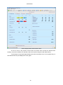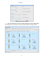
1
ENERGY MANAGEMENT SOFTWARE
POWERSTUDIO
(Standard, SCADA, Deluxe)
Version 3.4
USER MANUAL 3 / 4
(M98232001-03-12B)
CIRCUTOR S.A.
PowerStudio
1
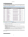
ACCESS VIA THE POWERSTUDIO CLIENT ........................................................................................ 3
1.1
WEB SERVER ........................................................................................................................................... 3
1.2
CLIENT ..................................................................................................................................................... 5
1.2.1
Status Bar ........................................................................................................................................ 6
1.2.2
Menu Bar......................................................................................................................................... 7
1.2.3
Toolbar ............................................................................................................................................ 8
1.2.4
General client application options ................................................................................................ 10
1.2.5
Displaying SCADA screens ........................................................................................................... 13
1.2.6
Displaying Reports ........................................................................................................................ 14
1.2.7
Displaying device status ................................................................................................................ 17
1.2.8
Displaying a device ....................................................................................................................... 20
1.2.9
Making graphs .............................................................................................................................. 29
1.2.9.1 Zoom mode ............................................................................................................................... 33
1.2.9.2 Panning mode ............................................................................................................................ 36
1.2.9.3 Tooltip mode ............................................................................................................................. 38
1.2.9.4 Magnifying glass mode.............................................................................................................. 39
1.2.9.5 Toolbar ...................................................................................................................................... 40
1.2.9.6 Graph properties ........................................................................................................................ 42
1.2.9.7 Printing a graph ......................................................................................................................... 53
1.2.9.8 Export graph .............................................................................................................................. 53
1.2.9.9 Graph types ............................................................................................................................... 53
1.2.10 Making tables ................................................................................................................................ 58
1.2.11 Displaying logged events .............................................................................................................. 63
1.2.12 Active and reported events ............................................................................................................ 65
1.2.13 Authentication ............................................................................................................................... 67
2
PowerStudio
1 Access via the PowerStudio Client
The software has a client application that will allow users to access SCADA screens, reports
and to display instantaneous values being measured by devices either locally or through a remote
connection. Graphs of the values recorded by the devices can also be prepared and listings accessed,
events can be viewed, device status can be displayed, etc. Similarly, this client is available as an
embedded applet on the application's webpage.
1.1 Web Server
The communications engine acts as a Web server configured in port 80 by default. To properly
configure the Web server review the ‘User manual’.
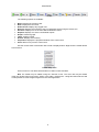
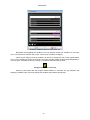
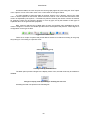
The appearance of the PowerStudio Client when run as a client application and as an
embedded client in an applet in the application webpage, is shown below.
Client application
3
PowerStudio
Client application embedded as applet on the application web page
N.B.: If user authentication is enabled, all access restrictions to device value screens, SCADA
screens, etc., will be applied to the remote user application trying to access them, either through the
client provided, or the embedded client application in the webpage such as a Java applet.
4
PowerStudio
1.2 Client
The client is in charge of viewing all the information generated by the communications engine and
the resource editor. The client is a platform independent program implemented in Java and ,therefore,
can be executed in different ,as long as Java Virtual Machine version 1.6.0 or later is installed.
Likewise, the client can be executed in Windows, Linux, Unix, Mac, OS/X, and other environments.
The client can be run both as a local application (AppletScada.jar) in the form of an embedded
applet on a downloadable webpage directly from the address where the engine is installed. In this last
case browsers such as Internet Explorer (version 6.0 or higher), Mozilla Firefox (version 1.5 or higher),
Opera (version 9 or higher) and Netscape Browser (version 8 or higher) can be used. Nevertheless,
the client application may work on other browsers or on older versions of the officially supported
browsers.
The client application is designed with a philosophy similar to that of a web browser. This means
that the program manages a series of views (or web pages on a browser), maintaining them on a list
and enabling access to them in different ways.
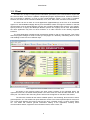
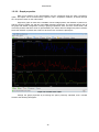
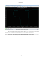
Client application with a SCADA screen as an active view
As shown in the previous image, the client mainly consists of four separate areas, the
uppermost menu bar, the toolbar directly below it, the active view, the center and the status bar, on the
lower part. The name of the view being shown at that moment appears on the title of the window.
The menu bar contains all the client's available options, view browsing, direct access to these,
general options, etc. The toolbar has quick and direct access to the most important options at any time.
The current view displays the resource active at the time, a SCADA screen, a report, device status,
etc. The status bar contains general information relating to the application, showing server
communications status, equipment communications status, active events, etc.
5
PowerStudio
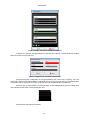
1.2.1 Status Bar
The client status bar contains general and relevant information about the application, such as
server communications status.
Status bar communicating correctly with the server
If the client application has established a connection with the engine, on the left side of the bar
you'll see a green indicator and a text stating that the server is active and communicating correctly
through the address and port given. If the client cannot establish a server connection this will also be
indicated.
Status bar not communicating with the server
Inability to establish a connection may be due to the following:
•
•
•
Incorrect IP address or port: Incorrect server IP address or port; make sure engine IP address
and port are correct.
Engine not running: Make sure the server the engine is running on the machine the client
application is trying to connect to.
Engine is not enabled as a web server: Make sure that the engine has managed to boot the
web server at the specified port.
Clicking on the corresponding icon on the right side of the status bar will also report
communications status with devices defined in the program, indicating whether there is any impact on
communications with any device in the box on the left.
Status bar communicating with the server but with errors in communication with the devices and active
events
Communication incidences are transmitted by two icons:
•
Error in communications: There has been some kind of error in communications, either
because of a device or a connection. This icon encompasses several individual incidences, as
detailed in "Device status."
•
Devices not initialized: There are unknown devices with which it has not yet been
possible to establish communication.
Similarly the icon corresponding to the square on the right reports active events in the
application. Floating the cursor over this icon will cause a message to appear indicating the number of
currently active events.
Message showing 6 active events
Double-click the icon in question to see details of device communication problems and active
events. First go to the device status view and the active events window will appear. Both device status
view and the active events window will be discussed later in more detail.
N.B: The status bar can be hidden using the "General” option in the client application menu. It
may also be hidden using the “Enable menu and toolbar” option in editor “Preferences”. In the latter
case it will not be possible to make it appear again from the client application.
6
PowerStudio
1.2.2 Menu Bar
The menu bar, located at the top, provides access to all available client features. There are
three main menus, "Options", "Views" and "General".
The ”Options" menu consists of the following sections:
"Options" menu
•
•
•
•
Properties: Displays properties of the currently active view. This option can be active or not
depending on the view in progress.
Print: Print currently active view. This option can be active or not depending on the view in
progress.
Export: Exports currently active view. This option can be active or not depending on the view
in progress.
Exit: Exit the client. This option is not available when the client is embedded in the application
website.
The "Views" menu consists of the following sections:
"Views" Menu
•
•
•
•
Back: Displays the previous view.
Next: Displays the next view.
Data log: Displays any logged view.
Studio: Displays graph and tables views.
"Studio" Menu
•
•
•
Screens: Displays one of the user-defined SCADA screens.
Reports: Displays one of the user-defined reports.
Devices: Displays the monitoring view of a particular device using the device tree.
7
PowerStudio
"Devices" Menu
•
Events: Displays the events log or the active events window.
Events Menu
•
Status of devices: Displays device status view.
Finally, the “General" menu comprises the following options:
"General" Menu
•
•
•
•
•
•
•
•
•
Toolbar: Displays or hides the toolbar.
Status bar: Displays or hides the status bar.
No communication alarm: Allows you to set whether or not an alarm should sound when
there is no server.
Events actions: Allows choice of which types of actions associated with the events we would
like to run on the client and which not.
Connect: Connects with another server changing the IP address and / or the port.
Logout: Closes the current session. Only available when the user has connected to a server
that requires authentication.
Language: Changes the client application language.
Appearance: Changes the appearance of the client application (Skin).
About: Displays client application information.
N.B: The menu bar may be hidden using the “Enable menu and toolbar” option in the editor
“Preferences”. In this case it will not be possible to make it appear again from the client application
itself.
1.2.3 Toolbar
The toolbar allows the user more direct access to the most important options at all times.
8
PowerStudio
Toolbar
The following options are available:
•
•
•
•
•
•
•
•
•
•
•
Back: Displays the previous view.
Next: Displays the next view.
Down Arrow: Displays any logged view.
Devices: Displays the monitoring view of a particular device using the device tree.
Screens: Displays one of the user-defined SCADA screens.
Reports: Displays one of the user-defined reports.
Graph: Creates a graph.
Table: Creates a table.
Events: Displays event history.
Properties: Displays the properties window of the current view.
Print: Allows us to print the current view.
Use the context menu of the button bar to hide or display buttons. Right click the toolbar button
to access this.
Toolbar setup menu
On this menu we can define which buttons we want to show and hide.
N.B: The toolbar may be hidden using the “General” menu. The menu bar may be hidden
using the “Enable menu and toolbar” option in the editor “Preferences”. Using this latter method it will
not be possible to make it appear again from the client application.
9
PowerStudio
1.2.4
General client application options
The client application has some general options that allow enhanced customization, as well as
the configuration of some general aspects. These functions are accessed using the "General" menu of
the application.
"General" Menu
As previously discussed, the "toolbar" and "Status Bar" options permit their respective bars to
be shown or hidden.
The "No communication alarm" option indicates whether or not the client application should
make an audible alarm sound when the engine is not communicating. Typically, the audible alarm
consists of a series of consecutive beeps that sound while attempts to connect to the engine are
unsuccessful.
The "Events actions” option allows enabling, disabling or notification of client events. You may
enable or disable view changes, sound messages or execution of external applications.
Event actions menu
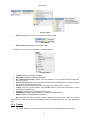
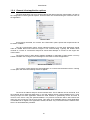
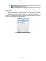
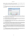
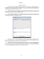
The "Connect” option directs the client application to connect with the desired server. Clicking
on this option will cause the following window to appear:
Server connection window
The server IP address and port can be indicated here. The IP address can be numerical, as in
the example above (XXX.XXX.XXX.XXX) or the web address directly (www.myaddress.com). Upon
clicking accept the client application verifies the data entered is syntactically correct and tries to
connect to the server using the specified address. The previous connection will be lost because the
client may only connect to one server at a time. This option is not available when the client application
is embedded as an Applet in the application website, because only connections with the machine from
which it is downloaded are permitted.
10
PowerStudio
The “Logout” option quits the current session. This option appears only if the authentication on
the engine is enabled and the user correctly enters the required user name and password at some
point.
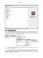
The "Language" option permits client language changes.
”Language” Menu
The available languages are provided by the engine. Upon executing the client application and
connecting to the engine, the list of available languages and texts relating to the local language of the
machine the client is running are requested. If the server does not have the client language it will
request the texts relative to the language in which the server is configured.
The “Look and feel" option allows you to customize the appearance of the client application
windows and the interface in general.
“Application" menu
The first time the client application runs it does so under a "Metal" appearance which is
available for any environment where it runs. However, depending on the environment, other aspects of
the application will be available and the user can even install others from options available on this
menu.
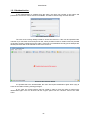
The user may view engine data from a PC that is in a different time zone from that of the
engine. By default, the data is shown referenced to the time zone where the client application is
running (local), but from the "Time Zone" option of the "General" menu in the client application this
configuration may be changed to show the data referenced to the time zone where the engine is
(remote).
Selection of the time zone
If the engine time zones and the client application coincide the option will not appear.
11
PowerStudio
"Windows" device status view
The "About" option provides general information about the client, such as version,
manufacturer, etc.
12
PowerStudio
1.2.5 Displaying SCADA screens1
One of the most important features of the client is its ability to display SCADA screens defined
and designed in the editor, both local and remote. You can display any SCADA screen defined using
the "Overviews" menu option and then "Screens" or directly from the "Screens" button on the toolbar.
However, when the client application connects to a server, the client will automatically show the initial
screen defined by the user on the server or if this is not specified, the first SCADA screen from the list
of defined screens.
SCADA screens basically consist of a background image (which may or may not exist and is
therefore white) and a series of controls placed on it. The information provided by a SCADA screen is
updated on an ongoing basis. It acts on the basis of two main types of controls, those displaying some
kind of data and those which require or allow user intervention.
The display controls simply show information on the screen. There are various types of
information which may or may not vary over time depending on the type of control. For example, a
formula varies over time depending on the values of the variables that make it up, and conversely a
static image is always fixed. Display controls are:
•
•
•
•
•
•
•
•
•
Text control
Image control
Date control
Formula control
Filler control
Conditioned control
Dynamic image control
Analogue bar control
Embedded graphic control
For scope and detailed operation of these controls see the SCADA screens editing manual
section.
Click on the action controls to use them. When on a control action since the cursor will change
to a hand with the index finger extended, rather than the typical arrow.
The typical action control lets you change your SCADA screen and provides a simple and
intuitive way to navigate through the designed application. Action controls are:
•
•
•
•
•
•
•
•
section.
Screen control
Report control
Device control
Graph / table Control
Active events control
Event view control
Execution Control
Forcing variables control
For scope and detailed operation of these controls see the SCADA screens editing manual
All SCADA features are shown on the screen and are fully dependent on the design used when
defining the controls.
1
Only in SCADA and Deluxe versions
13
PowerStudio
1.2.6 Displaying Reports2
Another of the prominent client application features the ability to see reports defined and
designed in the editor both locally and remotely. You can display any defined report defined "Views"
menu option and then "Reports" or directly from the "Report" button on the toolbar. You may also
access a particular report from a SCADA screen where a control report has been added, which will
point directly to the report defined.
The reports consist essentially of a series of pages and each page consists of a background
image (which may not exist and hence be white) and a series of controls placed on it. The controls
available in a report are as follows:
•
•
•
•
•
•
•
•
Text control
Image control
Date control
Formula control
Conditioned control
Graph control
Analogue bar control
Embedded graphic control
For scope and detailed operation of these controls see the reports section in the edition
manual.
The information provided by a report is always related to a period of time and will only be
updated in response to changes in this period by the user via the lower toolbar.
Report View
2
Only in SCADA and Deluxe versions
14
PowerStudio
Unlike a SCADA screen, in a report there are no active controls that react to user actions, so
that interaction with the report reduces the options available in the menus or toolbars, especially the
lower toolbar, which is typical of this type of view.
Reports toolbar
From the toolbar the desired page of the report can be displayed using the “Pages" buttons.
This option does not appear if the report consists of a single page.
"Pages" Menu
toolbar.
Each page of the report can be expanded or reduced by the "Zoom" button on the bottom
"Zoom” Menu
The "Adjust" option makes the current page fit completely into the active view maintaining the
ratio aspect. Choosing an option that causes the page not to fit into the view will cause scrollbars to
appear enabling page navigation.
15
PowerStudio
Report view with a 150% zoom
The user can change the grouping period the report refers to at any time. This is done using
the "Grouped by" option on the toolbar.
"Grouped by" option
As can be seen, the application provides quick access to daily, weekly, monthly, quarterly and
annual reports. To display a report of a period not included in any of those pre-defined, select the "Go"
option on the toolbar.
16
PowerStudio
Report interval selection window
Use this window to exactly specify the report period. For example, to make a report of the first
5 days of a month, or the first 6 hours of a day, and so on.
Irrespective of the period over which the report is made, the user can scroll to the previous
period or next (if any), using the "Back" and "Next" buttons in the toolbar below. Thus, if grouped by
day, the "Back" button displays the previous day; if grouped by week, the "Next" button displays the
following week.
The user can print the current page of the report at any time using “Print” in the “Options”
menu of the main menu or the "Print" button of the upper toolbar. Note that this option, unlike the
SCADA screens, is enabled for reports.
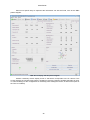
1.2.7 Displaying device status
Local and remote device communications status may be checked using the client application.
To view device status use the "Views" menu option and then "Device status". It is also possible to
access this view using the status bar by clicking on the icon that indicates that there are errors in
communications, only when there are incidents.
This view consists of a tree which details the status of all the devices connected to the engine.
The default representation of this tree is a series of father nodes that represent the equipment
connected directly to the PC where the search engine is running, from which a series of sons nodes
representing the equipment connected to the device are rooted.
17
PowerStudio
View device status by connection
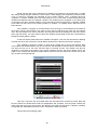
Each node has an icon representing the communication status of the equipment. The following
statuses are possible:
•
•
•
•
•
•
•
•
•
•
OK: Equipment communicating properly.
Device downloading: Currently downloading device data.
Connection error: The connection where the device can be found presents
problems.
Device not started up: Currently attempting to establish initial communication with
the equipment. This process is necessary initially to ascertain the configuration of the
equipment.
Failed communications: Unable to establish communication with the equipment;
response time exceeded.
Incorrect version: Equipment communicates correctly but it is a version the
program does not support. It may be an old version.
Phase error: Equipment communicates correctly but some phase connection is
incorrect.
Channel error: Unable to open the communication port. This action must be
carried out to establish communication with the device.
Failed communications: Some of the devices connected to this equipment do not
communicate properly.
Camera transmitting images: The engine is receiving images from the camera as
a customer application is requesting them.
18
PowerStudio
Camera paused: The engine is not receiving images from the camera as they are
not being required by any client application.
Error on the memory card. The SD Memory Card is invalid, write-protected or not
•
present.
When selecting a device from this tree (any node), we can see its characteristics on the right
hand panel. Typically these features are an image of the device itself, device type, name, description
and device number.
•
Right click to quickly display the entire tree. Clicking the middle mouse button (or scroll wheel)
will also quickly display the entire tree.
The device status tree can be organized in two ways, by connection or by device type. To
change its icon, access the "Properties" option from the toolbar or the equivalent option in the
“Options" menu, which will bring up the following dialogue:
Device status tree organisation selection
19
PowerStudio
Device status organized by device type
1.2.8 Displaying a device
The client application can display all devices in real time. Thus, each device provides one or
more overviews that allow its status and values to be displayed in real time. Display this view using the
"Views" menu option and then "Devices" or directly from the "Devices" button on the toolbar. In both
cases the user must search the tree for the required device.
User defined device tree organization
You can also access the display screen of a particular device from a SCADA screen where a
control device has been added.
A device display screen can have multiple appearances. Devices mainly define two types of
screens, one analogue and one text (numeric). The analogue view display most of the values in
maximum, minimum and present bars, while the current text view displays them in text form and
organized in different ways, usually in tabs.
20
PowerStudio
A common element on all the display screens is that there are numerical values for the
variables which refresh in real time and can be selected to be used when making graphs or historical
graphs (trends).
Another common element is that on most displays there is an upper bar specifying the device
status, and the name and date on which the values displayed were read.
Device display screen (text view)
As can be seen on the previous screen, the various variable values are organized in tabs,
graphs, tables, rows and/or columns for easier location. Likewise, some of the selected variables can
be seen marked by white letters on a blue background. Another common element among the various
device overviews is that limits can be set on the variables values, so that they can be marked with one
color or another depending on the interval.
21
PowerStudio
Screen display device with off-limits values
As can be seen in the previous screen there are values which exceed the defined limits.
Similarly, how some variables are selected is also shown (blue background with white letters).
The analogue view provides approximately the same information but in a more graphic way, so
that defined limits may be displayed as a bar graph.
22
PowerStudio
Device view. Analogue Representation
Devices providing more than one representation (typically two) can be exchanged with each
other by selecting "Properties". This option can be accessed from the “Options" menu or from the
"Properties" button on the toolbar. This option will be disabled for those devices that only have one
possible view.
Device view selection
Device information can be displayed in numerical values or bars organized into tabs, boxes,
rows and / or columns, as well as forms, depending on the type of device in question. A typical way to
represent the information would be graphically through descriptive images of the status of a variable or
set of variables.
23
PowerStudio
Displaying an RRM-C with an image representing the status of the relay
Displaying a C-14D with images representing digital output status, alarm status, etc.
24
PowerStudio
Other more specific ways to represent the information can also be found, such as the QNA
phasor diagram.
QNA Screen display with the phasor diagram
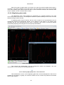
Another noteworthy device display screen is that which corresponds to the IP camera. This
screen displays the camera image which is updating in real time (speed of updating depends as much
on camera settings as the configuration for refreshing when adding this device, as well as the speed of
the TCP / IP network)
25
PowerStudio
IP camera display screen
In addition to the information already mentioned, some devices allow interaction with the
device itself or with the outside environment through the same screen display. Many device view
screens provide an option for resetting maximums and minimums. This action is accessed via a button
situated somewhere on the screen.
Display screen of equipment with "maximum / minimum reset" button
26
PowerStudio
Clicking on this button will bring up a window where the desired restart values may be
selected. Each device provides a window for selecting different variables, depending on the type, the
same type of device may even offer a separate window depending on how it is configured.
“Maximum / minimum reset" window
Another typical interaction is by clicking on a button. This can include many different kinds,
from acting on any digital output of the equipment or on any aspect of the configuration, to launching a
special graph or viewing the table of historical events.
Buttons to launch special graphs on the QNA screen
There are devices that provide more elaborate interactions, enabling adjustments and more
complex configurations by clicking on a button through a specific configuration window. For example,
RGU-10 type devices allow current triggering values and trigger delay to be adjusted.
27
PowerStudio
RGU-10 parameter adjustment window
From the monitoring view of a device it is faster to make a graph or a table, either through a
direct button in the view itself (as in the case of QNA equipment) or directly by clicking on the
corresponding buttons on the toolbar. This second option will be explained in the following section.
28
PowerStudio
Another of the special screens is the Computer Plus device alarms. If triggered by NC
(normally closed) or NO (normally open), each alarm displays a level bar with the maximum and
minimum configured value, value and date of last trigger, whether the alarm is currently triggered and
whether the alarm is assigned to the global relay.
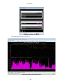
1.2.9 Making graphs
One of the most powerful tools of the client is the possibility of making graphs of the device
variables (trends). This view can be accessed using the "Views" menu option, then "Studio" and finally
“Graph” or directly from the “Graph” button on the toolbar. Graphs can be made from a predefined
SCADA screen where the graph control has been added or, as mentioned in the previous chapter,
from the buttons defined for this purpose in some types of device monitoring views (e.g. a QNA
monitoring view).
Typically, to make a graph the variables of the device that will be part of it need to be chosen.
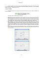
Thus, when accessing the “Graph option” from the main menu or from the toolbar, first a dialogue will
appear which allows selection of the device from which the variables will be chosen, and that will be
part of the graph.
Device selection screen
At first only variables from the same device may be chosen to create the graph, later variables
from other devices may be added (this will be explained further on). If the “Graph” option is selected
while in device monitoring the client application will understand that a graph of what is being displayed
is desired and will skip back to the previous screen.
Depending on the device chosen, a screen will then appear to select the type of graph and the
filter to be applied.
Graph and filter type selection screen
Note only certain types of graphs can be filtered, usually the standard type, if the graph type
chosen cannot be filtered the “filter” option will be disabled. If a default filter has been defined for the
equipment, it may still be modified or another one chosen, or it may be disabled. It is also possible that
29
PowerStudio
the equipment does not allow more than one type of graph, and that there are no filters defined, or they
are not applicable to this type of graph; in which case this screen will not appear and will pass directly
to selection of variables for the device in question.
After selecting the figure type and filter, the variables selection screen will appear.
Selection of variables to make a standard graph without the CVM-144 filter
Choose the desired graph variables here. This screen will depend on the device, the type of
graph required and the filter desired to implement these variables.
For example, if a filter is chosen a screen similar to the following may be found:
Selection of filtered standard variables
If non-standard type of graph is selected, for example a harmonics graph, the following
variable selection screen appears:
30
PowerStudio
Harmonic variables selection screen
appear.
Once variable display selection has been made, the graph with the variables in question will
The system automatically chooses the representation period and the grouping of data, which
can obviously be changed later. Later we will explain what the two concepts mean and how they can
be changed. It should be noted that the grouping chosen is a week and the period is typically 30
minutes. If the graph we are accessing comes from graph control on a SCADA screen, both the
grouping and the period are determined in the control and need not be predetermined by default.
However, as always, both properties can be modified in the graph view later. Similarly certain types of
representations are chosen by default (line, bars, etc.), as well as a few colors and a distribution of the
variables in axes and areas depending on the variables represented. All these characteristics can be
modified later at will. A description of what they mean and how they are modified will be explained later.
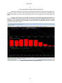
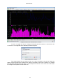
Graph of a standard variable without filtration.
31
PowerStudio
As can be seen a typical graph consists of a series of common characteristics:
•
•
•
Title: Situated on the upper area, this is a text describing the graph being viewed. Typically,
the names of devices forming part of the displayed variables are shown. They may contain
several lines of text, so that they can be represented as subtitles.
Representation areas: These are areas where data may be viewed. Typically, a graph
consists of one area, as in the previous example, but there may be several, each under the
next. Each area contains some common characteristics:
o Key: Provides general information about the variables that are represented in the
area. This information is often the color of the variable, the type of representation, the
title of the graph, and in some cases, a value indicating some feature of the variable
for the current representation (for example it is typical to see on energy variables the
accumulated value of all the visible values).
o Y-Axis: Provides information on the units of the variables that are represented in this
axis and the range of values that are being displayed. At first the range is calculated
so that they fit all the values of all the variables included in this axis. Typically, an area
has a y-axis, although this may be modified by the user as will be explained later.
o X-axis: Typically, this is the time axis and is located at the bottom of the
representation area. Here the time interval being represented may be seen. Usually
predefined time intervals are represented (day, month, etc.). But the user can choose
the most suitable as can be seen later. Similarly, there are types of graphs where this
axis does not represent time, in this case the units represented and the range of
values contained will be indicated.
o Drawing area: Contains the actual figure representing the variables of the area in
question. There is a drawing area for each area of representation.
Toolbar: Contains a series of actions that can be performed on the graph. Depending on the
type of graph it will contain more or fewer options. The typical actions are going to the previous
interval, going to the next, going to a user-defined interval, grouping according to a predefined
interval or changing the grouping period.
Any graph can always be found in the so-called "operating mode", which determines the
behaviour of the drawing area and the use of the mouse on it. There are four possible modes of
operation:
•
•
•
•
Zoom mode: Allows enlargements be made on one portion of the graph. This mode is
accessed through the F1 key or the corresponding graph context menu option.
Panning Mode: Allows the current window to be moved using the mouse, dragging and
dropping. This mode is only available if a Zoom has already been carried out. It is accessed by
the F1 key or the corresponding graph context menu option.
Tooltip Mode: Allows variable values viewing at the position cursor. This mode is accessed
with the F3 key or the related context menu option.
Magnifying glass Mode: Enables the area under the cursor to be enlarged in a separate
window. This mode is accessed with the F4 key or the related context menu option.
Graph context menu
32
PowerStudio
1.2.9.1 Zoom mode
The zoom mode permits magnification of a portion of the drawing area with the mouse. In this
mode the cursor looks like a magnifying glass.
Appearance of cursor in zoom mode (when zooming is possible and when not)
The cursor indicates whether or not it is over an area where magnification is possible (typically
not outside the drawing). To start an enlargement, left click on the drawing point where one corner of
the new viewing window is desired and, without releasing the button, move the cursor to the point the
opposite corner of that window should be.
It is interesting to see that while moving the cursor discontinuous lines indicating what will be
the new viewing window will appear if the button is released. The cursor also reports whether or not the
selected area is valid as a new viewing window by changing the appearance of the mouse cursor.
The new viewing window is invalid or is not permitted
This may be because it is too small, narrow or wide, both in window units (pixels) and variable
units, both in the X axis and the Y. For example, where the variable period is one hour magnification of
an area of the drawing of less than an hour on the X axis is not permitted.
Magnifying an area of the drawing in the Zoom mode
33
PowerStudio
Releasing the left mouse button accepts the discontinuous window as a new display window.
The action will be automatically executed and the enlarged area chosen will be displayed.
Graph with the enlargement of a specific area
The process can be repeated as many times as desired, provided the system permits it.
Enlarging enables the "Pan mode"; which will be described later, as well as the "Remove last zoom"
and Without zoom" options in the context menu.
The "Remove last zoom" option displays the previous enlargement, namely the display from
which the present enlargement was made, while the "Without zoom" option eliminates all enlargements
at once.
Enlarging a chart with several display areas is worth commenting on. If an enlargement is
made on a graph of this type it can be seen that not only do areas marked off with dashed lines appear
in the display area, but they also appear in other areas too, selecting the same interval X (usually time).
34
PowerStudio
Zooming in with a graph with several areas of representation selected in the first zone
This behaviour is defined by default, giving priority to conserving the same X-axis in all areas (it
is usually useful to compare values with the same dates or intervals, and therefore does not apply if the
X- axes are different, and is only included in the enlargement of those areas with similar X-axes ,
although they are not consecutive). Note that when the enlargement is carried out in more than one
area all the new selections are horizontal.
The behaviour of "Zoom mode" can be changed by varying the idea previously discussed using
the "Control" or "Shift" keys while selecting the new display window.
The "Control" key forces the selection to include only the area where the enlargement is being
made; therefore if the graph consists of a single area this modifier has no effect. If the enlargement is
being made between two different areas (one corner of the new window is in one area and the other in
a different area), only the areas between the two are included.
For example, if the enlargement is started in the first area and finished in the second, only
these two areas and not the third will be enlarged. A curious effect caused by this mode is that areas
with different X-axes can appear. In addition, this behaviour does not take into account whether the Xaxes are equal or not, always forcing the enlargement regardless of this information, thus allowing the
expansion of two zones with different X-axes, something that would be impossible with the default
behaviour.
35
PowerStudio
Graph with areas with different X axes (the first zone has an X-axis different from the other two)
The “Shift" key forces the enlargement to only affect the X-axis, even in the area where the
expansion is taking place, but keeps the enlargement of all the areas maintaining the X-axis, as in the
default behaviour. Note that if a graph consists of a single area this change in behaviour causes the
non-selection of the new viewing window not to affect the Y-axis
The combination of behaviours, Clicking the "Control" key and the "Shift" key at the same time
will enable enlargement of graphs with more than one representation area, a single area depending on
their X-axis. The user can freely combine the various behaviours in successive enlargements.
1.2.9.2 Panning mode
“Panning mode” is available when an enlargement is in effect, enabling viewing window
movement using the drag and drop technique. In this mode the cursor looks like a hand.
Appearance of the cursor in the pan mode (when it is possible to start the pan and when not)
As you can see the cursor indicates whether or not it is possible to move the viewing window
(typically not when out of the drawing zone). To start a movement left click on the point of the drawing
desired as an anchor and, without releasing the button, drag the cursor to move the window to the
desired location. Note that the window moves in real time with cursor movement.
It is interesting to see that once the anchor is positioned the cursor will change to indicate the
viewing window may be moved.
36
PowerStudio
Cursor indicating that viewing window may be moved
Movement is limited by the margins of the viewing window before making the first enlargement.
Therefore, if viewing a week of data, movement cannot be made to the previous or following week
using the pan option, or on top of the upper margin of the Y-axis, or below the lower margin of the axis
itself.
In graphs with more than one display area the pan mode establishes, by default, behaviour by
which all areas with the same X-axis as the area where the anchor is established must move. This
behaviour can be changed using the "Control" key. Holding down the key while moving the window
indicates to the program that only the window on which the anchor is established must move. This will
cause the X-axes to be unequal.
Graph with different X-axes in all display areas
37
PowerStudio
1.2.9.3 Tooltip mode
The "Tooltip mode" displays the values of variables located closest to the cursor with respect to
the X-axis. These values are updated instantly as the cursor is moved. In this mode the cursor looks
like a hand.
Cursor indicating Tooltip mode
The mode behaves in such a way as to show the values closest to the mouse position with
respect to the X-axis of all the areas that share the same X-axis.
Graph in Tooltip mode
For each area of representation with the same X-axis a window is shown with the value of the
X-axis (typically the date) and information about the variables that are represented in this X position
(typically the variable name, its value and its units).
The behaviour of this mode is changed by clicking the "Control" key, so as to show only the
information window of the area at the cursor location.
In graphs with a high density of values several different values with different X coordinates of a
variable may fall into the same cursor position. In this case there will be no values accessible through
cursor movement. To access all the values, without omitting any, the value display window may be
moved using the cursor keys (left or right), these keys allow movement to the value immediately before
or immediately after the current, although this is drawn in the same screen position.
38
PowerStudio
With some types of graphs there is more than one value of the same variable at the same Xcoordinate. This does not happen if the X-axis is time; but it can happen in other cases, as for example
in an event duration graph, which will be seen later. In these cases the maximum and minimum value
of each variable in that X-coordinate will be shown.
1.2.9.4 Magnifying glass mode
The "Magnifying glass mode" displays an enlargement in a separate window for the area
around the position of the cursor. The enlargement window is updated instantly as the cursor is moved,
always showing the area around it.
If magnifying glass mode is entered, and the cursor remains on the representation area, an
enlargement window will automatically appear, and a dotted box will appear in the drawing area
indicating that the area represented by the cursor is enlarging, and it may be moved as desired,
automatically displaying the enlargement in the superimposed window.
Zoom mode graph with an amplified area
Upon leaving the representation area the enlargement window will disappear, and upon
returning, the cursor will have the following appearance:
Cursor indicating Magnifying mode in the enabled area
This indicated the cursor is in the magnifying glass area, and that enlargement of the area is
possible (by left clicking). Logically, the extension window can be re-sized and positioned as desired
like any other window.
39
PowerStudio
Another possibility is to vary the size of the square area around the cursor. This can be done
with the mouse wheel or, if the mouse does not have this feature, by using the “+” keys "(greater
square area) and" - "(smaller square area).
1.2.9.5 Toolbar
The graphs always have a toolbar at the bottom that allows a series of actions related to the
data to be shown.
Toolbar of a typical graph
The typical options available in the toolbar are:
•
•
•
Back: Displays the previous interval of data. Typically, the range of previous data is a function
of data grouping and, if grouped by days, upon going to the previous interval the previous day's
data is displayed. There are types of graphs where grouping does not make sense, because
they are displaying values of a specific date (for example in QNA harmonics graphs), clicking
on this option in this case displays the next date immediately following that contains data.
Next: Displays the next interval of data. Typically, the interval of data following this is based on
the data grouping and, if grouped by weeks, upon going to the following interval data from the
following week is displayed. There are types of graphs where grouping does not make sense,
because they are displaying values of a specific date (for example in QNA harmonics graphs),
clicking on this option in this case displays the next date immediately following that contains
data.
Go to: Displays data within a user-defined time interval. There are graphs where it makes no
sense to specify an interval (graphic harmonics in QNA), and this permits indication of the
exact date desired.
Display data Interval selection dialogue
Display date selection dialogue
40
PowerStudio
•
Grouped by: Allows data grouping to be changed. Grouping is just the data interval desired to
be displayed. Typically there are five predefined groupings: day, week, month, quarter and
year.
"Grouped by” Selection Menu
•
Period: Enables desired date period to be specified. Each device can be configured to store
data every so often, typically in periods of 10 or 15 minutes. Use this option view data in a
different period, which must always be higher than that defined by the device. Note that this
does not change the configuration of the device, which will continue using the period
configured by the engine / editor, but will group the data, to a certain extent, to simulate the
fact that the device was programd for that period. Note that there is an "Automatic" option,
which directs the program to choose the period that best suits the selected grouping.
Period selection menu
Note that there are special graphs where the last two options (“Grouped by" and "Period") are
meaningless and therefore not available.
41
PowerStudio
1.2.9.6 Graph properties
Many more aspects of the representation may be configured using the graph “Properties”
option. This option can be accessed using “Options” menu, "Properties" submenu, or directly through
the "Properties" button on the main toolbar.
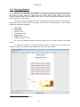
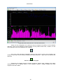
Suppose a graph is made of the variables of three voltage phases, the distortion in phase one,
and the current of phase one and two of the QNA measuring equipment. The client provides a view of
the graph with default configuration, namely a graph grouped as a week, set at the current week, with
30-minute periods, with three areas of representation (one where all three voltages are placed, another
where the distortion is placed and a final one where the two currents are placed) etc.
Graph with variables from a QNA
Change the graph properties by accessing the option previously indicated, and a window
similar to the following will appear:
42
PowerStudio
Graph properties window
This window allow the following changes to the graph:
•
•
•
•
•
•
Modify the representation of each variable (lines, bars and points)
Change the color of each variable.
Modify the y-axis margins.
Remove areas, axes and variables.
Add areas, axes and variables.
Change the distribution of areas, axes and variables.
As can be seen in the previous window a schematic representation of the variables and their
organization in areas and axes is shown. When the cursor is floated over this representation elements
can be modified (i.e. variables, axes and areas) will be highlighted.
43
PowerStudio
Select a variable, and click to change its properties
T change, for example, the representation properties of the phase 1 voltage distortion variable,
place the cursor here and left click.
Screen configuration of a variable representation
This screen permits configuration of the representation type (Lines, bars, or points), color, line
style (only if the line type representation is selected), the dot style (only if the dot type of representation
is selected) and the thickness of the line (only if the line type of representation is selected).
If the line type of representation is selected, there are five different style types to choose from:
solid, dashed, dotted, dash –dot and dash-dot –dot.
Selecting the line style
Line thickness may also be indicated.
44
PowerStudio
Selecting line thickness
If dots are selected, dot type may be indicated.
Selecting dot type
Suppose that the color is changed to a deep lilac. Note that it is possible to change the color
for any kind of representation by left clicking on the color chart.
Selecting lilac colored representation bars
This selection will be reflected in the graph screen properties.
Change variable representation properties
45
PowerStudio
A final property that can be changed on a variable is its position on the overall chart. To make
this change simply drag the variable to a new location. While dragging the variable the positions where
it can or cannot be "dropped” are indicated by red or green squares. Thus, a variable cannot be
"dropped" on another variable (does not make sense) or on an axis (with a white background) with
variable units different from the "dropped" variable. The variable may be "dropped" on any area (even
on the same area but in another position), on an axis with the same unit type as the "dropped" variable
(even within the same axis, but in another position) or "outside", i.e. between areas, above the first or
below the last.
If the variable is "dropped" on an axis with the same unit type, it will be added to that variable in
the order in which it was entered. The order in which they are placed is the order they are painted.
Thus, the last variable of an axis is painted in the last place and will be displayed on top of the others
(thus may hide them). It is often useful to place the variables represented by bars first, otherwise they
will almost entirely hide the others.
A new axis will be created where the variable is "dropped". This new axis will share the drawing
area with the other axes of the area, and all will be painted in the order they have been "dropped".
If the variable is "dropped" "outside” an area will be created with an axis in that position. Bear
in mind that if the variable was the only one on the axis, that axis will be removed and if, moreover, that
axis was the only one in the area, that area will be removed as well. The variable may also be
"dropped" in the trash at the bottom of the graph properties screen; this action deletes it from the
graph. In the example the distortion variable will be moved to the area where the currents are, at the
top, so that it will be painted first.
Moving a variable to another area
This way a new axis may be created within the area where the currents are found. Note that
the area where the variable was found has disappeared and, therefore, now the graph contains two
areas. Note also that in the second zone, the distortion axis (and thus the phase 1 distortion variable),
are painted first, afterwards that of the current, first phase 1 and then phase 2.
This produces the following graph:
46
PowerStudio
Graph with two zones and two axes in an area
The axes of a graph can also be configured using the properties window. In this window, click
on the axis to be configured and the following window will appear:
Shaft configuration window
This window allows the limit values of the axis in its Y-coordinate to be set. By default the
graphic engine set limits which enable all the values of a variable to be shown. However it is possible
to modify them manually using this option. In the example the minimum Y limit value of the axis where
the voltages of the phases are zero will be set.
47
PowerStudio
Forced axis minimum limit properties
Note that in axis properties the units may be seen, as well as the equipment they belong to
between parentheses (provided the variables are from only one device), and the Y-axis limits
(minimum and maximum value, in bold if this value is forced by the user).
Like variables, axes can redistributed using the drag and drop method. The operation is the
same as dragging and dropping a variable. So, one axis can be dropped on another with the same unit
type, on another area (or on the same area but in another position), or "outside" in the trash (deleting
all the variables it contains).
48
PowerStudio
Graph where the interior limit of a Y-axis has been forced
Finally, the only configuration of an area that may be changed is its position. So, like variables
and axes, a zone can be dragged to another position, but only within another area, "outside" or to the
trash (deleting all axes and variables that it contains).
Trash
One of the most interesting possibilities offered by the property screen is that of adding new
variables to the chart. This is done by clicking on the button with the “+” sign, which is located on the
lower left.
Add new variables to the graph
Equipment and variable selection windows will appear, allowing other variables to be added,
including those from a different device. In the example a phase 1 voltage variable from other
equipment has been added.
49
PowerStudio
Adding a variable from another device
Note that the device information has disappeared from the axes and appears on each variable,
because now there are no variables shown from one single device. The new variable (or new variables,
if several were chosen) are organized into new areas at the end, and the limits of the new lines are
unknown because they have not yet been loaded with data, although they may be forced by the user.
In the example the new variable was dragged onto the axis of the first zone and dropped on
top of the axis, leaving the new variable as the first on the list. Note how the axis limits are inherited
where they are released.
50
PowerStudio
Variables of different devices on the same axis
Remember that dragging the variable to its new position leaves two variables on the same
axis, in the same area, with the same color. This may be a problem for display.
There are two ways to solve the problem: the first is to change the color of the representation
of one of the variables by hand, the second is to let the program decide the appropriate distribution of
colors by itself. This latter is done by clicking on the button represented by a brush.
Intelligent distribution color brush
Clicking on this button lets the program decide whether or not there are any problems with
displaying variable colors, and it will change the variables that it deems appropriate.
51
PowerStudio
Intelligent automatic color change
The resulting figure would be as follows:
Graph with variables from multiple devices
52
PowerStudio
1.2.9.7 Printing a graph
The user can print the current graph page at any time using “print” in the “Options” menu of the
main menu or the "Print" button of the upper toolbar. Note that this option, unlike that in the SCADA
screens, is enabled for graphs.
1.2.9.8 Export graph
The user may at any time export the graph being viewed in a PNG format. This option should
be accessed through “Export" in the “Options" menu of the main menu. Note that this option, unlike
that in the SCADA screens, is enabled for graphs.
Note that graphs are exported with a white background to facilitate their inclusion in reports,
studies, etc.
1.2.9.9 Graph types
So far we have seen standard graph types, i.e. graphs comprising a number of areas, where
each zone has an X-axis, which is a time interval and a Y-axis for variable values. However, there are
certain types of graphs that have distinct characteristics.
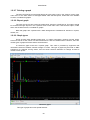
A harmonics graph would be a special graph. This chart is provided by equipment that
calculates harmonics variables, whether voltage or current. This type of graph may be found on QNA
equipment, for example, among others, and can show harmonic distortion for voltage as well as
current in each phase.
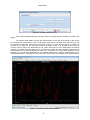
Harmonics graph
This type of graph has some special features:
53
PowerStudio
•
•
•
•
•
Subtitle: In the caption under the graph title, the date of the harmonic distortion being
displayed is indicated.
X-axis: The X- axis does not represent time, but rather the harmonic number. It therefore
lacks units.
Toolbar: The toolbar contains only 3 buttons to display other records, earlier records may be
displayed, or later ones, or those closest to a date specified by the user ("Go to" option).
Properties: The configurable properties of this type of graph are the same as with a standard
graph, the only difference being that only variables from equipment containing this type of
variable are available.
Representation using bars: Sets default representation to bars, as a special feature, but
these can be reconfigured later.
Another special feature graph is the waveform graph, generated by QNA equipment, which can
provide a screenshot of the voltage waveform as well as the current in each one of the phases.
The characteristics of this graph are very similar to the harmonics graph. The only differences
are that the X-axis units are milliseconds and that the representation is in lines by default. Only
waveform variables may be added to this type of graph.
QNA waveform graph
Another special graph is the event duration graph
54
PowerStudio
QNA event duration graph
This type of graph represents the voltage events registered during a period of time, organized
according to their duration. This graph has some special features:
•
•
•
•
•
•
•
X-axis: The X-axis represents the duration in milliseconds.
Representation Interval: The events of a user defined time interval are represented.
Toolbar: The toolbar may be used to move through time intervals, as well as define a new
time interval, either pre-defined or fully configurable by the user.
Representation: The default representation is dots, although it can be changed at will.
Tooltip: It is typical to see in such a figure a special tooltip indicating the number of values of
the variable that exist at this point, and between which values it can be found, as it is normal
that many values are repeated with certain duration.
Subtitle: Unlike the harmonics and waveform graph, the subtitle here indicates the time
interval displayed.
Adding new variables: Only variables of the type being viewed can be added, (i.e., duration
of events).
Another unusual graph is that of logged events.
55
PowerStudio
Logged events graph
This figure is essentially equivalent to a standard graph, with all the same characteristics. The
only difference is that each event is depicted as a dot plus a horizontal line whose length equals the
duration of the event represented.
Usually the values of events this graph shows are accompanied by nominal voltage. In both
cases the units are expressed as a percentage of the nominal value. Any other standard variable may
also be added.
The last special type of graph is the semi-circular effective voltage graph.
56
PowerStudio
Semi-circular effective voltage graph
This type of graph represents voltage evolution within a short space of time in semi-circular
intervals. These screenshots are made in response to an event capture at that moment.
Very similar to the waveform graph, the only difference being that the x-axis consists of dates
as in a standard graph, as the semi-cycle value capture takes place just at that moment.
57
PowerStudio
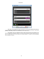
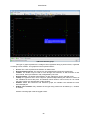
1.2.10 Making tables
Another important client tool is the ability to make variable value tables for a piece of
equipment. Access this view using the "Views" menu option, then "Studio" and finally “Table” or directly
from the “Table” button in the toolbar. Tables may be created from a predefined SCADA screen, where
a control table has been added, or from buttons defined for this purpose in the monitoring view of a
device (for example, a QNA monitoring view).
Typically, to make a table it is necessary to choose what variables from which devices will be
part of it. The selection of these variables is done in the same manner as for generating a graph.
Selection produces a table like this:
Value table
Note that the typical value table consists of three parts:
•
•
•
Title: This usually indicates what data period is displayed, although in special tables it may
contain other information.
Body: This contains a series of columns with the values each variable has in each register.
Each column is a variable and contains a header with the same title.
Toolbar: As in the graph, the grouping and the displayed data period can be configured.
There is a direct equivalence between the tables and graphs, in other words, the same type of
graph and table show the same values but in different formats and, obviously, with different
configuration capacities.
This feature is used by the PowerStudio client to deduce what graph or table to create when on
a graph or table display. That is, if a chart is displayed and client table button is clicked, PowerStudio
will deduce that a table of the variables represented in the graph is desired, and will immediately
58
PowerStudio
display it. Likewise, if a table is displayed and the graph button is clicked, PowerStudio client will
deduce that a graph of the variables shown on the table is desired.
The operation of the toolbar is absolutely the same as the operation of the same bar on the
graph view.
It is possible to configure some aspects using the table "Properties" option. This option can be
accessed using the “Options” menu, "Properties" submenu, or directly with the "Properties" button on
the main toolbar.
Table properties window
Use this window to add new variables to the table in the same way as they are added to the
graph, by clicking on "Add". It is also possible to delete variables from the table, simply by selecting the
desired variables and clicking on the “Delete” button.
As with the graphs, the user can print the current graph page at any time using the “Print”
option in the “Options” menu of the main menu or the "Print" button of the upper toolbar. Note that this
option, unlike that in the SCADA screens, is enabled for tables.
It is also possible to export this table by clicking "Export" in the "Options" menu of the main
menu. It will be exported in text format, where each line of text is a row of the table and where each
column is separated by the symbol ";".
A common feature in all tables is that they can be sorted by columns by clicking on them. By
default, tables usually appear sorted by date, usually the first column, but they can be ordered by other
variables. Clicking on the title of a column will place it in ascending order, clicking again on the same
place set it in descending order, and a third click will bring it back to its original format.
It is also possible to order a column so that a second column can later be ordered based upon
the first. For example, for a column representing a category type pertaining to each row, and another
representing a numerical value associated with each row, the category column may be ordered first by
clicking on its title, and afterwards, while holding the "CTRL" key, click the magnitude column (once for
ascending order or twice for descending order). This will order the table by group, and within each
group, by size.
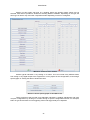
QNA equipment allows a special table to be made called "Events" that lets you view a list of
events recorded by the equipment. This table can only be viewed from the corresponding button on the
equipment monitoring screen and does not correspond with any graph view.
59
PowerStudio
QNA events timetable
The table has two columns: the first is the date and time when the incident occurred, and the
second is its description.
As you can see, this table does not allow the properties of the screen to be changed, nor the
variable period (which would not, on the other hand, make any sense). However it is possible to print it
in same way as other tables.
Special graphs have their equivalent table, and therefore we have table equivalents for
harmonics graphs, waveforms, logged events, duration of events and effective voltage semi-cycle
events.
The logged events table is peculiar in that for every event a great deal of information may be
displayed:
•
•
•
•
•
Event Type: An icon at the beginning of the report will indicate whether it is a gap, an
interruption or an overvoltage.
Value of the event: Indicates the most representative event value. In the case of an
overvoltage this value is the highest registered by the event, in other cases it is the minimum
value reached. It is expressed as a percentage of the nominal voltage.
Duration: The first value in brackets indicates the duration of the event.
Average voltage: Indicates average voltage of the event, expressed as a percentage of the
nominal voltage.
Previous Voltage: Indicates the voltage present at the beginning of the event, expressed as a
percentage of the voltage.
60
PowerStudio
Events history table
The events duration table displays a list wherein the first column contains the duration of
events in the interval shown. Aside from the duration in itself, it shows the number of events in the
interval with the same duration (irrespective of the phase). In each variable column the number of
events from that phase is indicated and between brackets the event value (if there is more than one
event in this phase with equal duration, the minimum and maximum value of the events of the same
duration in this phase are indicated).
Event duration table
61
PowerStudio
Harmonic tables and waveforms show the same information as the equivalent graph but as a
list. However, the effective semi-cycle voltage table shows more information.
Effective semi-cycle voltage table
As shown in the table title, data relative to the captured event is indicated, namely its date,
type, duration, value, average voltage of the event and the previous voltage.
62
PowerStudio
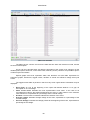
1.2.11 Displaying logged events3
Another important client tool is the ability to create tables showing information about past
events. Access this view using the "Views" menu option, then "Events" and finally “Event browser” or
directly from the “Events” button on the toolbar. A table of events from a SCADA screen can be
created wherein the event display control can be added
Logged events table
This table has two different viewing modes, the normal mode and the total mode. The normal
mode (above) table consists of five columns.
•
•
•
•
•
Date and time: Indicates the date and time at which the incident occurred.
Name: Name of event that occurred.
Annotation: Description of the event that occurred, which may have data relating thereto or
the execution environment at the time it occurred.
Recognized in: Time taken for the event to be acknowledged, whether or not it is finally
acknowledged. Floating the cursor over a cell will bring up a tooltip with the date on which the
event was recognized.
Deactivated on: Time the event took to end, if it actually ended. Floating the cursor over a cell
will bring up a tooltip with the date on which the event ended, if the event existed.
As a standard table, the active events table shows a time interval. These intervals may be
navigated or modified using the toolbar and the first four buttons on the left, as was discussed in the
section on graphs.
3
Only in SCADA and Deluxe versions
63
PowerStudio
As with the tables, the user can print the current graph page at any time using the “Print” option
in the “Options” menu of the main menu or the "Print" button of the upper toolbar.
It is also possible to export this table by clicking "Export" in the "Options" menu of the main
menu. It will be exported in text format, where each line of text is a row of the table and where each
column is separated by the symbol ";".The table may also be sorted by the various columns as desired,
for example, events may be sorted by duration, or even by type, and by the duration of each type as
explained above in the general table properties.
Note, however, that this type of table does not have a properties menu available that can be
used to configure it. However, the toolbar provides some extra options that permit a certain degree of
configuration for this type of table.
Logged events table toolbar
There are a couple of options that permit desired events to be filtered according to the group
they belong to or according to a specific event.
Filtering events by group
Filtering events by individual event
The latter option permits changes to the display mode. Thus, the total mode may be enabled or
disabled.
Change the display mode by enabling or disabling the total view
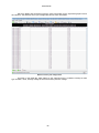
Activating the total view produces the following list:
64
PowerStudio
Logged events table, total mode
In this mode the table consists of five columns, one less than in the previous, and as many
rows as events defined in the environment. The first column indicates the event name, the second the
number of times it has been enabled in the period to which the data refers (indicated in the title), the
third column indicates how many times this event has been acknowledged (or <not applicable> if the
incident is not reported), the fourth column indicates how many times it has been disabled, and the fifth
the total time that the event has been active.
1.2.12 Active and reported events4
The powerStudio client enables current events to be viewed in real time, both the simple
events that are active as well as those that must also be acknowledged by the user.
Events not requiring user acknowledgement are displayed in a pop-up window, which may be
accessed via the "Views" menu option, then "Events" and finally "Active events" or directly from the
status bar by clicking on the icon indicating there are active events in the system. This window can be
viewed from a SCADA screen where an active event control has been added.
4
Only in SCADA and Deluxe versions
65
PowerStudio
Active event window
The date on which the event was enabled and its name can be seen. In addition, below, the
description selected and its programd annotation can be seen. This window is purely informative and
no action can be carried out here. In addition, it shows both those events that require user
acknowledgement as well as those which do not.
On the other hand, events requiring user acknowledgement are displayed in a pop-up window
that always remains visible and are shown automatically without user intervention when there are
events reported active or to be acknowledged (or both).
The information displayed by this window is very similar to that shown in the active events
window, but in addition to showing the activation date and the event name; the date it was
acknowledged by the user and disabled is shown.
Reported events window
Note that an event with an acknowledgement date and a deactivation date will disappear from
the list of events reported, i.e., there will be events on this list without an acknowledgement register,
without a disable date, without both dates, but not with both dates.
This window allows event acknowledgement. Select from the events to be acknowledged from
the events list and click the "Recognize events" button at the bottom. The event acknowledgement
date is shown. When an event is disabled it will disappear from the list. If a previously acknowledge
event is acknowledged again the operation will not produce any effect.
66
PowerStudio
1.2.13 Authentication
If user authentication is enabled from the editor, the client may request a user name and
password to access the various resources available. This will be done through a screen like this:
User authentication window
The user must correctly identify himself to access the resource. If the user and password are
unknown try a connection as an anonymous user, which provides access to certain resources provided
it has been properly configured from the editor. If the user is not identified correctly (three attempts are
allowed) the client will not be allowed access to the resource.
Access to the resource denied
It is possible that once authenticated, the client will require identification again when trying to
enter an area without having viewing privileges.
In any case, the current session may be closed in order to force the client to request user
identification again. This can be done via the "Logout" option from the “General" menu in the main
menu.
67
PowerStudio
“General” Menu
68
PowerStudio
Technical Service
For questions, contact CIRCUTOR's Technical Service or your nearest CIRCUTOR distributor.
CIRCUTOR, S.A. – Technical Departament
Vial Sant Jordi s/n
08232 – Viladecavalls
(Barcelona) Spain
Fax. +34 93 745 29 14
E-mail: [email protected]
For software actualization please view CIRCUTOR´s web page:
Web: www.circutor.com
69