1
Version 6.1
Feature List and
Tutorial Manual
By OriginLab Corporation
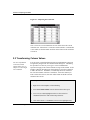
NEW FEATURES IN ORIGIN 6.1
Enhanced Exchange of Data, Graphs, and Tools
•
Raster Image Import/Export
•
ODBC Import
•
New EPS Export
•
Improved Raster Graphics Export
•
Print Large Graphs to Multiple Pages
•
Drag-and-Drop Custom Tool Files
•
Color-coded LabTalk Script Editor
DYNAMIC USER INTERFACE
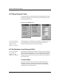
Project Organization
Organize projects with Project Explorer; Batch print
selected windows; Dockable results window.
GRAPHICS
Graph Organization
Integrated interface for page and data sets; Dynamically
preview symbols.
Graph Creation
Single-click access to 2D and 3D graph types; Layout
page to show multiple graphs and worksheets; Ultra-fast
graph drawing; Raster or Vector caching.
2D Graphs
Line, scatter, line+symbol, area, area fill,
inclusive/exclusive area fill, bar, stack bar, floating bar,
high-low-close, 3D pie charts, function graphs, column,
stack column, floating column, XYAM vector, XYXY
vector, polar, line series, time series, waterfall, ternary
diagram, double Y axis, multi-panel XY.
2D Contour Graphs
Custom level formatting using color, lines and font, gray
scale maps; Specify label prefix and/or suffix; Set label
decimal points.
3D Graphs
XYZ scatter with drop lines and/or projections, trajectory;
Bar, ribbon, walls, waterfall; Color map surface with
projected contour, wire frame, surface with constant
slices in X/Y direction. Cube frame.
Color
Independently set color for: page, axes, labels, symbols,
lines, patterns; Color-mapped symbols; Color scales;
RGB color settings; Indexed 3D symbol color, shape,
size; Color pattern support.
Line Styles
Straight, segment, B-spline, spline, step (horizontal,
vertical, center), Bezier.
Statistical Charts
Box charts with distribution curves, Column Scatter with
distribution curves, Histogram, Stacked Histograms,
Histogram with distribution curves,
Histogram+Probability, QC charts.
Symbols
Over 100 built-in symbols in graphical gallery; Userdefined bitmap symbols.
Error Bars
X/Y direction, width, thickness control; % of data,
standard deviation, independent dataset.
Data Labels
Associate with data point, control color, font, size;
Rotate, offset, white out, justify.
Axes Styles
Linear, log 10, probability, probit, reciprocal, offset
reciprocal, logit, ln, log 2.
Axes Scales
Normal, auto, fixed from, fixed to, axes break, reverse.
Axes Control
Thickness, color, offset, user-defined position.
Grid Lines
Major, minor, control color, style (solid, dash, etc.),
thickness, density.
Tick Labels
Numeric, text, time, date, month, day of week, indexed
from data set; Control color, font, size; Align, rotate,
offset, show/hide.
Text Labels
TrueType fonts, bold, underline; Italic, Greek,
superscript, subscript.
Drawing Tools
Arrows: Straight/curved; Lines: solid, dashed, dot;
Rectangles/ellipses: hollow, fill color, fill pattern.
Object Edit Tools
Align labels: left, right, top, bottom, center
(vertical/horizontal); Resize labels: same width, same
height; Bring objects to the front/back of other objects;
Group/ungroup.
Multiple Axes
Up to 50 XY axes (layers) per page; Merge multiple
pages, arrange multiple layers, link axes, extract layers
into multiple graphs.
Export
Export graphs or layout pages as AI, BMP, CGM, DXF,
EPS, JPG, PCX, PNG, TGA, PCT, PDF, PSD, TIF,
WMF, XPM; Copy graphs or layout pages to clipboard,
paste; Paste link using Origin as OLE 2 server,
exchange data using DDE.
Print
Active graph, selected graphs, all open graphs, all
graphs in the project; Printer, PostScript file; Print
preview; Batch printing.
DATA ANALYSIS
Data Selection
Select region of interest, Mask data.
Linear, Polynomial, and Multiple Regression
Linear Fit and Polynomial Fit tools; Weighted and
apparent fit; Confidence and prediction bands, standard
errors of estimated parameters; t-Test and p-values for
fitting parameters; ANOVA table.
Fast Fourier Transform (FFT)
Forward, backward FFT; Data windowing; Welch,
Hanning, Hamming, Blackman; Scientific or Engineering
phase convention, Phase wrap/unwrap.
Correlation
Autocorrelation, cross-correlation.
Convolution
Convolution and de-convolution.
FFT Filters
Low Pass, High Pass, Band Pass, Band Block, Noise
threshold.
Peak Finding and Fitting
Find positive and negative peaks, fit positive and
negative peaks; User-defined baseline definition.
Curve Fitter
About 200 built-in fitting functions and create/save userdefined models; Models in spectroscopy,
chromatography, pharmacology, engineering, etc.
Confidence/prediction bands, variance-covariance
matrix, residual plots; Parameter estimation, standard
errors, confidence intervals, R2, χ2.
Curve Fitter Controls
Interactive GUI controls Levenberg-Marquardt and
Simplex methods with general linear constraints; Model
simulation: Find appropriate initial parameters; Set data
range; Share parameters globally; Fit multiple data sets
simultaneously; Control tolerance, total number of
iterations; Set lower/upper bounds for fitting parameters.
Statistics
Descriptive statistics: Sum, minimum, maximum,
percentile, histogram, mean, SD, SEM. t-Test: One
population, two population (paired/unpaired). ANOVA:
One-way ANOVA.
Mathematics
Simple math between data sets: =, +, -, x, ÷,
interpolate/extrapolate; Subtract reference data or
straight line; Average multiple curves, translate curves
(vertical/horizontal).
Calculus
Differentiation, integration, differentiation using SavitzyGolay smoothing.
Built-in Functions
Supports a large collection of scientific functions, such
as: INT, NINT, MOD, EXP, SQRT, LOG, LN, SIN, COS,
ASIN, SINH, COSH, SORT, SUM, DIFF, DATA, RND,
GRND, GAMMA, BETA, UNIFORM, NORMAL,
HISTOGRAM, PERCENTILE, ERF, INVERF, INCBETA,
PROB, INVPROB, QCD2, QCD3, QCD4, covariance,
sum of squares, polynomial, Bessel functions,
correlation.
WORKSHEETS
Import
ASCII – single or multiple files, Axon pCLAMP, dBASE,
Excel, Lotus, DIF, Sound, LabTech, Mathematica
vectors and matrices, Kaleidagraph data.
Data Size
No preset limitations on number of worksheet columns
or rows. Data set size limited only by machine memory.
Data Types
Numeric, text, numeric/text, time, date, month, day of
week, custom date formats.
Origin Worksheet
Mask data; Select non-adjacent columns; Drag-and-drop
selections into graphs; Extract data; Sort, Nested sort,
Frequency count; Normalize; Transpose; Transpose
paste; XYZ data to Matrix conversion.
Excel
Directly open Excel 95 or later workbooks; Drag-anddrop selection into graphs; Drop Excel files onto Origin
icon; Run Excel simultaneously.
Matrix
Shrink; Expand; Set internal data type.
Export
ASCII file, selected region; Option to include headers,
choose separators.
Print
Worksheet, worksheet range; Printer, PostScript file;
Print preview; Batch printing.
USEFUL TOOLS
Baseline and Peaks Tool
Automatic baselines; User-defined baselines; Automatic
determination of positive and negative peak location;
Peak labels and markers; Integration from baseline.
Data Smoothing
Savitzky-Golay smoothing with large asymmetric
windowing (up to 100 points), adjacent averaging
(running average), FFT filter smoothing.
Data Exploration
Data Reader: display data point coordinates; Screen
Reader: display screen coordinates;
Data Markers: set data range for analysis; Move data
graphically; Remove bad data; Mask points from
analysis in worksheet or graph, hide masked points or
display in different colors, swap masked for non-masked.
Zoom Tool
Zoom-in on any graph region; Automatic rescale; Display
enlarged region in separate graph.
PROGRAMMING
Built-in Scripting Language
th
Easy-to-learn 4 generation language for transforms,
batch routines, automation; Math expressions on:
variables, data points, data sets, functions; Arithmetic,
binary, logical, and ternary operators; Value and
reference argument passing.
Custom Interface
Use commands to create dialog boxes, open new
windows; Create toolbar buttons to carry out your own
operations; Modify menus, define new menu commands.
External Functions
With OriginPro write applications in C, C++, or Visual
Basic and use them in Origin.
SYSTEM REQUIREMENTS
Windows 95/98/2000 or Windows NT 4.0 or higher, 41
MB hard disk space, 16 MB RAM, SVGA or higher.
Tutorial Manual
Copyright
OriginLab, Origin, and LabTalk are either registered trademarks or trademarks of OriginLab
Corporation.
Microsoft, Windows, and Windows NT are registered trademarks of the Microsoft Corporation.
2000 OriginLab Corporation. All rights reserved.
The software (including any images, "applets," photographs, animations, video, audio, music and text
incorporated into the software) is owned by OriginLab Corporation or its suppliers and is protected by
United States copyright laws and international treaty provisions. Therefore, you must treat the
software like any other copyrighted material (e.g., a book or musical recording) except that you may
either (a) make one copy of the software solely for backup or archival purposes, or (b) transfer the
software to a single hard disk provided you keep the original solely for backup or archival purposes.
You may not copy the printed materials accompanying the software, nor print copies of any user
documentation provided in "online" or electronic form.
Grant of License
This OriginLab Corporation End-User License Agreement ("License") permits you to use one copy of
the OriginLab Corporation product Origin, which may include user documentation provided in
"online" or electronic form ("software"), on any single computer, provided the software is in use on
only one computer at any one time. If this package is a license pack, you may make and use additional
copies of the software up to the number of licensed copies authorized. If you have multiple licenses
for the software, then at any time you may have as many copies of the software in use as you have
licenses. The software is "in use" on a computer when it is loaded into the temporary memory (i.e.,
RAM) or installed into the permanent memory (e.g., hard disk, CD-ROM, or other storage device) of
that computer, except that a copy installed on a network server for the sole purpose of distribution to
other computers is not "in use". If the anticipated number of users of the software will exceed the
number of applicable licenses, then you must have a reasonable mechanism or process in place to
ensure that the number of persons using the software concurrently does not exceed the number of
licenses.
OriginLab Corporation Technical Support
Support hours are 8:30 A.M. to 6:00 P.M. EST. Users must have their Origin serial number and
registration code ready. Users who have not yet registered with OriginLab Corporation should be
prepared to register upon calling for technical support.
1-800-969-7720 (U.S. & Canada)
OriginLab Corporation
Tel: + 413-586-2013
One Roundhouse Plaza
Fax: + 413-585-0126
Northampton, MA 01060
[email protected]
USA
Contents
Contents
Tutorial 1: Plotting Your Data
1
1.1 Introduction..........................................................................................................................1
1.2 Importing Your Data ............................................................................................................1
1.3 Designating Worksheet Columns as Error Bars...................................................................2
1.4 Plotting Your Data ...............................................................................................................3
Focusing on a Region of Your Graph ..........................................................................4
1.5 Customizing the Graph ........................................................................................................5
Customizing the Data Plot ...........................................................................................6
Customizing the Axes..................................................................................................6
Adding Text to the Graph ............................................................................................8
1.6 Saving Your Project ...........................................................................................................10
Tutorial 2: Exploring Your Data
11
2.1 Introduction........................................................................................................................11
2.2 Transforming Column Values............................................................................................12
2.3 Sorting Worksheet Data .....................................................................................................13
2.4 Plotting a Range of the Worksheet Data ............................................................................15
2.5 Masking Data in the Graph ................................................................................................17
2.6 Performing a Linear Fit on the FLUOR Data Plot .............................................................19
2.7 Saving the Project ..............................................................................................................22
Tutorial 3: Creating Multiple Layer Graphs
23
3.1 Introduction........................................................................................................................23
3.2 Opening the Project File.....................................................................................................23
3.3 Viewing Origin's Multiple Layer Graph Templates...........................................................23
3.4 Designating Multiple X Columns in the Worksheet ..........................................................25
3.5 Creating a Multiple Layer Graph .......................................................................................25
Arranging Layers in the Graph Window....................................................................28
Adding Data to the New Layers.................................................................................30
Linking Axes .............................................................................................................31
3.6 Customizing the Legend ....................................................................................................32
3.7 Saving the Graph as a Template.........................................................................................34
Contents • iii
Contents
Tutorial 4: Nonlinear Curve Fitting
37
4.1 Introduction ........................................................................................................................37
4.2 Fitting from the Menu ........................................................................................................37
4.3 Fitting Using the Tools.......................................................................................................38
4.4 The Nonlinear Least Squares Fitter....................................................................................38
The Basic Mode .........................................................................................................38
The Advanced Mode..................................................................................................39
4.5 Fitting a Dataset Using Your Own Function ......................................................................40
Opening the Project File ............................................................................................40
Defining a Function ...................................................................................................41
Assigning the Function Variables to the Datasets......................................................42
Simulating Curves to Initialize the Parameter Values................................................43
Fitting the Data ..........................................................................................................46
Creating a Worksheet With the Fitting Results and Exiting the Fitter.......................47
Tutorial 5: Creating 3D Surface Graphs
51
5.1 Introduction ........................................................................................................................51
5.2 Converting a Worksheet to a Matrix ..................................................................................51
Selecting the Type of Conversion ..............................................................................52
5.3 Creating a 3D Surface Graph .............................................................................................53
5.4 Customizing the Graph.......................................................................................................54
Changing the Color Map Values................................................................................54
Changing the Color Map Colors ................................................................................56
Adding Contours to the Color Map Surface Graph....................................................59
Changing the Perspective of the Graph......................................................................61
Tutorial 6: Creating Presentations with the Layout Page
63
6.1 Introduction ........................................................................................................................63
6.2 Adding Graphs, Worksheets and Text to the Layout Page.................................................63
Opening the Project File ............................................................................................63
Creating a New Layout Page .....................................................................................64
Adding Pictures and Text to a Layout Page...............................................................64
6.3 Customizing the Appearance of the Layout Page ..............................................................67
Arranging Pictures on the Layout Page .....................................................................67
Editing the Pictures in the Layout Page .....................................................................69
6.4 Exporting the Layout Page .................................................................................................70
iv • Contents
Contents
Tutorial 7: Working with Excel in Origin
71
7.1 Introduction........................................................................................................................71
7.2 Opening an Excel Workbook in Origin..............................................................................71
7.3 Plotting an Excel Workbook in Origin...............................................................................72
Creating a Graph Using the Select Data for Plotting Dialog Box..............................72
Creating a Data Plot by Dragging Data Into a Graph ................................................74
Creating a Graph Using Origin’s Default Plot Assignments .....................................75
7.4 Saving an Excel Workbook in Origin ................................................................................77
Index
79
Contents • v
Contents
This page is intentionally left blank.
vi • Contents
Tutorial 1: Plotting Your Data
Tutorial 1: Plotting Your Data
1.1 Introduction
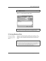
This tutorial will show you how to import ASCII data into a worksheet,
plot the data, and then customize some basic elements of the graph.
1.2 Importing Your Data
There are many ways to get your data into Origin. If your data exists in
an ASCII file, you can import that file into an Origin worksheet.
For more information
on importing data,
including multiple
ASCII files, see
Chapter 6 in the Origin
User's Manual.
Origin can import almost any type of ASCII file just by selecting
File:Import:Single ASCII or clicking Import ASCII
on the
Standard toolbar. Origin examines the file, looking for columns of data
as well as column header text. With complex ASCII files, Origin may
need some help from you. This help is provided in the Import ASCII
Options dialog box.
To Import the ASCII File:
1) Begin this lesson by clicking New Project
toolbar.
2) Click Import ASCII
on the Standard
on the Standard toolbar.
3) In the Origin TUTORIAL folder, select TUTORIAL_1.DAT from
the list of files.
4) Click Open. The ASCII file imports into the worksheet.
The worksheet is renamed using the name of the ASCII file you
imported. Because the file contains text in the first two rows, the first
row of text is used to rename the columns, while the first and second
1.1 Introduction • 1
Tutorial 1: Plotting Your Data
rows of text are used to create column labels. The labels are used for the
text in the legend when a graph is created.
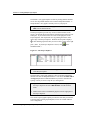
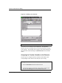
Note: You may need to resize the worksheet to see all the columns.
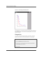
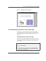
Figure 1.1: Importing the ASCII file
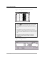
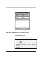
1.3 Designating Worksheet Columns as Error Bars
When you import data into a worksheet, the default column designations
of X, Y, Y, Y, etc. are used to show data associations. If your data is
associated differently, you can manually set the column designations.
In this example, the data has the following associations: X, Y, Err, Y,
Err, Y, Err.
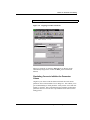
To Designate Columns as Error Bars:
1) Click on the Time(X) column heading and drag to the Error3(Y)
column heading.
2) Right-click within the highlighted cells to open a shortcut menu.
3) Select Set As:XYYErr from the shortcut menu. This changes the
Error1, Error2, and Error3 columns to error bar columns.
2 • 1.3 Designating Worksheet Columns as Error Bars
Tutorial 1: Plotting Your Data
Figure 1.2: Changing Worksheet Column Designations
1.4 Plotting Your Data
For more information
on grouped data
plots, see Chapter 11
in the Origin User's
Manual.
Origin offers a broad range of plotting options. The quickest way to create
a graph is to select your worksheet data by highlighting the column(s), and
then clicking a graph button on one of the graphing toolbars. When you
plot multiple columns using this technique, Origin automatically groups
the data plots and increments attributes such as the symbol type and color,
so that you can easily distinguish between data plots.
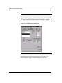
To Plot Your Worksheet Data:
1) With your worksheet data still selected, click Line + Symbol
on
the 2D Graphs toolbar. The three Y columns are plotted as line and
symbol data plots with error bars provided by the error bar columns
to the right of the associated Y columns.
1.4 Plotting Your Data • 3
Tutorial 1: Plotting Your Data
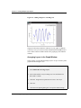
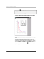
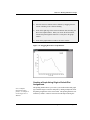
Figure 1.3: Plotting the Worksheet Data
Focusing on a Region of Your Graph
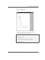
You may want to take a closer look at interesting areas of your data,
particularly if you have a large number of points. Origin provides a
number of tools to accomplish this, including the Enlarger tool. The
Enlarger tool automatically rescales the axes of the graph to show only
the region of the data plot(s) you select.
To Enlarge a Section of Your Data:
1) Click Enlarger
on the Tools toolbar.
2) Click-and-drag with the magnifying glass cursor to draw a box
around the large peaks (near X = 1.5) in the graph window. Release
the mouse button to complete the operation.
4 • 1.4 Plotting Your Data
Tutorial 1: Plotting Your Data
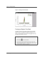
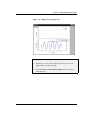
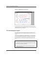
Figure 1.4: Enlarging a Section of Your Data
Figure 1.5: Rescaled Graph
Note: To return the axes to their original scale, double-click on the
Enlarger tool.
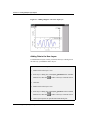
1.5 Customizing the Graph
Origin allows you to customize every aspect of your graph. The easiest
way to customize graphic elements is to double-click on them.
1.5 Customizing the Graph • 5
Tutorial 1: Plotting Your Data
Customizing the Data Plot
For more information
on the Plot Details
dialog box, see
Chapter 11 in the
Origin User's Manual.
Double-clicking on a data plot or the data plot icon in the legend opens
the Plot Details dialog box. This dialog box allows you to customize the
data plot you selected, as well as all the features of the graph window
except for the axes and text labels. The selection on the left side of the
dialog box determines the controls available for customizing on the right
side of the dialog box. For example, when a line and symbol data plot is
selected, you can edit the attributes of the lines and symbols, draw droplines to either axis, and select which features are incremented between the
grouped data plots.
To Customize the Data Plot:
1) Double-click on the Test1 data plot icon
in the legend. The
Plot Details dialog box opens with the TUTORIAL1:Time(x),
Test1(Y) data plot icon selected on the left side of the dialog box.
2) Select the Symbol tab if it is not currently selected.
3) Select the open circle symbol type
down list.
from the Preview drop-
4) Click OK.
Note: Because the data plots are grouped, the symbol type of the Test2
and Test3 data plots change to increment from the open circle symbol
selected for the Test1 data plot.
Customizing the Axes
For more information
on the Axis dialog box,
see Chapter 10 in the
Origin User's Manual.
Double-clicking on any of the axes in the graph opens the Axis dialog
box. Similar to the Plot Details dialog box, you can specify the axis you
want to customize by selecting it from the Selection list box on the left
side of the dialog box.
To Customize the Axes:
1) Double-click on the X axis.
6 • 1.5 Customizing the Graph
Tutorial 1: Plotting Your Data
2) On the Scale tab, type 1.2 in the From text box, 1.8 in the To text
box, and .1 in the Increment text box.
Figure 1.6: The X Axis Dialog Box
3) Select the Title & Format tab.
4) Type Time (sec) in the Title text box, overtyping the default text.
5) Select the Left icon from the Selection list box.
6) Type Potential (mV) in the Title text box, overtyping the default
text.
7) Select the Scale tab.
8) Type -.001 in the From text box, .014 in the To text box, and .002 in
the Increment text box.
9) Click OK.
1.5 Customizing the Graph • 7
Tutorial 1: Plotting Your Data
Figure 1.7: Customizing the Graph
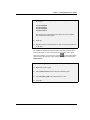
Adding Text to the Graph
To further customize your graph, you can add annotations including text,
arrows, lines, and shapes. The tools that let you add these annotations
are located on the Tools toolbar. Alternatively, you can right-click
anywhere in the graph to add text using a shortcut menu.
To Add Text to the Graph:
1) Click
on the Tools toolbar, and then click on the top center
position of the graph.
2) In the Text Control dialog box, type Effect of Solvent Loss on
Sample Potential.
3) Select 26 from the Size combination box.
8 • 1.5 Customizing the Graph
Tutorial 1: Plotting Your Data
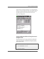
Figure 1.8: The Text Control Dialog Box
4) Click OK.
5) Drag the legend so that it is located in the top left corner of the
graph, next to the Y axis.
6) Drag the text label you just created so that it is centered at the top of
the window.
1.5 Customizing the Graph • 9
Tutorial 1: Plotting Your Data
Figure 1.9: The Finished Graph
1.6 Saving Your Project
Your project currently consists of one worksheet and one graph window
and the data displayed in both. Both of these windows and the data they
contain are saved within an Origin project file when you save the project.
To Save Your Project:
1) Click Save
on the Standard toolbar.
2) Type Tutorial_1 in the File Name text box, then click Save. The
project is saved as Tutorial_1.OPJ.
10 • 1.6 Saving Your Project
Tutorial 2: Exploring Your Data
Tutorial 2: Exploring Your Data
2.1 Introduction
This tutorial will show you how to mathematically transform data in a
worksheet column, sort a worksheet based on primary and secondary
columns, plot a range of worksheet data, and mask data from analysis
routines.
To begin this tutorial, you will open a new Origin project and import
ASCII data.
To Import the Data File:
1) Click New Project
on the Standard toolbar.
2) Click Import ASCII
, then select TUTORIAL_2.DAT from the
Origin TUTORIAL folder.
3) Click Open.
2.1 Introduction •11
Tutorial 2: Exploring Your Data
Figure 2.1: Importing the ASCII File
Note: There are several columns that are not visible due to the current
worksheet size. When there is a reference in this tutorial to a column that
is not visible, use the horizontal scroll bar on the bottom of the worksheet
to locate it.
2.2 Transforming Column Values
For more information
on the Set Column
Values dialog box, see
Chapter 3 in the Origin
User's Manual.
You can create or transform datasets using any mathematical expression
recognized by Origin in the Set Column Values dialog box. This dialog
box provides a text box for you to type a value or mathematical
expression to apply to the selected column or range of the column. It also
includes a function drop-down list from which you can select a function
to add to the text box. In addition, a column drop-down list contains a
list of all the columns in the active worksheet. Select the column you
want to add to the text box, then click Add Column to add the selected
column to the text box.
To Transform the Column Values:
1) Right-click on the Depth(Y) column heading.
2) Select Set Column Values from the shortcut menu that opens.
3) Leave col(A)-col(B) highlighted in the text box and select
col(DEPTH) from the Add Column drop-down list.
4) Click Add Column. Col(DEPTH) overwrites the highlighted text.
12 • 2.2 Transforming Column Values
Tutorial 2: Exploring Your Data
5) Leave the cursor at the current location in the text box and type
*.3048 in the text box.
Figure 2.2: Transforming the Column Values
6) Click OK. The expression you typed in the Set Column Values
dialog box is used to update the values in the DEPTH column.
2.3 Sorting Worksheet Data
For more information
on sorting, see Chapter
15 in the Origin User's
Manual.
Origin can sort individual columns, multiple selected columns, or entire
worksheets. Origin offers simple sorting in which specified data is sorted
using one "sort by" column and a selected sort order, as well as nested
sorting.
To Sort the Worksheet Data:
1) Move the mouse pointer to the upper-left corner of the worksheet to
turn the cursor into a downward pointing arrow (see Figure 2.3),
then click to select all the columns in the worksheet.
2.3 Sorting Worksheet Data •13
Tutorial 2: Exploring Your Data
Figure 2.3: Selecting All the Columns in the Worksheet
2) Click Sort
on the Worksheet Data toolbar to open the Nested
Sort dialog box. (To open the Worksheet Data toolbar, select
View:Toolbars, select the Worksheet Data check box, then click
Close.)
3) Select DEPTH from the Selected Columns list box, then click
Ascending. The column is added to the Nested Sort Criteria list box.
This selection makes DEPTH the primary sort column in ascending
order.
4) Select STN from the Selected Columns list box, then click
Ascending. This makes STN the secondary sort column in
ascending order.
Figure 2.4: Sorting the Worksheet
14 • 2.3 Sorting Worksheet Data
Tutorial 2: Exploring Your Data
5) Click OK.
6) De-select the worksheet by clicking in the upper–left blank space in
the worksheet (without the cursor changing to the downward
pointing arrow).
The entire worksheet is sorted so that the values in the DEPTH (primary)
column are ascending. If there are two cells of equal value in the
DEPTH column, then the values in the corresponding rows of the STN
(secondary) column are used to determine the worksheet order.
2.4 Plotting a Range of the Worksheet Data
You can set the worksheet display range so that subsequent plotting and
analysis are performed only on the data of interest.
To Select a Range of the Worksheet Data:
1) Select View:Go To Row.
2) Type 52 in the dialog box that opens, then click OK.
3) Right-click on the row heading for row number 52.
4) Select Set As Begin from the shortcut menu that opens.
2.4 Plotting a Range of the Worksheet Data •15
Tutorial 2: Exploring Your Data
Figure 2.5: Selecting a Range of Worksheet Data
5) Use the vertical scroll bar to move down in the worksheet so that
row number 68 is visible.
6) Right-click on the row heading for row number 68.
7) Select Set As End from the shortcut menu that opens.
Notice that the data outside the selected range is no longer displayed in
the worksheet. The data has not been deleted from the worksheet, only
hidden to provide for easier viewing of the selected range. The hidden
data can be shown by re-selecting the entire worksheet and then selecting
Edit:Reset to Full Range.
Plotting the Data:
1) Click the FLUOR column heading to select the column.
2) Drag the horizontal scroll bar on the bottom of the worksheet all the
way to the right.
3) CTRL+click on the TEMP column heading. This selects the TEMP
column while leaving the FLUOR column selected.
16 • 2.4 Plotting a Range of the Worksheet Data
Tutorial 2: Exploring Your Data
4) Click Double Y Axis
on the 2D Graphs Extended toolbar. (To
open the 2D Graphs Extended toolbar, select View:Toolbars, select
the 2D Graphs Extended check box, then click Close.)
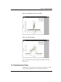
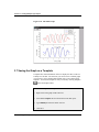
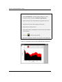
Figure 2.6: Plotting a Range of Worksheet Data
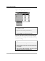
2.5 Masking Data in the Graph
The Mask toolbar is provided for excluding data from Origin's analysis
and fitting routines. You can mask individual data points or a range of
data. Once data is masked, options become available to change the
masked data color, hide or show the masked data, swap the masked and
unmasked data, and enable or disable masking.
To Mask a Data Point in the Graph:
1) Click Mask Point Toggle
on the Mask toolbar. This activates
the Data Reader tool. (To open the Mask toolbar, select
View:Toolbars, select the Mask check box, then click Close.)
2.5 Masking Data in the Graph •17
Tutorial 2: Exploring Your Data
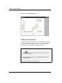
2) Double-click on the data point in the FLUOR data plot at X = 34,
Y = .59. The data point becomes red and the point is masked.
(Tip: With the Data Reader open, click on the FLUOR data plot,
then use the LEFT ARROW or RIGHT ARROW keys to read the
XY coordinates on the Data Display tool.)
Figure 2.7: Masking Data in the Graph Window
3) Click Change Mask Color
changes to green.
on the Mask toolbar. The color
4) Click Hide/Show Masked Points
the masked data point.
on the Mask toolbar to hide
5) Click Hide/Show Masked Points
show the data point.
on the Mask toolbar again to
18 • 2.5 Masking Data in the Graph
Tutorial 2: Exploring Your Data
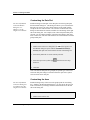
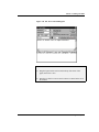
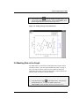
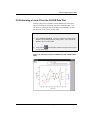
2.6 Performing a Linear Fit on the FLUOR Data Plot
Now that a data point is masked in the FLUOR data plot, subsequent
analysis and fitting are performed only on the non-masked data. You
can, however, disable the mask on the data point, and analyze or fit all
the data points in the current selection range.
To Perform a Linear Fit with the Data Point Masked:
1) Select Analysis:Fit Linear. A fit line is added to the graph and the
Results Log opens displaying the fitting results. You can scroll the
Results Log to view the results.
2) Click Refresh
on the Standard toolbar and reposition the legend
so it fits on the page.
Figure 2.8: Linear Fit of the FLUOR Data Plot with a Masked Data
Point
2.6 Performing a Linear Fit on the FLUOR Data Plot •19
Tutorial 2: Exploring Your Data
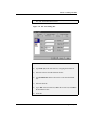
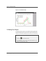
Figure 2.9: The Results Log
By default, the Results Log shows the results for all fitting done in the
currently active Project Explorer folder. To change this default behavior,
right-click in the Results Log and select a different viewing option.
Each time a new fit is done the results are appended to the Results Log.
Each entry in the Results Log includes a date/time stamp, the project file
location, the dataset, the type of analysis performed, and the results.
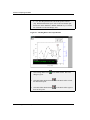
To Perform a Linear Fit with the Mask Disabled:
1) Click Disable/Enable Masking
on the Mask toolbar. The
masked data point changes from green to black.
2) Select Analysis:Fit Linear. A second fit line is drawn on the graph.
3) Verify that the mask is disabled by comparing the two fit results in
the Results Log.
20 • 2.6 Performing a Linear Fit on the FLUOR Data Plot
Tutorial 2: Exploring Your Data
Figure 2.10: Linear Fit of Data with Mask Disabled (2 Fit Lines)
To Remove the First Fit Line From the Graph:
1) Double-click on the layer 1 icon
in the upper-left corner of the
graph. This opens the Layer 1 dialog box.
2) Select linearfit1_tutoriafl from the Layer Contents list box.
3) Click the <= arrow (to the left of the Layer Contents list box). The
dataset is removed from the list box.
4) Click OK to close the dialog box.
5) Click New Legend
on the Graph toolbar to update the legend.
2.6 Performing a Linear Fit on the FLUOR Data Plot •21
Tutorial 2: Exploring Your Data
Figure 2.11: Linear Fit of Data with Mask Disabled (1 Fit Line)
2.7 Saving the Project
Your Origin project currently consists of your data, worksheets, graph,
analysis results and the current folder organization in the Project
Explorer.
To Save the Project:
1) Select File:Save Project.
2) Type a name in the File Name text box.
3) Click Save.
22 • 2.7 Saving the Project
Tutorial 3: Creating Multiple Layer Graphs
Tutorial 3: Creating Multiple Layer
Graphs
3.1 Introduction
This tutorial will introduce you to Origin's built-in multiple layer graph
templates. It will also show you how to create your own multiple layer
graph and then save it as a template.
3.2 Opening the Project File
The data for this tutorial is provided in a project file.
To Open the Project File:
1) Click Open
on the Standard toolbar.
2) In the Origin TUTORIAL folder, select TUTORIAL_3.OPJ from the
list of files.
3) Click Open. A project containing four graph windows and a
worksheet opens.
3.3 Viewing Origin's Multiple Layer Graph Templates
Origin contains several built-in, multiple layer graph templates. These
templates allow you to select a range of data, then click a button to plot
the selected data into multiple layers in a graph window.
3.1 Introduction • 23
Tutorial 3: Creating Multiple Layer Graphs
The double Y axis graph template is ideal for plotting data that includes
two or more dependent datasets and a common independent dataset. A
sample double Y axis graph is currently active in your project.
1) Right-click on the double Y axis graph window title bar and select
Hide from the shortcut menu.
The Project Explorer provides easy access to all the windows in the
project. By default, the Project Explorer is docked at the bottom of your
workspace. If you cannot see the five icons on the right pane of the
Project Explorer, then expand the view by pointing the mouse on the
upper edge of the Project Explorer. When the mouse pointer displays
, click-and-drag upward so that you can see all five icons on the right
pane. (Note: If your Project Explorer is closed, click
Standard toolbar.)
on the
Figure 3.1: The Project Explorer
2) Double-click on the Horizontal2Panel graph icon on the right pane
of the Project Explorer.
The horizontal 2 panel graph template is ideal for plotting related data
that does not share an independent dataset. You can use the Edit:Add &
Arrange Layers menu command and the Layer tool to customize the
spacing of the layers and to swap the layer arrangement.
3) Right-click on the Horizontal2Panel graph icon on the right pane of
the Project Explorer and select Hide Window from the shortcut
menu.
4) Double-click on the Vertical2Panel graph icon on the right pane of
the Project Explorer.
The vertical 2 panel graph template provides the same data presentation
as the horizontal 2 panel graph template, but in a one column with two
rows configuration.
24 • 3.3 Viewing Origin's Multiple Layer Graph Templates
Tutorial 3: Creating Multiple Layer Graphs
5) Right-click on the Vertical2Panel graph icon on the right pane of the
Project Explorer and select Hide Window from the shortcut menu.
6) Double-click on the 4Panel graph icon on the right pane of the
Project Explorer.
A 4 panel and a 9 panel (not shown) graph template complete the library
of built-in multiple layer graph templates.
3.4 Designating Multiple X Columns in the Worksheet
When your worksheet includes multiple X columns, Y columns in the
worksheet plot against the nearest X column to the left. Though this
default behavior can be disregarded by plotting using the Select Columns
for Plotting dialog box and by selecting non-associated columns with
CTRL selection, the default plotting behavior allows you to quickly
create graphs from associated XY datasets.
To Designate a Second X Column:
1) Double-click on the Layers worksheet icon on the right pane of the
Project Explorer.
2) Right-click on the Trial2 column heading in the Layers worksheet.
3) Select Set As:X from the shortcut menu that opens.
The Trial2 column designation changes to X2 and the columns to the
right of it are designated as Y2. In addition, the Trial1 column
designation changes to X1 and the columns between Trial1 and Trial2 are
designated as Y1. This allows you to quickly determine which column
will be providing the X values for the data you are plotting.
3.5 Creating a Multiple Layer Graph
Origin cannot possibly contain pre-defined templates for all the different
ways in which layers can be arranged, so it lets you to create your own
custom multiple layer graphs. Once you have created a graph, you can
save it as a template and then plot to it without having to re-build the
same graph every time.
3.4 Designating Multiple X Columns in the Worksheet • 25
Tutorial 3: Creating Multiple Layer Graphs
To Create a Multiple Layer Graph:
1) Click on the Potential1 column heading to highlight the column.
2) Click Line
on the 2D Graphs toolbar.
Figure 3.2: Line Graph of Potential1 Column
3) Select Tools:Layer to open the Layer tool.
4) With the Add tab selected, click Linked Right Y
on the Layer
tool. This adds a second layer to the graph displaying only the right
Y axis. By default, the X axis of this layer is linked to the X axis of
layer 1.
5) Double-click on the layer 2 icon in the upper-left corner of the graph
window.
6) Select layers_pressure1 in the Available Data list box.
26 • 3.5 Creating a Multiple Layer Graph
Tutorial 3: Creating Multiple Layer Graphs
7) Click
to add the dataset to the Layer Contents list box.
Figure 3.3: Adding Data to Layer 2
8) Click Layer Properties. The Plot Details dialog box opens.
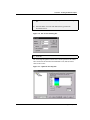
9) Double-click on the Layer2 icon on the left side of the dialog box.
10) Click on the LAYERS:Trial1(X), Pressure1(Y) data plot icon on
the left side of the dialog box. This action opens the Line tab.
Figure 3.4: Graph Tree of Plot Details Dialog Box
11) Select Blue from the Color drop-down list, then click OK.
12) Click OK to close the Layer 2 dialog box.
3.5 Creating a Multiple Layer Graph • 27
Tutorial 3: Creating Multiple Layer Graphs
Figure 3.5: Adding a Right Y Controlling Axis
Origin provides many methods to add layers to your graph. In addition
to the Layer tool, you can select menu commands from the Edit menu or
from a shortcut menu available outside of the graph page (but within the
window).
Arranging Layers in the Graph Window
In this section, you will add and arrange layers to set up a vertical 2 panel
graph with left and right Y axes.
To Add and Arrange Layers in the Graph:
1) Select Edit:Add & Arrange Layers.
2) In the Total Number of Layers dialog box, leave the default of 2
Rows and 1 Column.
3) Click OK. Origin asks for permission to create 1 more layer.
4) Click Yes.
5) Click OK in the Spacing dialog box to accept the default settings.
28 • 3.5 Creating a Multiple Layer Graph
Tutorial 3: Creating Multiple Layer Graphs
Figure 3.6: Adding and Arranging Layers
To Add the Right Y Controlling Axis to the Top Layer:
1) With the layer 3 icon selected, right-click in the gray area of the
graph window, outside of the page.
2) Select New Layer (Axes):(Linked): Right Y from the shortcut
menu that opens.
3.5 Creating a Multiple Layer Graph • 29
Tutorial 3: Creating Multiple Layer Graphs
Figure 3.7: Adding a Right Y Axis to the Top Layer
Adding Data to the New Layers
To add the data to layers 3 and 4, you will use the Layer n dialog box in
the same way you added the data to layer 2.
To Add Data to the New Layers:
1) Double-click on the layer 3 icon.
2) In the Layer 3 dialog box, select layers_potential2 in the Available
Data list box, then click
to add it to the Layer Contents list box.
3) Click OK.
4) Double-click on the layer 4 icon.
5) In the Layer 4 dialog box, select layers_pressure2 in the Available
Data list box, then click
to add it to the Layer Contents list box.
6) Click Layer Properties to open the Plot Details dialog box.
30 • 3.5 Creating a Multiple Layer Graph
Tutorial 3: Creating Multiple Layer Graphs
7) Double-click on the Layer4 icon on the left side of the dialog box,
then click on the LAYERS:Trial2(X), Pressure2(Y) data plot icon.
Figure 3.8: Graph Tree of Plot Details Dialog Box
8) Select Red from the Color drop-down list.
9) Click OK to exit the Plot Details dialog box.
10) Click OK.
Linking Axes
You can link axes between layers so that when you change the axis scale
in one layer the other layer's linked axis updates to the same scale
automatically.
To Link the X Axes:
1) Double-click on the layer 3 icon to open the Layer 3 dialog box.
2) Click Layer Properties.
3) Select the Link Axes Scales tab.
4) Select Layer 1 from the Link To drop-down list.
5) Select the Straight (1 to 1) radio button in the X Axis Link group,
then click OK.
6) Click OK in the Layer 3 dialog box.
3.5 Creating a Multiple Layer Graph • 31
Tutorial 3: Creating Multiple Layer Graphs
Figure 3.9: Adding Data to the Top Layers
You can test the axis link by double-clicking on the bottom X axis and
changing the From or To values on the Scale tab. After clicking OK, the
top X axis also reflects your changes.
3.6 Customizing the Legend
By default, Origin creates layer-specific legends. You can, however,
alter this default behavior and display the data from all the layers in one
legend.
Origin uses the embedded text formatting switch \L( ) to draw the data
plot type representations in the legend. To display the correct data plot
type representations from different layers, you must specify the layer
number followed by a period, then the number of the data plot in that
layer.
To Customize the Legend:
1) Click on the text portion of the legend for the bottom layer reading
Potential1 (mV), then press DELETE.
2) Double-click on the text portion of the legend for the top layer
reading Potential2 (mV).
32 • 3.6 Customizing the Legend
Tutorial 3: Creating Multiple Layer Graphs
3) In the Text Control dialog box, type the following text, overwriting
\L(1) %(1):
\L(1.1) Potential1
\L(2.1) Pressure1
\L(3.1) Potential2
\L(4.1) Pressure2
The preview box on the bottom of the dialog box shows what the
text will look like in the legend.
4) Click OK.
5) Drag the legend to a location where it does not overlap with the axes
or the data.
The legend now displays the data plot type representations from all the
layers in the graph. To prevent Origin from overwriting your custom
legend (for example, if you click New Legend
on the Graph toolbar)
you can rename the legend by right-clicking on the object and selecting
Label Control.
To Rename the Legend:
1) Right-click on the legend.
2) Select Label Control from the shortcut menu that opens.
3) Type Custom Legend in the Object Name text box.
4) Click OK.
3.6 Customizing the Legend • 33
Tutorial 3: Creating Multiple Layer Graphs
Figure 3.10: The Final Graph
3.7 Saving the Graph as a Template
Template files retain information on how to display the data, but do not
actually save the data. The next time you need to create a similar graph,
you can select your worksheet data and then select your custom graph
template. Your custom template is easily accessed by clicking Template
on the 2D Graphs toolbar.
To Save Your Graph as a Template:
1) Right-click on the graph window title bar.
2) Select Save Template As from the shortcut menu that opens.
3) Type Multilayer in the File Name text box.
4) Click Save.
34 • 3.7 Saving the Graph as a Template
Tutorial 3: Creating Multiple Layer Graphs
To test your template, you can make the Layers worksheet active, select
on the 2D
all the worksheet columns, and then click Template
Graphs toolbar. Select MULTILAYER.OTP, then click Open.
3.7 Saving the Graph as a Template • 35
Tutorial 3: Creating Multiple Layer Graphs
This page is intentionally left blank.
36 • 3.7 Saving the Graph as a Template
Tutorial 4: Nonlinear Curve Fitting
Tutorial 4: Nonlinear Curve Fitting
4.1 Introduction
Origin offers several methods of fitting functions to your data. These
methods vary in speed and complexity to optimize fitting for all users. In
this tutorial, you will be introduced to fitting using the menu commands,
the tools, and the nonlinear least squares fitter (NLSF). You will then
define your own function and fit sample data using the advanced mode of
the NLSF.
4.2 Fitting from the Menu
Origin offers access to several fitting functions directly from the
Analysis menu. To perform a fit on your data using the menu
commands, make sure that the data plot you want to perform the fit on is
active, then select the type of fit you want to perform from the Analysis
menu. Most of the menu commands require no parameter information
from you and will carry out the fit automatically. Some may ask you for
some parameter information, but will suggest default values based on
your data.
Figure 4.1: Fitting Commands on the Graph Window Analysis
Menu
4.1 Introduction • 37
Tutorial 4: Nonlinear Curve Fitting
4.3 Fitting Using the Tools
For a greater degree of control than the menu commands allow, Origin
provides three fitting tools: the Linear Fit tool, the Polynomial Fit tool
and the Sigmoidal Fit tool.
Figure 4.2: The Fitting Tools
For more information
on the fitting tools, see
Chapter 16 in the
Origin User's Manual.
The fitting tools are available when the worksheet or graph is active. To
use the fitting tools, select the dataset or data plot you want to fit,
customize the options on the tool, and then click Fit.
4.4 The Nonlinear Least Squares Fitter
For more information
on the NLSF, see
Chapter 16 of the
Origin User’s Manual.
The nonlinear least squares fitter (NLSF) is Origin's most powerful and
complex method of fitting data. There are two display modes available
for the NLSF: basic and advanced. You can switch between modes by
clicking the More button in the basic mode or the Basic Mode button in
the advanced mode.
The Basic Mode
The basic mode of the curve fitter provides an abbreviated fitting
function list and a less complex interface than the advanced mode.
Additionally, the basic mode offers less control over the fit and less
customization of the reported results.
38 • 4.3 Fitting Using the Tools
Tutorial 4: Nonlinear Curve Fitting
Figure 4.3: Basic Mode of the NLSF
The Advanced Mode
The advanced mode lets you customize all aspects of the fitting process.
It provides access to many more fitting functions than the basic mode and
the functions are separated into categories to facilitate searching. The
advanced mode also has its own menu and toolbar to provide access to all
its features.
To select a function in the advanced mode, select the appropriate
category from the Categories list box, then select the desired function
from the Functions list box. Once a function is selected, the procedure
for fitting is the same as for fitting after you define your own function.
4.4 The Nonlinear Least Squares Fitter • 39
Tutorial 4: Nonlinear Curve Fitting
Figure 4.4: Advanced Mode of the NLSF
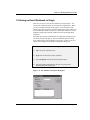
4.5 Fitting a Dataset Using Your Own Function
Opening the Project File
The data for this tutorial is provided in an Origin project file.
To Open the Project File:
1) Click Open
on the Standard toolbar.
2) In the Origin TUTORIAL folder, select TUTORIAL_4.OPJ from the
list of files.
3) Click Open.
40 • 4.5 Fitting a Dataset Using Your Own Function
Tutorial 4: Nonlinear Curve Fitting
The project opens showing a worksheet containing data and a graph
window containing a data plot.
Defining a Function
You can define your own function in the NLSF and then access that
function in future sessions from the fitter’s Functions list box. In the
basic mode, you click New to define a function. The following
procedure guides you through defining a function in the advanced mode.
To Define your own Function in the Advanced Mode:
1) Select Analysis:Nonlinear Curve Fit. If the fitter opens in the
basic mode, click More.
2) Select Function:New from the NLSF menu bar.
3) Type MyFitFunc in the Name text box.
4) Select 3 from the Number of Parameters drop-down list.
5) Type p1*exp(-x^p2/p3) in the Definition text box.
4.5 Fitting a Dataset Using Your Own Function • 41
Tutorial 4: Nonlinear Curve Fitting
Figure 4.5: Defining a New Function
6) Click Save.
The function is saved under the name MyFitFunc. The MyFitFunc
function will now be available in the list of functions under the currently
active category. The currently active category is the selected category In
the NLSF Select Function dialog box (Function:Select from the NLSF
menu).
Assigning the Function Variables to the Datasets
The next step is to assign the X and Y variables in the function to the
corresponding X and Y datasets in the data plot you are fitting.
To Assign the Function Variables to Datasets:
1) Select Action:Dataset from the NLSF menu bar.
2) In the list box at the top of the fitter, click on the Y variable in the
list, then click data1_b in the Available Datasets list box.
42 • 4.5 Fitting a Dataset Using Your Own Function
Tutorial 4: Nonlinear Curve Fitting
3) Click Assign.
Figure 4.6: Assigning Variables to Datasets
When you assign the Y variable to data1_b (the Y dataset), Origin
automatically assigns the X variable to data1_a (the associated X
dataset).
Simulating Curves to Initialize the Parameter
Values
Origin lets you observe what the function will look like with various
parameter values in the Simulate Curves dialog box. This enables you to
get an understanding of which parameter values produce curves that look
similar to your data. This is important because reasonably good starting
parameter values are in most cases a precondition for the success of the
fitting process.
4.5 Fitting a Dataset Using Your Own Function • 43
Tutorial 4: Nonlinear Curve Fitting
To Simulate Curves:
1) Select Action:Simulate from the NLSF menu bar.
2) Type 5 in the P1, P2, and P3 text boxes (overwriting the dashes).
Figure 4.7: Simulate Curves Dialog Box
3) Click Create Curve.
The parameters you typed in the text boxes are used to create a curve
which is plotted in the graph window containing your data plot.
44 • 4.5 Fitting a Dataset Using Your Own Function
Tutorial 4: Nonlinear Curve Fitting
Figure 4.8: Simulated Curve
You can type new parameter values in the text boxes to create a
simulated curve which looks more like your data.
4) Type 10 in the P1 text box (overwriting 5).
5) Click Create Curve.
6) Type 1 in the P2 and P3 text boxes (overwriting 5).
7) Click Create Curve.
4.5 Fitting a Dataset Using Your Own Function • 45
Tutorial 4: Nonlinear Curve Fitting
Figure 4.9: Fine-tuning the Simulated Curve
The simulated curve is much more similar to the plotted data with the last
set of parameter values. These will be the initial parameter values when
Origin fits the data.
Fitting the Data
You will now fit the data using the function you defined. The initial
parameter values will be used from the Simulate Curves dialog box.
To Fit the Data:
1) Select Action:Fit from the NLSF menu bar.
2) Click Chi-Sqr. The chi-squared value for the current parameter
values displays in the view box.
3) Click 10 Iter.
46 • 4.5 Fitting a Dataset Using Your Own Function
Tutorial 4: Nonlinear Curve Fitting
Origin fits the data, performing a maximum of 10 Levenberg-Marquardt
iterations. The fit curve displays in the graph. The chi-squared value and
the number of iterations performed are reported in the NLSF view box.
The updated parameter values are shown in the Value text boxes.
Figure 4.10: Fitting Session
Creating a Worksheet With the Fitting Results and
Exiting the Fitter
After fitting your data, you can create a worksheet that contains all the
results of your fitting session. Additionally, when you close the fitter,
Origin displays the parameter fitting results in the Results Log and in a
label in the graph window.
To Create a Worksheet with the Fitting Results
1) Select Action:Results in the NLSF.
2) Click Param. Worksheet.
4.5 Fitting a Dataset Using Your Own Function • 47
Tutorial 4: Nonlinear Curve Fitting
3) Click Close
NLSF.
in the upper-right corner of the NLSF to close the
4) Click Yes at the Attention prompt.
Figure 4.11: Final Graph (with label repositioned and formatted)
After closing the NLSF, a Parameters worksheet displays all the fitting
results.
The graph window displays your data plot, the simulated curves, the fit
curve, and a text label with the parameter results. To remove the
simulated curves from the graph, double-click on the layer 1 icon, then
select the myfitfunc1_b, myfitfunc2_b, and myfitfunc3_b datasets in
the Layer Contents list box and then click
Layer 1 dialog box.
48 • 4.5 Fitting a Dataset Using Your Own Function
. Click OK to close the
Tutorial 4: Nonlinear Curve Fitting
The Results Log also displays the parameter results. The Results Log is
a dockable, non-editable text window. The results from all the analysis
and fitting done in a project are sent to the Results Log for viewing. By
default, only the results from analysis performed in the active Project
Explorer folder are shown in the Results Log. To change the view mode,
right-click in the Results Log and select the desired view mode from the
shortcut menu that opens. This shortcut menu also contains options for
copying and clearing text from the Results Log.
4.5 Fitting a Dataset Using Your Own Function • 49
Tutorial 4: Nonlinear Curve Fitting
This page is intentionally left blank.
50 • 4.5 Fitting a Dataset Using Your Own Function
Tutorial 5: Creating 3D Surface Graphs
Tutorial 5: Creating 3D Surface
Graphs
5.1 Introduction
For more information
on 3D graphs, see the
plotting chapters in the
Origin User’s Manual.
Origin supports 3D graphs from three different data formats: XYY
worksheet data, XYZ worksheet data and matrix data. However, 3D
surface graphs can only be created from matrix data. This tutorial will
focus on converting a worksheet containing XYZ data to a matrix and
then creating and customizing a 3D surface graph from the matrix.
5.2 Converting a Worksheet to a Matrix
In this section you will learn how to change a worksheet column’s
designation, then convert an XYZ worksheet to a matrix so that it can be
plotted as a 3D surface graph.
The data for this lesson is provided in an ASCII file.
To Import the ASCII File:
1) Click New Project
2) Click Import ASCII
on the Standard toolbar.
on the Standard toolbar.
3) In the Origin TUTORIAL folder, select TUTORIAL_5.DAT from
the list of files.
4) Click Open.
5.1 Introduction • 51
Tutorial 5: Creating 3D Surface Graphs
Figure 5.1: Importing the ASCII File
By default, when the file is imported columns are added to the worksheet
as Y columns. To convert the worksheet to a matrix it must be in an
XYZ format.
To Change the Column Designation:
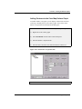
1) Right-click on the C(Y) column heading.
2) Select Set As:Z from the shortcut menu that opens. Column C is
now designated as a Z column.
Selecting the Type of Conversion
For more information
on converting
worksheets to matrices,
see Chapter 5 in the
Origin User’s Manual.
Origin provides several methods for converting worksheets to matrices,
including direct, expand columns, 2D binning, regular XYZ and random
XYZ conversions. The best method to use depends on the type of data in
the worksheet.
The data in this lesson is an XYZ worksheet with un-ordered XY data.
Thus, the method of conversion you will use is random XYZ.
To Convert the Worksheet to a Matrix:
1) If not still selected, click on the C(Z) column heading to select the
column.
2) Select Edit:Convert to Matrix:Random XYZ.
52 • 5.2 Converting a Worksheet to a Matrix
Tutorial 5: Creating 3D Surface Graphs
3) In the Gridding Parameters dialog box, leave the default values in
the text boxes, then click OK. The worksheet gets converted to a
matrix.
Based on the default settings in the dialog box, Matrix1 has dimensions
of 10 columns by 10 rows. It is linearly mapped in X by columns and
linearly mapped in Y by rows. The correlation gridding method was
used to compute the new Z values.
Figure 5.2: Converted Worksheet Data
5.3 Creating a 3D Surface Graph
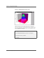
Now that you have your data in a matrix you can create any type of
contour or 3D surface graph. For this tutorial you will create a 3D color
mapped surface graph.
To Create a 3D Color Mapped Surface Graph:
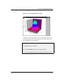
1) With the matrix active, select Plot 3D:3D Color Map Surface.
The matrix data is plotted as a color map surface graph. The different
colors represent different Z-value ranges.
5.3 Creating a 3D Surface Graph • 53
Tutorial 5: Creating 3D Surface Graphs
Figure 5.3: Color Map Surface Graph
5.4 Customizing the Graph
Origin gives you full control over the color mapping applied to the
surface data plot. All the options for customizing the color map are
located on the Color Map tab of the Plot Details dialog box.
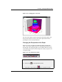
Changing the Color Map Values
The Color Map tab on the Plot Details dialog box displays the current
color map associated with levels of Z values. To edit an individual level
or color, click on the value or color in the Level or Fill column. To edit
the entire range of levels or colors, click on the Level or Fill column
heading. To edit a range of levels, SHIFT + click on the desired values
to select a range, then click on the Level or Fill column heading.
To Change the Number of Levels in the Color Map:
1) Right-click on the surface plot.
2) Select Plot Details from the shortcut menu that opens.
54 • 5.4 Customizing the Graph
Tutorial 5: Creating 3D Surface Graphs
3) Click on the Level column heading to open the Set Levels dialog
box.
4) Select the Num. of Levels radio button, then type 12 in the
associated text box.
Figure 5.4: The Set Levels Dialog Box
5) Click OK.
The Color Map tab updates to show twelve levels (plus levels for values
above and below the maximum and minimum levels) and associated
colors in the list box.
Figure 5.5: Updated Color Map Tab
5.4 Customizing the Graph • 55
Tutorial 5: Creating 3D Surface Graphs
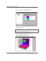
Changing the Color Map Colors
Customizing the Fill Color Range:
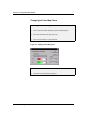
1) Click on the Fill column heading to open the Fill dialog box.
2) Select Red from the From drop-down list.
3) Select Green from the To drop-down list.
Figure 5.6: Editing the Fill Dialog Box
4) Click OK.
5) Click OK in the Plot Details dialog box.
56 • 5.4 Customizing the Graph
Tutorial 5: Creating 3D Surface Graphs
Figure 5.7: The Customized Surface Graph
In addition to editing color ranges, you can edit individual colors. This is
especially useful if you have an important section of your data that you
want to highlight or make transparent.
To Edit an Individual Color:
1) Right-click on the surface plot.
2) Select Plot Details from the shortcut menu that opens.
3) On the Color Map tab, click on the color associated with 1.833E -4.
5.4 Customizing the Graph • 57
Tutorial 5: Creating 3D Surface Graphs
Figure 5.8: Selecting an Individual Color to Edit
The Fill dialog box opens.
4) Select None from the Fill Color drop-down list, then click OK.
5) Click OK in the Plot Details dialog box.
The data plot redraws showing the transparent level.
Figure 5.9: Editing an Individual Color
58 • 5.4 Customizing the Graph
Tutorial 5: Creating 3D Surface Graphs
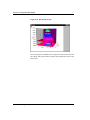
Adding Contours to the Color Map Surface Graph
To further enhance your graph, you can display contour lines and colors
on the top or bottom plane of your surface graph. This is done on the
Surface / Projections tab of the Plot Details dialog box.
To Add Contour Colors to the Bottom Plane of the Surface Graph:
1) Right-click on the surface graph.
2) Select Plot Details from the shortcut menu that opens.
3) Select the Surface / Projections tab.
4) Select the Fill Color check box under the Bottom Contour text.
Figure 5.10: The Surface / Projections Tab
5) Click OK.
5.4 Customizing the Graph • 59
Tutorial 5: Creating 3D Surface Graphs
Figure 5.11: Displaying Bottom Contour Colors
With the current Z axis scale range and the current view angle, the
surface plot substantially overlaps the bottom contour, blocking it from
view. To make more of the contour visible, you can change the Z axis
scale to begin from a lower value.
To Change the Z Axis Scale:
1) Select Format:Axes:Z Axis to open the Z Axis dialog box.
2) In the From text box, type -1E-4.
3) Click OK.
60 • 5.4 Customizing the Graph
Tutorial 5: Creating 3D Surface Graphs
Figure 5.12: Changing the Z Axis Scale
The Z axis now displays a greater range below the surface graph. This
decreases the amount of overlap of the surface plot and the contour,
providing for a better visual presentation.
Changing the Perspective of the Graph
When you create a 3D graph, the 3D Rotation toolbar automatically
opens. This toolbar contains buttons for controlling the perspective of
the 3D graph. By rotating the graph you can further reduce the overlap
of the surface plot with the contour, and provide a better perspective for
viewing the graph.
Figure 5.13: The 3D Rotation Toolbar
To Rotate the Graph:
1) Click Tilt Up
on the 3D Rotation toolbar.
2) Click Rotate Counterclockwise
on the 3D Rotation toolbar.
5.4 Customizing the Graph • 61
Tutorial 5: Creating 3D Surface Graphs
Figure 5.14: Rotating the Graph
This new perspective eliminates the overlap between the surface plot and
the contour, and provides better visibility of the transparent section of the
surface plot.
62 • 5.4 Customizing the Graph
Tutorial 6: Creating Presentations with the Layout Page
Tutorial 6: Creating Presentations
with the Layout Page
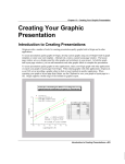
6.1 Introduction
The layout page is designed to facilitate the creation of graphic
presentations. Pictures of any worksheet or graph windows in your
project can be displayed and arranged on the layout page. In addition,
text and graphic objects can be added to enhance your presentation.
6.2 Adding Graphs, Worksheets and Text to the Layout Page
Pictures of graphs and worksheets are added to the layout page by
clicking the buttons on the Layout toolbar, or by selecting associated
menu commands. Text can be added with the Text tool, or by pasting
from the Clipboard. Shapes, lines and arrows can be added using the
drawing tools from the Tools toolbar.
Opening the Project File
The data for this tutorial lesson is provided in an Origin project file.
To Open the Project File:
1) Click Open
on the Standard toolbar.
2) In the Origin TUTORIAL folder, select TUTORIAL_6.OPJ from the
list of files.
3) Click Open.
6.1 Introduction • 63
Tutorial 6: Creating Presentations with the Layout Page
A project opens, displaying several worksheet and graph windows.
Creating a New Layout Page
To Create a New Layout Page:
1) Click New Layout
page opens.
on the Standard toolbar. A blank layout
2) If the layout page is displayed in the portrait orientation, right-click
on the gray area of the layout page, then select Rotate Page from the
shortcut menu that opens.
Adding Pictures and Text to a Layout Page
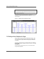
When you add a worksheet or graph to the layout page, it is added as a
graphic object and the features of the window cannot be edited directly in
the layout page. However, all changes made to the original window will
be reflected in the layout page.
To Add Pictures of Graphs and Worksheets to the Layout Page:
1) Click Add Graph
on the Layout toolbar. If the Layout toolbar
is not open, select View:Toolbars, select the Layout check box, then
click Close.
2) Select Graph3 from list box in the Select Graph Object dialog box
and click OK.
3) Drag out a box on the lower-left corner of the layout page.
64 • 6.2 Adding Graphs, Worksheets and Text to the Layout Page
Tutorial 6: Creating Presentations with the Layout Page
Figure 6.1: Adding a Graph Picture to the Layout Page
When you release the mouse button a picture of the graph window is
added to the layout page. When the graph picture is selected, you can
drag the picture to a new location, or use the sizing handles to resize it.
4) Right-click on a blank section of the layout page and then select Add
Worksheet from the shortcut menu that opens.
5) Select Peaks from the list box in the Select Worksheet Object dialog
box and click OK.
6) Drag out a box in the lower-right corner of the layout page.
6.2 Adding Graphs, Worksheets and Text to the Layout Page • 65
Tutorial 6: Creating Presentations with the Layout Page
Figure 6.2: Adding a Worksheet Picture to the Layout Page
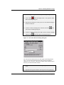
To Add Text to the Layout Page using the Text Tool:
1) Click Text Tool
on the Tools toolbar.
2) Click on the upper portion of the layout page, then type Peaks from
Spectroscopy Data in the Text Control dialog box.
3) Select 36 from the Size combination box.
4) Select Black Line from the Background drop-down list.
5) Click OK.
66 • 6.2 Adding Graphs, Worksheets and Text to the Layout Page
Tutorial 6: Creating Presentations with the Layout Page
Figure 6.3: Adding Text to the Layout Page
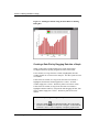
6.3 Customizing the Appearance of the Layout Page
In this section, you will fine tune the size and position of the graphic
objects displayed in the layout page. In addition, you will make changes
to the source graph window to change the graph’s appearance in the
layout page.
Arranging Pictures on the Layout Page
There are several ways to arrange pictures on the layout page. You can
drag the pictures and estimate the position, use the Object Edit toolbar, or
view the grid on the layout page and align the pictures using the grid
lines as a guide.
To Arrange the Pictures on the Layout Page Using a Grid:
1) Select View:Show Grid.
2) Right-click on the graph picture, then select Keep Aspect Ratio
from the shortcut menu that opens. This will preserve the aspect
ratio of the source graph window.
6.3 Customizing the Appearance of the Layout Page • 67
Tutorial 6: Creating Presentations with the Layout Page
3) Resize the graph picture, using the right horizontal sizing handle, to
take up the lower-left half of the layout page.
4) Follow the same procedure for the worksheet picture, resizing it to
the lower-right half of the layout page.
Note: The grid is only displayed on the layout page within Origin. If the
layout page is printed or exported, the grid will not be displayed.
Figure 6.4: Arranging the Objects on the Layout Page
5) Center the text label using the grid lines for alignment.
68 • 6.3 Customizing the Appearance of the Layout Page
Tutorial 6: Creating Presentations with the Layout Page
Figure 6.5: Aligning the Text in the Layout Page
Editing the Pictures in the Layout Page
Although you cannot edit the worksheets and graphs in the layout page
directly, Origin provides a shortcut menu command to go to the source
window.
To Edit a Source Window from the Layout Page:
1) Right-click on the graph picture in the layout page.
2) Select Go To Window from the shortcut menu that opens. Origin
makes the Graph3 window active.
3) Double-click on the gray area of the Graph3 window outside of the
page.
4) On the Legends tab of the Plot Details dialog box, select the Full
Dataset Name check box.
5) Click next to the Graph 3 icon on the left side of the dialog box,
then select the Layer 1 icon from the graph tree.
6.3 Customizing the Appearance of the Layout Page • 69
Tutorial 6: Creating Presentations with the Layout Page
6) On the Display tab, clear the Clip Data to Frame check box.
7) Click OK.
8) Drag the legend so that it displays within the axes of the graph, then
click in a blank section of the graph to de-select the legend.
9) Double-click on the Layout1 icon on the right side of the Project
Explorer to re-activate this window. The graph picture reflects your
changes.
6.4 Exporting the Layout Page
In addition to customizing your layout page presentation in Origin, you
can export the layout page into other applications. Origin provides a
number of graphic export filters. In addition, you can copy the layout
page to the Clipboard and paste it into other applications.
To Export the Layout Page as a Windows TIFF:
1) Select File:Export Page.
2) Type Presentation1 in the File Name text box.
3) Select Tag Image File (*.TIF) from the Save As Type drop-down
list.
4) Click Save.
The layout page is exported as a TIFF and can be inserted into any
application that recognizes this file type.
70 • 6.4 Exporting the Layout Page
Tutorial 7: Working with Excel in Origin
Tutorial 7: Working with Excel in
Origin
7.1 Introduction
Origin provides you with the ability to open Excel workbooks from
within Origin, provided you have Excel 7 or later installed on your
computer. This allows you to combine Excel’s spreadsheet functionality
with Origin’s powerful graphing and analysis tools. This tutorial will
introduce you to opening an Excel workbook in Origin and plotting the
workbook data, and saving workbooks from within Origin.
7.2 Opening an Excel Workbook in Origin
Note: To perform this tutorial, you must have Excel version 7 or later
installed on your computer either as a local or network copy. In addition,
this tutorial assumes the default settings are selected on the Excel tab of
the Options dialog box (Tools:Options).
To Open a Previously Created Excel Workbook:
1) Click New Project on the Standard toolbar.
2) Click Open Excel
on the Standard toolbar.
3) In the Origin TUTORIAL folder, select TUTORIAL_7.XLS from
the list of files.
7.1 Introduction • 71
Tutorial 7: Working with Excel in Origin
4) Click Open.
5) Select the Open As Excel Workbook radio button in the Open Excel
dialog box, then click OK.
The workbook opens in the Origin workspace. In addition, a
combination of Origin and Excel menus and toolbars are now displayed
in the workspace.
Figure 7.1: Opening an Excel Workbook in Origin
7.3 Plotting an Excel Workbook in Origin
There a number of ways to plot Excel workbook data in Origin. These
include, but are not limited to, using the Select Data for Plotting dialog
box, dragging data to a graph window and using Origin’s default plot
assignments.
Creating a Graph Using the Select Data for Plotting
Dialog Box
The Select Data for Plotting dialog box lets you select data and then
assign plotting designations.
72 • 7.3 Plotting an Excel Workbook in Origin
Tutorial 7: Working with Excel in Origin
To Create a Graph Using the Select Data for Plotting Dialog Box:
1) Click Column
on the 2D Graphs toolbar. This opens the Select
Data for Plotting dialog box.
2) Reposition the dialog box so that you can see the column headings in
the Excel workbook.
3) Click the column A heading in the workbook, then click
Select Data for Plotting dialog box.
in the
4) Click the column C heading, then CTRL+click the column F heading
and then click
in the Select Data for Plotting dialog box.
Figure 7.2: The Select Data for Plotting Dialog Box
The box below the buttons shows the data ranges representing the data
types. X:A1:A65536 means that the X data is being represented by
column A rows 1 to 65536. The last row number of the column is shown
because you selected the whole column.
5) Click Plot in the Select Data for Plotting dialog box, then click
Close.
6) Reposition the legend so that the entire legend is on the graph page.
7.3 Plotting an Excel Workbook in Origin • 73
Tutorial 7: Working with Excel in Origin
Figure 7.3: Plotting Excel Data Using the Select Data for Plotting
Dialog Box
Creating a Data Plot by Dragging Data Into a Graph
When you drag Excel workbook data into a graph, Origin makes
assumptions about the plotting designations of the selected data.
If one column (or a range from one column) is highlighted, then this
column supplies the Y values for the data plot. The data is plotted versus
row number.
If more than one column (or a range from more than one column) is
highlighted, the leftmost column supplies the X values. All other
columns supply the Y values. The data is plotted versus the X values.
If more than one column (or range from more than one column) is
highlighted and the CTRL key is depressed while dragging the data, then
all the columns supply the Y values. The data is plotted versus row
number.
To Create a Graph Using the Drag-and-Drop Method:
1) Click New Graph
on the Standard toolbar. Move the Graph2
window to the lower-right corner of the workspace, so that when the
workbook is active it won’t completely overlap the graph window.
74 • 7.3 Plotting an Excel Workbook in Origin
Tutorial 7: Working with Excel in Origin
2) Click on the title bar of the workbook to make it the active window.
3) Select the first two columns in the workbook by dragging from the
column A heading to the column B heading.
4) Click on the right edge of the selected workbook data, then drag the
data to the Graph2 window. When you release the mouse button,
column B is plotted against column A as a line plot in the graph
window.
5) Click on the graph window to make it the active window.
Figure 7.4: Dragging Data into a Graph Window
Creating a Graph Using Origin’s Default Plot
Assignments
For a complete
discussion on this
feature, see Chapter 4
in the Origin User’s
Manual.
This plotting method allows you to select your workbook data and graph
type, and then Origin creates the data plots by making assumptions about
the plotting assignments of the selected data. This plotting method is not
available by default. It must be activated from the Options dialog box.
7.3 Plotting an Excel Workbook in Origin • 75
Tutorial 7: Working with Excel in Origin
To Create a Graph Using the Default Plot Assignments:
1) Select Tools:Options to open the Options dialog box. (If the
workbook is active, then select Window:Origin Options.)
2) On the Excel tab, select the Default Plot Assignments check box.
3) Click OK, then click No in the dialog box that opens.
4) Make the Excel workbook active.
5) Click on the column A heading, then CTRL+click on the column D
and G headings.
6) Click Area
on the 2D Graphs toolbar.
7) Reposition the legend so that the entire legend is on the graph page.
Figure 7.5: Plotting Excel Data Using the Default Plot Assignments
76 • 7.3 Plotting an Excel Workbook in Origin
Tutorial 7: Working with Excel in Origin
7.4 Saving an Excel Workbook in Origin
There are two ways to save Excel workbooks in Origin projects. You
can save the workbook internal or external to the Origin project. When
you save a workbook internal to the project, it is saved as part of the
Origin project and can only be opened by opening the project. When you
save a workbook external to the project, a link to the workbook is saved
within the Origin project and the workbook can be opened and edited
with Excel.
By default, pre-existing workbooks that are opened in an Origin project
are saved external to the project, whereas workbooks that are created
from within Origin are saved internal to the project. However, the save
option can be changed in the Workbook Properties dialog box.
To Save the Workbook Internal to the Origin Project:
1) Make the Excel workbook active.
2) Right-click on the title bar of the workbook.
3) Select Properties from the shortcut menu that opens.
4) Select the Internal radio button in the Save As group of the
Workbook Properties dialog box.
Figure 7.6: The Workbook Properties Dialog Box
7.4 Saving an Excel Workbook in Origin • 77
Tutorial 7: Working with Excel in Origin
5) Click OK.
6) Select File:Save Project As.
7) Type Excel_Tutorial in the File Name text box.
8) Click Save.
The project is saved and the workbook is saved internal to the project.
Any changes that you now make to the Excel workbook located in the
TUTORIAL folder will not be reflected in the project file the next time it
is opened.
78 • 7.4 Saving an Excel Workbook in Origin
Index
Index
3
3D surface graphs
adding contours 59
changing colormap levels 54
creating 53
rotating 61
A
Adding
a right Y axis 26
contours to 3D surface graphs 59
data to layers 26
layers 26, 28
pictures to layou pages 64
text to layout pages 66
Arranging
layers 28
ASCII
importing 1
Axes
changing scale 60
customizing 6
Axis dialog box 6
C
Changing
axis scale 60
color map colors
individual color 57
range 56
Color map
changing colors
individual color 57
range 56
changing levels 54
Columns
changing designation 52
multiple X 25
selecting non-consecutive 16
setting designation 2
setting values 12
sorting 13
Converting
worksheets to matrices 52
Creating
layout pages 64
Customizing
axes 6
data plot color 27
data plots 6
mask color 18
the legend 32
D
Data plots
changing color 27
creating 3
customizing 6
fitting 19
masking data 17
Data points
masking 17
Designating
multiple X columns 25
Dialog boxes
Plot details 69
E
Enlarger tool 4
Error bars
designating columns as 2
Excel
opening workbooks 71
plotting
default plot assignments 76
drag-and-drop 74
Select Data for Plotting dialog
box 73
requirements 71
saving 77
exporting
TIFF files 70
Exporting
layout pages 70
Index • 79
Index
F
M
Fitting See also NLSF
from the menu 19
linear 19
using the menu commands 37
using the NLSF 38–49
using the tools 38
Mask
changing color 18
hiding/showing 18
single data point 17
Matrix
creating 52
plotting 53
setting dimensions 53
G
Graphs
adding text 8
saving as templates 34
H
Hiding windows 24
Hiding/showing masked data 18
I
Importing
ASCII 1
N
NLSF
advanced mode 39
assigning variables to datasets 42
basic mode 38
creating results worksheet 47
defining a function 41
fitting the data 46
initializing parameters 46
iterations 47
naming new functions 41
opening 41
saving new functions 42
simulating curves 44
L
Layer n dialog box
opening 26
Layer tool 26
Layers
adding 26, 28
adding data to 26
arranging 28
linking 31
linking axes scales 31
removing data 48
Layout pages
adding pictures 64
Layout pages 68
adding text 66
creating 64
exporting 70
resizing pictures on 68
rotating 64
showing grid 67
Legends
customizing 32
renaming 33
Linking
layers 31
80 • Index
O
Opening
Excel workbooks 71
Layer n dialog box 26
NLSF 41
Plot Details dialog box 27
projects 23
P
Plot Details dialog box 6, 27, 69
Color Map tab 55
Plotting
Excel data 73, 74, 76
matrix data 53
ranges of worksheet data 15–17
worksheet data 3
Project Explorer
hiding windows 24
viewing 24
Projects
opening 23
saving 10, 22
Index
R
Removing
datasets from layers 48
Renaming the legend 33
Resizing
pictures in layout pages 68
Results
creating NLSF worksheet 47
displaying 50
Results Log 50
Rotating
3D surface graphs 61
layout pages 64
importing ASCII 1
multiple X columns 25
NLSF results 47
plotting range 15–17
setting column values 12
setting display range 15–16
sorting 13
S
Saving
Excel workbooks 77
new fitting functions 42
projects 10, 22
templates 34
Scale See Axes
Select Data for Plotting dialog box
73
Selecting
non-consecutive columns 16
Set Levels dialog box 55
Setting
column values 12
matrix dimension 53
worksheet display range 15–16
Sorting
worksheet data 13
T
Templates
saving graphs as 34
Text
adding to graphs 8
Adding to layout pages 66
Text Control dialog box 8, 66
Tools
Enlarger 4
fitting 38
W
Worksheets
converting to matrices 52
creating XYZ 52
Index • 81