1
CHAPTER 7. PLOTTING DATA
124
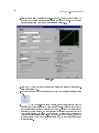
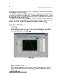
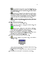
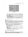
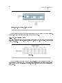
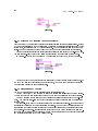
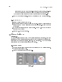
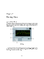
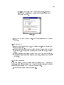
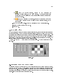
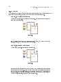
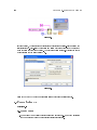
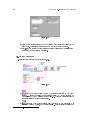
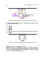
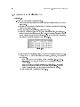
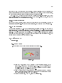
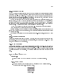
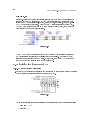
(b)b - Use the Labeling tool to double-click the second number from the bottom on
the y-axis, type 80.0, and press the <Enter> key. This number determines the
numerical spacing of the y-axis divisions. For example, if the number above 75.0
is 77.5, it indicates a y-axis division of 2.5, changing the 77.5 to 80.0 reformats
the y-axis to multiples of 5.0 (75.0, 80.0, 85.0, and so on).
The waveform chart size has a direct eect on the display of axis
scales. Increase the waveform chart size if you encounter problems while
customizing the axis.
note:
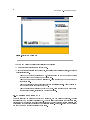
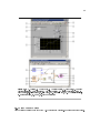
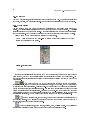
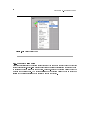
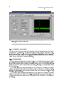
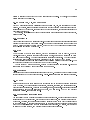
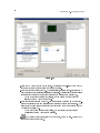
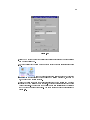
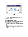
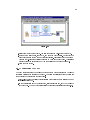
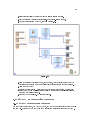
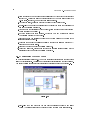
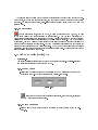
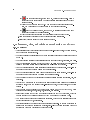
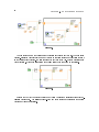
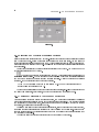
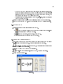
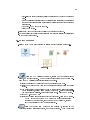
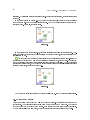
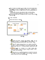
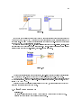
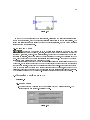
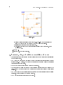
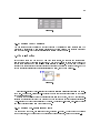
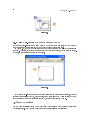
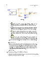
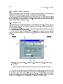
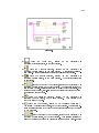
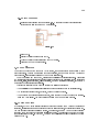
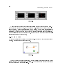
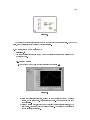
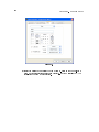
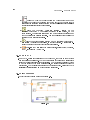
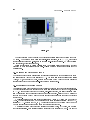
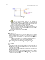
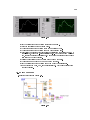
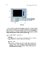
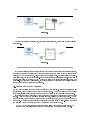
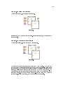
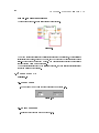
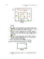
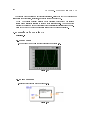
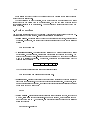
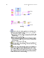
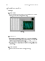
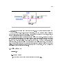
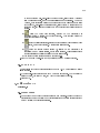
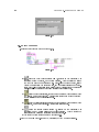
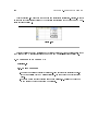
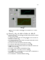
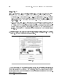
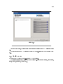
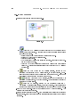
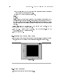
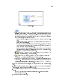
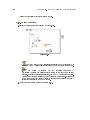
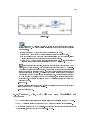
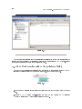
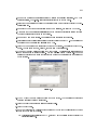
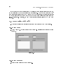
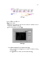
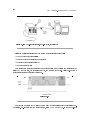
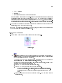
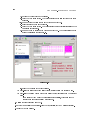
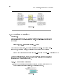
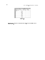
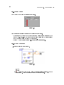
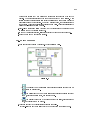
2.Right-click the waveform chart and select Visible ItemsScale Legend from the shortcut menu to display the scale legend, as shown in Figure 7.13. You can place the scale
legend anywhere on the front panel.
Figure 7.13:
1. X-axis, 2. Y-axis, 3. Scale Labels, 4. Scale Lock Button, 5. Autoscale Button,
6. Scale Format Button
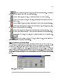
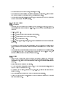
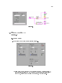
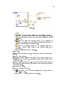
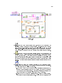
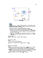
3.Use the scale legend to customize each axis.
(a)Make sure the Lock Autoscale button appears locked and the Autoscale LED is
green so the y-axis adjusts the minimum and maximum values to t the data in
the chart.
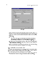
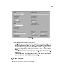
(b)Click the Scale Format button to change the format, precision, mapping mode,
scale visibility, and grid options for each axis.
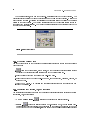
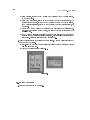
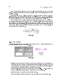
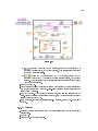
4.Use the plot legend to customize the plots.
(a)Use the Positioning tool to resize the plot legend to include two plots.
(b)Use the Labeling tool to change Temp to Running Avg and to change Plot 1 to
Current Temp. If the text does not t, use the Positioning tool to resize the plot
legend.
(c)Right-click the plot in the plot legend to set the line and point styles and the
color of the plot background or traces.
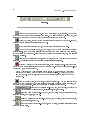
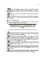
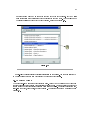
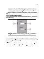
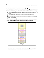
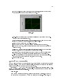
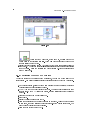
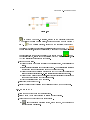
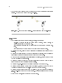
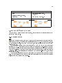
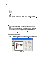
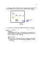
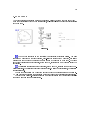
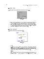
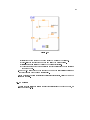
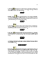
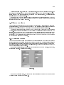
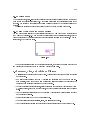
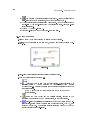
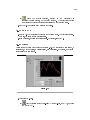
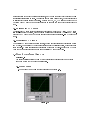
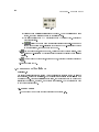
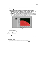
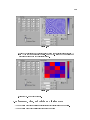
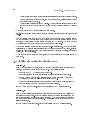
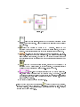
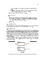
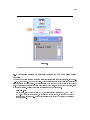
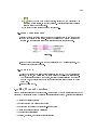
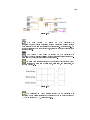
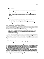
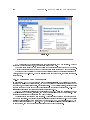
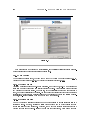
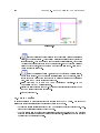
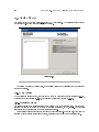
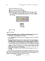
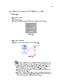
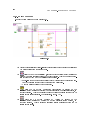
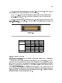
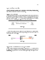
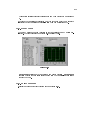
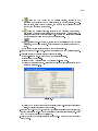
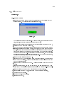
5.Right-click the waveform chart and select Visible ItemsGraph Palette from the
shortcut menu to display the graph palette, as shown in Figure 7.14. You can place
the graph palette anywhere on the front panel.