1
GETTING STARTED
5
provides the possibility to change the tracking of customisable sets of fonts, e. g.,
all small capitals. It also introduces two new commands \textls and \lsstyle for
ad-hoc letterspacing, which can be used like the normal text commands. Note that
letterspacing only works in PDF mode.
Adjustment of interword spacing is based upon the idea that in order to achieve
a uniform greyness of the text, the space between words should also depend on
the surrounding characters. For example, if a word ends with an ‘r’, the following
space should be a tiny bit smaller than that following, say, an ‘m’. You can think
of this concept as an extension to TeX’s ‘space factors’. However, while space
factors will influence all three parameters of interword space (or glue) by the same
amount – the kerning, the maximum amount that the space may be stretched
and the maximum amount that it may be shrunk – pdfTeX provides the possibility
to modify these parameters independently from one another. Furthermore, the
values may be set differently for each font. And, probably most importantly, the
parameters may not only be increased but also decreased. This feature may enhance
the appearance of paragraphs even more. Emphasis in the last sentence is on the
word ‘may’: this extension is still highly experimental – in particular, only ending
characters will currently have an influence on the interword space. Also, the settings
that are shipped with microtype are but a first approximation, and I would welcome
corrections and improvements very much. I suggest reading the reasoning behind
the settings in section 15.9.
Setting additional kerning for characters of a font is especially useful for languages whose typographical tradition requires certain characters to be separated
by a space. For example, it is customary in French typography to add a small space
before question mark, exclamation mark and semi-colon, and a bigger space before
the colon and the guillemets. Until now, this could only be achieved by making
these characters active (for example by the babel package), which may not always
be a robust solution. In contrast to the standard kerning that is built into the fonts
(which will of course apply as usual), this additional kerning is based on single
characters, not on character pairs.
The possibility, finally, to disable all ligatures of a font may be useful for typewriter fonts.
The microtype package provides an interface to all these micro-typographic extensions. All micro-typographic aspects may be customised to your taste and needs in
a straight-forward manner. The next chapters will present a survey of all options
and customisation possibilities.
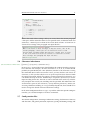
2 Getting started
There is nothing surprising in loading this package:
\usepackage{microtype}
This will be sufficient in most cases, and if you are not interested in fine-tuning
the micro-typographic appearance of your document (which would seem unlikely,
since using this package is proof of your interest in typographic issues), you may